L+D 22
Edição 22: Março/ Abril - 2009
Edição 22: Março/ Abril - 2009

Create successful ePaper yourself
Turn your PDF publications into a flip-book with our unique Google optimized e-Paper software.
l+d<br />
international lighting magazine<br />
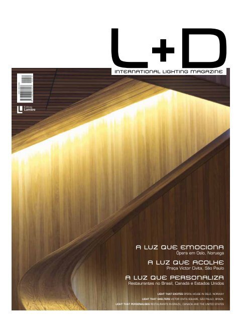
A LUZ QUE EMOCIONA<br />
Ópera em Oslo, Noruega<br />
A LUZ QUE ACOLHE<br />
Praça Victor Civita, São Paulo<br />
A LUZ QUE PERSONALIZA<br />
Restaurantes no Brasil, Canadá e Estados Unidos<br />
LIGHT THAT EXCITES Opera House in Oslo, Norway<br />
LIGHT THAT SHELTERS Victor Civita Square, São Paulo, Brazil<br />
LIGHT THAT PERSONALISES Restaurants in Brazil, Canada and the United States
<strong>L+D</strong><br />
2<br />
<strong>L+D</strong><br />
3
<strong>L+D</strong><br />
4<br />
<strong>L+D</strong><br />
5
<strong>L+D</strong><br />
6<br />
<strong>L+D</strong><br />
7
LIGHT THAT EXCITES Opera House in Oslo, Norway<br />
LIGHT THAT SHELTERS Victor Civita Square, São Paulo, Brazil<br />
LIGHT THAT PERSONALISES Restaurants in Brazil, Canada and the United States<br />
l+d #<strong>22</strong><br />
EDITORES | EDITORS<br />
Thiago Gaya<br />
Winnie Bastian<br />
52<br />
l+d<br />
INTERNATIONAL LIGHTING MAGAZINE<br />
Capa | cover<br />
Oslo Opera House<br />
Noruega | Norway<br />
Foto | Photo: Jiri Havran<br />
A LUZ QUE EMOCIONA<br />
Ópera em Oslo, Noruega<br />
A LUZ QUE ACOLHE<br />
Praça Victor Civita, São Paulo<br />
16<br />
A LUZ QUE PERSONALIZA<br />
Restaurantes no Brasil, Canadá e Estados Unidos<br />
16<br />
¿QuÉ Pasa?<br />
34<br />
PORTAL OF LIGHT<br />
44<br />
38<br />
52<br />
58<br />
66<br />
PROJETOS | PROJECTS<br />
Restaurantes | Restaurants<br />
40. Kaa, São Paulo<br />
44. Charlie Palmer’s, Dallas<br />
48. Nota Bene, Toronto<br />
Oslo Opera House<br />
Praça Victor Civita<br />
Canal Hangzhou<br />
72<br />
perfil | profile<br />
Piero Castiglioni<br />
48<br />
80<br />
Produtos | products<br />
<strong>L+D</strong><br />
8<br />
<strong>L+D</strong><br />
9<br />
72<br />
CONSELHO EDITORIAL | EDITORIAL BOARD<br />
Esther Stiller, lighting designer<br />
Dante Della Manna, arquiteto | architect<br />
Fernando Prado, designer
colaboradores | Contributors<br />
Débora Curbi é arquiteta formada pela FAU-<br />
USP e editora de Lighting Design Brasil e Lighting<br />
Design Europe. Desde 2003, mora e trabalha<br />
em Milão como arquiteta e freelance editor<br />
na Itália, Alemanha e Inglaterra. Colabora<br />
com a Editora Lumière desde 2001. Neste<br />
número, Débora nos mostra o rico universo<br />
de Piero Castiglioni, na seção Perfil.<br />
Débora Curbi is an architect trained at FAU-<br />
USP and editor of Lighting Design Brasil and<br />
Lighting Design Europe. Since 2003 she has<br />
lived and worked in Milan as an architect<br />
and freelance editor in Italy, Germany and<br />
England. She has contributed to Lumière<br />
Pulishing House since 2001. In this edition,<br />
Débora introduces us to the rich universe of<br />
Piero Castiglioni, in the Profile section.<br />
Valentina N. Figuerola é arquiteta formada<br />
pela FAU-USP e jornalista especializada<br />
em arquitetura e engenharia. Trabalhou<br />
nas revistas Arquitetura e Urbanismo (AU)<br />
e Téchne e, atualmente, colabora para<br />
uma série de publicações especializadas<br />
na área. Nesta edição, Valentina assina<br />
a matéria sobre a Ópera de Oslo.<br />
Valentina N. Figueirola is an architect<br />
trained at FAU-USP and a journalist<br />
specialising in architecture and engineering.<br />
She has worked for Arquitetura e Urbanismo<br />
(Architecture & Urbanism) and Téchne<br />
magazines and currently contributes to a<br />
series of specialised publications in these<br />
fields. In this edition, Valentina signs<br />
the article on the Oslo Opera House.<br />
<strong>L+D</strong><br />
10<br />
Márcia Bechara é jornalista, atriz e autora de Casa<br />
das Feras, coletânea de contos lançada pela 7Letras em<br />
2007. Mineira radicada em São Paulo, desenvolve<br />
conteúdo para mídias variadas como publicações de<br />
arte, reportagem e documentários. É sua a matéria “Luz,<br />
drama, ação”, que aborda a iluminação em restaurantes.<br />
Márcia Bechara is a journalist, actress and authoress<br />
of Casa das Feras (House of Beasts), a collection of short<br />
stories published by 7Letras in 2007. Originally from Minas<br />
Gerais, but settled in São Paulo for the last ten years, she<br />
works with various types of media such as art publications,<br />
reportage and documentaries. She wrote the article “Light,<br />
drama, action”, about restaurants’ lighting design.<br />
<strong>L+D</strong><br />
11
EDITORIAL<br />
PUBLICADA POR | PUBLISHED BY<br />
Uma praça, um amplo espaço junto à orla de um canal,<br />
uma casa de óperas, três restaurantes. Esta <strong>L+D</strong> reúne essencialmente<br />
projetos de espaços públicos e semipúblicos. Em todos<br />
eles, a luz possui importante papel estético, enfatizando formas<br />
e superfícies, mas também atua de maneira relevante no plano<br />
funcional, seja melhorando a legibilidade dos espaços, como no<br />
caso da Praça Santuário (Belém do Pará) e do Canal de Hangzhou<br />
(China), seja proporcionando ambientes com iluminação adequada<br />
e confortável, como na Praça Victor Civita (São Paulo), na Ópera de<br />
Oslo (Noruega) ou nos três restaurantes aqui publicados. A combinação<br />
equilibrada entre função e apelo visual também permeia<br />
o trabalho de uma figura emblemática do lighting design italiano<br />
e mundial: Piero Castiglioni, nosso retratado na seção Perfil.<br />
Ainda nesta edição, inauguramos uma coluna publicada em<br />
parceria com o Portal of Light, importante veículo digital com alcance<br />
internacional, que trará regularmente, aos nossos leitores,<br />
novidades do cenário mundial do lighting design.<br />
Boa leitura!<br />
Editora Lumière Ltda.<br />
Matriz no Brasil | Headquaters in Brazil:<br />
Rua Catalunha, 350<br />
05329-030 São Paulo SP<br />
t / f: 55 11 2827.0660<br />
ld@portallumiere.com.br<br />
www.portallumiere.com.br<br />
PUBLISHER<br />
>Thiago Gaya<br />
EDITORES | EDITORS<br />
>Thiago Gaya<br />
>Winnie Bastian<br />
TRADUÇÃO | TRANSLATION<br />
>Julia Bottai<br />
>Michael L. Jordan<br />
REVISÃO | PROOF READING<br />
>Deborah Peleias<br />
<strong>L+D</strong><br />
12<br />
A square, a broad space alongside a canal, an opera house,<br />
three restaurants. This edition of <strong>L+D</strong> brings together projects essentially<br />
for public and semi-public use. In all of them light plays an important<br />
aesthetic role, emphasising forms and surfaces, yet also acting with<br />
relevance on the functional level, whether giving greater legibility to<br />
the space, as in the cases of Santuário Square (Belém do Pará) and<br />
Hangzhou Canal (China), or furnishing the surroundings with suitable<br />
and comfortable lighting, as in Victor Civita Square (São Paulo), at<br />
the Oslo Opera House (Norway) or in the three restaurants reviewed<br />
here. The balanced combination of function with visual appeal also<br />
permeates the work of a figurehead of Italian and world-wide lighting<br />
design: Piero Castiglioni, our subject in the Profile section.<br />
Also in this edition, we open a new column, in partnership with the<br />
Portal of Light, an important digital media vehicle with an international<br />
reach, that will regularly bring to our readers all that is new on the<br />
world scene of lighting design.<br />
Enjoy your reading!<br />
ARTE | ART<br />
>Gustavo Cipriano<br />
>Anderson Baldime<br />
>Lygia Lacerda<br />
PUBLICIDADE | ADVERTISING SALES<br />
>Marta Oliveira<br />
comercial@portallumiere.com.br<br />
t: +55 11 2827.0660<br />
ASSINATURAS | SUBSCRIPTIONS<br />
assinaturas@portallumiere.com.br<br />
t: +55 11 2827.0660<br />
<strong>L+D</strong><br />
13<br />
IMPRESSA POR | PRINT BY
<strong>L+D</strong><br />
14<br />
<strong>L+D</strong><br />
15
¿QuÉ Pasa?<br />
agenda<br />
LIGHTFAIR 2009<br />
Neste ano, a principal feira norte-americana do mercado de iluminação<br />
completa seu 20º aniversário. Além da exposição propriamente<br />
dita, o evento é conhecido por trazer, todos os anos, uma programação<br />
paralela de peso, composta por palestras e workshops – nos quais<br />
lighting designers de todo o mundo compartilham suas experiências e<br />
estudos sobre os mais diversos temas – e pelos cursos Lightfair Institute<br />
e Lightfair Daylighting Institute, que acontecem isoladamente em 3 e 4<br />
de maio. Na programação de palestras, a Lightfair inaugura um novo<br />
formato de painel, sob o tema “Celebrando a História do Lighting Designer<br />
Independente”, em comemoração aos 40 anos da profissão nos<br />
Estados Unidos, com a presença confirmada de cinco grandes nomes<br />
do lighting design norte-americano: Howard Brandston, Ray Grenald,<br />
David A. Mintz, Sonny Sonnenfeld e William Warfel.<br />
<strong>L+D</strong><br />
16<br />
25ª EUROLUCE<br />
A mais importante feira italiana de iluminação acontece a cada<br />
dois anos em Milão (Itália), como parte das programações do Salão<br />
do Móvel, este realizado anualmente. O foco original do evento, voltado<br />
para aplicações decorativas, tem se ampliado ano a ano e, hoje,<br />
a Euroluce também reúne fabricantes de produtos mais técnicos. O<br />
forte da feira, no entanto, é sua capacidade de apontar as tendências<br />
formais do universo da iluminação. Em 2009, a programação inclui<br />
eventos paralelos organizados pelas associações de lighting designers<br />
PLDA (Professional Lighting Designers’ Association) e APIL (Associazione<br />
dei Professionisti dell’Illuminazione), além do congresso Designing<br />
Designers, um evento internacional realizado todos os anos com a<br />
participação de diversas escolas universitárias de design e que, nesta<br />
edição, será dedicado à iluminação.<br />
25ª EUROLUCE The most important lighting fair in Italy takes place<br />
every two years, as part of the programme of the International Furniture<br />
Fair, held yearly in Milan (Italy). The event, originally focused on decorative<br />
fixtures, has broadened its scope over the years and currently brings<br />
together manufacturers of more technical products. The fair stands out,<br />
nevertheless, for its ability to indicate the formal trends in the world of<br />
lighting. In 2009, the programme includes parallel events organized by<br />
the lighting designers associations PLDA (Professional Lighting Designers’<br />
Association) and APIL (Associazione dei Professionisti dell’Illuminazione),<br />
as well as the Designing Designers congress, a yearly international event<br />
with the participation of several design schools, that will, on this edition,<br />
be dedicated to lighting.<br />
LIGHTFAIR 2009 This year, the main North American fair for the lighting<br />
market reaches its 20 th anniversary. Besides the main exhibition, the<br />
event is known for hosting, every year, a high-profile parallel programme,<br />
made up of lectures and workshops – during which lighting designers<br />
from all over the world share their experiences and studies on a wide<br />
range of subjects – as well as the Lightfair Institute and Lightfair Daylighting<br />
Institute courses, that will take place separately from 3-4 May. In the<br />
conferences’ programme, Lightfair is launching a new panel format, on the<br />
subject “Celebrating the History of the Independent Lighting Designer”,<br />
in commemoration of the 40 years of the profession in the United States,<br />
with the confirmed presence of five big names in North American lighting<br />
design: Howard Brandston, Ray Grenald, David A. Mintz, Sonny Sonnenfeld<br />
and William Warfel.<br />
Quando | When: de 3 a 7 de maio de 2009 | 3-7 May 2009<br />
Onde | Where: Jacob K. Javits Convention Center, Nova York,<br />
EUA | Jacob K. Javits Convention Center, New York, USA<br />
www.lightfair.com<br />
<strong>L+D</strong><br />
17<br />
Quando | When: de <strong>22</strong> a 27 de abril<br />
de 2009 | <strong>22</strong>-27 April 2009<br />
Onde | Where: Fiera Milano Rho-Pero, Milão,<br />
Itália | Fiera Milano Rho-Pero, Milan, Italy<br />
www.cosmit.it
¿QuÉ Pasa?<br />
FEICON BATIMAT 2009<br />
A 17 a edição da Feira Internacional da Indústria da Construção, o<br />
principal evento de sua categoria no Brasil, reunirá 650 expositores<br />
e promete dois mil lançamentos. Dentre os eventos que compõem a<br />
programação paralela da feira, destacamos o Seminário “Construindo<br />
um Futuro Sustentável”, que inclui, em sua pauta, a discussão sobre<br />
eficiência energética nas construções sustentáveis; organizado pelo<br />
Green Building Council, o seminário acontece no Hotel Holiday Inn<br />
Parque Anhembi, em 27 de março.<br />
FEICON BATIMAT 2009 The 17 th edition of the International Construction<br />
Industry Fair, the main event of its category in Brazil, will bring together<br />
650 exhibitors, who are expected to launch over two thousand products.<br />
Among the events that the fair’s parallel programme will host, we recommend<br />
the “Building a Sustainable Future” seminar, which includes in its<br />
programme a debate over the energetic efficiency of sustainable constructions;<br />
organized by the Green Building Council, the seminar will be held at<br />
the Parque Anhembi Holiday Inn Hotel, on March 27 th .<br />
Quando | When: de 24 a 28 de março<br />
de 2009 | 24-28 March 2009<br />
Onde | Where: Pavilhão de Exposições do Anhembi, São<br />
Paulo, Brasil | Anhembi Exhibition Pavillion, São Paulo, Brazil<br />
www.feicon.com.br<br />
www.feicon.com.br/eventossimultaneos/27-03-2009.php<br />
1951, in a trip to Japan, a country still devastated by the war, sculptor<br />
Isamu Noguchi – already a famous artist at the time (his profile was published<br />
in <strong>L+D</strong> 20) – was asked by the mayor of the small town of Gifu to<br />
revitalize the local lanterns industry, creating a modern lamp for export. It<br />
was the birth of the Akari line, which has become an icon of 20 th century’s<br />
good design. Noguchi Museum is showing an exhibit that reveals the Akari<br />
lamps from an angle lesser known to the general public: the exemplars<br />
exposed in the American Pavillion at the 1986 Venice Biennale. One of the<br />
WHAT’S SCULPTURE? AKARI FROM THE 1986<br />
exhibit’s main attractions is a group of rare luminaires, produced especially<br />
VENICE BIENNALE<br />
for the Biennale – the last Akari lamps the artist would craft.<br />
<strong>L+D</strong><br />
18<br />
Em 1951, em uma viagem ao Japão, ainda devastado pela guerra,<br />
o escultor Isamu Noguchi – na época um artista já famoso (o perfil<br />
de Noguchi foi publicado em <strong>L+D</strong> 20) – recebeu um pedido do pre-<br />
Quando | When: até 31 de maio de 2009 | until May 31 st , 2009<br />
Onde | Where: Noguchi Museum, Long Island City, EUA<br />
www.noguchi.org<br />
<strong>L+D</strong><br />
19<br />
feito da pequena cidade de Gifu para revitalizar a indústria local de<br />
lanternas, criando uma luminária moderna para exportação. Nascia,<br />
então, a linha Akari, que se tornou um ícone do bom design do século<br />
20. O Noguchi Museum apresenta uma exposição que revela as Akari<br />
sob um ângulo pouco conhecido do grande público: os exemplares<br />
expostos no Pavilhão Americano na Bienal de Veneza de 1986. Um dos<br />
destaques da exposição é um grupo de luminárias raras, produzidas<br />
especialmente para a Bienal – as últimas Akari que o artista faria.
¿QuÉ Pasa?<br />
PAISAGEM ELETRÔNICA<br />
Ao percorrer a passarela subterrânea de ligação entre os edifícios<br />
leste e oeste da National Gallery of Art, em Washington (EUA), os<br />
visitantes podem visualizar uma verdadeira paisagem construída.<br />
Trata-se da instalação Multiverse, criada pelo artista norte-americano<br />
Leo Villareal a convite da galeria.<br />
A opressão do espaço subterrâneo é neutralizada pela coreografia<br />
das luzes, como afirma o diretor da National Gallery of Art, Earl A.<br />
Powell III: “Multiverse cria um ambiente exuberante e encantador, que<br />
transforma a experiência espacial”.<br />
Cerca de 41 mil pontos de LEDs correm por canais ao longo de todo<br />
o espaço, com cerca de 60m de comprimento. O projeto começou a<br />
ser desenvolvido há três anos e a montagem teve início em setembro<br />
de 2008. Após os equipamentos serem devidamente instalados na<br />
arquitetura, o artista programou sequências – com o auxílio de um<br />
software por ele projetado – para criar configurações abstratas da<br />
luz. A programação, ao mesmo tempo que orienta as luzes, permite a<br />
ação do acaso. Embora seja possível que um padrão se repita durante<br />
a experiência de um visitante, é altamente improvável.<br />
A simulação 3D da instalação e uma entrevista com o artista podem<br />
ser acessadas no site www.nga.gov/villareal. Multiverse ficará em exposição<br />
até novembro de 2009.<br />
ELECTRONIC LANDSCAPE As they pass through the underground<br />
walkway between the East and West Buildings of the National Gallery of Art<br />
in Washington, DC (USA), visitors are able to set eyes on a genuine manmade<br />
landscape: the Multiverse installation, created by North American<br />
artist Leo Villareal, after an invitation made by the gallery.<br />
The oppression that underground spaces tend to provoke is neutralized<br />
by the choreography of lights, as the National Gallery of Art’s director, Earl<br />
A. Powell III, affirms: “Multiverse creates an exuberant and mesmerizing<br />
environment which transforms the experience of its space”.<br />
Approximately 41 thousand LED nodes run through channels along the<br />
entire 60 meters long space. The project’s development began three years<br />
ago and the installation opened last September 2008. Once the appropriate<br />
hardware was installed in the existing architecture, the artist programmed<br />
sequences – through his custom-designed software – to create abstract<br />
configurations of light. His programming both instructs the lights and allows<br />
for an element of chance. While it is possible that a pattern will repeat<br />
during a viewer’s experience, it is highly unlikely.<br />
A 3D simulation of the installation, as well as an interview with the artist,<br />
can be found on www.nga.gov/villareal. Multiverse is scheduled to remain<br />
on view until November 2009.<br />
<strong>L+D</strong><br />
20<br />
<strong>L+D</strong><br />
21
¿QuÉ Pasa?<br />
THE SEQUENCE<br />
O entorno do Parlamento Flamenco, em Bruxelas (Bélgica), é o palco<br />
de uma das mais recentes instalações do artista belga Arne Quinze. A<br />
obra, batizada The Sequence (“a sequência”, em tradução livre), é uma<br />
escultura gigante (80m de comprimento por 15m de altura) na qual<br />
pequenos pedaços de madeira se conectam de forma aparentemente<br />
caótica, formando, ao final, uma espécie de marquise que conecta os<br />
prédios do Parlamento e da Câmara.<br />
A conexão física entre os edifícios vizinhos reflete o possível estreitamento<br />
entre os cidadãos de Bruxelas, como declara o artista: “The<br />
Sequence busca encurtar a distância entre as pessoas e gerar movimento<br />
na cidade. Quero reconectar as pessoas e levá-las a interagir<br />
entre si como faziam no passado, nas praças. Ao menos as pessoas<br />
falavam umas com as outras, então”.<br />
Neste contexto, a luz proposta por Quinze tem o papel de intensificar<br />
as sensações e emoções despertadas pela instalação. “Caminhar sob<br />
ela à noite é quase uma experiência mística”, analisa.<br />
Inaugurada em novembro de 2008, a obra deve permanecer no<br />
local por cinco anos; uma vez desmontada, todas as madeiras utilizadas<br />
– certificadas, diga-se – serão reaproveitadas. A preocupação de<br />
Quinze com a sustentabilidade estende-se à iluminação, com a escolha<br />
de lâmpadas a vapor metálico de baixo consumo (11W).<br />
THE SEQUENCE The surroundings of the Flemish Parliament, in Brussels<br />
(Belgium), have become stage for one of the most recent installations of<br />
Belgian artist Arne Quinze. The art-piece, named The Sequence, is a giant<br />
sculpture (80 meters large by 15 meters high) made of small pieces of wood<br />
that interconnect in a seemingly chaotic way, fashioning, in the end, a sort of<br />
platform that connects the Parliament with the House of Representatives.<br />
The physical connection between neighbouring buildings reflects the<br />
possible connection between all citizens in Brussels, as the artist declares:<br />
“The Sequence bridges the communication gap between people and<br />
generates movement in the city. I want to reconnect people and let them<br />
interact with each other like they did in the past on squares. At least people<br />
talked to each other then.”<br />
In such context, the lighting proposed by Quinze seeks to intensify the<br />
sensations and emotions that the installation awakens. “Walking under it<br />
in the night is almost a mystical experience”, he analyses.<br />
Launched on November 2008, the piece shall remain installed for five<br />
years; once it is deconstructed, all the wood employed – certified, by the<br />
way – will be reused. Quinze’s concern with sustainability extends to lighting,<br />
as shown by the choice of low voltage metal vapour lamps (11W).<br />
<strong>L+D</strong><br />
<strong>22</strong><br />
<strong>L+D</strong><br />
23
¿QuÉ Pasa?<br />
1<br />
2<br />
3<br />
1. Efeito Apagão, de Lucas Mafra<br />
2. Extemporânea, de Breno Libório<br />
3. What’s Up, de Paulo Henrique Pessoa<br />
PARA “ILUMINAR CONSCIÊNCIAS”<br />
Em novembro de 2008 aconteceu, em Belo Horizonte, a exposição<br />
TO “ENLIGHTEN CONSCIENCES” In November2008, in Belo Horizonte,<br />
LEDesign. A mostra exibiu o resultado da parceria entre a Faculdade<br />
the LEDesign exhibition took place. This show exhibited the results of the<br />
de Engenharia e Arquitetura da Universidade FUMEC e a empresa<br />
partnership between the Faculty of Engineering and Architecture of FUMEC<br />
Iluminar, que executou as peças propostas por alunos e professores<br />
University and the firm Iluminar, which produced the pieces designed by<br />
do curso de Design de Produto.<br />
students and teachers of the Product Design course.<br />
Foram apresentados 21 protótipos de luminárias criadas a partir da<br />
Twenty one prototypes were presented of lights made from a combination<br />
combinação de lâmpadas incandescentes queimadas e LEDs. O objetivo<br />
of spent incandescent lamps with LEDs. The aim was, by means of irony and<br />
<strong>L+D</strong><br />
24<br />
era, por meio da ironia e da experimentação, promover o questionamento<br />
dos hábitos do cotidiano, fortalecendo o apelo para o desenvolvimento<br />
de uma postura mais verde (centrada no tripé “reduza, reuse, recicle”),<br />
experimentation, to promote the questioning of day-to-day habits, reinforcing<br />
the appeal for the development of a “greener” attitude (around the triad “reduce,<br />
reuse, recycle), as much in the conception as in the use of products.<br />
<strong>L+D</strong><br />
25<br />
tanto na concepção quanto na utilização dos produtos.<br />
The focus adopted strikes a balance between “symbolism, irony and the<br />
O enfoque adotado equilibra “simbolismo, ironia e processo cons-<br />
constructive process, creating objects that aspire to being poetic-reflective-<br />
trutivo, criando objetos que aspiram a ser ação poético-reflexiva-<br />
political-instructive action. It is art-design, but also the idea that, by playing<br />
política-pedagógica. É art design, mas também a ponderação de que,<br />
with the whole range of challenges [...], one is throwing oneself against<br />
brincando com a pauta de desafios [...], lança-se contra a resistência<br />
the resistance to changing ones habits”, analyses journalist and art critic<br />
em mudar hábitos”, analisa o jornalista e crítico de arte Walter Sebas-<br />
Walter Sebastião in the exhibition catalogue.<br />
tião, no catálogo da mostra.<br />
Reflection is a must...<br />
Refletir é preciso...
¿QuÉ Pasa?<br />
ILUMINAÇÃO RENOVA PRAÇA EM BELÉM DO PARÁ<br />
LIGHTING RENOVATES SQUARE IN BELÉM DO PARÁ Santuário do<br />
Nazaré Square, in Belém do Pará (Brazil), is now the main stage for Círio do<br />
Nazaré, a traditional procession and religious celebration that takes place<br />
in Belém do Pará every year, in the month of October. Opened in 1982,<br />
the area has recently been through a revitalization process. As it has been<br />
declared public heritage, the square’s original plan has been maintained,<br />
but it was treated to new coating materials, vegetation and lighting.<br />
Simplicity sets the tone for the lighting design, with a mainly functional<br />
approach, according to lighting designer Carlos Fortes, who was respon-<br />
A Praça Santuário de Nazaré, em Belém do Pará, é hoje o palco<br />
Círio –, a iluminação também precisava garantir conforto e segurança<br />
sible for the new project, along with Gilberto Franco. “Since at least once<br />
<strong>L+D</strong><br />
26<br />
principal do Círio de Nazaré, tradicional procissão e celebração religiosa<br />
realizada em Belém do Pará todos os anos, no mês de outubro.<br />
Inaugurado em 1982, o espaço passou recentemente por uma<br />
para esse tipo de ocupação”, informa Fortes. Em vez de buscar uma<br />
iluminação dramática ou cenográfica, que trataria a praça como um<br />
cenário, optou-se por proporcionar uma luz homogênea, com boa<br />
a year the place is crowded with people – as it is there that, after the<br />
procession, the Círio solemnities take place –, lighting also had to ensure<br />
comfort and safety for that type of occupation”, Fortes informs. Instead<br />
<strong>L+D</strong><br />
27<br />
revitalização. Por se tratar de um espaço tombado como patrimônio<br />
iluminância média. Outra premissa do projeto foi a valorização – com a<br />
of searching for a dramatic or scenographic lighting, treating the square<br />
público, a praça teve seu traçado original mantido, mas ganhou no-<br />
implantação de iluminação de destaque – dos equipamentos alocados<br />
as a scenario, they chose to provide homogeneous lighting, with a good<br />
vos revestimentos, vegetação e iluminação.<br />
na praça, como a escultura em mármore branco que faz referência ao<br />
average luminosity. Another premise was the idea of highlighting – through<br />
O projeto luminotécnico é pautado pela simplicidade e tem enfoque<br />
manto de Nossa Senhora, dentre outros. As luminárias utilizadas são<br />
direct illumination – the square’s furnishings, such as the white marble<br />
principalmente funcional, segundo o lighting designer Carlos Fortes,<br />
da Schréder, fornecidas pela La Lampe Belém.<br />
sculpture that alludes to Virgin Mary’s mantle, among others.<br />
responsável pela nova proposta, ao lado de Gilberto Franco. “Como<br />
Com um projeto luminotécnico funcional e atento aos detalhes, a<br />
With a functional lighting design, attentive to details, Santuário Square’s<br />
pelo menos uma vez ao ano a praça recebe uma verdadeira multi-<br />
renovação da Praça Santuário trouxe novo fôlego ao espaço, ampliando<br />
renovation brought a new breath to the space, enhancing its usability far<br />
dão – pois é lá que, após a procissão, acontecem as solenidades do<br />
seu potencial de uso para muito além da semana do Círio de Nazaré.<br />
beyond the week of Círio do Nazaré.
¿QuÉ Pasa?<br />
LEDs PARA PROMOVER O BEM-ESTAR<br />
A Philips foi premiada, no final de 2008, em três categorias do importante<br />
prêmio Red Dot. Destacamos, aqui, o protótipo das bolas<br />
Mindspheres, vencedor na categoria Life Science: são pequenas esferas<br />
com LEDs incorporados que, conforme manuseadas, alteram o ritmo e<br />
a intensidade de sua luz. O projeto se baseia na ideia de que o exercício<br />
focado das habilidades motoras pode produzir relaxamento e calma.<br />
Um auxílio para desestressar e recobrar a paz de espírito...<br />
LEDS TO PROMOTE WELL-BEING Philips was a prize-winner, at the<br />
end of 2008, in three categories of the prestigious Red Dot awards. We<br />
highlight here the prototype of the Mindsphere ball, winner in the category<br />
of Life Science. This is a small sphere incorporating LEDs, which, according<br />
to the handling of the ball, modify the rhythm and intensity of the light.<br />
This project is based on the notion that the focussed exercise of motor<br />
skills can promote relaxation and tranquillity. An aid to stress reduction and<br />
recovering ones peace of mind...<br />
EM NOME DO CONFORTO<br />
Outra parceria entre empresa e escola que mostrou bons resultados<br />
aconteceu entre os alunos da Universidade de Munique e a Osram. Os<br />
estudantes propuseram a criação de cabines para uso individual, a serem<br />
instaladas em aeroportos. A ideia é reduzir o desgaste sofrido pelos<br />
passageiros nos períodos de espera entre conexões.<br />
Batizadas de NapCabs (“cabines para cochilo”, em português), as cabines<br />
possuem uma cama e uma escrivaninha com ponto de internet. A<br />
iluminação, executada com módulos LED LinearLight Dragon, pode ser<br />
controlada pelo usuário (sistema Easy Color Control), que tem a opção<br />
de selecionar a cor e a intensidade das luzes de modo a adequá-las ao<br />
uso que fizer da cabine: descanso ou trabalho.<br />
Dois protótipos já foram instalados no aeroporto de Munique para<br />
testes. Torcemos para que a iniciativa ganhe lugar também no Brasil!<br />
<strong>L+D</strong><br />
28<br />
IN THE NAME OF COMFORT Another partnership between a firm and<br />
a school that has produced excellent results occurred between Munich University<br />
and Osram. The students made a proposal for the creation of booths<br />
for individual use to installed in airports. The idea is to reduce the wear and<br />
tear on passengers during the wait between connections.<br />
Christened “NapCabs”, these cabins are equipped with a bed and a small<br />
desk with an internet connection. The lighting, using LinearLight Dragon LED<br />
modules, can be controlled by the user (Easy Color Control system), who<br />
can select the colour and intensity so as to adapt it to his own use of the<br />
cabin, for rest or for work.<br />
Two prototypes have already been installed in Munich airport for testing.<br />
Let us hope this initiative takes hold in Brazil too!<br />
<strong>L+D</strong><br />
29
<strong>L+D</strong><br />
30<br />
<strong>L+D</strong><br />
31
¿QuÉ Pasa?<br />
Intuição e planejamento norteiam o trabalho da artista norteamericana<br />
Vicki DaSilva, que cria estampas luminosas por meio de<br />
LUMINOUS PATTERNS Intuition and planning orientate the work of<br />
PADRONAGENS LUMINOSAS<br />
<strong>L+D</strong><br />
32<br />
um processo fotográfico. Tubos fluorescentes com filtros coloridos são<br />
deslocados manualmente por um sistema de trilhos metálicos, que se<br />
torna invisível nas fotos, graças à combinação entre as fontes de luz e<br />
North American artist Vicki Da Silva, who makes luminous images using<br />
a photographic method. Fluorescent tubes with colour filters are manually<br />
moved about on a system of metal tracks, which themselves become<br />
<strong>L+D</strong><br />
33<br />
o longo tempo de exposição (de 30 minutos a duas horas).<br />
invisible in the photos due to the combination of the light sources and<br />
Para chegar às imagens finais, vibrantes e altamente gráficas, Vicki<br />
the long exposure times (from 30 minutes to 2 hours).<br />
estabeleceu previamente fatores como o posicionamento da câmera<br />
To arrive at the final vibrant photographic images, Vicki predetermines<br />
e a sobreposição das cores-luz para criar novos matizes usando esta<br />
factors such as the camera position and overlapping of light colours, so<br />
adição das luzes. Durante o processo, no entanto, outros elementos<br />
as to create new patterns using an additive palette of coloured lights. In<br />
foram definidos de forma mais intuitiva: a velocidade com a qual os<br />
the process, however, other aspects are determined more intuitively: the<br />
tubos são deslocados, a densidade e saturação da cor, o posicionamento<br />
speed at which the tubes are moved, the colour density and saturation,<br />
da cor e a padronagem formada pelos tubos.<br />
the placement of colour and the patterning created by the tubes.
NOVIDADES DO PORTAL OF LIGHT*<br />
An European city in 2055… It was already night, but as usual<br />
no one could realize it because the city was awash in dazzling<br />
light. The people had long forgotten about the old word night<br />
and no longer cared about sunrise or sunset. The big clocks at<br />
each intersection were enough to tell those who cared whether<br />
the day was officially over or not.<br />
What you have just read is the beginning of the text of La Nuit Disparue<br />
[The Lost Night], a futuristic story that Roger Narboni wrote for the The Portale<br />
della Luce (www.lightingacademy.org) and Anno Luce. Mr. Narboni needs<br />
no introduction as a lighting designer. His projects, his ideas, his unique approach<br />
to the social aspects of lighting speak for him. A key example of his<br />
commitment is his recent founding of the association, Concepteurs Lumière<br />
Sans Frontières [Lighting Designers Without Borders] – for more information,<br />
see the Lighting Organizations area of the Portale.<br />
However, we knew little or nothing about Roger Narboni the author,<br />
partly because it is one thing, and an uncommon one at that, to describe<br />
one's projects clearly and it is totally another to test one's skills with a<br />
novella. Even though light is one of the main "characters", a story needs<br />
a beginning, a body and an end to make it interesting reading. We can<br />
find all this in Narboni's tale, and it is so well structured that we heartily<br />
recommend it to our readers. As we consider it a gift, La Nuit Disparue<br />
was published at Christmas time in the Dossiers area of our magazine, that<br />
usually hosts the most interesting texts.<br />
There is a dual goal in this initiative. On the one hand, there is the obvious<br />
interest in publishing a new work that marks the literary debut of one<br />
of the greatest lighting designers on the international scene. On the other,<br />
there is the perhaps even more ambitious goal of using the story to launch<br />
a Literary Contest that is open to all, but restricted to stories that speak<br />
of light. It does not matter whether the authors are lighting designers like<br />
Narboni, or established professionals, or students or simply enthusiasts.<br />
There is no limit as to length or restriction as to genre: a novella, short<br />
Uma cidade europeia em 2055... Já era noite, mas, como de costume,<br />
ninguém podia perceber, porque a cidade estava banhada<br />
em uma claridade deslumbrante. Há tempo as pessoas haviam<br />
esquecido a velha expressão da noite e não mais se importavam<br />
com o nascer e o pôr do sol. Os grandes relógios instalados em<br />
cada cruzamento eram suficientes para informar àqueles que<br />
desejavam saber se o dia já estava oficialmente terminado.<br />
O que você acabou de ler é o começo do conto “La nuit disparue”<br />
[A Noite Desaparecida], um conto futurista escrito por Roger Narboni<br />
para o site Il Portale della Luce (www.lightingacademy.org) e Anno Luce.<br />
Narboni dispensa apresentações como lighting designer: seus projetos,<br />
suas ideias e sua abordagem única em relação aos aspectos sociais da<br />
iluminação falam por ele. Um exemplo-chave deste comprometimento<br />
é a associação que fundou recentemente: Concepteurs Lumière Sans<br />
Frontières [Lighting Designers Sem Fronteiras] – para mais informações,<br />
acesse http://www.concepteurslumieresansfrontieres.org/. Sobre o autor<br />
Roger Narboni, no entanto, sabemos pouco ou nada, em parte porque<br />
descrever seus projetos claramente é uma coisa e testar sua habilidade<br />
para escrever um conto é algo completamente diferente.<br />
Mesmo que a luz seja um dos “personagens” principais, uma história<br />
precisa de início, meio e fim para que se torne uma leitura interessante. Nós<br />
podemos encontrar tudo isto no conto de Narboni, e ele é tão bem estruturado<br />
que nós o recomendamos entusiasticamente aos nossos leitores.<br />
O texto completo foi publicado em nossa revista eletrônica (www.<br />
lightingacademy.org), na área Dossiers. Com esta iniciativa, temos<br />
dois objetivos. Por um lado, há o interesse óbvio em publicar um<br />
novo trabalho que marca o début literário de um dos mais importantes<br />
lighting designers na cena internacional. Por outro, há o objetivo<br />
talvez ainda mais ambicioso de utilizar este conto para lançar um<br />
concurso literário que é aberto a todos, mas restrito a histórias que<br />
falem da luz. Não importa se os autores são lighting designers, como<br />
<strong>L+D</strong><br />
34<br />
<strong>L+D</strong><br />
35<br />
*A partir desta edição, <strong>L+D</strong> passa a publicar esta coluna, cujo objetivo é trazer atualidades relevantes da cena internacional do lighting design.<br />
*Starting with this edition, <strong>L+D</strong> will be publishing this column, whose aim is to bring to readers relevant current events on the international lighting design scene.
Se você deseja participar do concurso Light Tales, envie<br />
seus trabalhos para:<br />
If you wish to participate in the Light Tales Competition, please<br />
send your works to:<br />
Beatrice Santini<br />
Targetti Sankey<br />
Via Pratese, 164<br />
50145 Firenze<br />
b.santini@targetti.it<br />
Todas as ilustrações foram feitas por Roger Narboni. | All illustrations by Roger Narboni<br />
Os textos enviados devem ser escritos em inglês, italiano, francês ou espanhol.<br />
O prazo final é 31 de maio de 2009. Os trabalhos não serão devolvidos.<br />
Os vencedores serão anunciados até 30 de setembro.<br />
Entries may be submitted in English, Italian, French or Spanish.<br />
The deadline is May 31, 2009. Works will be not returned<br />
Winners will be announced by September 30, 2009<br />
Narboni, profissionais já estabelecidos, estudantes ou simplesmente<br />
entusiastas. Não há limite de tamanho ou restrição de gênero: conto,<br />
peça teatral, poesia... A condição essencial é que a luz – artificial ou<br />
story, play or poetry. The essential requirement is that light – artificial and<br />
mesmo natural – seja o “personagem” principal.<br />
even natural – be the logical "main character".<br />
A competição, que se chama simplesmente Light Tales [Contos de<br />
The competition, that is entitled simply Light Tales, is sponsored by Fondazi-<br />
Luz] é patrocinada pela Fondazione Targetti e tem o único propósito<br />
one Targetti and its exclusive purpose is to promote the culture of light.<br />
de promover a cultura da luz.<br />
All entries will be judged for originality, content and expression. The<br />
As inscrições serão julgadas segundo os seguintes critérios: originali-<br />
judging panel will consist of Roger Narboni, Stella Targetti, director of the<br />
dade, conteúdo e expressão. O júri será composto por Roger Narboni,<br />
Fondazione Targetti and Beatrice Santini, editor-in-chief of the Portale della<br />
Stella Targetti (diretora da Fondazione Targetti), Beatrice Santini (editora<br />
Luce, and others yet to be appointed. The three best works will be published<br />
do Portalle della Luce) e outros profissionais a serem nomeados.<br />
on the Portale della Luce and disseminated through all appropriate channels<br />
Os três melhores trabalhos serão publicados no Portale della Luce e<br />
starting with Anno Luce and the main lighting journals. If the quality of the<br />
divulgados por meio dos canais apropriados, a começar pela publicação<br />
compositions permits, they will be published in a single volume.<br />
<strong>L+D</strong><br />
36<br />
Anno Luce. Agora em sua terceira edição, Anno Luce é um livro que contém<br />
alguns dos melhores papers e artigos originais que foram publicados<br />
no Portale della Luce. O tema principal é a luz e todas as suas facetas –<br />
Now in its third edition, Anno Luce is a real book that contains some of<br />
the best original articles and papers that have appeared on the Portale.<br />
The main topic is light and all its facets: design, art, social, culture and<br />
<strong>L+D</strong><br />
37<br />
ligadas a design, arte, sociedade, cultura e ética – e o objetivo é oferecer<br />
ethics and the stated aim is to offer as complete an overview as possible<br />
um panorama tão completo quanto possível sobre o universo da luz nos<br />
of the world of light today. Anno Luce is distributed free of charge to<br />
dias de hoje. Anno Luce é distribuída gratuitamente aos designers mais<br />
the world's foremost lighting designers and to those involved with light<br />
proeminentes de todo o mundo e às pessoas envolvidas com a luz nos<br />
in education, art, advertising and, of course, industry. Over the years the<br />
meios da educação, da arte, da publicidade e, claro, da indústria.<br />
journal has increased in size and circulation.<br />
Beatrice Santini<br />
Beatrice Santini<br />
Editora do Portal of light<br />
Editor-in-chief of the Portal of Light
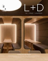
projetos | projects<br />
LUZ, DRAMA,<br />
AÇÃO<br />
1 2<br />
Quando a luz dá o tom em projetos arquitetônicos que<br />
privilegiam materiais densos e cores escuras.<br />
O restaurante Kaa trouxe para a imensidão concreta<br />
de São Paulo nada menos do que sete mil espécies de plantas origi-<br />
LIGHT, DRAMA, ACTION: when lighting sets the tone in architectural<br />
projects that favour dense materials and dark colours<br />
nárias da Mata Atlântica, que revestem, como um jardim vertical de<br />
Kaa restaurant has brought to the concrete vastness of São Paulo (Bra-<br />
proporções bíblicas, um de seus extensos paredões. Do lado oposto,<br />
zil) no less than seven thousand species of native plants from the Atlantic<br />
uma construção com pé-direito duplo acolhe a clientela, acomodada<br />
Forest, which cover, resembling a vertical garden of biblical proportions,<br />
solidamente sobre materiais densos como madeira e pedra de tons<br />
one of its large walls. On the opposite side, a building with double height<br />
<strong>L+D</strong><br />
38<br />
sóbrios e temperaturas quentes.<br />
Bem acima da linha do Equador, no árido estado norte-americano do<br />
Texas, o restaurante do überchef Charlie Palmer reproduz a elegância<br />
ceiling solidly accommodates the clientele among dense materials such as<br />
wood and stone, of sober tones and warm temperatures.<br />
Well above the Equator line, in the arid North American state of Texas, überchef<br />
<strong>L+D</strong><br />
39<br />
da madeira escura, seja no revestimento das paredes do salão, seja<br />
Charlie Palmer’s restaurant draws on the elegance of dark wood, be it on the<br />
nos balcões sofisticados que compõem o ambiente do bar. Subindo<br />
lining of the dining room’s walls, be it on the sophisticated counters chose to<br />
um pouco mais em direção ao Norte, o distinto Nota Bene, de Toron-<br />
compose the bar. Going a little further up north, the distinguished Nota Bene,<br />
to (Canadá), completa o trio de restaurantes contemporâneos cujo<br />
from Toronto (Canada), completes this trio of contemporary restaurants whose<br />
desenho de luz incorporou a necessidade de dar movimento a am-<br />
lighting design incorporated a need to confer movement onto sophisticated<br />
1- Kaa, São Paulo<br />
bientes sofisticados e heterogêneos, mas que têm em comum o desa-<br />
and heterogeneous spaces; projects that pose, in common, the challenge of il-<br />
2- Nota Bene, Toronto<br />
fio de iluminar detalhes, brincar com sombras e dar vida a ambientes<br />
luminating details, playing with shadows and injecting life into ambiences where<br />
3- Charlie<br />
dominados por tons aveludados de marrom. (Por Márcia Bechara)<br />
velvety tones of brown predominate. (By Márcia Bechara)<br />
3<br />
Palmer's, Dallas
Kaa: em primeiro plano, ambiente de jantar<br />
com pé-direito duplo; ao fundo, à esquerda,<br />
o bar. Na página anterior (foto 1), vista do<br />
lounge para espera | Kaa: in the foreground,<br />
dining room with double height ceiling;<br />
behind, on the left, the bar. Previous page<br />
(photo 1), view of the waiting lounge<br />
Cena tropical<br />
Para criar o projeto de iluminação do restaurante Kaa<br />
(mata em tupi-guarani), os lighting designers Carlos Fortes e Gilberto<br />
Franco, da Franco & Fortes Lighting Design, estudaram previamente,<br />
e em detalhes, a proposta arquitetônica e de decoração do ambiente,<br />
assinados por Arthur Casas. “Um dos desafios era criar movimentação<br />
e dramaticidade na área do jardim durante o período noturno, já que<br />
durante o dia isto é praticamente impossível, devido à claridade natural<br />
permitida pelo teto retrátil translúcido que recobre o local. A luz natural<br />
é chapada, sem volumetria. Criamos, então, uma iluminação de cima<br />
para baixo, com fachos concentrados que emprestam tridimensionalidade<br />
às folhagens e criam sombras nas plantas”, detalha Fortes.<br />
Vedete de uma das alas do restaurante, a imensa diversidade tropical<br />
do jardim contrapõe-se ao lado oposto da construção, composto por<br />
um edifício fechado de dois andares, ambos com pé-direito duplo. Nas<br />
laterais das vigas metálicas que compõem os trilhos da cobertura retrátil,<br />
os quais atravessam transversalmente a construção, os designers optaram<br />
por usar lâmpadas halógenas AR 111 de facho concentrado (50W, 8°,<br />
3.000K), assim como nas testeiras laterais com projetores orientados<br />
que iluminam a parte do jardim. “Já as palmeiras, posicionadas entre<br />
as mesas, têm seus troncos escultóricos iluminados de baixo para cima<br />
por lâmpadas embutidas nos canteiros. A luz que vem de cima, por sua<br />
vez, cria sombras na totalidade da vegetação e dá a sensação de área<br />
externa, reforçando a vocação do ambiente”, explica Fortes.<br />
Apesar da presença apaziguadora de um grande espelho d’água à frente<br />
do jardim, os lightings designers preferiram não iluminar diretamente<br />
o local. Todas as bicas que saem da parede recebem uma iluminação<br />
de baixo para cima a partir de projetores subaquáticos, com lâmpadas<br />
dicróicas de 50W de facho médio (3.000K). “Este tipo de luz cria um<br />
movimento interessante nas águas, que acaba por se refletir nas folhas<br />
da vegetação”, aponta Carlos Fortes. Já no hall de entrada do restaurante,<br />
com pé-direito duplo, utilizou-se uma sanca de madeira, posicionada a<br />
meia-altura da parede, a qual abriga baterias de lâmpadas fluorescentes<br />
(T5, 28W, 3.000K) cobertas por uma chapa de acrílico translúcida,<br />
técnica que cria uma luz mais homogênea e que reduz as manchas normalmente<br />
causadas pelo material fluorescente. Esta iluminação também<br />
foi estrategicamente pensada para valorizar a textura da cobertura de<br />
fibra de bananeira, que recobre a parede do restaurante, logo acima da<br />
sanca. “Todo o estabelecimento é dimerizado para melhor se adequar<br />
às necessidades dos ambientes”, reforça o lighting designer.<br />
Para a sala de espera do Kaa, que possui um forro de madeira baixo,<br />
os lighting designers especificaram luminárias Wall Washer com<br />
lâmpadas dicróicas de facho aberto (50W, 38°, 3.000K), embutidas<br />
no teto, intercaladas com abajures, para compor o layout. No centro<br />
do restaurante, um grande balcão de madeira faz as vezes de bar,<br />
recebendo, em sua primeira porção, grandes painéis fotográficos<br />
iluminados de cima para baixo com halógenas AR 111 (50W, 12V,<br />
8°, 3.000K). A parte de baixo do balcão, visível para os clientes, é<br />
revestida com pedra bruta e iluminada por um linelight de xenon,<br />
com lâmpadas xenon bipolares foscas (5W, 2V). Todas as prateleiras<br />
Tropical scene Before creating the lighting design for Kaa restaurant<br />
(kaa meaning forest in Tupi-guarani), designers Carlos Fortes and Gilberto<br />
Franco, of Franco & Fortes Lighting Design, studied in details the architectural<br />
and décor proposals, signed by Arthur Casas. “One of the challenges was to<br />
generate movement and drama in the garden’s area at night time, since that is<br />
practically impossible during the day, due to the natural luminosity that filters<br />
through the retractile translucent roof covering the area. Natural light is flat,<br />
deprived of volume. We’ve created, therefore, a design using lighting that<br />
comes from above, in narrow beams that grant a three-dimensional volume<br />
to the foliage and create shadows throughout the plants”, details Fortes.<br />
The star of one of the restaurant’s areas, the garden’s enormous tropical<br />
diversity acts as a counterpoint to the opposite side of the construction, a closed<br />
two-storey building with double height ceiling on both floors. On the sides<br />
of the metallic beams that constitute the tracks of the retractile roof, crossing<br />
the construction perpendicularly, the designers chose to place AR 111 narrow<br />
beam halogen lamps (50W, 8°, 3.000K); these were also used on the lateral<br />
of the building, with projectors pointed at the garden. “Regarding the palm<br />
trees, located among the dining tables, spotlights were concealed within the<br />
tree beds, lighting their bodies from below. The light coming from above produces,<br />
in turn, shadows on the whole of the vegetation, bringing an outdoors<br />
feeling to the space and reinforcing its vocation”, explains Fortes.<br />
Despite the soothing presence of a big water mirror in front of the<br />
garden, the lighting designers chose not to use direct light on this place.<br />
Water pipes coming off the walls have all been lit from below, using subaquatic<br />
projectors with 50W medium beam dichroic lamps (3.000K). “This<br />
type of light produces an interesting movement in the water, which ends<br />
<strong>L+D</strong><br />
40<br />
<strong>L+D</strong><br />
41
A iluminação pontual aparece em situações específicas,<br />
como na escada e no espelho d’água, subersa. Na página<br />
ao lado, o espaço do bar | Spotted lighting is found in<br />
specific situations, such as the staircase and the water<br />
mirror, where it’s submerged. Facing page, the bar space<br />
up reflected in the foliage”, Carlos Fortes points out.<br />
floor; this time, however, they were built into the floor. “In the VIP room,<br />
In Kaa’s waiting room, where we find a single height wooden ceiling, the<br />
where a sofa has been fixed along the entire wall, filtered fluorescent<br />
lighting designers opted for Wall Washer luminaires with wide beam dichroic<br />
tubes (T5, 28W, 3.000K) were built into a sort of coving placed behind<br />
lamps (50W, 38°, 3.000K), built into the ceiling, combined with lampshades<br />
the sofa, pointing upwards and also clad by acrylic and a purple filter”.<br />
to compose the layout. In the areas where the ceiling height is double, a<br />
On the small tables, the designers used AR 70 halogen lamps (50W, 8º e<br />
wooden coving was positioned on the walls, at mid-height, and batteries of<br />
24°, 3.000K), fitted pointing downwards. “One cannot light everything<br />
fluorescent tubes (T5, 28W, 3.000K) were fitted within it. These batteries were<br />
indiscriminately. This is a restaurant, not a diner. Our starting point was<br />
covered with a translucent acrylic panel, a technique that makes light more<br />
to define the lighting system for the vertical garden and, afterwards, to<br />
uniform and reduces the stains the fluorescent material normally produces.<br />
coordinate this area with the other side of the restaurant. We worked with<br />
This lighting design was also strategically conceived as a means to favour the<br />
lighting incorporated into the carpentry and masonry, granting movement<br />
texture of the banana tree fibre that covers the restaurant’s walls, from the<br />
and drama to the objects”, Carlos Fortes concludes.<br />
coving upward. “Dimmers were applied to the entire system, so as to better<br />
respond to the needs of each space”, the lighting designer emphasizes.<br />
da estante, ao fundo do balcão, recebem iluminação embutida em<br />
numa espécie de sanca atrás do sofá, posicionadas de baixo para cima<br />
In the middle of the restaurant, a big wooden counter works as a bar.<br />
bases de acrílico translúcido. Dentro das bases, lâmpadas fluores-<br />
e também recobertas por acrílico e filtro roxo, como as lâmpadas do<br />
Part of this area has been decorated with large photographic panels, lit from<br />
centes, do mesmo tipo, potência e temperatura do que as usadas<br />
bar”, relata Fortes. “Sobre as mesinhas, posicionamos halógenas AR<br />
above with AR 111 halogen lamps (50W, 12V, 8°, 3.000K). The base of<br />
na sanca de madeira que reveste o hall de entrada, são revestidas<br />
70 (50W, 8º e 24°, 3.000K), de cima para baixo. Na parte de trás do<br />
the counter, visible to customers, is clad by rough stone and lit by a xenon<br />
com filtro roxo para suavizar sua intensidade luminosa e se tornarem<br />
restaurante, uma sanca contínua traz lâmpadas AR 111 (50W, 8°,<br />
linelight, with bipolar frosted xenon bulbs (5W, 2V). The lighting of the bar<br />
<strong>L+D</strong><br />
42<br />
mais compatíveis com o xenon. A prateleira mais alta da estante,<br />
que comporta cestarias, recebe a luz de luminárias Wall Washer, com<br />
dicróicas (50W, 38°, 3.000K) para destacar cada objeto.<br />
3.000K), de cima para baixo, e uma lâmpada fluorescente compacta<br />
tripla amarelada (32W, 2.700K) ilumina a cozinha envidraçada. Sobre<br />
o grill, trabalhamos com três pendentes com lâmpadas halógenas<br />
shelves behind the counter is built into fixtures of translucent acrylic. Inside<br />
these fixtures, fluorescent tubes – of the same type, power and temperature<br />
as the ones used in the previously mentioned wooden coving – have been<br />
<strong>L+D</strong><br />
43<br />
Segundo Carlos Fortes, a caixa de escada que dá acesso à sala<br />
PAR 30 (75W, 3.000K)”, detalha.<br />
coated with a purple filter, aimed at softening their luminous intensity and<br />
VIP, localizada ao lado do balcão, foi iluminada com pontos de LED<br />
“Não se pode iluminar tudo indiscriminadamente. Trata-se de um<br />
making them more compatible with the xenon bulbs. The top shelf, display-<br />
Kaa<br />
brancos embutidos na parede e no corrimão (nichos construídos na<br />
restaurante, não de uma lanchonete. Nosso ponto de partida foi definir<br />
ing hand-made fibre baskets, is lit by Wall Washer luminaires with dichroic<br />
São Paulo, Brasil | Brazil<br />
própria alvenaria). Estes mesmos LEDs são utilizados na parte de cima<br />
o sistema de iluminação do jardim vertical e, depois, coordenar esta<br />
lamps (50W, 38°, 3.000K), making each object stand out.<br />
Projeto de Iluminação | Lighting project: Franco &<br />
do restaurante, no hall que dá acesso aos banheiros da sala VIP, no<br />
área com o outro lado do restaurante. Trabalhamos com a iluminação<br />
The stairwell that grants access to the VIP room, located beside the<br />
Fortes Lighting Design<br />
piso superior, só que, desta vez, embutidos no piso. “Ainda na sala<br />
incorporada na marcenaria e na alvenaria, dando movimentação e<br />
counter, was lit using white LED lamps built into the wall and the hand-<br />
Arquitetura | Architecture: Arthur Casas<br />
VIP, que possui um sofá fixo em toda a sua extensão, trabalhamos<br />
dramaticidade aos objetos”, finaliza Carlos Fortes.<br />
rail (coves were built into the masonry for this purpose). The same LED<br />
Fornecedores | Suppliers: Lumini, Osram, Philips, Rosco<br />
com lâmpadas fluorescentes com filtro (T5, 28W, 3.000K) embutidas<br />
lamps were used in the hall that leads to the VIP room’s toilets, on the top<br />
Fotos | Photos: Andrés Otero
Vista parcial do salão de jantar do Charlie<br />
Palmer’s: destaque para as grandes hélices<br />
dispostas por todo | Partial view of Charlie<br />
Palmer’s dining room: big turbines, fitted along<br />
the entire space, are one of the highlights<br />
Iluminando o vento<br />
A sudoeste do território norte-americano, no segundo<br />
maior estado dos Estados Unidos – o Texas –, o restaurante<br />
revestidas por dentro com seda em tons de âmbar, representando estruturas<br />
eólicas. Além disso, obras de arte originais em cada parede<br />
remetem a cenas históricas relativas ao vento – Dom Quixote ou Mary<br />
Poppins, por exemplo. A iluminação, segundo os designers, foi criada<br />
com o fim de destacar cada um destes curiosos elementos.<br />
“Tudo o que se vê é luz refletida”, afirma Gregory. “Você não vê o tampo<br />
de mármore das mesas, o vidro fosco das garrafas ou mesmo o rosto de<br />
seu acompanhante do outro lado da mesa de jantar. O que você vê é a<br />
luz refletindo a partir destas superfícies, e nós aplicamos esta abordagem<br />
da luz a cada espaço do restaurante”, aponta o lighting designer. “Na<br />
Focus, desejamos compreender profundamente cada material com que<br />
trabalhamos e como ele reagirá a diferentes tipos de luz. Consideramos<br />
também a maneira como as pessoas habitam os ambientes e como serão<br />
Lighting the wind At the southeast corner of the North American<br />
territory, in the second biggest of the United States – Texas –, chef Charlie<br />
Palmer’s restaurant, located at the Joule Hotel, Dallas, features a décor<br />
based on the power of wind, drawing upon the fact that the state is the<br />
top producer of wind energy in the nation of Obama. Bringing together<br />
the functionality of big wind turbines and the charm that these mechanical<br />
structures can bestow upon large spaces, lighting designers Paul Gregory<br />
and Christine Hope, of Focus Lighting, have incorporated thematic elements<br />
into the place’s décor and lighting design.<br />
“Lazily spinning turbines within glowing platinum ceiling coves impart<br />
a sense of tranquillity to the dining room”, analyses Paul Gregory. Walls<br />
feature walnut vertical screens lined in amber-toned silk, representing<br />
wind vent structures. Furthermore, original works of art on each wall de-<br />
pict historical scenes relating to wind – Don Quixote or Mary Poppins, for<br />
instance. The lighting, according to the designer, was meant to bring out<br />
all these interesting elements.<br />
“All you see is reflected light”, affirms Gregory. “You don’t see the marble<br />
tabletops, or the frosted glass liquor risers or even your company’s face<br />
across the dinner table from you. What you see is the light reflecting off of<br />
these surfaces, and we took that approach to every space”, points out the<br />
lighting designer. “At Focus Lighting we want to understand every material<br />
we are working with and how it will react to different types of light. We<br />
also consider how people inhabit a space and how they are affected by<br />
the lighting as they move throughout each area. Charlie Palmer is a worldrenowned<br />
chef so here we want to give a functional lighting system that is<br />
all about the food and the dining experience”, Gregory explains.<br />
<strong>L+D</strong><br />
44<br />
do chef Charlie Palmer, localizado no Hotel Joule, em Dallas, abriga<br />
uma decoração baseada na força dos ventos, uma vez que o estado<br />
é o maior produtor de energia eólica no país de Obama. Unindo a<br />
funcionalidade das grandes hélices ao charme que o esqueleto desta<br />
mecânica aplica em grandes ambientes, os lighting designers Paul<br />
Gregory e Christine Hope, da Focus Lighting, incorporaram elementos<br />
temáticos à decoração e ao desenho de luz do local.<br />
“Hélices que giram lentamente, dentro de nichos platinados e iluminados,<br />
construídos no teto, transmitem uma sensação de tranquilidade<br />
para o salão”, analisa Christine Hope. As paredes exibem estruturas<br />
em madeira de nogueira, que formam uma espécie de grade, e são<br />
<strong>L+D</strong><br />
45
afetadas pela iluminação à medida em que se deslocam por cada área.<br />
Charlie Palmer é um chef renomado internacionalmente, portanto nós<br />
desejamos proporcionar um sistema funcional de iluminação que valorize<br />
o alimento e a fruição gastronômica”, finaliza Gregory.<br />
“De maneira geral, o ambiente inspirado em energia natural é potencializado<br />
por meio de uma rica paleta de cores em tons terra, com<br />
caramelos, chocolates, vermelhos rústicos e âmbares, de modo a produzir<br />
uma experiência gastronômica acolhedora, num clima robusto,<br />
mas sofisticado. O Charlie Palmer’s é um espaço de degustação culinária,<br />
por isso buscamos criar um ambiente ao mesmo tempo chique<br />
e confortável, que acentuasse as qualidades do cardápio”, compara a<br />
lighting designer Christine Hope.<br />
O restaurante do chef Charlie Palmer apresenta ainda uma série de<br />
características de luz peculiares ao longo do espaço. Atrás do bar, as<br />
caixas de bebidas são destacadas por meio de fitas de LEDs (3.000K),<br />
montados individualmente em cada unidade. A técnica cria uma matriz<br />
de vidros e garrafas brilhantes, emoldurada pela luz. “Os nichos<br />
platinados do teto, onde estão instaladas as hélices, são iluminados<br />
Abaixo, a área do bar. No alto da página ao lado,<br />
detalhe de uma das hélices, cuja estrutura em metal<br />
polido reflete as luzes emitidas pela fita luminosa nela<br />
oculta | Below, the bar area. Facing page, detail of one<br />
turbine, made of a metal polished structure that reflects<br />
the light emitted by the luminous strip it conceals<br />
de baixo para cima com uma fita luminosa de baixa tensão (lâmpadas<br />
A 19, 40W, 12’’), enquanto as hélices giram lentamente, alterando a<br />
luz que brilha sobre a cena. O efeito é um brilho rico em nuances, que<br />
preenche todo o salão e constrói um ambiente aconchegante, mas<br />
elegante”, pontua Christine. “Em harmonia com as estruturas do teto,<br />
foram instaladas grelhas de madeira escura nas paredes, complementadas<br />
com painéis de seda âmbar retroiluminados (Light Strip Series<br />
2000-3000, xenon, 5W), criando a luz complementar para destacar<br />
os pratos e os rostos de seus donos”, afima Hope.<br />
Um dos principais desafios desse trabalho, segundo a designer, foi<br />
justamente montar as downlights (lâmpadas MR 16, 20W, Narrow Spot)<br />
no tecido do teto do restaurante. Segundo ela, “apesar destas lâmpadas<br />
possuírem uma blindagem excelente, com chapas extremamente planas,<br />
esta tarefa se revelou muito difícil e exigiu uma coordenação absoluta<br />
por parte de todos os envolvidos. Além disso, trabalhar com o sistema<br />
de controle global do hotel nos obrigou a contornar alguns obstáculos,<br />
os quais posteriormente se mostraram benéficos para a funcionalidade<br />
da luz do hotel e em termos de facilidade de manutenção”.<br />
Adequar-se ao briefing inicial proposto pelo arquiteto de interiores<br />
Adam Tihany não foi problema para a equipe da Focus Lighting. “Adam<br />
já tinha um conceito bastante forte a respeito do aproveitamento da<br />
energia eólica. Nós não nos desviamos muito deste conceito, pelo<br />
contrário, optamos por nos unir em torno desta ideia e criar um projeto<br />
sem costuras”, afirma Christine Hope. “O resultado se revelou<br />
extremamente satisfatório para todos os envolvidos. O estabelecimento<br />
está indo muito bem em Dallas e já ocupa o topo de todas as listas de<br />
melhores restaurantes da cidade”, finaliza a lighting designer.<br />
<strong>L+D</strong><br />
46<br />
“Overall, the ambience of naturally harvested energy is extended through the<br />
rich, earthy colour palette of caramels, chocolates, rustic reds and ambers to<br />
produce a warm dining experience in a rugged but sophisticated environment.<br />
Charlie Palmer is about the culinary experience, so we wanted the design for the<br />
restaurant to create a chic and comfortable environment that could accentuate<br />
the qualities of the menu”, compares the lighting designer Christine Hope.<br />
Chef Charlie Palmer’s restaurant displays a host of interesting light features<br />
throughout the space. Behind the bar, liquor boxes are accentuated with<br />
LED strip-lighting mounted in every box, from the bar top to the ceiling at<br />
the back bar. This technique creates a matrix of sparkling glass and bottles,<br />
gridded by the lighting. “The wind turbine ceiling coves are lit with a low<br />
voltage strip-light (lamps A19, 40W, 12’’), up-lighting the platinum leaf<br />
coves while the turbines spin below, altering the light that shines upon<br />
the scene. The effect is a rich glow, which fills the whole dining room and<br />
makes the dinner scene warm, yet smart”, observes Christine. “Complimenting<br />
the overhead fixtures, a dark wooden screen banquette wall with lit<br />
amber silk panels glowing behind it (light strip series 2000-3000, xenon,<br />
5W), creates the perfectly complimentary light to add highlights to the<br />
dishes and faces of the patrons”, affirms Hope.<br />
“Finally, in the meat-aging room, backlit etched glass panels partially<br />
obscure the chef’s specialties, making the ‘art’ of their dinner slightly visible<br />
from the dining room”, adds Paul Gregory. One of the project’s main challenges<br />
was to mount the down-lights (lamps MR 16, 20W, Narrow Spot) in<br />
the fabric ceiling of the restaurant. According to him, “even though these<br />
lamps feature great shielding, with very flat trim plates, the task proved<br />
especially difficult and required extra coordination from the contractors.<br />
Also, integrating the overall Hotel Lutron Control System required jumping<br />
over a few hurdles, but proved beneficial for the functionality of the lighting<br />
for the hotel, in terms of ease and future maintenance.”<br />
To conform to the initial briefing proposed by interior designer Adam<br />
Tihany was not a problem for the Focus Lighting team. “Adam had a really<br />
strong concept with the harnessing of wind power. We didn’t deviate<br />
much from that concept, but rallied around the idea to make the design<br />
seamless”, affirms Paul Gregory. “Everyone was pleased with the outcome.<br />
It is doing really well in Dallas and topping all the best restaurant lists for<br />
the city”, the lighting designer concludes.<br />
Charlie Palmer's<br />
Dallas, Estados Unidos| United States<br />
Projeto de Iluminação | Lighting project: Focus Lighting<br />
Arquitetura | Architecture: Adam Tihany<br />
Fornecedores | Suppliers: Cummings Electric e Balfour Beatty<br />
Fotos | Photos: Eric Laignel<br />
<strong>L+D</strong><br />
47
projetos | projects<br />
Presença urbana<br />
Situado no coração do edifício conhecido como<br />
One Eighty Queen West, no lado noroeste do centro financeiro de Toronto,<br />
no Canadá, o Nota Bene possui uma arquitetura que prioriza o<br />
conforto, a conveniência e a diversão acima de tudo. O restaurante,<br />
estabelecido numa área repleta de prédios históricos, fica próximo do<br />
Four Seasons Opera House e de toda a região de teatros. Por convergir<br />
um público tão diferenciado, que vai de juristas e advogados, passando<br />
por empresários e artistas até investidores e fashionistas de Queen<br />
West, o edifício atraiu a atenção do lendário restaurateur Franco Prevedello,<br />
cujo conceito inicial para o Nota Bene foi o de criar um local<br />
energético que unisse bar e restaurante em Toronto.<br />
A partir de um orçamento conservador, os arquitetos do Nota Bene<br />
otimizaram a estrutura da base do prédio para organizar a planta, aumentando<br />
o espaço do bar em direção ao nível da rua, criando uma plataforma<br />
suspensa para um salão destinado ao jantar formal, além de uma área<br />
de trabalho para a cozinha. A zona do bar cria uma área concentrada<br />
para a interação social e a luz, o som e os materiais foram pensados para<br />
equacionar uma situação propícia a jantares casuais e formais.<br />
A iluminação, projetada pelo time do escritório canadense Suzanne<br />
Powadiuk Design, foi criada para definir as transições espaciais e para<br />
iluminar o interior do estabelecimento de forma a posicionar o restaurante<br />
<strong>L+D</strong><br />
48<br />
Urban presence Located in the base of One Eighty Queen West, a<br />
commercial property sited at the northwest corner of downtown Toronto’s<br />
financial district area, in Canada, Nota Bene’s architecture prioritizes comfort,<br />
convenience and, above all, fun. The restaurant sits amongst several historic<br />
buildings and within a short walking distance from the Four Seasons Opera<br />
House and the theatre district. The diversity of people who frequent the<br />
region – ranging from the legal community and financial/business people<br />
to artists, opera and theatre patrons, as well as the “hip and fashionable”<br />
Queen West crowds – ultimately attracted the attention of the legendary<br />
restaurateur Franco Prevedello, whose original vision for Nota Bene was to<br />
create a new high-energy bar and dining spot for Toronto.<br />
Working within the parameters of a conservative budget, the architects<br />
optimized the existing base building condition to organize the plan,<br />
acquiring the street level space for the bar at the front and the raised<br />
platform for formal dining and back-of-house services at the rear. The<br />
bar zone creates a concentrated hub for social interaction. Light, sound,<br />
materials and colour are thoughtfully deployed to calibrate a congenial<br />
atmosphere conducive to both casual and formal dining.<br />
Lighting was strategically designed – by the team of Canadian studio<br />
<strong>L+D</strong><br />
49<br />
Sala de jantar do Nota Bene: a iluminação bem<br />
distribuída equilibra visualmente o espaço,<br />
marcado pelos tons escuros | Nota Bene’s dining<br />
room: good lighting distribution visually balances<br />
the space, where dark tones predominate
como um pólo de atividade na rua, mas que, em última instância, pudesse<br />
proporcionar aos fregueses uma iluminação agradável, sem comprometer<br />
a legibilidade dos cardápios. Três grandes paredes circunscrevem<br />
o salão de jantar e criam um ambiente ideal para iluminar objetos de<br />
arte (lâmpadas MR 16 Constant Color, 50W, FL40), com luminárias de<br />
revestimento fosco. A paleta de cores do Nota Bene privilegia dois tons<br />
de madeira de nogueira escura e matizes calorosos de cinza, aliados à<br />
suavidade que emana dos tons de framboesa e do chartreuse.<br />
Na parte exterior do restaurante, caixas de luz verde proporcionam uma<br />
alternativa de iluminação discreta à sinalização urbana (lâmpadas fluorescentes<br />
T5, 21W-35W, 2.700K, acomodadas em caixas de acrílico verdelimão<br />
3M). Uma série de colunas maciças de luz, com mix de lâmpadas<br />
incandescentes (PAR 38 Flood, 50W) instalado em colunas costumizadas<br />
de acrílico fosco, adicionam calor e profundidade ao restaurante, visando<br />
capturar o olho dos transeuntes do centro financeiro de Toronto.<br />
Ao lado dos restaurantes Kaa (São Paulo) e do Charlie Palmer’s (Dallas),<br />
o Nota Bene (Toronto) completa o trio dos restaurantes contemporâneos<br />
que apostam no movimento proporcionado pelo desenho de<br />
iluminação para inspirar vida a seus ambientes quase sempre densos<br />
e aveludados por matizes de madeira escura, vermelho, caramelos,<br />
pedras e metais.<br />
Suzanne Powadiuk Design – to define spatial transitions; illuminate the<br />
interior in a manner that positions the restaurant as a beacon of activity<br />
on the street; and ultimately cast the patrons in the most flattering<br />
of light, without compromising legibility of menus. Three major walls<br />
define the formal dining area and act as clean art walls, with concealed<br />
ambient lighting ideal for art illumination (lamps MR 16 Constant Color,<br />
50W, FL40). Nota Bene’s colour palette consists primarily of two tones<br />
of dark walnut combined with warm grey tones; additional accents of<br />
chartreuse and raspberry provide warmth and smoothness.<br />
On the exterior, long, narrow green light boxes define the windowsills,<br />
providing a discreet alternative to street signage (fluorescent tubes T5, 21W-<br />
35W, 2.700K, fitted in 3M lemon-green acrylic boxes). A series of massive<br />
light columns, composed of a mix of incandescent lamps (PAR 38 Flood, 50W)<br />
fitted within customized columns of frosted acrylic, add warmth and depth<br />
to visually catch the attention of Toronto’s financial districts’ passers-by.<br />
Alongside Kaa restaurant (São Paulo) and Charlie Palmer’s (Dallas), Nota<br />
Bene (Toronto) completes a trio of contemporary restaurants that have invested<br />
on the movement that lighting design can provide as a means to inject<br />
life into these often dense and velvety ambiences, permeated by shades of<br />
dark wood, red, caramels, stone and metal.<br />
<strong>L+D</strong><br />
50<br />
<strong>L+D</strong><br />
51<br />
Colunas iluminadas separam o ambiente do bar<br />
(no alto da página) do salão de jantar (na página<br />
ao lado). Na fachada (acima, à direita), caixas<br />
iluminadas destacam a janela | Illuminated columns<br />
separate the bar space (top of facing page) from the<br />
dining room (facing page). On the façade (above,<br />
right), illuminated boxes define the window<br />
Nota Bene<br />
Toronto, Canadá | Canada<br />
Projeto de iluminação | Lighting project: Suzanne Powadiuk Design<br />
Arquitetura | Architecture: Kuwabara Payne McKenna<br />
Blumberg Architects<br />
Fornecedores | Suppliers: GE, Philips, 3G Lighting, Lucifer<br />
Lighting Company, Bartco e OTY<br />
Fotos | Photos: Tom Arban
projetos | projects<br />
Jiri Havran<br />
<strong>L+D</strong><br />
52<br />
<strong>L+D</strong><br />
53<br />
LUZ POR TRÁS DA FORMA<br />
À noite, o foyer iluminado é revelado ao entorno pela grande fachada de vidro,<br />
transformando por completo o visual da casa de ópera. O interior passa a fazer<br />
parte do exterior, iluminando-o | At night, the illuminated foyer is revealed to<br />
the outside through the immense glass façade, making the Opera House look<br />
completely different. The interior becomes part of the exterior, illuminating it
Gerald Zugmann<br />
Lâminas de carvalho dourado revestem a parede<br />
curva do foyer que, durante o dia, é inundado pela luz<br />
natural. A iluminação artificial valoriza a textura e as<br />
diferentes tonalidades do material | In the daytime,<br />
natural lighting floods the foyer, whose curved wall<br />
is clad in golden oak. Artificial lighting highlights<br />
the texture and different tones of this material<br />
When entering the foyer, at ground level, the visitor encounters a large<br />
curved wall clad in golden oak, the “Wave Wall”, whose organic geometry<br />
contrasts with the clear and minimalist exterior. A grand staircase, leading<br />
to three galleries around the auditorium, is peeled out of the wooden wall.<br />
The main auditorium, a majestic horseshoe shaped room, accommodates<br />
approximately 1.370 viewers. Here, darkened oak is the dominating material<br />
used as cladding for balcony fronts, floors, walls, and ceilings.<br />
One of the auditorium’s highlights is the enormous Snøhetta designed<br />
oval chandelier. Measuring seven meters in diameter, the piece contains a<br />
total of 1.250 LED modules, each with a 12W voltage (six 2W LEDs, 30º),<br />
and constitutes the main light source for the auditorium and the stage.<br />
Apart from its beautiful shape, the chandelier stands out for its luminous<br />
efficiency: despite being suspended 16 meters above the floor, it ensures –<br />
combined with spotlights positioned on the side walls – a luminous intensity<br />
of 300 Lux at the auditorium’s floor-level. This exceptional performance<br />
is also due to the use of “thin-film” technology, which consists of a mirrored<br />
film reflecting, downwards, the light that would otherwise be lost,<br />
resulting in an optimal use of the LEDs’ light emission.<br />
The high number of tightly packed LED modules necessitated a special<br />
heat-sink design for the chandelier; based on passive cooling, this freshening<br />
system allows the light sources to reach a life span of up to 70 thousand<br />
hours. The shape of the chandelier presented a further challenge: to<br />
ensure that the rounded surfaces were also perfectly illuminated, Osram<br />
developed a special version of the linear LED modules.<br />
Overall, the lighting design specified fixtures that warrant low energy<br />
consumption, in tune with a construction that uses alternative sources<br />
<strong>L+D</strong><br />
54<br />
A volumetria inusitada e o revestimento em mármore<br />
branco já renderam ao edifício da Ópera de Oslo, na Noruega, o apelido<br />
de “iceberg”. Inaugurada em abril de 2008, a monumental construção,<br />
rampas. À noite, o percurso, que é revestido com mármore branco<br />
italiano, assim como parte da fachada, é assinalado por balizadores<br />
com lâmpadas a vapor metálico.<br />
LIGHTING BEHIND FORM The unusual shape and white marble cladding<br />
have already earned the building of the Oslo Opera House, in Norway, the<br />
epithet of “iceberg”. Opened in April 2008, this monumental construction,<br />
of electrical energy. A large part of the building’s glass façade is covered<br />
with photovoltaic panels that convert solar energy into electrical, and<br />
supply part of the lighting fixtures.<br />
<strong>L+D</strong><br />
55<br />
projetada pelo escritório de arquitetura norueguês Snøhetta, parece<br />
Ao acessar o foyer, no nível térreo, o visitante se depara com uma<br />
projected by the Norwegian architectural studio Snøhetta, seems to emerge from<br />
While projecting the Norway’s National Opera House, Snøhetta counted<br />
emergir de um fiorde como uma formação geológica. A grandiosida-<br />
grande parede curva revestida em carvalho dourado, a “Wave Wall”,<br />
a fjord like a geological formation. Here, grandiosity goes hand in hand with<br />
– as it usually does – on the collaboration of artists for the development of<br />
de é associada à depuração das formas, característica que o projeto<br />
cuja organicidade contrasta com o exterior do edifício, límpido e<br />
the refinement of form, a feature the lighting design sought to enhance.<br />
some constructive elements. The foyer’s restrooms, for example, are clad<br />
luminotécnico procurou enaltecer.<br />
minimalista. Da parede de madeira se desprende uma escadaria que<br />
Lighting fixtures have been built into the architectural elements, so as not<br />
with panels created by the Danish artist Olafur Eliasson, who was inspired<br />
Os equipamentos de iluminação permanecem ocultos nos elementos<br />
conduz o público às três galerias que circundam o auditório principal,<br />
to visually interfere with the spaces. This is found, for example, in the build-<br />
by the glacial look of the roofscape. These elements enrich the ambience<br />
da arquitetura, de forma a não interferir visualmente nos espaços. Isto<br />
uma majestosa sala em formato de ferradura, com capacidade para<br />
ing’s roofscape, turned into a public square, where visitors stroll freely across<br />
with a white, perforated three-dimensional surface, backlit with different<br />
acontece, por exemplo, na cobertura do edifício, convertida numa<br />
1.370 espectadores, onde o carvalho escurecido predomina como<br />
sloped planes. At night, the walkways, clad in Italian white marble, like part<br />
colours. Another remarkable collaboration was made with multimedia<br />
espécie de praça pública, onde os visitantes circulam livremente em<br />
revestimento em balcões, pisos, paredes e teto.<br />
of the façade, are signalled through markers fitted with metal vapour lamps.<br />
artist Pae White, who designed, for the main auditorium’s stage, a curtain
Jiri Havran<br />
Desenhado por Snøhetta, o monumental lustre é a<br />
principal fonte de luz do palco e de todo auditório<br />
Jiri Havran<br />
principal. O escritório de arquitetura contou com a<br />
parceria de artistas como Olafur Eliasson, criador de<br />
um painel retro-iluminado | The monumental Snøhetta<br />
designed chandelier is the main light source for the<br />
stage and the entire main auditorium. The architectural<br />
studio counted on collaborations with artists such<br />
as Olafur Eliasson, who created a backlit panel<br />
Erik Berg<br />
vidro do edifício é coberta por painéis fotovoltaicos que convertem energia<br />
that recreates to perfection the look of wrinkled aluminium foil, digitally<br />
solar em elétrica, alimentando parte dos equipamentos de iluminação.<br />
reflecting the colours and lights of the auditorium.<br />
No projeto do edifício da Ópera Norueguesa, Snøhetta contou – como<br />
As night falls, the irregular organic surface of the “Wave Wall” is illuminated<br />
de costume – com a colaboração de artistas plásticos no desenvolvi-<br />
and revealed to the exterior through the immense glass façade of the foyer,<br />
mento de componentes construtivos, como os painéis que revestem<br />
giving the building a singular appearance, especially for those observing<br />
os sanitários, no foyer. Criados pelo dinamarquês Olafur Eliasson, que<br />
from the outside. The interior becomes the façade, harmonizing with the<br />
buscou referência na volumetria glacial da cobertura, os elementos<br />
surroundings and illuminating the landscape. And, like the wooden surface,<br />
enriquecem o ambiente com sua superfície branca, perfurada e tridi-<br />
the marbled one, with its patterns and textures, is strategically lit, acquiring a<br />
mensional, que é retroiluminada em diferentes cores. Outra colabo-<br />
new aspect. “To highlight the materials, taking into account its characteristics,<br />
ração marcante é da artista multimídia Pae White, que propôs, para o<br />
textures and qualities, was one of the lighting design’s main goals”, concludes<br />
palco do auditório principal, uma cortina que simula com perfeição a<br />
the lighting designer Per Rasmussen. (By Valentina Figuerola)<br />
aparência de folhas de alumínio amassadas, incluindo reflexos virtuais<br />
<strong>L+D</strong><br />
56<br />
Um dos destaques do auditório é o grande lustre circular desenhado<br />
pela equipe do Snøhetta. Com 7m de diâmetro, a peça concentra 1.250<br />
módulos de LEDs, cada um com 12W de potência (6 LEDs de 2W, 30º),<br />
Por concentrar um grande número de LEDs, o lustre demandou a<br />
concepção de uma estrutura específica para a dissipação de calor; baseado<br />
no resfriamento passivo, este sistema de arrefecimento confere<br />
das cores e luzes empregadas no auditório.<br />
À noite, a superfície orgânica e irregular da “Wave Wall” é iluminada<br />
e revelada ao exterior por meio da imensa fachada de vidro do<br />
Ópera Nacional Norueguesa | Norway’s National<br />
<strong>L+D</strong><br />
57<br />
constituindo a principal fonte de luz do auditório e do palco. Além<br />
às fontes de luz uma vida útil de até 70 mil horas. A forma do lustre<br />
foyer, conferindo à obra arquitetônica um aspecto singular, sobretudo<br />
Opera House<br />
da bela forma, o lustre chama atenção por sua eficiência luminosa:<br />
também constituiu um desafio: para garantir que as superfícies arre-<br />
para quem a observa de fora. O interior se torna fachada, compondo<br />
Oslo, Noruega | Oslo, Norway<br />
mesmo estando suspenso a 16m de altura, garante – combinado a<br />
dondadas fossem perfeitamente iluminadas, a Osram produziu uma<br />
com o entorno e iluminando a paisagem. E, assim como a madeira,<br />
Projeto de Iluminação | Lighting Design: Per Rasmussen e Lars<br />
holofotes posicionados nas laterais – uma iluminância de 300 lux no<br />
versão especial dos módulos lineares de LEDs.<br />
o mármore, com suas estampas e texturas, é iluminado de maneira<br />
R. Bylund, em cooperação com Snøhetta | Per Rasmussen and<br />
nível do piso do grande auditório. O excelente desempenho também<br />
De maneira geral, o projeto luminotécnico procurou especificar equi-<br />
estratégica, adquirindo um novo semblante. “Valorizar os materiais,<br />
Lars R Bylund, in collaboration with Snøhetta<br />
se deve à incorporação da tecnologia “thin-film”, na qual uma película<br />
pamentos que propiciassem um baixo consumo de energia elétrica, de<br />
com suas características, texturas e qualidades, era um dos principais<br />
Arquitetura | Architecture: Snøhetta Architects<br />
espelhada reflete para baixo a luz que seria perdida, resultando no<br />
forma a permanecer em sintonia com a construção, que faz uso de fontes<br />
objetivos do projeto luminotécnico”, conclui o lighting designer Per<br />
Fornecedores | Suppliers: ES-System, Hadeland Glassverk,<br />
melhor aproveitamento da emissão luminosa dos LEDs.<br />
alternativas de geração de energia elétrica. Grande parte da fachada de<br />
Rasmussen. (Por Valentina Figuerola)<br />
Lichtbau, Osram
projetos | projects<br />
LAZER,<br />
INFORMAÇÃO E<br />
REFLEXÃO<br />
Fitas de LEDs contornam toda a extensão do<br />
deck de madeira, envolvendo os frequentadores<br />
em uma luz cálida | LED strips surround<br />
the whole extension of the timbered deck,<br />
enwrapping visitors in a warm light<br />
A cidade de São Paulo ganhou, no final de 2008, um<br />
novo espaço aberto. Trata-se da Praça Victor Civita, no bairro de Pinheiros,<br />
o contato direto do pedestre com o solo. O espaço principal da praça<br />
é formado por um imenso deck de madeira certificada, no qual um<br />
percurso interliga bolsões com diversas funções (área de estar, local<br />
para atividades físicas, auditório etc). Ao adentrar a praça, o visitante<br />
sobe uma rampa e acessa o deck; a impressão é a de estar em um<br />
barco, já que o piso do deck se eleva na diagonal formando paredes<br />
laterais, como se fosse o casco de uma embarcação. A sensação que<br />
se tem é a de estar protegido por aquele ambiente, cuja concepção faz<br />
com que o visitante se sinta envolvido pelo espaço da praça.<br />
O projeto de iluminação, concebido pelos lighting designers Gilberto<br />
Franco e Carlos Fortes, buscou realçar esta característica peculiar do<br />
novo espaço. “Quisemos valorizar o aspecto acolhedor desse deck. Por<br />
isso, em vez de pensarmos em usar postes com iluminação de cima<br />
LEISURE, INFORMATION & REFLECTION The city of São Paulo gained<br />
a new open space at the end of 2008. This is Victor Civita Square in the<br />
Pinheiros area, which came into being more as a place for reflection and<br />
information on the environment than as just a new green space open to<br />
the public. In keeping with this objective, the creators of this project have<br />
christened it an Open Space for Sustainability.<br />
The concept orientating the creation of the square is directly tied in to the<br />
history of this space, which, for forty years, has harboured a deposit and processing<br />
centre for household and hospital refuse, and also an incinerator plant. The<br />
soil, therefore, has suffered contamination over a period of many years.<br />
For this reason, as well as with a didactic aim — since this space arose<br />
with an educational purpose — a fundamental premise behind the project<br />
was the avoidance of any direct contact with the soil on the part of the<br />
pedestrian. The main area of the square is composed of a huge deck,<br />
made of timber of certified origin, the route to several linked areas with<br />
various functions (sitting area, physical activities area, auditorium area,<br />
etc.). On entering the square, the visitor climbs a ramp to reach the deck;<br />
one gets the impression of coming aboard a ship, since the deck floor rises<br />
diagonally to form the side-walls, just as if it were the hull of a boat. One<br />
has the feeling of being protected by this environment, whose concept<br />
makes the visitor feel enwrapped in the square.<br />
The lighting project, created by lighting designers Gilberto Franco and<br />
Carlos Fortes, sought to highlight this particular feature of the new space.<br />
“We wanted to emphasise the sheltering nature of the deck. So, instead<br />
of thinking in terms of lamp-posts lighting downwards, for example, we<br />
found, in conversation with the architects, that it would be preferable to<br />
<strong>L+D</strong><br />
58<br />
que, mais do que uma nova área verde aberta ao público, surgiu com<br />
o objetivo de ser um local de reflexão e informação sobre as questões<br />
ambientais e urbanas. Em consonância com este desejo, os idealizadores<br />
do projeto batizaram-no de Espaço Aberto da Sustentabilidade.<br />
O conceito que norteou a concepção da praça está diretamente<br />
vinculado com a história daquele espaço, que abrigou, durante 40<br />
anos, um depósito e centro de processamento de resíduos domiciliares<br />
e hospitalares, além de uma usina incineradora. O solo, portanto, foi<br />
sendo contaminado ao longo dos anos.<br />
Por esta razão, e também com objetivo didático – já que o espaço<br />
surgiu com intuito educativo –, uma das premissas do projeto era evitar<br />
<strong>L+D</strong><br />
59
À esquerda, vista lateral do antigo prédio incinerador e<br />
da chaminé; a iluminação destaca a textura dos tijolos.<br />
Abaixo, luz difusa banha a área de estar | Left, lateral<br />
view of the old incinerator building and the chimney;<br />
lighting accentuates the texture of the brickwork.<br />
Below, diffused light bathes the sitting area<br />
para baixo, por exemplo, achamos, em conversas com os arquitetos,<br />
que seria mais interessante iluminá-lo através destas bordas inclinadas.<br />
E que, mesmo que a iluminação ficasse tênue, a definição destas bordas<br />
daria uma perfeita compreensão do espaço, com a luz reforçando<br />
esta ideia de acolhimento”, analisa Gilberto Franco.<br />
A ideia inicial dos designers era utilizar LEDs para a iluminação das<br />
bordas do deck, pois, além de propiciar uma luz difusa que enfatizaria<br />
a sensação de acolhimento proposta, seria uma fonte ecologicamente<br />
correta, em vista de seu baixo consumo. No entanto, havia certas<br />
condicionantes para que a utilização dos LEDs fosse bem-sucedida:<br />
o sistema utilizado precisaria ser de fácil manutenção e ter um custo<br />
razoável, já que seria necessária a utilização de 350m lineares.<br />
A intenção, desde o início, foi a de embutir os pontos de luz nos corrimãos<br />
que circundam o deck, voltando a emissão luminosa para o piso.<br />
Tratando-se de um local aberto, a estanqueidade era outro fator imprescindível,<br />
conforme relata Franco: “abrigar um aparato complexo para proteger<br />
os LEDs da entrada de água seria uma opção cara e de pouca garantia;<br />
nós utilizamos LEDs que já nasciam estanques, envoltos por uma capa de<br />
light it making use of the sloping sides. And also, even though the lighting<br />
might be somewhat feeble, that the strong definition of these edges<br />
would furnish an effective comprehension of the space, with the light itself<br />
reinforcing the idea of shelter”, Gilberto Franco points out.<br />
The designers’ initial plan was to use LEDs for lighting the edges of the<br />
deck, since, as well as providing diffuse light that would emphasise the intended<br />
welcoming feeling, this would be an ecologically correct light source<br />
in view of its low power consumption. Nevertheless, there were still some<br />
conditioning factors for the use of LEDs to be completely successful: the<br />
system would have to be easy to service and be reasonable in cost, since<br />
350 linear metres of lighting would have to be used.<br />
Right from the start, the intention was to build the lights into the handrails<br />
surrounding the deck, directing the light output onto the ground. As<br />
it is an open-air space, waterproofing was another vital factor, as Franco<br />
relates: “Housing a complex device to protect the LEDs from water damage<br />
would be an expensive option with little guarantee of effectiveness; so we<br />
used LEDs that already came waterproofed, covered in a silicone coating,<br />
and this proved to be an excellent solution.”<br />
<strong>L+D</strong><br />
60<br />
<strong>L+D</strong><br />
61
The problem of costs was also successfully solved. To make the suggested<br />
budget viable, the LED strips — assembled in Brazil from imported<br />
components — had the number of light points on each printed circuit<br />
board reduced. “Even so, we obtained a very good and economical lighting<br />
package, given the high individual efficiency of the LEDs”, Franco rejoices.<br />
(Each linear metre strip has twenty warm white LEDs, using 5W in all, with<br />
a luminous output of 200 lumens per metre).<br />
Apart from the huge deck, the square has other areas — built over hollow<br />
core slab flooring, so as to avoid any direct contact with the soil. The<br />
lighting of these spaces is also based on gently diffused light.<br />
The circulation areas, surrounded by metal guard-rails, are highlighted<br />
by bollards that are custom-built so as to be incorporated harmoniously<br />
into the balustrades’ design. “The compact fluorescent lamp (32W, 2.700K)<br />
was fitted in a vertical position, with an aluminium reflector behind, and<br />
with anti-glare flaps in front pointing downward. This lamp directs the light<br />
more to the sides than to the front, creating a good wide beam, at the same<br />
time a grazing beam, since the flaps block any light other than that in the<br />
direction of the floor plane”, in the analysis of Gilberto Franco.<br />
The entrance, for its part, is lit by posts using reflectors for indirect diffusion<br />
of the light, generated by metal halide lamps (70W, 3.000K). This<br />
solution was also used in the car park and in a sitting area located off the<br />
deck. “Even with the knowledge that reflected light is not as efficient as a<br />
direct lighting lamp-post would be, we decided, since this area is small, to<br />
use diffused lighting so as to furnish the surroundings with a pleasanter<br />
quality”, explains the lighting designer. The same system of reflectors was<br />
used in the car park, but, instead of being fitted on posts, the lights were<br />
fitted directly to the railings.<br />
To highlight the plants, ground-level spotlights were used with ceramic<br />
metal halide lamps (150W, 3.000K) together with reflector lights (70W,<br />
3.000K). “The idea is that this lighting only be used during the first few<br />
hours of the night, since it represents a rather higher consumption level;<br />
thus it invites people to make use of the square at this time, without<br />
overly increasing energy use”, Franco explains. As for lighting the plants<br />
upwards, which could be a source of controversy, the lighting designer<br />
reflects: “To supply an environment with quality of use, in a hostile city<br />
such as São Paulo, is also a “green” attitude, taking into consideration<br />
that the inhabitants are also a part of the city and make use of the surroundings.<br />
So, what you lose on the one hand, since this kind of lighting<br />
increases light pollution, you gain on the other in the creation of attractive<br />
night-time surroundings.”<br />
The old incinerator building — which today houses a permanent exhibition<br />
on the recovery of the space, as well as an area for temporary<br />
displays — and its chimney, have also gained new lighting. The chimney<br />
is picked out by metal halide lamps with an asymmetric beam (70W,<br />
3.000K), fitted in lights fixed to a specially designed metal frame, a solution<br />
that delicately accentuates the texture of the brickwork. The façades<br />
Diferentes fontes luminosas são combinadas no projeto: no deck, LEDs;<br />
na fachada do edifício, lâmpadas a vapor metálico; no parapeito da<br />
circulação, fluorescentes compactas | Different lighting sources are<br />
combined in the project: on the deck, LEDs; on the building’s façade, metal<br />
halide lamps; on the circulation guard-rails, compact fluorescent tubes<br />
silicone à prova d’água, o que se mostrou uma ótima solução”.<br />
As áreas de circulação, margeadas por um guarda-corpo metálico, são<br />
realçadas por balizadores desenhados especialmente para incorporar-se de<br />
forma harmônica ao desenho do guarda-corpo. “A lâmpada fluorescente<br />
compacta (32W, 2.700K) foi instalada na posição vertical, com um refletor<br />
de alumínio por trás e pestanas antiofuscamento na frente, inclinadas para<br />
baixo. Este refletor faz com que a luz seja enviada mais para os lados do<br />
que para a frente, gerando uma boa abertura de facho, mas ao mesmo<br />
tempo rasante, pois as aletas barram qualquer emissão de luz além daquela<br />
direcionada ao plano do piso”, analisa Gilberto Franco.<br />
A entrada, por sua vez, é iluminada por postes que utilizam rebatedores<br />
para a difusão indireta da luz, emitida por lâmpadas a vapor<br />
metálico (70W, 3.000K). Esta solução também foi usada no estacio-<br />
<strong>L+D</strong><br />
62<br />
A questão dos custos também foi solucionada com sucesso. Para<br />
viabilizar o orçamento proposto, as fitas de LEDs – montadas no Brasil<br />
a partir de componentes importados – tiveram o número de pontos<br />
de luz de cada placa de circuito impresso reduzidos. “Mesmo assim,<br />
obtivemos um pacote de luz muito bom e econômico, dada a alta<br />
eficiência individual dos LEDs”, comemora Franco. (Cada metro linear<br />
de fita possui 20 LEDs na cor warm white, consumindo 5W no total<br />
e com emissão luminosa de 200 lumens por metro.)<br />
Além do grande deck, a praça possui outras áreas – instaladas sobre<br />
lajes alveolares, para evitar o contato direto com o solo. A iluminação<br />
destes espaços também se baseia na difusão suave da luz.<br />
<strong>L+D</strong><br />
63
namento e em uma área de estar localizada fora do deck. “Mesmo<br />
sabendo que a iluminação rebatida não é tão eficiente quanto seria<br />
um poste para iluminação direta, optamos, por se tratar de uma<br />
área pequena, pela difusão de luz, para proporcionar mais qualidade<br />
ao ambiente”, explica o lighting designer. O mesmo sistema de<br />
rebatedores foi utilizado no estacionamento, mas, em vez de serem<br />
instalados em postes, foram fixados diretamente no gradil.<br />
Para realçar a vegetação foram utilizados projetores de solo para<br />
lâmpadas de vapor metálico com bulbo cerâmico (150W, 3.000K) e<br />
refletoras (70W, 3.000K). “A ideia é que esta iluminação fosse acesa<br />
somente nas primeiras horas da noite, já que apresenta um consumo<br />
relativamente alto; desta forma, convida as pessoas a usarem a praça<br />
para uso neste horário, sem sobrecarregar o consumo”, explica Franco.<br />
Quanto a iluminar a vegetação de baixo para cima, que poderia ser um<br />
tema controverso, o lighting designer pondera: “proporcionar um ambiente<br />
com qualidade de uso em uma cidade hostil como São Paulo é<br />
também uma atitude ‘verde’, considerando que os habitantes da cidade<br />
também fazem parte e usufruem do ambiente. Então, perde-se de um<br />
lado, por ser um tipo de luz que aumenta a poluição luminosa, mas<br />
ganha-se do outro, na criação de ambientes noturnos atraentes”.<br />
O antigo edifício do incinerador – que hoje abriga uma exposição<br />
permanente sobre a reabilitação do espaço e uma área para mostras<br />
temporárias – e sua chaminé também receberam nova iluminação. A<br />
chaminé é destacada por lâmpadas a vapor metálico com facho assimétrico<br />
(70W, 3.000K) – instaladas em projetores dispostos em um suporte<br />
metálico desenhado especialmente para esta finalidade –, solução que<br />
acentua delicadamente a textura dos tijolos. As fachadas do edifício,<br />
por sua vez, foram tratadas com iluminação assimétrica: projetores<br />
com lâmpadas a vapor metálico (3.000K) instalados sobre o muro de<br />
contenção do espelho d´água (150W) e nos terraços (70W).<br />
No interior do edifício, trilhos eletrificados instalados no forro<br />
configuram uma malha de aproximadamente 3 x 3m, na qual são<br />
instalados os equipamentos. “Esta solução é muito versátil para qualquer<br />
tipo de demanda, pois permite variar o resultado em função<br />
dos projetores e das lâmpadas colocados”, destaca Gilberto Franco.<br />
Neste caso, por exemplo, esta malha foi utilizada como suporte de<br />
lâmpadas PAR 30 flood (75W) e AR 111 (50W, 4º e 8º), que, além de<br />
iluminarem a exposição, servem para destacar a própria arquitetura,<br />
iluminando os pilares de forma rasante.<br />
Pela qualidade espacial e pelo ineditismo de sua proposta, a Praça<br />
Victor Civita deve se tornar, em breve, uma referência para a reabilitação<br />
de áreas urbanas degradadas. (Por Winnie Bastian)<br />
O antigo edifício de incineração foi<br />
reconvertido para uso cultural. Acima,<br />
vistas externas do prédio; na página ao<br />
lado, o interior | The old incinerator<br />
building has been recovered for<br />
cultural use. Above, general view of the<br />
building; facing page, the interior<br />
of the building, for their part, were also given asymmetrical lighting:<br />
spotlights with metal halide lamps (3.000K) fixed to the containing wall<br />
<strong>L+D</strong><br />
64<br />
of the ornamental pool (150W) and on the terraces (70W).<br />
Inside the building, electric tracks on the ceiling make up a grid of around<br />
Praça Victor Civita<br />
<strong>L+D</strong><br />
65<br />
3 x 3 metres, on which the lighting equipment is fitted. “This solution is highly<br />
São Paulo, Brasil | Brazil<br />
versatile for any kind of demands, since it allows one to produce different<br />
Projeto de Iluminação | Lighting project: Gilberto Franco, Carlos<br />
results according to the lights and lamps used”, Franco points out. In this<br />
Fortes; Lívia Berriel, Renata Amato Efeiche, Rafaela Romitelli<br />
case, for example, the grid was used as a support for PAR 30 floods (75W)<br />
(colaboração) / Franco+Fortes Lighting Design<br />
and AR 111 lights (50W, 4° & 8°), which, apart from lighting the display itself,<br />
Arquitetura | Architecture: Adriana Blay Levisky e Anna Julia<br />
also serve to pick out the architectural features, grazing the pillars.<br />
Dietzsch / Levisky Arquitetos<br />
For its spatial qualities and the originality of its design, Victor Civita<br />
Paisagismo | Garden design: Benedito Abbud<br />
Square ought, in brief to turn into a standard reference for the recupera-<br />
Fornecedores | Suppliers: Lemca, Lumini, Osram, Philips, Schreder<br />
tion of decayed urban areas. (By Winnie Bastian)<br />
Foto | Photos: Nelson Kon
projetos | projects<br />
A luz azulada unifica e valoriza a paisagem<br />
do Grand Canal, em Hangzhou. Molduras<br />
luminosas instaladas nos edifícios se<br />
destacam no skyline da cidade, sinalizando<br />
a presença do canal | The bluish lighting<br />
unifies and enhances the landscape of the<br />
Grand Canal, in Hangzhou. Luminous frames<br />
installed in the buildings stand out in the<br />
city’s skyline, indicating the canal’s presence<br />
A história da cidade de Hangzhou está intimamente<br />
ligada à sua geografia e hidrologia. O primeiro assentamento foi es-<br />
RHYTHM AND UNITY The history of the city of Hangzhou is closely<br />
linked to its geography and hydrology. The first settlement was established<br />
beside the Qian Tang River, but the town grew when the construction of<br />
the Grand Canal started in 610 A.D., and developed progressively until,<br />
in the 12 th century, it became the cultural capital of Southern China. The<br />
Grand Canal then became part of a large waterway network that created<br />
the current layout of the city of Hangzhou and helped the city gradually<br />
to increase its prosperity.<br />
The government of Hangzhou decided, in 2007, to transform the image<br />
of the Grand Canal and develop tourism, by renewing the canal bank promenades<br />
and launching the construction of a fleet of fifty boats for daytime and<br />
nighttimet trips. They decided, as well, to create beautiful lighting that would<br />
enhance the Grand Canal, along a length of 10 kilometers, in the inner centre<br />
of the city, attracting both Chinese visitors and foreign tourists at night.<br />
At the end of 2007, Zhongtai Lighting Group was asked, by local government,<br />
to study the lighting master plan for the 10-kilometer long site of the<br />
Grand Canal and to create the final effect. With its wide range of international<br />
resources, Zhongtai invited Roger Narboni, famous worldwide for its ability<br />
to work with monumental water landscapes and recognized for its extensive<br />
experience in lighting master plans.<br />
The aim of the joint lighting proposal was to reveal the existing beauty<br />
of the site, its monumentality, its identity, its layout and the richness of its<br />
architecture and landscape. The lighting designers did not want to decorate<br />
the site with lights; on the contrary they wanted light to express the inner<br />
qualities and great potential of the Grand Canal nightscape.<br />
The bank’s landscape is unified and enhanced by a blue-green light coming<br />
from Led projectors (18x3W blue LEDs and 18x3W green LEDs) that can vary<br />
from an ice-blue color in wintertime to a warm green color in summertime,<br />
and 400W metal halide floodlight projectors equipped with colored filters.<br />
“The blue-green lighting creates a mysterious and tranquil environment that<br />
matches the personality of the Grand Canal”, state the designers.<br />
This lighting creates a wonderful misty impression on both sides, emphasizing<br />
the beautiful curved trajectory of the Grand Canal in the nocturnal<br />
scenery. The colored light also reveals the different depths and forms of<br />
the banks, showing all the monumentality of the site.<br />
tabelecido ao lado do rio Qiantang, mas a cidade começou a crescer<br />
a partir da construção do Grand Canal, iniciada no ano 610, e foi se<br />
desenvolvendo progressivamente, até se tornar, no século 12, a capital<br />
cultural do sul da China. O Grand Canal tornou-se parte de uma grande<br />
rede navegável, que criou o layout atual da cidade de Hangzhou e<br />
ajudou-a a aumentar sua prosperidade gradualmente.<br />
Em 2007, o governo de Hangzhou decidiu transformar a imagem<br />
do Grand Canal e desenvolver o turismo; para tanto, promoveu a<br />
construção de uma frota de 50 barcos para viagens diurnas e noturnas<br />
ao longo do canal e investiu na renovação dos passeios situados às<br />
margens do mesmo, assim como na implantação de uma iluminação<br />
que valorizasse a paisagem do canal e atraísse os visitantes.<br />
No final de 2007, a empresa Zhongtai Lighting Group foi convidada a<br />
propor um plano diretor de iluminação para esta área ao longo do canal,<br />
com uma extensão de 10km. A empresa decidiu convidar o escritório<br />
do lighting designer francês Roger Narboni, famoso pela habilidade em<br />
trabalhar com paisagens monumentais junto à água e reconhecido por<br />
sua extensa experiência em planos diretores de iluminação.<br />
O objetivo da iluminação proposta era revelar a beleza do local, sua<br />
monumentalidade, sua identidade, seu layout e a riqueza de sua arquitetura<br />
e sua paisagem. Os lighting designers não queriam decorar o lugar<br />
com luzes; ao contrário, eles queriam que a luz expressasse as qualidades<br />
intrínsecas e o grande potencial da vista noturna do Grand Canal.<br />
A paisagem do canal foi unificada e valorizada por uma luz azul<br />
esverdeada proveniente de projetores LED (18x3W azuis e 18x3W<br />
verdes) – cuja tonalidade pode variar de um azul frio, no inverno, até<br />
um verde cálido, no verão – e projetores equipados com lâmpadas<br />
a vapor metálico (400W) e filtros coloridos. “A iluminação em azul e<br />
verde cria um ambiente misterioso e tranquilo, que combina com a<br />
personalidade do Grand Canal”, afirmam os designers.<br />
Esta iluminação criou uma impressão nebulosa em ambos os lados<br />
do canal, enfatizando a trajetória curva do Grand Canal no cenário<br />
noturno. A luz colorida também revela as diferentes profundidades e<br />
formatos das margens, evidenciando a monumentalidade do sítio.<br />
<strong>L+D</strong><br />
66<br />
<strong>L+D</strong><br />
67<br />
RITMO E UNIDADE
Em contraste com o entorno colorido, algumas grandes árvores que<br />
ocupam as margens são destacadas com iluminação estática em um tom<br />
branco cálido (lâmpadas a vapor metálico com tubo cerâmico, 3.000K).<br />
Os caminhos e passeios são iluminados por colunas equipadas com<br />
lâmpadas fluorescentes brancas (3.000K), dispostas em intervalos regulares<br />
nas margens e junto ao rio, de modo a criar reflexos luminosos<br />
na água. Quando vista junto à névoa azul esverdeada no plano de<br />
fundo, esta luz branca assume nuances douradas.<br />
Cilindros luminosos equipados com LEDs (6x3W azul e 6x3W âmbar)<br />
foram instalados na água, para que a luz por eles emitida criasse<br />
reflexos na superfície negra, valorizando o canal. Encaixado em uma<br />
estrutura metálica fixa, o cilindro translúcido flutua conforme o nível<br />
da água e pode mudar de cor de acordo com as estações do ano.<br />
O sítio do Grand Canal é rodeado por diversos edifícios modernos,<br />
fortemente presentes na paisagem urbana cotidiana. As porções mais<br />
altas destas construções, visíveis a longa distância, receberam molduras<br />
verticais luminosas e coloridas em suas fachadas. Estas molduras se<br />
destacam no skyline de Hangzhou, criando uma paisagem poética e<br />
geométrica que sinaliza, desde longe, a presença do Grand Canal.<br />
A paisagem do canal também é composta por elementos da arquitetura<br />
tradicional chinesa, os quais foram iluminados com uma luz branca dourada<br />
que valoriza e destaca, em particular, os belos telhados em forma de pagode.<br />
Os pilares ou paredes também são iluminados para incluir as estruturas na<br />
In a manner naturally increasing the contrast with the colored surroundings,<br />
some major trees on the banks, mainly located near the water, are enhanced<br />
with a static warm white light (ceramic metal halide lamps, 3.000K).<br />
The paths and promenades are lit continuously by luminous Chinese columns,<br />
set out at regular intervals on the banks and near the river in order<br />
to create luminous reflections on the water. These translucent light fittings,<br />
equipped with white light fluorescent lamps (3.000K), look golden-white<br />
in comparison with the blue-green colored mist in the background.<br />
Luminous poles, equipped with LEDs (6x3W blue and 6x3W amber), are<br />
installed in the water to draw attention to the complex canal system. They<br />
shed light down onto the turgid water, creating beautiful reflections on the<br />
black surface. The translucent cylinder, encased in a metal frame, floats and<br />
moves with the wash created by the boats, depending on the level of water.<br />
The luminous cylinder changes color according to the seasons.<br />
There are many modern buildings near and around the Grand Canal site.<br />
They are strongly present in the day-to-day urban landscape. Colored luminous<br />
vertical frames are installed on the higher sections of these buildings<br />
(visible from very far away). These vertical frames stand in the Hangzhou<br />
skyline, creating a poetic and geometric landscape that indicates, from<br />
far away, the presence of the Grand Canal.<br />
The traditional Chinese architecture is also part of the Grand Canal<br />
landscape. It is all illuminated with a gold-white light that enhances and<br />
highlights, in particular, the beautiful pagoda-shaped roofs in nighttime<br />
À direita, totem sinalizador com LEDs<br />
coloridos. Na página ao lado, um dos<br />
caminhos no parque linear que contorna o<br />
canal: nos postes, projetores LED coloridos<br />
combinam-se a lâmpadas fluorescentes<br />
compactas | Right, signalling totem with<br />
coloured LEDs. Facing page, a walkway in the<br />
park that borders the canal: the lampposts<br />
are equipped with coloured LED projectors,<br />
combined with compact fluorescent tubes<br />
paisagem noturna. Cada canto do telhado possui uma tradicional lanterna<br />
vermelha equipada com uma lâmpada fluorescente compacta.<br />
O Grand Canal em Hangzhou é cruzado por mais de 20 pontes criadas<br />
em diferentes períodos, com diversos tamanhos, alturas, materiais<br />
e cores. Elas proporcionam diversidade ao panorama, especialmente<br />
durante uma longa viagem de barco. Todas as iluminações preexistentes<br />
foram modificadas para luz branca, para harmonizá-las com a<br />
paisagem do canal em larga escala. A iluminação é restrita às laterais<br />
das pontes, deixando as partes inferiores e os vãos completamente<br />
no escuro. “Esta escuridão irá preservar as vistas noturnas a partir de<br />
uma certa distância”, explicam os designers.<br />
A iluminação também serviu para criar marcos visuais ao longo do<br />
percurso junto às margens. O lado norte recebeu postes metálicos<br />
com 11m de altura, em aço inox, e LEDs coloridos, os quais indicam<br />
alternadamente a distância até o rio Qiantang, em Hangzhou, e a<br />
distância até Pequim. Estas distâncias são mostradas em quilômetros<br />
em verde e, depois, em vermelho é mostrado o antigo sistema chinês<br />
de medidas “Shi” (1 Li = 0,5km), desenvolvido pela dinastia Qin. Estes<br />
marcos dão ao turista, além da informação sobre a incrível extensão<br />
deste canal, um senso de ritmo para os passeios noturnos.<br />
O sistema de luz colorida instalado nas margens pode ser dimerizado<br />
e controlado por computador para modificar a intensidade da luz ou<br />
mudar as cores da névoa luminosa. No início da noite, o nível de luz é<br />
views. The pillars or walls are also illuminated, to give the structures a sense<br />
of material being in the nighttime landscape. Each corner of the roof has<br />
a traditional red lantern, equipped with a fluorescent lamp.<br />
The Grand Canal section in Hangzhou is crossed by more than 20 bridges<br />
of different periods, sizes, heights, materials and colors. They are a varied<br />
part of sightseeing especially during a boat trip, and they cut the canal<br />
perspectives into very different sequences. All the various existing lightings<br />
are changed to white lighting to harmonize the canal landscape on a large<br />
scale. The lighting is focused on the two sides of the bridges, leaving the<br />
under parts and vaulting completely in the dark. “This darkness will preserve<br />
the nocturnal views over some distance”, the designers explain.<br />
On first seeing the Grand Canal in Hangzhou, it is impossible to imagine<br />
the incredible history and size of this man-made construction. The lighting will<br />
help to draw the attention of the tourists to this amazing story. Eleven-meter<br />
metal poles, consisting of profiled stainless steel and colored LEDs, are installed<br />
on the North bank. At night, they indicate alternately the distance to the Tang<br />
Qian River in Hangzhou and the distance to Beijing. These distances are shown<br />
in kilometers in green then in red in the ancient Chinese “Shi” measure system<br />
(1 Li = 0.500 km) developed by the Qin dynasty. These milestones provide<br />
tourist information and a sense of rhythm for evening cruises.<br />
The colored lighting system installed on the banks can be dimmed and<br />
controlled by a computer, in order to modify the intensity of light or change<br />
the colors of the mist of light. At the beginning of the night, the level of light<br />
<strong>L+D</strong><br />
68<br />
<strong>L+D</strong><br />
69
Abaixo, esquema ilustrativo do plano de iluminação: projetores<br />
LED criam uma bruma azulada em toda a orla, enquanto árvores<br />
e elementos da arquitetura tradicional chinesa são destacados<br />
com luz branca em tons cálidos | Below, illustrative scheme of<br />
the lighting design: LED projectors create a bluish mist along<br />
the canal banks, while trees and elements of traditional Chinese<br />
architecture are highlighted through white lighting, in warm tones<br />
mais alto e as ondas de luz correm ao longo das margens, valorizando<br />
o fluxo do rio. Por volta das <strong>22</strong> horas, o nível de luz é dimerizado e<br />
os efeitos luminosos se tornam estáticos. Após a meia-noite, a névoa<br />
luminosa pode ser desligada para preservar a tranquilidade da vizinhança.<br />
A paisagem noturna colorida pode mudar conforme as estações,<br />
oferecendo aos turistas diferentes cenas noturnas coloridas.<br />
Os passeios de barco no Grand Canal, a partir dos dois pontos mais<br />
distantes, percorrem 10km. Ao longo do caminho, turistas e visitantes<br />
podem descobrir e admirar a vista noturna de diversos elementos iluminados,<br />
como pavilhões, pagodes, casas de chá tradicionais, velhas<br />
fábricas, pontes, árvores, estátuas, etc.<br />
Além disso, a paisagem do canal foi realçada e animada em lugares<br />
específicos, nos quais todos estes elementos se combinam para criar belos<br />
cenários noturnos, como um espaço com 300m de comprimento chamado<br />
Ying Yue (“reflexos da lua”, em chinês), localizado na margem norte do<br />
Grand Canal, no centro da cidade, o qual foi escolhido como o primeiro<br />
exemplo concreto do Plano Diretor de Iluminação do Grand Canal.<br />
Localizado em uma das intersecções com um canal menor, cortado<br />
por uma ponte antiga – a qual sustenta um belo pagode –, o sítio<br />
possui um agradável parque e alguns pavilhões tradicionais chineses<br />
que foram recentemente renovados pelas autoridades e que são muito<br />
apreciados pelos moradores locais à noite.<br />
A nova iluminação de Ying Yue transformou a vista noturna do local<br />
para benefício dos visitantes, mas também criou uma ambiência original<br />
e lúdica, para o deleite dos habitantes da cidade. (Da Redação)<br />
is higher and waves of light run along the banks, simulating the flow of the<br />
river. Around 10.00 pm, the level of light is dimmed and the lighting effects<br />
become static. After midnight, the mist of light can be shut off to preserve the<br />
tranquility of the neighborhood. The colored nightscape can change in accordance<br />
with the seasons, offering tourists different colored night scenes.<br />
Boat trips on the Grand Canal, from the two farthest wharves, are 10<br />
kilometers long. Along the way, tourists and visitors will be able to discover<br />
and admire a nighttime view of illuminated features of different sizes e.g.<br />
pavilions, pagodas, traditional teahouse, old factories, modern wharf,<br />
bridges, piles, canal intersections, trees, statues etc.<br />
In addition, the Grand Canal nightscape is highlighted and animated in<br />
particular places where all these features come together to create complete<br />
beautiful night scenes, as occurs in a 300-meter long site called Ying Yue<br />
(“reflections of the moon” in Chinese), located on the North Bank of the<br />
Grand Canal, in the inner centre of the city, which has been chosen as the<br />
first concrete example of the Grand Canal Lighting Master Plan.<br />
Located on one of the intersections with a smaller canal, crossed by a beautiful<br />
old bridge surmounted by a stunning pagoda, the site hosts a delightful park and<br />
some traditional Chinese pavilions that were recently renewed by the authorities<br />
and that are very much appreciated by the local people at nighttime.<br />
The new lighting of Ying Yue has totally transformed the night view of<br />
the site for the benefit of the visitors, but it has also brought an original<br />
and playful ambiance at night, to the delight of the local people.<br />
Plano Diretor de Iluminação para o Grand Canal |<br />
Lighting Master Plan for the Grand Canal<br />
Hangzhou, China<br />
Projeto de Iluminação | Lighting project: Rober Narboni, Fréderique<br />
Parent, Mélina Votadoro / Concepto Lighting; Wan Hong / Zhongtaï<br />
Lighting Group<br />
Fornecedores | Supplier: Zhongtaï Lighting Group<br />
Fotos | Pictures and renderings: Concepto & Zhongtaï<br />
<strong>L+D</strong><br />
70<br />
<strong>L+D</strong><br />
71
perfil | profile<br />
PIERO CASTIGLIONI<br />
Para quem pertence ao mundo do design ou se interessa<br />
por ele, Castiglioni é um sobrenome histórico dos mais recorrentes.<br />
Foram rádios, luminárias, móveis, talheres e inúmeros outros objetos<br />
de uso doméstico que marcaram o pós-guerra italiano e contribuíram<br />
para escrever a história do made in Italy no mundo.<br />
A família Castiglioni iniciou a sua jornada no contexto das artes<br />
com o patriarca, Giannino Castiglioni. Ele iniciou como escultor de<br />
medalhas já em 1906. Foi também quem deu forma aos portões de<br />
bronze da catedral de Milão, além de muitas outras obras espalhadas<br />
por pontos históricos da capital lombarda. Seus três filhos, Livio, Piergiacomo<br />
e Achille Castiglioni, formaram-se em arquitetura pelo Politécnico<br />
de Milão. Iniciaram seus trabalhos no ateliê do pai e gozaram<br />
do espírito inovador e empreendedor dos industriais italianos a eles<br />
contemporâneos. Graças à combinação do incrível talento dos irmãos<br />
Castiglioni – dentre outros designers da época – e da visão de industriais<br />
como Giulio Castelli (Kartell), Umberto Cassina (Cassina), Dino<br />
Gavina (Flos), Ernesto Gismondi (Artemide), Gino Sarfatti (Arteluce) e<br />
Piero Chiesa (FontanaArte), a partir dos anos 1950, a Itália viveu seu<br />
período de ouro no design e iniciou uma tradição da qual respira até<br />
os dias de hoje. Responsáveis pela criação de clássicos da iluminação,<br />
os Castiglioni desenvolveram um código formal próprio, reconhecível<br />
pela clara resposta a exigências funcionais, pela busca constante da<br />
simplicidade e da redução de componentes. Na linguagem deles, o<br />
aspecto estético torna-se puramente experimental e os produtos são<br />
quase teóricos e, pelo mesmo motivo, são belos e atemporais. Postulavam:<br />
“a escolha das funções é o primeiro ato do design”.<br />
Piero Castiglioni é filho de Livio e, portanto, a terceira geração do<br />
clã de designers que encanta o mundo. Piero iniciou no ateliê de seu<br />
pai aos 28 anos, em 1972, logo após a graduação em arquitetura<br />
no Politécnico de Milão. Pai e filho trabalharam incessantemente na<br />
concepção de luminárias até a morte de Livio, em 1979. Desde então,<br />
Piero prosseguiu com as luminárias, mas também especializou-se em<br />
lighting design. O escritório manteve-se no histórico endereço de Via<br />
Presolana e, hoje, depois de quase 40 anos de carreira, Piero pode<br />
orgulhar-se de ser um dos expoentes do lighting design europeu e de<br />
ter trabalhado com os maiores arquitetos internacionais da atualidade -<br />
desde Gae Aulenti, passando por Paulo Mendes da Rocha, Álvaro Siza,<br />
Renzo Piano até David Chipperfield. Aos 65 anos, ele continua ativo com<br />
seus projetos e viagens pelo mundo e não tem data para se aposentar.<br />
Piero concedeu a <strong>L+D</strong> uma simpática e inspiradora entrevista.<br />
For anyone from the world of design or even interested in it,<br />
Castglioni is one of the most frequently mentioned historic surnames. There<br />
were radios, lamps, pieces of furniture, cutlery and innumerable other<br />
household objects that marked the Italian post-war period and contributed<br />
to the “Made in Italy” story around the world.<br />
The Castiglioni family began its journey into the field of the arts with<br />
the patriarch Giannino Castiglioni. He started out as a sculptor of medallions<br />
as early as 1906. It was he who also shaped the great bronze doors<br />
of Milan Cathedral, as well as many other works scattered around the<br />
historic sites of the Lombard capital. His three sons, Livio, Giacomo and<br />
Achille Castiglioni, graduated in architecture from Milan Polytechnic. They<br />
began working in their father’s studio and took joy in the pioneering entrepreneurial<br />
spirit of their contemporaneous Italian industrialists. Thanks<br />
to the incredible combined talent of the Castiglioni brothers — among<br />
other designers of the period — and the vision of industrialists like Giulio<br />
Castelli (Kartell), Umberto Cassina (Cassina), Dino Gavina (Flos), Ernesto<br />
Gismondi (Artemide), Gino Sarfatti (Arteluce) and Piero Chiesa (FontanaArte),<br />
from the 50’s onwards, Italy achieved its golden age in design and<br />
began a tradition it still basks in today. Responsible for the creation of a<br />
number of lighting classics, the Castiglionis developed their own formal<br />
code, recognisable in the clear response to functional demands, for the<br />
constant quest for simplicity and the reduction of parts. In their language,<br />
the aesthetic aspect becomes purely experimental and the products are<br />
almost theoretical, and, for this reason, beautiful and timeless. “The choice<br />
of functions is the first act of design”, they postulated.<br />
Piero Castiglioni is the son of Livio and so the third generation of this clan<br />
of designers who enchant the world. Piero started in his father’s studio at the<br />
age of 28, in 1972, shortly after his graduation as an architect from Milan<br />
Polytechnic. Father and son worked unceasingly on the creation of lamps<br />
until Livio’s death in 1979. After that, Piero continued with the lamps, but<br />
also became specialised in lighting design. The firm remained at its historic<br />
address in Via Presolana and today, after almost 40 years in his career, Piero<br />
can pride himself on being one of the main exponents of European lighting<br />
design and on having worked with the greatest international architects of<br />
our times — form Gae Aulenti, through Paulo Mendes da Rocha, Álvaro Siza,<br />
Renzo Piano to David Chipperfield. At the age of 65, he actively continues<br />
with his projects and trips about the world and has set no date for his retirement.<br />
Piero granted <strong>L+D</strong> a most friendly and inspiring interview.<br />
<strong>L+D</strong><br />
72<br />
<strong>L+D</strong><br />
73
Qual foi o ensinamento mais importante transmitido por seu<br />
pai, Livio, nos anos em que vocês trabalharam juntos?<br />
A curiosidade... A curiosidade sobre como pensar além dos esquemas<br />
tradicionais. Por exemplo, ao pensar numa luminária que não é uma luminária.<br />
E, ao invés disso, explorar o conceito de luz. Pensar que o próprio<br />
ambiente se transforma numa grande luminária. Estimular a curiosidade<br />
sobre outras fontes luminosas, novos materiais de difusão e construção. Ser<br />
original numa abordagem ampla dos conceitos e não concentrar-se apenas<br />
sobre o objeto. Foi raciocinando sobre tudo isso, por exemplo, que nasceu<br />
o sistema Scintilla (FontanaArte, 1974), com difusão de luz indireta que<br />
transforma a própria arquitetura em uma grande fonte luminosa. As lâmpadas<br />
halógenas eram, então, uma novidade e pensamos em utilizá-las por<br />
serem inovadoras, mas também porque, para nós, elas faziam uma alusão<br />
ao senso de incrível alegria que um grande candelabro dá, reinterpretando<br />
este tipo de imagem da luz, brilhante, cintilante e vibrante.<br />
Como foi a passagem ao lighting design?<br />
Foi um fenômeno autodidata. Não havia escolas. Trabalhei com<br />
sistemas audiovisuais, de multivisão. Eu me interessei por luminotécnica<br />
quando percebi que, para mim, ela estava toda errada. A teoria<br />
que nasceu no início do século 20 se baseava em valores meramente<br />
quantitativos. Lux, lúmen e candela matematicamente funcionam. Mas<br />
são grandezas fotométricas relativamente insignificantes na medida<br />
Centro de serviços do Interporto di Nola, 2007, Nápoles<br />
(Itália) em colaboração com Renzo Piano Building Workshop<br />
| Interporto di Nola’s Services Centre, 2007, Naples, in<br />
collaboration with Renzo Piano Building Workshop.<br />
What was the most important lesson your father taught you,<br />
Livio, during the years you worked together?<br />
Curiosity... Curiosity about how to think beyond traditional limits. For<br />
example, to think of a lamp that is not a lamp. And, instead of this, to<br />
explore the idea of light. To imagine that the surroundings are transformed<br />
into one huge lamp. To stimulate curiosity about other light sources, new<br />
diffusion and construction materials. To be original in a broad approach to<br />
ideas rather than focusing on the object alone. It was from thinking this over,<br />
for example, that the Scintilla system (FontanaArte, 1974) first arose, with<br />
diffusion of indirect light that transforms the architecture itself into a vast<br />
light source. Halogen lamps were a novelty at that time and we thought of<br />
using them as an innovation, but also because, for us, they made allusion<br />
to the incredible sense of joy that a great chandelier gives, reinterpreting<br />
this kind of image of light, bright, scintillating and vibrant.<br />
What was it like switching over to lighting design?<br />
It was a self-taught thing. There were no schools. I was working with<br />
audio-visual systems, multivision. I got interested in lighting technique when<br />
I realised that, as far as I was concerned, they’d got it all wrong. The theory<br />
that prevailed at the beginning of the 20 th century was based on purely quantitative<br />
values. Lux, lumen and candela work mathematically. But these are<br />
just photometric values that are rather insignificant insofar as the luminous<br />
energy — our first point of reference — is a kind of energy that our eyes<br />
Acima, à esquerda, Igreja do Salvador sobre o Sangue Derramado, 2005, São<br />
Petersburgo (Rússia); à direita, Sala dei Corrazzieri, Palazzo del Quirinale, 2002,<br />
Roma (Itália) | Above, left, The Church of Our Savior on Spilled Blood, 2005,<br />
Saint Petersburg; right, Sala dei Corrazzieri, Palazzo del Quirinale, 2002, Rome<br />
em que a energia luminosa – a referência inicial – é uma energia que<br />
nossos olhos veem por meio de uma curva – que é matemática. Mas<br />
fora isso, a luz é percepção, altamente subjetiva e relativa. Basta pensar<br />
que as mulheres distinguem as cores melhor do que os homens,<br />
e estes, por sua vez, enxergam melhor no escuro. Para mim, a luminotécnica<br />
tem de trabalhar em função da percepção da visão, com<br />
todas as suas complexas inerências: a percepção da cor, a atenuação<br />
do ofuscamento e, ainda, com uma tarefa que nossos olhos fazem<br />
muito bem, a adaptação à luz por meio da íris, e outra, muito mal,<br />
a focalização. É por isso que devem ser levados em consideração os<br />
valores dos contrastes, reflexões, temperaturas de cor. A luminotécnica<br />
clássica deve ser um pouco desmistificada. Devemos seguir suas leis,<br />
mas deve sempre existir a possibilidade de criticá-las.<br />
perceive by means of a curve — which is again mathematical. Yet, besides<br />
this, light is perception, highly subjective and relative. You only have to think<br />
how women distinguish colours better than men and they, for their part, see<br />
better in the dark. For me, lighting design must work in function of visual<br />
perception, with all its inherent complexities: colour perception, reduction<br />
of glare and, furthermore, with one job our eyes do very well, luminous adaptation<br />
by means of the iris, and another very poorly, focusing. That’s why<br />
we must take into consideration contrast, reflection and colour temperature<br />
values. Classic lighting techniques need a lot of demystification. We must<br />
obey the laws, yet we should be able to criticise them.<br />
It’s possible to identify certain features in common among the<br />
various products bearing the Castiglioni name that have been<br />
produced in the past. Can we say the same about your lighting<br />
projects? What is the leitmotiv in your lighting design?<br />
Escape from the classic canons and continual research. In 1980, I was<br />
responsible for the lighting design of the Orsay Museum, in Paris, France.<br />
Gae Aulenti was the architect in charge of transforming a fin de siècle railway<br />
station into a museum. At that time, the general idea of museum lighting<br />
was of the “cave effect” kind, that conferred a romantic atmosphere on<br />
the viewing of works of art. We wanted to do away with this notion. We<br />
decided that the works should be lit together with their surroundings. This<br />
was undoubtedly a very challenging and innovative decision. The existing<br />
features we wanted to furnish with a homogeneous value were the belle<br />
époque architecture of late 1800, the new architecture of Gae Aulenti<br />
and, in addition, the works on display. The lighting had to accomplish its<br />
mission, yet by means of anonymous equipment. Once again the architecture<br />
became the lighting. It is the architecture of the Orsay Museum that<br />
controls, moderates and directs the lighting.<br />
É possível identificar características comuns nos vários produtos<br />
com a assinatura Castiglioni realizados no passado. Podemos<br />
afirmar o mesmo em relação ao seu lighting design?<br />
Qual é o fio condutor de seus projetos?<br />
Fuga dos cânones clássicos e a pesquisa contínua. Em 1980, fui<br />
encarregado do lighting design do Museu de Orsay, em Paris (França).<br />
Gae Aulenti era a arquiteta responsável por transformar uma estação de<br />
trem do final do século 19 em um museu. Naquela época, o conceito<br />
de iluminação dos museus era do tipo “efeito caverna”, que conferia<br />
uma atmosfera romântica na leitura das obras de arte. Nós quisemos<br />
destruir este conceito. Decidimos que as obras deveriam ser iluminadas<br />
juntamente ao ambiente. E foi, sem dúvida, uma decisão muito desafiadora<br />
e inovadora. Os elementos presentes e aos quais quisemos dar um<br />
valor homogêneo eram a arquitetura belle époque do final de 1800, a<br />
nova arquitetura de Gae Aulenti e, ainda, as obras a serem expostas. A<br />
<strong>L+D</strong><br />
74<br />
<strong>L+D</strong><br />
75
Museo de Arte Latinoamericano, 2001,<br />
Buenos Aires (Argentina) | Museo de Arte<br />
Latinoamericano, 2001, Buenos Aires<br />
iluminação deveria cumprir sua função, mas por meio de aparelhos anônimos.<br />
Mais uma vez, a arquitetura tournou-se iluminação. A arquitetura<br />
no Museu de Orsay é quem controla, modula e direciona a luz.<br />
Giò Ponti was an iconic catalyst of the singular relationships of that period.<br />
Already between the wars, apart from doing his own design, of profoundly<br />
eclectic character, he went out in search of new designers, got industrialists<br />
involved and published everything in his Domus magazine. Ponti sought to<br />
escape from the pattern of handicraft objects falsely denominated designer<br />
objects and so stimulate a real design industry. He was a visionary pioneer<br />
of what is today known as “industrial design” in Italy.<br />
O aparelho técnico Cestello, fabricado pela iGuzzini, é um dos<br />
produtos de maior sucesso no catálogo da empresa e já teve<br />
mais de um milhão de unidades vendidas no mundo todo. E,<br />
como diz Gae Aulenti, “já foi copiado infinitas vezes: apenas<br />
formalmente, porque nunca ninguém conseguiu copiar a sua<br />
eficiência”. Fale-nos sobre sua gênese.<br />
Como sempre, este projeto nasceu de uma tentativa de inovação.<br />
Eu e Gae estávamos trabalhando no Palazzo Grassi de Veneza (Itália)<br />
e tínhamos uma série de restrições e demandas rígidas. Tínhamos que<br />
ter o máximo de flexibilidade para suprir a dinâmica de um espaço expositivo<br />
e, ao mesmo tempo, não podíamos tocar os forros decorados<br />
de meados de 1700. Nasceu, então, a solução de usar as paredes como<br />
apoio para uma luminária vertical, composta por unidades flexíveis e<br />
independentes, que pudessem ser direcionadas a um plano vertical ou<br />
horizontal. Tudo isto acomodado em uma simples grelha ortogonal.<br />
Eu logo dei o nome de Cestello e a Gae me perguntou por quê? “Ora,<br />
é igual a um engradado de garrafas de vidro”*.<br />
Clearly today’s world is different. Little occurs just at a local<br />
level, but, rather, globally. Economic blocks undergo innumerable<br />
changes of orientation, drastically affecting industry in general.<br />
What was the most important change suffered by Italian industry<br />
with regard to the golden age of “Made in Italy”?<br />
The most serious change, in my opinion as an architect, was the advent<br />
of marketing, which turned into enemy number one of originality. It indicates<br />
the trend of what is already on the market, whether by means of<br />
sales points or public opinion analysis. Marketing can undoubtedly help<br />
a business to evolve, but it must be kept under control. I have designed<br />
over 100 lamps, both technical and decorative. I’ve always sought to<br />
make something that wasn’t on the market. Today a firm invites me to do<br />
a design for them. I design a form. This form passes into the hands of the<br />
commercial department for analysis. If it has recognisable features, then<br />
the design is approved... and lasts very briefly... Design is the stuff of ideas,<br />
not of forms. The design outlives the form, if it is meaningful. The form is<br />
itself the result of the technology used. One cannot just think up a form<br />
and design it. For an idea to take form, actually many different processes<br />
are needed. The form is the last stage. Marketing is useful, but one must<br />
not become a slave to it.<br />
Você trabalhou com Renzo Piano, Gae Aulenti, Alessandro<br />
Mendini, Paulo Mendes da Rocha, Burle Marx, David Chipperfield,<br />
Jean-Michel Wilmotte, Álvaro Siza. Com qual deles você<br />
teve sua experiência mais profunda?<br />
Eu tenho muito orgulho de ter trabalhado ao longo de minha<br />
carreira com seis prêmios Pritzker. Conheço os processos de projeto<br />
de todos eles. E, posso afirmar, são todos diversos entre si. Mas aqui<br />
deixamos a iluminação de lado. Aprendi que projeto se faz em campo,<br />
confrontando-se com a realidade. Eu nunca me sentei diante da prancheta<br />
para projetar uma luminária. O ensinamento mais importante<br />
que carrego comigo até hoje é o de Vico Magistretti: os melhores<br />
projetos são aqueles feitos por telefone, conversando, comunicando.<br />
Este é o segredo dos bons projetos. E para mim essa é uma verdade<br />
sagrada. Um projeto deve manifestar-se por meio de ideias. Ideias são<br />
queimadas com um pedaço de papel e um lápis. Com as palavras, elas<br />
permanecem abstratas. E elas devem mover-se abstratamente. Escrever<br />
torna-se um monólogo e um projeto deve ser um diálogo.<br />
The Cestello technical device, made by iGuzzini, is one of the<br />
But here we leave lighting aside for a moment. I learnt that design is carried<br />
out in the field, face to face with the realities. I’ve never sat down at the<br />
drawing-board to design a light. The most important lesson I bear with me<br />
today is that of Vico Magistretti: the best designs are those carried out over<br />
the phone, talking, communicating. This is the secret of good design. And,<br />
for me, this is a sacred truth. A project must make itself manifest through<br />
ideas. Ideas are tossed out with a pencil and a piece of paper. With words,<br />
they remain abstract. And they have to move around abstractly. Writing<br />
turns into a monologue and a project must be a dialogue.<br />
most successful products in the company’s catalogue, having sold<br />
over one million units around the world. And, as Gae Aulenti says,<br />
“It’s been copied over and over again; but only in its form, since<br />
no-one has ever managed to copy its efficiency.” Tell us about<br />
how it started.<br />
As always, this project came about from an attempt to innovate. Gae and I<br />
were working on the Pallazzo Grassi in Venice and we were suffering from a<br />
whole series of rigid demands and restrictions. We needed as much flexibility as<br />
possible to furnish the dynamics of a display space and, at the same time, we<br />
couldn’t touch the ceilings with their mid-17 th century decoration. The solution<br />
came up, then, of using the walls as a support for a vertical light made up of<br />
flexible, independent units, which could be directed in a vertical or horizontal<br />
plane. All this was fixed to a simple right-angled grid. I at once christened it<br />
Cestello and Gae asked me why. “Well, it looks just like a bottle-rack!” *<br />
How can Italy defend herself against the new rules imposed by<br />
the Chinese market?<br />
Salvation is through escaping from the marketing maze. Those who show<br />
originality have nothing to fear. The rest always arrive there later. There’s<br />
no way of predicting innovation. We must work towards quality. This way,<br />
it’s difficult for the Asians to make copies. A copy that’s better than the<br />
original doesn’t exist. People are prepared to pay for quality. The current<br />
number of millionaires in China is one and a half times the population of<br />
Italy. If we have low and medium-low quality in our exports, then we’re<br />
sure to have problems. Honestly, I see the Indian phenomenon as far more<br />
of a threat. They too produce intellectual material, create software and<br />
they have better technology than the Chinese.<br />
You’ve designed so many products, experienced Italian industry<br />
at first hand, taken part in the productive process, discussions,<br />
meetings with Italian industrialists who have made history. What<br />
was there then that is no longer?<br />
In the post-war period, I was still a youngster and didn’t yet understand<br />
the way things worked. But I was aware of the tremendous enthusiasm<br />
there was at that time. Enthusiasm that looked to developing the idea of<br />
design so as to escape from the pre-war moulds, to creating something<br />
new. This impulse, combined with the courage to take risks on the part of<br />
the big industrialists, was the real engine behind Italian design in the 50’s<br />
and 60’s. We have to mention here entrepreneurs like Castelli, Cassina,<br />
Gavina, Gismondi, Sarfatti and Chiesa. This mixture of creative leaven with<br />
industrial boldness and economic boom was crucial to the “Made in Italy”.<br />
<strong>L+D</strong><br />
76<br />
<strong>L+D</strong><br />
77<br />
You’ve worked with Renzo Piano, Gae Aulenti, Alessandro<br />
Mendini, Paulo Mendes da Rocha, Burle Marx, David Chipperfield,<br />
Jean-Michel Wilmotte and Álvaro Siza. With which of them did you<br />
share your most profound experience?<br />
I take great pride in having worked, in the course of my career, with six<br />
Pritzker prize-winners. I’m familiar with the creative design processes of<br />
them all. And I can honestly say that they’re all different from one another.<br />
Você projetou tantos produtos, viveu a indústria italiana em<br />
primeira pessoa, participou de processos produtivos, discussões,<br />
reuniu-se com os industriais italianos que fizeram história. O<br />
que havia então que hoje não existe mais?<br />
No pós-guerra eu ainda era pequeno e não compreendia ainda o<br />
mecanismo. Mas eu percebia o grande entusiasmo que havia naqueles<br />
anos. Entusiasmo que queria fazer evoluir a ideia de projeto, sair dos es-<br />
What is good taste in lighting design?<br />
An intelligent project is a project with class. I can’t stand stupidity. There<br />
are some architects who do the most ridiculous things in all seriousness.<br />
Me, I want to enjoy myself.
Auditório do Banco Popular de Lodi, 2002, Lodi (em colaboração com Renzo Piano Building Workshop)<br />
| People’s Bank of Lodi, 2002, Lodi (in collaboration with Renzo Piano Building Workshop)<br />
Palazzo Grassi, 1986, Veneza, (Itália) | Palazzo Grassi, 1986, Venice<br />
quemas pré-guerra, de fazer algo novo. Este impulso somado à coragem<br />
em assumir riscos por parte dos grandes industriais foram os verdadeiros<br />
motores do design italiano nos anos 1950 e 1960. Devem ser mencionados<br />
empreendedores como Castelli, Cassina, Gavina, Gismondi, Sarfatti,<br />
Chiesa. Esta combinação de fermento criativo, audácia industrial e boom<br />
econômico foram cruciais para o made in Italy. Um ícone catalisador das<br />
relações ímpares daquele período foi Giò Ponti. Já no entreguerras, além<br />
de fazer seu próprio design, com seu caráter profundamente eclético,<br />
ele ia em busca de novos designers, envolvia industriais, publicava tudo<br />
em sua revista Domus. Ponti queria escapar do esquema de produção de<br />
objetos artesanais falsamente denominados objetos de design e, assim,<br />
incentivar uma verdadeira indústria do design. Ele foi pioneiro na visão<br />
do hoje chamado industrial design na Itália.<br />
e me pede um projeto. Eu desenho uma forma. Esta forma vai às mãos do<br />
departamento comercial para análise. Se ela tem elementos reconhecíveis,<br />
então o projeto é aprovado... e dura pouquíssimo... O design é feito de<br />
ideias e não de formas. O design sobrevive à forma se tem um sentido. A<br />
forma é resultado até mesmo da tecnologia utilizada. Não se pode pensar<br />
numa forma e simplesmente desenhá-la. Para que uma ideia tome forma,<br />
justamente, são necessários inúmeros processos. A forma é o estágio final.<br />
O marketing serve, mas é preciso não ser escravo dele.<br />
No futuro, por qual razão você gostaria de ser lembrado?<br />
Por aquilo que consegui transmitir aos jovens. Não por aquilo que<br />
consegui fazer, mas por aquilo que consegui dar. Muitos de meus colaboradores<br />
abriram seus próprios escritórios de lighting design e, com<br />
alguns deles, mantenho colaborações até hoje. Isto é gratificante.<br />
In the future, what would you like to be remembered for?<br />
For what I’ve managed to pass on to the young. Not for that which I<br />
have managed to make, but for that I have managed to give. Many of my<br />
past partners opened their own lighting design firms and I still continue<br />
collaborating with some of them today. This is really gratifying.<br />
Então um conselho que você gostaria de transmitir...<br />
Que os valores éticos contam mais que os valores estéticos. A moral<br />
vem sempre antes do aspecto. Não é tanto como fazer, mas o que<br />
fazer. Como fazer é uma pergunta estética e o que fazer é uma pergunta<br />
ética. A ética está acima da estética.<br />
How about a word of advice that you’d like to pass on?<br />
That ethical values count for more than aesthetic values. Morals always<br />
come before looks. It’s not so much a question of how to do it as of what<br />
to do. How to do it is an aesthetic question, whereas what to do is an<br />
ethical one. Ethics is always above aesthetics.<br />
Como a Itália pode se defender das novas regras ditadas<br />
pelo mercado chinês?<br />
A salvação é sair do labirinto do marketing. Quem inova, não<br />
tem o que temer. Os outros chegam sempre depois. Não há como<br />
antecipar a inovação. Temos de trabalhar na direção da qualidade.<br />
Assim, fica difícil para os asiáticos fazerem cópias. Uma cópia melhor<br />
que o original não existe. As pessoas estão dispostas a pagar pela<br />
qualidade. A atual quantidade de milionários na China é 1,5 vez a<br />
população da Itália. Se tivermos uma qualidade baixa e médio-baixa<br />
em nossas exportações, certamente vamos ter problemas. Sinceramente,<br />
vejo o fenômeno indiano muito mais ameaçador. Eles também<br />
produzem matéria cerebral, fazem softwares, têm tecnologia<br />
superior à dos chineses.<br />
Piero, além de ser um Castiglioni puro-sangue, contador profissional das<br />
histórias mais incríveis e (quase) inacreditáveis, é designer, arquiteto, lighting<br />
designer... sem nunca se esquecer de ser gentil e simpático. Conversa com<br />
todos, desde o mais renomado arquiteto ao mais novato estudante com<br />
a mesma disponibilidade, o mesmo bom humor, a mesma voz barítona<br />
dos fumantes convictos. É aquele tipo de humanidade e magnetismo<br />
que somente os verdadeiramente sábios possuem. E depois de mais de<br />
duas horas de entrevista, em mais um dia típico milanês, frio e chuvoso,<br />
deixo seu ateliê já com vontade de voltar. Um abraço em Piero, depois<br />
outro em Chiara Baldacci, sua histórica companheira de vida, e saio com<br />
pressa. E volto, correndo, porque esqueci as minhas luvas: “mas Piero, e<br />
aquela vez em que você...” (Por Débora Curbi)<br />
Piero, as well as being a thoroughbred Castiglioni, professional story-teller<br />
of the most amazing and (almost) incredible tales, is a designer, architect and<br />
lighting designer... without ever forgetting to be kind and friendly. He talks<br />
to everybody, from the most famous architect to the freshest young student<br />
with the same candour, the same good humour, the same baritone voice of a<br />
confirmed smoker. And that kind of humanity and personal magnetism that<br />
is only possessed by the truly wise. And after over two hours of interviewing<br />
on another typically cold and rainy Milan day, I leave his workshop with a yen<br />
to return. A hug for Piero, then another for Chiara Baldacci, his long-time lifecompanion,<br />
and I make my hasty departure. Only to come racing back because<br />
I forgot my gloves: “But Piero, that time you ...” (By Débora Curbi)<br />
Obviamente, o mundo hoje é outro. Poucas coisas ocorrem<br />
de maneira local, mas global. Os blocos econômicos passaram<br />
por inúmeros reposicionamentos, afetando drasticamente a<br />
indústria de um modo geral. Qual foi a mudança mais importante<br />
sofrida pelas indústrias italianas em relação à época de<br />
ouro do made in Italy?<br />
A mudança mais grave, em minha opinião de arquiteto, foi o advento<br />
do marketing, que se tornou o inimigo número um da inovação. Ele indica<br />
a direção daquilo que já existe no mercado, seja por meio dos pontos-devenda<br />
ou por análise da opinião pública. O marketing, sem dúvida, pode<br />
levar à evolução de uma empresa, mas é preciso tê-lo sob controle. Eu<br />
projetei mais de 100 luminárias, dentre técnicas e decorativas. Sempre<br />
quis fazer algo que não existia no mercado. Hoje, a empresa me convida<br />
<strong>L+D</strong><br />
78<br />
<strong>L+D</strong><br />
79<br />
O que é o bom gosto no lighting design?<br />
Um projeto inteligente é um projeto de grande classe. Não suporto<br />
a estupidez. Há arquitetos que fazem coisas ridículas de maneira<br />
séria. Eu quero me divertir.<br />
*A palavra cestello em italiano é equivalente a “engradado” em português,<br />
mas também pode ser traduzida como “cesto, cestinho”.<br />
* The word cestello in Italian refers to a “bottle-crate” in English, but it<br />
can also be translated as a “little basket”.
Produtos | products<br />
IKON<br />
VIALIGHT<br />
A empresa brasileira ViaLight lançou, recentemente, uma linha de<br />
produtos assinada pelo badalado designer Karim Rashid. A família Ikon<br />
é composta por pendente e luminária de mesa, fabricados em aço<br />
minimizado pintado na cor prata e com difusores em acrílico fosco.<br />
Na parte interna, três opções de cores: Pink, Fluor Yellow e Ice White.<br />
A luminária de mesa emprega uma lâmpada (base E26 ou E27, até<br />
60W), enquanto o pendente utiliza duas.<br />
CRIO<br />
FABBIAN<br />
Concebido pelo designer Giovanni Minelli, o pendente Crio, da<br />
fabricante italiana Fabbian, possui difusor em alumínio anodizado e<br />
está disponível em dois tamanhos (115cm ou 57,2cm de diâmetro).<br />
Na versão maior, utiliza dez lâmpadas fluorescentes eletrônicas de base<br />
E27 (até 23W); em sua versão menor, cinco lâmpadas. O pendente<br />
possui duas opções de acabamento: pintura branca ou aplicação de<br />
uma lâmina de madeira no padrão wengé.<br />
The Brazilian company ViaLight has recently launched a product line<br />
signed by the celebrated designer Karim Rashid. The Ikon family is composed<br />
of table and pendant luminaires, made of steel painted in silver, with<br />
a frosted acrylic diffuser. The interior comes in three colour options: Pink,<br />
Fluorescent Yellow and Ice White. The table luminaire uses one lamp (base<br />
E26 or E27, until 60W), while the pendant requires two.<br />
Info: www.vialight.com.br<br />
Conceived by designer Giovanni Minelli, the Crio pendant, by Italian<br />
manufacturer Fabbian, comes with a diffuser made of anodized aluminium<br />
and is available in two sizes (115cm or 57,2cm diameter). The largest version<br />
requires ten electronic fluorescent tubes, base E27 (until 23W); the<br />
smallest one, five tubes. The pendant is offered in two finishing options:<br />
white paint or a wooden coating in the wengé pattern.<br />
Info: www.fabbian.com<br />
No Brasil: Fabbian Brasil<br />
tel: (41) 3284-4000 | phone number: (41) 3284-4000<br />
ORUS<br />
LIGHT DESIGN<br />
As linhas arredondadas da luminária Orus, da brasileira Light Design,<br />
DREAM<br />
DOMUS LINE<br />
permitem que sua estrutura, quando instalada, se integrem ao teto e<br />
seu disco central possibilita uma iluminação indireta e sem ofuscamen-<br />
A fabricante italiana Domus Line possui uma vasta linha de luminá-<br />
tos. Fabricada em alumínio, possui as opções de cor branca, prata e<br />
rias com LEDs para aplicação em móveis. A Dream pode ser instalada<br />
preta e utiliza duas lâmpadas halógenas (100W) ou duas fluorescentes<br />
semiembutida ou perfeitamente alinhada à superfície, dependendo do<br />
compactas (23W). A luminária, assinada pelos designers Fred Mame-<br />
efeito de luz desejado. A peça utiliza LED de alta performance e baixo<br />
de, Ruana Barros e Willames Verçoza, foi premiada em 2008 pelo iF<br />
consumo (1,2W) e sua luz é difundida dentro do fino policarbonato<br />
Product Design Award, um dos mais importantes prêmios do design<br />
por um refletor especial. Seu acendimento é feito pelo toque na parte<br />
mundial, realizado anualmente em Hannover, Alemanha.<br />
metálica central (soft-touch).<br />
<strong>L+D</strong><br />
80<br />
The rounded lines of the Orus luminaire, by Brazilian Light Design, allow<br />
its structure, when installed, to integrate to the ceiling, and its central disk<br />
Italian manufacturer Domus Line offers a vast line of luminaires with<br />
LEDs, for furniture application. Dream can be partially built-in or perfectly<br />
<strong>L+D</strong><br />
81<br />
facilitates indirect lighting, avoiding obfuscation. Made of aluminium, it<br />
aligned to the surface, depending on the desired lighting effect. The item<br />
comes in the colour options white, silver or black, and employs two halo-<br />
employs high performance and low voltage LED (1,2W) and a special<br />
gen lamps (100W) or two compact fluorescent tubes (23W). The luminaire,<br />
reflector diffuses its light within the thin polycarbonate. It’s switched on<br />
signed by designers Fred Mamede, Ruana Barros and Willames Verçoza, won<br />
through touching the metallic central part (soft-touch).<br />
a prize in 2008 from the iF Product Design Award, one of the world’s most<br />
important design awards, taking place yearly in Hannover, Germany.<br />
Info: www.domusline.com<br />
No Brasil: Ez’door<br />
Info: www.lightdesign.com.br<br />
www.ezdoor.com.br<br />
tel: (54) 3453-1916 | phone number: (54) 3453-1916
PARA SABER MAIS | INFORMATION<br />
Arne Quinze<br />
Walle 113<br />
8500 Kortrijk<br />
Belgium<br />
www.arnequinze.tv<br />
Piero Castiglioni<br />
Via Presolana 5<br />
20135 Milan<br />
Italy<br />
www.pierocastiglioni.com<br />
Evan Gant e Alex Tee / Altitude<br />
Inc.<br />
363 Highland Avenue<br />
Somerville, MA 02144<br />
USA<br />
www.altitudeinc.com<br />
Roger Narboni / Concepto<br />
Parc de Garlande<br />
1 rue de l'Egalité<br />
F9<strong>22</strong>20 Bagneux<br />
France<br />
roger.narboni@concepto.fr<br />
Franco + Fortes Lighting<br />
Design<br />
Rua Capitão Prudente, 43<br />
São Paulo, SP 054<strong>22</strong>-050<br />
Brazil<br />
www.francoefortes.com<br />
Snøhetta AS<br />
Skur 39, Vippetangen<br />
N-0150 Oslo<br />
Norway<br />
www.snoarc.no<br />
Leo Villareal<br />
www.villareal.net<br />
Paul Gregory / Focus Lighting<br />
255 West 101 Street<br />
New York, NY 10025<br />
USA<br />
www.focuslighting.com<br />
Vicki DaSilva<br />
1413 Linden Street<br />
Allentown, PA 18102-4<strong>22</strong>6<br />
USA<br />
www.vickidasilva.com<br />
www.flandersartgallery.com<br />
PATROCINADORES | ADVERTISERS INDEX<br />
DL Iluminação<br />
T: +55 (11) 5538-3382<br />
www.dliluminacao.com.br<br />
Light Design Iluminação<br />
T: +55 (81) 3339-1654<br />
www.lightdesign.com.br<br />
Philips Iluminação do Brasil<br />
T: +55 (11) 2125-0588<br />
www.luz.philips.com<br />
Ever Light Iluminação<br />
T: +55 (31) 3393-1963<br />
www.everlight.com.br<br />
Lemca Led Solutions<br />
T: +55 (11) 2827-0600<br />
www.lemca.com.br<br />
Schréder do Brasil<br />
T: +55 (11) 6114-4300<br />
www.schreder.com<br />
<strong>L+D</strong><br />
82<br />
Fabbian Brasil<br />
T: +55 (41) 3284-4000<br />
www.fabbian.com<br />
Lumina Tecno<br />
T: +55 (11) 4473-11<strong>22</strong><br />
www.luminatecno.com.br<br />
Steluti<br />
T: +55 (11) 3079-7339<br />
www.steluti.com.br<br />
Iluminar<br />
T: +55 (31) 3284-0000<br />
www.iluminar.com.br<br />
Lumini<br />
T: +55 (11) 55<strong>22</strong>-1988<br />
www.lumini.com.br<br />
Itaim Iluminação<br />
T: +55 (11) 4785-1010<br />
www.itaim.ind.br<br />
Lutron<br />
www.lutron.com/latinamerica
<strong>L+D</strong><br />
84