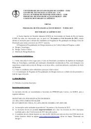
Rico Lins: uma gráfica de fronteira - Esdi
Rico Lins: uma gráfica de fronteira - Esdi
Rico Lins: uma gráfica de fronteira - Esdi

Create successful ePaper yourself
Turn your PDF publications into a flip-book with our unique Google optimized e-Paper software.
<strong>Rico</strong> <strong>Lins</strong><br />
<strong>Rico</strong> <strong>Lins</strong>: graphic bor<strong>de</strong>rlines<br />
apresenta
22<br />
textos | texts<br />
Agnaldo Farias<br />
Adélia Borges<br />
Rafael Cardoso<br />
André Stolarski<br />
<strong>Rico</strong> <strong>Lins</strong><br />
tradução | translation<br />
Anthony Doyle<br />
apresenta<br />
Solisluna Editora - Rio <strong>de</strong> Janeiro 2009<br />
<strong>Rico</strong> <strong>Lins</strong>: graphic bor<strong>de</strong>rlines
e x p o s i ç ão | exhibition<br />
r e a l i z a ç ã o | co n c e p t i o n <strong>Rico</strong> <strong>Lins</strong> + Studio e zucca Produções<br />
c u r a d o r i a | c u r at o r s h i p Agnaldo Farias<br />
d i r e ç ã o a r t í s t i ca | a r t direction <strong>Rico</strong> <strong>Lins</strong><br />
d i r e ç ã o d e p r o d u ç ã o | p r o d u c t i o n direction Julio Augusto zucca<br />
p r o d u ç ã o e x e c u t i va | e x e c u t i v e p r o d u c t i o n Julieta Sobral<br />
a s s i s t e n t e d e p r o d u ç ã o | p r o d u c t i o n a s s i s ta n c e Anna La<strong>de</strong>ira<br />
p r o j e t o g r á f i co | g r a p h i c d e s i g n <strong>Rico</strong> <strong>Lins</strong> + Studio<br />
m o n ta g e m | m o u n t i n g the image Press e Camuflagem Cenografia<br />
a s s e s s o r i a d e i m p r e n s a | p r e s s r e l e a s e Armazém Comunicação<br />
p u b l i c a ç ã o | publication<br />
co o r d e n a ç ã o editorial | editorial co o r d i n at i o n Cristina Fino<br />
e d i ç ã o d e l e g e n d a s | c a p t i o n s editing Regiane Pimentel<br />
p r o j e t o g r á f i co | d e s i g n c o n c e p t <strong>Rico</strong> <strong>Lins</strong> + Studio<br />
d e s i g n <strong>Rico</strong> <strong>Lins</strong> e Amanda Dafoe<br />
f o t o s e x p o s i ç ã o | exhibition p h o t o s Julieta Sobral<br />
f o t o s p r o d u t o s | p r o d u c t p h o t o s Lidia Arrais, <strong>Rico</strong> <strong>Lins</strong> + Studio<br />
p r o d u ç ã o g r á f i c a | p r i n t i n g p r o d u c t i o n Fátima Secches/GFK<br />
www.ricolins.com/grafica<strong>de</strong><strong>fronteira</strong><br />
a b e r t u r a d a e x p o s i ç ã o | exhibition o p e n i n g<br />
9 <strong>de</strong> fevereiro <strong>de</strong> 2009, segunda-feira, às 19h | Monday 9 February 7pm<br />
p e lo av e s s o: a c o n s t r u ç ã o d a i m a g e m - pa l e s t r a co m r i co l i n s |<br />
insi<strong>de</strong> o u t: building t h e i m a g e - ta l k b y r i co l i n s<br />
13 <strong>de</strong> fevereiro <strong>de</strong> 2009, sexta-feira, às 19h | Friday 13 February 7pm<br />
l a n ç a m e n t o d o l i v r o<br />
12 <strong>de</strong> março <strong>de</strong> 2009, quinta-feira, às 19h | Thursday 12 March 7pm<br />
visita g u i a d a e w o r k s h o p co m r i co l i n s<br />
14 <strong>de</strong> março <strong>de</strong> 2009, sábado, das 10h às 17h | Saturday 14 March from 10am to 5pm<br />
v i s i ta ç ã o | o p e n i n g h o u r s<br />
terça a sábado, das 10h às 22h | Tuesday to Saturday from 10am to 10 pm<br />
Domingo, das 10h às 21h | Sunday from 10am to 9pm<br />
CAIXA Cultural RJ – Galeria 1<br />
Av. Almirante Barroso, 25, Centro<br />
CEP 20031-003<br />
Rio <strong>de</strong> Janeiro, RJ – Brazil<br />
tels. (55) (21) 2544.4080 / 1099 / 7666<br />
www.caixa.gov.br/caixacultural<br />
E-mail: caixacultural.rj@caixa.gov.br<br />
Central <strong>de</strong> ouvidoria | Call Center CAIXA: 0800 725 7474<br />
Atendimento a pessoas com <strong>de</strong>ficiência auditiva | Service for hearing<br />
impaired people: 0800 726 2492<br />
SAC CAiXA: 0800 726 0101<br />
todos os eventos com entrada franca | All special events admissions free<br />
Acesso para portadores <strong>de</strong> necessida<strong>de</strong>s especiais<br />
Access for people with special needs<br />
Atendimento a escolas com agendamento prévio | Bookings for school groups<br />
<strong>Rico</strong> <strong>Lins</strong> : <strong>uma</strong> <strong>gráfica</strong> <strong>de</strong> <strong>fronteira</strong> = <strong>Rico</strong> <strong>Lins</strong> : graphic<br />
bor<strong>de</strong>rlines / textos: Agnaldo Farias<br />
...[et al] ; tradução Anthony Doyle. - Rio <strong>de</strong> Janeiro :<br />
Solisluna Editora, 2009.<br />
144 p. 310 il.<br />
texto em português com tradução paralela em inglês.<br />
iSBn: 978-85-890-5919-0<br />
1. <strong>Lins</strong>, <strong>Rico</strong>, 1955-. 2. Designers - Brasil.<br />
3. Artes <strong>gráfica</strong>s - Brasil. 4. Desenho - Brasil.<br />
i. Farias, Agnaldo, 1955-.<br />
Sistema <strong>de</strong> Bibliotecas - uFBA<br />
CDD - 741.60981<br />
REALizAção | PRoDuCtion:<br />
PAtRoCínio | SPonSoRShiP:<br />
A Caixa Econômica Fe<strong>de</strong>ral, ao lançar esta publicação, fruto da exposição homônima<br />
que ocupou a Galeria 1 da CAiXA Cultural Rio <strong>de</strong> Janeiro em fevereiro e março<br />
<strong>de</strong> 2009, prestigia com orgulho o trabalho e o talento do artista gráfico <strong>Rico</strong> <strong>Lins</strong>.<br />
Premiado e reconhecido internacionalmente, <strong>Rico</strong> <strong>Lins</strong> é responsável por inúmeros<br />
projetos <strong>de</strong> comunicação visual, museográficos e <strong>de</strong> sinalização, atuando<br />
ainda como educador e consultor nas áreas pelas quais transita: <strong>de</strong>sign, comunicação<br />
empresarial, <strong>de</strong>sign editorial, i<strong>de</strong>ntida<strong>de</strong> visual e projetos culturais.<br />
Suas obras fazem parte <strong>de</strong> importantes coleções mundo afora. A da Bibliothèque<br />
nationale e do Musée d’histoire Contemporaine, em Paris, a do Die neue<br />
Sammlung, em Munique, bem como a do Museu <strong>de</strong> Arte Contemporânea <strong>de</strong> São<br />
Paulo, são apenas alguns exemplos.<br />
A exposição aqui retratada contemplou mais <strong>de</strong> 100 obras, <strong>de</strong>ntre cartazes, capas<br />
<strong>de</strong> revistas e livros, sinalização, ilustração e projetos gráficos <strong>de</strong> <strong>uma</strong> maneira geral.<br />
A CAiXA, <strong>uma</strong> das empresas que mais investem em cultura no Brasil, reitera sua<br />
posição estratégica <strong>de</strong> fomento à diversida<strong>de</strong> cultural, apoiando o fazer artístico<br />
em todas as suas vertentes, linguagens e formas <strong>de</strong> manifestação.<br />
Caixa Econômica Fe<strong>de</strong>ral<br />
In launching this publication, fruit of a homonymous<br />
exhibition held at Galeria 1, CAIXA<br />
Cultural Rio <strong>de</strong> Janeiro between February and<br />
March 2009, Caixa Econômica Fe<strong>de</strong>ral is proud<br />
to pay tribute to the work and talent of the<br />
graphic artist <strong>Rico</strong> <strong>Lins</strong>.<br />
<strong>Rico</strong> <strong>Lins</strong> is responsible for innumerable<br />
projects in the areas of visual communication,<br />
museography and signalization, for which he<br />
has earned international awards and recognition.<br />
He also works as an educator and consultant<br />
in the various fields in which he operates:<br />
<strong>de</strong>sign, corporate communication, editorial<br />
<strong>de</strong>sign, visual i<strong>de</strong>ntity and cultural projects.<br />
His work can be found in important collections<br />
worldwi<strong>de</strong>, including those at Bibliothèque<br />
Nationale and Musée d’Histoire Contemporaine,<br />
in Paris, Die Neue Sammlung, in<br />
Munich, as well as Museu <strong>de</strong> Arte Contemporânea<br />
<strong>de</strong> São Paulo, among many others.<br />
The exhibition covered in this publication<br />
contained over a hundred works, including<br />
posters, magazine and book covers, signalling,<br />
illustrations and graphic projects in general.<br />
CAIXA, one of the companies that most invests<br />
in Brazilian culture, reaffirms its strategic<br />
position of nurturing cultural diversity and<br />
supporting artistic output in all its strains,<br />
languages and manifestations.<br />
Caixa Econômica Fe<strong>de</strong>ral
agra<strong>de</strong>cimentos | acknowledgments<br />
Adélia Borges, Adriana e Guto <strong>Lins</strong>, Agnaldo Farias, Alfredo Sertã, André Stolarski,<br />
Angela <strong>Lins</strong>, Bebel Franco, Clara Ramalho, Dodô Brandão, Enéas Guerra, Fabio <strong>de</strong> Fiori,<br />
Fátima Secches, iara e Fausto <strong>Lins</strong>, Gabriel Cavalcanti, Pai Gilberto, Gisela <strong>de</strong> Castro,<br />
Guguta Brandão, Julia Peregrino, Da. Lur<strong>de</strong>s Lauro <strong>de</strong> Freitas, Lara <strong>de</strong> Castro, Lu Mieli,<br />
Maria Elisa Costa, Mauro Ponzé, nina Franco <strong>Lins</strong>, Rafael Cardoso, Ricardo Arnt,<br />
Ricardo ohtake, Rodolfo Capeto, Valeria Pergentino; equipe + studio: Maira Roman,<br />
Alessandra Paes, Rafael Aguiar, Celeni Viana, Lidia Arrais, Amanda Dafoe; equipe zucca:<br />
Anacris Monteiro, Gisela <strong>de</strong> Castro, Leila Dantas, thais Flores e equipe da Caixa Cultural.<br />
o projeto <strong>Rico</strong> <strong>Lins</strong>: Gráfica <strong>de</strong> Fronteira foi viabilizado com patrocínio da Caixa Econômica<br />
Fe<strong>de</strong>ral através <strong>de</strong> edital da Caixa Cultural e inaugurado na unida<strong>de</strong> Rio <strong>de</strong> Janeiro em 9 <strong>de</strong><br />
fevereiro <strong>de</strong> 2009, ficando em exposição neste local até 15 <strong>de</strong> março do mesmo ano.<br />
The project <strong>Rico</strong> <strong>Lins</strong>: Graphic Bor<strong>de</strong>rlines has been ma<strong>de</strong> possible by sponsorship from Caixa Econômica<br />
Fe<strong>de</strong>ral through an announcement by Caixa Cultural and was opened at the Rio <strong>de</strong> Janeiro unit in 9 February<br />
2009. It stayed in exhibition at this venue until 15 March of the same year.<br />
<strong>Rico</strong> <strong>Lins</strong> – Designer onívoro<br />
<strong>Rico</strong> <strong>Lins</strong> – Omnivorous Designer<br />
Territórios reinventados<br />
Reinvented Territories<br />
O perfeito é péssimo<br />
The Perfect is the Pits<br />
Entrevista a André Stolarski<br />
Interview to André Stolarski<br />
Textos selecionados<br />
Selected Writings<br />
Trabalhos<br />
Works<br />
Sobre <strong>Rico</strong> <strong>Lins</strong><br />
About <strong>Rico</strong> <strong>Lins</strong><br />
Agnaldo Farias<br />
Adélia Borges<br />
Rafael Cardoso<br />
<strong>Rico</strong> <strong>Lins</strong>
<strong>Rico</strong> <strong>Lins</strong> – <strong>de</strong>signer onívoro<br />
Agnaldo Farias*<br />
A obra <strong>gráfica</strong> <strong>de</strong> <strong>Rico</strong> <strong>Lins</strong> <strong>de</strong>monstra como são imprecisos os limites entre a<br />
arte e o <strong>de</strong>sign. Mais ainda: arte e vida. Mas comecemos pela arte, aqui compreendida<br />
no sentido amplo, sem se restringir às artes plásticas, mas <strong>de</strong>sbordando<br />
para a música, dança, arquitetura, fotografia, moda, poesia... e, além disso, ignorando<br />
<strong>uma</strong> outra <strong>fronteira</strong> interna, aquela que até bem pouco separava as formas<br />
<strong>de</strong> expressão cultas, forjadas nas aca<strong>de</strong>mias, das formas populares, nascidas<br />
<strong>de</strong> inteligências tão potentes que, como é frequente em nosso país, vingam em<br />
territórios inóspitos, áridos e violentos.<br />
Para realizar essa fusão, esse amálgama <strong>de</strong> feixes visuais diversos, porque o<br />
mundo <strong>de</strong> <strong>Rico</strong> <strong>Lins</strong> sempre foi o da imagem, foi fundamental seu singular percurso,<br />
a começar pela vasta biblioteca do avô, repleta <strong>de</strong> livros ilustrados, e pelos<br />
passeios, levado pelas mãos <strong>de</strong> seu tio, para os ateliês <strong>de</strong> artistas tão discrepantes<br />
como Volpi, Djanira e João Câmara. A cálida e sensual geometria do mestre<br />
italiano, com as marcas rítmicas e sutis <strong>de</strong> suas pinceladas tumultuando suavemente<br />
os impulsos geométricos, a ingenuida<strong>de</strong> inteligente <strong>de</strong> Djanira, situada no<br />
gume que separa a expressão popular da erudita, o gosto pela narrativa sobre a<br />
vida política <strong>de</strong> Câmara, que especialmente na passagem dos anos 1960 para os<br />
70 ele soube renovar por meio <strong>de</strong> um engenhoso processo <strong>de</strong> esquartejamento e<br />
remontagem das figuras.<br />
Como aferir o impacto <strong>de</strong>ssas experiências precoces e difusas como a revista que se<br />
folheia quando criança ao longo das tar<strong>de</strong>s chuvosas, por parte <strong>de</strong> alguém que <strong>de</strong>s<strong>de</strong><br />
cedo acostumou-se a <strong>de</strong>senhar <strong>de</strong> tudo, a exercitar-se livremente em paráfrases<br />
visuais, interessado que era por ilustrações? A seguir, um tantinho mais velho, mais<br />
sistemático, disciplinado, porque se sabe que as aulas <strong>de</strong> Maciej Babinski e, principalmente,<br />
<strong>de</strong> mestre Evandro Carlos Jardim, puxassem por isto, veio o envolvimento<br />
no processo <strong>de</strong> produção <strong>de</strong> imagens, a vivência nas oficinas <strong>de</strong> aquarela e gravura.<br />
A entrada no gráfico dava-se então pelo convite ao <strong>de</strong>safogo do universo íntimo e<br />
não, como é comum nas escolas <strong>de</strong> <strong>de</strong>sign, pelo respeito ao repertório do outro,<br />
a esse <strong>de</strong>sejo <strong>de</strong> comunicabilida<strong>de</strong> que, levado com respeito excessivo, conduz à<br />
redundância e, com ela, ao sono e à cegueira. Afinal, não foi essa a verda<strong>de</strong>ira lição<br />
da mítica Sheraza<strong>de</strong> em As 1001 noites: aquele que narra garante o interesse, e com<br />
ele sua própria vida, daquele que escuta através da carga <strong>de</strong> surpresa e mistério<br />
que ele logra embutir na forma e no conteúdo daquilo que é narrado? Pois o nome<br />
<strong>de</strong>ssa mulher não merecia estar fixado nos umbrais das escolas <strong>de</strong> <strong>de</strong>sign?<br />
<strong>Rico</strong> <strong>Lins</strong> ingressou aos 17 anos na Escola Superior <strong>de</strong> Desenho industrial –<br />
ESDi, on<strong>de</strong> estavam Aloisio Magalhães, Décio Pignatari, Karl-heinz Bergmüller<br />
<strong>Rico</strong> <strong>Lins</strong> – Omnivorous Designer<br />
The graphic work of <strong>Rico</strong> <strong>Lins</strong> shows just how<br />
blurred are the limits between art and <strong>de</strong>sign,<br />
moreover: between art and life. We will start<br />
with art, here un<strong>de</strong>rstood in its broa<strong>de</strong>r sense,<br />
not restricted to the plastic arts, but with frontiers<br />
bor<strong>de</strong>ring on music, dance, architecture,<br />
photography, fashion, poetry… not to mention<br />
another, inner bor<strong>de</strong>rland that until very recently<br />
separated cultured expressions shaped<br />
in aca<strong>de</strong>mia from the popular forms born of<br />
intelligences so potent they can, as they often<br />
do in our country, thrive in even the most<br />
inhospitable, parched and violent of terrains.<br />
To engineer such a fusion, this amalgam<br />
of sundry visual beams – because <strong>Rico</strong>’s<br />
world was always one of images –, it took a<br />
trajectory as singular as his, starting with his<br />
grandfather’s vast library, replete with illustrated<br />
books, and the visits, led by his uncle’s<br />
hand, to the studios of such disparate artists<br />
as Volpi, Djanira and João Câmara. The ar<strong>de</strong>nt<br />
and sensual geometry of the Italian master,<br />
with the rhythmical, subtle brushstrokes gently<br />
causing a maelstrom among his geometric impulses,<br />
the intelligent ingenuity of Djanira, on<br />
the knife’s-edge between <strong>de</strong>motic and erudite<br />
expression, Câmara’s penchant for narrative on<br />
political life, which, especially at the turn of the<br />
70s, he could renew through a clever dismembering<br />
and reassembling of the figures.<br />
How do you gauge the impact of these precocious<br />
and diffuse experiences, like the comic<br />
books flicked through as a child on rainy afternoons,<br />
on someone who was used to drawing<br />
everything from a young age, dabbling freely<br />
in visual paraphrases, interested as he was<br />
in illustration? Later, ol<strong>de</strong>r, more systematic,<br />
disciplined, because the lessons of Maciej<br />
Babinski and, especially, of the master Evandro<br />
Carlos Jardim pulled in this direction, came<br />
involvement in image production processes<br />
and experience in watercolour and engraving<br />
workshops. The allure of graphics was the<br />
invitation it exten<strong>de</strong>d to vent his inner universe,<br />
rather than respect for the repertoires of<br />
others, as is so often the case in schools of<br />
graphic <strong>de</strong>sign, this <strong>de</strong>sire for communicability<br />
that, if pursued with too much respect, leads<br />
to redundancy and therefore to ennui and<br />
blindness. After all, wasn’t this the true lesson<br />
of the mythic Scheheraza<strong>de</strong> in 1001 Nights, who,<br />
holding the interest of the listener by infusing<br />
the tale with a dose of surprise and mystery,<br />
can assure her own life? Does not the name of<br />
this woman <strong>de</strong>serve a plaque above the door of<br />
schools of <strong>de</strong>sign?<br />
<strong>Rico</strong> <strong>Lins</strong> joined the Escola Superior <strong>de</strong><br />
Desenho Industrial – ESDI at seventeen years<br />
of age, at a time when the staff inclu<strong>de</strong>d the<br />
likes of Aloisio Magalhães, Décio Pignatari,<br />
Karl-Heinz Bergmüller and Zuenir Ventura, itself<br />
sufficient to indicate the diverse positions<br />
of a profession – used here in the exten<strong>de</strong>d<br />
sense of a way of being in the world – that<br />
didn’t even exist in Brazil at the time. It was a<br />
craft un<strong>de</strong>r construction, which meant it could<br />
enjoy the singular and extraordinary status<br />
of not being reducible to a unitary un<strong>de</strong>rstanding.<br />
It is worth recalling that ESDI was<br />
known as the spearhead of the Ulm School,<br />
the self-styled successor to the Bauhaus. As<br />
we should also remember Ulm’s <strong>de</strong>votion to a<br />
rationalism that far surpassed that envisaged<br />
by its mother-school, a true exponent of a<br />
holistic teaching based on an interchange of<br />
languages, just as later, in the United States,<br />
at Black Mountain College in North Carolina<br />
and at the New Bauhaus in Chicago, respectively,<br />
two of its key artists/pedagogues,<br />
Josef Albers and Lázló Moholy-Nagy, would<br />
continue to propagate its principles.<br />
To think of the Ulm School in Rio <strong>de</strong> Janeiro<br />
was tantamount to accosting Apollo with the<br />
most barbarous pounding of drums, blasting<br />
him with a dog-day sultriness more diverse<br />
than what he – the sun god – was used to.<br />
Because if you take the rationalism postulated<br />
by the ESDI and add to that the counterculture,<br />
the “<strong>de</strong>sbun<strong>de</strong>” (hippieness) – yes, words grow<br />
old too – flourishing in the chinks of light that<br />
ma<strong>de</strong> it through the dictatorship, in a curious<br />
association with rock and political resistance,<br />
the leftist groups abscon<strong>de</strong>d in clan<strong>de</strong>stinity,<br />
and the rea<strong>de</strong>r will have an i<strong>de</strong>a of what can<br />
happen to a young man like <strong>Rico</strong> <strong>Lins</strong> coming<br />
of age in the middle of such a hail of crossfire.<br />
In terms of <strong>de</strong>sign, in 1976, the year <strong>Rico</strong> <strong>Lins</strong><br />
enrolled at the ESDI, Brazil had long known<br />
the seminal power of the graphics of Rogério<br />
Duarte, the author of the poster for Glauber<br />
Rocha’s Deus e o diabo na terra do sol (God<br />
and Devil in the Land of the Sun), covers for<br />
the first LPs of Caetano Veloso and Gilberto<br />
Gil, the cornerstones of Tropicalism, and<br />
co-foun<strong>de</strong>r of Flor do Mal (Flower of Evil), the<br />
magazine edited by Luiz Carlos Maciel. In the<br />
whirlwind of a period that had still more to<br />
give, from Hélio Oiticica to Zé Celso Martinez,<br />
in which the publisher Civilização Brasileira<br />
exhumed the sacrosanct cadaver of Oswald<br />
<strong>de</strong> Andra<strong>de</strong> in editions prefaced by Haroldo <strong>de</strong><br />
Campos, Duarte had led the way in <strong>de</strong>fence of<br />
e zuenir Ventura, o que por si só dá conta das posições diversas sobre <strong>uma</strong><br />
profissão, termo que aqui <strong>de</strong>ve ser entendido como um modo <strong>de</strong> estar no mundo,<br />
e que naquela altura sequer existia no Brasil. um ofício em construção e que por<br />
isso gozava do singular e extraordinário estatuto <strong>de</strong> não possuir <strong>uma</strong> compreensão<br />
unitária. Vale lembrar que a ESDi ficou conhecida como a ponta <strong>de</strong> lança da<br />
Escola <strong>de</strong> ulm, a auto<strong>de</strong>nominada sucessora da Bauhaus. E também a <strong>de</strong>voção<br />
<strong>de</strong> ulm a um racionalismo que ultrapassava largamente o preconizado pela<br />
escola-mãe, esta sim propositora <strong>de</strong> um ensino holístico e fundado no intercâmbio<br />
<strong>de</strong> linguagens, como posteriormente, já nos Estados unidos, à frente da Black<br />
Mountain College, na Carolina do norte, e da new Bauhaus, em Chicago, haviam<br />
<strong>de</strong>monstrado dois <strong>de</strong> seus principais artistas/pedagogos, propagadores <strong>de</strong> seus<br />
principios, Josef Albers e Lázló Moholy-nagy, respectivamente.<br />
Pensar a Escola <strong>de</strong> ulm no Rio <strong>de</strong> Janeiro era o mesmo que submeter Apolo a<br />
<strong>uma</strong> batucada das mais brabas, calciná-lo sob <strong>uma</strong> canícula outra, muito diversa<br />
da que ele, <strong>de</strong>us do sol, estava acost<strong>uma</strong>do. Pois junte o racionalismo postulado<br />
pela ESDi com a contracultura, com o “<strong>de</strong>sbun<strong>de</strong>” – é, as palavras envelhecem...<br />
– que florescia sob as frestas da ditadura, n<strong>uma</strong> curiosa associação com o rock<br />
e com a resistência política, os grupos <strong>de</strong> esquerda submersos na clan<strong>de</strong>stinida<strong>de</strong>,<br />
e o leitor terá <strong>uma</strong> idéia do que podia acontecer com um jovem como <strong>Rico</strong><br />
formando-se sob um fogo cruzado <strong>de</strong>ssa magnitu<strong>de</strong>.<br />
Em termos <strong>de</strong> <strong>de</strong>sign 1976, quando <strong>Rico</strong> <strong>Lins</strong> ingressou na ESDi, o Brasil já havia<br />
sentido há muito tempo a força seminal da <strong>gráfica</strong> <strong>de</strong> Rogério Duarte, o homem<br />
que <strong>de</strong>senhou o cartaz <strong>de</strong> Deus e o diabo na terra do sol, <strong>de</strong> Glauber Rocha, as<br />
capas dos primeiros discos <strong>de</strong> Caetano Veloso e Gilberto Gil, pedras basilares do<br />
tropicalismo, e foi até o Flor do Mal, jornal editado por Luiz Carlos Maciel, 1976.<br />
no turbilhão <strong>de</strong> um período que ainda <strong>de</strong>u <strong>de</strong> hélio oiticica a zé Celso Martinez,<br />
que a editora Civilização Brasileira exumou o sacrossanto <strong>de</strong>funto oswald <strong>de</strong><br />
Andra<strong>de</strong> em edições apresentadas por haroldo <strong>de</strong> Campos, Duarte havia puxado<br />
a fila na <strong>de</strong>fesa <strong>de</strong> <strong>uma</strong> estética antropofágica quando, em 1965, manifestou sua<br />
reserva aos caminhos da ESDi, escola que ele ajudou a fundar mas on<strong>de</strong> não<br />
ensinou formalmente “porque nunca me foi permitido isso”. 1<br />
Em 1976 muita água já havia rolado <strong>de</strong>baixo da ponte. isso no nosso país. E o<br />
que dizer do resto do mundo? Por exemplo, <strong>de</strong> seus estudos aprofundados, e<br />
o consequente “<strong>de</strong>slumbramento” pelo dadaísmo e alg<strong>uma</strong>s ramificações do<br />
1 Chico homem <strong>de</strong> Melo (org.). O <strong>de</strong>sign gráfico brasileiro. Anos 60. São Paulo: Cosac naify, 2006, p. 195.<br />
8 9
surrealismo? Compreen<strong>de</strong>r a obra <strong>de</strong> <strong>Rico</strong> <strong>Lins</strong>, esse <strong>de</strong>signer onívoro, sacar sua<br />
voracida<strong>de</strong> por assuntos, territórios do conhecimentos, tempos e espaços diversos,<br />
passa por essas incontáveis referências diretamente aludidas e outras tantas<br />
intuídas e, aliadas a todas elas, <strong>uma</strong> noção importada da física que ele sempre<br />
<strong>de</strong>fen<strong>de</strong>u como subjacente a toda sua prática, a <strong>de</strong> que o “atrito gera energia”.<br />
Contudo, <strong>uma</strong> coisa é receber a informação em sua própria casa, a energia produzida<br />
pelo contato com um corpo escorado em ambientes e aromas familiares.<br />
outra, muito diferente, foi a opção <strong>de</strong> <strong>Rico</strong> <strong>Lins</strong> pelo nomadismo, largando-se<br />
pelo mundo afora, <strong>de</strong>zesseis anos <strong>de</strong> peregrinação por França, inglaterra, holanda,<br />
Alemanha, Estados unidos, mantendo permanentemente aberta a cesura<br />
mental provocada por aquilo que eu não compreendo ao certo, que não é meu.<br />
Apesar da sua pouca ida<strong>de</strong>, quando <strong>Rico</strong> <strong>Lins</strong> enten<strong>de</strong>u que o seu negócio era<br />
o <strong>de</strong>sign ele já era muitas outras coisas e ainda queria muito mais: lidava e<br />
transitava por territórios diversos um cidadão do mundo para o qual a nacionalida<strong>de</strong>,<br />
mais que um limite, era <strong>uma</strong> falsa questão, e o intercâmbio <strong>de</strong> idéias, o<br />
contrabando <strong>de</strong> tempos e espaços, <strong>uma</strong> condição para se sobreviver num mundo,<br />
para o bem e para o mal, <strong>de</strong>finitivamente contaminado. Afinal, quais são mesmo<br />
as <strong>fronteira</strong>s da língua? E da visualida<strong>de</strong>? Quem gosta da imagem, que tem a<br />
voluptuosida<strong>de</strong> da imagem, parafraseando Pedro nava em sua <strong>de</strong>fesa da palavra,<br />
interessa-se por tudo que há, seja aquilo que provém do outro ou aquilo que, sob<br />
a forma <strong>de</strong> erro, provém <strong>de</strong> mim mesmo, um mim oculto, incerto. um objet trouvé<br />
encontrado à tona da escuridão mais íntima.<br />
Ciente <strong>de</strong> que cada vez mais o <strong>de</strong>sign é <strong>uma</strong> colagem, zona <strong>de</strong> articulação da<br />
tecnologia, mercado e cultura, e que cada um <strong>de</strong>sses termos é um conceito<br />
pletórico, <strong>Rico</strong> <strong>Lins</strong> sempre se pautou pela sobreposição <strong>de</strong> técnicas e linguagens<br />
díspares, da xilogravura e da tipografia mais ortodoxa ao recurso gráfico <strong>de</strong><br />
última geração; do lambe-lambe à informação processada digitalmente; daquilo<br />
que é aplicado com apuro ao que se obtém arrancando. A colagem garante ao<br />
trabalho gráfico um resultado mais próximo dos processos operacionais e da<br />
imagética própria à cultura contemporânea que da experiência visual controlada<br />
e que era oferecida pelos mo<strong>de</strong>rnos. um jogo <strong>de</strong> justaposições entre vozes e<br />
ruídos; <strong>uma</strong> área <strong>de</strong> tensão em que formas e figuras mantêm-se num equilíbrio<br />
precário, crispado, ambíguo, que é, afinal das contas, o responsável por <strong>de</strong>mandar<br />
inteligência àquele que se põe a lê-la.<br />
Em <strong>Rico</strong> <strong>Lins</strong> o <strong>de</strong>sign converte-se em trespassamento <strong>de</strong> estruturas <strong>de</strong> pensamento<br />
e <strong>de</strong> técnicas produtivas: a comprovação <strong>de</strong> que o atrito produz energia, o<br />
an anthropophagic aesthetic when, in 1965, he<br />
expressed his reservations about the direction<br />
ESDI was taking, a school he had helped found<br />
but had never formally taught at, because, as<br />
he says, “I was never allowed to”. 1<br />
A lot of water had already passed un<strong>de</strong>r the<br />
bridge in 1976. If that was in Brazil, what can<br />
we say about his influences from the rest of<br />
the world? For example, of his more <strong>de</strong>tailed<br />
studies and consequent “bedazzlement” by<br />
Dadaism and certain offshoots of surrealism?<br />
To comprehend the work of <strong>Rico</strong> <strong>Lins</strong>, this omnivorous<br />
<strong>de</strong>signer, we must first un<strong>de</strong>rstand<br />
his voracity for issues, fields of knowledge,<br />
diverse times and spaces, we must flicker<br />
through these innumerable references – some<br />
directly allu<strong>de</strong>d to, others merely intuited –,<br />
allied with the notion borrowed from physics,<br />
and which he always conten<strong>de</strong>d un<strong>de</strong>rlay his<br />
entire work, that “friction generates energy”.<br />
However, it is one thing to receive information<br />
at home; the energy produced by contact with<br />
a body shrou<strong>de</strong>d in familiar environments and<br />
aromas, and quite another to do what <strong>Rico</strong><br />
<strong>Lins</strong> did, opting for nomadism, roaming the<br />
wi<strong>de</strong>r world on a seventeen-year pilgrimage<br />
through France, England, Holland, Germany<br />
and the United States, keeping permanently<br />
open that mental rift caused by what is not<br />
fully un<strong>de</strong>rstood, by what is not my own.<br />
Despite his young age, by the time <strong>Rico</strong> <strong>Lins</strong><br />
realized that <strong>de</strong>sign was his business, he was<br />
already many things and wanted to be so much<br />
more: he had <strong>de</strong>alt with and ranged through<br />
such a diversity of territories, a citizen of the<br />
world for whom nationality was not so much<br />
a limit as a false question, and for whom the<br />
exchange of i<strong>de</strong>as, the bartering of times and<br />
spaces was a condition for surviving in a world<br />
– for better or for worse – already <strong>de</strong>finitively<br />
interconnected. After all, what exactly are<br />
the limits of language? Of visuality? Whoever<br />
likes images, feels the voluptuousness of the<br />
image, to paraphrase Pedro Nava’s <strong>de</strong>fence of<br />
the word, is interested in everything, whether<br />
the output of the other or the stuff that comes<br />
from within, by mistake, from that hid<strong>de</strong>n,<br />
uncertain me. An objet trouvé stumbled upon<br />
in the most intimate dark.<br />
Aware that <strong>de</strong>sign was increasingly becoming<br />
a collage, a point of intersection for technology,<br />
the market and culture, and that each is a<br />
plethoric concept, <strong>Rico</strong> <strong>Lins</strong> always operated<br />
1 Chico Homem <strong>de</strong> Melo (org.). O <strong>de</strong>sign gráfico brasileiro.<br />
Anos 60. São Paulo: Cosac Naify, 2006, p. 195.<br />
through a layering of disparate techniques and<br />
languages, from orthodox woodcutting and<br />
typography to the latest graphic resources;<br />
from the street poster to digitally processed<br />
information; from the content one can apply<br />
with refinement to the stuff you have to snatch<br />
by force. Collage affords the graphic work a<br />
result that approaches much more closely to<br />
the operational and imagetic processes of contemporary<br />
culture than to the controlled visual<br />
experience offered by the mo<strong>de</strong>rns. A play<br />
of juxtapositions between voices and noise;<br />
a zone of tension in which forms and figures<br />
maintain a precarious, crumpled, ambiguous<br />
balance that is, after all, what <strong>de</strong>mands intelligence<br />
of those who presume to read it.<br />
In <strong>Rico</strong> <strong>Lins</strong>, <strong>de</strong>sign becomes a trespassing of<br />
thought structures and productive techniques,<br />
proof that friction generates energy, the same<br />
energy that radiates from the life of our cities,<br />
from their walls and ragged spaces.<br />
All of this is why “<strong>Rico</strong> <strong>Lins</strong> – graphic bor<strong>de</strong>rlines”<br />
is not an exhibition in the conventional<br />
sense; no mere presentation of his magnificent<br />
portfolio. More than that, what we have<br />
here is an artist willing to reveal the sap of<br />
his poetry, the purest possible state of the<br />
processes and elements that go into it. Hence<br />
the environmental character of this exhibition,<br />
a sort of “installation” that elucidates the<br />
worldview of <strong>Rico</strong> <strong>Lins</strong>, one proper to a graphic<br />
<strong>de</strong>signer capable of merging, combining<br />
and recycling words, images and rhythms,<br />
making them manifest in fabrics, papers and<br />
buildings, sounds and projections and even in<br />
supports that bor<strong>de</strong>r on the immaterial.<br />
* Agnaldo Farias is a professor of the Faculty of<br />
Architecture and urbanism of the university of São<br />
Paulo from 2003 and a consultant of curatorship at the<br />
instituto tomie ohtake from 2000. he was the curator of<br />
the Brazilian Representation at the 25th São Paulo international<br />
Biennial (2002) and is the main curator of the<br />
Museum of Mo<strong>de</strong>rn Art in Rio <strong>de</strong> Janeiro (1998-2000).<br />
mesmo tipo <strong>de</strong> energia que se <strong>de</strong>spren<strong>de</strong> da vida das nossas cida<strong>de</strong>s, dos seus<br />
muros e espaços crespos.<br />
Por tudo isso é que “<strong>Rico</strong> <strong>Lins</strong> – <strong>uma</strong> <strong>gráfica</strong> <strong>de</strong> <strong>fronteira</strong>” não é <strong>uma</strong> mostra<br />
no sentido convencional, não se reduz a <strong>uma</strong> apresentação <strong>de</strong> seu magnífico<br />
portfólio. Mais do que isso, tem-se aqui um artista que traz a público a seiva <strong>de</strong><br />
sua poética, a explicitação em estado mais puro dos processos e elementos dos<br />
quais se vale. Daí o caráter ambiental <strong>de</strong>ssa mostra, <strong>uma</strong> sorte <strong>de</strong> “instalação”<br />
que esclarece a visão <strong>de</strong> mundo <strong>de</strong> <strong>Rico</strong> <strong>Lins</strong>, própria a um <strong>de</strong>signer gráfico<br />
capaz <strong>de</strong> fundir, combinar e reciclar palavras, imagens e ritmos, encarnando-os<br />
em tecidos, papéis e edifícios, sons e projeções e até mesmo em suportes que<br />
rondam a imaterialida<strong>de</strong>.<br />
* Agnaldo Farias é professor da Faculda<strong>de</strong> <strong>de</strong> Arquitetura e urbanismo da uSP <strong>de</strong>s<strong>de</strong> 2003 e<br />
consultor <strong>de</strong> curadoria do instituto tomie ohtake (<strong>de</strong>s<strong>de</strong> 2000). Foi curador da Representação<br />
Brasileira para a 25a. Bienal internacional <strong>de</strong> São Paulo (2002) e curador geral do Museu <strong>de</strong> Arte<br />
Mo<strong>de</strong>rna do Rio <strong>de</strong> Janeiro (1998 a 2000).<br />
10 11
Territórios reinventados<br />
Adélia Borges*<br />
todos nós – pessoas, instituições, empresas – estamos vivendo hoje, <strong>de</strong> alg<strong>uma</strong><br />
forma, a necessida<strong>de</strong> <strong>de</strong> combinar <strong>uma</strong> compreensão ampla do mundo a <strong>uma</strong><br />
atuação que parte <strong>de</strong> um olhar e <strong>de</strong> um sentimento nascidos do local em que vivemos,<br />
da nossa história particular. isso que hoje é um atributo da contemporaneida<strong>de</strong><br />
<strong>Rico</strong> <strong>Lins</strong> já vem trazendo ao campo do <strong>de</strong>sign gráfico há alg<strong>uma</strong>s décadas.<br />
trafegar entre culturas diferentes sem abrir mão da sua própria, trazer ao <strong>de</strong>sign<br />
gráfico <strong>uma</strong> forte dose <strong>de</strong> criação pessoal, beber no caos das ruas e do popular<br />
para escrever o erudito, prever e incentivar a interação com o usuário do seu projeto,<br />
recorrer à manualida<strong>de</strong> da tradição brasileira para compor o digital são práticas<br />
incensadas em nossa época que <strong>Rico</strong> aporta <strong>de</strong>s<strong>de</strong> o início <strong>de</strong> sua caminhada.<br />
Sua formação e início da atuação profissional ocorrem no Rio <strong>de</strong> Janeiro nos<br />
anos 1970, período <strong>de</strong> forte dominância da idéia <strong>de</strong> que o <strong>de</strong>sign <strong>de</strong>veria ser<br />
neutro, asséptico e asceta; <strong>uma</strong> visão importada, sem questionamentos, das<br />
tendências alemã e suíça das artes <strong>gráfica</strong>s. Já em seus primeiros trabalhos<br />
<strong>Rico</strong> se insurge contra essa visão, incorporando a casualida<strong>de</strong> e a riqueza da<br />
cultura das ruas para chegar a um resultado marcado pela experimentação e,<br />
sobretudo, pela invenção.<br />
As temporadas estudando e trabalhando em Londres, Paris e nova York o<br />
chamado circuito helena Rubinstein, que durante tantos anos ditou tendências<br />
para o resto do mundo foram <strong>de</strong>cisivos no alargamento <strong>de</strong> seus horizontes,<br />
na ampliação <strong>de</strong> seu conhecimento h<strong>uma</strong>nista e na diversificação <strong>de</strong> seu<br />
repertório. nessas cida<strong>de</strong>s, <strong>Rico</strong> esteve no olho do furacão, trabalhando em<br />
ou para instituições e empresas importantes da gravadora CBS ao Beaubourg,<br />
o Centre George Pompidou; do The New York Times à Random house.<br />
nelas, contudo, o <strong>de</strong>signer não se <strong>de</strong>ixou cair na armadilha daqueles que<br />
a<strong>de</strong>rem a um estilo <strong>de</strong> vida e a <strong>uma</strong> linguagem internacionalista buscando um<br />
passaporte para o reconhecimento internacional. Antes, usou essa vivência<br />
para ampliar, <strong>de</strong> um lado, a sua compreensão da multiculturalida<strong>de</strong> como um<br />
dos fatores <strong>de</strong>cisivos do mundo hoje e, <strong>de</strong> outro, para alimentar e treinar a<br />
sua liberda<strong>de</strong> criativa.<br />
De volta ao Brasil, e <strong>de</strong>sta vez para São Paulo, permaneceu aberto às influências<br />
externas <strong>de</strong> um mundo em movimento e com <strong>fronteira</strong>s cada vez mais diluídas,<br />
a partir <strong>de</strong> um olhar pessoal e local – algo como a correspondência, no <strong>de</strong>sign,<br />
da parabólica fincada na lama com que o pernambucano Chico Science inventou<br />
<strong>uma</strong> nova sonorida<strong>de</strong> musical.<br />
Reinvented Territories<br />
All of us – people, institutions and companies<br />
– are experiencing, in some shape or form,<br />
the need to combine an arching un<strong>de</strong>rstanding<br />
of the world with a way of operating that<br />
is predicated upon a homegrown view and<br />
feeling, born from our own private histories.<br />
What is now an attribute of contemporaneity<br />
<strong>Rico</strong> <strong>Lins</strong> has long been bringing to the field of<br />
graphic <strong>de</strong>sign.<br />
Moving among different cultures without<br />
losing one’s own; infusing graphic art with<br />
a heavy dose of personal creation; drinking<br />
from the chaos of the streets and the low-brow<br />
in or<strong>de</strong>r to write the erudite; predicting and<br />
encouraging interaction with the user of the<br />
project; and taking recourse to the manual<br />
nature of the Brazilian tradition in or<strong>de</strong>r to<br />
compose the digital, these are all practices we<br />
see seeping into our day, but which have been<br />
part of <strong>Rico</strong>’s repertoire since the very beginning<br />
of his journey.<br />
His education and early career unfol<strong>de</strong>d in<br />
Rio <strong>de</strong> Janeiro in the 1970s, a time in which<br />
the i<strong>de</strong>a that <strong>de</strong>sign ought to be neutral,<br />
aseptic and ascetic prevailed; a view imported,<br />
unchallenged, from the German and Swiss<br />
schools of the graphic arts. From his earliest<br />
works, <strong>Rico</strong> rebelled against this view, incorporating<br />
the casualness and richness of street<br />
culture in or<strong>de</strong>r to attain a result <strong>de</strong>fined by<br />
experimentation and, above all, invention.<br />
His time spent studying and working in<br />
London, Paris and New York – the so-called<br />
“Helena Rubinstein circuit”, which for so long<br />
set the trend for the “rest” of the world – was<br />
<strong>de</strong>cisive in expanding his horizons, broa<strong>de</strong>ning<br />
his h<strong>uma</strong>nist knowledge and diversifying his<br />
repertoire. In these cities, <strong>Rico</strong> was in the eye<br />
of the storm, working in or for important institutions<br />
and companies – from the CBS record<br />
label to Beaubourg and the George Pompidou;<br />
from The New York Times to Random House.<br />
However, at no time did he fall into the trap of<br />
those who adhere to an internationalist lifestyle<br />
and language in pursuit of a passport to<br />
international recognition. He used his experience<br />
to <strong>de</strong>epen, on one hand, his un<strong>de</strong>rstanding<br />
of multiculturality as one of the <strong>de</strong>cisive<br />
factors at work in the world today, and, on the<br />
other, to feed and hone his creative freedom.<br />
Back in Brazil, this time in São Paulo, he<br />
remained open to outsi<strong>de</strong> influences coming<br />
to him from a world in motion and with<br />
increasingly more diluted bor<strong>de</strong>rs, but filtered<br />
through his own personal and local eye – a<br />
kind of <strong>de</strong>sign counterpart to the satellite dish<br />
stuck in the mud of Pernambuco with which<br />
Chico Science invented a new musical sonority.<br />
From his São Paulo studio, <strong>Rico</strong> attends to a<br />
diversity of <strong>de</strong>mands across the various <strong>de</strong>sign<br />
specialities, including books, brochures,<br />
posters, packaging, sites, exhibitions, TV<br />
programme and film openings, illustrations,<br />
etc, etc, etc. The practice of a multiple and<br />
consistent blend of <strong>de</strong>sign, one capable of<br />
dialoguing with other forms of expression,<br />
reconciling opposites and, as such, effectively<br />
speaking to the audiences to which his works<br />
are directed, has attracted a host of entrepreneurs<br />
from the cultural area who are in<br />
syntony with the <strong>de</strong>mands of contemporaneity.<br />
His experience has awar<strong>de</strong>d him a broad<br />
spectrum of clients, both Brazilians trying to<br />
reach international audiences and foreigners<br />
trying to reach <strong>de</strong>eper into the emerging<br />
markets on the new world map.<br />
Since the 1970s, <strong>Rico</strong> has been at the cuttingedge<br />
when it comes to translating notions<br />
of i<strong>de</strong>ntity, belonging, viewer inclusion and<br />
shared repertoire-building – the buzzwords of<br />
the day in marketing <strong>de</strong>partments worldwi<strong>de</strong>.<br />
This exhibition and catalogue will certainly<br />
afford a wi<strong>de</strong>r-reaching look at a rich career<br />
and equip us to set off together down newlytrod<strong>de</strong>n<br />
paths.<br />
* Adélia Borges is a journalist and curator<br />
specialized in <strong>de</strong>sign. She was the director of<br />
the Museu da Casa Brasileira (2003-2007) and<br />
<strong>de</strong>sign editor for the newspaper Gazeta Mercantil<br />
(1998-2002).<br />
De seu estúdio paulistano, <strong>Rico</strong> aten<strong>de</strong> a <strong>de</strong>mandas diversificadas nas várias<br />
especialida<strong>de</strong>s do <strong>de</strong>sign, incluindo livros, folhetos, cartazes, embalagens,<br />
sites, exposições, aberturas <strong>de</strong> programas <strong>de</strong> tevê e <strong>de</strong> filmes, ilustrações<br />
etc. etc. etc. A prática <strong>de</strong> um <strong>de</strong>sign múltiplo e consistente, capaz <strong>de</strong> conversar<br />
com outras formas <strong>de</strong> expressão, somar opostos e, assim, efetivamente<br />
falar às audiências às quais seus trabalhos são dirigidos, tem atraído muitos<br />
empreen<strong>de</strong>dores da área cultural sintonizados com as <strong>de</strong>mandas da contemporaneida<strong>de</strong>.<br />
Sua trajetória o cre<strong>de</strong>ncia a um amplo espectro <strong>de</strong> clientes, tanto<br />
daqueles brasileiros que querem falar a <strong>uma</strong> audiência internacional quanto<br />
dos estrangeiros que querem chegar mais fundo aos mercados emergentes da<br />
nova cartografia mundial.<br />
<strong>Rico</strong> vem se situando <strong>de</strong>s<strong>de</strong> os anos 1970 na ponta <strong>de</strong> lança da tradução na comunicação<br />
visual das noções <strong>de</strong> i<strong>de</strong>ntida<strong>de</strong>, pertencimento, inclusão do espectador<br />
e construção <strong>de</strong> repertórios comuns, que hoje são a bola da vez dos <strong>de</strong>partamentos<br />
<strong>de</strong> marketing das empresas. Esta exposição e este catálogo certamente<br />
permitirão um olhar abrangente sobre <strong>uma</strong> trajetória rica, e nos capacitar a<br />
trilhar, juntos, novos caminhos.<br />
* Adélia Borges é jornalista e curadora especializada em <strong>de</strong>sign. Foi diretora do Museu da Casa<br />
Brasileira (2003-2007) e editora <strong>de</strong> <strong>de</strong>sign do jornal Gazeta Mercantil (1998-2002).<br />
12 13
O perfeito é péssimo<br />
Rafael Cardoso*<br />
“o perfeito é péssimo.” A fala que dá título a este texto é extraída <strong>de</strong> entrevista<br />
concedida por <strong>Rico</strong> <strong>Lins</strong> a André Stolarski e incluída no presente livro. Ela é<br />
ótima, pois resume em poucas palavras <strong>uma</strong> trajetória <strong>de</strong> vida e toda <strong>uma</strong> visão<br />
<strong>de</strong> mundo. Quando <strong>Rico</strong> <strong>Lins</strong> voltou ao Brasil em 1994 – após mais <strong>de</strong> 16 anos<br />
<strong>de</strong> estudo e trabalho na França, na inglaterra e nos Estados unidos – ainda<br />
prevalecia no cenário local <strong>uma</strong> i<strong>de</strong>ologia antitética a essa fala. Pregava-se a<br />
perfeição não somente como meta, mas também como regra. Rigor, precisão,<br />
limpeza, funcionalida<strong>de</strong> eram as palavras <strong>de</strong> or<strong>de</strong>m, literalmente, que dominavam<br />
aulas <strong>de</strong> projeto Brasil afora. Por mais que caíssem os muros em Berlim<br />
e as estátuas <strong>de</strong> Lênin em Moscou, os velhos dogmas continuavam a dominar<br />
o senso comum sobre <strong>de</strong>sign – ou melhor, <strong>de</strong>senho industrial, como então era<br />
obrigatório chamá-lo – no país dos Bruzundangas.<br />
A geração <strong>de</strong> <strong>de</strong>signers que surgiu por aqui entre o final dos anos 1980 e o início dos<br />
1990 foi a primeira a romper com as pesadas prescrições impostas por três décadas<br />
<strong>de</strong> lavagem cerebral funcionalista. Como assim, reduzir o mundo a três cores, duas<br />
fontes tipo<strong>gráfica</strong>s e um estilo único? Less is more? Será? Pensando bem, less is<br />
more or less! É o que pareciam dizer os trabalhos <strong>de</strong> <strong>uma</strong> leva <strong>de</strong> profissionais que<br />
ousaram fugir dos ensinamentos normativos da escola e abraçar o mundo, com sua<br />
profusão <strong>de</strong> cores e tipos e estilos. no período <strong>de</strong> efervescência que seguiu à abertura<br />
política, valores como vitalida<strong>de</strong>, pluralismo e respeito às diferenças ganhavam<br />
força, em contraposição ao velho receituário das formas prontas. Destaque <strong>de</strong>ssa<br />
geração contestatória, <strong>Rico</strong> <strong>Lins</strong> trouxe para o <strong>de</strong>sign brasileiro <strong>uma</strong> nova característica.<br />
Seu trabalho mostrou que era possível atravessar <strong>fronteira</strong>s, que era <strong>de</strong>sejável<br />
subverter as expectativas, que havia riqueza em explorar as contradições.<br />
Contestação e subversão não são conceitos usualmente associados ao <strong>de</strong>sign,<br />
hoje ainda. isso é coisa <strong>de</strong> artista plástico, objetariam os a<strong>de</strong>ptos da antiga ortodoxia.<br />
não por acaso, <strong>Rico</strong> <strong>Lins</strong> não se consi<strong>de</strong>ra prioritariamente um <strong>de</strong>signer.<br />
Ele é, antes <strong>de</strong> tudo, um homem <strong>de</strong> imagens; e, conforme ele mesmo afirma,<br />
“falar <strong>de</strong> imagem é falar <strong>de</strong> ambiguida<strong>de</strong>”. Sim, porque o significado da imagem<br />
é sempre relacional. A imagem, para comunicar, precisa incluir o outro: a idéia<br />
do criador só se completa no entendimento do espectador. Menos <strong>de</strong>notativas<br />
do que a linguagem verbal, as linguagens visuais se abrem para um leque<br />
imenso <strong>de</strong> leituras e acabam por constituir um fantástico universo em permanente<br />
mutação. Com a ascensão da internet e das mídias digitais, encontramonos<br />
cada vez mais envolvidos na peculiar lógica imagética. Mais do que nunca,<br />
este é o mundo em que vivemos.<br />
The Perfect is the Pits<br />
“The perfect is the pits.” The line this piece<br />
takes as its title comes from the André<br />
Stolarski interview with <strong>Rico</strong> <strong>Lins</strong> published<br />
in this present volume. It’s excellent, because<br />
it sums up a whole life and worldview in such<br />
few words. When <strong>Rico</strong> <strong>Lins</strong> returned to Brazil<br />
in 1994 – after sixteen years spent studying<br />
and working in France, England and the United<br />
States – the local scene was still very much<br />
groun<strong>de</strong>d in an i<strong>de</strong>ology that was antithetical<br />
to this statement. Perfection was not only<br />
preached as a goal, but also as a rule. Rigor,<br />
precision, cleanness, functionality, these were,<br />
literally, the words of or<strong>de</strong>r that dominated<br />
project classrooms nationwi<strong>de</strong>. No matter<br />
how many walls fell in Berlin or statues of<br />
Lenin came tumbling down in Moscow, the<br />
old dogmas continued to rule common sense<br />
concerning <strong>de</strong>sign – or industrial <strong>de</strong>sign, as it<br />
was still obligatorily referred to – in the land<br />
of Bruzundangas. 1<br />
The generation of <strong>de</strong>signers that emerged<br />
here in the late 1980s, early 1990s, was the<br />
first to break with the severe prescriptions<br />
imposed by three <strong>de</strong>ca<strong>de</strong>s of functionalist<br />
brainwashing. How on earth do you reduce<br />
the world to three colours, two typefaces and<br />
a single style? Less is more, right? Really?<br />
When you think about it, less is only more or<br />
less! This would seem to be the stance taken<br />
by that handful of professionals who dared<br />
turn their backs on normative teachings<br />
and embrace the world, with its profusion of<br />
colours, fonts and styles. In the period of effervescence<br />
that followed the end of the dictatorship,<br />
such values as vitality, pluralism and<br />
respect for differences gained force, standing<br />
against the old list of readyma<strong>de</strong> forms. As the<br />
spearhead of that rebellious generation <strong>Rico</strong><br />
<strong>Lins</strong> brought a whole new characteristic to<br />
Brazilian <strong>de</strong>sign. His work showed that it was<br />
possible to cross bor<strong>de</strong>rs, that it was good to<br />
subvert expectations, that there was a wealth<br />
to be mined in contradiction.<br />
Contestation and subversion are not concepts<br />
often associated with <strong>de</strong>sign, even today.<br />
They are the preserve of the artist, object<br />
the a<strong>de</strong>pts of the old orthodoxy. It is perhaps<br />
no acci<strong>de</strong>nt, then, that <strong>Rico</strong> <strong>Lins</strong> does not<br />
consi<strong>de</strong>r himself first and foremost a <strong>de</strong>signer.<br />
He is, above all, a man of images; and, as he<br />
says himself, “to speak of images is to speak<br />
of ambiguity”. In<strong>de</strong>ed, because the meaning<br />
1 Reference to the book Os Bruzundangas, by the<br />
Brazilian writer Lima Barreto (1881-1922).<br />
of an image is always relational. In or<strong>de</strong>r to<br />
communicate, the image must inclu<strong>de</strong> the<br />
other: the creator’s i<strong>de</strong>a only ever reaches<br />
completion in the viewer’s un<strong>de</strong>rstanding.<br />
Less <strong>de</strong>notative than verbal language, visual<br />
languages open to a vast array of readings<br />
and end up comprising a fantastic universe<br />
in permanent mutation. With the rise of the<br />
internet and digital media, we find ourselves<br />
ever more <strong>de</strong>eply involved with a particular<br />
imagetic logic. More than ever, this is the<br />
world in which we live.<br />
For nearly thirty years the work of <strong>Rico</strong> <strong>Lins</strong><br />
has affirmed this open mo<strong>de</strong> of seeing and<br />
being; of transversal leaps and recombinatory<br />
possibilities. One of the first Brazilian <strong>de</strong>signers<br />
to wholly embrace fluidity of discourse as<br />
a creative principle, his projects push the envelope<br />
of <strong>de</strong>sign, contaminating the old notion<br />
of purity of form with a renewed hybridism of<br />
techniques, supports and languages. When<br />
asked about the relationship between indiscipline<br />
and collage in his work, he quipped:<br />
“friction generates energy”. It’s a basic law<br />
of physics, of the world of things. In another<br />
age, when we still believed in the objectivity<br />
of the physical world, <strong>de</strong>sign assumed the<br />
role of <strong>de</strong>fusing attrition, hiding the seams, of<br />
making everything easier. Not anymore. In the<br />
information age, ours is a cartoon physics. The<br />
anvil falls on the coyote’s head, but doesn’t<br />
kill him. Friction generates fluidity, while too<br />
much facility simply impoverishes.<br />
Rafael Cardoso is a writer and art historian, author<br />
of A arte brasileira em 25 quadros (2008), O <strong>de</strong>sign<br />
brasileiro antes do <strong>de</strong>sign (2005) and Uma introdução<br />
à história do <strong>de</strong>sign (2000), among other works.<br />
há quase trinta anos, o trabalho <strong>de</strong> <strong>Rico</strong> <strong>Lins</strong> vem afirmando esse modo aberto<br />
<strong>de</strong> ver e viver: <strong>de</strong> saltos transversais e possibilida<strong>de</strong>s recombinantes. um dos<br />
primeiros <strong>de</strong>signers brasileiros a se entregar plenamente à flui<strong>de</strong>z do discurso<br />
como princípio criador, seus projetos forçam os limites do próprio <strong>de</strong>sign,<br />
contaminando a velha noção <strong>de</strong> pureza das formas com <strong>uma</strong> renovada hibri<strong>de</strong>z<br />
<strong>de</strong> técnicas, suportes, linguagens. Questionado sobre a relação entre indisciplina<br />
e colagem em sua obra, ele provoca: “atrito gera energia”. É um princípio básico<br />
da física, do mundo das coisas. Em outros tempos, quando ainda se acreditava<br />
na objetivida<strong>de</strong> do mundo físico, o <strong>de</strong>sign se propunha ao papel <strong>de</strong> diminuir os<br />
atritos, <strong>de</strong> tornar invisíveis as emendas, <strong>de</strong> fazer tudo ficar mais fácil. não mais.<br />
na era da informação, a física é <strong>de</strong> <strong>de</strong>senho animado. o piano cai sobre o coiote,<br />
mas não o mata. o atrito gera flui<strong>de</strong>z; e facilitar <strong>de</strong>mais as coisas, empobrece.<br />
*Rafael Cardoso é escritor e historiador da arte, autor <strong>de</strong> A arte brasileira em 25 quadros (2008), O<br />
<strong>de</strong>sign brasileiro antes do <strong>de</strong>sign (2005) e Uma introdução à história do <strong>de</strong>sign (2000), entre outros.<br />
14 15
Entrevista a André Stolarski*<br />
O nome Gráfica <strong>de</strong> <strong>fronteira</strong> indica que o seu trabalho se faz na <strong>fronteira</strong> <strong>de</strong><br />
alg<strong>uma</strong> coisa. De modo geral, po<strong>de</strong>mos dizer que é a <strong>fronteira</strong> do <strong>de</strong>sign. Mas<br />
ao contrário do que se po<strong>de</strong> afirmar <strong>de</strong> alg<strong>uma</strong>s obras que procuram ampliar<br />
os limites da linguagem, no seu caso a <strong>fronteira</strong> é também o limite do próprio<br />
<strong>de</strong>sign como disciplina, em que ele toca as artes plásticas, a música, a arquitetura,<br />
a fotografia e muitas outras. Se essa <strong>fronteira</strong> existe e existiu, é porque<br />
serve ou serviu para <strong>de</strong>finir o que é <strong>de</strong>sign em contraposição a coisas que não<br />
são <strong>de</strong>sign. Quais têm sido as tentativas <strong>de</strong> <strong>de</strong>finir essa <strong>fronteira</strong> e como o seu<br />
trabalho as amplia ou dissolve?<br />
nunca me aventurei a <strong>de</strong>finir ou a traçar <strong>uma</strong> <strong>fronteira</strong> para o que é o <strong>de</strong>sign.<br />
isso nunca fez parte do meu universo <strong>de</strong> preocupações, seja do ponto <strong>de</strong> vista da<br />
ativida<strong>de</strong> profissional, do espaço expressivo ou da minha própria formação. Fui<br />
conduzido a esse universo da imagem que se chama <strong>de</strong>sign por meu interesse<br />
pela comunicação, por um lado, e pela visualida<strong>de</strong>, por outro. Ambas sempre me<br />
atraíram muito e <strong>de</strong>scobri casualmente que elas se combinavam n<strong>uma</strong> disciplina<br />
chamada Comunicação Visual, ensinada n<strong>uma</strong> escola chamada ESDi [Escola<br />
Superior <strong>de</strong> Desenho industrial].<br />
Assim, entrei para a ESDi e ali havia <strong>uma</strong> coisa chamada <strong>de</strong>sign, com a qual<br />
comecei a trabalhar. Quando percebi que gostava <strong>de</strong> <strong>de</strong>sign já era tar<strong>de</strong> <strong>de</strong>mais.<br />
Por isso, essa <strong>fronteira</strong> para mim nunca foi muito clara e <strong>de</strong>finida, mas muito<br />
flexível. Gosto muito <strong>de</strong> brincar com o exercício <strong>de</strong> contaminação <strong>de</strong>ssas áreas.<br />
o processo criativo resi<strong>de</strong> no binômio da liberda<strong>de</strong> e do limite. ter um limite<br />
muito bem <strong>de</strong>finido é ter um muro para pular. É um exercício <strong>de</strong> liberda<strong>de</strong> criativa<br />
seja com as formas, com a tipografia ou com os processos metodológicos, no<br />
qual você consegue ter <strong>uma</strong> amplitu<strong>de</strong> um pouco mais divertida.<br />
nesse sentido, nunca fui muito fiel ao <strong>de</strong>sign no sentido tradicional, linear,<br />
apesar <strong>de</strong> ter <strong>uma</strong> postura <strong>de</strong> comunicar para respon<strong>de</strong>r a <strong>uma</strong> <strong>de</strong>manda muito<br />
clara, que é <strong>uma</strong> atitu<strong>de</strong> do <strong>de</strong>sign, mas talvez por caminhos que não sejam<br />
exclusivos da disciplina.<br />
Fale um pouco <strong>de</strong> sua trajetória <strong>de</strong>s<strong>de</strong> a eSDI até os dias <strong>de</strong> hoje.<br />
Foi um caminho longo. Formei-me em 1979, mas já trabalhava antes disso. Des<strong>de</strong><br />
a época do ginásio, antes <strong>de</strong> ter qualquer tipo <strong>de</strong> perspectiva profissional, já lidava<br />
com comunicação visual sem saber que se tratava disso. Entrei na ESDi em 76<br />
pelas mãos do Darwin Brandão, meu tio, junto com Flávio <strong>de</strong> Aquino, que acabara<br />
<strong>de</strong> <strong>de</strong>ixar <strong>de</strong> ser diretor da escola. A ESDi contava então com professores como<br />
Interview to André Stolarski<br />
The name Graphic bor<strong>de</strong>rlines suggests that<br />
your work takes place at some frontier. In a<br />
general sense, we could say it’s the frontier<br />
of <strong>de</strong>sign. However, in your case, with the exception<br />
of some works that strive to expand<br />
the limits of the language, this frontier is also<br />
the limit of <strong>de</strong>sign itself as a discipline, where<br />
it touches on the plastic arts, music, architecture,<br />
photography and so on. If this limit<br />
exists and always has it’s because it serves<br />
to <strong>de</strong>fine <strong>de</strong>sign in relation to what <strong>de</strong>sign<br />
is not. What attempts have you ma<strong>de</strong> to set<br />
these boundaries and how has your work<br />
sought to stretch or dissolve them?<br />
I never ventured to set or draw a limit for<br />
what <strong>de</strong>sign is or is not. This was never a<br />
concern of mine, whether in terms of professional<br />
activity, expressive space or my own<br />
background. I was drawn to this universe of<br />
the image we call <strong>de</strong>sign by my interest in<br />
communication, on one hand, and visuality,<br />
on the other. Both always really attracted me<br />
and I discovered by chance that they came<br />
together in a discipline known as Visual Communication,<br />
taught at a school called ESDI<br />
[Escola Superior <strong>de</strong> Desenho Industrial].<br />
So I enrolled at ESDI and there was something<br />
called <strong>de</strong>sign, which I started working with.<br />
By the time I realized I liked <strong>de</strong>sign, it was too<br />
late. That’s why this frontier has never been<br />
particularly clear or <strong>de</strong>fined, but rather something<br />
highly flexible. I like to play around with<br />
the inter-contamination of these areas as an<br />
exercise. The creative process resi<strong>de</strong>s in the binomial<br />
liberty and limits. To have a well-<strong>de</strong>fined<br />
limit is to have a wall to climb. It’s an exercise in<br />
creative freedom, be it with shapes, typography<br />
or methodological processes, in which you can<br />
achieve an amplitu<strong>de</strong> that’s a little more fun.<br />
So I was never particularly true to <strong>de</strong>sign in<br />
the traditional, linear sense, <strong>de</strong>spite always<br />
espousing communication as a way of meeting<br />
a very clear <strong>de</strong>mand, which is a <strong>de</strong>sign attitu<strong>de</strong>,<br />
though maybe by means not exclusive<br />
to the discipline.<br />
Speak a bit about your career path, from eSDI<br />
to today.<br />
It was a long path. I graduated in 1979, but I<br />
started working before that. Since senior high,<br />
before I had any real professional perspective,<br />
I was already <strong>de</strong>aling with visual communication<br />
without knowing it. I joined ESDI in 76,<br />
through Darwin Brandão, my uncle, and Flávio<br />
<strong>de</strong> Aquino, who had just stepped down as di-<br />
rector of the school. At the time, you had people<br />
like Zuenir Ventura, Aloisio Magalhães and<br />
Décio Pignatari on the staff at ESDI. There was<br />
a very active circle and a very traditional circle,<br />
and it was great to experience these two very<br />
different and even antagonistic approaches at<br />
such an early stage in the professional formation<br />
of <strong>de</strong>sign in Brazil. It helped me <strong>de</strong>velop<br />
a critical sense in relation to a professional<br />
practice not yet fully formatted. I didn’t enroll<br />
at the school in or<strong>de</strong>r to secure a place on the<br />
market, because there was no market back<br />
then. I went there to meet an expressive need.<br />
My work was tightly bound up with illustration<br />
and the image. I was seventeen – youthful<br />
rebelliousness in full swing – and ESDI was<br />
like a creative laboratory for me.<br />
Interestingly, I felt much more affinity with<br />
the Bauhaus than with [The] Ulm [School]<br />
and I used to joke that I was much closer to<br />
my grandmother than to my mother. Bauhaus<br />
represented, and continues to represent,<br />
something more similar to what I do, working<br />
with bor<strong>de</strong>rs. It had this root in bor<strong>de</strong>rs, even<br />
historically speaking. At Bauhaus, <strong>de</strong>sign dialogued<br />
with art, fashion, dance, photography,<br />
architecture, poetry – it dialogued with society.<br />
Europe was in total effervescence, going<br />
through a moment of fantasy and cross-fertilizing<br />
i<strong>de</strong>as – architecture toyed with dance,<br />
dance played with photography, photography<br />
dabbled in poetry… it was an incredible time.<br />
zuenir Ventura, Aloisio Magalhães e Décio Pignatari. tinha um núcleo muito ativo<br />
e um núcleo tradicional. Foi ótimo conviver com duas posturas muito diferentes<br />
e até certo ponto antagônicas num momento incipiente da formação profissional<br />
do <strong>de</strong>sign no Brasil. Com isso, <strong>de</strong>senvolvi um senso crítico com relação a <strong>uma</strong><br />
prática profissional que estava em formatação. não fui à escola para ocupar<br />
um espaço no mercado porque esse mercado não existia. Fui respon<strong>de</strong>r a <strong>uma</strong><br />
necessida<strong>de</strong> expressiva. Meu trabalho era muito ligado à ilustração e à imagem.<br />
Estava com 17 anos – aquela rebeldia juvenil na carga total – e a ESDi serviu<br />
como um laboratório criativo para mim.<br />
Curiosamente, sentia muito mais afinida<strong>de</strong> com a Bauhaus do que com a [Escola<br />
<strong>de</strong>] ulm e brincava dizendo que era muito mais próximo da minha avó do que da<br />
minha mãe. A Bauhaus representava e ainda representa algo mais próximo do<br />
que eu faço, <strong>de</strong>sse trabalho <strong>de</strong> <strong>fronteira</strong>. Ela tinha essa raiz <strong>de</strong> <strong>fronteira</strong>, mesmo<br />
do ponto <strong>de</strong> vista histórico. na Bauhaus, o <strong>de</strong>sign dialogava com arte, moda, dança,<br />
fotografia, arquitetura, poesia – dialogava com a socieda<strong>de</strong>. A Europa vivia um<br />
momento <strong>de</strong> efervescência total, <strong>de</strong> fantasia e cruzamento <strong>de</strong> idéias – a arquitetura<br />
brincava com a dança, a dança com a fotografia, a fotografia brincava com a<br />
poesia... era um momento incrível.<br />
e <strong>de</strong>pois da eSDI?<br />
Depois fui para a França. Fiquei seis anos trabalhando com ilustração e <strong>de</strong>sign. Já<br />
tinha saído do Brasil com <strong>uma</strong> boa bagagem conceitual e política, consi<strong>de</strong>rando a<br />
realida<strong>de</strong> <strong>de</strong> um país sob ditadura. na imprensa <strong>de</strong> oposição, as imagens se valiam<br />
da ambiguida<strong>de</strong>; tinham conteúdo, reflexão e um po<strong>de</strong>r <strong>de</strong> articulação não-<strong>de</strong>corativa.<br />
na França, trabalhei muito para jornais, editoras, exposições, tive contato com<br />
vários grupos <strong>de</strong> <strong>de</strong>signers ativos e importantes com quem me relaciono até hoje.<br />
no início, meu interesse principal era estudar. Queria ir para Barcelona, Londres,<br />
Milão e acabei ficando em Paris. Depois, senti que precisava investir em outros<br />
caminhos, trabalhar um pouco mais com fotografia. tive a oportunida<strong>de</strong> <strong>de</strong> ir<br />
para Londres em <strong>de</strong>corrência <strong>de</strong> <strong>uma</strong> exposição no [Centre] Georges Pompidou<br />
sobre Alice no país das maravilhas. Lá, conheci o Royal College of Art e vi que po<strong>de</strong>ria<br />
voltar à escola <strong>de</strong>pois <strong>de</strong> um bom tempo <strong>de</strong> trabalho profissional. Consegui<br />
<strong>uma</strong> bolsa <strong>de</strong> estudos e fiquei dois anos internado ali. isso foi muito importante.<br />
na época o <strong>de</strong>partamento <strong>de</strong> <strong>de</strong>sign era coor<strong>de</strong>nado por Gert Dumbar, um<br />
<strong>de</strong>signer holandês muito interessante, com um trabalho iconoclasta, provocativo<br />
e imagético muito forte com o qual me i<strong>de</strong>ntificava muito. Ele me recebeu muito<br />
bem e disse “junte-se a nós, faça o que você bem enten<strong>de</strong>r aqui”.<br />
16 17<br />
And after eSDI?<br />
After graduation I went to France, where I<br />
spent six years working with illustration and<br />
<strong>de</strong>sign. I had left Brazil with solid conceptual<br />
and political baggage, consi<strong>de</strong>ring the<br />
reality of a country un<strong>de</strong>r dictatorship. In the<br />
opposition press, the image ma<strong>de</strong> good use<br />
of ambiguity; there was content, reflection<br />
and a non-<strong>de</strong>corative power of articulation. In<br />
France, I worked for a lot of newspapers, publishers,<br />
exhibitions; I had contact with various<br />
groups of active and important <strong>de</strong>signers who<br />
I’m still in touch with today.<br />
In the beginning, my main interest was in<br />
studying. I wanted to go to Barcelona, London,<br />
Milan, but I en<strong>de</strong>d up staying in Paris.<br />
Then I began to feel it was important to invest<br />
in other directions, work a little more with<br />
photography. I had the opportunity to go to<br />
London because of an exhibition at the Georges<br />
Pompidou [Centre] on Alice in Won<strong>de</strong>rland.<br />
That was when I got to know the Royal
Comecei a fazer cinema <strong>de</strong> animação, holografia e computação <strong>gráfica</strong>, que estava<br />
começando a surgir. De certa forma eu mesmo ia editando meu curso. Fazia<br />
o que me interessava. Esses dois anos foram um mergulho mais aprofundado e<br />
maduro na questão criativa e conceitual – reforcei a certeza <strong>de</strong> que sem conceito<br />
e processo não po<strong>de</strong> haver bom resultado. A geração espontânea e o acaso<br />
po<strong>de</strong>m ajudar, mas não são suficientes.<br />
Ao sair <strong>de</strong> lá, fui convidado a trabalhar com o Gert na holanda. Ao mesmo tempo,<br />
tinha curiosida<strong>de</strong> <strong>de</strong> ir a nova York, on<strong>de</strong> havia estado em férias e tivera um<br />
contato rápido com pessoas que <strong>de</strong>pois se tornariam muito importantes para<br />
mim: nigel holmes, diretor <strong>de</strong> arte da Time Magazine, e Steven heller, do New York<br />
Times Book Review. tanto Steven quanto nigel imediatamente me <strong>de</strong>ram trabalho.<br />
Estive com Seymour Chwast e Milton Glaser, que também foram receptivos.<br />
Então pensei: existe um espaço para explorar que talvez acrescente algo ao meu<br />
trabalho – a relação com o mercado. há um espaço <strong>de</strong> reflexão no mercado. não<br />
é preciso ter <strong>de</strong>le <strong>uma</strong> visão arcaica, como se fosse inimigo da profissão – o que<br />
era <strong>uma</strong> visão sessentaeoitista do trabalho <strong>de</strong> combate. o <strong>de</strong>safio era entrar <strong>de</strong><br />
cabeça na indústria cultural. Como sempre fui movido a <strong>de</strong>safios, banquei mais<br />
esse. Caí em nova York <strong>de</strong> paraquedas, mas com a mesma garra com que havia<br />
ido a Paris. Procurei pessoas, fiz contatos e fui convidado a ser diretor <strong>de</strong> arte na<br />
CBS Records, na ocasião <strong>uma</strong> das maiores gravadoras dos EuA. isso foi muito<br />
bom, porque comecei a ver como as coisas funcionavam do outro lado da mesa.<br />
Ao mesmo tempo, trabalhei como freelancer para outras empresas, como a MtV<br />
e outras gravadoras. Como nunca fui contratado formalmente, pu<strong>de</strong> preservar<br />
minha autonomia. Essa relação com o mercado formal talvez seja outro ponto <strong>de</strong><br />
<strong>fronteira</strong> em meu trabalho.<br />
Esse primeiro ano e meio em que fiquei em nova York foi <strong>de</strong>cisivo para acabar<br />
com o estereótipo <strong>de</strong> que os EuA, por valorizarem a especialização, não dariam<br />
espaço a quem nunca havia sido especialista, tanto no estilo quanto na forma<br />
<strong>de</strong> conduta. nunca fui fiel a um processo criativo; nunca disse “faço e vou fazer<br />
capas <strong>de</strong> livro, cartazes, marcas ou trabalhos para a televisão pelo resto da vida”,<br />
mas achava que nos EuA quem faz ilustração <strong>de</strong> tomate po<strong>de</strong> ganhar <strong>uma</strong> fortuna<br />
fazendo tomate mas nunca vai fazer caqui. Percebi que a coisa não era bem<br />
assim, que havia pessoas buscando um trabalho mais conceitual, um olhar mais<br />
transversal, mais sujo, menos disciplinado – talvez um pouco mais europeu.<br />
Eu tinha um olhar um pouco brasileiro – não do ponto <strong>de</strong> vista do estereótipo,<br />
porque sempre fiz questão <strong>de</strong> não ser um brasileiro dos clichês e dos estereó-<br />
College of Art and saw that I could go back<br />
to school after a good spell of professional<br />
work. I won a scholarship and spent two<br />
years there, which was really important. At<br />
the time, the head of the <strong>de</strong>sign <strong>de</strong>partment<br />
was Gert Dumbar, a very interesting Dutch<br />
<strong>de</strong>signer with strong iconoclastic, provocative<br />
and imagetic leanings I really i<strong>de</strong>ntified with.<br />
He was very welcoming and said: “Come join<br />
us, do whatever you feel like here”.<br />
I started doing animated film, holographics<br />
and computer graphics, which was only<br />
emerging then. To an extent, I set my own<br />
curriculum. I did what interested me. Those<br />
two years were a <strong>de</strong>eper and more mature immersion<br />
in the creative and conceptual arena<br />
– it reinforced my belief that there can be no<br />
good results without concepts and processes.<br />
Spontaneous generation and chance can help,<br />
but they’re not enough in themselves.<br />
When I left, I was invited to work with Gert in<br />
Holland. But I was also curious about New<br />
York, where I’d been on vacation and had<br />
some brief contact with people who would later<br />
become really important to me, like Nigel<br />
Holmes, the art director at Time Magazine, and<br />
Steven Heller from the New York Times Book<br />
Review. Both Steven and Nigel gave me work<br />
straight away. I also met Seymour Chwast<br />
and Milton Glaser, who were very receptive as<br />
well. So I thought: there’s a place to explore<br />
here that might bring something to my work –<br />
a relationship with the market. There is room<br />
for reflection in the market. There’s no need<br />
for that old-style view of it, as an enemy of the<br />
profession – which was a very 68-ish notion –<br />
work as combat. The challenge was to break<br />
into the cultural industry. As I’ve always been<br />
motivated by challenges, I took this one on<br />
too – just parachute straight into New York,<br />
but with the same grit as I’d tackled Paris. I<br />
started looking people up, making contacts,<br />
and was invited to join CBS Records, one of<br />
the biggest recording companies in the usa<br />
at the time, as art director. This was great,<br />
because I started to see how things worked on<br />
the other si<strong>de</strong> of the table. At the same time<br />
I was also working as a freelancer for other<br />
companies, like MTV and other record labels.<br />
As I was never on a formal contract I could<br />
keep my autonomy. This formal relationship<br />
with the market was perhaps another bor<strong>de</strong>r<br />
to cross in my work.<br />
This first year and a half in New York was<br />
<strong>de</strong>cisive in dispelling the stereotype that in the<br />
USA, because they place such value on specialization,<br />
there’s no space for people who’ve<br />
never been specialists, whether in style or approach.<br />
I was never loyal to a creative process,<br />
I never said “I do book covers, posters, tra<strong>de</strong>marks<br />
and stuff for TV and will continue to do<br />
so for the rest of my life”, but I thought that in<br />
the USA someone who does tomato illustration<br />
could make a fortune doing tomatoes,<br />
but he’ll never do persimmon. But I soon saw<br />
that it wasn’t like that; that there were people<br />
looking for a more conceptual kind of work,<br />
a more transversal way of looking at things,<br />
something messier, less disciplined – maybe a<br />
little more European.<br />
I had a slightly Brazilian way of looking<br />
at things – not in the stereotypical sense,<br />
because I’d always ma<strong>de</strong> a point of not being<br />
a Brazilian who uses national clichés or stereotypes.<br />
I found affinities with stuff done in<br />
Eastern Europe and other parts of the world,<br />
without needing to do macaws or pineapples –<br />
though no less Brazilian for that – or having to<br />
imitate the international style.<br />
I had some really strong interlocutors, like Jeff<br />
Keyton, an important art director at MTV, which<br />
was on the rise at the time. I also worked for<br />
VH1 and for the children’s channel Nickelo<strong>de</strong>on.<br />
I did some magazine work with Paula<br />
Scher, who had just left CBS to open a small<br />
studio with another <strong>de</strong>signer before going to<br />
Pentagram. There were some really interesting<br />
pockets in New York that I started to work with.<br />
I did a lot of stuff at the same time and realized<br />
that specialization wasn’t important, that is,<br />
I saw that it didn’t resi<strong>de</strong> in a style, but in a<br />
creative attitu<strong>de</strong>; not in the finished product,<br />
but in the work itself, the way you respond to<br />
a <strong>de</strong>mand. Maybe that was another frontier:<br />
to look at the work as a response rather than<br />
as an end product. The process is much more<br />
interesting than the result. It’s in the process<br />
that things become more consistent.<br />
When I left CBS I continued with my studio for<br />
some time. It was a small structure, but very<br />
flexible, and I still keep it today. I worked with<br />
lots of people from various different areas and a<br />
few years later became an agent illustrator for<br />
Push Pin and <strong>de</strong>signer for id+A, as well as keeping<br />
an image bank with the Japanese firm Photonika.<br />
So I created working relationships with<br />
clients I would never have lan<strong>de</strong>d alone in the US<br />
or abroad. I started to discover multimedia too,<br />
digital media, the first steps toward interactivity.<br />
Then my life took another turn: I received an<br />
invitation to return to Brazil, which I accepted<br />
for personal reasons and because I wanted to<br />
become involved with a market I knew nothing<br />
about here: advertising. I came back and soon<br />
felt that the scope was very limited in a market<br />
essentially built around the media. Creative<br />
work had no effective value and profits were<br />
sapped by communication costs. So I watched<br />
my hope of doing conceptual work in <strong>de</strong>sign<br />
go up in smoke. This has changed a little now,<br />
fruit of a repositioning in communications<br />
worldwi<strong>de</strong>. You don’t have that huge monolithic<br />
market with its massive public anymore;<br />
everything’s segmented today. The content is<br />
worth more now, the communication structures<br />
need to rearticulate and <strong>de</strong>sign is at the<br />
core of this question.<br />
tipos nacionais. Encontrei afinida<strong>de</strong>s com coisas feitas no Leste europeu e em<br />
outros cantos do mundo, sem precisar fazer araras ou abacaxis, sem <strong>de</strong>ixar <strong>de</strong><br />
ser brasileiro por isso e sem ter que arremedar o estilo internacional.<br />
tive alguns interlocutores muito fortes, como Jeff Keyton, importante diretor<br />
<strong>de</strong> criação na MtV, que estava surgindo. trabalhei também para a Vh1 e para o<br />
canal infantil nickelo<strong>de</strong>on. Fiz uns trabalhos para alg<strong>uma</strong>s revistas com a Paula<br />
Scher, que tinha saído da CBS e abrira um pequeno escritório com outro <strong>de</strong>signer<br />
antes <strong>de</strong> ir para a Pentagram. havia núcleos muito interessantes em nova York<br />
com os quais comecei a trabalhar. Fiz muitas coisas ao mesmo tempo e vi que a<br />
especialização não era importante, ou melhor, vi que ela não residia num estilo,<br />
mas n<strong>uma</strong> atitu<strong>de</strong> criativa; não no produto final <strong>de</strong> um trabalho, mas na forma <strong>de</strong><br />
respon<strong>de</strong>r a <strong>uma</strong> <strong>de</strong>manda. talvez essa seja outra <strong>fronteira</strong>: encarar o trabalho<br />
como resposta e não como produto final. o processo é muito mais interessante<br />
que o resultado. É nele que as coisas ficam mais consistentes.<br />
Quando saí da CBS continuei com meu estúdio por algum tempo, com <strong>uma</strong> estrutura<br />
muito pequena mas muito flexível, que mantenho até hoje. trabalhava com<br />
várias pessoas <strong>de</strong> áreas diferentes e fui agenciado anos <strong>de</strong>pois, como ilustrador<br />
pelo Push Pin, como <strong>de</strong>signer pelo id+A e mantinha um banco <strong>de</strong> imagens na<br />
japonesa Photonika. Desse modo, criei relações <strong>de</strong> trabalho com clientes que<br />
jamais conquistaria sozinho nos EuA ou no exterior. Comecei a <strong>de</strong>scobrir a multimídia,<br />
a mídia digital, os primeiros passos da interativida<strong>de</strong>.<br />
Então minha vida <strong>de</strong>u mais <strong>uma</strong> virada: recebi um convite para voltar ao Brasil,<br />
que aceitei tanto por razões pessoais quanto para me aproximar <strong>de</strong> um mercado<br />
que aqui eu <strong>de</strong>sconhecia: o publicitário. Vim e senti logo que as possibilida<strong>de</strong>s <strong>de</strong><br />
atuação eram muito limitadas em um mercado que se balizava essencialmente<br />
pela mídia. o trabalho criativo não tinha valor efetivo; sua remuneração se diluía<br />
nas taxas <strong>de</strong> veiculação. Com isso, todo o trabalho conceitual do <strong>de</strong>sign ia pro beleléu.<br />
isso hoje mudou um pouco, fruto do reposicionamento <strong>de</strong>sse jogo <strong>de</strong> comunicação<br />
no mundo inteiro. não existe mais o gran<strong>de</strong> mercado monolítico nem o<br />
gran<strong>de</strong> público, tudo está mais segmentado. o conteúdo vale mais, as estruturas<br />
<strong>de</strong> comunicação precisam se rearticular e o <strong>de</strong>sign está no centro <strong>de</strong>ssa questão.<br />
Você afirma que o que mais lhe interessa não é o <strong>de</strong>sign como um fim, mas<br />
como um processo, e que, apesar da sua busca por um trabalho autoral, há no<br />
mercado oportunida<strong>de</strong>s para estabelecer processos <strong>de</strong> comunicação interessantes.<br />
Tendo isso em vista, gostaria que você comentasse três dos seus<br />
trabalhos: o projeto gráfico da revista alemã Kultur Revolution, <strong>uma</strong> revista cul-<br />
18 19
tural combativa e questionadora, as capas e ilustrações para a revista Bravo!,<br />
também cultural mas inserida no mercado, e as capas da Newsweek, que opera<br />
no centro nervoso do capitalismo norte-americano.<br />
A Kultur Revolution tem circulação acadêmica. É minha colaboração mais perene.<br />
trabalho com eles há 27 anos, sempre com o mesmo tom. As primeiras capas<br />
agora são cult, mas na época eram apenas capas diferentes feitas para <strong>uma</strong> revista<br />
<strong>de</strong> esquerda. Seu público sempre foi bem-<strong>de</strong>finido. Por outro lado, toda publicação<br />
acadêmica alemã da época seguia a formação germânica do <strong>de</strong>sign, que<br />
também era a minha formação: tipos helvetica caixa baixa alinhados à esquerda<br />
etc. Era preciso fazer algo diferente disso para ser visto. o público da revista tinha<br />
cultura visual e era capaz <strong>de</strong> enten<strong>de</strong>r e articular imagens, mas os temas eram<br />
absolutamente áridos e eu era muito mal pago para fazer aquelas capas. Aquilo<br />
tinha tudo pra dar errado.<br />
A única coisa que podia fazer era tentar usar esse espaço para me divertir e<br />
realizar um trabalho que pu<strong>de</strong>sse atingir o público <strong>de</strong> forma inteligente, que<br />
me permitisse experimentar com a linguagem visual, que enviasse mensagens<br />
atravessadas e inesperadas. Se não fosse isso, não teria passado da primeira<br />
capa. imagine um briefing dado por um professor acadêmico alemão. Era <strong>uma</strong><br />
sinopse. nunca pu<strong>de</strong> seguir literalmente aqueles briefings. A revista <strong>de</strong>veria ter<br />
vários capistas, mas eu era o único. Precisava fazer várias capas e renovar a<br />
publicação a cada número, com temas diferentes, pelos quais precisava trafegar.<br />
Pegava fontes do construtivismo alemão, me inspirava nos passos <strong>de</strong> tango para<br />
falar sobre a esquerda ou n<strong>uma</strong> colagem do Bayer para falar sobre a presença<br />
da imigração turca na Alemanha. Eu experimentava graficamente, mas todas as<br />
capas eram bem-recebidas porque o público tinha um olhar preparado para isso.<br />
nesse sentido, a comunicação era muito clara. tudo isso resultou em <strong>uma</strong> longa<br />
parceria criativa e <strong>uma</strong> sólida amiza<strong>de</strong>.<br />
isso foi mantido na Bravo!. A diferença entre ambas é que a Bravo! se propôs a<br />
trabalhar na área cultural prestando serviços e conseguiu se firmar <strong>de</strong>sse modo.<br />
Comecei a trabalhar na Bravo! <strong>de</strong>s<strong>de</strong> o número 1, no momento em que ela se<br />
posicionava como <strong>uma</strong> publicação muito diferente no mercado. Eu colaborava em<br />
todos os números com <strong>uma</strong> capa interna ou com alg<strong>uma</strong> outra coisa, mas como<br />
nunca tive a preocupação ou a paranóia <strong>de</strong> possuir um estilo para ser reconhecido,<br />
percebi que o meu trabalho era i<strong>de</strong>ntificado mesmo sem ter a mesma cara,<br />
que o reconhecimento resultava <strong>de</strong> um outro tipo <strong>de</strong> expressão. isso me permitia<br />
fazer capas que num dia eram <strong>uma</strong> colagem, no outro <strong>uma</strong> foto e assim por<br />
You say that what interests you is not <strong>de</strong>sign<br />
as an end, but as a process, and that, <strong>de</strong>spite<br />
your search for authorial work, the market<br />
presents opportunities for interesting communication<br />
processes. With that in mind, I’d<br />
like you to talk about three of your works in<br />
particular: the graphic project for the German<br />
magazine Kultur Revolution, a combative<br />
and probing cultural magazine; your covers<br />
and illustrations for Bravo! magazine, another<br />
cultural publication, but one with market<br />
insertion; and your covers for Newsweek,<br />
which functions at the very nerve centre of<br />
North-American capitalism.<br />
Kultur Revolution has an aca<strong>de</strong>mic rea<strong>de</strong>rship.<br />
It’s my longest-standing collaboration.<br />
I’ve been working for them for 27 years,<br />
always with the same tone. The first covers<br />
are cult now, but at the time they were<br />
just something different ma<strong>de</strong> for a leftist<br />
magazine. The rea<strong>de</strong>rship was always very<br />
clearly <strong>de</strong>fined. And yet, all the other German<br />
aca<strong>de</strong>mic publications back then followed<br />
the Germanic school of <strong>de</strong>sign, which was my<br />
background too: Helvetica fonts in lowercase<br />
and left alignment, etc. You had to do<br />
something different to get noticed. The target<br />
public had a visual culture and was able to<br />
un<strong>de</strong>rstand and articulate images, but the<br />
themes were totally arid and I was extremely<br />
badly-paid for making those covers. It had<br />
disaster written all over it.<br />
The only thing for it was to try to use the<br />
space to have fun and produce something<br />
that could reach the public in an intelligent<br />
way; that would allow me to experiment with<br />
visual language and send out oblique and<br />
unexpected messages. If it hadn’t been for<br />
that, it wouldn’t have gone beyond the first<br />
cover. Imagine a briefing given by a German<br />
aca<strong>de</strong>mic. It was a summary. I could never<br />
follow those briefings literally. A magazine<br />
should have a number of cover <strong>de</strong>signers, but<br />
I was the only one. I had to produce various<br />
covers and renew the publication with each<br />
issue, with different themes, which I had to<br />
follow. I used to borrow fonts from German<br />
constructivism, I drew inspiration from tango<br />
steps in or<strong>de</strong>r to talk about the Left or from<br />
a collage by Bayer to talk about the presence<br />
of Turkish immigrants in Germany. I<br />
experimented graphically, but the covers were<br />
warmly accepted because the rea<strong>de</strong>rship was<br />
prepared for that sort of thing. In that sense,<br />
the communication was very clear. All that<br />
resulted in a long-term creative collaboration<br />
and a solid friendship.<br />
The same held for Bravo!. The difference<br />
between them is that the i<strong>de</strong>a behind Bravo!<br />
was to work in the cultural area by providing<br />
services, and it consolidated its position that<br />
way. I started working with Bravo! from the<br />
first issue, at a time when it positioned itself<br />
as something very different on the market.<br />
I collaborated on all the issues, either with<br />
an insi<strong>de</strong> cover or some such thing, but I was<br />
never worried – or paranoid – about having a<br />
recognizable style, though I saw that my work<br />
was recognized anyway, without having a<br />
hallmark as such, so it was a recognition that<br />
came from some other form of expression. This<br />
allowed me to use collage to make a cover one<br />
day and photography the next, and so on. This<br />
gave me a wi<strong>de</strong> circulation and I could maintain<br />
the same attitu<strong>de</strong> I had on Kultur Revolution and<br />
Newsweek. The difference is that Newsweek<br />
was produced for the market, Kultur Revolution<br />
was geared toward aca<strong>de</strong>mia, while Bravo!<br />
filled a market niche for services and culture on<br />
the Rio-São Paulo circuit.<br />
Newsweek was in accordance with the global<br />
market in all its aspects: production, industry,<br />
rea<strong>de</strong>rship and preparation. However, my relationship<br />
with the magazine was not particularly<br />
different in terms of creation, <strong>de</strong>livery,<br />
process, <strong>de</strong>adline, the need for communication<br />
and results. One particularity of Newsweek is<br />
that, given its enormous system of industrial<br />
production, the magazine has an art director<br />
for each section – three directors just for the<br />
cover. There were four editions: the domestic,<br />
Latin-American, European and Asian. Two or<br />
three covers with alternative themes were<br />
created for each edition per week, because<br />
one theme could rise or fall <strong>de</strong>pending on the<br />
week’s events – not to mention the emergency<br />
covers in case something came up at the last<br />
minute. It’s a huge volume at a breakneck<br />
production pace: the contents are closed on<br />
Tuesday to have the magazine ready for Friday.<br />
Even so, I had a very good relationship with the<br />
magazine. No-one ever called me up saying<br />
“I want you to make a cover like this or like<br />
that”, instead it was “I have a problem and I<br />
don’t know how to solve it”. So I’d come up<br />
with an i<strong>de</strong>a that could become a drawing, a<br />
photo or a collage. The end result was always<br />
a process ironed out with the magazine. So<br />
I signed some covers as illustrator, others<br />
as <strong>de</strong>signer and others as art director. Some<br />
were never used, or were used much later on.<br />
Some came out on the Asian market but not<br />
in Europe, others featured in Latin America,<br />
but not on the US edition, while others were<br />
run everywhere. Producing collages was very<br />
complicated, because a whole army of lawyers<br />
had to be mobilized to check if there was<br />
some chance the owner of an eye or fingertip<br />
might recognize his eye or fingertip and sue<br />
the magazine for image rights. The industrial<br />
production behind it all was insane.<br />
The form and structure of production varies a<br />
lot from magazine to magazine, but the solution,<br />
the process and the <strong>de</strong>mand, whether it<br />
was in conversation with the editor of Kultur<br />
Revolution, in the i<strong>de</strong>as I sent to Bravo! or in<br />
the work I did for Newsweek, were always<br />
quite similar from the creative point of view.<br />
diante. Com isso, ganhei muita circulação e mantive a mesma atitu<strong>de</strong> que tinha<br />
na Kultur Revolution e na Newsweek. A diferença é que a Newsweek tinha <strong>uma</strong><br />
produção voltada para o mercado, a Kultur Revolution dirigia-se à aca<strong>de</strong>mia e a<br />
Bravo! supria um mercado editorial <strong>de</strong> serviços e cultura no eixo Rio-São Paulo.<br />
A Newsweek moldava-se <strong>de</strong> acordo com um mercado mundial em todos os aspectos:<br />
na produção, na indústria, no público e na feitura da revista. no entanto,<br />
minha relação com a revista não foi muito diferente do ponto <strong>de</strong> vista criativo, da<br />
entrega, do processo, do prazo, da necessida<strong>de</strong> <strong>de</strong> comunicação e do resultado.<br />
<strong>uma</strong> particularida<strong>de</strong> da Newsweek é que, por causa do seu enorme sistema <strong>de</strong><br />
produção industrial, a revista possuía um diretor <strong>de</strong> arte em cada seção – três<br />
diretores <strong>de</strong> arte só para a capa. Eram quatro edições: <strong>uma</strong> doméstica, <strong>uma</strong><br />
latino-americana, <strong>uma</strong> européia e <strong>uma</strong> asiática. Para cada <strong>uma</strong> <strong>de</strong>las, duas ou<br />
três capas com temas alternativos eram produzidas toda semana, pois <strong>de</strong>pen<strong>de</strong>ndo<br />
dos acontecimentos <strong>uma</strong> po<strong>de</strong>ria cair e a outra subir – sem contar as<br />
capas que ficavam no colete, para o caso <strong>de</strong> estourar um fato <strong>de</strong> última hora. É<br />
um volume muito gran<strong>de</strong> e um ritmo muito rápido <strong>de</strong> produção, em que as pautas<br />
são fechadas às terças-feiras e a revista precisa estar pronta na sexta.<br />
Mesmo assim, estabeleci <strong>uma</strong> relação muito boa com a revista. ninguém jamais<br />
me ligou dizendo “quero que você faça <strong>uma</strong> capa assim”, e sim “estou com um<br />
problema e não sei qual a solução”. Então, eu passava <strong>uma</strong> idéia que podia virar<br />
um <strong>de</strong>senho, <strong>uma</strong> foto ou colagem. o resultado final era um processo a ser resolvido<br />
junto com a revista. Assim, assinei alg<strong>uma</strong>s capas como ilustrador, alg<strong>uma</strong>s<br />
como <strong>de</strong>signer e outras como diretor <strong>de</strong> arte. Alg<strong>uma</strong>s nunca aconteceram ou<br />
foram ressuscitadas bem <strong>de</strong>pois. Alg<strong>uma</strong>s saíam no mercado asiático mas não na<br />
Europa, outras no mercado latino-americano mas não nos EuA, outras saíam em<br />
todo lugar. Fazer colagens era muito complicado, porque um exército <strong>de</strong> advogados<br />
tinha que ser acionado para ver se havia alg<strong>uma</strong> possibilida<strong>de</strong> <strong>de</strong> o dono <strong>de</strong><br />
um olho ou da ponta <strong>de</strong> um <strong>de</strong>do recortado reconhecer seu olho ou seu <strong>de</strong>do e<br />
acionar a revista reclamando seus direitos <strong>de</strong> imagem. A produção industrial por<br />
trás <strong>de</strong> tudo isso é <strong>uma</strong> loucura.<br />
A forma e a estrutura <strong>de</strong> produção mudam muito <strong>de</strong> revista para revista, mas a<br />
solução, o processo e a <strong>de</strong>manda, seja na relação com o editor da Kultur Revolution,<br />
nas i<strong>de</strong>ias que enviava para a Bravo! ou nos trabalhos com a Newsweek,<br />
sempre foram muito próximos do ponto <strong>de</strong> vista criativo.<br />
Vou aproveitar sua menção à colagem e à indisciplina para falar um pouco mais<br />
precisamente do seu trabalho. Quando você afirmou sentir-se mais próximo<br />
20 21
da Bauhaus do que da escola <strong>de</strong> Ulm, <strong>de</strong>clarou também sua afinida<strong>de</strong> com as<br />
vanguardas do século 20. Uma das <strong>fronteira</strong>s fundamentais do seu trabalho<br />
são as artes visuais, mais precisamente o surrealismo e o dadaísmo. A i<strong>de</strong>ia <strong>de</strong><br />
indisciplina é comum a ambos. No caso do surrealismo, pela investigação do<br />
inconsciente, ou seja, daquilo que não po<strong>de</strong> ser disciplinado. No dadaísmo, pelo<br />
questionamento iconoclasta do estatuto da arte. Outro procedimento comum a<br />
ambos é a colagem. Que importância você dá à colagem e à indisciplina no <strong>de</strong>sign<br />
contemporâneo? Que ressonâncias pouco exploradas e po<strong>de</strong>rosas po<strong>de</strong>m<br />
ser incorporadas ao seu campo e ampliar suas <strong>fronteira</strong>s?<br />
Falar <strong>de</strong> imagem é falar <strong>de</strong> ambiguida<strong>de</strong>. Se isso não acontecer, per<strong>de</strong>-se <strong>uma</strong><br />
gran<strong>de</strong> qualida<strong>de</strong> da imagem. É como falar <strong>de</strong> culinária sem falar <strong>de</strong> sabor ou<br />
falar <strong>de</strong> sensualida<strong>de</strong> sem falar <strong>de</strong> cheiro. Antes <strong>de</strong> enten<strong>de</strong>r a importância do<br />
surrealismo ou do dadaísmo como escolas artísticas na historiografia da arte,<br />
antes <strong>de</strong> saber o que era um e outro, sempre tive interesse pela questão da ambiguida<strong>de</strong><br />
da imagem, que está na sua raiz.<br />
Atrito gera energia. Essa é <strong>uma</strong> das primeiras leis da física e acho que vale para<br />
qualquer tipo <strong>de</strong> comunicação. Em nossa área <strong>de</strong> trabalho essa é <strong>uma</strong> máxima<br />
básica. A colagem permite que você associe elementos que não necessariamente<br />
combinam, que permanecem dissociados. Essa associação gera <strong>uma</strong> coisa que<br />
é mais po<strong>de</strong>rosa do que a soma dos elementos. isso é evi<strong>de</strong>nte também pela<br />
capacida<strong>de</strong> que nós temos <strong>de</strong> ampliar nosso repertório visual, pela obrigação que<br />
temos <strong>de</strong> passá-lo adiante. Assim como um escritor tem um compromisso com<br />
a preservação da língua escrita, nós <strong>de</strong>signers temos um comprometimento com<br />
a preservação da cultura visual. Além disso, é importante alimentarmos esse<br />
repertório com as referências que as pessoas têm – e elas são inúmeras, vêm <strong>de</strong><br />
caminhos os mais diversos possíveis, tropeçamos nelas o dia inteiro.<br />
Se formos um pouco menos elitistas – e o olhar não é elitista, ou seja, não elegemos<br />
o que vemos, apesar <strong>de</strong> selecionarmos o que gostamos; vemos o que passa na frente,<br />
o público vê o que passa na frente – perceberemos que tudo vale: Marcel Duchamp,<br />
Kurt Schwitters ou <strong>uma</strong> colagem no quarto <strong>de</strong> <strong>uma</strong> criança, <strong>uma</strong> coisa pintada na rua,<br />
um rótulo, tudo isso faz parte do universo visual que nos permeia. Estamos mergulhados<br />
nisso. nosso trabalho é editar essas imagens e articular esses signos para ajudar<br />
a criar um certo repertório, estabelecer <strong>uma</strong> comunicação visual. É nesse terreno que<br />
surrealismo e dadaísmo se misturam, porque estamos falando <strong>de</strong> símbolos e a linguagem<br />
simbólica é sugestiva. Quando você <strong>de</strong>scontextualiza <strong>uma</strong> coisa como esses<br />
movimentos faziam, joga <strong>uma</strong> luz nova sobre aquilo. Esse trabalho é fundamental.<br />
Let me pick up on your mentioning collage<br />
and indiscipline to speak a little more<br />
precisely about your work. When you say<br />
you felt closer to Bauhaus than to the Ulm<br />
School, you also <strong>de</strong>clared your affinity with<br />
the 20th-century vanguards. One of the<br />
fundamental frontiers in your work lies in<br />
the visual arts, more precisely in Surrealism<br />
and Dadaism. The i<strong>de</strong>a of indiscipline is common<br />
to both. In the case of Surrealism, it’s in<br />
plumbing the unconscious, in other words,<br />
that which can’t be disciplined. In Dadaism,<br />
it’s the iconoclastic questioning of the statute<br />
of art. Another procedure common to both<br />
is collage. What importance do you give to<br />
collage and indiscipline in contemporary<br />
<strong>de</strong>sign? What scantly explored but powerful<br />
resonances can be incorporated into the field<br />
to expand its frontiers?<br />
To speak of the image is to speak of ambiguity.<br />
Otherwise you lose a major quality of the<br />
image. It’s like talking of cooking without<br />
mentioning taste or of sensuality without<br />
mentioning smell. Prior to un<strong>de</strong>rstanding<br />
the importance of Surrealism or Dadaism as<br />
artistic schools in art historiography, and before<br />
<strong>de</strong>termining what was one and what was<br />
the other, what always interested me was the<br />
question of ambiguity in the image that lies at<br />
both their roots.<br />
Friction generates energy. This is one of the<br />
first laws of fhysics and I think it holds for all<br />
types of communication. This is also a basic<br />
maxim in our area of work. Collage allows you<br />
to associate elements that do not necessarily<br />
combine, that remain dissociated. This association<br />
generates something that is far more<br />
powerful than the sum of the parts. This is<br />
evi<strong>de</strong>nt from our capacity to expand our visual<br />
repertoire, through our commitment to pass<br />
it on. So, just as a writer has a commitment to<br />
preserve written language, we <strong>de</strong>signers have<br />
a commitment to preserve visual culture. More<br />
than that, it is important that we feed this<br />
repertoire with the references that each of us<br />
has – and they are innumerable, they come to<br />
us down the most diverse paths, and we spend<br />
the whole day tripping over them.<br />
If we were a little less elitist – and the eye is<br />
not elitist, I mean, we don’t choose what we<br />
see – though we do select what we like –; we<br />
see what comes before us, the public sees<br />
what comes before it – we would see that<br />
everything is valid: Marcel Duchamp, Kurt<br />
Schwitters or a collage on a kid’s bedroom<br />
wall, something painted in the street, a label,<br />
all of this is part of the visual universe that<br />
permeates us. We are immersed in this. Our<br />
job is to edit these images and articulate<br />
these signs in or<strong>de</strong>r to help create a certain<br />
repertoire, establish visual communication. It<br />
is on this plane that Surrealism and Dadaism<br />
mix, because we are talking about symbols<br />
and symbolic language is suggestive. When<br />
you <strong>de</strong>-contextualize something the way these<br />
movements did, you shine a light on it. This<br />
work is fundamental.<br />
I think it’s great that <strong>de</strong>sign is incorporating<br />
this. These vanguards are almost a hundred<br />
years old and this has long been absorbed by<br />
the great <strong>de</strong>signers – in fact, great <strong>de</strong>signers<br />
that were consi<strong>de</strong>red more illustrators than<br />
<strong>de</strong>signers: Cassandre was a great illustrator;<br />
Paul Rand, a genius. They weren’t part of a<br />
functionalist, Swiss or German school, but<br />
they had a dialogue with communication that<br />
bor<strong>de</strong>red on art, illustration and advertising.<br />
In this sense, perhaps our vision of <strong>de</strong>sign<br />
is loosening up a little within the Brazilian<br />
perspective; maybe we’re managing to talk<br />
a little more, shaking off a certain plaster<br />
cast. That is not to say that we are losing<br />
composure; quite the contrary, we are gaining<br />
authority in what we do, we’re beginning to<br />
broa<strong>de</strong>n our visual repertoire and incorporate<br />
elements that never used to be part of <strong>de</strong>sign<br />
and weren’t welcome in it.<br />
I’d like you to talk about the relationship<br />
between the i<strong>de</strong>as of function, which has<br />
always been a touchstone in mo<strong>de</strong>rn <strong>de</strong>sign,<br />
functionalism, and a third, which you seem to<br />
<strong>de</strong>fend in your work: functionality.<br />
Interesting – I’ve never really thought about<br />
this. Functionality sounds more pragmatic<br />
to me, more disposable, perhaps more immediatist.<br />
The problem with the mo<strong>de</strong>rn is<br />
that it sees itself as eternal. When you think<br />
of a perfect form, you self-invest in a very<br />
weighty character of eternity, as if perfection<br />
actually existed. It’s an absurd contradiction in<br />
Mo<strong>de</strong>rnism, because it ceases to be mo<strong>de</strong>rn.<br />
Functionalism is very much connected with<br />
the mo<strong>de</strong>rn while function is less bound to<br />
a school geared toward the essence of the<br />
object. Form, function and application are<br />
essential. Things have to have a function.<br />
Breathing has a function, air has a function,<br />
objects have to have functions.<br />
I never reflected much on the relationship<br />
between form and function, but I always<br />
doubted that it could resolve all the problems.<br />
When you start to see <strong>de</strong>sign outsi<strong>de</strong> the<br />
theory and in practice, as a communication<br />
tool, then it begins to exist in the day-to-day,<br />
when you’re walking in the streets, bumping<br />
into the media and everything that goes with<br />
it. The elements are more impon<strong>de</strong>rable, less<br />
perfect. The classical form/function relationship<br />
presupposes a very perfect balance.<br />
It’s like the <strong>de</strong>sign of an egg. Everything is<br />
perfectly resolved in there. Nobody can mess<br />
with it or it topples over. Perhaps functionality<br />
is more pragmatic, ephemeral and transitory<br />
and so perhaps closer to reality. It is less<br />
romantic, stripped of an air of purism, more<br />
down to earth.<br />
Acho ótimo que o <strong>de</strong>sign esteja incorporando isso. Essas vanguardas já têm quase<br />
cem anos e isso já foi absorvido há algum tempo por gran<strong>de</strong>s <strong>de</strong>signers – aliás, gran<strong>de</strong>s<br />
<strong>de</strong>signers que eram consi<strong>de</strong>rados mais ilustradores que <strong>de</strong>signers: Cassandre<br />
era um gran<strong>de</strong> ilustrador; Paul Rand, genial. não faziam parte <strong>de</strong> <strong>uma</strong> escola funcionalista,<br />
suíça ou germânica, mas tinham um diálogo com a comunicação que beirava<br />
a arte, a ilustração e a publicida<strong>de</strong>. nesse aspecto, talvez, nossa visão do <strong>de</strong>sign esteja<br />
se afrouxando um pouco <strong>de</strong>ntro <strong>de</strong> <strong>uma</strong> perspectiva brasileira; talvez estejamos<br />
conseguindo conversar um pouco mais, saindo <strong>de</strong> um certo gesso. isso não significa<br />
estar per<strong>de</strong>ndo a compostura; ao contrário, estamos ganhando autorida<strong>de</strong> no que<br />
fazemos, começando a aumentar nosso repertório visual e a incorporar elementos<br />
que antigamente não faziam parte do <strong>de</strong>sign e não eram bem-vindos.<br />
Gostaria que você comentasse a relação entre as idéias <strong>de</strong> função, que sempre<br />
foi <strong>uma</strong> pedra <strong>de</strong> toque do <strong>de</strong>sign mo<strong>de</strong>rno, funcionalismo, e <strong>uma</strong> terceira, que<br />
você parece <strong>de</strong>fen<strong>de</strong>r em seu trabalho: funcionalida<strong>de</strong>.<br />
interessante – nunca refleti muito sobre isso. A funcionalida<strong>de</strong> me soa como <strong>uma</strong><br />
coisa mais pragmática, <strong>de</strong>scartável, talvez um pouco mais imediatista. o mo<strong>de</strong>rno<br />
peca por se prever eterno. Ao pensar n<strong>uma</strong> forma perfeita, você se autoinveste<br />
<strong>de</strong> um caráter <strong>de</strong> eternida<strong>de</strong> muito gran<strong>de</strong>, como se a perfeição existisse. É <strong>uma</strong><br />
contradição absurda do Mo<strong>de</strong>rnismo, porque assim ele <strong>de</strong>ixa <strong>de</strong> ser mo<strong>de</strong>rno.<br />
o funcionalismo está muito ligado ao mo<strong>de</strong>rno. A função está menos vinculada a<br />
<strong>uma</strong> escola mais ligada à essência do objeto. Forma, função e aplicação são coisas<br />
essenciais. As coisas têm que ter função. A respiração tem função, o ar tem<br />
função, os objetos têm que ter função.<br />
nunca questionei muito a relação entre forma e função, mas sempre duvi<strong>de</strong>i que<br />
ela resolvesse todos os problemas. Quando você começa a perceber o <strong>de</strong>sign fora<br />
da teoria e <strong>de</strong>ntro da prática, como <strong>uma</strong> ferramenta <strong>de</strong> comunicação, ele passa a<br />
existir no dia-a-dia, a andar na rua e a tropeçar com a mídia e com tudo o que se<br />
encontra no meio disso. São elementos mais impon<strong>de</strong>ráveis e menos perfeitos.<br />
A relação forma-função clássica pressupõe um equilíbrio muito perfeito. É como<br />
o <strong>de</strong>senho <strong>de</strong> um ovo. Está tudo muito resolvido ali. ninguém po<strong>de</strong> mexer senão<br />
<strong>de</strong>sequilibra. talvez a funcionalida<strong>de</strong> seja mais pragmática, efêmera e passageira<br />
e talvez por isso um pouco mais próxima da realida<strong>de</strong>. Ela é menos romântica,<br />
mais <strong>de</strong>sprovida <strong>de</strong> <strong>uma</strong> aura <strong>de</strong> purismo e talvez mais pé no chão.<br />
Na matemática, a função é <strong>uma</strong> correspondência direta entre dois elementos.<br />
No mundo das imagens, um tipo peculiar <strong>de</strong> função se estabelece entre as ima-<br />
22 23
gens vendidas pelos famosos bancos <strong>de</strong> imagem e certas mensagens textuais<br />
ou i<strong>de</strong>ológicas. De um modo geral, essas imagens servem apenas para traduzir<br />
mensagens: estão menos no campo da imagem e mais no da textualida<strong>de</strong>, são<br />
ilustrações literais ou funcionais. O seu trabalho parece ir na contramão <strong>de</strong>sse<br />
tipo <strong>de</strong> relação. Nele, as imagens quase nunca são o que parecem. O cartaz<br />
para a 21ª Bienal <strong>de</strong> São Paulo e a capa do número especial da revista Big sobre<br />
o Brasil são exemplos disso. Além <strong>de</strong> gerar impacto, essas imagens também<br />
ganham permanência, pois se mantêm como fonte <strong>de</strong> interesse e questionamento<br />
para quem as vê. Qual é o papel <strong>de</strong>sse tipo <strong>de</strong> imagem no contexto da<br />
comunicação contemporânea?<br />
n<strong>uma</strong> palavra, inclusão. os processos <strong>de</strong> comunicação estão cada vez mais se<br />
transformando em processos <strong>de</strong> informação. isso é um problema. A informação é<br />
um processo unilateral e unidirecional. Já a comunicação é um processo bidirecional<br />
e inclusivo, que pressupõe <strong>uma</strong> resposta. nesse sentido, as coisas nunca<br />
têm que estar completas. o perfeito é péssimo, a perfeição é um absurdo. Quando<br />
as coisas estão plenamente resolvidas você está passando um atestado <strong>de</strong><br />
burrice para o leitor, porque não há espaço para ele. os bancos <strong>de</strong> imagem são<br />
feitos disso. São <strong>de</strong> <strong>uma</strong> literalida<strong>de</strong> que exclui qualquer capacida<strong>de</strong> neuronial<br />
<strong>de</strong> quem vê. tudo ali já está absolutamente digerido e dito. noutras palavras, são<br />
imagens sem função. <strong>uma</strong> imagem <strong>de</strong>ssas po<strong>de</strong> funcionar para um anúncio publicitário,<br />
<strong>uma</strong> capa <strong>de</strong> relatório <strong>de</strong> empresa ou um cartaz <strong>de</strong> laboratório clínico. Se<br />
você trocar as imagens, elas terão a mesma função. Você po<strong>de</strong> ven<strong>de</strong>r um carro,<br />
<strong>uma</strong> conta <strong>de</strong> banco ou fazer extração <strong>de</strong> sangue com a mesma imagem. não faz<br />
diferença nenh<strong>uma</strong>. Ela não significa nada. Está ali simplesmente para compor.<br />
Mesmo com muito pouco tempo <strong>de</strong> comunicação <strong>de</strong> massas ou do que se chama<br />
<strong>de</strong> <strong>de</strong>mocratização dos meios <strong>de</strong> comunicação, conseguimos <strong>de</strong>struir a milenar<br />
frase chinesa “<strong>uma</strong> imagem vale mais do que mil palavras”. Atualmente, <strong>uma</strong><br />
palavra vale mais do que mil imagens. As imagens estão absolutamente <strong>de</strong>sprovidas<br />
<strong>de</strong> conteúdo. Estamos vivendo um momento em que é necessário um trabalho<br />
<strong>de</strong> ressignificação das imagens. temos acesso a imagens o tempo inteiro<br />
e elas estão cada vez mais vazias e <strong>de</strong>sconectadas <strong>de</strong> seu conteúdo. Se você não<br />
tem a capacida<strong>de</strong> <strong>de</strong> atribuir conteúdo a <strong>uma</strong> imagem, então ele não existe.<br />
Quando uso a imagem <strong>de</strong> um figo cortado na capa <strong>de</strong> <strong>uma</strong> edição da revista Big<br />
sobre o Brasil, não uso <strong>uma</strong> banana ou <strong>uma</strong> mulher, mas um fruto que, embora<br />
não seja necessariamente brasileiro, conota o natural e o erótico quando cortado.<br />
Quando essa capa causa estranhamento e faz com que alg<strong>uma</strong>s bancas <strong>de</strong> revista<br />
In mathematics, a function is the direct<br />
correspon<strong>de</strong>nce between elements. In the<br />
world of images, a peculiar type of function<br />
is established between images sold by the<br />
famous image banks and certain textual or<br />
i<strong>de</strong>ological messages. In general, these images<br />
serve only to translate messages: they<br />
belong less to the field of images than to that<br />
of textuality, they are literal or functional illustrations.<br />
Your work seems to run counter<br />
to this type of relation, as the images are<br />
never what they seem. The poster for the<br />
21st São Paulo Biennial and the cover for a<br />
special Brazil edition of Big magazine are<br />
examples of that. In addition to generating<br />
an impact, these images also acquire permanence,<br />
as they remain a source of interest<br />
and questioning for those who see them.<br />
What is the role of this kind of image in the<br />
context of contemporary communication?<br />
In a word, inclusion. Communication processes<br />
are transforming more and more into information<br />
processes. That’s a problem. Information<br />
is unilateral and unidirectional, while<br />
communication is a bidirectional and inclusive<br />
process that presupposes a reply. In this sense,<br />
things must never be complete. The perfect is<br />
the pits, perfection is absurd. When everything<br />
is totally resolved you’re basically signing a<br />
certificate of stupidity for the rea<strong>de</strong>r, because<br />
there is no space left for him. Image banks<br />
are ma<strong>de</strong> like this. Their stock is so literal it<br />
exclu<strong>de</strong>s all brain power on the part of the<br />
viewer. Everything there is already digested<br />
and said. In other words, they are images with<br />
no function. That kind of image may work in an<br />
advert, on the cover of a company report or as<br />
a poster in a laboratory. You can change the<br />
image, but the function stays the same. You<br />
can sell a car, a bank account or a blood test<br />
with that same image. It makes no difference<br />
at all. There’s no meaning there. It’s just there<br />
as a compositional element.<br />
Even after such a brief period of mass communication<br />
or the so-called <strong>de</strong>mocratization<br />
of means of communication, we’ve managed<br />
to <strong>de</strong>stroy the millennial Chinese saying that<br />
“a picture is worth a thousand words”. Today,<br />
a single word is worth a thousand images.<br />
Images are absolutely bereft of all content.<br />
We are living a moment in which images need<br />
to be re-signified. We have non-stop access to<br />
images, but they are becoming emptier and<br />
emptier and increasingly more disconnected<br />
from their content. If you can’t attribute content<br />
to an image, then it doesn’t exist.<br />
When I use the image of a sliced fig on the<br />
cover of the Brazil special in Big magazine, I<br />
am not using a banana or a woman, but a fruit<br />
that, while not necessarily Brazilian, connotes<br />
the natural and the erotic when sliced open.<br />
When this cover caused a stir and led some<br />
newsstands in Los Angeles to refuse to display<br />
it because they said it was pornographic, I<br />
know that I got my message across. There is<br />
a subliminal message in there over which I<br />
have no control. People saw something there<br />
of their own accord. I didn’t say “This fig has a<br />
pornographic meaning”. It’s up to you to see<br />
what you want to see in it. That’s where things<br />
get interesting, because you are <strong>de</strong>aling with<br />
the interpretive capacity of the viewer, with a<br />
public that is not passive, but actually ma<strong>de</strong><br />
up of co-authors, of people inclu<strong>de</strong>d in the<br />
communication. Perhaps this is a bor<strong>de</strong>r with<br />
music, because when you hear music you can<br />
dance. When you see an image and interact<br />
with it through a sense of strangeness, something<br />
similar is happening.<br />
Now, in the poster for the 21st São Paulo<br />
Biennial I used references to the history of<br />
art. In fact, it’s a series, a triptych revisiting<br />
three male statues from different periods in<br />
the history of art. There’s Rodin’s The Thinker,<br />
which is the most classical, there’s the Discus<br />
Thrower and then there’s Mercury, and I ma<strong>de</strong><br />
three posters. I mixed Rodin’s The Thinker with<br />
a portrait of Magritte that I love, in which he’s<br />
got his face covered with a chessboard. But<br />
it actually came out wrong and all the better<br />
for it, because I didn’t have much money to<br />
produce it and called a photographer friend<br />
of mine, who also agreed to do something<br />
more experimental. The photos were taken<br />
at his house (there was no budget to pay for<br />
the photo, or to rent a studio, lighting, none of<br />
that). The mo<strong>de</strong>l was another friend who had<br />
just had a plaster cast removed from his leg,<br />
so he couldn’t stand there posing on one leg<br />
as a classical statue. So we said: “let’s invent<br />
some issue here, with the elements we’ve<br />
got”. To do that, we had to combine low lighting<br />
with photos taken in motor drive, which<br />
resulted in a certain asynchrony when the shot<br />
was taken, and the shutter was left open as<br />
the film ran: due to a photographic “error” and<br />
the unusual movement of the image, the negative<br />
en<strong>de</strong>d up too long. It was much better and<br />
more surprising than the photo that actually<br />
“came out right”. These are acci<strong>de</strong>nts that end<br />
up being incorporated into the work.<br />
Another piece that shows this kind of encounter<br />
is the poster for the film Bananas is my<br />
Business, where part of Carmen Miranda’s<br />
face is replaced with bananas. Instead of<br />
a literal reading of the title, we have two<br />
characteristics of your work: an iconoclastic<br />
persuasion and evi<strong>de</strong>nt sense of humour<br />
related to this type of operation. What is the<br />
role of humour and irreverence in communication<br />
with the wi<strong>de</strong>r public?<br />
The poster is there to be pasted up. Everything<br />
has to be consi<strong>de</strong>red from the perspective<br />
of where it is going to exist. A magazine has<br />
to be thought of in a newsstand, a book in a<br />
bookstore, a TV show on a television set. This<br />
poster was ma<strong>de</strong> for the launch of the film<br />
em Los Angeles se recusem a pendurá-la porque a consi<strong>de</strong>ram porno<strong>gráfica</strong>, sei<br />
que a minha mensagem passou. há <strong>uma</strong> mensagem subliminar ali sobre a qual<br />
não tenho controle. Alguém viu alg<strong>uma</strong> coisa ali por conta própria. Eu não disse<br />
“esse figo cortado tem <strong>uma</strong> significação porno<strong>gráfica</strong>”. Cabe a você ver o que<br />
você quer ver <strong>de</strong>ntro <strong>de</strong>la. Aí a coisa fica interessante, porque você começa a lidar<br />
com a capacida<strong>de</strong> interpretativa <strong>de</strong> quem está vendo, com um público que não<br />
é passivo, mas feito <strong>de</strong> coautores, <strong>de</strong> pessoas incluídas na comunicação. talvez<br />
essa seja <strong>uma</strong> <strong>fronteira</strong> com a música, porque ao ouvir música você po<strong>de</strong> dançar.<br />
Quando alguém vê <strong>uma</strong> imagem e interage com ela pelo estranhamento, algo<br />
semelhante acontece.<br />
Já o cartaz da 21ª Bienal <strong>de</strong> São Paulo foi <strong>uma</strong> referência a repertórios oriundos<br />
da história da arte. na verda<strong>de</strong>, trata-se <strong>de</strong> <strong>uma</strong> série. É um tríptico que contém<br />
três estátuas masculinas revisitadas em períodos diferentes na história da arte.<br />
Peguei O pensador <strong>de</strong> Rodin, que é o mais clássico, o Discóbolo e o Mercúrio, e<br />
fiz três cartazes. Misturei O pensador <strong>de</strong> Rodin com um retrato do Magritte que<br />
adoro, em que ele aparece tampando o rosto com um tabuleiro <strong>de</strong> xadrez em<br />
cima da cabeça. Mas na verda<strong>de</strong> saiu errado e melhor, pois tinha pouquíssima<br />
grana para produzir e chamei um amigo fotógrafo que também topou fazer <strong>uma</strong><br />
coisa mais experimental. Fotografamos na casa <strong>de</strong>le (não tinha verba para pagar<br />
a foto, não tinha como alugar estúdio, luz, nada disso). o mo<strong>de</strong>lo era outro amigo,<br />
que tinha acabado <strong>de</strong> tirar o gesso da perna e não podia ficar posando <strong>de</strong> estátua<br />
clássica equilibrada num pé só. Então dissemos: “vamos inventar algum assunto<br />
aqui, com os elementos que temos”. Para fazer isso, tínhamos que usar baixa luz<br />
combinada com fotos feitas com motor drive, o que resultou n<strong>uma</strong> assincronia na<br />
hora da foto, e o obturador ficou aberto enquanto o filme andava: o negativo ficou<br />
comprido por um “erro” <strong>de</strong> fotografia e, pelo movimento inusitado na imagem.<br />
Ficou muito melhor e mais surpreen<strong>de</strong>nte do que a “foto que <strong>de</strong>u certo”. São<br />
acasos que acabo incorporando ao trabalho.<br />
Outro trabalho que mostra esse tipo <strong>de</strong> encontro é o cartaz do filme Bananas is<br />
my business. Nesse caso, parte do rosto da Carmen Miranda é substituído por<br />
bananas. em vez <strong>de</strong> <strong>uma</strong> leitura literal do título, aparecem duas características<br />
do seu trabalho: <strong>uma</strong> atitu<strong>de</strong> iconoclasta e um evi<strong>de</strong>nte senso <strong>de</strong> humor<br />
relacionado a esse tipo <strong>de</strong> operação. Qual o papel do humor e da irreverência na<br />
comunicação com um público mais amplo?<br />
o cartaz existe para ser colado. tudo tem que ser visto no local em que vai existir.<br />
<strong>uma</strong> revista tem que ser pensada na banca, um livro na livraria, um programa<br />
24 25
<strong>de</strong> televisão na televisão. Esse cartaz foi feito para a exibição do filme nos EuA,<br />
on<strong>de</strong> os cartazes são colados em tapumes nas ruas. tratava-se <strong>de</strong> um documentário<br />
ficcional sobre um gran<strong>de</strong> mito pop brasileiro, <strong>uma</strong> figura conhecidíssima.<br />
não fazia sentido fazer mais um trabalho sobre a Carmen Miranda mostrando a<br />
Carmen Miranda. tinha que fazê-lo <strong>de</strong> outra forma, porque o filme mostrava <strong>uma</strong><br />
nova Carmen Miranda a ser colada n<strong>uma</strong> pare<strong>de</strong>.<br />
Parti <strong>de</strong>sse princípio: Carmen Miranda diferente, colada na pare<strong>de</strong>, ícone pop.<br />
Peguei <strong>uma</strong> foto clássica da cantora e a <strong>de</strong>ixei completamente clara, impressa<br />
a <strong>de</strong>z ou cinco por cento, visível mas quase ausente. Reduzi a Carmen à boca da<br />
Carmen – porque seu sorriso, sua fala e sua voz a traduzem tanto quanto as frutas<br />
na cabeça – e pus em seus olhos as bananas do Andy Warhol da capa do disco<br />
do Velvet Un<strong>de</strong>rground, que para mim é um gran<strong>de</strong> ícone, a síntese da representação<br />
pop da banana. (Costumo pegar alg<strong>uma</strong>s coisas e usar várias vezes, em<br />
vários trabalhos.)<br />
Essa foi <strong>uma</strong> forma <strong>de</strong> ampliar o cartaz, porque quando os cartazes eram colados<br />
um ao lado do outro as bananas se emendavam e produziam <strong>uma</strong> dança. olhando<br />
<strong>de</strong> longe o que se via não eram os cartazes da Carmen, mas <strong>uma</strong> longa seqüência<br />
<strong>de</strong> bananas e bocas vermelhas. Aí você se aproximava para ver, porque o cartaz<br />
não tinha cara <strong>de</strong> cartaz, mas <strong>de</strong> <strong>uma</strong> pare<strong>de</strong> pintada <strong>de</strong> alg<strong>uma</strong> coisa. usei muito<br />
esse recurso nos cartazes <strong>de</strong> cinema que fiz em nova York.<br />
Foi assim também no cartaz que fiz para o filme Laberinto <strong>de</strong> Pasiones, <strong>de</strong> Pedro<br />
Almodóvar. no início da carreira, a estética do Almodóvar era muito carregada,<br />
muito kitsch. Eu, por outro lado, estava <strong>de</strong>scobrindo os cartazes <strong>de</strong> cinema<br />
indiano. Esse filme, feito com muito pouca produção, não era o Almodóvar que<br />
conhecemos hoje. Foi lançado na sequência <strong>de</strong> Mulheres à beira <strong>de</strong> um ataque <strong>de</strong><br />
nervos, que o trouxe para a fama mundial. Eu queria fazer um cartaz com a cara<br />
<strong>de</strong>sse filme, cuja estética ia na contramão <strong>de</strong> todo cinema que víamos. Acabei<br />
fazendo <strong>uma</strong> colagem malfeita <strong>de</strong> elementos amontoados. não era possível saber<br />
se os cartazes tinham acabado <strong>de</strong> ser colados na pare<strong>de</strong> ou se estavam sendo<br />
arrancados para outros serem colados por cima. Essa relação do espectador com<br />
o cartaz é muito importante para a sua visualização.<br />
outro trabalho que fiz para o cinema nos EuA foi o cartaz <strong>de</strong> um filme chamado<br />
Boca <strong>de</strong>l lobo, um filme político peruano sobre a luta armada, o Sen<strong>de</strong>ro Luminoso<br />
contra o exército peruano – aquela luta eterna, em que ora um, ora outro vencia<br />
a batalha; em que um estava visceralmente ligado ao outro para resolver <strong>uma</strong><br />
questão intrínseca da história política peruana. Vi que o cartaz não precisava ser<br />
in the USA, where posters are pasted onto<br />
boarding in the streets. It was a fictional documentary<br />
about a great Brazilian pop-culture<br />
legend, a very famous figure. It didn’t make<br />
sense to produce a work on Carmen Miranda<br />
that showed Carmen Miranda. I had to find<br />
another way, because the Carmen Miranda to<br />
be pasted onto the wall for this film was new.<br />
I started from this principle: A different Carmen<br />
Miranda, pasted on a wall, a pop icon. I<br />
took a classic photo of the singer and whitened<br />
it out, printed it at five to ten percent so that<br />
it was barely visible, almost absent. I reduced<br />
Carmen to Carmen’s mouth – because her<br />
smile and her voice are just as emblematic<br />
as the fruit on her head – and put some Andy<br />
Warhol bananas there for eyes, from his Velvet<br />
Un<strong>de</strong>rground cover, which is a huge icon for<br />
me, a synthesis of pop representations of the<br />
banana. (I tend to fix on certain things and use<br />
them on various occasions, in different works).<br />
This was a way of enlarging the poster,<br />
because when they were pasted in a row, the<br />
bananas joined up, creating a kind of dance.<br />
When you looked at them from a distance,<br />
what you saw wasn’t a row of Carmen posters,<br />
but a long sequence of bananas and red<br />
mouths. Then you had to go up close to see,<br />
because the poster didn’t look like a poster,<br />
but more like a painted wall or something. I<br />
used this <strong>de</strong>vice a lot on the cinema posters I<br />
ma<strong>de</strong> in New York.<br />
That was also the technique for the Pedro<br />
Almodóvar film Labirynth of Passions. At the<br />
beginning of his career, Almodóvar’s aesthetic<br />
was very charged, very kitsch, while I,<br />
on the other hand, was discovering the movie<br />
posters from Indian cinema. This film, which<br />
was ma<strong>de</strong> with very little production, was not<br />
the Almodóvar we know today. It came out<br />
after Women on the Verge of a Nervous Breakdown,<br />
which brought him worldwi<strong>de</strong> fame. I<br />
wanted to make a poster that had the feel of<br />
this film, with an aesthetic that went against<br />
the grain of the cinema we had then. I en<strong>de</strong>d<br />
up producing a haphazard collage of jumbled<br />
elements. You couldn’t quite tell if the posters<br />
had just been pasted up on the wall or if<br />
they were being torn town so others could be<br />
pasted over them. This relationship between<br />
the viewer and the poster is very important<br />
for its visualization.<br />
Another job I did for cinema in the US was<br />
a poster for a movie called Boca <strong>de</strong>l Lobo, a<br />
political film from Peru on the armed struggle<br />
of the Sen<strong>de</strong>ro Luminoso against the Peruvian<br />
army – that endless fight in which one was<br />
winning one minute, then losing the next; in<br />
which each was viscerally bound to the other<br />
in trying to resolve a question intrinsic to<br />
Peruvian political history. I saw that the poster<br />
didn’t have to be vertical, much less have<br />
a fixed position, but that it could somehow<br />
reflect this up one minute, down the next<br />
situation. As well, the political poster is only<br />
complete when it’s on the wall outsi<strong>de</strong>. There’s<br />
no point making a political poster and hanging<br />
it on the wall of your house. It’s sometimes<br />
much har<strong>de</strong>r to paste a political poster than<br />
it is to make one. Making them is even easy<br />
sometimes, compared with the guy who has<br />
to go paste it up and get truncheoned. That’s<br />
why I thought it could be an opportunity to<br />
inclu<strong>de</strong> the person who’s going to do the<br />
pasting, leaving it unclear which si<strong>de</strong> is up,<br />
giving no clear instructions. This was really<br />
good, because people hung them as they liked<br />
– sometimes upsi<strong>de</strong> down, sometimes the<br />
right way up, sometimes one upsi<strong>de</strong> down and<br />
the other right way up. There was no rule. I<br />
think this inclusion is fundamental. It’s nice to<br />
be the final author, but if you can un<strong>de</strong>rstand<br />
the final author as a conductor in the process,<br />
then things get much more interesting.<br />
You like to say that, contrary to what is<br />
normally said of art in the age of technical<br />
reproducibility, one of the most <strong>de</strong>fining<br />
characteristics of <strong>de</strong>sign is not the <strong>de</strong>mise of<br />
the original, but the possibility of transforming<br />
the scale and proportions of images. For<br />
you, more than any other field in culture or<br />
the visual arts, <strong>de</strong>sign is capable of altering<br />
the meaning of images in this way. Why is this<br />
an attribute so particular to <strong>de</strong>sign?<br />
The change of scale was an opening I found to<br />
respond to the challenge posed by the curator<br />
Agnaldo Faria when we started thinking<br />
about the project for this exhibition. Our i<strong>de</strong>a<br />
was to make an exhibition that worked with<br />
the frontier between <strong>de</strong>sign and the visual<br />
arts and that could explore the field of their<br />
dialogue and exchange. I saw that it was<br />
more interesting for me to focus on the work<br />
process than on the final product. My way of<br />
visually solving the riddle was to find a meeting<br />
point at which the visual and graphic arts<br />
both merge and differentiate.<br />
Scale and proportion strike me as very strong<br />
differentiating elements, because in addition<br />
to incorporating technical reproducibility, they<br />
also produce a displacement and re-contextualization<br />
that are specific to graphic <strong>de</strong>sign.<br />
The graphic arts can turn a postage stamp into<br />
a poster and a poster into a postage stamp,<br />
except that doing so entails more than simply<br />
distorting the scale, but also the function, the<br />
use, the context, the relationship with the surroundings,<br />
everything. A poster can’t be glued<br />
to the corner of an envelope, and a stamp<br />
cannot be pasted to a wall.<br />
This aspect of displacement is more directly<br />
related to my work, in which plucking something<br />
from one context and inserting it into<br />
another is a key part. We spoke about collage,<br />
about mixing and jumbling references. The<br />
vertical, muito menos ter <strong>uma</strong> posição fixa, mas que podia refletir algo que ora<br />
está por cima, ora por baixo. Além disso, o cartaz político só se completa quando<br />
é colado na pare<strong>de</strong>. não adianta fazer um cartaz político se ele ficar colado <strong>de</strong>ntro<br />
da sua casa. Às vezes, é mais difícil colar o cartaz político que fazê-lo. Fazer até<br />
que é fácil, comparado com quem vai colar e levar cacetada. Por isso, achei que<br />
essa seria <strong>uma</strong> oportunida<strong>de</strong> <strong>de</strong> incluir quem cola o cartaz no projeto, <strong>de</strong>ixando<br />
in<strong>de</strong>finido o lado <strong>de</strong> cima e o <strong>de</strong> baixo, sem instruções claras. isso foi muito legal,<br />
porque as pessoas colavam do jeito que queriam – às vezes <strong>de</strong> cabeça para baixo,<br />
às vezes <strong>de</strong> cabeça para cima, às vezes um para baixo e outro para cima. não<br />
havia regra. Acho que essa inclusão é fundamental. Ser o autor final é bom, mas<br />
se você pu<strong>de</strong>r enten<strong>de</strong>r o autor final como um condutor do processo, a coisa fica<br />
muito mais interessante.<br />
Você cost<strong>uma</strong> afirmar que, ao contrário daquilo que se diz da arte na era da reprodutibilida<strong>de</strong><br />
técnica, <strong>uma</strong> das características mais <strong>de</strong>finidoras do <strong>de</strong>sign não<br />
é a morte do original, mas a possibilida<strong>de</strong> <strong>de</strong> transformar a escala e as proporções<br />
das imagens. Segundo você, o <strong>de</strong>sign, mais que qualquer outro campo da<br />
cultura ou das artes visuais, é capaz <strong>de</strong> alterar o significado das imagens <strong>de</strong>ssa<br />
forma. Porque esse é um atributo tão particular do <strong>de</strong>sign?<br />
A mudança <strong>de</strong> escala foi <strong>uma</strong> abertura que encontrei para respon<strong>de</strong>r a um <strong>de</strong>safio<br />
proposto pelo curador Agnaldo Farias quando pensamos no projeto <strong>de</strong>ssa<br />
exposição. nossa idéia era fazer <strong>uma</strong> exposição que trabalhasse com a <strong>fronteira</strong><br />
entre o <strong>de</strong>sign e as artes visuais e que pu<strong>de</strong>sse explorar esse território <strong>de</strong> diálogo<br />
e contaminação. Vi que era mais interessante me <strong>de</strong>bruçar sobre o processo <strong>de</strong><br />
trabalho que sobre o produto final. A forma <strong>de</strong> respon<strong>de</strong>r visualmente a essa<br />
charada era encontrar um ponto em que as artes visuais a<strong>de</strong>rissem e se diferenciassem<br />
das artes <strong>gráfica</strong>s.<br />
A escala e a proporção me pareceram elementos diferenciadores muito fortes,<br />
porque, além <strong>de</strong> incorporar a reprodutibilida<strong>de</strong> técnica, produzem um <strong>de</strong>slocamento<br />
e <strong>uma</strong> recontextualização que são específicas do <strong>de</strong>sign gráfico. As artes<br />
<strong>gráfica</strong>s têm a capacida<strong>de</strong> <strong>de</strong> transformar um selo num cartaz e um cartaz num<br />
selo, só que ao fazer isso você não está simplesmente distorcendo a escala, mas<br />
a função, o uso, o contexto, o relacionamento com o entorno, tudo. um cartaz não<br />
se cola n<strong>uma</strong> carta; um selo não se põe na pare<strong>de</strong>.<br />
A questão do <strong>de</strong>slocamento tem mais diretamente a ver com o meu trabalho. Faz<br />
parte <strong>de</strong>le tirar <strong>uma</strong> coisa <strong>de</strong> seu contexto e colocar em outro. Falamos da cola-<br />
26 27
gem, <strong>de</strong> misturar e embaralhar referências. o cartaz do filme Boca <strong>de</strong>l lobo, por<br />
exemplo, precisava <strong>de</strong> <strong>uma</strong> imagem <strong>de</strong>sgastada. o original é do tamanho <strong>de</strong> um<br />
maço <strong>de</strong> cigarros, que foi ampliado na xerox até chegar a um tamanho reprodutível<br />
pela <strong>gráfica</strong> no formato final do cartaz.<br />
o computador <strong>de</strong> certa forma nos dá o controle do tamanho final, mas antes do<br />
computador era preciso se valer <strong>de</strong> um espaço físico que iria virar outro espaço<br />
físico: <strong>uma</strong> arte final <strong>de</strong> <strong>de</strong>z centímetros tinha que virar um metro. Já havia um<br />
<strong>de</strong>slocamento, mas como a superfície não era digital, numérica ou escalável em<br />
curvas bézier, as falhas seriam ampliadas. Sempre vi essa falha na ampliação<br />
como informação, na medida em que ela carrega a memória do original. Em um<br />
processo <strong>de</strong> trabalho que lida com o simbólico, é importante conseguir i<strong>de</strong>ntificar<br />
como as coisas são feitas. É interessante mostrar o processo do trabalho, usar<br />
o “truque” mas <strong>de</strong>ixar algo à mostra, <strong>uma</strong> dica pra quem vem <strong>de</strong>pois, como <strong>uma</strong><br />
charada para ser <strong>de</strong>scoberta. Sempre gostei <strong>de</strong> <strong>de</strong>scobrir como as coisas são feitas<br />
e procuro fazer com que as pessoas possam se perguntar “como é que aquele<br />
cara conseguiu fazer aquilo?”.<br />
o trabalho analógico permite isso mais que o trabalho digital. Ele tem um dado<br />
<strong>de</strong> imperfeição e lida com limites <strong>de</strong> <strong>uma</strong> forma muito mais concreta. no digital<br />
a origem po<strong>de</strong> ser disfarçada porque ela não existe, é numérica. o original existe<br />
no reino analógico mas não no digital. o que é um arquivo digital original? o que<br />
dá originalida<strong>de</strong> ao arquivo digital são as suas cópias.<br />
existem alguns outros procedimentos estéticos que po<strong>de</strong>mos i<strong>de</strong>ntificar no<br />
seu trabalho. em primeiro lugar, dificilmente as imagens aparecem isoladas,<br />
e quando isso ocorre elas não são o que parecem ser. Depois, raramente a<br />
tipografia aparece preservada ou em relação harmônica com a imagem. Finalmente,<br />
há <strong>uma</strong> energia produzida pelo atrito <strong>de</strong> sobreposições, transparências,<br />
recortes, vibrações, ruídos e acumulações, feitos com um cuidado evi<strong>de</strong>nte <strong>de</strong><br />
não <strong>de</strong>ixar que essa riqueza visual se transforme em confusão visual. Gostaria<br />
que você os comentasse não apenas como procedimentos estéticos, mas como<br />
algo valioso também para quem enten<strong>de</strong> o <strong>de</strong>sign como negócio, consi<strong>de</strong>rando<br />
que a limpeza – <strong>uma</strong> antítese do seu trabalho – foi e ainda é consi<strong>de</strong>rada por<br />
muitos um valor essencial do <strong>de</strong>sign.<br />
Vou respon<strong>de</strong>r me esquivando um pouco da sujeira e da conotação negativa que a<br />
estética clean lhe atribui e falando <strong>de</strong> dois conceitos que <strong>de</strong>senvolvi e que foram a<br />
espinha dorsal <strong>de</strong> um projeto <strong>de</strong> reposicionamento <strong>de</strong> linguagem visual. Fui con-<br />
poster for the film Boca <strong>de</strong>l Lobo, for example,<br />
nee<strong>de</strong>d a fa<strong>de</strong>d image. The original is the size<br />
of a cigarette pack, which was enlarged on a<br />
photocopier to a size that could be reproduced<br />
in poster format.<br />
In a way, the computer has given us control<br />
over the final size, but before the computer<br />
you had to avail of one physical space and turn<br />
it into another physical space: a piece of art<br />
ten centimetres long had to become a metre<br />
long. So there was already a displacement,<br />
but as the surface wasn’t digital, numerical<br />
or scalable in bézier curves, the flaws would<br />
be enlarged too. I always saw the flaws in<br />
enlargements as information, insofar as they<br />
carry the memory of the original. In a work<br />
process that <strong>de</strong>als with the symbolic, it is<br />
important to be able to i<strong>de</strong>ntify how things are<br />
done. It’s interesting to show the process, use<br />
the “trick” but leave something visible, a clue<br />
for those who come after you, like a riddle to<br />
be solved. I’ve always enjoyed discovering how<br />
things were done and I try to stimulate people<br />
to ask “how the heck did he do that?”.<br />
Analogical work leaves more space for that<br />
than digital work. It has this touch of imperfection<br />
and <strong>de</strong>als with limits in a much more<br />
concrete way. With digital technology the<br />
origin can be hid<strong>de</strong>n because it doesn’t really<br />
exist, it’s numerical. The original exists in the<br />
analogical world, but not in the digital. What<br />
is an original digital file? It’s the copies that<br />
confer originality upon a digital file.<br />
There are some other aesthetic procedures<br />
we can i<strong>de</strong>ntify in your work. First of all, the<br />
images rarely appear in isolation, and when<br />
they do, they are never what they seem. Secondly,<br />
the typography is rarely preserved or<br />
in harmony with the image. Finally, there’s an<br />
energy generated by the friction between the<br />
superimpositions, transparencies, profiles,<br />
vibrations, static and accumulations, which<br />
are all done with evi<strong>de</strong>nt care not to let the<br />
visual richness <strong>de</strong>scend into visual confusion.<br />
I’d like you to comment on these not only as<br />
aesthetic procedures but also as something<br />
valuable for those who un<strong>de</strong>rstand <strong>de</strong>sign as<br />
a business, consi<strong>de</strong>ring that cleanness – the<br />
antithesis of your work – has always been<br />
consi<strong>de</strong>red by many, as it still is today, to be<br />
an essential value in <strong>de</strong>sign.<br />
In answering that I’m going to stray a little<br />
from dirtiness and the negative connotations<br />
the clean aesthetic has attributed to it and<br />
talk about two concepts that I <strong>de</strong>veloped and<br />
that formed the backbone of a visual language<br />
repositioning project. I was invited by Ricardo<br />
Guimarães to come up with a language project<br />
that could align all the ethical attributes of<br />
Natura with its aesthetic expression. The<br />
company is known for its social responsibility,<br />
environmental concerns, etc., though these<br />
were not visible in the product line and communication.<br />
They had a brand book, tra<strong>de</strong>mark<br />
and institutional communication architecture<br />
all in place, but they didn’t have a roun<strong>de</strong>d<br />
brand communication strategy. The i<strong>de</strong>ntity [of<br />
the company] didn’t function as a language.<br />
So we had to formulate a language capable of<br />
aligning advertising, photography, packaging,<br />
institutional material, internet, etc. To do this I<br />
started from two concepts: whiteness and profile.<br />
The result was a controlled naturalness,<br />
which we called “artistic naturalness”.<br />
To achieve this it was also necessary to change<br />
the way things were done. For example,<br />
there was no point in having a briefing with<br />
an advertising agency <strong>de</strong>scribing a photo and<br />
layout. It was essential to establish a different<br />
relationship between the photographer and<br />
the subject, to capture a real relationship<br />
between mother and child at the right time,<br />
make a kind of photographic documentary of<br />
a real, intimate and quality relationship. You<br />
had to challenge the photographer, because<br />
otherwise you’d get the same-old photo –<br />
technically good, but impartial, distant, ma<strong>de</strong>to-or<strong>de</strong>r.<br />
The only way I found to do this was to<br />
strip the photographer of his secret weapon,<br />
lighting, obliging him to work in uncontrolled<br />
light – total blinding white light. Exposing the<br />
photographer to a situation of risk, in which he<br />
has only limited technical control, <strong>de</strong>man<strong>de</strong>d<br />
creative solutions, with more artistic involvement.<br />
If the “white” translated certain essential<br />
traits of Natura – corporate transparency,<br />
the purity and clarity of the cosmetics – it<br />
also showed the impurity, the dirt, the photo<br />
without <strong>de</strong>limitation, all the imperfection of<br />
the “real woman”, with wrinkles and what not.<br />
This aesthetic platform has a lot to do with<br />
a company’s ethical platform. That was the<br />
challenge: for the photo to represent aesthetically<br />
an attribute of the company through the<br />
approach of the photographer.<br />
Another aspect of the photographic approach<br />
concerned the representation of reality. It<br />
wasn’t enough to have a casted mother kissing<br />
a casted son. What we nee<strong>de</strong>d was a real<br />
mother kissing her real son with real involvement,<br />
with all the truth of that relationship.<br />
That takes a documental eye, believing that it<br />
is possible to achieve all the authorial force of<br />
a Pierre Verger in a picture for a bottle of perfume.<br />
That was the immense and insurmountable<br />
challenge, but we had to inclu<strong>de</strong> that<br />
dramatic touch, which translated, in turn, into<br />
a profile. This was the second element capable<br />
of aesthetically <strong>de</strong>fining the company within<br />
its worldview in any context. After all, if a 25<br />
ml bottle of camamu perfume is worth what<br />
it’s worth, it’s because it contains the work of<br />
the picker, the whole production chain, the<br />
commitment of the company, etc. The value<br />
is not just the liquid that’s in there, but the<br />
work of harvesting and everything else. It’s an<br />
vidado pelo Ricardo Guimarães para fazer um projeto <strong>de</strong> linguagem que alinhasse<br />
todos os atributos éticos da natura com sua expressão estética. A empresa é<br />
conhecida por seus compromissos com responsabilida<strong>de</strong> social, meio ambiente<br />
etc., que não eram visíveis na sua linha <strong>de</strong> produtos e comunicação. Já tinham<br />
um brand book, marca e arquitetura <strong>de</strong> comunicação institucional resolvida, mas<br />
não possuíam <strong>uma</strong> estratégia <strong>de</strong> comunicação <strong>de</strong> marca trabalhada. Sua i<strong>de</strong>ntida<strong>de</strong><br />
não se articulava como linguagem. Era necessário formular <strong>uma</strong> linguagem<br />
capaz <strong>de</strong> alinhar publicida<strong>de</strong>, fotografia, embalagem, editoração, internet etc.<br />
Para isso, parti <strong>de</strong> dois conceitos: o branco e o recorte. o resultado foi <strong>uma</strong> naturalida<strong>de</strong><br />
controlada, que batizamos <strong>de</strong> “natural artístico”.<br />
Para chegar a isso, foi também preciso mudar a forma <strong>de</strong> fazer as coisas. não<br />
adiantava ter, por exemplo, um briefing da agência <strong>de</strong> propaganda <strong>de</strong>screvendo<br />
<strong>uma</strong> fotografia com um layout. Era preciso estabelecer <strong>uma</strong> relação diferente do<br />
fotógrafo com quem estava sendo fotografado, registrar <strong>uma</strong> relação real entre<br />
mãe e filho na hora certa e fazer <strong>uma</strong> espécie <strong>de</strong> documentário fotografado <strong>de</strong><br />
<strong>uma</strong> relação íntima, real e <strong>de</strong> qualida<strong>de</strong>. Era preciso <strong>de</strong>safiar o fotógrafo porque,<br />
sem isso, ele iria fazer a foto <strong>de</strong> sempre, tecnicamente correta, mas isenta,<br />
distante, sob encomenda. A única forma que consegui encontrar para isso foi<br />
tirar da mão do fotógrafo o maior trunfo que a fotografia tem, a luz, obrigando-o a<br />
trabalhar em meio a <strong>uma</strong> luz sem controle, total, branca, estourada. Expor o fotógrafo<br />
a <strong>uma</strong> situação <strong>de</strong> risco, sobre a qual o controle técnico era limitado, exigia<br />
soluções criativas, com mais envolvimento artístico. Se o “branco” por um lado<br />
traduzia alguns dos atributos essenciais da natura – da transparência empresarial<br />
à pureza e a clareza atribuídos à cosmética – por outro ele mostra também<br />
a impureza, a sujeira, a foto sem <strong>de</strong>limitação, toda a imperfeição da “mulher <strong>de</strong><br />
verda<strong>de</strong>”, real, com rugas, tudo isso. Esse eixo estético tem a ver com um eixo<br />
ético da empresa. Esse foi o <strong>de</strong>safio: fazer com que a foto pu<strong>de</strong>sse representar<br />
esteticamente um atributo da empresa a partir da atitu<strong>de</strong> do fotógrafo.<br />
<strong>uma</strong> outra atitu<strong>de</strong> da fotografia relacionava-se à representação da realida<strong>de</strong>. não<br />
era suficiente ter <strong>uma</strong> mãe <strong>de</strong> casting beijando um filho <strong>de</strong> casting. Era preciso<br />
ter mãe e filho reais beijando-se com o envolvimento real, com a verda<strong>de</strong> daquela<br />
relação. Requeria um olhar documental, acreditando ser possível atingir no<br />
registro <strong>de</strong> um frasco <strong>de</strong> perfume a força autoral <strong>de</strong> um Pierre Verger. o imenso<br />
e inatingível <strong>de</strong>safio era esse, mas era preciso incluir dramaticida<strong>de</strong>, e essa dramaticida<strong>de</strong><br />
se traduzia em recorte. Esse foi o segundo elemento capaz <strong>de</strong> <strong>de</strong>finir<br />
esteticamente a empresa <strong>de</strong>ntro <strong>de</strong> sua visão <strong>de</strong> mundo em qualquer contexto.<br />
28 29
Afinal, se um frasco <strong>de</strong> perfume <strong>de</strong> camamu com 25 ml vale quanto vale é porque<br />
contém o trabalho <strong>de</strong> quem colheu, da ca<strong>de</strong>ia produtiva, do compromisso da empresa<br />
etc. Seu valor não é só o líquido que está ali, mas o trabalho <strong>de</strong> extração e<br />
tudo mais. Aquilo é um recorte <strong>de</strong> um processo muito maior que os mililitros <strong>de</strong>ntro<br />
do frasco. Esse trabalho <strong>de</strong> conceito visual solidificou e <strong>de</strong>u base a um projeto<br />
<strong>de</strong> linguagem <strong>de</strong> marca que alinhou das agências <strong>de</strong> propaganda e fotógrafos,<br />
até a estratégia <strong>de</strong> posicionamento <strong>de</strong> marca para o Mercosul, França, linhas <strong>de</strong><br />
produtos, embalagem, tudo. Foi mais <strong>de</strong> um ano <strong>de</strong> trabalho <strong>de</strong> posicionamento,<br />
<strong>de</strong> oficinas e <strong>de</strong> alinhamento para po<strong>de</strong>r aplicar esses conceitos <strong>de</strong> “branco” e<br />
“recorte” <strong>de</strong>ntro <strong>de</strong> <strong>uma</strong> estratégia <strong>de</strong> branding da marca. tudo isso, no entanto,<br />
foi fruto <strong>de</strong> um trabalho <strong>de</strong> conceituação visual que tem muito a ver com a<br />
sujeira que você mencionou, porque a imperfeição estava lá naquelas foto sujas<br />
e recortadas, muito embora brancas e puras. Assim, produzi conceitos e construí<br />
processos, mas muito pouco <strong>de</strong>sign no sentido <strong>de</strong> produto final.<br />
Você afirma em várias ocasiões que “<strong>de</strong>sign é mais do que valor agregado”. O<br />
que isso quer dizer?<br />
o <strong>de</strong>sign po<strong>de</strong> ser mais, menos, ou apenas valor agregado. num sentido mais amplo,<br />
o <strong>de</strong>sign tem um valor agregado não apenas do ponto <strong>de</strong> vista do mercado, do<br />
consumo e do uso, mas também da história por trás <strong>de</strong> algo, <strong>de</strong> seus significados<br />
culturais, conteúdos simbólicos e forma <strong>de</strong> produção. Esses valores, embora sejam<br />
agregados, não são tangíveis, não têm um medidor preciso ou objetivo. Já falamos<br />
aqui da formação <strong>de</strong> repertório. isso não é apenas valor agregado, ao menos no<br />
curto prazo. A percepção <strong>de</strong> valor agregado está muito ligada ao curto prazo, mas<br />
temos <strong>uma</strong> contribuição a dar para a história do <strong>de</strong>sign, que é <strong>de</strong> longo prazo. o<br />
<strong>de</strong>sign não é feito apenas para o mercado. É mercado, cultura, tecnologia. Ele se<br />
articula no equilíbrio <strong>de</strong> várias coisas. Quando o seu trabalho faz alguém pensar<br />
sobre algo, por exemplo, ele ultrapassa a noção <strong>de</strong> valor agregado.<br />
No seu trabalho, a tipografia raramente aparece com a pureza do tipógrafo,<br />
mas também é raro vê-la caligrafada, com a marca pessoal do autor.<br />
Para mim a tipografia é <strong>uma</strong> <strong>de</strong>scoberta até certo ponto recente. nunca tive o<br />
esmero, o tempo e o tesão do meio tipográfico. Faz apenas <strong>de</strong>z, quinze anos que<br />
a tipografia começou a se revelar para mim. Foi no Royal College que a tipografia<br />
passou a ter um significado maior que a forma <strong>de</strong> escrever palavras. isso<br />
veio por dois canais: Gert Dumbar, que trabalhava a tipografia com a facilida<strong>de</strong>,<br />
o humor e a soltura <strong>de</strong> um mestre-sala, com <strong>uma</strong> liberda<strong>de</strong> <strong>de</strong> quem enten<strong>de</strong>; e<br />
adumbration of a process that is much bigger<br />
than the milliliters in the flask. This visual<br />
concept work consolidated and gave rise to a<br />
brand language project that brought together<br />
from advertising agencies and photographers<br />
to the strategy of brand positioning for Mercosul,<br />
France, product lines, packaging, the lot.<br />
It took over a year of positioning work, workshops<br />
and alignments to get down to those<br />
concepts – “whiteness” and “profile” – within<br />
a branding strategy. However, all of this was<br />
the fruit of a visual concept drive that has a<br />
lot to do with the dirtiness you mentioned,<br />
because the imperfection was there to see in<br />
those cropped and dirty, though also white<br />
and pure photos. So I produced concepts and<br />
processes, but very little <strong>de</strong>sign in terms of<br />
the finished project.<br />
You have said on various occasions that “<strong>de</strong>sign<br />
is more than just aggregate value”. What<br />
do you mean by that?<br />
Design can be more than, less than or just aggregate<br />
value. In a broa<strong>de</strong>r sense, <strong>de</strong>sign has<br />
aggregate value not only from the perspective<br />
of the market, consumption and use, but also<br />
the history behind something, its cultural<br />
meanings, symbolic content and form of production.<br />
These values, though aggregate, are<br />
not tangible, not subject to precise or objective<br />
measurement. We’ve already spoken about<br />
repertoire-building. That’s not just short-term<br />
aggregate value. The perception of aggregate<br />
value is closely connected with the short term,<br />
but it also has a contribution to make to the<br />
history of <strong>de</strong>sign, which is long-term. Design<br />
is not done just for the market. You have the<br />
market, culture, technology. It helps strike<br />
a balance among various things. When your<br />
work makes someone think something, it already<br />
surpasses the notion of aggregate value.<br />
In your work, the typography rarely appears<br />
in all its typographical purity, but it’s almost<br />
never calligraphic either, with the author’s<br />
personal stamp.<br />
Typography is still a fairly recent discovery for<br />
me. I never had the care, time or <strong>de</strong>sire for<br />
the typographic area. It’s been only ten, maybe<br />
fifteen years since typography really revealed<br />
itself to me. It was at the Royal College that I<br />
started to see it as something more than just<br />
a way of writing words. This came through<br />
two channels: Gert Dumbar, who worked with<br />
typography with great ease, humour and the<br />
<strong>de</strong>ftness of a master, the freedom of someone<br />
who really knows what he’s doing; and the<br />
other was Phil Baynes and David Ellis, classmates<br />
who were always putting fonts together,<br />
slogging away in the typography workshop<br />
with lead typeheads during the day and getting<br />
their feet wet with the first computers at night.<br />
Phil used to make a monthly typographic<br />
postcard and distribute it among the class.<br />
He’d spend the whole day in the typography<br />
workshop. His graduation project was a pair of<br />
huge candles ma<strong>de</strong> from typographer’s wax,<br />
which burnt up their typography during the<br />
presentation. It was stimulating to be in touch<br />
with the experiments of the graphic vanguard<br />
– like the magazine The Face, mostly done in<br />
vegetal paper.<br />
Gert Dumbar used to do work that mixed printed<br />
type with photographed three dimensional<br />
letters and letters that were three-dimensional<br />
shadows. He did i<strong>de</strong>ntity projects for companies<br />
of the caliber of the Dutch Motor Club, on which<br />
he worked with a 61.5° grid just on a whim –<br />
and the company went along with it! There was<br />
a high <strong>de</strong>gree of experimentation in countries<br />
where <strong>de</strong>sign managed to play about so seriously.<br />
That was when I started to realize that<br />
typography ma<strong>de</strong> sense from an expressive<br />
point of view. That said, I never wanted to <strong>de</strong>lve<br />
<strong>de</strong>ep into the history of typography because I<br />
always looked at it that way, as an element of<br />
visual expression and composition.<br />
For example, there was one time I did the<br />
packaging for an O Boticário perfume called<br />
Insensatez, where the name of the product is<br />
written upsi<strong>de</strong>-down on the bottle. The bottle<br />
is placed upsi<strong>de</strong>-down in a box with no name<br />
on it, just an opening through which you can<br />
read the name off the flask, but you only know<br />
it’s in that position when you open the packaging.<br />
This word play between the perfume and<br />
its name is purely typographical.<br />
Yes, but that purity has nothing to do with the<br />
typographical purity of the Swiss School.<br />
Of course not, that would <strong>de</strong>mand something<br />
of me that I’m not.<br />
The authorial character of your work leaves<br />
you open to being bran<strong>de</strong>d a mere graphic<br />
artist or illustrator. There are many graphic<br />
artists who are restricted to a field that is in<br />
fact smaller, not in the sense that what they<br />
produce can’t be big or grand, but that they<br />
are limited to a much narrower universe than<br />
that encompassed by mo<strong>de</strong>rn <strong>de</strong>sign. Many<br />
examples show that, though authorial, your<br />
work has the mastery of scale normally associated<br />
with, shall we say, major <strong>de</strong>signers.<br />
I’d like you to comment on that.<br />
This smallness of the graphic artist is a<br />
market issue. Because the graphic artist<br />
doesn’t have the support of marchands, a<br />
corporation or some wi<strong>de</strong>r market structure<br />
like you have in the fine arts, corporate <strong>de</strong>sign<br />
or advertising. It’s a totally false smallness,<br />
because it’s not connected with the quality<br />
of the work, but with its temporality. Graphic<br />
art exists in ephemeral printed media. The<br />
poster and magazine are things that don’t last.<br />
Phil Baynes e David Ellis, que eram meus colegas <strong>de</strong> classe e ficavam montando<br />
fontes, mergulhados na oficina tipo<strong>gráfica</strong> compondo com tipos <strong>de</strong> chumbo<br />
durante o dia, enquanto molhavam os pés nos primeiros computadores à noite.<br />
Phil fazia mensalmente um cartão-postal tipográfico e distribuía aos colegas.<br />
Ficava o dia inteiro na oficina <strong>de</strong> tipografia. Seu trabalho <strong>de</strong> formatura foram<br />
duas velas enormes feitas <strong>de</strong> cera tipo<strong>gráfica</strong>, que iam queimando toda sua<br />
tipografia durante a apresentação. Era estimulante conviver com experiências<br />
da vanguarda <strong>gráfica</strong> – como a revista The Face – que se resolvia em boa parte<br />
no papel vegetal.<br />
Gert Dumbar fazia trabalhos que misturavam tipografia impressa com letras<br />
tridimensionais fotografadas e letras que eram sombras tridimensionais. Fazia<br />
projetos <strong>de</strong> i<strong>de</strong>ntida<strong>de</strong> para empresas do nível do Automóvel Clube holandês, nos<br />
quais resolvia trabalhar com um grid <strong>de</strong> 61,5º porque assim lhe dava na telha – e<br />
a empresa topava! Era um alto grau <strong>de</strong> experimentação <strong>de</strong> países on<strong>de</strong> o <strong>de</strong>sign<br />
conseguia fazer esse tipo <strong>de</strong> brinca<strong>de</strong>ira a sério. Foi aí que comecei a perceber<br />
que a tipografia fazia sentido do ponto <strong>de</strong> vista expressivo. Por outro lado, nunca<br />
quis me aprofundar na história da tipografia porque sempre a percebi <strong>de</strong>ssa<br />
forma, como um elemento <strong>de</strong> expressão e composição visual.<br />
<strong>uma</strong> vez, por exemplo, fiz <strong>uma</strong> embalagem para um perfume do Boticário chamado<br />
Insensatez em que o nome do produto aparece escrito <strong>de</strong> cabeça para baixo<br />
no vidro. o frasco <strong>de</strong> perfume é colocado <strong>de</strong> cabeça para baixo na caixa que não<br />
tem nenh<strong>uma</strong> indicação do nome, mas sim <strong>uma</strong> janela on<strong>de</strong> se vê o que vem impresso<br />
no frasco, <strong>de</strong> forma que só é possível dar-se conta <strong>de</strong> que o perfume está<br />
naquela posição ao abrir a embalagem. Esse jogo <strong>de</strong> sentido entre o perfume e o<br />
seu nome é puramente tipográfico.<br />
É, mas essa pureza não tem nada a ver com a pureza tipo<strong>gráfica</strong> da escola suíça.<br />
Claro, mas isso também é exigir <strong>de</strong> mim o que eu não sou.<br />
O caráter autoral do seu trabalho abre brechas para taxá-lo como mero artista<br />
gráfico ou ilustrador. existem vários artistas gráficos restritos a um campo que<br />
é <strong>de</strong> fato menor, não no sentido <strong>de</strong> que o que produzem não po<strong>de</strong> ser gran<strong>de</strong>,<br />
mas no <strong>de</strong> que estão limitados a um universo bem menos abrangente que o preconizado<br />
pelo <strong>de</strong>sign mo<strong>de</strong>rno. Muitos exemplos mostram que, embora autoral,<br />
seu trabalho tem um domínio <strong>de</strong> escala atribuído a <strong>de</strong>signers, digamos assim,<br />
<strong>de</strong> gran<strong>de</strong> porte. Gostaria que você comentasse isso.<br />
30 31
32<br />
Essa eventual pequenez do artista gráfico resi<strong>de</strong> n<strong>uma</strong> questão <strong>de</strong> mercado. isso<br />
ocorre porque o artista gráfico não tem o suporte <strong>de</strong> marchands, <strong>de</strong> <strong>uma</strong> corporação<br />
ou <strong>de</strong> <strong>uma</strong> estrutura mercadológica maior como ocorre com as artes plásticas,<br />
o <strong>de</strong>sign corporativo, a publicida<strong>de</strong>. Essa pequenez é absolutamente falsa,<br />
porque não está ligada à qualida<strong>de</strong> do trabalho, mas à temporalida<strong>de</strong>. A arte<br />
<strong>gráfica</strong> existe em mídia impressa efêmera. o cartaz e a revista são coisas que não<br />
duram. não são <strong>uma</strong> Monalisa, que tem cinco séculos, ou <strong>uma</strong> imagem empresarial,<br />
que vale bilhões <strong>de</strong> dólares ou consome rios <strong>de</strong> dinheiro em mirabolantes<br />
planos <strong>de</strong> mídia.<br />
Meu horizonte não é carreirista. nunca quis fazer nada a qualquer preço nem<br />
gosto <strong>de</strong> fazer da vida <strong>uma</strong> escada. o trabalho inclusivo faz parte disso: existem<br />
coisas para as quais vale mais a pena dizer sim do que não. Do ponto <strong>de</strong> vista<br />
criativo, sempre tive a inquietação e a vonta<strong>de</strong> <strong>de</strong> mexer com coisas diferentes,<br />
trafegar por áreas distintas e resolver questões <strong>de</strong> forma mais pragmática,<br />
aliando repertório e criativida<strong>de</strong>. Assim, consigo trilhar esses caminhos todos<br />
<strong>de</strong> forma menos problemática, com mais <strong>de</strong>senvoltura, menos rótulos. isso é<br />
complicado porque o mercado cobra essa rotulação e eu trafego num mercado<br />
mais híbrido. há o <strong>de</strong>signer que me consi<strong>de</strong>ra publicitário, o publicitário que me<br />
consi<strong>de</strong>ra ilustrador e por aí vai... Quando fui à França me perguntavam on<strong>de</strong><br />
iria me encaixar; quando saí <strong>de</strong> lá também não sabiam on<strong>de</strong> me encaixariam. É<br />
curioso, porque o mercado exigia <strong>uma</strong> especialização criativa, mas não oferecia<br />
as condições que sustentassem a especialização dos criadores. Além disso,<br />
criação e especialização nem sempre se sentam à mesma mesa. Eu sempre tive<br />
necessida<strong>de</strong> e prazer em fazer as coisas que sei fazer e se faço coisas tão variadas<br />
é porque <strong>de</strong>cidi muito cedo a sobreviver criativamente no mercado.<br />
Como mergulhar nas imagens sem se afogar?<br />
É só sair nadando.<br />
* André Stolarski é <strong>de</strong>signer e sócio-diretor da tecnopop, on<strong>de</strong> <strong>de</strong>senvolve projetos nas áreas<br />
editorial, expositiva e <strong>de</strong> i<strong>de</strong>ntida<strong>de</strong> visual. Concebeu e <strong>de</strong>senvolveu o volume Alexandre Wollner<br />
e a formação do <strong>de</strong>sign mo<strong>de</strong>rno no Brasil e adaptou para o português o livro Elementos do estilo<br />
tipográfico, <strong>de</strong> Robert Bringhurst, ambos editados pela Cosac naify em 2005.<br />
They’re not some Mona Lisa, five centuries<br />
old, or a corporate image that’s worth billions<br />
of dollars or that consumes rivers of money in<br />
dizzying media plans.<br />
My horizon has never been careerist. I never<br />
wanted to do something whatever the price<br />
and I don’t want to turn my life into a lad<strong>de</strong>r.<br />
Inclusive work is part of that: there are some<br />
things to which it makes more sense to say yes<br />
than no. From the creative point of view, I always<br />
had this restlessness and urge to dabble<br />
in new things, move through different areas<br />
and resolve matters in the most pragmatic<br />
manner, allying creativity and repertoire.<br />
That way I can travel all these paths in a less<br />
problematic fashion, with more confi<strong>de</strong>nce,<br />
fewer labels. And that is complicated because<br />
the market <strong>de</strong>mands labels and I move within<br />
a more hybrid market. There are <strong>de</strong>signers<br />
who consi<strong>de</strong>r me an ad-man, ad-men who<br />
think I’m a illustrator, and so on… When I went<br />
to France they asked me where I was going to<br />
fit in, but when I left they still didn’t know how<br />
to box me. It’s interesting, because the market<br />
<strong>de</strong>mands creative specialization, but it doesn’t<br />
offer the conditions that make specialization<br />
feasible for creators. Besi<strong>de</strong>s, creation and<br />
specialization don’t always sit at the same<br />
table. I’ve always had the need to do - and<br />
found pleasure in doing - things I know how to<br />
do and if I do such varied things it’s because<br />
I <strong>de</strong>ci<strong>de</strong>d early on that I wanted to survive<br />
creatively in the market.<br />
How do you immerse yourself in images<br />
without drowning?<br />
You swim.<br />
* André Stolarski is a graphic <strong>de</strong>signer and a<br />
partner-director of Tecnopop, where he <strong>de</strong>velops<br />
projects in the editorial, exhibition and visual i<strong>de</strong>ntity<br />
fields. He conceived and <strong>de</strong>veloped the book<br />
Alexandre Wollner and the formation of mo<strong>de</strong>rn <strong>de</strong>sign<br />
in Brazil and adapted for Portuguese the book<br />
Elements of typographic style, by Robert Bringhurst,<br />
both published by Cosac Naify in 2005.
Textos selecionados<br />
<strong>Rico</strong> <strong>Lins</strong><br />
Reciclando<br />
Do ponto <strong>de</strong> vista criativo, sempre me intrigou a idéia do <strong>de</strong>sign gráfico como<br />
“obra-única-reproduzida-em-série”. Revela a ambiguida<strong>de</strong> central do trabalho <strong>de</strong><br />
criação <strong>gráfica</strong>, sua efemerida<strong>de</strong>, sua existência limitada pelo uso, essencialmente<br />
utilitárioa, reprodutível e <strong>de</strong>scartável, mas também um termômetro do seu tempo<br />
e, <strong>de</strong> certa forma, permanente.<br />
De algum modo, sempre foi presente em parte <strong>de</strong> meu trabalho a apropriação<br />
<strong>de</strong> clichês visuais, seja reutilizando ícones da cultura <strong>de</strong> massa, seja extraindo<br />
referências <strong>de</strong> obras <strong>de</strong> artes plásticas ou do mero reaproveitamento <strong>de</strong> materiais<br />
impressos industrialmente. Das fotomontagens construtivistas <strong>de</strong> Rodtchenko à<br />
banana pop <strong>de</strong> Andy Warhol, <strong>de</strong> Kurt Schwitters a Walt Disney, o universo visual<br />
contemporâneo é o da cultura <strong>de</strong> massa e seus produtos: recortes <strong>de</strong> revistas,<br />
tickets, dinheiro, embalagens, santinhos, rótulos, folhetos <strong>de</strong> cor<strong>de</strong>l, bulas, formulários,<br />
propaganda, e a imensa produção <strong>de</strong> lixo <strong>de</strong>corrente. Em outras palavras, a<br />
mesma matéria-prima com que são produzidos os papéis reciclados.<br />
Quando a indústria <strong>de</strong> papéis Suzano me convidou a participar do evento <strong>de</strong> lançamento<br />
do papel Reciclato, minha proposta para o evento girou em torno do tema<br />
“reciclagem”, abrangendo nesse conceito <strong>de</strong>s<strong>de</strong> a criação <strong>gráfica</strong> até os processos<br />
<strong>de</strong> impressão e utilização finais do papel. O ponto <strong>de</strong> partida foram projetos em<br />
quenos quais me servi <strong>de</strong> imagens criadas por outros artistas, ou por mim mesmo,<br />
reutilizando-as posteriormente em diferente contexto. Na ocasião criei quatro<br />
trabalhos originais feitos a partir da combinação <strong>de</strong> outros já existentes, alterando<br />
suas proporções e cores, recompondo seus <strong>de</strong>talhes, superpondo transparências<br />
e finalmente reutilizando os fotolitos para reimpressões com cores especiais,<br />
vernizes e relevos a serem utilizados na fabricação <strong>de</strong> embalagens falsas e outros<br />
volumes tridimensionais.<br />
Gostaria também que essa proposta servisse como <strong>uma</strong> oportunida<strong>de</strong> para, ao<br />
esten<strong>de</strong>r a i<strong>de</strong>ia <strong>de</strong> reciclagem ao processo criativo, aprofundar a reflexão sobre<br />
direitos autorais, reprodução digital, originalida<strong>de</strong> e outros temas centrais da comunicação<br />
contemporânea. Essas imagens e o papel on<strong>de</strong> são impressas são fruto<br />
do mesmo refugo industrial. A reciclagem soma, divi<strong>de</strong>, multiplica e sutbrai tanto<br />
do ponto <strong>de</strong> vista <strong>de</strong> sua função social quanto <strong>de</strong> sua estratégia <strong>de</strong> marketing. Através<br />
dos sinais <strong>de</strong>ssa aritmética básica, nas superfícies sem tinta <strong>de</strong>sses trabalhos,<br />
vê-se o papel em seu estado bruto.<br />
Algum tempo <strong>de</strong>pois, n<strong>uma</strong> matéria pra revista Nervo Optico, registro dois outros<br />
passos do mesmo processo. O primeiro, para <strong>de</strong>ntro, cavando na genealogia um tanto<br />
ou quanto aci<strong>de</strong>ntal <strong>de</strong>ssas imagens. O segundo, para fora, mas não menos aci<strong>de</strong>ntal,<br />
na medida em que esse inventário <strong>de</strong> referências, sejam casuais ou explícitas,<br />
ecoa um modo <strong>de</strong> pensar e fazer <strong>de</strong>sign. É natural, portanto, que essas reflexões<br />
se encontrem num recorte entre o autoral e o comercial, em que a pessoa física e a<br />
jurídica se encontram no espelho. É nesse espaço <strong>de</strong>limitado pela diversida<strong>de</strong> que a<br />
i<strong>de</strong>ntida<strong>de</strong> se revela: a nossa i<strong>de</strong>ntida<strong>de</strong> visual, essa busca em integrar o aleatório<br />
e o sistemático, um gesto elástico que contém da previsibilida<strong>de</strong> <strong>de</strong> um cartão <strong>de</strong><br />
visitas à imprevisibilida<strong>de</strong> randômica <strong>de</strong> um website em permanente construção.<br />
Já que virou senso comum dizer que nada se cria, que ao menos tudo se transforme.<br />
Selected Writings<br />
1 Recycling<br />
From a creative perspective, the i<strong>de</strong>a of graphic<br />
<strong>de</strong>sign as a “unique-work-reproduced-in-series”<br />
has always intrigued me. It reveals the central<br />
ambiguity in graphic creation, its ephemerality,<br />
its existence limited by use, essentially utilitarian,<br />
reproducible and disposable, but also a barometer<br />
of its time and, to a <strong>de</strong>gree, permanent.<br />
In some form, the appropriation of visual clichés<br />
has always been present in part of my work,<br />
whether through the re-application of mass<br />
culture icons, the extraction of references from<br />
works of art or the mere reuse of industrially<br />
printed materials. From the constructivist<br />
photomontages of Rodchenko to the pop banana<br />
of Andy Warhol, from Kurt Schwitters to Walt<br />
Disney, the contemporary visual universe is that<br />
of mass culture and its products: magazines clippings,<br />
tickets, money, packaging, religious flyers,<br />
cor<strong>de</strong>l pamphlets, medication instructions, forms,<br />
advertising, and the immense volume of garbage<br />
these produce. In other words, the same raw<br />
material that is used to produce recycled paper.<br />
When the paper producer Suzano invited me to participate<br />
in the launch of their recycled paper brand,<br />
Reciclato, my proposal for the event centred on the<br />
theme of “recycling”, encompassing everything<br />
from the graphic creation itself, through to the<br />
printing processes and the final use of the paper.<br />
My basic i<strong>de</strong>a was to revisit existing projects as a<br />
source of images, produced by myself or other artists,<br />
which I could then reuse in another context. I<br />
created four original works by combining elements<br />
from earlier projects, altering the proportions and<br />
colours, recomposing the <strong>de</strong>tails, superposing<br />
transparencies and, finally, reusing the films to run<br />
reprints with special colours, varnishes and reliefs<br />
to be used in the production of fake packaging and<br />
other three dimensional volumes.<br />
By extending the i<strong>de</strong>a of recycling to the creative<br />
process, I also wanted this proposal to serve as an<br />
opportunity to <strong>de</strong>epen reflection on copyright, digital<br />
reproduction, originality and other themes central<br />
to contemporary communication. These images and<br />
the paper on which they were printed were fruit of<br />
the same industrial refuse. Recycling adds, divi<strong>de</strong>s,<br />
multiplies and subtracts both in terms of its social<br />
function and its marketing strategy. Through the<br />
signs of this basic arithmetic, on the unpainted surface<br />
of these works, we see paper in its brute form.<br />
Some time later, in an article for the magazine<br />
Nervo Optico, I outlined two other steps in this<br />
same process. The first, from the outsi<strong>de</strong> in, was to<br />
dig through the somewhat acci<strong>de</strong>ntal genealogy of<br />
these images, while the second, from the insi<strong>de</strong> out,<br />
was no less acci<strong>de</strong>ntal, insofar as this inventory of<br />
references, whether casual or explicit, echoes a way<br />
of thinking and doing <strong>de</strong>sign. It is only natural that<br />
these reflections took place somewhere between<br />
the authorial and commercial, where the person<br />
and the professional meet in the mirror. It is in this<br />
space <strong>de</strong>limited by diversity that i<strong>de</strong>ntity reveals<br />
itself: our visual i<strong>de</strong>ntity, this search to marry the<br />
random and the systematic, an elastic gesture that<br />
contains everything from the predictability of a calling<br />
card to the random unpredictability of a website<br />
un<strong>de</strong>r permanent construction.<br />
Now that it has become a catchphrase to say that<br />
nothing is ever created, at least we can still say<br />
that everything transforms.<br />
33<br />
Reciclando i<strong>de</strong>ntida<strong>de</strong>s: o marginal e o herói<br />
Meu olhar se voltou para as artes visuais ao mesmo tempo em que se voltou para<br />
o cartaz quando, nos apaixonados anos 60, ele reinava soberano. Fora as capas <strong>de</strong><br />
discos e revistas ilustradas, a expressão única dos cartazes crescia à medida que<br />
a contracultura expressava seus sonhos, <strong>de</strong>sejos e paixões. Nesses anos em que a<br />
vida começou a sentir mais pressa, a força <strong>de</strong>ssa expressão sintetizava n<strong>uma</strong> mensagem<br />
direta e contun<strong>de</strong>nte enormes doses <strong>de</strong> poesia, iconoclastia, contestação e<br />
utopia, banhando o cotidiano <strong>de</strong> drama, <strong>de</strong> informação e <strong>de</strong> opinião, legitimando no<br />
espaço físico <strong>de</strong> <strong>uma</strong> folha <strong>de</strong> papel toda a revolução <strong>de</strong> um mundo em revolução.<br />
Se o cinema e a bossa eram novos, o que dizer do <strong>de</strong>sign, esse rebento europeu na<br />
terra <strong>de</strong> macunaímas progressistas que buscavam no <strong>de</strong>senvolvimento industrial<br />
mais <strong>uma</strong> entre tantas expressões <strong>de</strong> nossa i<strong>de</strong>ntida<strong>de</strong> e mo<strong>de</strong>rnida<strong>de</strong>? Foi nesse<br />
período que, sob os arcos da Lapa, surgiu impávida a ESDI (Escola Superior <strong>de</strong><br />
Desenho Industrial), filha legítima <strong>de</strong> Ulm, neta da Bauhaus, marcada pelo compromisso<br />
i<strong>de</strong>ológico com o progresso <strong>de</strong> um país em industrialização. E foi nesse berço<br />
que, alguns anos <strong>de</strong>pois, vim a praticar meus passos no terreno das comunicações<br />
visuais. Foi assim que, além <strong>de</strong> Havana, San Francisco, Quartier Latin, Hanoi,<br />
Varsóvia e Arembepe, Ulm e Weimar passaram a fazer parte da minha história e <strong>de</strong><br />
minha geografia criativas.<br />
Foi nesse universo que meu olhar começou a se educar e, a partir <strong>de</strong>le, minhas<br />
referências, critérios e interesses começaram a se estabelecer. Mas meu contato<br />
com o cartaz iniciou-se pela gravura, e não pela prancheta, nas aulas com Maciej<br />
Babinski e Evandro Carlos Jardim, no Ginásio Vocacional. A ESDI <strong>de</strong> Aloisio Magalhães<br />
e Karl-Heinz Bergmiller <strong>de</strong>u o primeiro gran<strong>de</strong> passo no ensino do <strong>de</strong>sign no<br />
Brasil, que eu acompanhei. Acrescentou à experiência <strong>de</strong> Lina Bo e Pietro Bardi no<br />
IAC (Instituto <strong>de</strong> Arte Contemporânea) <strong>uma</strong> metodologia segundo a qual o <strong>de</strong>signer<br />
teria total controle sobre o processo criativo, <strong>uma</strong> estrutura clara e or<strong>de</strong>nada num<br />
<strong>de</strong>senho lógico para resolver todos os problemas projetuais.<br />
Do meu ponto <strong>de</strong> vista <strong>de</strong> aluno interessado mais na expressão do que na metodologia,<br />
via o compromisso com esse mo<strong>de</strong>lo <strong>de</strong> país em industrialização excluir do<br />
processo o saber ou o fazer autóctones, presentes no IAC. O silêncio que separava a<br />
cultura popular da tecnologia naquele momento opunha ban<strong>de</strong>irantes da Gestalt a<br />
folcloristas nostálgicos, ofuscando, com certa vergonha e datada intolerância, o que<br />
hoje é consi<strong>de</strong>rado correto.<br />
Naquele ambiente, nem a experimentação <strong>de</strong> linguagens nem nosso patrimônio<br />
gráfico se encaixavam ou encontravam legitimação. Ao lidar com a diversida<strong>de</strong> e a<br />
pluralida<strong>de</strong> <strong>de</strong> modo tão peculiar, a expressão pessoal perdia terreno para o pensamento<br />
projetual e a prática do <strong>de</strong>sign se distanciava da das artes <strong>gráfica</strong>s. Compreensivelmente,<br />
os projetos <strong>de</strong> i<strong>de</strong>ntida<strong>de</strong> visual e editorial – além do incipiente<br />
<strong>de</strong>sign <strong>de</strong> embalagens – <strong>de</strong>stacavam-se, pois melhor expressavam esse mo<strong>de</strong>lo.<br />
Criou-se assim <strong>uma</strong> espécie <strong>de</strong> cisão, que agrupava artistas gráficos e ilustradores<br />
<strong>de</strong> um lado e <strong>de</strong>signers do outro. Não por acaso, o quase escasso registro <strong>de</strong> <strong>uma</strong><br />
história do cartaz no Brasil encontra-se impresso nos livros <strong>de</strong> publicida<strong>de</strong>, e não<br />
nos <strong>de</strong> <strong>de</strong>sign. Essa dicotomia acabou relegando ao segundo plano expressões<br />
<strong>gráfica</strong>s <strong>de</strong> linhagem mais livre ou híbrida, como o cartaz.<br />
2 Recycling i<strong>de</strong>ntities:<br />
the outcast and the hero<br />
My attention turned to the visual arts at the<br />
same time it turned to the poster, back in the<br />
fervent 60s, when it reigned supreme. Beyond<br />
the covers of albums and illustrated magazines,<br />
the unique expression of the poster grew as the<br />
counterculture expressed its dreams, <strong>de</strong>sires<br />
and passions. During these years in which life<br />
started to hurry, the power of this expression<br />
compacted into a direct and bruising message<br />
laced with enormous doses of poetry, iconoclasm,<br />
protest and utopia, washing the humdrum<br />
in drama, information and opinion, legitimizing,<br />
on the physical space of a sheet of paper, all the<br />
revolution of a world in revolution.<br />
If cinema and bossa nova were new, then what<br />
can be said of <strong>de</strong>sign, this European scion<br />
planted in a land of progressionist macunaímas<br />
who sought in industrial <strong>de</strong>velopment another of<br />
many expressions of our i<strong>de</strong>ntity and mo<strong>de</strong>rnity?<br />
It was during this period, un<strong>de</strong>r the arches of<br />
Lapa, that the ESDI (Escola Superior <strong>de</strong> Desenho<br />
Industrial), the legitimate offspring of Ulm and<br />
granddaughter of the Bauhaus, emerged impavid<br />
and with an i<strong>de</strong>ological commitment to the progress<br />
of a nation in the throes of industrialization.<br />
It was in this cradle that I came, some years<br />
later, to take my first steps on the terrain of<br />
visual communication, adding Ulm and Weimar<br />
to a creative history and geography that already<br />
ranged Havana, San Francisco, the Quartier<br />
Latin, Hanoi, Warsaw and Arembepe.<br />
It was in this world that I began to educate my<br />
eye and consequently form my references,<br />
criteria and interests. My first contact with the<br />
poster did not come from the drawing board,<br />
but through the engraving lessons administered<br />
by Maciej Babinski and Evandro Carlos Jardim<br />
at the Ginásio Vocacional. The ESDI of Aloisio<br />
Magalhães and Karl-Heinz Bergmiller took the<br />
first major step in the teaching of <strong>de</strong>sign in Brazil,<br />
and I was able to follow it. To the experience<br />
of Lina Bo and Pietro Bardi at the IAC (Instituto<br />
<strong>de</strong> Arte Contemporânea) it ad<strong>de</strong>d a methodology<br />
according to which the <strong>de</strong>signer had total control<br />
over the creative process, a clear and or<strong>de</strong>red<br />
structure, with logical <strong>de</strong>sign, within which to<br />
solve all projectual problems.<br />
From my perspective as a stu<strong>de</strong>nt more interested<br />
in the expression than in the methodology,<br />
I felt that commitment to this mo<strong>de</strong>l of an<br />
industrializing nation stripped the process of the<br />
autochthonic knowledge and practice present<br />
at the IAC. The silence that separated popular<br />
culture from technology at that time pitted<br />
Gestalt trailblazers against folkloric nostalgists,<br />
obscuring, with a little shame and dated intolerance,<br />
what today is consi<strong>de</strong>red correct.<br />
In that environment, neither experimentation<br />
with languages nor our graphic heritage quite<br />
fit or found legitimization. Dealing with diversity<br />
and plurality in such a particular way, personal<br />
expression lost ground to projectual thinking<br />
and the practice of <strong>de</strong>sign drifted away from the<br />
graphic arts. Un<strong>de</strong>rstandably, visual i<strong>de</strong>ntity<br />
and editorial projects – as well as the fledgling<br />
activity of packaging <strong>de</strong>sign – came to the fore,<br />
as they better encapsulated this mo<strong>de</strong>l. What<br />
occurred was a kind of schism that grouped<br />
graphic artists and illustrators on one si<strong>de</strong><br />
and <strong>de</strong>signers on the other. It is no acci<strong>de</strong>nt,<br />
therefore, that the sparse record of the history<br />
of the poster in Brazil is to be found in books on<br />
advertising rather than those on <strong>de</strong>sign. This<br />
dichotomy relegated graphic expressions of a<br />
freer or more hybrid lineage – like the poster –<br />
to the background.<br />
A lot has changed since then. With industrialization<br />
– and, more recently, globalization –, we<br />
have discovered that the local does not <strong>de</strong>ny<br />
the global and that <strong>de</strong>sign, a word you can now<br />
even hear in TV soaps, sits at the table with such<br />
concepts as sustainability and inclusion. The<br />
qualities of Brazilian mo<strong>de</strong>s have finally been<br />
recognized and acquired their own expression<br />
and projection.<br />
Brasil em cartaz (Brazil in posters)<br />
The Brazilian poster is a utopian portrait: it has<br />
neither a social space in the budget nor on the<br />
walls. However, its expressive power largely resi<strong>de</strong>s<br />
precisely in the fact that it is something out of<br />
place and, more so than any other graphic expression,<br />
a catalyst for experimentalism. Embarking<br />
from the principle that good graphic creation obeys<br />
a basic law of physics – friction generates energy<br />
– the Brazilian poster is one of its most faithful<br />
expressions. Its intrinsic characteristics of production<br />
make it an outlaw and a hero. That is how it<br />
translates not only in the creative space, but also<br />
socially, technologically and historically.<br />
My perspective is that of a creator and is oriented<br />
by expression and surprise. When I was invited<br />
to mount this exhibition, it was clear that my approach<br />
would be involved, incomplete, imperfect<br />
and multifaceted. The responsibility to systematize<br />
in some way an expression as multiple and<br />
disperse as the Brazilian poster therefore availed<br />
of a look through the lens of a specific repertoire<br />
at a <strong>de</strong>finite historical moment.<br />
Furthermore, the posters in this exhibition<br />
were going to be sharing a roof with Chéret and<br />
Lautrec, Cieslewicz and Tomasewski, Tadanori<br />
Yokoo and Grapus, which gave the project more<br />
than just the ballast of individual reference, but<br />
also of those historical perspective, graphic<br />
quality and cultural representativeness. These<br />
were, therefore, the criteria I naturally embraced<br />
when I accepted the invitation, criteria that were<br />
shared by Christelle Kirchstetter, Graphics<br />
Director of the Chaumont Festival.<br />
To ensure representativeness beyond my individual<br />
references, the invitation was exten<strong>de</strong>d<br />
to, and wi<strong>de</strong>ly divulged within, the creative community,<br />
bringing to the project not only an influx<br />
of quantity, but also of expressions.<br />
Be it outcast, be it hero!<br />
In the contemporary world, <strong>de</strong>sign is increasingly<br />
articulating a balance between technology,<br />
the market and culture. The creative<br />
concept of the poster for the exhibition “Brasil<br />
em cartaz” basically comes down to the<br />
graphic spaces <strong>de</strong>fined by this reflection: the<br />
street poster, offset and silkscreen. It is a<br />
superposing of languages and technological<br />
moments that interpenetrate and contaminate,<br />
just as they do on the walls of our cities.<br />
Like <strong>de</strong>sert preachers, typographical posters<br />
heroically persist in their marginality. Cut adrift<br />
from the productive system, the graphic industry,<br />
urban legislation, <strong>de</strong>sign and advertising,<br />
they are pre-posters, pre-layouts, pre-images,<br />
pre-everything. Limited to woo<strong>de</strong>n letters,<br />
print colours and paper formats, the message<br />
De lá para cá muita coisa mudou e, com a industrialização – e mais recentemente a<br />
globalização –, <strong>de</strong>scobriu-se que o local não nega o global, e <strong>de</strong>sign é palavra que<br />
agora se fala nas novelas, agora se senta à mesa com conceitos como sustentabilida<strong>de</strong><br />
e inclusão. Reconheceu-se enfim as qualida<strong>de</strong>s dos modos <strong>de</strong> fazer brasileiros,<br />
que adquiriram expressão e projeção próprias.<br />
O Brasil em cartaz<br />
O cartaz brasileiro é o retrato <strong>de</strong> <strong>uma</strong> utopia: não tem lugar social no orçamento ou<br />
nas pare<strong>de</strong>s. No entanto, sua força expressiva resi<strong>de</strong>, em gran<strong>de</strong> medida, exatamente<br />
no fato <strong>de</strong> ser algo fora <strong>de</strong> lugar e, mais do que qualquer expressão <strong>gráfica</strong>,<br />
um catalisador do experimentalismo. Partindo do princípio <strong>de</strong> que a boa criação<br />
<strong>gráfica</strong> obe<strong>de</strong>ce a <strong>uma</strong> lei básica da física – atrito gera energia –, o cartaz brasileiro<br />
é <strong>uma</strong> <strong>de</strong> suas mais fiéis expressões. Por suas características intrínsecas <strong>de</strong><br />
produção é marginal e heroi. E assim se traduz não apenas no espaço criativo, mas<br />
também no social, tecnológico e histórico.<br />
O meu ponto <strong>de</strong> vista é o do criador e se orienta pela expressão e pela surpresa. Ao<br />
ser convidado a montar esta exposição, ficou claro que meu olhar seria envolvido,<br />
incompleto, imperfeito e multifacetado. A responsabilida<strong>de</strong> <strong>de</strong> sistematizar<br />
<strong>de</strong> alg<strong>uma</strong> forma <strong>uma</strong> expressão tão múltipla e dispersa como o cartaz brasileiro<br />
se valeu, portanto, <strong>de</strong> um olhar através da lente <strong>de</strong> um repertório específico num<br />
momento histórico <strong>de</strong>finido.<br />
Além disso, os cartazes da mostra iriam conviver sob o mesmo teto com Chéret e<br />
Lautrec, Cieslewicz e Tomasewski, Tadanori Yokoo e Grapus, o que <strong>de</strong>u ao projeto<br />
não mais o lastro da referência individual, mas o da perspectiva histórica, da qualida<strong>de</strong><br />
<strong>gráfica</strong> e da representativida<strong>de</strong> cultural. Esses foram, portanto, os critérios<br />
que naturalmente abracei ao aceitar o convite, critérios que foram divididos com<br />
Christelle Kirchstetter, diretora <strong>de</strong> grafismo do Festival <strong>de</strong> Chaumont.<br />
Para garantir <strong>uma</strong> representativida<strong>de</strong> que fosse além das minhas referências pessoais,<br />
o convite foi aberto e amplamente divulgado junto à comunida<strong>de</strong> criativa, que trouxe ao<br />
projeto não apenas um acréscimo <strong>de</strong> quantida<strong>de</strong>, mas também <strong>de</strong> expressões.<br />
Seja marginal, seja herói<br />
No mundo contemporâneo, cada vez mais o <strong>de</strong>sign se articula pelo equilíbrio entre<br />
tecnologia, mercado e cultura. O conceito criativo do cartaz da exposição “Brasil<br />
em cartaz” se resolve a partir <strong>de</strong> espaços gráficos <strong>de</strong>finidos por essa reflexão: o<br />
lambe-lambe, o offset e a serigrafia. Sobreposição <strong>de</strong> linguagens e momentos<br />
tecnológicos que se interpenetram e se contaminam, como <strong>de</strong> resto fazem nas<br />
pare<strong>de</strong>s <strong>de</strong> nossas cida<strong>de</strong>s.<br />
Como pregadores no <strong>de</strong>serto, os cartazes tipográficos resistem heroicamente em sua<br />
marginalida<strong>de</strong>. Apartados do sistema produtivo, da indústria <strong>gráfica</strong>, da legislação<br />
urbana, do <strong>de</strong>sign e da propaganda, eles são pré-cartaz, pré-layout, pré-imagem,<br />
pré-tudo. Limitada às letras <strong>de</strong> ma<strong>de</strong>ira, às cores <strong>de</strong> impressão e ao formato do papel,<br />
a mensagem é textual, informativa, garrafal. Se respeitados esses limites, estão<br />
ao alcance <strong>de</strong> quem assim quiser: rápidos, baratos e <strong>de</strong>scartáveis, <strong>de</strong>safiam teimosa<br />
e eficazmente a tecnologia, o mercado, a cultura e a estética <strong>de</strong> elite.<br />
Comparada com a rusticida<strong>de</strong> do lambe-lambe, a precisão do offset é numérica,<br />
quase abstrata; sua fisicalida<strong>de</strong> resi<strong>de</strong> no total controle do processo, formatos,<br />
suportes e tiragem. Her<strong>de</strong>iro direto da litografia, sua expressão atual é digital: não<br />
é mais limitada pela técnica, mas pelo espaço <strong>de</strong> veiculação e pelo direito autoral.<br />
Com infinitas possibilida<strong>de</strong>s <strong>de</strong> combinação, manipulação e reprodução, imagem e<br />
texto se fun<strong>de</strong>m na mesma plástica, on<strong>de</strong> sampling, movimento e ritmo são reais e<br />
literalmente recicláveis, móveis e sonoros. Com tantas limitações concretas à sua<br />
sobrevivência nos espaços urbanos atuais, a efemerida<strong>de</strong> intrínseca do cartaz se<br />
dissolverá, enfim, no lugar etéreo do virtual, incorporando à sua expressão som,<br />
animação, hiperlinks e <strong>de</strong>smaterialização?<br />
A serigrafia é requintadamente camaleônica, adapta-se primorosamente do manual<br />
ao digital com baixo custo, rapi<strong>de</strong>z e sofisticação. Com o insinuante nome <strong>de</strong> silkscreen,<br />
é responsável, <strong>de</strong>pois da litografia, por gran<strong>de</strong> parte da produção <strong>gráfica</strong> <strong>de</strong><br />
excelência. Na qualida<strong>de</strong> cirúrgica <strong>de</strong> sua tela <strong>de</strong> seda se projetaram do protesto <strong>de</strong><br />
Maio <strong>de</strong> 68 ao requinte das tiragens numeradas em cores e papéis especiais, da nata<br />
do teatro alternativo à quadricromia industrial em gran<strong>de</strong> formato, da arte pop à produção<br />
<strong>de</strong> quintal. Democrática e aristocrática em sua expressão, conserva o caráter<br />
essencialmente artesanal on<strong>de</strong> qualida<strong>de</strong>, liberda<strong>de</strong> e limite encontram sua síntese.<br />
E como tecnologia, mercado e cultura não se excluem, mas se completam, ao cartaz<br />
que traduz a exposição coube expressar esse equilíbrio. Lambe-lambe, digital<br />
e serigráfico são três cartazes que divi<strong>de</strong>m o espaço da mesma folha <strong>de</strong> papel.<br />
Impressos um sobre os outros, convivem com a tolerância das linguagens, o atrito<br />
<strong>de</strong> expressões, a reflexão e o resgate <strong>de</strong> técnicas.<br />
O atrito que gera energia<br />
Nos cartazes <strong>de</strong> Pierre Men<strong>de</strong>ll não existe a sombra da dúvida. Por mais sofisticada<br />
que seja a articulação da imagem e sutil o domínio da linguagem <strong>gráfica</strong>, tintas,<br />
formas, cores e tipografia se apossam da generosa superfície <strong>de</strong> papel que as recebe<br />
<strong>de</strong> modo <strong>de</strong>finitivo e soberano, <strong>de</strong>ixando <strong>uma</strong> marca irreversível.<br />
Sempre me impressionou a capacida<strong>de</strong> que Pierre Men<strong>de</strong>ll tem <strong>de</strong> trabalhar sobre<br />
um mesmo tema, <strong>de</strong> forma tão sintética e pessoal, sem que o estilo se faça sentir<br />
como algo que prenda, mas sim que liberte sua expressão. Essa reflexão nos coloca<br />
diante do que eu consi<strong>de</strong>ro um dos principais <strong>de</strong>safios, e consequentemente estímulos,<br />
criativos: o equilíbrio entre a liberda<strong>de</strong> e o limite.<br />
Acho que é esse o atrito que gera a gran<strong>de</strong> energia do trabalho <strong>de</strong> Pierre Men<strong>de</strong>ll e<br />
que o torna tão universal: mostrar que com <strong>uma</strong> nota também se faz <strong>uma</strong> sinfonia.<br />
(Texto <strong>de</strong> apresentação para a exposição “Pierre Men<strong>de</strong>ll Cartazes”,<br />
Caixa Cultural, Brasília e Rio <strong>de</strong> Janeiro, 2008)<br />
is textual, informative, blocky. If these limits<br />
are respected, they are accessible to whoever<br />
so wishes, being quick, cheap and disposable,<br />
stubbornly and efficiently <strong>de</strong>fying technology, the<br />
market, culture and elite aesthetics.<br />
Compared with the rustic nature of the street<br />
poster, the precision of offset is numerical, almost<br />
abstract; its physicality resi<strong>de</strong>s in total control<br />
over the process, formats, supports and print-run.<br />
Direct heir of lithography, its current expression<br />
is digital: it is no longer limited by technique, but<br />
by rented advertising space and copyright. With<br />
infinite possibilities for combination, manipulation<br />
and reproduction, image and text fuse in the same<br />
plastic, where sampling, movement and rhythm<br />
are real and literally recyclable, moveable and<br />
sonorous. With so many concrete limitations to its<br />
survival within present-day urban spaces, will the<br />
ephemerality intrinsic to the poster finally dissolve<br />
into the ethereal space of the virtual, incorporating<br />
with its expression, sound, animation, hyperlinks<br />
and <strong>de</strong>materialization?<br />
Serigraphy is quintessentially chameleonic, adapting<br />
seamlessly from the manual to the digital,<br />
with low cost, speed and sophistication. Un<strong>de</strong>r the<br />
provocative alias of silkscreen, it is responsible,<br />
after lithography, for much of what is excellent in<br />
graphic production. The surgical quality of its silk<br />
screen has projected everything from the May 1968<br />
protests to refined, numbered series in special<br />
colours and paper, from the cream of alternative<br />
theatre to large-format industrial quadrichromie,<br />
from pop art to homema<strong>de</strong> output. Democratic and<br />
aristocratic in its expression, it has preserved the<br />
essentially artisanal character in which quality,<br />
liberty and limits find their synthesis.<br />
And as technology, the market and culture are<br />
not mutually exclusive, but rather complementary,<br />
the poster for this exhibition could do no<br />
better than express this balance. The street,<br />
digital and silkscreen are three poster types<br />
that share the space of the same sheet of paper.<br />
Printed one upon the other, they live together in<br />
a tolerance of languages, a clash of expressions,<br />
a reflection and a recovery of techniques.<br />
3 Friction that generates energy<br />
There is not the slightest shadow of doubt in the<br />
posters of Pierre Men<strong>de</strong>ll. However sophisticated<br />
the articulation of the image or subtle<br />
the mastery of graphic languages, the paints,<br />
shapes, colours and typography lay claim to the<br />
surface of the page that receives them so <strong>de</strong>finitively<br />
and supremely, leaving an in<strong>de</strong>lible mark.<br />
I have always marvelled at Pierre Men<strong>de</strong>ll’s<br />
capacity to work on the same theme in such a<br />
synthetic and personal way while ensuring that<br />
the style continues to have a creative rather than<br />
strangle hold on his expression. This reflection<br />
places us firmly before what I consi<strong>de</strong>r to be one<br />
of our main creative challenges, and therefore<br />
also stimuli: achieving balance between freedom<br />
and limits.<br />
I think this is the friction that generates the great<br />
energy of Pierre Men<strong>de</strong>ll’s work and makes it so<br />
universal: proving that a single note can make a<br />
symphony.<br />
(Introductory text to the exhibition “Pierre Men<strong>de</strong>ll<br />
Cartazes”, Caixa Cultural, Brasília and Rio<br />
<strong>de</strong> Janeiro, 2008)
Capa KulTur revoluTion<br />
Cover for Kultur revolution<br />
Londres, 1986<br />
Projeto feito a partir da arte final analógica<br />
original com as indicações <strong>de</strong> produção e as<br />
marcações <strong>gráfica</strong>s <strong>de</strong> impressão para a capa da<br />
edição 11 da revista KulturRevolution.<br />
Project ma<strong>de</strong> from the original analogical artwork,<br />
with directions for production and printing marks, for<br />
the cover of 11th issue of KulturRevolution magazine.
42<br />
43
44<br />
45
Blind Beans regular<br />
Cliente (client): IED São Paulo<br />
São Paulo, 2009<br />
Fonte tipo<strong>gráfica</strong> experimental feita<br />
integralmente com fragmentos <strong>de</strong> óculos <strong>de</strong> sol.<br />
Criada por <strong>Rico</strong> <strong>Lins</strong> e Julieta Sobral em oficina<br />
realizada pelo Istituto Europeo di Design em<br />
parceria com a Chilli Beans.<br />
An experimental typographical font ma<strong>de</strong> entirely with<br />
fragments of sunglasses. Created by <strong>Rico</strong> <strong>Lins</strong> and<br />
Julieta Sobral at a workshop organized by the Istituto<br />
Europeo di Design in partnership with Chilli Beans.
EntrE nós<br />
Between Us<br />
Cliente (client): Editora Língua Geral<br />
Rio <strong>de</strong> Janeiro, 2007<br />
150 x 200 mm, papel Pólen (Polen paper), 300 pp.<br />
<strong>Rico</strong> <strong>Lins</strong> + Studio criou a i<strong>de</strong>ntida<strong>de</strong> visual da editora<br />
Língua Geral, especializada na literatura lusófona do<br />
Brasil, Portugal e África. O projeto da nova i<strong>de</strong>ntida<strong>de</strong><br />
inclui o logo da editora, selos e projetos gráficos para<br />
as coleções, direção <strong>de</strong> arte e <strong>de</strong>sign para as capas<br />
dos livros e materiais <strong>de</strong> divulgação.<br />
O volume Entre nós, <strong>de</strong> Luiz Ruffato (org.), é o<br />
primeiro livro da coleção Língua Franca, que<br />
reúne textos literários brasileiros relacionados ao<br />
comportamento e a questões contemporâneas. A<br />
obra trata da homossexualida<strong>de</strong> e o tema da inversão<br />
<strong>de</strong> papéis se reflete no projeto gráfico: o tecido<br />
(chitão), que geralmente reveste as capas, ocupa<br />
a superfície interna na antologia, e o tratamento<br />
tipográfico do livro está exposto na capa.<br />
<strong>Rico</strong> <strong>Lins</strong> + Studio created the visual i<strong>de</strong>ntity for<br />
the Língua Geral publishing house, specialized in<br />
Portuguese language fiction from Brazil, Portugal and<br />
Africa. The project inclu<strong>de</strong>s the company logo, stamps<br />
and graphic <strong>de</strong>sign for the series, art direction and<br />
<strong>de</strong>sign for the book covers and press material. The<br />
volume Between us, by Luiz Ruffato (org.), is the first<br />
book in the Língua Franca series, focused on Brazilian<br />
literature related to social mores and contemporary<br />
issues. This work is about homosexuality and the<br />
inversion of roles is reflected in the <strong>de</strong>sign: the fabric<br />
(calico), usually used to dress covers, goes to the<br />
internal surface of the anthology, while the insi<strong>de</strong><br />
typographic approach is transfered to the cover.<br />
51
Ronaldo Cagiano nasceu<br />
em Cataguases, Minas Gerais,<br />
em 1961. É contista e poeta, além<br />
<strong>de</strong> colaborar eventualmente com<br />
artigos, resenhas e crônicas para<br />
revistas e jornais. Estreou na<br />
literatura em 1989, com os poemas<br />
<strong>de</strong> Palavra engajada (São Paulo:<br />
Scortecci). Destacam-se, entre seus<br />
livros, Dezembro indigesto (contos,<br />
Prêmio Bolsa Brasília <strong>de</strong> Produção<br />
Literária 2001, da Secretaria<br />
<strong>de</strong> Cultura do Distrito Fe<strong>de</strong>ral)<br />
e Concerto para arranha-céus<br />
(contos, Brasília: LGE, 2004).<br />
Ainda organizou as coletâneas<br />
Poetas mineiros em Brasília<br />
(Brasília: Varanda Edições, 2001)<br />
e Antologia do conto brasiliense<br />
(Brasília: Projecto Editorial, 2004).<br />
foto Carlos Terrana<br />
Nicolas Behr (Nikolaus von Behr) nasceu em Cuiabá, em<br />
1958. Cursou o primário com os padres jesuítas, em Diamantino,<br />
Mato Grosso, on<strong>de</strong> os pais eram fazen<strong>de</strong>iros. Mudou-se para<br />
a capital aos <strong>de</strong>z anos e queria ser geólogo. Mora em Brasília<br />
<strong>de</strong>s<strong>de</strong> 1974. Casado, <strong>de</strong>s<strong>de</strong> 1986, com Alcina Ramalho, e tem<br />
três fi lhos: Erik (1990), Klaus e Max (gêmeos, 1992).<br />
Em 1977, lançou seu primeiro livrinho e best-seller, Iogurte com<br />
farinha, em mimeógrafo, e ven<strong>de</strong>u oito mil exemplares <strong>de</strong> mão<br />
em mão. Em agosto <strong>de</strong> 1978, após ter escrito Gran<strong>de</strong> circular,<br />
Caroço <strong>de</strong> goiaba e Chá com porrada foi preso e<br />
processado pelo DOPS por “porte <strong>de</strong> material pornográfi co”,<br />
sendo julgado e absolvido no ano seguinte. Até 1980, publicou<br />
mais <strong>de</strong> <strong>de</strong>z livrinhos mimeografados. A partir <strong>de</strong>sse ano,<br />
passou a trabalhar como redator em agências <strong>de</strong> publicida<strong>de</strong>.<br />
Em 1982, ajudou a fundar o MOVE – Movimento Ecológico <strong>de</strong><br />
Brasília, a primeira ONG ambientalista da capital fe<strong>de</strong>ral.<br />
Em 1986, abandonou a publicida<strong>de</strong> para trabalhar na<br />
FUNATURA – Fundação Pró-Natureza –, on<strong>de</strong> fi cou até 1990.<br />
Dedica-se, <strong>de</strong>s<strong>de</strong> então, profi ssionalmente, ao seu antigo<br />
hobby: produção <strong>de</strong> mudas <strong>de</strong> espécies nativas do cerrado.<br />
Co-autor do livro Palmeiras no Brasil.<br />
É sócio-proprietário da Pau-Brasília Viveiro Eco.loja.<br />
Contatos do autor<br />
Caixa-postal 08-762 / CEP 70.312-970<br />
Brasília – DF / tel.: (61) 3468-3191<br />
paubrasilia@paubrasilia.com.br<br />
Christiane Tassis nasceu<br />
em 1967, em Governador<br />
“É um escritor que conhece os atalhos<br />
Valadares, e vive entre Belo<br />
e percorre a estrada com serenida<strong>de</strong>, indignação,<br />
Horizonte e Rio <strong>de</strong> Janeiro.<br />
raiva, humor, sarcasmo, passando aqui pelo<br />
Formada em Jornalismo<br />
trágico, ali pelo dramático, lá pelo rídiculo, pelo<br />
e Publicida<strong>de</strong>, trabalha como<br />
sublime, pelo prosaico. [...] Cagiano, um escritor<br />
redatora e roteirista. Em 2004<br />
que te pren<strong>de</strong> na primeira página. Não acredite,<br />
foi premiada com a Bolsa Flip<br />
confi ra. Abra e veja se consegue parar.”<br />
<strong>de</strong> Criação Literária para<br />
Ignácio <strong>de</strong> Loyola Brandão<br />
escrever Sobre a neblina,<br />
seu primeiro romance.<br />
foto Daniel Mordzinski<br />
Trinta anos atrás eu tinha 18 anos. Nunca mais vou ter 18 anos. Nunca<br />
mais vou ter o furor <strong>de</strong> escrever Chá com porrada. Patrícia O Reis crescimento nasceu em é inexorável. 1970, vive<br />
Mas continuo cheio <strong>de</strong> dúvidas, cheio <strong>de</strong> confl em Lisboa, itos. Não é casada tenho certeza e tem dois <strong>de</strong> nada. fi lhos.<br />
As matrizes que permanecem são as da rebeldia. Jornalista Da não-aceitação durante 11 anos, <strong>de</strong> é regras sócia<br />
prontas para a poesia. Poesia não aceita<br />
do<br />
camisa-<strong>de</strong>-força.<br />
atelier 004, <strong>de</strong> <strong>de</strong>sign<br />
Na poesia<br />
e texto.<br />
vale<br />
tudo, até mentir.<br />
A autora escreveu a biografi a do ator<br />
cômico Vasco Santana, a novela Cruz<br />
Hoje talvez minha poesia seja mais existencialista, mais cama, mesa<br />
das almas e o livro Beija-me – um álbum<br />
e banho. Mais doméstica. Mas não domesticada. Na verda<strong>de</strong>, hoje tento<br />
com fotografi as do artista plástico<br />
romper comigo mesmo.<br />
João Vilhena e breves fi cções. É editora<br />
da revista Egoísta, que já recebeu<br />
Nicolas Behr<br />
diversos prêmios internacionais.<br />
Publicou, pela editora Língua Geral,<br />
o romance Amor em segunda mão (2006).<br />
Lúcia Horta<br />
ISBN 978-85-60160-174<br />
Língua Geral / Coleção Língua Real<br />
“Este romance é <strong>uma</strong> viagem alucinante pelos labirintos do <strong>de</strong>sejo<br />
e da solidão, que nos arrasta para lá das convenções dos géneros<br />
e do sexo, conduzindo-nos ao conhecimento da vertigem. A escrita<br />
transparente e comunicante <strong>de</strong> Patrícia Reis ganha corpo e espessura<br />
nesta narrativa polifónica orquestrada pela obsessão do Gran<strong>de</strong> Amor<br />
– aquela luz infi nita que simultaneamente cega e acen<strong>de</strong> a verda<strong>de</strong><br />
íntima <strong>de</strong> cada um <strong>de</strong> nós. Este livro mor<strong>de</strong>-nos, <strong>de</strong> facto, o coração<br />
– e é para isso que servem os bons livros.”<br />
Inês Pedrosa<br />
“Este (pequeno) livro é precioso (e raro) e <strong>de</strong>ve ser manuseado<br />
com cuidado: contém emoções.”<br />
José Eduardo Agualusa<br />
“(...) a escrita é precisamente o maior mérito <strong>de</strong>ste breve livro, espécie<br />
<strong>de</strong> cruzamento <strong>de</strong> pensamentos íntimos, <strong>de</strong>sarr<strong>uma</strong>dos no tempo, mas<br />
não no sentimento, dispostos <strong>de</strong> modo a falar <strong>de</strong> vidas <strong>de</strong>sarr<strong>uma</strong>das<br />
na Geografi a da Terra e nos acontecimentos da História. Uma espécie <strong>de</strong><br />
inventário <strong>de</strong> acasos que fazem a se<strong>de</strong> <strong>de</strong>ste amor absoluto, para que<br />
ten<strong>de</strong>m as personagens Xavier e Maria, transformá-los não apenas<br />
em fi guras <strong>de</strong> amor, mas também em agentes da Crónica do Mundo.”<br />
Lídia Jorge, Os Meus Livros, março 2007.<br />
52 53<br />
ISBN 85-60160-00-0<br />
Língua Geral / Coleção Ponta-<strong>de</strong>-Lança<br />
dicionário <strong>de</strong> pequenas solidões<br />
ronaldo cagiano<br />
laranja seleta nicolas behr<br />
ronaldo cagiano<br />
dicionário <strong>de</strong><br />
pequenas solidões<br />
Edição apoiada<br />
pelo Instituto Português do Livro e das Bibliotecas<br />
“A vida, as entranhas e as surpreen<strong>de</strong>ntes<br />
aventuras <strong>de</strong> H. Carvalho, que nasceu em<br />
plena revolução <strong>de</strong> costumes dos anos 60<br />
e só veio a se pronunciar a esse respeito<br />
por volta <strong>de</strong> 2006; que viveu em meio às<br />
montanhas e presenciou todos os tipos<br />
<strong>de</strong> fl agelos h<strong>uma</strong>nos, tendo estado nos<br />
rincões das fl orestas <strong>de</strong>smatadas <strong>de</strong> seus<br />
minérios, nos centros das gran<strong>de</strong>s cida<strong>de</strong>s<br />
nos quais todos pereceram, menos ele.”<br />
Trecho do romance<br />
nicolas behr<br />
ISBN 85-60160-05-1<br />
Língua Geral / Coleção Ponta-<strong>de</strong>-Lança<br />
laranja seleta<br />
ISBN 978-85-60160-12-9<br />
Língua Geral / Coleção Ponta-<strong>de</strong>-Lança<br />
Um livro <strong>de</strong>ve ser lido in<strong>de</strong>pen<strong>de</strong>nte do prefácio ou apresentação ou abertura. Os contos <strong>de</strong><br />
Cagiano se sustentam sem essas minhas palavras. Portanto, christiane<br />
quero mudar o caminho. Fala-se<br />
em literatura brasileira. É do que se <strong>de</strong>ve falar. Mas o “conceito” <strong>de</strong> literatura brasileira (ao<br />
menos na mídia) acabou circunscrito a autores do Rio, <strong>de</strong> São Paulo, tassis a alguns nor<strong>de</strong>stinos, a<br />
outros <strong>de</strong> Minas, sem esquecer certos gaúchos. O que “sobra” <strong>de</strong> Brasil fi ca por fora e já é mais<br />
do que tempo das coisas mudarem, saírem dos guetos, explodirem <strong>fronteira</strong>s. Ou então, vamos<br />
ter eternamente a literatura do Maranhão, a do Pará (com Dalcidio Jurandir), a do Piauí, a do<br />
Ceará (com Raquel <strong>de</strong> Queiroz), a do Mato Grosso (com Ricardo Guilherme Dicke), a <strong>de</strong> Goiás<br />
(com Miguel Jorge), a do Paraná (com Dalton Trevisan, Miguel Sanches, Cristóvão Tezza, Wilson<br />
Bueno, Karam), a <strong>de</strong> Santa Catarina (com Salim Miguel) e etc. Excelentes autores que, involuntariamente,<br />
porque não <strong>de</strong>pen<strong>de</strong> <strong>de</strong>les, colocam na sombra o resto <strong>de</strong> <strong>uma</strong> produção da melhor<br />
qualida<strong>de</strong>. Estarão con<strong>de</strong>nados a fi car à sombra, sempre? Digo isso <strong>de</strong>pois <strong>de</strong> ler os contos <strong>de</strong><br />
Cagiano. Um contista que po<strong>de</strong>ria estar naquela antologia dos Cem melhores organizada pelo<br />
Italo Moriconi. Que po<strong>de</strong>ria estar em qualquer antologia. Que po<strong>de</strong>ria ter <strong>uma</strong> acolhida mais<br />
digna nos suplementos literários que “comandam” a informação no país: Idéias, Prosa & Verso,<br />
Ca<strong>de</strong>rno 2 do Estadão, o Rascunho, sobre <strong>de</strong> Curitiba, e outros. Cagiano é contista maior com seu<br />
estilo, sua forma particular <strong>de</strong> escrever, seu pano <strong>de</strong> fundo brasiliense. Já está mais do que<br />
na hora <strong>de</strong> se olhar a produção cultural <strong>de</strong> Brasília, principalmente a literatura. Já temos duas<br />
gerações formadas lá e os romances e contos proliferam. Gente inquieta, angustiada, ansiosa.<br />
É <strong>uma</strong> cida<strong>de</strong> particular? É, para nós que estamos fora. Para eles, atípicos ou diferentes somos<br />
nós, os das cida<strong>de</strong>s tradicionais, como me disse um dia um sujeito a quem pedi <strong>uma</strong> informação<br />
naquela cida<strong>de</strong>. Claro aque<br />
essa cida<strong>de</strong> diferenciada produz criadores diferenciados e temos <strong>de</strong><br />
olhar para eles.<br />
Cagiano está entre os novos/veteranos. Há anos escreve, tem sido publicado em suplementos,<br />
tem seus livros editados, é respeitado. Mas por que o resto do País não olha para a sua<br />
produção? Por que não se encanta – como eu – por histórias como a <strong>de</strong> Kafka perambulando<br />
por Cataguases? Cataguases que <strong>de</strong>u Humberto Mauro, Rosário Fusco e Luiz Rufatto. Nada<br />
mais kafkiano do que Cataguases. Sei disso porque nasci também em <strong>uma</strong> cida<strong>de</strong> kafkiana,<br />
Araraquara. Como se o Brasil atual não fosse inteiro kafkiano! Quando você abre o livro e começa<br />
pelos contos da mulher violentada neblina<br />
e a visita <strong>de</strong> Kafka percebe que está diante <strong>de</strong> um escritor<br />
que sabe o que fazer, sabe para on<strong>de</strong> vai, como se vai, as conduções que <strong>de</strong>ve tomar. É um<br />
escritor que conhece os atalhos e percorre a estrada com serenida<strong>de</strong>, indignação, raiva, humor,<br />
sarcasmo, passando aqui pelo trágico, ali pelo dramático, lá pelo rídiculo, pelo sublime, pelo<br />
prosaico. Ou seja pelo Brasil, olhando <strong>de</strong> Brasília. Por Brasília, olhando do Brasil. Cagiano, um<br />
escritor que te pren<strong>de</strong> na primeira página. Não acredite, confi ra. Abra e veja se consegue parar.<br />
PS: Um dos meus orgulhos é que há anos o Cagiano foi o vencedor <strong>de</strong> um concurso <strong>de</strong> contos que<br />
leva meu nome em Araraquara; ali começava a se revelar um autor: agora o autor se confi rma.<br />
Não falemos mal dos concursos!<br />
Ignácio <strong>de</strong> Loyola Brandão<br />
christiane tassis sobre a neblina<br />
mor<strong>de</strong>-te o coração<br />
patrícia reis<br />
POESIA E MOVIMENTO<br />
patrícia reis<br />
mor<strong>de</strong>r-te o coração<br />
Há muitas entradas e saídas na poesia <strong>de</strong> Nicolas Behr.<br />
Como se trata <strong>de</strong> <strong>uma</strong> poesia em que a noção <strong>de</strong> movimento, do<br />
lugar <strong>de</strong> on<strong>de</strong> parte o autor em direção ao mundo, e <strong>de</strong> seu próprio caminhar<br />
é fundamental, essa idéia <strong>de</strong> situações em movimento, que se fecham e se<br />
abrem para o poeta, está muito presente.<br />
A poesia <strong>de</strong> Nicolas, para mim, é a poesia do homem que se move,<br />
do homem em travessia, que sai <strong>de</strong> um ponto em direção a outro. Num certo<br />
sentido é <strong>uma</strong> poesia da geometria do caminhar, <strong>de</strong> um traçado que se torna<br />
aparente na luz do movimento.<br />
Nesse ir e vir, é a poesia <strong>de</strong> um homem que se pensa, que se busca<br />
e que estabelece <strong>uma</strong> interlocução permanente e <strong>de</strong>sesperada com o espaço<br />
imediato e contíguo – a cida<strong>de</strong>; no caso Brasília, a qual retrata, <strong>de</strong> modo<br />
intermitente, o real em sua pseudo-aparência ou verda<strong>de</strong>, espelho em que<br />
este homem procura o contorno <strong>de</strong> si.<br />
Uma poesia que sofre o impulso simultâneo da ânsia da busca, que<br />
po<strong>de</strong> ser a da inocência que se encontra perdida em algum tempo e lugar, e<br />
que muitas vezes po<strong>de</strong> ou não retornar no <strong>de</strong>sejo pueril <strong>de</strong> recuperá-la; ou da<br />
perplexida<strong>de</strong> <strong>de</strong> quem se encontra confrontado com um feixe <strong>de</strong> caminhos e<br />
preten<strong>de</strong> dominá-los com os recursos <strong>de</strong> sua vonta<strong>de</strong>.<br />
Nessa medida é <strong>uma</strong> poesia que corre permanentemente o risco<br />
<strong>de</strong> não se alcançar e ao correr esse risco se <strong>de</strong>svela não apenas no que<br />
efetivamente conquista mas na comovedora gran<strong>de</strong>za e coragem <strong>de</strong> todo o<br />
seu percurso.<br />
Francisco Alvim<br />
Sobre a neblina é o primeiro livro <strong>de</strong> Christiane Tassis, premiada –<br />
em 2004 – com a Bolsa Flip <strong>de</strong> Criação Literária. A prosa <strong>de</strong><br />
Christiane é singular, versátil e <strong>de</strong>licada; o enredo ganha força<br />
por meio <strong>de</strong> imagens vibrantes e criativas, além <strong>de</strong> sua trama<br />
inesquecível. São atributos que revelam, sem dúvida, um talento<br />
para a novíssima literatura brasileira.<br />
Este romance, como as cida<strong>de</strong>s mo<strong>de</strong>rnas, abre-se para muitas<br />
leituras. São variados discursos, personagens, emoções e modos<br />
<strong>de</strong> olhar que proce<strong>de</strong>m arqueologicamente. Há lentes, fl ashes, zoons<br />
que se lançam a restos e ruínas da vida <strong>de</strong> Henrique, fotógrafo que<br />
po<strong>de</strong> morrer a qualquer momento em função <strong>de</strong> um tumor cerebral.<br />
Existe ainda outra morte: o esquecimento gradativo, causado pelo<br />
tumor. Trata-se da morte fi gurada, metafórica, mas igualmente cruel<br />
e <strong>de</strong>soladora. Para fugir das páginas em branco (símbolo <strong>de</strong> angústia<br />
e medo para quem escreve ou pinta), Henrique contata Lúcia,<br />
sua ex-namorada, e encomenda-lhe <strong>uma</strong> biografi a: “Sou agora o que<br />
você se lembrar, o que você me disser. Sua memória será minha única<br />
forma <strong>de</strong> existir, até que eu me transforme em um pequeno ponto fi nal,<br />
que <strong>de</strong>sconhece o parágrafo que havia antes”, ele escreve.<br />
Lúcia abandona o ca<strong>de</strong>rno “Cotidiano Mineiro”, on<strong>de</strong> trabalhava<br />
sem entusiasmo, e busca entrevistar Simone, Camila, Mariana, Lulu,<br />
Estela, todas ex-mulheres <strong>de</strong> Henrique, assim como ela. À medida que a<br />
narradora escreve o livro, mapeia não só a vida <strong>de</strong> Henrique como também<br />
reestrutura a sua própria. Descobre <strong>uma</strong> vocação: ouvir o outro, escrever,<br />
relatar, fi ccionalizar. Intermediado pela sua fala, conhecemos<br />
diversos Henriques, um Frankstein engendrado pelos relatos <strong>de</strong> suas<br />
Ponta-<strong>de</strong> ex-namoradas. Existem, porém, lança lacunas sobre series<br />
a história <strong>de</strong> Henrique.<br />
O que fazer? Abandonar essa biografi a? Ficcionalizá-la? Investir na incompletu<strong>de</strong><br />
a que toda obra po<strong>de</strong> se permitir?<br />
Sobre a neblina não é um romance para quem busca certezas.<br />
ColEção Ponta-dE-lança<br />
Cliente (client): Editora Língua Geral<br />
Rio <strong>de</strong> Janeiro, 2006-07<br />
Os volumes sugerem ca<strong>de</strong>rnos <strong>de</strong> viagem com<br />
tira <strong>de</strong> elástico estilo Moleskine e fazem parte<br />
da coleção Ponta-<strong>de</strong>-lança, que se propõe a<br />
revelar vozes novas ou ainda pouco conhecidas <strong>de</strong><br />
autores <strong>de</strong> língua portuguesa. O projeto gráfico<br />
<strong>de</strong> lançamento buscou posicionar os textos dos<br />
jovens autores contemporâneos com <strong>uma</strong> cara<br />
No labirinto difícil do amor, um homem acredita ter encontrado<br />
a sua pop, outra voz, valendo-se o seu avesso: <strong>uma</strong> mulher <strong>de</strong> cores quem nada sabe, vivas apenas e puras e imagens<br />
um conjunto <strong>de</strong> mentiras, pequenas e gran<strong>de</strong>s, que ela construiu para<br />
melhor <strong>de</strong> servir capa um amor inusitadas, <strong>de</strong> verão. Para ele – o homem que <strong>de</strong>sta atiçam história –, o a leitura. Um dos<br />
sentimento objetivos tem a força <strong>de</strong> do <strong>uma</strong> vida projeto inteira. era a valorização do livro como<br />
Depois <strong>de</strong> perdê-la, ele a procura como se nessa busca estivesse<br />
a sua objeto essência, o melhor gráfico; <strong>de</strong> si. Procura posteriormente, pelo mundo inteiro, pelos países a coleção abriu<br />
que ela confessou ter conhecido (terá?), pelas cida<strong>de</strong>s que relatou com<br />
mão do elástico para adaptar-se às condições do<br />
paixão. De <strong>uma</strong> ilha portuguesa a Veneza, o homem per<strong>de</strong> o rastro <strong>de</strong>la<br />
e per<strong>de</strong>-se mercado na tristeza infi e, nita <strong>de</strong> em saber contrapartida, que o seu <strong>de</strong>stino falhou. O amor passou a utilizar fotos<br />
visto por um homem tem o po<strong>de</strong>r e a dor das coisas maiores.<br />
coloridas Em Estocolmo, na cida<strong>de</strong> e a fria, trabalhar o personagem refaz com a sua forma repertório <strong>de</strong> <strong>de</strong> fotógrafos<br />
viver, <strong>de</strong> estar com os outros. Encontra <strong>uma</strong> outra mulher, que não sendo<br />
brasileiros, portugueses e africanos.<br />
ela, a mulher da sua vida, é alguém que po<strong>de</strong> abraçar todos os dias. Uma<br />
mulher que não faz perguntas, silenciosa, que bebe <strong>de</strong>mais e que o empurra<br />
The para um volumes triângulo amoroso evoke com <strong>uma</strong> amiga travel <strong>de</strong> origem sketchbooks angolana. with a<br />
Há, em Mor<strong>de</strong>r-te o coração, a procura do sexo como instrumento<br />
Moleskine-style elastic band and belong to the Ponta-<br />
<strong>de</strong> sobrevivência, como mais-valia <strong>de</strong> calor h<strong>uma</strong>no que nos protege e<br />
<strong>de</strong>fen<strong>de</strong> <strong>de</strong>-Lança da solidão. series, whose purpose is to reveal new or<br />
Entretanto, em Portugal, a primeira mulher faz o relato da sua infância,<br />
little-known do dia em que per<strong>de</strong>u o coração, voices a mãe, in o alcoolismo Portuguese do pai, os ho- language literature.<br />
mens The que a violentaram launch e perseguiram, <strong>de</strong>sign o <strong>de</strong>sejo sought <strong>de</strong> recomeçar, to a lay tentação out the texts by young<br />
da mentira, o fascínio da fotografi a, <strong>uma</strong> tentativa <strong>de</strong> suicídio. As duas<br />
histórias contemporary misturam-se. Ele e ela, e ainda authors ele com mais with duas mulheres. a pop appearance, drawing<br />
on Por mero bright acaso, ele and encontra pure o rosto colours do amor na internet and e foge cover images that<br />
<strong>de</strong> Estocolmo n<strong>uma</strong> <strong>de</strong>rra<strong>de</strong>ira tentativa <strong>de</strong> cumprir o seu <strong>de</strong>stino<br />
<strong>de</strong> felicida<strong>de</strong>. entice Porque the acredita rea<strong>de</strong>r. que ainda One é possível. of Porque the há project’s aconte- goals was to<br />
cimentos maiores do que a razão. O que suce<strong>de</strong> <strong>de</strong>pois são <strong>uma</strong> sucessão<br />
valorise the book as a graphic object. Later, the series<br />
<strong>de</strong> pequenos acontecimentos que marcam em <strong>de</strong>fi nitivo os <strong>de</strong>stinos dos<br />
personagens. gave up the elastic band in or<strong>de</strong>r to adapt itself to the<br />
Mor<strong>de</strong>r-te o coração não é <strong>uma</strong> clássica história <strong>de</strong> amor. É fruto do<br />
conditions of the market and, as a counterpart, started<br />
tempo alucinado em que vivemos. Para o melhor e para o pior.<br />
using colour photos and working with a repertoire of<br />
Brazilian, Portuguese and African photographers.
Percorri todo o Brasil à procura do novo e só encontrei<br />
elho, o que já é velho há cem anos na nossa Europa<br />
s nossas velhas i<strong>de</strong>ias, os nossos velhos hábitos, as<br />
ssas velhas fórmulas, e tudo mais velho, gasto até ao<br />
, como inteiramente acabado pela viagem e pelo sol.<br />
be o que me parecia, para resumir a minha impreso<br />
n<strong>uma</strong> imagem material, como recomenda Buffon?<br />
e por todo o Brasil se esten<strong>de</strong>ra um antigo e coçado<br />
ete, feito com os remendos da civilização europeia,<br />
ecobrindo o tapete natural e fresco das relvas e das<br />
res do solo... Concebe você maior horror? Sobre um<br />
dim perf<strong>uma</strong>do, em pleno viço, tudo tapar, tudo<br />
afar, rosas abertas e botões que vão abrir, com um<br />
ete <strong>de</strong> lã, esburacado, poeirento, cheirando a bafi o!<br />
E haverá remédio para tão duro mal? Decerto! Arcar<br />
o tapete sufocante. Mas que Hércules genial<br />
preen<strong>de</strong>rá esse trabalho santo? Não sei.<br />
ição apoiada<br />
lo Instituto os BrasilEiros Português do Livro e das Bibliotecas<br />
the Brazilians<br />
Cliente (client): Editora Língua Geral<br />
Rio <strong>de</strong> Janeiro, 2008<br />
140 x 205 mm, papel Pólen (Polen paper), 216 pp.<br />
A obra Os brasileiros, <strong>de</strong> Eça <strong>de</strong> Queiroz e Ramalho<br />
Ortigão, compõe a coleção Sal da Língua, que<br />
reúne textos <strong>de</strong> gran<strong>de</strong>s escritores africanos,<br />
brasileiros e portugueses.<br />
O projeto inclui capas mais rígidas do que as <strong>de</strong><br />
coleções anteriores, embora flexíveis, e a textura<br />
na capa leva <strong>uma</strong> marca d’água em formato<br />
<strong>de</strong> mandala, criada a partir da repetição da<br />
assinatura do autor.<br />
The Brazilians, a book by Eça <strong>de</strong> Queiroz and<br />
Ramalho Ortigão, is part of the Sal da Língua series,<br />
which gathers texts by great African, Brazilian and<br />
Portuguese writers.<br />
The covers are har<strong>de</strong>r than on the previous series,<br />
although still flexible. The texture on the cover has a<br />
watermark in the form of a mandala, created from the<br />
repetition of the author’s signature.<br />
www.linguageral.com.br<br />
ISBN 978-85-60160-11-2<br />
55
PassaPortE<br />
Passport<br />
Cliente (client): Cosac & Naify<br />
São Paulo, 2001<br />
95 x 145 mm, papel Couché (coated paper), 144 pp.<br />
Em formato <strong>de</strong> passaporte, e com ilustrações<br />
dispostas nos mais variados ângulos, como<br />
os carimbos <strong>de</strong> entrada e saída dos países,<br />
o livro do escritor Fernando Bonassi reúne<br />
aproximadamente 140 episódios, escritos durante<br />
suas viagens por vários países.<br />
In passport format and with illustrations and texts<br />
positioned at various angles like immigration stamps,<br />
the book by Fernando Bonassi features approximately<br />
140 episo<strong>de</strong>s, written during his trips through many<br />
countries.<br />
ViníCiUs dE MoraEs<br />
Cliente (client): Fred Rossi Produções e Eventos<br />
São Paulo, 2003<br />
180 x 230 mm<br />
Livro-agenda sobre a vida e a obra <strong>de</strong> Vinícius <strong>de</strong><br />
Moraes, publicado na coleção Anotações com Arte,<br />
em comemoração aos 90 anos <strong>de</strong> seu nascimento.<br />
A proposta foi trabalhar com a biografia do poeta<br />
e compositor, ilustrando os 365 dias do ano com<br />
letras musicais, poesias e imagens que contam<br />
um pouco da sua vida e trajetória.<br />
Diary-book about the work and life of the Brazilian<br />
poet and composer Vinícius <strong>de</strong> Moraes, published<br />
in the Anotações com Arte (Notes with Art) series,<br />
celebrating the 90th anniversary of his birth. The i<strong>de</strong>a<br />
was to work with his biography illustrating the 365<br />
days of the year with lyrics, poems and images that<br />
recount a little of his life and career.<br />
56 57
thE BErkElEy GUidEs<br />
Cliente (client): Berkeley University | Fodor’s Publications<br />
140 x 210 mm<br />
Nova York, 1993-95<br />
O projeto dos guias <strong>de</strong> viagem escritos por<br />
estudantes da Universida<strong>de</strong> Berkeley explora as<br />
memórias e reminiscências <strong>de</strong> viagem, dando<br />
ênfase aos objetos que as pessoas levam para casa.<br />
Graphic <strong>de</strong>sign for the budget traveller’s gui<strong>de</strong> series<br />
written by stu<strong>de</strong>nts at Berkeley University, exploring<br />
travel memories and experiences, with special<br />
emphasis on the mementos people take back home<br />
with them.<br />
59
CatáloGo iGUatEMi<br />
iguatemi Catalogue<br />
Cliente (client): Shopping Iguatemi<br />
São Paulo, 1988<br />
250 x 250 mm, papel Couché e acetato (coated paper and<br />
acetate)<br />
A concepção do catálogo promocional do<br />
Shopping Iguatemi para o mercado internacional<br />
levou em conta o objetivo <strong>de</strong> transmitir a imagem<br />
<strong>de</strong> soli<strong>de</strong>z do Shopping, aliada à sua conexão<br />
com a moda. A tiragem limitada, confeccionada<br />
com tela <strong>de</strong> aço, possui formato <strong>de</strong> fichário que<br />
permite a customização para públicos exclusivos.<br />
Bilíngue, as lâminas internas apresentam o<br />
Shopping, sua história, sua localização, mercados<br />
consumidores, marcas, campanhas publicitárias<br />
etc. Fotos: Tuca Reines.<br />
The concept for this promotional catalogue for<br />
Iguatemi Shopping Center was geared toward the<br />
international market and sought to convey the<br />
company’s image of solidity, allied with its connection<br />
with fashion. The limited print-run, ma<strong>de</strong> in steel<br />
screen, comes in paper file format, thus allowing<br />
it to be tailored to exclusive publics. Bilingual, the<br />
internal plates introduce the shopping mall, its history,<br />
localization, consumer markets, labels, publicity<br />
campaigns and so on. Photos: Tuca Reines.<br />
60 61
aliCE no País das MaraVilhas<br />
alice in Won<strong>de</strong>rland<br />
Cliente (client): Zoomp<br />
São Paulo, 1997<br />
310 x 290 mm, offset 4 cores e verniz sobre papel Couché<br />
e vegetal (4-colour offset and varnish on coated and<br />
tracing paper)<br />
Catálogo para a Zoomp, projeto que reuniu vários<br />
artistas em torno do tema Alice no País das<br />
Maravilhas, entre eles Arnaldo Antunes, Augusto<br />
<strong>de</strong> Campos e Waly Salomão. O primeiro catálogo<br />
<strong>de</strong> moda do <strong>de</strong>signer <strong>Rico</strong> <strong>Lins</strong>, por expor menos<br />
moda do que atitu<strong>de</strong>, revelou a possibilida<strong>de</strong> <strong>de</strong><br />
estreitar a ligação entre moda e cultura. Um dos<br />
primeiros trabalhos da mo<strong>de</strong>lo Gisele Bündchen,<br />
antes <strong>de</strong> estourar nas passarelas. Fotos: Willy<br />
Biondani.<br />
Catalogue for the retail chain Zoomp, this project<br />
brought together various artists around the theme<br />
of Alice in Won<strong>de</strong>rland, including Arnaldo Antunes,<br />
Augusto <strong>de</strong> Campos and Waly Salomão. The first<br />
fashion catalogue <strong>de</strong>signed by <strong>Rico</strong> <strong>Lins</strong>, the fact that<br />
it showcased less fashion than attitu<strong>de</strong>, revealed the<br />
possibility of strengthening the link between fashion<br />
and culture. This is one of the first works of top mo<strong>de</strong>l<br />
Gisele Bündchen, before her rise to catwalk fame.<br />
Photos: Willy Biondani.<br />
62 63
66 67
alManaqUE dos sEntidos<br />
almanac of the senses<br />
Cliente (client): Zoomp<br />
São Paulo, 1997-98<br />
210 x 260 mm, offset 5 cores e verniz, relevo seco sobre<br />
papel Couché e celofane (5 colour offset and varnish,<br />
embossed on coated paper and cellophane)<br />
O catálogo da coleção Primavera-Verão 1997/98<br />
da Zoomp combina as peças criadas para a<br />
coleção com jogos, testes, curiosida<strong>de</strong>s, receitas,<br />
trabalhos <strong>de</strong> artistas, fotógrafos e poetas,<br />
associados aos 5 sentidos.<br />
The catalogue for the Zoomp 1997/98 spring-summer<br />
collection combines pieces created for the collection<br />
with games, tests, curiosities, recipes, and works by<br />
artists, photographers and poets, all associated with<br />
the five senses.<br />
68 69
70 71
EVista<br />
BigMagazine<br />
revista (magazine): 24 x 30,5 cm, offset 4 cores (4-colour offset)<br />
convite (invitation): 15 x 20 cm, offset 4 cores, saco <strong>de</strong> nylon<br />
(4-colour offset, nylon bag)<br />
Nova York, 1999<br />
Cliente (client): Big Magazine<br />
Primeira edição brasileira da Big (à direita), revista<br />
internacional <strong>de</strong> estilo, arte e comportamento. A<br />
Big Brasil, com curadoria, direção criativa e <strong>de</strong>sign<br />
<strong>de</strong> <strong>Rico</strong> <strong>Lins</strong> + Studio, retratou a produção cultural<br />
urbana brasileira contemporânea através da<br />
colaboração <strong>de</strong> artistas convidados e <strong>de</strong>signers. O<br />
convite para a festa <strong>de</strong> lançamento da revista Big<br />
(acima) foi acondicionado em saquinhos <strong>de</strong> nylon,<br />
habitualmente utilizados para embalagem <strong>de</strong> frutas.<br />
This is the first Brazilian edition of Big (on the right), an<br />
international magazine for style, art and mores. Big Brazil,<br />
with curatorship, creative direction and <strong>de</strong>sign by <strong>Rico</strong><br />
<strong>Lins</strong> + Studio, portrayed the country’s contemporary urban<br />
cultural production through the collaboration of guest<br />
artists and <strong>de</strong>signers. The invitation for the launch (above)<br />
was wrapped in the small nylon bags normally used for<br />
fruit packaging.<br />
72 73
EVista BiG<br />
BigMagazine<br />
Nas páginas internas, <strong>uma</strong> referência ao tecido<br />
urbano brasileiro, na união <strong>de</strong> fotos da região<br />
ribeirinha do Rio São Francisco, da fotógrafa<br />
Anna Mariani, e <strong>de</strong> imagens <strong>de</strong> São Paulo tiradas<br />
pelo fotógrafo Cássio Vasconcellos; em seguida,<br />
matéria chamada “Serial Kisser”, sobre o<br />
Beijoqueiro, personagem do folclore carioca que<br />
beijava celebrida<strong>de</strong>s; a seguir, foto <strong>de</strong> Mario Cravo<br />
Neto em ensaio feito no Carnaval <strong>de</strong> Salvador, com<br />
texto do poeta Waly Salomão.<br />
On the insi<strong>de</strong> pages, a reference to the Brazilian urban<br />
fabric in an association of images of the São Francisco<br />
riversi<strong>de</strong> region, by photographer Anna Mariana, with<br />
photos of São Paulo taken by Cássio Vasconcellos,<br />
followed by a story called “Serial Kisser”, about The<br />
Kisser, a popular character from Rio <strong>de</strong> Janeiro, who<br />
used to kiss celebrities; and photos by Mario Cravo<br />
Neto from an essay ma<strong>de</strong> during the Carnival in<br />
Salvador, with text by the poet Waly Salomão.<br />
74 75
kUltUr rEVolUtion<br />
Cliente (client): Klartext Verlag Bochum-Hattingen<br />
Paris, São Paulo, Londres, Nova York, 1982-2008<br />
21 x 29,7 cm<br />
Criadas entre 1982 e 2008, as capas para a revista alemã Kultur Revolution,<br />
caracterizam-se por sua versatilida<strong>de</strong> temática e pela liberda<strong>de</strong> <strong>de</strong> expressão<br />
<strong>gráfica</strong> e experimentalismo. Até esta edição, as revistas eram impressas em<br />
duas ou três cores planas, passando então a ser produzidas digitalmente e<br />
impressas em quatro cores. Na página anterior: A matéria <strong>de</strong> capa questiona<br />
a existência <strong>de</strong> um coletivo simbólico no século xxi com foto do brasileiro<br />
Edson Meirelles <strong>de</strong> um carrinho <strong>de</strong> refrigerante no litoral fluminense. À<br />
esquerda: “Miragem -Multicultura?”, capa questiona a multiculturalida<strong>de</strong><br />
alemã, indagando se a imigração sul-européia contribuía para a diversida<strong>de</strong><br />
cultural alemã ou se servia apenas como mão-<strong>de</strong>-obra barata. A mulher<br />
da imagem <strong>de</strong> Hebert Bayer, artista e professor da Bauhaus, tem o rosto<br />
coberto por <strong>uma</strong> gaze, como <strong>uma</strong> fantasia <strong>de</strong> odalisca, formada pela f<strong>uma</strong>ça<br />
da indústria. A impressão em prata permite o reflexo da luz na imagem e<br />
acentua a idéia <strong>de</strong> miragem. Nesta página, <strong>de</strong>stacam-se: “O Discurso Faz<br />
a Hegemonia”, baseada n<strong>uma</strong> imagem do construtivista russo Alexan<strong>de</strong>r<br />
Rodchenko, a figura híbrida mistura a careca <strong>de</strong> Michel Foucault, a barba <strong>de</strong><br />
Marx, a estrela <strong>de</strong> Mao Tsé-Tung na testa e bottom com Trotsky no peito para<br />
questionar se o discurso faz a hegemonia da esquerda; “Esquerda/Direita”,<br />
a capa discute a alternância <strong>de</strong> po<strong>de</strong>r e a ascensão da social-<strong>de</strong>mocracia na<br />
Alemanha pré-queda do Muro <strong>de</strong> Berlim com a superposição do passo <strong>de</strong><br />
tango “volta à esquerda” nas cores da ban<strong>de</strong>ira Alemã.<br />
Created between 1982 and 2008, the covers for the German magazine Kultur<br />
Revolution stand out for their thematic versatility, freedom of graphic expression and<br />
experimentalism. Up to this edition they were printed in two or three flat colours,<br />
after which they began to be produced digitally and printed in four colours.<br />
Previous page: “Symbolic Collective from the Years 21?”, the story questions the<br />
existence of a symbolic collective in the 21 st Century, accompanied by a picture by<br />
Brazilian photographer Edson Meirelles of a vendor cart on the seasi<strong>de</strong> of Rio <strong>de</strong><br />
Janeiro. Left: “Mirage-Multi-culture?”, the cover questions German multiculturality,<br />
asking whether South-European immigration contributes to the diversity of German<br />
culture or serves only as cheap labour. The face of the woman in the image by<br />
Herbert Bayer, artist and former Bauhaus professor, is covered by a veil of industrial<br />
smoke, lending her the aspect of a belly-dancer. The silver printing allows for the<br />
reflection of the light and enhances the i<strong>de</strong>a of a mirage.<br />
Highlights on this page: “The Speech Makes the Hegemony” – based on an image<br />
by the Russian constructivist Aleksandr Rodchenko, the hybrid figure mixes Michel<br />
Foucault’s bald head, Karl Marx’s beard, Mao Tsé-Tung’s star on the forehead and a<br />
bottom inset with Trotsky to question whether the speech makes the hegemony of the<br />
Left; “Right/Left” – the cover discusses the alternation of power and the ascension<br />
of social-<strong>de</strong>mocracy in pre-unification Germany diagramming a tango step called<br />
“return to the left” in the colours of the German flag.<br />
76 77
kUltUr rEVolUtion<br />
Capa com matéria sobre o chamado “Contra Fast<br />
Knowledge” – cultura rápida e <strong>de</strong>scartável.<br />
À direita: Capa sobre inteligência artificial. O<br />
<strong>de</strong>stino está traçado no mundo digital, on<strong>de</strong> a<br />
curiosida<strong>de</strong> se transfere dos olhos para os <strong>de</strong>dos?<br />
Cover with a report entitled “Contra Fast Knowledge” –<br />
fast, disposable culture.<br />
Left: “mo<strong>de</strong>l of the brain and soul”: cover on artificial<br />
intelligence. Is <strong>de</strong>stiny written in the digital world,<br />
where curiosity slips from the eyes to the fingertips?<br />
78 79
80<br />
kUltUr rEVolUtion<br />
Capas para a revista KulturRevolution: à esquerda<br />
“Foucault vezes Luhmann: Qual o resultado?” ,<br />
à direita “Trópicos Tropicais – Exotismo”, on<strong>de</strong> o<br />
cartaz do filme “Banana is My Business” é revisto<br />
em discussão sobre o exotismo tropical.<br />
Covers for KulturRevolution magazine: (left) “Foucault<br />
multiplied by Luhmann: What’s the result?”; (right)<br />
“Tropical Tropics – Exotism”, where the poster of the<br />
film Banana is My Business is reviewed in a discussion<br />
on the tropical exotism.<br />
MaC kr MaM<br />
Cliente (client): MAC-SP & MAM-Rio<br />
São Paulo / Rio <strong>de</strong> Janeiro, 1990<br />
Cartazes para a exposição <strong>de</strong> capas da revista<br />
Kultur Revolution no Museu <strong>de</strong> Arte Contempor<br />
ânea <strong>de</strong> São Paulo, com as cores preto e vermelho<br />
aludindo ao Estado, e no Museu <strong>de</strong> Arte Mo<strong>de</strong>rna<br />
do Rio <strong>de</strong> Janeiro, em laranja.<br />
Posters for an exhibition of covers produced for the<br />
magazine Kultur Revolution at the Museu <strong>de</strong> Arte<br />
Contemporânea <strong>de</strong> São Paulo. The red and black is an<br />
allusion to the colours of the flag of São Paulo state,<br />
while orange was used for the Museu <strong>de</strong> Arte Mo<strong>de</strong>rna<br />
do Rio <strong>de</strong> Janeiro.<br />
páginas seguintes<br />
BraVo!<br />
Cliente (client): Editora D’Ávila<br />
São Paulo, 1988<br />
23,2 x 30 cm<br />
A capa da revista Bravo! que cobre a XXIV<br />
Bienal <strong>de</strong> São Paulo – a da antropofagia – joga<br />
com palavras e imagens jogos em torno <strong>de</strong> um<br />
“osso antropofágico” pintado no azul Klein e faz<br />
referência ao quadro Pain Paint, <strong>de</strong> René Magritte.<br />
Next page: The cover for Bravo! magazine featuring the<br />
21st São Paulo Biennial (theme: anthropophagy) plays<br />
with words and images around a “anthropofagic bone”<br />
painted in Klein blue and also makes a reference to the<br />
René Magritte’s Pain Paint.<br />
thE WashinGton Post MaGazinE<br />
Cliente (client): The Washington Post<br />
Washington, 1995<br />
Capa para o suplemento dominical do jornal.<br />
Colagem com grampos, cordas, esparadrapos<br />
e fios elétricos sobre a Ca<strong>de</strong>ira Elétrica <strong>de</strong> Andy<br />
Warhol para <strong>uma</strong> matéria sobre pena <strong>de</strong> morte.<br />
Cover for the Sunday supplement of the newspaper.<br />
Collage with staples, stitches, tapes and eletric wires<br />
after Electric Chair by Andy Warhol for a story on the<br />
<strong>de</strong>ath penalty.
82 83
88<br />
páginas anteriores<br />
Dois registros da evolução tecnológica: à<br />
esquerda, colagem para capa da revista<br />
Communications of the ACM, sobre o surgimento<br />
da Hipermídia. À direita, a Newsweek retrata a<br />
interativida<strong>de</strong> como a galinha dos ovos <strong>de</strong> ouro<br />
da indústria <strong>de</strong> informática. Capa para <strong>uma</strong> das<br />
edições da revista publicadas na Ásia, que teve<br />
nesta semana capa com edição mundial.<br />
previous pages<br />
Two accounts of the technological evolution: (left)<br />
collage for the cover of Communication of the ACM<br />
magazine, about the emergence of the Hypermedia<br />
(right) Newsweek portraits the interactivity as the<br />
Web industry chicken of the gol<strong>de</strong>n eggs. Cover for<br />
the Asian issue of the magazine that this week had<br />
worldwi<strong>de</strong> edition.<br />
PanaMEriCana GraPhiC dEsiGn 96<br />
Cliente (client): Escola Panamericana <strong>de</strong> Arte, W/Brasil<br />
São Paulo, 1996<br />
45 x 95,5 cm, offset quatro cores com tintas fluorescentes<br />
(4-colour offset with fluorescent inks)<br />
Cartaz para o congresso internacional sobre<br />
<strong>de</strong>sign gráfico que reuniu <strong>de</strong>signers brasileiros<br />
e americanos da AGI - Alliance Graphique<br />
Internationale. <strong>Rico</strong> <strong>Lins</strong> + Studio fez a direção<br />
<strong>de</strong> criação do evento e toda a campanha <strong>de</strong><br />
comunicação. Para enfatizar a pluralida<strong>de</strong> <strong>de</strong><br />
expressões no <strong>de</strong>sign gráfico, <strong>Rico</strong> <strong>Lins</strong> solicitou<br />
um cartaz “oficial” a cada um dos 18 participantes;<br />
o cartaz ao lado abordou o tema da interferência<br />
do acaso no processo criativo, introduzindo em<br />
cada etapa <strong>de</strong> produção do cartaz, da fotografia à<br />
impressão, um elemento inesperado que motivasse<br />
<strong>uma</strong> solução criativa dos profissionais envolvidos.<br />
Poster for an international congress on graphic<br />
<strong>de</strong>sign that gathered Brazilian and American<br />
<strong>de</strong>signers affiliated with the AGI– Alliance Graphique<br />
Internationale. <strong>Rico</strong> <strong>Lins</strong> + Studio was in charge of<br />
the creative direction for the event, as well as the<br />
whole communications campaign. To un<strong>de</strong>rline the<br />
plurality of expressions in graphic <strong>de</strong>sign, <strong>Rico</strong> <strong>Lins</strong><br />
requested an “official” poster from each of the 18<br />
participants; the poster shown here broaches the<br />
theme of the interference of acci<strong>de</strong>nt in the creative<br />
process, introducing at each stage in the production<br />
of the poster, from the photography to the printing, an<br />
unexpected element that <strong>de</strong>mands a creative solution<br />
from the professionals involved.<br />
À esquerda: Capa para a edição comemorativa <strong>de</strong><br />
20 anos da revista KulturRevolution, feita a partir<br />
do reaproveitamento do arquivo digital do cartaz<br />
ao lado.<br />
left: Cover for the commemorative edition for the 20 th<br />
anniversary of KulturRevolution, ma<strong>de</strong> out from the<br />
reutilization of the digital file of the poster besi<strong>de</strong>.
The real thing.<br />
90 91
páginas anteriores (previous pages)<br />
laByrinth of Passion<br />
Cliente (client): Cinevista<br />
Nova York, 1989<br />
Cartaz para o lançamento do filme <strong>de</strong> Pedro<br />
Almodóvar no mercado americano.<br />
Poster for the release of the movie by Pedro<br />
Almodóvar in the American market.<br />
CarMEn Miranda: Banana is My BUsinEss<br />
Cliente (client): International Film<br />
Nova York, 1995<br />
Cartazes para documentário ficcional sobre<br />
Carmen Miranda, <strong>uma</strong> co-produção <strong>de</strong> Brasil e<br />
Estados Unidos, <strong>de</strong> Helena Solberg e David Mayer.<br />
Posters for the ficcional documentary about Carmen<br />
Miranda, a Brazilian-American co-production by<br />
Helena Solberg and David Mayer.<br />
la BoCa dEl loBo<br />
Cliente (client): Cinevista<br />
Nova York, 1989<br />
Cartaz para o filme <strong>de</strong> Francisco Lombardi que<br />
retrata a luta entre o exército peruano e o grupo<br />
guerrilheiro Sen<strong>de</strong>ro Luminoso.<br />
Poster for the film by Francisco Lombardi that shows<br />
the fight between the Peruvian army and the guerrilla<br />
group Sen<strong>de</strong>ro Luminoso.<br />
CoCa-Cola: thE rEal thinG<br />
Nova York, 1991<br />
Cartaz feito para a exposição “Coca-Cola – 50<br />
anos com arte” em preto sobre preto, utilizando a<br />
garrafa <strong>de</strong> Andy Warhol. O único elemento em cor é<br />
o título “The real thing”, transferindo seu valor real<br />
à comunicação: a cor vermelha e seu slogan.<br />
Poster for the exhibition “Coca-Cola – 50 Years<br />
with Art” in black on black, using the bottle by<br />
Andy Warhol. The only element in colour is the title<br />
“The real thing”, transferring its real value on its<br />
communication: the red colour and its slogan.<br />
olhos ardEntEs<br />
ar<strong>de</strong>nt Eyes<br />
Cliente (client): Asdrúbal Trouxe<br />
o Trombone Produções Ltda.<br />
Rio <strong>de</strong> Janeiro<br />
40 x 60 cm, offset 4 cores e prata (4-colour offset and silver)<br />
Cartaz para a peça Olhos ar<strong>de</strong>ntes, <strong>de</strong> Hamilton<br />
Vaz Pereira e Fausto Fawcett, do grupo Asdrúbal<br />
Trouxe o Trombone.<br />
Poster for the play Olhos ar<strong>de</strong>ntes, by Hamilton Vaz<br />
Pereira and Fausto Fawcett, from the group Asdrúbal<br />
Trouxe o Trombone.<br />
olEanna<br />
Cliente (client): Serino Coyne<br />
Nova York, 1992<br />
36 x 56 cm, offset 1 cor (1-colour offset)<br />
Cartaz para a peça <strong>de</strong> David Mamet lançada no<br />
Orpheum Theatre, em Nova York, que abordava a<br />
questão do assédio sexual. A extrema simplicida<strong>de</strong><br />
<strong>gráfica</strong> garantia seu <strong>de</strong>staque <strong>de</strong>ntre os coloridos<br />
cartazes <strong>de</strong> teatro nova-iorquinos.<br />
Poster for the launch of the David Mamet play at the<br />
Orpheum Theatre, New York. This play, later adapted<br />
for film, raised the issue of sexual harassment. The<br />
extreme simplicity ensured that it would stand out<br />
among the colourful New York posters.<br />
92 93
Brasil: o trânsito da MEMória<br />
Brazil: the traffic of Memory<br />
Cliente (client): Universida<strong>de</strong> <strong>de</strong> Maryland<br />
Nova York, 1988<br />
71 x 49,5 cm, offset 2 cores (2-colour offset)<br />
Cartaz para conferência sobre os efeitos da<br />
ditadura militar na cultura brasileira durante os<br />
anos 1964-84. Durante a euforia pós-ditadura,<br />
o filme Je Vous Salue Marie teve sua projeção<br />
proibida no Brasil, trazendo <strong>de</strong> volta a ameaça da<br />
censura representada no cartaz pela ressurreição<br />
da sua metáfora, a tesoura.<br />
Poster for a conference on the effects of the<br />
dictatorship on Brazilian culture during the 1964-84<br />
military regime. Amid the post-dictatorship euphoria,<br />
the film Je Vous Salue Marie was banned in Brazil,<br />
raising anew the spectre of censorship represented in<br />
the poster through the resurrection of its metaphor,<br />
the scissors.<br />
94 95<br />
BrECht<br />
Cliente (client): Berliner Ensemble / VGD<br />
São Paulo, 1998<br />
63 x 77 cm, digital<br />
Cartaz para o evento “Brecht 100 Plakate”,<br />
celebrado pelo Berliner Ensemble em comemoração<br />
ao centenário do dramaturgo Bertold Brecht.<br />
Poster for the event “Brecht 100 Plakate”, commissioned<br />
by Berliner Ensemble to commemorate the centenary of<br />
the birth of the playwright Bertold Brecht.
96<br />
EU sEi qUE VoU tE aMar<br />
i know i Will love you<br />
Cliente (client): Suzana Villas Boas<br />
Rio <strong>de</strong> Janeiro, 1994<br />
31 x 46 cm, offset 4 cores (4-colour offset)<br />
Cartaz para montagem teatral baseada no<br />
filme <strong>de</strong> Arnaldo Jabor, com Júlia Lemmertz<br />
e Alexandre Borges. Foto <strong>de</strong> Lenise Pinheiro.<br />
Poster for the theatre adaptation of the film by<br />
Arnaldo Jabor, starring Júlia Lemmertz and<br />
Alexandre Borges. Photo by Lenise Pinheiro.<br />
doCEs PodErEs<br />
sweet Powers<br />
Cliente (client): Taiga Filmes/ Rio Filmes<br />
Rio <strong>de</strong> Janeiro, 1996<br />
60 x 90 cm, offset 4 cores (4-colour offset)<br />
Cartaz para o filme que mostra os bastidores<br />
<strong>de</strong> <strong>uma</strong> campanha política no Brasil, com<br />
direção <strong>de</strong> Lúcia Murat.<br />
Poster for a film taking a behind-the-scenes look<br />
at an electoral campaign in Brazil, directed by<br />
Lúcia Murat.<br />
lEs droits dE l’hoMME<br />
Et dU CitoyEn<br />
Cliente (client): Artis 89<br />
Paris, 1989<br />
59 x 84 cm, offset 4 cores (4-colour offset)<br />
Durante as comemorações do<br />
bicentenário da Revolução Francesa,<br />
um grupo internacional <strong>de</strong> 66 <strong>de</strong>signers<br />
foi convidado a criar cartaz alusivo à<br />
Declaração dos Direitos do Homem e<br />
a participar <strong>de</strong> um fórum internacional<br />
sobre o papel social do <strong>de</strong>sign gráfico.<br />
Os cartazes produzidos resultaram em<br />
<strong>uma</strong> exposição em Paris, seguida <strong>de</strong><br />
lançamento simultâneo em diversas<br />
cida<strong>de</strong>s do mundo.<br />
During the bicentennial commemorations of<br />
the French Revolution, an international group<br />
of 66 <strong>de</strong>signers was invited to create a poster<br />
alluding to the Declaration of H<strong>uma</strong>n Rights<br />
and to participate in an international forum<br />
on the social role of graphic <strong>de</strong>sign. The<br />
posters produced resulted in an exhibition<br />
in Paris, followed by simultaneous launch in<br />
various cities worldwi<strong>de</strong>.
óPEra aMazônia<br />
Cliente (client): Bienal <strong>de</strong> Ópera <strong>de</strong> Munique/ ZKM /<br />
Goethe Institut / SESC SP<br />
São Paulo, 2008<br />
60 x 82 cm aberto, offset 5 cores e verniz (5-colour offset<br />
and sheen)<br />
Frente e verso do cartaz-fol<strong>de</strong>r para prélançamento<br />
da Ópera Amazônia, projeto<br />
multimídia que integra duas representações do<br />
universo amazônico: a alta tecnologia oci<strong>de</strong>ntal e<br />
o xamanismo dos índios yanomami.<br />
Front and back of a poster/fol<strong>de</strong>r for the prelaunch<br />
of the Amazonian Opera. This multimedia<br />
project hinged around two representations of the<br />
Amazonian universe: western high-technology and<br />
Yanomami shamanism.<br />
98 99
100 101<br />
Jazz sinfôniCa<br />
Cliente (client): Jazz Sinfônica<br />
São Paulo, 2006-07<br />
40 x 60 - cartaz-programa (poster-programme)<br />
64 x 94 cm (digital), offset impresso sobre papel<br />
Reciclato (offset printed on Reciclato paper)<br />
Projeto <strong>de</strong> i<strong>de</strong>ntida<strong>de</strong> visual concretizado a<br />
partir do reconhecimento <strong>de</strong> sua programação<br />
e repertório e material <strong>de</strong> divulgação da<br />
orquestra Jazz Sinfônica.<br />
Os cartazes para a Jazz Sinfônica+convidados,<br />
concertos que combinam a formação<br />
<strong>de</strong> orquestras sinfônicas e <strong>de</strong> jazz com<br />
convidados especiais da música popular,<br />
trazem o programa do show impresso no<br />
verso <strong>de</strong> cada cartaz e são distribuídos ao<br />
público e também enviados pelo correio.<br />
A série <strong>de</strong> cartazes Jazz+ 2006 resultou<br />
em exposições que no final da temporada<br />
celebravam e consolidavam o trabalho da<br />
orquestra. O projeto iniciou-se no MIS-Museu<br />
da Imagem e do Som <strong>de</strong> São Paulo, itinerou<br />
pelo Brasil, agregando os novos espetáculos<br />
da série, e terminou em Havana, Cuba, com o<br />
total <strong>de</strong> 27 cartazes criados.<br />
Visual i<strong>de</strong>ntity project <strong>de</strong>signed around the<br />
programme, repertoire and promotional material<br />
of the Jazz Symphonic orchestra.<br />
The posters for Sinfônica+convidados, concerts<br />
combining the talents of the symphonic and jazz<br />
orchestras with those of special guests from the<br />
world of popular music, came with the concert<br />
programme printed on the back and were<br />
distributed to the public and sent by circular<br />
mail. The Jazz+2006 poster series resulted in<br />
exhibitions to celebrate and consolidate the<br />
work of the orchestra at the close of the season.<br />
The project began at MIS-Museu da Imagem<br />
e do Som in São Paulo and then went on tour<br />
throughout Brazil, adding new performances to<br />
the series, which en<strong>de</strong>d in Havana, Cuba, with a<br />
total of 27 posters created.
102 103
104 105
106 107
Brasil EM Cartaz<br />
Brazil on Posters<br />
Cliente (client): Prefeitura <strong>de</strong> Chaumont<br />
Chaumont, França, 2005<br />
Mostra “Brasil em cartaz”, exibida no Ano Brasil-<br />
França 2005. O Pôle Graphique <strong>de</strong> Chaumont convidou<br />
<strong>Rico</strong> <strong>Lins</strong> para montar a exposição <strong>de</strong> cartazes<br />
produzidos por <strong>de</strong>signers brasileiros a partir dos<br />
anos 50. O evento que representou o <strong>de</strong>sign gráfico<br />
brasileiro nas festivida<strong>de</strong>s incluiu conferência,<br />
workshop e ativida<strong>de</strong>s paralelas relacionadas ao<br />
cartaz brasileiro. Criação do catálogo da exposição e<br />
série <strong>de</strong> cartazes digitais, serigráficos e em tipografia<br />
tradicional estilo lambe-lambe, impressos superpostos<br />
uns sobre os outros, resultaram em tiragem<br />
experimental e no projeto final do cartaz impresso em<br />
policromia offset e serigrafia.<br />
The show “Brasil em cartaz” was exhibited in France<br />
during the Brazil-France Year in 2005. The Pôle<br />
Graphique <strong>de</strong> Chaumont invited <strong>Rico</strong> <strong>Lins</strong> to put together<br />
an exhibition of posters produced by Brazilian <strong>de</strong>signers<br />
since the 50s. The event representing Brazilian graphic<br />
<strong>de</strong>sign during the festivities inclu<strong>de</strong>d a conference,<br />
workshop and parallel activities related to Brazilian<br />
poster art. <strong>Lins</strong>’ work involved the creation of an<br />
exhibition catalogue and series of posters using different<br />
techniques: digital, silk-screen and rough typography<br />
from stree posters, printed one over the other in an<br />
experimental run that led to the final project for the<br />
poster printed in polychrome offset and silk-screen.<br />
108 109
cartaz!!<br />
idEntidadE E Conflito<br />
i<strong>de</strong>ntity and Conflict<br />
Cliente (client): Arte Educação<br />
Brasília, 2004<br />
46 x 64 cm<br />
Criação <strong>de</strong> i<strong>de</strong>ntida<strong>de</strong> visual e projeto gráfico para<br />
a exposição “I<strong>de</strong>ntida<strong>de</strong> e Conflito”, do artista<br />
plástico brasileiro Alex Flemming, realizada no<br />
Centro Cultural Banco do Brasil em Brasília.<br />
O material inclui projeto gráfico das peças<br />
impressas (catálogo, fol<strong>de</strong>r, convite, cartaz) e do<br />
espaço expositivo (banners, textos e legendas), e<br />
reproduz, em tamanho real, <strong>uma</strong> peça da principal<br />
instalação, inédita, da obra.<br />
Creation of the visual i<strong>de</strong>ntity and graphic project for<br />
the exhibition “I<strong>de</strong>ntida<strong>de</strong> e Conflito” (i<strong>de</strong>ntity and<br />
conflict) by the Brazilian plastic artist Alex Flemming,<br />
held at the Centro Cultural Banco do Brasil in Brasília.<br />
The material inclu<strong>de</strong>d the graphic <strong>de</strong>sign of printed<br />
pieces (catalogue, fol<strong>de</strong>r, invitation and poster) and all<br />
art for the exhibition hall (banners, texts and plaques),<br />
as well as a full-size reproduction of a piece from the<br />
main exhibit, a previously unseen installation.<br />
110 111
EU, GEtúlio<br />
i, Getúlio<br />
Cliente (client): Museu da República<br />
Rio <strong>de</strong> Janeiro, 1999<br />
13,7 x 88 cm - fol<strong>de</strong>r aberto (open fol<strong>de</strong>r)<br />
Co-curadoria, projeto gráfico e direção <strong>de</strong> arte para “Eu, Getúlio”, exposição<br />
sobre Getúlio Vargas inaugurada no Museu da República, Palácio do Catete,<br />
em comemoração ao 45º aniversário <strong>de</strong> sua morte. Objetos pessoais e<br />
documentos do acervo familiar retratam a trajetória política e privada <strong>de</strong><br />
Vargas, através <strong>de</strong> instalações, suportes multimídia e espaços interativos.<br />
O projeto gráfico inclui suportes multimídia, catálogo, cartazes, convites,<br />
banners, fol<strong>de</strong>rs e brin<strong>de</strong>s.<br />
Co-curatorship, graphic project and art direction for “Eu, Getúlio”, an exhibition on<br />
Getúlio Vargas, inaugurated at Museu da República, Palácio do Catete, to mark the 45th<br />
anniversary of the former Brazilian presi<strong>de</strong>nt’s <strong>de</strong>ath. Personal affects and documents<br />
from the family archives recount Vargas’ private and public life in the form of installations,<br />
multimedia supports and interactive spaces. The graphic project inclu<strong>de</strong>d multimedia<br />
supports, catalogue, posters, invitations, banners, fol<strong>de</strong>r and free gifts.<br />
112 113
xxi BiEnal intErnaCional dE são PaUlo<br />
21st international são Paulo Biennial<br />
Cliente (client): Fundação Bienal <strong>de</strong> São Paulo<br />
São Paulo, 1991<br />
63 x 94 cm, offset 4 cores (4-colour offset)<br />
Projeto gráfico para cartaz vencedor do concurso da 21º<br />
Bienal <strong>de</strong> São Paulo, cujo tema era o Homem. O projeto<br />
inicial fazia a revisão <strong>de</strong> três esculturas clássicas,<br />
em três peças diferentes, mas apenas O Pensador <strong>de</strong><br />
Rodin foi impresso no formato cartaz; as peças com as<br />
estátuas do Discóbolo e <strong>de</strong> Mercúrio foram impressas<br />
em cartões-postais. Foto <strong>de</strong> Alejandro Cabrera.<br />
Graphic project for the winning entry to the 21 st São Paulo<br />
Biennial poster competition, on the theme Homen (Man). The<br />
project revisits three classic sculptures from three different<br />
periods, but only Rodin’s The Thinker was issued in poster<br />
form. The pieces based on The Discus Thrower and Mercury<br />
appeared on postcards. Photo by Alejandro Cabrera.<br />
114 115
aroUnd dada<br />
Londres, 1987<br />
Série <strong>de</strong> doze cartões postais fotográficos e cartaz<br />
para o projeto <strong>de</strong> conclusão <strong>de</strong> curso no Royal<br />
College of Art - Around Dada.<br />
Páginas seguintes: storyboard para animação;<br />
embalagens para holografia e fita VHS; selo<br />
tipográfico criados para o projeto Around Dada.<br />
Series of twelve postcards and poster produced as part<br />
of the author’s course project at the Royal College of<br />
Art, entitled Around Dada.<br />
Next pages: storyboard for animated film; packaging<br />
for hologram and VHS tape; typographic stamp created<br />
for the Around Dada project.<br />
116 117
118
JUMP Box<br />
Cliente (client) <strong>Rico</strong> <strong>Lins</strong> + Studio<br />
São Paulo, 2003<br />
Material promocional composto <strong>de</strong> mini-portfolio<br />
e frases-conceito dobradas em formato sanfona e<br />
acondicionadas em caixa <strong>de</strong> fósforo.<br />
Mini-portfolio and concept-phrases fol<strong>de</strong>d as an<br />
accor<strong>de</strong>on insi<strong>de</strong> a matchbox-shaped promo piece.<br />
idEntidadE VisUal riCo lins + stUdio<br />
Visual i<strong>de</strong>ntity rico lins + studio<br />
Cliente (client): <strong>Rico</strong> <strong>Lins</strong> + Studio<br />
São Paulo, 2000<br />
O material <strong>de</strong>senvolvido para o lançamento do<br />
papel Reciclato serviu <strong>de</strong> base para a i<strong>de</strong>ntida<strong>de</strong><br />
visual do estúdio: pasta, cartão <strong>de</strong> visita, sacola,<br />
caixa, website etc.<br />
The material <strong>de</strong>veloped for the launch of the recycled<br />
paper product Reciclato served as the platform for the<br />
studio’s own visual i<strong>de</strong>ntity: fol<strong>de</strong>r, business card, bag,<br />
box, website, etc.<br />
121
122 123<br />
ProJEto GUri<br />
Cliente (client): Projeto GURI<br />
São Paulo, 2006-07<br />
Criação <strong>de</strong> i<strong>de</strong>ntida<strong>de</strong> visual, novo logo e materiais <strong>de</strong><br />
comunicação do Projeto Guri, organização que promove<br />
a inclusão social <strong>de</strong> crianças e adolescentes através<br />
do ensino da música. O novo sistema <strong>de</strong> i<strong>de</strong>ntida<strong>de</strong>,<br />
disponível para os colaboradores do projeto, po<strong>de</strong> ser<br />
a<strong>de</strong>quado e aplicado <strong>de</strong> acordo com as necessida<strong>de</strong>s e<br />
possibilida<strong>de</strong>s <strong>de</strong> cada um <strong>de</strong> seus 360 polos existentes<br />
no estado <strong>de</strong> São Paulo, pois a marca do Projeto Guri é<br />
variável e resulta da associação do nome às ilustrações<br />
que remetem às ativida<strong>de</strong>s e ações do Projeto Guri<br />
junto a seus diversos públicos.<br />
Creation of a visual i<strong>de</strong>ntity, new logo and<br />
communication materials for Projeto Guri, an<br />
organization that promotes the social inclusion<br />
of children and teens through music lessons. The<br />
new i<strong>de</strong>ntity system, ma<strong>de</strong> available to the project’s<br />
collaborators, can be adjusted and applied to suit<br />
the needs and possibilities of each of the 360 units<br />
throughout São Paulo state, as the Projeto Guri logo<br />
can be combined with a series of different illustrations<br />
representing its range of activities and projects with<br />
different stakehol<strong>de</strong>r groups.
124 125<br />
kit aqUarEla<br />
aquarela kit<br />
Cliente (client): Gráfica Editora Aquarela<br />
São Paulo, 2002<br />
Caixa comemorativa <strong>de</strong> fim <strong>de</strong> ano (2001/2002) para os 40<br />
anos da Gráfica Editora Aquarela SA., contendo agenda,<br />
calendário <strong>de</strong> pare<strong>de</strong> e <strong>de</strong> mesa, bloquinhos <strong>de</strong> anotações<br />
e encarte <strong>de</strong> pantones. A proposta das imagens presentes<br />
no trabalho refletem a produção <strong>gráfica</strong> da empresa<br />
nas últimas décadas. Foram utilizadas cores especiais,<br />
impressões e acabamentos diferenciados.<br />
Commemorative gift case for the 40th anniversary of Gráfica<br />
Editora Aquarela S.A., containing diary, wall and <strong>de</strong>sk<br />
calendar, notepad and pantone sample book. The images<br />
presented in the work reflect the graphic production of the<br />
company in the last <strong>de</strong>ca<strong>de</strong>s. Special colours, exclusive<br />
printing and finishing processes were used.
126 127<br />
VoCê<br />
you<br />
Cliente (client): H. Stern<br />
Formato: 145 x 145 mm - caixa (box)<br />
São Paulo, 2003-04<br />
Criação <strong>de</strong> cartão-presente para os clientes<br />
aniversariantes da H.Stern. O conjunto <strong>de</strong> estrelas<br />
associa tanto o significado <strong>de</strong> universalida<strong>de</strong><br />
quanto o símbolo <strong>de</strong> <strong>uma</strong> estrela já agregado<br />
à marca H.Stern. Em meio à carta celeste,<br />
<strong>de</strong>scobrimos também as constelações e os signos<br />
do zodíaco, remetendo a data <strong>de</strong> nascimento dos<br />
aniversariantes.<br />
Creation of a birthday card/present for H.Stern clients.<br />
The star motif allu<strong>de</strong>s to both a sense of universality<br />
and to the star symbol already associated with the<br />
H.Stern brand. This stellar map also features the<br />
constellations and zodiac signs in reference to the<br />
clients’ birth dates.<br />
insEnsatEz<br />
Cliente (client): O Boticário, W/Brasil<br />
São Paulo, 1995<br />
I<strong>de</strong>ntida<strong>de</strong> e embalagem da fragrância Insensatez.<br />
O frasco <strong>de</strong> perfume é colocado <strong>de</strong> cabeça para<br />
baixo n<strong>uma</strong> caixa sem o nome impresso, mas<br />
com <strong>uma</strong> janela pela qual se vê o que vem<br />
impresso no frasco. Só é possível dar-se conta<br />
<strong>de</strong> que o perfume está naquela posição ao abrir<br />
a embalagem, criando assim um jogo <strong>de</strong> sentido<br />
entre a embalagem e o nome do perfume.<br />
I<strong>de</strong>ntity and packaging for the fragrance Insensatez.<br />
The bottle is placed upsi<strong>de</strong>-down in a box with no<br />
name on it, with just an opening through which you<br />
can read the name off the flask. You only know it’s in<br />
that position when you open the box, playing, thus,<br />
with the meaning of the packaging and the name of<br />
the perfume.
linGUaGEM natUra<br />
natura language<br />
Cliente (client): Natura Brasil<br />
São Paulo, 2003-04<br />
O projeto Linguagem Natura teve por objetivo<br />
<strong>de</strong>finir um caminho criativo para a linguagem visual<br />
da marca que melhor expressasse sua essência,<br />
crenças e valores.<br />
O projeto <strong>de</strong>senvolvido em parceria com a Thymus<br />
Brandity envolveu <strong>uma</strong> etapa <strong>de</strong> implantação através<br />
<strong>de</strong> oficinas <strong>de</strong> capacitação e alinhamento para os<br />
fornecedores, parceiros, gestores <strong>de</strong> comunicação<br />
interna, colaboradores, workshops para fotógrafos,<br />
publicitários, <strong>de</strong>signers, jornalistas, arquitetos e<br />
comitês estratégicos <strong>de</strong> linguagem da marca.<br />
O resultado <strong>de</strong>ste projeto está sendo aplicado<br />
<strong>de</strong>s<strong>de</strong> 2004 em campanhas publicitárias, peças<br />
institucionais, brin<strong>de</strong>s, eventos e novos produtos.<br />
The goal of the Natura Language project was to set a<br />
creative course for the company’s visual language so as<br />
to enable the brand to better express its essence, beliefs<br />
and values.<br />
The project, <strong>de</strong>veloped in conjunction with Thymus<br />
Brandity, involved an implantation phase that inclu<strong>de</strong>d<br />
training and alignment sessions for suppliers, partners,<br />
internal communications managers and collaborators,<br />
workshops for photographers, advertising people,<br />
<strong>de</strong>signers, journalists and architects and strategic brand<br />
language committees.<br />
Natura has been implementing the results of this project<br />
since 2004 through advertising campaigns, institutional<br />
materials, free gifts, events and new products.<br />
128 129
lEs EPhéMèrEs<br />
Cliente (client): SESC SP / Théâtre du Soleil<br />
220 x 260 mm, 100 x 150 mm<br />
bloco <strong>de</strong> notas (notepad format)<br />
São Paulo, 2007<br />
Material promocional criado para a gerência <strong>de</strong><br />
produtos do SESC-SP em ocasião do lançamento<br />
da peça Les Ephémères. Os produtos estão<br />
relacionados ao conteúdo do espetáculo, que gira<br />
em torno da memória e <strong>de</strong> reminiscências.<br />
Promotional material commissioned by the SESC-SP<br />
Products Department for the launch of the play<br />
Les Ephémères. The products are all related to the<br />
content of the show, which is about memory and<br />
reminiscences.<br />
130 131
132<br />
MUsEU da línGUa PortUGUEsa<br />
Museum of Portuguese language<br />
São Paulo, 2005<br />
Projeto <strong>de</strong> comunicação visual e sistema <strong>de</strong><br />
sinalização do Museu da Língua Portuguesa.<br />
Project for visual i<strong>de</strong>ntity and signalizing system of the<br />
Museu da Língua Portuguesa.
ProMo Estúdio<br />
Washington, 1989<br />
Cruz (cross): 54 x 54 cm, quadrados (squares): 18 x 18 cm<br />
Cartaz, catálogo e convite em única peça <strong>gráfica</strong><br />
para a exposição <strong>de</strong> quatro artistas brasileiros<br />
na galeria Brazilian-American Cultural Institute<br />
em Washington, Estados Unidos. Cada artista<br />
possui as informações bio<strong>gráfica</strong>s e das obras<br />
em um dos quadrados, que funciona como<br />
convite individual <strong>de</strong> cada um ou, acondicionadas<br />
no quadrado central, um convite geral para a<br />
exposição. Verso em preto-e-branco.<br />
Poster, catalogue and invitation in a single graphic<br />
unit for the exhibition of the work of four Brazilian<br />
artists at the gallery of the Brazilian – American<br />
Cultural Institute in Washington, USA. Each of the<br />
squares is <strong>de</strong>voted to the biography and works<br />
of one of the participants and functions as an<br />
individual invitation for that artist. Conversely, the<br />
four squares can be packed insi<strong>de</strong> a central square<br />
fol<strong>de</strong>r comprising a collective invitation. Back in<br />
black and white.<br />
134 135<br />
PanaMEriCana<br />
Cliente (client): Escola Panamericana <strong>de</strong> Artes<br />
São Paulo, 1996<br />
63 x 63 cm - offset 4 cores + cor especial<br />
(4-colours + special colour)<br />
20,5 x 20,5 cm<br />
Catálogo-convite para evento internacional sobre<br />
o tema “Design Gráfico e Globalização”, realizado<br />
pela Escola Panamericana <strong>de</strong> Artes, com direção<br />
<strong>de</strong> criação <strong>de</strong> <strong>Rico</strong> <strong>Lins</strong>. As dimensões do sistema<br />
modular permitiram o aproveitamento total do<br />
papel e serviram <strong>de</strong> base para a formatação<br />
<strong>de</strong> todo o projeto. O catálogo é composto por<br />
lâminas avulsas com portfólio e notas bio<strong>gráfica</strong>s<br />
individuais <strong>de</strong> cada participante.<br />
Catalogue-invitation to the international event on the<br />
theme “Graphic Design and Globalization”, held at the<br />
Escola Panamericana <strong>de</strong> Artes, with art direction and<br />
creation by <strong>Rico</strong> <strong>Lins</strong>. The dimensions of the modular<br />
system meant the paper could be put to total use<br />
and serve as the base for the formation of the entire<br />
project. The catalogue consists of sundry sheets with<br />
the portfolio and biography of each participant.
136<br />
kit aCáCia riPasa<br />
acácia ripasa kit<br />
Cliente (client): Ripasa<br />
São Paulo, 2002<br />
Criação e <strong>de</strong>senvolvimento <strong>de</strong> kit promocional<br />
para reposicionamento e lançamento <strong>de</strong><br />
novos produtos da linha <strong>de</strong> papéis Acácia.<br />
O kit é composto <strong>de</strong> materiais diversos que<br />
exploram a capacida<strong>de</strong> <strong>de</strong> impressão da<br />
nova linha <strong>de</strong> papéis: mostruário, baralho<br />
<strong>de</strong> letras, jogo da memória e outros itens<br />
foram <strong>de</strong>senvolvidos a partir <strong>de</strong> trabalhos<br />
produzidos em oficinas <strong>de</strong> educação artística.<br />
Creation and <strong>de</strong>velopment of a promotional kit for<br />
repositioning and launching new products from<br />
Acácia papers. The kit is composed by diverse<br />
materials that explore the printing capacity of<br />
this new line of papers: showcases, pack of<br />
playing cards, memory game and other items<br />
were <strong>de</strong>veloped from works produced in art<br />
education workshops.<br />
aCaCia E trofEU aBiGraf<br />
lEGEndas!!!!!<br />
aBiGraf aWard<br />
Cliente (client): Abigraf<br />
São Paulo, 2001<br />
Troféu para prêmio <strong>de</strong> excelência <strong>gráfica</strong>, em<br />
resina sintética simulando <strong>uma</strong> folha dobrada nas<br />
proporções da seção áurea.<br />
Trophy for a graphic excellence award, in synthetic<br />
resin simulating a fol<strong>de</strong>d sheet using gol<strong>de</strong>n section<br />
proportions.
BoWiE<br />
Cliente (client): RCA Discos,<br />
Rio <strong>de</strong> Janeiro, 1984<br />
Disco <strong>de</strong> David Bowie<br />
Álbum by David Bowie<br />
soy loCo Por ti aMEriCa<br />
Cliente (client): Warner International Paris<br />
London, 1986<br />
Projeto gráfico do disco <strong>de</strong> Gilberto Gil, lançado<br />
na Europa e EUA.<br />
Projeto gráfico do disco <strong>de</strong> Gilberto Gil, lançado na<br />
Europa e EUA<br />
PoPsaMBalanço,<br />
Cliente (client): RCA Discos, Rio 1991<br />
Nova York, 1991<br />
Disco <strong>de</strong> Lulu Santos<br />
Album by Lulu Santos<br />
holiday GrEEtinGs<br />
Cliente (client): Columbia Records NY<br />
Nova York, 1989<br />
Colagem tridimensional para disco promocional<br />
<strong>de</strong> fim-<strong>de</strong>-ano<br />
3-dimensional collage for Christmas promotional record<br />
138 139
MilEs daVis aUra<br />
Cliente (client): Columbia Records NY<br />
Nova York, 1989<br />
Auto-retrato <strong>de</strong> Miles Davis para capa inédita <strong>de</strong><br />
seu último disco a ser lançado pela gravadora.<br />
Self-portrait of Miles Davis for the unpublished cover<br />
of his latest record to be released by Columbia<br />
MEltinG PoP: Brazilian GrooVE<br />
Cliente (client): LUX Music NY<br />
Nova York, 1993<br />
Compilação <strong>de</strong> MPB dançante organizada por<br />
Nelson Motta<br />
Compilation of dancing MPB [Brazilian Pop Music]<br />
organized by Nelson Motta<br />
João PEnCa E sEUs MiqUinhos<br />
aMEstrados<br />
Cliente (client): RCA Discos<br />
Rio <strong>de</strong> Janeiro, 1985<br />
Capa do primeiro disco da banda <strong>de</strong> surf music<br />
“João Penca e Seus Miquinhos Aamestrados”<br />
Cover for the first album by the surf music band “João<br />
Penca e seus miquinhos amestrados”<br />
141
sobre rico lins<br />
Designer, diretor <strong>de</strong> arte, ilustrador e educador, <strong>Rico</strong> <strong>Lins</strong> acumula extensa<br />
carreira <strong>de</strong> ativida<strong>de</strong>s profissionais e didáticas para instituições e empresas <strong>de</strong><br />
<strong>de</strong>staque, tanto no cenário brasileiro como internacional.<br />
Graduou-se em <strong>de</strong>senho industrial pela ESDI-Rio em 1976 e recebeu o Diplome<br />
d’Étu<strong>de</strong>s Approfondies em artes plásticas pela Université <strong>de</strong> Paris viii, em 1981.<br />
Em 1987, obteve o título <strong>de</strong> Master of Art pelo Royal College of Art, Londres.<br />
Atuou nos últimos 30 anos entre Paris, Londres, Nova York, Rio <strong>de</strong> Janeiro e São<br />
Paulo, em projetos para empresas como CBS Records, Time Warner, New York<br />
Times, Newsweek, MTV, Le Mon<strong>de</strong>, Centre Pompidou, TV Globo, Editora Abril,<br />
Zoomp, Natura, SESC, entre muitas outras.<br />
Ex-professor da School of Visual Arts <strong>de</strong> Nova York, coor<strong>de</strong>nou e atualmente é<br />
professor do Master em Graphic Design no Istituto Europeo <strong>de</strong> Design, em São<br />
Paulo. Promove palestras e workshops no Brasil e no exterior, como no Festival<br />
<strong>de</strong> Chaumont, Festival <strong>de</strong>lla Creatività Firenze, IED Barcelona, SENAC e SENAI,<br />
Escola Panamericana <strong>de</strong> Artes, Universida<strong>de</strong> do Livro, RevelaDesignRecife, alem<br />
<strong>de</strong> um programa itinerante das chamadas oficinas <strong>de</strong> <strong>de</strong>sign analógico no seu<br />
próprio estúdio e em diversas instituições. Com exposições individuais em Paris,<br />
São Paulo, Rio <strong>de</strong> Janeiro, Caracas e Chaumont, tem participado também ativamente<br />
dos principais congressos, bienais e mostras coletivas <strong>de</strong> <strong>de</strong>sign em vários<br />
países, como expositor, curador e membro <strong>de</strong> júris.<br />
Tem artigos e portfólio publicados nas principais revistas e livros especializados<br />
internacionais e há obras suas nas coleções permanentes <strong>de</strong> instituições<br />
como o Musée d’Histoire Contemporaine, Musée <strong>de</strong> l’Affiche et <strong>de</strong> La Publicité<br />
e Bibliothèque Nationale Française, em Paris, o Pôle Graphique <strong>de</strong> Chaumont,<br />
o Sttatliches Museum für Angewandte Kunst, em Munique, e o Museu <strong>de</strong> Arte<br />
Contemporânea <strong>de</strong> São Paulo.<br />
Recebeu, entre outros prêmios, as medalhas <strong>de</strong> ouro do NY Art Directors Club e<br />
da Society of Publication Designers, o Prêmio Abril, o Design by Designers 2001 e<br />
o Merit Award do Type Directors Club em 2007. É membro do Comitê <strong>de</strong> Notáveis<br />
da Escola Panamericana <strong>de</strong> Artes, São Paulo e <strong>de</strong>s<strong>de</strong> 1997 integra a AGI – Alliance<br />
Graphique Internationalle.<br />
About <strong>Rico</strong> <strong>Lins</strong><br />
Designer, art director, illustrator and educator,<br />
<strong>Rico</strong> <strong>Lins</strong> has accumulated an extensive<br />
curriculum of professional and didactic activities<br />
in expressive institutions and companies<br />
both in Brazil and abroad.<br />
He graduated in industrial <strong>de</strong>sign from the<br />
esdi-Rio in 1976 and received his Diplome<br />
d’Étu<strong>de</strong>s Approfondies in the Arts from Université<br />
<strong>de</strong> Paris viii, in 1981. In 1987, he obtained<br />
the title of Master of Arts from the Royal<br />
College of Art, London. Over the last 30 years<br />
he has worked in Paris, London, New York, Rio<br />
<strong>de</strong> Janeiro and São Paulo, on projects for such<br />
companies as CBS Records, Time Warner, The<br />
New York Times, Newsweek, MTV, Le Mon<strong>de</strong>,<br />
The Pompidou Centre, TV Globo, Editora Abril,<br />
Zoomp, Natura, SESC, and many others.<br />
A former teacher at the School of Visual Arts<br />
in New York, he coordinated and currently<br />
teaches on the Master’s Degree course in<br />
Graphic Design at the Istituto Europeo <strong>de</strong><br />
Design, in São Paulo. He has given lectures<br />
and workshops in Brazil and abroad at events<br />
that inclu<strong>de</strong> the Festival <strong>de</strong> Chaumont, Festival<br />
<strong>de</strong>lla Creatività Firenze, IED Barcelona, SENAC<br />
and SENAI, Escola Panamericana <strong>de</strong> Artes,<br />
Universida<strong>de</strong> do Livro, RevelaDesignRecife,<br />
as well as a touring programme of so-called<br />
analogical <strong>de</strong>sign workshops at his own<br />
studio and numerous institutions. He has had<br />
individual exhibitions of his work in Paris, São<br />
Paulo, Rio <strong>de</strong> Janeiro, Caracas and Chaumont,<br />
and has also actively participated as an exhibitor,<br />
curator and juror at the main congresses,<br />
biennials and collective exhibitions in <strong>de</strong>sign<br />
in numerous countries.<br />
His articles and portfolio have been published<br />
in all the main international specialist magazines<br />
and books and his works feature in the permanent<br />
collections of important institutions,<br />
such as the Musée d’Histoire Contemporaine,<br />
Musée <strong>de</strong> l’Affiche et <strong>de</strong> La Publicité and Bibliothèque<br />
Nationale Française, in Paris, the Pôle<br />
Graphique <strong>de</strong> Chaumont, Sttatliches Museum<br />
für Angewandte Kunst, in Munich, and the Museu<br />
<strong>de</strong> Arte Contemporânea <strong>de</strong> São Paulo.<br />
Among his various awards are gold medals<br />
from the NY Art Directors Club and Society<br />
Black<br />
of Publication Designers, the Prêmio Abril,<br />
Design by Designers 2001 and the Type<br />
Futura<br />
Directors Club Merit Award in 2007. He is a<br />
Din,<br />
member of the Comitê <strong>de</strong> Notáveis da Escola<br />
Panamericana <strong>de</strong> Artes (Board of Notables of<br />
(fonts)<br />
the Escola Panamericana <strong>de</strong> Artes), São Paulo<br />
and has been a member of the AGI – Alliance<br />
Graphique Internationalle since 1997. FONTES<br />
142 143<br />
PAPÉIS (papers) couché fosco (matt coated) 150gm2 , duo<strong>de</strong>sign 250gm2 IMPRESSÃO offset 5 cores (5-colour offset printing) GRÁFICA (printer) Ave Maria
144