Pier Ludovico Rupi: colore come provocazione ... - Istituto Del Colore
Pier Ludovico Rupi: colore come provocazione ... - Istituto Del Colore
Pier Ludovico Rupi: colore come provocazione ... - Istituto Del Colore

You also want an ePaper? Increase the reach of your titles
YUMPU automatically turns print PDFs into web optimized ePapers that Google loves.
IL COLORE SECONDO / COLOUR ACCORDING TO [ 1 2 3 4 (5 + 6) 7 8 ]<strong>Pier</strong> <strong>Ludovico</strong> <strong>Rupi</strong>: <strong>colore</strong> <strong>come</strong> <strong>provocazione</strong> / <strong>Pier</strong> <strong>Ludovico</strong> <strong>Rupi</strong>: colour as provocationArezzo, Casa unifamiliare nellaValdichiana 1972. I colori verdee blu sono usati liberamente acontrastare o a seguire le lineearchitettoniche secondo un giocolibero e a volte ironico. L’architettura<strong>come</strong> scultura e pittura, sovrapposteindipendentemente l’una sull’altra (il<strong>colore</strong> per un’esperienza artistica).Arezzo, Family house in Valdichiana1972. The green and blue colours areused to freely counteract or to followthe architectural lines according to afree and sometimes ironic game. Thearchitecture as sculpture and painting,independently overlaid on each other(colour for an artistic experience).Arezzo, località Quarata, Cooperativa indue edifici, 1974.In zona agricola, composizione bianconerocon piccole citazioni in rosso suuno schema volumetrico tipo “lego”che consente di aggregare alloggiassolutamente autonomi e diversificatisecondo le esigenze e le aspettativedei singoli soci. Rottura totale deicondizionamenti formali tradizionali(sovrapposizione, allineamenti,scanditure regolari, ecc.) e assunzione,<strong>come</strong> base per fare architettura, dellediverse richieste delle singole famiglie.Arezzo, locality Quarata, Cooperative intwo buildings, 1974.In agricultural area, a white-blackcomposition with small quotes in redon a “Lego” type volumetric diagram,which allows to aggregate absolutelyautonomous housings and diversifiedaccording to the needs and expectationsof individual members. A total breakof traditional formal constraints(overlap, alignments, regular beats,etc.) and intake, as a basis for makingarchitecture, of the different demands ofindividual families.Arezzo, Cooperativa con primopiano, secondo piano, piano libero esovrastante duplex, 1980. “L’uomo,sopra il secondo piano non ha piùradici”. Su questo assunto, agli alloggisoprastanti (duplex) è stato annessoun sottostante piano libero, metaforadi territorio. Questa particolaritàarchitettonica è sottolineata da unadoppia coloritura (azzurro e blu). Lazona è periferica e degradata (il <strong>colore</strong><strong>come</strong> elemento rivitalizzante di uncontesto periferico).Arezzo, Cooperative with first floor,second floor, free plan, and duplexabove, 1980. “Man, has no moreroots above the second floor”. On thatassumption a free plan, a metaphorof territory, was attached below to theflats above (duplex). This architecturaldistinctiveness is emphasized bya dual colour (light-blue and blue).The area is peripheral and degraded(colour as a revitalization element of aperipheral context).di un piano libero e aperto, sopraal quale gli alloggi diventano duplex,il secondo volume è quasisospeso nel vuoto, <strong>come</strong> se fossegalleggiante, leggero.Possiamo dire che nell’ambitoin cui è inserito, l’edificio è <strong>come</strong>una sottolineatura cromatica chespezza e crea discontinuità, rispettoall’immobilità e allo squalloredella periferia.Armonie, accordi, combinazionio contrasti tra i colori, quali relazionicromatiche si possono realizzarein architettura?Personalmente ho sperimentatomolto abbinando cromie particolari,ricordo <strong>come</strong> nelle Officinegrafiche Badiali, un edificio interamentericoperto di lamelle inalluminio elettrosaldato colorate,ho proposto un’associazione dicolori “disarmonici”: giallo uovo,verde panchina e nero. I volumiarchitettonici puri venivano in talmodo esaltati con un effetto divoid, as if it were floating, light.We can say that within the environmentin which it is inserted,the building is like a chromaticunderline that breaks and createsdiscontinuity, relative tothe immobility and squalor of thesuburbs.rigore e purezza in relazione allespecifiche attività grafiche interneall’edificio.Credo che esistano modi diversidi esprimersi in rapporto al contesto.Ho sempre la convinzionee l’ambizione che un architettopossa unire la consapevolezzae la coscienza nel suo operato diprogettista.Gli accostamenti cromatici in unedificio possono diventare un potentemezzo di lettura dello spaziourbano, ad esempio nella villettacostruita in Val di Chiana, il <strong>colore</strong>“gioca” per così dire con la formaarchitettonica, spezza la volumetria,diventa una texture.Verde e blu, nuance fondamentalinella natura, sono riproposti inmodo ironico con pannelli moltocolorati in sintonia con il paesaggiodella zona.Può citare dei maestri a cui si èispirato nella sua lunga carrieradi architetto?Harmonies, attunements, combinationsor contrasts betweencolours, what chromatic relationscan be made in architecture?Personally, I have experimentedvery much with special colourcombinations, I remember how,in Officine grafiche Badiali, abuilding entirely covered withstrips of coloured electro-weldedaluminium, I proposed a combinationof “disharmonious” colours:egg yellow, bench greenand black. The pure architecturalvolumes were so exalted with aneffect of rigor and purity in relationto the specific graphic activitiesinternal to the building.I think there are different waysto express yourself in relationto the context. I always have theconviction and ambition that anarchitect can combine knowledgeand awareness in his workas designer.The colour combinations in abuilding can be<strong>come</strong> a powerfulmeans of reading of urbanspace, for example in the smalldetached house built in Val diChiana, the colour “plays” soto speak with the architecturalform, breaks the volumetry, be<strong>come</strong>sa texture.Green and blue, fundamentalshades in nature, are presentedin an ironic way with very colouredpanels, much in tune withthe landscape of the area.Can you cite any of the mastersby whom you have been inspiredin your long career as anarchitect?Non mi riconosco in scuole particolari,ma cito volentieri nelmetodo progettuale dei maestri<strong>come</strong> Michelucci, Cardini e Ricci,che insegnavano all’epoca nellaFacoltà di Architettura di Firenze.Mi hanno insegnato a guardarecon attenzione tutto ciò che micircondava, a trarre ispirazioneda tutto ciò che si poteva osservaree interiorizzare; il progettareè un’attività che corrisponde a uncreare, ricreare e ricominciare conl’obiettivo di superare stereotipi emodelli.La mia caratteristica e aspirazione<strong>come</strong> progettista si è costruita neltempo attraverso una notevoleautonomia di pensiero nel parlare,nel fare e nello scrivere sull’architettura.L’invenzione penso sia l’essenzadel nostro lavoro, avendo <strong>come</strong>chiaro punto di riferimento la nostrastoria, le nostre radici culturalie antropologiche 5 .I do not acknowledge myself inspecific schools, but I like to citethe design method of masterssuch as Michelucci, Cardini andRicci, who once taught at the Facultyof Architecture of Florence.They have taught me to look carefullyat everything around me, todraw inspiration from everythingthat we could observe and internalize;design is an activity thatcorresponds to create, recreateand start over again with the goalof overcoming stereotypes andmodels.My characteristics and aspirationas a designer has built over timethrough a remarkable independenceof thought in speech, inmaking and writing about architecture.Invention, I think, is the essenceof our work, having as a clearpoint of reference our history,our cultural and anthropologicalroots 5 .50 COLORE COLORE 51
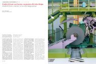
IL COLORE SECONDO / COLOUR ACCORDING TO [ 1 2 3 4 5 6 (7 + 8)]<strong>Pier</strong> <strong>Ludovico</strong> <strong>Rupi</strong>: <strong>colore</strong> <strong>come</strong> <strong>provocazione</strong> / <strong>Pier</strong> <strong>Ludovico</strong> <strong>Rupi</strong>: colour as provocationSopra:Arezzo, le due aziende orafe “AR167”e “AR 195” acquistano una banalecasa di abitazione e hanno urgenza dicaratterizzarla esternamente <strong>come</strong>azienda artigianale, 1982. All’epocala coloritura esterna non richiedeconcessione edilizia. Il progettistainterviene con una pitturazione a forteintensità, componendo le parole oro, AR167 e AR 195 in due gialli oro e biancosu fondo pitturato nero. L’edificio perabitazione si deconnota radicalmente ediviene manifesto pubblicitario delle duefabbriche (il <strong>colore</strong> <strong>come</strong> connotazionefunzionale).On the top:Arezzo, the two gold companies “AR167”and “AR 195” bought a banal residentialhouse and had urgency to make itexternally over as an artisan company,1982. At that time, external colouringdidn’t require a building permission.The designer intervened with a strongintensity painting, composing the wordsgold, AR 167 and AR 195 in two yellow,gold and white, on a painted blackbackground. The residential buildingis radically changed and be<strong>come</strong>s aposter of the two factories (colour as afunctional connotation).A sinistra e a destra:Betlemme, Millenium Center nella piazzadella Natività con funzioni culturali,spirituali di accoglienza e di incontro.L’edificio, di forme rammemorate dalleantiche architetture dei luoghi, sisviluppa su una scarpata di 11 piani.Due grandi ascensori per quarantapersone ne assicurano le connessioni.L’edificio in pietra locale (sabbia deldeserto pietrificata), viene colorato convari sistemi illuminanti (il <strong>colore</strong> e laluce).On the left and on the right:Bethlehem, Millennium Centre in theSquare of the Nativity with cultural,spiritual, hosting and meeting functions.The building, with forms reminiscent ofthe ancient architecture of that place,spread over a slope of 11 floors. Twolarge elevators for forty people maintainconnections. The building in local stone(petrified desert sand) is coloured withvarious lighting systems (colour andlight).Note1. Cfr Koenig Giovanni Klaus, “Quattro cooperative nei Piani di Edilizia Economica e Popolare”, in<strong>Rupi</strong> <strong>Pier</strong> <strong>Ludovico</strong>, Volumi e colori, Firenze, 2003.2. Panza <strong>Pier</strong> Luigi, “Ma l’architettura non è un feticcio”, Corriere della Sera, Venerdì 28 Novembre2008.3. Zevi Bruno, “Il primo edificio a colori. La casa rossa e blu per l’<strong>Istituto</strong> Autonomo case popolaridi Arezzo”, in <strong>Rupi</strong> <strong>Pier</strong> <strong>Ludovico</strong>, Volumi e colori, Firenze, 2003.4. Dorfles Gillo, Horror pleni. La (in)civiltà del rumore, Roma, 2008.5. Un commento interessante sull’opera di Per <strong>Ludovico</strong> <strong>Rupi</strong> è stato scritto da Sergio Signorini,l’autore confronta, significativamente, le opere rupiane con quelle di Zacchiroli: “Basti, al riguardo,confrontare l’immagine nel tessuto urbano della Banca d’Italia di Siena, con quella deglialloggi economici di via Manzoni ad Arezzo di <strong>Pier</strong> <strong>Ludovico</strong> <strong>Rupi</strong>. Anche l’intervento di <strong>Rupi</strong> ècoraggioso e di elevata qualità, ma su una lunghezza d’onda affatto diversa. Il centro anticoaretino è assimilabile a quello di Siena, anche se meno forte e protetto. L’architetto, in questocaso, rompe con ogni tipo di tradizione, riformula un programma d’uso degli spazi esterni cheincide sulla struttura portante dei fabbricati. E soprattutto, con un urlo cromatico, trasgrediscela razionalità degli impianti compositivi e dissona espressionisticamente, in grado non dissimiledal Municipio di Bensberg (1965-1967) o dalla Pilgrimage Church a Neviges (1965-1968)di Gottfried Böhm”. Signorini Sergio, Enzo Zacchiroli. Forma e spazio, Electa, 2000.Notes1. See Koenig Giovanni Klaus, “Quattro cooperative nei Piani di Edilizia Economica e Popolare”,in <strong>Rupi</strong> <strong>Pier</strong> <strong>Ludovico</strong>, Volumi e colori, Florence, 2003.2. Panza <strong>Pier</strong> Luigi, “Ma l’architettura non è un feticcio”, Corriere della Sera, Friday 28 November2008.3. Zevi Bruno, “Il primo edificio a colori. La casa rossa e blu per l’<strong>Istituto</strong> Autonomo case popolaridi Arezzo”, in <strong>Rupi</strong> <strong>Pier</strong> <strong>Ludovico</strong>, Volumi e colori, Florence, 2003.4. Dorfles Gillo, Horror pleni. La (in)civiltà del rumore, Rome, 2008.5. An interesting comment on the work of <strong>Pier</strong> <strong>Ludovico</strong> <strong>Rupi</strong> was written by Sergio Signorini,the author compares, significantly, the works of <strong>Rupi</strong> with those of Zacchiroli: “It is enough, inthis regard, to compare the image of the Banca d’Italia of Siena in the urban fabric, with thatof <strong>Pier</strong> <strong>Ludovico</strong> <strong>Rupi</strong>’s council flats located in via Manzoni, Arezzo. Even <strong>Rupi</strong>’s intervention iscourageous and high quality, but on a far different wavelength. The historic centre of Arezzo issimilar to that of Siena, although less strong and protected. The architect, in this case, breakswith every kind of tradition, reformulates a program of use of outdoor spaces that affects thebearing structure of the buildings. And above all, with a chromatic scream, he infringes therationality of composition plans and expressionistically discords, which is not dissimilar fromGottfried Böhm’s Municipality of Bensberg (1965-1967) or the Pilgrimage Church in Neviges(1965-1968)”. Signorini Sergio, Enzo Zacchiroli. Forma e spazio, Electa, 2000.Bibliografia<strong>Rupi</strong> <strong>Pier</strong> <strong>Ludovico</strong>, Architettura ed antropologia, Firenze, 1981.Cinelli Alessandro, <strong>Rupi</strong> <strong>Pier</strong> <strong>Ludovico</strong>, Nel nome del <strong>colore</strong>. Uso e abuso del <strong>colore</strong> in architettura,Firenze, 1989.<strong>Rupi</strong> <strong>Pier</strong> <strong>Ludovico</strong>, Volumi e colori, Firenze, 2003.<strong>Rupi</strong> <strong>Pier</strong> <strong>Ludovico</strong>, “Architettura e <strong>colore</strong>”, in Opere rivista toscana di architettura, n. 20, 2008,pp. 16-23.Bibliografy<strong>Rupi</strong> <strong>Pier</strong> <strong>Ludovico</strong>, Architettura ed antropologia, Florence, 1981.Cinelli Alessandro, <strong>Rupi</strong> <strong>Pier</strong> <strong>Ludovico</strong>, Nel nome del <strong>colore</strong>. Uso e abuso del <strong>colore</strong> in architettura,Florence, 1989.<strong>Rupi</strong> <strong>Pier</strong> <strong>Ludovico</strong>, Volumi e colori, Florence, 2003.<strong>Rupi</strong> <strong>Pier</strong> <strong>Ludovico</strong>, “Architettura e <strong>colore</strong>”, in Opere rivista toscana di architettura, n. 20, 2008,pp. 16-23.52 COLORE COLORE 53