08X1388_Etruria_Pix_Cop:Layout 1 - Etruria design
08X1388_Etruria_Pix_Cop:Layout 1 - Etruria design
08X1388_Etruria_Pix_Cop:Layout 1 - Etruria design

Create successful ePaper yourself
Turn your PDF publications into a flip-book with our unique Google optimized e-Paper software.
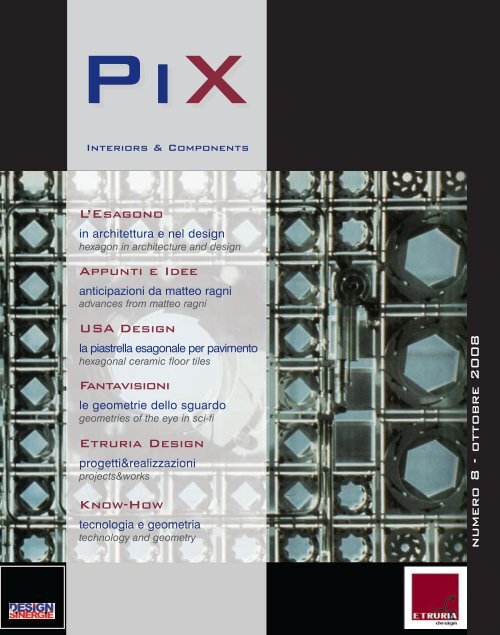
PiX<br />
Interiors & Components<br />
L’Esagono<br />
in architettura e nel <strong>design</strong><br />
hexagon in architecture and <strong>design</strong><br />
Appunti e Idee<br />
anticipazioni da matteo ragni<br />
advances from matteo ragni<br />
USA Design<br />
la piastrella esagonale per pavimento<br />
hexagonal ceramic floor tiles<br />
Fantavisioni<br />
le geometrie dello sguardo<br />
geometries of the eye in sci-fi<br />
<strong>Etruria</strong> Design<br />
progetti&realizzazioni<br />
projects&works<br />
Know-How<br />
tecnologia e geometria<br />
technology and geometry<br />
numero 8 - ottobre 2008
indice/index<br />
presentazione/presentation .....................................................................................................................................................................<br />
editoriale/editorial ............................................................................................................................................................................................<br />
L’esagono in architettura e nel <strong>design</strong>. Figura geometrica componibile e scomponibile/<br />
The hexagon in architecture and <strong>design</strong>. A geometric figure that can be put together and taken apart ...........<br />
Un sogno chiamato Diamantato. Forse è proprio così che potrei definire la nostra azienda/<br />
A dream evoked by diamond bevel-edging. Perhaps this is how I could define our company ..............................<br />
Un buon inizio. Appunti, idee ed anticipazioni dal <strong>design</strong>er italiano/<br />
A good start. Notes, ideas and advances from the Italian <strong>design</strong>er ........................................................................................<br />
Le geometrie dello sguardo. La semplificazione delle forme nel cinema di fantascienza/<br />
The geometries of the eye. Simplification of shapes in science-fiction cinema ...............................................................<br />
Progetti&Realizzazioni/Project&Works ...........................................................................................................................................<br />
Know-how. Tecnologia e geometria. Materiali innovativi a matrice esagonale/<br />
Know-how. Technology and geometry. New materials in a hexagonal matrix ....................................................................<br />
Storia di un adorato elemento americano di <strong>design</strong>. La piastrella esagonale per pavimento/<br />
History of a cherished american <strong>design</strong> element. Hexagonal ceramic floor tiles ............................................................<br />
1<br />
3<br />
4<br />
8<br />
12<br />
16<br />
20<br />
28<br />
32<br />
Tutti i diritti di riproduzione degli articoli pubblicati sono riservati. È vietata la riproduzione senza l’autorizzazione di ETRURIA <strong>design</strong>.<br />
Entire contents copyright <strong>Pix</strong>. All rights reserved.<br />
Un’iniziativa<br />
An initiative<br />
Gruppo di lavoro interno al Dipartimento di Progettazione e studio dell’architettura dell’Università degli Studi<br />
Roma Tre, finalizzato alla collaborazione tra università ed attività produttive.<br />
Work group which operates in the framework of the Roma Tre University’s Department of Design and architectural<br />
studies, targeted at optimising synergies between training, <strong>design</strong>ing and productive activities.<br />
Coordinamento/Coordinator: prof. Paolo Martegani http://host.uniroma3.it/progetti/<strong>design</strong><br />
Via Jugoslavia 74/76 - 41100 Modena (Italia) - Tel. 059.452188 - Fax 059.452191<br />
e-mail: info@etruria<strong>design</strong>.it<br />
www.etruria<strong>design</strong>.it<br />
Pubblicazione Semestrale - Numero 8 - Ottobre 2008<br />
Iscrizione al Tribunale di Modena n° 1724 del 12 Novembre 2004<br />
Direttore Responsabile: dott. ssa Giulia Ligabue - ETRURIA <strong>design</strong><br />
Direzione Scientifica: prof. arch. Paolo Martegani, dott. arch. Mauro Corsetti - Design&Sinergie<br />
Progetto Grafico: Mauro Corsetti<br />
Collaborazione alla Redazione: dott. arch. Chiara Lucarini<br />
Fotografie: Luciano Busani, Photodigital<br />
Traduzioni: LOGOS<br />
Stampa: Litographic Group spa<br />
Finito di stampare: Settembre 2008<br />
in copertina: Jean Nouvel, IMA - Institut du Monde Arabe, Parigi, 1987. Dettaglio della facciata.<br />
cover: Jean Nouvel, IMA - Institut du Monde Arabe, Paris, 1987. Facade detail.
Andrea Ligabue<br />
Presentazione<br />
Presentation<br />
ETRURIA <strong>design</strong>, che fino ad ora si era occupata solo di rivestimento<br />
Diamantato, fa la sua proposta per il pavimento. ETRURIA <strong>design</strong> porta il<br />
Diamantato a pavimento, che diventa “Esagono”.<br />
Nel mio percorso di ricerca e approfondimento sulla storicità dell’esagono, mi<br />
sono imbattuto nel matematico premio Nobel per l’economia (1994) John<br />
Nash, inventore nel 1949 del Gioco dell’Hex; personalità molto complessa ma<br />
di un’incredibile straordinarietà, che mi porta a fare alcune considerazioni sul<br />
lavoro e sul gioco.<br />
Si lavora, se costretti dalla necessità, anche se non ci piace; il gioco al contrario<br />
si fa solo liberamente per nostra scelta e piacere, consistendo nella gioia e<br />
nel coraggio di sfidare volontariamente se stessi con intelligenza, fantasia<br />
destrezza e caparbietà. Sia nel lavoro che nel gioco ci sono regole da rispettare,<br />
che nel lavoro ci impongono limiti repressivi, mentre nel gioco ci offrono<br />
opportunità incentivanti. Il gioco è competizione, evasione, fortuna, rischio, premio;<br />
serve a rompere la monotonia rendendo bella e varia l’esistenza.<br />
Sia nel lavoro che nel gioco vi è dispendio di energie, che vanno recuperate<br />
attraverso il riposo, che è quindi complementare e non alternativo ad essi.<br />
Il gioco è sempre espressivo, il lavoro lo è solo quando è creativo. Più il lavoro<br />
diventa creativo, più si avvicina al gioco fino quasi a sovrapporsi ad esso.<br />
L’imprenditore, quindi, tutto preso dalla passione dell’impresa in cui rischia e<br />
cresce, difficilmente sa dire se la propria attività è un lavoro o un gioco.<br />
1<br />
ETRURIA <strong>design</strong>, that until now had specialised only in bevel-edged tiles, now offers its floor product.<br />
ETRURIA <strong>design</strong> brings bevel-edging to the floor, that becomes a “Hexagon”.<br />
On my journey of research and learning about the history of the hexagon, I met the mathematician<br />
who won the Nobel prize for economics (1994), John Nash; in 1949 he invented the Hex Game; he<br />
is a very complex personality but an incredibly unusual one, and it is he who leads me to put forward<br />
some considerations on work and play.<br />
We work, if forced by necessity, even if we do not like it; on the other hand, we play freely at our<br />
choice and pleasure, and play consists of the joy and courage of voluntarily challenging ourselves<br />
with intelligence, imagination, skill and stubbornness.<br />
In both work and play there are rules to observe, which in work impose repressive limits on us, while<br />
in play they offer us stimulating opportunities.<br />
Play is competition, evasion, luck, risk, prize-winning; it is used to break the monotony, making life<br />
pleasant and varied.<br />
In both work and play there is expenditure of energy, that is recuperated through rest, and this process<br />
is therefore complementary and not an alternative to it.<br />
Play is always expressive, work is only expressive when it is creative. The more creative work becomes,<br />
the closer it gets to play until it almost takes its place.<br />
The businessman, therefore, completely taken up by the passion for the business in which he takes<br />
risks and grows, finds it hard to say whether his job is work or play.<br />
Presentazione<br />
Andrea Ligabue<br />
Presidente ETRURIA <strong>design</strong>
Paolo Martegani<br />
editoriale<br />
editorial<br />
Questa edizione di PiX Interiors&Components è speciale. Infatti mentre continua la<br />
consolidata linea editoriale volta ad argomentare sulle caratteristiche ed ad offrire testimonianza<br />
dell’uso del diamantato prevalentemente nelle superfici verticali degli spazi<br />
architettonici, il numero 8 presenta in anteprima la nuova collezione di piastrelle ETRU-<br />
RIA <strong>design</strong>, per la prima volta espressamente dedicata ai pavimenti. Se la piastrella<br />
tronco piramidale che da sempre caratterizza ETRURIA <strong>design</strong> è particolarmente adatta<br />
ai rivestimenti, la nuova collezione di piastrelle esagonali Hex trova nelle posature<br />
orizzontali delle pavimentazioni la propria naturale destinazione. La geometria complessa,<br />
la componibilità, i trattamenti cromatici costituiscono degli elementi di contatto tra le<br />
collezioni “storicizzate” di ETRURIA <strong>design</strong> ed Hex, che offre nuove opportunità di realizzare<br />
ambientazioni sempre più complesse, ricche e variegate.<br />
Proprio in occasione della presentazione della collezione Hex, questo numero di PiX<br />
raccoglie un numero considerevole di articoli, interventi, illustrazioni, curiosità che fanno<br />
riferimento all’esagono. Si spazia dalla geometria, che nell’esagono e nei suoi sviluppi<br />
tridimensionali risulta particolarmente intrigante, fino ad osservarne le molteplici conseguenze<br />
di carattere percettivo, astratto, grafico, cromatico e riservando sempre alle<br />
applicazioni pratiche del prodotto industriale una particolare attenzione. L’intento è<br />
quello di offrire un contributo di idee e di metodo per il rilancio di un prodotto che affonda<br />
le radici nella tradizione, ma che opportunamente trattato può essere ancora capace<br />
di evoluzione e re interpretazione propositiva. In un scenario che diviene sempre più<br />
contraddistinto dalla competizione, è importante che ogni singola realtà aziendale<br />
tenda allo sviluppo della propria produzione e che, contemporaneamente, contribuisca<br />
alla crescita ed all’affermazione più in generale del sistema in cui è inserita. In linea con<br />
questa esigenza, PiX contribuisce allo sviluppo del comparto a cui appartiene, punta<br />
sull’innovazione basata sullo sviluppo continuo di valori radicati nella tradizione, favorendo<br />
l’affermarsi di questa formula tipica del Made in Italy.<br />
3<br />
This issue of PiX Interiors&Components is special. In fact, although the consolidated editorial line<br />
turns towards affirming the features and offering testimony to the use of the bevelled tile predominantly<br />
on upright surfaces of architectural areas, issue number 8 presents a preview of the new collection of<br />
ETRURIA <strong>design</strong> tiles, for the first time expressly intended for floors. Although the truncated cone-shaped<br />
tile that has always characterised ETRURIA <strong>design</strong> is particularly suitable for wall-coverings, the<br />
new collection of Hex hexagonal tiles finds, in the horizontal settings of floors, its own natural destination.<br />
The complex geometry, composition capability and colour treatment all form the elements of contact<br />
between the “historically-based” collections of ETRURIA <strong>design</strong> and Hex, that provides new opportunities<br />
for making increasingly complex, rich and variegated settings.<br />
At the same time as the Hex collection is presented, this PiX edition brings together a considerable<br />
number of articles, works, illustrations and studies referring to the hexagon. It ranges from geometry,<br />
that in the hexagon and its three-dimensional developments is particularly intriguing, to an observation<br />
of its numerous consequences of a perceptive, abstract, graphic and chromatic nature, and always<br />
paying special attention to the practical applications of the industrial product.<br />
The aim is to provide a contribution of ideas and method for relaunching a product that has its roots<br />
deep in tradition, but that, if correctly treated, can also be capable of development and reinterpretation<br />
in the way it is used. In a scenario that is increasingly marked by competition, it is important that every<br />
individual company aspect should lead to development of the company’s own production and that, at<br />
the same time, help towards the growth and strengthening in more general terms of the system of which<br />
it is a part. In line with this requirement, PiX contributes towards the development of the division it<br />
belongs to, with the aim of achieving innovation based on continuous development of values rooted in<br />
tradition, and helps consolidate this typical formula of the product Made in Italy.<br />
Le lucertole di M.C. Escher<br />
(1898-1972) si ripetono<br />
all’infinito, poiché disegnate<br />
attraverso una tassellazione<br />
di elementi esagonali.<br />
The lizards of M.C. Escher<br />
(1898-1972) are repeated<br />
ad infinitum, since they are<br />
<strong>design</strong>ed through a<br />
mosaic pattern of hexagonal<br />
pieces.<br />
Editoriale
Paolo Martegani<br />
L’esagono in architettura e nel <strong>design</strong><br />
Figura geometrica componibile e scomponibile<br />
The hexagon in architecture and <strong>design</strong><br />
A geometric figure that can be put together and taken apart<br />
4<br />
Monitor<br />
Le api nella loro operosità utilizzano<br />
la forma esagonale.<br />
Bees in their operations use the<br />
hexagonal shape.<br />
Palmanova Città Fortezza.<br />
Palmanova Fortress City<br />
http://www.palmanova.it/<br />
“L’architettura è il gioco sapiente rigoroso<br />
e magnifico dei volumi assemblati nella<br />
luce” secondo la definizione di Le<br />
Corbusier, il massimo esponente del<br />
movimento moderno: l’esagono, figura<br />
piana interessante, può acquisire connotati<br />
tridimensionali e si presta bene ad<br />
interpretare il proprio ruolo nel “gioco”.<br />
Infatti nel piano si può giustapporre, comporre<br />
e si può ridurre ai propri elementi<br />
costituenti, mentre nello spazio si può estrudere totalmente<br />
o parzialmente e infine si può rappresentare in un<br />
vuoto definito dai piani che lo delimitano: ne è derivato e<br />
ne deriva un impiego esteso e variegato.<br />
Esagonale è lo schema di città fortificata che venne utilizzato<br />
in Europa a partire dal Cinquecento. In Italia si fortificarono<br />
diverse città impiegando questa forma geometrica:<br />
nel 1593 Palmanova, definita<br />
urbanisticamente attraverso un<br />
chiaro sistema radiale, nel 1693<br />
l’esagono venne impiegato per<br />
progettare le città di Avola e di<br />
Occhialà ora Grammichele.<br />
La pianta esagonale caratterizza<br />
numerose costruzioni, spesso a<br />
forte sviluppo verticale, quali torri,<br />
ciminiere, silos e grattacieli.<br />
Nelle abitazioni mono famigliari si<br />
sono sperimentate le forme più<br />
varie, tuttavia nelle sperimentazioni<br />
di industrializzazione la forma<br />
esagonale è stata spesso privilegiata;<br />
basti ricordare la Dymaxion<br />
House che Buckminster Fuller propose negli anni centrali<br />
del secolo scorso e i numerosi esempi che seguirono.<br />
Le caratteristiche geometriche presenti nell’esagono<br />
offrono ampi spunti per trattamenti cromatici di interessante<br />
valore espressivo, che acquistano connotati scientifici<br />
quando la forma esagonale viene utilizzata per rappresentare<br />
il “cerchio dei colori”.<br />
Interessanti proprietà ottiche sono connesse all’esagono<br />
e alla dimensione degli angoli dei triangoli che lo costituiscono.<br />
Gli oggetti - posti all’interno dell’angolo diedro di<br />
60° formato da due specchi inseriti all’interno di un cilindro<br />
osservati da un punto di vista azimutale - si moltiplicano<br />
creando l’illusione ottica di un esagono. È il principio<br />
del caleidoscopio apparecchio ideato dal fisico scozzese<br />
David Firewster. Un richiamo al caleidoscopio torna<br />
alla mente osservando lo stand “Kasa Digitalia” allestito<br />
alla Triennale di Milano ’08, dove la suggestione delle<br />
variazioni dei piccoli oggetti interni al caleidoscopio viene<br />
sostituito dalla cangianza dell’illuminazione posta dietro<br />
ai pannelli traslucidi posizionati in modo da realizzare un<br />
suggestivo spazio a sezione esagonale.<br />
Il nido d’ape, struttura a maglia esagonale, ha da tempo<br />
costituito la parte centrale, leggera e spesso coibente<br />
delle strutture tamburate. La sua funzione, inizialmente<br />
solo tecnica e nascosta alla vista, lo ha reso di colore<br />
neutro e non curato negli aspetti espressivi.<br />
Più recentemente, con lo sviluppo dei nuovi materiali<br />
dalle caratteristiche fisiche e specialmente ottiche legate<br />
alla trasparenza ne ha favorito lo sviluppo anche degli<br />
aspetti estetici.<br />
Alla scala ridotta la forma esagonale è utilizzata nella produzione<br />
di elementi metallici di connessione e fissaggio<br />
come i dadi dei bulloni, le rispettive chiavi per il serraggio<br />
Avola, dopo il terremoto del 1693 nella Val di Noto<br />
alcune città furono riedificate in aree ritenute più<br />
sicure. Foto aerea dell’area centrale della città di<br />
Occhialà ora Grammichele.<br />
Avola - after the earthquake in 1693 in the Val di<br />
Noto some cities were rebuilt in areas considered<br />
safer. Aerial photo of the central area of the city<br />
of Occhialà, now Grammichele.
La figura esagonale possiede caratteristiche<br />
geometriche che ne garantiscono una componibilità<br />
complessa sia per ripetizioni che per<br />
riduzione di essa nei sei triangoli che la costituiscono.<br />
The hexagonal figure has geometric characteristics<br />
that guarantee that it can be put together<br />
in a complex way both by repetitions and by<br />
breaking it up into the six triangles forming it.<br />
e la diffusa brucola cava esagonale. Di maggiore visibilità<br />
sono gli elementi e i complementi d’arredo: tavoli, piani<br />
d’appoggio, sedute, tuttavia il massimo della diffusione di<br />
questa forma in architettura si raggiunge nei componenti<br />
edilizi legati alle pavimentazioni dove la componibilità<br />
della forma ne facilita un impiego esteso e variegato per<br />
colori posature ed abbinamenti.<br />
Frequente è l’uso della matrice formale che fa riferimento<br />
all’esagono nelle strutture espositive, infatti gli angoli<br />
diversi da quello retto consentono slanci e viste prospettiche<br />
di dinamismo maggiore; normalmente gli elementi<br />
strutturali sono connessi mediante giunti cilindrici o sferici,<br />
le aggregazioni modulari che ne derivano privilegiano<br />
l’angolo di 60° ed i suoi multipli, ma non escludono composizioni<br />
con porzioni dell’insieme caratterizzate dall’angolo<br />
retto. Giustapponendo gli elementi base si ottengono<br />
articolazioni differenti che si adattano all’involucro<br />
architettonico all’interno del quale vengono collocate e si<br />
individuano percorsi che possono caratterizzarsi sia al<br />
proprio interno che nei terminali, realizzando ambiti o<br />
“stanze” con destinazioni differenziate.<br />
Attualmente sono in corso sperimentazioni per riproporre<br />
le strutture espositive insieme agli involucri architettonici<br />
che le ospitano negli universi sintetici - come Second Life<br />
- che rappresentano l’attuale tentativo di introdurre la<br />
terza dimensione nel Web.<br />
L’innovazione è cercata anche negli spazi reali, infatti la<br />
tendenza della “transmodernità” concepisce l’architettura<br />
come spazio pluridimensionale capace di utilizzare le<br />
potenzialità offerte dalla dimensione digitale.<br />
Avanzatissima in tal senso è la ricerca di Paul Verschure<br />
sugli ambienti immersivi intelligenti dotati di pareti e pavimenti<br />
interattivi. “ADA – the intelligent space” è un padiglione<br />
interattivo presentato<br />
all’Esposizione Nazionale<br />
Svizzera Expo.02 e progettato<br />
dall’Istituto di<br />
Neuroinformatica di Zurigo.<br />
Le pareti e i pavimenti di<br />
ADA si “intrattengono” con<br />
i suoi visitatori ed è interessante<br />
notare che per la<br />
forma dei moduli sensibili<br />
costituenti il calpestio è<br />
stato scelto l’esagono.<br />
“Architecture is the wise, strict<br />
and magnificent play of volumes<br />
assembled in the light” as<br />
defined by Le Corbusier, the<br />
greatest exponent of the<br />
modern movement: the hexagon,<br />
an interesting flat figure,<br />
can take on three-dimensional<br />
characteristics and lends itself<br />
well to interpreting its own role<br />
in the “play”. In fact, on the flat it is possible to juxtapose, put<br />
together and break up its constituent parts, while in space it can<br />
be extruded totally or partially and lastly it can be represented in<br />
a vacuum defined by the planes that demarcate it: from it an<br />
extensive and variegated use is derived and derives. The hexagonal<br />
shape is the layout of the fortified city that has been used in<br />
Europe from the sixteenth century. In Italy, several cities were fortified<br />
using this geometric shape: in 1593 Palmanova, defined in<br />
city planning terms by means of a clear radial system, and in 1693<br />
the hexagon was used to <strong>design</strong> the cities of Avola and Occhialà,<br />
Il Matitone (ufficialmente "San<br />
Benigno Torre Nord") grattacielo<br />
progettato da Skidmore, Owings<br />
and Merrill, Mario Lanata e Andrea<br />
Messina e terminato nel 1992<br />
Sampierdarena, Genova.<br />
Matitone (officially "San Benigno<br />
Torre Nord"), a skyscraper <strong>design</strong>ed<br />
by Skidmore, Owings and<br />
Merrill, Mario Lanata and Andrea<br />
Messina and completed in 1992,<br />
Sampierdarena, Genova.<br />
5<br />
Abitazioni a pianta esagonale:<br />
progetto della Dymaxion<br />
House di Buckminster Fuller e<br />
la Chemosphere realizzata dall’architetto<br />
John Lautner a Los<br />
Angeles nel 1960.<br />
Hexagonal-shaped houses:<br />
<strong>design</strong> of Dymaxion House by<br />
Buckminster Fuller and the<br />
Chemosphere made by the<br />
architect John Lautner in Los<br />
Angeles in 1960.
La forma esagonale<br />
impiegata per rappresentare<br />
“il cerchio dei<br />
colori” nel quale le tre<br />
tinte primarie, rosso,<br />
giallo e blu, si integrano<br />
e costituiscono<br />
l’arancio (miscela di<br />
rosso e giallo), il verde<br />
(miscela di giallo e<br />
blu), il porpora (miscela<br />
di rosso e blu).<br />
The hexagonal shape used to represent “the circle of<br />
colours” in which the three primary colours, red, yellow and<br />
blue are added together and become orange (mixture of red<br />
and yellow), green (mixture of yellow and blue), purple (mixture<br />
of red and blue).<br />
6<br />
Monitor<br />
Nella “Biblioteca di Babele” di Jorge Luis Borges,<br />
si descrive un allucinante universo che essenzialmente<br />
è una biblioteca spazialmente infinita composta<br />
di sale esagonali, che raccoglie disordinatamente<br />
tutti i possibili libri di 410 pagine in cui si<br />
susseguono sequenze di caratteri senza ordine, in<br />
tutte le possibili combinazioni.<br />
In “Babel’s Library” by Jorge Luis Borges, a dazzling<br />
world is described that is essentially a spatially infinite<br />
library made up of hexagonal rooms, that gathers together<br />
in a disorderly fashion all possible books with 410<br />
pages in which there follow sequences of characters in<br />
no order, in all possible combinations.<br />
now called Grammichele.<br />
The hexagonal plan characterises numerous constructions, often<br />
with a strong vertical development, such as towers, chimneys,<br />
silos and skyscrapers. In individual family houses the most varied<br />
forms have been tried, while in industrialised experiments the<br />
hexagonal shape has often been preferred; we only need to<br />
remember Dymaxion House that Buckminster Fuller offered in the<br />
mid-twentieth century, and numerous examples after that.<br />
The geometric characteristics existing in the hexagon offer extensive<br />
suggestions for chromatic treatments of interesting expressive<br />
value, that take on scientific features when the hexagonal<br />
shape is used to represent the “circle of colours”. Interesting<br />
optical properties are connected to the hexagon and to the<br />
dimension of the angles of the triangles forming it. Objects - placed<br />
inside the dihedral angle of 60° formed by two mirrors inserted<br />
inside a cylinder observed from an azimuth viewpoint - multiply<br />
creating the optical illusion of a hexagon. This is the principle<br />
of the kaleidoscope, a device invented by the Scottish physicist,<br />
David Firewster. A reminder of the kaleidoscope comes to mind<br />
when looking at the “Kasa Digitalia” stand set up at the Milan ’08<br />
Triennial Exhibition, where the suggestion of the variations of<br />
small objects inside the kaleidoscope is replaced by the change<br />
of lighting placed behind translucent panels put in such positions<br />
as to make a suggestive hexagonal-section area.<br />
The honeycomb, in a hexagonal mesh formation, has for a long<br />
time been the central, light and often insulating part of the drumshaped<br />
structures. Its function, initially only technical and hidden<br />
from view, has made it neutral in colour and with no care taken in<br />
its expressive aspects. More recently, the development of new<br />
materials with physical and in particular optical characteristics<br />
linked to transparency has allowed it to take on aesthetic aspects<br />
as well. In the small scale, the hexagonal shape is used in the<br />
production of metal connecting and fixing parts, such as nuts,<br />
Milano, Triennale 2008, allestimento<br />
"KASA DIGITALIA"<br />
Milan, Triennial Exhibition 2008,<br />
stand “KASA DIGITALIA”
L’esagono nella produzione industriale,<br />
la rete a maglie esagonali e<br />
l’interpretazione del nido d’ape<br />
con materiale plastico traslucido.<br />
The hexagon in industrial production,<br />
the hexagonal wire mesh and<br />
the interpretation of the honeycomb<br />
with translucent plastic<br />
material.<br />
their respective tightening keys and the widely-used hexagonalheaded<br />
screw. More visible are furniture items and accessories:<br />
tables, shelves, chairs, although the most popular aspect of this<br />
form in architecture is reached in building components related to<br />
floors where the form can be put together and creates a widespread<br />
and variegated use for colour bases and combinations.<br />
The formal matrix referring to the hexagon is often used in exhibition<br />
buildings, in fact the angles, being different from right angles,<br />
allow more dynamic prospective rakes and views; normally structural<br />
parts are connected by means of cylindrical or spherical<br />
joints, modular additions that result by giving preference to the<br />
60° angle and its multiples, but do not exclude compositions with<br />
portions of the whole characterised by the right angle. By juxtaposing<br />
the basic elements, different articulations are obtained<br />
that adapt to the architectural shell inside which they are placed<br />
and passages are identified that can be characterised both inside<br />
themselves and in the terminals, forming areas or “rooms”<br />
intended for different uses.<br />
At present, experiments are being conducted to offer again exhibition<br />
buildings together with architectural shells that house them<br />
in synthetic worlds - like a Second Life - representing the current<br />
attempt to introduce the third dimension into the Web. Innovation<br />
is sought also in real spaces, in fact the trend of “transmodernism”<br />
sees architecture as a multi-dimensional area capable of<br />
using the potentials offered by the digital dimension. In this<br />
respect, the research of Paul Verschure on intelligent immersive<br />
environments equipped with interactive walls and floors is very<br />
advanced. “ADA – the intelligent space” is an interactive pavilion<br />
presented at the Swiss National Exhibition Expo.02 and <strong>design</strong>ed<br />
by the Neurocomputer Science Institute in Zurich. The walls and<br />
floors of ADA “engage” with their visitors and it is interesting to<br />
note that for the shape of the sensitive modules forming the tread<br />
surface the hexagon was chosen.<br />
Elemento d’arredo in poliestere rinforzato con fibre di vetro, le superfici verticali<br />
alternativamente concave e convesse ne garantiscono la componibilità.<br />
Piece of furniture in reinforced polyester with fibre glass; the vertical surfaces<br />
alternatively concave and convex guarantee its modularity.<br />
Strutture espositive a configurazione esagonale in uno studio di allestimento<br />
in Second Life con la presenza di avatar.<br />
Show buildings in a hexagonal shape in a Second Life equipment study with<br />
avatar present.<br />
7<br />
Nell’ambiente sensibile ADA - the intelligent space, Paul<br />
Verschure, Zurigo, 2002 una pavimentazione a matrice<br />
esagonale reinterpreta in chiave avveniristica un connotato<br />
espressivo ben radicato nell’inconscio collettivo.<br />
In the sensitive ADA environment - the intelligent space,<br />
Paul Verschure, Zurich, 2002 a floor in a hexagonal matrix<br />
reinterprets in a futuristic key an expressive characteristic<br />
deep-rooted in the collective unconscious.
Giulia Ligabue<br />
Un sogno chiamato Diamantato<br />
Forse è proprio così che potrei definire la nostra azienda<br />
A dream evoked by diamond bevel-edging<br />
Perhaps this is how I could define our company<br />
8<br />
Una scena tratta dal film di Dino Risi (1968) “Straziami ma di baci saziami”.<br />
Un’abitazione tipica degli anni ’30 dove ritroviamo un pavimento esagonale.<br />
A scene taken from the film by Dino Risi (1968) “Straziami ma di baci saziami”<br />
(Torment me but cover me with kisses). A typical house of the ’30s where we<br />
find a hexagonal floor.<br />
Mercato centrale di Valencia (Spagna): il pavimento esagonale disegna un<br />
pattern geometrico.<br />
Central market in Valencia (Spain): the hexagonal floor draws a geometric<br />
pattern.<br />
ETRURIA <strong>design</strong> nacque con una missione<br />
ben precisa: riportare alla luce la classica<br />
piastrella diamantata 15x15 cm e 7,5x15 cm<br />
comparsa sulla scena mondiale nei primi anni<br />
del Novecento e poi scomparsa causa l’industrializzazione<br />
del processo produttivo.<br />
Come poteva una piastrella che fu la prima ed unica vera<br />
piastrella di <strong>design</strong> scomparire dal mercato<br />
Come potevano non essere sviluppate quelle sue caratteristiche<br />
di tridimensionalità, quindi giochi di luci ed<br />
ombre, che la resero un basilare e nobile elemento architettonico<br />
e non solo un semplice rivestimento<br />
Si è saputo addirittura che nel suo primo utilizzo nella<br />
Metropolitana di Parigi, queste sue caratteristiche contribuirono<br />
a mascherare le storture delle volte delle gallerie.<br />
La forte personalità della piastrella diamantata, colore<br />
dopo colore, pezzo dopo pezzo, ha permesso ad ETRU-<br />
RIA <strong>design</strong>, dopo il recupero della parte classica già<br />
conosciuta, di evolverla verso il futuro con le collezioni<br />
Optical ed Haring, che tracciano le linee guida che<br />
l’azienda seguirà per mantenere sempre il prodotto al<br />
passo con i tempi.<br />
Monitor<br />
Assecondando l’evoluzione della piastrella diamantata a<br />
rivestimento, è giunto il momento per ETRURIA <strong>design</strong> di<br />
pensare anche al pavimento.<br />
La prima idea è quella di portare il diamantato a pavimento.<br />
Sembra strano, quasi folle l’idea di una piatrella<br />
diamantata da calpestare, invece ecco un pavimento<br />
che non è altro che la trasposizione del diamante a terra:<br />
l’ESAGONO.<br />
Guardando un diamante dall’alto, l’esagono è la forma che
La natura, per sua definizione è colei che fa nascere le cose, e le cose create<br />
dalla natura sono sempre state perfette nella sostanza e nella forma.<br />
È l'Esagono la forma perfetta generata dalla natura. Basti pensare all'ape, che<br />
senza nessuno strumento di misura, costruisce l'alveare creando esagoni di<br />
straordinaria perfezione. Anche l'uomo, quando ha voluto costruire simboli<br />
importanti, ha usato questa forma geometrica; i battisteri, per esempio ne<br />
sono una testimonianza.<br />
All'Esagono si sono ispirati uomini di scienza e poeti che hanno visto in esso<br />
un simbolo di perfezione. Leonardo da Vinci vedeva nei sei lati dell'esagono le<br />
fonti essenziali della vita umana.<br />
spesso troviamo, in quanto è uno dei tipi di taglio usati.<br />
Altra grande similitudine che troviamo tra il diamante e<br />
l’esagono, sempre guardandoli dall’alto, è tra i giochi di<br />
luce e le conseguenti differenze di colorazioni che scaturiscono<br />
dalle innumerevoli sfaccettature del diamante, e<br />
le diverse combinazioni di colori che si possono ottenere<br />
con le molteplici composizioni di posa dell’esagono.<br />
Stesse magiche atmosfere che poi ritroviamo nelle pareti<br />
rivestite con la piastrella diamantata, a dimostrazione<br />
che questo pavimento s’inserisce perfettamente nel progetto<br />
ETRURIA <strong>design</strong>, fatto di forme, colori e grande<br />
progettualità. Piastrella Diamantata ed Esagono sono<br />
accumunati dallo stesso destino: molto popolari all’inizio<br />
del Novecento e poi dimenticati nei decenni successivi<br />
causa la trasformazione dei processi produttivi.<br />
Nasce così HEX collection: il diamantato a pavimento.<br />
Il matematico premio Nobel per l’economia (1994) John<br />
F. Nash Junior nella primavera del 1949, nell’università di<br />
Princeton, studiò i giochi fino a farne una teoria applicabile<br />
a vari campi scientifici, dalla matematica all’economia.<br />
Partendo dalla teoria dei giochi di Von Neumann e<br />
Mortensen, sviluppò una parte di questa che nessuno<br />
aveva precedentemente approfondito: la teoria alla base<br />
dei giochi tra più persone non a somma zero.<br />
Durante questi studi, inventò un gioco che consisteva<br />
nel raggiungere il lato opposto di una tavola da gioco<br />
romboidale suddivisa in esagoni regolari.<br />
Gli studenti della facoltà furoni i primi a cimentarsi in<br />
questo gioco. La grande particolarità era che giocavano<br />
nelle pause tra una lezione e l’altra sui pavimenti dei<br />
bagni dell’università, rivestiti appunto da esagoni di pic-<br />
Marciapiede rivestito di esagoni utilizzati con il tipico pattern a fiori consecutivi<br />
creati con l’uso di due colori a contrasto.<br />
Pavement covered with hexagons used with the typical pattern of consecutive<br />
flowers created with the use of two contrasting colours.<br />
Hex: gioco da tavolo inventato da John Nash poi commercializzato dalla<br />
Parker Brothers nel 1952.<br />
Hex: table game invented by John Nash, then marketed by Parker<br />
Brothers in 1952.<br />
9
Nature, by definition, is the one who creates things, and things created by nature<br />
have always been perfect in substance and form.<br />
It is Hexagon the perfect shape generated by nature. Just think of bee, that<br />
without any measuring instrument, builds its honeycomb creating hexagons of<br />
extraordinary perfection. Even the human being used this geometrical shape,<br />
when he wanted to build important symbols; baptisteries, for example, are an<br />
evidence of it.<br />
By Hexagon have been inspired scientists and poets that saw in it a symbol of<br />
perfection. Leonardo da Vinci saw in the six sides of Hexagon the essential<br />
sources for human life.<br />
10<br />
John F. Nash Junior vinse il premio Nobel per l’economia nel 1994 grazie<br />
alla sua Teoria dei Giochi.<br />
John F. Nash Junior won the Nobel prize for Economics in 1994, thanks<br />
to his Games Theory.<br />
cola dimensione, quindi molto adatti. Si trattava del<br />
Gioco dell’Hex.<br />
Per affinità, così come per rendere omaggio ad uno dei<br />
più grandi studiosi di tutti i tempi, ETRURIA <strong>design</strong> chiama<br />
HEX collection il suo diamante a pavimento.<br />
ETRURIA <strong>design</strong> si avvale della migliore tecnologia ceramica<br />
oggi disponibile e produce HEX collection in Gres<br />
fine porcellanato a tutto impasto, affinchè siano garantite<br />
quelle qualità tecniche che il mercato oggi richiede a<br />
un pavimento, utilizzabile sia da interno sia da esterno.<br />
ETRURIA <strong>design</strong> was founded with a very<br />
precise mission: to bring to light the classical<br />
diamond bevel-edged tile 15x15 cm and<br />
7.5x15 cm that appeared on the world scene<br />
in the early 20th century and then disappeared<br />
because of the industrialisation of the<br />
production process.<br />
Monitor<br />
How could a tile that was the first and only true <strong>design</strong> tile<br />
disappear from the market How could those three-dimensional<br />
features disappear, that were then plays of light and shadow,<br />
that made it a basic and noble architectural item and not<br />
simply a covering It is even known that in its first use in the<br />
Underground in Paris, its features helped to hide the imperfections<br />
of the vaults in the tunnels.<br />
The strong personality of diamond bevel-edged tile, colour<br />
after colour, piece after piece, has enabled ETRURIA <strong>design</strong>,<br />
after restoring the already familiar classical part, to develop it<br />
to the future with the Optical and Haring collections, that<br />
trace the guidelines that the company will follow to keep the<br />
product always up with the times.<br />
HEX collection: ETRURIA <strong>design</strong> porta il diamante a pavimento e propone una piastrelle esagonale in gres porcellanato<br />
a tutto impasto in 15 colori.<br />
HEX collection: ETRURIA <strong>design</strong> brings the diamond to the floor and offers a hexagonal tile in tile in fully impasted<br />
porcelain stoneware in 15 colours.
Diamante Hexagon 73: nuovo<br />
taglio esagonale, a 73 faccette, che<br />
esalta la forma perfetta della natura.<br />
Hexagon 73 Diamond: new hexagonal<br />
cut with 73 facets, which<br />
exalts the perfect form of nature.<br />
In accordance with the development of the diamond bevelshaped<br />
wall tile, the moment arrived for ETRURIA <strong>design</strong> to<br />
think also about floor. The initial idea was that of bringing diamond<br />
bevel-edging to the floor. It seems strange, almost<br />
crazy the idea of a diamond bevel-edged tile to tread on, but<br />
instead here is a floor that is none other than the transfer of<br />
the diamond to the ground: the HEXAGON.<br />
Looking down at a diamond from above, the hexagon is the<br />
shape we often find, since it is one of the types of cut used.<br />
Another great similarity we find between the diamond and the<br />
hexagon, still looking down on it from above, is between the<br />
plays of light and the resulting differences in colouring that<br />
originate from the countless facets of the diamond, and the<br />
different combinations of colours that can be obtained with<br />
the many compositions of the setting of the hexagon.<br />
The same magical atmospheres that we then find again in the<br />
walls covered with the diamond bevel-edged tile, showing that<br />
this flooring is perfect for inclusion in the ETRURIA <strong>design</strong> project,<br />
made up of shapes, colours and grand <strong>design</strong>s.<br />
The Diamond bevel-edged tile and Hexagon are united by the<br />
same destiny: very popular at the beginning of the 20th century<br />
and then forgotten in the subsequent decades because<br />
of the conversion of production processes.<br />
one had previously studied in depth: the theory based on<br />
games between several people not to a zero sum.<br />
During these studies, he invented a game that consisted of<br />
reaching the other side of a rhomboid-shaped games table<br />
subdivided into regular hexagons.<br />
The students of the faculty were the first to try their hand at this<br />
game. The very special detail was that they played in the breaks<br />
between one class and another on the floors of the bathrooms<br />
at the university, covered precisely with small hexagons,<br />
and therefore very suitable. It was called the Hex Game.<br />
Thus, in order to pay homage to one of the great scholars of<br />
all time, ETRURIA <strong>design</strong> calls its diamond floor tiles the HEX<br />
collection.<br />
ETRURIA <strong>design</strong> uses the best tile technology available today<br />
and produces the HEX collection in fine fully impasted porcelain<br />
stoneware, so as to guarantee those technical qualities<br />
that the market today requires in a floor, and that can be used<br />
both indoors and outdoors.<br />
Due esempi della grande progettualità<br />
del pavimento HEX<br />
collection: utilizzando due<br />
colori si possono creare molteplici<br />
pattern differenti.<br />
Two examples of the large<br />
<strong>design</strong> potential of the HEX<br />
collection floor: by using two<br />
colours, many different patterns<br />
can be created.<br />
11<br />
Thus the HEX collection is founded: the diamond beveledged<br />
floor tile.<br />
The mathematician who won the Nobel prize for economics<br />
(1994), John F. Nash Junior, in the spring of 1949, at the<br />
University of Princeton, studied games until he reached a<br />
theory applicable to various scientific fields, from mathematics<br />
to economics. Starting from the theory of games of Von<br />
Neumann and Mortensen, he developed a part of this that no-
Matteo Ragni<br />
Un buon inizio<br />
Appunti, idee ed anticipazioni dal <strong>design</strong>er italiano<br />
A good start. Notes, ideas and advances from the Italian <strong>design</strong>er<br />
12<br />
Monitor<br />
BUONI APPETITI: rendering del progetto nato dalla collaborazione di ETRURIA <strong>design</strong> con il <strong>design</strong>er<br />
Matteo Ragni.<br />
BUONI APPETITI: rendering of the project derived from the co-operation between ETRURIA <strong>design</strong> and<br />
the <strong>design</strong>er Matteo Ragni.<br />
Non è da molto che conosco Andrea Ligabue, ma fin dalla<br />
prima telefonata a ridosso del Salone è scattata una certa<br />
simpatia; sarà per il suo accento modenese ed il suo<br />
modo di saperti mettere a tuo agio, ma siamo partiti subito<br />
con darci del tu e parlare a ruota libera di progetto.<br />
Il primo incontro non è stato da meno. In azienda per<br />
un’oretta, una chiacchera su chi sono, cosa fanno e<br />
soprattutto cosa vogliono diventare, poi un buon pranzo<br />
di rito in un locale tipico con del buon vino rosso.<br />
Ricordo sempre le parole di Vico Magistretti che diceva:<br />
“il <strong>design</strong> è come l’amore: si fa sempre in due: da una<br />
parte il <strong>design</strong>er, dall’altra l’imprenditore”.<br />
E meno male che esistono ancora degli imprenditori che<br />
hanno il coraggio di rischiare in prima persona, di mettersi<br />
in gioco, di sperimentare per cercare di fare sempre<br />
qualcosa di diverso dagli altri.<br />
E su questo ci siamo trovati con il primo progetto che ho<br />
sviluppato per loro in occasione della Mostra in Triennale<br />
Architectural_food organizzata da Ceramic Tiles of Italy.<br />
Il tema assegnato, molto aperto, voleva indagare il rapporto<br />
tra ceramica e spazio del cibo. Progettare una tavola<br />
Troppo scontato. Così l’idea di trasferire l’atto del consumo<br />
del cibo, e non solo, nella zona più intima della<br />
casa, nella stanza da letto. Ed è nato “Buoni Appetiti“.<br />
Allora il letto come luogo degli appetiti Perché no.<br />
Sempre più fulcro della casa, il letto non è più il luogo<br />
della privacy, o almeno non solo. A letto si lavora, si riceve,<br />
si decidono strategie domestiche, si mangia qualcosa.<br />
Luogo ibrido, di nuova convivialità e, naturalmente, di<br />
antichi appetiti. Buoni Appetiti è un ready made: un letto<br />
primo prezzo di Ikea (la favolosa serie Malm), tempestato<br />
di tessere di ceramica ETRURIA <strong>design</strong>, scelte nella collezione<br />
più lussuosa: Mondrian Diamantato.<br />
Letto Malm di Ikea: la miglior rappresentazione del <strong>design</strong> democratico.<br />
Ikea Malm bed: the best representation of democratic <strong>design</strong>.
Lo specchio diventa cornice, racchiudendo<br />
al suo interno una texture composta da piastrelle<br />
Diamantate, che grazie all'illuminazione<br />
interna allo specchio, acquista ancor più<br />
valore. Quasi come una teca in vetro che racchiude<br />
al suo interno un oggetto prezioso.<br />
Di fronte al letto un mosaico riproduce l’immagine della<br />
schermata più famosa della televisione. Per esorcizzarne<br />
la presenza almeno a letto…<br />
Infine la scelta dei colori e del pattern: un richiamo alle<br />
tovaglie quadrettate della tradizionale trattoria italiana.<br />
Buoni Appetiti.<br />
Questo progetto sperimentale ed ironicamente provocatorio<br />
è stato il primo passo per conoscerci meglio, diciamo<br />
un primo appuntamento andato a buon fine. Così,<br />
dopo un paio di mesi dal Salone, una chiamata “alle<br />
armi” di Andrea: “la settimana prossima sarò da te per<br />
parlarti di una cosa che ho in mente”, niente di più.<br />
Il mistero si è svelato qualche giorno più tardi, davanti ad<br />
un cappuccino ed una brioche alla Nutella. L’idea è quella<br />
di produrre degli oggetti che siano rappresentativi dello<br />
spirito dell’azienda e che possano essere venduti, in serie<br />
limitata e numerata, come opere d’arte, ma con una funzione<br />
specifica.<br />
Uno specchio potrebbe essere una buona tipologia,<br />
anche se le perplessità iniziali sul perché progettare un<br />
oggetto di questo genere mi hanno fatto cercare fin da<br />
subito delle alternative tipologiche.<br />
Poi però è nata un’intuizione sulla quale poter raccontare<br />
una storia, fatta di magia, di spaesamento percettivo e di<br />
un pensiero alternativo. Ancora una volta allora, come nel<br />
caso di “Buoni appetiti”, ho provato a “mescolare” gli<br />
ingredienti del progetto. Ne è nato sì uno specchio ma<br />
ribaltato, ossia il rapporto specchio cornice è stato ribaltato:<br />
la cornice diventa specchio, mentre al suo interno,<br />
al posto dello specchio, è custodito un mosaico di<br />
Mondrian Diamantato in diverse colorazioni.<br />
Una sorta di teca che rispecchia l’essenza di ETRURIA<br />
<strong>design</strong>, la sua attitudine al voler essere sempre qualcosa<br />
BUONI APPETITI<br />
alla Mostra Architectural_Food,<br />
tenutasi alla Triennale di Milano<br />
in occasione del Salone del<br />
Mobile (Aprile 2008).<br />
BUONI APPETITI<br />
at the Architectural_Food Fair,<br />
held at the Milan Triennial<br />
Exhibition during the Furniture<br />
Show (April, 2008).<br />
13
The mirror becomes frame surrounding an<br />
internal texture composed of Bevelled Tiles,<br />
that rises in value thanks to lighting inside the<br />
mirror. Almost as a glass shrine that encloses<br />
a precious object.<br />
14<br />
Monitor<br />
kirupatext=Matteo Ragni si è laureato in Architettura al<br />
Politecnico di Milano. Dal 1995 si occupa di <strong>design</strong>. Docente<br />
presso il Politecnico di Milano e l'Istituto Europeo di Design.<br />
Dal 1998 al 2005 dà vita con Giulio Iacchetti allo studio<br />
Aroun<strong>design</strong> ed insieme nel 2001 si aggiudicano il<br />
Compasso d’Oro con la posata multiuso biodegradabile<br />
“Moscardino”, oggi parte dell'esposizione permanente del<br />
<strong>design</strong> al MOMA di New York.<br />
kirupatext=Matteo Ragni graduated with a degree in<br />
Architecture from Politecnico di Milano. He works as <strong>design</strong>er<br />
since 1995. He teaches at the Politecnico di Milano and the<br />
Istituto Europeo di Design. From 1998 till 2005 collaborates<br />
with Giulio Iacchetti and with him gives life to the Aroun<strong>design</strong><br />
studio. In 2001 their project for a disposable fork<br />
"Moscardino" wins the Compasso d'Oro ADI, now part of the<br />
permanent <strong>design</strong> exhibition at MOMA, New York.<br />
Tra i suoi clienti/He works for: Armani, Bialetti, Breil, Caimi<br />
Brevetti, Coop, Desalto, De Vecchi, Guzzini, JVC, Krios Italia,<br />
Liv'it, Mandarina Duck, Meritalia, Mitshubishi, Nava<strong>design</strong>,<br />
Pandora Design, Pinetti, Piquadro, Samsung, Suisse<br />
Lagenthal, Ti Voglio, United Pets.<br />
Attività didattica/Teaching: Politecnico di Milano, Facoltà del<br />
Design; IED, Istituto Europeo di Design Milano; Edinburgh<br />
College of Art, Edinburgh, Scotland; Università Marittima,<br />
Vina del Mar, Cile; Università Tecnica Santa Maria,<br />
Valparaiso, Cile.<br />
Conferenze/Conferences: Politecnico di Milano, Facoltà del<br />
Design; IED, Istituto Europeo di Design Milano; IED, Istituto<br />
Europeo di Design Barcellona; IULM, Milano; Domus<br />
Academy, Milano; Università La Sapienza, Roma; Edinburgh<br />
College of Art, Edinburgh, Scotland; Università Marittima,<br />
Vina del Mar, Cile; Università Tecnica Santa Maria,<br />
Valparaiso, Cile; Università Finis Terrae, Santiago, Cile.<br />
di diverso, di riconoscibile, ma anche e soprattutto un<br />
oggetto che rispecchi l’immagine di chi l’ha comprata, in<br />
senso fisico ma anche e soprattutto metaforico.<br />
Una serie di LED inseriti nello spessore della struttura illuminano<br />
in modo radente la superficie, enfatizzando maggiormente<br />
la tridimensionalità della piastrella e rendendola<br />
magicamente vibrante.<br />
Per ora esistono due versioni, una rettangolare da appoggio<br />
a parete (120x220 cm) ed una quadrata da appendere<br />
come un quadro (120x120). Verranno presentate al prossimo<br />
Cersaie a Bologna e tutto ci fa sperare che possano<br />
diventare dei prodotti/manifesto di ETRURIA <strong>design</strong> nei<br />
punti vendita più esclusivi, ma anche degli oggetti d’uso,<br />
utilizzabili in ambienti domestici per rispecchiare il carattere<br />
di chi li utilizza.<br />
Per le sue magiche commistioni di riflessioni e spiazzamenti<br />
visivi, ho pensato che “Incanto” potrebbe essere<br />
un buon nome per questo mio secondo progetto.<br />
La strada è segnata, ma sono certo che il meglio deve<br />
ancora venire!<br />
I have not known Andrea Ligabue for long, but ever since the first<br />
telephone call just after I Saloni exhibition a certain sympathy<br />
sprang up; perhaps it was because of his Modenese accent and<br />
his way of putting you at ease, but we started off right away by<br />
being informal and talking freely. The first meeting was not a failure.<br />
In the business for about an hour, a chat about who they are,<br />
what they do and above all what they want to become, then the<br />
usual good lunch in a typical restaurant with good red wine.<br />
I always remember the words of Vico Magistretti who used to say:<br />
“<strong>design</strong> is like love: it’s always done in pairs: on one side the<br />
<strong>design</strong>er, on the other the entrepreneur”.<br />
It’s a good thing there are still entrepreneurs who still have the<br />
courage to take a personal risk, to become involved, to experiment<br />
in order to do something ever different from the others.<br />
And on this matter we have the first project that I have developed<br />
for them at the Ceramic Tiles of Italy Triennial Exhibition<br />
Architectural_food.<br />
The very open subject assigned was to look into the relationship<br />
between ceramics and the food area. To <strong>design</strong> a table Too<br />
much taken for granted. Hence the idea of transferring the act of<br />
eating food, and not just that, in the most intimate part of the<br />
house, in the bedroom. So, “Buoni Appetiti” was born.<br />
Now, the bed as a place for appetites Why not More and more<br />
the heart of the house, the bed is no longer the place of privacy,<br />
or at least not just that. Bed is where people work, receive guests,
decide domestic plans, eat something. A hybrid place, of new<br />
conviviality and, of course, of ancient appetites. Buoni Appetiti is<br />
a ready made unit: a prime price bed from Ikea (the legendary<br />
Malm series), studded with ETRURIA <strong>design</strong> ceramic mosaics,<br />
chosen in a most luxurious collection: Mondrian Diamantato.<br />
Opposite the bed a mosaic reproduces the image of the most<br />
famous television screen. To exorcise its presence at least in bed<br />
… Finally, the choice of colours and pattern: a reminder of the<br />
check tablecloth of the traditional Italian trattoria. Buoni Appetiti.<br />
This experimental and ironically provocative project was the first<br />
step to our getting to know each other better, let’s say a first date<br />
that went well. So, a couple of months after the exhibition, a call<br />
“to arms” from Andrea: “next week I’m coming to talk to you<br />
about something I have in mind”, nothing else.<br />
The mystery was revealed several days later, before a cappuccino<br />
and a brioche with Nutella. The idea is that of producing<br />
objects that are representative of the spirit of the company and<br />
that can be sold, in a limited and numbered series, as works of<br />
art, but with a special function. A mirror could be a good type,<br />
even if the initial concerns on the reason for <strong>design</strong>ing an object<br />
of this kind made me immediately look for alternative types.<br />
Then, however, an intuition was born on which to be able to tell a<br />
story, made of magic, of perceptive bewilderment and an alternative<br />
thought. Now once again, as in the case of “Buoni appetiti”,<br />
I tried to “mix” the ingredients of the project.<br />
A mirror was born, yes, but upside down, or rather the mirrorframe<br />
relationship was turned upside down: the frame becomes<br />
mirror, while inside it, in place of the mirror, a mosaic of Mondrian<br />
Diamantato in different colours is housed.<br />
A sort of reliquary that respects the essence of ETRURIA <strong>design</strong>,<br />
its attitude to wanting always something different, recognisable,<br />
but also and above all an object that reflects the image of the person<br />
who has bought it, in a physical but also and in particular a<br />
metaphysical sense.<br />
A series of LEDs inserted in the thickness of the frame light up the<br />
surface in a skimming fashion, emphasising mostly the threedimensional<br />
nature of the tile and making it magically vibrant.<br />
For now there are two versions, a rectangular one to lean against<br />
a wall (120x220 cm) and a square one to be hung as a picture<br />
(120x120). They will be on show at the forthcoming Cersaie in<br />
Bologna and we hope that they will become the showpieces of<br />
ETRURIA <strong>design</strong> at the most exclusive sales outlets, but also everyday<br />
objects that can be used in the home to reflect the character<br />
of the person using them. Through their magical mixtures of<br />
visual reflections and movements, I thought that “Incanto” could<br />
be a good name for this second project of mine.<br />
The road is marked, but I am sure that the best is still to come!<br />
INCANTO: il nuovo frutto della collaborazione tra ETRURIA <strong>design</strong> e Matteo Ragni.<br />
Nuova concezione dello specchio come opera d’arte.<br />
INCANTO: the new outcome of co-operation between ETRURIA <strong>design</strong> and Matteo Ragni.<br />
A new concept of the mirror as a work of art.<br />
15
Barbara Maio<br />
Le geometrie dello sguardo<br />
La semplificazione delle forme nel cinema di fantascienza<br />
The geometries of the eye<br />
Simplification of shapes in science-fiction cinema<br />
16<br />
Monitor<br />
La Lamborghini Countach rappresenta una rivoluzione nel <strong>design</strong> automobilistico per la sua forma innovativa<br />
della parte anteriore, detta “a cuneo”, che le attribuisce un carattere particolarmente aggressivo.<br />
The Lamborghini Countach represents a revolution in car <strong>design</strong> because of its innovative share at the<br />
front, known as “wedge-shaped”, that gives it a particularly aggressive character.<br />
La Autocar della serie televisiva Automan è la virtualizzazione della Lamborghini Countach, realizzata<br />
attraverso linee laser blu, che evidenziano la matrice geometrica del veicolo.<br />
The Autocar from the television series Automan is the virtualisation of the Lamborghini Countach, made<br />
by means of blue laser lines, that show the vehicle’s geometric matrix.<br />
Lo schermo cinematografico, interfaccia reale per un racconto<br />
virtuale, è il mezzo attraverso il quale il meccanismo<br />
cinefilo seduce lo sguardo dello spettatore.<br />
Uno sguardo che vuole farsi sedurre – non è necessario<br />
citare qui il piacere voyeristico della scopofilia cinematografica<br />
– uno sguardo che cerca la seduzione promessa<br />
dalla macchina cinema.<br />
Lo sguardo, però, non è sempre fonte di piacere: il perturbante<br />
freudiano, cioè l’incontro tra lo spaventoso e il<br />
familiare è, ad esempio, un ossimoro sul quale si basa<br />
gran parte del cinema horror.<br />
La voglia di voler essere spaventati, il desiderio di subire<br />
uno shock aspettato eppure improvviso.<br />
Lasciando però da parte le teorie psicoanalitiche sulla<br />
visione cinematografica, esiste un altro punto di vista su<br />
cui ragionare parlando dello sguardo spettatoriale: le<br />
geometrie come oggetto della visione.<br />
Partendo da ciò che ci viene mostrato, è possibile individuare<br />
le forme geometriche come protagoniste dello scenario<br />
filmico. E non si tratta di oggetti di <strong>design</strong> che compongono<br />
l’arredamento del set <strong>design</strong> ma forme che<br />
diventano protagoniste, geometrie – reali o virtuali – che<br />
fanno da contrappunto alle geometrie dello sguardo.<br />
Per ovvi motivi iconici, è il genere sci-fi ad offrire numerosi<br />
esempi a questo riguardo: che si tratti dell’interno delle<br />
navicelle spaziali della saga di Star Wars o delle ambientazioni<br />
ibride sci-fi/western di Serenity, il reiterarsi di elementi<br />
geometrici che fanno da sfondo a queste avventure<br />
assume un significato che va al di là del puro allestimento<br />
scenico.<br />
In questa ottica è interessante analizzare il film Tron.<br />
Prodotto dalla Disney e diretto da Steve Lisberger nel<br />
1982, Tron rappresenta per molti versi il precursore della<br />
Alla stregua degli altri veicoli della serie Automan, anche l’elicottero del protagonista è connotato dalla silhouette di<br />
linee luminose, che ne graficizzano la geometria.<br />
In the same way as the other vehicles of the Automan series, the main character’s helicopter is also characterised<br />
by the silhouette of lines of light, that trace its geometry.
Il cinema racconta storie meravigliose che si<br />
ambientano in spazi accuratamente disegnati<br />
e decorati. Il cinema di fantascienza è il<br />
genere privilegiato per rappresentazioni<br />
audaci e futuribili, spesso descritte mediante<br />
caratterizzazioni geometriche e scomposizioni<br />
in forme base.<br />
sci-fi contemporanea. Reale e virtuale si alternano nell’universo<br />
proposto dal film dove l’azione non è svolta<br />
nello spazio profondo, nell’infinitamente grande, ma esattamente<br />
nel suo opposto, nell’infinitamente piccolo dei<br />
bit, degli zero e degli uno del sistema binario.<br />
La trama, infatti, si sviluppa seguendo le avventure di un<br />
programmatore di software che viene incorporato all’interno<br />
del sistema virtuale da lui stesso creato. Gran parte<br />
del film segue le avventure di Flynn (Jeff Bridges) in questo<br />
universo freddo e pericoloso, accompagnato dal suo<br />
alter ego virtuale, Tron (Bruce Boxleitner).<br />
L’universo computerizzato – girato in bianco e nero e<br />
colorato in post-produzione – si avvale di segmenti esagonali<br />
che vanno a comporre lo sfondo ma anche la struttura<br />
stessa del cyber-mondo. Una struttura modulare che<br />
si compone di geometriche ripetizioni all’infinito, creando<br />
un mondo senza orizzonte, al contempo infinito e asfittico.<br />
Le strade percorse da Flynn e Tron sono semplici<br />
fasci di luce blu o griglie ripetute all’infinito in cui corrono<br />
veloci moto virtuali (le light-bikes).<br />
Un immaginario iconico raccolto solo un anno dopo, nel<br />
1983, dalla serie tv creata da Glen A.Larson per la Fox e<br />
trasmessa dalla ABC, Automan. In questa serie assistiamo<br />
immediatamente ad un rovesciamento del punto di<br />
partenza: in questo caso è il personaggio virtuale ad<br />
entrare nel mondo reale ed affiancare il suo programmatore.<br />
La serie condivide comunque con il film l’immaginario<br />
visuale del côté virtuale. Automan (Chuck Wagner) si<br />
presenta con forti analogie con i personaggi di Tron a<br />
partire dalle tute composte da elementi geometrici fosforescenti<br />
che richiamano l’esagono, il quadrato, il triangolo.<br />
Anche i mezzi di trasporto utilizzati dal protagonista<br />
della serie, elicottero, auto, moto, si denotano come una<br />
composizione geometrica modulare.<br />
Esagoni, triangoli, parallelepipedi, vanno ad agglomerarsi<br />
per comporre una sorta di puzzle di luci. La macchina<br />
del protagonista, ad esempio, è una Lamborghini<br />
Countach (1973-1981) personalizzata da fasci di luce blu<br />
che ne evidenziano la linea squadrata, detta “a cuneo”,<br />
caratteristica della vettura così come gli sportelli ad apertura<br />
verticale.<br />
La serie, omaggio-citazione di Tron, ha avuto vita breve –<br />
solo 13 episodi – ma è interessante notare come tra i due<br />
prodotti vi sia un’affinità di impianto visivo.<br />
In pratica, il modulo geometrico è qui utilizzato per evocare<br />
una futuribilità oggi sicuramente ingenua ma che,<br />
all’inizio degli anni Ottanta rappresentava quanto di più<br />
avveniristico si potesse immaginare.<br />
Senza queste sperimentazioni visive film come Matrix o<br />
Speed Racer non sarebbero oggi possibili.<br />
L’utilizzo della geometria, quindi, come contrappunto alla<br />
geometria dello sguardo: l’oggetto che diventa protagonista<br />
non come oggetto in sé ma come composizione.<br />
E comunque, non si tratta di un semplice dècor ma di un<br />
utilizzo significativo della costruzione geometrica.<br />
Si tratta a ben guardare di una analisi puramente descrittiva<br />
ma che possiede una fascinazione non indifferente<br />
per lo spettatore in cerca di seduzioni visive.<br />
17<br />
Speed Racer è l’ultima evoluzione del genere Sci-Fi, che fa largo uso della<br />
geometrizzazione del set <strong>design</strong> in forma evoluta, abbandonando le forme<br />
poligonali semplici a favore di una geometria non euclidea, tipica del<br />
nuovo millennio.<br />
Speed Racer is the latest development of the Sci-Fi genre, that makes extensive<br />
use of geometrization of the set <strong>design</strong> in advanced form, abandoning<br />
simple polygonal shapes in favour of a non-Euclidian geometry, typical of<br />
the new millennium.
18<br />
I passaggi tra reale e virtuale<br />
sono rappresentati tramite tunnel<br />
computerizzati formati da esagoni<br />
scomposti in moduli triangolari<br />
o quadrati.<br />
The journeys between real and<br />
virtual are represented by means<br />
of computerised tunnels made<br />
up of hexagons broken down<br />
into triangular or square modules.<br />
The cinema tells marvellous stories that are<br />
set in accurately <strong>design</strong>ed and decorated<br />
spaces. Science-fiction cinema is the preferred<br />
genre for bold and futurist pictures, often<br />
described by means of geometric characterisations<br />
and decompositions in basic shapes.<br />
And it is not a question of object of <strong>design</strong> that make up the decoration<br />
of the set <strong>design</strong> but shapes that become protagonists,<br />
geometries – real or virtual – that act as a counterpoint to the<br />
geometries of the eye.<br />
For obvious iconic reasons, it is the sci-fi genre that offers numerous<br />
examples in this respect: whether it is the inside of spaceships<br />
in the Star Wars saga or the hybrid sci-fi/western settings<br />
of Serenity, repeating geometric parts that act as a background<br />
The cinema screen, a real interface for a virtual story, is the<br />
to these adventures takes on a significance that goes beyond that<br />
means whereby the cinema-loving mechanism seduces the<br />
of the mere scenic decoration.<br />
audience’s eye.<br />
From this viewpoint it is interesting to study the movie Tron.<br />
An eye that wants to be seduced – it’s not necessary to mention<br />
Produced by Disney and directed by Steve Lisberger in 1982,<br />
here the voyeuristic pleasure of cinematographic scopophilia –<br />
Tron in many ways represents the precursor of the modern sci-fi<br />
an eye that looks for the seduction promised by the cinema<br />
cinema. Real and virtual alternate in the universe suggested by<br />
machine.<br />
the film where the action is not carried out in deep space, in the<br />
The eye, however, is not always a source of pleasure: the pertur-<br />
infinitely large space, but precisely the opposite, in the infinitely<br />
bing Freudian, that is the meeting between the frightening and<br />
small space of bits, zeros and ones of the binary system.<br />
the familiar is, for example, and oxymoron on which a large part<br />
The plot, in fact, develops following the adventures of a software<br />
of the horror cinema is based.<br />
programmer who is put inside the virtual system he himself crea-<br />
The will to want to be frightened, the desire to suffer an expected<br />
ted. A large part of the film follows the adventures of Flynn (Jeff<br />
yet sudden shock.<br />
Bridges) in this cold and dangerous universe, accompanied by<br />
But, leaving aside the psychoa-<br />
his virtual alter ego, Tron (Bruce Boxleitner).<br />
nalytical theories on cinemato-<br />
The computerised universe – shot in black and white and made<br />
graphic vision, there is another<br />
into colour at the post-production stage – uses hexagonal seg-<br />
point of view on which to rea-<br />
ments that go to make up the background but also the structure<br />
son talking about the eye of the<br />
of the cyberworld itself. A modular structure that is made up of<br />
spectator: the geometries as<br />
geometrical repetitions ad infinitum, creating a world with no hori-<br />
an object of vision.<br />
zon, at the same time infinite and asphyxiated. The roads taken by<br />
Starting from what is shown to<br />
Flynn and Tron are simple shafts of blue or grey lights repeated<br />
us, it is possible to identify geo-<br />
ad infinitum on which fast virtual motorbikes (light-bikes) run.<br />
metric shapes as protagonists<br />
An iconic fictitious character taken just a year later, in 1983, from<br />
Monitor<br />
of the film scenario.<br />
the TV series created by Glen A. Larson for Fox and transmitted<br />
Il protagonista di Automan è caratterizzato da una tuta virtuale composta da poligoni fluorescenti, che richiamano evidentemente<br />
all’iconografia di Tron.<br />
The main character of Automan is characterised by a virtual suit made up of fluorescent polygons, that clearly recall<br />
the iconography of Tron.
y ABC, Automan. In this series, we witness at once an upset<br />
from the outset: in this case it is the virtual character who goes<br />
into the real world and helps his programmer.<br />
The series, however, shares with the film the visual fictitious character<br />
of the virtual côté. Automan (Chuck Wagner) is shown with<br />
strong analogies to the characters in Tron from the suit made up<br />
of phosphorescent geometric parts that recall the hexagon, the<br />
square, the triangle. Even the means of transport used by the<br />
main character in the series, helicopter, car, motorbike, are<br />
depicted as a modular geometric composition.<br />
Hexagons, triangles, parallelepipeds combine to form a sort of<br />
puzzle of lights. The main character’s machine, for example, is a<br />
Lamborghini Countach (1973-1981), customised by shafts of<br />
blue light that show its square line – known as “wedge-shaped”,<br />
characteristic of the car as well as the vertically-opening doors.<br />
The series, a homage-mention of Tron, was short-lived – just 13<br />
episodes – but it’s interesting to note how there is a similarity of<br />
visual system between them. In practice, the geometric module<br />
is used here to evoke a futurism that today is surely naive but that,<br />
in the early nineteen-eighties represented the most futuristic<br />
world imaginable.<br />
Without these visual experiments, films like Matrix or Speed<br />
Racer would not be possible today.<br />
The use of geometry, therefore, as a counterpoint to the geometry<br />
of the eye: the object that becomes a protagonist not as an<br />
object in itself but as a composition. And in any case, it is not a<br />
question of a simple décor but of a significant use of geometric<br />
construction.<br />
Looking closely, it is a matter of a purely descriptive study but one<br />
that has a not-indifferent fascination for the spectator looking for<br />
visual seductions.<br />
I personaggi del film si muovono su sfondi geometrici così come utilizzano le forme geometriche i costumi<br />
dei personaggi.<br />
The characters in the film move against geometric backgrounds and also the costumes they wear are made<br />
up of geometric shapes.<br />
19<br />
Gli interni “reali” sono connotati dall’utilizzo della forma geometrica per qualificare gli elementi<br />
d’arredo come non convenzionali e futuristici.<br />
The “real” interiors are characterised by the use of the geometric form to qualify the pieces<br />
of furniture as unconventional and futuristic.
20<br />
Il colore degli stati d’animo. Immagine tratta da libro “L’arte del colore”, Betty Edwards, 2006, Longanesi.<br />
The colour of states of mind. Picture taken from the book “The art of colour”, Betty Edwards, 2006, Longanesi.<br />
Progetti&Realizzazioni<br />
Colore significa vita.<br />
Tutte le aree della terra brulicanti di vita - giungle, oceani,<br />
foreste e pianure - sono un tripudio di colori naturali.<br />
E’ difficile immaginare un mondo che ne sia privo, anche<br />
se il nostro approccio nei confronti del colore rischia di<br />
diventare sempre più scontato.<br />
In natura ogni colore ha subìto una graduale evoluzione<br />
per assolvere specifici fini pratici. In passato esistevano<br />
colori estremamente costosi, come il viola, riservato<br />
all’abbigliamento dei ricchi; alcuni colori costituivano elementi<br />
preziosi, paragonabili a gioielli.<br />
Questa ricchezza di significato è andata estinguendosi<br />
con il tempo, anche perché la possibilità di fruizione di<br />
milioni di tinte a buon mercato ha fatto sì che oggi, sia se<br />
si compra un vestito o se si deve ridipingere una parete,<br />
si può scegliere liberamente tra una vasta gamma di<br />
colori che in passato sarebbero stati inaccessibili.<br />
L’attenuazione di significato e di scopo pratico ha determinato<br />
il rischio di ridurre la nostra sensibilità all’importanza<br />
del colore. Eppure il nostro retaggio biologico continua<br />
ancora a dettare le sue leggi. Ci sono colori che<br />
destano attrazione, altri repulsione, alcuni colori considerati<br />
rilassanti, altri rivitalizzanti, altri energizzanti.<br />
Esiste un “codice colore” che regola il traffico stradale, un<br />
“codice cromatico” che regolamenta alcune feste comandate:<br />
il verde ed il rosso per il Natale; l’arancione ed il<br />
nero per Halloween. Molti illustri pensatori della storia,<br />
come Aristotele, Newton, Goethe, versarono fiumi d’inchiostro<br />
per dare una risposta alla domanda: “Che cos’è<br />
il colore”. Un interrogativo che non riesce ad avere<br />
ancor oggi una risposta univoca ed oggettiva.<br />
Colour means life.<br />
All the areas of the earth teeming with life - jungles, oceans,<br />
forests and plains - are a galaxy of natural colours. It’s difficult to<br />
imagine a world without colour, even if our approach to it risks<br />
becoming more and more taken for granted. In nature, every<br />
colour has undergone a gradual development in order to perform<br />
specific practical purposes. In the past there were extremely<br />
costly colours, like violet, reserved for the clothes of the rich;<br />
some colours were precious elements, comparable to jewels.<br />
This wealth of meaning began to disappear over time, also<br />
because the possibility of the use of millions of cheap shades has<br />
ensure that today, whether you buy a dress or have to repaint a<br />
wall, you can choose freely from among a vast range of colours<br />
that in the past would have been inaccessible. The weakening of<br />
meaning and practical purpose has brought about the risk of<br />
reducing our sensitivity to the importance of colour.<br />
Nevertheless, our biological heritage still continues to dictate its<br />
laws. There are colours that arouse attraction, others repulsion,<br />
some colours are considered relaxing, other revitalising, other<br />
energising. There is a “colour code” that regulates road traffic, a<br />
“chromatic code” that regulates some controlled holidays: green<br />
and red for Christmas; orange and black for Halloween.<br />
Many famous thinkers throughout history, like Aristotle, Newton<br />
and Goethe, poured out rivers of ink to answer the question:<br />
“What is colour”. A question that even today still has no unequivocal<br />
and objective answer.
Progetti&Realizzazioni<br />
Il colore è vita!<br />
Projects&Works<br />
Colour is life!<br />
I colori possono cambiare radicalmente l’aspetto e l’atmosfera<br />
di un ambiente. Nei progetti che analizzeremo si<br />
noterà come i progettisti siano riusciti ad ottenere armonie<br />
cromatiche molto diverse.<br />
Uno schema cromatico rilassante è ad esempio quello<br />
ottenuto nel progetto Collage armonico.<br />
Il caldo color sabbia delle pareti permette di ottenere una<br />
base neutra, ottimale per l’inserimento del marrone (terra<br />
di Siena bruciata) del mosaico, che è un colore caldo e<br />
ricco e dunque aggiunge profondità all’ambiente.<br />
La colorazione del marmo mantiene armonioso lo schema,<br />
un tocco di verde oliva lo vivacizza e lo riporta ad un<br />
equilibrio ispirato ai toni della terra.<br />
Un elemento che desta curiosità è la presenza di mattonelle<br />
anche sul soffitto, dove è collocato anche uno specchio<br />
che moltiplica le superfici. Questo trattamento delle<br />
pareti ricrea un involucro accogliente, un’alcova, nel<br />
luogo in cui prevale l’elemento acqua, rappresentato<br />
dalla monumentale vasca.<br />
Il ritorno alla natura culmina nella vista panoramica attraverso<br />
due finestre molto grandi che si affacciano sul giardino<br />
esterno. Le textures aggiungono un’ulteriore connotazione<br />
armonica al progetto; si può notare, infatti, oltre<br />
all’inserimento di un motivo zebrato, anche quello di formati<br />
completamente diversi di piastrelle: dal mosaico,<br />
alla piastrella quadrata, alla lastra di marmo. Materiali che<br />
ben si addicono al concept del progetto: “...è una villa nei<br />
dintorni di Mosca progettata per un businessman, che<br />
aveva bisogno di una casa in stile serio e severo ma con<br />
un tocco di moderna vivacità”, come scrive il progettista.<br />
L’uso del marmo, delle piastrelle e dei tessuti coordinati<br />
fa pensare al linguaggio e alla ricerca di struttura del collage:<br />
una tecnica che vanta origini assolutamente sovversive,<br />
e che è diventata una poetica di sfrontata maestria,<br />
dagli esiti a volte bizzarri, altre kitsch, altre ancora, da virtuoso<br />
trompe-l’oeil. Di sicuro, una poetica di grande<br />
inventiva. Tutto parte dall’invenzione del papier collé,<br />
delle carte incollate ad opera dei genitori del cubismo,<br />
con Picasso e Braque in prima linea, che guardavano al<br />
prelievo diretto di materiali dalla sfera del quotidiano<br />
come ad una logica rivoluzionaria per costruire nuove<br />
strutture sceniche, innovative variazioni cromatiche e<br />
figurative, per stimolare una lettura diversa dell’opera da<br />
parte del pubblico.<br />
Come reazione feroce all’idea di collage cubista, insorge<br />
il collage futurista che affronta con una temperatura più<br />
drammatica la questione del superamento dei confini<br />
della pittura. La carica eversiva del collage esplode, se<br />
non deflagra, con l’esperienza Dada, acquisendo un<br />
carattere provocatorio di deformazione e ibridazione<br />
delle immagini in senso polemico e ironico. Lo dimostra<br />
Max Ernst, che attraverso l’accostamento di realtà diverse<br />
Eric Blumenfeld, Collage.<br />
Collage armonico.<br />
Progetto di un’abitazione a Mosca.<br />
Harmonic collage.<br />
Project for a house in Moscow.<br />
21
22<br />
Marcel Duchamp, Collage.<br />
Bar Ficus. Progetto di un locale ad Agrigento.<br />
Ficus Bar. Design of a venue in Agrigento (Sicily).<br />
e lontane tra loro riesce ad esasperare quel sapiente<br />
effetto di spaesamento che di lì a poco assurgerà a principio<br />
guida della poetica surrealista.<br />
Poi arriva Matisse e la tecnica del ritaglio punta ad esprimere<br />
la “gioia di vivere”. Bando alla sovversione, alla provocazione,<br />
alla scalpitante voglia di trasfigurare le norme<br />
della pittura, com’era accaduto fino allora, il collage assume<br />
un’aura più mite ed estetica.<br />
Tra i progetti presentati, un altro interessante esempio d’incrocio<br />
tra ricerca cromatica e collage di materiali è il Bar Ficus.<br />
Nella nostra percezione non incidono solo le condizioni<br />
di luce. Noi vediamo i colori in modo diverso anche a<br />
seconda di quelli circostanti o adiacenti. I colori sortiscono<br />
una specie di effetto avanti-indietro tra loro e sulla percezione<br />
dei loro rapporti, un effetto noto come “contrasto<br />
simultaneo”. Quando due colori complementari vengono<br />
a contatto, il loro accentuato contrasto ci fa vedere una<br />
specie di luccichio. Inoltre, se circondiamo di colori diversi<br />
una medesima tonalità di grigio, questo sembra assumere<br />
una vaga sfumatura del colore che gli sta intorno.<br />
È sul contrasto simultaneo che si basa l’armonia cromatica<br />
della parete del bar, in cui campeggia un rettangolo<br />
di piastrelle verdi su uno sfondo color glicine.<br />
Il tutto è arricchito da un gioco di forme geometriche,<br />
materiali e textures giustapposti come in un collage.<br />
Progetti&Realizzazioni<br />
Nel progetto Città del Mare, il progettista spiega così il<br />
suo intervento: “L’intento principale del progetto è stato<br />
quello di riqualificare l’intero villaggio Città del Mare,<br />
costruito negli anni Settanta e poi ristrutturato negli anni<br />
2000. Durante questa ristrutturazione, si sono incontrate e<br />
intrecciate due necessità differenti: il voler rimodernare<br />
alcuni servizi pur mantenendo la “sicilianità” intrinseca nel<br />
luogo. L’utilizzo di maioliche locali unite alla piastrella diamantata<br />
di ETRURIA <strong>design</strong> che, in alcune tinte, richiama<br />
la ceramica tradizionale, ha permesso di esprimere questo<br />
connubio.In particolare, il bar e la piazza su cui si<br />
affaccia, rappresentano il luogo tipico dello svolgimento<br />
della vita e delle abitudini degli abitanti. All’interno, si è<br />
deciso di utilizzare piastrelle più moderne rispetto alle<br />
maioliche usate negli altri locali, e di richiamare con la<br />
loro tinta unita blu intenso e la loro tridimensionalità, il<br />
colore e la fluttuazione del mare. L’unione con il legno<br />
delle finiture, richiama l’idea del ponte di una nave, con<br />
riferimenti architettonici alla prua”.<br />
I riferimenti all’acqua, alla prua di una nave, sono presenti<br />
come elementi iconografici legati indissolubilmente alla<br />
natura del luogo. Così l’interno diviene specchio dell’esterno,<br />
nello spazio fisico che accoglie il visitatore sono presenti<br />
tutti gli elementi del viaggio e del confronto dell’uomo<br />
con la natura: uno dei temi interpretati dal Romanticismo.<br />
Nel dipinto “Il viandante sul mare di nebbia” (Caspar<br />
David Friedrich, 1811), viene ritratto di spalle un uomo,<br />
solitario, la sua posizione evoca la parte inconscia e<br />
nascosta di se stesso. Affacciato su un mare di nebbia,<br />
come dalla prua di una nave che copre un intero paesaggio,<br />
è lì ad osservare il tutto. Si avverte inconfondibilmente<br />
un senso di sublime meraviglia e sgomento di fronte<br />
all’immensità dell’universo.<br />
Questo senso ci è dato anche dall’uso di colori con tonalità<br />
tali da creare uno stacco tra il primo piano e lo sfondo.<br />
Il dipinto rappresenta uno dei manifesti del romanticismo:<br />
l’uomo è assorto nella contemplazione dell’infinito,<br />
di qualcosa che sublima la comprensione umana.<br />
Il tema dal rapporto con la natura e con il paesaggio, seppure<br />
in un’accezione più stemperata, legata ad un’idea di<br />
convivenza armonica più che di sublime contemplazione,<br />
è centrale anche nell’iconografia della pittura nostrana:
l’identità italiana si rispecchia fino al Novecento nella trama<br />
intricatissima dell’espressione figurativa italiana. Dalle tele<br />
dei quadri paesaggi multiformi, fatti di natura, luce e case<br />
alte squadrate, ci hanno parlato delle nostre radici.<br />
La tradizione fa da costante guida alle scelte progettuali<br />
delle Terre Toscane, come spiega l’autore: “...Nel cuore<br />
del Mugello, nella terra natia di artisti come Giotto e Beato<br />
Angelico, ricca di tradizioni, usi e costumi gelosamente<br />
conservati, si trova la fattoria. Lo scopo del progetto è<br />
stato realizzare un agriturismo che conservasse la memoria<br />
storica dell’edificio rurale con le tipiche caratteristiche<br />
tosco-mugellane. Anche nei bagni, quindi, sono state utilizzate<br />
le piastrelle diamantate ETRURIA <strong>design</strong> per creare<br />
un sapore retrò e legare questi ambienti alla storicità<br />
dell’edificio. Per quanto riguarda la matrice cromatica,<br />
l’uso di intonaci a grassello di calce, quindi non pitturati,<br />
ha dato toni naturali alle stanze e ai bagni. La scelta di tutti<br />
i materiali è stata guidata dalla stessa necessità di rispettare<br />
le tradizioni: cotto fatto a mano per i pavimenti, porte<br />
antiche di recupero, arredamento di memoria rurale<br />
dell’Ottocento”. Il legno delle travi, il color cotto del pavimento,<br />
l’uso del marrone, dell’ocra, del bianco e del<br />
nero, costituiscono un forte richiamo alla terra, giustificato<br />
dalla vocazione del luogo. Il fatto che sia il colore legato<br />
alla terra, spiega probabilmente perché il marrone<br />
(insieme al bianco, al nero e al rosa) appartenga al novero<br />
delle denominazioni cromatiche più antiche, pur non<br />
essendo tra i colori primari né tra quelli secondari.<br />
Nel momento in cui l’arte, nel compimento del destino<br />
della modernità, abbandona i luoghi ad essa deputati e si<br />
riversa per le strade e sugli oggetti che accompagnano la<br />
vita dell’uomo, questi si fanno paesaggi essi stessi, s’impadroniscono<br />
dei colori delle terre, dei campi, dei blu dei<br />
cieli. È proprio in questi oggetti che oggi trasferiamo i<br />
nostri paesaggi interiori, è anche questo uno dei motivi<br />
per cui il <strong>design</strong> è così centrale nella cultura del nostro<br />
paese. Espressione di questa identità, disegnatore di<br />
paesaggi interiori dove non esiste più differenza tra interno<br />
ed esterno, Ettore Sottsass incarna pienamente questa<br />
filosofia. Gli anni Novanta per la sua produzione hanno<br />
contraddistinto l’estensione dei suoi progetti a quasi tutte<br />
le realtà del mondo industriale, esplorando l’universo del<br />
colore e delle superfici in un viaggio nelle possibilità della<br />
cultura materiale.”Se è vero che il timbro di voce è indicativo<br />
della vita interiore di un individuo, molto si può intuire<br />
del modo di pensare di una persona, della sua sensibilità<br />
e dei suoi comportamenti, dalle combinazioni cromatiche<br />
predilette” (Johannes Itten, Arte del colore, 1961).<br />
Per gli artisti parte della gioia di dipingere sta nello scoprire<br />
le sensazioni che ci danno i colori. Ciascuno di noi<br />
ha le sue preferenze cromatiche radicate nella propria<br />
esperienza, natura e psicologia. Cosicché, anche per un<br />
architetto, dare indicazioni sulla scelta di un colore per<br />
arredare un ambiente diviene un’operazione assai difficile,<br />
poiché deve essere capace di interpretare le soggettive<br />
predilezioni cromatiche della committenza.<br />
Contrasto simultaneo. Immagine tratta da libro “L’arte del colore”, Betty Edwards, 2006, Longanesi.<br />
Simultaneous contrast. Picture taken from the book “The art of colour”, Betty Edwards, 2006, Longanesi.<br />
23<br />
BAR FICUS<br />
STUDIO SALEFINO<br />
Via Giovanni XXIII, 42a - Agrigento<br />
info@salefino.com<br />
Rivenditore/Reseller:<br />
COSTANZA CERAMICHE (Raffadali – AG)<br />
Bar ad Agrigento<br />
Materiali Utilizzati/Materials used:<br />
Toilette: 15x15 Lilla Silk<br />
Bar: 7,5x15 Deep Green Silk
24<br />
Caspar David Friedrich, “Il viandante sul mare<br />
di nebbia”, 1811.<br />
Caspar David Friedrich, “The traveller on the<br />
sea of fog”, 1811.<br />
Città del Mare - progetto di un villaggio vacanze<br />
a Terrasini (Pa).<br />
Città del Mare - project of a holiday village in<br />
Terrasini (Pa).<br />
Nel progetto Intensi cromatismi di un’abitazione a<br />
Palermo, il progettista dà questa spiegazione alla scelta<br />
dei colori dei rivestimenti: “...nella scelta dei materiali,<br />
negli accostamenti, nelle finiture e nei colori si è scrupolosamente<br />
cercato di evitare di soverchiare gli elementi<br />
originari, come ad esempio nei due ambienti bagno. E’<br />
stata utilizzata dunque una piastrella tradizionale sino ad<br />
un’altezza di cm. 110 ad effetto lambris, così da creare<br />
un’area di gusto vagamente retrò ravvivata da colori (il<br />
rosso e l’azzurro intenso) che vi aggiungono un tocco di<br />
rinnovata vitalità. Il bianco, individuato come colore base<br />
nella decorazione degli ambienti doccia in abbinamento<br />
ai colori forti, comunica una sensazione di fresca luminosità.<br />
L’azzurro, scelto in quanto colore riposante e distensivo,<br />
accoppiato al bianco, evoca l’allegria del mare (perfetta<br />
la tonalità scelta fra quelle proposte di ETRURIA<br />
<strong>design</strong>) mentre si è puntato su una tonalità energica ed<br />
avvolgente per il bagno rosso, che accoppiato al bianco,<br />
riesce a dare energia a tutto l’ambiente”.<br />
La scelta operata predilige colori primari. Nel cerchio cromatico,<br />
come molti sanno, i tre colori puri sono il giallo, il<br />
rosso ed il blu. Essi rappresentano i tre elementi costitutivi<br />
del colore. Sono detti “primari” perché costituiscono l’imprescindibile<br />
punto di partenza e perché non si possono<br />
ottenere da nessuna mescolanza di colori preesistenti.<br />
Il nostro retaggio biologico anche in questo caso ha dettato<br />
la sua interpretazione, come spiega anche il progettista,<br />
sembra che vi sia un certo accordo generale riguardo<br />
al nesso esistente tra colore e stati emotivi.<br />
Sul significato simbolico del rosso converge in assoluto il<br />
più vasto consenso: associato all’idea di forza, di stimolo,<br />
di pericolo, di eccitamento, di energia. Il rosso è associato<br />
al diavolo (nell’iconografia ritratto con pelle e abiti<br />
rossi), è il colore della guerra (i soldati romani andavano<br />
in guerra con insegne rosse), la bandiera rossa è un<br />
segnale di pericolo, per i Russi significava rivoluzione, in<br />
Cina le spose vestono di Rosso, il rosso è il colore dell’amore<br />
e potremmo continuare ancora per molto.<br />
La tranquillità è espressa il più delle volte con colori tenui,<br />
mentre alla gioia sono spesso abbinati colori vivaci.<br />
Progetti&Realizzazioni<br />
In conclusione, nel loro riferimento agli elementi della<br />
natura, del paesaggio, della tradizione italiana, i progetti<br />
presentati ci hanno ricordato che, come ha scritto Henri<br />
Matisse: “Il colore dovrebbe essere per quanto possibile a<br />
servizio dell’espressione: questo è il suo fine principale”.<br />
Colours can radically change the appearance and atmosphere of<br />
an environment. In the projects we will study, you will see how the<br />
<strong>design</strong>ers succeeded in obtaining very different colour harmonies.<br />
A relaxing colour scheme is, for example, the one obtained<br />
in the project Harmonic collage. The warm sand colour of the<br />
walls makes it possible to obtain a neutral base, excellent for<br />
inserting the brown (earth of burnt sienna) of the mosaic, that is a<br />
warm rich colour and thus adds depth to the environment.<br />
The marble colouring keeps the scheme harmonious, a touch of<br />
olive green enlivens it and brings it back to a balance inspired by<br />
the shades of the earth. One element that arouses curiosity is the<br />
presence of tiles also on the ceiling, where a mirror is also placed<br />
that multiplies the surfaces. This treatment of the walls<br />
COLLAGE ARMONICO<br />
Ava Design<br />
Davydkovskaja UL., 3<br />
Mosca 121352 - Russia<br />
ava_<strong>design</strong>@mail.ru<br />
Abitazione a Mosca<br />
Materiali Utilizzati/Materials used:<br />
30x45 Mondrian comp. B Brown Silk<br />
30x45 Mondrian comp. J Mink Lux<br />
CITTA’ DEL MARE<br />
Studio Fanti<br />
Arch. Gloria & Ing. Livio Fanti<br />
Via Trebbi n°7 - 40128 Bologna<br />
Geom. Tommaso Brudetti<br />
c/o “Città del Mare”<br />
S.S. 113, Km 301,100<br />
90049 Terrasini (PA)<br />
Rivenditore/Reseller:<br />
F.LLI BALSAMO (Terrasini – PA)<br />
Villaggio Turistico “Città del Mare”<br />
www.cittadelmare.it<br />
Materiali Utilizzati/Materials used:<br />
7,5x15 Diamantato Victoria Blue Lux
ecreates a cosy shell, an alcove, in the place where the water<br />
element prevails, represented by the monumental bathtub.<br />
The return to nature culminates in the panoramic view through<br />
two very large windows overlooking the outdoor garden. The textures<br />
add a further harmonic characteristic to the project; in fact,<br />
you can see, besides the insertion of a striped motif, including<br />
that of completely different tile formats: from the mosaic, to the<br />
square floor-tile, to the marble slab. Materials that are well-suited<br />
to the concept of the project: “…it’s a villa on the outskirts of<br />
Moscow, <strong>design</strong>ed for a businessman, who needed a house in a<br />
serious and severe style, but with a touch of modern vivacity”,<br />
the <strong>design</strong>er writes. The use of marble, tiles and co-ordinated<br />
fabrics makes us think of the language and the search for a collage<br />
structure: a technique that boasts absolutely subversive origins,<br />
and that has become a poetry of audacious mastery, from<br />
the results that are sometimes bizarre, other times kitsch, other<br />
times still, with a virtuoso trompe-l'oeil. Of course, a very inventive<br />
poetry. Everything starts from the invention of papier collé,<br />
paper glued to works of the fathers of cubism, with Picasso and<br />
Braque in the forefront, who were looking at the direct collection<br />
of materials from the everyday world, like a revolutionary logic, to<br />
construct new scenic structures, innovative chromatic and figurative<br />
variations, in order to stimulate a different reading of the work<br />
by the public. As a fierce reaction to the idea of cubist collage,<br />
there arises the futurist collage that faces, with a more dramatic<br />
temperature, the question of overcoming the boundaries of painting.<br />
The subversive charge of the collage explodes, but does not<br />
burst into flame, with the Dada experience, acquiring a provocative<br />
character of deformation and hybridisation of images in a<br />
polemic and ironic sense. Max Ernst shows it; by putting together<br />
different realities that are far apart from each other, he manages<br />
to exasperate that learned effect of bewilderment that will soon<br />
rise to become the main guide of surrealist poetry. Then comes<br />
Matisse and the technique of point cutting to express joie de<br />
vivre. Banishing subversion, provocation, the insistent will to transform<br />
the rules of painting, as had happened up to then, the collage<br />
takes on a milder and more aesthetic aura.<br />
Giotto, “Cacciata dei diavoli da Arezzo”<br />
1295 - 1300.<br />
Giotto, “Expulsion of the devils from<br />
Arezzo” 1295 - 1300.<br />
Terre toscane. Progetto per una fattoria<br />
a Molezzano (Fi).<br />
Tuscan Lands. Project for a farm in<br />
Molezzano (Fi).<br />
Beato Angelico, “Deposizione della croce”, 1432 -1434.<br />
Fra Angelico, “Deposition from the cross”, 1432 -1434.<br />
25<br />
Among the projects on display, another interesting example of the<br />
cross-over between the search for colour and collage of materials<br />
is the Ficus Bar. Not only light conditions affect our perception.<br />
We see colours in a different way according to those circumstances<br />
or surroundings. The colours have a sort of forward-backward<br />
effect among themselves and on the perception of their relations,<br />
an effect known as “simultaneous contrast”. When two complementary<br />
colours come into contact, their accentuated contrast<br />
makes us see a kind of sparkling. Furthermore, if we surround the<br />
same shade of grey with different colours, the latter seems to take<br />
on a slight gradation of the colour that is around it. It is on simultaneous<br />
contrast that the chromatic harmony of the wall of the bar<br />
is based, in which resides a rectangle of green tiles on a wisteriacoloured<br />
background. It is all enriched with a play of geometric<br />
shapes, materials and textures juxtaposed as in a collage.<br />
In the project entitled Città del Mare (City of the Sea), the <strong>design</strong>er<br />
explains his work as follows: “The main aim of the project<br />
was to redefine the whole village of Città del Mare, built in the<br />
‘70s and then restructured in decade of 2000. During this<br />
restructuring, two different needs were found and intertwined:<br />
the wish to re-modernise some services while keeping the intrinsic<br />
“Sicilian nature” of the place. The use of local majolica tiles<br />
TERRE TOSCANE<br />
arch. Pozzoli Marco<br />
Via delle casine, 31/A - Firenze<br />
studio.pozzoli@tin.it<br />
Rivenditore/Reseller:<br />
SPAZIOCASA S.R.L.<br />
(Castelfiorentino - FI)<br />
Fattoria il Farneto<br />
Molezzano, Firenze - Italia<br />
www.fattoriailfarneto.com<br />
Materiali Utilizzati/Materials used:<br />
15x15 Ottagono White Lux<br />
3x3 Tozzetto Burgundy Lux<br />
11x15 Battiscopa Metro Burgundy Lux<br />
15x15 Diamantato White Lux<br />
15x15/2 Triangolo Diamantato White Lux<br />
3.5x15 Cornice Guimard Burgundy Lux<br />
5x15 Cornice Liberty Burgundy Lux<br />
Materiali Utilizzati/Materials used:<br />
15x15 Piano Burgundy Lux<br />
11x15 Battiscopa Metro Mink Lux<br />
15x15 Diamantato Burgundy Lux<br />
15x15/2 Triangolo Diamantato<br />
Burgundy Lux<br />
3.5x15 Cornice Guimard Mink Lux<br />
5x15 Cornice Liberty Mink Lux
26<br />
Ettore Sottsass, Mobile in laminato plastico, 1994.<br />
Ettore Sottsass, Piece of furniture in laminated plastic, 1994.<br />
Rappresentazione dei tre colori fondamentali nel cerchio<br />
cromatico di Delacroix.<br />
Representation of the three primary colours in the<br />
colour circle of Delacroix.<br />
together with the diamond-shaped wall tiles of ETRURIA <strong>design</strong><br />
that, in some shades, recalls traditional ceramics, has made it<br />
possible to express this union. In particular, the bar and the<br />
square it overlooks represent the typical place where the life and<br />
the customs of the people go on. Inside, the decision was to use<br />
more modern tiles than the majolica tiles used in the other places,<br />
and to recall with their uniform bright blue shade and their<br />
three-dimensional nature, the colour and movement of the sea.<br />
The union with the wood of the finishings recalls the idea of the<br />
bridge of a ship, with architectural references to the bow”.<br />
The references to the water and to the bow of a ship are present<br />
as iconographic elements indissolubly linked to the nature of the<br />
place. Thus the interior becomes a mirror of the outside, and in<br />
the physical space that welcomes the visitor there are present all<br />
the elements of the journey and man facing nature: one of the<br />
themes interpreted by Romanticism. In the picture “The traveller<br />
on the sea of fog” (Caspar David Friedrich, 1811), a solitary man<br />
is depicted from the back. His position conjures up the unconscious<br />
and hidden part of oneself. Looking out over a sea of fog,<br />
as from the bow of a ship that covers a whole landscape, and<br />
there to see everything. We notice unmistakeably a feeling of<br />
sublime wonder and awe at the immensity of the universe. We get<br />
this feeling also from the use of colours with such shades as to<br />
create a gap between the foreground and the background.<br />
The picture is one of the expressions of romanticism: man is<br />
absorbed in contemplation of the infinite, something that goes<br />
beyond human comprehension.<br />
The theme of the relationship with nature and the landscape,<br />
although in a softer meaning, linked to the idea of harmonious<br />
coexistence rather than sublime contemplation, is central also in<br />
the iconography of national painting: the Italian identity is reflected<br />
up into the 20th century in the very intricate weave of figurative<br />
Italian expression. From the canvases of the multiform landscape<br />
pictures, matters of nature, light and high square houses<br />
have spoken to us of our roots.<br />
Progetti&Realizzazioni<br />
Intensi cromatismi. Progetto di<br />
un’abitazione a Palermo.<br />
Intense colours. Project of a<br />
house in Palermo.<br />
Tradition acts as a constant guide to the <strong>design</strong> choices of the<br />
Terre Toscane, as the author explains: “... In the heart of Mugello,<br />
in the native land of artists like Giotto and Fra Angelico, rich in<br />
traditions, uses and customs jealously preserved, lies the far.<br />
The aim of the project was to do an agricultural tourism that<br />
would keep the historical memory of the rural building with the<br />
typical characteristics of Tuscany and Mugello. Therefore, even<br />
in the bathrooms ETRURIA <strong>design</strong> diamond-shaped tiles are<br />
used to create a retro taste and link these environments to the<br />
building’s history. As regards the colour matrix, the use of lime<br />
putty plaster, then not painted, has given natural tones to the<br />
rooms and bathrooms. The choice of all the materials was guided<br />
by the same need to respect traditions: hand-made brick for<br />
the floors, antique doors of regenerated wood, furniture reminding<br />
us of the countryside in the 19th century”. The wood of the<br />
beams, the terracotta colour of the floor, the use of brown, ochre,<br />
black and white, are a strong reminder of the earth, justified by<br />
the type of place it is. The fact that the colour is linked to the earth<br />
probably explains why brown (together with back, white and pink)<br />
belongs to the list of the most ancient names of colours, while not<br />
being among the primary or the secondary colours.<br />
At the time when art, fulfilling the destiny of modernity, abandons<br />
the places assigned to it and goes back along the roads and<br />
Materiali Utilizzati/Materials used:<br />
15x15 Piano Mink Lux<br />
15x15 Diamantato Burgundy Lux<br />
15x15 Diamantato Mink Lux<br />
15x15/2 Triangolo Diamantato Burgundy Lux<br />
7.5x15 Diamantato Burgundy Lux<br />
Materiali Utilizzati/Materials used:<br />
15x15 Ottagono Light Gray Lux<br />
3x3 Tozzetto Victoria Blue Lux<br />
11x15 Battiscopa Metro Victoria Blue Lux<br />
15x15 Diamantato Light Gray Lux<br />
15x15/2 Triangolo Diamantato Light Gray Lux<br />
3.5x15 Cornice Guimard Victoria Blue Lux<br />
5x15 Cornice Liberty Victoria Blue Lux
objects accompanying man’s life, these become landscapes<br />
themselves, they take on the colours of the earth, the fields, the<br />
blue of the skies. It is precisely into these objects that today we<br />
transfer our interior landscapes, and this is also one of the reasons<br />
why <strong>design</strong> is so central in the culture of our country. An<br />
expression of this identity, <strong>design</strong>er of interior landscapes where<br />
there is no longer any difference between internal and external,<br />
Ettore Sottsass fully embodies this philosophy. For his production,<br />
the ‘90s have marked the extension of his projects to almost<br />
all the real situations of the industrial world, exploring the universe<br />
of colour and surfaces in a voyage into the possibilities of<br />
material culture. “If it is true that the tone of voice expresses the<br />
inner life of a person, it is possible to understand a lot about a<br />
person’s way of thinking from his or her sensitivity and his or her<br />
behaviour, from the favourite colour combinations” (Johannes<br />
Itten, Art of colour, 1961). For artists, part of the joy of painting lies<br />
in discovering the sensations that colours give us. Each one of us<br />
has his or her colour preferences that stem from one’s own experience,<br />
nature and psychology. So it is that, for an architect too, to<br />
give indications on the choice of a colour to furnish an environment<br />
becomes a rather difficult operation, since he or she must be<br />
able to interpret the customers’ subjective colour preferences.<br />
Il colore degli stati d’animo.<br />
Immagine tratta da libro: “L’arte del colore”, Betty Edwards, 2006, Longanesi.<br />
The colour of states of mind.<br />
Picture taken from the book: “The art of colour”, Betty Edwards, 2006, Longanesi.<br />
27<br />
In the project Intense colours of a house in Palermo, the <strong>design</strong>er<br />
gives this explanation on the choice of colours for coverings:<br />
“...in the choice of materials, in the matches, in the finishings<br />
and in the colours, a scrupulous attempt was made to<br />
avoid outdoing the original elements, as for example in the two<br />
bathroom environments. So, a traditional tile was used up to a<br />
height of 110 cm with a panelling effect, such as to create an<br />
area of vaguely retro taste revived with colours (red and bright<br />
blue) that add to it a touch of renewed vitality. White, identified as<br />
a base colour in decorating shower areas in combination with<br />
strong colours, gives a feeling of fresh brightness. Blue, chosen<br />
as being a restful and soothing colour, together with white, evokes<br />
the joy of the sea (the tone chosen among those on offer by<br />
ETRURIA <strong>design</strong> is perfect), the aim was for a powerful and<br />
enveloping tone for the red bathroom, that combined with white,<br />
succeeds in giving the whole environment energy”. The choice<br />
made has a preference for primary colours. In the colour circle,<br />
as many people know, the three pure colours are yellow, red and<br />
blue. These represent the three elements making up colour. They<br />
are called “primary” because they are the essential starting point<br />
and because they cannot be obtained by mixing pre-existing<br />
colours. In this case too, our biological heritage has dictated its<br />
interpretation, as the <strong>design</strong>er also explains. It seems that there is<br />
a certain general agreement regarding the existing bond between<br />
colour and emotional states. There is absolutely the widest<br />
consensus on the symbolic meaning of red: associated with the<br />
idea of force, stimulus, danger, excitement, energy. Red is associated<br />
with the devil (in iconography pictured with red skin and<br />
clothes), it is the colour of war (Roman solders went into war with<br />
red insignia), the red flag is a sign of danger, for the Russians it<br />
meant revolution, in China, wives wear red, red is the colour of<br />
love and we could go on and on. Tranquillity is most often expressed<br />
with soft colours, while joy is often linked to bright colours.<br />
Intensi cromatismi. Progetto di un’abitazione<br />
a Palermo.<br />
Intense colours. Project of a house in<br />
Palermo.<br />
In conclusion, in their reference to elements of nature, the landscape,<br />
Italian tradition, the projects displayed have reminded us<br />
that, as Henri Matisse wrote: “Colour should be, as far as possible,<br />
at the service of expression: this is its main purpose”.<br />
INTENSI CROMATISMI<br />
Studio Stewens Arch. Aldo Lena<br />
Piazzetta F. Bagnasco n.29<br />
- 90141 - Palermo<br />
sws@stewens.it<br />
Abitazione a Palermo<br />
Materiali Utilizzati/Materials used:<br />
15x15 Diamantato White Lux<br />
7.5x15 Diamantato White Lux<br />
15x15 Piano White Lux<br />
7.5x15 Diamantato China Blue Lux<br />
7.5x15 Piano China Blue Lux<br />
3x15 Cornice Flavin White Lux<br />
Materiali Utilizzati/Materials used:<br />
15x15 Diamantato Red Lux<br />
15x15 Piano Red Lux<br />
7.5x15 Cornice Crane White Lux
Carlo Lannutti e Mauro Corsetti<br />
Tecnologia e geometria<br />
Materiali innovativi a matrice esagonale<br />
Technology and geometry<br />
New materials in a hexagonal matrix<br />
28<br />
Know-How<br />
Tutti i elementi strutturali vengono sagomati al fine di massimizzare le<br />
prestazioni, togliendo materiale laddove non serve.<br />
All the structural parts are formed in order to maximise performance,<br />
removing material where it is of no use.<br />
Quando le bolle si uniscono tendono a disegnare degli esagoni, in<br />
quanto figura geometrica che più si avvicina al cerchio e permette la formazione<br />
di una superficie piano/curva continua.<br />
When the bubbles are joined together they tend to draw hexagons, since<br />
the hexagon is a geometric figure that is closest to the circle, and allows the<br />
formation of a continuous flat/curved surface.<br />
The Eden Project, Nicholas Grimshaw, St. Blazey (UK), 2001.<br />
Le grandi bolle che coprono le serre sono realizzate in strutture esagonali in ETFE.<br />
The Eden Project, Nicholas Grimshaw, St. Blazey (UK), 2001.<br />
The large bubbles covering the greenhouses are made in hexagonal structures in ETFE.<br />
Gli elementi che devono sopportare sforzi di compressione<br />
o di flessione aumentano il loro momento d’inerzia<br />
cambiando la geometria della sezione trasversale.<br />
Le strutture piene possono essere sostituite da tubi vuoti,<br />
sull’esempio della struttura dei bambù e anche di molte<br />
ossa. Gli ingegneri usano spesso tubi o elementi con<br />
sezioni a doppia T per “togliere” il materiale dove non<br />
serve, utilizzandolo solo dove “lavora”. Per massimizzare<br />
le prestazioni, quando i materiali vengono sagomati in<br />
fogli o lamine, vengono spesso corrugati, come le lamiere<br />
o il cartone; oppure corrugati a forma esagonale a<br />
costituire una struttura continua a “nido d’ape”, che diviene<br />
la più simile ad un fascio di tubi contigui.<br />
Dall’osservazione delle forme che crea la natura è possibile<br />
trarre alcune considerazioni che possono essere utili<br />
nella progettazione di strutture e per la produzione di<br />
materiali artificiali.<br />
Guardando ad esempio il comportamento delle bolle e<br />
delle gocce risulta evidente che i liquidi hanno una tensione<br />
superficiale, perché resistono ad un aumento della<br />
loro area superficiale. Se non vi fosse una tensione<br />
superficiale, non sarebbe infatti possibile la formazione<br />
né di bolle, né di gocce. Un aspetto rilevante consiste nel<br />
verificare che quando si uniscono tra loro le bolle tendono<br />
a disegnare, lungo le linee di contatto, degli esagoni<br />
in quanto figura geometrica che più si avvicina al cerchio<br />
pur permettendo la formazione di una superficie<br />
piano/curva continua.<br />
Questa caratteristica naturale è alla base di alcune tra le<br />
più interessanti applicazioni di un polimero parzialmente<br />
fluorato, l’ETFE (Etilene TetrafluoroEtilene); questo è un<br />
materiale plastico progettato per avere un'alta resistenza<br />
alla corrosione in un ampio spettro di temperature. Si tratta<br />
di una plastica trasparente, più leggera e più resistente<br />
del vetro e di altri materiali plastici trasparenti. Rispetto<br />
al vetro, è più isolante e più semplice ed economico da<br />
installare. Un recentissimo utilizzo di questo materiale si<br />
può vedere sull’involucro dell’Eden Project (2001) o del<br />
Water Cube, la piscina olimpionica realizzata per<br />
Pechino2008.<br />
Oltre a questo materiale che si utilizza alla grande scala<br />
dell’architettura, esiste anche una grande quantità di altri<br />
prodotti “a matrice geometrica esagonale” che possono<br />
essere utilizzati anche negli interni o per il <strong>design</strong>.<br />
Il laminato plastico è un materiale oramai di uso comune<br />
e dalle caratteristiche note; è un materiale costituito da<br />
strati di carta kraft impregnata con resine termoindurenti<br />
e da uno o più strati superficiali di carta decorativa impregnata<br />
con resine aminoplastiche, pressati a 9 MPa e a<br />
150°C. Presenta ottime caratteristiche di resistenza
La configurazione geometrica dei materiali<br />
ne condiziona le prestazioni e dunque i possibili<br />
utilizzi. Numerosi sono i materiali, sia<br />
naturali che artificiali, che si basano sulla<br />
forma esagonale.<br />
In questa breve carrellata illustriamo alcuni<br />
materiali innovativi ed i loro possibili utilizzi.<br />
Installazione Abet Laminati alla Triennale di Milano, 2003. Il laminato<br />
è stampato con un pattern esagonale che reagisce alla luce di Wood.<br />
Abet Laminates Installation at the Milan Triennial Exhibition, 2003.<br />
The laminate is printed with a hexagonal pattern that reacts to Wood light.<br />
all'abrasione, stabilità dimensionale alle temperature elevate,<br />
resistenza all'urto con sfera di piccolo diametro,<br />
resistenza al graffio.<br />
L’azienda leader del prodotto, l’Abet Laminati si caratterizza<br />
dalla continuità dell’attività di ricerca tecnologica e<br />
da un’intensa e mai interrotta collaborazione con il<br />
mondo del <strong>design</strong>. Proseguendo su tale cammino l’Abet<br />
Laminati ha introdotto nella sua gamma DigitalPrint, il<br />
laminato realizzato con stampa digitale, creando così un<br />
collegamento rapido e diretto tra il computer del progettista<br />
e la produzione della superficie laminata.<br />
Il risultato di tale “specializzazione” è che ogni progettista<br />
può a suo piacimento personalizzare la superficie del<br />
laminato. Nel 2003 l’Abet ha promosso una<br />
mostra/concorso alla Triennale di Milano che coinvolse i<br />
progettisti nella progettazione di una superficie che innovasse<br />
il laminato: uno degli esiti è stato una superficie<br />
trattata con un pattern esagonale che fosse visibile alla<br />
luce di Wood (la cosiddetta “luce nera”, che riflette i colori<br />
dello spettro ultravioletto).<br />
Il Bencore Starlight è un pannello composito con anima<br />
interna in struttura a nido d'ape trasparente (Birdwing) e<br />
pelli di rivestimento in PETG, Policarbonato o PMMA<br />
Starlight.<br />
È un materiale plastico il cui utilizzo nasce per imballi e<br />
allestimenti con struttura “a nido d’ape”, ma grazie all'ampia<br />
gamma di colori e finiture, è un prodotto adattabile ad<br />
innumerevoli soluzioni architettoniche ed il suo uso si è<br />
allargato anche all'arredo ed alla decorazione.<br />
Presenta un ottimo Modulo di Elasticità (1300 N/mm 2 ) ed<br />
una elevata resistenza a compressione (3 N/mm 2 ).<br />
Ci sono anche delle varianti al prodotto: lo Starlight Extra<br />
a resistenza maggiorata, adatto alle situazioni in cui il<br />
pannello viene sottoposto a forti stress di tensione o carico,<br />
lo Starlight Plus, particolarmente indicato in situazioni<br />
in cui la resistenza al fuoco è determinante (Classe 1<br />
Italia) oppure per pavimentazioni sopraelevate retroilluminate<br />
e per utilizzi in esterno grazie a particolari superfici<br />
con protezione UV; il LightBen è invece un pannello composito<br />
con anima alveolare costituita da cilindri paralleli di<br />
policarbonato trasparente e pelli di rivestimento in materiale<br />
plastico trasparente (o colorato, o satinato) ed ha<br />
una struttura interna cellulare che riflette la luce.<br />
Il materiale è facilmente lavorabile per fresatura, può essere<br />
rifinito ai bordi ed i pannelli solo tra loro incollabili.<br />
I materiali metallici hanno caratteristiche e forme ampiamente<br />
diversificate; la rete metallica esagonale è utilizzata<br />
prevalentemente per recinzioni, ma una sua possibile<br />
evoluzione è un elemento decorativo di grande appeal,<br />
progettato dallo studio australiano Korban/Flaubert.<br />
Hexscreen è uno schermo decorativo ed un divisorio spaziale<br />
che si basa sulla geometria dell'esagono e struttura<br />
il suo semplice modello attraverso elementi ripetuti in<br />
acciaio inox. L’ispirazione nasce dalle sequenze matematiche<br />
e dai modelli di crescita naturali, realizzando un effetto<br />
visualmente stimolante attraverso un utilizzo minimo di<br />
materiali. Si possono realizzare pannelli da pavimento a<br />
soffitto di dimensioni che arrivano ai 200x193x10 cm.<br />
Quando il materiale diventa multimediale, i suoi utilizzi e<br />
l’interesse intorno alle potenzialità che esso offre crescono<br />
in maniera esponenziale.<br />
È questo il caso del sistema Light Brix, progettato dallo<br />
studio francese HEHE Association, in collaborazione con<br />
l’Interaction Design Institute Ivrea. Il mattone luminoso<br />
intelligente è un sistema leggero e modulare che risponde<br />
al tocco attraverso i campi elettromagnetici del corpo<br />
umano. Un’architettura composta da luce; le unità esagonali<br />
possono essere assemblate in molte forme ed essere<br />
modulate per comporre situazioni di illuminazione multiple.<br />
Una parete ricoperta da esagoni plastici interattivi e<br />
reattivi: passando la mano gli esagoni si accendono o si<br />
spengono, e la luce aumenta o diminuisce.<br />
La composizione dei moduli offre infinite possibilità di<br />
caratterizzare uno spazio in maniera sempre differente ed<br />
interattiva; così come è possibile creare un sistema si<br />
segnalazioni o di “scritte luminose”, si può infatti lasciare<br />
agli utenti la scelta di variare o comporre a piacimento<br />
l’immagine della parete.<br />
Mind the Gap è un’installazione interattiva che coinvolge<br />
lo spettatore e ne varia la percezione dello spazio.<br />
Si tratta di una superficie in materiale plastico trasparente<br />
di dimensioni customizzabili da utilizzare in interno per<br />
dividere lo spazio, caratterizzandolo.<br />
Il sistema Mind the Gap è una rete interconnessa di scatole<br />
esagonali in materiale acrilico e strisce plastiche<br />
applicate a differenti densità.<br />
La <strong>design</strong>er danese Ann Lykke utilizza queste scatole<br />
come mattoni per costruire pareti personalizzate,<br />
con specifiche caratteristiche<br />
di profondità ed introspezione.<br />
I livelli paralleli e la riflessione della luce<br />
sulle superfici acriliche creano illusioni<br />
ottiche in cui le strisce verticali sembrano<br />
muoversi a seconda di come varia la<br />
posizione dell’utente e della sua distanza<br />
rispetto alla parete stessa.<br />
Bencore Starlight. Il materiale<br />
plastico ha una struttura a nido<br />
d’ape che lo rende leggero,<br />
trasparente e molto resistente.<br />
I suoi utilizzi spaziano dall’allestimento<br />
al <strong>design</strong>.<br />
Bencore Starlight. The plastic<br />
material has a honeycomb<br />
structure that makes it light, transparent<br />
and very hard-wearing.<br />
It has many uses, from equipment<br />
to <strong>design</strong>.<br />
29
The geometric configuration of materials<br />
affects their performance and thus their possible<br />
uses. There are many materials, both natural<br />
and artificial, that are based on the hexagonal<br />
shape. In this brief tracking shot we describe<br />
some new materials and their possible uses.<br />
30<br />
Know-How<br />
Bencore Starlight. Tabella delle caratteristiche meccaniche del materiale.<br />
Bencore Starlight. Table of mechanical characteristics of the material.<br />
Il mattone esagonale<br />
LightBrix si accende e<br />
spegne mediante sfioramento<br />
e consente una<br />
componibilità che permette<br />
di realizzare scritte,<br />
disegni e decorazioni<br />
luminose interattive a<br />
parete.<br />
The LightBrix hexagonal<br />
brick lights up and goes<br />
out by touch and provides<br />
modularity which<br />
permits interactive writing,<br />
drawings and light<br />
decorations to be made<br />
on the wall.<br />
Elements that have to support compression or flexion stresses<br />
increase their moment of inertia by changing the geometry of the<br />
transverse section. Full structures can be replaced by empty<br />
tubes, on the example of the bamboo cane and many-boned<br />
structure. Engineers often use tubes or double-T section parts to<br />
“remove” the material where it is of no use, only using “work”<br />
goddesses. In order to maximise performance, when materials<br />
are shaped into leaves or sheets, they are often corrugated, like<br />
sheet-iron or cardboard; or corrugated in a hexagonal shape to<br />
form continuous “honeycomb” structure, that becomes very similar<br />
to a bundle of adjacent tubes.<br />
By observing shapes that nature creates it is possible to derive<br />
some ideas that may be useful in <strong>design</strong>ing buildings and for producing<br />
artificial materials. For example, looking at the behaviour<br />
of bubbles and drops it is clear that liquids have a surface tension,<br />
because the resist an increase of their surface area. If there<br />
were no surface tension, it would not, in fact, be possible for<br />
either bubbles or drops to form.<br />
One important aspect consists of checking that, when they join<br />
together, bubbles tend to draw, along the lines of contact, hexagons,<br />
like a geometric figure that is nearer to the circle, yet permitting<br />
a continuous flat/curved surface to be formed. This natural<br />
characteristic is at the basis of some of the most interesting<br />
applications of a partially fluorinated polymer, ETFE (Ethylene<br />
Tetrafluoroethylene); this is a plastic material <strong>design</strong>ed to be<br />
highly rust-resistant in a wide range of temperatures. It is a transparent<br />
plastic, lighter and stronger than glass and other transparent<br />
plastic materials. Compared to glass, it is more insulating<br />
and simpler and cheaper to install.<br />
A very recent use of this material can be seen on the shell of the<br />
Eden Project (2001) and on the Water Cube, the Olympic swimming<br />
pool made for Peking 2008. As well as this material that is<br />
used on a grand scale in architecture, there are a large number<br />
of other products with a “hexagonal geometric matrix” that can<br />
also be used in interiors or for <strong>design</strong>.<br />
Laminated plastic is a material that is now commonly used and<br />
has well-known characteristics; it is a material made up of layers<br />
of kraft paper impregnated with thermo-setting resins and of one<br />
or more surface layers of decorative paper impregnated with aminoplastic<br />
resins, pressed at 9 MPa and at 150 °C. It has excellent<br />
characteristics of abrasion resistance, dimensional stability at<br />
high temperatures, knock resistance with small-diameter spheres,<br />
and scratch resistance. The product leader company, Abet<br />
Laminati is characterised by the continuity of technological research<br />
activity and by an intense and uninterrupted co-operation<br />
with the world of <strong>design</strong>. Continuing on this road, Abet Laminati<br />
has introduced into its DigitalPrint range the laminate made with<br />
digital printing, thus creating a rapid and direct connection between<br />
the <strong>design</strong>er’s computer and production of the laminated<br />
surface. The result of this “specialisation” is that every <strong>design</strong>ed<br />
can customise the surface of the laminate as he or she wishes.<br />
In 2003 Abet put on a show/competition at the Milan Triennial<br />
Exhibition that involved <strong>design</strong>ers in the <strong>design</strong> of a surface that<br />
would introduce innovation to the laminate: one of the results was<br />
a surface treated with a hexagonal pattern that would be visible in<br />
Wood’s light (the so-called “black light”, that reflects the colours<br />
of the ultraviolet spectrum).<br />
The Bencore Starlight is composite panel with an internal core in<br />
a transparent honeycomb (Birdwing) structure and coating layers<br />
in PETG, Polycarbonate or PMMA Starlight.
It is a plastic material, which was originally used for packages<br />
and equipment with a “honeycomb” structure, but thanks to the<br />
wide range of colours and finishes, it is a product that can be<br />
adapted to countless architectural solutions and its use has<br />
extended also to furniture and decoration.<br />
It has an excellent Elasticity Module (1300 N/mm 2 ) and high compression<br />
resistance (3 N/mm 2 ). There are also variations of the<br />
product: the Starlight Extra with greater resistance, adapted to<br />
situations where the panel is subjected to strong pressure and<br />
load stress, the Starlight Plus, especially recommended in situations<br />
where fire resistance is a determining factor (Class 1 Italy)<br />
or for backlit raised floors and for outdoor uses thanks to special<br />
surfaces with UV protection; the LightBen is, on the other hand, a<br />
composite panel with an alveolar core made up of parallel cylinders<br />
of transparent polycarbonate and coating layers in transparent<br />
(or coloured or glazed) plastic material and has an inner cell<br />
structure that reflects the light.<br />
The material can be worked easily by milling, it can be finished<br />
on the edges and the panels can just be stuck together.<br />
The metallic materials have widely differing characteristics and<br />
shapes; the hexagonal wire mesh is used mainly for fencing, but<br />
one of its possible developments is as a decorative item of huge<br />
appeal, <strong>design</strong>ed by the Australian workshop of Korban/Flaubert.<br />
Hexscreen is a decorative screen and a room divider that is<br />
based on the geometry of the hexagon and builds its simple<br />
model by means of repeated stainless steel parts. The inspiration<br />
derives from mathematical sequences and models of natural<br />
growth, making a visually stimulating effect through minimal use<br />
of materials. Panels can be made from floor to ceiling in sizes that<br />
reach 200x193x10 cm.<br />
HexScreen è uno schermo decorativo in metallo che disegna un pattern<br />
esagonale tridimensionale, progettato dallo studio Korban/Flaubert.<br />
HexScreen is a decorative metal screen that draws a three-dimensional<br />
hexagonal pattern, <strong>design</strong>ed by the Korban/Flaubert studio.<br />
Mind the Gap è una rete tridimensionale di scatole esagonali in acrilico<br />
e strisce plastiche progettate dalla <strong>design</strong>er danese Ann Lykke come<br />
alternativa alle tradizionali pareti divisorie per gli interni.<br />
Mind the Gap is a three-dimensional network of hexagonal boxes in acrylic<br />
material and plastic strips <strong>design</strong>ed by the danish <strong>design</strong>er Ann Lykke<br />
as an alternative to the traditional partitions for interiors.<br />
31<br />
When the material becomes multimedia, its uses and the interest<br />
in relation to the potentials it offers grow exponentially.<br />
This is also the case of the Light Brix system, <strong>design</strong>ed by the<br />
French workshop HEHE Association, in co-operation with the<br />
Interaction Design Institute in Ivrea. The intelligent light brick is a<br />
light modular system that responds to touch through the electromagnetic<br />
fields of the human body. A form of architecture made<br />
up of light; the hexagonal units can be assembled in many shapes<br />
and be modulated to form multiple-light situations.<br />
A wall covered with interactive and reactive plastic hexagons:<br />
when the hand passes over it, the hexagons light up or extinguish,<br />
and the light increases or reduces.<br />
The composition of the modules offers infinite possibilities to characterise<br />
a room in an ever different and interactive way; in the<br />
same way it is possible to create a system of signals or “writing<br />
in lights”, users can, in fact, be left to choose whether to vary or<br />
create the picture of the wall as they wish.<br />
Mind the Gap is an interactive system that involves the spectator<br />
and varies his or her perception of space. It is a surface in transparent<br />
plastic material with made-to-measure sizes, to be used<br />
indoors to divide the room by characterising it. The Mind the Gap<br />
system is an interconnected network of hexagonal boxes in acrylic<br />
material and plastic strips applied at different thicknesses.<br />
The danish <strong>design</strong>er Ann Lykke uses these boxes as bricks to<br />
build customised walls, with specific characteristics of depth and<br />
introspection. The parallel levels and the reflection of light on the<br />
acrylic surfaces create optical illusions in which the vertical strips<br />
seem to move as the position of the user varies and according to<br />
the distance he or she is away from the wall itself.
Nancy Bhupathi<br />
Storia di un adorato elemento americano di <strong>design</strong><br />
La piastrella esagonale per pavimento<br />
History of a cherished american <strong>design</strong> element<br />
Hexagonal ceramic floor tiles<br />
32<br />
News<br />
Nell’evoluzione della piastrella di ceramica<br />
usata in America, il pavimento<br />
esagonale occupa un posto speciale.<br />
È un classico senza tempo, che attrae<br />
sia la sensibilità di <strong>design</strong> tradizionale<br />
che moderno.<br />
Creato circa un secolo fa, questo pavimento<br />
iconico era definito negli Stati<br />
Uniti “bathroom style”. Storicamente<br />
significante e destinato ad essere<br />
ammirato almeno per un altro secolo a<br />
venire, lo sviluppo di questo stile è una<br />
storia multi-sfaccettata e affascinante.<br />
Le piastrelle esagonali si adattano perfettamente al<br />
movimento “Arts and Crafts”<br />
Nel tardo 19° inizio 20° secolo, il movimento “Arts and<br />
Crafts” (Arti e Mestieri) si diffuse nell’Europa occidentale<br />
così come negli Stati Uniti. I devoti a questo punto di vista<br />
estetico erano influenzati dagli scritti di John Ruskin, professore<br />
ad Oxford e più famoso teorico dei suoi tempi.<br />
Semplicemente, la sua enfasi era rivolta alla riverenza per<br />
la natura, rispetto per gli artigiani e per il rapporto organico<br />
tra il lavoratore, il suo ambiente e la sua comunità. In<br />
Gran Bretagna, il movimento favorì un <strong>design</strong> in stile<br />
Gotico ricco di dettagli, che era prodotto da artigiani<br />
escusivamente per i benestanti, a causa dell’accurato<br />
processo produttivo necessario. In America invece il<br />
trend era decisamente a favore dell’uguaglianza. I fautori<br />
del movimento qui respinsero l’opulenza a favore della<br />
semplicità, buon artigianato, <strong>design</strong> e accessibilità.<br />
La casa preferita del movimento “Arts and Crafts” americano<br />
era il “bungalow”, sebbene sia lo stile sia il termine<br />
siano originari dell’oriente indiano. La versione americana<br />
di questa casa ad un piano con ampia veranda ha<br />
assunto molte incarnazioni, con adattamenti di stile per<br />
ogni regione geografica. Questo stile rimane oggi molto<br />
popolare e ricercato.<br />
Il <strong>design</strong> del bagno nei bungalows americani dell’inizio<br />
del 20° secolo mostrava gli ideali del “Sanitary Movement”<br />
(Movimento Sanitario), così come la praticità e semplicità<br />
dell’ideologia artigiana. Con una gran enfasi sull’igiene, la<br />
sola superficie adatta per pavimento, pareti e soffitto era<br />
la piastrella, la quale poteva essere pulita facilmente. Le<br />
piastrelle da rivestimento erano della tipologia “Subway”,<br />
così chiamate perchè erano simili a quelle usate nelle stazioni<br />
della metropolitana di New York, Boston e Chicago<br />
recentemente inaugurate. Il pavimento prevalentemente<br />
utilizzato era il mosaico esagonale di 1 pollice (2,54 cm);<br />
la superfice non smaltata e le molte linee di fuga che risultavano<br />
dalla piccola dimensione, creavano una superfice<br />
virtualmente antiscivolo. Questi pavimenti sopravvivono<br />
tutt’ora grazie alla loro natura praticamente indistruttubi-<br />
Chicago. Bagno di una casa privata rinnovata dal <strong>design</strong>er Christine Julian pubblicato<br />
dalla rivista “The Old House Magazine”: il pavimento esagonale beige scuro<br />
con qualche accenno bianco è un mite allontanamento dal pattern bianco e nero<br />
tipico dei bagni vintage.<br />
Chicago. Bathroom in a private home renovated by <strong>design</strong>er Christine Julian published<br />
in the magazine “The Old House Magazine”: the hexagonal floor tiles in a taupe<br />
background with white accents is a soothing departure from the black and white patterns<br />
tipically used in vintage bathrooms.
le. Originariamente, sia i rivestimenti che i pavimenti<br />
dovevano essere bianchi per ragioni sanitarie. Ma dalla<br />
metà degli anni Venti, influenzate dalla Jazz Age e dall’Art<br />
Decò, le piastrelle e le finiture in colori arditi e assertivi<br />
divennero popolari. In tutto il paese, le piastrelle esagonali<br />
per pavimento divennero una finitura onnipresente<br />
per i bagni, sia residenziali che commerciali.<br />
Un gioco intelligente – le piastrelle da bagno esagonali<br />
stimolano la mente<br />
Nell’antica Asia, le piastrelle esagonali erano usate nelle<br />
strategie di connessione del gioco del “Go”. Nel 1942,<br />
all’istituto Niels Bohr in Danimarca, il matematico Piet<br />
Hein ha creato un gioco che chiamò “Con-Tac-Tix”, che<br />
era giocato con le piastrelle esagonali. Il gioco continuò<br />
ad essere popolare in Danimarca, ma fu successivamente<br />
conosciuto come “Polygon”. Indipendentemente, il<br />
brillante matematico John Nash, ispirato dalle complessità<br />
del gioco del “Go”, inventò un gioco basato sulle stesse<br />
piastrelle esagonali all’università di Princeton nel 1949.<br />
Gli studenti di Nash si riferivano a questo gioco col nome<br />
“John” (slang americano che significa bagno) perchè lo<br />
giocavano sul pavimento dei bagni, non in omaggio al<br />
loro professore. Nel 1952, Parker Brothers ne mise sul<br />
mercato una versione da tavolo, che chiamarono “Hex” e<br />
questo fu il nome che rimase.<br />
Pavimenti di bagni rivestiti con piastrelle esagonali –<br />
ancora al passo con i tempi<br />
Anche oggi, questo look vintage è ricercato da molti <strong>design</strong>ers,<br />
che optano per il suo aspetto elegante, pratico e<br />
senza tempo. La decorazione chic del “SoHo Grand<br />
Hotel” di Manhattan ravviva l’aspetto della New York di<br />
fine secolo. L’acclamata azienda di interior <strong>design</strong>, Studio<br />
Sofield, ha pavimentato i bagni con piastrelle esagonali<br />
grigie e bianche per completare il look retrò.<br />
Leigh Bucknam, Manager del famoso ristorante “Five<br />
Points” a New York, ha lavorato in stretto contatto con<br />
l’architetto Senior dello studio Riddell Kurczabas, Erin<br />
Shilliday, per rinnovare il locale. L’entusiasmo di Leigh è<br />
contagioso: “Trovo che queste piastrelle esagonali siano<br />
senza tempo. Amo il sentimento sdolcinato. Non ti servono<br />
molte decorazioni su queste piastrelle, perchè puoi<br />
creare un pattern con le piastrelle stesse. Ci piace anche<br />
il fatto che queste piastrelle abbiano un aspetto mascolino,<br />
ma stiano molto bene anche negli spazi tipicamente<br />
femminili. È semplicemente la forma perfetta.” Secondo il<br />
sig. Shillday, “Five Points era inteso come una versione<br />
moderna di uno spazio “Arts and Crafts”. L’edificio fu<br />
costruito nel 1860. Nel rifarne il <strong>design</strong>, volevamo diventasse<br />
un cenno a Frank Lloyd Wright, e che fosse in più<br />
moderno e fresco. Associo le piastrelle esagonali all’estetica<br />
Europea e la New York dei<br />
primi del ‘900 emanava un<br />
vero sentimento europeo.<br />
Nelle vecchie case popolari<br />
nella zona del lower east side,<br />
si trovavano questi tipi di pavimenti<br />
anche con bordature.<br />
L’aspetto è tipico della New<br />
York di quegli anni. Siamo stati<br />
capaci di mescolare le piastrelle<br />
con altri elementi, come<br />
un soffitto moderno, così che<br />
lo spazio desse ascolto al passato<br />
e contemporaneamente<br />
sembrasse molto attuale.”<br />
Lo style director di “House<br />
Beautiful”, Newell Turner, utilizzò<br />
piastrelle esagonali da 2<br />
inch (5,08 cm) nere e bianche<br />
per il pavimento del suo<br />
bagno vintage. Secondo<br />
Turner, “le piastrelle esagonali<br />
nere e bianche fanno eco al<br />
passato, ma la dimensione<br />
leggermente più grande mantiene<br />
un aspetto fresco."<br />
Bagno vintage di Newell Turner<br />
(style director della rivista House<br />
Beautiful): le piastrelle esagonali<br />
bianche e nere fanno eco al passato,<br />
ma la dimensione leggermente<br />
più grande (2 inch = 5.08<br />
cm) mantiene un aspetto fresco.<br />
Vintage bathroom of Newell<br />
Turner (style director of House<br />
Beautiful magazine): black-andwhite<br />
hezagonal tiles echo the<br />
past, but the slightly larger<br />
scale (2 inch) keeps the look<br />
fresh.<br />
33
In the evolution of ceramic tile use in<br />
America, the hexagonal floor tile holds a<br />
special place. It is an enduring classic,<br />
which appeals to both traditional and<br />
modern <strong>design</strong> sensibilities. Beginning<br />
almost a century ago, this iconic flooring<br />
defined bathroom style in the US. Historically<br />
significant, and bound to be admired for at<br />
least another century to come, the development<br />
of this style is both a multi-faceted and<br />
fascinating story.<br />
34<br />
Bagno vintage di Newell<br />
Turner (style director della rivista<br />
House Beautiful): le piastrelle<br />
esagonali bianche e<br />
nere fanno eco al passato, ma<br />
la dimensione leggermente più<br />
grande (2 inch = 5.08 cm)<br />
mantiene un aspetto fresco.<br />
Vintage bathroom of Newell<br />
Turner (style director of<br />
House Beautiful magazine):<br />
black-and-white hexagonal<br />
tiles echo the past, but the<br />
slightly larger scale (2 inch)<br />
keeps the look fresh.<br />
House Beautiful “Cucine<br />
migliori dell’anno 2007”:<br />
la cucina vincitrice disegnata<br />
da Joan Schindler.<br />
(Photo credits: Lucas Allen Photographer)<br />
http://www.lucasallen.com<br />
House Beautiful “Kitchen of<br />
the Year 2007”:<br />
the award-winning kitchen<br />
<strong>design</strong>ed by Joan Schindler.<br />
(Photo credits: Lucas Allen Photographer)<br />
http://www.lucasallen.com<br />
La rivista ha celebrato la piastrella esagonale in molti articoli,<br />
compreso uno sulle cucine migliori dell’anno 2007.<br />
Disegnata da Joan Schindler, la cucina vincitrice metteva<br />
in risalto un pavimento con esagoni neri e bianchi in una<br />
realizzazione molto regale e invitante. L’Hampton summer<br />
cottage della Designer Leslie Klotz, anch’esso esaltato<br />
nella rivista “House Beautiful”, include un bagno con<br />
pavimento composto da piastrelle esagonali da 2 inch.<br />
Apartment Therapy, un blog che traccia i trend del <strong>design</strong>,<br />
decantava recentemente le piastrelle esagonali trovate in<br />
una drogheria nell’area centrale e modaiola di<br />
Manhattan, “Abbiamo approvato questo nuovo negozio e<br />
amato i suoi pavimenti puliti e di aspetto vintage. Era semplice<br />
ma aveva carattere, ci piacerebbe in una cucina.<br />
Anche lo stucco aiuta a creare il look, non bianco ma di<br />
un caldo grigio.”<br />
La rivista “This Old House Magazine”, la risorsa di informazioni<br />
più amata negli Stati Uniti sulla costruzione e<br />
mantenimento di vecchie case, ha offerto un pezzo<br />
approfondito sulla ristrutturazione di una casa privata<br />
fatta dal <strong>design</strong>er di Chicago Christine Julian.<br />
Secondo quello che hanno scritto gli editori in Raising the<br />
Roof, “il bagno non solo sta bene con il resto della casa,<br />
ma ha anche un aspetto pulito e invitante. Sebbene<br />
nuovo, sembra come se fosse stato strappato dal passato.<br />
Così fa il pavimento esagonale. Il proprietario ha scelto<br />
un fondo beige scuro con qualche accenno bianco<br />
come una mite allontanamento dal pattern bianco e nero<br />
tipico dei bagni vintage.”<br />
In aggiunta al progetto di Julian, la rivista ha incluso altri<br />
due bagni con il pavimento esagonale nella loro galleria<br />
“I nostri 19 bagni migliori di sempre” (Our Nineteen<br />
Favorite Baths Ever). Nel suo articolo, intitolato Country<br />
Rock, Betsy Andrews, editore online scrive, “Sebbene<br />
questo bagno sia stato costruito per una famiglia, è sexy.<br />
È un po’ country, con pareti blu e dettagli rivestiti con pannelli<br />
di legno, ed è un po’ rock’n’roll. Immagino qualcuno<br />
fissarsi le calze al reggicalze… i suoi tacchi picchiettare<br />
attraverso i pavimenti esagonali”.<br />
Nella storia, San Francisco Treat, il bagno elegantemente<br />
rinnovato nel cottage nel 1920 a San Francisco mette in<br />
evidenza un pattern a pavimento composto di piastrelle<br />
esagonali bianche, che mostrano la versatilità di questa<br />
forma e il suo impatto quando viene usata in una composizione<br />
su larga scala.<br />
Le piastrelle esagonali sono una finitura amata negli interni<br />
americani, sia tradizionali sia contemporanei, commerciali<br />
e residenziali. I <strong>design</strong>ers apprezzano la loro versatilità<br />
di formato, finitura, potenziale decorativo e possibilità<br />
di colore, dal rigido colore monocromatico fino alle tinte<br />
vibranti e tutte le possibilità intermedie.<br />
Per oltre un secolo, queste piastrelle sono state inserite in<br />
alcuni dei progetti più ispirati, creativi ed unici.<br />
Chiaramente, la tendenza e ancora viva e vegeta e lo sarà<br />
anche nel prossimo secolo.<br />
Hexagonal Tiles Fit Right into the Arts and Crafts Movement<br />
In the late 19th to early 20th century, the Arts and Crafts Movement<br />
flourished in Western Europe as well as the US. Devotees of this<br />
aesthetic viewpoint were influenced by the writings of John<br />
Ruskin, the Oxford professor and most famous cultural theorist of<br />
his day. Simply put, his emphasis was on reverence for nature,<br />
respect for artisans and the organic relationship between the worker,<br />
his environment and his community. In Britain, the movement<br />
favored richly detailed Gothic-style <strong>design</strong>, which was produced<br />
by craftsmen exclusively for the wealthy, due to the painstaking<br />
process of creating it. In America however, the trend was decidedly<br />
egalitarian. Proponents here rejected opulence in favor of sim-<br />
News
plicity, good craftsmanship, <strong>design</strong> and affordability.<br />
The runaway favorite house style of the American Arts and Crafts<br />
movement was bungalow, although both the style and word are<br />
East Indian creations. The American version of this single or one<br />
and one half story home with a wide veranda has taken on many<br />
incarnations, with each geographic region adapting a bungalow<br />
style of its own. This style remains extremely popular and sought<br />
after today.<br />
Bathroom <strong>design</strong> in American bungalows of the early 20th century<br />
displayed the ideals of the “Sanitary Movement” as well as the<br />
practicality and simplicity of the Craftsman ideology. With an<br />
emphasis on hygiene, the only suitable wall, ceiling and floor surface<br />
was tile, which could be cleaned easily. Wall tiles were of the<br />
“Subway” variety, so named for the similar tile used in the recently<br />
opened subway stations in New York, Boston and Chicago.<br />
The most prevalent type of floor tile was the one-inch hexagonal<br />
mosaic. Its unglazed ceramic face and the many grout lines resulting<br />
from its small size produced a virtually slip proof surface. The<br />
tile floors survive even today, due to their practically indestructible<br />
nature. Originally, both wall and floor tiles as well as fixtures<br />
were mandated to be white for sanitary reasons. But by the mid<br />
1920s, influenced by both the Jazz Age and Art Deco, tiles and<br />
fixtures in bold and assertive colors became the rage. Across the<br />
country, hexagonal floor tiles became an omnipresent feature of<br />
bathrooms, both residential and commercial.<br />
A Clever Game – Hexagonal Bath Tiles Stimulate the Mind<br />
In ancient Asia, hexagonal tiles were used in the connection strategy<br />
game of Go. In 1942, at the Niels Bohr Institute in Denmark, the<br />
mathematician Piet Hein created a game he called Con-Tac-Tix,<br />
which was played with hexagonal tiles. The game continued to be<br />
popular in Denmark, but was subsequently known as Polygon.<br />
Independently, the brilliant mathematician John Nash, inspired by<br />
the intricacies of Go, invented a game based on these very same<br />
hexagonal tiles at Princeton University in 1949. Nash’s students<br />
referred to the game as John (American slang term for bathroom)<br />
because they played on the lavatory floor, not in homage to their<br />
professor. In 1952, Parker Brothers marketed a boxed board-game<br />
version, which they named Hex and this time the name stuck.<br />
Hexagonal Tiled Bathroom Floors: Still In Step with the Times<br />
Even now, this vintage look is sought after with many <strong>design</strong>ers<br />
opting for its elegant, practical and timeless appearance. The<br />
chic décor in Manhattan’s SoHo Grand Hotel revives the look of<br />
turn of the century New York. Acclaimed interior <strong>design</strong> firm,<br />
Studio Sofield, incorporated bathrooms floored in gray and white<br />
hexagonal tile to complete the retro look.<br />
Leigh Bucknam, Manager of the popular Five Points restaurant in<br />
New York, worked closely with Riddell Kurczaba’s Senior<br />
Architect, Erin Shilliday, on the restaurant renovation. Leigh’s<br />
enthusiasm is contagious: “I find these hexagonal tiles to be<br />
timeless. I love the honeycomb feeling. You don’t need too much<br />
pattern on the tiles since you create a pattern with the tiles. We<br />
also like the fact that these tiles feel masculine but also work well<br />
for women’s spaces. It is simply the perfect shape.” According to<br />
Mr. Shillday, “ Five Points was meant to be a modern version of<br />
an Arts and Crafts space. The building was built in 1860. In doing<br />
the <strong>design</strong>, we wanted it to be a nod to Frank Lloyd Wright, yet<br />
we wanted it to be modern and fresh. I associate hexagonal tiles<br />
with a European aesthetic- and early New York had a real<br />
European feeling. In old tenement buildings in the lower east<br />
side, I would find those kinds of tile floors with borders as well.<br />
The look is very much a part of old New York. We were able to<br />
mix the tiles with other elements, like a modern ceiling, so that<br />
the space hearkened back to the past, yet felt very current.”<br />
House Beautiful Style Director, Newell Turner, utilized two-inch<br />
black and white hexagonal tiles for the floor in his own vintage<br />
inspired bathroom. According to Turner, “Black-and-white hexagonal<br />
tiles echo the past, but the slightly larger scale keeps the<br />
look fresh”. The magazine has celebrated the hexagonal tile in<br />
Bar Tano (Brooklin – U.S.A.): in<br />
questo locale di NY si è scelto<br />
di portare il pavimento esagonale<br />
utilizzato all’interno anche<br />
sull’entrata esterna. Questo da<br />
un senso di continuità con la<br />
sala principale del bar, che<br />
accompagna chi esce e invita<br />
ad entrare chi è fuori.<br />
Tano Bar (Brooklyn – U.S.A.): in<br />
the NY venue the choice has<br />
been made to have the hexagonal<br />
floor, used inside and also<br />
at the outside entrance. This<br />
gives a feeling of continuity with<br />
the main room of the bar, which<br />
accompanies the person leaving<br />
and invites the person outside<br />
to come in.<br />
Bar Tano (Brooklin – USA):<br />
particolare del pavimento<br />
esterno che continua all’interno<br />
del locale.<br />
Tano Bar (Brooklyn – USA):<br />
detail of the outside floor that<br />
continues inside the premises.<br />
35
36<br />
News<br />
Bar Tano (Brooklin – USA):<br />
particolare della sala interna.<br />
Tano Bar (Brooklyn - USA):<br />
detail of the main room.<br />
many articles, including one on the House Beautiful Kitchen of<br />
the Year 2007. Designed by Joan Schindler, the award- winning<br />
kitchen featured a black and white hexagonal patterned floor in a<br />
very regal yet inviting setting. Designer Leslie Klotz’s Hampton’s<br />
summer cottage, also featured in House Beautiful, includes a<br />
bathroom floor composed of two-inch white hexagonal tiles.<br />
Apartment Therapy, a hip website blog that charts <strong>design</strong> trends,<br />
recently extolled the hexagonal tiles found in a local grocery store<br />
in Manhattan’s fashionable downtown area, “We passed this new<br />
shop and just loved the clean, vintage feeling of their new tile floors.<br />
It was simple, but had character. We'd love this in a kitchen.<br />
The grout also informs the look. Not white, it’s a warm grey.”<br />
This Old House Magazine, the beloved source for all information<br />
on building and maintaining old houses in the US, offered an indepth<br />
piece on the renovation of a private home by Chicago<br />
Designer Christine Julian. According to the magazine editors in<br />
Raising the Roof, “The bathroom not only fits right in with the rest<br />
of the house, but it has a clean, inviting look. Though new…it<br />
looks like it was plucked from the past. So does the hexagonal<br />
floor tile. The owners chose a taupe background with white<br />
accents as a soothing departure from the black and white patterns<br />
typically used in vintage bathrooms.”<br />
In addition to Julian’s project, the magazine included two other<br />
baths with hexagonal tiled floors in their gallery of Our Nineteen<br />
Favorite Baths Ever. In her piece, entitled Country Rock, Betsy<br />
Andrews, Online editor writes, “Though this bath is built for a<br />
family, it’s sexy. It’s a little bit country, with blue walls and wainscoting<br />
details, and it’s a little bit rock’n’roll. I imagine someone<br />
fastening her stockings to her garters …her heels clicking across<br />
the hexagonal tile floors.” In the story, San Francisco Treat, the<br />
elegantly renovated bath in a 1920s San Francisco cottage features<br />
a floor pattern comprised of white hexagonal tiles, which<br />
shows the versatility of this form and its impact when used in a<br />
larger scale composition.<br />
Hexagonal tiles are a beloved fixture in fine American interiors,<br />
both traditional and contemporary, commercial and residential.<br />
Designers appreciate their versatility of size, finish, patterning<br />
potential and color possibilities, running the spectrum from starkly<br />
monochromatic to vibrantly hued and everything in between.<br />
For over a century, these tiles have been included in some of the<br />
most inspired, creative and unique projects. Clearly, the trend is<br />
alive and well in the next century.
PiX_8 a cura di/ edited by:<br />
Paolo Martegani<br />
Giulia Ligabue<br />
Barbara Maio<br />
Nancy Bhupathi<br />
Carlo Lannutti<br />
Mauro Corsetti<br />
Architetto, docente dell'Università degli Studi Roma Tre, si occupa di progettazione architettonica, <strong>design</strong> e Information Communication<br />
Technology. Ha organizzalo alcune mostre e collaborato con numerose riviste. Tra le pubblicazioni: “architettura, componente, computer”.<br />
“Digital Design. New Frontiers for the Objects”. Coordina l'iniziativa “Design&Sinergie”. Ha fondato e curato dal 2002 al 2005 la rubrica<br />
“<strong>design</strong>” su AR - Periodico dell'Ordine degli Architetti di Roma. La pubblicazione più recente “Digital Habitat, evolving architecture international<br />
network”. È membro dell’ADI - Associazione per il Disegno Industriale.<br />
Architect, professor at Università degli Studi Roma Tre and expert in architectural planning, <strong>design</strong> and information communication technology.<br />
He has organized several exhibitions and worked with a number of specialist journals. His recent publications include: “architettura, componente,<br />
computer” [architecture, component, computer], “Digital Design. New Frontiers for the Objects”. He is coordinator for<br />
“Design&Sinergie” [<strong>design</strong> and synergies]. He founded and directed from 2002 to 2005 the “<strong>design</strong>” column in AR, the periodical published<br />
by the National Association of Architects in Rome. His most recent publication is entitled “Digital Habitat, evolving architecture international<br />
network”. He is a member of the Italian Industrial Design Association (ADI).<br />
martegan@uniroma3.it<br />
Laureata in Economia e Marketing Internazionale presso l’Università degli Studi di Modena e Reggio Emilia. Responsabile Marketing e<br />
Comunicazione ETRURIA <strong>design</strong>.<br />
An Economics and International Marketing graduate from the University of Modena and Reggio Emilia, she is currently the Marketing and<br />
Communication Director at ETRURIA <strong>design</strong>.<br />
marketing@etruria<strong>design</strong>.it<br />
Dottore di Ricerca presso il Dipartimento Comunicazione e Spettacolo dell’Università Roma Tre, laureata in Lettere – Indirizzo Spettacolo e<br />
Comunicazione all’Università Roma Tre e specializzata in Scienze della Comunicazione all’Università “La Sapienza”. È curatrice della collana editoriale<br />
Fiction TV (Aracne Editrice, Roma) nella quale ha pubblicato il volume inaugurale sulla serie televisiva Buffy The Vampire Slayer. Tra le ultime<br />
pubblicazioni: Legittimare la cacciatrice, il Set Design di Firefly e Serenity, Dario Argento e la Televisione, L’estetica dell’ibrido. Il cinema contemporaneo<br />
tra reale e digitale, Fiction Tv. Manuale della fiction televisiva.<br />
PhD at the Department of Entertainment and Communication at the “Roma Tre” University, graduated in Arts – with a study track centring on<br />
Entertainment and Communication at the “Roma Tre” University - and specialised in Communication Sciences at the “La Sapienza” University.<br />
She edits the series Fiction TV (Aracne Editrice, Roma) whose inaugural book she published on the television serie Buffy The Vampire Slayer.<br />
Among the last pubblications: Legittimare la cacciatrice, il Set Design di Firefly e Serenity, Dario Argento e la Televisione, L’estetica dell’ibrido.<br />
Il cinema contemporaneo tra reale e digitale, Fiction Tv. Manuale della fiction televisiva.<br />
barbara.maio@uniroma3.it<br />
Giornalista freelance, vive e lavora a New York City. Attualmente lavora come PR nell'industria del <strong>design</strong>.<br />
Is a freelance writer that lives and works in New York City. She currently works in PR in the <strong>design</strong> industry.<br />
Professore ordinario in “Tecnologia dell'Architettura” presso la facoltà di architettura “Valle Giulia” dell’Università degli Studi di Roma “La Sapienza”.<br />
Svolge attività di ricerca all'interno del dipartimento ITACA (Dipartimento di industrial <strong>design</strong>, tecnologia dell’architettura e cultura dell’ambiente); in<br />
tale ambito ha orientato la ricerca alla definizione di metodologie per un approccio sistematico alla conoscenza delle caratteristiche fisiche e meccaniche<br />
dei materiali; al fine di valutarne il comportamento in opera. Parallelamente, ha condotto studi sulla compatibilità tecnologica ed architettonica<br />
tra le componenti energetiche e le logiche costruttive dell’esistente.<br />
Full Professor in “Architectural Technology” at the faculty of architecture “Valle Giulia” of the “La Sapienza” university in Rome. He conducts<br />
research within the ITACA department (Industrial <strong>design</strong>, Architectural technology and Enviromental culture); within this field he has guided<br />
research towards the definition of methodologies for a systematic approach to the understanding of the physical and mechanical characteristics<br />
of materials, with the aim of evaluating their operational behaviour. At the same time, he has directed studies on the technological and<br />
architectural compatibity between energy components and construction logic in existing structures.<br />
Architetto, dottore di ricerca in “Progettazione Ambientale” presso il dipartimento Itaca dell’Università degli Studi di Roma “La Sapienza”.<br />
Si occupa di allestimento ed architettura alla piccola scala. Nel DIPSA dell’Università degli Studi Roma Tre partecipa all'iniziativa<br />
“Design&Sinergie”. Insegna presso il corso di Laurea in Disegno Industriale della Facoltà di Architettura dell’Università degli Studi di Roma “La<br />
Sapienza” e collabora al corso di Allestimento della Facoltà di Architettura dell'Università degli Studi Roma Tre. Ha pubblicato il libro<br />
“BrandProject - La progettazione degli spazi espositivi nell'era del franchising” ed articoli su libri e riviste di settore.<br />
Architect, PhD in “Environmental Design” at the ITACA department of the “La Sapienza” University in Rome, he specializes in interior planning<br />
and small-scale architecture. He is part of the “Design&Sinergie” project at DIPSA department at the Università degli Studi di Roma<br />
Tre. He is part of the teaching staff of the Industrial Design degree course at the Faculty of Architecture of the “La Sapienza” University in<br />
Rome. He also contributes to the exhibit <strong>design</strong> course at the Faculty of Architecture, Università degli Studi Roma Tre. He published “Brand<br />
Project - Designing exhibition spaces in the franchising era” and various articles for specialist books and journals.<br />
<strong>design</strong>@uniroma3.it<br />
Corrispondenza dall’estero<br />
Foreign correspondence<br />
Università&Industria<br />
University&Industry<br />
Comunicazione innovativa per l'industria<br />
Innovative Comunication for Industry<br />
nel prossimo numero:<br />
next issue:<br />
Desidero abbonarmi gratuitamente a PiX<br />
I wish to receive a free subscription to PiX<br />
Desidero ricevere gratuitamente il catalogo generale<br />
I wish to receive a free copy of the general catalogue<br />
Le chiediamo semplicemente di compilare il seguente coupon e di inviarlo<br />
al nostro numero di fax 059 452191.<br />
Simply fill in the following coupon and send it to us by fax at +39 59 452 191<br />
Nome/Name ...............................................................................................................................................................<br />
Indirizzo/Address ..................................................................................................................................................<br />
Città/City ............................................................................... Cap/Zip Code ................................................<br />
Anticipazioni<br />
Tel. ....................................................................................... Fax ......................................................................................<br />
Know-How. Tecnologia&Ceramica<br />
Know-How. Technology&Ceramic<br />
E-mail .................................................................................................................................................................................<br />
Non appena riceveremo il fax inseriremo il suo nominativo nella nostra Mailing List Privilegiata<br />
per permetterLe di Ricevere tutte le informazioni sulle nuove iniziative di ETRURIA <strong>design</strong>.<br />
As soon as we receive your fax, your name yill be added to our Privileged Mailing List.<br />
This will allow you to receive all the updated news about ETRURIA <strong>design</strong>.<br />
Ai sensi della legge 196/03 i suoi<br />
dati saranno utilizzati unicamente<br />
Firma/Signature ...................................................................................................<br />
ai fini promozionali. Lei potrà in<br />
qualsiasi momento chiedere l’aggiornamento<br />
o la cancellazione<br />
In accordance with the current Privacy Law (196/03), your data will only be used for promotional<br />
reasons. Should you wish to update or cancel your data, you may do so at any time. scrivendo al nostro indirizzo.<br />
PiX_8
€ 0,50