COULEUR ACRYLIQUE - Van Gogh - Royal Talens
COULEUR ACRYLIQUE - Van Gogh - Royal Talens
COULEUR ACRYLIQUE - Van Gogh - Royal Talens

You also want an ePaper? Increase the reach of your titles
YUMPU automatically turns print PDFs into web optimized ePapers that Google loves.
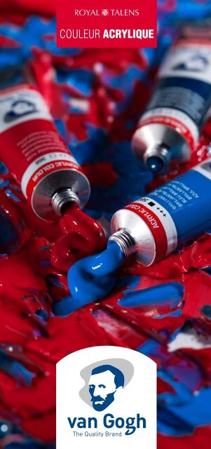
<strong>COULEUR</strong> <strong>ACRYLIQUE</strong>
<strong>COULEUR</strong> <strong>ACRYLIQUE</strong>
VAN GOGH<br />
THE QUALITY BRAND<br />
La qualité est un choix. En peignant avec la peinture <strong>Van</strong><br />
<strong>Gogh</strong>, vous pouvez vous concentrer uniquement sur votre<br />
propre créativité et le procès de peinture. Grâce aux<br />
couleurs vives et brillantes, vous avez un nombre infini de<br />
possibilités. Votre inspiration vous guide et la peinture est<br />
votre instrument. <strong>Van</strong> <strong>Gogh</strong> est la marque idéale pour les<br />
peintres sérieux qui font cas de la qualité.<br />
L’acrylique <strong>Van</strong> <strong>Gogh</strong> est une peinture multiple avec une palette étendue<br />
de 40 couleurs intenses et brillantes. L’acrylique est onctueuse, donc<br />
le coup de pinceau reste bien visible. Vous pouvez aussi mélanger<br />
la peinture avec de l’eau afin de travailler de façon plus liquide ou<br />
transparente. L’acrylique sèche en devenant résistante à l’eau. Grâce<br />
à son temps de séchage court, il est possible d’appliquer rapidement<br />
plusieurs couches les unes sur les autres. Le degré de résistance à la<br />
lumière permet aux couleurs de rester vives et uniques très longtemps.<br />
L’acrylique <strong>Van</strong> <strong>Gogh</strong> fait honneur à vos créations.<br />
<strong>COULEUR</strong> <strong>ACRYLIQUE</strong>
Acrylique <strong>Van</strong> <strong>Gogh</strong><br />
haute qualité<br />
• Les couleurs acryliques <strong>Van</strong> <strong>Gogh</strong> sont intenses et<br />
brillantes grâce à leur haut teneur en pigment et le<br />
broyage fin des pigments purs.<br />
• L’acrylique <strong>Van</strong> <strong>Gogh</strong> est une peinture onctueuse rendant<br />
le coup de pinceau bien visible.<br />
• L’acrylique <strong>Van</strong> <strong>Gogh</strong> offre un choix entre 4 degrés<br />
d’opacité (transparent, semi-transparent, semi-opaque<br />
et opaque).<br />
• La peinture résiste bien ou même très bien à la lumière,<br />
donc les créations seront longtemps conservées.<br />
<strong>COULEUR</strong> <strong>ACRYLIQUE</strong>
acrylique <strong>Van</strong> <strong>Gogh</strong><br />
offre de nombreuses<br />
possibilités<br />
L’acrylique <strong>Van</strong> <strong>Gogh</strong> est une peinture multiple qui peut être<br />
utilisée de façons bien différentes. Quelques exemples:<br />
Peindre en couches<br />
Vous pouvez appliquer un nombre infini de couches, pures ou diluées<br />
à l’eau. Le temps de séchage dépend de l’épaisseur de la couche, de la<br />
température et de l’humidité de l’air, mais il est relativement court. Vous<br />
pouvez donc travailler vite ! Utilisez de préférence des couleurs (semi)<br />
opaques (identifiées sur le tube par ou ) si vous ne voulez pas<br />
que la couleur sous-jacente reste visible.<br />
<strong>COULEUR</strong> <strong>ACRYLIQUE</strong>
Glacis<br />
L’acrylique vous permet également de faire des glacis. Appliquez une<br />
couche colorée transparente par-dessus une couche sèche. Vous<br />
obtiendrez le meilleur résultat en utilisant une couleur transparente,<br />
indiqué sur le tube par ou . La peinture pure peut être bien étalée.<br />
Si vous voulez un glacis moins coloré, diluez la peinture avec de l’eau<br />
ou un médium acrylique.<br />
<strong>COULEUR</strong> <strong>ACRYLIQUE</strong>
Techniques mixtes<br />
La multiplicité de l’acrylique se voit bien dans les techniques mixtes.<br />
L’acrylique colle bien, donc vous pouvez y ajouter toutes sortes de<br />
matériels comme du papier, carton, textile et sable. Il est conseillé de<br />
bien mélanger les matériels fins tels que sable, sciure et cailloux avec<br />
la peinture avant de l’appliquer sur la toile. Laissez libre court à votre<br />
créativité !<br />
Technique du couteau<br />
A l’aide d’un couteau à peindre, vous pouvez appliquer des touches<br />
de peinture plates et des structures de toute épaisseur désirée. Avec le<br />
dessous du couteau vous pouvez aussi bien mélanger la peinture sur la<br />
palette que l’appliquer sur la toile. Le couteau à peindre se rince<br />
facilement avec un vieux chiffon ou un mouchoir en papier.<br />
<strong>COULEUR</strong> <strong>ACRYLIQUE</strong>
Pinceaux<br />
<strong>Van</strong> <strong>Gogh</strong><br />
Chaque technique de peinture demande le pinceau parfait !<br />
L’assortiment <strong>Van</strong> <strong>Gogh</strong> vous en offre une série complète. Les pinceaux<br />
<strong>Van</strong> <strong>Gogh</strong> sont fabriqués avec soin et savoir-faire. Vous pouvez choisir<br />
entre différents poils, tous d’excellente qualité, et différentes formes.<br />
Pour peindre à l’acrylique, il est conseillé d’utiliser des pinceaux à poils<br />
durs, grâce à la touffe qui résiste bien à l’usure.<br />
Séries 210 en 211 (soies de porc) pour<br />
peinture diluée et non diluée.<br />
Séries 232, 234 en 235 (poils d’oreille<br />
de bœuf) pour peinture diluée. Glacis et<br />
techniques de peinture fines.<br />
Séries 294, 295 et 296 (polyester) pour<br />
peinture diluée et non diluée.<br />
Comment RINCER LES PINCEAUX ?<br />
• Mouillez bien les pinceaux pendant le travail pour éviter que<br />
la peinture sèche.<br />
• Rincez les pinceaux après usage à l’eau chaude savonneuse.<br />
• Remodelez les poils après rinçage.<br />
• Gardez les pinceaux avec la touffe dirigée vers le haut.<br />
<strong>COULEUR</strong> <strong>ACRYLIQUE</strong>
Supports<br />
pour acrylique<br />
<strong>Royal</strong> <strong>Talens</strong> offre un assortiment étendu de<br />
supports de qualité pour acrylique:<br />
• Châssis entoilés : toile tendue sur un châssis en lin ou coton<br />
préparé, en différents formats et versions. Il existe aussi des châssis<br />
3D avec des côtés à peindre plus épais.<br />
• Cartons toilés : coton préparé tendu sur un panneau médium,<br />
différents formats.<br />
L’acrylique <strong>Van</strong> <strong>Gogh</strong> peut aussi être utilisée sur beaucoup d’autres<br />
supports, tels que papier, carton, bois et pierre à condition qu’ils soient<br />
dégraissés et suffisamment absorbants.<br />
<strong>COULEUR</strong> <strong>ACRYLIQUE</strong>
Auxiliaires pour<br />
acrylique <strong>Van</strong> <strong>Gogh</strong><br />
L’usage d’auxiliaires n’est pas indispensable quand vous<br />
travaillez à l’acrylique, parce que la peinture se dilue<br />
simplement à l’eau. Néanmoins il existe certains auxiliaires<br />
qui peuvent être utiles ou qui donnent des effets spéciaux.<br />
<strong>Royal</strong> <strong>Talens</strong> propose un assortiment étendu d’auxiliaires<br />
pour acrylique en conditionnements différents sous la<br />
marque Amsterdam.<br />
<strong>COULEUR</strong> <strong>ACRYLIQUE</strong>
Médium acrylique brillant 012 et mat 117: rend la peinture plus<br />
liquide et transparente. La résine d’acrylate donne aux pigments une<br />
protection optimale.<br />
Médium gel 094/080, Médium gel épaississant 015/020 et<br />
Médium gel extra épaississant 021/022: pâtes blanches qui,<br />
utilisées de façon pure, sèchent incolores et transparentes. Mélangées<br />
avec de la peinture, elles donnent plus de volume et structure et un<br />
coup de pinceau plus prononcé. Grâce au caractère collant, ce produit<br />
convient parfaitement aux techniques mixtes avec des matériels divers,<br />
tels que sable, cailloux, bois, papier et carton. Chaque Médium gel est<br />
disponible aussi bien en brillant que mat.<br />
Pâte à modeler 1003: pour créer des supports en relief et des<br />
couches de peinture épaisses, mélangé ou non avec de la peinture<br />
acrylique.<br />
Médium épaississant 040: pour créer une peinture onctueuse sans<br />
éclaircir les couleurs ou perdre en pouvoir colorant. Rend le coup de<br />
pinceau nettement plus prononcé.<br />
Retardateur acrylique 070: ralentit le séchage de la peinture<br />
acrylique pour que vous puissiez travailler plus longtemps mouillé sur<br />
mouillé. A utiliser de façon économe.<br />
Vernis acrylique 114/115: pour protéger votre peinture et pour<br />
créer un degré de brillance égal. Disponible en version brillante et<br />
matte, aussi bien en flacon qu’en aérosol.<br />
Décapant acrylique 013: aide à enlever les restes de peinture<br />
séchées des pinceaux.<br />
<strong>COULEUR</strong> <strong>ACRYLIQUE</strong>
<strong>COULEUR</strong> <strong>ACRYLIQUE</strong>
L’assortiment<br />
acrylique <strong>Van</strong> <strong>Gogh</strong><br />
Toutes les couleurs acryliques <strong>Van</strong> <strong>Gogh</strong> sont disponibles en<br />
tubes en aluminium 40 ml. Les teintes blanc de titane et noir<br />
oxyde sont également disponible en tubes 150 ml. Nous vous<br />
proposons différents sets et coffrets pour expérimenter vousmême<br />
ou pour offrir:<br />
Set<br />
avec 5 tubes 40 ml<br />
Set<br />
avec 10 tubes 40 ml<br />
Set combi<br />
avec 10 tubes 40 ml et<br />
accessoires<br />
<strong>COULEUR</strong> <strong>ACRYLIQUE</strong>
ROYALTALENS<br />
Coffrets en bois avec acrylique<br />
<strong>Van</strong> <strong>Gogh</strong> biedt een breed<br />
assortiment teken- en schilderproducten.<br />
Coffret “Basic”<br />
Naast <strong>Van</strong> <strong>Gogh</strong> olieverf is er een<br />
avec 10 tubes 40 ml<br />
compleet<br />
et accessoires<br />
assortiment Acrylverf,<br />
Aquarelverf, Pastels (Oliepastels en Carrépastels)<br />
en Potloden verkrijgbaar.<br />
Natuurlijk van<br />
<strong>Royal</strong> <strong>Talens</strong><br />
<strong>Royal</strong> <strong>Talens</strong> is al meer dan<br />
100 jaar gerenommeerd producent en wereldwijd<br />
leverancier van kwaliteits-kleurmaterialen en schilderbenodigheden.<br />
Coffret “Inspiration”<br />
avec 14 tubes 40 ml<br />
et accessoires<br />
<strong>COULEUR</strong> <strong>ACRYLIQUE</strong>
<strong>Van</strong> <strong>Gogh</strong> offre un assortiment<br />
étendu d’articles de dessin et<br />
de peinture. En plus de<br />
l’acrylique, il existe un<br />
assortiment complet d’huile,<br />
aquarelle, pastels (à l’huile et<br />
carré) et crayons.<br />
<strong>Royal</strong> <strong>Talens</strong>,<br />
naturellement !<br />
Depuis plus de 100 ans,<br />
<strong>Royal</strong> <strong>Talens</strong> est un fabricant<br />
réputé, et distributeur<br />
mondial de matériels de<br />
couleur et de beaux-arts de<br />
haute qualité.<br />
www.royaltalens.com<br />
<strong>COULEUR</strong> <strong>ACRYLIQUE</strong>
Symboles sur le tube<br />
1<br />
3<br />
2<br />
4<br />
<strong>COULEUR</strong> <strong>ACRYLIQUE</strong>
Explication de<br />
symboles sur le tube<br />
Nous utilisons les symboles suivants:<br />
1 Résistance à<br />
la lumière<br />
+++ = au minimum 100 ans sous<br />
conditions de musée.<br />
++ = 25 – 100 ans sous conditions<br />
de musée.<br />
La résistance à la lumière de<br />
toutes les couleurs est testée<br />
selon la norme ASTM D4303.<br />
2 Transparence/<br />
Opacité<br />
Le degré d’opacité d’une peinture<br />
est indiqué par les symboles<br />
suivants :<br />
= transparent<br />
= semi-transparent<br />
= semi-opaque<br />
= opaque<br />
Chaque pigment a des caractéristiques<br />
spécifiques en ce qui<br />
concerne l’opacité et la transparence.<br />
Il existe des pigments très<br />
opaques et des pigments très<br />
transparents. Il existe aussi des<br />
pigments ayant un degré d’opacité<br />
entre les deux.<br />
Pour certaines techniques, il<br />
est indispensable que l’artiste<br />
connaisse les caractéristiques des<br />
couleurs. Pensez par exemple au<br />
glacis. Les couleurs transparentes<br />
montrent toujours la couleur<br />
sous-jacente. Les couleurs<br />
opaques sont si opaques qu’elles<br />
ne montrent pas ou quasiment<br />
pas la couleur sous-jacente.<br />
Evidemment l’épaisseur de la<br />
couche de peinture y joue un rôle<br />
important.<br />
3 Numéro de couleur<br />
Au lieu d’utiliser le nom de la<br />
couleur, vous pouvez utiliser ce<br />
numéro. Le numéro correspond<br />
toujours au même nom.<br />
4 Pigment<br />
Indique les pigments utilisés pour<br />
fabriquer la couleur.<br />
<strong>COULEUR</strong> <strong>ACRYLIQUE</strong>
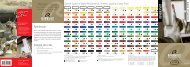
Napelsgeel Azogeel Titaanwit middel rood<br />
+++ +++ 105 224 269<br />
PW6/PY42/PO43<br />
PY74<br />
et kleurassortiment<br />
Azogeel Azo-oranje citroen donker<br />
+++ 276 267 270<br />
PO34/PY74 PY74/PO43 PY3<br />
Nuancier Acrylique <strong>Van</strong> <strong>Gogh</strong><br />
Napelsgeel Azogeel Vermiljoen licht donker<br />
+++ 268 311 223<br />
PW6/PBr24/PY154<br />
PY3/PY74 PO34<br />
Naftolrood Napelsgeel Azogeel Blanc Titaanwit de middel licht titane rood<br />
+++ +++ 398 105 224 269<br />
PW6/PY42/PO43<br />
PR112/PO34<br />
PY74<br />
Naftolrood Jaune Azogeel Azo-oranje azo citroen donker middel citron<br />
++ +++ 396 276 267 270<br />
PO34/PY74 PY74/PO43 PR112 PY3<br />
Napelsgeel Jaune Azogeel Vermiljoen Karmijn azo licht donker clair<br />
++ +++ 318 268 311 223<br />
PW6/PBr24/PY154<br />
PY3/PY74 PR23 PO34<br />
Naftolrood Napelsgeel Azogeel Karmijn<br />
Briljantblauw<br />
Jaune Naples middel donker licht rood rouge<br />
+++ +++ 398 322<br />
564<br />
224<br />
PB15/PG7/PW6<br />
269<br />
PW6/PY42/PO43<br />
PR112/PO34 PR12/PV19 PY74<br />
Naftolrood Quinacridonerose<br />
Turkooisblauw<br />
Azogeel Orange Azo-oranje donker middel azo<br />
+++<br />
+++ +++ 396 366<br />
522<br />
276<br />
PB15/PG7/PW6<br />
270<br />
PO34/PY74 PY74/PO43 PR112 PV19<br />
Permanentkraplak<br />
Permanentgroen<br />
Napelsgeel Vermiljoen Karmijn<br />
licht<br />
Vermillon donker<br />
+++ +++ +++ 336 318<br />
618<br />
311<br />
PG7/PY74<br />
223<br />
PW6/PBr24/PY154<br />
PR264 PR23 PO34<br />
Permanentgroen<br />
Naftolrood Napelsgeel Karmijn Perm.roodviolet<br />
Carmin Briljantblauw donker foncémiddel<br />
licht rood<br />
+++ +++ 398 322 567<br />
614 564<br />
224<br />
PB15/PG7/PW6<br />
PW6/PY42/PO43<br />
PR112/PO34 PR122/PV23<br />
PG7/PY74<br />
PR12/PV19<br />
Paul<br />
Naftolrood Rose Quinacridonerose<br />
Perm.blauwviolet<br />
Turkooisblauw Veronesegroen<br />
Azo-oranje<br />
quinacridone middel<br />
+++ +++<br />
+++ 396 366 522 615<br />
276 568<br />
PB15/PG7/PW6<br />
PG7/PY74/PW6<br />
PV23/PR122 PO34/PY74 PR112 PV19<br />
Permanentgroen Laque Permanentkraplak<br />
Ultramarijn Vermiljoen Karmijn garance perm. donker licht<br />
+++ ++ +++ 504 336 318<br />
618 619<br />
PG7/PY128<br />
311<br />
PG7/PY74 PR264 PB29 PR23 PO34<br />
Permanentgroen Kobaltblauw Bleu Phtalogroen<br />
Naftolrood Karmijn Perm.roodviolet<br />
Briljantblauw cobalt donker (outrem.)<br />
licht (ultram.) middel<br />
+++<br />
+++ 398 322 512<br />
675<br />
567 614 564<br />
PB15/PG7/PW6<br />
PR112/PO34 PB29/PB15 PR122/PV23<br />
PR12/PV19<br />
PG7/PY74<br />
Paul<br />
Naftolrood Quinacridonerose<br />
Perm.blauwviolet<br />
Turkooisblauw<br />
Phtaloblauw<br />
Sapgroen Bleu Veronesegroen phtalo<br />
middel<br />
+++<br />
++ +++ 623<br />
396 366 570 522 615 568<br />
PB15/PG7/PW6<br />
PG7/PY74/PW6<br />
PV23/PR122 PR112 PV19<br />
PG8<br />
Pruisischblauw Permanentgroen Bleu Permanentkraplak<br />
Chroomoxydgroen<br />
Ultramarijn Prusse Karmijnphtalo<br />
donker licht<br />
+++ ++ +++<br />
504 566 336 318<br />
618 619 668<br />
PB15/PBk11 PG7/PY128 PG7/PY74 PG17<br />
PR264 PB29 PR23<br />
Permanentgroen Kobaltblauw Vert Gele<br />
Karmijn Perm.roodviolet<br />
Phtalogroen permanent oker licht<br />
donker (ultram.) moyen middel<br />
+++ +++ 322 512 675 228<br />
567<br />
614<br />
PB29/PB15 PR122/PV23<br />
PR12/PV19<br />
PG7/PY74 PBr24<br />
Paul Vert<br />
Quinacridonerose<br />
Perm.blauwviolet<br />
Phtaloblauw Sapgroen Paul Veronesegroen<br />
Gele Véronèse oker<br />
+++ +++<br />
+++<br />
623<br />
366 570 615 227<br />
568<br />
PG7/PY74/PW6<br />
PV23/PR122 PV19 PB15 PG8 PY42<br />
Pruisischblauw Permanentgroen Chroomoxydgroen<br />
Permanentkraplak<br />
Vert Sienna<br />
Ultramarijn permanent naturel<br />
phtalo donker fcé<br />
+++<br />
+++ +++ 234<br />
504 566 336<br />
619 668<br />
PB15/PBk11 PG7/PY128 PY42<br />
PR264 PB29<br />
PG17<br />
Sienna<br />
Kobaltblauw<br />
Gele Ocre<br />
Perm.roodviolet<br />
Phtalogroen oker jaune gebrand<br />
(ultram.)<br />
licht clair<br />
+++ +++ 512<br />
675 228 411<br />
PR101<br />
567<br />
PB29/PB15<br />
PBr24<br />
PR122/PV23<br />
PG7<br />
Perm.blauwviolet<br />
Phtaloblauw<br />
Sapgroen Engelsrood Ocre Gele jaune oker<br />
+++<br />
++ +++ +++<br />
623 339<br />
570<br />
227<br />
568<br />
PV23/PR122 PB15<br />
PG8 PR101 PY42<br />
Terre<br />
Pruisischblauw<br />
Chroomoxydgroen<br />
Sienna Omber Sienne naturel<br />
nat.<br />
Ultramarijn phtalo<br />
+++<br />
+++ +++ 504 566<br />
234 408 668<br />
PY42/PBk11<br />
PB15/PBk11<br />
PB29<br />
PG17<br />
Terre Sienna<br />
Kobaltblauw<br />
Gele Omber ombre oker gebrand<br />
(ultram.)<br />
licht brûlée<br />
+++ +++ +++<br />
512<br />
228 411 409<br />
PR101/PBk11<br />
PB29/PB15<br />
PBr24<br />
Brun <strong>Van</strong> Engelsrood<br />
Phtaloblauw<br />
Gele Dijckbruin <strong>Van</strong> oker Dyck<br />
+++ +++ 339<br />
570<br />
227 403<br />
PBk11/PR101 PR101<br />
PB15<br />
PY42<br />
Pruisischblauw<br />
Sienna Omber Gris Paynesgrijs<br />
naturel<br />
phtalo<br />
+++ +++ 566<br />
234 708 408<br />
PBk11/PB15/PV19<br />
PY42/PBk11<br />
PB15/PBk11<br />
Explication des signes<br />
Transparence/Opacité<br />
= transparent (6 couleurs)<br />
Résistance Sienna Omber Oxydzwart<br />
gebrand à la lumière <strong>Van</strong> Engelsrood Dijckbruin = semi-transparent Omber Paynesgrijs (9 naturel couleurs)<br />
+++ 411 735 409<br />
+++ 339 403<br />
+++ 708 408<br />
+++ PR101/PBk11 = PBk11 100 ans minimum sous éclairage PBk11/PR101 PR101 = semi-opaque PBk11/PB15/PV19<br />
PY42/PBk11 (14 couleurs)<br />
de musée (31 couleurs).<br />
= opaque (11 couleurs)<br />
++ = 25 – 100 ans sous éclairage de<br />
musée (9 couleurs).<br />
La résistance Omber Oxydzwart gebrand à la lumière est testée <strong>Van</strong> Dijckbruin<br />
Paynesgrijs<br />
+++ 735 409<br />
+++ 403<br />
+++ 708<br />
selon PR101/PBk11 la PBk11 norme ASTM D4303. PBk11/PR101<br />
PBk11/PB15/PV19<br />
Oxydzwart<br />
+++ 735<br />
PBk11<br />
<strong>COULEUR</strong> <strong>ACRYLIQUE</strong>
Napelsgeel Azogeel Titaanwit middel rood<br />
+++ +++ 105 224 269<br />
PW6/PY42/PO43<br />
PY74<br />
Azogeel Azo-oranje citroen donker<br />
+++ 276 267 270<br />
PO34/PY74 PY74/PO43 PY3<br />
Napelsgeel Azogeel Vermiljoen licht donker<br />
+++ 268 311 223<br />
PW6/PBr24/PY154<br />
PY3/PY74 PO34<br />
Naftolrood<br />
Briljantblauw<br />
Jaune Napelsgeel Azogeel +++<br />
azo<br />
564 middel licht moyen rood<br />
++<br />
PB15/PG7/PW6<br />
+++ 398 224 269<br />
PW6/PY42/PO43<br />
PR112/PO34 PY74<br />
Naftolrood<br />
Turkooisblauw<br />
Jaune Azogeel Azo-oranje<br />
+++<br />
azo<br />
522 donker middel foncé<br />
++<br />
PB15/PG7/PW6 +++ 396 276 270<br />
PO34/PY74 PY74/PO43 PR112<br />
Permanentgroen licht<br />
Jaune Napelsgeel Vermiljoen Karmijn<br />
+++<br />
Naples<br />
618donker<br />
foncé<br />
++ PG7/PY74 +++<br />
318 311 223<br />
PW6/PBr24/PY154<br />
PR23 PO34<br />
Permanentgroen middel<br />
Rouge Naftolrood Napelsgeel Karmijn Briljantblauw<br />
naphtol donker licht<br />
614rood<br />
clair<br />
+++<br />
+++ 398 322 564<br />
PG7/PY74 224<br />
PB15/PG7/PW6<br />
PW6/PY42/PO43<br />
PR112/PO34 PR12/PV19<br />
Paul Veronesegroen<br />
Rouge Naftolrood Quinacridonerose<br />
Turkooisblauw<br />
Azo-oranje naphtol middel moyen<br />
+++<br />
615<br />
+++<br />
PG7/PY74/PW6 ++ 396 366 522<br />
276<br />
PB15/PG7/PW6<br />
PO34/PY74 PR112 PV19<br />
Permanentkraplak<br />
Permanentgroen donker<br />
Vermiljoen Karmijn Carmin<br />
licht<br />
+++ 619<br />
+++<br />
PG7/PY128 ++ 336 318<br />
618<br />
311<br />
PG7/PY74 PR264 PR23 PO34<br />
Permanentgroen Phtalogroen<br />
Naftolrood<br />
Violet Karmijn Perm.roodviolet<br />
Briljantblauw rouge donker<br />
675licht<br />
perm. middel<br />
+++ 398 322 567 614 564<br />
PB15/PG7/PW6<br />
PR112/PO34 PR122/PV23<br />
PR12/PV19<br />
PG7/PY74<br />
Paul Sapgroen<br />
Naftolrood Quinacridonerose<br />
Violet Perm.blauwviolet<br />
Turkooisblauw Veronesegroen<br />
bleu<br />
++ 623 middel<br />
perm.<br />
+++ +++<br />
PG8 396 366 522 568 615<br />
PB15/PG7/PW6<br />
PG7/PY74/PW6<br />
PV23/PR122 PR112 PV19<br />
Permanentgroen Chroomoxydgroen<br />
Permanentkraplak<br />
Ultramarijn Outremer donker<br />
Karmijn<br />
licht<br />
+++<br />
668<br />
++ +++ 504 336 318<br />
618 619<br />
PG7/PY128 PG7/PY74 PG17<br />
PR264 PB29 PR23<br />
Kobaltblauw Permanentgroen Gele oker licht<br />
Karmijn Perm.roodviolet<br />
Phtalogroen Briljantblauw<br />
Bleu brillant<br />
228 donker (ultram.) middel<br />
+++ +++<br />
PBr24 322 512 675<br />
567 614 564<br />
PB15/PG7/PW6<br />
PB29/PB15 PR122/PV23<br />
PR12/PV19<br />
PG7/PY74<br />
Paul Gele oker<br />
Quinacridonerose<br />
Perm.blauwviolet<br />
Phtaloblauw Turkooisblauw<br />
Bleu Sapgroen Veronesegroen<br />
turquoise<br />
227<br />
+++ +++ 623<br />
366 570 522 568 615<br />
PB15/PG7/PW6<br />
PG7/PY74/PW6 PY42<br />
PV23/PR122 PV19<br />
PG8<br />
Pruisischblauw Permanentgroen Sienna naturel<br />
Permanentkraplak<br />
Vert Chroomoxydgroen<br />
Ultramarijn permanent phtalo donker cl. licht<br />
+++<br />
+++ 234<br />
+++ +++<br />
504 566 336<br />
618 619 668<br />
PB15/PBk11 PG7/PY128 PG7/PY74 PY42<br />
PR264 PB29<br />
PG17<br />
Sienna gebrand<br />
Kobaltblauw Permanentgroen Gele<br />
Perm.roodviolet<br />
Phtalogroen Vert oker phtalo (ultram.)<br />
lichtmiddel<br />
411<br />
+++ +++ 512 675 228<br />
PR101 567<br />
614<br />
PB29/PB15 PR122/PV23<br />
PG7/PY74 PBr24<br />
Paul Engelsrood<br />
Perm.blauwviolet<br />
Phtaloblauw Vert Sapgroen Veronesegroen<br />
Gele de vessie oker<br />
339<br />
+++ +++ +++ 623 570<br />
PR101 568<br />
615 227<br />
PG7/PY74/PW6<br />
PV23/PR122 PB15 PG8 PY42<br />
Omber Pruisischblauw Permanentgroen Chroomoxydgroen<br />
Vert Sienna oxyde naturel chrome<br />
Ultramarijn phtalo donker<br />
408<br />
+++<br />
+++ +++<br />
PY42/PBk11 504 566<br />
234 619 668<br />
PB15/PBk11 PG7/PY128<br />
PB29<br />
PG17<br />
Terre Sienna Omber Kobaltblauw<br />
Gele Phtalogroen Sienne oker gebrand<br />
409 (ultram.)<br />
licht brûlée<br />
+++ +++<br />
PR101/PBk11 512<br />
675 228 411<br />
PB29/PB15<br />
PBr24 PG7<br />
Rouge <strong>Van</strong> Dijckbruin<br />
Phtaloblauw<br />
Sapgroen Engelsrood Gele anglais oker<br />
403<br />
+++<br />
++ +++ 623 339<br />
PBk11/PR101 570<br />
227<br />
PB15<br />
PG8 PR101 PY42<br />
Paynesgrijs<br />
Pruisischblauw<br />
Chroomoxydgroen<br />
Terre Sienna Omber ombre naturel<br />
nat.<br />
708 phtalo<br />
PBk11/PB15/PV19<br />
+++<br />
+++ +++ 566<br />
234 408 668<br />
PY42/PBk11<br />
PB15/PBk11<br />
PG17<br />
Sienna Gele Omber Noir Oxydzwart oker oxyde gebrand licht<br />
+++ +++ 228 411 735 409<br />
PR101/PBk11<br />
PBr24 PBk11<br />
Les couleurs illustrées se rapprochent autant que<br />
les couleurs <strong>Van</strong> Engelsrood Gele Dijckbruin réelles. oker<br />
Sienna Omber Paynesgrijs naturel<br />
+++ 339 227 403<br />
+++ 234 708 408<br />
PBk11/PR101 PR101 PY42<br />
PBk11/PB15/PV19<br />
PY42/PBk11<br />
Les pigments – Index des Couleurs<br />
Les pigments utilisés dans nos peintures<br />
acryliques Sienna Omber Oxydzwart<br />
gebrand sont classifiés selon l’Index <strong>Van</strong> Engelsrood Dijckbruin<br />
+++ 411 735 409<br />
+++ 339 403<br />
des Couleurs.<br />
PR101/PBk11<br />
PBk11 L’Index des Couleurs est un<br />
PBk11/PR101 PR101<br />
système international qui permet d’identifier<br />
les pigments et les colorants utilisés dans<br />
tous les types de peinture (y compris la<br />
peinture Omber Oxydzwart pour gebrand beaux-arts). Le système <strong>Van</strong> est Dijckbruin<br />
+++ 735 409<br />
+++ 403<br />
basé sur un numéro et un nom liés à une<br />
PR101/PBk11 PBk11<br />
PBk11/PR101<br />
structure chimique. L’Index des Couleurs a<br />
été développé aux Etats-Unis. Voilà pourquoi<br />
la description des catégories chimiques se<br />
fait en Oxydzwart anglais. Les abréviations s’expliquent<br />
+++ 735<br />
ainsi :<br />
PBk11<br />
PW = pigment white<br />
PO = pigment Omber orange Paynesgrijs naturel<br />
+++ 708<br />
PB = pigment blue408<br />
PBk11/PB15/PV19<br />
PY42/PBk11<br />
PG = pigment green<br />
PBk = pigment black<br />
PY = pigment yellow<br />
PR = pigment red Paynesgrijs<br />
+++ 708<br />
PV = pigment violet<br />
PBk11/PB15/PV19<br />
PBr = pigment brown<br />
<strong>COULEUR</strong> <strong>ACRYLIQUE</strong>
Acrylique <strong>Van</strong> <strong>Gogh</strong><br />
haute qualité<br />
• Couleurs intenses et brillantes<br />
• Haute teneur en pigment<br />
• Peinture onctueuse rendant le coup<br />
de pinceau bien visible<br />
• Bonne et même très bonne résistance à<br />
la lumière<br />
8220112 2011<br />
P.O. Box 4, 7300 AA Apeldoorn, NL<br />
www.royaltalens.com<br />
8 712079 309503