Cornell Law School Visual Style Guide
Cornell Law School Visual Style Guide
Cornell Law School Visual Style Guide

Create successful ePaper yourself
Turn your PDF publications into a flip-book with our unique Google optimized e-Paper software.
<strong>Style</strong><br />
GUIDE
Introduction<br />
Our visual style is a key part<br />
of the power we have to effectively<br />
communicate who we are.<br />
Elements of our visual style: our logo, colors, typefaces,<br />
graphics, photographs and they way in which they are used,<br />
become the face we show the world. Utilizing these elements<br />
in a high quality way (both from an aesthetic and production<br />
standpoint) reinforces to the viewer our standards and<br />
professionalism. Presenting them in a consistent way builds<br />
our personality and recognizability.<br />
Our goal is to present an appealing style that both describes<br />
and distinguishes us—that represents <strong>Cornell</strong> <strong>Law</strong> <strong>School</strong>’s<br />
traditional roots and its contemporary, forward-thinking<br />
edge as well.<br />
This style guide outline the basic visual building blocks we<br />
use—our visual elements—and also show examples of how<br />
these elements come together in our communications.<br />
<strong>Cornell</strong> <strong>Law</strong> <strong>School</strong> style guide | our visual elements | 2<br />
CONTENTS<br />
our visual elements<br />
Our Signature 3-4<br />
Our Font Palette 5<br />
Our Color Palette 6<br />
Our Secondary Graphics 7<br />
Our Photography <strong>Style</strong> 8<br />
Our Illustration <strong>Style</strong> 9<br />
how we put it together<br />
Gallery of Examples 10-17
Our Signature<br />
OUR INSPIRATION<br />
OUR OFFICIAL SIGNATURE<br />
Our official signature combines the<br />
<strong>Cornell</strong> University insignia and type with<br />
the law school’s tagline.<br />
The signature must always be used as<br />
shown. Do not make any alterations.<br />
Andrew D. White, Founder of <strong>Cornell</strong> <strong>Law</strong> <strong>School</strong> in 1887 said:<br />
<strong>Cornell</strong> <strong>Law</strong> <strong>School</strong> style guide | our visual elements | 3<br />
“Our aim should be to keep its instruction strong,<br />
its standards, high, and so to send out a fair<br />
number of well-trained, large-minded, morallybased<br />
lawyers in the best sense.”
Our Signature<br />
SIGNATURE COLORS<br />
The only colors acceptable for the<br />
signature are:<br />
n black with PMS 187 red<br />
only in the breakdown shown<br />
n all PMS 187 red<br />
n all black<br />
n all white<br />
SIMPLE VERSION<br />
If the signature will be used at a small size, or will be printed in a technique<br />
that might result in filling-in (such as silkscreen or foil stamping) use the<br />
official “simple” version, where the detail has been simplified in the insignia.<br />
The simple signature may be used in all the colors listed above.<br />
<strong>Cornell</strong> <strong>Law</strong> <strong>School</strong> style guide | our visual elements | 4
Our Font Palette<br />
MAIN FONTS<br />
The Palatino and Fruitger typeface families (above) offer classic forms<br />
beyond trend, an appealing contrast when paired together, and a high<br />
degree of usefulness with multiple weights and styles.<br />
ACCENT FONTS<br />
<strong>Cornell</strong> <strong>Law</strong> <strong>School</strong> style guide | our visual elements | 5<br />
AaAa<br />
Palatino Small Caps Palatino Bold<br />
Frutiger 45 Light<br />
Frutiger 75 Black<br />
Palatino Light<br />
Palatino Bold Italic<br />
Frutiger 46 Light Italic Frutiger 76 Black Italic<br />
Palatino Light Italic<br />
Palatino Black<br />
Frutiger 55 Roman Frutiger 95 Ultra Black<br />
Palatino Roman<br />
Palatino Black Italic<br />
Frutiger 56 Roman Italic<br />
Palatino Roman Italic<br />
Frutiger 65 Bold<br />
Palatino Medium<br />
Frutiger 66 Bold Italic<br />
Palatino Medium Italic<br />
Celestia and Voluta (right) can be used occasionally and sparingly to offer<br />
antiqued texture or stylistic emphasis.<br />
AaAa<br />
Celestia Voluta
Our Color Palette<br />
MAIN COLORS<br />
A useful palette of neutral and brighter<br />
hues designed to work well with <strong>Cornell</strong><br />
red and each other. Use consistently by<br />
specifying their inks or ink builds through<br />
the Pantone system.<br />
COLORS CLOSE IN RANGE<br />
These colors may also be adjusted for needed contrast by<br />
proportionally lightening or darkening CMYK or RGB values, or by<br />
using colors occurring on the same Pantone sheet, which results<br />
in more options that maintain the basic hue and saturation.<br />
PMS 187<br />
<strong>Cornell</strong> <strong>Law</strong> <strong>School</strong> style guide | our visual elements | 6<br />
PMS 7528<br />
PMS 7503<br />
PMS 7531<br />
PMS 158<br />
PMS 458<br />
PMS 7458<br />
PMS 5473<br />
PMS 159<br />
PMS 384<br />
PMS 542<br />
PMS 5473<br />
PMS 188<br />
PMS 582<br />
PMS 7455<br />
PMS 462
Our Secondary Graphics<br />
PEACE TOWER<br />
A contemporary rendering of the<br />
law school’s tower can be used as<br />
main art or a small graphic accent<br />
on many communications. The<br />
tower is a symbol of solidity and<br />
tradition, but also aspiration. The<br />
graphic can distinguish our school<br />
from others on campus and evoke<br />
nostalgia to alumni.<br />
STRIPES<br />
Stripe patterns made from our<br />
color palette evoke an Ivy League<br />
feel and add vibrancy to communications<br />
whether used in a small<br />
strip or larger panel.<br />
LAURELS<br />
<strong>Cornell</strong> <strong>Law</strong> <strong>School</strong> style guide | our visual elements | 7<br />
We have created these secondary graphics to be another design tool, easily and economically used to help distinguish and style communications<br />
and build our visual personality.<br />
Another graphic used by the law<br />
school is a contemporary rendering<br />
of the classic symbol of higher<br />
learning and achievement: laurels.<br />
Our laurels can be made into a<br />
tonal pattern as shown in the<br />
border above, as whimsical sprigs<br />
of upward growth or classic text<br />
ornament.<br />
STONEWORK<br />
A contemporary pattern inspired<br />
by the distinctive stonework on<br />
our buildings can be used as<br />
background or accent graphics.
Our Photography <strong>Style</strong><br />
The photography style we use is positive in<br />
mood and straight-forward and natural in<br />
style, such as shown in these examples (right).<br />
We use stock photography for some projects,<br />
such as a still life to illustrate a conceptual<br />
meaning, or of scenery outside of Ithaca. But<br />
we never use stock photography to represent<br />
people at <strong>Cornell</strong>.<br />
<strong>Cornell</strong> <strong>Law</strong> <strong>School</strong> style guide | our visual elements | 8
Our Illustration <strong>Style</strong><br />
Classic, engraving-style illustrations are<br />
also part of our style. We have commissioned<br />
a small but growing collection<br />
(right) of these iconic illustrations for use in<br />
our communications when appropriate.<br />
We also suppliment these with the use of<br />
antique engravings (examples below) found<br />
in stock art books or stock agencies.<br />
<strong>Cornell</strong> <strong>Law</strong> <strong>School</strong> style guide | our visual elements | 9
Gallery of Examples<br />
HOW WE PUT IT TOGETHER<br />
BN_<strong>Cornell</strong>_Schwab_BC.ai 3/7/08 11:37:18 AM<br />
The following pages show actual <strong>Cornell</strong> <strong>Law</strong> <strong>School</strong> projects.<br />
Notice how our visual elements (signature, fonts, colors and<br />
graphic and photographic art) are used again and again across<br />
our communications to create a consistent personality. And even<br />
as they use the same basic elements, great variety is still possible<br />
—for example to express distinction between events or to<br />
illustrate a specific concept for an article.<br />
BN_<strong>Cornell</strong>_Schwab_BC.ai 3/7/08 3:36:35 PM<br />
<strong>Cornell</strong> <strong>Law</strong> <strong>School</strong> style guide | how we put it together | 10<br />
www.lawschool.cornell.edu<br />
<strong>Cornell</strong> <strong>Law</strong> <strong>School</strong> Directory 2006 ~ 2007
Gallery of Examples<br />
On general items for the law school,<br />
the <strong>Cornell</strong> red is prominent, with other<br />
colors from the palette as accent.<br />
<strong>Cornell</strong> <strong>Law</strong> <strong>School</strong> style guide | how we put it together | 11<br />
The cover (right) uses an accent<br />
font in a the subtle tone-on-tone<br />
treatment.<br />
“Our aim should be to keep<br />
its instruction strong,<br />
its standards high, and so<br />
to send out a fair number<br />
W E I N V I T E Y O U T O B E C O M E<br />
of well-trained, large-<br />
A L A W Y E R I N T H E B E S T S E N S E<br />
minded, morally based<br />
lawyers in the best sense.”<br />
~ A. D. White, <strong>Cornell</strong> University’s �rst President
Gallery of Examples<br />
B E R G E R I N T E R N A T I O N A L S P E A K E R S E R I E S<br />
www.lawschool.cornell.edu<br />
” CHICKENS AND JONGWE COME<br />
HOME TO ROOST: ZIMBABWE'S<br />
CURRENT REALITIES AND THEIR<br />
HISTORICAL ROOTS”<br />
R E G I N A L D A U S T I N<br />
Professor, University College London<br />
Reginald Austin, a citizen of Zimbabwe, has practiced law there since<br />
1959. Educated at the University of Capetown (B.A., LL.B.) and<br />
University College London (LL.M.), he has taught at University College<br />
London, the University of Zimbabwe (where he was the dean of the law<br />
faculty from 1982--1992), and various visiting professorships. He has<br />
held many consultancies with the UN, the ILO, UNESCO, and the World<br />
Council of Churches, in the fields of democratic governance, and<br />
peacekeeping/elections. He has been responsible for directing and<br />
implementing elections in the Solomon Islands (2005-06), Afghanistan<br />
(2003-04), South Africa (1994), Cambodia (1992-93) and Zimbabwe (1982-88).<br />
Wednesday, September 20, 2006 at 4:15pm<br />
Room 227<br />
Working with our established visual elements makes creating frequently needed<br />
basic communications fast and easy.<br />
<strong>Cornell</strong> <strong>Law</strong> <strong>School</strong> style guide | how we put it together | 12
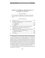
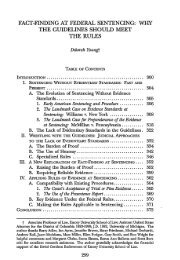
Gallery of Examples<br />
Even editorial design for Forum magazine makes use of our fonts, colors and graphics in its basic<br />
structure, along with specific conceptual illustration and photography to illustrate articles.<br />
<strong>Cornell</strong> <strong>Law</strong> <strong>School</strong> style guide | how we put it together | 13
Gallery of Examples<br />
Examples of our online communications expressing<br />
the law school personality.<br />
<strong>Cornell</strong> <strong>Law</strong> <strong>School</strong> style guide | how we put it together | 14
Gallery of Examples<br />
The two examples here show how<br />
secondary graphics can be incorporated<br />
into event-specific concepts: with the<br />
laurels becoming multi-colored for<br />
diversity and the stripes becoming part<br />
of a medal for awards for public service.<br />
The banners use type, color and<br />
secondary graphics in combination<br />
with subject-specific photography.<br />
<strong>Cornell</strong> <strong>Law</strong> <strong>School</strong> style guide | how we put it together | 15
Gallery of Examples<br />
<strong>Cornell</strong> <strong>Law</strong> <strong>School</strong> style guide | how we put it together | 16<br />
This notecard series, poster, magazine advertisement all use our illustration style of engravings, both those created<br />
for us and from found sources.
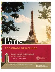
Gallery of Examples<br />
Here the visual elements are used in a similar way across a series<br />
of program-specific brochures (above). Extra secondary graphics<br />
were created for two of these programs (left and center) and used<br />
in a similar way to the laurels (far right).<br />
Using different colors from the palette for each postcard within a<br />
direct-mail series (right) creates variety.<br />
<strong>Cornell</strong> <strong>Law</strong> <strong>School</strong> style guide | how we put it together | 17