AMA Style Guide - American Marketing Association
AMA Style Guide - American Marketing Association
AMA Style Guide - American Marketing Association

You also want an ePaper? Increase the reach of your titles
YUMPU automatically turns print PDFs into web optimized ePapers that Google loves.
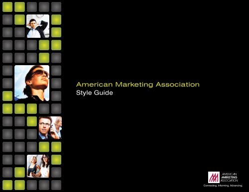
<strong>American</strong> <strong>Marketing</strong> <strong>Association</strong><br />
<strong>Style</strong> <strong>Guide</strong><br />
Connecting. Informing. Advancing.
Table of Contents<br />
Introduction<br />
<strong>AMA</strong> Brand Building Blocks 3<br />
Copy Tone 4<br />
Design 5<br />
Logo and Tagline 6<br />
Color Palette 7<br />
Acceptable Photography 8<br />
Unacceptable Photography 9<br />
Type Treatment 10<br />
Motifs and Patterns 11<br />
2
The Brand Building Blocks<br />
Any discussion of the graphic standards<br />
for the <strong>AMA</strong> must start with a thorough<br />
understanding of the <strong>AMA</strong>’s mission and<br />
value to the marketing community.<br />
Connecting.<br />
Informing.<br />
Advancing.<br />
After talking at length with <strong>AMA</strong> members<br />
and marketing professionals about their<br />
perceptions of the <strong>AMA</strong> versus other<br />
marketing organizations, these three words<br />
were chosen to express the <strong>AMA</strong>’s unique<br />
proposition and value to the art and science<br />
of marketing.<br />
They constitute a terse anthem, reflecting<br />
both the needs of our members and the<br />
unique strengths of our association. They<br />
are, in short, our raison d’être.<br />
They are the inspiration for how we<br />
should position everything the <strong>AMA</strong><br />
offers, combined with our well-defined<br />
brand platform.<br />
Attributes defined by <strong>AMA</strong> brand statements<br />
Vision (To Be)<br />
To be the leading marketing<br />
resource and network, where the<br />
best marketing talent gathers<br />
to advance the profession of<br />
marketing worldwide.<br />
Mission (To Do)<br />
The <strong>AMA</strong> is a professional association<br />
for individuals and organizations<br />
leading the practice, teaching and<br />
development of marketing worldwide.<br />
Our principal roles are:<br />
Connecting: Serving as a conduit to<br />
foster sharing knowledge and building<br />
relationships.<br />
Informing: Providing resources,<br />
education, and career and professional<br />
development opportunities.<br />
Advancing: Promoting/supporting<br />
marketing practice, thought leadership<br />
and career success.<br />
Brand Essence<br />
(To Feel)<br />
The <strong>AMA</strong> empowers me by<br />
providing resources that inspire,<br />
nurture and motivate me. I can<br />
count on the <strong>AMA</strong> to keep my<br />
marketing knowledge current and<br />
provide a place where I can give<br />
and seek advice and contribute to<br />
something bigger than myself.<br />
Brand Positioning<br />
(To Say)<br />
For marketing leaders, thinkers and<br />
doers, the <strong>AMA</strong> is the only organization<br />
that brings together marketing across<br />
all specialities to collaborate and<br />
inspire one another. Through relevant<br />
information, comprehensive education<br />
and targeted networking, the <strong>AMA</strong><br />
assists marketers in deepening their<br />
expertise, elevating their careers and,<br />
ultimately, achieving better results.<br />
3
Copy Tone<br />
From the Brand Statement, it is apparent<br />
that the <strong>AMA</strong> strives to be a dynamic,<br />
industry-leading organization, instrumental<br />
in stimulating new thinking and enabling<br />
individual career success.<br />
Our copy should always reflect these<br />
values, inspiring confidence in the <strong>AMA</strong>’s<br />
singular ability to provide the information<br />
and support that marketers need.<br />
Copy should reflect a positive, practical<br />
attitude, tackling even the most complicated<br />
and pressing issues head-on, using clear,<br />
straightforward language. Copy should<br />
never use unnecessary jargon or<br />
stilted language.<br />
Clear. Concise. Positive. Keep the copy<br />
simple, upbeat and inspiring.<br />
Clear.<br />
Concise.<br />
Positive.<br />
4
Design<br />
The graphic motif has been carefully crafted<br />
to evoke the unique and valuable qualities<br />
of the organization. By adhering to the<br />
motif as closely as possible, the <strong>AMA</strong> will<br />
project a consistent and professional image<br />
throughout all touch points with members,<br />
prospective members and the marketing<br />
community at large.<br />
Important Elements<br />
The motif is based on several key elements.<br />
Used in combination, these elements present<br />
the image of a dynamic, innovative and<br />
authoritative organization.<br />
Central to the motif is the radius-cornered<br />
screen—a highly stylized representation of<br />
the ubiquitous LCD or LED screen on which<br />
so many of us depend for information, from<br />
handheld PDAs and laptops, to 52-inch<br />
plasma TVs.<br />
The screens are used as a framing device to<br />
present information or illuminate key ideas<br />
with visual support.<br />
Organized into patterns, the screens are<br />
also used to evoke the <strong>AMA</strong>’s vital role in<br />
connecting marketers with information and<br />
with one another.<br />
Finally, through the use of bold colors<br />
and dynamic, high-contrast photography<br />
treatments, the motif inspires confidence in<br />
the <strong>AMA</strong>’s ability to advance the theory and<br />
practice of marketing.<br />
Always Innovating<br />
This guide will help you combine these<br />
elements in a style that is consistent yet<br />
varied enough to accommodate virtually<br />
any communication need.<br />
But remember, these are guidelines, not<br />
laws. The <strong>AMA</strong> must and always will stand<br />
for creativity and innovation.<br />
So please read this document carefully<br />
and use the guidelines to help create a<br />
consistent tone and feel for the <strong>AMA</strong>. Then<br />
feel free to experiment, evolve and explore,<br />
finding new ways within the brand look and<br />
feel to communicate the <strong>AMA</strong>’s core values:<br />
Connecting. Informing. Advancing.<br />
Evolution of the<br />
<strong>AMA</strong> Graphic Motif<br />
5
Logo and Tagline<br />
The <strong>AMA</strong> logo must be paired with the<br />
phrase “Connecting. Informing. Advancing.”<br />
once on every piece.<br />
The use of this tagline should follow these<br />
guidelines:<br />
• “Connecting. Informing. Advancing.”<br />
must always be separated by periods.<br />
• In printed media, it must always be in the<br />
Swis721 BT font. It may be used in hTMLfriendly<br />
fonts for web-based pieces.<br />
here are some examples of acceptable<br />
ways to pair “Connecting. Informing.<br />
Advancing.” with the <strong>AMA</strong> logo.<br />
Connecting. Informing. Advancing.<br />
Connecting. Informing. Advancing.<br />
Connecting. Informing. Advancing.<br />
Connecting.<br />
Informing.<br />
Advancing.<br />
Connecting. Informing. Advancing.<br />
6
Color Palette<br />
The color palette is very diverse and is meant<br />
to serve as a guide, rather than a strict rule<br />
for colors.<br />
Generally speaking, the palette is vibrant<br />
and bold. It is unacceptable to use pale,<br />
pastel colors, or muddy, dark colors.<br />
Often, there are times when an illuminating<br />
effect is used. A radial gradient with the<br />
lighter color at the center and the darker color<br />
at the edges lends itself to this technique.<br />
Unacceptable Palettes<br />
Pastels or Pale Shades of Color Are Unacceptable<br />
Acceptable Color Palette<br />
- - - - - - - - - - - - - - - - - - - - - - - - - - - - - - - - - - - - - - - - - - - - - - - - - - - - - - - - - - - - - - - - - - - - - - - - - - - - - - - - - - - - - - - - - - - - - - - - - - - - - - - - - - - - - - - - - - - - - - - - - - - - - - - - - - - - - - - - - - - -<br />
Dark Red<br />
c: 16<br />
m: 100<br />
y: 100<br />
k: 7<br />
r: 194<br />
g: 32<br />
b: 38<br />
Pantone 1807 C<br />
Pantone 137 C<br />
Pantone 7495 C<br />
Pantone 7461 C<br />
Pantone 266 C<br />
Pantone<br />
Cool Gray 4 C<br />
Pantone<br />
Warm Gray 7 C<br />
Light Red<br />
c: 0<br />
m: 82<br />
y: 100<br />
k: 0<br />
r: 240<br />
g: 85<br />
b: 35<br />
Pantone 179 C<br />
- - - - - - - - - - - - - - - - - - - - - - - - - - - - - - - - - - - - - - - - - - - - - - - - - - - - - - - - - - - - - - - - - - - - - - - - - - - - - - - - - - - - - - - - - - - - - - - - - - - - - - - - - - - -<br />
Dark Orange<br />
c: 0<br />
m: 32<br />
y: 100<br />
k: 0<br />
r: 253<br />
g: 181<br />
b: 21<br />
Light Orange<br />
c: 2<br />
m: 20<br />
y: 57<br />
k: 0<br />
r: 247<br />
g: 203<br />
b: 128<br />
Pantone 135 C<br />
- - - - - - - - - - - - - - - - - - - - - - - - - - - - - - - - - - - - - - - - - - - - - - - - - - - - - - - - - - - - - - - - - - - - - - - - - - - - - - - - - - - - - - - - - - - - - - - - - - - - - - - - - - - -<br />
Dark Green<br />
c: 48<br />
m: 21<br />
y: 100<br />
k: 2<br />
Dark Blue<br />
c: 73<br />
m: 28<br />
y: 0<br />
k: 0<br />
Dark Purple<br />
c: 72<br />
m: 76<br />
y: 0<br />
k: 0<br />
r: 144<br />
g: 164<br />
b: 59<br />
r: 51<br />
g: 150<br />
b: 211<br />
r: 99<br />
g: 86<br />
b: 165<br />
Dark Heather Gray<br />
c: 23<br />
m: 19<br />
y: 16<br />
k: 0<br />
r: 196<br />
g: 194<br />
b: 198<br />
Dark Charcoal Gray<br />
c: 68<br />
m: 61<br />
y: 60<br />
k: 47<br />
r: 64<br />
g: 64<br />
b: 64<br />
Light Green<br />
c: 17<br />
m: 0<br />
y: 100<br />
k: 0<br />
Light Blue<br />
c: 50<br />
m: 7<br />
y: 1<br />
k: 0<br />
Light Purple<br />
c: 48<br />
m: 50<br />
y: 0<br />
k: 0<br />
r: 222<br />
g: 226<br />
b: 29<br />
r: 117<br />
g: 195<br />
b: 234<br />
r: 140<br />
g: 130<br />
b: 190<br />
Light Heather Gray<br />
c: 5<br />
m: 4<br />
y: 3<br />
k: 0<br />
r: 237<br />
g: 237<br />
b: 239<br />
Light Charcoal Gray<br />
c: 0<br />
m: 0<br />
y: 0<br />
k: 69<br />
r: 79<br />
g: 79<br />
b: 79<br />
Pantone 381 C<br />
- - - - - - - - - - - - - - - - - - - - - - - - - - - - - - - - - - - - - - - - - - - - - - - - - - - - - - - - - - - - - - - - - - - - - - - - - - - - - - - - - - - - - - - - - - - - - - - - - - - - - - - - - - - -<br />
- - - - - - - - - - - - - - - - - - - - - - - - - - - - - - - - - - - - - - - - - - - - - - - - - - - - - - - - - - - - - - - - - - - - - - - - - - - - - - - - - - - - - - - - - - - - - - - - - - - - - - - - - - - - - - - - - - - - - - - - - - - - - - - - - - - - - - - - - - - -<br />
Pantone 297 C<br />
- - - - - - - - - - - - - - - - - - - - - - - - - - - - - - - - - - - - - - - - - - - - - - - - - - - - - - - - - - - - - - - - - - - - - - - - - - - - - - - - - - - - - - - - - - - - - - - - - - - - - - - - - - - -<br />
Pantone 265 C<br />
- - - - - - - - - - - - - - - - - - - - - - - - - - - - - - - - - - - - - - - - - - - - - - - - - - - - - - - - - - - - - - - - - - - - - - - - - - - - - - - - - - - - - - - - - - - - - - - - - - - - - - - - - - - -<br />
Pantone 7541 C<br />
- - - - - - - - - - - - - - - - - - - - - - - - - - - - - - - - - - - - - - - - - - - - - - - - - - - - - - - - - - - - - - - - - - - - - - - - - - - - - - - - - - - - - - - - - - - - - - - - - - - - - - - - - - - -<br />
Pantone 424 C<br />
7
Acceptable<br />
Uses of Photography <strong>Style</strong><br />
and Content<br />
Bold, heroic photographs set the tone for the<br />
new style of <strong>AMA</strong> imagery.<br />
To highlight these bold images, the<br />
background has been desaturated, while the<br />
contrast and saturation of the foreground<br />
content have been exaggerated.<br />
Usage of both people and technology is<br />
acceptable.<br />
Keynote Speaker Photography<br />
One important speaker may get individual<br />
treatment (e.g., the New Photo examples at<br />
right), but if several are used together, their<br />
photographs should be made consistent in<br />
quality and style. One possibility is to convert<br />
them to black and white. They could then be<br />
featured on vibrant, illuminated backgrounds<br />
inside radius-cornered enclosures.<br />
Examples of Speaker Photos<br />
Original Photo Original Photo<br />
New Photo<br />
New Photo<br />
8
Unacceptable<br />
Uses of Photography <strong>Style</strong><br />
and Content<br />
The <strong>AMA</strong> is looking toward the future, and its<br />
photography should reflect this thought. It is<br />
unacceptable to use dated, overused, cliché<br />
stock photography.<br />
here are some examples of unacceptable<br />
stock photography.<br />
The <strong>AMA</strong> Image Library<br />
The <strong>AMA</strong> is providing royalty-free images,<br />
in the <strong>AMA</strong> style, for use in your marketing<br />
materials. Additional images may be provided<br />
as they come available.<br />
9
Type Treatment<br />
The Swis721 BT family should be used in<br />
printed pieces. (hTML-friendly fonts can be<br />
used for web-based pieces.)<br />
If room permits, headlines should use the<br />
extended versions of Swis721. however, it<br />
is acceptable to use other, more distinctive<br />
fonts as headlines if they lend themselves to<br />
the tone or spirit of a particular project.<br />
If for some reason you are unable to use<br />
Swis721, the helvetica Neue font family is an<br />
acceptable alternative.<br />
headline Fonts<br />
Swis721 Ex BT<br />
Swis721 Ex BT<br />
Swis721 LtEx BT<br />
Primary Fonts for Body Copy<br />
Swis721 BT<br />
Swis721 BT<br />
Swis721 Lt BT<br />
Sample<br />
10
Motifs and Patterns<br />
As stated in the introduction of this style<br />
guide, the screens are used as a framing<br />
device to present information or illuminate<br />
key ideas with visual support.<br />
There are several ways to creatively use these<br />
elements. For example:<br />
• On a slant as in Fig. 1, or straight up<br />
and down.<br />
• As a path that highlights focal points. In<br />
Fig. 1, the path directs your eye to the<br />
image and leads into the special offer<br />
message. In Fig. 2a, the path is more<br />
playful and staggered.<br />
• As a subtle background pattern (Fig. 2a<br />
enlargement).<br />
• Also, as Fig. 2a shows, gradients can be<br />
used in color bars. This can be a design<br />
element or used to highlight copy.<br />
Fig. 4 illustrates how text can easily<br />
be incorporated inside the radiuscornered<br />
box.<br />
• As accents (Fig. 3).<br />
Fig. 1: Screens as Framing Devices<br />
As a marketer what are you<br />
doing to improve your<br />
marketability?<br />
Get ahead in 2010 with an<br />
<strong>AMA</strong> Membership.<br />
Special offer<br />
inside!<br />
Fig. 2a: Screens as Staggered Framing Devices and as Background Pattern<br />
Special<br />
Membership<br />
Offer!<br />
Now 6/18<br />
Click for details.<br />
Fig. 3: Screens as Accents Fig. 4: Screen with Text Inside<br />
11
May 2010<br />
<strong>Marketing</strong>Power.com<br />
800.<strong>AMA</strong>.1150<br />
Connecting. Informing. Advancing.