GIMP Magazine 2
The second GIMP Magazine has a lot of new and interesting topics to read and learn more about GIMP. In this issue you find a master class by Yeshua Nel. The digital artist shows step by step how he creates a masterpiece. On page 29 Madeleine Fisher gives a tutorial on how to create a graphic novel using GIMP. An oil painting tutorial by Susanna Bur can be found on page 42.
The second GIMP Magazine has a lot of new and interesting topics to read and learn more about GIMP. In this issue you find a master class by Yeshua Nel. The digital artist shows step by step how he creates a masterpiece. On page 29 Madeleine Fisher gives a tutorial on how to create a graphic novel using GIMP. An oil painting tutorial by Susanna Bur can be found on page 42.

Create successful ePaper yourself
Turn your PDF publications into a flip-book with our unique Google optimized e-Paper software.
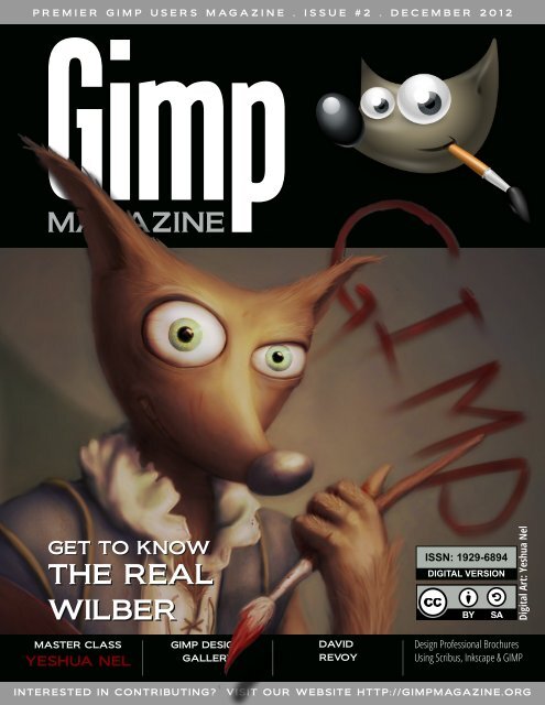
P R E M I E R G I M P U S E R S M A G A Z I N E . I S S U E # 2 . D E C E M B E R 2 0 1 2<br />
GET TO KNOW<br />
THE REAL<br />
WILBER<br />
MASTER CLASS<br />
YESHUA NEL<br />
<strong>GIMP</strong> DESIGN<br />
GALLERY<br />
DAVID<br />
REVOY<br />
ISSN: 1 929-6894<br />
DIGITAL VERSION<br />
INTERESTED IN CONTRIBUTING? VISIT OUR WEBSITE HTTP://<strong>GIMP</strong>MAGAZINE.ORG<br />
Digital Art: Yeshua Nel<br />
Design Professional Brochures<br />
Using Scribus, Inkscape & <strong>GIMP</strong>
g i m p m a g a z i n e . o r g<br />
2<br />
M A G A Z I N E C O N T E N T S<br />
FEATURE<br />
67<br />
5<br />
10<br />
20<br />
22<br />
24<br />
26<br />
LETTER FROM THE EDITOR<br />
MARTÍN ESCHOYEZ<br />
PRZEMYSLAW GEREMEK<br />
MARIA WENDT<br />
JEREMY GOOCH<br />
MASTER CLASS BY YESHUA NEL<br />
Yeshua Nel is a digital artist who has a passion for art—maybe even a<br />
“slight obsession,” according to him. This master class is a highlevel,<br />
step-by-step guide to how Yeshua started with a basic digital drawing<br />
and created a finished product called “Wilber” in six major steps using<br />
<strong>GIMP</strong>.<br />
DAVID REVOY, FOR <strong>GIMP</strong> MAGAZINE<br />
David Revoy is an illustrator / concept artist living and working in the<br />
south of France (Toulouse) as a freelancer since 2002. <strong>GIMP</strong> <strong>Magazine</strong><br />
asked David to contribute and here is his story.<br />
29<br />
GRAPHIC NOVEL<br />
<strong>GIMP</strong> TUTORIAL<br />
Madeleine Fisher is a<br />
Superhero by Day, Graphic<br />
Novelist by Night.<br />
Madeleine shares her story<br />
with us, as well as a full<br />
tutorial on how she creates<br />
graphic novels using <strong>GIMP</strong>.
42<br />
48<br />
80<br />
90<br />
94<br />
OIL PAINTING TUTORIAL<br />
USING <strong>GIMP</strong> BY SUSANNA<br />
BUR<br />
TUTORIAL: DESIGN<br />
PROFESSIONAL BROCHURES<br />
USING <strong>GIMP</strong>, INKSCAPE<br />
AND SCRIBUS<br />
TUTORIAL: USING A GRAPHIC TABLET<br />
WITH <strong>GIMP</strong> BY ROLF STEINORT<br />
<strong>GIMP</strong> DESIGN GALLERY<br />
Some of the most outstanding Digital Art<br />
from around the world—all created<br />
using <strong>GIMP</strong>.<br />
66<br />
THE HUNT FOR WILBER, A SPECIAL FEATURE<br />
BY DAVE LEPEK<br />
PRODUCT REVIEW<br />
The Artist's Guide to <strong>GIMP</strong>, a book review<br />
by Oma Dial<br />
g i m p m a g a z i n e . o r g<br />
3
g i m p m a g a z i n e . o r g<br />
4
L E T T E R F R O M T H E E D I T O R<br />
First, I want to sincerely thank everyone for your overwhelming support of our launch of <strong>GIMP</strong><br />
<strong>Magazine</strong>. Upon the announcement of our launch teaser (in July) we accumulated over 2,500 followers<br />
and roughly 20,000 page views from all parts of the world—and this happened over a weekend.<br />
All of this was based on a mock cover design, a website, social media properties, and an idea to<br />
make the coolest <strong>GIMP</strong> magazine ever. The notion that this is going to be an international magazine<br />
quickly grew as some subscribers from New Zealand asked for clarification of "Fall 2012" (something<br />
I never considered).<br />
<strong>GIMP</strong> <strong>Magazine</strong> - Issue 1 was downloaded over<br />
10,000 times in the first 24 hours, shattering all expectations<br />
and estimates. And our website views<br />
exploded to over 60,000 all while doubling our followers.<br />
Wow! Besides the numbers, most important<br />
were your comments, of which so many were<br />
positive. We greatly appreciate your comments as<br />
they drive us to do more. We want to get better at<br />
this and your constructive criticisms are helping. It<br />
does take significant effort from many people to<br />
produce this magazine, including our team and<br />
submitters.<br />
I am really excited about Issue 2, as it features<br />
digital arts, illustrations, graphic novels, tutorials, a<br />
book review, and so much more. We have had<br />
some pretty spectacular submissions to date, and<br />
the cover art by Yeshua Nel is simply outstanding.<br />
Acting as a curator of this magazine has become a<br />
more difficult task given the amazing submissions<br />
that we are receiving. And the fact that Yeshua and<br />
all the other contributors are willing to share their<br />
art and process under a Creative Commons licence<br />
with the world is pretty incredible.<br />
The format has been revised slightly for Issue 2.<br />
The magazine has been reformatted for professional printing. We are planning to make all issues<br />
from here on in available in a glossy, print-on-demand format. We are now accepting donations and<br />
you can also support us by buying official <strong>GIMP</strong> <strong>Magazine</strong> merchandise available from our gift shop.<br />
These items help us to cover the ongoing costs associated with running a free publication.<br />
I think for me the most spectacular thing is not what we have produced so far in Issues 1 and 2,<br />
but rather the enormous potential that <strong>GIMP</strong> <strong>Magazine</strong> has for the future. There are so many amazing<br />
opportunities that lie before us with this publication, and we can only make it better with your<br />
help. We would love to hear your ideas as to what you would like to see <strong>GIMP</strong> <strong>Magazine</strong> become—after<br />
all, it is your publication. Share your ideas with us on Twitter (www.twitter.com/gimpmagazine),<br />
on Google+ (+<strong>GIMP</strong> <strong>Magazine</strong>), on our website (http://gimpmagazine.org), or simply send<br />
us an email at gimpmagazine@hotmail.ca. With that, we (the <strong>GIMP</strong> <strong>Magazine</strong> Team) proudly leave<br />
you with Issue 2. There are many more <strong>GIMP</strong> users that we want to reach, so do us a favor and continue<br />
to spread the word.<br />
Enjoy!<br />
Cheers<br />
Steve<br />
http://www.twitter.com/steveczajka<br />
http://steveczajka.posterous.com<br />
g i m p m a g a z i n e . o r g<br />
5
A SPECIAL THANKS TO...<br />
HTTP://MEETTHE<strong>GIMP</strong>.ORG<br />
HTTP://SCRIBUS.NET<br />
HTTP://SMASHINGMAGAZINE.COM<br />
HTTP://PHOTOGRAPHYBLOG.COM<br />
HTTP://HOWTOGEEK.COM<br />
HTTP://CHIP.PL<br />
HTTP://MUKTWARE.COM<br />
+<strong>GIMP</strong> ON GOOGLE+<br />
HTTP://<strong>GIMP</strong>USERS.COM<br />
HTTP://<strong>GIMP</strong>USERS.DE<br />
HTTP://OPENNET.RU<br />
HTTP://OSTATIC.COM<br />
HTTP://OSWORLD.PL<br />
HTTP://NL.FOTOVIDEO.NU<br />
HTTP://GOLEM.DE<br />
HTTP://WYKOP.PL<br />
HTTP://PLANET.UBUNTUUSERS.DE<br />
HTTP://PHOTOGEEK.FR<br />
HTTP://<strong>GIMP</strong>FR.ORG<br />
HTTP://<strong>GIMP</strong>FORUMS.COM<br />
HTTP://<strong>GIMP</strong>TALK.COM<br />
HTTP://DYSCULTURED.COM<br />
ISSUE #2 . DECEMBER 2012<br />
EDITORIAL TEAM:<br />
Steve Czajka, Managing Editor<br />
Design & Desktop Publishing<br />
Jorden Grau, All things Editing / Submissions<br />
Dave Lepek, Contributing Writer / Editing Assistance<br />
Oma Dial, All things Product Reviews<br />
Rolf Steinort, All things Web<br />
Sandra Livingston, All things Proof / Editing<br />
LEGAL:<br />
<strong>GIMP</strong> <strong>Magazine</strong> does not take any responsibility, express<br />
or implied, for the material and its nature or accuracy of the<br />
information which is published in this magazine. All the<br />
materials presented in this magazine have been produced<br />
with the express permission of their respective<br />
authors/owners.<br />
<strong>GIMP</strong> <strong>Magazine</strong> and the contributors disclaim all<br />
warranties, express or implied, including but not limited to<br />
implied warranties of merchantability or fitness for a<br />
particular purpose. All images and materials presented in<br />
this document are printed/reprinted with express<br />
permission from the authors and/or writers. The content<br />
responsibility lies completely with the contributing writer or<br />
the author of the article, and may not be representative of<br />
the views of the publisher.<br />
This PDF magazine is free and available from the <strong>GIMP</strong><br />
<strong>Magazine</strong> website. <strong>GIMP</strong> <strong>Magazine</strong> is made available under<br />
Creative Commons "Attribution-Share Alike 2.5" license.<br />
<strong>GIMP</strong> <strong>Magazine</strong> trademark logo is copyright by the owner<br />
Steve Czajka.<br />
ADVERTISING:<br />
Please visit our website to view our advertising rate card<br />
and policies at http://gimpmagazine.org/about .<br />
HOW TO CONTACT <strong>GIMP</strong> MAGAZINE:<br />
Email: <strong>GIMP</strong><strong>Magazine</strong> at hotmail dot ca<br />
Website: http://gimpmagazine.org<br />
Twitter: www.twitter.com/<strong>GIMP</strong><strong>Magazine</strong><br />
Google+: +<strong>GIMP</strong> <strong>Magazine</strong><br />
Publication Origin: Mississauga, Ontario, Canada<br />
PRODUCTION NOTES:<br />
<strong>GIMP</strong> <strong>Magazine</strong> was created using Scribus 1.4.1, <strong>GIMP</strong><br />
2.6/2.8, Inkscape 0.47. Biondi was used for headlines,<br />
Open Sans and Open Sans Condensed for house<br />
typography. And we can't forget "the coolest mascot" ever,<br />
Wilber, adorning the front cover and various locations! ISSN<br />
1929-6894 (online), ISSN 1929-8498 (print).<br />
g i m p m a g a z i n e . o r g<br />
7
g i m p m a g a z i n e . o r g<br />
8<br />
S I N C E R E T H A N K S F R O M G I M P M A G A Z I N E<br />
KARL GEIGER JR4<br />
Awesome!<br />
IAN MUTTOO<br />
Congrats on issue 1! It<br />
looks great - and I'm happy<br />
to be a part of it.<br />
REID BAKER @REID_BAKER<br />
Congratulations to<br />
@<strong>GIMP</strong><strong>Magazine</strong> on the<br />
launch of issue #1...great<br />
work!<br />
DUNCAN @DUNCANHIMSELF<br />
@<strong>GIMP</strong><strong>Magazine</strong> Just<br />
read the first issue. Looks<br />
great.<br />
ΛΕΩΝΊΔΑΣ ΚΑΔΉΣ<br />
That was a great move!! A<br />
Bravo to all of you!!!<br />
KELLIANNE HUTCHINSON<br />
Awesomeness!<br />
LUKE GOODLING<br />
Awesome idea! :D<br />
DEVO BIDEAU<br />
I'm a fan.<br />
THOMAS HEINE<br />
...I am very impressed.<br />
RENÉ SANDOVAL @2ALIN<br />
@<strong>GIMP</strong><strong>Magazine</strong> I'm so<br />
impressed with the first<br />
issue. Looking forward to<br />
the next. Thanks and<br />
congrats!! :D<br />
MISTERMATT2U<br />
@MISTERMATT2U<br />
Just read the first issue of<br />
@<strong>GIMP</strong><strong>Magazine</strong>. Really<br />
enjoyed in. #<strong>GIMP</strong> is a great<br />
tool. Really really happy that<br />
it is now native on OS X too!<br />
TONI TALLEY @2TONTONI<br />
@<strong>GIMP</strong><strong>Magazine</strong> love the<br />
mag, read it cover to cover<br />
in one sitting, I couldn't put<br />
it down! So much great info.<br />
And the tutorial rocks!<br />
FILIPPO VENIERO<br />
@IFILGOOD_NET<br />
@<strong>GIMP</strong><strong>Magazine</strong> great<br />
job :-)<br />
ANDRE DE JESUS @A_DE_JESUS<br />
@<strong>GIMP</strong><strong>Magazine</strong> Great<br />
article with Ian Muttoo. His<br />
tip on using UFRaw was<br />
great being a new Rebel T3i<br />
owner its great to know I<br />
can shoot Raw<br />
ISHA(MARYSIAKUROWSKI<br />
@ISHABLUEBELL<br />
Great free 50 page pdf<br />
mag about the free graphics<br />
program Gimp<br />
http://gimpmagazine.org/<br />
thanks<br />
LUDOVIC CELLE @LUDOVICCELLE<br />
@<strong>GIMP</strong><strong>Magazine</strong> Thanks!<br />
Great job too on the whole<br />
magazine! It is a very<br />
professional mag, real high<br />
class show for Gimp !<br />
Congrats!!<br />
@TRAD76<br />
@<strong>GIMP</strong><strong>Magazine</strong> thank<br />
you :)<br />
CHEREPANOV ANDREY<br />
@ANDREYKAUF<br />
@<strong>GIMP</strong><strong>Magazine</strong> Good<br />
work, guys! Long Live<br />
Wilber!<br />
SCOTT PHILLIPS @EASTBYSOUTH<br />
@<strong>GIMP</strong><strong>Magazine</strong><br />
congratulations on the<br />
publication of Issue 1! On<br />
my #readinglist for today,<br />
can't wait to dive in<br />
#<strong>GIMP</strong>mag<br />
AARONDELANEY1983<br />
@ENGLISHYAM1983<br />
@<strong>GIMP</strong><strong>Magazine</strong> well<br />
done on issue #1, just had a<br />
quick glance, looks fantastic.<br />
MANUFACTURA IND.<br />
@MANUFACTURAIND<br />
@<strong>GIMP</strong><strong>Magazine</strong><br />
Congratulations on the<br />
release! Wonderful to see<br />
the libre design press field<br />
get richer :-)<br />
PIXEL TO VOXEL @PIXELTOVOXEL<br />
@<strong>GIMP</strong><strong>Magazine</strong> Great<br />
work guys!! Nice <strong>Magazine</strong> :)<br />
CHRIS<br />
...Congrats for the<br />
magazine release, must<br />
have been a lot of work.<br />
ARAM GRIGORYAN<br />
Great work from great<br />
people for great<br />
community…<br />
Thank you !!!<br />
DIMITRI ROBERT<br />
I enjoy to read this<br />
magazine that looks<br />
beautiful and interesting.<br />
MARIA<br />
I read and loved it! So<br />
exciting! I’m working on a<br />
project that I want to<br />
submit! I would love to<br />
make the front page!!<br />
SAVANNAH SOFTWARE<br />
This is exciting! Spreading<br />
the word.<br />
JEREMY<br />
Worked great for me on<br />
my tablet. I can`t wait untill<br />
the next issue. Keep up the<br />
good work!<br />
JORGE E.<br />
Great stuff! So glad to<br />
finally see this happening. I<br />
really want to learn Gimp,<br />
sometimes I struggle to find<br />
where to start.<br />
MIKE BING<br />
Wonderful magazine,<br />
well-written and excellent<br />
level of content. Feel very<br />
related to Ian (cover story) –<br />
there’s so much he says<br />
that rings a bell, it’s creepy!<br />
DINA BLASZCZAK<br />
Thanks for the magazine,<br />
looking forward to the next<br />
issue!<br />
LOLITHA RATNAYAKE<br />
Great work guys!<br />
REYNANTE M. MARTINEZ<br />
Great to see <strong>GIMP</strong> finally<br />
has a magazine to be<br />
featured with, and it has all<br />
the right to be.<br />
Looking forward to more<br />
issues.<br />
‘Grats, team. -Reyn<br />
JALOVELESS<br />
Excellent. I have been a<br />
long time user of Gimp but<br />
was self taught and I know I<br />
was missing a great deal by<br />
not really knowing what I<br />
was doing much of the time.<br />
The magazine will be an<br />
inspiration to me to start<br />
anew. Great job, guys and<br />
ladies! Thanks. Jon<br />
CHRIS KILBY<br />
This is belting. I really<br />
hope this flies well – thanks.<br />
CLEMENS ON<br />
Just awesome, guys<br />
Thanks alot^^<br />
VMEDEL<br />
thanks a lot !<br />
FABRICIO ROMERO<br />
Excellent… from<br />
Venezuela thanks a lot<br />
LOIC97450<br />
coooool!!!!!<br />
BWENDO<br />
Great new innovation<br />
JOHN.STILES<br />
Looks great, looking<br />
forward to reading it.<br />
PAUL @PAULSAVAGE<br />
who knew that there was<br />
a magazine for <strong>GIMP</strong>? cool!<br />
JEAN-LOUP R-S @JEAN_LOUP
This could prove really<br />
quite useful as a resource :)<br />
<strong>GIMP</strong> <strong>Magazine</strong> originally<br />
shared this…<br />
THOMAS HEINE<br />
Thanks for your efforts<br />
and impressive work,<br />
+<strong>GIMP</strong> <strong>Magazine</strong> :)<br />
TROY LAUFFER +2<br />
I miss Photoshop a lot. A<br />
whole lot. But Gimp has<br />
surprised me with how<br />
powerful it can be if you<br />
know how it likes to be<br />
tickled. I can't wait to dig in!<br />
JOHN MCCORMACK<br />
Sincere thanks<br />
CHRIS FIEDLER<br />
Congrats to the first issue<br />
of the gimp-magazine!<br />
LOST TRIBE<br />
Awesome work! Thanks<br />
for that!<br />
Wow, Im on 10 page...<br />
EMANUL NOMAN<br />
Great<br />
BRANKO STRIHIC<br />
Congrats!<br />
TIMOTHY BURDINE<br />
the best :)<br />
STEVEN ELLEN STARAR<br />
Very nice!<br />
NICO KEMPE<br />
Awesome!<br />
BORIS PEJIC<br />
Great magazin ;)<br />
POPURI SAI DHRUV<br />
owesome<br />
STUART MCDERMID<br />
Bring out the <strong>GIMP</strong>!<br />
ROBERT FROST<br />
ROBERT FROST<br />
AWESOME<br />
JONAS TIRUNAS<br />
I like this! Glad you guys<br />
are doing this! Best of luck<br />
for new issues.<br />
JOHN MALLOY<br />
Great read, looking<br />
forward to the artist<br />
reviews.<br />
Thanks again for my daily<br />
inspiration!!!<br />
KEVIN HODGES<br />
Great job! I look forward<br />
to the next issue.<br />
ELVIN SURTIDA<br />
Owesome!<br />
LAWRENCE LAGERLOF<br />
Shit, this is awesome!<br />
GEORGE HAYES<br />
very cool about time<br />
someone came out with<br />
this. Great work.<br />
HIMITSU ANIMO<br />
Woo-hoo! :)<br />
MUHAMMAD MAAHIR<br />
So awesome<br />
SHAILESH GYAWALI<br />
wow Finally. thank you<br />
JOSEPH KAYCES<br />
awesome<br />
JIMMY NAIDOO<br />
Was worth the wait...<br />
SUSAN DEVY<br />
awesome ! great job !<br />
OUSSAMA BOUNAIM<br />
Congratulations keep the<br />
good work.<br />
OSCAR MONZÓN<br />
Downloading it right now.<br />
Congratulations, keep up<br />
the good work!.<br />
HORST JENS<br />
already subscribed. will<br />
spread the word. keep<br />
making awesome<br />
magazines !<br />
IMAGISPEAK<br />
wow!! very cool!!<br />
BRIAN A CATNUT<br />
Nice Job, it looks great !!!<br />
NEWMIKEY<br />
Excellent read!<br />
LANCEKINGPHOTO<br />
I enjoyed the first issue<br />
very much. This is some<br />
quality work! It's<br />
encouraging to see there<br />
are serious professionals<br />
using <strong>GIMP</strong> - and creating<br />
fantastic art! rodbotic<br />
thanks<br />
FRANZ CHRISTOPHER<br />
@LEGIONZERO<br />
A high quality free<br />
magazine made entirely of<br />
#FOSS simply awesome! Go<br />
#<strong>GIMP</strong> #INKSCAPE<br />
#SCRIBUS<br />
FRED<br />
yeeeaaah boi. this is<br />
exactly what <strong>GIMP</strong> needs.<br />
Hopefully can this will help<br />
to convert to <strong>GIMP</strong> for good.<br />
JOHN BUK<br />
This is excellent news...this<br />
magazine will be a boon.<br />
Good luck to you all.<br />
COWBOY NICK<br />
So awesome! I’ve always<br />
wanted to dig in deep with<br />
gimp, and this will be a<br />
preferred resource. Thanks<br />
again!<br />
RICHARD<br />
This is going to be great.<br />
DEB SPOONS<br />
Great Idea on the back to<br />
school theme! Always nice to<br />
find information on one<br />
page..can not wait to try it<br />
out.<br />
WYATT<br />
I am so incredibly excited<br />
for this to come out!<br />
ANDREAS HEIMOWSKI<br />
You make a great Job!<br />
THANKS! … for this Mag.<br />
JOHN<br />
Hi. Great news about the<br />
magazine. Really good<br />
timing as I am soon to<br />
launch a serious endeavour<br />
to encourage our school art<br />
department to consider<br />
using <strong>GIMP</strong>. As another from<br />
downunder I agree with<br />
previous poster about<br />
referring to issues by month,<br />
or maybe 1st Quarter, 2nd<br />
Quarter etc. Looking good.<br />
g i m p m a g a z i n e . o r g<br />
9
DAVID REVOY, FOR <strong>GIMP</strong> MAGAZINE<br />
David Revoy is an illustrator / concept artist living and working in the south of France (Toulouse) as a freelancer since<br />
2002. <strong>GIMP</strong> <strong>Magazine</strong> asked David to contribute and here is his story. David's website is http://www.davidrevoy.com<br />
and he can be reached at info@davidrevoy.com. This interview with <strong>GIMP</strong> <strong>Magazine</strong> took place on 2012-08-10.<br />
HOW AND WHEN DID YOU GET STARTED WITH YOUR<br />
ART?<br />
I think I wanted to stick seriously with the idea to become an<br />
artist at around 12 years old. It sounds an early age for a life<br />
choice, but I felt really too seriously concerned by the question of<br />
adults around me: "What do you want to do in the future?" I had<br />
to find a quick and definitive solution to answer this. As I was a<br />
young geek creative boy, I decided to be a comics author. Comics<br />
appeared to me the most full art, and I started to train hard [on]<br />
my drawing skill. But my own comics while I was a teenager were<br />
mostly only made with the part of the "concept-art dossier," not<br />
so much of real story pages. Designing all characters, scenes,<br />
clothes—a universe—was a real passion for me. That's how I discovered<br />
I would love the work of concept artist and illustrator<br />
(and more, art director), which all include a bit of what I love. On<br />
the “how” question, I'm mostly a self-taught artist and started<br />
more than 10 years ago, when [the] Internet and computers<br />
were not in all houses like today.<br />
WHO OR WHAT INFLUENCED YOU THE MOST TO PURSUE<br />
THIS PASSION?<br />
I got a pretty big immersion when I was kid with an RPG game<br />
named "Secret of Mana" on the Nintendo Super Famicom/SNES.<br />
I'll never forget the immersive power of this game, and till today<br />
I'm motivated to one day create something of the same excellence.<br />
WHAT TYPE OF WORK DO YOU DO?<br />
I paint mainly book-cover illustrations for the printing industry<br />
and draw concept art of characters and environments for video<br />
games and movies. I also do training DVDs, and teach in school,<br />
at workshop events, etc.<br />
DESCRIBE YOUR CREATIVE PROCESS.<br />
I have various creative processes. I 'll try to make a little list of<br />
the first that came to my mind.<br />
• Take notes after waking up from an interesting dream (might<br />
g i m p m a g a z i n e . o r g<br />
11
g i m p m a g a z i n e . o r g<br />
have pretty creative contents)<br />
• Watch chaotic shapes (clouds , concrete, fractal imagery) and try<br />
to make sense of it<br />
• Play with Blender 3D and build a scene with random modelled<br />
objects<br />
• Just get an idea and sketch on my sketchbook<br />
TELL US SPECIFICALLY ABOUT THE “CENDREA” IMAGE.<br />
“Cendrea” is a fully video-recorded illustration done to be the<br />
cover of my first training DVD, Chaos & Evolutions. It’s an open<br />
workshop DVD (under Creative Commons Attribution licence),<br />
about digital painting with <strong>GIMP</strong> Painter. I wanted to paint a portrait<br />
for it, inspired by a character design I do in the DVD too.<br />
DESCRIBE YOUR OVERALL DIGITAL PROCESS.<br />
Well, that’s a bit complex and long to write. I create pictures<br />
from scratch on a white digital canvas using a pen tablet. I'll attach<br />
pictures of the work-in-progress of “Cendrea” just to let you<br />
see how things evolve. Most of my process, tutorials, and my two<br />
open DVDs are also available online, under the Tutorial category<br />
of my website http://www.davidrevoy.com/4-tutorials.html<br />
TELL US ABOUT HOW YOU CAME TO USE <strong>GIMP</strong> AND / OR<br />
OTHER OPEN SOURCE GRAPHICS TOOLS?<br />
I started as a poor CG artist, and I always refused to fall into<br />
piracy. That’s how I discovered the free-offer world. My first freelancing<br />
studio ran with <strong>GIMP</strong> 2.2, Photoshop Elements 2, Inkscape,<br />
and Blender. But with time, I had problems with the clients<br />
who wanted CMYK pictures for book covers or board games. I<br />
had to buy Photoshop CS2 for this feature.<br />
Then my studio evolved with more new costly apps, like Painter<br />
9.5 or Manga Studio 3. When Microsoft Vista was a default on<br />
new computers at this time, I had an issue with reinstalling my<br />
paid licences. The only way to solve this issue was to pay for upgrades,<br />
and they were really expensive. So expensive that it was<br />
cheaper to buy back an old computer with XP. I started to see the<br />
total nonsense of proprietary software, and started to get interested<br />
in Linux distributions. I started to play with Ubuntu in 2006.<br />
Being around open source software I also got contacted to do<br />
the art direction on Sintel, the third open movie of the Blender<br />
Foundation, a good challenge to do all the concept art and illustrations<br />
of the preproduction with open sources on Linux.<br />
At this time, <strong>GIMP</strong> Painter 2.6, MyPaint 0.7, and Alchemy were<br />
the best of the digital painting with FLOSS. I'm happy about last<br />
year’s development, the direction MyPaint took, and how Krita<br />
totally got transformed in the last three years to be the reference<br />
as digital painting software. For <strong>GIMP</strong>, I stopped using it full-time<br />
since the 2.8 update at the start of 2012 . I still open it time to<br />
time, mainly for filters.<br />
WHAT COULD THE <strong>GIMP</strong> DEVELOPERS DO TO MAKE <strong>GIMP</strong><br />
3.0 A BETTER PAINT PACKAGE?<br />
I’ve already spent full days working on it with the <strong>GIMP</strong> Mental<br />
Models team, doing long webcam interviews and writing detailed<br />
reports, and I got no feedback. So I doubt my opinion here is<br />
wanted or important. Digital painters like me are not the target<br />
12<br />
TITLE: “LUCID LYNX” (ABOVE, P.10)<br />
DESCRIPTION: AN HOMAGE TO ONE OF MY<br />
FAVORITE LINUX DISTRIBUTIONS. UBUNTU<br />
LUCID LYNX WAS A REALLY MATURE<br />
DISTRIBUTION, AS ALL LTS AND RECENT<br />
PRECISE PANGOLIN. TOO BAD I'M NOT LIKING<br />
GNOME 3’S NEW ERGONOMY AND UBUNTU<br />
UNITY. I’VE SWITCHED TO KUBUNTU 12.04<br />
NOW, WHICH IS ADORABLE.<br />
DONE WITH <strong>GIMP</strong> PAINTER 2.6 AND MYPAINT<br />
1.0
TITLE: “ANCIENT BEAST VOLCANO CREATURE” (ABOVE)<br />
DESCRIPTION: A VOLCANO CREATURE DONE FOR THE ANCIENT BEAST OPEN GAME<br />
CREATION.<br />
DONE WITH KRITA 2.5 AND MYPAINT 1.0
TITLE: “QUETZALCOAT” (LEFT)<br />
DESCRIPTION: A PAINTING FOR THE TRAINING<br />
DVD CHAOS & EVOLUTIONS<br />
DONE WITH <strong>GIMP</strong> PAINTER 2.6 AND MYPAINT 0.8<br />
users of the newer <strong>GIMP</strong> (and never were; that’s why <strong>GIMP</strong> Painter<br />
was a fork).<br />
From <strong>GIMP</strong> Painter 2.6 to actual <strong>GIMP</strong> 2.8 there is a big gap.<br />
I'm happy if the <strong>GIMP</strong> team focuses now on serving other users<br />
with specific needs, such as photographer tweaks or specific image<br />
manipulation.<br />
Digital painters now have Krita and MyPaint, which are both<br />
very powerful. It would be silly to duplicate effort on this side<br />
now, in my opinion.<br />
WHERE DO YOU SEE THE FUTURE OF <strong>GIMP</strong>?<br />
I have no idea. I think as it is now, just more solid, more featured.<br />
Or maybe largely simplified to win the attention of a larger<br />
public, at the cost of the professional users.<br />
WHERE DO YOU SEE YOUR ART GOING? AND WHAT PRO-<br />
JECTS ARE YOU WORKING ON NOW THAT YOU WANT TO<br />
PROMOTE?<br />
I have no idea too at all about my art. I work for the moment to<br />
get more effective, to find a good balance between good quality<br />
and time of creation. Mainly to come back to visual storytelling. I<br />
didn't produce any personal artwork for months; mainly sketchbook<br />
studies.<br />
The project I want to promote is, of course, Tears of Steel (http://mango.blender.org/),<br />
the fourth open movie of the Blender<br />
Foundation, where I did concept art and helped on storyboarding.<br />
AND HOW CAN PEOPLE CONTACT YOU (WEBSITE, TWIT-<br />
TER, ETC.)?<br />
Website http://www.davidrevoy.com<br />
Email info@davidrevoy.com<br />
Twitter https://twitter.com/davidrevoy<br />
Deviant.Art http://deevad.deviantart.com/ ■<br />
g i m p m a g a z i n e . o r g<br />
15
g i m p m a g a z i n e . o r g<br />
16<br />
TITLE: “MEETING UNDER THE TREE” (TOP RIGHT)<br />
DESCRIPTION: A SPEED PAINTING FOR THE TRAINING DVD<br />
CHAOS & EVOLUTIONS<br />
DONE WITH <strong>GIMP</strong> PAINTER 2.6 AND BLENDER<br />
TITLE: “MISSION” (MIDDLE RIGHT)<br />
DESCRIPTION: A PAINTING DONE WITH A 3D BASE, FOR<br />
THE DVD BLEND & PAINT<br />
DONE WITH BLENDER 2.6, <strong>GIMP</strong> PAINTER 2.6, AND<br />
MYPAINT 1.0<br />
TITLE : “LEZARD” (BOTTOM RIGHT)<br />
DESCRIPTION: ONE OF THE FIRST SCREEN RECORDINGS I<br />
DID BEFORE CHAOS & EVOLUTIONS, SHOWING FOR THE<br />
FIRST TIME MY DIGITAL PAINTING WORKFLOW.<br />
DONE WITH <strong>GIMP</strong> PAINTER 2.6 AND MYPAINT 0.7<br />
TIMELAPSE (HTTPS://VIMEO.COM/6143607)<br />
TITLE: “CENDREA” (IMAGE SET BELOW P.18,19)<br />
DESCRIPTION: INCLUDED IN THE INTERVIEW. THERE ARE ALSO THREE WORK-IN-PROGRESS STEPS IN THE<br />
ARCHIVE.
Texture: flickr CC BY Neighya
TITLE: "366 DIBUJOS" (366 DRAWINGS)<br />
ABOUT MARTÍN: I'M A SELF-TAUGHT DESIGNER / ANIMATOR / CG ARTIST &<br />
TEACHER BASED IN ARGENTINA, STRONG PROMOTER OF LIBRE / OPEN SOURCE<br />
SOFTWARE. I AM ALSO A PROFESSOR AT VARIOUS INSTITUTES, AND I'VE GIVEN<br />
TALKS AND WORKSHOPS COVERING OPEN SOURCE TOOLS FOR DESIGN AND<br />
ANIMATION.<br />
DESCRIPTION: THIS IS MY LITTLE PROJECT 366 DRAWINGS, ONE PER DAY.<br />
WEBSITE MY STUDIO & ALTER EGO WWW.EPANIMATION.COM.AR<br />
WEBSITE THE VACUI SPACII OPEN PROJECT WWW.VACUISPACII.ORG<br />
g i m p m a g a z i n e . o r g<br />
21
g i m p m a g a z i n e . o r g<br />
22
Przemyslaw Geremek<br />
TITLE: "PANM+ÔZGDRUK" (LEFT) AND "LUST" (ABOVE)<br />
ABOUT PRZEMYSLAW: PRZEMYSLAW IS FROM POLAND, WORKING AS FREELANCER (IN GAME DEVELOPMENT) IN<br />
THE EVENINGS, AFTER HIS FULL-TIME JOB. PRZEMYSLAW LIKES SCI-FI AND FANTASY, AND THESE IMAGES ARE<br />
MOSTLY MADE IN THIS MOOD. PRZEMYSLAW USES ONLY <strong>GIMP</strong>.<br />
DESCRIPTION: ALL IMAGES WERE MADE WITH PEN TABLET IN <strong>GIMP</strong> 2.6.12 WITH A ROUND BRUSH. PRZEMYSLAW<br />
IS ALSO FEATURED WITHIN OUR DESIGN GALLERY.<br />
EMAIL: PRZEMYSLAWGEREMEK@WP.PL<br />
g i m p m a g a z i n e . o r g<br />
23
g i m p m a g a z i n e . o r g<br />
24<br />
Maria Wendt<br />
TITLE: "VAIN AS A PEACOCK"<br />
ABOUT MARIA: I'VE BEEN USING <strong>GIMP</strong> FOR THE PAST SIX YEARS OR SO AND I LOVE IT!<br />
DESCRIPTION: I TOOK A BASIC PEACOCK SILHOUETTE, COLORED IT BLUE AND PAINTED THE SPLOTCHES<br />
OVER IT. I THEN DOWNLOADED SOME STAINED PAPER TEXTURES AND PUT IT BEHIND THE PEACOCK. I<br />
USED THE FREE FONTS "BEBAS" AND "REGENCYSCRIPTFLF MEDIUM." I DON'T KNOW IF THIS IS MY<br />
BEST WORK, BUT IT'S ONE OF MY FAVORITES.<br />
CONTACT: MWENDT@HYPERDO.COM
g i m p m a g a z i n e . o r g<br />
26
TITLE: "STEAMPUNK" (LEFT) AND "PORTRAIT" (ABOVE)<br />
ABOUT: I'VE BEEN USING <strong>GIMP</strong> SINCE 2008 AND I'VE MADE IT A PERSONAL MISSION TO<br />
SWITCH TO ENTIRELY FREE SOFTWARE TO CREATE MY ARTWORK, SO USING <strong>GIMP</strong> WAS A<br />
NATURAL TRANSITION FOR ME.<br />
I WORK PROFESSIONALLY AS AN INTERFACE DESIGNER, AND I DO FREELANCE ILLUSTRATION AS<br />
WELL. I ENJOY WORKING IN A VARIETY OF MEDIUMS, BUT LATELY I HAVE BEEN WORKING<br />
PRIMARILY IN THE DIGITAL REALM.<br />
DESCRIPTION: ARTWORK CREATED USING <strong>GIMP</strong> 2.6 ON LINUX MINT 11.<br />
CONTACT: HTTP://JEREMYGOOCH.BLOGSPOT.COM/<br />
g i m p m a g a z i n e . o r g<br />
27
g i m p m a g a z i n e . o r g<br />
30<br />
PART 1 - SUPERHERO BY DAY<br />
Tutorial by Madeleine Fisher, Edited by Steve Czajka and Sandra Livingston<br />
My name is Madeleine Fisher. I'm an artist, and I use <strong>GIMP</strong>. By day, I have two very special hours during which I take<br />
simple requests. And, well . . . during the rest of my day and night I create comics. Let me share with you these aspects<br />
of my art in this two-part article.<br />
At 1:30 p.m. every day, I get a knock on my door. I<br />
open it up, lug my backpack along, and join my client<br />
in his mother's car. This is my day job. I work with a<br />
man with profound autism.<br />
Over the years I have developed a talent for<br />
drawing and, for whatever reason, John, my client (as<br />
I call him on my blog) enjoys it. I'm not a social<br />
worker, and this work is not considered art therapy.<br />
John insists on having me there as often as he can.<br />
As soon as I finish up, he's asking if I can come back<br />
again the next day. His mother says that when I'm<br />
there it is the only time when he is really in the<br />
moment.<br />
John’s mother claims, “Every other time, he's<br />
focusing on the next thing. If I take him to the<br />
movies, he's asking to go to his dad's office; if I take<br />
him to his dad's office, he's asking to go to Target;<br />
when he's at Target he asks for the next thing, and so<br />
on. When he's with you [Madeleine], he doesn't ask<br />
for anything.”<br />
So, there we sit, just John and me. John pulls up<br />
Google® images for references, and I draw simple<br />
illustrations for him. This is my job, every day for<br />
about two hours. He requests everything from<br />
Disney characters to video game levels. John<br />
especially likes characters from the early nineties and<br />
late eighties, so I've had to revisit a great deal of my<br />
past to get a handle on all the characters and<br />
settings he likes me to draw. Chip ‘n’ Dale, Mega Man,<br />
the Quack Pack—I draw them all.<br />
Here's how!<br />
Now, I can't use any copyrighted or copyrightbased<br />
materials in this article, but I can show you<br />
what I do, especially if I use a character near and<br />
dear to all our <strong>GIMP</strong>-loving hearts: Wilber!
STEP 1 - CREATE IMAGE<br />
First, I make a large image file—the size of an 8½by-11<br />
sheet of paper.<br />
STEP 2 - CREATE TRANSPARENT LAYER<br />
I then create a transparent, blank layer on top of<br />
the white background. Then I zoom in to 100%. From<br />
there, it's up to John. Here is an example of a request<br />
from John: “Wilber Baseball Cap Baseball Shorts Toes<br />
Tummy.” To make this I use the pencil tool to create<br />
the line art. I could talk about drawing, but I'd need<br />
another article in itself to even scratch the surface,<br />
so let's just stick with what tools I'm using. I set the<br />
pencil to respond to pressure in terms of how big it<br />
is (check “Size”), and leave everything else<br />
unchecked. (In the new release candidate [prior to<br />
2.8], this became much less tedious; instead of<br />
having to adjust every tool, I was able to create a new<br />
pressure setting called “Default Madeleine Pressure,”<br />
and it applies to everything.)<br />
READ MORE:<br />
LEARN ABOUT HOW TO SET UP A GRAPHIC TABLET ON PAGE 90.<br />
EDITOR'S NOTE:<br />
WHILE MADELEINE WROTE THIS TUTORIAL, WE ADDED THE SUPERHERO BIT, BECAUSE WE THINK SHE IS<br />
A TRUE SUPERHERO!<br />
g i m p m a g a z i n e . o r g<br />
31
g i m p m a g a z i n e . o r g<br />
32<br />
STEP 3 - THE PENCIL TOOL<br />
Why the pencil tool? Because (and this is<br />
important) the pencil tool does not produce<br />
feathered edges. This means I also set my eraser tool<br />
to “Hard Edge.” It matches with the hard lines of the<br />
pencil tool so that I can fill easily. (This holds true of<br />
every tool that I want to use directly on the drawing.)<br />
I also make sure to set the mode to “Behind” at this<br />
point. Since this lets me always draw “behind”<br />
whatever I've already drawn, it can really help when I<br />
need to quickly close up a not-quite-closed shape, or<br />
fill in tiny areas like one or two pixels.<br />
STEP 4 - ADD BACKGROUND ELEMENTS<br />
I did a few lines in green, as you can see. This will<br />
be part of the sparse background I like to add. From<br />
there, I pick the colors from the color wheel (the one<br />
with the triangle) and apply as I see fit.
STEP 5 - THE EYEDROPPER TOOL<br />
If I've already drawn a character I can go back and<br />
just use the eyedropper tool to select the colors I<br />
chose the first time. This process goes really fast, and<br />
I can turn out maybe 15 drawings a day with it. That<br />
might not sound like a lot, but 15 drawings in two<br />
hours makes for a finished, fully colored drawing<br />
every eight minutes! Not bad for a free program!<br />
Here's the finished product:<br />
PART 2 - GRAPHIC NOVELIST BY NIGHT<br />
Tutorial by Madeleine Fisher, Edited by Steve Czajka and Sandra Livingston<br />
The other thing I do with my artistic abilities—courtesy of <strong>GIMP</strong>—is create comics. Right now I have two projects in the<br />
works. One is my very own original, “Precious Metal.” I try to update it five days a week. My other comic project now in<br />
the works is tentatively titled “The True Power.”<br />
Since I try to do a full-color page practically every day, I've had to work to find the most efficient methods possible.<br />
Thanks to my job with John, I have a lot of practice daily with efficient drawing and (especially) digital coloring. My<br />
process has changed a lot since the first few pages, even those of the current issue. So far, this is what I've come up<br />
with.<br />
STEP 1 - THUMBNAIL SKETCH<br />
First, I start with a thumbnail. I use plain old white<br />
printer paper and just scribble down the layouts and<br />
rough passes at the dialogue. I've found that the<br />
more I get down on paper at this stage, the easier it<br />
is for me later, so I try hard to include backgrounds,<br />
room for speech bubbles, the characters' positions,<br />
etc. The expressions are probably the most fun part,<br />
and I do get some good ones at this stage. It's a fun<br />
challenge to try to capture those at a bigger size<br />
when I do this!<br />
[see image (right) Here's me at my light box.]<br />
STEP 2 - ROUGH DRAWINGS<br />
I use <strong>GIMP</strong> to cut apart the rough drawings and<br />
reassemble them (when necessary) so I can print out<br />
a full-page-sized version of each page rough. That's<br />
the image you can see below my pencils. I tape a<br />
clean sheet on top, get out my ruler and pencil, and<br />
start doing a rough, large version. Currently I just use<br />
normal 8½-by-11 sheets because that's all my<br />
scanner can handle. The pencilling stage is useful for<br />
g i m p m a g a z i n e . o r g<br />
33
g i m p m a g a z i n e . o r g<br />
34<br />
placing everything, but it's even more useful if I need<br />
to adjust something. Also, the pencil is a great way to<br />
experiment with the little details—poses and<br />
expressions can be adjusted, I can work out the<br />
background and the textures, patterns, and details I<br />
might use. It's a good way for me to see how I can fill<br />
out the panel properly.<br />
STEP 3 - INKING<br />
Once that is finished the rough is no longer<br />
needed, so I peel the two sheets from the light box<br />
and tape down the next clean-sheet and rough. In<br />
the meantime, inking isn't a process tied to the light<br />
box, since I just do it right on top of the pencils, so I<br />
can take my pens and sit somewhere comfortable,<br />
watch a movie, and generally bask in the populace<br />
while I set down my pen lines.<br />
When I ink I try not to just follow the pencil lines. I<br />
focus more on the varying widths and the textures of<br />
the lines than I did in the pencil stage. To get more<br />
rhythm, my lines sometimes extend along past the<br />
overlaps. Thankfully, <strong>GIMP</strong> will help me fix this.<br />
Speaking of which, it's finally time to take it there.<br />
Back into the computer the image goes, through the<br />
magic of digital scanning technology!<br />
STEP 4 - CLEANUP<br />
From here, I go through the longest part of the<br />
process: cleanup then color. Since this is the part<br />
that is the most <strong>GIMP</strong>-intensive step, I use really<br />
basic tools and methods, but again, I'm going for<br />
efficiency. I start by opening up my scanned image<br />
and cropping off the unnecessary edges. I use the<br />
rectangle tool and then choose Image - Crop to<br />
Selection.<br />
The next step is scaling it up. I like to scale it up to<br />
a width of 3300, because that size makes it suitable<br />
enough for printing, yet small enough that it doesn't<br />
crash my computer. When complete I can scale this<br />
down for the Internet.<br />
I learned a nifty image cleanup trick a while ago:<br />
with the image scaled up to at least twice the original<br />
size, when I threshold it, I will end up with nice clean<br />
lines.<br />
(I learned the basics of that technique from a guy<br />
who uses Photoshop®, admittedly, but he knows a<br />
lot more than I do! Anthony Clark, the creator of the<br />
web comic “Nedroid” (http://nedroid.com/), gave<br />
some great free advice on cleanup at
g i m p m a g a z i n e . o r g<br />
36<br />
More free advice along these lines can be found<br />
from another of my favorite artists, Gigi D.G., at<br />
http://gigidigi.tumblr.com/post/16744776382/firstthank-you-so-much-for-all-the-likes-and<br />
After the elusive and sometimes hidden first step,<br />
it's time to actually really truly color.<br />
The first thing I do is select all the black lines and<br />
put them on their own layer. The second thing is to<br />
create a check layer and fill it with an eye-blinding<br />
color. This layer will help me see what I have and<br />
haven't colored, which can be more difficult to do<br />
with just plain white. Once complete I fill in all the<br />
areas that are supposed to be white, including<br />
gutters, speech bubbles, characters' eyes and teeth.<br />
Then I set my pencil tool to behind mode. This allows<br />
me to get the right color in little, hard-to-reach areas.<br />
Rather than having to click a fill bucket precisely on<br />
one pixel, I can just rub the pencil behind the pixel's<br />
general vicinity. This is also useful in situations like<br />
this:
Finally, the most useful thing I get out of behind<br />
mode is that I can start off with two shades, rather<br />
than having to use filters or other layers. My colors<br />
for the chef's skin, for example, are already selected.<br />
For efficiency's sake, I only have two—one for the<br />
light areas and one for the shaded.<br />
I try to keep this as quick as possible by just<br />
coloring all the areas that are the same color. Again,<br />
let's use the chef's skin as an example. The first thing<br />
I do is put in the outlines of the dark areas in the<br />
panel. I fill those, and there are my shadows.<br />
I fill the rest with the lighter color.<br />
Then I move to the next panel, and so forth and so<br />
on until all of the chef's skin on the page is colored.<br />
TIPS AND TRICKS<br />
WANT TO NAVIGATE QUICKLY IN <strong>GIMP</strong>?<br />
USE THE NAVIGATION WINDOW BY CLICKING ON THE TRIANGLE<br />
LOCATED JUST ABOVE WHERE IT SAYS CONFIGURE THIS TAB. CLICK<br />
ON ADD TAB / NAVIGATION. ONCE ADDED, YOU CAN ZOOM IN,<br />
ZOOM OUT, ZOOM FULL IMAGE AND ZOOM 1:1 SCALE. THIS IS A<br />
VERY QUICK WAY TO NAVIGATE YOUR IMAGE!<br />
g i m p m a g a z i n e . o r g<br />
37
g i m p m a g a z i n e . o r g<br />
42<br />
OIL PAINTING TUTORIAL USING <strong>GIMP</strong><br />
By Susanna Bur, Edited by Steve Czajka and Sandra Livingston<br />
Susanna has been an artist since she was 20 years old, and she delved into the world of digital artistry a year and a half<br />
ago. She is a Master of Business Administration graduate, a photographer, painter, and author – publisher.<br />
QUICK <strong>GIMP</strong> USER FACTS<br />
• USES <strong>GIMP</strong> BOTH FOR WORK AND AS A HOBBY<br />
• USES <strong>GIMP</strong> PAINTER 2.6 FOR DIGITAL ART (LOVES<br />
THE MIXBRUSH TOOL) AND <strong>GIMP</strong> 2.8 FOR PHOTOS<br />
• IN TERMS OF NON-<strong>GIMP</strong> SOFTWARE, USES SIGIL,<br />
CALIBRE, CELTX, MS OFFICE, OPENOFFICE,<br />
SKETCHBOOK PRO 2011, HDR DARKROOM,<br />
SCRIBUS, PDFCREATOR, ITUNES, IRFANVIEW, AND<br />
PDF-XCHANGE VIEWER .<br />
• USES AND CREATES THOUSANDS OF TEXTURES,<br />
BRUSHES, AND PALLETTES, WHICH ARE BACKED UP<br />
ON AN EXTERNAL DRIVE<br />
• USES TRUST AND BAMBOO AS GRAPHICS TABLETS<br />
• USES BOTH A NIKON D80 AND SAMSUNG CAMERAS<br />
• USES HER VAST COLLECTION OF PENS, COLORS,<br />
PAPERS, AND CANVASES FOR NON-DIGITAL<br />
MATERIALS
STEP 5 – CREATE DEPTH<br />
Always add to your work on a duplicated layer so<br />
you may go back in case of an error. Choose a round<br />
soft, middle-round-soft, or fuzzy brush to put on the<br />
darker colors.<br />
STEP 6 – PAINT DETAILS<br />
In the next layer, paint the apple’s strems in a<br />
green-gray (R51 G56 B34) color. Use white to paint<br />
the light, with opacity of 30 per cent. Repeat this<br />
procedure several times in order to achieve the<br />
desired result.<br />
STEP 7 – SURFACE TEXTURE<br />
Paint the surface texture of the apples with small<br />
strokes in a darker red. Use the Smudge tool again,<br />
with reduced opacity, to make the surface look soft.<br />
Paint the green color in the left top edge. Work the<br />
piece with the smudge tool over and over again until<br />
you achieve the desired effect.<br />
g i m p m a g a z i n e . o r g<br />
45
g i m p m a g a z i n e . o r g<br />
46<br />
STEP 8 – CREATING STRUCTURE<br />
Paint the structure on the left side above the<br />
apples with darker colors in green and red. Smudge<br />
the colors again to give the painting the look of a soft<br />
oil painting. In the last step draw the water drops.<br />
STEP 9 – ADDING WATER DROPS<br />
(PENDULOUS WATER DROPS AND<br />
HORIZONTAL WATER DROPS)<br />
In this sample, the light rays are flowing from<br />
above left, so the shadows have to be on the lower<br />
right side. Draw the shapes of the drops with a hard,<br />
small, round brush in a dark color using a preset<br />
round brush, 01 – 02 , in black.<br />
The texture under the drops (e.g., leaf veins)<br />
should be drawn as broken, intensified, and<br />
disarranged.<br />
In the next step, the shadows inside the drops are<br />
painted with a soft brush. In this case, the shadowed<br />
area lies on the left side; the white light reflections<br />
have to be placed in the lower right side. Draw the<br />
hard shadow of the water drops.<br />
Lastly, draw the white highlights with a soft brush.<br />
The white spots arise in the areas where the light is<br />
intruding, and in the opposite area in which it is<br />
reflecting. Activate the hard shadows and the image<br />
is complete.<br />
SUSANNA BUR’S COORDINATES:<br />
email: susannabur@googlemail.com<br />
Facebook:www.facebook.com/susanna.bur<br />
Twitter: twitter.com/Susanna_Bur<br />
website: www.punkt-werk.de<br />
website: www.art-and-people.de ■<br />
TIP:<br />
THE BEST WAY TO DRAW NATURE IS TO OBSERVE IT FIRST. TRY TO OBSERVE THE WAY THE LIGHT SHINES<br />
ONTO AN APPLE AND WHERE THE HIGHLIGHTS AND SHADOWS FORM ON A DROPLET OF WATER. THEN TRY<br />
TO REPLICATE THAT INSIDE THE DIGITAL WORLD OF <strong>GIMP</strong>.
g i m p m a g a z i n e . o r g<br />
48<br />
G I M P D E S I G N G A L L E R Y
A Gallery of Works from our <strong>GIMP</strong><br />
User Community<br />
IF YOU’D LIKE TO HAVE YOUR WORK CONSIDERED FOR THE NEXT ISSUE OF <strong>GIMP</strong> MAGAZINE, SEND YOUR<br />
SUBMISSIONS TO HTTP://<strong>GIMP</strong>MAGAZINE.ORG/SUBMISSIONS<br />
g i m p m a g a z i n e . o r g<br />
49
STEVE CZAJKA<br />
TITLE: "CALLIGRAPHY BORDER - ROUND"<br />
DESCRIPTION: THIS IS AUTHENTIC HAND DONE CALLIGRAPHY THAT WAS POST PROCESSED USING BOTH INKSCAPE<br />
0.47 AND <strong>GIMP</strong> 2.6. A COMPLETE FIVE PART TUTORIAL IS AVAILABLE. THIS ARTWORK WAS USED IN A<br />
SIGNIFICANT CERTIFICATES PROJECT.<br />
TEXTURE CREDIT HTTP://WWW.FLICKR.COM/PHOTOS/JODYSPHOTOGRAPHY<br />
WEBSITE HTTP://STEVECZAJKA.POSTEROUS.COM/CALLIGRAPHY-BORDER<br />
CERTIFICATES HTTP://STEVECZAJKA.POSTEROUS.COM/CORPORATE-AWARD-CERTIFICATES<br />
YOUTUBE TUTORIAL<br />
http://www.youtube.com/watch?v=2U8b60mmvLg<br />
g i m p m a g a z i n e . o r g<br />
51
g i m p m a g a z i n e . o r g<br />
52
STAN CZAJKA<br />
Title: "Face"<br />
About Stan: My father, Stan Czajka, is a retired professional sign painter who is now studying fine art.<br />
Description: This fine art was created by hand in his sketch book. Learn how you can take your fine art and prepare it for the web or printed materials.<br />
This image was post processed using <strong>GIMP</strong> 2.6.<br />
Course: http://steveczajka.posterous.com/digital-arts-course-dvd-gimp-inkscape<br />
YESHUA NEL<br />
Title: "Birthday Character"<br />
About Yeshua: I'm a freelance digital artist from South Africa. I've been using <strong>GIMP</strong> for a number of years now. I'm also a big fan of the open source<br />
community.<br />
Description: It is a Character Design for my brother's birthday, Jethro Nel. His birthday is on the 9th of December. The character has a face that looks like<br />
my brother's.<br />
The image was drawn using <strong>GIMP</strong> 2.8 and the default tools.<br />
I mostly used a hard-edge brush with a graphics tablet.<br />
Website: www.unnamed.co.za<br />
Twitter: https://twitter.com/unnamedArt<br />
DeviantArt: http://yeshuanel.deviantart.com/<br />
Facebook: https://www.facebook.com/pages/Unnamed-Art/155739901112016?ref=hl<br />
g i m p m a g a z i n e . o r g<br />
53
g i m p m a g a z i n e . o r g<br />
54<br />
LIBESH B<br />
Title: "ICE"<br />
About Libesh: I'm a newbie graphics and web designer. I use <strong>GIMP</strong> for all my graphics works.<br />
I've always been a <strong>GIMP</strong> user. I did try out other graphics programs, including Photoshop, but<br />
always came back to using <strong>GIMP</strong>. Using a program that is not Photoshop in a .PSD dominated<br />
graphics world hasn't been easy, but <strong>GIMP</strong> seems to be the right program for me. I use<br />
Photoshop for my .XCF to .PSD file conversions.<br />
Description: I worked on this scene in my free time, gathering inspiration from Maxime<br />
Quoilin's beautiful artwork. His artwork has been a huge source of inspiration for this scene. I<br />
humbly thank him for what he has done.<br />
Contact: libeshb@gmail.com
SURE2TALK<br />
Title: "Snowy Bokeh texture"<br />
A variation on the rainbow bubbles bokeh, with this one I added my own texture layer and used 'multiply'<br />
as the layer mode. The tutorial thread that I used for the rainbow bokeh is listed below<br />
Tutorial: http://www.flickr.com/groups/learning_gimp/discuss/72157622253099790<br />
Link: http://www.flickr.com/photos/finlap/4166207562/<br />
SAM HALLADAY<br />
Link http://www.flickr.com/photos/samhalladay/7653593452/<br />
g i m p m a g a z i n e . o r g<br />
55
g i m p m a g a z i n e . o r g<br />
56<br />
CARLOS VENDRAMINI<br />
Title: "gimp_0022_1280x1280"<br />
Title: "gimp_0024_1280x1280"<br />
Description: I don't know how to define this work. I didn't imagined anything<br />
before to start it. As usual, I just start and try to arrive in safe place. I always<br />
try to think about somebody special.<br />
flickr http://www.flickr.com/photos/crvendramini/6545438/<br />
flickr http://www.flickr.com/photos/crvendramini/6576508/
OLLIN BOER BOHAN<br />
Title: "Chrome Cookie"<br />
About Ollin: Iconist and Illustrator from the United States, specializing in desktop icons<br />
on the Mac platform.<br />
Description: An unusual idea I had late one Friday night.<br />
It was a challenge to get this looking tasty enough to eat.<br />
Website: http://madebyollin.com<br />
Twitter: http://twitter.com/madebyollin<br />
g i m p m a g a z i n e . o r g<br />
57
MARIA WENDT<br />
Title: "Sailing On"<br />
About Maria: I've been using <strong>GIMP</strong> for the past six years or so and I'm loving every minute of it. I mainly use it for digital art, but I also use it for editing/manipulating<br />
photos. I really love the <strong>GIMP</strong> community and am so happy to be a part of it!<br />
Description: I don't often use black as the prominent color in my work, but I thought that this fit. I also really liked the coral, to give it contrast. It was fairly simple to<br />
make; some brushes that I modified, some texture that I also modified, a little bit of playing around and trying new things. I'd say it took me about two hours or so to<br />
do.<br />
STEVE CZAJKA<br />
Title: "Angels and Demons"<br />
Description: The skull you are looking at is a scan of a skull<br />
that I had hand drawn using stipple art. Stippling is the<br />
technique of using small dots to simulate varying degrees of<br />
solidity or shading. I used Rapidograph technical pens by<br />
Koh I Noor to create this skull. I sketched the skull out in light<br />
pencil to get the proportions correct, then I inked the work.<br />
The calligraphy shown here was done in late 2011. The<br />
gothic style of calligraphy fits perfectly with the skull idea.<br />
Using Helvetica just wouldn't cut it here, even though I have<br />
a love for Helvetica (who doesn't?). I liked the overlays of<br />
angels in white (top), and demons (bottom) in black against<br />
an off-black background. I think the piece looks pretty cool.<br />
This even looks cool on a T-shirt!<br />
Blog Post:<br />
http://steveczajka.posterous.com/angels-and-demons<br />
TShirt: http://www.cafepress.ca/dd/70501845<br />
TShirt (Hellfire Edition):<br />
http://www.cafepress.ca/dd/70501924<br />
Contact: mwendt@hyperdo.com<br />
g i m p m a g a z i n e . o r g<br />
59
g i m p m a g a z i n e . o r g<br />
60<br />
MARCELINOPORTFOLIO<br />
Title: "Mask Scream, Macara O grito"<br />
I used brushes from Mozard Couto.<br />
brushes: blogdodesenhador.blogspot.com/<br />
flickr: http://www.flickr.com/photos/marcelinonovais/4492912807/<br />
NORBERT ROCHE<br />
Title: "...Hope From A Stranger" (Neuttro)<br />
About the piece: I created this album cover for my band Neuttro (twitter.com/neuttro) with <strong>GIMP</strong><br />
2.8. The logo (Neuttro) also was made with <strong>GIMP</strong> 2.8.<br />
Twitter: www.twitter.com/norbertroche
ANDREW MASON<br />
Title: "Facial Experiment"<br />
Description: This a test experiment in mixing media. First a line drawing was<br />
made, onto which was superimposed a photograph of my own face. Tone was<br />
added, and then alpha layers were used to remove certain areas. I plan on<br />
doing more work in this area.<br />
flickr: http://www.flickr.com/photos/a_mason/7829604/<br />
g i m p m a g a z i n e . o r g<br />
61
g i m p m a g a z i n e . o r g<br />
62
EDDI VAN W.<br />
Title: "The Cave"<br />
Title: "Mysterious"<br />
Title: "Spring"<br />
Title: "Around the Clock"<br />
flickr: http://www.flickr.com/photos/spiritual_marketplace/3556501522/<br />
flickr: http://www.flickr.com/photos/spiritual_marketplace/3173902764/<br />
flickr: http://www.flickr.com/photos/spiritual_marketplace/3257359061/<br />
flickr: http://www.flickr.com/photos/spiritual_marketplace/3417955378/<br />
See more at: http://www.flickr.com/photos/spiritual_marketplace/sets/72157604604898332/<br />
g i m p m a g a z i n e . o r g<br />
63
RAMON MIRANDA<br />
TITLE: "VULCANO LAND"<br />
DESCRIPTION: I WANTED TO CREATE AN ENVIRONMENT FULL OF FIRE, DUST, AND SMOKE. THIS IS THE FINAL<br />
RESULT. I DON’T THINK ANYBODY WANTS TO LIVE THERE. I USED <strong>GIMP</strong> PAINT STUDIO II. SO ANYBODY OUT THERE<br />
CAN USE THE SAME TOOLS TO CREATE THE EFFECTS OF TEXTURING OR LIGHTING.<br />
THIS PIECE IS A CONTRIBUTION FOR THE OPEN PROJECT CALLED "ANCIENT BEAST." ANCIENT BEAST IS A 2D TURN<br />
BASED STRATEGY GAME PLAYED ONLINE AGAINST OTHER PEOPLE, FEATURING A WIDE VARIETY OF ITEMS AND<br />
CREATURES TO ACQUIRE AND PUT TO GOOD USE IN ORDER TO DEFEAT YOUR OPPONENTS. ANCIENT BEAST IS FREE,<br />
OPEN SOURCE AND DEVELOPED BY FREEZING MOON (AND COMMUNITY). THIS WAS CREATED WITH <strong>GIMP</strong>, A GOOD<br />
<strong>GIMP</strong> PAINT STUDIO (GPS) 2 TEST.<br />
SOFTWARE : <strong>GIMP</strong> 2.8 +GPS2<br />
TABLET: INTUOS 4 S<br />
TIME: APPROXIMATELY 16H<br />
TOTAL LAYERS: 20<br />
64 WEBSITE: WWW.RAMONMIRANDA.COM<br />
g i m p m a g a z i n e . o r g
PRZEMYSLAW GEREMEK<br />
TITLE: "TROLL"<br />
ABOUT PRZEMYSLAW: I'M FROM POLAND, WORKING AS FREELANCER (IN GAME<br />
DEVELOPMENT) IN EVENINGS, AFTER MY FULL-TIME JOB. I LIKE SCI FI AND FANTASY,<br />
AND MY PICTURES ARE MOSTLY MADE IN THIS MOOD. I ONLY USE <strong>GIMP</strong> FOR MAKING<br />
MY PICTURES.<br />
DESCRIPTION: THIS IS PICTURE OF TROLL THAT I IMAGINED MYSELF WAS MADE JUST<br />
FOR FUN, AND FOR MY PORTFOLIO.<br />
THIS WAS MADE WITH A PEN TABLET IN <strong>GIMP</strong> 2.6.12 WITH ROUND BRUSH, AND A<br />
PICTURE OF A WALL FROM MY BASEMENT, THAT I USED AS A TEXTURE AT THE END.<br />
CONTACT: PRZEMYSLAWGEREMEK@WP.PL<br />
NOTE: PRZEMYSLAW'S WORKS ARE ALSO FEATURED EARLIER IN THIS ISSUE OF <strong>GIMP</strong><br />
MAGAZINE.<br />
g i m p m a g a z i n e . o r g<br />
65
Dave’s Journal<br />
Day One: “ . . . formerly known as Rhodesia”<br />
How does one really pack for a trip that has a large<br />
question mark under the duration category? If lessons<br />
were ever to be learned, they were learned back in<br />
previous hunting trips in '02, '97, '92, and '89. The most<br />
important lesson? That you can never have enough socks<br />
and underwear. I'll buy the rest locally when needed.<br />
With two-thirds of my titanium Samsonite packed<br />
tightly with the aforementioned essential linens, I'm<br />
finally ready to part with my gold bullion. Ten bars<br />
should do it! Ever since the fall of the US dollar, the<br />
only world currency is gold. Nobody trusts the euro, the<br />
pound is tough to "clean," and the yuan—well, don't get<br />
me started on the yuan.<br />
With huntin', trappin', and shootin' always on the mind,<br />
the question is never who. It hasn't been who since 2005.<br />
The only question now is where. After seven long years<br />
of research, thousands upon thousands of hours of<br />
tracking, reading reports while becoming more and more<br />
anxious and bloodthirsty, I am going on the Hunt for<br />
Wilber.<br />
What is known of Wilber is myth, and this myth has been<br />
well documented. It spans five continents and has<br />
consumed the lives of four lesser hunters. It is known to<br />
have killed three innocent Icelanders, two polar bears,<br />
and one large Indian elephant. Legend has it that Wilber<br />
has the strength of a large grizzly bear, the speed of a<br />
cheetah, and the intelligence of a 5-year-old human. It
������ ��� ��� ������ �� ���� �� �� ��� ��<br />
��� ����� � ������ ��������� �� ��� ������<br />
������ ������ �� � ���� ����� ������ ���<br />
������ ���� ��� ���� �������<br />
����� ������ ���<br />
Yeshua Nel is a digital artist who has a<br />
passion for art—maybe even a “slight<br />
obsession,” according to him. Yeshua has been<br />
using <strong>GIMP</strong> for over six years now and he<br />
works in the game industry. His dream is to<br />
create concept art and illustrations for some of<br />
his favorite game developers.<br />
This master class is a highlevel, stepbystep<br />
guide to how Yeshua started with a basic<br />
digital drawing and created a finished product<br />
called “Wilber” in six major steps using <strong>GIMP</strong>.<br />
While creating this article, Yeshua did mention<br />
that “the process for each artist will differ as<br />
will an artist's style,” so feel free to experiment<br />
and use this master class as a guide for your<br />
work.<br />
�������������<br />
Software:<br />
<strong>GIMP</strong> 2.8<br />
Software plugins / scripts:<br />
Highpass filter (comes with <strong>GIMP</strong> 2.8), or<br />
use the highpass filter by Rob Antonishen,<br />
found at http://ffaat.pointclark.net<br />
Hardware:<br />
Memory 2.0 GB +, processor 3.00 GHz x2<br />
+, and any entrylevel card that can display 24<br />
bit or more<br />
Graphics pen tablet:<br />
Any tablet will suffice<br />
Extras:<br />
Yeshua used the standard brushes from<br />
<strong>GIMP</strong> 2.8, the soft circle brush and circle<br />
brush, and two of his own textures for added<br />
effect on the wood and cloth. The textures<br />
were taken with his own digital camera.
Understanding of <strong>GIMP</strong> techniques:<br />
Layers, layer modes, opacity, masks,<br />
brushes, use of graphics tablet, filters, and<br />
extensions<br />
Drawing experience:<br />
Figure drawing, color understanding,<br />
lighting concepts<br />
Level of difficulty:<br />
Hard (8/10)<br />
���� � �������� � ���<br />
�����<br />
Start with a new image that has a white<br />
background. The picture I made for this<br />
tutorial had an image size of 3508 x 4960 at<br />
300 dpi.<br />
Save the image and name it (01 Line<br />
Art.xcf ).<br />
Note: Each time a main layer is added, you<br />
will save and rename the file (e.g., 02 Base, 03<br />
Depth). Saving in this manner will allow you to<br />
access any of the steps if needed at a later stage.<br />
Next, make a new layer with a Transparent<br />
fill type. Name this layer “Line Art” and move<br />
it on top of the white background layer.<br />
Now create your line art on it with a black<br />
circle brush.<br />
Note: the line art is the foundation of the<br />
image, so make sure the<br />
proportions/perspectives are pleasing to the eye<br />
before continuing to the next step.<br />
���� � ��������� ��� ����<br />
In this step you will add body to the white<br />
background layer. First, save the image and<br />
name it (02 Base.xcf ).<br />
Next, use a soft circle brush and paint in<br />
the base tone using different shades of<br />
monotone on the background layer.
For this step you will use the line art as a<br />
guide. It will also help if you paint in from<br />
background to foreground, using darker shades<br />
for the foreground (areas with more contrast)<br />
and lighter shades where there is less contrast.<br />
Note: In general you want to view any art<br />
piece in layers: foreground, midground, and<br />
background. Give them three different levels of<br />
shade working from back to front and from<br />
light to dark, with the foreground being the<br />
darkest.<br />
In the case of this Wilber tutorial I only<br />
used two layers: a foreground layer and a<br />
background layer. As a result, I used the<br />
different shades to separate dark and light<br />
shapes.<br />
���� � ������ �����<br />
In this step you will give the illusion of a<br />
threedimensional character. I find that people<br />
generally perceive depth better in monotones<br />
than in color, so at this stage I work in<br />
monotones then add color in a later stage.<br />
Save the image and name it (03 Depth.xcf ).<br />
To add depth while using monotones, draw<br />
on the background layer with a soft circle<br />
brush. Use dark shades for shading and lighter<br />
shades for highlights.<br />
TIP: Take this step slowly, and don't be too<br />
eager to add very dark shades or overbright<br />
highlights too early in the process. Add depth<br />
slowly.<br />
It is a good idea to use references of what<br />
you will be drawing throughout the process of<br />
creating the art piece. Reference materials are<br />
hardcopy, digital concept sketches, finished<br />
works, or photographs. Reference materials<br />
include details such as eyes, fur, texture, and so<br />
forth. Reference materials help to define a<br />
style guide for artistic creations and to get the<br />
desired effect.<br />
As you progress, set your “Line Art” layer’s
TIP: Frequently flip your image<br />
horizontally throughout the step of adding<br />
detail. This gives you a fresh perspective and<br />
reveals areas that may look out of place.<br />
Next, make a backup of the flattened layer<br />
by duplicating it. This way you can easily refer<br />
back to its state before you started adding<br />
�������� �����<br />
I rarely recommend merging down layers to our readers as this is generally a oneway<br />
operation. Once you merge down and proceed with editing, you lose the ability to separate your<br />
foreground object from the background. In this Wilber example, Yeshua was not able to provide<br />
me with a layered master for the front cover of <strong>GIMP</strong> <strong>Magazine</strong>. When I contacted Yeshua his<br />
response was, “I found that merging the back [background layer] and front [foreground layer]<br />
before adding detail speeds the process by easily a few hours and most of the time I like the final<br />
product more. I use a process with Layers/Alpha channels but not with this style. This style is<br />
aimed slightly more toward the rugged look, as to the clean crisp look.”<br />
detail.<br />
Note: Repeat the step above but to the<br />
detail layer every time you feel like you have<br />
added enough detail while still feeling safe<br />
about the additions. This way, you can always<br />
return to a save point if necessary.<br />
Repeat the above step until you have<br />
reached your desired effect.<br />
Adding detail can be anything from<br />
•Adding fur<br />
•Touching up messy areas<br />
•Tweaking shades / highlights<br />
•Adding extra lights<br />
•Refining lines<br />
•Adding texture<br />
•Adding clouds<br />
•Creating smoke<br />
•Marking dirt<br />
•Decaying the image<br />
Adding texture can be achieved by drawing<br />
it on manually using references, or by using<br />
downloaded or homemade textures with<br />
overlay modes and masks.<br />
In this image of Wilber I added the<br />
following detail:<br />
•Fur<br />
•Paint splatters<br />
•Dirt<br />
•Defined key edges
•Enhanced focal area lights<br />
•Texture to clothes and wood<br />
•The word “<strong>GIMP</strong>” on the wall<br />
•Cast shadow from his hand on to his chest<br />
•A drop shadow on the back wall<br />
•And, last but not least, a highpass filter<br />
The highpass filter can be great for<br />
enhancing focal points. In this image I've set<br />
the highpass filter radius to about 20, the<br />
filter mode to Color, and, in the filter options,<br />
"Keep original layer" is set to On. I've also set<br />
the mode of the highpass layer to Overlay, and<br />
gave it a mask that is black (in other words, has<br />
full transparency). I then painted my key focal<br />
points in white with a soft brush on the mask.<br />
���� � ����������<br />
Save the image and name it (06<br />
Colorize.xcf ).<br />
Flatten the image and then open the Color<br />
Balance tool, which can be found under Colors<br />
– Color Balance. In the color balance tool,<br />
adjust the color balance properties by adding or<br />
removing different colors. This step can give<br />
the image more color unity and allows you to<br />
add more warmth or coolness to the image.<br />
This step can also help set the mood of the<br />
image.<br />
Yeshua has been busy contributing to a<br />
short story called “A Couple Hundred Years<br />
B.C.” He is planning to create all of the<br />
graphics in <strong>GIMP</strong>. He’s also working on a few<br />
more tutorials that provide insight on how to<br />
make 3D environments and flames using<br />
<strong>GIMP</strong>.<br />
Yeshua Nel can be found at<br />
email art@unnamed.co.za<br />
website http://www.unnamed.co.za/<br />
Twitter www.twitter.com/unnamedArt ■
�������� �� ����������� �� ������
is rarely seen and has never been caught.<br />
This Wilber character was last seen wandering the<br />
Atlantic Seaboard, which lies just west of Cape Town in<br />
South Africa . The latest rumors have him allegedly<br />
stepping into a local bar called The Lions Head for a<br />
single shot of locally brewed bourbon. Being almost six<br />
months old this rumor is not much, but it's a start.<br />
Whether it comes to clothes or weapons, I always buy<br />
local. I quickly take out my wallet. There, I still have<br />
it! I dust off a now-dirty business card that simply<br />
reads<br />
Leonard: Gewere en ammunisie<br />
Rhodesië - Afrika<br />
I remember that I first received this card three years<br />
ago. It came tucked neatly into a package of military-<br />
grade sand goggles from eBay. On the back of the card<br />
was a handwritten message that read "for elephant guns,<br />
two weeks’ notice." This is my arms guy! Lead on,<br />
Leonard!<br />
I tuck it back into my wallet. My journey will first<br />
take me straight into Harare International Airport,<br />
right in the centre of Harare, Zimbabwe. I will meet up<br />
with some old contacts who can perhaps point me in the<br />
direction of Leonard.<br />
I just heard two quick beeps—the taxi must be<br />
waiting for me. I don't know where or when I will find<br />
this elusive beast, but I can assure you of three simple<br />
facts. My name is Dave, I will hunt down Wilber to his<br />
eventual death—and I'll be wearing a fresh pair of<br />
underwear!<br />
Wilber Sighting
"THE WILBER" BY YESHUA NEL
g i m p m a g a z i n e . o r g<br />
82
g i m p m a g a z i n e . o r g<br />
83
g i m p m a g a z i n e . o r g<br />
84<br />
Design Professional Brochures Using<br />
<strong>GIMP</strong>, Inkscape, and Scribus<br />
Written by Steve Czajka, Edited by Sandra Livingston<br />
his article will show you how to create professional brochures using<br />
completely free and open source software. This article uses a highlevel<br />
approach to show you the overall steps to create a brochure, and<br />
some items to consider. Read this article and decide if open source can<br />
do the job for you. Keep in mind that <strong>GIMP</strong>, Inkscape, and Scribus are similar to<br />
Adobe® Photoshop®, Illustrator®, and InDesign® respectively.<br />
Equipment Used<br />
Software: <strong>GIMP</strong> 2.6, Inkscape 0.47, Scribus 1.4.1<br />
Hardware: HP HDX Premium Series Intel Centrino 2<br />
Scanner: Standard HP scanner capable of scanning 300<br />
dpi TIFF images<br />
Skill Level: This article assumes you have a moderate<br />
level of skill with both <strong>GIMP</strong> and Inkscape, yet may be<br />
completely new to Scribus. Scribus is an advanced<br />
desktop publishing tool, and there are multiple online<br />
tutorials and a detailed wiki resource to help you get<br />
started.<br />
About the Project<br />
his brochure was developed during the summer of<br />
2012 for the Calligraphic Arts Guild of Toronto<br />
(http://cagt.posterous.com), a nonprofit<br />
organization run by volunteers of which I am a<br />
member. The Guild was founded in 1974 by Alf Ebsen and a<br />
small group of enthusiasts with a mandate to promote the<br />
teaching and appreciation of hand lettering. The knowledge<br />
of calligraphy has grown to encompass many related arts,<br />
reflecting a contemporary approach to writing.<br />
This is an annual brochure targeted to attract new<br />
members and to provide basic information for existing<br />
members. The brochure is being produced for an outreach<br />
event called Culture Days, where members of the public visit<br />
many different arts groups from all over Canada during this<br />
focused event weekend. This is the first time this brochure<br />
was produced using digital methods. This was also the first<br />
time the brochure was produced in full color. The<br />
expectation was high in that we had to produce a brochure<br />
that best reflected the skills of the Guild members—graphic<br />
appeal and artistic design quality were of the utmost<br />
importance.<br />
The overall piece took a few weeks of effort (working a<br />
few hours per night) to produce. The various project stages<br />
included<br />
• conversion from hard copy to digital design process<br />
• preparing the hard copy artwork pieces for digital<br />
design<br />
• setting up and preparing the layout<br />
• perfecting graphic elements<br />
• preparing various design options<br />
(seven options, A – G)<br />
• working on seven different versions of option G<br />
toward the final version for printing<br />
• proof editing<br />
• gathering print estimates<br />
• preparing and approving the print proof<br />
• preparing the final print run<br />
Note: Each individual art piece took considerable effort to<br />
design and prepare completely outside of this project. All of<br />
the art was created prior to this project.<br />
Step 1 Prepare Overall Design<br />
his brochure is based on a traditional legalsized<br />
paper brochure design that the Guild has used for<br />
several years. Once the basic content was processed
g i m p m a g a z i n e . o r g<br />
86
and placed in Scribus, I was able to produce a few variations.<br />
The original intent was to simply replicate the previous<br />
brochure with updated information (but using a digital<br />
process). Because I am now working in a full digital<br />
environment, the sky is the limit; hence the shift from black<br />
and white to full color.<br />
I produced seven different versions ranging from black and<br />
white to full color. Partway through the design I started to<br />
develop an Old World theme, choosing design elements like<br />
fonts, old maps, an aged background, etc. In keeping with the<br />
goal of the brochure, I realized that in order to attract new<br />
members to our Guild we would have to produce a spectacularlooking<br />
brochure that showcased our calligraphy and design<br />
while providing basic information at the same time. Detailed<br />
information can be found on our new website. The great part<br />
about working on this project for my Guild is that I am<br />
surrounded by experts in these fields who were able to assist<br />
and guide me with the creation of this brochure.<br />
Step 2 Understanding the Graphic Elements<br />
ront and Back Covers: I chose a historic map to go<br />
with our Old World theme, and I also went with our<br />
formal logo, not the contemporary version of our<br />
logo. I also went with an aged, textured background.<br />
The back cover included art from calligrapher Mark<br />
Lurz and a sticker that I developed using original calligraphy.<br />
Inside Map and Art Panel: I used my own calligraphy piece<br />
titled "Letters Interacting." I also used a modernday map<br />
and made it look Old World using <strong>GIMP</strong>.<br />
Inside Brochure (four panels): I used a font called IM Fell,<br />
and various versions of that to give the map and overall<br />
brochure a pirate kind of look and feel. This font is closer to<br />
the gothic style calligraphy that was available for the project.<br />
It wasn’t a historically perfect fit, but given the time frame<br />
looked much better than our other options.<br />
Step 3 Prepare Artwork Assets (<strong>GIMP</strong>)<br />
IMP was critical to the success of this piece. <strong>GIMP</strong><br />
was used to process all of the artwork. The pieces<br />
done by other artists were scanned using my scanner<br />
(300 dpi TIFF format), then cleaned up in <strong>GIMP</strong>,<br />
rotated, aligned, cropped, and readied for Inkscape.<br />
The map was prepared in <strong>GIMP</strong> by taking a screen capture<br />
from a modernday mapping product. This screen capture was<br />
pulled into <strong>GIMP</strong>, and then I used a simple digital effect<br />
called Filters / Oil Paint. This effect did exactly that while<br />
blurring some of the lines. This was touched up using a<br />
paintbrush in <strong>GIMP</strong>, then separated from the background to<br />
add a drop shadow against the roads. The road names were<br />
later added and rotated in Inkscape.<br />
<strong>GIMP</strong> was also used to prepare the background texture.<br />
g i m p m a g a z i n e . o r g<br />
87
g i m p m a g a z i n e . o r g<br />
88<br />
This texture was a combination of a stock texture from<br />
Stock.XCHNG (www.sxc.hu) and my own creation. Years<br />
ago I created a stock texture by hand by overspraying onto a<br />
blank white sheet of paper. The two were merged together<br />
using <strong>GIMP</strong>. I used the command Color / Color to Alpha,<br />
then saved as a PNG file. This is a very highfidelity<br />
texture.<br />
Step 4 Process Vector Artwork (Inkscape)<br />
he artistic quality of this brochure was key. Part of<br />
that is preparing crisp and sharp graphics—and this<br />
means vector graphics. Once the artwork was<br />
prepared in <strong>GIMP</strong> and saved to PNGformat files,<br />
they were pulled into Inkscape and vectorized. I used Path /<br />
Trace Bitmap to vectorize and color each image. This<br />
process prepares a true vector image that can be pulled<br />
directly into Scribus. The quality is outstanding, and super<br />
high fidelity.<br />
The Since 1974 sticker was prepared using Inkscape<br />
entirely. This was done by using curved text around a circle<br />
object. The outer seal was created from vector art that is<br />
freely available.<br />
Note: While Scribus can view .SVG files perfectly, Scribus<br />
cannot view advanced .SVG files that may contain filters<br />
like, for example, drop shadows. I think this would be a key<br />
feature for Scribus developers to add.<br />
Step 5 Layout (Scribus)<br />
y local printer mentioned the only specification<br />
for this project. When printing in full bleed, they<br />
require a print margin of about 0.25". This<br />
means that no text or art can appear in this area,<br />
although the background image must bleed right to the edge<br />
of the page. The digital (not offset) print process is simple.<br />
Simply hand over a printquality PDF file, and they print<br />
the 8.5 x 14 legalsize brochure onto a large 11 x 17 page<br />
doublesided. Few printers are perfect, meaning that when<br />
you hold the page up to the light the full bleed edges will<br />
rarely match up perfectly—this is normal. They then<br />
manually crop the sheet to compensate for this.<br />
Once I knew these requirements from my printer, I was<br />
able to start the layout. Setting up the layout in Scribus is<br />
trivial.<br />
HINT: Use this Scribus guide when preparing folded brochure<br />
layouts<br />
http://wiki.scribus.net/canvas/Creating_a_threefold_brochure<br />
This brochure's specs are<br />
• twosided<br />
• full bleed printing<br />
• 0.25" print margin<br />
• fourcolumn<br />
• digitally printed<br />
This brochure had to be circulated to various members of<br />
my Guild during the design and approvals process. My<br />
Guild provided design guidance as well as proofreading and<br />
approvals. Scribus is an excellent tool to facilitate<br />
circulating design drafts. Simply produce two separate<br />
outputs (one for proofing, one for printing). Here are the<br />
settings I used:<br />
• Proof output<br />
72 dpi<br />
embed fonts (be sure to do this, otherwise it will not<br />
look the same on the receiving side)<br />
screenbased output<br />
• Print Output<br />
300 dpi<br />
embed fonts<br />
print / no spot colors<br />
no print marks as my printing company prefers that<br />
• Image Output for Website<br />
150 dpi, for lowres print and screen reading<br />
My Thoughts<br />
s I have shown, professional brochures can be<br />
produced using completely free and open source<br />
software.<br />
Steve Czajka’s design and calligraphy can be<br />
viewed at<br />
Calligraphic Arts Guild of Toronto<br />
http://cagt.posterous.com<br />
TheKDU www.thekdu.net/steveczajka<br />
Twitter www.twitter.com/steveczajka<br />
Website http://steveczajka.posterous.com<br />
Editor’s Note: <strong>GIMP</strong> <strong>Magazine</strong> is also produced using<br />
<strong>GIMP</strong> 2.6/2.8, Inkscape 0.47, and Scribus 1.4.1.■<br />
WATCH A 26 MIN VIDEO TUTORIAL AT<br />
http://www.youtube.com/watch?v=Jd1-tqoxiVk
g i m p m a g a z i n e . o r g<br />
89
g i m p m a g a z i n e . o r g<br />
90<br />
USING A GRAPHICS TABLET WITH <strong>GIMP</strong> 2.8:<br />
Article and Video Tutorial by Rolf Steinort Edited by Steve Czajka and Sandra Livingston<br />
In this article I’ll show you how to set up and use a graphics tablet with <strong>GIMP</strong>. With the release of version 2.8 there have<br />
been some dynamic new features included that make working with a tablet much easier.<br />
INTRODUCTION<br />
Using a graphics tablet with <strong>GIMP</strong> and other<br />
graphics programs boosts your productivity. Drawing<br />
with a pen is much more intuitive than pushing<br />
around a mouse while pressing a button. And you<br />
can vary the pressure of the pen on the tablet or tilt<br />
it, both impossible with a mouse. Absolute positioning<br />
(which means that the tablet is mapped to the<br />
screen, so a certain pen position on the tablet always<br />
results in the same position on the screen) allows<br />
you to build muscle memory for reaching buttons<br />
and menus.<br />
With all these advantages, tablets have long been<br />
an expensive tool for the professional. In recent<br />
years, though, they have entered a price range that is<br />
accessible for an amateur, and now some usable<br />
models are well under CAD 130 (EUR 100).<br />
I have been using a Wacom Intuos3 tablet for<br />
many years. With an active size of 4 x 6 inches, that’s<br />
about 11 x 17 cm or a little bit larger than a sheet of<br />
A6 paper. It was quite expensive—today I would<br />
probably buy one of the Wacom Bamboo models.<br />
There are other suppliers of tablets but Wacom has<br />
been in the market for ages, produces most of the<br />
high-end, pro-grade tablets, and works out of the<br />
box under Linux; you just plug it into the USB port.<br />
For Windows and Mac there is a DVD with drivers<br />
and setup program in the box, but I have never installed<br />
a tablet on those operating systems (OS).<br />
Linux (and other OS too, I assume) handles the<br />
pen as a mouse-like input device. The tip acts as the<br />
left mouse button and the rocker switch on the side<br />
of the pen as the right and middle buttons. <strong>GIMP</strong><br />
does the rest, but you have to set it up to get the full<br />
potential.<br />
WHICH TABLET TO BUY?<br />
TABLETS DIFFER IN SIZE, RESOLUTION, ABILITY TO RECORD THE TILT OF THE PEN, AND OPTIONS TO ADD<br />
OTHER TOOLS. FOR BASIC PHOTOGRAPHY WORK, A SIMPLE TABLET WITH A SIZE LIKE MINE (A6) OR A BIT<br />
SMALLER IS GOOD ENOUGH. TILT CONTROL IS NOT NECESSARY. WITH THESE TABLETS YOU CAN CONTROL<br />
YOUR CLONE TOOL OR PEN WHILE WORKING ON A MASK AND THE RESULT WILL BE “GOOD ENOUGH.”<br />
IF “GOOD ENOUGH” IS NOT GOOD ENOUGH OR YOU ARE PLANNING TO PAINT IMAGES OR DO GRAPHICS<br />
WORK WITH <strong>GIMP</strong>, GET A BETTER TABLET WITH TILT CONTROL AND HIGHER RESOLUTION. THE SIZE DE-
STEP 1 - SETUP<br />
Open the setup dialog under “Edit/Input Devices”<br />
and select your pen from the list. Set the Mode to<br />
“Screen” and then do the same for the eraser. This is<br />
the basic setup; for more details have a look at my<br />
video.<br />
STEP 2 - TEST<br />
Test your pen by opening a new blank image. Select<br />
the Paint Brush tool with a soft brush and set the<br />
Dynamics to “Basic Dynamics.”<br />
Now draw some lines. Start soft and increase the<br />
pressure during your stroke. Try some different<br />
speeds. You should get something like this:<br />
PENDS ON YOUR DESK CLUTTER FACTOR, YOUR ARM, AND YOUR CREDIT CARD LIMIT. AS THE TABLET SIZE<br />
INCREASES SO DOES THE CONTROL, BUT THIS ADDS TO THE DISTANCE YOUR ARM MUST TRAVEL AS WELL<br />
AS THE IMPACT ON YOUR FINANCES. PRICES START BELOW CAD 250 (EUR 200) AND GO UP TO CAD 1,000<br />
(EUR 800) FOR A LARGE A3 VERSION. AND IF YOU DON’T MIND PAYING FOUR FIGURES IN EUROS OR CA-<br />
NADIAN DOLLARS, GET ONE WITH A 21-INCH LCD SCREEN IN IT. THEN YOU HAVE THE PERFECT PEN AND<br />
PAPER ILLUSION.<br />
g i m p m a g a z i n e . o r g<br />
91
g i m p m a g a z i n e . o r g<br />
92<br />
STEP 3 – DYNAMICS WINDOW<br />
Now open the Paint Dynamics Dialog (Windows/Dockable<br />
Dialogs/Paint Dynamics). I have<br />
pulled this into the dock on the right side of the<br />
screen and now have it accessible on a tab.<br />
STEP 4 – CREATE NEW PRESET<br />
You see a list of all available Paint Dynamics presets,<br />
but let’s make a new one! Click on the “New”<br />
icon on the bottom of the dialog. Now the Paint Dynamics<br />
Editor pops up.<br />
First you see a matrix of brush properties (such as<br />
opacity and size) vs. input from the tablet (such as<br />
pressure and velocity). In the matrix you can link<br />
them together. Here I have linked pressure to opacity.<br />
The more I press, the darker the stroke gets. Velocity<br />
is linked to size, color to stroke direction, and<br />
random to spacing. Random is not an input from the<br />
tablet but a random value from <strong>GIMP</strong>. To test this,<br />
choose red as the foreground color and green as the<br />
background color, and draw some more lines.<br />
As you draw, see if you can figure out the connection<br />
between your results and the settings in your<br />
new Paint Dynamics preset.
STEP 5 – OPACITY DYNAMICS<br />
Let’s change this a bit more. Switch from “Mapping<br />
Matrix” to “Opacity” in the drop-down list below the<br />
name of the dynamics preset. You get a curve where<br />
you can modify the relationship between pressure<br />
and opacity. Just try it—it’s easier to learn by doing<br />
than by reading. The curve in the screenshot makes<br />
a much softer stroke that needs more pressure to<br />
get dark colors.<br />
Below the curve is a list of all the other properties<br />
that you can link to modify the opacity. They all get<br />
their own curve to play with.<br />
This should be enough to get you started exploring<br />
the world of Brush Dynamics. Play around and you’ll<br />
learn the rest. Check out the “Dynamic Options” in<br />
the Brush tool dialog and experiment with these settings.<br />
VIDEO TUTORIAL<br />
Rolf Steinort is a science teacher in Berlin, Germany,<br />
and produces the video podcast Meet the<br />
<strong>GIMP</strong>! about <strong>GIMP</strong> and other open source graphics<br />
and photography programs. In his free time he<br />
sometimes tries to be a photographer.<br />
Website www.meetthegimp.org<br />
Tablet video tutorial http://blog.meetthegimp.org/episode-183-dynamics/<br />
■<br />
g i m p m a g a z i n e . o r g<br />
93
THE ARTIST'S GUIDE TO <strong>GIMP</strong><br />
Book Review By Oma Dial<br />
Your first impression of The Artist’s Guide to <strong>GIMP</strong> might be that<br />
it is a slick, high-quality production and you wouldn’t be wrong. It<br />
has a nice layout with good visuals and is honest about who its<br />
target audience is.<br />
Michael J. Hammel can at no point be accused of misleading<br />
his audience, because the title itself gives a good idea of what<br />
you are going to find in this resource and it really is directed toward<br />
and most useful for (graphic) artists and photographers. In<br />
other words, true beginners be wary.<br />
This book covers everything from an overview of the canvas<br />
and button functions, to techniques showcasing manipulations of<br />
images and photographs, some very sharp-looking font work,<br />
94 and how to create neo noir, Frank Miller type images. The general<br />
g i m p m a g a z i n e . o r g<br />
layout is quite appealing, with each chapter, such as “Web<br />
Design” and “Advertising and Special Effects,” working as competent<br />
standalone tutorials. The graphic examples are sharply done<br />
and are interesting enough that they spark your own creative<br />
flow. Check out the chapter called “Creative Inspiration: Mobsterville.”<br />
For instance, the introduction provides a concise synopsis of<br />
the topics covered, and Hammel emphasizes that he focuses<br />
more on process than on learning by rote. Initially, a friendly<br />
hand is offered to beginners through the book’s introductory<br />
chapter but the process-centric teaching style in the later<br />
chapters does not allow for hand-holding or spoon-feeding.<br />
So if you are accustomed to the step-by-step method of most
how-to manuals, you may not find this approach to be one to<br />
pursue. Should you find you need further foundation and information<br />
not provided in the introductory chapters, you are referred<br />
to <strong>GIMP</strong>’s own help feature—and that’s a daunting maze for the<br />
uninitiated to navigate. In that respect, The Artist’s Guide to <strong>GIMP</strong><br />
falls short.<br />
But don’t feel that you’ll be totally lost at sea, because as a dabbler<br />
in <strong>GIMP</strong> you’ll find that this book does have appeal. Chapter<br />
One, for instance,<br />
provides<br />
the user with a<br />
solid overview<br />
of the canvas<br />
and button<br />
functions. Some<br />
techniques are<br />
included here<br />
but are easy to<br />
miss simply because<br />
they’re<br />
encased in what<br />
you’d assume to<br />
be introductory<br />
text. So if you<br />
are a skimmer,<br />
you might be<br />
out of luck unless<br />
you read<br />
carefully.<br />
Also, defined terms are not always flagged, so the skimmer<br />
would be short-changed. Even so, one of the chapters that most<br />
appealed to me was “Type Effects.” It ably covers almost any technique<br />
you could want, with vivid illustrations, and once you have<br />
that background secure you can really get creative.<br />
On a nitpicking note, most how-to manuals use a mixture of<br />
spacing and other formatting effects to break up large swaths of<br />
text into digestible sections. But in this book there is a real risk of<br />
missing some clever tips in what would appear to be preliminary<br />
text, simply because the techniques aren’t bulleted or otherwise<br />
highlighted to show that they are, in fact, instruction and process.<br />
The tone of The Artist’s Guide to <strong>GIMP</strong> is more formal than you<br />
might expect a how-to manual to be, given that most resources<br />
of this type use a friendly, approachable style. That is not to say<br />
that this book is intimidating; just that there is an assumption<br />
that the reader has more than a nodding acquaintance with this<br />
software.<br />
Given that all<br />
other software<br />
out there<br />
seems to have<br />
a deluge of<br />
manuals devoted<br />
to it and<br />
<strong>GIMP</strong> is still in<br />
the process of<br />
building its<br />
bookshelf,<br />
someone eager<br />
to get their<br />
hands on the<br />
latest and<br />
greatest may<br />
initially be discouraged<br />
by<br />
the intermediate<br />
tone of this<br />
Artist’s Guide. But they can be assured that in their <strong>GIMP</strong> journey,<br />
this resource is a solid stepping stone. ■<br />
PAGES: 295<br />
PRICE: $39.95 ($42.95 CAD)<br />
PUBLISHER: NO STARCH PRESS<br />
WEBSITE: HTTP://NOSTARCH.COM/<strong>GIMP</strong>2
Jordan<br />
Dave<br />
Oma<br />
Rolf<br />
Sandra<br />
and Steve