


You also want an ePaper? Increase the reach of your titles
YUMPU automatically turns print PDFs into web optimized ePapers that Google loves.
INTERNATIONAL TYPEFACE CORPORATIO' ,'<br />
UPPER AND LOWER CASE<br />
The International Journal of Type and Graphic Design, Published by International Typeface Corporation<br />
VOLUME 21, NUMBER 2, FALL 1994. $5.00 U.S. $9.90 ADD
(TO tric cI11111(1-11 1<br />
ITC fonts directly from ITC! For the first time, we will be selling fonts directly to you.<br />
Now you'll be able to get our distinctive, high-quality typeface designs with all the<br />
features you'd expect from ITC at no extra cost, including:<br />
Hign quality Type 1 outlines for Mac and P<br />
Oldstyle figures and small caps<br />
Superior spacing and kerning with up to 1,000 kerning pairs<br />
Complete character complements, including ligatures, acce'<br />
Every new ITC typeface available upon rc<br />
Every new ITC typeface will be available directly from us upon their release, along<br />
with a number of ITC designs from our existing library. In addition, we now have<br />
ITC GX Fonts, the new "smart" fonts available for Quickdraw GX, the latest Apple<br />
system software.<br />
We at ITC are committed to offering you the highest quality designs from the<br />
top typeface designers in the field, such as Matthew Carter, Sumner Stone,<br />
Erik Spiekermann, Ed Benguiat and Daniel Pelavin.<br />
So keep your eyes on us: Great type, great value from the source!<br />
ITC Bodoni- Family ITC blotter Corpus'"<br />
ITC Charter- ITC Officina® Serif<br />
Friz Quadrata ITC Officina® Sans<br />
ITC Century® Handtooled IT(Atitit<br />
ITC Cheltenham- Handtooled IT! SEC/KNEES'<br />
ITC Garamond' Handtooled 1 /C Etaclio EaAtpt®<br />
ITC Highlander- ITC Mona isa® Pearl<br />
ITC Legacy® Serif ITC Mona Lisa® Solid<br />
ITC Legacy® Sans ITC ClOwlsvoaltair<br />
2
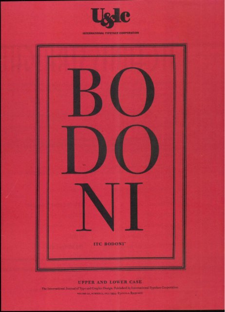
ITC Bodoni Family (see article on page 8)<br />
ITC Bodoni Six Book, Bold and Italics<br />
ITC Bodoni Twelve Book, Bold and Italics<br />
ITC Bodoni Seventy-Two Book, Bold and Italics<br />
ITC Charter<br />
Regular, Bold,<br />
ITC Handtooled Serie<br />
ITC Century Handtooled Bold & Bold Italic<br />
ITC Cheltenham Handtooled Bold & Bold Italic<br />
ITC Garamond Handtooled Bold & Bold Italic<br />
ITC Highlander<br />
Book, Medium, Bold and Italics<br />
ITC Legacy Serif<br />
Book, Medium, Bold and Italics with Ultra<br />
ITC Legacy Sans<br />
Book, Medium, Bold and Italics with Ultra<br />
ITC Motter Corpus<br />
Bold and Bold Condensed<br />
ITC Officina Serif<br />
Book, Bold and Italics<br />
ITC Officina Sans<br />
Sans Book, Bold and Italics<br />
ITC Anna, ITC Beesknees, ITC Studio Script<br />
ITC Mona Lisa Recut and Solid, ITC Ozwald<br />
1111 c011-11(1.<br />
Partial families also available. *Introductory offers valid through 12/15/94.<br />
I TC<br />
For more information on ordering, contact ITC FONTS at<br />
1-800-425-3882 (212-371-0699 within New York) between<br />
9:30-4:30 EST, or fax to 212-233-1915.<br />
3<br />
Circle 1 on Reader Service Card<br />
165<br />
60<br />
110<br />
110<br />
90<br />
90<br />
ALSO<br />
AVAILABLE:<br />
ITC GX Fonts<br />
(Quickdraw GX)<br />
Call us for<br />
details
CONTENTS<br />
Message from ITC New technology for a changing marketplace 4<br />
New Media, New Questions Designers face a world of new options 6<br />
Notes from Parma __ SUMNER STONE documents how a new ITC typeface<br />
captures the style and the passion of Giambattista Bodoni 8<br />
ITC Bodoni: A Size-Sensitive Design How this typeface emulates the<br />
master type designer's attention to detail<br />
Re-creating a Classic JIM WAS SEAMAN reassembles an ancient papyrus with<br />
the help of modern electronic technology 20<br />
Timeless Typefaces Leading type designers describe which qualities are necessary<br />
for a typeface to endure 24<br />
Signature Styles Designers use handwriting to add an edge of individualism<br />
and expressionism to their work 32<br />
The Proof Is in the Printer DAVID POGUE trouble-shoots printer errors plaguing<br />
a harried team of graphic designers 36<br />
Tidy Up Your Type _ GENE GAB LE shows you how to houseclean your desktop<br />
and make your computer run more efficiently<br />
1/&Ic Colophon How this issue was designed and produced 52<br />
THE DESIGNERS<br />
International Typeface Corporation would like to thank<br />
Roger Black and Paul Barnes of Roger Black Incorporated, New York<br />
for the design of this issue of U&lc.<br />
SEPTEMBER 1994 Is A LANDMARK month for ITC. As<br />
a company we are evolving rapidly to keep pace<br />
43<br />
MESSAGE FROM ITC<br />
with the challenges and changing needs of graphic<br />
designers throughout the world. ITC also remains<br />
fully committed to the development of quality<br />
type and typography.<br />
For example, this September sees the release of ITC<br />
Bodoni,'" a typeface we have been working on since late 1990.<br />
It is available in light, bold and italic for each of three differ-<br />
ent versions. They are called ITC Bodoni Six, ITC Bodoni<br />
Twelve and ITC Bodoni Seventy-Two. We are very proud of<br />
this well-crafted, lively and human set of typefaces, which<br />
has been created digitally for the contemporary market and<br />
effectively emulates the master designer's sensitivity to<br />
weight and proportion.<br />
At the same time we are also forging ahead in advanced<br />
typographic technology by releasing a new range of fonts in<br />
full, rich TrueType GX character complements using Apple's<br />
Line Layout Manager technology. Among these we have<br />
included ITC Charter- and ITC Highlander': which are available<br />
in four weights; ITC Newtext: in two weights; and ITC<br />
Anna' and ITC Studio Script: in one weight. These typeface<br />
releases will be known as ITC GX fonts.<br />
All of these new typefaces mentioned here will be avail-<br />
able for the first time from ITC directly, and you will find<br />
more information and font ordering details in this issue of<br />
U&lc (see page 2).<br />
In addition, a special advertising section of this issue of<br />
U&lc announces a major new development, not just for ITC,<br />
but for the worldwide graphics community. ITC Design<br />
Palette is now available. It is a new system for you to access<br />
thousands of products on demand at any time, without leav-<br />
ing the job you are working on. ITC Design Palette allows<br />
graphic designers to review and purchase line images, back-<br />
grounds, photographs, utilities, fonts, extensions for major<br />
applications, and much more. ITC Design Palette is set up<br />
so that only what is actually accessed is billed for. Products<br />
purchased for specific jobs are tracked and categorized in a<br />
monthly statement. ITC Design Palette also provides messages<br />
about special product promotions and useful con-<br />
sumer information about the latest products.<br />
ITC is committed to providing creative and productive<br />
tools to graphic designers. We will do this through ITC<br />
Design Palette. But we shall not forget the importance of<br />
creating new ITC typefaces, and making them widely avail-<br />
able. This is the rationale for supplementing present dis-<br />
tribution by making new ITC typeface releases directly<br />
available from us. These projects and refinements convey<br />
the ITC commitment to meet the pressing demands of<br />
the rapidly changing design industry. Mark Batty<br />
(TABLE OF CONTENTS) HEADLINE/SUBHEADS: ITC BODONI SEVENTY-TWO BOLD, BOLD ITALIC NUMERALS/TEXT: ITC BODONI TWELVE BOLD, LIGHT, LIGHT ITALIC (MESSAGE FROM ITC) HEADLINE: ITC BODONI SEVENTY-TWO BOLD<br />
DROP CAP/TEXT: ITC BODONI TWELVE LIGHT, LIGHT ITALIC MASTHEAD: ITC FRANKLIN GOTHIC BOOK CONDENSED, BOOK CONDENSED ITALIC<br />
FRONT COVER: ITC FRANKLIN GOTHIC BOOK, DEMI. ITC BODONI SEVENTY-TWO LIGHT, ITC BODONI TWELVE BOLD, LIGHT<br />
4<br />
WMP/<br />
74 e / /<br />
VOLUME TWENTY-ONE,<br />
NUMBER TWO, FALL 1994<br />
EXECUTIVE PUBLISHER:<br />
CHARLES M. WILHELM<br />
EDITOR: MARGARET RICHARDSON<br />
MANAGING EDITOR: JOYCE RUTTER KAYE<br />
CONSULTING EDITORS:<br />
EDWARD GOTTSCHALL<br />
ALLAN HALEY<br />
GRAPHIC DESIGN:<br />
ROGER BLACK INCORPORATED<br />
CREATIVE SERVICES DIRECTOR:<br />
JANE DIBUCCI<br />
ART/PRODUCTION MANAGER: CLIVE CHIU<br />
ART/PRODUCTION:<br />
LORRAINE KATT,<br />
JAMES MONTALBANO, SID TIMM<br />
OPERATIONS: REBECCA L. PAPPAS<br />
PUBLIC & MEDIA RELATIONS:<br />
SHARON BODENSCHATZ<br />
SUBSCRIPTIONS: ELOISE A. COLEMAN<br />
ADVERTISING SALES:<br />
CALHOUN & ASSOCIATES<br />
ATL: (404) 594-1790<br />
NY: (212) 682-8125<br />
CA: (415) 788-6325<br />
© INTERNATIONAL TYPEFACE<br />
CORPORATION 1994.<br />
1.31c (ISSN 0362 6245) IS<br />
PUBLISHED QUARTERLY BY<br />
INTERNATIONAL TYPEFACE CORPORATION,<br />
866 SECOND AVENUE,<br />
NEW YORK, NY 10017.<br />
ITC IS A SUBSIDIARY OF<br />
ESSELTE LETRASET.<br />
U.S. SUBSCRIPTION RATES,<br />
$30 FOR THREE YEARS;<br />
FOREIGN AIRMAIL SUBSCRIPTIONS,<br />
$60 U.S. FOR THREE YEARS;<br />
U.S. FUNDS DRAWN ON U.S. BANK.<br />
FOR ADDITIONAL INFORMATION<br />
CALL: (212) 371-0699.<br />
FAX: (212) 223-1915.<br />
SECOND-CLASS POSTAGE PAID AT<br />
NEW YORK, NY AND ADDITIONAL<br />
MAILING OFFICES. POSTMASTER: SEND<br />
ADDRESS CHANGES TO<br />
U&Ic SUBSCRIPTION DEPARTMENT,<br />
P.O. BOX 129,<br />
PLAINVIEW, NY 11803-0129.<br />
ITC OPERATING EXECUTIVE BOARD 1994<br />
MARKJ. BATTY,<br />
PRESIDENT AND CEO<br />
RANDY S. WEITZ,<br />
CONTROLLER<br />
CHARLES M. WILHELM,<br />
VICE PRESIDENT, CORPORATE MARKETING<br />
AND COMMUNICATIONS<br />
ILENE STRIZVER,<br />
DIRECTOR OF TYPEFACE DEVELOPMENT<br />
ITC FOUNDERS:<br />
AARON BURNS, HERB LUBALIN,<br />
EDWARD RONDTHALER<br />
ITC, U&Ic AND THE<br />
U&Ic LOGOTYPE ARE REGISTERED<br />
TRADEMARKS OF INTERNATIONAL<br />
TYPEFACE CORPORATION.<br />
MICROFILM (16mm OR 35mm)<br />
AND MICROFICHE (105mm) COPIES<br />
OF U&Ic ARE AVAILABLE FROM<br />
UMI, 300 NORTH ZEEB ROAD,<br />
ANN ARBOR, MI 48106-1346.<br />
PHONE: (800) 521-0600<br />
OR (313) 761-4700.<br />
FAX: (313) 761-3221.<br />
VBPA<br />
4ravai
Art Parts is losing its yip on reality. Ron and<br />
Joe 1,1N¢ absolutely ho self control since tkey've<br />
discovered tbeir ihate power to create Parts. Thy<br />
c2.1.1" stop. 'Ile Parts just keep cohsih7...and<br />
cohsih7...and...cohsin7. Can tkey be stopped?! Do<br />
{-key want kelp? Is tkis ad hserely a vekicle to<br />
earn ihcohse for Ron and Joe? Or is it 2.<br />
desperate, beartwrehcLih7 cry for kelp? We leave<br />
tkat d¢t¢rhsin&tioh to you, dear friend. Read tkis<br />
ad carefully. Observe every little nuance of its<br />
'layout and design. Call for your official copy of<br />
Art Parts tke Newsletter, and give it tke sane<br />
rigorous analysis. Buy Soh .42 Art Parts. 1-1.4h, 24hd<br />
only tkeh, can you kelp ROh Nhcl Joe grou71, tkis<br />
very difficult tihse. Tkey've hever heeded you hNorg.<br />
a rt parts po box 2926 orhh7e. c.s. 92669-0926 714.771.6754 fax 714.633.9617<br />
IN,<br />
Circle 2 on Reader Service Card<br />
CO<br />
vt<br />
—A<br />
V 9P<br />
vi<br />
7—<br />
0<br />
vi<br />
.4<br />
I
Five hundred tele-<br />
vision channels,<br />
adult video games,<br />
interactive CDs,<br />
online downloaded<br />
communication,<br />
e-mail. What does<br />
any of this have<br />
to do with design?<br />
Everything.<br />
Ten years ago, many designers were<br />
suspicious of anything created on<br />
a computer. When "computer" was<br />
used as an adjective (computer<br />
aided design, computer imagery,<br />
computer illustration, computer<br />
type) it suggested that something<br />
was unprofessional and not meet-<br />
ing the standards of graphics done<br />
conventionally.<br />
Recently, I walked into a friend<br />
who works for a leading publisher<br />
as head of its new interactive media<br />
group. She said that her project<br />
was going very well with deals<br />
being made and mergers getting<br />
finalized. She added, "Now we<br />
need more designers to put our<br />
messages on the screen:'<br />
The world of type and<br />
design as we have always<br />
known it is transforming<br />
rapidly. We collectively sighed<br />
with relief after we invested in and<br />
embraced computers and found<br />
how effectively we could use them.<br />
Good designers have produced<br />
great designs and<br />
no one now queries how<br />
they were done. Editorial<br />
design, type design and illustra-<br />
tion have been strongly influenced<br />
by what can be done on the com-<br />
puter as seen, for example, in<br />
Rick Poyner's The Graphic<br />
Edge (Booth-Clibborn Editions,<br />
North Light Books) or in "TDC<br />
the recent Type Directors Club<br />
exhibition (which included video).<br />
A knee-jerk resistance to techno-<br />
logical change has almost disap-<br />
peared as hardware and software<br />
have become more accessible<br />
and refined, and designers have<br />
become more agile and sophisti-<br />
cated in the use of their new tools.<br />
Yet even as we acquire another<br />
Power Mac or upgrade our pro-<br />
grams, we need to quickly<br />
prepare for the next<br />
phase: designing in and<br />
for digital media. Although<br />
many aspects of contemporary<br />
design can often be enhanced by<br />
computers, there is also the<br />
opportunity for designers to get<br />
involved in, and contribute to,<br />
the conceptual and visual devel-<br />
opment of new media.<br />
Designing the next<br />
generation of graphics<br />
is today's challenge.<br />
Clients who wanted beautiful<br />
brochures may soon promote their<br />
wares on CD as well. How will the<br />
designer do both? Major publish-<br />
ers are gearing up for interactive<br />
magazines, interactive books and<br />
interactive newspapers. How do<br />
these differ from the printed page?<br />
The graphics which appear on<br />
the screen, such as backgrounds,<br />
images, animation,icons, ding-<br />
bats, and type with accompanying<br />
sound, need quite a different<br />
approach, expertise and technical<br />
skills. Designing for new media<br />
also needs effective design con-<br />
cepts and an esthetic philosophy.<br />
Every design conference,<br />
publication and professional orga-<br />
nization includes multimedia as<br />
a topic for discussion and review.<br />
Every designer who has worked<br />
effectively in print, video, packag-<br />
ing or exhibitions has the chal-<br />
lenge of designing for the screen,<br />
the interface, the compact disk.<br />
These designs often have to trans-<br />
HEADLINE: ITC OFFICINA SANS BOOK SUBHEAD/BYLINE: ITC OFFICINA SERIF BOOK, BOLD TEXT: ITC OFFICINA SANS BOOK, BOOK ITALIC, BOLD<br />
6<br />
late into another medium like print<br />
or packaging or film.<br />
What you need to know, we at<br />
U&lc need to know. We ask you to<br />
share your thoughts on the impact<br />
of technology on your design<br />
efforts. How has new technology<br />
changed the way you work? What<br />
are the challenges now facing<br />
you as a designer, an art director,<br />
a production artist, an educator,<br />
a student, a type designer? What<br />
kind of information do you need<br />
to keep up with changes in technol-<br />
ogy? What equipment and soft-<br />
ware do you expect to purchase in<br />
the next two years? What specific<br />
issues do you want discussed? What<br />
design projects, which designers<br />
and what kinds of features would<br />
you like to see in U&lc? What do<br />
you want to know?<br />
We do need to know<br />
since our intention is to provide<br />
knowledgeable, provocative,<br />
inspiring articles which bridge<br />
the information gap and move<br />
into the next realm of design.<br />
MARGARET RICHARDSON<br />
Editor, U&lc<br />
866 Second Ave nue<br />
New Yor k, NY 10017
ITC BODONITM<br />
NOTES<br />
FROM PARMA<br />
by Sumner Stone<br />
WE ARE IN PARMA, a small pros-<br />
perous city in northern Italy. Parma,<br />
of course, is best<br />
known for its<br />
cheese—<br />
Parmesan<br />
cheese. Real<br />
Parmesan cheese.<br />
It is irresistible. The locals eat<br />
it in fresh,<br />
sweet, large<br />
chunks. And the<br />
ham is equally delectable. It melts<br />
in your mouth like butter.<br />
PROSCIUTTO RAM AND PARMIGIANO REGGIANO CHEESE COMPLIMENTS OF ZABAR'S, NEW YORE<br />
8
BODONI<br />
Lamlitusco di NiT,<br />
We have come to Parma in August,<br />
1991, on a pilgrimage, but we<br />
have not come for the food. We<br />
have come for the type. In Parma,<br />
the type is Bodoni. This is the<br />
city where Giambattista Bodoni<br />
lived and<br />
THE<br />
CHARTERHO USE<br />
OF PARMA<br />
STEND HAL<br />
STENDHAL, the French writer and critic and<br />
a contemporary of Bodoni's set his<br />
classic novel, The Charterhouse of Parma,<br />
in this illustrious city.<br />
PHOTOGRAPHS OF BODONI AND BODONI ' S BOOKS BY DANIE<br />
Our small band of travelers<br />
consists of Holly Goldsmith and<br />
Janice Prescott Fishman from<br />
Xerox Corporation, Allan Haley<br />
and Ilene Strizver from Inter-<br />
national Typeface Corporation,<br />
and me.<br />
worked 200<br />
years ago.<br />
These are<br />
the streets<br />
H ic ille est Magnus, typica quo nullus in are<br />
Mures depromsit divitiaS, veneres.<br />
PORTRAIT of Bodoni, drawn by A. Appiani<br />
and engraved by E Rosaspina, which<br />
appeared in Bodoni's Manuale Tipografico,<br />
Parma, 1818 (18 cm).<br />
he walked and the food he ate. But<br />
we are not here merely to taste.<br />
We want to take something home.<br />
We are here to begin making<br />
ITC Bodoni.<br />
RIVERS. WITH PERMISSION FROM CARY GRAPHIC ARTS COLLECTION, ROCHESTER INSTITUTE OF TECHNOLOGY<br />
9
A HEBREW alphabet from Pel Solenne Battesimo<br />
di S.A.R. Ludovico Principe Primogenito di<br />
Parma...Parma, Impresso nella R. Stamperia, 1774.<br />
Essentially a type specimen book showing<br />
a number of the exotic alphabets Bodoni cut early<br />
in his career (26 cm).<br />
THE BIBLIOTECA Palatina houses the Museo Bodoniana, a collection of Bodoni's type<br />
relics, which includes metal punches and thousands of volumes of books.<br />
Walking down the streets on a sleepy summer day, it is difficult<br />
to imagine that the rhythm of life in Parma has changed<br />
much in two centuries. The shops and museums are closed for<br />
the afternoon nap. We walk across the piazza and go into the<br />
cathedral. It is cool and dark inside. We walk slowly, our footsteps<br />
echoing Suddenly we are in front of a magnificent marble<br />
bust. It is Bodoni. In Parma, Bodoni is like a saint. He has his<br />
own place in the cathedral. This unexpected encounter with<br />
Bodoni's sculpted image sets the mood for the rest of our visit.<br />
The search for Bodoni takes on a new<br />
dimension, a new meaning. We are<br />
here not only to look at old books<br />
and ancient metal<br />
punches. We are<br />
here to find the<br />
spirit of Bodoni.<br />
The Real Bodoni.<br />
HE BODONI TYPE<br />
relics are housed in<br />
a museum inside a<br />
library. Getting into<br />
the Museo Bodoniana<br />
requires an<br />
appointment. First,<br />
we climb the long<br />
BODONI'S steel punches are each carefully<br />
stored in their own special compartments<br />
in wooden boxes like this one.<br />
The steel punches<br />
are remarkable pieces<br />
of cculpture<br />
set of marble stairs to enter the Biblioteca Palatina.<br />
Then up another floor in a creaky old<br />
elevator. We step out and are surrounded by<br />
the products of Bodoni's prodigious career.<br />
There are thousands of volumes—everything<br />
from humble herbals to lavish folio classics<br />
printed for kings, emperors and popes.<br />
PHOTOGRAPHS OF PARMA AND METAL TYPE BY SUMNER STONE<br />
10
IN -NVPTIAS<br />
NAPOLEONIS MAC NI<br />
cvu<br />
MARIA- ALOI SI A<br />
FR A NCISCI II<br />
ATSTODE - DDTAVIVItH431.11<br />
ODE ALCAICA<br />
PLACIDI.VADMI<br />
.1.151,6,0= .7(43,61.110<br />
MANUALE<br />
Imo KA PICO<br />
Guivorrism uotgra<br />
.41-111k POMO.<br />
PARMA<br />
mos.. ...DO,.<br />
TITLE PAGE opening of the Manuale Tipografico, a collection of Bodoni's typefaces<br />
published in Parma by his widow ini818 (32 cm).<br />
g eXII<br />
- .110,11.00.<br />
PAR MAE<br />
1- VrIX 180<br />
...4444,.<br />
-u-<br />
IN NUPTIAS Napoleonis Magni cum Maria<br />
Aloisia...Ode Alcaica Placidi Tadini. Parma,<br />
Typis Bodonianis, ,8,o (42 cm).<br />
Bodoni also created an astounding number of fonts—i46 sizes<br />
of his roman types (with another 146 accompanying italics),<br />
115 titling and script fonts, as well as large numbers of orna-<br />
ments and numerous non-latin scripts,<br />
including a beautiful Greek and Cyrillic.<br />
And all of these were done in a single<br />
elegant style.<br />
Bodoni was obsessed with making<br />
type. It was in his blood. His grandfa-<br />
ther sold one of the family vineyards to<br />
finance his own type-making activities.<br />
Although Bodoni<br />
was renowned as<br />
a printer in his own<br />
day and since, he<br />
regarded printing<br />
books as a necessary<br />
function of making<br />
sure his typefaces<br />
were used properly.<br />
BODONI WAS THE<br />
BODONI'S<br />
GRANDFATHER<br />
"41PeNtel`<br />
IMUST FINALLY ADD THAT TYPES WERE Cut<br />
and cast in Saluzzo, in the workshop of<br />
my grandfather Gian Domenico Bodoni.<br />
When he was young, during the pontificate<br />
of Innocent XI (1676-89), he went to Rome<br />
and stayed there for some years as a compos-<br />
itor in the Stamperia Camerale. He made<br />
friends with an engraver whose name I do not<br />
know, and learned punchcutting. When he<br />
returned home he spent his fortune and even<br />
sold a vineyard to support his passion for cut-<br />
ting punches and casting type. My father told<br />
me more than once that he had seen types<br />
being cast for a Garamone body, and I myself<br />
found a furnace set up on the gallery of our<br />
house, and moulds, counterpunches, a few<br />
punches and several matrices of little value.<br />
printer for the Duke<br />
of Parma. He made typefaces for his own<br />
AN EXCERPT from Notizie intorno a vari incisori<br />
di caratteri... (Notes on Some Punch Cutters and<br />
Type Founders in Italy). Bibliotheque Nationale,<br />
Paris, MS. ital 222. Translated by James Mosley.<br />
use, not to sell as products. One has the dis-<br />
tinct feeling after looking at his entire col-<br />
lection of type that all the fonts were works<br />
in progress, because he worked on them<br />
continually throughout his career. The result is a body of type<br />
which matured along with the maturing Bodoni. The complete<br />
collection is shown in the two-volume Manuale Tipografico,<br />
published posthumously in 1818 by his widow. The Manuale was<br />
ARCHIVAL TEXT PACES PHOTOGRAPHED BY DANIELLE RIVERS FOR THE CARY GRAPHIC ARTS COLLECTION, ROCHESTER INSTITUTE OF TECHNOLOGY<br />
11
■ ■W IMHOF. ■ ■■■■ ---<br />
PAPALE<br />
Quousq;<br />
tandem<br />
abutere,<br />
Catilina,<br />
SALUZZO<br />
BODONI'S largest textface, the Papale,<br />
shown here in its roman version. From the<br />
Manuale Tipografico (Parma, 1818).<br />
Everyone is skeptical,<br />
but remarkably,<br />
it works<br />
SUMNER STONE (right) and Allan Haley prepare<br />
to photograph steel punches from Bodoni's original<br />
collection for reference in designing ITC Bodoni.<br />
reprinted in 1964 for a modern audience<br />
in a beautiful facsimile edition by Franco<br />
Maria Ricci, the publisher of FMR magazine,<br />
and a native son of Parma.<br />
After a brief tour of the Museo<br />
Bodoniana we immerse ourselves in the<br />
type. The steel punches are remarkable<br />
pieces of sculpture, each one carefully<br />
stored in its own special compartment<br />
in a wooden case. We are going to make<br />
at least three different varieties of the<br />
type: a very small size, a text size, and a<br />
display version for very large type. The<br />
model for the largest size of the roman<br />
is an easy decision. It clearly has to be<br />
Bodoni's largest size, the Papale,<br />
the Pope's type. Choosing models for<br />
the smaller sizes is more complex.<br />
We look at specimens printed on the<br />
delicate vellum pages of an original<br />
Manuale to try to match the type in<br />
the book to the specimen. Finally, we<br />
agree on using the Filosofia Bassano<br />
for the small size. We photograph<br />
punches. We photograph books. We<br />
reluctantly leave, piled high with<br />
journals and other publications from<br />
the Museo Bodoniana thanks to the<br />
good graces of our diligent host,<br />
Luigi Pelizzoni.<br />
WE RETURN HOME TO THE<br />
United States and begin to draw.<br />
The romans are first. Holly Gold-<br />
smith starts on the small size, which<br />
requires a good deal of interpreta-<br />
12<br />
FT LOSOFIA<br />
Quousque tandem abutere, Catilina, patientiit<br />
nostril ? quamdiu etiam furor isle tuns nos eludes?<br />
quem ad finem sese effrenata jactabit audacia<br />
? nihitne to nocturnum prmsidium Palatii, nihil<br />
urbis nihil timor populi, nihil concursus<br />
bonorum omnium, nihil hic munitissimus habendi<br />
senatus locus, nihil horum ora vultusque<br />
raoverunt ? Patere tua consilia non sentis? constrictam<br />
jam omnium horum eonscientia teneri<br />
conjurationem tuam non vides? Quid proxima,<br />
quid superiore nocte egeris, ubi fueris , quos convocaveris<br />
, quid consiliiceperis, quern nostram ignorare<br />
arbitraris? 0 tempora, o mores! Senatus laze<br />
intelligit , consul videt: hic tamen vivit. Vivit?<br />
MARCUS TULLIUS CICERO ARPINATEN.<br />
EATINAE ELOQUENTIAE PATER AC PRINCEpS.<br />
`91<br />
BASSANO<br />
BODONI cut to variants in the body size known<br />
as Filosofia. This specimen was used as a<br />
model for the small size of ITC Bodoni. From<br />
the Manuale Tipografico, Parma, r8:8.
tion. Holly's task is to<br />
preserve the feeling and<br />
the gesture of the orig-<br />
inal letters sculpted at<br />
size on a bar of steel.<br />
This has to be done with-<br />
out making the type a<br />
photo-realistic interpre-<br />
tation showing every<br />
bump and lump from the<br />
enlargements of printed<br />
letters.<br />
Janice Prescott<br />
Fishman begins working<br />
on the large size based<br />
on the Papale. Here the<br />
challenge is different.<br />
We want to capture the<br />
Papale's engraved ele-<br />
gance. In both the small<br />
and large sizes care is<br />
taken not to introduce<br />
oversimplified geome-<br />
try into the characters—<br />
a common practice in<br />
making previous Bodoni<br />
revivals.<br />
Shortly after return-<br />
ing from Parma, we real-<br />
ize that we would need<br />
more opportunities to<br />
HOLLY GOLDSMITH created the<br />
small size of ITC Bodoni roman by<br />
enlarging tiny samples of<br />
Bodoni's original metal types.<br />
ITC Bodoni:<br />
A Size-Sensitive<br />
Design<br />
This new digital typeface<br />
release emulates<br />
the master type designer's<br />
attention to detail.<br />
FROM THE TIME MOVABLE type<br />
was invented by Gutenberg<br />
until metal type was replaced by<br />
phototype, punch cutters painstakingly<br />
created each weight<br />
of a font of type with design and<br />
proportional changes in mind.<br />
As a result, each size of a given<br />
typeface was usually slightly dif-<br />
ferent in design<br />
and proportion<br />
from the next<br />
size up or down.<br />
When comparing<br />
fonts at<br />
extreme ends<br />
of the size<br />
spectrum, the<br />
overall differ-<br />
ences could be quite dramatic.<br />
These adjustments were<br />
necessary to ensure optimum<br />
readability of the font. In a<br />
serif typeface, for example, the<br />
thin parts of a character were<br />
designed proportionally heavier<br />
for small sizes than for large<br />
sizes. If they were kept the same<br />
weight, the contrast between<br />
thick and thin would be too<br />
great, causing an effect called<br />
"dazzling:' which makes text diffi-<br />
cult to read.<br />
When metal typesetting was replaced<br />
by phototype in the 196os,<br />
most manufacturers of phototype<br />
fonts did not take the time and<br />
effort necessary to produce sizesensitive<br />
typeface designs. This<br />
practice has spilled over into digital<br />
fonts, so that the number of<br />
fonts that have been created to be<br />
size-sensitive can be counted on<br />
one hand.<br />
Giambattista Bodoni was a<br />
master at creating fonts that took<br />
the best advantage of their size.<br />
Not only did he create different<br />
designs for each point size, he<br />
also produced a range of fonts for<br />
text composi-<br />
tion which had<br />
smaller than<br />
half-point size<br />
changes—each<br />
version subtly<br />
BODONI created d ifferent designs for<br />
each point size, so the differences with-<br />
in one typeface could be dramatic.<br />
look at and photograph<br />
the Manuale. David Pankow, curator for the Cary Collection<br />
of printing history at Rochester Institute of Technology, is gra-<br />
cious enough to lend us one of the Cary's two original copies of<br />
Manuale which we then use extensively for further reference.<br />
Having prepared some trial characters<br />
for the small and large sizes of the roman, we<br />
now come to a critical stage in the project.<br />
Can we get the com-<br />
puter to make the text<br />
size by interpolation<br />
from the large and the<br />
small versions, or<br />
will we draw the text<br />
size as well? Every-<br />
one is skeptical about the success of the interpolation. The two<br />
sets of drawings seem so different.<br />
Remarkably, it works. After some experimenting we pro-<br />
duce a text size which has not only the right weight but also<br />
different from<br />
the next size up<br />
or down. To the<br />
left is a show-<br />
ing of an "a" in one of Bodoni's<br />
smallest fonts, compared to one<br />
of his largest. The differences<br />
are obvious.<br />
Unfortunately, none of the<br />
modern revivals of Bodoni's work<br />
took into account his mastery of<br />
size-sensitive designs—until now.<br />
With the release of ITC Bodoni,<br />
finally there is a range of fonts that<br />
begins to do justice to Bodoni's<br />
genius.<br />
Allan Haley<br />
The computer created<br />
new fonts by 'averaging'<br />
4711 all and large sizes
a distinct Bodoni flavor—a flavor every<br />
bit as robust as the rich porcini mush- In Parma,<br />
rooms in a Parma risotto. It seems clear<br />
that Bodoni had a precise visual image<br />
_Bodoni is like<br />
of his type which he developed and maintamed<br />
over<br />
a saint<br />
fi.-P I NI PE MALE -4'<br />
Quousque<br />
tandem a-<br />
butere,Ca-<br />
tilina, pa-<br />
tient-id no-<br />
1<br />
TIVOLI<br />
many years. He was making the same<br />
letters, large or small. Our ability to<br />
have the computer make<br />
a new font for text size by<br />
"averaging" the small and<br />
large sizes is a testimony<br />
to that vision.<br />
As the project advances<br />
we realize that we need<br />
another hand to help, so<br />
Jim Parkinson is recruited<br />
to work on the small italic.<br />
The drawings for the small<br />
italic must be based on<br />
the stylistic choices that<br />
Holly made in drawing the<br />
small roman. The task<br />
is made more complex by<br />
the fact that we do not<br />
have enough material to<br />
base the small italic on<br />
THE BEAUTIFULLY proportioned italic of Bodoni's<br />
Imperiale-size type, characterized by its large any single size of Bodoni's<br />
x-height. From the Manuale Tipografico, Parma, di&<br />
type. A number of different<br />
italic fonts are used as models. Finally, I begin<br />
drawing the remaining size, the large italic Like the<br />
large roman, it is based on a single example, but the<br />
next smaller size, the Imperiale.<br />
Weights are adjusted. Side bearings are tweaked.<br />
The type begins to emerge—a full-blown family of<br />
ITC Bodoni with the rich, sensuous aromas of Parma.<br />
WAROCOMAAAVANIANAANsamItAaLaN<br />
ALTO TER Z 0<br />
E AI 4<br />
Te.er in/amee,e ARISIRDFAIO<br />
* aaa aakoaaa<br />
Na, ew. Se mem<br />
Rana* the dd par drake rid.<br />
II aid goods. 0 cid < &d ad manna<br />
.59<br />
For many years ITC had hoped to<br />
commission the design of a true<br />
Bodoni revival: one that accurately<br />
represented Giambattista Bodoni's<br />
incredibly rich stylistic palette.<br />
But the project was<br />
delayed due to the<br />
limitations of tech-<br />
nology and the<br />
necessity of finding<br />
the appropriate<br />
type design team.<br />
When technology<br />
progressed to the<br />
point that complex,<br />
accurate, stylistic<br />
design interpola-<br />
tions were feasible, all that remained<br />
was to find those with the technical<br />
and esthetic expertise to design it.<br />
Allan Haley, then ITC's execu-<br />
tive vice president, approached type<br />
designer Janice Prescott Fishman<br />
at Xerox Corporation's Font Services<br />
to work on ITC's Bodoni revival.<br />
Prescott Fishman was joined by her<br />
colleague Holly Goldsmith, who<br />
is an accomplished type designer<br />
with experience rendering Bodoni<br />
letterforms.<br />
Sumner Stone, the eminent type<br />
designer and owner of the Stone Type<br />
Foundry, shared the desire to develop<br />
a modern version of Bodoni's types.<br />
Stone agreed to art direct the Bodoni<br />
typeface design and to design one of<br />
the versions of the "extended" ITC<br />
ITC BODONI<br />
,,-<br />
V 114444a....000,<br />
pw,,, „,......-4114”.<br />
Bodoni typeface family. Finally, Jim<br />
Parkinson, a type designer and letter-<br />
ing artist, most noted for his work in<br />
publication design, was recruited to<br />
work on the final stages of the pro-<br />
ject, which was managed<br />
by Ilene Strizver,<br />
ITC's director of type-<br />
face development.<br />
From beginning to<br />
end, the ITC Bodoni<br />
project took more than<br />
three years, but the<br />
results well reflect this<br />
Herculean effort. In<br />
the tradition of Giam-<br />
battista Bodoni and<br />
early punch cutters, ITC Bodoni was<br />
designed so that its weights, pro-<br />
portions and even personality,<br />
change over a range of point sizes.<br />
ITC Bodoni is<br />
available in<br />
Book and Bold<br />
weights with<br />
correspond-<br />
ing Italics.<br />
Each variant<br />
is available<br />
as a caption<br />
design based<br />
on original<br />
Bodoni 6<br />
point type, a text design intended for<br />
use in most body copy settings,<br />
and a display design patterned after<br />
Bodoni's 72 point "Papale" font.<br />
Small capitals have been created for<br />
the Book weights. Oldstyle figures<br />
are available for the roman and italic<br />
designs in both weights, and a series<br />
of ornaments were drawn to comple-<br />
ment the family. At a later date a<br />
special set of swash capitals and addi-<br />
tional ornaments will be released<br />
to accompany what is shown on these<br />
pages. In addition, a subhead<br />
design for use in setting point<br />
sizes in between the text and<br />
display sizes is planned for<br />
future release.<br />
Only licensed ITC Sub-<br />
scribers are authorized to<br />
reproduce, manufacture and<br />
offer for sale these and other<br />
ITC typefaces shown in this<br />
issue. This license is your<br />
guarantee of authenticity.<br />
These new typefaces will be avail-<br />
able to the public on or after August<br />
23, 1994, depending on each manufacturer's<br />
release schedule. IBA<br />
FONTS NOW AVAILABLE FROM ITC<br />
ITC Bodoni and other ITC typeface designs can now be ordered directly<br />
from ITC. Each typeface family includes a complete character complement<br />
(small caps, oldstyle figures and other essential characters) and superior<br />
kerning. Typefaces are available in both the Mac and PC formats. Turn to<br />
page 2 for more information.<br />
ILLUSTRATIONS BY ISTVAN BANYAI<br />
15
ITC BODONI<br />
SEVENTY-TWO<br />
BOOK<br />
48/5 6<br />
ITC BODONI<br />
SEVENTY-TWO<br />
BOOK ITALIC<br />
48/56<br />
ITC BODONI<br />
SEVENTY-TWO<br />
BOLD<br />
4 8/5 6<br />
ITC BODONI<br />
SEVENTY-TWO<br />
BOLD ITALIC<br />
4 8 /5 6<br />
ITC BODONI<br />
SEVENTY-TWO<br />
BOOK<br />
3 6/44<br />
PRESENTING<br />
ITC BODONI<br />
ITC BODONI SEVENTY-TWO<br />
This essay is the fruit of man<br />
y years' assiduous labour-a r<br />
eal labour of love-th the seri)<br />
ice of the art ofprinting. Prin<br />
ting is the final outcome o<br />
f man's most beautiful, in<br />
geniottc and usefid invent/<br />
on. that I mean, of writing.<br />
and its most valuable form where it i<br />
s required to turn out many copies of<br />
AN EXCERPT FROM G. B. BODONI'S PREFACE TO THE MANUALE TIPOGRAFICO OF 1818. FIRST ENGLISH TRANSLATION PUBLISHED BY ELKIN MATHEWS LTD., LONDON, 1925.<br />
16
the same text. Thic applies still more w<br />
here it is important to ensure uniform&<br />
y, and most of all where the work in<br />
question is one which deserves tra<br />
nsmission in clearer and more rea<br />
dableforinfor the enjoyment of pos<br />
terity. When we consider the range of u sefuln<br />
ess of printing, together with the long series<br />
of devices which have brought usfrom thefirs<br />
t diccovery of letters to our present power ofp<br />
rinting on thousands of sheets of fine laid<br />
paper words no longer evanescent but fixe<br />
d and preserved with sharper outlines tha<br />
n the articulation of lips can give them, th<br />
e thought of such surpassing achievement compels ad<br />
miration at the force of the human intellect. But it woul<br />
dbe superfluous to enlarge on the merits of an invention<br />
which has already been the subject of many elaborate tr<br />
eatises and of much eloquent praise; to the glory of<br />
that happy century which not only discovered it, but<br />
sopursuedits development as to leave little room fo<br />
r the participation of its successors. Nor do I think it<br />
17
ITC BODONI<br />
TWELVE<br />
BOOK,<br />
BOOK ITALIC,<br />
BOLD &<br />
BOLD ITALIC<br />
18/20<br />
ITC BODONI<br />
TWELVE<br />
BOOK,<br />
BOOK ITALIC,<br />
BOLD &<br />
BOLD ITALIC<br />
14/16<br />
ITC BODONI<br />
TWELVE<br />
BOOK,<br />
BOOK ITALIC,<br />
BOLD &<br />
BOLD ITALIC<br />
12/14<br />
ITC BODONI<br />
TWELVE<br />
BOOK,<br />
BOOK ITALIC,<br />
BOLD &<br />
BOLD ITALIC<br />
10/12<br />
ITC BODONI<br />
TWELVE<br />
BOOK,<br />
BOOK ITALIC,<br />
BOLD &<br />
BOLD ITALIC<br />
8/10<br />
ITC BODONI SIX<br />
BOOK,<br />
BOOK ITALIC,<br />
BOLD &<br />
BOLD ITALIC<br />
8 /1 o<br />
ITC BODONI SIX<br />
BOOK,<br />
BOOK ITALIC,<br />
BOLD &<br />
BOLD ITALIC<br />
6/8<br />
ITC BODONI SIX<br />
BOOK,<br />
BOOK ITALIC,<br />
BOLD &<br />
BOLD ITALIC<br />
5 /7<br />
ITC BODONI TWELVE<br />
proper to dwell upon my own unr f my performance does not at<br />
emitting efforts to increase the p test them, no preface of mine<br />
erfection of so valuable an art. W can do so. I shall do better, the<br />
hatever their nature and degree, i refore, to turn these remarks t<br />
o the same purpose by applying them to s<br />
uch practical and theoretical considerati<br />
ons as undoubtedly make for the refinem<br />
ent of the art. The subject is one on which I<br />
cannot speak without enthusiasm. If then,<br />
my words succeed in communicating to th<br />
mpetitive spirit of the printers, not all of whom<br />
are more avid of gold than of glory. For the sake<br />
of logical arrangement, I may here observe that<br />
it is possible to develop typography by means of<br />
an increase both in quality and in output-two th<br />
ings which, though advantageously combined in<br />
onception of that improvementwhich, making itself app<br />
arent in the finished work, bespeaks the technical maste<br />
ry of the craftsman concerned in the production of beau<br />
tiful and well printed books. The conception of the Beauti<br />
ful must, it is true, not be confounded with those of the Coo<br />
d and the Useful; none the less, the three are, in reality, but<br />
he mind. Moreover, this same adaptation to the standards required b<br />
y our eyes, which discriminate between fount and fount, constitutes i<br />
is beauty. This varies according as it succeeds in delighting them by s<br />
ure proportionment of details, charm, and perfection, not only at a fi<br />
rst glance but in the long run. It often happens that we have the same b<br />
ook before our eyes for a long time. If it turns out less and less agreeabl<br />
e to the eye, so that it becomes wearisome more quickly than any othe<br />
r, our opinion of its merits will sink. Visual powers vary largely in di<br />
1 without any further qualification. Long-sighted people, whose e<br />
yes must be at a distance from the object viewed to see it distinctl<br />
y, can take in and appreciate at a glance the masterly ensemble of<br />
a finely printed folio: while the Short-sighted, whose eyes must be<br />
quite near to see the print clearly, can only view it piecemeal. On th<br />
e other hand, the former cannot bear to read a tiny script which the<br />
latter, far from growing tired, enjoy because of its elegance and just<br />
proportions. Short-sighted scholars possess herein no small compe<br />
ounds. To this important advantage, especially for those who have often to change the<br />
it abodes, maybe added that of smaller expense. Thus, in the case of these small and e<br />
legant editions, as I have called them, it is possible to have an eye to economy; but thi<br />
s is not to be thought of by the reader who wants big books, fine enough to stand comp<br />
arison with a Terence, a Virgil, a Horace, or a Juvenal du Louvre. Still, if this sumptuou<br />
s format cannot aspire to the useful properties of the small and elegant, it has its own ad<br />
vantages, which have nothing to fearfrom the comparison. These are, that it ensures a b<br />
ook the longest life possible, and earns respect both for itself and for its owner. Cheap, ha<br />
s, how is it possible to avoid the inference that their owner is no ordinary rich man but a cultivated eoll<br />
ector of books and of the knowledge therein contained? Pliny considered that the following incident of<br />
itself furnished an adequate instance of Alexander's great love of Homer. Amongst the spoils of Darius<br />
was found his perfume-box, made of gold and richly studded with pearls and other precious stones; thi<br />
s Alexander would use for no other purpose than to keep his Horner in it. He had had the text revised byAri<br />
stotle, and couldfairly claim that it was his constant companion, his bedside book; indeed, he called it the<br />
source of all the military virtues. He read it with. Callisthenes and Anavarchus, and had even added an ob<br />
servation or two of his own. Now Pliny held that the reason which madeAlevander use the finest casket po<br />
ITC BODONI SIX<br />
18<br />
e reader some measure of this spirit,<br />
making him a keener critic and a sou<br />
nder judge of typographical merit, to<br />
vers of reallyfine editions will increas<br />
e in number; and this will have a corre<br />
sponding effect on the courage and co<br />
practice, are, I think, better considered se<br />
parately. My first point, then, is this: that i<br />
ncrease in quality is indispensable. Now, it<br />
is not my intention to deal with mechanical<br />
devices, nor to teach intending printers thei<br />
r business. My one aim will be to clarify the c<br />
different aspects from varying angles of one and th<br />
e same thing. The measure of the virtue in a printe<br />
d book is the number of people who read it and the f<br />
requency, eagerness, and speed with which it is read:<br />
indeed, the oftener a book is read-assuming it to be g<br />
ood-the greater the pleasure andprofit resulting to t<br />
erent people; we must not, therefore, expect every pair of eyes t<br />
o be equally attracted, or repelled, by the same type: and this is<br />
one of the principal reasons why books should by no means all b<br />
e printed after the same fashion. Beauty in books maybe classifi<br />
ed under three different headings. These are: the splendid style, i<br />
n large books suitable for the Long-sighted; the elegant, in small<br />
books suitable for the Short-sighted; and, in those of average siz<br />
e, whose appeal is more general, what we may term the beautifu<br />
nsation for their inferior ability to appreciate the particul<br />
ar excellences and beauties of buildings, landscapes, and<br />
moving objects. Mainly for them it was that Rovilles, the Ja<br />
nsons, the Elzevirs, and their competitors produced those<br />
elegant little volumes, as beautiful as they are small, which<br />
enshrine the noblest writers in every language. It is thus pos<br />
sible for them to form a select and handy travelling library, f<br />
airly complete in several branches, yet weighing only a few p<br />
ndy volumes are easily lost and worn out: big, handsome books, on the other<br />
hand, are more carefully kept and less handled; their paper, too, is stronger<br />
and more capable of resisting the assaults of time, so they may easily last for<br />
centuries. The other advantage of splendid editions is no less manifest; for w<br />
ill not even the layman, when confronted with a book sumptuous and elaborat<br />
ely printed in the largest and costliest format, be forced to conclude that it is wo<br />
rth a price which it succeeded in fetching? Again, in going through the shelves<br />
of a library discriminatingly yet abundantly stocked with sumptuous edition<br />
ssible to enshrine his Homer was clearly that he considered it the noblest work of the huma<br />
n intellect. It is true that splendid editions are things more of luxury than of use; it is even<br />
true that luxury is the appanage of wealth; but no wealth can be so great that this insatiable<br />
spirit—be it of God or of the devil—cannot exhaust it without having recourse to books. It is<br />
ever and again demanding a thousand new fashions of clothes, fabrics, embroideries, ribbon<br />
s, laces, jewels, silver, china, pictures, tapestries, rugs, mansions, villas, gardens, coaches, h<br />
orses, grooms, banquets, festivities, and all the numberless things on which a man is practic<br />
ally bound to spend money if he wishes to parade his wealth. Indeed, ifa library or museum o
ABCDEFGHIJKLMNOPQRSTUVWXYZ<br />
abcdefghijklmnopqrstuvwxyz1234567890&$ fzE,Toc OZECE<br />
13cc4oEfiflA - 11(:;,!?--"2/#*)[t11 »«I2345678901<br />
ABCDEFGHIJKLMNOPQRSTUVWXYZ<br />
ABCDEFGHIJKLMNOPQRSTUVWXYZ<br />
abcdefghifichnnopqrstuvwxyz<br />
1234567890&$0.E%catEffficOd&fift<br />
0(,;, 1?---/#*)[77§»«1234567890_1<br />
ABCDEFGHIJKLMNOPQRSTUVWXYZ<br />
abcdefghijklmnopqrstuvwxyz<br />
1234567890&$ %cOAEI[E13co'di:ififl'<br />
{)(:;,.!?- - ` 1/# * ) Eft §»«I234567890 1<br />
ABCDEFCHIJKLMNOPQRSTVVWXYZ<br />
abcdefghijklrnnopqrstuvwxyz<br />
1234567890&$ 0.E%ca/ECE ficod&fill'<br />
0(*-;,..f?--/#*)if.t§»(
ALL IMAGES © 1994. JAMES WASSERMAN Re-creating<br />
a Classic<br />
The book designer of a new edition of The Egyptian Book of the Dead<br />
describes how this ancient text was integrated and enhanced<br />
by modern technology. BY JIM WASSERMAN
PERHAPS THE BEST KNOWN VIGNETTE<br />
from The Book of the Dead, the Weighing of the Heart depicts the setting of the after-death<br />
judgment of Ani's soul. As Ani and Tutu look on, Anubis, the God of Embalming,<br />
adjusts the scale to balance Ani's heart against the feather ofMaat, the goddess of Truth and<br />
Balance. Thoth, the God of Writing, records the result. Ammit, the crocodile-headed<br />
monster, waits to consume those who are judged impure.<br />
TWENTY- ONE YEARS AGO, I WENT<br />
to work for Samuel Weiser's Occult<br />
Bookstore in New York City. My lunch<br />
hours were dedicated to exploring the<br />
basement, which was legendary for its<br />
collection of rare volumes amassed over so years by<br />
the world's leading specialists in metaphysical books.<br />
21<br />
Among the many stacks was an 1890 facsimile edition<br />
of the Papyrus ofAni, one of the funerary scrolls<br />
known as The Egyptian Book of the Dead. Holding<br />
the delicate, oversized volume, I was overwhelmed<br />
by the intensity and brilliance of its 35oo-year-old<br />
color images and was filled with a passion that has<br />
never waned.
The Egyptian Book of the Dead, properly known<br />
as The Book of Going Forth by Day, is a collection of<br />
ancient Egyptian religious writings which were<br />
intended as a guide to the afterlife. Ani, an important<br />
Temple scribe, chose from among some zoo available<br />
prayers, hymns, spells and ritual texts, the 8o<br />
that most appealed to him and his wife, Tutu, and<br />
the couple's likenesses were painted among the elaborately<br />
crafted hieroglyphic vignettes. This individualized<br />
scroll, which would be buried with them,<br />
would open a way in the afterlife. If successful in persevering<br />
through the trials encountered there, they<br />
expected to eventually feast and commune with the<br />
Gods of the rich Egyptian pantheon.<br />
In 1888, Ani's papyrus was acquired in Egypt by<br />
Sir Wallis Budge of the British Museum. He opened<br />
the scroll to find that it was the longest, best preserved<br />
and most beautiful example of an Egyptian<br />
funerary papyrus ever discovered. He cut it into 37<br />
relatively even length sheets, which were glued to<br />
wooden boards for translation and display. He later<br />
commissioned the elaborate facsimile lithograph edition<br />
of 1890 that I was to discover nearly a century<br />
later. Unfortuately, the original papyrus was damaged<br />
by the glue on its delicate sheets and from exposure<br />
to direct sunlight from a skylight above its museum<br />
display. Also tragic was the damage to the continuity<br />
of the papyrus caused by Budge's "yardstick" method<br />
of cutting. His translation, released five years later,<br />
revealed that chapters and images were often inadvertently<br />
cut in mid-sentence, while carefully crafted<br />
whole images were split onto different sheets.<br />
My interest in the wisdom of the ancients led to<br />
the study of the text of The Egyptian Book of the Dead<br />
ANI AND TUTU ARE SHOWN IN A POSTURE OF WORSHIP<br />
and adoration as they seek to enter the Field of Offerings. Their prayer asks for human<br />
acts and conditions to continue in the afterlife. The Field ofReeds, seen<br />
here, is the threshold realm between this world and the next, a type of natural paradise.<br />
22<br />
(so called because the 19th century tomb robbers<br />
offering the scrolls to historians called them the<br />
"Dead Man's Book"). I found Budge's 1895 translation<br />
reprinted in a modern paperback edition. This translation<br />
was intended to be a companion to the images<br />
in the 1890 facsimile, which would be useful if only<br />
the scroll were available to the public. I realized with<br />
irony that I was one of the few modern readers even<br />
aware of the existence of these images.<br />
T PURCHASED<br />
BUDGE'S RARE FACSIMILE<br />
volume in 1979, and knew that one day I would<br />
publish it. Initially, however, many publishers<br />
were daunted by the enormity of the project. This<br />
was not surprising since the technique of manual dot<br />
etching available at the time for color retouching<br />
meant the reconstruction of the original form of the<br />
scroll would be unwieldy and expensive. However,<br />
modern computer imaging techniques gradually<br />
developed to the point where the project became<br />
feasible (see page 23).<br />
The design challenges of presenting a scroll in<br />
book form are complex, because a scroll is structurally<br />
different from a book, and I especially wanted<br />
to maintain the integrity of the images. Budge's<br />
facsimile volume looked like a book, with relatively<br />
even width images on even width pages. The book<br />
I visualized would instead allow the reader to interpolate<br />
how the scroll was originally structured. To<br />
accomplish this, it was first necessary to place the<br />
translation directly below the hieroglyphic text of<br />
the images, so that the reader can appreciate the text<br />
relating to the image. Next, to best display some
sections of the papyrus, a few images would need<br />
just over a third of the page in width, while others<br />
had to be designed as gatefold spreads to present the<br />
ornately bordered art. Additionally, the broad variations<br />
of the length of text in the original papyrus<br />
determined layout considerations. Essentially combined<br />
here are one book of pictures, placed on top of<br />
another book of words, which was why an unusual<br />
trim size was needed.<br />
Three principal scholars at the British Museum,<br />
Metropolitan Museum and New York University<br />
were consulted to oversee the accuracy of this book's<br />
text. In addition, my design and layout of the papyrus<br />
underwent numerous revisions and improvements.<br />
This included a full-size tracing of Budge's<br />
78-foot facsimile, with spreads worked out until<br />
I could accept it as the best job possible of transferring<br />
the scroll to book form. After over two years<br />
of daily work, I completed the final design and<br />
production, and Chronicle Books of San Francisco<br />
was contracted by book packager Bill Corsa to publish<br />
the book this Fall.<br />
The book features the translation of the late<br />
Dr. Raymond O. Faulkner, completed in 1972, and<br />
acknowledged by scholars as the finest in English<br />
to date. Faulkner's translation has been augmented<br />
and updated by Dr. Ogden Goelet of New York<br />
University, who has also written an introduction<br />
and extensive commentary. Following the-color<br />
papyrus section, the other sections of The Book of<br />
the Dead (approximately ioo chapters not chosen<br />
by Ani and Tutu for inclusion in their personal<br />
scroll) are presented. Also provided is a section<br />
called "The Map Key to the Papyrus" which graphically<br />
displays the layout of the hieroglyphic text<br />
relative to the numbering system of the translation.<br />
Thanks to modern electronic technology and the<br />
efforts of a team of experts, it has been possible to<br />
reclaim one of antiquity's most beautiful treasures<br />
assembled in an accessible book.<br />
THE EGYPTIAN BOOK OF THE DEAD<br />
THE BOOK OF GOING FORTH BY DAY<br />
Production notes about how this new, full-color edition<br />
was re-created using modern electronic publishing technology.<br />
HE DESIGN, TYPOGRAPHY AND COLOR PREPRESS<br />
T of The Egyptian Book of the Dead were done by Studio 31,<br />
New York. The book was produced on a dual platform of traditional<br />
typography and state-of-the-art computer graphics.<br />
The typesetting was accomplished with a Linotron 202, driven<br />
by Bestinfo Pagewright composition software, running on<br />
a PC-based computer through a Marcus Interface Box. ITC<br />
Galliard® was selected for the text font, which makes extensive<br />
use of italics, true small caps and oldstyle numbers. Manual<br />
pasteup and FPO color laser prints of the matchprints were<br />
used to produce camera-ready mechanicals.<br />
The 1890 facsimile volume was photographed by Rick<br />
Young Photography, New York on 8 x io" Fuji film, and<br />
scanned and separated on a Crosfield Scantex drum scanner;<br />
the color scans, separation, and film were by Pergament<br />
Graphic Systems. The high resolution images were electronically<br />
edited on a Macintosh Quadra 84oAv using Adobe<br />
Photoshop. The "Map Key to the Papyrus" was assembled in<br />
Photoshop with QuarkXPress. Final film output was done<br />
on an Agfa Selectset s000 film recorder. Printing and binding<br />
were done by Mandarin Offset Printers, Hong Kong. The<br />
facsimile volume was rebound by Amistad Enterprises.<br />
HEADLINE/SUBHEADS/BYLINE/INITIAL CAPS/TEXT/CAPTIONS: ITC GALLIARD ROMAN, ITALIC<br />
23<br />
It Milk kW [IC<br />
coward olda.<br />
y/ass<br />
gni agen4<br />
THE OPENING PRAISES AND RECITATIONS<br />
forgoing in and out of the Gods' Domain. This sequence of images begins<br />
with Ani and Tutu playing senet, a game similar to chess, and<br />
proceeds for four plates. It is an introduction to features of the Egyptian<br />
after* and themes developed through the rest of the papyrus.<br />
JIM WAS S E RMAN is the owner of Studio 31 in NewYork,<br />
agraphic design and book production studio.
Colin Brignall<br />
London, England<br />
I'm not a great visionary, but first of all, we<br />
should look for legibility and readability,<br />
as always, in a text typeface. Second, there<br />
shouldn't be any quirkiness and it should<br />
not be mannered.<br />
I think we'll see the oldstyle Roman faces<br />
Like Palatino with its angled stresses and gradual<br />
thick to thins replaced by more modern<br />
Roman faces with upright stresses and more<br />
abrupt thick to thins like Bodoni. I can't see<br />
Palatino and Goudy being very popular in the<br />
21st century.<br />
The typefaces that do last will have to be<br />
elegant and readable, with clean lines. Slightly<br />
thicker thins on the strokes will be required to<br />
make them easy to read on screen. People are<br />
still going to be brought up on the structure of<br />
the traditional Roman letterforms—as much as<br />
they are brought up on Emigre typefaces.<br />
.Typefaces include:<br />
Letraset Aachen Bold<br />
Letraset Epoldta<br />
Letraset Figural series<br />
(with Michael Gills)<br />
Letraset Italia series<br />
Letraset Premier Lightline<br />
Letraset Retro Bold<br />
Letraset Revue<br />
Letraset Romic series<br />
Typefaces include:<br />
ITC Veljovic®<br />
ITC Esprit®<br />
ITC Gamma®<br />
URW Script<br />
Mirostav Cyrillic<br />
Drina<br />
Drina Cyrillic<br />
Hector<br />
Simonida Cyrillic<br />
Linnea MM<br />
Timeless Typefaces<br />
peface design, once c<br />
Letraset Aachen Bold and Roman by Colin Brignall<br />
sacrosanct craft, is now avail<br />
ITC Gamma ® Book by Jovica Veljovk<br />
fokt crgadioz mft lt' gire mum intaat atitg<br />
Klee by Timothy Donaldson<br />
electronic typefaces available on th<br />
Adobe Garamond Regular and Italic by Robert Slimbach<br />
it seems impor<br />
Matrix Book and Script Bold by Zuzana Licko<br />
Jovica Veljovie will endure, and wh<br />
Hamburg, Germany<br />
A good typeface should provoke emotions that<br />
bring on a good mood and a joyfulness. A good<br />
typeface does not leave us indifferent. It has<br />
positive qualities, mainly balanced proportions<br />
and good legibility in all sizes. The details on its<br />
Letters are important for its general appearance<br />
and structure. A sense of beauty, simplicity of<br />
form, clarity of style and precision of statement,<br />
combined with good proportions, are the main<br />
prerequisites for a functional typeface. Baskerville,<br />
Bodoni, Walbaum, Optima and Frutiger are<br />
good examples. They are the work of human-<br />
ists whose love of life and wisdom is combined<br />
in a mosaic to create a solid entity of possible<br />
symbols. Their joy is silent and introverted,<br />
dedicated to a better and more human life.<br />
If we manage to resist primitivism, intolerance<br />
and stupidity; if we can preserve the<br />
beauty of the language and a sense of the positive<br />
and human, then there is no reason to<br />
worry that the above mentioned typefaces will<br />
not survive into the next century. They will<br />
remain as legends, only being modified to meet<br />
new technical requirements. They will lose<br />
nothing of the beauty and strength that we<br />
so admire now.<br />
24<br />
FF Meta Plus Black and Black Italic by Erik Spiekermann<br />
Robert slimbach<br />
Mountain View, California<br />
Typefaces include:<br />
ITC Slimbach®<br />
Minion multiple masters<br />
Minion Cyrillic<br />
ITC Giovanni®<br />
Poetica<br />
Utopia<br />
Adobe Garamond<br />
Sanvito<br />
Caflisch Script<br />
Myriad multiple masters<br />
(with Carol Thrombley)<br />
Many of the qualities which make a composition<br />
typeface timeless can also be found in timeless<br />
examples from other creative fields, such as art,<br />
literature and architecture. Timeless expressions<br />
speak to the universal humanity within all of us,<br />
without a need for interpretation. They transcend<br />
the fashion of the day, while encompassing<br />
the spirit of the day. They utilize the current<br />
technology without being limited by it. They successfully<br />
balance utility and beauty. They possess<br />
originality and vision, without abandoning the<br />
ideals of the past. They obey the universal principles<br />
of harmony, balance and clarity; simply put,<br />
timeless expressions possess grace.<br />
It is difficult to predict which types will be<br />
popular in the next century; however, if a type<br />
designer has mastered the craft, understands<br />
the classic principles of letter design, and has<br />
creative insight into the modern age, this may<br />
be enough to produce a timeless typeface or two.
asidered a<br />
ant to focus on which typetaces<br />
ch typefaces<br />
Typefaces include:<br />
Ru.ach<br />
Klee<br />
Letraset Pink<br />
Ulysses<br />
Quad & Quadsoft<br />
Pneuma<br />
Cheshire, England<br />
We are indebted to the Humanists, who made<br />
the brilliant mistake of interpreting the work of<br />
Carolingian scribes as the letter of Rome. Nicolas<br />
Jenson froze letters in the 15th century and<br />
they haven't changed since. There have been<br />
transitional forms, like variations on a theme,<br />
Eirik ySpiekermann<br />
Uvwaiffiox<br />
but they all have this same skeleton, which<br />
Adrian Frutiger illustrated very well in his cross-<br />
hatched drawings. So, if we want a thing to<br />
be readable, it has to look like its grandparent.<br />
You have to be aware of Humanist design to<br />
make timeless design.<br />
31e to anyone with a computer,<br />
market,<br />
Typefaces include:<br />
Berliner Grotesk<br />
LoType<br />
ITC Officina®<br />
FF Meta<br />
ation Zuzana Licko<br />
The characteristics of a contemporary typeface<br />
which would make it timeless are: It has to<br />
capture the spirit of its time without following<br />
obvious fashions or trends. It has to be suited<br />
to many purposes. It has to have a good range<br />
of weights. It has to have at least a few characters<br />
which are unique, slightly different from<br />
other typefaces so it can be recognized from<br />
them. It has to be technically well executed.<br />
The most important point is the first one.<br />
All successful typefaces clearly show their heritage—the<br />
time they were created and why they<br />
were designed. This makes them honest and<br />
believable. Contrived designs don't age well.<br />
Lastly, you cannot design a classic; only history<br />
will tell whether it is or not. It will take five<br />
years, even today, for a face to be accepted,<br />
and another five for it to become a classic.<br />
25<br />
Typefaces include:<br />
Citizen<br />
Narly<br />
Elektrix<br />
Oblong (with Rudy Vanderlans)<br />
Journal<br />
Quartet<br />
Lunatix<br />
Senator<br />
Matrix<br />
Matrix Script<br />
Triplex Roman<br />
Modula<br />
Variex<br />
Emperor<br />
Universal<br />
Oakland<br />
Emigre<br />
But what does timeless mean anyway? A<br />
design that could be used at any time throughout<br />
history, regardless of what government is in<br />
power, what zeitgeist? If we substitute "timeless"<br />
with "longevity" then my answer is this:<br />
The characteristics that give typefaces longevity<br />
are the same things that give a pair of trousers<br />
longevity. They're not too tight, they're not too<br />
ostentatious and they're easily available.<br />
Rudy Vanderlans (on behalf of Emigre, with<br />
Zuzana Licko) What a novel and awful question.<br />
If anyone knew the answer we'd all be without<br />
work. There probably is something that makes<br />
a typeface last a Long time, but I think it has a<br />
Lot to do with familiarity. I don't think there is<br />
anything intrinsically legible about Bodoni,<br />
for example. It is beautifully designed, but it<br />
is highly legible because it is familiar. We read<br />
easiest what we are most familiar with.<br />
It all depends on how typefaces are marketed<br />
and forced down people's throats. Some<br />
were automatically installed on every laser-<br />
writer that came out, as default fonts, which<br />
had a phenomenal impact on our ideas of<br />
Legibility and usage.<br />
How do we pick an Emigre typeface? It must<br />
have a certain amount of originality, which is<br />
always difficult. Something that adds to the<br />
typefaces already out there. Also, a real idea<br />
has to be visible; a lot of typefaces submitted to<br />
us are just based on computer errors and tricks.<br />
We tend to stay away from those. We try to look<br />
for a design where there is real. intent, and<br />
something added, like the designer's signature.<br />
And, of course, we choose fonts that we think<br />
we might use in our own work. Finally, we ask,<br />
"Would it sell?"
Behind every typeface are two distinct sets of<br />
influences: the personal tastes of the designer<br />
on one hand, and the functional constraints of<br />
the machine on the other. For a face to become<br />
a "classic," all of these concerns must reach an<br />
equilibrium, with no single attribute dominat-<br />
ing another. In years past, the original cuts of<br />
Franklin Gothic and Caledonia found the right<br />
balance; Galliard and Meta are surely bound<br />
for a similar destiny. In these designs, the taste<br />
of the designer is exactly as important as any-<br />
thing else. It must be just as interesting as it is<br />
useful. A typeface cannot be timeless all on its<br />
own; people must want it to stay around, and for<br />
that a distinct flavor is necessary. Bare function<br />
is not enough.<br />
There are designs, though, that nobody can<br />
be objective about, because they have been<br />
around for so long. Helvetica is timeless, since<br />
it will simply never go away. For similar reasons,<br />
Garamond (in most versions, at least), Bodoni<br />
and Caslon are beyond the normal scope of con-<br />
sideration. Whatever their inherent qualities,<br />
these faces will endure because they already<br />
have for so long.<br />
Tobias Frere-Jones<br />
Boston, Massachusetts<br />
Typefaces include:<br />
Dolores<br />
Dolores Cyrillic<br />
Stereo<br />
Garage Gothic<br />
Nobel<br />
Epitaph<br />
Cafeteria<br />
Interstate<br />
Reiner Script<br />
Armada<br />
Fibonacci<br />
David Berlow<br />
Boston, Massachusetts<br />
Typefaces include:<br />
ITC Frankin Gothic® Condensed<br />
& Compressed<br />
Bureau Grotesque<br />
merit the accolade of "class<br />
Interstate Regular by Tobias Frere-Jones<br />
To a selection of influentia<br />
ITC Jami Book and Bold by Mark Jamra<br />
U&Ic posed the question<br />
ITC Franklin Gothic® Compressed Demi and Giza Condensed Display by David Berlow<br />
What are t<br />
Big Caslon by Matthew Carter<br />
of a co<br />
Big Caslon by Matthew Carter<br />
Apple Zeal<br />
Millenium GX<br />
FF Berlinsans<br />
Giza GX<br />
Newsweek Scotch<br />
FF Yumacular<br />
which would m<br />
Hollander Regular by Gerard Unger<br />
Marketing will determine which typefaces<br />
will continue to be used in the next century.<br />
Obviously, good esthetic qualities are important,<br />
too; but what will those esthetics be?<br />
That remains to be seen. Type will have to be<br />
big, so that you can project advertising mes-<br />
sages from satellites on the mirrors of people's<br />
cars. These cars will of course be driven by<br />
computer chips, so people will need to have<br />
something to do while they're sitting there.<br />
I have a hard time believing that Helvetica<br />
will ever go away. And I'm sure that in the<br />
future, there will be some RAMs with Chicago<br />
on them. Legibility will continue to be challenged,<br />
as it has always been. In the old days,<br />
however, legibility was challenged by obscuring<br />
type with elaborate florals and other<br />
organic matter. Today, there is an urban streetstomped<br />
road-kill kind of font which is challenging<br />
legibility; it's more violent. The publishing<br />
community will continue to adopt this<br />
look because there's a market for it, but of<br />
course, there will always be people who will<br />
respond to classic typography.<br />
26<br />
timeless?<br />
Hollander Italic by Gerard Unger
I<br />
type designers,<br />
Gerard Unger<br />
Bussum, The Netherlands<br />
Any design targeted at being timeless is, simply,<br />
hard work. Important ingredients of such<br />
designs are conventionality and formality, com-<br />
bined with just the right dose of the designer's<br />
personality, and with that, inevitably, a sprin-<br />
kling of time. Such faces should have the right<br />
disposition to encounter many different production<br />
circumstances. Besides these ingredients,<br />
I would personally add: increased legibility (or<br />
clarity), durability, economy and ecology. Such<br />
a concoction will produce designs approaching<br />
timelessness in our perception. But future type<br />
designers will recognize the traces of time and<br />
find reasons to make new designs.<br />
Typefaces include:<br />
Auriga<br />
ITC Gaillard®<br />
Cascade Script<br />
Bell Centennial<br />
Snell Roundhand<br />
Bitstream Charter<br />
Helvetica Compressed<br />
Elephant<br />
Typefaces include:<br />
Markeur<br />
M.O.I.<br />
Demos<br />
Praxis<br />
ITC Flora®<br />
Hollander<br />
Swift<br />
Oranda<br />
Amerigo<br />
Argo<br />
Gulliver<br />
Olympian<br />
Mantinia<br />
Shelley Script<br />
Sophia<br />
Video<br />
Big Caslon<br />
Matthew Carter<br />
Boston, Massachusetts<br />
Your question supposes there are two kinds<br />
of scratching in the sand: one below the high-<br />
water mark which will go out with the tide,<br />
and another higher up on the beach which<br />
will endure. Perhaps this was true once, but<br />
the mighty Mac bulldozer has leveled the<br />
beach and now nothing is safe from the next<br />
wave. Good. It's all a toss-up anyway; some<br />
of the most indestructible types had limited<br />
aims—look at Times Roman—while many<br />
that claimed timelessness have now faded<br />
to period pieces. Besides, worrying about<br />
fitness for survival can only lead to more<br />
revivals of Bodoni. As far as I'm concerned,<br />
the 21st century can design their own lousy<br />
typefaces—I'm with [English essayist Joseph]<br />
Addison on this one: "We are always doing<br />
something for posterity, but I would fain see<br />
posterity do something for us."<br />
he characteristics<br />
ntemporary TYPEFACE<br />
aloe it Mark Jamra<br />
Hamburg, Germany<br />
27<br />
Typefaces include:<br />
ITC Jamille®<br />
Latienne<br />
XT15 (in progress)<br />
I'm not sure if a typeface can be absolutely time-<br />
less, but when I think about what might give it<br />
the potential for enduring over many years, even<br />
centuries, I come upon characteristics which<br />
also lend this potential to most other forms of<br />
art: Originality—it has to have never been there<br />
before. Individuality—it has to stand out in a<br />
crowd. Clear expression—the message can't<br />
be muddled. Quality of craftsmanship—which<br />
requires an excellent sense of proportion and<br />
a strong grasp of form.<br />
A typeface is like an artform in the sense<br />
that it is a vehicle of artistic expression, and it's<br />
annoying how many people don't realize this.<br />
But it is an unusual artform in that it occupies a<br />
precarious position between being a work of art<br />
and being a tool. This utilitarian aspect means<br />
that readability and range of applicability will<br />
also influence a typeface's potential for lasting<br />
through the years.
CAROL TWOMBLEY<br />
Palo Alto, California<br />
Typefaces include:<br />
Lithos<br />
Mirarae<br />
Charlemagne<br />
Adobe Casion<br />
Viva multiple masters<br />
Myriad multiple masters<br />
(with Robert Slimbach)<br />
Neuva multiple masters<br />
Trajan<br />
I'm very classically trained, and I think<br />
typefaces that have well-proportioned<br />
and classically-based underlying shapes<br />
tend to stick around longer. They are<br />
more legible, and they speak to our in-<br />
nate sense of beauty. The golden section<br />
[relating to proportion] is always<br />
cropping up in architecture, art and—<br />
I think—typography. So it's an understanding<br />
of those classical roots, and<br />
how to use them in type, combined with<br />
a quality of not being too mannered<br />
or too "art for art's sake" that makes a<br />
long-Lasting typeface. It needs to be<br />
legible and useful (a lot of the typefaces<br />
I see today are not really legible)<br />
new, and artistically expressive. My<br />
favorites include Sabon and Spectrum,<br />
but I tend to admire the work of typographers<br />
rather than single out particular<br />
typefaces: William Dwiggins, as<br />
always, Jan van Krimpen, whose refine-<br />
ment was exquisite, Matthew Carter,<br />
who has put out some beautiful types,<br />
and, of course, Adrian Frutiger.<br />
Sumner Stone<br />
Palo Alto, California<br />
THE ANSWERS GATHERED BY<br />
Trajan Regular and Bold by Carol Twombley<br />
Peter Hall, A<br />
ITC Modern No. 216° Light Italic by Ed Benguiat<br />
Silvia Ficini and me emphasi<br />
Lucida Bright and Bright Bold by Kris Holmes (with Charles Bigelow)<br />
Typefaces include:<br />
ITC Stone®<br />
Silica<br />
Stone Print<br />
ITC Bodoni" If you Look at the old typefaces we still use, three<br />
things are true of them all. First, they are typefaces<br />
which are used for a wide variety of purposes. They<br />
work. They're legible, and generally speaking, they<br />
are the text typefaces that we preserve. Second, they<br />
seem to have some identifiable character to them<br />
which comes through even if people make them over<br />
and over again. We still call Garamond Garamond,<br />
though there are many different versions available<br />
now. Third, they have the personality and character<br />
of the person who created them, or, as in the case<br />
Typefaces, our respondents concur,<br />
Silica Bold and Regular by Sumner Stone<br />
must be esthetically pleasing and effe<br />
Beowulf Serif R22 by Erik van Blokland and Just van Rossum<br />
Just van Rossum & Erik van Blokland<br />
The Hague, The Netherlands<br />
Typefaces include:<br />
Beowulf (both designers)<br />
Erik van Blokland<br />
Trixie<br />
Trixie Cyrillic<br />
Kosmik<br />
ErikRightHand<br />
Just van Rossum<br />
Advert<br />
AdvertRough<br />
BeoSans<br />
JustLeftHand<br />
Brokenscript<br />
Erik van Blokland<br />
(LettError with Just van Rossum)<br />
The main reason certain types will be used well<br />
into the 21st century is because they have been<br />
licensed to printer manufacturers and every-<br />
body got them. Everybody will use these until<br />
they're sick of them. Of course, this is no fault<br />
of the quality of the typeface. We can also talk,<br />
for example, about the beauty of serifs or the<br />
sexiness of the Bodoni "a" as a letterform. But<br />
more realistically, a lasting typeface has the<br />
absence of the things that would make it belong<br />
to a specific design or style. We think of type<br />
as influenced by handwriting and calligraphy<br />
rather than just other typefaces. Then the<br />
method of how the type is made is important,<br />
how it looks beyond logic and convention.<br />
28<br />
Ty eface<br />
AdvertRough 4 and 2 by Just van Rossum
of Caslon, the dynasty that created them. It is those<br />
that have a life of their own which are propelled<br />
through time.<br />
I would love to make something that was infinitely<br />
popular, but you can never know what will suc-<br />
ceed. The typefaces I did at Adobe were like that.<br />
I had no idea that Lithos would be successful, and<br />
Tekton barely got made. It was based on the lettering<br />
that architects use on their drawings. I think a<br />
Lot of successful typefaces grow out of very utilitar-<br />
ian purposes like that.<br />
JOYCE RUTTER KAYE,<br />
Tthatie d'Harcoru,rt,<br />
e form and function.<br />
:tively usable.<br />
s should be<br />
legible anb reababk,<br />
Ed Benguiat<br />
New York, NY<br />
I think it's rather difficult to create a new type-<br />
face design, or for that matter, to create a new<br />
anything that's in everyday use. A new piece of<br />
music would parallel the creation of a new typeface.<br />
For example, the notes of music don't<br />
change, and the letters of the alphabet don't<br />
change, either. It's a matter of how they're put<br />
together. The most important feature must<br />
be that its newness has a reflection all its own<br />
29<br />
and fits into the pattern of today's generation<br />
of graphic designers. The new creation must<br />
have something in its character that makes the<br />
potential user sit up and take notice. These typographic<br />
traits could create a popular demand<br />
but we must also consider that this popularity<br />
may only be temporary. Personally, I don't think<br />
there's anything wrong with that. I know we<br />
all feel our designs will last forever, but some<br />
things like music don't last either. It's like "here<br />
today and forgotten tomorrow:' Anyway, you and<br />
I can be sure of one thing: the number of type-<br />
faces will surely increase.<br />
Typefaces include:<br />
ITC Benguiat®<br />
ITC Panache ®<br />
ITC Modern No. 216®<br />
Bauhaus Geometries<br />
Charisma Script<br />
Congressional Script<br />
AT&T Garamond<br />
Montage<br />
Spectra<br />
Kris Holmes<br />
Menlo Park, California<br />
Typefaces include:<br />
ITC Isadora®<br />
Sierra<br />
Apple Chancery (with Charles Bigelow)<br />
Apple New York (with Charles Bigelow)<br />
Apple Chicago (with Charles Bigelow)<br />
Apple Geneva (with Charles Bigelow)<br />
Apple Monaco (with Charles Bigelow)<br />
Lucida (with Charles Bigelow)<br />
I was trying to think about this question while<br />
Looking at a plastic version of a cuneiform, from<br />
a system of writing about 3000 years old, sitting<br />
on top of my ultramodern computer.<br />
What I think makes a typeface popular is the<br />
balance between sensual beauty and logic—the<br />
internal logic of the typeface, and how it will<br />
be used. As a type designer, everything you do<br />
has to be examined in order to create a beauti-<br />
ful system of shapes. But if that were all you<br />
did, the typeface would have a clinical, medici-<br />
nal look and not a sensual beauty.<br />
It is logic and beauty working against each<br />
other that makes things progress. My calligraphy<br />
teacher used to say that in the history of<br />
writing, the mind and eye are the conservative<br />
forces, and the hand is the radical element that<br />
would rather be scratching out something with<br />
a stick. I think that there is a primitive spirit at<br />
work in people that can ignore the vast texture<br />
of graphics around us and do its own thing.
Typefaces include:<br />
Univers<br />
Frutiger<br />
OCR-B<br />
Opera<br />
President<br />
Apollo<br />
Versailles<br />
Icone<br />
Centennial<br />
Adrian Frutiger<br />
Berne, Switzerland<br />
I have a lot of confidence in the future.<br />
We have melted lead for 450 years, then<br />
the laser printer took over in only 40<br />
years. But despite this revolution in our<br />
technologies, we still use the same text<br />
type. The style of the future will surely<br />
change, but very slowly. It will alter in<br />
three different ways: First, our alphabet<br />
will continue to evolve little by little<br />
around its basic skeleton. Second, old<br />
typefaces will revive. It happens regularly<br />
over different periods of time such<br />
as the case of American Gothics over the<br />
Last few years. Third, new typefaces will<br />
emerge and become stable. I nicknamed<br />
Helvetica the blue jeans of typography<br />
because it arrived 50 years ago when<br />
blue jeans were introduced. Both will<br />
last another 200 years as very ordinary<br />
and comfortable things. Contrary to<br />
text types, headline types are changing<br />
very quickly and will continue to change.<br />
This is a good thing since the more variations,<br />
the more graphic designers can<br />
express themselves and explore the<br />
frontier of legibility.<br />
contemporary yet<br />
Frutiger Black and Light by Adrian Frutiger<br />
distinctive yet<br />
Univers 45 Light, Univers 75 Black by Adrian Frutiger<br />
It is also important tc<br />
Carmina Medium Italic by Gudrun Zapf von Hesse<br />
the individuality<br />
Photina Regular by Jose Mendoza y Almeida<br />
each typeface, as derr<br />
Eurostile by Aldo Novarese<br />
by thesedesigners. Behind each type<br />
Jose Mendoza y Almeida<br />
Sevres, France<br />
Nothing is more futuristic than the past. Timeless<br />
typefaces are classic ones: they are not<br />
marked by the style of a person or a trend; they<br />
have a simple schema, open forms, serifs, small<br />
capital letters, a few Ligatures, aligned and<br />
alternative figures, and a real italic. Here are<br />
examples of typefaces I think will last: Plato,<br />
Bembo and Baskerville from Monotype, Palatino<br />
from Zapf, and, perhaps, ITC Mendoza Roman®<br />
and Photina from Monotype, two typefaces that<br />
I created. The archetype of the eternal typeface<br />
is Jenson. Its harmonious capital letters are<br />
based on the scheme of Roman lapidary letters,<br />
on 20 centuries of existence. Its italic was used<br />
by the Venetian calligraphers. Classic typefaces<br />
have run through five centuries and 15 generations<br />
of occidental readers. They are nearly part<br />
of our genes. As long as the Latin alphabet will<br />
Last, those typefaces will continue to be in use.<br />
Typefaces include:<br />
Pascal<br />
Pere Castor<br />
Fidelio<br />
Yerma<br />
Sully-Jonquieres<br />
Photina<br />
Convention<br />
ITC Mendoza Roman®<br />
human face, the<br />
Melior Regular and Bold by Hermann Zapf<br />
Herman n Zapf<br />
Darmstadt, Germany<br />
A long lasting type design will not follow a fashion<br />
or a contemporary trend of taste. Design<br />
should express our age: a time of industrial<br />
design and electronics. Contrary to much ephemera<br />
on the market, a good design must avoid<br />
eccentricities and should be self evident in its<br />
appearance. The user may not discover why he<br />
likes a special face, for the secret is its careful<br />
balance of proportions, the basic structure and<br />
harmony of the different parts together.<br />
Typefaces include:<br />
Palatino<br />
Optima<br />
Melior<br />
Zapf Renaissance Roman<br />
ITC Zapf Chancery®<br />
Comenius<br />
Marconi<br />
Edison<br />
Venture<br />
Euler
sting,<br />
niversai.<br />
note that<br />
Gudrun Zapf von Hesse<br />
Darmstadt, Germany<br />
A typeface of continuity should not be modish, Typefaces include:<br />
but should follow classic forms without copying Diotima<br />
them. Typefaces have to express the personalities Smaragd<br />
of the designers. Each era has developed its spe- Ariadne Initialen<br />
cific letterforms and the best of them has been Shakespeare<br />
taken over by the following generations. There- Carmina<br />
fore, our time has many outstanding typefaces in Nofret<br />
use. They will be accepted also in the future. Christiana<br />
Alcuin<br />
Colombine Script<br />
of the designer is reflected in<br />
nstrated in the typefaces<br />
ace is the<br />
person who transforms craft into art.<br />
Margaret Richardson<br />
Photina Semi Bold Italic by Jose Mendoza y Almeida<br />
HEADLINE/CAPTIONS: ITC OFFICINA SANS BOLD<br />
Typefaces Include:<br />
ITC Novarese®<br />
ITC Fenice®<br />
Garaldus<br />
Nadianne<br />
Magister<br />
Stop<br />
Estro<br />
Eurostile<br />
Aldo Novarese<br />
Turin, Italy<br />
One can discuss the matter from two different<br />
points of view: the typeface as a starting point,<br />
vital and timeless because it allows the possibility<br />
of reaching new results and new develop-<br />
ments, or the typeface in practical use with a full<br />
range of possible applications. In the first case,<br />
I can mention the basic forms, the classical ones<br />
(which I really think of as eternal) such as Roman<br />
Lapidary (for upper case) or Venetian (for lower<br />
case). I would also mention Didot Bodoni for its<br />
linearity and Garamond, too, and the sans serif<br />
typefaces. In the case of typefaces being used,<br />
the main characteristics of a timeless face are<br />
legibility and readability. These are too often<br />
neglected by designers, but I do think these two<br />
features will be the ones to influence a timeless<br />
use of type. Some examples? ITC Mixage® and<br />
ITC Symbol,' of course.<br />
TEXT: ITC OFFICINA SANS BOOK, BOOK ITALIC, ITC OFFICINA SERIF BOOK, BOOK ITALIC, BOLD<br />
31
ORESPEARE PROJECT<br />
n9,10...2 %V 1.154<br />
go Pico ✓ k,, eu- 7,<br />
BY STEVEN HELLER<br />
JAMES VICTORE: His casual lettering<br />
for this Romeo and Juliet poster for<br />
The Shakespeare Project theatre<br />
company is so understated that it<br />
jumps off the page.<br />
Graphic designers are increasingly turning to<br />
hand-drawn letterforms as a fresh way to add<br />
expressiveness and individuality to their work.<br />
32
tIlly %Ida aptelt, 6 (,. ..11■W<br />
Mina naio is timi t Apar ilk: roil<br />
Ilie Mvkidinurui luicand,and.futpshA<br />
76 (eAttrol oarra is banned<br />
`thr beS°: LIL 0114ictof<br />
4c 1:4 iitAboato udeft,ity<br />
c.;<br />
faCI ,<br />
UAW:7 ,<br />
au mosalikaar woutatilin<br />
CIEJaclatlatlatovinnittle<br />
r. aaattsham: *7.1.111.1<br />
JEFFREY FISHER: For the Bloomsbury Poetry<br />
Classics Fisher brilliantly and stylishly interprets<br />
through his handwriting the classic cover and<br />
jacket designs of the King Penguin series.<br />
AT ONE TIME, formal typography was the<br />
mainstay of all printed work. The computer,<br />
of course, changed all that to the point where<br />
modern typography became loose, unstructured<br />
and available to the masses. As a result,<br />
many graphic designers today are increasingly<br />
using handwriting as a contrast to computermanipulated<br />
type and as a new way to show<br />
expressive graphics. This is not simply a reactionary<br />
return to script for its own sake but<br />
a means of achieving color, texture and contrast<br />
in layouts that require individuality.<br />
One needn't return to the pre-Gutenberg<br />
days of illuminated manuscripts to find the<br />
influence of handwriting in graphic arts. In<br />
fact, more recently when type was hot, heavy<br />
and expensive, handwriting was a way to<br />
squeeze a few extra dollars from tight produc-<br />
JAMES VICTORE: The lettering for Racism is a<br />
doodle with such power and strength that it<br />
translates not only the word, but the emotion.<br />
/I.A 1S<br />
Irt<br />
p dents<br />
tfss<br />
Ziltaiumtu<br />
IC SCAM.<br />
/51.10S.:<br />
OCNIDINCI<br />
111061USD*<br />
*Ct111000013<br />
* 11/04*13/110<br />
r 110801113110<br />
*01.0100.<br />
* ii0i0 1.0 10<br />
,..-aci sacts.<br />
0 0 ... 01UALinallialw....<br />
o 9 pltsiimugaltatitt2<br />
*;111101111D44SUIllf111<br />
f 0 suillialliCtltil<br />
Angela Carter<br />
Sharon rnesen<br />
filbert Wendt<br />
Jinn lorp holelt<br />
Vine 0 Snaivan<br />
avieo<br />
il<br />
alyn axwell<br />
Margaret Malty<br />
Pl'agergZ<br />
rt Gr ie<br />
nec;i avgrel<br />
t<br />
4¢amfet Teaney<br />
Lisald'ittea<br />
Simeon Damflom Jr<br />
Owen Marshall<br />
Philip salt?'<br />
JEFFREY FISHER: His Soho Square book jacket<br />
is a veritable painting wherein handwriting is<br />
both type and texture.<br />
Lion budgets. In the early ig4os, for example,<br />
ALEX STEINWEISS, the designer of Columbia<br />
Records' album covers, wrote out his headlines<br />
in sinuous curlicues to save both time and<br />
money. His distinctive lettering was later called<br />
Steinweiss Scrawl and was ironically issued as a<br />
Photo-Lettering, Inc. typeface. Likewise when<br />
PAUL RAND designed covers for Direction magazine<br />
during this same period, he too used handwriting<br />
to express immediacy and to eliminate<br />
expenses. In the early 195os when playwright<br />
and artist EDWARD GOREY was a young book cover<br />
designer at Doubleday, he also saved typesetting<br />
costs by writing out all his text, from headlines<br />
to credits. Although larger words were drawn to<br />
roughly approximate existing type, the rest was<br />
stylized handwriting which over time developed<br />
into his signature style.<br />
33<br />
Getting Personal Unlike calligraphy (or<br />
hand lettering, for that matter), handwriting<br />
has no claim as art, craft or science but is rather<br />
an ad hoc means for creating cheap yet expressive<br />
design. Handwriting did come close to<br />
being art when used in Polish and Czech posters<br />
in the early 196os and '7os, when typesetting was<br />
restricted by government decree and handwriting<br />
in design was a way of both circumventing<br />
officialdom and signaling defiance. During the<br />
197os handwriting also enjoyed a revival of sorts<br />
in American and British record album design<br />
where it was used to suggest the autograph<br />
of the recording artist pictured on the front or<br />
back. Handwriting appeared in publication<br />
design as headings for stories or columns, such<br />
as letters to the editor, to imply a personal relationship<br />
with the reader. In the late 198os hand-<br />
JOSH GOSFIELD: Blends painterly lettering—<br />
a mixture of naïf and modern form—with<br />
his narrative painting in a totally integrated<br />
composition.
Z Ss Cr I. W1CCLE trIcK 2. li.00 BUCKS 3, Tut DE<br />
vIt'S (*MAW! HE LIVJN' oN TNE iDOE (oF wou from)<br />
5. you CAN'T &ET AWAY FRon H E g.l3EER:3<br />
LITTLE IlAer 8.1.twso<br />
rti %BALE'S o F C-<br />
t o. 0/0121)<br />
VRTUM ny pig/<br />
N AND To- VIC ifit.oEf<br />
ORO f`N<br />
AM 0,-<br />
AOCA<br />
T A 2<br />
gEcoRPED II<br />
RE V.<br />
MEMPHIS Al' Ho RToW<br />
ARDENT ST- HEAT<br />
uDios. pRoa -\ \ ;VI 1/4i,<br />
uCED BY 6108? LEAD VOCA<br />
ilAYNES.ENCINEE -1<br />
AERk- ER1K FI-ETTRIM<br />
FoR A<br />
a &go ri: sup pop,<br />
P. 01 06 if<br />
FREE CATAL.0-<br />
writing was used less extensively, because digital<br />
fontography made eclectic design styles possible.<br />
This anything-goes, high-tech potential<br />
eventually contributed to a revived appreciation<br />
of informal, personal handwriting in design.<br />
The designers represented in this brief survey<br />
tend to be influenced by either turn-ofthe-century<br />
design which combined images<br />
with words, or modern and contemporary<br />
artists who wed letterforms to abstract and<br />
narrative compositions.<br />
The seamless weavings that characterize<br />
JEFFREY FISHER'S book jackets for Soho Square<br />
are art-based with communication as the goal.<br />
By using raw handscrawls he avoids the otherwise<br />
artificial imposition of formal typography<br />
onto images that are rough by nature. In a<br />
somewhat more refined manner, Fisher's hand-<br />
Vit iser<br />
VocALILX/ ttp°<br />
199? Sufi Pop<br />
C)1 1143 NoRreN<br />
noUSE Pu$1.1-<br />
/501,40 tentte<br />
_jxcEPT"maitTu<br />
Rs flY rle10 Loco<br />
oesidm erA<br />
PH6TVS<br />
ART CHANTRY: Employs a seemingly untutored<br />
brushstroke to approximate the hand of the<br />
nail; religious signpainter in this back cover of<br />
a Sub Pop recording by the Rev. Horton Heat.<br />
ART CHANTRY'S scribble lettering for this Sub<br />
Pop recording by the band Hole tests the limits<br />
of legibility as it invites closer perusal.<br />
writing on the front and back jackets of the<br />
Bloomsbury Poetry Classics provides a stunning<br />
counterpoint to the roughly painted decorative<br />
patterns reprising the tradition of the classic<br />
English King Penguin book series. Like Gorey's<br />
Doubleday covers, Fisher's signature style distinguishes<br />
his books from all others in the market.<br />
Marks of Distinction While Fisher max-<br />
imizes, another handwriting expert, JAMES<br />
VICTORE, minimizes the use of excessive imagery.<br />
His book jackets and posters are as spontaneous<br />
as street art yet full of nuance and subtlety.<br />
The handwriting is influenced by 196os Polish<br />
posters where the personalized scrawl provided<br />
intense dramatic effect. Yet what distinguishes<br />
Victore's work from the earlier posters is its<br />
almost Swiss design economy. His surfaces are<br />
JAMES VICTORS: The side o' beef markings superimposed<br />
on this soldier update this classic tale<br />
of wartime horror. Victore's faux formal handwriting<br />
provides a hauntingly discordant note.<br />
34<br />
JAMES VICTORS: Like jazz itself, Victore's<br />
improvisational lettering underscores the subject<br />
of this book of interviews with musicians.<br />
C J."' t/ions with 22<br />
ee<br />
y3sCk Et'1" .'‘E-4'?"44rt".<br />
koy V tGYA 513&L'Llt VI<br />
C*riOkE/970<br />
114A.,t! le,d<br />
\AT., i ■ i l &. Paul Rubin<br />
unencumbered by graphic minutia thus forcing<br />
the handwriting to not only bear the textual,<br />
but the illustrative weight of the composition.<br />
A vivid example is his Racism poster which<br />
looks like an overdrawn scribble, blown up ten<br />
times its size, which effectively screams out the<br />
idea for which it stands.<br />
Unlike Victore's recognizable approach, ART<br />
CHANTRY'S work is purposefully lacking in overt<br />
stylistic identity. Chantry's lettering suggests<br />
the hand of an untutored magic marker user<br />
and the enterprise of a graffiti artist. Chantry is<br />
known for conscripting ambient visual vocabularies<br />
into the service of graphic design, and<br />
one of the keys to his expertise is knowing when<br />
to leave well enough alone. Although much of<br />
his lettering is rewritten or redrawn based on<br />
existing, vernacular models, the most deceptive
STEVEN GUARNACCIA' s spaghetti-like handwriting<br />
goes perfectly well with these signs which<br />
are forged from pieces of soldered steel.<br />
are those where he has done little or no manipulation.<br />
Such is the case with his artwork for<br />
a rqqo single for the Sub Pop band called Hole,<br />
where his writing is so resolutely unpretentious<br />
that it's hard to decide where design begins<br />
and ad hocism leaves off.<br />
Integrating Word and Picture For his<br />
signature style STEVEN GUARNACCIA also borrows<br />
from other sources, but he bases his writing<br />
more on the comics than on the street. Guarnaccia<br />
is an illustrator with an intense interest<br />
in typographic ephemera and has devised<br />
curvilinear and rectilinear handwriting styles<br />
that are integrated into his ostensibly linear<br />
work. His cartoons for Spy magazine were driven<br />
by the word with spiderweb-like letterforms<br />
integrally woven through the pictures so that<br />
PAULA SCHERs obsession with facts 4nd figures<br />
is well articulated in these word/map illustrations<br />
that use elaborate letterforms as both texture<br />
and a source of information.<br />
L T ,<br />
k'A<br />
0<br />
STEVEN GUARNACCIA: In the manner of the<br />
192os and '3os cartoonist, Guarnaccia has<br />
developed a veritable caption lettering style<br />
which adds dimension to his drawings.<br />
the end result is a seamless marriage of both.<br />
Similarly, JOSH GOSFIELD'S integration of word<br />
and picture, though rooted more in the legacy<br />
of naive commercial signage, is totally unified.<br />
His brushed handwriting is used as a decorative<br />
or compositional device, yet it also provides an<br />
additional level of information. Gosfield ignores<br />
any semblance of stylistic consistency in his writing—indeed<br />
the only consistency is inconsistency.<br />
Conversely, the handwriting that comprises<br />
PAULA SCHER'S imaginary maps, influenced by<br />
naïf art, is recognizably and resolutely consistent<br />
even though it is done on the spot. These<br />
obsessively labored compositions are formed<br />
by writing made from brushstrokes, sometimes<br />
decorated with outlines, inlines and colorful<br />
underlines that guide the viewer on a path<br />
through the image. Unlike Gosfield's lettering,<br />
1111<br />
(,ci.A ixrE,415,m-rAil Q4/ARreR BE Gil i 5 flPrf#BEN r9, ifft<br />
`jet f<br />
.1AN 0 Atvf<br />
i4EMIAriy<br />
044141"4",,,,i r,<br />
NVPIANI ri ES<br />
A ND<br />
5 a ci . dater<br />
5(1 E N4r, I"<br />
HEADUNE ART BY PAUL BARNES BYLINE: ITC FRANKLIN GOTHIC HEAW SUBHEADS/CAPTIONS: ITC NEW BASKERVILLE ROMAN, ITC FRANKLIN GOTHIC HEAW TEXT: ITC NEW BASKERVILLE ROMAN, ITALIC<br />
35<br />
which is often randomly composed, Scher deliberately<br />
forms and follows a logical pattern<br />
that appears to be random—almost stream of<br />
consciousness—but in truth is quite linear.<br />
The hand is not quicker than the computer<br />
here, nor is it a panacea for cold typography.<br />
As practiced by these designer/illustrators it is<br />
not merely a nostalgic return to the past either,<br />
especially since a handwriting style can be digitized<br />
and used as computer-generated type.<br />
Handwriting in design as used by these practitioners<br />
is an effective way to distinguish, call<br />
attention to, and indeed personalize a message.<br />
STEVEN HELLER is co-author of American<br />
Typeplay (PBC International). His book, Jackets<br />
Required: An Illustrated History of the<br />
American Book Jacket 1920-1950 (Chronicle<br />
Books) will be out in Spring, 1995.<br />
iroMfo<br />
1 Ei
{Ni Est }{W<br />
rittersiG141<br />
FALL 1994 UPDATE<br />
ese prices are good for orders dire-'<br />
AlBadTimes<br />
porn Alphabets only!<br />
,0110,olog o ffer s a e valtd through Octobe r 5994<br />
All{C --<br />
,<br />
1A1 5}-s 1 i- C<br />
CLCISSIC CAP S IN CeNvS<br />
Reg/Bracket/Bold/Ingenus MKS -?-'. "1<br />
W c I g v= y o u both of these for s<br />
AllrICINC1CRON1CA<br />
buy the entire AlPic<br />
A*I SomeDrawings<br />
PictureFont MK 33-1 9's<br />
Font Library (includes 12 fonts) for t o<br />
QuantaMedium<br />
Wood-Painter<br />
AlphaKidBlack<br />
Ampersands<br />
Prospera II Italic<br />
Parsons Medium<br />
-Mt<br />
Al DinoSaurier<br />
Picture Font MK L s=i<br />
Al JESSICA Plus<br />
Two Fonts MK $34.95 ea. Si )( Rundle'<br />
A*I Menu<br />
Picture Font IG 334.95<br />
011 S:AMPLELS<br />
1<br />
an d we can fax<br />
you specimen sheets for the<br />
ss■<br />
tj<br />
Antique Condensed<br />
FrenchXXXCondensed<br />
Prospera II Roman<br />
OzPosterRegular<br />
OzBrushltalic<br />
Quanta Black<br />
Wood-BoxGothic<br />
Ampersands<br />
Prospera Small Caps<br />
Parsons Light 3<br />
Neuland (incl. KochDingbats) Alpha Kid Plain<br />
Quanta Light<br />
Wood-Barrel<br />
EgyptianCond-MediumSma I I<br />
Parsons Heavy<br />
Koch Antiqua-Medium<br />
Oz Poster Condensed<br />
s pe-ot1/41.7 ! !i AL,L, fOciR Oi shs $717.95!! !<br />
$POS each<br />
DOWNLOCId FREE WITH 3 MONTH<br />
oe-51C,NONLINe-- svbsckip -rioN<br />
dISCOVNTS FOR s -i- vdeNTs<br />
SOCIAC1ON5<br />
Cornpuserve 13306.2/03 I Fax 708 3281922<br />
60204 01)1 los<br />
PO Boy. 5448, Evanston, ■t<br />
esignOnline at<br />
login to d<br />
J O*<br />
25 812<br />
Ask forAlphabets Fonts at your local distributors<br />
Very Soon on the I nternational TypeFounders CD-ROM<br />
and ITC Design Palette!<br />
Circle 4 on Reader Service Card<br />
The<br />
Proof<br />
Is in the Printer<br />
...And the bike messenger's waiting.<br />
How a (fictitious) design studio overcame<br />
a series oflaser printer problems that could<br />
strike anyone, anytime.<br />
by David Pogue<br />
It was late on a Friday afternoon in one of New<br />
York City's most successful fictitious design stu-<br />
dios. Tia Sperling had an easy assignment: to print<br />
out a laser proof of the brochure mockup she<br />
had designed on her Macintosh. After printing the<br />
two-page galley, she planned to get it bike-mes-<br />
sengered to the client, then grab a cab home and<br />
relax for the weekend.<br />
She called Blazing Pedals, the bike-messenger<br />
company. "The envelope will be ready in half an<br />
hour," she told them, "and it has to be uptown by<br />
six, because my client is six-foot-five and short-<br />
tempered, and he needs this printout under his<br />
arm when his flight leaves for Tokyo at eight."<br />
They said okay. She sat at her computer, chose<br />
the Print command from the menu, leaned back,<br />
and took a sip of iced coffee. Then the Macintosh<br />
beeped. She looked at it, puzzled. This is what it<br />
told her:<br />
OK<br />
Can't open printer. Use the<br />
Chooser command on the ri menu<br />
to select another printer.<br />
"I don't want to open it:' she muttered. "I just<br />
want to print with it."<br />
She opened the Chooser desk accessory, as<br />
it was suggesting; sure enough, the window, nor-<br />
mally crowded with printer icons, was empty.<br />
"Strange;' she said. "They were there yesterday. I<br />
remember seeing them, just before Jake came by<br />
to install that system-software update—"<br />
She snapped her fingers. "Jaaake!"<br />
Jake, 21 and ponytailed, came loping in from<br />
the other side of the office. He apologized, in<br />
his noncommunicative way, and grabbed the<br />
System disks that come with every Macintosh.<br />
He used the Installer disk to reinstall the printer<br />
drivers; when the computer was restarted, the<br />
printer icons were all back where they were sup-<br />
posed to be—in the Extensions folder, inside the<br />
System folder. And, therefore, in the Chooser<br />
window "Thanks loads;' said Tia, as she selected<br />
36<br />
the laser printer icon once more.<br />
Now there were two problems. First problem:<br />
even when the laser printer icon was selected, the<br />
name of her printer, LaserWriter IV, didn't show<br />
up in the Chooser window. And she knew what<br />
that meant: no printer name, no communication<br />
between computer and printer—and no printout.<br />
Second problem: the Blazing Pedals guy had<br />
just showed up, grubby from the city filth and<br />
looking like a large insect in his protective gear.<br />
"Just a sec;' Tia called out to him.<br />
The computer wasn't seeing the printer. What<br />
could be wrong? She inspected the cables. It all<br />
seemed fine: the network connector was attached<br />
to her Mac; telephone wire stretched along the<br />
desk; and the other connector was attached to the<br />
printer. The printer was turned on—so why was<br />
the Mac reporting that the printer wasn't there?<br />
Since the computer was working, and the<br />
printer usually worked fine, Tia figured that either<br />
the connectors or the cable was on the fritz. But<br />
there was no time to investigate; she reasoned that<br />
she could rule out three possible flaky compo-<br />
nents in one swoop just by substituting somebody<br />
else's connector-and-cable ensemble. "Jaaaake!"<br />
Within three minutes, Jake's wiring had re-<br />
placed Tia's, and the printer was at last on speak-<br />
ing terms with the computer. (Only days later<br />
would Tia discover that her original cable had<br />
indeed developed a crimp.)<br />
UK<br />
OK, But Cannot Be Printed<br />
As Tia tried the Print command, she tried to<br />
smile at the impatient bike messenger, who was<br />
shifting restlessly from foot to foot. "Almost<br />
there; she cooed.<br />
But she wasn't. Now the computer told her this:<br />
R PostScript error has occurred.<br />
The document is OK, but cannot be<br />
printed.<br />
"That's whatyou think;' she told the computer.<br />
"If I can't print it, it's not OK<br />
Even Jake was nonplussed. "Huh; he said.<br />
Zephyr, Tia's wonderful but New Age partner,<br />
came over to check out the ruckus. Zephyr sized<br />
up the situation immediately. "Your work is too<br />
complex;' she said.<br />
Tia was hurt. "But this is exactly the effect the<br />
client wanted! He kept saying, 'I want this to be<br />
the mother of all brochures!"<br />
"No, no, not the design;' replied Zephyr, "the<br />
document." PostScript, she reminded Tia, is the<br />
behind-the-scenes code language spoken by com-<br />
puters to laser printers. A PostScript error can<br />
mean only one of two things: either the fonts or<br />
the graphics are too complex for the printer to<br />
handle. In Tia's PageMaker document, one or the<br />
other was having a bad hair day.<br />
Tia glanced nervously at the bike messenger,<br />
Continued on page 40
Al<br />
SLOOP SCRIPT (THREII. STYLES AVAIL<br />
EVA ANTIQUA HEA<br />
GROTESCA EXTRA CONDENSE<br />
abebefg4Wilmnopcirotuua1 p;<br />
Introducing FontHaus<br />
FontSqueezer,'' the clever<br />
utility that automatically<br />
removes extra screen font<br />
sizes from font suitcases.<br />
If you use ATM on the<br />
Macintosh, you only<br />
need one size of each<br />
screen font installed.<br />
Extra screen fonts take<br />
up more disk space than<br />
you think! For more<br />
information see the<br />
Reader Response Card<br />
in this issue of U81c or<br />
call FontHaus. $29.<br />
Circle 5 on Reader Service Card<br />
a<br />
1<br />
MILDEW ROMAN $59<br />
ntIqua<br />
c $49, ($79 WITH BLACK)<br />
STELLAR CLASSIC REGULAR $49 (FULL FAMILY AVAILABLE SEPTEMBER, 1994)<br />
abcdefghijklmnopqrstuvvvxyz<br />
are always arr vmg a ontHaus. o our st to<br />
eld CT 06430 USA, Toll-free (USA or Canada) 800 942 9110, Telephone 203 367 1993,<br />
ntHaus International Ltd. Market Street, Bradford-Upon-Avon Avon BA15 ILK United Kingdom, Telephone<br />
0985 844061, Fax 0985 844062 ustralia 8 New Zealan =<br />
iance, Beigiuni, Luxembourg, Spain ortuga 1 48 89 60 46<br />
erniany tzer an Stria t. Swede 8 Norway<br />
,<br />
call UK office.<br />
STYLE I<br />
GALLO NUMBERS:<br />
TI1REE STYLES, EACH<br />
WITH CIRCLE, DIAMOND<br />
AND SQUARE CHARACTERS<br />
STYLE 2 IN REVERSE AND POSITIVE<br />
STYLE 3<br />
abcdephijklmnopqrstuvwxyz<br />
MEND ITALIC $35. FULL FAMILY AVAILABLE AT DISCOUNT.<br />
PRODUCTS<br />
growing library of over io,000 fonts (our catalog, included inx-height, is pro-<br />
duced three times a year so that we're able to show you new fonts frequent]<br />
Speaking of new fonts, we welcome new design submissions. So<br />
you've got a type design up your sleeve, (or if you want. to lace<br />
order), call us toll-free from the USA or<br />
onager (AIM) recominended. Prices in SUS. Price and product availability subject to change<br />
FontSqneexer System Requirements: Macunosh 68920 or better, System 7.0 or higher, 4mb RAM, h desk<br />
without notice. For pricing and product availability outside the USA, please contact your nearest Fond fans distributor. Macintosh is a trademark of Apple Computer, Inc. ATM and Adobe Type Manager are trademarks of Adobe Systerns,<br />
Inc. FontSqueezer is a trademark of Noticeable ByteMarks. FontHaus, the FontHaus logo and x-height are trademarks of FontHaus Inc. Other product names are trademarks of their respective owners. 01994 FontHaus Inc.<br />
37<br />
FONT<br />
DAUS<br />
p i<br />
FROM 1 THRU 99 EACH.<br />
$39 PER STYLE OR ALL<br />
THREE FOR $99.<br />
Now in full-color, the new<br />
x-height features stories<br />
about incunabula (those<br />
beautiful works printed<br />
before 1500, including the<br />
Gutenberg Bible), [T-261,<br />
TrueType GX and more.<br />
x-height also contains<br />
the FontHaus Catalog.<br />
Over 1,700 fonts are<br />
displayed. $7 or free<br />
with a font order.
"My advice to<br />
anyone starting<br />
an agency<br />
today is build<br />
plenty of extra<br />
shelves for<br />
your Graphis<br />
magazines.<br />
You're going<br />
to need them."<br />
RALPH AMMI RATI<br />
CHAIRMAN,<br />
AMMIRATI & PURIS/<br />
LINTAS<br />
"The thing I like<br />
about Graphis<br />
is when<br />
they decide<br />
to cover a<br />
subject, it's<br />
covered top<br />
to bottom.<br />
You really<br />
don't need a<br />
second opinion."<br />
MICHAEL ONEILL<br />
PHOTOGRAPHER<br />
In Advertising,<br />
Architecture,<br />
Illustration,<br />
Design and<br />
Photography,<br />
no other<br />
publication<br />
has given<br />
more inspiration<br />
to the world's<br />
greatest talents.<br />
For Graphis<br />
subscription<br />
information,<br />
call toll free<br />
800-351-0006.<br />
GRAPHIS<br />
Circle 6 on Reader Service Card
613205 Eaglefeather - Formal<br />
Laglefeather Light<br />
Eaglefeather Light Italic<br />
Eaglefeather Regular<br />
Laglefeather Regular Italic<br />
Laglefeather bold<br />
Eaglefeather hold Italic<br />
AN/IOU/ICING LAGLErEATHERim<br />
613206 Eaglefeather- Informal<br />
Laglefeather Informal Light<br />
Laglefeather Informal Light Italic<br />
Laglefeather Informal Regular<br />
Eaglefeather Informal Regular Italic<br />
Laglefeather Informal bold<br />
Eaglefeather Informal hold Italic<br />
613207 Eaglefeather- Small Caps<br />
LAGLErLATMER /MALL CAP/. LIGMT<br />
LAGLEFE.ATHER./MALL CAPJ REGULAR<br />
EAGLEFEATIIER 'MALL CAPJ F5OLD<br />
■<br />
UIIMIJTAKAhLY rRAPIK LLOYD WRIGI=IT.<br />
. 1 .;<br />
Laglefeather, an Agfa-exclusive design based on a rrank Lloyd Wright<br />
lettering style, is under license from the rrank Lloyd Wright roundation.<br />
This product has been developed in cooperation with the rrank Lloyd<br />
Wright roundation (Taliesin I esticottsclale AZ). A portion of the sales<br />
supports the conservation and education programs of the foundation.<br />
'<br />
AVAILAbLL ONLY rROM AGM.<br />
because they exist only on his drawings, the lettering designs of rrank Lloyd Wright have<br />
remained an untapped source of type design reference—until now.<br />
Lnter the Laglefeather typeface family: as original and exciting today as when it was first<br />
crafted. Laglefeather's source alphabet, designed by Wright circa 1920 for a southern<br />
California estate plan, supplied 19 capital letters, which designers Davidfiegel and Carol<br />
Toriumi-Lawrence have completed into a family of typefaces following standards set by the<br />
rrank Lloyd Wright roundation. /low Laglefeather faces are available exclusively from Agfa.<br />
both Laglefeather and Laglefeather Informal have three weights and matching hand-<br />
tuned italic weights. The beautifulfmall Caps set includes alternate old-style figures.<br />
rinally, the period aesthetic of rrank Lloyd Wright's lettering is available as a sophisticated<br />
typeface filled with design options and alternate characters, to use as Wright himself might in<br />
his own work. Don't wait to add this exceptional font family to your type collection!<br />
AbCDEFGHIJKLM/10PQRfTUVWXYZ<br />
abcdefghijklmnopqrstuvwxyz 1254567890 !@#$%^&*( )<br />
Agfa offers the remarkable Laglefeather font family in three volumes<br />
Laglefeather [ormal (volume 615205)-6 weights, $210.fingle weights $45 each.<br />
raglefeather Informal (volume 615206)-6 weights, $210.fingle weights $45 each.<br />
Laglefeatherfmall Caps (volume 615207)-5 weights, $105.fingle weights $45 each.<br />
Free Wood Type poster—and the AgfaType Idea Catalog #2<br />
Order Laglefeather and we'll send you our beautiful Wood Type poster, an award-winning,<br />
eight color image of antique wood types, suitable for framing. Circle /lumber 7 on the<br />
Readerfervice card to receive a free copy of the AgfaType Idea Catalog #2, showing more<br />
than 100 new typefaces from Agfa and work by the hottest designers in London!<br />
flo other library provides as complete and powerful a resource as the AgfaType ®<br />
AGFA<br />
AGrA and the Agfa Rhombus are registered trademarks of Agfa-Gevaert, AG; AgfaType is a trademark of Agfa Division, Miles Inc. Adobe and Postioript are trademarks of Adobe and may be<br />
registered in some jurisdictions. Laglefeather and rrank Lloyd Wright - are trademarks of the rrank Lloyd Wright roundation. All other brand or product names are trademarks or registered<br />
trademarks of their respective holders.<br />
Circle 7 on Reader Service Card<br />
Copyright 0 1994 by Agfa Division, Miles Inc. All rights reserved.<br />
39<br />
Collection. [or more information, and to order Laglefeather, call 1-800-424-TYPL.
F7‘<br />
abb. 4_<br />
1 tZ,<br />
I 4- 1111"<br />
AUTUMN<br />
Seen in this issue of U&k.<br />
We think Bodoni might be<br />
pleased. Call us for details.<br />
III A<br />
7J8, 1InN<br />
1994-<br />
A Riot begets a Fobia and a few Twists on type.<br />
Comes the Faithful Fly and a Freakshow or two.<br />
No,we won't say -Yes,we have no Bodoni." So.<br />
Tag, you're it and you may catch a series of Yan.<br />
To see over sco other fonts,<br />
order our FontSampler...<br />
it's Type In Black &WInte.<br />
en-al:1E4440i<br />
irrilapor@tuv<br />
VVI)cyziinavirp<br />
—<br />
The Font Bureau - $45.00<br />
Si 6 .9 5<br />
Free With<br />
Any Order<br />
ak6eWah.ljigtao r8W<br />
uNew,yy.Att4A r i Gla<br />
*MT4Lek*C.Mottr9Ttrii$-<br />
MI*,g01:4346.61*990<br />
U U<br />
■ El El A<br />
D 4<br />
from ChristianShwartzDesign -$79.00<br />
AMENHIJKLMNOPQRSTUVWXYZ ABOEF<br />
GHIJKLMNOPQRSi/WXYZABgEgm<br />
911113sIPAY2 ABCDEF6HIJHLMOOP<br />
(IRSTUVWXYZ& ABCDEFGHIALME1<br />
OPQRSTUVWXYZRecilEF6HIsiimnoPa<br />
131-1J(ILITURBC0EF6H1J1+1239567890<br />
00000000 000<br />
Letraset - $35.00<br />
,40PAIT:K,W0 ,019a2Q<br />
?0YWXYZ.../t2Xi-ig67,%Pe<br />
00210 13 A al SCARY<br />
from !T-2.6! - $59.00<br />
ale flyifjkl nm crsttorwxy4W0bFGHTA<br />
LMIXTPORMVVANZ .12,N5G78N. alcaef<br />
taifidirrn op crfuvwx ABeIM PG M/act.74<br />
7101)QRSTUVIAVZ . 12,V15678011.-t7,<br />
A<br />
from Yan&Assoc s - $199.00<br />
oman,Bokl&Black with Itahes&Alternates<br />
abcdefghijklmnop<br />
qrstuvwxyz&AB<br />
DEFGJKLMNOP<br />
QRSTUVWXYZI2<br />
3456789o&abcde<br />
hijklmnopqrstuv<br />
xyzABCDEFGH<br />
7KLMNOPQRS<br />
TUVW XYZ.<br />
A ->ET-
YOU'RE<br />
HOLDING<br />
OUR<br />
SALES<br />
BROCHURE<br />
You no<br />
appeared.<br />
infamous, p<br />
Some of the<br />
Some are frivolo<br />
tive qualities that<br />
If you drill a hole in<br />
corner, for reasons th<br />
buy as you can find in t<br />
It also weighs a you<br />
£10 or $16 hard<br />
Typobooks,<br />
66 Prettygate Road,<br />
Colchester,<br />
CO3 4ED<br />
Tel & Fax (+44) 206 561 510<br />
IS<br />
Circle 9 on Reader Service Card<br />
This issue of (Jac, like<br />
every one since the first<br />
in 1973, was printed by<br />
us—Lincoln Graphics.<br />
Every page tells you why<br />
we continually win awards<br />
for printing excellence from<br />
organizations such as<br />
PIMNY, AIGA, and PIA.<br />
And if we print this well on<br />
newsprint, imagine what<br />
we can do on top quality<br />
paper.<br />
Whatever your printing<br />
needs—publications, catalogs,<br />
brochures, inserts—<br />
we provide total service.<br />
From concept, through<br />
production, to mailing.<br />
When you've finished reading<br />
our sales brochure, call<br />
us at 516-293-7600.<br />
Lincoln Graphics, Inc.<br />
1670 Old Country Road<br />
Plainview, New York 11803<br />
es<br />
REMEMBERED<br />
curious back to front book that has recently<br />
yes and hates of some of the most famous, and<br />
orid.<br />
erudite. Some are frivolous and erudite.<br />
ome are none of these, but have alternaescribe.<br />
other in the bottom left hand<br />
Parent, it is probably as good a<br />
perfect to hang in the lavatory<br />
ndation is there than that?<br />
pages:<br />
BookMasters Inc, P 0 Box 2039,<br />
Mansfield, OH 44905<br />
Tel (+01) 419 289 6051<br />
Fax 419 281 6883<br />
& in USA credit card orders<br />
to 1-800 247 6553<br />
erback. Available from:<br />
N31100H0d 1S98<br />
sa I<br />
Circle 11 on Reader Service Card<br />
URW Verlag,<br />
Harksheiderstrasse 102,<br />
D-22399 Hamburg<br />
Tel (+49) 40 6060 5271<br />
Fax (+49) 40 6060 5252<br />
You can have<br />
Any Font You Want!<br />
with FontLab 2.5 for Windows -<br />
the complete typographic tool<br />
*ur newest release lets you create<br />
unique characters, morph<br />
symbols,edit typefaces, and rearrange<br />
your keyboard.<br />
Adobe Type 1 or TrueType input/<br />
output - with automatic hinting, z '<br />
kerning, and tracking. /<br />
/<br />
Powerful drawing tools, macros, subroutines! //Ks.ze'l-,<br />
it- WYSIWYG, drop-and-drag, & GUI make /e &'<br />
-cN, '' ZY<br />
your work easy.<br />
/ 4.` ,,> , 4.<br />
et: Findfont - FREE!<br />
ScanFont - FREE!<br />
Plus much, much more!<br />
c,„y. -,<br />
/ /,Pt- IP 'tt" \<br />
.4§c43)4Z/<br />
/ / I§*e'(.,Obt- i.'Pc' e'4<br />
Only $349 for the complete bundle / (.,c9 w . N.-- 0<br />
phone 800-435-1960<br />
/ (1, ,,,co.<br />
/39 xse., N . ... P C.. °'<br />
+1(410)987-5616 / e ,o- .,,,, ,,,,c<br />
/ .ce ,c‘c.I. ,,sy -<br />
fax +1(410)987-4980 / ,ke, , t" .,,e - 0<br />
mail: Pyrus NA, Ltd., / z' 0.cN' --\ ' ,b.<br />
Box 465 , / c,, e,'c' op \ e 0 4. ?<br />
/ e, c, .<br />
Millersville, /,\.e.",&c., .. c\-°0 z 4,<br />
MD 21108 / 4r c$''' 4S Nc`- e' b. ee<br />
/ , , b ^t 0 c 6-1). 'c -4b- ,. v., .<br />
USA /
A<br />
URW's exclusive letter spacing tool<br />
gives you the power to automatically<br />
create over 1,000 point size specific kerning<br />
pairs in under 30 seconds for all Post-<br />
Script Type 1 or TrueType fonts! Ideal<br />
for designing headlines, or use Kernus<br />
to optimize the clarity of text as small as<br />
6 point. A built-in editor enables you to<br />
modify or adjust individual kerning<br />
pairs. You no longer need to spend valuable<br />
time manually kerning fonts, and<br />
you'll save money by not buying premade<br />
kerning pair packages. $499<br />
The world's best autotracing<br />
software for the Macintosh keeps getting<br />
better. Using precise user definable parameter<br />
controls, you can convert color,<br />
grayscale, or black and white scanned<br />
artwork to outlines in either EPS or<br />
KARUS format. Color and grayscale are<br />
ncorporated into EPS files automatically!<br />
Contains an editing tool palette,<br />
allowing fast and easy clean-up without<br />
having to buy or rely on additional illus-<br />
tration or draw<br />
programs.<br />
Includes multi<br />
undo, 32 bit<br />
addressable and<br />
virtual storage<br />
management.<br />
$349<br />
The professional's choice<br />
for font, letterform and logo-type production.<br />
With a 15,000 x 15,000 units to the<br />
em internal resolution, Ikarus-M for the<br />
Macintosh packs all the power and delivers<br />
precision for the most demanding<br />
design and production tasks. Achieve<br />
accuracy to 1/100 mm with the URW<br />
point-on-curve method. No fumbling<br />
with bezier handles, no more guessing.<br />
The Ikarus outline moves where you<br />
want it, when you want it. Every indus-<br />
try format is<br />
supported: Post-<br />
Script Type 1,<br />
Type 3, EPS and<br />
TrueType.<br />
$598<br />
URW Software & Type<br />
TypeWorks<br />
URW TypeWorks—choose <strong>Volume</strong> 1 or <strong>Volume</strong> 2. Each TypeWorks CD-ROM contains<br />
3,000 ultra-high quality typefaces. Select PostScript Type 1 or TrueType fonts.<br />
All fonts are supplied with up to 1,000 kerning pairs. Also included is<br />
Kernus, the industry's most sophisticated tool for precision letter spacing l i,ncludes<br />
nernus<br />
and kerning. TypeWorks is supplied completely unlocked. All fonts and software<br />
are available for immediate access. Full type families, complete character sets, a<br />
professional library for the price of a single software package.<br />
Includes a comprehensive 1,001 page Reference Guide<br />
showing examples of all typefaces in text and display sizes.<br />
EuroWorks ors CD<br />
PrintWorks CD<br />
For over 20 years, URW has been making quality type and software<br />
for companies like Berthold, ITC, Miles Inc./Agfa Division, Linotype<br />
and Monotype. Now you can get the same high quality, industry<br />
standard typefaces for a fraction of the price you're paying.<br />
URW TypeWorks Vol. 1 or Vol. 2 CD-ROM $979<br />
URW TypeWorks light—one-third the calories! TypeWorks<br />
light CD-ROM contains 1002 PostScript Type 1 fonts, all<br />
fonts supplied with up to 1,000 kerning pairs. Each URW<br />
TypeWorks Light CD-ROM works on both Macs and PCs.<br />
It's the ideal solution for cross-platform compatibility.<br />
Supplied completely unlocked, all fonts are available for<br />
immediate access. A comprehensive 336 page Reference<br />
Guide is included. Full type families and complete character<br />
sets. An excellent value!<br />
URW TypeWorks light CD-ROM $389<br />
The quintessential solution to multi-lingual typesetting and cross-platform requirements.<br />
The EuroWorks CD-ROM contains 500 ultra-high quality PostScript Type 1 and<br />
TrueType fonts, all supplied with up to 1,000 kerning pairs. The URW EuroWorks CD<br />
works on both Macs and PCs. Each typeface contains the necessary accented characters<br />
for all Western and Eastern European languages, such as Hungarian, Czech,<br />
Polish and Slovenska. Special keyboard drivers are supplied to enable easy access on a<br />
language basis. All fonts and keyboard<br />
ii<br />
drivers are supplied completely<br />
unlocked and are available for<br />
immediate access.<br />
$1399<br />
A must have for all book, magazine and newspaper designers and publishers. URW<br />
PrintWorks contains 500 fonts made from 10 classic text typeface families, such as<br />
Garamond, Bodoni, Baskerville, Clarendon, etc. All families contain up to 50 roman<br />
and italic weights, ranging from condensed through black expanded. This is the most<br />
comprehensive selection of text typefaces ever offered! All fonts are supplied with up<br />
to 1,000 kerning pairs. The URW PrintWorks CD-ROM contains both PostScript and<br />
TrueType fonts, for both Mac and PCs. All fonts are supplied completely unlocked and<br />
are available for immediate access.<br />
$ 119<br />
Get both Ikarus-M<br />
and Linus-M for only $895 URW Software & Type the company that pioneered digital type<br />
4 Manchester St., Nashua, NH 03060 Phone 800.229.8791, Fax 603.882.7210<br />
Circle 13 on Reader Service Card<br />
42
T I D Y<br />
U P<br />
C\<br />
Easy Steps<br />
to Organizing Your<br />
Electronic Type<br />
Library<br />
by Gene Gable<br />
If you ever worked with type when it had phys-<br />
ical properties—being made of wood, or metal,<br />
or film—you have a favorite memory about the<br />
technology. From the over-romanticized feel<br />
of hot metal type and smell of type-wash, to<br />
the clickity clack of strobe lights and the whirl<br />
of filmstrips around a drum, type was real. It<br />
had sounds and smells and you could break it or<br />
scratch it and otherwise render it useless while<br />
on deadline. And for compulsive neurotics like<br />
me, it needed to be, well, properly filed.<br />
And what beautiful files they were! I have<br />
always admired Gutenberg as much for his<br />
wonderful type drawers as for the type itself.<br />
He learned quickly what we have all come to<br />
know—that in order to make type work, you<br />
must be its master. Fonts are to be called upon<br />
to do their work quickly, accurately and consis-<br />
tently. They should then go back to where they<br />
came from and sit quietly until needed again.<br />
Expediting this process has been a successive<br />
stream of schemes and dreams.<br />
For some it was custom cabinets and filmstrip<br />
hangers, for others, felt-lined boxes or plastic<br />
sleeves. A large Typositor library could fill sev-<br />
eral rooms—each 2" reel clearly marked with<br />
some sort of number or code, precisely filed<br />
and accounted for—treated like the valuable<br />
asset that it was. Need a line of type in Caslon<br />
54o? No problem. That's on reel C357. Whole<br />
staffs were dispatched to retrieve, track and<br />
return fonts while the letters sped through the<br />
production department on their way to becom-<br />
ing important words.<br />
But when type went from having physical<br />
properties to being so much binary code on a<br />
floppy disk, the discipline of good type library<br />
management went out the window, and with it<br />
the efficiency, speed and flexibility computer<br />
technology promised. Bloated type libraries are<br />
growing on hard drives all over the world—files<br />
inside files inside files. Duplicate files. Files with<br />
no names. Files full of README DOCS. Useless,<br />
hard-to-find, badly organized files.<br />
Don't let this happen to your collection.<br />
Take these few suggestions under advisement<br />
and treat your type library with respect—do<br />
that and it will serve you efficiently, promptly<br />
and with very few error messages. Technology<br />
has eliminated the need for the cabinets and<br />
boxes, but not the discipline and structure<br />
they represent.<br />
Keep Your System Lean<br />
When you physically cart fonts around a build-<br />
ing you learn pretty quickly that there's no<br />
use hauling unnecessary items. Moving, install-<br />
ing and copying extraneous files slows com-<br />
puter performance and uses up valuable space.<br />
A good half of the items (like AFM files) that<br />
come when you buy a PostScript font are un-<br />
necessary for normal operations, assuming you<br />
use Adobe Type Manager (ATM). Consider<br />
ATM a mandatory part of your system (espe-<br />
cially for Windows).<br />
All you need, then, to make a PostScript font<br />
work is the printer font (often called the out-<br />
line font), and at least the to point font suitcase<br />
(often called the screen font). There is a handy<br />
Mac utility from FontHaus called FontSqueezer<br />
that automates the process of suitcase consoli-<br />
dation. Suitcases and outline fonts should be<br />
in the same folder together—there's no good<br />
reason to separate the font components. Make<br />
sure you have the appropriate screen and<br />
printer font for every style in the folder, name<br />
it for the family, and for the rest of eternity it<br />
will be ready to serve you.<br />
And don't install or store fonts in your system<br />
folder—keep the clutter in there to an<br />
absolute minimum.<br />
Organize Fonts the Way You Work<br />
Once you've prepared these lean font files, you<br />
should store them in a manner that's compatible<br />
with your work habits and takes advantage of<br />
your system's speed. This pretty much eliminates<br />
the idea of installing and working with fonts<br />
directly off a CD or floppy disk, where access<br />
time is extremely slow Ideally you should have<br />
one giant font hard drive—if you can't fit all<br />
your type in one place, then consider a "work-<br />
ing" collection and a "reference" collection.<br />
Once you open the suitcase (which installs the<br />
font in your system for screen use) it doesn't<br />
much matter where the font is. But when it<br />
comes time to print the job (and the font gets<br />
downloaded to the printer) you want there<br />
to be a fast, clear path.<br />
How you actually file your fonts is a very per-<br />
sonal decision. If you know your faces well,<br />
you may want to go alphabetical, but be pre-<br />
pared for tough choices when it comes to some-<br />
thing like ITC Garamond! I or G? Some prefer<br />
to organize by typographic definition, like serifs,<br />
sans serifs and scripts. Most type catalogs were<br />
43<br />
Continued on page 45<br />
17<br />
19<br />
20<br />
21<br />
22<br />
23<br />
1.z./28-4<br />
- 19/235<br />
1 8. /AM 15<br />
1 kg /NO Is.<br />
- COM<br />
- I M./254 am<br />
cm /394m.<br />
-- ft./.36<br />
In /3.261 n.<br />
-<br />
t 6,/1.609 km<br />
I kes /.6214<br />
'INCHES, MILLIMETERS<br />
- PICAS A STUFF<br />
his precision multi-<br />
purpose linear gauge<br />
combines 15" of commonly<br />
used units of measurement<br />
with printer's rules Et points,<br />
type sizes, and a metric<br />
conversion table.<br />
Translucent yellow masks<br />
dark images underneath,<br />
making the scales easy<br />
to define.<br />
And for good measure, it<br />
incorporates the absolute<br />
six-to-inch pica used in<br />
desktop computers.<br />
That's the long and short<br />
of it.<br />
Just think, for only $8.95<br />
you'll never need another<br />
measuring device.<br />
inches<br />
picas<br />
millimeters<br />
agates<br />
decimals<br />
printer's points<br />
printer's rules<br />
metric conversion<br />
type sizes<br />
1 7;8' wide<br />
16 314" long<br />
125- b<br />
Special<br />
Introductory<br />
Offer<br />
- zz 8 .-<br />
54 2Z 7 First/c- 1 1 U<br />
55<br />
-130- 2 /<br />
56 -_-_—__ a Z z<br />
Limited tito<br />
only<br />
Order ttfeKtie NV today!<br />
=118001245-OG47<br />
1-10 $8.95*ea. 11-20 57.95*ea.<br />
Over 20 $6.95*ea.<br />
U.S. FUNDS PLUS 53.00 SHIPPING PER ORDER<br />
CUSTOM IMPRINTING WITH YOUR LOGO, ETC.<br />
AVAILABLE IN MULTIPLES OF 200<br />
For more information call 1-800-245-9647<br />
or FAX 204-957-0126<br />
TM<br />
110<br />
P.O. Box 1341 Winnipeg MB R3C 2Z1<br />
Circle 14 on Reader Service Card
Kerning easy as 123<br />
The URW gcesnus Solution<br />
At URW, technology and common sense equal simplicity, which<br />
is the shortest distance between two points. It's also the quickest<br />
road to profitability, so forget about making kerning pairs manu-<br />
ally. You'll go insane before you're finished-or worse, you'll go<br />
broke before you get a chance to use them. Manually kerning a<br />
font is like crocheting a fishing net. Not only is it senseless, it<br />
doesn't guarantee you'll catch fish.<br />
1<br />
Open original font and choose<br />
from the available styles.<br />
Specify point size specific<br />
kerning pairs and<br />
kernstrength for desired fit.<br />
B Palatino Bold<br />
BI Palatino Bold! ...<br />
I Palatino Italic<br />
Palatino<br />
Pointsize: 18.00<br />
Kernstrength:<br />
Destination:<br />
1.01<br />
PalatinoN18<br />
Calculatejl<br />
Kernus by URW Hamburg<br />
URW ooKerning<br />
Dpeat<br />
pica 16.85<br />
Designsize:<br />
11144 ■ 1141411111414141111141141411444 1(1411141444114141444111(44414444.41101144144414144441 ■411.11<br />
If you want great looking kerning and time to fish for new clients,<br />
consider URW Kernus. You can automatically create over 1,000<br />
point size specific kerning pairs for any PostScript or TrueType font<br />
in about 30 seconds! Thomas Roosevelt once said, "If you can't<br />
finish the job, don't start it." Reality says, "You can't eat what<br />
you can't invoice:'<br />
Style : Regular ❑ Bold<br />
didot<br />
❑ Italic ❑ Bold Italic<br />
12.00 pica<br />
4.38 mm capheight<br />
Kernpai 1039<br />
on the Flu ro<br />
Kerning File: R_1000.KRN<br />
Adobe Palatino<br />
Typeset at 16 point with 1000<br />
URW kerning pairs created by<br />
Kernus.<br />
Available for the Macintosh or PC. Also<br />
includes an editor to modify individual<br />
pairs. Kern an entire typeface library for<br />
only $499.<br />
3 Calculate.<br />
The new Kernus<br />
font(s) will be ready for use.<br />
110141111100011114111■ 1140011111141141141111M111111111011WIIIIIIIMMIIIMMIII1114111111 ■ 11111111191111011111410111111 / 111 11 01101111 1fil4 111 41 4141 41144141 1114111441110114411414411444011411014144114444114414141111111414144111014144114141144141411414141111110101141444<br />
The beauty of a typeface lies in its restfulness an<br />
d the way it seems to extract light from the paper.<br />
This restfulness which makes a type beautiful ha<br />
s nothing lifeless or paralyzed about it, it might r<br />
ather be described as organized life. As in the oth<br />
er arts, it consists of a balance of movement. This<br />
calm therefore has two components: life, and bal<br />
ance or rhythm. The beauty of a typeface lies in it<br />
The beauty of a typeface lies in its restfulness and<br />
the way it seems to extract light from the paper. Th<br />
is restfulness which makes a type beautiful has no<br />
thing lifeless or paralyzed about it, it might rather<br />
be described as organized life. As in the other arts,<br />
it consists of a balance of movement. This calm the<br />
refore has two components: life, and balance or rh<br />
ythm. The beauty of a typeface lies in its restfulne<br />
Adobe Palatino<br />
Typeset at 16 point with the<br />
normal kerning pairs supplied<br />
with the font.<br />
Hamburgefonts<br />
72 point ITC Berkeley OldStyle Medium from Linotype, with supplied kerning<br />
Hamburgefonts<br />
72 point ITC Berkeley OldStyle Medium from Linotype, with URW Kernus pairs<br />
Optimize the clarity of text as small<br />
as 6 point. Comparison showing<br />
Adobe Palatino with supplied kerning<br />
(top) versus kerning created by<br />
Kernus for use at 6 point (bottom).<br />
The beauty of a typeface lies in its restfulness and the way it s<br />
eems to extract light from the paper. This restfulness which ma<br />
kes a type beautiful has nothing lifeless or paralyzed about it,<br />
it might rather be described as organized life. As in the other<br />
arts, it consists of a balance of movement. This calm therefore<br />
has two components: life, and balance or rhythm. The beauty<br />
of a typeface lies in its restfulness and the way it seems to extra<br />
ct light from the paper. This restfulness which makes -a type be<br />
autiful has nothing lifeless or paralyzed about it, it might rathe<br />
The beauty of a typeface lies in its restfulness and the way<br />
it seems to extract light from the paper. This restfulness wh<br />
ich makes a type beautiful has nothing lifeless or paralyze<br />
d about it, it might rather be described as organized life. As<br />
in the other arts, it consists of a balance of movement. this<br />
calm therefore has two components: life, and balance or rh<br />
ythm. The beauty of a typeface lies in its restfulness and th<br />
e way it seems to extract light from the paper. This restfuln<br />
ess which makes a type beautiful has nothing lifeless or pa<br />
1111111110100010,14,1410141111100010,01111,011401100), P)CIMOPOOD, OPOPOIIII )001011111111)10,0111.0) 11,1114111,4114.14401 44 111 114414 ■ 4111444411114411114.11.4414141111411111111144111144144.441.1114101411414441411141114411411444ft<br />
RW For more information about Kernus or other products, call 1 -800.229-8791 or fax 603.882.7210.<br />
URW Software & Type 4 Manchester Street Nashua, NH 03060<br />
44<br />
Circle 15 on Reader Service Card
Continued from page 43<br />
organized this way, so it's familiar and helpful<br />
to a lot of traditionalists. Some of the newer<br />
designs, however, make this sort of categorizing<br />
a bit difficult.<br />
Because my own type library has grown so<br />
large, I prefer to categorize by foundry. I know<br />
the large foundries have most of the tradi-<br />
tional faces, so I can usually locate the stan-<br />
dards pretty easily. And I find that the smaller<br />
foundries tend to have personalities all their<br />
own—I can't possibly expect to remember every<br />
type design, but I can remember a particular<br />
foundry style (or quality). When you're fishing<br />
for a type design, going foundry hopping is<br />
often a good start.<br />
Organizing by foundry also allows you to use<br />
some of the existing reference material pro-<br />
vided by the manufacturer. But that brings me<br />
to my next point.<br />
You Can't Use What You Can't See<br />
Any typeshop owner will tell you that without<br />
a type catalog, they would be dead. People<br />
won't buy what they can't see. And you won't<br />
end up using typefaces that you can't visually<br />
reference.<br />
There are several shareware programs and a<br />
couple of excellent commercial ones (like Type-<br />
Chart from Agfa and FontMinder from Ares)<br />
that allow you to print sample pages from your<br />
Postscript type library. Consider printing one<br />
of these pages a mandatory part of the font in-<br />
stallation process. A binder with such sheets<br />
becomes a rich reference of your beautiful type<br />
collection—something you can see, touch and<br />
leaf through for inspiration. Specimen books<br />
have been the preferred method of type selec-<br />
tion for centuries. No screen sample can ever<br />
replace them.<br />
There's also the question of character access.<br />
When you opened a drawer to get the letter S<br />
(or positioned the dry-transfer sheet), you could<br />
look over the choices. Now, we just type the<br />
S key and hope for the best, often ignorant of<br />
any alternate choices the type designer may<br />
have provided us. A printed reference is most<br />
helpful in displaying the full complement of a<br />
font (the programs mentioned here allow you<br />
to print keyboard layout charts). In the good<br />
old days, operators had binders full of key-<br />
board layouts next to their terminal—to set a<br />
job without it would be suicide. There are a<br />
few electronic devices that work well too.<br />
Character Chooser from Letraset is one of<br />
the best. This pop-down utility shows you an<br />
on-screen keyboard layout of the font of your<br />
choice and allows you to have direct access<br />
to all characters. You can pop up Character<br />
Chooser (or Apple's Key Caps) from within any<br />
application, choose the characters you need<br />
and then return to your work. Most fonts have<br />
alternate characters—to ignore them is to<br />
ignore great possibilities.<br />
Automate the Installation Process<br />
If you have a Mac, you should have Suitcase II<br />
from Fifth Generation Systems, Inc., and if you<br />
have Windows, you'll need FontMinder from<br />
Ares or FontConsultant from FontShop. These<br />
two essential utilities (there are others, but<br />
these are the most widely used allow you to<br />
more easily install (and most importantly, de-<br />
install) font suitcases. This is important because<br />
you'll want to keep the amount of installed<br />
fonts for any given job to a minimum. Scrolling<br />
through long lists of fonts is not only annoying,<br />
it's handicapping your system's performance<br />
and taking up valuable RAM.<br />
With these utilities, sets of fonts can be saved<br />
by job or client, then called up again each time<br />
you're working on a job for a certain client.<br />
Utilities can provide wonderful shortcuts if used<br />
properly but most of them are underused. If<br />
you do something more than three times on a<br />
computer there's probably a way to automate it.<br />
If you are inclined to customize kerning pairs,<br />
that process too can be made easier with pro-<br />
grams like Kern Edit from Agfa, Kernus from<br />
URW, or if you're feeling ambitious, Fontogra-<br />
pher from Altsys. A kerning application makes<br />
it possible to build your own private version of<br />
a font. These programs are, on the whole, easy<br />
to master, but they are also potentially danger-<br />
ous—if you're going to start mucking around<br />
with the font, then version control and library<br />
updating is a much bigger issue. If you open a<br />
job that you completed six months ago and use<br />
a recently kerned version of the same font, you<br />
may end up with different line breaks and un-<br />
welcome double kerning.<br />
One utility you don't need is one that dis-<br />
plays type menus in their actual fonts. These<br />
tend to greatly reduce performance and, really,<br />
should you be choosing typefaces by scrolling<br />
the font menu looking at jagged bitmaps?<br />
Don't Be Too Neurotic<br />
I've seen simple systems that worked, and I've<br />
seen elaborate pulleys and wheels that needed<br />
more maintenance than the library itself. If you<br />
really think that you'll enter the details of all<br />
new font purchases into a database so you can<br />
alphabetize, cross-reference and sort by serif<br />
size, okay, but generally a poorly maintained<br />
ambitious system is worse than a simple and less<br />
detailed one. I'd suggest a few basics:<br />
0 Store all font disks in one place. Don't<br />
have islands of fonts floating around the office<br />
or your desktop. It's okay to make copies and<br />
keep them with a job (I'd recommend it), but<br />
there should always be a master library.<br />
Be consistent in your naming structures.<br />
Computers organize mostly alphabetically.<br />
Don't be afraid to change the name of a folder<br />
to one that is most efficient for you.<br />
Backup your files! You'll always have the<br />
Continued on page 46<br />
NEW!<br />
A FASTER, SAFER<br />
PERMANENT<br />
ADHESIVE SYSTEM<br />
Daige introduces ROLLATAQ; a revolutionary<br />
new cold adhesive system that makes spray adhesives,<br />
rubber cement and dry mount obsolete. If<br />
you need to create presentations or mount photos,<br />
lithographs, labels and displays, you cannot afford<br />
to be without the Rollataq system.<br />
It's fast. Rollataq requires no heat, no warm-up<br />
time and takes just one second to apply a smooth,<br />
uniform coating.<br />
It's permanent. Rollataq adhesive forms a clear<br />
film that will not bleed through even the thinnest<br />
paper. The coating is not "sticky," making repositioning<br />
easy. Once in position, burnishing the<br />
material creates a strong bond.<br />
It's safe. Rollataq adhesive is completely nontoxic,<br />
emits no hazardous fumes or odors and is acid free.<br />
It's economical. Rollataq can save thousands of<br />
dollars per year over conventional adhesives.<br />
For more information<br />
or for a dealer near you,<br />
please call toll free:<br />
1-800-645-3323<br />
Just press the motor<br />
switch. Your<br />
material shoots<br />
through the rollers<br />
and receives a thin,<br />
uniform coating.<br />
The ROLLATAQ<br />
hand applicator<br />
rolls a 21/2" strip<br />
of adhesive and<br />
requires no<br />
electricity.<br />
Refilling the<br />
applicator is as easy<br />
as opening the top<br />
and pouring the<br />
adhesive—there's<br />
no mess or spillage.<br />
Daige<br />
Inc.<br />
One Albertson Avenue<br />
Albertson, NY 11507<br />
516-621-2100<br />
FAX 516-621-1916<br />
45 Circle 16 on Reader Service Card
Datafont Systems<br />
UK Ltd.<br />
Datafont Systems UK Ltd.<br />
(Leicester, United Kingdom)<br />
has signed a licensing agree-<br />
ment with International<br />
Typeface Corporation (ITC).<br />
Datafont will supply ITC®<br />
typeface designs with its<br />
Datafont APS - design and<br />
production software used<br />
in the signmaking industries.<br />
The Datafont software is<br />
used by all major vinyl<br />
cutters, routers, engravers<br />
and printers. The software<br />
also interfaces with Data-<br />
fonts' own ZEUS Z100<br />
laser cutter.<br />
Datafont Systems UK Ltd.<br />
Whetstone Magna<br />
Lutterworth Rd<br />
Whetstone<br />
Leicester LE8 3NB<br />
United Kingdom<br />
Phone: +44- (0)533-783225<br />
Fax: +44- (0)533-786724<br />
Stone Type<br />
Foundry Inc.<br />
Stone Type Foundry Inc.<br />
(Palo Alto, CA) was founded in<br />
1990 to provide high quality tools<br />
for the typographer. The company<br />
designs, manufactures and markets<br />
typefaces. It also provides custom type<br />
design services. Stone Type Foundry Inc.<br />
recently concluded a licensing agreement<br />
with International Typeface Corporation<br />
(ITC) enabling Stone Type Foundry to<br />
offer ITC® typefaces as part of its product<br />
line. Stone Type Foundry's initial offer-<br />
ing from the ITC® type library is the<br />
complete ITC Stone® family, designed<br />
by Sumner Stone, the founder of<br />
Stone Type Foundry.<br />
Stone Type Foundry Inc.<br />
626 Middlefield Rd<br />
Palo Alto, CA 94301<br />
Phone: (415) 324-1870<br />
Fax: (415) 324-1783<br />
46<br />
Continued from page 45<br />
original program disk or CD, but<br />
don't discount the time you in-<br />
vested in organizing and cleaning<br />
up your library. Save the organiza-<br />
tion as well as the fonts.<br />
0 Build in some maintenance<br />
time. No matter what the system,<br />
it's a sure bet you'll end up with<br />
stray fonts and wayward suitcases.<br />
Take the time once a month or so<br />
to "tidy up" the font collection—<br />
it's fun to run through them any-<br />
way and check out how impressive<br />
your collection is.<br />
ED I could never advise you to<br />
throw away a font. Like books, I<br />
think all fonts have a right to<br />
exist, even Park Avenue and<br />
Souvenir. But if you hate them<br />
and are unlikely to ever use them,<br />
relegate them to deep backup.<br />
The whole point of computer type<br />
is to make experimenting easier<br />
and more fun. Everything you do<br />
should be geared toward making<br />
browsing and finding fonts easy.<br />
And if you work on a network<br />
or in a small workgroup, you have<br />
to make sure everyone shares the<br />
same vision of how type is managed.<br />
Some simple written guidelines<br />
seem reasonable, and don't forget<br />
to make sure you stick by the origi-<br />
nal licensing agreement, which may<br />
limit your ability to copy fonts.<br />
Keep Up on the Technology<br />
One of the great things about com-<br />
puter software is how quickly it<br />
gets updated. If even a handful of<br />
people request a feature, it often<br />
gets added in the next release. So<br />
keep your utilities and applications<br />
up to date, and let a developer<br />
know if there's something you want.<br />
You'll need to know another little<br />
secret, too. No matter what any-<br />
one tells you, the technology will<br />
change again in your lifetime and<br />
your font library will lose a great<br />
deal of its value. So don't be afraid<br />
of new ideas like Apple's TrueType<br />
GX, which is an opportunity for<br />
font designers to build more of their<br />
talent into the font itself [ed. note:<br />
more details about GX technol-<br />
ogy and ITC's GX font releases will<br />
appear in the next issue of U&lc].<br />
You have to be willing to accept<br />
that fonts are an ever-changing<br />
thing. Today's PostScript fonts are<br />
already being threatened by the<br />
technology of products like Ares<br />
FontChameleon and ElseWare's<br />
FontWorks (which use master font<br />
outlines and "create" specific fonts<br />
on the fly). The library of the<br />
future may very well contain only<br />
one font that can take on thou-<br />
sands of personalities.<br />
Don't Confuse the Creative<br />
with the Technical<br />
It was true with wood type, with<br />
metal type, film fonts and in the<br />
digital era: technology does not<br />
make you a good typesetter. The<br />
best place to choose a type style<br />
or a graphic design is still in your<br />
mind, not on a computer screen.<br />
When typesetting machines only<br />
held 12 or 18 individual fonts at<br />
a time, it forced us to do careful<br />
planning of work to boost pro-<br />
ductivity. Use the creative possibil-<br />
ities that technology provides, but<br />
don't be a slave to them—some-<br />
times having an infinite number<br />
of choices is overwhelming.<br />
Most of all, be proud of your<br />
collection and the way you care<br />
for it. Keep it clean, well orga-<br />
nized, and displayed nicely. And<br />
if you must, you can always build<br />
a clever little custom box to store<br />
the floppy disks in.<br />
Gene Gable is the Editorial<br />
Director at Publish magazine in<br />
San Francisco. His career has<br />
spanned several generations of<br />
type technology.<br />
Company Resources<br />
Agfa Division, Miles Inc.<br />
(800) 288-4o39<br />
Altsys Corp.<br />
(214) 680-2060<br />
FontHaus<br />
(800) 942-9110<br />
Ares Software Corp.<br />
(800) 783-2737<br />
ElseWare Corp.<br />
(206) 448-9600<br />
Fifth Generation Systems, Inc.<br />
(800) 873-4384<br />
FontShop<br />
(800) 463-6687<br />
URW America<br />
(603) 882-7445
i TO*A* V ICJ rj111.CIE:1110-mr:ntE3<br />
1 (90&41:241-1- -fkylv7i.:°EiwciCDOMOV**<br />
^ hunnoPoRs<br />
*<br />
JAISAAC) PC JKLMNOPQR *<br />
1 -iclf! ABCDEFGHIJKLMNO "M e2,599 fiBCOEFGHLI C-YALD2b 1I10 ABCDEFGH1 N<br />
:r QRSTUVWXYZ&1234 ii,Ly.,<br />
TUUWHYEE la I FRT:ihtC<br />
R-,...1_,I .711`',/<br />
2 srvian s ,:eiwi abed<br />
1+ 567890abcdefghijk )t. El<br />
/_ 'd , ' . fziy___ rya' cdqiiiikiiiino JOI NILal P - mno<br />
i<br />
mewl-gm/cot-ft pqrstuukimg2 cjinucuvwLgy eiguij im *<br />
klmnopqrstuvwxyz V2f,r4ef-emexV 123[15678qg 12,34567890 pqrstuvwxyz 4?,<br />
. +I. Ad Grotesk Medium Condensed 9 Brush Script 18 Data 70 21. Futura Shaded 28. All Ramie Extra Bold<br />
nbeizyQ ABCDEFG ABCDEFGHJKL ABCDEFGH ABCDEFGH<br />
10 cf squarno HJKLMNR JKLMNOPQ J<br />
* 4a4.1 OS123abed MNOPQRSTUVVV RS1234abcd<br />
RSTVWXYZ t<br />
abcdefghijkl t).<br />
1 1:14, abedefghti aghiumno abcclefghijklmno efghijklmno mnopqrstuv 9_3_,<br />
C) h1mnOpqr5 pqrstuwxyz pqrstuvwxyz123 pqrstuvwxyz wxyz12345<br />
2. Arnold Backlin Regular<br />
i IN -4( IJKL mi Nop<br />
10 Caslon Black<br />
Fonts Fo i<br />
f Th e FontHaus $<br />
Sav Savings Buffet<br />
29 Univers 85 Extra Bold<br />
g ® ABCDEFG114 AMEHMIffi III<br />
I<br />
! 4; Q R S T a b c d<br />
'fp efghjklmn<br />
opqrstuvw<br />
INEIMV.1\1 1E1<br />
1 /;11<br />
Now here's a deal you can really<br />
xyz1234567 sink your teeth into: buy any six ra<br />
3 Antique Oboe Nord 30. Univers 39 Extra Light Extra Carden ed ka<br />
of the 35 Scangraphic fonts<br />
shown here for only$99. This<br />
offer is good for a limited time ABCDEFGHIj ABCDEFG-11 +6<br />
li ABCDEFGHIft ABCDEGIIJ<br />
KLMNQRS<br />
1 IINQRSTUVWX TUVI234ab<br />
!, abcdeighjklm cdefghjklmn<br />
noprstuvwxyz opqrstuwxyz<br />
11. Centaur Roman<br />
!<br />
CD, ABCDEFGH ABCDEFGH<br />
JKLMNQRS KLMNQRS<br />
io TUV1234ab TUV1234abc<br />
soy cdefghjklmn defghjklmn<br />
opqrstuwxyz opqrstuwxyz<br />
I<br />
0<br />
lidefghijklmovir S<br />
st[111. -.X\IliniUH :.)<br />
so act now-and don't worry KLMNOPQRS IJKLMNCV 47. 7<br />
about your diet!<br />
FREE BONUS! TUVWXYZab TUVW1234ab Ft<br />
Receive the font PictoGraph One<br />
from Harris Design (see border) cdefghijklmn cdefghjklmn 1:1<br />
oprstuvwxyz ?.E.,92tuwxyz<br />
Call toll-free (USA or Canada)<br />
❑ A<br />
FREE with every set! To order,<br />
800.942.9110<br />
Faus Inc.<br />
1375 Kings Highway East<br />
Fairfield CT 06430 USA<br />
Tel 203 3671993<br />
23. Goody Heavy Condensed<br />
ABCDEFGH ABCDEFGHI lJl<br />
KLMNQRS JKLMNOPQR +,,,,<br />
Fax 203 3671860 TUV1234a13 STW1234abc 1<br />
cdefghjklmn defghjklmno 4<br />
opqrstuwxyz pqrstuvwxyz<br />
24. Goody Handtooled<br />
32. Vega VW<br />
12. Century Bold<br />
31E<br />
ABCDEFG111 ABCDEFGHK ABODEFGHK ABCDEFGH ABCDEFGHIJK1 -4<br />
1-1- ILIKLMNOP<br />
1 QRSTabcd LMNQRSTUW LMNQRSTUV ITUTTIV4R1S) MNOPQRSTUVW 1 ,<br />
!±: opqrstuvw c cdefghjklmn m abcdefghklmno<br />
14: eighjklmn 123abcdefghjkl abedefghjklm ij 5<br />
■ xyz1234567 mnoprstuvwxyz noprstuvwxyz opqrstuwxyz pqrstuvwxyz123 1<br />
6. Black Heavy 13. Cheltenham Oldstyle Condensed 18. Egyptienne Bold Condensed 25. Mediaeval Regular 33. Vendome Regular Condensed<br />
I .14 ABODEFGHJKL ABCDEFGH d Kg %Z A B C D E F G H I J K L 2,1Z&WW, 0<br />
KLMNQRS ,9- ,,X7YYe MNOPQRSTUV At ,*Z<br />
i A MNOPQRSTUVW<br />
TUV1234ab(7W ak VWXYZ1234567 Z111112345ab<br />
, , „<br />
i abulefghijklmno<br />
, ,<br />
in<br />
PostScript Type 1 fonts<br />
for Macintosh or PC. Adobe<br />
Type Manager (ATM) and a<br />
PostScript output device<br />
recommended.<br />
cdefghjklmn ,-, , , ..<br />
FONT<br />
HAUS<br />
ii 89abcdefghijkl cbefgbiifimn j<br />
11<br />
,J1,,WVge4WX ABCDEFGHJ ABCDEFGHI ABCDEFGH 4<br />
ini pqrstuvwxyz123 opqrstuwxyz mou}x-Fz/2545O7S9 mnopqrstuvwxyz opcotutvgpi *<br />
gi 0 7. Bodoni Extra Bold Condensed 14. Cloister Old Style Roman 19. Englisch Schreibschrift 26. News Gothic Condensed 34. Walbaum Fraktur<br />
' . ABCDEFGHJKL<br />
JKLMNQRS KLMNQRS<br />
ci 4.- MNOP QRSTUVW 4-PC"" KLMNPQRS<br />
TUV1234abc TUV12345ab TUW1234ab W<br />
°- - I -. abcdefghijklmno i td7--/rr°(fier / /<br />
defghjklmno cdefghjklmn cdefghjklmn MI<br />
w<br />
i<br />
I I 34 pqrstuwxyz opqrstuwxyz opqrstuwxyz 4 ..<br />
Ell pqrstuvwxyz123<br />
i ii<br />
CD 8. Bodoni No.1 Regular Condensed 15. Commercial Script 20. Freeborn Roman 27. Perpetua Medium 35. Worcester Round Regular<br />
%1110<br />
■11714111 . MI A"Akik 13(90&.11+ -1-**t7i: ° 0 CrOgONO V** OelIC* 0 IMP ®Criiiiii 0<br />
FontHaus North America, Tel 203-367-1993, Fax 203-367-1860. FontHaus International Ltd., 4 Market Street, Bradford-Upon-Avon, Avon BA15 1LH, United Kingdom, Tel 0985-844061, Fax 0985-844062. Australia & New Zealand<br />
61-3-747-9301. France, Belgium, Luxembourg, Spain & Portugal 33-1-48-89-60-46. Germany, Switzerland & Austria 49-40-789-2608. Sweden, Finland & Norway 46-8-16-81-00. All other countries please call the UK office.<br />
Circle 17 on Reader Service Card<br />
6 AT
z<br />
O<br />
ral<br />
8-1<br />
0<br />
U<br />
U<br />
U<br />
1-1<br />
Fall 1994<br />
The typefaces<br />
shown on these<br />
pages represent<br />
the complete<br />
collection of ITC<br />
typefaces as of<br />
August 23,1994<br />
International Typeface<br />
Corporation operates<br />
under this name domestically<br />
and in foreign<br />
countries and is known<br />
as "ITC!' ITC and its typeface<br />
names are registered<br />
trademarks of<br />
International Typeface<br />
Corporation in certain<br />
countries. In addition,<br />
ITC typefaces are protected<br />
by design legislation<br />
and copyrights in<br />
certain countries. (See<br />
ITC specimen booklets.)<br />
*Protected by United<br />
States patent Des. 317,621,<br />
324,535, 323,849, 322,985,<br />
325,042, 325,219.<br />
ITC American<br />
Typewriter®<br />
Light<br />
Light Italic<br />
Medium<br />
Medium Italic<br />
Bold<br />
Bold Italic<br />
Light Condensed<br />
Medium Condensed<br />
Bold Condensed<br />
IT( flriti-Ir<br />
ITC Avant Garde<br />
Gothic®<br />
Extra Light<br />
Extra Light Oblique<br />
Book<br />
Book Oblique<br />
Medium<br />
Medium Oblique<br />
Demi<br />
Demi Oblique<br />
Bold<br />
Bold Oblique<br />
Book Condensed<br />
Medium Condensed<br />
Demi Condensed<br />
Bold Condensed<br />
ITG Barcelona'<br />
Book<br />
Bookhalic<br />
Medium<br />
Medium Italic<br />
Bold<br />
Bold Italic<br />
Heavy<br />
Heavy Italic<br />
ITC New Baskerville®<br />
Roman<br />
Italic<br />
Semi Bold<br />
Semi Bold Italic<br />
Bold<br />
Bold Italic<br />
Black<br />
Black Italic<br />
ITC Bauhaus'<br />
Light<br />
Medium<br />
Demibold<br />
Bold<br />
Heavy<br />
IT! OCEPIMCE<br />
ITC Benguiat®<br />
Book<br />
Book Italic<br />
Medium<br />
Medium Italic<br />
Bold<br />
Bold Italic<br />
Book Condensed<br />
Book Condensed Italic<br />
Medium Condensed<br />
Medium Condensed<br />
Italic<br />
Bold Condensed<br />
Bold Condensed Italic<br />
ITC Benguiat Gothic'<br />
Book<br />
Book Italic<br />
Medium<br />
Medium Italic<br />
Bold<br />
Bold Italic<br />
Heavy<br />
Heavy Italic<br />
ITC Berkeley Oldstyle®<br />
Book<br />
Book Italic<br />
Medium<br />
Medium Italic<br />
Bold<br />
Bold Italic<br />
Black<br />
Black Italic<br />
ITC Bodoni'"<br />
Seventy-Two<br />
Book<br />
Book Italic<br />
Bold<br />
Bold Italic<br />
ITC Bodoni - Twelve<br />
Book<br />
Book Italic<br />
Bold<br />
Bold Italic<br />
ITC Bodoni- Six<br />
Book<br />
Book Italic<br />
Bold<br />
Bold Italic<br />
ITC Bookman® '<br />
Light<br />
Light Italic<br />
Medium<br />
Medium Italic<br />
Demi<br />
Demi Italic<br />
Bold<br />
Bold Italic<br />
ITC Caslon No. 224®<br />
Book<br />
Book Italic<br />
Medium<br />
Medium Italic<br />
Bold<br />
Bold Italic<br />
Black<br />
Black Italic<br />
48<br />
ITC Century'<br />
Light<br />
Light Italic<br />
Book<br />
Book Italic<br />
Bold<br />
Bold Italic<br />
Ultra<br />
Ultra Italic<br />
Light Condensed<br />
Light Condensed Italic<br />
Book Condensed<br />
Book Condensed Italic<br />
Bold Condensed<br />
Bold Condensed Italic<br />
Ultra Condensed<br />
Ultra Condensed<br />
Italic<br />
ITC Century'<br />
Handtooled<br />
old<br />
Bold Italic<br />
ITC Cerigo-<br />
Oook with Swash<br />
23ook Italic with Swash<br />
Medium<br />
Medium Italic<br />
Bold<br />
Bold Italic<br />
ITC Charter -<br />
Regular<br />
Regular Italic<br />
Bold<br />
Bold Italic<br />
Black<br />
Black Italic<br />
ITC Cheltenham'<br />
Light<br />
Light Italic<br />
Book<br />
Book Italic<br />
Bold<br />
Bold Italic<br />
Ultra<br />
Ultra Italic<br />
Light Condensed<br />
Light Condensed Italic<br />
Book Condensed<br />
Book Condensed Italic<br />
Bold Condensed<br />
Bold Condensed Italic<br />
Ultra Condensed<br />
Ultra Condensed Italic<br />
ITC Chelltennham®<br />
Handtooled<br />
Bold<br />
Bold Italic<br />
ITC Clearface®<br />
Regular<br />
Regular Italic<br />
Bold<br />
Bold Italic<br />
Heavy<br />
Heavy Italic<br />
Black<br />
Black Italic<br />
ITC Cushing'<br />
Book<br />
Book Italic<br />
Medium<br />
Medium Italic<br />
Bold<br />
Bold Italic<br />
Heavy<br />
Heavy Italic<br />
ITC Elan®<br />
Book<br />
Book Italic<br />
Medium<br />
Medium Italic<br />
Bold<br />
Bold Italic<br />
Black<br />
Black Italic<br />
ITC Eras®<br />
Light<br />
Book<br />
Medium<br />
Demi<br />
Bold<br />
Ultra<br />
ITC Esprit®<br />
Book<br />
Book Italic<br />
Medium<br />
Medium Italic<br />
Bold<br />
Bold Italic<br />
Black<br />
Black Italic<br />
ITC Fenice®<br />
Light<br />
Light Italic<br />
Regular<br />
Regular Italic<br />
Bold<br />
Bold Italic<br />
Ultra<br />
Ultra Italic<br />
ITC Flora®<br />
Medium<br />
Bold<br />
ITC Franklin Gothic®<br />
Book<br />
Book Italic<br />
Medium<br />
Medium Italic<br />
Demi<br />
Demi Italic<br />
Heavy<br />
Heavy Italic<br />
Book Condensed<br />
Book Condensed Italic<br />
Medium Condensed<br />
Medium Condensed Italic<br />
Demi Condensed<br />
Demi Condensed Italic<br />
Book Compressed<br />
Book Compressed Italic<br />
Demi Compressed<br />
Demi Compressed Italic<br />
Book X-Compressed<br />
Demi X-Compressed<br />
Friz Quadrata<br />
Regular<br />
Italic<br />
Bold<br />
Bold Italic<br />
ITC Gaillard'<br />
Roman<br />
Italic<br />
Bold<br />
Bold Italic<br />
Black<br />
Black Italic<br />
Ultra<br />
Ultra Italic<br />
ITC Gamma®<br />
Book<br />
Book Italic<br />
Medium<br />
Medium Italic<br />
Bold<br />
Bold Italic<br />
Black<br />
Black Italic<br />
ITC Garamond®<br />
Light<br />
Light Italic<br />
Book<br />
Book Italic<br />
Bold<br />
Bold Italic<br />
Ultra<br />
Ultra Italic<br />
Light Narrow<br />
Light Narrow Italic<br />
Book Narrow<br />
Book Narrow Italic<br />
Bold Narrow<br />
Bold Narrow Italic<br />
Light Condensed<br />
Light Condensed Italic<br />
Book Condensed<br />
Book Condensed Italic<br />
Bold Condensed<br />
Bold Condensed Italic<br />
Ultra Condensed<br />
Ultra Condensed Italic<br />
ITC Garamond ®<br />
Handtooled<br />
Bold<br />
Bold Italic<br />
ITC Giovanni®<br />
Book<br />
Book Italic<br />
Bold<br />
Bold Italic<br />
Black<br />
Black Italic<br />
ITC Golden Type®<br />
Original<br />
Bold<br />
Black<br />
ITC Goudy Sans"<br />
Book<br />
Book Italic<br />
Medium<br />
Medium Italic<br />
Bold<br />
Bold Italic<br />
Black<br />
Black Italic
h<br />
ITC Highlander'"<br />
Book<br />
Book Italic<br />
Medium<br />
Medium Italic<br />
Bold<br />
Bold Italic<br />
ITS Idadarre<br />
`14ptictr<br />
Raid<br />
ITC Isbell®<br />
Book<br />
Book Italic<br />
Medium<br />
Medium Italic<br />
Bold<br />
Bold Italic<br />
Heavy<br />
Heavy Italic<br />
Italia<br />
Book<br />
Medium<br />
Bold<br />
ITC Jamille®<br />
Book<br />
Book Italic<br />
Bold<br />
Bold Italic<br />
Black<br />
Black Italic<br />
ITC Kabel®<br />
Book<br />
Medium<br />
Demi<br />
Bold<br />
Ultra<br />
ITC Korinna®<br />
Regular<br />
Kursiv Regular<br />
Bold<br />
Kursiv Bold<br />
Extra Bold<br />
Kursiv Extra Bold<br />
Heavy<br />
Kursiv Heavy<br />
ITC Leawood'<br />
Book<br />
Book Italic<br />
Medium<br />
Medium Italic<br />
Bold<br />
Bold Italic<br />
Black<br />
Black Italic<br />
ITC Legacy"Sans<br />
Book<br />
Book Italic<br />
Medium<br />
Medium Italic<br />
Bold<br />
Bold Italic<br />
Ultra<br />
ITC Legacy Serif<br />
Book<br />
Book Italic<br />
Medium<br />
Medium Italic<br />
Bold<br />
Bold Italic<br />
Ultra<br />
ITC Lubalin Graph<br />
Extra Light<br />
Extra Light Oblique<br />
Book<br />
Book Oblique<br />
Medium<br />
Medium Oblique<br />
Demi<br />
Demi Oblique<br />
Bold<br />
Bold Oblique<br />
Book Condensed<br />
Book Condensed Oblique<br />
Medium Condensed<br />
Medium Condensed<br />
Oblique<br />
Demi Condensed<br />
Demi Condensed<br />
Oblique<br />
Bold Condensed<br />
Bold Condensed<br />
Oblique<br />
ITC Mendoza Roman®<br />
Book<br />
Book Italic<br />
Medium<br />
Medium Italic<br />
Bold<br />
Bold Italic<br />
ITC Mixage®<br />
Book<br />
Book Italic<br />
Medium<br />
Medium Italic<br />
Bold<br />
Bold Italic<br />
Black<br />
Black Italic<br />
ITC Modern No. 216®<br />
Light<br />
Light Italic<br />
Medium<br />
Medium Italic<br />
Bold<br />
Bold Italic<br />
Heavy<br />
Heavy Italic<br />
ITC Mona Lisa® Recut<br />
ITC M. Lisa® Solid<br />
ITC Motter Corpus"<br />
Regular<br />
Condensed<br />
ITC Newtext<br />
Light<br />
Light Italic<br />
Book<br />
Book Italic<br />
Regular<br />
Regular Italic<br />
Demi<br />
Demi Italic<br />
ITC Novarese®<br />
Book<br />
Book Italic<br />
Medium<br />
Medium Italic<br />
Bold<br />
Bold Italic<br />
Ultra<br />
ITC Officina Sans"<br />
Book<br />
Book Italic<br />
Bold<br />
Bold Italic<br />
ITC Officina Serif'<br />
Book<br />
Book Italic<br />
Bold<br />
Bold Italic<br />
ITC 411102r,walltl'<br />
ITC Pace<br />
Book<br />
Book Italic<br />
Medium<br />
Medium Italic<br />
Bold<br />
Bold Italic<br />
Black<br />
Black Italic<br />
49<br />
ITC Panache"<br />
Book<br />
Book Italic<br />
Bold<br />
Bold Italic<br />
Black<br />
Black Italic<br />
ITC Quay Sans'<br />
Book<br />
Book Italic<br />
Medium<br />
Medium Italic<br />
Black<br />
Black Italic<br />
ITC Quorum'<br />
Light<br />
Book<br />
Medium<br />
Bold<br />
Black<br />
ITC Serif Gothic'<br />
Light<br />
Regular<br />
Bold<br />
Extra Bold<br />
Heavy<br />
Black<br />
ITC Slimbach®<br />
Book<br />
Book Italic<br />
Medium<br />
Medium Italic<br />
Bold<br />
Bold Italic<br />
Black<br />
Black Italic<br />
ITC Souvenir<br />
Light<br />
Light Italic<br />
Medium<br />
Medium Italic<br />
Demi<br />
Demi Italic<br />
Bold<br />
Bold Italic<br />
ITC Stone Informal'<br />
Medium<br />
Medium Italic<br />
Semi Bold<br />
Semi Bold Italic<br />
Bold<br />
Bold Italic<br />
ITC Stone®<br />
Phonetic Sans<br />
[at ti: si: staun<br />
fau'nEtik sariz]<br />
ITC Stone ®<br />
Phonetic Serif<br />
[ai ti: si: staun<br />
fau'nEtik 'serif]<br />
ITC Stone Sans"-'<br />
Medium<br />
Medium Italic<br />
Semi Bold<br />
Semi Bold Italic<br />
Bold<br />
Bold Italic<br />
ITC Stone Serif''<br />
Medium<br />
Medium Italic<br />
Semi Bold<br />
Semi Bold Italic<br />
Bold<br />
Bold Italic<br />
OTO S)ttidio S'eript<br />
ITC Symbol'<br />
Book<br />
Book Italic<br />
Medium<br />
Medium Italic<br />
Bold<br />
Bold Italic<br />
Black<br />
Black Italic<br />
ITC Syndor<br />
Book<br />
Book Italic<br />
Medium<br />
Medium Italic<br />
Bold<br />
Bold Italic<br />
ITC Tiepolo®<br />
Book<br />
Book Italic<br />
Bold<br />
Bold Italic<br />
Black<br />
Black Italic<br />
ITC Tiffany<br />
Light<br />
Light Italic<br />
Medium<br />
Medium Italic<br />
Demi<br />
Demi Italic<br />
Heavy<br />
Heavy Italic<br />
ITC Usherwood®'<br />
Book<br />
Book Italic<br />
Medium<br />
Medium Italic<br />
Bold<br />
Bold Italic<br />
Black<br />
Black Italic<br />
ITC Veljovic®<br />
Book<br />
Book Italic<br />
Medium<br />
Medium Italic<br />
Bold<br />
Bold Italic<br />
Black<br />
Black Italic<br />
ITC Weidemann'<br />
Book<br />
Book Italic<br />
Medium<br />
Medium Italic<br />
Bold<br />
Bold Italic<br />
Black<br />
Black Italic<br />
ITC Zapf Book'<br />
Light<br />
Light Italic<br />
Medium<br />
Medium Italic<br />
Demi<br />
Demi Italic<br />
Heavy<br />
Heavy Italic<br />
ITC Zapf Chancery ®<br />
Light<br />
Light Italic<br />
Medium<br />
Medium Italic<br />
Demi<br />
Boat<br />
ITC Zapf International`<br />
Light<br />
Light Italic<br />
Medium<br />
Medium Italic<br />
Demi<br />
Demi Italic<br />
Heavy<br />
Heavy Italic
z<br />
a<br />
1-1<br />
z<br />
0<br />
U<br />
E-4<br />
ITC Boutros Calligraphy"<br />
u.a,="I<br />
Light<br />
Light Italic<br />
*3.14 Z±},1,2 oa_},lay<br />
Medium<br />
311\-0 )41-6-6151-4 1) A )4Q4<br />
Medium Italic<br />
A-4<br />
0=j<br />
udaJ4=1/40<br />
Bold<br />
Bold Italic<br />
ITC Boutros Kufie<br />
Light<br />
Light Italic<br />
4'ELLI49.10 c7-46 L}LI*1:1<br />
Medium<br />
3:11-0 A L1144:1-0 011*4<br />
Medium Italic<br />
W5-111/ l'454 LiAlijd14<br />
Bold<br />
SA-0 -11A1 JkAa4<br />
Bold Italic<br />
ITC Boutros Modern Kufic'"<br />
J=1441 --t-1-1=-1. J-I-0-1=34<br />
Light<br />
37=,-.1,1\<br />
Light Italic<br />
.6.1/J9Z0 r=-1. 95jashr<br />
Vit0 "4143<br />
A44611:lum-1. Og.5<br />
Vito ay agl<br />
Medium<br />
Medium Italic<br />
Bold<br />
Bold Italic<br />
ITC Boutros Rokaa"<br />
4114.3/<br />
Medium<br />
ITC Boutros Setting"<br />
japl<br />
31\4' 064\<br />
Light<br />
- Light Italic<br />
Medium<br />
I:U.4514 L:50■-A",Z, 1.A.}12<br />
Medium Italic<br />
ja.a.set 601 j.ia4<br />
Bold<br />
Slta 4.3"4\ 46 3"t' 46.016'<br />
' Bold Italic<br />
ITC Latif"<br />
jaat,._?1 6,1,11<br />
Light<br />
6-1\-x) va-Y\ C9403<br />
Light Italic<br />
Medium<br />
%IRA ID-Lug:La tit..403<br />
Medium Italic<br />
49aii Lida)<br />
Bold<br />
dltila ASADA UAL)<br />
Bold Italic<br />
ITC Avant Garde Gothic' Cyrillic<br />
ITC ABaHrap4 FOTV1K<br />
HOpMaAbHb11%1<br />
Book<br />
ITC ABC:IF/Mpg roTI4K<br />
HOpMaAbHbli%1<br />
Book Oblique<br />
ITC ABaHrapA rOTIAK<br />
n0AriaolpHbIcl<br />
Demi<br />
ITC ABaHrapA r0THK<br />
no/wimp-1bn%! HOKAOHH1,1171<br />
Demi Oblique<br />
ITC Bookman® Cyrillic<br />
ITC ByFCMaH CBeTJLbIII<br />
Light<br />
ITC ByKmart ceeTribtii<br />
Kypcua<br />
Light Italic<br />
ITC Byxmaii<br />
110J1pECIIpHbIll<br />
Demi<br />
ITC BylcAuut<br />
nanyaicupublil icypcus<br />
Demi Italic<br />
ITC Fat Face Cyrillic<br />
ITC 4103T 031lie<br />
ITC Garamond® Cyrillic<br />
ITC FapaMOH CBeT/lbai<br />
Light<br />
ITC Tapamon ceembia<br />
Kypcu6<br />
Light Italic<br />
ITC Tapamox AcHpHbin<br />
Bold<br />
ITC Tapantou mupubiti<br />
KypC116<br />
Bold Italic<br />
ITC Kabel' Cyrillic<br />
ITC Ka6eAb HOpMaAbHb111<br />
Book<br />
ITC Ka6enb ymapa<br />
Ultra<br />
ITC New Baskervillea Cyrillic<br />
ITC Hbio BaCKepB14J1b<br />
HOpMailiabIA<br />
Roman<br />
ITC HMO EaC7Cep6U.413 icypcue<br />
Italic<br />
ITC limo Bacicepsiuus<br />
xcHrnibuil<br />
Bold<br />
ITC Hb10 Baocepeuftb<br />
dICUpliblit 1Cypette<br />
Bold Italic<br />
ITC Studio Script' Cyrillic<br />
ITO Oftgyoo Oicptaimv<br />
ITC Zapf Chancery® Cyrillic<br />
ITC Van0 'Llaucepu<br />
ra<br />
U<br />
O.<br />
>4<br />
U<br />
50<br />
ITC OKI LINES®<br />
&EL2,G1@elm<br />
UTED@WignGT E310D,Ca<br />
©mtntaag<br />
ITC Bauhaus Heavy'<br />
C @QuplaEgo 11@aoT<br />
dag<br />
ITC Bernase Roman®<br />
ITC Bolt Bold<br />
ITC/LSC Book<br />
Regular Roman<br />
Regular Italic<br />
Bold Roman<br />
Bold Italic<br />
X-Bold Roman<br />
X-Bold Italic<br />
BBC )g3c)clamsm<br />
CACM-Rg<br />
Mwea.g17<br />
ITC Bookman<br />
C ntour with<br />
Swash<br />
ITC BUSORtIMA<br />
LIGHT<br />
MEDIUM<br />
BOLD<br />
ITC Caslon Headlin6'<br />
ITC/LSC Caslon<br />
No. 223®<br />
Light<br />
Light Italic<br />
Regular<br />
Regular Italic<br />
Bold<br />
Bold Italic<br />
X-Bold<br />
X-Bold Italic ,<br />
Chelitenh@im<br />
011tlllle®<br />
ITC CV Bell<br />
°Milne llii®<br />
ITC Cheltenham<br />
Contour® 7<br />
ITC aearfae Out hle®<br />
ITC Clearface<br />
Contour®<br />
ITC Ciearrface<br />
thatilllne Shadow®<br />
ITC/ISC Condensed®<br />
ITC/1SC Condensed Ilie®<br />
ITC Didi®<br />
Mmo °guano'<br />
ig TC Eras Contour®<br />
ITC Fat Fate®<br />
ITC Firenze®<br />
Trc Frank ,WArdg<br />
auffh4<br />
Mt. VTaokh ItcAb<br />
tidoV/®<br />
ITC Franklin Gothic<br />
Contour®<br />
ITC Gorilla®<br />
ITC Grizzly<br />
ITC Grouch®<br />
ITC Honda®<br />
ite) ,(A OCoMmCG®<br />
ITC Rabe! Contour®<br />
nrc Kolltrom Bad<br />
Dunne<br />
ITC MACHINE'<br />
ITC MACHINE BOLD®<br />
441uhittiu®<br />
ITC Milano Roman®<br />
ITCH, E<br />
ova 000aLLL®<br />
ITC Ronda®<br />
Light<br />
Regular<br />
Bold<br />
Sedf GA* .Noild<br />
0A109. -<br />
C/L&C Stymie<br />
airline<br />
ITC Tom's Roman®<br />
OTC Upright<br />
Regular<br />
ITC Upright flean®
WHAT WEIGHS ONE X110, LEGAtIY SMOKES,<br />
Toox OVER 4200 DAYS To CREATE, AND<br />
0111Y COSTS 74 Bucxs?<br />
In the beginning... American Typefounders brought<br />
together small, independent foundries so clients could experience<br />
one-stop shopping. Now, at the end of this century, International<br />
TypeFounders (ITF) is bringing together a passel of independents<br />
on one sizzling CD for the same reason. You'll find recognizables<br />
like Emigre, Font Bureau, Lanston, and bunches of incognitos<br />
like Metal Studio, Dennis Ortiz-Lopez and [T-26].<br />
The new ITF CD has more than 2000 MAC PostScript® fonts,<br />
1000 PC PostScript fonts (many available in TrueType, too) and<br />
some totally hip clip-art. That's more than 100,000 hours of<br />
blue-flame foundry energy at your fingertips for fast access to<br />
tons of way cool headline faces and lots of top-notch text fonts.<br />
Included with this locked CD is an exquisite, Smyth-sewn,<br />
case-bound, 240 page, krypton-forged catalog. Along with a<br />
heat-seeking categorical one-line specimen that's oh„.so<br />
helpful with those monster matches, each independent has<br />
its own section with a full showing of every font at a size large<br />
enough for sans Hubble viewing.<br />
OK, howzabout the HE stuff? From ITF comes<br />
20 pre-selected pearls plus, to help you chill out from the overwhelming<br />
74 clam expense, we'll toss in a six-pack of our own<br />
super-kerned Phil's Fonts. Buy now and throw a bone to<br />
the wee foundries so they can turn the heat back up this winter.<br />
00'6.2$ = 01131 I =)Iond-s75 paudam-dadn,s- s,buid + anYommo Mg I + a.9 10H I 'YgAISNV .<br />
ALPHABETS, INC.<br />
CASTLE SYSTEMS<br />
DTP TYPES<br />
THE ELECTRIC TYPOGRAPHER<br />
Late-Breaking Weird Phenom.<br />
H ed<br />
Rooster Typefounders (RRT) just hatched<br />
another 11 families (29 faces) and one picture<br />
font adding to their growing library of 280. Never<br />
heard of Red Rooster? Well, the typography in this<br />
ad was produced with their fonts. Pretty, isn't it?<br />
That's because they hand-kern all their typefaces<br />
looking at gazillions of pairs to achieve that gorgeous,<br />
but virtually extinct, professional look. So, if you<br />
don't waste another minute re-kerning type you'll<br />
EMIGRE<br />
THE FONT BUREAU<br />
FOSTER & HORTON<br />
GARAGEFONTS<br />
HANDCRAFTED FONTS<br />
HEADLINERS INTERNATIONAL<br />
HOUSE INDUSTRIES<br />
ISIS<br />
LANSTON TYPE COMPANY<br />
LETTER PERFECT<br />
MAGNUM SOFTWARE<br />
MECANORMA<br />
METAL STUDIO<br />
DENNIS ORTIZ-LOPEZ<br />
POLYTYPE<br />
RED ROOSTER TYPEFOUNDERS<br />
RUSSIAN TYPEFOUNDRY<br />
CHRISTIAN SCHWARTZ DESIGN<br />
STYLUS LETTERING<br />
[T-26]<br />
THIRSTYPE<br />
TYPE REVIVALS<br />
VISUALOCIK<br />
OOSTE GIUES BIRTH!<br />
cI1gs `ight. Nahum. Mold BASUTO Beckenham Light, Medium, Bold,<br />
Extra Bold javelin Ijght, Medium, Hold, Extra 73.ald Jubilee<br />
Light, Medium, Bold Woad Light, Medium, fold - HALER GMT [DIMISE11<br />
MEDIUM, EXTRA NH Rarivit RtVOLI tNtTtALS Schilidlei light, Book, Medium,<br />
Bold, him Bold -- AT W 2 ';) f t tcT;'<br />
have more time for fun stuff like„.buying more faces!!<br />
And if kerning doesn't make your blood rush maybe<br />
we can tease you into testing a randy little Rooster font<br />
with more free type. For every two RRT fonts you<br />
purchase, pick another one for nothing. And, for<br />
every two families you pay for, choose one more<br />
family (of lesser value) for free. Can't make up your<br />
mind? Get'em all for $2,760. Quick, call Phil's now for a<br />
catalogue. Offers end on Halloween.<br />
PostScript is a trademark of Adobe Systems, Inc. Circle 18 on Reader Service Card TOLL FREE: 800-424-2977<br />
51<br />
LOCALLY: (202)328-4141 FAX: (202)328-4138
Voking for afresh face?<br />
Find out about new fonts from all over the world<br />
as they are being released in the<br />
DIRECTORY OF new TYPEFACES<br />
Each specimen page includes:<br />
Complete alphabet, symbol or image set<br />
9 Selection of symbols<br />
Text blocks showing various weights<br />
* Text blocks showing variety of leading<br />
Cr Names of other faces in the family<br />
♦ Designer's name and technical data<br />
Design notes and background information<br />
'f Resource data and 800 numbers to call to get<br />
the faces<br />
* Distinguishing characters to help you recognize<br />
each face<br />
Current Participating Foundries include:<br />
ABC1DITG7-algl.<br />
7,47401>C210 77.1v<br />
wxyz.barig#<br />
non? slurwxyal2313?<br />
78901, lstiVe,<br />
Adobe Systems Inc. ♦ Apply Design Group ♦ Bigelow & Holmes ♦ Bitstream, Inc.<br />
Carter & Cone Type Inc. Casady & Greene Inc. ♦ Club Type Ltd. ♦ Design Studio Deutsche ♦ Elsner+Flake<br />
Emigre 4■, Esselte Letraset Ltd. ♦ FontHaus Inc. ♦ FontShop ♦ Galapagos Design Group<br />
Image Club Graphics ♦ Isis ♦ LanstonType ♦ LetterPerfect ♦ Linotype-Hell Corp. ♦ Microsoft ♦ Monotype<br />
Panache Graphics ♦ Red Rooster ♦ Richard Beatty Designs ♦ Stone Type Foundry Inc.<br />
Stylus Fonts ♦ The Electric Typographer ♦ The Font Bureau ♦ Treacyfaces ♦ Type-0 Tones ♦ URW<br />
7 Reasons to Subscribe Right Now:<br />
0 Makes your job easier finding new and fresh faces<br />
Keeps you current with what's happening in new typefaces available from around the world<br />
(0 Indexed 6 different ways, including by designer, by classification, and by typeface name<br />
0 Updated quarterly-you receive new specimen pages every 3 months<br />
(i) Free binder, tabs and index listings<br />
0 There is no other industry-wide service that compiles for you all the new typefaces from<br />
around the world as they are being released<br />
(a You SAVE if you order now.<br />
LRST cHAnce TO SRVE on YOUR SUBSCRIPT1011<br />
❑ Yes send me the 1993 edition with a total of 256 Specimen Pages for only $119-<br />
That's more than 50% savings off the regular rate.<br />
❑ Please send me the 4 quarterly issues of the 1994 Directory of New Typefaces for just<br />
$125-a 50% savings off the regular subscription price.<br />
I understand I can cancel at any time. for any reason and receive 100% of my money back for all the unmailed issues.<br />
Please check LP the appropriate boxes ❑ Check enclosed ❑ Please bill my credit card: ❑ Visa ❑ MasterCard<br />
lAccount Number)<br />
(Name as it appears on the card)<br />
1 (Signature)<br />
I<br />
DIRECTORY OF new TYPEFACES<br />
c/o ITC, 866 Second Avenue, New York, NY 10017<br />
Or call today (800) 634-9325 (9:30-1:30 EST). In New York State call (212) 371-0699.<br />
Or PRA your order any time to (212) 752-4752.<br />
I<br />
All payments must be made on U.S. banks only<br />
Canada add $14. Far East add 40. and all others outside North America please add $28 for shipping. Ul9<br />
L t aWm MEM SAW MOIN NNW 4111.1 MK WM MR NM WNW V&A NAM ffie<br />
Circle 19 on Reader Service Card<br />
---<br />
AlCDEFGHIJKI e<br />
111NOPQV RSTU<br />
WXYZ&12J45<br />
67890ST07:4 1=-71_<br />
RORY Is r<br />
: Ma la ndra GD, Arma<br />
LW_NtrellE1_ 11141<br />
52<br />
UMC, Issue 21.2, Fall, 1994<br />
This colophon serves to share with readers<br />
information about the electronic tools<br />
used to produce this issue. The production<br />
team responsible for these pages includes:<br />
Jane DiBucci, director of creative services;<br />
Clive Chiu, production manager; Lorraine<br />
Katt, production assistant; and designer<br />
and type consultant James Montalbano,<br />
president, Terminal Design, New York.<br />
Cover<br />
Hardware: Macintosh Quadra 65o, Laser-<br />
Master I200XL printer, UMAX 840 scanner,<br />
Agfa Selectset 5000 imagesetter.<br />
Software: QuarkXPress 3.3, Adobe Illustrator<br />
5.o, Adobe Photoshop 2.5.<br />
Comments: The background tint and logo<br />
type were assembled in Adobe Illustrator<br />
and saved as an EPS file. Border art was<br />
scanned at 12oo dpi using the UMAX 840<br />
scanner, edited in Photoshop, saved as an<br />
EPS file and brought into QuarkXPress. The<br />
document was assembled in QuarkXPress,<br />
then output to film using the Agfa Selectset<br />
5000 imagesetter.<br />
4<br />
Message from ITC; Table of Contents<br />
Hardware: Macintosh Quadra 65o, Laser-<br />
Master I200XL printer, Linotronic imagesetter.<br />
Software: QuarkXPress 3.3.<br />
Comments: Type was created in QuarkX-<br />
Press. The file was output to film on the<br />
Linotronic imagesetter.<br />
6<br />
New Media, New Questions<br />
Hardware: Macintosh IIfx, LaserMaster<br />
mooxi. printer, Agfa Selectset 5000 imagesetter.<br />
Software: QuarkXPress 3.3, Adobe Illustrator<br />
5.o.<br />
Comments: Headline art was created in<br />
Illustrator, saved as an El's file and imported<br />
into QuarkXPress. Text was created in<br />
QuarkXPress; the file was output to film on<br />
the Agfa Selectset 5000 imagesetter.<br />
8<br />
Notes from Parma<br />
Hardware: Macintosh Quadra 7oo, UMAX<br />
840 scanner, LaserMaster I200XL printer,<br />
Dai Nippon/ISC-2oto scanner, Agfa Selectset<br />
5000 imagesetter.<br />
Software: QuarkXPress 3.3, Adobe Illustrator<br />
5.o, Adobe Photoshop 2.5.<br />
Comments: Border art and map were created<br />
in Adobe Illustrator and saved as EPS<br />
files. Halftone art was scanned on a Dai<br />
Nippon/ISC-2mo at 240 dpi, then brought<br />
into Photoshop, where images were<br />
cropped and drop shadows were created,<br />
then saved as EPS files. Line illustrations<br />
were scanned using a UMAX 840 scanner<br />
and saved as EPS files. All EPS files were imported<br />
into QuarkXPress, where type was<br />
created and pages were assembled. The file<br />
was output to film using the Agfa Selectset<br />
5000 imagesetter.<br />
20<br />
Re-creating a Classic<br />
Hardware: Macintosh IIfx, Macintosh<br />
Quadra 7oo, LaserMaster I200XL printer,<br />
UMAX 840 scanner, Agfa Selectset 5000<br />
imagesetter.<br />
Software: QuarkXPress 3.3, Adobe Photoshop<br />
2.5.<br />
Comments: Original art was provided as<br />
TIFF files. They were resized and resampled<br />
in Photoshop to accomodate a 120 line<br />
screen, re-saved as TIFF files and imported<br />
into QuarkXPress. In sidebar article, the<br />
layout shown was re-created by scanning<br />
the book's text on the UMAX 840 scanner,<br />
and merging text EPS with image files. Type<br />
in the article was created in QuarkXPress.<br />
The file was output to film using the Agfa<br />
Selectset 5000 imagesetter.<br />
24<br />
Timeless Typefaces<br />
Hardware: Macintosh Quadra goo, Laser-<br />
Master 12ooxto printer, Dai Nippon/ISC<br />
2010 scanner, UMAX 840 scanner, Agfa<br />
Accuset imagesetter.<br />
Software: QuarkXPress 3.3.<br />
Comments: Photos were scanned on a Dai<br />
Nippon/ISC-2oIo scanner, saved as EPS<br />
files and imported into QuarkXPress. All<br />
type was created in QuarkXPress. The file<br />
was output to film using the Agfa Accuset<br />
imagesetter.<br />
32<br />
Signature Styles<br />
Hardware: Macintosh Quadra 65o, Crosfield<br />
646 scanner, LaserMaster I200XL<br />
printer, Agfa Accuset imagesetter.<br />
Software: QuarkXPress 3.3.<br />
Comments: Headline art was provided as<br />
an EPS file. Artwork was scanned at 240 dpi<br />
on a Crosfield scanner. Images were saved<br />
as EPS files and imported into QuarkXPress.<br />
The file was output to film using the Agfa<br />
Accuset imagesetter.<br />
36<br />
The Proof Is in the Printer<br />
Hardware: Macintosh Quadra 700, Laser-<br />
Master I200XL printer, Linotronic imagesetter.<br />
Software: QuarkXPress 3.3, Adobe Photoshop<br />
2.5.<br />
Comments: Headline icon art was copied<br />
from the Laserwriter Extension's "Get Info"<br />
box, pasted into a Photo shop document,<br />
resized and rescreened, then saved as an EPS<br />
file. Computer screen shots were provided<br />
as Microsoft Word graphics. Type was created<br />
in QuarkXPress. The file was output to<br />
film on the Linotronic imagesetter.<br />
43<br />
Tidy Up Your Type<br />
Hardware: Macintosh Quadra 65o, Laser-<br />
Master I200XL printer, Linotronic imagesetter.<br />
Software: QuarkXPress 3.3, Adobe Illustrator<br />
5.o.<br />
Comments: Headline art was created in<br />
Illustrator; text was created in QuarkX-<br />
Press. The file was output to film on the<br />
Linotronic imagesetter.<br />
Compiled by Joyce Rutter Kaye<br />
Throughout this colophon, trademarks are<br />
used. Rather than place a trademark symbol<br />
at every occurrence of a trademarked<br />
name, we state that we are using the names<br />
in an editorial context with no intention of<br />
infringement of the trademark.
q Q wWe Er R t Ty Y<br />
q w ,e ,,r r RR At t cyy y<br />
tju qcokipp ppp raa a Atl. ss s (Ad<br />
Ff s% cQf ki< zzz<br />
x )x sc Ccc 4vvYvv6 BBt nnN-}"lin 3<br />
! 2 2, SL st<br />
Type Designers<br />
PB Philip Bouwsma, NewHaven, United States<br />
LD Lester Dore, Madison, United States<br />
PF Peter Fraterdeus, Evanston, United States<br />
IG hula Gertsberg, Evanston, United States<br />
MK Manfred Klein, Frankfurt, Germany<br />
RJ Randall Jones, Madison, United States<br />
RM Robert McCamant, Chicago, United States Designer<br />
TCR TimeCycles Research (C. J. Weigand)<br />
BS Brain Sooy, Ohio, United States<br />
ES Ejaz Syed, Evanston, United States<br />
Al Alphabets, Inc., Evanston, United States<br />
9 o ?<br />
Firm<br />
+1 708 328 2733 fax 328 1922<br />
Al Koch Antigua MM $ 74.95 I<br />
Light, Demi, ExtraBold and one axis (weight) multiple maste<br />
Adobe Font Creator, reference booklet and posters.<br />
Type Designer, Randall Jones<br />
Award Winning Three Poster Series<br />
To order call Toll Free<br />
UNITED STATES, MEXICO, CANADA<br />
1800 326TYPE<br />
Michael Thibodeau<br />
Alphabets Design Group<br />
Evanston, United States<br />
Designer Ejaz Syed<br />
WATT711111111RWIllif<br />
Designer David Robson Firm : Alphabets Design Group<br />
Firm Concrete Evanston, United States<br />
Chicago, United States<br />
Produced by Alphabets, Inc: David Berg, Martha Chiplis, Peter Fraterdeus, Irina Gertsberg, Charlie Lehwald, Bob McCamant, Ren Porter, Ejaz Syed f Imagesetters<br />
Prepress. Chicago, United States Infocomm Electronic<br />
Printer Lincoln Graphics, Plainview, New York. United States f Prod uced on Apple Macintosh Computers, and DayStar PowerPro 601 PPC with Quark<br />
Xpress 3.2, Aldus Freehand 4.0, Adobe Photoshop 2.5.1 & 3.0. Altsys Fontographer 4.04, Specular Infini<br />
- D 2.6 and the Alphabets Font Library. 0 1994 Alphabets Inc. All rights reserved.<br />
Alphabets Quality<br />
Alphabets has been in the digital<br />
font business since 1987. All of<br />
our fonts are carefully rendered<br />
and are guaranteed to function<br />
properly on any Postscript or<br />
TrueType output device.<br />
With our careful kerning, strategic<br />
stems, deliberate spacing and fully<br />
conscious curves, we believe that<br />
you will see the difference in<br />
Alphabets font products. We know<br />
that your satisfaction is the only<br />
gauge of our success'<br />
If you find errors of any sort in an<br />
Alphabets font, we will fix it, and<br />
send you a free font sampler for<br />
your trouble!<br />
Licensing Alphabets Fonts<br />
Each typeface purchased from<br />
Alphabets may be installed on up to<br />
five computers and one printer .<br />
For software licensing information<br />
and volume purchasing please call<br />
+1 708 328 2733.<br />
For an online preview of Alphabets<br />
products logon designOnline-<br />
+1 708 328 8723.<br />
Alphabets, Inc,<br />
P.O.Box 5448, Evanston, Illinois 60202
FgeFg Fig Fg<br />
g Fig Fig Fg Fg<br />
g Fig Fg Fig IFig<br />
The multiple master typefaces allow you to change attributes such as weight, width, style, and optical size for greater flexibility<br />
and control over typography for text and headlines.<br />
REMOTE CONTROLLED TYPOGRAPHY<br />
0<br />
0<br />
0<br />
0<br />
0<br />
0<br />
0<br />
0<br />
0';<br />
0<br />
0<br />
0<br />
0<br />
0<br />
0<br />
0<br />
0<br />
1`14'<br />
0<br />
0<br />
0<br />
All Alphabets multiple master fonts are provided with Adobe's Font Creator software.<br />
Adobe Type Manager 3.6 or later is also required to use these fonts.<br />
0 0 0 0 0 0 0 0 0 0 0 0 0 0 0 0 0 siti; s'At 0 0 0= 0 0 0 0 0<br />
0 0 0 0 0<br />
' 0 0 0 0 0 0 s." 0 0 0 0 0 0 0 0<br />
Alphabets is committed to offering a technologically advanced font library, and was the first "third-party<br />
foundry to release a multiple-master Postscript family (Al Koch Antigua). Al Egyptian MM is the latest release in this series.<br />
Further multiple-master and TrueTypeGX fonts are under development.<br />
FOR PEOPLE WHO LOVE TO TURN CHANNELS<br />
EgyptianCondensed MM 1$ 74.951<br />
Large, Small, Medium Large, Medium Small, Bold Large, Bold Small, and<br />
multiple master with Adobe Font Creator, reference booklet and posters.<br />
Type Designer, Robert McCamant<br />
SO SO sO
Peter Fraterdeus, A'l Quanta' Five Weights r$74 951 Multiple Master, Two Axis. MM f$109 951
A*I Toskana [$34.951<br />
ONLINE SPECIAL<br />
A*I FONT LIBRARY<br />
[$649.95]
Information Services for DesignTM<br />
designOnline' runs on SoftArc's<br />
FirstClasse Server, providing rock-solid data<br />
transport over dial-up lines at 28,800 BPS,<br />
so your up/downloads are fast and efficient.<br />
You can even browse and open other<br />
windows while transporting files (upload<br />
or down).<br />
The un-matched graphical user interface<br />
supports online viewing, text styling, color,<br />
and sound, whether on Windows or<br />
Macintosh platforms. A command-line user<br />
interface allows anyone, regardless of<br />
hardware configuration, to use the service<br />
(or to download the free FC Client software.)<br />
Base Rates of $45/quarter are flat rate —<br />
there's no hourly charge. So although you<br />
pay for your own phone call, you'll quickly<br />
find that its cheaper than those online<br />
MegaMalls (for anywhere from $5-10/ hour),<br />
where you can barely make your way<br />
through the excess of material to find<br />
anything of value!<br />
designOnline will be fully internet accessible<br />
in the early Fall 1994. The FirstClass Client<br />
will work over the net to give you full<br />
56KBaud SPEED'<br />
Students pay only $15/quarter with a fax of<br />
your School ID on file.<br />
Members of professional associations may<br />
get dOL subscriptions as a membership<br />
benefit. Ask your Board of Directors about<br />
designOnlinel<br />
F'.<br />
F', FrO.erdeus ( Admin)<br />
F'. Fraterdeus (Admin .)<br />
F'et.e.r Fraterdeus Adrr<br />
AIGA Link The Nets<br />
Design Associations / Design Schools<br />
Professional associations and educational<br />
users can create a virtual meeting place on<br />
designOnline, and provide a central resource<br />
for wide-spread chapters and membership.<br />
Substantial discounts (up to 75%) are<br />
available for organizations wishing to resell<br />
or provide subscriptions to their members.<br />
Organizations already online include the<br />
American Institute of Graphic Arts (Regional<br />
Chapters), American Center for Design (ACD),<br />
and Architects, Designers and Planners for<br />
Social Responsibility (ADPSR).<br />
Members of these groups should send a<br />
message to "signup" to gain Associations<br />
privileges.<br />
LVoice Overs : Paul Friedman, designOnline<br />
Paul D. Friedman<br />
P. Fraterdeu: ?Admin./<br />
Voice-over Talent<br />
Digital Gallery<br />
Help Wanted<br />
designOnline Net'<br />
Organizations and design firms, agencies,<br />
clients, creative professionals and vendors<br />
can all become more integrally linked<br />
through designOnline Net. Utilizing the<br />
powerful FirstClass® Server-to-Server<br />
gateway, member sites can carry portions of<br />
the designOnline content base, as well as<br />
establishing an in-house FirstClass communi-<br />
cations system which is second to none.*<br />
Contact Charlie Lehwald, designOnline (or<br />
call 708 328 2733) for details on<br />
designOnline Net and communications<br />
consulting.<br />
*Byte, MacUser Reviews give FirstClass top ratings<br />
Internet Connection<br />
The uucp gateway at designOnline provides<br />
all subscribers with an internet mail address.<br />
Usenet Newsgroups and global OneNet<br />
(FirstClass gateways) conferences are<br />
continually updated.<br />
In the fall of 1994, designOnline will be<br />
linked directly to the Internet, dOL resources<br />
and files will be available by telnet, ftp or by<br />
using the designOnline FirstClass Client with<br />
MacTCP (included in System 7.5) or a<br />
Windows TCP Stack.<br />
Illustration : Claudia Newell, designOnline<br />
0,1 Ha rdsell 3 us 7.<br />
1 62K<br />
SoftSell<br />
ed p rofessional voice-over<br />
93K<br />
m ng a . Colilnibia College in I..: hi oago<br />
I have read multimedia narration for The Leap Partnership based i n<br />
ice fees 8re a 'Ate rP.AnitrE,4111P I t irisi'd li ke a de mo cassette - l ease sena
Personal Address Books<br />
Make a new folder on your dOL desktop.<br />
Name the folder "Address Book"<br />
(use Get Info...)<br />
Type Command-N (Ctrl-N in Windows) to<br />
make a new Mail List in the folder.<br />
This list can be as simple as a single entry,<br />
which is very handy for making name aliases.<br />
Instead of having to type<br />
"president@whitehouse.gov " out in full each<br />
time, you can just type the address in the list<br />
once, name the list "Bill"<br />
(Get Info... again), and the FC name server<br />
will address the message for you.<br />
dOL Virtual Kiosk"<br />
In the dOL Virtual Kiosk are the Digital Gallery,<br />
Notices, Help Wanted and other items of public<br />
interest.<br />
The Digital Gallery brings opportunity and<br />
exposure to design professionals, multimedia<br />
talent and creative service providers.<br />
New Lolli<br />
New Folde<br />
App<br />
About Con<br />
Design Discussion<br />
Help<br />
designOnlinem-Public<br />
Multi-disciplinary crosstalk in the design arts.<br />
The Design Discussion groups are open<br />
forums for ideas, critique, and collaboration,<br />
Also, reviews, articles, technology and more!<br />
Internet newsgroups relating to design<br />
issues are available here, as well as in the<br />
Net News folders.<br />
Custom Working Environment<br />
The Make Alias command in the Conference menu allows you to create your own working<br />
environment. By creating aliases for the folders and conferences you use most frequently,<br />
you can customize your designOnline settings.<br />
These Icons can then be moved into folders, or left on the desktop.<br />
Products and Services<br />
30 Days Free Trial<br />
Al Products<br />
Vendors and providers of professional<br />
products and services gain a design<br />
sophisticated audience to demonstrate and<br />
promote their wares. Tech support, test<br />
marketing, and customer service can all be<br />
handled in one convenient place.<br />
Alphabets, Inc. products, prices and previews<br />
of upcoming releases are found in the A*I<br />
Products folder, with fontsOnline, the<br />
pTerafractal Image Library sampler, and<br />
Ellipsis Online, the A*I "virtual periodical."<br />
Coming soon, Red Rooster and other digital<br />
foundries will show their faces! Previews of<br />
pTerafractal CD-ROMs, and Photographic<br />
resources are in the works.<br />
Sign on to designOnline and Fill out the<br />
registration form. Send the form to "Sign Up".<br />
You'll have 30 days to explore and learn.<br />
Corporate memberships are also available.<br />
Please call 708 328 2733, or<br />
eMail: designOnline@alphabets.com for :1- Files<br />
more information.<br />
TM<br />
designO n hie<br />
F r aterdeus Adrnin<br />
Fr aterdeus Adrnin<br />
FREE Al Font Package<br />
For a limited time, Alphabets, Inc is offering a<br />
free set of four font samplers to new<br />
Subscribers to designOnline.<br />
Subscribe for the quarterly rate of $45, and<br />
receive 23 professional Alphabets fonts from<br />
Al Sampler Disks 1-4.<br />
The fonts will be available for downloading<br />
to paying Subscribers in Mac and Windows<br />
PostScript and TrueType Formats.<br />
The same series on floppy disks is available<br />
to dOL Subscribers for $24.95.<br />
Fonts Delivered Online — Save a Tree!<br />
Order your Alphabets fonts online and well<br />
deliver it to your dOL mailbox. Take 15% off<br />
of the current price, as listed in the Fall<br />
catalogue, or in current online listings, save<br />
on postage, get the fonts in minutes, and<br />
even help the environment!<br />
Online Fonts - Service Bureau Special!<br />
The entire Al Font Library (Fall 1994<br />
Catalogue) is available online for $649.95.<br />
Purchasers of the font library receive a<br />
special folder on their dOL desktop with the<br />
compressed font files ready to download .<br />
10 Folders<br />
design technology<br />
Fraterdeus (Adroin)<br />
LOGIN +1 708 328 8723 (28.8kbps) Fraterdeus.., Adrnin<br />
3K Living Gallery<br />
3K Living Surfaces In<br />
1K Please check the co<br />
1K Discussions...
E A R V O I C E COMMUNITY The Philadelphia Chapter of the AIGA [American<br />
Institute of Graphic Arts] was looking for ways to increase interaction and a sense of<br />
community among its 250+ members. With traditional programming and mailings, the<br />
benefits of membership for the majority of designers were of a passive nature, with<br />
active participation by a relatively small group. qi A conference on designOnline proved<br />
to be an ideal venue to create AIGAlink/philadelphia. Barriers of geography, schedules<br />
and weather fall away in the electronic approach to two-way communication. There is<br />
a voice for members to articulate thoughts to their peers and the organization, and a<br />
powerful ear for the AIGA to hear the needs and interests of the chapter members.<br />
Conversely, each member can "listen in" to queries, explanations, suggestions and<br />
debates— not to mention AIGA announcements. Thus the words "ear, voice,<br />
community"— better than any high tech buzz words — describe the experience of an<br />
organization online. For design professionals, designOnline is an ideal environment<br />
where our members can explore the world of ideas and issues closest to our hearts,<br />
beyond our own neighborhood. Provincialism is dead! Hierarchy is dead! We invite<br />
AIGA members, nationwide, to join us to see and shape what the future holds for<br />
design.<br />
Stella Gassaway<br />
AIGALINK / PHILADELPHIA<br />
designOnline<br />
A*I Prospera II & Quanta I$149.951<br />
EXPLORING THE FUTURE OF INTERACTIVE COMMUNICATION. LOGIN +1 708 328 8723 (28.8KBPS)<br />
SUBSCRIBE TODAY ($7.95 FOR START UP KIT)<br />
CALL 1 800 326 TYPE<br />
Alphabets. Inc. is a Registered Consultant for SoftArc Inc.'s FirstClass© line of telecommunication software. Please call or fax for information about how FirstClass can streamline your daily business,<br />
and link you with your clients, your suppliers and your colleagues anywhere in the world. FirstClass is a registered trademark of SoftArc, Inc. designOnline is a trademark of Alphabets, Inc,
3456789(© :;\140j@TmMIciAlfficaDerfFgGItHilfildartiMcOrPtArRi StTullvVwWxXyYzZIAriii<br />
;4567s9(0:; \l/!Si@TV){aAbBcCdDeEfFfiGhHillikKkinAlcOpPqQrRsStrullvVwWxXBYzZ}Aiiii<br />
2 )4 6 7 89(:; < -1->/! ?<br />
M1r2GSHMIBJEKMIZIACIOOPPQQ RR SOTIMVffIVI21*<br />
2 )4S 6789(:;< + >/!?@ TA )4EOCKEDD EraCaHM111#1(21.34400EPPQ.03 50TM NZ<br />
) C6 7 8 9 (:; (+)/ !?@)41POIMINCE1 1-6141SSMACIOEPPORINITIOEVEPS)4211<br />
ciitr-Ot99&E.ro-Q70 -sat&,E.1456C.5st- E_TC.5&-ftb9OCASCE99€7.&-V6(9€3-1_):60a.<br />
**1 41:104tAVilli tigr AVOlt<br />
34567890:; Ittgi®Th'ORAX1313CCOOCCFFccht)IllikkallICIDOOppCICIRI8144C-1<br />
3456789(C :;\I<br />
Om 0) faAbBcCobeEffs9111 -10Kbn,MoOpk -R5StruUvVwWyyzZlifiiii.<br />
X31- 567 !j-,)?1 .0 9 N'o( ,-) )[a,11:6T, CM)e&r.F5Chlit13)1cIALitt:MoOrYqgrlikivii<br />
.5 67 6 e<br />
°"('')7LuAll ,c,,GYDegy 3C-11-1H -Cr jjk:KtIAP-7Cg,ly j) 'Cy s ,})]AcTO)<br />
llt 0 : < Al 110. 111fifi EN] af4E11 I 11 0117 111M1111 1111 WW XX11Y dill fill<br />
123456789(©T;Av'>11/!B?I@TmllaAbBcC DeEfFgGhHilidIcKILmMoOpPcietAtiii<br />
DEDOOODOCYD<br />
?.3456789(0:;1111WC) aAbBcCdDeEfFgGhHiWkK1LmMoOpPqQrRsStruUvVwWxXyYzZIArit<br />
23456789(0:;1112?1@'®){aAbBcCdDeEfFgGhHiIjJkKImMoOpPqQrRsStTuUv VwWxXyYzZ}iiiiti<br />
23456789(0:;111!th@'®)1aAbBeedDeEfFgehlliliRKILndloOpPOrR atTuUvVwW lifiti<br />
.23456789(0:;111!M"AaAbBcCdDeEfFgGhHiIjJkK 1LmMoOpPqQrRsStTuUvVwW)Afiti<br />
-®){aAbBcCdDeEfFgGhHiIjJkK 1LmMoOpPqQrRsStTuUvVwWxXlAiiti<br />
.23456789(©:;111!itr®){aAbBcCdDeEfFgGhHiljJkKILmMoOpPqQrRsSt TuUvVwWxXiiiiiii<br />
le-tK.141741:tJ ri EllIffinfills I le Irina<br />
13<br />
C)Noc>on<br />
13 1 (V113 14 e RIME €_1[1 II 1111 file! 1r, 123 018 REP LI TB 14113 v<br />
123456789(©:;11/Mi @Tre){aAbBCCdDeEfFgGhHiliJkKILMMOOPPqQrRSSt<br />
2 B 4 5 6 7 91 © :;< + > \ I/I ? 4 -r"®){aAbBcC6DeEfFgGhPlifiJklaLinMoOpPQQr 6isSif utivV<br />
17'IACR75:101:; ♦ / I 91rt AhRrrrirIcAPfPrInhWi I i _ 114(11 .mIVInflinPralrDeCtTI<br />
23456789(0:;\I n @ 0)(aAlicC2IDeEfFgqhf(111)04#014o0pP‘grRsStTutivVwWx.XIMict<br />
23456789(©„(-: )\l/Vi&moLAUB,C,ID,EfFsGhHilinKIL,,,MOOpPqQ,RsStLAUX,W.XyYlAnci<br />
123456789(©:;
0123156789(0:;11/11neo)f aAbBcCdDefFsChHiljAKILm/i/foOpPqQrRIStTuLlvi/wWxXyYzVAiii;<br />
0123456789(©:;\ I Poieo)f aAbBcCciDeEfFgGhHiljAKILmM oOpPqQrRsStTu UvVwWxXyYzZ<br />
0123456789040)\ 1/1121@m®XaAbBcCdDeEffgGhHilNIkKILmMoOpPqQrRsSfruUvVwWxXyribkiiii<br />
0123456789(©4 \ 1/11.7i@TN ®naAbBcCdDeEfFgahHILNklaLmMoOpPqQrRsStTuUvVwV/xXylAiiii<br />
0123456789(© :,p /re N4TAC).ayibBcCdDeEfFgGhliziffklamilloOpPq0-17sStruUvVw1FiXqYz<br />
012 3456789(©:;< >® /!i,?iTm®) aAbBcCdDeEfFgGhHiIjAKILmMoOpPqQ.rlisStTuUvVwWxXyYzZOAalii<br />
3123456789MS+M Lem 9faAbBcCdDeEfFcightlil(Jk1aLmIlloOpPcPrRsSITIAtiii<br />
)123456789(©:;1?Iene)laAbl3cCdDeEfFcAhlilliJkK1LmMoOpPcPr Rs StrrulltiOjAtiii<br />
)123456789(©: ; V11,7[ene){aAbl3cCd1DeEfFgchtlil1JkK1LmilloOpPcPrRsSiTuUv1))Mil<br />
)1 23456789(©:;11/.12?/@"'MlaAbBcCdDeEfFgGhHiljJkK1LmMoOpPqQrRsStTuUvVwWxXyY zZi Anu<br />
123456789(©: ;Vai@-® hAABBcCDDEEFFGGHHIWKKT.ImMoOpPQQRRsSTTuUvVwWxXyYzZik:rti<br />
1123456789(0 :;
Adi<br />
Al DinoSaurier $34.00<br />
Type Designer, Manfred Klein<br />
*****400e*<br />
Al StopperRosetten $34.95 MK<br />
A aBbCcDOEeGgHhliJiKlit.<br />
A} IA} W 1 - 141<br />
ABCDEFGEFGHIJKLMN<br />
A 13 ( Ci 12 1 lc LI CO N<br />
AbcOefci binkl,caN<br />
As. leak<br />
UniTronicaBlack<br />
si 46. vat<br />
ABCDEFGHIJKLMNOPQ<br />
FOR INTRODUCTORY OFFERS SEE ALPHABETS ADVERTISEMENT ON PAGE 36 OF YOUR U&Ic
■<br />
A*I Sampler 2<br />
A*I PleFeats" ,<br />
SpiCeEMIS" 2<br />
grim 31015;<br />
[ Release January 19951<br />
A*ICD-ROM [IRELAND, TOM FOX) [PTERAFRACTAL I. DAVID WRIGHT) [WILD PLANTS IN FLOWER , TORKEL KORLINIOJ<br />
et)<br />
Picrentr. 2<br />
Alettief 123<br />
ITCDESIGN/RETTE .<br />
TO ORDER CALL TOLL FREE<br />
1800 326 TYPE<br />
UNITED STATES, CANADA, MEXICO<br />
sales@alphabets.com<br />
International Orders .1 708 328 2733<br />
Ask your local Precision Type, FontShop, Font Haus, and Phil's Type.<br />
Al Sampler 3<br />
ft)<br />
A I SpiceFontsn' i<br />
*eceo I El<br />
POI Samplers, AI PicFonts, AI SpiceFonts.<br />
WoodType, designOnline, fontsOnline, and pTeraFractal Research are trademarks of Alphabets, Inc.<br />
ITC DesignPalette is a trademark of International Typeface Corporation. ITF is a trademark of International Type Founders.<br />
TM<br />
Al Samplers' [$ 74.95]<br />
Al Ampersands<br />
Al AlphaKid-Plain<br />
Al AlphaKid-Black<br />
Al Antique -Condensed<br />
Al Barrel<br />
Al BoxGothic<br />
Al Egyptian Condensed-MedSmall<br />
Al FrenchXXXCondensed<br />
Al KochAntiqua-Medium<br />
Al Neuland (w/KochDingbats)<br />
Al OzBrush-Italic<br />
A*I OzPoster-Condensed<br />
Al OzPoster-Regular<br />
Al Parsons-Light<br />
Al Parsons-Regular<br />
Al Painter<br />
A*I Prospera II -SmallCaps<br />
Prospera II-Italic<br />
Al Prospera II-Roman<br />
Al Quanta-Light<br />
Al Quanta -Medium<br />
MK Special ES 74.95]<br />
Any Three Single Fonts by Manfred Klein<br />
Al PicFonts" IS 74.95]<br />
Al Before the Alphabets<br />
Al Dino-Heavy<br />
Al Eclectic-One<br />
Al Flighty<br />
PicFonts Bundle [$ 199.95]<br />
Includes 12 Picture Fonts<br />
Al SpiceFontsTM" ES 74.95]<br />
A*I ChaoTiqua<br />
Al Fusion<br />
Al Fragment<br />
ParmaPetit<br />
ITF CD-ROM ES 74.95]<br />
Includes casebound catalog showing<br />
over three thousand typefaces from<br />
independent foundries and designers.<br />
Al Font Library<br />
Delivered on ITF CD-ROM [$ 999.95]<br />
designOnline ($ 649.95]
SEE Hill [1111E11 FDA MORE IfifillIMRTI[111
users can customize maps with professional<br />
design software such as Illustrator and Aldus<br />
FreeHand.<br />
<strong>Volume</strong> 1: MapArt Countries & Continents<br />
includes detailed maps of 31 major countries<br />
and 15 world regions.<br />
<strong>Volume</strong> 2: MapArt U.S. States is a full fea-<br />
tured set of maps of all 50 states with<br />
interstates, state highways, counties and<br />
rivers and more.<br />
<strong>Volume</strong> 3: MapArt Global Perspective Maps<br />
offers standard projections, such as Merca-<br />
tor and Robinson, as well as innovative<br />
projections, such as Armadillo and Heart.<br />
<strong>Volume</strong> 4: MapArt Metro Areas—USA<br />
includes maps of 35 U.S. metropolitan areas<br />
showing major roads, coastlines, parks<br />
and airports.<br />
TYPE<br />
Adobe Type Library<br />
This version of the Adobe Type Library is<br />
under license from Agfa Division, Miles, Inc.<br />
There are more than 1800 typefaces in the<br />
Adobe Type Library, including the collections<br />
of foundries such as Agfa, Berthold, ITC, Lino-<br />
type-Hell, Monotype, Morisawa, TypeBank<br />
and Adobe itself. The Adobe Originals collec-<br />
tion is comprised of new designs and classic<br />
revivals created by Adobe's type designers.<br />
An Adobe Expert Collection package of<br />
special characters is often available to com-<br />
plement Adobe Originals typefaces. Multiple<br />
master typefaces allow users to generate<br />
thousands of fonts from a single typeface<br />
by varying design attributes such as weight,<br />
width, optical size and style. Multiple master<br />
typefaces are compatible with existing appli-<br />
cations and Type 1 typefaces; each MM pack-<br />
age includes a set of ready-to-use primary<br />
fonts, plus ATM and Adobe Type Reunion.<br />
AgfaType Collection<br />
The AgfaType Collection features the Agfa<br />
PostScript Library, which contains the<br />
Typographer's Edition and Designers Show-<br />
case and the Logos & Symbols Collection.<br />
Alphabets, Inc.<br />
Alphabets, Inc. is a Chicago-based producer<br />
of fonts and digital image collections for the<br />
design communications industry. It offers<br />
a collection of original typefaces from such<br />
designers as Manfred Klein, Philip Bouwsma<br />
and Bob McCamant. Alphabets also offers<br />
typefaces in the multiple masters format.<br />
Carter & Cone Type, Inc.<br />
This independent type foundry was started<br />
several years ago in Cambridge, Massachu-<br />
setts by type designer Matthew Carter and<br />
Cherie Cone, two co-founders of Bitstream,<br />
the first digital type foundry.<br />
Emigre, Inc.<br />
This company's original typeface designs,<br />
which were initially designed exclusively for<br />
use in Emigre magazine, are currently avail-<br />
able to Macintosh and PC users worldwide.<br />
The Font Bureau, Inc.<br />
The Font Bureau, Inc. is an independent<br />
digital type foundry founded by type design-<br />
er David Berlow and publications director<br />
Roger Black in 1989.<br />
Letraset Fontek Display Faces<br />
and Text Fonts<br />
Letraset has commissioned many 20th<br />
century type designers and lettering artists<br />
to contribute their designs to this broad col-<br />
lection. Available: 210 Display Faces, 4 Text<br />
Families and 3 sets of Type Embellishments.<br />
Letraset Fontek DesignFonts<br />
Sixteen collections of spot illustrations in<br />
font format, which can be colored, edited<br />
and resized. Categories include: Attitudes,<br />
Calligraphic ornaments, Celebrations, Com-<br />
mercials, Delectables and Moderns.<br />
Handcraftedfonts Collection<br />
Handcraftedfonts' typefaces are influenced<br />
by a number of early 20th century designers<br />
and design movements, and most of the<br />
fonts include a supply of alternates, ligatures<br />
and ornaments. Handcraftedfonts' original<br />
designs are designed, drawn on computer<br />
and kerned (up to 2000 pairs) by the original<br />
designers. Available will be 29 typefaces, 3<br />
picture fonts and a Macintosh dingbat utility<br />
called Dingbat Magician.<br />
International Typeface Corporation<br />
ITC offers a full range of distinctive, high qual-<br />
ity typeface designs with all the professional<br />
features you would expect from ITC, at no<br />
extra cost, featuring high quality Type 1 out-<br />
lines, oldstyle figures and small caps, up to<br />
1000 kerning pairs, and complete character<br />
complements, including ligatures, accents<br />
and symbols. Fonts are available as full fami-<br />
lies as well as individual weights. Currently<br />
the library consists of 18 typeface families.<br />
Also included are 12 typefaces using Apple<br />
Computer's new TrueTypeGX technology.<br />
The Monotype Typeface Library<br />
The electronic typeface library from this<br />
venerable type vendor holds over 800<br />
typefaces (including over 200 non-latin<br />
typefaces) and thousands of symbols, spe-<br />
cial signs and characters for mathematical<br />
typesetting and other specialized uses.<br />
New typefaces include Ellington, designed<br />
by Michael Harvey; Arnasis, designed by<br />
Ron Carpenter; Columbus, designed by<br />
Patricia Saunders; and Blueprint, designed<br />
by Steve Matteson.<br />
Red Rooster Typefaces<br />
Red Rooster Typefounders offers a collec-<br />
tion of original typeface designs by such<br />
foundries and designers as Stephenson<br />
Blake, Ltd. and Pat & Paul Hickson, England;<br />
The Typsettra/Usherwood Collection,<br />
Canada, and the TP Collection from Charac-<br />
ters, New York. RRT fonts have complete<br />
character complements that include Scan-<br />
dinavian and European letterforms and all<br />
available ligatures. Expert fonts contain<br />
both caps and true small caps and, when<br />
suitable, oldstyle figures.<br />
Stone Type Foundry<br />
Stone Type Foundry is an independent c om-<br />
pany founded in 1990. The typeface families<br />
this company offers have been developed<br />
as fully integrated systems of weights and<br />
variations with full character sets and ex-<br />
tensive kerning tables.<br />
Judith Sutcliffe:<br />
The Electric Typographer<br />
Judith Sutcliffe: The Electric Typographer<br />
is a type designer whose primary emphasis<br />
is on calligraphic display faces ranging from<br />
16th century Italian styles to contemporary<br />
casual calligraphy. She also designs floral<br />
initials and image fonts, with petroglyphic<br />
art a specialty.<br />
[T-26]<br />
[T-26] is a digital type foundry founded by<br />
graphic designers Carlos Segura of Segura,<br />
Inc., and designer Scott Smith, who have<br />
contributed their own designs to their<br />
library. They have also tapped designers<br />
from around the world to contribute exper-<br />
imental typeface designs.<br />
Treacyfaces/Headliners<br />
For ten years, Treacyfaces has marketed<br />
a font library consisting of new fonts de-<br />
signed by principal Joseph Treacy, as well<br />
as other type designers. In July, 1994, the<br />
West Haven, Connecticut company joined<br />
with The Headliners International to form<br />
Treacyfaces/Headliners, and will be adding<br />
exclusive typefaces from the Headliners<br />
collection of distinctive typefaces.<br />
U-Design Type Foundry<br />
The U-Design Type Foundry specializes<br />
in picture and novelty fonts for electronic<br />
publishing and graphic design. The UTF<br />
collection includes dingbats, decorations,<br />
ampersands, ornaments, display fonts, a<br />
clip art series based on classic showcard<br />
designs from the 1930s, a collection of bor-<br />
ders and printer's ornaments from the<br />
Barnhardt Bros. & Spindler specimen book<br />
of 1909, and more.<br />
BAR CODE FONTS<br />
Bear Rock Technologies Corp.<br />
Bear Rock Technologies Corp. develops and<br />
markets bar coding and labeling products<br />
54<br />
worldwide (including UPC, EAN, ISBN, Code<br />
39 and more). Bear Rock's most popular<br />
product, PrintBar, is a family of bar code<br />
fonts which is used widely in the graphic arts<br />
community for producing the bar codes used<br />
in retail product packaging, book and maga-<br />
zine covers and business reply mail.<br />
SOFTWARE PROGRAMS<br />
& UTILITIES<br />
Adobe Products<br />
ITC Design Palette offers a full line of Adobe's<br />
digital products, from graphics applications<br />
to type-related tools.<br />
Adobe Acrobat is a software program which<br />
allows users to share documents electroni-<br />
cally-complete with text, graphics, photos<br />
and color-regardless of computer, operating<br />
system, fonts or application software.<br />
Acrobat Exchange<br />
Acrobat Exchange software gives you<br />
the power to share documents with other<br />
Acrobat users.<br />
Acrobat Distiller<br />
Acrobat Distiller software converts Post-<br />
Script language files into PDF files for other<br />
Acrobat users to view and print. It is avail-<br />
able in personal and network versions.<br />
Acrobat Reader<br />
Acrobat Reader allows corporate and com-<br />
mercial publishers to distribute electronic<br />
documents to a large audience. When users<br />
are provided Acrobat Reader, they are able<br />
to view and print any PDF document they<br />
are sent. Includes ATM software and multi-<br />
ple master technology for font substitution.<br />
Acrobat Starter Kit<br />
This package contains everything a work-<br />
group of 10 needs to use Adobe Acrobat<br />
software.<br />
Adobe Illustrator<br />
Adobe Illustrator is a powerful design tool<br />
that includes text handling capabilities, auto-<br />
matic graphing and ease-of-use features.<br />
Users can enter any number of combination<br />
of typeface characters on screen, without<br />
working through a dialog box; manipulate,<br />
edit, kern and place text on a curve; cus-<br />
tomize data with shadows, patterns and<br />
textures; group and ungroup objects in com-<br />
plicated drawings, and much more. Adobe<br />
Illustrator supports 24-bit color, so you can<br />
view more than 16.7 million colors on-screen.<br />
Adobe Streamline<br />
Adobe Streamline converts high-resolution<br />
bitmapped images—from electronic files or<br />
for scanned drawings, illustrations, pho-<br />
tographs, technical illustrations and forms—<br />
into Adobe Illustrator or EPS files.<br />
Adobe Dimensions<br />
Adobe Dimensions is a 3D tool which allows<br />
users to create, extrude, revolve, bevel and<br />
manipulate simple 3D objects and effects<br />
and integrate them with artwork from pop-<br />
ular 2D graphics programs.<br />
Adobe Photoshop<br />
Adobe Photoshop is a photo design and pro-<br />
duction tool. It allows users to create original<br />
images using advanced painting functions,<br />
to retouch and edit photographs and other<br />
scanned-in, digitized images, make color cor-<br />
rections and produce four-color separations.<br />
It features a wide variety of painting and<br />
editing tools, and gives users great control<br />
over the colors used in an image.<br />
Adobe Premiere<br />
Adobe Premiere is digital video software<br />
which was developed to take advantage of<br />
Apple's QuickTime system software exten-<br />
sion. Premiere allows users to combine<br />
video footage, audio recordings, animation,<br />
still images, and graphics to create high-<br />
quality movies right on the Macintosh. .<br />
Adobe Audition<br />
Adobe Audition brings together a package<br />
of limited editions of Adobe Photoshop and<br />
Adobe Premiere programs. These editions<br />
have all of the powerful features of their<br />
parent programs, except certain high-end<br />
output capabilities, such as generating<br />
color separations and edit decision lists for<br />
professional video production. For these<br />
features, Audition owners can upgrade at<br />
a special low price.<br />
Adobe Type Manager (ATM)<br />
ATM software eliminates jagged type on<br />
the computer screen and printed page. The<br />
program installs in minutes and works trans-<br />
parently with most Macintosh and Windows<br />
applications. Because ATM scales Type 1<br />
fonts on the fly to any point size, what you<br />
see on-screen is what you'll get on paper<br />
Adobe SuperATM<br />
Adobe SuperATM software is an enhanced<br />
version of ATM which creates substitute<br />
fonts that match the weight and width of<br />
many Adobe text typefaces whenever the<br />
typeface is missing from the computer.<br />
Adobe TypeAlign<br />
This utility enables users to create type<br />
effects, such as type on an arc or a free-<br />
hand curve. The text automatically follows,<br />
even around corners and inside shapes.<br />
Adobe TypeAlign files are compatible with<br />
most word processing, drawing, presents-.<br />
tion and page-layout programs. (Requires<br />
ATM software.)<br />
Adobe Type Reunion<br />
Adobe Type Reunion automatically sorts<br />
and displays all your Type 1 typefaces alpha-<br />
betically by family name, with a submenu<br />
that shows styles and weights.<br />
Adobe Type Basics<br />
Adobe Type Basics brings together the 35<br />
standard typefaces found in most Adobe<br />
PostScript printers, plus 30 other best-sell-<br />
ing Adobe typefaces. This extra selection<br />
gives you lively text and display faces, plus<br />
script faces and symbols chosen to com-<br />
plement the 35 printer fonts. Includes ATM<br />
software.<br />
EDUCATION & TUTORIALS<br />
Adobe Photoshop Exposed<br />
Adobe Photoshop Exposed is a tutorial pro-<br />
gram from Publishing Technologies which<br />
explores every facet of this image manipula-<br />
tion program. The tutorial serves as a<br />
roadmap for Photoshop's tools, menus, tips<br />
and tricks. Users can learn a technique, then<br />
jump to their own copy of Photoshop to<br />
practice.<br />
ColorExpert<br />
ColorExpert is a tutorial program designed<br />
to run alongside an application to allow<br />
users to take control of the color production<br />
process. Through QuickTime animations<br />
and still photographs, ColorExpert illustrates<br />
how users can evaluate, scan and separate<br />
photos, get the color needed for a project,<br />
how to use proofs to head off problems, how<br />
to work with experienced color profession-<br />
als, and how to verify that work is correct,<br />
from conception to final press approval.<br />
XTENSIONS<br />
Vision's Edge, Inc.<br />
Vision's Edge, Inc. produces a wide range<br />
of )(Tensions for QuarkXPress. More than<br />
50 )(Tensions are available, and each is fully<br />
described on-screen. )(Tensions include:<br />
Color Change FlexScale<br />
Color Usage Press Marks<br />
Assassin PageShot<br />
GridMaster AdTracker<br />
Guide Master LogX<br />
Pricer XT PageCopy<br />
RefleXTion TimeStamp<br />
Resize XT 2.0 Touch<br />
Copy & Apply XPreview<br />
CopySet Fontasy<br />
HyphenSet Job Slug<br />
IndeXTension PartialPrints<br />
Stylin' The Missing Link<br />
TeXT Tools Navigator XT<br />
Thesaurus Rex Nouveau II<br />
Expose AutoLib<br />
Picture Daemon CapSize<br />
Picture Tools BoxStyles<br />
TIFFormation EDGAR Filter<br />
AutoXTract Crops XT<br />
TeXTractor Layer It!<br />
Verbaytum XFlow
ITCH<br />
[IFSIGN<br />
iAtETTE.<br />
I<br />
E<br />
C<br />
PHOTOGRAPHS<br />
PhotoDisc<br />
PhotoDisc is a digital collection of profes-<br />
sional stock photography for advertising, pre-<br />
sentations and corporate communications.<br />
Each PhotoDisc volume includes up to 400<br />
royalty-free images, provided in both high<br />
and low resolution. High resolution images<br />
are JPEG-compressed 24-bit RGB TIFF files<br />
at 300 dpi. The low-resolution images are un-<br />
compressed, 24-bit RGB TIFF files at 72 dpi,<br />
ideal for on-screen viewing and comping.<br />
<strong>Volume</strong> 1: Business and Industry<br />
Images ranging from boardrooms to manu-<br />
facturing. Ideal for annual reports, brochures<br />
and advertising.<br />
<strong>Volume</strong> 2: People and Lifestyles I<br />
Families, kids, teens and seniors from all<br />
backgrounds engaged in everyday activities.<br />
<strong>Volume</strong> 3: Backgrounds and Textures<br />
Adds depth, interest and dimension to<br />
printed pieces and on-screen presentations.<br />
<strong>Volume</strong> 4: Science, Technology and Medicine<br />
Spacecraft, computers, circuit boards, fiber<br />
optics and more.<br />
<strong>Volume</strong> 5: World Commerce and Travel<br />
Images of overseas trade and transport,<br />
exotic people and locations.<br />
<strong>Volume</strong> 6: Nature, Wildlife and<br />
the Environment<br />
A menagerie of animals, plants, flowers,<br />
sunsets and landscapes.<br />
<strong>Volume</strong> 7: Business and Occupations<br />
Farmers, firemen, barbers, bankers, survey<br />
crews, surgeons and more.<br />
<strong>Volume</strong> 8: Backgrounds and Objects<br />
A magnifying glass, a clock, a set of keys<br />
and more.<br />
<strong>Volume</strong> 9: Holidays and Celebrations<br />
Birthday cakes, Christmas candles,<br />
fireworks, religious holidays and more.<br />
<strong>Volume</strong> 10: Sports and Recreation<br />
Swimming, sailing, fishing, jogging, biking.<br />
<strong>Volume</strong> 11: Retro Americana<br />
Black-and-white photographs of American<br />
scenes from past decades.<br />
<strong>Volume</strong> 12: Food and Dining<br />
Fruits at an outdoor market, braised seafood,<br />
and more. Includes people and restaurants.<br />
<strong>Volume</strong> 13: Italian Fine Art and<br />
Historical Photos<br />
Masterpieces from the 14th through 20th<br />
centuries, including etchings, water colors,<br />
drawings, maps, illustrations and historical<br />
photographs.<br />
<strong>Volume</strong> 14: Business and Transportation<br />
Ships, trains, automobiles, taxis, subways,<br />
barges, trucks, planes and the people who<br />
are part of the journey.<br />
<strong>Volume</strong> 15: People and Lifestyles II<br />
More professional, spontaneous shots.<br />
<strong>Volume</strong> 16: U.S. Landmarks and Travel<br />
Historical monuments, famous landmarks,<br />
renowned buildings and national parks in<br />
every season.<br />
<strong>Volume</strong> 17: European Business and Lifestyles<br />
Europeans at home, on the job and at leisure<br />
amid famous historical settings.<br />
<strong>Volume</strong> 18: Health and Medicine<br />
Doctors with patients, a researcher in a lab,<br />
people enjoying good nutrition and active<br />
lifestyles.<br />
BACKGROUNDS & TEXTURES<br />
Backgrounds & Borders<br />
from Letraset<br />
Six new collections of high-quality textures,<br />
patterns, shapes, scenes and borders from<br />
Letraset. Available as high-resolution (266<br />
dpi) and low-resolution (72 dpi) black and<br />
white images. JPEG-compressed.<br />
55<br />
Phototone<br />
Phototone is a collection of more than 1100<br />
royalty-free background images from<br />
Letraset. Images are available in both low-<br />
and high-resolution 24-bit TIFF files.<br />
Categories include:<br />
Industrial<br />
Metal, objects, urban surfaces, synthetics<br />
and glass.<br />
Natural<br />
Wood, plants, stone, fauna.<br />
Paper/Textiles<br />
Paper, cloth, mats.<br />
Food<br />
Fruits, vegetables, cereals, grains and more.<br />
Miscellaneous<br />
Household items, accessories, leisure and<br />
more.<br />
Seasons<br />
Foliage, flowers, cloud formations.<br />
Work<br />
Industry, science and technology, finance<br />
and service.<br />
Abstract<br />
Patterns, shapes, ripples.<br />
Extra<br />
Stone, wood, metal, cloth<br />
LINE ART & CLIP ART<br />
AdArt<br />
This collection from Innovation Advertising<br />
& Design includes symbols, illustrations and<br />
corporate logos for advertising. Categories<br />
include International Symbols, Rags of the<br />
World, Mascots, Patriotic Art, Real Estate<br />
Art, Cars -St Light Trucks, Women, Weddings,<br />
Recycled Art and Logos & Trademarks.<br />
ARROglyphs<br />
The ARROglyphs clip art collection, published<br />
by Arro International, illustrates a variety of<br />
environment-related subjects, such as recy-<br />
cling, wildlife, pollution and hazardous waste.<br />
Environment Vol. 1 contains 200 black and<br />
white images of a variety of environmental<br />
subjects in a range of graphic styles, such as<br />
woodcuts, marker sketches ad fine brush.<br />
Energy! has 50 b&w images representing<br />
scenes and concepts relating to energy pro-<br />
duction, use, waste and pollutants.<br />
Living Planet contains 30 color and 35 b&w<br />
images representing scenes and concepts<br />
relating to global warming, greenhouse effect,<br />
ozone layer, animals, forests and more.<br />
Pollution includes 63 color and b&w images<br />
relating to acid rain, garbage, waste disposal,<br />
oil spills, chemicals, and factories.<br />
Recycling includes 72 color and b&w images<br />
of paper, plastic, cans, boxes, newspaper<br />
and more.<br />
Wildlife Accents contains 96 b&w and color<br />
images of Nature's creatures. As a bonus,<br />
the package includes Wildbits, a 144 charac-<br />
ter pictographic font.<br />
Wildlife has 50 color and b&w images illus-<br />
trating air, land and sea creatures.<br />
The Best of Letraset Library<br />
This collection of EPS images consists of<br />
several categories, including advertising<br />
imagery, artwork/coupon design, bursts<br />
& flashes, borders & corners, copperplate<br />
flourishes, decorative initials, flags, shapes,<br />
and more.<br />
ClickArt Studio Series<br />
This collection from T/Maker includes five vol-<br />
umes of EPS images of a variety of subjects:<br />
Animals & Nature portfolio contains over 150<br />
images of pets, farm & game animals, birds,<br />
flowers, trees and more.<br />
Artistry & Borders contains over 375 images<br />
of people, food, dingbats, borders, silhou-<br />
ettes, flowers & animals and more.<br />
Business Art has over 200 images of people,<br />
communications, borders, computers, busi-<br />
ness icons, and more.<br />
Illustrations portfolio includes more than 175<br />
images of animals, desk items, maps, sea-<br />
sons, sports, states, transportation and<br />
more.<br />
Harter Image Archives (<strong>Volume</strong> 1)<br />
Harter Image Archives provides collections<br />
of 19th century wood engraving imagery in<br />
digital format. The first volume, Assorted<br />
Images <strong>Volume</strong> 1, includes a wide variety of<br />
subjects, including art supplies, birds, flags,<br />
furniture, hands, insects, reptiles, trunks<br />
and chests, toys and more. Each category<br />
contains hundreds of different wood engrav-<br />
ings scanned at high resolution and provided<br />
in EPS format.<br />
[metal] Studio Inc.<br />
[metal] images are diverse collections of<br />
visually cool elements that defy tradition.<br />
No standard clip art here, but innovative<br />
images and icons that represent holidays,<br />
animals, travel, entertainment, architecture,<br />
special events, industry, tools, and more.<br />
All images are provided in EPS format. Also<br />
available are several collections of abstract<br />
patterns and backgrounds in TIFF format.<br />
as well as a collection of complex EPS illus-<br />
trations.<br />
RT Computer Graphics<br />
The Santa Fe Collection is a series of EPS<br />
clip art images representing Native Ameri-<br />
can and Southwestern themes. Collections<br />
include pottery, birds, people, stars, borders<br />
and sunfaces.<br />
PHOTOGRAPHIC OBJECTS<br />
CMCD's Visual Symbols Library<br />
CMCD's Visual Symbols Library is comprised<br />
of seven collections of Photo CD images<br />
from CMCD, Inc., a San Francisco based mul-<br />
timedia title developer. Each collection in-<br />
cludes over 100 royalty-free photographs<br />
selected by graphic designer Clement Mok,<br />
and are stored in the Kodak Photo CD for-<br />
mat. They come in five file sizes, from<br />
thumbnail (128 x 192 pixels, 72KB) to full<br />
print resolution (3072 x 2048 pixels, 18 MB).<br />
The collection includes:<br />
Everyday Objects (3 disks)<br />
Items include a telephone, a fire extinguish-<br />
er, a shopping bag, a briefcase, a piggy bank,<br />
a wire hanger, a trophy, slippers, a combina-<br />
tion lock and other things that take a long<br />
time to locate, prop and stylize.<br />
Just Tools<br />
A library of common tools like a pencil, cellu-<br />
lar phone, a pair of binoculars, a pair of pliers,<br />
an ax, a pair of scissors, a saw, a scale, a<br />
bucket, a broom, an oil can, a vise, a set of<br />
wrenches, a scrub brush, and more.<br />
Metaphorically Speaking<br />
A library of visual puns and depictions of<br />
everyday sayings, such as a hare and a tor-<br />
toise, a cup of water half full, a black sheep,<br />
a yellow ribbon, a dart board, keys, locks, a<br />
bowl of alphabet soup, a life saver, a white<br />
picket fence, golden handcuffs, a broken<br />
record, a snail, AIDS ribbon and more.<br />
Just Hands<br />
Photographs of male and female hands in<br />
different positions-American Sign Language<br />
and numbers, and hands holding a variety<br />
of everyday objects and tools.<br />
Just Documents<br />
A library of different kinds of business, finan-<br />
cial and personal documents. Items like<br />
deeds, memos, mail, a diary, tickets, spread-<br />
sheets, x-rays, calendars, blueprints, bank<br />
statements, slides and children's doodles .<br />
MAPS<br />
MapArt<br />
MapArt is a five volume series of map graph-<br />
ics published by Cartesia Software. The<br />
series includes world maps, globes, maps<br />
of countries, world regions, the USA, U.S.<br />
states and metropolitan areas. Maps are<br />
created and saved in Adobe Illustrator, so
specifications and use demo versions of the products before you make your purchase. The range of prod-<br />
ucts available is large and rapidly growing. It includes:<br />
a broad spectrum of high-quality digital photographic images, backgrounds and objects<br />
available in high resolution for fine production work, as well as 72 dpi for comping<br />
a wide range of quality line art and illustrations, including maps and special images<br />
software utilities, including XTensions, Additions, plug-ins and filters are also available<br />
and are continuously updated<br />
tutorials and training programs<br />
the largest selection of digital type, borders and logos available electronically today.<br />
To see the complete selection of ITC Design Palette products currently available, turn to pages 54 & 55<br />
of this insert.<br />
ITC Design Palette Automatic Licensing & Registration<br />
ITC Design Palette simplifies the registration process: when you decide to buy a product, ITC Design<br />
Palette presents the product's license agreement on the screen. If you agree to the license, press<br />
the "Agree" button, and you are automatically licensed and registered. No more forms or delays in get-<br />
ting technical assistance. Automatic site licensing is also available for many products.<br />
ITC DPS 1 Palette Accounting & Invoicing<br />
You can closely monitor and track your graphics purchases without extensive bookkeeping and paper-<br />
work. In addition to automatically recording the name and price of the item you buy, ITC Design Palette<br />
allows you to select and record additional information that will help you identify and track graphics<br />
expenditures-like the purpose of the purchase, the client or project to be charged, the date and time<br />
the product was purchased, and who purchased it.<br />
The ITC central computer polls each ITC Design Palette unit on a daily basis and retrieves the<br />
current product purchase information. These transactions are processed at the end of each month's bill-<br />
ing period and you are mailed a statement of what you bought for the month.<br />
What Does ITC Design Palette Cost?<br />
There is no direct purchase of any hardware or software. Once you are an ITC Design Palette customer,<br />
ITC provides the entire system for your use. This includes the hardware unit, the browser software,<br />
and the entire CD library of products, including any CD upgrades and new releases as they become avail-<br />
able. You also receive catalogs or printed materials that may help make product identification and<br />
purchasing easier.<br />
ITC Design Palette does require that you have a minimum monthly purchase of products from<br />
the system. This will be less than your current typical monthly expenditure for stock images, back-<br />
grounds, fonts, software utilities and rush shipping or messenger charges. There will be no additional<br />
or hidden charges for the products you purchase.<br />
ITC Design Palette Technical Support<br />
If you should have a problem with the Design Palette system, you simply call ITC directly on our 24-hour<br />
toll-free hotline: (800) 625-3880. This number will put you in touch with our in-house technical staff.<br />
Each representative is available to solve your ITC Design Palette technical problems, as well as providing<br />
front-line support for purchased products.<br />
For More information About ITC Design Palette<br />
Please supply the following information as requested and fax it to ITC at (212) 223-1915, or call us at (800) 625 -3880.<br />
NAME TITLE<br />
COMPANY<br />
BUSINESS ADDRESS<br />
CITY STATE ZIP<br />
TEL FAX<br />
E-mail Address:<br />
❑ America Online<br />
How many designers are at your location:<br />
How many systems are Macintosh<br />
❑ AppleLink ❑ CompuServe<br />
❑ Internet ❑ eWorld<br />
How many people work at this location<br />
PC What is the largest amount of RAM available in your Macs<br />
Please check the industry category that best represents the business you are in at this location: CP/ease only check one)<br />
❑ Graphic Design ❑ Public Relations ❑ Manufacturing ❑ Service Business ❑ Creative services (Writer, Photographer...)<br />
❑ Printing ❑ Service Bureau ❑ Multi-Media ❑ Education/Training ❑ Finance/Legal/Health Care/Real Estate<br />
❑ Publishing ❑ Broadcast/ ❑ Consulting ❑ Government ❑ Association/Not-for-Profit<br />
❑ Advertising<br />
Motion Pictures ❑ Architecture ❑ Engineering/ ❑ Other<br />
Aerospace/R&D<br />
TEXT: ITC NEWTEXT LIGHT, REGULAR, DEMI, DEMI ITALIC; MARBLE: LETRASET PHOTOTONE<br />
56<br />
find a complementary head-<br />
line face and that perfect spot<br />
illustration. ITC Design Palette<br />
automatically records the client<br />
to be billed and licenses and<br />
registers the purchase.<br />
8:40 p.m. Next, you look for<br />
the perfect image: you enter<br />
some keyword descriptions<br />
of what you are looking for,<br />
and up comes a selection of<br />
thumbnail images. Click on<br />
the ones you selected. Preview<br />
them individually at full<br />
size, check the technical requirements<br />
for reproduction.<br />
They all meet your standards,<br />
so you again click on "buy"<br />
for the ones you want. (At<br />
this stage, you purchase the<br />
low-resolution image; once<br />
you get client approval, you'll<br />
purchase the high-resolution<br />
image.)<br />
8:50 p.m. Now you search for<br />
just the right background texture:<br />
one click opens a vast<br />
array of background textures,<br />
from marble to graffiti. Using<br />
the keyword search, you enter<br />
the type of background you<br />
need, click "find;" and you see<br />
thumbnails of every variation<br />
on that theme. You select one,<br />
click "buy" and the texture<br />
is at your fingertips.<br />
8:56 p.m. You realize that you<br />
need a Quark XTension which<br />
can automatically resize an ad.<br />
You find it and add it to your<br />
list of purchased items for this<br />
job. Now you can really give<br />
this job the finished look with<br />
layout flexibility that will help<br />
sell the concept.<br />
9:05 p.m. All of your new<br />
graphic elements are on your<br />
hard disk: photos, type, background<br />
textures, line art and<br />
logos. Now you can rework<br />
your layouts to produce tight<br />
comps for the client meeting<br />
tomorrow.<br />
Meanwhile, Design Palette has<br />
automatically recorded all your<br />
purchases, registered you<br />
with the product suppliers and<br />
automatically noted to which<br />
account and project they are to<br />
be billed. You have saved hours<br />
of paperwork.<br />
10:00 p.m. Everything falls into<br />
place. You head home.
7:45 p.m. You meet with your<br />
creative director to show her<br />
the comps for the new ad<br />
campaign you're working on.<br />
She's satisfied with the approach,<br />
but wants a number<br />
of revisions to be made. The<br />
client is showing up at 10 a.m.<br />
the next morning. Time Is lim-<br />
ited and the pressure is on.<br />
8:10 p.m. Back at your com-<br />
puter. You rough out the<br />
changes on your Macintosh.<br />
Now you need to get your<br />
hands on some photos, back-<br />
ground textures, typefaces<br />
and a few unique elements in<br />
order for your comps to look<br />
professional. It's too late to<br />
call up to get unlocking codes<br />
for your CD-ROM-based type-<br />
face collections, and there<br />
is no other source open to pur-<br />
chase from. You remember<br />
that the Art Director just<br />
installed ITC Design Palette.<br />
8:30 p.m. Without leaving<br />
your design application, you<br />
launch ITC Design Palette<br />
and get instant access to a<br />
vast library of the graphic<br />
products you need. Using the<br />
ITC Design Palette browser<br />
application, you use your key-<br />
board to enter your name<br />
and password, insert a Design<br />
Palette CD and you're off<br />
and running.<br />
8:35 p.m. First, you need<br />
a new text face, display type-<br />
face, and a picture font. Using<br />
your mouse, you open one of<br />
the font folders, scroll through<br />
the list of typefaces, compare<br />
different typefaces by clicking<br />
the "preview" button, and find<br />
the one you want. You click<br />
on the "buy" button and it's de-<br />
crypted and copied onto your<br />
hard disk, ready to use. You<br />
Hom BOE5 ITC DESIGIl PRETTE III nil?<br />
1. A hardware unit<br />
2. A software application<br />
3. A CD-ROM library<br />
he Hardware Unit: It's a small, stackable unit, no bigger than a SyQuest drive. It requires two<br />
connections. The first is to your CD reader using a standard SCSI cable which is supplied. Or, you<br />
can connect the box directly into your Macintosh computer (System 7.0 or later) if it has an<br />
internal reader. The second connection is to an accessible telephone line, which can be direct or<br />
shared with your phone, fax machine or modem. That's all. The unit is now completely set up.<br />
The Software Application: The primary feature of this part of the system is a "browser:' And the name<br />
says it all. Say you're working in your favorite design application and you want to check out some graphic<br />
products. You can't afford to stop what you're doing. With the ITC Design Palette "browser," you can<br />
search through the vast library of available products, compare, preview, select and purchase whatever<br />
you want, without quitting your open application.<br />
As a secondary feature, the software, working with the hardware unit, acts as your own private<br />
accountant. This means you don't have to worry about filling out forms, purchase orders or time-con-<br />
suming paperwork. ITC Design Palette does it all for you-automatically, including keeping track of your<br />
available credit. The software manages your purchases and transfers them into a folder you designate<br />
on your Macintosh so you can use them immediately.<br />
The CD-ROM Library: As part of the ITC Design Palette System, you receive a library of CD-ROMs that<br />
contains thousands of encrypted graphics products. Unlike other systems, you don't need to retrieve<br />
or remember unlocking codes. With Design Palette, you just select your product, press the "Buy" but-<br />
ton, and the decryption is handled automatically. The best part is, this entire CD-ROM library, which is<br />
expanded and updated as new products become available, is provided without charge to you as a user.<br />
Each night your Design Palette unit is polled by ITC's central computer. At no cost to you, ITC<br />
retrieves the day's Design Palette purchase information and adjusts your unit's credit status. That's<br />
when ITC may also send you useful information for your review the next morning, including informa-<br />
tion about special promotions, new products, and updates on conferences and exhibitions.<br />
The polling process does not in any way interfere with your Macintosh; in fact, your system does<br />
not even have to be turned on.<br />
The ITC Design Palette Triple Level Security<br />
ITC understands that one of the biggest concerns for professionals today is their system's security. That's<br />
why, from our earliest design stages, ensuring security and confidentiality for both the user of the sys-<br />
tem and the product supplier has been a critical component of the ITC Design Palette system. We achieve<br />
this with three levels of security.<br />
Level 1: User-Controlled Access. The first level of security is ITC Design Palette's physical inability to access<br />
your system. While ITC may transmit information to you, and vice versa, there is only one way to bridge the<br />
gap between the Design Palette hardware unit and your system: you, the user, have to actually log on to<br />
Design Palette in order to make purchases and retrieve information stored in the system's hardware unit.<br />
Level 2: Personal Data. All information pertaining to your unit and purchasing activity is kept confidential<br />
in an encrypted format. ITC only accesses information required to invoice you for purchased products and<br />
the licensing and registration information required to make you eligible for technical and product support.<br />
Level 3: DES Encryption. All of the products and information distributed by ITC Design Palette are en-<br />
crypted using a DES encryption scheme. This is a highly secure form of protection which in no way can<br />
affect or interfere with your system in any manner. In addition, product purchase activity retrieved<br />
from the Design Palette hardware unit is also DES-encrypted.<br />
Your Personal Back-Up System<br />
As an added benefit, if for any reason you should lose products which you had purchased through ITC<br />
Design Palette because of a system crash, the system is capable of completely replacing all information,<br />
allowing you to retrieve those items previously purchased.<br />
What Kinds of Products Does Design Palette offe r?<br />
ITC Design Palette offers a broad spectrum of the highest-quality digital graphics products available today.<br />
Every product from ITC Design Palette reflects the high-quality and professional standards for which<br />
ITC has been known for the past 25 years. And finding the right item is easy. The system allows you to pre-<br />
view products, use keywords to search for products, compare thumbnails of items, get product facts and<br />
HEADLINE: EMIGRE SENATOR TALL; TEXT: ITC NEWTEXT REGULAR, DEMI, DEMI ITALIC; IMAGES: PHOTODISC
1111111T Is ITC DESIGII PALETTE<br />
ntroducing an entirely new way to access and purchase digital graphic<br />
products-ITC Design Palette. Imagine a vast library of graphics, from<br />
high-resolution photos and line art to fonts and utilities, all as close as<br />
your Macintosh. Now you can browse and shop your own personal<br />
graphics library-thousands of professional quality graphic images, type<br />
and software products-at any hour of the day or night, 7 days a week,<br />
without leaving your active software application.<br />
Whether you're a design or production professional in graphic design,<br />
orate communications, ITC Design Palette<br />
ple and buy: background tex-<br />
tures, duality line art, type, illustrations, low-resolution photographic<br />
ping and high-res images for output. In addition, you'll<br />
program extensions, plug-ins, productivity utilities,<br />
sounds and multi-media tools. You do it all, without making a single<br />
phone call or leaving your computer application.<br />
Not an expensive on-line service or catalog company. With ITC Design<br />
Palette you never have to: deal with unlocking access codes, log on to<br />
a time-consuming on-line service, use a credit card for an over-the-phone<br />
purchase, or restrict your access to 9 to 5. When you make a purchas-<br />
ing decision, it's implemented-immediately, instantly, seamlessly. Your<br />
purchase is then properly recorded, accounted and invoiced on a monthly<br />
basis-automatically.<br />
HEADLINE/INITIAL CAP: EMIGRE SENATOR TALL; TEXT: ITC NEWTEXT REGULAR, DEMI; IMAGE: PHOTODISC; DINGBAT: LETRASET FONTEK DESIGNFONTS ATTITUDES<br />
58
It's the single source of quality digital products for all your design needs.<br />
It provides instant access to products, 24 hours a day, 7 days a week.<br />
You buy exactly the products you need, when you need them.<br />
You don't have to invest in a library of CDs-it's provided free with the<br />
system.<br />
You are kept up-to-date by regular issues of new CDs at no additional<br />
charge.<br />
You can preview and compare products prior to purchase.<br />
You don't need unlocking codes-product decryption is handled<br />
automatically.<br />
You pay only for the product, not for rush shipping costs or on-line<br />
charges.<br />
It tracks your purchases automatically, identifying them by user and job.<br />
Throughout this brochure tradenames and trademarks of some companies and products are used. We state<br />
that we are using the names in an editorial context with no intention of infringement of the trademark.<br />
DINGBATS: LETRASET FONTEK DESIGN FONTS ATTITUDES. RADICALS AND PRIMITIVES: TEXT: ITC NEWTEXT DEMI AND REGULAR


