


Create successful ePaper yourself
Turn your PDF publications into a flip-book with our unique Google optimized e-Paper software.
te Olympic traditions, the conation<br />
of a valiant fight.<br />
awar<br />
e<br />
7ed for<br />
E<br />
ATIONAL TYPEFACE CORPORATIO N . VOLUME 20 , NUMBER 3 , W<br />
00'S$ 'E66T ?i31 N<br />
that<br />
its p<br />
ruden<br />
d the<br />
s rul<br />
.ing th<br />
ble to<br />
tly the<br />
almost L<br />
i al condemn.-<br />
itCOMe.<br />
s press prevented pre<br />
re are lessons here for the C...<br />
from rewa<br />
) grievou<br />
v critics. C<br />
'ic atten'<br />
impress;<br />
overnment, for the Foreign<br />
in its dealings with Peking<br />
ae next four years, and, not<br />
Or the Olympic committee itlonger<br />
may it assume a cornaudience<br />
for any decision<br />
in secrecy, founded upon<br />
mable motives and dictated at<br />
:lin of its president, Juan An-<br />
Samaranch. The president's<br />
ts a mask as he read out a vere<br />
doubtless would have preto<br />
avoid. No public account<br />
! vouchsafed, of course, but<br />
r's victory was almost cerhis<br />
defeat.<br />
too late to mourn the withtreath<br />
of Olympian endeavr<br />
to lament the passing of<br />
al based since ancient ti<br />
ty through competition a<br />
r to the unblemished victor.<br />
lought that nostalgia might<br />
pai t vanished with the failure<br />
ens to win the crown in 1996.<br />
if Manchester awakes in<br />
this morning it may take<br />
n the truth that the quality of<br />
, the skill of its leaders and t<br />
ty of its cause contributed<br />
al climate which averted a<br />
ourable choice. To Sydney,<br />
le laurels of victory, but to<br />
tester that most hallowed of<br />
Hympic traditions, the conn<br />
of a valiant fight.<br />
.y and<br />
at last<br />
:rats in local government —<br />
hstanding the nastiness of<br />
Hamlets — also helped Mr<br />
wn to make the leap from the<br />
analytical to the practical.<br />
pidly growing number of Libemocrat<br />
councils are, by and<br />
.flicient and reg. onsive — less<br />
hrift than Labour, less cavain<br />
the Tories with the services<br />
care for. The more Mr Ashcan<br />
convince the voters that<br />
. offal Democrats would apply<br />
Local government principles<br />
pertise to central government,<br />
!ater will be their credibility.<br />
g imes, however, over the past<br />
--ys, the party has sounded too<br />
h like a little echo of Labour, fa-<br />
ring taxing and spending as the<br />
er to everything. Mr Ashdown<br />
erday showed he is alive to the<br />
gers of being seen by crucial<br />
ting southern voters as a pale<br />
on of Labour. His favoured apch<br />
is "No taxation without exation".<br />
He wants people's tax<br />
ands to show what their money<br />
be spent on and to find ways of<br />
ulting the electorate directly<br />
t the balance between taxation<br />
services. Significantly, these are<br />
iberal Democrat ideas from loovernment.<br />
portantly, Mr Ashdown's<br />
ch also included an attack on<br />
e, identifying overmanning in<br />
tehall and overblown schemes<br />
unicipal socialism in the town<br />
as Liberal Democrat enemies.<br />
e acknowledged, the "question<br />
x lies at the heart of the dia<br />
for progressive politicians".<br />
ke Labour, the Liberal Demo-<br />
, with their greater freedom for<br />
oeuvre, are at least addressing<br />
isSue with honesty and some<br />
nation. It is precisely that cotn-<br />
my heart, protests that the abolition<br />
of a largely anonymous list of<br />
names is contrary to the "public"<br />
interest. From m ledge<br />
of the professi.<br />
for far less altruistic<br />
' with its<br />
ad 1 only 60 yr(<br />
same .me<br />
" _Le<br />
Tont<br />
, rde<br />
inct<br />
even years of<br />
aining. The<br />
gister of those<br />
the course and<br />
profession since<br />
of the last century.<br />
I am a ed architect, a<br />
member of 'RIBA, and I am<br />
proud of it. y qualifications and<br />
achievement are there to be seen.<br />
No cumbersome, costly and unnecessary<br />
legislation that siMply<br />
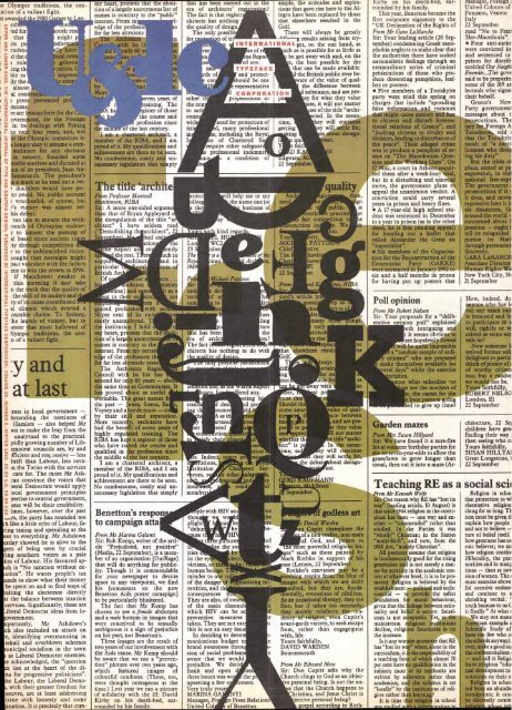
The title `archite<br />
From Professor Maxwell<br />
Hutchinson, RIBA<br />
Sir: A more one-sided argume<br />
than that of Bryan Appleyard o<br />
the deregulation of the title "ar<br />
chi tect" I have seldom read<br />
("Demolishing th architect", 2<br />
ked on<br />
ation<br />
eport an co<br />
the rest. T er<br />
ig<br />
suppo architect<br />
particular al<br />
British Arc<br />
Of ost<br />
olition<br />
non] and s m<br />
to their ex enc<br />
om<br />
guered profession with aro<br />
50 per cent of its nu<br />
rently unemployed. T<br />
the institution I hold<br />
my heart, protests that the<br />
tion of a largely anonym°<br />
names is contrary to the<br />
interest. From my certai<br />
edge of the profession th<br />
for far less altruistic reaso<br />
The Architects Regis<br />
Council with its list has<br />
around for only 60 years — abo<br />
the same time as Communism. It<br />
has proved about as useful<br />
workable. The great names<br />
the past — Jones, Soane, Ba<br />
Voysey and a horde more — st<br />
by their skill and reputation.<br />
More recently, architects have<br />
had the benefit of seven years of<br />
highly regulated training. The<br />
RIBA has kept a register of those<br />
who have stayed the course and<br />
qualified in the profession since<br />
the middle of the last century.<br />
I am a chartered architect, a<br />
member of the MBA, and I am<br />
proud of it. My qualifications and<br />
achievement are there to be seen.<br />
No cumbersome, costly and unnecessary<br />
legislation that simply<br />
Benetton's respon<br />
to campaign atta<br />
From Ms Marina Galanti<br />
Sir: Rob Kemp, writer df the article<br />
"Prejudiced, not positive"<br />
(Media, 22 September), is a member<br />
of an organisation [OutRage)<br />
that will do anything for publicity.<br />
Though it is commendable<br />
for your newspaper to devote<br />
space to any viewpoint, we find<br />
his [comments on the new<br />
Benetton Aids poster camapign]<br />
to be particularly blinkered.<br />
The fact that Mr Kemp has<br />
chosen to see a female abdomen<br />
and a male bottom in images that<br />
were conceived to be sexually<br />
ambiguous is a sign of prejudice<br />
on his part, not Benetton's.<br />
These images are the result of<br />
two years of our involvement with<br />
the Aids cause. Mr Kemp should<br />
be aware that we ran a "prevention"<br />
picture over two years ago,<br />
which featured images of<br />
colourful condoms. (These, too,<br />
were thought outrageous at the<br />
time.) Last year we ran a picture<br />
of solidarity with the ill: David<br />
Kirby on his death-bed, surrounded<br />
by his family.<br />
a<br />
that has been carried out in the<br />
era of architects' reg<br />
The fact is that registr<br />
chitects has nothing<br />
the quality of design<br />
The only possibl<br />
for n of ti<br />
e of<br />
e Repo<br />
d any.<br />
TYPEFACE<br />
and protecthould<br />
be one<br />
representative<br />
other c<br />
the con<br />
to sat<br />
cons<br />
with need for protection of<br />
titl d, many professional<br />
in s, including the Royal<br />
n of Chartered S<br />
require other safeguar<br />
s professional indemni<br />
nc s a condition of<br />
ill help me or my<br />
the name one jot<br />
business of<br />
oes<br />
ling<br />
ture<br />
that has been the<br />
era of archi 'on?<br />
The fact i<br />
chitects has nothing to do with<br />
stan f dem<br />
g t sume<br />
as th<br />
rtere<br />
er ered<br />
co don<br />
e. Indeed, m pr<br />
tions,<br />
stitution Cha<br />
yors, r c other<br />
insu<br />
membe<br />
ple with HIV an<br />
thou w w<br />
plight a<br />
"dehu<br />
fes<br />
be<br />
by<br />
use t h HI<br />
t e ur<br />
ities<br />
in the e<br />
victims, o th<br />
human beings. T<br />
minder to our co<br />
of the danger of<br />
norities, and th<br />
consequences t<br />
They are also, of cours<br />
of the main channel<br />
which HIV can be a<br />
preventive measures<br />
taken. They are not eas<br />
this is not an easy issu<br />
In deciding to devot<br />
munications budget t<br />
brand awareness throu<br />
sion of social problem<br />
aware that we would<br />
prejudice. We deci<br />
frank and open uss<br />
these issues was wo the p<br />
upsetting a few c umers.<br />
Very truly your<br />
MARINA GA TI<br />
eaS<br />
tion<br />
51<br />
Manager, Fo n Press Relations<br />
United Co of Benetton<br />
ample, the attitudes and aspirations<br />
that gave rise here to the Allegro<br />
have been replaced by those<br />
that elsewhere resulted in the<br />
Golf.<br />
There will always be greatly<br />
A'cr--'^g results arising from try-<br />
INTERNATIONALget, on the one hand, as<br />
red any.<br />
oting<br />
d pr<br />
Id<br />
ese<br />
ite<br />
5<br />
ered Sur-<br />
afeg<br />
nd<br />
cond<br />
s,<br />
ty<br />
of<br />
we<br />
he<br />
re<br />
e-<br />
ed<br />
x-<br />
ening mi-<br />
. .<br />
uch as is possible for as little as<br />
be got away with and, on the<br />
r the best possible for the<br />
that can be made available.<br />
d-the British public ever beware<br />
of the value of qualthe<br />
difference between<br />
d substance, and are preay<br />
for what they value<br />
ate, it will not matter<br />
use of the title "archi-<br />
time,<br />
getting<br />
ing<br />
aware,<br />
22 S<br />
FMANN<br />
t. re, dlesex<br />
ill', 2 September<br />
quality<br />
t public.<br />
estric e practic<br />
fair corn tition i<br />
struction in y. We<br />
on.<br />
You rely,<br />
MIC PATT<br />
Chie tive<br />
The Instit<br />
urve<br />
yar s artic e un<br />
questi<br />
this<br />
es<br />
many<br />
only<br />
ttitud<br />
e rise<br />
ep ac<br />
that elsewhere result<br />
olf.<br />
'ff<br />
ng<br />
uc<br />
er,<br />
cted. In the meaney<br />
will continue<br />
ey will settle for,<br />
te about dereguvant.<br />
ways<br />
arisin<br />
he on<br />
fo<br />
way with<br />
t po<br />
nn, RIBA<br />
then,<br />
ign<br />
is<br />
at<br />
ngs,<br />
se<br />
he<br />
as<br />
he<br />
Should th<br />
come awar value of qual-<br />
it<br />
nce between<br />
im<br />
and are pre-<br />
par to p t they value<br />
a prec 11 not matter<br />
whether th e title "architect"<br />
is p In the mean-<br />
'me, sa y will continue<br />
they will settle for,<br />
he debat bout dereguant.<br />
f godless art<br />
r David Warden<br />
n Cupitt champions the<br />
of a non-realist, non-male<br />
al God, and points to<br />
e most powerful religious imes"<br />
such as those painted by<br />
Mark Rothko in support of his<br />
ase (Letters, 22 September).<br />
Rothko's canvasses may be a<br />
oothing respite from the blur of<br />
mages with which we are daily<br />
aulted, but they are, fundamentally,<br />
evocations of nihilism.<br />
As an occasional therapy, they are<br />
fine; but if taken too seriously,<br />
they merely reinforce the tendency<br />
of religion, even Cupitt's<br />
avant-garde variety, to seek escape<br />
from, rather than engagement<br />
with, life.<br />
Yours faithfully,<br />
DAVID WARDEN<br />
Bournemouth<br />
From Mr Edward Moss<br />
Sir: Don Cupitt asks why the<br />
Church clings to God as an objecve<br />
personal being. Is not the aner<br />
that the Church happens to<br />
hristian, and Jesus Christ is<br />
'ective personal being?<br />
gospel according to Roth-<br />
Kirby on his death-bed, surrounded<br />
by his family.<br />
This year, Benetton became the<br />
first corporate signatory to the<br />
"UK Declaration of the Rights of<br />
From Mr Gara LaMarche<br />
Sir: Your leading article (20 September)<br />
condemning Greek xenophobia<br />
neglects to make clear that<br />
the authorities there have stoked<br />
nationalistic feelings through an<br />
extraordinary series of criminal<br />
proiecutions of those who produce<br />
dissenting pamphlets, leaflets<br />
or posters:<br />
Five members of a Trotskyite<br />
party were tried this spring on<br />
charges that include "spreading<br />
false information and rumours<br />
that might cause anxiety and fear<br />
to citizens and disturb international<br />
relations of Greece", and<br />
"inciting citizens to rivalry and<br />
division, leading to disturbance of<br />
the peace". Their alleged crime<br />
was to produce a pamphlet of essays<br />
on "The Macedonian Question<br />
and the Working Class". On<br />
17 May, a court in Athens acquitted<br />
them after a week-low trial,<br />
but in a disturbing and unusual<br />
move, the government plans to<br />
appeal the unanimous verdict. A<br />
conviction could carry several<br />
years in prison and heavy fines.<br />
A 17-year-old high school student<br />
was sentenced in December<br />
to a year in prison (as in the other<br />
cases, he is free pending appeal)<br />
for handing out a leaflet that<br />
called Alexander the Great an<br />
"imperialist".<br />
Six members of the Organisation<br />
for the Reconstniction of the<br />
Communist Party (OAKKE)<br />
were sentenced in January 1992 to<br />
six and a half months in prison<br />
for having put up posters that<br />
Poll opinion<br />
From Mr Robert Nelson<br />
Sir: Your proposals for a "deliberative<br />
o inion poll" explained<br />
oth intriguing and<br />
t it seems obvious to<br />
are hopelessly flawed<br />
will be quite impossible<br />
a "random sample of ordicitizens"<br />
who are prepared<br />
make themselves available for<br />
eral days" while the exercise<br />
ertaken.<br />
atter what subsidies 'le<br />
w are the mothers of<br />
n, the carers for the<br />
e lone parents going<br />
ed to give up time?<br />
Garden mazes<br />
From Mrs Susan Hillyard<br />
Sir: We have found it a sure-fire<br />
hit at summer birthday parties for<br />
six- to seven-year-olds to allow the<br />
grass/lawn to grow longer than<br />
usual, then cut it into a maze (Ar-<br />
From Mr Kenneth Wolfe<br />
Sir: One reason why RE has "lost its<br />
way" (leading article, 10 August) is<br />
that since 1944 religion in the curriculum<br />
has been — one way and another<br />
— "commended" rather than<br />
studied. In the Forties it was<br />
"wholly" Christian; in the Sixties<br />
"multi-faith", and now, from the<br />
1988 Act, "mainly Christian".<br />
All postures assume that religion<br />
is fundamentally good for the rising<br />
generation and is not merely a matter<br />
for scrutiny in the academic context<br />
at whatever level; it is to be promoted.<br />
Religion is believed by the<br />
establishment — political and ecclesiastical<br />
— to provide the safest<br />
foundation for moral behaviour,<br />
given that the linkage between rationality<br />
and belief is secure: fanaticism<br />
is not acceptable. Yet, as the<br />
mainstream religious institutions<br />
decline, religious fanaticism is on<br />
the increase.<br />
Is it any wonder moreover that RE<br />
has "lost its way" when, alone in the<br />
curriculum, it is the responsibility of<br />
a teaching force of which almost 70<br />
per cent have no qualification in the<br />
subject; most of its textbooks are<br />
written by adherents rather than<br />
academics; and the syllabus is set<br />
"locally" by the institutions of religion<br />
rather than learning?<br />
It is time that religion in school<br />
was stildied with a determination to<br />
manager, r °reign 1<br />
United Colours of<br />
Ponzano, Veneto<br />
Italy<br />
22 September<br />
read "No to Patri<br />
Slav-Macedonia".<br />
Four anti-natio<br />
were convicted in<br />
and sentenced to<br />
prison for distrib<br />
entitled Our Neighl<br />
Enemies.,The gove<br />
said to be preparin<br />
some of the 169 ar<br />
lectuals who signe<br />
their behalf.<br />
Greece's New<br />
Party government<br />
messages about t<br />
prosecutions. The<br />
tary for Foreign A<br />
Tsouderou, told<br />
that the Trotskyit<br />
result of "a narrc<br />
liceman who thou:<br />
ing his duty"<br />
But the trials cc<br />
place, aimed at pe<br />
expression, in viol<br />
national free-expr<br />
The government<br />
prosecutions if it<br />
it does, and move<br />
repressive laws it i!<br />
zle dissenters, GI<br />
around the world -<br />
concerned about 1<br />
pression — ought t<br />
tell its misguided<br />
pursue its Mac(<br />
through persuasior<br />
Sincerely,<br />
GARA LaMARCH<br />
Associate Director<br />
Human Rights Wa<br />
New York City, N(<br />
21 September<br />
How, indeed, do<br />
anyone who has<br />
out any exam suci<br />
is bemused and bt<br />
to participate in a<br />
will, rightly or w:<br />
ceived as some sor<br />
talk-in?<br />
Now someone<br />
retired former soli<br />
delighted to partic<br />
think of plenty of (<br />
of worthy citizen<br />
too; but a randox<br />
we would not be.<br />
Yours faithfiilly,<br />
ROBERT NELSC<br />
London, El<br />
22 September<br />
chitecture, 22 Se]<br />
children have gre:<br />
finding their way<br />
then seeing who et<br />
Yours faithfully,<br />
SUSAN HILLYA1<br />
Great Longstone,<br />
22 September<br />
Teaching RE as a social scil<br />
Religion in schot<br />
that protection to wl<br />
resentative religiou<br />
clung for so long. TI<br />
tion must be given tl<br />
explain how people<br />
and not to believe —<br />
ture of belief itself.<br />
how greatness has co<br />
roic believer; we mt<br />
how religion contint<br />
illiberality, the pert<br />
norities and in man),<br />
tions — then as nov<br />
sion of women. The<br />
must examine above<br />
ful coercive endeav<br />
and continue to a<br />
shrieking recital:<br />
truth because to us C<br />
it finally." At what<br />
We may not mana<br />
American example a<br />
Scientific Study of<br />
have too few who e<br />
the schools anyway).<br />
ever, make a good sti<br />
the confessionalism I<br />
— and call it Religi,<br />
leave religious "edw<br />
tual development to<br />
stitutions on their o<br />
Religion in schoo<br />
ied from an abunda:<br />
standpoints; it cani<br />
be discreetly comrn<br />
helieverc who e
Other Font Suppliers.<br />
ored with what other font<br />
suppliers offer?Well,<br />
discover where some of the<br />
most creative designers shop for<br />
thefreshest fonts — FontHaus.<br />
FontHaus is much more than just<br />
another "box mover." It is a resource<br />
fully committed to providing the<br />
very best in typographic product and<br />
service.<br />
At FontHaus you will find some of<br />
the finest fonts available anywhere —<br />
more than 4o fully-licensed, highquality<br />
libraries like Adobe, Agfa,<br />
Autologic, Bitstream, E+F, The<br />
Font Bureau, ITC, Monotype,<br />
Red Rooster, Scangraphic and<br />
FPS<br />
Treacyfaces — just to name a few. "r<br />
However, these libraries are<br />
only the beginning. Once you pass<br />
through our doors you will discover<br />
what makes FontHaus so different —<br />
like our new and exclusive fonts. In<br />
fact, we have earned a reputation as<br />
being the only resource in the US to<br />
first carry the newest ITC and Font<br />
Bureau releases like ITC Highlander,<br />
ITC Charter, the new ITC<br />
Handtooled fonts (shown on the following<br />
pages), FB Reiner Script, FB<br />
Stereo, FB Showcard Gothic and the<br />
famous FB Interstate family. Agy„<br />
If you would like a FontHaus<br />
"ImageBureau" poster — illustrating<br />
the zany Art Parts library of<br />
images, our PictureFonts and an<br />
array of other non-alphabet image<br />
fonts, give us a call — it's FREE.<br />
2<br />
However, for something really fresh,<br />
check out Art Parts; a wacky yet sophisticated<br />
library of outrageous illustrations<br />
— a new and exclusive<br />
FontHaus collection.<br />
Service: A FontHaus Specialty<br />
Trouble finding a font? Give us a call<br />
first. Our trained greengrocers will<br />
swing into action. Chances<br />
are excellent that we'll<br />
have what you want. Or<br />
at least, something very<br />
close. You see, we carry<br />
more than 7,000 fonts!<br />
Trouble finding a font —<br />
because it doesn't exist?<br />
FontHaus is pleased to offer<br />
a range of custom digital<br />
services. Our expert team of<br />
type designers can digitize<br />
your corporate font or logo in<br />
any of the popular font formats:<br />
Mac, PC and TrueType.<br />
You'll find working with people<br />
who actually know type a refreshing<br />
experience — never stale.<br />
FontHaus Fonts: Delivered<br />
Fresh. by Mail and CD-ROM<br />
Mail. You can hand-pick your<br />
FontHaus fonts over the phone and<br />
have them delivered fresh the very<br />
next day.<br />
CD-ROM. Need a peck of fonts,<br />
fast? FontHaus is excited to an-<br />
nounce its very own CD-ROM! Now<br />
you can purchase over 85o high-<br />
quality, fully-licensed Macintosh<br />
fonts — on the brand new Font-<br />
Haus OpenHausTM CD-ROM.<br />
Presenting two fresh, new FontHaus<br />
exclusives. Starting in December,<br />
we'll be the first to offer the full<br />
I7-0) library on CompuServe.®<br />
Yust dial "Go Fommus" from<br />
anywhere, any time to order and<br />
receive ITC fints. Also, in December, the new<br />
FontHaus OpenHaus'' CD-ROM will be available<br />
with over 8so quality fonts on a single, unlocked<br />
disk. No codes, no fuss and no waiting.<br />
For only $4,995 (that's about 6 bucks<br />
a font!)you get the entire ITC library<br />
(more than 520 typefaces including<br />
the newest releases), the most popular<br />
licensed fonts from the E+F library<br />
like Alternate Gothic, the<br />
complete Futura family, Hollander,<br />
Radiant and Swift. And as a special<br />
bonus: OpenHaus im also includes<br />
the wacky Art Parts<br />
EPS images.<br />
Unlike other font CD-<br />
ROMs, the FontHaus Open-<br />
Haus 'm CD arrives completely<br />
UNLOCKED 09E — no item<br />
codes, passwords, access keys<br />
or fax unlocks — just a bunch<br />
of great fonts, all at once.<br />
Is $4,995 a bit out of budget?<br />
FontHaus is prepared to make<br />
your font investment affordable<br />
with FontHaus EasyPay.TM<br />
FontHaus EasyPay is easy. You<br />
can elect to spread your purchase<br />
over six or 12 months.<br />
Isn't that a fresh idea?<br />
fr -Or" FontHaus on CompuServe:<br />
FontHaus is proud to announce<br />
that in December it will bring to<br />
market ITC® licensed fonts on<br />
CompuServe CompuServe, one of<br />
the best-known and most popular<br />
remote-access information services<br />
in the world, is now able<br />
to offer its members one<br />
of the best-known and<br />
most popular type libraries<br />
in the world.<br />
What a team we make!<br />
More than 520 typefaces<br />
will be available,<br />
including all<br />
Published three times a year,<br />
x-height has already<br />
achieved a respected<br />
position as one of the<br />
industry's most interesting<br />
and useful publications devoted to type<br />
and type issues. It ispacked with not only interesting<br />
articles, interviews, and industry news, IT IS<br />
ALSO THE FON171AUS FONTS CATALOG. x-height<br />
is FREE with any font order or by subscription.<br />
A "must" for new users of computer type as well<br />
as for seasoned professionals.
,51-301-iJ Og:g_WfIX-,C90 V 0 ,9Q<br />
c_S: 7 e0 (-62),T Z123567890&<br />
aScareigininop yrs v toxy z ?<br />
RR Byron Bold $49 (Light, Medium and swash syles also available).<br />
3."T40,Aw4).<br />
AlPl?`74(`It*).)titA
4<br />
MESSAGE FROM ITC<br />
A report from<br />
Mark Batty<br />
on the Association<br />
Typographique<br />
Internationale's fall<br />
meeting in<br />
Antwerp.<br />
6<br />
TYPE AND DESIGN:<br />
AN EDITORIAL<br />
With this redesigned<br />
issue, U&Ic is<br />
even better prepared<br />
to promote<br />
effective type and<br />
graphic design.<br />
8<br />
DECO ESPANA<br />
Steven Heller explores<br />
Spain's contribution to<br />
this elegant era of design.<br />
12<br />
DAILY DESIGN<br />
British newspapers<br />
turn to design for a<br />
competitive edge. An<br />
overview by Peter Hall.<br />
18<br />
THE PENCIL TEST: AN<br />
ANIMATOR'S LIFELINE<br />
John Canemaker<br />
explores the early steps<br />
in animation through<br />
his latest project.<br />
A U&/c exclusive.<br />
22<br />
ITC CHARTER'"<br />
Matthew Carter's classic<br />
typeface is now part<br />
of the ITC library.<br />
THE ANNUAL CONFERENCE of ATypI (Association Typographique<br />
Internationale) took place in Antwerp, Belgium,<br />
between the 24th and the 27th of September. This year<br />
some 24o people came together to talk about type. As<br />
usual, much of the real activity took place in conversations<br />
in corridors, but there was also a worthy conference<br />
program. Because ATypI is an international typographic<br />
association, its members are people who are interested<br />
and involved with type—people who design it, design<br />
with it, produce type products and products with type,<br />
teach about typography and conduct scholarly projects<br />
related to type issues. It is a<br />
very specialized but never-<br />
MESSAGE<br />
theless highly diversified group. The most important<br />
part of the conference program was TypeLab. Imagine a<br />
windowless, slightly L-shaped room measuring about 6o<br />
x 4o feet, with a bank of computers on work surfaces. In<br />
the center of the room, there was equipment for cutting<br />
letters into stone and wood. To the right at the back,<br />
there was a small approximation of an auditorium.<br />
Also imagine some 5o people at any given time huddled<br />
around the computers, watching letters being worked<br />
with, or listening to experts talk about their work of<br />
designing or using letterforms. These were predominantly<br />
young people whose interest was infectiously<br />
passionate, intense and serious. A daily newspaper of the<br />
conference was planned to be printed, and this became<br />
a reason for some to work through the night with almost<br />
28<br />
ITC HANDTOOLED<br />
SERIES<br />
Three popular<br />
ITC typefaces<br />
now have special<br />
"engraved"<br />
characteristics.<br />
32<br />
SHADES OF BLUE<br />
The blues has<br />
a whole new<br />
audience—and<br />
packaging<br />
to boot.<br />
36<br />
TRANSFORMING TYPE<br />
Robin Williams<br />
shows how type<br />
software can solve<br />
common design<br />
problems.<br />
38<br />
TECH TALK<br />
What's new in software,<br />
hardware and pre-press.<br />
52<br />
EASY ACCESS<br />
New graphic symbols are<br />
developed for the disabled.<br />
53<br />
THANK You<br />
ITC and U&/c win accolades<br />
from the industry.<br />
55<br />
U&1C COLOPHON<br />
THE DESIGNERS:<br />
International<br />
Typeface<br />
Corporation<br />
would like<br />
to thank<br />
Woody Pirtle,<br />
John Klotnia<br />
and Ivette<br />
Montes de Oca<br />
of Pentagram<br />
for the design<br />
of this<br />
issue of U&/c.<br />
manic dedication. It was as if participants had spontaneously<br />
agreed to make a singular affirmation that the<br />
crafts of type design and typography are not only alive<br />
and well, but becoming stronger with each new development<br />
in technology. TypeLab was a success because it<br />
captured the interest of a significant proportion of the delegates<br />
at the conference, and showed the value of people<br />
using new technology to produce fine quality work. The<br />
formal part of the conference was a lecture program which<br />
featured titles like "Text: A Calculated Accident?;' "Travels<br />
in Virtual Space;' and "Noisy Text in Space and Time."<br />
Actually, the talks were not<br />
FROM ITC as formidable as these titles<br />
would suggest, and some were quite interesting. The<br />
problem lay in the erroneous assumption that multimedia<br />
was in itself a cornerstone for discussing new developments<br />
in the production and use of type. Multimedia<br />
represents a series of tools, not an end in itself. The end<br />
lies predominantly in the imagination of the creator, the<br />
user of the tools. So the conference in Antwerp was largely<br />
a success in both content and interaction of the attendees.<br />
Next year, an expanded conference is planned to be in<br />
San Francisco for Type 94-95 in mid-September. A lot was<br />
learned this year about what matters to people who design<br />
and work with type. This should help make the San<br />
Francisco conference a truly dynamic event.<br />
MARK BATTY, PRESIDENT AND CEO, ITC; VICE PRESIDENT, ATYPI;<br />
CHAIRMAN, TYPE 94 -95<br />
Or' ,<br />
VOLUME TWENTY,<br />
Er"' , ,<br />
NUMBER THREE, WINTER 1993<br />
EXECUTIVE PUBLISHER:<br />
CHARLES M. WILHELM<br />
EDITOR: MARGARET RICHARDSON<br />
MANAGING EDITOR: JOYCE RUTTER KAYE<br />
EDITORIAL DIRECTOR: ALLAN HALEY<br />
CONSULTING EDITOR:<br />
EDWARD GOTTSCHALL<br />
GRAPHIC DESIGN:<br />
PENTAGRAM<br />
ART/PRODUCTION MANAGER:<br />
JANE DiBUCCI<br />
ART/PRODUCTION COORDINATOR:<br />
CLIVE CHIU<br />
ART/PRODUCTION:<br />
JAMES MONTALBANO, SID TIMM<br />
OPERATIONS: REBECCA L PAPPAS<br />
DIRECTOR OF CREATIVE SERVICES:<br />
PAT KRUGMAN<br />
PUBLIC & MEDIA RELATIONS:<br />
SHARON BODENSCHATZ<br />
SUBSCRIPTIONS: ELOISE A. COLEMAN<br />
ADVERTISING SALES:<br />
CALHOUN & ASSOCIATES<br />
PHONE: (404) 594-1790<br />
FAX: (404) 594 -1849<br />
© INTERNATIONAL TYPEFACE<br />
CORPORATION 1993.<br />
U&Ic (ISSN 0362 6245) IS<br />
PUBLISHED QUARTERLY BY<br />
INTERNATIONAL TYPEFACE CORPORATION,<br />
866 SECOND AVENUE,<br />
NEW YORK, NY 10017.<br />
ITC IS A SUBSIDIARY OF<br />
ESSELTE LETRASET.<br />
U.S. SUBSCRIPTION RATES,<br />
$30 FOR THREE YEARS;<br />
FOREIGN AIRMAIL SUBSCRIPTIONS,<br />
$60 U.S. FOR THREE YEARS;<br />
U.S. FUNDS DRAWN ON U.S. BANK.<br />
FOR ADDITIONAL INFORMATION<br />
CALL (212) 371-0699.<br />
SECOND-CLASS POSTAGE PAID AT<br />
NEW YORK, NY AND ADDITIONAL<br />
MAILING OFFICES. POSTMASTER: SEND<br />
ADDRESS CHANGES TO<br />
U&Ic SUBSCRIPTION DEPARTMENT,<br />
P.O. BOX 129,<br />
PLAINVIEW, NY 11803-0129.<br />
ITC OPERATING EXECUTIVE BOARD 1993<br />
MARK J. BATTY,<br />
PRESIDENT AND CEO<br />
ALLAN HALEY,<br />
EXECUTIVE VICE PRESIDENT<br />
MAUREEN A. JACKSON,<br />
CONTROLLER<br />
CHARLES M. WILHELM,<br />
DIRECTOR, CORPORATE COMMUNICATIONS<br />
ILENE STRIZVER,<br />
DIRECTOR OF TYPEFACE DEVELOPMENT<br />
ITC FOUNDERS:<br />
AARON BURNS, HERB LUBALIN,<br />
EDWARD RONDTHALER<br />
ITC, U&Ic AND THE<br />
U&Ic LOGOTYPE ARE REGISTERED<br />
TRADEMARKS OF INTERNATIONAL<br />
TYPEFACE CORPORATION.<br />
MICROFILM (16mm OR 35mm)<br />
AND MICROFICHE (105mm) COPIES<br />
OF U&Ic ARE AVAILABLE FROM<br />
UMI, 300 NORTH ZEEB ROAD,<br />
ANN ARBOR, MI 48106-1346.<br />
PHONE: (800) 521-0600<br />
OR (313) 761-4700.<br />
FAX: (313) 761-3221.<br />
VBPA<br />
MEMBER<br />
TABLE OF CONTENTS: HEADLINE/NUMERALS/SUBHEADS/TEXT: ITC CHARTER REGULAR MESSAGE FROM ITC: HEADLINE ITC CHARTER BOLD; TEXT: REGULAR MASTHEAD: ITC FRANKLIN GOTHIC BOOK CONDENSED, BOOK CONDENSED ITALIC FRONT COVER: A: ITC AVANT GARDE GOTHIC BOOK; 0: ITC BENGUIAT BOLD; B: ITC ANNA;<br />
M: ITC GIOVANNI BOOK; 13: ITC CHELTENHAM BOOK; E: ITC SOUVENIR DEMI; F: ITC TIFFANY MEDIUM; C: ITC AMERICAN TYPEWRITER MEDIUM; G: ITC FRANKLIN GOTHIC DEMI CONDENSED; I: ITC BAUHAUS HEAVY; H: ITC OZWALD; 1: ITC CHELTENHAM HANDTOOLED BOLD; K: ITC LUBALIN GRAPH DEMI; L: ITC SOUVENIR DEMI;<br />
N: ITC HIGHLANDER BOOK; Q: ITC CASLON NO. 224 BOLD; P: ITC NEW BASKERVILLE ROMAN; R: ITC GALLIARD ROMAN; 5: ITC MONA LISA RECUT; V: ITC NEWTEXT BOOK; W: ITC BENGUIAT BOOK; T: ITC NEW BASKERVILLE BLACK; U: ITC NEW BASKERVILLE BLACK; Z: ITC KABEL ULTRA; Y: ITC CASLON NO. 224 BOOK<br />
4
T<br />
The URW TypeWorks Collection is an advanced typographic<br />
resource comprised of 3,000 ultra-high quality PostScript Typel<br />
or TrueType fonts and q(e. rnus, the industry's most sophisticated<br />
tool for precision letterspacing and kerning.<br />
Since 1972, URW has been making quality type<br />
for companies like Berthold, ITC, Linotype and<br />
Monotype. Now, you can get the same high quality,<br />
industry standard fonts for a mere fraction of<br />
the price you're currently paying.<br />
URW TypeWorks2 is the second volume from<br />
our exciting CD ROM collection and contains<br />
3,000 more ultra-high quality PostScript or<br />
TrueType fonts. All fonts come supplied with<br />
up to 1,000 unique kerning pairs! CDs are available<br />
for either the Macintosh or PC.<br />
Use Kernus to automatically create 1,000 point<br />
size specific kerning pairs for any PostScript or<br />
TrueType font, in under 30 seconds! Together<br />
with our 1,001 page Reference Guide, which<br />
displays every one of our typefaces in glorious<br />
detail, you can own the world's most comprehensive<br />
typographic resource.<br />
Best of all, TypeWorks is supplied fully unlocked,<br />
which means all software and type is instantly<br />
accessable. No complicated encryptions or expensive<br />
transactions to deal with. You get what you<br />
want when you need it. And you get it all for the<br />
price of a single software application.<br />
Quality, simplicity and cost effectiveness—<br />
sponsored by innovation, technology and common<br />
sense. Brought to you by the company that<br />
pioneered digital type.<br />
For more information on URWTypeWorks call:<br />
Type<br />
800-248-3668<br />
516-864-0167<br />
FACSIMILE<br />
516-543-5721<br />
47 Mali Drive<br />
Commack, NY<br />
11725-5703<br />
Precision Type is an authorized URW <strong>Res</strong>eller<br />
Circle 268 on Reader Service Card<br />
URW Alcuin, Alternate Gothic No.1, Alternate Gothic No.2, Alternate<br />
Gothic No. 3, Arsis, ITC New Baskerville, ITC Bauhaus, Bellevue, Belshaw,<br />
Belwe, ITC Benguiat, ITC Benguiat Gothic, Berling, Beton, Bodoni<br />
Antigua, Bottleneck, Brighton, ITC Caslon No. 224, Caxton, Carousel,<br />
Caslon, ITC Century, Century Schoolbook, Cheltenham Old Style No. 2,<br />
Churchward, URW Classico, Clearface Gothic, Compacta, Conference,<br />
Corinthian, Cortez, Countdown, Data 700, DeVinne Ornament, Dynamo,<br />
Eckmann, Edwardian, Egyptienne, ITC Elan, ITC Eras, ITC Esprit, Eurostile,<br />
Ewie, Fette Fraktur, Frankfurter, ITC Franklin Gothic, Futura Display,<br />
ITC Gamma, Garamond No. 9, ITC Giovanni, WTC Goudy, Goudy<br />
Heavyface, Goudy Old Style, Grotesque No. 9, Handel Gothic, Hawthorn,<br />
Hobo, Horatio, Italia, Jensen Old Style, Julia Script, Kalligraphia, Latienne,<br />
Latin Wide, URW Latino, ITC Leawood, ITC Legacy Sans, Lindsay, Litera,<br />
ITC Lubalin Graph, Magnus, Mandarin, Memphis, ITC Mendoza,<br />
Metropolitaines, ITC Mixage, ITC Mona Lisa Solid, Neuzeit Grotesk,<br />
Nimbus, Nimbus Sans, ITC Novarese, Octopuss, Odin, Okay, Old English,<br />
Ondine, ITC Ozwald, ITC Pacella, Paddington, URW Palladio, ITC Panache,<br />
Peignot, Proteus, Pump, Quartz, ITC Quorum, Raleigh, Rialto, Romic,<br />
Serifa, Shamrock, Shelley, Skidoos, ITC Slimbach, Springfield, Squire,<br />
ITC Stone Sans, ITC Stone Serif, ITC Stone Informal, ITC Syndor, Syntax,<br />
Tango, Tarragon, Thorowgood, ITC Tiepolo, ITC Tiffany, Time Script,<br />
University Roman, URW Antigua 2039 Super, URW Grotesk 2012, VAG<br />
Rundschrift, Vendome, Volta, Washington, Weiss Rundgotisch, Windsor,<br />
ITC Zapf Chancery, Zirkus and many, many more.<br />
5
Reinventing U&lc From cover to colophon, this<br />
issue of U 8dc has been redesigned. The intention<br />
of this formidable undertaking of reinvention<br />
is to emphasize ITC's role as a leader in type edu-<br />
cation W and marketing. As U&lc has evolved over the last two decades<br />
its pages have conveyed various design styles. Art directors from Herb<br />
Lubalin to Woody Pirtle have created effective editorial designs featuring<br />
ITC typefaces, and forged this journal's unique reputation in the design,<br />
printing and type industries (for recent awards granted to ITC and U&lc<br />
see page 53). When the U &lc Editorial Board recently considered how to yet<br />
again improve this quarterly publication, the focus was on revamping our<br />
approach to new ITC typeface release pages and our back-of-the-book pages<br />
like the ITC typeface directory and ITC Subscriber listings. Woody Pirtle, John<br />
Klotnia and Ivette Montes de Oca of Pentagram Design worked closely with<br />
ITC's vice-president of marketing, Allan Haley, and director of typeface devel-<br />
opment, Ilene Strizver, to strategize on making the marketing pages more<br />
dynamic. The results, starting on page 22, are reminiscent of the best of classic<br />
type specimen books but were produced electronically. According to Allan<br />
Haley, "Our goal with the redesign of U &lc was to meld typographic tradition<br />
and the most current design vocabulary. The intent, however, was to eschew<br />
fashion for graphic content. We wanted to create what Jan Tschichold called<br />
`centered typography." After a typeface submission has been approved by<br />
the ITC Type Review Board, the process of development from an initial<br />
design to a typeface release is lengthy and painstaking. An introduction of<br />
a new ITC typeface in the pages of U&/c, therefore, must show immediately<br />
the typeface's esthetics and personality. Ilene Strizver emphasizes, "The<br />
purpose of the new type release pages is not only to entertain or inform,<br />
but to showcase the new typeface, to convey the excitement and the enthu-<br />
siasm we felt initially when we chose this face, and to show how this type-<br />
face can be used in an optimal way." The editorial features in this issue also<br />
capture the spirit of reinvention. Peter Hall looks at British newspapers and<br />
provides an overview of how design provides a competitive edge. We also look<br />
at CD packaging for the blues geared for a new audience. Reinventing U&lc<br />
for us means rethinking what is important to ITC: relevant editorial and<br />
visual content and impeccable contemporary design. Margaret Richardson
Ar1ii63t Amyl'<br />
( )LET'S<br />
HAVE A<br />
Fontek collections are offered in<br />
Postscript Type 1 and TrueType formats<br />
on one disk for the Macintosh. As part of<br />
Letraset's premier digital display and text<br />
typeface library, these eight new Fontek<br />
collections are available now at a<br />
suggested retail price of $39.95 per<br />
collection. Or you can purchase all eight<br />
in our portfolio pack for the discounted<br />
price of $249.00.<br />
1("4<br />
11,4eft s5ot.<br />
Contact your local Letraset Art<br />
Materials dealer for more<br />
information, or call<br />
(800) 343-TYPE<br />
to find the dealer<br />
nearest you.<br />
AISCDErGriT<br />
vwxYzircroi<br />
ON/\ -AAAAA<br />
/.'"*Sr<br />
sfiiiratait °<br />
KINK<br />
DIIIIIIIL FOOTS HAM [MASH<br />
Letrasee v4vt'i<br />
Circle 265 on Reader Service Card<br />
Hot off the press from<br />
the Letraset type foundry<br />
are eight new typefaces<br />
with an ultramodern flair for<br />
today's designers and graphic artists.<br />
Designed exclusively for Letraset, these<br />
fresh digital faces add mischief, fun and<br />
style to publications, videos, packaging,<br />
ads, brochures and more.<br />
With names as exciting as the faces<br />
themselves — Bang, Flamme, Mo' Funky<br />
Fresh, Party, Bendigo, Arriba, Arriba-<br />
Arriba„ and Roxy - the eight new trend<br />
setting releases from Letraset range from<br />
jungle, surf, and party themes to the feel of<br />
Latin America, fireworks, and the'SOs. Each<br />
typeface includes a complete character set,<br />
alternatives, accents, and symbols.<br />
WILL DO THE<br />
'REM NOPQRSTLI<br />
34567890£$CYfrgo<br />
ctEttiiitiri5606
PUBLICOLOR eRRCELONFI
(<br />
LOGOS AND TRADEMARKS<br />
FROM THE '20S AND '30S<br />
BY STEVEN HELLER<br />
rt Deco was the first commercial design style to be embraced<br />
universally. First emerging in France prior to World War I,<br />
it was a reaction to Art Nouveau's floreated madness and<br />
Modernism's purist mania which took root in other industrial coun-<br />
tries during the '20s and '30s. Art Deco combined ancient Mayan,<br />
Egyptian and Asian motifs with 20th century European avant garde<br />
influences such as Cubism, Futurism and Constructivism. Deco gave<br />
the appearance of being on the edge, yet it was rooted in convention.<br />
A STUDY IN CONTRASTS<br />
Characterized by numerous, not always harmonious, graphic<br />
ingredients, Art Deco was most often used in design to rep-<br />
resent contradictions, such as those between tradition and<br />
progress or Communism and Fascism. In its earliest manifestation,<br />
Art Deco (or Art Moderne as it was known) was informed by a clas-<br />
sical revival. Later it evolved into the sharp rectilinear geometrics<br />
which characterize early 20th century design.<br />
The French unveiled the new style at the 1925 Exposition<br />
Internationale des Arts Decoratifs et IndustrieIs Modernes in Paris,<br />
a city notable for its excesses flourishing along both banks of the<br />
Seine. Many European nations were represented by lavish pavilions<br />
and those who had not already embraced (or co-opted) the new<br />
style seized the opportunity at that time to imitate what they saw.<br />
American merchants, including stylists from chic New York depart-<br />
ment stores, returned home with the archetypes upon which they<br />
based new waves of design for packaging, products and showrooms.<br />
Each country which adopted Art Deco imbued it with a<br />
distinct national flavor, but there were shared, fundamental traits<br />
as well: airbrush was the most popular medium; streamlined<br />
decorative typefaces were the rage; and ziggurats, lightning bolts,<br />
sunbursts and stylized ocean waves were frequent motifs.<br />
3 2 r, I 3<br />
3 g<br />
.. co 0<br />
a. a 3 1.0<br />
0,<br />
a<br />
><br />
A ,72<br />
LA CASA IIAS SUITE<br />
RADIO<br />
c..a.e.c wwiS z Nam 10%,11104111/11<br />
3
°LW [STA<br />
CILAS ICA<br />
it 113AIA ILONA<br />
C1 , eoLI<br />
0 a<br />
f.<br />
o EP 07<br />
A COMMERCIAL STYLE...<br />
The hotbeds of Art Deco were France, England and Italy, yet<br />
some of the lesser known, but no less fascinating applications<br />
of the style took hold in Spain during the early to mid-'30s.<br />
Spain was then in the wake of a transition from a monarchy to a<br />
republic—the kind of social, cultural and political transformation<br />
that invites artistic revolution. It was also a period of economic<br />
re-evaluation that offered new opportunities for manufacturers and<br />
merchants. In this milieu, Art Deco became an unofficial, national<br />
style for its symbolic link to the rest of the industrialized world. Art<br />
Deco graphics were used to sell some of the same products and<br />
services in Spain that signaled progress—automobiles, airplanes,<br />
fashion and cosmetics—in the rest of Europe and the United States.<br />
Numerous businesses used Art Deco for advertisements, trade-<br />
marks and logos, giving their corporate identities a contemporary<br />
quality that earned them a competitive edge.<br />
...AND A POLITICAL TOOL<br />
rt Deco was not exclusively a commercial style, since it served ry<br />
the propagandists of warring political parties and became<br />
the most frequently used graphic style of the Spanish Civil<br />
War. In 1936 when the republic was threatened by monarchist<br />
and Fascist (Falangist) rebels who were striving to violently over-<br />
throw the legitimate government, poster campaigns were launched<br />
by both sides, each notable for their striking graphics. The monu-<br />
mental aspects of Art Deco—the sleek, airbrushed renderings<br />
of heroic, neoclassical figures—served both factions in their efforts<br />
to win hearts and minds. Art Deco was not partisan. It belonged<br />
to whichever group embraced it, and its symbolic imagery could be<br />
claimed equally by good and bad, right and wrong, left and right.<br />
ART DECO GAVE THE<br />
APPEARANCE OF BEING<br />
ON THE EDGE, YET IT WAS<br />
ROOTED IN CONVENTION<br />
The rebels led by Generalissimo Franco ultimately achieved<br />
a decisive military victory that ended the republic and squelched<br />
free expression for the next four decades. Yet Art Deco remained a<br />
popular style for political propaganda and commercial advertising<br />
through World War II, after which its effectiveness slowly dissipated<br />
as it gave way to more au courant styles.<br />
The logos and trademarks presented here, culled from<br />
Boletin Oficial De La Propriedad Industrial, a monthly registry of<br />
commercial designs, span the late 1920s to mid 1930s. It was the<br />
period when Art Deco reigned supreme prior to the bloody Civil<br />
War and before Art Deco became a style of oppression.<br />
STEVEN HELLER IS CO-AUTHOR (WITH LOUISE FILI) OF ITALIAN ART DECO: GRAPHIC DESIGN BETWEEN<br />
THE WARS AND DUTCH MODERN: GRAPHIC DESIGN FROM DESTUL TO DECO. THEY ARE CURRENTLY<br />
WORKING ON STREAMLINE: AMERICAN ART DECO GRAPHIC DESIGN (CHRONICLE BOOKS).<br />
10
w .71 ,T<br />
a o<br />
N IN 6) .<br />
0 3 0,<br />
O<br />
.0 0<br />
IA)<br />
0L*<br />
3<br />
3<br />
Glj<br />
11<br />
VITHOL<br />
HEADLINE: ITC ANNA SUBHEADS/INITIAL CAPS: ITC HABEL BOLD TEXT: MEDIUM, DEMI CAPTIONS: DEMI
DAILY<br />
DESIGN<br />
NEWSPAPER DESIGN WINTER, 1993 PUBLISHED IN NEW YORK<br />
Stalwart British newspapers find that<br />
redesign is the key to capturing new<br />
readers in a highly competitive market<br />
The Independent's<br />
latest facelift<br />
introduced the<br />
"classically strong"<br />
Plantin-based<br />
typeface Aldine<br />
Plantin from<br />
Mainstream.<br />
Aldine Bold<br />
Aldine Roman<br />
CHRISTOPHER HUHNE<br />
that the recovery has been<br />
weakened by the hangover of<br />
debt from the free-spending<br />
Aldine Bold<br />
BY PETER HALL<br />
FOR TWO YEARS now I've been<br />
living in New York and wrestling<br />
with The New York Times every<br />
day, and I'm almost beginning to<br />
enjoy it, but there are days when<br />
I long for British newspapers. I<br />
miss that rich variety of voices<br />
and strong visual identities, that<br />
parochial playground of newspaper<br />
rivalries, gossip and hypocritical<br />
morality. I miss the vivacious<br />
political debate and the merciless<br />
derision heaped upon public<br />
figures, the omnipresence of<br />
intrepid reporters and alcoholic<br />
columnists, and the class-ridden<br />
battle between the trashy tabloids<br />
and arrogant "qualities. "<br />
Newspapers have always been<br />
shaped by various conflicting<br />
opinions of what the public want,<br />
and what the public should know:<br />
The history of the English newspaper<br />
(beginning in 1702 with<br />
the first daily, The Daily Courant,<br />
subsequently flowering with five<br />
London titles by the mid-18th<br />
century) vividly illustrates this.<br />
The early English news-sheets<br />
were often produced by corrupt<br />
journalists who accepted bribes to<br />
temper their comments on public<br />
figures. Today, while the question<br />
of what the public should know is<br />
still in the hands of the powerful,<br />
the question of what the public<br />
wants has escalated in importance<br />
for newspapers. It has become a<br />
question of survival. With readership<br />
declining steadily, newspapers<br />
are forced to compete with<br />
television, radio and 24-hour<br />
online news services.<br />
We all know how the tabloids<br />
coped with competition; they cut<br />
prices, introduced color and generally<br />
turned themselves into<br />
sensationalist comics. But what<br />
makes the quality British newspapers<br />
so interesting is that they<br />
have been forced by the competition<br />
to address their visual identities<br />
more thoroughly than ever<br />
before. In the last six years, complete<br />
visual overhauls, right down<br />
to typefaces have been extraordinarily<br />
frequent at The Daily<br />
Telegraph, The Financial Times,<br />
The Times, The Guardian and<br />
The Independent. Not since the<br />
"Century Schoolbook revolution"<br />
of the 1960s, when the Sunday<br />
broadsheets (a term which dis-<br />
tinguishes larger-format papers<br />
from tabloids) restyled themselves<br />
to be more responsive to news<br />
and more appealing to a broader<br />
audience, has there been such a<br />
concentrated spate of design<br />
activity. Editorial designers have<br />
never been more in demand.<br />
A New Pretender:<br />
The Independent<br />
ONE CATALYST FOR this new-<br />
found visual consciousness was<br />
the launch of The Independent<br />
in October 1986. Spawned out of<br />
a voting swing towards centrist<br />
politics in Britain and a dissat-<br />
isfaction with the political biases<br />
of existing newspapers, The Inde-<br />
pendent's advantage, as editor<br />
Andreas Whittam-Smith wrote in<br />
the first issue, was its freedom<br />
from "union restrictive prac-<br />
tices...and the political prejudices<br />
of proprietors." (Attempts by the<br />
ruthless publisher Rupert Mur-<br />
doch to steamroller through a<br />
series of employee layoffs with<br />
the introduction of new<br />
technology at his news-<br />
papers [The Times, The<br />
Sun, Today and The<br />
News of the World] had<br />
provoked a progression<br />
of bloody battles with<br />
unions.) As a newcomer<br />
funded by not one entre-<br />
4 institutions,<br />
f:LI<br />
44<br />
preneur but 30 financial<br />
The Inde-<br />
pendent sneakily side-<br />
stepped the whole issue,<br />
invested in all the new<br />
technology it wanted and<br />
produced a paper of singular<br />
clarity.<br />
From its first issue,<br />
The Independent looked<br />
like it had been around<br />
11<br />
I<br />
for years. Designed initially<br />
by designers at<br />
Carroll, Dempsey and<br />
Thirkell, London, and<br />
then by in-house art<br />
director Michael Crozier,<br />
it adopted the authorita-<br />
tive air of its rivals, using<br />
Century Expanded type<br />
for headlines, a Times-<br />
based font for text, and a<br />
masthead faintly reminis-<br />
cent of The Times itself,<br />
but outshone them all<br />
with magazine-quality<br />
13<br />
photography and an open, airy<br />
layout. Everyone else had been<br />
hacking away at the old formats<br />
for so long that their pages<br />
looked claustrophobic in comparison.<br />
The Independent had<br />
started from scratch with a paper<br />
designed for a specific method of<br />
production. There was, of course,<br />
no need for it to adopt—as it<br />
did—the template of the traditional<br />
newspaper; this was just a<br />
marketing tactic to convey an air<br />
of permanence, which was sup-<br />
ported by writers who had<br />
defected from the rival papers.<br />
But everyone was fooled, and<br />
readers began to move over, most<br />
notably from Britain's biggest<br />
leftish newspaper The Guardian.<br />
The Euro-look:<br />
The Guardian<br />
THE GUARDIAN RESPONDED<br />
in 1988 with a dramatic redesign,<br />
partly to combat the loss of readers<br />
to The Independent and<br />
partly to use new technology to<br />
clean up the confusing sequence<br />
of pages which had evolved over<br />
the years. The redesign was<br />
masterminded by David Hillman<br />
at Pentagram, London. Working<br />
with The Guardian over three<br />
months, Hillman threw out the<br />
newspaper's tired and clumsy<br />
image, imposed a tight layout<br />
Garamond Italic<br />
For The Guardian, a<br />
politically left-wing<br />
newspaper, three<br />
easily-accessed, workhorse<br />
typefaces-<br />
Garamond, Helvetica<br />
and Nimrod—were<br />
selected by design consultant<br />
David Hillman,<br />
who has little time<br />
for customized, proprietary<br />
faces: "For the<br />
majority of the public,<br />
there are only two<br />
typefaces in the world,"<br />
he says, "those with<br />
feet and those without."<br />
Helvetica Bold<br />
TheGuardian<br />
Chris Mihill<br />
Medical Correspondent<br />
MORE than 1,000<br />
women in the West<br />
Midlands have been<br />
recalled for cervical<br />
smear tests after it was discovered<br />
that a nurse used the<br />
wrong technique for 2 'A years.<br />
Birmingham Family Health<br />
Services Authority said yesterday<br />
that the nurse who took the<br />
RUC may call<br />
supergrass He e a L gh<br />
scheme back<br />
Nimrod
HE INDEPENDIE T<br />
While Major seeks to boost Tory morale ID country and woo Cabinet's Thatcheritcs<br />
Clarke talks tough on tax<br />
Izetbegovic plea to UN met<br />
with deafening silence<br />
Threat to Rabin as<br />
minister forced out<br />
`rztn,r,n=<br />
Booking bonus leaves drivers in despair<br />
Whitehall<br />
unions fear<br />
140,000<br />
jobs at risk<br />
Stow:T.4<br />
ChotteS<br />
sago 15.24<br />
1000 kninnYoSt PIENtetra ISor DuttIrshm1 re I s,<br />
In the broadsheet section In the Guardian 2 tabloid<br />
Somr day my<br />
Prince<br />
will come<br />
mit r<br />
arottotoOt<br />
utouttolookur<br />
+Om to moo<br />
bora AboasmeIir<br />
IMpe<br />
The washing<br />
machine<br />
winner<br />
Otone °um .1,1<br />
:117 1=rt='<br />
der breem<br />
Too young<br />
to know?<br />
utottur<br />
ot,Pout Ankkf<br />
torm Rom<br />
oar trot tu.<br />
tttottet
Qlbie # ailty dijraik<br />
f.4.1■Y. SOMMIR'S 9 IV.<br />
usstava :Jamas<br />
CMIOUSEVSENCORE<br />
melee 4481441 4144411 484448<br />
44 1848414 14,44 .41114444 1.011111<br />
Lffilatille A110114SAS Ftgetiii 04488111 4881484 csonarvilaiiiBarl<br />
1:1016,1Si lAnsessl. Oislismiesiri Vs s<br />
ouT: 22422StrO VIRSINC.22-222 246an<br />
THE RAND-NEOTYRANT TRENDY LAIVO CKRIS<br />
Closisisifsir she firm tilt<br />
FC cash for Ignidaeks<br />
Moroccan Tourist shot dead after , gun attack<br />
'Poe farms car is bumped in Miami """" queue<br />
,‘<br />
EXCLUSIVE: Ni, reversing vAT on fuel plan:<br />
Right-wing calls for further cuts rejected<br />
Chancellor gives<br />
strong signal that<br />
taxes will rise<br />
England win<br />
B ht profit<br />
Manlant awards<br />
ROM!,<br />
No DOUBT...<br />
Mali 8/6-8141115,1211.442.41 -<br />
118. 048 48.444i11444 Nationall,<br />
rya swi VICis Ma TI<br />
ths, PIsstsiossits1 issisosissA<br />
1111',<br />
Wale Uvir pa.. Pr c,inahr In...+4 .444 .8 4441<br />
THE TIMES<br />
Surprise Olympic defeat<br />
for Peking hid hailed<br />
oaa as 'great victory for sport<br />
Sydney sinks<br />
Manchester<br />
Games dream<br />
Short<br />
,a`■."V. deputies vote to rain ow patch up' ERM 'eff4110P°<br />
=IF= impeach Yeltsin of ctam<br />
'" TIlov Mal.orx 75Er4<br />
RYDER CUP<br />
Wresting the trophy<br />
from Tom Watson<br />
Russian hardline Aggressive Major refuses to<br />
BREITLING<br />
1884<br />
"ataa'ai<br />
Economic optimism falls<br />
t.a.:<br />
4.<br />
atF"'"4t.<br />
SPORT 2<br />
RYDER CUP GOLF ' Wind of change goes Gallachetaa train realistic c hance as :romance is granted a full apology<br />
European surge<br />
of form could<br />
not have been<br />
better timed<br />
`^-<br />
arret.-72. lasla<br />
RORIDEENEE INIY1011"1013tre<br />
Cooper and Smail takes time Robinson<br />
Saunders<br />
lines up<br />
Champions feel the pressure<br />
triumph to find his feet McMillan pre, iows the National L.P. 1/4 111<br />
8.44.441. 4.4444 - „ 04,444 2 ..2488444 harder than ever 144,<br />
RYDER CUP<br />
CrIESY,,ET9<br />
changed its look again this year. Likewise, all four broadsheets copied The Guardian's masthead cut-out headshots, a move which forced that paper to abandon the device.<br />
Naomi Gam—pbell and<br />
costs of the catwalk<br />
flSUPERMODELS<br />
*1.<br />
15<br />
1111 11,1114188,41‘41411442828 24 4 4, 39<br />
ORERAREP,<br />
Senissi Keensysistle st a<br />
vcerthi Dan Gathers In<br />
Pther Nth<br />
fityrsdeocurrisistasgsng<br />
A scepter'd<br />
isle newly<br />
discovered<br />
Riegard Cork unravels the mracrics rA the<br />
ext84488 WA108 1:41212411 recently ksaned . and<br />
now the Meta of a National (1011er5 exialation<br />
L.<br />
a.m./eon<br />
:24;;:r"274*Z42<br />
4484 envorx 4412 Lter"ne<br />
niEATRE: Ifisvedirt Nightingak at the 1121115 premier, at Larry f(lame, nen play stow the victims of Aids<br />
BOCK pao, On<br />
Cat SerSas 844198<br />
4884.81 at 825 an<br />
albun 4881 4441-4441811<br />
knlY RVSSEL1<br />
Nureyev<br />
auction<br />
delayed<br />
sIll<br />
NIARKET:<br />
kRY" )<br />
.44
Nimrod Bold<br />
Britain's most successful<br />
"quality," the<br />
conservative Daily<br />
Telegraph, stealthily<br />
introduced a new<br />
typeface, new layouts<br />
and color photographs.<br />
There was<br />
barely a murmur of<br />
complaint. "The<br />
idea was not to jolt or<br />
shock the readers,"<br />
says the paper's<br />
redesign consultant,<br />
Edwin Taylor.<br />
taxes<br />
By John Kampfner<br />
In Moscow<br />
address, Mr Rutskoy told deputies<br />
he would reverse most of<br />
the economic reforms of the<br />
past two years, slashing privatisation<br />
and re-establishing<br />
price controls, and give Rus-<br />
Mat al Zetesrap<br />
Telegraph New Face (Roman)<br />
based on a grid of 12 horizontal<br />
divisions and introduced Monotype<br />
Helvetica and Stemple Garamond<br />
for headlines, as well as<br />
Monotype Nimrod for text. He<br />
also sectionalized the paper like a<br />
magazine, with tabloid format<br />
pull-outs, and introduced a striking<br />
masthead device with four<br />
cut-out headshots.<br />
There were many critics of the<br />
redesign. Clive Irving, designer<br />
of The Sunday Times and The<br />
Observer in the 1960s was<br />
reported saying The Guardian<br />
was "shooting itself in the foot"<br />
and criticized its "European"<br />
design derivation as "fatuous."<br />
Others said the new look was<br />
difficult to read, and that the<br />
tight format was "unnatural" for a<br />
newspaper, which should evolve<br />
its visual appearance out of the<br />
editorial values, not blithely<br />
accept a look imposed by an outsider.<br />
Even now, Edwin Taylor,<br />
who worked on a subsequent<br />
redesign of the conservative Daily<br />
Telegraph, sees The Guardian as<br />
a "liberal paper dressed in Fascist<br />
trimmings."<br />
There is an element of truth<br />
in all the criticisms. The use of a<br />
magazine-like format and the<br />
absence of serif faces did call to<br />
mind Spanish, German or Swiss<br />
design, but then only the British<br />
could cite European-ness as a<br />
fault.<br />
Hillman's system is not<br />
organic, growing naturally from<br />
the content, and Nimrod is not as<br />
flowing a text face as, say, Stanley<br />
Morison's Times New Roman<br />
(which served The Times for<br />
nearly 60 years) but layout and<br />
type combine to give the paper a<br />
powerful identity, which in a competitive<br />
environment, has to be<br />
an asset. "You should know what<br />
you're reading at a glance when<br />
you open the first page," says<br />
Hillman. There is no doubt with<br />
The Guardian. Hillman rests his<br />
case with the fact that The<br />
Guardian has actually experienced<br />
some growth in readership<br />
since 1988, and has moved into<br />
second place above the Times<br />
and Independent.<br />
Redesign by Stealth:<br />
The Daily Telegraph<br />
AT THE OTHER end of the political<br />
spectrum we encounter an<br />
entirely different redesign tactic.<br />
The unashamedly patriotic and<br />
middle-class Daily Telegraph (aka<br />
"Torygraph"), which has enjoyed<br />
the biggest circulation of the<br />
qualities for several years, followed<br />
The Independent and<br />
Guardian's lead in 1991 by calling<br />
DAILY DESIGN<br />
in "spatial editor" Edwin Taylor<br />
to address its peculiar dilemma.<br />
Conrad Black' had recently purchased<br />
the paper, a brand-new<br />
editor, Max Hastings, had been<br />
appointed, and both recognized<br />
that the Telegraph needed to be<br />
repositioned: its readership was<br />
old, and literally dying off. Its<br />
look was "ancient and archaic,"<br />
according to Taylor, but a radical<br />
change would be unacceptable to<br />
its conservative readership. A new<br />
typeface (New Face) based on the<br />
original Bodoni, was drawn by<br />
Walter Tracy and Shelley Winter<br />
to exploit the advantages of digitization,<br />
but only the bold version<br />
was being used; not the Roman.<br />
Taylor's task, as he saw it, was<br />
to redesign the paper without any<br />
of its readers noticing. Rather<br />
than impose a new format on<br />
paper for the editorial team to<br />
figure out, he chose a kind of free<br />
market approach. This included<br />
recommendations for breaking<br />
up the insistent verticality of the<br />
old layout, by allowing stories to<br />
work across three columns and<br />
letting their content dictate what<br />
kind of space they needed. Taylor<br />
reintroduced the roman New<br />
Face, and added a bold sans serif,<br />
Franklin, for pointers to "disturb"<br />
the overly-comfortable balance of<br />
existing fonts on the pages, and<br />
encouraged the use of more vital<br />
pictures.<br />
Did it work? "I believe it did,"<br />
says Taylor, "the paper has held<br />
its circulation, which in itself is an<br />
achievement." Many of its new<br />
readers were in fact coming from<br />
THE<br />
NEADUNE/IEXT/CREDIT: ITC NEW BASKERVILLE<br />
more downmarket tabloids like<br />
The Daily Mail and Daily Express.<br />
"The Telegraph is really a tabloid<br />
parading as a broadsheet," says<br />
Taylor, "it doesn't try to teach you<br />
about ethics or society. It's the<br />
kind of thing a good chap doesn't<br />
mind taking on the train; it<br />
doesn't disturb his world or confuse<br />
him by creating too many<br />
issues so that he doubts himself."<br />
A Bout of<br />
Plastic Surgery<br />
IN THE TWO years since the Telegraph's<br />
revamp, The Times has<br />
introduced a new typeface, New<br />
Times Millennium, by Aurobind<br />
Patel, which attempts to recapture<br />
the robustness of Morison's classic<br />
Times New Roman, which was felt<br />
to have been lost in the transference<br />
from hot metal to phototypesetting.<br />
The Independent, too,<br />
has replaced its headline face<br />
with Mainstream's Plantin-based<br />
Aldine typeface, and revamped<br />
its page layouts in an effort to<br />
regain some of the clarity it feels<br />
has been lost in the evolution of<br />
the paper. While adaptive<br />
changes to cater for new production<br />
methods have a justification,<br />
the latest flurry of changes has<br />
been criticized in some quarters<br />
as design for design's sake. Taylor<br />
bemoans The Independent's<br />
newfound "lack of airiness, due to<br />
an excessive use of line rules,"<br />
and Hillman questions the<br />
paper's motives: "I think The<br />
Guardian forced The Independent<br />
into a redesign when it<br />
didn't need it."<br />
16<br />
SUBHEADS/CALLOUT/CAPTIONS: ITC NEW BASKERVILLE SEMIBOLD<br />
There is a similar lack of<br />
explanation for the broadsheets'<br />
enthusiasm for color, apart from<br />
the sad excuse that everyone else<br />
is doing it. Here, The Times,<br />
Telegraph and now The Independent<br />
have taken another envious<br />
glance at the commercial<br />
success of the garish tabloids.<br />
Only The Financial Times and<br />
diverted<br />
New Times<br />
Millennium Bold<br />
BY MELVYN MARCKUS, CITY EDITOR<br />
MIRROR Group Newspapers'<br />
extraordinary general<br />
meeting yesterday — which<br />
called for shareholders to approve<br />
the settlement of "sub-<br />
TIMES<br />
Guardian remain aloof: "Until<br />
someone learns to print decent<br />
color at high speed on newsprint,"<br />
says Hillman, "I'll persuade<br />
The Guardian to stay black<br />
and white."<br />
But such is the quality newspapers'<br />
dilemma. Do you move<br />
downmarket to attract tabloid<br />
readers and risk losing—as The<br />
Times did—that long-established<br />
and respected voice of authority?<br />
Do you keep redesigning in an<br />
effort to retain the interest of the<br />
"moveable" readership? Do you<br />
focus on an international readership<br />
and risk losing local readers?<br />
Or do you focus on a specific<br />
sector—as The Independent has<br />
focused on the arts—at the<br />
expense of the traditional beat of<br />
the newspaper, the breakfast companion<br />
that told you everything<br />
you needed to know?<br />
The quality British newspaper<br />
has , lost its crown. But in many<br />
ways, the dethroning of the newspaper<br />
has infused it with a new<br />
vitality. Gone is the old arrogant<br />
complacency, and tired, stodgy<br />
design. Gone too are the days<br />
when King George's physician<br />
speeded the King's death to<br />
ensure a position in the morning's<br />
Times. Now The Times has<br />
to fight with breakfast TV. It may<br />
be humbling, but it brings out a<br />
PETER HALL<br />
is a British journalist who specializes<br />
in design. He writes for several<br />
publications in England and the<br />
United States.<br />
<strong>Res</strong>earch was assisted by London<br />
designer Julia Hamilton.<br />
New Times<br />
Millennium Demi Bold<br />
The NatWest and the Midland<br />
(along with Lloyds and<br />
Goldman Sachs) have loans of<br />
£300 million secured on the —<br />
administrator's 54.8 per cent<br />
"We hope you like it,"<br />
wrote The Times'<br />
editor Simon Jenkins<br />
in an editorial introducing<br />
Millennium,<br />
the newspaper's new<br />
typeface, in November<br />
1991. While<br />
Edwin Taylor of The<br />
Telegraph scorned<br />
its rival's attempts to<br />
explain typography<br />
to readers, the proud<br />
Times felt moved<br />
enough to explain<br />
that Millennium was<br />
essentially an update<br />
of Stanley Morison's<br />
New Times Roman<br />
of 1932 which aimed<br />
to recapture elements<br />
of the original<br />
that had been lost<br />
with the disappearance<br />
of metal typesetting.<br />
New Times<br />
Millennium Roma,
▪<br />
sire # Xtlesraph<br />
FINAL<br />
I ipr. 41.11.14.s. 1.1<br />
ear<br />
112:=E=ILI:OCII<br />
PUONDESMOTREASURE ty ■<br />
j Why WO genet eve vitt Paster I. -<br />
ter terminal ert 010 of* Muss<br />
STORM IN ANA CI<br />
Mt that bra hes tesossoft'<br />
mkt Olt stuttatelse<br />
T11IONSIII00, CLAN.<br />
TilsegaidetatinremlUliny<br />
rumen */ Mean:kr AWN<br />
-.,3<br />
tC<br />
' 11<br />
Photolinish decided by two votes as Manchester's bid to host Games comes u proud third<br />
Sydney pips<br />
Peking to<br />
the Olympics<br />
SYDNEY loyssfolet 7feethysten G.Ir q thelnirrnammul<br />
0.404 Cenoninee<br />
1.11144 leap run mu. unIn.<br />
-<br />
Standiesnesiiiielensa<br />
.0<br />
11.44.4.<br />
.. ei 110. {446E411 041 stows ea. tat..<br />
letesiessofornmates el Cleso".... n41.4.4.1<br />
"r.rotid 7.f Utitt<br />
.1 boa<br />
ryl.W.1.:Zot =fit<br />
.fir=to<br />
"""*.r<br />
`Barmy' MP may<br />
leave politics<br />
.."<br />
zrz.<br />
ar<br />
ero",<br />
Yee „<br />
Aussies call tune with schmaltzmg Matilda<br />
Yeltsin 'impeached'<br />
by banned Congress<br />
Ytata... ..... SI<br />
Want .<br />
......... 7. .." '''' .".' ..r.:rar=7:;<br />
a....<br />
.... ...217.?". '.."...‘"<br />
....-1.""'"j'' . te """"ar**<br />
La ......... ./.0...... .........<br />
b... '..'st. =1.= **.=. 4.4 zr. . .A. '"" oyo<br />
IIMMINEEp.stosi„,cesSsiass - 04 .6.34.114.,11404.41 CP.. ,Insunmemanaj f 1.14 ■ 114111.4.<br />
Miprt111.1.41111 7,41441...11405 0...1410111<br />
21<br />
Vt.ct<br />
SECTION II<br />
Horror ion, ;wine<br />
in Me 0Intemans<br />
Z LIVING<br />
""r") Winner. who<br />
LL bred for<br />
BUSINESS<br />
Bill 7nnian<br />
33 D manufacturing<br />
in Sonwini Britain<br />
i ?angry<br />
"<br />
4.1<br />
His home Is destroyed.<br />
His family is missing.<br />
You can do something to help.<br />
SPORT<br />
A it nn r of nn ,<br />
fl ors Idbol, inni Mir<br />
Airs nn the inns<br />
H IHJ MEP END IENT<br />
lYNIESDAV 13 00101E10 1St? Po+ JtJ J,n<br />
myna on.<br />
oalpoYera IYMY.<br />
sloarYles<br />
--A.trarz- .+1=‘,.<br />
.<br />
'71:27,1=4„,„„ y 1,N1.F=tt 4.'1:11E„„y„ Morg„ „Y...<br />
3<br />
as.<br />
*" ?..='t":"' .74." .."..ti<br />
arm. me*<br />
Waldegrave owns<br />
up to Iraq error<br />
"="11"*Z ro<br />
Zia'avq=„7„1<br />
*„. wa r.at ""=„y„. *<br />
Judge advocates legalising drugs<br />
us. .11.<br />
. 1.S., PRO Sy. IA . by. bar we .<br />
........<br />
..... tr o„ y« an. „ \ 1 ..=,......y.„„j . o. ..........<br />
'Twit. .„„..„ i „„ ■:: „y="„1: k<br />
00 .9 ... .... . 40 ...r....<br />
.................. ...... FAY yd. ow<br />
.......... ......<br />
r. ■..4=1.6. .100HW ..4<br />
1 urn..<br />
1 ...<br />
... .. : eaZZ.14<br />
4...e ........... . ttrOl..,<br />
., .. ] Lei 1....<br />
'..'"..""""*"= =,..1 ■■<br />
.1, Y dra0.4 ta MM. 4.4.1.14.4444 ... ,<br />
44.4 a M<br />
Confidential briefing paper says borrowing<br />
most be cut by ilbn; VAT could rim bv 1.5%<br />
Bank tells<br />
Clarke to<br />
raise taxes<br />
In the broadsheet section In thy Guardian 2 tabloid<br />
410<br />
Haar<br />
tosifelt, '*3<br />
rsm<br />
essoomt .0 Leeson<br />
am ..M.1M<br />
no Milling<br />
prison<br />
tillndlgen did<br />
Sadoenit<br />
Baghdad<br />
P31141010<br />
Page to<br />
Homeland<br />
plan for<br />
SA whites<br />
ANC in secret talks<br />
with Afrikaner right<br />
Analysis Why Ma Pope has<br />
upset one et his former nuns<br />
intornational Jordan's lea(<br />
Sport Ryder Cup bus a<br />
telote the big lat-olf<br />
Joanna Ceim on the runs<br />
of Gael Olympia Oreains<br />
....<br />
i.nainno knew Moss says romance<br />
Um Solt 44/1 break 00114 CPA<br />
Pule , Short ROM. 09otts on BO..<br />
ou how HY WWII MIN/Onna<br />
Sn111. and David Meer has Sky Ones<br />
KI/InOck got linvIronotent Intel am blight<br />
itTor" Mato ChikPon Mme slam<br />
.. ....... .. .....- . -<br />
&Guardian<br />
Manchester's last hurrah as Beijing looks to 2004<br />
v - ....... - ........._<br />
..,.... -- '...7.7s .......n Sydney wins right to stage Olympiad 2000<br />
I. Ilta Ylwe' ..%.;=,,.,:1....................<br />
.<br />
Ei...14'.,o: 71 Thi.:141.. ...:14:7::<br />
:171.4.6 . Y: r"? : A:4=Z' =<br />
V...15.....zzo ..... mr.... ,......ostoor .................... o .............. ................7<br />
yy, 744". nos . ` .."Vt ,firr.,,. ,z<br />
..... ::::L.1..„.4...<br />
yew<br />
"T<br />
,z,„...„ - - - -<br />
▪ i :f: ... 1.........<br />
z .....r.,. ..1.. ..... ..... ,... rttir..- --. .. !,04 '<br />
Ashdown sees 'no ceiling<br />
iii...... -7--- =es.<br />
....<br />
a. g<br />
I 911:13.1/ bar= ".. 1.1=' ;."=":":. 7.. ...Z.:'<br />
\ 1<br />
'"ZrartirrE<br />
"...."' .1..=<br />
:::" --a,Etz ' -,--..<br />
„,:..t.;; ,<br />
ra.,..........„.<br />
.......„...... .=.-.7„-,..,<br />
Redaction of openly OlifiCA1 campaign will cut deep<br />
with Chinese and raise question of who Is le blame<br />
r<br />
tte" l=e' .7,..= .-....r.<br />
rm. .I. .......... 41.44.<br />
........ ..... ......... "==.1.'"<br />
444<br />
."'"."'"""."""""' """"-----"'" P111<br />
Po.<br />
rr<br />
▪<br />
7,.,.................. ....... ... . ..... ....... ....1.7.71.7<br />
-spennYKs dad Is ono<br />
.V.I..ra.=.<br />
Sm.,<br />
.„.... . . -, ....„-r. ..r.,7*.,...... ......... ...-_,,... -=,....... ... the bestthIngs Ns ow done"<br />
.....47... TY.<br />
...:41.". "... z......r...1.1<br />
.....<br />
.... rol=r74r.... sm. c....4<br />
I. a Vb.. ....<br />
. . 'e:1.1 i I :la 1 i r. =to .4. r<br />
a a 4 1547; 1 P *" :4... 'i.. '= fr:r7 14 ..'" .<br />
"...' --I.:: .... .. - .... '..1"<br />
2:147.. ra A:e .a.41 .. mu.. web 11.<br />
..i.o'"ku r...F. 1 1 yoo .. ■ 21:: ......14 .0"141. 12="'"■■. ..'"" "V".. rt ....... =ro....=0 .=..,<br />
.....41=rez... O 7.. .....Z.....7:41 %. 2:......<br />
.......,<br />
c ...r..1==<br />
...........t<br />
Sass eat<br />
All the "qualities," except the dogged Guardian, have plunged into full-color, with varying results.<br />
17<br />
ANATOLE KALETSKY<br />
Economic success<br />
cannot buy votes<br />
THE<br />
Major throws<br />
open door to<br />
tax increases<br />
17"::1111.1;41. dunn onennyy InJohn MaJor os<br />
buml pny monde 4111n. 1.1e<br />
divisions stile.. dic cabinet tiles It<br />
re.44.4.1441. ta Pei k anal palky<br />
en,<br />
,11 1Y ar.r,<br />
la.<br />
f„...... ... 2Z7.72 1.7. 7:"." 7.172.0. 77"*"."<br />
TIMES<br />
Women face new<br />
smear tests after<br />
nurse's blunder<br />
*NW 07, Or .n101. YU<br />
ros.r.r.. ■■■<br />
at,,.. """ t4. =<br />
rfe% ■<br />
■...0 *rt..=<br />
.44.4<br />
HIGH INTEREST<br />
AND<br />
IMMEDIATEE.<br />
ACCESS?<br />
YOU CAN<br />
HAVE BOTH<br />
MILL<br />
Tie v une<br />
.
In pencil tests,<br />
an animator's graphic signature<br />
stands out<br />
TCR 0105-11-00
(Left Page) The pencil<br />
test offers an animator the<br />
chance to test-drive new<br />
work. This strip of rough<br />
sequential animation drawings<br />
from the upcoming<br />
TV special, "Break the<br />
Silence," was shot on film<br />
and transferred to video.<br />
Time code numbers at<br />
the bottom of the video<br />
screen provide a "meter"<br />
for editing purposes.<br />
To illustrate the plight of<br />
Rachel, a neglected child,<br />
and the burden of her care<br />
on her alcoholic grandmother<br />
in the feature,<br />
designer/director John<br />
Canemaker first shows<br />
Rachel running and jumping<br />
to embrace her grandmother.<br />
The grandmother<br />
is knocked off-balance by<br />
the child, and in the third<br />
scene, both grandmother<br />
and child fall helplessly<br />
into a giant gin bottle.<br />
Pictured behind the six<br />
panels here is a blow-up of<br />
a subsequent sequence in<br />
which the unwanted child<br />
Rachel is tossed from house<br />
to house by a series of<br />
anthropomorphic foster<br />
homes.<br />
An animator's first-hand account of the I<br />
initial steps in creating a sensitive and emotional project I<br />
A"pencil test"is really an audition of dreams.<br />
The creative process, the ethereal state which inspires the idea and storyline for animation, must<br />
inevitably come to earth and transmute itself into concrete imagery—storyboard<br />
drawings, concept sketches, character design models, scene layouts, timing (or<br />
exposure) charts, and sequential drawings on an animator's lightbox.<br />
Eager to see characters and designs come tote, the animator first cradles a stack of preliminary<br />
drawings like a baby, and flips each sketch. One by one the drawings fall and the<br />
images appear to spring to life. But flipping is only an approximation of action,<br />
performance, timing and staging of characters. For an exact demonstration<br />
of how animation drawings will look and act on a screen in real time, there is no<br />
substitute for a pencil test, which involves photographing the rough penciled<br />
animation drawings frame-by-frame and projecting them over and over.<br />
A pencil test—or "line test,"as the British more accurately call it—is an important and necessary<br />
part of the animation process. It allows the animator to make changes before<br />
proceeding to the subsequent time- and money-consuming stages of coloring<br />
the drawings and final photography. I found pencil tests extremely useful in<br />
the creation of animation sequences for "Break the Silence—Kids Against Child<br />
Abuse," a network television special produced by Arnold Shapiro Productions,<br />
to be broadcast this spring.<br />
As an animation designer/director, I specialize in producing animation that illuminates difficult<br />
subject matter—from child abandonment in The World According to Garp, to John<br />
Lennon's assassination in the Yoko Ono-produced John Lennon Sketchbook, to<br />
chit ttle against cancer in FIBb's A my Award-winning documentary<br />
1.17You 't Have to Die," among others. "Rreak the Silence" proved to be an<br />
Ilen nmentin it, foijir children who survived<br />
ban ment, sexu and pl cal awe speakout in liv tion<br />
t keints, Sit wa ds s seamlessly to their narratives to give<br />
ensi expr n to each one's eriel<br />
I " =k th enc nimat used as a visual meta r, not to show what abuselooks<br />
like, how it feels emotionally to a chill . his, in any opinion, it one advantage<br />
animation has over live-action: It magically translates the invisible—thoughts,<br />
emotions, attitudes—into visible imagery.<br />
In researching drawings and testimonies by abuse survivors, I noticed a recurring symbol of<br />
large hands used to represent the abuser. Hands, therefore, are predominant in<br />
two of the "Break the Silence" animated segments. In one, a small girl named<br />
Xochitl (pronounced So-shee) describes forced sexual encounters with her<br />
stepfather, who is symbolized in the animation by a giant blue hand. A cartoon<br />
version of Xochitl and the hand are visualized not as static symbols, but as actors<br />
who project a range of attitudes and emotions. There are scenes of fear and<br />
loathing from the child as the hand bursts into her room like a ghostly snake, and<br />
waits, tapping its fingers impatiently on a bottom bunk bed for the right time<br />
(when the girl's mother has left) to delicately remove a blanket protecting the<br />
child and her teddy bear, and to descend on them like a thick blue fog.<br />
The pencil test for this project revealed areas in all segments where the timing could be fine-<br />
tuned, poses could be strengthened and animation refined. And so it went<br />
throughout the film, with animators Eugene Salandra, Guy Moore and Ray<br />
Kosarin refining each scene.<br />
Early Studio Animation<br />
In the earliest days of studio animation (circa 1914-1929), animators never saw their work until it<br />
was in a finished film because producers like Max Fleischer (Betty Boop and<br />
Popeye) and Paul Terry (Farmer Alfalfa, Mighty Mouse) felt testing animation was<br />
a waste of time and money. In their opinion any animator worth his salt should<br />
already know exactly how things moved.<br />
19
"I never saw what I animated," legendary animator Vladimir Tytla once recalled about working<br />
at Terrytoons in the 1920s and '30s on silent and early sound animated films.<br />
"We would catch a movie once every two weeks to see a scene we had experi-<br />
mented on for drawing or spacing or timing, but we couldn't get much benefit<br />
from one viewing...the whole thing whizzed by."<br />
Pencil tests were invented at the Walt Disney studio around 1930, because Walt was a perfec-<br />
tionist of epic proportions. Overnight, a day's worth of animator's rough<br />
drawings would be shot onto negative film for viewing and criticism the fol-<br />
lowing morning.<br />
The look of pencil tests can, at first, be difficult to decipher. A number of levels of paper draw-<br />
ings might be superimposed on each other for each frame of film, and underlit<br />
and shot, lending the image a differing texture in each frame and causing a<br />
flicker. Characters may appear to walk right through sets and props, and details<br />
are often missing.<br />
"There must always be an initial shock when what one has been planning in the imagination<br />
for months appears in reality for the first time," wrote Harvard art professor<br />
Robert D. Feild in the book, The Art of Walt Disney, with great understatement in<br />
1942 regarding pencil tests for Walt Disney's Fantasia. "What happens upon the<br />
screen is for a time shrouded in mystery," explained Feild. "By degrees, the lines<br />
are seen to embrace forms, and recognizable characters appear, full of vitality yet<br />
of ghost-like transparency. Occasionally they seem entirely to disappear, only to<br />
reappear, overlapping one another in a tangle of limbs...Is that a hippopotamus<br />
dancing upon the screen? Am I seeing it with my own eyes? Or am I still only<br />
imagining...ls that the way we intended her to look? Similar questions arise in<br />
the minds of observers as the fruits of their endeavors begin to mature before<br />
their eyes."<br />
In the late '30s, Alexander Woollcott visited Disney's studio and, according to animators Frank<br />
Thomas and 011ie Johnston who were there, "was greatly impressed by the<br />
pencil tests he was shown." Which caused Woollcott "to state that there was<br />
more creativity in this form than in any finished animation."<br />
Frank Lloyd Wright agreed with this observation on a subsequent visit, though, according to<br />
author/critic Richard Schickel, "Disney was reportedly puzzled by the architect's<br />
suggestion that he ought to distribute his animators' black and white roughs that<br />
were projected for his edification and not bother with polishing them to their<br />
customary high gloss...in his most imperious manner [Wright cried], 'Walt<br />
Disney, you too can be a prophet!' To which Disney replied...'You want me to<br />
make pictures like that?'"<br />
Preliminary drawings by Raphael, Leonardo and Daumier, among many other artists, are con-<br />
sidered beautiful, and can be said to be like animator's pencil test roughs, in that<br />
the master's drawings seek order out of creative chaos and present motion<br />
through a fluttering repetition of layered lines. Baudelaire called Daumier an<br />
artist "of the fleeting moment and of all it suggests of the eternal."<br />
Animators are modern artists "of the fleeting moment," and most of them prefer pencil tests<br />
to the final look of the films, simply because after the initial rough drawings are<br />
cleaned up, traced in ink and painted, the juiciness of the original art has been<br />
squeezed out. Besides, there is the ego factor: in pencil tests, each animator's<br />
graphic signature stands out, and the sweaty act of creation lives in every ner-<br />
vous individualistic line, in every erasure and multiple stroke of colored pencils.<br />
Pencil tests are invisible thought (and re-thinking) made visible, manifested in brave and bold<br />
suggestions for actions in time, gestures, expressions and emotions. Pencil<br />
tests represent a search for perfection—for the perfect pose that, when added<br />
sequentially to other poses, will bring a fluidity of movement and (hopefully) a<br />
flicker of life.<br />
IN ADDITION TO PRODUCING/DESIGNING/DIRECTING ANIMATED FILMS FOR TELEVISION, JOHN CANEMAKER IS THE AUTHOR OF FOUR<br />
BOOKS ON ANIMATION HISTORY, INCLUDING WINSOR MCCAY-HIS LIFE AND ART AND FELIX-THE TWISTED TALE OF THE WORLD'S MOST FAMOUS<br />
CAT. HE IS ASSOCIATE PROFESSOR/CHAIR OF THE ANIMATION PROGRAM AT NEW YORK UNIVERSITY'S TISCH SCHOOL OF THE ARTS.<br />
HEADLINES/TEXT: ITC STONE SANS CALLOUTS/SUBHEADS/CAPTIONS: ITC STONE SANS SEMIBOLD<br />
20<br />
Most animators<br />
prefer pencil tests to the final<br />
look of the films<br />
1.<br />
A giant hand symbolizes<br />
an abusive stepfather in<br />
another sequence from<br />
"Break the Silence!' The<br />
pencil test shows the<br />
hand tapping impatiently<br />
on the bottom half of a<br />
bunk bed. When the child<br />
Xochitl's mother leaves<br />
for work, the hand rises<br />
to the top bunk to<br />
remove the little girl's<br />
blanket, leaving her vulnerable.<br />
The test gives<br />
the animator and director<br />
a sense of the timing and<br />
staging of this sequence.<br />
2.<br />
Large hands are symbols<br />
which often appear in<br />
drawings by abuse survivors.<br />
Canemaker uses<br />
the symbol again in a<br />
sequence depicting the<br />
helplessness of a boy<br />
whose adult abuser's<br />
hand becomes a giant<br />
entrapping cage.<br />
3.<br />
An abusive father<br />
becomes a belt-wielding<br />
octopus to his two frightened<br />
children.
TCR 01:02.34.00 TCR 01:03-3?-01<br />
TCR 01:02-35-00<br />
TCR 01:02-36-00 TCR 01:01-26-15<br />
TCR 01:03-40-01<br />
TCR 01:02-38-00 TCR 01:03-40-15<br />
1 2
ITC HAS OBTAINED THE RIGHTS TO CHARTER, A CLASSIC TYPEFACE DESIGNED BY MATTHEW CARTER<br />
AND RELEASED IN 1987 AS BITSTREAM'S<br />
FIRST ORIGINAL TYPEFACE DESIGN.
ITC CHARTER FOLLOWS traditional 18th century<br />
Roman types in proportion and form, but with<br />
some very untraditional traits of its own.<br />
Among its classic characteristics are the rela-<br />
tively narrow capitals which are similar in<br />
proportion to late oldstyle designs. The serif<br />
structure of the italic (which is similar to<br />
the roman in design) and the engraver's forms<br />
in the italic letters a, d and q derive from types<br />
cut by P. S. Fournier in Paris in the 174as.<br />
THE SERIFS IN ITC Charter, however, deviate from<br />
tradition. They are square in form, and not<br />
as delicate as those found in Fournier designs.<br />
The lowercase ball-terminals have a straight<br />
trailing edge and the lowercase italic propor-<br />
tions are almost as wide as in the roman. And<br />
finally, the contrast in stroke weights is less<br />
severe than Fournier's. These adaptations were<br />
made because ITC Charter was designed to be<br />
a highly legible text face for use on both laser<br />
printers and high resolution imagesetters.
STRIVING FOR LEGIBILITY Square<br />
serif types are long known<br />
for their durability under<br />
difficult printing conditions.<br />
Their more open lowercase<br />
proportions aid character<br />
legibility and typographic<br />
readability. Carter chose to<br />
temper these rugged design<br />
traits with the style of<br />
Fournier's designs as a fresh<br />
alternative to other square<br />
serif designs. For the same<br />
reason, character stroke<br />
weights have been moder-<br />
ated to avoid "dazzling"<br />
in text sizes.<br />
A TRADITION IN TYPE Matthew<br />
Carter inherited a legacy of<br />
type design and type found-<br />
ing. His father, Harry Carter,<br />
was a renowned type his-<br />
torian and archivist for the<br />
Oxford University Press.<br />
ITC CHARTER FOLLOWS<br />
traditional i8th century Roman types<br />
in proportion and form, but with<br />
some very untraditional traits of its own.<br />
Among its classic characteristics are<br />
the relatively narrow capitals which are<br />
similar in proportion to late old-<br />
style designs. The serif structure of the<br />
italic (which is similar to the<br />
roman in design), and the engraver's<br />
forms in the italic letters<br />
a, d and q derive from types cut by PS.<br />
Fournier in Paris in the 1740s.<br />
THE SERIFS IN ITC CHARTER, HOWEVER, DEVI-<br />
ATE FROM TRADITION. THEY ARE SQUARE IN<br />
FORM, AND NOT AS DELICATE AS THOSE FOUND<br />
IN FOURNIER DESIGNS. THE LOWERCASE BALL-<br />
TERMINALS HAVE A STRAIGHT TRAILING EDGE<br />
AND THE LOWERCASE ITALIC PROPORTIONS<br />
ARE ALMOST AS WIDE AS IN THE ROMAN. AND<br />
FINALLY, THE CONTRAST IN STROKE WEIGHTS<br />
IS LESS SEVERE THAN FOURNIER'S. THESE ADAPTA-<br />
TIONS WERE MADE BECAUSE ITC CHARTER<br />
WAS DESIGNED TO BE A HIGHLY LEGIBLE TEXT<br />
FACE FOR USE ON BOTH LASER PRINTERS AND<br />
HIGH RESOLUTION IMAGESETTERS.
Striving for Legibility<br />
Square serif types are<br />
long known for their<br />
durability under diffi-<br />
cult printing condi-<br />
tions: their more open<br />
lowercase proportions<br />
aid character legibility<br />
and typographic read-<br />
ability. Carter chose to<br />
temper these rugged<br />
design traits with the<br />
style of Fournier's<br />
designs as a fresh alter-<br />
native to other square<br />
serif designs. For the<br />
same reason, char-<br />
acter stroke weights<br />
have been moderated<br />
to avoid "dazzling"<br />
in text sizes.<br />
A Tradition in Type<br />
Matthew Carter<br />
inherited a legacy<br />
of type design and<br />
type founding. His<br />
father, Harry Carter,<br />
was a renowned<br />
type historian and<br />
archivist for the<br />
Oxford University<br />
Press. At the age<br />
of iso, Matthew stud-<br />
ied punchcutting<br />
with P. H. Itadisch at<br />
the Enschede type<br />
foundry, and has<br />
been designing type<br />
ever since. Follow-<br />
ing a long associa-<br />
tion with Linotype,<br />
in 1981 Carter<br />
co-founded Bitstream<br />
Inc., the first digital type<br />
foundry. Currently he is<br />
involved in a new ven-<br />
ture: Carter and Cone<br />
Type, Inc., an indepen-<br />
dent type foundry<br />
he started with Cherie<br />
Cone, another Bitstream<br />
co-founder.<br />
Other faces designed by<br />
Carter include Snell<br />
Roundhand, Olympian,<br />
Bell Centennial, ITC<br />
Gaillard': and most<br />
recently, Mantinia.<br />
Availability<br />
ITC Charter is available in<br />
Roman, Bold and Black<br />
weights with correspond-<br />
ing italics. Small caps<br />
have been created for the<br />
Roman and Bold weights.<br />
Oldstyle figures are avail-<br />
able in all weights. Only<br />
licensed ITC Subscribers<br />
are authorized to repro-<br />
duce, manufacture and<br />
offer for sale these and<br />
other ITC typefaces shown<br />
in this issue. This license<br />
is your guarantee of<br />
authenticity. These new<br />
typefaces will be avail-<br />
able to the public on or<br />
after November Is, 1993,<br />
depending on each manu-<br />
facturer's release schedule.<br />
1. 5 25<br />
At the age of 19, Matthew<br />
studied punchcutting<br />
with P. H. Radisch at the<br />
Enschede type foundry,<br />
and has been designing<br />
type ever since. Following<br />
a long association<br />
with Linotype, in 1981<br />
Carter co-founded<br />
Bitstream Inc., the first<br />
digital type foundry.<br />
Currently he is involved<br />
in a new venture: Carter<br />
and Cone Type, Inc., an<br />
independent type foundry<br />
he started with Cherie<br />
Cone, another Bitstream<br />
co-founder.<br />
OTHER FACES DESIGNED by<br />
Carter include Snell Round-<br />
hand, Olympian, Bell Cen-<br />
tennial, ITC Galliard, and<br />
most recently<br />
ITY ITC Ch<br />
n Roman,<br />
lack weights with<br />
onding italics. Small<br />
have been created for<br />
the Roman and Bold weigh<br />
Oldstyle figures are avail-<br />
able in all weights. Onl<br />
licensed ITC S<br />
author o re rod<br />
manuf<br />
sale these and other ITC<br />
typefaces shown in this<br />
issue. This license is your<br />
guarantee of authenticity.<br />
ese new typefaces will be<br />
ailable to the public on or<br />
er November 15, 1993
ABCDEFGHIJKL<br />
MNOPQRSTUV<br />
WXYZ abcdefgh<br />
ijklmnopqrstuv<br />
wxyz12345678<br />
90&$4E (Y090./E<br />
CE.13code'fifl.'"<br />
[#§>>012 345 67 8<br />
90]ABCDEFGHI<br />
JKLMNOPQRSTU<br />
VWXYZ<br />
[ITC CHARTER REGULAR 8/10]<br />
Excellence in typography is the result of nothing more than a<br />
n attitude. Its appeal comes from the understanding used in<br />
its planning; the designer must care. In contemporary adverti<br />
sing the perfect integration of design elements often deman<br />
ds unorthodox typography. It may require the use of compact<br />
[ITC CHARTER REGULAR IO/12]<br />
Excellence in typography is the result of nothing<br />
more than an attitude. Its appeal comes from the<br />
understanding used in its planning; the designer<br />
must care. In contemporary advertising the perfe<br />
ct integration of design elements often demands<br />
[ITC CHARTER REGULAR 1 2/ 1 41<br />
Excellence in typography is the result of n<br />
othing more than an attitude. Its appeal c<br />
omes from the understanding used in its<br />
planning; the designer must care. In cont<br />
emporary advertising the perfect integrat<br />
[ITC CHARTER REGULAR 14/16]<br />
Excellence in typography is the resul<br />
t of nothing more than an attitude<br />
Its appeal comes from the understan<br />
ding used in its planning; the design<br />
er must care. In contemporary adve<br />
[ITC CHARTER BOLD]<br />
ABCDEFGHIJK<br />
LMNOPQRSTU<br />
VWXYZabcdef<br />
ghijklmnopqrs<br />
tuvwxyz12345<br />
67890&$$E%c<br />
01ECE140 .0Seli<br />
/#*)[tt§»«123<br />
4567890]ABCD<br />
EFGHIJKLMNOP<br />
QRSTUVWXYZ<br />
[ITC CHARTER BOLD 8/10]<br />
Excellence in typography is the result of nothing more th an<br />
an attitude. Its appeal comes from the understanding used<br />
in its planning; the designer must care. In contemp orary<br />
advertising the perfect integration of design elem<br />
ents often demands unorthodox typography. It may requi<br />
[ITC CHARTER BOLD 10/12]<br />
Excellence in typography is the result of nothi<br />
ng more than an attitude. Its appeal comes fr<br />
om the understanding used in its planning; th<br />
e designer must care. In contemporary advert<br />
ising the perfect integration of design elemen<br />
I TC CHARTER BOLD 12/14]<br />
Excellence in typography is the result o<br />
f nothing more than an attitude. Its ap<br />
peal comes from the understanding us<br />
ed in its planning; the designer must ca<br />
re. In contemporary advertising the p<br />
[ITC CHARTER BOLD 14/16]<br />
Excellence in typography is the re<br />
suit of nothing more than an attit<br />
ude. Its appeal comes from the u<br />
nderstanding used in its plannin<br />
g; the designer must care. In con<br />
26<br />
[ITC CHARTER BLACK]<br />
ABCDEFGHI<br />
JKLMNOPQR<br />
STUVWXYZ<br />
abcdefghijkl<br />
mnopqrstuv<br />
wxyz123456<br />
7890&$4$£%<br />
coAcEaco<br />
[11:§»«I23456<br />
789o]<br />
'ITC CHARTER BLACK 8/101<br />
Excellence in typography is the result of nothing m<br />
ore than an attitude. Its appeal comes from the un<br />
derstanding used in its planning; the designer mus<br />
t care. In contemporary advertising the perfect int<br />
egration of design elements often demands unorth<br />
I ITC CHARTER BLACK 10/12]<br />
Excellence in typography is the result of n<br />
othing more than an attitude. Its appeal c<br />
omes from the understanding used in its<br />
planning; the designer must care. In cont<br />
emporary advertising the perfect integra<br />
111C CHARTER BLACK 12/14]<br />
Excellence in typography is the res<br />
ult of nothing more than an attitud<br />
e. Its appeal comes from the under<br />
standing used in its planning; the<br />
designer must care. In contempor<br />
[ITC CHARTER BLACK 14/16]<br />
Excellence in typography is th<br />
e result of nothing more than<br />
an attitude. Its appeal comes<br />
from the understanding used<br />
in its planning; the designer m
[ITC CHARTER REGULAR ITALIC]<br />
ABCDEFGHI<br />
JKLMNOPQRS<br />
TUVWXYZ<br />
abcdefghijklm<br />
nopqrstuvw<br />
xyz12345678<br />
90&$a%<br />
c0/ECE.Sca<br />
aefifl i"' 0 0;y.<br />
-*§ »0 123456<br />
7890]<br />
[ITC CHARTER REGULAR ITALIC 8/10]<br />
Excellence in typography is the result of nothing more than an<br />
attitude. Its appeal comes from the understanding used in its pl<br />
anning; the designer must care. In contemporary advertising t<br />
he perfect integration of design elements often demands unorth<br />
odox typography. It may require the use of compact spacing, mi.<br />
[ITC CHARTER REGULAR ITALIC 10/12]<br />
Excellence in typography is the result of nothing m<br />
ore than an attitude. Its appeal comes from the un<br />
derstanding used in its planning; the designer must<br />
care. In contemporary advertising the perfect inte<br />
gration of design elements often demands unortho<br />
Excellence in typography is the result of no<br />
thing more than an attitude. Its appeal co<br />
mes from the understanding used in its pl<br />
anning; the designer must care. In contem<br />
porary advertising the perfect integration<br />
[ITC CHARTER REGULAR ITALIC 14/16]<br />
Excellence in typography is the result<br />
of nothing more than an attitude. Its<br />
appeal comes from the understanding<br />
used in its planning; the designer mu<br />
st care. In contemporary advertising<br />
[ITC CHARTER BOLD ITALIC] [ITC CHARTER BLACK ITALIC]<br />
ABCDEFGHI<br />
JKLMNOPQR<br />
STUVWXYZ<br />
abcdefghijklm<br />
nopqrstuvw<br />
xyz12345678<br />
90&$avoc<br />
0/ECEficOee<br />
fifl'(:;!?<br />
§»«1234567<br />
890]<br />
[ITC CHARTER BOLD ITALIC 8/10<br />
Excellence in typography is the result of nothing more than<br />
an attittude. Its appeal comes from the understanding used in<br />
its planning; the designer must care. In contemporary a<br />
dvertising the perfect integration of design elements often<br />
demands unorthodox typography. It may require the use of<br />
[ITC CHARTER BOLD ITALIC IO/I21<br />
Excellence in typography is the result of nothing<br />
more than an attitude. Its appeal comes from the<br />
understanding used in its planning; the design<br />
er must care. In contemporary advertising the p<br />
erfect integration of design elements often dem<br />
Excellence in typography is the result of<br />
nothing more than an attitude. Its ap<br />
peal comes from the understanding us<br />
ed in its planning; the designer must c<br />
are. In contemporary advertising the p<br />
[ITC CHARTER BOLD ITALIC 14/16]<br />
Excellence in typography is the res<br />
ult of nothing more than an attitu<br />
de. Its appeal comes from the und<br />
erstanding used in its planning; t<br />
the designer must care. In contem<br />
27<br />
ABCDEFGHIJ<br />
KLMNOPQ<br />
RSTUVWXYZ<br />
abcdefghijk<br />
lmnopqrstuv<br />
wxyz12345<br />
678908r$CE%<br />
cOlECEfic0<br />
!?..cLy2/# .,9<br />
rt*§>>0I23456<br />
78907<br />
[ITC CHARTER BLACK ITALIC 8/10]<br />
Excellence in typography is the result of nothing mo<br />
re than an attitude. Its appeal comes from the und<br />
erstanding used in its planning; the designer must c<br />
are. In contemporary advertising the perfect integra<br />
tion of design elements often demands unorthodox<br />
[ITC CHARTER BL ACK ITALIC TO/T2]<br />
Excellence in typography is the result of no<br />
thing more than an attitude. Its appeal co<br />
mes from the understanding used in its pla<br />
nning; the designer must care. In contemp<br />
orary advertising the perfect integration o<br />
i . ITC CHARTER BLACK ITALIC 12/14]<br />
Excellence in typography is the resu<br />
It of nothing more than an attitude<br />
Its appeal comes from the understa<br />
nding used in its planning; the desi<br />
finer must care. In contemporary a<br />
ITC CHARTER BLACK ITALIC 14/16]<br />
Excellence in typography is th<br />
e result of nothing more than<br />
an attitude. Its appeal comes f<br />
rom the understanding used i<br />
n its planning; the designer m
[ITC HANDTOOLED SERIES BY ED BENGUIAT]
L-7<br />
30<br />
te n ha m Hancitool
THREE OF ITC'S<br />
most popular type families,<br />
ITC Cheltenham, ITC Century m and ITC Garamond<br />
now have sped 1"handtooled" vari nts to round out their mily<br />
offerings. H ndtooled designs are special displ4y versions of type designs which<br />
have a distinctive highlight engraved or "tooled" into the left side of the character strokes. This seemingly simple design trait is actually quite<br />
difficult to add properly to an existing design. Even with the capabilities of current digital technology and sophisticated software design<br />
programs, handtooling a typeface is still best done manually. For this reason, ITC asked Ed Benguiat to undertake these three new designs.<br />
Benguiat has been creating<br />
designs to his credit were created<br />
technology. In developing this series,<br />
ating a perfectly proportioned incision<br />
weights of ITC Century, ITC Cheltenham<br />
typefaces for over 30 years, and virtually all of the 200<br />
by hand without the aid of design software or computer<br />
Benguiat was challenged with the demanding task of cre-<br />
into the character strokes of every character in the bold<br />
and ITC Garamond. The process was time-consuming<br />
and tedious, requiring a sensitive eye and a careful hand, but the results provide a valuable range of new display typefaces.<br />
Handtooling lends a completely new personality to most typeface designs; they take on the elegant strength of letters incised in smooth<br />
granite or fine marble. As a result of this process, handtooled designs acquire an authority and grace not typical of most display<br />
typefaces. Although first introduced as early as the middle of the 19th century, handtooled designs became popular additions to<br />
type families in the early 20th century. Many<br />
classic faces, including those by Frederic<br />
Goudy, Oswald Cooper and Morris Fuller<br />
Benton, had handtooled variants created<br />
for them. But most, however, were limited in character complement and in the range of point sizes available. The ITC Handtooled series<br />
maintains all the dignity and charm of these earlier designs—and adds the flexibility and versatility of current fonts and imaging technologies.<br />
The ITC Handtooled series is available in roman, and italic designs for<br />
mond typefaces. Only licensed ITC Subscribers are authorized to<br />
31<br />
the bold weights of ITC Century, ITC Cheltenham and ITC Gara-<br />
reproduce, manufacture and offer for sale these and other<br />
ITC typefaces shown in this issue. This license is your guarantee<br />
of authenticity. These new typefaces will be available to the<br />
public on or after November 15, 1993, depending on each manu-<br />
facturer's release schedule. OfiA
The music<br />
known as the<br />
blues has<br />
distinct character-<br />
istics—a strong<br />
12-bar bass line,<br />
whining and<br />
soulful guitar<br />
riffs, gritty<br />
and seductive<br />
lyrics—and<br />
strong stylists<br />
whose signature<br />
sounds can<br />
be recognized<br />
in the first<br />
few notes of<br />
any song.<br />
Reissues of blues<br />
masters and<br />
new releases<br />
have to appeal<br />
to the blues<br />
aficionado who<br />
collects every-<br />
thing, as well<br />
as to a growing<br />
broader audi-<br />
ence. The pack-<br />
aging of these<br />
CDs, therefore,<br />
must have a<br />
strong visual<br />
impact and<br />
must evoke the<br />
sounds, the<br />
spirit and the<br />
feeling of<br />
the blues.<br />
S<br />
des of Blue<br />
By Margaret Richardson
A<br />
CD cover (front) for<br />
Albert King: The Ultimate<br />
Collection (Rhino). Art<br />
Direction, Geoff Gans;<br />
design, Rachel Gutek.<br />
CO<br />
I'm Ready (Verve). Cover<br />
photography, Carol<br />
Friedman; art direction,<br />
Patrice Beausejour;<br />
design, CB Graphic.<br />
A<br />
Photo on flip side of<br />
CD cover from Disc<br />
One of Albert King: The<br />
Ultimate Collection,<br />
a two-CD boxed set with<br />
accompanying booklet.<br />
4<br />
Back cover of liner<br />
notes for B.B. King,<br />
Blues Summit (MCA).<br />
Art Direction, Va<br />
design, O'Brien.<br />
(Above) Disc design<br />
for Blues Summit.<br />
Cover for John Mayan,<br />
Wake Up Call (Silvertone).<br />
direction, W.R. Tyler/<br />
Bill Tyler Designs; photog-<br />
raphy, Richard McLaurin;<br />
hand lettering, John Maya11.<br />
(Above right) Disc design<br />
for Wake Up Call.<br />
Cover for Juinp ues<br />
Classics, Vol.5 of Blue<br />
Masters: The Essential<br />
Blues Collection (Rhino).<br />
Art. Direction, Geoff<br />
Gans; logo design, Glenn<br />
Parsons; package design,<br />
Rachel Gutek and Brigid<br />
Pe arson. (Right) Disc for<br />
Harmonica Classics (Vol.<br />
4 of the Blues Masters '<br />
ilection).<br />
A<br />
Detail of photograph for<br />
Johnny Adams, Walking<br />
on a Tightrope: The Songs<br />
of Percy Mayfield (Rounder).<br />
Producer Scott Billington<br />
is also art director (these<br />
are his shoes).<br />
Photography, Rick Olivier.
B.B. King's King of th<br />
Blues is a boxed 4-CD<br />
package (MCA) tracing<br />
King's life and music.<br />
The CDs include record-<br />
ings from 1949 through<br />
1991 including previ-<br />
ously unreleased mate-<br />
rial. Each element of the<br />
package featured here<br />
works to capture the<br />
quintessential B.B. King.<br />
Art direction, Vartan;<br />
design, O'Brien for Cimar-<br />
ron/Bacon/O'Brien.<br />
For retrospective collections of blues<br />
classics, designers have created interre-<br />
lated visual packages, as in the two sets<br />
featured here: King of the Blues pre-<br />
senting the work of B.B. King and<br />
Lightnin' Hopkins featuring that per-<br />
former's complete Prestige/<br />
Bluesville recordings. Not only<br />
does each package give an<br />
iconic identity to the featured<br />
musician, but each projects<br />
the distinctive blues style<br />
of the artist.<br />
0<br />
0*<br />
0<br />
2<br />
e.
,,,<br />
-\1445°<br />
0<br />
Ob'<br />
.--\<br />
4?;3'<br />
''''<br />
so'*-°) ,1644,6 e?<br />
,,,e....<br />
c 6\ Se6c5c- .2 6-c,soc"<br />
musi<br />
_,6 es‘4:4‘6(4 tree`<br />
blues as well as fov Who the eNlatious seasoheP°16.. 00, \::l<br />
Collection,<br />
te<br />
Ultima<br />
SVOSN VOSt "Av.<br />
—C.")5<br />
Gan/ Walker, caoThiug,<br />
.e<br />
PO" LIGNTNIN'^<br />
''77).t747,;47,7`<br />
4<br />
,..,.§*<br />
.■<br />
■.,<br />
60<br />
'' P V<br />
e .'" -167<br />
75 : , s5.<br />
s '_.<br />
, ' _.9<br />
t .<br />
s°, ° 1<br />
O ...,<br />
a., ,, #::-<br />
A° ' cv p.<br />
g c:3.<br />
:--,<br />
e<br />
4,<br />
e' ...... _<br />
ce .T<br />
a_, `, ,4„ 0Z 47, =<br />
ai9<br />
, —<br />
,,<br />
e ,i,,, e,<br />
4- 4, , ,<br />
.9.<br />
(<br />
ry a. ,;(.><br />
$'<br />
>, cy.<br />
0 .;) ce,<br />
c,<br />
c.,0 ., ,/<br />
,si...- / Ql.<br />
4 '.v<br />
4) 0<br />
kf<br />
_.<br />
,<br />
MOM HOPIN<br />
GUMAIOGilit5 &IND<br />
CLIFTON CHEW<br />
L., 415 imam<br />
ZYDEMBAIIV<br />
VI. MONDAY. BCE 9<br />
PALEY RN117,13M<br />
(IV' CAMKOLLLEWELCY<br />
DmALLUs. SlaXftr
O<br />
FONTOGRAPHER<br />
SOLVES A WIDE RANGE OF<br />
TYPOGRAPHIC PROBLEMS<br />
Transforming type<br />
A A<br />
0<br />
This is the typeface<br />
called Scarlett—designed,<br />
produced and sold by<br />
my daughter.<br />
36<br />
Even with thousands of digital<br />
typefaces on the market to choose<br />
from, sometimes you need some-<br />
thing that isn't quite there, such<br />
as a specialized font or a few char-<br />
acters for one part of a project. Or<br />
maybe you simply need to tweak<br />
an existing character.<br />
There are several programs<br />
available for creating and manip-<br />
ulating fonts, but the most versa-<br />
tile is Fontographer from Altsys.<br />
Fontographer is a very deep pro-<br />
gram, in that it has all the tools<br />
necessary to create typefaces of<br />
the most exacting and profes-<br />
sional standards. But it is also very<br />
intuitive and elegant, and you can<br />
work with it for five minutes or a<br />
couple of hours to solve a number<br />
of typographic problems.<br />
Of course you can make funda-<br />
mental changes in Fontographer,<br />
such as creating fractions, turning<br />
a TrueType font into a PostScript<br />
font or creating fonts for the NeXT,<br />
the Sun, and Windows systems.<br />
But there are other problems that<br />
you may not have realized can be<br />
solved with Fontographer, and<br />
with the very recent release of ver-<br />
sion 4.0, it is easier than ever to<br />
implement efficient and effective<br />
solutions. Here are some examples<br />
to consider:<br />
A children's book publisher<br />
needed to change a few charac-<br />
ters in the primary serif font it<br />
uses. The company wanted a one-<br />
story "a" and a one-story "g"<br />
(letters not typically found in serif<br />
fonts) in their learn-to-read books<br />
so that children would not confuse<br />
the a's and g's they are taught<br />
to write with the ones they are<br />
taught to read. Fontographer was<br />
used to change the forms of those<br />
characters.<br />
Many shareware and freeware<br />
fonts are missing the bullet (orthe<br />
em dash, the slash, the quotation<br />
marks, etc.), butyou can add one<br />
to the font in two minutes. Have<br />
you ever needed a Zapf Dingbat<br />
arrow pointing to the left? It takes<br />
less than thirty seconds to copy<br />
and flip these two arrows and add<br />
them to the font (see figure 1).<br />
I had a call from a man who<br />
was struggling with typesetting<br />
the Hawaiian language with its<br />
numerous accent marks over let-<br />
ters. I suggested he use Fontog-<br />
rapher and copy the accent marks<br />
he needed, copy the characters<br />
T<br />
Sometimes<br />
you want arrows to point<br />
in the other<br />
direction without having<br />
to rotate the text.<br />
(30 seconds)<br />
O<br />
To create accented<br />
and flopped characters<br />
was a matter of<br />
seconds. I also copied the<br />
stress mark and<br />
had Fontographer make<br />
it a little bolder.<br />
(20 seconds per character)<br />
0<br />
I don't recommend<br />
you arbitrarily make your fonts<br />
heavier or lighter<br />
or slanted, but occasionally it<br />
can get you out of<br />
a pinch or help you create<br />
a special effect.<br />
(2 minutes)
they belong with, and paste the<br />
two of them together into an<br />
unused character space. This<br />
simple technique would also work<br />
should you need to add special<br />
characters to set pronunciations<br />
fora dictionary or similar refer-<br />
ence work (see figure 2).<br />
Have you ever needed a font to<br />
be slightly heavier in weight, but<br />
not bold, so you could reverse it<br />
successfully (see figure 3)? Or did<br />
you need a font just ever so slightly<br />
slanted—or perhaps radically<br />
slanted? Fontographer can take<br />
a copy of your whole font or just<br />
selected characters and add the<br />
weight or slantyou need with the<br />
click of a button.<br />
A friend recently wrote me with<br />
this question: "You are too young<br />
to remember the interrabang (a<br />
combination question mark and<br />
exclamation point) which had its<br />
15 minutes about a generation<br />
ago. How can it be resuscitated?<br />
Can you make one up and attach<br />
it as a pi character? That would be<br />
a true contribution to The Cause!"<br />
The answer: Open any font in Fon-<br />
tographer, then copy the excla-<br />
mation point and paste it into an<br />
empty character space. Copy the<br />
question mark and paste it into<br />
the same space. Eliminate one of<br />
the dots, adjust the spacing, and<br />
there you have it (see figure 4).<br />
Sometimes a project needs a<br />
specialty typeface that maybe so<br />
bizarre you know you won't find<br />
it commercially. Using Fontog-<br />
rapher to create a specialty font is<br />
so incredibly easy thatyou could<br />
turn designing a typeface into a<br />
family project. At left is the type-<br />
face my seven year-old daughter,<br />
Scarlet( designed for the chapter<br />
heads in the computer dictionary<br />
I just wrote. She drew the original<br />
letters onto tissue paper, then we<br />
recreated their free forms right on<br />
the screen (see fi gure 5).<br />
Wouldn't it be handy to have<br />
your signature as a keystroke?<br />
If you're good with a mouse or if<br />
you have a tablet with a stylus,<br />
you can turn your signature into<br />
a character right on the screen.<br />
Or if you have a scanner, simply<br />
writeyour name, scan it in, and<br />
turn the image into a character. If<br />
you're feeling ambitious, you can<br />
write out the alphabet, scan it in,<br />
and turn your own handwriting<br />
into a font. To add texture, draw<br />
The interrabang<br />
would have to be separately<br />
created in each font<br />
to match, but it doesn't<br />
take long.<br />
(6 minutes)<br />
0<br />
I used a heavy marker<br />
on a paper towel, scanned<br />
it in, and used the<br />
auto.'trace feature. (About<br />
1.5 minutes per character,<br />
after scanning.)<br />
0<br />
You can see that it<br />
didn't take much to tweak<br />
the curves into female<br />
forms (the figures above are<br />
the original characters).<br />
(7 minutes per character)<br />
It took about 5 seconds<br />
to choose "Import..."<br />
from the File menu and<br />
add this EPS graphic<br />
as a character.<br />
the alphabet on a paper towel or<br />
sandpaper instead of on smooth<br />
paper (see figure 6). Oryou can<br />
choose the calligraphic pen tool,<br />
choose a stroke width and angle,<br />
and draw a calligraphic font<br />
directly onto the screen. It's easiest<br />
with a tablet and stylus, butyou<br />
can do interesting things with the<br />
mouse as well.<br />
You can transform picture<br />
font characters to suityour pur-<br />
pose. For instance, I love the font<br />
Printers Ornaments M from<br />
Richard Beatty Designs, but all<br />
these wonderful characters are<br />
men. I copied a couple, pasted<br />
them into unused spaces,<br />
adjusted a few points, and now<br />
I have these nice female figures,<br />
too (see figure 7). Or, ifyou have<br />
an EPS file of a graphic, you can<br />
simply import the EPS file into any<br />
font and it becomes a character<br />
(see figure 8).<br />
Create specially adapted<br />
swashes or distinctive characters<br />
to act as part ofyour logo or<br />
masthead. In Figure 9, I took the<br />
letter o in the font Addled (from<br />
FontBank) and a character from<br />
the wonderful picture font Birds<br />
(from FontHaus) and made a<br />
new, composite character.<br />
With Fontographer's new<br />
drawing tools, you can create<br />
instant blots of all sorts, simple<br />
and complex (see figure 10). And<br />
use the drawing tools to add your<br />
own interesting dingbats to an<br />
existing font. Use them as bullets,<br />
borders, graphics or graphic ele-<br />
ments (see figure 11).<br />
Fontographer also has a new<br />
Blend command, with which you<br />
can take two existing fonts and<br />
then create hundreds of varia-<br />
tions on the blend. It's the morph<br />
tool for fonts!<br />
The times noted on these<br />
examples are the actual times it<br />
took me to generate the charac-<br />
ters you see. Fontographer4.0,<br />
released just a few months ago,<br />
is more intuitive and easier than<br />
ever (truly, it is simple to use);<br />
many dialog boxes provide Easy<br />
or Advanced options, and the<br />
manual is very helpful. All of these<br />
features further improve a tool<br />
which eases the design process<br />
and helps designers solve typo-<br />
graphic problems more quickly,<br />
efficiently and creatively.<br />
0<br />
Of course I could<br />
create this entire word as<br />
a graphic image, but by<br />
making the composite<br />
character I can just type<br />
the new "o" whenever<br />
and wherever I like.<br />
(7 minutes)<br />
0<br />
You can create many<br />
kinds of blats, both useful<br />
and useless.<br />
(About 1 minute each)<br />
0<br />
Dingbats, of course,<br />
are always useful in so<br />
many ways. This is<br />
part of Scarlett's font.<br />
(3,5 minutes)<br />
ROBIN WILLIAMS<br />
is the author of several<br />
books, including The<br />
Little Mac Book and<br />
The Mac is not a<br />
Typewriter (Peachpit<br />
Press). Her latest book<br />
from Peachpit is Jargon:<br />
An Informal Dictionary<br />
of Computer Terms.<br />
HEADLINE/SUBHEAD/BYLINE: ITC GOLDEN TYPE ORIGINAL TEXT: ITC FLORA MEDIUM CAPTIONS: ITC ZAPF DINGBATS, ITC GOLDEN TYPE ORIGINAL BIO: ITC GOLDEN TYPE ORIGINAL, BOLD<br />
37<br />
Post Office Box 5448, Evanston, IL 60204<br />
AppleLink: ALPHABETS/Facsimile 708 32819<br />
Compuserve: 73306,2703<br />
APB POO AU/HABINT AT POPMNOH MUM TYPO AND<br />
Ci rcle 244 on Reader Service Card
GeoPoint, Inc.<br />
GeoPoint, Inc. (San<br />
Francisco, CA) was<br />
founded in 1993 to<br />
develop and publish<br />
business, educational<br />
and entertainment<br />
software. GeoPoint<br />
signed a licensing<br />
agreement with Inter-<br />
national Typeface<br />
Corporation (ITC) to<br />
use ITC Zapf Dingbats®<br />
in its BaseMap'" soft-<br />
ware. BaseMap, a map-<br />
making tool for the<br />
Apple Macintosh; now<br />
uses ITC Zapf Dingbats<br />
as symbols that can<br />
be plotted with lati-<br />
tude/longitudepre- cision on any map.<br />
GeoPoint, Inc.<br />
401 China Basin Street,<br />
Ste 200<br />
San Francisco, CA 94107<br />
Phone: (415) 957-1560<br />
Fax: (415) 957-1644<br />
The Software<br />
Construction<br />
Company, Inc.<br />
The Software Construction<br />
Company, Inc. (College<br />
Station, TX) provides<br />
high resolution Post-<br />
Script' packages to<br />
original equipment<br />
manufacturers, value-<br />
added resellers and<br />
dealers. Under a licens-<br />
ing agreement with<br />
Internalimial Typeface<br />
Corporation (ITC), The<br />
Software Construction Com-<br />
pany, Inc. (SCC) now offers<br />
the entire 35 basic PostScript"<br />
Type 1 fonts, ten of which<br />
are ITC' typefaces, in SCC's<br />
PostScript RIP, X-Script:"<br />
X-Script is available as an<br />
embedded or stand-alone RIP<br />
on a variety of platforms<br />
including Apple Macintosh,<br />
IBM PC,' MIPs, NeXT,'<br />
Am29000- and 680X0<br />
platforms.<br />
The Soft ware ('oust ruction<br />
Company, Inc.<br />
29009 tongmire Drive<br />
College Station, TX 77845<br />
Phone: (409) 696-5432<br />
Fax: (409) 696-0684<br />
by Barry Zl ther<br />
38<br />
Hardware<br />
Upgrade Your LaserWriter<br />
The Accel -a-Writer is a hardware<br />
controller that upgrades most Apple<br />
LaserWriter and HP LaserJet print-<br />
ers to 600 dots-per-inch resolution.<br />
The controller also increases pro-<br />
cessing speed, provides more con-<br />
nectivity options and additional<br />
flexibility. Virtual Disk Technology<br />
allows users to download up to 30<br />
fonts directly on the controller with-<br />
out the use of an external hard<br />
drive. XANTE Corporation. $1195.<br />
2559 Emogene Street, Mobile, AL<br />
36606. (205) 476-8189.<br />
Rainbow Color Proofing<br />
The 3M Rainbow®desktop color<br />
proofing system produces high-qual-<br />
ity color proofs with 300 continuous<br />
pixels per inch, in as little as five<br />
minutes. The 3M Rainbow system is<br />
the only digital PostScript proofing<br />
system that allows the user to view<br />
trap and overprint information be-<br />
fore making films For Macintosh.<br />
3M Printing and Publishing Systems<br />
Division, 3M Center Bldg. 223-2N-01,<br />
St. Paul, MN 55144. (800) 328-1684.<br />
Energy-Saving Monitors<br />
Radius Inc. has begun shipping two<br />
monitors designed to be energy-effi-<br />
cient and meet the U.S. EPA Energy<br />
Star compliance specifications.<br />
The Two Page Display/20gs- and the<br />
Two Page Display/21gs" are gray-<br />
scale displays designed for desktop<br />
publishing and professional two-<br />
page publishing applications. With<br />
Radius' PowerSaver software, the<br />
monitors can power down to 12<br />
watts at user-specified time periods,<br />
an 87% reduction in overall power<br />
consumption. The display can re-<br />
turn to full power operation in a few<br />
seconds, eliminating any impact on<br />
productivity. The monitors are fully<br />
compatible with the built-in video<br />
offered with Apple Quadra- and AV<br />
Macintosh® computers. For Macin-<br />
tosh. Two Page Display/20gs $999,<br />
Two Page Display/21gs $1199. Radius<br />
Inc., 1710 Fortune Drive, San Jose,<br />
CA95131. (408) 434-1010.<br />
Edge-to-Edge Printing<br />
The QMS 860® Plus Print System is<br />
a new 1200 x 600 dot-per-inch laser<br />
printer that supports true 11"x 17"<br />
edge-to-edge printing at an afford-<br />
able price. The 860 Plus is specially<br />
designed to meet the needs of pro-<br />
fessional designers with 100 gray<br />
shades at 85 line screens per inch,<br />
and imaging to the edge of the page<br />
to support bleeds. The printer offers<br />
extensive network connectivity and<br />
multi-platform support. Features<br />
of the 860 Plus include: PostScript®<br />
Level 2 support, Apple LocalTalk;"<br />
serial and parallel ports, optional<br />
Ethernet or Token Ring cards, pro-<br />
cessing of multiple print jobs simul-<br />
taneously, emulation switching<br />
and automatic collation. For Macin-<br />
tosh and Windows. $5999. QMS,<br />
Inc., One Magnum Pass, Mobile, AL<br />
36689. (205) 639-4474.<br />
Digital Color Copiers/Printers<br />
The Majestik Color Series is a fam-<br />
ily of three full-color copier/printers<br />
from Xerox aimed at office and pro-<br />
duction environments that require<br />
the highest level of photographic<br />
image quality. Each model produces<br />
full-color, photographic-quality<br />
copies at six letter-size copies per<br />
minute with 400 x 400 dots-per-inch<br />
resolution. Black-and-white copies<br />
are produced at a rate of 36 copies<br />
per minute. Paper sizes range from<br />
8 1/2"x 11" to 11" x 17." Each model<br />
is capable of printing short-run, full-<br />
color documents from a Macintosh<br />
or IBM-compatible computer. Xerox<br />
5760-$29,750; Xerox 5760 ADF-<br />
$31,580; Xerox 5765-$31,750. Xerox<br />
Corporation, Box 24, Rochester, NY<br />
14601. (800) 832-6979.<br />
Plug 'n' Go Publishing<br />
Adobe Systems Inc., Dell Computer<br />
Corporation and SuperMac Tech-<br />
nology, Inc. have announced the for-<br />
mation of the Power Publishing<br />
Alliance to promote the arrival of<br />
professional color publishing solu-<br />
tions for the Windows environment.<br />
Dell Computer offers two publishing<br />
Continued on page 40
'="id:C=I2<br />
Mk Ms stag?*<br />
70 To w r _<br />
- -<br />
Macintosh<br />
is a register-<br />
ed trademark al<br />
Apple Computer Inc.<br />
Postscript is a registered trademark<br />
of Adobe Systems Inc. Colons and<br />
Windows Metallic are registered<br />
trademarks of Microsof I<br />
Comelier'.<br />
0<br />
-<br />
di<br />
' on CO -V<br />
.= Li =<br />
11<br />
CO C<br />
...<br />
E<br />
0 CD 03<br />
E<br />
CO = CO<br />
= C.) = .1..1 1= .11 .... =<br />
...<br />
CD<br />
....<br />
>. NI<br />
0 .- 0 = CD<br />
CD 03 03 ... 11 ..= CO<br />
a., 3 o 0 CO L., -X<br />
CL<br />
>+ 1:3 C 0 CC s.-<br />
013 ....<br />
03<br />
0<br />
00<br />
>.<br />
X ).' .-<br />
CD CD -<br />
CO as<br />
C a) 0 'CI<br />
.= ..... 66,<br />
.-<br />
o - m .....<br />
0 ,..<br />
a,<br />
..... =<br />
CO)<br />
... CC - a)<br />
.....<br />
L.<br />
7., = as 03 0 as CD<br />
6,-■ 0<br />
LO<br />
1= = .- a aco s<br />
co - ..scs = I-- E o<br />
cc, a<br />
E vi<br />
to J 0 .-<br />
E<br />
CD<br />
= =<br />
CO<br />
0-. 0 .... 4:3 a) o co .= =<br />
._ co o a.. o c - .- as<br />
o o<br />
N 1 11. .1= L. 0.1 ...<br />
w<br />
.--...<br />
0<br />
CD ■ ■ ■ =11<br />
=<br />
1=1 Cl 0<br />
as 0 CO .. a- CO 3 1U<br />
.....<br />
.....<br />
as = = E CD s,_ .. ...■ = CD -=<br />
CL CL<br />
D... E n11. 1<br />
C O a) ca 4.1 CO CI)<br />
.= =<br />
1.1.1<br />
(13 1= a- 7...<br />
0 o<br />
1= CO,<br />
1.■<br />
111.1<br />
2.■<br />
111.<br />
CD<br />
et. = 1:1 0<br />
=<br />
O. 0 .- 0 CO CID<br />
03 =<br />
.=<br />
11 0 CD CL CO CO =<br />
03 .=<br />
no co -CD CD 03 E a- 4.-<br />
0..3 -=<br />
In = I.. .... CV<br />
.... 03<br />
5 0<br />
a..<br />
at<br />
N >. ..- o =<br />
0 3 o ... .... ....<br />
0 CD -=<br />
.<br />
00 .1<br />
.- a) ... ..... ..-. as ca as...<br />
a)<br />
a.. c= 0<br />
= = 03<br />
0<br />
LL.<br />
1■ = 17 03 C71 o as ca >., CO<br />
CO CD 0 ><br />
=<br />
u, a) a> ... .=<br />
.ac Vi tel =<br />
CO<br />
... 0 (A- 4. 0 =1 Y.. CL/ 5<br />
CL CD ...<br />
CO<br />
=<br />
a7 3 'T7 s- >.<br />
..-.<br />
CD .... = CZ .= CD = -<br />
ea 03<br />
CD co ._ .-.<br />
CD<br />
CD<br />
IL<br />
CD<br />
COD 0- as RI<br />
= C.3 0 = .. CM<br />
=<br />
= CO 0 0 -= CO<br />
IL CD > .= 03 >. 0 .. 0 X<br />
= cn I-- ... ›.. CD<br />
E<br />
.<br />
`. as - -- -<br />
-= co .-<br />
.... - 10<br />
=<br />
= =<br />
.-<br />
CD<br />
tO<br />
U - ._<br />
O cc = . 0 .01 V., DO<br />
-CTS<br />
0 L a) as<br />
1- .. _ 0 = CA<br />
..- V)<br />
03<br />
›.. o CD .-<br />
- U3<br />
CD .. .1 =<br />
.- CL<br />
= 03 CD - 11 as /... '''' -NC.' =<br />
-= -1 CD = CZ<br />
CD ..... co .-<br />
,...<br />
Z CO 0 E =,.. 0<br />
. 0 0<br />
= 133 = M ._<br />
.....0<br />
C.; .= C'''<br />
- 11 CD 0<br />
= ...= 03 co<br />
a. .-<br />
cn<br />
cn<br />
1.61 = V) CI 03 CL<br />
= E o<br />
cp c CD<br />
CD<br />
as CO E C.4 -= >, 4...<br />
¢ 0... CO<br />
as<br />
0<br />
c*<br />
I=<br />
as = ._a'<br />
CO en en<br />
V3 = - 0<br />
G<br />
E<br />
u ._, = .= = V) 0/ >.<br />
ao co soc s_ o z'<br />
Y .- c..1 .- co<br />
ccs CL<br />
CD<br />
... .- = .- = ...- cc<br />
.svaa 04 NI% .sved liti MA IHm noA .sijed my 40<br />
LL. M<br />
v) CD DJ<br />
CD 0<br />
O-<br />
un-<br />
>.<br />
- = = D. .<br />
■<br />
■<br />
0 as = ID<br />
tie anew "'"<br />
-<br />
▪<br />
.5 -'I 84 ► NOY Lucia -sued ' ,iv A nti 01 afila 1°Salcialiv<br />
FAX 014) 633-9617; MAIL Art Parts PO ... Box u<br />
. ■<br />
El El a, .......<br />
Inquiries kwoolf. -<br />
Orders and =-<br />
CD<br />
.., 3> ci,=L -' .9 *<br />
0 -,.-, < cn ,. _1 -13 = Z ° C71.<br />
F<br />
or<br />
co) o = -. -, co o<br />
co o<br />
y<br />
=,-<br />
_,. 8 CO)<br />
a N cri =<br />
cc) (sa a<br />
> 2 a- [n= Q., o<br />
co o.., =<br />
<<br />
Co cn<br />
csc.<br />
..,<br />
C<br />
0 -<br />
-<br />
. .-<br />
o.<br />
_<br />
CD<br />
CD<br />
-<br />
c =<br />
,,,,<br />
n-,0<br />
a ,<br />
0 CD E.<br />
" a,<br />
WW><br />
5<br />
Co<br />
CDt.<br />
..<br />
01<br />
0<br />
3"<br />
al. CO 0<br />
a<br />
,<br />
CA<br />
03<br />
o<br />
O<br />
c-i;<br />
3D<br />
0<br />
cs:<br />
57<br />
cn c.,<br />
CL<br />
-..<br />
CU<br />
o<br />
■<br />
=,<br />
'al<br />
-<br />
:eader<br />
E<br />
Circle 275 on -n Service Card<br />
A. ♦ A ♦ A. ♦ A ♦ A. 411., AI<br />
*<br />
-'<br />
CD<br />
as<br />
. c.O<br />
0<br />
V)<br />
ca<br />
10<br />
cli"<br />
5<br />
co<br />
cc, no<br />
co<br />
x Ei so) 4o<br />
Fi<br />
ir =<br />
3<br />
-.. =<br />
-<br />
...<br />
Di<br />
o.<br />
Pk-<br />
CD<br />
c<br />
0. 0<br />
.<br />
=<br />
0<br />
n , .00Q<br />
v.;<br />
as<br />
CD<br />
ai<br />
C.1<br />
as<br />
as<br />
0.<br />
O<br />
as<br />
C3<br />
CO<br />
0<br />
.-<br />
0<br />
sata Ino ono daap Hood<br />
Art Parts ar<br />
,„ cont‘AallS.'<br />
e also available Worldwide from ' -2,2255<br />
a:.4ia8/New Zealand<br />
FrancAeu8.3. 61.3.747 9301 Canada 41°7. 3 I<br />
,,,,,,9_2coc<br />
89. 60.46<br />
German y61787 :i6tz-e8t1<br />
1-aonod ulksu kr:1:0304.994 ,240.4A 15<br />
swede un. n/Fi<br />
nland/Norwa<br />
Orange PA<br />
ro<br />
O<br />
CD<br />
. .<br />
lied Kingdom<br />
44.73,287 111 and 44.71<br />
251 .3746<br />
.5<br />
:oN ppm<br />
2669-0926 PHONE .114)<br />
Method of P a ym ent:<br />
fl ch eck [] visa ❑ maste rcar<br />
:(1 u ntio dwt) ON auoild<br />
73.<br />
CD<br />
CO<br />
CO<br />
O<br />
C.)<br />
3<br />
ass<br />
4<br />
3
Continued from page 38<br />
systems through its customer-direct<br />
sales organization and select dealers.<br />
Each system includes a powerful<br />
80486 EISA-based hardware system,<br />
a 24-bit accelerated graphics card<br />
and high-resolution SuperMatch"<br />
color monitor from SuperMac,<br />
Adobe Illustrator version 4.0 for<br />
Windows, Adobe Photoshop" version<br />
2.5 for Windows, 200 Adobe fonts,<br />
Adobe Streamliner Adobe Type Man-<br />
ager," Adobe TypeAlign" and the cus-<br />
tomer's choice of Aldus PageMaker"<br />
or QuarlaPress" for Windows. The<br />
H alf-for8otten typefaces, many with expert and tabular secs, from<br />
„: 80 0-424-Z911<br />
Locally: ZOZ-328-4141<br />
Font Bureaus Bodega Sans Black<br />
Saint Louis Bold<br />
1 [1 [1 Fil l<br />
if MFM iii<br />
We also like the BIGGIES.You 11 find Adobe, Agfa, Bitstream,<br />
The Font Company, Linotype & Monotype at Phil's and our<br />
5 CD bundle still can't be beat. Best of all you'll find folks who<br />
know and love great type and typography. Red Rooster's Benin! Original<br />
Circle 211 on Reader Service Card<br />
foundries in Europe and North<br />
America. What three words best<br />
describe Red Rooster? KRUNCHITATIOU5 KERNING PAIRS!!!!<br />
Canterbury Oldstyle Bold<br />
TF Forever Regular<br />
Original typefaces that will have you Tre acy fa ces<br />
asking "Why am I still using Garamond<br />
and Futura?" So saddle on up to some fresh & frisky Treacyface workhorses!<br />
TF Habitat Condensed Regular and Bold<br />
HEADLINE TYPEFACES THAT ARE BOTH GRAPHIC AND CLASSIC BEFORE<br />
0-C Corvinus Bold Condensed Title<br />
THEIR TIME. ART<br />
DIRECTORS LOVE<br />
THIS STUFF! You<br />
CAN SEE MANY OF DENNIS' FONTS IN ROLLING STONE MAGAZINE.<br />
Franklin Gothic Wide Small Caps Regular<br />
You've seen their Bodega Sans everywhere<br />
and for good reason. This foundry knows<br />
how to do typefaces that are fun and accessible. Be bodacious, buy and try Bodega Serif!<br />
Bodega Serif Light with Bodega Sans Medium<br />
prices of these systems are $6695 for<br />
the low-end and $8995 for the high-<br />
end system. Each system comes<br />
completely pre-configured, tested<br />
and fully loaded with software. The<br />
price of each system includes a 30-<br />
day money back guarantee, next day<br />
on-site service, a one-year limited<br />
warranty on parts and labor and a<br />
one-year service contract. The<br />
Power Publishing Alliance. $6995;<br />
$8995. (800) 289-3355.<br />
Desktop Video Production<br />
VideoVision Studie by Radius Inc.<br />
40<br />
is a powerful new desktop video pro-<br />
duction system for the Macintosh.<br />
VideoVision Studio provides profes-<br />
sional-level production features and<br />
is the first QuickTime-based 24-bit<br />
system with full-screen, 30-frame-<br />
per-second capabilities. VideoVision<br />
Studio combines computer graphics,<br />
text, analog and digital video and<br />
sound, and outputs the results to a<br />
variety of media including hard<br />
drives, videotape and a variety of<br />
other formats. Advanced profes-<br />
sional features include SMPTE time<br />
code support, A/B roll editing and<br />
I<br />
Ortiz-Lopez<br />
Sinead<br />
Stoned and<br />
Pointy<br />
extensive video special effects gen-<br />
eration required for high-end video<br />
applications. Included in the Video-<br />
Vision Studio system are two of the<br />
leading video editing and special<br />
effects software packages: Adobe<br />
Premiere" and VideoFusionr For<br />
Macintosh. $4499. Radius Inc., 1710<br />
Fortune Drive, San Jose, CA 95131.<br />
(408) 434-1010.<br />
Software<br />
Image Library Management<br />
IGIX YCC Exchange® is a<br />
new software utility to in-<br />
crease productivity and en-<br />
hance image library management<br />
capabilities using Photo CD. Digix<br />
YCC Exchange allows users to easily<br />
attach caption and index informa-<br />
tion directly to Photo CD ImagePac<br />
files. The utility allows for easy repli-<br />
cation of captions and text, eliminat-<br />
ing the need for a user to laboriously<br />
rekey each record. The images with<br />
text can then be output to a variety<br />
of formats including TIFF, PICT,<br />
EPS, JPEG and ImagePac. Digix YCC<br />
Exchange supports the Newspaper<br />
Association of America standard for<br />
binding copyright information to<br />
digital photographs in the newspa-<br />
per, magazine and publishing mar-<br />
kets. For Macintosh. $699. Digix,<br />
3404 North Duke Street, Durham,<br />
NC 27704. (800) 344-9496.<br />
Photoshop Accelerators for Windows<br />
Storm Technology has announced a<br />
breakthrough for Adobe Photoshop<br />
for Windows users by delivering the<br />
PhotoDSP® family of accelerators<br />
for Intel-based computers. The Pho-<br />
toDSP is the industry's first Photo-<br />
shop accelerator for Windows. The<br />
PhotoDSP 800 and PhotoDSP 400<br />
accelerate commonly-used Photo-<br />
shop functions up to ten times<br />
by the use of AT&T Digital-Signal<br />
Processors (DSPs). For Windows.<br />
PhotoDSP 800 $899, PhotoDSP 400<br />
$399. Storm Technology, 1861<br />
Landings Drive, Mountain View,<br />
CA 94043. (800) 275-5734.<br />
Photoshop Color Separations<br />
PlateMaker® is an Adobe Photoshop<br />
Plug-In module that exports DCS 2.0<br />
files to create multiple plate color<br />
separations. With PlateMaker, it is<br />
now possible to export images of<br />
multiple plates using the PostScript<br />
file format. For example, color sep-<br />
arations can be created to include
additional channels for spot colors,<br />
Pantone backgrounds, varnishes, foil<br />
stamping, embossing or any other<br />
special effect. Additional channels<br />
can be created and exported as 5th<br />
or 6th plates, without creating reg-<br />
istration problems. For Macintosh.<br />
$295. In Software, 2403 Conway<br />
Drive, Escondido, CA 92026.<br />
(619) 743-7502.<br />
New QuarkXPress<br />
Quark, Inc. and Electronics for<br />
Imaging, Inc. (EFI) have joined forces<br />
with a powerful color management<br />
system in the new version of Quark-<br />
XPress' 3.2. QuarkXPress 3.2 offers<br />
a wide range of user-requested fea-<br />
tures to increaseproductivity and<br />
speed production. In addition,<br />
QuarkXPress 3.2 includes new color<br />
management capabilities, most no-<br />
tably, the EfiColor XTension. Other<br />
features include: full cross-platform<br />
compatibility with QuarkXPress<br />
3.12 for Windows so documents can<br />
be exchanged seamlessly; EfiColor<br />
device-specific color profiles for con-<br />
sistent color matching across a wide<br />
array of display and output devices,<br />
and optimized code for faster per-<br />
formance. In addition, it offers the<br />
support of Apple® Events scripts to<br />
build integrated systems and auto-<br />
mate repetitive tasks; auto save/auto<br />
backup; the ability to open 25 doc-<br />
uments at a time; keyboard short-<br />
cuts; a collect-for-output feature that<br />
copies all files, pictures and docu-<br />
ments into a user-specified folder for<br />
delivery to a service bureau; inter-<br />
active text scaling for sizing type<br />
visually, vertical character scaling,<br />
plus many more exciting features.<br />
The Windows version of QuarkX-<br />
Press 3.2 is slated to ship shortly.<br />
For Macintosh and Windows. $895.<br />
Quark Inc., 1800 Grant Street,<br />
Denver, CO 80203. (303) 894-8888.<br />
Let Your Designs Soar in 3D<br />
Alias Sketch!" is a 3D Mac-based<br />
design and illustration program for<br />
use with Adobe Illustrator,- Adobe<br />
Photoshop- or Aldus FreeHand® Alias<br />
Sketch lets you import outlines from<br />
a drawing program and bring them<br />
to life by extruding them into the<br />
third dimension. With it, you can<br />
convert a 2D logo into a 3D sign or,<br />
mold a package, then overlay your<br />
2D label concepts and render photo-<br />
realistic images in Sketch. Images<br />
can be moved into Photoshop for<br />
final touch-up or imported into Page-<br />
Maker® or QuarkXPress® documents<br />
for page layout. For Macintosh. $995.<br />
Alias Inc., 110 Richmond Street East,<br />
Toronto, Ontario M5C1P1, Canada.<br />
(800) 447-2542.<br />
Exchange Documents<br />
Cuttiog4dge CLASSICS<br />
FROM MONOTYPE<br />
MONOTYPE TYPOGRAPHY CONTINUES A NINETY—SEVEN YEAR TRADITION OF<br />
excellence in typography with new, high quality font products for use<br />
on PC or Macintosh® systems. Monotype is proud to announce many<br />
new releases — call any authorized Monotype font reseller or i-800 MONOTYP for<br />
more information including our current special offers!<br />
Over 5o new PostScript' fonts released in the historic Classic Fonts' typeface<br />
range including new styles of the extremely popular Gill Sans ® typeface family<br />
and Monotype's first multiple master typeface — Ocean Sans'.<br />
The Type Designers of the World collection includes over 350<br />
exciting new typefaces licensed from 18 independent foundries.<br />
The Monotype Font Synopsis Catalogue is a must-have<br />
resource showing complete listings of the entire Monotype<br />
& AdobeTM Type Libraries. Special Offer: Mention this ad<br />
and receive the Synopsis Catologue for only $15 (a $25 retail value).<br />
Monotype Typography Inc. Suite z63o, 150 So. Wacker Drive, Chicago, Illinois 6o6o6 USA 312 855 144o<br />
Monotype Typography Ltd. Perrywood Business Park, Salfords, Surrey mu 5p' England 0737 765 959<br />
Adobe Acrobat" gives users the abil-<br />
ity to distribute complex documents<br />
electronically, complete with text,<br />
graphics and color regardless of the<br />
computer, applications or fonts they<br />
are using. The document can be<br />
read, annotated, printed and stored<br />
by the receiving computer while to-<br />
tally preserving the document's look<br />
and feel. For example, a brochure<br />
designed on the Macintosh could<br />
quickly and easily be sent over the<br />
network to colleagues who could<br />
open it with Acrobat on their Win-<br />
dows-based computers. They would<br />
then be able to view the brochure<br />
in full color, with all the fonts and<br />
graphics looking letter-perfect. Com-<br />
ments or suggestions can be added<br />
on-screen and then sent back to the<br />
designer for review. Adobe Acrobat<br />
consists of three products. Acrobat<br />
Reader enables users to view, navi-<br />
gate and print the cross-platform<br />
Portable Document Format (PDF)<br />
files. Acrobat Exchange includes<br />
both the Reader software and the<br />
PDF writer, which will allow the cre-<br />
ation and transmission of PDF files.<br />
Acrobat Distiller translates Post-<br />
Script files into PDF files for informa-<br />
tion distribution. Starter Kit $1395,<br />
Single Exchange $195, Distiller $695.<br />
Reader (multipack of 50) $2500.<br />
Adobe Systems, Inc., 1585<br />
Charleston Road, Mountain View,<br />
CA 94039-7900. (800) 862-3623.<br />
Software Utilities<br />
Planet Vision is a newly-formed com-<br />
pany specializing in software and<br />
utilities for graphic art and design.<br />
Clip Art with a History is a series of<br />
clip art collections of classical art<br />
themes, periods and styles, works of<br />
the masters and ethnic art through-<br />
out history. Planet Vision also offers<br />
a scanning accessory for scan-<br />
ning images from print sources. The<br />
accessory, Dr. DeMoire; removes<br />
halftone dots or moire patterns that<br />
appear when images are scanned<br />
from sources that have been offset<br />
printed. Dr. DeMoire is a simple<br />
adapter that fits on any scanner. For<br />
New Releases Winter 1993-94<br />
Ocean Sans Multiple Master (Weight tr. Width)<br />
abcdefghijklmnopqrstuvwxyz<br />
ABCDEFGHIJKLMNOPQRSTUVWXYZ<br />
a bcdefghijklmnopqrstuvwxyz<br />
ABCDEFGHIJKLMNOPQRSTUVWXYZ<br />
Artifact'" (Type Des igners of the World Collections)<br />
f9k<br />
Continued an page 45<br />
Pig M AIME° SI. .4111= T<br />
Gill Sans Book & Heavy (with italics)<br />
abcdefghijklmnopqrstuvwxyz<br />
ABCDEFGHIJKLMNOPQRSTUVWXYZ<br />
abcdefghijklmnopqrstuvwxyz<br />
ABCDEFGHIJKLMNOPQRSTUV<br />
Christmas Borders & Ornaments<br />
tar,<br />
-rf<br />
Blueprint'" (also bold fr. bold italic)<br />
abcdefghijklmnopqrstuvwxyz<br />
ABCDEFGH IJ KLMNOPQRSTUVWXYZ<br />
abcdefghijklmnopqrstuvwxyz<br />
ABCDEFGHIJKLMNOPQRSTUVWXYZ<br />
Monotype is a registered trademark of Monotype Typography Ltd. Typeface names are trademarks or registered trademarks of the Monotype Corporation Ltd. All other trademarks are the property of their respective owners.<br />
Circle 214 on Reader Service Card<br />
41
z<br />
0<br />
t.)<br />
I-1<br />
0<br />
U<br />
Winter 1993<br />
The typefaces<br />
shown on these<br />
pages represent<br />
the complete<br />
collection of ITC<br />
typefaces as of<br />
November 15, 1993<br />
International Typeface<br />
Corporation operates<br />
under this name domestically<br />
and in foreign<br />
countries and is known<br />
as "ITC?' ITC and its typeface<br />
names are registered<br />
trademarks of<br />
International typeface<br />
Corporation in certain<br />
countries. In addition,<br />
ITC typefaces are protected<br />
by design legislation<br />
and copyrights in<br />
certain countries. (See<br />
ITC specimen booklets.)<br />
°Protected by United<br />
States patent Des. 317,621,<br />
324,535, 323,849, 322,985,<br />
325,042, 325,219.<br />
ITC American<br />
Typewriter ®<br />
Light<br />
Light Italic<br />
Medium<br />
Medium Italic<br />
Bold<br />
BoLd Italic<br />
Light Condensed<br />
Medium Condensed<br />
Bold Condensed<br />
IT( AN lig "<br />
ITC Avant Garde<br />
Gothic®<br />
Extra Light<br />
Extra Light Oblique<br />
Book<br />
Book Oblique<br />
Medium<br />
Medium Oblique<br />
Demi<br />
Demi Oblique<br />
Bold<br />
Bold Oblique<br />
Book Condensed<br />
Medium Condensed<br />
Demi Condensed<br />
Bold Condensed<br />
ITG Barcelona®<br />
Book<br />
BookItalic<br />
Medium<br />
Medium Italic<br />
Bold<br />
Bold Italic<br />
Heavy<br />
Heavy Italic<br />
ITC New Baskerville®<br />
Roman<br />
Italic<br />
Semi Bold<br />
Semi Bold Italic<br />
Bold<br />
Bold Italic<br />
Black<br />
Black Italic<br />
ITC Bauhaus ®<br />
Light<br />
Medium<br />
Demibold<br />
Bold<br />
Heavy<br />
IT@ OCIMMICer<br />
ITC Benguiat ®<br />
Book<br />
Book Italic<br />
Medium<br />
Medium Italic<br />
Bold<br />
Bold Italic<br />
Book Condensed<br />
Book Condensed Italic<br />
Medium Condensed<br />
Medium Condensed<br />
Italic<br />
Bold Condensed<br />
Bold Condensed Italic<br />
ITC Benguiat Gothic®<br />
Book<br />
Book Italic<br />
Medium<br />
Medium Italic<br />
Bold<br />
Bold Italic<br />
Heavy<br />
Heavy Italic<br />
ITC Berkeley Oldstyle®<br />
Book<br />
Book Italic<br />
Medium<br />
Medium Italic<br />
Bold<br />
Bold Italic<br />
Black<br />
Black Italic<br />
ITC Bookman®<br />
Light<br />
Light Italic<br />
Medium<br />
Medium Italic<br />
Demibold<br />
Demibold Italic<br />
Bold<br />
Bold Italic<br />
ITC Caslon No. 224®<br />
Book<br />
Book Italic<br />
Medium<br />
Medium Italic<br />
Bold<br />
Bold Italic<br />
Black<br />
Black Italic<br />
ITC Century ®<br />
Light<br />
Light Italic<br />
Book<br />
Book Italic<br />
Bold<br />
Bold Italic<br />
Ultra<br />
Ultra Italic<br />
Light Condensed<br />
Light Condensed Italic<br />
Book Condensed<br />
Book Condensed Italic<br />
Bold Condensed<br />
Bold Condensed Italic<br />
Ultra Condensed<br />
Ultra Condensed<br />
Italic<br />
ITC Century<br />
Handtooled-<br />
Bold<br />
old Italic<br />
42<br />
ITC Cerigo"<br />
23ook with Swash<br />
Oook 7talic with Swash<br />
Medium<br />
Medium Italic<br />
Bold<br />
Bold Italic<br />
ITC Charter"<br />
Regular<br />
Regular Italic<br />
Bold<br />
Bold Italic<br />
Black<br />
Black Italic<br />
ITC Cheltenham®<br />
Light<br />
Light Italic<br />
Book<br />
Book Italic<br />
Bold<br />
Bold Italic<br />
Ultra<br />
Ultra Italic<br />
Light Condensed<br />
Light Condensed Italic<br />
Book Condensed<br />
Book Condensed Italic<br />
Bold Condensed<br />
Bold Condensed Italic<br />
Ultra Condensed<br />
Ultra Condensed Italic<br />
ITC Cheltenham<br />
Flandtooled"<br />
Bold<br />
Bold italic<br />
ITC Clearface®<br />
Regular<br />
Regular Italic<br />
Bold<br />
Bold Italic<br />
Heavy<br />
Heavy Italic<br />
Black<br />
Black Italic<br />
ITC Cushing®<br />
Book<br />
Book Italic<br />
Medium<br />
Medium Italic<br />
Bold Italic<br />
Heavy<br />
Heavy Italic<br />
ITC Elan®<br />
Book<br />
Book Italic<br />
Medium<br />
Medium Italic<br />
Bold<br />
Bold Italic<br />
Black<br />
Black Italic<br />
ITC Eras®<br />
Light<br />
Book<br />
Medium<br />
Demi<br />
Bold<br />
Ultra<br />
ITC Esprit®<br />
Book<br />
Book Italic<br />
Medium<br />
Medium Italic<br />
Bold<br />
Bold Italic<br />
Black<br />
Black Italic<br />
ITC Fenice ®<br />
Light<br />
Light Italic<br />
Regular<br />
Regular Italic<br />
Bold<br />
Bold Italic<br />
Ultra<br />
Ultra Italic<br />
ITC Flora®<br />
Medium<br />
Bold<br />
ITC Franklin Gothic®<br />
Book<br />
Book Italic<br />
Medium<br />
Medium Italic<br />
Demi<br />
Demi Italic<br />
Heavy<br />
Heavy Italic<br />
Book Condensed<br />
Book Condensed Italic<br />
Medium Condensed<br />
Medium Condensed Italic<br />
Demi Condensed<br />
Demi Condensed Italic<br />
Book Compressed<br />
Book Compressed Italic<br />
Demi Compressed<br />
Demi Compressed Italic<br />
Book X-Compressed<br />
Demi X-Compressed<br />
Friz Quadrata<br />
Friz Quadrata<br />
Friz Quadrata Bold<br />
ITC Galliard®<br />
Roman<br />
Italic<br />
Bold<br />
Bold Italic<br />
Black<br />
Black Italic<br />
Ultra<br />
Ultra Italic<br />
ITC Gamma®<br />
Book<br />
Book Italic<br />
Medium<br />
Medium Italic<br />
Bold<br />
Bold Italic<br />
Black<br />
Black Italic<br />
ITC Garamond®<br />
Light<br />
Light Italic<br />
Book<br />
Book Italic<br />
Bold<br />
Bold Italic<br />
Ultra<br />
Ultra Italic<br />
Light Narrow<br />
Light Narrow Italic<br />
Book Narrow<br />
Book Narrow Italic<br />
Bold Narrow<br />
Bold Narrow Italic<br />
Light Condensed<br />
Light Condensed Italic<br />
Book Condensed<br />
Book Condensed Italic<br />
Bold Condensed<br />
Bold Condensed Italic<br />
Ultra Condensed<br />
Ultra Condensed Italic<br />
ITC Garamond<br />
Handtooled"<br />
Bold<br />
Bold Italic<br />
ITC Giovanni®<br />
Book<br />
Book Italic<br />
Bold<br />
Bold Italic<br />
Black<br />
Black Italic<br />
ITC Golden Type®<br />
Original<br />
Bold<br />
Black<br />
ITC Goudy Sans®<br />
Book<br />
Book Italic<br />
Medium<br />
Medium Italic<br />
Bold<br />
Bold Italic<br />
Black<br />
Black Italic<br />
ITC Highlander"<br />
Book<br />
Book Italic<br />
Medium<br />
Medium Italic<br />
Bold<br />
Bold Italic
ITC 1adara®<br />
'ke.6tular<br />
Raid<br />
ITC Isbell®<br />
Book<br />
Book Italic<br />
Medium<br />
Medium Italic<br />
Bold<br />
Bold Italic<br />
Heavy<br />
Heavy Italic<br />
Italia<br />
Book<br />
Medium<br />
Bold<br />
ITC Jamille®<br />
Book<br />
Book Italic<br />
Bold<br />
Bold Italic<br />
Black<br />
Black Italic<br />
ITC Kabel®<br />
Book<br />
Medium<br />
Demi<br />
Bold<br />
Ultra<br />
ITC Korinna®<br />
Regular<br />
Kursiv Regular<br />
Bold<br />
Kursiv Bold<br />
Extra Bold<br />
Kursiv Extra Bold<br />
Heavy<br />
Kursiv Heavy<br />
ITC Leawood®<br />
Book<br />
Book Italic<br />
Medium<br />
Medium Italic<br />
Bold<br />
Bold Italic<br />
Black<br />
Black Italic<br />
ITC Legacy- Sans<br />
Book<br />
Book Italic<br />
Medium<br />
Medium Italic<br />
Bold<br />
Bold Italic<br />
Ultra<br />
ITC Legacy'" Serif<br />
Book<br />
Book Italic<br />
Medium<br />
Medium Italic<br />
Bold<br />
Bold Italic<br />
Ultra<br />
ITC Lubalin Graph ®<br />
Extra Light<br />
Extra Light Oblique<br />
Book<br />
Book Oblique<br />
Medium<br />
Medium Oblique<br />
Demi<br />
Demi Oblique<br />
Bold<br />
Bold Oblique<br />
Book Condensed<br />
Book Condensed Oblique<br />
Medium Condensed<br />
Medium Condensed<br />
Oblique<br />
Demi Condensed<br />
Demi Condensed<br />
Oblique<br />
Bold Condensed<br />
Bold Condensed<br />
Oblique<br />
ITC Mendoza Roman®<br />
Book<br />
Book Italic<br />
Medium<br />
Medium Italic<br />
Bold<br />
Bold Italic<br />
ITC Mixage®<br />
Book<br />
Book Italic<br />
Medium<br />
Medium Italic<br />
Bold<br />
Bold Italic<br />
Black<br />
Black Italic<br />
ITC Modern No. 216 ®<br />
Light<br />
Light Italic<br />
Medium<br />
Medium Italic<br />
Bold<br />
Bold Italic<br />
Heavy<br />
Heavy Italic<br />
ITC Mona Lisa- Recut<br />
ITC Mona Lisa.- Solid<br />
ITC Newtext ®<br />
Light<br />
Light Italic<br />
Book<br />
Book Italic<br />
Regular<br />
Regular Italic<br />
Demi<br />
Demi Italic<br />
ITC Novarese®<br />
Book<br />
Book Italic<br />
Medium<br />
Medium Italic<br />
Bold<br />
Bold Italic<br />
Ultra<br />
ITC Officina Sans®<br />
Book<br />
Book Italic<br />
Bold<br />
Bold Italic<br />
ITC Officina Serif®<br />
Book<br />
Book Italic<br />
Bold<br />
Bold Italic<br />
ITC 40■2c-sivaild-<br />
ITC Pacella®<br />
Book<br />
Book Italic<br />
Medium<br />
Medium Italic<br />
Bold<br />
Bold Italic<br />
Black<br />
Black Italic<br />
43<br />
ITC Panache®<br />
Book<br />
Book Italic<br />
Bold<br />
Bold Italic<br />
Black<br />
Black Italic<br />
ITC Quay Sans®<br />
Book<br />
Book Italic<br />
Medium<br />
Medium Italic<br />
Black<br />
Black Italic<br />
ITC Quorum®<br />
Light<br />
Book<br />
Medium<br />
Bold<br />
Black<br />
ITC Serif Gothic®<br />
Light<br />
Regular<br />
Bold<br />
Extra Bold<br />
Heavy<br />
Black<br />
ITC Slimbach ®<br />
Book<br />
Book Italic<br />
Medium<br />
Medium Italic<br />
Bold<br />
Bold Italic<br />
Black<br />
Black Italic<br />
ITC Souvenir ®<br />
Light<br />
Light Italic<br />
Medium<br />
Medium Italic<br />
Demi<br />
Demi Italic<br />
Bold<br />
Bold Italic<br />
ITC Stone Informal ®d<br />
Medium Italic<br />
Semi Bold<br />
Semi Bold Italic<br />
Bold<br />
Bold Italic<br />
ITC Stone<br />
Phonetic" Sans<br />
[ar ti: si: staun<br />
fau'netik snz]<br />
ITC Stone<br />
Phonetic" Serif<br />
[ai ti: six staun<br />
fau'netik 'serif]<br />
Medium<br />
ITC Stone Sans®"<br />
Medium<br />
Medium Italic<br />
Semi Bold<br />
Semi Bold Italic<br />
Bold<br />
Bold Italic<br />
ITC Stone Serif®'<br />
Medium<br />
Medium Italic<br />
Semi Bold<br />
Semi Bold Italic<br />
Bold<br />
Bold Italic<br />
OTO Studio geripr<br />
ITC Symbol ®<br />
Book<br />
Book Italic<br />
Medium<br />
Medium Italic<br />
Bold<br />
Bold Italic<br />
Black<br />
Black Italic<br />
ITC Syndor"<br />
Book<br />
Book Italic<br />
Medium<br />
Medium Italic<br />
Bold<br />
Bold Italic<br />
ITC Tiepolo®<br />
Book<br />
Book Italic<br />
Bold<br />
Bold Italic<br />
Black<br />
Black Italic<br />
ITC Tiffany<br />
Light<br />
Light Italic<br />
Medium<br />
Medium Italic<br />
Demi<br />
Demi Italic<br />
Heavy<br />
Heavy Italic<br />
ITC Usherwood®<br />
Book<br />
Book Italic<br />
Medium<br />
Medium Italic<br />
Bold<br />
Bold Italic<br />
Black<br />
Black Italic<br />
ITC \raj ovic®<br />
Book<br />
Book Italic<br />
Medium<br />
Medium Italic<br />
Bold<br />
Bold Italic<br />
Black<br />
Black Italic<br />
ITC Weidemann®<br />
Book<br />
Book Italic<br />
Medium<br />
Medium Italic<br />
Bold<br />
Bold Italic<br />
Black<br />
Black Italic<br />
ITC Zapf Book®<br />
Light<br />
Light Italic<br />
Medium<br />
Medium Italic<br />
Demi<br />
Demi Italic<br />
Heavy<br />
Heavy Italic<br />
ITC Zapf Chancery®<br />
Light<br />
Light Italic<br />
Medium<br />
Medium Italic<br />
Demi<br />
Bold<br />
ITC Zapf International®<br />
Light<br />
Light Italic<br />
Medium<br />
Medium Italic<br />
Demi<br />
Demi Italic<br />
Heavy<br />
Heavy Italic
ITC Boutros Calligraphy"<br />
ja71)<br />
.17,j,tamihis4 j.,1:111<br />
SIL4 1 -5"41-)42"&" 041,.)4g4<br />
ITC Boutros Kufic"<br />
ITC Boutros Modern Kufic-<br />
j=w1 j±1=u<br />
\13 3=44\<br />
.61-tu 9:110 J.u.}.64<br />
1A.3 6-11Alo=yam s ,v1).64<br />
4t0-%. Olg5<br />
Vit4) *14 vo,64<br />
ITC Boutros Rokaa'"<br />
Light<br />
Light Italic<br />
Medium<br />
Medium Italic<br />
Bold<br />
Bold Italic<br />
Light<br />
Light Italic<br />
Medium<br />
Medium Italic<br />
Bold<br />
Bold Italic<br />
Light<br />
Light Italic<br />
Medium<br />
Medium Italic<br />
Bold<br />
Bold Italic<br />
-.6.."4.0 ;Lai/ j'''f .s...4) Medium<br />
ITC Boutros Setting'"<br />
.12-w3I4 02-›-kz) 04,,J2‘)<br />
SA4 10-w fv-o<br />
J3-1.01 i-ah-to 44J 124<br />
SA4 4.9.A4)\ ja■a-ho 41.034<br />
Light<br />
Light Italic<br />
Medium<br />
Medium Italic<br />
Bold<br />
Bold Italic<br />
Light<br />
Light Italic<br />
Medium<br />
Medium Italic<br />
Bold<br />
Bold Italic<br />
col<br />
rya<br />
U<br />
Iw<br />
gai<br />
a.<br />
a.<br />
U<br />
44<br />
ITC AKI LINES®<br />
nanatman yp emir Mg all ant line<br />
ITC Bauhaus Heavy®<br />
GQQ @auGamo ffl@agu (Dugthe<br />
ITC Bernase Roman®<br />
ITC Bolt Bold®<br />
ITC/LSC Book Regular Roman®<br />
ITC/LSC Book Regular Italic®<br />
ITC/LSC Book Bold Roman-<br />
/TC/LSC Book Bold Italic®<br />
ITC /LSC Book X-Bold Roman®<br />
ITC/LSC Book X-Bold Italic®<br />
XU© DazkEmeam Omfam® uAel egga®<br />
ITC Bookman Contour with Swank®<br />
Sri<br />
1 ®<br />
ITC 11USORAMA MEDIUM®<br />
ITC BUSORAMA BOLD®<br />
ITC Caslon Headline®<br />
ITC /I Caslon Light No.223®<br />
ITC/LSC Caslon Light N).223 Italic.<br />
ITC/LSC Caslon Regular No.223®<br />
ITC/LSC Caslon Regular No.223 Italic.<br />
ITC/LSC Caslon Bold No.223®<br />
ITC /ESC Caslon Bold No.223 Italie<br />
ITC/LSC Caslon X-Bold No.223®<br />
ITC/LSC Caslon X-Bold No.223 Italic®<br />
llTC Cheiltenham 011b®<br />
nice Clineatealeana Oil Meackwe<br />
ITC Cheltenham Contour®<br />
CIleadace (Nan*<br />
ITC Clearface Contour®<br />
HTC Madam WAN 11®<br />
IN 1St Coadeised®<br />
11VIAT (Waited Nalie®<br />
ITC Didr<br />
NMIO DEORDga<br />
Eras C nt<br />
lit hi Fart®<br />
ITC Firenze®<br />
FrfankEk goldc ©take<br />
[in PtsirdIad 0 di dow<br />
ITC Franklin Gothic Contour<br />
ITC Gorilla®<br />
ITC Grizzly®<br />
ITC Grouch®<br />
ITC Honda®<br />
B1 [13,5b29 ©MAW<br />
ITC Babel Contour®<br />
NOTfitinEtl Bad OUthilfillia<br />
ITC MACHINE ®<br />
ITC MACHINE lit,®<br />
ITC/ ISC Atitacittir*<br />
ITC Milano Roman®<br />
ITC NEON'<br />
IALLILit"<br />
ITC Ronda Light®<br />
ITC Ronda®<br />
ITC Ronda Bold'<br />
dVC k4dv acyatk MclareniNG*<br />
ITC/L&C Stymie Hairline®<br />
ITC Tom's Roman®<br />
ITC Upright Regular<br />
ITC Upright neon®
Continued from page 41<br />
Macintosh and Windows. Clip Art<br />
CD $89.95. Dr. DeMoire $39.95.<br />
Planet Vision, 8383 Wilshire Boule-<br />
vard, Suite 532, Beverly Hills, CA<br />
90211. (800) 200-3405.<br />
Fetch Images Fast<br />
Fetch" by Aldus Corporation is a<br />
software program for cataloging,<br />
browsing through and retrieving dig-<br />
itized information on a Macintosh.<br />
Fetch stores photographs, artwork,<br />
illustrations and audio and video<br />
files in an easy-to-use database. The<br />
new version of Fetch 1.2 includes in-<br />
creased catalog capacity to 100,000<br />
items per catalog. Fetch 1.2 also pro-<br />
vides increased networking capa-<br />
bilities for simultaneous access to a<br />
catalog by as many as 50 users. For<br />
Macintosh. $295. Aldus Corporation,<br />
411 First Avenue South, Seattle, WA<br />
98104. (206) 628-2361.<br />
GetThePicture<br />
GetThePicture" is an integrated soft-<br />
ware solution that brings together<br />
Apple Macintosh and Sun SPARC -<br />
Station networking, bi-directional<br />
printing, print spooling, printer<br />
queue administration and monitor-<br />
ing, OPI (Open Pre-Press Interface)<br />
Server and image database man-<br />
agement. GetThePicture saves users<br />
time and money by improving<br />
productivity at the network level be-<br />
tween Macintosh and Sun comput-<br />
ers and peripherals. For Macintosh<br />
and Sun computers. $8995. Informa-<br />
tion Presentation Technologies, 555<br />
Chorro Street, Suite A., San Luis<br />
Obispo, CA 93405. (805) 541-3000.<br />
Prepress and Imagesetting<br />
High-quality Trapping<br />
0<br />
sland Graphics Corporation<br />
is shipping a new Macintosh<br />
application for highquality<br />
trapping of color PostScript<br />
files. IslandTrappee lets the user<br />
trap Encapsulated PostScript (EPS)<br />
pages created in any desktop pub-<br />
lishing program including QuarkX-<br />
Press, Aldus PageMaker and Adobe<br />
Illustrator. IslandTrapper creates<br />
professional quality traps for all ele-<br />
ments of the page, including text,<br />
tints, images and vignettes. The<br />
program also traps embedded EPS<br />
graphics on any page. For Macin-<br />
tosh. $4495. Island Graphics Corpo-<br />
ration, 4000 Civic Center Drive, San<br />
Rafael, CA 94903. (415) 491-1000.<br />
Scitex Bundle<br />
Harlequin has announced that<br />
ScriptWorke, its award-winning<br />
PostScript Level 2 compatible inter-<br />
preter, has been selected by Scitex<br />
Corporation Ltd. to drive the Sci-<br />
tex Dolev 100. The Dolev 100 system<br />
is a fast, compact internal drum im-<br />
agesetter for outputting PostScript<br />
files directly from the desktop. The<br />
Dolev 100 system includes the im-<br />
agesetter, the Harlequin ScriptWorks<br />
RIP and a PC running Windows 3.1<br />
or Windows NT. Harlequin, Inc.,<br />
1 Cambridge Center, Cambridge,<br />
MA 02142. (617) 252-0052.<br />
Faster Imagesetter<br />
Screen (USA) has developed an ex-<br />
ceptionally fast, precise PostScript<br />
compatible imagesetter designed to<br />
match the output performance of<br />
its high-speed RIPs and accelerators.<br />
The DT-R2035 images at a top speed<br />
of 5.9"/minute with a resolution of<br />
4064 dots-per-inch. Six resolution<br />
settings (1200, 1500, 2032, 2400,<br />
3000 and 4064 dots-per-inch) in-<br />
crease flexibility in selecting the<br />
optimal speed/resolution combina-<br />
tion needed for each job. The<br />
DT-2035 is available with Adobe's<br />
CPSI" RIP/Pixel Burst" or Harle-<br />
quin's ScriptWorks RIP. Other fea-<br />
tures include automatic internal<br />
punching, automatic film handling<br />
and optional on-line film process-<br />
ing. Screen (USA), 5110 Tollview<br />
Drive, Rolling Meadows, IL 60008.<br />
(708) 870-7400.<br />
Digital Offset Color Press<br />
Computer technology has revolu-<br />
tionized the design and creation of<br />
camera-ready film and mechanicals.<br />
The breakdown in the electronic<br />
"link" occurs in the production of<br />
plates, proofs and time-consum-<br />
ing make-ready of conventional off-<br />
set color presses. Indigo Ltd. has<br />
announced the introduction of the<br />
world's first digital offset color<br />
press that totally eliminates the<br />
need for plates. The E-Print 1000<br />
is the first of a family of digital off-<br />
set color products that prints<br />
directly from digital data. It accepts<br />
industry-standard formats such<br />
as PostScript, Scitex and others.<br />
The E-Print 1000 can operate in a<br />
stand-alone mode or networked to<br />
prepress and desktop publishing<br />
systems. The E-Print 1000 accepts<br />
a broad range of coated as well as<br />
Continued on page 48<br />
45<br />
Design,<br />
Form, and Chaos pot<br />
Paul Rand<br />
"To have the preeminent graphic designer in America—the leading<br />
proponent of the Modern —intelligently and forcefully speak out makes this<br />
a document for today and the ages. Rand's book is a classic?' ... Steven Heller<br />
Yale University Press 92A Yale Station, New Haven, CT 06520<br />
224 pp. 64 b/w, 6o color plates $45<br />
Circle 284 on Reader Service Card<br />
n A u a f3 6 14<br />
Francais, Pycau4i4, Espariol and<br />
PostScript Are Among<br />
The Languages We Speak.<br />
Spectrum can take the worry (and a lot of the expense) out of<br />
converting your PostScript pages into the international editions<br />
you require — in any of hundreds of world languages.<br />
Along with our capabilities as outstanding translators and foreign<br />
language typographers, we've also got the PostScript power to:<br />
convert copies of your English page files into correctly translated<br />
and typeset versions in other languages, with all your formats,<br />
graphics, and color breaks just as you designed them; or<br />
supply translations on disk as files that you can import directly<br />
and easily into your own PostScript document pages (with<br />
embedded hyphenation coding available in some languages).<br />
Spectrum's PostScript Partnerships"' services are fast, economical, and<br />
flexibly adaptable to your specific needs. Write, phone, or fax today<br />
for more information from the people who put a foreign language<br />
perspective on PostScript:<br />
SPECTRUM<br />
MULTILANGUAGE COMMUNICATIONS<br />
225 West 39th Street New York 10018<br />
Phone: (212) 391-3940 Fax: (212) 921-5246<br />
PostScript is a trademark of Adobe Systems, Inc.<br />
6 f )1( V g V i Jb ET<br />
Circle 212 on Reader Service Card
International Typeface<br />
Corporation is a developer<br />
and marketer<br />
of high quality typeface<br />
designs that are applicable<br />
to a wide variety<br />
of graphic communication<br />
needs. ITC has a<br />
professional understanding<br />
of both the esthetics<br />
and business of type.<br />
As a result, we have<br />
established a business<br />
relationship with the<br />
companies listed to<br />
the right of this column.<br />
Purchasing fonts and<br />
type imaging equipment<br />
from any of these companies<br />
assures authenticity<br />
of ITC typefaces<br />
and optimal quality<br />
design representation.<br />
These Subscriber companies<br />
are licensed<br />
to manufacture and sell<br />
ITC typefaces.<br />
ACCENT Software, Inc. Autologic SA dada Indugu The Font Factory GST Software Products<br />
902 Veneto 1030 Bussigny Pres Lausanne 9095 Picasso 2400 Central Parkway Limited<br />
Irvine, CA 92714 Switzerland St. Leonard, Quebec H1P 3JS Suite A Meadow Lane, St. Ives<br />
(714) 552-7672 021 89 29 71 Canada Houston, TX 77092 Huntington, Cambridgeshire<br />
High-Quality Graphics and Bobst Graphic Products and (514) 526-6200 (713) 682-8973 PE17 4LG<br />
Typefaces for Use with Phototypesetting Systems Desktop Publishing Typefaces England<br />
Computer Aided Design/Drafting Dainippon Screen Mfg. for Ventura Publisher and 44-480-496789<br />
on Macintosh, IBM PC and Bitstream Inc. Co., Ltd. Window/PageMaker (603) 329-5076<br />
UNIX Platforms Athenaeum House Overseas Division Software for Typesetting on<br />
215 First Street 12-2 Bohjoh-cho, Chudoji FontHaus Inc. Personal Computers<br />
Adobe Systems Inc. Cambridge, MA 02142 Shimokyo-ku, Kyoto, 600 Japan 15 Perry Avenue<br />
1585 Charleston Road (617) 497-6222 (81) 75/365-3131 Suite A7 Heidelberg-PMT<br />
P 0. Box 7900 High Quality Digital Type for Color Scanners, Imagesetters, Norwalk, CT 06850 Co., Ltd.<br />
Mountain View, CA 94039-7900 the Macintosh and IBM PC Color Prepress Systems PostScript Font <strong>Res</strong>ellers and 3-21-4 Minami Oi<br />
(415) 961-4400 and Graphic Arts Equipment Software Developers Supporting Shinagawa-ku, Tokyo<br />
Interactive Software Tools for British Broadcasting Macintosh and IBM Formats Japan<br />
Graphic Arts Corporation THE Datafile (03) 763-4141<br />
Broadcasting House 71 Anson Road FONTS<br />
Aim Graphics, Inc. London W1A 1AA Locking Hardy-Williams (Design) Ltd. Hampstead<br />
6 White Plains Drive England Weston-Super-Mare 300A High Street Computer Graphics<br />
Chesterfield, MO 63017 01 580 4468 Avon BS24 7DQ Sutton, Surrey 378 Emerson Avenue<br />
(314) 536-2855 Video Fonts for the BBC England SM1 PQ England Hampstead, NH 03841<br />
Developer of AIM-3D Computer 011 44 934 823005 01-636-0474<br />
Animation System for 80386 CADCAM PUNCH LTD. Helix Limited<br />
and 80486 PCs 43, Arkwright Street Dawlex Software FontShop International P 0. Box 15<br />
Nottingham NG2 2JR Halesowan BergmannstraBe 102 Lye Stourbridge<br />
Ampex Corporation England West Midland B63 3XE D-10961 Berlin West Midlands DY9 70.1<br />
401 Broadway 0602 862561 England Germany England<br />
Redwood City, CA 94063-3199 CADCAM Textile Designing 021 585 6897 (30) 693 70 22 (0384) 424441<br />
(415) 367-2011 Systems<br />
AVA-3 (Video Graphic Art DIGI-FONTS, Inc. Font World, Inc. Dr.-Ing Rudolf Hell<br />
Generator) Carter & Cone Type Inc. 528 Commons Drive 2021 Scottsville Road GmbH<br />
2155 Massachusetts Avenue Golden, CO 80401 Rochester, NY 14623-2021 D-2300 Kiel 14<br />
Anagraph, Inc. Cambridge, MA 02140 (303) 526-9435 (716) 235-6861 Grenzstrasse 1-5<br />
3580 Cadillac Avenue (617) 576-0398 Manufacturer of Scalable Supplier of Multiple Language Germany<br />
Costa Mesa, CA 92626 Independent Type Designers Outline Fonts and Font Utility Publishing Systems (0431) 2001-1<br />
(714) 540-2400 and Font Makers Software for HP LaserJet Digiset Phototypesetting<br />
Graphic Design Systems,<br />
Family and PostScript Printers Fundicion Tipografica<br />
Equipment and Systems,<br />
Plotting and Cutting Systems Casady & Greene Inc.<br />
Neufville, S.A.<br />
Digiset-Fonts<br />
22734 Portola Drive Digital Composition Puigmarti, 22<br />
Apple Computer, Inc. Salinas, CA 93908-1119 Systems, Inc. Barcelona-12 Hewlett Packard<br />
20525 Mariani Avenue (408) 484-9228 1715 West Northern Spain Vancouver Division, Washington<br />
Cupertino, CA 95014 FAX: (408) 484-9218 Suite 201 219 50 00 18110 S.E. 34th Street<br />
(408) 996-1010 Manufacturer of Bitmap Phoenix, AZ 85021 Poster Types Camas, WA 98607<br />
Manufacturer of Apple's and PostScript Typefaces (602) 870-7666 (206) 944-8110<br />
Macintosh Equipment for Macintosh Database Publishing Software GDT Softworks Inc.<br />
for Microcomputer Users Suite 188 Hewlett Packard<br />
Applied Arabic Limited Color Image 4664 Lougheed Highway Corporation<br />
South Bank TechnoPark Products Company Digital Typeface Burnaby Boise Division<br />
90 London Road 1116 Manheim Pike Corporation British Columbia V5C 6B7 11311 Chinden Boulevard<br />
London SE1 6LN Lancaster, PA 17601 9955 West 69th Street Canada Boise, ID 83714<br />
England (717) 393-2591 Eden Prairie, MN 55344 (604) 291-9121<br />
01922-8803 Manufacturer of (612) 944-9264 Developer of Macintosh Printer HOUSEstyle<br />
Distributors of Arabic Typefaces Dry Transfer Letters High-Quality Typefaces from Driver, Employs Outline Font 50-54 Clerkenwell Road<br />
and Suppliers of Digital URW, ITC and Other World-Class Technology for HP Deskjet, HP London EC1M 5PS<br />
Information for Arabic Typefaces Computer Associates Type Libraries Laserjet Series, and HP Laser England<br />
International, Inc. Compatible Printers 071 251 3746<br />
Apply Design Group Great Valley Corporate Center dtp Types Limited<br />
Am Gehrkamp 45 40 Valley Stream Parkway 13 Nurserylands Gossops Green General Parametrics Image Club<br />
0-3160 Lehrte Malvern, PA 19355 Crawley West Sussex RH11 8RH Corp. Graphics Inc.<br />
Germany (215) 251-9890 England 1250 Ninth Street #5 1902 11th Street Southeast<br />
011 49 51 32 12 28 Manufacturer of Graphic 0293 615469 Berkeley, CA 94710 Calgary, Alberta T2G 2G2<br />
Supplier and Manufacturer of Software for Apple Macintosh Manufacturers of Software and (415) 524-3950 Canada<br />
Digital Typefaces Computer Font Products for Electronic (403) 262-8008<br />
Publishing and Graphic Arts Genicom Corporation Manufacturer of PostScript<br />
Architext Inc. Computer Gesellschaft Genicom Drive Typefaces<br />
121 Interpark Boulevard Konstanz MBH Dubner Computer Waynesboro, VA.22980<br />
Suite 1101 Max-Stromeyer-Strasse 116 Systems, Inc. 1 (800) 4-GENICOM Information<br />
San Antonio, D( 78216 D-7750 Konstanz 6 Forest Avenue (1 (800) 443-6426) International, Inc.<br />
(512) 490-2240 Germany Paramus, NJ 07652 5933 Slauson Avenue<br />
The Architext OmniFont Library (07531) 87-4433 (201) 845-8900 Genigraphics Culver City, CA 90230<br />
& Digitization Services. Fonts Laserset-Laser Typesetter Broadcast TV Equipment Corporation (213) 390-8611<br />
for HP, IBM, Kodak, PostScript, OCR-Equipment<br />
2 Corporate Drive<br />
Phototypesetting Systems<br />
Siemens and Xerox Laser<br />
Electra Font<br />
Suite 340<br />
Printers. Custom Fonts for IBM Computer Output Technologies Shelton, CT 06484-6206 International Business<br />
& Okidata Desktop Printers Printing, Inc. 1601 Trapelo Road (203) 926-8808 Machines Corporation<br />
4828 Loop Central Drive Waltham, MA 02154 Computer Generated Old Orchard Road<br />
ASIBA GmbH Houston, TX 77081 (617) 890-1288 Graphic Production Armonk, NY 10504<br />
Ostengasse 7 (713) 666-0911 Distribution of High Quality (303) 924-4807<br />
8400 Regensburg High End Electronic Printing Image Printers/Fonts GeoPoint, Inc. Electronic Printing Systems<br />
Germany Systems and Digital Fonts (Standard/PostScript) 401 China Basin Street<br />
(0941) 52240 Suite 200 International Digital<br />
Letterplot 33 (Software for Corel Systems Elsner +Flake San Francisco, CA 94107 Fonts<br />
Signage) Corporation Designstudios 1431 6th Street Northwest<br />
1600 Carling Avenue Dorfstrage 11 Gepeto Electronica Ltda Calgary, Alberta T2M 3E7<br />
Aston Electronic Ottawa, Ontario KZ 8R7 D-2081 Langeln Praia de Botafog 440-16 andar Canada<br />
Designs Ltd. Canada Germany Rio de Janeiro CEP 22250 (403) 284-2288<br />
- 125/127 Deepcut Bridge Road 04123/4843 Brazil Digital Fonts for Laser Printers<br />
Deepcut, Camberley, Surrey Crosfield (021) 286-8284 Available in PostScript Type 1<br />
GU16 6SD England Lightspeed Inc. ETP Systems, Inc. Telex 021-33499 and TrueType Formats<br />
(0252) 836221<br />
47 Farnsworth Street<br />
2906 North East Glisen Street Digital Phototypesetters,<br />
Video Character Generators<br />
Boston, MA 02210<br />
Portland, OR 97232<br />
Photocomposition Systems Izumiya Co., Inc.<br />
(617) 338-2173 (503) 234-5522 Ebisu Subaru Building 4F<br />
Autologic, Inc. Lightspeed Color Layout Manufacturers of Laser Glyph Systems, Inc. 20-08, Ebisu 1-chome<br />
1050 Rancho Conejo Boulevard Systems, Lightspeed Publishing Systems 2 Stevens Street Shibuya-ku, Tokyo 150<br />
Newbury Park, CA 91320 Interactive Kerning Editor Incorporating Typesetting and Andover, MA 01810 Japan<br />
(805) 498-9611 Fonts into Unit Based Computer (508) 474-8087 011 81 3 440 1531<br />
Phototypesetting and Laser<br />
System<br />
Imaging System Photo Units,<br />
Kagema AG<br />
Digital Photo Units/Digital<br />
The Font Company<br />
Postfach 422 CH-8051<br />
Recorders, Laser Recorders,<br />
12629 North Tatum Boulevard<br />
Zurich, Switzerland<br />
Headline Typesetters, Scanners<br />
Suite 210<br />
Phoenix, AZ 85032<br />
(602) 998-9711<br />
PostScript Publisher of the Font<br />
Company Type Library for Mac,<br />
Next and PC<br />
(1321) 0600<br />
46
Kroy<br />
Scottsdale Airpark<br />
14555 N. Hayden Road<br />
Scottsdale, AZ 85260<br />
(602) 948-2222<br />
Mesac GmbH<br />
Saarstrasse 29<br />
6360 Friedberg/H.<br />
Germany<br />
06031/3677<br />
Phoenix<br />
Technologies Ltd.<br />
846 University Avenue<br />
Norwood, MA 02062<br />
(617) 551-4000<br />
Ryobi Limited Printing<br />
Equipment Division<br />
762 Mesaki-cho<br />
Fuchu-shi<br />
Hiroshima-ken 72<br />
Tektronix, Inc.<br />
Wilsonville Industrial Park<br />
26600 S.W. Parkway<br />
Wilsonville, OR 97077<br />
(503) 682-3411<br />
Wang Laboratories, Inc.<br />
One Industrial Avenue<br />
<strong>Low</strong>ell, MA 01851<br />
(508) 459-5000<br />
Document Processing and<br />
Kyocera Corporation<br />
2-14-19 Tamagawadai<br />
Setagaya-ku, Tokyo 158<br />
Japan<br />
UNI.LET (CAD-CAM System)<br />
Micrografx, Inc.<br />
1303 Arapaho<br />
Richardson, D( 75081-2444<br />
Multiple Printer Language<br />
Interpreter and Operation<br />
System for Laser Printer<br />
Polycutters Limited<br />
Japan<br />
03 257 1502<br />
Text Display Phototypesetters<br />
Scangraphic<br />
Ink Jet Printers 4692/4695/<br />
4696, Laser Printer 4636,<br />
Thermal Wax Printer 4693<br />
Models, Phaser Printer Card<br />
4530 and Quick Draw Printer<br />
Office Automation Specialist<br />
Xenotron, S.A.<br />
3, Rue Sandoz<br />
B.P. 118<br />
LaserGo, Inc.<br />
9369 Carroll Park<br />
Suite A<br />
San Diego, CA 92121<br />
(619) 450-4600<br />
(214) 234-1769<br />
Microtype<br />
8 Faubourg St. Jean<br />
21200 Beaune<br />
France<br />
25 Bridge Street<br />
Rothwell, Kettering<br />
Northants NN14 21W<br />
England<br />
(0536) 712627<br />
Dr. Boger GmbH<br />
Rissener Strasse 112-114<br />
2000 Wedel/Hamburg<br />
Germany<br />
(04103) 6021-25<br />
Manufacturer of the Scanted<br />
Driver<br />
The Software<br />
Construction Company<br />
2900 B Longmire<br />
College Station, D( 77845<br />
93130 Noisy-le-Sec<br />
France<br />
(1) 48 91 78 33<br />
Manufacturer of Laser<br />
Imagesetters<br />
PostScript Interpreter Software<br />
GoScript, GoScript Plus, and<br />
GoScript Select<br />
LaserMaster<br />
Corporation<br />
Film Fonts Manufacturer,<br />
Alphabet Designers<br />
Agfa Division,<br />
Miles Inc.<br />
90 Industrial Way<br />
Presentation<br />
Technologies, Inc.<br />
743 North Pastoria Avenue<br />
Sunnyvale, CA 94086<br />
(408) 749-1959<br />
Image-Maker Slide-Making<br />
Phototypesetting System,<br />
Frontend, Typesetter, Graphic<br />
Page, Logoscanner, Interfaces<br />
and Digital Fonts<br />
Seaside Software<br />
TypeMasters, Inc.<br />
15 Union Hill Road<br />
West Conshohocken, PA 19428<br />
(215) 834-7840<br />
Full Graphic Services<br />
Xerox Corporation<br />
Xerox Font Center<br />
880 Apollo Street<br />
MS P2-83<br />
El Segundo, CA 90245<br />
(213) 333-6612<br />
7156 Shady Oak Road<br />
Eden Prairie, MN 55344<br />
Wilmington, MA 01887<br />
(508) 658-0200<br />
System Incorporated<br />
Clio Chigasaki 2-bankan #301 Typesoft Limited<br />
Fonts for Xerox Printing Systems<br />
(612) 944-9330<br />
Manufacturer of Printer<br />
AgfaType- CD ROM; ProSef"<br />
Series: 9400, 9550, and 9800<br />
PROSOFT Tesler<br />
Software Corporation<br />
1-21-3 Higashikaigan-minami<br />
Chigasaki, Kanagawa<br />
17 Willow Close<br />
Hamworthy, Poole<br />
Xerox Corporation<br />
Intran Operation<br />
Controllers/Typesetters for<br />
PC Compatibles/Macintosh<br />
Laser Imaging Devices;<br />
SelectSef" 5000 Laser Imaging<br />
7248 Bellaire Avenue<br />
No. Hollywood, CA 91605<br />
Japan 253<br />
81-467-83-4372<br />
Dorset, England<br />
(0202) 631590<br />
8400 Normandale Lake<br />
Boulevard<br />
Esselte Letraset<br />
Letraset Limited<br />
St. George's House<br />
195-203 Waterloo Road<br />
Device; StudioSet" 2000 Plus<br />
Laser Imaging Device; 9000<br />
PS MAX Plus/1 Kanji PostScript<br />
RIP; 5000 and 9000 PS Star<br />
PostScript RIPs; Agfa Color<br />
(818) 764-4555<br />
"Fontasy" Software<br />
Purdy and<br />
Associates, Inc.<br />
Simulation Excel A.S.<br />
Dag Hammarskjolds vei 15<br />
Oslo 5, Norway<br />
47-2-15 66 90<br />
TypoGabor<br />
5 Rue Du Mai 1945<br />
92586 Clichy-Cedex<br />
France<br />
Bloomington, MN 55431<br />
(612) 831-0342<br />
Digital Fonts, Xerox High-End<br />
Printing Systems<br />
London SE1 8XJ<br />
England<br />
071 928 7551/3411<br />
Scape" Color Electronic<br />
Prepress Systems; Focus'"<br />
Scanner family; PostScript<br />
100 Perimeter Road<br />
Nashua, NH 03063<br />
(603) 883-9796<br />
PAGEscan Digital Typesetter<br />
PAGEcomp Interactive Ad<br />
and Page Make-up Terminal<br />
33 1 47 39 66 00<br />
Typogram, Inc.<br />
Zenographics, Inc.<br />
4 Executive Park Circle<br />
Irvine, CA 92714<br />
Dry Transfer Letters, TrueType<br />
and Type 1 Format Fonts<br />
Letraset USA Inc.<br />
Slidemakers<br />
NEC Corporation<br />
7-1, Shiba 5-Chome<br />
Device Independent Computer<br />
Board for Printers<br />
Purup Electronics<br />
SoftCraft, Inc.<br />
227 N. El Camino Real #201<br />
Encinitas, CA 92024<br />
900 Broadway<br />
New York, NY 10003<br />
(212) 505-1640<br />
(714) 851-6352<br />
Professional Graphics Software<br />
and Windows-Based Printing<br />
Solutions<br />
40 Eisenhower Drive Minato-Ku, Tokyo 108-01 5 Sonderskowej (619) 944-0151 URW Software & Type<br />
Paramus, NJ 07652 Japan DK-8520 Lystrup SoftCraft Font Library GmbH<br />
(201) 845-6100 0423 641111 Denmark Harksheider StraSe 102<br />
Dry Transfer Letters, TrueType<br />
and Type 1 Format Fonts<br />
Lexmark<br />
International, Inc.<br />
NEC Information<br />
Systems, Inc.<br />
1414 Massachusetts Avenue<br />
Boxborough, MA 01719<br />
4586 222522<br />
Punip PrePress Products: High<br />
<strong>Res</strong>olution Laser Image Setters,<br />
Interactive Graphic Systems for<br />
Forms and LabeVPackaging,<br />
SoftWood, Inc.<br />
7776 Pointe Parkway West<br />
Suite 270<br />
Phoenix, AZ 85044<br />
(602) 431-9151<br />
22399 Hamburg<br />
Germany<br />
011 49 40 60 60 50<br />
IKARUS-Digital Type Production<br />
SIGNUS-Type Setting with Foils<br />
740 New Circle Road<br />
(508) 264-8000<br />
Purup Typeface Libraries, High<br />
Lexington, KY 40511 Personal and Small Business <strong>Res</strong>olution PostScript: Purup Special Graphic U.S. Lynx<br />
(606) 232-2000 Computer Systems, Printers<br />
Image Maker Lettering Systems<br />
853 Broadway<br />
A. J. Lincoln & Co., Inc.<br />
29 Domino Drive<br />
and Peripherals<br />
Neo-Visuals, Inc.<br />
QMS, Inc.<br />
One Magnum Pass<br />
Holland B.V.<br />
P O. Box 211<br />
2160 AE Lisse<br />
New York, NY 10003<br />
(212) 673-3210<br />
Lynx Laser Plain-Paper<br />
Concord, MA 01742 1200 Eglington Avenue E Mobile, AL 36618 The Netherlands Proofing System<br />
(508) 369-1441 Suite 404 (205) 633-4300 01718-26114/22871<br />
LincPager High-Speed<br />
Interpreter of PostScript for<br />
Don Mills, Ontario<br />
Canada M3C 1H9 QMS/Imagen<br />
Dry Transfer Lettering Varitronic Systems, Inc.<br />
300 Shelard Tower<br />
Printing, Imagesetting, Fax (416) 443-9811 Corporation Straightforward 600 South County Road 18<br />
Conversion, and Other High End 3D Computer 2650 San Tomas Expressway 15000 Halldale Avenue Minneapolis, MN 55426<br />
Applications Graphics and Animation Santa Clara, CA 95052-8101 Gardena, CA 90249 (612) 542-1500<br />
Linotype-Hell Company<br />
Linotype-Hell Company<br />
Nippon Information<br />
& Science Ltd.<br />
(408) 986-9400<br />
Electronic Printing Systems<br />
(213) 324-8827<br />
Z-Font Software<br />
Merlin Electronic Lettering<br />
Systems for the Office<br />
425 Oser Avenue Sumire Building 4F Qualitype Strata Inc. Varityper Inc. -<br />
Hauppauge, NY 11788 5-4-4 Koishikawa 630 Ninth Avenue 2 West St. George Boulevard A Tegra Company<br />
(516) 434-2074 Bunlvo-ku, Tokyo 112 New York, NY 10036 Ancestor Square, Suite 210 11 Mt. Pleasant Avenue<br />
Japan (212) 765-7000 St. George, UT 84770 East Hanover, NJ 07936<br />
Linotype-Hell Limited<br />
Chelham House<br />
033 814 3201<br />
Digital Fonts, Latin and Quantel Limited<br />
(801) 628-5218 (201) 887-8000<br />
Electronic Prepress Systems<br />
Bath Road<br />
Non-Latin Alphabets,<br />
31 Turnpike Road<br />
Sumitomo<br />
Cheltenham-Glos. GL53 7LR<br />
Including Kanji Characters<br />
Newbury<br />
Bakelite Co., Ltd. VCG Holdings<br />
England<br />
(0242) 222 333 Officine Simoncini s.p.a.<br />
Berkshire RG13 2NE<br />
England<br />
2-2, 1-chome, Uchisaiwai-cho<br />
Chiyoda-ku, Tokyo 100, Japan<br />
Berkshire House<br />
56 Herschel Street<br />
Casella Postale 776 (0635) 48222 (03) 595-9391 Slouth SL1 1PY<br />
Linotype-Hell AG 40100 Bologna Designers and Manufacturers of Printwheels, Daisy Wheels and England<br />
Mergenthaler Allee 55-75 Italy Digital Television Broadcasting Thimbles (404) 956-0325<br />
D-6236 Eschborn bei Frankfurt (051) 744246 Equipment; the Paint Box Software Developers for<br />
Germany Hot Metal Composing Matrices Sun Microsystems/Folio Presentation Graphics for<br />
(06196) 982 260 and Phototypesetting Systems Qume Corporation 100 View Street Macintosh and IBM Systems<br />
Typefaces and Fonts of Digital<br />
Typesetters (CRT and Laser),<br />
and other Visual<br />
Pacific Data<br />
Products, Inc.<br />
500 Yosemite Drive<br />
Milpitas, CA 95035<br />
1-800-223-2479<br />
Suite 106<br />
Mountain View, CA 94042<br />
(415) 960-1300<br />
VideoSoft, Inc.<br />
2103 South Broadway<br />
Communication Equipment 9125 Rehco Road Manufacture and Distribute Technology for Digital P.O. Box 165920<br />
(e.g. PostScript LaserPrinters). San Diego, CA 92121 Electronic Office Printing Typography Little Rock, AR 72206<br />
Linotronic Laser Imagesetters, (619) 552-0880 Systems<br />
(501) 376-2083<br />
CRTronic Imagesetting<br />
Equipment and Systems ParaGraph Ryley Communications<br />
Synapsis Corporation<br />
5460 White Oak Avenue<br />
Supplier and Manufacturer of<br />
Digital Fonts for Electronic<br />
Management<br />
Graphics, Inc.<br />
1309 S. Mary Avenue<br />
Suite 150<br />
Sunnyvale, CA 94087<br />
Limited<br />
39 Haviland Road<br />
Ferndown Industrial Estate<br />
Suite A336<br />
Encino, CA 91316-2407<br />
(818) 906-1596<br />
Systems<br />
Visual Graphics<br />
140179th Street East (408) 522-3000 Wimborne Dorset BH21 7SA Electronic Forms Vendor Corporation<br />
Minneapolis, MN 55425<br />
(612) 854-1220<br />
Manufacturer of<br />
Slide-Making System<br />
Mecanorma<br />
14 Route de Houdan<br />
78610 Le Perray-en-Yvelines<br />
Paris, France<br />
(1) 34 83 92 66<br />
Dry Transfer Letters<br />
ParaGraph<br />
International<br />
32 Krasikova Street<br />
Moscow 117418<br />
Russia<br />
(7095) 129-1500<br />
Developer of Cursive<br />
Handwriting Recognition<br />
Technology/Fonts (Including<br />
Cyrillic Fonts) and Type<br />
Management Software<br />
England<br />
(0202) 871313<br />
Television Character Generators<br />
Focusing in All CPU Hardware<br />
Environments/50 Page Per<br />
Minute/Below Non-Impact<br />
Printers<br />
Tegra, Inc.<br />
Middlesex Technology Center<br />
900 Middlesex Turnpike<br />
Billerica, MA 01821<br />
(508) 663-7435<br />
Electronic Printing and<br />
Imaging Systems<br />
5701 N.W. 94th Avenue<br />
Tamarac, FL 33321<br />
(305) 722-3000<br />
Manufacturer of Photo Typositor<br />
and Original Typositor Film Fonts<br />
For further information<br />
write or call:<br />
International<br />
Typeface<br />
Corporation<br />
866 Second Avenue<br />
New York, NY 10017<br />
(212) 371-0699<br />
Fax: (212) 752-4752<br />
47
INTRODUCING<br />
A PERMANENT ADHESIVE SYSTEM<br />
YOU'LL WANT TO STICK WITH<br />
DESKTOP APPLICATOR<br />
(12" & 24" MOORS)<br />
HAND APPLICATOR<br />
(2 1/2" ROLLER)<br />
Daige introduces ROLLATAQ; a revolutionary new cold adhesive system that<br />
makes spray adhesives, rubber cement and double-sided film adhesives obsolete.<br />
If you need to create presentations or mount photos, lithographs, labels<br />
and displays, you cannot afford to be without the Rollataq system. There are<br />
no fumes, no overspray, no<br />
waiting and no waste with<br />
Just switch on<br />
Rollataq, so it preserves your<br />
desktop appli-<br />
environment, your schedule<br />
cator, lift the<br />
and your budget.<br />
It's fast. Rollataq requires no<br />
heat, no warm-up time and<br />
takes just one second to apply a<br />
bump- and bubble-free coating.<br />
It's permanent. Rollataq adhesive<br />
forms a clear film that will<br />
not bleed through even the<br />
thinnest paper. The coating is<br />
not "sticky," making repositioning<br />
easy. Once in position,<br />
burnishing the material creates<br />
a strong bond that won't yellow,<br />
crack or peel.<br />
It's safe. Rollataq adhesive is<br />
completely nontoxic, emits no<br />
hazardous fumes or odors and<br />
cleans with water.<br />
It's economical. Rollataq can<br />
save thousands of dollars per<br />
year over conventional adhesives<br />
and self-adhesive labels.<br />
The Rollataq system features<br />
three applicators; Model 2400<br />
with a 24" width, Model tzoo<br />
with a if width, and Model<br />
300, a convenient hand-held<br />
unit with a 21/2" width.<br />
For more information or for a<br />
dealer near you, please call toll free Daige<br />
1-800-645-3323<br />
the ROLLATAQ<br />
hinged lid and<br />
feed your ma-<br />
terial through<br />
the rollers.<br />
Mount your<br />
material and<br />
roll to create a<br />
permanent<br />
bond. The<br />
adhesive stays<br />
positionable for<br />
ten minutes.<br />
The ROLLATAQ<br />
hand applicator<br />
rolls a 20 ".strip<br />
of adhesive and<br />
requires no elec-<br />
tricity--perfect<br />
forjobs in and<br />
out of the office.<br />
Refilling the<br />
applicator is as<br />
easy as opening<br />
the top and<br />
pouring the<br />
adhesive—<br />
there's no mess<br />
or spillage.<br />
One Albertson Avenue<br />
Albertson, NY 11507<br />
Inc. 516-62.1-noo<br />
Fax 516-62.1-1916<br />
Circle 245 on Reader Service Card<br />
48<br />
Continued from page 45<br />
uncoated paper types including<br />
card stock. With a process speed<br />
of 120 feet-per-minute and a reso-<br />
lution of 800 dots-per-inch, the<br />
E-Print 1000 can print 2000 full-<br />
color, letter-sized images per hour.<br />
Indigo Ltd., P.O. Box 150, Rehovot<br />
76101, Israel, 972-838-1818, U.S.<br />
(617) 259-1400.<br />
Affordable Imagesetting<br />
Affordable imagesetting is becom-<br />
ing a reality with the release of<br />
the Panther by PrePRESS DIRECT,<br />
Inc., a Tegra Company. At a price<br />
of $22,995, Panther features an<br />
Adobe Level 2 software RIP for the<br />
Macintosh and a high-quality,<br />
high-resolution laser film recorder.<br />
The Panther imagesetting system<br />
supports four output resolutions<br />
ranging from 900 to 2400 dots-per-<br />
inch, a 13.3" media width, Adobe<br />
Accurate Screening and an optional<br />
PixelBurst accelerator. For Mac-<br />
intosh. $22,995. PrePRESS DIRECT,<br />
Inc., 11 Mt. Pleasant Avenue, East<br />
Hanover, NJ 07936. (800) 443-6600.<br />
Scanning in a Vertical Position<br />
The Itek 350i is a revolutionary<br />
color drum scanner that scans pho-<br />
tographs vertically with the drum<br />
being mounted in an upright, rather<br />
than horizontal position. The ergo-<br />
nomically-efficient design helps the<br />
operator with drum loading while<br />
reducing the space requirements<br />
of the scanner. All scanning opera-<br />
tions are controlled using Adobe<br />
Photoshop" on a standard Macin-<br />
tosh. For Macintosh. Itek Colour<br />
Graphics, Princess Elizabeth Way,<br />
Cheltenham, Glos. G151 7RD,<br />
England. (0242) 582182.<br />
Photo CD Industry Study<br />
The Color <strong>Res</strong>ource- has published<br />
a technical and marketing study<br />
on the Kodak Photo CD entitled,<br />
Inside Photo CD: Market Opportu-<br />
nities in a Leading Edge Technol-<br />
ogy. The 150-page report answers<br />
vital questions surrounding Kodak's<br />
Photo CD technology, such as: How<br />
will the pre-press, printing and pho-<br />
tography industries profit from the<br />
technology? Who is succeeding in<br />
selling Photo CD services, and how<br />
are they doing it? Is Kodak fully<br />
commited to Photo CD? $195. The<br />
Color <strong>Res</strong>ource, 708 Montgomery<br />
Street, San Francisco, CA 94111.<br />
(415) 398-5337.<br />
Fonts<br />
Unlocked Typeface Library<br />
RW now offers the URW<br />
TypeWorks Collection®<br />
<strong>Volume</strong> 2 both direct and<br />
through the company's distribution<br />
channels. URW TypeWorks is<br />
an advanced typographic library<br />
of 3000 ultra-high quality PostScript<br />
Type I fonts. In addition, the col-<br />
lection contains Kernus, a sophisti-<br />
cated typographic tool for precision<br />
letterspacing and kerning. The<br />
URW TypeWorks Collection is pro-<br />
vided on CD-ROM for either the<br />
Macintosh or PC Windows platforms.<br />
The CD is supplied completely un-<br />
locked so that all fonts and software<br />
are available for instant access.<br />
For Macintosh and Windows. $895.<br />
URW Software & Type GmbH,<br />
4 Manchester Street, Nashua, NH<br />
03060. (603) 882-7445.<br />
Solve Windows Font Problems<br />
Font Works'" isan integrated font so-<br />
lution that gives Windows users a<br />
comprehensive library of high-qual-<br />
ity fonts and the tools to use them<br />
effectively. Font Works assures users<br />
that they will get intelligent font re-<br />
placements when exchanging docu-<br />
ments, helps them make informed<br />
font selections and gives them more<br />
than 220 high-quality fonts. Using<br />
Font Works, documents can be<br />
moved from one computer to an-<br />
other without losing the intended<br />
appearance of the original. For Win-<br />
dows. $129.95. ElseWare Corpora-<br />
tion, 101 Stewart Street, 7th Floor,<br />
Seattle, WA 98101. (206) 448-9600.<br />
Easy Access Fonts<br />
Agfa has begun shipping a major up-<br />
grade to its AgfaType CD-ROM, offer-<br />
ing a broad range of new typefaces<br />
and several new features that make<br />
it easier to review and order type.<br />
AgfaType CD-ROM Version 4.0 now<br />
offers the complete Berthold library,<br />
with classics such as Berthold<br />
Walbaum, Akzidenz Grotesk and<br />
Poppi-Pontifex. In addition, the CD<br />
contains a new selection of Agfa<br />
PostScript fonts and TrueType fonts<br />
for a total of more than 2500 type-<br />
faces-an addition of more than 500<br />
faces. Version 4.0 also offers a new<br />
FindFont/Order Form, easier auto-<br />
matic updating for new CD releases<br />
and a special educational multime-<br />
dia "Guide to Page Layout," which<br />
Continued on page 54
OM Linotype-Heii<br />
id PrecisionType<br />
Special Value:<br />
Precision Type has Linotype-Hell's<br />
Just In Time c D-ROM for the lowest<br />
price available anywhere: just $32.49<br />
Special Savings:<br />
Elsner+Flake fonts purchased from<br />
the Just In Time CD-ROM cost less than<br />
half of what you'd pay for the very<br />
same fonts on diskette from other<br />
font distributors. So, why pay more?<br />
Precision<br />
Type<br />
47 mail Drive<br />
cornmack New York<br />
11725.5703<br />
TELEPHONE<br />
800.248.3668<br />
516.864.0167<br />
FACSIMILE<br />
516.543 .5721<br />
To see our complete collection of fonts<br />
and font software products from more<br />
than 40 type foundries & manufacturers,<br />
order our 264-page catalogue for just<br />
$6.95 plus $2.50 for shipping & handling.<br />
Call for shipping & handling costs outside USA.<br />
ITC Anna: Elsner + Flake<br />
la(Dif(411J111511NOMISTUVWXV1<br />
1n4EC1090 ($°4) "*"<br />
Aurelia Book: Elsner+Flake<br />
abcdefghijklmnopqrstuvwxyz &fiflfS<br />
ABCDEFGHIJKLMNOPQRSTUVWXYZ<br />
1234567890 ($%,£) !.;-,:? "" 'Ocean'<br />
Barbedor Black. Elsner+Flake<br />
abcdefghijklmnopqrstuvwxyz &fitlfi<br />
ABCDEFGH1JKLMNOPQRSTUVWXYZ<br />
1234567890 ($%f)1,,--,:? "*" 'ocean'<br />
Didot Headline OSF: Linotype-Hell<br />
a bcdefghijklninopqrstuvwxyz<br />
§ ABCDEFGHIJKLMNOP<br />
QRSTUVWXYZ 1134567890<br />
($%±;) !.;-,:? *<br />
Letraset Einhorn ElsnerFlake<br />
abuleiglaldmnepqrstuatteugz 811<br />
WI ASCU! G1111110.MNOPORST11<br />
ItIOVIIZ 1234567890 ($%E) !.;-,:?<br />
Linoletter Black: Linotype-Hell<br />
abcdefghijklmnopqrstuvwxyz &M13<br />
ABCDEFGHIJKLMNOPQRSTUVWX<br />
YZ 1234567890 ($%£) !.;-,:? "*"'ocean<br />
ITC Lubalin Graph Bold Condensed: Elsner+Flake<br />
abcdefghijklmnopqrstuvwxyz 8cfifl<br />
ABCDEFGHIJKLMNOPQRSTUVW<br />
XYZ 1234567890 OW "*"<br />
*Oa'<br />
ITC Mendoza Medium: Elsneri-Flake<br />
abcdefghijklmnopqrstuvwxyz &fiflI<br />
ABCDEFGHIJKLMNOPQRSTUVWXYZ<br />
1234567890 ($%£) !.;-,:? "*"<br />
Omnia: Linotype-Hell<br />
.3.13 CO ef QM) kt CD El opcprzsTuv<br />
SzWXYZ 1234567890 ($ %E) I ; , :?<br />
"*" #050X.1:1'<br />
Ruzicka Freeha, d Bold - Free with your Just In Time CD-ROM!<br />
Ruzicka Freehand Bold: Linotype-Hell<br />
abedef8hijklmnopqrstuvwxqz<br />
ABCDEFGH1J KLM NO PQRSTUVWXYZ<br />
1234567890 ($%E) !.;-,:? "*" 'Ocean'<br />
400 fonts from The Li o pe I a y and E F Design Studios<br />
Special Offer:<br />
Just for readers of US1c. Mention<br />
this ad when you call Precision Type<br />
to purchase the Just In Time CD-ROM.<br />
We'll include one of the latest<br />
additions to the Linotype Library -<br />
Ruzicka Freehand Bold - with your<br />
order. Absolutely free ! This special<br />
offer will be effective for a limited<br />
time only. Don't miss out, call<br />
Precision Type today.<br />
800.248.3668<br />
(OR DIAL 5 16 . 86 4. 016 7)<br />
Circle 254 on Reader Service Card<br />
Fairfield 86 — Heavy Italic Swash OSF: Linotype-Hell<br />
abcdefghijklmnopqrstuvwxyz 6fijip A`13<br />
CIDETG3-11T -ke,91VIVOT QA_STIJIT<br />
XiZ,1234567890 ($%C) !.; - 1: ? " `Ovecin'<br />
iii ikliQIIIJRLTITIOPQRSTUVWXYZ<br />
1234567690 (Plot) !.;-,:? "k" `Octillt<br />
Hollander Regular SCOSF: Elsner*Flake<br />
ABCDEFGHIJKLMNOPQRSTUVWXYZ &<br />
ABCDEFGHIJKLMNOPQRSTUVWXYZ<br />
1234567890 ($%£) !.;-,:? "*" 'Oct /kW<br />
Latienne Bold Italic SwashCaps: Elsner+Flake<br />
abcdefghijklmnopqrstuvwxyz &Mfg<br />
AlICOETgq-11V(2S4WY9PQ1(Stly(1/TV<br />
XYZ12 34567890 ($%) "f "<br />
Letraset Le Griffe: Elsner-Flake<br />
aiciefhijgrnnorqrstuvwxp g 91(13C<br />
DcZyggigyAX/11\10PQS!FZI(VcCV<br />
( .,12345.6.78go ($%0 r;-,:? a" *la'<br />
Just In Time CD-ROM Checklist*<br />
The $32.49 purchase price includes:<br />
Two Fonts Unlocked -<br />
PMN Caecilia 76 Bold Italic<br />
Radiant EF Text Medium<br />
35 EPS Clip Art Images Unlocked.<br />
Five Linotype-Hell Font Utilities.<br />
2400 Screen Fonts Unlocked.<br />
Linotype-Hell Typeface Browser.<br />
Available for future purchase are:<br />
2400 PostScript Fonts<br />
— 1559 Linotype Library Fonts<br />
— 841 E+F Design Studio Fonts<br />
1100 EPS Clip Art Images.<br />
55 TrueType Fonts.<br />
Special Font Packages.<br />
Just In Time CD - ROM available for Macintosh only.<br />
toommemeemeamm<br />
Stentor. Elsner+Flake<br />
a6cdefqhiihtmnupqrshiuuncyz c&fifli3<br />
413C5DC146117 koC,44/1/012(9145VW9k9)4/Z<br />
12345674690 ($%L) 14-4 "*" 46ceiiii!<br />
Stop: Elsnerr-Flake<br />
a3CDEFGHXLM110?ORIEUVWX<br />
$12 Z1234:567890 (3%E) !.;—,:?<br />
ii*" CO/M11<br />
Swift Bold Condensed: Elsner+Flake<br />
abcdefghijklmnopqrstuvwxyz<br />
&fif113 ABCDEFGHIJKLMNOPQRS<br />
TUVW-XYZ 1234567890 ($%E)<br />
!.;-,:? "*" 'ocean'<br />
ITC Syndor Bold Elsner-Flake<br />
abcdefghijklmnopqrstuvwxyz &fiflB<br />
ABCDEFGH KUM OPQRSTUVWXYZ<br />
1234567890 ($%f) !.;-,:? "*" 'ocean'<br />
Vario Regular Elsner+Flake<br />
abcddghgklmnomrstuvwxyz &11<br />
ABCDEFGH1JKLMNOPQRSTUY<br />
WXYZ 1234567890 ($%1) !.;-,:?<br />
"" ocean<br />
v;-64:7*/dmimp9 -7-sturkrzz &fil/fAce<br />
06:icy&9(yedicy,z)cce<br />
‘e;z Qs row cww,cyvws<br />
123567890 `)/02) "* "<br />
0,0cdn<br />
Typophort Headlines set in ITC Quay Sans. Text and subheads in Stein. Trademarks: Adobe is a registered trademark of Adobe Systems Incorporated. Macintosh and TrueType are registered trademarks of Apple Compute, ITC Anna, TIG. Mendora, ITC Quay Sans and ITC Syndor are registered trademarks of International Typeface Corporation. Einhorn and le Griffe are trademarks of Esselte-Letraset. Aurelia. PMN Caetilia, ['idol, neidield, Hollander, lust<br />
In Time, latolatter, Linotype-Hell, Linotype Library, Omnia, Ruzika Freehand. Sierra, Stop, Swift and Vario are trademarks or registered trademarks of linotype.Hell AG and/or its subsidiaries, Precision Type H a registered trademark of Precision Type Inc. Copyright: 1993, Precision Type Inc. Notice: Outside of a dog, a book is man's best friend. Inside of a dog at too dark to read.
4<br />
z<br />
0<br />
FA.<br />
U<br />
poi ■<br />
NI<br />
0<br />
1141<br />
CI<br />
International Typeface<br />
Corporation (ITC) is<br />
pleased to offer the ITC®<br />
typeface Directory,<br />
which details all ITC®<br />
typeface families avail-<br />
able for both IBM and<br />
Macintosh computer<br />
environments from ITC<br />
licensed Subscribers.<br />
In the chart, squares indi-<br />
cate that the Subscriber<br />
offers the complete ITC<br />
typeface family. Circles<br />
indicate a partial avail-<br />
ability for that family. For<br />
more information, call<br />
ITC Typeface Directory<br />
at (800) 634-9325 or<br />
Fax (212) 752-4752.<br />
International Typeface<br />
Corporation operates under<br />
this name domestically<br />
and in foreign countries and<br />
is known as "ITC!' ITC<br />
and its typeface names are<br />
registered trademarks<br />
of International Typeface<br />
Corporation in certain<br />
countries. In addition, ITC°<br />
typefaces are protected<br />
by design legislation and copyrights<br />
in certain countries.<br />
(See ITC specimen books.)<br />
complete family<br />
❑partial family<br />
Bold Face denotes<br />
new release<br />
Adobe<br />
Systems Inc.<br />
Agfa Division,<br />
Miles Inc.<br />
tn<br />
0<br />
0ti<br />
V)<br />
Cl.<br />
A'<br />
PC<br />
Mac<br />
PC<br />
Mac<br />
Autologic Inc. PC<br />
Mac<br />
Bitstream Inc. PC<br />
Mac<br />
Digital PC<br />
Typeface Corp.<br />
Elsner+Flake<br />
Designstudios<br />
Mac<br />
PC<br />
Mac<br />
FontHaus Inc. PC<br />
FontShop<br />
International<br />
Image Club<br />
Graphics Inc.<br />
Linotype -Hell<br />
Company<br />
Mac<br />
PC<br />
Mac<br />
PC<br />
Mac<br />
PC<br />
Mac<br />
GUM Inc. PC<br />
Mac<br />
Scangraphic PC<br />
URW Software<br />
& Type GmbH &<br />
URW America<br />
tj<br />
0 '"<br />
.^. ,-<br />
CD<br />
Anna<br />
0<br />
F.-. ITC<br />
❑<br />
❑<br />
❑<br />
❑<br />
■<br />
■<br />
■<br />
■<br />
■<br />
■<br />
■<br />
■<br />
■<br />
■<br />
❑<br />
❑<br />
■<br />
■<br />
■<br />
■<br />
■<br />
■<br />
■<br />
■<br />
■<br />
■<br />
■<br />
■<br />
ITC Avant Garde Gothic ®<br />
ITC Barcelona®<br />
■<br />
■<br />
■<br />
■<br />
■<br />
■<br />
■<br />
■<br />
❑<br />
❑<br />
■<br />
■<br />
■<br />
■<br />
■<br />
■<br />
❑<br />
❑<br />
■<br />
■<br />
❑<br />
❑<br />
■<br />
■<br />
■<br />
■<br />
■<br />
■<br />
❑<br />
❑<br />
ITC Bauhaus®<br />
ITC Beesknees-<br />
■<br />
■<br />
■<br />
■<br />
■<br />
■<br />
■<br />
■<br />
■<br />
■<br />
■<br />
■<br />
■<br />
■<br />
■<br />
■<br />
■<br />
■<br />
■<br />
■<br />
■<br />
■<br />
■<br />
M-<br />
■<br />
■<br />
■<br />
■<br />
PInbueg OZI<br />
❑<br />
❑<br />
❑<br />
❑<br />
❑<br />
❑<br />
■<br />
■<br />
■<br />
■<br />
■<br />
■<br />
■<br />
■<br />
❑<br />
❑<br />
❑<br />
❑<br />
ITC Benguiat Gothic'<br />
■<br />
■<br />
■<br />
■<br />
■<br />
■<br />
■<br />
■<br />
■<br />
■<br />
■<br />
■<br />
■<br />
■<br />
❑<br />
❑<br />
■<br />
■<br />
ITC Berkeley Oidstyle®<br />
ITC Bookman®<br />
ITC Caslon No. 224®<br />
ITC Century ®<br />
ITC Century'llandtooled<br />
■<br />
■<br />
■<br />
■<br />
■<br />
■<br />
■<br />
■<br />
■<br />
■<br />
■<br />
■<br />
■<br />
■<br />
■<br />
■<br />
❑<br />
❑<br />
■<br />
■<br />
■<br />
■<br />
■<br />
■<br />
■<br />
■<br />
■<br />
■<br />
❑<br />
❑<br />
■<br />
■<br />
■<br />
■<br />
■<br />
■<br />
■<br />
■<br />
■<br />
■<br />
■<br />
■<br />
■<br />
■<br />
■<br />
■<br />
■<br />
■<br />
■<br />
■<br />
■<br />
■<br />
■<br />
■<br />
■<br />
■<br />
■<br />
■<br />
❑<br />
❑<br />
■<br />
■<br />
■<br />
■<br />
■<br />
■<br />
❑<br />
......<br />
O<br />
❑ ❑ ■<br />
JellD110 DLI<br />
ITC Cerigo"<br />
ITC Cheltenham®<br />
ITC Cheltenham® Handtooled<br />
■<br />
■<br />
■<br />
■<br />
■<br />
■<br />
■<br />
■<br />
■<br />
■<br />
■<br />
■<br />
❑<br />
❑<br />
■<br />
■<br />
ITC Clearface ®<br />
ITC Cushing®<br />
■<br />
■<br />
■<br />
■<br />
■<br />
■<br />
■<br />
■<br />
■<br />
■<br />
■<br />
■<br />
■ ■<br />
Mac ❑ ■ ■ ■ ■ ■ ■ ■ ■ ■ ■ ■ ■<br />
PC<br />
Mac<br />
Varityper Inc. PC<br />
Mac<br />
■<br />
■<br />
■<br />
■<br />
■<br />
■<br />
■<br />
■<br />
■<br />
■<br />
■<br />
■<br />
■<br />
■<br />
■<br />
■<br />
■<br />
■<br />
■<br />
■<br />
■<br />
■<br />
❑<br />
■<br />
■<br />
■<br />
■<br />
■<br />
■<br />
■<br />
■<br />
■<br />
■<br />
■<br />
❑<br />
❑<br />
■<br />
■<br />
■<br />
■<br />
■<br />
■<br />
■<br />
■<br />
■<br />
■<br />
■<br />
■<br />
■<br />
■<br />
■<br />
■<br />
■<br />
■<br />
■<br />
■<br />
■<br />
■<br />
■<br />
■<br />
■<br />
■<br />
■<br />
■<br />
■<br />
■<br />
■<br />
■<br />
■<br />
■<br />
❑<br />
❑<br />
■<br />
■<br />
❑<br />
❑<br />
■<br />
■<br />
■<br />
■<br />
■<br />
■<br />
■<br />
■<br />
❑<br />
❑<br />
■<br />
■<br />
■<br />
■<br />
■<br />
■<br />
❑<br />
❑<br />
■<br />
■<br />
■<br />
■<br />
■<br />
■<br />
■<br />
■<br />
■<br />
■<br />
■<br />
■<br />
■<br />
.upt?<br />
..<br />
ITC Erase<br />
■<br />
■<br />
■<br />
ITC Esprit ®<br />
ITC Fenice®<br />
ITC Flora ®<br />
ITC Franklin Gothic ®<br />
■<br />
■<br />
■ ■ ■<br />
■<br />
■<br />
■<br />
■<br />
❑<br />
❑<br />
■ ■<br />
■ ■<br />
■ ■<br />
■<br />
......<br />
■<br />
■<br />
■<br />
■ ■ ■<br />
■ ■<br />
■ ■<br />
0111<br />
0<br />
■<br />
■<br />
■<br />
■<br />
■<br />
■<br />
■<br />
■<br />
■<br />
■<br />
❑<br />
❑<br />
■<br />
■<br />
■<br />
■<br />
■<br />
■<br />
■<br />
■ ■<br />
■<br />
■<br />
■<br />
■<br />
■<br />
■<br />
■<br />
■<br />
■<br />
■<br />
■<br />
■<br />
❑<br />
❑<br />
■<br />
■<br />
■<br />
■<br />
■<br />
■<br />
■<br />
■<br />
■<br />
■<br />
■<br />
■<br />
Friz Quadrata<br />
.IDIDTIID5<br />
❑ ■ ■<br />
❑ ■ ■<br />
❑ ■ ■<br />
❑ ■ ■<br />
❑ ■ ■<br />
❑ ■ ■<br />
❑ ■ ■<br />
❑ ■ ■<br />
■ ■ ■<br />
■ ■ ■<br />
■ ■ ■<br />
■ ■ ■<br />
■ ■ ■<br />
■ ■ ■<br />
o ❑<br />
❑ ■ ❑<br />
❑ 1<br />
❑ ■ ■<br />
❑ ❑<br />
❑ ❑<br />
ITC Gammas<br />
ITC Garamond®<br />
ITC Garamond® Handtooled<br />
■<br />
■<br />
■<br />
■<br />
■<br />
■<br />
■<br />
■<br />
❑<br />
❑<br />
❑<br />
❑<br />
❑<br />
ITC Giovanni-<br />
ITC Golden Type-<br />
ITC Goudy Sans ®<br />
ITC Highlander '"<br />
■<br />
❑ ■ ■<br />
❑<br />
❑<br />
■<br />
■<br />
❑<br />
❑<br />
■<br />
■<br />
■<br />
■<br />
■<br />
■<br />
❑<br />
❑<br />
❑<br />
❑<br />
❑<br />
❑<br />
■<br />
■<br />
■<br />
■<br />
■<br />
■<br />
■<br />
■<br />
■<br />
■<br />
■<br />
■<br />
■<br />
■<br />
■<br />
■<br />
■<br />
■<br />
■<br />
■<br />
■<br />
■<br />
■<br />
■<br />
■<br />
.. .....<br />
■<br />
..... "<br />
■ ■ ■ ■ ❑ ■ ■ ■ ❑ ■<br />
■ ■<br />
■ ■<br />
_ ■<br />
■<br />
■<br />
■<br />
■<br />
■<br />
■<br />
■<br />
■<br />
■<br />
■<br />
■<br />
■<br />
■<br />
■ ■ ■<br />
■ ■ ■<br />
❑ ■ ■<br />
❑ ■ ■<br />
■<br />
■<br />
■<br />
■<br />
❑<br />
❑<br />
■<br />
■<br />
■<br />
■<br />
■<br />
■<br />
■<br />
■<br />
■<br />
■ ■<br />
■<br />
■<br />
■<br />
■<br />
■<br />
■<br />
■<br />
■<br />
Mr Terreirvree<br />
1<br />
...
mum<br />
■<br />
■<br />
■<br />
AIllumf DZI<br />
JectDX DZI<br />
■<br />
■<br />
■<br />
....<br />
❑<br />
❑<br />
❑<br />
I ITC Korinna* apoohirel au I<br />
■<br />
■<br />
■<br />
suns „,Apbete'l DZI<br />
ITC Legacy' Serif<br />
ITC Lubalin Graph'<br />
ITC Mendoza Roman"<br />
ID<br />
A5oxTIAI DZI<br />
ITC Modern No. 216*<br />
... .<br />
ITC Mona Lisa Recut"<br />
ITC Mona Lisa Solid"<br />
ITC New Baskerville*<br />
■<br />
■<br />
❑<br />
❑<br />
0<br />
OxeimeN 011<br />
ITC Novarese<br />
■<br />
-<br />
■<br />
■<br />
ITC Officina" Sans<br />
ITC Officina" Serif<br />
■<br />
..<br />
■<br />
■<br />
■<br />
ITC Ozwald"<br />
ITC Pacella*<br />
ITC Panache*<br />
ITC Quay Sans"<br />
■<br />
■<br />
Junione DZI<br />
ITC Serif Gothic'<br />
.. -<br />
■ ■<br />
■<br />
j4oncituns OZI<br />
ITC Souvenir'<br />
■ ■<br />
■ ■ ■<br />
ITC Stone Informal"<br />
ITC Stone Phonetic<br />
ITC Stone Phonetic" Serif<br />
■ ■ ■ ■<br />
. ...<br />
ITC Stone Sans'<br />
ITC Stone Serif-<br />
ITC Studio Script"<br />
■ ■<br />
■<br />
aocrtuAs oZI<br />
modem, au<br />
ITC Syndor"<br />
ITC Tiffany<br />
ITC Usherwood"<br />
■ ■ ❑<br />
O<br />
■<br />
■ El<br />
.014wileA OZI<br />
ITC Weidemann°<br />
.2100a Idoz DZI<br />
-<br />
■ ■ ■<br />
.Aienunto Idaz DZI<br />
■<br />
■ ■ ■<br />
■ ■ ■ ❑ ■ ❑ ❑ ■ ■ ■ ■ ■ ■ ■ ■ ■ ■ ■ ■ ❑ ■ ■ ■ ■ ■ ■<br />
■ ■ ■ ❑ ■ ❑ ■ ❑ ■ ■ ■ ■ ■ ■ ■ ■ ■ ■ ■ ■ ❑ ■ ■ ■ ■<br />
ITC Zapf Dingbats*<br />
ITC Zapf International'<br />
1585 Charleston Road<br />
PO Box 7900<br />
Mountain View, CA<br />
94039-7900<br />
(800) 833-6687<br />
90 Industrial Way<br />
Wilmington, MA 01887<br />
(508) 658-5600<br />
1050 Rancho Conejo Blvd.<br />
Thousand Oaks, CA 91320<br />
. .... - .. .... (805) 498-9611<br />
■ ■ ■ ■ ■ ❑ ■ ■ ■ ■ ■ ■ ■ ■ ■ ■ ■ ■<br />
■ ■ ■ ❑ ■ ■ ■ ■ ■ ■ ■ ■ ■ ■ ■ Athenaeum House<br />
III III M<br />
215 First Street<br />
.. - - .. .. . ... - - - - - Cambridge, MA 02142<br />
■ ■ ■ ■ ❑ ■ ■ ■ ■ ■ ■ ■ ■ ■ ■ ■ ■ (617) 497-6222<br />
■<br />
-<br />
❑ ■ ❑ ■ ■<br />
-<br />
❑ ■ ■ ■ ■ ❑ 9955 West 69th Street<br />
■ Eden Prairie, MN 55344<br />
- (612) 944-9264<br />
■ o ■ ❑ ■ ■ ❑ ■ ■ ■ ■ ❑ ■<br />
■ ■ IN ■ ■ ■<br />
Dorfstra6e 11, D-2081<br />
Langeln, Germany<br />
-... -- - - - .. - - 011 49 4 123 4843<br />
■ ■<br />
■ ■ ■ ■ ■ ■ ■ ■ ■ ■ ■ ■ ■ II ■ ■ ■ ■ II ■ ■ ■ ■ ■ ■ ■ ■ ■<br />
11 III<br />
111<br />
0 0 0 ❑ ■ ❑ ❑ ■ ❑ ❑ ❑ ❑ ❑ ❑ 10 ■ ■ ❑ 0000<br />
D 0 0 ❑ ■ ❑ ❑ ■ ❑ 0 0 ID ED O ■ ■ ❑ 0 0010 ❑<br />
Fairfield,<br />
l3 7 5 Kings i Highway E a s t<br />
l c T 3ag<br />
(800) 942-9110<br />
Bergmannstraft e 102<br />
D-1000 Berlin 61<br />
Germany<br />
(030) 69 00 62 62<br />
❑ #5 , 1902-11 Street Southeast<br />
Calgary, Alberta<br />
T2G 3G2, Canada<br />
(403) 262-8008<br />
■ ■ ■ ■ ■ ■ ■ ■ ■ ■ ■ ■ ■ ■ ■ ■ ■ ■ 425 Oser Avenue<br />
Hauppauge, NY 11788<br />
(800) 633-1900<br />
■ ■ ■ ■ ■ ■ ■ ■ ■ ■ ■ ■ ■ ■ ■ ■ ■<br />
■ ■ ■ ■ ❑ IS ■ ■ ■ ■ ■ ■ ■ ■ ■ ■ ■ M....<br />
❑ ■<br />
❑ ■<br />
1 Magnum Pass<br />
Mobile, AL 36618<br />
(205) 633-4300<br />
Rissener Stra6e 112-114<br />
Postfach 220, D-2000<br />
Wedel bei Hamburg<br />
Germany<br />
(04103)801190<br />
1 III<br />
Harksheider Stralle 102<br />
22399Hamburg, Germany<br />
1<br />
011 49 40 60 60 50<br />
(URW America) 1 Tara Blvd.<br />
Nashua,NH03062<br />
(603) 882-7445<br />
I ■ ■ ■ ■ ❑ ■ ■ ■ ■ ■ ■ ■ ■ ■ ■ ■ ■ ■<br />
111 0 ■ ■ ■ ■ ■ ■<br />
I ■ ■ ■ ■ ■ ■ ■ ■ ■ ■ ■ ■ ■ ■ ■ ■ ■ ■ ■ ■ ■ ■ ■ ■ ■ ■ ■<br />
51<br />
11 Mount Pleasant Avenue<br />
East Hanover, NJ 07936<br />
(800) 526-0767<br />
7<br />
0<br />
`g<br />
a<br />
0<br />
a rt<br />
0<br />
0<br />
0<br />
0<br />
00<br />
.<br />
0<br />
0<br />
0<br />
0
Last Chance to Save $95 on your Charter Subscription to:<br />
THE DIRECTORY<br />
OF NEW TYPEFACES<br />
Updated Quarterly<br />
From All Major<br />
Foundries and Type<br />
Designers.<br />
Text & Display<br />
specimen pages include:<br />
r<br />
Complete alphabet<br />
Selections of symbols<br />
Text blocks showing<br />
various weights<br />
Text blocks showing<br />
variety of leading<br />
Names of other faces<br />
in the family<br />
Designer's name and<br />
technical data<br />
<strong>Res</strong>ource information<br />
and 800 numbers to<br />
call to get faces<br />
Distinguishing characters<br />
to help you recognize<br />
the face<br />
Last Chance To Save $95 on Your Charter Subscription<br />
Yes, please send me the 1993 MMG Directory of New Typefaces including the<br />
3-ring binder, tabs, 256 Specimen Pages, plus over 100 Opinion & Gallery and<br />
Index Pages for only $95, a 50% savings over the regular rate.<br />
❑ Please send me the 4 quarterly issues of the 1994 MMG Directory of New<br />
Typefaces for $125 off the regular rate, induding the larger binder and tabs.<br />
Publisher's No-Risk Moneyback Guarantee<br />
1. You are guaranteed satisfaction with the Directory or your money back.<br />
2. You may cancel at any time, for any reason or your money back for all the<br />
unmailed issues.<br />
Name Title<br />
Company<br />
Address<br />
City State Zip<br />
Country<br />
Please check the appropriate boxes<br />
❑ Check enclosed ❑ Please bill my credit card<br />
❑ Visa ❑ MasterCard<br />
Account Number Exp date<br />
Name as it appears on the card<br />
Signature<br />
Current Participating<br />
Foundries Include:<br />
Adobe Systems<br />
Agfa<br />
Apply Design Group<br />
Bitstream<br />
Carter & Cone Type<br />
Casady & Greene<br />
Club Type<br />
Elsner + Flake<br />
Emigre<br />
Esselte Letraset<br />
FontHaus<br />
TYPOGRRpHY i.<br />
The<br />
Directory<br />
of New<br />
Typefaces<br />
-moraw .<br />
swarmemmmlwak<br />
FontShop<br />
The Font Bureau<br />
Image Club Graphics<br />
Isis<br />
Linotype - Hell<br />
Monotype<br />
Panache<br />
Red Rooster<br />
Stone Type Foundry<br />
URW<br />
and many others<br />
7 Reasons This Directory Is Of Value To You<br />
1. Makes your job easier fmding 4. Updated quarterly—You receive 64<br />
new and fresh faces<br />
new specimen pages every 3 months<br />
2. Keeps you current with what's 5. Free binder, tabs and index listings<br />
happening in new typefaces 6. There is no other industry- wide<br />
available from around the world service that compiles for you all the<br />
3. Indexed 6 different ways, including new typefaces from around the<br />
by designer, by classification, and world, as they are being released<br />
by typeface name<br />
7. You SAVE 50% if you order now.<br />
L<br />
711.1113,61411KIAINOPQRSINIVIIIIM<br />
A .{011.1wwsveMYS<br />
abeatm<br />
5-3<br />
Cut along the dotted line and return today.<br />
DIRECTORY OF NEW TYPEFACES<br />
Suite 20062, Dag Hammarskjold Convenience Center, New York, NY 10017<br />
Or call today 1-800-634-9325 (9:30 - 4:30 EST) In New Your State call 212-371-0699.<br />
Or FAX your order any time to 212-752-4752.<br />
All payments must be made on U.S. banks only. Canada add $14, Far East add $40,<br />
and all others outside North America, please add $28 for shipping.<br />
U15<br />
Circle 271 on Reader Service Card<br />
KLm<br />
t ilrvinx Yz<br />
180<br />
8*Or"<br />
3grO<br />
TYPO grap<br />
FOPOG rophu Is<br />
TYPOGIORPH u r the rem.<br />
TOPCORTSIV as to. I* CIF 4,<br />
S by Sharon Bodenschatz<br />
EWE..<br />
I<br />
0<br />
O<br />
rA<br />
-I E.<br />
52<br />
A New Symbols Program Aids the<br />
Communication Process<br />
For the first time, a standardized set<br />
of graphic symbols to communicate<br />
with people who have mobility, vision<br />
or hearing limitations is available<br />
in digital form to the graphic design<br />
community. These symbols can be<br />
obtained through the Graphic Artists<br />
Guild (GAG) Foundation, which<br />
was commissioned to create the<br />
symbols by The National Endowment<br />
for the Arts' Office for Special Constituencies.<br />
The Disability Access Symbols<br />
Project was the brainchild of Jacki<br />
Clipsham, an artist, writer and<br />
teacher in Califon, New Jersey, who<br />
says the idea grew out of need: "I<br />
knew from cutting and pasting poorquality<br />
photocopies of access symbols<br />
on newsletters and conference<br />
1)0<br />
(L's<br />
VOLUME CONTROL INTERNATIONAL SYMBOL CLOSED CAPTIONING (CC)<br />
TELEPHONE OF ACCESSIBILITY<br />
Large<br />
Print<br />
brochures that a library of symbols on<br />
floppy disk was a good idea;' she says.<br />
The symbols were developed in<br />
conjunction with the design community<br />
to achieve clarity and standardization.<br />
They were then reviewed<br />
by more than 15 organizations representing<br />
people with various disabilities.<br />
ITC took part in the program by<br />
joining with Infosafe Systems, Inc.,<br />
to provide diskettes for distribution.<br />
Symbols in the library are in the<br />
public domain and have not been<br />
trademarked or copyrighted. Copying<br />
of the symbols is permitted to<br />
encourage use, but copies may not<br />
be sold. The symbols are available'<br />
on floppy disks formatted for both<br />
the IBM PC® and the Apple Macintosh':<br />
and may be purchased from the<br />
GAG Foundation,11West 20th Street,<br />
8th Floor, New York, NY 10011-3704;<br />
(212) 463-7730.<br />
cc<br />
SIGN LANGUAGE ASSISTIVE LISTENING<br />
INTERPRETED SYSTEMS<br />
ACCESSIBLE PRINT TELEPHONE ACCESS (OTHER THAN<br />
(18 PT. OR LARGER) TYPEWRITER (TTY) PRINT OR BRAILLE) FOR<br />
INDIVIDUALS WHO ARE<br />
BLIND OR HAVE LOW VISION
This year U&/c was recognized by a<br />
number of national and international<br />
type and design organizations in their<br />
awards competitions. Being acknowledged<br />
by a wide spectrum of design<br />
disciplines, from type to printing to<br />
editorial design, reinforces our mission<br />
of presenting type and editorial<br />
content as effectively as possible.<br />
The following is a list of the honors<br />
U&lc has received for issues 19.1<br />
through 20.1. Various graphic design<br />
studios were responsible for the<br />
design of these issues. They are as<br />
follows: Issue 19.1-WBMG Design,<br />
Inc., New York. Designers: Walter<br />
Bernard, Milton Glaser, Frank Baseman,<br />
Sharon Okamoto, Janet Parker.<br />
Issue 19.2-Alexander Isley Design,<br />
New York. Issue 19.3-The Pushpin<br />
Group, New York. Designers: Seymour<br />
Chwast, Greg Simpson. Issues 194-<br />
20.1-Paul Davis Design, New York.<br />
Designers: Paul Davis, Lisa Mazur,<br />
Chalkley Calderwood.<br />
In addition, the U&/c art/production<br />
department has received awards<br />
specifically for type, printing and electronic<br />
publishing. This staff includes:<br />
Jane DiBucci, art/production director;<br />
Clive Chiu, art/production manager;<br />
and James Montalbano, president,<br />
Terminal Design, Inc., New York.<br />
Type Directors Club<br />
TDC 38<br />
19.1 Entire Issue<br />
19.1 "The Letter R"<br />
19.3 "Seedy, Tawdry, Spectacular<br />
Times Square"<br />
ITC Kis keepsake book for ATypI<br />
Society of Publication Designers<br />
28th Annual SPD Competition<br />
19.1 Entire Issue: Merit Award<br />
19.1 "The Letter R": Merit Award<br />
19.3 "What's New from ITC: ITC<br />
Ozwald7ITC Mona Lisa Solid": Merit<br />
Award<br />
19.3 "Vote": Merit Award<br />
Art Directors Club<br />
The 72nd National and 7th<br />
International ADC Competition<br />
19.1 Entire Issue: Distinctive Merit<br />
Award<br />
19.1 "The Letter R"<br />
19.2 "What's New from ITC: ITC<br />
Lubalin Graph' Condensed"<br />
19.3 Entire Issue<br />
19.3 "Vote"<br />
19.3 "What's New from ITC: ITC<br />
Ozwald7ITC Mona Lisa Solid'<br />
N.J. Electronic Publishing Society, Inc.<br />
1992 Vector & Pixel Awards<br />
19.4 "The Letters U,V,W&Y":<br />
Bronze Medal<br />
19.4 "Magazine 2000": Certificate of<br />
Excellence<br />
Print Magazine<br />
Regional Design Annual/1993<br />
19.1 "Ephemera"<br />
19.1 "The Letter R"<br />
19.3 Cover<br />
Printing Industries of America<br />
1993 PIA Benny Award Competition<br />
19.1 Entire Issue: Best of Category<br />
19.3 Entire Issue: Certificate of Merit<br />
Typographers International Association<br />
TIA's 25th Anniversary Typographic<br />
Design Excellence Competition<br />
19.3 "Seedy, Tawdry, Spectacular<br />
Times Square": Silver Award<br />
19.3 "Vote": Silver Award<br />
19.4 "The Letters U,V,W&Y": Silver<br />
Award<br />
19.4 "Taming Technology": Silver<br />
Award<br />
20.1 Cover: Silver Award<br />
20.1 "Anniversary Scrapbook": Silver<br />
Award<br />
20.1 "Quirky Alphabets": Silver Award<br />
Studio Magazine<br />
1993 Studio Magazine Awards,<br />
8th Annual<br />
20.1 Entire Issue: Merit Award<br />
53<br />
Font<br />
AUSTRIA [Os 649]<br />
(0222) 523 2946<br />
BENELUX<br />
[BF 2 100 X-EPN] [HFL 114 X-F3TW]<br />
(09) 220 65 98<br />
FRANCE [FF 333 (AT)]<br />
(1) 42 99 95 61<br />
GERMANY [om 79]<br />
(030) 69 58 59<br />
ITALY [LIT So 000]<br />
(2) 7010 0555<br />
SWITZERLAND [SFR 70]<br />
(41) 44 326 26<br />
UNITED KINGDOM [6301<br />
(071) 490 5390<br />
CANADA: $49 85. .<br />
`PLUS ANY APPLICABLE TAXES.<br />
SET IN FF QUADRAAT & FF META+ WITH<br />
A SOLITARY FF 001011 GLYPH.<br />
OUTPUT ON AN AGFA IMAGESETTER.<br />
Book<br />
P.<br />
Ed Cleary<br />
Jurgen Siebert<br />
Erik Spiekermann<br />
aaaaaaawb<br />
4,<br />
j<br />
4,<br />
u+111+®<br />
4,<br />
■<br />
Reference to 8000+ faces<br />
from 32 manufacturers.<br />
Alphabet showings.<br />
Text samples.<br />
More non-roman<br />
and accented fonts,<br />
dingbats, signs,<br />
ornaments and<br />
symbols than you'd<br />
believe.<br />
Nearly 70o pages.<br />
And unlike most<br />
type books,<br />
FontBook's been designed.<br />
By a real designer.<br />
So it's both good to<br />
look at and good to use.<br />
Best of all, it's easy to get<br />
and easy to pay for.<br />
Call 800-363-6687<br />
or 416-348-9837.<br />
$39 plus $5 shipping:<br />
rant Shop<br />
Circle 260 on Reader Service Card<br />
=<br />
In North America
U<br />
4<br />
;L.<br />
U<br />
0<br />
E-4<br />
z<br />
U.S. POSTAL SERVICE<br />
STATEMENT OF OWNERSHIP, MANAGEMENT AND CIRCULATION<br />
(Required by 39 U.S.C. 3685)<br />
LA. TITLE OF PUBLICATION B. PUBLICATION NO. 2. DATE OF FILING<br />
U&Ic (Upper and lower case) 0681330 10/1/93<br />
3. FREQUENCY OF ISSUE A. NO. OF ISSUES B. ANNUAL<br />
PUBLISHED ANNUALLY<br />
SUBSCRIPTION PRICE<br />
Quarterly 4 $10.00<br />
4. COMPLETE MAILING ADDRESS OF KNOWN OFFICE OF PUBLICATION (Street, City, County, State and Zip Code) (Not printers)<br />
866 Second Avenue, 3rd Fl., New York, NY 10017 -2991<br />
5. COMPLETE MAILING ADDRESS OF THE HEADQUARTERS OR GENERAL BUSINESS<br />
OFFICES OF THE PUBLISHERS (Not printer)<br />
866 Second Avenue, 3rd Fl., New York, NY 10017 -2991 (Contact Maureen A. Jackson, 212/371 - 0699)<br />
6. FULL NAMES AND COMPLETE MAILING ADDRESS OF PUBLISHER, EDITOR, AND<br />
MANAGING EDITOR (This item MUSTNOT be blank)<br />
PUBLISHER (Name and Complete Mailing Address)<br />
International Typeface Corporation, 866 SeconclAvenue, 3rd Fl., New York, NY 10017 -2991<br />
EDITOR (Name and Complete Mailing Address)<br />
Margaret Richardson, International Typeface Corporation, 866 Second Avenue, 3rd Fl., New York, NY 10017 -2991<br />
MANAGING EDITOR (Name and Complete Mailing Address)<br />
Joyce R. Kaye, International Typeface Corporation, 866 Second Avenue, 3rd Fl., New York, NY 10017-2991<br />
7. OWNER (If owned by a corporation, its name and address must be stated and also immediately thereunder the names and addresses of stockholders owning or<br />
holding 1 percent or more of total amount of stock. If not owned by a corporation, the names and addresses of the individual owners must be given. If owned by a<br />
partnership or other unincorporated firm, its name and address, as well as that of each individual must be given. If the publication is published by a nonprofit<br />
organization, its name and address must be stated.) (Item must be completed)<br />
FULL NAME<br />
COMPLETE MAILING ADDRESS<br />
Esselte Letraset<br />
Esselte House<br />
4 Buckingham Gate<br />
8. KNOWN BONDHOLDERS, MORTGAGEES, AND OTHER SECURITY HOLDERS OWNING OR HOLDING 1 PERCENT<br />
OR MORE OF TOTAL AMOUNT OF BONDS, MORTGAGES OR OTHER SECURITIES (If there are none, so state)<br />
FULL NAME<br />
COMPLETE MAILING ADDRESS<br />
None<br />
9. FOR COMPLETION BY NONPROFIT ORGANIZATIONS AUTHORIZED TO MAIL AT SPECIAL RATES<br />
(Section 411.3, DMM only) The purpose, function, and nonprofit status of this organization and the exempt status for Federal income<br />
tax purposes (Check one)<br />
Non-applicable<br />
(1) (2) (If changed, publisher must submit<br />
HAS NOT CHANGED DURING r--1 HAS CHANGED DURING explanation of change with this<br />
PRECEDING 12 MONTHS L.1 PRECEDING 12 MONTHS statement.)<br />
10. EXTENT AND NATURE OF CIRCULATION<br />
A. TOTAL NO. COPIES (Net Press Run)<br />
B. PAID AND/OR REQUESTED CIRCULATION<br />
1. SALES THROUGH DEALERS AND CARRIERS,<br />
STREET VENDORS AND COUNTER SALES<br />
2. MAIL SUBSCRIPTION<br />
C. TOTAL PAID AND/OR REQUESTED CIRCULATION<br />
(Sum of 10B1 and 1082)<br />
D. FREE DISTRIBUTION BY MAIL, CARRIER<br />
OR OTHER MEANS. SAMPLES, COMPLIMENTARY<br />
AND OTHER FREE COPIES<br />
E. TOTAL DISTRIBUTION (Sum of C and D)<br />
F. COPIES NOT DISTRIBUTED<br />
1. OFFICE USE, LEFT OVER, UNACCOUNTED,<br />
SPOILED AFTER PRINTING<br />
I certify that the statements made by<br />
me above are correct and complete<br />
PS Form<br />
January 1991<br />
2. RETURN FROM NEWS AGENTS<br />
G. TOTAL (Sum of E, Fl and 2-should equal net<br />
press run shown in A)<br />
717<br />
144,108<br />
N/A<br />
160,850<br />
ACTUAL NO. COPIES<br />
OF SINGLE ISSUE<br />
PUBLISHED NEAREST<br />
TO FILING DATE<br />
740<br />
146,158<br />
N/A<br />
163,400<br />
SIGNATURE AND TITLE OF EDITOR, PUBLISHER, BUSINESS<br />
MANAGER, OR OWNER.<br />
Charles M. Wilhelm, Executive Publisher<br />
Typefaces<br />
ITC American Typewriter®<br />
ITC Anna"'<br />
ITC Avant Garde Gothic®<br />
ITC Bauhaus®<br />
ITC Benguiat®<br />
ITC Caslon No. 224®<br />
ITC Century Handtooled®<br />
ITC Charter"<br />
ITC Cheltenham®<br />
ITC Cheltenham Handtooled®<br />
ITC Flora®<br />
ITC Franklin Gothic®<br />
ITC Gailiard®<br />
ITC Garamond®<br />
ITC Garamond Handtooled®<br />
ITC Giovanni®<br />
ITC Golden Type®<br />
ITC Highlander-<br />
ITC Kabel®<br />
ITC Lubalin Graph®<br />
ITC Mona Lisa Recut"'<br />
ITC Mona Lisa Solid-<br />
ITC New Baskerville®<br />
ITC Newtext®<br />
ITC Ozwald-<br />
ITC Souvenir®<br />
Front Cover<br />
Front Cover, 9<br />
Front Cover<br />
Front Cover<br />
Front Cover<br />
Front Cover, 38, 40-41, 45, 48, 54, 55<br />
28, 30-31<br />
4, 6, 22-27, 32, 35<br />
Front Cover<br />
Front Cover, 29, 30-31, 55<br />
36-37<br />
Front Cover, 4, 32-35, 38<br />
Front Cover<br />
28-31<br />
28, 30-31<br />
Front Cover<br />
36-37<br />
Front Cover<br />
Front Cover, 8-11<br />
Front Cover, 26, 38, 40, 45, 48, 54, 55<br />
Front Cover, 38<br />
40, 45, 48, 54<br />
Front Cover, 13-17<br />
Front Cover<br />
Front Cover<br />
Front Cover<br />
ITC Stone Sans® 18-20<br />
ITC Tiffany Front Cover, 38<br />
ITC Zapf Dingbats®<br />
London SW1E 6JR<br />
United Kingdom<br />
AVERAGE NO. COPIES<br />
EACH ISSUE DURING<br />
PRECEDING<br />
12 MONTHS<br />
160,850<br />
143,391<br />
8,099<br />
152,207<br />
8,643<br />
163,400<br />
145,418<br />
8,368<br />
154,526<br />
8,874<br />
36-37<br />
54<br />
Continued from page 48<br />
tutors novice designers about the<br />
basic design process of publications<br />
and other documents. For Macin-<br />
tosh. 899. Agfa Division, Miles Inc.,<br />
100 Challenger Road, Ridgefield<br />
Park, NJ. (201) 440-0111.<br />
Buying Fonts on CD-ROM<br />
Have you ever thought about pur-<br />
chasing a library of fonts on CD-ROM<br />
but didn't know what questions to<br />
ask? Answers may be found in The<br />
Consumer Bulletin, available free<br />
from URW. The bulletin discusses<br />
myriad economic issues that should<br />
be considered by any professional<br />
faced with the difficulties of making<br />
purchasing decisions for CD-ROM<br />
based font products. The Bulletin<br />
also discusses the business of mak-<br />
ing type from a manufacturer's point<br />
of view and contains real answers<br />
to the questions imposed on end-<br />
users regarding the perceived value<br />
of type for the computer. Free.<br />
URW Software & Type GmbH,<br />
4 Manchester Street, Nashua, NH<br />
03060. (800) 229-8791.<br />
Trends<br />
0<br />
lectronic Color Management<br />
System, Pantone, Inc.<br />
and Light Source Computer<br />
Images, Inc. have introduced the<br />
Pantone Open Color Environment®<br />
(POCE). POCE is the first color<br />
management system to deliver true<br />
WYSIWYG color. The system makes<br />
obtaining accurate, predictable color<br />
matching possible for both photo-<br />
graphic and spot colors. This will<br />
enable software applications to uni-<br />
formly access, display and print<br />
solid and process Pantone Colors<br />
from application to application uti-<br />
lizing Pantone's visually-optimized<br />
device lookup tables.<br />
The Integration of Television<br />
and Computers<br />
The next high-stakes market for<br />
electronics and broadcasting has<br />
begun. Nearly every major computer<br />
vendor, communications network<br />
and cable TV company is forming<br />
alliances to become the leader in the<br />
new emerging market of interactive<br />
television. The integration of the<br />
computer, television and cable TV<br />
into a single device promises to offer<br />
on-demand information at your fin-<br />
gertips. For example, interactive TV<br />
will have special interfaces for shop-<br />
ping at home, networked game-play-<br />
ing and special services. Here's a<br />
brief list of the companies that are<br />
jockeying to bring the benefits of<br />
digital services to you: AT&T, TCI,<br />
Microsoft, Time Warner, IBM, Apple,<br />
General Instruments, Scientific-<br />
Atlanta, Motorola, Silicon Graphics,<br />
MIPS, 3DO, The Home Shopping<br />
Network and Viacom. Watch the<br />
news to keep up with the multi-bil-<br />
lion dollar mergers and buyouts.<br />
Kodak Joins Forces<br />
Eastman Kodak Company and<br />
Adobe Systems have announced a<br />
partnership to incorporate the new<br />
Kodak Color Management System<br />
(CMS) Photo CD plug-in into the<br />
2.5.1 release of Adobe Photoshop.<br />
By incorporating the Kodak Preci-<br />
sion CMS into an image file plug-in,<br />
Photoshop users will be able to see<br />
the full fidelity of a Photo CD image<br />
when opened in Photoshop.<br />
In other news related to the Kodak<br />
Photo CD, Dainippon Screen, Cros-<br />
field, Linotype-Hell and Scitex<br />
have announced intent to work with<br />
Kodak on development of a new<br />
Print Photo CD disk specifically tar-<br />
geted to the prepress market. The<br />
four manufacturers will also enable<br />
their systems to read and display<br />
files from all Kodak Photo CD discs.<br />
In addition, they have agreed to<br />
a common format for CMYK image<br />
files; a format based on existing<br />
standards. Print Photo CD will allow<br />
access to data in both Photo CD<br />
and CMYK formats across all four<br />
manufacturers' platforms. East-<br />
man Kodak Company, 901 Elmgrove<br />
Road, Rochester, NY 14653.<br />
(716) 253-0053.<br />
Correction<br />
product listing in the "Tech<br />
Talk" column in the last<br />
issue of U&lc inadvertently<br />
ran a fax number instead of a tele-<br />
phone number for Logos On-Line, a<br />
service of Software Complement<br />
in Matamoras, PA. The telephone<br />
number is: (717) 491-2492.<br />
Barry Zuber is a consultant and<br />
computer instructor for the Elec-<br />
tronic Publishing & Design Center<br />
based in Schenectady, NY He is<br />
also principal of Egeland Wood<br />
& Zuber Inc., a graphic design and<br />
advertising agency.
U&lc, Issue 20.3, Winter, 1993<br />
U&lc is produced using desktop publishing<br />
technology. This colophon shares with readers<br />
information about the tools used to produce<br />
editorial features in this issue. Working<br />
with the design team from Pentagram, the<br />
production team responsible for these pages<br />
includes: Jane DiBucci, art/production<br />
director; Clive Chiu, production manager;<br />
and designer and type consultant James<br />
Montalbano, president, Terminal Design,<br />
New York.<br />
Cover<br />
Hardware: Macintosh Quadra 900, Laser-<br />
Master 1200XL0 printer, Linotronic imagesetter.<br />
Software: QuarkXPress 3.11, Adobe Illustrator<br />
3.2.<br />
Notes and Comments: Newspaper art was<br />
scanned using the Fuji FujixScanart, saved<br />
as an EPS file, and imported into Quark-<br />
)(Press. Type was created in Adobe Illustrator,<br />
saved as an EPS file and imported into<br />
QuarkXPress. Film was output on the Lino-<br />
tronic imagesetter.<br />
4 Message from ITC; Table of Contents<br />
Hardware: Macintosh Quadra 700, Laser-<br />
Master 1200XL printer, Linotronic imagesetter.<br />
Software: QuarkXPress 3.11.<br />
Notes and Comments: The type in "Message<br />
from ITC" and the "Table of Contents" was<br />
created in QuarkXPress. EPS files of logos<br />
were imported into layouts in QuarkXPress<br />
Images were output to film on the Linotronic<br />
imagesetter.<br />
6 Editorial<br />
Hardware: Macintosh Quadra 900, Laser-<br />
Master 1200XLO printer, Linotronic imagesetter.<br />
Software: QuarkXPress 3.11.<br />
Notes and Comments: Type was created in<br />
QuarkXPress and output to film on the Linotronic<br />
imagesetter.<br />
8 Deco Espana<br />
Hardware: Macintosh Quadra 700, Macintosh<br />
IIfx, LaserMaster 1200XL printer, Linotype-Hell<br />
341 color scanner, Agfa AccuSet<br />
imagesetter, Linotronic imagesetter.<br />
Software: QuarkXPress 3.11, Adobe Illustrator<br />
3.2.<br />
Notes and Comments: Color artwork was<br />
scanned using a Linotype-Hell 341 color<br />
scanner, saved as an EPS file, imported into<br />
QuarkXPress and output to film on the Agfa<br />
AccuSet imagesetter. Headline was created<br />
in Adobe Illustrator, saved as an EPS file and<br />
imported into QuarkXPress. Black-andwhite<br />
artwork was created and positioned<br />
on the mechanical traditionally. All text type<br />
was created in QuarkXPress and output to<br />
repro on the Linotronic imagesetter.<br />
12 Daily Design<br />
Hardware: Macintosh Quadra 900, Laser-<br />
Master 1200XLO printer, UMAX 840 color<br />
scanner, Fuji FujixScanart scanner, Linotype-Hell<br />
341 color scanner, Agfa AccuSet<br />
imagesetter.<br />
Software: QuarkXPress 3.11, Adobe Illustrator<br />
3.2.<br />
Notes and Comments: Type samples were<br />
scanned as line art at 800 dpi with the<br />
UMAX 840 color scanner, saved as EPS files<br />
and imported into QuarkXPress. Full-page<br />
black-and-white newspaper artwork was<br />
shot to 11 x 14" prints, scanned with the Fuji<br />
FujixScanart scanner, saved as EPS files<br />
and imported into QuarkXPress. Color<br />
newspaper artwork was shot to 8x10" transparencies,<br />
scanned with the Linotype-Hell<br />
341 color scanner, saved as EPS files and<br />
imported into QuarkXPress. Type was created<br />
in QuarkXPress. Film was output with<br />
automatic picture replacement using the<br />
Agfa AccuSet imagesetter.<br />
18 The Pencil Test<br />
Hardware: Macintosh Quadra 900, Laser-<br />
Master 1200XLO printer, Matrix Color<br />
Graphic Recorder, Linotype-Hell 341 color<br />
scanner, Agfa AccuSet imagesetter.<br />
Software: QuarkXPress 3.11.<br />
Notes and Comments: Video stills were<br />
shot on the Matrix Color Graphic Recorder<br />
to 35mm slides, which were scanned with<br />
the Linotype-Hell 341 color scanner, saved<br />
as EPS files, then imported into Quark-<br />
XPress. All type was created in QuarkX-<br />
Press. Film was output with automatic<br />
picture replacement using the Agfa AccuSet<br />
imagesetter.<br />
22 ITC Charter'<br />
Hardware: Macintosh Quadra 700, Macintosh<br />
IIfx, LaserMaster 1200XL printer,<br />
Fuji FujixScanart scanner, Agfa AccuSet<br />
imagesetter, Linotronic imagesetter.<br />
Software: QuarkXPress 3.11, Adobe Illustrator<br />
3.2.<br />
Notes and Comments: Headline was created<br />
in Adobe Illustrator, saved as an EPS<br />
file and imported into QuarkXPress. Photograph<br />
of Matthew Carter was scanned with<br />
the Fuji FujixScanart scanner, saved as an<br />
EPS file and imported into QuarkXPress.<br />
All type was created in QuarkXPress. Film<br />
was output with automatic picture replacement<br />
using the Agfa AccuSet imagesetter<br />
and the Linotronic imagesetter.<br />
28 ITC Handtooled" Series<br />
Hardware: Macintosh IIfx, LaserMaster<br />
1200XL printer, Fuji FujixScanart scanner,<br />
Agla AccuSet imagesetter, Linotronic<br />
imagesetter.<br />
Software: QuarkXPress 3.11.<br />
Notes and Comments: Headline and body<br />
copy were created in QuarkXPress. Photograph<br />
of Ed Benguiat was scanned with the<br />
Fuji FujixScanart scanner, saved as an EPS<br />
file and imported into QuarkXPress. Film<br />
was output with automatic picture replacement<br />
using the Agfa AccuSet imagesetter<br />
and the Linotronic imagesetter.<br />
32 Shades of Blue<br />
Hardware: Macintosh Quadra 900, Macintosh<br />
Quadra 700, Macintosh IIfx, Laser-<br />
Master 1200XLO, Agfa AccuSet imagesetter.<br />
Software: QuarkXPress 3.11.<br />
Notes and Comments: Artwork was shot<br />
to 4x5" transparencies and scanned with a<br />
Linotype-Hell 341 color scanner. EPS files<br />
of the images were imported into QuarkX-<br />
Press. All type was created in QuarkXPress.<br />
Film was output on the Agfa AccuSet image-<br />
setter.<br />
36 Transforming Type<br />
Hardware: Macintosh Quadra 900, Laser-<br />
Master 1200XL0 printer, Linotronic imagesetter.<br />
Software: QuarkXPress 3.11, Fontographer<br />
4.0.<br />
Notes and Comments: Artwork was created<br />
as a typeface in Fontographer. All type<br />
was created in QuarkXPress. Film was output<br />
on the Linotronic imagesetter.<br />
Throughout this colophon, trademarks are<br />
used. Rather than place a trademark<br />
symbol at every occurrence of a trademarked<br />
name, we state that we are using<br />
the names in an editorial context with no<br />
intention of infringement of the trademark.<br />
55<br />
<strong>Res</strong>earcher in<br />
Type Design<br />
Hewlett-Packard Laboratories, Bristol, UK<br />
Attractive package and prospects<br />
Hewlett-Packard Laboratories in Bristol is Hewlett-Packard's<br />
premier research establishment in Europe, with a clear objective to<br />
engage in world class research in Information Technology relevant<br />
to its business.<br />
A key position has been created to join a research team shaping the<br />
long term typographic capabilities of Hewlett-Packard printers. The<br />
goal of the research is to identify the next generation of type<br />
technology. This new position has two aspects: to develop an<br />
informed view of the typographic requirements of the late 90's and<br />
to evaluate the typographic consequences of type technology<br />
choices.<br />
You should be a graduate in the Graphic Arts who, through<br />
training or work experience, has developed expertise in type design.<br />
An eye for typographical design and the ability to analyse and<br />
communicate design values is also important, together with a solid<br />
understanding of the basic principles of modern type technology.<br />
Experience of research would be useful but not essential.<br />
The role offers an excellent opportunity to join a worldwide<br />
organisation with prospects to diversify into other areas of<br />
Hewlett-Packard's business. In addition, we offer superb research<br />
facilities and an excellent salary and benefits package which<br />
includes a profit-sharing and share purchase scheme.<br />
To apply, please send your résumé, stating current remuneration,<br />
to: Maureen Rowley, Personnel Department, Hewlett-Packard,<br />
Filton Road, Stoke Gifford, Bristol, BS12 6QZ, England,<br />
United Kingdom.<br />
V3 HEWLETT<br />
PACKARD<br />
A world-wide resource.<br />
MATTI law CARTER'S<br />
SO PH IA<br />
AABCDEEFF<br />
qi-iluKKLmm<br />
NONgiksTr<br />
uvwx)(yz e‹.<br />
AGE<br />
FONTS FOR TI IC MAC AND PC FRom<br />
CARTER G‹ CONE TYPE INC.<br />
800 952:2129<br />
OR 617 576 0398: FAX 617 354 4146<br />
AND FROM THE FONTHAUS Gt. PRECISION TYPE<br />
SOPHIA IS A TRADEMARK OF CARTER Qt CONE TYPE INC.<br />
Circle 267 on Reader Service Card
RETURN ADDRESS<br />
INTERNATIONAL TYPEFACE CORPORATION<br />
2 Hammarskjold Plaza<br />
New York, NY 10017<br />
hen Gutenberg introduced moveable type, a whole lot of people got upset. Downright nasty. The scribes'<br />
union, the church, even the mayor—you see, his nephew specialized in illuminations, borders, and<br />
pinstriping. They called Gutenberg an eccentric, a lunatic, even a heretic. He was shunned by his<br />
contemporaries, but eventually, his dream came true. If it hadn't, you would not be reading this ad. In<br />
fact, you might not be reading at all.<br />
logy sponsored by ,Ierseverance and<br />
ns. revolts.<br />
On the other hand, old habits die hard Like buying fonts individually, or in preselected volumes. Or making kerning<br />
pairs manually. Did you know there are better ways to spend your time and money? Consider...<br />
Aer 4ilanchester S.reet NH 03060<br />
rks<br />
TM<br />
Something new and different from URW. Imagine, 3000 ultra-high quality PostScript Type 1 fonts on CD ROM, all<br />
conveniently unlocked and available for immediate access. Each font is supplied with up to 1000 kerning pairs. And<br />
KernusTM, a stand-alone application that lets you automatically generate up to 1000 kerning pairs for any PostScript<br />
Type 1 font, on a point size specific basis. If that's not enough, you have to see our 1001 page Reference Guide which<br />
shows every typeface in the URW TypeWorksTm Collection. All this for the price of a page layout or illustration draw<br />
program: only $895. To find out more about URW and our products, call us toll free: 1.800.229.8791.<br />
TypeWorks type works, lan and a mple. sp sored by<br />
tnnovation, echno and common sense, br you by<br />
the company that pl 'leered digital type,<br />
SECOND CLASS POSTAGE PAID


