magazinE - dSPACE
magazinE - dSPACE
magazinE - dSPACE
You also want an ePaper? Increase the reach of your titles
YUMPU automatically turns print PDFs into web optimized ePapers that Google loves.
<strong>dSPACE</strong> is wellknown for continuity.<br />
But there comes a time when<br />
you just have to try something new.<br />
That’s what we’re doing now:<br />
We’ve got a brandnew corporate<br />
design. New logo, new slogan, new<br />
magazine. Our logo and slogan<br />
were almost 20 years old, and<br />
<strong>dSPACE</strong> NEWS, our newsletter, had<br />
been running since 1992.<br />
What’s changed? For one thing, the<br />
stripes have gone from our logo.<br />
They originated because we wanted<br />
to add a touch of color to the<br />
slipcases for our first manuals, with<br />
long stripes running across. We then<br />
just cut them for the logo. Some<br />
people might have looked for a<br />
deeper meaning in them later, but<br />
there really wasn’t one. We didn’t<br />
intend to imply connections with<br />
either a wellknown French airline or<br />
Dutch cheese. And we felt it was time<br />
for a change, more “rectangular”,<br />
which is what engineers like.<br />
The situation is different with our<br />
new slogan, “Embedded Success“.<br />
The old one, “Solutions for Control”,<br />
was chosen intentionally at the time.<br />
We were control engineers working<br />
in control engineering. Closedloop<br />
control systems were our specialty.<br />
Today, the field is much broader,<br />
and so is our tool chain. We believe<br />
that “Embedded Success” reflects<br />
everything that makes <strong>dSPACE</strong> stand<br />
out from the crowd. With our tool<br />
chain, success is embedded in the<br />
process.<br />
This is why we often report on our<br />
customers’ success stories. Until<br />
now, <strong>dSPACE</strong> NEWS was the platform<br />
for this. Now we’ve completely<br />
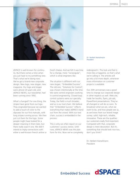
Dr. Herbert Hanselmann<br />
President<br />
eDITORIAL<br />
redesigned it. The look and feel is<br />
more like a magazine, so that’s what<br />
we’re calling it. The articles will<br />
go into a lot more depth, whenever<br />
more information on customer<br />
projects is available.<br />
Our 20th anniversary was a good<br />
time to change our corporate design<br />
in other respects as well. Web site,<br />
trade fair booths, flyers, job ads,<br />
PowerPoint presentations: They’ve<br />
all changed or will do so soon. To<br />
broadcast what we are, what we<br />
want to be, and how people see us,<br />
as we know from our brand image<br />
survey: solid, hightech, reliable,<br />
innovative. These are the qualities<br />
our customers really find important.<br />
Compared with that, corporate<br />
design is mere decoration. But it’s<br />
something that should look nice too,<br />
don’t you think?<br />
Dr. Herbert Hanselmann<br />
President<br />
pAGe 3


