
You also want an ePaper? Increase the reach of your titles
YUMPU automatically turns print PDFs into web optimized ePapers that Google loves.
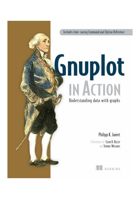
IN ACTION<br />
Understanding data with graphs<br />
Philipp K. Janert<br />
FOREWORDS BY COLIN D. KELLEY<br />
AND THOMAS WILLIAMS<br />
MANNING
<strong>Gnuplot</strong> in <strong>Action</strong>
<strong>Gnuplot</strong> in <strong>Action</strong><br />
Understanding Data with Graphs<br />
PHILIPP K. JANERT<br />
MANNING<br />
Greenwich<br />
(74° w. long.)
For online information and ordering of this and other Manning books, please visit<br />
www.manning.com. The publisher offers discounts on this book when ordered in quantity.<br />
For more information, please contact<br />
Special Sales Department<br />
Manning Publications Co.<br />
Sound View Court 3B fax: (609) 877-8256<br />
Greenwick, CT 06830 email: orders@manning.com<br />
©2010 by Manning Publications Co. All rights reserved.<br />
No part of this publication may be reproduced, stored in a retrieval system, or transmitted, in<br />
any form or by means electronic, mechanical, photocopying, or otherwise, without prior written<br />
permission of the publisher.<br />
Many of the designations used by manufacturers and sellers to distinguish their products are<br />
claimed as trademarks. Where those designations appear in the book, and Manning<br />
Publications was aware of a trademark claim, the designations have been printed in initial caps<br />
or all caps.<br />
Recognizing the importance of preserving what has been written, it is Manning’s policy to have<br />
the books we publish printed on acid-free paper, and we exert our best efforts to that end.<br />
Recognizing also our responsibility to conserve the resources of our planet, Manning books<br />
are printed on paper that is at least 15 percent recycled and processed without the use of<br />
elemental chlorine.<br />
Development editor: Nermina Miller, Tom Cirtin<br />
Copyeditor: Benjamin Berg<br />
Manning Publications Co. Proofreader: Katie Tennant<br />
Sound View Court 3B Typesetter: Dottie Marsico<br />
Greenwich, CT 06830 Cover designer: Marija Tudor<br />
ISBN 978-1-933988-39-9<br />
Printed in the United States of America<br />
1 2 3 4 5 6 7 8 9 10 – MAL – 14 13 12 11 10 09
The purpose of computing is insight,<br />
not numbers.<br />
—R. W. Hamming<br />
The purpose of computing is insight,<br />
not pictures.<br />
—L. N. Trefethen
vii<br />
brief contents<br />
PART 1 BASICS ..........................................................................1<br />
1 ■ Prelude: Understanding data with gnuplot 3<br />
2 ■ Essential gnuplot 16<br />
3 ■ Working with data 29<br />
4 ■ Practical matters 49<br />
PART 2 POLISHING .................................................................65<br />
5 ■ Doing it with style 67<br />
6 ■ Decorations 90<br />
7 ■ All about axes 110<br />
PART 3 ADVANCED GNUPLOT ................................................131<br />
8 ■ Three-dimensional plots 133<br />
9 ■ Color 152<br />
10 ■ Advanced plotting concepts 175<br />
11 ■ Terminals in depth 200<br />
12 ■ Macros, scripting, and batch operations 222
PART 4 GRAPHICAL ANALYSIS WITH GNUPLOT .......................243<br />
13 ■ Fundamental graphical methods 245<br />
14 ■ Techniques of graphical analysis 273<br />
15 ■ Coda: Understanding data with graphs 301
foreword xvii<br />
foreword xix<br />
preface xxi<br />
acknowledgments xxiii<br />
about this book xxv<br />
ix<br />
contents<br />
PART 1 BASICS .................................................................1<br />
1<br />
Prelude: Understanding data with gnuplot 3<br />
1.1 A busy weekend 4<br />
Planning a marathon 4 ■ Determining the future 6<br />
1.2 What is graphical analysis? 9<br />
Data analysis and visualization concepts 10 ■ Why graphical<br />
analysis? 12 ■ Limitations of graphical analysis 12<br />
1.3 What is gnuplot? 13<br />
<strong>Gnuplot</strong> isn’t GNU 13 ■ Why gnuplot? 14 ■ Limitations 15<br />
1.4 Summary 15
x<br />
2<br />
3<br />
4<br />
Essential gnuplot 16<br />
2.1 Simple plots 16<br />
CONTENTS<br />
<strong>In</strong>voking gnuplot and first plots 17 ■ Plotting data from a<br />
file 20 ■ Abbreviations and defaults 23<br />
2.2 Saving and exporting 24<br />
Saving and loading commands 25 ■ Exporting graphs 25<br />
One-step export script 27<br />
2.3 Summary 28<br />
Working with data 29<br />
3.1 Managing large data sets 30<br />
Multiple data sets per file: index 30 ■ Records spanning multiple<br />
lines: every 31<br />
3.2 Smoothing and summarizing data 32<br />
Plotting unsorted data files 32 ■ Smoothing noisy data 35<br />
3.3 Math with gnuplot 38<br />
Mathematical expressions 38 ■ Built-in functions 38<br />
User-defined variables and functions 39 ■ Complex numbers 40<br />
3.4 Data transformations 41<br />
Simple data transformations 41 ■ Pseudocolumns and the column<br />
function 42<br />
3.5 Plotting functions and data 43<br />
Tricks and warnings 44<br />
3.6 Logarithmic plots 44<br />
How do logarithmic plots work? 44<br />
3.7 Summary 47<br />
Practical matters 49<br />
4.1 Managing options 50<br />
4.2 Data files 51<br />
Permissible formats and options 51<br />
4.3 Strings 55<br />
Quotes 55 ■ String operations 55 ■ String applications 57<br />
Crazy example: plotting the Unix password file 58<br />
4.4 Generating textual output 59<br />
The print command 59 ■ The set table option 60
4.5 <strong>In</strong>teracting with gnuplot 61<br />
CONTENTS xi<br />
Getting help 61 ■ Command history 61 ■ Hot keys and<br />
mousing 62 ■ Reading data interactively 63<br />
4.6 Summary 64<br />
PART 2 POLISHING ........................................................65<br />
5<br />
6<br />
7<br />
Doing it with style 67<br />
5.1 Choosing plot styles 68<br />
<strong>In</strong>line style directives 68 ■ Terminal capabilities 69<br />
Global style directives 70<br />
5.2 Plot styles 70<br />
Core styles 71 ■ Box styles 72 ■ Styles with errorbars or<br />
ranges 78 ■ Filled styles 81 ■ Other styles 84<br />
5.3 Customizing styles 85<br />
Custom line styles 86 ■ Specifying color 87<br />
Worked example: half-tone shading 87<br />
5.4 Summary 89<br />
Decorations 90<br />
6.1 Quick start: minimal context for data 91<br />
6.2 Digression: locations on a graph 92<br />
6.3 Additional graph elements: decorations 94<br />
Common conventions 94 ■ Arrows 94 ■ Text labels 97<br />
Objects 99<br />
6.4 The graph’s legend or key 100<br />
Turning the key on and off 101 ■ Placement 101<br />
Layout 101 ■ Explanations 102 ■ Appearance 104<br />
Default settings 104<br />
6.5 Worked example: features of a spectrum 104<br />
6.6 Overall appearance 106<br />
Size and aspect ratio 106 ■ Borders and margins 108<br />
6.7 Summary 109<br />
All about axes 110<br />
7.1 Multiple axes 111<br />
Terminology 111 ■ Plotting with two coordinate systems 112<br />
Should you do it? 113
xii<br />
CONTENTS<br />
7.2 Selecting plot ranges 115<br />
7.3 Tic marks 116<br />
Major tic marks 116 ■ Minor tic marks 117 ■ Formatting the<br />
tic labels 118 ■ Reading tic labels from file 122<br />
Grid and zero axes 123<br />
7.4 A worked example 123<br />
7.5 Special case: time series 124<br />
Turning numbers into names: months and weekdays 124<br />
General time series: the gory details 127<br />
7.6 Summary 130<br />
PART 3 ADVANCED GNUPLOT .......................................131<br />
8<br />
9<br />
Three-dimensional plots 133<br />
8.1 Basics 135<br />
8.2 Options for surface and contour plots 136<br />
Surface plots 136 ■ Contour lines 139<br />
8.3 Coordinate axes and view point 141<br />
Borders 142 ■ View point 143<br />
8.4 Plotting data from a file using splot 145<br />
Grid format 146 ■ Matrix format 148 ■ Smooth surfaces 149<br />
8.5 Summary 151<br />
Color 152<br />
9.1 Defining palettes 153<br />
Color spaces: a refresher 153 ■ The palette option 154<br />
9.2 Creating colored graphs with palettes 157<br />
The pm3d mode 157 ■ The colorbox 158 ■ Other ways to use<br />
color 160<br />
9.3 Using color for data representation 161<br />
Thoughts on palette design 162 ■ Some sample palettes 165<br />
Words of caution 168<br />
9.4 Case studies 169<br />
A smoothly varying function 169 ■ A complex figure 171<br />
9.5 Summary 173
10<br />
11<br />
12<br />
Advanced plotting concepts 175<br />
10.1 Multiplot 176<br />
CONTENTS xiii<br />
Regular arrays of graphs with layout 177 ■ Graphs within a<br />
graph 179 ■ Graphs aligned on a common axis 181<br />
10.2 Higher math and special occasions 183<br />
Parametric plots 183 ■ Non-Cartesian coordinates 184<br />
Vector fields 188<br />
10.3 Curve fitting 190<br />
Background 190 ■ Using the fit command 191 ■ Worked<br />
example 195 ■ Should you do it? 197<br />
10.4 Summary 199<br />
Terminals in depth 200<br />
11.1 Exporting graphs to file 201<br />
11.2 Common terminal options 202<br />
Size 202 ■ Fonts 202 ■ Enhanced text mode 202<br />
Miscellaneous appearance options 205 ■ Flushing output<br />
channels 205<br />
11.3 Standard graphics file formats 206<br />
Bitmaps 206 ■ SVG 208<br />
11.4 Print-quality output 209<br />
PostScript 209 ■ Using PostScript plots with LaTeX 211<br />
PDF 217<br />
11.5 <strong>In</strong>teractive terminals 218<br />
wxt 218 ■ x11 219 ■ aqua 219 ■ windows 219<br />
11.6 Other terminals 220<br />
11.7 Summary 221<br />
Macros, scripting, and batch operations 222<br />
12.1 Strings and string macros 223<br />
12.2 Calling other programs from gnuplot 224<br />
Executing a command in a subshell 225 ■ Capturing the output of<br />
a subprocess 225 ■ <strong>In</strong>put/output redirection (Unix only) 226<br />
Example: watermarking plots 227<br />
12.3 Calling gnuplot from other programs 228<br />
Batch operations 228 ■ <strong>In</strong>voking gnuplot from other<br />
programs 229 ■ Example: creating a font table 232
xiv<br />
CONTENTS<br />
12.4 Slideshows with pause and reread 232<br />
12.5 Configuring your workspace 234<br />
Creating custom hot key bindings 236<br />
12.6 <strong>Gnuplot</strong> for the web 239<br />
Using <strong>Gnuplot</strong> as a CGI script 239 ■ Using gnuplot as a<br />
subprocess to a CGI script 241<br />
12.7 Summary 241<br />
PART 4 GRAPHICAL ANALYSIS WITH GNUPLOT ............. 243<br />
13<br />
14<br />
Fundamental graphical methods 245<br />
13.1 Relationships 246<br />
Scatter plots 246 ■ Logarithmic scales 252<br />
13.2 Counting statistics 256<br />
Jitter plots and histograms 256 ■ Kernel density estimates 258<br />
Cumulative distribution functions 259 ■ Consider using median<br />
and percentiles 261<br />
13.3 Ranked data 262<br />
13.4 Multivariate data 264<br />
Parallel coordinate plots 264 ■ Multivariate analysis 269<br />
Star plots 270 ■ Historical perspective: computer-aided data<br />
analysis 271<br />
13.5 Summary 272<br />
Techniques of graphical analysis 273<br />
14.1 The core principle of graphical analysis 274<br />
14.2 Iteration and transformation 275<br />
A case study in iteration: car data 275 ■ Making data<br />
comparable: monitoring quantities in a control chart 278 ■ Honor<br />
the data: truncation and responsiveness 280<br />
14.3 Changing the appearance to improve perception 284<br />
Banking 284 ■ Judging lengths and distances 287<br />
Enhancing quantitative perception 289 ■ Plot ranges and the<br />
matter of zero 291 ■ A tough problem: the display of changing<br />
compositions 292
15<br />
14.4 Housekeeping 296<br />
CONTENTS xv<br />
The lifecycle of a graph 296 ■ <strong>In</strong>put data files 296 ■ Output<br />
files 298<br />
14.5 Reminders for presentation graphics 298<br />
14.6 Summary 300<br />
Coda: Understanding data with graphs 301<br />
appendix A Obtaining, building, and installing gnuplot 303<br />
appendix B <strong>Gnuplot</strong> reference 309<br />
appendix C Resources 345<br />
index 351
xvii<br />
foreword<br />
Thomas Williams was a CS undergrad and I was an EE/CS undergrad at Villanova University.<br />
The EE department had just built a VLSI design lab and we were both immediately<br />
drawn to it. The campus had two existing computer labs, both depressing. They<br />
were crammed into dingy basements filled with rows of VT100 terminals and the acrid<br />
smell of burnt coffee. By contrast, the new VLSI lab was on the top floor of the engineering<br />
building in a room with high ceilings and plenty of light. Better still, it had a<br />
brand-new Pyramid minicomputer—right there in its own air conditioned room—<br />
that ran Unix. The lab had a dozen AED color displays and a huge HP plotter. Dr. Richard<br />
Perry ran the lab and was happy to let us hack away as much as we wanted.<br />
Together we got a UUCP link that dialed out nightly to Princeton. We got sendmail<br />
and a news reader running. After a few months, the administrators discovered that the<br />
phone bill had skyrocketed due to nightly long distance calls to New Jersey! But we<br />
had Villanova on the Arpanet.<br />
I’d been taking classes in electromagnetism and signal processing and really<br />
wanted to visualize the equations. Tom had a similar need to visualize differential<br />
equations. There were no reasonable tools on campus to do so. At home I had an<br />
early PC clone with a bootlegged copy of Lotus 123 that could graph data, but graphing<br />
a simple equation was a clumsy process to first fill a spreadsheet with data points<br />
and then plot them. And Lotus 123 was never going to work with the HP plotter or<br />
AED terminals we had right there. <strong>In</strong> the fall of 1986, I suggested to Tom that we write<br />
the program we really wanted. He agreed. We settled on calling it gnuplot as a pun on<br />
a lame program at school that predated ours called “newplot.” It wasn’t until a month
xviii<br />
FOREWORD<br />
later that we read Richard Stallman’s Gnu Manifesto. That resonated with us and<br />
matched our thinking perfectly. The common name was simply a lucky coincidence.<br />
Fortran and Pascal were the prevailing languages taught in school then, but neither<br />
was portable. C was clearly a better fit and Unix was the right OS to start with.<br />
Tom focused on writing the equation parser and P-code evaluator while I focused on<br />
the command-line processor and graphics drivers. The command-line approach was<br />
patterned after Vax/VMS and chosen out of necessity; there were no portable GUIs<br />
then and, besides, we wanted to be able to use dumb terminals to drive the plotters<br />
and printers we had nearby. Within a month we had the basics working. After that we<br />
started porting to every machine we could find with a C compiler: VMS, MS-DOS, and<br />
several flavors of Unix.<br />
By the fall of 1987, we published gnuplot as open source to newsgroups like<br />
sci.math. We were surprised by the response we got! Notes of thanks and encouragement<br />
came in from all around the world. More importantly, we received bug fixes and<br />
patches to make gnuplot more portable to add support for many more terminals and<br />
devices. We folded those in while adding features and fixing bugs ourselves.<br />
Tom and I both graduated in 1987 and didn’t look at gnuplot much after that. But<br />
it took on a life of its own thanks to the dedicated contributions of others, and now it’s<br />
tremendously more powerful than when we left it. People have continued to add features<br />
to it, and now there is this book, <strong>Gnuplot</strong> in <strong>Action</strong>, to serve as guide to all that<br />
gnuplot has to offer. What a great testament to the benefits of open source!<br />
—COLIN D. KELLEY<br />
CTO, RingRevenue, <strong>In</strong>c.<br />
Original <strong>Gnuplot</strong> Author
xix<br />
foreword<br />
I smiled when I learned that there would be a book about gnuplot. It had been a long<br />
time since Colin and I were busy compiling new builds, which at the time needed to<br />
be cut up into little “packages” to fit on the relatively new USENET. And a long time<br />
since we heard from the early customers. To be honest, back then, we were pretty surprised<br />
at the actual volume of reactions and the diversity of uses people were finding<br />
for it. It made us really happy to realize that universities, researchers, economists, hospitals,<br />
and various companies around the world were using it. For me, it was a bellwether<br />
for the future power of the <strong>In</strong>ternet and open source software. I still<br />
remember when the “University of Free Estonia” sent us an email just days before the<br />
Baltic States had officially announced their independence. And I remember tracking<br />
when we’d been deployed in every inhabited continent (with active websites in Czech,<br />
French, German, <strong>In</strong>donesian, Japanese, Portuguese, Slovak, Italian, and more). And<br />
now this new book, <strong>Gnuplot</strong> in <strong>Action</strong>, is finally available to help those people starting<br />
out with gnuplot or those stepping up to do more complicated things!<br />
There are a few fundamental beliefs I’d like readers to understand about gnuplot.<br />
From the beginning, it had to be fun, with no learning curve to create your first few<br />
plots. It had to be free and stay free. It had to be easily available and reliable. We wrote<br />
it to run on every type of computer, every display, every printer we could get our<br />
hands on. But of course we didn’t have everything on hand and new devices launched<br />
all the time. So there was a requirement for gnuplot to be modifiable, so that one<br />
group of users or developers could write new features simply and have the results
xx<br />
FOREWORD<br />
included in subsequent versions. Ultimately, gnuplot of today owes most of its success<br />
to the many volunteers who consistently contribute ideas and time to the development<br />
of the project. The result, hopefully, is a product powerful enough to create<br />
graphs which convey exactly the information their authors intended.<br />
Enjoy!<br />
—THOMAS “THAW” WILLIAMS<br />
Google<br />
Original <strong>Gnuplot</strong> Author
xxi<br />
preface<br />
I have been using gnuplot for 15 years, and it’s an indispensable part of my toolset:<br />
one of the handful of programs I can’t do without.<br />
<strong>In</strong>itially, I used gnuplot as part of my academic research work as a theoretical condensed<br />
matter physicist. But much later, when I joined Amazon.com, I found myself<br />
using gnuplot again, this time to analyze the movement of workers in Amazon’s gargantuan<br />
warehouses and the distribution of packages to customers. Later yet, I found<br />
gnuplot helpful when analyzing web traffic patterns for the Walt Disney Company.<br />
I find gnuplot indispensable because it lets me see data, and do so in an easy,<br />
uncomplicated manner. Using gnuplot, I can draw and redraw graphs and look at<br />
data in different ways. I can generate images of data sets containing millions of points,<br />
and I can script gnuplot to create graphs for me automatically.<br />
These things matter. <strong>In</strong> one of my assignments, I was able to discover highly relevant<br />
information because I was able to generate literally hundreds of graphs. Putting all<br />
of them on a web page next to each other revealed blatant similarities (and differences)<br />
between different data sets—a fact that had never before been noticed, not<br />
least because everybody else was using tools (mostly Excel) that would only allow<br />
graphs to be created one at a time.<br />
While at Amazon, I discovered something else: data is no longer confined to the<br />
science lab. <strong>In</strong> a modern corporation, data is everywhere. Any reasonably sophisticated<br />
organization is constantly collecting data: sales numbers, web traffic, inventory, turnover,<br />
database performance, supply chain details, you name it. Naturally, there’s a continuous<br />
and ever-increasing demand to make use of this data to improve the business.
xxii<br />
PREFACE<br />
What this means is that data analysis is no longer a specialist’s job—everybody has<br />
a need for it, even if only to monitor one’s own metrics or performance indicators.<br />
This isn’t a bad thing. The way inputs influence outputs is often not obvious, and placing<br />
decisions on a firmer, more rational footing is reasonable.<br />
But what I also found at Amazon and elsewhere is that the people doing the data<br />
analysis often don’t have the right toolset, both in terms of actual software tools and in<br />
regard to methods and techniques.<br />
<strong>In</strong> many ways, my experience in the corporate world has been an influence while<br />
writing this book. I believe that graphical methods—which are accessible to anyone,<br />
regardless of mathematical or statistical training—are an excellent way to understand<br />
data and derive value from it (much better and more powerful than a five-day statistics<br />
class, and much more flexible and creative than a standard Six-Sigma program).<br />
And I believe that gnuplot is a very good tool to use for this purpose. Its learning<br />
curve is flat—you can pick up the basics in an hour. It requires no programming skills.<br />
It handles a variety of input formats. It’s fast and it’s interactive. It’s mature. It’s also<br />
free and open source.<br />
<strong>Gnuplot</strong> has always been popular with scientists all over—I hope to convince you<br />
that it can be useful to a much larger audience. Business analysts, operations managers,<br />
database and data warehouse administrators, programmers: anybody who wants to<br />
understand data with graphs.<br />
I’d like to show you how to do it.
xxiii<br />
acknowledgments<br />
Several data repositories on the web were helpful, either because of the data sets available<br />
there or merely as a source of inspiration. Among the most helpful were<br />
■ The data set collection and the Data and Story Library (DASL) at StatLib<br />
(http://lib.stat.cmu.edu)<br />
■ The UCI Machine Learning Repository at UC Irvine (http://www.ics.uci.edu/<br />
~mlearn/MLRepository.html)<br />
■ R. J. Hyndman’s Time Series Data Library (http://www-personal.buseco.<br />
monash.edu.au/~hyndman/TSDL)<br />
■ The Exploring Data site at Central Queensland University (http://exploring-<br />
data.cqu.edu.au)<br />
Wherever specific data sets have been used, detailed attribution is given in the text.<br />
Two resources I relied on more than on any other: the excellent collection of the<br />
University of Washington libraries (Seattle), and the amazingly comprehensive store<br />
of information available at Wikipedia.<br />
Writing a book is a long process, much more involved than writing a collection of<br />
independent papers of equal length. One of the lessons I learned during the preparation<br />
of this book is this: even if you know that writing a book will take longer than you<br />
expect, it still takes longer than you expect!<br />
Handling projects of such nature takes true dedication and courage. I would like<br />
to express special appreciation to Marjan Bace and his team at Manning publications<br />
for taking this project on and guiding it to completion.
xxiv<br />
ACKNOWLEDGMENTS<br />
I’d like to thank the original gnuplot authors Colin Kelley and Thomas Williams<br />
for sharing their reminiscences about the early history of gnuplot. I also would like to<br />
thank Professor Nick Trefethen for giving me permission to use his maxim 22 as<br />
motto for this book. It can’t be said any better.<br />
While writing this book, I enjoyed conversations or correspondence with Nick<br />
Chase, Austin King, and Richard Kreckel. Professor Ethan Merritt answered many of<br />
my questions about gnuplot internals and has been very helpful in a variety of ways.<br />
Many readers pointed out errors in the manuscript, or provided thoughtful comments<br />
and helpful suggestions. Reviewers who took time out of their busy schedules to<br />
read the manuscript at different stages in its development and to provide invaluable<br />
feedback included Mark Pruett, Nishant Sastry, Dawid Weiss, Hans-Bernhard Bröker,<br />
Petr Mikulík, Bas Vodde, Daniel Sebald, Maxim Belushkin, and Scott White. Mitchell<br />
Johnson painstakingly verified the correctness of all gnuplot commands in the text.<br />
I’m grateful for the care and effort everyone expended on behalf of this project.<br />
Special thanks go to PAUL Schrader (Bremen).<br />
Finally, this book is about an open source project and has been written using tools<br />
from other open source projects: I’d like to mention iceWM, tcsh, XEmacs, Perl, and<br />
of course gnuplot itself. I’m indebted to their creators, maintainers, and contributors—without<br />
their efforts this book wouldn’t exist.<br />
My final thoughts go to Angela, who got me started and kept me going. Without<br />
her, nothing would be much worth doing.
xxv<br />
about this book<br />
This book is intended to be a comprehensive introduction to gnuplot: from the basics<br />
to the power features and beyond. Besides providing a tutorial on gnuplot itself, it<br />
demonstrates how to apply and use gnuplot to extract insight from data.<br />
The gnuplot program has always had complete and detailed reference documentation,<br />
but what was missing was a continuous presentation that tied all the different bits<br />
and pieces of gnuplot together and demonstrated how to use them to achieve certain<br />
tasks. This book attempts to fill that gap.<br />
The book should also serve as a handy reference for more advanced gnuplot users,<br />
and as an introduction to graphical ways of knowledge discovery.<br />
And finally, this book tries to show you how to use gnuplot to achieve surprisingly<br />
nifty effects that will make everyone say, “How did you do that?”<br />
Contents of this book<br />
This book is divided into four parts.<br />
The first part provides a tutorial introduction to gnuplot and some of the things<br />
you can do with it. If you’re new to gnuplot, start here. Even if you already know gnuplot,<br />
I suggest you at least skim the chapters in this part: you might pick up a few new<br />
tricks. (For example, did you know that you can use gnuplot to plot the Unix password<br />
file? No? Thought so.)<br />
The second part is about polishing and describes the ways that we can influence the<br />
appearance of a plot: by using different styles (chapter 5); using labels, arrows, and<br />
other decorations (chapter 6); and by changing the axes and the overall appearance
xxvi<br />
ABOUT THIS BOOK<br />
of a graph (chapter 7). The material in these chapters has the character of a reference—this<br />
is the place to look up some detail when you need it.<br />
<strong>In</strong> part 3, we move on to more advanced concepts. Here’s where we talk about fun<br />
topics such as color (chapter 9) and three-dimensional plots (chapter 8). Chapter 10<br />
introduces more specialized topics, such as plots-within-a-plot, polar coordinates, and<br />
curve fitting. <strong>In</strong> chapter 11 we’ll talk about gnuplot terminals and ways to export our<br />
work to common file formats, and chapter 12 is about ways to use gnuplot in conjunction<br />
with, or instead of, a programming language.<br />
<strong>In</strong> the last part, I’ll take gnuplot for granted, and focus instead on the things you<br />
can do with it. <strong>In</strong> chapter 13 I’ll present fundamental types of graphs and discuss<br />
when and how to use them. I’ll also show you how to generate such graphs with gnuplot.<br />
<strong>In</strong> the remaining two chapters, I focus on the discovery and analysis process<br />
itself, and describe some techniques that I’ve found helpful.<br />
There are three appendixes. Appendix A describes how to obtain and install gnuplot<br />
if you don’t already have it. It also contains some pointers in case you want to<br />
build gnuplot from source.<br />
Appendix B is a command and options reference, grouped by topic, not alphabetically.<br />
So if you know that you want to change the appearance of the tic labels, but<br />
you’ve forgotten which option to use, this appendix should point you in the right<br />
direction quickly.<br />
<strong>In</strong> appendix C, I list some additional resources (books and web sites) that you<br />
might find helpful. I also give a brief overview of a few tools that are comparable to<br />
gnuplot.<br />
I’ve tried to be comprehensive in my coverage of gnuplot’s features, with two<br />
exceptions. I don’t cover obsolete or redundant features. I also don’t discuss features<br />
that would only be of interest to a very limited group of users: all material in this book<br />
should (at least potentially) be useful to all readers, no matter what their situation.<br />
Where appropriate, I refer to the standard gnuplot reference documentation for<br />
details not discussed here.<br />
As far as the examples are concerned, I’ve tried to present fresh or at least unfamiliar<br />
data sets. This means you won’t find a plot of the Challenger O-Ring data here,<br />
nor Napoleon’s march, nor Playfair’s charts regarding trade with the West <strong>In</strong>dies.<br />
(The one classic I would’ve liked to include is Anscombe’s Quartet, but I couldn’t<br />
find a suitable context in which to present it. If you’ve never seen it before, go and<br />
look it up yourself.)<br />
How to read this book<br />
This book presents a continuing narrative, and the material is arranged as if the<br />
reader were going to read the book sequentially, cover to cover.<br />
But I know that most people reach for a piece of documentation when they need<br />
to “get something done, now!” Therefore, I tried to make this book as diveable as possible:<br />
once you’ve mastered the essential gnuplot basics, you should be able to open this
ABOUT THIS BOOK xxvii<br />
book on any chapter that’s relevant to your current task and start reading, without loss<br />
of continuity.<br />
While the chapters are conceived as largely independent of each other, each chapter<br />
presents a continuous, progressive exposition, which is best read in order, and<br />
from start to finish. The nature of the topic demands that concepts need to be introduced<br />
early in a chapter and not brought to completion until the end, after necessary<br />
circumstantial material has been introduced.<br />
My advice to you is that you should feel free to pick any chapter you’re interested<br />
in, but that you should attempt to read each chapter in its entirety, end-to-end, to get<br />
the maximum out of this book. I know that the temptation is great to just read a relevant<br />
figure caption and then to take it from there, but I’d advise you against that. <strong>Gnuplot</strong><br />
has many odd quirks, and many useful little tricks as well, which you will not learn<br />
about by just skimming the headlines and the captions. I tried to keep the chapters<br />
short—try to take them in as a whole.<br />
One caveat: gnuplot is very connected, and explaining one feature often requires<br />
knowledge of some other feature. The most proper way to introduce gnuplot would<br />
have been to follow a strict bottom-up approach: first, introduce string handling and<br />
number formats, followed by the syntax for option management and styles, and finally,<br />
in the last chapter, bring it all together by talking about the plot command. This<br />
would’ve been easy to write, perfectly organized—and excruciatingly boring to read!<br />
I take a different approach: explain the most common use early, and leave more<br />
exotic variants and applications of commands for later. The price we have to pay is an<br />
increased number of forward references. This is an <strong>In</strong> <strong>Action</strong> book: I want to get you<br />
going quickly, without burdening you with unnecessary details early on.<br />
<strong>In</strong>tended audience<br />
This book was written with two groups of people in mind: those who already know<br />
gnuplot, and those who don’t.<br />
If you already know gnuplot, I hope that you’ll still find it a useful reference, in<br />
particular in regard to some of the more advanced topics in the second half of this<br />
book. I’ve tried to provide the big-picture explanations and the examples that have<br />
always been missing from the standard gnuplot reference documentation.<br />
If you’re new to gnuplot, I think you’ll find it easy enough to pick up—in fact, I<br />
can promise you that by the end of chapter 2 you’ll be productive with gnuplot, and<br />
by the end of chapter 3 you’ll be well equipped for most day-to-day data graphing<br />
tasks that may come your way. A flat learning curve was one of the design objectives of<br />
the original gnuplot authors, and the ease with which you can get started is one of the<br />
great strengths of gnuplot today.<br />
This book doesn’t require a strong background in mathematical methods, and<br />
none at all in statistics: anybody with some college level (or just high-school) math<br />
should be able to read this book without difficulty. (Some familiarity with basic calculus<br />
is advantageous, but by no means required.)
xxviii<br />
ABOUT THIS BOOK<br />
This book should be accessible and helpful to anybody who tries to understand<br />
data. This includes scientists and engineers—in other words the kinds of people<br />
who’ve always been using gnuplot. If this describes you, I think you’ll find this book a<br />
helpful reference and handbook for gnuplot.<br />
But I think this book will also be helpful to readers who don’t have a primary background<br />
in analytical methods, yet need to deal with data as part of their jobs: business<br />
analysts, technical managers, software engineers. If this is your situation, you may find<br />
the discussions on graphical methods in part 4 particularly helpful.<br />
Conventions<br />
I spell the name of the program in all lowercase, except at the beginning of a sentence,<br />
when I capitalize normally. This is in accordance with the usage recommended<br />
in the gnuplot FAQ.<br />
The gnuplot documentation is extensive and I refer to it occasionally, for additional<br />
detail on topics covered briefly or not at all here. Traditionally, the gnuplot documentation<br />
has been called the online help or online documentation, owing to the fact<br />
that it’s available “online” during a gnuplot session. But since the advent of the <strong>In</strong>ternet,<br />
the word online seems to suggest network connectivity—falsely in this context. To<br />
avoid confusion, I’ll always refer to the standard gnuplot reference documentation instead.<br />
<strong>Gnuplot</strong> commands are shown using a typewriter font, like this: plot sin(x). Single<br />
command lines can get long; to make them fit on a page, I occasionally had to<br />
break them across multiple lines. If so, a gray arrow (➥) has been placed at the beginning<br />
of the next line, to indicate that it is the continuation of the previous one:<br />
plot "data" using 1:2 smooth csplines title "data" with lines,<br />
➥ sin(x) title "model"<br />
The break in the original line is not indicated separately. When using gnuplot in an<br />
interactive session, your terminal program should wrap a line that is too long automatically.<br />
Alternatively, you can break lines by escaping the newline with a backslash as<br />
usual. This is useful in command files for batch processing, but you don’t want to do<br />
this during an interactive session, since it messes with the command history feature.<br />
<strong>Gnuplot</strong> has a large number of options, and keeping all of them, and their suboptions<br />
and optional parameters, straight is a major theme running through this book.<br />
Throughout the text, and in the reference appendix B, you’ll find summaries of gnuplot<br />
commands and their options and suboptions.<br />
Within these summaries, I use a few syntactic conventions. My intent is to stay close<br />
to the usage familiar from the standard gnuplot reference documentation, but also to<br />
follow more general conventions (such as those used for Unix man pages):<br />
[ ... ] # Square brackets for optional parts<br />
[ | ] # Vertical bars to separate alternatives<br />
{ ... } # Curly braces for user-supplied input<br />
For parameters supplied by the user, it’s not always clear from the context what kind of<br />
information the command expects: is it a string or a number? If it’s a number, is it an
ABOUT THIS BOOK xxix<br />
index into some array or a numerical factor? And so on. I’ve tried to clarify this situation<br />
by prefixing each user-supplied input parameter with a type indicator, terminated<br />
by a colon. I summarize the prefixes and their meanings in table 1.<br />
Table 1 Type indicators for user-supplied parameters<br />
Prefix Description<br />
str: A string<br />
int: An integer number<br />
flt: A floating-point number<br />
idx: An integer number, which is interpreted as index into an existing array<br />
clr: A color specification—for example, rgbcolor "red" or rgb "#FFFF00"<br />
pos: A pair of coordinates, comma separated, optionally containing coordinate system<br />
specifiers—for example, 0,0 or first 1.1, screen 0.9<br />
enum: A gnuplot keyword as unquoted string<br />
Many gnuplot options and directives<br />
have abbreviated forms, some of which I<br />
use frequently in the latter parts of the<br />
book. Table 2 lists both the abbreviated<br />
and the full forms. Also keep in mind<br />
that an empty filename inside the plot<br />
command uses the most recently named<br />
file in the same command line again.!<br />
Hardware and software requirements<br />
Table 2 Abbreviations for the frequently used<br />
directives to the plot command and for the most<br />
important options<br />
Abbreviation Full<br />
i index<br />
ev every<br />
u using<br />
s smooth<br />
This book describes version 4.2.x of gnu- s acs smooth acsplines<br />
plot, which was initially released in<br />
March 2007. The most current bug-fix<br />
t title<br />
release at the time of this writing is ver- w l with lines<br />
sion 4.2.5, released in March 2009. w linesp or w lp with linespoints<br />
After being stagnant for a long time,<br />
gnuplot development has picked up<br />
w p with points<br />
again in the last few years, so that things set t set terminal<br />
have changed significantly since gnuplot set o set output<br />
version 3.7. I won’t explain obsolete or<br />
deprecated features, and only make cursory<br />
remarks (if that) regarding backward<br />
compatibility.<br />
set logsc set logscale<br />
Some installations and distributions still use gnuplot 4.0 (or older). Not all examples<br />
in this book will work with version 4.0 of gnuplot or earlier. If this is your situation, you
xxx<br />
ABOUT THIS BOOK<br />
should upgrade, either by installing a precompiled binary of version 4.2, or by compiling<br />
gnuplot from source. Appendix A tells you how to do it.<br />
The current development version is gnuplot 4.3, which will be released eventually<br />
as minor gnuplot release 4.4 (or potentially as major 5.0 release). Except for some features<br />
that I’ve worked on myself (such as the smooth cumul and smooth kdens features<br />
I’ll introduce in chapter 14), I won’t have much to say about upcoming features<br />
in the next gnuplot release.<br />
I assume you have access to a reasonably modern computer (not older than five<br />
years or so), running any flavor of Unix/Linux, a recent release of MS Windows, or<br />
Mac OS X. Although gnuplot has been ported to many other platforms in the past,<br />
most of them are by now obsolete, and I won’t talk about them in this book.<br />
About the author<br />
My education is in physics, and I’ve worked as technology consultant, software engineer,<br />
technical lead, and project manager, for small startups and in large corporate<br />
environments, both in the U.S. and overseas.<br />
I first started using gnuplot when I was a graduate student, and it has become an<br />
indispensable part of my toolbox: one of the handful of programs I can’t do without.<br />
Recently, I’ve also started to contribute a few features to the gnuplot development<br />
version.<br />
I provide consulting services specializing in corporate metrics, business intelligence,<br />
data analysis, and mathematical modeling through my company, Principal<br />
Value, LLC (www.principal-value.com). I also teach classes on software design and data<br />
analysis at the University of Washington.<br />
I hold a Ph.D. in theoretical physics from the University of Washington.<br />
Author online<br />
Purchase of <strong>Gnuplot</strong> in <strong>Action</strong> includes free access to a private web forum run by Manning<br />
Publications where you can make comments about the book, ask technical questions,<br />
and receive help from the author and from other users. To access the forum<br />
and subscribe to it, point your web browser to www.manning.com/<strong>Gnuplot</strong>in<strong>Action</strong>.<br />
This page provides information on how to get on the forum once you are registered,<br />
what kind of help is available, and the rules of conduct on the forum. It also provides<br />
links to the source code for the examples in the book, errata, and other downloads.<br />
Manning’s commitment to our readers is to provide a venue where a meaningful<br />
dialog between individual readers and between readers and the author can take place.<br />
It is not a commitment to any specific amount of participation on the part of the<br />
author, whose contribution to the Author Online remains voluntary (and unpaid). We<br />
suggest you try asking the author some challenging questions lest his interest stray!<br />
The Author Online forum and the archives of previous discussions will be accessible<br />
from the publisher’s website as long as the book is in print.
About the title<br />
ABOUT THIS BOOK xxxi<br />
By combining introductions, overviews, and how-to examples, the <strong>In</strong> <strong>Action</strong> books are<br />
designed to help learning and remembering. According to research in cognitive science,<br />
the things people remember are things they discover during self-motivated<br />
exploration.<br />
Although no one at Manning is a cognitive scientist, we are convinced that for<br />
learning to become permanent it must pass through stages of exploration, play, and,<br />
interestingly, retelling of what is being learned. People understand and remember<br />
new things, which is to say they master them, only after actively exploring them.<br />
Humans learn in action. An essential part of an <strong>In</strong> <strong>Action</strong> guide is that it’s exampledriven.<br />
It encourages the reader to try things out, to play with new code, and explore<br />
new ideas.<br />
There is another, more mundane, reason for the title of this book: our readers are<br />
busy. They use books to do a job or solve a problem. They need books that allow them<br />
to jump in and jump out easily and learn just what they want just when they want it.<br />
They need books that aid them in action. The books in this series are designed for<br />
such readers.<br />
About the cover illustration<br />
The figure on the cover of <strong>Gnuplot</strong> in <strong>Action</strong> is captioned “A peer of France.” The title<br />
of Peer of France was held by the highest-ranking members of the French nobility. It<br />
was an extraordinary honor granted only to few dukes, counts, and princes of the<br />
church. The illustration is taken from a 19th-century edition of Sylvain Maréchal’s<br />
four-volume compendium of regional dress customs published in France. Each illustration<br />
is finely drawn and colored by hand.<br />
The rich variety of Maréchal’s collection reminds us vividly of how culturally apart<br />
the world’s towns and regions were just 200 years ago. Isolated from each other, people<br />
spoke different dialects and languages. <strong>In</strong> the streets or in the countryside, it was easy<br />
to identify where they lived and what their trade or station in life was just by their dress.<br />
Dress codes have changed since then and the diversity by region, so rich at the<br />
time, has faded away. It is now hard to tell apart the inhabitants of different continents,<br />
let alone different towns or regions. Perhaps we have traded cultural diversity<br />
for a more varied personal life-certainly for a more varied and fast-paced technological<br />
life.<br />
At a time when it is hard to tell one computer book from another, Manning celebrates<br />
the inventiveness and initiative of the computer business with book covers<br />
based on the rich diversity of regional life of two centuries ago, brought back to life by<br />
Maréchal’s pictures.
Part 1<br />
Basics<br />
<strong>Gnuplot</strong> is a tool for visualizing data and analyzing it using graphical<br />
methods. This first part provides an introduction to all those features of gnuplot<br />
that you are going to need on a daily basis.<br />
Chapter 1 introduces gnuplot and describes the kinds of problems it is<br />
designed to solve. I also define some important terms and provide a brief overview<br />
of gnuplot’s history.<br />
Chapter 2 is a quick start tutorial on gnuplot—you will learn everything to<br />
become productive with gnuplot right here.<br />
Chapter 3 goes into more depth on the way gnuplot handles data. We will<br />
talk about file handling, data transformations, and math.<br />
Chapter 4 discusses a variety of practical matters, from string handling to<br />
gnuplot’s help feature.
This chapter covers<br />
■ Warm-up examples<br />
■ What is graphical analysis?<br />
■ What is gnuplot?<br />
Prelude: Understanding<br />
data with gnuplot<br />
<strong>Gnuplot</strong> is probably the most widely used open source program for plotting and<br />
visualizing data. <strong>In</strong> this book, I want to show you how to use gnuplot to make plots<br />
and graphs of your data: both quick and easy graphs for your own use and highly<br />
polished graphs for presentations and publications.<br />
But I also want to show you something else: how to solve data analysis problems<br />
using graphical methods. The art of discovering relationships in data and extracting<br />
information from it by visual means is called graphical analysis and I believe gnuplot<br />
to be an excellent tool for it.<br />
As a teaser, let’s take a look at some problems and how we might be able to<br />
approach them using graphical methods. The graphs here and in the rest of the<br />
book (with very few exceptions) have been, of course, generated with gnuplot.<br />
3
4 CHAPTER 1 Prelude: Understanding data with gnuplot<br />
1.1 A busy weekend<br />
To get a feeling for the kinds of problems that we may be dealing with, and for the<br />
kinds of solutions that gnuplot can help us find, let’s look at two examples. Both take<br />
place during a long and busy weekend.<br />
1.1.1 Planning a marathon<br />
Imagine you’re in charge of organizing the local city marathon. There will be more<br />
than 2,000 starters, traffic closed around the city, plenty of spectators—and a major<br />
Finish Line Festival to celebrate the victors and help the wounded. The big question<br />
is: when should the Finish Line crew be ready to deal with the majority of runners? At<br />
what point do we expect the big influx of the masses?<br />
You still have the results from last year’s event. Assuming that the starters haven’t<br />
improved dramatically over the last year (probably a safe assumption), you do a<br />
quick average on the completion times and find that last year’s average was 172 minutes.<br />
To be on the safe side, you calculate the standard deviation as well, which<br />
comes out to about 15 minutes. So you tell your crew to be ready for the big rush<br />
starting two and a half hours (150 minutes) after the start, and feel reasonably well<br />
prepared for the event.<br />
So it comes as a surprise when on the big day, plenty of runners start showing up on<br />
the finish line after only 130 minutes—a good 20 minutes earlier than the expected<br />
onset of the rush. <strong>In</strong> terms of event management, being off by 20 or 30 minutes isn’t<br />
catastrophic, yet it is a bit strange. The next day you wonder: what went wrong?<br />
Let’s look at the data to see what we can learn about it. So far, all we know of it is<br />
the mean and the standard deviation.<br />
The mean is convenient: it is easy to calculate and it summarizes the entire data set<br />
in a single number. But in forming the mean, we lost a lot of information. To understand<br />
the whole data set, we have to look at it. And since we can’t understand data by<br />
looking at more than 2,000 individual finish times, this means we’ll have to plot it.<br />
It will be convenient to group the runners by completion time and to count the<br />
number of participants that completed during each full minute. The resulting file<br />
might start like this:<br />
# Minutes Runners<br />
133 1<br />
134 7<br />
135 1<br />
136 4<br />
137 3<br />
138 3<br />
141 7<br />
142 24<br />
...<br />
Now we plot the number of runners against the completion (see figure 1.1).
160<br />
140<br />
120<br />
100<br />
80<br />
60<br />
40<br />
20<br />
A busy weekend<br />
0<br />
120 140 160 180 200 220 240<br />
Figure 1.1 Number of finishers versus time to complete (in minutes)<br />
It is immediately obvious where we went wrong: the data is bimodal, meaning it has<br />
two peaks. There is an early peak at around 150 minutes, and a later main peak at<br />
180 minutes.<br />
Actually, this makes sense: a major sporting event such as a city marathon attracts<br />
two very different groups of people: athletes, who train and compete throughout the<br />
year and are in it to win, and a much larger group of amateurs, who come out once a<br />
year for a big event and are mostly there to participate.<br />
The problem is that for such data, the mean and standard deviation are obviously<br />
bad representations—so much so that at the time when we expected the big rush<br />
(170 minutes), there’s actually a bit of a lull at the finish line!<br />
The take-home message here is that it is usually not a good idea to rely on summary<br />
statistics (such as the mean) for unknown data sets. We always should investigate<br />
what the data looks like. Once we’ve confirmed the basic shape, we can choose how to<br />
summarize our findings best.<br />
And of course, there is always more to learn. <strong>In</strong> this example, for instance, we see<br />
that after about 200 minutes, almost everybody has made it, and we can start winding<br />
down the operation. The actual “tail” of the distribution is quite small—actually, a bit<br />
surprisingly so (I would’ve expected to see a greater number of stragglers, but possibly<br />
many runners who are really slow drop out of the race when they realize they’ll<br />
place badly).<br />
5
6 CHAPTER 1 Prelude: Understanding data with gnuplot<br />
USING GNUPLOT<br />
Let’s look at the gnuplot command that was used to generate figure 1.1. <strong>Gnuplot</strong> is<br />
command-line–oriented: after you start gnuplot, it drops you into an interactive command<br />
session, and all commands are typed at the interactive gnuplot prompt.<br />
<strong>Gnuplot</strong> reads data from simple text files, with the data arranged in columns as<br />
shown previously. To plot a data file takes only a single command, plot, like this: 1<br />
plot "marathon" using 1:2 with boxes<br />
The plot command requires the name of the data file as argument in quotes. The rest<br />
of the command line specifies which columns to use for the plot, and in which way to<br />
represent the data. The using 1:2 declaration tells gnuplot to use the first and second<br />
column in the file called marathon. The final part of the command, with boxes,<br />
selects a box style, which is often suitable to display counts of events.<br />
<strong>Gnuplot</strong> handles most everything else by itself: it sizes the graph and selects the<br />
most interesting plot range, it draws the border, and it draws the tic marks and their<br />
labels. All these details can be customized, but gnuplot typically does a good job at<br />
anticipating what the user wants.<br />
1.1.2 Determining the future<br />
The same weekend when 2,000 runners are running through the city, a diligent graduate<br />
student is working on his research topic. He studies diffusion limited aggregation<br />
(DLA), a process wherein a particle performs a random walk until it comes in contact<br />
with a growing cluster of particles. At the moment of contact, the particle sticks to the<br />
cluster at the location where the contact occurred and becomes part of the cluster.<br />
Now, a new random walker is released to perform a random walk, until it sticks to the<br />
cluster. And so on.<br />
Clusters grown through this process have a remarkably open, tenuous structure<br />
(as in figure 1.2). DLA clusters are fractals, but rather little is known about them with<br />
certainty. 2<br />
The DLA process is very simple, so it seems straightforward to write a computer<br />
program to grow such clusters in a computer, and this is what our busy graduate student<br />
has done. <strong>In</strong>itially, all seems well, but as the simulation progresses, the cluster<br />
seems to grow more and more slowly. Excruciatingly slowly, in fact. The goal was to<br />
grow a DLA cluster of N=100,000 particles. Will the program ever finish?<br />
Luckily, the simulation program periodically writes information about its progress<br />
to a log file: for each new particle added to the cluster, the time (in seconds) since the<br />
start of the simulation is recorded. We should be able to predict the completion time<br />
1 Depending on your gnuplot setup and initialization, your graphs may look slightly different than the figures<br />
shown in this chapter. We’ll discuss user-defined appearance options starting in chapter 5.<br />
2 The original paper on DLA was “Diffusion Limited Aggregation, A Kinetic Critical Phenomenon” by T. A. Witten<br />
and L. M. Sander, and appeared in Physical Review Letters Vol. 41, p. 1400 in 1981. It is one of the most<br />
quoted papers from that journal of all time. If you want to learn more about DLA and similar processes, check<br />
out Fractals, Scaling, and Growth Far From Equilibrium by Paul Meakin (1998).
A busy weekend<br />
Figure 1.2 A DLA cluster of N=30,000<br />
particles, drawn with gnuplot<br />
from this data, but an initial plot (figure 1.3) is just not very helpful; there are too<br />
many ways that this curve can be extrapolated to larger cluster sizes.<br />
The time consumed by many computer algorithms grows as a simple power of the<br />
size of the problem. <strong>In</strong> our case, this would be the number N of particles in the cluster<br />
T ~ N k , for some value of k. Our research student therefore plots the running time of<br />
Run Time [sec]<br />
16000<br />
14000<br />
12000<br />
10000<br />
8000<br />
6000<br />
4000<br />
2000<br />
0<br />
0 5000 10000 15000 20000 25000 30000<br />
Cluster Size<br />
Figure 1.3 Time required to grow a DLA cluster<br />
7
8 CHAPTER 1 Prelude: Understanding data with gnuplot<br />
Run Time [sec]<br />
1e+06<br />
100000<br />
10000<br />
1000<br />
100<br />
10<br />
1<br />
0.1<br />
data<br />
model<br />
1000 10000 100000<br />
his simulation program on a double logarithmic plot versus the cluster size (see<br />
figure 1.4). The data points fall on a straight line, indicating a power law. (I’ll explain<br />
later how and why this works.) Through a little trial and error, he also finds an equation<br />
that approximates the data quite well. The equation can be extended to any cluster<br />
size desired and will give the time required. For N=100,000 (which was the original<br />
goal), we can read off T=300,000 seconds (or more), corresponding to 83 hours or<br />
four days, so we can tell our friend that there is no point in spending the weekend in<br />
the lab—he should go out (maybe run a marathon), and come back on Monday. Or<br />
perhaps work on a better algorithm. (For simulations of DLA cluster growth, dramatic<br />
speedups over the naive implementation are possible. Try it if you like.)<br />
USING GNUPLOT<br />
Again, let’s see how the graphs in this section were created. The easiest to understand<br />
is figure 1.3. Given a file containing two columns, one listing the cluster size and the<br />
other listing the completion time, the command is simply<br />
plot "runtime" using 1:2 with lines<br />
Cluster Size<br />
Figure 1.4 Time required to grow a DLA cluster in a double-logarithmic plot,<br />
together with an approximate mathematical model<br />
The only difference compared to figure 1.1 is the style: rather than boxes, I use line<br />
segments to connect consecutive data points: with lines.<br />
Did you notice that figure 1.3 and figure 1.4 contain more than just data? Both<br />
axes are now labelled! Details such as labels and other helpful decorations often make<br />
the difference between a mediocre and a high-quality graph, because they provide the<br />
observer with the necessary context to fully understand the graph.
What is graphical analysis?<br />
<strong>In</strong> gnuplot, all details of a graph’s appearance are handled by setting the appropriate<br />
options. To place the labels on the x and y axes in figure 1.3, I used<br />
set xlabel "Cluster Size"<br />
set ylabel "Run Time [sec]"<br />
Figure 1.4 is drawn using double-logarithmic axes. This is another option, which is set<br />
as follows:<br />
set logscale<br />
Figure 1.4 shows two curves: the data together with a best “fit.” Plotting several data<br />
sets or mathematical functions together in one plot is easy: we just list them one after<br />
another on the command line for the plot command:<br />
plot "runtime" using 1:2 title "data" with lines,<br />
➥ 1.2*(x/1000)**2.7 title "model"<br />
This command introduces a further gnuplot feature: the title directive. It takes a<br />
string as argument, which will be displayed together with a line sample in the plot’s<br />
key or legend (visible in the upper left of figure 1.4).<br />
Finally, we come to figure 1.2. That’s a somewhat different beast. You’ll notice that<br />
the border and the tic marks are missing. The aspect ratio (the ratio of the graph’s<br />
width to its height) has been constrained to 1, and a single dot has been placed at the<br />
position of each particle in the cluster. Here are the most important commands that I<br />
used:<br />
unset border<br />
unset xtics<br />
unset ytics<br />
set size square<br />
plot "cluster" using 1:2 with dots<br />
You see that gnuplot is really simple to use. <strong>In</strong> the next section, I’d like to talk more<br />
about using graphical methods to understand a data set, before coming back to gnuplot<br />
and discussing why it is my favorite tool for this kind of activity.<br />
1.2 What is graphical analysis?<br />
These two examples should have given you an idea of what graphical analysis is and<br />
how it works. The basic steps are always the same:<br />
1 Plot the data.<br />
2 <strong>In</strong>spect it, trying to find some recognizable behavior.<br />
3 Compare the actual data to data that represents the hypothesis from the previous<br />
step (as we did in the second example earlier, when we plotted running<br />
time of the simulation program together with a power-law function).<br />
4 Repeat.<br />
9
10 CHAPTER 1 Prelude: Understanding data with gnuplot<br />
We may try more sophisticated things, but this is the basic idea. If the hypothesis in<br />
the second step seems reasonably justified, we’ll often try and remove its effect, for<br />
instance by subtracting a formula from the data, to see whether there is any recognizable<br />
pattern in the residual. And so on.<br />
Iteration is a crucial aspect of graphical analysis: plotting the data this way and that<br />
way; comparing it to mathematical functions or to other data sets; zooming in on<br />
interesting regions or zooming out to detect the overall trend; applying logarithms or<br />
other data transformations to change its shape; using a smoothing algorithm to tame<br />
a noisy data set; and so on. During an intense analysis session using a new but promising<br />
data set, it’s not uncommon to produce literally dozens of graphs.<br />
None of these graphs will be around for long. They’re transient, persisting just<br />
long enough for us to form a new hypothesis, which we’ll try to justify in the next<br />
graph we draw. This also means that these graphs won’t be “polished” in any way, since<br />
they’re the graphical equivalent to scratch paper: notes of work in progress, not<br />
intended for anyone but ourselves.<br />
This isn’t to say that polishing doesn’t have its place. But it comes later in the process:<br />
once we know what the results of our analysis are, we need to communicate them<br />
to others. At this point, we’ll create “permanent” graphs, which will be around for a<br />
long time—maybe until the next departmental presentation, or (if the graph will be<br />
part of a scientific publication, for instance) possibly forever!<br />
Such permanent graphs have different requirements: other people must be able to<br />
understand them, possibly years later, and most likely without us there to explain them.<br />
Therefore, graph elements such as labels, captions, and other contextual information<br />
become very important. Presentation graphs must be able to stand by themselves.<br />
Presentation graphs also should make their point clearly. Now that we know the<br />
results of our analysis, we should find the clearest and most easily understood way<br />
of presenting our findings. A presentation graph should make one point and make<br />
it well.<br />
Finally, some would argue that a presentation graph should “look good.” Maybe. If<br />
it makes its point well, there is no reason why it shouldn’t be visually pleasing as well.<br />
But that is an afterthought. Even a presentation graph is about the content, not the<br />
packaging.<br />
1.2.1 Data analysis and visualization concepts<br />
Data analysis and visualization is a broad field. Besides different graphical approaches,<br />
there are of course also other methods, which may do entirely without visual help. I<br />
think it will help to introduce and distinguish a number of terms and concepts for different<br />
activities in data analysis. At times, the boundaries between these different concepts<br />
may be fuzzy, but I think the overall distinctions are clear.<br />
Graphical analysis Graphical analysis is an investigation of data using graphical<br />
methods. The purpose is the discovery of new information about the underlying data<br />
set. <strong>In</strong> graphical analysis, the proper question to ask is often not known from the outset,<br />
but is discovered as part of the analysis process.
What is graphical analysis?<br />
Presentation graphics <strong>In</strong> contrast to graphical analysis, presentation graphics is concerned<br />
with communicating information and results that are already understood. The<br />
discovery has been made; now it merely needs to be communicated clearly.<br />
Control charts I use the term control chart somewhat loosely for situations where we<br />
already know the questions to ask of the data (as in the case of presentation graphics),<br />
but where the primary audience for the graph isn’t the public, but the people who<br />
created the data themselves. Besides classical control charts (for example in quality<br />
engineering), many plots of experimental data fall into this category, because the<br />
question is determined at the outset and the graph is drawn to extract specific information<br />
to answer it.<br />
Reality representation What graphical analysis, presentation graphics, and control<br />
charts have in common is that they are “digital”: some aspect of reality has been measured<br />
and translated into numbers, and it is these numbers that are plotted (temperature,<br />
stock price, electric field strength, response time... whatever).<br />
Reality representation, by contrast, tries to construct an image that is in some form<br />
analogous to the system under consideration. A regular topographic map is a simple<br />
form of reality representation. More complex computer-assisted methods include<br />
three-dimensional solid body imaging, many ray-tracing systems, most immersive virtual<br />
reality methods, and many network flow or relationship-connectivity visualization<br />
systems.<br />
Data analysis using reality representation is a large, amorphous, and highly experimental<br />
field.<br />
Image analysis Image analysis takes a two- or (rarely) three-dimensional image of<br />
the system under investigation and tries to detect significant structure in this image,<br />
often using color variations to indicate changes in value—think medical imaging.<br />
Image analysis may either be highly automated (using signal-processing methods) or<br />
be done visually. <strong>In</strong> the latter case, it shares aspects with graphical analysis.<br />
Statistical analysis This is the classical definition of data analysis. Statistical analysis<br />
typically tries to characterize a data set by calculating some mathematical quantity<br />
(such as the mean, the median, or the standard deviation) from the data. Statistical<br />
analysis gives a quantitative answer to a known, well-posed question.<br />
Statistical analysis works great if we know what questions to ask of the data, and if<br />
we want to perform essentially similar analyses repeatedly (for instance, after varying<br />
some control parameter in a prescribed fashion). But it’s not applicable if the questions<br />
to ask are yet unknown. And it can be misleading even otherwise, as our marathon<br />
example has shown: statistical analysis always makes some (silent) assumptions<br />
about the data that may not be fulfilled in practice. These challenges are well-known<br />
in the statistical community.<br />
Exploratory data analysis Exploratory (or initial) data analysis (EDA or IDA) is a<br />
term sometimes used in the statistical literature to describe the initial examination of<br />
data to determine its basic characteristics. Graphs typically play a large role. What<br />
11
12 CHAPTER 1 Prelude: Understanding data with gnuplot<br />
makes it different from graphical analysis is that it is only seen as precursor to a “real”<br />
formal statistical analysis.<br />
1.2.2 Why graphical analysis?<br />
Graphical analysis is a discovery tool. We can use it to reveal as-yet unknown information<br />
in data. <strong>In</strong> comparison to statistical methods, it helps us discover new and possibly<br />
quite unexpected behavior.<br />
Moreover, it helps us develop an intuitive understanding of the data and the information<br />
it contains. Since it doesn’t require particular math skills, it is accessible to anyone<br />
with an interest and a certain amount of intuition.<br />
Even if rigorous model building is our ultimate goal, graphical methods still need<br />
to be the first step, so that we can develop a sense for the data, its behavior, and quality.<br />
Knowing this, we can then select the most appropriate formal methods.<br />
1.2.3 Limitations of graphical analysis<br />
Of course, graphical analysis has limitations and its own share of problems.<br />
■ Graphical analysis doesn’t scale. Graphical analysis is a manual process that can’t<br />
easily be automated. Each data set is treated as a separate special case, which<br />
isn’t feasible if there are thousands of data sets.<br />
But this problem is sometimes more apparent than real. It can be remarkably<br />
effective to generate a large number of graphs and browse them without studying<br />
each one in great depth. It’s totally possible to scan a few hundred graphs<br />
visually, and doing so may already lead to a high-level hypothesis regarding the<br />
classification of the graphs into a few subgroups, which can then be investigated<br />
in detail. (Thank goodness gnuplot is scriptable, so that preparing a few hundred<br />
graphs poses no problem.)<br />
■ Graphical analysis yields qualitative, not quantitative results. Whether you regard<br />
this as a strength or a weakness depends on your situation. If you’re looking for<br />
new behavior, graphical analysis is your friend. If you’re trying to determine the<br />
percentage by which a new fertilizer treatment increases crop production, statistical<br />
analysis is the way to go.<br />
■ It takes skill and experience. Graphical analysis is a creative process, using inductive<br />
logic to move from observations to hypothesis. There is no prescribed set of<br />
steps to move from a data set to conclusions about the underlying phenomena,<br />
and not much that can be taught in a conventional, classroom format.<br />
But by the same token, it does not require formal training, either. <strong>In</strong>genuity,<br />
intuition, and curiosity are the most important character traits. Everyone<br />
can play this game, if they’re interested in finding out what the data tries to<br />
tell them.
1.3 What is gnuplot?<br />
What is gnuplot?<br />
<strong>Gnuplot</strong> is a program for exploring data graphically. Its purpose is to generate plots<br />
and graphs from data or functions. It can produce highly polished graphs, suitable for<br />
publication, and simple throw-away graphs, when we’re merely playing with an idea.<br />
<strong>Gnuplot</strong> is command-line–driven: you issue commands at a prompt, and gnuplot<br />
will redraw the current plot in response. <strong>Gnuplot</strong> is also interactive: the output is generated<br />
and displayed immediately in an output window. Although gnuplot can be<br />
used as a background process in batch-mode, typical use is highly interactive. On the<br />
other hand, its primary user interaction is through a command language, not through<br />
a point-and-click GUI interface.<br />
Don’t let the notion of a command language throw you: gnuplot is easy to use—<br />
really easy to use! It takes only one line to read and plot a data file, and most of the<br />
command syntax is straightforward and quite intuitive. <strong>Gnuplot</strong> does not require programming<br />
or any deeper understanding of its command syntax to get started.<br />
So this is the fundamental workflow of all work with gnuplot: plot, examine,<br />
repeat—until you have found out whatever you wanted to learn from the data. <strong>Gnuplot</strong><br />
supports the iterative process model required for exploratory work perfectly.<br />
1.3.1 <strong>Gnuplot</strong> isn’t GNU<br />
To dispel one common confusion right away: gnuplot isn’t GNU software, has nothing<br />
to do with the GNU project, and isn’t released under the GNU Public License (GPL).<br />
<strong>Gnuplot</strong> is released under a permissive open source license.<br />
<strong>Gnuplot</strong> has been around a long time—a very long time! It was started by Thomas<br />
Williams and Colin Kelley in 1986. On the gnuplot FAQ, Thomas has this to say about<br />
how gnuplot was started and why it is named the way it is:<br />
I was taking a differential equation class and Colin was taking Electromagnetics, we both<br />
thought it’d be helpful to visualize the mathematics behind them. We were both working as<br />
sys admin for an EE VLSI lab, so we had the graphics terminals and the time to do some<br />
coding. The posting was better received than we expected, and prompted us to add some,<br />
albeit lame, support for file data.<br />
Any reference to GNUplot is incorrect. The real name of the program is “gnuplot.” You<br />
see people use “<strong>Gnuplot</strong>” quite a bit because many of us have an aversion to starting a<br />
sentence with a lower case letter, even in the case of proper nouns and titles. gnuplot is not<br />
related to the GNU project or the FSF in any but the most peripheral sense. Our software was<br />
designed completely independently and the name “gnuplot” was actually a compromise. I<br />
wanted to call it “llamaplot” and Colin wanted to call it “nplot.” We agreed that “newplot”<br />
was acceptable but, we then discovered that there was an absolutely ghastly pascal program<br />
of that name that the Computer Science Dept. occasionally used. I decided that “gnuplot”<br />
would make a nice pun and after a fashion Colin agreed.<br />
13
14 CHAPTER 1 Prelude: Understanding data with gnuplot<br />
For a long time (about 10 years), the stable major version of gnuplot was version 3.7.x,<br />
until version 4.0.0 was released in 2004. As part of the 4.x release, gnuplot has<br />
acquired a number of useful new features, including<br />
■ Palette-mapped color mode (pm3d), which makes it possible to choose colors<br />
for plots from continuous, user-defined color gradients (palettes).<br />
■ Much better text-handling capabilities, including the ability to read text from a<br />
file and use text as a plot style, support for common string functions, and<br />
“enhanced” text mode, allowing the use of formatting commands and special<br />
characters in gnuplot graphs.<br />
■ New plot styles: filled curves and boxes, histograms, and vectors.<br />
■ Improved output handling, including an entirely new interactive terminal<br />
based on the wxt widget set using the Cairo and Pango graphics and font libraries,<br />
resulting in a dramatically improved visual appearance over previous interactive<br />
gnuplot terminals. There are also many marginal improvements to other<br />
terminals, including a unified treatment of common pixmap file formats (GIF,<br />
PNG, JPG) using libgd.<br />
The current release of gnuplot is version 4.2.5 (released in March, 2009). <strong>Gnuplot</strong><br />
continues to be actively developed—if you’d like to contribute, subscribe to the developers’<br />
mailing list: gnuplot-beta@lists.sourceforge.net.<br />
1.3.2 Why gnuplot?<br />
I have already mentioned the most important reasons why I like gnuplot: easy to learn,<br />
easy to use, excellent support for iterative, exploratory use, yet nevertheless scriptable<br />
for bulk or offline processing, able to produce publication-quality graphs.<br />
Here are some other reasons why I believe gnuplot is a good tool for many situations.<br />
<strong>Gnuplot</strong> is<br />
■ Stable, mature, and actively maintained.<br />
■ Free and open source.<br />
■ Available on all three platforms currently in use: Linux/Unix, Windows,<br />
Mac OS X.<br />
■ Able to generate polished, publication-quality graphs, and offering detailed<br />
control over the final appearance of plots.<br />
■ Supporting all common graphics formats (and quite a few less common ones).<br />
■ Able to read regular text files as input, and is tolerant regarding the specifics of<br />
the input file format. (No need for the data to be in some special archive file<br />
format!)<br />
■ Capable of handling large data sets (easily many millions of data points)<br />
and fast.<br />
■ Modest in its resource consumption.
1.3.3 Limitations<br />
Summary<br />
It is important to remember that gnuplot is a data-plotting tool, nothing more, nothing<br />
less. <strong>In</strong> particular, it is neither a numeric or symbolic workbench, nor a statistics<br />
package. It can therefore only perform rather simple calculations on the data. On the<br />
other hand, it has a flat learning curve, requiring no programming knowledge and<br />
only the most basic math skills.<br />
<strong>Gnuplot</strong> is also no drawing tool. All its graphs are depictions of some data set. It<br />
has only very limited support for arbitrary box-and-line diagrams, and none at all for<br />
free-hand graphics.<br />
Finally, gnuplot makes no attempt at what I earlier called “reality representation.”<br />
It is a tool for quantitative analysis, and therefore its bread and butter are dot and line<br />
plots. It has no support for three-dimensional solid body imaging, ray-tracing, fisheye<br />
functionality, and similar techniques.<br />
Overall, though, I regard these limitations more as strengths in disguise: in the<br />
Unix tradition, gnuplot is a rather simple tool, doing (mostly) one thing, and doing it<br />
very, very well.<br />
1.4 Summary<br />
<strong>In</strong> this chapter, I showed you a couple of examples that demonstrate the power of<br />
graphical methods for understanding data. I have also tried to suggest a suitable<br />
method for dealing with data analysis problems. Start with a plot of the data and use it<br />
to identify the essential features of the data set. Then iterate the process to bring out<br />
the behavior you’re most interested in. And finally (not always, but often) develop a<br />
mathematical description for the data, which can then be used to make predictions<br />
(which, by their nature, go beyond the information contained in the actual data set).<br />
Our tool in doing this kind of analysis will be gnuplot. And it is gnuplot, and how<br />
to use it, that we’ll turn to next. Once we have developed the skills to use gnuplot well,<br />
we’ll return to graphical analysis and discuss useful techniques for extracting the most<br />
information possible from a data set, using graphs.<br />
15
This chapter covers<br />
■ <strong>In</strong>voking gnuplot<br />
■ Plotting functions and data<br />
■ Saving and exporting<br />
Essential gnuplot<br />
<strong>In</strong> this chapter, we introduce gnuplot’s most important features: generating plots,<br />
saving them to a file, and exporting graphs to common graphics file formats. <strong>In</strong> the<br />
next chapter, we’ll talk about data transformations and the organization of data<br />
sets. By the end of the next chapter, you’ll know most of the commands you’ll use<br />
on a day-to-day basis.<br />
Are you surprised that a couple of chapters are sufficient to get us this far? Congratulations,<br />
you just discovered why gnuplot is cool: it makes easy things easy, and<br />
hard things possible. This chapter and the next cover the easy parts; as to the hard<br />
parts... well, that’s what the rest of this book is all about.<br />
2.1 Simple plots<br />
Since gnuplot is a plotting program, it should come as no surprise that the most<br />
important gnuplot command is plot. It can be used to plot both functions (such as<br />
16
Simple plots<br />
sin(x)) and data (typically from a file). The plot command has a variety of options<br />
and subcommands, through which we can control the appearance of the graph as well<br />
as the interpretation of the data in the file. The plot command can even perform<br />
arbitrary transformations on the data as we plot it.<br />
2.1.1 <strong>In</strong>voking gnuplot and first plots<br />
<strong>Gnuplot</strong> is a text-based plotting program: we interact with it through command-line-like<br />
syntax, as opposed to manipulating graphs using the mouse in a WYSIWYG fashion.<br />
<strong>Gnuplot</strong> is also interactive: it provides a prompt at which we type our commands. When<br />
we enter a complete command, the resulting graph immediately pops up in a separate<br />
window. This is in contrast to a graphics programming language (such as PIC), where<br />
writing the command, generating the graph, and viewing the result are separate activities,<br />
requiring separate tools. <strong>Gnuplot</strong> has a history feature, making it easy to recall,<br />
modify, and reissue previous commands. The entire setup encourages you to play with<br />
the data: making a simple plot, changing some parameters to hone in on the interesting<br />
sections, eventually adding decorations and labels for final presentation, and in<br />
the end exporting the finished graph in a standard graphics format.<br />
If gnuplot is installed on your system, it can usually be invoked by issuing the<br />
command:<br />
gnuplot<br />
at the shell prompt. (Check appendix A for instructions on obtaining and installing<br />
gnuplot, if your system doesn’t have it already.) Once launched, gnuplot displays a<br />
welcome message and then replaces the shell prompt with a gnuplot> prompt. Anything<br />
entered at this prompt will be interpreted as gnuplot commands until you issue<br />
an exit or quit command, or type an end-of-file (EOF) character, usually by hitting<br />
Control-D.<br />
Probably the simplest plotting command we can issue is<br />
plot sin(x)<br />
(Here and in the following, the gnuplot> prompt is suppressed to save space. Any<br />
code shown should be understood as having been entered at the gnuplot prompt,<br />
unless otherwise stated.)<br />
On Unix running a graphical user interface (X11), this command opens a new<br />
window with the resulting graph, looking something like figure 2.1.<br />
Please note how gnuplot has selected a “reasonable” range for the x values automatically<br />
(by default from -10 to +10) and adjusted the y range according to the values<br />
of the function.<br />
Let’s say we want to add some more functions to plot together with the sine. We<br />
recall the last command (using the up-arrow key or Control-P for “previous”) and edit<br />
it to give<br />
plot sin(x), x, x-(x**3)/6<br />
17
18 CHAPTER 2 Essential gnuplot<br />
1<br />
0.8<br />
0.6<br />
0.4<br />
0.2<br />
0<br />
-0.2<br />
-0.4<br />
-0.6<br />
-0.8<br />
-1<br />
-10 -5 0 5 10<br />
Figure 2.1 Our first plot: plot sin(x)<br />
This will plot the sine together with the linear function x and the third-order polynomial<br />
x - 1 /6 x 3 , which are the first few terms in the Taylor expansion of the sine. 1 (<strong>Gnuplot</strong>’s<br />
syntax for mathematical expressions is straightforward and similar to the one<br />
found in almost any other programming language. Note the ** exponentiation operator,<br />
familiar from Fortran or Perl. Appendix B has a table of all available operators<br />
and their precedences.) The resulting plot (see figure 2.2) is probably not what we<br />
expected.<br />
The range of y values is far too large, compared to the previous graph. We can’t<br />
even see the wiggles of the original function (the sine wave) at all anymore. <strong>Gnuplot</strong><br />
adjusts the y range to fit in all function values, but for our plot, we’re only interested<br />
in points with small y values. So, we recall the last command again (using the up-arrow<br />
key) and define the plot range that we are interested in:<br />
plot [][-2:2] sin(x), x, x-(x**3)/6<br />
The range is given in square brackets immediately after the plot command. The first<br />
pair of brackets defines the range of x values (we leave it empty, since we’re happy<br />
with the defaults in this case); the second restricts the range of y values shown. This<br />
results in the graph shown in figure 2.3.<br />
1 A Taylor expansion is a local approximation of an arbitrary, possibly quite complicated, function in terms of<br />
powers of x. We won’t need this concept in the rest of this book. Check your favorite calculus book if you want<br />
to know more.<br />
sin(x)
200<br />
150<br />
100<br />
50<br />
0<br />
-50<br />
-100<br />
-150<br />
Simple plots<br />
sin(x) x<br />
x-(x**3)/6<br />
-200<br />
-10 -5 0 5 10<br />
Figure 2.2 An unsuitable default plot range: plot sin(x), x, x-(x**3)/6<br />
We can play much longer with function plots, zoning in on different regions of interest<br />
and trying out different functions (check the reference section in appendix B for a<br />
full list of available functions and operators), but instead let’s move on and discuss<br />
what gnuplot is most useful for: plotting data from a file.<br />
2<br />
1.5<br />
1<br />
0.5<br />
0<br />
-0.5<br />
-1<br />
-1.5<br />
sin(x)<br />
x<br />
x-(x**3)/6<br />
-2<br />
-10 -5 0 5 10<br />
Figure 2.3 Using explicit plot ranges: plot [][-2:2] sin(x), x, x-(x**3)/6<br />
19
20 CHAPTER 2 Essential gnuplot<br />
2.1.2 Plotting data from a file<br />
<strong>Gnuplot</strong> reads data from text files. The data is expected to be numerical and to be<br />
stored in the file in whitespace-separated columns. Lines beginning with a hashmark (#)<br />
are considered to be comment lines and are ignored. Listing 2.1 shows a typical data<br />
file containing the share prices of two fictitious companies, with the equally fictitious<br />
ticker symbols PQR and XYZ, over a number of years.<br />
Listing 2.1 A typical data file: stock prices over time<br />
# Average PQR and XYZ stock price (in dollars per share) per calendar year<br />
1975 49 162<br />
1976 52 144<br />
1977 67 140<br />
1978 53 122<br />
1979 67 125<br />
1980 46 117<br />
1981 60 116<br />
1982 50 113<br />
1983 66 96<br />
1984 70 101<br />
1985 91 93<br />
1986 133 92<br />
1987 127 95<br />
1988 136 79<br />
1989 154 78<br />
1990 127 85<br />
1991 147 71<br />
1992 146 54<br />
1993 133 51<br />
1994 144 49<br />
1995 158 43<br />
The canonical way to think about this is that the x value is in column 1 and the y value<br />
is in column 2. If there are additional y values corresponding to each x value, they are<br />
listed in subsequent columns. (We’ll see later that there’s nothing special about the<br />
first column. <strong>In</strong> fact, any column can be plotted along either the x or the y axis.)<br />
This format, simple as it is, has proven to be extremely useful—so much so that<br />
long-time gnuplot users usually generate data in this way to begin with. <strong>In</strong> particular,<br />
the ability to keep related data sets in the same file is a big help (so that we don’t<br />
need to keep PQR’s stock price in a separate file from XYZ’s, although we could if we<br />
wanted to).<br />
While whitespace-separated numerical data is what gnuplot expects natively,<br />
recent versions of gnuplot can parse and interpret significant deviations from this<br />
norm, including text columns (with embedded whitespace if enclosed in double<br />
quotes), missing data, and a variety of textual representations for calendar dates, as<br />
well as binary data (see chapter 4 for a more detailed discussion of input file formats,<br />
and chapter 7 for the special case when one of the columns represents date/time<br />
information).
Simple plots<br />
Plotting data from a file is simple. Assuming that the file shown in listing 2.1 is<br />
called prices, we can simply type<br />
plot "prices"<br />
Since data files typically contain many different data sets, we’ll usually want to select<br />
the columns to be used as x and y values. This is done through the using directive to<br />
the plot command:<br />
plot "prices" using 1:2<br />
This will plot the price of PQR shares as a function of time: the first argument to the<br />
using directive specifies the column in the input file to be plotted along the horizontal<br />
(x) axis, while the second argument specifies the column for the vertical (y) axis. If<br />
we want to plot the price of XYZ shares in the same plot, we can do so easily (as in figure<br />
2.4):<br />
plot "prices" using 1:2, "prices" using 1:3<br />
By default, data points from a file are plotted using unconnected symbols. Often this<br />
isn’t what we want, so we need to tell gnuplot what style to use for the data. This is<br />
done using the with directive. Many different styles are available. Among the most<br />
useful ones are with linespoints, which plots each data point as a symbol and also<br />
connects subsequent points, and with lines, which just plots the connecting lines,<br />
omitting the individual symbols.<br />
plot "prices" using 1:2 with lines,<br />
➥ "prices" using 1:3 with linespoints<br />
180<br />
160<br />
140<br />
120<br />
100<br />
80<br />
60<br />
"prices" u 1:2<br />
"prices" u 1:3<br />
40<br />
1975 1980 1985 1990 1995<br />
Figure 2.4 Plotting from a file: plot "prices" using 1:2, "prices" using 1:3<br />
21
22 CHAPTER 2 Essential gnuplot<br />
This looks good, but it’s not clear from the graph which line is which. <strong>Gnuplot</strong> automatically<br />
provides a key, which shows a sample of the line or symbol type used for each<br />
data set together with a text description, but the default description isn’t very meaningful<br />
in our case. We can do much better by including a title for each data set as<br />
part of the plot command:<br />
plot "prices" using 1:2 title "PQR" with lines,<br />
➥ "prices" using 1:3 title "XYZ" with linespoints<br />
This changes the text in the key to the string given as the title (figure 2.5). The title<br />
has to come after the using directive in the plot command. A good way to memorize<br />
this order is to remember that we must specify the data set to plot first and provide the<br />
description second: define it first, then describe what you defined.<br />
Want to see how PQR’s price correlates with XYZ’s? No problem; just plot one<br />
against the other, using PQR’s share price for x values and XYZ’s for y values, like so:<br />
plot "prices" using 2:3 with points<br />
We see here that there’s nothing special about the first column. Any column can be<br />
plotted against either the x or the y axis; we just pick whichever combination we need<br />
through the using directive. Since it makes no sense to connect the data points in the<br />
last plot, we’ve chosen the style with points, which just plots a symbol for each data<br />
point, but no connecting lines (figure 2.6).<br />
180<br />
160<br />
140<br />
120<br />
100<br />
80<br />
60<br />
PQR<br />
XYZ<br />
40<br />
1975 1980 1985 1990 1995<br />
Figure 2.5 <strong>In</strong>troducing styles and the title keyword: plot "prices" using<br />
1:2 title "PQR" with lines, "prices" using 1:3 title "XYZ" with<br />
linespoints
180<br />
160<br />
140<br />
120<br />
100<br />
80<br />
60<br />
Simple plots<br />
40<br />
40 60 80 100 120 140 160<br />
A graph like figure 2.6 is known as a scatter plot and can show correlations between two<br />
data sets. <strong>In</strong> this graph, we can see a clear negative correlation: the better PQR is<br />
doing, the worse XYZ’s stock price develops. We’ll revisit scatter plots and their uses<br />
later in chapter 13.<br />
Now that we’ve seen the most important, basic commands, let’s step back for a<br />
moment and quickly introduce some creature comforts that gnuplot provides to the<br />
more experienced user.<br />
2.1.3 Abbreviations and defaults<br />
<strong>Gnuplot</strong> is very good at encouraging iterative, exploratory data analysis. Whenever we<br />
complete a command, the resulting graph is shown immediately and all changes take<br />
effect at once. Writing commands isn’t a different activity from generating graphs,<br />
and there’s no need for a separate viewer program. (Graphs are also created almost<br />
instantaneously; only for data sets including millions of points is there any noticeable<br />
delay.) Previous commands can be recalled, modified, and reissued, making it easy to<br />
keep playing with the data.<br />
There are two more features which gnuplot offers to the more proficient user:<br />
abbreviations and sensible defaults.<br />
Any command and subcommand or option can be abbreviated to the shortest,<br />
nonambiguous form. So the command<br />
plot "prices" using 1:2 with lines,<br />
➥ "prices" using 1:3 with linespoints<br />
"prices" u 2:3<br />
Figure 2.6 Any column can be used for either x or y axis: plot "prices"<br />
using 2:3 with points<br />
23
24 CHAPTER 2 Essential gnuplot<br />
would much more likely have been issued as<br />
plot "prices" u 1:2 w l, "prices" u 1:3 w lp<br />
This compact style is very useful when doing interactive work and should be mastered.<br />
From here on, I’ll increasingly start using it. (A list of the most frequently used abbreviations<br />
can be found in table 2 in the section on conventions in the front of the book.)<br />
But this is still not the most compact form possible. Whenever a part of the command<br />
isn’t given explicitly, gnuplot first tries to interpolate the missing values with values<br />
the user has provided, and, failing that, falls back to sensible defaults. We’ve<br />
already seen how gnuplot defaults the range of x values to [-10:10], but adjusts the y<br />
range to include all data points.<br />
Whenever a filename is missing, the most recent filename is interpolated. We can<br />
use this to abbreviate the last command even further:<br />
plot "prices" u 1:2 w l, "" u 1:3 w lp<br />
Note that the second set of quotation marks must be there.<br />
<strong>In</strong> general, any user input (or part of user input) will remain unaffected until<br />
explicitly overridden by subsequent input. The way the filename is interpolated in the<br />
preceding example is a good example for this behavior. <strong>In</strong> later chapters, we’ll see<br />
how options can be built up step by step, by subsequently providing values for different<br />
suboptions. <strong>Gnuplot</strong> helps to keep commands short by remembering previous<br />
commands as much as possible.<br />
One last example concerns the using directive. If it’s missing entirely and the data<br />
file contains multiple columns, gnuplot plots the second column versus the first (this<br />
is equivalent to using 1:2). If a using directive is given, but lists only a single column,<br />
gnuplot will use this column for y values and provide x values as integers starting at<br />
zero. This is also what happens when no using is given and the data file contains only<br />
a single column.<br />
Let’s close this section with a general comment regarding the syntax of gnuplot<br />
commands. <strong>Gnuplot</strong> syntax is mostly positional, not keyword oriented. This makes for<br />
compact commands, since the meaning of an abbreviation can be inferred from the<br />
position within the command. The price to pay is that occasionally subcommands that<br />
are expected earlier in the command need to be specified, even if we do not want to<br />
change their default settings. <strong>In</strong> this case, they are left blank. We’ve encountered this<br />
in the way empty brackets for the x range have to be supplied, even if we only want to<br />
change the y range, or in the way empty quotes indicate that the previous filename<br />
should be used again.<br />
2.2 Saving and exporting<br />
There are two ways to save our work in gnuplot: we can save the gnuplot commands<br />
used to generate a plot, so that we can regenerate the plot at a later time. Or we can<br />
export the actual graph to a file in one of a variety of supported graphics file formats,<br />
so that we can print it or include it in web pages, text documents, or presentations.
2.2.1 Saving and loading commands<br />
Saving and exporting<br />
If we save the commands that we used to generate a plot to file, we can later load them<br />
again and in this way regenerate the plot where we left off. <strong>Gnuplot</strong> commands can be<br />
saved to a file simply using the save command:<br />
save "graph.gp"<br />
This will save the current values of all options, as well as the most recent plot command,<br />
to the specified file. This file can later be loaded again using the load command:<br />
load "graph.gp"<br />
The effect of loading a file is the same as issuing all the contained commands (including<br />
the actual plot command) at the gnuplot prompt.<br />
An alternative to load is the call command, which is similar to load, but also takes<br />
up to 10 additional parameters after the filename to load. The parameters are available<br />
inside the loaded file in the variables $0 through $9. Strings are passed without<br />
their enclosing quotes, and the special variable $# holds the number of parameters to<br />
call. We can use call to write some simple scripts for gnuplot.<br />
Command files are plain text files, usually containing exactly one command per<br />
line. Several commands can be combined on a single line by separating them with a<br />
semicolon (;). The hashmark (#) is interpreted as a comment character: the rest of<br />
the line following a hashmark is ignored. The hashmark isn’t interpreted as a comment<br />
character when it appears inside quoted strings.<br />
The recommended file extension for gnuplot command files is .gp, but you may<br />
also find people using .plt instead.<br />
Since command files are plain text files, they can be edited using a regular text editor.<br />
It’s sometimes useful to author them manually and load them into gnuplot, for<br />
instance to set up preferences or to imitate a limited macro capability (we’ll give an<br />
example later in the chapter).<br />
We’ll discuss command files in more detail in chapter 12 on batch operations and<br />
user configurations.<br />
2.2.2 Exporting graphs<br />
As we’ve just seen, saving a set of plotting commands to a file is very simple. Unfortunately,<br />
exporting a graph in a file format suitable for printing is more complicated. It’s<br />
not actually difficult, but unnecessarily cumbersome and prone to errors of omission.<br />
<strong>In</strong> this section, we’ll first look at the steps required to export a printable graph from<br />
gnuplot; then we’ll discuss the ways this process can go wrong. Finally, I’ll show you a<br />
simple script that takes most of the pain out of the experience.<br />
For any graph we want to generate (using gnuplot or anything else), we need to<br />
specify two things: the format of the graph (GIF, JPG, PNG, and so on) and the output<br />
device (either a file or the screen). <strong>In</strong> gnuplot, we do this using the set command:<br />
set terminal png # choose the file format<br />
set output "mygraph.png" # choose the output device<br />
25
26 CHAPTER 2 Essential gnuplot<br />
We’ll discuss the set command in much more detail in chapter 4. For now, it’s enough<br />
to understand that it sets a parameter (such as terminal) to a value. However, and this<br />
is often forgotten, it does not generate a plot! The only commands to do so are plot,<br />
splot (which is used for three-dimensional graphs, which we’ll discuss in chapter 8),<br />
and replot (which simply repeats the most recent plot or splot command).<br />
So, with this in mind, the complete sequence to export a graph from gnuplot and<br />
to resume working is shown in listing 2.2.<br />
Listing 2.2 The complete workflow to generate a PNG file from gnuplot<br />
plot exp(-x**2) # some plot command<br />
set terminal png # select the file format<br />
set output "graph.png" # specify the output filename<br />
replot # repeat the most recent plot command,<br />
# with the output now going to the<br />
# specified file.<br />
set terminal x11 # restore the terminal settings<br />
set output # send output to the screen again,<br />
# by using an empty filename.<br />
This example demonstrates an important point: after exporting to a file, gnuplot does<br />
not automatically revert back to interactive mode—instead, all further output will be<br />
directed to the specified file. Therefore, we need to explicitly restore the interactive<br />
terminal (x11 in this example) and the output device. (The command set output<br />
without an argument sends all output to the interactive device, usually the screen.)<br />
This should come as no surprise. As we’ve seen before, gnuplot remembers any previous<br />
settings, and so neither the terminal nor the output setting change until we<br />
explicitly assign them a different value.<br />
Nevertheless, this behavior is rather different than what we’ve come to expect from<br />
user interfaces in most programs: we usually do not have to restore the interactive session<br />
explicitly after exporting to a file. It’s also unexpected that three separate commands<br />
are required to generate a file (set terminal, set output, and replot),<br />
making it easy to forget one.<br />
It’s helpful to understand the technical and historical background for this particular<br />
design. <strong>Gnuplot</strong> was designed to be portable across many platforms, at a time (late<br />
1980s!) when graphic capabilities were much less dependable than today. <strong>In</strong> fact, it<br />
wasn’t even safe to assume that the computer had an interactive graphics terminal at<br />
all (only an attached hardware plotter, for example). So all graphics generation was<br />
encapsulated into the terminal abstraction. And since it wasn’t safe to assume that<br />
every installation would have a graphics-capable interactive terminal as well as a plotter<br />
or a file-based output device, the same terminal abstraction was used for both the<br />
interactive session as well as the printable export, requiring you to switch between different<br />
modes in a way that seems so cumbersome today.<br />
Nevertheless, what we really want most of the time is a simple export routine,<br />
which takes the name of a file to export to, as well as the desired file format, and does<br />
all the required steps in one fell swoop. <strong>In</strong> the next section, I show you how to build<br />
one yourself.
2.2.3 One-step export script<br />
Saving and exporting<br />
The multistep process we just described to generate printable graphics from gnuplot<br />
is clearly a nuisance. Luckily, we can use the call command introduced earlier to<br />
bundle all required steps into one handy macro.<br />
The call command executes all commands in a single file. Therefore, we can put<br />
all commands required to generate (for example) a PNG file and to restore the gnuplot<br />
session back to its original state into a command file, which we can then invoke<br />
through a single call command. And because call can take arguments, we can even<br />
pass the name of the desired output file as part of the same command.<br />
If the commands shown in listing 2.3 are placed into a file, this file can be executed<br />
using call and will write the most recent plot to a PNG file and restore the initial<br />
session to its original state.<br />
Listing 2.3 A useful script to export the current plot to file<br />
set terminal push # save the current terminal settings<br />
set terminal png # change terminal to PNG<br />
set output "$0" # set the output filename to the first option<br />
replot # repeat the most recent plot command<br />
set output # restore output to interactive mode<br />
set terminal pop # restore the terminal<br />
Here we’ve used the two pseudoterminals push and pop to help with the back-and-forth<br />
between the interactive and file terminals. The former (push) saves the current terminal<br />
settings onto a stack; the latter (pop) restores the terminal to the state saved on the<br />
stack. Neither makes any assumptions about the choice of interactive terminal, and<br />
therefore both can safely be used in scripts that must be portable across architectures.<br />
Assuming the file shown in listing 2.3 was named export.gp in the current directory,<br />
we would call it like this, to write the current plot to a file called graph.png:<br />
call "export.gp" "graph.png"<br />
Here, both arguments are quoted. Quoting the second argument isn’t strictly necessary,<br />
but highly recommended to avoid unexpected parsing of the output filename.<br />
The quotes are stripped before the argument is made available to the command file in<br />
the $0 variable.<br />
Before leaving this section, one last word of advice: always save the commands used<br />
to generate a plot to a command file before exporting to a printable format. Always. It’s<br />
almost guaranteed that you’ll want to regenerate the plot to make a minor modification<br />
(such as fixing the typo in a label, or adding one more data set, or adjusting the<br />
plot range slightly) at a later time. This can only be done from the commands saved to<br />
file using save, not from plots exported to a graphics file. <strong>In</strong> chapter 11, section 11.1,<br />
I’ll give an improved version of the export script which does both at the same time—<br />
that’s how I generate all of my graphs.<br />
27
28 CHAPTER 2 Essential gnuplot<br />
2.3 Summary<br />
<strong>In</strong> this chapter, we learned how to do the most important things with gnuplot: plotting,<br />
saving, and exporting. <strong>In</strong> detail, we discussed<br />
■ How to plot functions or data with the plot command: plot sin(x)<br />
■ How to restrict the plot range using bracket notation: plot [0:5] sin(x)<br />
■ How to select which columns from a data file to plot through using: plot<br />
"data" using 1:2<br />
■ How to save our work to file with the save command and how to load it again<br />
using load<br />
■ How to export a graph to a printable file format using set output, set termi-<br />
nal, and replot<br />
■ How to write simple scripts and use them through the call command<br />
This means that we can do the three most important things for day-to-day work<br />
already: generate a plot, save it to file, and export it. <strong>In</strong> the next chapter, we’ll learn<br />
about further things we can do with data in gnuplot: smoothing and filtering.
This chapter covers<br />
■<br />
■<br />
■<br />
■<br />
Managing large data sets<br />
Smoothing and summarizing data<br />
Math with gnuplot<br />
Data transformations<br />
Working with data<br />
Working with data is what gnuplot is all about. <strong>In</strong> this chapter, we look at three<br />
blocks of functionality, all of which help us to perform increasingly complicated<br />
operations on data. First we look at some special gnuplot syntax to pick out only<br />
parts from a larger file—often useful when dealing with data sets that are larger or<br />
more complicated than the straightforward ones we’ve considered so far. Then we<br />
discuss commands to smooth or otherwise clean up messy data sets. And finally,<br />
after taking a quick look at its math capabilities, we introduce gnuplot’s data transformation<br />
features, which allow us to perform arbitrary data manipulations when<br />
generating a plot. These are particularly useful, and we’ll make use of them many<br />
times going forward.<br />
Everything I describe in this chapter is part of the plot command, similar to the<br />
using or title directives we’ve encountered before. Actually, there’s even more to<br />
29
30 CHAPTER 3 Working with data<br />
the plot command than this: we’ll encounter some additional features in the following<br />
chapters on style and coordinate systems (axes). You can check appendix B for a<br />
full list of available directives. All directives to the plot command can be used<br />
together (potentially leading to long command lines), but they have to occur in<br />
proper order. Check the appendix for details.<br />
3.1 Managing large data sets<br />
Sometimes data sets have more internal structure than the simple one-record-per-line<br />
model we used in the previous chapter. Two cases in particular are reasonably common<br />
and must be dealt with: files containing data blocks—that is, different data sets<br />
one after another in a single file—and files containing records that span several lines<br />
each. We’ll show how to handle each case in turn.<br />
3.1.1 Multiple data sets per file: index<br />
Here is a common scenario: some long-running program is performing a complex calculation.<br />
Periodically, it summarizes its results up to that point and appends them to<br />
an output file; it then continues its calculations. We want to use gnuplot to look at the<br />
contents of the resulting file.<br />
The important issue here is that each intermediate result isn’t a single data point,<br />
but an entire data set, spanning many rows (and, potentially, many columns as well) in<br />
the data file. Say the program simulates the structure of a liquid undergoing a freezing<br />
transition and writes the correlation function to file every 1,000 timesteps. The file<br />
might then look something like the file shown in listing 3.1.<br />
Listing 3.1 A data file containing several sets<br />
# Liquid/Solid transition simulation - density=0.0017<br />
# x: first col; corr(x): second col<br />
# t=0<br />
0 0.99<br />
1 0.03<br />
2 0.01<br />
3 0.02<br />
4 0.01<br />
# t=1000<br />
0 0.98<br />
1 0.10<br />
2 0.05<br />
3 0.01<br />
4 0.02<br />
# t=2000<br />
0 0.99<br />
1 0.32<br />
2 0.14<br />
3 0.08<br />
4 0.03
Managing large data sets<br />
This data file looks as if several distinct data files (for different times t) had been<br />
appended to one another. Since this situation is sufficiently common, gnuplot provides<br />
a way to handle it. But first, we need to look at the meaning of blank lines in a<br />
data file.<br />
For gnuplot, blank lines in a data file are significant. A single blank line indicates<br />
a discontinuity in the data. The data above and below the blank line will be treated<br />
as belonging to the same data set (and be shown using the same line color and line<br />
style), but no connecting line will be drawn between the record before and after<br />
the blank.<br />
<strong>In</strong> contrast, double blank lines are used to distinguish data sets in the file. Each set<br />
can be addressed in the plot command as if it were in a separate file using the index<br />
directive to plot.<br />
The index directive follows immediately after the filename in the plot syntax and<br />
takes at least one numeric argument specifying which data set from the file to select.<br />
<strong>In</strong> line with the C language convention for indexing into arrays, index counts from 0<br />
(zero). Therefore, to plot only the correlation function for t=1000, we could use<br />
plot "data" index 1 using 1:2 w linespoints<br />
This picks out only the data set with index 1 and shows it with linespoints.<br />
The index directive can take up to three arguments, separated by colons (similar<br />
to the syntax familiar from using):<br />
index {int:start}[:{int:end}][:{int:step}]<br />
If only a single argument is given, only the corresponding data set is plotted. If two<br />
arguments are present, they’re treated as the index of the first and last data set (inclusive)<br />
to be shown: plot "data" index 2:5 will plot four data sets total. A third argument<br />
is interpreted as a step size. Accordingly, plot "data" index 2:5:2 will plot only<br />
the data in sets 2 and 4. Only the first argument is mandatory.<br />
So, in summary, the index directive lets us select consecutive sets of data from a<br />
file. The every option, which we discuss next, solves a different problem.<br />
3.1.2 Records spanning multiple lines: every<br />
Imagine that the data file mixes (in a regular fashion) different records in the same<br />
data set, for instance temperature and pressure readings, as in listing 3.2.<br />
Listing 3.2 A data file containing interleaved data sets<br />
# time - value<br />
0 100.03 # temperature<br />
0 2.10 # pressure<br />
1 100.26 # t<br />
1 2.02 # p<br />
2 101.34 # t<br />
2 1.95 # p<br />
3 102.41 # t<br />
3 1.87 # p<br />
31
32 CHAPTER 3 Working with data<br />
Here, each record for a single time really spans two lines: the first line gives the temperature<br />
and the second the pressure. If we want to plot only the temperature against<br />
time, we can use the every directive to pick up only the relevant subset of all lines:<br />
plot "data" every 2 using 1:2 with lines<br />
Using the every directive, we can control how we step through individual lines. The<br />
syntax looks similar to the syntax used for index, except that individual arguments are<br />
separated by two colons. Unfortunately, this similarity is somewhat deceiving, because<br />
the order of the arguments isn’t the same for every as it is for index:<br />
every {int:step}[::{int:start}[::{int:end}]]<br />
The first argument is the increment, followed (optionally) by the first and last line<br />
number. Line numbers are counted from zero. Don’t forget to use double colons with<br />
the every directive: single colons won’t generate an error message, but will lead to<br />
strange and hard-to-predict behavior. 1<br />
The index and every directives can be used to pick out certain parts from a data<br />
file. But what do we do if the data itself is noisy or otherwise not fit to plot directly?<br />
That’s the job of the smooth directive, which is the topic of the next section.<br />
3.2 Smoothing and summarizing data<br />
<strong>Gnuplot</strong> provides the smooth directive to the plot command as a simple tool to plot<br />
noisy or otherwise messy data files. For more sophisticated operations, check out section<br />
3.4 on data transformations.<br />
The smooth directive takes an additional parameter, which must be one of the<br />
following:<br />
unique, frequency, bezier, sbezier, csplines, acsplines<br />
(The current development version of gnuplot, version 4.3, contains two additional<br />
algorithms: cumul and kdens. Since they aren’t part of the current release, I’m not<br />
going to talk about them here, but we’ll discuss them in section 13.2 of chapter 13.)<br />
The first two are different from the rest—they provide means to summarize (or<br />
otherwise sanitize/clean) data from messy files. The last four provide smooth<br />
approximations to noisy data. We’ll look at them second, but first we’ll discuss<br />
unique and frequency.<br />
3.2.1 Plotting unsorted data files<br />
The unique directive sorts the values chosen by the using statement for the x axis. If<br />
any x value occurs more than once, it will be replaced with a single data point having<br />
1 I am simplifying here. <strong>Gnuplot</strong> recognizes an additional concept known as a data block in a file, as a set of<br />
consecutive lines delimited from each other using single blank lines. Data blocks are functionally redundant<br />
with data sets (delimited by double blank lines). Data blocks can be selected through additional arguments<br />
to the every directive, which are placed between the double colons. This is why it’s not illegal to use single<br />
colons in this context. If you want to know more about data blocks, check the standard gnuplot reference<br />
documentation.
Smoothing and summarizing data<br />
the average of all corresponding y values. The frequency directive works the same way<br />
except that it forms the sum of all y values for each x value (instead of the average).<br />
There are two different uses for unique. The first is a convenient shorthand to deal<br />
with unsorted data files such as the file in listing 3.3.<br />
1970 1<br />
1974 4<br />
1979 4<br />
1971 3 # out of order!<br />
1973 6<br />
1978 5<br />
1980 2<br />
When plotting such a file with a style that connects subsequent data points with lines<br />
(such as lines or linespoints), the graph won’t look right because gnuplot by<br />
default joins points according to their order in the file, not according to the order of<br />
the x values (see figure 3.1)<br />
plot "jumbled" u 1:2 smooth unique with linespoints<br />
We could sort the file externally, but unique does this for us on the fly (compare<br />
figure 3.2).<br />
The second use for unique is to deal with messy data files, such as the one in<br />
listing 3.4, which contains the temperature in three different cities, measured over a<br />
number of years. Note how the file isn’t in a particularly good format (see the comments<br />
in the file).<br />
7<br />
6<br />
5<br />
4<br />
3<br />
2<br />
1<br />
0<br />
Listing 3.3 An unsorted data file: the years are not in ascending order<br />
"jumbled" u 1:2<br />
1970 1972 1974 1976 1978 1980<br />
Figure 3.1 Plotting a messy datafile: plot "jumbled" using 1:2 with linespoints<br />
33
34 CHAPTER 3 Working with data<br />
7<br />
6<br />
5<br />
4<br />
3<br />
2<br />
1<br />
0<br />
1970 1972 1974 1976 1978 1980<br />
Figure 3.2 Using smooth unique lets us sort x values on the fly:<br />
plot "jumbled" u 1:2 smooth unique with linespoints<br />
Listing 3.4 A messy data file<br />
"jumbled" u 1:2<br />
# Temperature for three cities.<br />
# City codes (column 3): Portway (=1), Abermore (=2), Flagwell (=3)<br />
# Format: Year Temperature City<br />
# ... Portway and Abermore only, annually<br />
1990 32 1<br />
1990 29 2<br />
1991 33 1<br />
1991 27 2<br />
1992 31 1<br />
1992 29 2<br />
1993 32 1<br />
1993 26 2<br />
# ... now Flagwell tacked on, bi-annually<br />
1991 27 3<br />
1993 29 3<br />
If we just want to get a general sense of the temperature development overall, unique<br />
will do this for us in a snap. The following command shows us both the original data<br />
points (unconnected), and the trend of the average temperature (compare<br />
figure 3.3):<br />
plot [1989:1994][25:34] "messy" using 1:2 smooth uniq with linesp,<br />
➥ "" using 1:2 with points
34<br />
33<br />
32<br />
31<br />
30<br />
29<br />
28<br />
27<br />
26<br />
Smoothing and summarizing data<br />
25<br />
1989 1990 1991 1992 1993 1994<br />
The frequency option has a different purpose: together with data transformations, it<br />
can be used to generate histograms of statistical data. We’ll see an example later in<br />
section 13.2 of chapter 13.<br />
3.2.2 Smoothing noisy data<br />
While both unique and frequency summarize existing data, the remaining modes of<br />
the smooth directive generate smooth representations of the data by replacing the raw<br />
data with a mathematical description and plotting its values instead. The different<br />
modes generate different mathematical approximations to the data. 2<br />
■<br />
■<br />
"messy" u 1:2<br />
"" u 1:2<br />
Figure 3.3 Using smooth unique can also find the averages for multi-valued data<br />
sets: plot [1989:1994][25:34] "messy" using 1:2 smooth unique with<br />
linespoints, "" using 1:2 with points<br />
bezier calculates and plots a Bézier approximation of order n (where n is the<br />
number of data points). The curve is guaranteed to pass through the first and<br />
last data point exactly, but in general won’t pass through any of the internal<br />
points. The resulting curve usually appears particularly smooth.<br />
sbezier first applies the unique transformation to the data, then calculates and<br />
plots a Bézier approximation to the results.<br />
2 Bézier curves are usually explained in books on computer graphics. A standard is Computer Graphics: Principles<br />
and Practice in C by James D. Foley, Andries van Dam, Steven K. Feiner, and John F. Hughes (2nd ed, 1995).<br />
Splines are a topic in numerical analysis. A popular title is Numerical Recipes in C: The Art of Scientific Computing<br />
by William H. Press, Brian P. Flannery, Saul A. Teukolsky, and William T. Vetterling (2nd ed, 1992). Material<br />
for both Bézier curves and splines can easily be found on the web as well.<br />
35
36 CHAPTER 3 Working with data<br />
■<br />
■<br />
csplines applies a unique transformation, then calculates natural cubic splines<br />
to the result and plots these. The resulting curve passes exactly through all data<br />
points. As opposed to the Bézier curve (which is defined for the entire data<br />
set), splines are defined locally (between any two consecutive data points) and<br />
joined smoothly at the points. They’re therefore most suited for data that’s<br />
already quite smooth.<br />
acsplines applies the unique transformation to the raw data, then forms a<br />
weighted cubic splines approximation. The weight is taken from a mandatory<br />
third argument to the using directive.<br />
Before going any further, an example will help. Let’s consider again PQR’s stock from<br />
section 2.1.2. As usual for share prices, the data is quite noisy, making it hard to see<br />
the overall trend. So we smooth it:<br />
plot "prices" using 1:2 with linespoints,<br />
➥ "" using 1:2 title "bezier" smooth bezier,<br />
➥ "" using 1:2 title "csplines" smooth csplines<br />
The results are shown in figure 3.4. We see both the raw (noisy) data, as well as the<br />
Bézier curve and the spline approximation. Note how the Bézier curve is a global<br />
approximation, providing a smooth representation of the entire data set. <strong>In</strong> contrast,<br />
splines are local approximations, smoothly connecting adjacent segments individually.<br />
The weighted spline approximation (that is, smooth acsplines) modifies the local<br />
character of the spline approximation. Using weighted splines, each point contributes<br />
160<br />
140<br />
120<br />
100<br />
80<br />
60<br />
"prices" u 1:2<br />
bezier<br />
csplines<br />
40<br />
1975 1980 1985 1990 1995<br />
Figure 3.4 Using the smooth directive: plot "prices" using 1:2 with<br />
linesp, "" using 1:2 title "bezier" smooth bezier, "" using 1:2<br />
title "csplines" smooth csplines
Smoothing and summarizing data<br />
only according to its weight to the approximation, but the interpolation curve is no<br />
longer forced to pass through every point in the data set exactly. The weight is taken<br />
from a mandatory third column in the using specification, and can either be a constant<br />
(the same for all points in the data set) or vary from point to point.<br />
<strong>In</strong> general, the greater the weight, the more each individual data point contributes<br />
to the interpolation curve. <strong>In</strong> the limit of infinite weight, the spline passes through all<br />
points exactly, recovering the behavior of the smooth csplines algorithm. <strong>In</strong> the<br />
opposite extreme, as the weight goes to zero, each point’s individual contribution is<br />
reduced and the curve becomes smoother. <strong>In</strong> the limit of zero weight, the curve<br />
degenerates into a straight-line fit of the data. Figure 3.5 demonstrates this effect.<br />
<strong>In</strong> figure 3.5, all weights were constants, but it’s also possible to give each data<br />
point its own weight factor. This gives us the ability to take into account the uncertainty<br />
in each particular data point. Let’s assume a data file contains not only x and y<br />
values, but also the standard error in each y value. We may then plot a weighted spline<br />
curve using this information like so: plot "data" u 1:2:(1/$3**2) s acs. Points with<br />
larger errors are quadratically suppressed when forming the spline approximation.<br />
(This was a first example of inline data transformations, which we’ll formally introduce<br />
in section 3.4 later in this chapter.)<br />
The ability to adjust the “stiffness” of an interpolation curve continuously through<br />
a control parameter, as we’ve done in figure 3.5, can help us understand the structure<br />
of a data set. We’ll see some applications of this technique in chapters 13 and 14.<br />
160<br />
140<br />
120<br />
100<br />
80<br />
60<br />
Weight: 1<br />
1/50<br />
50<br />
1/10000<br />
40<br />
1975 1980 1985 1990 1995<br />
Figure 3.5 The effect of different weights on the acsplines algorithm: plot<br />
[1975:1995][40:160] "prices" using 1:2 with points, "" u 1:2:(1) smooth<br />
acsplines 1, "" using 1:2:(1/50.) smooth acsplines 2, "" using 1:2:(50) smooth<br />
acsplines 3, "" using 1:2:(1/10000.) smooth acsplines 4<br />
37
38 CHAPTER 3 Working with data<br />
3.3 Math with gnuplot<br />
Not surprisingly, gnuplot can evaluate mathematical expressions and includes support<br />
for many mathematical functions. <strong>Gnuplot</strong>’s syntax for mathematical expressions<br />
is straightforward and similar to the conventions found in other programming<br />
languages.<br />
<strong>Gnuplot</strong> ships with its own math library, which these days is only used when the system<br />
math library is found insufficient. The most notable extension that gnuplot’s<br />
math library provides is support for complex numbers.<br />
3.3.1 Mathematical expressions<br />
<strong>Gnuplot</strong> uses standard infix syntax for mathematical expressions, including the normal<br />
operators for the four basic arithmetical operations, as in most C-like languages.<br />
Parentheses can be used to change the order of evaluation. <strong>Gnuplot</strong> has the exponentiation<br />
operator (**), found in Fortran and Perl. All these operate either on floatingpoint<br />
values or on integers. <strong>In</strong>teger division truncates, so that 3/2 yields 1. <strong>In</strong>tegers are<br />
promoted to floating-point values in mixed expressions, but in some situations truncation<br />
occurs in expressions involving variables. If nontruncating division is desired, it’s<br />
always safer to force the use of floating-point arithmetic by writing x/2. or x/2.0. Two<br />
mathematical operators exist that accept only integer arguments: the familiar modulo<br />
operator %, and a unary factorial operator: n! = 1 * 2 * ... * (n-1) * n.<br />
All the usual relational and logical operators are available as well, including the<br />
ternary conditional operator (?:). A full list can be found in appendix B.<br />
3.3.2 Built-in functions<br />
<strong>Gnuplot</strong> provides all the mathematical functions you’ve come to expect on any scientific<br />
calculator: square root, exponential function and logarithms, and trigonometric<br />
and hyperbolic functions. It also supports some less-standard functions related to the<br />
Bessel functions, the error integral, and the gamma function. You can execute help<br />
functions from within gnuplot or check appendix B for the full list.<br />
The standard gnuplot distribution contains a file called stat.inc in the demo/<br />
folder, which defines many additional functions, most of them related to various probability<br />
distributions. You can load this file into your current gnuplot session using<br />
load, and then use these functions the same way you would use built-ins.<br />
<strong>Gnuplot</strong> also includes a random number generator, which can be quite useful at<br />
times. It can be accessed through the function rand(x). If called with an argument that<br />
is equal to zero, the function returns a pseudo random number between zero and one.<br />
The algorithm used to generate the pseudo random numbers requires two seeds<br />
to be set; given the same values for the seeds, exactly the same sequence of numbers<br />
will be returned. <strong>Gnuplot</strong> doesn’t have a separate function to set the seeds; instead<br />
this is accomplished by providing special values as arguments to rand(x). Check<br />
table 3.1 for details. Keep in mind that rand(x) is a function, and therefore must be<br />
called as an expression, even if only setting the seeds. The command print rand(-1),<br />
for example, can be used to reset the seeds to their default values.
Math with gnuplot<br />
Table 3.1 The rand(x) function is used both to access the random number generator and to set its<br />
seeds, depending on the value of the argument.<br />
<strong>In</strong>vocation Description<br />
rand(0) Returns the next pseudo random number, using the current values of both seeds<br />
rand(-1) Resets both seeds to a standard value<br />
rand(x) For x>0,sets both seeds to a value based on the value of x<br />
rand({x,y}) For x,y>0, sets the first seed to x and the other seed to y<br />
3.3.3 User-defined variables and functions<br />
It’s easy to define new variables simply by assigning an expression to a name. For<br />
instance, we might want to define some useful mathematical constants. (We don’t<br />
need to define pi, since it’s already defined by gnuplot—the only such predefined<br />
constant.) Listing 3.5 shows some more useful constants we may want to define.<br />
Listing 3.5 Examples of user-defined variables (constants)<br />
e = 2.71828182845905 # The base of the natural logarithm<br />
sqrt2 = sqrt(2) # The square-root of 2<br />
euler = 0.57721566490153 # The Euler-Mascheroni constant<br />
Here, euler is the Euler-Mascheroni constant (usually represented using the Greek<br />
letter gamma), which is “the most important number that you’ve never heard of<br />
before” (J. Stopple). 3<br />
Functions can be defined in a similar fashion, as shown in listing 3.6.<br />
Listing 3.6 Examples of user-defined functions<br />
f(x) = -x * log(x)<br />
gauss( x, m, s ) = exp( -0.5*( (x-m)/s )**2 )/sqrt(2*pi*s**2)<br />
# Using the factorial operator to generate binomial coefficients<br />
binom( n, k ) = n!/(k!*(n-k)!)<br />
min( a, b ) = ( a < b ) ? a : b # Using the ternary "?" operator<br />
step( x ) = ( x < 0 ) ? 0 : 1 # A piece-wise defined function<br />
Functions can have up to 10 variables and can contain other functions and operators.<br />
We use them as we would use any other function. Assuming we had issued the definitions<br />
in listing 3.6, we could then simply write plot sin(x), f(x).<br />
By default, gnuplot assumes that the independent dummy variable, which is automatically<br />
replaced by a range of x values when plotting a function, is labeled x, but<br />
this can be changed using the set dummy command. For example, set dummy t will<br />
make t the independent variable.<br />
3 Read his wonderful A Primer of Analytic Number Theory (2003) to find out why you should care. The quote can<br />
be found on page 49.<br />
39
40 CHAPTER 3 Working with data<br />
All other variables occurring in a function definition (parameters) must have been<br />
assigned values before we can plot (that is, evaluate) the function. For convenience,<br />
it’s possible to assign values to parameters as part of the plot command. The following<br />
code snippet draws two lines, one for a=1 and one for a=2 (also compare figure 3.6):<br />
g(x) = cos(a*x)/a<br />
plot a=1, g(x), a=2, g(x)<br />
1<br />
0.8<br />
0.6<br />
0.4<br />
0.2<br />
0<br />
-0.2<br />
-0.4<br />
-0.6<br />
-0.8<br />
-1<br />
-10 -5 0 5 10<br />
Figure 3.6 Assigning to variables as part of the plot command:<br />
plot a=1, g(x), a=2, g(x)<br />
All functions and variables have global scope. There’s no such thing as a private variable<br />
or local scope!<br />
Lists of all user-defined variables and functions can be generated using the following<br />
two commands:<br />
show variables<br />
show functions<br />
3.3.4 Complex numbers<br />
I mentioned earlier that gnuplot has limited support for complex numbers, so let’s<br />
take a quick look. (If you don’t know what complex numbers are, you probably want<br />
to skip this section.)<br />
Complex numbers are pairs of numbers, the so-called real and imaginary parts. <strong>In</strong><br />
gnuplot, a complex number is indicated using curly braces ({}). The following<br />
expression would be interpreted as the complex number z = 1 + i, where i is the imaginary<br />
unit.<br />
z = { 1, 1 }
Data transformations<br />
<strong>Gnuplot</strong> can perform simple arithmetic on complex numbers, such as { 1, 1 } + { -1, 0 }.<br />
Furthermore, many of the built-in mathematical functions (such as sin(x), exp(x), and<br />
so forth) can accept complex arguments and return complex numbers as results. We<br />
can use the special functions real(x) and imag(x) to pick out the real and imaginary<br />
parts, respectively.<br />
One important limitation of gnuplot’s complex numbers is that both parts must be<br />
numeric constants—not variables, not expressions! We can always work around this<br />
limitation, though, by using a complex constant as part of a more general expression.<br />
For example, the following command will plot real and imaginary parts of the exponential<br />
function, evaluated for imaginary argument:<br />
plot real( exp(x*{0,1}) ), imag( exp(x*{0,1}) )<br />
Complex numbers are of fundamental importance in mathematics and theoretical<br />
physics, and have important applications in signal processing and control theory.<br />
<strong>Gnuplot</strong>’s ability to handle them makes it particularly suitable for such applications.<br />
Now that we’ve seen what mathematical operations we can perform, let’s see how<br />
we can apply them to data.<br />
3.4 Data transformations<br />
As stated before, gnuplot is first and foremost a plotting tool: a program that allows us<br />
to generate straightforward plots of raw data in a simple and efficient manner. Specifically,<br />
it’s not a statistics package or a workbench for numerical analysis. Large-scale<br />
data transformations are not what gnuplot is designed for. Properly understood, this is<br />
one of gnuplot’s main strengths: it does a simple task and does it well, and does not<br />
require learning an entire toolset or programming language to use.<br />
Nevertheless, gnuplot has the ability to perform arbitrary transformations on the<br />
data as part of the plot command. This allows us to apply filters to the data from within<br />
gnuplot, without having to take recourse to external tools or programming languages.<br />
3.4.1 Simple data transformations<br />
An arbitrary function can be applied to each data point as part of the using directive<br />
in the plot command. If an argument to using is enclosed in parentheses, it’s not<br />
treated as a column number, but as an expression to be evaluated. <strong>In</strong>side the parentheses,<br />
you can access the values of the column values for the current record by preceding<br />
the column number with a dollar sign ($) (as in shell or awk programming).<br />
Some examples will help to clarify.<br />
To plot the square root of the values found in the second column versus the values<br />
in the first column, use<br />
plot "data" using 1:( sqrt($2) ) with lines<br />
To plot the average of the second and third columns, use<br />
plot "data" using 1:( ($2+$3)/2 ) with lines<br />
41
42 CHAPTER 3 Working with data<br />
To generate a log/log plot, we can use the following command (although the logscale<br />
option, discussed in section 3.6, is the preferred way to achieve the same effect):<br />
plot "data" using ( log($1) ):( log($2) ) with lines<br />
Here are some more creative uses. To plot two data sets of different magnitude on a<br />
similar scale, use this (assuming that the data in column three is typically greater by a<br />
factor of 100 than the data in column two):<br />
plot "data" using 1:2 with lines, "" using 1:( $3/100 ) with lines<br />
If the data file contains the x value in the first column, the mean in the second, and<br />
the variance in the third, we can plot the band in which we expect 68 percent of all<br />
data to fall as<br />
plot "data" using 1:( $2+sqrt($3) ) with lines,<br />
➥ "" using 1:( $2-sqrt($3) ) with lines<br />
All expressions involving operators or functions can be part of using expressions,<br />
including the conditional operator:<br />
plot "data" using 1:( $2 > 0 ? log($2) : 0 ) with lines<br />
Finally, it should be kept in mind that the expression supplied in parentheses can be a<br />
constant. The following command uses the frequency directive to count the number<br />
of times each of the values in the first column (assumed to be integers) has occurred.<br />
The resulting plot is a histogram of the values in the first column (remember that<br />
smooth frequency sums up the values supplied as y values and plots the sum):<br />
plot "data" using 1:(1) smooth frequency with lines<br />
A fundamental limitation to all these transforms is that they can only be applied to a<br />
single record at a time. If you need aggregate functions over several records (sums or<br />
averages, for example), or across different data sets, you’ll have to perform them<br />
externally to gnuplot. Nevertheless, the ability to apply an arbitrary filter to each data<br />
point, and to combine different data points for the same x value, is often tremendously<br />
useful.<br />
3.4.2 Pseudocolumns and the column function<br />
<strong>Gnuplot</strong> defines two pseudocolumns that can be used together with data transformations.<br />
The column 0 contains the line number in the current data set; the column -2<br />
contains the index of the current data set within the data file. When a double blank<br />
line is encountered in the file, the line number resets to zero and the index is incremented.<br />
We could use these pseudocolumns, for instance, like this:<br />
plot "data" using 0:1 # Plot first column against line number<br />
plot "data" using 1:-2 # Plot data set index against first column<br />
Another way to pick out a column is to use the column(x) function. This function evaluates<br />
its argument and uses the value (which should be an integer) to select a column.<br />
For instance, we may have a variable x (possibly obtained through some complicated
Plotting functions and data<br />
expression) and want to use x as column specifier. No problem: plot "data" u 1:<br />
(column(x)). The column(x) function is only available inside parenthetical expressions<br />
when used as part of the using directive.<br />
The column(x) function and pseudocolumns work together quite well. For<br />
instance, in this example, we plot all values from a file, but add a constant vertical offset<br />
of 1.5 to values from different data sets (to separate curves from different data sets<br />
from each other, so that we can distinguish them more easily):<br />
plot "data" using 1:($2 + 1.5*column(-2)) with lines<br />
There’s one other function we should mention in this context: valid(x). It returns<br />
true only if the value of the column with column number x is a valid number. We can<br />
use this function to test values from messy files, and only plot those that are valid.<br />
3.5 Plotting functions and data<br />
There are two options that we might want to know about when plotting functions and<br />
data: set samples and set clip.<br />
The set samples controls the number of points at which a function is evaluated to<br />
generate a plot. It defaults to 100 points, but this may not be sufficient for curves<br />
including cusps or singularities. A value of 300–500 works well—it rarely makes sense<br />
to set a sampling rate higher than the horizontal number of pixels of the output<br />
device (which is usually around 600). This option has no effect when plotting data,<br />
unless one of the smoothing algorithms is used; the smooth curve will be sampled<br />
according to the value of the set samples option.<br />
Changing the number of sampling points is easy: simply give an integer argument<br />
to set samples:<br />
set samples 300 # Now 300 points are used<br />
The set clip option controls how gnuplot plots points that are too close to or outside<br />
the plot range:<br />
set clip points set clip [ one | two ]<br />
The first version, set clip points, is only relevant when using a style that shows discrete<br />
plotting symbols (such as with points, with linespoints, and so on). If it’s<br />
active, symbols that would touch or overlap the borders of the plot are suppressed.<br />
Exactly how many points are clipped depends on the symbol size: for larger symbols,<br />
more points need to be clipped. (See chapter 5 for more detail on styles and ways to<br />
influence the symbol size.)<br />
The second version controls how gnuplot plots line segments connecting points if<br />
at least one of the points falls outside the currently visible plot range. If set clip one<br />
is active, line segments are drawn if at least one of the end points falls into the visible<br />
plot range. If set clip two is active, line segments are drawn even if both end points<br />
are outside the current plot range, but a straight line connecting them crosses the visible<br />
range. <strong>In</strong> no case are parts of the line segment drawn outside the visible range. By<br />
default, set clip one is on, but set clip two is off.<br />
43
44 CHAPTER 3 Working with data<br />
3.5.1 Tricks and warnings<br />
<strong>Gnuplot</strong> math allows for a few tricks, which can be used to good effect in some<br />
situations—or which may trip up the unwary.<br />
■<br />
■<br />
■<br />
First, remember that integer division truncates! This means that 1/4 evaluates to 0<br />
(zero). If you want floating-point division, you must promote at least one of the<br />
numbers to floating point: 1/4.0 or 1.0/4 will evaluate to 0.25, as expected.<br />
<strong>Gnuplot</strong> tends to be pretty tolerant when encountering undefined values:<br />
rather than failing, it just doesn’t produce any graphical output for data points<br />
with undefined values. This can be used to suppress data points or generate<br />
piecewise functions. For example, consider the following function:<br />
f(x) = abs(x) < 1 ? 1 : 1/0<br />
It’s only defined on the interval [-1:1], and a plot of it will only show data<br />
points for this interval.<br />
A similar method can be used to exclude certain data points when plotting data<br />
from a file. For example, the following command will only plot data points for<br />
which the y value is less than 10:<br />
plot "data" using 1:( $2 < 10 ? $2 : 1/0 ) with linespoints<br />
This 1/0 technique is a good trick that’s frequently useful, in particular in conjunction<br />
with the ternary operator, as in these examples.<br />
3.6 Logarithmic plots<br />
Lastly, let’s see how we can generate logarithmic plots. Logarithmic plots are a crucial<br />
technique in graphical analysis. <strong>In</strong> gnuplot, it’s easy to switch to and from logarithmic<br />
plots:<br />
set logscale # turn on double logarithmic plotting<br />
set logscale x # turn on logarithmic plotting for x-axis only<br />
set logscale y # for y-axis only<br />
unset logscale # turn off logarithmic plotting for all axes<br />
unset logscale x # for x-axis only<br />
unset logscale y # for y-axis only<br />
We can provide a base as a second argument: set logscale y 2 turns on binary logarithms<br />
for the y axis. (The default is to use base 10.)<br />
We’ll talk some more about uses for set logscale in chapter 13.<br />
3.6.1 How do logarithmic plots work?<br />
Logarithmic plots are a truly indispensable tool in graphical analysis. Fortunately, it’s<br />
possible to understand what they do even without detailed understanding of the<br />
mathematics behind them. However, the math isn’t actually all that hard, so in this<br />
section, I’ll try to explain how logarithmic plots work and how they’re used.
Logarithmic plots<br />
Let’s just quickly recapitulate the most relevant properties of logarithms. The<br />
defining relation for the log function is<br />
n = log b b n<br />
There isn’t a single log function, but infinitely many; we always need to specify the base<br />
b, with respect to which the logarithm needs to be taken.<br />
Logarithms with respect to different bases are related to one another in a simple<br />
way:<br />
log ax = log ab log bx<br />
Logarithms to two specific bases are used most often: the logarithm to base 10 (typically<br />
abbreviated log) and the so-called natural logarithm to base e=2.7818... (abbreviated<br />
ln). Be aware that the notation just introduced (log(x) and ln(x)) is common in<br />
mathematical contexts, but when using gnuplot’s built-in functions, log(x) refers to<br />
the natural logarithm; you must use log10(x) for the logarithm to base 10.<br />
Logarithms have many interesting properties, two of which are of fundamental<br />
importance:<br />
log( x y ) = log( x ) + log( y )<br />
and<br />
log( x k ) = k log( x )<br />
We can see that the logarithm of a product equals the sum of the logarithms, so these<br />
two relations can be summarized by saying that logarithms turn products into sums<br />
and powers into products. We’ll see how these relationships are at the core of logarithmic<br />
plots.<br />
<strong>In</strong> a logarithmic plot, we don’t plot the actual values; instead we plot their logarithms.<br />
But tic marks on the axes are usually labeled with the actual values (not their<br />
logarithms). Here’s an example: we want to plot the values of 1, 10, 100, and 1000.<br />
Their logarithms (to basis 10) are 0, 1, 2, and 3, respectively (since 10 3 = 1000 and so<br />
on). <strong>In</strong> a logarithmic plot, we’ll place tic marks at equal distance from each other (at<br />
the locations 0, 1, 2, and 3), but label them 1, 10, 100, and 1000.<br />
<strong>In</strong> figure 3.7 we demonstrate these aspects. The y axis on the left is scaled logarithmically.<br />
Comparing the values on the left-hand y axis to the units of the right-hand y<br />
axis shows how a logarithmic axis is linear in the exponent to which the base must be<br />
raised to obtain the actual value (that is, it’s linear in the logarithm). Also note how<br />
the same relative change results in the same visual length when using logarithmic<br />
scales: both scale arrows have the same length and represent a 100 percent change,<br />
although the absolute change is different for both arrows (1 to 2 on the left, 100 to<br />
200 on the right).<br />
We can switch on logarithmic plotting either on only a single axis (usually the y<br />
axis) or on both, yielding a single or double logarithmic plot, respectively. Single logarithmic<br />
plots are sometimes referred to as semi-log plots, and double logarithmic plots<br />
are also known as log-log plots. Both plots are used for different purposes.<br />
45
46 CHAPTER 3 Working with data<br />
Value<br />
10000<br />
1000<br />
100<br />
10<br />
1<br />
0.1<br />
800<br />
600<br />
400<br />
200<br />
100%<br />
0 20 40 60 80<br />
-1<br />
100<br />
There are two uses for single logarithmic plots. First of all, if we have data with exponential<br />
behavior, showing it on a single logarithmic plot will let the data fall onto a<br />
straight line:<br />
y(x) = e a x ⇒! log( y(x) ) = a x<br />
<strong>In</strong> other words, if y(x) is an exponential function of x, then log( y(x) ) is a linear function<br />
(straight line) of x. We can use single logarithmic plots in this way to determine,<br />
for instance, the half-life of a radioactive substance from measured decays.<br />
The other use for single logarithmic plots is common in finance: on a single logarithmic<br />
plot, all relative changes have the same size, no matter how large the underlying<br />
absolute changes.<br />
Here’s an example: If a stock we own falls by $10 in a single day, our reaction will<br />
be different depending on whether we paid $20 or $100 initially. <strong>In</strong> the first case, we<br />
lost 50 percent of our money, but in the second, we lost only 10 percent. What we<br />
really care about are relative changes, not the absolute ones. What we therefore want<br />
is a plot in which all changes of the same relative magnitude result in the same distance<br />
on the graph. That’s exactly what semi-log plots do for us. If the value before the<br />
change is y 1 and the value after the change is y 2 = g y 1, where g equals 1.1 (corresponding<br />
to a 10 percent gain), then the change in absolute terms is<br />
y 1 - y 2 = y 1 - g y 1 = ( 1 - g ) y 1<br />
which depends on the overall size of the value y 1. But if we consider logarithms, we find<br />
100%<br />
Figure 3.7 A semi-log plot. See the text for details. (Labels for some of the minor tic<br />
marks on the left axis have been provided.)<br />
log( y 1 ) - log( y 2 ) = log( y 1 ) - log( g y 1 ) = log( y 1 ) - log( g ) - log( y 1 ) = - log( g )<br />
4<br />
3<br />
2<br />
1<br />
0<br />
Power of 10
Summary<br />
which is independent of the overall value and depends only on the relative size of the<br />
change, g. This is why long-term charts of, for example, the Dow-Jones index are usually<br />
shown as semi-log plots: a 10 percent drop today or in 1929 results in the same distance<br />
covered on the graph, despite the fact that the Dow-Jones is over 13,000 today, 4<br />
but stood around 300 then.<br />
Double logarithmic plots serve a different purpose: they help us identify power law<br />
behavior—that is, data that follows an equation such as the following (C is a constant):<br />
y( x ) = C x k<br />
The analysis goes through as previously, but we end up with logarithms now on both<br />
sides of the equation:<br />
log( y( x ) ) = k log( x ) + log( C )<br />
The resulting graph is a straight line, with a slope that depends on the exponent k.<br />
We’ve seen an example of this in chapter 1, when estimating the completion time of a<br />
long-running computer program.<br />
Double logarithmic plots are very important. Power laws occur in many different<br />
contexts in the real world, but aren’t always easy to spot. Go back to figure 1.3 in<br />
chapter 1: many different curves will seem to fit the data about equally well. But<br />
once plotted on a double-log plot (see figure 1.4), the linear shape of the data<br />
stands out and provides a strong and easily recognizable indicator of the underlying<br />
power law behavior.<br />
Log and log-log plots are part of the standard toolset. When faced with a new data<br />
set, I typically plot it both ways, just to see whether there’s some obvious (exponential<br />
or power law) behavior in it that wasn’t apparent immediately. They’re also useful<br />
when dealing with data that changes over many orders of magnitude. Learn how to<br />
use them!<br />
3.7 Summary<br />
<strong>In</strong> this chapter, we covered what’s really the “meat” of gnuplot: working with data. We<br />
learned special commands to deal with large and with messy data sets. <strong>In</strong> detail, we’ve<br />
seen<br />
■<br />
■<br />
■<br />
The index specifier to the plot command, which lets us pick out only part of a<br />
data file<br />
The every specifier to the plot command, which allows us to select only a subset<br />
of records from a data file<br />
The smooth directive, which helps us summarize or approximate a noisy data set<br />
Even more importantly, we also introduced inline data transformations. They give us<br />
the ability to apply a random function to individual data points as they’re being<br />
4 This statement was true when this section was first written. As the book went to press, the Dow-Jones index<br />
had fallen below 9,000 points. (These two data points indicate the length of time it took to complete the manuscript!)<br />
47
48 CHAPTER 3 Working with data<br />
plotted. This will turn out to be extremely handy in our work. The most important features<br />
we’ve introduced are<br />
■<br />
■<br />
■<br />
User-defined functions and variables.<br />
The syntax for inline transformations. If the arguments to the using directive<br />
are enclosed in parentheses, their contents is evaluated as a mathematical<br />
expression. Columns from the data file are available as column numbers, prefixed<br />
with a dollar sign: plot "data" using 1:(sqrt($2)).<br />
The pseudocolumn 0 stands for the line number in the data file.<br />
Finally, we introduced logarithmic plots and discussed why and how they work, and<br />
what they’re good for.<br />
This concludes what we need to know to get started doing data analysis using gnuplot.<br />
<strong>In</strong> the next chapter, we’ll turn away from gnuplot’s core functionality of dealing<br />
with data and generating plots, and instead talk about a host of useful features which<br />
make our work with gnuplot easier.
This chapter covers<br />
■ Understanding and managing options<br />
■ Data file details<br />
■ Handling strings<br />
■ <strong>In</strong>teracting with gnuplot<br />
■ Getting help<br />
49<br />
Practical matters<br />
<strong>In</strong> the previous two chapters, we looked at ways to manipulate and visualize data<br />
using gnuplot, which is the core task that gnuplot was designed for. Before moving<br />
on to more sophisticated application areas, let’s close this introductory part of the<br />
book by looking at some features of gnuplot that don’t directly have much to do<br />
with data and visualization, but that are useful to have around.<br />
First, we’ll learn how to view and manipulate options, which are gnuplot’s way of<br />
controlling details of its operation. Then we’ll summarize what we’ve learned about<br />
input file formats and show how we can use options to customize some aspects of<br />
file handling. From files, it’s only a small step to strings: gnuplot can read strings<br />
from files and make them part of a graph. We’ll see how to do this, and learn about<br />
gnuplot’s facilities to handle and manipulate strings.
50 CHAPTER 4 Practical matters<br />
The last part of this chapter talks about useful tricks relating to gnuplot’s interactive<br />
terminals. <strong>In</strong> the process, we’ll also learn how to use gnuplot’s online help system<br />
and history feature.<br />
This chapter is a bit of a grab-bag of useful features. What they all have in common<br />
is that they help us be more productive with gnuplot, without directly being related to<br />
the manipulation and plotting of data. This chapter deals with the “other stuff.”<br />
4.1 Managing options<br />
<strong>Gnuplot</strong> has relatively few commands (such as the plot, save, and load commands<br />
we’ve already encountered in two preceding chapters), but a large number of options.<br />
These options are used to control everything, from the format of the decimal point to<br />
the name of the output file. There are more than 100 such options available, and<br />
countless suboptions for each. Check appendix B for a complete categorized reference<br />
of available options.<br />
The three commands used to manipulate individual options are<br />
■ show to display the current value of an option<br />
■ set to change the value of an option<br />
■ unset to disable a specific option, or to return it to its default value<br />
There’s also a fourth command, reset, which returns all options to their default values.<br />
The only options not affected by reset are the ones directly influencing output<br />
generation: terminal and output.<br />
We’ve already encountered the set command, when we discussed output file formats<br />
in chapter 2:<br />
set terminal postscript<br />
set output "graph.ps"<br />
The syntax of all three commands is straightforward. Here, we first set the global style<br />
for functions to unconnected points, then display the current settings for the style<br />
function option, and finally return it to its default value:<br />
set style function points<br />
show style function<br />
unset style function<br />
The show command is also used more generally to display all kinds of information<br />
about gnuplot’s internal state, not just options which can be changed using set. <strong>In</strong><br />
the previous chapter, we already encountered show variables and show functions,<br />
which display all user-defined variables and functions.<br />
Another useful command is<br />
show version long<br />
This prints the current version of gnuplot, together with a copyright notice and some<br />
pointers to the online documentation. More importantly, it also shows the compiletime<br />
flags that gnuplot was compiled with. This is particularly relevant, since some features<br />
have only recently been added to gnuplot, and may not be enabled on all
Data files<br />
platforms. You can use show version long to see which flags your version of gnuplot<br />
was built with.<br />
Finally, we can use show all to see a listing of all possible options and their values.<br />
Be prepared for a long listing!<br />
4.2 Data files<br />
By default, gnuplot data files are ASCII text files that contain data in whitespaceseparated<br />
columns. We can pick out any column and print its values against any other<br />
column by means of the using directive. All of this should be old hat by now (or go<br />
back and check section 2.1.2 to refresh your memory).<br />
Using text files as primary data store has a number of advantages: we don’t need<br />
special tools to generate or read them, and it’s easy to write scripts to pre- or postprocess<br />
them. If necessary, we can even load them into any text editor and manipulate<br />
them by hand. <strong>In</strong> addition, text files are largely portable across most current computer<br />
architectures (so that files generated on Unix, say, can be opened and read on<br />
Windows)—except for the choice of the linebreak indicator (newline character).<br />
<strong>Gnuplot</strong> expects lines in input files to be terminated by whatever the local operating<br />
system (or rather, the local C library) considers the “native” newline character. If you<br />
encounter problems reading files generated on a different platform, try converting<br />
newlines to the local format. (The same argument applies to the files gnuplot writes:<br />
lines are terminated with the native newline character on the given system.)<br />
Besides the regular, column-oriented file format, gnuplot can also read files in a<br />
packed matrix layout, with n rows of m columns each, representing data on a regular<br />
n-by-m grid. We’ll discuss them in chapter 8 on multidimensional plots.<br />
4.2.1 Permissible formats and options<br />
Several aspects of the file format can be controlled through options. For instance, we<br />
can choose additional characters to indicate comment lines in data files. <strong>In</strong> this section,<br />
we look at the fine points of input file formats: numbers and missing values, comments,<br />
and strings.<br />
NUMBER FORMATS<br />
<strong>Gnuplot</strong> can read both integers and floating point numbers, as well as numbers in scientific<br />
notation: a floating-point number, followed by an upper- or lowercase character<br />
'e', followed by an integer, which is interpreted as a power of 10. The numeric value<br />
of such a field is obtained after multiplying the floating-point part by 10 raised to the<br />
appropriate power. An example will make this clear: in scientific notation, the value<br />
35,100 would be encoded 3.51e4; the value -0.0001 would be written -1e-4.<br />
We can also allow the letters 'd' or 'q' (both upper- and lowercase) instead of 'e'<br />
or 'E' for Fortran D or Q constants, by setting<br />
set datafile fortran<br />
This option is off by default, since it requires additional parsing, and should only be<br />
enabled if actually needed.<br />
51
52 CHAPTER 4 Practical matters<br />
COMMENTS<br />
Comments can be included in a data file on lines starting with the comment character<br />
(#). The line must start with the comment character and is ignored entirely. If gnuplot<br />
encounters a # in any location other than the first one in the line, it isn’t interpreted<br />
as a comment character, and any text following it is interpreted as additional data.<br />
This isn’t a problem as long as only columns preceding it are specified in the using<br />
declaration of the plot command.<br />
We can make gnuplot interpret additional characters as comment characters by<br />
using the set datafile commentschars command:<br />
set datafile commentschar ["{str:chars}"]<br />
For example, to tell gnuplot that the exclamation point indicates a comment line in a<br />
data file, we’d say<br />
set datafile commentschar "!"<br />
The string can contain any number of characters, all of which will be interpreted as a<br />
comment character if found at the beginning of a line, which will result in the line<br />
being ignored. Resetting this option to a new value overrides all previous settings.<br />
FIELD SEPARATOR<br />
By default, fields (columns) are separated from one another by whitespace, which<br />
means any number of space or tab characters. We can change the field separator using<br />
the set datafile separator command:<br />
set datafile separator [ "{str:char}" | whitespace ]<br />
For example, to make the comma a field separator, we’d use<br />
set datafile separator ","<br />
Separator characters aren’t interpreted as separators when inside quoted strings:<br />
quoted strings are always interpreted as the entry of a single column.<br />
Only a single character can be defined as field separator at any given time. (This<br />
isn’t true when using whitespace.)<br />
To reset, we can issue set datafile separator whitespace or simply set datafile<br />
separator, so that columns will be split on whitespace again.<br />
MISSING VALUES<br />
We can use the set datafile missing command to specify the string that will be used<br />
in a data file to denote missing data:<br />
set datafile missing ["{str:str}"]<br />
An example would be set datafile missing "NaN", which interprets the IEEE floating-point<br />
indicator NaN (“Not-a-Number”) as missing value. There is no default value<br />
for this parameter.<br />
Having an indicator for missing values is important when using a whitespace-separated<br />
file format: if the missing value were just left blank, gnuplot wouldn’t recognize<br />
it as a column value at all, and use the value from the next column instead.
Data files<br />
The interpretation of missing values in a data set depends on the precise syntax of<br />
the using directive. Let’s look at two examples. Listing 4.1 shows a file containing a<br />
missing value.<br />
Listing 4.1 A data file containing a missing value<br />
1 10<br />
2 10<br />
3 11<br />
4 12<br />
5 NaN<br />
6 11<br />
7 11<br />
8 10<br />
9 10<br />
If we plot this file using<br />
plot "data" using 1:2 with linespoints<br />
the fifth record (containing the missing value) will be ignored and the data will be<br />
plotted with one continuous, unbroken line. On the other hand, the command<br />
plot "data" using 1:($2) with linespoints<br />
will also ignore the fifth record, but will treat it as a blank line, and therefore not draw<br />
a connecting line across the gap (see figure 4.1).<br />
12<br />
11<br />
10<br />
Missing value interpolated:<br />
plot ’data’ u 1:2<br />
Missing value skipped:<br />
plot ’data’ u 1:($2)<br />
9<br />
0 2 4 6 8 10<br />
Figure 4.1 <strong>Gnuplot</strong> treats missing values differently, depending on the plot<br />
syntax. The file is the same as in listing 4.1.<br />
13<br />
12<br />
11<br />
10<br />
53
54 CHAPTER 4 Practical matters<br />
STRINGS AND TITLE STRINGS<br />
If gnuplot has been built with support for data strings (see section 4.3 in this chapter),<br />
gnuplot can read and process text fields found in input files. A valid text field can be<br />
any string of printable characters not including blank spaces. If the string contains<br />
blanks, it must be enclosed in double quotes to prevent gnuplot from interpreting the<br />
blanks as column separator. (Single quotes don’t work!) The enclosing double quotes<br />
are stripped off and aren’t part of the field’s value. If a field contains whitespace and is<br />
protected by enclosing double quotes, it must not contain double quotes as part of the<br />
string value. If you need to use quotation marks and blanks in the same string, you<br />
must use single quotes inside the string and double quotes to enclose the entire field.<br />
If you have designated a non-whitespace character as column separator using set<br />
datafile separator, the same considerations apply: strings containing the separator<br />
must be protected with double quotes. Listing 4.2 shows some ways that strings can be<br />
used in a data file.<br />
Listing 4.2 Strings in data files need only be quoted if they contain whitespace.<br />
# Year Title<br />
1965 Yesterday # Bare string without blanks<br />
1966 "Yellow Submarine" # Blanks require double quotes<br />
1969 "Maxwell's Silver Hammer" # Sgl quote inside dbl quotes<br />
Strings can be placed directly onto the plot, either using the with labels style (see<br />
section 4.3.4 later in this chapter) or the ticslabels() family of functions (see section<br />
7.3.4 in chapter 7, and the examples in section 13.3 in chapter 13). Finally, it’s<br />
possible to use the values of the first line in an input file as entries into the legend or<br />
key of a plot (see section 6.4.4 in chapter 6).<br />
For more information on string handling, check section 4.3 on string handling<br />
later in this chapter.<br />
MORE TRICKS WITH DATA FILES<br />
For the most part, input file parsing with gnuplot is very robust and works without<br />
much tinkering. One good piece of advice is to always specify all required columns<br />
explicitly via the using directive. If this is done, gnuplot silently skips any garbage<br />
(fields it can’t parse) in the file, treating them as missing values. If one relies on the<br />
default columns (without the using directive), gnuplot will instead silently bail when<br />
it encounters an unparseable field. This is most likely to happen when doing casual<br />
work with small files containing only two columns, sometimes leading to mysterious<br />
failures. My advice: make it a habit always to specify all columns with using.<br />
For the sake of completeness, I want to mention two additional features related to<br />
the handling of data files.<br />
It’s possible to parse more complicated record formats than the ones we’ve discussed<br />
so far by passing a format string, which describes the format of each record, to<br />
using. The format string must be compatible with the scanf() family of functions,<br />
familiar from the standard C library. Check the standard gnuplot reference documentation<br />
if you believe this is of relevance to you, but given the well-known fussiness of
Strings<br />
scanf(), this is rarely the best path forward. If a file has a format that can’t be parsed<br />
normally by gnuplot, it’s usually a better idea to convert it to a gnuplot-compatible format<br />
using a small conversion program in Perl, awk, or a similar tool. Also, time and<br />
date strings are handled in a special way: don’t attempt to parse them using a scanf()like<br />
format string. Use the special commands described in section 7.5 in chapter 7<br />
instead to parse and process such data.<br />
Finally, gnuplot can read certain binary packed file formats. Again, if this is of relevance<br />
to you, I suggest the standard gnuplot reference documentation. Unless you<br />
have very special needs, I recommend you stick with text files.<br />
4.3 Strings<br />
String handling is a new feature in the 4.2 release of gnuplot and may not be enabled<br />
in all installations. Before proceeding, you should check whether your version of gnuplot<br />
is built with support for strings by running show version long. Among the compile-time<br />
options, you want to find +DATASTRINGS and +STRINGVARS (both with a plus<br />
sign). If gnuplot on your system is built without support for strings, you might have to<br />
compile your own—appendix A tells you how to.<br />
<strong>In</strong> this section, we’ll first look at the way strings are quoted, and then introduce<br />
operations that gnuplot can perform on strings. We conclude with some example<br />
applications that demonstrate what we just learned.<br />
4.3.1 Quotes<br />
You can assign a string constant to a gnuplot variable. String constants must be<br />
enclosed in quotes, either single or double quotes. The difference is that escaped control<br />
characters (such as \n) are interpreted as control characters within double quoted<br />
strings, but are treated literally (that is, not interpreted) inside of single quoted strings.<br />
(Reminiscent of the behavior of Perl strings, for instance.)<br />
A double-quoted string can contain single quotes; to obtain a double quote inside<br />
of a double quoted string, it must be escaped with a preceding backslash. Within single-quoted<br />
strings (which don’t recognize the backslash as escape operator), we can<br />
get a single quote by doubling it:<br />
a = 'This is a string.'<br />
b = "First Line\nSecond Line."<br />
c = "Double quote\" escaped."<br />
d = 'Single quote'' escaped.'<br />
4.3.2 String operations<br />
Strings can be assigned to variables just as numbers can. Strings are converted to numbers<br />
silently, if possible; only integers (not floating-point numbers) are promoted to<br />
strings:<br />
x = '3.14' # String<br />
y = 2 + x # Promotes to number: now y = 5.14<br />
55
56 CHAPTER 4 Practical matters<br />
a = 4 # Number (integer!)<br />
b = 'foo' . a # Promotes to string: now b = foo4<br />
There are three operators acting on strings and a handful of functions. The first of<br />
the operators is the concatenation or “dot” operator:<br />
a = 'baz'<br />
b = "foo" . 'bar'<br />
c = b . a # c is now "foobarbaz"<br />
The other two operators are comparison operators, for use in conditionals: eq<br />
(equals) returns true if both of its arguments are equal, and ne (not equals) returns<br />
true if they differ.<br />
a = 'foo'<br />
b = 'bar'<br />
c = a eq 'foo' ? 'equal' : 'different'<br />
Strings can be indexed like arrays, using a syntax similar to the syntax used to indicate<br />
plot ranges:<br />
a = "<strong>Gnuplot</strong>"<br />
b = a[2:4] # b is now "nup"<br />
c = a[4:] # c is now "plot"<br />
The first character in the string has index 1 (not zero!). If we leave either the beginning<br />
or the end of the substring empty, it will default to the beginning or the end of<br />
the entire string, as shown.<br />
There are a small number of functions to analyze and parse strings (see table 4.1)<br />
and we can define our own string functions, in the same way that we define functions<br />
operating on numbers:<br />
head( s ) = s[1:3]<br />
a = head( "January" ) # a is now "Jan"<br />
Table 4.1 String functions<br />
Function Description<br />
strlen( "str" ) Takes a string and returns the number of characters in the<br />
string.<br />
substr( "str", i, j ) Takes a string and two integers. Equivalent to str[i:j].<br />
strstrt( "str", "key" ) Takes two strings. Returns the index of the first character of the<br />
string key in the string str, or zero if not found.<br />
words( "str" ) Takes a string. Strips leading and trailing whitespace, then<br />
breaks the string into tokens on whitespace. Returns the number<br />
of tokens found. Newlines and tabs are interpreted as<br />
whitespace only if the string was double-quoted.
Table 4.1 String functions (continued)<br />
4.3.3 String applications<br />
Strings<br />
Function Description<br />
word( "str", n ) Takes a string and an integer. Strips leading and trailing<br />
whitespace, then breaks the string into tokens on whitespace.<br />
Returns the nth token found. (Tokens are counted starting at 1,<br />
not at zero.) Newlines and tabs are interpreted as whitespace<br />
only if the string was double-quoted.<br />
sprintf( "format", ... ) Returns a formatted string. Equivalent to the sprintf() function<br />
in the C standard library.<br />
gprintf( "format", ... ) Returns a formatted string. Similar to sprintf(), but uses<br />
gnuplot’s format specifiers. See section on 7.3.3 on set<br />
format for details.<br />
system( "string" ) Takes a shell command as string and executes it in a subshell.<br />
Returns the output of the shell command. (More detail in chapter<br />
12.)<br />
Let’s conclude this section on strings and string handling with a brief look at practical<br />
uses for strings within gnuplot.<br />
There are two different ways to place strings onto a graph: either as individually<br />
(or manually) placed options using the set command, or read from a data file and<br />
placed automatically by gnuplot. We’ll discuss manual placement of labels and tic<br />
marks in chapters 6 and 7 on decorations and axes.<br />
<strong>In</strong> regards to automatic placement of strings, three different uses stand out. First<br />
of all, we can use labels as data and place strings, rather than symbols, onto a plot<br />
using the with labels style (see listing 4.3). When using this style, we must supply a<br />
third column to the using directive (see section 5.2.5 for details). Values in this column<br />
will be interpreted as strings and placed onto the plot at the position specified by<br />
the values from the first and second colum.<br />
Listing 4.3 Printing strings from the data file using with labels<br />
plot 'data' using 1:2:3 with labels<br />
We can apply inline data transformations to the with labels style. Of course, the only<br />
possible operations are string operations. The stringcolumn(n) function is often useful<br />
in this context: it returns the value of column n as a string (whereas the column(n)<br />
function returns the value of column n as a number). We’ll show an example for all of<br />
this in the next section.<br />
We can also read the labels to be used for tic marks from a file, through the ticlabels()<br />
family of functions, which we’ll describe in section 7.3.4, when we discuss axes<br />
labeling in general. You can find an example of its use in listing 4.4.<br />
57
58 CHAPTER 4 Practical matters<br />
Listing 4.4 Reading x axis tic labels from file using xticlabels()<br />
plot "data" using 1:2:xticlabels(3) with lines<br />
Finally, we can use the first noncomment entry in the data file as label for the data set<br />
in the plot’s legend (the key), by giving the column number as argument to the title<br />
option of the plot command (see listing 4.5—more details in section 6.4.4).<br />
Listing 4.5 Reading text for the graph’s key from the data file<br />
plot "data" using 1:2 title 2 with lines<br />
4.3.4 Crazy example: plotting the Unix password file<br />
As a crazy example of what is possible, let’s plot a typical Unix password file with<br />
gnuplot!<br />
Here is the file (see listing 4.6). (For non-Unix users: each line in the file describes<br />
a user. Each line consists of several fields, separated by colons. The first field is the<br />
username, the third field is a numeric user ID, and the fifth field is a textual description<br />
of the user. The other fields are of no relevance to us here.)<br />
Listing 4.6 A text file that can be plotted by gnuplot<br />
at:x:25:25:Batch jobs daemon:/var/spool/atjobs:/bin/bash<br />
daemon:x:2:2:Daemon:/sbin:/bin/bash<br />
ftp:x:40:49:FTP account:/srv/ftp:/bin/bash<br />
games:x:12:100:Games account:/var/games:/bin/bash<br />
ldap:x:76:70:User for OpenLDAP:/var/lib/ldap:/bin/bash<br />
lp:x:4:7:Printing daemon:/var/spool/lpd:/bin/bash<br />
mail:x:8:12:Mailer daemon:/var/spool/clientmqueue:/bin/false<br />
man:x:13:62:Manual pages viewer:/var/cache/man:/bin/bash<br />
mysql:x:60:108:MySQL database admin:/var/lib/mysql:/bin/false<br />
news:x:9:13:News system:/etc/news:/bin/bash<br />
ntp:x:74:103:NTP daemon:/var/lib/ntp:/bin/false<br />
postfix:x:51:51:Postfix Daemon:/var/spool/postfix:/bin/false<br />
sshd:x:71:65:SSH daemon:/var/lib/sshd:/bin/false<br />
uucp:x:10:14:Unix-to-Unix CoPy system:/etc/uucp:/bin/bash<br />
wwwrun:x:30:8:WWW daemon apache:/var/lib/wwwrun:/bin/false<br />
To plot this file, we need to set the field separator to be the colon (:) and are then<br />
able to plot it using the with labels style (see section 5.2.5 in chapter 5).<br />
Just for fun, we also make the letter 'm' the comment character. Verify how the<br />
records starting with an 'm' don’t show up in the graph!<br />
<strong>In</strong> the plot (see listing 4.7; the resulting graph is shown in figure 4.2), we use<br />
the numeric user ID as the x coordinate and the line number in the file as the y<br />
coordinate. The label, printed at the resulting position, consists of each user’s login<br />
name, stacked (by virtue of a newline character) on top of the textual description<br />
of the user.
Generating textual output<br />
set datafile separator ':'<br />
set datafile commentschar "m"<br />
plot [-20:150][:27] "/etc/passwd"<br />
➥ u 3:($0+2):( stringcolumn(1) . "\n" . stringcolumn(5) ) w labels<br />
14<br />
12<br />
10<br />
8<br />
6<br />
4<br />
2<br />
0<br />
Listing 4.7 Plotting a text file (the Unix password file) with gnuplot<br />
4.4 Generating textual output<br />
<strong>Gnuplot</strong> creates graphs—after all, that’s the whole point! Nevertheless, sometimes it<br />
can be useful to have gnuplot create textual output. For example, we may want to<br />
export the results from gnuplot’s spline interpolation algorithm to a file, so that we<br />
can use them in another application. Or we may have applied some inline data transformation<br />
and want to get our hands on the resulting data for some reason.<br />
<strong>Gnuplot</strong> has two different facilities for generating text: the print command and<br />
the set table option.<br />
4.4.1 The print command<br />
wwwrun<br />
WWW daemon apache<br />
uucp<br />
Unix-to-Unix CoPy system<br />
news<br />
News system<br />
lp<br />
Printing daemon<br />
daemon<br />
Daemon<br />
games<br />
Games account<br />
at<br />
Batch jobs daemon<br />
0 20 40 60 80<br />
The print command evaluates one or more expressions (separated by commas) and<br />
prints them to the currently active printing channel—usually the screen:<br />
print sin(1.5*pi)<br />
print "The value of pi is: ", pi<br />
ftp<br />
FTP account<br />
postfix<br />
Postfix Daemon<br />
/etc/passwd<br />
sshd<br />
SSH daemon<br />
ntp<br />
NTP daemon<br />
ldap<br />
User for OpenLDAP<br />
Figure 4.2 Demonstrating string functions and the with labels plot style<br />
The device to which print will send its output can be changed through the set print<br />
option:<br />
59
60 CHAPTER 4 Practical matters<br />
set print # print to STDERR<br />
set print "-" # print to STDOUT<br />
set print "{str:filename}" [ append ] # print to file<br />
By default, print sends its output to standard error (usually the current terminal if<br />
gnuplot is run interactively). But output can be redirected either to standard output<br />
(using the special filename -), or to a regular file (simply by giving the filename as<br />
argument to set print). Each invocation of set print creates a new file (clobbering<br />
any existing file of the same name), unless the additional keyword append has been<br />
specified. On systems that support input/output redirection, it’s possible to specify a<br />
shell command as recipient of the output from the print command, by starting the<br />
filename with the pipe symbol (|) (see section 12.2.3).<br />
Some gnuplot commands that generate textual output use the set print option<br />
internally to determine where to send their output (an example is the show palette<br />
palette command; check section 9.1.2).<br />
4.4.2 The set table option<br />
The set table facility gives us access to the data that makes up a graph as text. <strong>In</strong> other<br />
words, using set table, we can obtain the values of all points shown in a plot as<br />
numeric expressions.<br />
The command to generate output as numbers, as opposed to graphics, is the set<br />
table command:<br />
set table ["{str:filename}"]<br />
As long as set table is active, all output will be directed to the specified file (or to the<br />
current value of set output if no file was named). To return gnuplot to creating<br />
graphics, use unset table. (Don’t forget!)<br />
Similar to what we found for the set terminal command, it’s important to remember<br />
that set table doesn’t generate any output: it merely selects a channel to which<br />
the output will be sent. Only plot or replot commands generate actual output. One<br />
of them must be issued after set table; otherwise the resulting file will be empty. (<strong>In</strong><br />
fact, in previous versions of gnuplot, what is now the set table facility was exposed as<br />
one of the terminals: set terminal table.)<br />
Both x and y values will be printed to the file as two separate columns. If the plot<br />
contains several curves, they’ll be written to the file one after another, as separate data<br />
sets. The data format is taken from the value of the set format option, which is also<br />
used for formatting axis tic labels (see section 7.3.3). The third column contains a<br />
marker indicating whether this data point was within the plot range or outside of it: an<br />
i for “inside,” an o for “outside”, or u if the point is undefined.<br />
For data from a file, only the data points read from the input file will be written to<br />
the output file. For functions, including Bézier and Spline approximations, the number<br />
of data points depends on the value of the set samples option (see section 3.5).
4.5 <strong>In</strong>teracting with gnuplot<br />
<strong>In</strong>teracting with gnuplot<br />
By now, you should be familiar with the basic gnuplot edit-view workflow. <strong>In</strong> this section,<br />
I introduce some convenience features that can help make the work go more<br />
smoothly. First, we learn how to access the built-in help system and the command history<br />
feature. Then I explain how to use keyboard shortcuts (hot keys) and the mouse<br />
to interact with gnuplot. Finally, we look at ways to read data from the interactive terminal,<br />
rather than from a file.<br />
4.5.1 Getting help<br />
<strong>Gnuplot</strong> has an extensive, built-in online help system (“online” in the sense that it’s<br />
accessible from within the gnuplot session; it has nothing to do with network connectivity<br />
to the <strong>In</strong>ternet). To get started, enter help at the gnuplot prompt. Alternatively,<br />
you can go directly to the reference page for a specific command by entering the<br />
name of the command as argument to the help command. For example, to learn<br />
about the plot command, you’d use<br />
help plot<br />
The online help is very detailed and comprehensive, so you should become familiar<br />
with it. But keep in mind that it’s a reference, not a tutorial. If you know the name of the<br />
command or option you are looking for, it’s great. But if you want to find all relevant<br />
options for a specific task, navigating the online help can be very frustrating.<br />
This is what appendix B of this book is for: there, you’ll find all commands and<br />
options, grouped by topic. The appendix can therefore be used as a roadmap to the<br />
online help system.<br />
4.5.2 Command history<br />
<strong>Gnuplot</strong> has a history feature, making it possible to recall the most recent commands.<br />
(The size of the history buffer is controlled by the set historysize option.) The history<br />
feature is bound to the up- and down-arrow keys, as well as to the Ctrl-p and<br />
Ctrl-n key combinations.<br />
If you want more control over the command history, you can use the history command.<br />
The history command can be used in three ways: to print all or parts of the<br />
command history, to search it, or to reexecute a command:<br />
history [quiet] [{int:max}] ["{str:filename}" [append]] # show<br />
history ?"{str:cmd}" # search<br />
history !"{str:cmd}" # execute<br />
The first line shows how to print the command history to the screen, or (if a filename<br />
is given) to a file. Optionally, history clobbers any existing file of the same name,<br />
unless the append keyword is used. By default, the command history is shown together<br />
with line numbers, but they can be suppressed through the quiet option. Finally, we<br />
can restrict the output to the last max entries by providing a numerical argument. For<br />
example, the command history quiet 5 will plot the last five commands to screen,<br />
suppressing line numbers. The current output on my system is shown in listing 4.8.<br />
61
62 CHAPTER 4 Practical matters<br />
Listing 4.8 Typical output from the command: history quiet 5<br />
plot sin(x)<br />
plot [-2:2] sin(x)<br />
plot [-2:2] sin(x), x<br />
plot [-2:2][-1:1] sin(x), x<br />
history quiet 5<br />
Alternatively, we can give a command, or just its beginning, as argument to history,<br />
prefixed by either a question mark (?) or an exclamation point (!). If the question<br />
mark is used, gnuplot will search the command history and show only those entries<br />
that start with the string provided. If the exclamation point is used, the most recent<br />
matching entry in the command history will be executed again. For example, history<br />
?"set term" will show all commands that changed the terminal setting.<br />
4.5.3 Hot keys and mousing<br />
When we issue a plot command, gnuplot pops up a new window containing the plot<br />
(assuming of course that we’re working with one of the interactive terminals, and not<br />
currently exporting graphs to file). The new window containing the graph is automatically<br />
raised or active.<br />
When a graphics window is active like this, we can invoke gnuplot commands<br />
through keyboard shortcuts or mouse clicks. <strong>In</strong> this section, we look at some of the<br />
default bindings provided by gnuplot. <strong>In</strong> chapter 12, we’ll see how to define our own<br />
keyboard or mouse shortcuts.<br />
HOT KEYS<br />
Hitting the spacebar when the plot window is active raises the gnuplot command window.<br />
This is convenient when doing actual work: you can iteratively continue working<br />
on a single graph without ever having to take your hands off the keyboard!<br />
Grid lines can be toggled on or off through the hot key g. Logarithmic plotting is<br />
bound to l (y axis only) and L (in this case, gnuplot scales only the axis closest to the<br />
mouse pointer logarithmically). Hitting q closes the current plot window.<br />
Some other interesting default bindings are listed in table 4.2, and we can get a display<br />
of all currently defined key bindings by pressing h while the plot window is active.<br />
I don’t find most of the default bindings all that useful, but in chapter 12 I’ll show<br />
you how to install a set of convenient hot key bindings yourself.<br />
Table 4.2 Selected default hot key bindings<br />
Key Function<br />
Spacebar Raise command window and switch keyboard focus to it<br />
q Close the current plot window<br />
g Toggle grid lines on the plot<br />
r Toggle crosshair (ruler) at current mouse position
<strong>In</strong>teracting with gnuplot<br />
Table 4.2 Selected default hot key bindings (continued)<br />
MOUSING<br />
<strong>In</strong> interactive terminals, we can use the mouse to navigate the graph. By default,<br />
mouse actions should be enabled, but in case they aren’t, we can enable them using<br />
the command<br />
set mouse<br />
Key Function<br />
l (lowercase letter L) Toggle y axis logarithmic scale<br />
L Toggle logarithmic scaling for the axis closest to the mouse pointer<br />
u Unzoom (after zooming using the mouse)<br />
h Help: show all key bindings<br />
When the mouse is active, the current coordinates are always displayed at the bottom<br />
of the plot window. We can place a temporary crosshair at the current mouse position<br />
by hitting the r key. Hitting r again switches the crosshair off. While the crosshair is<br />
active, its location and the relative distance of the mouse pointer from the crosshair<br />
coordinate are shown in the plot window, together with the absolute coordinates of<br />
the mouse pointer.<br />
We can use the mouse to zoom in on a graph by dragging the mouse while holding<br />
mouse button 3 (often the right mouse button). Click into the graph with mouse<br />
button 3 and drag while holding the button down, then click with mouse button 1 to<br />
replot only the section of the graph in the indicated region. Hit u (unzoom) to return<br />
to the previous setting. When using the mouse to set the plot range in this way, both<br />
the x and the y range are fixed according to the mouse coordinates.<br />
The mouse can be used for additional effects. The current mouse coordinates are<br />
written to gnuplot variables whenever we click in the plot windows, and are therefore<br />
available in user-defined functions. <strong>In</strong> chapter 12, we’ll look at some cool macros that<br />
make use of this to place arrows onto the plot using only the mouse.<br />
4.5.4 Reading data interactively<br />
All data that’s rendered by the plot command must be read from a file: gnuplot<br />
doesn’t maintain any data sets in memory. Nevertheless, sometimes you want to plot<br />
just a few points without creating a file for them. <strong>In</strong> situations like this, it’s possible to<br />
enter the data in the command window.<br />
When given the special filename -, gnuplot attempts to read data from standard<br />
input, which in an interactive session is the command window. <strong>Gnuplot</strong> will show a<br />
prompt at which data can be typed. Finish each line by hitting the return key. <strong>Gnuplot</strong><br />
will keep prompting for data until either an end-of-file (EOF) character (typically<br />
Ctrl-D) is encountered or the character e is entered on a line by itself.<br />
63
64 CHAPTER 4 Practical matters<br />
It’s even possible to read data from standard input multiple times within the same<br />
plot command: plot '-', '-' will read data until an end-of-file character is encountered<br />
and then expect to read more data (for the second “file”) until finding a second<br />
EOF character. Of course, the data entered at a prompt this way can have multiple columns,<br />
from which we can select some with using, and all the other features of the<br />
plot command can be used as well.<br />
Although this feature can be used interactively, it’s mostly intended for situations<br />
where gnuplot is used in batch-mode as part of larger scripts (we’ll talk more about<br />
that in chapter 12). When used interactively, this feature quickly becomes inconvenient,<br />
because (as explained earlier), gnuplot doesn’t maintain data sets in memory<br />
and therefore all data has to be manually reentered every single time one wants to<br />
plot or replot the graph.<br />
4.6 Summary<br />
This chapter was somewhat of a grab-bag of useful features that make life easier. <strong>In</strong><br />
particular, we talked about<br />
■ <strong>Gnuplot</strong>’s commands for option management: set, unset, and show.<br />
■ The file format for gnuplot data files. We also introduced all the options that<br />
can be used to customize aspects of input file handling.<br />
■ String handling in gnuplot.<br />
■ Obtaining textual instead of graphical output.<br />
■ The online help system and how to use it.<br />
■ Special key bindings, which we can use when the plot window is active.<br />
■ How to use the mouse with gnuplot.<br />
This concludes the first part of the book. We now have all features and commands at<br />
our disposal to work efficiently with gnuplot. <strong>In</strong> the next part, we’ll take the basics for<br />
granted, and instead talk in detail about the different ways that we can affect the<br />
appearance of a graph: the “looks.” Stay tuned.
Part 2<br />
Polishing<br />
This part is about all the different features gnuplot provides to make a<br />
graph both pretty and informative.<br />
Chapter 5 talks about different styles with which to represent data, such as<br />
lines, symbols, or bars. I’ll also explain how to define your own custom styles.<br />
Chapter 6 introduces all kinds of decorations that we can use to make a<br />
graph more informative. You will learn about arrows, labels, and ways to customize<br />
the graph’s legend.<br />
Chapter 7 describes how to control the way axes and tic marks are drawn.<br />
This chapter also explains how to handle timeseries data and how to use calendar<br />
dates as tic labels.
This chapter covers<br />
■ Choosing plot styles<br />
■ Plot style gallery<br />
■ Customizing styles<br />
Doing it with style<br />
The following three chapters describe the different ways to control the appearance<br />
of a plot: how to make it look just right. <strong>In</strong> this chapter, we’ll discuss the various<br />
ways to display data, and in the next chapter we’ll talk about all the other stuff that<br />
goes onto a plot, such as labels, borders, arrows, and similar decorations. Since axes<br />
and their labels can provide so much relevant information about a plot, they’ve<br />
been given their own chapter (chapter 7) which is the third and last in this part.<br />
This chapter consists of three parts. First I describe the syntax for choosing a<br />
specific style for a plot. Then I’ll give a comprehensive, illustrated catalog of available<br />
styles. And finally, I’ll talk about ways you can define your own custom styles.<br />
Only the first section in this chapter is required reading, because here is where I<br />
explain how to choose plot styles and where I introduce the important concept of<br />
terminal capabilities. For the rest of this chapter, feel free to just look at the figures<br />
so that you get a sense for the kinds of plots that gnuplot can create. You can always<br />
come back to this chapter when you need a specific plot type.<br />
67
68 CHAPTER 5 Doing it with style<br />
5.1 Choosing plot styles<br />
Different types of data call for different display styles. For instance, it makes sense to<br />
plot a smooth function with one continuous line, but to use separate symbols for a<br />
sparse data set where each individual point counts. Experimental data often requires<br />
error bars together with the data, whereas counting statistics call for histograms.<br />
Choosing an appropriate style for the data leads to graphs that are both informative<br />
and aesthetically pleasing.<br />
There are two ways to choose a style for the data: inline, as part of the plot command,<br />
or globally, using the set style directive. Let’s talk about inline styles first, and<br />
then come back to global preferences later, once we’ve had a chance to introduce the<br />
notion of terminal capabilities, because it is up to the terminal which styles are actually<br />
available.<br />
5.1.1 <strong>In</strong>line style directives<br />
We have already seen inline styles in chapter 2: by giving the with keyword as part of<br />
the plot command, we can specify which style to use:<br />
plot "data" u 1:2 with lines, "" u 1:3 with linespoints,<br />
➥ "" u 1:4 with points<br />
As usual, keywords can be abbreviated to the shortest unambiguous form, so we’d<br />
probably write w l, w linesp or w lp, and so on.<br />
<strong>In</strong> graphical analysis, we often want to plot several similar data sets together on the<br />
same plot, usually so that we can compare them directly to one another:<br />
plot "data" u 1:2 w l, "" u 1:3 w l, "" u 1:4 w l<br />
All of these are plotted using the same style (with lines). Now the question is: which<br />
curve is which (see figure 5.1)?<br />
<strong>Gnuplot</strong> helps us here by plotting each curve with a different line pattern (or different<br />
symbol, or different color, depending on the specific style chosen). Styles are<br />
chosen from a list of available patterns. If we need to plot more data sets than there<br />
are different styles, the selection begins again at the beginning.<br />
We can overrule this automatic progression of plot styles by fixing the specific style<br />
to use:<br />
plot "data" u 1:2 w l 2, "" u 1:3 w l 2, "" u 1:4 w l<br />
This will plot the second and third column in the data file using the second style from<br />
the list of available styles for the current terminal. Fixing a specific style like this<br />
doesn’t affect the way the internal style counter is incremented, so the fourth column<br />
of the data will be displayed using the third style from the selection.<br />
All this brings up the question: how many styles are there, and what are they?<br />
There’s no absolute answer to this question; it all depends on the output format, or<br />
rather, the terminal.
1<br />
0.8<br />
0.6<br />
0.4<br />
0.2<br />
0<br />
-0.2<br />
-0.4<br />
5.1.2 Terminal capabilities<br />
Choosing plot styles<br />
-0.6<br />
0 1 2 3 4 5 6 7 8 9 10<br />
<strong>Gnuplot</strong> itself knows little about rendering a graph—this is left to the individual<br />
terminal devices. This way, gnuplot itself makes no assumptions about the platform it<br />
is running on and can be very portable. Output devices obviously differ widely in their<br />
capabilities—we can’t get color plots from a black-and-white printer. On the other<br />
hand, an interactive color terminal (such as X11) gives us color, but possibly only a<br />
smaller selection of patterns and available fonts.<br />
<strong>Gnuplot</strong> has a built-in command called test that generates a standard test image.<br />
The test image shows all available line styles and fill patterns, and also attempts to<br />
demonstrate more advanced terminal capabilities, such as the ability to rotate text<br />
through an arbitrary angle. To use the test command, we first need to select the terminal<br />
we are interested in and set the name of the output file (if it’s not an interactive<br />
terminal) like so:<br />
set terminal postscript<br />
set output "test.ps"<br />
test<br />
"data" u 1:2<br />
"data" u 1:3<br />
"data" u 1:4<br />
Figure 5.1 <strong>Gnuplot</strong> chooses a different line style for each curve automatically.<br />
Note that the command is test—not plot test!<br />
Along the right side of figure 5.2 we see the available line and symbol styles, fill patterns<br />
along the bottom, and line widths on the left side. We can also see what kinds of<br />
arrows the terminal supports, and whether it has the ability to rotate text. For a Post-<br />
Script terminal as shown in the figure, all these features are supported.<br />
69
70 CHAPTER 5 Doing it with style<br />
rotated ce+ntred text<br />
Terminal Test<br />
rotated by +45 deg<br />
rotated by -45 deg<br />
linewidth<br />
5.1.3 Global style directives<br />
Although inline styles give us a lot of control over the detailed representation of the<br />
data, they can be clumsy, in particular in large plot commands containing many data<br />
sets. This is where global styles come in.<br />
By default, data (from a file) is plotted using the points style, while functions are<br />
plotted with lines. We can change these defaults using the set command, which we<br />
introduced in chapter 4. To specify the global defaults, we can use<br />
set style data {enum:style}<br />
set style function {enum:style}<br />
Here, the {style} parameter can either be a style family (such as lines or points),<br />
or a specific style (such as lines 3). If only the family is indicated, gnuplot will iterate<br />
through all available styles in that family as usual, but if we choose one specific style,<br />
only that one will be used for all curves. <strong>In</strong>line styles override global styles, as you<br />
would expect.<br />
Now that we know how to choose styles, it’s time to look at the possible choices. So,<br />
let’s take a tour of the big catalog of available plot styles.<br />
5.2 Plot styles<br />
lw 6<br />
lw 5<br />
lw 4<br />
lw 3<br />
lw 2<br />
lw 1<br />
show ticscale<br />
left justified<br />
centre+d text<br />
right justified<br />
test of character width:<br />
12345678901234567890<br />
(color) filled polygon:<br />
pattern fill<br />
0 1 2 3 4 5 6 7 8 9<br />
Figure 5.2 The standard test image to demonstrate terminal capabilities, shown here for<br />
the PostScript terminal<br />
There are well over two dozen styles available in gnuplot. Here we look at those most<br />
useful for ordinary, two-dimensional data. We’ll encounter some additional styles in<br />
chapter 8 on multidimensional plots.<br />
-1<br />
0<br />
1<br />
2<br />
3<br />
4<br />
5<br />
6<br />
7<br />
8<br />
9<br />
10<br />
11<br />
12<br />
13<br />
14<br />
15<br />
16<br />
17<br />
18<br />
19<br />
20<br />
21<br />
22<br />
23<br />
24<br />
25<br />
26<br />
27<br />
28<br />
29
5.2.1 Core styles<br />
Plot styles<br />
There are four styles I would call “core” styles, because they are so generally useful:<br />
with points, with lines, with linespoints, and with dots.These styles represent<br />
data with simple symbols or lines on the plot (see figure 5.3).<br />
10<br />
9<br />
8<br />
7<br />
6<br />
5<br />
4<br />
3<br />
2<br />
1<br />
0<br />
0 2 4 6 8 10<br />
POINTS<br />
The points style plots a small symbol for each data point. The symbols aren’t connected<br />
to each other. This is the default style for data (see figure 5.3).<br />
The size of the symbol can be changed globally using the set pointsize command.<br />
The parameter is a multiplier, defaulting to 1.0:<br />
set pointsize {flt:mult}<br />
It is also possible to change the pointsize inline:<br />
plot "data" u 1:2 w points pointsize 3<br />
points<br />
lines<br />
linespoints<br />
dots<br />
Figure 5.3 The four core styles: with points, with lines, with linespoints,<br />
and with dots<br />
LINES AND LINESPOINTS<br />
The lines style does not plot individual data points, only straight lines connecting<br />
adjacent points. This is the default style for functions, and the preferred style for<br />
dense data sets without too much noise.<br />
Many aspects of lines, including their width and color, can be customized using<br />
set style line. Since lines are such fundamental objects, I have collected all this<br />
material in a separate section at the end of this chapter for easier reference<br />
(section 5.3).<br />
71
72 CHAPTER 5 Doing it with style<br />
The linespoints style is a combination of the previous two: each data point is<br />
marked with a symbol, and adjacent points are connected with straight lines. This style<br />
is mostly useful for sparse data sets.<br />
DOTS<br />
The dots style prints a “minimal” dot (a single pixel for bitmap terminals) for each<br />
data point. This style is occasionally useful for very large, unsorted data sets (such as<br />
large scatter plots). Figure 1.2 in chapter 1 was drawn using dots.<br />
5.2.2 Box styles<br />
Box styles, which draw a box of finite width, are sometimes useful for counting statistics,<br />
or for other data sets where the x values cannot take on a continuous spectrum of<br />
values.<br />
STEPS<br />
<strong>Gnuplot</strong> offers three styles to generate steplike graphs, consisting only of vertical and<br />
horizontal lines (see figure 5.4). The only difference between the three styles is the<br />
location of the vertical step:<br />
■ histeps style places the vertical step midway between adjacent x values.<br />
■ steps style places the vertical step at the end of the bin.<br />
■ fsteps style places the vertical step at the front of the bin.<br />
If in doubt, the histeps style is probably the most useful one.<br />
42<br />
40<br />
38<br />
36<br />
34<br />
32<br />
30<br />
28<br />
26<br />
fsteps<br />
steps<br />
histeps<br />
1994 1995 1996 1997 1998 1999 2000 2001<br />
Figure 5.4 The three steps styles. The same data set is shown three times (vertically<br />
shifted). <strong>In</strong>dividual data points are represented by symbols; the three steps styles are<br />
shown in different line styles. Note how different the same data set can appear,<br />
depending on the exact location of the vertical steps.
Plot styles<br />
BOXES AND IMPULSES<br />
<strong>In</strong> contrast to the step styles from the previous section, the boxes style plots a box centered<br />
at the given x coordinate from the x axis (not from the graph border) to the y<br />
coordinate (see figure 5.5). The width of the box can be set in one of three ways:<br />
■ Supplied as third parameter to using.<br />
■ Set globally through the set boxwidth option.<br />
■ Otherwise, boxes are sized automatically to touch adjacent boxes.<br />
If a third column is supplied in the using directive, it is interpreted as the total width<br />
of the box in the same coordinates that are used for the x axis. The set boxwidth<br />
option has the following syntax:<br />
set boxwidth [ {flt:size} ] [ absolute | relative ]<br />
The size parameter can either be a measure of the absolute size of the box in x axis<br />
coordinates, or it can denote a fraction of the default box size, which is the width of<br />
the box if it touches adjacent boxes. If absolute mode isn’t stated explicitly, relative<br />
sizing is assumed. A boxwidth of -2 can be used to force automatic sizing of boxes<br />
(with adjacent boxes touching each other). The impulses style is similar to the boxes<br />
style with a boxwidth set to zero. The examples in figure 5.5 make this more clear.<br />
Boxes can be filled or shaded, according to the value of the set style fill option.<br />
It has the following syntax:<br />
set style fill [ empty | solid [{flt:density}] | pattern [{idx:n}] ]<br />
[ border [ {idx:linetype} ] | noborder ]<br />
20<br />
plot u 1:2 w boxes - default width<br />
plot u 1:2:(0.75) w boxes - fixed width<br />
plot u 1:2:3 w boxes - variable width<br />
15<br />
plot u 1:2 w impulses<br />
10<br />
5<br />
0<br />
-5<br />
-10<br />
-15<br />
-10 -5 0 5 10<br />
Figure 5.5 Box and impulse styles. The widths of boxes can be set globally or for<br />
each box individually. The second data set uses a fixed width (enclosed in parentheses<br />
in the using directive); the third one reads values for variable box widths from file.<br />
73
74 CHAPTER 5 Doing it with style<br />
Density is a numeric value between 0.0 (empty) and 1.0 (solid); the color used is the<br />
same as the current line type. Available fill patterns vary from terminal to terminal.<br />
Use the test command to see what’s available. By default, each box is bounded by a<br />
border in the current linetype. This can be changed using the border attribute. The<br />
border can be turned off entirely using noborder.<br />
HISTOGRAMS<br />
The histogram styles are a recent addition to gnuplot and are somewhat of a departure<br />
from gnuplot’s usual processing model, in that they have the concept of a data set.<br />
The overall appearance of the plot depends on both row and column information<br />
simultaneously.<br />
Histograms are the result of counting statistics. For the sake of discussion, let’s<br />
assume that there are three parties (Red, Blue, and Green) and we want to show the<br />
number of votes for each party. The outcome of a single election can be shown easily<br />
using, for instance, the histeps style.<br />
But what to do if elections are held annually, and we want to show the results for a<br />
number of years in one plot? To make matters concrete, let’s consider a specific data<br />
file, shown in listing 5.1.<br />
Listing 5.1 Data for figure 5.6 and figure 5.7<br />
# Year Red Green Blue<br />
1990 33 45 18<br />
1991 35 42 19<br />
1992 34 44 14<br />
1993 37 43 25<br />
1994 47 15 30<br />
1995 41 14 32<br />
1996 42 20 35<br />
1997 39 21 31<br />
One possible solution would be to plot the data as a regular time series (see<br />
figure 5.6):<br />
set style data linesp<br />
plot "histo" u 1:2 t "Red", "" u 1:3 t "Green", "" u 1:4 t "Blue"<br />
Often this is exactly what we want, but this format can be clumsy, in particular if there<br />
are many competing parties or if there is a lot of variation year over year. The histogram<br />
style offers an alternative.<br />
Using set style histogram clustered generates a sequence of histograms (see<br />
figure 5.7). Each histogram corresponds to one row in the input file (in our example,<br />
this corresponds to one year):<br />
set style fill pattern<br />
set style histogram clustered<br />
plot "histo" u 2 t "Red" w histograms,<br />
➥ "" u 3 t "Green" w histograms, "" u 4 t "Blue" w histograms<br />
<strong>In</strong>stead of inline styles, we can use global styles and achieve the same result:
50<br />
45<br />
40<br />
35<br />
30<br />
25<br />
20<br />
15<br />
Plot styles<br />
Red<br />
Green<br />
Blue<br />
10<br />
1990 1991 1992 1993 1994 1995 1996 1997<br />
Figure 5.6 Election results as a time series. The data file is shown in listing 5.1.<br />
set style fill pattern<br />
set style histogram clustered<br />
set style data histograms<br />
plot "histo" u 2 t "Red", "" u 3 t "Green", "" u 4 t "Blue"<br />
50<br />
45<br />
40<br />
35<br />
30<br />
25<br />
20<br />
15<br />
Red<br />
Green<br />
Blue<br />
10<br />
-1 0 1 2 3 4 5 6 7 8<br />
Figure 5.7 Election results using set style histogram clustered. This is the<br />
same data set as in figure 5.6.<br />
75
76 CHAPTER 5 Doing it with style<br />
For all of the histogram styles, it is usually a good idea to have the boxes filled to<br />
make them more easily distinguishable, and so we have enabled this option here. We<br />
can control the spacing between consecutive histograms using the optional gap<br />
parameter to the set style command: set style histogram clustered gap 2. The<br />
size of the gap is measured in multiples of individual boxes in the histograms. (To<br />
create gaps within each histogram, so that neighboring boxes don’t touch each other,<br />
use set boxwidth.)<br />
Keep in mind that the way gnuplot reads the data file for histograms is a bit unusual:<br />
each new row generates a new histogram cluster, but the histogram style accepts only a<br />
single column in the using directive. We therefore have to list the file repeatedly in the<br />
same plot command to generate meaningful histograms, as shown previously.<br />
Finally, the labels gnuplot places along the x axis aren’t very meaningful. We can<br />
either set explicit labels for each histogram using the set xtics add command or we<br />
can read a textual label from the data file using the function xticlabels() (or<br />
xtic() for short). The effect of the latter is demonstrated in figure 5.8. Both of these<br />
commands will be treated in more detail in chapter 7 on axes.<br />
Besides the clustered histogram style we looked at so far, there is also a stacked<br />
style. Using this style, the individual boxes aren’t placed next to one another, but<br />
stacked on top of each other, so that each vertical box comprises an entire histogram.<br />
By default, adjacent boxes touch each other, but as usual, set boxwidth can be used<br />
to control the width of individual boxes (see figure 5.8).<br />
110<br />
100<br />
90<br />
80<br />
70<br />
60<br />
50<br />
40<br />
30<br />
20<br />
10<br />
Red<br />
Green<br />
Blue<br />
1990 1991 1992 1993 1994 1995 1996 1997<br />
Figure 5.8 Election results using set style histogram rowstacked. This is the<br />
same data set yet again. Note the effect of the xtic() function, which is used to<br />
read x axis labels directly from the data file.
Plot styles<br />
set style fill pattern<br />
set style histogram rowstacked<br />
set style data histograms<br />
plot "histo" u 2:xtic(1) t "Red", "" u 3 t "Green", "" u 4 t "Blue"<br />
There are two additional histogram styles, which I won’t describe here in detail, since<br />
they’re similar to the ones we discussed already. The set style histogram errorbars<br />
style is similar to the clustered style, except that it reads two values for each box, the<br />
second being the uncertainty in the data, represented with a standard errorbar. The<br />
set style histogram columnstacked style is equivalent to the rowstacked style,<br />
except that each vertical box is built from a single column (not row) in the input file.<br />
One last directive related to histograms is newhistogram (see figure 5.9). It can<br />
be used to have several sets of clustered histograms on the same plot. An example<br />
will suffice:<br />
set style fill pattern<br />
set style histogram clustered<br />
set style data histograms<br />
plot newhistogram "Election Results",<br />
➥ "histo1" u 2 t "Red", "" u 3 t "Green", "" u 4 t "Blue",<br />
➥ newhistogram "Campaign Spending",<br />
➥ "histo2" u 2 t "Red", "" u 3 t "Green", "" u 4 t "Blue"<br />
The syntax for the newhistogram command is a bit unintuitive (I still tend to get it<br />
wrong), so let me point out the salient features: the newhistogram keyword is followed<br />
by a mandatory string label (an empty string is permitted), a mandatory comma, and<br />
then the rest of the plot command follows, starting with the filename.<br />
55<br />
50<br />
45<br />
40<br />
35<br />
30<br />
25<br />
20<br />
15<br />
Red<br />
Green<br />
Blue<br />
Red<br />
Green<br />
Blue<br />
10<br />
-2 0 2 4<br />
Election Results<br />
6 8 10 12 14<br />
Campaign Spending<br />
16 18<br />
Figure 5.9 Using newhistogram, we can put several histograms into a single graph.<br />
77
78 CHAPTER 5 Doing it with style<br />
Histograms such as those discussed in this section look good and are frequently used<br />
in business presentations or in the media. But they make it difficult to see trends in<br />
the data, and in particular quantitative comparison of data can be quite difficult. <strong>In</strong><br />
section 14.3.5, we’ll discuss this matter in more detail.<br />
5.2.3 Styles with errorbars or ranges<br />
Sometimes we don’t just want to show a single data point, but also want to indicate<br />
some range with it. This may be the experimental uncertainty (the errorbar), or it may<br />
be the range over which some quantity has changed during the observation interval<br />
(this is typical of financial charts). <strong>Gnuplot</strong> offers several styles that place an indicator<br />
for such a range onto the plot. First we’ll look at styles that draw regular errorbars<br />
(both in vertical and in horizontal directions). Then we’ll go on to discuss styles that<br />
allow us to indicate several ranges at once (but only in the vertical direction).<br />
STYLES WITH ERRORBARS<br />
There are two basic styles to show data with errorbars in gnuplot: errorbars and<br />
errorlines. The errorlines style is similar to the linespoints style (a symbol for<br />
each data point, adjacent points connected by straight lines), while the errorbars<br />
style is similar to the points style (disconnected symbols).<br />
These styles draw errorbars in addition to the actual data. Errorbars can be drawn<br />
in either x or y direction, or in both. To select a direction, prefix the style with x, y, or<br />
xy respectively, as in set style data xerrorbars or plot "file" with xyerrorlines.<br />
Table 5.1 summarizes all available combinations.<br />
Table 5.1 All possible combinations of errorbars and errorlines styles<br />
Errorbars in<br />
x direction<br />
Errorbars in<br />
y direction<br />
Errorbars are drawn in the current line style. A tic mark is placed at the ends of each<br />
errorbar (see figure 5.10). The size of the tic mark can be controlled using the set<br />
bars option:<br />
set bars [ small | large | fullwidth | {flt:mult} ]<br />
Errorbars in both<br />
directions<br />
Unconnected symbols xerrorbars yerrorbars xyerrorbars<br />
Connected symbols xerrorlines yerrorlines xyerrorlines<br />
The parameter is a multiplier, defaulting to 1.0. The symbolic names small and large<br />
stand for the values 0.0 and 1.0, respectively. The value fullwidth is only relevant to<br />
histogram styles (more on that in a minute). Finally, the tic marks can be turned off<br />
entirely using unset bars.<br />
We must supply additional information to styles with errorbars. Just the x and y<br />
coordinates aren’t enough; we must also provide data about the size of the uncertainties.<br />
Usually, this data comes from the data file, in the form of one or two additional<br />
columns. If one additional column is given, it’s interpreted as a range dy to be added
2<br />
1.5<br />
1<br />
0.5<br />
0<br />
Plot styles<br />
yerrorlines<br />
xyerrorbars<br />
boxxyerrorbars<br />
boxerrorbars<br />
0 0.5 1 1.5 2 2.5<br />
Figure 5.10 Different plot styles showing uncertainty in the data. From top to bottom:<br />
connected symbols using errorlines, unconnected symbols using errorbars,<br />
ranges indicated as boxes using boxxyerrorbars, and finally errors on top of a<br />
histogram using boxerrorbars.<br />
and subtracted from the corresponding data value, so that the errorbar would be<br />
drawn from (x, y-dy) to (x, y+dy). If two additional columns are supplied, they are<br />
interpreted as the absolute coordinates of the lower and upper end of the errorbar<br />
(not the ranges), so that errorbars are drawn from (x, ylow) to (x, yhigh). Corresponding<br />
logic applies to errorbars drawn in x direction.<br />
As usual, the columns to use are indicated through the using directive to plot:<br />
plot "data" using 1:2:3 w yerrorbars # ( x, y, dy )<br />
plot "data" using 1:2:3:4:5:6 w xyerrorbars # ( x, y, xlow, xhigh,<br />
# ylow, yhigh )<br />
Data transformations (see section 3.4 in chapter 3) are often useful in this context.<br />
Here are some examples:<br />
■ If the input file contains only the variance (instead of the standard deviation,<br />
which is usually plotted as error) together with the data, we can apply the necessary<br />
square root inline: plot "data" u 1:2:(sqrt($3)) w yerrorb.<br />
■ If we know that the uncertainty in the data is a fixed number (such as 0.1), we<br />
can supply it directly: plot "data" u 1:2:(0.1) w yerrorl.<br />
■ If the data supplied in the file is of the unsupported form (x, y, ylow, yhigh, dx),<br />
we can build up the required plot command manually:<br />
plot "data" u 1:2:($1-$5):($1+$5):3:4 w xyerrorl.<br />
79
80 CHAPTER 5 Doing it with style<br />
As a final style to visualize data with uncertainty in both directions, there’s the boxxyerrorbars<br />
style. It’s similar to the xyerrorbars style, except that the range of uncertainty<br />
is shown as a rectangular box centered at the data point, rather than as a cross<br />
of errorbars.<br />
The last style that uses errorbars is boxerrorbars (not to be confused with boxxyerrorbars),<br />
which is a combination of the boxes and yerrorbars styles. It is displayed<br />
as a box, with a vertical errorbar centered at its top. It might be used, for instance, for<br />
histograms that have some uncertainty in their counting statistics. The additional values<br />
required for the errorbar are supplied as the third (or third and fourth) arguments<br />
to the using directive. <strong>In</strong> any case, the box width is provided as the last<br />
argument to using.<br />
The styles that we’ve discussed in this section are mostly used to plot data stemming<br />
from scientific experiments or calculations, where we want to show the uncertainty<br />
in the data clearly. But there are other situations, where we want to indicate a<br />
range (or even several ranges) together with the data. Those will be the topic of the<br />
next section.<br />
TIME SERIES STYLES<br />
<strong>Gnuplot</strong> offers two styles that are mostly useful for time series data, although they can<br />
be used for other purposes as well: the candlesticks style (also known as bar-and-whiskers<br />
plot) and the financebars style. Both have the ability to show two ranges in a single<br />
(the vertical) direction, for instance the typical band of variation and the highest<br />
and lowest values ever. Both are frequently used for financial data (such as stock<br />
prices) and I’ll discuss them in those terms.<br />
Both require five columns of data: the x value, followed (in order) by the opening,<br />
low, high, and closing prices. As usual, the appropriate columns are selected through<br />
the using directive to the plot command.<br />
Both styles represent the maximum range (low to high) by a vertical line. They differ<br />
in the way the secondary (opening to closing) range is displayed: in the candlesticks<br />
style, a box of finite width is overlaid the vertical line; in the financebars style,<br />
tic marks indicate the opening and closing values. The size of the tic marks is controlled<br />
by the set bars option familiar from errorbars styles (see figure 5.11).<br />
Details of the candlesticks can be controlled through some additional options.<br />
First of all, if the closing value is greater than the opening one, three vertical lines are<br />
drawn inside the box; otherwise, the box is left empty. The width of the box can be<br />
changed through the set boxwidth option. (If boxwidth is unset, the value of set<br />
bars will be used instead, but this usage is deprecated and should be avoided.) Finally,<br />
tic marks can be placed at the ends of the vertical line by appending the keyword<br />
whiskerbars (or whisker) to the plot command. The size of these tic marks can be<br />
controlled independently from the box width by appending a numerical value to the<br />
whiskerbars keyword. This value is interpreted as a multiplier giving the length of the<br />
tic mark relative to the box width. Finally, the box will be filled with color or patterns<br />
according to the set style fill option.
22<br />
20<br />
18<br />
16<br />
14<br />
12<br />
10<br />
8<br />
Plot styles<br />
A few examples will make this more clear:<br />
plot "data" u 1:2:3:4:5 w candlesticks # Plain<br />
plot "data" u 1:2:3:4:5 w cand whiskerbars # Tic marks same length<br />
# as boxwidth<br />
plot "data" u 1:2:3:4:5 w cand whisker 0.1 # Tic marks one tenth<br />
# of boxwidth<br />
Neither the financebar nor the candlesticks style connect consecutive entries. If<br />
that’s what we want, we’ll have to do so explicitly. Keep in mind that it’s not even clear<br />
what should be connected in these styles—they don’t have a concept of a “middle”<br />
value. This is why we have to supply a sixth column containing some form of average<br />
value, which can then be connected like so: plot "data" u 1:2:3:4:5 w cand, "" u 1:<br />
6 w lines.<br />
The candlesticks style in particular is quite versatile and can be used to good<br />
effect in a variety of situations.<br />
5.2.4 Filled styles<br />
financebars<br />
candlesticks<br />
-6 -4 -2 0 2 4 6<br />
Figure 5.11 Styles for time series: financebars and candlesticks<br />
As of version 4.2, gnuplot has the ability to fill the area between two curves in twodimensional<br />
plots with color or patterns. This is accomplished through the filledcurves<br />
style. The appearance of the filled regions is determined by the settings of the<br />
fill style, which is controlled by the set style fill option, which we discussed earlier<br />
in section 5.2.2.<br />
We need to distinguish between different cases, depending on the nature of the<br />
boundaries of the fill region:<br />
81
82 CHAPTER 5 Doing it with style<br />
■ Fill the area between two curves.<br />
■ Fill the area between one curve and one straight line (which may be one of the<br />
coordinate axes or a plot boundary.<br />
■ Treat a single curve as a closed polygon and fill its interior.<br />
■ Specify an additional point that will be included when constructing the<br />
polygon.<br />
The first case is simple. It requires a data set with at least three columns, corresponding<br />
to the x value and the y values for both curves (see figure 5.12):<br />
plot "data" u 1:2:3 w filledcurves<br />
This style is only available when plotting data from a file—it can’t be used when plotting<br />
functions with gnuplot.<br />
The two lines in this example cross each other, and we can distinguish the<br />
enclosed areas depending on whether the first or the second line is greater than (that<br />
is, above) the other. <strong>In</strong> figure 5.12, all enclosed areas are shaded, but we could restrict<br />
shading to only one of the two kinds of areas by appending either the keyword above<br />
or below. For example, the command plot "data" u 1:2:3 w filledcurves above<br />
would shade only the areas indicated in the graph.<br />
Filling the area between a curve and a straight line is more complicated, because<br />
we have to specify the location of the straight line, and also have to indicate whether<br />
we want to fill on both sides of it or only on one. Figure 5.13 shows both cases. (<strong>In</strong> all<br />
1.1<br />
1<br />
0.9<br />
0.8<br />
0.7<br />
0.6<br />
0.5<br />
0.4<br />
0.3<br />
0.2<br />
0.1<br />
above<br />
above<br />
0<br />
0 0.5 1 1.5 2 2.5 3 3.5 4 4.5 5<br />
Figure 5.12 Shading the area between two curves: plot "data" u 1:2:3 w<br />
filledcurves. The areas that would be shaded if the above keyword was given<br />
are indicated.
3<br />
2.5<br />
2<br />
1.5<br />
1<br />
0.5<br />
0<br />
-0.5<br />
-1<br />
Plot styles<br />
-10 -5 0 5 10<br />
Figure 5.13 Shading between a curve and horizontal straight lines<br />
examples in this section, the limiting line is horizontal. The vertical case works in the<br />
same way.)<br />
The bottom curve was created using the following:<br />
plot -cos(x)/(1+0.1*x**2) w filledc y1=0<br />
Here, the bordering straight line is located at y=0 and filling occurs both above and<br />
below this line. This is the default. If we want to fill on only one side of the boundary<br />
line, we need to indicate this using the keywords above and below. For example,<br />
if we had wanted to shade only the areas with positive y values, we could have said<br />
plot -cos(x)/(1+0.1*x**2) w filledc above y1=0.<br />
What do we do if we want to fill both above and below certain thresholds for the<br />
same curve, as in the middle curve in figure 5.13? The filledcurves style allows for<br />
only one limit at a time, but we can help ourselves by overlaying several plots with different<br />
locations for the boundary line. The middle curve in figure 5.13 was drawn<br />
using the following command:<br />
plot 0.5*cos(x)+1.25 w filledc above y1=1.5,<br />
➥ 0.5*cos(x)+1.25 w filledc below y1=1.0<br />
You can see how we draw the same curve twice, once filling above the upper threshold,<br />
and once filling below the lower one. For more complicated shading tasks, we can<br />
use user-defined functions that are trimmed (using the ternary operator) where we<br />
want the shading to end. The top curve in figure 5.13 was generated this way, using<br />
the following:<br />
83
84 CHAPTER 5 Doing it with style<br />
plot 1/cosh(x)+2,<br />
➥ 1/cosh(x)+2 < 2.6 ? 1/cosh(x)+2 : 2.6 w filledc above y1=2.4<br />
After these examples, let’s look at all options of the filledcurves style:<br />
filledcurves [ above | below ] [ x1 | y1 | x2 | y2 ][={flt:limit}]<br />
filledcurves closed<br />
filledcurves xy = {flt:x},{flt:y}<br />
The first usage is the one we’ve been discussing so far. Note how the limiting value can<br />
be given with respect to either the first or the second coordinate system (see chapter<br />
6, section 6.2). Specifying a limiting value for x1 or x2 will lead to a vertical boundary<br />
line. The limiting value defaults to zero if not specified otherwise.<br />
The second and third uses treat the curve as a closed polygon (if necessary by connecting<br />
the leftmost with the rightmost point of the graph) and attempt to fill its interior.<br />
The third use specifies an additional point, which will be included in the<br />
polygon. Both of these modes make most sense when used together with parametric<br />
plots (see chapter 10, section 10.2.1).<br />
5.2.5 Other styles<br />
Two styles allow us to encode information by other means than the position on the<br />
graph: with labels lets us read a test string from the input file and place it on the<br />
plot, and pointsize variable lets us change the symbol size according to the values<br />
in the data set.<br />
Let’s look at an example that demonstrates both styles. Listing 5.2 shows a short<br />
data file containing the additional information we’ll use for labels and symbol sizes as<br />
additional columns. Given this file, we can generate the plot in figure 5.14 using the<br />
following commands:<br />
plot [0:6][0:3.5] "labels" u 1:2:3 w p pt 6 ps var,<br />
➥ "" u ($1+0.25):($2-.25):4 w labels<br />
Both styles require a third column as part of the using declaration, the contents of<br />
which are interpreted as labels or desired symbol sizes, respectively. Variable symbol<br />
sizes are most easily recognized if the symbols are circles, which for this terminal setting<br />
are chosen by pointtype 6 (or pt 6 for short). Then follows the pointsize<br />
variable (abbreviated ps var) specification. Labels are chosen using with labels,<br />
and I make sure that all labels are offset a little down and to the right, so that they<br />
don’t overlap with any of the circles.<br />
Listing 5.2 Data for figure 5.14<br />
# x y size label<br />
1 2.6 3 ABC<br />
2 2.1 6 EFG<br />
3 1.0 2 PQR<br />
4 1.2 1 UVW<br />
5 1.6 4 XYZ
Customizing styles<br />
The with labels style in particular is quite versatile and we’ll see some examples that<br />
use it in chapter 13. On the other hand, you should exercise some caution when using<br />
pointsize variable. For instance, it’s not necessarily clear to the observer whether<br />
the radius or the area of the symbol is proportional to the encoded quantity. More<br />
generally, it’s not easy to estimate and compare symbol sizes accurately, so that information<br />
can easily be lost when encoding it this way. I’ll have more to say about visual<br />
perception in chapter 14.<br />
3.5<br />
3<br />
2.5<br />
2<br />
1.5<br />
1<br />
0.5<br />
ABC<br />
0<br />
0 1 2 3 4 5 6<br />
This concludes our overview of styles for regular, two-dimensional xy-plots. We’ll discuss<br />
additional styles for surface and contour plots in chapter 8.<br />
5.3 Customizing styles<br />
EFG<br />
PQR<br />
The drawing elements for data are lines and points. Lines and points come in different<br />
types (such as solid, dashed, and dotted for lines, or square, triangular, and circular<br />
for points), and different widths or sizes (respectively). Finally, they may have<br />
color. Of course, the specific range of possible selections depends on the terminal,<br />
and we can use the test command to see all available choices. For portability reasons,<br />
though, two line types are guaranteed to be present in any terminal: the linetype -1<br />
is always a solid line in the primary foreground color (usually black). The linetype 0<br />
is a dotted line in the same color.<br />
UVW<br />
Figure 5.14 Encoding additional information through symbol size or the use of<br />
textual labels: pointsize variable and with labels. The corresponding data<br />
file is shown in listing 5.2.<br />
XYZ<br />
85
86 CHAPTER 5 Doing it with style<br />
5.3.1 Custom line styles<br />
Besides the predefined line types that exist for a given terminal, we can form our own<br />
customized styles as well. <strong>In</strong> this section, we look at this possibility, and also take the<br />
opportunity to talk about the syntax for style specification in more detail.<br />
To define a new line style, use the set style line command:<br />
set style line {int:index} [ [ linetype | lt ] {idx:linetype} ]<br />
[ [ linewidth | lw ] {flt:linewidth} ]<br />
[ [ pointtype | pt ] {idx:pointtype} ]<br />
[ [ pointsize | ps ] {flt:pointsize} ]<br />
[ [ linecolor | lc ] {clr:colorspec} ]<br />
set style line {int:index} default<br />
The command set style line ... creates a new entry in a sequence of user-defined<br />
line styles. The base for each new style is the corresponding system style; only those<br />
properties explicitly named in the set style line command are changed.<br />
The linetype and pointtype options refer to the dash pattern for lines and the<br />
shape of the symbol used for data points, respectively. Check the test command for<br />
your terminal to see the available patterns and symbols.<br />
The linewidth and pointsize options are measured as multipliers relative to the<br />
default size. (<strong>In</strong> other words, the default for both linewidth and pointsize is 1.) Values<br />
less than 1 are possible.<br />
The colorspec must be a valid color specification, using any one of the syntax variants<br />
described in the following section.<br />
A user-defined combination of linetype, linewidth, pointtype, pointsize, and<br />
linecolor (even if many of these properties have default values), created using the<br />
set style line command, is referred to as a linestyle, and can be used wherever<br />
an individual linetype, linewidth or similar option is expected. For instance, we can<br />
use custom line styles in a plot by specifying their index, like so:<br />
set style line 1 lt 3 lw 2<br />
set style line 2 lt 3 lw 4<br />
plot "data" u 1:2 w l ls 1, "data" u 1:3 w l ls 2<br />
Finally, we can make gnuplot switch entirely to using our custom styles. As we’ve seen<br />
before, if there is more than one data set, gnuplot cycles through all available plot<br />
styles automatically (unless we request a specific style, of course). Usually, gnuplot<br />
only uses the predefined styles. However, using the command<br />
set style increment [ default | userstyle ]<br />
we can choose which set of line types to use. The argument default makes gnuplot<br />
choose system styles only, while userstyle makes gnuplot choose preferentially from<br />
custom styles. I say “preferentially” because gnuplot will fall back to a system style if a<br />
custom style isn’t found for some index.
5.3.2 Specifying color<br />
Customizing styles<br />
<strong>In</strong> the previous section, I referred to a colorspec. A colorspec identifies a color in gnuplot.<br />
<strong>In</strong> this section, we look at the syntax for colorspecs.<br />
A colorspec begins with the keyword rgbcolor (or abbreviated rgb), followed by<br />
the actual identifier. Three different formats for the identifier are available:<br />
rgbcolor "{str:colorname}"<br />
rgbcolor "{#RRGGBB}"<br />
rgbcolor variable<br />
<strong>In</strong> the first format, we would use an explicit color name, for example rgbcolor "blue".<br />
<strong>Gnuplot</strong> knows 78 distinct colors; you can find a listing of all known color names and<br />
their RGB components by issuing this command: show palette colornames.<br />
The second format uses an explicit RGB-triple in hexadecimal representation, preceded<br />
by a hashmark. This format is familiar, for instance, from cascading style sheet<br />
(CSS) indicators. So, to select blue, we could write rgbcolor "#0000FF" or rgb<br />
"#0000ff" (capitalization doesn’t matter).<br />
Finally, rgbcolor variable means that the color is read together with the actual<br />
data from the file. This mode is only available for three-dimensional plots generated<br />
using the splot command, which we will study in chapter 8. For more details on rgbcolor<br />
variable, check the standard gnuplot reference documentation.<br />
Although we won’t make use of this now, I want to mention that there is yet<br />
another way to write a colorspec: we can select a color from a continuous spectrum or<br />
palette of colors by specifying the position of the color within that spectrum. This<br />
allows us to select a color based on the values of the data being plotted, so that we can<br />
generate density or other false-color plots. We’ll come back to them in chapter 9.<br />
5.3.3 Worked example: half-tone shading<br />
Let’s look at a quick example that will put many of the topics we’ve just introduced<br />
together.<br />
<strong>In</strong> section 5.2.2 we drew some figures, such as figure 5.7, which contained boxes<br />
filled with different fill patterns to help distinguish them from one another. <strong>In</strong>stead of<br />
fill patterns, we can choose to have boxes filled with different fill colors, simply by saying<br />
set style fill solid instead of set style fill pattern. But what if we want<br />
a solid fill style (that is, no patterns), but need to generate output in black and white<br />
(as for this book, for example)?<br />
<strong>In</strong> such a case, we want to replace the different colors with different shades of gray.<br />
We also want gnuplot to choose automatically from all available shades, the way it usually<br />
cycles through all available colors or line types.<br />
To achieve this effect, we have to set up a sequence of custom styles, consisting<br />
entirely of grayscales. We can then use the set style increment user command to<br />
force gnuplot to choose from this collection of custom styles only. Listing 5.3 demonstrates<br />
the required commands and figure 5.15 shows the resulting graph.<br />
87
88 CHAPTER 5 Doing it with style<br />
120<br />
100<br />
80<br />
60<br />
40<br />
20<br />
0<br />
Listing 5.3 Defining and using custom styles—see figure 5.15<br />
set style line 1 lc rgb 'grey30'<br />
set style line 2 lc rgb 'grey50'<br />
set style line 3 lc rgb 'grey70'<br />
set style increment user<br />
set style fill solid 1 border -1<br />
set style histogram rowstacked<br />
set style data histogram<br />
plot "histo" u 2:xtic(1) t "Red", "" u 3 t "Green", "" u 4 t "Blue"<br />
Let’s step through the commands:<br />
Red<br />
Green<br />
Blue<br />
1990 1991 1992 1993 1994 1995 1996 1997<br />
Figure 5.15 A histogram drawn with custom fill styles—see listing 5.3<br />
1 Set up three custom styles (labeled 1, 2, and 3), specifying different shades of<br />
gray as line color (lc for short).<br />
2 Force gnuplot to choose from the custom line styles whenever possible through<br />
set style increment user.<br />
3 Switch to a solid fill style at full saturation (solid 1). This will take the color of<br />
each line style and apply it as the fill color.<br />
4 Also request a border to be drawn around the boxes, using the maximally visible<br />
default line type -1 (a solid, black line for almost all terminals).<br />
5 Draw the histogram as usual.
Summary<br />
This example employed several of the techniques we learned in this chapter: custom<br />
styles, color specs, fill styles, and histograms. The most important aspect is that you<br />
understand how to define your own styles and how to make gnuplot use them whenever<br />
possible. This will allow you to tailor the appearance of your graphs to your specific<br />
needs (as we did in this example).<br />
5.4 Summary<br />
This chapter was a bit of an illustrated catalogue: a place where all of gnuplot’s major<br />
plot styles are demonstrated by way of an example. As such, I’m not disappointed if you<br />
didn’t read the chapter from start to finish: it’s perfectly fine to just look at the figures<br />
until you find one that does what you need, and then read the accompanying section.<br />
<strong>In</strong> the first section, we learned how to choose plot styles (either inline, as part of<br />
the plot command, or globally, by fixing the appropriate options with set).<br />
We also introduced the important topic of terminal capabilities early in this chapter:<br />
what we can show on a gnuplot-generated graph depends on the capabilities of<br />
the output device or terminal. For each possible choice of terminal, we can use the<br />
test command to generate a test image that demonstrates the chosen terminal’s capabilities<br />
in a standardized fashion.<br />
Everything we did in this chapter is there to visualize data. By contrast, in the next<br />
chapter (chapter 6), we look at things we may want to put on a plot in addition to the<br />
data: labels, arrows, and other decorations.<br />
89
This chapter covers<br />
■ Locations on a graph<br />
■ Adding arrows, labels, and other decorations<br />
■ Providing explanations using a key<br />
■ Changing the overall appearance<br />
90<br />
Decorations<br />
Data alone doesn’t tell a story. To be useful, the data needs to be placed into context:<br />
at least, we must tell the observer what the data is (such as position versus<br />
time, particle count versus scattering angle, stock price versus date, or whatever)<br />
and what units the data is plotted in (centimeters or inches, seconds or minutes,<br />
dollars or euros). No plot is complete without this information.<br />
But we can do much more to make a graph useful and informative: we can add<br />
arrows and annotations on the graph to point out and explain interesting features.<br />
We may also want to provide special tic marks and labels to make quantitative information<br />
stand out more. Or we may need to change the overall size and shape of the<br />
entire graph to accommodate a specific data set.<br />
<strong>In</strong> this chapter, we discuss all the means that gnuplot offers to put additional<br />
information on a plot (in addition to the actual data). Because much of this material<br />
is quite dry, I’ve gathered the most important commands and options
Quick start: minimal context for data<br />
together in the next section. Unless you have special needs, this may be all you need<br />
to know right now—gnuplot is quite good at automatically “doing the right thing” in<br />
most situations.<br />
6.1 Quick start: minimal context for data<br />
For the sake of concreteness, let’s go back to the DLA (diffusion limited aggregation)<br />
example of section 1.1.2 and in particular figure 1.4. We’ll use this plot as our example<br />
throughout this section.<br />
The absolute quickest way to add the most important contextual information to<br />
the plot is to give it a title, such as<br />
set title "Run Time (in seconds)<br />
➥ vs. Cluster Size (in thousands of particles)"<br />
This tells the observer both what is plotted (computation time versus system size) as<br />
well as the relevant units (time is given in seconds, while particles are counted by the<br />
thousands), conveniently packaged into a single command. This is the bare minimum.<br />
The title is centered at the top of the graph (as in figure 6.1—you may want to go<br />
back to section 1.1.2 to learn about the context in which this example arose).<br />
With a little additional effort we can put labels on the axes, using the set xlabel<br />
and set ylabel commands. This frees up the title for contextual information about<br />
the data in the plot, like so:<br />
set xlabel "Cluster Size [thousands]"<br />
set ylabel "Running Time [sec]"<br />
set title "DLA Growth Program: Run Time<br />
➥ vs Cluster Size (Double Logarithmic)"<br />
Finally, we have the key (or legend), which relates line types to data sets. By default,<br />
it’s placed in the top-right corner of the graph, but this may not be suitable if it would<br />
interfere with data. We can change the position of the key using the keywords<br />
left, right, top, bottom, center<br />
in the set key command, for example, set key right center, to place the key vertically<br />
centered on the right side of the graph. The order of the keywords doesn’t matter,<br />
and if only one is given, all other options retain their values. Finally, the key can be<br />
suppressed entirely using unset key.<br />
We have already seen (in section 2.1.2) how we can change the string describing<br />
the data set in the key using the title option to the plot command. To suppress an<br />
entry in the key, we can either use the notitle option or provide an empty title string.<br />
<strong>In</strong> the following command, only the actual data curve will have an entry in the key, but<br />
the fitted curve won’t:<br />
plot [0.5:40][.5:30000] "dla-log-short" u 2:6 title "data" w p,<br />
➥ 1.2*x**2.7 notitle<br />
Now we can put all of this together. Listing 6.1 summarizes all commands that were<br />
used to build figure 6.1.<br />
91
92 CHAPTER 6 Decorations<br />
Running Time [sec]<br />
10000<br />
1000<br />
100<br />
10<br />
1<br />
data<br />
Listing 6.1 The set of commands used to create figure 6.1<br />
set xlabel "Cluster Size [thousands]"<br />
set ylabel "Running Time [sec]"<br />
set title "DLA Growth Program: Run Time<br />
➥ vs Cluster Size (Double Logarithmic)"<br />
set key top left<br />
set logscale<br />
DLA Growth Program: Run Time vs Cluster Size (Double Logarithmic)<br />
1 10<br />
plot [0.5:40][.5:30000] "dla-log-short" u 2:6 title "data" w p,<br />
➥ 1.2*x**2.7 notitle<br />
This concludes our quick start, and may be all you need for now. <strong>In</strong> the rest of this<br />
chapter, we’ll discuss all the miscellaneous options that are available in case we aren’t<br />
happy with the defaults. But first I need to describe the different ways you can refer to<br />
a location on the plot.<br />
6.2 Digression: locations on a graph<br />
Cluster Size [thousands]<br />
Figure 6.1 Providing minimal context to a plot using a title and axes labels. See listing 6.1.<br />
First, let’s establish some terminology. The entire area of the plot is referred to as the<br />
screen or the canvas. On the canvas there is the actual graph, which is surrounded by a<br />
border (unless we explicitly turn the border off). The region outside the border is<br />
called the margin. All these are indicated in the figure 6.2.<br />
We can provide up to two different sets of axes to a plot. This is occasionally useful<br />
when comparing different data sets side by side: each data set can be presented with<br />
its own coordinate system in a single graph. The primary coordinate system (named
first<br />
screen (0,0)<br />
graph (0,0)<br />
Digression: locations on a graph<br />
Border<br />
second<br />
Figure 6.2 The parts of a gnuplot graph: canvas, border, margin<br />
first<br />
first) is plotted along the bottom and left borders. The secondary coordinate system<br />
(second) is plotted along the top and right borders. By default, the secondary system<br />
not shown, instead the primary system is displayed on all four borders. (You’ll find<br />
more information on axes and coordinate systems in chapter 7.)<br />
Now that we know what all parts of a graph are called, we can talk about the different<br />
ways to specify locations. <strong>Gnuplot</strong> uses five different coordinate systems:<br />
first, second, graph, screen, character<br />
graph (1,1)<br />
Margin<br />
screen (1,1)<br />
The first two refer to the coordinates of the plot itself. The third and fourth (graph<br />
and screen) refer to the actual graph area or the entire canvas, respectively, placing<br />
the origin (0,0) at the bottom-left corner and the point (1,1) in the top-right corner<br />
(see figure 6.2). Finally, the character system gives positions in character widths and<br />
heights from the origin (0,0) of the screen area. Obviously, positions in this last coordinate<br />
system depend on the font size of the default font for the current terminal.<br />
Coordinates are given as pairs of numbers separated by a comma. As necessary,<br />
each number in this pair can be preceded by one of the five coordinate specifiers. The<br />
default is first, and if no coordinate system is given explicitly for y, the one for x is<br />
used for both values. 1<br />
We’ll see many examples of coordinate specifications in the rest of this chapter.<br />
1 Although it may seem weird to use different coordinate systems in the same coordinate pair, this feature is<br />
occasionally very useful. For example, we can use the following command to place a vertical line at a fixed x<br />
location and let it extend over the full range of the graph, independent of the y range: set arrow from 1.25,<br />
graph 0 to 1.25, graph 1.<br />
second<br />
93
94 CHAPTER 6 Decorations<br />
6.3 Additional graph elements: decorations<br />
I use the term decorations for all additional graphical elements that can be placed onto<br />
the graph, but do not (primarily) represent data. The most useful decorations are<br />
arrows and text labels, but gnuplot can also draw arbitrary rectangles. (The current<br />
development version of gnuplot allows additional shapes.)<br />
6.3.1 Common conventions<br />
6.3.2 Arrows<br />
All decorations are created using the set ... command (see chapter 4). It’s very<br />
important to remember that this command does not generate a replot event: the decorations<br />
won’t appear on the plot until the next plot, splot, or replot command has<br />
been issued!<br />
Keep in mind that decorations aren’t taken into account by the autoscale feature,<br />
which automatically attempts to adjust the plot ranges in such a way as to display the<br />
relevant parts of the data. <strong>In</strong> other words, if a decoration (or a part of it) falls outside<br />
the plot range (either the explicitly given or the automatically selected one), it will not<br />
appear on the plot. (More on autoscaling in section 7.2.)<br />
So that we can later refer to a specific object (such as an arrow or a text label), we<br />
can give each object a numeric tag, for instance set arrow 3 .... Now we can make<br />
changes to this arrow only by providing this tag in the next call to set arrow or even<br />
eliminate it using unset arrow 3. If we omit the label, gnuplot will assign the next<br />
unused number automatically. Arrows, labels, and objects have separate counters.<br />
Finally, all decorations have a number of options that control their appearance on<br />
the plot. <strong>In</strong> general, we specify these options inline as part of the set ... call. For<br />
arrows and rectangles, we can also fix these options globally through appropriate set<br />
style commands. <strong>In</strong>line styles can still be used to override global settings.<br />
Arrows are generated using the set arrow command, which has the following set of<br />
options:<br />
set arrow [{idx:tag}] [ from {pos:from} ][ [to|rto] {pos:to} ]<br />
[ [ arrowstyle | as {idx:style} ]<br />
| [ [ nohead | head | backhead | heads ]<br />
| [ size {flt:length} [,{flt:angle}]<br />
[,{flt:backangle}] ]<br />
[ filled | empty | nofilled ]<br />
[ front | back ]<br />
[ [ linetype | lt {idx:type} ]<br />
[ linewidth | lw {int:width} ]<br />
| [ linestyle | ls {idx:style} ] ]<br />
]<br />
]<br />
We need to specify the two endpoints of the arrow, using the from and to keywords.<br />
When using rto (relative to), the second set of coordinates is interpreted as relative to<br />
the first: set arrow from 1,1 rto 2,0 draws a horizontal arrow of length 2.
Additional graph elements: decorations<br />
If we’ve defined custom arrow styles (see the next section), we can simply choose<br />
one of them with arrowstyle (as is a synonym for arrowstyle). Alternatively, we can<br />
provide the required information inline. Let’s go through the options in some detail.<br />
CUSTOMIZING ARROW APPEARANCE<br />
By default, arrows have a single head at the destination endpoint. This behavior can<br />
be changed using the four keywords explained in the table 6.1.<br />
From To<br />
nohead none none<br />
head none head<br />
backhead head none<br />
heads head head<br />
We can also change the form of the head using the size keyword. This option takes two<br />
or three parameters. The length gives the length of each side of the head. The units<br />
are taken from the x axis of one of the coordinate systems; by default first is used.<br />
You can set the angle that the side of the head makes with the arrow’s “backbone”<br />
using the angle argument. The angle is measured in degrees. It’s not restricted to values<br />
smaller than 90 degrees, so that it’s possible to terminate an arrow with a perpendicular<br />
crossbar (for example, to create scale indicators as in figure 6.6), or to create<br />
even more creative arrowheads.<br />
The backangle option only takes effect when either filled or empty is used. It<br />
measures the angle the back of the head makes with the arrow. The backangle is measured<br />
in the same direction as the angle option. Choosing a backangle greater than<br />
angle but less than 90 creates a “feathered” arrowhead. Making backangle greater<br />
than 90 but less than 180 creates a diamond-shaped head. All these terms are<br />
explained in figure 6.3.<br />
The arrowhead can be filled with the current line color using filled. Using empty<br />
just draws the outline of the arrowhead (see figure 6.4).<br />
The arrow is drawn in front of the plotted data if we use front; if back is given, the<br />
arrow is drawn underneath the data.<br />
If we’ve defined custom line styles, we can choose one of them. Alternatively, we<br />
can specify linetype and linewidth explicitly.<br />
Backangle<br />
Angle<br />
Table 6.1 Options to<br />
set arrow ... controlling<br />
the generation of arrowheads<br />
Figure 6.3 The parameters that control the<br />
shape of an arrowhead<br />
95
96 CHAPTER 6 Decorations<br />
set arrow<br />
set arrow heads<br />
set arrow nohead<br />
set arrow heads size 0.3,90<br />
set arrow empty<br />
set arrow filled size 0.5,15,165<br />
set arrow empty size 0.75,30,60<br />
(check main text for description)<br />
-10 -5 0 5 10<br />
Figure 6.4 Different arrow forms and the commands used to generate them.<br />
See listing 6.2 for the last one.<br />
CUSTOM ARROW STYLES<br />
<strong>In</strong>stead of fixing all options on each arrow individually, we can create custom arrow<br />
styles using set style arrow. Each arrow style is given an index, and we can choose<br />
one of the custom styles when creating an arrow: set arrow arrowstyle 3 ... will<br />
draw an arrow using style 3. Attempting to create an arrow in a style that has not been<br />
explicitly defined will generate an error.<br />
set style arrow {idx:index} default<br />
set style arrow {idx:index} [ nohead | head | backhead | heads ]<br />
[ size {flt:length} [,{flt:angle}]<br />
[,{flt:backangle}] ]<br />
[ filled | empty | nofilled ]<br />
[ front | back ]<br />
[ [ linetype | lt {idx:type} ]<br />
[ linewidth | lw {int:width} ]<br />
| [ linestyle | ls {idx:style} ] ]<br />
The options available for arrow styles are the same as for individual arrows. The<br />
default keyword resets all arrow properties to their default values.<br />
MORE TRICKS WITH ARROWS<br />
The arrow facility is quite flexible and can be used for purposes other than placing<br />
explicit arrows on a plot. Here are some ideas.<br />
Since an arrow without a head is just a straight line, we can use set arrow ... to<br />
draw arbitrary straight lines on a plot. <strong>In</strong> particular, arrows can be used to draw vertical<br />
lines. (We don’t need arrows to draw horizontal lines of course; just say plot 1, -1 to<br />
draw horizontal lines at y=-1 and y=+1.)
Additional graph elements: decorations<br />
The ability to mix different coordinate systems in the same coordinate specification<br />
can come in handy in this context. For example, if we want to draw a vertical line<br />
at x=0.5 from the lower to the upper boundary, we can simply say set arrow from<br />
0.5, graph 0 to 0.5, graph 1, without having to worry about the exact values of<br />
the vertical plot range.<br />
A set of short arrows without heads can be used to draw custom tic marks, if<br />
gnuplot’s built-in tic marks are insufficient (see chapter 7 for more information on<br />
tic marks).<br />
Arrows with customized heads can be used to indicate a scale or range on a<br />
graph—figure 6.6 contains such an arrow used for this purpose.<br />
Finally, we can generate an arrow with two different heads by generating two singleheaded<br />
arrows back to back. We can also overlay arrows to generate more sophisticated<br />
effects. <strong>In</strong> listing 6.2, we show the commands used to generate the bottom arrow<br />
in figure 6.4.<br />
set arrow 1 from 0,-9 to 6, -9 size 0.5,30<br />
set arrow 2 from 0,-9 to 5.75, -9 size 0.5,30<br />
set arrow 3 from 0,-9 to 1, -9 backhead size 0.3,90<br />
As we’ve seen, arrows are a versatile graph element. But more often than not, we’ll<br />
want to combine them with some textual explanation. That’s what labels are for.<br />
6.3.3 Text labels<br />
Listing 6.2 Commands used to generate the double-feathered arrow in figure 6.4<br />
Text labels are a natural companion to arrows: the arrow shows the observer where to<br />
look, and the label explains what is happening. There are fewer options for labels<br />
compared to arrows, so let’s discuss them quickly.<br />
set label [{idx:tag}] [ "{str:text}" ] [ at {pos:location} ]<br />
[ left | center | right ]<br />
[ rotate [ by {int:degrees} ] | norotate ]<br />
[ font "{str:name}[,{int:size}]" ]<br />
[ [no]enhanced ] [ front | back ]<br />
[ textcolor | tc [ {clr:colorspec}<br />
| lt {idx:type}<br />
| ls {idx:style} ] ]<br />
[ point lt|pt {idx:pointtype}<br />
| ps {idx:pointsize} | nopoint ]<br />
[ offset {pos:off} ]<br />
The label text is typically a constant, but it can also be a string variable or any stringvalued<br />
expression (see chapter 4 for more information about string handling in gnuplot).<br />
By default, the text is placed flush left at the position specified by the at ... location,<br />
but this can be controlled using the left, center, and right keywords.<br />
<strong>Gnuplot</strong> allows text to be rotated, but not all terminals support arbitrary angles.<br />
Use the test command to see what’s possible (see section 5.1.2).<br />
We can control the stacking order with front and back as for arrows.<br />
97
98 CHAPTER 6 Decorations<br />
The color of the text can be selected using textcolor (abbreviated tc), which<br />
takes two different kinds of arguments: either a colorspec (see section 5.3) or the<br />
index of an existing line type or line style, preceded by one of the keywords lt or ls,<br />
respectively. If the latter form is chosen, the color of the indicated line type or line<br />
style will be used for the text of the label.<br />
Using point, a symbol can be placed at the position specified with at and the text<br />
label is shifted relative to it. The point style and size can be fixed using lt (line type),<br />
pt (point type), or ps (point size), and the offset can be customized using offset.<br />
The nopoint option suppresses the point.<br />
Finally, a specific font can be chosen using the font option. The keyword noenhanced<br />
suppresses the interpretation of enhanced-mode control characters in the text<br />
string, even if enhanced mode is active for the current terminal (read chapter 11 for<br />
an in-depth discussion of font selection and enhanced text mode).<br />
Besides the fully general set label facility that I just described, gnuplot offers two<br />
specialized labelling commands: to add a label to any axis of the plot, or to add a title<br />
to the entire graph. Both provide convenient shortcuts for common situations.<br />
TITLE<br />
The title option is a label with some special defaults. For instance, it’s automatically<br />
placed centered at the top of the graph.<br />
The title option takes the following arguments, which should be familiar from<br />
the label discussed previously.<br />
set title [ "{str:text}" ]<br />
[ font "{str:name}[,{int:size}]" ][ [no]enhanced ]<br />
[ textcolor | tc [ {clr:colorspec}<br />
| lt {idx:type}<br />
| ls {idx:style} ] ]<br />
[ offset {pos:off} ]<br />
Only the behavior of the offset directive requires an explanation. It can be used to<br />
shift the title from its default position by a specified amount. What’s unusual is that by<br />
default it interprets its argument as given in the character coordinate system. With<br />
this in mind, the following commands are entirely equivalent—both shift the title<br />
down by the height of a single character:<br />
set title "..." offset 0,-1<br />
set title "..." offset character 0,-1<br />
AXIS LABELS<br />
The commands that place labels on the axes of a plot are also variants of the standard<br />
set label command. Since labels can be placed onto any axis, there’s an entire family<br />
of related commands, all differentiated by prefixes (such as x and y), that indicate<br />
which axis the label belongs to. (We haven’t discussed these prefixes yet, but will do so<br />
in chapter 7). <strong>In</strong> the following synopsis, the underscore (_) stands for any of the permissible<br />
prefixes.<br />
set _label ["{str:text}"] [ offset {pos:offset} ]<br />
[ font "{str:name}[,{int:size}]" ]
Additional graph elements: decorations<br />
[ textcolor | tc [ {clr:color}<br />
| lt {idx:type}<br />
| lt {idx:style} ] ]<br />
[ [no]enhanced ]<br />
[ rotate by {int:degrees} ]<br />
All the options are a strict subset of the ones available for the plain set label<br />
command.<br />
Finally, always keep in mind that both set title and the axis label commands are<br />
merely standard text labels with some convenient defaults. If they don’t give you sufficient<br />
control to achieve the effect you’re looking for, you can always use explicit set<br />
label commands instead.<br />
Besides arrows and labels, which primarily are intended to add explanations to a<br />
graph, gnuplot also offers the user the ability to place arbitrary graph objects on a plot.<br />
This is done using the set object command.<br />
6.3.4 Objects<br />
The set object ... facility can place arbitrary geometrical objects on a graph. At the<br />
time of this writing, only rectangles with their sides parallel to the axes of the plot are<br />
supported, but future versions of gnuplot will also include circles and ellipses as<br />
objects that can be added in this fashion.<br />
set object [{idx:tag}] rectangle [ from {pos:from} [to|rto] {pos:to}<br />
| center|at {pos:ctr}<br />
size {pos:extent} ]<br />
[ default ]<br />
[ front | back | behind ]<br />
[ fillcolor | fc {clr:color} ]<br />
[ fillstyle | fs {idx:style} ]<br />
[ linewidth | lw {flt:width} ]<br />
set style rectangle [ front | back | behind ]<br />
[ fillcolor | fc {clr:color} ]<br />
[ fillstyle | fs {idx:style} ]<br />
[ linewidth | lw {flt:width} ]<br />
Most of the options are familiar by now, so we only need to discuss placement and sizing<br />
in detail.<br />
Rectangles can be specified in two ways. We can either fix two corners that are<br />
diagonally across from each other using from and to or rto, or we can fix the center<br />
of the rectangle using either center or at, followed by the width and height. As usual,<br />
all positions, as well as the size can be given in any one of the coordinate systems.<br />
The familiar front and back options exist to control the stacking order. There is<br />
also the behind option, which will place the current rectangle behind everything else<br />
on the plot. This is intended primarily to provide colored backgrounds for graphs.<br />
<strong>In</strong>stead of providing all the detail inline, we can also define a global rectangle style<br />
using set style rectangle. Currently, only a single rectangle style can be defined in<br />
this way and will be used for all rectangles if no specific options are used inline as part<br />
of the set object rectangle command.<br />
99
100 CHAPTER 6 Decorations<br />
Arrows, labels, and objects are graphical elements that we can use to make graphs<br />
more interesting and more informative. But they aren’t the only elements that can go<br />
on a plot besides data, and aren’t even the most useful ones. The single most useful<br />
element is probably the graph’s legend or key, which explains what all the lines and symbols<br />
on the plot stand for. <strong>Gnuplot</strong>’s set key facility is very powerful, and therefore<br />
deserves a section by itself.<br />
6.4 The graph’s legend or key<br />
We all know the little boxes on hiking maps explaining what all the symbols mean:<br />
thick red lines indicate highways, white is for country roads, and thin dashed lines<br />
mean unpaved gravel. And the odd-looking symbol with a roof: right, that’s an outhouse.<br />
<strong>In</strong> gnuplot, this box is called the key.<br />
The key (or legend) explains the meaning of each type of line or symbol placed on<br />
the plot. Because gnuplot generates a key automatically, it’s the most convenient way<br />
to provide this sort of explanation. On the other hand, relying on the key separates<br />
the information from the actual data. I therefore often find it preferable to place<br />
arrows and labels directly on the graph instead, to explain the meaning of each curve<br />
or data set. A separate key excels again when there are so many curves that individual<br />
arrows and labels would clutter the graph.<br />
As usual, almost anything about the key can be configured. The full command synopsis<br />
is as follows:<br />
set key [ on|off ] [ default ]<br />
[ [ at {pos:position} ]<br />
| [ inside | lmargin | rmargin | tmargin | bmargin ] ]<br />
[ left | right | center ] [ top | bottom | center ]<br />
[ vertical | horizontal ] [ Left | Right ]<br />
[ [no]reverse ] [ [no]invert ]<br />
[ [no]autotitle [columnheader] ] [ [no]enhanced ]<br />
[ samplen {flt:len} ] [ spacing {flt:factor} ]<br />
[ title "{str:text}" ]<br />
[ width {int:chars} ] [ height {int:chars} ]<br />
[ [no]box [ [ linetype | lt {idx:type} ]<br />
[ linewidth | lw {int:width} ]<br />
| [ linestyle | ls {idx:style} ] ] ]<br />
As you can see, there are a lot of suboptions! To make information easier to find, I’ve<br />
broken the following explanation into separate sections under their own headings.<br />
First we talk about the key as a whole and its position on the plot; then I’ll explain the<br />
internal layout of information within the key itself. And finally, I’ll show you how to<br />
affect the overall appearance of the key, and how to restore sanity, if you’re in danger<br />
of getting lost in all the options.
6.4.1 Turning the key on and off<br />
The graph’s legend or key<br />
The entire key can be suppressed using either of the following two commands:<br />
set key off<br />
unset key<br />
The command set key on enables it again.<br />
6.4.2 Placement<br />
The key can be placed at any position on the entire canvas. The most straightforward<br />
(but not necessarily the most convenient) method is to fix a specific location using the<br />
at option. The location can be prefixed by any of the standard coordinate system prefixes.<br />
The keywords left, right, top, bottom, and center can be used to align the key<br />
relative to the specified position. For instance,<br />
set key at 0,0 left top<br />
places the top-left corner of the key at the origin of the coordinate system.<br />
As usual, with great power comes great responsibility. When using the explicit at<br />
option, gnuplot does not rearrange the plot in any way to make room for the key: this<br />
must be done explicitly by the user. <strong>In</strong>stead, we can use several predefined keywords<br />
to place the key relative to the graph. When using these keywords, the borders of the<br />
graph are automatically adjusted to make room for the key.<br />
We can use the keywords left, right, top, bottom, and center to push the key<br />
into the desired position. We can place the key inside the plot using inside (this is the<br />
default), or on any one of the margins, using lmargin, rmargin, tmargin, bmargin<br />
(meaning the left, right, top, and bottom margin, respectively). We can use combinations<br />
of position specifiers, such as set key left top. The effect of these options is<br />
cumulative, so that the following two examples will have the same effect:<br />
set key bottom left<br />
or<br />
6.4.3 Layout<br />
set key bottom<br />
set key left<br />
One surprising exception is that the keyword center by itself is interpreted as the center<br />
of the graph (both horizontally and vertically).<br />
The samples in the key can either be stacked vertically or aligned horizontally using<br />
the vertical and horizontal keywords. The alignment of the labels within the key is<br />
controlled using the Left and Right options (note the capitals). The default is<br />
vertical Left.<br />
Usually, the textual description of the line sample is to the left, with the line sample<br />
on the right. This arrangement can be interchanged using reverse.<br />
Entries in the key are made in the order in which the corresponding data sets<br />
occur in the plot command. If we want to sort entries in some specific way, we need to<br />
101
102 CHAPTER 6 Decorations<br />
list the data sets in the appropriate order in the plot command. But we can invert the<br />
stacking order of the samples within the key through invert. This is mainly useful to<br />
force the ordering of labels in the key to match the order of box types in a stacked histogram<br />
(see section 5.2.2).<br />
6.4.4 Explanations<br />
The explanation is a bit of text that assigns a meaning to each line sample or symbol<br />
type included in the key. The string for the explanation can come from one of two<br />
places. The usual (and until recently, the only) source for the explanatory text is the<br />
plot command itself. But the most recent versions of gnuplot added the possibility to<br />
embed the explanation together with the data in the input file. Let’s take a look at<br />
both methods.<br />
TAKING EXPLANATIONS FROM THE PLOT COMMAND<br />
Usually, the explanatory text is taken from the plot command, using the title<br />
keyword:<br />
plot "data" u 1:2 title "Experiment" w l, sin(x) title "Theory" w l<br />
If no explicit title has been set in the plot command, gnuplot will generate a standard<br />
description, based on the filename and the selection of columns plotted.<br />
There are several ways to suppress key entries. First of all, keep in mind that if an<br />
empty string is given as argument to the title keyword, gnuplot will not generate a<br />
key entry for the corresponding data set. (To generate a key entry without a visible<br />
explanation, use a string consisting only of whitespace as argument.) Alternatively, we<br />
can use the notitle keyword in the plot command instead. Finally, using the noautotitle<br />
option to set key suppresses all key entries that don’t have an explicit title<br />
string in the plot command.<br />
<strong>In</strong>terpretation of control characters in the key can be suppressed using the<br />
noenhanced flag (see chapter 11 for details on enhanced text mode).<br />
TAKING EXPLANATIONS FROM THE DATA FILE<br />
The option set key autotitles columnhead, which is only available when gnuplot is<br />
built with support for data strings, makes gnuplot take the explanations for the key<br />
from the first noncomment line in the data file.<br />
Let’s look at an example. Listing 6.3 shows a data file suitable for use with this<br />
option: note how the first line, containing the column headings (which will be used in<br />
the key of the plot) isn’t a comment line! We can plot this file using the following (see<br />
figure 6.5):<br />
set style data linesp<br />
set key autotitle columnhead<br />
plot "data" u 1:2, "" u 1:3, "" u 1:4<br />
Without the key autotitle columnhead option, we’d have to include the explanations<br />
explicitly in the plot command, like so:<br />
plot "data" u 1:2 t "Wheat", "" u 1:3 t "Barley", "" u 1:4 t "Rye"
The graph’s legend or key<br />
Listing 6.3 Data for the set key autotitle columnhead example (figure 6.5)<br />
Year Wheat Barley Rye # Not a comment line!<br />
1990 8 6 14<br />
1991 10 5 12<br />
1992 10 7 15<br />
1993 11 5 13<br />
1994 9 6 12<br />
There is yet another way to achieve the same effect: if the argument to the title keyword<br />
in the plot command is a number instead of a string, then this number is interpreted<br />
as a column number, and the entry in the key is taken from the first<br />
noncomment line in this column:<br />
plot "data" u 1:2 t 2, "" u 1:3 t 3, "" u 1:4 t 4<br />
Note that the title can be taken from a different column than the data, which can be<br />
useful in combination with data transformations: commands such as plot "data"<br />
using 1:($2/$3) title 2 are legal.<br />
The ability to take explanations directly from the data file is an interesting new feature,<br />
adding significant convenience in particular when plotting many data sets in the<br />
same plot. Nevertheless, I am a bit uncomfortable with the way it mixes data and comments<br />
in the same file without an easy way to distinguish the two, making files using<br />
this format harder to use with data processing filters or as input to other programs.<br />
(I’d probably have preferred to make the line containing the column heads a<br />
16<br />
14<br />
12<br />
10<br />
8<br />
6<br />
Wheat<br />
Barley<br />
Rye<br />
4<br />
1990 1991 1992 1993 1994<br />
Figure 6.5 A plot of the file in listing 6.3 using the set key autotitle<br />
columnhead option<br />
103
104 CHAPTER 6 Decorations<br />
comment line, but indicate it through a special marker, such as a doubled hashmark<br />
or other comment character at the beginning of the line.) Judge for yourself.<br />
6.4.5 Appearance<br />
The length of the line sample in the key can be controlled using samplen. The sample<br />
length is the sum of the tic length (see chapter 7), and the argument given to<br />
samplen times the character width. A negative argument to samplen suppresses the<br />
line sample.<br />
The vertical spacing between lines in the key is controlled using spacing. The<br />
spacing is the product of the point size, the vertical tic size, and the argument to<br />
spacing. This parameter does not influence the horizontal spacing between entries in<br />
horizontal mode.<br />
The entire key can be given a title, using the title option, and be surrounded by a<br />
frame using box. <strong>In</strong> this case, it may be necessary to adjust the size of the box: this can<br />
be done using the width and height parameters. Both take the number of characters<br />
to be added or subtracted from the calculated size of the key, before the box is drawn.<br />
<strong>In</strong> particular, if any text label in the key contains control characters for enhanced text<br />
mode, the size of the autogenerated box may be incorrect. Finally, the parameters of<br />
the lines used to draw the box can be adjusted using the usual options.<br />
6.4.6 Default settings<br />
Just to provide a reference, the default settings for the key are<br />
set key on right top vertical Right noreverse noinvert autotitle<br />
➥ samplen 4 spacing 1.25 title '' nobox<br />
The previous command is equivalent to the much shorter<br />
set key default<br />
which can occasionlly be helpful to restore sanity when experimenting with key placement<br />
and layout.<br />
Now that we’ve seen all of the different graph elements that can be used in a gnuplot<br />
figure, it’s time to put everything together and look at a worked example. That’s<br />
what we’ll do next.<br />
6.5 Worked example: features of a spectrum<br />
To put all the things we’ve learned together, let’s study a more extensive example (see<br />
figure 6.6). The plot shows some (supposedly) experimental data, together with two<br />
theoretical curves that might explain the data from the experiment. The data in this<br />
example is fake, but the plot is real enough!<br />
Listing 6.4 gives the commands used to generate this graph, as they would have<br />
been entered at the gnuplot prompt. Let’s step through them in detail—there is<br />
much to learn.
1<br />
0.8<br />
0.6<br />
0.4<br />
0.2<br />
0<br />
-0.2<br />
data<br />
Lorentzian<br />
Gaussian<br />
Cusp at x=-π ?<br />
set terminal wxt enhanced<br />
set key top left box<br />
Worked example: features of a spectrum<br />
Full Width at<br />
Half Maximum<br />
Listing 6.4 The commands used to generate the plot in figure 6.6<br />
set arrow 1 from -4,.35 to -3.4,0.2<br />
set label 1 "Cusp at x=-{/Symbol p} ?" at -6,0.4<br />
set arrow 2 from 5,-.2 to 5,.95 nohead linetype 4<br />
set label 2 "Singularity at x=5" at 5,1 center<br />
Singularity at x=5<br />
-6 -4 -2 0 2 4 6<br />
Figure 6.6 A complicated plot. See listing 6.4 for the commands used to generate it.<br />
set arrow 3 from -1,0.2 to 1,0.2 heads size 0.1,90<br />
set label 3 "Full Width at\nHalf Maximum" at 0,0.15 center<br />
plot [-7:7][-.2:1.1] "spectrum.dat" u 1:2 t "data" w p,<br />
➥ 1/(1+x**2) t "Lorentzian", exp(-x**2) t "Gaussian"<br />
1 First, we select our favorite terminal (wxt in this case), making sure to use the<br />
enhanced mode. We haven’t learned about enhanced text mode for terminals yet<br />
(we’ll do so in chapter 11)—suffice it to say that enhanced mode allows us to<br />
use special characters (such as Greek letters) and things such as subscripts and<br />
superscripts in our labels.<br />
2 We move the key to the top-left corner, so that it doesn’t interfere with the data<br />
and surround the key with a box.<br />
3 We place an arrow and a label onto the graph, pointing out an oddity in the<br />
data. Note the odd form of the label text: {/Symbol p}. These characters have a<br />
special meaning in enhanced text mode. Here, we select the Symbol font for<br />
the character p, which is a lowercase Greek letter !.<br />
105
106 CHAPTER 6 Decorations<br />
4 We use an arrow without heads to place a vertical line on the plot. The line<br />
shows the vertical asymptote as the data approaches the singularity at x=5.<br />
5 Yet another creative use for an arrow, this time with two customized heads. This<br />
arrow isn’t used to point out a feature in the graph, but to give an indication of<br />
a scale. (The “Full Width at Half Maximum” is commonly used in spectroscopy<br />
to measure the width of a spectral line.)<br />
6 The label for the last arrow contains an explicit line break, so that it spreads<br />
over two lines. Remember from chapter 4 that escaped characters (such as the<br />
\n here) in double-quoted strings are interpreted as control characters.<br />
7 Finally, finally: plot the data!<br />
I hope this example gives you an idea of what can be achieved using decorations.<br />
Arrows and labels can be used to explain the data and point out specific features, but<br />
nothing prevents us from getting more creative.<br />
Everything we’ve discussed in this chapter so far related to graphical elements we<br />
put on the graph itself: simple decorations, such as arrows, labels, and objects, and<br />
complex aggregates, such as the key. But there are other, more global aspects of a<br />
graph we may want to control: its overall size and aspect ratio and the way the actual<br />
plot is contained within the entire graph. That’s what we turn to now.<br />
6.6 Overall appearance<br />
Besides the individual decorations we just discussed, there are some features of a plot<br />
that determine its general appearance: the overall size and aspect ratio, and the presence<br />
or absence of axes and gridlines, borders and margins.<br />
6.6.1 Size and aspect ratio<br />
We have to distinguish between the size of the plot and the size of the canvas. The latter<br />
determines the size of the output file (or screen), while the former affects the size<br />
of the graph on the canvas. The canvas size is specified using the<br />
set terminal {enum:terminaltype} size {flt:x},{flt:y}<br />
command, which we’ll discuss in chapter 11 on files and output devices. Here, we’re<br />
interested in the size of the plot on the screen or canvas, which is controlled by the<br />
set size command:<br />
set size [ [no]square | ratio {flt:r} | noratio ]<br />
[ {flt:x} [,{flt:y}] ]<br />
The numeric values x, y scale the plot with respect to the screen. For values less than<br />
1.0, the graph won’t fill the entire screen; for values greater than 1.0, only part of the<br />
graph will be shown. If y is omitted, the plot will be scaled in both directions by x. For<br />
example, set size 0.5 will reduce the extent of the plot by half along both axes, while<br />
keeping the overall canvas size fixed.
1<br />
0.8<br />
0.6<br />
0.4<br />
0.2<br />
0<br />
-0.2<br />
-0.4<br />
-0.6<br />
-0.8<br />
Overall appearance<br />
If the size of the graph is smaller than the size of the canvas, it’s not clear where on<br />
the canvas the graph should be located. The graph’s position on the screen is fixed<br />
using the set origin option:<br />
set origin {flt:x},{flt:y}<br />
The arguments give the origin of the graph in screen coordinates.<br />
The ratio option and its relatives (square and noratio) provide a shorthand to<br />
control the aspect ratio of the plot; that is, the ratio of the y axis length to the x axis<br />
length. Setting set size ratio 2 will therefore result in a plot that’s twice as tall as<br />
wide, and set size square is a synonym for set size ratio 1.<br />
Negative values for the ratio have a special meaning: set size ratio -1 will scale<br />
the graph so that the length of the x axis unit is equal to the length of the y axis unit.<br />
For ratio -2, the y axis unit has twice the length of the x axis unit; for ratio -0.5, the<br />
x axis unit is twice the y axis unit’s length. Figure 6.7 demonstrates all these settings.<br />
With nosquare and noratio, we reset the aspect ratio of the graph to the default<br />
value of the terminal (typically a value around 1.25 to 1.5—the postscript terminal<br />
defaults to 10/7; the GIF/JPG/PNG terminal defaults to 600/480). Note that neither<br />
command resets the scale given by x, y.<br />
It’s possible to give contradictory hints to gnuplot when prescribing both scale values<br />
in addition to the aspect ratio. <strong>In</strong> such cases, gnuplot attempts to maintain the<br />
Default<br />
-1<br />
-3 -2 -1 0 1 2 3<br />
1<br />
0.8<br />
0.6<br />
0.4<br />
0.2<br />
0<br />
-0.2<br />
-0.4<br />
-0.6<br />
-0.8<br />
-1<br />
set size ratio -1<br />
-3 -2 -1 0 1 2 3<br />
1<br />
0.8<br />
0.6<br />
0.4<br />
0.2<br />
0<br />
-0.2<br />
-0.4<br />
-0.6<br />
-0.8<br />
-1<br />
set size 0.5<br />
-3 -2 -1 0 1 2 3<br />
Figure 6.7 Controlling overall image size and aspect ratio with set size. Clockwise from top left:<br />
default settings, aspect ratio 10/7; full plot size, aspect ratio 1/1; reduced plot on full-size canvas,<br />
default aspect ratio; full plot size, x unit with same apparent length as y unit.<br />
1<br />
0.8<br />
0.6<br />
0.4<br />
0.2<br />
0<br />
-0.2<br />
-0.4<br />
-0.6<br />
-0.8<br />
set size ratio 1<br />
107<br />
-1<br />
-3 -2 -1 0 1 2 3
108 CHAPTER 6 Decorations<br />
desired aspect ratio without exceeding the minimum area given by the scale values.<br />
It’s always possible to avoid these situations by fixing only two of the values. My recommendation<br />
is to control the size of the plot on the canvas through the x or y scale values,<br />
and to control the aspect ratio using the ratio option. The effect of both of these<br />
options is intuitively clear, and no ambiguity is possible.<br />
6.6.2 Borders and margins<br />
By default, gnuplot puts borders on all four sides of the plot. This is actually quite suitable<br />
if the graph is going to be used in a larger text document (because it gives the<br />
plot a “frame” separating it from surrounding text), but can feel cluttered for a standalone<br />
diagram. And it’s simply unsuitable for some special diagrams that don’t fit<br />
neatly into a rectangular box. For these reasons, gnuplot gives us the ability to control<br />
all parts of the border, using the set border option:<br />
set border [ {int:mask} ] [ front | back ]<br />
[ [ linetype | lt {idx:type} ]<br />
[ linewidth | lw {int:width} ]<br />
| [ linestyle | ls {idx:style} ] ]<br />
The only argument that isn’t familiar by now is mask. This argument is a bit-mask in<br />
form of an integer, each bit referring to one side of the border. A mask value of 1<br />
refers to the bottom, 2 to the left, 4 to the top, and 8 to the right, so that 15 (1+2+4+8)<br />
paints borders on all four sides. (There are additional bits used for three-dimensional<br />
plots using splot—we’ll discuss them in chapter 8.) To draw borders on some, but not<br />
all sides, we first need to unset all borders, and then switch on those we want to see:<br />
unset border # Unset all borders<br />
set border 3 # Switch on bottom and left border: 3=1+2<br />
If tic marks are drawn on the border (as is the default), unsetting the border does not<br />
unset the tic marks: they must be controlled separately using options we discuss in<br />
chapter 7.<br />
By default, gnuplot calculates the size of the margins automatically, based on the<br />
presence or absence of tics, axis labels, the plot title, and other decorations placed<br />
outside the borders. If necessary, we can fix margins manually, using the following<br />
commands:<br />
set bmargin [ {int:margin} ] # bottom margin<br />
set lmargin [ {int:margin} ] # left margin<br />
set tmargin [ {int:margin} ] # top margin<br />
set rmargin [ {int:margin} ] # right margin<br />
show margin # show current settings<br />
If an argument is given, it’s interpreted as the desired size of the margins in character<br />
widths and heights, using the current terminal’s default font. <strong>Gnuplot</strong> makes a besteffort<br />
attempt to determine the average character size for variable-width fonts, either<br />
by using the nominal font size in printer points (PostScript) or by sampling the size of
Summary<br />
a test string (libgd-based bitmap terminals). 2 Omitting the argument restores the<br />
default automatic sizing.<br />
6.7 Summary<br />
<strong>In</strong> this chapter, we learned how to decorate our graphs with additional image elements:<br />
overall descriptions, such as graph title or key, and additional graphic elements,<br />
such as labels and arrows. We also learned how to change the overall size and<br />
aspect ratio of the entire graph.<br />
Specifically, we saw<br />
■ The set title command, to give an overall description to the plot.<br />
■ The set xlabel and set ylabel commands, which can be used to provide<br />
labels for the axes.<br />
■ The set arrow command, which can be used to place arrows and other straight<br />
lines directly on the graph.<br />
■ The set label command, to add text labels to a plot.<br />
■ The set object facility for adding arbitrary rectangles.<br />
109<br />
■ The complex set key command, which allows us to customize the explanation<br />
of lines and symbols used to plot data. The most important directives of the set<br />
key command are<br />
– unset key to suppress the key altogether.<br />
– set key top left, and so on, to move the key to a different spot on the<br />
canvas.<br />
■ The set size command, to change the size of the actual plot on the canvas<br />
(changing the size of the canvas is done using set terminal size ...; see chapter<br />
11) and to affect the aspect ratio of the plot.<br />
■ The set origin option determines the position of the actual graph on the<br />
canvas.<br />
■ The set border option, to turn the borders around the plot on or off.<br />
We also studied some ways that these decorations can be used in creative ways to<br />
achieve somewhat special visual effects, such as unusual arrowheads, and so forth.<br />
<strong>In</strong> the following chapter, we’ll take a look at the last important thing that gives a<br />
plot context: the axes, and their subdivisions and labels. Stay tuned.<br />
2 <strong>In</strong> the current development version of gnuplot, the position of margins can also be specified explicitly using<br />
the screen coordinate system, using a new command syntax: set bmargin at screen .... Check the standard<br />
gnuplot reference documentation for details.
This chapter covers<br />
■ Using multiple axes<br />
■ Selecting plot ranges<br />
■ Customizing tic marks and tic labels<br />
■ Plotting time series with gnuplot<br />
110<br />
All about axes<br />
<strong>In</strong> this chapter, we finally come to coordinate axes and their labeling. Treating<br />
them last, after discussing plot styles and decorations, may seem surprising, given<br />
how critical well-labeled coordinate axes are to achieving an informative graph. On<br />
the other hand, gnuplot’s default behavior for axes-related options is perfectly adequate<br />
in almost all situations, so that explicit customization is rarely required.<br />
One topic deserves special consideration, namely, the use of multiple axes on<br />
the same plot, and this is what we’ll discuss first. Then we move on and describe all<br />
the ways that axes and their labels can be customized. Lastly, we treat the special case<br />
when one axis (usually the x axis) represents time, in other words, when the plot<br />
shows a time series. Time series plots pose special challenges, since now the labels<br />
aren’t simply numeric. <strong>In</strong>stead, we need to worry about things such as the names of<br />
months and weekdays, potentially in different languages, too! This has long been a<br />
problem to gnuplot users, and so I’ll devote significant space to this application.<br />
But first, let’s talk about multiple axes on the same plot.
7.1 Multiple axes<br />
Multiple axes<br />
<strong>Gnuplot</strong> gives us the ability to plot graphs using two different coordinate systems<br />
within the same plot. Typically, these coordinate systems will share one axis (otherwise<br />
there’s no good reason to have them on the same plot), but they may also be entirely<br />
independent.<br />
Plots involving two different y axes usually make the most sense when we want to<br />
compare two data sets side by side which have very different units. As a typical example,<br />
let’s study figure 7.1, which compares the average ice cream consumption (in some<br />
community) over consecutive four-week periods with the mean temperature during<br />
the same period. 1<br />
Figure 7.1 is a good example of why we might want to use multiple axes on a plot:<br />
the two quantities (ice cream consumption and temperatures) have a different nature,<br />
and are also numerically quite different. Yet, once we put them next to each other, the<br />
correlation becomes clear (not too surprisingly, in this example).<br />
Mean Icecream Consumption per Head [Grams]<br />
260<br />
240<br />
220<br />
200<br />
180<br />
160<br />
140<br />
120<br />
7.1.1 Terminology<br />
Icecream<br />
Temperature<br />
100<br />
-5<br />
01 Apr 01 Jul 01 Oct 01 Jan 01 Apr 01 Jul 01 Oct 01 Jan 01 Apr 01 Jul<br />
Figure 7.1 Using multiple axes on a plot to compare two different quantities side by<br />
side. (See listing 7.2 find out how this plot was made.)<br />
As we’ve just seen, gnuplot can handle two sets of axes on a single plot. The consequence<br />
is that all commands and options to manipulate axes-related properties come<br />
in two versions—one for each set of axes. <strong>In</strong> this section, we summarize the naming<br />
conventions associated with these commands.<br />
1 This example was inspired by the “Ice Cream Consumption” story, found on the StatLib’s Data and Story<br />
Library (DASL) at http://lib.stat.cmu.edu/DASL/Datafiles/IceCream.html.<br />
25<br />
20<br />
15<br />
10<br />
5<br />
0<br />
Mean Temperature [Celsius]<br />
111
112 CHAPTER 7 All about axes<br />
The primary coordinate system is usually plotted along the bottom and left borders<br />
of the graph. (This corresponds to the first coordinate system we introduced in section<br />
6.2.) If the secondary system (second) is used, it’s plotted along the top and right<br />
borders.<br />
Be default, the secondary system isn’t used. <strong>In</strong>stead, the tic marks (but not the<br />
labels) of the primary system are mirrored on the opposite sides of the plot.<br />
All options that modify aspects of the coordinate<br />
systems can be applied to any of the axes:<br />
either the x or the y axis, in either the primary or<br />
the secondary coordinate system. The actual<br />
commands and options are prefixed to indicate<br />
which specific axis a command should be<br />
applied to (see table 7.1). Omitting the prefix<br />
applies the option to all axes.<br />
<strong>In</strong> the rest of this chapter, I’ll frequently dis-<br />
cuss only one variant of any option—typically the one for the x axis of the primary<br />
coordinate system. It should be understood that everything applies to all other axes as<br />
well, just by selecting the appropriate prefix per table 7.1.<br />
7.1.2 Plotting with two coordinate systems<br />
The best way to understand how multiple coordinate systems are used in the same<br />
plot is through an example. Listing 7.1 shows the beginning of the data file from figure<br />
7.1, and the complete set of commands used to generate the plot from the data<br />
file is in listing 7.2.<br />
Listing 7.1 The beginning of the data file from figure 7.1<br />
# Date Consumption[g] Temperature[Celsius]<br />
1951-04-01 179.8 6.01<br />
1951-04-29 180.8 13.34<br />
1951-05-27 186.5 17.78<br />
1951-06-24 202.1 19.38<br />
1951-07-22 190.1 19.48<br />
...<br />
Table 7.1 Prefixes used to indicate the<br />
selected coordinate system<br />
Primary Secondary<br />
x axis x x2<br />
y axis y y2<br />
The first three lines (from set timefmt to set xdata) tell gnuplot how to parse and<br />
format the calendar date used along the x axis. We’ll discuss them in section 7.5 later<br />
in this chapter.<br />
Next, we switch off the mirroring of the primary axis’s tic marks on the opposite<br />
(right) side of the plot (set ytics nomirror) and instead explicitly switch on tic marks<br />
for the secondary y axis (set y2tics).<br />
We make sure that labels are placed on the graph—this step is crucial when using<br />
multiple axes, since otherwise the viewer has no chance of figuring out which data set<br />
goes with which axis. We also modify the key from its default location and appearance<br />
(see section 6.4 if you need a refresher on any of the options).
Multiple axes<br />
Finally, the actual plot command. The only thing new here are the axes keywords<br />
and their arguments. These directives tell the plot command which combination of<br />
axes to use for each data set. For example, axes x1y2 means that the data should be<br />
plotted according to the primary x axis, but the secondary y axis.<br />
There are four possible combinations of axes that can be used, and they can be<br />
selected using x1y1, x1y2, x2y1, and x2y2.<br />
Listing 7.2 The commands used to generate figure 7.1<br />
set timefmt "%Y-%m-%d"<br />
set format x "%d%b%y"<br />
set xdata time<br />
set ytics nomirror # Switch mirroring of primary system OFF<br />
set y2tics # Switch secondary system ON<br />
set ylabel "Mean Icecream Consumption per Head [Grams]"<br />
set y2label "Mean Temperature [Celsius]"<br />
set key top left reverse Left<br />
plot ["1951-03-25":]<br />
➥ "icecream" u 1:2 t "Icecream" axes x1y1 w linesp,<br />
➥ "" u 1:3 axes x1y2 t "Temperature" w linesp<br />
I hope this example convinced you that using multiple axes in gnuplot is really quite<br />
simple (we’ll also study a further example in section 7.4). A different question is<br />
whether you should do it.<br />
7.1.3 Should you do it?<br />
Multiple axes on a single plot are occasionally frowned upon, because they can easily<br />
be abused to manipulate the message of a graph. Look at figure 7.2. The middle panel<br />
shows both data sets drawn in a single coordinate system. We can see that both curves<br />
grow, but also that one grows more strongly than the other.<br />
<strong>In</strong> the other two panels, we show exactly the same data, but how different is the<br />
appearance! <strong>In</strong> the panel on the top, it seems as if both curves are almost identical,<br />
while in the panel at the bottom, one seems to be growing much more strongly than<br />
the other one. (Look closely—the seemingly strongly growing curve is the one that<br />
changed least in the middle panel.)<br />
These dramatically different appearances have been achieved solely by manipulating<br />
the plot ranges for each curve individually. Being able to select different plot<br />
ranges for the same data on a single plot is what makes dual axes plots open to the kind<br />
of abuse you see in figure 7.2.<br />
Also note how in the figure no indication is given which curve is plotted on which<br />
axis, making it impossible to determine the actual meaning of the graph!<br />
I think dual axes plots have their use, in particular when we want to compare two<br />
quantities side by side that are entirely different in nature and are measured in different<br />
units. (<strong>In</strong> this case, we couldn’t even plot them “to scale” in a single coordinate<br />
113
114 CHAPTER 7 All about axes<br />
10<br />
8<br />
6<br />
4<br />
2<br />
0<br />
0 2 4 6 8 10 3.5<br />
10<br />
9<br />
8<br />
7<br />
6<br />
5<br />
4<br />
3<br />
2<br />
1<br />
0<br />
0 2 4 6 8 10 0<br />
40<br />
35<br />
30<br />
25<br />
20<br />
15<br />
10<br />
5<br />
0<br />
0 2 4 6 8<br />
3.5<br />
10<br />
6<br />
5.5<br />
5<br />
4.5<br />
4<br />
10<br />
9<br />
8<br />
7<br />
6<br />
5<br />
4<br />
3<br />
2<br />
1<br />
6<br />
5.5<br />
5<br />
4.5<br />
4<br />
Figure 7.2 The malicious effect of<br />
not-to-scale graphs. The data in all<br />
three panels is the same, but the<br />
scales have been changed for both<br />
curves independently. The scale for<br />
the solid curve is always on the<br />
left, the scale for the dashed curve<br />
is on the right. Only in the middle<br />
panel are both curves drawn to the<br />
same scale.
Selecting plot ranges<br />
system.) Yet, in all such graphs, care must be taken that the selected plot range is chosen<br />
suitably for the data at hand. I’ll have more to say about the effect of scales and plot<br />
ranges in chapter 14.<br />
7.2 Selecting plot ranges<br />
We’ve already encountered plot ranges in chapter 2, but only in a limited form as an<br />
inline specification to the plot command, looking something like this:<br />
plot [-10:10][-2:2] sin(x)<br />
The first pair of numbers in brackets sets the desired x range, while the second<br />
(optional) pair of numbers in brackets fixes the y range.<br />
This is enough—most of the time. However, using this syntax, only the plot ranges<br />
of the primary coordinate system can be fixed, which is insufficient if we want to use<br />
multiple axes on the same plot. Also, the inline syntax doesn’t work well when attempting<br />
to change the plot range with the mouse.<br />
The inline syntax is a shorthand for the family of _range commands. (Here and in<br />
the following, the underscore is intended as a placeholder for any one of the prefixes<br />
from table 7.1.) To adjust plot ranges for the primary and the secondary systems independently,<br />
we need to issue separate set _range commands using different prefixes.<br />
Listing 7.3 shows how this is being done.<br />
The explicit set _range commands expect a pair of numbers enclosed in square<br />
brackets, similar to the syntax for inline range specifications. Besides providing explicit<br />
lower and upper boundaries, we can leave one or both of the numbers blank, in which<br />
case the corresponding value won’t be changed. Alternatively, we can supply a star (*),<br />
which indicates to gnuplot to turn on the autoscale feature for that particular value.<br />
If autoscaling is active, gnuplot chooses the plot range so that all of the data (or<br />
function) is visible and then extends the plot range to the next full tic mark position.<br />
Turning on autoscaling for the independent variable (that is, for the x axis) isn’t meaningful<br />
unless a data file is being plotted, in which case the plot range is extended to the<br />
next full tic mark that includes all data points from the input file. 2<br />
Listing 7.3 shows some examples of the _range commands in action.<br />
Listing 7.3 Examples for the syntax permissible when setting plot ranges<br />
set xrange [-1:5] # Explicit min and max<br />
set xrange [:10] # Leave min unaffected, set max explicitly<br />
set yrange [3:*] # Set min explicitly, use autoscaling for max<br />
set yrange [:sqrt(2)] # Numeric expressions are legal<br />
set yrange [1:0] # <strong>In</strong>verted axes are possible<br />
2 There is also a way to read out the values chosen by the autoscale feature and use them for further computation.<br />
Check the standard gnuplot reference documentation on set _range writeback and set autoscale<br />
for more details.<br />
115
116 CHAPTER 7 All about axes<br />
7.3 Tic marks<br />
Tic marks are the subdivision markers placed onto the axes of a plot to indicate the<br />
scale of the graph. Only if tic marks are present can a viewer infer quantitative information<br />
from a graph. Suitably chosen tic marks are therefore of critical importance to any<br />
well-constructed graph. Fortunately, gnuplot handles tic marks really well on its own<br />
and we rarely need to customize tic mark generation and labeling. But for the few<br />
cases when we do have special requests, here’s how to do it.<br />
<strong>Gnuplot</strong> distinguishes between major and minor tic marks. The difference is that<br />
major tic marks also carry a textual label (normally a number), while minor tic marks<br />
don’t. By default, only major tic marks are used, except for logarithmic axes, where<br />
both major and minor tic marks are drawn by default.<br />
7.3.1 Major tic marks<br />
We can control the appearance of major tic marks using the set xtics family of<br />
options. (The usual prefixes for different axes apply.) The command has the following<br />
synopsis:<br />
set _tics [ axis | border ]<br />
[ [no]mirror ]<br />
[ in | out ]<br />
[ scale [ default | {flt:major} [,{flt:minor}] ] ]<br />
[ [no]rotate [by {flt:ang}] ]<br />
[ offset {pos:offset} | nooffset ]<br />
[ font "{str:name} [,{int:size}]" ]<br />
[ textcolor | tc {clr:color} ]<br />
[ add ]<br />
[ autofreq<br />
| {flt:incr}<br />
| {flt:start}, {flt:incr} [,{flt:end}]<br />
| ( ["{str:label}"] {flt:pos} [ 0 | 1 ]<br />
[, ["{str:label}"] ... ] ) ]<br />
By default, gnuplot draws tic marks on the border of the plot, and mirrors the primary<br />
system on the opposite side. Alternatively, tic marks can be drawn along the zero axis<br />
(for instance, set xtics axis will draw tic marks along the line of the plot where y<br />
equals 0). If the zero axis isn’t within the plot range, the tic marks will always be drawn<br />
along the border.<br />
Mirroring of tic marks can be turned off. You probably want to do this when using<br />
different coordinate systems for the primary and secondary axes.<br />
Usually, tic marks are drawn on the inside of the border (extending into the plot<br />
region), but they can be drawn toward the outside using the out option. This is useful<br />
in particular when the tic marks would interfere with the data.<br />
The scale parameter controls the size of both major and minor tic marks. If no size<br />
for the minor tic marks is given explicitly, it’s set to half the size of the major marks.<br />
The size is given relative to the default size of 1.0 for major tic marks.
Tic marks<br />
The text labels associated with major tic marks can be rotated and shifted using<br />
rotate and offset. If rotate is used without an explicit angle (in degrees), the labels<br />
will be turned by 90 degrees to the left. The position of the labels can be adjusted using<br />
offset. The relative shift can be specified in one of the five usual coordinate systems<br />
(see section 6.2). Text font and color can be selected in the usual fashion.<br />
Finally, we can control where tic marks will be drawn. If we choose autofreq, gnuplot<br />
will automatically generate tic marks based on the plot range. Alternatively, we can<br />
provide an increment. Tic marks will be drawn at integer multiples of the increment.<br />
Or we can specify a start point, an increment, and (optionally) an endpoint.<br />
Some examples will clarify:<br />
pi = 3.1415<br />
set xtics pi # Draws tic marks at pi, 1*pi, 2*pi, ...<br />
set xtics 1, pi # Draws tic marks at 1, 1+pi, 1+2pi, ...<br />
set xtics 0,0.1,1 # Draws tic marks at 0, 0.1, 0.2, ... 0.9, 1 only<br />
We can also provide a list of explicit labels and locations at which to draw tic marks.<br />
The list must be enclosed in regular parentheses, with list entries separated by commas.<br />
Each entry in the list consists of the text label for the tic mark (possibly empty),<br />
its location, and a third, optional parameter that indicates whether the tic mark<br />
should be drawn as a major or minor tic mark: 0 for major and 1 for minor.<br />
Using the add keyword, we can apply additional tic marks, without clobbering previous<br />
settings. This can be very useful for adding tic marks for special values to otherwise<br />
autogenerated tics, like so:<br />
set xtics autofreq<br />
set xtics add ( "pi" 3.1415 )<br />
These commands draw an additional tic mark at 3.1415, in addition to the automatically<br />
generated ones. Had we omitted the add keyword in the previous example, the<br />
second line would have clobbered the first, and the only tic mark would have been the<br />
one explicitly set at 3.1415.<br />
7.3.2 Minor tic marks<br />
Minor tic marks aren’t labeled, and are typically drawn smaller than the major tic<br />
marks. By default, minor tic marks are disabled for linear axes and enabled for logarithmic<br />
axes.<br />
Minor tic marks can be switched on using the m_tics family of options, where the<br />
underscore is again used as a placeholder for any of the usual prefixes:<br />
set m_tics [ {int:intervals} ]<br />
The optional parameter counts the number of subintervals between major tics marks;<br />
the number of minor tic marks generated is one less than this number.<br />
Minor tic marks are only drawn when there are regularly spaced major tic marks. If<br />
all major tics are individually placed, m_tics will have no effect. Minor tic marks can<br />
still be created manually, using set _tics.<br />
117
118 CHAPTER 7 All about axes<br />
7.3.3 Formatting the tic labels<br />
We can change the formating used for the labels placed at the major tic marks, using<br />
set format:<br />
set format [ x|y|xy|x2|y2 ] [ "{str:format}" ]<br />
The format can be chosen for each axis individually. Omitting the axis specifier will<br />
apply the format command to all axes at the same time. (Beware: this is a common<br />
mistake leading to often mysterious error messages!)<br />
The format string is similar to the format string familiar from the printf() family<br />
of functions from the standard C library. <strong>In</strong> addition, gnuplot uses extra format (or<br />
conversion) specifiers, which are listed in table 7.2. These conversion specifiers only<br />
apply to numeric arguments; for date/time values, check section 7.5.<br />
If the % character is encountered in the format string, it’s interpreted as the<br />
beginning of a conversion specifier. It must be followed by one of the characters<br />
from table 7.1. A numeric value may be inserted between the % and the following<br />
character, which will be interpreted as a desired width. For instance, set format<br />
"%.3f" will restrict floating-point values to at most three decimal places. (Check the<br />
documentation for the standard C library’s family of printf() functions for all possible<br />
format modifiers.)<br />
Table 7.2 Conversion specifiers understood by the gprintf( ... ) function and used to format<br />
numeric values for the set format command. See table 7.3 and table 7.4 for conversion specifiers for<br />
date and time values.<br />
Conversion specifier Description<br />
%f Floating point notation<br />
%e or %E Exponential notation, using 'e' or 'E' (respectively) to indicate exponent<br />
%g or %G Uses the shorter of %f and %e (or %E)<br />
%x or %X Hexadecimal representation<br />
%o (lowercase only) Octal representation<br />
%t Mantissa to base 10<br />
%l Mantissa to base of current logscale<br />
%s Mantissa to base of current logscale; scientific power (restricts power to multiple<br />
of 3)<br />
%T Power to base 10<br />
%L Power to base of current logscale<br />
%S Scientific power (restrict power to multiple of 3)<br />
%c Character replacement for scientific power, such as 'k' (kilo) for 1000, and so on<br />
%P Multiple of !
Tic marks<br />
Table 7.3 Alphabetically sorted conversion specifiers for date/time information for the set format and set<br />
timefmt commands. See table 7.2 to format numeric values. See table 7.4 for a list sorted by topic.<br />
Conversion<br />
specifier<br />
Available for ...<br />
input:<br />
set<br />
timefmt<br />
output:<br />
set<br />
format<br />
Values Description<br />
%a ✓ Sun, Mon, ... Abbreviated day of week<br />
%A ✓ Sunday, Monday, ... Full day of week<br />
%b ✓ ✓<br />
(also %h)<br />
Jan, Feb, ... Abbreviated name of month (3 characters)<br />
%B ✓ ✓ January, February, ... Full name of month<br />
%d ✓ ✓ 01–31 Day of month (always two digits on output)<br />
%D ✓ e.g. “03/25/08” Shorthand for “%m/%d/%y” (US date format)<br />
%H ✓ ✓ 00–24 Hour—24-hour clock (always two digits on output)<br />
%I ✓ 00–12 Hour—12-hour clock (always two digits)<br />
%j ✓ ✓ 001–366 Day of year (always three digits on output)<br />
%k ✓ ✓ 0–24 Hour—24-hour clock (one or two digits on output)<br />
%l ✓ 0–12 Hour—12-hour clock (one or two digits)<br />
%m ✓ ✓ 01–12 Month (always two digits on output)<br />
%M ✓ ✓ 00–60 Minute (always two digits on output)<br />
%p ✓ “am”, “pm” a.m./p.m. indicator<br />
%r ✓ e.g. “10:55:48 pm” Shorthand for “%I:%M:%S %p” (US time format)<br />
%R ✓ e.g. “22:12” Shorthand for “%H:%M” (24-hour clock time format<br />
without seconds)<br />
%s ✓ 0–... Unix epoch seconds (input only!)<br />
%S ✓ ✓ 00–60 Seconds (always two digits on output)<br />
%T ✓ e.g. “22:12:48” Shorthand for “%H:%M:%S” (24-hour clock with<br />
seconds)<br />
%U ✓ 00–53 Week of the year (weeks starting on Sunday;<br />
always two digits)<br />
%w ✓ 00–06 Day of the week (0=Sunday; always two digits)<br />
%W ✓ 00–53 Week of the year (weeks starting on Monday;<br />
always two digits)<br />
%y ✓ ✓ 00–99 Year (two-digit; always two digits on output)<br />
%Y ✓ ✓ 0000–9999 Year (four-digit; always two digits on output)<br />
119
120 CHAPTER 7 All about axes<br />
Table 7.4 Conversion specifiers for date/time information for the set format and set timefmt commands,<br />
sorted by topic. See table 7.2 to format numeric values. See table 7.3 for a list sorted alphabetically by<br />
conversion specifier.<br />
Conversion<br />
specifier<br />
Available for ...<br />
input:<br />
set<br />
timefmt<br />
output:<br />
set<br />
format<br />
Values Description<br />
%s ✓ 0–... Unix epoch seconds (input only)<br />
%S ✓ ✓ 00–60 Seconds (always two digits on output)<br />
%M ✓ ✓ 00–60 Minute (always two digits on output)<br />
%k ✓ ✓ 0–24 Hour—24-hour clock (one or two digits on output)<br />
%H ✓ ✓ 00–24 Hour—24-hour clock (always two digits on output)<br />
%l ✓ 0–12 Hour—12-hour clock (one or two digits)<br />
%I ✓ 00–12 Hour—12-hour clock (always two digits)<br />
%p ✓ “am”, “pm” a.m./p.m. indicator<br />
%j ✓ ✓ 001–366 Day of year (always three digits on output)<br />
%d ✓ ✓ 01–31 Day of month (always two digits on output)<br />
%m ✓ ✓ 01–12 Month (always two digits on output)<br />
%b ✓ ✓<br />
(also %h)<br />
Jan, Feb, ... Abbreviated name of month (3 characters)<br />
%B ✓ ✓ January, February, ... Full name of month<br />
%y ✓ ✓ 00–99 Year (two-digit; always two digits on output)<br />
%Y ✓ ✓ 0000–9999 Year (four-digit; always four digits on output)<br />
%w ✓ 00–06 Day of the week (0=Sunday; always two digits)<br />
%a ✓ Sun, Mon, ... Abbreviated day of week<br />
%A ✓ Sunday, Monday, ... Full day of week<br />
%W ✓ 00–53 Week of the year (weeks starting on Monday;<br />
always two digits)<br />
%U ✓ 00–53 Week of the year (weeks starting on Sunday;<br />
always two digits)<br />
%R ✓ e.g. “22:12” Shorthand for “%H:%M” (24-hour clock time format<br />
without seconds)<br />
%T ✓ e.g. “22:12:48” Shorthand for “%H:%M:%S” (24-hour clock with<br />
seconds)<br />
%r ✓ e.g. “10:55:48 pm” Shorthand for “%I:%M:%S %p” (US time format)<br />
%D ✓ e.g. “03/25/08” Shorthand for “%m/%d/%y” (US date format)
Tic marks<br />
The format string can also contain arbitrary characters, which are placed verbatim<br />
onto the plot. This makes it possible, for instance, to print the units (such as kg or cm)<br />
together with the numerical values.<br />
Finally, providing an empty string as format specifier to set format is a way to suppress<br />
the generation of tic labels, although the tic marks will be drawn.<br />
Let’s look at an interesting example (listing 7.4 and figure 7.3).<br />
set terminal wxt enhanced<br />
set xtics pi<br />
set format x "%.0P{/Symbol p}"<br />
plot [-3*pi:3*pi][-1:1] cos(x)<br />
Let’s step through this example:<br />
1<br />
0.5<br />
0<br />
-0.5<br />
Listing 7.4 The commands used to generate figure 7.3<br />
1 Make sure enhanced text mode is enabled. (You may choose a different terminal,<br />
such as x11 if the wxt terminal doesn’t work for you, as long as it supports<br />
enhanced mode.)<br />
2 Turn on major tic marks at all multiples of !.<br />
3 Choose formatting as a full multiple of !, suppressing any digits to the right of<br />
the decimal sign. Also, append the Greek letter for ! (namely {/Symbol p}) to<br />
the numeric value.<br />
4 Plot. Note the choice of plot range in multiples of !.<br />
cos(x)<br />
-1<br />
-3π -2π -1π 0π 1π 2π 3π<br />
Figure 7.3 The graph generated using the commands in listing 7.4. Note the tic marks<br />
at multiples of ! and the Greek letters used for the tic labels.<br />
121
122 CHAPTER 7 All about axes<br />
It’s important to understand that the format specifier %P will interpret a value as multiple<br />
of !, but by itself does not ensure that tic marks will only be drawn at integer multiples<br />
of !. <strong>In</strong>stead, we must explicitly choose the locations where tic marks will be<br />
drawn using set xtics, then use set format x "%P" to format the labels at those positions<br />
accordingly. (Try it both ways to fully understand the difference.)<br />
There are some conversion specifiers in table 7.2 that give us access to the power<br />
and mantissa individually. They’re intended for situations where you want to build<br />
up the combination of power and mantissa yourself; for instance (not using<br />
enhanced mode)<br />
set format y "%.1t^%T"<br />
leads to tic labels of the form 1.5^2. If we use enhanced text mode for the terminal,<br />
we might want to use a format specification like<br />
set format y "%.1t 10^%T"<br />
<strong>In</strong> enhanced text mode, the caret character will be interpreted as superscript indicator,<br />
so that the tic labels will be plotted properly, with the powers as superscripts to 10.<br />
7.3.4 Reading tic labels from file<br />
Finally, we can read the tic labels from the input file, using the xticlabels() and<br />
yticlabels() functions (or xtic() and ytic() for short) as part of the using directive<br />
to the plot command.<br />
Let’s look at the data file in listing 7.5. We see that the x values are both present in<br />
numeric form (column 1) and as strings. Of course, it would be nice to use the strings<br />
for the tic labels. Here’s how we do that:<br />
plot "months" u 1:2:xtic(3) w linesp<br />
The xtic() function takes as argument the number of a column that will be used for<br />
the tic labels. Equivalent functions exist for the other coordinate axes (ytic(),<br />
x2tic(), and so forth). Labels for the y axis are specified after labels for the x axis.<br />
Listing 7.5 A data file containing a time series—see listing 7.7 and figure 7.4<br />
# Month Data Month Name<br />
1 3 Jan<br />
2 4 Feb<br />
3 2 Mar<br />
4 5 Apr<br />
5 8 May<br />
6 7 Jun<br />
7 4 Jul<br />
8 5 Aug<br />
9 3 Sep<br />
10 2 Oct<br />
11 4 Nov<br />
12 2 Dec
A worked example<br />
When employing any of the _tic() functions, tic marks and labels will only be drawn<br />
at the locations explicitly read from the data file—in other words, autogeneration of tic<br />
marks is turned off.<br />
<strong>In</strong> section 7.5.1, we’ll see yet another way to plot a file like the one in listing 7.5.<br />
7.3.5 Grid and zero axes<br />
<strong>In</strong> addition (or as alternative) to tic marks along the border of the graph, we can overlay<br />
a scale grid on the data. Grid lines are drawn at the position of major and, optionally,<br />
minor tic marks.<br />
set grid [ [no]_tics ] [ [no]m_tics ]<br />
[ layerdefault | front | back ]<br />
[ polar [ {flt:angle} ] ]<br />
[ [ linetype | lt {idx:majortype} ]<br />
[ linewidth | lw {flt:majorwidth} ]<br />
| [ linestyle | ls {idx:majorstyle} ] ]<br />
[, [ linetype | lt {idx:minortype} ]<br />
[ linewidth | lw {flt:minorwidth} ]<br />
| [ linestyle | ls {idx:minorstyle} ] ]<br />
We can switch the grid on to be drawn at major or minor tic marks, for the primary or<br />
secondary coordinate system. (The underscore again must be replaced by any one of<br />
the prefixes from table 7.1.) Tic marks must be enabled—instructions to draw a grid<br />
at nonexistent tic locations will be ignored. The grid is either drawn in front (set<br />
grid front) or behind the data (set grid back). The lines to use for the grid can be<br />
set separately for grid lines drawn at major and minor tic marks. If no style or type is<br />
given, the style ls 0, which draws the least visible lines possible (often using a dotted<br />
line), is assumed. The polar option is only relevant for plots using polar coordinates,<br />
which we’ll discuss in chapter 10.<br />
Similar to grid lines, but less obtrusive, are zero axes. These are lines drawn across<br />
the graph for all the points where one of the coordinates is equal to zero:<br />
set _zeroaxis [ [ linetype | lt {idx:type} ]<br />
[ linewidth | lw {flt:width} ]<br />
| [ linestyle | ls {idx:style} ] ]<br />
For example, set xzeroaxis switches on a horizontal line at y=0 (representing the x<br />
axis). The default line type is ls 0, same as for the grid.<br />
7.4 A worked example<br />
You may have wondered how I generated the plot in figure 4.1 using two different y<br />
axis scales, each covering only part of the plot. Now we have all the information at<br />
hand to lift the secret (shown in listing 7.6).<br />
The plot shows the same data twice, but vertically shifted. I achieve this by adjusting<br />
the plot ranges for the primary and secondary coordinate system. Note how the visible<br />
range (from min to max) is the same for both systems, but how the two ranges are offset<br />
from each other.<br />
123
124 CHAPTER 7 All about axes<br />
Now, the only thing missing are the tic marks. Here, I make sure to specify both a<br />
start and an end value for tic mark generation—this way, I achieve the partial labeling<br />
of each axis, only for the part of the plot that’s relevant to each curve. It’s all very simple,<br />
really...<br />
Listing 7.6 The commands used to generate figure 4.1 in chapter 4<br />
set yrange [9:16]<br />
set y2range [6:13]<br />
set ytics 9,1,12 nomirror<br />
set y2tics 10,1,13<br />
7.5 Special case: time series<br />
Whenever we want to study how some quantity changes over time, we are dealing with<br />
a time series. Time series are incredibly common—from stock charts and opinion<br />
polls to fever curves. Unfortunately, they pose special challenges, since the tic labels<br />
we would like to use for the x axis (such as the names of months or weekdays) aren’t<br />
strictly numeric.<br />
Worse, they aren’t even universal, but locale-dependent. If we want to plot time<br />
series data, we therefore need to be able to parse arbitrary date/time formats from a<br />
file, and we must have the ability to format timestamps in a suitable, locale-dependent<br />
format.<br />
<strong>Gnuplot</strong> offers three different ways to deal with date/time information as part of<br />
axes labels:<br />
■ The “classic” way, using set _data and set timefmt, which allows us to parse<br />
and reformat arbitrary date/time information in the input file, and which I’ll<br />
describe in detail in section 7.5.2.<br />
■ The “new” style, which reads fully formatted tic labels directly from the input<br />
file using the _ticlabels() functions introduced in section 7.3.4.<br />
■ For the special cases when we don’t require arbitrary date/time labels, but<br />
merely want to use the names of months or weekdays in a plot, gnuplot provides<br />
the simplified set _mtics and set _dtics facilities (see section 7.5.1).<br />
<strong>In</strong> the next section, we first discuss the simpler case of using month or weekday names<br />
as tic labels. Afterwards, we’ll tackle the harder problem of dealing with arbitrary<br />
date/time information, both for input and for output.<br />
7.5.1 Turning numbers into names: months and weekdays<br />
<strong>Gnuplot</strong> provides two simple commands to turn numbers into the names of months<br />
or days of the week. They offer much less flexibility than the general time series commands<br />
discussed in the next section, but are easy to use.<br />
Let’s look back at the data file in listing 7.5. We want to label the x axis with the<br />
names of the month, but without using the explicit names in the third column. We can<br />
do this using the set xmtics command, which maps numbers to names of months
Special case: time series<br />
(with 1=“January”, ..., 12=“December”). Don’t confuse this command with the set<br />
mxtics command introduced in section 7.3.2, which switches on minor tic marks!<br />
The sequence of commands in listing 7.7 was used to produce the plot in figure 7.4.<br />
Note the dual x axis, with the primary axis showing the names of the month and the<br />
secondary showing the index of the corresponding month.<br />
Listing 7.7 Commands used to plot the file in listing 7.5<br />
set xtics nomirror # switch off mirrored tic marks on secondary axis<br />
set xmtics # set primary tic mark formatting to Months<br />
set x2tics 1,1 # switch on secondary tics, starting at 1, not 0<br />
plot [][0:10] "months" u 1:2 w linesp<br />
1 2 3 4 5 6 7 8 9 10 11 12<br />
10<br />
8<br />
6<br />
4<br />
2<br />
0<br />
Jan Feb Mar Apr May Jun Jul Aug Sep Oct Nov Dec<br />
Figure 7.4 The data from listing 7.5 plotted using the commands in listing 7.7<br />
This example demonstrates a general problem when using multiple coordinate systems:<br />
the tic marks on the secondary set of axes aren’t properly synchronized with the<br />
data read from file—they are merely tic marks distributed uniformly over the range<br />
inherited from the primary axis of the plot. If we didn’t specify the starting value for<br />
x2tics, gnuplot would distribute 12 units over the range from 0 to 12 (as opposed to<br />
1 to 12), with the result that the primary and secondary tic marks wouldn’t even match<br />
up with each other! This is true in general for tics on the secondary axes: the plot isn’t<br />
scaled to them; they’re merely aliases for the data in the primary axes, and it’s the<br />
user’s responsibility to make sure the range plotted on the secondary axes matches<br />
the data properly.<br />
Besides the names of months, we also can use days of the week (such as “Mon”,<br />
“Tue”, and so on) as tic labels. We enable them using set xdtics (with 0=“Sunday”, ...,<br />
125
126 CHAPTER 7 All about axes<br />
6=“Saturday”), similar to what we’ve seen for set xmtics. Both set xmtics and set<br />
xdtics map overflows back into the legal range through a modulo operation (modulo<br />
12 and modulo 7, respectively), as you would expect.<br />
Listing 7.9 shows an interesting application, where we adjust the x values on the fly<br />
to align the days of the month with the days of the week. The original data file is shown<br />
in listing 7.8.<br />
Listing 7.8 Another time series example—see listing 7.9 and figure 7.5<br />
# Day in month Value<br />
1 5.080 # First of the month - a WEDNESDAY!<br />
2 5.310<br />
3 5.561<br />
4 5.574<br />
5 6.008<br />
6 5.540<br />
7 5.419<br />
8 5.519<br />
9 5.715<br />
...<br />
31 5.945<br />
Listing 7.9 The commands to plot the file in listing 7.8 to generate figure 7.5<br />
set xtics nomirror<br />
set xdtics<br />
plot "days" u ($1+2):2 w linesp<br />
7<br />
6.5<br />
6<br />
5.5<br />
5<br />
Wed Fri Sun Tue Thu Sat Mon Wed Fri Sun Tue Thu Sat Mon Wed Fri<br />
Figure 7.5 The data from listing 7.8 plotted using the commands in listing 7.9. Note<br />
the days of the week as tic labels on the x axis.
Special case: time series<br />
We can restore normal (numerical) axes labeling through unset xmtics or unset<br />
xdtics.<br />
The actual strings used for the tic labels are determined by the current locale. The<br />
default is taken from the LANG environment variable, but can be changed using the following<br />
command:<br />
set locale ["{str:locale}"]<br />
The choice of available locales is system-dependent. On Unix systems, you can use the<br />
shell command locale -a for a list of available locales, or check the directory /usr/<br />
share/locale/. Note that some locales have country-specific variations (such as en_AU,<br />
en_CA, en_GB, and en_US). <strong>In</strong> this case it may not be sufficient to set the general locale<br />
(such as en), and a more specific locale must be chosen.<br />
Finally, similar commands exist for all other axes, using the usual prefixes per<br />
table 7.1.<br />
OLD VERSUS NEW STYLE<br />
If the data file contains a column with suitable strings that can be used for tic labels,<br />
the new style (see section 7.3.4) is very convenient. Nevertheless, the old style that we<br />
introduced in this section still has its uses. Three points stand out:<br />
■ The old style can be used even when the data file doesn’t contain explicit<br />
tic labels.<br />
127<br />
■ The old style supports internationalization through the set locale option.<br />
■ The old style gives better results if data points are missing or irregularly spaced.<br />
Remember that the new style plots tic marks only at the locations found in the<br />
data file. So, if for example the entry for the month of May were missing from<br />
the file in listing 7.5, no tic mark for May would be generated using the new<br />
style. By contrast tic marks (and labels) for all 12 months are drawn when using<br />
the old style.<br />
7.5.2 General time series: the gory details<br />
For more general time series, we face two problems: first we must be able to read arbitrary<br />
timestamps from the input file, and then format them again for output.<br />
First, we must enable time series mode (for the primary x axis) using<br />
set xdata time<br />
Issuing set xdata (without an argument) restores normal operation again. Equivalent<br />
commands exist for all other axes, distinguished through the usual prefixes.<br />
<strong>In</strong> time series mode, input (parsing of timestamps from files) and output (formatting<br />
timestamps for inclusion in the plot) are controlled by the two commands<br />
set timefmt for input and set format for output. Both accept a format string using<br />
a syntax similar to the one found in the POSIX strftime() routine. (We already<br />
encountered set format in section 7.3.3, but there we only talked about the formatting<br />
of plain numbers. To this, we now add the possibilities to format complex date/<br />
time values.)
128 CHAPTER 7 All about axes<br />
<strong>Gnuplot</strong> assumes all data to be in universal time coordinates (UTC)—it has no facilities<br />
to perform time zone changes, adjust for daylight savings, or apply similar transformations.<br />
If they are required, they must be applied externally, before attempting to<br />
plot the data. 3<br />
INPUT<br />
Time/date information is parsed in a way reminiscent of the scanf() family of functions,<br />
and shares its familiar challenges.<br />
The expected input format is indicated through a format string to set timefmt.<br />
The format string may contain several conversion specifiers, all of which begin with the<br />
% character, followed by a letter that indicates how an input value should be interpreted.<br />
Check tables 7.3 and 7.4 for a list of all possible conversion specifiers and their<br />
meanings.<br />
The input format string may contain other characters besides format specifiers, but<br />
input strings must match the format exactly (with some exceptions regarding<br />
whitespace we’ll discuss shortly):<br />
set timefmt "%Y-%m-%d" # will match 2000-01-01, but also 2000-1-1<br />
set timefmt "%d%b%y" # will match 1JAN05, 01Jan05, 1jan05<br />
If there are no characters separating different fields from one another, gnuplot consumes<br />
a fixed number of characters per field (left-to-right), and the fields must be leftzero-padded<br />
as necessary:<br />
set timefmt "%Y%m%d" # will parse 20020101 as Jan 01st,<br />
# but will parse 2002101 as Oct 01st,<br />
# and will fail to parse 200211<br />
Special rules apply when the date format to be parsed contains whitespace. First of all,<br />
gnuplot will interpret whitespace-separated data as occupying several columns. A<br />
timefmt format containing whitespace in turn will consume several columns. A blank<br />
space (not an escaped tab: \t) embedded in a formatting string matches zero or more<br />
blanks (not tabs) in the input file. So, "%H %M" matches 1220, 12"20, and 12"""20.<br />
(The " symbol indicates a whitespace character.)<br />
An example will help. The following input file<br />
2005-01-01 8:41 3<br />
2005-01-01 9:17 4<br />
2005-01-01 22:46 2<br />
2005-01-02 03:05 5<br />
will be correctly parsed and plotted by the following commands:<br />
set timefmt "%Y-%m-%d %H:%M"<br />
plot "data" u 1:3 w linesp<br />
3 According to the gnuplot documentation, timestamps are internally represented as seconds since midnight,<br />
January 01, 2000 (UTC). Of course, users should not rely on this particular internal representation, but<br />
insight into this piece of the implementation helps to understand the way some values default when generating<br />
tic marks from dates. For instance, when reading only month and day (using set timefmt "%d %m" for<br />
example) but plotting month, day, and year (using set format x "%D" or similar), you’ll find that the year<br />
defaults to 2000.
Special case: time series<br />
Note that the column used for the y values is the third, since the time format consumes<br />
two columns. Also, the format string contains a single whitespace, but in the data file<br />
several blanks separate the date from the time. The file won’t parse correctly if the<br />
spaces between date and time are replaced by tabs.<br />
Finally, gnuplot won’t parse strings enclosed in quotes (see section 4.2.1). Therefore,<br />
it’s not possible to parse a file that contains date/time information as strings with<br />
embedded whitespace:<br />
"2005-01-01 8:41" 3 # will NOT parse<br />
"2005-01-01 9:17" 4<br />
<strong>Gnuplot</strong> seems to be tolerant with regard to the locale when it comes to parsing %b<br />
and %B fields (abbreviated and full name of months), and appears to parse them on a<br />
best-effort basis.<br />
OUTPUT<br />
Compared to parsing time/date information, it’s much easier to format it into<br />
human-readable tic labels. Simply specify the desired output format using set format<br />
_ "..." (where the underscore again is a placeholder for any of the possible prefixes<br />
from table 7.1).<br />
Only one word of caution: do not omit the specification of the axis to which this format<br />
should be applied. Leaving the axis open will apply the same format to all axes.<br />
This can lead to mysterious error messages. For instance, if the data for the y axis<br />
exceeds the legal range of values for the defined format, this will lead to a Bad format<br />
character message. (<strong>Gnuplot</strong> won’t generate a plot in these cases, making it difficult<br />
to find the location of the error.) 4<br />
The format string can contain arbitrary text besides the formatting characters.<br />
Here’s a useful snippet to stack the time on top of the date (note the embedded newline):<br />
set format x "%T\n%D" # Time stacked on top of date<br />
But other text is also possible, such as formatting characters:<br />
set format x "%Y-%m-%D %H:%M" # Date, followed by time<br />
and even plain text:<br />
set format x "It happened on %A" # Full day of week<br />
<strong>In</strong> particular when used together with string functions, there is almost no limit to the<br />
appearance of tic labels for plots displaying time series.<br />
WORKING IN TIME SERIES MODE<br />
Keep in mind that when working in time series mode (after issuing the set xdata<br />
time command), all x coordinates will be interpreted according to the current setting<br />
of the set timefmt format option (equivalently for all other axes).<br />
4 If the output formatting routine gets wedged, it may even be necessary to exit gnuplot and restart to reach<br />
consistent behavior.<br />
129
130 CHAPTER 7 All about axes<br />
<strong>In</strong> particular, this means that plotting ranges must be specified as quoted strings, in<br />
the format given by timefmt (the input time format): plot ["01Jan00":"15Jan00"]<br />
"data" u 1:2". Similar concerns hold for the coordinates supplied to set arrow or set<br />
label.<br />
Finally, don’t forget that the currently selected locale (as inherited from the environment<br />
when gnuplot was started, or set using set locale) will affect the tic labels<br />
(names of months and of days in week).<br />
7.6 Summary<br />
<strong>In</strong> this chapter, we talked about all the ways we can control the appearance of the axes<br />
on a plot. It’s been a long chapter, but axes—or rather, the tic marks and labels placed<br />
on them—are important: they enable the viewer to gain quantitative insight from the<br />
data displayed in the plot.<br />
Before moving on, let’s summarize the most important points:<br />
■ Most of the time, gnuplot’s default behavior is just fine. It will place reasonably<br />
spaced tic marks along the axes and label them appropriately.<br />
■ We can put an explanatory label on each axis using the set xlabel and set<br />
ylabel commands.<br />
■ Tic marks are usually autogenerated, but we can exert great control using the<br />
set _tics family of commands. We can influence the range and frequency at<br />
which tic marks are placed; we can even put individual tic marks onto the plot<br />
explicitly.<br />
■ Using the same family of commands, we can also customize the appearance of<br />
tic marks and tic labels.<br />
■ The visible range of a plot is controlled through the set _range family of<br />
functions. Alternatively, plot ranges can be specified inline as part of the plot<br />
command.<br />
■ <strong>Gnuplot</strong> supports multiple coordinate systems in a single graph. We can switch<br />
them on through the set x2tics and set y2tics commands, but need to take<br />
care not to generate a confusing graph or a graph that distorts the data inappropriately.<br />
■ There are several ways to format time and date information for use in tic labels.<br />
Numbers can be formatted as names of months or weekdays through the simple<br />
set _mtics and set _dtics commands. For more sophisticated labeling tasks,<br />
we can use the set xdata time facility, together with the range of formatting<br />
options available through the set format command.<br />
This chapter concludes our overview of what I would call “basic” gnuplot. <strong>In</strong> the following<br />
chapters, we’ll look at some exciting but distinctly more advanced topics, such<br />
as color in graphs, multidimensional plots, and other special-purpose features.<br />
We’ll also take an in-depth look at ways to script and program gnuplot, and learn<br />
everything there is about exporting graphs to standard file formats.
Part 3<br />
Advanced <strong>Gnuplot</strong><br />
<strong>In</strong> this part, we look at several more complicated topics in detail. First we discuss<br />
several more sophisticated plotting techniques that we have not encountered<br />
before; then we talk about ways to configure gnuplot’s terminals and use<br />
its scripting capabilities.<br />
Chapter 8 introduces three-dimensional plots.<br />
Chapter 9 is about color plots and also discusses different ways color can be<br />
used to convey information in a graph.<br />
Chapter 10 discusses some special techniques, such as graphs containing several<br />
subplots, or polar and parametric plots. I also introduce gnuplot’s curvefitting<br />
capabilities.<br />
Chapter 11 describes in detail how to export graphs from gnuplot to file,<br />
using gnuplot’s terminal capabilities.<br />
Chapter 12 explains how to script gnuplot and how to call it from other programs.<br />
We also discuss how to use gnuplot to create dynamic graphics for use on<br />
a website.
This chapter covers<br />
■ Basics of three-dimensional plots<br />
■ Generating surface and contour plots<br />
■ Plotting data from a file<br />
Three-dimensional plots<br />
<strong>In</strong> all the plots that we’ve seen so far, we plotted one variable (y) as a function of<br />
another one (x). But what if we want to show how some quantity depends on two<br />
independent variables? <strong>In</strong> other words, how can we best visualize a single “output”<br />
variable as a function of two “input” variables?<br />
One approach we can take distinguishes the two input variables into the actual<br />
independent variable (x) and one parameter. We can then generate a plot showing y<br />
as a function of x, for different values of the parameter, as shown in figure 8.1.<br />
There, we plot the function<br />
f(x,a) = 0.5*(x**4)/4! + a*(x**2)/2 + x/2 + 2*a<br />
as a function of x—but for three different values of the parameter a.<br />
Quite often, this method turns out to be sufficient, in particular when there’s a<br />
natural distinction between the independent variable and the parameter. For<br />
example, in a biology experiment, we may want to study how the size of a cell<br />
133
134 CHAPTER 8 Three-dimensional plots<br />
15<br />
10<br />
5<br />
0<br />
-5<br />
-10<br />
f(x,1)<br />
f(x,0)<br />
f(x,-1)<br />
-6 -4 -2 0 2 4 6<br />
Figure 8.1 Plotting f(x,a) = 0.5*(x**4)/4! + a*(x**2)/2 + x/2 + 2*a for<br />
three different values of the parameter a<br />
culture changes over time, but for three different nutrient solutions. This leads naturally<br />
to three different curves, one for each choice of nutrient.<br />
Whenever the second variable assumes only a few distinct values, we’re probably<br />
better off treating it as a parameter, rather than as a second independent variable.<br />
(Such quantities are referred to as categorical variables in the statistical literature. Further<br />
examples include on/off, male/female/unknown, new account/established<br />
account. The choice of nutrient solution is another example.)<br />
But sometimes we have a genuine need to plot a data set as a function of two equivalent<br />
variables, neither of which can be declared a parameter. A typical case often<br />
occurs whenever we try to show how a quantity is distributed across a spatial area: in<br />
such a situation, neither direction is distinguished from the other. The only suitable<br />
way to present such data is in a plot that treats both independent variables equivalently.<br />
It’s not possible to represent more than two dimensions in a (flat) graph directly,<br />
so we have to resort to some form of visual trickery. There are three ways to do this: we<br />
can use perspective to create the illusion of depth in our graph. Or we can draw a flat<br />
graph, but indicate elevation through the use of contour lines—this is the method<br />
familiar from topographic maps. Finally, we can use color to indicate the third dimension.<br />
We can even combine some of these techniques in the same graph.<br />
The gnuplot command to generate any one of these graphs is the splot command—a<br />
close relative of the plot command we’ve been working with so far. <strong>In</strong> this<br />
chapter, we’ll learn everything there is to know about it and will also discuss some special<br />
gnuplot options that are only relevant for plots generated using splot.
Basics<br />
A word of caution. Graphs generated with the splot command can be visually very<br />
appealing, and we’ll see some nice examples in the rest of this chapter and in<br />
chapter 9. Nevertheless, my recommendation is to use them sparingly and to also<br />
explore other ways of representing multivariate data (such as the one in figure 8.1).<br />
Surface plots are often stunning, but (because of the additional need to find a suitable<br />
view point) getting them “right” is disproportionately more difficult. Reading<br />
quantitative (as opposed to qualitative) information off of them is often tricky, if not<br />
impossible. Finally, they are simply not suitable for noisy data sets. But they can be<br />
effective for conveying the broad aspects of a multidimensional data set, in particular<br />
to an audience that has a harder time making sense out of other ways of representing<br />
such data (such as false-color plots: for those, see chapter 9).<br />
8.1 Basics<br />
As mentioned previously, the syntax of the splot (short for surface plot) command is<br />
very similar to the syntax for the plot command. The differences are largely due to<br />
the need to handle one additional dimension, which we’ll refer to as the z direction.<br />
Here’s an example of the splot command in action (also see figure 8.2—if your<br />
plot doesn’t look anything like figure 8.2, keep on reading; I’ll tell you about the<br />
options you need to adjust manually to get a satisfactory result shortly):<br />
splot [-2:2][-2:2]<br />
➥ exp(-(x**2 + y**2))*cos(x/4)*sin(y)*cos(2*(x**2+y**2))<br />
We can see how the function must depend on two variables, called x and y. Corresponding<br />
to the two variables, there are two brackets to limit the plot range. A third<br />
bracket can be added to restrict the plot range in the new, “vertical” z direction.<br />
Most of the additional options we know from the plot command are available for<br />
the splot command as well. We can plot data from a file as well (see section 8.4 later<br />
in this chapter) and use many of the directives familiar from plot. The title option<br />
is available to place a descriptive string into the key. The using directive now requires<br />
-2<br />
-1.5<br />
-1<br />
-0.5<br />
x<br />
0<br />
0.5<br />
1<br />
1.5<br />
2 -2<br />
-1.5 -1 -0.5 0<br />
Figure 8.2 Creating three-dimensional plots using the splot command:<br />
splot [-2:2][-2:2] exp(-(x**2 + y**2))*cos(x/4)*sin(y)*cos(2*(x**2+y**2))<br />
y<br />
0.5<br />
1<br />
1.5<br />
2<br />
135
136 CHAPTER 8 Three-dimensional plots<br />
three arguments to pick out the columns used for the x, y, and z directions, respectively.<br />
Similarly, we have to add a third bracket if we want to restrict the z range: splot<br />
[xmin:xmax][ymin:ymax][zmin:zmax] ... . Although we don’t show an example<br />
here, nothing prevents us from plotting several functions simultaneously using splot:<br />
e.g. splot f(x,y), g(x,y).<br />
Finally, we can select the plotting style in the usual form through the with option.<br />
Not all the styles we described in chapter 5 are available with splot. Only points,<br />
lines, linespoints, and impulses can be used with splot. <strong>In</strong> particular, this means<br />
that none of the styles drawing errorbars are available.<br />
Besides using, we can use index and every to plot only parts of a file. The smooth<br />
directive (see chapter 3) isn’t available for splot, but we can apply data transformations<br />
as part of the using directive, as discussed in section 3.4. Furthermore, the<br />
dgrid3d option provides a way to calculate and plot a smooth approximation to a<br />
noisy data set when using splot (see section 8.4.3 later in this chapter).<br />
Global options can be used with splot in the same way as with plot. Both set<br />
style function and set style data have the desired effect. <strong>In</strong> addition to the familiar<br />
xrange and yrange options (see section 7.2), there’s now a zrange option to control<br />
the plot range globally.<br />
Arrows and labels (but no rectangles) can be placed onto a three-dimensional<br />
graph without problems. Just remember to provide a third value to each coordinate<br />
for the z value (for example, set label "text" at -2,-3,1).<br />
<strong>In</strong> contrast to plot, graphs generated with splot can have only a single coordinate<br />
system. Therefore, all the options used to control the secondary coordinate system<br />
(see section 7.1) have no meaning for graphs generated with splot. Also the axes<br />
directive can’t be used with splot. We’ll study tic marks and axes in more detail later,<br />
when we discuss ways to choose the viewpoint for a graph created with splot.<br />
8.2 Options for surface and contour plots<br />
<strong>In</strong> this section, we’ll study the options used to generate surface and contour plots.<br />
(Density and false-color plots will be discussed in chapter 9, after we’ve had a chance<br />
to talk about color and palettes.)<br />
To keep the discussion simple, we’ll focus on plotting functions for now. We’ll<br />
come back to plotting data from a file toward the end of this chapter, in section 8.4.<br />
8.2.1 Surface plots<br />
There are three options specific to the appearance of a surface plot: isosamples,<br />
hidden3d, and surface.<br />
The isosamples option controls the number of grid points at which a function will<br />
be evaluated when using splot. (Keep in mind that this option is only relevant when<br />
plotting functions—it has no effect when plotting data from a file. But see section 8.4.3<br />
on dgrid3d for comparable functionality when plotting data.)
Options for surface and contour plots<br />
The set isosamples command takes one or two integer values, which specify the<br />
number of grid points in x and y direction, respectively. If only a single value is provided,<br />
it’s used for both directions:<br />
set isosamples {int:xlines} [, {int:ylines} ]<br />
By default, functions are evaluated on a 10 x 10 grid, which is too coarse to give a<br />
good, smooth appearance of the plotted curve. I find values of around 30 to be<br />
ideal—using an even finer grid brings little additional smoothness, but leads to grid<br />
lines overlapping each other unfavorably. Figure 8.3 shows the same function plotted<br />
in figure 8.2, but now plotted with the default setting of set isosamples 10.<br />
<strong>In</strong> both the figures drawn with splot we’ve seen so far, the surface was opaque:<br />
parts closer to the observer obscured parts of the surface further back. By default, this<br />
effect is off, and only a transparent wire-mesh of the surface is drawn. To switch to an<br />
opaque surface rendering, we use the set hidden3d option. Figure 8.4 demonstrates<br />
what a plot looks like if no opaque surface is drawn.<br />
You’ll usually want to adjust both of these options explicitly, since their default settings<br />
rarely lead to satisfying surface plots. <strong>In</strong> fact, I include the following lines in my<br />
gnuplot startup file (see chapter 12):<br />
set hidden3d<br />
set isosamples 30<br />
The hidden3d option can take a number of options arguments. The most important<br />
of these are offset and trianglepattern. 1<br />
set hidden3d [ offset {int:offset} ] [ trianglepattern {int:mask} ]<br />
-2<br />
-1.5<br />
-1<br />
-0.5<br />
x<br />
0<br />
0.5<br />
1<br />
1.5<br />
2 -2<br />
-1.5 -1 -0.5 0<br />
Figure 8.3 The isosamples option controls the number of nodes used to<br />
draw the surface. Here, we use the default value of set isosamples 10,<br />
whereas in figure 8.2 we used a much finer grid of set isosamples 30.<br />
1 There are a few further options to hidden3d, most of which deal with certain edge cases that may arise when<br />
making a surface plot containing undefined points or points outside of the z range. Check the standard gnuplot<br />
reference documentation if this is relevant to you.<br />
y<br />
0.5<br />
1<br />
1.5<br />
2<br />
137
138 CHAPTER 8 Three-dimensional plots<br />
-2<br />
-1.5<br />
-1<br />
-0.5<br />
x<br />
The offset keyword can be used to control the color and line type that will be used<br />
for the bottom side of the surface. As we know, gnuplot will cycle through all available<br />
plot styles for each new data set. Through the integer argument to offset, we can<br />
control how far the internal style counter should be advanced from the style used for<br />
the top side of the surface. By default, gnuplot chooses the next available style. An<br />
argument of zero (set hidden3d offset 0) will draw both sides of the surface in the<br />
same style.<br />
Through the trianglepattern keyword, we can control which lines will be drawn<br />
to connect neighboring grid points. The argument to trianglepattern is an integer,<br />
which will be interpreted as a bitmask (see table 8.1).<br />
Any combination of bits can be selected. The default is 3, so that the surface is<br />
made up out of rectangular surface elements. When using a value of 7, diagonal lines<br />
are also drawn, so that the surface appears to be made out of triangles. Figure 8.5<br />
compares different settings of this option.<br />
The third option affecting the appearance of the surface is set surface. By<br />
default, the surface is shown, but it can be switched off entirely using the following<br />
command:<br />
unset surface<br />
0<br />
0.5<br />
1<br />
1.5<br />
2 -2<br />
-1.5 -1 -0.5 0<br />
Figure 8.4 The same plot as in figure 8.2, but without the opaque<br />
surface effect. Use set hidden3d to enable the drawing of an opaque,<br />
nontransparent surface.<br />
Table 8.1 The values used in the mask to the set hidden3d option<br />
Bit position Value Description<br />
0 1 Lines parallel to x axis<br />
1 2 Lines parallel to y axis<br />
2 4 Diagonal lines, from the<br />
southwest to the northeast<br />
y<br />
0.5<br />
1<br />
1.5<br />
2
isosamples 90<br />
trianglepattern 1<br />
-2<br />
-1.5<br />
-1-0.5<br />
0<br />
0.5<br />
x 1<br />
1.5<br />
2<br />
isosamples 60<br />
trianglepattern 4<br />
-2<br />
-1.5<br />
-1-0.5<br />
0<br />
0.5<br />
x 1<br />
1.5<br />
2<br />
Options for surface and contour plots<br />
We switch the surface back on using set surface.<br />
For surface plots, this is of course not useful, but we’ll see later in this chapter and<br />
in chapter 9 other graphs that are generated using splot, but in which a surface<br />
doesn’t play a role.<br />
8.2.2 Contour lines<br />
-2<br />
-2<br />
2<br />
1.5<br />
1<br />
0.5<br />
0<br />
-0.5<br />
-1 y<br />
-1.5<br />
2<br />
1.5<br />
1<br />
0.5<br />
0<br />
-0.5<br />
-1 y<br />
-1.5<br />
We can add contour lines to a plot generated using splot. Contour lines can be a<br />
great help when it comes to associating specific z values with surface plots. And, as<br />
we’ll see toward the end of this section, they can be extremely useful by themselves.<br />
(Mapmakers and hikers have known this for a long time!)<br />
One word of caution: when plotting data from a file (instead of functions), the features<br />
discussed in this section require that the data be prepared in a “gridded” format:<br />
either coming from a file using the grid (as opposed to the matrix) layout, or by using<br />
dgrid3d to obtain an on-grid approximation to the actual data. (We’ll be talking more<br />
about plotting data from files using splot in section 8.4.)<br />
We use the set contour option to enable contour lines:<br />
set contour [ base | surface | both ]<br />
isosamples 60<br />
trianglepattern 2<br />
-2<br />
-1.5<br />
-1-0.5<br />
0<br />
0.5<br />
x 1<br />
1.5<br />
2<br />
isosamples 40<br />
trianglepattern 7<br />
-2<br />
-1.5<br />
-1-0.5<br />
0<br />
0.5<br />
x 1<br />
1.5<br />
2<br />
By default, contour lines are only plotted on the bottom of the box surrounding the<br />
surface plot. But contours can also be drawn on either the plot surface, or on both<br />
(base and surface), through the use of the appropriate options to set contour (as in<br />
figure 8.6).<br />
-2<br />
-2<br />
2<br />
1.5<br />
1<br />
0.5<br />
0<br />
-0.5<br />
-1 y<br />
-1.5<br />
2<br />
1.5<br />
1<br />
0.5<br />
0<br />
-0.5<br />
-1 y<br />
-1.5<br />
Figure 8.5 Comparing different values of isosamples and hidden3d trianglepattern.<br />
Except for the values of those two options, these graphs are identical to figure 8.2.<br />
139
140 CHAPTER 8 Three-dimensional plots<br />
-2.0<br />
-1.5<br />
-1.0<br />
-0.5<br />
x<br />
0.0<br />
0.5<br />
1.0<br />
1.5<br />
2.0 -2.0<br />
If contours are active (through set contour), we can control two aspects of the contours<br />
through the set cntrparam option: the smoothness of the contour lines, and<br />
their spacing.<br />
set cntrparam [ linear | cubicspline | bspline ]<br />
set cntrparam [ points {int:q} ]<br />
set cntrparam [ order {int:q} ]<br />
set cntrparam levels [ auto [{int:n}]<br />
| discrete {flt:z0} [, {flt:z1} [, ...]]<br />
| incremental<br />
{flt:start}, {flt:inc} [, {flt:end}] ]<br />
To draw contours, gnuplot determines a set of points (called nodes) at which the function<br />
(or data) has the same z value. Through the first set of keywords, we can choose<br />
how these points will be connected: linear (the default) uses straight lines; cubicspline<br />
uses a smooth curve, which is guaranteed to pass exactly through the nodes;<br />
and bspline uses a curve that’s guaranteed smooth, but isn’t guaranteed to pass<br />
through the nodes exactly. For “crumply” surfaces, or low resolutions (that is, few grid<br />
points), one of the spline options may give significantly better results than the default.<br />
We can specify two additional parameters that are relevant to the way splines are<br />
drawn (they have no meaning for linear mode). The points option controls the<br />
number of points for which the interpolation between any two neighboring nodes is<br />
evaluated when drawing the contour. More points again mean smoother curves. With<br />
order, we can set the order of the spline to be used (this option is only relevant for<br />
bspline). The order must be an integer between 2 and 10. The greater the order, the<br />
0.2<br />
0.1<br />
0.0<br />
-0.1<br />
-0.2<br />
-0.3<br />
2.0<br />
1.5<br />
1.0<br />
0.5<br />
0.0<br />
-0.5 y<br />
-1.0<br />
-1.5<br />
Figure 8.6 Adding contour lines at the base and on the surface using set contour both and set<br />
cntrparam levels incremental -0.3,0.1,0.8. The function is the same as in figure 8.2.
Coordinate axes and view point<br />
smoother the contour. Note that both points and order require separate calls to set<br />
cntrparam—they can’t be combined with the type of curve (linear, cubicspline, or<br />
bspline) in the same call.<br />
Using set cntrparam levels, we can control how many contour lines will be<br />
drawn and for which values of z. The different ways we can do this are reminiscent of<br />
the options used to place tic marks along the axes (see section 7.3.1). <strong>Gnuplot</strong> automatically<br />
generates an entry in the key (see section 6.4) for each contour line. Calls to<br />
set cntrparam levels must be made separately from selecting the type of curve and<br />
can’t be combined into a single command.<br />
When using auto, approximately five uniformly spaced contour lines will be<br />
drawn. We can pass an integer argument to auto to change the number of contour<br />
lines that will be generated. All these settings are approximate, because gnuplot will<br />
attempt to place contour lines at “round” numbers.<br />
Using discrete, we can control exactly where contour lines will be placed. The<br />
discrete suboption takes a comma-separated list of z values as argument, at which<br />
contours should be drawn. All z values for which contours should be shown must be<br />
specified in a single call to set cntrparam levels discrete.<br />
Lastly, we can fix a starting z value and an increment (and optionally an end value)<br />
through the incremental keyword.<br />
By default, contour lines change their line type (color or dash pattern) from one<br />
consecutive z value to the next, and the line styles, together with the associated z values,<br />
are entered into the key of the graph. The clabel option gives us a certain<br />
amount of control over the appearance of the key:<br />
set clabel [ "{str:format}" ]<br />
The optional format string, which can be passed to clabel, fixes the number format<br />
that will be used to print the z values in the key. (See section 7.3.3 for the syntax of the<br />
format string.) We can also remove all entries for the contour lines from the key<br />
through unset clabel. <strong>In</strong> this case, all contour lines will be drawn with the same line<br />
style, but none are entered into the key.<br />
Because contour lines allow us to associate a specific z value with a point on the<br />
graph, they allow us to include quantitative information into a three-dimensional plot.<br />
<strong>In</strong> fact, we don’t even need to make the plot three-dimensional anymore: a flat bird’seye<br />
view showing only contour lines can be a practical representation (as in a topographic<br />
map). This brings us to our next topic: the view point.<br />
8.3 Coordinate axes and view point<br />
With three-dimensional plots, we face a new problem that doesn’t exist with regular,<br />
two-dimensional plots: we can view them from different positions and under different<br />
angles. We must therefore choose a view point. Closely related is the issue of coordinate<br />
axes: we need to provide a clear frame of reference so that the viewer can understand<br />
from which position the graph is seen. And finally, we have to provide a scale<br />
and tic marks if we want to convey quantitative information. Let’s look at all of that.<br />
141
142 CHAPTER 8 Three-dimensional plots<br />
8.3.1 Borders<br />
A regular (two-dimensional) plot has four borders that we can modify using the set<br />
border option, as we’ve seen in chapter 6. For a surface plot, we can imagine the<br />
entire surface embedded in a cube. Now, the set border option can be used to switch<br />
each individual edge of this cube on or off.<br />
The set border command takes an integer argument, which is interpreted as a 12bit<br />
bitmask, each bit turning one of the edges on or off. Table 8.2 shows the bit positions<br />
for each edge of the surrounding cube.<br />
The default value is 31 when using splot, turning on the four sides of the base and<br />
the leftmost vertical axis. (No matter what’s specified in the set border option, borders<br />
other than the base are only drawn if set surface is true.)<br />
Labels can be placed along the borders of the plot in the usual fashion using set<br />
xlabel, set ylabel, and (only for splot) set zlabel. <strong>In</strong> all graphs in this chapter,<br />
I’ve made sure to use explicit labels on both the x and the y axes.<br />
Tic marks are drawn independently of the borders—see chapter 7 for all the<br />
options available to control the drawing and placement of tics. Just keep in mind that<br />
the secondary coordinate system (x2tics and so on) isn’t available, but that instead<br />
there’s an additional set of options to control the appearance of tic marks in z direction<br />
(ztics and so forth).<br />
By default, the surface is elevated a certain distance above the base plan of the surrounding<br />
box. We can control this elevation through the xyplane option:<br />
set xyplane [ at {flt:zvalue} | {flt:frac} ]<br />
There are two ways we can use set xyplane to fix the position of the base relative to<br />
the plot surface.<br />
We can simply specify an explicit z value at which the base plan should be drawn,<br />
using the keyword at together with xyplane:<br />
set xyplane at 0.1<br />
Table 8.2 The values of the mask used in the set border option. The fat lines are the ones switched<br />
on by the corresponding bit in the mask.<br />
Bit<br />
postion<br />
Value Edge<br />
Bit<br />
postion<br />
Value Edge<br />
Bit<br />
postion<br />
0 1 4 16 8 256<br />
1 2 5<br />
32<br />
9 512<br />
2 4 6 64 10 1024<br />
3 8 7 128 11 2048<br />
Value Edge
Coordinate axes and view point<br />
This is the easiest way to fix the location of the base plane if we use an explicit plot<br />
range in the vertical direction.<br />
If the z range is dynamically chosen, it doesn’t make sense to specify a fixed location<br />
for the base plane; instead its position should be chosen as a fraction of the total<br />
apparent height of the figure. This is precisely what set xyplane without the at keyword<br />
does: it allows us to control the elevation of the plot surface above the base plane<br />
as a fraction of the total z range.<br />
A few examples may help to clarify. The command<br />
set xyplane 0<br />
puts the base plane right at the low end of the z range. Choosing<br />
set xyplane 0.5<br />
elevates the plotted surface by half the total z range (or half the apparent height of<br />
the plot) above the base plane. Using negative arguments to set xyplane lifts the<br />
base plane so that it intersects with the plot surface. For example, the command<br />
set xyplane -0.5<br />
places the base plane at the middle of the z range.<br />
The following formula can be used to convert between the two models. It tells us<br />
the z value at which the base plane will be drawn, given the fractional parameter f and<br />
the z-range [zmin:zmax]:<br />
z = zmin - f * ( zmax - zmin )<br />
8.3.2 View point<br />
When creating surface plots using splot, we can control one aspect of the graph that<br />
has no equivalent in two-dimensional plots as we’ve seen so far: the view point, that is,<br />
the location (relative to the graph) from which the observer appears to be regarding<br />
the plotted surface. We can set the view point in two ways: either programmatically<br />
with the set view option, or interactively using the mouse.<br />
The more convenient way to adjust the viewing angle is of course using the mouse!<br />
Grab the plotted surface (by left-clicking into the plot window) and drag it to its<br />
desired position. This requires a reasonably fast computer (and works much better if<br />
the surfaces are opaque—when hidden3d is true). When holding down the Control<br />
key while dragging with the mouse, only the box surrounding the graph is shown: this<br />
may facilitate this process on slow computers or for surfaces containing many points.<br />
Holding down the middle mouse button and moving the mouse zooms the graph:<br />
moving the mouse left to right increases the size of the entire graph (and vice versa).<br />
Moving the mouse upward stretches the graph in the z direction only; moving the<br />
mouse downward shrinks the graph in z direction. Again, we can suppress rendering<br />
of the actual plot surface when dragging by holding down the Control key while moving<br />
the mouse.<br />
143
144 CHAPTER 8 Three-dimensional plots<br />
Finally, holding down the Shift button together with the middle mouse button<br />
allows us to move the base plane of the plot (this is equivalent to set xyplane).<br />
The set view command gives us exactly the same capabilities, but in a noninteractive<br />
fashion. The set view option takes up to four optional arguments:<br />
set view [ {flt:polar} [, {flt:azimuthal}<br />
[, {flt:scale} [, {flt:z_scale} ]]]]<br />
set view map<br />
The first two arguments are the angles (in degrees) of the view point around the horizontal<br />
and the vertical axes, respectively. (<strong>In</strong> spherical coordinates, these are the polar<br />
and azimuthal angles.) The first angle is restricted to the range [0:180], while the second<br />
angle is restricted to [0:360]. <strong>In</strong> figure 8.7, we demonstrate how a graph can<br />
appear from different view points.<br />
The third and fourth parameter correspond to the zooming effect I’ve already<br />
mentioned in the context of mouse interactions. Both default to 1.0: choosing<br />
smaller scale factors results in a smaller graph on the canvas.<br />
Finally, set view map is a shorthand for set view 0, 0, 1, 1, which places the<br />
observer right above the plotted surface, so that the observer perceives just the base<br />
-2<br />
set view 60,65<br />
set xyplane -0.25<br />
-1<br />
x<br />
0<br />
set view 77,77<br />
set xyplane 0<br />
-2<br />
-1<br />
0<br />
x 1<br />
2<br />
1<br />
2<br />
-2<br />
-1.5<br />
-1<br />
-0.5<br />
0<br />
0.5<br />
-2 -1.5 -1 -0.5 0 0.5 1 1.5 2<br />
y<br />
y<br />
1<br />
1.5<br />
2<br />
Figure 8.7 Different view points.<br />
Compare to figure 8.2 where the same<br />
function is shown with set view<br />
45,50.
Plotting data from a file using splot<br />
plane of the plot as a regular, two-dimensional plot. This allows us to show graphs as a<br />
contour plot, meaning without the three-dimensional plot surface (which is suppressed<br />
through the unset surface command). Listing 8.1 summarizes the commands<br />
necessary to go from a three-dimensional surface plot to a flat contour plot,<br />
and figure 8.8 shows the result.<br />
To get good results when creating contour plots, you might want to increase the<br />
number of grid points, using set isosamples 100 or higher. Alternatively, you can<br />
experiment with the spline options on set cntrparam.<br />
set view map # Choose birds-eye view<br />
set size square # Choose equal units in both directions<br />
unset surface # Switch off the surface...<br />
set contour # ... but switch on contours lines<br />
set cntrparam levels 10 # <strong>In</strong>crease the number of contour lines<br />
set clabel "%.1f" # Choose format of contour labels in key<br />
set isosamples 150 # <strong>In</strong>crease sampling frequency<br />
The set view map command comes in particularly handy when we start discussing<br />
false-color plots in chapter 9.<br />
y<br />
Listing 8.1 Commands to switch to a contour view—see figure 8.8<br />
2<br />
1.5<br />
1<br />
0.5<br />
0<br />
-0.5<br />
-1<br />
-1.5<br />
-2<br />
-2 -1.5 -1 -0.5 0<br />
x<br />
0.5 1 1.5 2<br />
8.4 Plotting data from a file using splot<br />
Everything we’ve done so far involved the plotting of functions only. Surely, gnuplot<br />
can use data from a file to generate surface and contour plots? Of course it can!<br />
There are two supported data file formats that work with splot. For data files in<br />
other formats, or for data that’s not on a grid, check the dgrid3d option described in<br />
section 8.4.3.<br />
0.3<br />
0.2<br />
0.1<br />
-0.0<br />
-0.1<br />
-0.2<br />
-0.3<br />
Figure 8.8 The function from figure 8.2<br />
plotted in contour view. See listing 8.1.<br />
145
146 CHAPTER 8 Three-dimensional plots<br />
8.4.1 Grid format<br />
If the data file is in grid format, each line must contain both x and y coordinates, as well<br />
as the z value that is to be plotted. Data must be organized into data blocks, which are<br />
separated from each other by a single blank line. Each block must contain all data<br />
points for a single row of data points, parallel to the x axis (in other words, within<br />
each data block, the x coordinate stays constant, but the y coordinate runs).<br />
Listing 8.2 shows a short example file demonstrating this format. The corresponding<br />
plot is in figure 8.9.<br />
Listing 8.2 A simple data file suitable for splot—see figure 8.9<br />
# x y z<br />
0 -1 10<br />
0 0 10<br />
0 1 10<br />
1 -1 10<br />
1 0 5<br />
1 1 10<br />
2 -1 10<br />
2 0 1<br />
2 1 10<br />
3 -1 10<br />
3 0 0<br />
3 1 10<br />
One very important restriction: all data blocks must contain the same number of data points.<br />
If the number of data points isn’t the same in all data blocks, or if even a single data<br />
point is missing or invalid, splot can’t draw a surface.<br />
z<br />
10<br />
8<br />
6<br />
4<br />
2<br />
0<br />
0<br />
0.5<br />
x<br />
1<br />
1.5<br />
2<br />
2.5<br />
3<br />
-1<br />
-0.5<br />
Figure 8.9 The data from listing 8.2 plotted using splot "data" u 1:2:3 w linesp<br />
0<br />
y<br />
0.5<br />
1
Plotting data from a file using splot<br />
This is a formal requirement, only: there’s no constraint that the data values (that is,<br />
the x and y coordinates) form a regular grid. But the resulting plot may look strange<br />
or may not be very useful if the underlying grid is too distorted.<br />
It’s actually instructive to see what gnuplot does with a “defective” file that doesn’t<br />
follow this format. Figure 8.10 shows the results of the splot command for a file<br />
that’s the same as in listing 8.2, except that the last line (the point at (3,1,10)) has<br />
been omitted.<br />
The splot command connects all points in one data block consecutively, but<br />
doesn’t connect data points separated (in the file) by a single blank line—this is<br />
exactly what the plot command does when encountering single blank lines in a file.<br />
But in addition, splot staggers the plots for successive data blocks (front to back) and<br />
thus gives the illusion of optical depth. Finally, cross lines (parallel to the x axis) are<br />
only drawn when the data in the input file fulfills the requirements of regular, gridded<br />
data blocks, as discussed earlier.<br />
As mentioned in the introduction to this chapter, many of the directives familiar<br />
from the plot command are available when plotting gridded data using splot. <strong>In</strong> particular,<br />
we can have different data sets in a single file, separated from each other by<br />
double blank lines (as discussed in chapter 3). We can then select a specific such set<br />
using index. The every directive can be used to pick out subsets of each data set.<br />
Finally, the using directive can be used to choose the data columns for x, y, and z values<br />
and to apply data transformations in the usual fashion (see section 3.4).<br />
z<br />
10<br />
8<br />
6<br />
4<br />
2<br />
0<br />
0<br />
0.5<br />
x<br />
1<br />
1.5<br />
2<br />
2.5<br />
3<br />
-1<br />
-0.5<br />
0<br />
y<br />
Figure 8.10 The splot command requires all data points to be supplied on a regular grid, with<br />
none missing. This figure shows what happens when the last point (at x=3, y=1) has been omitted<br />
from the data file in listing 8.2. The splot command is the same as in figure 8.9.<br />
0.5<br />
1<br />
147
148 CHAPTER 8 Three-dimensional plots<br />
8.4.2 Matrix format<br />
The matrix format is an alternative file format for data on a regular grid. It’s more compact,<br />
because the coordinates of the grid points aren’t stored in the file; only the z values<br />
at the grid locations are kept. The data set from listing 8.2, stored in matrix<br />
format, is shown in listing 8.3.<br />
Listing 8.3 The data from listing 8.2 in the more compact matrix format<br />
# y1: x1 x2 x3 ...<br />
# y2: x1 x2 x3 ...<br />
# y3: ...<br />
10 10 10 10<br />
10 5 1 0<br />
10 10 10 10<br />
Each row corresponds to a single y value, each column to a single x value. We can plot<br />
a file in matrix format by appending the matrix keyword after the filename in the<br />
splot command:<br />
splot "data2" matrix w linesp<br />
If you execute this command, you’ll find that we’ve lost all information on the real x<br />
and y coordinates—which makes sense, given that they aren’t encoded in the input<br />
data at all in this format! This is a serious problem: without coordinates, it’s not possible<br />
to interpret a graph properly.<br />
If we plot data in matrix format, we therefore have to provide our own coordinates.<br />
As it turns out, we can use the using directive for this purpose. <strong>In</strong> the context of the<br />
splot ... matrix command, there are three pseudocolumns that can be used as part<br />
of using. Pseudocolumns 1 and 2 refer to the integer index of each data point,<br />
counted from zero, while pseudocolumn 3 refers to the actual z value. Put another<br />
way, the value of pseudocolumn 1 is the number of the column in the data file, while<br />
the value of pseudocolumn 2 is the line number.<br />
It’s now very easy to reconstruct the absolute coordinates of each data point in a<br />
regular grid from the index of the position through a linear transformation. If x0<br />
and y0 are the absolute coordinates of the first point in the file, and dx and dy are<br />
the respective spacings between lattice points, then the absolute coordinates for any<br />
point are<br />
splot ... matrix using (x0+dx*$1):(y0+dy*$2):3<br />
For the example file, the first point is located at (0, -1) in absolute coordinates, and<br />
the spacing between consecutive points is 1 in either direction, so this expression<br />
reduces to<br />
splot "data2" matrix using 1:(-1+$2):3 w l<br />
This command will give exactly the same plot as figure 8.9.
Plotting data from a file using splot<br />
The usual splot directives apply to the matrix format as well: you can use index<br />
and every. Data transformations can be applied to the z value as well, through<br />
pseudocolumn 3.<br />
One final word of advice: when using the matrix format to store data, always, always<br />
store the absolute coordinates of the first value and the lattice spacings in both directions<br />
as a comment in the file itself!<br />
8.4.3 Smooth surfaces<br />
Surface plots can be fun, but as we’ve seen, several things can go wrong, so that splot<br />
either can’t be used at all, or leads to unsatisfactory results:<br />
■ Data is scattered (not on a regular grid), so that no regular surface can be<br />
drawn.<br />
■ Data is sparse, so that the surface consists only of a few elements and is therefore<br />
not easy to recognize.<br />
■ Data is noisy, so that the surface appears overly bumpy.<br />
■ The data file isn’t in a suitable format.<br />
<strong>Gnuplot</strong> provides a slick little facility that takes arbitrary input data and generates a<br />
smooth interpolation onto a two-dimensional grid: the dgrid3d option.<br />
If dgrid3d is on, splot doesn’t plot the raw data. <strong>In</strong>stead, it reads the data and<br />
then generates an approximation to this data for every point of a regular grid. The<br />
number of grid points and some aspects of the interpolation algorithm can be controlled<br />
through set dgrid3d. 2<br />
set dgrid3d [ {int:nx} [, {int:ny} [, {int:q} ] ] ]<br />
set dgrid3d [ {int:nx} [, {int:ny} ] ]<br />
[ splines<br />
| qnorm [ {int:q} ]<br />
| gauss | cauchy | exp | box | hann<br />
[ {flt:dx} [, {flt:dy} ] ] ]<br />
By default dgrid3d is disabled. When enabled, 3D data read from a file are always<br />
treated as a scattered data set. A grid with dimensions derived from a bounding box of<br />
the scattered data and size as specified by the nx and ny parameters is created for plotting<br />
and contouring. The grid is equally spaced in x rows and in y columns; the z values<br />
are computed as weighted averages or spline interpolations of the scattered<br />
points’ z values. <strong>In</strong> other words, a regularly spaced grid is created and a smooth<br />
approximation to the raw data is evaluated for all grid points. Only this approximation<br />
is plotted, but not the raw data.<br />
The number of columns defaults to the number of rows, which defaults to 10.<br />
Several algorithms are available to calculate the approximation from the raw data.<br />
Some of these algorithms can take additional parameters. These interpolations are<br />
2 Only the first form of the set dgrid3d option is available in gnuplot version 4.2; the extended second form<br />
is only available in version 4.3 and up.<br />
149
150 CHAPTER 8 Three-dimensional plots<br />
such that the closer the data point is to a grid point, the more effect it has on that<br />
point.<br />
The splines algorithm calculates an interpolation based on thin plate splines. It<br />
doesn’t take additional parameters.<br />
The qnorm algorithm calculates a weighted average of the input data at each grid<br />
point. Each data point is weighted inversely by a measure of its distance from the grid<br />
point raised to the q power. (For arbitrary q, the weights are calculated as the inverse of<br />
dx q + dy q , where dx and dy are the components of the separation of the grid point from<br />
each data point. If q takes on the value 4, 8, or 16, gnuplot uses the Euclidean distance<br />
when calculating the weight: (dx 2 +dy 2 ) q/2 .) The power of the norm can be specified as<br />
a single optional parameter (it defaults to 1). This algorithm is the default.<br />
Finally, several smoothing kernels are available to calculate weighted averages: z =<br />
# i w(d i) zi / # i w(d i), where z i is the value of the ith data point and di is the distance<br />
between the current grid point and the location of the ith data point. All kernels<br />
assign higher weights to data points that are close to the current grid point and lower<br />
weights to data points further away. Table 8.3 lists all available smoothing kernels.<br />
When using one of the five smoothing kernels from table 8.3, up to two additional<br />
parameters can be specified: dx and dy. These are used to rescale the coordinate differences<br />
when calculating the distance d i = ( ((x-x i)/dx) 2 + ((y-y i )/dy) 2 ) 1/2 , where x and y<br />
are the coordinates of the current grid point and x i and yi are the coordinates of the<br />
ith data point. The value of dy defaults to the value of dx, which defaults to 1. The<br />
parameters dx and dy make it possible to control the radius over which data points<br />
contribute to a grid point in the units of the data itself.<br />
Figure 8.11 shows the data from listing 8.2 plotted when smoothed using dgrid3d<br />
with the Gaussian kernel. (The Gaussian kernel is probably the most generally useful<br />
and versatile kernel—unless you have specific reasons to use a different one, it’ll probably<br />
serve you well in a variety of situations.)<br />
The dgrid3d facility isn’t perfect. <strong>In</strong> particular, it can’t be turned on and off for<br />
individual data sets—either all data sets are smoothed with it, or none. This makes it<br />
impossible, for instance, to plot the raw data together with the smooth surface. But<br />
Table 8.3 The smoothing kernels available with set dgrid3d for gnuplot<br />
versions 4.3 and higher<br />
Keyword Definition<br />
gauss w(d) = exp(-d 2 )<br />
cauchy w(d) = 1/(1+d 2 )<br />
exp w(d) = exp(-d)<br />
box w(d) = 1 if |d| < 1; w(d) = 0 otherwise<br />
hann w(d) = 0.5 (1-cos(2 ! d)) if |d| < 1; w(d) = 0 otherwise
z<br />
10<br />
9<br />
8<br />
7<br />
6<br />
5<br />
4<br />
3<br />
2<br />
1<br />
Summary<br />
overall, dgrid3d is a great tool to generate good-looking two-dimensional graphs from<br />
otherwise unsuitable data.<br />
8.5 Summary<br />
0<br />
0.5<br />
x<br />
1<br />
1.5<br />
2<br />
2.5<br />
3<br />
-1<br />
-0.5<br />
Figure 8.11 The same data as in figure 8.9 but plotted after turning<br />
on smoothing using set dgrid3d 30,30 gauss 0.6,0.6<br />
0<br />
y<br />
<strong>In</strong> this chapter, we’ve started to explore ways to visualize data that depends on more<br />
than one variable. <strong>Gnuplot</strong>’s primary tool for this purpose is the splot command,<br />
which is an extension of the familiar plot command to three dimensions.<br />
The splot command can be used to plot surface graphs of functions or data<br />
depending on two variables. Using the set contour facility and related options, it’s<br />
possible to add contour lines to a graph, thus making it easier to extract quantitative<br />
information from the plot.<br />
The splot command can plot either functions or data. Data can only be plotted if<br />
it’s supplied on a regular grid and is formatted in a suitable format. But even if the<br />
data isn’t on a grid or is too distorted by noise, the dgrid3d facility allows us to draw<br />
smooth surfaces representing the data.<br />
But the splot command can do more: it can represent numeric values as color, adding<br />
yet another dimension to our abilities to visualize data. And it’s to color, and gnuplot’s<br />
sophisticated support for smoothly varying color palettes, that we’ll turn in the<br />
next chapter.<br />
0.5<br />
1<br />
151
This chapter covers<br />
■ Understanding color spaces<br />
■ Defining palettes<br />
■ Creating colored graphs with palettes<br />
■ Using color to represent data<br />
152<br />
Color<br />
We haven’t talked much about color yet in this book, so you might be wondering<br />
whether gnuplot isn’t good at handling it. Quite the opposite! <strong>Gnuplot</strong> has some<br />
clever features to handle palette-mapped color plots: plots in which colors are chosen<br />
from a continuous spectrum or palette and used to express a numeric quantity.<br />
When we briefly discussed color before (in chapter 5), we were only interested<br />
in specifying a single color at a time: one color for the first data set, a different color<br />
for the second data set, and so forth. <strong>In</strong> this chapter, we take the opposite view:<br />
color that varies smoothly, and therefore can be used to indicate continuous<br />
changes within a single data set.<br />
But first we must set up the palette that we want to use for our plots. As we’ll see,<br />
this isn’t an easy process, and the set palette command we use for this purpose is<br />
complicated. <strong>In</strong> the first part of this chapter, we’ll discuss all aspects of defining a<br />
palette using set palette in detail. If you’re in a rush, you might want to skip
Defining palettes<br />
ahead to section 9.3, where I describe some complete palettes that you can use in your<br />
graphs right away, together with some recommendations for good palette design.<br />
I’ll then show you how to use palettes to add color to surface plots. <strong>In</strong> the final section,<br />
we look at density or false-color plots: often the best way to visualize complicated<br />
data in two dimensions.<br />
9.1 Defining palettes<br />
For the rest of this chapter, I’ll refer to a mapping that assigns a color to each value<br />
within a plot range as a palette (color-map is an alternate expression you may find in<br />
the literature). The first thing we must do is to set up the palette we want to use for<br />
our plot. We do this using the set palette option, but before we can describe its<br />
syntax, we must take a brief detour and describe how color can be specified in computer<br />
graphics.<br />
9.1.1 Color spaces: a refresher<br />
The most common method to specify a color in computer graphics is through its RGB<br />
(red-green-blue) values: a triple of numbers giving the relative intensities of the red,<br />
green, and blue components that make up the desired color. <strong>In</strong> chapter 5, we encountered<br />
the compact #RRGGBB notation for RGB triples in hexadecimal representation,<br />
which is widely used outside of gnuplot (for instance, in Cascading Style Sheets). By<br />
convention, RGB values lie between 0 and 255.<br />
This method of describing a color has the advantage that it corresponds directly to<br />
the way computer displays operate, but it’s not a particularly intuitive way for a human<br />
to use. (Quickly, what does #CC6633 look like?)<br />
The HSV (hue-saturation-value) scheme is an alternative to the RGB color description<br />
and the most popular intuitive color model. Hue describes the actual shade of<br />
the color (by convention, a hue value of zero corresponds to red, followed by yellow,<br />
green, cyan, blue, magenta, and purple). The saturation measures the richness of the<br />
color, from pale pastel shades to full saturation. Finally, the third element of the HSV<br />
triple (value) describes the lightness of the color, from very dark to very bright. All<br />
HSV values vary from 0 to 1.<br />
Both ways to describe color are equivalent: mathematical algorithms exist to convert<br />
any RGB triple into an HSV triple and vice versa. 1<br />
This little refresher out of the way, we can now move on to describe the set<br />
palette command in detail.<br />
1 You can find conversion routines between RGB and HSV color spaces in many texts on computer graphics<br />
and on the web. The Wikipedia entry for “HSV Color Space” is a good starting point. The book Computer<br />
Graphics: Principles and Practice by J. D. Foley, A. van Dam, S. K. Feiner, and J. F. Hughes (2nd ed., 1995) is a<br />
classic reference (beware of typos and occasionally wrong or misleading diagrams).<br />
153
154 CHAPTER 9 Color<br />
9.1.2 The palette option<br />
We use the set palette command to map ranges of numeric values to colors. The<br />
command is relatively smart, doing a lot of the leg work for us: for instance, it’s sufficient<br />
to specify only the start and end values and the start and end colors, and gnuplot<br />
will construct a smooth color continuum for all intermediate data values automatically.<br />
But if we want to, we can provide detailed descriptions of how the interpolation<br />
should be done. Here is its synopsis:<br />
set palette [ model [ RGB | HSV ] ]<br />
[ defined ( {flt:v1} {clr:color1},<br />
{flt:v2} {clr:color2}, ... )<br />
| functions f1(gray), f2(gray), f3(gray)<br />
| file "{str:filename}" [ using ... ] ]<br />
[ positive | negative ]<br />
[ maxcolors {int:n} ]<br />
The command can interpret both RGB and HSV triples: use the model keyword to indicate<br />
which color space to use. The default model is RGB. Note that once a color space<br />
has been chosen, this choice remains in effect until a different color space is explicitly<br />
selected: this means that we don’t have to repeat the model ... in every call to set<br />
palette (although it’s often convenient to do so).<br />
There are three different ways to define the mapping from the plot range into the<br />
color spectrum. Using defined, we provide a list of colors together with their relative<br />
positions along the spectrum, and gnuplot will smoothly interpolate between these<br />
values. Alternatively, we can provide a set of three functions that transform the plot<br />
range into color components using the functions keyword. Finally, we can read a list<br />
of colors from a file with file.<br />
Let’s look at these possibilities in a bit more detail.<br />
CREATING PALETTES BY INTERPOLATING BETWEEN INDIVIDUAL COLORS<br />
By using set palette with the keyword defined, we can build up a palette from a list<br />
of individual colors:<br />
set palette model RGB defined ( 0 "red", 0.5 "yellow", 1 "green" )<br />
We see several things. First of all, we explicitly request the RGB color space. Then we<br />
give a set of three values together with their colors.<br />
It’s important to understand that the values given to defined specify the relative<br />
positions of the corresponding colors in the resulting spectrum: gnuplot will rescale<br />
the spectrum to cover the plot range of the data set automatically, so the palette<br />
defined previously will “just work,” regardless of whether the values we want to plot lie<br />
in the interval [0:1] or not.<br />
On the other hand, the following command will generate quite a different palette:<br />
set palette model RGB defined ( 0 "red", 0.1 "yellow", 1 "green" )<br />
<strong>In</strong> this case, the three colors aren’t equally spaced along the plot range, but the yellow<br />
is much closer to the red end than to the green.
Defining palettes<br />
You can use the test palette command to generate a picture of the palette we<br />
just defined. Color figure 1 shows the resulting test images for the most recent palette<br />
definitions.<br />
Colors can be specified in a defined gradient in one of three formats: by their<br />
name enclosed in quotes (such as "red", "green", and so on), as a hex triple<br />
("#FF0000", "#00FF00", and so on), or as a space-separated triple of floating-point<br />
numbers between 0 and 1 (1 0 0, 0 1 0, and so on—this notation is most useful in conjunction<br />
with the HSV color model). All three formats are equivalent, and all can be<br />
used together in a single command.<br />
<strong>In</strong> other words, the following commands are equivalent (the alignment tries to<br />
indicate corresponding entries):<br />
set palette model RGB defined (0 "red", 1 "yellow", 2 "green" )<br />
set palette model RGB defined (0 "#FF0000",1 "#FFFF00",2 "#00FF00" )<br />
set palette model RGB defined (0 1 0 0, 1 1 1 0, 2 0 1 0 )<br />
<strong>Gnuplot</strong> defines a set of 78 predefined colors that can be referenced by name. Using<br />
show palette colornames lists all names together with their RGB values. Color names<br />
only make sense when using the RGB color model—gnuplot will warn you when you<br />
attempt to use them together with the HSV model. (<strong>In</strong>ternally, color names are always<br />
replaced by their RGB triples, which may not be very meaningful when the HSV model<br />
is in effect.)<br />
If you think that having three different color formats to choose from is confusing,<br />
realize that they’re intended to be used with different color spaces. Color names and<br />
hex strings are the normal way to specify colors in the RGB color space. On the other<br />
hand, triples of floating-point values make perfect sense for the HSV model.<br />
CREATING PALETTES WITH FUNCTIONS<br />
Whereas set palette defined builds up a continuous palette from a discrete set of<br />
colors, with set palette functions we can define a palette using functions that map<br />
the normalized plot range into the color space. Functions work particularly well with<br />
the HSV color model, because we can picture smooth curves in the HSV space reasonably<br />
well. If we say, “let’s increase the lightness steadily, while at the same time drastically<br />
reducing the saturation,” we have an idea what that looks like, and it’s easy to<br />
express the desired behavior mathematically.<br />
When using the functions keyword, we must provide three functions, one for<br />
each component of the chosen model (either RGB or HSV). The functions must map<br />
the interval [0:1] to [0:1]. By convention, the “dummy” variable on these functions<br />
isn’t called x, but gray. Here’s an example:<br />
set palette model HSV functions gray,1,1<br />
The functions here are exceedingly simple: the first function is simply the identity<br />
(f(gray) = gray), and the second and third functions are constants (f(gray) = 1).<br />
Don’t forget that the dummy variable must be called gray. Although this example uses<br />
only simple functions, we can use arbitrarily complicated functions here, including<br />
user-defined ones.<br />
155
156 CHAPTER 9 Color<br />
The preceding example generates a rainbow: we iterate over the entire range of<br />
hues, while keeping both saturation and lightness constant at maximum intensity.<br />
We’ll see more examples of palettes using functions and the HSV space below in section<br />
9.3.<br />
READING PALETTES FROM FILE<br />
The last way to define a palette using set palette that I want to mention involves<br />
reading a set of color points from a file specified with the file keyword. This method<br />
is similar to set palette defined, except that the colors are read from a file, rather<br />
than being given inline.<br />
The set palette file command requires three or four columns. If four columns<br />
are given, the first one is interpreted as the location of the corresponding color in the<br />
plot range. Columns can be selected with using and the values for the color components<br />
read from the file must be in the interval [0:1]. <strong>In</strong>line transformations can be<br />
applied in the way familiar from the plot command, for instance, to rescale values to<br />
fall into the required range. Here’s an example that reads in a file containing RGB values<br />
from 0 to 255 and rescales them to the unit interval in one go:<br />
set palette model RGB file "palette.txt"<br />
➥<br />
using ($1/255):($2/255):($3/255)<br />
And here’s the corresponding file, representing a rainbow (in RGB space):<br />
255 0 0 # Red<br />
255 255 0<br />
0 255 0 # Green<br />
0 255 255<br />
0 0 255 # Blue<br />
255 0 255<br />
The set palette command has a few more options that you can read about in the<br />
standard gnuplot reference documentation. I only want to mention two here: first off,<br />
you can invert the order of the color spectrum by supplying the negative keyword to<br />
set palette. There’s also a corresponding positive keyword to return to the original<br />
behavior. Finally, we can limit the number of different colors in the palette through<br />
the integer argument to the maxcolors option. This option can be useful when creating<br />
large plots for terminals that only allow for a finite number of colors (such as GIF<br />
or X11). It has no effect on terminals that allow an infinite set of colors (such as wxt).<br />
QUERYING AND TESTING PALETTES<br />
We’ve already encountered the test palette command to generate a test image for<br />
each palette. We can generate a test image for any terminal and direct it to a file by issuing<br />
appropriate set terminal and set output commands, followed by test palette.<br />
Lastly, we can use show palette to obtain information about the current palette<br />
settings:<br />
show palette [ palette {int:n} [ float | int ]<br />
| gradient | colornames ]
Creating colored graphs with palettes<br />
As a convenience, we can export the RGB values of the smooth spectrum that gnuplot<br />
generates for us—for instance, to use them in another application. The command<br />
show palette palette (note the double use of the word palette) takes a mandatory<br />
integer argument, which indicates the number of intermediate colors in the exported<br />
palette. By default, the output is formatted for humans, but by giving either the int or<br />
float keywords, we can obtain a listing that’s easier to parse from a program. This list<br />
can be exported directly to a file by setting the set print option (see section 4.4.1) to<br />
a suitable destination filename first.<br />
The command show palette gradient can be used to show the defined colors and<br />
their locations if the palette has been set up using defined. We’ve already encountered<br />
the command show palette colornames, which lists all named colors known to<br />
gnuplot.<br />
Now that we understand the mechanics of defining palettes, we can move on and<br />
discuss how to create plots that use palettes!<br />
9.2 Creating colored graphs with palettes<br />
Now that we know how to set up a palette, let’s discuss how we use it. <strong>In</strong> the following<br />
section (section 9.3), I’ll show you how to use it well.<br />
9.2.1 The pm3d mode<br />
Colored graphs are controlled through the option pm3d (for palette-mapped three-dimensional).<br />
Actually, pm3d is both a style that can be used inline with splot or set style<br />
and an option that can be manipulated with set pm3d. As an option, it has the following<br />
set of suboptions:<br />
set pm3d [ at [b|s|t] ]<br />
[ implicit | explicit ]<br />
[ hidden3d {idx:linestyle} | nohidden3d ]<br />
[ interpolate {int:xsteps},{int:ysteps} ]<br />
[ corners2color<br />
[ mean|geomean|median|min|max|c1|c2|c3|c4 ] ]<br />
[ scansautomatic<br />
| scansforward | scansbackward | depthorder ]<br />
<strong>In</strong> pm3d mode, gnuplot constructs a surface from colored, nontransparent polygons.<br />
Because the polygons are opaque, no explicit hidden-line removal is required—<br />
instead, surface areas closer to the observer hide surface areas further away. The<br />
resulting effect therefore depends on the order or direction in which the surface has<br />
been drawn. Although gnuplot will usually choose a reasonable strategy for drawing<br />
surfaces, it helps to keep this point in mind when working in pm3d mode. An example<br />
of what a plot using pm3d looks like is shown in figure 9.1.<br />
A colored, opaque surface can be drawn at three positions: at the top of the plotting<br />
box, on the plotted surface itself, or at the bottom. The position is specified<br />
through the keyword at together with a combination of the letters b (bottom), s (surface),<br />
and t (top). Each letter can appear twice (for example, set pm3d at bsb: this is<br />
one instance where the way surfaces are drawn in pm3d mode is potentially relevant).<br />
157
158 CHAPTER 9 Color<br />
-2<br />
-1.5<br />
-1<br />
-0.5<br />
x<br />
By default, the command set pm3d puts pm3d into implicit mode, meaning that all surfaces<br />
drawn with splot will be drawn using colored, nontransparent polygons. If we<br />
want to combine colored surfaces together with transparent, wire-mesh surfaces in a<br />
single graph, we need to choose the explicit mode using set pm3d explicit. <strong>In</strong> explicit<br />
mode, we need to specify the pm3d as part of the splot command:<br />
splot f(x,y) w l, g(x,y) w pm3d<br />
will plot the function f(x,y) with a transparent wire-mesh, but the function g(x,y)<br />
with a colored, opaque surface.<br />
A colored surface can be drawn together with a wire-mesh of the same surface<br />
using set pm3d hidden3d. This command takes as an additional, mandatory argument<br />
the index of a (previously defined) line style, which will be used for the wire-mesh.<br />
When using this plot mode, don’t forget to switch off the regular surface and hiddenline<br />
removal using unset surface; unset hidden3d.<br />
As an alternative to set dgrid3d (see section 8.4.3), pm3d has a similar interpolating<br />
capability, triggered by the keyword interpolate, which takes two mandatory<br />
arguments, giving the number of interpolation steps in both x and y directions.<br />
The two remaining directives to the set pm3d command control the way the surface<br />
is constructed: the corners2color keyword selects how the color of each polygon<br />
is determined from the z coordinates of its four corners: as mean, median, and so on,<br />
or by choosing the value from one of the corners directly. The scansforward, scansbackward<br />
directives control the direction in which the surface is constructed. The<br />
default is scansautomatic and usually doesn’t need to be changed.<br />
9.2.2 The colorbox<br />
0<br />
0.5<br />
1<br />
1.5<br />
2 -2<br />
-1.5 -1 -0.5 0<br />
Figure 9.1 The familiar image from figure 8.2, this time plotted using pm3d<br />
The colorbox is the equivalent of the key (see section 6.4), but for colored plots. It<br />
indicates the mapping between colors and numeric values.<br />
The colorbox is only visible in pm3d mode; that is, after a set pm3d command has<br />
been issued. Its appearance is controlled through the set colorbox options:<br />
y<br />
0.5<br />
1<br />
1.5<br />
2<br />
0.4<br />
0.3<br />
0.2<br />
0.1<br />
0<br />
-0.1<br />
-0.2<br />
-0.3<br />
-0.4
Creating colored graphs with palettes<br />
set colorbox [ vertical | horizontal ]<br />
[ noborder | bdefault | border {idx:linestyle} ]<br />
[ default | user [ origin {pos:orig} ]<br />
[ size {pos:size} ] ]<br />
The colorbox can be oriented either horizontally or vertically (this is the default). It<br />
usually is surrounded by a border, but this can also be customized.<br />
The standard size and position for the colorbox can be chosen using the default<br />
keyword. Alternatively, the keyword user selects customized sizing and placing of the<br />
colorbox, indicated through the appropriate optional arguments. For three-dimensional<br />
plots, the only permitted coordinate system is the screen system (see<br />
section 6.2), but for two-dimensional plots (including set view map plots), all coordinate<br />
systems can be used.<br />
The colorbox can be suppressed using unset colorbox. Keep in mind that hiding<br />
the colorbox doesn’t allow the viewer to extract any quantitative information from<br />
your plot, since there’s no “obvious” mapping from colors to numbers and vice versa.<br />
Don’t do it, unless you’re sure that the graph is meaningful even without the colorbox.<br />
You can think of the colorbox as just a little plot within a larger one, and so it<br />
responds to all commands and options that manipulate plot ranges, axes, and tic<br />
marks. For the colorbox, there’s only a single axis, running from low values (and the<br />
corresponding colors) to high values (and colors). This axis is known as the cb (for<br />
colorbox) axis. Table 9.1 lists all relevant options. None of these options change the way<br />
colors are distributed in the palette; they merely change the way numeric values are<br />
assigned to those colors.<br />
Table 9.1 Colorbox options. They control the placement and formatting of tic marks along<br />
the colorbox, and are therefore very similar to the corresponding commands for any of the<br />
other axes.<br />
Option name Description Section<br />
cbrange Sets the range of numeric values covered by the colorbox, independently<br />
of the range chosen for the range of z values.<br />
logscale cb Distributes numeric values logarithmically across colors. 3.6<br />
cblabel Assign a text label to the colorbox. (This label will be placed next to<br />
the colorbox. If the label is invisible, use set cblabel offset,<br />
because the default placement may put the label outside the canvas<br />
area.)<br />
7.2<br />
6.3.3<br />
format cb Format string for the tic labels placed next to the colorbox. 7.3.3<br />
cbtics Controls all aspects of tics for the colorbox (major tic marks). 7.3.1<br />
mcbtics Minor tic marks for the colorbox. 7.3.2<br />
grid cbtics Draws grid lines within the colorbox at the major colorbox tic<br />
positions.<br />
7.3.5<br />
grid mcbtics Draws a grid within the colorbox at the minor colorbox tic positions. 7.3.5<br />
159
160 CHAPTER 9 Color<br />
Table 9.1 Colorbox options. They control the placement and formatting of tic marks along<br />
the colorbox, and are therefore very similar to the corresponding commands for any of the<br />
other axes. (continued)<br />
Option name Description Section<br />
cbdata time Choose time series mode for the values in the colorbox. 7.5.2<br />
cbdtics Use weekdays as tic labels for numeric values. 7.5.1<br />
cbmtics Use months as tic labels for numeric values. 7.5.1<br />
The range of the colorbox can be chosen independently from the z range of the plot.<br />
If the range of numeric values covered by the colorbox (as set with the set cbrange<br />
option) is larger than the zrange, only a small fraction of the available colors will be<br />
used in the plot. Conversely, if the cbrange is smaller than the zrange, those parts of<br />
the plot that have z values outside the cbrange will be colored using the color corresponding<br />
to the nearest end of the colorbox spectrum.<br />
Setting set logscale cb distributes tic marks (that is, numeric values) logarithmically<br />
across the color spectrum leading to a logarithmic color scale.<br />
9.2.3 Other ways to use color<br />
The pm3d mode is meant to generate colored surfaces in the way that I just described.<br />
But because it’s so flexible, it can be used in further ways to create attractive graphs.<br />
Here are a few ideas.<br />
We can let the apparent height of the surface and the local color of the surface<br />
represent different quantities. So far in this chapter, we used color only to enhance<br />
the height perception of the surface, but now we let height and color represent different<br />
quantities. This is done through an additional parameter to the using directive to<br />
the splot command:<br />
set pm3d at s<br />
splot "data" u 1:2:3:4 w pm3d<br />
Here, the first and second column of the data file are taken as x and y coordinates,<br />
while the value of the third column is used for the z coordinate (the height) of the<br />
surface, and the color is assigned according to the fourth column.<br />
By adjusting the view point, we can achieve other interesting effects. For example,<br />
we can plot a function depending only on one variable using splot, but viewing it from<br />
the side to obtain the appearance of a two-dimensional plot. Why would we do that?<br />
Because we can now color the curve depending on its local value! This may be interesting<br />
when generating a control chart: if the curve is within the desired range, it’s<br />
colored green, but as it approaches some threshold, its color changes smoothly to red.<br />
There’s a special style to do this: with lines palette (which also works with<br />
points or linespoints). Listing 9.1 demonstrates how it’s done, and color figure 2<br />
shows the result.
Using color for data representation<br />
Listing 9.1 Drawing a curve using smoothly changing colors (also see color figure 2)<br />
set view 90,0 # View from the side<br />
set isosamples 200,2 # Good resolution along x-axis,<br />
# few points along y-axis<br />
unset ytics # Not needed<br />
set xtics offset 0,-2 # Push tic marks down from default position<br />
set border 4095 # Turn on all borders<br />
set xyplane 0 # Center the plot within the bounding box<br />
set palette defined ( 0 'red', 0.25 'red', 0.5 'green',<br />
➥<br />
1.5 'green', 1.75 'red', 2 'red')<br />
splot sin(x)**3 + 0.3*sin(5*x) w l palette<br />
Most of the commands in listing 9.1 should be self-explanatory: first we select a view<br />
point that allows us to view the surface from the side (that is, along the direction of<br />
the y axis). Because of this, the y axis is no longer visible and we end up with a twodimensional<br />
graph spanned by the x and z axes. To get a smooth curve, we increase<br />
the resolution along the x axis, but to improve performance, we reduce the resolution<br />
along the y axis to its bare minimum. Because tic marks for the y axis aren’t needed,<br />
they’re switched off (otherwise they interfere with the graph), and tic marks for the x<br />
axis are shifted downward, which makes more sense given the selected view point.<br />
But there’s also an entirely different way to utilize the pm3d mode: we can do away<br />
with the (apparent) elevation of the surface altogether and merely provide a birds-eye<br />
view of the surface (by using set view map, introduced in section 8.3.2), but without<br />
the contour lines that we described in the previous chapter. <strong>In</strong>stead, we use color<br />
alone to indicate the z value of the data at each point in the plot range. This leads to<br />
so-called false-color plots and is such a powerful technique that we’ll spend the rest of<br />
this chapter talking about it.<br />
9.3 Using color for data representation<br />
<strong>In</strong> a false-color plot, color alone is used to express the magnitude of some quantity.<br />
But how do you express a magnitude (that is, a number) as color? There’s no obvious<br />
or even particularly “natural” way to represent numbers through colors. (Quick:<br />
what’s larger, green or brown?)<br />
If all information is transmitted by colors alone, without any further visual hinting,<br />
the quality of the encoding (colors-to-numbers) becomes critical: a badly chosen mapping<br />
won’t allow viewers to extract the necessary information from the image.<br />
<strong>In</strong> the absence of an obvious way to construct such a mapping, it’s natural to resort<br />
to one of a number of ad-hoc solutions. This is really unfortunate, because—as we’ll<br />
see—some of the most common encodings are a particular poor choice for virtually<br />
any data set. Additionally, some of the features that lead to well-designed mappings<br />
are rather counterintuitive and not likely to be found by chance.<br />
<strong>In</strong> the next section, I’d like to summarize some recommendations for good palette<br />
design. <strong>In</strong> the section after that, I put these recommendations to use and describe a<br />
161
162 CHAPTER 9 Color<br />
number of ready-to-use gnuplot palettes for a variety of different tasks. <strong>In</strong> section 9.4,<br />
we’ll look at two case studies and see (literally) how different palettes may hide or<br />
highlight certain features of a dataset.<br />
9.3.1 Thoughts on palette design<br />
Not a lot of information is readily available on the design of color schemes for visualization<br />
tasks, and very little of it is based on actual, empirical research. <strong>In</strong> this spirit,<br />
the following list is certainly not the last word on the matter, but can serve as a good<br />
base for further investigation: 2<br />
■ Be clear about the purpose of the visualization task. Are you looking for a truthful<br />
representation of the variation of values in the data, or are you more interested<br />
in segmenting (categorizing) it into different strata? Are you particularly interested<br />
in the features within a certain, limited range of values? Do you want to<br />
identify and highlight data points representing specific values (such as outliers)?<br />
All these tasks are valid, but lend themselves to different palettes. To represent<br />
smooth variation, a palette with a continuous spectrum of colors works<br />
best, but for segmentation tasks, a palette consisting of several discrete color<br />
bands makes more sense. These attributes can be combined, for instance in a<br />
palette varying smoothly in the center, but with solid colors once certain thresholds<br />
are crossed.<br />
■ Understand the data you’re plotting. This is somewhat of a corollary to the preceding<br />
item. Does the data come from a continuous spectrum of values, or does<br />
it consist of a set of discrete values? <strong>In</strong> either case, is there a natural ordering in<br />
the values? (<strong>In</strong> particular for categorical quantities—such as gender: male,<br />
female, unknown—this may not be the case!)<br />
If the data is discrete, you want to make sure the color bands in your palette<br />
include the values in your data set. If the data comes from a continuous spectrum,<br />
you may either want a continuous palette or a discrete one, depending on<br />
the purpose of the visualization. Finally, if the data is ordered, you want a palette<br />
that has some form of visual ordering (such as a black-to-white grayscale).<br />
■ Make sure there are strong visual gradients in those regions of the data where significant<br />
and relevant change occurs. This is one of the key elements in good palette<br />
design. There are two issues here: first of all, there tend to be regions in the<br />
data where change is more relevant to the task at hand than in others. What this<br />
region is depends all on the data (and the task): are we interested in the<br />
detailed behavior in the middle of the dataset, while caring less about the exact<br />
behavior near the edges of the spectrum? Or do we mostly want to identify outliers,<br />
and are therefore less interested in the variation in the middle ground?<br />
Either way, we want to make sure that the strongest visual change in the palette<br />
2 This list was partially inspired by a paper entitled “Why Should Engineers and Scientists Be Worried About<br />
Color?” by Lloyd A. Treinish and Bernice E. Rogowitz, and its companion papers, all of which can be found<br />
on the web.
Using color for data representation<br />
163<br />
coincides with those regions that we care about the most. The consequence of<br />
this is that palettes which distribute change uniformly across the full range of<br />
values will probably not give the most insight into the most relevant parts of our<br />
data. (This implies that most palettes generated by some simple mathematical<br />
formula, such as the standard rainbow, will be suboptimal.)<br />
The second important insight here is that we need to pay particular attention<br />
to those features of a palette that are perceived as strong visual change. <strong>In</strong><br />
section 9.4.1, we’ll study a continuous palette from blue over white to red. The<br />
strongest impression of visual change occurs where the palette is white, and the<br />
same dataset can appear quite differently, depending on the relative location of<br />
the white band within the palette. If there’s a region in the data that we want to<br />
visualize in even greater detail, we want to concentrate many strong visual gradients<br />
in that region.<br />
Specialized tasks call for more creativity in the creation of palettes. For example,<br />
the data may pass through zero (or some other relevant threshold) in the<br />
middle of the spectrum. We want to clearly indicate this threshold, but also<br />
show the smooth variation on both sides of it. <strong>In</strong> such a situation, we may want<br />
to have sharp transition (such as a hard red/blue changeover) in the spectrum<br />
at the location of the threshold, while letting the colors change smoothly as we<br />
go away from the threshold on either side.<br />
To summarize: don’t distribute strong visual gradients uniformly over the<br />
entire plot range if some regions of the plot range contain much less detail<br />
than others. Good palettes will typically not be uniform, and every palette must<br />
be tuned for both the current data set and the intended use.<br />
■ If there’s ordering in the data, try to find a palette that supports an intuitive sense of<br />
ordering. Color transitions that express a sense of ordering are the grayscale<br />
(black to white), the so-called heat scale (red to yellow to white), and the blue-tored<br />
palette. More sophisticated, but often particularly useful is the geo scale that<br />
is familiar from topographic maps (from dark blue over light blue to green and<br />
brown to white).<br />
When using such palettes, make sure you go from “cold” colors to “hot” ones<br />
(that is, associate blue with the low values in the plot range and red with the<br />
high ones, not the other way around). Also, beware of palettes that seem to<br />
wrap around, so that the colors seemingly come full circle with the highest and<br />
the lowest values mapping to colors that resemble each other.<br />
By the way, this item gives yet another reason why the “standard rainbow” is<br />
so particularly unfortunate: it maps low values to a hot color (red), proceeds<br />
with no sense of ordering via green to blue and then wraps around, mapping the<br />
highest values to red again!<br />
■ Prefer pastel colors and subtle changes in luminance and saturation. This is probably<br />
the most surprising of all recommendations. <strong>In</strong>tuitively, you’d expect that<br />
bright, fully saturated colors would give the best visual contrast. But this isn’t
164 CHAPTER 9 Color<br />
the case. <strong>In</strong>stead, pastel colors, which are “easier on the eyes,” make it easier to<br />
detect details and structure in the data. I’ve had good success with colors that<br />
were only 60 to 85 percent saturated. (We’ll give some examples later in<br />
section 9.3.2.)<br />
Similar considerations apply to changes in brightness (luminance). Quite<br />
subtle changes (in the 60 to 100 percent range) are sufficient to bring about<br />
clearly distinguishable changes in the palette. 3<br />
■ Use changes in luminance for data with lots of fine detail; use changes in hue and saturation<br />
for data with smooth, large-scale changes. This recommendation (which<br />
isn’t at all obvious) is based on empirical research. 4 It’s quite surprising, since<br />
it suggests that different changes to a palette have different, but predictable<br />
visual effects.<br />
When experimenting with palettes in this way, keep in mind the previous recommendation:<br />
quite subtle changes in saturation and luminance are all that is<br />
needed! On the other hand, if you crank either of them drastically from 0 to<br />
100 percent, the effect will probably be lost.<br />
Naively, it may seem like a good idea to create palettes in which all three<br />
quantities (hue, saturation, brightness) vary concurrently, so as to give the maximum<br />
visual change across the spectrum. Based on the previous, it’s clear that<br />
this doesn’t lead to the most suitable palettes: the eye is better than you’d<br />
expect at detecting subtle changes. By choosing the most suitable kind of<br />
change for any task, we can achieve much better results than with harsh<br />
changes.<br />
<strong>In</strong> section 9.4, I’ll discuss two case studies which demonstrate this point in<br />
some detail.<br />
■ Never, ever, publish a false-color plot without showing the mapping of numbers to colors<br />
explicitly. No matter how intuitive you think your chosen color scheme is, keep<br />
in mind that there’s no universally accepted, generally understood mapping<br />
from numbers to colors. Without a colorbox, there’s a good chance that your<br />
graph can’t be understood by someone else.<br />
What’s more, even if the ordering relation in your color scheme is clear (for<br />
example, in a simple grayscale), the mapping of actual numbers to specific colors<br />
is impossible to infer without an explicit key. Always provide one!<br />
Now let’s put these thoughts into practice by constructing some sample palettes that<br />
demonstrate some of these thoughts and ideas. <strong>In</strong> doing so, we’ll also learn how to put<br />
gnuplot’s set palette feature to good use in a variety of different scenarios.<br />
3 The paper “Escaping RGBland: Selecting Colors for Statistical Graphics” by Achim Zeileis, Kurt Hornik, and<br />
Paul Murrell makes a similar point and provides additional references. It can be found on the web.<br />
4 S. S. Stevens in Perception and Psychophysics, Volume 1, p5-8 (1966).
9.3.2 Some sample palettes<br />
Using color for data representation<br />
<strong>In</strong> this section, I’ll introduce and discuss a handful of different palettes. My intention<br />
here is twofold: on the one hand, I want to give you a fair number of worked examples<br />
to demonstrate gnuplot’s set palette facility. On the other hand, I want to make<br />
some of the principles introduced in the preceding section more concrete. Keep in<br />
mind, though, that these palettes are intended only as starting points—you’ll have to<br />
adjust them to fit your particular needs and data sets to get optimal results.<br />
We’ll start out with three simple and popular ad-hoc palettes, and then move on to<br />
some more sophisticated examples based on the principles discussed earlier.<br />
The simplest palette is the linear grayscale (for all palettes in this section, refer to<br />
color figure 3): 5<br />
set palette model RGB defined ( 0 'black', 1 'white' )<br />
Just to demonstrate gnuplot’s ability to handle different color spaces, here’s the same<br />
palette, but defined in HSV space, and using functions, rather than named colors:<br />
set palette model HSV functions 1,0,gray<br />
The three parameters after the functions keyword stand for hue, saturation, and<br />
value (luminance), respectively. Saturation is set to zero, leading to an achromatic<br />
spectrum—that is, a grayscale. Because saturation is zero, the value chosen for the first<br />
(hue) parameter doesn’t matter.<br />
<strong>In</strong> the third (luminance) parameter, the brightness is increased in a linear manner.<br />
It’s tempting to play with other functions that map the [0:1] interval to itself,<br />
such as gray**2 or sqrt(gray) or even (1-cos(pi*gray))/2, to achieve a variety of<br />
nonlinear grayscales, but I’ve found palettes based on simple mathematical functions<br />
like these rarely improve the appearance of a graph by much, because they don’t give<br />
us sufficient control to adapt the palette to the data set. <strong>In</strong> contrast, in section 9.4.2,<br />
I’m going to show you what a hand-tuned grayscale palette can do.<br />
Another simple palette is the so-called heat scale:<br />
set palette model RGB defined ( 0 'red', 1 'yellow', 2 'white' )<br />
Sometimes this palette is made to include black. (Yes, that’s a -1 in front of the black<br />
in the command below. Keep in mind that the values assigned to each color when<br />
using defined are merely interpreted as the relative location of the corresponding<br />
color in the palette—the actual values don’t matter.)<br />
set palette model RGB defined<br />
➥ ( -1 'black', 0 'red', 1 'yellow', 2 'white' )<br />
5 For the curious: these palettes were in fact created with gnuplot, using the following command sequence:<br />
unset border; unset key; unset tics; unset xtics; unset ytics; set pm3d; unset cbtics; set<br />
colorbox user origin 0.2, 0.05 size 0.6, 0.9; set palette ...; set terminal postscript eps<br />
color size 1.25cm,10cm; set output '...'; splot [0:1][0:1][0:1] 2. The individual panels were<br />
then combined into a single postscript file using the LaTeX array technique explained in chapter 11.<br />
165
166 CHAPTER 9 Color<br />
Both of these palettes are easy to define and express a sense of ordering. Unfortunately,<br />
shades of yellow are particularly hard to distinguish. Also, these palettes<br />
embody both drastic luminance and saturation changes (black has a luminance value<br />
of zero and white has zero saturation). Overall, they’re probably a poor choice for<br />
almost any situation.<br />
The final example of an ad-hoc palette is the standard rainbow. It’s most easily<br />
defined using the HSV color model:<br />
set palette model HSV functions gray,1,1<br />
As discussed previously, the standard rainbow has a number of problems, the most<br />
fundamental one relating to ordering: it maps the warm color red to the lowest values<br />
and then progresses to the cold color blue, only to wrap around all the way to red<br />
again. An improved rainbow changes the ordering to run from blue to red and<br />
magenta, while truncating the wrap-around (you may want to plot the function f(x)<br />
to see what’s going on):<br />
f(x) = x < 5./6 ? 2./3 - 4./5*x : 1 - (x-5./6)<br />
set palette model HSV functions f(gray),1,1<br />
This is much better, but still has a number of problems. For instance, the green band<br />
seems to occupy a disproportionately larger section of the spectrum, compared with<br />
the cyan and yellow bands.<br />
Actually, in this form, the rainbow starts to approach the geo scale, which is my recommended<br />
palette when looking for an ordered, multiband palette. Here’s a palette<br />
that works quite well:<br />
set palette model RGB defined<br />
➥ ( 0 '#3366ff', 1 '#99ffcc', 2 '#339900', 3 '#66ff33',<br />
➥ 4 '#996633', 5 '#ff9900', 6 '#ffff33' )<br />
This is a hue-based palette: there are no drastic changes in saturation or lightness. It’s<br />
therefore suitable for data sets with smooth, rather slow changes. <strong>In</strong> this palette, all<br />
colors are pastels: no hue is used at full saturation. You may want to experiment with a<br />
similar palette but replace all colors with their fully saturated equivalents. Which palette<br />
makes the data come out better? (We’ll see another application of this palette<br />
below in section 9.4.1.)<br />
Let’s look at two examples of saturation-based palettes. The first is a continuous<br />
blue/white/red palette:<br />
set palette model RGB defined ( -1 'blue', 0 'white', 1 'red' )<br />
Depending on the relative location of the white band, the data can appear amazingly<br />
different. (Experiment with defined (-1 'blue', 0.5 'white', 1 'red'), and so on.)<br />
As an example of a palette clearly indicating a transition through some sharp<br />
threshold value, we can use a “back-to-back” version of the red/blue palette:<br />
set palette model RGB defined<br />
➥ ( -1 'white', 0 'blue', 0 'red', 1 'white' )
Using color for data representation<br />
With this palette, there will be an unmistakable, but most of all sharp change in hue as<br />
data passes through zero. This palette is suitable only for data that varies continuously<br />
as it goes from positive to negative values: the continuous nature of the transition<br />
guarantees that there will be a sharp red/blue boundary separating the two domains.<br />
If the data jumps around discontinuously (so that strongly positive regions might be<br />
adjacent to strongly negative regions with no area close to zero in between), this palette<br />
isn’t suitable, because in the resulting graph, we won’t be able to distinguish<br />
between high and low values, as both of them map to the same color (white).<br />
Both of the preceding (red/blue) palettes are pure saturation palettes, with no<br />
change in lightness. They’re therefore appropriate to visualize relatively large structures<br />
in a data set.<br />
By contrast, here’s a luminance-dominated palette, suitable to detect fine details in<br />
data:<br />
green = 1.0/3.0<br />
blue = 2.0/3.0<br />
set palette model HSV defined<br />
➥ ( 0 blue 0.6 0.6, 1 blue 0.5 1, 2 green 0.5 1, 3 green 0.7 0.5 )<br />
This palette definition uses the third style of syntax inside the defined parentheses,<br />
which is particularly useful together with the HSV color model. Each entry consists of<br />
four numbers: the first being the relative location, and the following three representing<br />
the three components of the chosen color model—that is, hue, saturation, and<br />
luminance in this example. To facilitate understanding, I’ve defined symbolic names<br />
for 1/3 and 2/3, which are the hue values for green and blue, respectively.<br />
Although the primary change in this palette is in the luminance values, there’s<br />
concomitant change in the saturation as well. I found that I had to reduce the saturation<br />
toward the middle of the spectrum where the luminance reaches its maximum to<br />
achieve a uniform appearance of all colors. If you look closely, you’ll also find that the<br />
spectrum isn’t symmetric in its values, although I made a best effort to make it symmetric<br />
in its appearance. The color blue, for instance, appears much “fuller” than green at<br />
equal values of saturation, so I reduced its intensity relative to green. Feel free to<br />
experiment further!<br />
All the previous palettes consisted of smooth color changes. Let’s take a quick look<br />
at a palette consisting entirely of sharp bands of colors:<br />
set palette model RGB defined<br />
➥ ( 0 'green', 1 'green', 1 'yellow', 2 'yellow', 2 'red', 3 'red' )<br />
Such a “traffic-light” palette is suitable for segmentation tasks: when we only care<br />
whether data points fall into the allowed (green), warning (yellow), or prohibited<br />
(red) domain, but don’t actually want to follow how the data changes within each<br />
band. (<strong>In</strong> color figure 2, we’ve seen a similar palette with distinct bands for categorization<br />
purposes. There, however, we used smooth transitions between different colors,<br />
but restricted the transitions to narrow bands by assigning color locations unevenly<br />
across the palette.)<br />
167
168 CHAPTER 9 Color<br />
Finally, a completely different example: a continuous grayscale, combined with colored<br />
“tree-rings.” The grayscale indicates the smooth change of the data, while the<br />
discrete tree-rings make it easier to assign specific numeric values to different spots on<br />
the graph:<br />
hue(x) = x < 1./8. || x > 7./8. ? 0 : (8*x-1)/6.0<br />
sat(x) = x < 3.0/16.0 || x > 15.0/16.0 ? 0 : (1+cos(8*2*pi*x))/2<br />
lum(x) = x < 1.0/16.0 ? 0 : (1+cos(8*2*pi*x))/2<br />
stp(x,y) = x < y ? 0 : 1<br />
w = 0.99<br />
set palette model HSV functions<br />
➥ hue(gray), stp( sat(gray), w ), gray + (1-gray)*stp(lum(gray), w)<br />
This example also serves to demonstrate to what extremes you can go when playing<br />
with palettes!<br />
Here’s how it works: hue increases basically linearly, but has been shifted to make<br />
room for the white band. Saturation is zero in most places (so that colors appear<br />
achromatic gray), except at multiples of 1/8, where the cosine function has peaks.<br />
The step function stp(x,y) cuts off those parts of the peaks that are less than y and<br />
promotes the ones greater than y to one—this process narrows the peaks, with the<br />
parameter w controlling the width of the color bands. Finally, luminance increases linearly,<br />
except for the locations of the color bands, where luminance is switched on<br />
fully. Several edge cases have to be dealt with through the ternary ? operator; in particular,<br />
color bands right at the edges of the spectrum must be suppressed. The white<br />
color band also requires some special handling.<br />
Having seen this, it’s sad to say that I’ve found this palette not to be all that useful—<br />
unless the data is very smooth, the color bands are too thin and tend to disintegrate<br />
into individual pixels on a grey background. But apart from its immediate use, I find<br />
this palette interesting because it shows how different palette elements (smooth gradients<br />
and sharp bands, grayscale and color) can be combined in new and creative ways.<br />
To see all of what we just learned in practice, let’s study two case studies of custom<br />
palette design for two different data sets. The next section is devoted to that.<br />
9.3.3 Words of caution<br />
When I was a first-year graduate student, I once did an experiment involving a red<br />
laser and a green laser. I plotted the results (naturally enough) in red and green. (On<br />
paper. With colored pens. Using special, expensive logarithmic plotting paper. This<br />
story doesn’t predate gnuplot, but it does predate generally available color printers.)<br />
When I showed the graph to one of my professors at the time, he took a look and<br />
asked, “Which line is for the red laser?” I responded, somewhat snottily, “Well, the red<br />
line is for the red laser and the green one for the green one, of course.” (Duh!) He<br />
looked at me and said, “I’m color blind.” Oops.<br />
Color is a lot of fun and can add a new dimension to our graphs. But it has a number<br />
of serious disadvantages, and we need to consider carefully whether the advantages<br />
outweigh the drawbacks:
The following color figures are discussed in greater detail in chapter 9, “Color.”<br />
1<br />
0.9<br />
0.8<br />
0.7<br />
0.6<br />
0.5<br />
0.4<br />
0.3<br />
0.2<br />
0.1<br />
0<br />
0 0.1 0.2 0.3 0.4 0.5 0.6 0.7 0.8 0.9 1<br />
1<br />
0.9<br />
0.8<br />
0.7<br />
0.6<br />
0.5<br />
0.4<br />
0.3<br />
0.2<br />
0.1<br />
R,G,B profiles of the current color palette<br />
red<br />
green<br />
blue<br />
0 0.1 0.2 0.3 0.4 0.5 0.6 0.7 0.8 0.9 1<br />
R,G,B profiles of the current color palette<br />
0<br />
0 0.1 0.2 0.3 0.4 0.5 0.6 0.7 0.8 0.9 1<br />
red<br />
green<br />
blue<br />
0 0.1 0.2 0.3 0.4 0.5 0.6 0.7 0.8 0.9 1<br />
Color figure 1 The result of the test palette command for the two palettes defined by set palette model<br />
RGB defined ( 0 "red", 0.5 "yellow", 1 "green" ) (top) and set palette model RGB defined ( 0<br />
"red", 0.1 "yellow", 1 "green" ) (bottom). The top of each graph shows the intensity levels of the red,<br />
green, and blue color components; the bottom shows the spectrum of colors and their position in the spectrum.<br />
168a
168b<br />
1.5<br />
1<br />
0.5<br />
0<br />
-0.5<br />
-1<br />
-1.5<br />
1<br />
0.8<br />
0.6<br />
0.4<br />
0.2<br />
0<br />
-10 -5 0 5 10<br />
A B C D E F G H J K<br />
1.5<br />
1<br />
0.5<br />
0<br />
-0.5<br />
-1<br />
-1.5<br />
Color figure 2 A control chart: as the<br />
plotted value leaves the allowed<br />
region, the color of the curve changes<br />
smoothly from green to red. This<br />
graph was drawn using pm3d and the<br />
with lines palette style. See<br />
listing 9.1.<br />
Color figure 3 A collection of sample palettes. See section 9.3.2 for details. A: linear grayscale; B: heat scale; C:<br />
standard rainbow; D: improved rainbow; E: geo scale; F: blue/white/red saturation scale; G: blue/red saturation<br />
scale with sharp transition point; H: blue/green luminance scale; J: traffic light scale for segmentation tasks; K:<br />
smooth grayscale with colored level indicators.
Color figure 4 Color renderings of a function (see section 9.4.1). Compare these graphs to the black-and-white<br />
image in figure 9.2. Note how the square symmetry comes out much more clearly in the blue/white/red graph on<br />
the top, compared to the black-and-white image, and the additional level of detail discernible in the multi-colored<br />
graph on the bottom.<br />
168c
168d<br />
Color figure 5 Color renderings of a section of the Mandelbrot set: a hue-based palette on the top and a<br />
luminance-based palette on the bottom. Note how more detail seems to be discernible in the image on the<br />
bottom, despite the wider range of colors used in the image on the top. See listing 9.3 for definitions of the<br />
palettes and figure 9.3 for a black-and-white version of this plot.
Case studies<br />
169<br />
■ Color doesn’t reproduce well! A graph containing two lines distinguished only<br />
by their color will lose most of its values once photocopied. Similarly, offices<br />
tend to have powerful, high-speed laser printers—but they (still) usually only<br />
print black and white. There’s no guarantee that the printout somebody makes<br />
of your article containing nicely colored graphs will come out the way it looks<br />
on the screen.<br />
■ As my embarrassing anecdote demonstrates, about 10 percent of people are at<br />
least partially color blind. Relying on color to convey critical (as opposed to<br />
supporting) information makes your graphs inaccessible to a significant fraction<br />
of viewers.<br />
■ Finally, it can be difficult to read quantitative information from color. Using welldesigned<br />
palettes can help, but in the end, colored graphs are great to indicate<br />
the “lay of the land” of a data set—once we reach the level of detail that we<br />
would like to study quantitative changes in data, we’re usually back to twodimensional<br />
xy-plots.<br />
9.4 Case studies<br />
To conclude this chapter on color, let’s look at two case studies and see how we can<br />
apply what we just learned about palette design. <strong>In</strong> the first case study, we want to find<br />
a palette to represent a smoothly varying, but wiggly function. <strong>In</strong> the second case<br />
study, we’re looking for a color scheme suitable for the edge of the Mandelbrot set—<br />
an object known to have structure on the finest of scales.<br />
9.4.1 A smoothly varying function<br />
Let’s consider a trigonometric function, such as the following:<br />
f(x,y,n,m) = cos(n*x)*cos(m*y)+cos(m*x)*cos(n*y)<br />
This function depends on the two variables x and y and two parameters. It changes in<br />
a regular way, but (depending on the values for the parameters n and m) it wiggles a<br />
lot. It’s very difficult to get a good picture of this function by taking slices (such as fixing<br />
y at some value and then plotting it as a function of x), and in a surface plot, some<br />
of the details are guaranteed to be hidden by other parts of the function. So a falsecolor<br />
plot seems to be a good way forward.<br />
For the sake of discussion, let’s fix the parameters as follows: n=2 and m=5. (Feel<br />
free to play around with other values of n and m. You can get particularly bizarre<br />
behavior by adding multiple instances of this function, but choosing different values<br />
for the parameters—for example, f(x,y,2,5) + f(x,y,7,3), and so on.)<br />
To do a false-color plot, we need to choose a palette. Let’s start with a simple grayscale.<br />
The commands are shown in listing 9.2 and the resulting graph in figure 9.2.
170 CHAPTER 9 Color<br />
Listing 9.2 A false-color plot, using linear grayscale—see figure 9.2<br />
set pm3d # Turn on pm3d mode<br />
set view map # Switch to birds-eye view...<br />
set size square # ... and scale x- and y-axes equally<br />
unset surface # No need for a surface in a false-color plot!<br />
set isosamples 300 # But we want good resolution.<br />
set palette model RGB defined ( 0 'black', 1 'white' )<br />
splot [-6:6][-6:6] f(x,y,2,5)<br />
But this is wrong! The grayscale is a luminance-based palette—for smooth, large-structure<br />
data such as this, we should use a saturation- or hue-based palette. So let’s give it a<br />
try with the blue/white/red palette. The result is shown in color figure 4. The difference<br />
from figure 9.2 is stunning!<br />
<strong>In</strong> particular, the square symmetry of the function is clearly visible now, whereas it<br />
wasn’t at all obvious before. Also, it’s now clear that the function displays a checkerboard<br />
pattern, assuming predominantly positive or negative values in adjacent fields<br />
of the checkerboard.<br />
More fun can be had by changing the position of the white band in the palette. But<br />
wouldn’t it be nice to be able to see all the variation in this function in one graph,<br />
rather than having to scan through it by moving the white band? This is where a multihue<br />
palette such as the geo scale comes in.<br />
Give this a shot:<br />
set palette defined<br />
➥ ( 0 'magenta', 1 '#0066ff', 2 'cyan', 3 '#009900',<br />
➥ 4 'green', 5 '#996633', 6 'orange', 7 'yellow', 8 'red' )<br />
This is a geo scale consisting of bright (fully saturated) colors. Now try this:<br />
set palette defined<br />
➥ ( 0 'magenta', 1 '#3366ff', 2 '#99ffcc', 3 '#339900',<br />
➥ 4 '#66ff33', 5 '#996633', 6 '#ff9900', 7 '#ffff33', 8 'red' )<br />
Figure 9.2 A grayscale rendering of a<br />
smoothly varying function. Compare this<br />
figure with color figure 4. The commands<br />
for this plot are in listing 9.2.
Case studies<br />
This is very similar to the preceding palette, but the colors are less saturated. Compare<br />
for yourself—in which one can you see more details? (The pastel version of the plot is<br />
shown in color figure 4.) The only colors that aren’t pastels are the ones for the most<br />
extreme values of the spectrum (magenta and red, in this example). I chose to leave<br />
them fully saturated, because they’re only used in small, isolated spots of the overall<br />
graph, and I wanted to make it easy to detect the distribution of extreme values. <strong>In</strong><br />
general, the colors are distributed rather uniformly over the entire spectrum, because<br />
this matches up with the regularly varying function in this plot.<br />
9.4.2 A complex figure<br />
As an example of a graph that includes a lot of fine detail, I’ve chosen a section from<br />
the edge of the Mandelbrot set. The Mandelbrot set is the set of all points in the complex<br />
plane for which a certain simple iteration process stays bounded. What’s noteworthy<br />
here is that the border between points inside the set and outside of it isn’t<br />
smooth—in fact the border is “infinitely” complicated, showing details at all levels of<br />
magnification. 6 For points far from the Mandelbrot set, the iteration will diverge<br />
quickly (after just a few steps). But as we approach the border, the iteration will take<br />
many more steps before finally diverging. Once inside the set, the iteration doesn’t<br />
diverge (that’s the definition of the Mandelbrot set, after all).<br />
The input to the data visualization project we want to study in this section is a file<br />
containing the x and y coordinates of all points in a certain region of the complex<br />
plane, together with the number of steps that were required before the iteration<br />
diverged. The value 10,000 indicates that the iteration didn’t diverge and that the<br />
point therefore lies on the inside of the Mandelbrot set. (The iteration is stopped if it<br />
hasn’t diverged after 10,000 steps, so we know that there won’t be any value larger<br />
than this threshold.)<br />
We want to use a color scale to indicate how long the iteration lasted before it<br />
diverged. The interior of the Mandelbrot set is customarily drawn in black.<br />
Figure 9.3 shows a possible grayscale view of our data set (the corresponding palette<br />
can be found in listing 9.3). For the chosen section of the set, most of the detail<br />
occurs at iteration counts around 225, which is why I placed the strongest visual gradients<br />
in that range. <strong>In</strong> contrast, the long interval between 1,500 and 10,000 iteration<br />
steps is colored in a uniform white, because there are only few pixels in the image falling<br />
into this region (mostly the thin white boundaries that you can see around the<br />
solid black regions, which belong to the interior or the Mandelbrot set). There’s no<br />
reason to waste visual gradients on parameter ranges that occupy only a small and not<br />
very relevant area of the plot.<br />
Grayscale is of course only the first step. <strong>In</strong> color figure 5, I show the same data set,<br />
plotted with two different palettes, which are also listed in listing 9.3. One is huebased;<br />
the other is luminance-based. According to our guidelines, a luminance-based<br />
6 This isn’t the place to give a detailed introduction to fractals and the Mandelbrot set. Plenty of information<br />
is readily available on the <strong>In</strong>ternet—the Wikipedia entry for the Mandelbrot set is a good place to start.<br />
171
172 CHAPTER 9 Color<br />
palette should be more suitable than a hue-based one for graphs containing a high<br />
level of detail, such as this one, and I think this example bears this out—the level of<br />
detail can be recognized more clearly when using the luminance-based palette. (This<br />
isn’t to say that the hue-based version isn’t aesthetically more pleasing, which brings us<br />
back to the first item of the list of recommendations: know your purpose. Are you preparing<br />
graphs for illustration or analysis?)<br />
<strong>In</strong> the two color palettes, I’m employing a weird trick that I should explain. As you<br />
can see in figure 9.3, the visual gradient is all bunched up at the low end of the color<br />
scale. It would be helpful to expand just the low end of the color scale over the entire<br />
colorbox. Unfortunately, we can’t simply use set cbrange [0:1000] to adjust the<br />
scale—this would assign the z values 0 and 1,000 to the ends of the entire palette (thus<br />
changing all the mappings from z values to colors), instead of slicing out a section<br />
from the palette (while leaving the mappings unchanged).<br />
<strong>In</strong>stead, I use the set logscale cb command to distribute z values in a logarithmic<br />
fashion across the spectrum. The last piece of the trick is that I use the logarithm of the<br />
number of iterations for the location parameter when defining the palette. The logarithm<br />
for the location parameter cancels against the log scale for the colorbox, so that<br />
the color #ff6666 is indeed used (in the hue-based palette) to color points corresponding<br />
to 20 iteration steps. (If the preceding discussion is too abstract, I suggest<br />
you try it yourself in all different ways to see how these different options interact with<br />
each other.)<br />
Listing 9.3 Palettes for the Mandelbrot set example. See text for details.<br />
# Gray-scale palette<br />
set palette model RGB defined<br />
➥ ( 0 'white', 10 'white', 225 'black', 1500 'white',<br />
➥ 9999 'white', 10000 'black' )<br />
Figure 9.3 A black-and-white<br />
rendition of a section of the<br />
Mandelbrot set. Note the strongly<br />
uneven grayscale, visible in the<br />
colorbox. See listing 9.3 for the<br />
definition of the palette, and color<br />
figure 5 for color renderings of the<br />
same image.
Summary<br />
# Hue-based palette<br />
set logsc cb<br />
set palette model RGB defined<br />
➥ ( log(15) 'white', log(20) '#ff6666', log(35) '#cc99cc',<br />
➥ log(50) '#3366ff', log(100) '#99ffcc', log(133) '#339900',<br />
➥ log(167) '#66ff33', log(200) '#996633', log(250) '#ff9900',<br />
➥ log(300) '#ffff33', log(999) 'white', log(9999) 'white',<br />
➥ log(10000) 'black' )<br />
# Luminance-based palette<br />
set logsc cb<br />
blue = 2.0/3.0<br />
green = 1.0/3.0<br />
set palette model HSV defined<br />
➥ ( log(15) blue 0.7 0.6, log(50) blue 0.6 0.9,<br />
➥ log(100) green 0.5 1, log(200) green 0.7 0.5,<br />
➥ log(1000) green 0.9 0.4, log(5000) 0 0 1,<br />
➥ log(9999) 0 0 1, log(10000) 0 1 0 )<br />
<strong>In</strong> fairness, this application isn’t really what gnuplot is intended to do. Nevertheless,<br />
gnuplot has served us well, because of its nifty support for palettes, and by playing out<br />
its core strengths: the ability to handle large data sets and its support for common data<br />
formats.<br />
9.5 Summary<br />
This was a long chapter, touching on many different issues, not all of them strictly<br />
related to gnuplot. So let’s summarize what we’ve learned. First, in regard to gnuplot’s<br />
support for generating colored graphs:<br />
■ The pm3d mode is used to generate images using smooth color scales, by mapping<br />
numeric values to be plotted into a continuous spectrum.<br />
■ The set palette option can be used to define our own number-to-color mappings.<br />
The palette option has a rich syntax and can construct smooth spectra<br />
based on just a few fixed values.<br />
■ The colorbox is the equivalent to the key for a colored image. Using set colorbox,<br />
we can manipulate different aspects of it.<br />
We also discussed some recommendations for the use of color in graphics. Some of<br />
the most important items are<br />
173<br />
■ To achieve optimal results, it’s almost always necessary to generate a customized<br />
palette, adapted to the current data set and the intended visualization task.<br />
■ Don’t just distribute visual gradients uniformly over the spectrum; instead place<br />
them in the region of the most relevant change. Use sharp transitions in the<br />
spectrum to indicate relevant thresholds in the data.<br />
■ Prefer pastel colors. It’s not necessary to make drastic changes in saturation and<br />
luminance—the eye can detect gradual changes more easily.
174 CHAPTER 9 Color<br />
■ Prefer saturation-based or hue-based palettes for data with large-scale structures;<br />
prefer luminance-based palettes for data containing a great level of fine detail.<br />
■ Don’t forget to include a colorbox with your graph, showing the mapping of<br />
actual numbers to colors.<br />
More than anything, though, the take-away from this chapter is that color can be a lot<br />
of fun, and gnuplot (properly used) can make it even more so!
This chapter covers<br />
■ Combining graphs with multiplot mode<br />
■ Advanced math features in gnuplot<br />
■ Curve fitting<br />
175<br />
Advanced<br />
plotting concepts<br />
This is the last chapter in which we’re going to talk about gnuplot’s graphing features.<br />
<strong>In</strong> the next two chapters, we’ll talk about different ways of exporting graphs<br />
to files and about scripting gnuplot for batch mode, before turning our attention<br />
to the things we can find out using graphs. But before we can leave gnuplot’s plotting<br />
commands behind, we still have to finish off some topics that we haven’t mentioned<br />
so far.<br />
<strong>In</strong> the next section, I’ll introduce gnuplot’s multiplot feature, a way to combine<br />
different plots in a single graph. <strong>In</strong> the remainder of this chapter, we’ll look at<br />
ways of visualizing vector fields at other coordinate systems (besides the rightangled,<br />
Cartesian system we’ve been using exclusively so far), and at parametric<br />
representations. <strong>In</strong> the final section, I’m going to introduce gnuplot’s built-in<br />
curve-fitting capabilities.
176 CHAPTER 10 Advanced plotting concepts<br />
Except for the first topic (on multiplot), the material in this chapter is rather specialized<br />
and involves more advanced math than the rest of this book. Make sure you<br />
catch the multiplot features, but feel free to skip the rest if it’s not relevant to you<br />
right now.<br />
10.1 Multiplot<br />
Using gnuplot’s multiplot feature, we can combine several plots into a single graph.<br />
This can be useful for a number of different purposes:<br />
■ To make arrays of related graphs<br />
■ To create insets: graphs within a graph (for example, to show some details at<br />
greater magnification)<br />
■ For special effects, such as multiple, clearly separate plots aligned on a common<br />
axis<br />
Multiplot mode is enabled like an option through a set multiplot command, and<br />
remains active until an unset multiplot command has been issued. When multiplot<br />
mode is active, the usual gnuplot> prompt changes and is replaced by a multiplot><br />
prompt. All plot (or splot or replot or test, but not test palette) commands<br />
issued at this prompt are directed to the same graph, and we can control their relative<br />
location by giving additional directives to the set multiplot command. Any other<br />
option modified while in multiplot mode is applied to all subsequent plots. This is the<br />
normal gnuplot behavior; multiplot mode doesn’t change that. Any option or decoration<br />
we want to apply to only one of the plots in a multiplot combination has to be<br />
explicitly set before and unset after the respective plot command. (This doesn’t apply<br />
to decorations positioned with screen coordinates: since there’s only a single screen<br />
coordinate system even for a multiplot graph, they’re global objects.)<br />
Different terminals may exhibit different behavior regarding the time when plots<br />
become visible. Some show each plot right when the corresponding plot has been<br />
issued; others may delay generation of the entire array of graphs until multiplot mode<br />
is switched off again.<br />
There’s one very important limitation to multiplot mode: you can’t change the terminal<br />
while in multiplot mode! This implies that we have to change the way we usually<br />
use gnuplot: it’s not possible to build up a graph iteratively using an interactive<br />
(screen) terminal, and then, finally, export it to a graphics file format, since this<br />
would require a change of terminal before the last step. <strong>In</strong>stead, the file-based terminal<br />
has to be selected first, with all other commands following. Personally, I write all<br />
my commands to a command file (using a text editor) and then run it using load,<br />
while using an interactive terminal. When I’m satisfied with the resulting graph, I<br />
insert a terminal and output setting at the top of the command file, and run it one<br />
final time to export the graph to file. Since multiplot mode is mostly a tool for generating<br />
final presentation graphics (as opposed to exploratory data analysis, which must<br />
be interactive to be useful), this works quite well.<br />
There’s one additional gotcha to be aware of when using multiplot mode: if you want<br />
to capture the commands for the plot using save, you must issue the save command
Multiplot<br />
before leaving multiplot mode. (Otherwise, only the commands for the last plot in the<br />
multiplot set will be saved to file!) And remember to exit multiplot mode using unset<br />
multiplot, not using Control-D (which will terminate gnuplot altogether).<br />
The multiplot feature can be used in two different ways. We can specify the layout<br />
of a tabular array of graphs as part of the set multiplot command and let gnuplot<br />
figure out sizing and positioning of all components in the overall graph automatically.<br />
Or we can take control of all aspects of the layout ourselves and arrange the individual<br />
graphs using set size and set origin. All of this will become much clearer once we<br />
look at some examples.<br />
The set multiplot option has the following suboptions:<br />
set multiplot [ title "{str:title}" ]<br />
[ layout {int:rows},{int:cols}<br />
[ rowsfirst | columnsfirst ]<br />
[ downwards | upwards ]<br />
[ scale {flt:xfactor}[,{flt:yfactor}] ]<br />
[ offset {flt:xoff}[,{flt:yoff}] ] ]<br />
The title directive is the equivalent to the set title (see section 6.3.3) for regular<br />
plots: it can be used to give an overall title to the entire assembly of graphs. (The set<br />
title command can still be used to assign a title to each of the individual component<br />
graphs.) All other directives (besides title) are only meaningful in combination with<br />
the layout keyword, which is a convenience feature to create arrays of graphs easily.<br />
<strong>In</strong> the following sections, we work through some examples of using both the layout<br />
facility and explicit placing of component graphs.<br />
10.1.1 Regular arrays of graphs with layout<br />
The layout directive takes two mandatory integer arguments, which describe the<br />
number of rows and columns in the resulting array of graphs. This array will be filled<br />
with subsequent plot commands. We can control the order in which subsequent panels<br />
will be filled through the rowsfirst, columnsfirst, downwards, and upwards keywords<br />
(see figure 10.1). The default is rowsfirst downwards.<br />
Figure 10.1 Choosing the layout direction in multiplot mode: rowsfirst downwards (left) and<br />
columnsfirst upwards (right)<br />
177
178 CHAPTER 10 Advanced plotting concepts<br />
<strong>In</strong>dividual plots can be scaled and shifted from their (automatically assigned) size<br />
and position using the scale and offset keywords. The arguments to scale are multiplicative<br />
scale factors for the x and y size of the individual plots (if only one is given,<br />
it’s applied to both axes). Using the offset directive, we can shift all graphs by the<br />
same amount; the arguments are interpreted as screen coordinates (see section 6.2),<br />
so that offset 0.25, 0.1 shifts everything by a quarter of the overall width of the<br />
graph to the right and by a tenth of the height up.<br />
One important limitation: set multiplot layout doesn’t nest—you can’t have a<br />
small array of graphs as a panel in a larger array.<br />
The layout feature makes it really easy to generate multipanel graphs (as in<br />
figure 10.2), as listing 10.1 shows.<br />
Listing 10.1 Creating a regular array with multiplot layout (see figure 10.2)<br />
t(x,n) = cos(n*acos(x)) # Define some function<br />
set xrange [-1:1]<br />
set yrange [-1:1]<br />
set multiplot title "Chebyshev Polynomials" layout 3,2<br />
plot t(x,1)<br />
plot t(x,2)<br />
plot t(x,3)<br />
plot t(x,4)<br />
plot t(x,5)<br />
plot t(x,6)<br />
unset multiplot # Don't forget!<br />
1<br />
0.5<br />
0<br />
-0.5<br />
t(x,1)<br />
-1<br />
-1 -0.5 0 0.5 1<br />
1<br />
0.5<br />
0<br />
-0.5<br />
-1<br />
-1 -0.5 0 0.5 1<br />
1<br />
0.5<br />
0<br />
-0.5<br />
t(x,3)<br />
t(x,5)<br />
-1<br />
-1 -0.5 0 0.5 1<br />
Chebyshev Polynomials<br />
1<br />
0.5<br />
0<br />
-0.5<br />
t(x,2)<br />
-1<br />
-1 -0.5 0 0.5 1<br />
1<br />
0.5<br />
0<br />
-0.5<br />
t(x,4)<br />
-1<br />
-1 -0.5 0 0.5 1<br />
1<br />
0.5<br />
0<br />
-0.5<br />
t(x,6)<br />
-1<br />
-1 -0.5 0 0.5 1<br />
Figure 10.2 A regular array of small plots created in multiplot mode. See listing 10.1.
Multiplot<br />
If we want to have more control over the way individual plots are assembled to form a<br />
plot, we can’t use layout; instead we have to handle everything ourselves using set<br />
size and set origin. Let’s look at an example, which lets us demonstrate some fine<br />
points that come up when using multiplot mode.<br />
10.1.2 Graphs within a graph<br />
Sometimes it’s useful to place small graphs inside a larger one, for example to show a<br />
detail of the overall graph at greater magnification, or to provide some form of ancillary<br />
information (as in figure 10.3). This can’t be accomplished using layout, so we<br />
have to roll our own.<br />
Listing 10.2 shows how it’s done. 1 Let’s step through this example carefully and<br />
point out some details and potential pitfalls.<br />
2<br />
1.5<br />
1<br />
0.5<br />
0<br />
-0.5<br />
-1<br />
-3 -2 -1 0 1 2<br />
Figure 10.3 A larger graph with insets showing ancillary information. See listing 10.2.<br />
1 This example is taken from the thermodynamics of phase transitions: if you heat a magnet beyond its critical<br />
temperature, it loses all magnetization. <strong>In</strong> the graph, the thick curve shows the magnetization as a function of<br />
temperature, while the three insets show the typical form of the free energy as a function of the magnetization<br />
for three different temperatures: below, at, and above the critical value. Below the critical temperature, the<br />
free energy develops two minima at nonzero values of the magnetization, indicating that a magnetized phase<br />
is stable. Right at the critical temperature, these two minima coalesce, yielding a curve that’s flat at the origin.<br />
Above the transition temperature, there’s only a single minimum at zero: the magnetization of the sample is<br />
now zero.<br />
179
180 CHAPTER 10 Advanced plotting concepts<br />
Listing 10.2 Creating small graphics or insets within a larger graph—see figure 10.3<br />
f(x,a) = x
Multiplot<br />
This example demonstrates most of the steps that are typical when combining graphs<br />
using multiplot: switching on options only for those plots that require them, clearing<br />
the plot area (if necessary and desired), and finally sizing and placing all graphs individually.<br />
Let’s look at a second example: rather than placing small plots within a larger one,<br />
now we want to place several plots side by side.<br />
10.1.3 Graphs aligned on a common axis<br />
Occasionally, we want to show two or more graphs together, aligned on a common<br />
axis, to facilitate comparison between curves in both graphs. Of course, we could put<br />
all curves into a single plot (as we did in section 7.1), but sometimes doing so would<br />
lead to an overly cluttered graph—for example, if we want to compare, not just two<br />
curves, but two entire sets of curves.<br />
For example, let’s assume I want to compare the log-normal probability density<br />
function and its cumulative distribution function for a whole set of parameters. I<br />
could place all these curves into a single graph, but the graph would appear crowded<br />
and it would be difficult to distinguish the curves properly from each other.<br />
<strong>In</strong>stead, let’s put them into two different graphs, aligned on a common axis, as<br />
shown in figure 10.4. By now, we know how to create a multipanel plot using multiplot<br />
mode (see listing 10.3). The only new details are those that are required to manage<br />
the common axis.<br />
Listing 10.3 Showing two plots side by side using multiplot mode—see figure 10.4<br />
lgn( x, s ) = exp(-0.5*(log(x)/s)**2)/(x*s*sqrt(2*pi)) # Log-normal<br />
clgn( x, s ) = 0.5*(1+erf(log(x)/(s*sqrt(2)))) # Cumulative<br />
set multiplot layout 2,1<br />
set bmargin 0 # Switch OFF bottom margin of the top panel<br />
set format x "" # ... and eliminate tic labels for the x-axis<br />
set ytics 0.2,0.2 # Suppress the tic label for y=0 (start,step)<br />
set key bottom<br />
plot [0:2.5][0:1] clgn(x,0.5) t "s=0.5", clgn(x,1) t "s=1.0",<br />
➥<br />
clgn(x,5) t "s=5.0"<br />
set bmargin # Restore the bottom margin<br />
set tmargin 0 # ... but switch of the top one<br />
set format x "%g" # Also restore the tic labels for the x-axis<br />
set ytics 0,0.2,0.8 # Suppress tic label for y=1 (start,step,stop)<br />
set key top<br />
plot [0:2.5][0:1] lgn(x,0.5) t "s=0.5", lgn(x,1) t "s=1.0",<br />
➥<br />
lgn(x,5) t "s=5.0"<br />
unset multiplot<br />
181
182 CHAPTER 10 Advanced plotting concepts<br />
1<br />
0.8<br />
0.6<br />
0.4<br />
0.2<br />
0.8<br />
0.6<br />
0.4<br />
0.2<br />
s=0.5<br />
s=1.0<br />
s=5.0<br />
s=0.5<br />
s=1.0<br />
s=5.0<br />
0<br />
0 0.5 1 1.5 2 2.5<br />
Figure 10.4 Showing two plots side by side using multiplot mode (see listing 10.3)<br />
I want to point out just a few items. This example uses the set multiplot layout<br />
option, since (after all) both plots are arranged in a regular fashion, but customizes<br />
the appearance. <strong>In</strong> particular, note how the bottom margin of the top graph and the<br />
top margin of the bottom graph have been eliminated to give the appearance of a single,<br />
two-panel graph.<br />
The other interesting detail concerns the tic marks along the horizontal axis. For<br />
the top panel, I wanted regular tic marks, but without the labels, while for the bottom<br />
one I wanted both tic marks and labels. <strong>In</strong> addition, I was quite happy to let gnuplot<br />
figure out where to place tic marks—I certainly didn’t want to specify them individually<br />
if I could avoid it. I suppressed tic mark labels (but not the tic marks themselves)<br />
in the top panel by choosing set format x "" (see section 7.3.3), which tells gnuplot<br />
to use an empty string as label. This is a good trick, and is worth remembering (it<br />
comes in handy in other situations as well).<br />
There is also a bit of fine-tuning going on in regard to the y axis labels: to make sure<br />
that they don’t clobber each other, I suppress the first label in the top graph and the<br />
last label in the bottom graph (see section 7.3.1 for details of the set ytics option).<br />
Lastly, it’s easy to compare data for equal “categories” in both panels, since I made<br />
sure to use the same line styles for comparable data in each plot.<br />
Plots generated using multiplot mode can be useful when we want to compare different<br />
data sets to one another, but placing them all into a single graph would lead to<br />
a cluttered appearance. And as we’ve seen in figure 10.3, we can use multiplot mode<br />
to show different aspects of a data set in a single plot. <strong>In</strong> the rest of this chapter, we’ll<br />
look at some more mathematically advanced gnuplot features.
Higher math and special occasions<br />
10.2 Higher math and special occasions<br />
<strong>In</strong> this section, I’ll discuss gnuplot’s support for some more advanced mathematical<br />
constructs: parameterized curves, non-Cartesian coordinates (such as polar, cylindrical,<br />
and spherical coordinates), and support for vectors.<br />
Since this isn’t a math book but a book on gnuplot, I will not explain these concepts;<br />
I’ll just show you how gnuplot handles them. This section is best skipped, unless<br />
you have a specific need for its contents. Rest assured: if you don’t know what I’m talking<br />
about, you aren’t going to need it.<br />
10.2.1 Parametric plots<br />
Parametric plots are only relevant when plotting functions with gnuplot: the concept<br />
has no meaning when plotting data from files.<br />
So far, whenever we plotted a function, the function provided a y value (the dependent<br />
variable) as a function of an x value (the independent variable): plot sqrt(x).<br />
Alternatively, we can give two functions, one for the x and one for the y value, both<br />
depending on a common parameter, which by convention is called t. For certain kinds<br />
of curves, such a parameterization is simpler than the explicit form. The following<br />
plot command will draw a circle (after adjusting the aspect ratio appropriately):<br />
set parametric<br />
plot [0:2*pi] cos(t), sin(t)<br />
This parametric representation is significantly simpler than the equivalent explicit<br />
form:<br />
unset parametric<br />
plot [-1:1] sqrt(1-x**2), -sqrt(1-x**2)<br />
<strong>In</strong> general, the following two commands will give the same result:<br />
unset parametric<br />
plot f(x)<br />
set parametric<br />
plot t, f(t)<br />
For parametric plots, there are now three relevant plot ranges: trange, xrange, and<br />
yrange. The first controls the range of values assumed for the parameter (the dummy<br />
variable) t, while the other two are used (as before) to control the range of points that<br />
are visible in the plot. All three ranges can be adjusted either explicitly using set trange<br />
or the familiar set xrange and set yrange commands (see section 7.2), or inline as part<br />
of the plot command. If used inline, the setting for the trange precedes the other two.<br />
This is demonstrated in listing 10.4. The resulting plot is shown in figure 10.5.<br />
Listing 10.4 Plotting in parametric mode (see figure 10.5)<br />
set parametric<br />
set size square<br />
r(t) = 1 - exp(-0.25*t/pi) # the radius as function of t<br />
plot [0:25*pi][-1.1:1.1][-1.1:1.1] r(t)*cos(t), r(t)*sin(t)<br />
183
184 CHAPTER 10 Advanced plotting concepts<br />
1<br />
0.5<br />
0<br />
-0.5<br />
-1<br />
For three-dimensional plots, we obviously need to provide a third function, with all<br />
three functions depending on two variables, called u and v, and possessing corresponding<br />
options set urange and set vrange.<br />
10.2.2 Non-Cartesian coordinates<br />
Not all coordinate systems are made out of straight lines at right angles to each other.<br />
To plot points on a circle, for instance, it makes more sense to use polar coordinates,<br />
or to use spherical or cylindrical coordinates for systems possessing those kinds of<br />
symmetry. <strong>Gnuplot</strong> has built-in support for these three symmetries, through the set<br />
polar and set mapping facilities. To generate plots using other coordinate systems, we<br />
have to resort to inline data transformations or external filters.<br />
Polar mode is enabled using<br />
set polar<br />
-1 -0.5 0 0.5 1<br />
which doesn’t take any further options. <strong>In</strong> polar mode, the independent variable is<br />
interpreted as an angle and the dependent variable as a radius. <strong>In</strong> polar mode, the<br />
independent (dummy) variable is denoted with t (not x), similar to the convention<br />
used for parametric plots.<br />
The angle may be given either in radians (multiples of !—this is the default) or in<br />
degrees. We can switch between both representations using<br />
set angles [ degrees | radians ]<br />
Figure 10.5 A parametric plot. The<br />
spiral starts at the origin and<br />
approaches the unit circle as the<br />
parameter t becomes large. See<br />
listing 10.4.<br />
The current value of this option affects not only polar plots, but also how the arguments<br />
of trigonometric functions are interpreted.
Higher math and special occasions<br />
Let’s look at an example (see listing 10.5 and figure 10.6). The process to generate<br />
attractive plots in polar mode requires several steps, because some artifacts from regular<br />
plots must be removed explicitly. Here’s the list:<br />
1 Switch to polar mode. Angles will be interpreted as radians (default setting).<br />
2 Select a 1:1 aspect ratio for the diagram.<br />
3 Switch off all parts of the usual decorations: the border, the tic mark labels, and<br />
the tic marks themselves. Rather than turning tic marks off entirely, their length<br />
is set to zero using the scale directive (this is discussed later in this section).<br />
4 Turn on circular and radial grid lines using set grid polar. The optional argument<br />
specifies the angular spacing at which radial grid lines will be drawn.<br />
5 Select a suitable spacing for the circular grid lines using set xtics.<br />
6 Make room for the top and bottom labels by increasing the respective margins.<br />
7 Put labels for the angles on the perimeter of the diagram. Place labels for the<br />
radial distances at suitable positions. Using the Symbol font for the Greek letter<br />
! requires a terminal in enhanced text mode (see section 11.2.3 for details on<br />
enhanced mode).<br />
8 Make sure the key doesn’t interfere with the graph by moving it outside the<br />
actual plotting region.<br />
9 Plot.<br />
Listing 10.5 Creating a plot in polar mode—see figure 10.6<br />
set polar<br />
set size square<br />
unset border<br />
set format x ""; set format y ""<br />
set xtics scale 0; set ytics scale 0<br />
set grid polar pi/8.0<br />
set xtics 0.25<br />
set tmargin 1; set bmargin 1<br />
set label "0{/Symbol p}" at 1,0 offset char 1,0<br />
set label "+0.5{/Symbol p}" at 0,1 center offset char 0,0.5<br />
set label "-0.5{/Symbol p}" at 0,-1 center offset char 0,-0.5<br />
set label "+/-{/Symbol p}" at -1,0 offset char -5,0<br />
set label "0.5" at 0.5*cos(0.84*pi),0.5*sin(0.84*pi) offset char .5,0<br />
set label "1.0" at 1.0*cos(0.83*pi),1.0*sin(0.83*pi) offset char .5,0<br />
set key outside left<br />
plot [-2*pi/3:2*pi/3][-1:1][-1:1] "polar-data" u 1:2 t "Data" w l,<br />
➥ 0.27*(2-cos(3*t)+0.75*cos(5*t)) t "Model"<br />
The zero angle in this diagram is located on the right of the diagram, not at the top<br />
(which is the more commonly used convention for polar plots like this). You can perform<br />
the required calculations yourself by subtracting !/2 from function arguments or<br />
making the corresponding inline data transformation when plotting data from a file.<br />
185
186 CHAPTER 10 Advanced plotting concepts<br />
Data<br />
Model<br />
+/-π<br />
1.0<br />
0.5<br />
+0.5π<br />
-0.5π<br />
Figure 10.6 A graph in polar mode. See listing 10.5.<br />
While the spacing of the radial lines in the polar grid is controlled through the argument<br />
to set grid polar, the concentric circular grid lines are controlled through set<br />
xtics. Specifically, circular grid lines are drawn where major tic marks would be drawn<br />
on the x axis—this is also why we mustn’t switch off these tic marks entirely using unset<br />
xtics, but instead merely reduce them to zero length as done in the example.<br />
If you study the commands in listing 10.5 carefully, you’ll notice that gnuplot<br />
doesn’t actually have a polar coordinate system! The positions for the labels, for<br />
instance, were given in the first coordinate system (see section 6.2), despite the fact<br />
that this coordinate system isn’t actually visible in the graph, since borders and tic<br />
marks have been suppressed. If desired, we can use explicit trigonometric expressions<br />
to perform the necessary calculations on the fly, as has been done when placing the<br />
radial labels.<br />
<strong>In</strong> the example, three plot ranges are used as part of the plot command. The first<br />
corresponds to the trange and controls the range of angles for which the function is<br />
evaluated. The second and third ranges are the xrange and yrange respectively, which<br />
control (as usual) the visible part of the plot.<br />
There’s also the set rrange option, which can be used to cut off parts of the data<br />
that exceed a desired plot range in the radial dimension. Note that the lower boundary<br />
on rrange must be zero, for example set rrange [0:0.5]. It’s not possible to select<br />
just an intermediate slice of r values (such as 0.25 to 0.75). Similarly, gnuplot will neither<br />
warn you if you attempt to plot data containing negative values for the radial<br />
variable, nor suppress such data points: instead it’ll plot them shifted by ! in the angular<br />
coordinate. You’ve been warned!<br />
0π
Higher math and special occasions<br />
Polar mode only makes sense for graphs generated using plot—the equivalent for<br />
graphs created with splot is the set mapping option:<br />
set mapping [ cartesian | cylindrical | spherical ]<br />
I’ll demonstrate it here only by showing the data set world.dat (which you can find in<br />
the demo folder of your gnuplot installation) twice: once plotted using plot as a projection<br />
into the plane, and once plotted with set mapping spherical (see figure 10.7).<br />
Check the standard gnuplot reference documentation for further details.<br />
100<br />
80<br />
60<br />
40<br />
20<br />
0<br />
-20<br />
-40<br />
-60<br />
-80<br />
-100<br />
-200 -150 -100 -50 0 50 100 150 200<br />
Figure 10.7 Using a spherical coordinate system together with splot. On top, the data set has been<br />
plotted as a regular two-dimensional plot using plot; below it’s been plotted (together with a grid)<br />
using set mapping spherical and splot.<br />
187
188 CHAPTER 10 Advanced plotting concepts<br />
10.2.3 Vector fields<br />
Vector-valued quantities have both a magnitude and a direction, in contrast to scalars,<br />
which only have a magnitude. Simply put, vectors are arrows, while scalars are numbers.<br />
Think of a climber in a mountainscape: the local height is a scalar, but the direction<br />
that the climber would tumble down (if he let go) is a vector.<br />
<strong>Gnuplot</strong> has a with vectors style, which can be used to plot vector-valued quantities.<br />
This style is available for both the plot and the splot commands.<br />
We must supply additional information when plotting vectors to indicate the direction.<br />
For two-dimensional plots using plot, gnuplot requires four columns: the first<br />
two give the position of the start of each arrow, while the last two give the offset (relative<br />
to the start) of the arrow’s end. <strong>In</strong> other words, the columns must represent x, y,<br />
dx, and dy, and gnuplot will show the data as arrows from (x, y) to (x+dx, y+dy). All<br />
quantities are interpreted as coordinates in the diagram’s coordinates.<br />
Figure 10.8 shows an example. The data can be interpreted as the force on a test<br />
charge in the presence of three other charges (indicated by dots). By default, gnuplot<br />
draws the arrowhead as a fixed fraction of the length of each arrow, so that short arrows<br />
have smaller heads. This is shown in the top panel. By contrast, we can supply our own<br />
arrow style directives as part of the plot command, in which case all arrowheads are<br />
drawn with the same size. An example is shown at the bottom of figure 10.8. (You might<br />
want to check section 6.3.2 for details on arrow style parameters.)<br />
Similar considerations apply to vectors in three dimensions, only that now we need<br />
to supply six columns in total. <strong>In</strong> three dimensions (when using splot), the with<br />
vectors style can be used in creative ways to visualize three-dimensional objects. <strong>In</strong><br />
particular, together with the mousing capabilities of interactive terminals (see<br />
section 8.3.2), this can be quite useful—a lot of visualization power that’s usually only<br />
achieved with much more complicated programs.<br />
A quick example will help to clarify. Listing 10.6 shows a data file. The top part of<br />
the data file gives the coordinates of a pyramid-shaped body. The bottom part of the<br />
file shows the edges of the pyramid. The labels A, B, C, and D of the corners help to<br />
identify the edges of the body.<br />
Listing 10.6 A data file with coordinates for a simple pyramid—see figure 10.9<br />
# End Points<br />
-1 -1 0 # A<br />
-1 1 0 # B<br />
1 0 0 # C<br />
0 0 1.75 # D<br />
# Edges<br />
-1 -1 0 -1 1 0 # A -> B<br />
-1 -1 0 1 0 0 # A -> C<br />
-1 -1 0 0 0 1.75 # A -> D<br />
-1 1 0 1 0 0 # B -> C<br />
-1 1 0 0 0 1.75 # B -> D<br />
1 0 0 0 0 1.75 # C -> D
4<br />
2<br />
0<br />
-2<br />
-4<br />
4<br />
2<br />
0<br />
-2<br />
-4<br />
Higher math and special occasions<br />
-4 -2 0 2 4<br />
-4 -2 0 2 4<br />
When attempting to plot this data, we need to remember that the with vectors style<br />
requires the starting points and the relative offsets of the end points, not the coordinates<br />
of the start and end points directly. The commands in listing 10.7 use inline data<br />
transformations to convert the coordinates into offsets on the fly. (If you need a<br />
reminder how to use the index keyword to pick out different parts from a file, you<br />
might want to review section 3.1.1.) The resulting graph is shown in figure 10.9. Try it<br />
yourself, and then “grab” the figure with the mouse to rotate. Have fun!<br />
189<br />
Figure 10.8 Plotting a vector field<br />
using with vectors. The top panel<br />
shows the gnuplot default, in which the<br />
size of the arrowhead is a fixed fraction<br />
of the overall length of the arrow. The<br />
bottom panel shows the same data<br />
plotted using plot "vectors.dat"<br />
with vectors head size 0.15,25.
190 CHAPTER 10 Advanced plotting concepts<br />
unset border<br />
unset tics<br />
unset key<br />
set view 75,35<br />
splot "pyramid.dat" index 0 with points pointtype 7 pointsize 3,<br />
➥ "" i 1 u 1:2:3:($4-$1):($5-$2):($6-$3) with vectors nohead<br />
To close out this chapter on more advanced plotting concepts, we’ll look at gnuplot’s<br />
curve-fitting support. That will be the topic of the next section.<br />
10.3 Curve fitting<br />
<strong>Gnuplot</strong> includes a facility to perform nonlinear least-square fits. This subject, involving<br />
a fair amount of data manipulation and descriptive statistics, is actually a little outside<br />
gnuplot’s primary area of applicability (which is to generate plots of data).<br />
<strong>Gnuplot</strong>’s fitting functionality consists of<br />
■ Two commands: fit and update<br />
■ Two options: set fit logfile and set fit errorvariables; and one environ-<br />
ment variable FIT_LOG<br />
■ Eight gnuplot variables<br />
Before describing how to use the fit command and the associated options, let me<br />
explain the context and some specific terms. 2<br />
10.3.1 Background<br />
Listing 10.7 The commands used to generate figure 10.9 from the data in listing 10.6<br />
Figure 10.9 The body whose coordinates<br />
were given in listing 10.6. Try this yourself,<br />
then “grab” this figure with the mouse and<br />
try to rotate it!<br />
Assume that we have a set of N data points: (x i , y i ) and a function f(x; a 1, ..., a m ) of<br />
known functional form. Note that the function doesn’t just depend on the independent<br />
variable x, but also on m parameters a 1 through a m. Fitting this function to the data<br />
means finding those values for (a 1 , ..., a m ) that optimize a certain merit function—a<br />
function measuring how well the data is represented by the function. The most<br />
2 An easily accessible, but certainly not sufficient reference for nonlinear least-squares fits is chapter 15 of<br />
Numerical Recipes (2nd ed., 1992) by W. H. Press, S. A. Teukolsky, W. T. Vetterling, and B. P. Flannery.
Curve fitting<br />
common merit function is the sum of the squares of the deviations, which is traditionally<br />
referred to as $ 2 (or chi-square):<br />
$ 2 = # i N ( yi - f(x i ; a 1 , ..., a m ) ) 2<br />
We can assign a weight to each term in this sum, such that data points that are known<br />
more accurately contribute more strongly to the final sum. We write the weight for the<br />
ith term as 1/! i, where ! i is a measure for the uncertainty (such as the standard deviation)<br />
of that term. The result is the weighted least-squares merit function (also denoted<br />
chi-square):<br />
$ 2 = # i N ( yi - f(x i ; a 1 , ..., a m ) ) 2 /% i 2<br />
The optimal choice of parameters (in a least-squares sense) will minimize this value. 3<br />
If the function f(x; a 1 , ..., a m ) is linear in the independent variable—that is, if<br />
f(x; a, b) = a x + b<br />
then the optimal values of the parameters a and b can be calculated directly from the<br />
data (linear regression). If the function is not linear in x, but linear in the parameters—<br />
for example, f(x;a,b) = a sin(x) + b cos(x) —a similarly simple relation holds. But if the<br />
function is not linear in the parameters—for example, f(x; a, b ) = sin(a x)/sqrt(x+b)—<br />
there’s generally no solution to the minimization problem in closed form.<br />
<strong>In</strong> this case, the merit function must be minimized using an iterative algorithm, in<br />
which different values for the parameters are tried repeatedly until the merit function<br />
reaches its optimal value. The standard numerical algorithm for this task, which takes<br />
into account the specific analytic form of the merit function as a sum of squares, is<br />
known as the Marquardt-Levenberg method. This is what gnuplot’s fit command uses.<br />
<strong>In</strong> the next section, we describe this command in some detail, and then move on<br />
to demonstrate it by way of a worked example.<br />
10.3.2 Using the fit command<br />
The syntax of the fit command is superficially similar to the plot command:<br />
fit [ {ranges} ]<br />
{function} "{str:datafile}"<br />
[ index {int:start}[:{int:end}][:{int:step}] ]<br />
[ every {int:step}[::{int:start}[::{int:end}]] ]<br />
[ using {columnspec} ]<br />
via [ {var1}, {var2}, ... | "{str:parameterfile}" ]<br />
The requirements for the format of the data file are the same as for the plot command.<br />
The index, every, using directives are available for fit as well, and so are onthe-fly<br />
transformations through the using option. Plot ranges can be specified inline,<br />
using the syntax familar from the plot command.<br />
3 Although the sum of least-squares is by far the most commonly used merit function, it’s not the only possible<br />
choice. It can be justified on statistical grounds when the noise in the data has certain properties. It has the<br />
technical advantage of being simple and analytic everywhere. On the minus side, it tends to overemphasize<br />
outliers.<br />
191
192 CHAPTER 10 Advanced plotting concepts<br />
When used with fit, the using directive can specify one to three columns: if only a<br />
single column is given, it’s assumed to be the y value. Two columns are interpreted as<br />
(x, y) pairs. A third column is interpreted as the standard deviation for the corresponding<br />
value and is used to form a weighted-least squares merit function (if the value in the<br />
third column is !, then each term in the sum of squares is multiplied by 1/! 2 ).<br />
The function must depend on the dummy variable explicitly, but otherwise can be<br />
any valid gnuplot expression. Usually, it’ll be a user-defined function. The names of<br />
the parameters with respect to which the fit will be performed are specified using the<br />
via directive. There are two variants: the names of the parameters can be given explicitly<br />
as part of the fit command, or can be read from a file.<br />
Since nonlinear least-squares require an iterative algorithm, good starting values<br />
for all parameters must be selected. With badly chosen starting values, the procedure<br />
may require many steps to converge, or diverge altogether.<br />
Values can be assigned to parameters before they’re used—any parameter that<br />
hasn’t been defined is set equal to zero. Alternatively, the parameter file may contain<br />
starting values for all parameters, using the following syntax:<br />
varname = value<br />
varname = value # FIXED<br />
The comment on the second line forces gnuplot to keep this value fixed during the<br />
iteration; that is, the corresponding variable won’t be adjusted when attempting to<br />
optimize the merit function.<br />
At each step in the iteration, the fit command prints out the current values of<br />
the fitting parameters, as well as some information about the progress of the iteration.<br />
When the algorithm has converged, gnuplot prints out the final values for all<br />
fitting parameters, as well some additional information that can be used to interpret<br />
the results and evaluate the goodness of the fit and the reliability of the parameter<br />
estimates.<br />
At the end of the iteration, the variables are assigned their final values and therefore<br />
can be used directly in subsequent plots. Let me give you a quick demonstration of<br />
the basic usage right now, and let’s look at a more involved example in section 10.3.3.<br />
The basic workflow when using the fit command consists of three steps: define a<br />
function, then use it as argument to fit, and finally plot the function together with<br />
the data set using plot.<br />
f(x) = sin( a*x + b )<br />
fit f(x) "data" u 1:2:(0.25) via a,b<br />
# Many lines of gnuplot output suppressed...<br />
plot "data" u 1:2 w linesp, f(x) # Plot data together with<br />
# "best-fit" function<br />
After the fit command has completed, all the parameters (here: a and b), contain<br />
their proper values, so that the function can be plotted without further modification.<br />
This is what we do in the final step, where we plot the function (using the fitted values
Curve fitting<br />
for a and b) together with the data. Also note that we’ve used a constant value (0.25)<br />
for the amplitude of the noise.<br />
Finally, if the list of parameters (and their starting values) has been read from a<br />
file, then the resulting values can be written out to a file using the update command.<br />
This command takes the name of the parameter file as mandatory first argument. If<br />
no second argument is given, the input file is renamed by appending .old and the<br />
resulting values are written to a file with the original name. Alternatively, if a second<br />
filename is supplied, the resulting values are written to this file, while the original file<br />
is left untouched.<br />
CONTROL VARIABLES AND OUTPUT VARIABLES<br />
We can control several aspects of the fitting operation through a number of control<br />
variables. These are regular gnuplot variables, and we can influence the behavior of<br />
the fit command by assigning numeric values to these variables.<br />
193<br />
■ FIT_LIMIT: The main convergence criterion. If the relative change in the sum<br />
of squared residuals between successive iteration steps is less than this value, the<br />
iteration stops. Defaults to 10 -5 .<br />
■ FIT_MAXITER: Maximum number of iteration steps taken. If set to zero, the<br />
algorithm only stops on convergence. Defaults to 0.<br />
■ FIT_START_LAMBDA and FIT_LAMBDA_FACTOR: The Marquardt-Levenberg algorithm<br />
always attempts to take the largest possible step that will reduce chisquare.<br />
A numerical factor (usually called & or “lambda”) controls the size of<br />
the step taken and is itself modified by the algorithm as the iteration proceeds.<br />
FIT_START_LAMBDA is the initial value of lambda at the start of each iteration<br />
step; FIT_LAMBDA_FACTOR is the factor by which lambda itself is varied when<br />
searching for the optimal step size. Controlling these variables can help to<br />
achieve convergence in difficult situations.<br />
After the iteration has converged (or has been interrupted), gnuplot sets several variables<br />
that can be read out to obtain the results of the fitting procedure:<br />
■ FIT_CONVERGED: A flag that equals 1 if the iteration converged, 0 if it was interrupted<br />
or exceeded the allowed number of steps.<br />
■ FIT_NDF: The number of degrees of freedom for this fit. It equals the number<br />
of data points, less the number of adjustable parameters and is usually denoted<br />
"(“nu”): "= N - m.<br />
■ FIT_WSSR: Weighted sum of squares residual, evaluated at the point that the<br />
iteration converged to: $ 2 = # i N ( yi - f(x i ; a 1 , ..., a m ) ) 2 /! i 2 .<br />
■ FIT_STDFIT: sqrt( $ 2 /' ).<br />
Also keep in mind that the simplest and most effective way to influence the behavior<br />
of the fitting routines is to provide better starting values for the fit parameters. A reasonable<br />
selection of starting values will usually obviate the need to fiddle with the control<br />
parameters entirely.
194 CHAPTER 10 Advanced plotting concepts<br />
OPTIONS AND ENVIRONMENT VARIABLES<br />
<strong>Gnuplot</strong> writes information about each iteration step of the fitting process to the<br />
screen and simultaneously to a file called fit.log. This file is always appended to, so as<br />
not to overwrite previous results. The name of this log file can be changed through<br />
the option set fit logfile, which takes the desired filename as argument. Leaving<br />
the filename empty reverts back to the default convention.<br />
A different default name for the log file can be set using the environment variable<br />
FIT_LOG, which is evaluated when gnuplot first starts up.<br />
Finally, if we activated the option set fit errorvariables, then for each fitted<br />
parameter, the uncertainty in this parameter will be written to a new variable. This<br />
new variable will be named like the parameter, but with the extension _err appended<br />
(for example, the error of the fitted parameter a will be contained in a variable called<br />
a_err). This option is disabled using set fit noerrorvariables.<br />
You can find more information regarding the fit command and some of its features<br />
not discussed here in the standard gnuplot reference documention.<br />
PRACTICAL ADVICE<br />
Nonlinear least-squares fitting is a pretty complex topic, with many subtle issues. If you<br />
want to get serious about it, you’ll want to consult a good numerical analysis text, and<br />
a good statistics text as well. Here are just a few items of practical advice to get you<br />
started. You may also want to take a look at the gnuplot reference documention for<br />
further discussion and additional features.<br />
Since the fitting algorithm is an iterative process, it’s not guaranteed to converge.<br />
If the iteration doesn’t converge, or converges to an obviously wrong solution, try to<br />
initialize the fitting parameters with better starting values. Unless the variables have<br />
been initialized explicitly, they’ll be equal to zero, which is often a particularly bad<br />
starting value. <strong>In</strong> special situations, you may also want to try hand-tuning the iteration<br />
process itself by fiddling with values of FIT_START_LAMBDA and FIT_LAMBDA_FACTOR.<br />
All fitting parameters should be of roughly equal scale. If some of the parameters<br />
differ wildly (by many orders of magnitude) from one another, the fitting function<br />
should be modified to take these factors into account explicitly. (Say, we want to fit<br />
f(x; a, b) = a cos( b x ) and we know that a is close to 1,000, while b is close to 1; we<br />
could either divide the data by 1,000, or write the function as f(x; a, b) = 1000 a cos(b x)<br />
instead.)<br />
The iteration problem becomes mathematically badly conditioned if the fitting<br />
function contains several parameters that have similar effects on the behavior of the<br />
function. A blatant example is f(x; a,b) = a exp(x+b), which despite its appearance has<br />
only one adjustable parameter, since a exp(x+b) = (a exp(b)) exp(x) = c exp(x). For<br />
more complicated models, this kind of cross-correlation may be hard to detect<br />
ahead of time.<br />
The number of data points, less the number of adjustable parameters (that is,<br />
N - m), is known as the number of degrees of freedom of the fit, usually denoted "(“nu”).<br />
The final value of $ 2 (the sum of the squares of the residuals) should be of the same<br />
order of magnitude as the number of degrees of freedom for a reasonably good fit.
Curve fitting<br />
If you find that the final $ 2 is significantly larger than ", although the fit “looks”<br />
good, you may have overestimated the uncertainty in the data points (the ! i ).<br />
10.3.3 Worked example<br />
Assume we have a data set like the one in figure 10.10. From other information about<br />
the source of the data (for instance the experimental setup), we have reason to<br />
believe that the data can be described by a harmonic oscillation:<br />
f(x; a, b, c, d) = a cos(b x + c) + d<br />
1.5<br />
1<br />
0.5<br />
0<br />
-0.5<br />
-1<br />
-1.5<br />
0 2 4 6 8 10<br />
Although we have a fair number of data points (namely 51), the data covers only little<br />
more than one period of the oscillation, making it impossible to determine the frequency<br />
via correlogram analysis, for instance. Furthermore, no transformation of the<br />
fitting function suggests itself (inverting trigonometric functions is rarely useful). So a<br />
nonlinear fit seems like a reasonable approach, and indeed a fit:<br />
fit a*cos(b*x+c)+d "data" u 1:2 via a,b,c,d<br />
converges rapidly. The final output is shown in listing 10.8.<br />
Listing 10.8 The final output of the fit command for the data set shown in figure 10.10<br />
After 5 iterations the fit converged.<br />
final sum of squares of residuals : 0.838001<br />
rel. change during last iteration : -9.32605e-06<br />
Data<br />
Fit<br />
Figure 10.10 A noisy data set and a best fit curve. See listing 10.8 for the output of<br />
the fit command.<br />
195
196 CHAPTER 10 Advanced plotting concepts<br />
degrees of freedom (FIT_NDF) : 47<br />
rms of residuals (FIT_STDFIT) = sqrt(WSSR/ndf) : 0.133528<br />
variance of residuals (reduced chisquare) = WSSR/ndf : 0.0178298<br />
Final set of parameters Asymptotic Standard Error<br />
======================= ==========================<br />
a = 1.08898 +/- 0.02733 (2.509%)<br />
b = 0.894293 +/- 0.008294 (0.9274%)<br />
c = 0.384983 +/- 0.0473 (12.29%)<br />
d = -0.0368921 +/- 0.01961 (53.16%)<br />
Although the fit appears quite good, the final $ 2 is way too small, suggesting that we<br />
overestimated the noise in the data. <strong>In</strong> fact, since we didn’t specify a third column to<br />
the fit command, gnuplot silently assumed the uncertainty in the data to have an<br />
amplitude equal to +/-1 in each data point. Looking at the data (which varies only<br />
between -1 and +1 overall) clearly shows this to be wrong.<br />
However, we only have this one data set. If we want to obtain at least an estimate for<br />
the amplitude of the noise, we’ll have to extract it from the data. To do so, we look at<br />
the residuals between the data and the best-fit solution (see figure 10.11):<br />
plot "data" u 1:($2 - (a*cos(b*$1+c)+d)) w linesp<br />
Immediately we see that there doesn’t seem to be a systematic drift in the residuals,<br />
giving further confidence in our model. From the graph, we can estimate the amplitude<br />
of the noise to be about 0.15. Using this to improve our fit, we try<br />
fit a*cos(b*x+c)+d "data" u 1:2:(0.15) via a,b,c,d<br />
0.3<br />
0.2<br />
0.1<br />
0<br />
-0.1<br />
-0.2<br />
Residual<br />
-0.3<br />
0 2 4 6 8 10<br />
Figure 10.11 The residual between the data and the best fit. For the most part, the<br />
residual is bounded in the interval [-0.15:0.15]. See figure 10.10 and listing 10.8.
Curve fitting<br />
giving no change in the estimated values of the fitting parameters, but now resulting<br />
in a $ 2 of 37.2445.<br />
We can find a “probability” that this model correctly describes the data by evaluating<br />
the $ 2 distribution for this value of $ 2 and the number of degrees of freedom. This<br />
distribution is tabulated, but we can use gnuplot’s built-in igamma function to give us<br />
the result: 4<br />
print 1.0 - igamma( 0.5*47, 0.5*37.2445 )<br />
which equals P = 0.845, suggesting a good fit.<br />
Since the estimate for the constant offset d is small, we may wonder whether the<br />
offset might be exactly zero. So we eliminate d from the fitting function and run fit<br />
again:<br />
fit a*cos(b*x+c) "data" u 1:2:(0.15) via a,b,c<br />
Now, the final $ 2 equals 40.0481, giving rise to a value of P = 0.786. Still pretty good,<br />
but a little less so. What this tells us is that from the data alone, we can’t conclusively<br />
deduce whether the offset vanishes, or is small but non-zero.<br />
10.3.4 Should you do it?<br />
Let me make a bold statement: whenever you find yourself reaching for a nonlinear<br />
fit, you’re probably up to no good. Hold it—I said probably! Let me explain.<br />
There are three reasons why you may find yourself wanting to perform a nonlinear<br />
fit:<br />
■ To estimate parameter values for an established model<br />
■ To find an analytical approximation to a data set<br />
■ To select a model from among a set of possible choices<br />
Parameter estimation is a valid application of nonlinear fits, although easily overused.<br />
Before reaching for the fitting routine, we should at least have contemplated the following<br />
approaches:<br />
197<br />
■ Do closed form solutions exist? Sometimes they do, even if the equations look<br />
forbidding. For example, imagine a data set x i , 0 < i < N that we believe to be<br />
normally distributed, according to exp( -(x i - m) 2 ). Naively, we may attempt a<br />
nonlinear fit here, but in reality, the value of m that will give the best fit is simply<br />
the mean of all the values: m = (1/N)# i x i .<br />
■ Can we transform the equation in such a way that it becomes linear? For example,<br />
let’s assume that we suspect our data to follow a power-law with unknown<br />
exponent. Rather than fitting f(x;a,n) = a x n , we can take logarithms on both<br />
sides, or (equivalently) plot the data on a double-log plot. If the power-law relation<br />
holds, the data will fall on a straight line and we can obtain the exponent<br />
from the slope of this line. (We showed an example in figure 1.4.)<br />
4 Check for instance Numerical Recipes, section 15.1 for more details on this.
198 CHAPTER 10 Advanced plotting concepts<br />
■ Even if no such a transformation is possible, can we identify and isolate the<br />
dominant behavior and perform a transformation to a linear form on that? For<br />
example, if we have a model such as y = a cos(b x))/x n , and want to determine<br />
the optimal value of the parameter n, we’re probably much better off taking<br />
absolute values and plotting the results on a double-log plot, rather than starting<br />
out with a nonlinear fit (which, by the way, will have to be done for all three<br />
parameters a, b, and n, although we’re only interested in one).<br />
Also, keep in mind that your mathematical model may describe the dominant behavior<br />
over some region of the data set well, but may nevertheless be incorrect elsewhere.<br />
The fitting process, by contrast, attempts to minimize the $ 2 merit function globally. If<br />
the model isn’t applicable over some part of the data set, the values obtained from the<br />
fit may be less accurate than if the fit had been constrained to only that part of the<br />
original data which can be described accurately by the model. You should therefore<br />
be careful to perform fits only on those parts of the data set for which the model is<br />
good. But how do you decide? This depends on how your data was generated and<br />
what you know about the approximations that went into the derivation of your model,<br />
among other things. Proceed with caution!<br />
The second reason for attempting nonlinear fits (replacing a noisy data set with a<br />
simple analytic expression) looks innocuous enough, but can easily lead to pure evil.<br />
Two problems are likely to arise. First of all, it won’t be long before it’ll be conveniently<br />
forgotten that the simple analytical model that was assumed for the fitting procedure<br />
has no theoretical justification, and all kinds of unwarranted conclusions will<br />
be drawn from it (don’t think it won’t happen to you!). The second problem is that<br />
the fit loses information that can’t be restored anymore. Say we think a third-order<br />
polynomial (f(x) = a x 3 + b x 2 + c x + d) is sufficient to represent the data well enough.<br />
But maybe we should really have used a higher-order polynomial. Or maybe an expansion<br />
in trigonometric functions. Or something else entirely.<br />
When your goal is to make a noisy data set manageable by finding an analytic formula<br />
to describe it, I have three recommendations for you:<br />
■ If you want to evaluate the function at arbitrary points, you really are talking<br />
about a (much simpler) interpolation problem. You can use local two- or threepoint<br />
interpolation formulas if the data is smooth, or something like a spline if<br />
it’s noisy.<br />
■ If you want to represent the data, try an expansion in basis functions (orthogonal<br />
polynomials or trigonometric functions). This has a couple of advantages.<br />
The expansion coefficients can be found through explicit (noniterative)<br />
expressions, avoiding all problems of nonconvergence of an iteration. And furthermore,<br />
the expansion is a systematic process that can be pushed to any<br />
desired degree of accuracy by calculating higher and higher terms. At the same<br />
time, it gives you a built-in criterion for the goodness of the approximation: if<br />
the coefficients of subsequent terms are sufficiently small, the expansion can be<br />
truncated safely.
Summary<br />
199<br />
■ Only if the data is close to linear (that is, it doesn’t look like the data in<br />
figure 10.10) should you attempt a fit to a low-order polynomial. I’d caution<br />
strongly against representing more complicated looking data sets with intricate<br />
mathematical functions.<br />
Finally, attempting to select one model from a set of candidates based purely on a<br />
nonlinear fit is simply exceptionally hard, and rarely all that conclusive. <strong>In</strong> particular,<br />
never blindly believe the numeric “goodness of fit” values calculated from the final<br />
residuals and the $ 2 distribution. <strong>In</strong>stead, plot the residuals and look for systematic<br />
deviations from zero: if there are any, that’s a strong sign that your model is incomplete<br />
or just plain wrong. This is another reason why a transformation to a linear<br />
model (if one exists) is so powerful: deviations from linearity are much easier to spot<br />
than deviations from more complicated curves. If the transformed data falls on a<br />
straight line, that provides strong proof for the validity of the model implied by the<br />
transformation!<br />
So, in summary: if you find yourself reaching for nonlinear fits, there are almost<br />
certainly better ways to achieve your purpose. They may require more work, but the<br />
added confidence in the results should be well worth the effort. As a final rule of<br />
thumb, I’d say this: don’t do a nonlinear fit unless you’ve completed one of the alternative<br />
approaches. Once this has been done, a nonlinear fit can be a convenient way<br />
to speed up the process or to polish the values.<br />
But only then.<br />
10.4 Summary<br />
<strong>In</strong> this chapter we looked at a variety of advanced techniques for specialized situations.<br />
It may well be that you’ll never need any of them—but if you do, you’ll be glad<br />
they’re there!<br />
First, we discussed gnuplot’s multiplot mode, which allows us to combine several<br />
plots into a single graph. Typical applications are regular arrays of small graphs,<br />
placed next to each other for easy comparison, or insets of smaller graphs in a larger<br />
one to highlight details or special features.<br />
Then we moved on to a number of topics of somewhat higher mathematical<br />
sophistication, such as parametric plots, non-Cartesian coordinates, and plots of vector<br />
fields.<br />
<strong>In</strong> the final section, we discussed gnuplot’s built-in facility to perform nonlinear<br />
fits in some detail, and I tried to give some recommendations on how to use it most<br />
appropriately.<br />
<strong>In</strong> the next chapter, we’ll learn all there is to know about gnuplot’s ways of generating<br />
output: its terminal facility.
This chapter covers<br />
■ Exporting graphics using terminals<br />
■ Generating standard graphics file formats<br />
■ Generating print-quality output<br />
■ Customizing interactive terminals<br />
Terminals in depth<br />
<strong>Gnuplot</strong> supports more than 70 terminals: devices for which it can produce output.<br />
This may seem daunting, but the reality is that most of them are obsolete today—<br />
the number of terminals that are relevant is (thankfully) much smaller.<br />
We can divide the currently used terminals broadly into three groups: terminals<br />
that produce output in a standard graphics file format (bitmaps: GIF, JPG, PNG; scalable<br />
vector graphics: SVG), terminals that produce output primarily for print (Post-<br />
Script and PDF), and terminals for interactive use.<br />
Terminal handling used to be a bit messy, but a lot of effort has been made to<br />
streamline the user interface in recent releases (version 4.2 and higher). Today,<br />
most terminals follow similar conventions and share a common set of options.<br />
<strong>In</strong> this chapter, I’ll first review the steps required to export plots to graphics file<br />
formats and make some additional suggestions on how this process can be<br />
improved (we touched on this briefly in chapter 2). I’ll then describe the most<br />
commonly found terminal features by themselves. <strong>In</strong> the sections dealing with individual<br />
terminals, we can then concentrate on features specific to each terminal.<br />
200
11.1 Exporting graphs to file<br />
Exporting graphs to file<br />
The set terminal command controls the type of the currently active output device,<br />
including all its options. As we’ve already seen in chapter 2, this necessitates a multistep<br />
process to export a graph to a file:<br />
1 Preserve the current (interactive) terminal setting, using set terminal push.<br />
2 Switch to the desired export terminal type, including all necessary options.<br />
3 Set the output filename using set output.<br />
4 Generate the plot using plot or replot.<br />
5 Restore the previous (interactive) terminal with set terminal pop.<br />
6 Direct output back to the interactive terminal using set output without a<br />
filename.<br />
The pseudoterminals terminal push and terminal pop are very helpful in this context,<br />
because they preserve not only the type, but all selected settings for the interactive<br />
terminal.<br />
We can greatly improve the efficiency of this process by combining all of these<br />
steps into a command script, such as the one in listing 2.3. <strong>In</strong> listing 11.1 I show you a<br />
slightly improved version, which not only exports the plot to a graphics file, but also<br />
saves the commands to a gnuplot command file at the same time.<br />
Listing 11.1 An improved export script<br />
save "$0.gp" # Save commands to file<br />
set t push # Store current terminal settings<br />
set t png $1 # Set terminal type to PNG, taking additional<br />
# options from second argument<br />
set o "$0.png" # Set output file name<br />
replot # Generate plot<br />
set o # Restore output to interactive terminal<br />
set t pop # Restore interactive terminal settings<br />
We’d invoke this script using call, for example like this (export.gp is the filename of<br />
the script in listing 11.1):<br />
call 'export.gp' 'myplot'<br />
The script will append the appropriate file extensions (.gp or .png) to the base name<br />
supplied in the call command. As a bonus feature, this script can take an additional<br />
(second) argument, which is passed straight to the set terminal command. <strong>In</strong> this<br />
way, it’s still possible to pass additional options to the export terminal, like so:<br />
call 'export.gp' 'myplot' 'size 160,100'<br />
This will result in a PNG image, which is much smaller than the default.<br />
It should be clear from this example that this call macro trick is extremely versatile.<br />
For example, you might find it convenient to read the desired terminal type (such<br />
as PNG, PDF, or SVG) as an argument, rather than hard-coding in the script itself. You<br />
might want to supply default values for common terminal options. <strong>In</strong> section 12.2.4,<br />
we’ll see further possibilities.<br />
201
202 CHAPTER 11 Terminals in depth<br />
11.2 Common terminal options<br />
11.2.1 Size<br />
11.2.2 Fonts<br />
Some settings exist for all terminals (although there may be small variations in syntax),<br />
and we summarize them here so that we don’t have to repeat this information for<br />
each individual terminal.<br />
Remember when we talked about the set size command back in chapter 6? There,<br />
we made the distinction between the size of the canvas and the size of the plot on the<br />
canvas, and explained how to adjust the size of the plot using set size. Now it’s time<br />
to talk about ways to set the size of the canvas.<br />
Almost all terminals have a size option, which can be used to fix the size of the<br />
resulting canvas. (Some interactive terminals are exceptions to this rule, since for<br />
those terminals the size of the plot window is determined by the platform-dependent<br />
windowing system, and not under the control of gnuplot.) The size can be given in<br />
pixels (for bitmap terminals) or in inches or centimeters (for printable output, such<br />
as PostScript and PDF).<br />
Fonts aren’t handled by gnuplot itself—instead, gnuplot relies on the capabilities of<br />
the output devices and their driver libraries. What gnuplot can do with fonts, therefore,<br />
depends not so much on gnuplot itself, but on the font-handling capabilities of<br />
the installed system libraries (and, of course, on the selection of installed fonts).<br />
Most terminals allow you to declare a default font, usually using the font keyword.<br />
This font will be used for all text labels, unless explicitly overridden using the special<br />
commands available in enhanced mode (see the next section). The default font is also<br />
relevant, because the average size of its characters is used to define the character<br />
coordinate system, and because it is used to set the size of the graph’s margins (see<br />
section 6.6.2). For variable-width fonts, gnuplot makes a best-effort attempt to determine<br />
the average character size, either by using the nominal font size in printer points<br />
(PostScript) or by sampling the size of a test string (libgd-based bitmap terminals).<br />
Several terminals can use PostScript Type 1 or TrueType fonts, if the underlying<br />
libraries support them. Check the following sections on individual terminals for details.<br />
11.2.3 Enhanced text mode<br />
All contemporary terminals support enhanced text mode, which allows additional formatting<br />
options: mainly support for sub- and superscripts, and for font changes. (If a<br />
font name can’t be resolved, gnuplot selects a standard font instead.) Changing the<br />
font makes it possible to use symbols in graph labels that aren’t part of regular fonts:<br />
for example, the standard PostScript Symbol font includes Greek letters and many<br />
special math characters (see figures B.1 and B.2 in appendix B for a list of available<br />
symbols). Enhanced text mode is off for all terminals by default; we must explicitly<br />
enable it when choosing a terminal using the enhanced keyword.
Common terminal options<br />
<strong>In</strong> enhanced text mode, certain characters are used as control characters and<br />
influence the way text is formatted. Table 11.1 lists all special characters.<br />
Table 11.1 Control characters for enhanced text mode<br />
Control character Example Result Description<br />
{} Grouping and scoping.<br />
^ x^2<br />
_ A_{ij}<br />
@ x@^s_i<br />
~ ~B/<br />
x@_i^{-3/2}y<br />
x@^{-3/2}_iy<br />
~x{.6-}<br />
Superscript.<br />
Subscript.<br />
Alignment of sub- and superscripts.<br />
Put the shorter one first...<br />
... rather than last.<br />
{/ } {/Times Hello} Change font.<br />
{/Symbol } {/Symbol abc}<br />
{/= } {/=20 A}<br />
Overlay the two following characters or<br />
groups.<br />
203<br />
Overlay a - character on previous character,<br />
raised by 0.6 times the current character<br />
size. a<br />
Use Symbol font.<br />
Select an absolute font size (size in printer<br />
points).<br />
{/* } {/*0.5 A} Change font size relative to enclosing font.<br />
{/Symbol=24 G}<br />
Font family and size selections can be<br />
combined.<br />
& [&{abc}] Space, corresponding to the length of the<br />
enclosed argument.<br />
\NNN \101 Select a symbol, using its octal code.<br />
\ Escape special characters within single<br />
quoted strings. b<br />
\\ Escape special characters within double<br />
quoted strings. b<br />
a. Overlay operator doesn’t nest inside PostScript terminals.<br />
b. Not available for PostScript terminals.
204 CHAPTER 11 Terminals in depth<br />
1<br />
0.9<br />
0.8<br />
0.7<br />
0.6<br />
0.5<br />
0.4<br />
0.3<br />
0.2<br />
0.1<br />
0<br />
φ(x)<br />
Φ(x)<br />
-π/2 0 π/2<br />
Figure 11.1 Enhanced text mode. See listing 11.2.<br />
x<br />
Φ(x) = ∫ −∞ φ(t) dt<br />
φ(x) = e -x2 /2 / √ 2 π<br />
Curly braces ({...}) are used both to group several characters together and to limit<br />
the effect of a font declaration to the contents of the braces only. They can be left off<br />
for single-character sub- and superscripts.<br />
Let’s look at some examples of enhanced mode (see listing 11.2 and figure 11.1).<br />
Most of the commands should be clear; I only want to point out a few details.<br />
Enhanced mode can be used anywhere that gnuplot expects a string: in the example,<br />
we use it in the labels, for the x tics, and for the entries in the graph’s key. The scope<br />
of a font selection can be limited using curly braces. We use this several times, for<br />
example in expressions such as {/Symbol f}(x), which prints the first character using<br />
the Symbol font, but the last three using the regular font.<br />
A word of warning: enhanced mode works best for simple applications, such as<br />
sub- and superscripts, and simple font changes (mostly to get access to Greek letters<br />
and a few other special characters). But complicated, nested expressions may not<br />
always work out the way you expected them to, in particular when using one of the<br />
PostScript terminals (see the footnotes in table 11.1).<br />
As part of the documentation that comes with the gnuplot distribution, you’ll<br />
also find a document titled ps_guide.ps, which contains more information on<br />
enhanced mode.<br />
Listing 11.2 Enhanced text mode example—see figure 11.1<br />
set terminal ... enhanced # Don't forget to turn on enhanced mode!<br />
set label 1<br />
➥ "{/Symbol f}(x) = e^{-x^2/2} / {/Symbol \326 2 p}" at 1.2,0.25<br />
set label 2
Common terminal options<br />
➥ "{/Symbol F}(x) = {/Symbol \362 @_{-\245}}^x &{i} {/Symbol f}(t) dt"<br />
➥ at 1.2,0.8<br />
set key top left<br />
unset xtics # Switch off default xtics<br />
set xtics ( "{/Symbol p}/2" pi/2, "0" 0, "-{/Symbol p}/2" -pi/2 )<br />
plot [-3:3] exp(-0.5*x**2)/sqrt(2*pi) t "{/Symbol f}(x)",<br />
➥<br />
norm(x) t "{/Symbol F}(x)"<br />
11.2.4 Miscellaneous appearance options<br />
Several of the terminals have options that can be used to influence the way graph elements<br />
are drawn.<br />
Using rounded, line ends and joins of two lines are rounded off; using butt forces<br />
rectangular line ends and sharp angles where lines join. Both butt and rounded only<br />
make sense for line widths greater than one.<br />
The solid keyword can be used to force all lines to be drawn solid. The opposite is<br />
dashed. These options are occasionally useful when switching between color and<br />
monochrome terminals. For example, interactive terminals (these days) are usually<br />
color terminals, so all lines are drawn with solid line styles and distinguished by their<br />
colors. When exporting a graph to a monochrome PostScript terminal, for instance,<br />
the colors are translated into different dash styles. Often, this is just what we want. But<br />
sometimes it leads to poor results, for example if our graph includes boxes filled with<br />
dash patterns (as in figure 5.7)—the boxes are distinguished by their different fill patterns,<br />
and we don’t want the fill patterns themselves to be drawn with dashed lines.<br />
Using the solid option forces all lines to be drawn with solid lines, as desired.<br />
Several terminals offer the possibility of scaling line widths globally using the<br />
linewidth option. Its argument is a floating-point number, which is used to scale all<br />
line widths used in the graphs. The dashlength option is similar: it can be used to<br />
control the length of dashes (for dashed line styles) globally.<br />
11.2.5 Flushing output channels<br />
Finally, a word of warning: don’t assume that the gnuplot plot or replot commands<br />
will automatically flush their output buffers to file! This isn’t a problem with bitmap<br />
terminals, but can lead to frustrating problems with file formats that can contain more<br />
than one graph in a single file (among them PostScript, PDF, and SVG). I’ve also<br />
encountered this sort of problem with terminals that generate output which requires<br />
postprocessing (for instance, by LaTeX).<br />
<strong>In</strong> short, when the plot or replot command returns, the output files may still be<br />
incomplete and not yet ready to be used as input to other programs.<br />
There’s a simple remedy, though: the next set terminal or set output command<br />
is guaranteed to flush any open output buffers. Therefore, when generating (for<br />
example) PostScript files, issue a set output after each plot or replot command.<br />
Note that quitting gnuplot does not necessarily flush open files! (But set output<br />
always seems to work.)<br />
205
206 CHAPTER 11 Terminals in depth<br />
11.3 Standard graphics file formats<br />
<strong>Gnuplot</strong> can generate images in the most popular image file formats. <strong>In</strong> this section,<br />
we‘ll look first at bitmap formats (GIF, JPG, PNG), and then at the vector-oriented SVG<br />
format.<br />
11.3.1 Bitmaps<br />
All bitmap formats (GIF, JPG, PNG) are generated using Tom Boutell’s libgd library,<br />
and therefore the options available depend on the capabilities of your local libgd version.<br />
You may also want to check the libgd documentation for further details (http://<br />
www.libgd.org).<br />
All three terminal options take a common set of options, available for all formats, as<br />
well as options specific to the capabilities of each file format. The common options are<br />
set terminal XXX [ size {int:x},{int:y} ] [ [no]crop ]<br />
[ tiny | small | medium | large | giant ]<br />
[ font [ {str:name} [ {int:size} ] ]<br />
| [ "{str:path} [, {int:size} ]" ] ]<br />
[ [no]enhanced ]<br />
[ rounded | butt ]<br />
[ {color0} {color1} {color2} ...]<br />
Here, XXX stands for gif, jpeg, or png.<br />
The size of the resulting image (in pixels) is controlled by the size directive,<br />
defaulting to 640 x 400 pixels. Unless set size has been set, gnuplot will size the<br />
actual plot (including margins, tic marks, and other decorations) to fill this image.<br />
Using the crop option, any white background margins around the image can be<br />
cropped to the smallest possible image size. A cropped image isn’t scaled up to the<br />
specified size after cropping, resulting in an image of smaller size (in pixels) than<br />
requested by size. We’ll see an example in listing 11.4 later in this chapter.<br />
The GD library provides five basic named fonts (tiny: 5 x 8 pixels; small: 6 x 12 pixels;<br />
medium: 7 x 13 pixels [boldface]; large: 8 x 16 pixels; and giant: 9 x 15 pixels).<br />
These fonts can neither be scaled nor rotated around arbitrary angles.<br />
Much better-looking results can be obtained if the GD library has been built with<br />
support for TrueType fonts. (Look for the option +GD_TTF in the output of show<br />
version long.) <strong>In</strong> this case, both TrueType (.ttf) and Adobe Type 1 (.pfa) fonts can<br />
be used.<br />
The font directive takes either the name of a font file (without the extension),<br />
optionally followed by the desired font size, or full path name to the font file enclosed<br />
in quotes, possibly followed by the desired size after a comma (see listing 11.3). <strong>In</strong> the<br />
latter case, the filename must include the extension, while in the former case, it must<br />
not. <strong>In</strong> either case, the font specification is case sensitive. The set terminal command<br />
will print an error message if the desired font couldn’t be found.<br />
Listing 11.3 Two equivalent ways to specify the fonts to be used by the PNG terminal<br />
set t png font FreeSans 11<br />
set t png font "/usr/share/fonts/truetype/FreeSans.ttf, 11"
Standard graphics file formats<br />
If no explicit path to the font file is supplied, standard locations as well as the list of<br />
directories given by the GDFONTPATH environment variable are searched. (Note that<br />
gnuplot’s fontpath option applies only to PostScript terminals and has no affect for<br />
bitmap images.) If no font is specified, gnuplot checks the GNUPLOT_DEFAULT_GDFONT<br />
environment variable for a font name or font file. The font size defaults to 12 point.<br />
<strong>In</strong> any case, the selection of available fonts (and their installation location)<br />
depends on your local system, so it’s difficult to make recommendations that are guaranteed<br />
to work everywhere. I’ve achieved good results with the TrueType font Free-<br />
Sans (at 11pt), which is a rather tight and compact sans serif font. It’s part of the<br />
freefont project (http://www.gnu.org/software/freefont/) and should therefore be<br />
available to anyone. To use it, I use the following command:<br />
set terminal png font "FreeSans,11"<br />
Finally, a color map for the image can be given explicitly. The first color (color0) will<br />
be used for the background, the second color for the border, the third for the axes<br />
(when using set zeroaxis, for instance). All remaining colors are used for consecutive<br />
line types. The format for the color specification is different from the format used<br />
elsewhere by gnuplot. The required format here consists of a color specification as a<br />
hex string, preceded by the letter x, for example xFF0000 for red, and so on.<br />
GIF<br />
Since the expiration of the Unisys patent, libgd does generate GIF images. The<br />
options for the gif terminal are the common options given previously. <strong>In</strong> addition, it<br />
supports a transparent option, which makes the first (background) color transparent.<br />
Default is notransparent.<br />
set terminal gif ...<br />
[ [no]transparent ] [ animate [delay {int:time}] ]<br />
Animated GIFs can be created using animate. Subsequent plots sent to a terminal set<br />
up with set terminal gif animate are used as successive images in the animation. By<br />
default, the delay between images is 1/100 of a second. This delay can be changed<br />
using the delay option, which expects an integer argument, giving the desired delay<br />
in units of 1/100 of a second. The next set output or set terminal command terminates<br />
the animation sequence.<br />
PNG<br />
The PNG terminal supports the common options, as well as some options specific to<br />
the PNG image format:<br />
set terminal png ...<br />
[ [no]transparent ] [ [no]interlace ]<br />
[ [no]truecolor ]<br />
The transparent option is the same as for GIF (PNG alpha-channel support for partial<br />
transparency isn’t supported by the gnuplot interface). The PNG image format supports<br />
interlacing, so that a partially received image is visible, albeit at reduced quality.<br />
<strong>In</strong>terlacing of the created image can be enabled using interlace; it’s off by default.<br />
207
208 CHAPTER 11 Terminals in depth<br />
11.3.2 SVG<br />
Finally, PNG images can draw their colors either from a fixed-size palette or support<br />
true-color images with eight bits per red, green, and blue channel. By default,<br />
truecolor is disabled.<br />
JPG<br />
The JPG terminal supports all the common options, as well as the interlace option<br />
we just discussed in the context of the PNG terminal:<br />
set terminal jpeg ...<br />
[ [no]interlace ]<br />
EXAMPLE: CREATING THUMBNAILS<br />
As a hands-on demonstration of some of the options we just introduced, let’s assume<br />
that we want to generate thumbnail versions of our plots. They should be tiny, but<br />
still show the most dominant features of the plot. This is actually an interesting example,<br />
because it demonstrates some of the difficulties when generating output for specific<br />
purposes.<br />
Let’s assume we export the full plot to a PNG file of the standard size (640 x 400<br />
pixels) and would like a thumbnail of size 64 x 40. If we scale text down correspondingly,<br />
the characters will be too small to read (in particular on the web, given the limited<br />
resolution of computer monitors). So we’ll leave all textual information (tic<br />
marks and so forth) off.<br />
Furthermore, we want to export a cropped image, since at 64 x 40 pixels, we don’t<br />
have any room to waste on empty margins. But if we set the terminal to set terminal<br />
png size 64,40 crop, the final image file will end up being 24 x 13 pixels only—<br />
remember that the image size isn’t scaled up when using crop.<br />
We therefore have to add the margins onto the image size we specify in the set<br />
terminal command, to end up with an image of the desired size. The sequence of<br />
commands in listing 11.4 will do the trick.<br />
Listing 11.4 Creating thumbnails: all non-essentials removed<br />
unset xtics # Switching off all textual information...<br />
unset ytics<br />
unset key<br />
set terminal png size 104,67 crop<br />
set output "thumb.png"<br />
replot<br />
The resulting image file is 64 x 40 pixels, exactly as desired. 1<br />
The SVG terminal generates images in scalable vector graphics format:<br />
set terminal svg [ size {int:x},{int:y} [ fixed | dynamic ] ]<br />
[ font "{str:name} [, {int:size} ]" ]<br />
1 The same effect can be achieved by setting all margins to a small number, such as 0.1, and specifying the<br />
terminal without the crop feature. Note that you can’t set the margin width to zero, because this will make<br />
the output routine fail. (This bug has been fixed in gnuplot version 4.3.)
Print-quality output<br />
[ fontfile "{str:filename}" ]<br />
[ [no]enhanced ]<br />
[ rounded|butt ] [ linewidth {flt:factor} ]<br />
By default, gnuplot creates an image of 600 x 480 pixels with fixed size. Choosing the<br />
dynamic keyword leads to an image that can be dynamically resized by the application<br />
used to view the SVG file.<br />
A font name and size (in points) can be specified (the defaults are Arial, 12pt).<br />
Note that the size specification must be part of the string argument giving the name of<br />
the font. Fonts aren’t embedded into the SVG file, so the SVG viewer may replace a different<br />
font when rendering the image. It’s also possible to embed a link to a font file<br />
in the SVG file, using the fontfile option. <strong>Gnuplot</strong> will search for this file in the<br />
directories pointed to by the GNUPLOT_FONTPATH environment variable.<br />
The linewidth directive takes a floating-point argument: the width of all lines in<br />
the graph will be increased by the corresponding factor.<br />
11.4 Print-quality output<br />
<strong>Gnuplot</strong> has excellent support for generating print-quality graphs. Most of them are<br />
built on top of gnuplot’s powerful PostScript terminal, which I am going to describe<br />
next. After that, we’ll take a look at the rather symbiotic relationship between gnuplot<br />
and LaTeX: how to include PostScript graphs generated with gnuplot into a<br />
LaTeX document, and vice versa—how to include text typeset using LaTeX into a<br />
gnuplot graph.<br />
11.4.1 PostScript<br />
<strong>Gnuplot</strong>’s PostScript terminal is very powerful, with many options that can be configured<br />
individually:<br />
set terminal postscript [ landscape | portrait | eps ]<br />
[ color | mono ] [ blacktext | colortext ]<br />
[ simplex | duplex | defaultplex ]<br />
[ size {flt:x}[in|cm], {flt:y}[in|cm] ]<br />
[ [font] "{str:name}" [ {int:size} ] ]<br />
[ [no]enhanced ]<br />
[ solid | dashed ]<br />
[ linewidth | lw {flt:factor} ]<br />
[ dashlength | dl {flt:factor} ]<br />
[ rounded | butt ]<br />
set terminal postscript [ fontfile [add|delete] "{str:filename}"<br />
| nofontfiles ]<br />
The landscape and portrait options chose the orientation of the plot on the page.<br />
The default is landscape. If the image will be used inside some other document (for<br />
example, to illustrate a text document), instead of being sent directly to a printer by<br />
itself, we usually want to generate Encapsulated PostScript using the eps option.<br />
The resulting graph may either use color (color) or be black and white (mono or<br />
monochrome—this is the default). We can force text to be black (blacktext), even in a<br />
graph using color. The opposite is colortext. By default, the PostScript terminal uses<br />
209
210 CHAPTER 11 Terminals in depth<br />
different dash patterns to distinguish between line types. When generating colored<br />
PostScript output, we may therefore want to use the solid option as well: the appearance<br />
of the graph will be clearer when all lines are drawn as solid and distinguished by<br />
their color alone.<br />
Plots can be printed on only one side of the paper (simplex) or on both sides<br />
(duplex). Choosing defaultplex uses whatever the printer is set to. If the printer isn’t<br />
capable of printing double-sided, this option is ignored. Of course, the duplex option<br />
only makes sense if there’s more than one graph in the file.<br />
The size of a PostScript image can be specified in either inches or centimeters (in<br />
or cm). The default size for raw PostScript is 10 x 7 inches; the default for EPS is 5 x 3.5<br />
inches. The correct dimension of the bounding box for the chosen size is calculated<br />
correctly and written to the PostScript file.<br />
We can specify a font by giving its name (such as Helvetica, Times, or Palatino) as a<br />
string argument. We can include the desired size of the font (in points) after the font<br />
name:<br />
set terminal postscript "Helvetica" 12<br />
This is now the default font. If enhanced text mode is enabled, we can select a different<br />
font for individual text elements, such as labels or key entries (see section 11.2.3).<br />
For all fonts that we use in a PostScript plot, only the font name is embedded in<br />
the file, and the font isn’t resolved until the document is rendered (printed or<br />
viewed). Font information must be available at that time. There are two ways we can<br />
guarantee a portable PostScript document. We can restrict ourselves to one of the 35<br />
basic PostScript fonts, which are supported directly by all PostScript-capable devices.<br />
Alternatively, we can embed the font information necessary to render the font in the<br />
PostScript file itself, via the PostScript terminal’s fontfile functionality.<br />
The argument to fontfile is the name of a font file (not a font name), possibly<br />
including path information. Only a single file can be specified per invocation of set<br />
terminal postscript fontfile, but the command can be used repeatedly to add several<br />
font files to the PostScript document.<br />
<strong>Gnuplot</strong> attempts to find the file in the directories listed on the gnuplot font path.<br />
The font path may either be set using the set fontpath command or via the<br />
GNUPLOT_FONTPATH environment variable. If neither is set, gnuplot looks for the file in<br />
the platform-dependent default locations. If the file is found, gnuplot will report both<br />
the name of the font contained in the file, as well as the file’s absolute location:<br />
set fontpath '/usr/share/fonts'<br />
set terminal postscript fontfile 'Type1/l047013t.pfa'<br />
Font file 'Type1/l047013t.pfa' contains the font 'LuxiMono'.<br />
Location:<br />
/usr/share/fonts/Type1/l047013t.pfa<br />
We need to specify the reported name of the font when we want to use it. For instance,<br />
assuming enhanced text mode is enabled, we can now say<br />
set label "{/LuxiMono This is my text!}" at 0,0
Print-quality output<br />
We can use either PostScript Type 1 fonts or TrueType fonts. <strong>Gnuplot</strong> can handle<br />
ASCII-encoded Type 1 fonts (file extension .pfa) directly, but for binary-encoded<br />
Type 1 fonts (.pfb) or TrueType fonts (.ttf), gnuplot requires external helper programs.<br />
Check the standard gnuplot reference documentation or the special documentation<br />
on PostScript that’s part of the standard gnuplot distribution if this is of<br />
relevance to you.<br />
The PostScript terminal includes a PostScript prologue at the beginning of each<br />
PostScript file it generates. It expects to find a file containing the prologue in a standard<br />
location, or alternatively, in the directories specified by the environment variable<br />
GNUPLOT_PS_DIR. By pointing this variable to a directory containing your own version<br />
of the prologue file, it’s possible to customize the resulting PostScript files. (The command<br />
show version long will display the current search path for prologue files.)<br />
There’s more information regarding gnuplot’s PostScript capabilities in the gnuplot<br />
standard reference documentation and the psdoc directory in the gnuplot documentation<br />
tree.<br />
11.4.2 Using PostScript plots with LaTeX<br />
One very common use of PostScript graphs is to include them as illustrations in a<br />
LaTeX document. <strong>In</strong> this section, I give a couple of cookbook-style recipes. First, I<br />
describe how to include a regular PostScript file as an image in a LaTeX document.<br />
Then we discuss gnuplot’s special epslatex terminal, which allows us to combine<br />
PostScript graphics with LaTeX text in the same illustration, so that we can use the full<br />
power of LaTeX for mathematical typesetting in gnuplot graphs.<br />
INCLUDING AN EPS FILE IN A LATEX DOCUMENT<br />
If we want to include a PostScript file in another document, it’s usually best to use an<br />
EPS (Encapsulated PostScript) file, rather than “raw” PostScript. Encapsulated Post-<br />
Script contains some additional information regarding the size and location of the<br />
graph, which can be used by the embedding document to position the image properly.<br />
As an example, let’s assume we want to include the graph from figure 11.1 in a LaTeX<br />
document. We’d have to export the graph to EPS, using the following commands:<br />
... # plot commands<br />
set terminal postscript eps enhanced<br />
set output 'enhanced.eps'<br />
replot<br />
There are different ways to import this PostScript file into a LaTeX document. Here,<br />
we use the graphicx package for this purpose. The LaTeX document is shown in listing<br />
11.5.<br />
Listing 11.5 A LaTeX document that imports enhanced.eps. See figure 11.2.<br />
\documentclass{article}<br />
\usepackage{graphicx}<br />
\begin{document}<br />
\section{The First Section}<br />
211
212 CHAPTER 11 Terminals in depth<br />
Here is a very short paragraph. The plot will be included<br />
after this paragraph.<br />
\begin{figure}[h]<br />
\begin{center}<br />
\includegraphics[width=10cm]{enhanced}<br />
\end{center}<br />
\caption{A Postscript file, included in \LaTeX}<br />
\end{figure}<br />
And here is a second paragraph. The graph should have<br />
been included before.<br />
\section{The Second Section}<br />
The second section really contains only a very short<br />
text.<br />
\end{document}<br />
The graphicx package provides the \includegraphics command, which takes the<br />
name of the graphics file to include as mandatory parameter. (The filename extension<br />
isn’t required and it’s recommended that you omit it.) The \includegraphics<br />
command takes a number of optional parameters as key/value pairs, which allow us to<br />
perform some useful operations on the image as it’s included: we can trim, scale, and<br />
rotate it. Here, we adjust its size ever so slightly (from 5 inches down to 10 cm). 1 The<br />
final appearance of the document after processing it with LaTeX is shown in<br />
figure 11.2.<br />
USING THE EPSLATEX TERMINAL<br />
<strong>In</strong> the previous example, we included a PostScript file containing enhanced mode<br />
text in a LaTeX document. This seems inconvenient, to say the least: since LaTeX has<br />
such powerful capabilities to format text (and mathematical expressions specifically),<br />
we should find ways to use them to lay out our text, rather than dealing with the much<br />
more limited possibilities available through the enhanced text mode.<br />
The epslatex terminal does exactly that: it splits a gnuplot graph into its graphical<br />
and its textual components. The graph is stored as EPS file, while the text is saved to a<br />
LaTeX file. We then include this LaTeX document, which in turn imports the Post-<br />
Script file, into our LaTeX master file.<br />
An example will make this more clear. Let’s re-create the graph from figure 11.1,<br />
this time using LaTeX formatting commands instead of enhanced text mode (see listing<br />
11.6—see listing 11.2 for a version of this graph using enhanced text mode).<br />
Listing 11.6 Combining gnuplot and LaTeX using the epslatex terminal<br />
set label 1<br />
➥ '$\phi(x) = \frac{1}{\sqrt{2 \pi}} e^{-\frac{1}{2} x^2}$'<br />
➥ at 1.2,0.25<br />
set label 2 '$\Phi(x) = \int_{-\infty}^x \phi(t) dt$' at 1.2,0.8<br />
set key top left Left # <strong>In</strong>terchange line sample and explanation<br />
1 There are many more options—check your favorite LaTeX reference for details. A good place to start is Guide<br />
To LaTeX (4th ed.) by H. Kopka and P. W. Daly, Addison-Wesley, 2004.
Print-quality output<br />
Figure 11.2 The final appearance of the LaTeX document shown in listing 11.5. Note the labels using enhanced<br />
text mode in the included gnuplot graph.<br />
213
214 CHAPTER 11 Terminals in depth<br />
unset xtics<br />
set xtics ( '$-\pi/2$' -pi/2, '$0$' 0, '$\pi/2$' pi/2 )<br />
plot [-3:3] exp(-0.5*x**2) /sqrt(2*pi) t '$\phi(x)$',<br />
➥ norm(x) t '$\Phi(x)$'<br />
set terminal epslatex<br />
set o "epslatex.tex" # Name of output LaTeX file with extension!<br />
replot<br />
The text for labels and tic marks that we’re adding to the graph now contains LaTeX<br />
directives. <strong>In</strong> particular, note the $...$, which indicate math-mode in LaTeX, and<br />
which are required for many of the special mathematical formatting commands.<br />
The epslatex terminal generates two files: the actual graph (as EPS file) and the<br />
text (as LaTeX file). <strong>Gnuplot</strong> expects the full name (including extension) of the<br />
LaTeX file as output device when using the epslatex terminal (see the second-to-last<br />
line in listing 11.6).<br />
Listing 11.7 A LaTeX document that imports epslatex.eps. See figure 11.3.<br />
\documentclass{article}<br />
\usepackage{graphicx}<br />
\begin{document}<br />
\section{The First Section}<br />
This is a different document. We will include a \LaTeX\ file<br />
containing the graph below.<br />
\begin{figure}[h]<br />
\begin{center}<br />
\input{epslatex}<br />
\end{center}<br />
\caption{A Postscript file included in \LaTeX, with \LaTeX\ labels}<br />
\end{figure}<br />
And here is a second paragraph. The graph should have<br />
been included before.<br />
\section{The Second Section}<br />
The second section really contains only a very short<br />
text.<br />
\end{document}<br />
The LaTeX master file is shown in listing 11.7. Note how similar the document is to<br />
the one in listing 11.5. We again must explicitly require the graphicx package at the<br />
beginning of the document. We then use \input (instead of \includegraphics—<br />
that’s the only difference) to include the LaTeX file written by gnuplot. Again, it’s recommended<br />
to omit the extension—LaTeX will look for a file with .tex extension. The<br />
appearance of the final document (after LaTeX processing) is shown in figure 11.3.
Print-quality output<br />
Figure 11.3 The final appearance of the LaTeX document shown in listing 11.7. Note the true LaTeX labels<br />
and tic marks on the graph. Also see figure 11.2.<br />
215
216 CHAPTER 11 Terminals in depth<br />
Now that we’ve seen how the epslatex terminal is used, we can take a closer look<br />
at its features. The complete set of options is here:<br />
set terminal epslatex [ standalone | input ]<br />
[ header "{str:header}" | noheader ]<br />
[ color | mono ] [ blacktext | colortext ]<br />
[ size {flt:x}[in|cm], {flt:y}[in|cm] ]<br />
[ [font] "{str:latexfont}" [ {int:size} ] ]<br />
[ solid | dashed ]<br />
[ linewidth | lw {flt:factor} ]<br />
[ dashlength | dl {flt:factor} ]<br />
[ rounded | butt ]<br />
With two exceptions (more on them later), this is a strict subset of the syntax for the<br />
postscript terminal, but a few options that make no sense for epslatex (such as<br />
duplex) aren’t available.<br />
Two options are new (compared to the postscript terminal). If we select standalone,<br />
the generated LaTeX document is complete and can be compiled by itself. <strong>In</strong><br />
other words, it doesn’t have to be included into another LaTeX document for further<br />
processing. This way, we can create standalone graphics with LaTeX-style annotations.<br />
<strong>In</strong> standalone mode, the name of the generated EPS file is modified by appending<br />
-inc to the base name: the two files written by epslatex would be called (for example)<br />
graph.tex and graph-inc.eps (so that the resulting graph, which combines both plot<br />
and text, can simply be called graph.eps). The default value for this option is input,<br />
which generates an incomplete LaTeX document for inclusion in a master file, as<br />
shown earlier.<br />
The other new option is the header option. With it, an arbitrary set of LaTeX commands<br />
can be added into the LaTeX file containing the text component of the plot.<br />
We could use this, for instance like this:<br />
set terminal epslatex header "\\bfseries"<br />
to print all text within the plot as boldface.<br />
If the file gnuplot.cfg is found by LaTeX when processing a standalone file, it’s<br />
included into the preamble of the document. It’s included before the argument to the<br />
header option, so the latter can be used to override global settings from the gnuplot.cfg<br />
file.<br />
Finally, the font option changes its meaning for the epslatex terminal, compared<br />
to the postscript terminal. <strong>In</strong>stead of the names of PostScript fonts, epslatex obviously<br />
expects names for LaTeX fonts. The font description consists of three parts: the<br />
font name, the font series, and the font shape. All three parts are optional, but the<br />
commas are mandatory. Two quick examples:<br />
set terminal epslatex "cmr,b,it" # ComputerModern, Bold, Italic<br />
set terminal epslatex ",,sc" # Surrounding font, with Small Caps<br />
The size of the font can be given after the font description: set terminal epslatex<br />
"cmr" 14. Check your favorite LaTeX reference for more details.
Print-quality output<br />
FURTHER TRICKS WITH LATEX AND GNUPLOT<br />
Here’s a great trick I learned from Toshihiko Kawano’s excellent gnuplot page. 1 Imagine<br />
you have several PostScript plots that you want to combine into a single graph, so<br />
that individual plots become tiles in an array of graphs. If these are individual gnuplot<br />
plots, you could use multiplot, but what if some of the graphs are only available as<br />
PostScript files, or multiplot mode is unavailable or impractical for some reason?<br />
The tabular effect can be achieved easily using the LaTeX tabular environment:<br />
1 Make sure all the individual image files are properly trimmed EPS files.<br />
2 Create a LaTeX document similar to the one in listing 11.8.<br />
3 Process this document using LaTeX.<br />
4 Use the dvips utility with the -E flag to turn the resulting DVI file into Encapsulated<br />
PostScript.<br />
Done!<br />
11.4.3 PDF<br />
Listing 11.8 Bundling several PostScript images into an array using LaTeX<br />
\documentclass{article}<br />
\usepackage{graphicx}<br />
\begin{document}<br />
\pagestyle{empty} % Suppress page numbering<br />
\begin{tabular}{cc}<br />
\includegraphics{img1} & \includegraphics{img2} \\<br />
\includegraphics{img3} & \includegraphics{img4}<br />
\end{tabular}<br />
\end{document}<br />
This is just one example of combining gnuplot PostScript output with LaTeX. Further<br />
applications are possible. Just keep in mind that you must explicitly require the color<br />
package in your LaTeX files if you want to process colored PostScript graphics.<br />
Also, don’t forget that classic LaTeX can’t generate PDF files directly (use dvipdf<br />
to translate DVI files to PDF). And vice versa, pdflatex can’t process PostScript graphics<br />
files. Such files must usually be converted to PDF format before pdflatex is run.<br />
Finally, let me remind you once more of the need to flush gnuplot output buffers<br />
explicitly when using the PostScript or epslatex terminals (see section 11.2.5).<br />
Compared to its PostScript capabilities, gnuplot acquired support for PDF rather<br />
recently. The pdf terminal was added in gnuplot release 4.0. It relies on the pdflib<br />
library, which is a commercially developed product.<br />
The current development version of gnuplot (version 4.3) contains a new PDF terminal<br />
pdfcairo based on the Cairo graphics library, which promises to be the best way<br />
to generate PDF output from within gnuplot. Check the standard gnuplot reference<br />
documentation or the gnuplot web site for updates.<br />
1 http://t16web.lanl.gov/Kawano/gnuplot/index-e.html<br />
217
218 CHAPTER 11 Terminals in depth<br />
11.5 <strong>In</strong>teractive terminals<br />
11.5.1 wxt<br />
<strong>In</strong> contrast to the large range of options available for file-based terminals, interactive<br />
terminals are rather straightforward.<br />
<strong>Gnuplot</strong> can have multiple plot windows open at any given time (on all platforms<br />
except Microsoft Windows), although only one of the windows will receive plot commands<br />
at any time. We can create a new plot window by specifying the terminal ID<br />
(which is just an integer expression) when choosing the terminal. To distinguish<br />
between multiple plot windows, we can give them a title, which will (depending on the<br />
window manager) be displayed in the window’s header bar. (This is the title of the<br />
window only and has nothing to do with the title that can be placed on the plot using<br />
set title.) To switch between open windows, use set terminal together with the terminal<br />
ID to select the active terminal. The keyword close in a set terminal command<br />
will close the identified window. (Depending on the window manager, the<br />
window may persist until it has received mouse or keyboard focus for the first time<br />
after the set terminal ... close command has been issued.)<br />
Plot windows are automatically raised and receive input focus when a new plot is<br />
drawn. This behavior can be disabled using the noraise option, so that keyboard<br />
focus stays with the command window even when a plot is issued. (I highly recommend<br />
this—it makes interactive work go surprisingly more smoothly. Unfortunately,<br />
for some of the terminals, the window won’t be redrawn until it receives an event from<br />
the windowing system, making this option much less useful.)<br />
When the persist option has been enabled, plot windows will stay up even when<br />
gnuplot is exited (or prevent gnuplot from terminating completely until all plot windows<br />
have been closed explicitly).<br />
Three commands can be used to manipulate interactive terminals directly: raise,<br />
lower, and clear. The first two take an optional window identifier as optional argument.<br />
The clear command (which always acts on the most currently active terminal)<br />
is useful even for noninteractive terminals: it clears the plot area (and forces a formfeed<br />
or page break for noninteractive terminals). We’ve already encountered it in<br />
conjunction with multiplot mode (in section 10.1.2).<br />
The wxt terminal is a relatively recent addition to gnuplot. It’s based on the<br />
wxWidgets widget set and uses the Cairo and Pango libraries for graphics and text representation.<br />
Because wxWidgets and the other libraries are cross-platform, the wxt terminal<br />
promises the availability of a single interactive terminal for all three of the<br />
current operating systems. 1<br />
1 The operational word here is promise. At the time of this writing, the wxt terminal doesn’t work for Mac OS<br />
X. A project to make wxt available on the Mac is underway, but the problem proves hard and progress is slow.<br />
The wxt terminal does work for Windows, but you may have to search for prebuilt binaries with support for<br />
it (as of mid 2008, the “official” binaries distributed on the gnuplot home page are built without it). For example,<br />
the Windows port of the Octave project includes a version of gnuplot with support for wxt. You can download<br />
it from the Octave Forge web site, accessible through the Octave project’s home page.
11.5.2 x11<br />
11.5.3 aqua<br />
<strong>In</strong>teractive terminals<br />
The wxt terminal is still classified as experimental by the gnuplot developer team,<br />
but it’s arguably the best interactive terminal currently available (at least for the<br />
Linux/Unix platform). It creates very high-quality graphics (using anti-aliasing to<br />
avoid jagged edges on sloped lines, for instance) and provides some useful interactive<br />
menus. I recommend it highly!<br />
set terminal wxt [ {int:winid} ] [ title "{str:title}" ]<br />
[ [no]enhanced ]<br />
[ font "{str:name} [,{int:size}]" ]<br />
[ [no]persist ] [ [no]raise ] [ [no]ctrl ]<br />
set terminal wxt {int:winid} close<br />
The only option requiring explanation at this point is the ctrl option. Usually, a plot<br />
window can be closed using the q key and focus be directed back to the command window<br />
using the spacebar when the plot window is active. Setting the ctrl option binds<br />
these functions to the key combinations ctrl-q and ctrl-space, respectively, allowing<br />
other commands to be bound to the single keystrokes.<br />
The x11 terminal is gnuplot’s classic Unix terminal for interactive use:<br />
set terminal x11 [ {int:winid} ] [ title "{str:title}" ]<br />
[ [no]enhanced ]<br />
[ font "{str:fontspec}" ]<br />
[ [no]persist ] [ [no]raise ] [ [no]ctrlq ]<br />
[ solid | dashed ]<br />
set terminal x11 [ {int:winid} ] close<br />
See section 11.5.1 on the wxt terminal for the meaning of the ctrlq (or ctrl) option.<br />
If gnuplot is used with the x11 terminal, it’ll honor several standard X11 options<br />
and resources (such as geometry) given on the command line when gnuplot is first<br />
started. Check the standard gnuplot reference documentation if this is relevant to you.<br />
The aqua terminal is a native Mac OS X terminal for gnuplot. It relies on Aqua-<br />
Term.app:<br />
set terminal aqua [ {int:winid} ] [ title "{str:title}" ]<br />
[ size {int:x} {int:y} ]<br />
[ [no]enhanced ]<br />
[ font "{str:name} [,{int:size}]" ]<br />
[ solid | dashed ] [ dl {flt:dashlength} ]<br />
It supports the standard options for interactive terminals.<br />
11.5.4 windows<br />
The windows terminal for use on Microsoft Windows platforms doesn’t allow multiple<br />
plot windows to be open at the same time:<br />
219
220 CHAPTER 11 Terminals in depth<br />
set terminal windows [ color | monochrome ]<br />
[ [no]enhanced ]<br />
[ font "{str:name} [,{int:size}]" ]<br />
11.6 Other terminals<br />
As mentioned in the introduction to this chapter, gnuplot supports a lot of terminals—many<br />
more than I discussed in this chapter. While most of them are no longer<br />
relevant, there are some that may be of use in specialized situations.<br />
There are many more terminals that generate commands suitable for LaTeX processing<br />
than I described here. If you’re interested, you might want to check out the<br />
standard gnuplot reference documentation for eepic, latex, pslatex, pstricks,<br />
texdraw, and tpic.<br />
Besides LaTeX, gnuplot supports some other graphical command languages.<br />
Check out the fig, tgif, and gpic (for PIC processing) terminals.<br />
Finally, a true classic: the dumb terminal (see figure 11.4). This is a terminal for<br />
character-oriented output devices. It uses characters to draw an ASCII-art rendition of<br />
the plot—useful when you want to run gnuplot remotely over a telnet connection.<br />
(Don’t laugh—I’ve done that.)<br />
For all of these terminals, see the standard gnuplot reference documentation.<br />
Figure 11.4 The dumb terminal
11.7 Summary<br />
Summary<br />
<strong>In</strong> this chapter, we studied all the different devices and file formats for which gnuplot<br />
can generate output. Although gnuplot supports some 70 different formats, only a few<br />
are really relevant today, and those can be grouped into three major groups:<br />
■ Standard graphic file formats: bitmap and SVG<br />
■ PostScript for print-quality output<br />
■ <strong>In</strong>teractive terminals for Linux/Unix, Windows, and Mac OS X<br />
Most of the time, the defaults for terminal options are well chosen and don’t require<br />
much customization. An exception is the enhanced text mode, which enables all<br />
kinds of additional formatting options for textual labels on the plot. Depending on<br />
the font selection on your local computer, you may also want to customize the default<br />
font for terminals, in particular for the bitmap terminals (GIF, PNG, JPG).<br />
Finally, for those who are familiar with LaTeX, the epslatex terminal makes it possible<br />
to use LaTeX’s text (and in particular, math) formatting capabilities together<br />
with gnuplot’s plotting facilities to achieve particularly high-quality PostScript plots<br />
for publications or other printable documents.<br />
221
This chapter covers<br />
■ Understanding strings and string macros<br />
■ Calling other programs from gnuplot<br />
■ Calling gnuplot from other programs<br />
■ Configuring your workspace<br />
■ <strong>Gnuplot</strong> for the web<br />
Macros, scripting,<br />
and batch operations<br />
<strong>In</strong> the preceding 11 chapters, we’ve studied almost every command or option that<br />
can be used from within gnuplot. But up to this point, our discussions always<br />
assumed that we’d be running gnuplot interactively: actually entering commands<br />
at the gnuplot prompt, viewing the plot on the screen, and then entering more<br />
commands.<br />
But sometimes that’s not what we want. For instance, we may have a large number<br />
of data sets and just want to convert all of them to plots using the same plot<br />
command. Or we may have a cron job running nightly to scan web server logs and<br />
want it to also generate some plots showing the number of hits per hour. Or we<br />
might want to use gnuplot as a graphing engine from within some other program,<br />
possibly even a web script.<br />
222
Strings and string macros<br />
<strong>In</strong> all these situations, we want to run gnuplot in the background, without human<br />
intervention. <strong>In</strong> this chapter, we study ways to do this, and also look at other things we<br />
can do with gnuplot that aren’t primarily interactive: macros, configuration, and the<br />
ability to interact with other programs.<br />
12.1 Strings and string macros<br />
The string-handling capabilities that gnuplot acquired in release 4.2 make it possible<br />
to construct command lines programmatically in a number of ways.<br />
First of all, anywhere a command expects a string, a string expression can be substituted<br />
as well. For instance, this will work just fine:<br />
file = "data.txt" # Assign string "data.txt" to variable<br />
desc = "My Data" # Assign description to a variable<br />
plot file title desc # Equivalent to:<br />
# plot "data.txt" title "My Data"<br />
Functions that return a string can also be used. Here, we use a function to provide the<br />
file extension for us:<br />
f( x ) = x . '.txt'<br />
plot f( 'data' ) # Plots the contents of "data.txt"<br />
The example is whimsical, of course, but it’s easy to come up with more useful applications.<br />
The string functions (see chapter 4) will often be helpful in this context.<br />
When we want to replace a part of a command line where gnuplot doesn’t expect a<br />
string, we can’t use a string variable (or string expression) directly. <strong>In</strong>stead, we must<br />
resort to a string macro. String macros let us insert the contents of string variables at<br />
arbitrary positions within a gnuplot command. Here’s an example:<br />
set macro # Turn macro expansion ON<br />
cols = "using 1:3" # Assign a string variable<br />
style = "with lines 3" # Assign another one<br />
plot "data" @cols @style # Equivalent to:<br />
# plot "data" using 1:3 w lines 3<br />
The symbol @ in front of a variable name indicates that the value of the variable<br />
should be interpolated into the command line at the current location. The command<br />
line is evaluated after all string macros have been expanded.<br />
Be aware that gnuplot must have been compiled with macro expansion enabled<br />
(you can test this by running show version long—look for +MACROS), and macro processing<br />
must have been explicitly switched on using set macro within your gnuplot<br />
session. (It’s off by default.)<br />
We can play all kinds of games with string macros. <strong>In</strong> the previous example, we<br />
used it simply to avoid having to repeat the column specification. Obviously, we could<br />
do the same thing to define mnemonic names for custom styles. We can even define<br />
entirely new commands:<br />
223
224 CHAPTER 12 Macros, scripting, and batch operations<br />
redblue =<br />
➥ "set pm3d; set palette defined( 0 'blue', 1 'white', 2 'red' )"<br />
Now it suffices to say<br />
set macro<br />
@redblue<br />
splot cos(x)*sin(y)<br />
Macros aren’t evaluated within quotes (either single or double), but we can usually<br />
achieve the desired effect through simple string manipulations. This example shows<br />
both situations:<br />
set macro<br />
tool = "(made with gnuplot)" # String variable<br />
set title "My plot @tool" # Macro expansion does not work...<br />
set title "My plot " . tool # but string concatenation is fine!<br />
Only string variables are evaluated when prefixed with an @, but more general string<br />
expressions aren’t. The return value from a string function must therefore always be<br />
assigned to a variable before it can be evaluated. Using such a two-step process, we can<br />
write string functions that are able to process arguments. For example, here we define<br />
a function that takes a filename and then prepares a command line consisting of all<br />
commands necessary to export a plot to the indicated file as PNG:<br />
export( file ) =<br />
➥ sprintf("set t push;set t png;set o '%s';replot;set o;set t pop",<br />
➥ file );<br />
We’d use it like this:<br />
set macro<br />
cmd = export( 'out.png' ) # setup<br />
@cmd # evaluate<br />
You might want to compare this version with the version we gave in section 2.2 earlier.<br />
Macro expansion can provide convenience by allowing us to define and then reuse<br />
certain repetitive expressions. We may even want to predefine certain macros so that<br />
they’re available whenever we start a gnuplot session. That’s a topic we’ll pick up again<br />
in section 12.5.<br />
12.2 Calling other programs from gnuplot<br />
<strong>Gnuplot</strong> can’t do everything by itself; therefore it’s sometimes helpful to execute an<br />
external program from within gnuplot. There are several ways to do this: we can<br />
spawn a subshell to execute commands in; we can evaluate an external command, capturing<br />
its output so that we can use it in the current the gnuplot session; and, finally,<br />
we can establish a direct interprocess-communication (IPC) channel between gnuplot<br />
and external programs using pipes (if available).
Calling other programs from gnuplot<br />
A word of warning: since all the material in this section is about interacting with<br />
the system outside of gnuplot, this material is necessarily somewhat platform dependent.<br />
<strong>In</strong> particular, section 12.2.3 only applies to Unix-based computers (including<br />
Linux and Mac OS X).<br />
12.2.1 Executing a command in a subshell<br />
We can simply execute a command in a subshell through the system command:<br />
system "ls" # Shows directory contents<br />
system "lpr -P laser plot.ps" # Sends file 'plot.ps'<br />
# to printer 'laser'<br />
Output of the subprocess is always directed to the interactive terminal.<br />
Whereas the system command executes an external program in a subshell, the<br />
shell command suspends the current gnuplot session and starts an interactive shell.<br />
Quitting the shell (typically by typing exit or Control-D) resumes the gnuplot session.<br />
The shell command is somewhat of a legacy from days before windowing systems—today,<br />
we’re more likely to pop up a shell in another terminal window, rather<br />
than suspending the process in the current window. But the command is there if we<br />
need it.<br />
12.2.2 Capturing the output of a subprocess<br />
Besides the system command, there is also a system( "..." ) function. The latter takes<br />
a command as argument, executes it as a subprocess, and returns its output as a string<br />
(in contrast to the system command, which always directs any output from the subprocess<br />
to the interactive terminal). For example, if we wanted to capture the current<br />
date and time information in astring variable, we can use the system() function and<br />
the Unix date utility:<br />
now = system( "date" ) # Capture timestamp in variable 'now'<br />
set label now at 0,0 # Use variable for a label<br />
The system( "..." ) function is very versatile and can be used in some creative ways.<br />
Let’s assume that we have a bunch of log files with really opaque filenames, such as<br />
rL0Y20zC+Fzt72VPzMSk2A.vv-markim.log. The filenames themselves aren’t helpful,<br />
but each file contains a header line with the calendar date of the day the log was<br />
taken, for example # 2007-11-01. We can now use the Unix grep facility to find the<br />
file containing the desired date:<br />
file = system( "grep -l '2007-11-01' *" )<br />
The -l (list) option forces grep to return only the name of any matching file, and the<br />
star operator (*) instructs the Unix shell to look in all files in the current directory for<br />
matches. We can take this a step further, because we can use the system() function<br />
wherever gnuplot expects a string. Therefore, we can use it in place of the filename as<br />
part of the plot command directly, like so:<br />
plot system( "grep -l '2007-11-01' *" ) u 1:2 w lp<br />
225
226 CHAPTER 12 Macros, scripting, and batch operations<br />
This example should give you an idea of the kinds of things you can do with the<br />
system() function.<br />
There’s another (older) way to execute a subprocess and capture its output that’s<br />
occasionally still useful—namely, to execute a command via back ticks.<br />
Back ticks or back quotes (decimal ASCII code 96—typically bound to the leftmost<br />
key in the top row on the keyboard) may be familiar from Perl and some Unix shells.<br />
The command in back quotes is executed, and its output replaces the back-quoted<br />
text (including the back quotes). Back quote substitution can be used anywhere,<br />
except inside of single-quoted strings.<br />
<strong>In</strong> general, the system() function is more versatile than back ticks, and the preferred<br />
way to capture output from a subprocess. But back ticks have the advantage<br />
that they can occur inside of double-quoted strings, whereas the output from the<br />
system() function would have to be concatenated explicitly to the string. <strong>In</strong> other<br />
words, the following two commands are equivalent:<br />
set label 1 "Today: `date`" at 0,0<br />
set label 2 "Today: " . system( "date" ) at 0,1<br />
For simple string substitutions such as these, back ticks can be a convenient shorthand.<br />
For more complicated operations, the system() function is the better choice.<br />
12.2.3 <strong>In</strong>put/output redirection (Unix only)<br />
The following functionality is only available on platforms supporting the popen() system<br />
call (all Unix and Unix-derived operating systems, but not Windows).<br />
All gnuplot commands expecting a filename as argument can also take the name<br />
of a process, preceded by either < (for input) or | (for output). For example, instead<br />
of reading from a file, we can read from a process:<br />
plot "< a.out"<br />
Here, a.out is some command that writes data that we want to plot to standard output.<br />
Equivalently, we can send output to a process via a pipe, instead of a file, for example<br />
to send a plot directly to a printer:<br />
set terminal postscript<br />
set output "| lpr -P laser"<br />
The first version (input) is occasionally useful to apply an external filter to the data:<br />
for example, to sort the data before it is plotted:<br />
plot "< sort data.txt"<br />
But be aware that each invocation of a command spawns a separate subprocess. A<br />
command like plot "< a.out" u 1:2, "< a.out" u 1:3 will run the a.out process<br />
twice. So if you want to grab multiple columns, it probably makes more sense to dump<br />
the results into a file first.
12.2.4 Example: watermarking plots<br />
Calling other programs from gnuplot<br />
To conclude this section, let’s look at an example that demonstrates some of the<br />
things we can do with the techniques we just learned.<br />
Let’s revisit the export macros that we first introduced in section 2.2 and extended<br />
in section 11.1. Now I’m going to show you a version that automatically includes a<br />
watermark at the bottom of each page, with the filename, the current username, and a<br />
timestamp (Unix only—sorry).<br />
Listing 12.1 shows one possible implementation. Let’s step through it:<br />
1 First of all, save the current commands (before adding the timestamp) to file, so<br />
that the plot can be re-created later.<br />
2 Generate the watermark and save it to a string variable called watermark. To<br />
create the watermark, we call the Unix commands whoami and date in back<br />
ticks. Their return values will be interpolated into the string.<br />
3 Place the watermark on the plot. I give it the huge label ID 9999, so as not to<br />
clobber any existing labels.<br />
4 The watermark is placed into the bottom-left corner, using a very small font<br />
(6pt). Note the screen coordinates (see section 6.2), which we can use to indicate<br />
an absolute position for the label, independent of the plot range.<br />
5 I increase the bottom margin to 3 character heights. The default in the absence<br />
of an xlabel (see section 6.3.3) is 2.<br />
6 Now follow the same commands to change the terminal, plot to it, and restore<br />
it. This is familiar from section 2.2.<br />
7 Finally, I restore the session by removing the watermark label and restoring the<br />
bottom margin to automatic sizing.<br />
If we place these commands into a file called export.gp, then we could call it like this:<br />
call "export.gp" "graph"<br />
The resulting plot would be placed into a file called graph.png.<br />
One caveat: if the size of the bottom margin has been changed from its default<br />
value, either explicitly through a set bmargin command or implicitly through a set<br />
xlabel command, this macro may lead to strange results, because this script can’t<br />
detect such changes. <strong>In</strong>stead, it specifically requests a fixed margin size, clobbering<br />
any previous settings. Not the biggest problem in the world—just be aware!<br />
Listing 12.1 Script to export a plot to a PNG file with a watermark<br />
save "$0.gp" # save the current commands to file w/o watermark<br />
watermark = "File $0.png - Generated by `whoami` at `date`";<br />
set label 9999 watermark at screen 0.02,0.02 font "FreeSans, 6"<br />
set bmargin 3 # increase bottom margin to make room for watermark<br />
set t push # save the current terminal settings<br />
set t png font "FreeSans, 11" # change terminal to PNG,<br />
# choosing a decent font<br />
227
228 CHAPTER 12 Macros, scripting, and batch operations<br />
set o "$0.png" # set the output filename to the first option<br />
replot # repeat the most recent plot command<br />
set o # restore output to interactive mode<br />
set t pop # restore the terminal<br />
watermark = '' # revert to previous state...<br />
unset label 9999<br />
unset bmargin<br />
Executing a subprocess from within a gnuplot session can be a convenient technique<br />
to get access to functionality that gnuplot itself doesn’t offer. But now we’re turning to<br />
the opposite task: calling gnuplot from a separate application, to provide graphing<br />
capabilities that the parent application itself doesn’t possess.<br />
12.3 Calling gnuplot from other programs<br />
Up to this point, we’ve always assumed that we were running gnuplot interactively, with<br />
a human user entering commands at the gnuplot prompt. But sometimes it makes<br />
sense to run gnuplot as a background process to execute some well-defined, possibly<br />
repetitive task.<br />
There are two ways that this can be done. We can run gnuplot unattended as a<br />
batch job, for example if we want to generate plots automatically for a large number<br />
of data files. Or we may want to use gnuplot’s plotting capabilities to give graphics<br />
functionality to some other program. <strong>In</strong> this case, gnuplot serves as a graphing backend<br />
or graphing engine and is controlled by some master program.<br />
Given the way gnuplot is implemented, the latter is always a variation of the batch<br />
mode mentioned earlier. Therefore, this is what we need to understand first.<br />
12.3.1 Batch operations<br />
Running gnuplot in batch mode is straightforward: any files listed after the gnuplot<br />
command itself are expected to contain gnuplot commands. They’re executed in the<br />
order specified, as if they had been loaded using load. (<strong>In</strong> the following, commands<br />
following a shell> are meant to have been entered at a shell prompt. Commands without<br />
a prefix are entered at the gnuplot prompt.)<br />
The following three commands are all equivalent:<br />
■ Using command-line arguments:<br />
shell> gnuplot plot1.gp plot2.gp plot3.gp<br />
■ Reading from standard input:<br />
shell> cat plot1.gp plot2.gp plot3.gp | gnuplot<br />
■ From within a gnuplot session:<br />
load "plot1.gp"<br />
load "plot2.gp"<br />
load "plot3.gp"<br />
<strong>Gnuplot</strong> doesn’t start an interactive session when invoked with command-line arguments:<br />
it just processes all commands (including any plot commands) and terminates.<br />
This implies that plots sent to an interactive terminal will usually not be visible, or<br />
rather, they’re visible for a tiny moment as gnuplot opens the terminal window, draws
Calling gnuplot from other programs<br />
the graph, and immediately closes the plot window again and exits. It’s a common mistake<br />
to forget to set appropriate (file-based) terminal and output options in gnuplot<br />
batch files!<br />
We can force an interactive session by using the special filename - (hyphen) on the<br />
command line, for example after running a setup script. Upon terminating the interactive<br />
session, the commands in the teardown script will be executed:<br />
shell> gnuplot setup.gp - teardown.gp<br />
Batch files usually contain some options (such as set title, and so on), selection of<br />
terminal and output file, and a plot command. It’s good form to end them with the<br />
reset command, which returns all options to their default values. (The only options<br />
not affected by reset are set output and set terminal, as well as set loadpath and<br />
set fontpath. See section 12.5 in this chapter for the latter two options.)<br />
Another helpful technique when writing batch files (and even more so when calling<br />
gnuplot from other programs, as we’ll see in a moment) is the use of the special<br />
filename - as part of the plot command (see 4.5.4). Remember: the command plot<br />
"-" tells gnuplot to read data from the current source; that is, from the same input<br />
device from which the most recent command was read. So if the command was read<br />
from a batch file, plot "-" will expect to find the data in the batch file, like so:<br />
# Batch file bat1.gp<br />
set t png<br />
set o "out.png"<br />
plot "-" u 1:2 w linesp<br />
1 2<br />
2 5<br />
3 6<br />
4 3<br />
10 0<br />
and we’d invoke it like this:<br />
shell> gnuplot bat1.gp<br />
Alternatively, if gnuplot read the commands from standard input, it expects to read<br />
the data from standard input as well:<br />
shell> cat bat2.gp data.txt | gnuplot<br />
Here, the file bat2.gp contains only commands; all the data is in file data.txt.<br />
This latter technique shows how to use gnuplot from another program: pipe the<br />
commands to gnuplot, followed by the data to plot. Let’s look at a few examples in the<br />
next section.<br />
12.3.2 <strong>In</strong>voking gnuplot from other programs<br />
The methods in the preceding section work well if the data we want to plot already<br />
exists as files somewhere. But what if the data comes out of a calculation performed by<br />
a computer program or is contained in a database that needs to be queried? Do we<br />
have to write it to file and then invoke gnuplot on it?<br />
229
230 CHAPTER 12 Macros, scripting, and batch operations<br />
The answer is no—if we’re on a Unix or Unix-like system that allows pipes. <strong>In</strong> this<br />
case, we can pipe the data straight from the program that calculated or retrieved it<br />
directly into gnuplot. Listing 12.2 shows a simple way to do so in Perl; listing 12.3<br />
shows a slightly more complicated one using Python. The main differences between<br />
these examples concern the way Perl and Python handle subprocesses and have little<br />
to do with gnuplot itself.<br />
Listing 12.2 Calling gnuplot from a Perl program using a file handle<br />
open PROC, "| /usr/bin/gnuplot "<br />
|| die "Could not start gnuplot: $!";<br />
print PROC "set xlabel 'Time'; set ylabel 'Amplitude';";<br />
print PROC "set o 'graph.png';";<br />
print PROC "set t png;";<br />
print PROC "plot '-' u 1:2 t 'data' w l\n";<br />
for( $x = 0.0; $x
Calling gnuplot from other programs<br />
x = -5.0;<br />
while( x
232 CHAPTER 12 Macros, scripting, and batch operations<br />
12.3.3 Example: creating a font table<br />
Scripting can be used together with gnuplot for other purposes besides plotting data.<br />
<strong>In</strong> listing 12.4, a Perl script builds up a lengthy command line, consisting of labels that<br />
demonstrate every character in a character set, using two different fonts. (The resulting<br />
graphs can be found in figure B.1 and figure B.2 in appendix B.) This command<br />
line is then piped to gnuplot, which generates the desired PostScript output. Note<br />
that it’s not necessary to call gnuplot as a subprocess: we could’ve dumped the command<br />
line to a file and then called gnuplot on it in batch mode: gnuplot cmd.gp.<br />
<strong>In</strong> this example, gnuplot is used strictly as a PostScript generator: none of its datahandling<br />
and graphing capabilities are utilized. This technique of building up a<br />
lengthy and possibly complicated command line programmatically is a good trick,<br />
which is well worth remembering.<br />
Listing 12.4 A Perl script that uses gnuplot as PostScript generator<br />
$k = 32; # + 128;<br />
for $i ( 0..3 ) {<br />
for $j ( 0..23 ) {<br />
( $x, $y ) = ( 2*$i, 23-$j );<br />
$cmd .= sprintf("set label '%o' at %f,%f right;", $k, $x, $y);<br />
$cmd .= sprintf("set label '{\\%o}' at %f,%f;", $k, $x+0.3, $y);<br />
$cmd .= sprintf("set label '{/Symbol \\%o}' at %f,%f;",<br />
$k, $x+0.8, $y);<br />
$k++;<br />
}<br />
}<br />
$cmd .= "unset border; unset xtics; unset ytics; unset key;";<br />
$cmd .= "set t po eps enh font 'Helvetica' 20 size 4.9in,4.5in;";<br />
$cmd .= "set o 'font-table1.eps';";<br />
$cmd .= "plot [-.2:6.8][0:23] -1\n";<br />
open PROC, "| /usr/bin/gnuplot" or die "Could not start gnuplot: $!";<br />
print PROC $cmd;<br />
close PROC;<br />
12.4 Slideshows with pause and reread<br />
As we’ve seen, when gnuplot reads its commands from a batch file, it usually doesn’t<br />
enter into an interactive session, immediately closing any interactive terminal windows<br />
after completing a plot. But using the pause command, we can force interactive terminals<br />
to persist until either a fixed length of time has gone by or a user event (such as a<br />
mouse click) has occurred. The pause command takes the number of seconds to wait<br />
(-1 will wait until a carriage return is encountered) and an optional string argument,<br />
which will be printed to the command window:<br />
pause {int:seconds} [ "{str:message}" ]<br />
Another command that’s frequently useful in this context is reread. The reread command<br />
instructs gnuplot to begin executing the current batch file from the beginning,<br />
basically resulting in an infinite loop. (We’ll see in a minute how to stop it.)
Slideshows with pause and reread<br />
Why is this useful? Imagine you have a program that performs some long-running<br />
calculation. Every 30 seconds, the program appends its results to an output file and<br />
you want to watch the data in this file as it accumulates. Using pause and reread, this<br />
is now easy. We write a batch file along the following lines:<br />
plot "data" u 1:2 w l<br />
pause 30<br />
reread<br />
Now all we have to do is to load this file, and gnuplot will refresh the plot periodically.<br />
There’s a second form of the pause command that waits until a specific user event<br />
has occurred:<br />
pause mouse [ {eventmask} ] [ "{str:message}" ]<br />
The event mask can contain any combination of the following keywords, separated by<br />
commas: keypress, button1, button2, button3, and any. If pause was terminated<br />
through a keyboard event, the ASCII value of the selected key will be stored in the<br />
gnuplot variable MOUSE_KEY and the corresponding character in the variable<br />
MOUSE_CHAR. If a mouse event occurred, the mouse coordinates will be stored in the<br />
variables MOUSE_X, MOUSE_Y or MOUSE_X2, MOUSE_Y2, respectively, and available for further<br />
processing.<br />
The pause command is also useful when using gnuplot as the graphing engine for<br />
some other program: it forces output to be generated for the interactive terminal.<br />
Listing 12.5 shows one possible application. The Perl script in the example uses gnuplot<br />
as a graphing backend. After each graph is drawn, gnuplot waits, using pause<br />
mouse keypress, until a keyboard event has occurred in the active plot window, at<br />
which point the program redraws the graph with different parameters.<br />
Listing 12.5 Using gnuplot from Perl while capturing user input with pause mouse<br />
open PROC, "| /usr/bin/gnuplot" or die "Could not start process: $!";<br />
print PROC "set o; set t wxt; set o;\n";<br />
print PROC "set bmargin 3;\n";<br />
print PROC "set label 'Press key (not Space!) to continue' ",<br />
"at screen 0.02,0.02 tc rgb 'red'\n";<br />
for $a ( 1..20 ) {<br />
print STDERR "$a\n";<br />
print PROC "plot '-' u 1:2 w linesp;\n";<br />
for $x ( -10..10 ) {<br />
print PROC "$x ", sin($a*$x), "\n";<br />
}<br />
print PROC "e\n";<br />
print PROC "pause mouse keypress\n";<br />
}<br />
close PROC;<br />
There are some additional commands that are useful in this context. I'll only mention<br />
the if command which allows conditional execution. The if command together with<br />
233
234 CHAPTER 12 Macros, scripting, and batch operations<br />
a counter can be used to terminate an otherwise infinite reread loop. Check the standard<br />
gnuplot reference documentation for further details.<br />
12.5 Configuring your workspace<br />
On startup, gnuplot reads a number of environment variables if they’re defined.<br />
They’re described in table 12.1.<br />
<strong>Gnuplot</strong> also attempts to read a startup file, called .gnuplot on Unix (and Mac OS)<br />
and GNUPLOT.INI on Windows. <strong>Gnuplot</strong> searches for this file first in the current<br />
directory, then in the home directory (as defined by the corresponding environment<br />
variable). Once a file has been located, searching doesn’t continue. The file is executed<br />
(using load) before any other files or commands are read from the command<br />
line, standard input, or an interactive terminal. <strong>In</strong> general, settings in the initialization<br />
file override environment variables.<br />
Table 12.1 The environment variables that gnuplot reads on startup. Unless otherwise specified, the<br />
variables have the same name on all platforms.<br />
Name (Unix and Mac OS X)<br />
➤ Name (Windows, if different)<br />
Description<br />
GNUTERM The name of the terminal to be used. (Compare the set<br />
terminal command.)<br />
GNUHELP The path to the online help file gnuplot.gih.<br />
GNUPLOT_LIB Additional directories to be searched for data and command<br />
files. (Compare the loadpath variable.) a<br />
GDFONTPATH and<br />
GNUPLOT_DEFAULT_GDFONT<br />
Search path used by terminals based on the GD library<br />
(PNG, GIF, and JPG) to locate font files, and a default font<br />
to be used with these terminals, respectively.<br />
GNUPLOT_FONTPATH Search path used by the PostScript terminal to locate font<br />
files. (Compare gnuplot’s fontpath variable.) a<br />
GNUPLOT_PS_DIR Used by the PostScript terminal to locate custom prologue<br />
files.<br />
FIT_SCRIPT and FIT_LOG Name of a file to execute when gnuplot’s fit (discussed in<br />
section 10.3) command is interrupted, and the name of the<br />
log file maintained by fit, respectively.<br />
HOME<br />
➤ GNUPLOT and USERPROFILE<br />
PAGER<br />
➤ n/a<br />
SHELL<br />
➤ COMSPEC<br />
The directory to search for a .gnuplot initialization script if<br />
none is found in the current directory.<br />
The name of pager program to use.<br />
The name of the shell to spawn in response to the gnuplot<br />
shell command.<br />
a. Path entries are separated from one another using a colon (:) on Unix, and a semicolon (;) on Windows.
Configuring your workspace<br />
The initialization file can be used to customize your gnuplot environment.<br />
Listing 12.6 shows what an initialization file might look like.<br />
Most of the entries should be clear. Two features we haven’t yet seen are the set<br />
loadpath and set fontpath options. Both can be used to specify additional search<br />
paths that will be examined by gnuplot whenever appropriate. The loadpath will be<br />
searched for command files (read by load and call) and for data files (as read by<br />
plot and splot). The fontpath is used by the PostScript terminal to locate additional<br />
font files. Note that the bitmap terminals which are based on the GD library do not<br />
examine fontpath. Use the GDFONTPATH environment variable for these terminals!<br />
Path entries on both loadpath and fontpath are separated from each other using<br />
a platform-dependent separator: the colon (:) on Unix and Mac OS, and the semicolon<br />
(;) on Windows.<br />
Many of the entries in listing 12.6 either add some basic functionality not provided<br />
out of the box by gnuplot (such as a function for the logarithm to an arbitrary base:<br />
logb( x, base )) or set up my personal preferences where I find the default settings<br />
unsatisfactory (for example, set isosamples 30 and set hidden3d). An interesting<br />
application is the selection of a better default font for bitmap terminals: the terminals<br />
remember their font attribute, so that the call set terminal png implies my preferred<br />
font selection as well.<br />
The entries regarding arrow styles are intended as examples of the kinds of things<br />
you might want to explore if you have a recurring need: I define two custom arrow<br />
styles that I can now simply refer to when placing an arrow on the graph. To facilitate<br />
this, I invent symbolic names for the styles, so that I can now refer to them by their<br />
descriptive names, rather than having to memorize which style had index 1 and which<br />
index 2. <strong>In</strong>stead, I can simply (and clearly) say (as is short for arrowstyle):<br />
set arrow from 0,0 to 2,0.5 as @scale<br />
I need to use gnuplot’s new macro functionality here, because gnuplot won’t accept a<br />
variable (containing an integer value) as argument to arrowstyle. But the detour<br />
through the string expressions that’s evaluated when encountered works quite well.<br />
The last entries define custom keyboard and mouse bindings. That’s a new topic<br />
(we mentioned it briefly before in section 4.5.3), and we’ll devote the entire next section<br />
to it.<br />
Listing 12.6 A personalized .gnuplot initialization file<br />
# Path to my personal library of gnuplot snippets<br />
set loadpath "/home/janert/lib/gnuplot"<br />
# Turn on macro expansion<br />
set macro<br />
# Define some useful constants and functions<br />
e = 2.7182818284590452354<br />
euler = 0.5772156649015328606<br />
log2(x) = log(x)/log(2.0)<br />
235
236 CHAPTER 12 Macros, scripting, and batch operations<br />
logb(x, base) = log(x)/log(base)<br />
# Adjust sample quality<br />
set samples 300<br />
set isosamples 30<br />
set hidden3d<br />
# Set a default font for GD based terminals<br />
set terminal png font FreeSans 11<br />
set terminal gif font FreeSans 11<br />
set terminal jpeg font FreeSans 11<br />
# Select my preferred interactive terminal<br />
set terminal wxt<br />
# Custom arrow styles<br />
scale = '1' # Symbolic names for styles!<br />
diamond = '2'<br />
set style arrow 1 heads size screen 0.0075, 90<br />
set style arrow 2 head size screen 0.02, 15, 165 filled<br />
# Palettes<br />
falsecolor = "set pm3d; set view map; set size square;<br />
➥ unset surface; set isosamples 100"<br />
gray = "set palette model RGB defined ( 0 'black', 1 'white' )"<br />
bluered =<br />
➥ "set palette model RGB defined ( 0 'blue', 1 'white', 2 'red' )"<br />
# Mouse and Key Bindings<br />
# 1) Toggle logarithmic axes<br />
is_log_x = 0;<br />
is_log_y = 0;<br />
bind 'y' "if(is_log_y) is_log_y=0; unset logsc y; replot;<br />
➥ else is_log_y=1; set logsc y; replot";<br />
bind 'x' "if(is_log_x) is_log_x=0; unset logsc x; replot;<br />
➥ else is_log_x=1; set logsc x; replot";<br />
# 2) Place arrows using the mouse<br />
bind ">" "call 'arrow1.plt'";<br />
12.5.1 Creating custom hot key bindings<br />
The bind command is used to bind gnuplot commands to specific keystrokes. These<br />
commands will be executed if the corresponding keyboard event takes place while<br />
the plot window has keyboard focus. They don’t apply when the command window<br />
has focus.<br />
bind<br />
bind!<br />
bind [allwindows] "{str:keys}" "{str:command}"<br />
The bind command has several formats. If it’s used without any arguments, it reports<br />
all currently effective key bindings. Appending an exclamation point to the command<br />
name restores the default key bindings.
Configuring your workspace<br />
Custom bindings can be registered by passing two arguments to the bind command:<br />
the first is the key (possibly in combination with one or several of the control<br />
keys); the second is the command to be executed. Quotes aren’t strictly necessary if<br />
either the key or the command consists of a single token. It’s possible to bind commands<br />
to special keys—see listing 12.7 for the symbolic names of some function keys<br />
you might want to know, and the standard gnuplot reference documentation for the<br />
bind command for the complete list. If the optional allwindows option has been<br />
given, the binding applies to all plot windows, active or not.<br />
Listing 12.7 Symbolic names of some of the function keys available<br />
# Control keys:<br />
ctrl<br />
alt<br />
# On main key block:<br />
"Tab" "Escape" "Return"<br />
# On arrow-block:<br />
"Home" "End" "PageUp" "PageDown"<br />
"Left" "Up" "Down" "Right"<br />
# Function keys:<br />
"F1" ... "F12"<br />
Here are two quick examples. The first binds the replot command to the R key (that<br />
is, the Shift-r combination), the second places an arrow and a label on the plot in<br />
response to the key combination Control-a (that is, a lowercase a):<br />
bind R "replot"<br />
bind "ctrl-a" "set arrow from 0,0 to 1,1;<br />
➥ set label 'northeast' at 1,1; replot"<br />
When mousing is active (using set mouse), clicking into a plot window will set several<br />
variables in your current gnuplot session (see table 12.2). These variables can be<br />
accessed in the commands bound to keys using bind.<br />
Table 12.2 These variables are set whenever a mouse or keyboard event occurs when a plot window is<br />
active, provided that mousing has been enabled using set mouse.<br />
Variable name Description<br />
MOUSE_X x coordinate at the time of the mouse event (measured in first coordinate<br />
system)<br />
MOUSE_Y y coordinate (in first coordinate system)<br />
MOUSE_X2 x coordinate (measured in second coordinate system)<br />
MOUSE_Y2 y coordinate (in second coordinate system)<br />
MOUSE_BUTTON ID of the mouse button clicked (1, 2, or 3)<br />
MOUSE_SHIFT Nonzero if the Shift key was pressed when the event occurred<br />
237
238 CHAPTER 12 Macros, scripting, and batch operations<br />
Table 12.2 These variables are set whenever a mouse or keyboard event occurs when a plot window is<br />
active, provided that mousing has been enabled using set mouse. (continued)<br />
Variable name Description<br />
MOUSE_CTRL Nonzero if the Control key was pressed when the event occurred<br />
MOUSE_ALT Nonzero if the Alt (Meta) key was pressed when the event occurred<br />
MOUSE_KEY ASCII code of the key that was pressed<br />
MOUSE_CHAR The character value of the key that was pressed<br />
MOUSE_KEY_WINDOW ID of the plot window that received the event<br />
The last two entries in listing 12.6 should give you some idea of how the bind command<br />
can be used to create additional interactive functionality within gnuplot.<br />
The first of these shows a way to toggle some setting using bind—in this case, toggling<br />
the logarithmic scaling for either the x or the y axis. Since we can’t read out the<br />
value of a gnuplot option (such as set logscale) programmatically, we have to introduce<br />
a variable (is_log_x in this example) to keep track of the current value of the<br />
toggle switch. The actual switching between the states is performed through the if<br />
statement. The action is bound to a key, so that pressing the key while a plot window<br />
has keyboard focus will trigger the action.<br />
This works well; the only problem occurs if we interchange toggling using the hot<br />
key and using the set logsc command. Since the latter won’t update the is_log_x<br />
variable, the two methods can get out of step. Hitting the hot key twice will bring<br />
everything back in sync.<br />
The second example is more involved and demonstrates how we can combine the<br />
bind command, mouse variables, and external command scripts to create our own<br />
gnuplot “commands.”<br />
I want to be able to place arrows using only the mouse. <strong>Gnuplot</strong> doesn’t provide<br />
built-in support for this. What can I do?<br />
First I use the bind command so that pressing the selected hot key (which is >,<br />
because it looks like an arrow) will load and execute a first command file, which is<br />
called arrow1.plt. The contents of this file is shown in listing 12.8. You can see that this<br />
file, when loaded, will wait for mouse input (using pause mouse), prompting the user<br />
appropriately. If the user clicks the left mouse button, it saves the coordinates of the<br />
mouse pointer at the time of the click and loads a second external command file,<br />
called arrow2.plt, which is shown in listing 12.9. When the second file is executed, it<br />
waits for the user to select the endpoint coordinates of the arrow, again using the<br />
mouse, and creates the arrow using the newly entered endpoint and the saved start<br />
point coordinates from the previous step. If the user doesn’t click the left mouse button<br />
at either step, the command sequence terminates.<br />
Although both these examples are quite useful by themselves, my main intention<br />
here is to give you some pointers for your own development of custom key bindings,<br />
commands, and macros. Have lots of fun!
<strong>Gnuplot</strong> for the web<br />
Listing 12.8 The contents of the file arrow1.plt—see listing 12.6<br />
pause mouse any "\n Start point (Button-1) ? "<br />
if( MOUSE_BUTTON == 1 ) my_x = MOUSE_X; my_y = MOUSE_Y;<br />
➥ print "From ", my_x,my_y; call 'arrow2.plt';<br />
➥ else print "Never mind...";<br />
Listing 12.9 The contents of the file arrow2.plt—see listing 12.6<br />
pause mouse any " End point (Button-1) ? "<br />
if( MOUSE_BUTTON == 1 ) print "To ", MOUSE_X,MOUSE_Y;<br />
➥<br />
set arrow from my_x,my_y to MOUSE_X,MOUSE_Y;<br />
➥<br />
replot;<br />
➥ else print "Never mind...";<br />
12.6 <strong>Gnuplot</strong> for the web<br />
As a final application of gnuplot scripting, let’s see how we can use gnuplot to draw<br />
dynamic graphics for inclusion in web pages. (This section assumes basic familiarity<br />
with CGI programming and HTTP.)<br />
The simple (but not necessarily wrong) approach would be to let gnuplot generate<br />
whatever graphics are required and write them to file. A web page can then include a<br />
tag linking to this file. If there’s any chance that the same graph will be requested several<br />
times, this would probably be the right way to go about it. <strong>In</strong> contrast, if the graph<br />
will never be needed again, we now have the problem of having to clean up the graphics<br />
files that get generated every time a user visits our site. Can’t we make do without<br />
ever writing anything to disk?<br />
We can, and I’ll show you two different ways to do so, depending on your circumstances.<br />
12.6.1 Using <strong>Gnuplot</strong> as a CGI script<br />
The first version I’d like to show you is a variation of the batch processing we encountered<br />
in section 12.3.1. The principle is simple: what if the gnuplot batch file were<br />
called as a CGI script?<br />
Listing 12.10 shows a simple web page, including an tag. Look closely at the<br />
src attribute of this tag: the attribute doesn’t point to an image file, but to a command<br />
script that will generate the required graph on the fly.<br />
Listing 12.10 The web page (HTML file) that references a dynamically generated image<br />
<br />
<br />
<br />
Our Page<br />
<br />
<br />
<br />
239
240 CHAPTER 12 Macros, scripting, and batch operations<br />
Listing 12.11 shows the contents of the command file graph.cgi, which is nothing<br />
more than a gnuplot batch file. It couldn’t be any simpler.<br />
Listing 12.11 A gnuplot batch file that can be used as a CGI script<br />
#!/usr/bin/gnuplot<br />
set t png<br />
set o<br />
set print '-'<br />
print "Content-Type: image/png\n"<br />
plot "data.txt" u 1:2 w linesp<br />
Let’s step through the command file:<br />
1 <strong>In</strong> the first line, we tell the system which command interpreter to use for this<br />
file—in our case, it happens to be gnuplot.<br />
2 We set the terminal type (PNG) and then direct output to standard output.<br />
According to the CGI spec, the web server will return the output of the CGI<br />
script to the requesting client (typically, a web browser).<br />
3 Set the output channel for text to standard output as well, using the special filename<br />
dash ( - ) (see section 4.4.1).<br />
4 Print the header line containing the MIME type of the following message body,<br />
as required by the HTTP spec. Note the single newline terminating the header<br />
line: gnuplot’s print command will add another one, so that the header is separated<br />
from the body of the response by a line containing only a newline—<br />
again, as required by the HTTP spec. (We are cheating here a little bit: according<br />
to the HTTP spec, line breaks should be indicated using the CR-LF character<br />
combination. Nevertheless, this script will work for most modern web servers<br />
and browsers.)<br />
5 Finally, the plot command, showing the contents of some data file in the<br />
desired way.<br />
This method (though cheeky) works well if we don’t need to parse any input data sent<br />
from the client. I can imagine a situation where we know exactly what data to display;<br />
we just want to make sure that the most recent version of the data is used.<br />
Two points to remember:<br />
■ Make sure the command file has the executable bit set.<br />
■ Depending on your local web server configuration, this script must be placed<br />
into a special directory (such as cgi-bin) or must have a certain extension (such<br />
as .cgi). Check with your local system administrator.<br />
Next, let’s look at the more general case.
Summary<br />
12.6.2 Using gnuplot as a subprocess to a CGI script<br />
While the previous example was an application of the batch processing model of<br />
section 12.3.1, in this section we apply the subprocess approach of section 12.3.2 to<br />
the web.<br />
We can reuse the HTML file from listing 12.10, but use a different CGI file (see listing<br />
12.12). The CGI file is straightforward—we use the standard CGI Perl module,<br />
which gives us access to any input parameters that may have been specified as part of<br />
the URL. Then we call gnuplot as a subprocess, using the PROC file handle to access it.<br />
<strong>In</strong> contrast to listing 12.2, we direct gnuplot’s output to standard output (set o), so<br />
that the web server will send it along to the client. Everything else should be familiar<br />
from the examples we’ve seen before.<br />
#!/usr/bin/perl<br />
use CGI;<br />
$q = new CGI;<br />
# Possibly do something interesting with input parameters...<br />
# ....<br />
print $q->header( 'image/png' );<br />
open PROC, "| /usr/bin/gnuplot" or die "Cannot start gnuplot: $!";<br />
print PROC "set t png; set o;";<br />
print PROC "plot '-' u 1:2 w linesp\n";<br />
for( $x=0; $x
242 CHAPTER 12 Macros, scripting, and batch operations<br />
contents of a startup file (if found), which can be used to set up personal<br />
preferences, adjust to the local installation environment, and to introduce useful<br />
extensions to the basic gnuplot functionality.<br />
■ There are different ways to call other programs from within gnuplot. They differ<br />
mostly in how output from these auxiliary programs is handled: the system<br />
command directs output to the command window, while back ticks return the<br />
output of the subprocess as a string. On platforms supporting it, interprocess<br />
communications via pipes is available.<br />
■ Although we think of gnuplot primarily as an interactive plotting environment,<br />
it’s possible to run it entirely in the background as a batch job. <strong>Gnuplot</strong> reads<br />
files containing gnuplot either from the command line or from standard input.<br />
■ Since gnuplot can read commands and (inline) data from standard input, it<br />
can be used in command-line pipelines. When called from other programs, IPC<br />
via pipes is a convenient way to use gnuplot as graphing engine for programs<br />
written in other programming languages.<br />
■ Limited functionality exists to customize how users interact with generated<br />
interactive graphics. We can bind commands to specific keys and capture certain<br />
kinds of mouse input.<br />
■ <strong>Gnuplot</strong> can be used to serve up dynamically generated images from a web<br />
server. If we don’t need to process individual, dynamic user input, it’s sufficient<br />
to use an appropriate gnuplot batch file as server-side script. Using a wrapper in<br />
a general-purpose programming language, which employs gnuplot as graphing<br />
engine, gives us much greater flexibility.<br />
Now that we know how to use gnuplot, I want to spend some time discussing what can<br />
be done with it. This is what the next (and last) part of this book is about: applications<br />
of graphical analysis. Stay tuned.
Part 4<br />
Graphical Analysis<br />
with <strong>Gnuplot</strong><br />
We can now take gnuplot for granted and discuss how it can be used to<br />
solve problems using graphical methods.<br />
Chapter 13 discusses different kinds of plots and their uses. It also explains<br />
how to produce them with gnuplot.<br />
Chapter 14 turns its attention away from the tools and towards the problems<br />
we are trying to solve. It explains how to understand data with graphs, emphasizing<br />
practices such as iteration and transformation, as well as various housekeeping<br />
tasks.<br />
Chapter 15 is a reminder that the purpose of any analysis is to arrive at a set<br />
of correct conclusions.
This chapter covers<br />
■ <strong>In</strong>vestigating relationships<br />
■ Representing counting statistics<br />
■ Visualizing ranked data<br />
■ Exploring multivariate data<br />
Fundamental<br />
graphical methods<br />
<strong>In</strong> this chapter and the next, I want to shift my attention: I’ll now largely take gnuplot<br />
for granted, and concentrate on applying it to problems. Nevertheless, whenever<br />
appropriate, I’ll take the opportunity to show you how a certain effect can be<br />
achieved with gnuplot. <strong>In</strong> this chapter I want to talk more generally about different<br />
graphical methods and the kinds of problems they’re applicable to. <strong>In</strong> the next<br />
chapter, I’m going to take a number of different problems and walk you through<br />
the different steps that the analysis may take. If you will, this chapter introduces la<br />
technique, while the next chapter explains la méthode (with a nod to Jacques Pépin).<br />
When faced with a new data set, there are two questions that usually dominate.<br />
The first one is, how does one quantity depend on some other quantity—how does<br />
245
246 CHAPTER 13 Fundamental graphical methods<br />
y vary with x? The second question (for data sets that include some form of statistical<br />
noise) asks, how is some quantity distributed—what’s the character of its randomness?<br />
We’ll look at graphical methods suitable for either question in the next two sections. <strong>In</strong><br />
the last two sections of this chapter, I’ll discuss two particularly challenging problems:<br />
ranked data, and methods applicable to large, unstructured, multivariate data sets.<br />
13.1 Relationships<br />
For many data sets, we’re interested in the question of whether one quantity depends<br />
on another, and if so, how: does y grow as x grows, or does it fall, or does y not depend<br />
on x to begin with?<br />
13.1.1 Scatter plots<br />
A scatter plot is the first step in finding the answer. <strong>In</strong> a scatter plot, we just show unconnected<br />
symbols, located at the position given by x and y. It’s an easy way to get a feeling<br />
for an otherwise unknown data set.<br />
AN EXAMPLE: CAR DATA<br />
Listing 13.1 shows the first few lines from a sample data set, containing 26 attributes<br />
for 205 different car models that were imported into the US in 1985. 1 The 14th column<br />
gives the curb-weight in pounds, and the last (26th) column the price (in 1985<br />
dollars). We can use a scatter plot as in figure 13.1 to see how weight varies as a function<br />
of price.<br />
<strong>In</strong> this case, the input file isn’t whitespace separated, but comma separated.<br />
<strong>In</strong>stead of transforming the input file to space separated, it’s more convenient to use<br />
gnuplot’s set datafile separator option to plot this data file:<br />
set datafile separator ","<br />
plot "imports-85.data" u 26:14<br />
Listing 13.1 A few lines from the Automobile data set (truncated)—see figure 13.1<br />
1,158,audi,gas,turbo,four,sedan,fwd,front,105.80,192.70,71.40,55.90,...<br />
0,?,audi,gas,turbo,two,hatchback,4wd,front,99.50,178.20,67.90,52.00,...<br />
2,192,bmw,gas,std,two,sedan,rwd,front,101.20,176.80,64.80,54.30,2395...<br />
0,192,bmw,gas,std,four,sedan,rwd,front,101.20,176.80,64.80,54.30,239...<br />
0,188,bmw,gas,std,two,sedan,rwd,front,101.20,176.80,64.80,54.30,2710...<br />
...<br />
We can clearly see that weight goes up as the price increases, which is reasonable. We<br />
should also note that there are many more low-price/low-weight cars than heavy, premium<br />
vehicles. For budget cars, weight seems to increase in step (linearly) with price<br />
for a while, but for higher-priced vehicles, the gain in weight levels off. This observation<br />
may have a simple explanation: the price of mass market vehicles is largely<br />
1 This example comes from the “Automobile” data set, available from the UCI Machine Learning Repository:<br />
Asuncion, A. and Newman, D.J. (2007). UCI Machine Learning Repository [http://www.ics.uci.edu/<br />
~mlearn/MLRepository.html]. Irvine, CA: University of California, School of <strong>In</strong>formation and Computer<br />
Science.
Curb Weight (in pounds)<br />
4500<br />
4000<br />
3500<br />
3000<br />
2500<br />
2000<br />
1500<br />
Relationships<br />
1000<br />
5000 10000 15000 20000 25000 30000 35000 40000 45000 50000<br />
Cost (in 1985 dollars)<br />
Figure 13.1 Curb weight versus price for 205 different cars. See listing 13.1.<br />
determined by the cost of materials, so that a car that’s twice as big (as measured by its<br />
overall mass) is also twice as expensive, whereas the price of luxury cars is determined<br />
by higher quality (fancier materials such as leather seats, and additional options such<br />
as more electronics), rather than by sheer bulk.<br />
It’s tempting to try to find a mathematical model to describe this behavior, but the<br />
truth of the matter is that there’s not enough data here to come to an unambiguous<br />
conclusion. Various functions of the form a (x-b) 1/n + c or even a log(x-b) + c fit the data<br />
about equally well, but the data alone doesn’t allow us to determine which one would<br />
be the “correct” model.<br />
USING SCATTER PLOTS<br />
This example demonstrates what to look for when examining a scatter plot. The first<br />
question usually concerns the nature of the relationship between x and y. Does y fall<br />
as x grows or vice versa? Do the points fall approximately onto a straight line or not? Is<br />
there an oscillatory component? Whatever it is, take note of it.<br />
The second question concerns the strength of the relationship, or, put another<br />
way, the amount of noise in the data. Do the data points jump around unpredictably<br />
as you go from one x value to the next? Are there outliers that seem to behave differently<br />
than the majority of the points? Detecting outliers is important: gone unnoticed,<br />
they’ll mess up most statistical quantities (such as the mean) you may want to calculate<br />
later. And sometimes outliers indicate an interesting effect—maybe some subgroup of<br />
points follows different rules than the majority. Outliers in scatter plots should never<br />
go uninvestigated.<br />
247
248 CHAPTER 13 Fundamental graphical methods<br />
A third aspect to look out for in a scatter plot is the distribution of points in either<br />
dimension. Are points distributed rather uniformly, or do they cluster in a few locations?<br />
If so, do we understand the reason for the clustering, or is this something we<br />
need to investigate further? There may be a lot of information even in a humble scatter<br />
plot!<br />
A MORE COMPLICATED EXAMPLE: THE 1970 DRAFT LOTTERY<br />
Be warned that correlations aren’t always trivial to detect. Figure 13.2 shows a famous<br />
data set, which I’ll explain in a minute. But first, what do you think: is there a correlation<br />
between x and y?<br />
350<br />
300<br />
250<br />
200<br />
150<br />
100<br />
50<br />
50 100 150 200 250 300 350<br />
Figure 13.2 Is there any correlation<br />
between x and y in this data?<br />
Here’s the story behind the data: during the Vietnam war, men in the US were drafted<br />
into the armed forces based on their birth dates. Each possible birth date was assigned<br />
a draft number from 1 to 366, and men were drafted in order of their draft numbers. To<br />
ensure fairness, draft numbers were assigned to birth dates using a lottery process. Yet,<br />
allegations quickly arose that the lottery was biased, such that men born later in the<br />
year had a higher chance of being drafted early.<br />
Figure 13.2 shows the draft numbers (as they’d been assigned by the lottery process)<br />
as a function of the birth dates. If the lottery had been fair, there should be no<br />
detectable pattern in the data.<br />
Figure 13.3 shows the same data, but this time together with two interpolation<br />
curves, drawn using plot ... smooth. The curves clearly slope downward, indicating<br />
that there’s a trend in the data: the later in the year the birth date falls, the<br />
lower (on average) the draft number. It was later found that the procedure used in<br />
the lottery process to mix entries was insufficient to achieve true randomness. <strong>In</strong>
350<br />
300<br />
250<br />
200<br />
150<br />
100<br />
50<br />
Relationships<br />
50 100 150 200 250 300 350<br />
later draft lotteries, this process was improved and the lottery produced truly random<br />
results. 2<br />
Using an interpolating line as in figure 13.3 can be a useful tool to discover otherwise<br />
invisible behavior when the input data is very noisy. It’s often useful when the<br />
“stiffness” of the interpolating line can be varied continuously: If the line is very soft,<br />
it’ll follow all the bumps in the data; if it’s too stiff, if may flatten out relevant features<br />
in the data set. Iteration, visual inspection, and judgment are critical. <strong>In</strong> the figure,<br />
I’ve used gnuplot’s smooth acsplines weighted spline feature, with two different<br />
weights: 10 -4 for the wobbly line and 10 -15 for the straight line (plot "data" using<br />
1:2:(1e-4) smooth acsplines). The smaller the weight, the less each individual data<br />
point influences the local shape of the curve. Therefore, as the weight goes to zero,<br />
the approximation becomes increasingly global, just showing the overall trend. For<br />
more information on using locally smooth approximations to detect features and<br />
trends in data, you might want to check out the Lowess (or Loess) family of algorithms.<br />
Cleveland’s books mentioned in appendix C are a good starting point.<br />
A NOTE ON SPLINES<br />
Splines are a way to provide a smooth approximation to a set of points. The points are<br />
called knots. 3<br />
2 The 1970 draft lottery is a famous example in statistical analysis and has been analyzed in many places, for<br />
example in the introductory textbook <strong>In</strong>troduction to the Practice of Statistics by D. S. Moore and G. P. McCabe.<br />
The description of the lottery process can be found in The Statistical Exorcist by M. Hollander and F. Proschan<br />
and is well worth reading. The raw data can be found in StatLib’s Data and Story Library at http://<br />
lib.stat.cmu.edu/DASL/Stories/DraftLottery.html.<br />
3 I’d like to thank Lucas Hart for helpful correspondence regarding this topic.<br />
249<br />
Figure 13.3 The 1970 draft lottery.<br />
Birth date (as day after Jan 01 st ) on<br />
the horizontal axis, draft number on<br />
the vertical axis. The lines are<br />
weighted spline approximations, with<br />
different weights. The data is the<br />
same as in figure 13.2.
250 CHAPTER 13 Fundamental graphical methods<br />
Splines are constructed from piece-wise polynomial functions, which are joined<br />
together in a smooth fashion. <strong>In</strong> the case of interpolating splines, the resulting curve is<br />
forced to pass exactly through all knots; in the case of smoothing or approximating<br />
splines, the resulting curve will in general not pass through the individual knots.<br />
Because in the latter case the curve doesn’t have to pass through any points exactly, it<br />
can be less wiggly.<br />
Both interpolating and approximating splines must fulfill the same smoothness<br />
conditions, but in addition, the approximating spline must strike a balance between<br />
the following two conditions:<br />
■ Passing close to the knots<br />
■ Not being too wiggly<br />
These conditions are expressed in the following functional, which is minimized by the<br />
approximating spline s(x):<br />
J[s] = ( (s)) 2 dx + # i N wi ( s(xi) - yi ) 2<br />
where (x i , y i ) are the coordinates of the knots, the wi are the weights attached to each<br />
knot, and the prime indicates a derivative with respect to x. <strong>In</strong> this functional, the first<br />
term is large if s(x) is wiggly, and the second term is large if s(x) doesn’t pass close to<br />
the knot points. (The form of the first term comes from a physical analogy: if the<br />
spline were made out of a real material, such as a thin strip of wood or metal, the first<br />
term would be related to the total bending energy of the strip.)<br />
The balance between these two terms is controlled through the weight parameters<br />
wi: if the wi are small, the first term dominates, and the resulting spline approaches a<br />
straight line (which happens to coincide with the least-squares linear regression line<br />
for the set of knots). If the weights are large, the second term dominates and the<br />
spline approaches the interpolating spline (which passes exactly through all knots).<br />
Another way to think about the weights is to write wi = 1/d i 2 , where di is a measure<br />
for the uncertainty in the data of point i (such as the standard deviation in this point).<br />
We’d expect that the spline will pass through the interval [yi-di, yi+di] at xi. The higher<br />
our confidence in one point, the smaller we can choose this interval, and therefore<br />
the larger the weight w i will be. By choosing di = 0 for one of the points, we can even<br />
force the curve to pass through this point exactly, although we can let the spline float<br />
more freely for the other points. Although we may choose different weights for each<br />
point, we can also use the same weight for all points, if we know all points to the same<br />
accuracy. This is what was done for all examples in this book.<br />
One important remark: the way J[s] is written in our example, the size of the second<br />
term depends on the number of knots—if you double the number of knots, the<br />
size of the second term will be (approximately) twice as large. By contrast, the first<br />
term does not depend on the number of knots. If the number of knots grows, the second<br />
term will therefore become larger relative to the first one, and the resulting<br />
spline will be more wiggly.<br />
To maintain the original balance between wigglyness and closeness of approximation,<br />
the weights must be increased accordingly for data sets containing a larger
Relationships<br />
number of points. Equivalently, you might want to take the number of points into<br />
account explicitly by writing wi = ui/N, where ui is the actual weight and N is the number<br />
of knots. With this choice for wi, the balance between both terms will be maintained<br />
regardless of the number of knots in the data set. 4<br />
SCATTER PLOTS WITH LABELS: CAR DATA, AGAIN<br />
We can add an additional dimension to a scatter plot by using gnuplot’s with labels<br />
style. Let’s come back to the car data from listing 13.1. The data set contains many<br />
more attributes than just weight and price. Column 4, for instance, gives the type of<br />
fuel used: gas or diesel. We want to include this information in our graph. Maybe diesel-powered<br />
vehicles tend to be heavier at a given price point?<br />
We could split the data set apart (using external text-editing tools) into one set<br />
containing all diesel engines and one containing all others, and then plot these two<br />
data sets using different plot symbols. For a presentation graph, that’s exactly what we<br />
should be doing, but while we’re still experimenting, that’s awfully inconvenient.<br />
<strong>In</strong>stead, we’ll use the information in the column itself as part of the graph.<br />
We could simply use the value of the fourth column as plotting symbol: plot<br />
"imports-85.data" u 26:14:4 w labels, but there are too many records in the data set<br />
so that the strings would start overlapping each other badly. So instead, we just make<br />
the diesel cars stand out more (see figure 13.4), using gnuplot’s string functions:<br />
plot "imports-85.data" u 26:14,<br />
➥ "" u 26:14:(stringcolumn(4) ne 'gas' ? 'D' : '') w labels<br />
Curb Weight (in pounds)<br />
4500<br />
4000<br />
3500<br />
3000<br />
2500<br />
2000<br />
1500<br />
D<br />
D D<br />
D<br />
D<br />
D<br />
D<br />
D<br />
D D<br />
D<br />
D<br />
D<br />
1000<br />
5000 10000 15000 20000 25000 30000 35000 40000 45000 50000<br />
Cost (in 1985 dollars)<br />
4 More information on splines can be found in chapter 1 of Handbook on Splines for the User by E. V. Shikin and<br />
A. I. Plis (CRC Press, 1995).<br />
D<br />
D<br />
Figure 13.4 Curb weight of cars as a function of their price. Cars with diesel engines are<br />
indicated with the letter D. Note the distribution of diesel engines relative to gas-powered cars.<br />
D<br />
251
252 CHAPTER 13 Fundamental graphical methods<br />
The stringcolumn(4) function returns the value of column 4 as a string, which is then<br />
compared to the standard fuel (namely “gas”). Only if the fuel isn’t regular gasoline, a<br />
text label ("D" for diesel) is placed onto the graph in addition to the usual plot symbol.<br />
And, yes, overall diesel-powered vehicles seem to be slightly on the heavy side. We<br />
should also take note that diesel is most prevalent in the mid-price sector: there are a<br />
few cheap diesels, but none of the true luxury cars use it.<br />
13.1.2 Logarithmic scales<br />
Logarithmic scales are one of the most versatile tools in the graphical analyst’s toolbox.<br />
I introduced them already in section 3.6.1 and discussed how they work. Now<br />
let’s put them into action.<br />
Logarithmic scales serve three purposes when plotting:<br />
■ They rein in large variations in the data.<br />
■ They turn multiplicative deviations into additive ones.<br />
■ They reveal exponential and power-law behavior.<br />
To understand the meaning of the first two items, let’s study the daily traffic pattern at<br />
a web site. Figure 13.5 shows the number of hits per day over approximately three<br />
months. There’s tremendous variation in the data, with alternating periods of high<br />
and low traffic. During periods of high traffic, daily hit counts may reach close to half<br />
a million hits, but then fall to very little traffic shortly thereafter. On the scale of the<br />
graph, the periods of low traffic seem barely different from zero, with little fluctuation.<br />
450000<br />
400000<br />
350000<br />
300000<br />
250000<br />
200000<br />
150000<br />
100000<br />
50000<br />
0<br />
0 10 20 30 40 50 60 70 80 90<br />
Figure 13.5 Traffic patterns at some web site. Daily hit count versus day of the year.<br />
Note the extreme variation in traffic over time.
Relationships<br />
<strong>In</strong> figure 13.6 we see the same data, but now on a semi-logarithmic scale. The logarithmic<br />
scale helps to dampen the extreme variation of the original data set (two orders of<br />
magnitude), so that we can now see the structure both during the high- and the lowtraffic<br />
season. That’s the first effect of logarithmic plots: they help to make data spanning<br />
extreme ranges visible, by suppressing high-value outliers and enhancing lowvalue<br />
background.<br />
Furthermore, we can see that the relative size of the day-to-day fluctuations is about<br />
equal during both phases. The absolute size of the fluctuations is quite different, but<br />
their size as a percentage of the average value is roughly the same (very approximately,<br />
during low season, traffic varies between 2,000 and 20,000 hits a day, a factor<br />
of 10; whereas during high season it varies between 30,000 and 300,000 hits a day,<br />
again a factor of 10). That’s the second effect of logarithmic plots: they turn multiplicative<br />
variations into additive ones.<br />
Figure 13.7 tries to demonstrate the last point in a different way. The bottom panel<br />
shows the web traffic on consecutive days (like figure 13.5), displaying great seasonal<br />
variance, but the top panel shows the ratio of the difference in traffic on consecutive<br />
days divided by the actual value—(current day - previous day)/current day—which does<br />
not exhibit a seasonal pattern: further proof that the daily fluctuation, viewed as a percentage<br />
of the overall traffic, is constant throughout.<br />
Finally, let’s look at a curious example that brings together two benefits of logarithmic<br />
plots: the ability to display and compare data of very different magnitude, and the<br />
ability to turn power-law behavior into straight lines.<br />
1e+06<br />
100000<br />
10000<br />
1000<br />
0 10 20 30 40 50 60 70 80 90<br />
Figure 13.6 The same data as in figure 13.5, but on a semi-logarithmic scale. Note<br />
how the high-traffic outliers have been suppressed and the low-traffic background has<br />
been enhanced. <strong>In</strong> this presentation, data spanning two orders of magnitude can be<br />
compared easily.<br />
253
254 CHAPTER 13 Fundamental graphical methods<br />
1<br />
0.5<br />
0<br />
-0.5<br />
-1<br />
0 10 20 30 40 50 60 70 80 90<br />
450k<br />
400k<br />
350k<br />
300k<br />
250k<br />
200k<br />
150k<br />
100k<br />
50k<br />
0k<br />
0 10 20 30 40 50 60 70 80 90<br />
Figure 13.7 Bottom panel: hits per day over time (as in figure 13.5); top panel:<br />
change in traffic between consecutive days, divided by the total traffic. Note how the<br />
relative change (top panel) doesn’t exhibit any seasonal pattern, indicating that the<br />
relative size of the variation is constant.<br />
Mammals come in all shapes and sizes, from tiny rodents (the smallest known land<br />
mammal is the Pygmy Shrew, which weighs only a few grams, but some bats found in<br />
Thailand are apparently smaller still) to the largest of whales (weighing several hundreds<br />
of tons). It’s a curious empirical fact that there seem to be fixed relationships<br />
between different metabolic quantities—basically, the larger an animal is, the slower<br />
its bodily functions progress. Figure 13.8 shows an example: the duration (in seconds)<br />
of a single resting heartbeat, as a function of the typical body mass. The regularity of<br />
the data is remarkable—spanning eight orders of magnitude for the mass of the animal.<br />
What’s even more amazing is how well the data is represented by the simple function<br />
T ~ m 1/4 . This law isn’t limited to the examples shown in the graph: if you added further<br />
animals to the list, they’d also fall close to the straight line (I didn’t just pick the<br />
best ones).<br />
The existence of such scaling relations in biological systems has been known for a<br />
long time and seems to hold generally. For example, it turns out that the typical lifetime<br />
of a mammal also obeys a quarter-power scaling law relation against the body<br />
mass, leading to the surprising conclusion that the total number of heartbeats in the<br />
life of a single organism is fixed—no matter what the typical resting heart rate is. (<strong>In</strong><br />
case you care, the number comes out to about 1.5 billion heartbeats during a typical<br />
lifetime.)<br />
Recently these observations have been explained in terms of the geometrical constraints<br />
that must exist in the vascular networks (the veins and arteries), which supply
Relationships<br />
nutrients to all parts of the organism. 5 As it turns out, you can derive the quarterpower<br />
scaling laws starting from only three simple assumptions, namely that the support<br />
network must be a space-filling fractal, reaching all parts of the organism; that<br />
the terminal capillaries where nutrients are actually exchanged are the same size in all<br />
animals; and finally that organisms have evolved in such a way that the energy<br />
required for the transport of nutrients through their bodies is minimized. I think it’s<br />
amazing how such a powerful result can be derived from such simple assumptions,<br />
but on the other hand, we shouldn’t be surprised: generally applicable laws (such as<br />
the quarter-power scaling in this example) must stem from very fundamental assumptions<br />
disregarding any specifics.<br />
Let’s come back to figure 13.8. The double-logarithmic scales make it possible to<br />
follow the data over eight orders of magnitude. (Had we used linear scales, all animals<br />
except for the whale would be squished against the left side of the graph—literally<br />
crushed by the whale.) So again, logarithmic scales can help to deal with data spanning<br />
a wide range of values. <strong>In</strong> addition, the double-logarithmic plot turns the power<br />
law relationship T ~ m 1/4 into a straight line and makes it possible to read off the exponent<br />
from the slope of the line. I explained how this works in detail in section 3.6.1<br />
and won’t repeat it here.<br />
Pulse Duration [sec]<br />
1<br />
Hamster<br />
Cat<br />
Dog<br />
Monkey<br />
Rabbit<br />
Chicken<br />
Human<br />
Pig<br />
0.1<br />
0.01 0.1 1 10 100 1000 10000 100000 1e+06<br />
Weight [kg]<br />
5 The original reference is the paper “A General Model for the Origin of Allometric Scaling Laws in Biology”<br />
by G. B. West, J. H. Brown, B. J. Enquist in the journal Science (Volume 276, page 122 (1997)). Additional references<br />
can be found on the web.<br />
Horse<br />
Cow<br />
Elephant<br />
LargeWhale<br />
Figure 13.8 Allometric scaling: the duration of a average resting heartbeat as a<br />
function of the typical body mass for several mammals. Note how the data points seem<br />
to fall on a straight line with slope 1/4.<br />
255
256 CHAPTER 13 Fundamental graphical methods<br />
Finally, figure 13.8 is a nice example for the power of gnuplot’s with labels plot<br />
style. The graph was generated using<br />
plot "mammals" u 2:3 w points, "" u 2:(1.1*$3):1 w labels<br />
The first part of the command draws the symbols (with points); the second adds the<br />
labels. All the labels are shifted a bit upward so as not to obscure the symbols themselves.<br />
<strong>In</strong> this example, the vertical offset is multiplicative, because of the logarithmic<br />
scale of the graph (remember: logarithms turn multiplicative offsets into linear ones).<br />
13.2 Counting statistics<br />
Besides detecting relationships between quantities, we may want to understand how<br />
data points that are somehow random are distributed. Are data points spread out evenly<br />
or are they clustered in a few spots? Are distributions symmetric or are they skewed?<br />
How much weight is contained in the tails of a distribution, compared to its center?<br />
Let’s say we have a file containing a set of measurements—these can be anything:<br />
interarrival times for requests at a web server, completion times of database queries,<br />
weights of potatoes, heights of people—whatever. What can we say about them?<br />
13.2.1 Jitter plots and histograms<br />
One easy way to get a visualization of a collection of random points is to generate a jitter<br />
plot, which is really a one-dimensional scatter plot, but with a twist (as in the bottom<br />
part of figure 13.9).<br />
This graph was created by shifting each data point vertically by a random amount.<br />
(The rand(0) function returns a random number in the range [0:1].) If we’d just plotted<br />
the data in a true, one-dimensional fashion, too many of the points would’ve overlapped,<br />
making it difficult to detect clustering. Such jittering by a random amount is a<br />
good trick to remember whenever creating scatter plots of larger data sets!<br />
plot "random-points" u 1:(0.25*rand(0)-.35)<br />
We can see that the distribution of points is skewed. It’s strictly bounded by zero on the<br />
left, with points clustering around one, and as we move to the right, points become<br />
increasingly sparse. But it’s hard to say something more definite by just looking at the<br />
jitter plot. For instance, is there a second cluster of points between three and four?<br />
This does seem possible, but it’s hard to tell for sure using this representation.<br />
The next step when investigating the properties of a distribution usually involves<br />
drawing a histogram. To create a histogram, we assign data points to buckets or bins<br />
and count how many events fall into each bin. It’s easiest to make all bins have equal<br />
width, but with proper normalization per bin, we can make a histogram containing<br />
bins of differing widths. This is sometimes useful out in the tails of a distribution<br />
where the number of events per bin is small.<br />
<strong>Gnuplot</strong> doesn’t have an explicit histogramming function, but we can use the<br />
smooth frequency functionality (see section 3.2) to good effect. Recall: smooth frequency<br />
sorts the x values by size, and then plots the sum of y values per x value. That’s<br />
what we need to build a histogram.
Counting statistics<br />
<strong>In</strong> the following code, I introduce a function bin(x,s) of two parameters. The first<br />
parameter is the x value we’d like to bin, and the second parameter is the bin width.<br />
Note that the bins obtained in this way are flush left—you can use the binc(x,s)<br />
function for bins centered at the bin value.<br />
The smooth frequency feature forms the sum of all y values falling into each bin. If<br />
all we care about is the overall shape of the histogram, we may supply any constant,<br />
such as (1), but if we want to obtain a normalized histogram (one including a total<br />
surface area equal to unity), we need to take into account the number of points in the<br />
sample and the bin width. You can convince yourself easily that the proper y value for<br />
a normalized histogram is<br />
1/(bin-width * number-of-points-in-sample)<br />
We can use the with boxes style to draw a histogram (see figure 13.9), but we want to<br />
fix the width of the boxes in the graph to coincide with the bin width. (By default, the<br />
boxes expand to touch their neighbors, which leads to a faulty graphical representation<br />
if some of the internal bins are empty.) The bin width is 0.1 and there are 300<br />
points in the sample. (We have to count them ourselves—unfortunately, gnuplot currently<br />
doesn’t have the ability to report the number of records in a data file.)<br />
bin(x,s) = s*int(x/s)<br />
binc(x,s) = s*(int(x/s)+0.5)<br />
set boxwidth 0.1<br />
plot "random-points"<br />
➥ u (bin(1,0.1)):(1./(0.1*300)) smooth frequency with boxes<br />
1<br />
0.8<br />
0.6<br />
0.4<br />
0.2<br />
0<br />
-0.2<br />
smooth frequency<br />
smooth cumulative<br />
-0.4<br />
0 2 4 6 8 10<br />
Figure 13.9 Three ways to represent a distribution of random points: jitter plot<br />
(bottom), histogram (with boxes), and cumulative distribution function (dashed line)<br />
257
258 CHAPTER 13 Fundamental graphical methods<br />
Before leaving this section, I should mention another graphical device you may<br />
encounter in the literature, the so-called box-and-whiskers plot or box plot for short. Basically,<br />
a box-plot is similar to the with candlesticks style (see section 5.2.3), with the<br />
box representing the upper and lower quartiles (see section 13.2.4 if you aren’t familiar<br />
with percentiles). The “whiskers” extending from the central box are a measure of<br />
the outliers and may represent, for example, the 10 and 90 percent percentiles.<br />
I must say that I never use box plots for the purpose of representing a single distribution<br />
of points. They give you all the hassles of a graph, but don’t add much information<br />
that couldn’t be expressed by the sheer percentile numbers alone. Furthermore,<br />
if I’m looking for a graphical representation, a histogram or even a jitter plot tells me<br />
so much more than a box plot. This comment doesn’t apply to situations where I want<br />
to compare a large number of distributions, such as the time series plots, where box<br />
plots can be very useful.<br />
13.2.2 Kernel density estimates<br />
The apparent simplicity of the histogramming method hides some pitfalls. The first<br />
concerns the width of the bins: make them too narrow and the resulting histogram<br />
will be bumpy; make them too wide and you lose relevant features. There’s also ambiguity<br />
in regard to the placement of the bins: is the first bin centered at zero (or any<br />
other value) or flush left there? The overall appearance of the histogram can depend<br />
quite sensitively on these details!<br />
A better method to generate distribution curves from individual data points goes<br />
under the name kernel density estimation. Rather than counting how many data points<br />
fall into each bin, we place a strongly peaked, but smooth function (a kernel) centered<br />
at the location of each data point. We then sum the contributions from all these<br />
curves and plot the result. Mathematically, the kernel estimate f(x) for a data set consisting<br />
of N points xi is<br />
f(x) = (1/N)# i N (1/h) K( (x-xi)/h )<br />
Here, K(x) is any smooth, peaked, normalized function, and h is the bandwidth: a measure<br />
of the width of the kernel function. A popular example is the Gaussian kernel:<br />
K(x) = (2 !) -1/2 exp(-x 2 /2)<br />
The current development version of gnuplot (version 4.3) contains code to generate<br />
such curves, using the smooth kdensity functionality. It works in much the same way<br />
as the smooth frequency feature we saw earlier:<br />
plot "random-points" u 1:(1./300.):(0.05) smooth kdensity<br />
The first column specifies the location; the second gives the weight each point should<br />
have. For a normalized histogram, this should be the inverse of the number of data<br />
points—since the kernel functions are normalized themselves, you don’t have to<br />
worry about the bandwidth at this point as you did for histograms using smooth<br />
frequency. The third parameter is optional and fixes the bandwidth of the kernels. If<br />
it’s omitted (or negative), gnuplot calculates a default bandwidth, which would be
0.8<br />
0.6<br />
0.4<br />
0.2<br />
0<br />
-0.2<br />
Counting statistics<br />
-0.4<br />
0 2 4 6 8 10<br />
optimal if the data were normally distributed. This default bandwidth tends to be<br />
quite conservative (that means, rather broad).<br />
Figure 13.10 shows several curves drawn using kdensity for the same data set<br />
we’ve already seen in figure 13.9, for a variety of bandwidth parameters. Studying this<br />
graph carefully, we may conclude that there’s indeed a second cluster of points,<br />
located near 3.5. Note how the choice of bandwidth can hide or reveal features in the<br />
distribution of points.<br />
13.2.3 Cumulative distribution functions<br />
default<br />
Bandwidth 0.3<br />
Bandwidth 0.1<br />
Figure 13.10 An alternative to histograms: kernel density estimates using<br />
smooth kdensity. Curves for three different bandwidths are shown. A<br />
bandwidth of 0.3 seems to give the best trade-off between smoothing action and<br />
retention of details. Note how it brings out the secondary cluster near x=3.5.<br />
Histograms and density estimates have the advantage of being intuitive: they show us<br />
directly the probability for a certain value to occur. But they have some disadvantages<br />
when it comes to making quantitative statements. For example, based on the histogram<br />
in figure 13.9, it’s hard to determine how much “weight” is in the tail of the distribution:<br />
how likely are values larger than 4 to occur? How about values larger than<br />
6? We can guess that the probability will be small, but it’s hard to be more precise. To<br />
answer such questions, we need to know the area under the histogram within certain<br />
bounds. <strong>In</strong> other words, we want to look at the cumulative distribution function (or simply<br />
distribution function for short).<br />
The value of the cumulative distribution function at position x gives us the fraction<br />
of events that have occurred with xi less than x. <strong>In</strong> figure 13.9, I already showed<br />
the distribution function together with the histogram. To repeat: the value of the<br />
259
260 CHAPTER 13 Fundamental graphical methods<br />
cumulative distribution function at position x is equal to the area under the (normalized)<br />
histogram from its left border to the position x.<br />
Cumulative distribution functions are part of the current development version of<br />
gnuplot (version 4.3), and are accessible using smooth cumulative. The smooth cumulative<br />
feature is similar to smooth frequency: first, all points are sorted in order of<br />
ascending x value, then the sum of all y values to the left of the current position is plotted<br />
as smoothed value. To obtain a normalized distribution function, we must supply<br />
1/number-of-points as y value. <strong>In</strong> contrast to histograms or density estimates, distribution<br />
functions don’t depend on a width parameter.<br />
plot "random-points" u 1:(1./300.) smooth cumulative<br />
Cumulative distribution functions can be a little unintuitive at first, but they’re well<br />
worth becoming familiar with. They make it easy to answer questions such as those<br />
raised at the beginning of this section. From figure 13.9 we can immediately see that<br />
there’s a 3 percent chance of finding a point at x > 6 and about a 15 percent chance<br />
for x > 4. We can also find more proof for the second cluster of points between 3 and<br />
4: at this point, the distribution function seems to make a jump, indicating an accumulation<br />
of points in this interval.<br />
The cumulative distribution function is sufficiently useful that you may want to<br />
dump it into a file, in order to study it in its own right. Listing 13.2 shows how to do<br />
that and also demonstrates a good graphical method to check whether the points in a<br />
data set are normally (Gaussian) distributed. If they are, the resulting plot will be a<br />
straight line. Moreover, we can read off the width of the Gaussian from the slope of<br />
the line and the location of the Gaussian from the intersection of the line with the y<br />
axis. (Here’s how it works: if the data points were normally distributed, then the<br />
cumulative distribution function would be the Gaussian one, so that y = *( (x-µ)/! ),<br />
where *() stands for the Gaussian distribution function, µ is the mean and ! is the<br />
standard deviation. Now operate on both sides with the inverse of the distribution<br />
function: * -1 ( y ) = (x-µ)/!. Rearranging terms, we end up with ! * -1 ( y ) + µ = x. A similar<br />
argument also holds for non-Gaussian distributions functions, although few of<br />
them have a closed form for the inverse of their distribution functions, and µ and !<br />
need to be taken as the appropriate location and scale parameters for the distribution<br />
under consideration.)<br />
Listing 13.2 Testing whether a cumulative distribution function is normal<br />
plot "data" u 1:(1./100.) s cumul # Distribution function of<br />
# original data<br />
set table "cdf" # Re-direct output to file 'cdf'<br />
replot # ... write to file<br />
unset table # ... and switch file output off again.<br />
plot "cdf" u (invnorm($2)):1 w l # Should be straight line<br />
# if data is Gaussian
Counting statistics<br />
13.2.4 Consider using median and percentiles<br />
When faced with a random distribution of points or events, it’s natural to look for<br />
some form of summary statistics that’ll give a good estimate for the location of the distribution<br />
and its spread. The best-known measures of location and spread are the mean<br />
and the standard deviation:<br />
µ = (1/N) # i N xi<br />
! = [ (1/N) # i N (xi - µ) 2 ] 1/2<br />
One major reason for their popularity is the relative ease with which they can be calculated.<br />
Both can be found by iterating over the data set, updating the sum # i N xi and<br />
the sum of squares # i N xi 2 (it’s not hard to show that the standard deviation can be<br />
found from the sum and the sum of squares: ! 2 = (1/N) (# i N xi 2 ) - µ 2 ). <strong>In</strong> particular, it’s<br />
never necessary to manipulate the entire data set at once; elements need only be<br />
accessed one by one and in any order.<br />
The problem is that mean and standard deviation may not be good estimators of<br />
location and spread. If the distribution of points is asymmetrically skewed, the mean<br />
won’t be a good measure of the location, and if the distribution has so-called fat tails<br />
(so that relatively many events occur far away from the center), the standard deviation<br />
won’t be of much value. If the distribution is bi- or multimodal (has more than one<br />
peak), both of these measures are basically meaningless.<br />
I therefore strongly recommend that you become familiar with the median and<br />
percentile statistics. To find the median, sort all values in ascending order: the median<br />
is the element exactly in the middle, so that half of all points are below the median<br />
and the other half above it. (This rule holds if the overall number of points is odd. If<br />
it’s even, take the average of the two points closest to the middle.) Percentiles work in<br />
a similar fashion: the 10 percent percentile is the value below which 10 percent of points<br />
fall, and so on. The lower and upper quartiles are the values below which 25 and 75<br />
percent of points fall, respectively.<br />
The median is a much more reliable estimator of the true center of the distribution<br />
in the presence of asymmetry than the mean. For the same reason, the quartiles are a<br />
better measure of the spread than the standard deviation. The latter are also much less<br />
sensitive to the occasional “crazy” outlier (in contrast to the standard deviation).<br />
The problem with median and percentiles is that they’re computationally expensive:<br />
the entire data set must be read and sorted. <strong>In</strong> particular, this requirement makes<br />
it impossible to process a data set point by point—instead, the entire file must be<br />
slurped and processed at once.<br />
Many actual distributions that one encounters in the wild aren’t well represented<br />
by mean and standard deviation. Skewed and multimodal distributions are the rule<br />
rather than the exception. Heavy-tail phenomena occur frequently and their effects<br />
tend to be important; outliers, both real and accidental, are widespread and need to<br />
be dealt with. Any one of these effects renders mean and variance nearly useless, but<br />
the median and quartiles will tend to hold up in these situations. Use them!<br />
261
262 CHAPTER 13 Fundamental graphical methods<br />
13.3 Ranked data<br />
Imagine I give you a list of the countries in the European Union, together with their<br />
land area (in square kilometers) and population numbers. How would you represent<br />
this information? How would you represent it graphically?<br />
The particular challenge here is that the independent variable has no intrinsic ordering.<br />
What does this mean?<br />
Given the name of a country, the value of the area measure is fixed; hence the<br />
name is the independent variable and the area is the dependent variable. We’re used<br />
to plotting the independent variable along the x axis and observing the behavior of<br />
the dependent variable with it. But in this case, there’s no natural ordering of the<br />
independent variable. Sure, we can order the states alphabetically by their names, but<br />
this ordering is entirely arbitrary and bears no relationship on the data. (We wouldn’t<br />
expect the size of a state to change if we gave it a different name, would we?) Also, the<br />
ordering would change if we were to translate the names to a different language. But<br />
the information that we want to display depends on the areas, and shouldn’t be<br />
affected by the spelling of the country names in any way.<br />
For data like this, the only ordering that’s intrinsic to the data itself is in the values<br />
of the dependent variable. Therefore, a graphical representation of this data<br />
should be ordered by the dependent variable, not the independent one. Such plots<br />
are often called dot plots, but I tend to think of them as rank-order plots. Figure 13.11<br />
shows an example.<br />
France<br />
Spain<br />
Sweden<br />
Germany<br />
Finland<br />
Poland<br />
Italy<br />
UnitedKingdom<br />
Romania<br />
Greece<br />
Bulgaria<br />
Hungary<br />
Portugal<br />
Austria<br />
CzechRepublic<br />
Ireland<br />
Lithuania<br />
Latvia<br />
Slovakia<br />
Estonia<br />
Denmark<br />
Netherlands<br />
Belgium<br />
Slovenia<br />
Cyprus<br />
Luxembourg<br />
Malta<br />
0 100 200 300 400 500 600 700<br />
Area [1000 sq km]<br />
Figure 13.11 A rank-order plot. Because there’s no natural ordering in the<br />
independent variable (in this case, the country names), we sort the data by the<br />
dependent variable to emphasize the structure in the data.
Ranked data<br />
If the input file is sorted by the appropriate quantity, we can generate such plots easily<br />
using gnuplot’s facility for reading tic labels from the input file. Given an input file<br />
containing the names and areas in two columns, 6 such as this:<br />
France 643427<br />
Spain 504782<br />
Sweden 449964<br />
Germany 357021<br />
Finland 338145<br />
...<br />
the entire plot can be generated using the following command:<br />
plot [][26:1] "data" using 2:0:ytic(1)<br />
The ytic(1) function selects the values in column 1 as tic labels for the y axis (see section<br />
7.3.4), and the pseudocolumn 0, which evaluates to the line number in the input<br />
file, is used as the corresponding vertical coordinate (see section 3.4.2). The inverted<br />
y range places the first line in the file at the top of the graph instead of the bottom.<br />
This is the basic idea. We could’ve plotted the state names along the x axis instead,<br />
but then we’d need to rotate the labels, to make sure they don’t overlap. Unfortunately,<br />
rotating the labels by 90 degrees (so that they run vertically) makes them hard<br />
to read. A good trick is to rotate them by some angle so that they run diagonally (we’ll<br />
see an example in figure 13.13). But the initial layout, with the names running down<br />
the y axis, is the easiest to read.<br />
What if we want to show and compare multiple data sets, such as the land area and<br />
the population? The best strategy is to declare a primary data set, which determines<br />
the ordering for all others. <strong>In</strong> figure 13.12, we can see an example. The points of the<br />
secondary data set (the population in millions) have been connected by lines to make<br />
them stand out more. Additionally, the x axis has been scaled logarithmically, which is<br />
often useful with dot-plots of this sort. We can see that overall the population count<br />
follows the area, but there are some notable outliers: the northern Scandinavian<br />
countries Sweden and Finland are thinly populated, whereas the so-called Benelux<br />
countries (Belgium, Netherlands, and Luxembourg) have an exceptionally high population<br />
density.<br />
Dot- or rank-order plots are useful whenever the dependent variable has no natural<br />
ordering. On the other hand, if the dependent variable can be ordered, even if<br />
it’s nonnumeric (such as the categories Strong Dislike, Dislike, Neutral, Like, Strong Like),<br />
we should use the information in our graphs and order data points by the independent<br />
variable.<br />
6 All data in this section comes from the CIA World Factbook, because I was unable to find this data in a suitable<br />
format on the European Union’s official web site.<br />
263
264 CHAPTER 13 Fundamental graphical methods<br />
France<br />
Spain<br />
Sweden<br />
Germany<br />
Finland<br />
Poland<br />
Italy<br />
UnitedKingdom<br />
Romania<br />
Greece<br />
Bulgaria<br />
Hungary<br />
Portugal<br />
Austria<br />
CzechRepublic<br />
Ireland<br />
Lithuania<br />
Latvia<br />
Slovakia<br />
Estonia<br />
Denmark<br />
Netherlands<br />
Belgium<br />
Slovenia<br />
Cyprus<br />
Luxembourg<br />
Malta<br />
13.4 Multivariate data<br />
Sometimes we don’t even know what to look at, much less what to look for. This problem<br />
typically arises for large, somewhat disparate sets of data. For example, later in<br />
this section we’ll look at a data set containing measurements for more than 200 individual<br />
samples of glass. For each bit of glass, nine different quantities have been measured.<br />
<strong>In</strong> such a situation, it’s not at all clear where to begin. What quantity should we<br />
plot as a function of which other? Which one will tell us the most about the data in the<br />
sample? Our first task is therefore to find which quantities are the most relevant. We<br />
can then study how the other quantities vary with them. It would also be nice to be<br />
able to break the original data set up into a handful of groups, so that the records<br />
within each group are somehow similar. But first we’d have to find the criteria by<br />
which the data could be classified!<br />
<strong>In</strong> this section, we study two different graphical methods that have been suggested<br />
for problems of this kind: parallel coordinate plots and star plots.<br />
13.4.1 Parallel coordinate plots<br />
Population [Millions]<br />
0.1 1 10 100 1000<br />
0.1 1 10 100 1000<br />
Area [1000 sq km]<br />
Area<br />
Population<br />
Figure 13.12 A rank-order plot displaying a primary and a secondary data set for<br />
comparison. The country names are sorted according to the primary data set (the<br />
area); the points in the secondary data are connected by lines to make them easier to<br />
distinguish. Note the logarithmic scale for the horizontal axes.<br />
The purpose of a parallel coordinate plot is to visualize all measurements for a large<br />
number of records simultaneously. The price we pay is a highly unintuitive and not very<br />
pretty graph. A parallel coordinate plot is strictly a tool for graphic discovery, not for<br />
presentation or communication.
Multivariate data<br />
Let’s imagine we have a data set of n records, where each record consists of k measurements<br />
of different quantities. Each record is therefore a point in a k-dimensional<br />
space: each measured quantity spans a separate dimension. To construct a scatter plot,<br />
we’d have to pick two (or at most three) of these dimensions as axes of the plot. <strong>In</strong> a<br />
parallel coordinate plot, we instead assign a fixed location along the x axis to each of<br />
the measured quantities. For each record, the value of this quantity is taken as the y<br />
coordinate at the corresponding x location. All points from a single record are then<br />
connected with straight lines.<br />
An example will make this more clear. Let’s look at a data set of more than 200<br />
individual samples of glass taken from crime scenes. 7 For each glass sample, nine<br />
quantities were measured: the refractive index and the content of substances such as<br />
sodium, silicon, iron, and so on. Each of these quantities is assigned a position along<br />
the x axis, and the reported value is used as y coordinate. Figure 13.13 shows the<br />
resulting plot after only a single record has been plotted; figure 13.14 shows it after all<br />
records have been added, with the original record highlighted.<br />
We can now examine this plot for possible structure in the data set. We look for<br />
clusters or gaps along one of the marked x values. Those can be used to classify data<br />
sets into groups. We can also look for outliers and for correlations among data sets:<br />
positively correlated quantities show up as parallel (or nearly parallel) lines, whereas<br />
negative correlation is indicated by lines crossing each other.<br />
1<br />
0.8<br />
0.6<br />
0.4<br />
0.2<br />
0<br />
Refractive Idx<br />
Sodium<br />
Magnesium<br />
Aluminum<br />
Silicon<br />
Potassium<br />
Figure 13.13 A single record in a parallel coordinates plot<br />
7 This example comes from the “Glass Identification” data set, available from the UCI Machine Learning<br />
Repository: Asuncion, A. and Newman, D.J. (2007). UCI Machine Learning Repository [http://<br />
www.ics.uci.edu/~mlearn/MLRepository.html]. Irvine, CA: University of California, School of <strong>In</strong>formation<br />
and Computer Science.<br />
Calcium<br />
Record 78<br />
Barium<br />
Iron<br />
265
266 CHAPTER 13 Fundamental graphical methods<br />
1<br />
0.8<br />
0.6<br />
0.4<br />
0.2<br />
0<br />
Refractive Idx<br />
Sodium<br />
Magnesium<br />
Aluminum<br />
Silicon<br />
Potassium<br />
The data set in figure 13.14, for instance, exhibits clustering along the third axis (measuring<br />
magnesium content). Taking this as a hint, I separate the records into two sets:<br />
one with high magnesium content and one with low magnesium content. <strong>In</strong><br />
figure 13.15, I show only the records with high magnesium content, which allows us to<br />
identify additional characteristics. For example, the records shown in figure 13.15 can<br />
be partitioned again based on the potassium content. It also appears as if records with<br />
high potassium content have a low calcium concentration. On the other hand, iron<br />
exhibits no clustering whatsoever. <strong>In</strong> this way, we can proceed and detect those criteria<br />
(such as high or low magnesium content) that can be used to classify records.<br />
There are a few technical points that need to be discussed. The first concerns the<br />
best data input format for this kind of plot. Listing 13.3 shows the first few lines of the<br />
original data set. Each row contains one record; the individual measurements are separated<br />
by commas. The first entry in a line is the index of that record, followed by the<br />
nine measurements. The last entry is a check digit, which we’ll ignore.<br />
Calcium<br />
Listing 13.3 The beginning of the Glass Identification data set<br />
1,1.52101,13.64,4.49,1.10,71.78,0.06,8.75,0.00,0.00,1<br />
2,1.51761,13.89,3.60,1.36,72.73,0.48,7.83,0.00,0.00,1<br />
3,1.51618,13.53,3.55,1.54,72.99,0.39,7.78,0.00,0.00,1<br />
4,1.51766,13.21,3.69,1.29,72.61,0.57,8.22,0.00,0.00,1<br />
5,1.51742,13.27,3.62,1.24,73.08,0.55,8.07,0.00,0.00,1<br />
...<br />
Barium<br />
Figure 13.14 All records in a parallel coordinates plot. The record from figure 13.13<br />
is highlighted.<br />
Iron
1<br />
0.8<br />
0.6<br />
0.4<br />
0.2<br />
0<br />
Refractive Idx<br />
Sodium<br />
Magnesium<br />
Multivariate data<br />
This format isn’t ideal for the kind of plot we have in mind. It would be much better if<br />
all measurements for a single record would form a column instead of a row. I therefore<br />
transform the original data set using the short Perl program shown in listing 13.4<br />
to a more suitable format. The first few rows of the transformed data set are shown in<br />
listing 13.5.<br />
<strong>In</strong> the transformed data set, each record has been turned into a data block, with<br />
individual data blocks separated from each other using two blank lines. This means<br />
that we can now plot each data block individually using the plot ... index facility<br />
(see section 3.1.1).<br />
The transformation script also rescales the original values to lie in the unit interval<br />
[0:1]. Although not strictly necessary, this is usually a good idea to make different<br />
measured quantities comparable. Finally, the appearance of a parallel coordinates<br />
plot depends on the specific ordering of the dimensions along the x axis. You may<br />
want to try out different permutations to see how this changes the image.<br />
Listing 13.4 Perl script to transform listing 13.3 to the format in listing 13.5<br />
while( ) {<br />
chomp;<br />
push @r, [ split "," ];<br />
}<br />
Aluminum<br />
Silicon<br />
Potassium<br />
Calcium<br />
Mg > 0.67<br />
Barium<br />
Figure 13.15 A subset of records: only those records from figure 13.14 are shown in<br />
which the magnesium concentration exceeds 0.67. Note the secondary structure in<br />
this subset: there are two distinct clusters of data characterized by their<br />
concentration of potassium and calcium.<br />
Iron<br />
267
268 CHAPTER 13 Fundamental graphical methods<br />
for $i ( 1..scalar( @{ $r[0] } )-1 ) { # For each column...<br />
( $min, $max ) = ( 100000, 0 ); # ... find min and max<br />
for $j ( 0..scalar @r-1 ) { # ... over all rows.<br />
$min = $r[$j][$i] < $min ? $r[$j][$i] : $min;<br />
$max = $r[$j][$i] > $max ? $r[$j][$i] : $max;<br />
}<br />
for $j ( 0..scalar @r-1 ) { # Rescale this column in all rows<br />
$r[$j][$i] = ($r[$j][$i] - $min)/($max-$min);<br />
}<br />
}<br />
for $r ( @r ) {<br />
# unless( $r->[3] > 0.67 ) { next; } # Optional filter logic<br />
for $i ( 1..scalar( @{ $r[0] } )-1 ) {<br />
print "$i\t", $r->[$i], "\n";<br />
}<br />
print "\n\n";<br />
}<br />
# Column<strong>In</strong>dex RescaledValue<br />
1 0.43<br />
2 0.43<br />
3 1<br />
4 0.25<br />
5 0.35<br />
6 0.00<br />
7 0.30<br />
8 0<br />
9 0<br />
10 0<br />
1 0.28<br />
2 0.47<br />
3 0.80<br />
4 0.33<br />
5 0.52<br />
6 0.07<br />
7 0.22<br />
8 0<br />
9 0<br />
10 0<br />
...<br />
Listing 13.5 The transformed data set, ready for plotting<br />
Finally, I’ve collected the most pertinent commands I used to create figure 13.13 in<br />
listing 13.6. The most interesting aspect is the way x tic labels are handled. I use<br />
explicit text labels rotated by 45 degrees. I also use the secondary x axis (at the top),<br />
rather than the primary axis, because the textual labels align better along the top than<br />
at the bottom. Additionally, the size of the top margin has been adjusted manually to<br />
make room for the rotated text labels.
Multivariate data<br />
Listing 13.6 Commands to generate figure 13.13 from the data in listing 13.5<br />
unset xtics<br />
set tmargin 5<br />
set x2tics rotate by 45 offset 0 mirror<br />
➥ ( 'Refractive Idx' 1, 'Sodium' 2, 'Magnesium' 3, 'Aluminum' 4,<br />
➥ 'Silicon' 5, 'Potassium' 6, 'Calcium' 7, 'Barium' 8, 'Iron' 9 )<br />
plot [1:9][0:1] "data" i 78 u 1:2 w linesp t 'Record 78'<br />
13.4.2 Multivariate analysis<br />
The study of problems involving the simultaneous consideration of several related statistical<br />
quantities is called multivariate analysis. The first, and often the most important,<br />
goal of multivariate analysis is to find any kind of structure in the data, and thereby<br />
simplify the problem. This leads to classification, clustering, or projection techniques,<br />
some of them quite sophisticated. 8<br />
Multivariate analysis is hard, and graphical methods quickly seem to reach their<br />
limits. (I think parallel coordinate plots can’t be regarded as anything but a kludge,<br />
but much weirder techniques have been suggested. The idea behind Chernoff-faces,<br />
for example, is to encode each quantity as a facial feature in a stylized human face:<br />
size of the mouth or distance between eyes, and so on. The observer then tries to find<br />
the faces that are “most similar” or “least similar” to one another.) For much larger<br />
data sets, one may resort to computationally intensive methods, which go under the<br />
name of data mining or more specifically pattern recognition and machine learning. 9 The<br />
latter set of methods is a highly active area of research.<br />
I must say that I experience a certain degree of discomfort with the “random<br />
search” character of some multivariate methods. The purpose of data analysis is to<br />
gain insight into the problem domain that the data came from, but any brute-force<br />
method that isn’t guided by intuition about the problem domain runs the risk of<br />
being about the numbers only, not about the actual system that the data came from<br />
originally.<br />
The analysis we did earlier on the glass data set (see listing 13.3) is a case in point:<br />
we found that records can be classified according to their magnesium content—but<br />
what does that tell us about the original problem? This isn’t at all clear at this point.<br />
We’ll have to go back and understand more about the context in which this data was<br />
collected.<br />
Multivariate classification methods, such as the parallel coordinates technique<br />
introduced here, can be a useful starting point when faced with large and unsystematic<br />
data sets, or any time we don’t have good intuition about the actual problem<br />
8 Two short and accessible introductory texts are Multivariate Statistical Methods: A Primer by Bryan F.J. Manly<br />
(Chapman & Hall, 3rd ed., 2004) and <strong>In</strong>troduction to Multivariate Analysis by Chris Chatfield and A. Collins<br />
(Chapman & Hall, 1981).<br />
9 Three introductory texts, in approximate order of increasing sophistication, are: Pattern Recognition and<br />
Machine Learning by Christopher M. Bishop (Springer, 2007); Pattern Classification by Richard O. Duda, Peter<br />
E. Hart, David G. Stork (Wiley-<strong>In</strong>terscience, 2nd ed., 2000); and The Elements of Statistical Learning by T. Hastie,<br />
R. Tibshirani, J. H. Friedman (Springer, 2003).<br />
269
270 CHAPTER 13 Fundamental graphical methods<br />
domain. We can use these methods to develop strategies for more detailed analysis,<br />
but we must make sure to tie the results back to the original problem. The purpose of<br />
data analysis is insight into the problem domain, not insight into the data!<br />
13.4.3 Star plots<br />
Star plots are basically parallel coordinate plots in polar coordinates. <strong>In</strong>stead of showing<br />
many records in a single plot, it’s more common to draw a single star plot for each<br />
record and to compare the resulting images. They’re therefore more suited for<br />
smaller data sets (fewer records). Figure 13.16 shows a star plot for some of the<br />
records of the glass samples data set. The commands (involving both polar coordinates<br />
and multiplot mode) are shown in listing 13.7.<br />
The advantage of star plots over parallel coordinate plots is that they give the<br />
viewer more of a sense of a recognizable shape. <strong>In</strong> figure 13.16, for instance, we can<br />
easily distinguish the three records of the top row as being similar to one another,<br />
while the three records in the bottom row are clearly different from both the top row<br />
and from each other.<br />
Listing 13.7 Commands for a star plot array—see figure 13.16<br />
set polar<br />
set size square<br />
unset border<br />
set format x ""; set format y ""<br />
set xtics scale 0; set ytics scale 0<br />
set grid polar 2.0*pi/9.0<br />
set xtics 0.25<br />
unset key<br />
set style data linesp<br />
set multiplot layout 2,3<br />
set label 1 '77' at graph 0,0.95<br />
plot [0:2*pi][-1:1][-1:1] "stardata" i 77 u (2*pi*($1-1)/9.):2<br />
set label 1 '78' at graph 0,0.95<br />
plot [0:2*pi][-1:1][-1:1] "stardata" i 78 u (2*pi*($1-1)/9.):2<br />
set label 1 '79' at graph 0,0.95<br />
plot [0:2*pi][-1:1][-1:1] "stardata" i 79 u (2*pi*($1-1)/9.):2<br />
set label 1 '105' at graph 0,0.95<br />
plot [0:2*pi][-1:1][-1:1] "stardata" i 105 u (2*pi*($1-1)/9.):2<br />
set label 1 '174' at graph 0,0.95<br />
plot [0:2*pi][-1:1][-1:1] "stardata" i 174 u (2*pi*($1-1)/9.):2<br />
set label 1 '184' at graph 0,0.95<br />
plot [0:2*pi][-1:1][-1:1] "stardata" i 184 u (2*pi*($1-1)/9.):2<br />
unset multiplot<br />
reset
Multivariate data<br />
77 78 79<br />
105 174 184<br />
Figure 13.16 Star plot of six individual records from listing 13.3. The records in the<br />
top row are more or less similar to one another, but the records in the bottom row<br />
belong in very different categories.<br />
13.4.4 Historical perspective: computer-aided data analysis<br />
<strong>In</strong> this chapter, we talked about some more modern techniques for data analysis:<br />
using the median (instead of the mean), kernel density estimates (instead of histograms),<br />
parallel coordinate plots (for multivariate data). All these techniques have<br />
something in common that sets them apart from their “classical” counterparts: they<br />
require a computer to be practical.<br />
I already commented on this when discussing the median (which requires sorting<br />
the entire data set, compared to the mean, which only requires a running sum of<br />
totals). Similar considerations apply to the kernel density estimate: a histogram only<br />
requires counting the number of events in each bin, whereas the kernel method<br />
requires an evaluation of the kernel function for each data point and for each sample<br />
point at which the curve should be drawn. And the parallel-coordinate plot is<br />
intended for data sets that are too large for manual techniques, anyway.<br />
But this is only the beginning. Once we fully embrace the computer as a readily<br />
available and fully legitimate tool, what other methods for visual exploration become<br />
possible? The short answer is: we don’t know yet. There are some new ideas that have<br />
started to come out of research in computer-assisted data visualization, some good,<br />
some certainly misguided. Time and experience will tell which is which.<br />
One possible direction for the development of new visualization techniques is the<br />
ability to interact dynamically with a plot. For instance, a concept known as brushing<br />
involves two different views on a single, multivariate data set. When selecting a subset<br />
of points with the mouse in one view, the corresponding points in the other view are<br />
271
272 CHAPTER 13 Fundamental graphical methods<br />
highlighted simultaneously. This technique can be used to investigate structure in<br />
multivariate data sets. (I can also imagine applications to the parallel-coordinate plots<br />
we discussed.)<br />
<strong>Gnuplot</strong> isn’t suitable for such applications, but some academic software systems<br />
are freely available for experimentation. If you’re interested, you might want to check<br />
out GGobi (www.ggobi.org) or Mondrian (www.rosuda.org/mondrian). The book<br />
Graphics of Large Datasets by A. Unwin, M. Theus, and H. Hofmann (Springer, 2006)<br />
also contains many useful pointers in this regard.<br />
13.5 Summary<br />
<strong>In</strong> this chapter, we started with the most fundamental questions we may pose to a data<br />
set, and discussed ways to answer them using graphical methods:<br />
■ For questions about the functional relationships between two quantities, we’ll<br />
usually use a scatter plot of some form. We also discussed how a smooth curve<br />
approximation can help to detect structure in noisy data.<br />
■ For data sets of random points, we’re mostly interested in the distribution of<br />
the points. Questions of this sort quickly take us into the territory of statistics,<br />
and I introduced jitter plots, histograms and kernel density estimates, and<br />
cumulative distribution functions.<br />
■ Data sets for which the independent variable has no natural sort order pose particular<br />
challenges. I suggested rank-order plots, in which we utilize the sort<br />
order of the dependent variable as the best way to visualize such data sets.<br />
■ Finally, we looked at unstructured, multivariate data sets. Here, our ambition<br />
was much more modest: rather than making definitive statements about the<br />
data, we were satisfied merely to find some form of structure in the data, which<br />
can help partition the data set into smaller and more uniform fragments.<br />
<strong>In</strong> passing, I mentioned several mathematical concepts that are of particular usefulness<br />
during analysis. First we discussed logarithms, which are always helpful with data<br />
spanning many orders of magnitude, and which can reveal exponential and power-law<br />
behavior in data. Although I first discussed logarithms in connection with scatter<br />
plots, they’re more generally useful, for example for rank-order plots. I also discussed<br />
the problems that may arise from the uncritical use of classical summary statistics<br />
(such as mean and standard deviation) and recommended instead statistics based on<br />
the median and percentiles. And finally, I tried to put the purpose and challenges of<br />
multivariate statistics into perspective.<br />
<strong>In</strong> the next chapter, we’ll get more specific and work through some particular<br />
problems in much more detail. Stay tuned.
This chapter covers<br />
■ Iteration and transformation<br />
■ Changing appearance to improve perception<br />
■ Housekeeping<br />
■ Reminders for presentation graphics<br />
Techniques of<br />
graphical analysis<br />
<strong>In</strong> this chapter, I want to show you some more specialized techniques that are helpful<br />
when analyzing data graphically. We’ll look at a few examples in more detail, so<br />
that I can explain the different steps and the rationale behind them.<br />
There are a few overarching ideas I want to convey here. First and foremost is the<br />
importance of iteration: the need to plot data, learn something about it, and plot it<br />
again in a different manner, until we’ve learned whatever was possible from it.<br />
Another theme in this chapter is the importance of transformations, either mathematical<br />
transformations that we apply to the data, or (and this is a topic we haven’t<br />
touched on before in this book), visual transformations in which we change the<br />
overall appearance of the plot to make features in the data stand out. It turns out<br />
273
274 CHAPTER 14 Techniques of graphical analysis<br />
that our human perception of features in a graph can be helped or hindered by the<br />
way that data is presented, and in changing the appearance of a plot, we attempt to<br />
find the format that lets us recognize certain features most easily.<br />
This chapter is also a good place to talk about some other housekeeping activities<br />
that help with the organization of our work. And I’ll close with a short checklist for<br />
presentation graphics.<br />
14.1 The core principle of graphical analysis<br />
Here’s what I believe to be the core principle of graphical analysis:<br />
Plot exactly what you want to see!<br />
That sounds trite, doesn’t it? But it isn’t, for a number of reasons.<br />
First off, it’s often not at all obvious what to look at from the outset. Very often, it’s<br />
only when we look at data that we come up with new ideas about the data and therefore<br />
new ways that we want to plot it. When dealing with a truly new data set, I’ve<br />
found that frequently I don’t know what to look for until I see it! Hence the importance<br />
of iteration, to bring out the relevant information in a data set.<br />
Secondly, initially data isn’t necessarily in the form that brings out its most important<br />
features most clearly; therefore we might have to apply some transformation<br />
before graphing it. Maybe we shouldn’t plot the data itself, but its logarithm instead.<br />
Or maybe its standardized z-score. Or we don’t actually care about the data itself, but<br />
the difference between two data sets, so that we should plot this difference instead.<br />
And so on.<br />
Finally, we need to understand how our minds process visual information, and use<br />
this information to present data in a way that makes it easiest for us to recognize features<br />
in a data set that we care about. If we want to see the change in a data set, we<br />
should choose the plot ranges in such a way that the graph only includes the values<br />
over which change happens. If instead we want to understand the global behavior of<br />
the same data set, we need to choose plot ranges wide enough to include the entire<br />
data set. We’ll see more sophisticated examples later.<br />
I stress this simple principle, to plot what you want to see, because it’s so frequently<br />
overlooked—maybe precisely because of its simplicity. But if you look at some of the<br />
well-publicised examples of bad information graphics, you’ll find that often what<br />
makes them bad is that they don’t show what you really want to see. Maybe the relevant<br />
quantity is the difference between two signals, but the two individual signals are shown<br />
separately instead. Or the relevant information is the relative change of some quantity<br />
about a baseline, but the total value of the quantity is shown instead. Or only a specific<br />
subset of all data points is relevant, but all points are shown instead. Based on what<br />
I’ve seen, this seems to be the single most frequent fundamental problem with information<br />
graphics—much more serious than the superficial problems with missing labels<br />
or inappropriate line widths that so much of the debate concentrates on.<br />
I’d also like to stress that finding out what’s most relevant is often not easy. Take your<br />
time. Think about it. Try it several times. It’s supposed to be hard. That’s why it’s fun!
Iteration and transformation<br />
<strong>In</strong> this chapter, I’m not trying to show you “the one right way to do it,” because<br />
all I’ve seen has taught me that no such thing exists. <strong>In</strong>stead, I want to suggest ways<br />
to think about graphing data and how we can use graphs to relate to and understand<br />
data.<br />
14.2 Iteration and transformation<br />
Let’s look at a few examples that require multiple plots, and typically some data transformations<br />
as well. The first example is a study in iteration: we plot the same data set<br />
several times. Each plot reveals some structure or behavior in the data, which we<br />
remove in the next step to see whether there’s evidence of weaker (secondary) structure.<br />
After several iterations, we’ll have extracted all useful information and will be<br />
left with an apparently random collection of points that doesn’t suggest any further<br />
structure. <strong>In</strong> the second example, I’m going to discuss the importance of making data<br />
sets from different sources comparable to one another by normalizing them. <strong>In</strong> the<br />
last example, we’ll take a look at the dangers of truncating or censoring data and the<br />
sometimes hidden ways these issues can occur when working with data.<br />
14.2.1 A case study in iteration: car data<br />
Our first example concerns a data set we already know from listing 13.1. Besides the<br />
weight and the price, it contains many more attributes for each car, including values<br />
for cars’ fuel consumption in miles per gallon (mpg), both for city traffic and for<br />
highway driving. On a lark, I plotted both against the price (see figure 14.1).<br />
There are a lot of points in this plot, many of which overlap at least partially. Since<br />
we want to compare the distribution of data points for inner-city and highway driving,<br />
we need to be able to distinguish between points for either case most clearly. For these<br />
reasons, I’ve chosen open and filled circles as symbols. There is empirical evidence 1<br />
that among geometric shapes, circles remain identifiable most clearly even when partially<br />
overlapping, and that open and filled symbols provide greater contrast than symbols<br />
of different shapes.<br />
This is certainly a minor point, but I’d like to emphasize how attention to even<br />
such an apparent detail can make a difference in the visual usefulness of even a modest<br />
scatter plot!<br />
Also keep in mind that this entire discussion is only relevant because of the blackand-white<br />
restriction imposed by the printed book: in an interactive session using a<br />
color terminal, we’d use highly contrasting colors (such as red and green) to help us<br />
distinguish between the two data sets.<br />
Looking at figure 14.1, I was struck by the similarity in behavior between city and<br />
highway uses, so I plotted one against the other to see more clearly how they behave<br />
relative to each other. I found that the points seem to fall on a straight line. This is<br />
shown in figure 14.2, where I’ve also added the linear function f(x) = x for comparison.<br />
1 See The Elements of Graphing Data by William S. Cleveland, Hobart Press (1994) and references therein.<br />
275
276 CHAPTER 14 Techniques of graphical analysis<br />
Mileage [mpg]<br />
55<br />
50<br />
45<br />
40<br />
35<br />
30<br />
25<br />
20<br />
15<br />
10<br />
5000 10000 15000 20000 25000 30000 35000 40000 45000 50000<br />
This graph is quite interesting by itself. It tells us that the highway mileage grows in<br />
step with the mileage for city use. The only difference is that we seem to get a few<br />
more miles per gallon on the highway than in the city. (It’s not entirely clear yet how<br />
many more miles.) I find this mildly surprising: I would’ve expected cars with overall<br />
high consumption to turn into disproportional guzzlers on the highway. But they<br />
don’t appear to.<br />
The functional form suggested by figure 14.2 is<br />
highway-mpg = city-mpg + const<br />
Price [1985 Dollars]<br />
City<br />
HighWay<br />
Figure 14.1 Mileage (in miles per gallon) for city and highway use of 205 cars versus<br />
their price (1985 data)<br />
To verify this, I looked at the residual between the data and the functional form; in<br />
other words, I plotted the difference between the highway mileage and the city mileage<br />
as a function of the city mileage. If the preceding equation holds, I’d expect the<br />
residuals to be scattered about the value of the (as yet unknown) constant, without a<br />
significant trend. The result is shown in figure 14.3, where I’ve also added a weighted<br />
spline to indicate the trend (if any), similar to the process we used in section 13.1.1.<br />
Because in this plot many points coincide, I’ve added a small random component to<br />
both x and y values, and chosen open circles (again), which remain most clearly visible<br />
even when partially overlapping. There’s no discernible overall trend, and we can<br />
read off the difference in mileage between city and highway use: we get about 5.5<br />
miles more to the gallon on the highway.<br />
This is admittedly not the most fascinating result in the world, but it’s interesting<br />
how we arrived at it by purely graphical means. Also, observe how each step in this<br />
(mini) analysis was based directly on the results of the preceding one.
Mileage, HighWay [mpg]<br />
55<br />
50<br />
45<br />
40<br />
35<br />
30<br />
25<br />
20<br />
15<br />
Iteration and transformation<br />
10<br />
10 15 20 25 30 35 40 45 50<br />
Mileage, City [mpg]<br />
Figure 14.2 Highway mileage versus city mileage. Also shown is the function f(x) = x for<br />
comparison. (See figure 14.1.)<br />
Residual [mpg]<br />
12<br />
10<br />
8<br />
6<br />
4<br />
2<br />
0<br />
-2<br />
10 15 20 25 30 35 40 45 50<br />
Mileage, City [mpg]<br />
Figure 14.3 The residual after subtracting the postulated functional form from the data<br />
in figure 14.2. Note how there doesn’t seem to be a significant trend in the residuals,<br />
suggesting that the functional form represents the data well.<br />
277
278 CHAPTER 14 Techniques of graphical analysis<br />
There’s one additional interesting tidbit in this example. If you fit a straight line<br />
through the points in figure 14.3, you’ll find that it displays a weak upward slope, suggesting<br />
that high consumption vehicles do in fact need disproportionately more fuel<br />
in the city. But if you compare it with the smooth trend line in the graph, it becomes<br />
apparent that the upward slope is due mostly to the existence of a few outliers on the<br />
very left of the graph. Excluding them, no overall trend can be detected.<br />
14.2.2 Making data comparable: monitoring quantities<br />
in a control chart<br />
Imagine you’re in charge of a factory or some production plant. You’re responsible<br />
for the smooth running of the operation, so you want to monitor the most relevant<br />
metrics constantly.<br />
To keep things simple, let’s say there are just three parameters that really matter:<br />
the overall productivity (units per hour), the completion time for each unit (in minutes),<br />
and the defect rate (the ratio of defective units to the total number of units produced).<br />
You might want to plot them together on a control chart, so that you can<br />
immediately see if one of them starts running out of the allowed zone. But most of all,<br />
you want to be able to compare them against each other: is one parameter consistently<br />
performing better than the other ones? Is one of the parameters on a slippery slope,<br />
getting worse and worse, relative to the other ones? And so forth.<br />
A naive way to achieve this effect is to just plot the three parameters in a single<br />
chart. The result is shown in figure 14.4 and is probably not what you wanted!<br />
12000<br />
10000<br />
8000<br />
6000<br />
4000<br />
2000<br />
0<br />
Productivity (Units per Hour)<br />
Completion Time (Minutes)<br />
Defect Rate (Defects per Thousand)<br />
0 20 40 60 80 100 120 140 160<br />
Figure 14.4 A control chart, showing three very different quantities simultaneously.<br />
What’s wrong with this picture?
Iteration and transformation<br />
The problem is that the three parameters assume very different values: productivity is<br />
typically around 10,000 units per hour, assembly time is on the order of an hour, and<br />
the defect rate should be very, very small.<br />
So, what to do? One possible solution might be to use a logarithmic scale for the y<br />
axis (see section13.1.2) and this is indeed a valid approach. But in our example, we<br />
run into trouble with it, because the defect rate is in fact often zero (no defects<br />
found), and logarithms are undefined at zero.<br />
What other ways do we have to make the three data streams comparable? We can<br />
subtract an offset (for example, the value that they have first thing in the morning).<br />
But that won’t do the trick, because it’s not just the overall magnitude that matters,<br />
but also the range of values over which each parameter fluctuates. The productivity<br />
ranges from as low as 7,000 units per hour to almost 10,000 units per hour. The assembly<br />
time hovers around one hour, plus or minus thirty minutes, while the defect rate is<br />
always smaller than 0.001 (one defect per thousand items).<br />
So after we’ve shifted the values to have a common starting point, we need to<br />
divide by the range of possible values to make the three quantities really comparable.<br />
The resulting graph is shown in figure 14.5.<br />
This example serves to make a more general point: before you can compare different<br />
quantities, you have to make sure to make them comparable. A strong hint that<br />
something is missing can come from a consideration of the units of the quantities<br />
involved. Look at figure 14.4, for example. What units are plotted along the y axis?<br />
The three quantities that are so innocuously graphed together are measured in three<br />
1.5<br />
1<br />
0.5<br />
0<br />
-0.5<br />
-1<br />
Productivity (normalized)<br />
Completion Time (normalized)<br />
Defect Rate (normalized)<br />
-1.5<br />
0 20 40 60 80 100 120 140 160<br />
Figure 14.5 A control chart showing normalized metrics. The data is the same as<br />
in figure 14.4.<br />
279
280 CHAPTER 14 Techniques of graphical analysis<br />
totally different systems of measurement, so that the absolute numbers plotted in the<br />
figure have no meaning relative to each other.<br />
A general strategy to make data comparable is to perform a linear transformation<br />
on it: first shift the curves to have a common starting point, then scale them to make<br />
the fluctuations comparable:<br />
z i = ( x i – m ) / s<br />
Here, m is the offset, and s is a measure of the spread.<br />
What to use for m and s is somewhat arbitrary and depends on the specifics of the<br />
data. One reasonable possibility is to use the (long-term) mean for m and the standard<br />
deviation for s. (With these choices for m and s, the quantity z is sometimes called the<br />
standardized value or z-score by statisticians.)<br />
m = (1/N) # i x i<br />
s = sqrt( (1/N) # ! (x i 2 ) - m 2 )<br />
But this isn’t the only possible choice. <strong>In</strong> other situations it might make sense to take<br />
m as the minimum of all values, and to make s be the range between the maximum<br />
and the minimum:<br />
z i = ( x i - min(x i ) ) / ( max(x i ) - min(x i ) )<br />
This transformation makes particular sense when there’s a well-defined minimum and<br />
a similar maximum value. <strong>In</strong> our example, we know that the defect rate can never be<br />
negative, so zero is an obvious choice for the lower limit, and we may know from experience<br />
that rarely are there more than 5 defects per 1,000 items, giving us a reasonable<br />
maximum value. (Be aware that transforming a quantity by subtracting the mean will<br />
lead to a variable that assumes both positive and negative values, while subtracting the<br />
minimum value will lead to a strictly positive variable.)<br />
14.2.3 Honor the data: truncation and responsiveness<br />
Figure 14.6 shows the finishing times of the winners in a marathon event from when<br />
the event was first conducted until 1990. 2 <strong>In</strong> general, we see that the finishing times<br />
have decreased over time—the top athletes are getting better every year. The changes<br />
are particularly dramatic for the women’s results since they started competing in 1966.<br />
Also shown are the “best-fit” straight-line approximations to the data, and they<br />
seem to represent the data quite well. The only issue is that according to those fits,<br />
women should overtake men sometime in the early ’90s—and then continue to get<br />
dramatically faster. Is this a reasonable conclusion?<br />
This example attempts to demonstrates two important points when working with<br />
data. The first one is the need to be sensitive to the structure and quality of the data.<br />
For the data in figure 14.6, fitting a straight line provides only a very coarse—and as<br />
we’ll see, misleading—approximation of the real behavior.<br />
2 This example was inspired by the book Graphic Discovery by Howard Wainer, Princeton University Press (2005).
200<br />
180<br />
160<br />
140<br />
120<br />
Iteration and transformation<br />
Men<br />
Women<br />
Men<br />
Women<br />
1900 1920 1940 1960 1980 2000<br />
Figure 14.6 Finishing times (in minutes) for the winner of a marathon competition<br />
(up to the year 1990), together with the best straight-line fit. Will women overtake<br />
men in the coming years?<br />
You need to remember that by fitting a straight line, you’ve chosen one specific model<br />
to represent the data. At this point, you’re no longer analyzing the data with the intention<br />
of revealing the information contained in it, but are making a very specific statement<br />
about its surmised behavior. Before making such a strong statement, you should<br />
have sufficient evidence for the applicability of the particular model selected. And<br />
coming back to the current example, there certainly doesn’t seem to be any strong<br />
theoretical reason why athletic performance should follow a straight line as a function<br />
of time.<br />
To understand the structure of the data, we might instead attempt to represent the<br />
data by some “soft” local approximations, such as weighted splines. Some experimentation<br />
with the weights will tell us much about the structure of the data: does the overall<br />
shape of the approximation curve change drastically as we vary the weighting?<br />
Which features are the most robust, and which disappear most quickly? Typically, significant<br />
features tend to be rather robust under transformations, while less relevant<br />
features are more transient.<br />
Figure 14.7 shows the same data as figure 14.6, but instead of a straight line, a soft<br />
spline has been used to represent the data. This approximation suggests that women’s<br />
performance starts to level off in the late ’80s, and the results from years after 1990<br />
corroborate this observation. Note that the spline approximation is based only on<br />
years up to and including 1990, but not on later data points.<br />
The second point I want to make is this: be very careful when truncating or rejecting<br />
data points—for whatever reason. But we didn’t actually reject any data points, you<br />
281
282 CHAPTER 14 Techniques of graphical analysis<br />
say? Yes, we did: we didn’t include any result past the year 1990 in our analysis. But<br />
they hadn’t happened yet when the analysis was done, you say. Fair enough—but<br />
reject them we did.<br />
Rejecting, truncating, and censoring of data takes many forms.<br />
■ Outlier removal—This is probably the most readily understood case. Often a data<br />
set will contain a few isolated points that just seem “way off,” and you may want<br />
to remove them, so as not to distort the overall result. Just be very careful. Try to<br />
avoid automatic outlier removal, and never allow data points to be removed<br />
silently. No point should be removed from a sample without a (visible) audit<br />
trail. (There’s a story that the detection of the hole in the ozone layer was<br />
delayed by several years, because on-board software on the survey satellite kept<br />
silently rejecting the low ozone readings as outliers. 3 )<br />
■ Sampling bias—This is the most insidious form of data censoring, because often<br />
you won’t even know that you’re doing it. A few examples: a survey conducted<br />
over the phone will be biased, because it excludes everyone who doesn’t have a<br />
phone, or doesn’t answer (or doesn’t answer at the time the survey is conducted).<br />
A study of mutual funds available today will show unjustifiably high<br />
returns on average, because it doesn’t include funds that have been closed or<br />
merged away because of poor performance. Polling children for the number of<br />
siblings will give a wrong number of children per household because it excludes<br />
households without children. One of the best publicized cases of data censoring<br />
is related to the space shuttle Challenger accident: by restricting analysis to<br />
only those flights exhibiting damage to the O-rings (effectively removing cases<br />
with no damage to the O-rings from the analysis), it appeared as if temperature<br />
wasn’t a significant influence on the occurrence of defects.<br />
■ Edge effects—Another form of truncation occurs naturally at the edge of the plot<br />
range. Data points very close to the edge should always be regarded with suspicion,<br />
simply because we don’t know how the curve would continue if it were to<br />
extend beyond the plot range. (<strong>In</strong> experimental setups, points near the edge<br />
may also have higher uncertainty because we’re reaching some technical limit<br />
of the apparatus: if there were no such limit, the data would extend further.)<br />
<strong>In</strong> figure 14.6, the problem is such an edge effect. Figure 14.7 tells us how the story<br />
ends: the performance of female runners has begun to level off in the late ’80s, just<br />
when figure 14.6 was drawn.<br />
But in fact the story doesn’t end there. We’ve merely pushed out the edge by<br />
another 15 years—how things progress from here is hard to predict. Has the time of<br />
dramatic improvements come to an end or will it continue? <strong>In</strong>cidentally, there are several<br />
places along the men’s curve that would have suggested a similar flattening of the<br />
curve earlier in time. For example, cover the points to the right of 1950 (or 1977),<br />
3 “Ozone Depletion, History and Politics” by Brien Sparling, available at http://www.nas.nasa.gov/About/Education/Ozone/history.html.
200<br />
180<br />
160<br />
140<br />
120<br />
Iteration and transformation<br />
and you’d be forgiven for guessing that performance had reached a stable plateau—<br />
only to see a dramatic improvement within the next few years! (Similar observations<br />
can be made for the records in other sports as well. 4 )<br />
What causes the apparently steady improvement in athletic performances in a variety<br />
of sports? One surprising answer might be simply that an increased number of<br />
people are trying! The number of humans on Earth continues to grow, and therefore<br />
the likelihood that one of them is a tremendous athlete also increases—even if the<br />
overall performance of all of humanity doesn’t change. A study 5 showed that a large<br />
part of the year-over-year improvement in athletic performance can be attributed to<br />
this effect alone.<br />
One last mystery, before leaving this example behind: what happened in the years<br />
1910–1930? Why did the winning time suddenly drop significantly (to levels that<br />
wouldn’t be attained for another 40 years), and then abruptly increase again after a few<br />
years? We can’t tell, but it makes you wonder whether the length of the course wasn’t<br />
too well established in those early years. Another indicator is the strong fluctuation of<br />
data points from one year to the next for all years prior to 1930: maybe time wasn’t<br />
taken very carefully then. But that’s speculation—we can’t tell from the data available.<br />
4 See for example the delightful Teaching Statistics—A Bag of Tricks by Andrew Gelman and Deborah Nolan,<br />
Oxford University Press (2002).<br />
5 “A Statistician Reads the Sports Pages: One Modern Man or 15 Tarzans?” by S. M. Berry in Chance, Vol 15/2,<br />
p. 49 (2002).<br />
Men<br />
Women<br />
1990<br />
1900 1920 1940 1960 1980 2000<br />
Figure 14.7 The same data as in figure 14.6, together with a weighted-splines fit. The<br />
fit is based only on points prior to 1990, but the actual finishing times for the following<br />
years are also shown. The softer spline clearly reveals the leveling off of the women’s<br />
results well before 1990.<br />
283
284 CHAPTER 14 Techniques of graphical analysis<br />
14.3 Changing the appearance to improve perception<br />
Even if we’ve found the most appropriate combination of quantities to look at, the<br />
amount of information we extract from a graph still depends on the way the data is<br />
presented. The way we perceive a plot depends on our human, visual-psychological<br />
perception of it. To get the most out of a graph, we should therefore format it to<br />
improve the way it will be perceived.<br />
Whether we’re aware of it or not, in looking at a plot we always tend to engage in<br />
comparisons. Is this line longer than that? Is this part of the curve steeper than that? Is<br />
the area underneath this function larger than the area underneath that function?<br />
And so on.<br />
To gain the maximum insight from a plot, we therefore want to find a representation<br />
of the data that facilitates such comparisons as much as possible. <strong>In</strong> this section, I<br />
want to give you some ideas how this can be achieved.<br />
14.3.1 Banking<br />
The idea of banking (or banking to 45 degrees) goes back to W. S. Cleveland, who demonstrated<br />
in a series of controlled experiments that our ability to compare angles is<br />
greatest for angles that are close to 45 degrees. 6 <strong>In</strong> other words, if we want to assess<br />
and compare the slopes of lines on a graph, we’ll do best if the graph is sized in such a<br />
way that most of the lines are roughly going diagonally across it.<br />
<strong>In</strong> a way, this is just a confirmation of something that you probably have been<br />
doing intuitively already. Whenever you’ve found yourself adjusting the plot ranges of<br />
a graph to get its aspect ratio right (as opposed to narrowing the plot ranges to “zoom<br />
in” on some region), you’ve probably been “banking.” Figure 14.8 shows a silly example<br />
of what I mean: both panels show the function f(x) = 1/x. <strong>In</strong> the top panel, the y<br />
range is very large, so that the plot is dominated by vertical and horizontal line segments<br />
(keep in mind that the curve is built up from many straight line segments, connecting<br />
adjacent data points) leading to an unsatisfactory impression of the graph. <strong>In</strong><br />
the bottom panel, the y range has been constrained, so that more of the graph is occupied<br />
with line segments close to 45 degrees. That’s a form of banking.<br />
Figure 14.9 shows a more interesting data set: the number of sun spots observed<br />
annually, for the 300 years from 1700 to 1999. The number of sun spots observed varies<br />
from year to year, following an irregular cycle of about 11 years.<br />
Because of the large number of cycles included in the graph, vertical (or almost<br />
vertical) line segments dominate the graph, making it hard to recognize the structure<br />
in the data. Figure 14.10 shows exactly the same data, but now the aspect ratio of the<br />
plot has been changed so that the raising and falling edges of the curve are close to 45<br />
degrees. We can now easily recognize an interesting feature in the data, namely, that<br />
the number of sun spots during each cycle rises quickly, but tends to fall more slowly.<br />
6 See The Elements of Graphing Data by William S. Cleveland, Hobart Press (1994) and references therein.
1000<br />
800<br />
600<br />
400<br />
200<br />
0<br />
-200<br />
-400<br />
-600<br />
-800<br />
Changing the appearance to improve perception<br />
-1000<br />
-10 -5 0 5 10<br />
6<br />
4<br />
2<br />
0<br />
-2<br />
-4<br />
-6<br />
-10 -5 0 5 10<br />
Figure 14.8 Banking: two plots of the function 1/x. <strong>In</strong> the bottom panel, the vertical plot range<br />
has been constrained so that the average angle of line segments is approximately 45 degrees.<br />
285
286 CHAPTER 14 Techniques of graphical analysis<br />
Annual Sunspot Number<br />
200<br />
180<br />
160<br />
140<br />
120<br />
100<br />
80<br />
60<br />
40<br />
20<br />
0<br />
1700 1750 1800 1850 1900 1950 2000<br />
Figure 14.9 Annual sunspot numbers for the years 1700 through 2000. What can<br />
you say about the shape of the curve in this representation?<br />
(There’s the visual comparison, referred to earlier!) We wouldn’t have been able to<br />
spot this from the representation of the data in figure 14.9.<br />
<strong>In</strong> figure 14.10, I adjusted the aspect ratio of the entire plot (using set size ratio<br />
0.075), not just the plot range. Just extending the y range by the required amount to<br />
compress the data in the vertical direction sufficiently would’ve led to a graph with an<br />
inappropriate amount of unused, wasted space.<br />
Personally, I’m unhappy with the graph in figure 14.10. Through the banking process,<br />
we’ve made some important structure in the data visible, yet we’ve lost a lot of<br />
detail by shrinking the y axis down to almost nothing. <strong>In</strong> figure 14.11 I show a third<br />
way to render the data: the continuous time series has been broken up, and subsequent<br />
centuries have been shifted horizontally and vertically to make it possible to<br />
look at all of them at the same time. (Note that all the shifting can be done as part of<br />
the plot command, without the need to chop up the data file: plot [1700:1800]<br />
"data" u 1:2 w l, "" u ($1-100):($2+200) w l 1, "" u ($1-200):($2+400) w l 1, 200<br />
w l 0, 400 w l 0.) I think this graph (a cut-and-stack plot) strikes a good balance<br />
200<br />
100<br />
0<br />
1700 1750 1800 1850 1900 1950 2000<br />
Figure 14.10 The same data as in figure 14.9, plotted at an aspect ratio which<br />
banks lines to 45 degrees
Annual Sunspot Number<br />
100<br />
0<br />
100<br />
0<br />
100<br />
1900<br />
1800<br />
1700<br />
Changing the appearance to improve perception<br />
0<br />
0 20 40 60 80 100<br />
between the desire to find the optimal aspect ratio for the plot and the desire to<br />
choose the optimal plot range for the data.<br />
Banking is a valuable tool. <strong>In</strong> particular, I find it helpful because it draws our attention<br />
to the importance of the apparent slopes of lines on a graph. Nevertheless, it<br />
must be used with judgment and discretion. Taken by itself, it can lead to graphs with<br />
strongly skewed aspect ratios (such as figure 14.10), which can be inconvenient to<br />
handle and which make comparisons between different parts of the graph (such as<br />
the left and the right sides in figure 14.10) difficult.<br />
14.3.2 Judging lengths and distances<br />
Year in Century<br />
Figure 14.11 A third representation of the sunspot data from figure 14.9: a cut-andstack<br />
plot<br />
Look at figure 14.12. It shows the inflows and outflows to and from a storage tank over<br />
time. For the interval considered here, the inflows are always greater than the outflows,<br />
so that the tank tends to fill up over time, but that’s not our concern right now.<br />
(Let’s say the tank is large enough.)<br />
<strong>In</strong>stead, let’s ask for the net inflow as a function of time—the inflow less the outflow<br />
at each moment. Could you draw it? Does it look at all like the graph in figure 14.13?<br />
<strong>In</strong> particular, did your graph contain the peak between 6 and 7 on the horizontal axis?<br />
How about the relative height of the peak?<br />
This example shows how hard it is to estimate accurately the vertical distance<br />
between two curves with large slopes. The eye has a tendency to concentrate on the<br />
shortest distance between two curves, not on the vertical distance between them. The<br />
shortest distance is measured along a straight line perpendicular to the curves. For<br />
287
288 CHAPTER 14 Techniques of graphical analysis<br />
Flow Rate<br />
60<br />
50<br />
40<br />
30<br />
20<br />
10<br />
0<br />
0 2 4 6 8 10 12<br />
Time<br />
Outflow<br />
<strong>In</strong>flow<br />
Figure 14.12 <strong>In</strong>flow and outflow to and from a storage tank. What’s the net flow to the tank?<br />
Net Flow Rate<br />
25<br />
20<br />
15<br />
10<br />
5<br />
0<br />
0 2 4 6 8 10 12<br />
Figure 14.13 Net flow to the storage tank. This is the difference between the inflow and<br />
the outflow (see figure 14.12).<br />
Time
Changing the appearance to improve perception<br />
nearly horizontal curves, this is reasonably close to the vertical distance, but as the<br />
slopes become more steep, the difference becomes significant. (Because we’re interested<br />
in the difference between the two flow rates at the same point in time, we’re<br />
looking specifically for the vertical distance between the two curves.)<br />
Figure 14.14 demonstrates the same point. Looking at the plot, the conclusion<br />
seems inevitable that the distance between the two curves varies, being largest close to<br />
the maxima and minima of the two curves, and in general increasing from left to<br />
right. Yet, in reality, the vertical distance between the two curves is exactly constant<br />
over the entire plot range: the graph shows the same function twice, shifted vertically<br />
by a constant amount.<br />
Figure 14.14 The same curve plotted twice, shifted by a small vertical amount. Note<br />
how the distance between the two curves seems to vary depending on the local slope<br />
of the curves.<br />
14.3.3 Enhancing quantitative perception<br />
Our ability to recognize differences between graphical elements depends not on the<br />
absolute, but on the relative size of the differences. <strong>In</strong> other words, we have an easier<br />
time determining which of two line segments is longer if they’re 1 and 2 inches long,<br />
respectively, rather than if they’re 11 and 12 inches long—the absolute difference is<br />
the same, but the relative difference is much smaller in the second case. (You may find<br />
references to Weber’s Law or Steven’s Law in the literature.)<br />
We can leverage this observation to make it easier to detect differences in our<br />
graphs, for example by using a reference grid. Rather than having to compare features<br />
of the graph directly to each other, we can instead compare differences between<br />
289
290 CHAPTER 14 Techniques of graphical analysis<br />
points on the graph and nearby grid lines. As long as the grid is sufficiently fine, those<br />
differences will be smaller than the features themselves and their relative sizes therefore<br />
easier to estimate accurately.<br />
An example will clarify. <strong>In</strong> figure 14.15, we see two curves, one above the other.<br />
Both seem to be similar to each other, exhibiting two local maxima (indicated by<br />
arrows) for example, but shifted horizontally and vertically relative to each other. But<br />
just by looking at this figure, though, it’s hard to decide just how similar the two<br />
curves are.<br />
Figure 14.16 shows exactly the same data, but now a reference grid has been<br />
added. We can use this grid to help us compare specific features of both curves. For<br />
example, we can now easily see that the vertical distance between the two maxima is<br />
approximately the same for both curves (about 2.5 vertical units), but that the intermediate<br />
minimum is shallower for the bottom curve. The horizontal distance between<br />
the maxima, on the other hand, is nearly equal between the top and bottom curves.<br />
And so on.<br />
This is a somewhat different use for grid lines than the usual one, which is to make<br />
it easier to read off specific numeric values from the plot of a curve. Here, we’re not<br />
interested in actual numbers (which is why I quite intentionally left the tic labels off),<br />
but only in the relative distances between points on the curve.<br />
There’s of course nothing special about grid lines here; they’re merely the most<br />
convenient way to achieve our purpose. Alternatively, we could’ve placed some arrows<br />
of equal length next to the maxima of both curves and used them as yardsticks for<br />
comparisons.<br />
Figure 14.15 How similar are the two curves to each other?
Changing the appearance to improve perception<br />
Figure 14.16 The same curves as in figure 14.15. The reference grid helps to make<br />
detailed comparisons between curves.<br />
14.3.4 Plot ranges and the matter of zero<br />
Plots should have meaningful plot ranges, showing those parts of the data that the<br />
viewer is most likely going to be interested in at a reasonable resolution. It may not be<br />
possible to convey all the meaning appropriately with a single choice of plot ranges, so<br />
don’t be shy about showing two or more views of the same data set, for instance an<br />
overview plot and a detailed close-up of only a small section of the entire data set.<br />
A long-standing, and largely unfruitful discussion concerns the question of<br />
whether zero should be included in the range of a graph. The answer is simple: it all<br />
depends.<br />
If you’re interested in the total value of a quantity, you probably want to include<br />
zero in your range. If you care only about the variation relative to some baseline other<br />
than zero, then don’t include zero.<br />
Figure 14.17 demonstrates what I mean. Both panels of the graph show the same<br />
data. One tells us that the total variation is small, compared to the overall value. The<br />
other panel tells us that there has been a steady increase from left to right. Both views<br />
are valid, and each gives an answer to a different question.<br />
Plot ranges are a bit more of a concern when several graphs need to be compared<br />
against each other. <strong>In</strong> such a situation, all graphs should have the same scale to facilitate<br />
comparison; in fact, using different scales for different graphs is a guaranteed<br />
path to confusion (because the difference in scales will go unnoticed or be conveniently<br />
forgotten). And if one of the graphs legitimately includes zero, then all of<br />
them will have to do the same.<br />
291
292 CHAPTER 14 Techniques of graphical analysis<br />
21.4<br />
21.2<br />
21<br />
20.8<br />
20.6<br />
20.4<br />
20.2<br />
20<br />
0 2 4 6 8 10<br />
30<br />
25<br />
20<br />
15<br />
10<br />
5<br />
0<br />
0 2 4 6 8 10<br />
Figure 14.17 The effect of plot ranges. The data in both panels is the same, but the vertical plot range<br />
is different. The top panel shows only the variation above a baseline; the bottom panel shows the global<br />
structure of the data. Either plot is good, depending on what you want to see.<br />
14.3.5 A tough problem: the display of changing compositions<br />
A hard problem without a single, good solution concerns the graphical representation<br />
of how the breakdown of some aggregate number into its constituent parts changes<br />
over time (or with some other control variable). Examples of this type are often found
Changing the appearance to improve perception<br />
in “general interest” domains. Let’s consider the Earth’s population, for example. Its<br />
overall magnitude changes over time, but its breakdown by continent is changing as<br />
well. Or consider pre-election opinion polls: the way votes are distributed across different<br />
candidates continues to change over time. The second example is different<br />
than the first, in that the total sum of all parts is fixed (namely, 100 percent), whereas<br />
the earth’s overall population is changing together with the breakdown by continent.<br />
A popular way to represent such information is to draw a stacked graph: we order<br />
the individual components in some way (more on this later), and then add the numbers<br />
for each subsequent component to all previous ones.<br />
Let’s look at an example. A company manufactures four different products,<br />
labeled A, B, C, and D. Figure 14.18 shows the number of parts manufactured per day<br />
in a stacked graph, meaning that the line labeled B gives the sum of produced parts of<br />
type A and B. The topmost line shows the total number of units produced per day.<br />
A graph of this sort can be desirable if the composition changes dramatically over<br />
time, because it can give an intuitive feeling for the size of the relative changes. But it’s<br />
hard to extract quantitative information from stacked graphs if the variation is small<br />
relative to the absolute values. Consider figure 14.18 again. For which of the four<br />
products has production increased over time, and by how much? We can only answer<br />
this question accurately for product A, because for all the other products, the changing<br />
baselines make comparisons difficult, if not impossible.<br />
So why not show the production numbers for the four product lines individually,<br />
in a nonstacked representation? Figure 14.19 shows the whole dilemma: all the magnitudes<br />
are similar, and so the curves overlap, making the graph both unattractive and<br />
120<br />
100<br />
80<br />
60<br />
40<br />
20<br />
0<br />
0 5 10 15 20<br />
Figure 14.18 A stacked graph. Each line represents the sum of the current quantity<br />
and all previous quantities.<br />
A<br />
B<br />
C<br />
D<br />
293
294 CHAPTER 14 Techniques of graphical analysis<br />
60<br />
50<br />
40<br />
30<br />
20<br />
10<br />
0<br />
0 5 10 15 20<br />
Figure 14.19 The four components from figure 14.18, but now not shown stacked<br />
hard to read. Of course, this problem only gets worse as the number of components<br />
increases.<br />
Figure 14.20 is yet another attempt to represent the same information: as an array<br />
of individual graphs, one for each of the product lines. This graph makes the differences<br />
in the production numbers for the four components very clear: A fluctuates,<br />
but grows strongly; B has gone up and down; C stays flat, while D has fallen continuously.<br />
The price we pay is the smaller scale of each graph. Of course we could blow<br />
each of the individual panels up to full size, but this seems like overkill for this information.<br />
As usual, it’s a trade-off.<br />
As I said in the introduction to this section, I think there’s no single best approach<br />
for problems of this kind. The main take-away from this example is that stacked<br />
graphs (as in figure 14.18) easily hide trends in component parts of aggregate numbers,<br />
and we should consider alternative ways of visualizing this information. <strong>In</strong>dividual<br />
graphs, either as a panel (like figure 14.20) or as a combined graph (figure 14.19)<br />
are often a better idea, possibly augmented by an additional graph showing just the<br />
total sum of all components. If aggregate numbers are required (for example, production<br />
of A and B), it’s easy enough to read off the (approximate) numeric values from<br />
the individual graphs and add them—easier than to perform the visual subtraction<br />
required in figure 14.18 to get back to the individual quantities.<br />
Make sure to draw the individual graphs to the same scale, so that quantities from<br />
different panels can be compared directly to each other.<br />
A<br />
B<br />
C<br />
D
50<br />
40<br />
30<br />
20<br />
10<br />
50<br />
40<br />
30<br />
20<br />
10<br />
Changing the appearance to improve perception<br />
A<br />
C<br />
Figure 14.20 The four components shown in individual graphs. Note that all graphs<br />
are drawn to the same scale, so that they can be compared to each other directly.<br />
50<br />
40<br />
30<br />
20<br />
10<br />
50<br />
40<br />
30<br />
20<br />
10<br />
Stacked graphs can be a good idea if we’re only interested in the intermediate sums<br />
(which are pictured directly), but not in the constituent parts. To consider an example<br />
from manufacturing again, we may want to show how many parts were machined<br />
to within 5 percent of the specification, how many were within 10 percent, and how<br />
many within 25 percent. <strong>In</strong> such a situation, it’s less likely that someone will ask for the<br />
number of parts that were more than 10 but less than 25 percent out of spec. But even<br />
in this example, there’s trouble: someone is guaranteed to ask for the number of parts<br />
that were off by more than 25 percent (and therefore had to be rejected), which brings<br />
us back to the beginning.<br />
This last example highlights another interesting question in regard to stacked<br />
graphs: the sort order. <strong>In</strong> the last example, the problem itself determines the natural<br />
sort order: smallest deviation first. But in the example in figures 14.18 through 14.20,<br />
no such natural sort order is present. <strong>In</strong> such cases, it’s best to place the components<br />
with the least amount of variation first, to preserve the stability of the baseline as<br />
much as possible. The graph in figure 14.18 intentionally violates this recommendation—have<br />
you noticed how the rapid raise in component A toward the right side of<br />
the graph compounds the difficulty in assessing the changes in the other three quantities<br />
(see the discussion in section 14.3.2)?<br />
This examples emphasizes that for some graphing problems no happy solution<br />
exists, which would combine a maximum of clarity and precision with a minimum of<br />
required space, while being intuitive and unambiguous at the same time. Don’t be<br />
afraid to make trade-offs when necessary.<br />
B<br />
D<br />
295
296 CHAPTER 14 Techniques of graphical analysis<br />
14.4 Housekeeping<br />
Besides actually looking at graphs, there’s a need for some other activities, which I<br />
tend to think of as housekeeping. Many of them involve the handling and organization<br />
of input and output files.<br />
Most of these ideas amount to no more than motherhood and apple pie, meaning<br />
that you almost certainly know all of this already. But then again, as with motherhood<br />
and apple pie, a second serving doesn’t hurt. Consider this dessert.<br />
14.4.1 The lifecycle of a graph<br />
It’s helpful to have a sense for the life expectancy of your graphs: short (seconds to<br />
days, for interactive exploration and ongoing work), intermediate (days to weeks, for<br />
intermediate results), and long (weeks to infinity, for final results and public consumption).<br />
Treat graphs differently, based on their expected lives: for short-lived graphs, ease<br />
of use is the predominant concern. Nothing should stop you from redrawing the<br />
graph, changing the range or plotting style, or a transformation. Any amount of “polishing”<br />
is too much.<br />
For graphs in the intermediate bracket, polishing is still not required, but contextual<br />
descriptions (title, units, key) become important: not necessarily to communicate<br />
such details to others, but to serve as reminder to yourself, should you find yourself<br />
coming back to your work after a few days or weeks of absence. (It’s amazing how<br />
quickly even essential details can be forgotten.)<br />
For long-lived graphs, and those published or presented publicly, different rules<br />
apply. Such graphs belong to “presentation graphics” proper, and I’ll have a bit more<br />
to say about that topic in section 14.5.<br />
14.4.2 <strong>In</strong>put data files<br />
Data files should be reasonably self-contained and self-explanatory. Let me explain.<br />
When I was looking for data sets to use as examples for this book, I checked out<br />
quite a few publicly accessible data set libraries on the web. On one of them, I found a<br />
data set that, according to the description on the web site, contained annual sunspot<br />
numbers for a certain specified range of years. I downloaded the corresponding file<br />
together with several others data sets from the web site, and only then started to examine<br />
the contents of each file in detail.<br />
Each file consisted of only a single column, containing the dependent variable—<br />
and nothing else! Looking at these files alone, it was no longer possible to determine<br />
which one contained what, be it sunspot numbers or carbon-dioxide concentration in<br />
the atmosphere, or some other data set. Since even the independent variable was<br />
missing, I couldn’t even tell whether I was looking at monthly or yearly data, and in<br />
any case, for what time frame.<br />
<strong>In</strong> other words, the sheer act of downloading a file turned it into instant garbage,<br />
by irrevocably separating it from the information that gave it meaning!
Housekeeping<br />
To avoid such embarrassments, it’s generally a good idea to keep the basic information<br />
that’s necessary to understand the data contained in the data set as part of the<br />
data file itself, typically as a block of comments near the beginning of the file. (I find it<br />
more convenient to have this information at the top of the file than at the end.) The<br />
information contained in such a header is more or less the same information that<br />
we’d put onto a graph itself in the form of textual labels and descriptions.<br />
Most important is a description of the file format. It should at least include a<br />
description of the content of all columns, together with the units used. It’s nice if it<br />
also contains a brief overall “headline” description of the file. If there’s ancillary information<br />
that would be required to recreate the data set, it should also be included:<br />
things such as parameter settings for the experimental apparatus, or starting values<br />
and the version number for the simulation program that was used to calculate the<br />
data. If the data was downloaded from the web, I always make sure to keep a reference<br />
to the source URL in the file itself.<br />
I also recommend you be rather generous when it comes to the inclusion of<br />
“redundant” information. The sunspot data I mentioned earlier is an interesting<br />
example. The lack of data for the independent variable (namely, the date) made it<br />
more difficult to use and understand the contents of the file. Given the starting value<br />
and the increment, it’s trivial to reproduce it, but it’s generally much more convenient<br />
to have all this information available already.<br />
The ability to reproduce a data file if necessary is critical. Should you combine data<br />
from several sources into a single data set, or manually edit a data set to remove<br />
glitches, keep the originals. And stick a note in the combined file explaining its origins.<br />
More likely than not, you’ll have to come back and do it all over again at some<br />
point. Remember: if you delete the originals, they’re gone forever.<br />
Unless there are extenuating circumstances (and even in most cases when there<br />
are), prefer plain text files over binary formats. The advantages of plain text are just<br />
too numerous: plain text is portable across all platforms (despite the annoying newline<br />
character issue), and can be manipulated using standard tools (editors, spreadsheets,<br />
scripting languages). A corrupted text file can be repaired easily—not so for a<br />
binary file. A text file is by construction more self-explanatory than a binary file will<br />
ever be. And finally, text files compress nicely, and therefore don’t have to take up<br />
much disk space.<br />
Some statistics packages keep their data sets in proprietary binary formats, and I’ve<br />
found the constant need to invoke a special, proprietary program just to view the contents<br />
of a file a major inconvenience, and the dependence on the operations provided<br />
by the package for all data manipulation tasks an unwelcome hindrance to my work.<br />
If you have a legitimate need for a binary file format, at least use an existing standard,<br />
for which quality libraries are easily available. Ad-hoc binary formats are almost<br />
certainly a bad idea.<br />
Something we don’t tend to think of often are clerical errors: typos, incorrectly<br />
named files, data entered into the wrong column, wrongly recorded units—that sort<br />
297
298 CHAPTER 14 Techniques of graphical analysis<br />
of thing. They’re apparently more common than you might think: Cleveland and<br />
Wainer 7 give interesting examples of odd entries in well-known data sets and provide<br />
convincing arguments that explain these entries as due to clerical errors, such as the<br />
interchange of digits, or the inadvertent switching of columns for the data points in<br />
question.<br />
I’m not sure whether the move to electronic data manipulation (from paper and<br />
pencil) has made errors of this sort more or less likely. My hunch is that individual<br />
errors (interchange of two digits, for example) have become much less likely, while<br />
the probability for catastrophic errors (such as the mislabeling of entire files or columns)<br />
has gone up. The good news is that such catastrophic errors are possibly found<br />
much more quickly; the bad news is of course that computers are much more tolerant<br />
of complete nonsense than most humans are.<br />
Finally: make sure critical data is backed up frequently. (I once accidentally<br />
deleted data that had taken weeks to compute. Praise your system administrators!)<br />
14.4.3 Output files<br />
The most important advice (again) is to make plots reproducible. Don’t just export<br />
to a printable format and move on. It’s almost guaranteed that you’ll want to redraw<br />
the graph, with minor modifications, as more data becomes available or the understanding<br />
of it grows. Always save the plotting commands and options to a file before<br />
moving on.<br />
Use an appropriate file format: PNG or GIF (possibly SVG) for the web; PostScript,<br />
EPS, or PDF for print publications. I routinely create both PostScript and bitmap versions<br />
of all graphs at the same time, so that I’m all set for all possible applications.<br />
This means that I end up with at least three files for each plot I make (commands, bitmap,<br />
print). Adopting a naming convention (such as always using the same basename<br />
for all three files) helps.<br />
14.5 Reminders for presentation graphics<br />
This book isn’t primarily about presentation graphics, but about graphical analysis.<br />
There’s already plenty of advice on presentation graphics, and you’ll have no difficulty<br />
finding it, but not much of it appears to be based on rigorous studies. Nevertheless,<br />
the advice is often worded assertively, if not emotionally, and there’s an unfortunate<br />
(and ultimately unhelpful) tendency toward the derision of work considered inadequate.<br />
Given the lack of rigorous evidence, tastes and personal opinions naturally play<br />
a large role.<br />
I don’t intend to add to this debate. <strong>In</strong>stead, I’d like present a list of reminders<br />
concerning details that are easily (and inadvertently) forgotten when preparing a<br />
graph for publication. Most of them concern the inclusion of contextual information,<br />
which can’t be inferred from the graph itself, but which is nevertheless important for<br />
7 See section 6.4 in Visualizing Data by W. S. Cleveland, Hobart Press (1993) and the introduction to Graphic<br />
Discovery by H. Wainer, Princeton University Press (2005) for details.
Reminders for presentation graphics<br />
understanding. By “publication” I mean any form of wider distribution of the graph:<br />
anything leaving the immediate group of coworkers who were involved in its creation,<br />
and in particular any use with a long expected lifetime.<br />
These aren’t commandments, but reminders. Use your own good judgment.<br />
299<br />
■ Axes should be labeled. The labels should describe the quantity plotted and<br />
should include the units of measurement. Don’t leave this information to a separate<br />
figure caption. Keep in mind that the graph may be separated from its<br />
context, so that information contained only in the caption may be lost. The caption<br />
should be used to describe salient features of the graph, not to give vital<br />
information about the plotted data itself.<br />
■ Choose meaningful, self-explanatory labels. If you must use abbreviations that<br />
aren’t in common use, explain them, ideally on the graph itself, not in the caption<br />
(see previous item). (<strong>In</strong> a recent book on data graphing, I found a figure<br />
of a histogram in which the buckets were labeled Married, Nvd, Dvd, Spd, and<br />
Wdd. I marveled about the possible meaning of Nvd for quite a while. The<br />
abbreviations were explained neither in the text nor in the figure caption.)<br />
■ If there’s more than one line in a graph, explain what each of the lines represent;<br />
either through a key, or using an explicit label referring to each line. If<br />
using a key, make sure the key entries are meaningful.<br />
■ If there’s ancillary information, consider placing it onto the graph itself, rather<br />
than supplying it only in the caption.<br />
■ When publishing a false-color plot, always include the associated color scale in<br />
the graph. No matter how intuitive the chosen palette may appear to you,<br />
remember that there’s no universal and unambiguous mapping from numbers<br />
to colors and vice versa.<br />
■ Describe the meaning of errorbars. Do they show the calculated standard deviation<br />
of the sample population? Do they represent interquartile ranges? Or do<br />
they indicate the limits of resolution of your experimental apparatus? This<br />
information can’t be inferred from the graph, but must be explained through<br />
textual information.<br />
■ Use an appropriate measure of uncertainty. Don’t show standard deviations for<br />
highly skewed or multimodal populations just because they’re easy to calculate.<br />
■ Don’t forget the basics. Choose meaningful plot ranges. Make sure that data<br />
isn’t obscured by tics, keys, labels, or arrows.<br />
■ Don’t be shy about choosing a different font if the default font looks ugly. Given<br />
the importance of textual information on a graph (labels, tic marks, keys),<br />
make the necessary effort to ensure that all text is clearly readable, even after<br />
the graph has been reproduced and possibly reduced in size a few times. (On<br />
the other hand, making labels too big or too bold can easily ruin the overall<br />
appearance of a plot. Experiment!)
300 CHAPTER 14 Techniques of graphical analysis<br />
14.6 Summary<br />
<strong>In</strong> general, sans-serif fonts (such as Helvetica) are preferred for standalone<br />
pieces of text, whereas serif fonts (such as Times Roman) are considered more<br />
suitable for body text. Since labels on a graph tend to be short, this suggests<br />
using a good sans-serif font in plots. (I also find that sans-serif fonts enhance the<br />
visual clarity of a graph, whereas serif fonts don’t, but others may disagree.<br />
Judge for yourself.)<br />
■ Don’t use bit-mapped graphics formats (PNG, GIF, JPG) in print publications.<br />
Use vector formats such as PostScript, EPS, PDF, or SVG instead.<br />
■ Proofread graphs. Common spots of errors include typos in textual labels,<br />
switched data sets or interchanged labels, and omitted qualifiers (milli-, kilo-,<br />
and so on) for units.<br />
<strong>In</strong> this chapter, we worked through some case studies in more detail and emphasized<br />
some more specialized techniques that are helpful when analyzing data through<br />
graphs.<br />
I stressed the need to normalize data from different sources to make it comparable,<br />
and to be particularly careful when truncating or censoring data sets. It’s important<br />
to understand the structure of the data before postulating specific mathematical<br />
models, to avoid drawing conclusions that are unsupported by the evidence.<br />
I discussed some specific techniques that can be used to allow us to recognize features<br />
in the data, such as banking of curves to 45 degrees, or the use of a reference<br />
grid to help make detailed comparisons between different parts of a plot.<br />
Two unifying themes of the chapter are the importance of iteration and the need<br />
to change the overall appearance of the graph to facilitate human perception of the<br />
displayed data. Rarely do we know at the outset what it is we want to see: the questions<br />
arise—and are answered—as we continue to work with the data.
But in the end, the most important<br />
thing is to draw the right<br />
conclusions from the available<br />
evidence.<br />
During World War II, a program<br />
was launched to explore<br />
the possibility of equipping<br />
fighter planes with additional<br />
armor as protection against<br />
ground-based anti-aircraft fire. 1<br />
To determine where on the airplane<br />
to place the armor,<br />
fighter planes returning from<br />
combat missions were investigated<br />
for bullet holes. <strong>In</strong><br />
figure 15.1, the areas where bullet<br />
holes were found are shown<br />
shaded; areas without bullet<br />
holes are left white.<br />
Given this evidence, where<br />
would you put additional<br />
armor?<br />
Coda: Understanding<br />
data with graphs<br />
1 The inspiration to this story stems from the book Graphic Discovery by Howard Wainer, Princeton University<br />
Press (2005).<br />
Figure 15.1 Schematic outline of a fighter airplane. Areas<br />
where bullet holes were found on machines returning from<br />
combat missions are shaded. Where would you recommend<br />
additional armor to be placed?<br />
301
302 CHAPTER 15 Coda: Understanding data with graphs<br />
The not-so-obvious obvious answer is to add the armor in those areas where no bullet<br />
holes were found. Why? Because airplanes are subject to hits everywhere, but if the<br />
hits strike in the white areas in figure 15.1, the airplane doesn’t come back from its mission.<br />
(Statisticians speak of survivorship bias.) Therefore, those are the most vital areas<br />
of the machine and should receive the best possible protection.<br />
So, let this be our final lesson. Evidence, be it graphical or otherwise, is just that:<br />
mere data. But actual insight arises only through the correct interpretation of those facts.
appendix A:<br />
Obtaining, building,<br />
and installing gnuplot<br />
The easiest way to install gnuplot on your local computer is to download and install<br />
a precompiled package. If you’re running Linux, there’s a good chance gnuplot is<br />
already installed; if not, you’ll have no difficulty finding an RPM or Debian package<br />
on the net. There are Fink packages for Mac OS X, and precompiled binaries for<br />
Windows as well. <strong>In</strong> section A.2 we consider some of these options in more detail.<br />
If you’d like to be totally up to date and have access to the newest features, or if<br />
you want to start hacking on gnuplot yourself, you’ll have to build from source. Section<br />
A.3 in this appendix is will help you get started.<br />
A.1 Release and development versions<br />
<strong>Gnuplot</strong> versions are generally labeled by a three-part version number, indicating<br />
major, minor, and bug-fix releases. Bug fix releases are prepared as needed<br />
(roughly twice a year). Minor releases introduce new features, but preserve backward<br />
compatibility for existing gnuplot command scripts. Major releases may break<br />
backward compatibility. The development version of a minor release is indicated by<br />
an odd version number, which is incremented to the next even number on promotion<br />
to a “released” version.<br />
<strong>Gnuplot</strong> is a mature project—for the 4.x.x major release series, minor releases<br />
are a few years apart, and the core developer team is very conscientious about not<br />
introducing instability into released versions. On the other hand, new and exciting<br />
features continue to be added to gnuplot all the time, so there are good reasons for<br />
learning how to build gnuplot from source.<br />
303
304 APPENDIX A<br />
A.2 <strong>In</strong>stalling a prebuilt package<br />
A.2.1 Linux<br />
<strong>In</strong>stalling a prebuilt package is usually straightforward and mostly dependent on your<br />
choice of package manager.<br />
Usually, the easiest way to install new software on a Linux box is to use the standard<br />
administration tool that comes with your local Linux distribution.<br />
On RPM-based distributions, you can also download an RPM file explicitly and then<br />
install it (as root) using<br />
rpm -i gnuplot-XXX.rpm<br />
where you should replace gnuplot-XXX.rpm with the exact name of your downloaded<br />
package file.<br />
On Debian-based systems, you can simply execute<br />
apt-get install gnuplot<br />
but be warned that gnuplot for Debian-based systems is usually built without the GNU<br />
readline library (due to strict interpretations of the differences in the GNU and the<br />
gnuplot licenses), so that you might want to build gnuplot from source instead.<br />
A.2.2 Mac OS X<br />
At the time of this writing, a version of gnuplot packaged as DMG (or Mac <strong>In</strong>staller)<br />
file is not generally available. The most convenient way to install gnuplot on a Mac OS<br />
X computer is via fink. Fink is a package manager based on apt-get, and you can use it<br />
to install gnuplot with the command<br />
sudo fink install gnuplot<br />
If you have a development environment installed, you can also use MacPorts. Mac-<br />
Ports does not install prebuilt packages; instead, it builds a gnuplot binary from<br />
scratch, resolving and downloading required libraries as needed. If you have MacPorts<br />
installed and configured, the following command will build and install gnuplot on<br />
your computer:<br />
sudo port install gnuplot<br />
Both commands will prompt you for the root password, which you should enter. Once<br />
gnuplot has been successfully installed using either method, you can run it by issuing<br />
the command gnuplot in the Terminal window.<br />
A.2.3 Windows<br />
The easiest way to install gnuplot on Windows is to use the precompiled package<br />
available from the download section of the gnuplot website at www.gnuplot.info. At<br />
the time of this writing, the most recent version available was gnuplot 4.2.5. Simply
APPENDIX A<br />
download the file gp425win32.zip and unpack it into a directory of your choice. (The<br />
file gp425win32x11.zip is for people who use Cygwin on Windows.)<br />
<strong>In</strong>side the zip file, you will find four folders (bin, contrib, demo, and docs), as well<br />
as some files containing the gnuplot license, a list of the most recent updates, and several<br />
files with installation instructions. The most important one of these is<br />
README.Windows, which contains Windows-specific instructions.<br />
No further installation is required. To run gnuplot, simply execute (double-click)<br />
the prebuilt binary wgnuplot.exe in the bin folder. A new window will pop up, containing<br />
the familiar gnuplot command prompt. The window has some additional<br />
menus, which provide shortcuts to many of the gnuplot commands.<br />
The bin directory contains some additional gnuplot executables, which are<br />
intended to emulate Unix “pipes”. You can use TrueType fonts with bitmap or Post-<br />
Script terminals, provided you specify the path to the local font directory (typically<br />
C:\WINDOWS\FONTS when you call set terminal. Refer to the README.Windows file<br />
for additional details.<br />
A.3 Building from source<br />
If you want to build gnuplot from source, you have two choices: either you can download<br />
and build an officially released version of gnuplot, or—if you want to be truly on<br />
the cutting edge—you can download and build the latest development version.<br />
Released versions of gnuplot can be downloaded as source tarballs from the gnuplot<br />
home page at www.gnuplot.info. There, you can also find precompiled binaries<br />
for several non-Unix platforms.<br />
A.3.1 Obtaining the development version from CVS<br />
The development version of the gnuplot source tree is kept in CVS at www.sourceforge.net.<br />
To get a copy of the development version from the repository, follow<br />
these steps:<br />
1 Create a directory on your local drive and change into it. You can name it any<br />
way you like.<br />
2 Login to the CVS repository:<br />
305<br />
cvs<br />
➥ -d:pserver:anonymous@gnuplot.cvs.sourceforge.net:/cvsroot/gnuplot<br />
➥ login<br />
Simply hit Enter when prompted for a password. (This step is only necessary the<br />
first time around.)<br />
3 Check out the source tree:<br />
cvs<br />
➥ -d:pserver:anonymous@gnuplot.cvs.sourceforge.net:/cvsroot/gnuplot<br />
➥ checkout gnuplot<br />
You may want to set the environment variable CVSROOT to<br />
:pserver:anonymous@gnuplot.cvs.sourceforge.net:/cvsroot/gnuplot
306 APPENDIX A<br />
(How you do this depends on the shell you’re using). If CVSROOT is set, you don’t need<br />
to repeat the cvs-directory as part of the CVS command-line using the -d option.<br />
The checkout command creates a directory called gnuplot in the current directory.<br />
We’ll examine its contents next.<br />
A.3.2 Layout of the source tree<br />
Whether you downloaded and unpacked a tarball of a released version or checked out<br />
the current development version from CVS, you should now have a directory called<br />
gnuplot (or similar) on your local drive. <strong>In</strong>side this directory you’ll find (listing only<br />
the most important files and directories):<br />
config/ Files required by the automake/autoconf utility, which is used to configure<br />
the build process to the local environment.<br />
demo/ A large set of gnuplot demos and the data files required by them.<br />
docs/ Source files for the gnuplot reference documentation. Documentation for<br />
gnuplot is maintained in a markup language that’s specific to gnuplot. Help files in<br />
common formats (HTML, TeX, GNU <strong>In</strong>fo, and so on) are built from the master file<br />
(called gnuplot.doc), as is the gnuplot online help feature. An explanation of the<br />
markup format can be found in the README file in the docs/ directory.<br />
lisp/ Emacs-Lisp files, that allow Emacs to be used as a front end for gnuplot.<br />
src/ The actual source tree.<br />
Copyright The gnuplot copyright and license.<br />
INSTALL <strong>Gnuplot</strong> build and installation instructions. Very detailed.<br />
INSTALL.gnu Documentation for the GNU autoconf/configure utility.<br />
NEWS Overview of new features, changes, and fixes in the current version of<br />
gnuplot.<br />
README The overall gnuplot Readme file (slightly out of date).<br />
README.1ST A short file with updates on issues with external libraries that are used<br />
by gnuplot (notes on conflicting licensing models, and so forth).<br />
A.3.3 Building and installing<br />
Specific build instructions are platform dependent. Because of the great variability of<br />
Unix platforms, the instructions for building on Unix are the most complex.<br />
UNIX<br />
Building gnuplot from source on Unix requires that the standard Unix development<br />
tools are installed. Besides a C compiler and make, this also includes the autoconf/<br />
automake utility, which is used during the configuration step to probe many aspects of<br />
the local build environment and to create a localized Makefile. Building is then a<br />
rather painless process using make.
APPENDIX A<br />
Configure<br />
When building from source, it’s necessary to set up your build script first. To do so,<br />
change into the gnuplot directory and execute ./prepare to create a configure script.<br />
(This step is only required when building the development version of gnuplot; the<br />
release versions already include a usable configure script.)<br />
<strong>In</strong> either case, run ./configure in the gnuplot directory to create a Makefile.<br />
The configure script takes a large number of command-line options, which are<br />
described in detail in the INSTALL file. Here, I mention just the ones that you’ll most<br />
likely want to tinker with. For the majority of options, the defaults are just fine.<br />
--prefix=PREFIX This controls where the gnuplot executable, library, and documentation<br />
files will be installed. The default is /usr/local. If you don't have root permission<br />
on your box, or if you’d like to maintain a local version of the development<br />
version, you might want to provide a different path here.<br />
There are many more options that control the installation location of executable,<br />
library, and documentation files independently. Check the INSTALL file for details.<br />
--with-readline <strong>Gnuplot</strong> comes with its own minimal version of a readline library<br />
(which provides command-line editing capabilities, command completion, and a history<br />
feature). You can select this version using --with-readline or using --withreadline=builtin<br />
(this is the default). If instead you’d like to use the more powerful<br />
GNU readline library, use --with-readline=gnu, or --with-readline=DIR, where DIR<br />
is the path to a (nonstandard) directory containing the GNU readline library. Note that<br />
the GNU readline library is released under a different license than the rest of gnuplot.<br />
--with-gd=DIR <strong>Gnuplot</strong> uses Tom Boutell’s GD library for common bitmap terminals<br />
(PNG, GIF, JPG). This option can be used to provide a path to the directory containing<br />
the library.<br />
--with-pdf=DIR As of release 4.2, gnuplot uses the PDFlib Lite library<br />
(www.pdflib.de). Check the file README.1ST for more details.<br />
As of version 4.3, gnuplot ships with a new terminal pdfcairo, which generates<br />
PDF output and is based on the Cairo graphics library, making this option obsolete.<br />
--with-wx-config=DIR This is required if you want to build gnuplot with support<br />
for the wxt terminal, using the wxWidgets set. The value of this option must be the<br />
name of a directory containing a utility called wx-config, which is part of the wxWidgets<br />
distribution.<br />
--with-cwdrc This indicates whether gnuplot should check the current working<br />
directory for a .gnuplot file on startup. Usually disabled for security reasons.<br />
The configuration step produces a long list of output, describing the local environment<br />
that will be used during the build process. It’s worth skimming this output: if the<br />
configuration utility doesn’t seem to find libraries that you know are available, you<br />
might have to change some of the defaults using additional command-line options<br />
described in the INSTALL file.<br />
307
308 APPENDIX A<br />
Also be aware that you’ll need the devel packages for many of the required libraries,<br />
if you want to build gnuplot from source, not just the release packages. <strong>In</strong> particular<br />
the devel packages required for the wxt, cairo, and pango libraries might not be<br />
installed on your local system by default.<br />
Build and install<br />
If the configuration step has completed successfully, building gnuplot is very simple:<br />
just execute make from within the gnuplot directory. Compilation (on a reasonably<br />
current system) takes only a few minutes.<br />
If the compilation was successful, execute make install to install the gnuplot<br />
binary, its documentation, and any required auxiliary files into the specified locations.<br />
You may want to follow this by make distclean to remove many of the temporary files<br />
left over from the build process.<br />
WINDOWS<br />
To build gnuplot for Windows, you must have a development environment installed.<br />
Assuming that you have Visual C++, you can compile gnuplot by stepping into the src<br />
directory and executing<br />
nmake -f ..\config\makefile.nt<br />
If you’re using a different compiler (such as the Windows or Cygwin port of gcc), the<br />
process is similar, but you’ll need to use a different Makefile. Check the INSTALL file<br />
for more details.<br />
MAC OS X<br />
There are two ways to build gnuplot for Mac OS X: either via a manual process similar<br />
to the one used for Unix/Linux, or using Fink. Here, I’ll give some pointers for the<br />
first case only (not using Fink).<br />
You’ll need to have a development environment installed (typically Xcode from<br />
Apple’s Developer Tools collection, although having merely compiler and linker will<br />
do).<br />
You’ll also need either AquaTerm or X11 installed. (<strong>Gnuplot</strong> will compile without<br />
them, but the only interactive terminal you will be able to use will be the dumb terminal.<br />
File terminals, on the other hand, will work.)<br />
X11 is a standard installation option for Mac OS X, unless you’re running Leopard<br />
or newer, on which it’s already preinstalled by default. AquaTerm can be downloaded<br />
either as source code or as precompiled binary from SourceForge (available<br />
at http://aquaterm.sourceforge.net).<br />
Once either one of these is installed and is detected during the configure step, the<br />
build process is the same as for all other Unix platforms.<br />
There are reports that recent versions 1 of OS X ship with a broken version of the<br />
GNU readline library. These problems won’t be detected during the configure step,<br />
but will lead to compile-time errors later. There are two workarounds: you can use<br />
gnuplot’s own (minimalistic) version of the readline library: ./configure --withreadline=builtin;<br />
or you can replace Apple's version of the library with the GNU version<br />
before building.<br />
1 As of June 2008.
B.1 Command reference<br />
appendix B:<br />
<strong>Gnuplot</strong> reference<br />
Commands are grouped by topic and sorted alphabetically within each section.<br />
B.1.1 Running gnuplot<br />
exit Terminate gnuplot session.<br />
exit<br />
help Access the online help.<br />
help [{enum:topic}]<br />
Full documentation: section 4.5.1.<br />
history List the command history.<br />
history [quiet] [{int:max}] ["{str:filename}" [append]] # show<br />
history ?"{str:cmd}" # search<br />
history !"{str:cmd}" # execute<br />
Full documentation: section 4.5.2.<br />
print Evaluate one or more expressions and print result as text.<br />
print {expression} [, {expression}, ... ]<br />
Comments<br />
■ By default, output is sent to standard error.<br />
■ Output can be redirected using set print.<br />
Full documentation: section 4.4.<br />
See also set print.<br />
quit Terminate gnuplot session.<br />
quit<br />
309
310 APPENDIX B<br />
B.1.2 File system<br />
cd Change current directory.<br />
cd "{str:path}"<br />
pwd Print the current working directory to screen.<br />
pwd<br />
B.1.3 Saving and loading commands<br />
call Load commands from a file and execute them.<br />
call "{str:filename}" [ {val}, ... ]<br />
Comments<br />
■ Up to ten optional parameters can be specified to call. Their values are available<br />
inside the called script in the variables $0 through $9.<br />
■ <strong>In</strong>side the script, the variable $# holds the number of parameters passed to call.<br />
■ call must be the last command on a multi-command line.<br />
Full documentation: section 2.2 and section 12.2.4.<br />
load Load commands from file and execute them.<br />
load "{str:filename}"<br />
Comments<br />
■ load must be the last command on a multi-command line.<br />
Full documentation: section 2.2.<br />
save Save details of the current session to file.<br />
save "{str:filename}"<br />
save [ functions | variables | set | terminal ] "{str:filename}"<br />
Comments<br />
B.1.4 Plotting<br />
■ functions writes only user-defined functions to file.<br />
■ variables writes only user-defined variables to file.<br />
■ set writes only the values of all currently defined options to file. The values of the<br />
terminal and output options are written out as comments.<br />
■ terminal writes only the current terminal setting and output file name to file<br />
(uncommented).<br />
■ Without any of the optional constraints, all user-defined functions and variables, the<br />
current values of all options, and the last plot command are written to file. The values<br />
of the terminal and output options are written out as comments.<br />
■ The special filename hyphen ( - )redirects to standard output.<br />
Full documentation: section 2.2.<br />
plot Plot function or data (two-dimensional plot).<br />
plot [ {ranges} ]<br />
[ {function} | "{str:filename}" ]<br />
[ index {int:start}[:{int:end}][:{int:step}] ]<br />
[ every {int:step}[::{int:start}[::{int:end}]] ]<br />
[ using {columnspec} ]
Comments<br />
[, ... ]<br />
APPENDIX B<br />
[ axes [ x1y1 | x1y2 | x2y1 | x2y2 ] ]<br />
[ title [ "{str:explanation}" | {int:col} ]<br />
| notitle ]<br />
[ smooth [ unique | frequency | bezier | sbezier<br />
| csplines | acsplines ] ]<br />
[ with {stylespec} ]<br />
311<br />
■ Ranges are given as pairs in brackets: [min:max]. Leaving an entry empty leaves the<br />
corresponding limit unchanged; supplying a * turns on autoscaling for that limit.<br />
Up to two ranges can be supplied: one to limit the x range, and one to constrain<br />
the y range.<br />
<strong>In</strong> parametric mode, up to three ranges can be supplied. The first measures the<br />
range of the parameter; the following two are as before.<br />
■ A function can be supplied, depending on a dummy variable called x in regular<br />
mode, or t in parametric mode. (The name can be changed using set dummy.)<br />
■ A text file containing data to plot can be specified.<br />
Supplying an empty filename reuses the most recently named file in the same<br />
plot command.<br />
The special filename hyphen ( - ) indicates that data should be read from the<br />
same device that the command was read from (usually standard input—the terminal<br />
in interactive mode).<br />
■ index selects which data set(s) in the input file should be plotted. Data sets are separated<br />
from each other by double blank lines in the data file. Data sets are counted<br />
starting at zero.<br />
■ every controls how lines in multiline records should be read.<br />
■ using selects which columns should be used for x and y values, and possibly other<br />
values as well (style-dependent). Column numbers start at 1.<br />
The pseudocolumn with column number 0 contains the line number (starting at<br />
zero) in the current data set, resetting to zero when encountering a double blank<br />
line. The pseudocolumn with column number -2 contains the index of the current<br />
data set, which is incremented whenever a double blank line is found.<br />
If a column number is enclosed in parentheses, the expression within the parentheses<br />
is evaluated and the result is used as if it were the column value. Within such<br />
an expression, the value of each column can be accessed by prefixing the column<br />
number with a dollar sign ($).<br />
■ axes indicates which set of axes the current data file or function should be plotted<br />
against.<br />
■ title takes a string that will be placed as explanation into the graph’s key. Supplying<br />
an empty string or the notitle keyword suppresses the key entry.<br />
■ If the set key autotitle columnhead option has been enabled, title takes an integer<br />
argument that will be interpreted as a column number. The first noncomment line<br />
in the column indicated will be used as explanation in the graph’s key.<br />
■ smooth applies a smoothing algorithm:<br />
– unique sorts points by x value and replaces multiple data points having the same<br />
x value with the average of the y values.
312 APPENDIX B<br />
– frequency sorts points by x value and replaces multiple data points having the<br />
same x value with the sum of the y values.<br />
– bezier calculates the Bézier curve through all data points.<br />
– sbezier applies the unique transformation and then calculates the B?zier curve<br />
for the result.<br />
– csplines applies the unique transformation, then calculates a natural cubic<br />
spline interpolation, passing exactly through all data points.<br />
– acsplines applies the unique transformation, then calculates a weighted cubic<br />
spline approximation. The weights must be supplied through an additional column.<br />
As of version 4.3, gnuplot contains two additional smoothing algorithms, cumulative<br />
and kdensity, which calculate the cumulative distribution function and the<br />
Gaussian kernel density estimate (a form of smooth histogram) for the data set.<br />
■ A number of inline styles can be specified following with; see chapter 5 for details.<br />
Full documentation: chapter 2 and chapter 3 for basic usage; chapter 5 for style information.<br />
replot Repeat the last plot or splot command.<br />
replot<br />
See also the standard gnuplot reference documentation for additional options.<br />
splot Plot function or data (three-dimensional plot).<br />
splot [ {ranges} ]<br />
[ {function} | "{str:filename}" ]<br />
[ index {int:start}[:{int:end}][:{int:step}] ]<br />
[ every {int:step}[::{int:start}[::{int:end}]] ]<br />
[ using {columnspec} ]<br />
[ title "{str:explanation}" | notitle ]<br />
[ with {stylespec} ]<br />
[, ... ]<br />
Comments<br />
■ The syntax is similar to the plot command, except where the additional dimension<br />
needs to be accommodated (additional range and column specs).<br />
■ Some options available for the plot command aren’t available for splot: smooth and<br />
axes.<br />
Full documentation: chapter 8 and chapter 9.<br />
B.1.5 !!Managing options<br />
set Set an option.<br />
set ...<br />
Full documentation: section 4.1.<br />
show Display information about the current session.<br />
show ...<br />
show plot<br />
show [ variables [all] | functions ]<br />
show [ all | version ] [ long ]
Comments<br />
APPENDIX B<br />
313<br />
■ Can be used with any option to see the current value of that option.<br />
■ show plot displays the most recent plot command.<br />
■ variables and functions display only user-defined variables and functions.<br />
■ variables all displays user-defined and gnuplot internal variables.<br />
■ show version and show version long display information about the version of gnuplot<br />
installed and its compile-time options.<br />
Full documentation: section 4.1.<br />
reset Reset all options to their system defaults.<br />
reset<br />
Comments<br />
■ Leaves the following plot-related options unchanged: terminal and output.<br />
■ Leaves the following configuration-related options unchanged: fontpath and loadpath.<br />
Full documentation: section 4.1.<br />
unset Disables an individual option or resets it to its default state.<br />
unset ...<br />
Full documentation: section 4.1.<br />
B.1.6 Subprocesses<br />
shell Spawns an interactive shell.<br />
shell<br />
Comments<br />
■ Exit the shell to return to the gnuplot session.<br />
Full documentation: section 12.2.<br />
system Executes a shell command and displays its output on the screen.<br />
system "{str:shellcmd}"<br />
Full documentation: section 12.2.<br />
(back ticks) A shell command enclosed in back ticks is executed and its output evaluated as an expression<br />
and returned.<br />
`{str:shellcmd}`<br />
Full documentation: section 12.2.<br />
B.1.7 Terminal handling<br />
clear Clears the current output device.<br />
clear<br />
Comments<br />
■ Clears the current output device as set by set output.<br />
■ Particularly useful when using multiplot mode to generate images with insets.<br />
See also set multiplot.
314 APPENDIX B<br />
lower Lowers a plot window.<br />
lower {int:winid}<br />
Comments<br />
■ Lowers the named plot window, or the currently active one if no window ID has<br />
been supplied.<br />
raise Raises a plot window.<br />
raise {int:winid}<br />
Comments<br />
■ Raises the named plot window, or the currently active one if no window ID has been<br />
supplied.<br />
test Generates a test image, demonstrating the capabilities of the currently chosen terminal.<br />
test<br />
test palette<br />
Comments<br />
B.1.8 Curve fitting<br />
■ test generates a standard test image, demonstrating line styles and point types,<br />
using the currently chosen settings of set terminal and set output.<br />
■ test palette generates a test image of the currently active pm3d color mapping,<br />
using the currently chosen settings of set terminal and set output.<br />
■ Both set terminal and set output must have been set to appropriate values prior to<br />
executing the test command.<br />
Full documentation: section 5.1.2 for test and section 9.1.2 for test palette.<br />
fit Performs a numerical, nonlinear least-squares fit.<br />
fit [ {ranges} ]<br />
{function} "{str:datafile}"<br />
[ index {int:start}[:{int:end}][:{int:step}] ]<br />
[ every {int:step}[::{int:start}[::{int:end}]] ]<br />
[ using {columnspec} ]<br />
via [ {var1}, {var2}, ... | "{str:parameterfile}" ]<br />
Comments<br />
■ Most of the syntax is similar to the syntax for the plot command and many of the<br />
data selection and transformation directives available for plot are also available for<br />
fit.<br />
■ Both the function to fit and a file with the data must be supplied. The function must<br />
depend on the dummy variable explicitly.<br />
■ The parameters named in the via clause are varied to obtain the best fit result.<br />
Full documentation: section 10.3.<br />
See also set dummy.<br />
update Writes the current values of the best-fit parameters to the named file.<br />
update "{str:filename}"<br />
Comments<br />
■ This command is only useful in conjunction with the fit command.<br />
■ The format of the output file is such that it can be used as input file in the via directive<br />
of the fit command.
APPENDIX B<br />
Full documentation: section 10.3.<br />
See also the standard gnuplot reference documentation for further options.<br />
B.1.9 Miscellaneous<br />
bind Change or display hot key bindings.<br />
bind<br />
bind!<br />
bind [allwindows] "{str:keys}" "{str:command}"<br />
Comments<br />
315<br />
■ bind without any arguments displays all currently defined key bindings.<br />
■ bind! restores default key bindings.<br />
■ bind with two arguments defines a new key binding. The first argument must be the<br />
key (possibly in combination with control keys); the second argument must be the<br />
name of the command to invoke.<br />
■ The allwindows keyword makes the hot key active for all windows, active or not.<br />
Full documentation: section 12.5.1.<br />
See also set mouse and the standard gnuplot reference documentation for additional<br />
details.<br />
if Conditional execution of commands.<br />
if ({condition}) {command}<br />
[; else if ( {condition} ) {command} ]<br />
[; else {command} ]<br />
Comments<br />
■ The condition will be evaluated. If it’s nonzero, the commands following it will be<br />
executed; otherwise the secondary condition (if present) is evaluated, and so on.<br />
■ Can be used with a counter to stop an infinite reread loop.<br />
See also sections 12.4 and 12.5 and the standard gnuplot reference documentation for<br />
more details.<br />
pause Prints a message to the screen, then waits until a timer expires or a user event occurs.<br />
pause {int:seconds} [ "{str:message}" ]<br />
pause mouse [ {eventmask} ] [ "{str:message}" ]<br />
Comments<br />
■ pause -1 will wait until the return key is hit; pause 0 won’t wait at all.<br />
■ The eventmask must be a comma-separated combination of keypress, button1,<br />
button2, button3, and any. The character code (in case of a keyboard event) or the<br />
mouse coordinates (in case of a mouse event) are made available through the variables<br />
MOUSE_KEY, MOUSE_CHAR MOUSE_X, MOUSE_Y, MOUSE_X2, and MOUSE_Y2.<br />
Full documentation: section 12.4.<br />
reread If used within a file containing gnuplot commands, forces gnuplot to read the file again from the<br />
beginning.<br />
reread<br />
Comments<br />
■ The reread command will continue rereading the current command file in an infinite<br />
loop, until explicitly terminated using if.
316 APPENDIX B<br />
■ Can be used to generate animated slideshows.<br />
■ The reread command has no effect if used at the interactive gnuplot prompt.<br />
Full documentation: section 12.4.<br />
B.2 Function reference<br />
For nonelementary functions with ambiguous notations, I’ve given a pointer to the<br />
defining relationship in Handbook of Mathematical Functions by M. Abramowitz and I.<br />
Stegun (Dover Publications, 1965), quoted as A&S. (The full content of the book can<br />
be found on the web, for instance at http://www.nr.com/aands/ and http://www.convertit.com.)<br />
B.2.1 Square root, exponential function, logarithms<br />
Function Description<br />
sqrt(x) Square root function<br />
exp(x) Exponential function<br />
log(x) Natural logarithm (base e)<br />
log10(x) Common logarithm (base 10)<br />
All functions can handle complex arguments.<br />
B.2.2 Trigonometric functions<br />
Function Description<br />
sin(x), cos(x), tan(x) Trigonometric functions.<br />
asin(x), acos(x), atan(x) <strong>In</strong>verse trigonometric functions.<br />
atan2(y, x) Evaluates to atan(y/x), but uses the signs of both arguments<br />
to determine the resulting quadrant. Arguments must<br />
not be complex.<br />
Depending on the value of the set angles option, angles are either interpreted in radians<br />
or in degrees.<br />
All functions can handle complex arguments, except where indicated.<br />
B.2.3 Hyperbolic functions<br />
Function Description<br />
sinh(x), cosh(x), tanh(x) Hyperbolic functions<br />
asinh(x), acosh(x), atanh(x) <strong>In</strong>verse hyperbolic functions<br />
All functions can handle complex arguments.
B.2.4 Bessel functions<br />
APPENDIX B<br />
Function Description<br />
besj0(x) Bessel function of the first kind of order 0<br />
besy0(x) Bessel function of the second kind of order 0<br />
besj1(x) Bessel function of the first kind of order 1<br />
besy1(x) Bessel function of the second kind of order 1<br />
Arguments to Bessel functions are given in radians and must not be complex.<br />
(A&S 9.1.1)<br />
B.2.5 Error integral and related functions<br />
Function Description<br />
erf(x) Error function (A&S 7.1.1)<br />
erfc(x) Complementary error function (A&S 7.1.2):<br />
erfc(x) = 1 - erf(x)<br />
inverf(x) <strong>In</strong>verse error function<br />
invnorm(x) <strong>In</strong>verse normal distribution function<br />
norm(x) Normal (Gaussian) distribution function (A&S 26.2.2):<br />
norm(x) = 0.5*(1+erf(x/sqrt(2)))<br />
All functions accept complex arguments, ignoring the imaginary part.<br />
B.2.6 Gamma function and related functions<br />
Function Description<br />
gamma(x) Gamma function (A&S 6.1.1)<br />
ibeta(p, q, x)<br />
<strong>In</strong>complete beta function (A&S 6.6.1)<br />
igamma(a, x) <strong>In</strong>complete gamma function (A&S 6.5.1)<br />
lgamma(x) Natural logarithm of gamma function:<br />
lgamma(x) = log( gamma(x) )<br />
All functions accept complex arguments, ignoring the imaginary part.<br />
317
318 APPENDIX B<br />
B.2.7 Miscellaneous mathematical functions<br />
Function<br />
abs(x) Absolute value for real or complex x.<br />
ceil(x) Smallest integer not less than x (as floating-point value).<br />
floor(x) Largest integer not greater than x (as floating-point value).<br />
int(x) <strong>In</strong>teger part of x, truncated to zero.<br />
lambertw(x) Lambert-W Function (the inverse of f(w) = w exp(w)). Argument must<br />
not be complex.<br />
rand(x) Random number generator (see table 3.1).<br />
sgn(x) Sign function (-1 if x < 0; 0 if x = 0; 1 if x > 0).<br />
All functions accept complex arguments, ignoring the imaginary part (except for<br />
abs()).<br />
B.2.8 Functions for complex arguments!<br />
Function<br />
abs(x) Absolute value of x: sqrt( real(x)**2 + imag(x)**2 )<br />
arg(x) Phase angle of x: atan( imag(x)/real(x) )<br />
imag(x) Imaginary part of x<br />
real(x) Real part of x<br />
B.2.9 String functions!!<br />
Function Description<br />
exists("x") Takes a variable name as string and returns 1 if a variable with<br />
that name has been defined, 0 otherwise.<br />
strlen( "str" ) Takes a string and returns the number of characters in the string.<br />
substr( "str", i, j ) Takes a string and two integers and returns the substring indicated<br />
by the two arguments. Equivalent to str[i:j]. The argument<br />
i is the position of the first character in the substring, the<br />
argument j is the position of the last character in the substring.<br />
Character positions start at 1.<br />
strstrt( "str", "key") Takes two strings. Returns the index of the first character of the<br />
string key in the string str, or zero if not found. Character positions<br />
start at 1.<br />
Continued on next page
APPENDIX B<br />
Function Description<br />
words( "str" ) Takes a string. Strips leading and trailing whitespace, then breaks<br />
the string into tokens on whitespace. Returns the number of<br />
tokens found. Newlines and tabs are interpreted as whitespace<br />
only if the string was double-quoted.<br />
word( "str", n ) Takes a string and an integer. Strips leading and trailing<br />
whitespace, then breaks the string into tokens on whitespace.<br />
Returns the nth token found. (Tokens are counted starting at 1,<br />
not at zero.) Newlines and tabs are interpreted as whitespace<br />
only if the string was double-quoted.<br />
sprintf( "format", ... ) Returns a formatted string. Equivalent to the sprintf() function<br />
in the C standard library.<br />
gprintf( "format", ... ) Returns a formatted string. Similar to sprintf(), but uses<br />
gnuplot’s format specifiers. Compare section 7.3.3 on set<br />
format for details.<br />
system( "command" ) Takes a shell command as string and executes it in a subshell.<br />
Returns the output of the shell command. (More detail in<br />
chapter 12.)<br />
B.2.10 Column manipulation functions<br />
The following functions are only useful as part of a using directive.!<br />
Function Description<br />
column(x) Takes the number of a column as integer and returns the current<br />
value of that column as a number.<br />
stringcolumn(x) Takes the number of a column as integer and returns the current<br />
value of that column as a string.<br />
valid(x) Takes the number of a column as integer and returns 1 if the<br />
current value of that column is valid.<br />
B.2.11 Time column handling functions!<br />
Function Description<br />
timecolumn(x) Takes the number of a column as integer and parses the column value according<br />
to set timefmt. It returns the result as a numeric value, which can be supplied<br />
to the time handling functions (such as tm_sec(x), and so forth) for<br />
interpretation. The function requires that set _data time not be enabled for<br />
the columns in question. This function can only be used as part of a using<br />
directive.<br />
319<br />
Continued on next page
320 APPENDIX B<br />
B.3 Operator reference<br />
Operators are grouped by the number of operands they take: unary, binary, and<br />
ternary.<br />
B.3.1 Unary operators<br />
Function Description<br />
tm_sec(x),<br />
tm_min(x),<br />
tm_hour(x),<br />
tm_mday(x),<br />
tm_mon(x),<br />
tm_year(x),<br />
tm_wday(x),<br />
tm_yday(x)<br />
<strong>In</strong> order of decreasing precedence.!<br />
B.3.2 Binary operators<br />
<strong>In</strong> order of decreasing precedence.<br />
These functions take the value returned from timecolumn(x) and extract<br />
individual elements of date/time information from it. The functions return seconds,<br />
minutes, hours, day of month (1...31), month (0...11), year (including the<br />
century part), day of week, day of year, respectively.<br />
Operator Example Argument type Description<br />
! !a int logical NOT<br />
~ ~a int one’s complement<br />
! a! int factorial<br />
- -a any numerical unary minus<br />
+ +a any numerical unary plus<br />
Operator Example Argument Type Description<br />
** a**b any numerical exponentiation<br />
* a*b any numerical multiplication<br />
/ a/b any numerical division<br />
% a%b int modulo<br />
+ a+b any numerical addition<br />
- a-b any numerical subtraction<br />
< a
APPENDIX B<br />
Operator Example Argument Type Description<br />
The logical operators && and || short-circuit, meaning that the second argument is<br />
only evaluated if the truth of the entire expression isn’t determined after evaluating<br />
the first argument.<br />
B.3.3 Ternary operator<br />
The ternary operator<br />
a ? b : c<br />
evaluates its first argument (which must evaluate to an integer). If true (nonzero), the<br />
second argument is evaluated and returned; otherwise, the third argument is evaluated<br />
and returned.<br />
B.4 Option reference<br />
Options are grouped by topic and sorted alphabetically within each section.<br />
B.4.1 Configuration<br />
>= a>=b any numerical greater than or equal to<br />
== a==b any numerical numerical equality<br />
!= a!=b any numerical numerical inequality<br />
& a&b int bitwise AND<br />
^ a^b int bitwise XOR<br />
| a|b int bitwise OR<br />
&& a&&b int logical AND<br />
|| a||b int logical OR<br />
. a.b string string concatenation<br />
eq a eq b string string equality<br />
ne a ne b string string inequality<br />
datafile Controls how certain aspects of a data file will be interpreted when read by gnuplot.<br />
set datafile commentschar ["{str:chars}"]<br />
set datafile separator [ "{str:char}" | whitespace ]<br />
set datafile missing ["{str:str}"]<br />
Comments<br />
321<br />
■ whitespace is the default. <strong>In</strong> this mode, columns may be separated from each other<br />
by any number of space or tab characters.<br />
■ If not using whitespace, only a single character can be declared as separator at any<br />
given time.<br />
■ Separator characters aren’t interpreted as separators within quoted strings.<br />
Full documentation: section 4.2.
322 APPENDIX B<br />
decimalsign Changes the character to be used as decimal sign.<br />
set decimalsign [ "{str:char}" | locale [ "{str:locale}" ] ]<br />
Comments<br />
■ If an explicit string is given, it’ll be used as decimal sign.<br />
■ If a locale is specified, the locale-dependent decimal sign will be used.<br />
See also the standard gnuplot reference documentation.<br />
Example:<br />
set decimalsign ","<br />
set decimalsign locale<br />
encoding Selects the character encoding.<br />
set encoding [ default | iso_8859_1 | iso_8859_2 | iso_8859_15<br />
| koi8r | koi8u | cp437 | cp850 | cp852 | cp1250 ]<br />
Comments<br />
■ iso_8859_1 is equivalent to the PostScript encoding ISO-Latin-1 and is commonly<br />
used for Western European languages.<br />
■ iso_8859_2 is used for Central and Eastern European languages.<br />
■ iso_8859_15 is similar to iso_8859_1, but includes the euro symbol.<br />
■ koi8r (Russian) and koi8u (Ukrainian) are Cyrillic encodings.<br />
■ The other encodings are used by MS-DOS, OS/2, and MS Windows.<br />
See also the standard gnuplot reference documentation.<br />
fit Defines the filename to which the fit command writes its output. Also controls whether the fit<br />
command will populate certain variables in the current gnuplot session.<br />
set fit [ logfile "{str:filename}" ] [ [no]errorvariables ]<br />
Full documentation: section 10.3.<br />
See also the fit command.<br />
fontpath The path searched by PostScript terminals for font files.<br />
set fontpath [ "{str:path}" ]<br />
Comments<br />
■ This option is only relevant to PostScript terminals.<br />
■ The path value must be suitable for the local platform (for example, with respect to<br />
the choice of path separator character).<br />
■ Bitmap terminals based on the libgd library don’t use this option. They inspect the<br />
GDFONTPATH environment variable instead.<br />
Full documentation: section 11.4.<br />
See also section 12.5 on environment variables.<br />
historysize Sets the number of commands retained in the command history buffer.<br />
set historysize {int:size}<br />
Comments<br />
■ Only available when gnuplot was built with support for the GNU readline library.<br />
Full documentation: section 4.5.2.
APPENDIX B<br />
loadpath General gnuplot search path, used to locate command and data files.<br />
set loadpath [ "{str:path}" ]<br />
Comments<br />
323<br />
■ The directories in the loadpath are searched after the current working directory.<br />
■ The path value must be suitable for the local platform (for example, with respect to<br />
the choice of path separator character).<br />
■ If the environment variable GNUPLOT_LIB is set, its contents is appended to loadpath.<br />
See also section 12.5.<br />
macros Enables macro expansion.<br />
set macros<br />
Comments<br />
■ Only available when gnuplot was built with support for macro substitution.<br />
See also section 12.1.<br />
mouse Enables mouse actions.<br />
See also the standard gnuplot reference documentation.<br />
B.4.2 Math<br />
angles Selects whether angles are interpreted as radians (default) or degrees.<br />
set angles [ radians | degrees ]<br />
Comments<br />
■ This option affects how the arguments of trigonometric functions are interpreted.<br />
■ This option is relevant in polar mode (set polar) or when using cylindrical or<br />
spherical coordinates (set mapping).<br />
■ This option has no effect on Bessel or hyperbolic functions.<br />
■ <strong>In</strong>verse hyperbolic functions of complex arguments require set angles radians.<br />
See also set polar, and set mapping.<br />
dummy Sets the name of the dummy variable in plot commands.<br />
set dummy {varname1} [, {varname2} ]<br />
Comments<br />
■ By default, the name of the dummy variable for the plot command is x (or t in<br />
parametric or polar mode).<br />
■ By default, the name of the dummy variables for the splot command are x and y (or<br />
u and v in parametric mode).<br />
mapping Chooses the coordinate system for the splot command.<br />
set mapping [ cartesian | cylindrical | spherical ]<br />
See also section 10.2.2.<br />
parametric Switches to parametric mode.<br />
set parametric<br />
Full documentation: section 10.2.1.
324 APPENDIX B<br />
polar Switches to polar mode.<br />
set polar<br />
Comments<br />
■ Not supported for splot.<br />
Full documentation: section 10.2.2.<br />
See also set mapping.<br />
samples The number of points at which a function is evaluated for a plot.<br />
set samples {int:samples1} [, {int:samples2} ]<br />
Comments<br />
■ Defaults to set samples 100.<br />
■ The second parameter is only relevant for splot.<br />
Full documentation: section 3.5.<br />
See also set isosamples.<br />
zero Threshold for small values.<br />
set zero {expression}<br />
Comments<br />
B.4.3 Appearance<br />
■ <strong>Gnuplot</strong> won’t plot a point if its imaginary part is greater in magnitude than the<br />
zero threshold.<br />
■ Defaults to 1.0e-8.<br />
■ set zero 0 is legal.<br />
See also the standard gnuplot reference documentation.<br />
border Controls whether a border is drawn around the plot region.<br />
set border [ {int:mask} ] [ front | back ]<br />
[ [ linewidth | lw {int:width} ]<br />
[ linetype | lt {idx:type} ]<br />
| [ linestyle | ls {idx:style} ] ]<br />
Comments<br />
■ The mask parameter is used to turn individual sides of the border on or off. For twodimensional<br />
plots, the mask values are 1=bottom, 2=left, 4=top, 8=right. For threedimensional<br />
plots, see table 8.2.<br />
Full documentation: section 6.6.2 and section 8.3.1.<br />
See also set margin.<br />
clip Suppresses data points near the edge of the graph and lines connecting data points outside the<br />
graph area.<br />
set clip points<br />
set clip [ one | two ]<br />
Comments<br />
■ set clip points suppresses individual data points which would touch or overlap the<br />
graph’s border. Only relevant for styles using individual plot symbols, such as with<br />
points or with linespoints.<br />
■ The effect of set clip points depends on the current symbol size.
APPENDIX B<br />
325<br />
■ If set clip one is active, line segments are drawn if at least one of their endpoints<br />
falls into the visible plot range.<br />
■ If set clip two is active, line segments are drawn even if neither of their endpoints<br />
falls into the visible plot range.<br />
Full documentation: section 3.5.<br />
See also set offsets.<br />
logscale Switches on log-scaling for the selected axes.<br />
set logscale [ {enum:axes} ] [ {flt:base} ]<br />
Comments<br />
■ The axes parameter must be any one of the following indicators: x, y, x2, y2, z, or cb.<br />
If omitted, all axes are assumed.<br />
■ The base defaults to 10.<br />
Full documentation: section 3.6.<br />
margin Sets the empty margins around the graph.<br />
set bmargin [ {int:margin} ] # bottom margin<br />
set lmargin [ {int:margin} ] # left margin<br />
set tmargin [ {int:margin} ] # top margin<br />
set rmargin [ {int:margin} ] # right margin<br />
show margin # show current settings<br />
Comments<br />
■ The units are character widths and heights using the default font for the current<br />
terminal.<br />
■ A negative value instructs gnuplot to revert to the computed default value.<br />
Full documentation: section 6.6.2.<br />
See also set border.<br />
multiplot Turns on multiplot mode.<br />
set multiplot [ title "{str:title}" ]<br />
[ layout {int:rows},{int:cols}<br />
[ rowsfirst | columnsfirst ]<br />
[ downwards | upwards ]<br />
[ scale {flt:xfactor}[,{flt:yfactor}] ]<br />
[ offset {flt:xoff}[,{flt:yoff}] ] ]<br />
Comments<br />
■ layout creates a regular grid of plots. rowsfirst, columnsfirst, downwards, and<br />
upwards control the order in which the grid is filled.<br />
■ scale and offset apply size scaling and translation from the default position.<br />
■ If layout isn’t used, set origin and set size must be set explicitly for each subgraph.<br />
Full documentation: section 10.1.<br />
See also set origin, set size, and the clear command.
326 APPENDIX B<br />
offsets Offsets puts an empty boundary around the data inside an autoscaled graph. <strong>In</strong> other words, the<br />
autoscaled plot ranges are extended to make room for the offsets in addition to the data.<br />
set offsets [ {flt:left} [, {flt:right}<br />
[, {flt:top} [, {flt:bottom}]]]]<br />
Comments<br />
■ Left and right offsets are given in x axis units, top and bottom offsets in y axis units.<br />
See also the standard gnuplot reference documentation.<br />
origin Fixes the origin of the graph on the canvas.<br />
set origin {flt:x}, {flt:y}<br />
Comments<br />
■ Coordinates must be given in the screen coordinate system.<br />
Full documentation: section 6.6.1.<br />
See also set size.<br />
size Fixes the size of the graph on the canvas.<br />
set size [ [no]square | ratio {flt:r} | noratio ]<br />
[ {flt:x} [,{flt:y}] ]<br />
Comments<br />
B.4.4 Decorations<br />
■ set size x,y scales the graph relative to the canvas.<br />
■ For positive values of r, set size ratio r generates a graph with an aspect ratio equal<br />
to r. (The aspect ratio is the ratio of the y axis length to the x axis length.)<br />
■ For negative values of r, set size ratio r generates plots in which the ratio of the y<br />
and x axis units equals the absolute value of r.<br />
■ square is equivalent to ratio 1.<br />
Full documentation: section 6.6.1.<br />
See also set origin.<br />
arrow Place an arrow on the graph.<br />
set arrow [{idx:tag}] [ from {pos:from} ][ [to|rto] {pos:to} ]<br />
[ [ arrowstyle | as {idx:style} ]<br />
| [ [ nohead | head | backhead | heads ]<br />
| [ size {flt:length} [,{flt:angle}]<br />
[,{flt:backangle}] ]<br />
[ filled | empty | nofilled ]<br />
[ front | back ]<br />
[ [ linetype | lt {idx:type} ]<br />
[ linewidth | lw {int:width} ]<br />
| [ linestyle | ls {idx:style} ] ]<br />
]<br />
]<br />
Full documentation: section 6.3.2.
APPENDIX B<br />
key Configure the key (or legend) of the graph.<br />
set key [ on|off ] [ default ]<br />
Comments<br />
[ [ at {pos:position} ]<br />
| [ inside | lmargin | rmargin | tmargin | bmargin ] ]<br />
[ left | right | center ] [ top | bottom | center ]<br />
[ vertical | horizontal ] [ Left | Right ]<br />
[ [no]reverse ] [ [no]invert ]<br />
[ [no]autotitle [columnheader] ] [ [no]enhanced ]<br />
[ samplen {flt:len} ] [ spacing {flt:factor} ]<br />
[ title "{str:text}" ]<br />
[ width {int:chars} ] [ height {int:chars} ]<br />
[ [no]box [ [ linetype | lt {idx:type} ]<br />
[ linewidth | lw {int:width} ]<br />
| [ linestyle | ls {idx:style} ] ] ]<br />
327<br />
■ left, right, top, bottom, and center can be used in any combination as shorthand<br />
to indicate the desired position of the key.<br />
■ vertical and horizontal control the arrangement of line samples in the key.<br />
■ Left and Right control the alignment of the textual explanations within the key.<br />
■ reverse places the explanation to the right of the line sample.<br />
■ inverse reverses the vertical stacking of all items in the key.<br />
■ autotitle columnheader takes the explanations from the first noncomment line in<br />
the data file.<br />
Full documentation: section 6.4.<br />
label Places a text label on the graph.<br />
set label [{idx:tag}] [ "{str:text}" ] [ at {pos:location} ]<br />
[ left | center | right ]<br />
[ rotate [ by {int:degrees} ] | norotate ]<br />
[ font "{str:name}[,{int:size}]" ]<br />
[ [no]enhanced ] [ front | back ]<br />
[ textcolor | tc [ {clr:colorspec}<br />
| lt {idx:type}<br />
| ls {idx:style} ] ]<br />
[ point lt|pt {idx:pointtype}<br />
| ps {idx:pointsize} | nopoint ]<br />
[ offset {pos:off} ]<br />
Comments<br />
■ left, center, and right control the text alignment.<br />
■ point places a symbol at the position named in the label.<br />
Full documentation: section 6.3.3.<br />
object Places a graphics object on the graph.<br />
set object [{idx:tag}] rectangle [ from {pos:from} [to|rto] {pos:to}<br />
| center|at {pos:ctr}<br />
size {pos:extent} ]<br />
[ default ]<br />
[ front | back | behind ]<br />
[ fillcolor | fc {clr:color} ]<br />
[ fillstyle | fs {idx:style} ]<br />
[ linewidth | lw {flt:width} ]
328 APPENDIX B<br />
Comments<br />
■ Rectangles can be defined by specifying to corners diagonally across from each<br />
other using to (absolute coordinates of both corners) or rto (relative coordinates<br />
of second corner).<br />
■ Alternatively, the center of the rectangle can be fixed using at, followed by the<br />
width and height.<br />
■ behind draws the rectangle behind all other graph elements (so that the rectangle<br />
becomes the graph’s background).<br />
Full documentation: section 6.3.4.<br />
timestamp Places a timestamp using the current time and date into the left margin of the graph.<br />
set timestamp ["{str:format}"]<br />
[ top | bottom ] [ [no]rotate ]<br />
[ offset {pos:offset} ]<br />
[ font "{str:name}[,{int:size}]" ]<br />
Comments<br />
■ The format string uses the same syntax as the set timefmt option. The default is "%a<br />
%b %d %H:%M:%S %Y".<br />
■ rotate rotates the label by 90 degrees.<br />
See also set timefmt.<br />
title Places a textual title centered at the top of the plot.<br />
set title [ "{str:text}" ]<br />
[ font "{str:name}[,{int:size}]" ][ [no]enhanced ]<br />
[ textcolor | tc [ {clr:colorspec}<br />
| lt {idx:type}<br />
| ls {idx:style} ] ]<br />
[ offset {pos:off} ]<br />
B.4.5 Style<br />
Full documentation: section 6.3.3.<br />
A color specification begins with the keyword rgbcolor (or rgb for short), followed by a<br />
string, which can either be the name of a color known to gnuplot, or a hex string, preceded<br />
by a # character, giving the RGB components of the desired color.<br />
rgbcolor "{str:colorname}"<br />
rgbcolor "{#RRGGBB}"<br />
Use show palette colornames for a list of available color names.<br />
See the standard gnuplot reference documentation for additional ways to specify color.<br />
set style Controls global style aspects.<br />
set style data {enum:style}<br />
set style function {enum:style}<br />
set style increment [ default | userstyles ]<br />
Comments<br />
■ set style data sets the default style for data read from a file.<br />
■ set style function sets the default style for plotting functions.<br />
■ set style increment controls how gnuplot chooses line types or line styles when<br />
plotting several data sets or functions with the same plot command. default cycles<br />
through the predefined line types available for the current terminal; userstyles
APPENDIX B<br />
prefers user-defined custom line styles if available, falling back to predefined line<br />
types if no line style with the required index is available.<br />
Full documentation: section 5.1.3 and section 5.3.<br />
set style arrow Creates custom arrow styles.<br />
set style arrow {idx:index} default<br />
set style arrow {idx:index} [ nohead | head | backhead | heads ]<br />
[ size {flt:length} [,{flt:angle}]<br />
[,{flt:backangle}] ]<br />
[ filled | empty | nofilled ]<br />
[ front | back ]<br />
[ [ linetype | lt {idx:type} ]<br />
[ linewidth | lw {int:width} ]<br />
| [ linestyle | ls {idx:style} ] ]<br />
Comments<br />
■ Creates a custom arrow style for the desired index. Styles defined in this way can<br />
then simply be called as part of a set arrow command.<br />
Full documentation: section 6.3.2.<br />
See also set arrow.<br />
set style fill Sets aspects of the global fill style.<br />
set style fill [ empty | solid [{flt:density}] | pattern [{idx:n}] ]<br />
[ border [ {idx:linetype} ] | noborder ]<br />
Comments<br />
329<br />
■ There’s only a single fill style, which applies globally.<br />
■ The fill style applies to box styles and to the filledcurves style.<br />
■ solid takes a density parameter between 0 (empty) and 1 (solid).<br />
■ pattern takes an integer parameter referring to one of the patterns available for the<br />
current terminal.<br />
Full documentation: section 5.2.2.<br />
See also the test command.<br />
set style histogram Enables the interpretation of input data for histograms.<br />
set style histogram [ clustered [ gap {flt:gap} ]<br />
| errorbars [ gap {flt:gap} ]<br />
[ linewidth | lw {int:width} ] ]<br />
| rowstacked | columnstacked<br />
Comments<br />
■ clustered plots each row in the input file as a separate histogram (histogram boxes<br />
are placed side by side).<br />
■ The gap parameter controls the spacing between distinct histograms, as a multiple<br />
of the width of an individual histogram box.<br />
■ errorbars is similar to clustered, but adds an errorbar on top of each box in the<br />
histogram.<br />
■ rowstacked builds a stacked histogram from each row in the input file (histogram<br />
boxes are stacked on top of each other).<br />
■ columnstacked builds a stacked histogram from each column in the input file (histogram<br />
boxes are stacked on top of each other).<br />
Full documentation: section 5.2.2.
330 APPENDIX B<br />
set style line Creates custom line styles.<br />
set style line {int:index} default<br />
set style line {int:index} [ [ linetype | lt ] {idx:linetype} ]<br />
[ [ linewidth | lw ] {flt:linewidth} ]<br />
[ [ pointtype | pt ] {idx:pointtype} ]<br />
[ [ pointsize | ps ] {flt:pointsize} ]<br />
[ [ linecolor | lc ] {clr:colorspec} ]<br />
Comments<br />
■ Creates a custom line style for the desired index.<br />
Full documentation: section 5.3.<br />
set style rectangle Sets aspects of the global style for rectangle objects.<br />
set style rectangle [ front | back | behind ]<br />
[ fillcolor | fc {clr:color} ]<br />
[ fillstyle | fs {idx:style} ]<br />
[ linewidth | lw {flt:width} ]<br />
OPTIONS<br />
Full documentation: section 6.3.4.<br />
See also: set object.<br />
bars Controls the size of the tic mark at the end of errorbars.<br />
set bars [ small | large | fullwidth | {flt:mult} ]<br />
Comments<br />
■ The parameter is a multiplier, relative to the default length.<br />
■ small is equivalent to 0.0; large is equivalent to 1.0.<br />
Full documentation: section 5.2.3.<br />
boxwidth Controls the width of boxes for box styles.<br />
set boxwidth [ {flt:size} ] [ absolute | relative ]<br />
Comments<br />
■ The parameter can be an absolute box width in x axis units using the absolute keyword.<br />
■ The parameter can be a multiplier relative to the default box width using the relative<br />
keyword. The default width is the width that makes each box touch adjacent<br />
boxes.<br />
Full documentation: section 5.2.2.<br />
pointsize Controls the size of plotting symbols.<br />
set pointsize {flt:mult}<br />
Comments<br />
■ The parameter is a multiplier, relative to the default point size.<br />
Full documentation: section 5.2.1.
B.4.6 Axes<br />
APPENDIX B<br />
Several options related to axes exist in different<br />
forms, applicable to the different axes that may<br />
exist in a plot. The respective axis is referenced<br />
as part of the option name. For the options<br />
described in this section, the specific axis indicator<br />
has been replaced by an underscore ( _ ).<br />
When calling such an option, the underscore<br />
must be replaced with one of the values from the<br />
following table.<br />
A screen location can be specified in five different coordinate systems. Each part of a<br />
coordinate specification can be prefixed individually with a keyword identifying the<br />
coordinate system it refers to. (See section 6.2 for more detail.)!<br />
Identifier Description<br />
first The primary coordinate system (bottom and left).<br />
second The secondary coordinate system (top and right). Not available for three-dimensional<br />
plots.<br />
graph The graph area proper. The bottom-left corner of the graph has coordinate (0,0); its<br />
top-right corner has coordinate (1,1).<br />
screen The entire screen area. The bottom-left corner of the graph has coordinate (0,0); its<br />
top-right corner has coordinate (1,1).<br />
character Positions in character widths and heights from the origin (0,0) of the screen area.<br />
Coordinates depend on the font size of the default font for the current terminal.<br />
autoscale Enables automatic selection of plot ranges for axes.<br />
See also set _range and the standard gnuplot reference documentation.<br />
format Sets the number format to be used for tic labels.<br />
set format [ x | y | x2 | y2 | xy | z | cb ] [ "{str:format}" ]<br />
Comments<br />
331<br />
■ Omitting the axis specifier will apply the formatting to all axes.<br />
■ The format string uses printf()-like conversion specifiers. See table 7.2.<br />
■ Additional conversion specifiers are available for date/time information. See<br />
table 7.3 and table 7.4.<br />
■ An empty format string leads to a tic mark without a tic label.<br />
■ This option also determines the output format when using the set table option.<br />
Full documentation: section 7.3.3 and section 7.5.2.<br />
See also set table.<br />
Prefix Applicable axis<br />
x Primary x axis<br />
y Primary y axis<br />
x2 Secondary x axis<br />
y2 Secondary y axis<br />
z z axis<br />
cb colorbox
332 APPENDIX B<br />
grid Draws a reference grid at the tic mark positions across the plot area.<br />
set grid [ [no]_tics ] [ [no]m_tics ]<br />
[ layerdefault | front | back ]<br />
[ polar [ {flt:angle} ] ]<br />
[ [ linetype | lt {idx:majortype} ]<br />
[ linewidth | lw {flt:majorwidth} ]<br />
| [ linestyle | ls {idx:majorstyle} ] ]<br />
[, [ linetype | lt {idx:minortype} ]<br />
[ linewidth | lw {flt:minorwidth} ]<br />
| [ linestyle | ls {idx:minorstyle} ] ]<br />
Comments<br />
■ Grid lines can be enabled/disabled for major and minor tic marks individually,<br />
using no_tics (major) and nom_tics (minor).<br />
■ The grid can be drawn in front of (front) or behind (back) the data.<br />
■ layerdefault is only relevant for three-dimensional plots and may interfere with set<br />
hidden3d. Check the standard gnuplot reference documentation for details.<br />
■ polar draws a circular grid suitable for polar coordinates.<br />
Full documentation: section 7.3.5.<br />
See also set polar.<br />
_label Places a label on the axis.<br />
set _label ["{str:text}"] [ offset {pos:offset} ]<br />
[ font "{str:name}[,{int:size}]" ]<br />
[ textcolor | tc [ {clr:color}<br />
| lt {idx:type}<br />
| ls {idx:style} ] ]<br />
[ [no]enhanced ]<br />
[ rotate by {int:degrees} ]<br />
Comments<br />
■ This option is a special case of the more general set label command with specific<br />
defaults.<br />
Full documentation: section 6.3.3.<br />
See also set label.<br />
m_tics Controls the placement of minor tic marks.<br />
set m_tics [ {int:intervals} | default ]<br />
Comments<br />
■ Minor tic marks are never labeled.<br />
■ By default, minor tic marks are drawn for logarithmic axes, but not for linear axes.<br />
■ The optional parameter counts the number of subintervals between major tics; the<br />
number of minor tic marks generated is one less than this number.<br />
■ To place minor tic marks at specific locations, use set _tics.<br />
■ Don’t confuse with _mtics, which is used in time series mode.<br />
Full documentation: section 7.3.2.<br />
See also set _tics.
APPENDIX B<br />
_range Sets the plot range.<br />
set _range [{flt:min}:{flt:max}] # <strong>In</strong>cluding the [..] brackets!<br />
Comments<br />
■ Omitting the value for either minimum or maximum limit leaves the corresponding<br />
setting unchanged.<br />
■ The colon (:) must be supplied, even if one of the limits is omitted.<br />
■ Using a star (*) turns on autoscaling for that limit.<br />
■ <strong>In</strong> addition to the usual axes prefixes, there are additional variants of this option:<br />
trange, urange, vrange for parametric mode; and rrange for polar mode.<br />
Full documentation: section 7.2.<br />
See also set autoscale and the standard gnuplot reference documentation for additional<br />
options.<br />
_tics Controls placement and appearance of tic marks and tic labels.<br />
set _tics [ axis | border ]<br />
[ [no]mirror ]<br />
[ in | out ]<br />
[ scale [ default | {flt:major} [,{flt:minor}] ] ]<br />
Comments<br />
[ [no]rotate [by {flt:ang}] ]<br />
[ offset {pos:offset} | nooffset ]<br />
[ font "{str:name} [,{int:size}]" ]<br />
[ textcolor | tc {clr:color} ]<br />
[ add ]<br />
[ autofreq<br />
| {flt:incr}<br />
| {flt:start}, {flt:incr} [,{flt:end}]<br />
| ( ["{str:label}"] {flt:pos} [ 0 | 1 ]<br />
[, ["{str:label}"] ... ] ) ]<br />
■ Only major tic marks are labeled.<br />
333<br />
■ By default, tic marks are drawn on the border, but can also be placed on the axis<br />
(the location where one of the coordinates is zero).<br />
■ By default, tic marks are mirrored on the opposing border.<br />
■ By default, tic marks are drawn to extend into the graph area from the border, but<br />
can also made to extend outward.<br />
■ scale takes one or two numeric arguments, which are interpreted as multiplicative<br />
factors to adjust the size of tic marks relative to their default size. If no value for the<br />
scale of the minor tic marks is given, minor tic marks are drawn half as long as<br />
major tic marks.<br />
■ Tic labels can be rotated or shifted from their default positions.<br />
■ Using the add keyword, all subsequent tic mark requests are added to the already<br />
existing ones. When omitting add, the current tic mark request will clobber previous<br />
settings.<br />
■ Tic marks can be autogenerated using autofreq.<br />
■ If only a single numeric argument is given, it’s interpreted as an increment for tic<br />
mark placement, starting at zero.<br />
■ If two or more numeric arguments are given, they’re interpreted as starting value<br />
and increment, treating the optional third argument as end value.
334 APPENDIX B<br />
■ <strong>In</strong>dividual tic marks can be placed by giving their label, followed by their location in<br />
regular parentheses: ( "0.5" 0.5 ). To set several tic marks this way, separate them<br />
by commas inside the parentheses: ( "0.5" 0.5, "1.0" 1.0 ). An optional third<br />
parameter can be given to indicate whether the tic mark is supposed to be drawn as<br />
major (0) or minor (1).<br />
■ set tics (without axis prefix) applies settings to all axes.<br />
Full documentation: section 7.3.1.<br />
ticscale Deprecated—use set tics scale instead.<br />
zeroaxis Draws axes on the graph itself.<br />
set _zeroaxis [ [ linetype | lt {idx:type} ]<br />
[ linewidth | lw {flt:width} ]<br />
| [ linestyle | ls {idx:style} ] ]<br />
DATE/TIME<br />
Comments<br />
■ Axes are drawn at locations where at least one of the coordinates has value zero.<br />
Full documentation: section 7.3.5.<br />
locale Determines the language and formatting of tic labels when using set _dtics or set _mtics.<br />
set locale ["{str:locale}"]<br />
Comments<br />
■ The argument must be a locale designation available on the current platform. (On<br />
Unix, the command locale -a lists all available locales.)<br />
■ This option is only used when using either the set _dtics or the set _mtics option<br />
to generate textual tic labels for the names of weekdays or months (respectively).<br />
Full documentation: section 7.5.1.<br />
See also set _dtics and set _mtics.<br />
timefmt Determines the way date/time information in a data file will be parsed.<br />
set timefmt "{str:format}"<br />
Comments<br />
■ This option has no effect unless time series mode has been enabled using set _data<br />
time.<br />
■ This option determines how entries in an input file will be read; it doesn’t influence<br />
output formatting.<br />
■ The format string uses scanf()-like conversion specifiers. See table 7.3 and table 7.4<br />
for available conversions.<br />
Full documentation: section 7.5.2.<br />
_data Switches time series mode on or off.<br />
set _data [ time ]<br />
Comments<br />
■ If used with the keyword time, time series mode is enabled for that axis. Values in<br />
the data file will be parsed according to the format specified by set timefmt. (Output<br />
is controlled by set format.)<br />
■ If used without the time keyword, reverts back to normal processing.<br />
Full documentation: section 7.5.2.<br />
See also set timefmt and set format.
APPENDIX B<br />
_dtics <strong>In</strong>terprets numeric input values as days of the week and uses weekday names as tic labels.<br />
set _dtics<br />
Comments<br />
■ <strong>In</strong>put value 0=Sunday, ..., 6=Saturday.<br />
■ Overflows are converted modulo 7.<br />
■ Weekday names are locale dependent, according to the value of set locale.<br />
Full documentation: section 7.5.1.<br />
See also set locale and set _mtics.<br />
_mtics <strong>In</strong>terprets numeric input values as months of the year and uses month names as tic labels.<br />
set _mtics<br />
Comments<br />
■ <strong>In</strong>put value 1=January, ..., 12=December.<br />
■ Overflows are converted modulo 12.<br />
■ Month names are locale dependent, according to the value of set locale.<br />
Full documentation: section 7.5.1.<br />
See also set locale and set _dtics.<br />
B.4.7 Three-dimensional plots<br />
dgrid3d Constructs a smooth surface approximation to an arbitrary set of points.<br />
set dgrid3d [ {int:nx} [, {int:ny} [, {int:q} ] ] ]<br />
Comments<br />
■ The first two parameters control the number of node points for the approximation<br />
surface.<br />
■ The third parameter controls the order of the approximation.<br />
■ Additional smoothing kernels are available in gnuplot version 4.3 and later.<br />
Full documentation: section 8.4.3.<br />
hidden3d Enables hidden-line removal for surface plotting (surfaces will appear opaque).<br />
set hidden3d [ offset {int:offset} ] [ trianglepattern {int:mask} ]<br />
Comments<br />
■ offset takes an integer argument, which specifies how far the internal style counter<br />
will be advanced to determine the line style that will be used for the back side of the<br />
drawn surface. An offset of 0 means that both front and back will be drawn using<br />
the same style.<br />
■ trianglepattern takes an integer as argument, which will be interpreted as a bitmask<br />
and controls which lines of each surface element will be drawn (0: lines parallel<br />
to x axis; 2: lines parallel to y axis; 4: diagonal lines).<br />
Full documentation: section 8.2.1.<br />
isosamples Controls the number of points at which a function of two variables will be evaluated to generate<br />
a surface plot.<br />
set isosamples {int:xlines} [, {int:ylines} ]<br />
Comments<br />
■ This option is irrelevant when plotting data from a file.<br />
Full documentation: section 8.2.1.<br />
335
336 APPENDIX B<br />
surface Enables surface plots.<br />
set surface<br />
Comments<br />
■ unset surface can be used to suppress the plotting of an actual surface, for instance<br />
to generate pure contour plots.<br />
Full documentation: section 8.2.1.<br />
view Controls the view point for three-dimensional plots.<br />
set view [ {flt:polar} [, {flt:azimuthal}<br />
[, {flt:scale} [, {flt:z_scale} ]]]]<br />
set view map<br />
Comments<br />
■ Angles are measured in degrees.<br />
■ polar is the polar angle and is restricted to [0:180].<br />
■ azimuthal is the azimuthal angle and is restricted to [0:360].<br />
■ scale is a multiplicative scaling factor for the size of the overall plot, relative to the<br />
default size.<br />
■ z_scale is a multiplicative scaling factor for the apparent “height” of the plot, relative<br />
to the default height.<br />
■ map is shorthand for set view 0, 0, 1, 1 and places the view point straight above the<br />
plotted surface.<br />
Full documentation: section 8.3.2.<br />
xyplane Controls the elevation of the plotting surface above the base plane of the surrounding box.<br />
set xyplane [ at {flt:zvalue} | {flt:frac} ]<br />
CONTOUR PLOTS<br />
Comments<br />
■ set xyplane at draws the base plane at the z value named as argument.<br />
■ set xyplane (without at) controls the elevation of the plot surface above the base<br />
plane as a fraction of the total z range. The argument is interpreted as a fraction of<br />
the overall z range of the plot.<br />
■ This option used to be known as set ticslevel.<br />
Full documentation: section 8.3.1.<br />
clabel Defines the format for the numeric explanation placed in the key for each contour line.<br />
set clabel [ "{str:format}" ]<br />
Comments<br />
■ Only relevant when drawing contour lines using splot.<br />
■ The format string uses printf()-like conversion specifiers.<br />
Full documentation: section 8.2.2.<br />
See also set contour and set format.<br />
cntrparam Controls aspects of contour lines.<br />
set cntrparam [ linear | cubicspline | bspline ]<br />
set cntrparam [ points {int:q} ]<br />
set cntrparam [ order {int:q} ]<br />
set cntrparam levels [ auto [{int:n}]
Comments<br />
APPENDIX B<br />
| discrete {flt:z0} [, {flt:z1} [, ...]]<br />
| incremental<br />
{flt:start}, {flt:inc} [, {flt:end}] ]<br />
337<br />
■ linear, cubicspline, bspline select the interpolation algorithm for lines drawn<br />
between adjacent points.<br />
■ points controls the number of interpolation points for each spline segment. Only<br />
relevant for cubicspline and bspline. Cannot be combined with any other option<br />
in a single set cntrparam call.<br />
■ order determines the order of the bspline approximation. Only relevant for<br />
bspline. Cannot be combined with any other option in a single set cntrparam call.<br />
■ levels auto determines z levels at which contour lines will be drawn automatically.<br />
The integer parameter can be used to express the preferred number of levels, but<br />
gnuplot will adjust this number so as to draw contour lines at “round” values of z.<br />
■ discrete draws contour lines only at the explicitly named values of z.<br />
■ incremental draws contour lines at z values beginning at the first numeric parameter,<br />
incrementing by the second numeric parameter. A third parameter can be used<br />
to limit the range of z values for which contour lines will be drawn.<br />
Full documentation: section 8.2.2.<br />
contour Enables drawing of contour lines and determines where they are drawn.<br />
set contour [ base | surface | both ]<br />
Comments<br />
■ base draws contour lines on the base of the drawing box.<br />
■ surface draws contour lines on the surface itself.<br />
■ both draws contour lines both on the base and on the surface.<br />
Full documentation: section 8.2.2.<br />
COLOR PLOTS (PM3D MODE)<br />
colorbox Controls the appearance of the colorbox in pm3d plots.<br />
set colorbox [ vertical | horizontal ]<br />
[ noborder | bdefault | border {idx:linestyle} ]<br />
[ default | user [ origin {pos:orig} ]<br />
[ size {pos:size} ] ]<br />
Comments<br />
■ The colorbox can be drawn horizontally or vertically.<br />
■ The colorbox can be positioned automatically (default) or explicitly by the user<br />
(user). For three-dimensional plots, the only allowed coordinate system is the<br />
screen system, but for two-dimensional plots (including set view map plots), all coordinate<br />
systems can be used.<br />
Full documentation: section 9.2.2.<br />
palette Defines a mapping between values in the z range and colors.<br />
set palette [ model [ RGB | HSV ] ]<br />
[ defined ( {flt:v1} {clr:color1},<br />
{flt:v2} {clr:color2}, ... )<br />
| functions f1(gray), f2(gray), f3(gray)<br />
| file "{str:filename}" [ using ... ] ]<br />
[ positive | negative ]
338 APPENDIX B<br />
[ maxcolors {int:n} ]<br />
show palette [ palette {int:n} [ float | int ]<br />
| gradient | colornames ]<br />
Comments<br />
■ defined maps a list of colors to their relative positions along the z range.<br />
■ functions evaluates three functions, which must map [0:1] to [0:1], for the three<br />
components of the selected color space. The dummy variable must be called gray.<br />
■ file reads colors and their positions from the named file. A using directive can be<br />
supplied.<br />
■ show palette palette with an integer argument n prints a list of n colors to the output<br />
device as set by set print.<br />
■ show palette gradient displays the relative locations and colors supplied to defined,<br />
if the palette has been set up this way.<br />
■ show palette colornames prints all symbolic color names known to gnuplot.<br />
Full documentation: section 9.1.2.<br />
See also the standard gnuplot reference documentation for additional options.<br />
pm3d Enables palette-mapped mode (colored surfaces).<br />
set pm3d [ at [b|s|t] ]<br />
[ implicit | explicit ]<br />
[ hidden3d {idx:linestyle} | nohidden3d ]<br />
[ interpolate {int:xsteps},{int:ysteps} ]<br />
[ corners2color<br />
[ mean|geomean|median|min|max|c1|c2|c3|c4 ] ]<br />
[ scansautomatic<br />
| scansforward | scansbackward | depthorder ]<br />
Comments<br />
B.4.8 Output<br />
■ at determines where a colored surface should be drawn (bottom, surface, top).<br />
■ By default, pm3d operates in implicit mode, so that all surfaces drawn with splot will<br />
be drawn using colored, nontransparent polygons. If only some surfaces should be<br />
colored, use set pm3d explicit and use with pm3d as part of the splot command.<br />
Full documentation: section 9.2.<br />
output Redirects output to a file or device.<br />
set output [ "{str:filename}" ]<br />
Comments<br />
■ Empty filename directs output to standard output. This value must be set for interactive<br />
terminals.<br />
See also the standard gnuplot reference documentation.<br />
print Redirects textual output and output from the print command to a file or device.<br />
set print [ "{str:filename}" ] [ append ]<br />
Comments<br />
■ Empty filename directs output to standard error.<br />
■ The special filename - (hyphen) directs output to standard output.<br />
■ The append keyword causes output to be appended if the file already exists.<br />
Full documentation: section 4.4.1.
APPENDIX B<br />
table Generates a textual representation of the data points, rather than a graph.<br />
set table [ "{str:filename}" ]<br />
Comments<br />
■ If no filename is given, output is sent to the current value of set output.<br />
■ The current setting of set format is used to format the output.<br />
Full documentation: section 4.4.2.<br />
terminal Selects the output format for graphical output.<br />
See separate section on terminal handling in this appendix (section B.4.9).<br />
termoption Change suboptions on the current terminal device.<br />
set termoption [no]enhanced<br />
set termoption font "{str:name} [, {int:size} ]"<br />
Comments<br />
B.4.9 Terminals<br />
■ set termoption can be used to change a single option for the current terminal, without<br />
requiring a full set terminal command.<br />
■ Only a single option can be changed with each invocation of set termoption.<br />
■ Currently, only the font and the enhanced mode options can be changed using set<br />
termoption.<br />
See section on terminal handling in this appendix (section B.4.9).<br />
ENHANCED TEXT MODE<br />
Enhanced text mode allows for advanced formatting options, such as sub- and superscript,<br />
as well as font changes. <strong>In</strong> enhanced text mode, several characters assume a<br />
special meaning.!<br />
Control<br />
character<br />
Example Result Description<br />
{} Grouping and scoping.<br />
^ x^2 Superscript.<br />
_ A_{ij} Subscript.<br />
@ x@^s_i Alignment of sub- and superscripts.<br />
x@_i^{-3/2}y Put the shorter one first...<br />
x@^{-3/2}_iy ... rather than last.<br />
~ ~B/ Overlay the two following characters or groups.<br />
~x{.6-} Overlays - on previous character, raised by 0.6<br />
times the current character size. a<br />
a. Overlay operator doesn’t nest inside PostScript terminals.<br />
Continued on next page<br />
339
340 APPENDIX B<br />
Control<br />
character<br />
{/ } {/Times Hello} Change font.<br />
{/Symbol } {/Symbol abc} Use Symbol font.<br />
{/= } {/=20 A} Select an absolute font size (size in printer<br />
points).<br />
{/* } {/*0.5 A} Change font size relative to enclosing font.<br />
{/Symbol=24 G} Font family and size selections can be combined.<br />
& [&{abc}] Space, corresponding to the length of the<br />
enclosed argument.<br />
\NNN \101 Select a symbol, using its octal code.<br />
\ Escape special characters within single quoted<br />
strings. b<br />
\\ Escape special characters within double<br />
quoted strings. b<br />
b. Not available for PostScript terminals.<br />
Example Result Description<br />
SYMBOL FONT<br />
Enhanced text mode allows font changes within a textual label. Of particular interest<br />
is the standard PostScript Symbol font, because it contains many characters frequently<br />
used in mathematical contexts.<br />
Figures B.1 and B.2 show the following (using the default encoding for the Post-<br />
Script terminal):<br />
■ Each character’s ASCII code in octal representation (suitable for use with<br />
enhanced mode)<br />
■ The corresponding character using a standard text font (Helvetica)<br />
■ The corresponding character using the Symbol font
40<br />
41 ! !<br />
42 " ∀<br />
43 # #<br />
44 $ ∃<br />
45 % %<br />
46 & &<br />
47 ’ ∋<br />
50 ( (<br />
51 ) )<br />
52 * ∗<br />
53 + +<br />
54 , ,<br />
55 - −<br />
56 . .<br />
57 / /<br />
60 0 0<br />
61 1 1<br />
62 2 2<br />
63 3 3<br />
64 4 4<br />
65 5 5<br />
66 6 6<br />
67 7 7<br />
240 €<br />
241 ¡ ϒ<br />
242 ¢ ′<br />
243 £ ≤<br />
244 ⁄ ⁄<br />
245 ¥ ∞<br />
246 ƒ ƒ<br />
247 § ♣<br />
250 ¤ ♦<br />
251 ' ♥<br />
252 “ ♠<br />
253 « ↔<br />
254 ‹ ←<br />
255 › ↑<br />
256 fi →<br />
257 fl ↓<br />
260 °<br />
261 – ±<br />
262 † ″<br />
263 ‡ ≥<br />
264 · ×<br />
265 ∝<br />
266 ∂<br />
267 • •<br />
70 8 8<br />
71 9 9<br />
72 : :<br />
73 ; ;<br />
74 < <<br />
75 = =<br />
76 > ><br />
77 ? ?<br />
100 @ ≅<br />
101 A Α<br />
102 B Β<br />
103 C Χ<br />
104 D ∆<br />
105 E Ε<br />
106 F Φ<br />
107 G Γ<br />
110 H Η<br />
111 I Ι<br />
112 J ϑ<br />
113 K Κ<br />
114 L Λ<br />
115 M Μ<br />
116 N Ν<br />
117 O Ο<br />
270 ‚ ÷<br />
271 „ ≠<br />
272 ” ≡<br />
273 » ≈<br />
274 … …<br />
275 ‰ ⏐<br />
276 ⎯<br />
277 ¿ ↵<br />
300 ℵ<br />
301 ` ℑ<br />
302 ´ ℜ<br />
303 ˆ ℘<br />
304 ˜ ⊗<br />
305 ¯ ⊕<br />
306 ˘ ∅<br />
307 ˙ ∩<br />
310 ¨ ∪<br />
311 ⊃<br />
312 ˚ ⊇<br />
313 ¸ ⊄<br />
314 ⊂<br />
315 ˝ ⊆<br />
316 ˛ ∈<br />
317 ˇ ∉<br />
APPENDIX B<br />
120 P Π<br />
121 Q Θ<br />
122 R Ρ<br />
123 S Σ<br />
124 T Τ<br />
125 U Υ<br />
126 V ς<br />
127 W Ω<br />
130 X Ξ<br />
131 Y Ψ<br />
132 Z Ζ<br />
133 [ [<br />
134 \ ∴<br />
135 ] ]<br />
136 ^ ⊥<br />
137 _ _<br />
140 ‘ ⎺<br />
141 a α<br />
142 b β<br />
143 c χ<br />
144 d δ<br />
145 e ε<br />
146 f φ<br />
147 g γ<br />
320 — ∠<br />
321 ∇<br />
322 ®<br />
323 ©<br />
324 <br />
325 ∏<br />
326 √<br />
327 ⋅<br />
330 ¬<br />
331 ∧<br />
332 ∨<br />
333 ⇔<br />
334 ⇐<br />
335 ⇑<br />
336 ⇒<br />
337 ⇓<br />
340 ◊<br />
341 Æ 〈<br />
342 ®<br />
343 ª ©<br />
344 <br />
345 ∑<br />
346 ⎛<br />
347 ⎜<br />
150 h η<br />
151 i ι<br />
152 j ϕ<br />
153 k κ<br />
154 l λ<br />
155 m µ<br />
156 n ν<br />
157 o ο<br />
160 p π<br />
161 q θ<br />
162 r ρ<br />
163 s σ<br />
164 t τ<br />
165 u υ<br />
166 v ϖ<br />
167 w ω<br />
170 x ξ<br />
171 y ψ<br />
172 z ζ<br />
173 { {<br />
174 | |<br />
175 } }<br />
176 ~ ∼<br />
177<br />
350 Ł ⎝<br />
351 Ø ⎡<br />
352 Œ ⎢<br />
353 º ⎣<br />
354 ⎧<br />
355 ⎨<br />
356 ⎩<br />
357 ⎪<br />
360<br />
361 æ 〉<br />
362 ∫<br />
363 ⌠<br />
364 ⎮<br />
365 ı ⌡<br />
366 ⎞<br />
367 ⎟<br />
370 ł ⎠<br />
371 ø ⎤<br />
372 œ ⎥<br />
373 ß ⎦<br />
374 ⎫<br />
375 ⎬<br />
376 ⎭<br />
377<br />
Figure B.1 Character<br />
codes, part 1. Columns are<br />
ASCII code (octal),<br />
Helvetica, Symbol Font.<br />
341<br />
Figure B.2 Character<br />
codes, part 2. Columns are<br />
ASCII code (octal),<br />
Helvetica, Symbol Font.
342 APPENDIX B<br />
BITMAP TERMINALS<br />
set terminal XXX Common options for all bitmap terminals based on the GD library.<br />
set terminal XXX [ size {int:x},{int:y} ] [ [no]crop ]<br />
[ tiny | small | medium | large | giant ]<br />
[ font [ {str:name} [ {int:size} ] ]<br />
| [ "{str:path} [, {int:size} ]" ] ]<br />
[ [no]enhanced ]<br />
[ rounded | butt ]<br />
[ {color0} {color1} {color2} ...]<br />
Comments<br />
■ size of the image in pixels.<br />
■ crop trims empty space around the graph, possibly resulting in an image smaller<br />
than size.<br />
■ Built-in fonts: tiny: 5 x 8 pixels, small: 6 x 12 pixels, medium: 7 x 13 pixels (bold<br />
face), large: 8 x 16 pixels, and giant: 9 x 15 pixels). These fonts can’t be scaled or<br />
rotated.<br />
■ If libgd was built with support for TrueType fonts, either TrueType (.ttf) or Adobe<br />
Type 1 (.pfa) fonts can be used. Specify either the font name (for example, Free-<br />
Sans) or the full name to a font file (for example, "/usr/share/fonts/truetype/<br />
FreeSans.ttf").<br />
■ A color map can be specified explicitly. The first color (color0) will be used for the<br />
background, the second color for the border, the third for the axes (when using set<br />
zeroaxis, for instance). All remaining colors are used for consecutive line types.<br />
The format for the color specification consists of a hex string preceded by the letter<br />
x, for example xFF0000 for red, and so on.<br />
Full documentation: section 11.3.1.<br />
set terminal gif GIF output.<br />
set terminal gif ...<br />
[ [no]transparent ] [ animate [delay {int:time}] ]<br />
Full documentation: section 11.3.1.<br />
set terminal png PNG output.<br />
set terminal png ...<br />
[ [no]transparent ] [ [no]interlace ]<br />
[ [no]truecolor ]<br />
Full documentation: section 11.3.1.<br />
set terminal jpeg JPG output.<br />
set terminal jpeg ...<br />
[ [no]interlace ]<br />
Full documentation: section 11.3.1.<br />
POSTSCRIPT TERMINALS<br />
set terminal postscript PostScript output.<br />
set terminal postscript [ landscape | portrait | eps ]<br />
[ color | mono ] [ blacktext | colortext ]<br />
[ simplex | duplex | defaultplex ]<br />
[ size {flt:x}[in|cm], {flt:y}[in|cm] ]
APPENDIX B<br />
[ [font] "{str:name}" [ {int:size} ] ]<br />
[ [no]enhanced ]<br />
[ solid | dashed ]<br />
[ linewidth | lw {flt:factor} ]<br />
[ dashlength | dl {flt:factor} ]<br />
[ rounded | butt ]<br />
set terminal postscript [ fontfile [add|delete] "{str:filename}"<br />
| nofontfiles ]<br />
Comments<br />
343<br />
■ A single file can contain multiple graphs, except when creating Encapsulated Post-<br />
Script (eps).<br />
■ Size given in either inches or centimeters. Defaults to 10 x 7 inches; 5 x 3.5 inches<br />
for EPS.<br />
■ Examines the values of the fontfile option and the GNUPLOT_FONTPATH environment<br />
variable to find font files.<br />
■ The name of a PostScript font can be specified to set the default font for the terminal.<br />
■ fontfile takes the name of a font file and embeds the font information (not just<br />
the font name) in the PostScript file.<br />
Full documentation: section 11.4.1.<br />
See also set fontpath.<br />
set terminal epslatex PostScript graphics with LaTeX text and labels.<br />
set terminal epslatex [ standalone | input ]<br />
[ header "{str:header}" | noheader ]<br />
[ color | mono ] [ blacktext | colortext ]<br />
[ size {flt:x}[in|cm], {flt:y}[in|cm] ]<br />
[ [font] "{str:latexfont}" [ {int:size} ] ]<br />
[ solid | dashed ]<br />
[ linewidth | lw {flt:factor} ]<br />
[ dashlength | dl {flt:factor} ]<br />
[ rounded | butt ]<br />
Comments<br />
■ Generates two files: a PostScript file and a LaTeX file.<br />
■ The full name of the LaTeX file (including extension .tex) should be set via set<br />
output. An Encapsulated PostScript file with the same base name but with the extension<br />
.eps will automatically be created, containing the graphics part of the plot.<br />
■ The argument to header will be placed verbatim in the header of the generated<br />
LaTeX file.<br />
Full documentation: section 11.4.2.<br />
See also set terminal postscript.<br />
INTERACTIVE TERMINALS<br />
set terminal wxt <strong>In</strong>teractive terminal using the wxWidgets widget set.<br />
set terminal wxt [ {int:winid} ] [ title "{str:title}" ]<br />
[ [no]enhanced ]<br />
[ font "{str:name} [,{int:size}]" ]<br />
[ [no]persist ] [ [no]raise ] [ [no]ctrl ]<br />
set terminal wxt {int:winid} close<br />
Full documentation: section 11.5.
344 APPENDIX B<br />
set terminal x11 <strong>In</strong>teractive terminal using the standard X11 libraries.<br />
set terminal x11 [ {int:winid} ] [ title "{str:title}" ]<br />
[ [no]enhanced ]<br />
[ font "{str:fontspec}" ]<br />
[ [no]persist ] [ [no]raise ] [ [no]ctrlq ]<br />
[ solid | dashed ]<br />
set terminal x11 [ {int:winid} ] close<br />
Full documentation: section 11.5.<br />
set terminal aqua <strong>In</strong>teractive terminal for Mac OS X.<br />
set terminal aqua [ {int:winid} ] [ title "{str:title}" ]<br />
[ size {int:x} {int:y} ]<br />
[ [no]enhanced ]<br />
[ font "{str:name} [,{int:size}]" ]<br />
[ solid | dashed ] [ dl {flt:dashlength} ]<br />
Full documentation: section 11.5.<br />
set terminal windows <strong>In</strong>teractive terminal for MS Windows.<br />
set terminal windows [ color | monochrome ]<br />
[ [no]enhanced ]<br />
[ font "{str:name} [,{int:size}]" ]<br />
MISC<br />
Full documentation: section 11.5.<br />
set terminal svg SVG (scalable vector graphics) output.<br />
set terminal svg [ size {int:x},{int:y} [ fixed | dynamic ] ]<br />
[ font "{str:name} [, {int:size} ]" ]<br />
[ fontfile "{str:filename}" ]<br />
[ [no]enhanced ]<br />
[ rounded|butt ] [ linewidth {flt:factor} ]<br />
Comments<br />
■ Creates a fixed-size image of 600 x 480 pixels by default.<br />
■ dynamic generates an image that can be resized by the viewer. fixed by default.<br />
■ fontfile will embed font information (not just the font name) in the output file.<br />
■ Examines the GNUPLOT_FONTPATH environment variable for font files.<br />
Full documentation: section 11.3.2.
C.1 Web sites and mailing lists<br />
345<br />
appendix C:<br />
Resources<br />
The official web site for the gnuplot project is www.gnuplot.info. There you’ll find<br />
the official documentation, including the extensive and helpful FAQ as well as links<br />
(not always current) to other sites and related projects.<br />
Community support is available through the newsgroup comp.graphics.apps.gnuplot<br />
and the mailing list gnuplot-info@lists.sourceforge.net. There’s<br />
also a mailing list for gnuplot developers: gnuplot-beta@lists.sourceforge.net.<br />
Very helpful, with many examples of more advanced uses, is the “not-so-frequently<br />
asked questions” list, maintained by Toshihiko Kawano at the Los Alamos<br />
National Lab: http://t16web.lanl.gov/Kawano/gnuplot/index-e.html.<br />
And if you’re curious to see how far you can push gnuplot, I suggest you take a<br />
look at Bastian Maerkisch’s brilliant “99 Bottles of Beer” implementation: http://<br />
99-bottles-of-beer.net/language-gnuplot-1598.html.<br />
C.2 Books<br />
These are books on topics relevant to the material in this book that I’ve found helpful<br />
and interesting.<br />
C.2.1 Graphics and graphical analysis<br />
The Elements of Graphing Data by William S. Cleveland. Hobart Press (1994).<br />
Probably the definitive reference on graphical analysis (as opposed to presentation<br />
graphics). Much of the material in chapter 13 and chapter 14 has been influenced<br />
by Cleveland’s careful approach. There’s also a companion volume, Visualizing Data<br />
(1993), by the same author.<br />
Creating More Effective Graphs by Naomi B. Robbins. Wiley (2005).<br />
A catalog of graph types with commentary. This book is in part based on Cleveland’s<br />
work and makes many of the same points, but it may be much easier to find.
346 APPENDIX C<br />
Visual Revelations by Howard Wainer. Copernicus/Springer (1997); Graphic Discovery by Howard<br />
Wainer. Princeton University Press (2005).<br />
Two collections of short essays on statistical graphics, written in an entertaining, semipopular<br />
style. Many good ideas and interesting case studies can be found here, but<br />
also a lot of editorializing about various issues.<br />
The Visual Display of Quantitative <strong>In</strong>formation by Edward R. Tufte. Graphics Press (2nd Ed,<br />
2001); Envisioning <strong>In</strong>formation by Edward R. Tufte. Graphics Press (1990); Visual<br />
Explanations: Images and Quantities, Evidence and Narrative by Edward R. Tufte. Graphics<br />
Press (1997).<br />
A series of best-selling books with an emphasis on presentation graphics.<br />
Graphics of Large Data Sets by Antony Unwin, Martin Theus, Heike Hofmann. Springer (2006).<br />
A research monograph, describing some of the current thinking regarding the visualization<br />
of large data sets, both in the number of records and in the number of dimensions:<br />
parallel-coordinate plots, tree-maps, dynamic graphics. Accessible, interesting.<br />
<strong>In</strong>formation Dashboard Design by Stephen Few. O’Reilly, (2006).<br />
Much interesting (and current) information on good ways to present information<br />
visually, with an emphasis on business uses.<br />
Visualizing Data by Ben Fry. O’Reilly (2007).<br />
This book describing the Processing environment—a Java tool that allows the user to<br />
create graphs programatically—was written by the tool’s creator. Graphs may be complex<br />
and involve animation or dynamic interaction.<br />
C.2.2 Statistics<br />
An <strong>In</strong>troduction to Mathematical Statistics and Its Applications by Richard J. Larsen and Morris L.<br />
Marx. Prentice Hall (4th ed, 2005)<br />
An excellent introductory textbook. The authors manage to strike a very nice balance<br />
between practical applications and mathematical depth. The emphasis of this book is<br />
more on mathematical development, rather than on practical applications. The text<br />
contains a large number of uncommonly interesting examples.<br />
The Statistical Sleuth by Fred L. Ramsey and Daniel W. Schafer. Duxbury (2002).<br />
An undergraduate textbook which emphasizes practical application of statistical<br />
methods to a variety of data analysis problems. Strongly emphasizes the distinction<br />
between randomized and observational studies and contains a particularly careful discussions<br />
of the steps required to arrive at definitive (in a statistical sense) statements<br />
about a set of data points.<br />
Statistics for Technology: A Course in Applied Statistics by Chris Chatfield. Chapman & Hall (1983).<br />
A compact introduction to classical statistics for readers who are mostly interested in<br />
applications. Despite the practical bend, this is no mere collection of cookie-cutter<br />
recipes, but a thorough introduction to both the theory and the application of statistics.<br />
Not a textbook, but a guide for a self-motivated audience.<br />
All of Statistics by Larry Wasserman. Springer (2004).<br />
A post-graduate reference for people who already know statistics. <strong>In</strong>cludes many modern<br />
topics. Beware that necessary context may be lost due to the extreme terseness of<br />
the presentation.
APPENDIX C<br />
Data Analysis: A Bayesian Tutorial by D. S. Silva with J. Skilling. Oxford University Press (2006).<br />
An accessible introduction to the Bayesian view point of statistics.<br />
e-Handbook of Statistical Methods by NIST/SEMATECH: www.nist.gov/stat.handbook<br />
A valuable online resource published by the National <strong>In</strong>stitute for Standards and<br />
Technology (NIST). Broad coverage of statistics from an engineering point of view,<br />
including topics not usually covered in introductory treatments (such as time series<br />
modeling and reliability estimation).<br />
C.2.3 Mathematical methods and modeling<br />
How to Model It by Anthony M. Starfield, Karl A. Smith, and Andrew L. Bleloch. Burgess Publishing<br />
(1994).<br />
The best introduction into the application of mathematics to real-world problems for<br />
the general audience that I’m aware of. <strong>In</strong> each chapter, the authors present one<br />
problem, and then proceed to devise various approximate answers to the question<br />
posed by the problem, achieving better accuracy at each step. The range of topics and<br />
methods is impressive. Out of print, but easily available used.<br />
Used Math by Clifford E. Swartz. American Association of Physics Teachers (1993).<br />
If you need a refresher on college math, with a bend toward applications, this book is<br />
a good choice. The selection of topics—and most of the examples—reveal the<br />
author’s background in physics, but the material presented here is generally applicable<br />
and useful.<br />
<strong>In</strong>dustrial Mathematics by Charles R. MacCluer. Prentice-Hall (2000).<br />
A catalogue of more advanced mathematical techniques helpful in data analysis and<br />
model building. The choice of topics is excellent, but the presentation often seems a<br />
bit aloof and too terse for the uninitiated. Very expensive.<br />
An <strong>In</strong>troduction to Mathematical Modeling by Edward A. Bender. Dover (1978, 2000).<br />
Short and idiosyncratic. A variety of problems are investigated and mathematical models<br />
developed to help answer specific questions. Requires only basic math skills, the<br />
emphasis being on the conceptual model building process.<br />
Problem Solving: A Statistician’s Guide by Chris Chatfield. Chapman & Hall (1995).<br />
A thorough discussion of the data analytical thought process. <strong>In</strong>cludes typically<br />
neglected topics such as data gathering. The book consists of three parts: a general<br />
exposition, a set of well-posed problems with discussion, and a sketchlike overview of<br />
statistical techniques.<br />
C.3 Other open source tools<br />
If you’re dealing with data and graphics, here are some additional tools you might<br />
find helpful. This list is by no means comprehensive. For a project to be listed here,<br />
first of all I had to be aware of it. Then, the project had to be<br />
■ Free and open source<br />
■ Available for the Linux platform<br />
■ Active and mature<br />
■ Available as a standalone product and allowing interactive use (this requirement<br />
eliminates libraries and graphics command languages)<br />
347
348 APPENDIX C<br />
■ Reasonably general purpose (this eliminates specialized tools for molecular<br />
modeling, bio-informatics, high-energy physics, and so on)<br />
■ Comparable to or going beyond gnuplot in at least some respects<br />
C.3.1 Math and statistics programming environments<br />
R The R language and environment (www.r-project.org) are in many ways the de<br />
facto standard for statistical computing and graphics using open source tools. R shares<br />
with gnuplot an emphasis on iterative work in an interactive environment. It’s extensible,<br />
and many user-contributed packages are available from the R website and its mirrors.<br />
R is famous for its graphics capabilities. Its learning curve is rather steep.<br />
An alternative project, with an emphasis on time series analysis and financial applications,<br />
is gretl. Gretl uses gnuplot as graphics backend.<br />
Octave Octave is a high-level programming language, primarily for “classic” numerical<br />
applications (linear algebra, quadrature, differential equations, and so forth). It<br />
provides an interactive command-line environment or can be used for batch processing.<br />
Octave uses gnuplot for graphical output.<br />
Scilab is an alternative project, maintained by the INRIA national research institute<br />
in France.<br />
Maxima Maxima is a system for symbolic calculations, including integration and differentiation,<br />
Taylor series expansion, differential equations, fractions, and vectors. It<br />
includes support for high- and arbitrary-precision numerical calculations as well. It<br />
uses gnuplot for graphical output.<br />
A relatively new project for symbolic computation, maintained by researchers at<br />
the University of Washington, is SAGE.<br />
C.3.2 Graphing tools<br />
OpenDX Started by IBM in 1991 as “Visualization Data Explorer,” this project was<br />
donated to the open source community in 1999. Giving off a distinctly early-1990s feel<br />
(everything opens in a separate Motif window) and using somewhat unfamiliar and<br />
crude GUI metaphors, this program isn’t easy to learn. But it offers many features not<br />
often found otherwise, including support for surface, volume, and flow visualization,<br />
as well as the ability to interact with graphs dynamically.<br />
SciDAVis SciDAVis is a fork of the QtiPlot project. Both combine spreadsheet-like<br />
functionality, including the ability to load, edit, and save data, with plotting and analysis<br />
capabilities in a WYSIWYG environment. This, together with the availability of nongraphical<br />
analysis functions (interpolation, Fourier transforms, numeric integration)<br />
positions these projects as expressions of a design philosophy very different from gnuplot.<br />
kst Although it can handle other types of plots as well, this program is particularly<br />
suited for the real-time visualization and analysis of streaming data. It features an<br />
impressive set of spectral analysis tools and rich support for color. Documentation<br />
appears spotty.
APPENDIX C<br />
Grace Grace (Xmgr, xmgrace) has long been a mainstay of Unix-based plotting programs.<br />
It’s GUI-based and has numerical analysis capabilities (fitting, Fourier transforms,<br />
numerical integration, joining and sorting), as well as a built-in scripting<br />
language. <strong>In</strong> contrast to gnuplot, its central work unit is the individual graph, not the<br />
data file. Grace doesn’t read data files natively, but “imports,” then stores, all data,<br />
together with the commands that make up a plot, in its own native file format. This,<br />
together with the way the user interface is designed, makes Grace appear to be more<br />
of a graph-preparation program, rather than a tool for visual exploration.<br />
349
Symbols<br />
; (semicolon) 25<br />
{} (curly braces) 40, 204<br />
@ (at symbol) 223<br />
** (exponentiation<br />
operator) 38<br />
# (hashmark) 25<br />
A<br />
abbreviations feature 23<br />
abbreviations, directives xxix<br />
acsplines mode 36<br />
adding<br />
contour lines 139<br />
tic marks 117<br />
adjusting interpolation<br />
curves 37<br />
airplane 301<br />
allometric scaling 254<br />
analysis<br />
data 10<br />
exploratory data (EDA) 11<br />
geographical 12<br />
graphical 3, 9–10<br />
image 11<br />
multivariate 269<br />
statistical 11<br />
angles option 323<br />
animate 207<br />
Anscombe’s Quartet xxvi<br />
appearance (plot) 106<br />
aspect ratio 106<br />
changing 284<br />
key 104<br />
options 324<br />
size ratio 106<br />
applications (strings) 57<br />
aqua terminal 219<br />
AquaTerm 308<br />
armor 301<br />
arrays<br />
bundling PostScript images<br />
into 217<br />
creating with multiplot<br />
layout 178<br />
of graphs with layout 177<br />
arrows 94<br />
custom styles 96<br />
customizing appearance 95<br />
option 326<br />
tricks 96<br />
aspect ratio 106<br />
autoscale option 94, 331<br />
axes 110<br />
double-logarithmic 9<br />
example 123<br />
formatting tic labels 118<br />
grid 123<br />
input 128<br />
multiple 111<br />
options 330<br />
output 129<br />
plotting with two coordinate<br />
systems 112<br />
reading tic labels 122<br />
restoring numerical<br />
labeling 127<br />
selecting plot ranges 115<br />
350<br />
terminology 111<br />
tic marks 116<br />
time series 124, 127<br />
uses for multiple 113<br />
zero 123<br />
axis labels 98<br />
B<br />
index<br />
back ticks 226<br />
backhead option 95<br />
banking 284<br />
bar-and-whiskers plot 80, 258<br />
bars option 330<br />
batch operations 228<br />
bessel functions 317<br />
bezier mode 35<br />
bimodal data 5<br />
binary operators 320<br />
bind command 236, 315<br />
bitmap terminal options 342<br />
bitmaps 206<br />
blank lines 31<br />
double 31<br />
single 31<br />
borders 108<br />
defined 92<br />
option 324<br />
three-dimensional plots 142<br />
Boutell, Tom 206<br />
box kernel 150<br />
box plot 72, 258<br />
box-and-whiskers plot 80, 258<br />
boxes style 73<br />
boxwidth option 330
uilding<br />
from source 305<br />
gnuplot 303<br />
on Mac OS X 308<br />
on Unix 306<br />
on Windows 308<br />
bundling PostScript images into<br />
arrays 217<br />
butt keyword 205<br />
C<br />
call command 25, 27, 310<br />
calling<br />
gnuplot 228<br />
programs 224<br />
candlesticks style 80<br />
canvas 92<br />
capturing subprocess<br />
output 225<br />
car data 246, 251, 275<br />
case study<br />
color 169<br />
iteration 275<br />
categorical variables 134<br />
cauchy kernel 150<br />
cb axis 159<br />
cbdata time option 159<br />
cbdtics option 159<br />
cblabel option 159<br />
cbmtics option 159<br />
cbrange option 159<br />
cbtics option 159<br />
cd command 310<br />
censoring data 282<br />
CGI script 239, 241<br />
changing<br />
appearance 284<br />
composition problems 292<br />
charts (control) 11, 278<br />
Chebyshev polynomial 178<br />
CIA World Factbook 263<br />
clabel option 336<br />
clear command 218, 313<br />
clip option 324<br />
clr type indicator xxviii<br />
clustered histogram style 76<br />
cntrparam option 336<br />
color 152<br />
box 158<br />
case studies 169<br />
defining 155<br />
interpolating between 154<br />
palettes 153<br />
plots option 337<br />
spaces 153<br />
specifying 87<br />
uses for 160<br />
using for data<br />
representation 161<br />
warnings 168<br />
color blind 168<br />
colorbox options 159, 337<br />
color-map. See palettes<br />
colorspec 87<br />
column function 42<br />
column manipulation<br />
functions 319<br />
columnsfirst keyword 177<br />
command history 61<br />
command-line-orientation 6, 13<br />
commands<br />
bind 236, 315<br />
call 25, 27, 310<br />
cd 310<br />
clear 218, 313<br />
curve fitting 314<br />
executing in subshells 225<br />
exit 309<br />
file system 310<br />
fit 191, 314<br />
help 309<br />
history 309<br />
if 315<br />
load 25, 310<br />
loading 310<br />
lower 218, 314<br />
managing options 312<br />
pause 232, 315<br />
plot 6, 9, 16, 26, 102, 310<br />
plotting 310<br />
print 59, 309<br />
pwd 310<br />
quit 309<br />
raise 218, 314<br />
_range 115<br />
recalling 17<br />
replot 26, 312<br />
reread 232, 315<br />
reset 50, 313<br />
running gnuplot 309<br />
save 25, 310<br />
saving 310<br />
set 25, 50, 312<br />
set logsc 44, 238<br />
set multiplot 176<br />
set mxtics 124<br />
set palette 154<br />
set palette file 156<br />
set pm3d hidden3d 158<br />
351<br />
set size 202<br />
set terminal 201<br />
set xmtics 124<br />
shell 313<br />
show 50, 312<br />
show palette 156<br />
show palette gradient 157<br />
splot 26, 134, 145, 312<br />
subprocesses 313<br />
system 313<br />
terminal handling 313<br />
test 69, 314<br />
test palette 155–156<br />
unset 50, 313<br />
unset colorbox 159<br />
unset multiplot 176<br />
update 314<br />
comment character 25, 52<br />
comparing data 278<br />
comparison operator 56<br />
complex numbers 40<br />
functions 318<br />
components (graphs) 92<br />
computer-aided data<br />
analysis 271<br />
concatenation operator 56<br />
configure options 307, 321<br />
configuring<br />
gnuplot 307<br />
workspace 234<br />
conifg/ directory 306<br />
contour lines 139<br />
contour option 337<br />
contour plots 336<br />
control characters 203<br />
control charts 11, 160<br />
monitoring quantities 278<br />
control variables 193<br />
conversion routines 153<br />
conversion specifiers 122<br />
coordinate axes 141<br />
coordinates<br />
graphs 93<br />
non-Cartesian 184<br />
Copyright file 306<br />
core plot styles 70<br />
corners2color keyword 158<br />
counting statistics 256<br />
creating<br />
animated GIFs 207<br />
arrays with multiplot<br />
layout 178<br />
colored graphs with<br />
palettes 157<br />
custom hot key bindings 236
352<br />
creating (continued)<br />
font tables 232<br />
palettes 154–155<br />
plots in polar mode 185<br />
three-dimensional plots 135<br />
thumbnails 208<br />
critical point 179<br />
crop option 206<br />
csplines mode 36<br />
cumulative directive 243<br />
cumulative distribution<br />
functions 259<br />
curb weight 246<br />
curve fitting 190<br />
background 190<br />
commands 314<br />
curves<br />
scaling 280<br />
shifting 280<br />
custom line styles 86<br />
customizing<br />
arrows 95<br />
styles 85<br />
CVS, obtaining development<br />
version from 305<br />
D<br />
dashed keyword 205<br />
dashlength option 205<br />
data<br />
analysis 10<br />
bimodal 5<br />
censoring 282<br />
comparing 278<br />
exploratory analysis (EDA) 11<br />
grid format 146<br />
matrix format 148<br />
minimal context 91<br />
multimodel 261<br />
multivariate 264<br />
plotting 43<br />
from files 20<br />
using splot 145<br />
ranked 262<br />
reading interactively 63<br />
rejecting 282<br />
representation 161<br />
smoothing noisy 35<br />
transformations 41<br />
truncating 282<br />
understanding with<br />
graphs 10, 301<br />
data files 51<br />
comments 52<br />
examples 20, 33, 53–54<br />
explanations 102<br />
field separator 52<br />
formats 51<br />
input 296<br />
missing values 52<br />
number formats 51<br />
options 51<br />
plotting unsorted 32<br />
strings 54<br />
title strings 54<br />
tricks 54<br />
_data option 334<br />
data sets 30<br />
blank lines 31<br />
examples 30–31<br />
managing 30<br />
multiple 30<br />
datafile option 51–52, 321<br />
date options 334<br />
decimalsign option 322<br />
decorations 94, 326<br />
default keyword 159<br />
default settings 104<br />
defining colors 155<br />
demo/ directory 306<br />
design palettes 162<br />
development versions 303<br />
dgrid3d option 149, 335<br />
diesel fuel 251<br />
diffusion limited aggregation<br />
(DLA) 6<br />
dimensions 265<br />
directives<br />
abbreviations xxix<br />
every 31<br />
font 206<br />
frequency 33, 35, 257<br />
global style 70<br />
index 31<br />
inline style 68<br />
layout 177<br />
linewidth 209<br />
scansautomatic 158<br />
scansbackward 158<br />
scansforward 158<br />
size 206<br />
smooth 32, 35<br />
title 9, 177<br />
unique 32, 35<br />
using 24, 192<br />
with 21<br />
distances (judging) 287<br />
DLA. See diffusion limited aggregation<br />
docs/ directory 306<br />
dots style 72<br />
double blank lines 31<br />
double-logarithmic axes 9, 47,<br />
255<br />
downwards keyword 177<br />
draft lottery 248<br />
_dtics option 335<br />
dumb terminal 220<br />
dummy option 323<br />
duplex plots 210<br />
dynamic keyword 209<br />
E<br />
EDA. See exploratory data<br />
analysis<br />
edge effects 282<br />
enabling<br />
interlacing 207<br />
multiplot mode 176<br />
polar mode 184<br />
encoding option 322<br />
enhanced text mode 202<br />
control characters 203<br />
examples 204<br />
options 339<br />
enhancing quantitative<br />
perception 289<br />
enum type indicator xxviii<br />
environment variables 194, 234<br />
EPS file 211<br />
epslatex terminals 212<br />
error integral functions 317<br />
errorbars 78<br />
Euclidean distance 150<br />
European Union 262<br />
every directive 31<br />
example data sets<br />
airplane 301<br />
allometric scaling 254<br />
armor 301<br />
car data 246, 251, 275<br />
Chebyshev polynomial 178<br />
curb weight 246<br />
diesel fuel 251<br />
diffusion limited aggregation<br />
(DLA) 6<br />
draft lottery 248<br />
European Union 262<br />
flow balance 287<br />
fractal 6, 171<br />
fuel consumption 275<br />
glass data 265<br />
ice cream 111<br />
lottery 248
example data sets (continued)<br />
mammals 254<br />
Mandelbrot set 171<br />
marathon 4, 280<br />
miles per gallon (mpg) 275<br />
price 246<br />
spectrum 104<br />
sunspots 284<br />
web traffic 252<br />
examples<br />
axes 123<br />
enhanced text mode 204<br />
fit command 195<br />
scatter plots 246, 248<br />
executing commands in<br />
subshells 225<br />
exit command 309<br />
exp kernel 150<br />
explanations 102<br />
data files 102<br />
plot command 102<br />
explicit mode 158<br />
exploratory data analysis<br />
(EDA) 11<br />
exponential functions 316<br />
export script 27<br />
exporting 25, 201<br />
expressions (math) 38<br />
F<br />
false-color plot 161<br />
features<br />
abbreviations 23<br />
autoscale 94<br />
multiplot 175<br />
sensible defaults 23<br />
smooth cumulative 260<br />
field separators 52<br />
fig terminal 220<br />
file formats<br />
EPS 210<br />
GIF 207<br />
JPG 208<br />
PDF 217<br />
PNG 207<br />
PostScript 210<br />
SVG 208<br />
file system (commands) 310<br />
files<br />
data 51<br />
data sets 30<br />
examples of data 20<br />
exporting graphs to 201<br />
initialization 235<br />
input data 296<br />
loading 25<br />
output 298<br />
plotting data from 20<br />
plotting unsorted data 32<br />
reading palettes from 156<br />
reading tic labels from 122<br />
saving 25<br />
filled plot styles 81<br />
financebars style 80<br />
fit command 191, 314<br />
control variables 193<br />
environmental variables 194<br />
example 195<br />
options 194<br />
output variables 193<br />
tips 194<br />
fit option 322<br />
flow balance 287<br />
flt type indicator xxviii<br />
flushing output channels 205<br />
font<br />
default 202<br />
directive 206<br />
PostScript 202, 210–211, 216<br />
specifying 210<br />
terminals 202<br />
TrueType 202, 206–207, 211<br />
font tables 232, 341<br />
fontpath option 207, 322<br />
forcing interactive sessions 229<br />
format cb option 159<br />
format option 331<br />
formats<br />
data files 51<br />
grid 146<br />
matrix 148<br />
formatting tic labels 118<br />
fractal 6, 171<br />
freefont project 207<br />
frequency directive 33, 35, 257<br />
fsteps style 72<br />
fuel consumption 275<br />
functions<br />
Bessel 317<br />
built-in 38<br />
column 42<br />
column manipulation 319<br />
complex arguments 318<br />
creating palettes with 155<br />
cumulative distribution 259<br />
error integral 317<br />
exponential 316<br />
gamma 317<br />
gprint() 122<br />
G<br />
hyperbolic 316<br />
imag() 41<br />
keyword 155<br />
logarithmic 316<br />
miscellaneous 318<br />
plotting 43<br />
rand() 38, 256<br />
real() 41<br />
scanf() 128<br />
smooth frequency 256<br />
smooth kdensity 258<br />
strftime() 127<br />
strings 56, 318<br />
system() 225<br />
time column handling 319<br />
trigonometric 316<br />
user-defined 39<br />
valid() 43<br />
xticlabels() 122<br />
yticlabels() 122, 263<br />
gamma functions 317<br />
Gaussian kernel 150, 258<br />
generating<br />
logarithmic plots 44<br />
textual output 59<br />
GIF terminal 207<br />
glass data 265<br />
global plot styles 68, 70<br />
GNU software, compared with<br />
gnuplot 13<br />
gnuplot 3, 13<br />
benefits 14<br />
building 303<br />
calling 228<br />
as CGI script 239<br />
command history 61<br />
compared with GNU<br />
software 13<br />
configuring 307<br />
examples 4, 6<br />
help 61<br />
hot keys 62<br />
installing 303<br />
invoking 17, 229<br />
limitations 15<br />
mailing list 14, 345<br />
mousing 62–63<br />
new features 14<br />
obtaining 303<br />
tricks and warnings 44<br />
web pages 239<br />
web sites 305<br />
353
354<br />
gpic terminal 220<br />
gprint() function 122<br />
Grace graphing tool 349<br />
graphical analysis 3, 9–10<br />
benefits 12<br />
limitations 12<br />
resources 345<br />
graphical analysis<br />
techniques 273<br />
banking 284<br />
changing appearance 284<br />
changing compositions<br />
problems 292<br />
comparing data 278<br />
core principle 274<br />
enhancing quantitative<br />
perception 289<br />
housekeeping 296<br />
iteration 275<br />
judging lengths/<br />
distances 287<br />
plot ranges 291<br />
presentation graphics 298<br />
responsiveness 280<br />
transformation 275<br />
truncation 280<br />
zero in plot range 291<br />
graphical methods 245<br />
counting statistics 256<br />
multivariate data 264<br />
ranked data 262<br />
relationships 246<br />
graphics<br />
file formats 206<br />
presentation 11, 298<br />
graphicx package (LaTeX) 212<br />
graphing tools 348<br />
graphs 92<br />
aligned on common axis 181<br />
arrays with layout 177<br />
arrows 94<br />
components 92<br />
coordinates 93<br />
creating with palettes 157<br />
decorations 94<br />
exporting 25<br />
exporting to file 201<br />
key 100<br />
legend 100<br />
lifecycle 296<br />
objects 99<br />
pm3d mode 157<br />
polar mode 185<br />
presentation 10<br />
scatter plot 23<br />
stacked 293<br />
text labels 97<br />
understanding data with 10,<br />
301<br />
within graphs 179<br />
grid axes 123<br />
grid cbtics option 159<br />
grid format 146<br />
grid mcbtics option 159<br />
grid option 332<br />
H<br />
half-tone shading example 87<br />
hann kernel 150<br />
hardware requirements xxix<br />
head option 95<br />
header option 216<br />
heat scale palette 165<br />
help command 61, 309<br />
hidden3d option 136, 335<br />
histeps style 72<br />
histograms 74, 256<br />
history command 61, 309<br />
history feature 17<br />
historysize option 322<br />
hot key bindings, creating<br />
custom 236<br />
hot keys 62<br />
housekeeping 296<br />
graph lifecycle 296<br />
input data files 296<br />
output files 298<br />
hue-based palette 166<br />
hue-saturation-value (HSV)<br />
scheme 153, 165<br />
hyperbolic functions 316<br />
I<br />
ice cream 111<br />
idx type indicator xxviii<br />
if command 315<br />
imag() function 41<br />
image analysis 11<br />
implicit mode 158<br />
impulses style 73<br />
including EPS files in LaTeX<br />
documents 211<br />
index directive 31<br />
indexing strings 56<br />
initialization file 235<br />
inline plot styles 68<br />
input<br />
axes 128<br />
data files 296<br />
redirection 226<br />
insets 176<br />
INSTALL file 306<br />
INSTALL.gnu file 306<br />
installing 308<br />
gnuplot 303<br />
on Linux 304<br />
on Mac OS X 304<br />
on Windows 304<br />
int type indicator xxviii<br />
interactive terminals 218<br />
options 343<br />
interlacing 207<br />
interpolate keyword 158<br />
interpolating between<br />
colors 154<br />
interpolation curves 37<br />
invoking gnuplot 17, 229<br />
isosamples option 136, 335<br />
iteration 273, 275<br />
case study 275<br />
defined 10<br />
J<br />
jitter plots 256<br />
JPG terminal 208<br />
judging lengths/distances 287<br />
K<br />
kdensity directive 258<br />
Kelley, Colin (software<br />
developer) 13<br />
kernel 258<br />
density estimates 258<br />
Gaussian 258<br />
smoothing 150<br />
key 22, 100<br />
appearance 104<br />
default settings 104<br />
explanation 102<br />
layout 101<br />
option 327<br />
placement 101<br />
turning on/off 101<br />
keyboard event 238<br />
keywords<br />
butt 205<br />
columnsfirst 177<br />
corners2color 158<br />
dashed 205<br />
default 159<br />
downwards 177<br />
dynamic 209<br />
functions 155
keywords (continued)<br />
interpolate 158<br />
offset 138, 178<br />
rounded 205<br />
rowsfirst 177<br />
scale 178<br />
solid 205<br />
title 22<br />
trianglepattern 138<br />
upwards 177<br />
knots, splines 249<br />
kst graphing tool 348<br />
L<br />
_label option 332<br />
label option 327<br />
labels (scatter plots) 251<br />
landscape option 209<br />
LaTeX<br />
EPS file 211<br />
PostScript plots 211<br />
tricks 217<br />
layout<br />
directive 177<br />
key 101<br />
source tree 306<br />
least squares fitting 191<br />
legend. See key<br />
lengths, judging 287<br />
libgd library 206<br />
linear grayscale palette 165<br />
lines<br />
blank 31<br />
style 71, 86<br />
linespoints style 71<br />
linewidth directive 209<br />
linewidth option 205<br />
Linux, installing gnuplot 304<br />
lisp/ directory 306<br />
load command 25, 310<br />
loading<br />
commands 310<br />
files 25<br />
loadpath option 323<br />
locale option 334<br />
logarithmic functions 316<br />
logarithmic plots 44, 252–256<br />
logarithmic scales 8, 44,<br />
252–256<br />
log-log plots 8, 45, 255<br />
log-normal distribution 181<br />
logscale cb option 159<br />
logscale option 325<br />
lottery 248<br />
lower command 218, 314<br />
luminance-dominated<br />
palettes 167<br />
M<br />
Mac OS X<br />
building gnuplot 308<br />
installing gnuplot 304<br />
terminals 219<br />
macros<br />
option 323<br />
string 223<br />
magnet 179<br />
mailing lists resources 345<br />
mammals 254<br />
managing<br />
data sets 30<br />
option commands 312<br />
options 50<br />
Mandelbrot set 171<br />
mapping option 323<br />
marathon 4, 280<br />
margin 92, 108<br />
option 325<br />
Marquardt-Levenberg<br />
method 191<br />
math 38<br />
built-in functions 38<br />
complex numbers 40<br />
expressions 38<br />
functions 316<br />
non-Cartesian<br />
coordinates 184<br />
options 323<br />
parametric plots 183<br />
user-defined functions/<br />
variables 39<br />
vector fields 188<br />
mathematical methods and<br />
modeling, resources 347<br />
Maxima calculation system 348<br />
mcbtics option 159<br />
mean 4, 261<br />
median 261<br />
Microsoft Windows<br />
terminal 219<br />
miles per gallon (mpg) 275<br />
minimal context for data 91<br />
miscellaneous<br />
commands 315<br />
functions 318<br />
options 344<br />
missing values 52<br />
modes<br />
enhanced text 202<br />
explicit 158<br />
implicit 158<br />
multiplot 176<br />
palette-mapped color 14<br />
parametric 183<br />
pm3d 157<br />
polar 184<br />
smooth directive 35<br />
time series 129<br />
monitoring control chart<br />
quantities 278<br />
mouse event 238<br />
mouse option 323<br />
mousing 62–63<br />
_mtics option 335<br />
m_tics option 117, 332<br />
multiple axes 111<br />
multiplot feature 175<br />
arrays 177<br />
multiplot layout 178<br />
multiplot mode 176<br />
multiplot option 325<br />
multivariate analysis 269<br />
multivariate data 264<br />
N<br />
355<br />
Napoleon’s march xxvi<br />
NEWS file 306<br />
nohead option 95<br />
non-Cartesian coordinates 184<br />
nonlinear fit 190, 197<br />
noraise option 218<br />
number formats 51<br />
number of degrees of<br />
freedom 194<br />
numbers (complex) 40<br />
O<br />
object option 327<br />
objects 99<br />
obtaining<br />
development version from<br />
CVS 305<br />
gnuplot 303<br />
Octave Forge 218<br />
Octave programming<br />
language 348<br />
offset keyword 138, 178<br />
offsets option 326<br />
open source resources 347<br />
OpenDX graphing tool 348
356<br />
operations (strings) 55<br />
operators<br />
binary 320<br />
comparison 56<br />
concatenation 56<br />
ternary 321<br />
unary 320<br />
options<br />
angles 323<br />
appearance 324<br />
arrow 326<br />
autoscale 94, 331<br />
axes 330<br />
backhead 95<br />
bars 330<br />
bitmap terminals 342<br />
border 324<br />
boxwidth 330<br />
cbdata time 159<br />
cbdtics 159<br />
cblabel 159<br />
cbmtics 159<br />
cbrange 159<br />
cbtics 159<br />
clabel 336<br />
clip 324<br />
cntrparam 336<br />
color plots 337<br />
colorbox 159, 337<br />
configuration 321<br />
configure 307<br />
contour 337<br />
contour plots 336<br />
crop 206<br />
dashlength 205<br />
_data 334<br />
data files 51<br />
datafile 321<br />
date 334<br />
decimalsign 322<br />
decorations 326<br />
dgrid3d 149, 335<br />
_dtics 335<br />
dummy 323<br />
encoding 322<br />
enhanced text mode 339<br />
fit 322<br />
fit command 194<br />
fontpath 207, 322<br />
format 331<br />
format cb 159<br />
grid 332<br />
grid cbtics 159<br />
grid mcbtics 159<br />
head 95<br />
header 216<br />
heads 95<br />
hidden3d 136, 335<br />
historysize 322<br />
interactive terminals 343<br />
isosamples 136, 335<br />
key 327<br />
_label 332<br />
label 327<br />
landscape 209<br />
linewidth 205<br />
loadpath 323<br />
locale 334<br />
logscale 325<br />
logscale cb 159<br />
macros 323<br />
managing 50<br />
mapping 323<br />
margin 325<br />
math 323<br />
mcbtics 159<br />
miscellaneous 344<br />
mouse 323<br />
_mtics 117, 335<br />
m_tics 332<br />
multiplot 325<br />
nohead 95<br />
noraise 218<br />
object 327<br />
offsets 326<br />
origin 326<br />
output 338<br />
palette 154, 337<br />
parametric 323<br />
persist 218<br />
pm3d 338<br />
pointsize 330<br />
polar 324<br />
portrait 209<br />
PostScript terminal 342<br />
print 338<br />
_range 333<br />
samples 324<br />
set clabel 141<br />
set cntrparam 140<br />
set contour 139<br />
set fontpath 235<br />
set loadpath 235<br />
set mapping 187<br />
set multiplot 177<br />
set style 328<br />
set style arrow 329<br />
set style fill 329<br />
set style histogram 329<br />
set style line 329<br />
set style rectangle 330<br />
set table 60<br />
set terminal aqua 344<br />
set terminal epslatex 343<br />
set terminal gif 342<br />
set terminal jpeg 342<br />
set terminal png 342<br />
set terminal postscript 342<br />
set terminal svg 344<br />
set terminal windows 344<br />
set terminal wxt 343<br />
set terminal x11 344<br />
set xtics 116<br />
size 326<br />
standalone 216<br />
style 328<br />
style function 50<br />
surface 136, 336<br />
surface plots 136<br />
symbol font 340<br />
table 339<br />
terminal 202, 339<br />
terminal appearance 205<br />
terminals 339<br />
termoption 339<br />
three-dimensional plots 335<br />
_tics 333<br />
ticscale 334<br />
time 334<br />
timefmt 334<br />
timestamp 328<br />
title 328<br />
transparent 207<br />
view 336<br />
xyplane 142, 336<br />
zero 324<br />
zeroaxis 334<br />
origin option 326<br />
O-ring xxvi<br />
outlier removal 282<br />
output<br />
axes 129<br />
capturing subprocess 225<br />
channels 205<br />
files 298<br />
options 338<br />
print-quality 209<br />
redirection 226<br />
variables 193<br />
overview of gnuplot 4<br />
P<br />
palette option 154, 337<br />
palette-mapped color mode 14
palette-mapped three-dimensional.<br />
See pm3d mode<br />
palettes 153<br />
color spaces 153<br />
creating 154<br />
creating colored graphs 157<br />
creating with functions 155<br />
design 162<br />
heat scale 165<br />
hue-dominated 166<br />
linear grayscale 165<br />
luminance-dominated 167<br />
palette option 154<br />
querying 156<br />
reading from files 156<br />
sample 165<br />
saturation-based 166<br />
testing 156<br />
warnings 168<br />
parallel coordinate plots 264<br />
parameter<br />
estimation 197<br />
scale 116<br />
parametric option 323<br />
parametric plots 183<br />
pause command 232, 315<br />
PDF terminal 217<br />
percentiles 261<br />
Perl, calling gnuplot from 230<br />
persist option 218<br />
phase transition 179<br />
pipes 230<br />
plot command 6, 9, 16, 26,<br />
102, 310<br />
plot styles<br />
box 72<br />
core 70<br />
errorbars 78<br />
filled 81<br />
other 84<br />
ranges 78<br />
selecting 68<br />
plots<br />
appearance 106<br />
borders 108<br />
box 72, 258<br />
box-and-whiskers 258<br />
color 337<br />
contour 336<br />
creating in polar mode 185<br />
duplex 210<br />
generating logarithmic 44<br />
jitter 256<br />
logarithmic 44, 252<br />
log-log 45, 255<br />
margins 108<br />
parallel coordinate 264<br />
parametric 183<br />
ranges 18, 291<br />
scatter 246<br />
selecting ranges 115<br />
semi-log 45, 252<br />
simplex 210<br />
star 270<br />
three-dimensional 133<br />
watermarking 227<br />
plotting<br />
axes with two coordinate<br />
systems 112<br />
commands 310<br />
data 43<br />
data from files 20<br />
data using splot 145<br />
functions 43<br />
in parametric mode 183<br />
Unix password 58<br />
unsorted data files 32<br />
vector fields 188<br />
pm3d mode 157<br />
pm3d option 338<br />
PNG terminal 207<br />
points style 71<br />
pointsize option 330<br />
pointsize variable style 84<br />
polar mode 184<br />
creating plots 185<br />
graphs 185<br />
polar option 324<br />
polishing 10<br />
pop 27<br />
portrait option 209<br />
pos type indicator xxviii<br />
PostScript<br />
images 210<br />
plots 211<br />
terminals 209, 342<br />
power law 7, 252, 254<br />
presentation graphics 10–11,<br />
298<br />
price 246<br />
print command 59, 309<br />
print option 338<br />
print-quality output 209<br />
programs, calling 224<br />
pseudocolumns 42<br />
push 27<br />
pwd command 310<br />
Python, calling gnuplot<br />
from 230<br />
Q<br />
qnorm algorithm 150<br />
quantitative perception,<br />
enhancing 289<br />
querying palettes 156<br />
quit command 309<br />
quotes 55<br />
R<br />
R language and<br />
environment 348<br />
raise command 218, 314<br />
rand() function 38, 256<br />
_range commands 115<br />
_range option 333<br />
ranges (plots) 291<br />
ranked data 262<br />
reading<br />
data interactively 63<br />
palettes from files 156<br />
tic labels 122<br />
README file 306<br />
README.1ST file 306<br />
real() function 41<br />
reality representation 11<br />
recalling commands 17<br />
redirection<br />
input 226<br />
output 226<br />
rejecting data 282<br />
relationships 246<br />
logarithmic scales 252<br />
scatter plots 246<br />
release versions 303<br />
replot command 26, 312<br />
reread command 232, 315<br />
reset command 50, 313<br />
resources<br />
books 345<br />
graphics/graphical<br />
analysis 345<br />
mailing lists 345<br />
mathematical methods and<br />
modeling 347<br />
open source 347<br />
statistics 346<br />
web sites 345<br />
responsiveness 280<br />
restoring numerical axes<br />
labeling 127<br />
rgbcolor 87<br />
rounded keyword 205<br />
rowsfirst keyword 177<br />
running commands 309<br />
357
358<br />
S<br />
sample palettes 165<br />
samples option 324<br />
sampling bias 282<br />
saturation-based palettes 166<br />
save command 25, 310<br />
saving<br />
commands 310<br />
files 25<br />
sbezier mode 35<br />
scale keyword 178<br />
scale parameter 116<br />
scales, logarithmic 252<br />
scaling curves 280<br />
scaling law 7, 252, 254<br />
scanf() function 128<br />
scansautomatic directive 158<br />
scansbackward directive 158<br />
scansforward directive 158<br />
scatter plots 246–247<br />
example 248<br />
graph 23<br />
labels 251<br />
splines 249<br />
SciDAVis graphing tool 348<br />
screen 92<br />
scripts export 27<br />
segmentation tasks 167<br />
selecting<br />
plot ranges 115<br />
plot styles 68<br />
semi-log plots 45<br />
sensible defaults feature 23<br />
set clabel option 141<br />
set clip 43<br />
set cntrparam option 140<br />
set command 25, 50, 312<br />
set contour option 139<br />
set fontpath option 235<br />
set format 118<br />
set loadpath option 235<br />
set logsc option 238<br />
set mapping option 187<br />
set multiplot option 177<br />
set mxtics option 124<br />
set palette option 154<br />
set pm3d hidden3d option 158<br />
set samples 43<br />
set size option 202<br />
set style arrow option 329<br />
set style fill option 329<br />
set style histogram option 329<br />
set style line option 329<br />
set style option 328<br />
set style rectangle option 330<br />
set table option 60<br />
set teminal command 201<br />
set terminal aqua option 344<br />
set terminal epslatex option 343<br />
set terminal gif option 342<br />
set terminal jpeg option 342<br />
set terminal png option 342<br />
set terminal postscript<br />
option 342<br />
set terminal svg option 344<br />
set terminal windows option 344<br />
set terminal wxt option 343<br />
set terminal x11 option 344<br />
set xmtics command 124<br />
set xtics options 116<br />
settings, default key 104<br />
shell command 313<br />
shifting curves 280<br />
show command 50, 312<br />
show palette command 156<br />
show palette gradient<br />
command 157<br />
simplex plots 210<br />
single blank lines 31<br />
size<br />
directive 206<br />
option 326<br />
terminals 202<br />
size ratio 106<br />
slideshows 232<br />
smooth directive 32, 35<br />
cumulative feature 260<br />
frequency function 256<br />
kdensity function 258<br />
smooth surfaces 149<br />
smoothing<br />
kernels 150<br />
noisy data 35<br />
software requirements xxix<br />
solid keyword 205<br />
source tree layouts 306<br />
SourceForge web site 308<br />
Space shuttle xxvi<br />
specifying<br />
color 87<br />
fonts 210<br />
size of PostScript images 210<br />
spectrum 104<br />
splines 150, 249<br />
splot command 26, 134, 145, 312<br />
dgrid3d option 149<br />
grid format 146<br />
matrix format 148<br />
smooth surfaces 149<br />
spread 280<br />
src/ directory 306<br />
stacked graph 293<br />
stacked histogram style 76<br />
standalone option 216<br />
standard deviation 4, 79,<br />
261, 280<br />
star plots 270<br />
statistical analysis 11<br />
statistics<br />
counting 256<br />
resources 346<br />
StatLib’s Data and Story Library<br />
web site 249<br />
steps style 72<br />
str type indicator xxviii<br />
strings 55, 223<br />
applications 57<br />
data files 54<br />
examples 54, 57<br />
functions 56, 318<br />
indexing 56<br />
macros 223<br />
overview 55<br />
quotes 55<br />
variables 224<br />
styles 21<br />
custom arrow 96<br />
custom line 86<br />
customizing 85<br />
function option 50<br />
options 328<br />
subprocesses<br />
capturing output 225<br />
CGI script 241<br />
commands 313<br />
sunspots 284<br />
suppressing colorbox 159<br />
surface option 136, 336<br />
surface plots 136<br />
See also splot command<br />
SVG terminal 208<br />
symbol font options 340<br />
system command 313<br />
system() function 225<br />
T<br />
table option 339<br />
tabular environment 217<br />
Taylor expansion 18<br />
terminals 200<br />
appearance options 205<br />
aqua 219<br />
capabilities 69
terminals (continued)<br />
common options 202<br />
dumb 220<br />
enhanced text mode 202<br />
epslatex 212<br />
exporting graphs to files 201<br />
fig 220<br />
flushing output channels 205<br />
font 202<br />
gpic 220<br />
graphics file formats 206<br />
handling commands 313<br />
interactive 218<br />
JPG 208<br />
LaTeX documents 211<br />
Mac OS X 219<br />
option 339<br />
PDF 217<br />
PNG 207<br />
pop 201<br />
PostScript 209<br />
print-quality output 209<br />
push 201<br />
size 202<br />
SVG 208<br />
tgif 220<br />
Unix 219<br />
window 219<br />
wxt 218<br />
x11 219<br />
terminology (axes) 111<br />
termoption option 339<br />
ternary operators 321<br />
test command 69, 314<br />
test palette command 155–156<br />
testing palettes 156<br />
text labels 97<br />
axis labels 98<br />
title 98<br />
textual output<br />
generating 59<br />
print command 59<br />
set table option 60<br />
tgif terminal 220<br />
thermodynamics of phase<br />
transitions 179<br />
three-dimensional plots 133<br />
borders 142<br />
contour plot options 136<br />
coordinate axes 141<br />
creating 135<br />
grid format 146<br />
matrix format 148<br />
options 335<br />
smooth surfaces 149<br />
splot command 145<br />
surface plot options 136<br />
view point 141, 143<br />
thumbnails, creating 208<br />
tic labels, formatting 118<br />
tic marks 116<br />
adding 117<br />
major 116<br />
minor 117<br />
_tics option 333<br />
ticscale option 334<br />
time column handling<br />
functions 319<br />
time options 334<br />
time series 124, 127, 252<br />
time series mode 129<br />
time series styles 80<br />
timefmt option 334<br />
timestamp option 328<br />
title directive 9, 177<br />
title keyword 22<br />
title label 98<br />
title option 328<br />
title strings 54<br />
transformations 273, 275<br />
data 41<br />
transparent option 207<br />
tree-rings palette 168<br />
trianglepattern keyword 138<br />
trigonometric functions 316<br />
truncation 280<br />
data 282<br />
edge effects 282<br />
turning key on/off 101<br />
type indicators for user-supplied<br />
parameters xxviii<br />
U<br />
UCI Machine Learning Repository<br />
web site 246, 265<br />
unary operators 320<br />
understanding data with<br />
graphs 10, 301<br />
unique directive 32, 35<br />
Unix<br />
building gnuplot 306<br />
input/output redirection 226<br />
password plotting 58<br />
terminals 219<br />
unset colorbox command 159<br />
unset command 50, 313<br />
unset multiplot command 176<br />
unsorted data files examples 33<br />
update command 314<br />
upwards keyword 177<br />
user-defined<br />
functions 39<br />
variables 39<br />
using directive 24, 192<br />
V<br />
valid() function 43<br />
variables<br />
categorical 134<br />
control 193<br />
environmental 194, 234<br />
keyboard event 238<br />
mouse event 238<br />
output 193<br />
string 224<br />
user-defined 39<br />
vector fields 188<br />
plotting 188<br />
versions, release/<br />
development 303<br />
view option 336<br />
view point, three-dimensional<br />
plots 143<br />
visualization concepts 10<br />
W<br />
watermarking plots 227<br />
web sites<br />
freefont project 207<br />
gnuplot 239, 305<br />
libgd library 206<br />
resources 345<br />
SourceForge 308<br />
StatLib’s Data and Story<br />
Library 249<br />
UCI Machine Learning<br />
Repository 246, 265<br />
web traffic 252<br />
Williams, Thomas (software<br />
developer) 13<br />
Windows<br />
building gnuplot 308<br />
installing gnuplot 304<br />
windows terminal 219<br />
with boxes style 257<br />
with directive 21<br />
with labels style 84<br />
workspace, configuring 234<br />
wxt terminal 218<br />
359
360<br />
X<br />
X11 308<br />
x11 terminal 219<br />
xticlabels() function 122<br />
xyplane option 142, 336<br />
Y<br />
yticlabels() function 122, 263<br />
Z<br />
z value 280<br />
zero axes 123<br />
zero included in range 291<br />
zero option 324<br />
zeroaxis option 334<br />
z-score 274
O PEN S O URCE/DATA VISUALIZATI O N<br />
<strong>Gnuplot</strong> IN ACTION Philipp K. Janert<br />
FOREWORDS BY COLIN D. KELLEY AND THOMAS WILLIAMS<br />
<strong>Gnuplot</strong> is an open source graphics program that helps you<br />
analyze, interpret, and present numerical data. Available<br />
for Unix, Mac, and Windows, it is well maintained, very<br />
<strong>Gnuplot</strong> in <strong>Action</strong> is a comprehensive tutorial written for all<br />
gnuplot users: data analysts, computer professionals, scientists,<br />
researchers, and others. It shows how to apply gnuplot to data<br />
analysis problems. It gets into tricky and poorly documented<br />
areas. You’ll quickly move from basic charts to advanced graphics,<br />
mastering powerful techniques like multi-dimensional<br />
and false-color plots. You’ll also learn scripting techniques for<br />
unattended batch jobs or how to use gnuplot to generate web<br />
graphics on demand.<br />
� is book does not require programming skills, nor previous<br />
knowledge of gnuplot.<br />
What’s <strong>In</strong>side<br />
Generate simple and complex graphics<br />
Graphic methods to understand data<br />
Scripting and advanced visualization<br />
Philipp K. Janert has been a<br />
gnuplot power user for over 15 years, in business and academic<br />
environments. He holds a Ph.D. in theoretical physics.<br />
For online access to the author and a free ebook for owners<br />
of this book, go to manning.com/ <strong>Gnuplot</strong>in<strong>Action</strong><br />
MANNING<br />
$34.99 / Can $43.99 [INCLUDING eBOOK]<br />
SEE INSERT<br />
“Knee-deep in data? � is is your<br />
guidebook to exploring it with<br />
gnuplot.”<br />
—Austin King<br />
Senior Web Developer, Mozilla<br />
“Sparkles with insight about<br />
visualization, image perception,<br />
and data exploration.”<br />
—Richard B. Kreckel, Hacker and<br />
Physicist, GiNaC.de<br />
“<strong>In</strong>credibly useful for beginners—indispensible<br />
for<br />
advanced users.”<br />
—Mark Pruett, Systems Architect<br />
Dominion<br />
“Bridges the gap between<br />
gnuplot’s reference manual<br />
and real-world problems.”<br />
—Mitchell Johnson<br />
So� ware Developer, Border Stylo<br />
“A Swiss Army knife for<br />
plotting data.”<br />
—Nishanth Sastry, Computer<br />
Cambridge/IBM<br />
ISBN 13: 978-1-933988-39-9<br />
ISBN 10: 1-933988-39-8<br />
5 3 4 9 9<br />
9 7 8 1 9 3 3 9 8 8 3 9 9