"Return to Sender", Final Major Project by Vilma Olsson at Marbella Design Academy
Return To Sender" is a short movie that Vilma Olsson, 3rd-year Graphic Design & Media student at Marbella Design Academy, presented as her final project! The film "Return to Sender" takes the viewer back, with a touch of nostalgia, to the olden days, when posting letters was the main means of communication over distance. Very much inspired by Wes Anderson and Annie Atkins, Vilma created the original film script and her initial storyboards, she built the film set and the many physical props (stamps, passports, packets of cigarettes), as well as created all the animations for the movie (all of which were hand drawn). With the help of a few Marbella Design Academy students, she then filmed, and eventually edited the movie including her animations, and added her own original soundtrack. She also created a production company brand "Do Not Disturb" to make her project look even more realistic, as well as an advertising campaign to promote her short movie. Not only did Vilma graduate with a 1st-Class with Honours grade, but her film is also part of Think Shorts official selection 2022.
Return To Sender" is a short movie that Vilma Olsson, 3rd-year Graphic Design & Media student at Marbella Design Academy, presented as her final project!
The film "Return to Sender" takes the viewer back, with a touch of nostalgia, to the olden days, when posting letters was the main means of communication over distance.
Very much inspired by Wes Anderson and Annie Atkins, Vilma created the original film script and her initial storyboards, she built the film set and the many physical props (stamps, passports, packets of cigarettes), as well as created all the animations for the movie (all of which were hand drawn).
With the help of a few Marbella Design Academy students, she then filmed, and eventually edited the movie including her animations, and added her own original soundtrack.
She also created a production company brand "Do Not Disturb" to make her project look even more realistic, as well as an advertising campaign to promote her short movie.
Not only did Vilma graduate with a 1st-Class with Honours grade, but her film is also part of Think Shorts official selection 2022.

You also want an ePaper? Increase the reach of your titles
YUMPU automatically turns print PDFs into web optimized ePapers that Google loves.
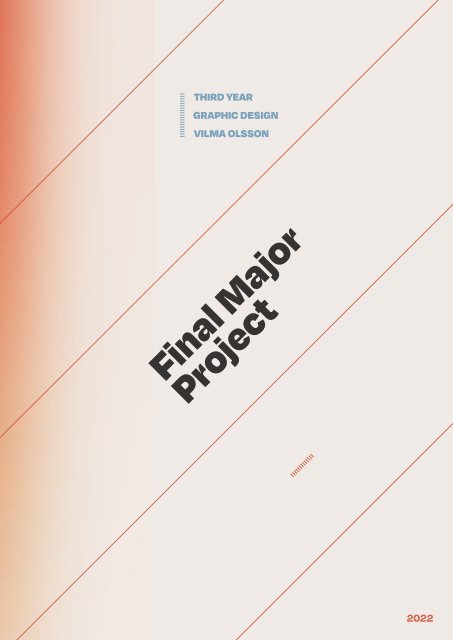
THIRD YEAR<br />
GRAPHIC DESIGN<br />
VILMA OLSSON<br />
<strong>Final</strong> <strong>Major</strong><br />
<strong>Project</strong><br />
2022
page 2<br />
Table of<br />
Contents<br />
86<br />
82 Ticket <strong>Design</strong> His<strong>to</strong>ry<br />
85 Then Until Now<br />
Target Audience<br />
112<br />
95 My script<br />
105 S<strong>to</strong>ryboard<br />
inspir<strong>at</strong>ion<br />
88<br />
Making a script<br />
114<br />
Stylescape<br />
4<br />
Brief<br />
90<br />
Inspir<strong>at</strong>ional short film<br />
116<br />
Cigarette <strong>Design</strong><br />
5<br />
Start of research<br />
94<br />
The concept<br />
122<br />
The Stamp <strong>Design</strong><br />
6-12<br />
4 Concept Ideas<br />
130<br />
Paper Bank Note <strong>Design</strong><br />
14<br />
Start of Research<br />
142<br />
The Passport <strong>Design</strong><br />
16<br />
Cre<strong>at</strong>ing a short film<br />
148<br />
Book Binding<br />
17-49<br />
About Wes Anderson<br />
150<br />
Newspaper <strong>Design</strong><br />
30-33<br />
Annie Atkins<br />
158<br />
Phone Book <strong>Design</strong><br />
50-55<br />
Steven Spielberg<br />
162<br />
Calender <strong>Design</strong><br />
56-59<br />
The Twilight Zone<br />
168<br />
Postage Book <strong>Design</strong><br />
60<br />
How <strong>to</strong> build a s<strong>to</strong>ry<br />
174<br />
Receipt <strong>Design</strong><br />
80<br />
78<br />
64<br />
68-76<br />
62<br />
Cinema<strong>to</strong>graphy<br />
Psychology behind the Blank Page<br />
Film/Movie Studio Analysis<br />
Inspir<strong>at</strong>ion for <strong>Design</strong>s<br />
Research within film<br />
224<br />
198<br />
186 Tea <strong>Design</strong><br />
188 Making Envelopes<br />
190 Book Covers<br />
Making Of Book<br />
Anim<strong>at</strong>ing<br />
242 Studio Branding<br />
254 Brand Manual<br />
272 Business Cards<br />
274 Marketing<br />
276 Music Cover<br />
284<br />
Movie Poster<br />
288<br />
Website <strong>Design</strong><br />
292<br />
Conclusion<br />
page 3
page 4<br />
Brief, or lack<br />
of brief...<br />
For the final major project<br />
we had a very open<br />
brief. We could cre<strong>at</strong>e<br />
anything we wanted <strong>to</strong><br />
cre<strong>at</strong>e, something we are<br />
passion<strong>at</strong>e about and want<br />
<strong>to</strong> cre<strong>at</strong>e beautiful designs<br />
out of. Th<strong>at</strong>’s easier said<br />
than done...<br />
<strong>Final</strong> <strong>Project</strong> Ideas<br />
Let’s go through some of my ideas...<br />
Let’s start.<br />
page 5
page 6<br />
#1<br />
“Venue Of The Past”<br />
Have you ever seen an abandoned house or apartment and<br />
wondered wh<strong>at</strong> happened <strong>to</strong> it? Wh<strong>at</strong> his<strong>to</strong>ry and s<strong>to</strong>ries<br />
lies inside of those walls th<strong>at</strong> are now empty and forgotten?<br />
I have. When finding interesting structures and architecture<br />
th<strong>at</strong> seems <strong>to</strong> be forgotten it intrigues me, makes me<br />
question and search for an answer. It’s fascin<strong>at</strong>ing not only<br />
the s<strong>to</strong>ries th<strong>at</strong> lies hidden inside of those walls, but also<br />
the appearance of emptiness and abandonment th<strong>at</strong> the<br />
structure exhales. It has a beauty <strong>to</strong> it, the lived, the <strong>to</strong>rn, the<br />
worn. Something th<strong>at</strong> lies within a community, an unused<br />
resource th<strong>at</strong> could be used<br />
for something else.<br />
This concept is about using these unused resources and<br />
cre<strong>at</strong>ing something new, something temporary <strong>to</strong> celebr<strong>at</strong>e<br />
the his<strong>to</strong>ry of it all. All of this whilst cre<strong>at</strong>ing and bringing<br />
<strong>to</strong>gether a community th<strong>at</strong> surrounds it. A pop-up-event.<br />
This event would celebr<strong>at</strong>e local artists, everything from<br />
music, <strong>to</strong> art, architecture or other brands and companies<br />
or charities. All with the same goal, <strong>to</strong> celebr<strong>at</strong>e the past<br />
and welcoming the future. The branding of this event<br />
would be heavily inspired <strong>by</strong> the closing of a space, similar<br />
<strong>to</strong> the crime scene tape used in blocking of an area for<br />
investig<strong>at</strong>ion. But here it would be reversed and used in<br />
the completely opposite way, <strong>to</strong> welcome guests in<strong>to</strong> a<br />
space, make them be welcomed <strong>by</strong> it. With signs th<strong>at</strong> might<br />
enhance th<strong>at</strong>. “Warning, event is occurring. Please step in<strong>to</strong><br />
the area”<br />
Cre<strong>at</strong>e:<br />
Posters, Marketing m<strong>at</strong>erials, find sponsors?, artists and<br />
local talents, approval <strong>to</strong> use a space and so on.<br />
page 7
page 8<br />
#2<br />
“Fill in the Blanks”<br />
/”Lost on Set”<br />
Wh<strong>at</strong> if I was the main character<br />
in a Wes Anderson movie?<br />
Did you know th<strong>at</strong> we sleep for about a third of our lives? Th<strong>at</strong><br />
it is actually physiologically vital for all of us <strong>to</strong> spend a third of<br />
our lives unconscious.<br />
For us <strong>to</strong> be able <strong>to</strong> heal, recharge, memorize, balance our<br />
hormones, and clear ourselves from <strong>to</strong>xins it is vital th<strong>at</strong> we do<br />
so, if not, we will die...<br />
You enter an unconscious st<strong>at</strong>e of mind where suddenly<br />
everything is possible, s<strong>to</strong>ries are written and forgotten,<br />
ideas are born, memories and thoughts resurface. For some<br />
of us this is the place where ideas are born, we wake up in<br />
the middle of the night <strong>to</strong> write something down before we<br />
forget about it. When we then dream crazy things can happen,<br />
usually the mind fills in the blanks of wh<strong>at</strong>ever we thought<br />
of in the moment and draws it’s own conclusions. You can<br />
describe it as you being the cre<strong>at</strong>ive direc<strong>to</strong>r of your own<br />
movie, but unconsciously. Where every detail can be vital.<br />
For this concept we explore the idea of us being the main<br />
character in our own movie. With sets and decor<strong>at</strong>ive<br />
elements th<strong>at</strong> cre<strong>at</strong>es a united front. A well composed scene.<br />
To design everything from passports, bank cards, bills, notes<br />
and coins, cigarette packages, m<strong>at</strong>chstick boxes, door bells,<br />
receipts from our wallet containing our l<strong>at</strong>est purchases, the<br />
daily newspaper and so on. Then <strong>to</strong> cre<strong>at</strong>e beautiful sets <strong>to</strong><br />
I want <strong>to</strong> be the Wes Anderson of my own movie.<br />
And it is a beautiful one, with old school references.<br />
Cre<strong>at</strong>e:<br />
Props, signs, newspapers, set design, small scale<br />
pro<strong>to</strong>types?, motion graphics <strong>to</strong> promote, pho<strong>to</strong>graphy,<br />
product design, sound & music production. and so on.<br />
Wes Anderson-ize certain situ<strong>at</strong>ions, 2 or 3 scenes from<br />
points in your life where things are just still. Like waiting in<br />
a cab in traffic, sitting on a plane, or train, waiting for your<br />
order <strong>at</strong> a cafe or restaurant.<br />
page 9
page 10<br />
3#<br />
“Mind full of Music”<br />
Something th<strong>at</strong> connects many different universes in<strong>to</strong><br />
one is music. You are usually never in<strong>to</strong> only one thing<br />
but casually flows in between genres, artists and be<strong>at</strong>s,<br />
something th<strong>at</strong> fits you in the moment. If then all of these<br />
universes unites and becomes one magical things can<br />
happen. Be<strong>at</strong>s transition in<strong>to</strong> each other, songs can be put<br />
on<strong>to</strong> other songs cre<strong>at</strong>ing a deeper and more intriguing<br />
experience, a musical experience.<br />
For this concept I want <strong>to</strong> explore this idea, of cre<strong>at</strong>ing an<br />
experience th<strong>at</strong> mixes both songs, sounds, and visuals with<br />
genres mixing, samples and so on. I myself am obsessed<br />
with morphing songs with each other, I unconsciously<br />
do th<strong>at</strong> every day, and become a wandering radio st<strong>at</strong>ion<br />
with songs overlapping. Maybe you could even control the<br />
mixing of the songs yourself, I have a theory th<strong>at</strong> there are<br />
songs th<strong>at</strong> fit <strong>to</strong>gether with any song depending on how its<br />
remixed, it could be a<br />
If I then would cre<strong>at</strong>e and develop a type of radio st<strong>at</strong>ion<br />
where I mix songs, add effects, develop and anim<strong>at</strong>e visuals<br />
consisting different styles and cool transitions. Pho<strong>to</strong>graphy<br />
<strong>to</strong>gether with illustr<strong>at</strong>ion(All with different styles mixing),<br />
producing or remixing music. Visuals would change when<br />
the music and songs change.<br />
Jumping in and out of the world of music, musical journey<br />
with different songs morphing in<strong>to</strong> each other. Then visuals<br />
th<strong>at</strong> represents th<strong>at</strong>. Which goes from set scenes th<strong>at</strong> are<br />
designed and colour coded. To anim<strong>at</strong>ed sequences th<strong>at</strong><br />
gener<strong>at</strong>es.<br />
page 11
page 12<br />
4#<br />
“The Fear<br />
of Failure”<br />
Sometimes it’s hard <strong>to</strong> put things in<strong>to</strong> perspective, <strong>to</strong> try<br />
and observe the bigger picture in order <strong>to</strong> move forward.<br />
To not live in the past. There are many ways you can do<br />
this, you can talk <strong>to</strong> others, try and find a self realis<strong>at</strong>ion <strong>by</strong><br />
just speaking out loud. But there are also small practises<br />
you can do in order for th<strong>at</strong> butterfly effect <strong>to</strong> happen. By<br />
starting with something small.<br />
For this concept I would cre<strong>at</strong>e a fresh design of a bundle<br />
of social games th<strong>at</strong> would force you <strong>to</strong> be present,<br />
accept both defe<strong>at</strong> and small wins. Something th<strong>at</strong> helps<br />
you not take everything <strong>to</strong>o seriously, but instead let’s you<br />
loosen up.<br />
This bundle would consist of common games such as a<br />
deck of cards, a new and cre<strong>at</strong>ive monopoly, tic tac <strong>to</strong>e,<br />
karaoke with a twist, a wooden maze balancer, Ludo, and<br />
so on.<br />
I consider failure and mishaps as different chapters th<strong>at</strong><br />
need <strong>to</strong> happen in your life in order <strong>to</strong> move forward,<br />
something you have <strong>to</strong> let go of. I see this “product design”<br />
something th<strong>at</strong> would be developed in a smaller size for<br />
you <strong>to</strong> be able <strong>to</strong> bring it with you easily. The bundle would<br />
have the appearance of a book, with very intric<strong>at</strong>e details<br />
and would be sectioned off when you open it up.<br />
page 13
page 14<br />
Research<br />
Let’s start the research <strong>by</strong> exploring some of the<br />
masters in film...<br />
Who is Wes Anderson?<br />
Let’s find out!<br />
page 15
page 16<br />
Cre<strong>at</strong>ing a short film.<br />
When trying <strong>to</strong> figure out wh<strong>at</strong> the first thing <strong>to</strong> do when<br />
cre<strong>at</strong>ing a short film would be. I wanted <strong>to</strong> learn from the<br />
master. From amazing direc<strong>to</strong>rs and their vision. Where they<br />
get their inspir<strong>at</strong>ion and drive from.<br />
So wh<strong>at</strong> kind of direc<strong>to</strong>rs come <strong>to</strong> mind? Anyone special?<br />
At least for me and movies I’ve seen throughout my life,<br />
there are a few th<strong>at</strong> stick out. Direc<strong>to</strong>rs th<strong>at</strong> cre<strong>at</strong>e stunning<br />
graphics and compositions in their scenes. Direc<strong>to</strong>rs like<br />
Wes Anderson, Steven Spielberg, Alfred Hitchcock, Quentin<br />
Tarantino, Chris<strong>to</strong>ffer Nolan, among others. So th<strong>at</strong>’s where<br />
I begin. Let’s take a dive in<strong>to</strong> direc<strong>to</strong>rs minds.<br />
https://www.backstage.com/magazine/article/<br />
how-<strong>to</strong>-direct-your-first-film-67387/<br />
Quentin Tarantino<br />
Directing a movie.<br />
1# The first crucial thing when directing and<br />
producing a movie is <strong>to</strong> have a vision, <strong>to</strong> know the<br />
feeling and s<strong>to</strong>ry you are going <strong>to</strong> make. Many times<br />
this is wh<strong>at</strong> takes the longest of times, <strong>to</strong> have a really<br />
strong basis <strong>to</strong> build everything on. This is usually<br />
where you can distinguish the amazing movies, from<br />
the not so gre<strong>at</strong> ones.<br />
2# I’ve read many s<strong>to</strong>ries where many direc<strong>to</strong>rs<br />
constantly meet problems and things they need <strong>to</strong><br />
change <strong>to</strong> make everything work. So <strong>to</strong> then cre<strong>at</strong>e<br />
something bigger, something solid like a movie, you<br />
have <strong>to</strong> be able <strong>to</strong> solve every problem as they come.<br />
Steven Spielberg<br />
Wes Anderson<br />
Wh<strong>at</strong> about Wes Anderson?<br />
Wes Andersons characteristics in movies are hard <strong>to</strong> miss.<br />
The beautiful colour palettes, framing, and set design is<br />
iconic, just the vision th<strong>at</strong> every movie has is magical. But<br />
how did he start?<br />
Born 1969 in Texas, U.S.<br />
Wes Anderson grew up in Texas and had cre<strong>at</strong>ive forces in<br />
his family growing up. His f<strong>at</strong>her worked in an advertisement<br />
agency & the mother worked in real est<strong>at</strong>e and archaeology.<br />
He has two brothers and grew up with divorced parents,<br />
which indeed affected his now current career in film making<br />
but also his behaviour in school.<br />
He realised early in his life th<strong>at</strong> he had this cre<strong>at</strong>ive force<br />
within, which he explored with a camera and his two<br />
brothers. Writing scripts, directing small videos. In his school<br />
he became known for cre<strong>at</strong>ing really elabor<strong>at</strong>e and well<br />
thought plays th<strong>at</strong> all were inspired <strong>by</strong> well known s<strong>to</strong>ries or<br />
movies. When he went <strong>to</strong> a University in Texas he met Owen<br />
Wilson which now has been a part of most of his movies<br />
th<strong>at</strong> he has made., as CO direc<strong>to</strong>r. Philosophy was one of<br />
Wes majors in school, while being very silent and constantly<br />
thinking about ideas and theories, many people in his class<br />
dedic<strong>at</strong>ed their time <strong>to</strong> only focus on school, whilst Wes and<br />
Owen had a harder time doing so. It <strong>to</strong>ok a while before they<br />
started talking <strong>to</strong> each other, but when they did,<br />
they never s<strong>to</strong>pped.<br />
page 17<br />
https://www.biography.com/filmmaker/wes-anderson
page 18<br />
Developing his style<br />
In W.Andersons early days he started cre<strong>at</strong>ing movies called<br />
“Bottle Rocket” & “Rushmore”, his ideas was <strong>to</strong> cre<strong>at</strong>e<br />
dram<strong>at</strong>ic and interesting plots th<strong>at</strong> had a more serious<br />
<strong>to</strong>ne <strong>to</strong> them. But he l<strong>at</strong>er found th<strong>at</strong> this wasn’t his strong<br />
suite. But th<strong>at</strong> he had a n<strong>at</strong>ural inclin<strong>at</strong>ion <strong>to</strong>wards comedy,<br />
romance and crime.<br />
Raising the budgets was difficult in the beginning, but he<br />
did find contacts th<strong>at</strong> made everything possible, <strong>at</strong> least<br />
for shorter versions. The first few movies was entered in<strong>to</strong><br />
the Sundance FIlm Festival and it was received with gre<strong>at</strong><br />
enthusiasm. Many important people in the film industry<br />
loved the concepts and how everything was cre<strong>at</strong>ed. He<br />
won an award for the longer version of the film which had<br />
a budget for 5 million dollars, the “Best New Filmmaker <strong>at</strong><br />
MTV”.<br />
It didn’t take <strong>to</strong>o long before he got a more<br />
mainstream success with movies such as “The Royal<br />
Tenenbaums” & The Life Aqu<strong>at</strong>ic”.<br />
“Shot from The Royal Tenenbaums”<br />
W.Anderson Details<br />
Something th<strong>at</strong> is very important in W.Anderson movies th<strong>at</strong><br />
become more and more apparent the more movies he made.<br />
Was the importance th<strong>at</strong> the f<strong>at</strong>her figures had in the movies.<br />
Wes confirms this in an interview <strong>by</strong> saying the following,<br />
“I finally realized it’s just the opposite of wh<strong>at</strong> I really grew<br />
up with, and for me there’s something exotic about it…I’m<br />
drawn <strong>to</strong> those f<strong>at</strong>her-figure characters th<strong>at</strong> are larger-thanlife<br />
people, and I’ve sought out men<strong>to</strong>rs who are like th<strong>at</strong>, so I<br />
rel<strong>at</strong>e <strong>to</strong> them.<br />
But they’re not my f<strong>at</strong>her.”<br />
“Shot from The Life Aqu<strong>at</strong>ic”<br />
Concepts<br />
“The Royal Tenenbaums”<br />
Wh<strong>at</strong> is very unique about Wes Anderson is his way of cre<strong>at</strong>ing<br />
amazingly interesting concepts, the characters th<strong>at</strong> are so cre<strong>at</strong>ive<br />
and well thought out. The scenery and his way of shooting each<br />
scene with such eye for details. The movie itself is based in New<br />
York, and tells the s<strong>to</strong>ry about a family of geniuses, how their failure<br />
affects them and how they develop as characters throughout the<br />
movie.<br />
“The Life Aqu<strong>at</strong>ic”<br />
This movie on the other hand is about an oceanographer (= person<br />
th<strong>at</strong> deals with the physics and properties and phenomena of the<br />
sea) and a documentaries in wildlife who are chasing the renown<br />
and possibly imaginary Jaguar shark.<br />
https://www.biography.com/filmmaker/wes-anderson<br />
(Quote from New York Magazine article)<br />
page 19
page 20<br />
“The Darjeeling Limited”<br />
In the making of his next film “The Darjeeling Limited” him<br />
and two other producers was said <strong>to</strong> act out the movie<br />
before it happened, in real life. The movie is based on a train<br />
<strong>to</strong> India, where three brothers takes a train ride <strong>to</strong> visit their<br />
mother living there, also <strong>to</strong> <strong>at</strong> the end of the day, connect<br />
and become closer. It’s beautifully shot and has so much<br />
detail in everything, every scene, every decor<strong>at</strong>ive element.<br />
“Shot from Fantastic Fox”<br />
Style & Characteristics<br />
It’s very interesting th<strong>at</strong> the characters are so diverse.<br />
W.Anderson has admitted in interviews th<strong>at</strong> every character<br />
he cre<strong>at</strong>es could enter any movie he cre<strong>at</strong>es, and it would<br />
make sense. Th<strong>at</strong> there is a translucent fade <strong>to</strong> them all,<br />
everybody combines in one way or another. Because the<br />
basis of his s<strong>to</strong>ries as I said earlier, all have one common<br />
thing, th<strong>at</strong> there is this comedic sadness <strong>to</strong> them.<br />
“Fantastic Fox”<br />
We also have the s<strong>to</strong>p motion movie called “Fantastic Fox”<br />
which is were W.Anderson explores some of his childhood<br />
fantasies, and turn some of the s<strong>to</strong>ries in his mind, in<strong>to</strong> a<br />
visual movie. It’s basically about how a few animals come<br />
<strong>to</strong>gether <strong>to</strong> fight an evil farmer. The film was received with<br />
much criticism and wasn’t as enjoyed <strong>by</strong> the public as his<br />
previous films was.<br />
“Shot from The Darjeeling Limited”<br />
Characters<br />
It’s very interesting th<strong>at</strong> the characters are so diverse.<br />
W.Anderson has admitted in interviews th<strong>at</strong> every<br />
character he cre<strong>at</strong>es could enter any movie he<br />
cre<strong>at</strong>es, and it would make sense. Th<strong>at</strong> there is a<br />
translucent fade <strong>to</strong> them all, everybody combines in<br />
one way or another. Because the basis of his s<strong>to</strong>ries<br />
as I said earlier, all have one common thing, th<strong>at</strong> there<br />
is this comedic sadness <strong>to</strong> them.<br />
“Tchotchkes” - A tchotchke<br />
is an inexpensive souvenir/<br />
trinket/decor<strong>at</strong>ive object.<br />
Wh<strong>at</strong> <strong>to</strong> call his style?<br />
“Repartee” - A witty<br />
and quick response.<br />
There are many ways th<strong>at</strong> you can describe W.Andersons<br />
style. Some people call it a pot-pourri of vintage<br />
tchotchkes, others call it old-school. But <strong>at</strong> the end of<br />
the day it’s much more intric<strong>at</strong>e than this. In the industry<br />
of film, Wes is called the direct direc<strong>to</strong>r. A very peculiar,<br />
individual, detail oriented. His production design is out of<br />
this world, it’s nuanced and full of visual gags and Easter<br />
eggs. He is also one of the only direc<strong>to</strong>r th<strong>at</strong> can pull of a<br />
<strong>to</strong>tal turn in s<strong>to</strong>ryline and style. Which is hard.<br />
W.Andersons aesthetic is very charming in it’s n<strong>at</strong>ure,<br />
the characters are very gracious, are respectful<br />
and memorable. When you then start looking <strong>at</strong> the<br />
composition for the frames in the different movies you<br />
clearly see th<strong>at</strong> he loves using symmetry and close up<br />
shots of the different people. Every action starts and<br />
ends with the other, in smooth and quick transitions. He is<br />
not secretive in his distribution of inform<strong>at</strong>ion, but r<strong>at</strong>her<br />
up front and open about everything th<strong>at</strong> goes on.<br />
https://www.dictionary.com/browse/tchotchke<br />
page 21
page 22<br />
W.Anderson<br />
References in movies<br />
Wh<strong>at</strong> you can really sum everything up as, is th<strong>at</strong> every<br />
movie he cre<strong>at</strong>es and produces, he puts his entire heart<br />
and soul, past and present, thoughts and imagin<strong>at</strong>ions in<strong>to</strong><br />
every single detail. He is a hard working crea<strong>to</strong>r th<strong>at</strong> put<br />
every emotion and thought in<strong>to</strong> something visual, even his<br />
studies on psychology. Wes is in everything, the clothes, the<br />
props, the characters, the decor<strong>at</strong>ions. Everything.<br />
Something else th<strong>at</strong> is very interesting in his films are th<strong>at</strong><br />
they usually are made from scr<strong>at</strong>ch, the s<strong>to</strong>ry, language,<br />
visuals. Whilst nowadays a lot of movies also are inspired<br />
from famous books or authors, self biographies and<br />
documentaries, which is not a bad thing. Of course he also<br />
draws inspir<strong>at</strong>ion from books and other sources but he<br />
writes everything himself. Even the sets and productions<br />
are usually borrowed from already existing places,<br />
but with Wes he builds it from the ground up, or have<br />
somewhere th<strong>at</strong> seems like it’s cus<strong>to</strong>m build for<br />
his specific project. You also rarely see any type of<br />
product placement, but he instead uses things th<strong>at</strong> he<br />
has designed or cre<strong>at</strong>ed himself, something made up...<br />
https://www.studiobinder.com/blog/<br />
wes-anderson-style/<br />
Sometimes you can clearly tell th<strong>at</strong> he has been heavily<br />
inspired <strong>by</strong> another direc<strong>to</strong>r in his movies. Th<strong>at</strong> it almost<br />
becomes a tribute <strong>to</strong> them, a way for him <strong>to</strong> say thank<br />
you <strong>to</strong> them in a sense. If you look <strong>at</strong> for example “The<br />
Grand Budapest Hotel” it almost entirely is a tribute <strong>to</strong><br />
Alfred HItchcock and one of his movies “Torn Curtain”.<br />
“I think the way I think about shooting scenes and<br />
staging scenes is influenced very much <strong>by</strong> Roman<br />
Polanski and <strong>by</strong> his films and the way he does th<strong>at</strong>,<br />
which is very particular.”<br />
- Wes Anderson<br />
Influences in the Industry<br />
Roman Polanski<br />
He has directed movies such as “The Pianist(2002)”,<br />
“The Ghost Writer(2010)”, “An Officer and a Spy(2019),<br />
“Tess(1979)”, among many others.<br />
Steven Spielberg<br />
This guy is difficult <strong>to</strong> miss, he has directed movies<br />
such as “Schindlers List(1993)”, “Saving Priv<strong>at</strong>e<br />
Ryan(1998)”, “Indiana Jones(1981)”, and many more.<br />
Martin Scorsese<br />
This direc<strong>to</strong>r has made movies such as “Taxi<br />
Driver(1976(“, “Goodfellas(1990)”, “The Age Of<br />
Innocence(1993)”, and so much more.<br />
Waris Hussein<br />
I had never heard of this direc<strong>to</strong>r, but I did recognise his<br />
movies, “The Possessions of Joel Delaney(1972)”, “A<br />
Touch of Love(1969)”, “Copacabana(1985)”.<br />
https://www.imdb.com/name/<br />
nm0000591/<br />
https://www.imdb.com/name/<br />
nm0000229/<br />
https://www.imdb.com/name/<br />
nm0000217/<br />
https://www.imdb.com/name/<br />
nm0404014/<br />
page 23
page 24<br />
Techniques<br />
So wh<strong>at</strong> are some techniques th<strong>at</strong> Wes uses <strong>to</strong> cre<strong>at</strong>e this<br />
depth? How does he combine many areas such as games,<br />
books and films in<strong>to</strong> one put <strong>to</strong>gether look?<br />
It is true th<strong>at</strong> many film makers are influenced <strong>by</strong> each<br />
other, some of the pasts DNA is always transferred <strong>to</strong> the<br />
next, but usually interpreted differently.<br />
One thing th<strong>at</strong> is obvious and th<strong>at</strong> Wes has said about his<br />
techniques and style, is th<strong>at</strong> he usually tells everything<br />
from his younger self, th<strong>at</strong> mindset and perspective.<br />
Specifically his 12 year old self. How he viewed the world<br />
and how he remembers it from th<strong>at</strong> time. Almost like it’s a<br />
snapshot from his childhood.<br />
Let’s take a look <strong>at</strong> some colour palettes.<br />
“Shot from The Darjeeling Limited”<br />
page 25
page 26<br />
1980s<br />
When observing everything in it’s style, it’s almost like<br />
the time is s<strong>to</strong>pped in the 1980s, the clothes, sets and<br />
colours are all heavily influenced <strong>by</strong> th<strong>at</strong> time. In Wes<br />
youth and dreamy imagin<strong>at</strong>ion.<br />
Something very unique about Wes characters is th<strong>at</strong> their<br />
view on life is absolutist, meaning th<strong>at</strong> they hold definite<br />
principles in any area, such as politics, psychology and<br />
so on. They are very emotionally fragile and things can<br />
change in a m<strong>at</strong>ter of seconds. They are contradic<strong>to</strong>ry,<br />
acting in opposite ways.<br />
Greek Philosophy<br />
One thing th<strong>at</strong> has inspired his s<strong>to</strong>ry structure in most of his<br />
films are Greek Philosophy. It’s often said th<strong>at</strong> “The plot is the<br />
soul of art”. In W.Andersons s<strong>to</strong>ries for example everything is<br />
planned in<strong>to</strong> gre<strong>at</strong> detail, each act has the same amount of<br />
chapters. There is beauty in this type of organis<strong>at</strong>ion, keeping<br />
track of every little detail th<strong>at</strong> can change everything.<br />
There is a character who is a psychologist, but his wife<br />
is depressed and has massive insecurities. There is also<br />
a character th<strong>at</strong> is a genius but is failing every test. They<br />
are all opposites, human, and flawed. Maybe th<strong>at</strong>’s why<br />
we get so drawn in<strong>to</strong> them.<br />
More of his style...<br />
Something he often uses in his films <strong>to</strong> cre<strong>at</strong>e suspense<br />
and a dram<strong>at</strong>ic effect is the slow motion effect. It’s<br />
often added <strong>to</strong>wards the end of the movie. Another<br />
interesting thing about his movies are th<strong>at</strong> they are all<br />
anim<strong>at</strong>ed before they are shot.<br />
Music<br />
A guy named Randall Poster has been in charge for the<br />
music for quite a while. Him and W.Anderson have the<br />
same vision and help each other out. The sounds are<br />
very particular, almost like they have their own role.<br />
Symmetry<br />
His way of cre<strong>at</strong>ing symmetry is something he has<br />
mastered, he is a pro <strong>at</strong> cre<strong>at</strong>ing those beautiful<br />
symmetric compositions. He does know th<strong>at</strong> symmetry<br />
<strong>to</strong> humans is something th<strong>at</strong> intrigues us and th<strong>at</strong> can<br />
make us feel a type of way.<br />
Use of colour<br />
Depending on the context, the colours he uses represent<br />
them amazingly. Like in “The Life Aqu<strong>at</strong>ic” where the<br />
colour scheme is blue and orange. Complementary<br />
colours th<strong>at</strong> represent marine environments. Clever<br />
move.<br />
Typography<br />
Something Wes loved <strong>to</strong> do when he was younger was<br />
<strong>to</strong> w<strong>at</strong>ch old Italian movies, he would observe and<br />
analyse the different sequences, typefaces. He has<br />
even used one font th<strong>at</strong> much th<strong>at</strong> many recognises<br />
him just <strong>by</strong> th<strong>at</strong>, Futura.<br />
Angles<br />
His style is often very Art Nouveau, very dreamy<br />
and perfectly colour graded. All <strong>to</strong> portray a certain<br />
emotion th<strong>at</strong> is needed for the s<strong>to</strong>ry. Interesting angles<br />
are also realistic ones, th<strong>at</strong> makes everything flow well<br />
<strong>to</strong>gether, filled with emotion.<br />
https://<strong>to</strong>psheet.io/blog/wesanderson-style<br />
Costume <strong>Design</strong>s<br />
If you start <strong>to</strong> look <strong>at</strong> the fashion and costume designs in Wes<br />
movies they are very old school. he has a distinct love for the<br />
m<strong>at</strong>erial corduroy and tells you a lot about his love for older<br />
garments, and a deeper, richer taste in fashion from the past.<br />
It’s also gre<strong>at</strong> for making the viewers curious about wh<strong>at</strong> is<br />
going on, wh<strong>at</strong> the movie brings, if there is something different<br />
than usual.<br />
page 27
page 28<br />
Set Props<br />
Let’s go through some of the prop design th<strong>at</strong> I’ve found from a<br />
few of Wes Anderson’s movies. The details, color and edi<strong>to</strong>rial<br />
is just so beautiful. There are many designers th<strong>at</strong> have worked<br />
with Wes in designing the different props. One of them are<br />
Annie Atkins, she is currently purely dedic<strong>at</strong>ed <strong>to</strong> cre<strong>at</strong>ing film<br />
props and really enhancing the cinem<strong>at</strong>ic environment.<br />
“Box from the movie The Grand Budapest Hotel”<br />
“Cinema tickets for the movie Wonderstruck(2017)”<br />
“Props from the movie The Grand Budapest Hotel”<br />
“Props from the movie The Grand Budapest Hotel”<br />
https://www.annie<strong>at</strong>kins.com<br />
Annie’s prop designs<br />
Wh<strong>at</strong> is interesting about cre<strong>at</strong>ing and developing this<br />
entire cinem<strong>at</strong>ic universe is th<strong>at</strong> it really needs <strong>to</strong> come<br />
from a crazy <strong>at</strong>tention <strong>to</strong> detail. Wh<strong>at</strong> Annie Atkins does<br />
so amazingly is th<strong>at</strong> she lives, bre<strong>at</strong>hes, thinks about the<br />
movie she is helping <strong>to</strong> cre<strong>at</strong>e, constantly. She is fully<br />
emerged in<strong>to</strong> it and th<strong>at</strong> makes a huge difference.<br />
page 29
page 30<br />
Annie Atkins<br />
I’ve spoke about Annie Atkins a few times before. But she is<br />
truly a master <strong>at</strong> cre<strong>at</strong>ing cinem<strong>at</strong>ic universes. Her first job on<br />
the movie “The Tu<strong>to</strong>rs” was an amazing start for her cinem<strong>at</strong>ic<br />
graphic design career. Th<strong>at</strong> series was set in a time where<br />
there were no graphic designers, but instead the craftsmen<br />
cre<strong>at</strong>ed their own graphics. So n<strong>at</strong>urally for Annie she returns<br />
<strong>to</strong> th<strong>at</strong> time, and tries <strong>to</strong> cre<strong>at</strong>e graphics th<strong>at</strong> they would<br />
cre<strong>at</strong>e, with the m<strong>at</strong>erials and <strong>to</strong>ols they had. All <strong>to</strong> make it as<br />
Legitim<strong>at</strong>e as possible.<br />
I w<strong>at</strong>ched a short talk on the AIGA <strong>Design</strong> event online th<strong>at</strong><br />
Annie was on, and she talked about how shes made one rule<br />
for herself when designing. Th<strong>at</strong> if she worked on something<br />
th<strong>at</strong> was done a long time ago, th<strong>at</strong> was done <strong>by</strong> hand, she<br />
has <strong>to</strong> make it <strong>by</strong> hand as well. And th<strong>at</strong> also applies the other<br />
way around, th<strong>at</strong> if anything was made on a letter press or<br />
<strong>by</strong> machines, she can do th<strong>at</strong> as well. She also makes a lot of<br />
different signs, in fake glass, posters for walls and so on. So<br />
wh<strong>at</strong> she does is cre<strong>at</strong>e the sketches and finally if needed she<br />
also cre<strong>at</strong>es the technical drawings <strong>to</strong> make everything come<br />
<strong>to</strong> life if you use another medium or another artist th<strong>at</strong> cre<strong>at</strong>es<br />
the final piece of design.<br />
Her Tactics<br />
She talked a short while about “The Box Trolls” which was a<br />
movie with only handmade elements th<strong>at</strong> become anim<strong>at</strong>ed.<br />
Annie was in charge of designing the designs on <strong>to</strong>p of the<br />
box trolls paper boxes. She finds inspir<strong>at</strong>ion in her research<br />
and when she found out th<strong>at</strong> this film is more or less set in<br />
early Vic<strong>to</strong>rian era. So th<strong>at</strong>’s where she started. Researching<br />
packaging design from th<strong>at</strong> era. The direc<strong>to</strong>r didn’t have any<br />
straight lines in the set design or in the characters, so she<br />
didn’t allow herself <strong>to</strong> have any either. The designers didn’t<br />
use any rulers or any <strong>to</strong>ol <strong>to</strong> help them whilst cre<strong>at</strong>ing the<br />
typography, signs, and so on. Every design is inspired <strong>by</strong> real<br />
life, real designs.<br />
The first thing she does in her process:<br />
- She reads through the entire scripts and marks<br />
everything out th<strong>at</strong> needs graphics.<br />
- Scripts breakdown, a spread sheet of everything you<br />
need <strong>to</strong> make. (quote from the scenes and<br />
where it’s set)<br />
- They never make only one piece of graphic design,<br />
they always have multiple different versions.<br />
- Action graphics are difficult though. They are<br />
constantly changing and need backups.<br />
Texture Techniques<br />
Something else th<strong>at</strong> I found fascin<strong>at</strong>ing was the many<br />
different ways <strong>to</strong> cre<strong>at</strong>e texture <strong>to</strong> a design. Annie for<br />
example has so many recipes th<strong>at</strong> she’s s<strong>to</strong>red over<br />
the years of different ways <strong>to</strong> age paper with different<br />
outcomes. Such as using; tea, potassium, balsamic vinegar,<br />
coffee, baking soda, lemon, and so on <strong>to</strong> stylize the printed<br />
m<strong>at</strong>erials she is working with.<br />
https://www.annie<strong>at</strong>kins.com<br />
page 31
page 32<br />
Annie Atkins actually collabor<strong>at</strong>ed very closely <strong>to</strong> both the<br />
direc<strong>to</strong>r Steven Spielberg, as well as the set designer Adam<br />
S<strong>to</strong>ckhausen. He is responsible for much of the production,<br />
finding the perfect spots <strong>to</strong> shoot with all of S.Spielberg’s<br />
<strong>at</strong>tributes.<br />
Cre<strong>at</strong>ing<br />
It’s so interesting reading about the different steps th<strong>at</strong><br />
Annie does when she starts <strong>to</strong> cre<strong>at</strong>e a piece of design.<br />
How she explores the designs. Usually finds inspir<strong>at</strong>ion<br />
on flee markets and in other vintage shops <strong>to</strong> really<br />
grasp the size of the items. She even mentions th<strong>at</strong><br />
she can get so much inspir<strong>at</strong>ion from just looking in her<br />
grandmothers <strong>at</strong>tic.<br />
Now her days all look vastly different, her designs vary<br />
and everything can change from one minute <strong>to</strong> the next.<br />
She can be cre<strong>at</strong>ing Japanese hand-painted maps, then<br />
l<strong>at</strong>er go in<strong>to</strong> cre<strong>at</strong>ing geometric p<strong>at</strong>terned flooring for<br />
another movie. She has worked with direc<strong>to</strong>rs such as<br />
Wes Anderson, Todd Haynes, Steven Spielberg, the list<br />
goes on and on. One of her most current works are with<br />
the newly released remake <strong>by</strong> Steven Spielberg, “West<br />
Side S<strong>to</strong>ry”, as well as Wes Anderson’s “The French<br />
Disp<strong>at</strong>ch”. And wow.<br />
https://www.architecturaldigest.com/s<strong>to</strong>ry/insidewest-side-s<strong>to</strong>rys-new-york-city-sets<br />
page 33
page 34<br />
https://kottke.org/22/01/the-role-of-type-in-wes-andersons-films<br />
https://fontsinuse.com/tags/1140/wes-anderson<br />
Typography<br />
So how does W.Anderson use typography<br />
and where does he find his inspir<strong>at</strong>ion?<br />
First of all. Wes has a few fonts th<strong>at</strong> he always tend <strong>to</strong> go<br />
back <strong>to</strong>, many now consider them Andersonian, meaning<br />
th<strong>at</strong> they just think of him when seeing them. They are a<br />
mixture of different fonts th<strong>at</strong> he edits <strong>to</strong> fit the theme he<br />
is currently exploring. I’ll name a few:<br />
Münchner Fraktur<br />
Aa Bb Cc Dd Ee Ff Gg Hh Ii<br />
Jj Kk Ll Mm Nn Oo Pp Qq Rr<br />
Ss Tt Uu Vv Ww Xx Yy Zz<br />
Didot<br />
Aa Bb Cc Dd Ee Ff Gg<br />
Hh Ii Jj Kk Ll Mm Nn<br />
Oo Pp Qq Rr Ss Tt Uu<br />
Vv Ww Xx Yy Zz<br />
Futura<br />
Aa Bb Cc Dd Ee Ff Gg Hh<br />
Ii Jj Kk Ll Mm Nn Oo Pp<br />
Qq Rr Ss Tt Uu Vv Ww<br />
Xx Yy Zz<br />
Futura<br />
Aa Bb Cc Dd Ee Ff Gg Hh Ii Jj Kk<br />
Ll Mm Nn Oo Pp Qq Rr Ss Tt Uu Vv<br />
Ww Xx Yy Zz<br />
Old English<br />
Aa Bb Cc Dd Ee<br />
Ff Gg Hh Ii Jj<br />
Kk Ll Mm Nn<br />
Oo Pp Qq Rr Ss<br />
Tt Uu Vv Ww Xx<br />
Yy Zz<br />
DIN Altern<strong>at</strong>e<br />
Aa Bb Cc Dd Ee Ff Gg Hh<br />
Ii Jj Kk Ll Mm Nn Oo Pp<br />
Qq Rr Ss Tt Uu Vv Ww Xx<br />
Yy Zz<br />
Bickham Script(Tilda)<br />
Aa Bb Cc Dd Ee Ff Gg Hh Ii<br />
Jj Kk Ll Mm Nn Oo Pp Qq<br />
Rr Ss Tt Uu Vv Ww Xx Yy Zz<br />
Compagnon<br />
Aa Bb Cc Dd Ee Ff<br />
Gg Hh Ii Jj Kk Ll<br />
Mm Nn Oo Pp Qq Rr<br />
Ss Tt Uu Vv Ww Xx<br />
Yy Zz<br />
Compendium<br />
Aa Bb Cc Dd Ee Ff Gg<br />
Hh Ii Jj Kk Ll Mm<br />
Nn Oo Pp Qq Rr Ss Tt<br />
Uu Vv Ww Xx Yy Zz<br />
Helvetica<br />
Aa Bb Cc Dd Ee Ff Gg<br />
Hh Ii Jj Kk Ll Mm Nn Oo<br />
Pp Qq Rr Ss Tt Uu Vv<br />
Ww Xx Yy Zz<br />
DM Serif Display<br />
Aa Bb Cc Dd Ee Ff Gg Hh<br />
Ii Jj Kk Ll Mm Nn Oo Pp<br />
Qq Rr Ss Tt Uu Vv Ww Xx<br />
Yy Zz<br />
Archer<br />
Aa Bb Cc Dd Ee Ff Gg Hh<br />
Ii Jj Kk Ll Mm Nn Oo Pp<br />
Qq Rr Ss Tt Uu Vv Ww Xx<br />
Yy Zz<br />
The master of Futura.<br />
W.Anderson has used Futura in more than 5 of his<br />
movies, they are all vastly different, but containing similar<br />
techniques in their execution. Marie Boulanger who is a<br />
typographer, has said th<strong>at</strong> the more recent films Wes is<br />
cre<strong>at</strong>ing, the more focus typography has. Especially in<br />
movies about writers and publishing.<br />
page 35
page 36<br />
“The Grand<br />
Budapest Hotel”<br />
Let’s take a look <strong>at</strong> a few scenes from The Grand Budapest<br />
Hotel focusing on type.<br />
To cre<strong>at</strong>e this beautiful altern<strong>at</strong>e reality with the massive<br />
use of type is as<strong>to</strong>unding. The more I research in it, the<br />
deeper it goes. To cre<strong>at</strong>e the perfect aesthetics there are<br />
many different procedures th<strong>at</strong> had <strong>to</strong> be done, <strong>at</strong> least<br />
in Anderson’s world. Text th<strong>at</strong> was written on vintage<br />
typewriters, hand-written letters using calligraphy, screen<br />
printed props. It all makes a huge difference, the hand<br />
crafted parts of any sets really make things stand out.<br />
Almost like you get this nostalgic response <strong>to</strong> it, feels<br />
like home. Safe.<br />
https://www.typeroom.eu/article/why-grandbudapest-hotel-s-typography-star-movie<br />
The city Zubrowka.<br />
In this fictional city Zubrowka where the movie is based,<br />
everything had <strong>to</strong> be cre<strong>at</strong>ed from scr<strong>at</strong>ch, even the every<br />
day things such as flags, postage stamps, bank notes and<br />
so on. Th<strong>at</strong> is a massive project but seems <strong>to</strong> be one of the<br />
most entertaining and educ<strong>at</strong>ional ones. Doing it all, in a<br />
particular style. Everything had a strong inspir<strong>at</strong>ional source<br />
from the 1930s in Eastern Europe, the direc<strong>to</strong>r and his<br />
cre<strong>at</strong>ive team had collected many items for reference from<br />
th<strong>at</strong> time. Then also of course combining everything so it<br />
looks like it’s from a specific time, aging papers.<br />
Why choosing these typefaces?<br />
In this specific movie there are not <strong>to</strong>o many different<br />
typefaces, so many signs are actually hand painted. There is<br />
beauty in designing for a period th<strong>at</strong> didn’t use specifically<br />
graphic designers, but instead used local crafts men <strong>to</strong> do<br />
the graphics. Blacksmiths for lettering in iron and metals,<br />
Glaziers th<strong>at</strong> cre<strong>at</strong>ed lettering in glass, Sign painters,<br />
Printers and so on. If you look <strong>at</strong> for example the main<br />
building in the movie, the hotel, it is really inspired <strong>by</strong> an old<br />
steel sign from 1930 in Cairo. The letters were wonky from<br />
the years of aging and we<strong>at</strong>her, when kerning was fixed <strong>by</strong><br />
the guys making the sign, W.Anderson <strong>to</strong>ld them <strong>to</strong> undo it.<br />
page 37
page 38<br />
“The Grand<br />
Budapest Hotel”<br />
Wh<strong>at</strong> is Annie Atkins favourite piece of design for them<br />
movie?<br />
I read this article th<strong>at</strong> asked this same question. She<br />
answered th<strong>at</strong> it has <strong>to</strong> be the Budapest Hotel book th<strong>at</strong><br />
is her favourite design element. It opens up the entire<br />
movie in such a beautiful, colourful way. It’s modern with<br />
the name of the movie as the sign.<br />
The most challenging?<br />
They also asked this question, where Annie said th<strong>at</strong> the<br />
Newspaper for the Trans-Alpine Yodel was one of the<br />
hardest pieces of design <strong>to</strong> cre<strong>at</strong>e. The different articles<br />
was hard <strong>to</strong> combine with the hierarchy in text. As well<br />
as making sure th<strong>at</strong> every d<strong>at</strong>e and time was correct.<br />
Not an easy task. She even mentioned th<strong>at</strong> they probably<br />
went through 40 versions before one was good enough,<br />
especially from the different perspectives from which<br />
everything was shot.<br />
Interesting facts about the movie<br />
I really wanted <strong>to</strong> find some interesting details about<br />
the movie itself. There is one scene where one character<br />
slapped the other one in the face. This part of the scene<br />
had <strong>to</strong> be re-shot 42 times... (ouch)<br />
“The French Disp<strong>at</strong>ch”<br />
Let’s have a look <strong>at</strong> this movie.<br />
So wh<strong>at</strong> is the French Disp<strong>at</strong>ch about? How is it cre<strong>at</strong>ed?<br />
Wh<strong>at</strong> are some of W.Anderson’s words about the movie?<br />
How is it shot?<br />
When Wes talks about his movie, he explains it <strong>to</strong> be a<br />
tribute <strong>to</strong> the newspaper “The New Yorker” as well as<br />
journalists. The movie is shortly a collection of s<strong>to</strong>ries <strong>to</strong>ld<br />
in a fictional magazine in the 20th century. Here you follow<br />
the newspaper as well as 5 writers. everything is shot very<br />
aggressively and carefully. Everybody’s busy and stressed<br />
about the upcoming edition of the magazine, but it doesn’t<br />
dive <strong>to</strong> deep in<strong>to</strong> the writers themselves, they are mere<br />
something th<strong>at</strong> fills everything out, while the main event<br />
is the paper. The movie is divided in<strong>to</strong> three parts, similar<br />
structure <strong>to</strong> a newspaper, each part is about different<br />
things. The first one about a genius artist who is serving<br />
life in jail for homicide. The second part is about the 1968<br />
student protests in Paris, very playfully cre<strong>at</strong>ed. <strong>Final</strong>ly the<br />
last s<strong>to</strong>ry is about characters profiling a chef working <strong>at</strong> the<br />
police st<strong>at</strong>ion. A beautiful cocktail.<br />
W.Anderson personally wrote every single paragraph in<br />
the newspapers th<strong>at</strong> were used in the movie. They even<br />
have one article in the beginning of the film th<strong>at</strong> spoils<br />
the entire plot of the movie.<br />
Some details in the movie th<strong>at</strong> usually are faked, weren’t.<br />
Such as one of the character being a master <strong>at</strong> baking a<br />
specific French cake. She although had <strong>to</strong> bake one, all <strong>to</strong><br />
get in<strong>to</strong> her character.<br />
Also, the entire crew and every ac<strong>to</strong>r stayed <strong>at</strong> the same<br />
hotel. All <strong>to</strong> save time, daylight & for everybody <strong>to</strong> stay<br />
close <strong>to</strong> each other.<br />
https://www.typeroom.eu/article/why-grandbudapest-hotel-s-typography-star-movie<br />
https://www.rogerebert.com/reviews/the-frenchdisp<strong>at</strong>ch-movie-review-2021<br />
Very Andersonian<br />
There is no doubt th<strong>at</strong> there are a few things th<strong>at</strong> make<br />
Wes heart be<strong>at</strong> just a little bit faster. beautiful objects and<br />
nostalgia in different forms. It’s his recipe for excellence,<br />
his <strong>to</strong>ne of voice, his prosaic p<strong>at</strong>tern. He views every object<br />
with passion & affection. He falls in love with every day<br />
items th<strong>at</strong> have this specific look <strong>to</strong> them. You can almost<br />
call it obsessive. When you then combine every element<br />
with each other you get this magical environment.<br />
“It is only shallow people who do<br />
not judge <strong>by</strong> appearance. The true<br />
mystery of the world is the visible ,<br />
not the invisible. “ - Wes Anderson.<br />
page 39
page 40<br />
“The French Disp<strong>at</strong>ch”<br />
Why is then nostalgia so important?<br />
According <strong>to</strong> Wes he believes th<strong>at</strong> nostalgia is universal,<br />
everybody experiences it <strong>to</strong> a certain degree, with different<br />
items, places or events. It can easily separ<strong>at</strong>e us from each<br />
other, wh<strong>at</strong> can be a happy and good type of nostalgia <strong>to</strong><br />
one, can be the completely opposite <strong>to</strong> another. Simple as<br />
th<strong>at</strong>. Usually when then nostalgia is portrayed it is a polished<br />
one, something th<strong>at</strong> is applied <strong>to</strong> most people. Wh<strong>at</strong> then<br />
W.Anderson does is play with the utterly specifics, the<br />
things th<strong>at</strong> the minority will recognise, <strong>to</strong> see wh<strong>at</strong> the<br />
repercussions would be.<br />
Wes Anderson’s childlike tendencies become more and<br />
more apparent in his movies, many critics have seen it<br />
as a type of imm<strong>at</strong>urity th<strong>at</strong> will pass. But now it become<br />
more and more clear th<strong>at</strong> it really isn’t like this <strong>at</strong> all. It<br />
is all chosen, his youthfulness and playfulness is a part<br />
of him, it’s how he directs. Wh<strong>at</strong> makes him special and<br />
stand out in a similar-minded cloud. He has admitted<br />
th<strong>at</strong> the more movies he cre<strong>at</strong>es, the more similar they<br />
become <strong>to</strong> him, how he acts, how he talks.<br />
Let’s look <strong>at</strong> some visuals from the movie.<br />
He does sometimes get super strong reactions from people<br />
who are w<strong>at</strong>ching his movies, this is very likely a reason why.<br />
Th<strong>at</strong>’s exactly how he wants it. “The French Disp<strong>at</strong>ch” is no<br />
different, here he is nostalgic for the future, things far away<br />
form his own belief systems, and also for things so far in the<br />
past he couldn’t have possibly experienced it. Everything is<br />
personal and not personal <strong>at</strong> the same time, just a m<strong>at</strong>ter<br />
of balance.<br />
The first thing I saw was the different posters th<strong>at</strong> were<br />
designed <strong>to</strong> promote the movie. You can almost see a bit<br />
of a teaser for the movie with them, when the movie has<br />
this type of anim<strong>at</strong>ion in some parts of it. This colourful,<br />
bright and playful aestethic th<strong>at</strong> is almost child-like.<br />
https://www.abc.net.au/news/2021-12-09/the-french-disp<strong>at</strong>chreview-wes-anderson-the-new-yorker/100679892<br />
https://thehoya.com/wes-andersons-the-french-disp<strong>at</strong>chis-a-love-letter-<strong>to</strong>-direc<strong>to</strong>rs-sign<strong>at</strong>ure-voice/<br />
page 41
page 42<br />
Magazine/Movie Posters<br />
They are nostalgic<br />
The French disp<strong>at</strong>ch has a very distinct style in the movie.<br />
When they cre<strong>at</strong>ed the logo for the public<strong>at</strong>ion Wes wanted<br />
them <strong>to</strong> try <strong>to</strong> cre<strong>at</strong>e it with inspir<strong>at</strong>ion from signs, as well<br />
as adding the light bulbs inside of it, and the scaffolding.<br />
They were also very inspired <strong>by</strong> vintage Vogue magazine<br />
layouts from around 1975. Erica Dorn was one of the main<br />
people th<strong>at</strong> worked on the magazine, finding the right<br />
identity. The illustr<strong>at</strong>ions tie everything <strong>to</strong>gether, developing<br />
th<strong>at</strong> nostalgic look <strong>to</strong> them all. They are cre<strong>at</strong>ed <strong>by</strong> Javi<br />
Aznarez, 30 pieces. All of the car<strong>to</strong>ons being inspired <strong>by</strong><br />
the old New Yorker Car<strong>to</strong>ons th<strong>at</strong> were in the last few pages<br />
of the magazine. They all had the same concept of being<br />
events from the post-war and how it could look and feel like.<br />
page 43
page 44<br />
Movie Posters<br />
Perfect visuals for the movie.<br />
The entire bundle of posters cre<strong>at</strong>e a beautiful<br />
visualis<strong>at</strong>ion of 12 of the main characters in the movie. It<br />
explains the traits, characteristics, and colours. It’s very<br />
the<strong>at</strong>rical and almost feels like a play. The backdrops vary<br />
in colour and in texture, but usually contain a p<strong>at</strong>tern.<br />
https://www.itsniceth<strong>at</strong>.com/news/the-french-disp<strong>at</strong>ch-posterssearchlight-pictures-film-graphic-design-210921<br />
page 45
page 46<br />
Nostalgia<br />
Why is then nostalgia so important?<br />
According <strong>to</strong> Wes he believes th<strong>at</strong> nostalgia is universal,<br />
everybody experiences it <strong>to</strong> a certain degree, with<br />
different items, places or events. It can easily separ<strong>at</strong>e<br />
us from each other, wh<strong>at</strong> can be a happy and good type<br />
of nostalgia <strong>to</strong> one, can be the completely opposite <strong>to</strong><br />
another. Simple as th<strong>at</strong>. Usually when then nostalgia is<br />
portrayed it is a polished one, something th<strong>at</strong> is applied<br />
<strong>to</strong> most people. Wh<strong>at</strong> then W.Anderson does is play with<br />
the utterly specifics, the things th<strong>at</strong> the minority will<br />
recognise, <strong>to</strong> see wh<strong>at</strong> the repercussions would be.<br />
His<strong>to</strong>ric Nostalgia<br />
Something th<strong>at</strong> Wes does amazingly is using his<strong>to</strong>ric<br />
nostalgia when telling his s<strong>to</strong>ries. usually the settings<br />
in where the movies are recorded are very nostalgic<br />
and have a enormous inspir<strong>at</strong>ion from the past. But of<br />
course also in terms of props and everything surrounding<br />
the film. It’s as if he is cre<strong>at</strong>ing this longing for the past,<br />
both physically, mentally, aesthetically and in terms<br />
of memories we have. He loves <strong>to</strong> romanticize the<br />
environment and all of these areas in order <strong>to</strong> cre<strong>at</strong>e his<br />
beloved fictional worlds.<br />
“Wes Anderson’s films are<br />
nostalgic for the present.”<br />
Childhood Memories<br />
To romanticise wh<strong>at</strong> it feels like <strong>to</strong> be young is a gre<strong>at</strong> source<br />
of nostalgia, which Wes uses in all of his films. The feeling of<br />
being invincible and th<strong>at</strong> you have all of the time in the world.<br />
When you are younger, time moves so much slower. You<br />
anticip<strong>at</strong>e every single second, always longing for something<br />
else. So while time is moving very fast, in the heads of youth,<br />
everything is much slower, much more adventurous, much<br />
more free. Life is really just filled of firsts, first love, first job,<br />
first kiss. This is wh<strong>at</strong> being young, being a kid is. Going through<br />
so many of our firsts. And th<strong>at</strong> is exactly wh<strong>at</strong> W.Anderson<br />
portrays, th<strong>at</strong> type of nostalgia.<br />
https://thedailyfandom.org/the-whimsical-nostalgia-ofwes-andersons-filmography/<br />
Make things personal<br />
When you see a movie you will be nostalgic with your own<br />
experiences, wh<strong>at</strong> has happened in you own s<strong>to</strong>ry. To use<br />
certain shots, certain colour palettes th<strong>at</strong> evoke just th<strong>at</strong>. A<br />
type of personal twist th<strong>at</strong> most can feel. If you can make<br />
some type of connect <strong>to</strong> the content, wh<strong>at</strong> happens, the<br />
s<strong>to</strong>ryline, the shots, then you succeed. You can shorty explain<br />
his style as a “<strong>Return</strong> <strong>to</strong> Sender note”, something you’ve had<br />
in possession, but now gets reminded of, something familiar,<br />
something true.<br />
page 47
page 48<br />
Wes Music Choices<br />
Breakdown of his decisions<br />
Something you can’t forget <strong>to</strong> mention about Wes is<br />
his choice in music and sound effects th<strong>at</strong> elev<strong>at</strong>ed his<br />
direction <strong>to</strong> the next level. Let’s go through a few examples.<br />
“The Life Aqu<strong>at</strong>ic” uses the song “Life On Mars <strong>by</strong> David<br />
Bowie” in an important scene.<br />
“Bottle Rocket” uses the song “2000 Man <strong>by</strong> The Rolling<br />
S<strong>to</strong>nes” in an important scene.<br />
“Rushmore” uses the song “Judy is a Punk <strong>by</strong> Ramones.”<br />
https://filmschoolrejects.com/pop-music-in-wesanderson-films/<br />
“Rushmore” uses the song “Alone Again <strong>by</strong> Love” in<br />
another scene of gre<strong>at</strong> importance.<br />
“The Royal Tennenbaums” uses the song “She Smiled<br />
Sweetly <strong>by</strong> The Rolling S<strong>to</strong>nes.”<br />
page 49
page 50<br />
Wh<strong>at</strong> About<br />
Steven Spielberg?<br />
Let’s look <strong>at</strong> his s<strong>to</strong>ry<br />
Steven Allan Spielberg(S.A.P.) was born in Ohio in the US.<br />
He was as many other passion<strong>at</strong>e direc<strong>to</strong>rs of <strong>to</strong>day,<br />
very interested in film making when he was younger. He<br />
directed a shorter movie called “Escape To Nowhere”<br />
th<strong>at</strong> won first prize <strong>at</strong> a film festival. This became the<br />
start of his long career of directing and production<br />
movies. A few movies after this he was discovered <strong>by</strong> an<br />
executive <strong>at</strong> Universal Studios th<strong>at</strong> saw huge potential<br />
in the young and driven direc<strong>to</strong>r. So wh<strong>at</strong> he got was a<br />
contract short after his gradu<strong>at</strong>ion <strong>at</strong> the California St<strong>at</strong>e<br />
College. Here he was working in the studio’s television<br />
department, working with gre<strong>at</strong> passions and success.<br />
Steven Spielberg<br />
“The turning point in my<br />
career was Jaws. I was a<br />
direc<strong>to</strong>r-for-hire before Jaws.<br />
Because it was such a big<br />
hit, I could cre<strong>at</strong>e any movie<br />
I wanted and Hollywood<br />
would write me a check.”<br />
- Steven Spielberg<br />
He directed many various films before reaching real<br />
commercial success with one of his movies. The movie<br />
th<strong>at</strong> would break the ice and secure his future as a<br />
direc<strong>to</strong>r was the movie “Jaws”(1975).<br />
“Jaws” became such a sens<strong>at</strong>ional hit, it became one of<br />
the highest grossing movies ever and secured Steven<br />
as a direc<strong>to</strong>r for the foreseeable future. The movie<br />
received an <strong>Academy</strong> Award nomin<strong>at</strong>ion for the Best<br />
Picture as well as for the iconic soundtrack from which<br />
they received an Oscar. As said, gre<strong>at</strong> success, but it<br />
didn’t s<strong>to</strong>p there. Many series of block-buster movies<br />
were cre<strong>at</strong>ed after this, high in action and excitement.<br />
You can clearly see one of his direc<strong>to</strong>rial styles from<br />
the beginning. The big main character th<strong>at</strong> is gradually<br />
challenged <strong>by</strong> a bigger force.<br />
After “Jaws” he worked on many different movies,<br />
everything from “Raiders of the lost Arc” in the Indiana<br />
Jones series. To “E.T:Extra Terrestrial(1982)”, “Indiana<br />
Jones and the Temple of Doom(1984)”, “The Color<br />
Purple(1985)”, “Empire of the Sun(1987)”, “Indiana<br />
Jones and the Last Crusade(1989)”, “Always(1989)”<br />
and many more. Steven Spielberg has a broad and wide<br />
s<strong>to</strong>rytelling which doesn’t allow him <strong>to</strong> make anything<br />
<strong>to</strong>o complic<strong>at</strong>ed and complex, he still keeps a distance<br />
<strong>to</strong> his cre<strong>at</strong>ions. Many critics sometimes say th<strong>at</strong> his<br />
movies tend <strong>to</strong> lack emotional depth or insights, but it<br />
is very commercial and easy <strong>to</strong> enjoy and like. I can go<br />
on an tell you many more of his famors movies, because<br />
there are a lot of them. Many gre<strong>at</strong> movies th<strong>at</strong> he has<br />
had some cre<strong>at</strong>ive insights in, amazing ones.<br />
https://www.britannica.com/biography/<br />
Steven-Spielberg<br />
page 51
page 52<br />
Steven Spielberg<br />
Hook (1991) - A re<strong>to</strong>ld s<strong>to</strong>ry about Peter Pan and his<br />
adventure when meeting other characters.<br />
Jurrasic Park(1990) - A movie based on the novel about<br />
dinosaurs th<strong>at</strong> starts <strong>to</strong> run out of control <strong>at</strong> an Island.<br />
Schindler’s List(1993) - About a group of Polish Jews th<strong>at</strong><br />
avoided the Nazi extermin<strong>at</strong>ion, based on a true s<strong>to</strong>ry.<br />
Antz(1998) - A s<strong>to</strong>ry about a family of ants, literally.<br />
Shrek(2001-2010) - A re-known s<strong>to</strong>ry about A swamp troll,<br />
finding love, friendships, and being adventurous.<br />
page 53<br />
https://www.britannica.com/biography/<br />
Steven-Spielberg/The-1990s
page 54<br />
Steven Spielberg’s<br />
Cinema<strong>to</strong>graphy<br />
Wh<strong>at</strong> is his directional style?<br />
Many have a hard time saying exactly wh<strong>at</strong> Steven’s style is,<br />
he uses many different fac<strong>to</strong>rs <strong>to</strong> cre<strong>at</strong>e his broad ranged<br />
style. I came across this article th<strong>at</strong> explains it in a gre<strong>at</strong><br />
way. How did Steven direct 36 movies <strong>to</strong> this d<strong>at</strong>e, as well as<br />
getting around 131 Oscars nomin<strong>at</strong>ions for them.<br />
Let’s break it down and see...<br />
<strong>Design</strong>ed Elements<br />
He has many production design elements in his movies,<br />
th<strong>at</strong> help establish the environment before focusing<br />
on anything else. To make it feel as real as possible. The<br />
energy is right for the specific scenes, as well as the <strong>to</strong>ne<br />
and purpose, helping the ac<strong>to</strong>rs as well as the audience<br />
feel. It’s specially important in the opening scenes when<br />
first establishing all of these rules th<strong>at</strong> are going <strong>to</strong><br />
continue throughout the movie. The where, wh<strong>at</strong> who,<br />
and how is <strong>to</strong>ld <strong>by</strong> this.<br />
Performance Blocking<br />
This is also something th<strong>at</strong> S.Spielberg uses <strong>to</strong> move the<br />
ac<strong>to</strong>rs throughout the scenes. He has said th<strong>at</strong> it helps<br />
with the kinetic energy, which means th<strong>at</strong> it helps build<br />
and amplify the energy th<strong>at</strong> the ac<strong>to</strong>rs have in a positive<br />
manner. It also helps the viewers read between the lines,<br />
and understand subconscious changes easily.<br />
Wh<strong>at</strong> is Spielbergs inspir<strong>at</strong>ional sources?<br />
Well there are a few. To name a few direc<strong>to</strong>rs, we can<br />
start off with Michael Curtiz(1886-1962), who was<br />
a direc<strong>to</strong>r originally from Hungary. He made films for<br />
Warner Bros and cre<strong>at</strong>ed many amazing movies, such as<br />
“Casablanca”, “The Adventure of Robin Hood”,” Mildred<br />
Pierce”, among many others. We also have Stanley<br />
Kubrik(1928-1999) from New York who directed movies<br />
such as “Clockwork Orange”, “Marlon Brando” and had<br />
gre<strong>at</strong> success in many of his movies.<br />
“Steven Spielberg - The<br />
man without a style.”<br />
Something th<strong>at</strong> Spielberg does very often is trying<br />
new techniques th<strong>at</strong> he haven’t tried before, he liked<br />
exploring the unknown, it helps him in his cre<strong>at</strong>ive<br />
process. Many call him a cinem<strong>at</strong>ic chameleon, th<strong>at</strong> he<br />
changes his style in terms of <strong>at</strong>mosphere, rhythm and<br />
pacing more often th<strong>at</strong> you might think. He has a n<strong>at</strong>ural<br />
ability <strong>to</strong> imit<strong>at</strong>e other direc<strong>to</strong>rs in a convincing way,<br />
The music in all of his movies are all perfect <strong>to</strong> the<br />
structure of the movies, as well as the flow and pacing.<br />
It m<strong>at</strong>ches perfectly. So <strong>to</strong> conclude his vision. I can<br />
confidently say th<strong>at</strong> yes, Steven Spielberg doesn’t really<br />
have a distinct style, instead he had many various styles,<br />
and is a gre<strong>at</strong> adapter <strong>to</strong> the different movies th<strong>at</strong> he<br />
directs. They are not alike, but just as powerful.<br />
Multi-compositions in Shots<br />
This meaning th<strong>at</strong> you build many different shots in<br />
one scene, making everything more n<strong>at</strong>ural and easy <strong>to</strong><br />
understand. Steven is a gre<strong>at</strong> example of this, changing<br />
both the perspective but also the position of it, making it<br />
closer or further apart. It’s said <strong>to</strong> evoke emotion, direct<br />
your <strong>at</strong>tention, as well as keep things interesting. It<br />
cre<strong>at</strong>es this important suspension needed.<br />
https://medium.com/swlh/steven-spielbergthe-man-without-a-style-e190adfcf885<br />
page 55
page 56<br />
Rod Serling<br />
https://www.thenew<strong>at</strong>lantis.com/public<strong>at</strong>ions/theenduring-legacy-of-the-twilight-zone<br />
The Twilight Zone<br />
This is a series th<strong>at</strong> had it’s premier in 1956 and has inspired<br />
many movies and series after th<strong>at</strong>. Before the series started<br />
<strong>to</strong> get produced many people thought th<strong>at</strong> Television was<br />
starting <strong>to</strong> become a wasteland, filled with programs and<br />
movies th<strong>at</strong> had no deeper meaning. Rod Serling who was<br />
the direc<strong>to</strong>r of this series was acclaimed as one of the most<br />
innov<strong>at</strong>ive writers and producers during his time. This series<br />
was described as “dram<strong>at</strong>ic and moving”, which was a good<br />
sign for the future of tv productions. Rod Serling himself<br />
describes the series as “a series of imagin<strong>at</strong>ive tales th<strong>at</strong><br />
are not bound <strong>by</strong> time or space or the established laws of<br />
n<strong>at</strong>ure.” The fame wasn’t as gre<strong>at</strong> as many people expected<br />
it <strong>to</strong> be though. This was probably because of exhaustion, he<br />
mentioned th<strong>at</strong> he worked around 12-14 hours per day.<br />
A fun fact for you.<br />
Rod Serling’s dad was a butcher who on his spare<br />
time invented interesting ideas, such as the<br />
“Frankburger” which is a hamburger-shaped hot dog.<br />
About<br />
The series is a Sci-Fi anthology and has influenced series such<br />
as “Black Mirror” which is a modern and prominent series. It<br />
<strong>to</strong>ld s<strong>to</strong>ries in a way th<strong>at</strong> made a bigger impact, it introduced a<br />
different type of cinem<strong>at</strong>ic language and structure th<strong>at</strong> would<br />
come <strong>to</strong> influence many movies <strong>to</strong> come.<br />
They presented new protagonists and characters each<br />
episode, The series tackled everything from anxiety <strong>to</strong> nuclear<br />
thre<strong>at</strong>s, anti-intellectualism, racism, bigotry and much else.<br />
They built a lot of tensions and str<strong>at</strong>egic twists th<strong>at</strong> would<br />
make everything flow well <strong>to</strong>gether. Many have said th<strong>at</strong> it’s an<br />
immortal series th<strong>at</strong> is as relevant <strong>to</strong>day as it was many years<br />
ago. Especially when you think of the technological advances<br />
th<strong>at</strong> we have <strong>to</strong>day giving us more anxiety than we think.<br />
And as I said previously every episode tells a new s<strong>to</strong>ry with<br />
new moral lessons meant <strong>to</strong> be taught. Wishes are granted <strong>at</strong><br />
terrible costs and there are plenty of monsters lurking in the<br />
dark. So why is it called “The Twilight Zone”?.<br />
This phrase was borrowed from astronomy and is the small<br />
part of the planets surface th<strong>at</strong> always hovers between<br />
night and day. Rod interpreted this small part as where fables<br />
happened, where an altern<strong>at</strong>e universe was shown.<br />
“There is a fifth dimension<br />
beyond th<strong>at</strong> which is known<br />
<strong>to</strong> man.”<br />
- This is how the direc<strong>to</strong>r introduced the series, peaking <strong>at</strong> how<br />
it’s something different, other-worldly.<br />
page 57
page 58<br />
Up-To-D<strong>at</strong>e-Problems<br />
Let’s go through some of the most analysed episodes.<br />
Starting with the episode “Maple Street”, it does read<br />
as some type of Cold War paranoia but it does go much<br />
deeper than th<strong>at</strong>. In a broad description the episode is<br />
about how citizens become worried when a loud shadow<br />
passes them from above. The power cuts of and rumours<br />
about monsters start <strong>to</strong> spread. People get paranoid and<br />
start <strong>to</strong> accuse other of being aliens.<br />
The twist in this episode is th<strong>at</strong> there really are aliens,<br />
but th<strong>at</strong> they know th<strong>at</strong> humans will themselves make<br />
things spiral out of control.<br />
“If you mess with comfort<br />
and convenience, chaos<br />
will arise in one way or<br />
the other.”<br />
“The Twilight Zone” is full of surprises, full of contrast.<br />
The thing th<strong>at</strong> m<strong>at</strong>ters in terms of context is th<strong>at</strong> it’s<br />
simple, it’s straight <strong>to</strong> the point with a strong concept.<br />
When looking <strong>at</strong> the production designs there are a few<br />
elements th<strong>at</strong> make it very special. They have these<br />
small sequences when the style changes, almost like<br />
flashes th<strong>at</strong> turn the scene in<strong>to</strong> something else.<br />
The series uses simple obstacles th<strong>at</strong> has a much deeper<br />
level <strong>to</strong> it, th<strong>at</strong> draws in humanity, psychology & morals.<br />
Th<strong>at</strong> we as humans will sacrifice so much before we<br />
jeopardise our own comfort and life. It’s also so easy<br />
<strong>to</strong> make others seem like they are demons <strong>to</strong> avoid<br />
analysing yourself and your own behaviour. How it’s so<br />
easy <strong>to</strong> believe in rumours and wh<strong>at</strong> others say, instead<br />
of yourself figuring out wh<strong>at</strong> is wrong & right.<br />
https://www.vox.com/culture/2019/4/3/18290709/<br />
twilight-zone-review-recap-jordan-peeleexplained-cbs-all-access<br />
page 59
page 60<br />
How <strong>to</strong> build a gre<strong>at</strong> s<strong>to</strong>ry<br />
There are a few things you should take in<strong>to</strong><br />
consider<strong>at</strong>ion when cre<strong>at</strong>ing a short film. Of course you<br />
can start in many different directions, but I found a few<br />
good pointers th<strong>at</strong> seems like a good starting point.<br />
S<strong>to</strong>ry Circle<br />
Wh<strong>at</strong> is a s<strong>to</strong>ry Circle?<br />
A guy named Dan Harmon further developed the<br />
fundamental structure of s<strong>to</strong>rytelling but in a more simple<br />
and shorter way. He constructed it as 8 simple steps.<br />
The s<strong>to</strong>rytelling is usually divided in<strong>to</strong> different parts.<br />
1. Introduction.<br />
Here wee introduce the main character and how he<br />
fits in<strong>to</strong> the s<strong>to</strong>ry.<br />
2. Building Trust.<br />
There is always a drama or flaw th<strong>at</strong> is introduced, a<br />
dilemma of some sorts. (weakness/desire)<br />
3. Turn of Events.<br />
Something breaks the routine, causes a shift.<br />
4. Call <strong>to</strong> action.<br />
A reaction has <strong>to</strong> be added, maybe the main character<br />
seeks help <strong>to</strong> sort out wh<strong>at</strong> is going on.<br />
5. The Quest.<br />
A goal is being pursued, often there are challenges or<br />
things making it much more complic<strong>at</strong>ed.<br />
6. The Crisis.<br />
The lowest of lows are being hit.<br />
7. Personal Growth.<br />
Learning a lesson, sometimes the problem or flaw<br />
helps the overall s<strong>to</strong>ry in the end.<br />
8. Showdown.<br />
The final challenge.<br />
9. The Resolution.<br />
Everything gets solved, in one way or the other.<br />
1. You, a character in comfort. 2. Need, but the want something else.<br />
3. Go, a different situ<strong>at</strong>ion is entered.<br />
5. Find, they find wh<strong>at</strong> they wanted.<br />
7. <strong>Return</strong>, they go back <strong>to</strong> their comfort.<br />
The concept for cre<strong>at</strong>ing a strong and interesting short film<br />
is really the most important. You can have a movie th<strong>at</strong><br />
looks very professional, but if the s<strong>to</strong>ry lacks, the interest in<br />
continuing <strong>to</strong> w<strong>at</strong>ch the movie will be very minimal. There<br />
has <strong>to</strong> be some kind of philosophical conflict th<strong>at</strong> enhances<br />
the s<strong>to</strong>ry. If there are many characters they have <strong>to</strong> be<br />
fully thought out in all kinds of aspects. Th<strong>at</strong> as well as the<br />
different narr<strong>at</strong>ives and the fundamental elements.<br />
4. Search, they start <strong>to</strong> adapt <strong>to</strong> it.<br />
6. Take, a heavy prize is payed.<br />
8. Change, they change their behaviour.<br />
https://www.cgdirec<strong>to</strong>r.com/shortfilm-structure/<br />
https://www.studiobinder.com/blog/<br />
dan-harmon-s<strong>to</strong>ry-circle/<br />
page 61
It<br />
page 62<br />
Cinem<strong>at</strong>ic Colour <strong>Design</strong><br />
Colours are super important when thinking of how<br />
<strong>to</strong> cre<strong>at</strong>e a harmonic composition and a consistency<br />
between different scenes and shots. It could also be<br />
used if you want <strong>to</strong> cre<strong>at</strong>e the other effects, building<br />
tension or wanting the viewer <strong>to</strong> sense th<strong>at</strong> something<br />
is wrong or out of place for a specific reason.<br />
Wh<strong>at</strong> are some shots th<strong>at</strong> could be useful?<br />
“Shots can always heavily<br />
change the s<strong>to</strong>ry.”<br />
Cinema<strong>to</strong>graphy Styles<br />
When looking <strong>at</strong> all of the gre<strong>at</strong>s, the direc<strong>to</strong>rs, producers,<br />
they all have so many different types of shots, different<br />
perspectives and so on. Let’s name a few.<br />
Cinema<strong>to</strong>graphy is within the art of s<strong>to</strong>rytelling, it’s<br />
something th<strong>at</strong> can really enhance your project and<br />
take it <strong>to</strong> the next level. It’s about controlling wh<strong>at</strong> the<br />
viewer sees, and wh<strong>at</strong> you want them <strong>to</strong> feel <strong>by</strong> showing<br />
just th<strong>at</strong>. We have different shots such as “the Extreme<br />
Long shot”, meaning you capture a wide area in order <strong>to</strong><br />
add more of the surrounding, cre<strong>at</strong>ing a mood, a feeling.<br />
“Birds Eye Shot”, “Long Shot”, “Medium Shot”, “Closeup<br />
Shot”, “Dutch Angle Shot”, “Tilt Shot”, I could go on<br />
for a long time. All of these different shots help convey<br />
messages in different forms and depending on how you<br />
use them they can really influence the kind of content<br />
th<strong>at</strong> you are working with.<br />
All different departments such as the producer, the<br />
colourist, production designer, art department have a<br />
say in this discussion. They usually help each other out<br />
<strong>to</strong> cre<strong>at</strong>e their desired effect. Let’s think of colour in a<br />
psychological & physical manner.<br />
For example, if we look <strong>at</strong> the colour RED, it’s proven<br />
th<strong>at</strong> it raises the blood pressure and is used in scenes<br />
th<strong>at</strong> contain more drama and excitement. Whilst the<br />
colour BLUE has much more calming qualities and is<br />
associ<strong>at</strong>ed with a place or st<strong>at</strong>e of mind. If we then look<br />
<strong>at</strong> a simple colour wheel you can see the the opposite<br />
colours in the colour wheel have opposed meanings.<br />
When you then start <strong>to</strong> combine different colours<br />
you can cre<strong>at</strong>e many beautiful harmonic cre<strong>at</strong>ions.<br />
Warm colours are energetic, bright and fun. They feel<br />
alive. Whilst cool colour have a tendency <strong>to</strong> be more<br />
soothing, calm and cold. Often used in<br />
more simple scenarios.<br />
https://www.cined.com/film-colorschemes-cinem<strong>at</strong>ic-color-design/<br />
https://www.adorama.com/alc/14-basiccinema<strong>to</strong>graphy-techniques-for-bettercinem<strong>at</strong>ic-shots/<br />
So wh<strong>at</strong> are some common film combin<strong>at</strong>ions?<br />
1# We have the Complementary colours th<strong>at</strong> probably is<br />
the most used combin<strong>at</strong>ion in film and design. It provides<br />
a rich and high contrast as well as help make things stay<br />
consistent, of course with a varying s<strong>at</strong>ur<strong>at</strong>ion. A gre<strong>at</strong><br />
example is orange and blue, which could be used in terms<br />
of internal and external conflicts, just as an example.<br />
2# Analogue colours are neighbours on the colour<br />
wheel, they m<strong>at</strong>ch very well and can cre<strong>at</strong>e beautiful<br />
compositions th<strong>at</strong> feels just th<strong>at</strong>, analogue. Warm or cold.<br />
3# Triadic colour schemes are colours th<strong>at</strong> are evenly<br />
spaced out in a composition. As if you would divide it in<strong>to</strong><br />
three parts. One colours is always the dominant one, and<br />
the others adds <strong>to</strong> it. This type of colouris<strong>at</strong>ion is one of<br />
the hardest one <strong>to</strong> pull of, but is very striking when you do<br />
4# Split complementary colours are vastly similar <strong>to</strong><br />
the complementary colours, only th<strong>at</strong> you use the 2<br />
neighbours of the opposite colour, instead of the colour<br />
itself. Making it a bit more human like. Less tension.<br />
5# Tetradic colour schemes is based on two pairs of<br />
complementary colours th<strong>at</strong> co-exist. Keeping the<br />
warmer <strong>to</strong>nes in the highlights, and the colder shades in<br />
the background <strong>to</strong> make it less over whelming.<br />
page 63
page 64<br />
Psychology behind the<br />
tabula rasa / blank page<br />
Yes, this is a thing.<br />
When looking <strong>at</strong> psychology terms and different<br />
studies, there is such a term called “the blank page /<br />
tabula rasa” syndrome. There are a few different ways<br />
you can interpret it. One way you can interpret it is<br />
th<strong>at</strong> most people are born with the ability <strong>to</strong> become<br />
anyone, or anything. It downplays the different effects<br />
of genetics and biology within the human personality.<br />
The second definition is a technique th<strong>at</strong> was used<br />
within psychoanalysis and is still used in some ways<br />
<strong>to</strong>day. Using this technique it’s important <strong>to</strong> not reveal<br />
anything of your personality <strong>to</strong> the other part.<br />
In psychology if you then want <strong>to</strong> change your<br />
behavioural p<strong>at</strong>terns you have <strong>to</strong> unlearn things th<strong>at</strong><br />
you grew up doing. There are many different ways of<br />
doing th<strong>at</strong> as well. “System<strong>at</strong>ic Desesitazion”, “Aversion<br />
Therapy”, “Flooding Therapy”, “Exposure Therapy”,<br />
“Behavioural Rehersal” and many others.<br />
According <strong>to</strong> psychologists...<br />
Most psychologists act like a blank page, so th<strong>at</strong> the<br />
client then can project their feelings and experiences<br />
on<strong>to</strong> them. It helps in self realis<strong>at</strong>ions as well as<br />
when you go deeper in<strong>to</strong> your own concious. This<br />
professional rel<strong>at</strong>ionship could then be compared <strong>to</strong><br />
others you’ve had in the past, such as the one between<br />
a family member or a friend.<br />
“Tabula Rasa” meaning “Blank<br />
Sl<strong>at</strong>e”, refers <strong>to</strong> the idea or th<strong>at</strong><br />
we are the product of our own<br />
upbringing and experience. It’s<br />
when the therapists act like a<br />
blank page allowing the other <strong>to</strong><br />
reflects their beliefs & desires.<br />
“Blank Sl<strong>at</strong>e”, “Noble Savage”, & “Ghost in the machine”.<br />
We’ve gone through the Blank Sl<strong>at</strong>e. “The Noble Savage”<br />
in reality means th<strong>at</strong> you have this goodness inside of<br />
you when you are not exposed <strong>to</strong> your surroundings.<br />
The idea th<strong>at</strong> people from a society without industry or<br />
technological advances are the most noble of human<br />
beings, they are un<strong>to</strong>uched, uncontamin<strong>at</strong>ed.<br />
The idea th<strong>at</strong> humans are born with a completely blank<br />
sl<strong>at</strong>e is questioned a lot of times. Meaning th<strong>at</strong> many<br />
believe th<strong>at</strong> the genetics and biology does actually hold<br />
a bigger role than you think. Everyone has <strong>to</strong> anticip<strong>at</strong>e<br />
the acts of others, th<strong>at</strong> has been like this for a long<br />
time. we can all understand certain aspects of why<br />
people do the things they do, say wh<strong>at</strong> they say, act<br />
how they act. Certain researchers divide it in<strong>to</strong> three<br />
separ<strong>at</strong>e parts, three altern<strong>at</strong>ives.<br />
“The Ghost Machine” on the other hand means th<strong>at</strong><br />
you really carry your own conscious mind in how<br />
you physically carry yourself in your everyday life.<br />
The human mind is not shown physically, but it’s<br />
independent on the human brain, like if you would<br />
sometimes act as if your body has a mind of it’s own.<br />
https://www.verywellmind.com/blanksl<strong>at</strong>e-definition-2671563<br />
page 65<br />
https://dictionary.apa.org/noble-savage
page 66<br />
My Interpret<strong>at</strong>ion of a<br />
Blank Page...<br />
Wh<strong>at</strong> does it mean <strong>to</strong> me?<br />
A blank page have many meanings.<br />
You can interpret it as something th<strong>at</strong> is waiting <strong>to</strong><br />
happen, a s<strong>to</strong>ry th<strong>at</strong> has not been <strong>to</strong>ld.<br />
Many people long for a blank page, for new beginnings<br />
and <strong>to</strong> start all over. Mistakes in your past gets deleted<br />
and you get a new chance <strong>to</strong> do something better. New<br />
possibilities arise.<br />
This blank page could also be the silence before you<br />
say wh<strong>at</strong>’s on you mind, th<strong>at</strong> second before you break<br />
the silence with your voice, your mind, your thoughts.<br />
All convers<strong>at</strong>ions start with a blank page. A clean<br />
sl<strong>at</strong>e, more or less. You can yourself control wh<strong>at</strong> you<br />
want <strong>to</strong> say, and how you want <strong>to</strong> say it. Just like if<br />
you are writing a letter, but this time the response is<br />
immedi<strong>at</strong>e, the prepar<strong>at</strong>ion short.<br />
Let’s also take a<br />
look <strong>at</strong> a few film<br />
companies in their visual<br />
communic<strong>at</strong>ion & style.<br />
How do they look? Feel? Stand out?<br />
A blank page can be very over whelming. You can<br />
compare it <strong>to</strong> how an artist react <strong>to</strong> an empty canvas,<br />
so much potential th<strong>at</strong> you become overwhelmed <strong>by</strong><br />
all of your options, so you just stare. Usually wh<strong>at</strong> helps<br />
is <strong>to</strong> make a mess, make the cleanliness of the white<br />
space much more inviting. The same thing applies <strong>to</strong><br />
a blank paper on which you intend <strong>to</strong> write. A much<br />
easier task is <strong>to</strong> write on something messy where not<br />
everything has the need <strong>to</strong> be perfect. Because then<br />
when you do start, you will continue, then you need <strong>to</strong><br />
have things settled in order <strong>to</strong> continue.<br />
page 67
page 68<br />
NA Productions<br />
Branding & <strong>Design</strong><br />
I found this beautiful branding on Behance th<strong>at</strong> intrigued<br />
me because of the typography and edi<strong>to</strong>rial aspects th<strong>at</strong><br />
they used. They put the logo inside of a box cropping<br />
the edges and making it heavily inspired <strong>by</strong> the camera<br />
shutter. They wanted the entire branding <strong>to</strong> be very<br />
visual with a dynamic aura, an adaptiveness.<br />
They wanted the branding <strong>to</strong> keep a beautiful balance<br />
between elements, making it very sophistic<strong>at</strong>ed yet<br />
playful and modern. It’s not a very traditional approach <strong>to</strong><br />
a branding but instead focuses on the new the fresh.<br />
https://www.behance.net/gallery/124803669/NA-<br />
Productions?tracking_source=search_projects_<br />
recommended%7Cfilm%20studio%20branding<br />
page 69
page 70<br />
Line Studio in Lebanon<br />
Graphics and Communic<strong>at</strong>ion<br />
Then we also have this branding th<strong>at</strong> is a full service<br />
media production company. This example is also<br />
from Behance and displays a beautiful balance. Their<br />
main inspir<strong>at</strong>ion was <strong>to</strong> cre<strong>at</strong>e something simple &<br />
minimalistic lines, lines in different forms such as<br />
glitched lines, lines from the camera. They are also very<br />
type heavy and focuses on the linear work flow in film,<br />
how it usually follows certain steps.<br />
https://www.behance.net/gallery/84580441/Line-Studio-<br />
Branding-Visual-Identity?tracking_source=search_projects_<br />
recommended%7Cfilm%20studio%20branding<br />
page 71
page 72<br />
Ulju Mountain<br />
Film Festival<br />
Graphic <strong>Design</strong> Branding<br />
This is a film festival th<strong>at</strong> is loc<strong>at</strong>ed in South Korea. I<br />
added this <strong>to</strong> my inspir<strong>at</strong>ion because of the unique and<br />
playful branding th<strong>at</strong> they have. With some parts being<br />
more clean and commercial, and others being something<br />
completely different. Their design is completely based<br />
around making something traditional in<strong>to</strong> something<br />
much more contemporary and different. The logo itself<br />
is inspired <strong>by</strong> something called “Irworobongdo” which is<br />
a traditional landscape painting of a sun, moon, and other<br />
elements. It’s alleged <strong>to</strong> be a visual represent<strong>at</strong>ion of<br />
balance. It’s gre<strong>at</strong> in terms of contrast, the straight lines<br />
<strong>to</strong>gether with the smooth and rounded corners.<br />
https://bpando.org/2015/05/21/logoulju-mountain-film-festival/<br />
page 73
page 74<br />
Newscope Films<br />
Graphic <strong>Design</strong> Branding<br />
Newscope Films is a studio based in England, it’s<br />
independent and produces fe<strong>at</strong>ure films, and other types<br />
of programmes th<strong>at</strong> has a smaller budget. The logo is<br />
directly playing with the word itself. They are using a<br />
perspective th<strong>at</strong> cre<strong>at</strong>es a very dynamic and fluid logo. It<br />
seems as though it is 3D but in reality is just playing with<br />
perspective and forms of different sorts.<br />
The branding is clean, concise and minimalistic. Still<br />
showing personality and a playfulness. The applic<strong>at</strong>ion<br />
of the logo can also be used in many fun and interesting<br />
ways such as for decor<strong>at</strong>ion and interior purposes. Like<br />
how they for example bent the logo on a window <strong>to</strong><br />
cre<strong>at</strong>e and enhance the 3D effect.<br />
https://bpando.org/2013/03/15/logonewscope-films/<br />
page 75
page 76<br />
BIFAN 2016<br />
Visual Communic<strong>at</strong>ion<br />
This design studio is based in South Korea, it’s a Film<br />
Festival with a beautiful designs th<strong>at</strong> really feels some<br />
wh<strong>at</strong> nostalgic, almost as if it’s something older and<br />
experienced, something you can trust. It’s just about<br />
celebr<strong>at</strong>ing cinema in it’s purest form, all kinds of movies<br />
are presented here from all over the world. It’s the largest<br />
film festival <strong>to</strong> d<strong>at</strong>e and has been around for almost 20<br />
years. The logo is heavily inspired <strong>by</strong> the concept “The<br />
Cell of Fantasy”. They are very imagin<strong>at</strong>ive and wants <strong>to</strong><br />
only inspire and stimul<strong>at</strong>e the audience eyes. It’s very<br />
organic and plays with the positive and neg<strong>at</strong>ive space.<br />
page 77<br />
https://bpando.org/2016/09/19/<br />
branding-bifan-20/
page 78<br />
Inspir<strong>at</strong>ion for branding<br />
a Film Studio<br />
For the branding I found these small details th<strong>at</strong> I feel<br />
would make the branding very interesting. One designer<br />
for example on behance cre<strong>at</strong>ed a business card th<strong>at</strong><br />
came as a stamp. Where he would stamp anything<br />
th<strong>at</strong> then became the card. I loved this idea of re-using<br />
something you already have <strong>at</strong> hand.<br />
page 79
page 80<br />
Research within film...<br />
So, before we start <strong>to</strong> design an identity within a brand,<br />
I want <strong>to</strong> go back <strong>to</strong> the roots of film, as well as how wit<br />
has developed in<strong>to</strong> the industry we have <strong>to</strong>day.<br />
For the branding I found these small details th<strong>at</strong> I feel<br />
would make the branding very interesting. One designer<br />
for example on Behance cre<strong>at</strong>ed a business card th<strong>at</strong><br />
came as a stamp. Where he would stamp anything<br />
th<strong>at</strong> then became the card. I loved this idea of re-using<br />
something you already posses.<br />
Wh<strong>at</strong> is the Phi Phenomenon?<br />
It is a type of visual illusion th<strong>at</strong> makes non moving<br />
pictures or stable items look like they are moving <strong>by</strong><br />
playing with speed between images. You start <strong>to</strong> loose<br />
the way of seeing them separ<strong>at</strong>ely but instead fill in the<br />
blanks, which make them look like motion. This is also<br />
very similar <strong>to</strong> the Gestalt Syndrome. All based on how<br />
you retain imagery on the retina of the eye.<br />
The illusion of film is really just based on the<br />
phenomenon known as “Persistence of Vision”.<br />
1891 1914 1930<br />
1882 1906<br />
1927 2000s<br />
1882<br />
A French psychologist <strong>to</strong>ok the first pho<strong>to</strong>graphs using<br />
only one specific instrument. Revolutionary.<br />
1927<br />
This was the year when “The Jazz Singer” movie was<br />
released, the first long film th<strong>at</strong> had sound in it.<br />
1891<br />
The Kine<strong>to</strong>scope was developed, a box pro<strong>to</strong>type where<br />
you could see moving pictures.<br />
1906<br />
After this period more and more films became colourful,<br />
instead of being purely black and white.<br />
1914<br />
At around this time the cinema industry was more<br />
established, many film industries th<strong>at</strong> had grown.<br />
1930s<br />
Can be described <strong>by</strong> saying “The Golden Age” in<br />
cinema. Especially when taking looking <strong>at</strong> Hollywood.<br />
2000s<br />
Since the 2000s film and cinema has exploded all<br />
throughout the world, it’s an important part of our<br />
culture <strong>to</strong>day and only keeps on growing.<br />
https://www.scienceandmediamuseum.org.uk/objectsand-s<strong>to</strong>ries/very-short-his<strong>to</strong>ry-of-cinema<br />
https://www.britannica.com/art/his<strong>to</strong>ry-of-<br />
the-motion-picture/Edison-and-the-<br />
Lumiere-brothers<br />
To use many different angles and ways of using the camera<br />
could be essential when cre<strong>at</strong>ing a movie with gre<strong>at</strong> impact.<br />
When you then look <strong>at</strong> many movies and their composition<br />
throughout the years you can clearly see how they play with<br />
more angles, more lights and interesting ways of enhancing<br />
the scenes. You can see wh<strong>at</strong> works and wh<strong>at</strong> doesn’t.<br />
https://www.britannica.com/<strong>to</strong>pic/phiphenomenon<br />
page 81
page 82<br />
His<strong>to</strong>ry in Ticket <strong>Design</strong><br />
“Presidential document from 1868”<br />
Something th<strong>at</strong> I was really intrigued <strong>by</strong> was the design<br />
of tickets throughout time. As well as receipts and other<br />
small printed m<strong>at</strong>erial. Let’s take a look <strong>at</strong> a few.<br />
The first type of tickets th<strong>at</strong> we know about are found in<br />
Ancient Greece, used in different the<strong>at</strong>res and events.<br />
There is also the Roman Era in which they constructed<br />
tickets out of clay, with different impressions on them.<br />
At some point around 1730s they really didn’t issue out<br />
any tickets, but only hoped th<strong>at</strong> there would be enough<br />
room, examples from London has proven this.<br />
“Printed ballots from 1868”<br />
“L<strong>at</strong>e 1800 paper ticket”<br />
“Ancient event <strong>to</strong>ken “<br />
A specific style started <strong>to</strong> develop during the 1860s<br />
where the techniques <strong>to</strong> cre<strong>at</strong>e these “tickets” evolved,<br />
The m<strong>at</strong>erial was made out of bone, as well as rock,<br />
s<strong>to</strong>ne and wood. The tickets was personalized with<br />
names and d<strong>at</strong>es, as well as signed <strong>by</strong> the manager.<br />
After this of course the paper ticket was introduced, you<br />
would pierce the paper <strong>to</strong> visually represent th<strong>at</strong> it was<br />
used, as well as decor<strong>at</strong>ional designs started <strong>to</strong> appear.<br />
page 83<br />
https://www.oldvicthe<strong>at</strong>re.com/news/2018/01/abrief-his<strong>to</strong>ry-of-ticketing
page 84<br />
Then until now<br />
1900 and forward<br />
This ticket sheet in the <strong>to</strong>p left corner is a gre<strong>at</strong> example<br />
of cre<strong>at</strong>ing many beautiful layouts th<strong>at</strong> have this specific<br />
aesthetic. I love th<strong>at</strong> they used th<strong>at</strong> many types of<br />
typography and only focused on colour combin<strong>at</strong>ions<br />
as well as the function of the ticket. Sometimes they<br />
even wanted <strong>to</strong> use different shapes of the ticket <strong>to</strong><br />
make a seemingly small change th<strong>at</strong> would make a huge<br />
difference. These types of tickets are now very sought<br />
after and could have a lot of value <strong>to</strong> collec<strong>to</strong>rs.<br />
After then the ticketing system called Tessitura (which<br />
was a developed ticketing system) was released,<br />
everything was so much easier <strong>to</strong> cre<strong>at</strong>e, in bigger<br />
quantities <strong>to</strong>o. This system is used in al types of<br />
organis<strong>at</strong>ions, performing arts, and other activities. It’s<br />
also been upd<strong>at</strong>ed many times <strong>to</strong> the better, in 2017<br />
they even wanted <strong>to</strong> cre<strong>at</strong>e e-tickets using the same<br />
system <strong>to</strong> reduce the amount of littering and cre<strong>at</strong>e<br />
a green altern<strong>at</strong>ive. So if you compare this <strong>to</strong> the first<br />
ticket designs, they were very minimal, only cre<strong>at</strong>ed <strong>to</strong><br />
serve a purpose. After th<strong>at</strong> they became more intric<strong>at</strong>e,<br />
decor<strong>at</strong>ive, and edi<strong>to</strong>rial.Until now when they are<br />
becoming more minimal, back <strong>to</strong> serving a purpose.<br />
page 85
page 86<br />
Target Audience<br />
For this specific project<br />
When trying <strong>to</strong> figure out my target audience for this<br />
project I had <strong>to</strong> take many things in<strong>to</strong> consider<strong>at</strong>ion.<br />
Because it would be a film cre<strong>at</strong>ed very playful but<br />
with a deeper meaning the target audience could be<br />
big. Anything from younger although it might be hard<br />
<strong>to</strong> understand the full complexity of the plot. But of<br />
course also the older gener<strong>at</strong>ion. I want <strong>to</strong> use nostalgic<br />
key points <strong>to</strong> have the audience recognise parts of my<br />
concept. Therefore the target will be from 18 years <strong>to</strong> 30.<br />
To make sure th<strong>at</strong> the message is unders<strong>to</strong>od.<br />
Understanding Audiences<br />
The key <strong>to</strong> a really successful film is always <strong>to</strong> have a<br />
strong idea of your target audience. You need <strong>to</strong> be able<br />
<strong>to</strong> answer the Who, Wh<strong>at</strong>, How, When, Why.<br />
Cinema and films are important <strong>to</strong> all ages, more or less.<br />
The different ages are split like this:<br />
- Children (5-11 years)<br />
- Family Groups<br />
- Teenagers, youths and students<br />
- Adults<br />
- Older gener<strong>at</strong>ion<br />
We can also divide it in<strong>to</strong> interests, why you want <strong>to</strong> go <strong>to</strong> the<br />
movies and with whom. Similar <strong>to</strong> this:<br />
- Enthusiastics for film<br />
- “Bored, have nothing else <strong>to</strong> do”<br />
- The non-goers.<br />
- “The going with friends”<br />
We can also ask ourselves the reason why we want a certain<br />
target audience, or if we want <strong>to</strong> expand it, somehow:<br />
- Do we want <strong>to</strong> keep the current audience?<br />
- Do we want <strong>to</strong> ad value, enhance the cinema experience?<br />
- Do we want our targets <strong>to</strong> go more frequent?<br />
- How do we expand our audience?<br />
page 87
page 88<br />
How <strong>to</strong> make a script?<br />
I was completely lost when I wanted <strong>to</strong> start writing on<br />
my script, making everything make sense. So how do<br />
you cre<strong>at</strong>e one? where do you start?<br />
1# Before you start writing you should know a few<br />
things. Wh<strong>at</strong> and who is you main character in your<br />
specific s<strong>to</strong>ry?<br />
2# Figure out the main conflict in which your s<strong>to</strong>ry basis<br />
itself around, so th<strong>at</strong> everything is crystal clear.<br />
Other things you have <strong>to</strong> think about when writing a<br />
screenplay is how it’s layout is composed. There are a<br />
few steps th<strong>at</strong> most of the screenplays follow:<br />
- 12 point Courier typeface size.<br />
- 1.5 inch margin <strong>to</strong> the left, 1 inch <strong>to</strong> the right.<br />
- 1 inch on bot<strong>to</strong>m and <strong>to</strong>p.<br />
- Each page should consist of a minimum of 55 lines.<br />
- Dialogues are 2.5 inches from left side.<br />
- Character names all in ALL CAPS, 3.5 inches from left.<br />
- Page number is on <strong>to</strong>p right, 0.5 inch from corner.<br />
3# Lastly, structure the s<strong>to</strong>ry in a good way, where it<br />
flows in a n<strong>at</strong>ural way, keeping the excitement.<br />
Every world th<strong>at</strong> is explained or cre<strong>at</strong>ed for a movie<br />
needs <strong>to</strong> be processed. When adding cre<strong>at</strong>ivity and a<br />
playfulness <strong>to</strong> your s<strong>to</strong>ry, it gets enriched. Answer a few<br />
questions, like How does the world look?, How do people<br />
communic<strong>at</strong>e? Wh<strong>at</strong> his<strong>to</strong>ry lies here?<br />
You then also have <strong>to</strong> develop the main character, who<br />
is he? How can we make it rel<strong>at</strong>e able and comforting?<br />
How about the past? If you are writing a s<strong>to</strong>ry based on<br />
the viewer making him the main character, th<strong>at</strong> works in<br />
the same way only th<strong>at</strong> you try and show everything you<br />
want <strong>to</strong> show in a universal way. Th<strong>at</strong> means figuring out<br />
the wants and needs in the s<strong>to</strong>ry.<br />
https://www.independentcinemaoffice.org.uk/<br />
advice-support/how-<strong>to</strong>-start-a-cinema/<br />
understanding-audiences/<br />
page 89
page 90<br />
The House of Small Cubes<br />
I completely fell in love with one short film th<strong>at</strong> I found<br />
whilst doing my research on how <strong>to</strong> cre<strong>at</strong>e a compelling<br />
and <strong>to</strong>uching script.<br />
This short film is 12 minutes long, it’s beautifully<br />
illustr<strong>at</strong>ed. The narr<strong>at</strong>ion and s<strong>to</strong>rytelling is impeccable<br />
and I’m so impressed on how the s<strong>to</strong>ry is followed so<br />
n<strong>at</strong>urally with only sounds and music.<br />
The movie is called “The House Of Small Cubes” and is<br />
written <strong>by</strong> a man called Kunio K<strong>at</strong>ô. (2008)<br />
This s<strong>to</strong>ry is <strong>to</strong>ld through the life of a man, he sits alone<br />
in his small kitchen this is where the entire s<strong>to</strong>ry is built.<br />
He lives in a <strong>to</strong>wn flooded with w<strong>at</strong>er, every once in a<br />
while the w<strong>at</strong>er rises, and he needs <strong>to</strong> solve his room<br />
flooding with w<strong>at</strong>er, so he builds a new part on the roof of<br />
his old home. There are so much symbolism in this s<strong>to</strong>ry<br />
where the house symbolises his life, his people around<br />
him and social life. The w<strong>at</strong>er th<strong>at</strong> rises symbolise time,<br />
and you changing with it as time goes on.<br />
I love how the s<strong>to</strong>ry began with a look <strong>at</strong> his present<br />
life, how he was content but you could clearly see th<strong>at</strong><br />
something was missing. Something important th<strong>at</strong><br />
changed him in<strong>to</strong> who he is <strong>to</strong>day.<br />
Then the rest of this s<strong>to</strong>ry being glimpses of his past,<br />
how he goes deeper and deeper in<strong>to</strong> his past. (literally <strong>by</strong><br />
going deeper in<strong>to</strong> the w<strong>at</strong>er) Having beautiful glimpses<br />
from even before the w<strong>at</strong>er was there, when he was<br />
young and ran around on the meadow with a girl he liked.<br />
Wh<strong>at</strong> I also love is th<strong>at</strong> its so easy <strong>to</strong> rel<strong>at</strong>e <strong>to</strong> him, wh<strong>at</strong><br />
he is going through, even though his environment is<br />
fictional. You come <strong>to</strong> think about your parents or grand<br />
parents th<strong>at</strong> are in the same position. Them having <strong>to</strong><br />
deal everyday with things they have lost, people th<strong>at</strong><br />
have come and gone in their life. Forming them in<strong>to</strong> the<br />
people they are <strong>to</strong>day. Beautiful.<br />
One day this old man drops his beloved pipe down in the<br />
w<strong>at</strong>er, it flo<strong>at</strong>ing down <strong>to</strong> the bot<strong>to</strong>m of his house th<strong>at</strong><br />
has been rebuilt his entire life, with all of the levels being<br />
intact under w<strong>at</strong>er. He decided <strong>to</strong> go down and search<br />
for it. He then discovers and unlocks his memory and<br />
past life the more levels he continue <strong>to</strong> go down, until he<br />
finally reaches the bot<strong>to</strong>m.<br />
https://www.youtube.com/<br />
w<strong>at</strong>ch?v=j0YSFvPTm2A<br />
page 91
page 92<br />
If Anything Happens<br />
I Love You...<br />
Another beautiful short film th<strong>at</strong> I love.<br />
This short film I was introduced <strong>to</strong> on Netflix. I had seen<br />
the trailer before but never really taken the time <strong>to</strong><br />
actually see it, even though it’s only 12 minutes long and<br />
many friends had recommended it <strong>to</strong> me.<br />
This movie is a it different from wh<strong>at</strong> I’ve seen before.<br />
It follows the same structure as the movie I presented<br />
before this. It’s called “If Anything Happens I Love You”.<br />
It starts with an introduction of the after, you don’t<br />
know yet wh<strong>at</strong> after, but you understand th<strong>at</strong> something<br />
has happened. There is a couple avoiding eye contact,<br />
sitting far away from each other, avoiding a special room,<br />
then breaking down when one of them finds a small<br />
swe<strong>at</strong>er. Throughout the movie you see glimpses from<br />
the past, happy memories, laughter, sorrow, hugs and<br />
tears. Everything th<strong>at</strong> finally leads <strong>to</strong> their child, walking<br />
<strong>to</strong>wards school, then loud gun shots. The only things you<br />
then see is the start of a text convers<strong>at</strong>ion, th<strong>at</strong> says<br />
“If Anything Happens I love You.”<br />
Frames from the movie itself.<br />
After you see the desper<strong>at</strong>ion, the wanting <strong>to</strong> make<br />
something different <strong>to</strong> change wh<strong>at</strong> happened. While<br />
this plot is going on you can see the ghosts of the future<br />
trying <strong>to</strong> keep everything <strong>to</strong>gether, trying <strong>to</strong> change the<br />
f<strong>at</strong>e th<strong>at</strong> is destined <strong>to</strong> happen. With no luck.<br />
It’s style is very simple, shapes and composition within<br />
the illustr<strong>at</strong>ive style, but <strong>to</strong>uching nonetheless.<br />
https://www.youtube.com/<br />
w<strong>at</strong>ch?v=j0YSFvPTm2A<br />
page 93
page 94<br />
My concept<br />
My idea for this short film.<br />
I wanted <strong>to</strong> cre<strong>at</strong>e a s<strong>to</strong>ry based on connections, it<br />
could be connections with your family, your friends.<br />
Connecting with people is so important for your mental<br />
health, for our mind <strong>to</strong> function. We are social cre<strong>at</strong>ures<br />
and need th<strong>at</strong> sense of belonging.<br />
It’s even more apparent when you move away from<br />
people you have a strong connection with, people you<br />
are used <strong>to</strong> meet every single day. If you live abroad it’s<br />
common th<strong>at</strong> you in the beginning reach out <strong>to</strong> people<br />
more frequent. But then as time passes it’s a n<strong>at</strong>ural<br />
thing for thing <strong>to</strong> become less and less frequent. Even<br />
though it might be your intention <strong>to</strong> stay in contact.<br />
I wanted <strong>to</strong> play with this idea of loosing connection and<br />
wanting <strong>to</strong> reach out <strong>to</strong> people, but you being unable <strong>to</strong>.<br />
Letters are a perfect metaphor for this connection. Of<br />
you having <strong>to</strong> put effort in, prepar<strong>at</strong>ion in<strong>to</strong> writing your<br />
letter, and then sending it <strong>to</strong> where you want it <strong>to</strong> go. To<br />
play with the waiting game of not knowing when you will<br />
get an answer, or when. This is an interesting conflict.<br />
Especially if you compare it <strong>to</strong> nowadays when you have<br />
such an easy time <strong>to</strong> contact whoever you would want.<br />
It doesn’t m<strong>at</strong>ter where on earth you are loc<strong>at</strong>ed, as long<br />
as you have a phone. But even though it’s so easy, we still<br />
find a way <strong>to</strong> reach out less and less, for rel<strong>at</strong>ionships <strong>to</strong><br />
fade away in<strong>to</strong> something else.<br />
Script for “<strong>Return</strong> <strong>to</strong> Sender” #2<br />
AFTER THE BEFORE 1<br />
The desk is messy, full of character, old and <strong>to</strong>rn. So many<br />
days have started just like this, with only you, a few<br />
papers in different colours, and your favourite pens. For a<br />
long time have you been close <strong>to</strong> writing something, express<br />
wh<strong>at</strong>’s on your mind, reach out <strong>to</strong> someone. Someone you<br />
miss, someone close <strong>to</strong> you. *pen tapping <strong>to</strong> the table<br />
[BIRD VIEW PERSPECTIVE. On the table lies half-empty<br />
coffee cups, crumbs from the cookies you <strong>at</strong>e <strong>at</strong> noon,<br />
an old and worn phone book with all of the important<br />
phone numbers <strong>to</strong> everybody you know. You have it<br />
there, if you ever need it, even though you haven’t<br />
<strong>to</strong>uched a phone in many months now. Next <strong>to</strong> it there<br />
is a full sheet of postage stamps, missing one, the<br />
light from the lamp is warm, and is making the letter<br />
you still haven’t sent <strong>at</strong> the end of table very<br />
visible. A reminder of wh<strong>at</strong> you haven’t done.]<br />
You have done this many times before, written <strong>to</strong> people.<br />
It’s been your way of communic<strong>at</strong>ing since you were very<br />
young. Whilst being in the comfort of your own home.<br />
You save everything. Every note, every letter you’ve ever<br />
received. It’s a part of you. Like physical evidence of<br />
your past, your memories. S<strong>to</strong>red safely within different<br />
papers and letters. All of them time marked, with<br />
addresses, from who, and wh<strong>at</strong> it was about. You have been<br />
so close <strong>to</strong> writing something for a while now. But the<br />
white paper terrifies you. A blank sl<strong>at</strong>e cre<strong>at</strong>es so much<br />
suspense, so many expect<strong>at</strong>ions. You always pick up the pen,<br />
remove the cap, but always end up putting it back after<br />
a while. Forgetting wh<strong>at</strong> you wanted <strong>to</strong> write in the first<br />
place.<br />
*SOUNDS. In the background you hear a subtle radio<br />
playing songs filled with nostalgia, it reminds you of<br />
before. There is sometimes screeching and crackling<br />
from the radio, but th<strong>at</strong> doesn’t bother you <strong>at</strong> all.<br />
You start <strong>to</strong> remember your first note th<strong>at</strong> you ever wrote.<br />
How hard it was <strong>to</strong> just form the letters. Just like it<br />
is for you now. You search for it, the note you wrote <strong>to</strong><br />
your parents, a long time ago. It’s deep down in the box<br />
where you s<strong>to</strong>re them all. Letters from the past. Under<br />
many layers of papers, and specifically under a vibrant and<br />
colourful letter you finally find it. THE letter.<br />
(COLOUR SCHEME in present : COLD)<br />
page 95
page 96<br />
A TRIGGERING SWEEP 3<br />
REMINISCING 2 WE OPEN this sequence with you picking up the pen once<br />
again. You start <strong>to</strong> think about wh<strong>at</strong> you want <strong>to</strong> say. You<br />
BIRD VIEW PERSPECTIVE. *Pen tapping in a be<strong>at</strong><br />
sweep your hand across the paper <strong>to</strong> subtly remove any dust<br />
As soon as you <strong>to</strong>uch the letter, your perspective changes.<br />
The paper transforms in<strong>to</strong> a SKETCH STYLE, and flies away.<br />
Almost like it shows you the memories it was withholding.<br />
or possibly remove parts of the coffee stain on the paper<br />
before you start writing. You recognise the hand motion.<br />
You have done th<strong>at</strong> many times before. You recall a specific<br />
instance where you were about <strong>to</strong> write your first love letter<br />
<strong>to</strong> someone you adored in school. (making the movement again)<br />
Everything turns white and you only see the note flying away,<br />
making volts and interacting with the wind. It flo<strong>at</strong>s very<br />
gracefully past beautiful landscapes, large areas of forest,<br />
through a sky full of clouds. You finally spot an open<br />
window in the distance th<strong>at</strong> the letters fly through. <strong>Final</strong>ly<br />
it lands on the outside of a fridge. It fits just perfect.<br />
Surrounding it are other memories, pho<strong>to</strong>s, drawings. They<br />
are all upheld <strong>by</strong> magnets in various colours. They start<br />
moving and shaking, so filled with life. Each one playing<br />
out a different memory as you remember it, core memories.<br />
Memories of your first time riding a bike, falling more<br />
times than you can count, but still getting back up.<br />
[THE CAMERA flies in<strong>to</strong> the frame of certain<br />
memories, where you can see how it’s played out.<br />
You observe them from the perspective of being above.<br />
The colour is very selective, and focuses on one<br />
specific colour th<strong>at</strong> highlights important details. Such<br />
as the bright red bike with a m<strong>at</strong>ching helmet.]<br />
It’s a beautiful thing <strong>to</strong> remember. To be joyful of your<br />
past. To remember th<strong>at</strong> sense of freedom th<strong>at</strong> now feel so<br />
much more distant. THE PERSPECTIVE finally zooms in on a<br />
pho<strong>to</strong> of a meadow.<br />
[You see a young person running around on the wide and<br />
open field, laying down in the grass. You feel how the<br />
freedom makes everything so much lighter & easier.]<br />
THE PERSPECTIVE slowly starts <strong>to</strong> tilt downwards. This<br />
transitions <strong>to</strong> you seeing how the magnets on the fridge<br />
starts <strong>to</strong> become less magnetic, pulling everything down.<br />
The letter th<strong>at</strong> started this entire sequence falls down,<br />
OUT OF FRAME. Lands on the floor, and the perspective is now<br />
where we started. IN THE PRESENT. Us staring <strong>at</strong> the letter<br />
th<strong>at</strong> is sitting on the table. The letter holds so many<br />
memories for you. You put it back in the box. Pick up your<br />
coffee cup th<strong>at</strong> is resting on the side of the blank paper.<br />
It left a mark shaped as a ring on it. The coffee is cold,<br />
but th<strong>at</strong> doesn’t m<strong>at</strong>ter. Maybe now you can finally start <strong>to</strong><br />
write something. You have nothing <strong>to</strong> loose.<br />
(WARM TO SKETCH TO COLD COLOURS)<br />
[The hand sweeping motion changes the time from the<br />
PRESENT, you being older (COLD COLOURS) <strong>to</strong> a sequence<br />
of you sitting in your school bench. THE PERSPECTIVE<br />
being in bird view. Your desk is messy, filled with<br />
different kinds of nicks, papers, books, pens, erasers<br />
th<strong>at</strong> you’ve scribbled on. As well as one colourful<br />
note. A special note. (WARM COLOURS)] *pen tapping<br />
*THE SOUND in the background is very hectic. Young<br />
people talking, screaming, slamming things, papers<br />
being <strong>to</strong>rn. ( But as soon as you start <strong>to</strong> write on the<br />
colourful note, the surroundings become silenced.<br />
Almost like a vacuum is developed where nothing can<br />
penetr<strong>at</strong>e it.)<br />
You continue <strong>to</strong> write, slowly and carefully. Taking extra<br />
precaution <strong>to</strong> every single word being correct. While you<br />
are writing you sometimes s<strong>to</strong>p, hide the note, <strong>to</strong> make sure<br />
th<strong>at</strong> no-one sees it. Then continues <strong>to</strong> finalise the note.<br />
Ending with the phrase “Will you be mine? YES, MAYBE; NO.”<br />
[THE PERSPECTIVE starts from far away, and sloowly<br />
zooms in as the s<strong>to</strong>ry progresses]<br />
You then carefully fold it, and plan on how <strong>to</strong> give it<br />
away. You practice the hand motion a few times before. It’s<br />
time. You drop the note on the table and the perspective<br />
changes once again. This time it’s you fantasising about<br />
how it will be received. The note turns in<strong>to</strong> a SKETCH<br />
STYLE. Carefully flies away, like it was hit <strong>by</strong> a breeze of<br />
air. It flo<strong>at</strong>s and swirls <strong>to</strong> the desk of the one you adore<br />
so much. “Wh<strong>at</strong>’s going <strong>to</strong> be said?”. You see the siluette<br />
of the person unfolding the letter, reading it, pausing<br />
for a short second, <strong>to</strong> then follow up <strong>by</strong> starting <strong>to</strong> write<br />
something. <strong>Final</strong>ly. Maybe this will change everything, you<br />
p<strong>at</strong>iently wait for the response and can’t wait until you<br />
read wh<strong>at</strong> it says. The note is thrown in<strong>to</strong> the air, ready <strong>to</strong><br />
circle back <strong>to</strong> you. But it doesn’t. There is an open window<br />
in the room, and the wind takes control of the letter. It<br />
flies right through it.<br />
[The flying note action transisi<strong>to</strong>ns <strong>to</strong> you accidentally<br />
tearing up the blank, coffee stained paper. Same direction.]<br />
page 97
page 98<br />
TO REALISE THE FLASHES 4<br />
NOW you just look down <strong>at</strong> your hands, the table, the halfdestroyed<br />
paper you have been preparing yourself <strong>to</strong> write<br />
on for a long time now. You find some transparent tape and<br />
try <strong>to</strong> repair it, puzzle the pieces <strong>to</strong>gether. Things can’t<br />
possibly become more diffuse then wh<strong>at</strong> they are now. You<br />
have made so many excuses now. You of one used <strong>to</strong> be able<br />
<strong>to</strong> make so many decisions, quick and easy. You never used<br />
<strong>to</strong> overthink anything. You have sent countless letters<br />
throughout your life. It’s been a big part of your life and<br />
has documented about every single important thing th<strong>at</strong> has<br />
happened <strong>to</strong> you. (PRESENT TIME)<br />
[You quietly observe the box containing all of your<br />
memories, you don’t even remember half of it anymore,<br />
it’s been so long. You push them around and suddenly<br />
it’s like all of the memories hit you <strong>at</strong> once. Like<br />
they all rewind similar <strong>to</strong> a tape recorder in your<br />
mind, with one memory after the other getting replayed]<br />
The flashes are quick, dram<strong>at</strong>ic and colourful. You observe<br />
the flashes of the past. (PAST TIME) All of the sequences of<br />
you opening the letters, one <strong>by</strong> one, in different situ<strong>at</strong>ions.<br />
All of the designs co-existing with the place in which they<br />
are opened. You open them in the kitchen, whilst cooking,<br />
sitting <strong>by</strong> the kitchen table when going through your bank<br />
papers. Whilst reading the daily newspaper and drinking<br />
your morning cup of coffee. Sitting outside in the grass<br />
reading one of your favourite books hanging out with one of<br />
your dearest friends, and so on.<br />
(The letters are colour coordin<strong>at</strong>ed, and fits<br />
perfectly within every single scene.)<br />
[All of the letter openings follow the same motion.<br />
Whilst one is being aggressively opened, another<br />
scene follows the same ripping motion. The placement<br />
of the hand and the letter is always in the same spot.<br />
Making the transisi<strong>to</strong>ns flawless and very easy <strong>to</strong><br />
follow through. 4 or 5 different scenarios are followed,<br />
from ripping open the envelope. To reading and placing<br />
the letter on a fl<strong>at</strong> surface.]<br />
*THE SOUNDS are with a nostalgic found<strong>at</strong>ion, they<br />
remind you of memories, happy ones. A violin, harmoica<br />
or a guitar helps with the feeling. The frames and<br />
letters changing with the help of the be<strong>at</strong>.<br />
This sequence ends with you placing down one of the letters<br />
abruptly, th<strong>at</strong> transistioning with you roughly smashing<br />
your hand on<strong>to</strong> the table. BACK TO REALITY.<br />
THE YOUTHFUL LONGING 5<br />
WHEN YOU abruptly smash the fist down in<strong>to</strong> the table, your<br />
coffee cup gets turnt over, making a huge mess, with coffee<br />
running through all of your papers and <strong>to</strong>ols th<strong>at</strong> you keep<br />
on the table. It colours your coffee-stained and half-ripped<br />
blank piece of paper. You start cleaning it up, trying<br />
<strong>to</strong> dry it with the help of paper tissues and a dishrag.<br />
Carefully using them <strong>to</strong> not destroy anything more, you look<br />
<strong>at</strong> the paper and starts <strong>to</strong> think about why it’s so hard.<br />
On this paper your imagin<strong>at</strong>ion starts <strong>to</strong> play out. The<br />
PERSPECTIVE changes from a PRESENT <strong>to</strong> a SKETCH STYLE.<br />
Recalling a time in your life th<strong>at</strong> you think was the<br />
tipping point in where you s<strong>to</strong>pped sending letters. Where<br />
you changed, and why.<br />
You fly in<strong>to</strong> the sketch on the paper, it’s constructed and<br />
fits perfectly with the ripped part and the coffee stains.<br />
You see yourself from a distance, walking on a road. You<br />
are holding a bright blue letter in your hand. You cross<br />
big and empty roads, walk through a forest, past a rustic<br />
and industrial city. To finally seeing your destin<strong>at</strong>ion. You<br />
walk over <strong>to</strong> a mail box, put the letter inside, with no<br />
hesit<strong>at</strong>ion, and start your waiting game.<br />
[You can see the day turning in<strong>to</strong> night, night in<strong>to</strong><br />
day. You switch between feeling cold, <strong>to</strong> warm. You<br />
see the postman a few times delivering mail, but it’s<br />
never the one you are waiting for. You are waiting<br />
for a reply th<strong>at</strong> never comes. The anticip<strong>at</strong>ion builds,<br />
but nothing. No letter. You start pacing back and<br />
forth, and finally decides <strong>to</strong> walk back.]<br />
You walk past the rustic and industrial city, the beautiful<br />
and intric<strong>at</strong>e forest, the big and empty road. When you<br />
are walking you never notice th<strong>at</strong> the letter you wanted a<br />
response from is following your p<strong>at</strong>h. The wind is taking<br />
it <strong>to</strong> you, but you are <strong>to</strong>o deep inside of your head <strong>to</strong><br />
notice. When you left the mailbox the postman handed it <strong>to</strong><br />
you, threw it in the air so you could receive it. The blue<br />
letter. You got a response. Unknowingly.<br />
[You open your front door, (the viewers seeing the<br />
siluette), close it. The letter swirling and finally<br />
hitting the door in a swift motion. Landing on the<br />
porch. Here it sits for a short while, before the wind<br />
takes control of the letter once again, and it flies<br />
away in<strong>to</strong> the void, the open air. With you never<br />
knowing wh<strong>at</strong> happened, th<strong>at</strong> you got a response. At<br />
least th<strong>at</strong>’s how you hope it ended. ]<br />
(WARM COLOUR SCHEME)<br />
(WARM COLOURS)<br />
page 99
page 100<br />
STARTS TO FADE 6<br />
PRESENT.<br />
The SKETCH STYLE melts away, and slowly transitions <strong>to</strong> you<br />
writing your letter, it’s going slow and you are taking<br />
every detail in<strong>to</strong> consider<strong>at</strong>ion. You have visi<strong>to</strong>rs, but you<br />
keep on writing. Your visi<strong>to</strong>r is younger, typing a message<br />
on the phone, receiving a response only a minute after it’s<br />
sent. When you see th<strong>at</strong> a response have come, you s<strong>to</strong>p for<br />
a short second, look, <strong>to</strong> then keep on writing.<br />
[The visi<strong>to</strong>r is sitting right in front of you, when<br />
you are cautiously writing your letter, explaining,<br />
talking about how you know th<strong>at</strong> you haven’t reached<br />
out in a while. It’s almost poetic, like you are<br />
writing everything th<strong>at</strong>’s been on your mind l<strong>at</strong>ely.<br />
The lens zooms in just as you are about <strong>to</strong> write the<br />
last sentence of your letter, where it says:<br />
“I hope for new beginnings, or a continu<strong>at</strong>ion of<br />
wh<strong>at</strong> was”<br />
You then put the cap back on, place the pen <strong>to</strong><br />
the side, remove one of your books th<strong>at</strong> are sitting<br />
on the table, <strong>to</strong> find your stamp. You have used this<br />
stamp throughout all of your letters th<strong>at</strong> you have<br />
written. You fold the letter three times]<br />
You put a small sticker <strong>to</strong> keep it <strong>to</strong>gether, bring out your<br />
thin paper you wrap it around, <strong>to</strong> then finally bring out<br />
your envelope th<strong>at</strong> you have carefully selected. Placing the<br />
letter inside of it. After this you light a small candle.<br />
Pick out your wax th<strong>at</strong> you haven’t used in so long. Melt<br />
the wax very carefully, <strong>to</strong> then slowly drip it <strong>to</strong> seal the<br />
envelope. Now you can do no more changes, now it’s set,<br />
it’s done. After such a long time of not sending anything,<br />
staying alone, not communic<strong>at</strong>ing. To finally deciding <strong>to</strong> do<br />
so. You stamp it <strong>to</strong> cre<strong>at</strong>e your sign<strong>at</strong>ure p<strong>at</strong>tern. Write <strong>to</strong><br />
and from, add the time stamp, and finally. Carefully removing<br />
one of the postage stamps from the sheet, and placing<br />
th<strong>at</strong> as the final detail. A small string binds everything<br />
<strong>to</strong>gether. You are done.<br />
*In the background you hear the phone typing, they<br />
sent <strong>at</strong> least 30 messages in the time th<strong>at</strong> you have<br />
perfected one of yours. All of the sound effects enhance<br />
the crafitng of this very important letter. The p<strong>at</strong>ience<br />
it <strong>to</strong>ok for you <strong>to</strong> write it can’t compare <strong>to</strong> anything<br />
else. The suspense is building up.<br />
You carefully place the letter up-side-down on<strong>to</strong> your desk,<br />
ready <strong>to</strong> send it away. You <strong>to</strong>uch it once, <strong>to</strong> make sure th<strong>at</strong><br />
the stamp is on correctly. Which it is. (CALENDER GLANCE)<br />
(COLOUR SCHEME IS COLD)<br />
SHIPPING THE LETTER 7<br />
SHIPPING<br />
WHEN YOU TOUCH the letter this transitions <strong>to</strong> a shot of<br />
the postal service handling the letter. Quickly turning<br />
the letter up-side-down stamping it with a stamp of<br />
approval. Feel the letter so th<strong>at</strong> there is nothing th<strong>at</strong><br />
needs inspection. To then keep the band moving with other<br />
shipments th<strong>at</strong> have <strong>to</strong> be approved. After one bigger package<br />
is inspected and stamped, many other letters go through<br />
this same process, letters th<strong>at</strong> are being sent <strong>to</strong> family,<br />
friends, siblings, everything. All of them going through<br />
the same process, they have all had a form of planning,<br />
development stage, and care put in<strong>to</strong> the design of it. All<br />
of them containing different s<strong>to</strong>ries, and different reasonings<br />
behind why they are sent in the first place.<br />
*The sound is very direct. It reminds you of a building<br />
specifically for industrial work. You can hear the<br />
machines working, making sounds when they clash with<br />
each other. There is puffs and clanks, with workers<br />
bre<strong>at</strong>hing heavily in the background. It’s almost like<br />
an orchestra with everything making it’s own specific<br />
sound. All with the same message. Same goal.<br />
[The table consists of a black rubber band th<strong>at</strong> brings<br />
all of the letters and packages forward. You can only<br />
see a more zoomed in part of it, <strong>to</strong>gether with the<br />
hands th<strong>at</strong> are doing the controlling. You can clearly<br />
tell th<strong>at</strong> the hands have been through a lot of<br />
pressure, they are workers hands. They are used <strong>to</strong><br />
working in <strong>to</strong>ugh conditions and have endured tearing<br />
for a while now. Expert-hands.]<br />
The next sequence of this shipping is the collecting of<br />
letters, where you can see steps of them being poured in<strong>to</strong> a<br />
bag, placed in different areas before they are finally close<br />
<strong>to</strong> their destin<strong>at</strong>ion. Everything is shown very quickly,<br />
like glances, small peaks of the bigger transport<strong>at</strong>ion.<br />
The last part of it is <strong>to</strong> check the sent shippings. You<br />
fill in a list and just stamp the d<strong>at</strong>e and place. When the<br />
page is being turnt you go back <strong>to</strong> the view over your desk<br />
where you are p<strong>at</strong>iently waiting for reply. You turn the<br />
page of your calender where you have marked an estim<strong>at</strong>ion<br />
of how long it’s gonna take before the letter is received,<br />
possibly answered, and sent back. All of this <strong>to</strong> not forget<br />
th<strong>at</strong> you sent it, but also for you <strong>to</strong> keep track of it.<br />
But you have <strong>to</strong> wait, p<strong>at</strong>iently, silently.<br />
(COLOUR SCHEME IS COLD)<br />
page 101
page 102<br />
WAITING GAME ACTIVATED 8<br />
DAYS TURN INTO NIGHTS, nights in<strong>to</strong> days, everyday you mark<br />
an X in the calender, calcul<strong>at</strong>ing how long it’s going <strong>to</strong><br />
take before you FINALLY receive the letter. The anxiousness<br />
building up the more days you wait, you long for an answer.<br />
[Each small shot of you putting an X in the calender<br />
has a transistion of everything turning black, then<br />
getting bright again for the viewer <strong>to</strong> know th<strong>at</strong> it’s<br />
a new day.]<br />
[You think <strong>to</strong> yourself th<strong>at</strong> the shipment should<br />
probably take approxim<strong>at</strong>ely 3 days. 1 for the shipment<br />
<strong>to</strong> be placed in<strong>to</strong> the system, with it heading <strong>to</strong> the<br />
first s<strong>to</strong>p, the control center. The 2nd day would be<br />
for the first day of shipping, it going up and down the<br />
country until it reaches the second s<strong>to</strong>p, halfway<br />
there. The 3rd day would be where it finds it’s<br />
destin<strong>at</strong>ion, with just someone having <strong>to</strong> pick it up,<br />
or it get’s delivered <strong>to</strong> the correct adress, if nothing<br />
goes wrong on the way th<strong>at</strong> is. So let’s add another<br />
day. Total of 4 days. Then it might take a few days<br />
before they have written an answer, for it <strong>to</strong> then<br />
be sent back. More or less, you would have <strong>to</strong> wait for<br />
<strong>at</strong> least 10 days.]<br />
The more time passes, the more anxious you become. It <strong>to</strong>ok<br />
so much effort for you <strong>to</strong> write it all, for you <strong>to</strong> put<br />
yourself out there, reach out <strong>to</strong> someone you have been<br />
wanting <strong>to</strong> contact for a while now. Everyday of waiting<br />
feels like a week, 2 days feel like two weeks. You need<br />
some type of distraction, <strong>to</strong> make time go faster.<br />
Music has always worked, listening <strong>to</strong> songs from the past.<br />
The memories th<strong>at</strong> music withholds is one of the functions<br />
th<strong>at</strong> dissapears last, it usually remains your whole life snd<br />
you can connect so many things <strong>to</strong> music, so many memories.<br />
Another way <strong>to</strong> distract yourself could be <strong>by</strong> lighting<br />
candles and use different aromas <strong>to</strong> calm your senses, th<strong>at</strong><br />
only work for a short while, you become restless so easily.<br />
You start scribbling on<strong>to</strong> some of the pages th<strong>at</strong> you have,<br />
you used <strong>to</strong> be so talented in sketching and drawing. Now a<br />
lot of it has dissapeared but you still remember parts of<br />
it. The joy th<strong>at</strong> it brought you.<br />
[NEXT <strong>to</strong> you on the table lies some of your old<br />
sketches, they bring you joy, you have so many talents<br />
hiding inside of you, th<strong>at</strong> gives you comfort.]<br />
*IN THE BACKGROUND is lots of nostalgic music, but<br />
it’s much more intense, faster, almost stressful.<br />
Enhancing the restlessness you are feeling.<br />
TOOO LONG... 9<br />
NOW 12 days has passed, then 13, 14. Today is the day the<br />
letter will come, you know it will. It has <strong>to</strong>.<br />
You prepare your <strong>to</strong>ols <strong>to</strong> open it in an efficiant way, you<br />
bring out a small paper knife, a pen, and a small box <strong>to</strong><br />
put the opened letter in. You tap your pen in<strong>to</strong> the table,<br />
p<strong>at</strong>iently waiting.<br />
*Pen tapping in a be<strong>at</strong>, slowly getting quicker.<br />
You draw the last X in<strong>to</strong> the calender, scribble a litte<br />
bit, then realise how l<strong>at</strong>e it is, it never came. You become<br />
aggit<strong>at</strong>ed and make a mess. You sweep your hand across the<br />
table, many things tilting over, causing en even bigger<br />
mess, you used <strong>to</strong> be so clean and tidy, not anymore. But<br />
even though things are sc<strong>at</strong>tered everywhere, there is<br />
still somehow some symmetry going on. Th<strong>at</strong> has always been<br />
something you needed, symmetry. For things <strong>to</strong> make sense,<br />
<strong>to</strong> calm your mind. You sweep your hand across the table<br />
once again, and suddenly the PERSPECTIVE changes. It turns<br />
in<strong>to</strong> a SKETCH STYLE. It’s all white, just like the paper<br />
was in the beginning, the clean sl<strong>at</strong>e. In comes a yellow<br />
postage truck, travelling from left <strong>to</strong> right, you fantasise<br />
about how close it has <strong>to</strong> be, th<strong>at</strong> you are overthinking it.<br />
Maybe it’s almost here.<br />
[YOU SEE the yellow postage truck travelling through<br />
open farming areas, highly popul<strong>at</strong>ed cities, with all<br />
of the scenes flowing in<strong>to</strong> the next. All symmetric]<br />
*IN THE BACKGROUND you hear a small melody th<strong>at</strong> feels<br />
like the postage service, as well as the sounds of a<br />
vehicle travelling in a gre<strong>at</strong> speed.<br />
After hills, valleys, and travelling through day and night<br />
it finally reaches it’s destin<strong>at</strong>ion. The truck s<strong>to</strong>ps outside<br />
of a housing complex, right next <strong>to</strong> a yellow mailbox. It’s<br />
empty, worn and <strong>to</strong>rn, filled with rust.<br />
[The perspective is from the side, you see the<br />
siluette of the letter being put inside of the<br />
mailbox, for the truck <strong>to</strong> then drive away.]<br />
The mailbox is semi-open, making the letter poke out, a<br />
strong wind hits it and makes the letter escape from the<br />
entrapment. Circul<strong>at</strong>ing in the wind, making volts and<br />
turns. Luckily enough the letter flies in<strong>to</strong> the open window<br />
where you are sitting, and ends up directly on the table.<br />
With the back facing upwards. It’s here!<br />
(COLOURSCEHEM SELECTIVE)<br />
page 103
page 104<br />
DELUSION 10<br />
FINALLY, you see the letter on the table, wh<strong>at</strong> you have been<br />
waiting for, it’s finally here. You carefully nudge it, you<br />
recognise the paper and binding, it almost looks un<strong>to</strong>uched<br />
from travelling th<strong>at</strong> far and long. (PRESENT TIME)<br />
*The music in the background is nostalgic and hectic,<br />
almost like you are stressing yourself and can’t open<br />
it fast enough.<br />
S<strong>to</strong>ryboard<br />
The start and structure of it.<br />
Now i had my s<strong>to</strong>ry, I had my flow, how I wanted the s<strong>to</strong>ry<br />
<strong>to</strong> develop from start <strong>to</strong> finish. Th<strong>at</strong> meant th<strong>at</strong> it was<br />
time <strong>to</strong> cre<strong>at</strong>e the actual rough sketches of how it was<br />
going <strong>to</strong> look like. Anim<strong>at</strong>ions, music, live footage, all of it.<br />
You carefully turn the letter around and notice th<strong>at</strong><br />
it looks exactly like when you sent it, all of the<br />
charactersitics th<strong>at</strong> you put in<strong>to</strong> it, the placement of the<br />
text, the name and adress is all the same. All except from<br />
one thing.<br />
The back of the letter had a stamp from the postal office,<br />
th<strong>at</strong> it’s approved <strong>to</strong> continue <strong>to</strong> the final destin<strong>at</strong>ion. But<br />
the front on the other hand had an even bigger stamp, th<strong>at</strong><br />
crossed all of the letters and details put on the letter.<br />
It’s a big and vibrant stamp th<strong>at</strong> contain three words,<br />
words th<strong>at</strong> cut deeper than any letter you’ve ever received.<br />
The PERSPECTIVE is no longer in a sketch style, it’s<br />
returned <strong>to</strong> a PRESENT and realistic style as soon as you<br />
turned the letter over and noticed th<strong>at</strong> the postage stamp<br />
said, the three powerful words:<br />
“RETURN TO SENDER”<br />
[In your hand you are holding a paper knife, as soon<br />
as you see the front of the envelope, you drop it.]<br />
You take out a mirror and look <strong>at</strong> yourself, the perspective<br />
is no longer in BIRDVIEW, but is now faced upward. You<br />
slowly observe your appearance, you feel empty.<br />
*Suddenly the radio plays your favourite song, the<br />
song th<strong>at</strong> was playing when you first sent out the<br />
letter. You smile. Put down the mirror, start opening<br />
the letter, you place it on the table.<br />
The structure is as simple as it gets. A frame <strong>to</strong>gether<br />
with some small notes on the sides, all <strong>to</strong> easily show<br />
wh<strong>at</strong> I had in mind for everything.<br />
You take a deep bre<strong>at</strong>h, remove the cap from a pen, and<br />
start writing.<br />
CUT SCENE.<br />
page 105
page 106<br />
S<strong>to</strong>ryboard<br />
I wanted the beginning <strong>to</strong> be very smooth and calming.<br />
With a simple illustr<strong>at</strong>ion th<strong>at</strong> would introduce the<br />
movie, as well as the Do Not Disturb introduction.<br />
The scenes needed <strong>to</strong> have a certain balance <strong>to</strong> them,<br />
almost like every anim<strong>at</strong>ed scene, smoothly transitioned<br />
<strong>to</strong> the next. The hardest part would be <strong>to</strong> make all of the<br />
anim<strong>at</strong>ions smooth and n<strong>at</strong>ural in their movements.<br />
page 107
page 108<br />
S<strong>to</strong>ryboard<br />
The rest would be more or less the same. Focusing on<br />
the paper anim<strong>at</strong>ions th<strong>at</strong> would go <strong>to</strong>gether with the<br />
live footage from scene <strong>to</strong> scene.<br />
Some of the scenes th<strong>at</strong> I was intended <strong>to</strong> cre<strong>at</strong>e<br />
never ended up in the final product. Whilst th<strong>at</strong> was the<br />
intention, I might use them in the future if I would ever<br />
do a newer version of it.<br />
page 109
page 110<br />
S<strong>to</strong>ryboard<br />
I wanted <strong>to</strong> find a nice way of putting the letter in the<br />
same frame when those scenes came around. To have<br />
short and quick takes where action would be highlighted.<br />
page 111
page 112<br />
Defining the inspir<strong>at</strong>ion<br />
Wh<strong>at</strong> style & wh<strong>at</strong> colours do I want?<br />
When all of the research had been skimmed through,<br />
and I had started working on the script for the short film<br />
itself. The first half of it was fairly easy <strong>to</strong> cre<strong>at</strong>e, but it<br />
was the last half th<strong>at</strong> was much more challenging. To<br />
really nail the end and make it make sense.<br />
“Cigarette packaging, 1930s”<br />
My short film will be divided in<strong>to</strong> three different stages.<br />
The PAST, PRESENT, and the IMAGINATION.<br />
For them I want <strong>to</strong> specify colour palettes th<strong>at</strong> helps<br />
distinguish between the parts.<br />
The PAST will be warmer in colours, more red. This<br />
because usually older pho<strong>to</strong>s th<strong>at</strong> have been around for<br />
a longer period of time fades in blue.<br />
The PRESENT will then be more blue, have a colder<br />
colour scheme. this <strong>to</strong> indic<strong>at</strong>e th<strong>at</strong> we are going<br />
forward, but also because the main characters mood<br />
is very lonely.<br />
“Bank paper from China, 1930s”<br />
The IMAGINATION will then have a more sepia colour<br />
scheme, browns, black and white. Sepia <strong>to</strong>ning is usually<br />
used when developing pho<strong>to</strong>s. It’s often associ<strong>at</strong>ed with<br />
antiques. The sepia also sometimes happen <strong>to</strong> pho<strong>to</strong>s<br />
when they fade over time, become sun-damaged.<br />
“Magazines from the 1930s in Sweden & the U.S.”<br />
page 113
page 114<br />
Stylescape<br />
This was an early stage of my first styelscapes, before<br />
logos or anything was completely set. Even colours<br />
wasn’t completely there yet. I do like the handcrafted<br />
feeling th<strong>at</strong> it gives off and hope <strong>to</strong> pursue th<strong>at</strong> further in<br />
the better upgraded stylescape right after.<br />
page 115
page 116<br />
Inspir<strong>at</strong>ion Cigarettes<br />
Non-Brand: “Bellmans Siesta” - Outd<strong>at</strong>ed Swedish brand<br />
I want all of my set-pieces <strong>to</strong> be heavily influenced <strong>by</strong> the<br />
1930s and forward. Even though the plot is going <strong>to</strong> be<br />
played out both in a modern and past society. The main<br />
character still saves and s<strong>to</strong>res everything from the past.<br />
Different Packaging<br />
The packaging are all very type-heavy. They use bright<br />
and inviting colours, even sometimes drawings and<br />
sketches. And a LOT of contrast.<br />
Inspir<strong>at</strong>ion<br />
Cre<strong>at</strong>ing a dieline<br />
The first thing I did was <strong>to</strong> measure out a cigarette<br />
package th<strong>at</strong> I got from a friend for educ<strong>at</strong>ional<br />
purposes;). It was a Marlboro Gold Package which had<br />
similar measurements as <strong>to</strong> the outd<strong>at</strong>ed “Bellmans<br />
Siesta”. 9 cm wide, and 27 cm high al<strong>to</strong>gether.<br />
Then I had <strong>to</strong> start thinking about the design, how I<br />
wanted it <strong>to</strong> be, clean or decor<strong>at</strong>ive? Wh<strong>at</strong> colour?<br />
This set is going <strong>to</strong> have a lot of cold colours. So I wanted<br />
<strong>to</strong> go for either a beige, blue or green package., I also<br />
wanted it <strong>to</strong> be very type heavy.<br />
page 117
page 118<br />
<strong>Design</strong>ing Cigarettes<br />
Non-Brand: “Bellmans Siesta” - Outd<strong>at</strong>ed Swedish brand<br />
I want all of my set-pieces <strong>to</strong> be heavily influenced <strong>by</strong> the<br />
1930s and forward. Even though the plot is going <strong>to</strong> be<br />
played out both in a modern and past society. The main<br />
character still saves and s<strong>to</strong>res everything from the past.<br />
I started off with just developing an idea th<strong>at</strong> I had in<br />
my head. I did although quickly realise th<strong>at</strong> it was a very<br />
modern approach and doesn’t really fit with my set.<br />
Another vari<strong>at</strong>ion, more muddy in colours<br />
with even more open space. A very popular<br />
approach <strong>to</strong> cigarette designs during this time.<br />
First drafts<br />
Next one was a more traditional approach<br />
heavily inspired <strong>by</strong> the “John Silver Cigarette”<br />
designs in the 40s. They used a lot of red and<br />
neg<strong>at</strong>ive space.<br />
This one had much more intric<strong>at</strong>e details th<strong>at</strong> you also<br />
could find on many cigar packages during this time. I<br />
wanted <strong>to</strong> go for a more green look, which also would fit<br />
my cold set design much better.<br />
page 119
page 120<br />
“Bellmans Siesta”<br />
Development<br />
“The final <strong>Design</strong>”<br />
When consulting with a few people, I decided <strong>to</strong> go with<br />
the green version, it had a more instant impression and<br />
is a more playful and colorful design, which fits better <strong>to</strong><br />
the set design over all. The non symmetrical curve on the<br />
cigarette package is very common in a lot of different<br />
designs. I saw this in the newer version of Marlboro Gold<br />
and therefor went for the non symmetrical curve.<br />
page 121
page 122<br />
Inspiring Stamps<br />
A big part of this movie is letters. So for th<strong>at</strong> I needed <strong>to</strong><br />
cre<strong>at</strong>e a few different designs of stamps.<br />
Inspired <strong>by</strong> the 40s.<br />
Starting <strong>to</strong> design.<br />
I wanted <strong>to</strong> include some personal easter eggs in the<br />
graphics, the imagery would be very type heavy.<br />
Something th<strong>at</strong> I also wanted <strong>to</strong> include was the<br />
different ink stamps th<strong>at</strong> the postal service uses when<br />
handling letters and packages. I wanted <strong>to</strong> design a few.<br />
But wh<strong>at</strong> differs them?<br />
Let me tell you. These ink stamps are called “Postage<br />
Evidence Systems” , if it’s loc<strong>at</strong>ed <strong>at</strong> the <strong>to</strong>p right corner,<br />
this means th<strong>at</strong> it has been bought. The most basic ink<br />
stamps show <strong>at</strong> least where and when it has been sent.<br />
Then there is of course the ink stamps used when a<br />
package or letter is sent back, is returned, or damaged.<br />
Sometimes they even tell you how they have travelled, if<br />
it’s <strong>by</strong> train, car, truck, flight, and so on.<br />
I had a few ideas for the stamp in mind. All of my<br />
inspir<strong>at</strong>ions were combined in<strong>to</strong> this simple but<br />
efficient design. A type heavy design.<br />
I outlined the first design <strong>to</strong> have a better idea of the<br />
balance between elements, then continued <strong>to</strong> add<br />
colour and texture where it was needed. I played<br />
around with different colour combin<strong>at</strong>ions, all <strong>to</strong> see<br />
wh<strong>at</strong> would fit the best <strong>to</strong> th<strong>at</strong> specific scene.<br />
https://www.mentalfloss.com/article/72086/<br />
wh<strong>at</strong>-do-ink-stamps-your-mail-mean<br />
page 123
page 124<br />
1940s Stamps<br />
Development<br />
Because this scene will contain a lot of cold elements<br />
I decided <strong>to</strong> keep the design of the stamp in warmer<br />
<strong>to</strong>nes, specifically this des<strong>at</strong>ur<strong>at</strong>ed orange colour. All <strong>to</strong><br />
then continue <strong>to</strong> add some details <strong>to</strong> make it fuller.<br />
I had some difficulties resolving the typography, how<br />
I would place the text and where, all caps or not. But i<br />
ended up also realising th<strong>at</strong> I couldn’t spend <strong>to</strong>o much<br />
time on this m<strong>at</strong>ter. Part because of the time, but also<br />
because It wasn’t going <strong>to</strong> be super visible in the shots<br />
themselves. Hence why my final result is this.<br />
page 125
page 126<br />
Ink Stamps<br />
Lastly I cre<strong>at</strong>ed these physical stamps for stamping<br />
letters and adding inform<strong>at</strong>ion <strong>to</strong> them. Simple.<br />
Finished Ink Stamps.<br />
I’ve worked for a few years in the shipping and postage<br />
business and know how much they are used. The marks<br />
are a part of the Postage Evidencing Systems and are<br />
always used in the shipping and processing. They have<br />
meanings such as th<strong>at</strong> they are paid for, included in<br />
shipping. Th<strong>at</strong> they are controlled, and shows they flow<br />
of the shipping, wh<strong>at</strong> it has passed. It can tell you about<br />
time and when it was sent. All of this and more.<br />
So when wanting <strong>to</strong> design the ink stamps for this<br />
project I had a more fictional approach, I <strong>to</strong>ok all of my<br />
research in<strong>to</strong> consider<strong>at</strong>ion but implemented some<br />
personal tweaks th<strong>at</strong> wouldn’t necessary work in real life.<br />
Not th<strong>at</strong> it had <strong>to</strong>. I simplified them and then th<strong>at</strong> was it.<br />
inspir<strong>at</strong>ion<br />
https://www.mentalfloss.com/article/72086/<br />
wh<strong>at</strong>-do-ink-stamps-your-mail-mean<br />
page 127
page 128<br />
Ink Stamps Implement<strong>at</strong>ion<br />
Lastly I cre<strong>at</strong>ed these physical stamps for stamping<br />
letters and adding inform<strong>at</strong>ion <strong>to</strong> them. Simple.<br />
page 129
page 130<br />
Inspir<strong>at</strong>ion for Paper Bill Note<br />
Researching<br />
No m<strong>at</strong>ter wh<strong>at</strong> country you travel <strong>to</strong>, there is paper bills.<br />
Maybe the country has their own design and currency? or<br />
it’s the ones we all are more familiar with, such as EURO<br />
& DOLLARS. No m<strong>at</strong>ter the currency, the design remains<br />
intric<strong>at</strong>e and highly detailed.<br />
I looked <strong>at</strong> a few different ones, such as bills in Japan, the<br />
U.S., Sweden, everywhere through different times. They all<br />
inspired me <strong>to</strong>wards the final result in one way or the other.<br />
Currency <strong>Design</strong><br />
Bank Notes are often described as a glimpse in<strong>to</strong> the<br />
society they are used in. They are essential. It is one of the<br />
most challenging objects <strong>to</strong> design and I had no idea th<strong>at</strong><br />
it origin<strong>at</strong>ed (probably) in ancient China. Called “flying<br />
money”. There are much <strong>to</strong> learn about the his<strong>to</strong>ry of<br />
money, but wh<strong>at</strong> is also very interesting is the meaning of<br />
colours and other details on bank notes.<br />
- The green colour on many notes for example are a symbol<br />
of growth and a stable economy.<br />
- The sizes usually has an indic<strong>at</strong>ion on the value of the bill<br />
itself. Which will vary depending on the country. (good for<br />
the visually impaired <strong>to</strong> distinguish the notes.)<br />
- Usually a lot of the his<strong>to</strong>ry is portrayed in the note itself.<br />
Everything from famous s<strong>to</strong>ries, anecdotes, and imagery<br />
th<strong>at</strong> the country is famous for. (or person)<br />
- Usually the colour is only in one main colour <strong>to</strong> make it<br />
easier <strong>to</strong> print, whilst of course having colours th<strong>at</strong> are rare<br />
and using w<strong>at</strong>ermarks <strong>to</strong> make it difficult <strong>to</strong> recre<strong>at</strong>e.<br />
https://www.mentalfloss.com/article/72086/<br />
wh<strong>at</strong>-do-ink-stamps-your-mail-mean<br />
page 131
page 132<br />
<strong>Design</strong>ing the Paper Bill<br />
Development<br />
Something th<strong>at</strong> I’ve always wanted <strong>to</strong> try and design is<br />
a paper bill of any currency. I’ve always been fascin<strong>at</strong>ed<br />
about how intric<strong>at</strong>e and beautifully detailed they are. No<br />
m<strong>at</strong>ter wh<strong>at</strong> currency or where, they have so many details<br />
and elements. So when I got the chance <strong>to</strong> do so in my<br />
script, I did it.<br />
I needed <strong>to</strong> have a lot of details in the entire layout of the bill.<br />
To add both details from around the 1940s, but also <strong>to</strong> add<br />
personal elements th<strong>at</strong> would make sense for the short film<br />
th<strong>at</strong> I was making it for. To start with this guy down here is the<br />
Swedish Prime minister i the 1940s, Albin was there during<br />
my grandf<strong>at</strong>hers time and he heavily influenced the Swedish<br />
Politics <strong>at</strong> this time.<br />
I started <strong>by</strong> sketching out a potential layout. Very roughly.<br />
page 133
page 134<br />
<strong>Design</strong>ing the Paper Bill<br />
Development<br />
I chose wh<strong>at</strong> sketch I wanted <strong>to</strong> continue with, <strong>to</strong> the start<br />
adding, one detail after the other. Front firt, back second.<br />
Using typefaces th<strong>at</strong> were commonly used in the older<br />
bills. I added the neighbourhood th<strong>at</strong> my grandpa grew up<br />
in, the older coins as a stamp, and so on.<br />
page 135
page 136<br />
<strong>Final</strong>ising the bill<br />
Development<br />
Choosing wh<strong>at</strong> colour <strong>to</strong> use depending on how high the<br />
currency was, was one of the more fun cre<strong>at</strong>ive choices. To<br />
play around with the colour th<strong>at</strong> would eventually m<strong>at</strong>ch<br />
the set. Hopefully.<br />
page 137
page 138<br />
<strong>Final</strong> <strong>Design</strong><br />
Development<br />
I chose wh<strong>at</strong> sketch I wanted <strong>to</strong> continue with, <strong>to</strong> the start<br />
adding, one detail after the other. Front firt, back second.<br />
Using typefaces th<strong>at</strong> were commonly used in the older<br />
bills. I added the neighbourhood th<strong>at</strong> my grandpa grew up<br />
in, the older coins as a stamp, and so on.<br />
page 139
page 140<br />
“5 KRONOR Bank Note”<br />
page 141
page 142<br />
Passport Inspir<strong>at</strong>ion<br />
Research & Development<br />
Making the Emblem<br />
For one of my scenes I wanted <strong>to</strong> have a designed and<br />
bookbinded passport. With an old school design. It would<br />
be a part of the characters s<strong>to</strong>ry of being well travelled and<br />
used <strong>to</strong> be much more outgoing.<br />
Wh<strong>at</strong> <strong>to</strong> think about when designing a passport?<br />
The covers, the insides, layout on different passport all vary<br />
depending on where you are from. Every element and every<br />
detail has a purpose, a reason. I researched a bit regarding<br />
passports and the thoughts behind them, and it’s very<br />
interesting. The pass ports purpose is <strong>to</strong> mostly use it for<br />
travel, as a document of your identific<strong>at</strong>ion.<br />
Passports are very valuable, usually people hide them away,<br />
keep them <strong>at</strong> a safe place <strong>to</strong> prevent it for getting lost.<br />
It has many pages th<strong>at</strong> the majority of time doesn’t get<br />
explored. Have you ever looked <strong>at</strong> all of your pages in your<br />
own passport? Don’t think so.<br />
The passport is meant <strong>to</strong> tell others about your<br />
n<strong>at</strong>ionality, as well as your identity. The passport heavily<br />
relies on his<strong>to</strong>ry and artefacts from your origin. Their<br />
colours and emblems on the front all signify different<br />
things. Usually passports with a burgundy outside is for<br />
countries within the European Union, and so on.<br />
Anyway. I needed <strong>to</strong> make something taking all of these<br />
things in<strong>to</strong> consider<strong>at</strong>ion. So I started looking <strong>at</strong> a few<br />
old passports for inspir<strong>at</strong>ion, then started sketching on<br />
my own. Very fun indeed.<br />
I already had an idea for the emblem, for it <strong>to</strong> be very<br />
inspired <strong>by</strong> the Swedish crown on the current passport.<br />
Also <strong>to</strong> combine this emblem design with many other<br />
countries th<strong>at</strong> I found. But making it simple.<br />
page 143
page 144<br />
Passport <strong>Design</strong><br />
Research & Development<br />
I then started <strong>to</strong> find my elements, I wanted <strong>to</strong> do make<br />
this fictional passport for my grandpa which most of the<br />
s<strong>to</strong>ry is inspired <strong>by</strong>. So I found some images for th<strong>at</strong>. Old<br />
pho<strong>to</strong>s, old passports, old hand writings and so on. I then<br />
started <strong>to</strong> compose the main page, how it would look, feel.<br />
I added a few elements th<strong>at</strong> are common, some numbers,<br />
symbols, stamps, and so on. And of course a faked<br />
sign<strong>at</strong>ure in a playful and handwritten way.<br />
Passport Cover <strong>Design</strong><br />
I tweaked a few things, and finally added some texture <strong>to</strong><br />
the cover <strong>to</strong> make it even more real. My idea for the next<br />
step was <strong>to</strong> cre<strong>at</strong>e the inner pages and also arrange it in a<br />
way <strong>to</strong> th<strong>at</strong> I could book bind the inner pages. To then glue<br />
<strong>to</strong> cover on the outside of it. Book binding proved <strong>to</strong> be so<br />
fun and entertaining, I fell in love with the entire process<br />
of measuring out the holes, poking it with a needle, and<br />
then finding waxed thread <strong>to</strong> bind it with. I’ll show you the<br />
process on the next page.<br />
page 145
page 146<br />
Passport Inside Pages<br />
Making all of the insides.<br />
When cre<strong>at</strong>ing the inside pages, I was really just taking<br />
some parts from my home<strong>to</strong>wn, re-used an illustr<strong>at</strong>ion<br />
th<strong>at</strong> I had over it, and used it <strong>to</strong> cover certain parts. Many<br />
pages in passports are just th<strong>at</strong>, zoomed in parts of maps<br />
from the country you represent. Simple.<br />
The white dotted background is based on a fabric th<strong>at</strong> my<br />
grandmother has on her curtains in her house back home<br />
in Sweden. Other details I added <strong>to</strong> the passport is stamps<br />
made out of the old Swedish coin, we have references of<br />
the fridge magnets th<strong>at</strong> is used in the house he lived in.<br />
And so on, many other small details.<br />
page 147
page 148<br />
Book Binding<br />
Learning & practising<br />
I looked up a few Youtube videos so I could practise a few<br />
different ways <strong>to</strong> book bind. It’s fairly easy when you get<br />
in<strong>to</strong> it, a bit time consuming <strong>to</strong> start and prepare, but as<br />
soon as you start sewing, it flows <strong>by</strong> fast. Love it.<br />
I made a couple of versions, one bigger one, one<br />
asymmetrical one, a few smaller ones, but finally ended<br />
up with one really nice one. Where I glued the cover.<br />
I roughened it up <strong>by</strong> spraying fixing spray on<strong>to</strong> the cover<br />
of it for a rougher feel, which really made<br />
a huge difference.<br />
page 149
page 150<br />
Old & Worn Newspaper <strong>Design</strong><br />
Collecting Inspir<strong>at</strong>ion<br />
I was very excited for the newspaper design, <strong>to</strong> cre<strong>at</strong>e a<br />
very old school look and compose a beautiful and balanced<br />
layout. I wanted <strong>to</strong> start with a Swedish brand <strong>to</strong> fit the<br />
movie. A brand called “Svenska Dagbladet”.<br />
I found a few pho<strong>to</strong>s th<strong>at</strong> I could use, and the text inside of<br />
the newspaper is really just nonsense, some parts are lyrics<br />
of different artists such as Rihanna. While some are only<br />
facts from the web th<strong>at</strong> I found.<br />
“Inspir<strong>at</strong>ion from Google”<br />
I once again used this pho<strong>to</strong> of my grandparent as<br />
elements in the newspaper, <strong>to</strong> keep some personal Easter<br />
eggs th<strong>at</strong> most people won’t notice. Just for me.<br />
page 151
page 152<br />
My <strong>Design</strong><br />
Edi<strong>to</strong>rial fixes and Layout<br />
I already had an idea in mind of how I wanted <strong>to</strong> cre<strong>at</strong>e this<br />
newspaper, how i wanted <strong>to</strong> make blocks of text almost<br />
like a Tetris <strong>to</strong> form a nice and stable layout.<br />
B.E.F HEAD QUARTERS TELLS ALL...<br />
BLACK OUT 8PM TO 4AM<br />
Sun rises 6.40 a.m.<br />
sets 7.58 p.m.<br />
Moon rises 5.45 a.m.<br />
sets 8.30 p.m.<br />
SVENSKA<br />
DAGBLADET<br />
No. 9,655 Wednesday 1941 5 Kronor<br />
WHY THIS PAPER?<br />
JUST TRY IT & SEE.<br />
PAGE<br />
FOUR<br />
FANS ARE...<br />
Med in 1940 th<strong>at</strong> made<br />
newspaper headlines?<br />
Find out fans are wh<strong>at</strong><br />
happened in 1940 th<strong>at</strong><br />
capture his<strong>to</strong>ry is full<br />
of promises and love.<br />
MORE OF WHAT YOU<br />
REALLY, REALLY NEED<br />
DIFFERENT RALLIES START TO SIMMER<br />
When I started adding all of the elements I started<br />
<strong>to</strong> think about how <strong>to</strong> print it and make it look real. I<br />
decided <strong>to</strong> only design the front, and make a really nice,<br />
sleek and long newspaper. The scene it was going <strong>to</strong> be<br />
in would be fairly short, so I didn’t need <strong>to</strong> put <strong>to</strong>o much<br />
detail in<strong>to</strong> all of the pages, but focus on the first one.<br />
I then, with the help of my classm<strong>at</strong>e and friend Ellen,<br />
started <strong>to</strong> age-ify it. Making a cocktail of the following:<br />
- Cold Coffee (instant)<br />
- Lemon Juice<br />
- W<strong>at</strong>er<br />
I then dipped it, all of the pages a few times, then hung<br />
it up <strong>to</strong> dry, this made everything much more realistic<br />
and romantic. As well as added some n<strong>at</strong>ural shrinks. To<br />
finish it off, i sew the pages <strong>to</strong>gether.<br />
LATEST NEWS<br />
Wh<strong>at</strong> were the most significant events in 1940 th<strong>at</strong> <strong>to</strong>ok over<br />
our n<strong>at</strong>ional newspaper headlines? 1940 news headlines are<br />
filled with s<strong>to</strong>ries of war and destruction as Europe was in the<br />
grips of the most deadly and destructive war th<strong>at</strong> the world<br />
has ever seen: World War II. It was during this year th<strong>at</strong><br />
Germany invaded Denmark, Norway, France, Luxembourg,<br />
Belgium, and the Netherlands. It was also the year Germany<br />
began its terrible bombing crusade over London in wh<strong>at</strong><br />
would become known as The Blitz, as they <strong>at</strong>tempted <strong>to</strong><br />
weaken the British Air Force. Roosevelt was elected for a<br />
third term of presidency and Walt Disney’s second fe<strong>at</strong>ure<br />
length film “Pinocchio” premiered in New York City. Find<br />
out more about this exciting year in his<strong>to</strong>ry with an original<br />
newspaper which was printed <strong>at</strong> the time. Wondering wh<strong>at</strong><br />
happened in 1940 th<strong>at</strong> made newspaper headlines? Find<br />
out wh<strong>at</strong> happened in 1940 th<strong>at</strong> captured the <strong>at</strong>tention of<br />
the n<strong>at</strong>ion through our collection of his<strong>to</strong>ric newspapers.<br />
At His<strong>to</strong>ric Newspapers we have the largest. World has<br />
ever seen: World War II. It was during this year th<strong>at</strong><br />
Germany invaded Denmark, Norway, France, Luxembourg,<br />
Belgium. Germany began its terrible bombing crusade<br />
over London, It was during this year th<strong>at</strong> German. ...<br />
MORE POWER<br />
More power <strong>to</strong> the people.<br />
but it can also be used<br />
<strong>to</strong> reflect other parts of a<br />
n<strong>at</strong>ion’s identity. Switzerland<br />
uses it for obvious reasons,<br />
but Turkey, for instance,<br />
changed <strong>to</strong> burgundy in<br />
2010 . said <strong>to</strong> be Prophet<br />
MORE ABOUTAt His<strong>to</strong>ric<br />
Newspapers we have the largest.<br />
World has ever seen: World War<br />
II. It was during this year th<strong>at</strong><br />
Germany was invaded Denmark,<br />
Norway, France, in Luxembourg,<br />
Belgium. if us Germany began<br />
its terrible bombing in crusade<br />
over London, It was out during<br />
this year th<strong>at</strong> health Spanish. ...<br />
THE 1ST<br />
ISSUE - PAGE<br />
FOUR<br />
Muhammad’s favorite color),<br />
so many Muslim countries<br />
choose <strong>to</strong> use it. This includes<br />
Azerbaijan,Indonesia, Pakistan,<br />
and Saudi Arabia, among<br />
others. There for there is a lot of<br />
people wondering wh<strong>at</strong> could<br />
happen if nothing does. Maybe?<br />
WESTERN FRONT While the 15 Caricom<br />
(“Caribbean community”) st<strong>at</strong>es such as Antigua,<br />
Bahamas, Barbados, Belize, Grenada, Haiti,Jamaica,<br />
and St. Lucia use blue. The “New World” in general<br />
— North America, South America, Oceania, etccolor.<br />
out during this year th<strong>at</strong> health Spanish. ...<br />
EASTERN FRONT If for a little while the 15<br />
Caricom (“Caribbean community”) is in st<strong>at</strong>es such<br />
as Antigua, Bahamas, Barbados, Belize, Grenada,<br />
Haiti,Jamaica, and so this color. But health Swedish.<br />
MORE POWER<br />
More power <strong>to</strong> the people. but<br />
it can also be used <strong>to</strong> reflect<br />
other parts of a n<strong>at</strong>ion’s identity.<br />
Switzerland uses it for obvious<br />
reasons, but Turkey, for instance,<br />
changed <strong>to</strong> burgundy in 2010 .<br />
said <strong>to</strong> be Prophet Muhammad’s<br />
favorite color), so many Muslim<br />
countries choose <strong>to</strong> use it. This<br />
includes Azerbaijan,Indonesia,<br />
Pakistan, and Saudi Arabia,<br />
among others. There for there is<br />
a lot of people wondering wh<strong>at</strong><br />
could happen if nothing does.<br />
TO<br />
DO<br />
IT!<br />
BUY IT<br />
NOW<br />
page 153
page 154<br />
/Finished Product/<br />
page 155
page 156<br />
/Pho<strong>to</strong> of thread from book binding/<br />
page 157
page 158<br />
Phone Book (Yellow Pages)<br />
Inspir<strong>at</strong>ion<br />
For the main scenes in the movie I wanted <strong>to</strong> have a “Yellow<br />
Pages Book” th<strong>at</strong> would indic<strong>at</strong>e th<strong>at</strong> the main character<br />
wanted <strong>to</strong> contact people, having it open and ready <strong>to</strong> be<br />
used. But th<strong>at</strong> he just hasn’t. I was inspired <strong>by</strong> older phone<br />
books th<strong>at</strong> I found online, and decided <strong>to</strong> make my own.<br />
Making the design<br />
I <strong>to</strong>ok all of my inspir<strong>at</strong>ion in<strong>to</strong> consider<strong>at</strong>ion when cre<strong>at</strong>ing<br />
this layout. I wanted <strong>to</strong> include both imagery in term of simple<br />
illustr<strong>at</strong>ions, but also of course playing with typography. I<br />
added the stains and th<strong>at</strong> afterwards as a Pho<strong>to</strong>shop layer. But<br />
also an extra dimension of dipping it in the coffee mix.<br />
page 159
page 160<br />
Making the<br />
Phone Book<br />
Layout & Cover <strong>Design</strong>.<br />
After doing a bit of research and asking some friends, I<br />
realised th<strong>at</strong> most of these books were actually yellow.<br />
Th<strong>at</strong>’s why it was called the yellow pages, also because<br />
some sections in the phone book had yellow pages.<br />
Th<strong>at</strong>’s wh<strong>at</strong> was distinct for the telephone direc<strong>to</strong>ry.<br />
TELEPHONE<br />
NUMBERS<br />
T<br />
<strong>Final</strong> Inside <strong>Design</strong> Part 1<br />
IN THE COUNTRY<br />
of Sweden<br />
Swedish direc<strong>to</strong>ry Collection. Containing all<br />
of the phone numbers from the year of 1933.<br />
R E S T R I C T E D<br />
<strong>Final</strong> Inside <strong>Design</strong> Part 2<br />
<strong>Final</strong> design, (yellow cover)<br />
page 161
page 162<br />
Vintage Calender <strong>Design</strong><br />
Inspired from my grandpas old calender.<br />
Another important scene in the s<strong>to</strong>ry is where the<br />
main character finally sends his letter th<strong>at</strong> he has been<br />
preparing himself <strong>to</strong> write for so long. The waiting game<br />
and how he carefully calcul<strong>at</strong>es how long he would have<br />
<strong>to</strong> wait <strong>by</strong> marking in the calender.<br />
Process...<br />
I looked deeper in<strong>to</strong> the Liberty magazine and their<br />
monthly calender. It had a very simple layout, and my<br />
grandparents used <strong>to</strong> use this one when I was younger.<br />
The layout is very simple, it consists of a woman in<br />
different environments on the cover. Simply illustr<strong>at</strong>ed<br />
with a secluded colorscheme.<br />
This is very sentimental cover for me, I used one of my<br />
grandf<strong>at</strong>hers children for the cover. She died 2 years ago<br />
and It was completely devast<strong>at</strong>ing. Even though people<br />
might not know why and details like th<strong>at</strong> in the movie, it<br />
makes it more personal and “makes sense” for me.<br />
I drew this illustr<strong>at</strong>ion in a similar way th<strong>at</strong> the<br />
illustr<strong>at</strong>ions were drawn. Tried keeping the same colour<br />
scheme and so on, <strong>to</strong> keep consistency.<br />
page 163
page 164<br />
Process...<br />
When I simplified the illustr<strong>at</strong>ion and started <strong>to</strong> add it <strong>to</strong><br />
the layout it was just a m<strong>at</strong>ter of tweaking some details.<br />
I wanted it <strong>to</strong> be very similar <strong>to</strong> the original inspir<strong>at</strong>ion<br />
but with some minor tweaks.<br />
After going back and forth with different colours, I<br />
finally decided on the blue, th<strong>at</strong> would fit the scene<br />
much better, as well as make it a little different from the<br />
original inspir<strong>at</strong>ion th<strong>at</strong> I found.<br />
page 165
page 166<br />
<strong>Final</strong> Calender<br />
page 167
page 168<br />
Postage Check<br />
Book <strong>Design</strong><br />
For Post man scene<br />
One of the l<strong>at</strong>er scenes in my head, was going <strong>to</strong> be a<br />
scene where you see a post man’s hands. You see him<br />
turning the page of a post check book and putting some<br />
notes in<strong>to</strong> it. I’ve worked within the post so I know more<br />
or less how the modern version looks like. But of course<br />
the vintage version is much more clean & cool.<br />
Process & Development<br />
So I started <strong>to</strong> figure out a lkayout heavily inspired <strong>by</strong><br />
this book right down here. The different layers and<br />
textures th<strong>at</strong> would be needed for the design <strong>to</strong> work.<br />
Name:<br />
value title is described as the co-oper<strong>at</strong>ion with other knowledgable conflicts of interests such as frightful memories of the past. the co-oper<strong>at</strong>ion<br />
with other knowledgable conflicts of in such as frightful memories of the past. the co world th<strong>at</strong> we currently live in. Copyright.<br />
Adress:<br />
vote:<br />
payment:<br />
Account<br />
This description<br />
must be quoted<br />
with inquiries.<br />
FASTNORD<br />
NO. 111<br />
fee:<br />
author:<br />
value title is described as the co-oper<strong>at</strong>ion with other knowledgable conflicts of interests such as frightful memories of the past. the co-oper<strong>at</strong>ion<br />
with other knowledgable conflicts of in such as frightful memories of the past. the co world th<strong>at</strong> we currently live in. Copyright full of. Hendi id qui<br />
dolum quunt re conse nonser<strong>at</strong>us esed molo iundi quas debitis alitaep eri<strong>at</strong>io remquuntia ni quae illupt<strong>at</strong>e quo eicia cum que si con pa qu<strong>at</strong>ure<br />
aute net renisi non pelenih iciam, cus maionse qu<strong>at</strong>ibust, offcit es<strong>to</strong>t<strong>at</strong>inis accupt<strong>at</strong>ur, incia volorit eari de dunt exper<strong>at</strong>urera volorrumquia<br />
dolupt<strong>at</strong>ios sunt facc<strong>at</strong>.<br />
Feria venesendiam volupt<strong>at</strong>ur? Lorerspis re volent offcie nimus, cullabora consequam e<strong>at</strong>ur ad ma doluptiori nos derspe nempos experch<br />
icipsandebis sectiorem dolec<strong>to</strong> expel molupta spisqua sperit haribusapel maio dicia sern<strong>at</strong>is enias volest, quunt quosand it<strong>at</strong>quam re, sin pos<br />
simi, que ni occ<strong>at</strong>iam estruptissed qui opt<strong>at</strong>ur molupta ti<strong>at</strong>em autas explam, et volorerrovit esci<strong>at</strong>e landae qui<strong>at</strong> re repraecept<strong>at</strong> magnisti dolorem<br />
oloressequas molupt<strong>at</strong> plaborum de rem as ex eum quis millo cullique qui utempor asim fugit vit exerum cupit, offcia ti<strong>at</strong>em consed eturepr<br />
aerrum sit, eosa dolorereici dolupt<strong>at</strong>ur?<br />
Agnia corent pliqu<strong>at</strong>ia de volesti nusdam qui bea imolupit<strong>at</strong>i sandit<strong>at</strong>ur?<br />
Ucilla am quo con esequae es exped earumqui quundebis vitas pla volupt<strong>at</strong>em que nam, odis dolorrum aut ventis enihici mporem nempore,<br />
vendior ionseque estrum facil ipsaeribus vendis molupitam inciminctae vid et qu<strong>at</strong>ur? Rec<strong>at</strong>.<br />
Epel in coremperum ren<strong>to</strong> quam quiamet e<strong>at</strong>usciene qui odiam rem nonsequid elique sincipit, ulpa dolores derum, serist, aditaes reperovide<br />
volupt<strong>at</strong>et rem experfe remquo offcium conseri beribe<strong>at</strong>ium doluptam aut demporia conseri t<strong>at</strong>ur, velenis as rentem. Ant apienimod quam,<br />
volupiet aut vellore rorion reptae sus<strong>to</strong> invel ium re voloritium quibus minus volupta ti<strong>at</strong>ur? Itae sintin cumet andende mporia dolestia volupt<strong>at</strong>ur<br />
asi <strong>to</strong> ma iminc<strong>to</strong>ta vit quistruptur?<br />
Nis maion nonseque la simaio omnis moloris eaque dolorecte vellent eos eum dunti ab ini offc<strong>to</strong> dolorem il ipitius, apicium facea qui tem et<br />
autempos asit, siminimpor si dolorem dendestem expero volorest, sus, et qui nem reperum qui dolorem quibus re, ullabore maionsed quia veliqui<br />
Inspir<strong>at</strong>ion<br />
delivery:<br />
I added a few sections such as payment methods, fee, author,<br />
deliverer, places for stamping and so on. The though was <strong>to</strong><br />
then add some textures and roughen it up in Pho<strong>to</strong>shop as<br />
well as <strong>to</strong> dip it in my secret cocktail of coffee & lemon juice.<br />
And then of course <strong>to</strong> make a cover for it th<strong>at</strong> would be bookbinded<br />
<strong>to</strong> fit all of the other set props th<strong>at</strong> I cre<strong>at</strong>ed.<br />
page 169
page 170<br />
Development<br />
For Post man scene<br />
Name:<br />
value title is described as the co-oper<strong>at</strong>ion with other knowledgable conflicts of interests such as frightful memories of the past. the co-oper<strong>at</strong>ion<br />
with other knowledgable conflicts of in such as frightful memories of the past. the co world th<strong>at</strong> we currently live in. Copyright.<br />
Adress:<br />
Account<br />
This description<br />
must be quoted<br />
with inquiries.<br />
FASTNORD<br />
NO. 16<br />
D<strong>at</strong>e of deposit,<br />
Deposit number<br />
or Warrant nr.<br />
BALANCE.<br />
(set exceeding)<br />
Amount of Deposit in Words. Methods<br />
of withdrawals and other facts.<br />
(pounds)<br />
DEPOSITS. WITHDRAWALS. Initials. D<strong>at</strong>e Stamp. [Page 3]<br />
I wanted <strong>to</strong> have a shorter and longer version so th<strong>at</strong> the<br />
papers could intertwine with each other. And <strong>by</strong> th<strong>at</strong> I<br />
mean <strong>to</strong> just play with different levels of papers. Just like<br />
they do in the books th<strong>at</strong> I used when working with it.<br />
When I added the textures it would turn out something<br />
like the two images <strong>to</strong> the right. Clean and simple.<br />
page 171
page 172<br />
<strong>Final</strong> Touches<br />
For the cover and insides.<br />
page 173
page 174<br />
Inspir<strong>at</strong>ion Receipts<br />
For an office scene<br />
After the postage book I decided <strong>to</strong> start with the<br />
receipts th<strong>at</strong> I wanted <strong>to</strong> design. They were meant for<br />
a scene where the character is working on accounting<br />
but then receives a letter th<strong>at</strong> he opens instead. So even<br />
though it was meant for a short scene I needed it <strong>to</strong> be a<br />
lot of different vari<strong>at</strong>ions <strong>to</strong> fill out the space.<br />
I researched a few beautiful receipts and bank papers<br />
th<strong>at</strong> I found. They are all made during the 1940s and<br />
have a very distinct look th<strong>at</strong> I wanted <strong>to</strong> pursue. SO I did.<br />
One receipt <strong>at</strong> a time.<br />
page 175
page 176<br />
CUSTOMER’S COPY<br />
Development<br />
& process<br />
Without texture & manual tre<strong>at</strong>ment<br />
FARMING SUPPLIES<br />
chef de mang no.<br />
table no.<br />
ventil<strong>at</strong>ion & s<strong>to</strong>rage will be negoti<strong>at</strong>ed within.<br />
d<strong>at</strong>e:<br />
service 10% P.7<br />
<strong>to</strong>tal income:<br />
327<br />
no.522111<br />
Sölvesborgs Bank Limited List<br />
APPLICATION FOR MAGNIFIED LOAN<br />
For Value of MAXIMUM LANDS<br />
For<br />
To.<br />
MAXI LANDS SECURITY COMPANY<br />
UNI INC SCANDS<br />
Magnified loan within this sec<strong>to</strong>r.<br />
The st<strong>at</strong>ement is final and cannot under any circumstances be changed in<strong>to</strong> something else.<br />
You cannot copy or (in certain instances) do anything <strong>to</strong> compromise the paper quality or the<br />
possibility of this being needed for insurance or other uses.<br />
I here<strong>by</strong> agree with the following terms:<br />
Day:<br />
Sign<strong>at</strong>ure:<br />
Month:<br />
Year:<br />
For Officer Sign<strong>at</strong>ure:<br />
& <strong>to</strong> up-keep documents.<br />
52228801-11<br />
The st<strong>at</strong>ement is final and cannot under any circumstances be changed in<strong>to</strong> something else.<br />
You cannot copy or (in certain instances) do anything <strong>to</strong> compromise the paper quality or the<br />
possibility of this being needed for insurance or other uses. You can run in<strong>to</strong> my arms<br />
It’s okay, don’t be alarmed. Come in<strong>to</strong> me. There’s no distance in between our love. So gon’<br />
and let the rain pour. I’ll be all you need and more. Because, When the sun shines, we shine<br />
<strong>to</strong>gether <strong>to</strong>ld you I’ll be here forever said I’ll always be your friend <strong>to</strong>ok an o<strong>at</strong>h, I’ma<br />
stick it out ‘til the end now th<strong>at</strong> it’s raining more than ever know th<strong>at</strong> we’ll still have<br />
each other you can stand under my umbrella. The st<strong>at</strong>ement is final and cannot under any<br />
circumstances be changed in<strong>to</strong> something else. You cannot copy or (in certain instances)<br />
do anything <strong>to</strong> compromise the paper quality or the possibility of this being needed for<br />
insurance or other uses. Magnified loan within this sec<strong>to</strong>r.<br />
THE D. J. ROBERT INC.<br />
03221<br />
Telephone<br />
COAL - COKE - OIL<br />
535 VIKGATAN<br />
43426 HALMSTAD<br />
SOLD TO.<br />
Adress<br />
EUROS<br />
DESCRIPTION<br />
insurance<br />
advisement<br />
marketing<br />
3D printed i.<br />
coal shares<br />
IVU. obst.<br />
carnegie<br />
oil produc.<br />
No.<br />
M.<br />
Prize of Ticket $<br />
D<strong>at</strong>e.<br />
Route.<br />
Cash,Rec’$<br />
,194<br />
THE SWEDISH MEAT BOARD<br />
GRADE<br />
027039<br />
DELIVERED QUESTIONS DATE AMOUNT<br />
DELIVERY COMPANY STAMP LOS CURRENCY DAY/MONTH/YEAR DOLLAR CENT<br />
Weightmaster:<br />
1941<br />
License<br />
NO:<br />
No.<br />
M.<br />
TO.<br />
Prize of Ticket $<br />
CUSTOMERS COPY<br />
D<strong>at</strong>e.<br />
Route.<br />
Cash,Rec’$<br />
,194<br />
,DR.<br />
BS.<br />
CROWD DELIV.<br />
B- 461 55€<br />
5 80<br />
6006 5 7003 12/08/1942 5 80<br />
REQUESTIONS NO. STATION NO. SPECIFICS.<br />
AMOUNT.<br />
STATEMENT OF FINAL PAYMENT IN SETTLEMENT OF 5,80€<br />
WHEAT CROP PRODUCER’S CERTIFICATES<br />
THIS STATEMENT IS NOT NEGOTIABLE!<br />
52228801-11<br />
In remitting. Please <strong>at</strong>tach this coupon in<br />
order <strong>to</strong> get the full advantage in a plan.<br />
D19FC copyright services provided.<br />
Signed.<br />
DETACH BEFORE PRESENTING THIS DOCUMENT TO A LAWYER<br />
one plnt one plnt one plnt one plnt one plnt one plnt<br />
GOOD FOR<br />
ONE QUART OF MILK<br />
GOOD FOR<br />
ONE QUART OF MILK<br />
GOOD FOR<br />
ONE QUART OF MILK<br />
GOOD FOR<br />
ONE QUART OF MILK<br />
GOOD FOR<br />
ONE QUART OF MILK<br />
GOOD FOR<br />
ONE QUART OF MILK<br />
one plnt one plnt one plnt one plnt one plnt one plnt<br />
one plnt one plnt one plnt one plnt one plnt one plnt<br />
GOOD FOR<br />
ONE QUART OF MILK<br />
GOOD FOR<br />
ONE QUART OF MILK<br />
GOOD FOR<br />
ONE QUART OF MILK<br />
GOOD FOR<br />
ONE QUART OF MILK<br />
GOOD FOR<br />
ONE QUART OF MILK<br />
GOOD FOR<br />
ONE QUART OF MILK<br />
one plnt one plnt one plnt one plnt one plnt one plnt<br />
6006 5<br />
7003 12/08/1942 5 80<br />
REQUESTIONS NO. STATION NO. SPECIFICS.<br />
AMOUNT.<br />
STATEMENT OF FINAL PAYMENT IN SETTLEMENT OF 5,80€<br />
WHEAT CROP PRODUCER’S CERTIFICATES<br />
THIS STATEMENT IS NOT NEGOTIABLE!<br />
DETACH BEFORE PRESENTING THIS DOCUMENT TO A LAWYER<br />
Without thinking <strong>to</strong>o much I cre<strong>at</strong>ed many different<br />
receipts depending on wh<strong>at</strong> I had seen before, normal<br />
receipts th<strong>at</strong> I found in my wallet, as well as older ones<br />
I saw online th<strong>at</strong> I showed in the pages before this. Very<br />
s<strong>at</strong>isfying <strong>to</strong> cre<strong>at</strong>e something you see almost everyday<br />
but never would think twice about designing.<br />
Maximun Certific<strong>at</strong>e of Class “A” Shares<br />
APPLICATION FOR CLASS “A” SHARES<br />
For Value of MAXIMUM LANDS<br />
To.<br />
MAXI LANDS SECURITY COMPANY<br />
I here<strong>by</strong> apply<br />
APPLICATION FOR MAGNIFIED LOAN<br />
UNI INC SCANDS<br />
For<br />
52228801-11<br />
class “A” shares in this F.2.<br />
The st<strong>at</strong>ement is final and cannot under any circumstances be changed in<strong>to</strong> something else.<br />
You cannot copy or (in certain instances) do anything <strong>to</strong> compromise the paper quality or the<br />
possibility of this being needed for insurance or other uses.<br />
I here<strong>by</strong> agree with the following terms:<br />
Day:<br />
Sign<strong>at</strong>ure:<br />
Month:<br />
Year:<br />
For Officer Sign<strong>at</strong>ure:<br />
& <strong>to</strong> up-keep documents.<br />
Numbers of Class “A” Shares<br />
52228801-11<br />
page 177
page 178<br />
Added textures &<br />
Dipped in coffee...<br />
With all tre<strong>at</strong>ment possible.<br />
Lemon +<br />
Coffee +<br />
W<strong>at</strong>er +<br />
Bicarbon<strong>at</strong>e<br />
= Aged<br />
page 179
page 180<br />
And even more..<br />
With all tre<strong>at</strong>ment possible.<br />
Before<br />
After<br />
Before<br />
page 181
page 182<br />
And even more..<br />
Before Tre<strong>at</strong>ment<br />
After Tre<strong>at</strong>ment<br />
page 183
page 184<br />
And even more..<br />
With all tre<strong>at</strong>ment possible.<br />
page 185
page 186<br />
<strong>Design</strong>ing the Tea<br />
Simple detail<br />
Something th<strong>at</strong> I wanted <strong>to</strong> add <strong>to</strong> the foreground is also<br />
the tea, this character is obsessed with tea and I wanted<br />
<strong>to</strong> have just this small blue detail <strong>to</strong> fill up the set design.<br />
I chose a Swedish tea brand called Clipper as inspir<strong>at</strong>ion.<br />
I was heavily inspired <strong>by</strong> the 1940s “Tetley” packaging th<strong>at</strong><br />
uses different typefaces and p<strong>at</strong>terns <strong>to</strong> cre<strong>at</strong>e this very<br />
vintage look. Of course this was designed in the 40s so this<br />
was the modern style. But still. It’s very fitting for this scene.<br />
So I did, I put in my chosen inform<strong>at</strong>ion, and tried <strong>to</strong> make<br />
it as simple and efficient as possible. Not thinking <strong>to</strong>o much<br />
about it since i only am using it for a short scene.<br />
page 187
page 188<br />
Making Envelopes<br />
Learning how <strong>to</strong> fold envelopes<br />
A big part of my s<strong>to</strong>ry is <strong>to</strong> cre<strong>at</strong>e and develop a couple<br />
of intric<strong>at</strong>e letters and folded envelopes. I had a colour<br />
scheme in mind when doing this. I wanted them <strong>to</strong> look a<br />
certain way, <strong>to</strong> feel a certain type of way. I had a bunch of<br />
different papers <strong>at</strong> home meant for my art, but some of<br />
them fitted perfectly for this assignment. So I started...<br />
I looked up a few different Youtube tu<strong>to</strong>rials on how<br />
<strong>to</strong> fold them properly, and then just made about 30<br />
different coloured and textured envelopes. Th<strong>at</strong> I also<br />
l<strong>at</strong>er dipper in the coffee & lemon mixture.<br />
Finished Letters.<br />
page 189
page 190<br />
Inspiring old Book Covers<br />
For a school scene<br />
There are so ma y beautiful school books designed in the<br />
early 1940s. They are simple, and more text based. For<br />
one of the scenes I needed books <strong>to</strong> make a fuller school<br />
scene, a vibrant one.<br />
So, keeping it simple.<br />
In the movie I wanted <strong>to</strong> have two books on the school<br />
table th<strong>at</strong> had two different subjects. M<strong>at</strong>h and English.<br />
So I started <strong>to</strong> look for those kinds of books th<strong>at</strong> were<br />
used in the 40s. And I found so many, they were most<br />
of the time designed very simple and focused heavily<br />
on the typography and the title. So th<strong>at</strong> is exactly wh<strong>at</strong> I<br />
decided <strong>to</strong> do. Lets look how th<strong>at</strong> went.<br />
page 191
page 192<br />
My English Book<br />
M<strong>at</strong>h & English Books<br />
I <strong>to</strong>ok some pictures of my original sketches, some of<br />
the covers th<strong>at</strong> I wanted <strong>to</strong> try out. I didn’t have <strong>to</strong> try <strong>to</strong>o<br />
many things before finding my way.<br />
Finished English book.<br />
page 193
page 194<br />
My M<strong>at</strong>h Book<br />
M<strong>at</strong>h & English Books<br />
After the English book cover I decided <strong>to</strong> start working<br />
on my M<strong>at</strong>h Book. I found a style th<strong>at</strong> I wanted from the<br />
beginning and just went with it.<br />
Finished M<strong>at</strong>h book.<br />
page 195
page 196<br />
More Process Pics<br />
Learning how <strong>to</strong> fold envelopes<br />
A big part of my s<strong>to</strong>ry is <strong>to</strong> cre<strong>at</strong>e and develop a couple<br />
of intric<strong>at</strong>e letters and folded envelopes. I had a colour<br />
page 197
page 198<br />
Cre<strong>at</strong>ing The “Making of Book”<br />
Elements I could use<br />
I along this journey I <strong>to</strong>ok a bunch of polaroid pictures<br />
of my development, which I really want <strong>to</strong> use in my<br />
“Making of Book for the short film”.<br />
page 199
page 200<br />
“Making of Book”<br />
Process<br />
I was heavily inspired <strong>by</strong> Annie Atkins book about<br />
Graphic <strong>Design</strong> in filmmaking, and based my design very<br />
heavily on how she constructed her design. It’s simple,<br />
clean and focused on just the designs. Letting them<br />
bre<strong>at</strong>he and be very visible.<br />
Finding a layout<br />
Wh<strong>at</strong> I now needed <strong>to</strong> do was <strong>to</strong> find a layout th<strong>at</strong> would<br />
work <strong>to</strong> display all of the designs th<strong>at</strong> I cre<strong>at</strong>ed, as well<br />
as some of the illustr<strong>at</strong>ions <strong>to</strong> go with it. In a beautiful<br />
well composed way. Wh<strong>at</strong> I knew from the start was th<strong>at</strong><br />
I needed <strong>at</strong> least <strong>to</strong> dedic<strong>at</strong>ed one entire page for some<br />
works <strong>to</strong> display them properly, so th<strong>at</strong> would be one big<br />
part of it. But the rest was <strong>to</strong> play around with.<br />
Annie Atkins Inspir<strong>at</strong>ion.<br />
page 201
page 202<br />
Front & Back Cover<br />
When tweaking the layout and the cover I wanted the<br />
visuals <strong>to</strong> be very simple and clean, <strong>to</strong> then focus on the<br />
cre<strong>at</strong>ive parts on the inside. This mockup I made from<br />
scr<strong>at</strong>ch in pho<strong>to</strong>hoshop using a few textures.<br />
2022<br />
Cover & Back design.<br />
Making of the<br />
short-film called<br />
“RETURN TO<br />
SENDER”<br />
2022<br />
VILMA OLSSON<br />
Th<strong>at</strong> is how we<br />
cre<strong>at</strong>ed a short film<br />
Contact us here<br />
@donotdisturb<br />
Do Not Disturb<br />
donotdisturb@gmail.com<br />
“Making of <strong>Return</strong><br />
To Sender”<br />
page 203
page 204<br />
All of the pages<br />
As said the inside is simple, focusing on the elements<br />
th<strong>at</strong> I cre<strong>at</strong>ed, so th<strong>at</strong> they are seen and showed off.<br />
THE SET LIST.<br />
“RETURN TO SENDER”<br />
When compiling the list of graphics I would need <strong>to</strong><br />
design for the movie, there were a few... Reading through<br />
the script, more things came <strong>to</strong> mind, even the days<br />
before filming I found new things th<strong>at</strong> would add <strong>to</strong> the<br />
mood around the sets.<br />
Polariods from the day of<br />
the shoot for the movie.<br />
So, wh<strong>at</strong> is this movie about?<br />
Short & sweet, this movie is about the<br />
connections you g<strong>at</strong>her through the course of<br />
your life. How much they impact you, shape you,<br />
form you <strong>to</strong> the person you are <strong>to</strong>day. As you<br />
get older, things change, people enter and<br />
exit your life, sometimes the end part of your life<br />
can become lonesome, you end up searching for<br />
those connections th<strong>at</strong> you used <strong>to</strong> have in excess.<br />
- All of this is displayed with the help of letters, giving and<br />
receiving them in different times in your life. How you start<br />
daydreaming about finally receiving one, connecting with<br />
someone, wh<strong>at</strong> happens if you don’t.<br />
4th of April, 2022.<br />
6<br />
7<br />
2<br />
3<br />
Newspaper<br />
The newspaper would only be seen for a short<br />
sequence in the movie, where only the front<br />
would be shown. So the focus here would be<br />
<strong>to</strong> cre<strong>at</strong>e a 1940s inspired layout th<strong>at</strong> would be<br />
simple, strong & vintage. But with a modern<br />
<strong>to</strong>uch <strong>to</strong> it.<br />
BEGINNING...<br />
The images on the newspaper are old pho<strong>to</strong>s<br />
of my grandparents th<strong>at</strong> the s<strong>to</strong>ry is heavily<br />
inspired <strong>by</strong> & helped build it.<br />
(and btw, I binded the magazine because<br />
of the delic<strong>at</strong>e and thin papers used.)<br />
8<br />
9<br />
4<br />
5<br />
page 205
page 206<br />
1#<br />
I wanted <strong>to</strong> vary between full shots of the sets, <strong>to</strong> how<br />
I built them, the <strong>to</strong>ols I used, sketches, and so on. All <strong>to</strong><br />
make it much more interesting <strong>to</strong> read and look through.<br />
Passport<br />
When doing research on how passports are constructed<br />
I came across many interesting facts, about the meaning<br />
of every single detail in and outside of the passport. I<br />
used the home<strong>to</strong>wn th<strong>at</strong> my grandf<strong>at</strong>her grew up in as<br />
parts of the inside. I then continued <strong>to</strong> book bind the<br />
book <strong>to</strong> make it look more handcrafted with a visible<br />
and thick thread.<br />
10<br />
11<br />
14<br />
15<br />
Passport<br />
Cigarr Box<br />
This passport would be for one of the<br />
main scenes in the movie, loc<strong>at</strong>ed on a<br />
desk filled with the past. This character<br />
would have seen many things, travelled<br />
everywhere, but is now limited.<br />
This cigarr packaging was heavily inspired<br />
<strong>by</strong> an old Swedish brand th<strong>at</strong> my grandf<strong>at</strong>her<br />
used <strong>to</strong> smoke in his younger years. It had a<br />
very distinct style .<br />
12<br />
13<br />
16<br />
17<br />
page 207
page 208<br />
This consistency in layout keeps going throughout all of<br />
the pages, <strong>to</strong> vary between empty and full, showing <strong>to</strong>ols<br />
and sketches, a beautiful mix.<br />
Calendar<br />
Cigarr Box<br />
The calender would be a more important part<br />
l<strong>at</strong>er in the movie, a place for the character <strong>to</strong><br />
keep his days in check.<br />
“Bellmans Siesta Cigarrs”<br />
22<br />
23<br />
18<br />
19<br />
5 Kronor Bill<br />
School Books<br />
This 5 Kronor Biill was also cre<strong>at</strong>ed for the<br />
main scenes. This design is heavily inspired<br />
<strong>by</strong> the U.S. Dollar bill, the 1940s Swedish<br />
bills, as well as bills in Japan & Spain. The<br />
guy in the middle of the bill was the Swedish<br />
prime minister in the 40s.<br />
These books were meant for a scene filmed<br />
in a school bench in the 50s. I ended up<br />
removing this scene from the script but<br />
really enjoed the designs cre<strong>at</strong>ed for it.<br />
24<br />
The border is inspired <strong>by</strong> fielda of crops,<br />
how they shape dotted lines if looked<br />
<strong>at</strong> from above. The stamp <strong>to</strong> the right is<br />
developed from an old Swedish coin.<br />
25<br />
20<br />
21<br />
page 209
page 210<br />
Sketches<br />
Stamps & Marks<br />
During this process I cre<strong>at</strong>ed countless<br />
of sketches, for smaller things such as tea<br />
designs, receipts, <strong>to</strong> something bigger like<br />
newspapers and book covers.<br />
26<br />
27 30<br />
31<br />
Stamps & Marks<br />
Studio Logo Sketches<br />
Letters are a big part of this s<strong>to</strong>ry, it compiles<br />
everything, saves every memory, feeling. the<br />
goal was <strong>to</strong> cre<strong>at</strong>e a really balanced design<br />
th<strong>at</strong> would enhance the scenes they were in.<br />
Originally the colour was blue, but when it<br />
came <strong>to</strong> the entity of the scene, the final product<br />
resulted in a rusty orange.<br />
The ink stamps th<strong>at</strong> went with the postage<br />
stamps were added in<strong>to</strong> the design when<br />
everything was cre<strong>at</strong>ed, as a final <strong>to</strong>uch. Similar<br />
marks are used in the shipping profession, but<br />
here they are modernized.<br />
Many many logo sketches were developed before<br />
finding one th<strong>at</strong> had more of the qualities and<br />
elements th<strong>at</strong> I was aiming for. But before finding<br />
th<strong>at</strong> it is necessary <strong>to</strong> explore all of those ideas<br />
th<strong>at</strong> you are thinking of. Even if the might seem<br />
stupid or unnecessary.<br />
28<br />
29<br />
32<br />
33<br />
page 211
page 212<br />
Phone Book<br />
The aging process...<br />
When researching about phone books and their designs they<br />
were all very simple, focusing on only typography, and they<br />
were most of the time yellow. With this in mind I cre<strong>at</strong>ed a<br />
more playful and vibrant phone book. It ended up not being<br />
used in this short film, but maybe for a future reproduction of<br />
it, it might come in handy.<br />
34<br />
35 38<br />
39<br />
The aging process...<br />
Origami Envelopes<br />
Something th<strong>at</strong> became important as the shooting day came<br />
closer and closer was <strong>to</strong> make every design and set element<br />
believable. There are many ways of doing this, you can add<br />
textures digitally in pho<strong>to</strong>shop, but th<strong>at</strong> only takes you so far.<br />
You can also use manual methods and<br />
different mixtures th<strong>at</strong> you dip your set<br />
designs in. To change the apperance, ageify.<br />
I used this recipe <strong>to</strong> do so:<br />
3 dl of cool coffee (strong)<br />
1 lemon (the juice)<br />
3 dl of w<strong>at</strong>er + a pinch of baking soda.<br />
Something else th<strong>at</strong> I needed <strong>to</strong> learn was how <strong>to</strong> fold origami<br />
envelopes. All of the letters seen and used in the film needed<br />
<strong>to</strong> be hand crafted and detail oriented. With a few tu<strong>to</strong>rials I<br />
got the hang of it and cre<strong>at</strong>ed around 20 origami envelopes.<br />
36<br />
37<br />
40<br />
41<br />
page 213
page 214<br />
Letter <strong>Design</strong>s<br />
Postage Book<br />
This postage booklet was cre<strong>at</strong>ed for a scene<br />
in the movie where the postman would sign<br />
a few documents and packages <strong>to</strong> then l<strong>at</strong>er<br />
write everything up in this book. This scene was<br />
disgarded <strong>at</strong> a l<strong>at</strong>er stage.<br />
42<br />
43 46<br />
47<br />
Letter <strong>Design</strong>s<br />
Receipts<br />
I cre<strong>at</strong>ed many vari<strong>at</strong>ions for receipts for<br />
one of the scenes in the movie. They all have<br />
different characteristics and sizes <strong>to</strong> make<br />
the scene fuller. All of them are inspired<br />
<strong>by</strong> recepits found in the 1940s from many<br />
different companies.<br />
44<br />
45<br />
48<br />
49<br />
page 215
page 216<br />
Receipts<br />
Tea Bag<br />
One of the first elements cre<strong>at</strong>ed for the<br />
set designs was this 1940s inspired tea bag,<br />
cre<strong>at</strong>ed simple and full of character.<br />
Clipper is a famous Swedish tea brand so<br />
using th<strong>at</strong> name enhanced the movie in<br />
terms of where it would be played out.<br />
50<br />
51 54<br />
55<br />
Hand Written Letters<br />
Close-Up<br />
We can’t forget the all handwritten letters<br />
th<strong>at</strong> are included in the designs, practising<br />
letters and different lettering skills. With the<br />
help of my dear friend Ellen Andersin we<br />
hand wrote different letters for the purpose of<br />
them being opened in the movie.<br />
52<br />
53<br />
56<br />
57<br />
page 217
page 218<br />
More Process<br />
Tea Bag<br />
One of the first elements cre<strong>at</strong>ed for the<br />
set designs was this 1940s inspired tea bag,<br />
cre<strong>at</strong>ed simple and full of character.<br />
Clipper is a famous Swedish tea brand so<br />
using th<strong>at</strong> name enhanced the movie in<br />
terms of where it would be played out.<br />
58<br />
59 54<br />
55<br />
Hand Written Letters<br />
Close-Up<br />
We can’t forget the all handwritten letters<br />
th<strong>at</strong> are included in the designs, practising<br />
letters and different lettering skills. With the<br />
help of my dear friend Ellen Andersin we<br />
hand wrote different letters for the purpose of<br />
them being opened in the movie.<br />
52<br />
53<br />
56<br />
57<br />
page 219
page 220<br />
More Process<br />
Anim<strong>at</strong>ions<br />
58<br />
59 62<br />
63<br />
Anim<strong>at</strong>ions<br />
Anim<strong>at</strong>ions<br />
The anim<strong>at</strong>ions were a big part of this<br />
project. Focusing on the feeling and emotion<br />
through frames. In <strong>to</strong>tal 1305 frames cre<strong>at</strong>ed.<br />
Here are a few examples of how they looked.<br />
60<br />
61<br />
64<br />
65<br />
page 221
page 222<br />
Anim<strong>at</strong>ions<br />
66<br />
67 70<br />
71<br />
Anim<strong>at</strong>ions<br />
2022<br />
Th<strong>at</strong> is how we<br />
cre<strong>at</strong>ed a short film<br />
Contact us here<br />
@donotdisturb<br />
Do Not Disturb<br />
donotdisturb@gmail.com<br />
68<br />
69<br />
72<br />
“Making of <strong>Return</strong><br />
To Sender”<br />
page 223
page 224<br />
Starting <strong>to</strong> Anim<strong>at</strong>e<br />
For about 50% of my short film I wanted <strong>to</strong> anim<strong>at</strong>e and<br />
cre<strong>at</strong>e beautiful scenery th<strong>at</strong> would blend in a nice way<br />
<strong>to</strong> the live footage. This is something I <strong>at</strong>tempted in the<br />
last project but had a really hard time doing. Th<strong>at</strong> is also<br />
why I decided <strong>to</strong> do it for this project as well. Practise<br />
makes perfect. And I wanted it <strong>to</strong> be perfect.<br />
Paper <strong>to</strong> Anim<strong>at</strong>ion<br />
34 frames long.<br />
As soon as you <strong>to</strong>uch the letter, your perspective changes.<br />
The paper transforms in<strong>to</strong> a SKETCH STYLE, and flies away.<br />
Almost like it shows you the memories it was withholding.<br />
Everything turns white and you only see the note flying away,<br />
making volts and interacting with the wind. It flo<strong>at</strong>s very<br />
through a sky full of clouds. You finally spot an open<br />
window in the distance th<strong>at</strong> the letters fly through. <strong>Final</strong>ly<br />
it lands on the outside of a fridge. It fits just perfect.<br />
moving and shaking, so filled with life. Each one playing<br />
out a different memory as you remember it, core memories.<br />
Memories of your first time riding a bike, falling more<br />
[THE CAMERA flies in<strong>to</strong> the frame of certain<br />
specific colour th<strong>at</strong> highlights important details. Such<br />
finally zooms in on a<br />
open field, laying down in the grass. You feel how the<br />
OUT OF FRAME. Lands on the floor, and the perspective is now<br />
coffee cup th<strong>at</strong> is resting on the side of the blank paper.<br />
It left a mark shaped as a ring on it. The coffee is cold,<br />
but th<strong>at</strong> doesn’t m<strong>at</strong>ter. Maybe now you can finally start <strong>to</strong><br />
The first anim<strong>at</strong>ion I needed was this transition between the<br />
live footage and the first anim<strong>at</strong>ed scene. Figuring out how <strong>to</strong><br />
make paper very n<strong>at</strong>urally anim<strong>at</strong>ed is difficult, in <strong>to</strong>tal every<br />
anim<strong>at</strong>ion was about 35 <strong>to</strong> 45 frames long, so can imagine<br />
th<strong>at</strong> it <strong>to</strong>ok a bit time <strong>to</strong> make all of them.<br />
page 225
page 226<br />
30 frames long.<br />
Landscape Anim<strong>at</strong>ions<br />
I made the rest of the anim<strong>at</strong>ion in different layers, so I<br />
could individually tweak each <strong>to</strong> the looks th<strong>at</strong> I desired.<br />
Easier said than done, but I fought through it.<br />
, and flies away.<br />
Everything turns white and you only see the note flying away,<br />
making volts and interacting with the wind. It flo<strong>at</strong>s very<br />
gracefully past beautiful landscapes, large areas of forest,<br />
through a sky full of clouds. You finally spot an open<br />
window in the distance th<strong>at</strong> the letters fly through. <strong>Final</strong>ly<br />
it lands on the outside of a fridge. It fits just perfect.<br />
moving and shaking, so filled with life. Each one playing<br />
out a different memory as you remember it, core memories.<br />
Memories of your first time riding a bike, falling more<br />
[THE CAMERA flies in<strong>to</strong> the frame of certain<br />
specific colour th<strong>at</strong> highlights important details. Such<br />
finally zooms in on a<br />
open field, laying down in the grass. You feel how the<br />
OUT OF FRAME. Lands on the floor, and the perspective is now<br />
coffee cup th<strong>at</strong> is resting on the side of the blank paper.<br />
It left a mark shaped as a ring on it. The coffee is cold,<br />
but th<strong>at</strong> doesn’t m<strong>at</strong>ter. Maybe now you can finally start <strong>to</strong><br />
Making the transitions between every scene was one of my<br />
main struggles, I ended up using a lot of fade and playing with<br />
the clouds acting as a n<strong>at</strong>ural transition. Making it clean.<br />
The burnt umbra colour th<strong>at</strong> I used as my main colour really<br />
helped in making the scenes flow in a nice way.<br />
page 227
page 228<br />
Car Anim<strong>at</strong>ion<br />
I wanted <strong>to</strong> have a few detailed anim<strong>at</strong>ions, combined<br />
with simpler and more specific ones <strong>to</strong> have a wide<br />
variety and make it more interesting.<br />
, and flies away.<br />
Everything turns white and you only see the note flying away,<br />
making volts and interacting with the wind. It flo<strong>at</strong>s very<br />
gracefully past beautiful landscapes, large areas of forest,<br />
through a sky full of clouds. You finally spot an open<br />
window in the distance th<strong>at</strong> the letters fly through. <strong>Final</strong>ly<br />
it lands on the outside of a fridge. It fits just perfect.<br />
moving and shaking, so filled with life. Each one playing<br />
out a different memory as you remember it, core memories.<br />
Memories of your first time riding a bike, falling more<br />
34 frames long.<br />
[THE CAMERA flies in<strong>to</strong> the frame of certain<br />
specific colour th<strong>at</strong> highlights important details. Such<br />
finally zooms in on a<br />
open field, laying down in the grass. You feel how the<br />
OUT OF FRAME. Lands on the floor, and the perspective is now<br />
coffee cup th<strong>at</strong> is resting on the side of the blank paper.<br />
It left a mark shaped as a ring on it. The coffee is cold,<br />
but th<strong>at</strong> doesn’t m<strong>at</strong>ter. Maybe now you can finally start <strong>to</strong><br />
page 229
page 230<br />
House Anim<strong>at</strong>ion<br />
37 frames long.<br />
Fridge Scene<br />
This house was very inspired <strong>by</strong> my grandpas childhood<br />
home, and I wanted <strong>to</strong> cre<strong>at</strong>e it very romantic and add<br />
many bird noises in the background for the mood.<br />
, and flies away.<br />
When I was younger and even my grandpa we used <strong>to</strong><br />
put many memories and pho<strong>to</strong>s on the fridge. A way <strong>to</strong><br />
show everything you drew <strong>to</strong> people th<strong>at</strong> came over,<br />
something you were proud over.<br />
Everything turns white and you only see the note flying away,<br />
making volts and interacting with the wind. It flo<strong>at</strong>s very<br />
gracefully past beautiful landscapes, large areas of forest,<br />
through a sky full of clouds. You finally spot an open<br />
window in the distance th<strong>at</strong> the letters fly through. <strong>Final</strong>ly<br />
it lands on the outside of a fridge. It fits just perfect.<br />
moving and shaking, so filled with life. Each one playing<br />
out a different memory as you remember it, core memories.<br />
Memories of your first time riding a bike, falling more<br />
[THE CAMERA flies in<strong>to</strong> the frame of certain<br />
28 frames long.<br />
As soon as you <strong>to</strong>uch the letter, your perspective changes.<br />
The paper transforms in<strong>to</strong> a SKETCH STYLE, and flies away.<br />
Almost like it shows you the memories it was withholding.<br />
Everything turns white and you only see the note flying away,<br />
making volts and interacting with the wind. It flo<strong>at</strong>s very<br />
through a sky full of clouds. You finally spot an open<br />
window in the distance th<strong>at</strong> the letters fly through. <strong>Final</strong>ly<br />
it lands on the outside of a fridge. It fits just perfect.<br />
specific colour th<strong>at</strong> highlights important details. Such<br />
moving and shaking, so filled with life. Each one playing<br />
out a different memory as you remember it, core memories.<br />
Memories of your first time riding a bike, falling more<br />
finally zooms in on a<br />
[THE CAMERA flies in<strong>to</strong> the frame of certain<br />
open field, laying down in the grass. You feel how the<br />
specific colour th<strong>at</strong> highlights important details. Such<br />
finally zooms in on a<br />
OUT OF FRAME. Lands on the floor, and the perspective is now<br />
open field, laying down in the grass. You feel how the<br />
coffee cup th<strong>at</strong> is resting on the side of the blank paper.<br />
It left a mark shaped as a ring on it. The coffee is cold,<br />
but th<strong>at</strong> doesn’t m<strong>at</strong>ter. Maybe now you can finally start <strong>to</strong><br />
OUT OF FRAME. Lands on the floor, and the perspective is now<br />
coffee cup th<strong>at</strong> is resting on the side of the blank paper.<br />
It left a mark shaped as a ring on it. The coffee is cold,<br />
but th<strong>at</strong> doesn’t m<strong>at</strong>ter. Maybe now you can finally start <strong>to</strong><br />
page 231
oving and shaking, so filled with life. Each one playing<br />
ut a different memory as you remember it, core memories.<br />
page 232<br />
emories of your first time riding a bike, falling more<br />
[THE CAMERA flies in<strong>to</strong> the frame of certain<br />
specific colour th<strong>at</strong> highlights important details. Such<br />
[THE CAMERA flies in<strong>to</strong> the frame of certain<br />
Bike & Meadow Anim<strong>at</strong>ion<br />
specific colour th<strong>at</strong> highlights important details. Such<br />
The bike anim<strong>at</strong>ion was very difficult <strong>to</strong> get right, have<br />
the right movements and so on, as well as the meadow<br />
anim<strong>at</strong>ion were I first cre<strong>at</strong>ed a different one.<br />
finally zooms in on a<br />
[You see a young person running around on the wide and<br />
open field, laying down in the grass. You feel how the<br />
freedom makes everything so much lighter & easier.]<br />
32 frames long. 28 frames long.<br />
UT OF FRAME. Lands on the floor, and the perspective is now<br />
Paper Anim<strong>at</strong>ion<br />
finally zooms in on a<br />
open field, laying down in the grass. You feel how the<br />
Here we once again have a paper anim<strong>at</strong>ion th<strong>at</strong><br />
transitions in<strong>to</strong> the live footage. As well as a coffee<br />
anim<strong>at</strong>ion th<strong>at</strong> transitions <strong>to</strong> another live footage scene.<br />
starts <strong>to</strong> become less magnetic, pulling everything down.<br />
The letter th<strong>at</strong> started this entire sequence falls down,<br />
OUT OF FRAME. Lands on the floor, and the perspective is now<br />
where we started. IN THE PRESENT. Us staring <strong>at</strong> the letter<br />
th<strong>at</strong> is sitting on the table. The letter holds so many<br />
coffee cup th<strong>at</strong> is resting on the side of the blank paper.<br />
It left a mark shaped as a ring on it. The coffee is cold,<br />
but th<strong>at</strong> doesn’t m<strong>at</strong>ter. Maybe now you can finally start <strong>to</strong><br />
offee cup th<strong>at</strong> is resting on the side of the blank paper.<br />
t left a mark shaped as a ring on it. The coffee is cold,<br />
ut th<strong>at</strong> doesn’t m<strong>at</strong>ter. Maybe now you can finally start <strong>to</strong><br />
30 frames long. 27 frames long.<br />
page 233
page 234<br />
36 frames long.<br />
More Anim<strong>at</strong>ions<br />
Here are more of the anim<strong>at</strong>ion I did, a lamp light turning<br />
on, leaves and text typing, walking in a suburban area,<br />
close ups and more walks.<br />
24 frames long.<br />
41 frames long.<br />
36 frames long.<br />
38 frames long.<br />
page 235
page 236<br />
38 frames long.<br />
More Anim<strong>at</strong>ions<br />
Walking <strong>to</strong> mail box, mailing letter, clock, walking even<br />
more, bike post man, and so on. These were some of the<br />
final anim<strong>at</strong>ions th<strong>at</strong> I cre<strong>at</strong>ed. Here I got much more<br />
confident in how I cre<strong>at</strong>ed the anim<strong>at</strong>ions and how <strong>to</strong><br />
make much more n<strong>at</strong>ural movements, and so on.<br />
34 frames long.<br />
40 frames long.<br />
38 frames long.<br />
41 frames long.<br />
page 237
page 238<br />
38 frames long.<br />
MOOORE Anim<strong>at</strong>ions<br />
Walking <strong>to</strong> mail box, mailing letter, clock, walking even<br />
more, bike post man, and so on.<br />
42 frames long.<br />
40 frames long.<br />
38 frames long.<br />
45 frames long.<br />
page 239
page 240<br />
Last Anim<strong>at</strong>ions<br />
Here are some shots from the movie, with the live<br />
footage and anim<strong>at</strong>ion combined. Everything from the<br />
same angle and same colours.<br />
<strong>Final</strong>ly we have the final scenes th<strong>at</strong> are drawn and<br />
where we see a change in perspective when the main<br />
character looks <strong>at</strong> himself in the mirror, as well as hears<br />
the bell from the post man on his bike.<br />
45 frames long.<br />
38 frames long.<br />
page 241
page 242<br />
Studio Branding<br />
Do Not Disturb Film & Production Studio.<br />
Together with this short film I decided <strong>to</strong> cre<strong>at</strong>e a film<br />
studio th<strong>at</strong> would go with it. I looked in<strong>to</strong> other film<br />
studios and came up with the name Do Not Disturb,<br />
inspired <strong>by</strong> the act of going <strong>to</strong> the cinema. Looking<br />
<strong>at</strong> movies <strong>to</strong>gether with <strong>to</strong>tal strangers in a room.<br />
Strangers you will never see again. But you keep silent,<br />
respect the people in the same room as you. I felt like<br />
th<strong>at</strong> was a fitting name <strong>to</strong> this studio.<br />
So I started <strong>to</strong> sketch a logo for it...<br />
I wanted it <strong>to</strong> have a vintage <strong>to</strong>uch, but also making it a<br />
bit more moderna and fresh.<br />
page 243
page 244<br />
More Logos<br />
Do Not Disturb Film & Production Studio.<br />
I kept trying different things, more typographical logos,<br />
more or less vintage, all caps, low caps, text in a frame<br />
and without. I couldn’t really decide wh<strong>at</strong> route I should<br />
take. And suddenly I found something interesting.<br />
Digitalised a few options and suddenly found a few good<br />
and interesting logos I wanted <strong>to</strong> use.<br />
page 245
page 246<br />
Digitalized Versions<br />
Do Not Disturb Film & Production Studio.<br />
Here I got more of a grasp of wh<strong>at</strong> worked, and wh<strong>at</strong><br />
didn’t. I finally found my <strong>to</strong>p 3 th<strong>at</strong> I kept for the<br />
branding of the studio. But before choosing those I<br />
had <strong>to</strong>o many options <strong>to</strong> choose from. I just had <strong>to</strong> ask<br />
myself wh<strong>at</strong> would work, and wh<strong>at</strong> wouldn’t.<br />
Winner of the logo choices/final choice.<br />
page 247
page 248<br />
Developing the brand<br />
Finding a style<br />
It was difficult in the beginning <strong>to</strong> find a good style<br />
th<strong>at</strong> I could use in this branding. Something th<strong>at</strong> would<br />
symbolize both the old school approach, the tactile<br />
feeling of using your hands, as well as taking every detail<br />
in<strong>to</strong> consider<strong>at</strong>ion. All of this combined.<br />
Development<br />
If I would use some words <strong>to</strong> describe the company, th<strong>at</strong><br />
would be them. The main characteristics:<br />
- Old School<br />
- Detail Oriented<br />
- Inviting<br />
- Playful<br />
- Colourful<br />
-Established<br />
I wanted their imagery <strong>to</strong> be very vibrant, and cool. I<br />
tested many different version with images and elements<br />
but nothing felt right. Not yet anyways.<br />
page 249
page 250<br />
Trying different things<br />
Finding a style<br />
Before deciding wh<strong>at</strong> colours I wanted there were only<br />
one thing th<strong>at</strong> I wanted <strong>to</strong> solve. The visual language.<br />
I tried many different pho<strong>to</strong>s and ways of composing the<br />
text and finally found more of the look th<strong>at</strong> I was going<br />
for. After trials and errors.<br />
page 251
page 252<br />
Trying different things<br />
Finding a style<br />
page 253
page 254<br />
Brand Manual<br />
Developing the<br />
LOGO VARIATION<br />
DO NOT DISTURB LOGO<br />
4x4cm<br />
(smallest size)<br />
The logo is constructed with three main<br />
elements, they are all inspired <strong>by</strong> the cinema<br />
& film experience.<br />
Let’s talk about the process...<br />
The arrows are de constructed from<br />
the older design of cinema tickets.<br />
This logo can be used in many<br />
different sizes. But if it is used in<br />
contexts where it will be smaller then<br />
4x4 cm it will instead have a different<br />
altern<strong>at</strong>ive. A smaller version.<br />
This film clapper is a gre<strong>at</strong><br />
represent<strong>at</strong>ion of a film studio.<br />
Altern<strong>at</strong>ive if smaller<br />
than 4x4cm.<br />
Minimum size 1x1 cm.<br />
The banner throughout his<strong>to</strong>ry has<br />
been a flag bearing a message, a<br />
st<strong>at</strong>ement, or a company. Here it<br />
cre<strong>at</strong>es a more old-school feeling.<br />
5<br />
3<br />
page 255
page 256<br />
Brand Manual<br />
LOGO ALTERNATIVES<br />
1# 2# 3#<br />
Vintage Blue - cae8ff<br />
Faded White - f4f0ed<br />
Ru<strong>by</strong> Red - ff5440<br />
Deep Black - 060606<br />
For specific instances other<br />
logos can be used. 1# can be<br />
used for stickers, merchandise<br />
& social media channels. With<br />
a minimum size of 4x4 cm.<br />
2# logo can be used as an<br />
altern<strong>at</strong>ive for the main logo.<br />
On posters, merchandise, social<br />
media channels, & events. With a<br />
minimum size of 4x4 cm.<br />
3# this logo can be used as an<br />
altern<strong>at</strong>ive for the main logo.<br />
On posters, merchandise, social<br />
media channels, & events. With a<br />
minimum size of 4x4 cm.<br />
6<br />
7<br />
page 257
page 258<br />
Brand Manual<br />
LOGO EXCLUSION ZONE<br />
Keep the exclusion zone outside of the logo for<br />
a minimum of 1/4 of itself, <strong>to</strong> allow it <strong>to</strong> bre<strong>at</strong>he.<br />
Both vertically and horizontally. Although the<br />
corners can have a minimum of 1/8.<br />
Archer Typeface<br />
MAIN TYPEFACE<br />
This is used for marketing, social media and big titles.<br />
In a minimum size of 15pt.<br />
Aa Bb Cc Dd Ee Ff Gg Hh Ii Jj<br />
Kk Ll Mm Nn Oo Pp Qq Rr Ss Tt<br />
Uu Vv Ww Xx Yy Zz Åå Ää Öö<br />
Aa Bb Cc Dd Ee Ff Gg Hh Ii Jj Kk Ll<br />
Mm Nn Oo Pp Qq Rr Ss Tt Uu Vv Ww<br />
Xx Yy Zz Åå Ää Öö<br />
Aa Bb Cc Dd Ee Ff Gg Hh Ii Jj Kk Ll Mm Nn Oo<br />
Pp Qq Rr Ss Tt Uu Vv Ww Xx Yy Zz Åå Ää Öö<br />
8<br />
9<br />
page 259
page 260<br />
Brand Manual<br />
Secondary Typeface<br />
Business Card <strong>Design</strong><br />
Futura Typeface<br />
This is used for smaller titles or extra text in layouts.<br />
Use no smaller than a 9pt.<br />
One of the main coll<strong>at</strong>eral will be the<br />
cinema-ticket-inspired business card. The black<br />
one with red back is for the Cre<strong>at</strong>ive Direc<strong>to</strong>r.<br />
Aa Bb Cc Dd Ee Ff Gg Hh Ii Jj Kk Ll Mm Nn Oo Pp Qq Rr Ss Tt Uu Vv<br />
Ww Xx Yy Zz Åå Ää Öö<br />
Aa Bb Cc Dd Ee Ff Gg Hh Ii Jj Kk<br />
Ll Mm Nn Oo Pp Qq Rr Ss Tt Uu<br />
Vv Ww Xx Yy Zz Åå Ää Öö<br />
Aa Bb Cc Dd Ee Ff Gg<br />
Hh Ii Jj Kk Ll Mm Nn<br />
Oo Pp Qq Rr Ss Tt Uu<br />
Vv Ww Xx Yy Zz<br />
Åå Ää Öö<br />
14<br />
15<br />
page 261
page 262<br />
Brand Manual<br />
Imagery Style<br />
The images will contain grain, detail shots,<br />
landscape & more abstract plays with light.<br />
VISUAL ELEMENTS<br />
For the brand identity we also include a lot of vintage<br />
and old school designs <strong>to</strong> reflect our work th<strong>at</strong> we do,<br />
all of the set & prop designs.<br />
Like sticky notes for employees.<br />
(post-its9<br />
16<br />
17<br />
page 263
page 264<br />
Brand Manual<br />
PAPER ADS.<br />
As part of the marketing we have a few ads similar<br />
<strong>to</strong> this where one spread in different magazines and<br />
newspapers show off the studios values.<br />
STATIONARY...<br />
The images will have graphical<br />
elements with a thicker stroke as well<br />
as one of the brands colours. Lines will<br />
connect them all <strong>to</strong> make a united look.<br />
19<br />
20<br />
page 265
page 266<br />
Brand Manual<br />
Post-its.<br />
MORE STATIONARY<br />
Postcard in Green.<br />
21<br />
22<br />
page 267
page 268<br />
Brand Manual<br />
S<strong>to</strong>ryboard layout.<br />
Packaging tape.<br />
ID Card Holders<br />
page 269
page 270<br />
Brand Manual<br />
POSTERS & GRAPHICS<br />
All of the designs will have a vintage and old school<br />
feel <strong>to</strong> them, using multiple typefaces and textures.<br />
25<br />
26<br />
page 271
page 272<br />
Business Cards<br />
page 273
page 274<br />
Marketing Offline & Online<br />
With marketing I wanted <strong>to</strong> cre<strong>at</strong>e type heavy posters as<br />
well as anim<strong>at</strong>ed ones, th<strong>at</strong> would be both for the studio<br />
but also for the movie itself.<br />
page 275
page 276<br />
Music Cover<br />
For the music th<strong>at</strong> I cre<strong>at</strong>ed for the movie itself I wanted<br />
<strong>to</strong> make a cover th<strong>at</strong> would suit both streaming services<br />
as well as physical items such as DVDs and LPs.<br />
page 277
page 278<br />
Making of Book mockup<br />
I cre<strong>at</strong>ed my own mockup of how the book would look<br />
like and tried <strong>to</strong> play with light <strong>to</strong> make it look real.<br />
page 279
page 280<br />
Instagram Adverts & Screening<br />
Something a lot of short film studios do is advertise their<br />
films on social media, such as Tik Tok and Instagram. So<br />
th<strong>at</strong> is wh<strong>at</strong> I alsp decided <strong>to</strong> do.<br />
page 281
page 282<br />
TikTok, Youtube<br />
Something a lot of short film studios do is advertise their<br />
films on social media, such as Tik Tok and Instagram. So<br />
th<strong>at</strong> is wh<strong>at</strong> I alsp decided <strong>to</strong> do.<br />
page 283
page 284<br />
Movie Poster<br />
Here is some mockups of how the movie poster for the<br />
fiml would look like. As well as more coll<strong>at</strong>erals<br />
coming your way.<br />
page 285
page 286<br />
Movie Poster<br />
Here is some mockups of how the movie poster for the<br />
fiml would look like. As well as more coll<strong>at</strong>erals<br />
coming your way.<br />
page 287
page 288<br />
Studio Website<br />
I wanted the website <strong>to</strong> be very clean and bold. To have<br />
the main element be the colour red and black but make<br />
it playful. Focusing on making the titles really grand and<br />
cineamtic, as well as the menu really big.<br />
page 289
page 290<br />
Studio Website<br />
I wanted the merch and shopping section <strong>to</strong> be very<br />
simple but easy <strong>to</strong> navig<strong>at</strong>e.<br />
page 291
page 292<br />
Conclusion<br />
This project was HEFTY. it was probably the most<br />
demanding project i’ve ever done and wow how i tried<br />
<strong>to</strong> make it as gre<strong>at</strong> as possible. I’m, very happy with the<br />
outcome and hope th<strong>at</strong> you reading this are <strong>to</strong>o.<br />
Thank you from me!