Finishing - July-August 2022
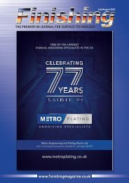
This issue has the winners of the galvanizing industry awards, plus an update on the new Carlisle innovation centre. There is also a report from the BCF conference and a review of the Qualicoat conference with took place in London a few weeks ago. It’s great to see that in person events are taking place and that people are excited to go. Long may this continue!
This issue has the winners of the galvanizing industry awards, plus an update on the new Carlisle innovation centre. There is also a report from the BCF conference and a review of the Qualicoat conference with took place in London a few weeks ago. It’s great to see that in person events are taking place and that people are excited to go. Long may this continue!
You also want an ePaper? Increase the reach of your titles
YUMPU automatically turns print PDFs into web optimized ePapers that Google loves.
20 PAINT<br />
Got that vibe<br />
Axalta has published the latest edition of<br />
its annual Vibes colour journal, in which<br />
it outlines a number of developing<br />
colour trends and their impact within the<br />
sphere of architecture and design. A key<br />
theme to emerge is the heightened<br />
preference towards familiar, simple and safe<br />
colours in response to widespread uncertainty<br />
resulting from major global events such as the<br />
pandemic.<br />
The latest edition of Vibes reveals the top<br />
10 most popular colours of the past year<br />
among designers and architects based on<br />
searches via the Axalta COLOURit online tool.<br />
Calm and serious shades ranging from<br />
bronze, gold, and brown, to off-whites and<br />
sombre blues and greys, feature prominently<br />
in the discussion. Above all, these trends<br />
capture the zeitgeist of the tail end of the<br />
pandemic era and are a reflection of the<br />
prevailing mood at this moment in time.<br />
The trend report features expert analysis<br />
from a variety of key names from across<br />
design and architecture, including Stephen<br />
Burks, Carolina Fernández Catalán (Rafael de<br />
la Hoz Architects), and Harbinder Birdi<br />
(Hawkins\Brown). Vibes is also interspersed<br />
with case studies outlining how these insights<br />
have been brought to life on major global<br />
projects in collaboration with renowned<br />
players like KPF Architects and HOK<br />
Architects.<br />
One of the key themes of the report is the<br />
changing role of the home, which has<br />
undergone a profound shift over the past two<br />
years. As multiple lockdowns have forced<br />
people to spend more time at home, many<br />
are now increasingly focused on how certain<br />
rooms make them feel rather than simply how<br />
they look, with colour playing a powerful role<br />
in creating the desired ambiance.<br />
Amid the chaos and uncertainty of an evercomplex<br />
world, colours that establish the<br />
home as a haven and invoke positive<br />
emotions and a sense of safety are in high<br />
demand. According to Vibes, this translates<br />
into an increased preference for neutral<br />
colours that are inspired by nature, in line with<br />
the biophilic design trends that have emerged<br />
in recent years.<br />
In response to the feelings of disconnection<br />
and isolation that have characterised large<br />
parts of the pandemic, Vibes also identifies a<br />
shift towards warmer colour palettes that draw<br />
inspiration from nature, with earthy colours<br />
such as Quartz Glint, Black Steel and<br />
SuprAnodic Terra proving most popular.<br />
The shock caused by the upheaval of the<br />
past two years has, according to Vibes, also<br />
brought about a return to sleek and functional<br />
designs which combine traditional materials<br />
with industrial and crafted ones, favouring<br />
minimalist, austere colour palettes with subtle<br />
blue and dark green tones for facades and<br />
cladding.<br />
The pandemic has sharpened our focus on<br />
sustainability and wellbeing and one of the<br />
themes discussed in Vibes is the role of colour<br />
in creating human-centric urban spaces and<br />
infrastructure which can help foster thriving<br />
communities for generations to come. It also<br />
highlights the growing role of diversity and<br />
how designs now draw on a wider than ever<br />
range of cultural influences and perspectives,<br />
to establish a feeling of exoticism that is<br />
difficult to attribute to a particular region but is<br />
nonetheless reflective of the global, pluriform<br />
world of today.<br />
Sally Put, Global ColourDesign and<br />
Communications Manager, said: “The<br />
pandemic has disrupted every facet of our<br />
lives over the past two years and it’s important<br />
to recognise the emotional impact this has<br />
had on the population. Against an uncertain<br />
and volatile backdrop, humans have been<br />
experiencing a profound need for comfort,<br />
intimacy, and familiarity, something that is<br />
reflected in the key selection of colours that<br />
we have identified within our research. These<br />
colours illustrate our desire for connection,<br />
both with each other and to the planet,<br />
therefore, it is understandable that we see a<br />
renewed focus on warm and neutral earthy<br />
colours which promote a sense of familiarity<br />
and intimacy.”<br />
<strong>Finishing</strong> - <strong>July</strong>/<strong>August</strong> <strong>2022</strong>


