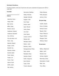
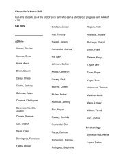
TSTC Visual Standard Guide 2020
TSTC Visual Standards Guide 2020
TSTC Visual Standards Guide 2020

Create successful ePaper yourself
Turn your PDF publications into a flip-book with our unique Google optimized e-Paper software.
ICONS / MAKING YOUR OWN<br />
Making Your Own<br />
Icon<br />
If you’re unable to find a suitable icon, making your own<br />
could be a good alternative if you feel comfortable with<br />
the process.<br />
There are a few simple rules of thumb to follow for the<br />
best results:<br />
• Keep our icon style in mind when creating an icon<br />
from scratch.<br />
• Line weights should be between 2% and 5% of<br />
the total height of the icon. For example, an icon<br />
approximately 100 pixels tall could have a 3-pixel<br />
line weight, but an icon 300 pixels tall might look<br />
better with a thicker line. Just make sure they are<br />
well-balanced.<br />
• Avoid sharp corners when possible. Use the “align<br />
to center,” “round join” and “round cap” stroke<br />
options in Illustrator.<br />
• Make them playful, but recognizable.<br />
Use “round join” and “round cap”<br />
in your stroke settings.<br />
4% 5% 2%<br />
Percentage of<br />
icon width<br />
• Above all, stay consistent.<br />
MAKING ICONS<br />
Stay balanced and consistant.<br />
46<br />
<strong>TSTC</strong> | BRAND IDENTITY