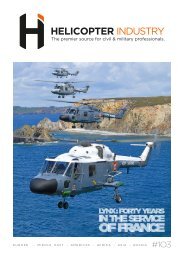
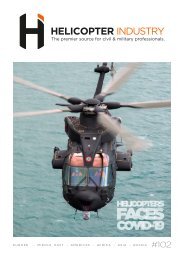
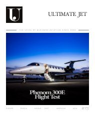
Ultimate Jet #72
- No tags were found...

You also want an ePaper? Increase the reach of your titles
YUMPU automatically turns print PDFs into web optimized ePapers that Google loves.
DESIGN I 34<br />
O<br />
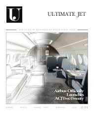
livier Dassault, owner of the trijet, symbolizes and promotes<br />
this ingenious France. The man, in turn political, entrepreneur,<br />
pilot and appreciably artist is not in his first cooperation with<br />
Didier Wolff. Indeed, Marcel Dassault’s favorite grandson had already<br />
asked Happy Design Studio to produce the livery for his former<br />
Falcon 10 in 2011. Almost ten years after this first experience, Olivier<br />
Dassault wished that the Strasbourg designer draws the livery of his<br />
new business jet, a livery outside the norms, probably summarizing a<br />
more personal part of his multifaceted life.<br />
At the crossroads<br />
It is in this context that Didier Wolff drew the first sketches of<br />
this resolutely «Frenchy» design. Working with a man like Olivier<br />
Dassault undoubtedly remains an experience apart, and the values<br />
he vigorously defends must have found their place as naturally as<br />
possible on this giant canvas. For his first draft, Didier Wolff «insisted<br />
to put blue, white and red references on this plane» by explaining that<br />
this project was «literally at the crossroads of business aviation and<br />
military aviation, but also a bearer of Olivier’s values» before adding:<br />
«The finalized design reflects fully the ideal vision I had of this project».<br />
The paint scheme borrows the variations of gray used on the Rafales<br />
or the Mirages. Some typographical notes and clues evoke the name<br />
Dassault historically linked to the military universe, the tricolor bands<br />
obviously referring to the French Republic and the mandate of the<br />
elected official. «Like a work, the paint scheme imposes a sense of<br />
reading from the front of the plane, clearer, towards the rear, in other<br />
words from business aviation to military aviation, the two universes<br />
being thus linked by a deliberately smooth transition», underlines Didier<br />
Wolff.<br />
« To face »<br />
This decoration carries in itself a number of symbols, «I worked<br />
on it just as if I worked on the French Republic Falcon, as their<br />
characteristics are close». It is the culmination of long hours of<br />
reflection and the fruit of a compilation of half a dozen projects<br />
submitted to the owner. «Even if Olivier did not give me any particular<br />
instructions, he validated a very intuitively designed project in which he<br />
simply recognized himself. Although he hesitated between two other<br />
more neo-retro proposals, the Thermidor livery imposed itself naturally<br />
«notes the designer before adding:» Once again, be attentive to the clues<br />
sown by my clients remains the common thread in the creation of my<br />
works. It’s a fairly long process, driven by curiosity and informationseeking.<br />
Without this approach, customizing the livery is meaningless.»<br />
Didier Wolff took up the idea of rings surrounding the air intake of<br />
the engine nacelles. «This is an option that I love and that has been in<br />
my drawers for years because it gives a lot of personality to an aircraft.<br />
Like rings encircling the front of the engines, these rings are perfect for<br />
hosting a name, a mention.» insists Didier Wolff who inscribes «To<br />
face», the motto of the French Air Force Academy from which Olivier<br />
Dassault comes.<br />
Like the engine nacelles, each detail comes together logically like<br />
the elements of a giant puzzle: «The original livery was slightly more<br />
contrasted. So, I chose to lighten the colors so that the inscriptions<br />
are visible without imposing.» Only the three-color bands extracted<br />
from the color spectrum were produced with the exact colors of the<br />
French flag, including a reference of perfectly pure white, unique in<br />
the color charts available in aeronautics. «The other important aspect<br />
for me was the lateral perception of blue, white and red. When we see the<br />
plane in profile, the three-color stripes seem perfectly balanced in terms<br />
of their dimensions, as if each was the replica of the other.» emphasizes<br />
the designer.