
Create successful ePaper yourself
Turn your PDF publications into a flip-book with our unique Google optimized e-Paper software.
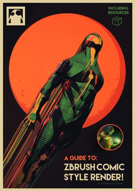
A guide to: Zbrush <strong>Comic</strong> <strong>Style</strong> render!<br />
By <strong>Pablo</strong> <strong>Munoz</strong> <strong>Gomez</strong><br />
A guide to:<br />
Zbrush <strong>Comic</strong><br />
<strong>Style</strong> render!<br />
By <strong>Pablo</strong> <strong>Munoz</strong> <strong>Gomez</strong><br />
www.pablander.com<br />
1
A guide to: Zbrush <strong>Comic</strong> <strong>Style</strong> render!<br />
By <strong>Pablo</strong> <strong>Munoz</strong> <strong>Gomez</strong><br />
Hello and welcome to another <strong>ZBrush</strong> guide!<br />
In this guide, I’ll try to tap into the fantastic world of comics<br />
and borrow bits and pieces of what’s considered a “comic<br />
style” to create a reusable <strong>Comic</strong> Material for render 3D<br />
sculptures using <strong>ZBrush</strong> BPR.<br />
In this tutorial you’ll learn:<br />
An illustration on its own is rarely referred to as a “comic”,<br />
unless is part of a sequence of related images, which are,<br />
in most cases, driven <strong>by</strong> a story. But there are also a lot of<br />
different comic styles simply because each artist has his/her<br />
own style. So how do we determine those visual clues that<br />
suggest our next piece of art is COMIC ART?<br />
- Various techniques to achieve the “<strong>Comic</strong> look” in <strong>ZBrush</strong>;<br />
- To create and render a “<strong>Comic</strong> style” artwork in <strong>ZBrush</strong>;<br />
- How to create your own <strong>Comic</strong> MatCaps;<br />
- Combine materials together for more complex effects;<br />
- A bunch of tips and trick related to material creation.<br />
•<br />
Resources!<br />
I have compiled a bunch of resources with this guide to help<br />
you understand certain things or simply to give you a head<br />
start in the right direction. Some of the things included in the<br />
resource folder might not make sense outside the context of<br />
this tutorial, so I encourage you to go through the tutorial<br />
and bring up the resources as they get mentioned<br />
(in yellow) in the different sections. Afterwards, feel free to<br />
use them as you want in your personal projects.<br />
Intro<br />
Although defining what a comic style is and what is not,<br />
could be a volatile topic of discussion, I will simply use the<br />
term to refer to a particular set of visual clues that (in my<br />
opinion) suggests an illustration could be part of what’s<br />
commonly referred to as a comic book or a graphic novel.<br />
A short answer could be: consistency. In other words, no<br />
matter what your style is, if you want to put together a short<br />
comic book or an epic graphic novel, consistency will be<br />
a strong element that could bind your sequence of<br />
images as a whole.<br />
Take for example the overpowering dark shadows and<br />
stylised anatomy of Mike Mignola’s Hellboy, or the<br />
beautiful, clean and simple linework of TinTin <strong>by</strong> Herge.<br />
The soft palettes and detailed illustration from Moebius, The<br />
bulky and oversized proportions of Rob Liefeld’s art, The<br />
psychedelic compositions and colours of Jim Starlin, The<br />
dynamic poses and zombie-like characters of Ryan Ottley<br />
as well as the complex lines and shadow work of Todd<br />
Mcfarlane or Jim Lee. I could go on and on just to mention<br />
some of my favourites (and I’m leaving a lot of big names<br />
out for the sake of not going over three pages here). I’m<br />
sure that you get the idea...<br />
In the construction of this tutorial I have used many<br />
references of my favourite comic artists and I have<br />
identified what I consider to be the key elements<br />
that make an illustration an artwork for a comic<br />
book. So here are the visual clues and what I will be<br />
discussing in this tutorial:<br />
OUTLINE AND LINE WEIGHT<br />
This is probably the most important one out of the four visual<br />
clues. Since most comic books are 2D in nature, Sculpting<br />
your character in 3D and getting the right shader to mimic<br />
the look and feel of a hand drawn illustration, is essential.<br />
We’ll take a detailed look into this further into the tutorial.<br />
www.pablander.com<br />
2
A guide to: Zbrush <strong>Comic</strong> <strong>Style</strong> render!<br />
By <strong>Pablo</strong> <strong>Munoz</strong> <strong>Gomez</strong><br />
In this particular case, and because we are going to be<br />
working in 3D, we have the advantage of quickly and<br />
interactively change the direction and intensity of the<br />
shadows much more efficiently than if we were just drawing<br />
of inking in 2D (more of these in the matcap section).<br />
“RESTRICTED” COLOURS AND RIM LIGHTS<br />
DYNAMIC POSES AND PERSPECTIVE<br />
This clue or idea is quite obvious. Not only a dynamic pose<br />
will make the character look more interesting, but it suggest<br />
movement which could make your image a bit more<br />
“sequential” even if you are working on a single image.<br />
The perspective is not simply a choice of camera angle, but<br />
an additional tool that could also add to the dynamism of<br />
the image and help to accentuate the mood of the scene<br />
(a hero pose usually from a low level perspective aiming<br />
upwards, for instance).<br />
In this fourth clue I’m doing a generalisation, but it’s<br />
necessary in order to create a couple of specific examples<br />
that can be explained in a step <strong>by</strong> step scenario.<br />
Regardless of the colour palette, you can use flat colours<br />
or a more sophisticated gradient that defines the volumes<br />
better. The reason why I called it “restricted” is because the<br />
different hues are usually applied to well defined areas of<br />
the characters.<br />
Ok, with this introduction out of the way here is a little bit of<br />
the structure of how we are going to tackle this guide:<br />
HARD SHADOWS AND CONTRAST<br />
Surely one of the coolest visual clues is the use of hard<br />
shadows that are often there to define volumes and the<br />
anatomy of the characters. In some cases they shadows are<br />
very intense and create an overly contrasted image with a<br />
very dramatic lighting, sometimes the shadow itself is the<br />
driving force of the whole composition of the image.<br />
First, I will show you some of the different approaches<br />
that we can take to achieve the look and feel we<br />
want, as well as giving you a rough indication of what are<br />
the process involves.<br />
Then, I will mention some points that are important to<br />
consider when sculpting in 3D if you want to go for<br />
this particular “comic style” look. This will lead to a better<br />
understanding of the use of <strong>ZBrush</strong> Matcap materials.<br />
Finally I will explain each one of the techniques in<br />
greater depth, finishing with a visual step <strong>by</strong> step<br />
guide of how I created the COVER IMAGE for this<br />
tutorial in which I make use of the technique previously<br />
discussed.<br />
For more advanced user, you can quickly scan the tutorial<br />
<strong>by</strong> reading the Green and Orange highlights, if you just<br />
want to have a general idea of the tools and methods used.<br />
www.pablander.com<br />
3
A guide to: Zbrush <strong>Comic</strong> <strong>Style</strong> render!<br />
By <strong>Pablo</strong> <strong>Munoz</strong> <strong>Gomez</strong><br />
Let’s get started:<br />
Let’s kick this guide off <strong>by</strong> establishing some of the the<br />
methods and/or <strong>ZBrush</strong> features that we can use to get<br />
what we want. Keep in mind that all of the aforementioned<br />
features can be combined to make even more complex<br />
illustrations.<br />
The following diagram showcases my hero character<br />
called Kepler, illustrating the result of each one of the<br />
methods that I will be explaining in this tutorial.<br />
This is just to give you a rough idea of what can be<br />
achieved and the tools involved.<br />
looking comic style render within zbrush. You have<br />
the advantages of the <strong>ZBrush</strong> MatCap materials and when<br />
combined with other shaders the possibilities are endless!<br />
I’m sure you will definitely enjoy this process.<br />
Outlines and photoshop finishing: With this approach,<br />
you will also have a whole lot of options. We’ll take<br />
advantage of the 3D nature of the model and the versatile<br />
materials of <strong>ZBrush</strong>, to produce an very accurate and<br />
clean outline that we can use as our linework to shade it in<br />
Photoshop, anyway you want!<br />
THE IDEA BEHIND THE MATCAP FOR COMIC STYLE<br />
(USING TESTING MATCAPS).<br />
Now I’m guessing you are as excited as I was when I<br />
started testing these techniques, but before jumping into the<br />
the action, I want to show you a few things that helped me<br />
achieve the look I was going for, instead of settling for a<br />
“good enough” result.<br />
This is the more technical part of the tutorial but I think it<br />
is fundamental to have a basic understanding of the way<br />
MatCaps in <strong>ZBrush</strong> work in order to make it work for you<br />
and for what you need, so here we go:<br />
TECHNIQUES AND METHODS <strong>TO</strong> ACHIEVE BPR COMIC STYLE<br />
Lightcap: This is one of the quickest ways to achieve the<br />
comic look within <strong>ZBrush</strong>. It gives you a lot of control on<br />
shadows and the way the colours (lights) are blended.<br />
Also it has a super fast render time, under 1 second without<br />
shadows.<br />
<strong>ZBrush</strong> Matcap: This is an obvious choice, you can<br />
quickly create a whole bunch of materials that have the<br />
lighting your want embedded in a single image. There are<br />
a few limitations that we’ll discuss later on but overall it<br />
gives a very decent result and the render time still is under 1<br />
second using BPR.<br />
MatCap is short for Material Capture and it captures<br />
the lighting and reflections of the environment. There are a<br />
few ways to create a MatCap but will get into that when we<br />
talk about the specific approaches of attaining the comic<br />
style.<br />
I believe that you learn best <strong>by</strong> doing, so let’s try to<br />
understand some of the features of a MatCap <strong>by</strong> jumping<br />
into <strong>ZBrush</strong> and playing around with some of the testing<br />
objects.<br />
In the resource folder you should have a .obj file called<br />
“MatCap_Objects_Tester.obj”. Open <strong>ZBrush</strong> and<br />
import that file, drag it into the canvas and enter the “edit”<br />
mode:<br />
Photoshop MatCap: Creating MatCaps within <strong>ZBrush</strong> is<br />
probably one of my favourite methods to experiment with,<br />
and when Photoshop is added to the mix, the results are<br />
very interesting and precise.<br />
Mixing Shaders with MatCaps: In my opinion<br />
this is the best possible way to get a really cool<br />
www.pablander.com<br />
4
A guide to: Zbrush <strong>Comic</strong> <strong>Style</strong> render!<br />
By <strong>Pablo</strong> <strong>Munoz</strong> <strong>Gomez</strong><br />
Nothing fancy here, but I found these objects to be<br />
the best simple forms to understand how a matcap<br />
interacts with a 3D object. In other words how a simple<br />
image is wrapped around a 3D model.<br />
In the same resource folder you should have a material<br />
called “RGBY_Testing_MatCap.ZMT”. Go ahead and<br />
load it up from the Material thumbnail > load. You’ll<br />
see a colourful set of objects like this:<br />
Pay attention to the left row while you slowly rotate the<br />
object clicking and draggin up or down like this:<br />
Repeat the rotation but this time keep in an eye on<br />
the row at the right. What you’ll see, is that the transition<br />
of the colours is smoother on the right and more abrupt<br />
on the left. The reason why, is because of the difference in<br />
the amount of geometry in the objects.<br />
First thing I would like you to do, is turn the perspective<br />
ON and OFF (<strong>by</strong> pressing P) just so you see that<br />
perspective doesn’t affect how the material is<br />
displayed.<br />
The testing material is a simple MatCap that consist of one<br />
channel with an image (the four squares of colour).<br />
Essentially, you could click on the image of the material and<br />
replace it with whatever photo you want but let’s stick with<br />
these colours for now.<br />
This also means that the objects with less geometry or<br />
less subdivisions, have less normals. This will be more<br />
relevant in the next section when we talk about modeling<br />
for comic render.<br />
So how is this colourful testing MatCap applicable in<br />
anyway? There are a couple of things we can assume:<br />
No matter how much we rotate the models, the BLUE and<br />
GREEN colours will always stay at the bottom and<br />
the RED AND YELLOW at the top.<br />
In the same way, YELLOW and GREEN are always<br />
right, and BLUE AND RED are always left.<br />
Now frame the objects and snap them to a front view<br />
(Hold shift while rotating).<br />
With that in mind, we could also assume that no matter<br />
the object you use, at any given angle that it is viewed,<br />
the polygon that has normals facing up and right will be<br />
YELLOW and the same principle applies for the rest of the<br />
colours.<br />
Let’s see if that is true with more complex objects, I just<br />
loaded my character and applied the MatCap that we’ve<br />
been using:<br />
www.pablander.com<br />
5
A guide to: Zbrush <strong>Comic</strong> <strong>Style</strong> render!<br />
By <strong>Pablo</strong> <strong>Munoz</strong> <strong>Gomez</strong><br />
Let’s load the “RGBYK_Testing_MatCap.ZMT” material and<br />
see what happens with our testing objects. All I did was<br />
edit the image in the MatCap and add a black dot<br />
right in the middle. For the purpose of this tutorial, I am<br />
going to refer to the faces with normals pointing directly at<br />
the camera as “front normals”.<br />
Ok cool it, looks like it’s true!... There are some faces that<br />
I’m sure are facing directly to me (or the camera if you like),<br />
and they still have colour.<br />
A couple of interesting things happened to our testing<br />
objects, the front normals are now black but the first object<br />
at the top left has no black in it. This is purely because the<br />
object is a pyramid with only five sides and none<br />
of the faces is pointing towards the camera.<br />
Here is when MatCaps start to get more complicated<br />
because you have to take into account all normals of<br />
the objects not just left, right up and down but also front<br />
and all the rest in between.<br />
The good news is that the image I used in this testing<br />
MatCap, is so simple that we can actually detect which<br />
parts of a more complex model are facing “the camera”<br />
at any given angle. The centre of the image used <strong>by</strong><br />
the MatCap (where the four colours meet), is actually<br />
the point that is facing the camera directly, so in the<br />
Kepler character example, these are the areas that have<br />
polygons facing the camera.<br />
Rotate the object 180 degrees and things are quite<br />
different, the pyramid (now at the top right) is just black<br />
because the “base” is a single polygon with front<br />
normal.<br />
So now let’s have a look at this testing material applied<br />
to the Kepler character:<br />
www.pablander.com<br />
6
A guide to: Zbrush <strong>Comic</strong> <strong>Style</strong> render!<br />
By <strong>Pablo</strong> <strong>Munoz</strong> <strong>Gomez</strong><br />
Very cool! Although the colours are too saturated and<br />
too bright at the moment, things are starting to look more<br />
interesting. Let’s have a look at some of the attributes of the<br />
material to modify it a bit more, before we move on into the<br />
more meaty part of this guide.<br />
Load another testing material called RGBYW_Testing_<br />
MatCap.ZMT. This is an exact copy of the previous<br />
material, but I just changed the black dot in the centre<br />
of the image used <strong>by</strong> the MatCap to be pure white.<br />
With cavity detection enabled (value more than 0), Zbrush<br />
is rendering the peaks or high points of the object, with the<br />
colour in the channel A and the cavities or low points with<br />
the colour in the channel called B and its also using these<br />
two colours to shade the materials using a 50% of each of<br />
these channels, which is why the colours are darker and the<br />
white areas look grey (50% white and 50% black - or 50%<br />
A channel and 50% B channel).<br />
I sculpted a couple of lines with the Dam_Standard brush<br />
in this plane to show you the above paragraph in practical<br />
terms:<br />
We are now going to take a look at two very important<br />
things for our comic look, the first one, is how to get the<br />
outlines that describe the volumes of the sculpture and the<br />
second one, is how to alter the “range” or depth of the<br />
MatCap. Make sure you turn off the polyframe so that the<br />
effects is more evident.<br />
One way we can achieve the outlines from the MatCap<br />
is <strong>by</strong> tweaking the Cavity Detection and Cavity<br />
Transition values (Intensity A and B are also relevant<br />
here). Let’s change the Cavity Detection to 1, you’ll<br />
see that the colours are less bright and the outlines in the<br />
model are pure white. Let’s invert the effect <strong>by</strong> changing the<br />
Cavity Transition to 1:<br />
If you move the Cavity Transition slider back to -1<br />
you’ll get the opposite effect. However, it’s important<br />
to know, that this attribute is not inverting the A<br />
and B colours but rather smoothing or sharpening<br />
the transition of the Peaks and the cavities (black<br />
and white in this case) so you are actually inverting the<br />
transition.<br />
Hopefully is not too confusing, but give me another<br />
chance to explain it. Imagine that A and B are a simple<br />
gradient from White to Black:<br />
If Cavity detection is not enabled, <strong>ZBrush</strong> will only<br />
take into account the A sliders.<br />
Great, now we have some black outlines but the colour<br />
are still a bit dull. The black or white outlines and the<br />
less bright colours are<br />
determined <strong>by</strong> the same<br />
attribute, which is the<br />
colour I chose for A and B<br />
at the bottom of the modifier<br />
subpalette.<br />
www.pablander.com<br />
But is Cavity Detection is enabled, the Cavity<br />
Transition will sharpen the transition between A<br />
and B:<br />
7
A guide to: Zbrush <strong>Comic</strong> <strong>Style</strong> render!<br />
By <strong>Pablo</strong> <strong>Munoz</strong> <strong>Gomez</strong><br />
when you invert the values in the Cavity Transition<br />
slider you are essentially flipping the effect:<br />
Let’s go back to the testing objects. As I mentioned<br />
earlier, the Intensity A and B are also very important<br />
here and this is how we are going to change the grey back<br />
to white. Turn the Intensity A all the way up (to 5)<br />
and Cavity Transition to 1. This is basically our original<br />
MatCap but now we have black outlines.<br />
These attributes are mainly to intensify the appearance<br />
of cavities or peaks, but the real value for us in this comic<br />
tutorial, is that we can change really quickly the area<br />
covered <strong>by</strong> the “front normals” colour in the image<br />
of our MatCap.<br />
These are some examples at different values and you can<br />
actually “flip” the MatCap image if you go to the negative<br />
values:<br />
You can play around with the Cavity Detection and<br />
Cavity Transition values to tweak the amount of<br />
lines and the thickness of the outlines. Now that you<br />
know that the colour of the outlines are determined <strong>by</strong> the B<br />
channel, you can simply change the B colour to something<br />
else to get different outline colours:<br />
Here are some screenshots with the same values from the<br />
above samples but used with Kepler character.<br />
We are getting closer! Maybe you are starting to get<br />
excited about the possibilities? I know this first part might<br />
be a bit tedious but I think we need to tackle some of these<br />
basics before getting into the super cool effects.<br />
MODELING FOR COMIC RENDER<br />
(DEEP INDENTATIONS - SHARP LINES - CONTRAST SHAPES)<br />
Ok, the next thing I want to show you is the Depth A and<br />
Depth B. The easiest way to understand the practicality of<br />
these attributes, is to see it as a “pinch” (positive values<br />
like 3) and “Magnify” (postivie values closer to 0). That<br />
<strong>ZBrush</strong> does to the MatCap image.<br />
One of the things you’ll realise when creating your own<br />
Materials, is that sometimes they look great in one model<br />
but not so much in a different one. If you create a <strong>Comic</strong><br />
MatCap material and want to reuse it, chances are that<br />
it will look good with a variety of models and using the<br />
testing objects provided with this guide will help you get<br />
a more consistent result. However, it’s not all about the<br />
material, so you might be modeling a really cool character<br />
but when you apply your brand new <strong>Comic</strong> MatCap, you<br />
may be disappointed. So this section is about some tips and<br />
tricks to make the models more likely to look awesome with<br />
the comic style materials.<br />
www.pablander.com<br />
8
A guide to: Zbrush <strong>Comic</strong> <strong>Style</strong> render!<br />
By <strong>Pablo</strong> <strong>Munoz</strong> <strong>Gomez</strong><br />
The head in the image on<br />
the right, is a quick dynames<br />
sketch that looks alright in the<br />
MatCap Gray. The model<br />
seems clean and there are<br />
some organic shapes and a<br />
bit of hard surface around the<br />
helmet/mask.<br />
I took the head and applied<br />
one of the MatCaps I made<br />
and suddenly, it started to look<br />
a bit boring. We are losing<br />
some important lines of<br />
expression and there is no<br />
much contrast:<br />
To upgrade the look of this head I exaggerated the<br />
volumes and indentations a bit more. I also added<br />
some alphas and a few lines on the suit; these subtle<br />
changes helps to accentuate the contours of the face and<br />
create greater contrast between the surfaces.<br />
Here is what’s happening… When we take a model and<br />
we exaggerate the low and high points or peaks and<br />
crevices we are also increasing the normals variations<br />
in the model. Take a plane for instance, if we apply the<br />
Testing Matcap with the black circle and we snap the view<br />
to look at it from the top, we will see the plane is totally<br />
black. Since the plane has only one face normal (pointing<br />
at the camera in this example) it can only pick a single<br />
colour from the Matcap determined <strong>by</strong> the view angle.<br />
Now, this is the same head with exactly the same<br />
material. It looks more defined and more interesting; the<br />
differences is purely in the model, not in the render<br />
settings or the MatCap attributes.<br />
If we subdivide the plane (more faces, more normals)<br />
and we pull some faces, the sculpted area will have<br />
normals pointing in directions that matches other<br />
point in the image of the MatCap.<br />
www.pablander.com<br />
9
A guide to: Zbrush <strong>Comic</strong> <strong>Style</strong> render!<br />
By <strong>Pablo</strong> <strong>Munoz</strong> <strong>Gomez</strong><br />
If you have a Matcap with an image that has very thin<br />
black outline, and you want to get some black lines<br />
within your model, you’ll need to carve deep in the model<br />
until the normals are almost 90 degrees from the view<br />
angle.<br />
LIGHTCAP FOR COMIC STYLE RENDER<br />
Lightcaps are very powerful. They essentially follow the<br />
same principle of MatCaps in that they both intend to<br />
capture light information. The main difference is that<br />
with LightCaps you can interactively adjust the light and<br />
its properties while you create it. With the MatCaps, on<br />
the other hand, the light information is baked into a single<br />
image, which means that to modify the lighting you’ll have<br />
to edit the image.<br />
A simple TIP to enhance your models for comic render:<br />
Work on your model as you normally would. Once you<br />
are happy with it, test your <strong>Comic</strong> MatCap and see if the<br />
model itself needs tweaking the you can simply create a<br />
new layer and exaggerate the cavities or crevices you want<br />
to be more prominent.<br />
Here is Kepler with a gray matcap so you can see the<br />
model. Ideally the volumes and lines I exaggerated should<br />
make the character look more consistent across different<br />
MatCaps:<br />
Although this is a very powerful method to achieve a comic<br />
style look, it is not my personal favourite. I chose it to be<br />
the first in the list to discuss, because it can give you very<br />
quick and interesting results, so this might get your<br />
creative juices flowing and get you excited enough to make<br />
it through the rest of this lengthy guide!<br />
Ok, the first thing I’ll get you to do is initialize <strong>ZBrush</strong><br />
so that we can start fresh. Load the “Testing_Hero_head.<br />
ZTL”, drag it into the canvas, enter edit mode and dock<br />
the Light palette to the left or right tray. Also, select the<br />
SkinShade4, you should have something like this:<br />
You should also have only one light enabled from the<br />
Light palette, go ahead and turn it off. Also set the<br />
Ambient light to 0 You should see something like this:<br />
Ok, now that we have gone through some basic concepts<br />
and a few tips we can start using the different techniques<br />
I mentioned at the beginning, to achieve our comic style<br />
render.<br />
www.pablander.com<br />
The reason you can still see the model and some<br />
volumes is because the SkinShade 4 has a bit of<br />
Ambient. If you open up the Materials palette and then<br />
10
A guide to: Zbrush <strong>Comic</strong> <strong>Style</strong> render!<br />
By <strong>Pablo</strong> <strong>Munoz</strong> <strong>Gomez</strong><br />
the Modifiers subpalette, you’ll see the first attribute is<br />
Ambient and it’s set to 15. Turn it to 0 and now we<br />
have a pure black silhouette (I also got rid of the<br />
Background gradient).<br />
Now find the LightCap subpalette in the Light palette. We<br />
don’t want to alter any MatCap but rather start fresh so<br />
select the SkinShade4 material again (keep in mind<br />
that the SkinShade is a <strong>ZBrush</strong> shader not a MatCap).<br />
Click on the “New Light” button from the LightCap<br />
subpalette. You should see something like this:<br />
Before we start creating our first LightCap, I want you to go<br />
to the material palette and click on any MatCap.<br />
Great! we just created a light that is letting us see the<br />
volume of our object again. Now let’s do a quick<br />
overview of some of the attributes we will be using<br />
to create the comic effect.<br />
THE STRENGTH is quite self<br />
explanatory. The higher the value the<br />
more light that is diffused from the<br />
object.<br />
What is going on? We have turned all the lights off! Why<br />
are we still seeing the MatCap? Well this is the practical<br />
example of some of the things I have been talking about.<br />
MatCaps have the lighting information already<br />
baked in an image so you can see it even if you don’t<br />
have lights in your project.<br />
When using MatCaps, the only difference between having<br />
a light on or off, is the ability of casting shadows on the<br />
model at render time.<br />
THE SHADOW slider determines the<br />
opacity of the shadows cast <strong>by</strong> the<br />
selected light in the LightCap. I will turn<br />
this attribute to 0 in most cases when<br />
creating a comic LightCap.<br />
THE APERTURE AND FALLOFF. These two attributes will<br />
be the most important ones to create the look we want:<br />
THE APERTURE defines how the light is<br />
spread over the model, think about it as a super<br />
concentrated laser beam when you have lower<br />
values or a huge diffused light box when you<br />
are in the higher values.<br />
THE FALLOFF defines the distance cover <strong>by</strong> the<br />
light in the model. For our purposes, the easiest<br />
way to think about it is as a “sharpen / Blur”<br />
slider for the area covered <strong>by</strong> the light.<br />
With all this in mind, set strength value to something<br />
like 1.3 and the Aperture slider to 60, you should get<br />
something like this:<br />
www.pablander.com<br />
11
A guide to: Zbrush <strong>Comic</strong> <strong>Style</strong> render!<br />
By <strong>Pablo</strong> <strong>Munoz</strong> <strong>Gomez</strong><br />
From this point you have a two options:<br />
1. Keep playing around with the lighting and add<br />
some polypaint to your model so you can start<br />
getting some colours into your comic illustration.<br />
2. Use the light sources to colour the model and<br />
then create a MatCap from the lightCap.<br />
Now go ahead and change the Falloff slider to 0…<br />
voila! The first step towards something cool in this <strong>Comic</strong><br />
style guide. Finally!<br />
Here is a quick example for option number 1. I just<br />
position the light in the angle that I liked and assign some<br />
flat colours to the hero head.<br />
Option two it’s a bit more juicy! so let’s see what else we<br />
can do.<br />
From the LightCap editor preview image, click and drag<br />
the little red dot that appears in the middle (this is your<br />
light). With just one light you can create a whole bunch of<br />
comic-like style effects:<br />
Keep the polypaint ON so you can see how the lights<br />
affect the colour. In the LightCap subpalette, there is a<br />
Colour picker next to the blending mode of the<br />
light, this allows you to pick a colour for your light source.<br />
I’m going to start <strong>by</strong> creating a bit of shading. I want to<br />
have strong sharp shadows but I’d like to see some details<br />
and the volumes a bit more. Let’s create the Base for this<br />
material: leave the colour in white and tweak the strength,<br />
aperture and falloff. I set the values to 1, 120 and 1.2<br />
respectively.<br />
NOTE: If you see a bit of gray between the black and the<br />
white areas on your model, this is because we haven’t<br />
turned off the Specular slider in the Material modifiers of<br />
the SkinShade4. If you want pure black and white, you can<br />
just set the specular slider to 0.<br />
www.pablander.com<br />
12
A guide to: Zbrush <strong>Comic</strong> <strong>Style</strong> render!<br />
By <strong>Pablo</strong> <strong>Munoz</strong> <strong>Gomez</strong><br />
Now create a new light from the “New Light” button.<br />
You will be able to cycle between the lights using the<br />
light index. When you have multiple lights, make sure you<br />
select the one you want to change because the attributes<br />
are unique to each light you create.<br />
The new light will be the specular or highlight but very<br />
subtle. With the Strength at 0.15, Aperture at 60 and<br />
falloff at 5.<br />
Finally, we just need to add a couple of highlights to<br />
make the render more interesting. Create another light (the<br />
fifth one), and change the colour to something like this<br />
bright yellow. Set the blending mode to Replace(normal)<br />
and crank up the strength to 20. Play with the aperture<br />
and falloff to get a sharp highlight and position the<br />
light to the right:<br />
The next step is to get some shadows but instead<br />
of enabling them,we are going to use the light itself as<br />
a shadow… WHAT?<br />
Yes, we’ll use is as a<br />
“black light” simply <strong>by</strong><br />
changing the colour<br />
to black and the<br />
blending mode to<br />
Multiply. Position it<br />
where you want, I put<br />
mine at the bottom left<br />
and got this:<br />
I’m sure you are starting to see the value of this method but<br />
let’s wrap it up and finish it <strong>by</strong> adding a few more lights.<br />
The next one is another “black light” that I positioned at<br />
the bottom and slightly to the right, just to make those sharp<br />
shadows a bit more prominent.<br />
Create one more final light<br />
that we’ll use as a secondary<br />
light source. This time I set<br />
the colour to blue and moved<br />
it to the left. Instead changing<br />
the strength to 20, I left it at 1<br />
and changed the Exposure to<br />
6 (the exposure multiplies the<br />
value of the strength slider…<br />
just so you know is there).<br />
Cool, so this is, in a nutshell, the idea of creating lightCaps.<br />
You can click on the “Create Texture” button to bake<br />
the lights into a single image that you can save with a<br />
MatCap. Alternatively, if you want to have the ability<br />
to further tweak you lights later on, you can save the<br />
LightCap and all your lights and attribute will be saved.<br />
There is an extra tip that I want to share with you before<br />
moving on… You don’t need to have polypaint on your<br />
model, you can actually turn the polypaint off and just use<br />
the lights to create your colour shading. For example:<br />
www.pablander.com<br />
13
A guide to: Zbrush <strong>Comic</strong> <strong>Style</strong> render!<br />
By <strong>Pablo</strong> <strong>Munoz</strong> <strong>Gomez</strong><br />
Obviously, you can enhance the render <strong>by</strong> mixing this<br />
method with some of techniques we’ll discuss in the next<br />
sections, but I think this can give you a good starting point<br />
for your comic style illustrations.<br />
This is Kepler with the LightCap image saved into a<br />
MatCap and I just tweaked a bit the Modifiers I mentioned<br />
before like Cavity Detection and Cavity Transition:<br />
First thing we should do is dock the Material palette<br />
to the left or right tray for easy access. Open up the<br />
modifiers subpalette and reset all the attributes.<br />
(I chose “Chalk” MatCap, also because you only need to<br />
reset the cavity transition to 0 and the intensity A to 1).<br />
The next step is find your reference image, try to pick<br />
something that has all the shades and colours you would<br />
like to bake into your new MatCap. I just loaded an<br />
illustration of Kepler and added to the spotlight (Texture<br />
palette > Select the image > Add to Spotlight). You can<br />
turn Spotlight on and off with Shift+Z and enter the<br />
spotlight edit mode just <strong>by</strong> pressing Z. Move your<br />
image to the side and your 3D model to the opposite side.<br />
ZBRUSH MATCAPS FOR COMIC STYLE RENDER<br />
The next technique I wanted to share with you, adopts<br />
the same idea behind the creation of a LightCap but this<br />
time we’ll be creating the MatCap image based on an<br />
illustration.<br />
This time we’ll be editing the image of the MatCap directly<br />
as we build it up. This approach is great if you want to<br />
create your material based on the style of your<br />
favourite comic and I think is one of the fastest ways to<br />
construct the look and feel what you want.<br />
I’ll start <strong>by</strong> loading the Kepler character, you can use the<br />
testing hero head, load the Kepler_bust.obj or your own<br />
model. The process should be exactly the same regardless<br />
of the model you use. Select a MatCap that you don’t<br />
use much because when we start the MatCap creation,<br />
the image used <strong>by</strong> the MatCap you choose will be<br />
overwritten (until you restart <strong>ZBrush</strong> again). I picked the<br />
“Chalk” MatCap.<br />
TIP: If you image has black areas, <strong>ZBrush</strong> will read it as<br />
transparent. An easy fix is to increase the intensity of the<br />
image from the spotlight menu.<br />
The most important thing to understand, is that the<br />
image used <strong>by</strong> any MatCap, is a capture of the<br />
“environment” (lighting, reflections, etc) and the best<br />
way to capture a 360 degree image is using a sphere to<br />
map all the light interaction points. So what we need to do<br />
before anything, is to identify in our reference image<br />
the closest thing to a sphere or a rounded surface.<br />
This could be a deltoid, a contracted biceps, a close up<br />
to the chin or a nose assuming it is a humanoid character,<br />
or in this case the head / helmet of the Kepler<br />
character which will work great as our reference point.<br />
www.pablander.com<br />
14
A guide to: Zbrush <strong>Comic</strong> <strong>Style</strong> render!<br />
By <strong>Pablo</strong> <strong>Munoz</strong> <strong>Gomez</strong><br />
Ok let’s introduce the MatCap brush! Go to the tool<br />
palette, open up the tool menu and select the MatCap<br />
brush from the 2.5D brushes section.<br />
<strong>ZBrush</strong> will tell you that your current tool is in edit mode<br />
and ask if you want to exit edit mode and switch tools. We<br />
need to click on “Switch” because we want to drop our 3D<br />
model onto the canvas and start using the MatCap tool /<br />
brush.<br />
Because we have chosen only one colour, there shouldn’t<br />
be any shading but a flat colour. If you still see some<br />
shadows is because the preview shadows are on.<br />
I personally don’t mind having them but if you want,<br />
you can turn them off from the <strong>Render</strong> palette ><br />
Preview Shadows > Object Shadows slider.<br />
Now we are ready to start building our comic MatCap.<br />
Begin <strong>by</strong> finding the colour or tone that is more<br />
prominent or that covers the biggest area, in my case, the<br />
light blue is a pretty safe choice. Once you have identified<br />
the primary colour, click on it (over your reference image)<br />
and you’ll see three things happening simultaneously:<br />
1. A small sphere with a little red arrow appears in the<br />
canvas.<br />
After choosing the first colour, I realised that there is<br />
actually a slightly darker blue that should be the<br />
primary and the light blue is just a really big<br />
specular / highlight so removing a marker (the point<br />
created where you click) from the MatCap is quite easy,<br />
you just need to sort of remember where you clicked.<br />
Hover over the area you clicked to pick your colour and<br />
you’ll see a little red square. You can now hold “Alt” and<br />
click on it to delete it. (the image in the MatCap or the<br />
3D model will not change until you click on a new colour -<br />
new marker).<br />
I clicked on the new colour that I think should be the<br />
primary shade and then click again on the lighter<br />
blue, but this time I’m going to give the highlight some<br />
direction. To do that, click and hold, then drag in the<br />
direction you want. You’ll see the little preview sphere<br />
updating as you drag the red arrow.<br />
2. The image used <strong>by</strong> the Chalk MatCap has been<br />
overwritten <strong>by</strong> the colour you chose.<br />
3. The 3D model (that is not editable because we<br />
dropped onto the canvas) is filled with the blue colour.<br />
Once you let go (of the click), you should start to see some<br />
shading on the model.<br />
This is a great way to create all sort of MatCaps, but we<br />
want to get the comic look and feel and at the moment, the<br />
transition between the colours, is very smooth. The<br />
next step is to learn how to get a sharper transition<br />
between the colours (moving from diffuse light to a more<br />
specular point).<br />
www.pablander.com<br />
15
A guide to: Zbrush <strong>Comic</strong> <strong>Style</strong> render!<br />
By <strong>Pablo</strong> <strong>Munoz</strong> <strong>Gomez</strong><br />
Click again on your image reference to select another<br />
colour. while clicking, drag the mouse to set the<br />
direction of the light and before releasing the click,<br />
hold Ctrl and keep dragging. When you add Ctrl to<br />
the equation, you’ll see how the area with the colour you<br />
picked, gets blurred or sharp as you drag from left to<br />
right.<br />
Ok, I know it doesn’t look quite right yet, especially in<br />
the very smooth areas (like the head and chest of the Kepler<br />
character). But don’t give up! this is a great way to achieve<br />
some very interesting shading. Once you have used all the<br />
markers you need to describe the lighting of your reference<br />
image, you can move on to refining the MatCap.<br />
First, check the image we have created<br />
in the MadCap texture. Just hover over<br />
the image input in the material to see<br />
how it looks, you might decide you<br />
need some extra markers. This is<br />
how mine looks:<br />
Since the idea is to make a very defined transition between<br />
colours to achieve the comic style, we need to hold Ctrl<br />
until we get a very sharp highlight. The problem is<br />
that each point you pick on an image is trying to mimic<br />
a light source, so the area of the light gets smaller as<br />
you make it sharper. You could think about using “Ctrl”<br />
as a way to modify the MatCap roughness; Ctrl + drag<br />
will change the “surface” between concrete and metal,<br />
for instance. Modifying the way the light interacts with the<br />
material from diffuse (like in a concrete wall) to very sharp<br />
highlight (like in a metal piece).<br />
Definitely not the best, but the way colours are mixed<br />
in the actual model is not too bad. This is why is a good<br />
practice to create your MatCaps based on the model<br />
you are intended to use the materials with.<br />
To refine this MatCap, open up the Matcap Maker<br />
subpalette (the last one in the Material palette).<br />
Here you have a series of attributes that you can tweak to<br />
change the look of your MatCap, the first one is: Gloss.<br />
This slider can help you sharpen the transitions between<br />
the markers or blur them a lot:<br />
All that to say that in order to make a sharp larger area<br />
in our MatCap we need to create various small sharp<br />
highlights of the same colour:<br />
I followed the same process to create the other colours<br />
including the black outline and got to something like this:<br />
Then you have the Refine attribute which I rarely use but<br />
you may want to experiment with it. The way I see it, is that<br />
it acts as a “burn-saturate” colour slider:<br />
www.pablander.com<br />
16
A guide to: Zbrush <strong>Comic</strong> <strong>Style</strong> render!<br />
By <strong>Pablo</strong> <strong>Munoz</strong> <strong>Gomez</strong><br />
Next you have intensity, saturation and contrast but<br />
these are self explanatory. Since these attributes modify<br />
the MatCap image, you could think of them simply as<br />
Levels, Hue/Saturation and brightness/contrast in<br />
Photoshop:<br />
For instance, the following image has the gloss slider at<br />
0.3 which is quite diffuse:<br />
This other one has a gloss value of 5 where you can start<br />
to see a clear definition of the different colours:<br />
Now look what happens if we take the first image with<br />
gloss at 0.3 and we increase the specular to 500. The<br />
image now looks almost like the one with gloss at 5:<br />
Then there is Backlight, but I haven’t found it to be that<br />
useful. I believe is a slider to exaggerate the fresnel<br />
effect depending on the samples of your image (if<br />
you have a very thin white outline around for example).<br />
Now, the specular<br />
slider is quite<br />
interesting. At first,<br />
if you are just playing<br />
around with the slider, it<br />
might seem that it does<br />
the same as the Gloss<br />
slider but it’s a different<br />
effect. It does blurs and<br />
sharpens the transitions<br />
between the markers,<br />
but it also reduces<br />
the radius of each<br />
marker sample.<br />
www.pablander.com<br />
So if we keep the specular at the maximum number (500)<br />
and we slowly increase the gloss value, we can see that<br />
<strong>ZBrush</strong> is reducing the diameter of each sample marker. In a<br />
way it’s like the Aperture and falloff attributes that<br />
we talked about in the LightCap section.<br />
So these are the final setting I used in the Matcap Maker<br />
to edit the image captured. Before and after:<br />
17
A guide to: Zbrush <strong>Comic</strong> <strong>Style</strong> render!<br />
By <strong>Pablo</strong> <strong>Munoz</strong> <strong>Gomez</strong><br />
TIP: Keep in mind that while you refine the MatCap from the<br />
Matcap Maker subpalette, you can add, remove or edit<br />
your existing markers at any point.<br />
Great - I think we’ve made good progress, but the next<br />
couple of methods are really going to take the comic style<br />
to the next level.<br />
Finally, you can also play with the MatCap falloff curve<br />
to create a wide range of very cool and interesting<br />
effects, <strong>by</strong> creating additional point in the curve or using<br />
the noise slider:<br />
One last thing, if you want to delete all the markers you<br />
have created, go to “Marker” in the top menu and then<br />
click on “delete Markers”.<br />
PHO<strong>TO</strong>SHOP MATCAPS FOR COMIC STYLE<br />
RENDER<br />
I know, I know… the idea of this tutorial is getting the comic<br />
style using just <strong>ZBrush</strong> BPR, so why Photoshop? Well, we<br />
are still using <strong>ZBrush</strong> to render the materials, is just that we’ll<br />
take advantages of the precise tools in photoshop to create<br />
the MatCaps images before using them in <strong>ZBrush</strong>.<br />
It doesn’t have to be photoshop, most image editing<br />
software will be ok to do what we are going to do but<br />
I’ll use Photoshop as is the most widely used software for<br />
image editing and because it is the one I prefer.<br />
I could have started this guide <strong>by</strong> describing this method,<br />
because it allows you to ditch out a large number<br />
of options, test various combinations of colours and it<br />
just make the models look very cool. But I thought it was<br />
necessary to understand the LightCap and MatCap<br />
creation process beforehand, because what we’ll do<br />
now is essentially the same thing but “blindfolded”. In other<br />
words, we will be creating the image for the MatCap<br />
but without the interactive feedback that the<br />
previous methods offered.<br />
Once you are happy with your MatCap and if you want<br />
to save it for later use, simply go to the top of the Material<br />
palette and click save, give it a name and you are<br />
good to go!<br />
Let’s begin <strong>by</strong> opening the Photoshop_MatCap_template.<br />
PSD that I prepared for you. I use Adobe CC so the file<br />
might not open in previous versions of Photoshop but you<br />
can create your own template really easily, I just shared the<br />
one I use to save you some time.<br />
You should be able to see just a couple of layers, a<br />
Background and the smart objects that has the image.<br />
TIP: If you want to have your brand new MatCap available<br />
every time you start <strong>ZBrush</strong>, you need to save your<br />
MatCap into the startup folder. in windows is something like<br />
this:<br />
C:\Program Files (x86)\Pixologic\<strong>ZBrush</strong> 4R7\ZStartup\<br />
Materials<br />
www.pablander.com<br />
18
A guide to: Zbrush <strong>Comic</strong> <strong>Style</strong> render!<br />
By <strong>Pablo</strong> <strong>Munoz</strong> <strong>Gomez</strong><br />
If you double click on the smart object, it should open up<br />
as a separate document that you can edit, you can add or<br />
remove layers and hit Ctrl+ S to save it. When you close<br />
after saving, all the changes will be saved into the<br />
template (because of the smart object) and you can save<br />
a JPEG to import into <strong>ZBrush</strong>.<br />
Within the smart object. you should see a few layers<br />
with objects that make the material, these layers can be<br />
anything, shapes, photos, hand painted, etc. Only what<br />
is inside of the circular area is going to be used <strong>by</strong><br />
<strong>ZBrush</strong> to render the material. That is why there is a<br />
mask image at the top for your reference which you can<br />
turn off before saving (doesn’t make a difference if you<br />
leave it on though).<br />
To start, delete or turn off the layers in the smart<br />
objects, leaving just the background and the mask.<br />
whatever we create in between this layers is going to be<br />
our MatCap image.<br />
I found that the easiest way to build an image for a<br />
MatCap is to work from the back to the front, or from<br />
the outline to the inner areas. So we’ll create the first<br />
colour that is going to be the dark outline.<br />
Create a new layer and let’s create a circle using the<br />
Ellipse Tool (u). hold Shift to create a perfect circle. After<br />
you create it you can also click Ctrl + T and transform it to<br />
put it in place. Fill this with Black, or use your reference<br />
image to colour pick the area with the colour you want.<br />
The next layer will be the next colour inwards: The<br />
dark purple. I also like to open my reference image as a<br />
separate document so I can keep it side <strong>by</strong> side.<br />
With his approach we are going to create the same image<br />
we created before with the MatCap creator, but this time<br />
we are going to have much more control over the<br />
transition of the colours, making very sharp distinctions<br />
between them and therefore achieving a better “comic”<br />
look:<br />
Using the same process as before, create a smaller purple<br />
circler to end up with something like this:<br />
TIP: If you created a shape (using the ellipse tool) you can<br />
simple press Ctrl + J to duplicate it and then Ctrl + T to scale<br />
and reposition it. Then just change the colour.<br />
Save the smart object, close it and save the<br />
document as a save a JPEG to the desktop for quick<br />
access. Switch back to <strong>ZBrush</strong> and import the JPEG<br />
into the texture of a matcap (I keep using the Chalk<br />
MatCap).<br />
www.pablander.com<br />
From the modifiers subpalette, click the texture > import.<br />
19
A guide to: Zbrush <strong>Comic</strong> <strong>Style</strong> render!<br />
By <strong>Pablo</strong> <strong>Munoz</strong> <strong>Gomez</strong><br />
So this is roughly what we should have:<br />
If you look closely to the reference, the light purple is<br />
touching the darker purple on the right hand side and at the<br />
bottom, so I tweaked to look like this:<br />
Not super exciting yet, but we can easily see that the outer<br />
black ring, is what is giving us some outlines in the<br />
model, even when the rest is a flat purple colour. At this<br />
point you can decide if you want thicker or thinner outlines<br />
and change the size of the inner purple circle to make the<br />
outline bigger or smaller:<br />
Now let’s add the lighter blue<br />
on top. It looks like it’s another<br />
horizontally squashed circle and you<br />
can also see a little bit of the light<br />
purple on the left.<br />
Finally we’ll add the tiny bit of green that is a subtle<br />
highlight towards the top.<br />
I will leave it as is, because the thickness of that outline<br />
colour can be tweaked within <strong>ZBrush</strong> and we’ll explore<br />
the attributes of the MatCap once we finish creating some<br />
more colours in Photoshop.<br />
Let’s save the image and test it in <strong>ZBrush</strong> with our MatCap<br />
(just replacing the previous image).<br />
Switch back to photoshop to create the next layer<br />
with the blue colour. Looking at the reference, if we<br />
concentrate in the rounded<br />
areas like the head,<br />
the purple colour gets<br />
thinner towards the top<br />
and bottom, so for the<br />
next colour I scaled it<br />
non-proportionally<br />
mimic that effect.<br />
to<br />
The next layer could be for the lighter blue or the lighter<br />
purple, but it looks like the lighter blue is sitting on top<br />
of the lighter purple and since we are working from<br />
back to front, the lighter purple seems like the<br />
right option. Since I’m using shapes, I can use the Direct<br />
Selection Tool (A) to manipulate the point in the ellipse to<br />
alter the shape.<br />
www.pablander.com<br />
Looks pretty decent giving the amount of time you can<br />
spend creating this images in Photoshop. It is also looking<br />
very close to our reference image and you can<br />
quickly tweak any of the colours, the size and shapes of<br />
the layers and completely change the MatCap really fast.<br />
20
A guide to: Zbrush <strong>Comic</strong> <strong>Style</strong> render!<br />
By <strong>Pablo</strong> <strong>Munoz</strong> <strong>Gomez</strong><br />
If you think that the model is looking too “flat” for instance,<br />
you can add a tiny bit of shading to define the volumes a<br />
bit more:<br />
This is where we explore that method. I will show you what<br />
most modifiers do but not in a particular order, we’ll start<br />
with the ones that affect the “shape” of the colours:<br />
Depth and Orientation.<br />
You’ll notice that you have Depth A and Depth B (same<br />
goes for most attributes) and that is because you can<br />
individually change the way the Raised (A) and Recessed<br />
(B) areas look in your MatCap. What Depth does, is<br />
visually change the elevation of the surface in your<br />
model, basically it does the following without altering the<br />
geometry:<br />
I prefer the flat look as it resembles more a comic style,<br />
but if you like the above image, all i did was create new<br />
white circle, assign some inner shadows and set it<br />
to multiply and save a new image:<br />
So let’s change the “outer line” so it cover a larger<br />
area in out <strong>Comic</strong> MatCap, <strong>by</strong> moving the Depth A to<br />
something like 1.5<br />
I think we are getting very close to the particular style we<br />
are aiming for. All we did in this section was create an<br />
image in Photoshop to use with <strong>ZBrush</strong> as the MatCap<br />
image. This is very helpful to create those precise lines<br />
and separation of colors and to achieve the comic style<br />
look. However, this is not the most powerful process of this<br />
technique, the best part is to modify the attributes<br />
of the MatCap once we have a working image like<br />
the one we created.<br />
We are now going to tweak our material and dig a<br />
bit deeper into the modifiers of the MatCap. At this<br />
point is good if you are around 70% happy with how the<br />
MatCap is looking. Switch back to <strong>ZBrush</strong> and make<br />
sure you have your recently created image loaded in the<br />
MatCap you are creating. Also, double check that all<br />
modifier sliders are set to default values.<br />
I looks like the colors are being<br />
duplicated and overlapping, that<br />
is because the Depth B is still at 0.<br />
There are a couple of ways to fix this,<br />
the easiest is just giving the same value<br />
to A and B unless you actually are<br />
going for this type of effect.<br />
Remember when I said that we can change the thickness<br />
of the outline? We can do that within <strong>ZBrush</strong> and without<br />
drawing a new image with a thicker border in Photoshop.<br />
www.pablander.com<br />
And the other way is to set the colour of B (at the bottom<br />
of the modifiers subpalette) to black and just increase<br />
the intensity of A.<br />
21
A guide to: Zbrush <strong>Comic</strong> <strong>Style</strong> render!<br />
By <strong>Pablo</strong> <strong>Munoz</strong> <strong>Gomez</strong><br />
For now we’ll stick with the simpler way and give the<br />
same value to A and B whenever we modify a<br />
slider. Set the Depth A and B to 1.5<br />
If you use the same values but in the negative numbers, you<br />
should get the same effect with the colours upside down:<br />
Now let’s say that I am not a 100% happy with the colours,<br />
rather that update the image in Photoshop, I can simple<br />
change the Hue of the image changing all the colours at the<br />
same time.<br />
Find the Hue sliders in the modifiers subpalette and<br />
tweak it to your liking (it works in the same way as the<br />
Hue/Saturation adjustment in Photoshop:<br />
That might be useful if you want to invert the direction of the<br />
light or where the highlights are placed, but I rather<br />
not use negative values here and use the Orientation<br />
slider instead and you’ll get the same result. Before we<br />
move to the orientation slider I should remind you that if you<br />
want the opposite effect in the outline of your model, that<br />
is a thinner line, you just need to enter smaller values in the<br />
Depth sliders like 0.5:<br />
In fact you can also modify the Saturation and the<br />
Intensity of the colour in the same way you would in<br />
photoshop. for the following image, I change the Saturation<br />
to 0.2 (also for A and B) and the Intensity A to 0.1.<br />
Orientation A and B are basically a control that allow<br />
us to rotate the image of the MatCap and therefore<br />
the orientation of the light we set up in the image. Let’s<br />
say I want the little green highlight moved slightly<br />
from the top to the right, all I need to do is put in the<br />
orientation sliders a value of 45 (as in 45 degrees).<br />
Pretty cool huh? I think I’m happy with this MatCap, You<br />
can save the MatCap from the material palette and also<br />
save the texture with all the modifications we just did. To<br />
do that just click on “create MatCap texture” at the<br />
bottom of the modifiers subpalette, and that will save<br />
an image to the Texture palette, which you can then export<br />
as an image file.<br />
I’ll finish up here because I think I have covered a fair chunk<br />
of information in this section. we’ll take a look at some of<br />
the other attributes in the next chapter as they become more<br />
relevant to the technique will be using next.<br />
www.pablander.com<br />
22
A guide to: Zbrush <strong>Comic</strong> <strong>Style</strong> render!<br />
By <strong>Pablo</strong> <strong>Munoz</strong> <strong>Gomez</strong><br />
MIXING SHADER AND MATCAP FOR COMIC STYLE<br />
RENDER<br />
Lets begin <strong>by</strong> understanding the QuadShader and<br />
defining some terminology that I’ll be using quite a bit:<br />
I hope you are still with me! I have covered the basics,<br />
sort of… and now we’ll get into more advanced Material<br />
creation. I’ll try to avoid repeating some of the things I<br />
have already mentioned, so I’ll encourage you to double<br />
check the previous sections, in case you are not sure about<br />
something that I say in here.<br />
QHADSHADER is a material in <strong>ZBrush</strong> that has 4 inputs<br />
(S1, S2, S3 and S4). There is an in depth explanation<br />
about this, in my tutorial on Making a skin material for BPR,<br />
we don’t need to be that extensive here, but in case you<br />
want to know more you can get the skin tutorial.<br />
In this section, we’ll be multiplying the power of a<br />
single MatCap <strong>by</strong> 4! as we’ll use a QhadShader to<br />
build our next comic Material. You will find that there<br />
are heaps of application for this technique but for this<br />
tutorial I’ll concentrate on generating a comic material that<br />
we can use with or without polypaint.<br />
THE 4 INPUTS in the QuadShader, are simple channels<br />
in which you can insert either a MatCap or another<br />
single shader. You can also use the Mixer to define how<br />
each one of this inputs or channels interact with each other<br />
affecting the overall look of the Material.<br />
Now let’s define some terms:<br />
SHADER: For this tutorial I’ll refer as shader as any<br />
Standard Material from Zbrush<br />
MATCAP: We should be clear on this <strong>by</strong> now, but let’s<br />
say that any shader that is driven <strong>by</strong> an image is called a<br />
MatCap.<br />
S1, S2, S3 AND S4 are shader inputs, but because they<br />
can be part of a QhadShader (which is a shader) it can be<br />
a bit messy to explain so we’ll just call them Channel 1, 2,<br />
3 and 4.<br />
MATERIAL: At the end of the day, a MatCap or a Shader<br />
or a QuadShader, is a material but for the illustrative<br />
purposes of this tutorial, I’ll call a Material to something<br />
made out of a combination of shaders and MatCaps.<br />
www.pablander.com<br />
I hope I’m not complicating things too much, I’m sure you’ll<br />
get the hang of all this once we start with the practical stuff.<br />
The idea is to create a reusable shader that can easily<br />
be tweaked to suit a variety of “shading” styles.<br />
23
A guide to: Zbrush <strong>Comic</strong> <strong>Style</strong> render!<br />
By <strong>Pablo</strong> <strong>Munoz</strong> <strong>Gomez</strong><br />
These are all screenshots using the same Material but with<br />
some small value changes:<br />
Once you have selected it,<br />
you’ll see 4 channels<br />
under the modifiers<br />
subpalette, click the first<br />
one to select it (pressed or<br />
orange) and then use the<br />
“PasteSH” button.<br />
NOTE: The little dots on each channel, are to turn on and<br />
off the visibility of that channel. Empty circle means ON<br />
and filled dot means OFF.<br />
Great, we have our base shader ready to start, but before<br />
we can see what it does or how it really looks on our<br />
model, we need to turn off all the other channels. The<br />
idea with this base shader is to:<br />
1. Create the “first pass” or basic outline of our comic<br />
material<br />
2. Remove all or most of the shading and<br />
3. Create a few subtle dark contour lines.<br />
Let’s get started!<br />
First, we are going to create the basis of the Material using<br />
a shader. Go to the Material palette and select the<br />
SkinShade4, this is a very versatile shader and is great<br />
for what we want. This also is going to be channel 1<br />
(first from left to right) in our comic material QuadShader,<br />
so start <strong>by</strong> copying the SkinShade4 into the first<br />
channel of the <strong>Comic</strong> Material, here is how:<br />
Creating a quick shadeless material with a black outlines<br />
is not hard, we could simply use the technique from the<br />
previous section and just build a MatCap. However, the<br />
reason I want to use a shader like SkinShade4 is because<br />
it will give us the option to do some simple shading<br />
or speculars later on if we want.<br />
Go ahead and turn the Ambient and the Specular<br />
sliders all the way down to 0. Doing this, will get rid of<br />
any ambient lighting and specular colour, leaving us with<br />
just the diffuse to tweak.<br />
With the SkinShade4<br />
selected, under the modifiers<br />
subpalette, you have two<br />
buttons: “CopySH” and<br />
“PasteSH”. click on CopySH<br />
to copy all the modifiers of the<br />
shader.<br />
Now we need to find the QuadShader under the<br />
Standard Materials in the Materials palette.<br />
www.pablander.com<br />
24
A guide to: Zbrush <strong>Comic</strong> <strong>Style</strong> render!<br />
By <strong>Pablo</strong> <strong>Munoz</strong> <strong>Gomez</strong><br />
At this point, I like to turn on the polypaint of the model<br />
or simply select any colour other than black or white. The<br />
idea is that this shader should not affect the colour so that<br />
we can use it on any other model with any polypoint.<br />
In other words we are creating a material for the<br />
“linework”.<br />
With that curve shape, you should get something that looks<br />
like the image below, with some sharp and subtle black<br />
outlines but you can also see a bit of the volumes.<br />
Now there are some Modifiers in this SkinShade4 that<br />
we don’t really want to have ON. Change Colorize<br />
diffuse, colorize specular, AnisotropicDiffuse and<br />
AnisotropicSpecular, switching all to 0. Also reduce<br />
High Dynamic Range to 1.<br />
We can still see some shadows that help define the<br />
volumes, but those have nothing to do with the<br />
Material we are building. the shadows you can see<br />
are simply “Preview Shadows” and you can control<br />
them from the <strong>Render</strong> palette, under the Preview Shadows<br />
subpalette. I turned the DeepSahdow off and the<br />
ObjShadow to 0:<br />
Cool, I think this is very exciting because we managed to<br />
create this with only one Modifier of a simple shader. Since<br />
we are using a shader and not a MatCap, this also<br />
means that we can affect the outlines or shadows just<br />
<strong>by</strong> changing the light position! wohooo! look at this:<br />
We end up with a very basic material that it’s basically<br />
controlled <strong>by</strong> the diffuse amount and the diffuse curve<br />
alone. We’ll leave the Diffuse slider to 100 but the<br />
Diffuse Curve is what does the magic trick. Play<br />
around with the curve but we are roughly looking for this<br />
shape:<br />
Not only that, we can<br />
change the light colour,<br />
intensity and the ambient<br />
light to quickly modify our<br />
comic look. think about the<br />
possibilities! and we are only<br />
25% done with our <strong>Comic</strong><br />
Material.<br />
www.pablander.com<br />
25
A guide to: Zbrush <strong>Comic</strong> <strong>Style</strong> render!<br />
By <strong>Pablo</strong> <strong>Munoz</strong> <strong>Gomez</strong><br />
For our second channel (S2) we are going to use a<br />
MatCap. You can use any MatCap because we will<br />
modify it anyway, but I think the FlatSketch01 is already<br />
pretty close to what we need. Following the process of<br />
“CopySH” and “PasteSH” from the first shader, bring the<br />
FlatSketch01 into the second channel (S2) of our<br />
QhadShader material.<br />
CAVITY TRANSITION: This is obviously linked to the<br />
Cavity Detection slider, but it deals with how sharp or<br />
soft the transition is between the raised areas and<br />
the crevices. This modifier will greatly affect the look of<br />
the shader because it allows the input of either positive or<br />
negative values (This will also serve as an “invert” function<br />
for our purposes).<br />
Turn off the first shader (S1) so that you can only see<br />
the contribution of the shader 2. The idea with this second<br />
shader is, to create the “volume lines” that describe<br />
the shapes and masses in your character. I’d say that the<br />
FlatSketch01 does a pretty good job but it can be further<br />
refined.<br />
Start <strong>by</strong> turning the opacity to 100 to make sure we see<br />
what this shader does at a 100%.<br />
We are going to tweak the Cavity Detection and<br />
Cavity Transition to create the lines based on the<br />
crevices, peaks or hard edges of our model. Let’s just<br />
do a quick overview of what these modifiers do:<br />
CAVITY DETECTION: Essentially, this slider defines how<br />
strong or how much “contrast” there is between the<br />
raised areas and the crevices or cavities. For the<br />
purpose of what we are trying to achieve, its almost like<br />
using Levels in Photoshop to contrast the lines of a sketch.<br />
As soon as you turn this slider ON (any value other than<br />
0), you are enabling all the “B” sliders. I have already<br />
mentioned these in the last section when I talked about<br />
Depth A and B and Orientation so let’s just sum it up like<br />
this: If the Cavity Detection equals to 0, any “B” slider is<br />
irrelevant as it won’t have any affect.<br />
TIP: You can benefit from the “B” sliders without having to<br />
see the cavities. You can make the Cavity Detection = 1 (this<br />
enables the “B” sliders) and change the Cavity Transition to<br />
0 (which keeps the “B” sliders ON but without seeing any<br />
cavities.<br />
Hopefully that is not too confusing. Basically what we need<br />
to know about these sliders to create our comic material, is<br />
that the Cavity Detections will gives us lines in deep<br />
areas and that the Cavity Transition will determine<br />
the sharpness of those lines (also invert them).<br />
Before we tweak those setting,<br />
change the colour B to black<br />
and leave the colour A in<br />
white. We are not going to use<br />
the Intensity A and B that are<br />
right below the Cavity Transition<br />
so change them to 0, instead<br />
we’ll use the Intensity A slider<br />
at 1, located towards the<br />
bottom of the Modifiers<br />
subpalette.<br />
The difference is that the first<br />
two deal with the Texture input<br />
of the MatCap and the second<br />
two refer to the intensity of the<br />
colours we picked for A and B<br />
(this will make more sense in a<br />
few paragraphs).<br />
www.pablander.com<br />
26
A guide to: Zbrush <strong>Comic</strong> <strong>Style</strong> render!<br />
By <strong>Pablo</strong> <strong>Munoz</strong> <strong>Gomez</strong><br />
We also need to get rid of<br />
the texture image used<br />
<strong>by</strong> the FlatSketch01 shader<br />
so select the texture input and<br />
then select “Texture Off”<br />
from the quick pick popup.<br />
Ok, all we need to do now, is set the Intensity A to 1 to<br />
get 100% of the A colour. Then you can play with the<br />
Cavity Detection and Cavity Transition sliders to to find a<br />
nice balance between A (White colour for the raised areas)<br />
and B (black colour for our cavities).<br />
Here are some examples with their settings:<br />
We basically want a good balance of white for the<br />
raised areas, close to pure black for the crevices (our<br />
volume lines) and gray as an in-between for all the flat or<br />
smooth areas.<br />
At this point, this is as exciting as the <strong>ZBrush</strong> default sketch<br />
shaders could be, but there is a difference: We have set up<br />
the rest of the modifiers, to just add a couple of extra steps<br />
and watch the magic happens! Ready to be amazed <strong>by</strong> the<br />
power of <strong>ZBrush</strong>?<br />
And the final values I end up using:<br />
Turn the Intensity A to 3 (the first one right below<br />
Cavity Transition). Nothing happens… still no magic.<br />
That is simply because as<br />
I mentioned before, this<br />
Intensity sliders are very<br />
important for a MatCap, but<br />
our shader right now, is not<br />
really a MatCap in that we<br />
haven’t added any Image.<br />
Go ahead and click on the Texture input, and select<br />
the Texture 28 (the one that looks like white Marble).<br />
YES!!!! THIS IS IT! this is what we are looking for but how?<br />
You don’t necessarily have to use the settings I used. Since<br />
you have a different model, the material will look slightly<br />
different than how it looks in the Kepler character. Either<br />
way you should aim for something that look a bit like this<br />
using the test head or test objects:<br />
www.pablander.com<br />
27
A guide to: Zbrush <strong>Comic</strong> <strong>Style</strong> render!<br />
By <strong>Pablo</strong> <strong>Munoz</strong> <strong>Gomez</strong><br />
Well, once we add the texture we have an actual<br />
MatCap again driven <strong>by</strong> the texture. The texture is<br />
replacing everything that we set up to be gray<br />
when we tweak the Cavity sliders. leaving the raise areas<br />
white and noticeable (colour A) and the cavities black<br />
(colour B) everything in between is governed <strong>by</strong> the texture.<br />
This is super cool because ultimately, we can add any<br />
texture here, to create any type of MatCap, and we’ll<br />
retain the “Volume Lines”:<br />
TIP: you can shift+Click a subpalette to open it while<br />
keeping another one open.<br />
I see the mixer as the blending modes of layers in<br />
photoshop but on steroids… Not only you can decide the<br />
blending mode for your material, but you can also<br />
assign where and how it is applied. It’s like having blending<br />
mode and masking all in one place.<br />
We want to keep all the Volume Lines we achieve with the<br />
MatCap S2 but we want to also have the functionality of<br />
the Base Shader S1, that reacts to the light position and has<br />
nice sharp shadows. So go ahead and set the blending<br />
mode to Multiply in the Mixer, to keep all the dark<br />
values and render the white colour transparent.<br />
You might have noticed in the previous examples, that the<br />
colour information from the texture input is mixed with<br />
the Gray colour which makes the colours look dull.<br />
This can be fixed <strong>by</strong> tweaking the intensity A, but we<br />
want the comic look so we won’t worry about that in this<br />
tutorial.<br />
Cool, all we have left is turn ON our base shader (S1)<br />
and see how it looks.<br />
Hummmm it doesn’t look quite right… you can see the<br />
volume lights from the S2 but there are very weak and<br />
changing the intensity doesn’t do anything. I don’t know<br />
how familiar you are with Photoshop, but you might have<br />
encountered this problem when you have a couple of<br />
layers with different blending modes and you merge them<br />
together? suddenly the effects you had on your image<br />
change completely. In a simplified way, this is what is<br />
happening but is a super easy fix, just turn on the button<br />
called “Black” next to the blending mode drop down.<br />
This will tell <strong>ZBrush</strong> to apply this MatCap (the S2) as if there<br />
was a black surface underneath it. all good now:<br />
OH WHAT! all the hard work gone!.... no, it is still there<br />
but we haven’t told <strong>ZBrush</strong> how to mix S1 with S2<br />
so we are just getting both at the same time with the same<br />
contribution. All we need to do, is open up the Mixer<br />
subpalette to define how we want the Matcap in S2 to be<br />
mixed with the Base Shader in S1.<br />
Make sure you are in<br />
the MatCap (S2) and<br />
open the Mixer.<br />
www.pablander.com<br />
28
A guide to: Zbrush <strong>Comic</strong> <strong>Style</strong> render!<br />
By <strong>Pablo</strong> <strong>Munoz</strong> <strong>Gomez</strong><br />
Finally, turn on your polypaint or change the Main<br />
Colour swatch to something other than white or black.<br />
It looks good but it’s a bit dark in some areas. So to<br />
render outlines is working great, but if you want to use a<br />
colour or polypaint with this shader you should tweak it a<br />
bit further. You can play with the intensity A (remember<br />
we changed it to 3 which is a lot) and with the Cavity<br />
sliders to find a nice balance.<br />
You could also turn the Ambient slider from channel 1 (S1)<br />
all the way to a 100 and you could also swap Texture 28<br />
with MagicTexture.jpg from the tutorial resource folder<br />
which is just a plain white texture:<br />
Perfect we are 50% there. Turn the polypaint off and set<br />
the Main colour Swatch to white again.<br />
Looks like we need an outline right? don’t worry - it<br />
won’t take us much longer to finish this <strong>Comic</strong> Material, we<br />
have covered most of the theory so the next steps are<br />
very easy and good for revision.<br />
The next MatCap we are going to create is a simple<br />
contour line to add it to our super<br />
comic Material (QuadShader).<br />
Feel free to use any technique we<br />
have talked about to create this new<br />
MatCap, we just need something in<br />
black and white that looks a bit like<br />
this (I made this image in photoshop):<br />
Pick a MatCap from the Material palette. I’ll stick with the<br />
Chalk MatCap I have been using as example. Copy and<br />
Paste the MatCap into the fourth channel (S4) of our<br />
QuadShader. Make sure you add it to the fourth channel<br />
because we want the third one free, for an extra effect and<br />
the order of the channels, does matter.<br />
Turn off the channels S1 and S2 and replace the<br />
MatCap image in the S4 with the one you created or<br />
use the one I provided with the Resources: Simple_Black_<br />
outline.jpg.<br />
Now go to Document<br />
and click on the<br />
Document background<br />
colour to choose a<br />
white colour (click and<br />
drag the cursor to a white<br />
area from the interface).<br />
www.pablander.com<br />
29
A guide to: Zbrush <strong>Comic</strong> <strong>Style</strong> render!<br />
By <strong>Pablo</strong> <strong>Munoz</strong> <strong>Gomez</strong><br />
This image gives us a very nice outline straightaway<br />
and due to the very defined crevices in the Kepler<br />
character, we are also getting some extra volume lines.<br />
All we need to do here is define how thick or thin we<br />
want the outline to be, and if you remember, we can<br />
control that with the Depth A and B. since you are going<br />
to do it one at a time, you’ll witness another display of<br />
awesomeness when you make Depth A and Depth B<br />
different values:<br />
All we have left to do for this MatCap S4 is to tell <strong>ZBrush</strong><br />
how to blend it with the rest and we are done. I set the<br />
blending mode identical to the previous MatCap:<br />
Multiply and “black” enabled.<br />
I’m very happy with how this is looking, but I wanted to add<br />
a little extra option to the comic material. we’ll use the<br />
third channel (S3) for that and it will be another very<br />
simple MatCap.<br />
NOTE : If you don’t see the effect of “double shading”<br />
happening, make sure your MatCap settings are reset to<br />
default, remember this is why I chose the Chalk MatCap to<br />
start with).<br />
I’m sure you are already getting many ideas with this so<br />
far but we’ll keep this MatCap as a simple outline for<br />
now. However, we are building a template material that<br />
can be reused in many ways, so is good that you know the<br />
capability is there. This is my outline MatCap and the setting<br />
I end up using:<br />
You can actually copy the S4 into the S3 since all we are<br />
going to do is change the MatCap image and tweak<br />
the setting just a bit.<br />
The image we are after is something like this:<br />
I made it in photoshop so you can create your own or use<br />
the one in the resources Long_shadows_rim_light.jpg. This<br />
image in the MatCap, will create some nice contrast<br />
shadows and a thin white rim light.<br />
www.pablander.com<br />
Add the image to the MatCap we copied to channel 3<br />
(S3) and turn the rest of the channels off.<br />
30
A guide to: Zbrush <strong>Comic</strong> <strong>Style</strong> render!<br />
By <strong>Pablo</strong> <strong>Munoz</strong> <strong>Gomez</strong><br />
The cool thing about having this extra MatCap, is that we<br />
are getting some cool shadows and a rim light at the same<br />
time. At any point, we can change the Depth A and B<br />
and the Orientation A and B to achieve different types of<br />
shading. I call this MatCap “the ink” and you can use it in<br />
combination with the other channels or on it own:<br />
Also one more thing. Remember that the MatCap in S3<br />
and S4 are just MatCaps so try plug in different<br />
images to experiment… that is the fun part:<br />
Set the blending mode to Multiply and turn “Black”<br />
ON. Turn the rest of the channels ON, this is what I got:<br />
OUTLINES FOR PHO<strong>TO</strong>SHOP FINISHING.<br />
This technique is probably not worth a full chapter in this<br />
tutorial, and from all the methods I have described, it<br />
relies a lot on your painting and illustration skills within<br />
photoshop. However, I think it deserves a mention as we<br />
can use <strong>ZBrush</strong> as our main tool of creation and then<br />
use Photoshop to render the illustration:<br />
The reason why I put it in the third channel (S3) and not<br />
the fourth one (S4), is because “the ink” shader has a<br />
dark ring that works as black outline already but there<br />
is also a little white outline or “rim light” that you<br />
can use. Once you turn the Outline MatCap on (S4) it<br />
will override the “Rim light” so you get two types of<br />
outlines very quickly just <strong>by</strong> turning ON and OFF the fourth<br />
channel.<br />
Ok, this was a very lengthy section but I hope I managed to<br />
illustrate some important concepts and that you now have<br />
the necessary tools to make your own <strong>Comic</strong> Materials.<br />
One more thing I would like to show you before moving<br />
on to the next section of the tutorial, is an obvious but often<br />
overlooked modifier.<br />
Using the multipurpose super <strong>Comic</strong> Material we<br />
created in the previous section, I tweaked the shader and<br />
MatCaps (primarily S2 and S4) to get some clean<br />
outlines and make a render. I saved the render and<br />
opened it in photoshop, I also created a new layer and<br />
place it under the <strong>ZBrush</strong> render.<br />
Setting the render layer to multiply, I can enjoy all the<br />
painting and drawing tools to create the shading of the<br />
character.<br />
THE OPACITY SLIDER:<br />
Changing the value of this slider<br />
on the different shaders and<br />
MatCaps from your Material,<br />
you can add a whole bunch of<br />
other effects.<br />
www.pablander.com<br />
31
A guide to: Zbrush <strong>Comic</strong> <strong>Style</strong> render!<br />
By <strong>Pablo</strong> <strong>Munoz</strong> <strong>Gomez</strong><br />
Here is a very quick step <strong>by</strong> step visual guide:<br />
1. Fill layer with base colour:<br />
5. Light suggestion and other details.<br />
2. Apply some initial shading:<br />
6. More colour variations to contrast the mask/helmet.<br />
3. Colour variations:<br />
7. Exaggerating the shadow areas.<br />
4. Continue with colour variations to help the design.<br />
8. Enhancing the lighting with soft gradients.<br />
www.pablander.com<br />
32
A guide to: Zbrush <strong>Comic</strong> <strong>Style</strong> render!<br />
By <strong>Pablo</strong> <strong>Munoz</strong> <strong>Gomez</strong><br />
9. Backlight or Rim light added.<br />
13. Final touches and curves tweaking.<br />
10. Scratches, Crosshatching and little details.<br />
We’ll talk a bit more about setting up the document a bit<br />
later on and also about BPR render passes and how to use<br />
them.<br />
MULTIPLE MATERIALS IN ONE OBJECT<br />
11. Energy string FX.<br />
Let’s talk a bit more about materials, about how we can<br />
apply them to our models or just to part of them. So far we<br />
have created MatCaps and a complex material that give<br />
use very cool results, this next chapter will take our<br />
shading complexity to the next level. Although the<br />
technique we’ll be using is super simple, if you combine it<br />
with previous methods you’ll get very interesting results like<br />
this:<br />
12. Enhancing and tweaking lighting from the energy string.<br />
www.pablander.com<br />
33
A guide to: Zbrush <strong>Comic</strong> <strong>Style</strong> render!<br />
By <strong>Pablo</strong> <strong>Munoz</strong> <strong>Gomez</strong><br />
Basically we’ll be doing some polypaint, but instead<br />
of using colour information only, we are going to paint<br />
with MatCaps. Since the MatCaps we are going to use,<br />
already have colour information you’ll end up with a very<br />
complex looking image.<br />
To begin, turn on Colorize on ther the Polypaint<br />
subpalette and choose the Standard Brush.<br />
Now, make sure that the switches at the top of the UI for<br />
Rgb and Zadd are off and turn the M on:<br />
With this settings, the Standard brush will paint but only<br />
using the material (M) information and nothing else. If<br />
you want to be very precise I’d recommend you mask out<br />
some areas before painting and when you are happy<br />
with the unmasked area, paint with the desired material.<br />
To mask simply hold Ctrl and draw over the model.<br />
TIP. you can Ctrl + click on the canvas to invert the mask,<br />
Ctrl + Drag in the canvas to clear the mask. You can also<br />
hold Ctrl and click over the mask to blur it and hold Ctrl +<br />
Alt and click the mask to sharpen the edges.<br />
At this point, before I get rid of the mask, I want to apply<br />
a different MatCap to the softer areas of the suit. All I<br />
need to do is invert the mask and load/select a new<br />
MatCap and filled the areas.<br />
You can go crazy with the different MatCaps, but try to<br />
create a balance with the colours you choose so that they<br />
enhance the design instead of breaking it:<br />
Ok, so I spent a couple of minutes masking out the<br />
“conductive” areas in the suit of Kepler and I want to give<br />
them a green bright colour. All we need to do is load the<br />
desired MatCap or image in the current MatCap and<br />
paint the unmasked areas.<br />
Feel free to use any of the MatCaps I shared in the resource<br />
folder <strong>Comic</strong> Materials.<br />
www.pablander.com<br />
34
A guide to: Zbrush <strong>Comic</strong> <strong>Style</strong> render!<br />
By <strong>Pablo</strong> <strong>Munoz</strong> <strong>Gomez</strong><br />
This is just one way in which you can use the MatCaps<br />
in your model, but it doesn’t necessarily have to be a<br />
MatCap, you can save 3 or 4 versions of the multipurpose<br />
super comic material we made in section 9 and apply them<br />
to different parts of your model.<br />
Then you can simply tweaks the setting to create<br />
variations for each part that you applied the Materials to.<br />
This will produce an effect similar to having different line<br />
values and various depths of outlines!<br />
There are two approaches that I found to be very<br />
effective:<br />
1. Sculpted details or deep crevices.<br />
2. Polypaint using alphas.<br />
The first method is very good if you want certain scratches<br />
to always be visible and react to chances in the<br />
MatCaps and light.<br />
The second option is probably less time consuming and<br />
can give you great results. The disadvantage is that the<br />
little details that you add will stick with the model, so if you<br />
rotate or change the angle they might not look ideal. This is<br />
something that I would do after choosing a final angle<br />
for render or strategically paint with the alphas in places<br />
that will look good from most angles.<br />
I hope all this keeps you motivated to do awesome stuff!<br />
In the next section I’ll explain a super effective and super<br />
simple technique to bring your renders closer to the<br />
comic look with some crosshatching and “ink” effects.<br />
The only thing I’ll say about the first approach is that the<br />
Dam_Standard and Pinch brush work great and is just<br />
a matter of patience sculpting the details.<br />
CROSSHATCHING ALPHAS AND POLYPAINT<br />
After posting a few WIPs online while I was working on<br />
this tutorial one of the most common questions I got was<br />
about how to do the cross hatching effect. So that is why I<br />
decided to dedicate a whole section to it, even though the<br />
techniques I used are extremely simple.<br />
With the other approach, choose the color of the outlines<br />
of your Material (I’ll assume is black). choose The<br />
standard Brush and pick the DragRect from the stroke<br />
menu.<br />
www.pablander.com<br />
35
A guide to: Zbrush <strong>Comic</strong> <strong>Style</strong> render!<br />
By <strong>Pablo</strong> <strong>Munoz</strong> <strong>Gomez</strong><br />
I have created and compiled a series of cross hatching<br />
alphas for you to use in the resources folder, but feel free<br />
to create your own. Click on the alpha thumbnail and<br />
load any alpha you want.<br />
Make sure you turn the Rgb on and the M off in the<br />
top menu (assuming you haven’t changed it from the<br />
previous chapter). We want to only paint the colours<br />
not the material.<br />
Now all you need to do, is click and drag over the<br />
model to project the cross hatching and other line effects.<br />
In essence, it is a control that changes the angle of vision of<br />
the camera therefore flattening or exaggerating the<br />
perspective:<br />
You will find this extremely useful when you start to render<br />
different angles of your character/scene to tell your story.<br />
Setting up the document is really a matter of defining<br />
how big you want the output image to be, the<br />
dimensions and the quality of the render. I usually start<br />
<strong>by</strong> resizing the document to something like 3000px x<br />
2000px from the Document Palette. then just drag your tool<br />
back into the canvas.<br />
I also like to set the SPix (sub pixel) slider to the<br />
maximum 7 to get a better quality anti-aliasing.<br />
Pretty simple right? you can also use the alphas with Zadd<br />
or Zsub to actually sculpt the effects and that way you can<br />
get the best of both worlds (not my favourite but you can do<br />
it if you want).<br />
TIP: Pressing the “AAHalf” will zoom the document to half of<br />
its current size to show a very clean preview, closer to what<br />
you will get once you render your image.<br />
RENDERING<br />
CAMERA ANGLE AND DOCUMENT SETUP<br />
We are coming to an end in this lengthy guide but there are<br />
two or three things I would like to mention before I let you<br />
go to create great comics. I reserved these last sections to<br />
talk a bit about setting up the document for rendering<br />
and post-rendering effects.<br />
First, let’s talk about the<br />
Camera Angle of View,<br />
which you can find in the<br />
Draw palette. This is<br />
a single slider that can<br />
dramatically change the<br />
render of our models but<br />
it could be overlooked<br />
sometimes.<br />
www.pablander.com<br />
Although, “rendering” is a key word in the name of this<br />
guide, we haven’t discussed it much. The only reason<br />
why this section is so small in comparison with the other<br />
chapters, is because we barely need to render to<br />
achieve the comic look! the preview is almost good<br />
enough in most cases.<br />
So why render, if what we see is pretty much what we get?<br />
Well for a couple of reason:<br />
Using BPR render we can take advantage of all the<br />
passes that can be generated from a single click: Mask,<br />
Depth, Shadows, AO, SSS, etc. These are extremely<br />
useful if you want to compose or edit your image later on in<br />
Photoshop.<br />
36
A guide to: Zbrush <strong>Comic</strong> <strong>Style</strong> render!<br />
By <strong>Pablo</strong> <strong>Munoz</strong> <strong>Gomez</strong><br />
As part of the advantages of rendering a few passes, we<br />
can also apply filters and adjustments based on<br />
those passes, to enhance the comic look or to change it<br />
completely.<br />
Let’s say we want to render this<br />
Kepler character and do a bit of<br />
post-rendering effects. Open up<br />
the <strong>Render</strong> palette, expand the<br />
<strong>Render</strong> Properties and BPR<br />
<strong>Render</strong> Pass sub palettes.<br />
In the <strong>Render</strong> Properties you can<br />
select which passes you want<br />
to generate. I generally turn on<br />
Shadows and AO occlusion but in<br />
this comic style, I prefer to create<br />
the shadows using a MatCap like<br />
we did on the <strong>Comic</strong> Material S3<br />
MatCap.<br />
You can choose a blending mode for each filter<br />
individually and play with the sliders to determine how<br />
the filters is masked and applied to the entire document.<br />
These are my favourite filters to use in rendering comic style:<br />
NOISE: This is great to get a more “papery” look and give<br />
some texture to the colours.<br />
Hit the BPR button to create all<br />
of your passes. <strong>Render</strong> shouldn’t<br />
take long but it will depend on the<br />
settings you set for each pass, once<br />
is finished you can export each<br />
pass to a PSD file and use them in<br />
Photoshop to compose your image.<br />
SHARPEN: It helps to sharpen the transition between the<br />
colours and define the outlines a bit better.<br />
NOTE: If you want a bit more in-depth explanation on<br />
rendering passes you can download the guide to <strong>ZBrush</strong><br />
skin material & BPR rendering or the Wet Clay and<br />
rendering tutorial.<br />
FILTERS AND ADJUSTMENTS<br />
Finally, we have the BPR filters and adjustments. I just<br />
wanted to mention briefly these extra tools that <strong>ZBrush</strong><br />
offers because they can modify your render quite a bit to<br />
make it look very interesting.<br />
ADDITIVE: I find this filter useful to create an extra sense<br />
of depth. Driven <strong>by</strong> the Depth slider and a bit of radius you<br />
can create a foggy render.<br />
There are up to 27<br />
types of effects you<br />
can add to 12 filters.<br />
To use them, turn on the<br />
selected one (similar<br />
to how we turn on and<br />
off the channels in the<br />
QuadShader material),<br />
and select the type of<br />
filter from the first drop<br />
down menu.<br />
www.pablander.com<br />
PAINT: With this filter you can add an extra bit of shading<br />
37
A guide to: Zbrush <strong>Comic</strong> <strong>Style</strong> render!<br />
By <strong>Pablo</strong> <strong>Munoz</strong> <strong>Gomez</strong><br />
or gradient across the whole model. particularly useful<br />
when used with the cavity and depth slider.<br />
And here is a version using all the filters:<br />
REFLECT SELF: This filter produces an effect that is<br />
weird enough to be interesting and useful in some cases,<br />
experiment with it and you might find yourself using it more<br />
than you think.<br />
last but not least we have the Adjustments at the bottom<br />
of the render palette. This are pretty much like using<br />
curves in Photoshop and can modify the whole look of<br />
your render quite a bit. It is tempting to change the values a<br />
lot because of the cool results you can get, but I suggest to<br />
keep the changes here very subtle.<br />
NEGATIVE: Not a “must have” filter but through<br />
experimenting I found a good use for it. Setting it to<br />
overlay, changing the colour to black and maskin<br />
its effect <strong>by</strong> fresnel you can add some shadows to the<br />
model like a broad Ambient Occlusion.<br />
This is just a quick alternative, but you’ll get better results if<br />
you render an actual AO pass and multiply it on top of the<br />
render image.<br />
Done!<br />
That’s it! This turned out to be a long tutorial but I think we<br />
have covered the essential bits. I hope I have shed a light<br />
on my process of creating comic style renders with <strong>ZBrush</strong><br />
BPR and that you have learnt something.<br />
I hope you can share with me some of the things you make<br />
with the help of this tutorial, I would love to see what you<br />
come up with. If you have a question, feel free to ask me on<br />
my facebook page. I do get a few emails but I’ll try answer<br />
as many as I can if I feel I can help.<br />
Feel free to share this tutorial with anyone you want, I just<br />
ask you to please share the download link, purely<br />
so I can keep track on how it is being received and to get<br />
feedback so I can continue to improve and refine the next<br />
guide!<br />
www.pablander.com<br />
38
A guide to: Zbrush <strong>Comic</strong> <strong>Style</strong> render!<br />
By <strong>Pablo</strong> <strong>Munoz</strong> <strong>Gomez</strong><br />
I invite you to like my facebook page www.facebook.com/pablander where I generally post updates on new projects<br />
I’m working on, including tutorials and resources. You can also follow me on twitter @pablander and now I’m starting<br />
to like instagram so we’ll give that a try too: Pablander.<br />
Looking forward to seeing what you create!<br />
All the best,<br />
<strong>Pablo</strong> <strong>Munoz</strong> G.<br />
PD: My new website is almost ready, I’ll be posting updates soon on my facebook page. If you enjoy this guide I’m sure<br />
you will like what’s coming! it’s going to be epic!<br />
As I promised, here is a quick visual step <strong>by</strong> step guide on how I created the cover for this tutorial:<br />
www.pablander.com<br />
39
A guide to: Zbrush <strong>Comic</strong> <strong>Style</strong> render!<br />
By <strong>Pablo</strong> <strong>Munoz</strong> <strong>Gomez</strong><br />
www.pablander.com<br />
40