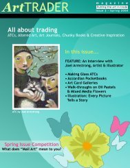
Beginner's - ArtTrader Magazine
Beginner's - ArtTrader Magazine
Beginner's - ArtTrader Magazine

You also want an ePaper? Increase the reach of your titles
YUMPU automatically turns print PDFs into web optimized ePapers that Google loves.
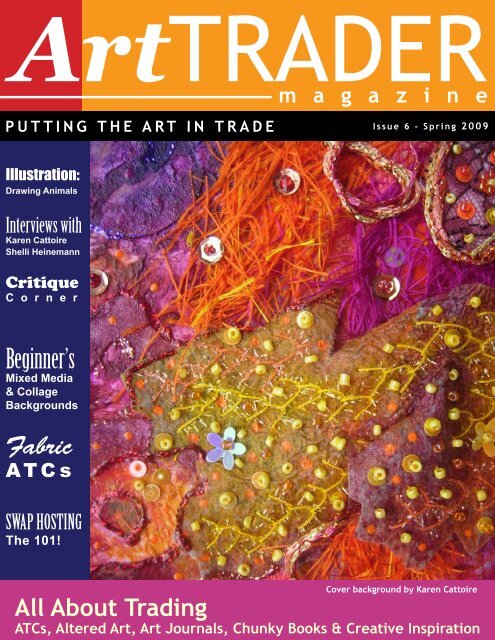
ArtTRADER<br />
m a g a z i n e<br />
PUTTING THE ART IN TRADE<br />
Illustration:<br />
Drawing Animals<br />
Interviews with<br />
Karen Cattoire<br />
Shelli Heinemann<br />
Critique<br />
C o r n e r<br />
Beginner’s<br />
Mixed Media<br />
& Collage<br />
Backgrounds<br />
Fabric<br />
ATCs<br />
SWAP HOSTING<br />
The 101!<br />
Issue 6 - Spring 2009<br />
Cover background by Karen Cattoire<br />
All About Trading<br />
ATCs, Altered Art, Art Journals, Chunky Books & Creative Inspiration
Art TRADER<br />
m a g a z i n e<br />
Table of Contents Spring 2009<br />
3<br />
4<br />
5<br />
7<br />
10<br />
13<br />
15<br />
18<br />
23<br />
28<br />
31<br />
36<br />
42<br />
44<br />
47<br />
49<br />
56<br />
57<br />
59<br />
64<br />
65<br />
69<br />
71<br />
73<br />
Art Trader Contributors<br />
Editor’s Note & Letters<br />
A Trade Story<br />
Design 911: Composition<br />
Presenting Your Artwork on the Web: Scanning<br />
Gallery of Warm Colors: Red, Yellow, Orange & Black<br />
Fabric Arts 101<br />
Artistic Journeys: Watercolor Pencils<br />
Feature Interview: Karen Cattoire<br />
Gallery: Altered CDs<br />
In the Artist’s Studio with Amy Sargent<br />
Feature Interview: Shelli Heinemann<br />
Gallery: Fabric Cards<br />
Beginner’s Mixed Media & Collage: Backgrounds<br />
Critique Corner with Andrea Melione<br />
Preparing and Shipping of Mail Art<br />
Vintage Collage Contest Winner<br />
Gallery: Nature Kings<br />
Illustration: Drawing (Cute) Animals<br />
Petite Artiste: Vivian S.K.<br />
Swap Hosting 101<br />
What is Whimsy Art?<br />
Advertisements<br />
How to Contribute to <strong>ArtTrader</strong> Mag<br />
-2-<br />
Page 13<br />
Page 57<br />
CHIEF EDITOR<br />
COPY EDITOR<br />
CONTRIBUTING AUTHORS<br />
ART DIRECTOR<br />
ASSOCIATE DESIGNERS<br />
PUBLISHED BY<br />
Page 23<br />
Dana Driscoll<br />
Meran ni Cuill<br />
Tracie Rozario<br />
Andrea Melione<br />
Sal Scheibe<br />
Dana Driscoll<br />
Amy Sargent<br />
Brittany Noethen<br />
Shelli Heinemann<br />
Sharon Safranyos<br />
Sal Scheibe<br />
Brittany Noethen<br />
Andrea Melione<br />
<strong>ArtTrader</strong>Mag.com<br />
ArtTRADER <strong>Magazine</strong><br />
www.arttradermag.com<br />
Editor: editor@arttradermag.com<br />
Advertising: ads@arttradermag.com<br />
Submissions: content@arttradermag.com<br />
Call for Entries: www.arttradermag.com
Art TRADER<br />
m a g a z i n e<br />
Contributors<br />
Brittany Noethen is an artist living in a tech manager’s body. She would rather be<br />
decapitated than give up making art, trading ATCs, or stop thinking that the phrase “Muffins<br />
or Bust” is hilarious. She currently lives in Iowa with her partner Cat, her 12 year old pit bull,<br />
Maggie, and shelves full of art supplies.<br />
• www.bnoethen.etsy.com<br />
• arty-iowa-girl.vox.com<br />
• www.flickr.com/photos/arty-ia-girl<br />
Andrea Melione (AKA EraserQueen) has a B.S. in Arts Management and is doggedly<br />
pursuing a Master’s in Library Science. She has been involved in Mail Art for five years<br />
and is the co-founder of IllustratedATCs.com. She is a contributor to <strong>ArtTrader</strong> <strong>Magazine</strong><br />
where she is a graphic designer and author. She mainly works in watercolor, colored<br />
pencil, acrylics, markers and gel pens. Her work has been in four exhibits, though two were<br />
academic and she isn’t sure if that counts enough to sound cool.<br />
• artpfunkcentral.blogspot.com<br />
• www.flickr.com/photos/littleboots<br />
Meran niCuill Fascinated by nature and science, Meran ni Cuill attempts daily to translate<br />
her passions into art. Sometimes she feels she even succeeds! And then something else<br />
will catch her attention and off she’ll go! Chasing another ideal. Meran enjoys gardening,<br />
sunsets, dogs, birds, and just about anything as long as it’s not endless crowds of people.<br />
When those present, she’ll retreat to a quiet place and read a book, or cut some glass, both<br />
of which she finds therapeutic.<br />
• www.meran.etsy.com<br />
• atcs2009.meran.fastmail.fm<br />
Dana Driscoll is an experimental artist working in a variety of media including watercolors,<br />
mixed media, oils, clay, book arts, hand papermaking, and altered art. She is currently<br />
working on several artistic projects, including painting her way through a 78-card tree tarot<br />
deck and combining her love of pottery and bookmaking. When not avoiding the perils of<br />
pursuing her Ph.D. in Rhetoric and Composition, she can be found frolicking in nearby<br />
forests or hanging out with her nerdy gamer friends. Dana’s work can be found at her blog:<br />
artisticjourneys.blogspot.com and she can be reached at adriayna@yahoo.com.<br />
• www.artisticjourneys.etsy.com<br />
Abi Aldrich is a K-6 Art teacher in Wyoming. She sells oil paintings professionally, makes<br />
pottery because she likes to play in the mud, and generally makes text -based sculptures<br />
and installations because that is her true love. Beyond that she loves printmaking, drawing,<br />
and graphic design. In all her massive amounts of free time, Abi hangs out with her<br />
menagarie, including several rabbits, a chinchilla, a hampster, a cockatiel and a large<br />
bearded dragon. She also calls West Africa every night to talk to the love of her life, Gee.<br />
So in a nutshell, she is a nut who likes to make a mess in art!<br />
www.abigayle.etsy.com<br />
-3-<br />
•
Art TRADER<br />
m a g a z i n e<br />
Contributors<br />
Sal Scheibe works as a creative designer for print and web and also as a freelance<br />
illustrator. Her designs and artwork have appeared in books, CDs and DVDs and posters.<br />
Sal is currently working on a number of large canvas paintings for art shows. She also<br />
enjoys trading ATCs and is an administrator at IllustratedATCs.com. Sal’s favorite artists<br />
and illustrators include Joe Sorren, J.C. Leyendecker, William Bougereau and John Singer<br />
Sargent. Her favored mediums are acrylic paint, colored pencils and markers.<br />
• www.slscheibe.com<br />
• www.flickr.com/photos/amerasu<br />
Amy L. Sargent is a poet, mixed-media artist, and writing professor living in Roseburg,<br />
Oregon. She trades mail art under the artist ID “amyfaerie” at www.atcsforall.com. She<br />
lives with her husband, their three cats, and an old, hand-me-down dog. When not writing,<br />
making art, or teaching, she is most certainly at the post office or at a thrift store.<br />
Angela Kingston-Smith (aka LemurKat) is an illustrator, not an artist. With her quirky,<br />
whimsical style she can turn anything cute and her art now graces the walls of fellow artists<br />
all over the world, from Guatemala to Madagascar. She hails from the lovely south island of<br />
New Zealand, and loves to add a “kiwi flavour” to her art. Kat is also a dedicated bibliophile.<br />
Her motto is “always bring a book”. When she is not drawing, reading, sleeping or working,<br />
Kat is usually writing (or editing). For more information on LemurKat or to see more of her<br />
art, pay a visit to her online gallery at deviantart.<br />
• lemurkat.deviantart.com<br />
Tracie Rozario Residing on the Sunny West Coast of Australia, Tracie is a self taught<br />
artist and lives with her husband, 3 children, 2 cats and 2 dogs. Her preferred medium is<br />
anything she can paint or draw with. Her passion lies in fantasy and portraits and much of<br />
her work revolves around that theme: fantasy and whimsical style. She believes that her<br />
biggest artistic influence is the Impressionist movement. The use of vibrant ‘true’ colors,<br />
visible brush strokes and freedom that the movement represents has always inspired<br />
her. From taking the step of trading ATCs, Tracie has found herself also creating altered<br />
Dominos, art dolls, 4”x4” chunky book pages, 8”x8” journal pages, altered Rolodex address<br />
cards and even creating her own line of polymer stamps; things that she would never have<br />
known about or even thought about doing. Tracie is a self-taught artist and is a qualified<br />
Parchment Craft Australia Teacher and Duncan Ceramics Teacher. She also paints larger<br />
works on commission.<br />
• www.purplerealm.etsy.com<br />
-4-<br />
•
Art TRADER<br />
m a g a z i n e<br />
Editor’s Letter<br />
Here at <strong>ArtTrader</strong> <strong>Magazine</strong> we have been very excited to announce our new site, shop, and workshop<br />
series! The new www.arttradermag.com site is full of new features that will inspire you as an artist.<br />
First, we have opened up an <strong>ArtTrader</strong> Store! Our store currently features a variety of fantastic collage<br />
sheets and books produced by artists in our community. The current books featured there include<br />
Color: A Collaborative Perspective and The Best of IllustratedATCs.com 2007, both created by artists at<br />
IllustratedATCs.com. We look forward to bringing you even more great books, including the ATCsforALL<br />
2008 and the <strong>ArtTrader</strong> Year 1 Compilation book!<br />
We are also very pleased to announce the first two workshops in our new online series—Whimsy Art<br />
Part I and Part II. We hope that you’ll be able to join us for these interactive online workshops and<br />
that they bring you inspiration. Because not everyone knows what “Whimsy Art” exactly is, we have<br />
included an article introducing Whimsy Art in this issue.<br />
And, as usual, we have a jam-packed issue full of eye candy, techniques, and so much more! This month<br />
we feature technique articles on scanning in your art to display online, an article on Packaging your<br />
ATCs for swaps and mailing, and an introduction to collage backgrounds. And if that isn’t enough, we<br />
also have a look at the studio of Amy Sargent, and interviews with Karen Cattoire and Shelli Heinemann.<br />
We also have our regular columns, including Artistic Journeys, Design 911, Petite Artiste, and more. So<br />
read, be inspired, and go create some art!<br />
-5-<br />
by Dana Driscoll<br />
Everyone is here on<br />
earth as an artist;<br />
to tell his particular<br />
story or sing her<br />
irreplaceable song; to<br />
leave a unique creative<br />
signature.<br />
Leonard Wolf
Art TRADER<br />
m a g a z i n e<br />
A Trade<br />
Story<br />
The cards and poem<br />
displayed here were<br />
created by David Diamond<br />
(Morning Walk) and<br />
Pamela Vosseller (The<br />
Rose), artists who trade at<br />
IllustratedATCs.com.<br />
In November, David<br />
saw a beautiful flower<br />
card displayed in the<br />
Illustratedatcs.com gallery<br />
titled “The Rose” by Pamela<br />
Vosseller. He asked for the<br />
card in trade, and promised<br />
a custom card in return.<br />
Pam happily sent off “The<br />
Rose” to David just as David’s wife, Irene, became seriously ill due to cancer complications.<br />
David’s wife passed away in late January, and David asked Pam<br />
for permission to incorporate “The Rose” into a memory tribute<br />
card to give to people attending Irene’s memorial service. “The<br />
Rose” was printed on watercolor paper and included a poem to<br />
Irene on the back. David keeps the card now on an altar in his<br />
bedroom dedicated to Irene.<br />
Just recently David was able to begin working on his art once<br />
again. His first project was to finish the ATC for Pam. He knew<br />
he wanted to create something extremely special, and “A<br />
Morning Walk” was the card he created.<br />
“A Morning Walk” was chosen as IllustratedATCs.com Card of<br />
the Month for February 2009.<br />
-6-
Art TRADER<br />
m a g a z i n e<br />
Design 911h<br />
by Andrea Melione<br />
The impact of color is tremendous: Not only does color have an emotional impact, it also has an impact<br />
on your design and the composition of your artwork, be it an ATC or a large mural! Color has the<br />
power to attract the eye, take attention away from an element in your work, move the eye around the<br />
composition, and make the artwork more exciting to look at. In this issue, we’re going to look at how to<br />
use this power to enhance the design of our personal artwork.<br />
To Draw Attention Around an Image<br />
Postcard by Andrea Melione<br />
-7-<br />
Color is a powerful tool to move the viewer’s<br />
eye through a piece of artwork. You can easily<br />
guide the viewer though your composition,<br />
using color.<br />
This postcard has a lot going on. Though<br />
there appears to be an explosion of color, the<br />
color is in fact carefully controlled. The text<br />
“Peace for All’ is a very light green, and green,<br />
of course, contains yellow. None of the other<br />
areas of color within the image contain yellow;<br />
they are either purple (red and blue) or blue.<br />
In addition, the light green is also the lightest<br />
color in the composition, adding the very<br />
important element of contrast. The light green<br />
word “Peace” seems to drip down through the<br />
rest of the lettering, and on down around the<br />
left hand, leading the viewer’s eye completely<br />
through the image.<br />
Color Composition Tip:<br />
Before adding color to your artwork, take<br />
a sheet of scratch paper and test the color<br />
you want to use first. Some shades of color<br />
work better together than others. If you do<br />
not have experience in color theory, it is a<br />
good idea to plan color first. As you gain<br />
experience, you will gradually learn to use<br />
color intuitively; but in the beginning it is best<br />
to make decisions based on experimentation,<br />
rather than random choices!
Art TRADER<br />
m a g a z i n e<br />
To Draw Attention Away<br />
You can actually use color to draw attention away from something in your art (such as a mistake!) Use a<br />
neutral color for the area you wish to draw attention from, and use brighter, more intense color (this is called<br />
saturation) in an area away from the neutral colors. Let’s look at the Peace postcard once more: You will<br />
see that the hands are a neutral color. Skin color can be any color; red, yellow, black, brown etc. But the<br />
hands for this image were specifically colored a neutral tan/gray so as not to compete with the round Earth!<br />
Because a neutral color can so easily fade into the background, the hands are outlined in fuchsia, so as to<br />
remain visible to the eye. Fuchsia was carefully chosen, though, so it would remain cohesive with the rest<br />
of the purple/blue elements in the design.<br />
To Draw Attention To<br />
The same principle applies here. If you wish to draw attention to a face, or to text, use color to draw the<br />
eye.<br />
This postcard has a really difficult composition: The text and collaged hand are almost competing with the<br />
cupcake because they take up about the same amount of space in the postcard. However, you can use<br />
color to save an iffy composition such as this. Notice that that hand/text area and the background all are<br />
fuchsias, blues and purples. All of these colors have some amount of blue in them, and are considered<br />
‘cool’ in temperature. In order to draw the eye toward the cupcake, I used warm colors, colors that would<br />
contain some amount of yellow. The green surrounding the cupcake contain yellow (yellow + blue = green),<br />
and I shaded the pink frosting with orange (yellow + red = orange) to warm it up! The cherry girl’s skirt is<br />
green and yellow, and the cake portion of the cupcake is a warm brown (which also contains yellow.) I left<br />
the collaged ‘pointing hand’ a neutral gray so as not to stand out more than it already does; the gray is tied<br />
into the color composition by the silver I used around the border of the card.<br />
-8-
Art TRADER<br />
m a g a z i n e<br />
Contrast with Color<br />
Contrast is simply a way to enhance the visual quality of an artwork and make it look more interesting.<br />
Think of cartoons in your newspaper: The ones that grab your attention the quickest are not the ones<br />
that feature simple line drawings, but the ones that feature a use of strong areas of black, or ones that<br />
use ‘half tones’ which are grays for shading. Color can be used for the same eye-catching effect.<br />
Thus, tonal value (the scale from light to dark) is very important, even with color, which also has a value<br />
of light to dark. Instead of creating a collage or painting with medium blues and medium purples, shake<br />
it up a bit by varying the light or darkness of the blues or purples. For example, if you are creating a<br />
color wash over your collage, vary how much paint you mix with the water: A lot of water will give a light<br />
colored wash, and less water and more paint will give a more intense colored wash.<br />
One thing that can be good to avoid is muddy color and color of all the same value, or color that does<br />
not match the mood you are trying to convey. Is your work cheerful? Avoid muddy colors! Muddy<br />
color is created when you mix too many colors together, such as mixing purple and yellow, or red, blue<br />
and yellow together.<br />
Muddy colors, or neutrals can actually convey a mood very well (such as contemplation, or fear) if you<br />
know how to use them, but contrast is still important! This card here has a distinct brown/red/neutral<br />
scheme but contrast is created with the use of white.<br />
-9-<br />
Collage or other media is no different; make sure<br />
your work has contrast, with lights and darks.<br />
And be careful where you place them: The whitest<br />
whites and the blackest blacks should not be<br />
added randomly (such in a collage or abstract)<br />
but placed with a composition in mind! For more<br />
ideas about composition of elements (rather than<br />
color), read the Design 911 column in issue four<br />
of <strong>ArtTrader</strong> Mag.<br />
Color is a crucial component of your design; try to<br />
make intentional decisions on how you use color,<br />
keeping some of the above tips in mind. In the next<br />
issue, I’ll be discussing how to create a cohesive<br />
composition through Gestalt Theory! (Trust me,<br />
it’s much less complicated than it sounds!)
Art TRADER<br />
m a g a z i n e<br />
Presenting Your Artwork on the Web: Scanning<br />
By Tracie Rozario<br />
Today’s technology has allowed us to reach millions of people with<br />
our art, to showcase our talents to places around the world that only<br />
15 years ago was a privilege of a select few. The tools we use to<br />
replicate our art for the Web are getting more and more advanced<br />
and yet accessible each day. Scanners, digital cameras and editing<br />
software are more affordable than ever and make the job of showing<br />
our art easier.<br />
The way art is presented on the web can help an artist get sales or<br />
trades initiated. What potential purchasers or traders see first is the<br />
image on the Web and may never have a chance to see the art in<br />
person until after the trade or sale is complete. As the old saying<br />
goes, first impressions count, and that couldn’t be truer for an artist<br />
on the web. There is nothing appealing about a badly scanned or<br />
photographed image no matter how creative and stunning the piece<br />
is.<br />
There are a few things an<br />
artist can do to help improve<br />
the quality of their art’s<br />
presentation on the Web.<br />
When scanning or<br />
photographing your artwork,<br />
it is important to do it in the<br />
highest resolution possible.<br />
This may take your scanner a<br />
little longer to create the scan,<br />
but the benefits far outweigh<br />
the additional time it takes.<br />
You should always think 'just<br />
in case I get published'—<br />
which means keeping a highresolution<br />
image of your art on<br />
file.<br />
First impressions<br />
count.<br />
The way art is<br />
presented on the<br />
web can help<br />
an artist get<br />
sales or trades<br />
initiated.<br />
As publishers require high-resolution images, why risk being rejected due to not being able to provide<br />
a good quality image? These high-resolution scans then become your basis for creating your image for<br />
the web.<br />
kjgflv<br />
-10-<br />
Above are two examples of a low-resolution scan that has been badly cropped and a high resolution<br />
scan, neatly cropped, of the same image.<br />
2D art is best scanned and allows for the best possible recreation of your image. So we will look at 'how'<br />
to do this in more detail.
Art TRADER<br />
m a g a z i n e<br />
All scanners come with software to use; this is always the best way to scan your work unless you are<br />
familiar with scanning through editing programs such as Adobe Photoshop.<br />
Ensure that your scanning bed is clean. It is amazing how many little pieces of fluff, dust, glue, paint,<br />
etc., can adhere to the scanning bed. A good way to clean it is by using a microfiber cloth and a cleaner<br />
for eyeglasses. Don’t spray the cleaner directly on the bed, but onto the microfiber cloth.<br />
Next look at your scanner’s settings. A good standard resolution is around 300-400dpi. Make sure<br />
that you have set it to this higher resolution in the settings. Secondly, ensure that your scanner is set<br />
for the correct document type. Some of the newer scanners have an 'auto detect' function which prescans<br />
your work and sets the scanner to the corresponding document type. Common document types<br />
include black and white, newspaper, text, photo, and so forth. If your scanner requires you to manually<br />
set the type, make sure you scan all your colored work with a color photo setting, for colored and black<br />
and white photo for black and white images only. Shaded black and white images scan better on a<br />
colored photo setting.<br />
Scan your artwork and save it 'as is' to a file on your computer. This will become your 'record' of your<br />
art, a raw un-cropped high-resolution copy.<br />
The next steps occur in your photo editing software. Editing your image this way gives you the best<br />
control of how your image appears on the web. Following certain steps each time will ensure that<br />
nothing gets missed.<br />
1.<br />
2.<br />
3.<br />
4.<br />
Open your image in your editing software. And use the software to rotate the image into a straight<br />
position.<br />
Once the image is straight, crop the image to as close to the edge of the art as possible. Even going<br />
slightly inside your design is ok.<br />
Once it is cropped, zoom into the image and look to see if the scanner has picked up any bits of stuff<br />
from the scanner bed. If it has, use the 'spot healing brush' to remove those marks.<br />
At this point, I recommend saving it as another high-resolution copy of your work. Rename the file<br />
when you do this.<br />
5. Finally most of the editing software has a 'save for web' option. When you use this reducing your<br />
work to around 40% is a good idea and saving it as 'high' or 'medium' resolution. This final save of<br />
your work is the image you use on the web.<br />
Scanning, cropping and editing<br />
your image ensures that you are shown<br />
to the world at your best<br />
-11-
Art TRADER<br />
m a g a z i n e<br />
PENCIL & GRAPHITE DRAWINGS<br />
Pencil/graphite drawings often loose a lot of detail in a scan, no matter what setting you use.<br />
Couchart at IllustratedATCs.com has a simple solution to retain a precise scan of pencil drawings.<br />
She suggests laying a standard clear transparency between your scanner and your artwork before<br />
scanning. Adding the transparency diffuses the scanner’s light so it doesn’t reflect directly on the<br />
graphite/pencil.<br />
These images were created and scanned by Couchart (Cynthia Couch). The image on the left is without<br />
the transparency and the image on the right is with the transparency. The difference is amazing.<br />
Scanning, cropping and editing your image ensures that you are shown to the world at your best. It may<br />
require a little bit of extra work, which over time becomes second nature, but it’s a small price to pay to<br />
always put your best foot forward.<br />
Artwork by Tracie Rozario<br />
& Cynthia Crouch<br />
-12-
Art TRADER<br />
m a g a z i n e<br />
Marlene Koons<br />
Gallery of Warm Colors<br />
Red, Yellow, Orange and Black<br />
From the artists of ATCsforAll.com<br />
s<br />
Grace Wolf Margaux Lashbrook Betty Yeo<br />
Elena Garcia Joni Owens Gail Flanders<br />
-13-
Art TRADER<br />
m a g a z i n e<br />
z Color<br />
Sue Spencer Charlie Dale Kati Barrett<br />
is the language of<br />
the poets. It is astonishingly<br />
lovely. To speak it is a privilege.<br />
Keith Crown<br />
Martine Schutt Paula Perrin Shirley Wolfe<br />
-14-
Art TRADER<br />
m a g a z i n e<br />
Fabric ATCs 101<br />
Or the Demystification of Fabric!<br />
by Sharon Safranyos<br />
What makes a fabric ATC different from any other ATC? Nothing<br />
except that the medium is fabric rather than paper, pencil, or<br />
paint. So why is fabric art so scary? I guess for the same reason<br />
watercolor painting is so scary to me! Fabric art is different , and<br />
you have not used it before. The terminology and sheer volume<br />
of terms can also be intimidating: Cottons and man made fibres,<br />
wool and other fibres to wet felt, needle felt, painting on silk, dying<br />
silk, heat distressing, and more. If you are not familiar with fabric<br />
and how it behaves it, it can be very scary. Fear not! Read on<br />
and see the possibilities fabric has to offer the ATC artist.<br />
How do I make an ATC base?<br />
There are many choices for creating the base of a fabric ATC.<br />
Most fabric needs a stabilizer of some sort if you are going<br />
to be doing any stitching on the card. Stabilizers can be as<br />
simple as freezer paper ironed onto the back of the fabric, or<br />
the specialized stabilizers used in machine embroidery. One of<br />
the stiffest products you can use is the stiffener used in curtain<br />
making; it can be purchased from fabric stores and is usually<br />
called buckram. Fabric stores also sell a most useful product<br />
known as iron-on adhesive, there are many brands and many<br />
can be used in ATCs. Misty-Fuse is another iron-on adhesive<br />
produced more for quilters, it is great to use on silk as it doesn’t<br />
leave any adhesive marks.<br />
What do I use to make the card?<br />
I can hear you say, “But I don’t have a stash of fabric!” I admit it, I do<br />
have a fabric stash. I have fabric in bins and boxes and drawers,<br />
but I have been addicted to fabric for many many years! You<br />
don’t need a huge stash, and you don’t need to spend a fortune<br />
in a fancy fabric store to make fabric ATCs. You can use clothes<br />
the kids have grown out off, cut off legs from jeans, or finds from<br />
a thrift store. Even the Dollar Store may have goodies you had<br />
never though of: lace placemats, bandanas and tea-towels. Any<br />
fabric can be used with a little imagination: plain cotton, printed<br />
cotton, wool, lace denim, silk, ultrasuede, and velvet. You can<br />
stamp on it, paint on it as well as stitch it!<br />
-15-
Art TRADER<br />
m a g a z i n e<br />
But what do I do with it?<br />
Although a sewing machine is extremely useful (so useful that<br />
I have seven, all the way from my Gran’s treadle machine to a<br />
computerized all singing, all dancing, treasure!), having a sewing<br />
machine is not essential. You can create a fabric collage card<br />
using gel medium on a card base (see Collage Tangled at bottom)<br />
and add in other media such as paper and paint or stamps. To<br />
try this, just think of fabric in the same way you would if you<br />
were going to collage with paper. Many printed fabrics can make<br />
interesting collages by virtue of the prints themselves, such as<br />
the landscape card shown here at right.<br />
If you have access to a sewing machine, then the possibilities are<br />
endless! You can embellish the existing fabric with stitching, either<br />
straight stitching or pre-programmed stitches if your machine has<br />
them. You can stitch around the existing image on the fabric.<br />
This can be especially effective if quilting batting is used under<br />
the fabric; it almost makes a sculpted card.<br />
Fabric collage can also be done using stitching to anchor the<br />
fabric as in this card where the poppies are held down with zig<br />
zag stitches. The Poppies card shown here (at right) was done<br />
using free motion stitching where the feed dogs have been<br />
lowered and the fabric is moved by your hands rather than the<br />
machine pulling the fabric through using the feed dogs. For more<br />
information on free motion stitching or thread-painting see the<br />
excellent article by Cathy Greene in <strong>ArtTrader</strong> Mag, issue four.<br />
Even if you only feel confident enough to stitch in a straight line<br />
you can create a lovely ATC using straight stitches, and built-in<br />
stitches if your machine has them.<br />
Ribbons can be added as well as fancy yarn and other threads.<br />
You can, of course, hand stitch on fabric! Beads and sequins can<br />
be added, as well as other embellishments such as rhinestones,<br />
fancy threads, and charms. Your inspiration can come from the<br />
same place as when you create other cards or it can come from<br />
the fabric itself.<br />
-16-
Art TRADER<br />
m a g a z i n e<br />
How to I finish my card?<br />
Fabric can fray over time and even if your card was glued to<br />
the base, threads can work their way free and you end up with<br />
a ratty looking card after a while. My favorite way to finish fabric<br />
cards is to use zig-zag stitch around the edges. You will have to<br />
practice this to find the best settings for your machine, but as a<br />
starting point I usually set the stitch width between 3.5 and 4mm<br />
depending upon the card, and the stitch length between 0.5 and<br />
0.2 mm. When the needle is to the right, it should be just off the<br />
edge of the fabric. Another way to finish the edges if you don’t<br />
want to stitch them is to brush the edges with an acrylic paint<br />
such as Jacquard Lumiere. This can give the edges a metallic<br />
look too which can be very effective.<br />
Conclusion<br />
To summarize, to create fabric ATCs:<br />
• Think of fabric as just another art media.<br />
• If you are going to stitch on the card then a stabilizer is<br />
essential; this will stop the fabric puckering as you stitch.<br />
• Gel medium works well on fabric.<br />
• Practice, practice, practice!<br />
So what are you waiting for? What, you really don’t have any<br />
fabric at all? No excuse! To get the novices going, I will send<br />
the first 6 people who PM me with a 4x6 inch envelope with<br />
fabric, stiffener for base, iron-on adhesive, ribbon and yarn to<br />
inspire you. Just send a PM to Pippin at ATCsforAll.com. Happy<br />
creating!<br />
-17-
Art TRADER<br />
m a g a z i n e<br />
Pencils<br />
If you want good quality pencils,<br />
you will have to be willing to pay<br />
a bit more. When I was quite<br />
young, my parents bought me a<br />
set of Crayola watercolor pencils.<br />
I had them for a long time, and<br />
later purchased a set of Kimberly<br />
watercolor pencils. I was amazed<br />
at the difference in quality between<br />
the two brands! Then of course,<br />
I bought some Faber Castell<br />
watercolor pencils and Derwent<br />
Inktense pencils—both fantastic<br />
brands. I was recently given a set<br />
of Prismacolor watercolor pencils<br />
by a friend, and these are also<br />
quite nice.<br />
One of the things you’ll find is<br />
that different pencil brands have<br />
different softness, which affects the<br />
application of color on the page. If<br />
you are serious about working with<br />
watercolor pencils, it might benefit<br />
you to purchase several types of<br />
brands to see which ones you like.<br />
Unfortunately, watercolor pencils<br />
are not graded like normal pencils<br />
(graded for hardness, such as 9H)<br />
so you just have to experiment.<br />
Artistic Journeys:<br />
Introduction to Watercolor Pencils<br />
by: Dana Driscoll<br />
Watercolor pencils are a hybrid between drawing and painting<br />
that are highly transportable and flexible. Watercolor pencils<br />
differ from normal colored pencils in the sense that they are<br />
water soluble (I think of it similar to dried paint in pencil form).<br />
You can draw with them as normal pencils, create watercolor<br />
washes, or even create whole paintings! They are also rather<br />
economical and easy to clean up, making them the perfect<br />
addition to your artistic repertoire. Finally, watercolor pencils<br />
are perfect for vacations or outdoor drawing!<br />
What materials do I need to start<br />
As a final note, you should keep<br />
your watercolor pencils stored<br />
separately from your regular<br />
colored pencils. Otherwise, you<br />
can end up with working on a piece<br />
you thought was all watercolor<br />
pencils, but is really only partially<br />
watercolor pencil (and ruin<br />
whatever design you were hoping<br />
to achieve).<br />
Brushes<br />
For watercolor pencils, you’ll<br />
want to use watercolor brushes<br />
(these are brushes with longer,<br />
softer bristles). For ATC sized<br />
cards, smaller sizes of brushes<br />
work best. If you are doing larger<br />
work, however, definitely switch<br />
to a larger brush so that you can<br />
avoid inconsistencies in your water<br />
application. I prefer using the<br />
round brushes for watercolor pencil<br />
work as the water flows smoothly<br />
into the pigment on the page and<br />
you can work in softer edges than<br />
with the square brushes.<br />
-18-<br />
Solvent, Sponges, and<br />
Other Blenders<br />
You can also have handy solvent<br />
(optional for techniques), Q-tips,<br />
paper towels, sponges (optional<br />
for techniques), and a colorless<br />
blender (paper or marker, usually<br />
found in drawing aisle (optional for<br />
techniques). I’ll cover using these<br />
in more detail below.<br />
Watercolor<br />
Pencils<br />
and ATCs<br />
I’ve used watercolor pencils<br />
for many of my ATCs,<br />
especially the ones I have<br />
done for swaps. I find<br />
that since the pencils lend<br />
themselves so well to fine<br />
detail, I can work in the<br />
smaller format with ease with<br />
the watercolor pencils. They<br />
really are a fantastic resource<br />
for ATC creators!
Art TRADER<br />
m a g a z i n e<br />
Many of the techniques I talk about next are not mutually<br />
exclusive—you don’t need to stick to only one technique, but<br />
rather can do several overlapping techniques. The overlapping of<br />
techniques can produce some of the best work!<br />
Colored Pencil Technique<br />
An easy way to use watercolor pencils is to simply use them<br />
like regular pencils. They give you a very rich color and have<br />
a different texture than regular colored pencils, allowing you to<br />
create different effects.<br />
If you are going to use them as normal pencils, I suggest you seal<br />
them with a spray workable fixative or laminate so that they don’t<br />
come in contact with water and ruin your design. DO NOT seal<br />
them with a wet/brush-on varnish! The colors will mix together and<br />
your image won’t be the way you want it.<br />
Honestly though, if you are only going to use them as colored<br />
pencils, you should really just be using colored pencils (oil-based<br />
colored pencils give a similar look and feel). This allows you to<br />
avoid “accidents” such as water drips or using the wrong sealer.<br />
Painting Technique (i.e. Wet Brush)<br />
My favorite way to use watercolor pencils is to first draw in a<br />
design as if I’m using colored pencils, then use a wet brush and<br />
water to “paint” that design into the paper. I find that I can get<br />
more precise designs this way than having to use watercolors or<br />
pencils alone. I can also work on my designs in places that normal<br />
watercolors would have difficulty going (like the bus station!)<br />
There is a ratio between the amount of color you add to your page<br />
and how brilliant the effect becomes. I recommend adding your<br />
color in layers instead of all at once, as you’ll get more subtle<br />
undertones and an overall more consistent color. You can also<br />
mix the colors you use for even more complex color combinations.<br />
I almost always use at least two or three colors for each color area<br />
I am working on.<br />
As soon as you apply the water to the pencilling, you’ll find that the<br />
drawing explodes in brilliant color! This is great if color is what you<br />
want—but be careful! If you are going for a muted tone, you’ll want<br />
to be cautious of how much pencil you apply; the colors could<br />
-19-<br />
Using the Pencil in Other<br />
Ways<br />
You can use the watercolor<br />
pencil to achieve many effects.<br />
One technique is to take a small<br />
blade and scrape pieces of the<br />
paint off of it in small chunks.<br />
Sprinkle these chunks into wet<br />
paper (I sometimes sprinkle<br />
them into a freshly made piece of<br />
wet handmade paper) and they<br />
will bleed and create interesting<br />
patterns. This quickly uses<br />
up your pencils, however! If<br />
you want to conserve, you can<br />
take the pieces from the pencil<br />
shavings.<br />
A second way you can use the<br />
pencil is by grabbing the paint<br />
from it directly with a wet brush.<br />
So in this case, your pencil<br />
becomes nothing but a mini well<br />
of paint for you to use. This<br />
is good to use for touching up<br />
pieces, but not for large-scale<br />
applications!<br />
Not just a Wet Brush!<br />
You can also use other brushlike<br />
materials to create effects.<br />
A wet or semi-wet sponge on a<br />
colored surface will produce a<br />
neat design! You can also use a<br />
sponge or Q-tip to remove some<br />
of the color when the paint is still<br />
wet on the page.<br />
You can use solvent instead of<br />
water to create a very different<br />
type of effect—solvent makes<br />
your watercolor pencils very<br />
transparent when compared<br />
with water. I’ve managed to get<br />
almost alcohol-ink like effects<br />
with them!<br />
For those of you who like rubber<br />
stamping—watercolor pencils are<br />
a fantastic way to add color to<br />
your designs. Because of the
Art TRADER<br />
m a g a z i n e<br />
fine control you can get with<br />
them, your designs can become<br />
very, very intricate!<br />
Layering of Paint and Other<br />
Media<br />
One of the neatest things<br />
about watercolor pencils is that<br />
since you can use so many<br />
techniques with them, they<br />
take well to layering of those<br />
techniques. So start with a<br />
wash, for example, and then<br />
use a wet pencil for bold lines!<br />
The techniques will complement<br />
each other.<br />
I also encourage you to use<br />
these pencils with other media.<br />
I’m very fond of using watercolor<br />
pencils with ink to create more<br />
contrast. You can also use both<br />
regular pencil and watercolor<br />
pencil in a design—the<br />
watercolor pencil will turn into<br />
paint but the regular pencils will<br />
stay put! Crayons or wax resist<br />
also produce very interesting<br />
combinations. Experiment and<br />
have fun!<br />
end up much brighter or deeper than you intended. If you want<br />
muted tones, only use the smallest amount of pencil—what it<br />
looks like before and after you have added the water can be<br />
strikingly different indeed!<br />
One of the techniques I like to use is to make your edges darker<br />
and your interior lighter. This is something that is more difficult<br />
to achieve with regular watercolors, but is relatively easy with<br />
watercolor pencils. You’ll see it on my finished piece on page<br />
21 — simply add double the pigment around the edges and be<br />
mindful when you are applying your water to the page.<br />
You should pay attention to your brush strokes when applying<br />
the color—different patterns can end in different designs. I apply<br />
color to one section of color at a time, always rinsing my brush<br />
with water before moving to a new colored section.<br />
You have to work very quickly—if you let the paper dry on one<br />
section, you will get a cloudy line or splotch where the wet and<br />
dry sections meet. Its better to keep a section slightly wet as<br />
you go along, or to work your way along a complete section.<br />
This is more of a problem with larger sections of color than with<br />
smaller sections of color.<br />
When you are filling in your color with your brush, you may<br />
also find that the brush has too much paint and the colors are<br />
getting too saturated. Simply dunk your paint brush back into<br />
your water and swish it around and then you will have a clean<br />
brush to work with. If you want consistent color in places, this is<br />
a very important technique. I often dip my brush back into my<br />
paint after every two or three strokes or so to maintain my color<br />
consistency.<br />
Wet Paper Technique<br />
Another technique you can use is the wet paper technique. With<br />
this technique, you begin by wetting a blank piece of watercolor<br />
paper. After wetting the paper, begin drawing with your pencils.<br />
How much water you use will impact how far the watercolor<br />
pencils will spread. This will give you soft lines but still fairly<br />
bright colors.<br />
This technique can be used with the wet brush technique,<br />
but only very carefully and AFTER you have done your wet<br />
brush work. Once you do the “painting” part of the wet brush<br />
technique, your paint is adhered to the paper quite well and<br />
could take on a bit more water. You might get some muddy<br />
results depending on how much pencil you used, however.<br />
-20-
Art TRADER<br />
m a g a z i n e<br />
Wet Pencil Technique<br />
You can also choose to<br />
wet your pencil and apply<br />
it to dry paper. You can<br />
wet your pencil with water<br />
or with solvent for different<br />
types of effects. The wet<br />
pencil technique produces<br />
very brilliant lines of solid<br />
color.<br />
This technique works very<br />
well in conjunction with<br />
the wet brush technique.<br />
Let your paper dry out<br />
completely after painting<br />
the color in with the wet<br />
brush and then draw with<br />
the wet pencil to add<br />
deeper, more brilliant hues.<br />
Watercolor Pencil Painting Walkthrough<br />
The following is a walkthrough using some of the techniques I described above. The image was<br />
a fantasy piece I created for my significant other for a Christmas gift—two fairies, myself and him,<br />
playing our musical instruments!<br />
1. Pencil Drawing: First, I started with a pencil<br />
drawing of the final image I wanted to produce.<br />
The drawing was done on watercolor paper with<br />
a little bit of roughness, but not too much.<br />
-21-<br />
2. Watercolor Pencil Application: I have<br />
started to apply the watercolor pencil to the<br />
figures in the center. You can already see how<br />
I’ve added more pigment to the outside areas to<br />
get shaded edges.
Art TRADER<br />
m a g a z i n e<br />
3. More Pigment: I applied water to the two<br />
figures in the center and have now begun to add<br />
in the colors for the flowers. With watercolor<br />
pencils, it really doesn’t matter if you do your<br />
background or foreground first.<br />
5. Water applied! The rest of the pigment has<br />
been filled in and the watercolor pencil has been<br />
applied. Notice the difference in color from the<br />
earlier images to this one.<br />
-22-<br />
4. And Yet More Pigment: I’ve filled in the<br />
details on the flowers and added the paint. Now<br />
I’ve begun to fill out the trees, grass and tree<br />
trunk.<br />
6. Adding Finishing Details: Watercolor pencils<br />
are wonderful on their own, but I decided to go<br />
back in and add some white acrylic for highlights<br />
and also some ink on the edges to make them<br />
more defined. The final result is on page 21.<br />
I hope you’ve enjoyed this issue’s Artistic Journeys column. Watercolor pencils have much to offer<br />
the mail artist, so have fun and experiment!
Art TRADER<br />
m a g a z i n e<br />
Karen Cattoire<br />
Interviewed by Andrea Melione<br />
Karen Cattoire, a fiber artist, paints with her thread, adds sparkle with beads and uses mirrors to create her<br />
magic. So much emotion can be expressed through pure color. Her art can evoke the joy of sunshine on the<br />
skin, the mystery of the ocean depths and the exotic scent of spices at a Middle Eastern marketplace. In this<br />
issue, Karen shares with us her experiences and inspirations.<br />
Tell us a little about yourself.<br />
Karen: Well... I am French, 40, and I live on a wonderful, peaceful, paradise-like island in the South Pacific<br />
Ocean, in the archipelago of Vanuatu. I settled there last year in November, and before that, for 15 years or<br />
so, I was a kind of globetrotter! I have been living in Sri Lanka for 3 years; before that, I was in Malaysia for 7<br />
years, and before that again, I was in Taiwan for 3 Years. I am married to the most adorable husband I could<br />
ever dream of, with no children, and happiness all around me! Two years ago, I created a company dedicated<br />
to gift wrapping made of fabric (mostly raw silk and organdy), but the political disastrous condition of Sri Lanka<br />
led us to leave the country before the company really took off! So, here I am, dedicating all my time to my new<br />
passion, creative contemporary fiber art, and I just love it!<br />
Have you had any formal training in art?<br />
Karen: Not at all! Would you believe me if I told you that I was “stapling” my trousers’ hem 4 years ago? Never<br />
touched a needle in my life before creating my company. And I was an absolute beginner in the beading field<br />
when I started the challenge called Beading Journal Project inspired by Robin Atkins in June 2007! Everything<br />
I learned was from the Internet, even my very first chain stitch! I got it from the “In a Minute Ago” of Sharon B.!<br />
Then, after getting into this field of bead and fabric, I attended training in France for one week, and that was<br />
that! Surfing on the Web is just a marvelous trip where you find all the answers to your questions. It is just<br />
limitless! I am seeking new techniques on the web every day, and I really enjoy experimenting all these new<br />
techniques and materials on my own. I think it is the best method for me to learn by myself in a remote place<br />
where only coconuts and seashells are available for creating! Anyway, I think I would be a very bad pupil, as I<br />
am reluctant to any reproduction of a model, or copying an existing design! It would work for 3 minutes... and<br />
then, I slip away and do it my way! Of course, to learn on my own is time consuming, but I guess this way I<br />
got less influenced by “the way it should be.” I am not too fond of the standards and traditional ways of doing<br />
things, and this is why I feel so at ease with art and mixed media; I can get all the freedom I want!<br />
-23-
Art TRADER<br />
m a g a z i n e<br />
You have traveled a great deal. Where have you been and how have these places inspired you and<br />
your work?<br />
Karen: Traveling has been my first passion for more than 25 years! I just love discovering new cultures, new<br />
faces, new landscapes, new colors and smells, new habits, new sounds from the languages and dialects.<br />
Every single trip gives me a lesson of humility, and enlarges the spirit. I have been traveling in every single<br />
country of Asia, from Japan to the Philippines, China to Indonesia, Nepal to Australia and New Zealand,<br />
South Korea to Thailand, and I kept from these wonderful trips some feelings, some images that, for sure,<br />
inspires my work today! I guess the most obvious influence I got from my traveling around Asia was India.<br />
I felt in love with this country, so rich in colors, fragrances, ancestral culture; such a rich heritage! When<br />
you see all the colors, the embellishments and embroidery of the saris of the women, the traditional outfit, it<br />
brings you into another world of wonders. The 1001 Nights, Ali Baba and the Magic Lamp, the grandeur of<br />
the Marahajahs, and the Taj Mahal. All my series of Shisha embroideries have a direct link with my last trip to<br />
Rajasthan; it is obvious! This is the most specific influence I got from my intense traveling. Other than that,<br />
I keep in mind a much more blurred, diffuse feeling from my trips that also influences my art. I am thinking<br />
about the colors in general, the brightness of the landscapes and flowers, the traditional Dances from Bali or<br />
Thailand, the terrific sky’s density after a tropical rain. All these visual elements make me want my pieces to<br />
appear bright and alive! This is why I make a lot of use of glass beads and sequins that reflect light. As soon<br />
as you make a move in front of my work, it changes because the reflection of the light gives a movement<br />
to the whole piece. We cannot see it in pictures because they are static, but my fiber art is very much alive<br />
when you can approach it. I like this idea of the observer having an interaction with my work, playing with<br />
the light together!<br />
Color and composition play a really important role in your art. Do you plan these carefully, or do you<br />
work with them more intuitively?<br />
Karen: As I just said, I like the idea of interaction between the observer and my work. In the same way,<br />
I like my work to stimulate the imagination of the watcher. How? I only do abstract art, where, off course,<br />
composition andcolors are everything! I like to think that when looking at my work, people will be lead to<br />
imagine their own little story, they might slide into sweet memories and dream to something that makes them<br />
happy. I am myself very much sensitive to colors, especially warm tones. They make me feel good, they<br />
move me or hypnotize me depending of my mood! I am very intuitive in my work, to answer your question!<br />
I never know what it will look like at the end. So, let me tell you how I proceed exactly when I start a new<br />
piece.<br />
-20- -24-
Art TRADER<br />
m a g a z i n e<br />
First I choose a color, or a two-color<br />
combination; very seldom do I start<br />
with a theme, an image or an idea.<br />
I put on my table everything related<br />
with this color, beads, threads, fabric,<br />
paper, paint, appliques, and I start<br />
playing with it. After a while, I leave<br />
the room, do something else, then<br />
come back, have a look to my work,<br />
arrange the elements differently, add<br />
new ones, remove some others, get<br />
out of the room, and this process can<br />
last for half a day, or more! Then, when<br />
I have an idea of the background and<br />
the emotion that comes out of it, I start<br />
to think about what kind of sense,<br />
significance, feeling or direction I<br />
want to give to this piece. This time<br />
of thinking (giving a significance to<br />
thepiece and also finding the title) is<br />
stretchable from one piece to another.<br />
Sometimes, the elements “talk” to me<br />
very clearly, they just lead me and<br />
show me the way; sometimes, they<br />
just keep quiet! And that can take<br />
a very long time to make them talk,<br />
sometimes, weeks! I look at them, try<br />
to see through the lines, just like when<br />
you try to guess somebody’s secret<br />
thoughts, I get patient, then lose<br />
patience, then get angry sometimes,<br />
then start another piece! And come<br />
back once in a while to see if the<br />
reluctant piece has finally something<br />
to say. It happened once that the<br />
piece never talked to me! Then guess<br />
what! I chopped it into ATCs pieces,<br />
embellished them and traded them all!<br />
Tell us a little about how you create your work: How many methods of embroidery do you<br />
incorporated into one piece? And can you explain what “Shisha” is?<br />
Karen: My first pieces of work were the first pages of the Beading Journal Project. I was a real beginner<br />
and had not much knowledge on my side to create. So, I was stitching newly learned stitches in front<br />
of my computer, pulling my tongue out of my mouth! I made a lot of use of laces at the beginning, which<br />
brought me a very nice design that I could embellish quite easily. Then, with the time and my many<br />
search results on the web, I got many different techniques I could use to achieve my work. I started to<br />
incorporate paper, silk fibers, paint, glitter, seeds and everything that could fit on the piece. I started<br />
gluing the beads on the round metallic plates that I use for creating my Bubbles series. That was last<br />
-21- -25-
Art TRADER<br />
m a g a z i n e<br />
week! Who know what I will be experimenting with tomorrow? One<br />
thing is for sure in my method to create, is that time is not ever taken<br />
into consideration to achieve a piece. I take time to make things nice<br />
and detailed. No matter how many days it takes. I like the watcher<br />
to come very very close to my work to discover how many details he<br />
can find, and stay a long, long time to enjoy all the tangled elements.<br />
I make it impossible to see everything in one glance!<br />
As for the Shisha, this is an Indian traditional embroidery. A little bit of<br />
history first: Most of the Banjaras tribes living in Gujarat, Rajasthan and<br />
Andhra Pardesh provinces (North of India) were using mica or glass cut<br />
into different shapes in their embroideries. The slightly convex silver<br />
glass used in the past for this process was thought to frighten away<br />
evil spirits who were terrified by the sight of their own image! Today<br />
again, the Shisha embroidery with small mirrors is very popular, and it<br />
is still in use to embellish the garments of the Indian ladies. However,<br />
in the more commercial items such as cushion covers, wall hangings<br />
or purses, the ladies now use a big silver plastic sequin instead of<br />
the mirror, and the effect is quite amazing too! I give a contemporary<br />
interpretation of the Shisha embroidery in my Shisha pieces. I mix silk<br />
fibers, which I spread on a raw silk background, free machine stitch<br />
over it, and then embellish with lots of beads, Shisha mirror embroidery<br />
and traditional stitches.<br />
Please tell us a little about your materials: What is your favorite<br />
thing to work with? What types of fabrics, beads and threads do<br />
you use?<br />
Karen: Natural Fibers! No synthetics! My favorite fabric is raw silk. I<br />
have tons of it! I especially like its fantastic sheen, and double color<br />
thread is the best of all, because as you pass by in front of it, it changes<br />
of color! Once again, it adds some alive feeling to the material and<br />
interaction with the viewer! I have one stunning pieceof raw silk, that<br />
shifts from violet to orange, and another exquisite one that changes<br />
from sunflower yellow to shocking pink! Really amazing material. And I<br />
also like the unevenness of the fabric, with sometimes big extras from<br />
the cocoon that makes you remember it comes from a worm! I also like<br />
t batiks, and I try to avoid any synthetic fibers as much as I can. Same<br />
thought process for the beads: I prefer glass beads, clay beads or<br />
terracotta beads instead of plastic beads. I guess this is a side effect<br />
of the deep respect I pay to our planet, and it can show in my choice<br />
of material, preferring natural non-pollutant materials instead of an “all<br />
plastic way of life!”<br />
-22- -26
Art TRADER<br />
m a g a z i n e<br />
Do you find the work of any other artists<br />
inspiring?<br />
Karen: I see thousands of creations from Flickr’s<br />
artist galleries and there are a lot of very skilled,<br />
impassioned, impressive, creative artists, but<br />
if you want one name, I guess it will be Arlee<br />
Barr! She fascinates me! I don’t think her art<br />
influences me, but I really admire her creativity,<br />
the significance she gives to her art, her sense<br />
of humor, and most of all, I am really amazed<br />
by the amount of work she has sustained for<br />
so long! Never a lack of inspiration, and very<br />
skillful! Absolutely original! As for creation, I draw<br />
inspiration from every single thing I see in my<br />
daily life! It could be a fallen leaf, a bizarre tree,<br />
the association of colors on somebody’s clothes,<br />
a printed fabric, a left-over on a plate after dinner,<br />
but most of the time, it comes from colors.<br />
How did you learn about ATCs?<br />
Karen: Surfing on the web! I saw these cards were<br />
traded from one artist to another, and I found it<br />
funny! It is a good way to get a nice artwork from<br />
someone who has mastered a technique that you<br />
ignore, and the idea of exchanging suits me very<br />
well! I wanted to try this tiny format, to see how<br />
it feels, and I must admit that I had fun at the<br />
beginning, but I felt very quickly short in space<br />
on a 2.5 x 3.5 inch surface! So, I sometimes do<br />
some 4x4 art squares or postcards, and it is only<br />
for trading. I prefer a bigger space to express<br />
myself!<br />
Karen Cattoire on the Web!<br />
Email: cattoire@vanuatu.com.vu<br />
Flickr online galery: http://www.flickr.com/photos/14552556@N06/<br />
-27-
Art TRADER<br />
m a g a z i n e<br />
Darlene Mariano<br />
Eileen Grobeck<br />
Altered CDs<br />
-28-<br />
Collage is the twentieth<br />
century’s greatest<br />
innovation.<br />
Linda Ann Brunton<br />
Tina Jones-Patrides Lynne Turnbull<br />
- Robert Motherwell -
Art TRADER<br />
m a g a z i n e<br />
Geraldine Gezza Rona Kelly<br />
p<br />
Helen Campbell<br />
Martha Cohen<br />
-29-<br />
Joni Owens
Art TRADER<br />
m a g a z i n e<br />
Marilyn Tuley<br />
-30-<br />
Shirley Bell<br />
Patricia Walsh Victoria Holdwick<br />
Shirley Bell<br />
Rona Kelly
Art TRADER<br />
m a g a z i n e<br />
Part I: Developing a Studio Space<br />
When my husband and I decided to pack up our household<br />
and move to Oregon in the summer of 2008, I had one wish<br />
for our new home; I didn’t want my art space to be in the<br />
basement any longer. In Pennsylvania, my art was created<br />
on a cramped workbench in a corner of a damp, centuryold<br />
stone cellar. In the winter, it was so cold in my little art<br />
dungeon that I constantly dragged projects up into all other<br />
rooms of our little house, just to stay warm.<br />
My husband had his own wish for our new home—that he<br />
could have a spare bedroom as his own space, for workout<br />
equipment, video games and our second television.<br />
So, when we landed in Roseburg, Oregon, in what seemed to<br />
be an otherwise perfect house, we realized we were stuck—<br />
there was only one spare bedroom, and the house had no<br />
basement. My husband didn’t care where my art supplies<br />
went, as long as he was able to claim that little extra bedroom<br />
as his own. So, it didn’t take much discussion—in lieu of<br />
adding a table and chairs to our dining room, it became my<br />
art studio.<br />
The windows along one wall let in ample natural light, and I<br />
was able to furnish the space from scratch. My largest piece<br />
of studio furniture is the white wooden countertop that fills one<br />
wall—it was found in an architectural salvage yard, already<br />
painted. I added the trim, made of a salvaged board, and the<br />
calico skirts to give myself a little hidden storage. Underneath<br />
the skirts, I store scrapbook papers, ephemera and vintage<br />
book text.<br />
-31-<br />
A Look at the<br />
Layered Art of<br />
Amy L. Sargent<br />
and the Studio<br />
Space Behind Her<br />
Process<br />
By Amy L. Sargent
Art TRADER<br />
m a g a z i n e<br />
An architectural salvage yard is an absolute treasure to any<br />
community that has one—I frequented one when I lived in<br />
Pittsburgh, and there are two near my new home. With an open<br />
mind and a few dollars, I can leave with a box of rusted switch<br />
plates, hinges and knobs, assorted gauges and electrical boxes<br />
perfect for use in larger altered art projects. The “Create” sign<br />
that hangs on my studio wall is mounted on a piece of board that<br />
was bought for fifty cents at the Roseburg salvage store. It also<br />
incorporates several old fuses that I bought in the same place.<br />
One of the best features of my salvaged countertop is that I<br />
have the space to do “prep work” for my collages. I like using<br />
transparencies that have been colored with alcohol inks to add<br />
a final overlay to my work, and I’ve recently been incorporating<br />
paper towels into my art after I’ve painted them with Lumieres<br />
and watercolors. I also like altering vintage book pages with<br />
an acrylic-paint laden brayer and using the resulting pages<br />
in backgrounds. Often, I’ll spend an afternoon just creating a<br />
stockpile of one or more of these components, so that they’re<br />
ready to use at a later date. So, this countertop is rarely as neat<br />
and clean as it is in these photos.<br />
My tall green cupboard traveled with me from Pennsylvania—I<br />
found it in a shop that sold primitive antiques and knocked out<br />
the door’s existing screens to add the fabric panel, which doubles<br />
as a makeshift note board on the inside. Inside this cupboard, I<br />
store my markers, pens, chunky book & altered art components,<br />
and my jewelry supplies. I use the bottom shelf to organize mail<br />
art swaps I’m hosting.<br />
On my work table, I have a small book shelf that I use to<br />
organize tools I use often—regular writing pens, sketching<br />
pencils, my stapler and Xyron machine. Also, a set of vintage<br />
metal paper trays (found in a thrift store) is kept here to sort<br />
certain ephemera that I use most often—one tray holds painted<br />
papers & transparencies, one holds odd scraps of vintage book<br />
text, and one holds the blank leaves of paper that one finds at<br />
the beginning and end of vintage hardback books. This paper is<br />
always yellowed and brittle and usually has a great tooth to it, so<br />
I like to rubber stamp on it.<br />
Whenever a person sends me a bit of vintage book text, either<br />
along with a trade or as a RAK, it gets added to these trays.<br />
So, gifted text usually gets incorporated into my artwork faster<br />
than any pages from the 100+ “tear-up” books I have stashed<br />
around the house. Most of my salvage books come from thrift<br />
stores—but I keep an eye out for foreign language books in the<br />
dollar bins at used bookstores, too.<br />
-32-
Art TRADER<br />
m a g a z i n e<br />
My rubber stamps take up much less room in my new studio than<br />
before—I removed all mounted stamps from their wood blocks,<br />
and all of them are organized and stored in empty CD cases in a<br />
single drawer now. They’re easier to find, and I find I use them a<br />
lot more often now that I don’t have to dig through several storage<br />
bins to find the image I want.<br />
In addition to what hides away in drawers and the cupboard, a<br />
lot of my art supplies are on display in the main living area of our<br />
home. I’ve worked slowly since the move to replace many of my<br />
plastic storage bins with vintage jars and tins that have more visual<br />
appeal. Many of these pieces seem to have their own stories, which<br />
I cherish. My favorite piece is a painted lard bucket that holds my<br />
alcohol inks. I also collect old coffee and tea tins—these have been<br />
collected from thrift shops and charity shops, mostly, but I have<br />
found inexpensive containers at antique malls, too.<br />
I regularly make the rounds at local thrift shops, usually browsing<br />
the aisles at my favorite stores once a week. I have found everything<br />
from an unused packet of transparencies to old Scrabble games<br />
to antique cabinet cards and vintage German glass beads. I am<br />
always looking to add to my art supplies and components of future<br />
mixed-media works, and I am paranoid that the week I don’t go to<br />
the Salvation Army shop will be the week that they have something<br />
amazing that I cannot live without owning. It takes a little time, but<br />
I am rewarded over and over again.<br />
Part Two: Creating a Card in My Workspace<br />
To walk through making an ATC in this space, I thought I’d make a<br />
set of cards.<br />
I begin all my cards the same way; I cut recycled chipboard to size,<br />
then cover it with a random layer of scrapbook paper. This is just<br />
a base paper—and sometimes very little of it shows through in the<br />
finished card. I use a Darice glue runner to adhere the paper in<br />
almost all my projects, because the refills are inexpensive, and I<br />
can buy them easily at any craft store.<br />
On top of the first full layer of scrapbook paper, I add one or two<br />
torn strips of a different printed paper, again with the glue runner.<br />
I don’t really worry about matching the papers—everything always<br />
works out, and it’s usually the mismatched papers that make my<br />
best cards. These torn layers add some visual interest and texture<br />
to the card; I like to have something going on behind the card’s<br />
focal image—torn papers are an easy way to achieve that.<br />
5<br />
-33-
Art TRADER<br />
m a g a z i n e<br />
Before moving on, I use a permanent paint marker in black to edge<br />
my cards, and I draw a crude border on the card with a Caran d’Ache<br />
watercolor crayon. Again, I don’t worry about matching the colors.<br />
I have been on a kick of using pink or lavender crayon lately, but it<br />
rarely matches the paper I use. I smudge the crayon with a dampened<br />
paintbrush and let it dry. Edging a card, especially a collage, with marker<br />
and crayon adds a finished, framed look to it that I really like.<br />
While cards dry, I select a few pieces of painted paper towel or vintage<br />
book text to add to the cards. I paint paper towels ahead of time, in<br />
batches of 6 or so at a time, to that I have them handy when I want to<br />
use them in ATCs or chunky book pages.<br />
I also cut out a few images and run them through my Xyron. For these<br />
cards, I am using anatomical hearts I printed from an anatomy book<br />
I own. I center each heart on a small torn square of painted paper<br />
towel, then use a zigzag stitch on my sewing machine to edge the heart.<br />
Again, this is just to add some textural interest.<br />
A note on the images I use—I own a large number of antique and vintage<br />
photos, which I try to purchase as inexpensively as possible. Occasionally,<br />
I’ll find a handful of photos at a thrift shop, but I’ve bought shoeboxes<br />
of photos at flea markets, too. I’m always compiling and making my<br />
own collage sheets from these snapshots as well as from copyright-free<br />
online images. While Google Image Search is often valuable when I<br />
need to find a particular type of image, I try to avoid using photography<br />
from the Internet, so that I’m not violating any copyrights.<br />
I try to avoid using a lot of purchased images or collage sheets/CDs, just<br />
because I feel that I can find weirder or more unique photos and images<br />
on my own. Like with my painted and altered papers, when I’m not in<br />
the mood to actually make art, I’ll often watch television or a DVD while<br />
cutting out a small pile of images from magazines, scans or rubberstamping<br />
sessions.<br />
At this point in making my cards, I adhere the paper towel square to the<br />
card that has been drying. To this, I add a few scraps of vintage text—<br />
for these cards, the text bits are taken from a French/English medical<br />
dictionary—I’m always pleased when I can use seemingly random text<br />
to make a statement, or add an additional meaning, to a card—and it’s<br />
a bonus when I get a laugh out of it!<br />
I then often add stamped images to my cards—in this case, I added a<br />
set of wings to the heart and some typewriter keys around the edges.<br />
I often lightly color the images with Prismacolor pencils and gel pens. I<br />
love to add brightly-colored stars with gel pens and spiraling swirls with<br />
metallic marker in random places on the surface of the card, too.<br />
-34-
Art TRADER<br />
m a g a z i n e<br />
The card is basically done, but I’ll sometimes add a<br />
transparency layer. I cut a piece to size, and I staple it<br />
to the face of the ATC with colored staples.<br />
I like this technique, because while the ATC stays<br />
relatively flat, the transparency on top of the paper<br />
towel adds a weird “shadowbox” effect to the card—<br />
and with 4 or more layers of paper and images<br />
underneath, the transparency layer gives the work a<br />
little depth as well as an antiqued finish.<br />
Occasionally, I’ll use copper foil tape to hold down the<br />
transparency instead of staples, but I try to mix it up. In<br />
this set of cards, I’ll use machine sewing on two, and<br />
copper tape on the other two so that the cards have<br />
one technique that’s a little more time-consuming, not<br />
both.<br />
Despite all of these steps in my card making, I really<br />
do love other artists’ distinctive style. Sometimes, the<br />
simplest of collage cards appeal to me, and sometimes<br />
a watercolor really knocks my socks off! I trade for all<br />
sorts of ATCs, but when making my own cards, I like<br />
the satisfaction I get from making such a tiny piece of<br />
art as layered and detailed as possible.<br />
Every once in a while I’ll have a fellow artist tell me<br />
that she can recognize my style without turning a<br />
card over to find my name—and this is the greatest<br />
compliment I could ever receive. I like to think I have<br />
my own distinctive style, and that is also what I find<br />
most appealing in the cards I collect from other artists.<br />
Art is a vital, empowering part of my life. What I love most about mail art is that anyone can find the<br />
confidence to embrace their own talents and create their own style, and I enjoy the inclusive nature of<br />
online mail art trading communities and art blogs.<br />
Now that my studio space affords me the room and natural light I need, I spend more time creating—which<br />
relaxes me, challenges me, and entertains me. I host more mail art swaps, I make more ATCs, and I am<br />
starting to branch out into creating larger works of altered art. It’s wonderful to have no more spiders in my<br />
art supplies or paint flaking off cellar walls onto my projects. Regardless of where my little family ends up<br />
in the future, I don’t think I’ll be willing to relegate my art to the cellar ever again.<br />
The artist, Miss (on ATCsforAll.com), is hosting the aforementioned medically/anatomically-themed ATC<br />
swap at www.atcsforall.com.<br />
-35-
Art TRADER<br />
m a g a z i n e<br />
Can you tell us a little about yourself?<br />
Shelli<br />
Heinemann<br />
-36-<br />
S<br />
Interview by Andrea Melione<br />
Shelli Heinemann, an award winning soft sculpture Teddy Bear<br />
artist, has taken on the Mail Art world and blessed it with her<br />
luscious French patisserie aesthetic. Her work reflects longings<br />
for the past combined with the excitement of modern tastes, and<br />
her art is sure to thrill a diverse and discerning audience. In this<br />
interview she discusses her inspiration, her materials, and how<br />
Mail Art has had an impact on her life.<br />
I’m a mom and a wife first. My sons, my family, are the center of my world and my priority. Art comes second.<br />
I couldn’t live happily without either.<br />
I’m also California born, schooled, and raised, and very proud of that; it’s a great state, very progressive and<br />
open minded — like me, I think. In the late 80’s and then again in the early 90’s, I attended UCLA, and earned<br />
a BA (Psych) and an M.Ed and credential, so I could teach elementary school if I chose. But in 2004, after<br />
many wonderful years as an at-home mom, I stumbled inadvertently into a surprisingly rewarding, creative<br />
niche making high-end, original teddy bears for adult collectors. Selling from my website and occasionally<br />
through eBay is where I earn my wage — for now, anyway. We’ll see how our faltering economy supports<br />
that niche going forward! I found Mail Art and ATCs a few years ago now, and I’ve been hooked — and wildly<br />
distracted by them, and loving the incredibly cool, interesting “art people” I’ve met online in this hobby — ever<br />
since.<br />
I think of myself as an optimist and a seeker, and I love to learn. I hope I’m still learning, still growing, when<br />
I’m 98 and drooling and bedridden and maybe smelling kinda poopy. No matter how dire things can get<br />
sometimes — and things do get dire, at times — I see beauty all around me, and find magic in surprising<br />
places, every single day of my life. This makes me one of the luckiest people on earth, I think. So life is<br />
good.<br />
Have you had any formal art training?<br />
No, none at all. Not a single class; not in elementary, junior, or high school. No one-day workshops. And<br />
no college courses surveying art history, although I admit to one highly specialized class in “Greco-Roman<br />
Art and Architecture,” which involved a lot of sepia-toned slides. Can you say AMPHORA?!? But I never<br />
learned or studied technique. In short, I am art-ignorant, I admit. But I make up for that with intense curiosity<br />
and wide-eyed enthusiasm, and a willingness to try just about anything!
Art TRADER<br />
m a g a z i n e<br />
What themes, artists (visual, performing, etc.) or outside influences inspire you?<br />
I’m drawn to oddness: to textures, layers and ephemera; to antiques; to romance and flowers; to erotica;<br />
and to moody, soulful, mystical, or dark objects. I get excited about rich fabrics like mohair, brocade,<br />
velvet and silk, and always find inspiration in the sweetness of a child’s face. Venetian masks inspire<br />
me, as does a beautiful piece of vintage satin lingerie or ornate, antique costuming. I am enamored of<br />
all things European, particularly France. Japanese themes — pop culture, cherry blossoms, beautiful<br />
geisha — are a recent inspiration. And I own that, like so many others, I’m not yet over my drooling<br />
infatuation with Sofia Coppola’s bon-bon-and-gilt vision of Marie Antoinette and her 18th century life of<br />
luxury.<br />
Lately, I’m absolutely vibrating with excitement about Santos, especially antiques. They have a wonderful<br />
patina of age; a spiritual glow that really captures me. And I love that they’re mixed media, with glass<br />
eyes and plaster heads and metal halos and wooden bodies, their legs replaced by a skirt-shaped cage.<br />
I’m sure their influence will show up somewhere in my art, very soon. Maybe I’ll make a doll.<br />
Your bears are exquisite, what materials do you use to make them?<br />
First of all, thank you for the very kind compliment! It never gets old to hear that my bears appeal.<br />
Seriously. Tell me again. *smile*<br />
Regarding materials: I’ve dabbled in synthetics and (vintage, repurposed) mink, but most of my<br />
bears—99.9% of my bears — are made of mohair, which comes from the angora goat, just like cashmere.<br />
But while cashmere is basically animal hair — goat wool that’s been gathered, then spun into yarn—<br />
mohair is created when a woven fabric backing (usually cotton or linen) is dotted with tufts of hooked-in<br />
wool to create a hairy pile.<br />
-37- -31-
Art TRADER<br />
m a g a z i n e<br />
It’s a pricey fabric, to be sure; I spend anywhere from<br />
$50 to over $200 per yard on material, which is partly the<br />
reason artist bears are so pricey. But mohair makes the<br />
most beautiful bears in my opinion, and it’s relatively easy<br />
to work with, and it’s traditional, so it’s my fabric of choice.<br />
My bears also feature leather, suede, or wool felt pads and<br />
premium glass eyes, which I custom color and lid to suit<br />
each bear, plus embroidered noses and shaded features.<br />
They’re pretty time-intensive to make, truth be told. Making<br />
one leaves my hands hurting, for days.<br />
How has being a soft-sculpture artist affected your 2D<br />
work?<br />
My bears have a winsomeness to them; I’ve been told repeatedly that they have “heartbreakingly<br />
soulful” faces and that people feel compelled to just hug them, and make them feel better. I consider<br />
that high praise, because it means my work is evocative. That soulfulness is what my hands and head<br />
and heart want to create when they get busy working; it’s not really the outcome of intent, I’m afraid. In<br />
a weird way, my bears make themselves.<br />
Most of my original 2D art has those same qualities; a certain sweetness, alongside a kind of “lostness.”<br />
I’m jonesing to create more somber ,provocative and edgy flat art, though — something more depthful<br />
and adult and alive — in a voice that feels authentic. But I’m frustrated to find I don’t really have anything<br />
serious or provocative or edgy to say! I keep circling around themes of love and innocence and clarity<br />
and optimism, all things bright and beautiful, but there’s a part of me that really wants to let loose in a<br />
different direction with something grungy and damaged<br />
and blackened and profane; because those things are in<br />
me, too. I don’t feel I’m repressed or anything; hell, I even<br />
have a tattoo. I just can’t make ART of my darker aspects,<br />
accessing those shadowy places. Yet, anyway. Maybe<br />
I need to join a biker gang or something; to roughen up<br />
around the edges a bit. I’m laughing here...<br />
What is your process for creative brainstorming?<br />
Sometimes, when I’m watching a movie or reading a<br />
magazine or viewing someone else’s art, something about<br />
it — some quality, some color, some subject — will just<br />
sorta fall out of the sky and hit me on the head like a ton of<br />
bricks, absolutely out of the blue. And when that happens,<br />
this fever will grow inside me, almost instantaneously, to<br />
do something with that new inspiration — and I mean<br />
RIGHT NOW! I sometimes get to where I can’t stop, can’t sleep, until I’ve started (and often finished)<br />
some new art, in those moments.<br />
-38-
Art TRADER<br />
m a g a z i n e<br />
What is your preferred media for your 2D work?<br />
Hmmm. That’s actually a tricky question. I’ve focused<br />
on ATCs and small mail art in my 2D work, and haven’t<br />
done anything over 8” x 10” in terms of large pieces,<br />
so I’m still finding my “preferred media.” I think I’m an<br />
oil painter at heart, though; I love the softness of oils,<br />
and their romance, blendability, and history. There’s<br />
a sensuality to them, a smeary-ness, I relate to and<br />
admire. And every time I play with oils, I surprise myself<br />
with — can I say this without sounding obnoxious? —<br />
how good my results are. I “think” in oils, perhaps.<br />
I can wrap my head around them much more easily<br />
than I can watercolors, or markers, or ink.<br />
But oils aren’t practical for ATCs in most cases — they<br />
take forever to fully dry and require an undercoat. Oil paints eat time. So I’m still playing around with mail<br />
art media, to find the best fit. I recently received a huge Prisma marker set as a gift, so that’s my current<br />
area of experimentation.<br />
Any tips or tricks you like to use or a favorite supply?<br />
I can’t live without a white gel pen and/or gesso, and I find myself using really skinny black fineline markers<br />
to outline a lot. My paper cutter is a must-have. If I use colored pencils, I must have thinner or spirits to<br />
blend them.<br />
You’ve also branched into digital work, and have created some really<br />
lovely pieces. Can you discuss your digital art a little? What draws you<br />
to creating work digitally?<br />
I’m such a hack with my digital stuff! It’s actually embarrassing. I have no<br />
idea what I’m doing. But I can move past that self-consciousness, because<br />
it’s so darn fun to draw with a magic, electric pen! And it’s fairly easy to<br />
create the kinds of soft effects I like so much with a pen and tablet, and to<br />
incorporate photo collage bits into art pieces, and to do and re-do and redo<br />
again, because the technology allows those things so readily. For a new<br />
2D artist like me who hasn’t yet learned how NOT to rip holes in watercolor<br />
paper when erasing, a digital canvas which can be repaired to perfection is a<br />
Godsend. So, you know—I’m hooked. I think, too, that I have an untrained,<br />
undeveloped, underlying talent for graphic design, which nowadays is a nearly<br />
entirely digital industry, and I’ve done some paid design work with reasonable<br />
success in the past, so all that connects the idea of “computer” to “art” for me,<br />
too.<br />
I guess if I’m intellectualizing things, I can acknowledge that I know more about<br />
digital drawing and Photoshop than most laypeople, for sure. But it’s such a<br />
complex program, and I have so little experience with it, and no training, and I<br />
just play around like a giddy dork and hope for a good outcome.<br />
-39-
Art TRADER<br />
m a g a z i n e<br />
Which of your art pieces is your favorite? And how would<br />
you describe your personal style and aesthetic?<br />
Like many creative people, I’m self-conscious and critical when<br />
it comes to my work, and tend to believe my “favorite” piece will<br />
probably be my NEXT piece. Because, you know, that’s usually<br />
the case! So it’s hard to pin down a “favorite” whether we’re<br />
talking about my bears or my 2D work.<br />
I guess in terms of original 2D art, my favorite piece is my Gothic<br />
Alice Triptych. It’s kinda weird and scary and totally not what<br />
you’d expect the characters from Alice in Wonderland to look<br />
like. I was proud of my imaginativeness here! And while there’s<br />
a fang-y aggressiveness to the imagery, it somehow retains a<br />
certain softness, too. I like that.<br />
A close second place finisher is a reproduction I did in oils; part of a Yevgenia Nayberg poster. The<br />
beautiful corset and white shoulders of the model are so feminine, and I think I did pretty darn okay with<br />
the palette, and with blending, too.<br />
In terms of personal style and aesthetics, I tend to create art that’s soft and gentle and feminine, and I<br />
know I admire art created by others in that same style — although I also admire work that’s darker and<br />
stranger and more intense than my own.<br />
How did you learn about ATCs?<br />
You know, oddly enough, I don’t recall. Isn’t that terrible? Probably<br />
while browsing the art/craft/hobby section of some bookstore; I<br />
spend a lot of time with my husband drinking soy mochas at Barnes<br />
& Noble, while reading cool books. I remember buying a paperback<br />
on how to create ATCs early on, then afterward, finding a trading site<br />
online. I think the book chicken came before the trading egg.<br />
“I tend to create art that’s soft and gentle and<br />
feminine, and I know I admire art created by<br />
others in that same style...”<br />
-Shelli Heinemann<br />
-34- -40-
Art TRADER<br />
m a g a z i n e<br />
Has Mail Art had an impact on you as an artist?<br />
What a question. It’s more like: How has Mail Art NOT impacted<br />
me as an artist—and a person?<br />
I never considered myself an artist at all until I found success<br />
and acclaim with my bears, after which I slowly let in that I might,<br />
possibly, be good at soft sculpture. It took me a while to really<br />
embrace the idea that I might be an actual “artist” in that realm.<br />
The idea that I might someday be an artist in another realm, in a<br />
more traditional sense, never even occurred to me until I found<br />
mail art. I recognize that I’m still finding my legs, my voice, in flat<br />
art; I don’t think I’m as far along the 2D artist path as I am with my<br />
bears, even after several years of trading and practicing. But even<br />
taking baby steps, I’m progressing, and I can feel it unfolding in<br />
front of me. I can see the growth potential. I can look at my flickr<br />
and see how far I’ve already come, even though I think I have so<br />
far left to go. Here’s a telling admission: I used to do pencil sketch<br />
portraits of my friends back in college. But I literally never put color to my drawings, ever, in my life, until<br />
I made my first ATC. I kid you not.<br />
I love the people I’ve met, trading art. I love their varied visions: their unique voices, their divergent<br />
histories. I love learning new things, and stretching myself. It’s amazing, but truly, I see things with<br />
new eyes! I’ve discovered so many things I never knew I could do, talents I never knew I had, which<br />
is so affirming. I’ve had opportunities to write and publish articles and participate on jury panels since<br />
becoming a part of the mail art community. And I’ve made real friends who send me real artworks<br />
which make my world more beautiful, and more broad. I even wrote a book, COLOR: A Collaborative<br />
Perspective, which I self-published on Lulu. All these things are direct outgrowths of my involvement<br />
with the Mail Art community. It’s been absolutely life-expanding.<br />
I don’t think it’s an overstatement to credit Mail Art with making my world measurably happier, bigger,<br />
and better.<br />
Long live the ATC!<br />
Find Shelli on the web at:<br />
www.potbellyarts.com<br />
eMail: Info@potbellyarts.com<br />
Blog: www.potbellyarts.typepad.com<br />
Etsy: www.potbellyarts.etsy.com<br />
-41-
Art TRADER<br />
m a g a z i n e<br />
jackie russell<br />
judy hutson<br />
FabricATCs<br />
-42-<br />
cathy green
Art TRADER<br />
m a g a z i n e<br />
kate mortimer<br />
tonya whitley<br />
FabricATCs<br />
-43-<br />
cindy vasquez
Art TRADER<br />
m a g a z i n e<br />
Making Mixed Media<br />
Backgrounds: A<br />
Beginner’s Approach<br />
By Sal Scheibe<br />
I’m a fairly new artist to the world of vintage images; pointy<br />
hats and collage and much of what I’ve learned is the result<br />
of trial and error. I’ll admit that my first efforts were really<br />
poor, embarrassingly so! But through some research,<br />
lots of inspiration and a handful or two of practice, I’ve<br />
come up with some simple background techniques that<br />
serve me well when making a collage/mixed media piece.<br />
Now, I’m not Jane Professional Collage Artist here — I’m<br />
warning you in advance. I’m basically a simple artist who<br />
enjoys mixed media art so this article is geared toward my<br />
fellow newbs [*waves hello*], so this is not for you super<br />
pro collagers… though I hope you enjoy my beginner’s<br />
article too.<br />
I like my collage backgrounds to be flat for a couple of<br />
reasons. The first one being that it’s really hard to glue<br />
elements to a bumpy surface! And the second being that<br />
it costs money to mail out mail art so the bulkier my art,<br />
the more I pay in postage. I also want to consider our dear<br />
swap hosts in this semi-flat decision too. Sending bulky art<br />
to multiple participants can add extra costs to their hosting<br />
duties. Plus flat art fits nicely into penny sleeves and 9<br />
pager sleeves for my ATC binders.<br />
Starting Paper<br />
My background paper is usually a somewhat sturdy<br />
cardstock — about 40 - 80 lbs. I find that by the time I glue<br />
on my paper backgrounds and all of the design elements,<br />
plus a cardstock and label for the backing, my ATC is fairly<br />
thick and quite sturdy.<br />
-44-<br />
Materials<br />
•<br />
•<br />
•<br />
•<br />
•<br />
•<br />
•<br />
•<br />
Colored pencils<br />
Markers<br />
Watercolor or acrylic paint<br />
Colorful scrapbooking papers<br />
Textured paper<br />
Tissue paper<br />
Newspaper or old book pages<br />
Tea bags and ground coffee
Art TRADER<br />
m a g a z i n e<br />
Technique 2: Shredded Papers<br />
Materials<br />
•<br />
•<br />
cardstock<br />
a bunch of torn scrapbooking<br />
papers<br />
-45-<br />
Technique 1: Tea and Coffee<br />
Materials<br />
•<br />
•<br />
•<br />
•<br />
cardstock<br />
tea bag<br />
coffee grounds<br />
colored pencil<br />
I rubbed the wet tea bag on the cardstock and tried to rub the grounds into the paper. That doesn’t work<br />
so well but it does tear up the paper surface a bit which looks cool. Use very warm water to get the<br />
coffee loose and the tea dripping! Once the paper was completely dried, I added a dark brown colored<br />
pencil shade around the border for extra definition.<br />
I glued the paper pieces to the cardstock (and each other). I didn’t use any real pattern—anywhere they<br />
fit looks good. I added a very simple bright pink marker to the edge to define the card.<br />
Technique 3: Textured Paper<br />
Materials<br />
• cardstock<br />
• oil pastels<br />
• deeply textured paper<br />
I glued the textured paper to the cardstock and then lightly ran some oil pastels over the top of the<br />
paper. I say lightly because you don’t want to cover everything. Use your fingers to smudge it all around<br />
and get into the grooves while leaving the raised parts of the paper free of pastel colors. I used a lightly<br />
shaded black colored pencil on the edges for definition.
Art TRADER<br />
m a g a z i n e<br />
Technique 5: Book Pages<br />
Materials<br />
• cardstock<br />
• old book page or newspaper<br />
• acrylic or watercolor paints<br />
-46-<br />
Technique 4: Tissue Paper<br />
Materials<br />
• cardstock<br />
• bright scrapbooking paper<br />
• tissue paper<br />
I glued the scrapbooking paper to the cardstock. While that was drying, I crumpled up my tissue paper<br />
and ripped it into pieces. I glued the tissue pieces, overlapping, on the cardstock but not so much that<br />
the paper pattern didn’t show through. On this card, I added a dark red border with marker and then<br />
used a black Sharpie to draw whimsy circles around the edge.<br />
I glued the book page to my cardstock and then quickly brushed over everything with my red and white<br />
acrylic paints. Nothing too fancy— just a quick wash so the text shows nicely underneath. I added rubber<br />
stamping to my edges. I used a star and a swirly. You could use anything, really, since I overlapped and<br />
wasn’t worried about the actual stamp showing. I just wanted a design-y edge.<br />
And there you have it—5 very simple and quick techniques for making mixed media backgrounds. The<br />
longest part of these backgrounds was waiting for the glue to dry!<br />
Finishing your cards<br />
Since I’ve just used the plain white cardstock as a base, I normally like to add a matching color cardstock<br />
to the back. This adds an extra layer of sturdiness, plus it looks good too. Once I’ve glued it all together<br />
along with my ATC label, I let air dry until there is no surface stickiness and then I leave my card<br />
between heavy books for at least 24 hours.<br />
In the next issue, we’ll find even more ways to make inexpensive and easy mixed media<br />
backgrounds.
Art TRADER<br />
m a g a z i n e<br />
Critique Corner!<br />
D<br />
-47-<br />
With Andrea Melione<br />
Welcome back to Critique Corner, where readers can submit their artwork for a friendly and helpful<br />
evaluation. Email us at <strong>ArtTrader</strong> Mag (andrea@arttradermag.com) if you’d like your work to be<br />
critiqued!<br />
First is a card by Nora Lundquist. She writes, “I know it’s not working, I just can’t figure out why.” This<br />
is a common problem: The artist likes what they have done for the most part, but can’t determine why<br />
the whole piece isn’t coming together. It is obvious from looking at the card that effort was taken in<br />
the various techniques: the embossing; the selection of the image stamp image, and metal charm,: the<br />
beadwork: and the painted details of the border. All of which obviously took some time, as the colors<br />
coordinate very well!<br />
However, this is a good example of the artist focusing a lot on the selection of materials used, and<br />
applying the materials, but less attention to how those materials will work together. Nora has made a<br />
good first step thinking about how it all can work together in terms of color, but you should also think<br />
about how they will work together in terms of texture, placement, and how they will work with the<br />
background; meaning the card/canvas/fabric used as the surface to which everything is applied.<br />
The first thing that strikes me about this card<br />
is the background: It appears to be either<br />
a white or cream cardstock. There is little<br />
tonal (dark/light) or color variation going on.<br />
When creating a mixed media card, it’s a<br />
great idea to create a background first. Use<br />
paints, scrapbook paper, tissue paper, melted<br />
crayon etc. to create a background to place<br />
your visual elements on. This will help your<br />
elements and images to look grounded, part<br />
of the background, rather than just lying on<br />
top of it. Nora’s images have no connection<br />
to their background.<br />
In a card that is completed like this, however,<br />
one could take watercolors and color the<br />
embossed stamp and surrounding areas.<br />
This card is also a good example of tangents. The fairy image is right next to the embossed moon and<br />
the wing is touching it. To achieve a sense of depth, the fairy wing could overlap the moon, to indicate<br />
that the fairy is closer.
Art TRADER<br />
m a g a z i n e<br />
D<br />
The next card (above) is by Catherine Drazkowski. In this vintage mixed media work, Catherine has a<br />
great color scheme and her composition is good. Pumping up the contrast a little could enhance this<br />
card; she has excellent lights, but the card needs some more darks and/or shadows. We all know how<br />
scanners and the computer can wash out a card, but using all the values in a value scale, from light<br />
to dark in your work can help a scanner read more value and scan a greater contrast! In this case,<br />
Catherine could add some shadows around the girl, the chair, and under the table (in a warm burnt<br />
orange, blue or purple color.) Outlining the “Tea Time” text with either purple or blue watercolor would<br />
also help bring the text forward.<br />
In closing, both artists have demonstrated talent by creating appealing cards. You can take your work<br />
to a further level if you like by keeping the three principles of composition in mind: color, placement and<br />
value. Color choices are crucial, and both artists used color well. Placement of elements in your work<br />
is very important, especially when creating a sense of depth and space. Value creates greater visual<br />
interest in your art work: Try creating a value scale on your own to keep with you while you work. Image<br />
Google “value scale” for more information.<br />
Thanks for submitting your work for critique; keep it coming! If you have any specific questions on how<br />
to create more visually dynamic work, feel free to ask us about them as well!<br />
-48-
Art TRADER<br />
m a g a z i n e<br />
Preparing and Shipping Mail Art<br />
By Shelli Heinemann<br />
With thanks to Sarah Zamora and the artists of IllustratedATCs, for their contributions<br />
You’re excited about Mail Art. You’ve become educated about all things ATC. You’ve even made a few cards, and<br />
you’re eager to send them out into the wide, waiting world. Amidst the bustle of excitement and anticipation, though<br />
comes a hiccup. Cards in hand, eagerness on full throttle, you find yourself stalled, wondering, “Now what? You’re<br />
asking yourself:<br />
• What can I do to adequately “finish” my ATCs?<br />
• How do I protect my cards during shipment?<br />
• What do I need to know about shipping costs and timeframes?<br />
• How should I address and fill my envelope?<br />
Below are some tried and tested answers to your questions (plus a whole lot more) offered by seasoned Mail Art<br />
traders. Their suggestions, borne of experience, will rescue you from your uncertainty and guide you toward efficient,<br />
polished card preparation and shipment—and ultimately, toward a satisfying, successful Mail Art exchange.<br />
THE BACK STORY<br />
Mail Art may pass through many hands during its lifetime. In fact, that’s the very essence of ATCs—they’re meant<br />
to be traded and shared. So be sure to add a unique and informative backside to your art cards; one that identifies<br />
you, the artist; provides information about your card; and creates a finished, professional look. Your trading partners<br />
will appreciate the extra effort and enhanced aesthetic. And as a bonus, you’ll stay “top of mind” as a potential swap<br />
partner with those who hold your work.<br />
The Five W’s: Who, What, Where, When and Why<br />
At a minimum, ALWAYS include:<br />
• Your username (I’m “potbellyarts” on every mail art forum I visit)<br />
• Your real name (preferably first and last)<br />
Other artist info you might include:<br />
• email<br />
• City/State/Country<br />
• Website<br />
• Blog<br />
• Trading sites (e.g. IllustratedATCs.com)<br />
• Gallery sites (e.g. flickr, Deviant Art)<br />
• Signature<br />
Information about your art:<br />
• Date<br />
• Edition/Series/Number<br />
• “For:” / dedication<br />
• Swap Title (if applicable)<br />
• Card Title<br />
• Media used<br />
• Copyright notice<br />
• “Not for sale | For trade only” reminder<br />
-49-
Art TRADER<br />
m a g a z i n e<br />
Stickers, Stamps and Ink<br />
There are infinite paths to an attractive,<br />
informative ATC backside. I dabble in Photoshop<br />
and graphic design, so I like to create custom<br />
backsides and print them at home, either on name<br />
badge stickers (perfectly sized!) or on cardstock<br />
trimmed to ATC dimensions and run through my<br />
Xyron, to add adhesive, then attached.<br />
WRAP IT UP<br />
Several more great ideas for creating ATC backsides:<br />
•<br />
•<br />
•<br />
•<br />
Hand write info on each card back individually<br />
Create a custom rubber stamp containing general info,<br />
and hand-write specifics<br />
Design a graphic, and print or copy onto ready-made<br />
stickers<br />
Design a graphic, print or copy onto paper or cardstock,<br />
hand-trim to ATC size, and attach with adhesive<br />
A custom backside, attached to your ATCs, also allows crosspromotion<br />
of your other sites, talents and interests, if you<br />
reference them in your design. For example: In addition to<br />
being an ATC trader, I also create high-end teddy bears, so I<br />
feature my bears in some of my backside designs. This brings<br />
the full scope of my art offerings to the attention of the ATC<br />
community, and hopefully, helps spread the arty goodness<br />
around.<br />
You worked hard on your art, right? To guarantee safe arrival, protect it during transit.<br />
Plastics<br />
Start with a clear plastic sleeve. Sleeves aren’t mandatory, but they ARE appreciated and usually, expected.<br />
Certainly, their use is currently the norm. You can buy protective plastic sleeves on eBay, through online retailers,<br />
at WalMart, or just about anywhere trading cards (like baseball or Pokemon cards) are sold. Costing roughly a<br />
penny each, sleeves protect cards from scratches, unintentional color transfers, smudges, and sticking.<br />
For a stiffer, more protective option, use a rigid toploader. Available in a variety of weights, toploaders can be<br />
especially useful for fabric ATCs and cards created on thick paper or canvas. They’re pricier than clear sleeves<br />
and add weight (and cost) to your envelope, so they’re not for every card and every trade. I use toploaders for<br />
ACEOs (art cards that are sold vs. traded,) and for the rare “masterpiece” ATC; for cards I worked especially<br />
hard on, am especially proud of, or that were purchased by my wonderful customers and need guaranteed<br />
safekeeping during transit.<br />
-50-
Art TRADER<br />
m a g a z i n e<br />
Traders sometimes use plastic nine-pocket pages, trimmed to match swap parameters, to store and protect<br />
ATCs during mailing. Although perfectly acceptable, this practice is relatively rare, probably because sleeves are<br />
so accessible, cheap, easy, and affordable.<br />
Special Handling<br />
Bulky or fragile art (such as glass or scratchboard ATCs) requires special handling and extra protection. These<br />
materials are likely to fracture if they process via automated machine, so encase such art first in plastic sleeves,<br />
then in bubble wrap, then in thick, rigid cardboard—or maybe even box it!—so that machine processing becomes<br />
an impossibility. Write “DO NOT BEND” and “HAND CANCEL” on the packaging, too.<br />
Extra bulk/thickness, hand canceling, and weighty protective materials will add to your shipping costs, so be sure<br />
to verify postage before sending, to avoid delivery delays.<br />
Paper and Envelopes<br />
A thick piece of letter-sized paper, folded into<br />
thirds, makes a nice wrap for your art. Junk mail,<br />
scratch paper, and scrap cardstock work too, and<br />
are environmentally-friendly ways to use handy<br />
recyclables to protect ATCs for mailing. If you<br />
include stiffer materials, like postcards, in your<br />
packaging, you provide even more protection.<br />
ATCs are frequently mailed inside #10, “Legal,”<br />
or “Business” envelopes. This type of envelope<br />
measures 4-1/8” x 9-1/2” and is the most common<br />
business envelope size, designed to hold standard<br />
8-1/2” x 11” sheets of paper. Other envelope<br />
sizes can work just as well. However, you might<br />
pay extra postage when using envelopes that<br />
deviate significantly from #10 dimensions (see<br />
“Cost” section, below, to learn why.) Regardless<br />
of size, thicker, “premium” envelopes provide more<br />
protective cushioning than flimsy envelopes will.<br />
hgd<br />
-51-
Art TRADER<br />
m a g a z i n e<br />
Greeting Cards<br />
Consider mailing your sleeved ATCs inside greeting cards. An<br />
easy and attractive alternative to plain paper and business<br />
envelopes, greeting cards are available at dollar and discount<br />
stores in bulk; they’re cheap; and they make an especially pretty<br />
—and functional—folio for presenting your work. You might even<br />
purchase greeting cards from a favorite charity organization,<br />
such as Unicef. You’ll spend a bit more per card, but your buying<br />
dollars will land somewhere meaningful.<br />
Add a quick note of thanks for your swap host inside, and voila!<br />
—a near-perfect shipping solution.<br />
Tape<br />
It’s so easy to secure your ATCs to one another—or to a greeting<br />
card or sheet of paper—with tape. Doing so prevents your<br />
cards from slipping and bunching up, both of which increase the<br />
likelihood they’ll be damaged in transit.<br />
If you’re sending just one card, a piece of scotch tape rolled back on itself and stuck to the backside of a sleeve<br />
works the same as double-sided tape, but is much easier to remove.<br />
If you’re sending multiple cards, first stagger them, then tape across the seams in spots, on the front side only.<br />
There IS such a thing as too much tape, by the way. ATCs can bend or scratch if they’re taped over zealously, and<br />
extricating them from their tape-mummy bondage can be difficult, not to mention frustrating and time-consuming.<br />
When it comes to tape, experienced traders agree: Less is definitely more!<br />
BON VOYAGE<br />
Con te partiro, art cards; it’s time to say goodbye. A little foresight on your part will get your art to its destination,<br />
perfectly addressed and right on time.<br />
Timeframe<br />
Seasoned traders take due dates very seriously, and don’t like to wait for swap returns when they’ve fulfilled<br />
their end of a trade agreement and submitted work timely. You risk negative feedback, a blemished reputation,<br />
probation, or even banning if your art is tardy.<br />
Carefully note the “due by” date for all your swaps. Finish and mail your art accordingly. Allow plenty of travel time.<br />
If need be, choose an expedited shipping option. In the US, that might be Priority Mail (2-3 days domestically)<br />
or even FedEx (overnight) if you’re really close to a deadline.<br />
Every country processes “regular” mail on a unique timetable, so please consult the appropriate postal service<br />
online or by phone, for specifics. On average, however, three weeks should be enough time to ship First Class<br />
letter mail between most countries.<br />
Domestically, most countries average letter mail delivery within five business days.<br />
-52-
Art TRADER<br />
m a g a z i n e<br />
Addressing “Address”-ing<br />
Every country has specific rules regarding how mail is to be addressed, but those rules don’t always make sense<br />
and they aren’t always obvious, so do your homework. Even though my own handwriting is particularly legible,<br />
for example, I’ve had my envelopes “returned to sender” when I didn’t scribe the recipient’s address using ALL<br />
CAPS. Hmph! Another time, just one wrong zip code digit was all it took to turn my mail around and land it back<br />
on my doorstep, instead of my swap host’s.<br />
A comprehensive listing of domestic and international mail regulations and address formats is beyond the scope<br />
of this article, so let me instead suggest that you simply ask your swap host or trade partner all address formatting<br />
questions before shipping. Foresight will prevent your envelopes from U-turning en route; a circumstance that<br />
might render you ineligible to complete your swap. And that’s an outcome nobody wants.<br />
Cost<br />
Postage is generally determined by a rate-per-weight formula. At the time of this writing, for example, US Postal<br />
Service pricing for First Class letter mail is 42 cents (rate) per ounce (weight).<br />
Be aware, however, that packaging dimensions add a layer of confusing complexity to pricing formulas and MAY<br />
increase postage costs. For instance, in the US, First Class letter mail is defined as:<br />
• Rectangular<br />
• At least 3.5 inches high x 5 inches long x .007 inches thick<br />
• No more than 6 1/8 inches high x 11.5 inches long x 1/4 inch thick<br />
• Maximum weight is 3.5 ounces<br />
• Letters considered non-machinable are subject to surcharge<br />
• Length is the dimension parallel to the address<br />
Meaning that, in the US:<br />
• If your envelope is less than 5 inches long, even though that’s smaller than a standard size envelope, it will<br />
cost more to send than a standard size envelope<br />
• Hand-cancelled mail can cost more to send than machine processed mail<br />
• No matter what the perimeter dimensions, envelopes thicker than 1/4 inch are considered “packages” and not<br />
“letters,” and will require extra postage<br />
And so on.<br />
As you can see, determining correct postage can be tricky. So consult your local postal service, or go online,<br />
for specifics. Or even better, hand-deliver your envelopes to a post office near you, where a knowledgeable<br />
employee can determine the correct postage for you, without any possibility of error.<br />
-53-
Art TRADER<br />
m a g a z i n e<br />
IF YOU PLEASE<br />
Yes, there’s an etiquette unique to ATC trading. When you respect that etiquette, you enjoy seamlessly smooth<br />
swaps while earning a glowing reputation and positive feedback within the Mail Art community—and you form<br />
lasting friendships with incredibly cool art people in the process. Any way you slice it, it’s win/win!<br />
Must-Sends<br />
Almost without exception, every swap host will require that, in addition to your art, you send:<br />
(1) Sufficient postage to cover mailing your returns<br />
(2) Your address<br />
Most often, you’ll be asked to include a self-addressed, stamped envelope or “SASE” along with your art. But<br />
sometimes, depending on host preferences, swap needs, and mailing considerations, you might instead be<br />
asked for variations on this theme, such as:<br />
• A sticker with your address (your host will provide the envelope)<br />
• Cash or stamps sufficient to cover postage on your returns<br />
• Postage payment via PayPal<br />
• An email communicating your street address<br />
Ensure your package meets swap requirements before sealing your envelope and shipping your art. Although<br />
most hosts understand the occasional “oops,” it’s still a nuisance and a chore for them to chase down missing or<br />
forgotten items (postage, addresses) after the due date. Worse, the entire swap is held up as a result.<br />
-54-<br />
“Extra” Credit<br />
In addition to the necessary “must-sends,” swap<br />
hosts appreciate a short note of thanks. It’s a huge<br />
responsibility to host a swap, requiring constant<br />
communication and monitoring, and flawless<br />
organization.<br />
While the rare host occasionally requests “No extras<br />
in your envie, please;” more commonly, it’s sincerely<br />
appreciated when you make a special gesture of a<br />
gift in the form of host extras, which might include:<br />
• A swap-themed ATC (make one extra, for your<br />
host)<br />
• ATCs, bookmarks, or journal pages in a theme the<br />
host collects (check the host profile)<br />
• Pre-cut ATC blanks or art-ready paper<br />
• Patterned paper bits, fibers, and ephemera (for<br />
mixed-media-friendly hosts only)<br />
• Loose stamps (or their cash equivalent) to<br />
cover postage shortages and the added cost of<br />
international returns.
Art TRADER<br />
m a g a z i n e<br />
It’s so easy to play nice in the Mail Art sandbox. By heeding just a few suggestions that<br />
encourage successful trading practices, you, too, can discover a world of Mail Art joy!<br />
I’ve spent the last several years actively and<br />
enthusiastically participating in a handful of<br />
Mail Art communities, and honestly, it’s been<br />
one of the most soul-feeding, enjoyable,<br />
creativity-expanding experiences of my life.<br />
I’ve mailed hundreds of ATCs and journal<br />
pages, and in return, have received a huge<br />
number of amazing works by other artists, to<br />
create a glorious collection of original art. I<br />
admit, I can’t see myself ever being “done”<br />
with ATCs and Mail Art. It’s just too darn fun.<br />
Best of all, it’s so easy to play nice in the Mail Art<br />
sandbox. By heeding just a few suggestions<br />
that encourage successful trading practices,<br />
you, too, can discover a world of Mail Art joy!<br />
Remember:<br />
• Swap only your best, most finished work<br />
• Respect due dates<br />
• Protect art from harm en route<br />
• Carefully address envelopes<br />
• Attach adequate postage<br />
• Allow ample time for mailing<br />
• Follow swap guidelines and send a<br />
complete envelope<br />
• Include thanks and, if possible, some<br />
“extras” for your host<br />
Easy peasy… and so much arty, good fun.<br />
Thanks for your audience, and happy<br />
swapping!<br />
www.potbellyarts.com<br />
Blog: www.potbellyarts.typepad.com<br />
Etsy: www.potbellyarts.etsy.com<br />
-55-
Art TRADER<br />
m a g a z i n e<br />
Winter Contest: Vintage Collage<br />
Last issue, we promoted a vintage collage contest and we received many<br />
fantastic entries. Among our favorites were Marsha Jorgensen’s “Zetti Style<br />
Sisters.” Her entries were all so nicely done with big, bold colors and quirky<br />
designs. Marsha’s “Zetti String-Bean Sisters“ was our winning entry.<br />
-56-<br />
Marsha Jorgensen<br />
“Zetti String-Bean Sisters”<br />
Contest Info<br />
Marsha Jorgensen will be receiving a stuffed<br />
bubble envelope of collage ephemera.<br />
Thanks to all who entered. There were<br />
many great entries and it was a difficult<br />
choice for the editorial team.<br />
Watch for our next contest coming in the<br />
Summer 2009 issue.<br />
.
Art TRADER<br />
m a g a z i n e<br />
Gwen Kitching<br />
Sal Scheibe Amber Marie Oxford Heather Thompson<br />
-57-<br />
Nature<br />
Kings<br />
The mountains, the<br />
forest, and the sea,<br />
render men savage;<br />
they develop the<br />
fierce, but yet do not<br />
destroy the human.<br />
-Victor Hugo
Art TRADER<br />
m a g a z i n e<br />
Andrea Melione<br />
-58-<br />
Randi Marx<br />
Audrey Boudreault Robyn Hollister Joy Saethre
Art TRADER<br />
m a g a z i n e<br />
How to Draw (cute) Animals<br />
By Angela Kingston-Smith<br />
Greetings and welcome to my new tutorial. As many of you know, I am somewhat fond of the critters<br />
and love to draw wildlife. There are such a wide range of animals out there! Now, I am no expert at<br />
animal portraits and cannot do realism to save my life, but here is my step-by-step guide to drawing<br />
animals. Cute fashion! My style tends me to over-exaggerate certain features like eyes and ears and<br />
aim for quirky expressions.<br />
Step 1. What to draw?<br />
First decide on a species. For the purposes of this tutorial I am concentrating<br />
on mammals. Do you have a favorite species? Maybe you could draw one<br />
of your pets?<br />
Step 2. What does it look like?<br />
Now you need some references. Always use a photographic reference.<br />
Never, ever copy off a handdrawn piece unless it is the only resource available.<br />
And don’t rely on your memory either. It is surprising how many stereotypic<br />
features lodge in your brain, and make you forget other important factors. If<br />
you don’t believe me, try drawing a rabbit. Unless you’ve drawn a great deal<br />
of bunnies, or see the real thing on a regular basis, chances are it will end up<br />
looking rather like the rabbit at right. Now, compare it with the rabbit below.<br />
Recommended resources are photographic books (the library is a good place<br />
to visit, if you don’t own a small bookstore of your own). Or you can ramble<br />
along into http://www.flickr.com and search for whatever you like. Try to find more than one reference<br />
from different perspectives. It is best not to copy directly.<br />
Or, if you prefer, you can draw from life. After all, cats do sleep 20 hours a day. I have selected these<br />
references:<br />
Even when closely related animals are involved the details are quite different. Now comes the first of<br />
the tricky states.<br />
-59-
Art TRADER<br />
m a g a z i n e<br />
Step 3. Laying down the linework and primary features<br />
Think of this as laying the foundations. You must look at your references and divide them up into parts.<br />
The easiest way to do this is to train yourself to see them not as features, but as shapes.<br />
Start with the general head shape: felines and canines have a roundish, slightly squared facial shape.<br />
This is because, being predators, they need to have good spatial vision and be able to focus both eyes<br />
on their potential dinner, whereas ungulates and rodents/lagomorphs have a more rectangular one. As<br />
“prey species” they benefit more from having good peripheral vision and can see the afore-mentioned<br />
predators sneaking up from all angles (except right behind them...)<br />
Sketch out the placement of the main facial features:<br />
• Eyes<br />
• Ears<br />
• Nose or muzzle<br />
Step 4: Secondary features<br />
Here’s where things get particularly fun.<br />
You have to look at your animal and think<br />
“what is it that makes this animal what it<br />
is?” Look for distinguishing markings -<br />
stripes on a tiger, the shaggy mane of fur<br />
on a wolf’s throat, the rabbit’s long ears.<br />
Now add in the secondary facial features -<br />
mouth, cheeks, eyebrows.<br />
PREDATORS<br />
Felines<br />
Felines tend to have short, rounded muzzles. Their ears are set at the<br />
edge of their head and usually point outwards.<br />
•<br />
•<br />
•<br />
•<br />
•<br />
Muzzle shape - square or round? Tigers have a squarer, more<br />
powerful muzzle<br />
Fur type - sleek or shaggy? Tigers and long-haired housecats have a<br />
distinctive ruff of fur<br />
Ear shape - rounded or pointed? Tigers ears are quite small and<br />
rounded, whereas most domestic breeds are more triangular<br />
Eye size - big or small? If the feline is predominently nocturnal - as<br />
the smaller species are, the eyes will be larger in proportion with their<br />
bodies. These can be exaggerated in the name of cuteness, but<br />
when applied to tigers or lions may confuse the viewer as to what<br />
they are actually viewing<br />
Eye shape - almond or round? Although my two subjects here are<br />
similar, a persian’s bug eyes are quite different from the narrow glare<br />
of a burmese<br />
-60-
Art TRADER<br />
m a g a z i n e<br />
Canines<br />
Canines have a longer, more rectangular shape to their muzzles. Of course, some<br />
of the more mutated breeds of dogs - chihuahua and boxers for example, have far<br />
shorter and rounder muzzles. Their ears either are erect pointing directly upwards, or<br />
flop comically beside their face. Their eyes are smaller in proportion to their body size,<br />
although it should be noted that some canine species are nocturnal (fox and coyote for<br />
example). Some species of wild dog and domesticated breeds sport a ruff of fur about<br />
their face and neck. These are not quite as defined as their feline cousins, but should<br />
not be overlooked.<br />
PREY<br />
Rodents/Lagomorphs<br />
Rodents and Lagomorphs are about as closely related as cats and dogs. They have<br />
large, round, dark eyes identifying their largely nocturnal lifestyle and more pronounced<br />
eye sockets. Their ears are quite large in proportion, giving them good hearing - all<br />
the better to hear those predators! Their snouts are quite long and pronouced but their<br />
mouths are quite small. Eyes are set back closer to the ears, giving them “all-round’<br />
vision. Note the difference in noses from the carnivores above - these prey species<br />
have a “V” shaped nose, the nostrils rimmed with pink. Features to look for when<br />
drawing rodents and lagomorphs:<br />
• Eye size - big or small? Most rodents have quite large eyes.<br />
• Cheeks - ruffs/pouches? Rodents store their food in cheek pouches, which can be<br />
characterized by tufts of fur.<br />
Ungulates<br />
Hoofed animals are prey species of the larger carnivores and as such need good<br />
peripheral vision. Their eyes are set back in the sides of their head, near the base of the ear and at a<br />
distinctly different angle to that of a carnivores. Their snouts are quite long, their mouths small. They also<br />
have fleshy lips, used to pull leaves from trees or grass. Their ears are set high on their head. Features<br />
to look for when drawing rodents and lagomorphs:<br />
• Nostrils or Dy Noses? Many ungulates have two separate nostrils, set to either side of their snout and<br />
rimmed with pink. Some, however, like deer and antelopes, have actual “dry noses” not unlike those<br />
of the carnivores.<br />
• Head adornments? To protect themselves and help defend mates, many ungulates<br />
sport defensive measures in the form of horns or tusks. Look for where these<br />
attach to the body and the form they take. They should be sketched in now if<br />
they’re not already.<br />
• Ear shape? Ungulates have longer, pointed ears. Some, like horses, point directly<br />
upwards, whereas goats and deer may rest at right angles to the cheeks or droop<br />
downwards.<br />
• Lips - narrow or wide? Ungulates have fleshy lips - browsers (tree eaters) have<br />
narrower lips often with prehensile properties, ideal for plucking. Others, like the<br />
white rhino which is a grazer, are much wider and act more-or-less like a<br />
lawnmower. Study your reference and imagine how it likes to dine. Also, look for<br />
tongues. Giraffes, for example, have very long tongues which they use to denude<br />
branches.<br />
• Pupil shape and size? Are the eyes large and dark and limpid like a deer’s or are<br />
the pupils narrow, evil, horizontal slits like a goats?<br />
-61-
Art TRADER<br />
m a g a z i n e<br />
Step 5: The fine details<br />
Now add in fur - density and markings. Look for the direction in which it runs and distinctive patterning.<br />
Don’t forget the hair in the ears! Hair can be depicted in a series of strokes - long extended “V”s for long<br />
furred creatures and neck ruffs/manes, short “l”s for short furred creatures or just a flat coour for the<br />
very short furred animals, like horses. Also note that most mammals have whiskers. These are more<br />
pronounced in the smaller prey animals, but even large ones like horses have bristles about their lips<br />
and nostrils. DO NOT feel you have to draw EVERY single whisker. About 3-5 on each side should be<br />
sufficient. Gel pens work well for whiskers - try silver or white (on dark-furred animals).<br />
Color<br />
If using coloring pencils, choose a range of colours. Most animals have a range of shading in their<br />
fur - especially brown or grey ones. Note: these colors pertain to the Faber-Castell Polychromos, my<br />
preferred pencils. You can find the chart of colors here: http://www.faber-castell.de/ (under “color<br />
chart”).<br />
Black<br />
Black, purple or indigo,<br />
dark (paynes) grey, medium<br />
grey, light purple or blue for<br />
highlights.<br />
Grey<br />
Light grey, medium grey, dark grey,<br />
black. Use indigo for added emphasis<br />
of shadows. A light blue-grey can be<br />
useful but use it carefully and don’t<br />
get into the bright blues.<br />
-62-<br />
White<br />
White, ivory, cream or pale<br />
blue, light grey. Be careful<br />
about overdoing the blues.
Art TRADER<br />
m a g a z i n e<br />
Orange<br />
Dark chrome yellow,<br />
orange glaze, dark naples<br />
orange, terracotta. For<br />
dynamic shading use<br />
indigo or a greenish-blue.<br />
Try to avoid using red or<br />
extremely bright orange<br />
as this looks unnatural.<br />
Now it’s your turn! Here are some photographic references taken by Yours Truly. See what you can<br />
make of them. Try and work out what lifestyle the animal leads! Good luck and happy drawing!<br />
Thank you to Desiree Dee Dziewa, Lisa Bufton,<br />
Sharon Safranyos and Laura Hartshorn for<br />
allowing the use of their pet photos.<br />
Reddish-Brown<br />
Sanguine, pompeian red,<br />
venetian red, indian Red,<br />
walnut brown, caput mortuum.<br />
-63-<br />
Golden-Brown<br />
Light yellow ochre, burnt<br />
ochre, brown ochre, bistre,<br />
nougat.
Art TRADER<br />
m a g a z i n e<br />
Petite Artiste<br />
Vivian S.K.<br />
Vivian S.K. is an engaging 8-year old who draws every day in<br />
her more than 25 sketchbooks. “It’s just kinda fun,” she says,<br />
“I like it a lot. I think it’s part of my nature. It’s a connection<br />
from my brain to my hand.” She likes drawing girls and food,<br />
and prefers to work in pencil and crayon. She says, “Pencil<br />
is easy to erase if you make a mistake and crayons come in a<br />
wide variety of colors.”<br />
When asked about her artistic influences, she states, “When<br />
I was a baby, my mom encouraged me to draw, so I love it.<br />
I also do collaborative art projects with my Papa.” Vivian<br />
has traveled across the U.S. with her family, visiting many<br />
museums, including the MOCA in San Diego and the MOMA in<br />
New York City. She says that, “I like Modern Art best because<br />
it seems different from all the other art.”<br />
In the future, Vivian would like to “make a giant tapestry with<br />
a city on it. I’ve already made a town of weird buildings with<br />
cars on it out of paper, so a city is next.”<br />
-64-
Art TRADER<br />
m a g a z i n e<br />
Swap Hosting 101: Part 1<br />
By Dana Driscoll<br />
Hosting swaps can be a fun and exciting step for any Mail Artist to take, although the logistics of hosting<br />
a swap can be challenging! As someone who has hosted over forty swaps, I’ve provided examples,<br />
instructions, and suggestions for how to make your first hosting experience a success. This article<br />
walks you through hosting a Mail Art swap with suggestions and tips to keep you organized. In this<br />
two-part article series, I’ll cover how to choose a swap theme, write clear swap guidelines, storing<br />
and organizing cards. In the second part, I’ll cover swapping cards out, mailing cards, and possible<br />
problems that can arise in swaps.<br />
Why Host a Swap?<br />
A number of reasons exist for why people host swaps, including the “fun-factor,” the ability to build a<br />
collection of cards, and the community connection.<br />
First of all, hosting swaps are a lot of fun. I love coming up with new themes, and then getting to see all<br />
of the cards that people create! To me, seeing the new cards alone is worth the commitment of swap<br />
hosting. It’s fun to see how different artists interpret a theme or how swap participants can use the<br />
same medium so differently. I also really enjoy posting challenging and fun swaps!<br />
The second reason to host is that you are able to build a collection of themed cards. I often host swaps<br />
for themes that I am interested in collecting—like trees, a favorite theme of mine. When the cards<br />
arrive, I will get to see all of the wonderful inspirational trees and also pick out some of my favorites.<br />
A third reason to host the swap is that it contributes to the mail art community and helps you build<br />
relationships with other traders. I have many participants who have joined swap after swap that I run,<br />
and through this I have gotten to know them and their art quite well. I enjoy building friendships through<br />
swap hosting.<br />
Choosing a Swap Theme<br />
Mail Art swaps come in all shapes, sizes, and themes! You can run a few different kinds of swaps, but<br />
the two most frequent types are media-specific, theme-specific, and technique-specific swaps.<br />
Media specific swaps can include pen and ink, mixed media, collage, watercolor, encaustic, acrylics,<br />
fabric, and so much more! Theme-specific swaps can include whimsy, colors, animals, nature, cityscapes,<br />
landscapes, houses, birds, and many more! Technique-specific swaps might include Impressionism or<br />
working in the style of a specific artist. Other types of swaps exist, often with a sense of play or fun to<br />
them. For example, you might choose to explore a specific word, like “love” or you might ask players to<br />
dig through their purses and pull out the junk and make mail art! Anything and everything is possible.<br />
-65-
Art TRADER<br />
m a g a z i n e<br />
For your first few swaps, try to keep the swap<br />
theme simple and make it something you are<br />
comfortable with. For example, if you really love<br />
the color red, run a Red Swap! As you grow<br />
more experienced as a swap host, you might<br />
combine themes and ask for birds in blue, or<br />
painted landscapes, or handmade paper quilts<br />
(three swaps that I have run in the past).<br />
Of course, you also think about the type of<br />
swap you want to run. Do you want to start with<br />
ATCs? Inchies? Chunky books? I recommend<br />
starting with an ATC swap because they are<br />
easy to mail and easy to store (more on this<br />
later). Chunky books, charms, skinny books,<br />
and other such artwork often requires more<br />
postage and are hence, harder to swap and<br />
package to send out.<br />
Committing to Swap Hosting<br />
-66-<br />
The CAT and the PAT<br />
If you’ve spent any time at a mail art site, you may<br />
have seen “PAT” or “CAT” style swaps. PAT stands<br />
for Pick-A-Theme and is a swap where participants<br />
are put into groups of 4-6 people. Each person in<br />
the group chooses a theme, “Trees” for example,<br />
and then the other participants in the group each<br />
make a tree card. Each person in the group ends<br />
up getting a set of cards made by the other group<br />
members on their chosen theme. In a CAT, or<br />
Choose-A-Theme swap, participants are again put<br />
into groups but this time, they choose the theme<br />
of the cards they will make.<br />
We recommend that you spend some time hosting<br />
“regular” swaps before committing to a PAT or CAT<br />
swap. These swaps represent unique challenges<br />
for new swap hosts.<br />
When you host a swap, you are making a commitment of time, energy, and money. It is important that<br />
you understand the commitment you are making up front to ensure that a swap is successful for both<br />
you and your participants.<br />
Time & Energy: Swaps require time and energy. At Atcsforall.com, IllustratedATCs.com,<br />
and Mailartworld.com, you are required to update your swap at least once a week. This<br />
includes letting your participants know whose cards have arrived and giving them updates<br />
on deadlines and other information. I suggest, however, that you aim to update your swap<br />
every 2-3 days at the least. Once you are ready to swap your cards, expect to take 2-5<br />
hours for swapping, packaging, leaving iTrader for participants, and mailing.<br />
Money: Swaps also take money. If you live in the US, give participants good directions on<br />
including an SASE (self-addressed stamped envelope), and limit the number of international<br />
participants, often you may only spend less than $10 to mail out a swap. However, if you are<br />
overseas, the costs can be much higher.<br />
Organizational Skill: Finally, swaps take some organizational skills. You need to find a<br />
safe place to store the swap cards while you are waiting for the swap to end.<br />
This includes keeping the cards out of the way of pets or small children. You need to keep track of who<br />
sent cards, who signed up, and when the swap is due. Once the swap is complete, you need to be<br />
prepared to swap the cards in an efficient manner (there will be more on how to do this in the second<br />
part of this article in the next issue).
Art TRADER<br />
m a g a z i n e<br />
Writing Clear Swap Guidelines<br />
Once you have a theme picked out for your swap, you should spend some time writing a clear set<br />
of guidelines for participants. First, go take a look at other swap guidelines that are posted. Look at<br />
several, noting which ones seem more effective. Use those swap guidelines as a template for your<br />
own!<br />
Here are questions you should answer in your swap guidelines:<br />
What is the swap theme and swap type? Be clear on what the theme is; provide definitions<br />
if necessary. Tell your players if they are swapping ATCs, Inchies, or other types of mail<br />
art.<br />
Do you have any restrictions or stipulations on the swap? If you are going to limit the<br />
number of players who can sign up out of the country, list this so. If you want only one<br />
type of media, list this as well. Are you going to ask players not to send in bulky cards?<br />
Can you provide examples of what you were looking for? Give some scans of artwork<br />
that fits the kind of cards you are looking to be created in the swap.<br />
What are the due dates for the swap? Give participants a reasonable amount of time to<br />
sign up and turn in cards—8 weeks from start to finish is a good ballpark figure. Look<br />
at your own calendar and make sure you aren’t having the swap due when you are on<br />
vacation or are otherwise too busy to commit to swapping the cards.<br />
Are participants required to pay for postage? If so, how? You can ask participants to<br />
send in loose stamps, pay via paypal (for larger items, like chunky books), or send wellconcealed<br />
cash. For ATC swaps, ask participants to send a SASE (Self Addressed<br />
Stamped Envelope) for their returns.<br />
Do you have any special mailing instructions? I often ask my players to put their contact<br />
information on the back of their cards and also write their User ID on the back of their<br />
envelopes. I ask that if participants are sending bulky cards, they send additional stamps<br />
to cover the returns.<br />
Number of Players in a Swap<br />
There is a direct relationship between the number of players in a swap and the time, energy, and money<br />
it requires to complete a swap. A swap with 10 players is much easier and less time-intensive to swap<br />
out and mail than one with 60 players! I suggest keeping your swaps small and gradually increasing<br />
the number of players over time.<br />
Posting Your Swap<br />
Once you post your swap, you can begin to seek out participants. Usually, participants will see your<br />
thread and be interested. Sometimes, however, hosts have trouble filling all of the spots in your swap.<br />
Contact your friends, trading partners, or those you know would be interested in your swap to recruit<br />
more members if necessary.<br />
-67-
Art TRADER<br />
m a g a z i n e<br />
Receiving Cards in the Mail and Storing Cards<br />
Within two weeks of sign ups for your swap, you can expect to start receiving cards in the mail. Here<br />
are the steps I follow to keep organized and make my life as a host easier when receiving and storing<br />
ATCs for an ATC swap. Some of these steps are modified for mail art swaps, especially those with<br />
bulky bubble envelopes.<br />
Once I get the mail for the day, I’ll open up all of the mail and set the swap cards aside. I will go to the<br />
thread where the swap is posted, and update the swap, letting participants know that their cards have<br />
arrived. Some swap hosts also elect to leave participants iTrader feedback at this point (although I<br />
usually wait to leave it all at once at the end of the swap). Because all participants are sending a SASE,<br />
I will remove the swap cards and SASE from the original envelope. I check the address, then put the<br />
swap cards in the SASE. On the back of the envelope, I write the participant’s User ID and number of<br />
cards they sent (minus any hostess gifts they may send). I have a plastic bin where I keep all of the<br />
swap cards; I simply place the cards in the bin and keep adding new cards to the bin as they arrive.<br />
If the participant did not send a SASE, I will write their address (or use an address label) on a new<br />
envelope and put it in the bin.<br />
Writing the participant’s name and number of cards they are to get in return helps you during the swapping<br />
process and also will help you identify which cards belong to which envelope if they accidentally fall out<br />
when you are moving or storing them.<br />
If You Get Behind<br />
If you find yourself overwhelmed or have family emergencies that keep you from fulfilling your hosting<br />
commitments, seek out help! Experienced hosts are always willing to take over a swap that you are<br />
unable to complete. Participants are usually very understanding if you need an additional few weeks to<br />
get your swap out of the door. The most important thing to remember is to keep communicating about<br />
the swap and to not think that you are alone in your situation.<br />
Conclusion<br />
This article has presented a first look at<br />
hosting mail art swaps. I encourage you to<br />
start thinking about and planning to host<br />
your first swap. Join us next time when we’ll<br />
cover the logistics of swapping and mailing<br />
cards in the second part of this article.<br />
-68-
Art TRADER<br />
m a g a z i n e<br />
Introduction to Whimsy Art<br />
By Dana Driscoll<br />
What does it mean to be a whimsical artist? What is all this talk of whimsical art? This article will<br />
present an introduction to whimsical art, including defining what it is (and isn’t) and providing a list of<br />
common features.<br />
In defining what whimsical art is, we can start with some definitions of whimsy and whimsical. Whimsical<br />
and whimsy actually come from the root word whim. According to Merriam-Webster, a whim is, “a:<br />
resulting from or characterized by whim or caprice ; especially : lightly fanciful <br />
b: subject to erratic behavior or unpredictable change.” Believe it or not, whim comes from whim-wham,<br />
a term that first appeared in print in the year 1500 that referred to a lighthearted object or ornament,<br />
usually for clothing. Not bad for a start!<br />
Merriam-Webster defines whimsical as “full of, actuated by, or exhibiting whims” or “resulting from or<br />
characterized by whim or caprice ; especially : lightly fanciful ” and “subject to<br />
erratic behavior or unpredictable change.” Yes! Now this sounds like art worth creating!<br />
Let’s take a look at some art that could be defined as whimsical. The three images presented here,<br />
by Sal Scheibe, Andrea Melione, and myself, are all very different, and yet all possess whimsical<br />
qualities.<br />
Sal Scheibe Andrea Melione Dana Driscoll<br />
First, none of the three pieces of art are entirely realistic. In Andrea’s piece, the fairy has exaggerated<br />
and disproportionate features including the neck, the eyes, even the hair and body. The fairy’s features<br />
are all stylized in a way that is playful, fun, and unique. Sal’s house looks like none in the real world,<br />
and rather reminds one of a gingerbread house, complete with the trees that have dots quite similar<br />
to gumdrops! In my piece, we have the two insects embracing on top of a flower and modified to look<br />
more human-like. Very whimsical indeed! In these three pieces, we see that the subject matter and<br />
stylization could fit the definition of “whimsical.”<br />
-69-
Art TRADER<br />
m a g a z i n e<br />
But there’s more. Do you notice the use of bold color? In<br />
all three pieces, color is used very effectively. Sal’s piece in<br />
particular is bright and playful! Andrea’s piece is a bit more<br />
subdued, but still uses color very effectively (and when is the<br />
last time you saw someone with purple hair?) In my piece,<br />
the yellows and reds are particularly bright.<br />
A third thing you’ll notice about all three pieces is that they<br />
use pattern in an effective way. In Andrea’s fairy piece,<br />
she uses dots throughout the background, and also uses a<br />
repetition of flowers and butterflies. Sal’s gingerbread house<br />
uses polka dots throughout. Think about how different the<br />
piece would be without those brightly colored polka dots on<br />
the trees or striped trunks! Finally, my piece uses swirls on<br />
the wings and in the sky to add a playful touch.<br />
So there you have it! Whimsical art can include:<br />
• whimsical themes or subject matter: often those that are<br />
fanciful, fun, happy, or fantastical<br />
• strong colors and very conscious choices on the part of<br />
the artist as to using color<br />
• stylization that takes the piece of art beyond the ordinary.<br />
This can include exaggerations, emphasis of certain<br />
features, distorting, simplifying or adding unrealistic<br />
elements<br />
• patterns: such as dots, swirls, lines, and so forth for<br />
increased effect<br />
As someone who considers herself a whimsical artist, I find<br />
that whimsical art is empowering and uplifting. I use art as<br />
a way to relax, to express myself, and really to enjoy and<br />
experience life. It also allows me to “re-see” the world in<br />
a way that is happier, friendlier, and much less serious. To<br />
me, my art needs to reflect my inner spirit and inner joy. And<br />
what better way to do that than to reach into my imagination<br />
and develop fantastical worlds full of swirled trees and boldcolored<br />
mountains?<br />
-70-<br />
Want more Whimsy?<br />
Join a Swap!<br />
ATCsforall.com has a few swaps<br />
going on right now that fit the whimsy<br />
category. Check them out!<br />
Harajuku Girls Swap<br />
Due April 15, 2009:<br />
http://atcsforall.com/forum/showthread.php?t=8578<br />
Whimsical Summer Girls Swap<br />
Due April 23, 2009:<br />
http://atcsforall.com/forum/showthread.php?t=9093<br />
Whimsical Goth Girls<br />
Due May 1st, 2009:<br />
http://www.atcsforall.com/forum/showthread.php?t=8419<br />
Super Kawaii Mixed Media Swap<br />
Due May 1st, 2009:<br />
http://www.atcsforall.com/forum/showthread.php?t=8759<br />
Take an Online<br />
Whimsy Workshop!<br />
The Whimsy Art Workshop<br />
The Whimsy Art Workshop is a twopart<br />
workshop designed for the artist<br />
or hobbyist who loves the whimsical,<br />
light, free style of art. The workshop<br />
is designed to help artists who are<br />
seeking to improve their artistic skills<br />
or working to develop a unique style.<br />
Level I Start Dates:<br />
April 1, 2009<br />
September 16<br />
Level II Start Dates:<br />
May 6, 2009<br />
October 21, 2009<br />
Register online at:<br />
www.arttradermag.com
Art TRADER<br />
m a g a z i n e<br />
-71-
Art TRADER<br />
m a g a z i n e<br />
-72-<br />
Advertise in the<br />
next issue of<br />
<strong>ArtTrader</strong> Mag!<br />
Please visit our<br />
website for details.<br />
www.arttradermag.com
Art TRADER<br />
m a g a z i n e<br />
Call for Articles and Artwork<br />
Thank you for your interest in contributing to <strong>ArtTrader</strong> <strong>Magazine</strong>.<br />
<strong>ArtTrader</strong> <strong>Magazine</strong> is a web-based publication (in PDF format) focused<br />
on Mail Art for trade such as ATCs (Artist Trading Cards), ACEOs, art<br />
journals, chunky books, altered art and altered books.<br />
We are always accepting the following types of materials:<br />
• “How to” or Step-by-step articles on artistic techniques. We are<br />
interested in techniques that can be applied to any mail art. These include<br />
illustrative techniques, and also works in fabric, digital, collage, mixed<br />
media, and more.<br />
• Articles on artistic journeys or experiences. Do you have an interesting<br />
story that you would like to share? We would like to hear it.<br />
• Artist Spotlight/Profile. Do you have a body of work you would like<br />
share? We would love to feature you in our artist spotlight.<br />
• Showcasing Art. We are interested in showcasing assemblages,<br />
mixed media work, creative journaling, chunky books, fat books, inchies,<br />
ATCs (Artist Trading Cards), post cards and more. These types of articles<br />
usually have a small bit of background accompanying them but primarily<br />
are visual in nature.<br />
• Product and Book Reviews. If you are interested in writing a review of<br />
a new product or book that is connected to the Mail Art world, we would<br />
enjoy hearing about it.<br />
Submissions of Artwork<br />
Almost all of our articles require artwork submissions. You might also want<br />
to submit artwork to appear in our webzine galleries. Our call for artwork<br />
is always open and we welcome your submissions of ATCs, ACEOs, art<br />
journals, chunky pages or altered books. Everyone is welcome to submit<br />
their art. You do not need to be a member of IllustratedATCs.com to submit<br />
artwork.<br />
You must submit your work to us in digital format.<br />
•<br />
•<br />
•<br />
300-400 DPI is sufficient. Do not submit artwork lower than 300 DPI.<br />
Acceptable formats include: JPG, BMP, TIF. Do not submit GIF files.<br />
Any submitted artwork should be at least 500 pixels wide and high<br />
(they can be much larger than this, of course!)<br />
-73-<br />
Art TRADER<br />
www.arttradermag.com<br />
Article Submissions<br />
Dana Driscoll, Editor<br />
editor@arttradermag.com<br />
Artwork Submissions<br />
Sal Scheibe, Art Director<br />
art@arttrader.com<br />
Advertising Inquiries<br />
ads@arttradermag.com<br />
Critique Corner<br />
Andrea Melione<br />
andrea@arttradermag.com<br />
For additional details on our<br />
submission and artwork guidelines,<br />
please visit our website:<br />
www.arttradermag.com<br />
“Frank, Peace Warrior”<br />
ATC by Sal Scheibe