
Create successful ePaper yourself
Turn your PDF publications into a flip-book with our unique Google optimized e-Paper software.
RnOBg rmlil'fluuum[nluuuluuuun +<br />
w-wToDRAS/<br />
voL.
Vol.1 : Compiling Characters<br />
Chapter 1 Drawing the Face<br />
Chapter 2 How <strong>to</strong> Draw Bodies<br />
Chapter 3 Drawing Characters<br />
lsBN4-7661 -1 473-6<br />
Vol.2: Compiling Techniques<br />
Chapter 1 Background Management Basics<br />
Chapter 2 Tone Techniques<br />
Chapter 3 Expressing Light and Shadows<br />
lsBN4-7 661 -1 47 4-4<br />
i'<br />
Vol.3: Compiling Application and Practice<br />
Chapter 1 How <strong>to</strong> Draw lnteriors and Exteriors<br />
Chapter 2 How <strong>to</strong> Draw Machines<br />
Chapter 3 How <strong>to</strong> Create a Short S<strong>to</strong>ry MANGA<br />
l5BN4-7661-147 5-2<br />
Vol.4: Dressing Your Characters in<br />
Casual Wear<br />
Chapter 1 Underwear and T-shirts<br />
Chapter 2 Sweatshirts and Skirts<br />
Chapter 3 Jackets and Jeans<br />
lsBN4-7661-1477-9<br />
Special: Colored Original Drawing<br />
(Copic Sketch Pen)<br />
Chapter 1 Copic Sketch Pen<br />
Chapter 2 Copic Airbrushing System<br />
Chapter 3 Try Using Different Painting Materials with Markers<br />
lsBN4-7 661 -1 47 9-5<br />
Vol.5: Developing Shoujo Manga<br />
Techniques<br />
Chapter 1 How <strong>to</strong> Draw Characters<br />
Chapter 2 How <strong>to</strong> Draw Backgrounds<br />
Chapter 3 How <strong>to</strong> Create S<strong>to</strong>ries<br />
Chapter 4 How <strong>to</strong> Create Manga<br />
Manuscripts<br />
tsBN4-7661 -1 476-0<br />
Vol.6: Martial Arts & Combat Sports<br />
Chapter 1 Judo<br />
Chapter 2 Karate<br />
Chapter 3 Kendo<br />
Chapter 4 Boxing<br />
Chapter 5 Street Battles<br />
lsBN4-7661-1478-7<br />
D stribured by<br />
JAPAN PUBLICATIONS TRADING CO.,LTD,<br />
- 2 -. Sa',ga
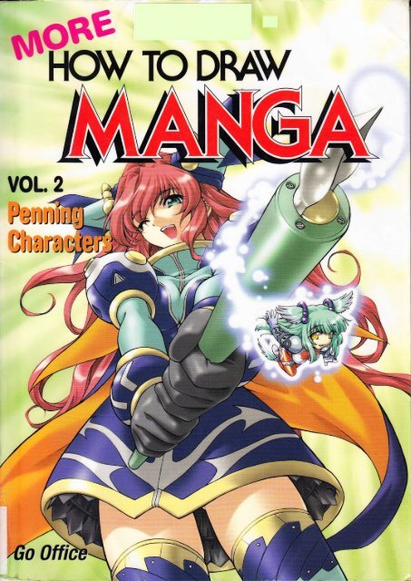
<strong>Penning</strong> Characters<br />
Vol.2
t<br />
HORE HOWT0 DRAW MANGAVoI.2: <strong>Penning</strong> Characters<br />
I Go Office<br />
Copynght @ 20<strong>02</strong> Go 0ffice<br />
Copyright @ 20<strong>02</strong> Graphic-sha Publishing Co., Ltd.<br />
Thrs book was first designed and published by Graphic-sha Publishing Co., Ltd. in Japan in 20<strong>02</strong>.<br />
This English edition was publisned by Graphic-sha Publishing Co., Ltd. in Japan in 2004.<br />
Artwork and Production: Kazuaki Morita, Yumiko Deguchi, Hiroko Shioda, Ushio, Takehiko Matsumo<strong>to</strong>,<br />
Production Assistant:<br />
Production Support:<br />
CwerArtwork:<br />
Hikaru Hagi Gekko, Akira Gokita, Kozue Onishi, Haru<strong>to</strong>, Hi<strong>to</strong>shi Sa<strong>to</strong>, BeE,<br />
Ken<strong>to</strong> Shimazaki, Rio Yagizawa<br />
Takumi Takahashi, Kozue 0nishi<br />
Julie Asakura<br />
Kazuaki Morita<br />
fulish Main T'itle Logo Design: Hideyuki Amemura<br />
Composition and Text:<br />
Heference Pho<strong>to</strong>graphy: Yasuo lmai<br />
Hikaru Hayashi, Rio Yagizawa (Go 0ffice)<br />
EElish Edition Layout: Shinichi lshioka<br />
EnglM Translation Management: Lingua friinca, lnc. (an3y-skmt@asahi-net.orjp)<br />
Phnnir€ Edi<strong>to</strong>r:<br />
Mo<strong>to</strong>fumi Nakanishi (Graphic-sha Publishing Co., Ltd.)<br />
Foreiln Language Edition Proiect Coordina<strong>to</strong>r: Kumiko Sakamo<strong>to</strong> (Graphic-sha Publishing Co., Ltd.)<br />
A{ rqhb reserved. No part of this publication may be reproduced 0r used in any form or by any means<br />
- graphic, electronic, or mechanical, including pho<strong>to</strong>copying, recording, taping, or information s<strong>to</strong>rage<br />
ffd rebieval systems - without written permission 0f the publisher<br />
Ds!firhc<br />
Japflr h.dilhalions Trading Co., Ltd.<br />
' -2- i Sarugaku-cho, Chiyoda-ku, Tokyo, I 01 -0064<br />
E-rna*: id@jpho.co.jp<br />
iJF{:-: @: wrw.lptco. co.jp/<br />
;rs ffro,.rE: March 2004<br />
I<br />
I<br />
sm, ,--m---r&l<br />
*e'csLrcr]I*a
Vot. 2<br />
<strong>Penning</strong> Gharacters<br />
i<br />
a<br />
t ț<br />
!<br />
t<br />
tt<br />
,<br />
:<br />
JT-7I,,<br />
>
Table of Contents<br />
Ghapter 1<br />
Pen Fundamentals ,7<br />
Ghapter 2<br />
Male vs. Female Faces......... ..........52<br />
Pointers in Drawing Cute Female Characters.. ......................54<br />
Creating Adult Faces ........,.,......,,...56<br />
The Basics of the Human Figure .......................60<br />
lnking the Figure: Using the Different Lines Appropriately......... ...................62<br />
Creating a Sense of Volume:Shading .,..,.............64<br />
Distinguishing Female Body Types ......................70<br />
Distinguishing Male and Female Figures........ ......74<br />
Features <strong>to</strong> Modify When Drawing Different Male Builds.. ...,.....76<br />
Drawing Hands and Feet..... .,...,.....78<br />
Hands......... ..............78<br />
Fee1............ ..............81<br />
Waking Up ............. ........................84<br />
The 3 Key Elements in a Gharacter Waking...... .......................84<br />
Sample:A Jolting Wake-up .............88
Chapter 3<br />
Drawing Any Expression lmaginable............,. .......................90<br />
Mouth Movements: Depicting Basic Vowel Sounds....... ........92<br />
Theatrical Eyes .......... ....................96<br />
Combining Features <strong>to</strong> Express Emotions.... ....100<br />
Symbolic Representation of Emotion,.,,,,........ ...............,....104<br />
Using the Mouth <strong>to</strong> S<strong>how</strong> Emotion ..................110<br />
Chibi (Super-deformed) Characters and Vowel Sounds ...........114<br />
Chapter 4<br />
Creating Key lmages and Character Entrance Scenes ........116<br />
Vehicles and Figures: Driving Scenes ........,.....1 18<br />
Suggesting Movement Using a Single Panel: Glancing Back..,........ .......120<br />
<strong>Penning</strong> Techniques That Create Depth ......... .....................122<br />
Making Corrections<br />
........,.............'125<br />
5
The Basic Manga<strong>draw</strong>ing Process: From Beginning ro End<br />
O Rough sketch: Set the composition<br />
at this point.<br />
@ Complete the under <strong>draw</strong>ing.<br />
. "'<br />
[r. v<br />
@ Erase as needed.<br />
3 lnk the <strong>draw</strong>ing.<br />
N'\/'<br />
Iv<br />
@ tne finisning <strong>to</strong>uches: Add special effect<br />
Iines and screen <strong>to</strong>ne.
Pen Fundamentals<br />
l<br />
&ffi1<br />
':<br />
,' ,i<br />
tt::l<br />
.,; : '<br />
.;, ,a a., .:<br />
,'.;r.ir iiMi;,,:. ::.<br />
ari,:r.,.t .31ir:l<br />
\; { '::<br />
I<br />
1'l'<br />
i&,.<br />
\<br />
. 1..
The Key lngredient <strong>to</strong> Manga and<br />
lllustrations is lnking.<br />
Finish using ink only<br />
(Realism <strong>manga</strong> style)<br />
The clear, distinct black strokes of a pen<br />
breathe life in<strong>to</strong> penciled <strong>draw</strong>ings.<br />
A sense of speed is generated<br />
using diagonal strokes.<br />
A gradation effect is created<br />
using kakeam i (crosshatching).<br />
The above was created using only<br />
various forms 0f hatching and solid<br />
blacks. This use of ink allowed me<br />
S,'urirq il'fi']mr: :a- :E<br />
qJE0fl5-rFrI lHnigrmn; :r -r:,r,r<br />
ciarym T'ffifnr[ s .se:<br />
Hatching suggests f lesh<br />
Uniform, parallel, ruled lines<br />
create a shading, almost<br />
silhouette-like effect.<br />
<strong>to</strong> create a soft overall look, while<br />
projecting an intense atmosphere.
l<br />
:<br />
i<br />
:r:,'i this version anticipating that I would use only various<br />
.l:rs of hatching and solid blacks for the final image. I rendered<br />
1-r s.,bjects using powerful, heavy, modulated lines for silhouette<br />
-:s Jagged sound effect lettering allows for the creation of an<br />
,-=-.se mood.<br />
I drew this version anticipating that I would use screen <strong>to</strong>ne for the<br />
final image. With the exception of the final panel, where perspective is<br />
stressed, the overall page is rendered primarily using fine, even lines.<br />
Since the Iinal image will have a lighter feel, I used more simplified<br />
style of sound effect lettering.<br />
-?:i" 2d <strong>draw</strong>ing<br />
--r:E'<strong>draw</strong>ing)<br />
<strong>manga</strong> version:<br />
Here, I used hatching in the<br />
pupils and irises as well.<br />
diagonal strokes used in the<br />
cheeks were carefully<br />
Screen <strong>to</strong>ne version:<br />
I used fine, uniform<br />
lines, giving the<br />
.':r.--; '6ns ygpsion: I filled in the pupils<br />
composition a clean,<br />
-,:i'r; ;: d black and then attached<br />
light look.<br />
r?=:,1'r <strong>to</strong>ne. The diagonal strokes<br />
i+: - :Te ,cheeks are less concentrated<br />
-r- :-.:-
lnking Tools<br />
and Materials<br />
Pens<br />
1'<br />
:<br />
t<br />
The nib inserts in<strong>to</strong><br />
the penholder.<br />
The nib is held<br />
securely up <strong>to</strong><br />
this point.<br />
Pen nib<br />
(Kabura-pen)<br />
Change nibs:<br />
o when the nib becomes worn<br />
o when the tips stad <strong>to</strong> spread.<br />
lnk<br />
Penholders<br />
(Available in wood and plastic)<br />
Many artists feel that wooden<br />
penholders are less tiring on the hand.<br />
Penholder mouth<br />
(Plastic)<br />
Black.ink, drafting ink, and lndia ink are those primarily used.<br />
lf the ink becomes gummy, add water.<br />
The advantage of<br />
drafting ink is that<br />
it dries quickly.<br />
Nibs become worn as they are<br />
used. 0nce your old nib tips<br />
become permanently spread, and<br />
you are no longer able <strong>to</strong> <strong>draw</strong> a<br />
crisp line, replace the old with a<br />
new nib. When inking <strong>characters</strong>,<br />
switch nibs about every 2 <strong>to</strong> 4<br />
sheets in the case of B4-sized<br />
paper (25.7 X 36.2 cm or approx.<br />
10" x 14 1/4').<br />
While lndia ink does take<br />
longer <strong>to</strong> dry than drafting<br />
ink, it gives a "blacker"<br />
finish.<br />
Black or drafting ink<br />
lndia lnk<br />
" ,,i,- rt :: ::,: .tuch ink <strong>to</strong> ihe nib,<br />
if-- . r, := : :- i3 nk jar's rim<br />
Itrr,,,"s.: r:'- ::Jlx end up with drops<br />
lr 1-I :- .':'-' :?itillg,.<br />
..<br />
Paper<br />
o 84 is the standard size for publication<br />
submissions.<br />
. Top quality paper (1 1 0 kg <strong>to</strong> 1 35 kg per<br />
1000 sheets or 121 lbs <strong>to</strong> 148.5 lbs per<br />
ream) or Kent paper is used.<br />
. Manga <strong>draw</strong>ing paper with pre<strong>draw</strong>n<br />
margin lines, which are available on the<br />
market, may also be used.<br />
. Use paper oI a size that will allow a margin<br />
around the entire <strong>draw</strong>ing.<br />
Note: since the /ranga process in<strong>vol</strong>ves penciling<br />
an under <strong>draw</strong>ing, inking, attaching <strong>to</strong>ne, and other<br />
work, most artists use large, durable paper.<br />
j<br />
T
Pgn NibS<br />
The 3 Most Common Nibs: The Kabura-pen, the G-pen, and the Maru-pen<br />
For those with a heavy hand:<br />
For those with a light <strong>to</strong>uch: The G-pen nib is flexible,<br />
making it somewhat<br />
G-Pen<br />
ditficult <strong>to</strong> control.<br />
However, it is capable of<br />
producing fine as well<br />
as thick strokes,<br />
allowing you <strong>to</strong><br />
modulate your lines.<br />
-\r<br />
Kabura-pen<br />
-- s nib <strong>draw</strong>s primarily<br />
=-er lines and allows<br />
':n modulated lines.<br />
. For artists who have a light<br />
<strong>to</strong>uch when using<br />
mechanical or regular pencils<br />
. For those who do great clean<br />
up work with the eraser, not<br />
leaving a single extra mark<br />
. ::r tlrose artists who often<br />
:,tak their mechanical or<br />
'-:;ular pencil points<br />
. ::r'those who tend <strong>to</strong><br />
lines even aftef<br />
'=-a're<br />
::F-alring it up with the<br />
:?ser<br />
For the technicians<br />
Maru-pen<br />
This nib allows you <strong>to</strong><br />
create thicker lines than<br />
with the G-pen and finer<br />
lines than with the<br />
kabura-pen,<br />
--i -.aru-pen comes with its own<br />
r*:,ei penholder. Holders of some<br />
-n ,ficturers cannot be used with<br />
:e -,as of others, so be careful <strong>to</strong><br />
:rr;:;.; brand names when<br />
:irr;-tasing.<br />
r For those who regularly<br />
distinguish between values<br />
when <strong>draw</strong>ing with a<br />
mechanical or regular pencil<br />
(i.e. those skilled in controlling<br />
the pressure applied <strong>to</strong> the pen)<br />
It is ditficult <strong>to</strong> <strong>draw</strong> long<br />
lines with this nib.<br />
However, this is a suitable<br />
nib for those who build up<br />
con<strong>to</strong>ur lines using<br />
multiple short strokes.
@Notethatthepenishelddifferentlyfromwhenwriting'<br />
Figure <strong>draw</strong>n with<br />
the pen held at an<br />
angle close <strong>to</strong> the<br />
paper<br />
,)<br />
\<br />
Figgre <strong>draw</strong>R<br />
holding tne pen al<br />
the, sarne angle.as.<br />
w[en. wt'iting ,',, "',',<br />
Not good<br />
Here, the pen<br />
is <strong>to</strong>o vertical.<br />
ln this figure, the nib caughl<br />
on<strong>to</strong> the paper, resulting in<br />
clumsy-looking strokes.
-riier <strong>draw</strong>ing<br />
Normally, arhsb start wittr the face con<strong>to</strong>urs<br />
and work from $ere.<br />
E*L--.---d**'d*:::1'<br />
...t<br />
lh:te paper <strong>to</strong> an angle that allows you <strong>to</strong> ink more easily.<br />
'lTe iarne holds true when<br />
$mri'ng hair standing on end.<br />
I<br />
r\:.\<br />
o i<br />
0<br />
a<br />
The paper is flipped<br />
<strong>to</strong> ink the hair.<br />
Return the paper <strong>to</strong> its original position<br />
when inking the shoulders. Constanfly<br />
rotate the paper <strong>to</strong> the most<br />
comfortable position when inking. An<br />
artist rarely inks an entire <strong>draw</strong>ing<br />
without moving the paper.<br />
13
I The Basics: Even and Tapered Lines<br />
. Tapered Line<br />
Using both lines with<br />
sharply tapered ends and<br />
blunt, uniform ends allows<br />
for a composition'with<br />
balance.<br />
Figure Drawn Entirely with Tapered Lines<br />
Figure Drawn Entirely with Even Lines<br />
While this<br />
<strong>draw</strong>ing does<br />
have vigor, it<br />
) has a diffuse,<br />
disorderly look.<br />
( q<br />
ft) risure nas<br />
( ))L"acrisper,tidier<br />
),q\) look but is<br />
..K,9 somewhat<br />
s ;;;iffi.
lHiltry fu h<br />
d Taoered and Even Lines: Drawing Nudes rapered rines are key t0 givins the ftesh <strong>vol</strong>ume.<br />
1<br />
\<br />
l,\ '/<br />
k a\<br />
-V<br />
\-<br />
rM<br />
(<br />
'Q<br />
I\tt'<br />
k<br />
\,<br />
(r<br />
\/<br />
A sense of <strong>vol</strong>ume is lacking in figures<br />
<strong>draw</strong>n only in even strokes.<br />
\(<br />
-/<br />
0hnawing Tapered Lines<br />
- )o"awing in a single stroke<br />
2. Building up a line using multiple<br />
'{ 'l @(1<br />
strokes<br />
hactica! application: Adjusting even tines<br />
1<br />
Adjust the lines so that<br />
the ends taper.
EI<br />
l.lsing Heany and Fine Lines (Balancing Heavy and Light Areas)<br />
Make con<strong>to</strong>ur and silhouette lines<br />
heavier than those in the interior.<br />
Balance your<br />
line usage<br />
even in small<br />
compositions.<br />
>.))- I<br />
5r*.1(fi v<br />
These lines are finer<br />
fian the con<strong>to</strong>ur line. t, ,<br />
l1<br />
\<br />
:r;<br />
:rr:<br />
-€<br />
-:!i<br />
ifr<br />
lr-<br />
;5f<br />
\<br />
I<br />
{,.<br />
,,/tr,
Assorted Uses of Heavy and Fine Lines<br />
Here, a G-pen was used,<br />
allowing for full exploitation<br />
of line modulation.<br />
The G-pen allows you <strong>to</strong><br />
<strong>draw</strong> graceful, sinuous lines.<br />
#r<br />
-ru s he most<br />
.lmriron way of<br />
rmrguishing lines.<br />
4m1: reavy lines were<br />
*imr r fie silhouette<br />
irmm :rn<strong>to</strong>ur lines,<br />
urnir iner lines were<br />
"unu: r fie interior.<br />
WfiilI)\I<br />
%ffi9;<br />
ts 1't<br />
This is a delicate<br />
figure rendered<br />
entirely using fine<br />
lines.<br />
>=--<br />
/<br />
F<br />
Use even finer lines<br />
for parts visible from<br />
underneath seethrough<br />
fabrics, etc.<br />
17
Modulating Lines: Building up Lines <strong>to</strong> Produce a Satistying Gomposition<br />
" 3,.: ding up those areas requiring heavier lines afterfirst doing an even inking<br />
)D t(<br />
\---<br />
lnking is not something that has <strong>to</strong> be done in one fell swoop.<br />
0nce you have done a simple first inking of the entire<br />
composition, go over it again, creating a balance between<br />
heavy and fine lines and gradually building up con<strong>to</strong>urs and<br />
silhouette lines using many short strokes.<br />
First inking<br />
Build up con<strong>to</strong>ur and<br />
silhouette lines in the face<br />
and figure as well as crease<br />
lines and lines distinguishing<br />
body parts.<br />
Finished <strong>draw</strong>ing
2, Building up tines right from the start<br />
This technique in<strong>vol</strong>ves using the pen in much the same manner as<br />
you would the pencil. lt is effective when the final is <strong>to</strong> be a reduction<br />
of the original (reducing <strong>draw</strong>ings causes the individual strokes <strong>to</strong><br />
come closer <strong>to</strong>gether, making the execution appear smoother).<br />
-rcer <strong>draw</strong>ing<br />
@<br />
Pen hatching<br />
diagram (Enlarged)<br />
Completed <strong>draw</strong>ing<br />
(reduced size): The<br />
<strong>draw</strong>ing appears <strong>to</strong><br />
have been rendered<br />
using single, Iong<br />
strokes.<br />
)<br />
\ \.=-<br />
19<br />
\<br />
\
fl<br />
Mastering Hatching, Etc.<br />
Hatching basically consists of short, tapered lines <strong>draw</strong>n freehand'<br />
Longer versions become diagonal lines. Hatching adds spice <strong>to</strong> the inking<br />
job and is a finishing technique used in artwork.<br />
These strokes<br />
are a standard<br />
technique aftists<br />
use <strong>to</strong> suggest<br />
"blond hair."<br />
The addition of<br />
these diagonal lines<br />
suggest a blush <strong>to</strong><br />
the cheek and help<br />
give the figure<br />
<strong>vol</strong>ume.<br />
I<br />
Completed inking of conlour, silhouette,<br />
and other major lines<br />
Drawing Tapered Lines<br />
\ Z\.- )-<br />
---_/ \\\<br />
,,,S*S}<br />
: rection perpendicular <strong>to</strong> that of<br />
Ie nib, Avoid pressing down on<br />
:'re pen. Use light, rapid strokes.<br />
Diagonal lines <strong>draw</strong>n<br />
with a downward stroke<br />
(Neck shadows, etc.)<br />
Diagonal lines <strong>draw</strong>n with an<br />
upward stroke [Suggesting<br />
<strong>vol</strong>ume in the chest (flesh), etc.l<br />
r44r1<br />
1l<br />
P'ractical Application of Hatching<br />
and Diagonal Lines<br />
--es€ are used for shading. The key<br />
: :l 'ccus on evoking <strong>vol</strong>ume in the<br />
':-r: and io <strong>draw</strong> strokes in the<br />
,1.-a,. l;'Ie figure's "curves."
Making <strong>characters</strong> Distinctive<br />
^r / t,F .-;42:<br />
ixf''' -'"r"'<br />
-fl-\<br />
//1 f'"f<br />
f' * q<br />
,f--<br />
{<br />
\<br />
J<br />
G
5 Basic Faces<br />
5 Gommon Faces Used for Glose-ups<br />
1. Face Turned <strong>to</strong> the Right (3/4 View) 2. Front View<br />
-:,: 3, I 'i e;r.i dr'rd front view are primarily used when the<br />
::-;a3:-y -akes his or her appearance on the scene 0r<br />
il.e. :'e a"!si l',,ants <strong>to</strong> s<strong>how</strong> the character's face.
\__<br />
I<br />
-\<br />
i<br />
1<br />
t<br />
;<br />
d<br />
t\ & x &<br />
I<br />
\<br />
3, Side View<br />
-:en used for <strong>characters</strong> when<br />
:;raking alone or engaged in<br />
::: nVefsati0n<br />
4. Moderate High Angl<br />
Primarily used in dialogue scenes<br />
5. Moderate Low Angle<br />
This view is effective<br />
when intending <strong>to</strong> give<br />
movement or variety <strong>to</strong><br />
the composition, or give<br />
a character's depiction<br />
impact.<br />
The main differences between this<br />
view and the standard 3/4 view and<br />
the points that you, the adist, must<br />
s<strong>how</strong> the most care are the extent <strong>to</strong><br />
which the crown is s<strong>how</strong>n and the<br />
nose's angle.<br />
Standard 3/4 view<br />
23
1 . 314 View<br />
Approximately the<br />
same distance<br />
€<br />
Slightly larger than the right eye<br />
Even when not intending <strong>to</strong><br />
keep the bridge of the nose in<br />
the final <strong>draw</strong>ing, including the<br />
bridge in the under <strong>draw</strong>ing will<br />
help you balance the eyes.<br />
i<br />
I<br />
I<br />
I<br />
I<br />
I<br />
i<br />
t<br />
'*4<br />
I<br />
*-i,-->i<br />
\ir<br />
:<br />
There should be a gap<br />
between the face's<br />
silhouette line and the<br />
corner of the eye.<br />
The throat's silhouette<br />
line should be further<br />
inward than the chin.<br />
lnk only the tip of the nose.<br />
The line of the neck should<br />
be <strong>draw</strong>n so that it would<br />
connect <strong>to</strong> the bot<strong>to</strong>m of the<br />
ear if extended.<br />
2 Standard Styles for Rendering the Nose<br />
Too close <strong>to</strong>gether<br />
---...--------Good<br />
Z-<br />
v6)<br />
Take<br />
care not <strong>to</strong><br />
space the eyes<br />
<strong>to</strong>o far apart or<br />
:co close <strong>to</strong>gether<br />
Nose rendered using only<br />
shadows underneath<br />
Nose rendered with the bridge<br />
and the nasion (where the<br />
bridge meets the eyes)
itioning the Figure with a 3/4 View Head<br />
. -.:nmon poses s<strong>how</strong>ing the throat's silhouette line<br />
'-1f:er inward than the chin<br />
There are standard positions for the <strong>to</strong>rso (i.e. from the neck down)<br />
used with each of the 5 head views. Since <strong>how</strong> the <strong>to</strong>rso and neck<br />
connect depends on in which direction the <strong>to</strong>rso is faced, I have<br />
compiled a few common samples for you.<br />
_":,rmon poses s<strong>how</strong>ing the throat's<br />
; .ouette line directly under the chin<br />
[,J<br />
,il<br />
ltl-r:l- :te head is <strong>draw</strong>n so this line<br />
I ;r':-y under the chin, the figure<br />
I :?.. s<strong>how</strong>n from a moderately<br />
",ly :i-Ele.<br />
Here, the figure is s<strong>how</strong>n from a<br />
somewhat high angle, displaying<br />
<strong>vol</strong>ume from the shoulders <strong>to</strong> the<br />
N<br />
The neck may appear overly<br />
thick (masculine) when this<br />
line is <strong>draw</strong>n further out than<br />
the chin.<br />
25
2. Front View<br />
Faces with the eyes <strong>draw</strong>n <strong>to</strong>o far apart 0r t00 close<br />
<strong>to</strong>gether are often intended <strong>to</strong> be stylized.<br />
Faces appear most<br />
attractive with the eyes<br />
spaced apart about the<br />
same length as the mouth.<br />
Getting the Best from<br />
the Front View<br />
There should be space<br />
left between the eyes<br />
and the face's outer<br />
con<strong>to</strong>urs.<br />
There are faces<br />
stylized so that the<br />
eyebrows span the<br />
space between the<br />
corner of the eyes<br />
and the face's<br />
con<strong>to</strong>ur.
=mct Views Etfective in Manga<br />
AYa*<br />
-"r :,-:?'con<strong>to</strong>ur is not perfectly<br />
- --al, but s<strong>how</strong>s the face<br />
.,,, -,*: :: fie right. Alternatively,<br />
', :,:,- : s<strong>how</strong> the face turning<br />
: -1.<br />
The nose should also be <strong>draw</strong>n facing either<br />
right or left with the head.<br />
l,ssorted Noses for Front Views<br />
-].*<br />
()l<br />
\a<br />
t:<br />
t<br />
Nose with shadows<br />
underneath<br />
Nose with shadows<br />
under one side<br />
kuk Girths<br />
- :; -ead's<br />
i :::-<br />
112lhe head's width<br />
Appropriate for female <strong>characters</strong><br />
1/3 the head's width<br />
Appropriate for stylized,<br />
<strong>manga</strong>-esque <strong>characters</strong><br />
2/3 the head's width<br />
Appropriate for realistic <strong>characters</strong><br />
and <strong>characters</strong> with naturally thick<br />
necks (i.e. male <strong>characters</strong>)<br />
27
hitioning the Figure with a Front View Head<br />
H.egulu Angle<br />
A frontal view of the face allows the character t0 connect<br />
strongly with the reader. lt is often used with the full figure.<br />
Low Angle<br />
lle character is looking down,<br />
:u:: fie face is seen straight on.
A+B<br />
Shoulders raised<br />
M<br />
^\*t//^<br />
--i: *roulders' and clavicles' con<strong>to</strong>urs<br />
$ uell as the chest's shape take on<br />
:'*:rEnt appearances in high angles<br />
:,r' uren the figure is lying on its<br />
r: -ach. Close-up of the upper body<br />
29
Fractioal Application Sample<br />
Sketch <strong>to</strong> check shading balance<br />
Penned <strong>draw</strong>ing<br />
,l<br />
\:l<br />
i<br />
M<br />
Beference figure<br />
_1[
Note the distance between the eye and ear.<br />
-->is*
hffiitioning the Figure with a Side View Head<br />
/'((<br />
r9<br />
Figures <strong>draw</strong>n at a low or high<br />
angle are rarely paired with<br />
side view heads.<br />
33
4. Moderate High Angle<br />
Regular side view<br />
Moderate<br />
high angle<br />
When <strong>draw</strong>ing a head at a moderately<br />
high angle, lower the level of the eye<br />
and shift the face's axis further away<br />
from the centerline in order <strong>to</strong> distinguish<br />
this angle from a regular side view.<br />
Furthermore, the <strong>to</strong>p half of the head<br />
(the haifl should occupy a larger portion<br />
of the whole.<br />
The jaw<br />
beneath<br />
the mouth<br />
becomes<br />
narr0w.<br />
Nose <strong>draw</strong>n with a bridge<br />
Nose <strong>draw</strong>n without a bridge<br />
1 ',<br />
t<br />
\i<br />
:.<br />
A,+
*<br />
m.cmg trc ileck and the Torso<br />
Pose where the<br />
neck is at an angle<br />
{*<br />
\\ ./'<br />
Pose where the<br />
neck is straight<br />
(1<br />
\l
,/<br />
,<br />
I<br />
i<br />
I<br />
.t-*#F'<br />
I<br />
:e,:c-s arar,tn at moderately<br />
- il- i.i! e.S ile great for<br />
:[ffi {rhE]'e $e back faces<br />
lE ''ei\31'
5. Moderate Low Angle<br />
Regular angle Moderate high angle<br />
The axis is<br />
positioned about<br />
the same as in a<br />
face <strong>draw</strong>n at a<br />
moderaiely high<br />
angle.<br />
i<br />
The <strong>to</strong>p half of the<br />
head occupies a<br />
smaller portion of<br />
the whole.<br />
f<br />
----S. /<br />
G<br />
Establish the<br />
chin's depth,<br />
The guideline for<br />
the eyes becomes<br />
an upward<br />
curving line.<br />
The neck can<br />
easily be <strong>draw</strong>n<br />
<strong>to</strong>o thick, so take<br />
extra care.<br />
'*: , Upwafd<br />
., ' -,: ites are used<br />
::r- ne upper<br />
": -,1:reyelids.<br />
,: :,:^. pafallel,<br />
. :: res for<br />
:. :+ -:s used <strong>to</strong><br />
ir"l- :ing the ear's<br />
:::- ng.<br />
Nose <strong>draw</strong>n with a bridge<br />
Nose <strong>draw</strong>n without a bridge
Connecting the Neck and the Torso<br />
Neck con<strong>to</strong>ur line<br />
The entire figure <strong>draw</strong>n from a low angle<br />
01<br />
Retaining the head in an "upward<br />
looking" position, but tilting the<br />
neck affects the length of the<br />
neck's silhouette line.
k".<br />
,<br />
i<br />
!t<br />
I<br />
\<br />
(,-<br />
Comparison of Neck Con<strong>to</strong>ur Lines<br />
\\<br />
Note that while the figure's<br />
pose is the same for all of<br />
these figures, the neck's<br />
con<strong>to</strong>ur lines change<br />
<strong>to</strong> which direction the head<br />
faces (i.e. <strong>how</strong> the neck and<br />
figure connects changes).<br />
I<br />
i<br />
l '---<br />
\\ ,/<br />
Moderate High Angle Front View<br />
Side View<br />
T9
Ghanges in Eye Shape for Each of the 5<br />
Front View<br />
Side View<br />
GG<br />
\l_ /<br />
$@<br />
@,G.<br />
Large,<br />
Round<br />
Eyes<br />
QB
,/)<br />
,'/lt<br />
,t1B<br />
-\ (.<br />
I\.<br />
l\\<br />
3/4 View<br />
Moderate High Angle<br />
Moderate Low Angle<br />
@<br />
I<br />
l:<br />
tr(
Back of the Head<br />
Depictions of <strong>characters</strong> from behind are<br />
essential in <strong>manga</strong>.lf you are able <strong>to</strong> <strong>draw</strong><br />
<strong>characters</strong>' heads from behind, the possibilities<br />
for dialogue scenes will expand dramatically.<br />
Skeletal <strong>draw</strong>ing of the back of the head<br />
Sample Close-ups<br />
Given the variety in panel<br />
shapes and margin sizes,<br />
the possibilities<br />
compositions are endless<br />
lf you can <strong>draw</strong> this area<br />
successfully, you can<br />
create a dialogue scene.<br />
Target area <strong>to</strong> include in a<br />
panel, trimmed as needed
ilon :.-atures in Drawing the Back of the Head:The Ear and Hair Flow<br />
r$hre' f€ Ear ls Visible<br />
i'<br />
u"/^y'/ ll<br />
ilqilll<br />
\- -<br />
"'rlrx- et !ef. Fig')<br />
Front View (Ref. Fig.)<br />
ffp<br />
litr/<br />
r<br />
When the bangs have<br />
plenty of <strong>vol</strong>ume:<br />
S<strong>how</strong> the bangs clearly<br />
flutfing outward. Ensure<br />
that you do not give the<br />
back of the head <strong>to</strong>o<br />
much hair.<br />
,gll'ifflii- :E ::a: and chin are<br />
Ii]illl:l ri<br />
'lirili': s p-ss hair in the<br />
':lillllll"?: 1-r: SidebUrns, and<br />
tr* 'ar s short.<br />
r:rru :E "ead so that the<br />
lll'r'tU*: :r ].]e back iS<br />
litr{:i*, lsemible.<br />
,fl{l\rrr fe Ear ls Not Visible<br />
-'ltflt- ?,rr tef. Fig.)<br />
illllilnfl" :E -air has little <strong>vol</strong>ume:<br />
ruli :p. 3re not visible, and<br />
tiLrlrt:-rJ- lre hair is long, since<br />
rx :e <strong>vol</strong>ume, it should<br />
iliiiti-r lr-s€lY <strong>to</strong> the head.<br />
- rH -ii1: should have a round<br />
iiii:r;: -.f'"1 fie <strong>to</strong>p of the head<br />
i r ,d-^.<br />
Front View (Ref. Fig.)<br />
With <strong>vol</strong>uminous hair:<br />
o Use the hair's silhouette lines and<br />
flow <strong>to</strong> suggest clearly that it is in<br />
fact the back of the head.
The Eyes are the Face's Key Feature.<br />
intaining Variety in the Characters' Eyes<br />
These 3 beauties all<br />
have completely<br />
different eyes. Desigthe<br />
eyes so that the<br />
particular character<br />
can be recognized<br />
even in a close-up<br />
of just the eyes.<br />
%x<br />
Figure s<strong>how</strong>ing variety in the hairstyle,<br />
face shapes, and clothes<br />
Not good<br />
The eyes constitute a major<br />
stylistic point. Give each<br />
character a distinctive eye<br />
shape.<br />
U<br />
Close-ups<br />
+\:r€>-':lf<br />
d"s
finffimg Process<br />
. aa::rl"xing: Process for Rendering Eyes Using Primarily Hatching<br />
@<br />
Under <strong>draw</strong>ing<br />
::.: ,vith the upper eyelid. Draw<br />
:.-r: rir-veS while rotating the<br />
.;=' - the direction easiest<strong>to</strong><br />
:-n,<br />
:<br />
2. Draw the upper eyelid. Build<br />
up strokes, keeping them at a<br />
comfortable. not overly long<br />
length,<br />
3. Draw the lower eyelid. Since<br />
you are using hatching <strong>to</strong> render<br />
the eye. make sure that the fine<br />
con<strong>to</strong>ur of the lower eyelid does<br />
not e<strong>vol</strong>ve in<strong>to</strong> a single (solid) line.<br />
Use fine, connecting strokes.<br />
", , :: outlines of the<br />
.-: :; light<br />
r' : r -r- S Take care <strong>to</strong><br />
, : . -*ing the iris<br />
r..--: -:ll becoming a<br />
:-a<br />
Since these are light<br />
reflections, use as fine<br />
a solid line as possible.<br />
5. tur the hatching inside the iris,<br />
use curved lines, maintaining an<br />
awareness of the iris's curved<br />
surface.<br />
7. To finish the eyelashes, the key is t0<br />
<strong>draw</strong> shorter lines clustered around a<br />
long, central line. Take care <strong>to</strong> use<br />
beautiful. tapered lines.<br />
. ,.' -atching <strong>to</strong> finish off the<br />
.-: cupil. Build up light and<br />
- r::,r, rotating the paper in<br />
-<br />
' : '=.ltron easiest <strong>to</strong> <strong>draw</strong>.<br />
When needed, add+<br />
for white highlights.<br />
8. Finished!<br />
45
'SiECon<strong>to</strong>urLines:Process<strong>to</strong>rRenderingEyesUsingPrimarilyCon<strong>to</strong>urLines<br />
@<br />
t Draw the con<strong>to</strong>ur of the uPPer<br />
eyelid. (the Paper often must be<br />
rotated <strong>to</strong> the direction easiest <strong>to</strong><br />
<strong>draw</strong>,)<br />
Draw the con<strong>to</strong>ur<br />
so that both ends<br />
come <strong>to</strong> distinct<br />
points<br />
2. Draw the con<strong>to</strong>ur<br />
of the lower eYelid.<br />
Take care <strong>to</strong> Prevent<br />
the con<strong>to</strong>ur from<br />
becoming overlY<br />
thick. (lf the <strong>draw</strong>ing<br />
is small, then You<br />
may simPlY use a<br />
solid line.)<br />
Use ultra fine lines<br />
for light reflection<br />
outlines.<br />
<strong>draw</strong>ing the iris<br />
outline is <strong>to</strong> use<br />
a uniform, heavy 3. Draw the iris, pupil,<br />
and light reflections.<br />
The inside oI the<br />
dotted lines<br />
the actual PuPil<br />
4. Draw the eyelashes and the inside ol<br />
the iris. X indicates which areas are <strong>to</strong><br />
be filled with solid black'<br />
Ensure that eac<br />
eyelash ends ir<br />
a clear Point.<br />
are connected.<br />
5. Spotting Blacks and Hatching<br />
@<br />
6. Finishedl White highlights<br />
lf the eyelashes are rendereo<br />
solely in solid black and end -<br />
with a rough, crude feel, add<br />
Iine, individual lines seParate:<br />
from the main lashes.
uishing<br />
Types<br />
Upward Titted Eyes<br />
The following pages discuss 5 common eye types:<br />
standard eyes, upward tilted eyes, Oownward-iitted<br />
eyes, large, round eyes, and almond_shaped eyes.<br />
Downward Tilted Eyes<br />
The corner of the<br />
eye is lowered.<br />
:tandard Eyes<br />
6\=44<br />
-mward Tilted Eyes<br />
A\2<br />
@
[-arge- Round Eyes<br />
Standard eyes<br />
Downward tilted eyes<br />
tf you find your large, round eyes resemble<br />
standard or downward tilted eyes, use your<br />
ingenuity and adjust as follows:<br />
. 0mit <strong>draw</strong>ing the lower eyelid,<br />
. Make the irises extra dark, or<br />
adjust <strong>how</strong> you render the eye's interior, etc.<br />
<strong>More</strong> large, round eyes<br />
Almond-shaped Eyes<br />
_i;,1r,ri -rofl gygg Standafd eyeS<br />
;1,1,-;'i i!Jr almond-shaped eyes<br />
,;,,rard titted or standard eyes,<br />
=Ei:-:,8<br />
-si ,rr,i" r]tr"-t)'and adjust by narrowing<br />
+*: ]tE!: r_<br />
<strong>More</strong> almond-shaPed eYes<br />
a8
Distinguishing Ages<br />
t*aking Children Look Ghildlike<br />
-roer Child with a Mature Face<br />
idult's face<br />
Child's face<br />
Somewhat Mature Child<br />
chitd<br />
This face basically has the same shape<br />
Here, the face's con<strong>to</strong>ur is ditferent and<br />
con<strong>to</strong>ur as that oI the mature face, but the the facial feafures' proportions have been<br />
features have been altered.<br />
adjusted.<br />
. The eyelashes were omitted.<br />
o The cheeks were made fuller.<br />
o The eyes were enlarged.<br />
. The eyes' position was lowered.<br />
. The bridge of the nose was reduced. o The eyes were spaced farther apart.<br />
. The portion taken up by the upper part of<br />
the head was enlarged.<br />
Not good<br />
To <strong>draw</strong> a child's face,<br />
concentrate all of the facial<br />
features <strong>to</strong>ward the lower<br />
half of the face.<br />
The presence of eyelashes<br />
and small eyes tend <strong>to</strong><br />
detract from a childlike<br />
appearance.<br />
Mature face<br />
Moderately childlike face<br />
Childlike face<br />
49
ItffiErencs between Adult and Child Faces<br />
Adult's Face<br />
Child's Face<br />
Smallish eyes<br />
Long<br />
The nose should<br />
be made longish.<br />
The nose should<br />
be kept small<br />
and_Shott.<br />
Thickish neck<br />
Position the eYes<br />
higher and make<br />
fiem smaller than<br />
you would ior a<br />
child's face. (lf<br />
you are using the----t<br />
adult's face as i<br />
your standard,<br />
I<br />
tren position the ----i<br />
eyes lower for a i<br />
child character.)<br />
Draw the neck tilted<br />
and on the narrowside.<br />
Long span<br />
ti<br />
This figure s<strong>how</strong>s<br />
--the 2 laces<br />
overlapping. Drav,<br />
the child's feature:<br />
------from the nose<br />
downward ,iutting<br />
out somewhat <strong>to</strong><br />
---------gain a "childlike<br />
neck appearance.<br />
thick and<br />
relatively straight<br />
up and down.<br />
The upper parl of<br />
the head occuPies<br />
a lesser portion.<br />
The<br />
upper<br />
part of<br />
the heat<br />
occupE<br />
a greait<br />
portior<br />
f frnon<br />
v_<br />
50<br />
3'''e fie cheeks angular -'---"' con<strong>to</strong>urs <strong>to</strong><br />
:ener-ate an adult" look.<br />
Give the cheeks roundish con<strong>to</strong>urs <strong>to</strong> adult's createl<br />
create a "childlike' look.<br />
childlike look
Mm$ishing Youthful and Elderly Faces<br />
Give older male<br />
<strong>characters</strong> large,<br />
distinct nose bridges.<br />
The neck should be<br />
short and thick.<br />
sarrfiars in Aging Gharacters<br />
Not good<br />
. Reduce the size of the eyes and irises.<br />
r 0mit the eyelashes.<br />
r Give the hair less <strong>vol</strong>ume.<br />
' :-r-,1 character's<br />
iliii:rli -: i.r9S afe lafge<br />
ifrll :E -,:Se and mOth<br />
,,,, ,, ,r,*ly.<br />
the mouth's sides still does<br />
not age the character.<br />
@,,, ae I<br />
\G) r<br />
sratrs Wrinkles alone do not make an old person.<br />
Not good<br />
I ir_-! man'S face<br />
, r --= iandard (slightly<br />
:' , ,-: : ied) eyeS, thiCk<br />
',1;":',r,-< afld hair, and<br />
,. -i nose and<br />
C. ..D<br />
I<br />
(-)<br />
Giving the eyes a<br />
downward tilt facilitate<br />
suggestion of mature or<br />
elderly character.<br />
K
Male vs. Female Faces<br />
Male and female <strong>characters</strong> share virtually the<br />
same eye, nose, mouth, and ear positioning.<br />
Female Character<br />
Give the hair a fine<br />
and supple appearance.<br />
Avoid making the<br />
eyebrows thick.<br />
Androgynous face<br />
lnclude the<br />
eyelashes.<br />
Use curved lines<br />
for lhe cheeks.<br />
1-/<br />
t-/<br />
Accentuate the<br />
lips'roundness<br />
The neck is thin.<br />
Male Character<br />
Be conscious of<br />
using thick lines<br />
for the hair.<br />
Draw thick, clearly<br />
delineated eyebrows.<br />
Keep the lips<br />
simple: just add<br />
a shadow.<br />
,se angulu lines for<br />
:E ?De s Gon<strong>to</strong>ur<br />
-:e reak is fiick.<br />
52
&rving a Gharacter That Feminine Touch<br />
Designing a Character<br />
That Looks Feminine<br />
o Enlarge the eyes.<br />
o Darken the eyelashes.<br />
r Move the neck con<strong>to</strong>ur<br />
inward, and <strong>draw</strong> the<br />
neck long and thin.<br />
. Accentuate the<br />
eyelashes and lips.<br />
. Use more detail in<br />
the hair.<br />
ilfltaking a Guy Look Like <strong>More</strong> a Guy<br />
Designing a Character<br />
That Looks Masculine<br />
r Reduce the size of the irises.<br />
o Make the neck thicker.<br />
. Use a heavy line for<br />
the face's con<strong>to</strong>ur and<br />
thicken the eyebrows.<br />
. Accentuate the bridge<br />
of the nose.<br />
facial con<strong>to</strong>ur can also<br />
be applied <strong>to</strong> a male<br />
character's face.<br />
Angular, bony facial<br />
con<strong>to</strong>urs are not<br />
usually used with<br />
female faces.<br />
Lv
Pointers in Drawing Cute<br />
Female Characters<br />
1, Enlarge the eyes.<br />
Good<br />
Not good<br />
Here, the eyes are<br />
small and the bridge<br />
of the nose is preser<br />
Smallish eyes<br />
2. Omit the bridge of the nose.<br />
Downward tilted eyes<br />
lM@m<br />
Upward tilted eyes
0trte Accessories and Hairstyles<br />
{<br />
1 't,'l\i<br />
,r\' ,,<br />
\-<br />
I<br />
The headband should<br />
be <strong>draw</strong>n coming<br />
behind the ear.<br />
r li :':nytail<br />
z----=\-_<br />
L<br />
'r\ilNtrr,),r<br />
Short, high piggy taits<br />
,,' , :- Glasses (Boxy, prominent frames s<strong>how</strong>n)<br />
k<br />
Bound frames<br />
(No ,*rames around lensesl<br />
55
Greating Adult Faces<br />
Yourfiful Character<br />
Mature Character<br />
Reduce the<br />
sizes of the<br />
eyes and<br />
irises.<br />
^<br />
S. W<br />
The eyes are<br />
made large.<br />
$<br />
-<br />
Lengthen the<br />
distance from<br />
the lower lid <strong>to</strong><br />
the nose.<br />
-rb
Use fewer lines in small <strong>draw</strong>ings.<br />
ci
a? nJ<br />
Pay attention <strong>to</strong> tlt:<br />
size of the eyes.<br />
Give the neck more<br />
gifth that you would<br />
for a young character.<br />
Rendering the Closing of the Eye and Depicting Eyelashes<br />
Sidelong<br />
Eyelid<br />
J<br />
!i 3 :J!,,:a a;rgle. closed eYes follow<br />
i f,!'Nr^r[?i] lUn{8.<br />
5E<br />
At a low angle, the eYes<br />
take on an uPward curve.<br />
Use the same downward curve for<br />
the eyelashes of the uPPer eYelid<br />
that you would for a closed eYe.
C;<strong>to</strong>se-ups of the Lips<br />
I<br />
t<br />
,@<br />
l_<br />
\@<br />
59
The Basics of the Human Figure<br />
Making Etfective Use of Even and Tapered Lines<br />
re<br />
Uentuating ffe muscular<br />
-ati'e urill allow you <strong>to</strong> suggest<br />
:e nardness of the male<br />
:cd'y. so use even lines<br />
=, "r<br />
Orginnrg of \ /<br />
s'roulder blade and<br />
" 3 b0ne con<strong>to</strong>urs.<br />
\<br />
Use a tapered line for the<br />
point where the shoulder<br />
joins the neck, since it<br />
also marks the swell of<br />
the muscle.<br />
The bony shape of the elbow<br />
is discernible. Use both even<br />
and tapered lines when<br />
<strong>draw</strong>ing a male character in<br />
order <strong>to</strong> achieve a rugged,<br />
craggy appearance.<br />
While the suit jacket is<br />
roomy, undulations form<br />
owing <strong>to</strong> protrusions<br />
and recesses in the<br />
body, such as the<br />
shoulder blade, waist,<br />
and elbows.<br />
-lraw a downward, tapered<br />
re cutting ever so slightly<br />
"'*ard. This subtle <strong>to</strong>uch<br />
,,,"1, accentuate the figure's<br />
- :.rscular look, generating<br />
a sense of manliness. ln<br />
:cntrast. use smooth,<br />
Jicroken lines for a female<br />
i)<br />
::: :: .O<br />
waist{o-hip con<strong>to</strong>ur<br />
\<br />
'N<br />
),<br />
A\\<br />
,r)<br />
i<br />
N<br />
Bunching formed by the<br />
loose trouser fabric.<br />
.\<br />
r>
Use a tapered line<br />
where the swell of the<br />
breast begins, since the<br />
breast does constitute a<br />
natural mound of flesh.<br />
:ir're fiese are inward-<br />
:i'-tng wrinkles, use<br />
rered lines.<br />
ryf: we see a tapered<br />
ii'r{: ?/en strokes used<br />
lq-,ier <strong>to</strong> suggest the<br />
llc :reated by the bent<br />
r;. Slnce the folded<br />
'*sfi- ts concentrated in<br />
l. rrard direction, the<br />
se' sfoke is the main<br />
iE<br />
Even strokes are used<br />
here <strong>to</strong> delineate the<br />
staft of the <strong>to</strong>es on the<br />
<strong>to</strong>p of the foot, while<br />
tapered strokes are<br />
used for the underside.<br />
These diagonal strokes<br />
are not used with<br />
nudes. They appear<br />
here <strong>to</strong> suggest the<br />
roundness of the<br />
blouse's shoulder. Use<br />
even lines.<br />
Use rounded, diagonal<br />
lines <strong>to</strong> suggest the<br />
bulge of the kneecap<br />
underneath jeans or<br />
snugly fitting pants.<br />
This shading. used <strong>to</strong>r re<br />
underside of a leg dad r<br />
tighty fitting jea,rs. s tr<br />
same as that usec or a<br />
nude figure"<br />
61
Pointers in Thickening (Darkening) Lines<br />
Making the line heavier in strategic locations<br />
will generate a sense of <strong>vol</strong>ume and<br />
presence.<br />
Juncture where the<br />
Jnderarm and other<br />
,res overlap<br />
lnside of the neckband and<br />
gap between the collar and<br />
neck<br />
Shadow forming<br />
as air moves<br />
under the cloth<br />
This figure was <strong>draw</strong>n using a<br />
uniform line thickness. While this<br />
is acceptable when designing a<br />
character or when producing<br />
anime genga (<strong>draw</strong>ings of key<br />
action scenes), in the case of<br />
<strong>manga</strong>,il makes for an<br />
unimpressive product.<br />
o<br />
Line Modulation<br />
When emphasizing<br />
form, use an even<br />
line.<br />
,-z--\<br />
Use a modulated line when<br />
intending <strong>to</strong> accentuate softness<br />
or a sense ol <strong>vol</strong>ume.<br />
J -t : tird:<br />
:r:t:-i-: -S f'!<br />
ir*j i"rlf<br />
-,:t-- - El:l<br />
lre:<br />
Here. portions of lines have been<br />
modulated by building them up<br />
.rslrc a dic or technical pen.<br />
/
in nig! and low angtes, use heavier lines<br />
*0r oDlects c<strong>to</strong>se <strong>to</strong> the picture plane.
Lighrsource y#l;Hiff'il::,ffiT1ili;ii$il:'ffi:li:'<br />
"g<br />
Use trick, heavY lines<br />
for tre side oPPosite<br />
$e light source.<br />
Light<br />
L<br />
Source
\<br />
lnked <strong>draw</strong>ing<br />
Hatched <strong>draw</strong>ing<br />
Under <strong>draw</strong>ing<br />
Screen <strong>to</strong>ne finish (Screen t0ne ,,,,,as crc ri .s<br />
developed as an alternative f0r l.a:Eh.r-a"c'<br />
cross-hatching)<br />
65
hactirxlApplication: Achieving a Sense of Volume<br />
Using Hatching, Etc.<br />
Blouse & Tight Miniskirt<br />
Use clean lines for<br />
blouse creases.<br />
I<br />
\<br />
--qr'<br />
--/-.
Tight T & Jeans<br />
Since this tufileneck<br />
has a snug fit, use<br />
short, diagonal lines<br />
for shading. Use widely<br />
spaced lines for sweaters.<br />
,)<br />
Unlike with the<br />
\-/_--z<br />
sweater, use<br />
clean, fine,<br />
diagonal lines for<br />
the T-shirt.<br />
-te ra,gonal lines<br />
iUlrtu :i,'3geSt the<br />
ru::rg s texture.<br />
"y :'reaters, use<br />
llfllE: lr-es<br />
lr,ng-F-afi the<br />
rlnts; :r-d on the<br />
.ilf--E<br />
Depending on the angle,<br />
it may be better <strong>to</strong> omit<br />
shading under the chest<br />
<strong>to</strong> make this snugly<br />
fitting shirt looks properly<br />
like a T-shirt.<br />
67
faffig the Back<br />
-E srslMer blade and waist are the main<br />
!ry pa!"E atrertins crease formation in<br />
nnffirnq. Add creases and diagonal strokes<br />
-fu slrading focused primarily on the right or<br />
eQ $uullder blade, depending on the<br />
drectb{r that fie figure faces.<br />
Blouse<br />
Use broad<br />
shadows.<br />
Emphasize<br />
them.<br />
Sweater<br />
T-Shirt<br />
Single-stroke<br />
crease<br />
Shadow<br />
indicating the<br />
shape of the<br />
shoulder blade<br />
Raising both shoulders<br />
causes the right and left<br />
shoulder blades <strong>to</strong> shift<br />
closer <strong>to</strong> the spine.<br />
Wearing a snug{itting<br />
blouse in the same<br />
pose, an inverted Y<br />
Sunken areas<br />
K<br />
lmagine 2<br />
rhombuses when<br />
<strong>draw</strong>ing the<br />
shoulder blades.<br />
68
fi.bing Lines <strong>to</strong> Reinforce Body Types<br />
"<br />
Emphasizing Curves<br />
\rlare extensive<br />
tse of diagonal<br />
nes and solid<br />
:racks <strong>to</strong><br />
u-derscore the<br />
rrfast of the<br />
ir;ure's hills<br />
rr1 valleys.<br />
-.?'\9<br />
o Drawing Slim Figures<br />
Use as unmodulated<br />
lines as possible for<br />
the figure's con<strong>to</strong>urs.<br />
--ese diagonal lines<br />
:rading) on and<br />
r:emeath the<br />
r-est emphasize the<br />
"qne I of the breasts<br />
"rsii i€avy lines<br />
u r:centuate<br />
nr :f:est, waist,<br />
!lrr: - lPS.<br />
Use a genty<br />
sloping curve<br />
from the hip<br />
<strong>to</strong> the thigh.<br />
----.-><br />
V<br />
--- ,nOtrf<br />
l*Ir:5<br />
\<br />
D*J,,r'<br />
Drawing the Back
nguishing Female Body Types<br />
Average Build Slender Build Athletic Build<br />
When <strong>draw</strong>ing the<br />
arms and legs,<br />
visualize a long,<br />
smooth column.<br />
Draw the neck on the<br />
shorl side <strong>to</strong> evoke<br />
the proper look.<br />
Muscular shoulders<br />
The limbs are<br />
clearly indented<br />
at the joints. ....<br />
\<br />
F eshy thighs<br />
Slim thighs:<br />
Visualize a uniform<br />
column for the legs<br />
as a whole when<br />
<strong>draw</strong>ing.<br />
Bulging muscles<br />
appear in the<br />
thighs and calves.<br />
Esg<br />
Rectangle<br />
lnverted triangle<br />
Draw cherubically<br />
chubby fingers gently<br />
tapering from knuckle<br />
<strong>to</strong> fingertip,<br />
i[-< ru'r],i':.:: l?<br />
s-r:Lir:E": :i-a? l:3' Ie<br />
:j15 :r:r:i -,:E<br />
Draw long, slender<br />
fingers.<br />
The shoulders and hips<br />
have approximately the<br />
same width.<br />
Give this figure wider<br />
shoulders than hips.<br />
Draw large joints tc<br />
generate an angula<br />
look.
Key Feature in the Side View: The posterior<br />
Average Build<br />
Structural Diagram<br />
Take care with thickness of the arms and wrists and the shape<br />
of the calves.<br />
Slender Build<br />
Structural Diagram<br />
Athletic Build<br />
Structural Diagram<br />
The waist does<br />
not taper, and<br />
the posterior<br />
protrudes.<br />
L'rnon<br />
ll/<br />
+,h\\<br />
ll ,i \<br />
l, / Sweilofagenfly<br />
l! I curvinscon<strong>to</strong>ur<br />
ir (<br />
) ,'\<br />
\s<br />
The shoulder and back<br />
of the posterior can be<br />
connected by an almost<br />
perfectly straight line.<br />
i ; Stender<br />
l,i:<br />
ll tl straight<br />
r( l,.t<br />
\i<br />
Since the shoulders<br />
and chest are<br />
muscularly developed,<br />
the posterior ends<br />
further inward.<br />
/{ il<br />
i,a<br />
t' b.<br />
tl<br />
(, ('*"*<br />
\*<br />
(ey Feature in the Rear View:<br />
"Tm Shoulder Blade<br />
The back has greater<br />
amounts of fatty<br />
tissue in an average<br />
build. The shoulder<br />
blade juts out stighfly.<br />
K<br />
The back on a slender<br />
build is on the thin<br />
side, and the shoulder<br />
blade is clearly<br />
visible.<br />
The athletic build<br />
is muscularly<br />
developed. The<br />
shoulder blade is<br />
visible <strong>to</strong> the point<br />
where its skeletal<br />
shape is clearly<br />
distinguishable.<br />
i<br />
I<br />
W<br />
71
./ tt, p, / breast size, the<br />
\ 1 Al<br />
-l &\r\<br />
) beyond the tip of<br />
--\<br />
/t \ tnenose.<br />
,/\<br />
// \\<br />
t( , \ \<br />
V\
When Wearing a T-Shifi<br />
For average-sized breasts, the chest is moderately accentuated<br />
Draw few creases in the clothing for small breasts and deep<br />
creases for large breasts. Use hatching, etc. <strong>to</strong> distinguish<br />
the different sizes.<br />
." -\r \ .////<br />
i\<br />
fl \<br />
',<br />
( ,/,<br />
,,-\\ L)<br />
a-=-'-- /<br />
"'\,,r,<br />
/-'-<br />
(,v<br />
,<br />
owi<br />
l\*<br />
\,r', \, \<br />
I<br />
\,M<br />
:pr small breasts, the chest is rendered in typical fashion<br />
4<br />
?-/<br />
\\ \<br />
%\2,,-'<br />
:!'n large breasts, the chest is accentuated <strong>to</strong> the extreme<br />
-^<br />
/r<br />
i N*<br />
*y<br />
*l(*' -<br />
N)
nguishing Male and Female Figures<br />
j,'raden the<br />
sloulders of male<br />
rharacters. The hips<br />
should be narrower<br />
fian the shoulders.<br />
As men and woman have different skin<br />
and skeletal structures, care should be<br />
taken with the figures' siihouettes.<br />
The hips of a<br />
female character<br />
should be as wide<br />
or wider than the<br />
shoulders,<br />
The neck is long<br />
and slender.<br />
While brawny<br />
male <strong>characters</strong><br />
do have beefy<br />
-nighs, the thigh<br />
should never have<br />
more girth than<br />
]te waist.<br />
Accentuating the<br />
calf muscles<br />
:reates a robust<br />
,ook.<br />
The <strong>to</strong>rso of a male figure is<br />
thicker than that of a female<br />
The arm is slender and graceful.<br />
The waist is trim and may be <strong>draw</strong>n<br />
with the same girth as that of the<br />
fattest paft ol the thigh.<br />
Adding lines <strong>to</strong> the<br />
knees <strong>to</strong> suggest<br />
the kneecap evokes<br />
a rugged appearance,<br />
Depiction of musculature and skeletal<br />
structure is often omitted from a<br />
female figure's arms, s<strong>to</strong>mach, knees,<br />
and legs.<br />
)ravring the arms thick and<br />
:rpnasizing musculature will set<br />
a snarp contrast with those of a<br />
'erale figure.<br />
,1.-
- =:rent Iines should also be used <strong>to</strong> <strong>draw</strong><br />
-:.' ard female figures. Use finer lines,<br />
:*rr.'., ng less pressure <strong>to</strong> the pen when<br />
r::,, irg female figures.<br />
Not good<br />
\ t\<br />
, /,1'<br />
\<br />
Here we have a poorly <strong>draw</strong>n sample, where<br />
not only the lines, but also the shoulder<br />
blade and the posterior are handled in the<br />
manner of a male figure.<br />
h<br />
)<br />
I<br />
Here we have a well-<strong>draw</strong>n sample, where the lines are<br />
flowing and the pans of the back (i.e. the shoulder blades,<br />
spine, and posterior) have been handled differenfly from<br />
that of a male figure.<br />
z___--<br />
Use angular<br />
shadow <strong>to</strong> suggest<br />
thickness in the<br />
hard muscles of a<br />
le figure<br />
Use a crescent<br />
shadow for giving<br />
<strong>vol</strong>ume <strong>to</strong> a female<br />
figure's curved<br />
surfaces.<br />
75
ffien<br />
Drawing Different Male<br />
Adjusting the Neck's Thickness and Length<br />
O The neck's girth<br />
@ The shoulders' breadth<br />
@ The <strong>to</strong>rso's thickness<br />
\l<br />
@ The arms'<br />
and legs' girth<br />
This figure features a long and<br />
Despite that the shoulders of this<br />
slender neck, creating the look figure are the same, the thicker<br />
of a style-conscious tyPe male<br />
and shofter neck suggests a<br />
character.<br />
rugged, muscular character.<br />
Adjusting the Neck and Shoulder Width<br />
FM /rv\ Fr7<br />
Adjusling the Torso's Thickness:<br />
Suggesting a Muscular Build<br />
Here, we see narrow shoulders<br />
and a slender neck, suited <strong>to</strong>ward<br />
adolescent boys and young men<br />
with slender builds.<br />
Muscular build<br />
Average build<br />
This expanse<br />
suggests the<br />
thickness of the<br />
<strong>to</strong>rso from the<br />
shoulder.<br />
Here we see a broad shoulderec<br />
build. Top the shoulders with a<br />
short neck.<br />
Broaden the<br />
shoulders.<br />
I<br />
Average build<br />
Y,J<br />
Accentuate the<br />
muscles in the<br />
shoulders and<br />
beef up the<br />
arms,<br />
--\-./;<br />
i<br />
The curved line extending<br />
from the underarm <strong>to</strong> the<br />
waist is a key Point.
Distinguishing Average Builds from Muscular Builds<br />
The key points in distinguishing<br />
an average build from a brawny<br />
build lie in the neck, the chest,<br />
and the arms.<br />
Drawing the arm on a brawny<br />
build at about 1,5 times that of<br />
an average-build character will<br />
establish a clear distinction.<br />
This con<strong>to</strong>ur<br />
suggests a<br />
well-developed<br />
chest.<br />
Avoid <strong>draw</strong>ing abundant<br />
muscle con<strong>to</strong>urs on the<br />
abdomen of an averagebuild<br />
character: keep it<br />
simple.<br />
The addition of this line<br />
indicating the bot<strong>to</strong>m of $e<br />
ribcage gives the abdomen<br />
a taut appearance,<br />
Flank muscles<br />
\erage Build<br />
-,* reck and<br />
:e lTn are<br />
rerir at<br />
*E :AJTE<br />
il.ri€SS.<br />
Muscular Build<br />
.F,<br />
.:Ls:ng the<br />
i'r,f;r;eSS Of the<br />
:es: and girth of<br />
:rE :{-,."ts and neck<br />
iszf, shes a<br />
:r=r-xrce in build,<br />
*r,,ry ri fie StOmaCh<br />
s =r6ered<br />
the<br />
ialE<br />
tL<br />
The chest on a<br />
muscular build<br />
appears puffed<br />
out.<br />
This figure s<strong>how</strong>s<br />
the muscles of<br />
the abdomen<br />
accentuated.<br />
77
ff<br />
chitd<br />
-u:l/.r<br />
,a<br />
\<br />
chird<br />
\<br />
/\<br />
Nchitd<br />
mMan
Lines Used on the Back<br />
of the Hand<br />
A man's hand has a rugged, knobby<br />
appearance. Depicting the skeletal<br />
and muscular structure will elicit a<br />
3-dimensional feel.<br />
Draw the lines on the back<br />
of the hand extending from<br />
almost the knuckles'<br />
centers.<br />
Emphasize the knuckles.<br />
----.-'t/"-'<br />
ihornan's Hand<br />
Draw long, tapered nails.<br />
These lines are <strong>draw</strong>n the same as<br />
those on a man's hand-from almost<br />
knuckles' centers. However, the<br />
protrusion of the joint is downplayed.<br />
These curved strokes are kept short<br />
and delicate.<br />
The knuckles are minimized.<br />
/ -'t<br />
79<br />
-€ frngers are<br />
n'awn at 2/3 the<br />
f ckness of a<br />
ral's.
ltand G€sfures and Poses
Lines Appearing on the Top of the Foot<br />
Tendons lying underneath the<br />
skin cause lines <strong>to</strong> form on <strong>to</strong>p<br />
of the foot.<br />
Tendons are included when<br />
intending <strong>to</strong> give a foot that<br />
masculine, rugged look.<br />
,//\<br />
\l<br />
\ ! '=--<br />
\"\ \\.<br />
The tendons extend<br />
from the joints'<br />
centers.<br />
Tendons become prominent<br />
when applying pressure <strong>to</strong><br />
the foot or raising a <strong>to</strong>e.<br />
The foot will appear busy and<br />
cluttered if <strong>to</strong>o many tendons<br />
are <strong>draw</strong>n. Reduce the number<br />
you <strong>draw</strong> according <strong>to</strong> the angle.<br />
*-e tendons are usually visible even when the foot is in a<br />
'' ued state. However, the tendons may be omitted when<br />
:':wing the foot in a relaxed state in order <strong>to</strong> render more<br />
.-:ctively (i.e. distinguish from) those times when the <strong>to</strong>es<br />
,.-: raised or pressure is applied <strong>to</strong> the foot.<br />
81
Draw the foot first and<br />
then the shoe on <strong>to</strong>P.
Note that the <strong>to</strong>e of highheeled<br />
shoes is different<br />
from that of an actual foot.<br />
When <strong>draw</strong>ing flat-heeled<br />
or athletic shoes, start with<br />
the outline, <strong>draw</strong>ing it as i{<br />
enveloping the foot.
Waking Up<br />
S<strong>how</strong>ing Gharacters Moving (Sdne Oeslgn and Portrayal)<br />
The 3 key Elemants<br />
in a Character Walking<br />
Scenes of a character waking<br />
are among the most common in <strong>manga</strong>.<br />
The character<br />
asleep.<br />
0<br />
a-<br />
The eyes open.<br />
The character<br />
rises.<br />
The first page of a <strong>manga</strong>will often include an<br />
establishing panel s<strong>how</strong>ing the sun rising as its<br />
initial panel, indicating that the scene takes place<br />
at dawn or in the morning.<br />
Notes<br />
. Shifting angles and movements are also<br />
included in these key elements.<br />
. Facial expressions and body language help<br />
illustrate the character's personality.<br />
'[" The Character Asleep.<br />
| iltLil: s:,Ii cf expression does she<br />
ilE;3.' 't*-€r<br />
sleeping?<br />
o 1:rdr f:85 Sh€ appear when asleep?<br />
" {thE{: :i-i: rri-ie.n is she sleeping?<br />
ar<br />
2. The Eyes 0pen.<br />
. Does she wake up immediatelY?<br />
0r, is she groggy and grumpy?<br />
. ln which direction does she sleep?<br />
. Under what circumstances does she<br />
awaken? What is her PersonalitY?<br />
These points tie in<strong>to</strong> the next element,<br />
where the character rises.<br />
3. The Character Rises.<br />
. ls she reluctant <strong>to</strong> get out of bed?<br />
o ls she cheerful and alert?<br />
. Does she hop out o{ bed?<br />
o Contrast the character's appearance<br />
waking with her appearance sleeping.<br />
These allow you <strong>to</strong> portray the character's<br />
personality.
Compositional Samples<br />
ffi a Character Waking<br />
ln most cases, <strong>manga</strong>aftists have no leeway in allocating scenes of a<br />
character waking <strong>to</strong> a significant number of pages. Such scenes function<br />
as an introduc<strong>to</strong>ry scene {or the protagonist 0r an incident within the s<strong>to</strong>ry<br />
portraying the personality or private liJe of the protagonist. Scenes like<br />
these do not usually extend beyond one page.<br />
A Leisurely<br />
Wake-up<br />
Here we have a<br />
peaceful, everyday<br />
scene. The first two<br />
panels may be<br />
condensed in<strong>to</strong> one<br />
by omitting the first<br />
panel, which<br />
portrays "sunlight"<br />
or "the sky" and<br />
combining it with the<br />
second panel <strong>to</strong><br />
s<strong>how</strong> sunlight falling<br />
on the character.<br />
2qe with the Sleeping Figure Emphasized<br />
Lltii'en emphasizing the sleeping figure, the scene is<br />
-s-aily <strong>draw</strong>n up <strong>to</strong> the characler opening her eyes,<br />
ur.r e the panel of her rising is omitted.<br />
lim Latel<br />
Scenes like this are primarily used <strong>to</strong> portray<br />
the character waking in a flurry. This is a<br />
popular form of portrayal, usually based on<br />
the concept that the character overslept.<br />
Slowly Unfolding Scene<br />
Scenes like this may take up 2 or more pages.<br />
The first scene s<strong>how</strong>s the character asleep and<br />
then her eyes opening. The second page<br />
s<strong>how</strong>s her rising. This approach is used with<br />
full-length <strong>manga</strong>or where "the morning" or<br />
"waking" constitutes a major plot development<br />
for the s<strong>to</strong>ry.<br />
85
hes SEq*ng<br />
You are not required <strong>to</strong> s<strong>how</strong> the entire figure when <strong>draw</strong>ing a character sreeping. rn fact,<br />
it may be more effective not <strong>to</strong>. prease note, <strong>how</strong>ever, that when cropping a tiguie, <strong>draw</strong><br />
the portions not visibre, beyond the pane|s borders as weil <strong>to</strong> ,n.rr. ine-rigrr;ir'<br />
-'-<br />
<strong>draw</strong>n correcfly.<br />
line may<br />
mark the grounc<br />
or floor line, or<br />
even the edge<br />
of the bed.<br />
/
ZA<br />
%<br />
,A-<br />
-'ese are the basic actions in rising.<br />
N-<br />
-"/
Sample: A Jolting Wake-up<br />
\--zz
Facial Expressions
Drawing Any Expression<br />
I m a g i n a b I e H;xlli'I-'r',l33,i',:'<br />
<strong>to</strong> Portrav<br />
Portraying lacial expressions by<br />
manipulating solely the eyebrows:<br />
OOOO<br />
When the eyebrows are left the same, and<br />
the other facial features are manipulated:<br />
Not good<br />
@OOO<br />
6B\<br />
\1
i.lr:<br />
s:i,'<br />
E<br />
&,.<br />
S,itl<br />
*;i,t'<br />
ialr;<br />
lii<br />
thing the Eyebrows <strong>to</strong> Portray Emotion:<br />
Joy/Pleasure Anger, SorroMPity, Surprise<br />
"Joy, anger, pity, and pleasure" are generally regarded in Japan as<br />
the 4 basic emotions. However, there is not much difference between<br />
"joy" and "pleasure" when rendered visually. Consequenfly, I tacked<br />
on the much-used-in-<strong>manga</strong> emotion of "surprise."<br />
kJ@ *@w<br />
w<br />
*1 w<br />
*@w<br />
w<br />
*@w<br />
M6a
Mouth Movements:<br />
Depicting Basic Uowel Sounds<br />
TIe following are the most common shapes taken by the mouth when expressing a<br />
character's emotional state. They are essential <strong>to</strong> porlraying a character full of life.<br />
Side View<br />
i<br />
c----,<br />
t<br />
D<br />
u<br />
U<br />
Q<br />
i O<br />
Q<br />
?\<br />
uE
Rendering the Mouth's lnterior<br />
A.na<strong>to</strong>my of the<br />
-)<br />
Sssorted Manga-esque Expressi0ns<br />
/iren sh0wing the<br />
-outh just barely<br />
:cen, <strong>draw</strong> only the<br />
- -rline of the lips.<br />
,\ \<br />
\=-.<br />
=----4.' \d-^a<br />
T4<br />
re mouth opens by the<br />
,: r,,er jaw dropping. The<br />
-:per jaw does not move,<br />
\<br />
(<br />
d//<br />
d<br />
Top teeth only<br />
)9<br />
s/\<br />
\/<br />
Corners of upper lip turned up<br />
i9<br />
w\<br />
Speed lines are frequently used<br />
when <strong>draw</strong>ing a character yelling.<br />
a<br />
Here, the moufi has<br />
been rendered solely<br />
as an outline. The<br />
Upper lip<br />
Top row of<br />
teeth<br />
Upper jaw<br />
(Maxillae)<br />
Throat<br />
teeth and <strong>to</strong>ngue have<br />
been omitted.<br />
Tongue<br />
Bot<strong>to</strong>m row<br />
of teeth<br />
Lower lip<br />
)9<br />
w(<br />
Bot<strong>to</strong>m teeth slightly revealed<br />
Tongue only<br />
IY<br />
\<br />
This figure<br />
s<strong>how</strong>s the outline<br />
of the lips.<br />
Portions of the<br />
teeth and the<br />
mouth's<br />
interior are<br />
covered<br />
by flesh.<br />
lf the skin were<br />
removed <strong>to</strong> reveal the<br />
entire mouth, it would<br />
look something like<br />
th is.<br />
*) r1-)<br />
,ffEtnd\<br />
\,4tJt<br />
\H "Y<br />
\rffr<br />
Top teeth and<br />
d (-l<br />
//<br />
Y<br />
\<br />
<strong>to</strong>ngue<br />
I<br />
L/<br />
,\<br />
Realistic mouth:Top ro and<br />
bot<strong>to</strong>m teeth and <strong>to</strong>ngue<br />
\<br />
g<br />
Screen <strong>to</strong>ne finish (Gradation <strong>to</strong>ne) Screen <strong>to</strong>ne finish (Dot <strong>to</strong>ne)<br />
93
Clme-ups of the Mouth<br />
There are occasions when <strong>draw</strong>ing some of the inside<br />
of the mouth is effective in character close-ups.<br />
fuce with mouth<br />
slightly open<br />
The mouth's interior is typically<br />
dark. However, blackening the<br />
mouth's interior or <strong>draw</strong>ing<br />
each <strong>to</strong>oth faithfully could<br />
easily cause your <strong>draw</strong>ing <strong>to</strong><br />
have an unsettling leel-unless<br />
you are working in a realism
Revealing the Teeth:<br />
Exaggeration through Realistic Portrayal<br />
{<br />
\<br />
I<br />
I<br />
o<br />
Here we see a relatively nonstylized,<br />
realistic portrayal. The teeth are<br />
rendered as a solid row rather than<br />
individually.<br />
To shout, the mouth opens widely,<br />
exposing the bot<strong>to</strong>m teeth and <strong>to</strong>ngue.<br />
Use simple lines <strong>to</strong> render them.<br />
Here we see another shouting<br />
mouth. A large expanse of the<br />
lower jaw is visible.<br />
The canines<br />
When the mouth<br />
is wide open, the<br />
inside flesh of the<br />
cheek swells.<br />
-ere, a center line has been added <strong>to</strong> the<br />
":'ngue, heightening the realism. Since the<br />
-:uth is wide open, the canines are<br />
,'sible. The canines are often exaggerated<br />
tr'en <strong>draw</strong>ing vampires and demons.<br />
J<br />
The key is <strong>to</strong> leave a small space between the<br />
con<strong>to</strong>ur for the molars and that for the front row<br />
of teeth. This will also give the molars their<br />
distinctive thickness.<br />
Here the mouth is open t0 the extent possible in<br />
a fullthrottle yell. The upper jaw, which is in<br />
fact stable, appears as it it could move, causing<br />
wrinkles t0 form at the sides of the nose, on the<br />
cheeks, and under the eyes. Furrows develop on<br />
the brow<br />
Mouth with molars<br />
given thickness<br />
Here we see a mouth open in full<br />
shout with the front teeth, the<br />
canines, and the molars faithfully<br />
rendered. The <strong>to</strong>ngue has been<br />
abstracted and diagonal strokes<br />
used for the throat's dark interior,<br />
resulting in a powerful image.
Theatrical Eyes<br />
ng the<br />
Wide open eyes<br />
--\<br />
YL-\<br />
W<br />
P'<br />
' The upper and<br />
lower eyelids move<br />
both up and down.<br />
Normally, when the eye<br />
is closed, the eyelashes<br />
form a downward curve.<br />
of the Eyes for Emotion Portrayal<br />
wr,en tni. is squeezed<br />
shut, the eyelashes take on an<br />
upward curve, and creases<br />
form around the eye.<br />
\<br />
s<br />
Manga-style iacial<br />
expression<br />
<strong>to</strong><br />
Droopy eyes
Dramatic Porkayals:Mouth and Eye<br />
Combinations<br />
}$e<br />
--<br />
::r,iard eye Half-closed eye Normally closed eye<br />
{4-<br />
Eye squeezed shut<br />
CErious Expressions wath the Eyes Glosed<br />
Adjusting the shape or position of the ma'uJr<br />
allows for a variety of facial expressiors. sve.<br />
when paired with the same eyes and eyebro,i,,E<br />
lU.---:<br />
lnr3fmalstate<br />
l1es SQueszed shut<br />
g7
Uses of S<strong>how</strong>ing the Eyes<br />
Maintaining the face in the same direction and at the<br />
same angle but changing the hair and the background<br />
makes this face adaptable <strong>to</strong> any number of scenes.<br />
3/4 View<br />
I<br />
tf<br />
It<br />
I<br />
\<br />
6<br />
[(<br />
Sleeping Scene: Adjust the flow of the hair and <strong>draw</strong><br />
a mattress edge and pillow creases.<br />
N<br />
0riginal <strong>draw</strong>ing<br />
ilffi([<br />
ihii I<br />
\,. r<br />
N--<br />
)<br />
JL<br />
S<strong>how</strong>er Scene: Draw water or perspiration droplets.<br />
S<strong>how</strong> the hair clinging <strong>to</strong> the face <strong>to</strong> suggest wet hair.<br />
,/l<br />
,tt<br />
tll<br />
ll // /,<br />
l{/#<br />
//( I<br />
/ /\)\<br />
I<br />
\\NX '>aF-+\<br />
\'<br />
>) *<br />
s-<br />
Eating Scene: Add chopsticks and a morsel of food.<br />
g8
Side VieW Drawing a side view on a diagonal or horizontally<br />
suggests that the character is lying down or reclining.<br />
Here is the original <strong>draw</strong>ing. I<br />
rotated it <strong>to</strong> a diagonal or till<br />
the head appeared lying down,<br />
setting up scenes of the<br />
character "nodding in<br />
acknowledgement, "<br />
"sleeping," "eating," and<br />
"reading. "<br />
Sleeping: I flipped the original <strong>draw</strong>ing on its side<br />
and drew part of a comforter.<br />
Here is the character<br />
nodding in<br />
acknowledgement<br />
(greeting). I used the<br />
same angle (with<br />
respect <strong>to</strong> the panel)<br />
for the eating and<br />
reading panels.<br />
Reading: I simply added a book and a hand.<br />
Nodding in<br />
acknowledgement<br />
Eating: I drew a hand and fork, and<br />
)ractical Application: S<strong>how</strong>ering<br />
this figure, I adlusted<br />
eyes and the moutr <strong>to</strong> suggest<br />
a smiling expression and drew<br />
the hair as if flowing in a<br />
breeze
Combining Features <strong>to</strong> Express<br />
Sample Emotions and Subtle Expressions<br />
Emotions Created by Combining Features<br />
Closing One Eye<br />
4IY_<br />
GE) iffifi:Hf,TJ"<br />
\Y -Wink<br />
Adjusting the Size of the Eyes<br />
S<strong>how</strong>ing One Eye Slightly Glosed<br />
Eyebrows: Angry<br />
Mouth: Smiling<br />
-rStruggling for patien<br />
This expression could change<br />
dramatically by slightly altering the<br />
angle or adjusting the size of the mouth<br />
Eyebrows: Angry<br />
Eyes: Hall closed<br />
Mouth: Angry<br />
--+Looking displeased,<br />
reproachful<br />
EVebrows: Concerned<br />
= -f j r;cutn:wry smile<br />
\_-/<br />
"0c<br />
-Casting a meaningful<br />
glance, signali<br />
Eyebrows: Asymmetrical<br />
Mouth: 0pen<br />
--+0bjectin g, com plai nin<br />
Eyebrows: Angry<br />
Eyes: Both half closed<br />
Mouth: Smiling<br />
--+Smiling scornfully, jeering
Using Eye Movement <strong>to</strong> Express Emotions<br />
Changing the appearance of<br />
fie mouth can also<br />
dramatically atfect the mood.<br />
Eye Portrayal Unique <strong>to</strong> Manga<br />
(\)*<br />
a,<br />
Using Ditferent Shapes for the<br />
Eyes and lrises<br />
"0"";''**@<br />
These are rarely used with realistic <strong>characters</strong><br />
o<br />
6;)<br />
v-/<br />
Blank Eyes<br />
0ften used in close-ups,<br />
these are used <strong>to</strong> s<strong>how</strong><br />
dumbfounderment, shock,<br />
or a glazed, vacant look.<br />
Dots<br />
Used with small images, these<br />
illustrate a flabbergasted,<br />
dumbfounded, disgusted<br />
expression.<br />
101
Ofiry:Tears<br />
+(E6<br />
As tears are a liquid, using<br />
an elliptical shape creates<br />
the look of tears brimming<br />
over. Use a broken line for<br />
the tear's con<strong>to</strong>urs.<br />
Since the lower eyelid<br />
is being seen through<br />
the tear (liquid), render<br />
it using a finer line.<br />
J<br />
I<br />
When <strong>draw</strong>ing<br />
streaming tears,<br />
imagine water falling<br />
along a surface. Use<br />
a gentle arc following<br />
the cheek's curved<br />
surface.<br />
eg<br />
Stylized Tears: Assorted Grying Faces<br />
1<strong>02</strong>
Sample Crying Faces<br />
.G<br />
,,//{i<br />
\<br />
b<br />
)
Strrrholic Representation O @ O O<br />
of Emotion<br />
@OOo<br />
Undemeath and above the eye<br />
Fine lines are used as a rule.<br />
Lseo *rfi a smile, the vertical line shading suggests a<br />
Ar_r s{fl lc covering something plaguing that character.<br />
ne lerrcal lines belie the smile.<br />
'10.4<br />
Note that use 0f thick lines will look like<br />
some sort of decorative patterning on<br />
the character's face.
. Express tension, unease, and the depth of emotion<br />
. Can be used in dramatic as well as humorous situations<br />
g@<br />
Comical rendition<br />
Serious rendition<br />
A single, large sweat bead<br />
used for a comical rendition<br />
Combination of sweat<br />
bead and vertical lines<br />
105
Dashes<br />
-1 . Used <strong>to</strong> express realization or surprise<br />
t-=7 . Can also be used with a smile or <strong>to</strong> express<br />
joy or cheerfulness<br />
While there are n0 set rules regarding the<br />
number of dashes or where they are placed,<br />
about 3 <strong>to</strong> 4 lines works fine.<br />
-+ b<br />
Drawing dashes on both sides suggests<br />
joyful cheer.<br />
\<br />
-=<br />
-= =<br />
4--<br />
sA<br />
-:r: -1.., 1:s rnay cause their intended<br />
:i,:tt-r=,::1.-,:.: -: Secomg vague.<br />
-t:
t<br />
*<br />
&<br />
i:<br />
t<br />
r<br />
lush<br />
. These are often used <strong>to</strong> s<strong>how</strong> a character suddenly<br />
turning red or suggest embarrassment<br />
//z , --<br />
About 2 <strong>to</strong> 3 lines are appropriate. When<br />
<strong>draw</strong>ing a close-up of a character <strong>draw</strong>n in a<br />
realistic style, use numerous, clean, fine lines.<br />
,7 A {t'<br />
U //. 107<br />
Take care in that<br />
making blush lines<br />
<strong>to</strong>o small can<br />
cause them simply<br />
<strong>to</strong> look like smudge<br />
marks.
m-rccrnered cross mark<br />
iJ/<br />
;a7<br />
h<br />
=-<<br />
'$D I<br />
When angered, our blood<br />
flows faster, and when<br />
truly incensed, the blood<br />
vessels at the temple<br />
become engorged and<br />
rise. The "cross mark" is<br />
a symbolic representation<br />
of this phenomenon.<br />
Felt-tip pens work well with this mark.<br />
4-cornered cross mark
@<br />
c' Iffi"ffi#:;il: ffi:i?ll iilx'#,ilfilx;,<br />
Mw<br />
)<br />
${<br />
()<br />
Fuming<br />
L<br />
!(E<br />
U<br />
)N<br />
G,<br />
/,,.4/F<br />
0ther Popular Symbolic Representations<br />
Horns, fangs, and<br />
lightening bolts<br />
Draw a smaller version when creating a close-up<br />
of a character rendered realistically.
Using the Mouth <strong>to</strong><br />
S<strong>how</strong> Emotion<br />
Long e<br />
Surprise<br />
;,\<br />
( :-<br />
1'10
@6ffix<br />
Standard face<br />
The size and shape of a speech balloon change along with the intensity of<br />
emotion. The stronger the emotion, the larger and more exaggerated the<br />
mouth, and the larger the speech balloon and copy inside.<br />
Long oo Short e Long o<br />
111
Aahll<br />
a)<br />
Yeeshl?<br />
5)<br />
Smiling Faces<br />
Ah<br />
ha<br />
ha<br />
ha<br />
ha<br />
ha<br />
Giggle,<br />
giggle<br />
1"'t2<br />
-<br />
"Tee hee hee" etc. may also be used.
t3<br />
,'ft<br />
l./<br />
oh,<br />
ha<br />
ha<br />
ha<br />
E<br />
When writing ',rrfir*,,, omit the puff (sigh).<br />
\./-/<br />
Tee hee hee or hee hee hee are other opilons.<br />
113
Chibi (Super-deformed) Gharacters and Vowel Sounds<br />
e<br />
uintttilillllllllllllllllllllltirl,rrrr<br />
pp)<br />
?<br />
|(q1
Manga Miscellaneous
Creating Key Images and<br />
Gharacter Entrance Scenes<br />
When <strong>draw</strong>ing key images and<br />
character entrance scenes, do not<br />
just simply make your subject<br />
large, but rather <strong>draw</strong> a pose,<br />
s<strong>how</strong>ing the character leaning<br />
against an object. The image will<br />
carry even more impact if you<br />
keep vague against exactly what<br />
the character is leaning.<br />
The key is <strong>to</strong> <strong>draw</strong> the<br />
character so that her<br />
back (back of the neck)<br />
and left foot follow the<br />
same line as they rest<br />
against the wall.<br />
( .EaI
7z)'-<br />
H-s@<br />
Character resting her<br />
:lbows on a table<br />
Character leaning against<br />
the panel frame<br />
\ Character leaning against a pillar<br />
,)<br />
I<br />
\<br />
Character leaning out<br />
beyond the Panel frame
Vehicles and Figures: Driving Scenes<br />
When illustrating a character driving, you are often portraying scenes where<br />
the character would actually be hidden by the car's roof or hood (i.e. when the<br />
figure would not appear in a pho<strong>to</strong>graph). Check out angles and shots used in<br />
movies and W dramas for pointers.<br />
The steering wheel is actually larger<br />
fian you probably imagine.<br />
This is a gpical car-driving<br />
shot. Key points are the<br />
partially visible steering wheel<br />
and seatbelt, and the window<br />
frame on the opposite side of<br />
the car.<br />
Perspective<br />
reference <strong>draw</strong>ing<br />
Here, the steering wheel is contrasted with the hands. Pay attention<br />
<strong>to</strong> the steering wheel's diameter and thickness and take care that<br />
the wheel does not become <strong>to</strong>o thin.<br />
a<br />
I<br />
Special effect lines are <strong>draw</strong>n<br />
in this direction. Use straight<br />
or curved lines <strong>to</strong> match the<br />
scene or purpose of the<br />
<strong>draw</strong>ing<br />
This composition<br />
tirequently appears in<br />
acceleration" scenes.<br />
Draw fie composition<br />
+om a relatively low<br />
ar,Ele: omit car windows<br />
a",0 other interior<br />
'?erres. filling in the<br />
lank space instead with-<br />
:r'eed iines and fie like.
This is the portion<br />
typically used in a<br />
. <strong>manga</strong>panel.<br />
Perspective<br />
reference <strong>draw</strong>ing<br />
of the passenger<br />
side<br />
Normally in a car,<br />
there would be<br />
enough space (sense<br />
of distance) between<br />
the 2 <strong>characters</strong> <strong>to</strong><br />
fit another figure.<br />
0verhead perspective <strong>draw</strong>ings<br />
of fie cars and passengers
Suggesting Movement Using<br />
a Single Panel: Glancing Back<br />
Taking Notice and Glancing Back<br />
\:-/ standard means of<br />
indicating "taking<br />
(- -) Dashesarea<br />
Here, rather than s<strong>how</strong>ing physical<br />
notice."<br />
movement, only the gaze is shifting.<br />
Repetition of similar cuts would result<br />
in bland <strong>manga</strong>; <strong>how</strong>ever, since<br />
compositions like this do seem <strong>to</strong><br />
composition. This<br />
carry significance, artists tend <strong>to</strong> lure<br />
themselves in<strong>to</strong> thinking they are<br />
s<strong>how</strong>ing movement. This is a common<br />
fap for beginning artists.<br />
. The Most Common lngredient of<br />
"Taking Notice" and "Looking Back": S<strong>how</strong>ing the Back and Face<br />
As the face and body are<br />
facing different directions,<br />
movement is given <strong>to</strong> the<br />
combination is used both<br />
for "taking notice" and<br />
"looking back."<br />
, /! - ""'rl<br />
I l, ,l<br />
l<br />
it.<br />
\ '\-.,, >
. The Gaze and Flow of the Hair Evoke a Sense of Movement<br />
Even if the full figure will not be included in<br />
the panel, <strong>draw</strong>ing the entire upper body or<br />
full figure will give your bust and close-up<br />
compositions a sense of energetic<br />
movement.<br />
When you are able <strong>to</strong> give<br />
<strong>to</strong>rsion <strong>to</strong> your figure's<br />
waist, then you will finally<br />
be capable of creating a<br />
striking, "key" image.<br />
121
<strong>Penning</strong> Techniques<br />
Th at G reate Depth frf#$fr',1',ffii,X?t',l,<br />
"<br />
Using a finer line for the horizon<br />
than for fie figure will generate a<br />
sense of deph.<br />
Using a finer line for the horizon than for<br />
the figure will generate a sense of depth.<br />
Reducing the concentration of diagonal strokes used<br />
for shading in the gossamer lace will give a sense of<br />
<strong>vol</strong>ume <strong>to</strong> the "closer" lace.
Space (Wind)<br />
Wind<br />
\<br />
z\<br />
Drawing clothing, angelic robes or other sort of<br />
shawl or scarf, or long hair sweeping in a wide<br />
arc around a central figure allows you <strong>to</strong> suggest<br />
space (wind). Special effect lines representing<br />
wind appear in 2 locations at the <strong>to</strong>p and bot<strong>to</strong>m<br />
of the composition.<br />
Tipse wind lines, not visible in actuality, are used <strong>to</strong> create a sense of the ,,air,s<br />
density" or speed. The lines can be rendered in various forms, be it straight or<br />
curved. Here, sweeping arcs are used <strong>to</strong> suggest air swirling. Having the wind<br />
lanes become finer as they wrap around <strong>to</strong>ward the back of the figure allows the<br />
lines themselves <strong>to</strong> give the composition a sense of depth.<br />
123
tlater Dmpleb<br />
The key point here is the contrast between the sizes of the water<br />
droplets and splash. ln the foreground, a large wave and a large<br />
splash of water appear in the foreground <strong>to</strong> suggest ,,proximity.,,<br />
The tiny circle centered at the woman's face is in fact a water<br />
droplet. The contrast between the small water droplets and the<br />
large splash create a sense of space and depth.<br />
/<br />
^o<br />
o<br />
The contrast between black, white, and greys form the water's surface. Hatching was used for the greys.<br />
A lcy poirlt is tre shapes used for the mosaic water pattern for:med by reflected-tignt. Since this is still<br />
a ltcutd s:rrace. geomekic patterns <strong>draw</strong>n using curved lines were used <strong>to</strong> suggeit the waves' undulations.<br />
124
Making Gorrections<br />
ffiite Paint Diluted with Water:Water-based White paint<br />
Brushes for use<br />
with white paint<br />
White poster paint<br />
ffi<br />
@Misnon<br />
Misnon W-20<br />
For use with<br />
permanent ink<br />
Misnon comes<br />
equipped with a<br />
brush attached <strong>to</strong><br />
the cap. This<br />
brush is NOT<br />
suited <strong>to</strong> detailed<br />
work.<br />
I<br />
Note: Too much water<br />
can cause the paint<br />
<strong>to</strong> become <strong>to</strong>o dilute.<br />
Use fine brushes like a<br />
mensofude (thin brush used <strong>to</strong><br />
render facial features) or a<br />
h a kke i (ultr a-fine m e n sof u d e ).<br />
Place some paint<br />
in a small dish.<br />
Clean up lines sticking beyond boundaries, etc.<br />
Using White for Special<br />
Clean-up target<br />
a\L<br />
-V Arlcl water<br />
quick brush strokes. Do<br />
not rub the paper.<br />
<strong>to</strong> Eyes<br />
Cleaned-up image<br />
Mix well.<br />
r As water-based white<br />
paints age, they begin <strong>to</strong><br />
dry out and become<br />
difficult <strong>to</strong> apply.<br />
r The Misnon brand uses a<br />
special liquid that easily<br />
damages the brush.<br />
"Once you have finished<br />
using the paint, wash the<br />
brush well.<br />
o Mistakes made with<br />
water-based technical<br />
pens and felt-tip pens are<br />
difficult <strong>to</strong> correct.<br />
*Use an oil-based<br />
product <strong>to</strong> conect waterbased<br />
materials.<br />
Create tiny dots by<br />
tapping with a brush.<br />
.0il-based products consist of correction pens, white ink pens, and liquid paper.<br />
125
Artist's Profile<br />
Hikaru Hayashi<br />
'1961 Bom in Tokyo.<br />
1986 Graduated with a degree in the Social Sciences and Humanities from Tokyo Metropolitan University<br />
with a major in Philosophy.<br />
1987 Received a hortative award and honorable mention for his work on Shueisha lnc.'s Business Jump and served as<br />
assistant <strong>to</strong> Hajime Furukawa.<br />
'1989 Worked on Shueisha's Shukan Young Jump while apprenticing under Noriyoshi lnoue.<br />
1992 Published his debut work based on a true s<strong>to</strong>ry, " Aja Kongu Monogatari ' ["The S<strong>to</strong>ry of Aja Kong"] in Bear's Club.<br />
1997 fuunded lhe <strong>manga</strong> design and production studio, Go office. Produced illustrations for the works Butsuzo ni ai ni iko lon<br />
the appreciation of Buddhist sculpturel by Hiromichi Fukushima (published by Tokyo Bijutsu lnc.)<br />
1 998 Authored How <strong>to</strong> Draw Manga: Female Characters, How <strong>to</strong> Draw Manga: Male Characters, How <strong>to</strong> Draw Manga: Couples,<br />
and How <strong>to</strong> Draw Manga: lllustrating Baftles.<br />
'1999 Authored How <strong>to</strong> Draw Manga: Bishoujo around the World, How <strong>to</strong> Draw Manga: Bishoujo/Pretty Girls, How <strong>to</strong> Draw<br />
Manga: 0ccult and Honor, and How <strong>to</strong> Draw Manga: <strong>More</strong> about Pretty Glas; promoted, produced, and wrote lhe <strong>manga</strong><br />
copy for Koki lshii's Kokuhatsu <strong>manga</strong> riken reffo (book on the wasteful spending of Japanese politicians), published by<br />
Nesco Co., Ltd.; and produced the corporate identity mascot characterforTaiyo Group driving school.<br />
2000 Authored How <strong>to</strong> Draw Manga: Animals ; produced and initiated the release ol Bishoujo Fighting, a dojinshi (lanzine or<br />
small press comic) for pro wrestling fans under the name 0f Me<strong>to</strong> (a fanzine specializing in woman's wrestling and cat<br />
fight videos, published biannually when matches occur; fifth issue on sale as of 20<strong>02</strong>).<br />
2001 Coauthored How <strong>to</strong> Draw Manga: Martial Arts and Combat Sports, How <strong>to</strong> Draw Manga: Giant Robots, and How <strong>to</strong> Dnw<br />
Manga: Costume Encyclopedia, Everyday Fashion.<br />
20<strong>02</strong> Coauthored <strong>More</strong> How <strong>to</strong> Draw Manga Vol. 1 and How <strong>to</strong> Draw Manga: Costume Encyclopedia, lntimate Apparel,<br />
published by Graphic-sha. Mr. Hayashi continues the planning and production of origlnal Go ffice fanzines.<br />
Rio Yagizawa<br />
Ms. Yagizawa was born in Tokyo on January 8. She is a Capricorn with an A blood type. She first started doodling in pencil in<br />
nursery school and made her first attempt at <strong>draw</strong>ing <strong>manga</strong>in pen during the fifth grade. ln junior high, she began <strong>to</strong> produce<br />
doujinshitype <strong>manga</strong>works with friends from upper grades and in her class.<br />
ln 1981 she debuted as an illustra<strong>to</strong>r with Minori Shobo's monthly publication, Gekkan 0W. She acted as an illustra<strong>to</strong>r, an<br />
aniparo (animation parody) and <strong>manga</strong> artist, an anime writer, etc., contributing illusfations <strong>to</strong> Minori Shobo's Aniparo Comics,<br />
Akita Publishing's My Anime,fokuma Shoten's Animage, elc.<br />
ln 1 986 she debuted as a full-fledged <strong>manga</strong> aftislin Kobunsha's Comic Val. Since then, she has contributed series and single<br />
publication works <strong>to</strong> Kobusha's Pretty,as well as cover and page illustrations for paperback editions targeted <strong>to</strong>ward young<br />
readers published by Seishinsha, Kadokawa Shoten, Shogakkan, and other publishers. She has aufiored g <strong>manga</strong><strong>vol</strong>umes and<br />
illustrated more than 25 paperback books.<br />
ln 1998 she began <strong>to</strong> participate on the production side with Graphic-sha and Go 0tfice, starting witr How <strong>to</strong> Draw Manga:<br />
Couples and continues such efforts <strong>to</strong>day.<br />
Go Otfice Profile<br />
Go 0ffice was founded in May 1997 and has been specialzing in the production of tu<strong>to</strong>rial resources using <strong>manga</strong> and<br />
illustrations, which include publications on How <strong>to</strong> Draw Manga series.<br />
126
ilIAilGA I}ISTRUGTIO]I<br />
FROIU TH ffil,l<br />
)t==<br />
1l 'r<br />
It<br />
=<br />
D,R i:..MANGA<br />
ct<br />
9<br />
Graphic€ia Publistriru Co., ttd.<br />
$n?ffuToDRA)/<br />
r81.1<br />
tnffiToDRAI/<br />
<strong>vol</strong>.3<br />
t@sr<br />
$wao?
us $19.99<br />
Vol.7: AMAZING EFFECTS<br />
Chapter 1 The Basics in Composition<br />
Chapter 2 The Basics in Character Portrayal<br />
Chapter 3 The Basics in Voice Portrayal<br />
Chapter 4 The Basics in Panel Design<br />
Chapter 5 The Basics of Manga Portrayal<br />
lsBN4-7661 - 1 480-9<br />
Vol.8: SUPER BASICS<br />
Chapter 1 Materials and Simple Means of Usage<br />
Chapter 2 Creating Manga<br />
Chapter 3 Drawing People and Animals<br />
Chapter 4 Manga Techniques<br />
Chapter 5 Depicting Greenery and 3-Dimensional Objects<br />
Chapter 6 Creating Well-composed Manga<br />
lsBN4 7661-1481-7<br />
€.",1_&.8.<br />
<strong>More</strong> How <strong>to</strong> Draw Manga<br />
Vol. 1 : The Basics of Character Drawing<br />
Chapter 1 Drawing in Pencil<br />
Chapter 2 Drawing Faces<br />
Chapter 3 Drawing the Figure<br />
Chapter 4 Manga Miscellaneous<br />
tsBN4-7661 -1 482-5<br />
<strong>More</strong> How <strong>to</strong> Draw Manga<br />
Vol. 2: <strong>Penning</strong> Characters<br />
Chapter'l Pen Fundamentals<br />
Chapter 2 Making Characters Distinctive<br />
Chapter 3 Facial Expressions<br />
Chapter 4 Manga Miscellaneous<br />
tsBN4-7661 -1 483 3<br />
*o#*roo*ov<br />
g{<br />
$+5<br />
<strong>More</strong> How <strong>to</strong> Draw Manga<br />
Vol.3: Enhancing a CharacterAfs Sense of Presence<br />
Chapter 1 TheTrick <strong>to</strong> a Character's Sense of Presence Lies in<br />
the Tone Work<br />
Chapter 2 What ls Meant by Character Shading and Color Portrayal<br />
Chapter 3 Portraylng Movement io :nhance a Character's Presence<br />
Chapter 4 <strong>More</strong> Manga<br />
tsBN4-7661-1484 1<br />
<strong>More</strong> How <strong>to</strong> Draw Manga<br />
Vol. 4: Mastering Bishoujo Characters<br />
Chapter 1 Twelve Characte'ry,o:s<br />
Chapter 2 Making the Figure Niove<br />
tsBN4-766 1 -1 485-X<br />
Distributed in North America by<br />
Diamond Comic Distribu<strong>to</strong>rs/Diamond Book Distribu<strong>to</strong>rs<br />
1966 Greenspring Drive<br />
Timonium, MD 21093<br />
Phone (41 0) 560-71 00<br />
www.diamondcomics.com<br />
www.diamondb00kdistribu<strong>to</strong>rs.com<br />
newaccounts@diamondcomics.com<br />
All of Graphic-Sha s publications can be foufld a'i<br />
you( local comic book s<strong>to</strong>re T0 find a s<strong>to</strong>re near you.<br />
: E:s: isa t:e ,Liic Shop Loea<strong>to</strong>!'Service by calling <strong>to</strong>ll free:<br />
- -:'ai-:::r*r :-3-:. 1-&88-m6-4226r rn 3e ll.S. or log on <strong>to</strong>
jI;ilil[mil<br />
r s B N 4-7 661 -1 483-3<br />
O<br />
(L<br />
l<br />
24869<br />
l<br />
l<br />
l<br />
l<br />
l<br />
BORONTA 97624099<br />
FTG.......................... 9294 8'140<br />
KNOX....................... 9801 1 422<br />
KNOX MOBTLE........ 9762 4099<br />
ROWVILLE .............. 9294 1300<br />
CRoYDON .............. 9294 5640<br />
RTNGWOOD ............ 9870 0177<br />
BELGFTAVE ............. 9754 7266<br />
HEALESVILLE ........ 5962 4423<br />
LILYDALE 92943120<br />
MONTROSE ............ 972A 4224<br />
MOOROOLBARK . ... 97 26 8200<br />
MT EVELYN ............ 9736 38s'1<br />
RANGES MOBILE -- 9754 7266<br />
VALLEY MOBILE .... 9294 3120<br />
YAHRAJUNCTION 5967 1588