


Create successful ePaper yourself
Turn your PDF publications into a flip-book with our unique Google optimized e-Paper software.
doesn’t necessarily need to be superfluously eyecatching,<br />
since you want your viewers essentially to<br />
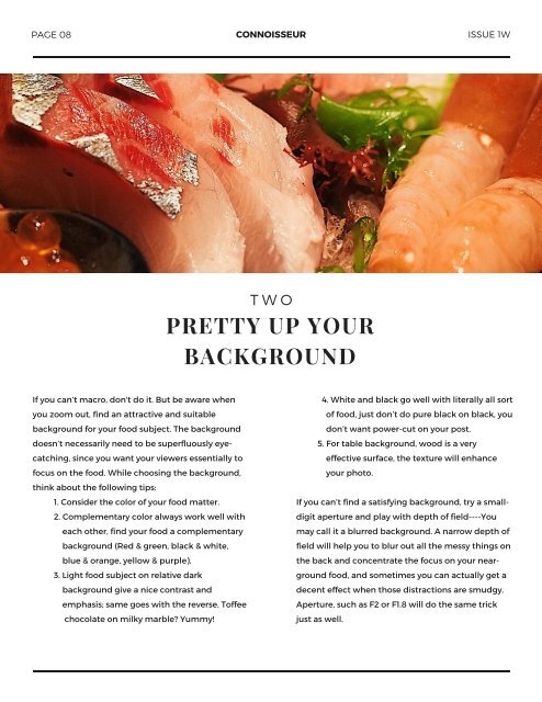
2. Complementary color always work well with<br />
3. Light food subject on relative dark<br />
emphasis; same goes with the reverse. Toffee<br />
4. White and black go well with literally all sort<br />
Aperture, such as F2 or F1.8 will do the same trick<br />
CONNOISSEUR<br />
ISSUE 1W<br />
PAGE 08<br />
T W O<br />
PRETTY UP YOUR<br />
BACKGROUND<br />
If you can’t macro, don't do it. But be aware when<br />
you zoom out, find an attractive and suitable<br />
of food, just don’t do pure black on black, you<br />
don’t want power-cut on your post.<br />
background for your food subject. The background<br />
5. For table background, wood is a very<br />
effective surface, the texture will enhance<br />
focus on the food. While choosing the background,<br />
your photo.<br />
think about the following tips:<br />
1. Consider the color of your food matter.<br />
If you can’t find a satisfying background, try a smalldigit<br />
aperture and play with depth of field----You<br />
each other, find your food a complementary<br />
may call it a blurred background. A narrow depth of<br />
background (Red & green, black & white,<br />
field will help you to blur out all the messy things on<br />
blue & orange, yellow & purple).<br />
the back and concentrate the focus on your nearground<br />
food, and sometimes you can actually get a<br />
decent effect when those distractions are smudgy.<br />
background give a nice contrast and<br />
chocolate on milky marble? Yummy!<br />
just as well.