5128_Ch03_pp098-184

Create successful ePaper yourself
Turn your PDF publications into a flip-book with our unique Google optimized e-Paper software.
Section 3.1 Derivative of a Function 103<br />
What’s happening at x 1?<br />
Notice that f in Figure 3.5 is defined at<br />
x 1, while f is not. It is the continuity<br />
of f that enables us to conclude that<br />
f 1 1. Looking at the graph of f, can<br />
you see why f could not possibly be<br />
defined at x 1? We will explore the<br />
reason for this in Example 6.<br />
David H. Blackwell<br />
(1919– )<br />
By the age of 22,<br />
David Blackwell had<br />
earned a Ph.D. in<br />
Mathematics from the<br />
University of Illinois. He<br />
taught at Howard<br />
University, where his<br />
research included statistics,<br />
Markov chains, and sequential<br />
analysis. He then went on to teach and<br />
continue his research at the University<br />
of California at Berkeley. Dr. Blackwell<br />
served as president of the American<br />
Statistical Association and was the first<br />
African American mathematician of the<br />
National Academy of Sciences.<br />
1<br />
5<br />
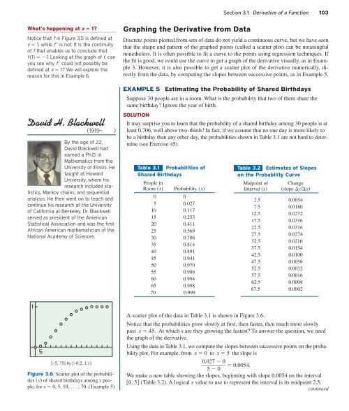
[–5, 75] by [–0.2, 1.1]<br />
Figure 3.6 Scatter plot of the probabilities<br />
y of shared birthdays among x people,<br />
for x 0, 5, 10, . . . , 70. (Example 5)<br />
Graphing the Derivative from Data<br />
Discrete points plotted from sets of data do not yield a continuous curve, but we have seen<br />
that the shape and pattern of the graphed points (called a scatter plot) can be meaningful<br />
nonetheless. It is often possible to fit a curve to the points using regression techniques. If<br />
the fit is good, we could use the curve to get a graph of the derivative visually, as in Example<br />
3. However, it is also possible to get a scatter plot of the derivative numerically, directly<br />
from the data, by computing the slopes between successive points, as in Example 5.<br />
EXAMPLE 5<br />
Estimating the Probability of Shared Birthdays<br />
Suppose 30 people are in a room. What is the probability that two of them share the<br />
same birthday? Ignore the year of birth.<br />
SOLUTION<br />
It may surprise you to learn that the probability of a shared birthday among 30 people is at<br />
least 0.706, well above two-thirds! In fact, if we assume that no one day is more likely to<br />
be a birthday than any other day, the probabilities shown in Table 3.1 are not hard to determine<br />
(see Exercise 45).<br />
Table 3.1 Probabilities of<br />
Shared Birthdays<br />
People in<br />
Room x Probability y<br />
0 0<br />
5 0.027<br />
10 0.117<br />
15 0.253<br />
20 0.411<br />
25 0.569<br />
30 0.706<br />
35 0.814<br />
40 0.891<br />
45 0.941<br />
50 0.970<br />
55 0.986<br />
60 0.994<br />
65 0.998<br />
70 0.999<br />
Table 3.2 Estimates of Slopes<br />
on the Probability Curve<br />
Midpoint of Change<br />
Interval x slope yx<br />
2.5 0.0054<br />
7.5 0.0180<br />
12.5 0.0272<br />
17.5 0.0316<br />
22.5 0.0316<br />
27.5 0.0274<br />
32.5 0.0216<br />
37.5 0.0154<br />
42.5 0.0100<br />
47.5 0.0058<br />
52.5 0.0032<br />
57.5 0.0016<br />
62.5 0.0008<br />
67.5 0.0002<br />
A scatter plot of the data in Table 3.1 is shown in Figure 3.6.<br />
Notice that the probabilities grow slowly at first, then faster, then much more slowly<br />
past x 45. At which x are they growing the fastest? To answer the question, we need<br />
the graph of the derivative.<br />
Using the data in Table 3.1, we compute the slopes between successive points on the probability<br />
plot. For example, from x 0 to x 5 the slope is<br />
0.0 27 0<br />
0.0054.<br />
5 0<br />
We make a new table showing the slopes, beginning with slope 0.0054 on the interval<br />
0, 5 (Table 3.2). A logical x value to use to represent the interval is its midpoint 2.5.<br />
continued