

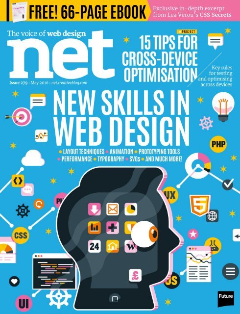
WEB DESIGN
net201605
net201605

You also want an ePaper? Increase the reach of your titles
YUMPU automatically turns print PDFs into web optimized ePapers that Google loves.
FREE! 66-PAGE EBOOK<br />
Exclusive in-depth excerpt<br />
from Lea Verou’s CSS Secrets<br />
The voice of web design<br />
PROJECT<br />
Issue 279 : May 2016 : net.creativebloq.com<br />
Key rules<br />
for testing<br />
and optimising<br />
across devices<br />
NEW SKILLS IN<br />
<strong>WEB</strong> <strong>DESIGN</strong><br />
LAYOUT TECHNIQUES ANIMATION PROTOTYPING TOOLS<br />
PERFORMANCE TYPOGRAPHY SVGs AND MUCH MORE!
Welcome<br />
WELCOME<br />
EDITOR’S NOTE<br />
We’re thrilled to announce that Generate,<br />
our conference for web designers and frontend<br />
developers, is expanding this year. Generate is now<br />
in its fourth year and has established itself as a<br />
valuable source of practical takeaways, inspiration<br />
and networking opportunities.<br />
Not only will we return to New York next month<br />
and run our flagship London event in September<br />
(this year preceded by a workshop day), we’re also<br />
adding three one-day, one-track shows on three<br />
continents! First is San Francisco on 15 July (tickets<br />
on sale now), where you can see Mike Monteiro, Wes<br />
Bos and Stephanie Rieger. We’ll then head to Sydney<br />
in September, followed by Bangalore in November.<br />
Our friends at fffunction have built us a brand new<br />
site (generateconf.com), where you’ll find details of all<br />
our events. You can also follow us on Lanyrd (lanyrd.<br />
com/series/generate) and Twitter, and for even more<br />
info and details of exclusive discounts, sign up to our<br />
Generate newsletter (netm.ag/newsletter-279).<br />
If you attend one of our new events, you’ll<br />
automatically become a founding member, which<br />
means you’ll get 50 per cent off tickets for all future<br />
Generates around the world – for life.<br />
See you at Generate, wherever you are!<br />
Oliver Lindberg, editor<br />
oliver.lindberg@futurenet.com<br />
FEATURED AUTHORS<br />
CHRISTOPHER<br />
MURPHY<br />
IAN<br />
FENN<br />
ALLISON<br />
WAGNER<br />
DONOVAN<br />
HUTCHINSON<br />
Christopher is a writer and<br />
designer based in Belfast. He’s<br />
a passionate educator and from<br />
page 68 lays out 10 web skills<br />
you should be focusing on<br />
w: www.christophermurphy.org<br />
t: @fehler<br />
Ian is an independent consultant<br />
in London, where he helps<br />
businesses get UX design done.<br />
From page 76 he explains how<br />
to create a top UX portfolio<br />
w: www.chopstixmedia.com<br />
t: @ifenn<br />
Allison is a frontend developer<br />
working at Happy Cog and<br />
living in Philadelphia. She<br />
curates our gallery this issue,<br />
from page 44<br />
w: www.alliwagner.com<br />
t: @alliwagner<br />
Donovan is a Dublin-based<br />
frontend designer and<br />
developer. On page 84 he<br />
explains how to create a bank<br />
of micro-interactions<br />
w: www.hop.ie<br />
t: @donovanh<br />
may 2016 3
Future PLC, Quay House, The Ambury, Bath, BA1 1UA +44 (0)1225 442244<br />
@netmag /netmag +netmagazine flickr.com/photos/netmag netmag@futurenet.com net.creativebloq.com<br />
EDITORIAL<br />
Editor Oliver Lindberg oliver.lindberg@futurenet.com, Production editor Ruth Hamilton ruth.hamilton@futurenet.com,<br />
Art editor Rebecca Shaw rebecca.shaw@futurenet.com, Commissioning editor Julia Sagar julia.sagar@futurenet.com,<br />
Staff writer Dominic Carter dominic.carter@futurenet.com, Staff writer Alice Pattillo alice.pattillo@futurenet.com<br />
CREATIVE BLOQ Global editor-in-chief Dan Oliver dan.oliver@futurenet.com, Managing editor<br />
Craig Stewart craig.stewart@futurenet.com, Content manager Kerrie Hughes kerrie.hughes@futurenet.com,<br />
EDITORIAL CONTRIBUTIONS<br />
Marc Andrew, Shehzad Azram, Tanya Combrinck, Jodie Doubleday, Andy Goodman, Kev Hoyle, Donovan Hutchinson, Sam Kapila, Yunmie<br />
Kim, Jamie Knight, Sammy Maine, Jim McCauley, Cordelia McGee-Tubb, Kevin Ngo, Chris Pearce, Jemma Proctor, Nathan Riley, Amber Leigh<br />
Turner, Tomer Sharon, William Smith, Craig Sullivan, Allison Wagner, Evan You<br />
ART CONTRIBUTIONS<br />
Ben the Illustrator, Daniel Byrne, Ben Mounsey, Marco Goran Romano<br />
MANAGEMENT<br />
Content and marketing director Nial Ferguson nial.ferguson@futurenet.com, Editorial director: games, photography, creative and design<br />
Matthew Pierce matthew.pierce@futurenet.com, Group art director Rodney Dive rodney.dive@futurenet.com<br />
ADVERTISING Advertising manager Sasha McGregor sasha.mcgregor@futurenet.com<br />
CIRCULATION Trade marketing manager Juliette Winyard juliette.winyard@futurenet.com<br />
PRODUCTION Production controller Nola Cokely nola.cokely@futurenet.com<br />
Production manager Mark Constance mark.constance@futurenet.com<br />
LICENSING Senior licensing and syndication manager Matt Ellis matt.ellis@futurenet.com<br />
NEXT ISSUE ON SALE 21 APRIL 2016<br />
All contents copyright © 2016 Future Publishing Limited or published under licence. All rights reserved. No part of this magazine may be reproduced, stored, transmitted or used<br />
in any way without the prior written permission of the publisher. Future Publishing Limited (company number 2008885) is registered in England and Wales. Registered office:<br />
Registered office: Quay House, The Ambury, Bath, BA1 1UA. All information contained in this publication is for information only and is, as far as we are aware, correct at the time<br />
of going to press. Future cannot accept any responsibility for errors or inaccuracies in such information. You are advised to contact manufacturers and retailers directly with<br />
regard to the price and other details of products or services referred to in this publication. Apps and websites mentioned in this publication are not under our control. We are not<br />
responsible for their contents or any changes or updates to them. If you submit unsolicited material to us, you automatically grant Future a licence to publish your submission in<br />
whole or in part in all editions of the magazine, including licensed editions worldwide and in any physical or digital format throughout the world. Any material you submit is sent at<br />
your risk and, although every care is taken, neither Future nor its employees, agents or subcontractors shall be liable for loss or damage.<br />
We are committed to only using magazine paper<br />
which is derived from well managed, certified<br />
forestry and chlorine-free manufacture. Future<br />
Publishing and its paper suppliers have been<br />
independently certified in accordance with the rules<br />
of the FSC (Forest Stewardship Council).<br />
COLOPHON<br />
APPS USED PAPER TYPEFACES<br />
Google Docs, Photoshop, Dropbox, COVER PaceSetter Gloss 250gsm Antonio, Share Tech,<br />
FutureSource, Illustrator, InDesign, P3-82 Galerie Fine 100gsm<br />
Merriweather,<br />
CodePen, GitHub<br />
P83-114 Grapholvent 70gsm<br />
Titillium Web<br />
4 may 2016
Issue 279 : May 2016 : net.creativebloq.com<br />
FEED<br />
SIDE PROJECT OF THE MONTH 16<br />
Frogs and lily pads help coders master<br />
flexbox in Thomas Park’s new game<br />
FEED<br />
WORKSPACE 18<br />
William Smith gives a tour of Motley Agency’s office, complete<br />
with artisan booze, Moomins and rogue ping pong balls<br />
CLIENTS FROM HELL 17<br />
Some over-zealous Photoshopping<br />
threatens to offend an important client<br />
BEYOND PIXELS 20<br />
Amber Leigh Turner shares the relaxing<br />
benefits of pouring your own candles<br />
NEED LIST 21<br />
The stuff we want, including the VR<br />
headset everyone’s been waiting for<br />
EVENT REPORT 23<br />
Nathan Riley reports on Awwards’ recently<br />
launched Amsterdam event<br />
VOICES<br />
PROGRESSIVE FRAMEWORKS 26<br />
Evan You explores a new framework option<br />
that offers devs the best of both worlds<br />
ZERO UI 28<br />
Andy Goodman explores the need for user<br />
interfaces to start taking a back seat<br />
USER OBSERVATION 37<br />
Tomer Sharon considers how careful<br />
observation can help us solve problems<br />
BIG QUESTION 38<br />
How do you debug animations? We asked<br />
web professionals their approaches<br />
Q&A 41<br />
CodePen’s Tim Holman chats about<br />
bouncing back and keeping things fun<br />
VOICES<br />
INTERVIEW 32<br />
Filament Group’s<br />
Patty Toland talks<br />
about the dangers of not<br />
paying performance and<br />
accessibility the attention<br />
they deserve<br />
SUBSCRIBE TO NET<br />
AND SAVE UP TO 54%<br />
TAKE ADVANTAGE OF THE<br />
PRINT AND DIGITAL BUNDLE<br />
Turn to page 24 to find out more<br />
Want the Pro package? Turn to Page 51<br />
6 may 2016
Contents<br />
FEATURES<br />
NEW SKILLS<br />
IN <strong>WEB</strong> <strong>DESIGN</strong> 68<br />
From SVGs to prototyping tools,<br />
Christopher Murphy runs down the<br />
areas you should be focusing on now<br />
FREE<br />
CSS SECRETS<br />
EXCERPT<br />
SEE PAGE 96<br />
<strong>DESIGN</strong> A WINNING<br />
UX PORTFOLIO 76<br />
Your portfolio is the perfect place to<br />
tell your story. Ian Fenn shows you<br />
how to make your work shine<br />
PROJECT<br />
REGULAR<br />
GALLERY 44<br />
Allison Wagner selects<br />
her favourite new sites,<br />
including the redesign of a<br />
magazine’s site to align it<br />
with the print publication<br />
SITE PERFORMANCE<br />
TIPS FROM THE BBC 104<br />
Jamie Knight reveals the<br />
techniques the BBC uses to<br />
keep its site smooth and speedy<br />
EXCLUSIVE VIDEO TUTORIALS!<br />
Look out for the video icon in the tutorials for<br />
exclusive screencasts created by the authors<br />
REGULARS<br />
NETWORK 8<br />
The latest mail, tweets, posts and rants<br />
EXCHANGE 10<br />
Heather Burns, Heydon Pickering, Scott<br />
Jehl and Geri Coady share advice<br />
SHOWCASE<br />
<strong>DESIGN</strong> CHALLENGE 52<br />
Three designers mock up theatre sites<br />
FOCUS ON 57<br />
Sam Kapila on how to write an About page<br />
PROFILE 58<br />
BitGold designer Mike Busby<br />
HOW WE BUILT 64<br />
An online recipe book of global recipes<br />
PROJECTS<br />
MICRO-ANIMATIONS 84<br />
Donovan Hutchinson walks through how to<br />
build a set of simple, adaptable animations<br />
SKETCH AND ZEPLIN 90<br />
Marc Andrew on how Zeplin helps bridge<br />
the gap between designers and developers<br />
CSS LINTING 94<br />
Jodie Doubleday looks at how to use linting<br />
to keep your CSS maintainable<br />
HEAD TO HEAD 97<br />
CSS-in-JS versus CSS Modules<br />
SVG ICONS 98<br />
Shehzad Azram looks at the benefits of SVG<br />
icons and shows you how to implement one<br />
<strong>WEB</strong> STANDARDS 104<br />
Kevin Ngo introduces Mozilla’s A-Frame<br />
OPTIMISATION 108<br />
Craig Sullivan presents 15 rules to help<br />
optimise your sites for different devices<br />
ACCESSIBILITY 114<br />
Cordelia McGee-Tubb explores onClick<br />
may 2016 7
Mail, tweets,<br />
posts and rants<br />
CONTACT US @netmag /netmag +netmagazine netmag@futurenet.com net.creativebloq.com<br />
LAYOUT WOES<br />
Do we ditch Bootstrap 4 and<br />
go with flexbox, or use both<br />
for adaptability? Can they be<br />
combined?<br />
Gregory Danelian,<br />
Edinburgh, UK<br />
net: Here’s what Zoe<br />
Mickley Gillenwater had to<br />
say: “Good news – Bootstrap<br />
4 actually includes flexbox<br />
as a layout option! To use it,<br />
go to _variables.scss and set<br />
$enable-flex to true . The full<br />
details are at netm.ag/flex-<br />
279. It’s also possible to<br />
add flexbox on top of older<br />
versions of Bootstrap, as<br />
flexbox automatically<br />
overrides most other layout<br />
CSS in browsers that support<br />
it. Adding flexbox as a<br />
progressive enhancement<br />
will get you easy vertical<br />
centring and equal-height<br />
columns, and blocks that are<br />
more responsive in size to<br />
their content.”<br />
SITE INSIGHTS<br />
net: In issue #277 we<br />
published an interview<br />
with Paravel’s Dave Rupert.<br />
One quote in particular<br />
resonated with readers (see<br />
image below).<br />
“Your website is a manifestation<br />
of your organisation’s problems.<br />
It shows the world how you<br />
work together”<br />
Dave Rupert<br />
Company issues “Your website shows you more of what a group of people does<br />
than what a group of technologies can do,” says Dave Rupert<br />
Flexbox extras Wes Bos wrote an article explaining the ins and outs of flexbox.<br />
You can now find it online at netm.ag/bos-279<br />
@bradwatersart Nail on the<br />
head @davatron5000.<br />
@kevinSuttle 99/100 sites’<br />
navigation mirrors its<br />
internal organisational<br />
structure: netm.ag/conway-279<br />
@bradwatersart Does this<br />
mean they are thinking about<br />
themselves and not the user?<br />
@dawnahukanna Some selffocus<br />
and some self-defining<br />
(right in front of their nose).<br />
@bradwatersart I agree<br />
- looking inwards rather<br />
than outwards.<br />
APPRENTICE HIT<br />
I work at Imaginate, a<br />
multidisciplinary design<br />
consultancy. Last year I wrote<br />
an article for Creative Bloq<br />
about apprentices in the<br />
design industry. Afterwards,<br />
we took on Meg, who is<br />
just about to complete her<br />
apprenticeship. It has been so<br />
cool watching her grow over<br />
the last 12 months – she has<br />
turned out to be a cracking<br />
illustrator and taken to 3D<br />
like a duck to water. As an<br />
employer, the apprenticeship<br />
has been an overwhelmingly<br />
positive experience, and<br />
we are in the process of<br />
organising two more.<br />
Sush Kelly, London, UK<br />
net: Thanks for the update!<br />
You can read Sush’s article<br />
at netm.ag/apprentice-279.<br />
National Apprentice week<br />
has just passed (14-18<br />
March), and there’s quite<br />
a buzz around work-based<br />
learning at the moment.<br />
It’s great to see studios<br />
supporting inexperienced<br />
designers and developers<br />
in this way.<br />
8 may 2016
Network<br />
Principle 5%<br />
With this versatile<br />
option you can create<br />
a short animation, a<br />
slick interaction, or<br />
a multi-screen app<br />
Animate CC 6%<br />
Flash may be dead,<br />
but die-hard fans can<br />
use this replacement<br />
from Adobe<br />
THE POLL<br />
WHICH TOOL DO YOU USE<br />
TO CREATE ANIMATIONS?<br />
GreenSock 35%<br />
Claiming to be “the new<br />
standard for HTML5<br />
animation”, this highperformance<br />
tool is a<br />
firm industry favourite<br />
Other 24%<br />
Alternative options<br />
aplenty – Bounce.js,<br />
Atomic and Easee all<br />
got a mention<br />
COOL STUFF<br />
WE LEARNED<br />
THIS MONTH<br />
WEATHER MEN<br />
Side projects are<br />
a great way to test<br />
out new skills and make<br />
your CV look even more<br />
impressive. Sometimes,<br />
though, they take on a life<br />
of their own. This was the<br />
case for Jonas Downey and<br />
Trevor Turk, who spent two<br />
years developing their<br />
successful Hello Weather<br />
app on the side.<br />
netm.ag/helloweather-279<br />
Velocity.js 13%<br />
The brainchild of<br />
Julian Shapiro, this<br />
speedy animation<br />
engine combines the<br />
best of jQuery and<br />
CSS transitions<br />
From our timeline<br />
What’s the secret to a successful<br />
web design pitch?<br />
Knowing that it’s OK<br />
to just say ‘No’ for the<br />
greater good of the<br />
website. #speakup<br />
@3fiveInc<br />
Jedi mind tricks.<br />
@matthamm<br />
A thorough<br />
understanding of the<br />
client’s brand and the<br />
provision of an effective solution.<br />
@gramatter<br />
Repeat the client’s<br />
wants and desires back<br />
to them during the<br />
pitch, while illustrating how<br />
you will solve each one.<br />
@shumylaj<br />
In a crowded market,<br />
sell your agency’s<br />
beliefs and explain<br />
how they align with those<br />
of the potential customer.<br />
Everyone can bamboozle<br />
someone with techology!<br />
@lukewillmatt<br />
After Effects 17%<br />
Adobe CC’s 3D, motion<br />
graphics and animation<br />
software is holding its<br />
own amongst animation<br />
enthusiasts<br />
Showing prototypes.<br />
@rajrindra<br />
It’s all about providing<br />
value. If you’re not<br />
showing how the site is<br />
communicating brand ideas and<br />
driving sales, then it won’t work.<br />
@cm_vernon<br />
PSDs. Clients love them.<br />
Lots of PSDs, lots!<br />
@danjdavies<br />
Be honest about<br />
expectations and don’t<br />
try to bullshit your way<br />
through. That goes for both<br />
parties, really.<br />
@Robb0wen<br />
FIGMA FURNITURE<br />
Good design can<br />
draw inspiration<br />
from some pretty<br />
surprising places and the<br />
recently launched Figma<br />
is a case in point. Having<br />
previously studied furniture<br />
design at college, Sarah<br />
Pease explains how she<br />
transferred that discipline’s<br />
principles to help create<br />
this collaborative interface<br />
design tool.<br />
netm.ag/furniture-279<br />
BUTTON BOOST<br />
Technology curation<br />
site Product Hunt<br />
already had a thriving<br />
Twitter community, so it<br />
was wary of developing a<br />
Facebook login platform if<br />
there wasn’t a worthwhile<br />
tradeoff. But, as Lukas<br />
Fittl explains here, once<br />
they tested a Facebook<br />
Login button on their site,<br />
Product Hunt saw its<br />
signups skyrocket.<br />
netm.ag/button-279<br />
may 2016 9
Send your questions to netmag@futurenet.com<br />
Practical<br />
advice from<br />
industry experts<br />
THIS MONTH FEATURING...<br />
HEATHER BURNS<br />
Heather is a web designer<br />
and digital law specialist<br />
based in Scotland*<br />
w: www.webdevlaw.uk<br />
t: @webdevlaw<br />
QUESTION OF THE MONTH<br />
Do you use any ‘offline’ tools for illustration?<br />
Sara Soueidan, Lebanon<br />
HEYDON PICKERING<br />
Heydon is a freelance web<br />
accessibility consultant,<br />
interface designer and writer<br />
w: www.heydonworks.com<br />
t: @heydonworks<br />
SCOTT JEHL<br />
GERI COADY<br />
Scott is a designer<br />
and developer working<br />
at Filament Group<br />
w: www.scottjehl.com<br />
t: @scottjehl<br />
Geri is a colour-obsessed<br />
illustrator and web designer<br />
based in North America<br />
w: www.hellogeri.com<br />
t: @hellogeri<br />
Work in progress Geri Coady’s initial pencil sketch and final design for an A List Apart article illustration<br />
GC: My illustration process is exactly the same as my web design workflow – I always<br />
sketch on paper first. Even the roughest of sketches gives me a starting point, instead<br />
of opening a blank digital canvas. Sometimes I’ll use a scanner to import them and<br />
place them in Illustrator, but usually I’ll just hold my sketchbook up to my webcam and<br />
snap a photo. I make sure my clients understand they’re purely conceptual at this<br />
point, which significantly speeds up the overall process.<br />
* Heather Burns is not a lawyer, and her<br />
answers pertain to UK law<br />
LEGAL<br />
DATABASE RIGHTS<br />
As a side project I have made a search<br />
engine of sneaker sites, which uses<br />
(credited) images and descriptions from<br />
the sites I have spidered. I show price<br />
comparisons for all sneakers and link to<br />
the ecommerce sites. Is this legal?<br />
Andy Barefoot, Munich, DE<br />
HB: This is an area of law known as<br />
database rights. While some databases<br />
(i.e. collections of information) will be<br />
available through an API, others are<br />
considered company assets. What’s<br />
more, many websites using databases<br />
will have commercial agreements in<br />
place that allow them to restrict who<br />
is scraping from them and for what<br />
purpose, and others will ban scraping<br />
altogether. You therefore run the risk<br />
of violating intellectual property,<br />
commercial agreements, or both. You<br />
need to check the terms and conditions<br />
of the sites you have spidered to see if<br />
aggregation and scraping are allowed<br />
for commercial use. Crediting the source<br />
10 may 2016
Q&As<br />
3 SIMPLE STEPS<br />
What is the best resource<br />
for learning how to apply<br />
a11y on websites?<br />
Anneke Sinnema, Enschede, NL<br />
GC: There are a number of helpful<br />
resources you should look into. These<br />
are some of my favourites.<br />
Responsive breakpoints The right breakpoints depend on the content and design you’re working with<br />
of the images and descriptions will not<br />
protect you on its own.<br />
RESPONSIVE <strong>DESIGN</strong><br />
BREAKPOINTS<br />
What are the best media query breakpoints<br />
to use for responsive web design?<br />
Rob Thomas, TX, US<br />
SJ: It depends on the site. The design<br />
and content should shape the layout’s<br />
breakpoints. Start with your smallscreen<br />
layout, make your browser<br />
window larger until the design starts to<br />
feel too wide or difficult to use, or the line<br />
length of the text columns exceeds 75<br />
characters or so. Check the width of the<br />
window and create a breakpoint to adjust<br />
the design for all viewports wider than<br />
that. Repeat as necessary all the way up<br />
to your largest layout.<br />
<strong>WEB</strong> TRENDS<br />
NEW FRAMEWORKS<br />
With the web constantly evolving, how<br />
do you decide what to keep up with, what<br />
to ignore or specialise in?<br />
Michael Groen, NL<br />
SJ: My approach is to try to maintain<br />
a general understanding of the purpose<br />
of new technologies and frameworks as<br />
they gain popularity and standardisation<br />
in browsers. Often, I won’t research a<br />
particular technology very deeply until<br />
I need it in my work, but it’s good to<br />
understand the problem it solves so<br />
you can make informed decisions about<br />
when it might be useful.<br />
ACCESSIBILITY<br />
LABEL WRAPS<br />
Should labels wrap all inputs or only<br />
checkboxes and radios?<br />
Mike Riley, MD, US<br />
HP: Wrapping an input in a label makes<br />
the label itself clickable. It’s possible and<br />
legitimate to wrap any field in its <br />
element, but it’s frequently done for<br />
checkboxes and radios because they’re<br />
small and tricky to target with a mouse<br />
click. It’s not well known, but using a<br />
for attribute on the pointing at<br />
the input’s ID will also make the <br />
clickable. For radio buttons, clicking the<br />
would select it. For basic text<br />
inputs, clicking the simply places<br />
the cursor inside it, ready to type.<br />
LEGAL<br />
NEW COMPANY<br />
If my side project is successful should I spin<br />
it off into a newly incorporated company?<br />
Martin Fraser, Fife, UK<br />
HB: As a private company, incorporating<br />
is a big step up. Your side project will<br />
become its own entity, and you will be<br />
running that entity rather than your<br />
project. Your personal financial liabilities<br />
will be limited, but your administrative<br />
burdens will increase exponentially.<br />
You’ll need to appoint a management<br />
team who are also shareholders in the<br />
business, and you must file a raft of<br />
financial statements. Once you’re lucky<br />
enough to reach that level, speak with<br />
your accountant.<br />
THE A11Y PROJECT<br />
This is one of my favourite<br />
resources. It is a collaborative project<br />
that strives to make accessibility easier<br />
to understand. You can find accessible<br />
pattern libraries, plus a checklist that is<br />
helpful for beginners.<br />
SIMPLY ACCESSIBLE BLOG<br />
Accessibility is not just ticking<br />
checklist boxes, so it can be helpful<br />
to delve deeper. On this blog (netm.ag/<br />
simple-279) there are fantastic articles.<br />
Search through the archive for clarification<br />
on any confusing topics.<br />
<strong>WEB</strong> AXE<br />
Web Axe (www.webaxe.org) is<br />
a regularly updated website and<br />
podcast with plenty of resource roundups.<br />
Its Twitter account is also worth following<br />
for all the latest accessibility news.<br />
may 2016 11
EXCHANGE<br />
Q&As<br />
<strong>WEB</strong> <strong>DESIGN</strong><br />
TOP TRENDS<br />
Flat/Material’s been popular for years. Any<br />
idea what direction design will go next?<br />
Peter Pec, SI<br />
GC: I think we’ll see more 3D design,<br />
especially 3D animation. Although Flash<br />
as a technology became unpopular due to<br />
accessibility concerns and a push towards<br />
web standards, some of the most creative<br />
web design work was once in the hands of<br />
Flash developers. Now CSS animation is<br />
becoming popular, I think we’ll see more<br />
well-considered design that challenges<br />
our expectations, and (hopefully) fewer<br />
cookie-cutter templates.<br />
ACCESSIBILITY<br />
FORM FIELDSETS<br />
Should every form have a fieldset, even<br />
if there’s only a single context (address,<br />
email subscription)?<br />
Mike Riley, MD, US<br />
HP: You have to think about the benefit to<br />
users. A on its own doesn’t offer<br />
anything more than a element – it’s<br />
just a wrapper. If there’s only one field,<br />
an extra wrapping element is probably<br />
redundant. I’d only use a where<br />
a can offer information that<br />
applies to multiple fields. For a single<br />
field, all the clarification you need should<br />
be in that field’s . When the input<br />
is focused, screen readers will usually<br />
announce the text, followed by<br />
the , so check they make sense<br />
when read out in this order.<br />
LEGAL<br />
COPYCATS<br />
A designer develops her own product then<br />
sees exactly the same graphics and layout<br />
used by a different company. What to do?<br />
Suzanne Stecker, Boulder, CO<br />
HB: If your intellectual property<br />
rights have been infringed, and the<br />
infringement does not qualify as an<br />
exception to copyright (netm.ag/except-<br />
279), the first thing to do is contact the<br />
plagiariser in writing. Politely inform<br />
them you believe they have copied your<br />
work without permission. Back up your<br />
claim with source files, contracts or other<br />
evidence that you are the originator of<br />
the work. Then, request they cease and<br />
Copyright exceptions Some limited use of copyright works without permission is allowed<br />
desist within 72 hours. Almost always,<br />
the plagiariser will comply, but a few<br />
will become difficult or abusive. The<br />
important thing is that you have evidence<br />
you have contacted the plagiariser and<br />
tried to negotiate with them. You can<br />
then either use the IPO’s mediation<br />
service, file a takedown request with<br />
the web host where the material resides,<br />
or take legal action.<br />
PERFORMANCE<br />
FILE OPTIONS<br />
Is it better to link to one large CSS file used<br />
site-wide, or multiple smaller files only<br />
where needed?<br />
Mike Riley, Baltimore, MD<br />
SJ: Traditionally, it has been best practice<br />
to keep HTTP requests to a minimum, to<br />
reduce demands on the browser. Also, we<br />
tend to reference CSS files at the top of an<br />
HTML document – because the browser<br />
will generally only render the page<br />
content when all the CSS files are loaded<br />
and ready, it’s best to minimise the time<br />
it takes to do this.<br />
Of course, we often work with many<br />
CSS files while maintaining a site, so it<br />
has become common to combine these<br />
into one file when preparing them for<br />
delivery to the browser. This means<br />
fewer HTTP requests, and tends to be<br />
beneficial for subsequent page visits as<br />
the entire CSS will be cached. However,<br />
it also means re-downloading all of a<br />
site’s CSS after only a portion of it has<br />
been updated, and can often result in<br />
pages requesting more CSS than they<br />
actually need. Fortunately, HTTP/2 is<br />
quickly making its way onto the scene.<br />
This improves the ways browsers<br />
communicate with the server – HTTP<br />
requests aren’t as costly, so keeping files<br />
separate will become good practice. Test<br />
your pages with a tool like webpagetest.org<br />
and make an informed decision.<br />
LEGAL<br />
COMMERCIAL ADS<br />
Can I use any TV (video) or radio (audio)<br />
commercial ad in my website without any<br />
legal problems?<br />
Enrique Vargas, Mexico City, MX<br />
HB: No. There are a range of issues<br />
to consider, from terms of service to<br />
intellectual property to age restrictions.<br />
Use an ad network; this ensures the<br />
advertisements are fully licensed for use<br />
and can be removed from the site if they<br />
are found to be unsuitable.<br />
Top trends First popularised by Microsoft’s Windows<br />
Phone, flat design has been around for some time<br />
12 may 2016
NEW YORK 22 APRIL 2016<br />
Learn cutting-edge CSS, JavaScript, user experience<br />
and web performance techniques, and much more!<br />
CAMERON MOLL<br />
<strong>DESIGN</strong>ER AND AUTHOR<br />
www.cameronmoll.com<br />
DAN MALL<br />
CREATIVE DIRECTOR<br />
www.superfriend.ly<br />
SARAH DRASNER<br />
SENIOR UX ENGINEER<br />
www.trulia.com<br />
UNA KRAVETS<br />
DEVELOPER<br />
www.ibm.com<br />
TICKETS ON SALE NOW<br />
www.generateconf.com
People, projects<br />
& paraphernalia<br />
THIS MONTH FEATURING...<br />
SIDE PROJECT OF THE MONTH 16<br />
Frogs and lily pads help coders master<br />
flexbox in Thomas Park’s new game<br />
CLIENTS FROM HELL 17<br />
Some over-zealous Photoshopping<br />
threatens to offend an important client<br />
WORKSPACE 18<br />
William Smith shows us Motley Agency’s<br />
office – also the home of the Moomins<br />
BEYOND PIXELS 20<br />
Amber Leigh Turner shares the relaxing<br />
benefits of pouring your own candles<br />
NEED LIST 21<br />
Stuff we want, including pocket notebooks<br />
to remind you of the principles of RWD<br />
EVENT REPORT 23<br />
Nathan Riley reports on Awwards’ recently<br />
launched Amsterdam conference<br />
may 2016 15
FEED<br />
Side project<br />
FLEXBOX FROGGY<br />
Thomas Park<br />
layouts with a cute positioning game<br />
INFO<br />
job: HCI and computer<br />
education researcher,<br />
Drexel University<br />
w: thomaspark.co<br />
t: @thomashpark<br />
SIDE PROJECT OF THE MONTH<br />
net: Where did you get the idea for Flexbox<br />
Froggy (flexboxfroggy.com)?<br />
TP: A couple of years ago I did some work at Mozilla<br />
on a tutorial for its code editor Thimble. We used an<br />
example tutorial that involved positioning furniture<br />
in front of windows and doors to block zombie<br />
intruders. The tutorial used absolute positioning,<br />
but with CSS flexbox coming into its own, I realised it<br />
could be used in a similar way. The idea really started<br />
to crystallise last fall, when I spoke to Luke Pacholski,<br />
the creator of CSS Diner (flukeout.github.io), which<br />
was a huge inspiration.<br />
net: Why did you go for a frog theme?<br />
TP: The goal of Flexbox Froggy is to use the flexbox<br />
properties to position the frogs on their respective<br />
lily pads. I initially brainstormed a bunch of ‘key<br />
and lock’ pairs with distinct colours and shapes.<br />
Some ideas were bird and nest, hermit crab and shell,<br />
bumblebee and honeycomb, and eel and seaweed. I<br />
focused on the frog theme because my limited artistic<br />
abilities were already being maxed out and the name<br />
was too good to pass up.<br />
net: Do you think games make learning easier?<br />
TP: If they’re designed well, absolutely. Games<br />
have three things going for them. They’re interactive,<br />
so you can play with cause and effect and start<br />
developing an intuition for what’s going on. They’re<br />
scaffolded, so in the best cases you get a smooth<br />
learning curve that guides you from beginner to some<br />
higher level of expertise. They’re fun, so they invite<br />
multiple play-throughs and mean you don’t mind the<br />
challenge of learning a new subject.<br />
net: Did you encounter any challenges?<br />
TP: One was the game art. I experimented with<br />
different styles, ranging from more realistic to pixel<br />
art. In the end I went with a flat design where I could<br />
get away with constructing the art using simple<br />
polygons. A second challenge was that while most<br />
of the flexbox properties fit well within the game’s<br />
mechanics, there were a few (like flex-grow and<br />
flex-basis) that I wasn’t able to make work. I haven’t<br />
overcome that one yet, so if anyone has ideas, please<br />
get in touch!<br />
net: Do you have any more games in mind?<br />
TP: One game idea my Drexel colleague Meen Chul<br />
Kim and I have been discussing is along the lines<br />
of the classic Lemmings. You get specialist miners<br />
that represent different computational concepts like<br />
conditional and iteration, and you have to use them in<br />
the right combination to dig mines through growing<br />
obstacles. Stay tuned!<br />
16 may 2016
Feed<br />
HOW TO<br />
MODERNISE LEGACY CSS<br />
Bringing an old site into the<br />
modern era can be tricky, so we<br />
asked our Twitter followers how<br />
they get CSS up to date<br />
Illustration: Ben the Illustrator huddleformation.prosite.com<br />
CALL BEFORE YOU PHOTOSHOP<br />
Exclusively for net: the latest in a series<br />
of anonymous accounts of nightmare clients<br />
When I first got started as a graphic<br />
designer, I was working as the pre-press<br />
person at an outdoor print shop. One day, we<br />
got a cold call from a guy running for mayor in<br />
a city about 90 minutes away, who wanted to us<br />
to put together a range of outdoor campaign<br />
signs. We took the job. He was a nice guy and<br />
had a good design brief – plus, the order would<br />
be enough to meet the sales target for the<br />
shop for weeks.<br />
This was before scanners were common or<br />
cheap, so later that day, he sent a courier over<br />
with his headshot for all the signs. When he<br />
arrived, we saw the envelope had been rained<br />
on, and the photo was not in a sleeve. We gently<br />
pulled it out and noticed a bit of water damage<br />
– but nothing I couldn’t fix in Photoshop. It also<br />
had what we figured was an ink blotch on the<br />
man’s forehead from the postal ink getting wet<br />
and bleeding through the envelope.<br />
My manager instructed me to scan the photo,<br />
airbrush it and lay out the signs. No one bothered<br />
calling to ask first – the timeline was tight, and<br />
we assumed anyone would want their photo<br />
retouching before being blown up to eight-feet<br />
tall. The production crew managed to put all the<br />
signs together over the course of two days.<br />
CLIENTS FROM HELL<br />
We called the client to let him know his signs<br />
were ready. He was so excited by the turnaround<br />
he said he would drive in with a truck and pick up<br />
the order himself. We set up the sales floor with<br />
all his signs arranged from one wall to the other<br />
and waited for him at the front.<br />
The client pulls up. Steps out of his truck.<br />
Approaches the door. And there, on his forehead,<br />
is a huge purple birthmark – the ‘ink blotch’ I had<br />
perfectly airbrushed away. He came in and looked<br />
around, agape.<br />
We all stood there like woodland creatures<br />
caught in headlights, waiting for him to react.<br />
No one moved or breathed. We thought we<br />
were about to get chewed out and have to<br />
redo everything.<br />
Then, after a couple of minutes of him closely<br />
inspecting the signs:<br />
Client: These look great! And you even took out<br />
my birthmark. Cool!<br />
We nearly fell to the floor in relief.<br />
clientsfromhell.net<br />
REVIEW AND REARRANGE<br />
@theonico85 says, “review code,<br />
and (slowly but surely) move<br />
snippets into smaller partials to<br />
improve at later date. Test, test,<br />
test!” @dalecruse agrees: “Take<br />
inventory first. You can’t throw out<br />
the garbage until you know what<br />
you have.” But @theonico85<br />
reminds us to be careful: “Even just<br />
moving CSS around can have<br />
adverse effects.”<br />
TAKE IT SLOW<br />
“Painfully,” says @iandevlin, who<br />
warns that a full modernisation<br />
takes a serious amount of<br />
patience. “Reconsider every code<br />
construct and mercilessly kill<br />
every one that doesn’t need to<br />
be there,” adds @dalecruse.<br />
@CHEWX suggests Sassing it up:<br />
“Copy and paste from CSS to<br />
SCSS and slowly modularise.”<br />
@ryannoondesign agrees,<br />
and also prescribes “a good<br />
SMACSS treatment.”<br />
JUST DON’T<br />
@LuckychairNews wouldn’t<br />
bother. He comments: “Retire<br />
legacy code and rewrite!”<br />
@LucPestille has a similar<br />
approach, and says he’d modernise<br />
“with a big stick, a burlap sack,<br />
a bonfire and a cup of tea.”<br />
And @blucube is also inclined to<br />
agree: “Delete delete delete delete<br />
delete delete delete delete delete<br />
delete. Start again.”<br />
may 2016 17
6<br />
2<br />
4<br />
1<br />
5<br />
3<br />
MOTLEY CREW<br />
William Smith introduces Motley Agency’s swanky<br />
WORKSPACE<br />
At Motley we do everything<br />
from new business strategy<br />
to service design, UX and visual<br />
design, product development,<br />
operations and growth. We work<br />
with exciting new startups and big<br />
Finnish companies that wish they<br />
could be exciting new startups.<br />
Our office is right in the centre<br />
of Helsinki, on the top two floors<br />
(and roof terrace) of Lönnrotinkatu<br />
5. It’s the former headquarters of<br />
one of Finland’s oldest insurance<br />
firms and is almost certainly the<br />
swankiest Mad Men-inspired office<br />
occupied by scruffy designer-types<br />
with beards in all of Finland.<br />
If we had to pick our company<br />
spirit animal, it would be a<br />
Moomin. Our biggest success story<br />
is Moomin.com, and the now-spunoff<br />
company still shares our office<br />
with us. This little fellow [1]<br />
brightens our days (both literally<br />
and figuratively).<br />
We’re pretty smart, but there’s<br />
no harm in getting smarter. The<br />
library [2] is where that magic<br />
happens: business, psychology,<br />
management, marketing, design<br />
and a smattering of tech. We’re<br />
mostly just reading Strategyzer’s<br />
Value Proposition Design though.<br />
However furiously you are<br />
typing, hunched over that poor,<br />
overworked MacBook, it’s not<br />
exercise. For that, we have a ping<br />
pong table [3]. Visitors are welcome<br />
to have a game – though they<br />
should be warned that Niko ‘the<br />
sales guy’ is just as competitive<br />
as you might expect.<br />
Along with a couple of fighting<br />
sport participants, we also have<br />
some part-time rockstars at<br />
Motley. We keep a guitar [4]<br />
handy for when inspiration<br />
strikes (and it’s not the digital<br />
transformation kind).<br />
There’s eating your own dog<br />
food and then there’s drinking the<br />
offerings of your own boutique<br />
omni-channel artisan wine store.<br />
We hide a stash in our secret globe<br />
bar [5], and there’s even more in<br />
the sideboard.<br />
Not only handsome modern<br />
design, but our fancy light fittings<br />
[6] are also the perfect place for<br />
a collection of long-lost ping pong<br />
balls to somehow end up.<br />
PROFILE<br />
Motely Agency (www.motleyagency.com)<br />
is a web design agency based in Finland.<br />
William is a growth hacker and full-stack<br />
Scotsman<br />
18 may 2016
FEED<br />
Beyond pixels<br />
STUFF I LIKE<br />
NINA FREEMAN<br />
Game designer<br />
www.ninasays.so<br />
FLIXEL<br />
When I first started making<br />
games, some friends<br />
introduced me to Flixel – an<br />
open source AS3 game<br />
library. It’s straightforward<br />
and fits my needs as a<br />
beginner programmer.<br />
It taught me all the basics<br />
I needed in order to graduate<br />
to languages like C++.<br />
www.flixel.com<br />
DISNEY TSUM TSUM<br />
I travel to a lot of events and<br />
my airport time-passer is<br />
Disney Tsum Tsum, a simple<br />
match three-style game. You<br />
swipe to match a row of<br />
digital Tsum Tsum plushies.<br />
I am shamelessly addicted<br />
to these toys, and have a<br />
pretty huge collection.<br />
netm.ag/tsumtsum-279<br />
GIRLSCAMERA<br />
GirlsCamera is an iPhone app<br />
for people who like to cover<br />
their selfies in adorable<br />
stickers. GirlsCamera has a<br />
great DIY feature that lets<br />
you draw stickers and share<br />
them, so the library is huge.<br />
I’m not sure how I’d decorate<br />
my selfies without this app.<br />
netm.ag/kawaii-279<br />
CANDLE-MAKING<br />
This month … the methodical process of pouring soy<br />
candles helps Amber Leigh Turner wind down<br />
By day, I’m a self-employed designer and<br />
marketing consultant who helps clients<br />
establish and build visual identities to meet their<br />
marketing goals. I love helping clients create a<br />
visual identity to use throughout all of their<br />
marketing and branding collateral.<br />
Working as a designer and marketing<br />
consultant means I spend a lot of time on the<br />
computer – more than I’m willing to admit.<br />
While I love what I do for a living, so long in front<br />
of a screen can be stressful and taxing. Feeling<br />
unmotivated and on the verge of burnout drove<br />
me to find another creative outlet that would pull<br />
me away from the computer when my work was<br />
done for the day.<br />
I’ve loved candles since before I can remember,<br />
so making my own seemed to be a perfect fit.<br />
I researched candle-making on Pinterest,<br />
and found so many creative ways to make them<br />
and the containers in which they are displayed.<br />
I purchased a soy candle kit and made my first<br />
candles with my mom. It was so relaxing and<br />
peaceful to go through the methodical and<br />
structured process, from measuring the wax<br />
and oil, to melting, picking a container and<br />
pouring the wax.<br />
After making my first candles, I started to<br />
experiment with different candle containers,<br />
even learning how to etch glass and cut wine<br />
BEYOND PIXELS<br />
bottles to make interesting holders. I was able<br />
to really flex my creative muscles.<br />
My family and friends loved the pictures of the<br />
candles I was making, so I started selling them<br />
through Facebook. Soon after, I gave my candles<br />
a name (Candleflare) and opened an Etsy shop.<br />
A creative hobby outside of my job helped me<br />
strengthen my mental health, relieve stress and<br />
avoid burnout. The best benefit, however, is that<br />
I found myself motivated again in my design<br />
business. While you wouldn’t necessarily think<br />
that graphic design and candle-making could<br />
influence each other, I learned a great deal about<br />
what it takes to experiment, create a product,<br />
design for it, and bring it to market – something<br />
I haven’t had experience with before. I’ve gained<br />
insights I now use in my business to help better<br />
understand my clients and their goals.<br />
Candle-making is a great outlet for me to<br />
experiment, relieve some stress, try new things<br />
(creatively and in business), learn as I go, and use<br />
my new knowledge to help my clients. Plus, my<br />
house always smells amazing.<br />
PROFILE<br />
Owner of January Creative in<br />
Nashville, Tennessee, Amber<br />
(@amberlturner) has been a<br />
self-employed designer for over<br />
eight years<br />
20 may 2016
Need list<br />
NEED LIST<br />
STUFF WE WANT<br />
Small objects of web design wonder: from retro UX posters<br />
to hotly anticipated VR headwear<br />
1<br />
2<br />
3<br />
RESPONSIVE <strong>DESIGN</strong> NOTEBOOKS £12<br />
OCULUS RIFT $599<br />
GET READY FOR CSS GRID LAYOUT $6<br />
4<br />
5<br />
6<br />
UX POSTERS<br />
SPRINT $28<br />
VALIDATING PRODUCT IDEAS $39<br />
What we think<br />
(1) Carry the core principles of RWD wherever you go thanks to these notebooks designed for your back pocket (netm.ag/notebook-279).<br />
(2) It’s finally here! The Oculus Rift offers an immersive VR experience for tailor-made games and content. But you probably knew that already<br />
(netm.ag/oculusrift-279). (3) Rachel Andrew walks through the cutting-edge essentials of CSS Grid Layout in this guide (netm.ag/grid-279).<br />
(4) Remind yourself of the web design fundamentals with these posters inspired by vintage propaganda artwork (netm.ag/uxposters-279).<br />
(5) In one working week companies of any size can solve problems and move forward. Find out how from three partners at Google Ventures<br />
(netm.ag/sprint-279) (6) Inspired by Tomer Sharon’s column (p37)? Discover more about user observation in his book (netm.ag/productideas-279).<br />
may 2016 21
NEXT<br />
MONTH<br />
MASTER BROWSER<br />
DEV TOOLS<br />
We reveal how to get the most out of Chrome, Firefox,<br />
Safari, Edge and Opera when building websites!<br />
PLUS<br />
Combine the power<br />
of SVG and D3<br />
visualisation<br />
Get started with<br />
Project Comet,<br />
Adobe’s new UX tool<br />
7 hidden gems<br />
of the GreenSock<br />
Animation Platform<br />
ISSUE 280 ON SALE 21 APRIL<br />
PRINT EDITION, BACK ISSUES AND SPECIAL EDITIONS AVAILABLE AT<br />
myfavouritemagazines.co.uk<br />
DIGITAL EDITIONS AVAILABLE ON ITUNES, GOOGLE PLAY, KINDLE, NOOK AND ZINIO<br />
net.creativebloq.com
Feed<br />
EVENT GUIDE<br />
Photography: Bebokeh Studio<br />
AWWWARDS AMS<br />
Nathan Riley stocked up on Dutch treats and design<br />
inspiration at the Awwwards Amsterdam conference<br />
DATE: 27-29 JANUARY 2016<br />
LOCATION: AMSTERDAM<br />
URL: conference.awwwards.com/amsterdam-2016<br />
Although a relative newcomer to the web<br />
events scene, the Awwwards conference in<br />
Amsterdam was nothing but inspiring, professional<br />
and educational throughout. From the point we<br />
arrived at the Royal Tropical Institute in true British<br />
tourist style (i.e. late because we’d got lost), it was<br />
clear we were in for a fantastic couple of days.<br />
The first day kicked off with an eye-opening talk<br />
from Anrick Bregman of UNIT9, giving a run-through<br />
of the incredible work they’ve been doing in the VR<br />
space. If that wasn’t enough to get everyone’s brains<br />
ticking, Bregman’s talk was immediately followed by<br />
Huge’s Josh Payton, with some high-energy insights<br />
into the processes and projects at one of the most<br />
globally respected agencies. To wrap up the day, the<br />
guys from MediaMonks took to the stage to explain<br />
the importance of combining video production and<br />
web to truly connect users to a brand.<br />
The morning of the second day provided a real<br />
mixture of speakers. One of my highlights was Greg<br />
Barth, who gave a very honest account of his career<br />
and how creating a personal project on a shoe-string<br />
budget paved the way for the mind-blowing<br />
portfolio of work we see today.<br />
EVENT REPORT<br />
The day ended with a fantastic presentation by<br />
two members of the creative team at Resn (pictured<br />
above), who discussed the importance of designing<br />
for the concept and client rather than our own<br />
personal ambitions. The duo also touched on their<br />
ideology of pushing boundaries and rethinking our<br />
perceptions of what a website truly is, a concept that<br />
went down very well with the creative audience.<br />
To top off a fantastic couple of days we were<br />
moved on to a former chapel-turned-events venue<br />
for an evening of networking, complete with a buffet<br />
and open bar. It provided the perfect opportunity to<br />
pick the brains of some of the speakers, as well as<br />
the lucky individuals who had picked up trophies<br />
at the Awwwards prize-giving ceremony that had<br />
taken place earlier.<br />
My biggest takeaway from the event was the<br />
realisation we are entering an exciting new age<br />
of web design that encourages the experimental,<br />
welcomes the wacky and embraces new media. Not<br />
forgetting the epic selection of edible Dutch treats<br />
provided over the course of the two days!<br />
PROFILE<br />
Nathan is the design director and<br />
co-founder of Green Chameleon<br />
(www.greenchameleondesign.com),<br />
a creative agency based in Bristol<br />
NOW WHAT? CONFERENCE<br />
DATE: 13-14 APRIL 2016<br />
LOCATION: SOUTH DAKOTA, US<br />
With top-notch speakers<br />
including Facebook’s product UX<br />
and content strategist Jonathon<br />
Colman, Now What? Conference<br />
offers two days of talks and<br />
workshops to help you maintain<br />
and improve your site.<br />
2016.nowwhatconference.com<br />
CONVERGE SE<br />
DATE: 13-15 APRIL 2016<br />
LOCATION: SOUTH CAROLINA, US<br />
With its vision of a united,<br />
thriving web design community,<br />
Converge SE has grown into one<br />
of the most popular events in the<br />
US. Featuring Cards Against<br />
Humanity’s Jenn Bane, Adobe’s<br />
Bradee Evans and CodePen’s<br />
Rachel Smith, this promises to<br />
be an inspiring event.<br />
www.convergese.com<br />
REACT AMSTERDAM<br />
DATE: 16 APRIL 2016<br />
LOCATION: AMSTERDAM, NL<br />
This conference is “a celebration<br />
of three good things coming<br />
together: React and spring in<br />
Amsterdam”. There are talks<br />
from PayPal’s Jamis Charles<br />
and Facebook’s Tadeu Zagallo.<br />
Grab a ticket to discover what<br />
React can do for your apps.<br />
www.react-amsterdam.com<br />
GENERATE NY<br />
DATE: 22 APRIL 2016<br />
LOCATION: NEW YORK, US<br />
net’s very own conference is back<br />
in New York for its third year.<br />
Featuring a truly stellar lineup<br />
of speakers, including Cameron<br />
Moll, Dan Mall, James White, Una<br />
Kravets, Tim Kadlec and more,<br />
it’s the one not to miss!<br />
generateconf.com/new-york-2016<br />
may 2016 23
SUBSCRIBE TO NET<br />
GET THE NO.1 CHOICE FOR <strong>WEB</strong> <strong>DESIGN</strong>ERS AND DEVELOPERS<br />
DELIVERED TO YOUR DOOR, YOUR DEVICE, OR BOTH<br />
PRINT EDITION ONLY<br />
Take out a print subscription to net and<br />
get your copy before it hits the shops.<br />
Each issue is packed with the latest web<br />
trends, technologies and techniques<br />
DIGITAL EDITION ONLY<br />
Take out a digital subscription to net<br />
for on-the-go access to our interactive<br />
edition, with streaming screencasts,<br />
extra images and more<br />
FROM<br />
£55<br />
BASED ON AN ANNUAL SUBSCRIPTION<br />
SAVE UP TO<br />
FROM<br />
SAVE UP TO<br />
29 % 31 %<br />
£45<br />
BASED ON AN ANNUAL SUBSCRIPTION<br />
Terms & conditions: Prices and savings quoted are compared to buying full priced print and digital issues. You will receive 13 issues in a year.<br />
If you are dissatisfied in any way you can write to us at Future Publishing Ltd, 3 Queensbridge, The Lakes, Northampton, NN4 7BF, UK to<br />
cancel your subscription at any time and we will refund you for all un-mailed issues. Prices correct at point of print and subject to change.<br />
For full terms and conditions please visit: bit.ly/magterms. Offer ends 30 April 2016
ARE YOU A <strong>WEB</strong><br />
PROFESSIONAL?<br />
GET OUR PRO PACK<br />
SEE PAGE 51<br />
PRINT & DIGITAL EDITION<br />
Enjoy a combined print and digital subscription, and take advantage<br />
of print as well as exploring the digital experience on the go<br />
GREAT REASONS TO SUBSCRIBE<br />
Print edition delivered to your door<br />
13 issues in a one-year subscription<br />
iPad and iPhone edition download<br />
Android edition download<br />
Money-back guarantee<br />
FROM<br />
£66<br />
SAVE UP TO<br />
54 %<br />
myfavouritemagazines.co.uk/NETMAG16
Opinions, thoughts & advice<br />
WORKFLOW<br />
PROGRESSIVE<br />
ZERO UI 28<br />
Andy Goodman explores how, as we move<br />
towards a mesh of connected devices, user<br />
interfaces need to recede into the background<br />
FRAMEWORKS<br />
Evan You walks through<br />
the different framework choices<br />
for developers, and introduces<br />
an exciting new option<br />
INTERVIEW 32<br />
Filament Group co-founder Patty Toland on<br />
the benefits that only open source can bring,<br />
and the dangers of ignoring performance<br />
Q&A 41<br />
Developer and engineer Tim Holman chats<br />
about his dream job at CodePen, quirky side<br />
projects, and dealing with career setbacks<br />
The world of frontend development<br />
today is an intimidating one. With so<br />
many frameworks and libraries, it can be<br />
quite difficult to figure out the best choice.<br />
We keep seeing beginners asking the<br />
question: Which framework should I learn?<br />
The answer is almost always: It depends.<br />
You have to pick the right tools that fit the<br />
constraints of each project.<br />
BIG FRAMEWORKS<br />
It can be tempting to go with a full-featured<br />
framework that claims to have solved all<br />
the hard problems for you. However, it will<br />
only be a good choice when you are indeed<br />
facing the problems these frameworks are<br />
designed to solve.<br />
Are you building a fully-fledged singlepage<br />
application that requires client-side<br />
routing, hundreds of components and multiple<br />
teams working on different features
Opinion<br />
in parallel? If the answer is no, big frameworks<br />
are probably not for you.<br />
In trying to deal with the complexities<br />
of large-scale applications, frameworks<br />
introduce complexities of their own in the<br />
form of extra layers of abstractions and<br />
tooling requirements. You have to first<br />
conquer a steep learning curve before<br />
becoming productive. While for a large<br />
project this is probably a wise price to pay,<br />
it’s total overkill for simpler scenarios.<br />
MICRO-LIBRARIES<br />
Many developers advocate for the idea of<br />
building your own stack with micro-libraries.<br />
This approach gives you the utmost<br />
flexibility: you can ignore the things you<br />
don’t need and you get to decide every<br />
part of your stack. This is great for simple<br />
projects where all you need is a few microlibraries<br />
that solve specific problems.<br />
However, if you extend this strategy<br />
to larger projects, you’ll find yourself<br />
having to make so many choices in order<br />
to build a suitable stack that it leads to<br />
decision fatigue. Moreover, the wiring<br />
and plumbing required to make sure everything<br />
works well together can quickly<br />
become overwhelming. It takes a lot of<br />
experience to get it right, and if you aren’t<br />
a seasoned developer, your code may end<br />
up much less maintainable than desired.<br />
VIEW LAYER-CENTRIC<br />
There is a third category on the libraryframework<br />
spectrum: the view layercentric<br />
libraries. The common trait in<br />
this category is that libraries provide a<br />
standalone, ready-to-use view layer for<br />
efficiently rendering dynamic content and<br />
handling user interactions. This is often<br />
sufficient for simple projects.<br />
At the same time, they can tap into their<br />
ecosystems of tools, libraries and conventions<br />
to handle more demanding scenarios.<br />
The aim here is incremental complexity:<br />
don’t over-engineer it if the size of the<br />
project doesn’t justify the overhead.<br />
React is a great example in this category.<br />
Its core library is just a view layer, but its<br />
community has created tools and libraries<br />
to fill in the gaps. The only issue is that<br />
contributors have such diverse opinions<br />
that the ecosystem has a very high churn<br />
It’s possible to create a framework<br />
simplicity for small projects and<br />
a full-featured stack for large projects<br />
rate and there is no single ‘best’ stack.<br />
Again, this can lead to decision fatigue.<br />
PROGRESSIVE<br />
It’s possible to create a framework that<br />
offers the best of both worlds: simplicity<br />
for small projects and a full-featured stack<br />
for larger ones. The key is that the user<br />
can scale up the framework’s complexity<br />
incrementally, when the project demands.<br />
To achieve that, the framework must<br />
be divided into incrementally applicable<br />
parts. Start with the view layer as the core.<br />
Then add routing, data persistence, build<br />
tools and higher-level architecture. These<br />
parts should work well together, but they<br />
should also be decoupled: so the user is free<br />
to use them one at a time or all together, or<br />
even swap some out for custom solutions.<br />
This is what I call a ‘progressive framework’<br />
, and I believe Vue.js qualifies as one.<br />
For the simplest use case, you can pull it<br />
down from a CDN and get the benefits of<br />
reactive, declarative data bindings with no<br />
set-up at all.<br />
For really ambitious projects, you can<br />
use the official command tool to scaffold<br />
a recommended stack with the best-inclass<br />
development experience. There are<br />
also official libraries to deal with common<br />
needs such as client-side routing, Ajax data<br />
fetching and touch gesture handling. If you<br />
think the idea of a progressive framework<br />
is plausible, check it out at vuejs.org.<br />
PROFILE<br />
Designer and frontend engineer Evan<br />
(www.evanyou.me) is the author and maintainer<br />
of Vue.js, and a core developer at Meteor<br />
may 2016 27
VOICES<br />
Essay<br />
28 may 2016
Essay<br />
INTERFACES<br />
ZERO UI<br />
Illustration by Ben Mounsey<br />
Andy Goodman explores a possible future in which we don’t<br />
need complicated interfaces to interact with our products<br />
Zero UI has been sometimes misinterpreted as<br />
meaning getting rid of the interface entirely. What<br />
it actually refers to is a process where many of the visual<br />
interfaces we currently spend so much time with recede<br />
into the background, leaving us open to engage with the<br />
stuff that is important and useful to us. It is analogous<br />
to inbox zero, where we strive to achieve a blissful state<br />
in which everything is dealt with, calm and invisible. If<br />
that is possible, of course.<br />
I started my career as an interaction designer in 1994,<br />
although it wasn’t called interaction design then.<br />
My job title was probably ‘graphic designer’ , and since<br />
then I have been labelled a UX designer, experience<br />
designer and service designer. What we can deduce<br />
from these titles is that the object being designed has<br />
become less tangible over time, and less to do with<br />
interactions happening on the screen. I’m not sure what<br />
people that practice Zero UI will be called, but it will be<br />
something different again.<br />
ELECTRONIC MESH<br />
This shift away from the very controllable – although<br />
quite primitive – environment of screen and pointer<br />
means the things we are trying to do are becoming more<br />
complex. They now have to take into account a lot more<br />
ideas around human behaviours, motivation, emotion,<br />
and all kinds of weird things like that.<br />
We’ve always had to bring aspects of psychology<br />
and perception into our work, admittedly in a pretty<br />
amateurish way most the time. Understanding what<br />
would make someone click a button, how users would<br />
retain information, and the barriers to committing to a<br />
decision is important – but for all the elegance of the<br />
interfaces we have designed, they are all two-dimensional,<br />
with simplistic cues and triggers.<br />
As we move into a connected world where objects,<br />
people and environments are all joined together by a<br />
mesh of invisible electronic tethers, the decision making,<br />
the services we want, and the results we expect from our<br />
interactions become exponentially more complicated.<br />
Not only will a system have to predict what someone<br />
wants to do next, but it will also need to know where<br />
they are, where they are heading and what their intent<br />
is. It will be about how we as humans interact with entire<br />
systems, and how the constellations of things around<br />
us become part of an endless dialogue between us and<br />
the world.<br />
I don’t think there is a huge groundswell of opinion<br />
bemoaning the terribleness of interactive systems,<br />
products and devices. Quite the opposite in fact; we seem<br />
to be entranced by them all. And why not? The devices<br />
are beautiful, the systems are intelligent and the<br />
services make life so much easier. A few dissident voices,<br />
from the likes of Sherry Turkle, have put together pretty<br />
strong arguments for the social and emotional dissonance<br />
that our addiction to electronic media causes. But in the<br />
end the benefit the digital world has brought us far<br />
exceeds the problems it has caused.<br />
Nevertheless, we can all agree that removing the<br />
complexity these devices bring into our lives would be a<br />
genuine improvement on the state of things. Not just for<br />
the older generations, who try as they might are often<br />
confounded by the intricacy and closed-shop paradigms<br />
of software, but for all of us that have ever struggled<br />
with an update or service switch.<br />
VISUAL CREATURES<br />
The phrase ‘Zero UI’ is designed to provoke people,<br />
because as designers we spend a lot of time thinking<br />
about the way things look, and not much time thinking<br />
may 2016 29
VOICES<br />
Essay<br />
about anything else. It is inevitable because of the way<br />
platforms and computer interfaces have always been,<br />
and also the way that we interact with the world<br />
generally. We are primarily visual animals, and so we<br />
sometimes forget how important all those other senses<br />
are in conveying experience, and how important a part<br />
of our memory and identity they are.<br />
If we think of the ways in which we can make use of<br />
those other senses, we can start creating interactions<br />
that become more intuitive, more pleasurable and<br />
more subtle; and that create less work for us. The objective<br />
is to be able to spend less time fiddling around<br />
with computers, but still achieve the same outcomes,<br />
enjoy the content they provide for us and the communications<br />
they enable.<br />
The irony is that rather than delivering on the promise<br />
of freedom, computers have in some sense enslaved us.<br />
Not in a Terminator or Matrix sense, but in a much more<br />
mundane way. It’s the fact that the battery life on our<br />
go and design a whole different set of patterns, but they<br />
probably wouldn’t be as good and would require people<br />
to learn new ways of interacting.<br />
However, there is a whole set of more complex things<br />
we are trying to do now, which are really quite hard<br />
problems to solve. One example is the Uber app on your<br />
Apple watch: in principle a genius simplification of the<br />
experience – just open the app and call a car. But we all<br />
know how flaky GPS is, what if the car gets sent two<br />
blocks away? With such a simple interface the user has<br />
no way of adjusting the information to give the precision<br />
required. So they end up checking on their phone and<br />
the magic is killed. We will need multiple layers of failsafe<br />
and redundancy in systems to allow these types of<br />
interactions to become commonplace.<br />
COORDINATED SYSTEMS<br />
Imagine a Zero UI scenario where the user wants to travel<br />
to the other side of the country. Leaving aside the booking<br />
Because the machines haven’t been designed well<br />
enough, it feels sometimes like we’re serving them rather than<br />
the other way around. We’re constantly having to feed them<br />
and keep them warm and keep them powered<br />
phone isn’t good enough, or that we can’t work out<br />
what’s wrong with our router that’s causing most problems.<br />
Who would have thought such banal things would<br />
become such a major factor in our lives?<br />
Because the machines haven’t been designed well<br />
enough, it feels sometimes like we’re serving them<br />
rather than the other way around. We’re constantly<br />
having to feed them and keep them warm and keep them<br />
powered. Kevin Kelly’s seminal book What Technology<br />
Wants alludes to this idea that machines are a kind of<br />
domesticated animal that have evolved over time to get<br />
us to look after them.<br />
ESTABLISHED PATTERNS<br />
Let’s wind back and consider the problem interaction<br />
design was there to solve initially. It was designed to help<br />
us understand how a computer or a machine works and<br />
provide an interface for us to operate it. When I was<br />
younger, I always knew I was going to do something to<br />
do with computers and design because I was the only one<br />
in the family that could programme the VCR. I would<br />
think: this is really bad, why can’t it be easier? That is<br />
the motivation of any designer.<br />
A lot of those purely functional parts of the UI have<br />
been solved now, with the help of patterns that are pretty<br />
good for simple kinds of interface problems. You could<br />
of the plane ticket for now (the complexity of which<br />
requires a detailed visual interface), all the systems that<br />
enable you to get to your destination could coordinate,<br />
from the alarm that gets you up in the morning,<br />
to your coffee machine grinding a double shot, to the<br />
alert that tells you when to leave and that you need to<br />
take the subway rather than trying to get a cab across<br />
town at that time of morning, to the system that allows<br />
you to walk straight through the pay barrier at the train<br />
station, and so on.<br />
Recently Matías Duarte, Google’s VP of design, talked<br />
about how atomised apps are the future of the mobile<br />
experience, and how even computer power will be<br />
distributed into smaller units, away from the device.<br />
This is very close to the vision I have for Zero UI, but<br />
perhaps a bit more conservative (necessarily). I would<br />
love to see a world where we can go about our daily<br />
business without having to waste valuable brain<br />
cycles on trivial things like making sure the cab finds<br />
our exact GPS coordinate.<br />
PROFILE<br />
Andy (@goodmania) is a pioneer of the service<br />
design industry and part-time futurist. He’s a<br />
frequent speaker at SxSW, TEDx and O’Reilly,<br />
and writes about emerging technology<br />
30 may 2016
VOICES<br />
Interview<br />
PATTY TOLAND<br />
Words by Tanya Combrinck Photography by Daniel Byrne<br />
The co-founder of Filament Group<br />
warns of the repercussions of ignoring<br />
performance, and explains why fixing<br />
chaotic content is so satisfying<br />
32 may 2016
Interview<br />
INFO<br />
job: Partner,<br />
Filament Group<br />
t: @pattytoland<br />
w: www.filamentgroup.com<br />
may 2016 33
For Patty Toland, the top priorities when<br />
making a website are accessibility and<br />
performance. “Those are far and away the<br />
most important pieces, ” she emphasises.<br />
“Making sure the site is fault-tolerant,<br />
that it works on slow networks and is usable<br />
if you have a visual impairment or are using<br />
a screen reader – those are essential right out<br />
of the gate.”<br />
Toland is co-founder of Filament Group,<br />
a small agency that was voted Agency of the<br />
Year in the 2015 net awards and is known for<br />
its dedication to open source and principled<br />
stance on building websites. Functional<br />
problems, such as an intricate UI or a situation<br />
where the complex must be communicated<br />
in a clear way, are the team’s niche.<br />
Filament came into existence in the early<br />
2000s when Toland was working at another<br />
company with her now-business partner Todd<br />
Parker. When that closed during the dotcom<br />
crash, a client asked them to continue on a<br />
project, which they did under the banner of<br />
their own agency. Within six months more<br />
projects had arrived, and they needed to hire.<br />
Accessibility came onto their radar when<br />
they were joined by Scott Jehl, who had<br />
previously designed projects for blind and<br />
deaf users, and experienced how challenging<br />
the web could be for them if it were not<br />
designed and developed thoughtfully.<br />
Ensuring the sites Filament Group delivered<br />
were accessible to everyone soon became<br />
central to their values. To this end, the team<br />
began to focus heavily on progressive<br />
enhancement, jointly authoring the book<br />
Designing with progressive enhancement.<br />
The second pillar of Filament Group’s value<br />
system evolved organically out of the first.<br />
“When you think about approaching design<br />
from a progressive enhancement standpoint<br />
– that is, you’re thinking of the most streamlined,<br />
functional, robust foundation for your<br />
websites – then performance optimisation<br />
naturally flows from that.” Toland notes that<br />
optimising for performance benefits both<br />
businesses and the wider community; better<br />
optimised sites will be available to more<br />
people, they will tax the networks less and<br />
be more sustainable.<br />
OPEN SOURCE PERKS<br />
Filament Group is well known for its heavy<br />
investment in open source projects, which<br />
offer – as Toland describes it – “double bang
Interview<br />
for your buck”. They have introduced the<br />
studio to a large community of smart, likeminded<br />
people that can contribute their<br />
expertise to solving complex coding<br />
challenges, as well as running rigorous tests<br />
on its components to ensure they’re well<br />
structured. Open source work can also be<br />
used in client projects to<br />
ensure these benefits are<br />
passed on.<br />
“It has changed the<br />
way the company works<br />
and dramatically increased<br />
our visibility, ”<br />
says Toland. “There’s no<br />
other way we could get us<br />
this kind of exposure, or<br />
the insights we get from<br />
participating in the open source community.<br />
It just makes us better.”<br />
SYSTEMS THAT MAKE SENSE<br />
Toland began her career as a business writing<br />
consultant and soon developed an interest<br />
in the way design could influence how a<br />
message is perceived. Then, following a twoyear<br />
stint with the Peace Corps in Ukraine<br />
(an exercise that taught her a lot about “how<br />
to articulate your base assumptions”), Toland<br />
took a job as a writer back in the US, which<br />
“There’s no other<br />
way we could gain<br />
the exposure or<br />
the insights we get<br />
from the open<br />
source community”<br />
transformed almost immediately into a<br />
content strategy role. It was at this point she<br />
found her true vocation. “It was very clear<br />
to me that a structural, systemic understanding<br />
of how content works was something I<br />
really enjoyed, and was an area where I had<br />
something to offer, ” she tells us.<br />
Building design<br />
systems and style guides<br />
is Toland’s speciality. “I<br />
really like helping people<br />
work through the full<br />
complexity of a problem, ”<br />
she says. This might<br />
mean auditing a website<br />
consisting of thousands<br />
of pages, categorising the<br />
components and justifying<br />
the existence of text.<br />
Design consistency is key. Toland defines<br />
this as “building the visual, and structural<br />
language into a design project that provides<br />
the logical infrastructure so the pieces can<br />
fit together effectively.” Responsive design<br />
is throwing up some interesting challenges<br />
in this area, because now content structures<br />
need to have scalability built in.<br />
“The structural language needs to have<br />
not only a logic for a size and scale, but also<br />
logical variations for how content expands<br />
and collapses. So there are some really interesting<br />
and fun meta-structures you can<br />
build into your system to make responsive<br />
screen designs and responsive interactions<br />
make sense.”<br />
Toland finds great value in articulating<br />
things that might otherwise go unsaid;<br />
digging into the nuances of the decisionmaking<br />
process that underlies design choices<br />
and exposing the system of reasoning.<br />
“You get to a point where you can see that<br />
everyone on the team starts to own the understanding<br />
of the system, ” she says.<br />
“The really satisfying part is when<br />
someone who is fairly new to the project<br />
finds an unprecedented problem that doesn’t<br />
have an example in the system, and they can<br />
articulate why they think they need a new<br />
variation of a component. Seeing the tools<br />
we’ve helped to develop take on a life of their<br />
own, and a kind of integrity that allows<br />
people to work with them and be effective,<br />
that’s my favourite part of it.”<br />
SHARED RESPONSIBILITY<br />
One of the most important lessons<br />
responsive design has taught Filament Group<br />
is that good accessibility and performance<br />
practices are everyone’s responsibility –<br />
individual designers and developers, client<br />
may 2016 35
VOICES<br />
Interview<br />
decision makers, and especially third-party<br />
infrastructure companies like CMS providers,<br />
MVC platform makers, advertisers and<br />
data tracking tools. The web is only as strong<br />
as its weakest link.<br />
Toland recalls when Filament Group<br />
worked on the Boston Globe site in 2010<br />
and 2011. “So much of our design decisionmaking<br />
process had to work around the ad<br />
network constraints, and there were little or<br />
no opportunities to think creatively about<br />
how responsive could work around the thenfixed<br />
advertising units available.”<br />
Ad networks and data tracking tools were<br />
a gatekeeping constraint back then, and<br />
remain so today: they add page weight and<br />
introduce processes that slow down performance.<br />
But at the same time, if a site doesn’t<br />
work with them, the revenue model starts<br />
to break down.<br />
“Journalism is vitally important – those<br />
people need to get paid, and ads are how<br />
that happens,” Toland explains. “There<br />
needs to be a dialogue about how to solve<br />
these problems in a way that’s more principled,<br />
that gives everyone a better sense of<br />
the value of what’s being exchanged.”<br />
IRRESPONSIBLE <strong>DESIGN</strong><br />
Today’s web may be flawed, but Toland is<br />
excited about changes on the horizon. The<br />
launch of technologies like Apple’s built-in<br />
adblock in iOS9, for example, are bringing<br />
these issues to a larger audience.<br />
Toland cites an article published by The<br />
New York Times in 2015 (netm.ag/NYtimes-<br />
279) that looked at the page weight of the<br />
top 50 news sites when Apple’s ad-block was<br />
enabled. Boston.com’s homepage went from<br />
16.3MB to 3.5MB, which on a typical 4G connection<br />
resulted in a saving of about 25<br />
seconds of page load time and a cost of about<br />
32 cents in data.<br />
And research carried out by Pew Research<br />
Centre (netm.ag/pew-279) is shining further<br />
light on the implications of technological<br />
decisions for users and<br />
consumers. For example,<br />
it found that 19 per cent of<br />
Americans – usually those<br />
of lower income – are<br />
totally or heavily reliant<br />
on their smartphones for<br />
internet access. What’s<br />
more, a sizable proportion<br />
of these routinely go over<br />
their data cap and have<br />
had to cancel or suspend their service.<br />
Web development practices that invisibly<br />
eat up the data allowances of those who are<br />
dependent on their smartphones are dangerous,<br />
Toland emphasises, as this could impact<br />
their ability to access essential content and<br />
services or engage in society. In a similar<br />
vein, she recalls a time when Filament Group<br />
developer Maggie Wachs discovered that a<br />
registration tool for refugees in Europe didn’t<br />
work without JavaScript.<br />
“It’s profoundly irresponsible, ” she says.<br />
“If you’re not conscious about those decisions<br />
you can put people in a risky place. I think<br />
that is something that’s so worrying and<br />
worth talking about.”<br />
SHIFTING CONTROL<br />
Thankfully, it does seem like that discussion<br />
is happening. When we spoke to Toland, she<br />
had just heard about Brave, a new browser<br />
“On the Boston<br />
Globe project, so<br />
much of our design<br />
process had to work<br />
around ad network<br />
constraints”<br />
being built by a team<br />
headed by Mozilla cofounder<br />
Brendan Eich.<br />
Brave blocks intrusive<br />
ads and trackers while<br />
giving users the option<br />
to accept respectful ads<br />
or pay sites directly with<br />
micropayments.<br />
As well as providing a<br />
solution to a growing<br />
problem, it is also sparking conversations<br />
about how much privacy users are being<br />
asked to trade for content, and whether they<br />
even realise that trade is taking place.<br />
Toland proposes a system that gives more<br />
priority to performance and accessibility,<br />
and gives publishers the control they need<br />
to integrate ads more seamlessly. “I’m not<br />
sure where the incentive lies for people to<br />
make that happen, but browsers [like Brave]<br />
could be a good first step.”<br />
Next month: We catch up with Cloud<br />
Four’s Lyza Danger Gardner<br />
36 may 2016
Opinion<br />
USER RESARCH<br />
USER OBSERVATION<br />
Tomer Sharon explores how observation can help<br />
us solve the problems people really care about<br />
I live in North New Jersey, on the East<br />
Coast of the US. For four years we<br />
rented a house with a detached garage that<br />
we mostly used to store outdoor toys for our<br />
kids. Every winter, when the weather<br />
turned very cold, the keypad to open the<br />
garage door froze over and stopped<br />
working. Definitely a problem.<br />
When this happened, I would crawl<br />
into the garage through a small window<br />
(which became smaller and smaller every<br />
year – I have no idea why) and turn the door<br />
system from automatic to manual. This<br />
way, the kids were able to open and close<br />
the garage while bypassing the frozen<br />
keypad. When spring arrived, I switched<br />
the system back to automatic.<br />
I had a problem and found a bypass for<br />
solving it. The issue was that it was the<br />
same story every year. The real solution<br />
was to pick up the phone, talk with my<br />
landlord, get a quote from a technician to<br />
fix it, argue with my landlord about the<br />
cost, get another quote, and so on. Yet I<br />
didn’t do that. I didn’t care enough about<br />
the problem to solve it properly.<br />
My story isn’t unique. We all have<br />
problems that, for one reason or another,<br />
we work around instead of addressing<br />
properly. In my story, the important<br />
problem was not the frozen keypad – it<br />
was my relationship with my landlord.<br />
It’s the same thing with product<br />
development and user research. In far too<br />
many cases, people, teams and organisations<br />
develop products that nobody needs<br />
and that do not solve any problems. Or<br />
even worse, they solve problems that users<br />
don’t care enough about.<br />
THE ART OF OBSERVATION<br />
One of the most reliable ways to find out<br />
how people are currently working around<br />
a problem – and how much they care about<br />
solving it properly – is through observation.<br />
Although it’s not an easy technique<br />
to apply, observing people in their natural<br />
context while using a product or service<br />
can go a long way towards establishing a<br />
deeper learning.<br />
There are five key pillars in this process:<br />
observing, listening, noticing, gathering<br />
and interpreting. Let’s take a closer look at<br />
these now.<br />
The first step is to watch people as they<br />
go about their daily lives – at home, work,<br />
or wherever is relevant to the particular<br />
product being built. Observing will help<br />
you uncover not only what has happened,<br />
but also why it happened.<br />
At this point you also need to listen.<br />
Learn the language people use in their<br />
own environments, as well as witnessing<br />
conversations they have with others.<br />
Listening to people’s jargon enables you<br />
to identify the words they use to describe<br />
things. For example, when using online<br />
banking, many people struggle to find<br />
mortgage information because banks use<br />
the word ‘loan’. Uncovering user jargon can<br />
help you identify the language you should<br />
be using in your product.<br />
While you’re doing this, you should be<br />
paying attention to a variety of occurrences<br />
that might have implications for<br />
users’ needs. Just standing there watching<br />
what people do can be a challenging and<br />
overwhelming experience if you don’t<br />
know what to look for. Noticing and<br />
paying attention to behaviours such as<br />
routines, annoyances, interferences and<br />
so on turns ‘just being there’ into an<br />
effective design tool.<br />
To support your observations you need<br />
to gather artefacts people use or create to<br />
complete certain tasks. These might signal<br />
user needs or missing features or products.<br />
For example, if you were conducting an<br />
observation in a grocery store, you might<br />
collect a person’s grocery list.<br />
Finally you need to interpret your<br />
findings. Figure out what the observed<br />
behaviour means and why the person is<br />
doing it that way.<br />
User research can help you find valid<br />
and reliable answers to your most burning<br />
questions about your audience. When<br />
you go back to creating your product, try<br />
to identify, validate (or invalidate) what<br />
your audience really needs, and how they<br />
are currently solving the problems they<br />
really care about.<br />
PROFILE<br />
Tomer is the head of UX at work and living<br />
space provider WeWork, and the author of<br />
Validating Product Ideas through Lean User Research<br />
(rfld.me/tsharon)<br />
may 2016 37
VOICES<br />
Big question<br />
DEBUGGING<br />
HOW DO YOU<br />
DEBUG ANIMATIONS?<br />
The speed of some animations can make debugging tricky. Here, seven<br />
developers reveal the tools they use to dig into code and fix any issues<br />
STEVEN FABRE<br />
Founder, Easee<br />
www.stevenfabre.com<br />
Generally speaking I like to use the Chrome<br />
Inspect Element tools, which are getting<br />
better every day. Instead of typing everything<br />
manually or doing the back-and-forth from<br />
cubic-bezier.com to your text editor, you can now<br />
change the animation’s speed and easing with<br />
a slider and visual cubic-beizer graph editor.<br />
Once I’m happy with the timing and easing of<br />
the animation, I like to enable paint flashing to<br />
identify and fix elements that may potentially<br />
make the animation jerky.<br />
DUDLEY STOREY<br />
Designer and developer<br />
www.thenewcode.com<br />
First, I avoid typos by writing<br />
CSS animations in Sass, using<br />
either CodePen or CodeKit – both<br />
of which flag syntax errors. If I am<br />
stuck with an unexpected result,<br />
I work backwards: one simple<br />
check is to set my CSS animation(s)<br />
to a single to { } declaration, which<br />
allows me to ensure the elements<br />
I’m animating can actually reach<br />
their final states.<br />
PATRICK BROSSET<br />
DevTools engineering manager, Mozilla<br />
www.medium.com/@patrickbrosset<br />
Animations play an important<br />
role in user interactions.<br />
Specially crafted animations<br />
not only look good but can help<br />
users make sense of changes in a<br />
user interface. Getting the perfect<br />
animation, fine-tuned to progress<br />
and last just the right way, is a trial<br />
and error process.<br />
Tooling is key. Debugging<br />
animations requires you to be able<br />
to see and edit CSS key frame rules<br />
right in the browser, and live edit<br />
complex cubic-beizer curves. But<br />
more importantly, being able to<br />
pause, seek, slow down or speed up<br />
an animation and edit its properties<br />
at any time is essential. Both Firefox<br />
and Chrome’s developer tools now<br />
allow you to do just this.<br />
38 may 2016
RACHEL NABORS<br />
Web animations advocate and consultant<br />
www.rachelnabors.com<br />
CSS animations and transitions can<br />
be tricky to debug – especially in UI<br />
animation, where the movement is often<br />
very quick. That’s why I like Firefox<br />
Developer Edition’s animation tools so<br />
much. In the animation panel, I can scrub<br />
through an animation or even a group<br />
of animations to see what’s actually<br />
happening. If an animation has already<br />
run, I don’t need to refresh the page, just<br />
back that playhead up. I’m also looking<br />
forward to trying out Chrome (Canary)<br />
DevTools’ new user timing measures to<br />
measure the performance of specific<br />
groups of animations at a time.<br />
SARAH DRASNER<br />
Senior UX engineer<br />
sarahdrasnerdesign.com<br />
For JavaScript, I usually use GreenSock, which comes equipped with<br />
timeScale(value) . This handy function allows me to slow a whole timeline<br />
down so I can see how things are interacting. There’s also timeline.seek(value) ,<br />
which allows me to find a specific place in time. The longer the animation, the<br />
more helpful this tool will be to your workflow.<br />
VAL HEAD<br />
Web motion designer<br />
www.uianimationnewsletter.com<br />
Debugging CSS animation has become<br />
infinitely easier recently thanks to new<br />
developer tools options in Chrome and Firefox.<br />
These new animation inspectors have saved me<br />
loads of time! I use these because they have the<br />
most features (though some are experimental).<br />
Both have visual timelines and cubic-beizer<br />
editors for individual animations. Canary’s<br />
animation inspector is my current favourite.<br />
The editable timeline, playhead scrubber, and<br />
playback speed control let me get a really good<br />
look at what’s happening in the code.<br />
BRYAN JAMES<br />
Freelance interactive designer<br />
and creative coder<br />
www.bryanjamesdesign.co.uk<br />
I don’t debug animations<br />
in any particular way – it’s<br />
purely trial and error. Recently,<br />
I’ve started using my own small<br />
personal group of transition sets<br />
that I tend to stick to, so I’m getting<br />
quicker at spotting errors with just<br />
my eyes. My transition set is a<br />
group of variables declared as<br />
descriptive names, for when<br />
particular eases are necessary<br />
– akin to the standard set of easeout<br />
, linear and so on, but a lot<br />
more bespoke and varied.<br />
TOOL TIME<br />
So now you’ve got the basics of animation<br />
debugging, what next? Take your CSS<br />
animation skills further with this list of coding<br />
tools compiled by Sarah Drasner (netm.ag/<br />
debugging-279). It’s packed with straightforward<br />
explanations and working examples to help you<br />
create beautiful, intuitive animations.<br />
RESOURCES<br />
LISTEN UP<br />
Hosted by Cennydd Bowles and Val<br />
Head, Motion and Meaning (netm.ag/<br />
podcast-279) is a podcast for web designers<br />
devoted to all things motion. It covers the<br />
history of motion design, principles you need<br />
to know, mistakes to avoid and more, plus links<br />
to a wealth of further reading.<br />
ANDROID ANIMATIONS<br />
Not to be outdone by Google Canary,<br />
Android provides both hosted and<br />
on-device tools to help designers perfect<br />
their animations. In this article (netm.ag/<br />
android-279), Chet Haase covers the three<br />
most beneficial animation debugging tools<br />
for Android developers.<br />
may 2016 39
Q&A<br />
this kind of thing too. I’ll be working on something<br />
and remember something a site did three years ago<br />
that could be applicable for this specific problem.<br />
net: You’re building a collection of cursor effects ...<br />
TH: I just thought it’d be fun. Particles are a great<br />
little coding exercise for new people, and I was<br />
brushing up on them a little. I don’t like code going<br />
to waste, so I moved them into a library to live, and<br />
I can just refer back to them at any time.<br />
net: Do you think more people should loosen up<br />
and have fun with the web?<br />
TH: If anything, I’d say the web is getting weirder<br />
every day. Different people like different things<br />
though. Some people are happy to work on<br />
architecture and systems. I was never one to<br />
sit around and not join in on the games, so that’s<br />
where I channel my energy. I definitely think some<br />
people can take it a little too seriously, but that’s<br />
true of every industry.<br />
Q&A<br />
TIM HOLMAN<br />
net: Do you like experimenting with new web tech?<br />
TH: It’s interesting; no single piece of technology<br />
really gets me going, it’s more about what we are<br />
doing with it. My eyes really go starry when I’m<br />
trying to build something, and the new technology<br />
is the key.<br />
The self-proclaimed tinkerer talks about his<br />
work at CodePen, and the fun side of the web<br />
INFO<br />
Job: Engineer, CodePen<br />
w: www.tholman.com<br />
t: @twholman<br />
net: Tell us about your work at CodePen ...<br />
TH: CodePen is like a dream for me. I’m fairly sure<br />
I signed up in the first 10 minutes it was released.<br />
It’s been a blast being part of the community that<br />
really shapes the product as a whole. I kind of work<br />
on everything; if I have just 30 minutes I can work<br />
on a bug or tiny feature, but if I have three hours,<br />
I’m looking more at the bigger picture. This kind<br />
of workflow is perfect for me.<br />
net: You have a lot of side projects – what do you<br />
get out of that?<br />
TH: I definitely feel a nag when I haven’t made<br />
something in a while. I guess in a way it’s expression,<br />
but mostly I tend to want to make people laugh.<br />
All the strange and odd stuff I dig up can really<br />
inspire new ideas. Plus, you never know what<br />
hitches you’ll run into. Elevator.js, for example,<br />
was a library to scroll to the top of the page<br />
(easy) but it ended up involving easing functions,<br />
requestAnimationFrame, and detecting browser<br />
features. I tend to have a pretty good memory for<br />
net: You have a degree in Games and Interactive<br />
Entertainment. Has this impacted on your work?<br />
TH: Not really. I feel like my degree did some broad<br />
strokes over programming in general, but didn’t<br />
really lead me down a creative path or a practical<br />
path. I was fortunate enough to have a few people<br />
shove me in the web direction early, and I really fell<br />
in love with it. Writing essays about ‘Are games art?’<br />
Come on, who needs that.<br />
net: You’ve had a lot of highs and lows in your<br />
career so far (netm.ag/timeline-279). What advice<br />
would you give to others suffering setbacks?<br />
TH: Setbacks can be pretty dangerous to a person<br />
creatively. If a big company turns you down, it can<br />
be hard to lift your chin up and get straight back<br />
into development. The recruitment process can be<br />
really brutal sometimes ... most of the time, actually.<br />
When I’m in a dark spot like that, I try to create<br />
something new. Something small or something big,<br />
it doesn’t really matter. Once your head is working<br />
on a problem, it becomes easier to forget about what<br />
was bothering you and move forwards.<br />
Tim Holman will be speaking at Generate NYC in April:<br />
www.generateconf.com/new-york-2016<br />
may 2016 41
NEVER MISS AN ISSUE!<br />
#277 MARCH 2016<br />
Discover the future of CSS,<br />
including CSS Shapes and<br />
PostCSS. Plus, we reveal the<br />
top design trends for 2016<br />
#278 APRIL 2016<br />
We show you how to top up your<br />
tool stack without spending a<br />
penny, and walk through the<br />
basics of CSS blend modes<br />
SAVE UP<br />
TO 31 %<br />
WITH A DIGITAL<br />
SUBSCRIPTION<br />
SEE PAGE 24<br />
#272 OCT 2015<br />
We reveal the UX insights<br />
you can glean from Google<br />
Analytics, and explore how<br />
to design for smart devices<br />
GOT AN APPLE DEVICE?<br />
Download net’s digital edition for your iPad, iPhone or iPod Touch<br />
NETM.AG/NET-IPAD (UK), NETM.AG/NET-IPAD-US (US)
CATCH UP ON ANY ISSUES YOU’VE MISSED<br />
BY DOWNLOADING OUR DIGITAL EDITIONS<br />
#276 FEB 2016<br />
We run down the prototyping<br />
tools you need to sit up and take<br />
notice of in 2016, and show you<br />
how to get started with ES6<br />
#275 JAN 2016<br />
Your guide to great UI design.<br />
Plus: We introduce flexbox – the<br />
CSS module that will help you<br />
tackle complex site layouts<br />
#274 DEC 2015<br />
Discover how to build perfect<br />
layouts without media queries,<br />
and take a look at the 15 APIs<br />
that will solve your dev problems<br />
#273 NOV 2015<br />
Join the Sketch revolution!<br />
We help you make the switch<br />
to the new top tool. Plus:<br />
what makes a great portfolio<br />
#271 SEPT 2015<br />
We tackle the new design<br />
challenges presented by<br />
the advent of wearable<br />
technology<br />
#270 SUMMER 2015<br />
The freelance special: we<br />
look at the pros and cons<br />
of going it alone, and share<br />
tips for landing big clients<br />
#269 AUG 2015<br />
Designers share their tips for<br />
building a better web. Plus,<br />
discover how to optimise<br />
your sites for mobile<br />
#268 JUL 2015<br />
We run down the 10 top tools<br />
you need to build responsive<br />
sites, and introduce the<br />
Genesis Framework<br />
PREFER TO READ ON ANDROID, PC OR MAC?<br />
net is also available on Google Play and Zinio, as well as Kindle, Nook, Windows 8 and more<br />
NETM.AG/NET-GOOGLEPLAY<br />
NETM.AG/NET-ZINIO
GALLERY<br />
Inspirational sites<br />
ALLISON WAGNER<br />
Sensational design and superb development<br />
Allison is a frontend<br />
developer living in<br />
Philadelphia and<br />
working at renowned<br />
studio Happy Cog<br />
w: www.alliwagner.com<br />
t: @alliwagner<br />
TYPOGRAPHY, VIDEO, CONTENT FILTERING<br />
WWW.THEFORECASTER-INTERACTIVE.COM<br />
Nico Roicke www.nicoroicke.de<br />
The Forecaster is an interactive extension to<br />
the documentary of the same name detailing the<br />
investigation of financial advisor Martin Armstrong.<br />
It’s intended as a research tool for viewers of the<br />
documentary, to help them unpick the complex<br />
backstory surrounding the controversial figure.<br />
“One of the most pressing questions viewers will<br />
have is if they should believe Armstrong and his<br />
forecasts,” says designer Nico Roicke. “We didn’t want<br />
to give a predefined explanation, but all the information<br />
that’s needed for them to find their own answer.”<br />
Typography is used to express hierarchy as well<br />
as delineating different content types. Additionally,<br />
content filters help structure the information and<br />
surface content that otherwise might get lost in the<br />
sheer volume of information included. For example,<br />
select ‘Exclusive video’ and ‘Front page headlines’<br />
and the layout changes dramatically.<br />
I especially love how Roicke has handled video.<br />
The stills on the site are given a half-tone overlay<br />
treatment that reads very editorial and subversive.<br />
On clicking play, a modal launches and users can<br />
watch the video on YouTube, without the site-specific<br />
art direction. By folding external assets into a very<br />
specific design system, Roicke was able to find the<br />
best of both worlds.<br />
44 may 2016
Inspirational sites<br />
PARALLAX, TYPOGRAPHY<br />
WWW.EPICURRENCE.COM<br />
Rally Interactive www.beta.rallyinteractive.com<br />
Salt Lake City-based studio Rally Interactive has become known for its<br />
elegant, forward-thinking design and interaction work and this site is<br />
no exception. It was created in support of Epicurrence 3, Dann Petty’s design<br />
conference-slash-outdoor adventure in the snowy mountains of Colorado.<br />
“The Epicurrence 3 site was a fast and chaotic labour of love,” recalls creative<br />
director Ben Cline. “The goal of the site was to draw further attention to the<br />
conference series as well as acquire invite requests for the third event. Aesthetically<br />
speaking, the focus was on bold typography and a broken grid.”<br />
Epicurrence, a portmanteau of ‘epic’ and ‘occurrence’, is an appropriate<br />
description for the site itself. Employing parallax scrolling techniques to play<br />
against the site’s broken grid; thin vertical lines that draw the eye down the<br />
page; large, bold typography and subtle animation, the site leaps at users with<br />
kinetic energy and invoking a sense of adventure – a not-so-subtle prerequisite<br />
for conference attendees (lift passes for skiing/snowboarding come bundled<br />
with conference tickets). It’s a clear measure of the site’s success that the<br />
conference had garnered over 1,000 invite requests within two weeks of<br />
launch, and I can see why.<br />
“One of the best designed sites<br />
I have seen in a long time, great<br />
job, @letsgorally. Looks fantastic”<br />
may 2016 45
GALLERY<br />
Inspirational sites<br />
SITE OF THE<br />
MONTH<br />
TYPOGRAPHY, FLEXBOX<br />
WWW.SCIENTIFICAMERICAN.COM<br />
AREA 17 www.area17.com<br />
Science and technology magazine Scientific<br />
American was in need of a redesign to closer<br />
ally its print and digital touchpoints, and Brooklyn’s<br />
Area 17 more than delivered. Its design accentuates<br />
the respected 170-year old brand’s content through<br />
careful treatment of design basics like typography,<br />
negative space, layout and photography.<br />
“Aligning the brand online with the strong<br />
personality of the print magazine was a goal of the<br />
design and the project overall,” says design director<br />
Miguel Buckenmeyer. “The print magazine’s visual<br />
identity was based on an exquisite English modern<br />
revival typeface called Brunel, by Paul Barnes and<br />
Christian Schwartz of Commercial Type. So using<br />
Brunel and visual elements similar to those in the<br />
magazine were obvious choices. In the era of web<br />
fonts, there is really no excuse for an editorial brand<br />
not to be using the same basic palette of typefaces<br />
online as well as off.”<br />
From a frontend layout perspective, I was happy<br />
to see the site using CSS flexbox effectively to support<br />
various layouts across screen sizes. The team has<br />
prioritised content to give a beautiful, elegant layout<br />
on different devices.<br />
46 may 2016
Inspirational sites<br />
ANIMATION, CANVAS, PIXI.JS<br />
WWW.ATIEVA.COM<br />
Superhero Cheesecake www.superherocheesecake.com<br />
Atieva is currently designing<br />
and prototyping a luxury electric<br />
vehicle from the ground up. The<br />
California-based company went<br />
through a fairly extensive redesign<br />
with development partner Superhero<br />
Cheesecake in 2015, and their hard<br />
work paid off. Visually speaking, the<br />
site quickly conveys a commitment<br />
to luxurious detail and emerging<br />
technologies. Every interaction,<br />
from the point of entry into various<br />
sub-pages, is seamless.<br />
The HTML5 Canvas mouse-aware<br />
animations on the homepage panel<br />
are particularly interesting, and nod<br />
to the circle motif as a foundational<br />
design element. When a user moves<br />
their mouse, they disrupt the particles<br />
forming the circle, creating new paths<br />
that the particles then quickly follow.<br />
“It’s a metaphor for the automotive<br />
industry, ” says Atieva design lead<br />
Robbin Cenjin, “and the impact of<br />
companies like Atieva that think<br />
differently and will make the market<br />
move in new directions.”<br />
Managing partner Rian Verhagen<br />
explains how the team created the site’s<br />
distinctive animations: “A lot of them<br />
were first developed in After Effects.<br />
From there on, the frontend team<br />
started recreating everything in code.<br />
The interactive circle animations were<br />
built using Pixi’s graphics class and a<br />
lot of custom calculations.”<br />
I love how the animations don’t serve<br />
a strictly ornamental purpose, and more<br />
broadly speak to how Atieva positions<br />
itself within the automaker industry.<br />
“Finally SciAm<br />
fans get an<br />
experience<br />
as noble and<br />
distinguished as<br />
the research and<br />
writing the site<br />
publishes. I wish<br />
I had done it”<br />
MICHAEL JOHNSON<br />
may 2016 47
GALLERY<br />
Inspirational sites<br />
CSS TRANSITIONS, HOVERS<br />
WWW.POC-SCULPTURE.COM<br />
Pier-Luc Cossette www.plcossette.com<br />
P.O.C. is a beautiful little portfolio<br />
site for eccentric woodworker<br />
and sculptor Pierro Caron, designed and<br />
developed by fellow Canadian Pier-Luc<br />
Cossette. It’s chock-full of surprise and<br />
delight, from the image loading effects<br />
to hover animations over the sculptures<br />
themselves, through to the elegant display<br />
of each sculpture’s details.<br />
With regard to tone, Cossette explains,<br />
“His sculptures are unique, spontaneous,<br />
bold, worked and reworked. They tell a<br />
story and show the richness of one of our<br />
most valuable resources: wood.”<br />
This organic sensibility extends into<br />
the animations, photography, and warm,<br />
neutral palette, complementing the work<br />
of the artist with great success.<br />
Cossette’s eye for design is highlighted<br />
by his playful approach to layout. “The<br />
challenge was to create a grid as sexy as<br />
it was uncommon. The key is to take time<br />
to think and rethink when designing on<br />
a special grid,” he explains. “I did extensive<br />
research in an effort to find an original<br />
way to present the artworks of P.O.C. and<br />
make the user feel like they were viewing<br />
an art exhibition.”<br />
To this end, Cossette succeeds, as<br />
the site he created is truly a work of art,<br />
highlighting the intricate work of a sculptor<br />
with its equally intricate design.<br />
48 may 2016
Inspirational sites<br />
CSS ANIMATION, SVG<br />
WWW.SWISSINCSS.COM<br />
Jon Yablonski www.jonyablonski.com<br />
Swiss in CSS is an experimental CSS<br />
playground designed and developed<br />
by Jon Yablonski. His inspiration for the<br />
project came from the International<br />
Typographic Style (or Swiss Style) that<br />
has been a key influence in his career.<br />
“As a design student, I was enamoured<br />
by the work of designers like Josef Müller-<br />
Brockmann and Armin Hofmann and the<br />
way they used typography, grid systems<br />
and shapes to communicate visually,”<br />
he explains. “It was a style that stood<br />
in sharp contrast to the predominantly<br />
digital style I was surrounded by in the<br />
late 2000s, which always seemed to be<br />
a bit too decorative and unrefined for<br />
my taste.”<br />
The project, which started with<br />
Yablonski recreating some of his<br />
favourite Swiss Style posters using CSS<br />
animations and transitions, provided an<br />
outlet for experimentation outside of the<br />
constraints of client work. “I am a big<br />
believer in self-initiated projects, and<br />
when I decide to start one, I am mindful<br />
to choose an idea that speaks to several<br />
creative pursuits,” he adds.<br />
Swiss in CSS did just that: “I could build<br />
a gallery to showcase these experiments<br />
I had (re)created, while paying homage<br />
to the style that had influenced my own<br />
design sensibilities in so many ways. It<br />
is a way of giving back, and I hope that<br />
it influences the young designers to look<br />
back at the history of design.”<br />
Yablonski gets creative in his HTML<br />
and CSS too. Instead of nesting div after<br />
div , he leans on generated content in<br />
:before and :after elements, as well as<br />
CSS gradients, SVGs and CSS borders<br />
to recreate the famous Swiss Style he<br />
loves. Animation adds a layer to the work<br />
the original designers could have never<br />
imagined, but would surely love.<br />
may 2016 49
GALLERY<br />
Inspirational sites<br />
“The friendly<br />
icons and wellconsidered<br />
animations make<br />
this site a joy to<br />
browse”<br />
YESENIA PEREZ-CRUZ<br />
ICONOGRAPHY, CSS HOVER EFFECTS, SVG<br />
WWW.PARCOURSCANADA.COM<br />
Locomotive www.locomotive.ca<br />
Parcours Canada is a gorgeous site designed and<br />
developed by Montreal’s Locomotive to promote<br />
Canadian tourism. Its purpose is to aid and inspire individuals,<br />
couples and families alike in the planning of custom trips<br />
throughout Canada.<br />
There is a lot to love about this site: the art direction is<br />
spot on, with meaningful and succinct iconography, a playful<br />
colour palette and gorgeous photography. The team has also<br />
taken performance and display density into consideration,<br />
employing SVGs for all graphical elements.<br />
Before starting work, Locomotive researched similar sites.<br />
“While studying the competition, we discovered the same<br />
tools and mechanisms were used interchangeably from one<br />
site to another. But more important, we were amazed that<br />
the pictures were small and of poor quality. They’re your<br />
best asset when selling holidays,” account director Daniel<br />
Savouyaud explains. “Our goal was simple: make people<br />
embark on a trip before even lifting off.”<br />
The attention to detail crafted by Locomotive – including<br />
peekaboo bonus-content hover states, CSS loading animations<br />
on card-like blocks of content, and colourful large-format<br />
photography – is a solid nod to a traveller’s playful sense of<br />
adventure that surely inspires visitors to take the next step<br />
and explore Canada’s vast wilderness.<br />
50 may 2016
YOU ARE INVITED<br />
TO JOIN NET PRO<br />
For more than 20 years, net magazine has been at the<br />
forefront of web design and development. Join net Pro and<br />
as a special introductory offer, you can save £30!<br />
WHAT YOU’LL GET<br />
13 issues of net in print and digital<br />
Annual Industry Report worth £100<br />
Discounts to industry events<br />
including Generate<br />
Inspirational design annual<br />
worth £9.99<br />
Monthly net Pro email newsletter<br />
Special discounts from selected<br />
design industry partners<br />
WORTH<br />
£371<br />
JOIN TODAY VISIT www.myfavouritemagazines.co.uk/netpro<br />
Terms and Conditions: Pricing and savings quoted are compared to buying full priced UK print and digital issues. You’ll receive 13 issues in a year.<br />
Prices correct at point of print and subject to change. Full terms and conditions bit.ly/magterms. Offer ends 30 April 2016
Sublime design<br />
& creative advice<br />
THIS MONTH FEATURING...<br />
<strong>DESIGN</strong><br />
CHALLENGE<br />
FOCUS ON 57<br />
How does your About page look? Sam Kapila<br />
explains how to use words, design and images<br />
to open a window into your personality<br />
This month ...<br />
THEATRES<br />
PROFILES<br />
YUNMIE KIM<br />
Yunmie is a senior designer currently<br />
working at UX agency cxpartners<br />
w: www.cxpartners.co.uk t: @yunmie<br />
PROFILE 58<br />
We chat to product designer and developer<br />
Mike Busby about how he’s shaking things<br />
up at successful financial startup BitGold<br />
JEMMA PROCTOR<br />
Jemma is the founder and managing<br />
director of One Ltd<br />
w: www.oneltd.co.uk t: @oneltd<br />
KEV HOYLE<br />
Kev is the owner and designer of<br />
Lancashire-based agency Iced<br />
w: www.icedgraphics.com t: @icedgraphics<br />
HOW WE BUILT 64<br />
Elespacio teamed up with a food advocate to<br />
present a digital cookbook celebrating small<br />
producers from around the world<br />
BRIEF<br />
We’d like you to design a website for a theatre. It<br />
could be a huge theatre in the West End or a smaller,<br />
independent venue dedicated to uncovering local talent<br />
and grassroots acts. Users need to be able to see<br />
what’s on quickly, and book tickets easily.
Design challenge<br />
1<br />
3<br />
4<br />
2<br />
5<br />
YUNMIE KIM<br />
GLASS THEATRE<br />
This scheme caters for different types of theatre fan, and takes the mystery out of choosing a seat<br />
MY MONTH<br />
After talking to people about their theatre<br />
experiences, I identified a few different<br />
types of users: people who go for a show, people<br />
who go for a certain date, and people who go for<br />
the venue itself. The Glass Theatre’s website is<br />
designed to serve all of these user types.<br />
The homepage features an image of the<br />
theatre itself, communicating its unique<br />
personality. Information about current and<br />
upcoming shows follows this closely. The<br />
calendar function serves users who come to<br />
the site with a certain date in mind (such as<br />
an anniversary).<br />
As the booking process is designed in a single<br />
page, a user can try a different time, date, seat<br />
or seating zone to find the best deal for them,<br />
without wasting unnecessary time on page<br />
loading. I chose to focus on the seat selection<br />
step because it seemed to be a big pain point<br />
– usually, users book their seats without much<br />
idea of what they’re paying for.<br />
CLOSE UP<br />
(1) When a user selects a date in the calendar, the relevant<br />
shows are displayed. (2) The current show (or featured<br />
show) section provides enough detail that users can skip<br />
the ‘more info’ step if they like, especially when they<br />
know about the show already. (3) As the user has already<br />
selected the particular number of people and ticket type<br />
(e.g. student), the system can display simple price figures<br />
here. (4) When a seating zone is chosen, the system will<br />
automatically suggest the best available seat(s) with an<br />
option to change the selection manually on the seating<br />
plan. When a seat is selected manually, the system will<br />
also suggest an adjacent seat for the next ticket. (5) When<br />
a seat is chosen, a user can see the views from the seat,<br />
and photos of the seat and its surroundings, in order to<br />
give an idea of what it might be like to sit there.<br />
What have you been<br />
doing this month?<br />
Working on a blog<br />
post about improving<br />
interdisciplinary team<br />
workflow through<br />
better documentation.<br />
Which sites have you<br />
visited for inspiration?<br />
www.siteinspire.com.<br />
What have you<br />
been watching?<br />
If YouTube counts,<br />
I’ve been fascinated<br />
by videos of character<br />
customisation in online<br />
games.<br />
What have you been<br />
listening to?<br />
I usually rely on Spotify<br />
to guide me, so it varies.<br />
I was listening to Future<br />
Islands today.<br />
may 2016 53
SHOWCASE<br />
Design challenge<br />
1<br />
3<br />
4<br />
2<br />
5<br />
MY MONTH<br />
What have you been<br />
doing this month?<br />
Working on two<br />
new websites for the<br />
Sheldonian Theatre<br />
and Examinations<br />
School at the University<br />
of Oxford.<br />
Which sites have you<br />
visited for inspiration?<br />
www.fornasetti.com<br />
and performingarts.<br />
withgoogle.com.<br />
What have you<br />
been watching?<br />
Agents of Shield (guilty<br />
pleasure) and season<br />
five of Breaking Bad.<br />
What have you<br />
been listening to?<br />
Mostly ‘Magic Dance’<br />
in honour of the late,<br />
great goblin king<br />
himself, David Bowie.<br />
JEMMA PROCTOR<br />
NOTIONAL THEATRE<br />
This design tackles the tricky proposition of a large metropolitan theatre with lots on offer<br />
The site has been designed for a large<br />
metropolitan theatre and venue space<br />
with lots of different performances, shows<br />
and events on a rolling basis. The challenge<br />
I set myself was how to balance the needs of<br />
the theatre with lots of ‘stuff’ to sell, with<br />
the needs of the user who wants to find out<br />
what’s right for them without getting lost in<br />
an ocean of content.<br />
My solution was to borrow from other<br />
content-rich platforms (for example, news,<br />
media and crowdfunding websites) and<br />
combine this with the user-centred search<br />
functionality you’d typically find on a dating<br />
or travel website.<br />
In terms of important techy stuff, I’d use<br />
Ajax for live reload when someone uses the<br />
filters on the homepage. Filter boxes would<br />
have autocomplete so users will always receive<br />
a search result.<br />
CLOSE UP<br />
(1) In the main navigation I focused squarely on enabling<br />
users to find what they need as quickly as possible.<br />
They can find out more about the theatre by clicking on<br />
a single ‘About us’ heading. (2) I was inspired by dating<br />
websites and the idea of letting people find shows they<br />
might be interested in based on more emotive social<br />
or cultural criteria. In the ‘3 Steps To A Great Night Out’<br />
feature, users can search based on things like a particular<br />
occasion or their favourite films. (3) Clicking on a show<br />
from the homepage brings you to a dedicated show page<br />
where you can find out more about the production, access<br />
video content and read user reviews. (4) Users can also<br />
go behind the scenes and watch vox pop-style video<br />
interviews with the cast and director, as well as behindthe-scenes<br />
insights. (5) The site aggregates all the social<br />
chatter around particular shows and curates these so<br />
users can find out what other people thought.<br />
54 may 2016
Design challenge<br />
1<br />
3<br />
5<br />
2<br />
4<br />
KEV HOYLE<br />
CHORLEY LITTLE THEATRE<br />
A smart user interface means purchasing is never more than one click away for this little theatre<br />
Chorley Little Theatre is just that – a little<br />
theatre in Chorley. It only holds 236 seats<br />
but is the perfect location to watch a top act in<br />
an intimate location. I wanted to redesign the<br />
existing site (www.chorleylittletheatre.com) to<br />
simplify the navigation process, cater to mobile<br />
and tablet users, make more of a feature of the<br />
acts scheduled to appear, and integrate a ticket<br />
purchasing system.<br />
The site would be created using ZURB’s<br />
Foundation framework, and purchasing<br />
functionality would be added with OpenCart.<br />
The homepage features a large scrollable<br />
banner that displays the latest acts. The<br />
simplified navigation means ticket purchasing<br />
is always only one click away, no matter<br />
what device the user is on. Finally, I have<br />
designed the online booking so that it is clear<br />
and simple: just pick the act, select the seats<br />
and purchase.<br />
CLOSE UP<br />
(1) On the What’s On page, users can search by the act<br />
image and some basic information. (2) The six featured<br />
acts can be booked instantly from the homepage slider.<br />
For each act there is a ‘quick buy’ feature, which allows<br />
up to six tickets to be purchased in one click. (3) Booking<br />
can be initiated by clicking on any of the act information<br />
sections throughout the site. (4) Ticket availability is<br />
indicated by circles of varying colours. Shows with low<br />
availability are shown in the Chorley Little Theatre’s deep<br />
red. When a show is sold out or has less than six seats<br />
available, the icon changes to a phone icon, to indicate<br />
a ‘last call’. Smartphone users can click the icon to call<br />
the box office. (5) At the booking stage, users choose their<br />
preferred seats and live information displays the selected<br />
seat numbers and total cost.<br />
MY MONTH<br />
What have you been<br />
doing this month?<br />
Putting together<br />
a 30,000-product<br />
ecommerce site and<br />
its 20 partner sites.<br />
Which sites have you<br />
visited for inspiration?<br />
www.creativeboom.com<br />
and fromupnorth.com.<br />
What have you<br />
been watching?<br />
Fargo, Community,<br />
Regular Show.<br />
What have you<br />
been listening to?<br />
The Staves and the<br />
Wainwright Sisters.<br />
may 2016 55
Focus on<br />
FOCUS ON<br />
‘ABOUT’ PAGES<br />
Sam Kapila shares what to consider when crafting your About page<br />
Personal sites such as blogs or<br />
portfolios are a great way to learn<br />
more about the people we follow in our<br />
industry. We can see them outside of their<br />
social media avatar and get a glimpse of<br />
PROFILE<br />
their life outside of their work.<br />
About pages can easily become an<br />
afterthought, but with a little thought<br />
you can create well-written and wellpresented,<br />
authentic content that matches<br />
your personality. When working on an<br />
About page, there are a few key things<br />
worth considering.<br />
First, plan out the content. Share a<br />
little about what your life is like outside<br />
of work – this is important, yet can<br />
easily be overlooked. Share your hobbies<br />
and interests, and write as if you were<br />
introducing yourself in real life. You could<br />
even consider using first person.<br />
Second, consider contrasting or bold<br />
typography, experimenting with different<br />
font weights, font families and colours. Be<br />
intentional with white space, so the focus<br />
is on what you want to share about yourself.<br />
It is a great way to lead the viewer through<br />
the text – those who are just quickly<br />
scanning the page will pause at anything<br />
that stands out.<br />
Finally, consider sharing some photos.<br />
Many About pages focus on the portrait of<br />
the owner, but glimpses of your hometown,<br />
beloved pets and favourite foods can<br />
help viewers connect with who you are.<br />
Edit the photos so they fit together with<br />
your personal brand, and the type and<br />
message of the site itself.<br />
Sam (samkapila.com) is a designer<br />
living in Texas and an instructor<br />
at The Iron Yard, an international,<br />
immersive coding school<br />
1<br />
2<br />
3<br />
(1) French artist and<br />
wood sculptor Pierre<br />
Caron (poc-sculpture.<br />
com/mon-histoire)<br />
shares his story,<br />
along with beautiful<br />
quotes and photos of<br />
his labours of love.<br />
(2) Charleston-based<br />
designer Blake<br />
Saurez (blakesuarez.<br />
com/contact) gives<br />
readers a glimpse of<br />
his goofy personality<br />
through his photo,<br />
along with longand<br />
shortform<br />
versions of his bio.<br />
(3) On her About<br />
page, Austin-based<br />
designer Allison<br />
House (allison.house/<br />
about) shares her<br />
nickname and<br />
photos of her most<br />
memorable work<br />
experiences, all in<br />
a friendly voice.<br />
may 2016 57
INFO<br />
Location: Toronto, Canada<br />
Designing since: 2007<br />
Areas of expertise: Creative<br />
direction, product design and<br />
development<br />
Worked with: adidas, Ford,<br />
Notable.ca, BitGold, GoldMoney
PROFILE<br />
MIKE BUSBY<br />
@mikebusby<br />
The designer giving financial<br />
UX a much-needed shot of life at<br />
successful startup BitGold<br />
In the digital world, the way we trade<br />
currency is evolving rapidly. Recent<br />
startup BitGold allows you to pay and save<br />
in “the century’s best performing currency”:<br />
gold bullion. In January 2015, busy co-running<br />
an agency and with a lifelong interest in<br />
of BitGold’s chief designer. He jumped at the<br />
chance, and led the company to remarkable<br />
success – it is now used in over 100 companies<br />
around the world. We got the low-down on his<br />
creative process.<br />
net: What drew you to BitGold?<br />
MB:<br />
and economics, so when the opportunity<br />
came up to work on an early-stage FinTech<br />
company I jumped at the chance. It wasn’t<br />
until a few months in that I realised we had<br />
something really special. I could already sense<br />
that both the product and company would<br />
experience the growth we have seen. Not only<br />
was it the success of the company that kept me<br />
going, but the fact I played such a large role in<br />
product design and development – at the time<br />
I was the only designer, and one of the very<br />
few frontend developers.<br />
net: BitGold was voted a Startup to Watch in<br />
2016 by Forbes – what is it about the design<br />
strategy that you think has made it so popular?<br />
MB: I think any company with a well thoughtout<br />
design strategy will do well in this space.<br />
It is my belief that this industry is one of the<br />
most convoluted and poorly planned from a user<br />
experience perspective. BitGold is approaching<br />
simple tools for both payments and savings.<br />
may 2016 59
SHOWCASE<br />
BitGold This startup provides a platform on which users can buy, store and spend gold bullion. Busby was<br />
the company’s second hire, and has led it to worldwide success over the past year<br />
net: Can you tell us a little bit about the<br />
BitGold Hybrid Mobile App?<br />
MB: We had a number of strong business<br />
goals, but above all else we needed to get<br />
something out fast. We wanted to keep it<br />
in-house as much as possible due to time<br />
and budget. We debated heavily between<br />
a native iOS and Android app. Our entire<br />
design team is composed of developers,<br />
a hybrid app and leverage all our skills.<br />
Trying to design a mobile app that<br />
works on both platforms is extremely<br />
too. The development was also incredibly<br />
tricky – native code is 10 times more<br />
performant than web-based technologies<br />
running in a web view, packaged as an<br />
app. I feel as though given the constraints<br />
we had to work within, we ended up with<br />
a very well-rounded product.<br />
net: What tools and techniques did<br />
you use?<br />
MB: We used a number of open source<br />
projects essentially designed to package<br />
web apps as mobile apps. For the design<br />
side, we had to combine the two platform<br />
interface guidelines into one. We decided<br />
we would focus more on the iOS side of<br />
things, as initial research showed more<br />
users on iOS than Android.<br />
Performance was a major challenge.<br />
This is like building a responsive web app<br />
and then trimming out any expensive<br />
the most.<br />
net: When it comes to building apps, do<br />
you prefer native, hybrid or responsive?<br />
MB: Hybrid and responsive apps share<br />
very similar constraints due to the fact<br />
they are both based in web browsers;<br />
Home office Busby’s home office, housed in his new condo overlooking the Toronto skyline. “This is<br />
where I feel most comfortable designing, and where I find I am most creative,” he explains<br />
Since I do a lot of frontend development<br />
I’m usually heavily involved when<br />
building hybrid or responsive apps.<br />
I don’t do iOS or Android development,<br />
60 may 2016
OFFICE CULTURE<br />
MIKE BUSBY<br />
What’s on your desktop?<br />
Jord Boards This freelance branding project for a snowboarding instructor gave Busby the platform to<br />
experiment with a new design style<br />
so I tend to stick to UX/UI design and<br />
asset creation. Obviously a lot more time<br />
is spent in Photoshop, and the challenge<br />
there is keeping control over the quality.<br />
Some developers are great at building out<br />
designs, others not so much. A lot of time<br />
is spent interfacing with the developer,<br />
adjusting and rebuilding components.<br />
As to what I prefer, it really comes down<br />
to the goals of the business. Like most<br />
designers, I have a thing for perfection,<br />
so being in control of all aspects<br />
net: Tell us about a highlight from your<br />
time as a freelancer ...<br />
MB: There is one project that stands out:<br />
I designed a logo for a snowboard<br />
instructor. After the client provided me<br />
with some examples of logos she liked,<br />
I quickly realised I didn’t usually design<br />
in the particular style she was interested<br />
in. I let her know, but she had faith in me.<br />
my design was accepted.<br />
I selected this project over others not<br />
because of its size or that fact that it was<br />
for a big-name client, but because it was<br />
a challenge for me. I don’t typically do a<br />
lot of brand design, nor do I depart so far<br />
from my usual style. Challenging yourself<br />
I was fortunate to land a client willing to<br />
give me that opportunity.<br />
net: Do you have any other passions<br />
outside of work?<br />
MB: Cars are a big part of my life. Ever<br />
since I was a kid, I always was interested<br />
in the design of cars. It was the typical<br />
designer lack-of-satisfaction-with-thenorm<br />
that really got me interested in<br />
creative outlet; taking something<br />
standard and making it unique.<br />
net: In the past, you worked with Ford<br />
Canada. Tell us a bit about that ...<br />
MB: We created a microsite that was<br />
based around events organised by<br />
Notable.ca and sponsored by Ford<br />
Canada. The project went through<br />
multiple iterations, with many levels<br />
of approval required. After the sixth<br />
iteration, we came to an agreement on<br />
the design. While the client was strict<br />
with visual design, we were given<br />
complete creative freedom with the UX.<br />
This was a blessing, as we were on a very<br />
tight schedule. After many long nights,<br />
we launched on time without any<br />
Two Thunderbolt Displays, 15" MacBook<br />
Pro, 12" MacBook, business cards, a<br />
wicked pyramid sculpture, a glass of<br />
champagne and a sketchbook.<br />
Little things that make your<br />
life worthwhile:<br />
Websites: StumbleUpon,<br />
Medium, Dribbble<br />
Music: EDM, metal, drum and bass<br />
Podcasts: ShopTalk, Design Details,<br />
99% Invisible<br />
What do you have<br />
on the walls?<br />
I just moved into a new apartment,<br />
so the walls are a blank canvas.<br />
What will you do for lunch?<br />
It’s winter here in Toronto, so I try<br />
my best to bring lunch to work.<br />
What hours do you work?<br />
I usually start around 8am and finish<br />
around 6pm, although the ideal time for<br />
me to work is actually 7pm until 2am.<br />
Unfortunately, I don’t get to work those<br />
hours that often.<br />
What else do you do<br />
in the office?<br />
I dabble in the fine art of ping pong<br />
from time to time.<br />
How often do you hang out<br />
with other designers?<br />
I enjoy attending Dribbble meetups and<br />
hanging out with my friends in the<br />
industry whenever I get a free moment.<br />
Describe your working culture<br />
in three words<br />
Methodical, precise, simplistic.<br />
may 2016 61
SHOWCASE<br />
TIMELINE<br />
A look at the pivotal dates in<br />
Mike Busby’s design career<br />
AUGUST 2006<br />
Moves to Canada from London<br />
JULY 2007<br />
Secures first freelance client project<br />
MAY 2009<br />
Rebuilds portfolio website for the<br />
seventh time<br />
FEBRUARY 2010<br />
Scores first big-name client<br />
APRIL 2011<br />
Ford Canada Busby battled strict design guidelines and a tight deadline to create this microsite for<br />
Notable.ca and Ford Canada<br />
net: There’s a lot attention being given<br />
to animation at the moment. How do<br />
you approach this aspect of your job?<br />
MB: Having a good understanding of UI<br />
development allows me to directly build<br />
my animations in browser. I brainstorm<br />
concepts, build prototypes and iterate<br />
behind a menu. The features that are not<br />
needed as often are kept in the ‘More’<br />
menu for easy access. We have users from<br />
all over the world, and in turn many<br />
utilised. I took all this into account when<br />
designing the navigation we have today.<br />
Beats cancer<br />
APRIL 2012<br />
Takes on full-time startup work<br />
NOVEMBER 2013<br />
Meets his girlfriend and partner in crime<br />
SEPTEMBER 2013<br />
Leaves the product design world to<br />
form his own creative agency<br />
SEPTEMBER 2014<br />
Starts as a contractor at BitGold;<br />
second hire of the company<br />
JANUARY 2015<br />
Becomes CDO at BitGold<br />
Unfortunately this process isn’t exactly<br />
scalable. With both our team and product<br />
growing constantly, I don’t always have<br />
the time to build every interaction or<br />
animation. This is where prototyping<br />
tools like Principle, Framer and After<br />
a liking to Principle. I can prototype<br />
interactions there quickly, and hand over<br />
the concept to a developer to implement<br />
fully. I am then free to tweak them once<br />
complete if I feel it’s necessary.<br />
net: You rolled out the new navigation<br />
design for BitGold back in November<br />
– how did you approach that?<br />
MB: The previous navigation was actually<br />
a result of a major direction change where<br />
we dropped a Bitcoin wallet component<br />
from the product before public launch.<br />
We ended up combining some navigation<br />
elements to create a functional, but ugly<br />
list of features.<br />
As we were a new product and users<br />
were just starting to understand us, I<br />
wanted to keep a similar experience, so<br />
I decided to combine the concepts created<br />
for the mobile app. I wanted the core<br />
features to remain visible, not hidden<br />
MB: I used to refer to Dribbble, but lately<br />
I’ve found the amount of credible UI<br />
inspiration there is dwindling. Most UI<br />
posted there is to grab other designers’<br />
become popular on Dribbble. The work<br />
is not necessarily posted to solve product<br />
design problems; it’s not really a user<br />
interface at that point. Recently I have<br />
outside of the digital word; industrial<br />
and editorial design have been great<br />
for sparking my creativity.<br />
net: With BitGold looking to expand,<br />
MB: As our product is currently used in<br />
100-plus countries at such an early stage,<br />
this has always been an important focus.<br />
We are still in the middle of building the<br />
entire ecosystem, so we are very much<br />
focused on that. As in most companies,<br />
we have to be reactive to any changes and<br />
new ideas. We are consistently adapting<br />
the product experience.<br />
Next month: EPIC, the agency<br />
creating digital awesomeness<br />
62 may 2016
SHOWCASE<br />
How we built<br />
HOW WE BUILT<br />
12 DISHES<br />
Elespacio created an online recipe book that celebrates small food<br />
producers and takes viewers on a culinary journey around the world<br />
1<br />
2<br />
6<br />
5<br />
4<br />
3<br />
BRIEF<br />
For this self-initiated project,<br />
digital agency Elespacio joined food<br />
advocate Imogen Wells to create a<br />
beautiful and thought-provoking<br />
site that combines 12 tasty recipes<br />
with the stories of small food<br />
producers around the world.<br />
CLOSE UP<br />
(1) The homepage was conceived as a gateway<br />
to the individual recipe pages. (2) Each page<br />
features a recipe and relates it to an independent<br />
food producer’s story. On desktop, the layout is<br />
split vertically. (3) From the beginning of the highlevel<br />
concepting stage, responsive design was a<br />
must. You need to be able to browse comfortably<br />
on your mobile and tablet while cooking! (4) The<br />
illustrations capture the essence of each recipe<br />
and the independent producer behind it. (5) This<br />
project was a collaborative effort: digital creative<br />
agency Elespacio was joined by independent food<br />
producers, a food advocate, a nutritionist, and<br />
a food photography studio. (6) Each recipe was<br />
carefully prepared by food advocate Imogen Wells<br />
and artfully photographed by Lumen.<br />
64 may 2016
How we built<br />
JUANMI<br />
SANSINENEA<br />
JACEK<br />
ZAKOWICZ<br />
DAVID<br />
BONÀS<br />
TIMELINE<br />
The key dates in the<br />
12 Dishes project<br />
15 OCT 2015<br />
Juanmi is the founder and<br />
director of Elespacio. He came<br />
up with the original idea for the<br />
site and acted as producer<br />
w: www.elespacio.net<br />
Keen to embark on a self-initiated<br />
project but in need of a suitable<br />
story to tell, Elespacio teamed up with<br />
food advocate Imogen Wells to create a<br />
small but perfectly formed online recipe<br />
book featuring 12 dishes from around the<br />
world, with a focus on independent food<br />
producers and the stories behind each<br />
recipe. The result (www.12dishes.com) is<br />
a responsive site in which typography,<br />
illustrations and mouthwatering food<br />
photography work together to bring a<br />
selection of unusual recipes to life in<br />
a thought-provoking way.<br />
net: What’s the story behind Around<br />
the World in 12 Dishes?<br />
JS: I’ve always admired Imogen for<br />
her passion and original point of<br />
view with regards to food. She sees food<br />
as a means to bring us closer to our<br />
essence as humans; to grow respect for<br />
the people who choose to sacrifice some<br />
productivity in order to output products<br />
with a soul and real nutritional value.<br />
I thought it would be amazing to work<br />
with her because she is an incredible<br />
source of interesting content.<br />
net: What are the key design features?<br />
DB: To me, the most distinctive design<br />
features are the use of typography and<br />
the illustrations. Initially we didn’t<br />
know what to expect from the food<br />
producers in terms of image assets,<br />
so we decided to inject the designs with<br />
as much personality as we could. Also,<br />
we didn’t want the site to look like your<br />
usual recipe blog, which is why we came<br />
ActionScript hero-turned<br />
modest frontend dev Jacek is<br />
Elespacio’s lead senior developer<br />
w: www.jacekzakowicz.com<br />
t: @jacekz<br />
Art director David was<br />
responsible for the UX and<br />
visual design of the site<br />
w: www.davidbonas.com<br />
t: @davidbonas<br />
up with the idea of using illustrations.<br />
We combined a vibrant colour palette<br />
with subtle texture as a reference to the<br />
multicultural nature of the project, and<br />
also the type of food producers we were<br />
interested in: small farmers, organic<br />
food, traditional production methods,<br />
and so on.<br />
net: The whole package is very printlike<br />
in its aesthetic. Did you face any<br />
difficulties pulling it all together?<br />
DB: In the end we received an amazing<br />
response from the food producers and<br />
they sent us great images, which we<br />
used as a base for the illustrations.<br />
We thought elegant serif fonts would<br />
create an interesting contrast with the<br />
illustrations and the colour palette.<br />
It’s also nice to see print-inspired<br />
typography in a digital context.<br />
For the food photography, we were<br />
very lucky to convince our friends at<br />
photography studio Lumen (lumenstudio.<br />
es) to get involved. They did an amazing<br />
job in almost no time.<br />
net: Was the site always envisaged<br />
as being responsive?<br />
DB: We knew a lot of people used their<br />
mobile devices to follow recipes while<br />
they cook, so making sure the site<br />
would work responsively was a must<br />
from day one. We tried to imagine how<br />
people would browse content in these<br />
situations. A simple vertical layout<br />
seemed a good place to start. We took<br />
that as a base to make sure the designs<br />
adapted well to all sorts of screens.<br />
Elespacio reaches out to Imogen Wells to<br />
explore the possibility of a collaboration<br />
20 OCT 2015<br />
The team prepares documentation<br />
outlining the project and sends it to<br />
independent food producers<br />
21 OCT 2015<br />
High-level concept creation and<br />
wireframe exploration starts, followed by<br />
development validation<br />
30 OCT 2015<br />
Content is curated and work begins<br />
on the design and layout<br />
16 NOV 2015<br />
Each of the 12 dishes are cooked for<br />
Lumen to shoot. Meanwhile, the vector<br />
illustrations are created<br />
18 NOV 2015<br />
Recipes and their ingredients<br />
are finalised. The development<br />
phase kicks off<br />
19 NOV 2015<br />
Cross-device testing is completed,<br />
and development sprints to transform<br />
the input into code start<br />
17 DEC 2015<br />
12dishes.com goes live<br />
may 2016 65
SHOWCASE<br />
How we built<br />
2<br />
1<br />
3<br />
EVOLUTION<br />
A look at the references, sketches and wireframes<br />
that helped shape the final design<br />
(1) The brief that was sent out to producers included a project description<br />
outlining the intention, scope, structure and participation requirements for<br />
the independent farmers. (2) The team created high-level concept sketches<br />
of each of the key pages, including the individual recipe page, homepage<br />
(shown here) and mobile version. (3) A wireframe of the recipe detail page.<br />
(4) Moodboards featuring the visual research and references that were<br />
used to inspire the look and feel of the site. (5) Lumen photographed all the<br />
dishes – here meghli and rose petals is in the spotlight.<br />
4<br />
5<br />
66 may 2016
How we built<br />
net: Did you face any compatibility<br />
problems in different browsers?<br />
JZ: We were using PNG files for the<br />
illustrations, and at a certain point<br />
in development (even with the newest<br />
version of IE) we struggled to properly<br />
scale these huge assets. To solve this,<br />
we moved to compressed and optimised<br />
SVG versions of the images.<br />
net: The site has lots of neat effects<br />
that add to the experience. Can you<br />
talk us through a couple of them?<br />
JZ: On the intro screen, the text is<br />
animated using basic CSS3 transitions:<br />
opacity and transforms. For the logo<br />
animation we shifted the PNG sprite<br />
with CSS3 key frames.<br />
The menu also moves from one side<br />
of the screen to the other. We loaded<br />
the menu as a simple list, and grouped<br />
it with JavaScript into sets that could be<br />
moved left and right in their respective<br />
containers. The latter ones work as<br />
masks, creating the visible effect.<br />
JS: I’m an old Flasher and as such I have<br />
a passion for good transitions. They<br />
seem to have gone out of fashion in the<br />
past few years, but I’m glad HTML can<br />
now do what Flash was doing back in the<br />
day, or better. I believe transitions, when<br />
applied tastefully, add to the overall<br />
perception of quality in a website.<br />
The creators The site’s About page introduces the figures that made the project possible, including culinary<br />
advocate Imogen Wells and dietician Dr Marta Guasch-Ferré<br />
net: Did you learn any useful lessons?<br />
JS: We have tried several times to kick<br />
off internal projects – you know, doing<br />
the cool stuff that we can’t always find<br />
time for. However, we had almost always<br />
came up against a challenge: we needed<br />
a story to tell!<br />
We are not really content creators;<br />
we are designers and developers. If you<br />
don’t have something to say, you need<br />
to collaborate with someone who does.<br />
The beautiful thing is, this is win-win:<br />
our favourite food advocate and the<br />
independent food producers gave us the<br />
luxury of telling their story, and we got<br />
the opportunity to show the world what<br />
we could do.<br />
net: What sort of challenges did you face<br />
along the way?<br />
JS: The challenges were related to the<br />
very tight deadlines, due to the fact this<br />
was an internal project and all the work<br />
need to be completed during the pre-<br />
Christmas mayhem. In addition, there<br />
were many stakeholders – the food<br />
producers, the photography studio, the<br />
food advocate and obviously our own<br />
team – that needed to deliver material<br />
to complete the project.<br />
net: Did you get to taste all the dishes?<br />
What’s your favourite?<br />
JS: I did have the pleasure of tasting<br />
all of them during the photoshoot<br />
for the site. It was, by far, the tastiest<br />
photoshoot I’ve been to! My favourite<br />
dish is the lawar salad, closely followed<br />
by the tropical coulant.<br />
Get cooking The individual recipe pages feature quirky illustrations and mouthwatering photography<br />
Next Month: Clearleft’s new digital<br />
strategy for Penguin books<br />
may 2016 67
FEATURES<br />
Cover feature<br />
NEW SKILLS<br />
IN <strong>WEB</strong> <strong>DESIGN</strong><br />
Christopher Murphy lays out his skills roadmap,<br />
pinpointing the areas you should be brushing up on<br />
AUTHOR<br />
CHRISTOPHER<br />
MURPHY<br />
Christopher is a writer,<br />
designer and speaker<br />
based in Belfast.<br />
He’s a passionate<br />
educator, mentor to<br />
creative entrepreneurs,<br />
and the author and<br />
publisher of Tiny Books<br />
www.tinybooks.org<br />
ILLUSTRATOR<br />
MARCO GORAN<br />
ROMANO<br />
Italian illustrator<br />
Marco’s work has been<br />
featured in books and<br />
magazines around the<br />
world, and in 2014 he<br />
was named one of Print<br />
magazine’s ‘20 Under<br />
30’ New Visual Artists<br />
www.goranfactory.com<br />
Our industry is evolving at a<br />
dizzying rate, and it seems to<br />
develop faster and faster each<br />
year. Knowing what to focus<br />
on in order to stay up to speed<br />
can be a challenge. Ask 10 different<br />
designers or developers ‘What should<br />
I learn this year?’ and you’ll get 10<br />
different answers.<br />
As a senior lecturer teaching<br />
Interaction Design at the Belfast School<br />
of Art, it’s important to me to ensure<br />
my curriculum’s up-to-date and fit for<br />
purpose, so I welcomed the opportunity<br />
to reflect upon the skills that web<br />
professionals should be homing in<br />
on this year. Like everyone, I find it<br />
a struggle to keep on top of everything,<br />
so I think it’s important to spend some<br />
time at the start of the year outlining<br />
a list of topics on which to focus during<br />
the year ahead.<br />
To ensure this list was industryfocused<br />
and relevant, I approached<br />
a number of others whose opinions<br />
I respect (including Sara Soueidan, Andy<br />
Budd, Jonathan Snook, Dan Edwards<br />
68 may 2016
may 2016 69
FEATURES<br />
Cover feature<br />
Grid Layout Everything you ever wanted to know about CSS<br />
Grid Layout, courtesy of Perch’s Rachel Andrew<br />
What the flexbox?! This is a free 20 video course by Wes Bos designed to help you master flexbox<br />
Atomic Design Brad Frost’s methodology encourages<br />
users to create design systems rather than pages<br />
and Jake Giltsoff) to find out where they<br />
see things heading. I’ve combined their<br />
thoughts with the topics I’m focusing on<br />
learning to create a ‘skills roadmap’ for<br />
the rest of 2016.<br />
Some of these topics will merit deep<br />
dives and focused research, others are<br />
included as areas to read up on and<br />
familiarise yourself with. So without<br />
further ado, let’s get started!<br />
Rediscover the basics<br />
1 In the headlong rush into the future,<br />
let’s not forget the basics. HTML, CSS<br />
and JavaScript are the core building<br />
blocks of the web. Understanding<br />
them – properly understanding them<br />
– is important. This year at the Belfast<br />
School of Art, in addition to core<br />
design principles, I’ve been teaching<br />
fundamental HTML, the principles<br />
of CSS and vanilla JavaScript.<br />
As Sara Soueidan puts it: “Libraries<br />
and tools come and go, but the only<br />
skills that will last a lifetime on the<br />
web are the fundamentals of the<br />
three main pillars of web design:<br />
markup, style and functionality, using<br />
dependency-less scripts.”<br />
In my teaching I explain that HTML<br />
is a design element. We can do a great<br />
deal at the markup layer, and we owe it<br />
to our content to do so. Understanding<br />
CSS is important before embracing tools<br />
like Sass that abstract it – and the same<br />
goes for JavaScript. Know the cost of<br />
dependencies such as jQuery and other<br />
libraries and frameworks. Keep your<br />
HTML, CSS and JavaScript tight and rely<br />
on dependencies only if you need to.<br />
Layout techniques<br />
2 How we lay things out within<br />
our viewports is evolving. There are<br />
exciting developments here – not least<br />
the Flexible Box Layout Module and CSS<br />
Grid Layout, which are rapidly reaching<br />
maturity. Embrace these and you’ll be<br />
able to create fine-grained, responsive<br />
layouts that are perfect for RWD and<br />
interface design.<br />
Flexbox is a layout mode that, as the<br />
W3C puts it, is optimised for UI design.<br />
Chris Coyier’s flexbox guide (netm.ag/<br />
guide-275) is regularly updated. Wes Bos<br />
has also created a series of 20 free videos<br />
entitled ‘What the flexbox?!’ (flexbox.io)<br />
to help you master this dark art.<br />
Don’t forget the basics: Know the cost of<br />
libraries and frameworks that abstract your code.<br />
Keep your HTML, CSS and JavaScript tight and use<br />
dependencies only if you need to<br />
CSS Grid Layout looks equally<br />
interesting. For more on this, take a<br />
look at Rachel Andrew’s Get Ready For CSS<br />
Grid Layout – one of A Book Apart’s new<br />
Briefs series, it’s a short read that covers<br />
the fundamentals. Finally, if you’re just<br />
starting out, I’d recommend Learn CSS<br />
Layout (learnlayout.com). This takes you<br />
through layout principles in an easy-tofollow<br />
manner, so you can ensure your<br />
skills are up to date.<br />
70 may 2016
The future<br />
by Andy Budd<br />
Web Typography This handbook by Richard Rutter will help you design beautiful and effective typography<br />
Modular design<br />
3 As screen sizes multiply, the<br />
contexts we design for are changing.<br />
What we need are ‘content building<br />
blocks’ that adapt themselves to any<br />
environment. Learning about modular,<br />
reusable fragments of content as a basis<br />
for design helps us create content that<br />
fits any situation, which is a powerful<br />
skill to have.<br />
With this in mind, I’m looking<br />
forward to Brad Frost’s Atomic Design<br />
book, which should see the light of<br />
day this year. Frost is helpfully sharing<br />
the content of his book while he works<br />
on it (atomicdesign.bradfrost.com).<br />
“My search for a methodology to<br />
craft interface design systems led<br />
me to look for inspiration in other<br />
fields and industries, ” explains Frost.<br />
“Fields such as industrial design and<br />
architecture have developed smart,<br />
modular systems for manufacturing<br />
immensely complex objects like<br />
aeroplanes, ships and skyscrapers.”<br />
Frost’s approach involves designing<br />
systems built around atoms, molecules,<br />
organisms, templates and pages. When<br />
we couple this approach with Jonathan<br />
Snook’s SMACSS (Scalable and Modular<br />
Architecture for CSS), we end up with an<br />
approach I call ‘modular design’ , which<br />
lends itself to the multiple contexts we<br />
have to design for.<br />
Typographic principles<br />
4 “95 per cent of the information<br />
on the web is written language, ”<br />
says information architect Oliver<br />
Reichenstein. “It’s only logical to<br />
say that a web designer should get<br />
good training in the main discipline<br />
of shaping written information. In<br />
other words, typography.”<br />
Reichenstein raises a good<br />
point. However, I would argue that<br />
understanding ‘the craft of words’<br />
(netm.ag/craftbook-279) should take<br />
priority. Words are an essential<br />
design element and, as designers<br />
of content, we often find ourselves<br />
working with language. A little time<br />
spent learning about language and<br />
how it can shape user experiences<br />
can go a long way.<br />
That being said, the principles of<br />
typography – especially as applied<br />
to the web – is something I think<br />
To prepare yourself for the future,<br />
three areas I think worth focusing on<br />
are motion design, augmented reality<br />
and discursive UI.<br />
Motion has the ability to inject<br />
character and personality into<br />
interfaces, as well as offering<br />
affordances in terms of screen real<br />
estate. As a result we’ve seen a rise in<br />
animation that is now migrating to the<br />
web. I believe animation is going to be<br />
an increasingly important tool in any<br />
product designer’s toolbox, and one that<br />
designers need to start adopting now,<br />
before they get left behind.<br />
Augmented reality is certainly not<br />
new, but with the nearing release of<br />
HoloLens, 2016 is going to be the year<br />
that it hits the mainstream. In the early<br />
stages, these augmented experiences<br />
will most likely be created by game<br />
designers. However, the challenges<br />
of navigating UIs that are overlaid<br />
onto the real world are considerable,<br />
and require a whole new set of skills<br />
and experiences.<br />
With the rise of artificial intelligence,<br />
we’re moving away from traditional<br />
graphical UIs and towards a world<br />
of discursive UI: interfaces that hold<br />
conversations with their users, either<br />
through text input or voice commands.<br />
Senior interaction designers face a<br />
steep learning curve to get to grips with<br />
the demands of this new approach.<br />
Of the three, motion design is<br />
obviously the most pressing, so that’s<br />
where designers should put their<br />
money at the moment. However, the<br />
long-term future of design is discursive<br />
UI, so that’s where they should focus<br />
if they still want to have a job in 10<br />
years’ time.
Conferences<br />
drive learning<br />
Conferences are a great way to meet<br />
like-minded individuals and hear from<br />
the leading voices in our community.<br />
They’re also a great place to learn new<br />
skills. Whether your focus is on design<br />
or development, there’s a conference<br />
that fits your bill perfectly – you just<br />
need to find it.<br />
Lanyrd, a social conference directory,<br />
helps you to find the conferences that<br />
are right for you. Even better, it allows<br />
you to make connections with other<br />
ticket-holders so you no longer feel like<br />
you’re attending an event alone. Sign<br />
up and you’ll soon discover a wealth<br />
of learning opportunities.<br />
We’re blessed with an abundance<br />
of web industry conferences. Three<br />
that spring to mind are Generate (run<br />
by the net magazine team), Smashing<br />
Conference and beyond tellerrand. All<br />
have built strong, friendly communities,<br />
and all are worth attending.<br />
If I could recommend one – highly<br />
beneficial – way of learning, it would<br />
be to attend the occasional conference<br />
workshop. Yes, a workshop might be<br />
an added expense, but look on it as an<br />
investment. Attending a workshop gives<br />
you the time and space – away from<br />
the studio – to focus on acquiring a new<br />
skill. Not to mention a chance to make<br />
new acquaintances.<br />
we can all stand to learn more about.<br />
Great typography enhances readers’<br />
enjoyment of content; something we<br />
should all strive for.<br />
I’m looking forward to reading<br />
Richard Rutter’s Kickstarter-funded<br />
Web typography: A handbook (book.<br />
webtypography.net). While Rutter works<br />
on completing his book, I’d recommend<br />
exploring his site webtypography.net,<br />
which provides a practical guide to<br />
web typography.<br />
Prototyping tools<br />
5 Digital prototyping tools have<br />
come of age over the last few years,<br />
and the opportunities in this space<br />
are developing rapidly. Tools like<br />
InVision, Marvel and Principle (not to<br />
mention Adobe’s soon-to-be-unveiled<br />
Project Comet) enable designers to create<br />
fully fledged digital prototypes, quickly<br />
and easily.<br />
If your focus is on the frontend, the<br />
ability to design and prototype websites<br />
and mobile apps, from wireframe to<br />
finished product, is extremely valuable.<br />
Digital prototyping tools have come of age over<br />
the last few years. Tools like InVision, Marvel and<br />
Principle enable designers to create fully fledged<br />
digital prototypes, quickly and easily<br />
I’d strongly recommend diving in and<br />
acquiring some new knowledge.<br />
This progression in tooling also<br />
means that designers focused on<br />
designing complex, interactive products<br />
now have the tools at their disposal to<br />
turn their visions into rich prototypes<br />
– complete with an emphasis on user<br />
interaction and also, importantly,<br />
animation and transitions.<br />
Of course, understanding the<br />
fundamentals of what is possible<br />
(and what is codable) is important.<br />
This knowledge, coupled with<br />
an understanding of how digital<br />
prototyping tools work, will ensure<br />
you’re future-focused and ready<br />
for the exciting opportunities that<br />
lie ahead.<br />
Find an event Lanyrd is a great free tool for<br />
discovering and getting more from events<br />
Framer One of many new prototyping tools, Framer offers a bold mission statement: “Prototype anything you can imagine”
Cover feature<br />
Project Comet This upcoming tool from Adobe<br />
promises a whole new experience in UX design<br />
Animation principles<br />
6 Animation is increasingly expected<br />
in the interfaces we design. “Subtle<br />
animations and interactions, used<br />
well, can be the difference between<br />
an app or site that’s feeling native,<br />
seamless and engaging, and one that is<br />
static and unintuitive, ” states designer<br />
Dan Edwards.<br />
Understanding the principles that<br />
underpin animation – ideas like<br />
timing, easing and spatial awareness<br />
– is becoming increasingly important.<br />
There’s lots to learn from here, but I’d<br />
recommend starting with the work of<br />
Disney (netm.ag/disney-279).<br />
There are a number of helpful tools<br />
that allow you to work on animation<br />
within an interaction design context,<br />
and exploring these is going to become<br />
increasingly helpful for designers.<br />
Tools like After Effects, Framer and<br />
Atomic will become a valuable part<br />
of the designers’ toolbox.<br />
One key point to stress, however,<br />
is that animation should be used with<br />
caution. After all, as Sophie Paxton<br />
blogged, ‘Your UI isn’t a Disney movie’<br />
(netm.ag/paxton-279).<br />
7 SVGs<br />
Scalable Vector Graphics (SVGs)<br />
have been around for a while, and<br />
understanding them is a great additional<br />
skill to have. “In the constant battle<br />
between high-resolution imagery and<br />
web performance concerns, there is<br />
pretty much only one way to go for<br />
logos, icons and illustrations on the<br />
web: SVG, ” says Typekit’s Jake Giltsoff.<br />
“Scalable Vector Graphics stay sharp<br />
at all screen resolutions, allow for<br />
SVG on the web This practical guide to Scalable Vector Graphics comes courtesy of Typekit’s Jake Giltsoff<br />
WebComponents.org This site covers everything you ever<br />
wanted to know about Web Components<br />
very small file sizes, and can be easily<br />
edited, modified and maintained.”<br />
Using SVGs offers a number of<br />
benefits: reduced file sizes, improved<br />
performance, and the possibility of<br />
lean and efficient animations. These<br />
are all good things from a performance<br />
perspective. A little time spent learning<br />
about SVGs will pay off considerably.<br />
Giltsoff’s site ‘SVG on the web:<br />
A practical guide’ (svgontheweb.com)<br />
affords an overview of the scalable<br />
landscape, and is the perfect primer<br />
if you’re just getting started with<br />
SVGs. Sara Soueidan has also shared<br />
a number of great resources through<br />
her site, which is worth bookmarking.<br />
If you’ve yet to dip your toe in the<br />
SVG waters I’d recommend doing so<br />
very soon.<br />
Time out Workshops like this React workshop with Wes Bos<br />
offer a chance to learn a new skill in a focused way<br />
8 APIs<br />
I find APIs a little complicated,<br />
as I live firmly on the designer end of<br />
the nerd-designer continuum, but that<br />
doesn’t mean I can’t learn a little more<br />
about these technologies. I think it’s<br />
important that we spend a little time<br />
getting to know skills from outside our<br />
comfort zones.<br />
Jonathan Snook states: “It’s a good<br />
year to get back to basics. Browsers have<br />
implemented new APIs at a dizzying<br />
pace and while frameworks abound,<br />
I think getting more familiar with<br />
APIs like service workers will allow<br />
developers to build leaner and cleaner<br />
sites and applications. I’m pretty excited<br />
about Web Components also, but always<br />
feel like they’re going to be ready soon,<br />
but never quite yet.”<br />
may 2016 73
Treehouse In a few short years, Treehouse has grown to become the perfect one-stop shop for expanding your skillset<br />
Skillshare This online learning platform’s focus is on enabling users to learn new skills. Its courses are taught by passionate creatives from all over the world<br />
Online learning<br />
Our industry might be evolving rapidly, but<br />
we’re incredibly fortunate to be living in an age<br />
where educational resources are literally at<br />
our fingertips. The web is an ideal medium and<br />
there are numerous resources to kickstart your<br />
learning. Here are three of the best:<br />
Treehouse teamtreehouse.com<br />
Treehouse is a great resource that I can<br />
recommend highly. Its video tutorials<br />
comprehensively cover the world of web design<br />
and development, offering “a library of lessons<br />
that goes far beyond the surface”. Its learning<br />
tracks are also supplemented with short quizzes,<br />
ensuring that what you’re focusing on learning<br />
is actually sticking in your brain.<br />
Udemy www.udemy.com<br />
Udemy is an excellent source of video tutorials,<br />
which make learning easy and enjoyable. It<br />
offers a library of over 40,000 courses on a huge<br />
range of topics, many of which are web-related.<br />
If you’re interested in acquiring new skills<br />
I’d recommend exploring this library.<br />
Skillshare www.skillshare.com<br />
Though its focus isn’t entirely web-related,<br />
Skillshare has a large volume of web-related<br />
material nonetheless. Membership is very<br />
reasonably priced and offers users the<br />
opportunity to learn at their own pace and<br />
– importantly – to learn by doing.
Cover feature<br />
One efficient way to pick up skills<br />
in these areas is to spend some time<br />
identifying conferences that are running<br />
workshops in your particular area of<br />
weakness. A day spent at Industry<br />
conference’s React JS Workshop with<br />
Wes Bos, for example, is a great way to<br />
learn something new, in a time-focused<br />
manner, away from the everyday<br />
distractions of the studio.<br />
9 Performance<br />
I’m sure we’re all guilty of having<br />
built cumbersome, overweight pages in<br />
our time. We know we should do better<br />
(optimise!) and this year, like most<br />
years, I’m reminding myself of the need<br />
to be mindful when it comes to page<br />
weight and performance.<br />
recently published a wonderful roundup<br />
of his thoughts on this matter: ‘The<br />
website obesity crisis’ (netm.ag/obese-<br />
279). Skewering, amongst other things,<br />
‘fat ads’ and ‘interface sprawl’ , he makes<br />
a passionate case for paring things back.<br />
As he puts it: “Keeping the web simple<br />
keeps it awesome.”<br />
I’d strongly suggest spending some<br />
time developing your skills around<br />
performance: learning about image<br />
compression; focusing on keeping<br />
your HTML, CSS and JavaScript lean;<br />
reducing weighty dependencies and<br />
so on. All of these things matter, not<br />
least due to the increasing shift towards<br />
mobile patterns of consumption, where<br />
bandwidth is expensive.<br />
The web is struggling under the weight<br />
of giant hero images, gargantuan video<br />
backgrounds and growing quantities<br />
of web fonts. Let’s all go on a diet and<br />
address this. Ask yourself, ‘How can I<br />
make this smaller?’ Trust me, your users<br />
will thank you.<br />
New technologies<br />
10 on the horizon<br />
The web is evolving at a dizzying<br />
rate and, as part of this constant<br />
development, we’re seeing a number of<br />
new and exciting technologies starting<br />
to appear on the horizon. Though these<br />
might not be within our reach at this<br />
precise moment, our realm as designers<br />
is ever-expanding, and they might very<br />
well be soon.<br />
Virtual reality, augmented reality,<br />
discursive interfaces … there’s a lot<br />
on the horizon and plenty to learn here<br />
(see boxout 71). It’s always good to stay<br />
ahead of the curve, and a little research<br />
and reading around these topics will add<br />
a further string to your bow.<br />
With the recent growth in messagingcentred<br />
services, one area worth<br />
focusing on in the coming months<br />
is text-driven interfaces and other,<br />
conversational forms of discursive<br />
UI. Emmet Connolly, a digital product<br />
designer at Intercom, spoke about<br />
this recently in a talk titled ‘Design is<br />
a conversation’ at Rebase in Dublin.<br />
Read some of his comments around<br />
the subject at emmetconnolly.com.<br />
The web is struggling under the weight of giant<br />
hero images, gargantuan video backgrounds and<br />
growing quantities of web fonts. Let’s all go on<br />
a diet and address this. Your users will thank you<br />
In closing …<br />
There’s never been a more exciting<br />
time to work on the web, but, equally,<br />
it’s never been more challenging. The<br />
modern web is rapidly diversifying,<br />
and looks very different to when I first<br />
started wrestling with it in the early<br />
90s. It’s becoming increasingly difficult<br />
– if not impossible – to hold everything<br />
you need to know in your head.<br />
And that’s alright – after all, no one<br />
can know everything. We are finding<br />
ourselves increasingly gravitating<br />
towards specialisms; focused areas<br />
of practice we can learn inside out.<br />
So long as you can master the core<br />
techniques around your area and<br />
acquaint yourself with other techniques<br />
in related areas, you should be fine.<br />
You might not be able to dig deep into<br />
everything I’ve covered, but the key<br />
is to keep on learning!<br />
Fat sites<br />
crisis’ in this talk<br />
explores ‘the website obesity<br />
Augmented reality The first fully untethered, holographic computer, Microsoft’s HoloLens promises to change the<br />
future of holographic computing<br />
may 2016 75
<strong>DESIGN</strong> A WINNING<br />
UX PORTFOLIO<br />
For UX designers a CV isn’t enough: only a top-notch portfolio will get you on the<br />
path to your dream job. Ian Fenn shows you how to make a great first impression
For any UX designer looking for<br />
work, a portfolio is practically<br />
mandatory these days. Apple,<br />
Google, IBM, and Adobe are among<br />
the many companies that insist<br />
job candidates submit a UX portfolio along<br />
with their CV. Hiring managers will review<br />
both documents, but typically only those<br />
with a decent portfolio will be invited to<br />
interview.<br />
In this article, I’ll run through some<br />
tips for pulling together a portfolio your<br />
prospective employers can’t ignore.<br />
TELLING YOUR STORY<br />
Over the past four years, I’ve spoken<br />
with several hundred hiring managers<br />
and recruiters from across the globe.<br />
What they see from candidates most<br />
often is portfolios containing galleries of<br />
beautiful user interfaces or collections of<br />
commonplace design documents such as<br />
site maps and wireframes.<br />
A decade ago this would have been fine.<br />
If you were asked to submit a portfolio<br />
before interview back then, it acted as a<br />
teaser – a way of saying ‘Here’s what I’ll<br />
talk through when we meet’. Today, with<br />
increased competition (over 100 applicants<br />
on average per role) and much ambiguity<br />
over what pertains to UX design, that<br />
approach is not useful. What you need is<br />
a portfolio full of design-based stories.<br />
UX design expert Jared Spool nailed<br />
this in his post ‘A Great Portfolio isn’t<br />
a Collection of Deliverables’ (netm.ag/<br />
spool-279). In it he describes one UX<br />
designer’s portfolio, which was well put<br />
together, but didn’t specify the designer’s<br />
accomplishments: “He didn’t talk about<br />
the projects he created the wireframe<br />
for. He didn’t say how he developed the<br />
personas or how they were used. He didn’t<br />
talk about places where the project got<br />
complicated and he worked through it,<br />
producing an elegant outcome given the<br />
constraints. These are things that smart<br />
hiring managers look for.”<br />
When you submit a UX portfolio before<br />
the interview, it will be examined without<br />
AUTHOR<br />
IAN FENN<br />
Ian (@ifenn) is an<br />
independent consultant<br />
in London, where he<br />
helps businesses get UX<br />
design done. He’s the<br />
author of the upcoming<br />
book Designing a UX<br />
Portfolio
FEATURES Second feature<br />
NON-DISCLOSURE<br />
AGREEMENTS<br />
Non-disclosure agreements (NDAs) are a<br />
contract between a designer and their client<br />
that protects information the client deems<br />
confidential. They can raise problems when<br />
it comes to sharing work in your portfolio.<br />
Some designers choose to share their<br />
work regardless. This approach will lead<br />
to many hiring managers questioning your<br />
ability to keep a confidence and concern<br />
about your professionalism in general.<br />
Just don’t do it.<br />
An attractive option is to anonymise any<br />
affected work. Be careful if you adopt this<br />
approach, particularly if you intend only to<br />
remove the name of the client. It is often<br />
possible to identify the client by crossreferencing<br />
the obfuscated design against<br />
information in an accompanying CV.<br />
The ideal situation is to avoid signing<br />
an NDA in the first place. The best time to<br />
query company policy on this is after the<br />
company has shown an interest in hiring<br />
you, not before. Ask them their policy on<br />
employees sharing work in their portfolios.<br />
If they reply that all work is subject to an<br />
NDA, decide if this is a deal-breaker.<br />
Some clients may agree to let you<br />
feature them in your portfolio if it’s<br />
password-protected. If you do this, put the<br />
minds of portfolio reviewers at rest on the<br />
confidentiality issue – make it clear you<br />
have permission. ‘Work made available with<br />
permission’ is all you need to say.<br />
you present, and often by a person<br />
who has never spoken to you. For the<br />
reviewer to understand your value as a<br />
potential employee, they need some form<br />
of commentary as to how the work you<br />
wish to share was achieved. A portfolio<br />
containing only UI designs or project<br />
deliverables just isn’t enough.<br />
That said, if you are asked to present<br />
your portfolio at the interview, you’ll need<br />
a different solution. You’re in the room,<br />
and you can share your design stories<br />
yourself. There is no need for any written<br />
narrative. So pull together an impactful<br />
deck of images, deliverables and key facts,<br />
then present that instead.<br />
Remember, the purpose of a UX<br />
portfolio is to get you an interview. It’s<br />
a sales document – in it, you’re trying to<br />
illustrate what you can offer the person<br />
reviewing it by demonstrating what you<br />
did for others. It is not a place for personal<br />
experimentation or for going into great<br />
detail about your needs or interests. You<br />
can address your requirements later on<br />
in the hiring process.<br />
FOLIO FORMATS<br />
One question that seems to vex many<br />
candidates is whether their portfolio<br />
should be a PDF, a personal website or<br />
a gallery within a portfolio community<br />
like Behance or Dribbble. Each platform<br />
has its pros and cons.<br />
Short story A design story doesn’t need to be lengthy, as<br />
this sample from my own portfolio demonstrates<br />
My research suggests many hiring<br />
managers prefer PDF-based portfolios,<br />
as they’re simple to navigate, annotate<br />
and share internally. They can also be<br />
printed quickly for the daily commute<br />
home. For a candidate, a key benefit is that<br />
it can be customised for specific jobs – and<br />
the more relevant the portfolio, the more<br />
likely an interview will result.<br />
It’s difficult to customise a web-based<br />
portfolio in quite the same way. However,<br />
an online portfolio will act as public<br />
promotion every day and night.<br />
Portfolio communities are often imageled,<br />
and this doesn’t tend to suit the<br />
demands of the UX designer or researcher.<br />
Another issue is that your competitors<br />
are often just one click away. A recruiter<br />
recently told me he’d been impressed<br />
by a Dribbble portfolio he’d been sent a<br />
link to, only to realise he’d taken a wrong<br />
Under wraps Designer Phil Verheul (www.philv.co.uk)<br />
keeps his portfolio password-protected<br />
Platform options Boraham Cho (www.medium.com/borahmcho)<br />
used Medium to quickly get his UX portfolio online<br />
Share your story James Grant (netm.ag/grant-279) uploaded<br />
his portfolio to SlideShare
Second feature<br />
In detail Portfolio sites like Dribbble aren’t enough to communicate the intricacies of UX<br />
design, or the stories behind the projects<br />
Keep it real A short, pragmatic introduction like this from Janice Ahn (www.janiceahn.com)<br />
works better than vague marketing speak<br />
turn and arrived on another designer’s<br />
portfolio instead. Good for the recruiter,<br />
who now had another prospective<br />
candidate to contact, but not so good<br />
for the original applicant.<br />
FIRST IMPRESSIONS<br />
Whichever format you opt for, the secret<br />
to making an effective portfolio is to<br />
treat it much as you would any other<br />
design project. In other words, make it<br />
user-centred. Your first step should be<br />
to understand the reviewers. Few hiring<br />
managers review portfolios because<br />
they want to; it’s a means to an end.<br />
They merely wish to exclude candidates<br />
so they have a list of interviewees.<br />
Research suggests recruiters and<br />
hiring managers spend six to 15 seconds<br />
reviewing a CV. You get a little more time<br />
with a UX portfolio, but not much: most<br />
reviewers will scan a portfolio for around<br />
a minute before deciding to reject it or<br />
explore it further. Exploring it further<br />
will take another five minutes.<br />
In a blog post (netm.ag/wodtke-279),<br />
UX coach Christina Wodtke explains that<br />
a hiring manager will review portfolios<br />
five minutes at a time, between doing<br />
multiple other jobs, which might include<br />
coaching new starters and meeting with<br />
peers and managers.<br />
Research suggests reviewers will scan<br />
a portfolio for around a minute before<br />
deciding to reject it or explore further<br />
Jon Kolko, founder and director of the<br />
Austin Center for Design, has also posted<br />
on the challenges that hiring managers<br />
face (netm.ag/kolko-279): “The sad reality<br />
of sending a portfolio to a consultancy<br />
is that your chances of getting a job are<br />
a weighted dice roll, based on a mixture<br />
of extremely fast first impressions,<br />
serendipitous timing, and who you know.”<br />
Whether you’re looking for freelance<br />
work or full-time employment, increase<br />
your chances of success by understanding<br />
the company you wish to work for. Ensure<br />
your UX portfolio contains only what<br />
you are confident will interest them,<br />
and nothing more.<br />
BEST FOOT FORWARD<br />
Creating an exciting portfolio of design<br />
stories starts with gathering together your<br />
biggest achievements. Pull together your<br />
best work, looking for projects where you<br />
really made a difference for your employer<br />
or client.<br />
Ensure it’s work you wouldn’t mind<br />
doing again. If you don’t want to sit in<br />
a corner and produce wireframes every<br />
day, leave past projects like that out of<br />
your portfolio! Also, exclude work that<br />
is too similar to another project – you<br />
only need to tell a story once.<br />
For each achievement, write up the<br />
business problem you were asked to<br />
address, the actions you took to solve it,<br />
and what the results were. Many hiring<br />
managers will be looking for evidence of<br />
how you understood user needs, so ensure<br />
you cover that too.<br />
The ability to collaborate and facilitate<br />
is also seen as a definite plus. Be explicit<br />
and honest about your role and who<br />
Funny start Adrienne Hunter (www.hunterux.com)<br />
communicates a sense of humour with her opening image<br />
may 2016 79
FEATURES<br />
Second feature<br />
RESOURCES<br />
There is plenty of conflicting advice<br />
online about UX portfolio design. Here<br />
are some of the wiser posts.<br />
10 Tips for a Better UX Portfolio<br />
netm.ag/moser-279<br />
An excellent selection of tips from hiring<br />
manager Craig Moser.<br />
Avoid these 5 things when building<br />
your design portfolio<br />
netm.ag/schneider-279<br />
Tobias van Schneider covers key<br />
annoyances often found with webbased<br />
portfolios.<br />
Never trust a skinny chef<br />
netm.ag/stockwell-279<br />
Amanda Stockwell explains how<br />
a spreadsheet helps her design her<br />
UX portfolio.<br />
How to wow me with your<br />
UX research portfolio<br />
netm.ag/travis-279<br />
David Travis with advice for user<br />
experience researchers.<br />
Designing a UX Portfolio<br />
lobsterbook.com<br />
The website of my upcoming book,<br />
containing further wise resources.<br />
you worked with. Any white lies on this<br />
front will quickly unravel later on in the<br />
hiring process.<br />
QUALITY, NOT QUANTITY<br />
One of the things hiring managers<br />
look for is how well the portfolio has<br />
been curated. The quality of the stories<br />
is more important than the quantity.<br />
If you’re creating a PDF-based portfolio,<br />
the entire document probably shouldn’t<br />
run more than 15 pages, even if you’re<br />
very experienced.<br />
With an online portfolio, it can be<br />
tempting to provide links to every single<br />
thing you’ve ever worked on. Doing this<br />
suggests you have no opinion about your<br />
past work and that reviewers should<br />
sort it out themselves. By all means,<br />
Clean design A simple site design (www.jedmund.com)<br />
allows reviewers to get to each story quickly<br />
keep an archive of previous stories for<br />
SEO purposes, but ensure your portfolio<br />
prioritises the stories you consider most<br />
relevant to your target audience.<br />
If you’re just starting out, it’s fine to<br />
have a portfolio of just one story, as long<br />
as it’s a good one. For junior roles, the<br />
smartest hiring managers will be looking<br />
for evidence of user-centred thinking,<br />
passion, self-education and collaboration.<br />
A single story can be enough.<br />
WRITE WELL<br />
With recruiters spending so little time<br />
reviewing portfolios, it’s important to<br />
write your stories well. First, ensure your<br />
spelling and grammar are perfect. UX<br />
research and UX design are detail-oriented<br />
professions, so simple errors could easily<br />
result in your portfolio being rejected.<br />
First off, put together a simple list of<br />
the points you wish to make. Then when<br />
you do start writing, follow the advice of<br />
advertising legend David Ogilvy (netm.<br />
ag/ogilvy-279): use short words, short<br />
sentences and short paragraphs; avoid<br />
jargon if you can think of an everyday<br />
equivalent; and use an active voice to<br />
bring your stories to life.<br />
Leave any editing until the end, as<br />
editing as you go will only prolong the<br />
time it takes you to write. If it is possible<br />
to remove a word, remove it. Consider<br />
calculating the Gunning fog index<br />
(gunning-fog-index.com) – which gives<br />
a measure of complexity based on the<br />
number of words per sentence, and within<br />
that the number of long words – for each<br />
story. Aim for a result of less than 12.<br />
USE IMAGES WISELY<br />
During the course of any project, keep<br />
every deliverable or artefact you produce.<br />
Take photos of any activity you participate<br />
in (and ask teammates to take pictures<br />
of you). When you design your portfolio,<br />
use these photos and extracts from your<br />
documents carefully to support your<br />
written narrative.<br />
For an online portfolio, try to avoid<br />
using thumbnail images that require the<br />
reviewer to click or tap to see anything<br />
of value. Remember that hiring managers<br />
have little time, and the less work they<br />
have to do, the better.<br />
80 may 2016
Second feature<br />
Word up Advice of advertising legend David Ogilvy: use short words, short sentences and short paragraphs<br />
If your portfolio is part of your<br />
personal website, expect a reviewer to<br />
explore the rest of the site too. Keep it all<br />
professional – host the drunken photos<br />
and questionable memes elsewhere.<br />
VISUAL <strong>DESIGN</strong> BASICS<br />
People perceive attractive products as<br />
easier to use than ugly ones. Both PDFbased<br />
and online portfolios are subject<br />
interactions required low. Don’t make<br />
reviewers jump through hoops to get what<br />
they need; they won’t.<br />
A PDF-based portfolio should be less<br />
than five MB so it can be sent by email<br />
easily. If you want to make it available<br />
via a cloud storage site instead, use more<br />
than one as employer firewalls do block<br />
some. Include your name in the file name<br />
so reviewers can easily identify your<br />
Keep things smart: adopt a consistent<br />
grid structure, and limit the number<br />
of typefaces and colours you use<br />
to this rule, which is known as the<br />
aesthetic usability effect. If your skills<br />
do not include visual design, there are two<br />
fundamental principles you can follow<br />
to keep things smart: adopt a consistent<br />
grid structure, and limit the number<br />
of typefaces and colours you use.<br />
KEEP THINGS LEAN<br />
If you’re creating an online portfolio,<br />
ensure it’s responsive and as efficient as<br />
possible. Keep code weight and the human<br />
portfolio once saved to their hard drive.<br />
‘UX-Portfolio.pdf’ won’t stand out!<br />
FINAL WORDS<br />
Like it or not, the UX portfolio is here to<br />
stay. Portfolios are a critical part of the<br />
recruitment process for many companies,<br />
but as many as nine out of 10 candidates<br />
are failing to deliver what’s required.<br />
These tips will give you a competitive<br />
advantage that could help you snag the<br />
role of your dreams. Good luck.<br />
Download option Khoi Nguyen Truing (www.khointruong.<br />
com) allows reviewers to download her case studies as PDFs<br />
may 2016 81
FROM THE MAKERS OF<br />
On sale<br />
now<br />
Master responsive design today!<br />
Pick up your copy at<br />
www.myfavouritemagazines.co.uk/design
Tips, tricks<br />
& techniques<br />
THIS MONTH FEATURING...<br />
90 104<br />
108<br />
CREATE A SET OF<br />
MICRO-ANIMATIONS 84<br />
HEAD TO HEAD:<br />
CSS-IN-JS VS CSS MODULES 97<br />
PERFORMANCE ADVICE<br />
FROM THE BBC 104<br />
COLLABORATE BETTER<br />
WITH SKETCH AND ZEPLIN 90<br />
MAKE YOUR SVG<br />
ICONS ACCESSIBLE 98<br />
15 TIPS FOR CROSS-DEVICE<br />
OPTIMISATION 108<br />
TAME YOUR STYLE SHEETS<br />
WITH CSS LINTING 94<br />
<strong>WEB</strong> STANDARDS:<br />
<strong>WEB</strong>VR 103<br />
ACCESSIBILITY:<br />
USING ONCLICK WISELY 114<br />
Desktop<br />
0<br />
Mobile/tablet<br />
0<br />
BROWSER SUPPORT<br />
EXCLUSIVE VIDEOS<br />
0<br />
0<br />
0<br />
0<br />
0<br />
0<br />
0<br />
0<br />
We feel it’s important to inform<br />
our readers which browsers the<br />
technologies covered in our tutorials<br />
work with. Our browser support<br />
info is inspired by @andismith’s<br />
excellent Can I Use web widget<br />
(andismith.github.io/caniuse-widget).<br />
It explains from which version of<br />
each browser the features discussed<br />
are supported.<br />
Look out for the video icon<br />
throughout our tutorials.<br />
This issue, Marc Andrew has<br />
created an exclusive screencast<br />
to complement his article on<br />
Zeplin: take a look to see how<br />
Sketch and Zeplin can be used in<br />
tandem to enable communication<br />
and bridge the gap between<br />
design and development teams.<br />
may 2016 83
PROJECTS<br />
Animation<br />
ABOUT THE AUTHOR<br />
DONOVAN<br />
HUTCHINSON<br />
w: www.hop.ie<br />
t: @donovanh<br />
job: Frontend designer<br />
and developer<br />
areas of expertise:<br />
CSS animation, web design<br />
and development, startups<br />
q: what’s the most useless<br />
gadget you own?<br />
a: A solar-powered<br />
Japanese waving cat.<br />
It uses a solar panel to<br />
charge a tiny battery, which<br />
powers an electromagnet<br />
to rock the arm. I love it<br />
ANIMATION<br />
CREATE A SET OF<br />
MICRO-ANIMATIONS<br />
Donovan Hutchinsonn<br />
discusses how we can create a bank of<br />
small, simple animations that can be applied in multiple situations<br />
VIDEO<br />
Ever wonder how you<br />
can bring animation<br />
into the workflow of a<br />
larger project and keep<br />
it consistent? Donovan<br />
Hutchinson explains<br />
how in this video<br />
from Defuse Dublin:<br />
netm.ag/defuse-279<br />
Animations can help our user understand<br />
our designs. They can also add polish and even<br />
make your site feel faster. We can have animations<br />
that introduce the page content, or animations<br />
that activate when we interact with the UI or<br />
when we scroll.<br />
Big, splashy animations are great for attracting<br />
attention and making our sites more fun, but it’s<br />
the small ones that really boost the quality of our<br />
work. We can call these ‘micro-animations’: the<br />
small animations that achieve one single purpose,<br />
as opposed to larger ones that tell stories through<br />
multiple sequences of movements.<br />
These subtle movements draw visitors to what we<br />
want them to see or understand. A micro-animation<br />
might be a list of links fading in, or a Submit button<br />
changing from ‘Submitting’ to ‘Done’.<br />
These simple animations may not be the main<br />
reason people visit your site, but they can make the<br />
difference between an average and an exceptional<br />
experience. Each one plays a part in communicating<br />
your brand.<br />
ANIMATION LIBRARIES<br />
As we develop our projects and they get bigger<br />
and more complex, it’s easy for all these microanimations<br />
to become inconsistent. Different<br />
timings, easing and styles can add up to problems<br />
when conveying a unified brand. We can solve this<br />
problem with a little forward-planning.<br />
84 may 2016
Animation<br />
FOCUS ON<br />
TRANSITIONS VS<br />
ANIMATIONS<br />
Aha! A simple, reusable fade animation causes this light bulb to light up<br />
on page load (netm.ag/animatepen-279)<br />
In this article, I’ll look at how we can create<br />
a library of small, generic micro-animations<br />
that can be applied to our projects as needed and<br />
reused many times. This common set of source<br />
animations can be used across multiple scenarios,<br />
and adjusted as necessary by overriding and<br />
changing specific properties.<br />
Micro-animations are<br />
the subtle movements<br />
that add up to an<br />
exceptional experience<br />
It’s almost like an object-oriented approach,<br />
where we create generic animations and associated<br />
classes, and modify them as required. This saves<br />
the creator from having to reinvent an animation<br />
each time one is needed, and also ensures they<br />
remain consistent across a project.<br />
Once we’ve decided what sort of movements<br />
we want to put across, how do we deliver these<br />
micro-animations? Putting animations in your<br />
style guide (24ways.org/2015/animating-your-brand)<br />
is a great way to start. We can define a range of<br />
animations, and set out rules for how they are<br />
used in our projects.<br />
SIMPLE ANIMATIONS<br />
Creating your own library may seem a large task,<br />
but we can start with basic examples and build them<br />
up. Let’s begin by creating some simple animations,<br />
and looking at ways we can apply them.<br />
Note: In this article I’ve omitted prefixes such<br />
as -webkit- from the examples. I’d recommend<br />
including these on production code. You can use<br />
a service such as Prefix-Free or AutoPrefixer<br />
to help streamline this process.<br />
Transitions and animations are both ways to introduce<br />
movement to your web pages, but each works in a different<br />
way and comes with its own set of considerations. Essentially,<br />
a transition is a rule that tells the browser how to go from one state<br />
to another (and back again), whereas an animation is a series of key<br />
frames that describe more complex movements.<br />
The syntax for the transition property is simpler. You only need<br />
to add one rule to your element’s CSS:<br />
transition: all 0.5s linear;<br />
This tells the browser to animate all aspects of the CSS (height,<br />
width, colour, transforms and so on) over a period of 0.5 seconds,<br />
and to do so in a linear easing style. If added to a link, then the<br />
browser will try to animate the hover state.<br />
However, transitions aren’t so great when you want an<br />
animation to happen without any interaction – that’s when you’ll<br />
need animation. Animations are a series of movements that the<br />
browser applies to an element, which usually occur straight away<br />
and are not reliant on user input. If you want to fade in some<br />
content on page load, this is the option to go for.<br />
You can use timing functions to dramatically change the feel of<br />
both animations and transitions. Rather than sticking to the basic<br />
ease-in or ease-out , try some custom Béziers (I recommend<br />
using www.cubic-bezier.com to generate them). With the right Bézier<br />
curve, your animations can bounce and zoom around with all sorts<br />
of character.<br />
Custom curves Sites such as www.cubic-bezier.com can help you create<br />
your own unique Bézier curves<br />
may 2016 85
PROJECTS<br />
Animation<br />
Simplifying prefixes<br />
Prefix-free is a helpful<br />
tool if you want to avoid<br />
having to write all the<br />
browser prefixes<br />
Fading in<br />
In our first example, we’ll take a look at the fade-in<br />
class, which we can use to cause elements to fade<br />
into view.<br />
@keyframes fade-in {<br />
0% { opacity: 0; }<br />
100% { opacity: 1; }<br />
}<br />
.fade-in {<br />
animation: fade-in 1s forwards linear;<br />
}<br />
This example is made up of two parts. The first<br />
sets out what the animation will do, using keyframes .<br />
It’s a simple fading-in animation, going from<br />
an opacity of 0 to 1 . The keyframes define the<br />
animation, and we then apply it to a class using<br />
the animation property.<br />
Here the animation fade-in takes one second,<br />
and plays just the once. We’ll go on to extend this<br />
example so it does more interesting things, but first<br />
let’s explore how we can apply the basic version in<br />
various ways.<br />
Triggering animations<br />
A simple way to trigger an animation is by adding<br />
a class to an element. We can apply the fade-in class<br />
to a div element (here I’m just using a circle) so it<br />
fades in on load (netm.ag/fade-279).<br />
The HTML looks like this:<br />
<br />
Let’s try triggering the animation when the user<br />
clicks a button (netm.ag/click-279, fig 1). For brevity,<br />
we’ll use jQuery.<br />
First update the HTML to include a button, and<br />
hide the circle:<br />
<br />
Press<br />
I’ve added a class of hidden that applies an initial<br />
opacity of 0 . We can then use JavaScript to toggle<br />
the fade-in class on click:<br />
$('#click-me').click(function() {<br />
$('#show-me').toggleClass('fade-in');<br />
});<br />
Transitions<br />
We aren’t limited to using key frames. While these<br />
are well suited to standalone animations, if we’re<br />
dealing with a situation where we want to change<br />
an object from one state to another, transitions are<br />
a better option (take a look at the boxout on p85 for<br />
A popular example is the hover state, where<br />
a second state is described within the CSS. Adding a<br />
transition tells the browser to animate to this second<br />
state. In the example below, the hover effect causes<br />
a link to animate from blue to red when the user<br />
hovers over it.<br />
a {<br />
color: blue;<br />
transition: all 0.2s ease-out;<br />
}<br />
a:hover { color: red; }<br />
Let’s recreate the fade-in animation from earlier,<br />
using transitions rather than key frames (net.ag/<br />
scroll-279). We’ll adjust the code to use opacity<br />
and a transition. The CSS becomes:<br />
.fade-in {<br />
opacity: 1;<br />
transition: all 1s ease-out;<br />
}<br />
Rather than reinventing the wheel when we<br />
want to detect when an element scrolls onto the<br />
page, I recommend using a utility such as Wow.js<br />
(mynameismatthieu.com/WOW).<br />
To set it up, download the script and reference<br />
it on your page:<br />
<br />
86 may 2016
Animation<br />
Activate the script by declaring the following code<br />
in JavaScript:<br />
<br />
new WOW().init();<br />
<br />
We can now add the class wow to any element<br />
we want to detect on scroll, along with the class<br />
of animation we want to apply.<br />
<br />
This will apply the fade-in animation when the<br />
element is visible.<br />
MORE COMPLEX ANIMATIONS<br />
If we want to be able to apply these animation<br />
effects to as wide a range of objects as possible,<br />
we should try and stick to the transform and opacity<br />
Built-in easing values<br />
are a little robotic.<br />
It’s worth taking time<br />
to create your own<br />
properties. As it happens, these are the properties<br />
that perform best.<br />
Even when limiting ourselves to these two<br />
properties, there are lots of effects we can create.<br />
Opacity can be used to pulse objects or show and<br />
hide them at will. Transform can scale, rotate and<br />
move objects. Let’s put these together to create<br />
some more interesting effects.<br />
Introducing page content<br />
We can use a fade animation to add some polish to<br />
our page load. Rather than suddenly showing all the<br />
content at once, we can make it transition into place.<br />
In this example (netm.ag/content-279), the content all<br />
fades and slides into place at the same time.<br />
Let’s create the animation and a corresponding<br />
class to go with it.<br />
@keyframes fade-up {<br />
0% {<br />
opacity: 0; transform: translateY(3em);<br />
}<br />
100% {<br />
opacity: 1; transform: translateY(none);<br />
}<br />
}<br />
.fade-up {<br />
animation: fade-up 3s cubic-bezier(.05,.98,.17,.97) forwards;<br />
}<br />
Animation principles<br />
This article sets out some<br />
principles you can apply to<br />
make sure your animations<br />
always run smoothly (netm.<br />
ag/perf-279)<br />
Figure 1 Pressing the button applies a fade-in class with its own animation,<br />
triggering the circle to appear<br />
Here we’ve created a new animation, fade-up ,<br />
that uses a transform to position the object lower<br />
on the Y-axis before animating. It’s called through<br />
the class fade-up .<br />
Notice we’re using a custom Bézier curve for this<br />
animation. All preset CSS animation easing values<br />
are based on Bézier curves, and the built-in values<br />
( ease-out and so on) are a little staid and robotic.<br />
It’s worth taking the time to create your own easing<br />
rules. You can find out more at cubic-bezier.com.<br />
may 2016 87
PROJECTS<br />
Animation<br />
IN-DEPTH<br />
CSS ANIMATION<br />
FRAMEWORKS<br />
There are great sources of inspiration online if you’re getting<br />
started with your own CSS animation library. Some you can<br />
simply include in your project and start straight away, or you might<br />
want to use them to create something custom for your brand or<br />
project. If you need more inspiration, you can also find lots of CSS<br />
and JavaScript animation examples on CodePen.<br />
Figure 2 Apply different timings to existing animations to introduce<br />
a different effect<br />
Animate.css<br />
daneden.github.io/animate.css<br />
This is a solid starting point, containing a massive list of classes you<br />
can apply to elements. Simply reference the CSS file, and when you<br />
add classes to an element, the animation happens. This works best<br />
when adding or removing classes using JavaScript.<br />
Motion UI<br />
zurb.com/playground/motion-ui<br />
This Sass library from ZURB makes it easier to apply custom<br />
animations to your UI. It’s a little more involved than Animate.css,<br />
but very powerful. You can create and tweak animations to meet<br />
your needs, then invoke them using JavaScript.<br />
In the previous example I applied our animation<br />
to the containing content element so the entire page<br />
would load as one element. Let’s take this further by<br />
making the elements slide into place independently<br />
(netm.ag/independent-279, fig 2).<br />
Consider ways content<br />
might be introduced,<br />
such as sliding up or<br />
appearing from the side<br />
BounceJS<br />
bouncejs.com<br />
This is a useful tool if you want to create your own library of<br />
animations. It has lots of fun presets and takes the heavy lifting<br />
out of writing complex animation code. It uses advanced transform<br />
operations to create the animations, which can then be added to<br />
your own animation CSS file and applied as you wish.<br />
We apply the fade-in class to each element,<br />
then specify an animation-delay value for each.<br />
fade-up { opacity: 0; }<br />
h1.fade-up { animation-delay: 0.1s; }<br />
p.fade-up { animation-delay: 0.25s;}<br />
.image { animation-delay: 0.6s; }<br />
GreenSock’s GSAP<br />
greensock.com/gsap<br />
GSAP is a JavaScript animation framework. If you’re creating more<br />
complex animations (such as in banner ads or hero images), GSAP<br />
offers a set of tools for handling playback, SVG tweening and more.<br />
This is great if you want to go further than what can be done in CSS<br />
animations, but does present a bit of a learning curve.<br />
First of all we need to set the fade-up items’<br />
opacity to 0 in order to delay when the animation<br />
starts. The delay is then specified in fractions of<br />
seconds. The result is that the various elements<br />
fade in at different times, but all use the same<br />
fade-in animation.<br />
We’re overriding the animation-delay value but<br />
retaining the original properties of the animation<br />
so it remains consistent. This ensures if we were to<br />
change the animation duration or easing, it would<br />
change for all places the animation was used.<br />
Overriding the timings<br />
We can continue this idea of overriding the animation<br />
-delay property when introducing a list of items.<br />
Let’s set up a list of Star Wars movies so each one<br />
appears after the previous one (netm.ag/stagger-279,<br />
88 may 2016
Animation<br />
fig 3). To achieve this, we set up initial key frames<br />
for a fade-right animation.<br />
@keyframes fade-right {<br />
0% { opacity: 0; transform: translateX(-3em); }<br />
100% { opacity: 1; transform: translateX(0); }<br />
}<br />
We can then apply this animation to the li elements<br />
and use a nth-child() selector to add a delay to each.<br />
li {<br />
opacity: 0; animation: fade-right 12s cubicbezier(.05,.98,.17,.97)<br />
forwards;<br />
}<br />
li:nth-child(1) { animation-delay: 1s; }<br />
li:nth-child(2) { animation-delay: 1.2s; }<br />
... and so on ...<br />
This means if we want to adjust the timings of the<br />
fade-right animation, we only need to change one set<br />
of key frames.<br />
Getting attention<br />
Animations can also be handy for attracting the<br />
attention of the user. Let’s create an example where<br />
a button will shake when scrolled into view (netm.<br />
ag/wiggle-279, fig 4). To begin, we’ll create the key<br />
frame animation:<br />
@keyframes wiggle {<br />
0%, 7% { transform: rotateZ(0); opacity: 0; }<br />
15% { transform: rotateZ(-15deg); opacity: 1; }<br />
20% { transform: rotateZ(10deg); }<br />
25% { transform: rotateZ(-10deg); }<br />
30% { transform: rotateZ(6deg); }<br />
35% { transform: rotateZ(-4deg); }<br />
40%, 100% { transform: rotateZ(0); }<br />
}<br />
Figure 3 This list of movie titles can be animated into place item-by-item<br />
using animation-delay<br />
We’re using opacity to fade the button in, while also<br />
applying rotation to shake the button left and right<br />
as it appears.<br />
We can apply this to the class wiggle using the<br />
animation property:<br />
Look at me!<br />
The Wow.js script takes care of hiding the button,<br />
and when we scroll to it, we see the wiggle<br />
animation. We could use this technique to introduce<br />
content – for example when sliding in a link to<br />
another article when the reader reaches the end of<br />
their current reading. Alternatively, we could use<br />
it to draw attention to a mailing list sign-up form.<br />
CodePen uses a similar animation to remind people<br />
to save their work.<br />
TAKING IT FURTHER<br />
If you’re approaching a large project, or just want<br />
a handy toolset of animations available to reach for<br />
as needed, this is an approach worth considering.<br />
It can help take a hassle and effort out of animation,<br />
and keep things consistent, too.<br />
Think about what sorts of animations might<br />
best represent your brand. You can then consider<br />
how content might be introduced, such as sliding<br />
up, appearing from the sides or flying around in<br />
3D. Put together little animations that enable each<br />
behaviour. Then you can apply these animations as<br />
and when they are needed, either directly to your<br />
classes, or by dynamically adding and removing<br />
classes using JavaScript.<br />
Even if you’re starting with an existing CSS<br />
framework, taking the time to learn how to<br />
create your own animations is a great way to<br />
really personalise your designs and add some<br />
individual character.<br />
Figure 4 Using JavaScript<br />
we can add a class to an<br />
element that will cause it<br />
to animate when it scrolls<br />
into view<br />
READING<br />
Learn all about CSS<br />
animation in Val Head’s<br />
pocket guide from Five<br />
Simple Steps. It’s a<br />
great introduction to the<br />
topic and very easy to<br />
read: netm.ag/head-279<br />
may 2016 89
PROJECTS<br />
Sketch<br />
Exclusive o !<br />
£10 OFF<br />
Get £10 off the Discover Sketch<br />
app book at netm.ag/offer-279<br />
with the code NETMAG<br />
Offer expires 29 May 2016<br />
ABOUT THE AUTHOR<br />
MARC ANDREW<br />
w: themmed.com<br />
t: @themmed<br />
job: UI designer, author<br />
areas of expertise:<br />
Visual design, frontend<br />
development<br />
q: what’s the most useless<br />
gadget you own?<br />
a: A Beanie hat with built-in<br />
earphones. Yes, really<br />
SKETCH<br />
COLLABORATE BETTER<br />
WITH SKETCH AND ZEPLIN<br />
Marc Andrew introduces Zeplin, a handy tool to help design<br />
VIDEO<br />
Marc Andrew has<br />
created an exclusive<br />
screencast to go with<br />
this tutorial. Watch<br />
along at netm.ag/<br />
zeplinvid-279<br />
Sketch has gained quite a bit of traction and<br />
a lot of acclaim over the past few years. It has<br />
become the de facto application for the modern-day<br />
UI designer, and rightly so. Since Sketch started to<br />
make a significant imprint on the digital landscape,<br />
many companion apps have sprung up around it that<br />
make the whole design and development process<br />
much more streamlined.<br />
One of those is Zeplin, a fantastic collaboration<br />
tool for designers and developers. This application<br />
helps you transition from a final design in Sketch to<br />
a working, pixel-perfect product with the greatest<br />
of ease. Say goodbye to the confusion of half-baked<br />
specifications and the drudgery of creating your<br />
specs manually, where hours of production time<br />
can be potentially lost. Say hello to you and your<br />
developer(s) working together as a tight unit, from<br />
hand off to sign off.<br />
As any designer can attest, creating and passing<br />
design specs to a developer can be one of the most<br />
time-consuming parts of any project. But with<br />
Zeplin you can rest assured your developer will have<br />
the most accurate specs, every step of the way.<br />
In this tutorial, we’ll create a simple screen design<br />
for an iOS app inside Sketch, and then I’ll show you<br />
how to take that design into Zeplin. I’ll talk you<br />
through many of the time-saving features that are<br />
available to you from within that application.<br />
90 may 2016
Sketch<br />
Step 2 Add a rectangle at the top; this is where your page header will sit<br />
Step 3 As we’re designing an iOS app, it makes sense to add a status bar<br />
01<br />
First, create a new Sketch<br />
document. From here we’re<br />
going to create a design for an iOS<br />
app screen that shows a list of<br />
membership options for a fictional<br />
service. Press A to bring up your<br />
(remember to remove the border).<br />
Place this at the top of the artboard.<br />
03<br />
As we’re working on a<br />
screen for an iOS app, it<br />
makes sense to include a status bar.<br />
( T ) and insert something like<br />
‘Choose your membership’. You can<br />
edit the font size, colour and spacing<br />
in the Inspector panel. Place this<br />
text layer inside the rectangle you<br />
created previously.<br />
EXPERT TIP<br />
WORK WITH<br />
ICONJAR<br />
artboard choices, and choose the<br />
iPhone 6 option from the Inspector<br />
panel on the right. Use cmd+R and<br />
Choose File > New From Template<br />
> iOS UI Design . Then, from the<br />
assortment of UI elements now<br />
05<br />
We’re going to create three<br />
membership options, so<br />
Keeping the various icon<br />
sets you have on your<br />
machine in order and<br />
rename it ‘Membership options’.<br />
presented to you, select one of<br />
let’s go ahead add those to our<br />
Give the artboard a background<br />
the ‘Status Bars (White) Symbols’,<br />
design. Press R , and draw out a<br />
one for a project can be<br />
colour of #FFFFFF.<br />
and position it at the top of<br />
rectangle 375x195 with a fill colour<br />
02<br />
Select the Rectangle tool<br />
( R ) and draw out a rectangle<br />
375x80, with the fill colour #324158<br />
the artboard.<br />
04<br />
Now add in a title for this<br />
screen. Bring up the text tool<br />
of #4B5D79. Then alt+click and<br />
drag the shape layer to duplicate<br />
it. Repeat this process one more<br />
time. Give the second rectangle<br />
a fill colour of #719A9A and make<br />
With Iconjar (geticonjar.<br />
com) you have access to<br />
all your icons from one<br />
application, and can<br />
search, organise and tag<br />
the third one #E2787D.<br />
06<br />
Let’s bring some icons into<br />
the mix. I’m using an SVG<br />
icon set called Entypo (www.entypo.<br />
an icon you like? Just<br />
drag it from Iconjar and<br />
drop it straight into the<br />
project you’re working<br />
com), but you can choose one of<br />
your own. Select a suitable icon<br />
for each of the membership options<br />
(I chose the Trophy, Emoji Happy<br />
and Price Tag icons). Place one in<br />
each of your three rectangles, and<br />
position them just away from the<br />
left edge.<br />
Step 6 Choose a suitable icon for each option – I’ve used an SVG set called Entypo<br />
07<br />
For each of the icons use<br />
the Scale tool ( cmd+K )<br />
and set the width to 50px. Give<br />
them a fill colour of #FFFFFF and<br />
add a subtle shadow just to lift<br />
them from the design slightly.<br />
may 2016 91
PROJECTS<br />
Sketch<br />
08<br />
For each of the icons, click on<br />
the ‘Make Exportable’ button<br />
at the bottom of the Inspector<br />
panel. ‘Do we need to set the<br />
different sizes?’ I hear you ask.<br />
Nope. And you’ll see why when<br />
we bring Zeplin into the mix.<br />
09<br />
Time to add some text to<br />
each of our membership<br />
options. Let’s make these too<br />
good to refuse. For the first option,<br />
use the text tool ( T ) to add a<br />
snappy title like ‘The Big One’,<br />
as well as the price for that option.<br />
Finally, add a short line of text to<br />
spur the user to choose that plan<br />
(something like ‘Includes everything<br />
but the kitchen sink’).<br />
As before, you can tweak the<br />
font size, colour and spacing via the<br />
Inspector panel. Align all those text<br />
elements to the right of the icon<br />
you inserted before.<br />
10<br />
Let’s group together the<br />
text layers we’ve just<br />
created. Select all those layers and<br />
press cmd+G , then use cmd+R<br />
to rename this group something<br />
suitable like ‘Title + Price’. Next,<br />
use the Alignment tools at the<br />
top of the Inspector panel to align<br />
that text group correctly inside<br />
the rectangle you created in an<br />
earlier step.<br />
11<br />
With your new group<br />
selected, alt+click and<br />
drag to duplicate the group twice,<br />
and place a version inside each of<br />
Step 15 With the Zeplin plugin installed, you can now export selected artboards in record time<br />
the relevant sections. Change the<br />
wording and pricing to reflect the<br />
different membership tiers.<br />
12<br />
Now, ladies and gentlemen,<br />
it’s time to hand over this<br />
great design to our development<br />
team. The Zeplin has landed! Head<br />
on over to zeplin.io and sign up for<br />
an account – there’s a free option<br />
that allows you to create one<br />
project. Once you’ve done that,<br />
download the Mac application.<br />
Install the app, launch it and then<br />
create your first project.<br />
13<br />
As we’ve been working<br />
on a design for an iOS app,<br />
choose the iOS option. This will<br />
ensure Zeplin adheres to specific<br />
iOS guidelines (such as measuring<br />
design elements in points).<br />
14<br />
On the next screen, click<br />
on the options in the right<br />
column and give your project a title.<br />
Let’s call it ‘Membership Concept’.<br />
Give it a density of 1x – the same<br />
as the artboards that we created<br />
previously. This will ensure any<br />
of the assets we export from Sketch<br />
will be the correct sizes.<br />
15<br />
Back in Sketch, if you go to<br />
the Plugins menu you will<br />
see the Zeplin plugin has been<br />
installed. This enables us to export<br />
selected artboards across to Zeplin<br />
in record time. Go ahead and do<br />
that now. Select the artboard we<br />
created, and choose Plugins ><br />
Zeplin > Export selected artboards<br />
( cmd+E ). A little notification box<br />
will pop up where you can select<br />
your project and click ‘Import’.<br />
It’s as effortless as that. Jumping<br />
back to Zeplin, you will see our<br />
artboard has now been imported<br />
into the application.<br />
16<br />
Now we want to bring our<br />
developer into the mix, so<br />
they can have an overview of the<br />
style guide, specifications and<br />
assets used on this project. From<br />
the Members section in the right<br />
panel, click on ‘Invite’.<br />
You can now enter the email<br />
addresses of your developer(s), and<br />
they will receive a notification that<br />
they can join the project. If they<br />
don’t have Sketch, or are working<br />
on Windows or Linux, that’s not a<br />
problem. They will be directed to<br />
the Zeplin Web App, and can work in<br />
tandem with you from there. That<br />
puts the ‘How can we collaborate<br />
EXPERT TIP<br />
CREATE CUSTOM SHORTCUTS<br />
Go to ‘Keyboard’ in your system preferences and click Shortcuts > App Shortcuts > +<br />
Step 9 Add descriptions of each option<br />
I use on a regular basis are shift+ctrl+U for setting my type to upper case, and shift+ctrl+l<br />
92 may 2016
Sketch<br />
Step 18 Measure the distance between elements by hovering over any part of the design<br />
Step 19 You can even leave notes for your developer on different elements of the design<br />
when all my devs are on Windows<br />
machines?’ argument to bed.<br />
17<br />
Double-click on the screen<br />
we imported, and from the<br />
right panel you can do a multitude<br />
of things: add a description for<br />
the screen, add Tags to easily<br />
manage multiple screens, or hover<br />
over a colour and click the droplets<br />
icon to add that colour to your<br />
style guide.<br />
You will also have an overview<br />
of any assets you have imported<br />
across for that screen (which in<br />
our case are the icons we made<br />
exportable back in Sketch). Zeplin<br />
has now set these assets at the<br />
required sizes for the project. Very<br />
handy indeed.<br />
18<br />
Your developer can click on<br />
any element and see all the<br />
associated specifications. For<br />
example, if they clicked on the titles<br />
they would see a detailed overview<br />
of the typeface, size, line height and<br />
so on that we set back in Sketch.<br />
In our case all these specifications<br />
will be in points, as we’ve created<br />
a design for iOS. The developer<br />
will also be able to measure the<br />
distance between elements by<br />
simply hovering over any part of<br />
the design.<br />
19<br />
on a specific element? No problem.<br />
cmd+click anywhere on your<br />
design to do just that. Here you<br />
can easily open and continue a<br />
conversation between yourself<br />
and the developer. This all happens<br />
between the Mac app and web app<br />
in real time.<br />
20<br />
Want to leave a note for your receive specific updates – for<br />
dev? Need their feedback example, when new designs are<br />
out the colours in an applicationspecific<br />
file.<br />
If you’re a user of Slack,<br />
you can take things one<br />
step further. From the web app<br />
dashboard, press ‘Add to Slack’.<br />
This will redirect you to the Slack<br />
configuration page, where you can<br />
choose your team and channel.<br />
This will then allow your team to<br />
uploaded or resources are updated.<br />
21<br />
Finally, click on the ‘Guideline’<br />
tab at the top of Zeplin. From<br />
here your developer can check the<br />
colour palette you’ve set for the<br />
project and a list of the fonts used.<br />
They also have the ability to export<br />
22<br />
Give Zeplin a try alongside<br />
Sketch. Never has it been<br />
easier for designers and developers<br />
to work together so efficiently on<br />
a project. It’s a match made in<br />
collaboration heaven!<br />
Step 21 Under the ‘Guideline’ tab is the project’s colour palette, plus a list of fonts used<br />
EXPERT TIP<br />
SETTING<br />
DEFAULT OPTIONS<br />
is one of those simple<br />
things that often gets<br />
overlooked, and keeps<br />
users repeating the<br />
same processes many<br />
if you’re drawing a<br />
rectangle and removing<br />
the default border every<br />
single time (we’ve all<br />
been there), there’s<br />
Give this a try: draw the<br />
rectangle and remove<br />
the border, then with the<br />
shape still selected, go<br />
to Edit > Set style as default<br />
No more insert, yawn,<br />
may 2016 93
PROJECTS<br />
CSS<br />
CSS<br />
ABOUT THE AUTHOR<br />
JODIE DOUBLEDAY<br />
w: www.holidayextras.co.uk<br />
t: @jodiedoubleday<br />
job: UI architect,<br />
Hungry Geek<br />
areas of expertise:<br />
CSS, beer<br />
q: what’s the most useless<br />
gadget you own?<br />
a: I bought a camera to<br />
check up on my new puppy<br />
at home. It just means I can<br />
now watch my dog chew<br />
my mail remotely<br />
TYLE<br />
SHEETS WITH CSS LINTING<br />
Are your style sheets a bloated mess? Jodie Doubleday takes a look<br />
at how CSS linting can help you create tidy, maintainable code<br />
We often start our CSS clean, simple and with<br />
good intentions, but as teams grow and we<br />
continue to deploy our code, it’s usually the style<br />
sheets that suffer. Developers scroll to the bottom<br />
of a CSS file, adding in their new bits as they go,<br />
with blatant disregard to the structure or rules that<br />
have gone before.<br />
I thought I was the only person who was tired of<br />
seeing relatively simple websites with 3,000-plus<br />
lines of badly written, inconsistent code, often<br />
scattered with the dreadful !important declaration.<br />
However at conferences I’ve spoken to many people<br />
with the same passionate hatred as me, from small<br />
startups to tech giants.<br />
Our style sheets are becoming monsters we<br />
need to tame. Daniel Eden recently spoke at the<br />
dotCSS conference about the same problems<br />
at Dropbox, and how his job is now focused on<br />
re-architecting the company’s CSS codebase.<br />
START LINTING<br />
So how do we solve this issue? Where do we even<br />
start? One solution is to bin the CSS and start again.<br />
Hey, why not do a full redesign of the website while<br />
you’re there? Although this seems like a fun project,<br />
it doesn’t really solve the issue. It just sweeps it<br />
under the rug for another year, until the same thing<br />
happens again. This is where linting can be your<br />
springboard to maintainable CSS.<br />
If you have not heard of linting before, it is the<br />
static analysis of code to alert you to obvious errors<br />
in your codebase. It gets its name from lint rollers<br />
of the real world, rolling over the top of your work,<br />
picking up those unsightly balls of code. Linting is<br />
not a new concept – notably, it was used in the Unix<br />
operating system in 1979. We have recently seen a<br />
heavy push for linting in our JavaScript projects,<br />
using services like ESlint or JSHint. So why not<br />
apply the same principles to our CSS?<br />
FIRST STEPS<br />
Linting your CSS doesn’t have to be hard. If you’re<br />
working on a small, uncomplicated project it’s as<br />
simple as manually copying and pasting your CSS<br />
into the CSSLint website (csslint.net). The strapline<br />
of this website will sum up your reaction as you<br />
parse your first CSS file: ‘Will hurt your feelings<br />
(And help you code better)’.<br />
Don’t be put off by the errors or warnings you<br />
first encounter; the key is to learn why your code<br />
is producing these errors, why they are important,<br />
and (of course) how to fix them. At the time of<br />
writing the most recent stable version of Bootstrap<br />
(v3.3.6) produced three errors and 247 warnings.<br />
The next step is to customise your linting rules.<br />
CSSLint breaks all its rules down into six distinct<br />
sections: errors, compatibility, accessibility,<br />
maintainability and duplication, performance and<br />
OOCSS. Each section’s rules can be individually<br />
turned off or on, depending on your project.<br />
For example, one of the rules states that you<br />
must not use box-sizing in your code, as it’s not<br />
supported by IE7 and below. Most companies have<br />
ditched support for this browser (I’m so sorry if<br />
yours hasn’t, I’ll give you a hug if we ever meet),<br />
therefore this rule is not needed. Switch it off and<br />
suddenly the warnings on Bootstrap will go down<br />
to 225. Not bad at all.<br />
94 may 2016
CSS<br />
Here you need to be strategic; you can’t just<br />
make all your CSS pass linting by switching off rules<br />
that give errors or warnings. Instead you should<br />
comb through the list of rules given by CSSLint and<br />
decide which you want to throw errors, which you<br />
want as warnings and which you are happy to let<br />
lie. At Holiday Extras we did just that: the UI team<br />
discussed how important each of the rules were and<br />
agreed which ones we should adhere to.<br />
TASK RUNNERS<br />
If your project uses a task runner like npm, gulp or<br />
Grunt, then the manual process of linting can be<br />
taken away with a few simple commands. Here we<br />
will use npm to install CSSLint globally.<br />
npm install -g csslint<br />
This installs the CSSLint CLI from the npm<br />
repository and allows you to run linting on the<br />
Linting is the static<br />
analysis of code to alert<br />
you to obvious errors<br />
in your codebase<br />
command line. You or your team can now check the<br />
status of your work as you go, which is much better<br />
than being alerted to all the errors after hours of<br />
development time.<br />
To run CSSLint on the command line:<br />
csslint [options] [path-to-file]<br />
This will report all the errors and warnings<br />
according to the default settings. However, you<br />
can customise the rules by passing in a commaseparated<br />
list of options to the linter.<br />
--warnings= --errors= --ignore=<br />
For example, if you wanted any use of the !important<br />
declaration to throw an error, you would write:<br />
csslint --errors=important [path-to-file]<br />
This is great for customisation, but with over<br />
30 rules to pick from your command line is going to<br />
get pretty hectic pretty quickly. However, it’s likely<br />
you are going to be using the same rules over and<br />
over again – this is where we can create a CSSLint<br />
config file.<br />
CONFIG<br />
You will need to create a .csslintrc file in the root<br />
of your project or wherever you will be running the<br />
CSSLint command from. CSSLint always checks<br />
the current working directory to see if there is a<br />
.csslintrc file present, and uses these rules over the<br />
default settings.<br />
Command line arguments will override anything<br />
that’s in the file, so if you need to tweak some rules<br />
for a specific project, then I would suggest doing<br />
that, rather than changing the rules in your config<br />
file. The linting config file we use at Holiday Extras<br />
can be found at hxts.co/csslint.<br />
CI TOOLS<br />
All these tools are very helpful for solving the<br />
problem of messy style sheets and maintainability,<br />
but you may still come up against some resistance<br />
from some developers who will grumble about<br />
their code taking longer to deploy. People don’t like<br />
change, and in this case may get around it by simply<br />
not running linting on their files.<br />
If you have continuous integration tools like<br />
Travis or CircleCI (both free if your project is open<br />
source) set up, you can get them to do the legwork.<br />
If someone deploys CSS that fails linting, these<br />
tools will fail the build and alert you or your team<br />
to the error. Nothing should go through a pull<br />
request without first getting the big green light<br />
from your CI tool.<br />
PREPROCESSORS<br />
If you use a preprocessor like Sass, Less or PostCSS,<br />
then of course there is a linting tool out there for<br />
you to use. Most are based on CSSLint but there are<br />
a few exceptions with different rules. Before you<br />
rely on these in your projects, you need to ensure<br />
you are using them for the right reasons.<br />
If it’s code quality you are after, and your linting<br />
rules mainly fall in the maintainability and<br />
duplication section, then linting your unprocessed<br />
code is perfect. If you’re looking to ensure the code<br />
being served has a high level of performance, then<br />
it would be more beneficial to lint your processed<br />
CSS, as that’s what the browser will be consuming<br />
and where performance matters most.<br />
SUMMARY<br />
This is only the start of a long road to ensuring your<br />
CSS stays beautiful. We always want to take pride in<br />
our work, and nobody wants to re-factor code just<br />
because it has become a monstrous mess. You may<br />
clash with a few developers along the way, but it’s<br />
surprising how quickly linting conditions people to<br />
code for the better.<br />
may 2016 95
Learn the secrets to<br />
solving everyday web<br />
problems with CSS.<br />
Download a free chapter of CSS Secrets by Lea Verou at oreilly.com/go/netmag2016<br />
In the past years, CSS has undergone a transformation from being a<br />
simple styling language with limited power, to a complex technology<br />
with its own developer ecosystem, conferences, frameworks, and<br />
tooling. CSS has grown so much that it’s practically impossible for<br />
any single person to hold all of it in their brain.<br />
As a CSS user, you know that the challenge today is not to memorize<br />
all of CSS’s features, but to use its features in a creative way to<br />
come up with DRY (Don’t Repeat Yourself), maintainable, flexible,<br />
lightweight, and as much as possible, standards-compliant solutions.<br />
That’s exactly what CSS Secrets is all about. Popular speaker and<br />
author Lea Verou aims to open your mind to new ways of using the<br />
features you already know, and show you a few you haven’t heard of.<br />
This free chapter offer is exclusive<br />
to net magazine readers only.<br />
If you like what you see,<br />
get 50% off the full<br />
CSS Secrets ebook, or<br />
40% off the print book.<br />
Use code PCBW when you<br />
check out at shop.oreilly.com.<br />
Enjoy this discount on most<br />
other titles as well.<br />
©2016 O’Reilly Media, Inc. The O’Reilly logo is a registered trademark of O’Reilly Media, Inc. D1700
Head to head<br />
ABOUT THE AUTHOR<br />
CHRIS PEARCE<br />
w: chrispearce.co<br />
t: @chrisui<br />
job: Frontend engineer,<br />
Lystable<br />
areas of expertise:<br />
JS applications, scalable<br />
frontend development<br />
q: what’s the most<br />
useless gadget you own?<br />
a: A Fitbit, for all the<br />
exercise I don’t do<br />
HEAD TO HEAD<br />
CSS-IN-JS VS CSS MODULES<br />
Chris Pearce<br />
CSS-IN-JS<br />
CSS MODULES<br />
CSS-in-JS takes in many different implementations, Taking its lead from the problems highlighted with<br />
based around the premise of writing your styles within scalable CSS, CSS Modules (netm.ag/modules-278)<br />
JavaScript (surprise!). It was brought to the industry’s is a recent solution championed by Glen Maddern.<br />
attention by Christopher Chedeau, and born out of With it, CSS is written in small, local chunks rather<br />
Facebook’s frustration with keeping CSS scalable. than within a global namespace.<br />
GETTING TO GRIPS<br />
Writing styles with JavaScript will feel surprisingly<br />
familiar. No preprocessors required – you have the<br />
full programmatic power of the JavaScript language.<br />
You already know CSS! The big adjustment is that no<br />
classes will be shared between files. Reusing styles<br />
comes down to using the explicit composes keyword.<br />
HURDLES<br />
States (e.g. :hover ) and media queries will require<br />
custom solutions if you’re not using a library (such as<br />
Radium or JSS). All styles need to be explicit as you<br />
can no longer rely on cascade or nested selectors<br />
(e.g. ul > li ).<br />
CSS Modules maintains the nicer features of CSS<br />
(states and media queries) but we still have to define<br />
all our states up-front and rely on source-order.<br />
Similar to CSS-in-JS, cascade and nested selectors<br />
are not reliable between components.<br />
RESOURCES<br />
INTEGRATION<br />
Going ‘raw’ and writing your styles inline with your<br />
components requires no extra tooling, and you can<br />
start right now. There are libraries that help fill the<br />
gaps of the CSS-JS jump. However, all come with extra<br />
tooling and output, which can result in bloat.<br />
CSS Modules requires a simple build step (the most<br />
popular being webpack’s css-loader ) after which<br />
you can simply import and reference styles in your<br />
JavaScript. First-class support for static templating,<br />
such as Jade or HAML, is on the roadmap.<br />
Take a look at the<br />
slides from Christopher<br />
Chedeau’s ‘React:<br />
CSS-in-JS’ talk, where<br />
it all began, at netm.<br />
ag/js-278. For a<br />
comparison of different<br />
CSS-in JS-techniques<br />
from Michele Bertoli, go<br />
to netm.ag/bertoli-278.<br />
Finally, you’ll find an<br />
introduction to CSS<br />
Modules from Glen<br />
Maddern at netm.ag/<br />
maddern-278.<br />
SUPPORT<br />
For support, you need look no further than the rapidly<br />
growing React Native community, where CSS-in-JS is<br />
the primary method for styling apps.<br />
VERDICT<br />
CSS Modules is stable (albeit rather new) and has an<br />
active, united community behind it. There are great<br />
docs and articles to get new users going.<br />
Both solutions require an atomic, component-style architecture to be utilised to their full<br />
potential, and really shine at larger scales. They are both pretty new, and under constant<br />
iteration by some of the cleverest engineers around. CSS Modules (being a minimal layer on<br />
existing CSS) is by far the simplest to start with, but the power and portability of CSS-in-JS<br />
(especially looking at cross-platform JS apps) means it is worth considering for some apps.<br />
may 2016 97
PROJECTS<br />
SVG<br />
ABOUT THE AUTHOR<br />
SHEHZAD AZRAM<br />
w: bitbucket.org/shez1983<br />
t: @Cohaesus<br />
job: Web developer,<br />
Cohaesus<br />
areas of expertise:<br />
Backend development,<br />
PHP, Python<br />
q: what’s the most useless<br />
gadget you own?<br />
a: Electronic bubble wrap<br />
(it was a gift). No one can<br />
resist the temptation of<br />
bubble wrap!<br />
SVG<br />
MAKE YOUR SVG<br />
ICONS ACCESSIBLE<br />
Shehzad Azram explores how SVG icons could help solve<br />
accessibility issues, and shows you how to implement one<br />
READING<br />
For a really great breakdown<br />
on how to style<br />
with SVGs, take a look<br />
at this article from<br />
Jakob Jenkov: netm.ag/<br />
jenkov-279<br />
Things have come a long way from the days<br />
when we used plain images as icons. Yet there<br />
are still a number of accessibility issues when it<br />
comes to icons. Thankfully, SVGs could go a long<br />
way towards addressing this problem. In this article,<br />
I’ll take you through the different icon options we<br />
have used in the past, then explore the benefits<br />
(and drawbacks) of SVG icons. Finally, I’ll explain<br />
how to implement SVG icons, using automation tools<br />
to reduce the workload.<br />
ICON HISTORY<br />
First, let’s go through a brief history of icons so you<br />
can understand how things have moved on. Before<br />
the advent of CSS, people used images to create<br />
icons, which gave rise to issues around accessibility<br />
and semantics. Each icon would have multiple<br />
images to support different states – for example,<br />
to show hover states, different colours or sizes.<br />
The number of icons being used increased HTTP<br />
requests, and thus also the page load time. If you had<br />
to redesign the site, you would need to build a whole<br />
new set of images for each icon.<br />
When CSS was introduced, things got better.<br />
People became accustomed to using sprites (many<br />
images glued together in one big image), resulting<br />
in one request. As well as faster page loads, this also<br />
improved accessibility. Readers were able to ignore<br />
the icons if they were for decoration purposes only,<br />
as there was no markup on the page. However,<br />
altering icons remained a cumbersome process –<br />
changing the colour or resolution still necessitated<br />
the creation of a separate image, which would<br />
increase the size of the sprite.<br />
Next came icon fonts. These are vector-based<br />
and therefore resolution-independent, and things<br />
like colour and position can be manipulated through<br />
CSS. They also boast wide-ranging support across all<br />
major browsers and versions. However, to make icon<br />
fonts accessible you have to include some extra code<br />
that browsers ignore but screen readers do not.<br />
There are further problems with this approach.<br />
If designers use their own CSS with a different font,<br />
a different icon will show. If the font rendering fails,<br />
the icon will not display; instead users get something<br />
like a square box, which doesn’t mean much to<br />
anyone. Relying on CSS font positioning properties<br />
like line height and font size can be unintuitive when<br />
working with graphical glyphs, particularly when the<br />
icons need to align with images and text.<br />
Fundamentally, using fonts to render vector<br />
images is a hack to get widespread browser support.<br />
However, if for whatever reason SVG icons are not<br />
a possibility, see the boxout opposite for a guide to<br />
using icon fonts properly.<br />
ENTER SVG<br />
Finally, along came SVG. These are based on an XML<br />
markup language for describing two-dimensional<br />
vector graphics, which means you can create<br />
graphics using code. Alternatively, if you don’t want<br />
to write code, you can create graphics using software<br />
such as Illustrator, save them as SVGs, and the code<br />
will be generated for you.<br />
98 may 2016
SVG<br />
Working icons How font icons might look when working correctly<br />
Alternative look How font icons appear when a font fails to render<br />
While SVG has been around since the last century,<br />
it took over a decade for Internet Explorer to catch<br />
up with v9. With the rapid decline of legacy IE usage,<br />
SVG is now a viable solution across the vast majority<br />
of browsers and devices. There are still some older<br />
browsers that do not support SVG icons, but there<br />
are tricks to get around this.<br />
So why should we use them over font icons?<br />
SVGs, like font icons, are vector-based. Unlike font<br />
icons, you don’t have to use workarounds to make<br />
them accessible: they already contain semantic title<br />
and description attributes. They scale to any size<br />
without losing detail, so look great on HDPI displays.<br />
Unlike font icons,<br />
SVGs already contain<br />
semantic title and<br />
description attributes<br />
IN-DEPTH<br />
MAKE YOUR CURRENT<br />
FONT ICONS ACCESSIBLE<br />
Font icons on their own are not really accessible in older (and<br />
some newer) browsers. In particular, mobile browsers such as<br />
Opera Mini and Blackberry do not support @font-face . With these<br />
browsers serving millions of users worldwide, it is imperative we<br />
address the issues if we are to use font icons.<br />
If your site is already in production or you support older<br />
browsers, it may not be wise to switch to SVG icons yet. Also,<br />
it does take some time to get accustomed to a change in your<br />
workflow. In the meantime you can use the following techniques<br />
to make sure your font-based icons are accessible and render<br />
properly in problematic browsers.<br />
Most popular libraries use :before or :after CSS to include icons.<br />
However, screen readers will try to read them even though they’re<br />
in the unintelligible area of unicode. To address this, we can add<br />
these icons using spans, and then add aria-hidden=true so they<br />
are not readable.<br />
In the event of no @font-face support, we can fallback to text,<br />
PNG or another glyph. You can include whichever option you want,<br />
hiding these versions by default and only showing them when they<br />
are required. My preferred technique is to use Modernizer to detect<br />
font-face support and a-font-garde from the Filament Group<br />
(netm.ag/garde-279) to handle fallbacks.<br />
When a font icon request fails, the browser can show a default<br />
icon instead, which may look horrible. To avoid this, make sure you<br />
define an alternative glyph using unicode.<br />
On top of this, SVGs have more CSS properties,<br />
providing designers and developers with greater<br />
control over stroke width and colour (they can now<br />
create multicoloured icons, for example), as well<br />
as enabling them to target different sections of the<br />
icons individually. It is also possible to animate all<br />
or part of an SVG with JavaScript or CSS.<br />
IMPLEMENTING SVGS<br />
Having looked at the background to the issues<br />
surrounding accessibility with icons, the question<br />
arises as to how SVG icons can best be implemented.<br />
Let’s look at an example workflow. Along the way<br />
I’ll explain the caveats you should be aware of when<br />
using SVGs.<br />
Correct icon How a Favourite icon might look<br />
Incorrect icon How a Favourite icon is changed on failed request<br />
may 2016 99
PROJECTS<br />
SVG<br />
RESOURCES<br />
REFERENCES<br />
Here are some resources you can go to for help with creating<br />
SVG Icons.<br />
Automation<br />
Creating an SVG icon workflow (netm.ag/fallback-279) – Luke<br />
Whitehouse walks though how to use gulp as a build tool (GitHub<br />
repo at netm.ag/whitehouse-279). Towards the end you’ll also find<br />
code that will help you turn your SVGs into PNGs for browsers that<br />
do not support SVGs.<br />
SVG icon sprites: An optimised workflow (netm.ag/osborne-279)<br />
– This guide to handling multiple vector graphics by Shane Osborne<br />
is also worth checking out.<br />
Troubleshooting<br />
SVG on the web: A practical guide (svgontheweb.com) – This site<br />
accompanies Jake Giltsoff’s talk at Breaking Borders. It’s a really<br />
detailed guide that is useful for many aspects of SVG icons.<br />
Bulletproof accessible icon fonts (netm.ag/filament-279) – From<br />
Filament Group, this is the place to look for help with modifying font<br />
icons to improve accessibility, as well as other issues.<br />
a-font-garde (netm.ag/fontgarde-279) – This tool from Filament<br />
Group is also really handy for ensuring your icon fonts load reliably.<br />
The repo gives a detailed guide on how to provide fallback in case<br />
of no @font-face support.<br />
Design icons in Illustrator<br />
Start by creating your SVG icons in Illustrator. You<br />
should use simple keystrokes as opposed to paths,<br />
as this will lead to less code being produced. When<br />
saving, make sure you save only the icon, and not<br />
the whole drawing board or canvas.<br />
Go to Objects > Artboards > Fit to Artwork Bounds .<br />
You’ll need to manually adjust this if there are<br />
strokes outside the icon (i.e. if the icon is not<br />
contained within a perfect square or rectangle).<br />
Make all the fills pure black and the strokes<br />
transparent. If we don’t do this, the icon will have<br />
an inline fill attribute that we won’t be able to<br />
override with the fill CSS property later.<br />
Clean up your icons to remove any excess text<br />
from Illustrator that is not required for your gulp<br />
or Grunt tasks. For this you can use something like<br />
SVGO, but be careful as this might also remove<br />
some information needed for CSS.<br />
Once you have saved all the icons, you may want<br />
to combine them all into a sprite. While these are<br />
similar to the PNG-based sprite sheets of old, you<br />
will now be able to reference each icon with an ID,<br />
rather than having to keep track of its position on<br />
the sheet.<br />
Add PNG fallbacks<br />
At this point you need to consider if you want to cater<br />
for those browsers that don’t support SVG icons, such<br />
as IE8 or older Android devices. If you do, you’ll need<br />
to create a PNG fallback.<br />
First, use JavaScript to check whether the browser<br />
in question supports SVG. If not, replace these<br />
with the fallback PNGs. To make this simpler,<br />
Luke Whitehouse has written some JavaScript code<br />
(netm.ag/fallback-279) that should help. Although<br />
it is not possible to change the colour or other<br />
properties of PNG icons, this approach should be<br />
sufficient for a fallback.<br />
SVG options Services such as IcoMoon offer SVG images to download<br />
100 may 2016
SVG<br />
Add and style icons with CSS<br />
Include SVG icons at the top of the page using a<br />
server-side language like PHP or Python. You might<br />
have to add title and describe attributes if these<br />
haven’t been put in automatically (or edit them<br />
if they are incorrect). This is important to ensure<br />
the icons are accessible.<br />
Next style the icons using CSS. As mentioned<br />
previously, with SVGs you have bit more flexibility.<br />
Remember to style the SVG using the ID of the <br />
tag (so if your symbol is ,<br />
you should use the ID #arrow-drop-down to target<br />
your CSS.<br />
AUTOMATION TOOLS<br />
While doing all this manually can be tedious, tools<br />
such as gulp and Grunt can help. Through these<br />
tools and with the help of plugins, we can automate<br />
the process of converting SVGs into sprites, setting<br />
We can automate the<br />
process of converting<br />
SVGs into sprites and<br />
adding supporting CSS<br />
up PNG fallbacks and creating supporting CSS files.<br />
Here are few plugin options for each step:<br />
grunt-iconizr: A powerful plugin that can create<br />
a CSS icon kit from SVG, and serve it as a SVG or<br />
PNG sprite with CSS, Sass or Less<br />
grunt-svg-sprite / gulp-svg-sprite: As the names<br />
suggest, these create sprites for SVG<br />
grunt-svgmin / gulp-svgmin: This is useful for<br />
stripping any excess information from SVGs in<br />
order to reduce file size<br />
Automation help Task runner Grunt automates repetitive tasks<br />
gulp-svg2png: Converts SVGs to PNGs<br />
gulp-svg-symbols: Converts SVGs files into<br />
a single SVG file as a symbol<br />
To use these tools, you need to install NodeJS<br />
and either Grunt or gulp, then create some code in<br />
JavaScript that uses the aforementioned plugins.<br />
This means you’ll need to be comfortable working<br />
in JavaScript and the command line. You can also<br />
follow the guidelines provided in references boxout<br />
opposite.<br />
To be able to style the SVGs by changing their<br />
colour in CSS, the SVG code needs to be included<br />
in the HTML body of the page. It is worth setting<br />
up an include to bring this in automatically.<br />
You may also want to define a task called watch<br />
using the plugins gulp-watch or grunt-contribwatch.<br />
This will watch for any changes you make<br />
in directories and automatically create new sprites,<br />
fallback PNGs and CSS, should you want to add more<br />
SVGs in the future.<br />
GET STARTED<br />
You should now have a basic idea why SVG icons<br />
are a good idea, how to implement them, and any<br />
particular caveats. Check the reference boxout for<br />
further resources that will help you automate your<br />
workflow and give some more detailed information<br />
on the hows and whys of the SVG.<br />
Remember, it may take some time to get used to<br />
a new workflow, especially if you are working in a<br />
large team that is accustomed to using font icons.<br />
Due to time constraints and having to support old<br />
browsers, it may not even be possible for you to use<br />
SVG icons. However, you could certainly experiment<br />
with them in a personal project before introducing<br />
them to your company and to the team.<br />
Enhanced workflow<br />
gulp is an automation tool<br />
that can streamline your<br />
workflow<br />
may 2016 101
The number one<br />
destination for web design<br />
news, views and how-tos.<br />
Get Creative<br />
Bloq direct to<br />
your inbox with<br />
our weekly<br />
web design<br />
newsletter<br />
Graphic design Web design 3D Digital art<br />
www.creativebloq.com
Standards<br />
libraries and frameworks. Only once emerging ideas<br />
are established should we move to standardisation.<br />
This is what the Extensible Web Manifesto (netm.ag/<br />
extensible-279) encourages and this is the direction<br />
Mozilla is taking with WebVR.<br />
HTML<br />
<strong>WEB</strong>VR<br />
Kevin Ngo explains how Mozilla’s<br />
A-Frame promotes innovation in VR<br />
The first wave of virtual reality headsets is<br />
shipping. Many of us have dreamed about<br />
a Metaverse: virtual worlds we can explore as if<br />
they were real. WebVR is VR within the browser<br />
and it’s a natural vehicle for driving that Metaverse.<br />
Just as today we can jump from page to page on the<br />
web, with WebVR we’re able to jump from world to<br />
world. Today we can publish a website; with WebVR<br />
we spawn worlds free from gatekeepers. It is<br />
important that WebVR makes early advancements,<br />
as we’re already witnessing fragmentation across<br />
different devices in the VR ecosystem.<br />
With VR being fairly new and WebVR even more<br />
of a greenfield, it’s difficult to know what will<br />
emerge as common patterns or best practices. With<br />
new features on the web there tend to be months<br />
or years of proposing and drafting behind closed<br />
doors, careful implementation by browser vendors<br />
and gradual adoption by developers, and only then<br />
feedback and iteration. This is not a feasible course<br />
of standardisation for WebVR.<br />
For WebVR to evolve quickly, we need open<br />
experimentation and healthy competition between<br />
THE EXTENSIBLE <strong>WEB</strong><br />
Within Mozilla is the MozVR team, a small group<br />
of researchers and engineers to which I belong.<br />
MozVR is bringing high-performance VR to the web,<br />
aligning with Mozilla’s mission to promote openness<br />
and innovation on the web.<br />
Recently we released a JavaScript framework<br />
called A-Frame (aframe.io). A-Frame brings 3D and<br />
VR to HTML, allowing developers and designers<br />
to use the interfaces they know and use existing<br />
tools and libraries as they like. The Extensible<br />
Web Manifesto encourages standards to “develop,<br />
describe and test new high-level features in<br />
JavaScript and allow web developers to iterate on<br />
them before they become standardised”. That’s<br />
what A-Frame is doing.<br />
A-Frame is built off an entity-component system,<br />
a pattern common in game development and<br />
universal game engines like Unity. Developers can<br />
write, share and plug in components that extend<br />
new features. So if a feature doesn’t yet exist or isn’t<br />
to par, they don’t have to wait on the core A-Frame<br />
team. The ecosystem already features third-party<br />
components that enable gamepad controls, physics<br />
and voice recognition. The extensibility of A-Frame<br />
grants developers permissionless innovation. With<br />
this short-term innovation scheme, developers can<br />
rapidly experiment with new ideas in order to help<br />
advance WebVR.<br />
Another tenet of the Extensible Web Manifesto<br />
is to make new features easier to understand and<br />
build out. A-Frame introduces a virtuous cycle:<br />
developers try out new things while the MozVR<br />
team introduces bleeding-edge WebVR APIs.<br />
With A-Frame as a vehicle, we can ship tools and<br />
implementations around the new WebVR API to<br />
developers immediately. They, in turn, can iterate<br />
and validate them. Hence the virtuous cycle.<br />
For WebVR to succeed, we’re going to need new<br />
interfaces, new tools and new ideas. Rather than<br />
designing these slowly behind closed doors, we built<br />
A-Frame so we could pull the entire web community<br />
into the effort. Together we’ll try lots of things and<br />
slowly focus on the ones that work. Then we’ll look<br />
at standards. And then at the Metaverse.<br />
PROFILE<br />
Kevin (@ngokevin_) is a software engineer for the MozVR team at<br />
Mozilla, based in San Francisco. He is a core developer of A-Frame,<br />
MozVR’s WebVR framework<br />
may 2016 103
PROJECTS<br />
Performance<br />
ABOUT THE AUTHOR<br />
JAMIE KNIGHT<br />
w: www.jkg3.com<br />
t: @jamieknight<br />
job: Senior accessibility<br />
specialist, BBC<br />
areas of expertise:<br />
Accessibility, performance,<br />
HTML, CSS<br />
q: what’s the most useless<br />
gadget you own?<br />
a: A Three-branded Skype<br />
phone I keep as a ‘spare’.<br />
It’s a terrible phone but<br />
works reasonably well as<br />
a hammer or a doorstop<br />
PERFORMANCE<br />
SITE PERFORMANCE<br />
ADVICE FROM THE BBC<br />
Jamie Knight reveals the techniques the BBC uses to speed<br />
RESOURCE<br />
This is a great<br />
discussion of different<br />
approaches to caching,<br />
with pragmatic advice<br />
on when and how to use<br />
different techniques:<br />
netm.ag/basics-279<br />
Last year during a user testing session for<br />
the BBC News app, one of the users made<br />
a comment that has really stuck with me. They<br />
declared: “I like to flow”. I don’t think there’s a<br />
better summary of what performance means to our<br />
users. On a fast app or website, the user can flow<br />
around, interact and engage with the content.<br />
Flowing experiences are good for site owners too.<br />
A fast-flowing experience helps users achieve their<br />
goals, and in turn we achieve our organisations’<br />
goals. Amazon and others have demonstrated the<br />
strong link between performance and user activity:<br />
as the wait for pages goes down, the amount of time<br />
and money the user spends goes up.<br />
In this tutorial I am going to explore some of<br />
the techniques we have used to keep the BBC site<br />
fast and our users flowing easily. I will first look at<br />
preserving flow, then take a closer look at caching.<br />
KEY GOALS<br />
Preserving flow within a site will help meet the<br />
needs of different users. There are two goals to bear<br />
in mind:<br />
1 Minimise pauses: Delays reduce the user’s focus<br />
and introduce a switch in context<br />
2 Prioritise content: Load the content the user<br />
cares about most first<br />
To achieve both goals we must consider website<br />
performance holistically. Performance is about<br />
more than just how long it takes for a page to load<br />
104 may 2016
Performance<br />
– to preserve our users’ flow we need to consider<br />
the overall experience and where the pauses lie;<br />
then think about which trade-offs we should make<br />
to give the best experience.<br />
Sometimes it’s possible to design out common<br />
pauses once we have a understanding of how our<br />
users consume our content. For example, if we<br />
have a tabbed interface and we know one tab is<br />
popular, loading the tab’s content with the rest of<br />
the page may give a better overall experience than<br />
lazy loading it on request. The first page load will<br />
be slowed, but the ‘instant’ tab load will make the<br />
interaction feel much smoother.<br />
THE NETWORK<br />
No matter how we slice it, we need to get content<br />
across the network from our servers to the user.<br />
The network is one of the main problem areas<br />
for causing pauses, so it’s a good place to look in<br />
order to improve our users’ flow. There are many<br />
techniques for optimising how we work with the<br />
network – two common ones are to reduce page<br />
weight and to reduce request count. The less we use<br />
the network, the fewer pauses we expose our users<br />
to. However these optimisations all occur after the<br />
first request for the HTML file is made.<br />
To preserve our users’<br />
IN-DEPTH<br />
ADDING A CACHING<br />
LAYER WITH VARNISH<br />
HTTP cache headers are used by the hardware between your<br />
servers and the user’s browser. These network caches can greatly<br />
aid performance and reduce load on your servers. At the BBC, we<br />
use Varnish Cache to provide our own HTTP cache as part of our<br />
server infrastructure. This is known as a reverse proxy cache.<br />
Varnish works much like the browser cache. For files marked as<br />
public, it can cache the complete page or parts thereof, and serve<br />
them direct to the user. It will serve the files until the maximum<br />
specified age of the file is reached.<br />
Varnish is very fast and easy to scale. If you need more capacity<br />
you can add servers to your Varnish pool. For a high-traffic website,<br />
even short caching periods of a few minutes can greatly reduce the<br />
load on the main servers. Unlike a cache within the server software<br />
itself, Varnish is technology-agnostic; with the correct headers set,<br />
it will work for any backend technology such as PHP, Node or Java.<br />
Varnish can also handle other, more advanced features.<br />
A technology know as an Edge Side Includes (ESI) allows Varnish to<br />
cache separate parts of a page individually, and to combine them as<br />
requested. This is very useful when working on websites made up<br />
of many modules. It can also perform other optimisations, such as<br />
managing cookies, various forms of routing and managing multiple<br />
different ‘variations’ automatically, to increase the hit rate.<br />
For more information about how we have used Varnish at the<br />
BBC, check out the presentation at netm.ag/varnish-279.<br />
The request for the HTML file is the lower<br />
bound for page performance. Nothing happens<br />
until it has been completed, so it’s a good place for<br />
optimisation. Caching is powerful because it works<br />
for the HTML request. Plus, it supercharges all our<br />
other network usage optimisations.<br />
CACHING<br />
Caches are created when a small amount of<br />
something is stored closer to where it is needed,<br />
normally to prevent rework. For example, if I am<br />
eating Skittles, I tend to pour a few into my hand<br />
and then eat from there. In effect, I am creating<br />
a cache of Skittles in my hand as it’s quicker to eat<br />
them that way than going back to the packet.<br />
This same pattern is used in technology. There<br />
are three caches we have to consider:<br />
Caching layer Varnish is an open source project providing a network cache that<br />
can be controlled directly by the site operator<br />
Server caches: Cached data on the server, such<br />
as the results of database queries<br />
may 2016 105
PROJECTS<br />
Performance<br />
RESOURCES<br />
FURTHER READING<br />
There are plenty of articles out there to help you expand<br />
your knowledge on caching techniques. These are some of<br />
the best, to get you started:<br />
A Beginner’s Guide to HTTP Cache Headers<br />
netm.ag/young-279<br />
A great guide for going deeper into the way cache headers work<br />
and how to apply them to your project.<br />
Intelligent PHP Cache Control<br />
netm.ag/coyier-279<br />
A good example of using caching controls headers with PHP.<br />
Speed Up your Mobile Website with Varnish<br />
netm.ag/andrew-279<br />
Rachel Andrew provides a great step-by-step guide to get you<br />
started with HTTP caching.<br />
Application Cache is a Douchebag<br />
netm.ag/archibald-279<br />
A detailed look at other forms of caching available to developers,<br />
targeting more modern use cases like offline apps.<br />
Time limit The News homepage uses a 30 second max-age cache header<br />
to get content in front of users quickly without too much load<br />
Caches built into the network,<br />
sometimes by the site operator (known as a<br />
reverse proxy cache), but more often by ISPs<br />
or other networking providers<br />
The browser stores files on the<br />
user’s hard drive for reuse by the user<br />
Caching can make for a huge performance<br />
improvement; at the BBC I have seen caching<br />
increase performance more than 20 times in<br />
production code. It is beneficial for site operators<br />
too. With caching, more users can be supported by<br />
the same hardware, or less hardware can be used<br />
to support a given number of users. This reduces<br />
BBC Weather: Changes to Technical Architecture<br />
netm.ag/weather-279<br />
A deep dive into how we have used varnish caching and CDN<br />
failover with client-side variation.<br />
the cost in hardware per user and therefore reduces<br />
website operating costs.<br />
<strong>DESIGN</strong> FOR THE CACHE<br />
For it to be effective, we want to use cached data<br />
as much as possible. To extend the Skittles analogy,<br />
if I want a blue Skittle but I don’t have any blue<br />
Skittles in my hand (aka my cache), I will have to go<br />
back to the packet. This is known as the ‘hit rate’.<br />
It’s a ‘hit’ when the item is in the cache and a ‘miss’<br />
when it’s not. We want a high hit rate so the cache<br />
takes most of the load.<br />
One of the simplest methods to increase hit rate is<br />
to reduce variation. Stretching my Skittles analogy<br />
a bit, imagine if all Skittles were red. That way, any<br />
Skittle in my hand would be a cache hit; I would<br />
never need to go back to the packet. Applying this<br />
to the web, if we can give the same page to as many<br />
106 may 2016
Performance<br />
users as possible, the cache becomes more effective<br />
as more requests will hit the cache.<br />
CACHING HTML<br />
So that’s the theory, let’s get practical. First, we<br />
need to tell the world that our pages are cacheable.<br />
Then we need to look at how to best use the<br />
cached pages to boost performance without losing<br />
functionality. For this deep dive, I will focus on<br />
network and browser caches.<br />
Let’s start by looking at caching the request for<br />
the HTML. Caching of all file types is controlled<br />
using HTTP headers. The headers are meta data<br />
(data about data) sent from the server to the<br />
browser and visible to all the network hardware<br />
in-between. To tell the world it has permission to<br />
cache our pages and to share that cache between<br />
users, we set the following header:<br />
Cache-Control: public, max-age=30<br />
Here, we have also set a time limit: the maximum<br />
amount of time the cache should reuse this page<br />
for, in seconds. For this example, I have set it to 30<br />
seconds. Explore the Further Reading boxout on the<br />
left for more resources on setting cache times.<br />
By setting the page to public , the user’s browser<br />
(and any hardware along the way) will keep a<br />
copy. So the first page load will make a request,<br />
but all page loads after that will reuse the original<br />
response, until the time limit is reached.<br />
The effect of network hardware along the way<br />
can be profound. Many large networks (such as ISPs)<br />
will have a cache shared between users. Mobile<br />
operators also use this technique heavily – for<br />
example, to cache and recompress images served<br />
over 3G. Site operators can also place a HTTP cache<br />
in front of their service. This is what we have done<br />
at the BBC (see boxout on page 105).<br />
CACHE STATIC ASSETS FOR AGES<br />
A technique we use a lot at the BBC is to treat static<br />
assets (like images, CSS and scripts) differently to<br />
Static assets BBC iPlayer stores static assets for a year – alterations to the<br />
URL ensures users see new versions promptly<br />
how we treat pages. Cached items are identified<br />
using the URL. There are ways to ‘revalidate’ cached<br />
content, but for the simplest case one URL means<br />
one cache entry, so caching HTML pages for too long<br />
can result in users missing content updates.<br />
However, we can take advantage of this behaviour<br />
when it comes to static assets. At the BBC we send<br />
all static assets with a maximum age of 31,536,000<br />
seconds set in the cache header. This ensures the<br />
assets are cached for 365 days. In effect, assets are<br />
only requested once. This is good for performance,<br />
but bad for flexibility as changes to that asset will<br />
take a long time to get to the user.<br />
In order to work around this, every time we<br />
release a new version of a page, we change the URL<br />
where the assets are kept. This trick means that<br />
new changes are put in front of users immediately,<br />
but we still get the same performance benefits.<br />
CLIENT-SIDE VARIATION<br />
As we observed before, putting the right content in<br />
front of the user is key. An example from the BBC<br />
would be showing signed-in users their user name<br />
on each page. People don’t visit the BBC to view<br />
their user name, so it’s not priority content.<br />
If implemented server-side, this variation would<br />
be terrible, as every signed-in user would have<br />
unique pages missing the cache. Instead, we give<br />
all signed-in users a single page, then swap the<br />
user name into place client-side. This is a good<br />
example of progressive enhancement being used to<br />
aid performance. It’s a subtle technique, but it gives<br />
a huge performance boost.<br />
FINAL WORDS<br />
In this article we have looked into using caching<br />
in order to enhance website performance. The<br />
enhanced performance will in turn lower operating<br />
costs for our websites and preserve our users’ flow,<br />
leading to a great user experience.<br />
Server-side variation<br />
Across the BBC sites,<br />
signed-in users will have<br />
their user name swapped<br />
into place client-side<br />
RESOURCE<br />
An in-depth discussion<br />
of how video files are<br />
cached differently to<br />
web pages within the<br />
BBC platform: netm.ag/<br />
video-279<br />
may 2016 107
PROJECTS<br />
Testing<br />
ABOUT THE AUTHOR<br />
CRAIG SULLIVAN<br />
t: @OptimiseOrDie<br />
job: Optimiser of<br />
everything, Optimal<br />
Visit Ltd<br />
areas of expertise:<br />
Analytics, UX, split testing<br />
q: what’s the most useless<br />
gadget you own?<br />
a: A videophone featuring<br />
a (gasp) 1200/75 modem<br />
and keyboard, with CRT<br />
monitor. It’s like something<br />
from a 60s Bond film!<br />
Photo: iStock<br />
TESTING<br />
15 TIPS FOR CROSS-<br />
DEVICE OPTIMISATION<br />
Craig Sullivan presents the key rules to remember when optimising<br />
and testing your sites to ensure compatibility on a range of devices<br />
RESOURCE<br />
If you want to use<br />
Google Analytics to<br />
optimise your device<br />
experiences, this article<br />
gives a complete stepby-step<br />
guide to mining<br />
the data profitably:<br />
netm.ag/mining-279<br />
I started messing around with HTTP log files<br />
and user agent strings over 15 years ago,<br />
analysing and attempting to understand all the<br />
different devices rocking up at the early John Lewis<br />
ecommerce websites. What advice would I give<br />
myself, if I could go back in time?<br />
It would be this: Every website or product<br />
you work on from now on will be broken – you<br />
just don’t know where, on what device or browser,<br />
or how severely. If you hunt these defects down,<br />
you’ll make easier money for your clients than<br />
almost all your other work put together.<br />
It’s taken me 15 years to realise that despite<br />
the tendency of customers to complain quickly,<br />
the vast majority won’t report bugs in your<br />
device experiences. If you get a small number of<br />
complaints, you probably have a major disaster on<br />
your hands. If you don’t get any complaints, it’s<br />
likely still broken.<br />
We can’t rely on website visitors to be our ‘canary<br />
in the coal mine’ for device and browser problems<br />
– we have to take responsibility, and become<br />
smarter and more proactive in how we test. Device<br />
compatibility is a right not a privilege, and getting<br />
it wrong is a form of neglectful discrimination.<br />
This article outlines the key rules to remember for<br />
cross-device optimisation and A/B testing. Tackle<br />
the optimisation tips first. If you’re making basic<br />
mistakes with device compatibility, performance<br />
and usability, there’s no point bothering with A/B<br />
108 may 2016
Testing<br />
testing. Find and fix the broken things first. Then,<br />
when you’ve got enough traffic to run A/B tests<br />
(at least 500 conversions or checkouts a month)<br />
– you can make some new mistakes.<br />
1. DON’T ASSUME RESPONSIVE<br />
SOLVES EVERYTHING<br />
I once built a tiny mobile site that’s not responsive,<br />
yet now takes the best part of a billion Euros in<br />
revenue every year. For the tasks required, it’s<br />
perfect. It’s not responsive in fluid layout terms,<br />
but it is responsive to the needs of almost everyone<br />
who uses it. Know the difference.<br />
Sometimes people think that ‘responsive’ is a<br />
sign of digital mastery. It’s just an attribute that<br />
conveys nothing of quality – like saying ‘we have<br />
a website’ or ‘our website lets you click things’. It’s<br />
no guarantee of a great cross-device experience.<br />
I see many responsive sites that have a superficial<br />
slickness but fail on usability because the team has<br />
ignored customer knowledge. One good example is<br />
Every website you work<br />
on will be broken – you<br />
just don’t know where<br />
or on what device<br />
an ecommerce site that went responsive and lost<br />
40 per cent of its revenue. It had built a great mobile<br />
experience but the desktop version sucked, and<br />
that’s where 80 per cent of the money came from.<br />
Knowing where the golden goose is helps if you<br />
want to avoid killing it!<br />
2. DO YOUR RESEARCH FIRST<br />
Optimising a site does not start with hacking at the<br />
page content. It starts with doing your research so<br />
when your lips say ‘customer journey’ , what comes<br />
out isn’t a fairytale. It’s vital to know the visitors,<br />
their tasks and goals, entry points, device mix,<br />
paths, flows and abandonment areas first. It is very<br />
difficult to solve a problem you don’t understand.<br />
Using analytics data with UX research, surveys or<br />
feedback is a rapid and lightweight way to remove<br />
bullshit, ego and assumptions about ‘the journey’.<br />
One hour of informed data is worth a thousand<br />
hours of unchallenged opinion.<br />
Further reading: ‘Conversion research in one hour’<br />
(netm.ag/batman-279); ‘Session replay tools for<br />
research’ (netm.ag/replay-279).<br />
FOCUS ON<br />
BUILD A DEVICE LAB<br />
There are several ways to get a good testing rig. Here are some<br />
options for you to choose from:<br />
Make your own device lab<br />
Use analytics data to figure out the key devices your customers are<br />
using, then buy most (or all) of these for the office. You’ll find unlocked<br />
phones on Amazon or eBay. There’s even a good book for building<br />
your own lab: netm.ag/build-279.<br />
Friends and family<br />
If you need devices for testing, your colleagues, friends and family<br />
may have what you’re after. Why not ask?<br />
Open device labs<br />
People donate their old phones and the labs make them freely<br />
available for you to drop in and test your stuff. There’s probably one<br />
near you – check at www.opendevicelabs.com.<br />
Cloud testing tools: Desktop<br />
There are a number of tools that let you test desktop browsers using<br />
real software (not simulators). Take a look at www.crossbrowser<br />
testing.com, www.browserstack.com and spoon.net.<br />
Cloud testing tools: Mobile & tablet<br />
Rent devices from the cloud and control them as if your finger was<br />
there. Install apps from any iTunes store, rent a phone in Brazil,<br />
and control a tablet on 3G in California. Try www.appthwack.com,<br />
www.crossbrowseresting.com or www.deviceanywhere.com.<br />
Browser sync software<br />
These tools are useful for your lab. You can throw designs or live<br />
sessions onto multiple devices in one click – a very handy way of<br />
seeing one page on 10, 20 or 30 devices! Try Browsersync (or the<br />
grunt-browser-sync plugin) or Ghostlab to get started.<br />
Open device labs Here, people donate their old hardware to make a free<br />
device lab where people can come and test their projects<br />
may 2016 109
PROJECTS<br />
Testing<br />
IN-DEPTH<br />
GET OUT OF THE OFFICE<br />
There are some excellent tools and techniques for getting<br />
feedback on your product. You want focus? Immerse yourself<br />
in customer feedback.<br />
Lab in a laptop<br />
With the right software, you can turn your laptop into a mobile<br />
usability lab that captures video, audio and faces. Here are some<br />
options for this:<br />
CamStudio (www.camstudio.org) – Basic but free<br />
Camtasia (www.techsmith.com/camtasia.html) – Good for the price<br />
Snagit (www.techsmith.com/snagit.html) – Brilliant despite<br />
some limitations<br />
Silverback (Mac) (www.silverbackapp.com) – Widely used<br />
Techsmith Morae (netm.ag/morae-279) – Pricey but excellent<br />
Recording mobiles and tablets<br />
Whilst I love usability rigs where you put your device under a<br />
camera and lights, it just never feels natural. Plus, it doesn’t work in<br />
a pub! So, some clever solutions here to mirror a device to another<br />
room, and a screen recorder for Android and iOS devices:<br />
Reflector Airplay Mirroring (www.airsquirrels.com/reflector)<br />
UX Recorder: iOS (uxrecorder.com)<br />
Screen Recorder: Droid (netm.ag/probe-279)<br />
Skype hugging (netm.ag/hug-279) is a great idea too – web-call your<br />
participant and get them to turn their laptop around and hold the<br />
phone in front of the webcam. Record the session, and you’re doing<br />
mobile remote UX testing.<br />
Remote recording<br />
Use these for recording customers on a web call (mobiles may<br />
need hugging):<br />
Skype & Hangouts (bit.ly/hosks) – You may need a screen<br />
recorder to record the audio/video<br />
Join.me (join.me) – Get the pro trial. This is my favourite option;<br />
the software is superb, and it’s free<br />
Gotomeeting (gotomeeting.com)<br />
Goto Assist (netm.ag/goto-279)<br />
Business Hangouts (netm.ag/hangout-279)<br />
Tip: If you have staging or test systems, you can share your (officebased,<br />
works on Firefox only) prototype with the customer, let<br />
them drive and record the entire thing!<br />
Swapping devices A Google Analytics User ID view showing<br />
overlapping device usage<br />
3. DO TRACK PEOPLE, NOT DEVICES<br />
Unless you’re using an analytics set-up that tracks<br />
users, you’ll just end up tracking devices instead.<br />
Companies complain that their ‘mobile’ traffic isn’t<br />
converting – and we find that the traffic is actually<br />
converting, just on a completely different device.<br />
People may use their phone to browse and add<br />
a product to their basket, but find it’s tricky to get<br />
through the checkout, so finish the sale on their<br />
laptop. The site thinks of these as two people:<br />
a mobile customer and a desktop customer.<br />
So your conversion problem is actually an<br />
attribution issue. How can you credit the sale to<br />
a device experience if the customer uses more<br />
than one device? Google Analytics has a user view<br />
you can switch on (for logged-in users) that lets<br />
you track people, not devices, and there are many<br />
analytics tools to help you make sense of this.<br />
4. DON’T IGNORE THE WIDER CONTEXT<br />
In this hyper-mobile device world, context is<br />
everything. What you need from an airline app<br />
might be very different 48 hours before your flight<br />
compared to when you’re running for the gate. For<br />
that person with the phone, you need to consider<br />
the factors that impact the experience. These might<br />
include the tasks, goals, device, location, data rate,<br />
viewport, urgency, motivation, data costs, call costs,<br />
or even the weather at the time of their visit!<br />
5. DO GET OUT OF THE OFFICE<br />
Making better products shouldn’t involve long<br />
days spent in the office. Why not break up the work<br />
day with visits to coffee shops and pubs? This is<br />
one of the cheapest ways to find customers for UX<br />
research. Offering a beer or coffee in exchange for<br />
feedback on your prototype or design is a priceless<br />
110 may 2016
Testing<br />
return on investment. And don’t forget the website<br />
– if you have traffic, you can recruit people and run<br />
tests with them online too.<br />
Further reading: ‘UX tools to rule them all’ (netm.ag/<br />
tools-279).<br />
6. DON’T ASSUME EVERYONE<br />
USES iPHONES<br />
In most analytics set-ups, iPhone models are<br />
lumped together, suggesting these are the main<br />
customer devices. If you just look at models in your<br />
data, this will skew your thinking; you need to split<br />
devices by OS or platform to see the real picture.<br />
Google Analytics might say my top model is the<br />
‘iPhone’ but even a handful of top Samsung models<br />
may add up to a much larger audience.<br />
Every time someone is tempted to focus on their<br />
own personal device preference instead of the<br />
customer mix, direct them to the diagram above<br />
right (it’s worth sticking it up on your office wall)<br />
to remind them what the data says.<br />
Further reading: ‘The ultimate guide to using Google<br />
Analytics for cross-device optimisation’ (netm.ag/<br />
diagram-279)<br />
In your data, you need<br />
to split devices by OS<br />
or platform to see the<br />
real picture<br />
7. DON’T FORGET CALL TRACKING<br />
A mention for a free and rarely used technique.<br />
If you have touch devices that can make phone<br />
calls, you can track calls. Simply add an event (or<br />
pageview) to your analytics data each time someone<br />
taps a phone number to call you. Then you’ll know<br />
how many calls you get, exactly what web page<br />
people called from and which marketing campaigns<br />
or sources drove the most calls.<br />
I used this data to analyse a PPC account for<br />
a large company. When we factored in the sales<br />
coming from phone calls, it completely changed our<br />
bidding. The saving was 40-70 per cent lower bills<br />
for PPC but the same amount of revenue.<br />
8. DO USE REAL DATA TO<br />
TRACK <strong>WEB</strong>SITE SPEED<br />
Not many people know that Google Analytics<br />
collects real visitors’ measurements of how slow<br />
your pages are, every day. Rather than imagining<br />
Device split Diagram showing the percentage splits across device<br />
classes, OS and models<br />
the performance (as you browse your site on a Wi-Fi<br />
connection), you can let the data tell you where it<br />
sucks. Look at the DOM timings report: this records<br />
how long the webpage structure and content takes<br />
to load. Making sites quicker is a game changer.<br />
There is a huge correlation between performance<br />
and conversion rate so if it’s slow, you’re spending<br />
marketing money just to send people to your<br />
competitors!<br />
Further reading: ‘Interpret site speed’ (netm.ag/<br />
metric-279).<br />
9. DO COPY THE TESTING METHOD,<br />
RATHER THAN THE CREATIVE<br />
When you look at the tests other companies have<br />
run, you have no idea if they completely borked<br />
the test or not. Their data, method, QA or sample<br />
size might show they made elementary mistakes.<br />
They might have run the test for too short a period<br />
of time or not checked if it was collecting data<br />
accurately. You just don’t know.<br />
And even if you did have all the background info,<br />
you still couldn’t predict if their method would work<br />
for you. Your customers, marketing, website and<br />
everything else are completely different. In short,<br />
the best practice rules for testing are mainly about<br />
copying the method and not the creative.<br />
Further reading: ‘The endless suck of best practice<br />
and optimisation experts’ (netm.ag/suck-279); ‘When<br />
conversion optimisation best practices fail’ (netm.ag/<br />
fail-279).<br />
10. DON’T TEST WITHOUT PLANNING<br />
There are millions of things you could test in<br />
places all over your site. If you just ‘get started’<br />
may 2016 111
PROJECTS<br />
Testing<br />
advance, then run it for that time, stop it and<br />
analyse it. Most of the tests being run in the<br />
real world are completely fictional – and that’s<br />
why people get disappointed when the promised<br />
‘lift’ in conversion does not arrive. Calling tests<br />
wrongly or waiting too long for results are common<br />
problems that should be avoided.<br />
Further reading: ‘Statistical significance does<br />
not equal validity’ (netm.ag/stat-279); ‘Why every<br />
internet marketer should be a statistician’ (netm.ag/<br />
market-279).<br />
Hypothesis kit Ask people to describe the test they want to run using this sentence. If you’re<br />
laughing, it’s a bad test<br />
you might eventually get an optimal website – but<br />
the heat death of the universe will get you first.<br />
If there is stuff broken in your experiences, you<br />
need to fix that first (before testing) as otherwise it<br />
will drag everything else down. Once you have the<br />
basics of performance and device compatibility, use<br />
analytics to identify opportunities.<br />
‘Just changing stuff’ isn’t a good enough reason<br />
to test; you need evidence or insight to drive a good<br />
test. The best learning comes from having great<br />
questions to channel into your testing.<br />
11. DO ESTABLISH YOUR HYPOTHESIS<br />
The Hypothesis Kit is one of the most useful things<br />
I teach:<br />
Because we saw [data/feedback] we expect that<br />
[data metric].<br />
Asking people to frame their question or A/B test<br />
in this way forces them to think about why they are<br />
running the test and how success will be measured.<br />
Further reading: Hypothesis kit 3 (netm.ag/kit-279).<br />
12. DO RUN A TEST CALCULATOR FIRST<br />
It’s really good practice to run a test calculator<br />
before you A/B test. If it says it will take around<br />
nine million years to finish, you can do something<br />
more useful with your life.<br />
13. DON’T STOP AT 95% CONFIDENCE<br />
It’s a very common noob mistake to make with<br />
A/B testing. You should decide your test time in<br />
14. DO SEGMENT BY DEVICE CLASS<br />
If you have different devices or breakpoints in your<br />
design, the A/B test will look completely different.<br />
If you’re not sure how your design looks on all<br />
devices, how can you be sure it works at all? If you<br />
don’t analyse and segment the data by the different<br />
device classes or ‘breakpoints’, how will you know<br />
the behavioural shift? One of my clients stores the<br />
exact design the customer saw in their data layer,<br />
which is very useful.<br />
Always understand how you’re targeting or<br />
segmenting people across mobile, tablet and<br />
desktop device classes. There is no ‘average’ visitor<br />
– not when the device experience varies so hugely.<br />
15. DON’T FORGET QA TESTING<br />
If you haven’t worked out your device mix, you are<br />
probably not QA testing your A/B tests either. That<br />
means quite a few of them are probably broken<br />
– and if your A/B tests are broken, your data and<br />
decision-making is likely flawed. About 30-40 per<br />
cent of all my test designs fail basic QA, even with<br />
high-quality developers – that’s JavaScript for you!<br />
Assume it’s broken until proven otherwise.<br />
SUMMARY<br />
Here I’ve covered a number of tips for improving<br />
your cross-device experiences. When you’re<br />
starting out, knowing your device mix and<br />
understanding the customers behind those devices<br />
is vital. The next stage is to work with data to help<br />
you prioritise your efforts. Making a good testing<br />
list (with the aid of Google Analytics) cuts the effort<br />
for developers, but will increase the number of<br />
defects you remove on popular devices.<br />
Designing great cross-device experiences is<br />
a careful balance of data, intuition, empathy and<br />
experimentation. If you allow these to occupy the<br />
space usually filled by ego and opinion, good work<br />
will flourish. As Stephen Hawkings said: “The<br />
greatest enemy of knowledge is not ignorance,<br />
it is the illusion of knowledge.”<br />
112 may 2016
ON<br />
SALE<br />
NOW<br />
Written by the industry’s leading experts, The Ultimate Guide<br />
to WordPress Vol II shows you how to get the best from the world’s<br />
most popular content management stystem<br />
Pick up your copy at<br />
netm.ag/WordPressguide
PROJECTS<br />
Accessibility<br />
ACCESSIBILITY<br />
USING ONCLICK WISELY<br />
Cordelia McGee-Tubb explores how to ensure your<br />
clickable elements are actionable by everyone<br />
The onClick handler is a powerful piece of<br />
JavaScript. You can add it to any HTML element<br />
to make that element clickable. But should you? Alas,<br />
there’s a big difference between making something<br />
clickable and making it actionable.<br />
Many frontend developers code first for what<br />
an element should look like, then what it should<br />
do. So, ‘an X in the upper-right corner that closes<br />
a panel’ might result in code with the onClick<br />
tacked on after styling: x .<br />
This span works as expected with a mouse, but<br />
keyboard users can neither reach it nor activate it<br />
with Enter or Space. So how can you ensure every<br />
clickable element is fully actionable?<br />
MAKING ELEMENTS ACTIONABLE<br />
Always tackle functionality first. If we think of the<br />
same element as ‘a button that closes a panel and<br />
appears as an X in the upper-right corner’ it’s more<br />
obvious how to structure it with semantic, accessible<br />
code: x .<br />
By default, the only HTML elements in the tab<br />
order whose click events work natively via keyboard<br />
are buttons, inputs and anchors with href s, so favour<br />
these over arbitrary clickable elements. Ensure you<br />
provide multiple ways to perform an action. You can<br />
add a click event to an element that isn’t natively<br />
actionable, as long as there’s another way to perform<br />
that action with a keyboard.<br />
Imagine you’re coding a tiled interface, where<br />
clicking a tile expands its content. Making the entire<br />
tile a button would mean screen reader users would<br />
hear the full text of the button, but no indication<br />
of what it does. Instead, adding an ‘Expand’ button<br />
inside the tile and assigning the same click event<br />
to both tile and button would make the action<br />
keyboard-friendly while preserving the mouse<br />
affordance of a larger click region:<br />
<br />
Article 1<br />
Text…<br />
Expand<br />
<br />
Test your website with just a keyboard to ensure you<br />
can activate each clickable element. If not, opt for<br />
more natively actionable controls, or use onKeyDown<br />
events and ARIA to roll your own widgets that have<br />
full keyboard-mouse parity.<br />
PROFILE<br />
Cordelia (@cordeliadillon) is a web developer and designer<br />
based in San Francisco. Her aim is to make the web more<br />
accessible for everyone (www.cordeliadillon.com)<br />
114 may 2016
SAN FRANCISCO 15 JULY 2016<br />
Learn all about SVG animations, the Internet of Things,<br />
MIKE MONTEIRO<br />
CO-FOUNDER, MULE<br />
www.mikemonteiro.com<br />
SARAH DRASNER<br />
SENIOR UX ENGINEER<br />
www.trulia.com<br />
PETER SMART<br />
EXPERIENCE <strong>DESIGN</strong> LEADER<br />
www.petesmart.co.uk<br />
LYZA DANGER GARDNER<br />
CO-FOUNDER, CLOUD FOUR<br />
www.lyza.com<br />
TICKETS ON SALE NOW
9000<br />
9001<br />
PROJECTS<br />
Create a set of<br />
micro-animations<br />
Collaborate better<br />
with Zeplin<br />
Tame style sheets<br />
with CSS linting<br />
Make your SVG<br />
icons accessible<br />
Site performance<br />
advice from the BBC<br />
15 tips for crossdevice<br />
optimisation
 Change language