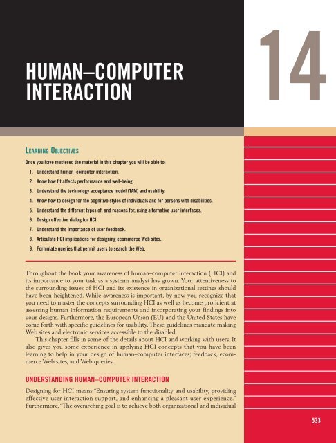
HUMAN–COMPUTER INTERACTION - Prentice Hall
HUMAN–COMPUTER INTERACTION - Prentice Hall
HUMAN–COMPUTER INTERACTION - Prentice Hall

You also want an ePaper? Increase the reach of your titles
YUMPU automatically turns print PDFs into web optimized ePapers that Google loves.
<strong>HUMAN–COMPUTER</strong><br />
<strong>INTERACTION</strong><br />
LEARNING OBJECTIVES<br />
Once you have mastered the material in this chapter you will be able to:<br />
1. Understand human–computer interaction.<br />
2. Know how fit affects performance and well-being.<br />
3. Understand the technology acceptance model (TAM) and usability.<br />
4. Know how to design for the cognitive styles of individuals and for persons with disabilities.<br />
5. Understand the different types of, and reasons for, using alternative user interfaces.<br />
6. Design effective dialog for HCI.<br />
7. Understand the importance of user feedback.<br />
8. Articulate HCI implications for designing ecommerce Web sites.<br />
9. Formulate queries that permit users to search the Web.<br />
Throughout the book your awareness of human–computer interaction (HCI) and<br />
its importance to your task as a systems analyst has grown. Your attentiveness to<br />
the surrounding issues of HCI and its existence in organizational settings should<br />
have been heightened. While awareness is important, by now you recognize that<br />
you need to master the concepts surrounding HCI as well as become proficient at<br />
assessing human information requirements and incorporating your findings into<br />
your designs. Furthermore, the European Union (EU) and the United States have<br />
come forth with specific guidelines for usability. These guidelines mandate making<br />
Web sites and electronic services accessible to the disabled.<br />
This chapter fills in some of the details about HCI and working with users. It<br />
also gives you some experience in applying HCI concepts that you have been<br />
learning to help in your design of human–computer interfaces; feedback, ecommerce<br />
Web sites, and Web queries.<br />
UNDERSTANDING <strong>HUMAN–COMPUTER</strong> <strong>INTERACTION</strong><br />
Designing for HCI means “Ensuring system functionality and usability, providing<br />
effective user interaction support, and enhancing a pleasant user experience.”<br />
Furthermore, “The overarching goal is to achieve both organizational and individual<br />
14<br />
533
534 PART IV THE ESSENTIALS OF DESIGN<br />
user effectiveness and efficiency. To reach these goals, managers and developers<br />
need to be knowledgeable about the interplay among users, tasks, task contexts,<br />
information technology (IT), and the environments in which systems are used,”<br />
(Carey et al., 2004, p. 358).<br />
How do we ensure that our systems are user centered, so that they appropriately<br />
include users’ needs as well as organizational needs? One way is to understand<br />
HCI concepts, another is to consider interfaces in the light of HCI issues, and<br />
another is to apply standard design concepts to computers in new ways because of<br />
an HCI approach.<br />
Knowledge about the interplay among users, tasks, task contexts, IT, and the<br />
environments in which the systems are used comprises the basis of human–<br />
computer interaction. The main tactic of HCI in systems analysis and design is to<br />
repeatedly elicit feedback from users about their experiences with prototyped<br />
designs (which could be screens, forms, interfaces, and the like), refining the design<br />
based on the suggested changes, trying them with users again until the design is<br />
acceptable, and until it is frozen by the analyst.<br />
HOW FIT AFFECTS PERFORMANCE AND WELL-BEING<br />
Let’s begin our exploration of human–computer interaction with some useful<br />
definitions that are commonly shared among those working in the field.<br />
Fit A good fit between the HCI elements of the human, the computer, and the<br />
task that needs to be performed leads to performance and well-being, as shown in<br />
Figure 14.1. Just as it is important that new shoes comfortably fit the shape of your<br />
foot, hold up during the activity you will be doing (such as running), and are made<br />
of a material (such as leather) that is durable and cost-effective, so too is it important<br />
that the fit among the user, computer, and task all correspond.<br />
Analysts want the best fit in their design. You want to make the best possible<br />
use of people in designing a computerized task that is intended to meet an organizational<br />
objective. Better fit is meant to result in better performance and greater<br />
overall well-being for the human involved in the system.<br />
Fortunately, humans’ capacity to learn better ways to work also influences the<br />
fit. We would never try running a marathon with a shoe right out of the box, without<br />
first getting our foot used to it by breaking it in. By the same token, users can<br />
be trained to develop a better fit by learning their tasks and computers thoroughly.<br />
Training continues to be an important way to improve fit. Chapter 17 contains<br />
more specifics about how the analyst can facilitate user training for new systems<br />
and software.<br />
Task In the foregoing chapters you have learned many methods to help you thoroughly<br />
understand, document, and graphically depict the tasks that people currently<br />
perform in the organization. You have also learned methods to help you<br />
design new tasks that will help them reach their objectives with the new systems<br />
you are creating. As you recall, tasks can be structured and routine, or they can be<br />
ill defined and without apparent structure. Complex tasks that require human,<br />
system, and task interaction are supported by ecommerce and Web systems, ERP<br />
systems, and wireless systems inside and outside the organization.<br />
Performance The definition of the word performance in the HCI context is also<br />
key. In this case, “performance” refers to a combination of the efficiency involved in
Nature of Work<br />
Computer<br />
Human<br />
Task<br />
Environment<br />
Fit<br />
Performance<br />
and well-being<br />
performing a task and the quality of the work that is produced by the task. For<br />
example, if analysts are using a high-level software or CASE tool to create data<br />
flow diagrams in which they are proficient, we would predict that the quality of<br />
the data flow diagrams produced would be high. The performance is also efficient,<br />
because the analysts are using an automated tool with which they are familiar.<br />
They can work rapidly, with good results. The task fits the objective, which is to<br />
create high-quality data flow diagrams to document a system. The efficiency of<br />
producing such diagrams with a CASE tool, which can then be used to store,<br />
retrieve, communicate, and modify the DFD diagrams, is excellent, compared to<br />
alternatives such as using a drawing tool unrelated to a data dictionary or drafting<br />
diagrams by hand, neither of which offer such features.<br />
Well-Being At this point, we can introduce the concept of well-being, which is a<br />
concern for a human’s overall comfort, safety, and health; in sum it is their physical<br />
as well as psychological state. Does using a CASE tool for producing DFDs on a<br />
computer serve the analyst’s well-being? Yes, because the task fits well with the analyst,<br />
the software, the objective, and the computer. Notice that the analyst is working<br />
in an environment where they are physically comfortable, are psychologically<br />
stimulated to be creative, and can be productive; also, the analyst’s work is valued by<br />
peers and clients, as well as valued monetarily by the employing organization.<br />
Psychological attitudes (the affective component) are also important. How<br />
users feel about themselves, their identities, their work life, and performance can<br />
Workspace<br />
FIGURE 14.1<br />
The “fit” among the human,<br />
computer, and task affects<br />
performance and well-being.<br />
<strong>HUMAN–COMPUTER</strong> <strong>INTERACTION</strong> CHAPTER 14 535
536 PART IV THE ESSENTIALS OF DESIGN<br />
all be gauged through assessing their attitudes. As an analyst taking an HCI perspective,<br />
you are concerned about how humans’ attitudes color the way they feel<br />
about technology and their tasks, and whether their attitudes hinder or enhance<br />
their experience.<br />
THE TECHNOLOGY ACCEPTANCE MODEL AND ATTITUDE<br />
The technology acceptance model (TAM), as proposed by Davis in 1989 and later<br />
refined and improved by Davis and others, basically is a way for analysts to organize<br />
their thinking about whether users will accept and use information technology. It<br />
can be used to shape training after a system has been developed, but it can also be<br />
used early in the development process to garner user reactions to prototypes so<br />
that systems can be changed early on in the development process to increase the<br />
likelihood of their adoption and use.<br />
There are many theoretical components and a good deal of research to argue<br />
the intricacies of TAM. However, from a practical point of view, you need to be<br />
aware that a large body of research on the acceptance and use of technology exists<br />
in the information systems literature and that TAM is one of the most popular subjects.<br />
TAM draws its power from examining the perceived usefulness of the system<br />
to increase one’s job performance and the belief about how easy the system will<br />
be to use when a user sits down to accomplish a task. So we have the two keys:<br />
perceived usefulness and perceived ease of use. Both can be used to understand<br />
how users intend to interact with a proposed system. Some researchers add an<br />
explicit attitude dimension to their conceptualization of the technology acceptance<br />
model that can help them think more specifically about what psychological<br />
states will shape the way users accept or reject the use of the information systems<br />
they design.<br />
Attitudes toward computers include user satisfaction with the human–<br />
computer interface, as well as users’ overall satisfaction with the system. These are<br />
generally ascertained through special user satisfaction surveys and are often used<br />
following implementation to estimate the overall success or failure of a systems<br />
project. (See Chapter 17 for some examples.) When you attempt to characterize<br />
attitudes toward computers, you may be surprised by all of the possible human<br />
responses that are conveyed. Most of the literature that we are examining for HCI<br />
will look at a variety of user attitudes, including satisfaction, anxiety, enjoyment,<br />
and playfulness in approaching technology.<br />
The technology acceptance model also points out the importance of<br />
whether users find a system useful and are thus motivated to use it. Since this is<br />
an important HCI concern, we can measure whether the information technology<br />
is found to be useful by examining whether the system provides support for<br />
an organizational member’s individual tasks. We can also measure whether there<br />
are important tasks that a user of the new system could not perform prior to its<br />
implementation. Our measurements can also determine whether the system<br />
extends a user’s capabilities (for example, increasing the ability to perform<br />
higher-level analysis quickly or performing an on-the-spot translation of a financial<br />
report into another language complete with currency conversions). Part of<br />
the usefulness criterion in HCI can also be measured by ascertaining whether<br />
users find it rewarding to use the system through postimplementation interviews<br />
and observations.<br />
USABILITY<br />
Usability is a term that is defined differently depending on the branch of science in<br />
which one first encounters it. For our purposes in exploring usability through an
HCI lens, we will try to focus on usability as a way for designers to evaluate the<br />
systems and interfaces they create with an eye toward addressing as many HCI<br />
concerns as thoroughly as possible. Usability studies (according to www.useit.com)<br />
are all about finding out what works in the world and what doesn’t. The ISO has<br />
created usability standards that you can explore on http://www.usabilitynet.org/<br />
tools/r_international.htm. The standards cover the use of the product (effectiveness,<br />
efficiency, and satisfaction in a particular context of use), the user interface and<br />
interaction, the process used to develop the product, and the capability of an organization<br />
to apply user-centered design.<br />
Nielsen and Mack (1994) and Nielsen, Molich, Snyder, and Farrell (2001) have<br />
published usability heuristics (or rules of thumb) based on their thousands of<br />
usability tests of interfaces and, later, tests of ecommerce Web sites. They include<br />
visibility of system status, match between the system and the real world, user control<br />
and freedom, consistency and standards, error prevention, reconnection rather<br />
than recall, flexibility and efficiency of use, aesthetic and minimalist design,<br />
help that users recognize, diagnosis and recovery from errors, and help and documentation.<br />
Some of these are already familiar to you from the input and output<br />
design chapters.<br />
Figure 14.2 is a usability survey to give directly to users who have personally<br />
interacted with a prototype. It asks users outright about some key usability and<br />
ergonomic questions. Another approach is to write up use case scenarios for the<br />
system. These are helpful in examining usability concerns.<br />
DESIGNING FOR THE COGNITIVE STYLES OF INDIVIDUAL USERS<br />
One important consideration is that data, particularly data used for decision making,<br />
are made available in different forms so that users with different cognitive<br />
abilities can make sense of them. Some users may prefer to examine tables and<br />
make decisions, some prefer graphs, and others want to read text.<br />
It is even possible for the same person to want different types of presentations<br />
at different times. For example, suppose a manager wants to compare inventory<br />
held at different stores in a region. A graph can present the data very effectively.<br />
A column chart can use colors to show when a store is near its stockout level, and<br />
it can also show the relative amount of stock by allowing the user to visually compare<br />
the height of the bars directly.<br />
Suppose now the same decision maker wants information about a particular<br />
store in a given month. The graphical depiction may have been set up to show the<br />
stores from highest to lowest inventory on a month-by-month basis. The user may<br />
prefer to return to the table that lists stores alphabetically, with the months listed<br />
chronologically. As you can see, the same person may want to see the same data in<br />
two very different ways.<br />
Pivot Tables Pivot tables allow users to arrange data in a table in any way they<br />
choose. An example of a pivot table template created in Microsoft Excel is shown<br />
in Figure 14.3. The user would take an item from the pop-up box called “Pivot<br />
Table Field List,” such as Product, drag it over to the table template, and drop it in<br />
one of the blank areas. In this example, the user drags and drops Product into the<br />
area on the left entitled “Drop Row Fields Here.” The user drops Sales into the<br />
largest area that says “Drop Data Items Here.”<br />
Finally the user takes the item called Quarter and drops it into the area called<br />
“Drop Column Fields Here.” The result is a table that shows each of the products<br />
in alphabetical order and its sales for each of the four quarters we have data for,<br />
followed by the grand total for the year. This table is shown in Figure 14.4.<br />
<strong>HUMAN–COMPUTER</strong> <strong>INTERACTION</strong> CHAPTER 14 537
Please fill this out after you complete your interaction with the prototype. Circle a number as you respond to each question.<br />
Please hand your survey to the analyst when you have completed it. Thank you for this important feedback.<br />
Prototype being evaluated ________________ Version ___________________ Date ____/____/______<br />
Human–Computer Interaction Factors<br />
Physical/Safety Concerns<br />
1. How well were you able to read the display or form?<br />
2. If audio was used, were you able to hear it?<br />
3. Did you consider the system safe to use?<br />
Usability Concerns How well did the system:<br />
4. Help you cut down on making errors?<br />
5. Allow you to recover from an error if you made one?<br />
6. Help you use it easily?<br />
7. Help you remember how to use it?<br />
8. Make it easy to learn how to use it?<br />
Pleasing and Enjoyable Attributes<br />
9. Was the system attractive?<br />
10. Was the system engaging (you wanted to use it)?<br />
11. Do you trust it as a system?<br />
12. Was it satisfying to use?<br />
13. Was it enjoyable to use?<br />
14. Was the system entertaining?<br />
15. Was the system fun to use?<br />
Usefulness Attributes How well did the system:<br />
16. Support your individual task or tasks?<br />
17. Help you to extend your capabilities?<br />
18. Make itself rewarding to use?<br />
19. Permit you to do tasks that the other system would<br />
not allow you to do?<br />
FIGURE 14.2<br />
A form may be used to survey<br />
users of prototypes on key<br />
usability and ergonomic factors.<br />
(Categories based on<br />
Zhang, Carey, Te’eni, and<br />
Tremaine, 2005, table of HCI<br />
concerns, p. 522.)<br />
538 PART IV THE ESSENTIALS OF DESIGN<br />
Usability Survey<br />
1<br />
1<br />
1<br />
1<br />
1<br />
1<br />
1<br />
1<br />
1<br />
1<br />
1<br />
1<br />
Of course, the user could have done the opposite, that is, drag the item<br />
Quarter to the leftmost column and the Product to the area that says “Drop<br />
Column Fields Here.” That operation, however, would have produced a table with<br />
many columns (one for each product) and only five rows (one for each quarter<br />
plus a row for the total). The resulting table would have been difficult to read.<br />
Many different tables can be displayed by just rearranging these four variables.<br />
If the user dragged the variable Category over to the area that says “Drop Column<br />
Fields Here,” the columns would have been categories of products, rather than the<br />
quarters, and the resulting table would have clearly shown which of the items<br />
belonged in each category and produced subtotals for each category. If Category was<br />
1<br />
1<br />
1<br />
1<br />
1<br />
Very<br />
Poor<br />
1<br />
1<br />
1<br />
2<br />
2<br />
2<br />
2<br />
2<br />
2<br />
2<br />
2<br />
2<br />
2<br />
2<br />
2<br />
2<br />
2<br />
2<br />
2<br />
2<br />
2<br />
2<br />
2<br />
3<br />
3<br />
3<br />
3<br />
3<br />
3<br />
3<br />
3<br />
3<br />
3<br />
3<br />
3<br />
Average<br />
3<br />
3<br />
3<br />
3<br />
3<br />
3<br />
3<br />
3<br />
4<br />
4<br />
4<br />
4<br />
4<br />
4<br />
4<br />
4<br />
4<br />
4<br />
4<br />
4<br />
4<br />
4<br />
4<br />
4<br />
4<br />
4<br />
4<br />
4<br />
5<br />
5<br />
5<br />
5<br />
5<br />
5<br />
5<br />
5<br />
5<br />
5<br />
5<br />
5<br />
5<br />
5<br />
5<br />
5<br />
5<br />
Very<br />
Good<br />
5<br />
5<br />
5
dragged to the area at the very top of the template that says “Drop Page Fields Here,”<br />
then each category would have a table of its own beginning on a separate page.<br />
The idea of a pivot table is useful because it gives users greater control over<br />
how they look at data in different ways within a table. We can examine this same<br />
concept for graphs in the next section.<br />
FIGURE 14.3<br />
A pivot table template can<br />
make it easier for users to<br />
see information displayed in<br />
different ways.<br />
FIGURE 14.4<br />
After the user drags the items<br />
Product, Quarter, and Sales to<br />
the template, the table looks<br />
like this.<br />
<strong>HUMAN–COMPUTER</strong> <strong>INTERACTION</strong> CHAPTER 14 539
FIGURE 14.5<br />
This table, showing the daily<br />
sales by category and by<br />
region, was produced using<br />
Tableau. (Courtesy of<br />
www.tableausoftware.com.)<br />
540 PART IV THE ESSENTIALS OF DESIGN<br />
Visual Analysis of Databases You might be surprised to learn that innovative visual<br />
displays of data existed for quite some time, as early as the eighteenth century.<br />
Barriers to widely using visual displays included lack of imagination, the inability<br />
to draw graphs and charts in a cost-effective manner, and a lack of appreciation for<br />
such displays. After all, the audience for the information must understand the<br />
information in the diagram or it adds little value.<br />
Software that enables the user to visually examine a database or spreadsheet is<br />
available. One example is Tableau Software’s product (www.tableausoftware.com).<br />
Using an approach similar to the pivot tables we saw in Microsoft Excel, Tableau<br />
allows the user to drag and drop variables onto either a row or a column, and they<br />
appear on a graph. In Figure 14.5, the Region and Weekday were designated as<br />
columns and the SUM (Sales Total) was designated as a row. Each Product<br />
Category was then graphed (with “furniture” in blue, “office supplies” in orange,<br />
and “technology” in green).<br />
The graph demonstrates that technology sales were higher than the other categories,<br />
but in particular technology sales were much higher than either furniture<br />
or office supplies in the East. The user was easily able to see this because the<br />
Region was singled out as one of the separators by dragging it to the area as a<br />
column.<br />
Tableau is a well designed software package because it goes much further in<br />
extending user capabilities to perform their tasks through the use of pivot table<br />
techniques. The developers also realized that users may want to group the data<br />
into what they consider a meaningful group. Users may then continue analysis by<br />
examining one of the groups further.<br />
Figure 14.6 examines the SUM (Gross Profit) from each Product Category<br />
from our example. This graph uses color to indicate a profit (green) or a loss (red).<br />
In fact, the intensity of the color indicates the amount of profit or loss.<br />
This graph can be used to explore the situation more deeply by selecting the<br />
three clusters of circles that are bright red, isolating them, and then looking at the<br />
data for those observations in more detail. Users can examine graphs or simply
look at the observations in a table. Once again, they have control over how the<br />
information is presented and thus control their task for best cognitive fit.<br />
Another example from Tableau, presented in Figure 14.7 shows that this software<br />
can also create a dashboard (explained in Chapter 11). Here a table, a scatter<br />
plot, and a column chart are all shown on the same page. Visual analysis tools like<br />
this support visual thinking and extend the user’s cognitive capabilities to do so.<br />
An appropriate visual display will increase the chances of making an appropriate<br />
decision.<br />
FIGURE 14.6<br />
Products yielding losses are<br />
highlighted in bright red on<br />
this scatter plot, created using<br />
Tableau. (Courtesy of<br />
www.tableausoftware.com.)<br />
FIGURE 14.7<br />
When different graphs or<br />
tables can be displayed on the<br />
same page, the page resembles<br />
a dashboard. (Courtesy of<br />
www.tableausoftware.com.)<br />
<strong>HUMAN–COMPUTER</strong> <strong>INTERACTION</strong> CHAPTER 14 541
542 PART IV THE ESSENTIALS OF DESIGN<br />
PHYSICAL CONSIDERATIONS IN HCI DESIGN<br />
In Chapters 11, 12, and 13 you learned the basis for sound design of screens,<br />
forms, Web sites, and databases. This included the special use of fonts, color, and<br />
layout design to communicate to users and to help them do the right thing with<br />
the input and output they encountered. To examine the underlying reasons for<br />
much of the design you learned, it is useful to look at human sensory capabilities<br />
and limitations that will inform our design. In keeping with the HCI philosophy,<br />
an analyst should be able to compensate, overcome, or replace human senses to a<br />
varying extent.<br />
Vision As you learn to become a systems analyst, you are becoming accustomed<br />
to designing screens and reports for sighted people. The use of color, fonts, graphics,<br />
software, and PowerPoint presentations for displays and printed reports as<br />
input and output were detailed in Chapters 11 and 12. However, from an HCI<br />
perspective, you will also want to think in terms of limitations on human vision.<br />
Factors such as length of the distance from display to the person performing a task;<br />
the angle of the display in relation to the person viewing it; the size and uniformity<br />
of the characters; the brightness, contrast, balance, and glare of the screen; and<br />
whether a display is blinking or stable can all be designed to standards established<br />
through ISO and other national and international groups.<br />
Hearing Humans also have limits to the amount of stress their senses can withstand.<br />
Noisy laser printers and phone conversations can lead to overload on human<br />
hearing. Office workers can wear noise-canceling headphones or get a personal<br />
music player like an iPod, but these solutions may have the effect of isolating a<br />
person from the organizational setting and may even diminish their capability to<br />
perform the task at hand. As an analyst you will need to consider noise when you<br />
design office systems.<br />
Touch When using an HCI perspective to evaluate the usefulness of keyboards<br />
and other input devices, we can rate the human–computer fit as well as the dimensions<br />
examining the human–computer–task fit. Later in this chapter we will<br />
discuss the choices of human–computer interfaces, such as keyboards, direct<br />
manipulation, using a stylus, a mouse, and touch screens.<br />
Keyboards have been ergonomically designed to provide the correct feedback<br />
for the person doing data entry. Users know by the firmness of the key under their<br />
finger that the keystroke has been entered. Although keyboards can be silenced,<br />
they are often designed with a click of feedback that is emitted when a key is hit.<br />
Keyboards also include slightly raised bumps on what are called home keys, often<br />
the f and the j keys, which orients users to where their fingers are positioned on the<br />
keyboard, enabling them to look at the screen or type from a printed page on their<br />
desk without continually glancing at the keyboard.<br />
Although the popular QWERTY keyboard that we most often use with computers<br />
today was originally designed to slow down typists so that mechanical keys<br />
of the day would not become entangled, this layout has proved to be quite an efficient<br />
way to enter data. In fact, since users do so well with this familiar interface, it<br />
is difficult to conduct experiments comparing the efficiency of QWERTY keyboards<br />
with other innovative keyboards.<br />
Designing for data entry using numeric keypads as the human entry device<br />
also provides a decision point for designers. Notice that numbers on your mobile<br />
phone are ordered differently than numbers on a numeric keypad or calculator.<br />
Your phone may be arranged with the numbers 1, 2, 3 on the top row. When you
look at a calculator layout or a numeric keypad on your keyboard, you will see 7,<br />
8, and 9 on the top row instead. Research now points to the superiority of the calculator<br />
layout when the user is doing a lot of data entry. However, the phone digit<br />
layout is supposed to be better for locating a number. As a designer, you are constantly<br />
examining the fit between the human, the computer, and the tasks set by<br />
the organization.<br />
Microsoft is currently developing touch screens featuring familiar icons that<br />
will help illiterate workers find domestic jobs through a touch screen interface that<br />
does not require reading, yet still allows unemployed workers power over choosing<br />
new employers. While illiteracy can be remedied through education, some limitations<br />
cannot.<br />
CONSIDERING HUMAN LIMITATIONS, DISABILITIES, AND DESIGN<br />
All humans have limitations in their physical capabilities. Some are immediately<br />
visible, others are not. When designing from an HCI perspective, you start realizing<br />
that limitations are often discussed in terms of disabilities. The application of HCI<br />
to supporting and enhancing the physical capabilities of humans is one of the most<br />
promising application areas. Strides in biomedical engineering mean that there is<br />
research to support the blind or those with low vision, those who are deaf or have<br />
impaired hearing, and people with limited mobility.<br />
There are also improvements in the technical supports available to those who<br />
face difficulties in cognitive processing, including persons suffering with symptoms<br />
of autism, dyslexia, and attention deficit disorder. As a systems analyst you<br />
will be working under the legal provisions of the country in which you are working.<br />
For instance, if you are designing for workplaces in the United States, you<br />
may want to access the obligations of an employer under the Americans with<br />
Disabilities Act at www.eeoc.gov/types/ada.html. There you will find definitions of<br />
who is considered disabled, which states in part, “An individual with a disability is<br />
a person who: has a physical or mental impairment that substantially limits one or<br />
more major life activities; has a record of such impairment; or is regarded as having<br />
such an impairment.”<br />
An employer in the United States is expected to make reasonable accommodation<br />
to employ a disabled person, which includes “Making existing facilities used<br />
by employees readily accessible to and usable by persons with disabilities; job<br />
restructuring, modifying work schedules, reassignment to a vacant position; acquiring<br />
or modifying equipment or devices, adjusting or modifying examinations, training<br />
materials, or policies, and providing qualified readers or interpreters.”<br />
A qualified employee or application is an individual who, “with or without reasonable<br />
accommodation, can perform the essential functions of the job in question.”<br />
An employer is required to make reasonable accommodation to the known<br />
disability of a qualified applicant or employee if it would not impose an undue<br />
hardship on the operation of the business. Undue hardship is defined as “an action<br />
requiring significant difficulty or expense when considered in light of factors such<br />
as an employer’s size, financial resources, and the nature and structure of its operation.<br />
An employer is not required to lower quality or production standards to<br />
make an accommodation.”<br />
One of the best ways to ensure the broadest possible accommodation is to<br />
begin designing from an HCI perspective. That way, your foremost concern will<br />
always be assisting a user in accomplishing a task, set by the organization, with<br />
the use of technology. However, when accommodations for disabled people<br />
are necessary, there are many sources to examine and many assistive devices to<br />
consider.<br />
<strong>HUMAN–COMPUTER</strong> <strong>INTERACTION</strong> CHAPTER 14 543
CONSULTING OPPORTUNITY 14.1<br />
SCHOOL SPIRIT COMES IN MANY SIZES<br />
Matt Scott manages the student-alumni clothing department for<br />
a large bookstore in Saratoga Springs.<br />
“Our clothing sales depend not only on whether our sports teams<br />
win or lose, but the overall well-being of our students and alums. If<br />
they are proud of their university, and want to show their school<br />
spirit, they’ll buy up everything on our racks,” exclaims Matt. “But<br />
don’t underestimate the weather as a factor,” he adds. “If the<br />
weather turns cold in October, you’ll see a surge in people buying<br />
warm sweaters, pullovers, and gloves.”<br />
“Our store serves the major three universities in our area,” Matt<br />
goes on to state. “First, there is Hyde Park, what we call ‘the football<br />
school.’ They have about 17,000 students going there. They have high<br />
demand for school-branded clothing, particularly in the fall. Then, of<br />
course, there’s Pierce University. Pierce thinks it’s part of the Ivy<br />
League, so the students like to buy crew and Lacrosse shirts. They<br />
have about 7,500 students. Then there is St. David’s, with about<br />
3,000 students. They are devoted to their basketball team. They really<br />
have faith in them. You’ll see sales pick up in the second semester,<br />
particularly during ‘March Madness.’”<br />
Mr. Scott continues, admitting, “I thought about asking the students<br />
what to stock, but an email survey is out of the question. I get<br />
spammed a lot, so I mostly don’t bother with email. Unfortunately, the<br />
lead time for getting official branded sportswear into the store is really<br />
long, and we run the risk of stocking out. But we try to never run out.”<br />
You’ve been asked to design a set of tables and graphs that will<br />
help analyze the sales of Matt Scott’s school clothing. Start by listing<br />
544 PART IV THE ESSENTIALS OF DESIGN<br />
about 20 different items of school-branded clothing for men and<br />
women fans, including items such as hooded sweatshirts, T-shirts,<br />
baseball caps, sweatbands, running shorts, and so on. Many of them<br />
feature fanciful embroidered designs depicting their mascots in<br />
menacing or endearing poses. Hyde Park has their Golden Retrievers;<br />
Pierce has their much beloved birds, the Puffins; and St. David’s<br />
cheers with their Dragons.<br />
Put the items into categories. Then think about what the data<br />
would look like. Does it make sense for Matt to look at the data<br />
weekly, monthly, or by semester? Will he want to look back five years<br />
to see if there were any trends? Set up tables identifying the rows and<br />
columns and the content of the main cells. Suggest several tables so<br />
that Matt can analyze them in different ways.<br />
Now construct graphs that analyze the same data. Using some of<br />
the examples found in this book, suggest the type of graphs and<br />
show the data so that different users with different styles can make<br />
some decisions regarding the trend of sales over the last few years.<br />
Remember to compare the schools as well. Suggest the appropriate<br />
graphs from column, line, scatter plots, or even pie charts.<br />
Also suggest three or four specific changes you would make to<br />
allow someone who has low vision to be able to read the graphs more<br />
easily. Magnification is one way to change a graph, but may not be<br />
the best approach.<br />
Consider the size of the schools since this may become the most<br />
important factor when determining how Matt Scott should adjust his<br />
ordering for David’s, Hyde, and Pierce.<br />
For people who are blind or who have low vision, there are braille keyboards as<br />
well as special speech software that reads Web pages and other documents aloud.<br />
There are also screen magnifiers that fit over a display to magnify the entire screen.<br />
For people who lack certain perceptual sensitivity (incorrectly called color<br />
blindness), you can work at testing the colors you are choosing to make certain<br />
that they can be easily distinguished from each other. Particular problems occur<br />
telling the difference between red and green for instance. Always design the screen<br />
or form with alternative cues, such as icons, written text, or audio cues that reinforce<br />
the content. For instance if a hyperlink that has been clicked on turns blue to<br />
show it has been followed, you can also add another icon to the display to indicate<br />
that it has been followed or create a separate sidebar list that shows which Web<br />
sites have been visited. These are better alternatives than relying solely on color to<br />
convey your message.<br />
For users who experience impaired hearing, you can make sure that the documents<br />
and screens you design include access to written versions of the audio<br />
material. Alternatively, you might design tasks where headphones can be successfully<br />
used.<br />
If you are designing computer tasks for those with limited mobility, you can<br />
think of speech input rather than keyboarding. Additionally, new advances in biomedical<br />
engineering permit mobility-impaired users to move the cursor on the<br />
screen by breathing into a tube or by directing the cursor to the desired spot on the
Guidelines for the HCI Approach to Systems Design<br />
• Examine the task to be done and consider the fit among the human, computer, and task.<br />
• Identify what obstacles exist for users in their attempts to accomplish their assigned tasks.<br />
• Keep in mind the perceived usefulness and perceived ease of use from TAM.<br />
• Consider usability. Examine the usage environment by creating use case scenarios that<br />
depict what is going on between users and the technology.<br />
• Use the information you have gained beforehand to figure out the physical and<br />
organizational environmental characteristics. Design with prototyping to accommodate<br />
diverse users and users with disabilities.<br />
screen by looking at that spot or even, in some highly specialized interfaces, by<br />
thinking about where the cursor should move.<br />
IMPLEMENTING GOOD HCI PRACTICES<br />
The ideal is to invite a usability specialist to serve on the systems development<br />
team with the other team members. However, many systems groups are quite<br />
small, and not many professionals are available who are involved in the practice of<br />
usability per se; so even if you make this recommended change to your project, the<br />
odds are that the position will go unstaffed or understaffed. However, don’t let<br />
that discourage you. You can take some simple steps that will positively influence<br />
the outcome of your systems project. Figure 14.8 provides a list of guidelines for<br />
taking an HCI approach to systems design. As systems designers, we can become<br />
aware of important HCI dimensions, knowledgeably linking them to systems<br />
designs, and we should attempt to measure how we are meeting each of these<br />
concerns for users and organizations.<br />
Although we have been discussing the system in the abstract, it is important to<br />
recognize that the interface is the system for most users. However well or poorly<br />
designed, it stands as the representation of the system and, by reflection, your<br />
competence as a systems analyst. A well designed interface improves the fit among<br />
the task, the technology, and the user.<br />
Your goal must be to design interfaces that help users and businesses get the<br />
information they need in and out of the system by addressing the following<br />
objectives:<br />
1. Matching the user interface to the task.<br />
2. Making the user interface efficient.<br />
3. Providing appropriate feedback to users.<br />
4. Generating usable queries.<br />
5. Improving the productivity of computer users.<br />
With these goals in mind, we move to more detailed discussions of how each of<br />
the objectives can be met.<br />
TYPES OF USER INTERFACE<br />
In this section, several different kinds of user interfaces are described, including<br />
natural-language interfaces, question-and-answer interfaces, menus, form-fill interfaces,<br />
command-language interfaces, graphical user interfaces (GUIs), and a variety<br />
of Web interfaces for use on the Internet. The user interface has two main components:<br />
presentation language, which is the computer-to-human part of the transaction,<br />
and action language, which characterizes the human-to-computer portion.<br />
Together, both concepts cover the form and content of the term user interface.<br />
FIGURE 14.8<br />
The HCI approach to systems<br />
design emphasizes the fit<br />
among the human, computer,<br />
and task.<br />
<strong>HUMAN–COMPUTER</strong> <strong>INTERACTION</strong> CHAPTER 14 545
FIGURE 14.9<br />
Natural-language interfaces.<br />
546 PART IV THE ESSENTIALS OF DESIGN<br />
> List all of the salespeople who met their quotas this month.<br />
Tom Otto<br />
Roz Berry<br />
Spin Etch<br />
> Compare the percentage of produce spoiled in each of our three stores.<br />
Fair Oaks 4%<br />
Tyson’s 5%<br />
Metro Center 3%<br />
> Graph the sale of DVD drives on a monthly basis for the last three years.<br />
Press any key to continue.<br />
NATURAL-LANGUAGE INTERFACES<br />
Natural-language interfaces are perhaps the dream and ideal of inexperienced<br />
users, because they permit users to interact with the computer in their everyday, or<br />
natural, language. No special skills are required of the user, who interfaces with the<br />
computer using natural language.<br />
The display depicted in Figure 14.9 lists three natural-language questions from<br />
three different applications. Notice that interaction with each seems very easy. For<br />
instance, the first sentence seems straightforward: “List all of the salespeople who<br />
met their quotas this month.”<br />
The subtleties and irregularities residing in the ambiguities of English produce<br />
an extremely exacting and complex programming problem. Attempts at naturallanguage<br />
interfacing for particular applications in which any other type of interface<br />
is infeasible (say, in the case of a user who is disabled) are meeting with<br />
some success; however, these interfaces are typically expensive. Implementation<br />
problems and extraordinary demand on computing resources have so far kept<br />
natural-language interfaces to a minimum. The demand exists, though, and many<br />
programmers and researchers are working diligently on such interfaces. It is a<br />
growth area, and it therefore merits continued monitoring. Some Web sites, such<br />
as Ask.com, use a natural interface for users to enter their search query. When the<br />
query is entered, Ask.com responds with a list of responses that match the question<br />
entered by the user.<br />
QUESTION-AND-ANSWER INTERFACES<br />
In a question-and-answer interface, the computer displays a question to the user<br />
on the display. To interact, the user enters an answer (via a keyboard stroke or a<br />
mouse click), and the computer then acts on that input information in a preprogrammed<br />
manner, typically by moving to the next question.<br />
A type of question-and-answer interface called a dialog box is shown in<br />
Figure 14.10. A dialog box acts as a question-and-answer interface within another
File Edit Chart Task Layout Dates Fonts Style<br />
Interview<br />
B. Crieghton<br />
9/24<br />
Administer<br />
Questionnaire<br />
Bakerloo Bros. Project<br />
Save changes before quitting?<br />
Yes<br />
No<br />
10/22<br />
Resolve<br />
Conflicting<br />
Information<br />
Cancel<br />
10/22<br />
10/22<br />
10/22<br />
Develop<br />
Database<br />
Build Input<br />
Prototype<br />
Build Output<br />
Prototype<br />
application, in this case a PERT chart for a systems analysis project for the<br />
Bakerloo Brothers. Notice that the rounded rectangle for “Yes” is highlighted, indicating<br />
that it is the most likely answer for this situation. The main interface for this<br />
application need not necessarily be question and answer. Rather, by incorporating<br />
a dialog box, the programmer has included an easy-to-use interface within a more<br />
complicated one.<br />
Wizards used to install software are a common example of a question-andanswer<br />
interface. The user responds to questions about the installation process,<br />
such as where to install the software or features. Another common example is the<br />
use of the Office Assistant with Microsoft products. When the user needs help,<br />
the Office Assistant asks questions and responds to the answers with additional<br />
questions designed to narrow the scope of the problem. Users unfamiliar with<br />
particular applications or not knowledgeable about a topic may find questionand-answer<br />
interfaces the most comfortable, quickly gaining confidence through<br />
their success.<br />
MENUS<br />
A menu interface appropriately borrows its name from the list of dishes that can<br />
be selected in a restaurant. Similarly, a menu interface provides the user with an<br />
onscreen list of available selections.<br />
In responding to the menu, a user is limited to the options displayed. The user<br />
need not know the system but does need to know what task should be accomplished.<br />
For example, with a typical word processing menu, users can choose from<br />
the Edit, Copy, or Print options. To utilize the menu best, however, users must<br />
know which task they desire to perform.<br />
Menus are not hardware dependent. Variations abound. Menus can be set up to<br />
use keyboard entry, light pen, or mouse. Selections can be identified with a number,<br />
letter, or keyword, or users can click on a selection with a mouse. Consistency is<br />
important in designing a menu interface.<br />
FIGURE 14.10<br />
A dialog box: one type of<br />
question-and-answer interface.<br />
<strong>HUMAN–COMPUTER</strong> <strong>INTERACTION</strong> CHAPTER 14 547
FIGURE 14.11<br />
A pull-down menu is there<br />
when the user needs it.<br />
548 PART IV THE ESSENTIALS OF DESIGN<br />
File Edit Chart Task Layout Dates Fonts Style<br />
Show Dates S<br />
Set Earliest Start E<br />
Set Latest Finish L<br />
Interview<br />
B. Crieghton<br />
9/24<br />
Administer<br />
Questionnaire<br />
Duration Scale D<br />
Timeline Scale T<br />
Calendar C<br />
10/22<br />
Resolve<br />
Conflicting<br />
Information<br />
Menus can also be put aside until the user wants to employ them. Figure 14.11<br />
shows how a pull-down menu is used while constructing a PERT diagram for a<br />
systems analysis project being completed for the Bakerloo Brothers. The user puts<br />
the pointer on Dates and pulls it down. Then the user puts the pointer on<br />
Calendar, selecting the option to display the project on a conventional monthly<br />
calendar.<br />
Menus can be nested within one another to lead a user through options in a<br />
program. Nested menus allow the screen to appear less cluttered, which is consistent<br />
with good design. They also allow users to avoid seeing menu options in<br />
which they have no interest. Nested menus can also move users quickly through<br />
the program.<br />
GUI menus are used to control PC software and have the following guidelines:<br />
1. The main menu bar is always displayed.<br />
2. The main menu uses single words for menu items. Main menu options always<br />
display secondary pull-down menus.<br />
3. The main menu should have secondary options grouped into similar sets of<br />
features.<br />
4. The drop-down menus that display when a main menu item is clicked often<br />
consist of more than one word.<br />
5. These secondary options perform actions or display additional menu items.<br />
6. Menu items in grey are unavailable for the current activity.<br />
An object menu, also called a pop-up menu, is displayed when the user<br />
clicks on a GUI object with the right mouse button. These menus contain items<br />
specific for the current activity, and most are duplicate functions of main menu<br />
items.<br />
Experienced users may be irritated by nested menus. They may prefer to use a<br />
single-line command entry to speed things up. Other users might use the shortcut<br />
abbreviations or key combinations such as Alt > I > P > C, which inserts a picture<br />
that is clip art in a Microsoft Office document.<br />
10/22<br />
10/22<br />
10/22<br />
Develop<br />
Database<br />
Build Input<br />
Prototype<br />
Build Output<br />
Prototype
CONSULTING OPPORTUNITY 14.2<br />
I’D RATHER DO IT MYSELF<br />
“I can get Mickey to download any data I need from the Web or our<br />
server to my PC,” DeWitt Miwaye, an upper-level manager for<br />
Yumtime Foods (a Midwest food wholesaler) tells you. “Getting data<br />
is no problem. What I don’t want are a lot of reports. I’d rather play<br />
with the data myself.”<br />
Miwaye goes on to tell you that as an executive, he doesn’t use his<br />
PC as often as he’d like, maybe only three times a month, but he has<br />
some very specific ideas about what he’d like to do with it.<br />
“I’d like to be able to make some comparisons myself. I could<br />
compare the turnover rate for all 12 of our warehouses. I’d also like to<br />
FORM-FILL INTERFACES (INPUT/OUTPUT FORMS)<br />
Form-fill interfaces consist of onscreen forms or Web-based forms displaying fields<br />
containing data items or parameters that need to be communicated to the user.<br />
The form often is a facsimile of a paper form already familiar to the user. This<br />
interface technique is also known as a form-based method and input/output forms.<br />
Figure 14.12 shows a form-fill interface. A pull-down menu for Part No. automatically<br />
enters a Description and Unit Price for the item.When the user tabs to the<br />
Quantity field and enters the number of items being purchased, the software automatically<br />
calculates the Extended Price by multiplying Quantity by Unit Price.<br />
Forms for display screens are set up to show what information should be input<br />
and where. Blank fields requiring information can be highlighted with inverse or<br />
flashing characters. The cursor is moved by the user from field to field by a single<br />
stroke of an arrow key, for instance. This arrangement allows movement one field<br />
backward or one field forward by clicking the appropriate arrow key. It provides<br />
the user good control over data entry. Web-based forms afford the opportunity to<br />
see how effectively the capacity of each of our warehouses is being<br />
used. Sometimes I’d like to be able to graph the comparisons or see a<br />
chart of them over time.”<br />
In three paragraphs, compare three different types of interfaces<br />
that Miwaye could use. Then recommend one interface for his use<br />
that takes into account his infrequent use of the PC, his enjoyment<br />
of working with raw data, and his desire to see data displayed in a<br />
variety of ways.<br />
FIGURE 14.12<br />
An example of the form-fill<br />
interface from Form Flow by<br />
JetForm.<br />
<strong>HUMAN–COMPUTER</strong> <strong>INTERACTION</strong> CHAPTER 14 549
FIGURE 14.13<br />
Command-language interfaces.<br />
550 PART IV THE ESSENTIALS OF DESIGN<br />
include hyperlinks to examples of correctly filled-out forms or to further help<br />
and examples.<br />
Form input for displays can be simplified by supplying default values for fields<br />
and then allowing users to modify default information if necessary. For example, a<br />
database management system designed to show a form for inputting checks may<br />
supply the next sequential check number as a default when a new check form is<br />
exhibited. If checks are missing, the user changes the check number to reflect the<br />
actual check being input.<br />
Input for display screen fields can be alphanumerically restricted so that, for<br />
example, users can enter only numbers in a field requesting a Social Security number,<br />
or they can input only letters where a person’s name is required. If numbers<br />
are input where only letters are allowed, the computer may alert the user via audio<br />
output that the field was filled out incorrectly.<br />
The chief advantage of the input/output form interface is that the printed version<br />
of the filled-in form provides excellent documentation. It shows field labels as<br />
well as the context for entries. In addition, Web forms can return incomplete forms<br />
to the user with an explanation of what data must be entered to complete the<br />
transaction. Often, fields with missing data are marked with a red asterisk. Webbased<br />
documents can be sent directly to billing if a transaction is involved, or they<br />
can go directly to a consumer database if a survey is being submitted. Web-based<br />
forms push the responsibility for accuracy to the user and make the form available<br />
for completion and submission on a 24-hour, 7-day-a-week, worldwide basis.<br />
There are few disadvantages to input/output forms. The main drawback is that<br />
users experienced with the system or appplication may become impatient with<br />
input/output forms and may want more efficient ways to enter data.<br />
COMMAND-LANGUAGE INTERFACES<br />
A command-language interface allows the user to control the application with a<br />
series of keystrokes, commands, phrases, or some sequence of these three methods.<br />
It is a popular interface that is more refined than those previously discussed.<br />
USE SALESPPL<br />
DISPLAY ALL LNAME, FNAME FOR CURSALES > QUOTA<br />
USE GROCER<br />
REPLACE ALL SPOILS WITH PBOUGHT - PSOLD<br />
GOTO TOP<br />
LIST
CONSULTING OPPORTUNITY 14.3<br />
DON’T SLOW ME DOWN<br />
“I’ve seen ’em all,” Carrie Moore tells you. “I was here when they<br />
got their first computer. I guess I’ve sort of made a career of this,”<br />
she says cheerfully, pointing to the large stack of medical insurance<br />
claim forms she has been entering into the computer system. As a<br />
systems analyst, you are interviewing Carrie, a data entry operator for<br />
AbundaCare (a large medical insurance company), about changes<br />
being contemplated in the computer system.<br />
“I’m really fast compared with the others,” she states as she nods<br />
toward the six other operators in the room. “I know, because we have<br />
little contests all the time to see who’s the fastest, with the fewest<br />
errors. See that chart on the wall? That shows how much we enter<br />
and how quickly. The gold stars show who’s the best each week.<br />
Performance measures are my friends.”<br />
“I don’t really mind if you change computers. Like I say, ‘I’ve seen<br />
’em all.’” She resumes typing on her keyboard as she continues the<br />
Two application examples of command language are shown in Figure 14.13.<br />
The first shows a user who asks to use a file containing data on all salespeople, then<br />
asks the computer to display all last names and first names for all salespeople<br />
whose current sales (CURSALES) are greater than their quotas. In the second<br />
example, a user asks to use a file called GROCER, then directs the computer to<br />
calculate the spoilage (SPOILS) by subtracting produce sold from produce<br />
bought. After that is done, the user asks to go back to the top of the file and to<br />
print out (LIST) the file.<br />
The command language has no inherent meaning for the user, and that fact<br />
makes it dissimilar to the other interfaces discussed so far. Command languages<br />
manipulate the computer as a tool by allowing the user to control the dialog.<br />
Command language affords the user more flexibility and control. When the user<br />
employs command language, the command is executed by the system immediately.<br />
Then the user may proceed to give it another command.<br />
Command languages require memorization of syntax rules that may prove to<br />
be obstacles for inexperienced users. Experienced users tend to prefer command<br />
languages, possibly because of their faster completion time.<br />
GRAPHICAL USER INTERFACES<br />
The key to graphical user interfaces (GUIs) is the constant feedback on task<br />
accomplishment that they provide to users. Continuous feedback on the manipulated<br />
object means that changes or reversals in operations can be made quickly,<br />
without incurring error messages. The concept of feedback for users is discussed<br />
thoroughly in a later section.<br />
The creation of GUIs poses a challenge, because an appropriate model of reality<br />
or an acceptable conceptual model of the representation must be invented.<br />
Designing GUIs for use on intranets, extranets, and, more pressingly, on the Web<br />
requires even more careful planning (see Chapter 12 on Web site design). By and<br />
large, the users of Web sites are unknown to the developer, so a design must be<br />
clear-cut. The choice of icons, language, and hyperlinks becomes an entire set of<br />
interview. “Whatever you do, though, don’t slow me down. One of the<br />
things I’m most proud of is that I can still beat the other operators.<br />
They’re good too, though,” Carrie adds.<br />
Based on this partial interview with Carrie Moore, what type of<br />
user interface will you design for her and the other operators? Assume<br />
the new system will still require massive amounts of data entry from<br />
a variety of medical insurance forms sent in by claimants.<br />
Compare and contrast interfaces such as natural language,<br />
question and answer, menus, input/output forms, and Web-based<br />
form-fill documents. Then choose and defend one alternative. What<br />
qualities possessed by Carrie and the other operators—and the data<br />
they will be entering—shaped your choice? Make a list of them. Is<br />
there more than one feasible choice? Why or why not? Respond in a<br />
paragraph.<br />
<strong>HUMAN–COMPUTER</strong> <strong>INTERACTION</strong> CHAPTER 14 551
CONSULTING OPPORTUNITY 14.4<br />
THAT’S NOT A LIGHTBULB<br />
From your preliminary analysis, it appears that a substantial<br />
reduction in errors will be realized if sales clerks at Bright’s Electric<br />
(which sells electrical parts, bulbs, and fixtures to wholesale customers)<br />
adopt an online system. The new system would allow sales<br />
clerks to withdraw a part from inventory (and thereby update inventory),<br />
return a part to inventory, check on the inventory status, and<br />
check on whether a part is backordered. Currently, to update inventory,<br />
sales clerks fill out a three-part form by hand. The customer gets<br />
one, inventory keeps one, and at the end of the day the originals are<br />
deposited in the front office.<br />
The next morning, the first thing the lone office worker does is<br />
enter the data from the forms into the computer. Errors occur when<br />
she enters the wrong part numbers or quantities. Additional time is<br />
consumed when inventory workers hunt for a part they think might be<br />
in stock but is not. Updated inventory sheets are available to the<br />
sales clerks around noon, but by that time they have already taken<br />
from inventory twice the number of parts that will be taken out after<br />
noon. Clearly, a well designed online system would help reduce these<br />
errors and also help with inventory control.<br />
The owner, Mr. Bright, has entertained the idea of an online system<br />
and dropped it several times over the last five years. The chief<br />
reason is that the sales clerks, who would be the heaviest users of<br />
the system, do not think the systems analysts they’ve talked to can<br />
fulfill their needs.<br />
552 PART IV THE ESSENTIALS OF DESIGN<br />
M. T. Sockette, the sales clerk who has been with Bright’s the<br />
longest, is the most vocal, telling you, “We know the parts, we know<br />
our customers. What we could do with a computer here would be<br />
great. The guys they’ve brought in here to get it going, though…<br />
I mean, they say things like, ‘You can step right up and type one<br />
60-watt General Electric lightbulb into the computer.’<br />
“To us, that’s not a lightbulb, it’s a GE60WSB. All of us know the<br />
part numbers here. We pride ourselves on it. Typing in all that junk<br />
will take all day.”<br />
After talking to Mr. Bright, you decide to implement an online system.<br />
You have talked to M. T. and the others and reassured them that<br />
the system will use the part numbers they’re familiar with and will<br />
save them time. Although they’re skeptical, you’ve persuaded them to<br />
give it a try.<br />
What type of user interface will you design for the sales clerks?<br />
Before you come to your solution, do a careful analysis in three<br />
paragraphs that compares and contrasts various user interfaces—<br />
natural language, question and answer, menus, input/output forms,<br />
command language, and Web-based form-fill documents—for their<br />
suitability at Bright’s. Then choose one interface and explain in a<br />
paragraph why you find this one the most appropriate based on what<br />
you know about Bright’s sales clerks and their current system. Draw a<br />
prototype of a display that will be part of your solution. Describe in a<br />
paragraph how you will test its usability with the sales clerks.<br />
decisions and assumptions about what kinds of users the Web site is hoping to<br />
attract. The designer must also adhere to conventions that users now expect to<br />
encounter on Web sites.<br />
OTHER USER INTERFACES<br />
Other less common user interfaces are growing in popularity. These interfaces<br />
include pointing devices such as the stylus, touch-sensitive screens, and speech<br />
recognition and synthesis. Each of these interfaces has its own special attributes<br />
that uniquely suit it to particular applications.<br />
The stylus (a small pointed stick that resembles a pen) is becoming popular<br />
because of new handwriting recognition software for personal digital assistants<br />
(PDAs) and mobile phones. Palms, combination mobile phones and PDAs, and<br />
Pocket/PC devices have been a success because they have are useful and easy to<br />
use. Additionally, they are portable and sell for a comparatively low price. There<br />
has been an explosion of fun and useful applications written for these mobile<br />
devices, including popular programs for restaurant reviews such as Zagats and for<br />
popular games such as Sudoku. Data entry is also facilitated with a docking cradle<br />
so that you can synchronize data with your PC.<br />
A tablet PC is a notebook computer with a stylus- or touch-sensitive display.<br />
It is much more powerful than a handheld computer but weighs considerably<br />
more. Both handhelds and tablet PCs can be equipped with built-in Wi-Fi or<br />
Bluetooth ® communication.
Touch-sensitive displays allow a user to use a finger to activate the display.<br />
Touch-sensitive displays are useful in public information displays, such as maps of<br />
cities and their sights posted in hotel lobbies or car rental facilities. They can also be<br />
used to explain dioramas in museums and to locate camping facilities in state parks.<br />
Touch-sensitive displays require no special expertise from users, and the screen is<br />
self-contained, requiring no special input device that might be broken or stolen.<br />
With voice recognition, the user speaks to the computer, and the system is able<br />
to recognize an individual’s vocal signals, convert them, and store the input. Voice<br />
recognition inventory systems are already in operation, and automobiles now feature<br />
voice input systems that respond to a driver’s voice commands to navigate or<br />
to change the radio station.<br />
An advantage of voice recognition systems is that they can speed data entry<br />
enormously, and free the user’s hands for other tasks (for example, driving). Speech<br />
input adds still another dimension to the PC. It is now possible to add equipment<br />
and software that allows a PC user to speak commands such as “open file” or<br />
“save file” to avoid using the keyboard or mouse. Users with limited mobility or<br />
impaired sight can benefit from voice recognition systems. In the example shown<br />
in Figure 14.14, the user corrects a word by pulling down a menu of alternative<br />
words that sound the same.<br />
When evaluating the interfaces you have chosen, keep some standards in mind:<br />
1. The necessary training period for users should be acceptably short.<br />
2. Early in their training, users should be able to enter commands without thinking<br />
about them or without referring to a help menu or manual. Keeping interfaces<br />
consistent throughout applications can help in this regard.<br />
3. The interface should be seamless so that errors are few and those that do occur<br />
are not occurring because of poor design.<br />
4. The time that users and the system need to bounce back from errors should be<br />
short.<br />
5. Infrequent users should be able to relearn the system quickly.<br />
FIGURE 14.14<br />
Using software such as Dragon<br />
NaturallySpeaking by Nuance,<br />
a user can speak commands<br />
to their computer. In this<br />
example, the user corrects a<br />
word by pulling up a menu of<br />
alternative words that sound<br />
the same.<br />
<strong>HUMAN–COMPUTER</strong> <strong>INTERACTION</strong> CHAPTER 14 553
554 PART IV THE ESSENTIALS OF DESIGN<br />
Many different interfaces are available, and it is important to realize that an<br />
effective interface goes a long way toward addressing key HCI concerns. Users<br />
should want to use the system, and they should find it attractive and pleasing to<br />
use. In the next section, we discuss the importance of providing feedback for users<br />
to support and sustain their involvement with the system, so that they will be able<br />
to accomplish their tasks.<br />
GUIDELINES FOR DIALOG DESIGN<br />
Dialog is the communication between the computer and a person. Well designed<br />
dialog makes it easier for people to use a computer and lessens their frustration<br />
with the computer system. Recall the elements of the TAM (technology acceptance<br />
model) indicating that perceived usefulness and perceived ease of use will<br />
lead first to an intention to use the system and eventually to using it. There are several<br />
key points for designing good dialog. Some of them were mentioned in<br />
Chapter 12. They include the following:<br />
1. Meaningful communication, so that the computer understands what people<br />
are entering and people understand what the computer is presenting or<br />
requesting.<br />
2. Minimal user action.<br />
3. Standard operation and consistency.<br />
MEANINGFUL COMMUNICATION<br />
The system should present information clearly to the user. This means having an<br />
appropriate title for each display, minimizing the use of abbreviations, and providing<br />
clear user feedback. Inquiry programs should display code meanings as well as<br />
data in an edited format, such as displaying slashes between the month, day, and<br />
year in a date field or commas and decimal points in an amount field. User instructions<br />
should be supplied regarding details, such as available function key assignments.<br />
In a graphical interface, the cursor may change shape depending on the<br />
work being performed.<br />
Users with less skill in using the computer or doing their tasks with a computer<br />
require more communication. Web sites must display more text and<br />
instructions to guide the user through the site. Intranet sites may have less dialog,<br />
because there is a measure of control over how well trained users are. Internet<br />
graphics should have pop-up text or roll-over descriptions when images are used<br />
as hyperlinks, because there may be uncertainty in interpreting their meaning,<br />
especially if the site is used internationally. Notice that EU guidelines for the display<br />
of Web graphics requires that all images be labeled, so that visually impaired<br />
users will be able to hear written descriptions announced through special software.<br />
Status line information for GUI screens is another way of providing instructions<br />
for users.<br />
Easy-to-use help screens should be provided. Many PC help screens have additional<br />
topics that may be directly selected using highlighted text displayed on the<br />
first help screen. These hyperlinks are usually in a different color, which makes<br />
them stand out in contrast to the rest of the help text. Remember to use icons or<br />
text in addition to color coding in order to reach the largest number of users. Many<br />
of the newer GUIs often incorporate tool tip help, displaying a small help message<br />
identifying the function of a command button when the cursor is placed over it.<br />
The other side of communication is that the computer should understand what<br />
the user has entered. Hence, all data entered on the screen should be edited for<br />
validity.
MINIMAL USER ACTION<br />
Keying is often the slowest part of a computer system, and good dialog will minimize<br />
the number of keystrokes required. You can accomplish this goal in a number<br />
of different ways:<br />
1. Keying codes, such as airport codes when making a flight reservation, instead<br />
of whole words on entry screens. Codes are also keyed when using a commandlanguage<br />
interface, such as a two-letter state postal abbreviation. On a GUI<br />
screen, the codes may be entered by selecting descriptions of the codes from a<br />
pull-down list of available options. This helps to ensure accuracy, since the<br />
code is stored as a value of the drop-down list, as well as helping to provide<br />
meaningful communication since descriptions that are familiar to the user<br />
are selected. An example would be selecting a Canadian province and having<br />
the two-character postal code stored.<br />
2. Entering only data that are not already stored on files. For example, when<br />
changing or deleting item records, only the item number should be entered.<br />
The computer responds by displaying descriptive information that is currently<br />
stored on the item file. Another example is when a user logs on to a Web site,<br />
the userID is used to find related records, such as a customer record, outstanding<br />
bills, orders, and so on.<br />
3. Supplying the editing characters (for example, slashes as date field separators).<br />
Users should not have to enter formatting characters such as leading<br />
zeros, commas, or a decimal point when entering a dollar amount; nor should<br />
they have to enter slashes or hyphens when entering a date. In general, Web<br />
sites are an exception to this rule, since Web forms do not include slashes or<br />
decimal points. Some Web forms use a series of entry fields with editing characters<br />
between them, such as parentheses around an area code.<br />
4. Using default values for fields on entry screens. Defaults are used when a user<br />
enters the same value in a screen field for the majority of the records being<br />
processed. The value is displayed, and the user may press the Enter key to<br />
Source: © 2003 Joe Dater from<br />
cartoonbank.com. All Rights Reserved.<br />
<strong>HUMAN–COMPUTER</strong> <strong>INTERACTION</strong> CHAPTER 14 555
FIGURE 14.15<br />
Example of nested pull-down<br />
menus with shortcut keys from<br />
Microsoft Visio Professional.<br />
556 PART IV THE ESSENTIALS OF DESIGN<br />
accept the default or overtype the default value with a new one. GUIs may<br />
contain check boxes and radio buttons that are selected when a Web form or<br />
dialog box opens. Context-sensitive menus appear when an object is clicked<br />
with the right mouse button. These menus contain options specific for the<br />
object under the mouse.<br />
5. Designing an inquiry (or change or delete) program so that the user needs to<br />
enter only the first few characters of a name or item description. The program<br />
displays a list of all matching names, and, when the user chooses one, the<br />
matching record is displayed.<br />
6. Providing keystrokes for selecting pull-down menu options. Often, these<br />
options are selected using a mouse, followed by keying. Users must move their<br />
hands from the keyboard to the mouse and back. As users become familiar<br />
with the system, shortcut keystrokes provide a faster method for manipulating<br />
the pull-down menus, because both hands remain on the keyboard. This helps<br />
users become efficient at their tasks. On a PC, keystrokes usually involve pressing<br />
a function key or the Alt key followed by a letter. Figure 14.15 is an example<br />
of nested pull-down menus with shortcut keys from Microsoft Visio<br />
Professional. Notice that the user, who is creating a structure chart, can get<br />
into a series of ever more specific menus.<br />
7. Use radio buttons and drop-down lists to control displays of new Web pages<br />
or to change Web forms. For example, when a radio button is clicked, a dropdown<br />
list may change to reflect the radio button choice. A radio button may be<br />
clicked and a form may change according to the choice. A drop-down list may<br />
change or a radio button may be clicked to move to a new Web page. Dropdown<br />
lists are often provided on a Web page for quick navigation, selecting a<br />
new Web page from the drop-down list takes the viewer to that page.<br />
8. Provide cursor control for Web forms and other displays so that the cursor<br />
moves to the next field when the right number of characters has been entered.<br />
An example would be when a user enters an area code for a telephone number,<br />
and, following the entry of three characters, the cursor then moves to the
local phone number field. Entering software registration key codes is another<br />
example. The codes are often in groups of four or five letters and, when the<br />
first field is filled, the cursor moves to the next field and so on. The analyst<br />
should examine every field to see if automatic cursor control should occur.<br />
Any combination of these eight approaches can help the analyst decrease the<br />
number of keystrokes required by the user, thereby speeding up data entry and<br />
minimizing errors.<br />
STANDARD OPERATION AND CONSISTENCY<br />
The system should be consistent throughout its set of different displays and in the<br />
mechanisms for controlling the operation of the displays throughout different<br />
applications. Consistency makes it easier for users to learn how to use new portions<br />
of the system once they are familiar with one component. You can achieve<br />
consistency by:<br />
1. Locating titles, date, time, and operator and feedback messages in the same<br />
places on all displays.<br />
2. Exiting each program by the same key or menu option. On Web pages there is<br />
often a logout image.When using programs such as Microsoft Access, use a common<br />
icon to exit the display screen. When using function keys to exit, it would<br />
be a poor design that used function key 4 (F4) to exit the ADD CUSTOMER<br />
program and function key 6 (F6) to exit the CHANGE CUSTOMER program.<br />
3. Canceling a transaction in a consistent way, usually by pressing the Esc key on<br />
a PC or by using a function key (usually F12) on a mainframe.<br />
4. Obtaining help in a standardized way. The industry standard for help is function<br />
key 1 (F1), and most software developers for the PC are adopting this<br />
convention.<br />
5. Standardizing the colors used for all displays or Web pages. Error messages are<br />
typically displayed in red. Use a standard combination of a color and an icon to<br />
denote an error. Remember to keep the background screen color the same for<br />
all applications.<br />
6. Standardizing the use of icons for similar operations when using a graphical<br />
user interface. For example, a small piece of paper with a bent upper corner<br />
often represents a document. Use standard images on a Web page.<br />
7. Using consistent terminology in a display screen or Web site.<br />
8. Providing a consistent way to navigate through the dialog. For example, find a<br />
consistent way to add records or to work with a Web site, such as using the<br />
same buttons for Back and Next.<br />
9. Using consistent font alignment, size, and color on a Web page.<br />
An example of good GUI design is the tab control dialog box shown in<br />
Figure 14.16. Currently, the user is choosing HP LaserJet print options, and he or<br />
she is in the Paper tab but also has the choice of six other tabs, including Fonts and<br />
Graphics. This display shows the options that a user can select by clicking on the<br />
left or right arrows on the horizontal sliding bar that runs along the bottom of the<br />
Paper size window: Com-10 Env, Monarch E, DL Env, C5 Env, and so on. The dark<br />
highlight indicates that the user has chosen to print a C5 envelope. Notice that the<br />
designer of this interface has used option buttons for both Layout and Orientation.<br />
The user has clicked on a choice of Portrait for orientation. A drop-down menu is<br />
also used to select the Paper source. In this instance, the user has chosen<br />
AutoSelect Tray. The designer has also used push buttons at the very bottom of<br />
the display that allow users to enter OK, Cancel, or Apply in regard to the options<br />
they have just chosen.<br />
<strong>HUMAN–COMPUTER</strong> <strong>INTERACTION</strong> CHAPTER 14 557
FIGURE 14.16<br />
This tab control dialog box has<br />
seven tabs. The chosen tab<br />
“Paper” appears as if it is in<br />
front of the other tabs.<br />
FIGURE 14.17<br />
Feedback is used in many<br />
ways.<br />
FEEDBACK FOR USERS<br />
558 PART IV THE ESSENTIALS OF DESIGN<br />
All systems require feedback to monitor and change behavior, as discussed in<br />
Chapter 2. Feedback usually compares current behavior with predetermined<br />
goals and gives back information describing the gap between actual and intended<br />
performance.<br />
Because humans themselves are complex systems, they require feedback from<br />
others to meet psychological and cognitive processing needs discussed earlier in<br />
this chapter. Feedback also increases human confidence. How much feedback is<br />
required is an individual characteristic.<br />
When users interface with machines, they still need feedback about how their<br />
work is progressing. As designers of user interfaces, systems analysts need to be<br />
aware of the human need for feedback and build it into the system. In addition to<br />
text messages, icons can often be used. For example, displaying an hourglass while<br />
the system is processing encourages the user to wait a while rather than repeatedly<br />
hitting keys to get a response.<br />
Feedback to the user from the system is necessary in seven distinct situations,<br />
as shown in Figure 14.17. Feedback that is ill timed or too plentiful is not helpful,<br />
because humans possess a limited capacity to process information. Each of the<br />
seven situations in which feedback is appropriate is explained in the upcoming<br />
Feedback Is Needed to Tell the User That:<br />
• The computer has accepted the input.<br />
• The input is in the correct form.<br />
• The input is not in the correct form.<br />
• There will be a delay in the processing.<br />
• The request has been completed.<br />
• The computer is unable to complete the request.<br />
• More detailed feedback is available (and how to get it).
subsections. Web sites should display a status message or some other way of notifying<br />
the user that the site is responding and that input is either correct or in need<br />
of further information.<br />
TYPES OF FEEDBACK<br />
CONSULTING OPPORTUNITY 14.5<br />
WAITING TO BE FED<br />
“Yeah, we were sold a package all right. This one right here. Don’t<br />
get me wrong, it gets the work done. We just don’t know when.”<br />
You are talking with Owen Itt, who is telling you about the sales<br />
unit’s recent purchase of new software for its networked PCs that<br />
allows the input of sales data for each of its 16 salespeople, provides<br />
output showing comparison data for them, and projects future sales<br />
based on past sales records.<br />
“We’ve had some odd experiences with this program, though,”<br />
Owen continues. “It seems slow or something. For instance, we’re<br />
never sure when it’s done. I type in a command to get a file and nothing<br />
happens. About half a minute later, if I’m lucky, the display I want<br />
might come up, but I’m never sure. If I ask it to save sales data, I just<br />
get a whirring sound. If it works, I’m returned to where I was before.<br />
Acknowledging Acceptance of Input The first situation in which users need feedback<br />
is to learn that the computer has accepted the input. For example, when a<br />
user enters a name on a line, the computer provides feedback to the user by<br />
advancing the cursor one character at a time when the letters are entered correctly.<br />
A Web example would be a Web page displaying a message that “Your payment<br />
has been processed. Your confirmation number is 1234567. Thank you for using<br />
our services.”<br />
Recognizing That Input Is in the Correct Form Users need feedback to tell them<br />
that the input is in the correct form. For example, a user inputs a command, and the<br />
feedback states “READY” as the program progresses to a new point. A poor example<br />
of feedback that tells the user that input is in the correct form is the message<br />
“INPUT OK,” because that message takes extra space, is cryptic, and does nothing<br />
to encourage the input of more data. When placing an order on the Web or making<br />
a payment, a confirmation page often displays, requesting that the user review the<br />
information and click a button or image to confirm the order or payment.<br />
Notifying That Input Is Not in the Correct Form Feedback is necessary to warn users<br />
that input is not in the correct form. When data are incorrect, one way to inform<br />
the user is to generate a window that briefly describes the problem with the input<br />
and tells how the user can correct it, as shown in Figure 14.18.<br />
Notice that the message concerning an error in inputting the subscription<br />
length is polite and concise but not cryptic, so that even inexperienced users will<br />
be able to understand it. The subscription length entered is wrong, but the feedback<br />
given does not dwell on the user’s mistake. Rather, it offers options (13, 26, or<br />
52 weeks) so that the error can be corrected easily. On a GUI screen, feedback is<br />
often in the form of a message box with an OK button on it.<br />
If it doesn’t save data, I’m still returned to where I was before. It’s<br />
confusing, and I never know what to do. There’s nothing on the display<br />
screen that tells me what to do next. See the little manual that<br />
came with it? It’s dog-eared because we have to keep thumbing<br />
through trying to figure out what to do next. Or we go online to try to<br />
get some help, but their technical assistance is just about nonexistent.<br />
It takes way too much time, too.”<br />
Based on what you’ve heard in the interview, take this opportunity<br />
to supplement the software by designing some onscreen feedback for<br />
Owen and his sales team. The feedback should address all of Owen’s<br />
concerns, and follow the guidelines for giving feedback to users, and<br />
the guidelines for designing good displays. Draw a prototype of the<br />
displays you think are necessary to address the problems Owen lists.<br />
<strong>HUMAN–COMPUTER</strong> <strong>INTERACTION</strong> CHAPTER 14 559
FIGURE 14.18<br />
Feedback informs the user that<br />
input was not in the correct<br />
form and lists options.<br />
560 PART IV THE ESSENTIALS OF DESIGN<br />
America Today Newspaper Subscription List<br />
First Initial M Middle Initial C Last Name HURST<br />
Number 3349 Street SOUTH STREET<br />
Apartment<br />
City LINCOLN State NE<br />
Zip Code<br />
Subscription Length in Weeks 14<br />
Method of Payment<br />
The subscription length you entered is<br />
not currently being offered. Please<br />
choose either 13, 26, or 52 weeks<br />
Web messages have a variety of formats. One method is to return a new page<br />
with the message on the side of the field containing the error. The new Web<br />
page may have a link for additional help. This method works for all Web sites, and<br />
the error detection and formatting of the new page are controlled by the server.<br />
Another method uses JavaScript to detect the error and display a message box on<br />
the current screen with details about the specific error. An advantage of this<br />
method is that the Web page does not have to be sent to the server, and the page is<br />
more responsive. Disadvantages are that, if JavaScript is turned off, the error will<br />
not be detected, and only one error is displayed at a time. There must also be a way<br />
of detecting the error on the server. A second disadvantage is that JavaScript may<br />
not detect errors that involve reading database tables, such as verifying a credit<br />
card number. This may be offset by using Ajax, which can send the number to the<br />
server and return an error to the Web page. Remember, however, that as many as<br />
25 percent of users intentionally turn off their JavaScript capability; so analysts<br />
need to follow a variety of tactics when communicating errors.<br />
Web pages may also use JavaScript to detect multiple errors and display text<br />
messages on the page. Caution must be used so that the error messages are bold<br />
enough for the user to notice. A small red line of text may go unnoticed. A message<br />
box or audible beeps may be used to alert the users that one or more errors have<br />
occurred.<br />
The analyst must decide whether to detect and report errors when a Submit<br />
button or link is clicked, called batch validation, or detect errors one at a time, such<br />
as when a user enters a month of 14 and leaves the field. The second method is a<br />
riskier approach since poor coding may put the browser into a loop, and the user<br />
will have to shut down the browser.<br />
So far, we have discussed visual feedback in text or iconic form, but many systems<br />
have audio feedback capabilities as well. When a user inputs data in the<br />
incorrect form, the system might beep instead of providing a window. But audio<br />
feedback alone is not descriptive, so it is not as helpful to users as onscreen instructions.<br />
Use audio feedback sparingly, perhaps to denote urgent situations. The same<br />
68506<br />
CHK
America Today Newspaper Subscription List<br />
First Initial Middle Initial Last Name<br />
Number treet<br />
City State<br />
Printing is now in progress.<br />
Subscription Length in weeksTo<br />
halt printing just type M Pethod<br />
of Payment<br />
advice also applies to the design of Web sites, which may be viewed in an open<br />
office, where sounds carry and a coworker’s desktop speakers are within earshot of<br />
several other people.<br />
Explaining a Delay in Processing One of the most important kinds of feedback<br />
informs the user that there will be a delay in processing his or her request. Delays<br />
longer than 10 seconds or so require feedback so that the user knows the system is<br />
still working.<br />
Figure 14.19 shows a display providing feedback in a window for a user who<br />
has just requested a printout of the newspaper’s subscription list. The display<br />
shows a sentence reassuring the user that the request is being processed, as well as<br />
a sign in the upper right corner instructing the user to “WAIT” until the current<br />
command has been executed. The display also provides a way to stop the operation<br />
if necessary.<br />
Sometimes during delays, while new software is being installed, a short tutorial<br />
on the new application is run, which is meant to serve as a distraction rather<br />
than feedback about the installation. Often, a list of files that are being copied<br />
and a status bar are used to reassure the user that the system is functioning<br />
properly. Web browsers usually display the Web pages that are being loaded and<br />
the time remaining.<br />
It is critical to include feedback when using Ajax to update Web forms.<br />
Because a new Web page does not load, the user may not be aware that data are<br />
being retrieved from the server that will change the current Web page. When a<br />
drop-down list is changing, a message, such as “Please wait while the list is being<br />
populated” informs the user that the Web page is changing.<br />
Timing feedback of this sort is critical. Too slow a system response could cause<br />
the user to input commands that impede or disrupt processing.<br />
Acknowledging That a Request Is Completed Users need to know when their request<br />
has been completed and new requests may be input. Often a specific feedback<br />
WAIT<br />
ment<br />
mode<br />
FIGURE 14.19<br />
Feedback tells the user that<br />
there will be a delay during<br />
printing.<br />
<strong>HUMAN–COMPUTER</strong> <strong>INTERACTION</strong> CHAPTER 14 561
562 PART IV THE ESSENTIALS OF DESIGN<br />
message is displayed when an action has been completed by a user, such as<br />
“Employee record has been added,” “Customer record has been changed,” or “Item<br />
number 12345 has been deleted.”<br />
Notifying That a Request Was Not Completed Feedback is also needed to let the<br />
user know that the computer is unable to complete a request. If the display reads<br />
“Unable to process request. Check request again,” the user can then go back and<br />
check to see if the request has been input correctly rather than continue to enter<br />
commands that cannot be executed.<br />
Offering the User More Detailed Feedback Users need to be reassured that more<br />
detailed feedback is available, and they should be shown how they can get it.<br />
Commands such as Assist, Instruct, Explain, and More may be employed. Or the<br />
user may type a question mark or point to an appropriate icon to get more feedback.<br />
Using the command Help as a way to obtain further information has been<br />
questioned, because users may feel helpless or caught in a trap from which they<br />
must escape. This convention is in use, and its familiarity to users may overcome<br />
this concern.<br />
When designing Web interfaces, hyperlinks can be embedded to allow the user<br />
to jump to the relevant help screens or to view more information. Hyperlinks are<br />
typically highlighted with underlining, italics, or a different color. Hyperlinks can<br />
be graphics, text, or icons.<br />
INCLUDING FEEDBACK IN DESIGN<br />
It is well worth the systems analyst’s time to provide user feedback. If used correctly,<br />
feedback can be a powerful reinforcer of users’ learning processes, serve to<br />
improve user performance with the system, increase motivation to produce, and<br />
improve the fit among the user, the task, and the technology.<br />
A Variety of Help Options Feedback on personal computers has developed over the<br />
years. “Help” originally started as a response to the user who pressed a function<br />
key, such as F1; the GUI alternative is the pull-down help menu. This approach<br />
was cumbersome, because end users had to navigate through a table of contents or<br />
search via an index. Next came context-sensitive help. Users could simply click on<br />
the right mouse button, and topics or explanations about the current screen or<br />
area of the screen would be revealed. Some COTS software manufacturers call<br />
these cue cards. A third type of help on personal computers occurs when the user<br />
places the arrow over an icon and leaves it there for a couple of seconds. At this<br />
point, some programs pop up a balloon similar to those found in comic strips. This<br />
balloon explains a little bit about the icon function.<br />
The fourth type of help is a wizard, which asks the user a series of questions<br />
and then takes action accordingly. Wizards help users through complicated or<br />
unfamiliar processes such as setting up network connections or booking an airline<br />
seat online. Most users are familiar with wizards through creating a PowerPoint<br />
presentation or choosing a style for a word processing memo.<br />
Besides building help into an application, software manufacturers offer online<br />
help (either automated or personalized with live chat) or help lines (most customer<br />
service telephone lines are not toll free, however). Some COTS software<br />
manufacturers offer a fax-back system. A user can request a catalog of various help<br />
documents to be sent by fax, and then can order from the catalog by entering the<br />
item number with a touch-tone phone.
Finally, users can seek and find support from other users through software<br />
forums. This type of support is, of course, unofficial, and the information thus<br />
obtained may be true, partially true, or misleading. The principles regarding the<br />
use of software forums are the same for those mentioned in Chapter 16, where<br />
folklore and recommendation systems are discussed. Beware! Read this section<br />
before you accept what is said on bulletin boards.<br />
Besides informal help on software, vendor Web sites are extremely useful for<br />
updating drivers, viewers, and the software itself. Most computer magazines have<br />
some sort of “driver watch” or “bug report” that monitors the bulletin boards and<br />
Web sites for useful programs that can be downloaded. Programs will forage vendor<br />
Web sites for the latest updates, inform the user of them, assist with the downloads,<br />
and actually upgrade user applications.<br />
SPECIAL DESIGN CONSIDERATIONS FOR ECOMMERCE<br />
Many of the user interface design principles you have learned concerning feedback<br />
also extend to designing ecommerce Web sites. A few extra considerations shown<br />
in this section can give your Web interface designs improved functionality. They<br />
include learning to incorporate methods for eliciting feedback on the Web site<br />
from ecommerce customers and four ways to provide one-click navigation on<br />
ecommerce sites to ensure that customers can easily navigate the site and that they<br />
can readily return to it.<br />
SOLICITING FEEDBACK FROM ECOMMERCE WEB SITE CUSTOMERS<br />
Not only do you need to give users feedback about what is happening with an<br />
order, but you need to elicit feedback as well. Most ecommerce Web sites have a<br />
Feedback button. There are two standard ways to design what users will experience<br />
when they click on the Feedback button.<br />
The first way is to launch the user’s email program with the email address of<br />
the company’s contact automatically entered into the To: field. This method<br />
prevents typing errors and facilitates ease in contacting the organization. The<br />
user does not need to leave the site to communicate with it. These messages,<br />
however, raise expectations that they will be answered just as regular mail or<br />
phone calls are. Research indicates that 60 percent of organizations with this<br />
type of email contact feature on their sites do not have anyone assigned to reply<br />
to the email messages received. Thus, the business is losing valuable feedback,<br />
allowing customers to harbor the impression that they are communicating, and<br />
engendering ill will when no response is received. If you design this type of feedback<br />
opportunity, you also need to design procedures for the organization to<br />
reply to email from the Web site. Some designers handle this problem by creating<br />
systems to automatically return an email reply, which generates a unique<br />
case or incident number, provides further instructions on how to proceed<br />
(hyperlinks to FAQ pages perhaps), or offers phone numbers to help lines that<br />
are unavailable to the general public.<br />
The second type of design for garnering feedback from customers using an<br />
ecommerce Web site is to take users to a blank message template when they click<br />
on Feedback. Even a familiar tool such as Microsoft FrontPage permits you to create<br />
and insert a feedback form into your site easily. This form might begin with a<br />
header that states “Company X Feedback” and then “You can use the form below<br />
to send suggestions, comments, and questions about the X site to our Customer<br />
Service team.”<br />
<strong>HUMAN–COMPUTER</strong> <strong>INTERACTION</strong> CHAPTER 14 563
CONSULTING OPPORTUNITY 14.6<br />
WHEN YOU RUN A MARATHON, IT HELPS<br />
TO KNOW WHERE YOU’RE GOING<br />
Marathon Vitamin Shops was successful in getting its Web site up<br />
and running. The Web developers put the company’s entire catalog<br />
online and included a choice of skins so that each type of customer<br />
would enjoy using the Web site. (See Consulting Opportunities 1.1<br />
and 12.4 for more details.)<br />
The analysts are meeting with owner Bill Berry and some employees<br />
to evaluate customer feedback as well as give their own reactions<br />
to the new Web site. They are meeting in a large conference<br />
room, where they have a computer with Internet access and a projector.<br />
As they sit down at the table, the entry screen for the Web site is<br />
projected at the front of the room. “The Web site has attracted lots of<br />
attention, but we want to give the customers even more so that they<br />
keep coming back,” says Bill, gesturing to the screen.<br />
He continues, “It’s not like we’re closing our retail stores or anything.<br />
In fact, it’s just the opposite. When customers notice we’re on<br />
the Web, they’re eager to locate the store in their community. They<br />
want to be able to walk into a store and talk to a trained expert rather<br />
than buying everything over the Internet. We need to tell people how<br />
to get there.”<br />
“We think we can improve the site by adding special enhancements<br />
and features,” says Al Falfa, a member of the systems team<br />
who originally developed and implemented the ecommerce Web site.<br />
“Yes,” says Ginger Rute, one of the other members of the systems<br />
development team, as she nods in agreement. “Blockbuster and<br />
Borders use a mapping facility from MapQuest, and Home Depot uses<br />
maps from Microsoft Vicinity, which also produces MapBlast!”<br />
Vita Minn, another member of the original systems development<br />
team, speaks up enthusiastically, saying, “We know of a couple good<br />
message board services and chat rooms we can build into our Web<br />
site. We think they can improve the stickiness of the site, making<br />
people stay on the site longer and also making them want to return.”<br />
“That’s a great idea,” says Jin Singh, one of the technologically<br />
savvy Marathon employees. “We can let customers talk with one<br />
another, tell each other about a product they liked, and so on. We<br />
could even let them start their own blogs.”<br />
564 PART IV THE ESSENTIALS OF DESIGN<br />
Vita continues by moving to the computer keyboard and saying,<br />
“Let me show you the sites at www.planetgov.com and www.<br />
worldviewer.com.” As she types in the first URL, the group sees the<br />
site projected. “They use chat systems from ichat and Multicity.com,<br />
respectively,” she continues.<br />
“Customers also need to search for more information about a<br />
product or manufacturer,” Al adds. “Let’s make it easier for them.<br />
Let’s look at www.Cincinnati.com for an example. They use Atomz to<br />
search for information.”<br />
After listening intently, Bill speaks up. “Medical information could<br />
also be useful” he says. “I’ve notice that www.medpool.com has<br />
medical news from NewsEdge. I’ve seen people on the treadmills at<br />
my health and fitness center watching the financial channels while<br />
they exercise.”<br />
“While we’re at it, why don’t we add news and financial information<br />
to the Web site?” Ginger asks. “I notice that www.nmm.com has<br />
market news from a company called Moreover.com.”<br />
Think about the conversation between the systems development<br />
team and the people from Marathon Vitamin shops. Some of the<br />
enhancement suggestions involved taking advantage of free services;<br />
others required payments ranging from $1,000 to $5,000<br />
annually. Although some were good ideas, others may not be practical<br />
or feasible. Perhaps some of the ideas just do not make sense for<br />
the company.<br />
For each of the following, review what you know about the mission<br />
and business activities of Marathon Vitamin Shops. Then make a recommendation<br />
regarding each option the analysts and clients have<br />
made and defend it:<br />
• Mashups using Google Maps.<br />
• Chat rooms and message boards.<br />
• Blogs.<br />
• Search engines.<br />
• Medical information.<br />
• News feeds and financial markets information.<br />
Fields can include First Name, Last Name, Email Address, Regarding (a subject<br />
field that supplies a drop-down menu of the company’s product or service selections,<br />
asking the user to “Please make a selection”), an “Enter Your Message Here:”<br />
section (a free-form space where users can type in their message), and the standard<br />
Submit and Clear buttons at the bottom of the form. Using this type of form permits<br />
the analyst to have the user data already formatted correctly for storage in a<br />
database. Consequently, it makes the data entered into a feedback form easier to<br />
analyze in the aggregate.<br />
Thus, the analyst does more than just design a response to individual email.<br />
The analyst helps the organization capture, store, process, and analyze valuable
customer information in a manner that makes it more likely that the company will<br />
be capable of spotting important trends in customer response, rather than simply<br />
reacting to individual queries.<br />
EASY NAVIGATION FOR ECOMMERCE WEB SITES<br />
Many authors speak of what is known as “intuitive navigation” for ecommerce Web<br />
sites. Users need to know how to navigate the site without having to learn a new<br />
interface and without having to explore every inch of the Web site before they can<br />
find what they want. The standard for this type of navigational approach is called<br />
one-click navigation.<br />
There are four ways to design easy, one-click navigation for an ecommerce site:<br />
(1) creating a rollover menu, (2) building a collection of hierarchical links so that<br />
the home page becomes an outline of the key topic headings associated with the<br />
Web site, (3) placing a site map on the home page and emphasizing the link to it<br />
(this would also be placed on every other page on the site), and (4) placing a navigational<br />
bar on every inside page (usually at the top or on the left side of the page)<br />
that repeats the categories used on the entry screen.<br />
A rollover menu can be created with a Java applet or with JavaScript and<br />
HTML layers, if you do not want to make users run a Java applet. The rollover<br />
menu appears when the customer using the Web site pauses the pointer over a link.<br />
Creating an outline of the content of the site through the presentation of a<br />
table of contents on the home page is another way to speed navigation of the site.<br />
This design, however, imposes severe constraints on the designer’s creativity, and<br />
sometimes simply presenting a list of topics does not adequately convey the strategic<br />
mission of the organization to the user.<br />
Designing and then prominently displaying the link to a site map is a third way<br />
to improve navigational efficiency. Remember to include the link to the site map<br />
on the home page and on every other page as well.<br />
Finally, you can design navigation bars that are consistently displayed on the<br />
home page as well as at the top and on the left of all other pages that comprise<br />
the site. Once you have established (during the information requirements phase)<br />
the most useful and most used categories (usually categories such as “Our<br />
Company” “Our Products,” “Buy Now,” “Contact Us,” “Site Map,” and “Search”),<br />
remember to include them on all pages.<br />
Including a search function is another option. Microsoft FrontPage extensions<br />
and other software have search capabilities built in; other possibilities include<br />
adding a search engine such as Google to your site. Simple search functions work<br />
well for small, manageable sites, but as a site grows large, advanced search functions<br />
that include Boolean logic (discussed later in this chapter) are needed.<br />
Creating flexibility in the way users navigate the Web is also important. An<br />
expert Web site designer would try to incorporate many different ways to look up<br />
information on a particular subject. Figure 14.20 shows a Web page from<br />
DinoTech. For example, a user interested in an international IT career can find out<br />
information from the DinoTech Web site in three different ways. If they are interested<br />
in working in Argentina, they can click on the Argentine flag, click on the<br />
name of the country, or click on the map representing Argentina.<br />
Designing a Web site with navigation for users with different cognitive processing<br />
or interests is desirable. It is even possible that the same user may use all three of<br />
these methods at different times.All of these add to the usability of a Web site.<br />
The main priority in navigation is, however, that, whatever you do, you must<br />
make it extremely easy for users to return to a previous page and make it somewhat<br />
<strong>HUMAN–COMPUTER</strong> <strong>INTERACTION</strong> CHAPTER 14 565
FIGURE 14.20<br />
An example of a Web page that<br />
allows users to navigate to the<br />
desired page in different ways.<br />
566 PART IV THE ESSENTIALS OF DESIGN<br />
easy to return to the place where they entered the client’s site. Your main concern<br />
is keeping customers on the Web site. The longer customers are on the site, the<br />
greater the chance is that they will purchase something. So make sure that, if users<br />
navigate to a link in your client’s Web site, they can easily find their way back.<br />
Doing these things will ensure the stickiness of the Web site. Do not create any barriers<br />
to the customer who wants to return to the client’s Web site.<br />
MASHUPS<br />
An application programming interface (API) is a set of small programs and protocols<br />
used like building blocks for building software applications. When two or<br />
more APIs are used together they form a mashup. Many mashups are open source,<br />
so developers can use an API from a site like Google maps and combine it with an<br />
API that contains other data, resulting in a new Web site that creates an entirely<br />
new application.<br />
Bogozo Real Estate (www.bogozo.com), for example, combines CraigsList real<br />
estate data with Google Maps. This new applications allows a user to see properties<br />
displayed on a map, view the location of neighborhood schools, and in the specific<br />
case of New York City, see an overlay of a New York City subway map to help<br />
buyers find a place convenient to the subway system.<br />
A large corporation that has many retail outlets in a region may want to make<br />
it easier for customers to find their retail stores. They may want to hire a company<br />
like Blipstar which provides a service that allows companies to upload information<br />
about retail stores. Blipstar geocodes them and places them on a Google map. The<br />
company then puts a link to this information on its own Web site, so customers can<br />
simply enter their ZIP or postal code and let the mashup display the location of<br />
the nearest retail store.<br />
Mashups are becoming a new way to present information. Expect to see many<br />
useful mashup applications soon. Look for them at www.programmableweb.com.
DESIGNING QUERIES<br />
When users ask questions of or communicate with the database, they are said to<br />
query it. Six different types of queries are among the most common. Your careful<br />
attention to query design can help reduce users’ time spent in querying the database,<br />
help them find the data they want, and result in a smoother user experience overall.<br />
QUERY TYPES<br />
The questions we pose concerning data from our database are referred to as<br />
queries. There are six basic query types. Each query involves three items: an entity,<br />
an attribute, and a value. In each case, two of these are given, and the intent of the<br />
query is to find the remaining item. Figure 14.21 will be used to illustrate all of the<br />
query examples.<br />
Query Type 1 The entity and one of the entity’s attributes are given. The purpose<br />
of the query is to find the value. The query can be expressed as follows:<br />
What is the value of a specified attribute for a particular entity?<br />
Sometimes it is more convenient to use notation to formulate the query. This<br />
query can be written as<br />
V ←− (E, A)<br />
where V stands for the value, E for entity, and A for attribute, and the variables in<br />
parentheses are given.<br />
The question<br />
What did employee number 73712 make in year 2003?<br />
can be stated more specifically as<br />
What is the value of the attribute YEAR-2003 for the entity EMPLOYEE<br />
NUMBER 73712?<br />
The record containing employee number 73712 will be found, and the answer to<br />
the query will be $47,100.<br />
The employee<br />
numbers are<br />
the entities.<br />
EARNINGS-HISTORY<br />
EMPLOYEE<br />
NUMBER<br />
The years<br />
are the<br />
attributes,<br />
EMPLOYEE NAME DEPARTMENT S/H YEAR-2000 YEAR-2001 YEAR-2002 YEAR-2003<br />
72845 Waters Outside Sales S 48,960 51,400 49,050 52,900<br />
72888 Dryne Outside Sales S 42,200 44,700 48,020 50,580<br />
73712 Fawcett Distribution H 43,500 45,500 46,780 47,100<br />
80345 Well, Jr. Marketing S 65,000 71,000 75,000 78,000<br />
84672 Piper Maintenance H 40,560 42,340 43,520 44,910<br />
89760 Acquia Accounting H 38,755 40,040 41,380 42,540<br />
The salaries<br />
are the values.<br />
FIGURE 14.21<br />
It is possible to perform six<br />
basic types of queries on a<br />
table that contains entities,<br />
attributes, and values.<br />
<strong>HUMAN–COMPUTER</strong> <strong>INTERACTION</strong> CHAPTER 14 567
568 PART IV THE ESSENTIALS OF DESIGN<br />
Query Type 2 The intent of the second query type is to find an entity or entities<br />
when an attribute and value are given. Query type 2 can be stated as follows:<br />
What entity has a specified value for a particular attribute?<br />
Because values can also be numeric, it is possible to search for a value equal to,<br />
greater than, less than, not equal to, greater than or equal to, and so on. An example<br />
of this type of query is as follows:<br />
What employee(s) earned more than $50,000 in 2003?<br />
The notation for query type 2 is<br />
E ←− (V, A)<br />
In this case, three employees made more than $50,000, so the response will be a<br />
listing of the employee numbers for the three employees: 72845, 72888, and<br />
80345.<br />
Query Type 3 The purpose of this query type is to determine which attributes fit<br />
the description provided when the entity and value are given. Query type 3 can be<br />
stated as follows:<br />
What attribute(s) has a specified value for a particular entity?<br />
This query is useful when many similar attributes have the same property. The following<br />
example has similar attributes (specific years) that contain the annual<br />
salaries for the employees of the company:<br />
What years did employee number 72845 make over $50,000?<br />
or, more precisely,<br />
What attributes {YEAR-2000, YEAR-2001, YEAR-2002, YEAR-2003}<br />
have a value � 50,000 for the entity EMPLOYEE-NUMBER � 72845?<br />
where the optional list in braces ({ }) is the set of eligible attributes.<br />
The notation for query type 3 is<br />
A ←− (V, E)<br />
In this example, Waters (employee number 72845) made over $50,000 for<br />
two years. Therefore, the response will be year 2001 and year 2003. Query type 3<br />
is rarer than the preceding two types due to the requirement of having similar<br />
attributes exhibiting the same properties.<br />
Query Type 4 Query type 4 is similar to query type 1. The difference is that the<br />
values of all attributes are desired. Query 4 can be expressed as follows:<br />
List all the values for all the attributes for a particular entity.<br />
An example of query type 4 is:<br />
List all the details in the earnings history file for employee number<br />
72888.<br />
The notation for query type 4 is<br />
all V ←− (E, all A)<br />
The response for this query will be the entire record for the employee named<br />
Dryne (employee number 72888).
Query Type 5 The fifth type of query is another global query, but it is similar in<br />
form to query type 2. Query type 5 can be stated as follows:<br />
List all entities that have a specified value for all attributes.<br />
An example of query type 5 is:<br />
List all the employees whose earnings exceeded $50,000 in any of the<br />
years available.<br />
The notation for query type 5 is<br />
all E ←− (V, all A)<br />
The response to this query will be 72845, 72888, and 80345.<br />
Query Type 6 The sixth query type is similar to query type 3. The difference is<br />
that query type 6 requests a listing of the attributes for all entities rather than a<br />
particular entity. Query type 6 can be stated as follows:<br />
List all the attributes that have a specified value for all entities.<br />
The following is an example of query type 6:<br />
List all the years for which earnings exceeded $40,000 for all employees in<br />
the company.<br />
The notation for query type 6 is<br />
all A ←− (V, all E)<br />
The response will be YEAR-2001, YEAR-2002, and YEAR-2003. As with<br />
query type 3, query type 6 is not used as much as other types.<br />
Building More Complex Queries The preceding six query types are only building<br />
blocks for more complex queries. Expressions, referred to as Boolean expressions,<br />
can be formed for queries. An example of a Boolean expression is:<br />
List all the customers who have Zip codes greater than or equal to 60001<br />
and less than 70000, and who have ordered more than $500 from our catalogs<br />
or have ordered at least five times in the past year.<br />
One difficulty with this statement is determining which operator (for example,<br />
AND) belongs with which condition; it is also difficult to determine the<br />
sequence in which the parts of the expression should be carried out. The following<br />
may help to clarify this problem:<br />
LIST ALL CUSTOMERS HAVING (ZIP-CODE GE 60001 AND ZIP-<br />
CODE LT 70000) AND (AMOUNT-ORDERED GT 500 OR TIMES-<br />
ORDERED GE 5)<br />
Now some of the confusion is eliminated.The first improvement is that the operators<br />
are expressed more clearly as GE, GT, and LT than as English phrases, such as<br />
“at least.” Second, the attributes are given distinct names, such as AMOUNT-<br />
ORDERED and TIMES-ORDERED. In the earlier sentence, these attributes were<br />
both referred to as “have ordered.” Finally, parentheses are used to indicate the order<br />
in which the logic is to be performed.Whatever is in parentheses is done first.<br />
Operations are generally performed in a predetermined order of precedence.<br />
Arithmetic operations are usually performed first (exponentiation, then either<br />
multiplication or division, and then addition or subtraction). Next, comparative<br />
operations are performed. These operations are GT (greater than), LT (less than),<br />
<strong>HUMAN–COMPUTER</strong> <strong>INTERACTION</strong> CHAPTER 14 569
CONSULTING OPPORTUNITY 14.7<br />
HEY, LOOK ME OVER (REPRISE)<br />
You have been called back to take another look at Merman’s<br />
Costume Rentals. Here is part of the database created for Annie<br />
Oaklea of Merman’s (with whom you last worked in Consulting<br />
Opportunities 7.1 and 8.1). The database contains information, such<br />
as the cost of the rental, the date checked out, the date due back,<br />
and the number of days the costume has been rented since the<br />
beginning of the year (YTD DAYS OUT) (see Figure 14.C1).<br />
Analyzing Annie’s typical day in the costume rental business, you<br />
realize there are several requests she must make of the database so<br />
that she can make decisions on when to replace frequently used<br />
COSTUME-RENTAL<br />
COSTUME<br />
NUMBER<br />
DESCRIPTION<br />
SUIT<br />
NUMBER<br />
COLOR<br />
570 PART IV THE ESSENTIALS OF DESIGN<br />
COST<br />
OF<br />
costumes or even when to buy more costumes of a particular type.<br />
She also needs to remember to keep in the good graces of customers<br />
she has previously turned down for a particular costume rental, to<br />
know when to recall an overdue costume, and so on.<br />
Formulate several queries that will help her get the information<br />
she needs from the database. (Hint: Make any assumptions necessary<br />
about the types of information she needs to make decisions and<br />
use as many of the different query types discussed in this chapter as<br />
you can.) In a paragraph, describe how Annie’s queries would be different<br />
if she were working with a Web-based or hyperlinked system.<br />
DATE<br />
CHECKED<br />
OUT<br />
DUE<br />
DATE<br />
YTD<br />
DAYS<br />
OUT<br />
TYPE OF<br />
COSTUME<br />
REQUESTS<br />
TURNED<br />
DOWN<br />
0003 Lady MacBeth F, SM 01 Blue 15.00 10/15 11/30 150 Standard 2<br />
1342 Bear F, MED 01 Dk. Brown 12.50 10/24 11/09 26 Standard 0<br />
1344 Bear F, MED 02 Dk. Brown 12.50 10/24 11/09 115 Standard 0<br />
1347 Bear F, LG 01 Black 12.50 10/24 11/09 22 Standard 0<br />
1348 Bear F, LG 02 Black 12.50 11/01 11/08 10 Standard 0<br />
1400 Goldilocks F, MED 01 Light Blue 7.00 10/24 11/09 140 Standard 0<br />
1402 Goldilocks F, MED 02 Light Blue 7.00 10/28 11/09 10 Standard 0<br />
1852 Hamlet M, MED 01 Dark Green 15.00 11/02 11/23 115 Standard 3<br />
1853 Ophelia F, SM 01 Light Blue 15.00 11/02 11/23 22 Standard 0<br />
4715 Prince M, LG 01 White/purple 10.00 11/04 11/21 145 Standard 5<br />
4730 Frog M, SM 01 Green 7.00 11/04 11/21 175 Standard 2<br />
7822 Jester M, MED 01 Multi 7.50 11/10 12/08 12 Standard 0<br />
7824 Jester M, MED 02 Multi 7.50 11/09 11/15 10 Standard 0<br />
7823 Executioner M, LG 01 Black 7.00 11/19 12/05 21 Standard 0<br />
8645 Mr. Spock N, LG 01 Orange 18.00 09/07 09/12 150 Trendy 4<br />
9000 Pantomime F, LG 01 Red 7.00 08/25 09/15 56 Standard 0<br />
9001 Pantomime M, MED 01 Blue 7.00 08/25 09/15 72 Standard 0<br />
9121 Juggler M, MED 01 Multi 7.00 11/05 11/19 14 Standard 0<br />
9156 Napoleon M, SM 01 Blue/white 15.00 10/26 11/23 56 Standard 1<br />
FIGURE 14.C1<br />
A portion of the database from Merman’s Costume Rental shop.<br />
and others. Finally, the Boolean operations are performed (first AND and then<br />
OR). Within the same level, the order generally goes from left to right. The precedence<br />
is summarized in Figure 14.22.<br />
QUERY METHODS<br />
Two popular query methods are query by example and structured query language.<br />
Query by Example Query by example (QBE) is a simple but powerful method for<br />
implementing queries in database systems, such as Microsoft Access. The database
Type<br />
Level Symbol<br />
Arithmetic Operators 1 * *<br />
2 * /<br />
3 + –<br />
Comparative Operators 4 GT LT<br />
EQ NE<br />
GE LE<br />
Boolean Operators 5 AND<br />
6 OR<br />
fields are selected and displayed in a grid, and the requested query values are either<br />
entered in the field area or below the field. The query should be able to select both<br />
rows from the table that match conditions as well as specific columns (fields).<br />
Complex conditions may be set to select records, and the user may easily specify<br />
the columns to be sorted. Figure 14.23 is an example of query by example using<br />
Microsoft Access. The query design screen is divided into two portions. The top<br />
portion contains the tables selected for the query and their relationships, and the<br />
bottom portion contains the query selection grid. Fields from the database tables<br />
are dragged to the grid.<br />
The first two rows contain the field and the table in which the field is located.<br />
The next row contains sorting information. In this example, the results will be<br />
sorted by CUSTOMER NAME. A check mark in the Show box (fourth row down)<br />
indicates that the field is to be displayed in the results. Notice that the CUSTOMER<br />
NUMBER, CUSTOMER NAME, and STATUS CODE MEANING are selected for<br />
the resulting display (other fields are displayed as well, but they do not show in the<br />
display). Notice that the ACCOUNT STATUS CODE and ACCOUNT TYPE<br />
CODE are not checked and therefore will not be in the final results. In the criteria<br />
rows, there is a 1 in the ACCOUNT STATUS CODE (indicating an active record)<br />
and a C and D (selecting a General Customer or a Discount Customer) in the<br />
FIGURE 14.22<br />
Arithmetic, comparative,<br />
and Boolean operators are<br />
processed in a hierarchical<br />
order of precedence unless<br />
parentheses are used.<br />
FIGURE 14.23<br />
Query by example using<br />
Microsoft Access.<br />
<strong>HUMAN–COMPUTER</strong> <strong>INTERACTION</strong> CHAPTER 14 571
FIGURE 14.24<br />
A query by example for CUS-<br />
TOMER STATUS yields these<br />
results.<br />
FIGURE 14.25<br />
A parameter query design<br />
screen.<br />
572 PART IV THE ESSENTIALS OF DESIGN<br />
ACCOUNT TYPE CODE columns. Two conditions in the same row indicate an<br />
AND condition, and two conditions in different rows represent an OR condition.<br />
This query specifies that the user should select both an Active Customer and either<br />
a General or Discount Customer.<br />
The results of a query are displayed in a table, illustrated in Figure 14.24.<br />
Notice that the ACCOUNT STATUS CODE and ACCOUNT TYPE CODE do<br />
not display. They are not checked and are included in the query for selection purposes<br />
only. Instead, the code meanings are displayed, which are more useful to the<br />
user. The customer names are sequenced alphabetically.
SELECT DISTINCTROW<br />
Customer.[Customer Number],<br />
Customer.[Customer Name],<br />
Customer.City,<br />
Customer.Telephone<br />
FROM Customer<br />
WHERE (((Customer.[Customer Name])<br />
Like ([Enter a partial Customer Name] & “*”)));<br />
One of the problems encountered when designing queries is that either the<br />
user must modify the query parameters or the same conditions are selected each<br />
time the query is executed. A solution to this problem is to use a parameter query.<br />
This type of query allows the user to enter the conditions in a dialog box each time<br />
the query is run. Figure 14.25 illustrates a parameter query. Notice that the<br />
Criteria row has the message “Enter a partial Customer Name” included inside<br />
brackets. Preceding the message is the word “Like,” and following the message is an<br />
ampersand (&), indicating that an exact match is not required. When the query is<br />
executed, a dialog box opens with the query message on the top. If the value “ma”<br />
is entered in the box requesting a partial customer name, then only customers<br />
whose names begin with the letters “Ma” are selected and displayed.<br />
Structured Query Language Structured query language (SQL) is another popular<br />
way to implement queries. It uses a series of words and commands to select the<br />
rows and columns that should be displayed in the resulting table. Figure 14.26<br />
illustrates the SQL code that is equivalent to the preceding parameter query. The<br />
SELECT DISTINCTROW keyword determines which rows are to be selected.<br />
The WHERE keyword specifies the condition that the CUSTOMER NAME<br />
should be used to select the data entered in the LIKE parameter.<br />
SUMMARY<br />
In this chapter we have examined human–computer interaction (HCI), a variety of<br />
interfaces, designing the user interface, designing user feedback, and designing ecommerce<br />
Web site feedback and navigation. We have focused on understanding HCI to<br />
ensure the functionality and usability of computer systems we design. By doing so<br />
we intend to provide effective support for user interaction with technology, making<br />
system use a pleasant user experience that serves the well-being of the individual<br />
and the objectives of the organization. When analysts create a proper fit among the<br />
HCI elements of the human, the computer, and the task, it leads to improved performance<br />
and overall psychological and physical well-being of the individual.<br />
Designs focus on such a fit, with one of the main concerns of the HCI designer<br />
being the overall psychological and physical well-being of the user. Analysts can<br />
use the TAM (Technology Acceptance Model) to organize their thinking about<br />
whether users will accept technology and eventually use it, by examining perceived<br />
usefulness and perceived ease of use experienced by users. This model has<br />
been used to predict the likelihood of acceptance and use, as well as to judge<br />
acceptance after implementation.<br />
FIGURE 14.26<br />
Structured Query Language<br />
(SQL) for the CUSTOMER<br />
NAME parameter query.<br />
<strong>HUMAN–COMPUTER</strong> <strong>INTERACTION</strong> CHAPTER 14 573
HYPERCASE<br />
14<br />
® EXPERIENCE<br />
574 PART IV THE ESSENTIALS OF DESIGN<br />
“I have no problem with using a mouse or any other rodent you throw my way. Really,<br />
though, whatever Snowden needs is what I try to do. Everyone is different, however. I’ve<br />
seen people here go out of their way to avoid using a computer altogether. Other people<br />
would prefer not to talk with a human. In fact, they would be as happy as a puppy chewing<br />
on a new bedroom slipper if they could use command language to interact. I have a hunch<br />
they would prefer not talking to people at all, but that’s just an impression. Most of the<br />
folks we have here are open to new things. Otherwise, they wouldn’t be here at MRE.We<br />
do pride ourselves on our creativity. I have you signed up for a meeting with people from<br />
the training group, including Tom Ketchem, Melissa Smith, and Kathy Blandford.You can<br />
invite anyone else you think should be included. Snowden may sit in as well, if he has time.<br />
That’s why he asked me to relay the message, I guess. They’ll be very curious to see what<br />
kind of interface you are suggesting for them on the new project reporting system.”<br />
HYPERCASE QUESTIONS<br />
1. Write a short proposal describing what type of user interface would be appropriate<br />
for the users of the project reporting system who are in the training group.<br />
Include reasons for your decision.<br />
2. Design a user interface using a CASE tool, such as Visible Analyst, a software package<br />
such as Microsoft Access, or paper layout forms. What are the key features that<br />
address the needs of the people in the training group?<br />
3. Demonstrate your interface to a group of students who can role-play as members<br />
of the training group. Ask for reactions.<br />
4. Redesign the interface based on the feedback you have received. Write a paragraph<br />
to say how your new design addresses any comments you have received.<br />
FIGURE 14.HC1<br />
In HyperCase, you can see how users process information in order to create a more<br />
effective user interface.
Usability is all about finding out what works for users and what does not.<br />
Usability heuristics for judging the usability of computer systems and ecommerce<br />
sites include the visibility of system status, the match between the system and the<br />
real world, user control and freedom, consistency and standards, error prevention,<br />
reconnection rather than recall, flexibility and efficiency of use, aesthetic and minimalist<br />
design, help that users recognize, diagnosis and recovery from errors, and<br />
help and documentation. It is possible to extend the cognitive capabilities of individuals<br />
by creating systems that offer elements such as pivot tables and visual<br />
analysis.<br />
Physical considerations of HCI design include vision, hearing, and touch.<br />
Physical disabilities and limitations should be taken into consideration during<br />
task and interface design. The guidelines for taking an HCI approach to systems<br />
design are as follows: (1) Examine the task to be done and consider the fit<br />
among the human, computer, and task. (2) Identify what obstacles exist for<br />
users in their attempts to accomplish their assigned tasks (keeping in mind the<br />
perceived usefulness and perceived ease of use from TAM). (3) Consider usability;<br />
examine the usage environment by creating use case scenarios that depict<br />
what is going on between users and the technology. (4) Use the information you<br />
have gained beforehand to figure out the physical and organizational environmental<br />
characteristics. Design with prototyping to accommodate diverse users<br />
and users with disabilities. The success of the systems you design depends on<br />
user involvement and acceptance. Therefore, thinking about users in systematic<br />
and empathic ways is of utmost importance and is not a peripheral issue for systems<br />
analysts.<br />
A variety of user interfaces and input devices were covered. Some interfaces<br />
are particularly well suited to inexperienced users, such as natural language, question<br />
and answer, menus, form-fill and Web-based form-fill, graphical user interfaces<br />
(especially on Web pages), the mouse, light pens, the stylus, touch-sensitive<br />
screens, and voice recognition systems. Command language is better suited to<br />
experienced users.<br />
Combinations of interfaces can be extremely effective. For example, using<br />
pull-down menus with graphical user interfaces or employing nested menus in<br />
question-and-answer interfaces yields interesting combinations. The Web has<br />
posed new challenges for designers, because the user is not known. Web design<br />
takes advantage of hyperlinks to allow users to take numerous paths as they interact<br />
with the Web site.<br />
Users’ need for feedback from the system is also an important consideration.<br />
System feedback is necessary to let users know if their input is being accepted, if<br />
input is or is not in the correct form, if processing is going on, if requests can or<br />
cannot be processed, and if more detailed information is available and how to get<br />
it. Feedback is most often visual, with text, graphics, or icons being used. Audio<br />
feedback can also be effective.<br />
Special considerations apply to designing ecommerce Web sites. Build<br />
improved functionality into the application by eliciting customer feedback<br />
through automatic email feedback buttons or by including blank feedback forms<br />
on the Web site. In addition, four important navigation design strategies improve<br />
the stickiness of ecommerce Web sites: (1) rollover menus, (2) hierarchical displays<br />
of links on the entry screen, (3) site maps, and (4) navigation bars that provide<br />
one-click navigation, making getting around the site and returning to it as easy as<br />
possible for the customer.<br />
Queries are designed to allow users to extract meaningful data from the database.<br />
There are six basic types of queries, and they can be combined using Boolean<br />
logic to form more complex queries.<br />
<strong>HUMAN–COMPUTER</strong> <strong>INTERACTION</strong> CHAPTER 14 575
KEYWORDS AND PHRASES<br />
576 PART IV THE ESSENTIALS OF DESIGN<br />
application programming interface<br />
(API)<br />
Boolean operators<br />
cognitive considerations of HCI<br />
command-language interface<br />
continuous speech system<br />
cue cards<br />
dialog box<br />
disabilities and design<br />
feedback<br />
feedback for users<br />
fit<br />
form-fill (input/output form) interfaces<br />
graphical user interface (GUI)<br />
intuitive navigation<br />
mashup<br />
menu<br />
natural-language interface<br />
navigation bar<br />
nested menus<br />
REVIEW QUESTIONS<br />
one-click navigation<br />
performance<br />
physical considerations of HCI<br />
psychological considerations of HCI<br />
pull-down menu<br />
query<br />
question-and-answer interface<br />
rollover menu<br />
site map<br />
speech recognition and synthesis<br />
stickiness<br />
structured query language (SQL)<br />
stylus<br />
task<br />
technology acceptance model (TAM)<br />
template<br />
touch-sensitive screen<br />
usability<br />
Web-based form-fill interface<br />
wizard<br />
1. Define HCI.<br />
2. Explain how fit among the HCI elements of the human, the computer, and the<br />
tasks to be performed leads to performance and well-being.<br />
3. What are the components of the term performance in the HCI context?<br />
4. What is meant by the word well-being when used using an HCI approach?<br />
5. What are the two variables of the Technology Acceptance Model (TAM)?<br />
6. List five of the eleven usability heuristics for judging the usability of computer<br />
systems and ecommerce Web sites provided by Nielsen and others.<br />
7. Describe some of the ways that a pivot table allows a user to arrange data.<br />
8. List three physical considerations that HCI design addresses.<br />
9. List three ways that analysts can improve task or interface design to help,<br />
respectively, a person who is visually impaired, hearing impaired, or mobility<br />
impaired.<br />
10. What are the five objectives for designing user interfaces?<br />
11. Define natural-language interfaces. What is their major drawback?<br />
12. Explain what is meant by question-and-answer interfaces. To what kind of<br />
users are they best suited?<br />
13. Describe how users use onscreen menus.<br />
14. What is a nested menu? What are its advantages?<br />
15. Define onscreen input/output forms. What is their chief advantage?<br />
16. What are the advantages of Web-based fill-in forms?<br />
17. What are the drawbacks of Web-based form-fill interfaces?<br />
18. Explain what command-language interfaces are. To what types of users are<br />
they best suited?<br />
19. Define graphical user interfaces. What is the key difficulty they present for<br />
programmers?<br />
20. For what type of user is a GUI particularly effective?<br />
21. What are the three guidelines for designing good screen dialog?
22. What are the roles of icons, graphics, and color in providing feedback?<br />
23. List eight ways for achieving the goal of minimal operator action when designing<br />
a user interface.<br />
24. List five standards that can aid in evaluating user interfaces.<br />
25. What are the seven situations that require feedback for users?<br />
26. What is an acceptable way of telling the user that input was accepted?<br />
27. When a user is informed that his or her input is not in the correct form, what<br />
additional feedback should be given at the same time?<br />
28. List three ways to notify a Web user that the input is not in the correct form.<br />
29. Why is it unacceptable to notify the user that input is not correct solely<br />
through the use of beeping or buzzing?<br />
30. When a request is not completed, what feedback should be provided to the<br />
user?<br />
31. Describe two types of Web site designs for eliciting feedback from customers.<br />
32. List four practical ways that an analyst can improve the ease of user navigation<br />
and the stickiness of an ecommerce Web site.<br />
33. What are hypertext links? Where should they be used?<br />
34. Describe what a mashup is.<br />
35. List in shorthand notation the six basic query types.<br />
PROBLEMS<br />
1. Manu Narayan owns several first-class hotels worldwide, including properties<br />
in Manhattan, Bombay, and even some in suburbia. He wants to make sure<br />
that the human–computer interface is appropriate to each culture but wants<br />
to be able to share the software among all of his hotel reservations departments.<br />
Design a nested menus interface for a check-in and checkout hotel<br />
reservation system that can be used internationally. Use numbers to select a<br />
menu item. Show how each menu would look on a standard PC display.<br />
2. Stefan Lano needs displays that will show the musical instrument inventory in<br />
his chain of music stores that caters to musicians playing in world-class symphony<br />
orchestras in Basel, Switzerland; Buenos Aires, Argentina; Philadelphia,<br />
USA; and New York. Design a form-fill interface for the inventory control of<br />
musical instruments in all four stores that could be used on a PC display<br />
screen. Assume that English will be the interface language.<br />
3. Design a Web-based form-fill interface to accomplish the same task as in<br />
Problem 2.<br />
a. What difficulties did you encounter? Discuss them in a paragraph.<br />
b. Of the two designs you did, which would you say is better suited to<br />
Mr. Lano’s task? Why? List three reasons for your choice. How would you<br />
test their usability?<br />
4. A U.K.-based travel agent, Euan Morton, LLC, would like your systems team<br />
to design a command-language interface he can use to book seats for airlines to<br />
which his firm has solid business ties, such as British Air, RyanAir, and Virgin-<br />
Atlantic.<br />
a. Show what the interface would look like on a standard display.<br />
b. Make a list of commands needed to book an airline seat and write down<br />
what each command means.<br />
5. An IT executive, Felicia Finley, from Jersey IT Innovators, Inc., has asked that<br />
you design a graphical user interface for an executive desktop to help her in<br />
her work. Use icons for file cabinets, a wastebasket, a telephone, and so on.<br />
Show how they would appear on the computer display.<br />
<strong>HUMAN–COMPUTER</strong> <strong>INTERACTION</strong> CHAPTER 14 577
578 PART IV THE ESSENTIALS OF DESIGN<br />
6. Nick, a celebrity chef/restaurant owner from Williamsburg, New York, wants<br />
to be able to receive clear feedback on the systems used to manage his many<br />
“show place” restaurants. Design a display that provides appropriate feedback<br />
for a user whose command cannot be executed.<br />
7. Design a screen for a payroll software package that displays information telling<br />
Nick from Problem 6 how to get more detailed feedback.<br />
8. Design a Web-based display that shows an acceptable way to tell Nick that<br />
input to his system was accepted.<br />
9. Design a feedback form for Nick’s restaurant customers using an ecommerce<br />
Web site.<br />
10. Write six different queries for the file in Problem 1 in Chapter 13.<br />
11. Write six different queries for the 3NF relation in Problem 6 in Chapter 13.<br />
12. Design a search that will find potential competitors of a company such as<br />
World’s Trend on the Web. Assume you are the customer.<br />
13. Search for World’s Trend’s potential competitors on the Web. (You won’t find<br />
World’s Trend itself on the Web. It is a fictional company.) Make a list of those<br />
you’ve found.<br />
GROUP PROJECTS<br />
1. With your group members, create a pull-down menu for an employment<br />
agency that matches professional candidates to position openings. Include a<br />
list of keystrokes that would directly invoke the menu options using the Alt-X<br />
format. The menu has the following options:<br />
Add employee Match employee to opening<br />
Change employee Print open positions report<br />
Delete employee Print successful matches report<br />
Employee inquiry<br />
Add position<br />
Position inquiry<br />
Change position<br />
Employer inquiry<br />
Delete position<br />
Add employer<br />
Change employer<br />
Delete employer<br />
2. In a paragraph, describe the problems your group faced in creating this menu.<br />
3. The drag-and-drop feature is used in GUIs and allows the user to move sentences<br />
around in a word processing package. As a group, suggest how drag and<br />
drop can be used to its fullest potential in the following applications:<br />
a. Project management software (Chapter 3).<br />
b. Relational database program (Chapter 13).<br />
c. Display or forms designer (Chapter 12).<br />
d. Spreadsheet program (Chapter 10).<br />
e. CASE tool for drawing data flow diagrams (Chapter 7).<br />
f. Fax program (Chapter 11).<br />
g. File management program (Chapter 14).<br />
h. Personal digital assistant (PDA) calendar (Chapter 3).<br />
i. Illustration in a drawing package (Chapter 10).<br />
j. CASE tool for developing data dictionaries (Chapter 8).<br />
k. Decision tree drawing program (Chapter 9).<br />
l. Web site for collecting consumer opinions on new products (Chapter 11).<br />
m. Organizing bookmarks for Web sites.<br />
For each solution your group designs, draw the display and show movement by<br />
using an arrow.
4. Ask all the members of your group to request a search based on their leisure<br />
activities. If there are four people in your group, there will be four unique<br />
searches to perform. Now go ahead and do all the searches. Compare your<br />
results. Does the person who is involved with the activity have an advantage<br />
over the people who know less about it? Explain.<br />
5. Look at the following mashup Web sites and describe how each of them adds<br />
value by providing a service.<br />
a. Aboutairportparking.com, http://www.aboutairportparking.com/<br />
b. Baebo, http://baebo.francisshanahan.com/<br />
c. Bogozo, http://www.bogozo.com/house/?new+york.<br />
d. Global Incident Map, http://www.globalincidentmap.com/home.php<br />
e. Hawkee Social Price Comparison, http://www.hawkee.com/<br />
f. Homethinking, http://www.homethinking.com/<br />
g. mpire, http://www.mpire.com/buyer/search.page<br />
h. Streeteasy, http://www.streeteasy.com/<br />
6. The following two mashups have political agendas. Suggest three other<br />
mashups that attempt to change something by appealing to the public. Health<br />
Care That Works, http://www.healthcarethatworks.org/maps/nyc/ On NY<br />
Turf, http://www.onnyturf.com/citycouncil/freedomzones/<br />
7. Try these mashups just for fun.<br />
a. The Geography of Seinfeld, http://www.stolasgeospatial.com/seinfeld.htm<br />
b. HBO: The Sopranos, http://www.hbo.com/sopranos/map/<br />
c. Dig to the Other Side, http://map.pequenopolis.com/<br />
d. PlotShot, http://www.plotshot.com/<br />
e. Flickr Sudoku, http://flickrsudoku.com/<br />
f. liveplasma.com, http://www.liveplasma.com<br />
g. Ms. Dewey http://www.msdewey.com/<br />
SELECTED BIBLIOGRAPHY<br />
Adam, A., and D. Kreps. “Web Accessibility: A Digital Divide for Disabled People?” In<br />
Societal and Organizational Implications for Information Systems, IFIP International<br />
Federation for Information Processing, Vol. 208, edited by E. Trauth, D. Howcraft,<br />
T. Butler, B. Fitzgerald, and J. DeGross, pp. 217–228. Boston: Springer, 2006.<br />
Barki, H., and J. Hartwick. “Measuring User Participation, User Involvement, and User<br />
Attitude.” MIS Quarterly, Vol. 18, No. 1, 1994, pp. 59–82.<br />
Berstel, J., S. C. Reghizzi, G. Roussel, and P. San Pietro. “A Scalable Formal Method for<br />
Design and Automatic Checking of User Interfaces.” ACM Transactions on<br />
Software Engineering and Methodology, Vol. 14, No. 2, April 2005, pp. 124–167.<br />
Bort, J. “Navigation: An Art for E-Com Sites.” Microtimes.com, Issue 201, December<br />
1999. Available at . Last accessed<br />
February 9, 2001.<br />
Butler, T., and B. Fitzgerald. “A Case Study of User Participation in the Information<br />
Systems Development Process.” In Proceedings of the Eighteenth International<br />
Conference on Information Systems, pp. 411–426. Atlanta, GA: ICIS, 1997.<br />
Carey, J., D. Galletta, J. Kim, D. Te’eni, B. Wildemuth, and P. Zhang. “The Role of<br />
Human–Computer Interaction in Management Information Systems Curicula: A<br />
Call to Action.” Communications of the Association for Information Systems, Vol. 13,<br />
2004, pp. 357–379.<br />
Davis, F. “Perceived Usefulness, Perceived Ease of Use, and User Acceptance of<br />
Information Technology.” MIS Quarterly, Vol. 13, No. 3, 1989, pp. 319–340.<br />
Davis, G. B., and M. H. Olson. Management Information Systems: Conceptual<br />
Foundations, Structure, and Development. New York: McGraw-Hill, 1985.<br />
<strong>HUMAN–COMPUTER</strong> <strong>INTERACTION</strong> CHAPTER 14 579
580 PART IV THE ESSENTIALS OF DESIGN<br />
Hornbaek, K., and E. Frokjaer. “Comparing Usability Problems and Redesign<br />
Proposals as Input to Practical Systems Development.” CHI 2005, April 2–7,<br />
2005, pp. 391–400.<br />
Laudon, K. C., and J. P. Laudon. Management Information Systems, 9th ed. Upper<br />
Saddle River, NJ: <strong>Prentice</strong>-<strong>Hall</strong>, 2005.<br />
Mantei, M. M., and Teorey, T. J. “Incorporating Behavioral Techniques in the System<br />
Development Lifecycle.” MIS Quarterly, Vol. 13, No. 3, September 1989.<br />
pp. 257–267.<br />
Nielsen, J., R. Molich, C. Snyder, and S. Farrell. E-Commerce User Experience. Fremont,<br />
CA: Norman Nielsen Group, 2001.<br />
Nielsen, J., and R. L. Mack. Usability Inspection Methods. New York: John Wiley, 1994.<br />
Rubin, J. Handbook of Usability Testing. New York: John Wiley, 1994.<br />
Sano, D. Designing Large-Scale Web Sites: A Visual Design Methodology. New York: John<br />
Wiley, 1996.<br />
Schneiderman, B., and C. Plaisant. Designing the User Interface: Strategies for Effective<br />
Human–Computer Interaction. New York: Addison-Wesley, 2005.<br />
Te’eni, D., J. Carey, and P. Zhang. Human Computer Interaction: Developing Effective<br />
Organizational Systems. New York: John Wiley, 2007.<br />
U.S. Department of Health and Human Services. “Usability Guide” (for developing<br />
Web sites). Available at www.usability.gov. Last accessed August 7, 2006.<br />
U.S. Equal Employment Opportunity Commission Web site listing employer obligations<br />
under the Americans with Disabilities Act. Available at<br />
www.eeoc.gov/types/ada.html. Last accessed September 24, 2006.<br />
UsabilityNet. “Overview of the User Centred Design Process.” Available at:<br />
http://www.usabilitynet.org/management/b_overview.htm. Last accessed<br />
August 6, 2006.<br />
Venkatesh, V., M. G. Morris, G. B. Davis, and F. D. Davis. “User Acceptance of<br />
Information Technology: Toward a Unified View.” MIS Quarterly, Vol. 27, No. 3,<br />
pp. 425–478.<br />
Zhang, P., J. Carey, D. Te’eni, and M. Tremeaine. “Integrating Human–Computer<br />
Interaction Development into the Systems Development Life Cycle: A<br />
Methodology.” Communications of the Association for Information Systems, Vol. 15,<br />
2005, pp. 512–543.
UP TO THE USERS<br />
ALLEN SCHMIDT, JULIE E. KENDALL, AND KENNETH E. KENDALL<br />
“Let’s take our prototypes and some new displays, reports, and forms to create the final<br />
user interface,” Anna says to Chip.<br />
“It’s about time, isn’t it?” replies Chip. He was all too aware of the importance of<br />
designing a good interface.<br />
After talking, they set up the following display dialog guidelines:<br />
1. Well-designed displays should:<br />
Communicate actions and intentions clearly to users.<br />
Show options available to operators. Examples are:<br />
MAKE CORRECTIONS OR PRESS ESC TO CANCEL<br />
ENTER HARDWARE INVENTORY NUMBER<br />
PRESS ENTER KEY<br />
PRESS ENTER TO CONFIRM DELETE, ESC TO CANCEL<br />
Buttons that say OK or Cancel<br />
Standardize use of any abbreviations.<br />
Avoid the use of codes, substituting the code meaning.<br />
Provide help screens for complicated portions of the dialog.<br />
Provide tool-tip help for toolbar icons.<br />
2. Feedback should be provided to the users. Feedback includes:<br />
Titles to show the current page.<br />
Actions successfully completed messages, such as:<br />
RECORD HAS BEEN ADDED<br />
RECORD HAS BEEN CHANGED<br />
Error messages. Examples are:<br />
INVALID DATE<br />
CHECKDIGIT IS INVALID<br />
SOFTWARE IS NOT ON FILE<br />
An invalid data dialog box, with an OK button on a graphical user interface display.<br />
Processing delay messages similar to:<br />
PLEASE WAIT—REPORT IS BEING PRODUCED<br />
An hourglass turning upside down on a graphical user interface.<br />
3. There should be consistency in the design, including:<br />
Location of the OPERATOR MESSAGE or FEEDBACK MESSAGE on the<br />
bottom of the display or in the status line area.<br />
Date,time,system name,and display reference number appearing in heading lines.<br />
Consistent exit of all displays, such as through the use of the same function key.<br />
Standard use of keys, such as PgDn and PgUp, to display a next or previous page<br />
in a multiple-page display.<br />
Consistent method of canceling an operation, such as through the use of the<br />
Escape key (Esc).<br />
Standardized use of color and high-intensity display, such as all error messages<br />
appearing in red.<br />
Standardized use of icons on a GUI display.<br />
Standardized pull-down menus on a GUI display.<br />
C P U C A S E EPISODE<br />
14<br />
<strong>HUMAN–COMPUTER</strong> <strong>INTERACTION</strong> CHAPTER 14 581
EPISODE C P U C A S E<br />
14<br />
582 PART IV THE ESSENTIALS OF DESIGN<br />
4. Minimum operator actions should be required to use the system. Some examples<br />
are:<br />
The use of Y and N as yes and no replies. The use of the plus (�) and minus (�)<br />
signs on the number pad as a substitute for Y and N.<br />
When changing or deleting records, only the record key need be specified. The<br />
system would obtain the record and display pertinent information.<br />
When names are required as key entries, only the first few letters of the name<br />
need be entered. The program should find all matching record key names and<br />
present them for selection by the operator.<br />
Data entry displays should allow the entry of codes.<br />
All numeric entries may omit leading zeros, commas, or a decimal point.<br />
As each data field is completed, the cursor should advance to the next entry field.<br />
After each option is completed, the same display, with blank entry areas, should<br />
be redisplayed until the Exit key is pressed.<br />
When an option is exited, the previous menu should be displayed.<br />
Drop-down list boxes should be used whenever possible on GUI displays.<br />
Check boxes and radio buttons should be used to make selections whenever<br />
possible.<br />
Default buttons should be outlined so that the user can press the Enter key to<br />
select them.<br />
5. Data entering the system should be validated. Guidelines are:<br />
Specific fields should be verified according to edit criteria.<br />
As errors are detected, operators should be given a chance either to correct the<br />
error or to cancel the transaction.<br />
When no errors have been detected in a transaction, the entry should be presented<br />
to the operator for visual confirmation. The operator should have the<br />
opportunity either to accept it or to make corrections to the data entered.<br />
Upon examining the many displays and reports (over 30 in all), Chip and Anna<br />
decide to split the menu into several functions. “How do we divide these various functions<br />
into a set of menus?” asked Chip.<br />
“Why don’t we use a decomposition diagram to organize the functions into a hierarchy,”<br />
replied Anna. Chip and Anna begin working on the diagram. The menu interactions<br />
will be represented in a hierarchical structure, with options shown as rectangles<br />
and the overall menu represented by the rectangle on the top. Each secondary menu<br />
will be shown beneath the primary menu, with screen programs at the lowest level.<br />
The main menu will have six main choices, as illustrated in Figure E14.1: (1) Update<br />
Software, (2) Update Hardware, (3) Inquiry, (4) Modify Codes, (5) Training, and<br />
(6) Report. Each of these options is further subdivided into smaller menus or individual<br />
functions. The Inquiry Menu is subdivided into two smaller menus, Software<br />
Options and Hardware Options, as well as options for running the Software Expert<br />
Inquiry and the Printer Location Inquiry.<br />
The rectangles on the functional decomposition diagram are implemented using a<br />
series of pull-down menu lists, which are shown in Figure E14.2. Notice that the<br />
Inquiry menu has functions corresponding to the rectangles on the previous figure.<br />
A row of buttons for common functions is included below the menus. The menu functions<br />
are included as a set of buttons in the main area of the screen, and these buttons<br />
may be clicked to run corresponding programs. It was decided that the Add Computer,
Update<br />
Software<br />
Menu<br />
Hardware<br />
Characteristics<br />
Inquiry<br />
Update<br />
Hardware<br />
Menu<br />
Hardware<br />
Options<br />
Hardware<br />
Details<br />
Inquiry<br />
FIGURE E14.1<br />
Screen hierarchy for the computer system.<br />
Inquiry Menu<br />
Software<br />
Expert<br />
Inquiry<br />
Component<br />
Boards<br />
Inquiry<br />
Computer<br />
System Main<br />
Menu<br />
Add Software Package, and Change Computer programs would be run directly from<br />
the main menu. Clicking the other buttons causes selection dialog boxes to display,<br />
with choices for selecting programs. Figure E14.3 shows the dialog box for the Reports<br />
option. All the reports are listed, with Print Preview, Print, and Close Form buttons for<br />
selecting actions.<br />
“Here’s what I think the guidelines for the update programs should be,” Anna tells<br />
Chip. “The key focus is on accuracy, with comprehensive editing for each data field.<br />
Add programs will display an entry page and allow either hardware or software records<br />
to be created. After all entries are complete, a user should double-check the data and<br />
click the Add Software Record button. Any data that are already in the system should<br />
be implemented using drop-down lists. There are also buttons to undo changes, move<br />
to different records, print the record, save the changes, and exit the page. A record<br />
could be added only if the primary key for the record does not already exist.<br />
“Delete displays must have a simple, primary key entry, such as the COURSE<br />
DESCRIPTION in the DELETE SOFTWARE COURSE display,” Anna continues.<br />
C P U C A S E EPISODE<br />
Modify<br />
Codes<br />
Menu<br />
Printer<br />
Location<br />
Inquiry<br />
Training Menu Report Menu<br />
Software<br />
Options<br />
14<br />
<strong>HUMAN–COMPUTER</strong> <strong>INTERACTION</strong> CHAPTER 14 583
EPISODE C P U C A S E<br />
14<br />
584 PART IV THE ESSENTIALS OF DESIGN<br />
FIGURE E14.2<br />
The main menu for the computer system.<br />
The DELETE SOFTWARE COURSE display uses a Find button (the binoculars) to<br />
help locate the desired record. The corresponding record is read and the information<br />
is displayed. Users click the Delete button and are prompted to confirm the delete. If<br />
the user clicks Cancel, the delete action is canceled. How does all that sound?” she<br />
asks Chip.<br />
“So far, so good,” he replies. “Anything about onscreen change displays?”<br />
“Yes. They have a primary key for the record entered and the matching record<br />
read. Record information is to be displayed that allows the operator to overtype the<br />
data with changes. All changes are to be validated with full editing. When all change<br />
fields are valid, the user must click a button to save the changes. Is that clear enough<br />
for the user?” Anna asks.<br />
“I think it’s very good,” Chip acknowledges.<br />
Chip is responsible for the inquiry portion of the system. The focus on these programs<br />
is speed. A short entry is obtained from the user, and the corresponding records<br />
are read. Information is formatted for maximum communication and displayed. “I’ve<br />
met with various users,” he tells Anna. “Here’s a list of inquiry programs.” Each of the<br />
inquiry displays is designed, along with the database tables needed and possible errors<br />
that could occur.<br />
“The first display I designed was the HARDWARE INQUIRY,” Chip continues.<br />
“I used the description of the display that we had put into the Visible Analyst repository<br />
after the prototypes had been created.” The Notes area contains information<br />
about how it should operate. An INVENTORY NUMBER or partial INVENTORY
FIGURE E14.3<br />
A dialog box for the computer system report menu.<br />
NUMBER should be entered. The first matching record is read (in the case of a partial<br />
INVENTORY NUMBER), and the user can scroll to the next record or to previous<br />
records.<br />
“I produced a rough layout and met with Dot to obtain feedback on the design,”<br />
Chip says. “After pointing out some minor corrections, she mentioned that the<br />
maintenance details should be included, providing complete information for each<br />
computer.”<br />
The program logic is to use the HARDWARE INVENTORY NUMBER as the<br />
entry field of a Parameter Value dialog box (illustrated in Figure E14.4), with the<br />
starting number of 3 entered. The record is searched for in the database. If it is not<br />
found, a message is displayed. Once the record is located, the matching board records<br />
are read. Board records contain a code for the type of board, and the BOARD CODE<br />
TABLE is searched for the matching code. The meaning of the code is formatted on<br />
the screen. The resulting display is shown in Figure E14.5. Notice that there are buttons<br />
for printing the current record on the form and closing the form. The New<br />
Inventory Number button redisplays the Parameter Entry dialog box, and it allows the<br />
user to choose a new record.<br />
“I selected the SOFTWARE LOCATION inquiry as the next display to develop,”<br />
Chip tells Anna. “After talking at length with Cher, I produced the details and documented<br />
them in the Visible Analyst repository. The entry field is a partial software<br />
TITLE, entered in a Parameter Value dialog box. The first record matching the partial<br />
TITLE is displayed, and, because there are different operating systems and versions of<br />
C P U C A S E EPISODE<br />
14<br />
<strong>HUMAN–COMPUTER</strong> <strong>INTERACTION</strong> CHAPTER 14 585
EPISODE C P U C A S E<br />
14<br />
586 PART IV THE ESSENTIALS OF DESIGN<br />
FIGURE E14.4<br />
HARDWARE INVENTORY NUMBER parameter value dialog box.<br />
FIGURE E14.5<br />
HARDWARE INVENTORY NUMBER inquiry screen as represented in Microsoft Access.
the software, the user can click buttons to advance to the next (or previous) record. Five<br />
columns of information are displayed: HARDWARE INVENTORY NUMBER, BRAND<br />
NAME, MODEL, CAMPUS, and ROOM. Cher can quickly locate a machine containing<br />
the desired software. She seems to be happy with this idea so far,” Chip adds.<br />
The program locates the SOFTWARE MASTER record using the alternate key<br />
TITLE. If the matching record is not found, an error message is displayed. Because<br />
there may be several versions, the Next Record button may be clicked until the correct<br />
OPERATING SYSTEM and VERSION NUMBER are obtained.<br />
Once the correct software has been obtained, the relational file is used to find the<br />
matching SOFTWARE INVENTORY NUMBER. This relational file contains the<br />
SOFTWARE INVENTORY NUMBER and the matching HARDWARE INVENTORY<br />
NUMBER, which is used to locate the matching record in the COMPUTER MASTER.<br />
For each matching machine, the CAMPUS table is used to locate the CAMPUS<br />
LOCATION code and to display the matching CAMPUS DESCRIPTION. The area<br />
for displaying the machines containing the software is a scroll region, because it may<br />
contain more machines than will fit on a single screen.<br />
“I think we’ve got a good start on designing our user interfaces,” Anna comments.<br />
Chip nods in agreement.<br />
EXERCISES<br />
E-1. Use Microsoft Access to view the menu options for the computer system.<br />
E-2. Examine the HARDWARE INQUIRY. Explain the inquiry type using the value,<br />
entity, and attribute (V, E, A) notation.<br />
E-3. In a paragraph, explain why a data entry display should emphasize accuracy,<br />
whereas an inquiry display emphasizes how fast results may be displayed.<br />
E-4. Modify and print the hierarchy chart representing the Update Hardware menu.<br />
Add rectangles to represent the following menu options:<br />
CHANGE COMPUTER<br />
DELETE COMPUTER RECORD<br />
UPDATE INSTALLED COMPUTER<br />
E-5. Use the Functional Decomposition feature of Visible Analyst to draw a hierarchy<br />
chart representing the options found on the Update Software menu. Start with<br />
the top rectangle representing the Update Software menu.<br />
ADD SOFTWARE PACKAGE<br />
CHANGE SOFTWARE RECORD<br />
DELETE SOFTWARE RECORD<br />
UPGRADE SOFTWARE PACKAGE<br />
E-6. Chip and Anna realize that the menu that has been designed is for the users<br />
involved in the installation and maintenance of computer hardware and software.<br />
This menu would not be suitable for general faculty and staff members, because<br />
they should not have the ability to update the records. Design a menu, either on<br />
paper or using software with which you are familiar, that would provide the general<br />
user with the ability to perform inquiries and reports.<br />
The exercises preceded by a Web icon indicate value-added material is available from the Web site at<br />
www.prenhall.com/kendall. Students can download a sample Visible Analyst Project and a Microsoft<br />
Access database that can be used to complete the exercises. Visible Analyst software can be packaged<br />
with this text for an additional fee.<br />
C P U C A S E EPISODE<br />
14<br />
<strong>HUMAN–COMPUTER</strong> <strong>INTERACTION</strong> CHAPTER 14 587
EPISODE C P U C A S E<br />
14<br />
588 PART IV THE ESSENTIALS OF DESIGN<br />
E-7. Discuss in a paragraph why the users would need to move to another page (by<br />
pressing the Next Record button) to display the correct record for the SOFT-<br />
WARE LOCATION inquiry.<br />
E-8. Design the SOFTWARE DETAILS inquiry display. The entry field is SOFT-<br />
WARE INVENTORY NUMBER, and all software information, with the exception<br />
of EXPERT and MACHINES INSTALLED ON, should be displayed. Refer<br />
to the Visible Analyst SOFTWARE DETAILS data flow repository entry.<br />
E-9. When scheduling classrooms for student use, Cher Ware needs to know all the<br />
software packages in a given room. She would like to enter the CAMPUS<br />
LOCATION and the ROOM on an inquiry display. The fields would be TITLE,<br />
VERSION, SITE LICENSE, and NUMBER OF COPIES.<br />
Design the SOFTWARE BY ROOM inquiry, which is described as a data<br />
flow in the Visible Analyst repository.<br />
E-10. Mike Crowe needs to know which component boards are installed in each<br />
machine. Use Visible Analyst to view the data flow entry for COMPONENT<br />
BOARD and to design the COMPONENT BOARD inquiry. The input field<br />
is the HARDWARE INVENTORY NUMBER. Output fields are BRAND<br />
NAME, MODEL, and a scroll region for BOARD. The logic is to read the<br />
COMPUTER MASTER using the HARDWARE INVENTORY NUMBER. If<br />
the record is not found, display an error message to that effect. Find the matching<br />
BOARD records. Use value, entity, and attribute (V, E, A) notation for the<br />
type of inquiry.<br />
E-11. Every so often, Hy Perteks receives a request for help concerning a given software<br />
package. Staff members and students need to perform advanced options or<br />
transfer data to and from different packages, and they are having difficulties. Hy<br />
would like to enter the software TITLE and VERSION NUMBER. The resulting<br />
display would show the SOFTWARE EXPERT NAME and his or her CAMPUS<br />
LOCATION and ROOM NUMBER. Design the screen for the LOCATE<br />
SOFTWARE EXPERT inquiry. Describe the logic and files needed to produce<br />
the inquiry. Use value, entity, and attribute (V, E, A) notation for this inquiry.<br />
The details for this inquiry are included in the Visible Analyst SOFTWARE<br />
EXPERT data flow repository entry.<br />
E-12. In a follow-up interview with Cher Ware, it was determined that she needs to<br />
know what machines are available to install any software package, given the<br />
package’s graphics requirements. Produce an inquiry that would allow Cher to<br />
enter the DISPLAY CODE and, optionally, a GRAPHICS BOARD and CAMPUS<br />
LOCATION for the software. Four columns should be displayed:<br />
HARDWARE INVENTORY NUMBER<br />
CAMPUS LOCATION<br />
ROOM LOCATION<br />
GRAPHICS BOARD<br />
Refer to the Visible Analyst MONITOR REQUIRED data flow. Write a paragraph<br />
describing the logic involved in obtaining the results. Include the type of<br />
inquiry using value, entity, and attribute (V, E, A) notation.<br />
E-13. Both Cher and Hy expressed an interest in finding machines of a specified brand<br />
connected to different printers. Sometimes the engineering students need a plotter,<br />
whereas other situations demand a color laser or portable printer.
Design an inquiry that would have the PRINTER and BRAND NAME of the<br />
computer as input fields. Output would be two columns: CAMPUS LOCATION<br />
(full name, not a code) and ROOM LOCATION. Refer to the Visible Analyst<br />
PRINTER LOCATION data flow.<br />
Briefly describe the logic used in producing the output. Would this inquiry<br />
need a scroll region to display all the information? Why or why not? Use a paragraph<br />
to describe the type of inquiry using value, entity, and attribute (V, E, A)<br />
notation.<br />
E-14. Hy receives a number of requests for training classes. He would like to plan training<br />
and place the upcoming classes on the intranet so that faculty would have an<br />
adequate amount of lead time to schedule a class. Design the SOFTWARE<br />
TRAINING CLASSES inquiry. The details may be found in the Visible Analyst<br />
data flow repository entry called SOFTWARE TRAINING CLASSES.<br />
C P U C A S E EPISODE<br />
14<br />
<strong>HUMAN–COMPUTER</strong> <strong>INTERACTION</strong> CHAPTER 14 589