Using Geogebra for Probability & Statistics - Project Maths
Using Geogebra for Probability & Statistics - Project Maths
Using Geogebra for Probability & Statistics - Project Maths

Create successful ePaper yourself
Turn your PDF publications into a flip-book with our unique Google optimized e-Paper software.
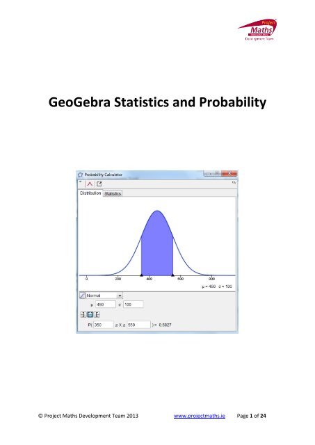
GeoGebra <strong>Statistics</strong> and <strong>Probability</strong>© <strong>Project</strong> <strong>Maths</strong> Development Team 2013 www.projectmaths.ie Page 1 of 24
IndexActivity Topic Page1 Introduction GeoGebra <strong>Statistics</strong> 32 To calculate the Sum, Mean, Count, Maximum and4Minimum of a data set3 To show the impact on the Mean of changing some of5the data4 To draw a Stem and Leaf plot when the numbers are5between 0 and 995 To draw a Stem and Leaf plot when the numbers are6between 100 and 9996 To change the data displayed in a Stem and Leaf 87 How to change text colour and size of a Stem and Leaf 88 How to transfer a Stem and Leaf to Word or PowerPoint 89 To draw a Line Plot 910 How to draw a Bar Chart 911 One Variable Analysis Tool 1112 How to calculate the Mode, Median and Mean of a set14of data and represent these in a textbox13 <strong>Probability</strong> Calculator to demonstrate the Normal15distribution13a To demonstrate (P≤0.5) 1613b To demonstrate (P≥0.5) 1613c To demonstrate (P≤−0.5) 1713d To demonstrate P(−0.4≤z≤0.5) 1714 Two Variable Analysis Tool to draw a Scatter Plot and19Line of Best Fit15 To demonstrate the impact on the Scatter Plot, Line of20Best Fit and the calculations of removing some of theoriginal data16 To create a table of data 2017 To plot data in the Spreadsheet View to the Graphics21View18 To fit a graph to a list of points that are shown on the21Graphics ViewAppendix AA1: How to save a file as a GeoGebra fileA2: How to save a file as an interactive web page22© <strong>Project</strong> <strong>Maths</strong> Development Team 2013 www.projectmaths.ie Page 2 of 24
Activity 1: Introduction GeoGebra <strong>Statistics</strong> and <strong>Probability</strong>To download GeoGebra go to www.geogebra.org and the following window will appear.Click Download and the following window will appear.Click Webstart and follow the indicated steps to download GeoGebra.Note in order to run GeoGebra it is essential that an up to date version of Java is availableon your machine. This package is available at free at http://www.java.com/en/ .In GeoGebra there are three views, Algebra, Graphics and Spreadsheet. The bar containingFile, Edit etc. is known as the Menu bar and depending if you have the cursor clicked in theGraphics View or the Spreadsheet View you get a different toolbar.AlgebraViewGraphics ViewSpreadsheetViewInput Bar© <strong>Project</strong> <strong>Maths</strong> Development Team 2013 www.projectmaths.ie Page 3 of 24
Note when you click on the Graphics View the following toolbar appears:and when you click on the Spreadsheet View the following toolbar appears:Note if the Spreadsheet View is not visible go to View and click Spreadsheet and if theGraphics View is not visible go to View and choose Graphics.Note: When drawing a function use f(x) = rather than y =, because when y = is used someof the commands from the Input Bar do not work <strong>for</strong> the function.Data can be copied and pasted from Excel and other Spreadsheet <strong>for</strong>mats to theGeoGebra Spreadsheet View <strong>for</strong> example CensusatSchool dataActivity 2: To calculate the Sum, Mean, Count, Maximum andMinimum of a data set1. Insert the data in the Spreadsheet View as follows:2. Highlight the data.3. In the toolbar click on the arrow beside andselect the appropriate action in the drop down menu.4. Depending on your choice of action the Sum, Mean, Count, Maximum or Minimum willappear in the next cell of the Spreadsheet View.5. If you require the answer to appear on a different cell, click on the cell you require theanswer to appear on, click onyou wish to use., select the appropriate action and highlight the data© <strong>Project</strong> <strong>Maths</strong> Development Team 2013 www.projectmaths.ie Page 4 of 24
Activity 3: To show the impact on the Mean of changing some of the data1. Click on one of the data cells that were used to calculate the mean and change thedata in this cell and see the cell that contains the value <strong>for</strong> the mean changeaccordingly.Activity 4: To draw a Stem and Leaf plot when the numbers are between0 and 991. Click on the Input Bar at the bottom of the GeoGebra screen.2. In the Input Bar type StemAndLeaf followed by the list of numbers that you wish to berepresented in the stem and leaf plot in square brackets and press Enter on thekeyboard.3. Alternatively type your data into the Spreadsheet View, highlight the data, right click,choose Create and List.© <strong>Project</strong> <strong>Maths</strong> Development Team 2013 www.projectmaths.ie Page 5 of 24
4. In the Input Bar type StemAndLeaf followed by the name that was given to your list in []brackets and you can find this name in the Algebra View section of the screen. The listcreated <strong>for</strong> the stem and leaf below was called list1. Press Enter.Activity 5: To draw a Stem and Leaf plot when the numbers are between100 and 9991. In the Spreadsheet View, type the numbers as follows.2. Highlight the numbers, right click and choose List.3. In the Input Bar type . This means the default stem unit isdivided by 10. Make sure your list of numbers was called list1 in your Algebra View andif not use the name it was given in your Algebra View.© <strong>Project</strong> <strong>Maths</strong> Development Team 2013 www.projectmaths.ie Page 6 of 24
Note 1:Outliers are not included in the stem and leaf plot, but listed separately.For example if 77 is added to the above list we get:In GeoGebra an outlier is defined as anything outside the interval [Q1 - 1.5 (Q3 - Q1) , Q3 + 1.5(Q3 - Q1) ], where Q1 is the first Quartile and Q3 is the third Quartile.Note 2:If you wish the default stem unit to be multiplied by 10, you insert 1 instead -1Note 3:in this command in the Input Bar.StemAndLeaf is replaced by StemPlot, if the language of the GeoGebra package is set toEnglish (US). To change the language of the GeoGebra package, go to Options, Languageand choose the language of your choice. These notes are <strong>for</strong> English UK.Note 4:If the Input bar is not visible go to View and click Input Bar.© <strong>Project</strong> <strong>Maths</strong> Development Team 2013 www.projectmaths.ie Page 7 of 24
Activity 6: To change the data displayed in a Stem and Leaf1. Click on the cell in the Spreadsheet View whose data you wish to change, delete theold number and type in the new number and the stem and leaf will changeaccordingly. Note that you cannot change the number of data items withoutredrawing the stem and leaf.Activity 7: How to change text colour and size of a Stem and Leaf1. Right click the stem and leaf and choose Object Properties. A new dialogue boxappears.2. Click on the Text tab to change the text and the Colour tab to change the colour.3. Click Close.Note the appearance of the stem and leaf can also be changed by selecting the stem andleaf, clicking on the arrow beside the word Graphics at the top of the Graphics View.A new styling bar appears.Use the tools on this styling bar to change the appearance of the stem and leaf.Activity 8: How to transfer a Stem and Leaf drawn using GeoGebrato Word or PowerPoint1. Locate the Snipping Tool program on your computer, normally found in Accessories.Open this program. Note: Snipping Tool is available in Windows 7.2. A new dialogue box appears click New.© <strong>Project</strong> <strong>Maths</strong> Development Team 2013 www.projectmaths.ie Page 8 of 24
3. <strong>Using</strong> the plus symbol outline the area of the screen that you require to be in yourpicture. The stem and leaf plot in this case.4. Open PowerPoint or Word and click paste.Activity 9: To draw a Line Plot1. In the Input bar type DotPlot followed by the list of numbers in square brackets andpress Enter on the keyboard.2. Alternatively one can insert the data in the Spreadsheet View , create a list and inthe Input bar type. This assumes your list was called list1.Note: If the points appear as a line or appear too close to each other go to the MoveGraphics View tool , click on the axis and drag to the left to reduce gapsbetween the numbers and drag to the right to increase the gaps between thenumbers.Activity 10: How to draw a Bar Chart1. In the Input bar type BarChart[ , , ] <strong>for</strong> example BarChart[{1,2,3,4,5},{2,3,1,0,4},0.5] yields the following Bar chart.Note 1: always make the Width of the bars less than the interval between the bars.Note 2: The list of data and the list of frequencies can both be inserted as lists fromthe Spreadsheet View.© <strong>Project</strong> <strong>Maths</strong> Development Team 2013 www.projectmaths.ie Page 9 of 24
2. If one wishes to remove the numbers from the axis, right click on the GraphicsView and go to Graphics. Open the Graphics tab and the axis tab. A new dialoguebox appears.3. Unclick Show Numbers and click Close.Exercise: Draw a line plot and a bar chart using the same data.© <strong>Project</strong> <strong>Maths</strong> Development Team 2013 www.projectmaths.ie Page 10 of 24
Activity 11: One Variable Analysis Tool1. Input your data in the Spreadsheet View in consecutive rows of a column as follows:2. Click somewhere on the Spreadsheet View and notice new set of tools appearsunderneath the Menu bar.3. Highlight the data you want to investigate.4. Click on the arrow beside and select One Variable Analysis.5. A new dialogue box appears.6. Click Analyse.© <strong>Project</strong> <strong>Maths</strong> Development Team 2013 www.projectmaths.ie Page 11 of 24
7. Click on the show <strong>Statistics</strong> tool at the top of this dialogue box to show the statisticsof the data being investigated.8. In the statistics view of this dialogue box notice the Mean, Standard Deviation, Min,Max , Median and Q1 and Q2.9. Without adjustments notice the minimum value in the histogram is the minimum valuein the data and the maximum value is the maximum value of the data.10. Move the slider to change the number of intervals.11. Notice if the data in the Spreadsheet view is changed the graph changes accordinglyprovided it is one of the original cells that were selected. To change the cells that arebeing graphed one needs to restart the above steps.12. To make further adjustments to the diagram click on the at the top of the screen.13. A new dialogue box appears.© <strong>Project</strong> <strong>Maths</strong> Development Team 2013 www.projectmaths.ie Page 12 of 24
14. Click on Set Classes Manually and the toolbar at the top of the diagram changes to15. Then pick the starting point and width of interval that you require.16. The frequency table can be shown by clicking on Frequency Table.17. Frequency Type and Class Rule can all be adjusted accordingly.18. Follow the arrow under Histogram to change to a different diagram.19. By going to Show 2nd Plot tool at the top left hand side of the dialogue box, asecond diagram of the same data can be drawn. By following the arrow beside thename of the diagram being shown an alternative type of diagram can be selected.Adjustment can also be made to the second diagram as can be done to the firstdiagram.20. To remove the second diagram unclick the Show 2nd Plot tool .© <strong>Project</strong> <strong>Maths</strong> Development Team 2013 www.projectmaths.ie Page 13 of 24
21. If you wish to show the data in the diagram go to the Show Data tool . By clickingthe arrow beside one or more data items you can see the impact on the data set andthe diagram of removing these data item(s).22. By clicking on the Graph tab at the top right hand side of the window when a Histogramis being displayed one can show the grid and make adjustments to the Dimensions.Activity 12: How to calculate the Mode, Median and Mean of a setof data and represent these in a textbox1. Type the list of data being investigated in a column in the Spreadsheet View.2. Highlight the data, right click and choose Create and List.3. To get the Mode in the Input bar type Mode[list1]. Provided list1 is the name of yourlist. Note this answer will be given as a list.4. Your answer will appear in the Algebra View.5. To get the Median in the Input bar type Median[list1]. Provided list1 is the name ofyour list.6. Your answer will appear in the Algebra View.7. To get the Mean in the Input bar type Mean[list1]. Provided list1 is the name of yourlist.8. Your answer will appear in the Algebra View.9. Click on the Text tool and click on the Graphics.10. A new dialogue box will appear.© <strong>Project</strong> <strong>Maths</strong> Development Team 2013 www.projectmaths.ie Page 14 of 24
11. In the Edit section type Mode = and where it states Objects follow the arrow untilthe object that represented the Mode appears. Repeat <strong>for</strong> Median and Mean. Noteit is not sufficient to type Median=a.12. Press OK.13. Now change some of the data in the Spreadsheet View and see the Mode, Medianand Mean change.14. To change the size, colour etc. of the text right click on the text and choose ObjectProperties.Activity 13: <strong>Probability</strong> Calculator to demonstrate the Normaldistribution1. Click on the <strong>Probability</strong> Calculator tool . (See below <strong>for</strong> location of this tool.)2. A new dialogue box appears.© <strong>Project</strong> <strong>Maths</strong> Development Team 2013 www.projectmaths.ie Page 15 of 24
3. If not already set to Normal with the Distribution tab open, follow the arrow <strong>for</strong>Normal.4. As the standard Normal distribution has mean=0 and standard deviation() =1 insert0 in the box beside Mean and press Enter on the keyboard and insert 1 in the boxbeside σ and press Enter on the keyboard.Activity 13a: To demonstrate P(X≤0.5)1. Click on the Left Sided tool , insert 0.5 in the box beside the and press enteron the keyboard. The answer will appear in the box to the right of the <strong>Probability</strong>section.Activity 13b: To demonstrate P(X≥0.5)1. Click on the Right Sided tool , insert the 0.5 in the box beside the Pand press Enter on the keyboard. The answer will appear in thebox to the right of the <strong>Probability</strong> section.© <strong>Project</strong> <strong>Maths</strong> Development Team 2013 www.projectmaths.ie Page 16 of 24
Activity 13c: To demonstrate P(X ≤−0.5)1. Click on the Left Sided tool , insert the − in the box beside the P andpress Enter on the keyboard. The answer will appear in the box to the right of the<strong>Probability</strong> section.Activity 13d: To demonstrate P(−0.4≤X≤0.5)1. Click on the Interval tool , insert the −0.4 in the first box after P and press Enteron the keyboard and in the second box type 0.5 and press Enter on the keyboard.The answer will appear in the box to the right of the <strong>Probability</strong> section.© <strong>Project</strong> <strong>Maths</strong> Development Team 2013 www.projectmaths.ie Page 17 of 24
Note: By right clicking on the probability Calculator or clicking on one can Copy toClipboard, Export as a Picture or Copy to Graphics View. If it is copied to Graphics View byright clicking one can change colour, line widths etc.To revert back to the <strong>Probability</strong> Calculator showing in the Graphics View click beside theand a new toolwill appear and click this tool.Note: If you change the black arrows underneath the curve the data in the <strong>Probability</strong> section willchange accordingly.The Empirical Rule can also be demonstrated using this tool.© <strong>Project</strong> <strong>Maths</strong> Development Team 2013 www.projectmaths.ie Page 18 of 24
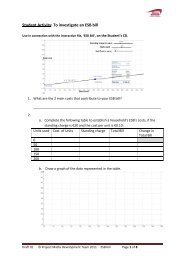
Activity 14: Two Variable Regression Analysis Tool to draw a Scatterplot and Line of Best Fit1. Input one set of the data in column A and the other set of the data in column B.2. Highlight both sets of data and choose Two Variable Regression Analysis.3. A new dialogue box appears.4. Click Analyse.5. Choose Scatter Plot and under Regression Model choose Linear to get the line of Best Fit.See the equation of the Line of Best Fit below the plot.© <strong>Project</strong> <strong>Maths</strong> Development Team 2013 www.projectmaths.ie Page 19 of 24
6. If you insert an X value beside Evaluate and press Enter on the keyboard it willpredict a corresponding Y value.7. Note the statistic gives the correlation.8. Clicking on the button reverses the x and y values.9. The original data can be changed on the Spreadsheet View and the scatter plotand line of best fit will be changed accordingly.Activity 15: To demonstrate the impact on the Scatter plot, Line ofBest Fit and the calculations of removing some of the original data1. Click on the Show Data tool . The impact of removing some of the data can beshown by un-clicking the arrow beside the appropriate data.2. If the statistics table is not being shown click on the Show <strong>Statistics</strong> tool .Activity 16: To create a table of data1. Select the data in the Spreadsheet View and choose Create and Table.© <strong>Project</strong> <strong>Maths</strong> Development Team 2013 www.projectmaths.ie Page 20 of 24
2. Move the table to the location you require on the Graphics View.3. To change the data size, colour etc. Right click the table and choose Object Properties andchange as appropriate.Activity 17: To plot data in the Spreadsheet View to the Graphics View1. Highlight two columns of data in the Spreadsheet View, right click, chose Create and List ofpoints.Activity 18: To fit a graph to a list of points that are shown on theGraphics View1. In the Input bar type Fitpoly[list1,2], if the list is list1 and you require a polynomial of degree2 <strong>for</strong> example.© <strong>Project</strong> <strong>Maths</strong> Development Team 2013 www.projectmaths.ie Page 21 of 24
Appendix AA1: How to save a file as a GeoGebra file1. Go to the Menu and choose Save as from the drop down menu. A new dialogue boxappears.2. For Save in, navigate to the folder that you wish the file to be saved in.3. For File name select the name you wish to give your file.4. Click Save. A file with the .ggb extension is created. This extension identifies the file as aGeoGebra file and it can be opened again and adjustments made using the GeoGebraapplication.A2: How to save a file as an interactive web page1. First save your file as a GeoGebra file.2. Go to File, from the drop down menu select Export and from the further menu select theoption Export Dynamic Worksheet as Webpage (html). A new dialogue box appears.© <strong>Project</strong> <strong>Maths</strong> Development Team 2013 www.projectmaths.ie Page 22 of 24
3. Click on the Export as Webpage tab.4. Add Title, Author, etc. Then click on the Advanced tab and a new dialogue box appears.It is recommended that one clicks the Show Icon to reset construction button.5. Click Export.© <strong>Project</strong> <strong>Maths</strong> Development Team 2013 www.projectmaths.ie Page 23 of 24
6. Navigate to the folder you want to save your file in. Give it the name of your choice.Note: This file will have a .html extension and will be viewed using an Internet browsersuch as Internet Explorer 8.7. Click Save and your default Internet browser will open.8. When the webpage comes up you the following message will normally appear at the top ofthe screen.9. Click on Click here <strong>for</strong> options and choose Allow Blocked Content... and click Yes.© <strong>Project</strong> <strong>Maths</strong> Development Team 2013 www.projectmaths.ie Page 24 of 24