Usability - Cornell University Ergonomics Web
Usability - Cornell University Ergonomics Web
Usability - Cornell University Ergonomics Web
You also want an ePaper? Increase the reach of your titles
YUMPU automatically turns print PDFs into web optimized ePapers that Google loves.
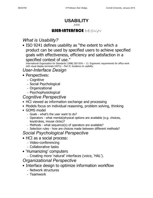
DEA4700 © Professor Alan Hedge, <strong>Cornell</strong> <strong>University</strong>, January 2014• What does the software really need to do?<strong>Usability</strong> Issues• How easy is it to use the software ?• Does the software have all the required features?• What does the user learn from using the software?<strong>Usability</strong> Measures• User performance (speed, errors)?• User preferences?• User behavior:– What do they expect to happen?– What features do they use?– What features don’t they use?– Where do they have problems?– Where do they go, where don’t they go?– What new features are needed, what features are redundant?Consistency("Principle of least astonishment")• Certain aspects of an interface should behave in consistent ways atall times for all screens• Terminology should be consistent between screens• Icons should be consistent between screens• Colors should be consistent between screens of similar functionScreen Color CombinationsSimplicity• Break complex tasks into simpler tasks• Break long sequences into separate steps• Keep tasks easy by using icons, words etc.• Use icons/objects that are familiar to the userHuman Memory Limitations• Organize information into a small number of "chunks"• Try to create short linear sequences of tasks• Don't flash important information onto the screen for brief timeperiods• Organize data fields to match user expectations, or to organizeuser input (e.g. autoformatting phone numbers)Human Memory Limitations
DEA4700 © Professor Alan Hedge, <strong>Cornell</strong> <strong>University</strong>, January 2014• Provide cues/navigation aids for the user to know where they arein the software or at what stage they are in an operation• Provide reminders, or warnings as appropriate• Provide ongoing feedback on what is and/or just has happened• Let users recognize rather than recall information• Minimize working memory loads by limiting the length ofsequences and quantity of information avoid icon mania!Cognitive Directness• Minimize mental transformations of information (e.g. using'control+shift+esc+8' to indent a paragraph)• Use meaningful icons/letters• Use appropriate visual cues, such as direction arrows• Use 'realworld' metaphors whenever possible (e.g. desktopmetaphor, folder metaphor, trash can metaphor etc.)Feedback• Provide informative feedback at the appropriate points• Provide appropriate articulatory feedback feedback that confirmsthe physical operation you just did (e.g. typed 'help' and 'help'appear on the screen). This includes all forms of feedback, such asauditory feedback (e.g. system beeps, mouse click, key clicks etc.)Feedback (con.)• Provide appropriate semantic feedback feedback that confirmsthe intention of an action (e.g. highlighting an item being chosenfrom a list)• Provide appropriate status indicators to show the user the progresswith a lengthy operation (e.g. the copy bar when copying files, anhour glass icon when a process is being executed etc.)System messages• Provide usercentered wording in messages (e.g. "there was aproblem in copying the file to your disk" rather than "executionerror 159")• Avoid ambiguous messages (e.g. hit 'any' key to continue there isno 'any' key and there's no need to hit a key, reword to say 'pressthe return key to continue’)• Avoid emotive messages (e.g. "illegal command" versus"unrecognized command")
DEA4700 © Professor Alan Hedge, <strong>Cornell</strong> <strong>University</strong>, January 2014System messages• Avoid using threatening or alarming messages (e.g. fatal error, runaborted, kill job, catastrophic error)• Use specific, constructive words in error messages (e.g. avoidgeneral messages such as 'invalid entry' and use specifics such as'please enter your name')• Make the system 'take the blame' for errorsAnthropomorphization• Don't anthropomorphize (i.e. don't attribute human characteristicsto objects)• Avoid the "Have a nice day" messages from your computerModality• Use modes cautiously a mode is an interface state where what the user doeshas different actions than in other states (e.g. changing the shape of thecursor can indicate whether the user is in an editing mode or a browsingmode)• Minimize preemptive modes, especially irreversible preemptive modes apreemptive mode is one where the user must complete one task beforeproceeding to the next. In a preemptive mode other software functions areinaccessible (e.g. file save dialog boxes)• Make user actions easily reversible use 'undo' commands, but use thesesparingly• Allow escape routes from operationsAttention• Use attention grabbing techniques cautiously (e.g. avoid overusing 'blinks' onweb pages, flashing messages, 'you have mail', bold colors etc.)• Don't use more than 4 different font sizes per screen• Use serif or sans serif fonts and upper case/lower case appropriately as thevisual task situation demands:– HOW EASY IS IT TO READ THIS?– How easy is it to read this?– How easy is it to read this?– How easy is it to read this?• Don't use all uppercase letters use and uppercase/lowercase mix• Don't overuse audio or videoAttention (con.)• Use colors appropriately and make use of expectations (e.g. don'thave an OK button colored red! use green for OK, yellow for'caution, and red for 'danger' or 'stop')
DEA4700 © Professor Alan Hedge, <strong>Cornell</strong> <strong>University</strong>, January 2014• Don't use more than 4 different colors on a screen• Don't use blue for text (hard to read), blue is a good backgroundcolor• Don't put red text on a blue backgroundAttention• Use high contrast color combinations• Use colors consistently• Use only 2 levels of intensity on a single screen• Use underlining, bold, inverse video or other markerssparingly• On text screens don't use more than 3 fonts on a singlescreenDisplay issues• Maintain display inertia make sure the screen changes little fromone screen to the next within a functional task situation• Organize screen complexity• Eliminate unnecessary information• Use concise, unambiguous wording for instructions and messages• Use easy to recognize iconsDisplay issues• Use a balanced screen layout don't put too much information at the top ofthe screen try to balance information in each screen quadrant• Use plenty of 'white space' around text blocks use at least 50% white spacefor text screens• Group information logically• Structure the information rather than just presenting a narrative format(comprehension can be 40% faster for a structured format)Individual differences• Accommodate individual differences in user experience (e.g. fromthe novice to the computer literate, young to old)• Accommodate user preferences by allowing some degree ofcustomization of screen layout, appearance, icons etc.• Allow alternative forms for commands (e.g. key combinationsthrough menu selections)<strong>Usability</strong> Testing Process• Define interface issues
DEA4700 © Professor Alan Hedge, <strong>Cornell</strong> <strong>University</strong>, January 2014• Define users• Define scenarios• Define methods• Conduct testing• Analyze data• Formulate recommendations


