A MAGAZINE FROM Iggesund paperboard ISSUE 44 2013
A MAGAZINE FROM Iggesund paperboard ISSUE 44 2013
A MAGAZINE FROM Iggesund paperboard ISSUE 44 2013

Create successful ePaper yourself
Turn your PDF publications into a flip-book with our unique Google optimized e-Paper software.
A <strong>MAGAZINE</strong> <strong>FROM</strong> <strong>Iggesund</strong> <strong>paperboard</strong> <strong>ISSUE</strong> <strong>44</strong> <strong>2013</strong>
time forplaySTAFFAN SJÖBERG Public Relations Manager,editorial <strong>Iggesund</strong> PaperboardMy earliest memory of play was when my father andgrandfather would sit down at Christmas and play chess.They sat for hours, uttering not a word, and my brotherand I quickly realised this activity seemed to involve completeinactivity.We had more fun when we managed to persuadethe grown-ups to play games like Monopoly. Suddenlythere was room for shouting, whining and swearing, allkicked off by this simple game with its board, tokens andcards.Although many modern games are digital and playedonline, there is still room for amusements where timehonouredanalogue aids, often made of <strong>paperboard</strong>, arecentral to the experience.In this issue we take a closer look at the revival oftraditional board games and also at the children’s book industry,which is facing new challenges with the arrival ofdigital media and e-books. New media present many newopportunities for illustrators, book publishers and designers,provided they don’t just transfer printed material butuse the new technology in a creative way.A playful, creative approach to design is important inall industries, not just those intended for children. Wetherefore announced a competition ahead of this issueand invited creative types and designers to send in theirsuggested covers on the theme of Fun&Games. JohannaSvantesson from Mid Sweden University in Sundsvallsubmitted the winning entry. On page 27 she talks abouther ideas behind the design and how she used <strong>paperboard</strong>to create a playful, appealing cover. nwww.iggesund.com
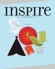
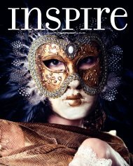
In this issueInspire, a source of inspiration,provided by <strong>Iggesund</strong> Paperboard,home of Invercote and Incada.Eight designerscreate threedimensionalrobots fromA3 sheets.41816The future ofpicture books forchildren, as seenby three insiders.Meet cover contest winnerJohanna Svantesson.272622Vinyl record covers anda chocolate memory gameshowcase <strong>Iggesund</strong>’sversatility.Inspire’s pick of themost creative uses ofpaper and <strong>paperboard</strong>.102413Address<strong>Iggesund</strong> PaperboardSE-825 80 <strong>Iggesund</strong>, Swedenphone: +46 650 280 00inspire@iggesund.comwww.iggesund.comPublisherCarlo Einarsson(responsible under Swedish press law)Editor in ChiefElisabeth Östlinelisabeth.ostlin@iggesund.comEditorial committeeVéronique Lafrance, Lydia Lippmann,Winnie Halpin, Wouter Hendrikse,Ian Huskinson, Frederique RosenauerStaffan Sjöberg, Elisabeth ÖstlinPublishing AgencyOTW CommunicationPO Box 3265, SE-103 65 StockholmEditor and project managerAnna-Lena Ahlberg Jansen,anna-lena.ahlberg@otw.seArt DirectorKajsen Burell, Jessica SunneboContributorsDaniel Dasey, Sam Eichblatt, EmmaHolmqvist, Isabelle Kliger, Shelah Linde,Michael Miller, Anders Modig, TsemayeOpubor HambraeusPhotos and illustrationsCamilla Lindqvist, Jann Lipka, KateMacpherson, Oliver Martin, MauroRongione, Emma Smallbone, JohannaSvantesson (cover)TranslationsComactiva Language Partner ABPrepressDonePrintingStrokirk-Landströms, Lidköping, SwedenISSN1404-2436Inspire is printed in English, Chinese,French, German, Japanese and SwedishThe alphabet throughthe eyes of pop-up artistMarion Bataille.Japanese design mixestraditional art forms withcutting-edge technology.Creative director HenrikNygren has a holisticapproach to his work.Traditional boardgames meet surgingdemand for socialinteraction.the cover. Johanna Svantesson's winning design on the theme Fun&Games is printed on InvercoteCreato 260 g/m2 in four color offset. The background is spot UV varnished, with exception of the Inspirelogotype and the maze game.Inspire aims to inform and entertainwith stories and photos that are notrestricted to the scope of <strong>Iggesund</strong>'sown business. As its name suggests,the idea is to be inspirational and notto infringe on a company's or person'simage rights or intellectual property.Products that are made with Invercote,Incada and other <strong>paperboard</strong> from<strong>Iggesund</strong> are marked in the text.www.iggesund.com
6the illustratoralready bestsellers in their own language. In those countries,says Marshall, children are taken seriously and bookstend not to be “dumbed down”.“When I started, only 3 percent of those books werebeing translated into English,” she says. “I found it extraordinarythat we weren’t reading the best writers fromother countries. My approach is to choose books that areperfect as they are and produce them to an extremelyhigh quality, so in fact these are the best in the world.”One of Gecko’s most significant and talked-aboutpublications was Duck, Death and the Tulip, translatedfrom a 2007 book by German writer and illustrator WolfErlbruch. The story revolves around a duck who becomesfriends with Death, and their subsequent conversationsabout life, death and possible afterlives.The book doesn’t sugar-coat it: the duck dies in the end,and Death gently places her in the river, lays a tulip on herbody and watches until the water takes her out of sight.“Death has a skull, but also a very soft dressing gown,”laughs Marshall. “It’s a beautiful book and an all-ages kindof book. It poses questions, and it’s funny in a wry, gentleway. When adults are moved by a picture book, theythink it’s not for kids. But the kids read it very matter-offactly,whereas adults end up weeping over it.”The book received critical acclaim, sparked an onlinedebate among librarians and was selected by uk Children’sLaureate and author Anthony Browne as one of the topbooks for 2012.The Gecko catalogue features The Bear and the Wildcat,on the subject of loneliness and grief, by acclaimed Japanesenovelist Kazumi Yumoto. People, by French illustratorBlexbolex, uses soft, minimalist images of biologists and“Play is serious, and being in themoment is important. We want abook to be read a thousand times,and still be great every time.”www.iggesund.com
7 percentThe share ofconsumere-books as apercentageof all booksales in theUK in 2012,according toBritish industrypublicationThe Bookseller.100 MILLION GBPThe value ofthe market forconsumere-books in theUK in 2012.However, salesof printedbooks generatedsalesof 75 millionpounds in theseven days beforeChristmasalone.400 millionThe numberof copies ofJ.K. Rowling'srecord-breakingHarry Potterseries that havebeen been soldin since therelease ofthe first bookin 1997.120 billion USDThe marketvalue of onlinebooksellerAmazon inFebruary<strong>2013</strong>. Amazonreported thatits US booksbusiness in 2011had seen thefastest yearon-yeargrowthfor books in allformats, printand digital.7astronomers, or conductors and tyrants, paired on opposingpages, revealing a sophisticated moral commentaryon the relationships between them.The line that sums it up, however, occurs at the endof Alla döda små djur, by Swedish author Ulf Nilsson.Three children start a company, Funerals Ltd, to bury theworld’s dead animals, and in true children’s book fashionthey bury progressively larger animals each day: “…Andthe next day, we found something else to do.”“The key thing for us is that the book relates to theworld of the child,” says Marshall. “Play is serious, andbeing in the moment is important. We want a book to beread a thousand times, and still be great every time.”Illustrator Andrew Kolb hasa fascination with robotsand dinosaurs, which haveappeared in both adultand children's books. Seesamples of his work onkolbisneat.comAt the other end of the spectrum is Canadian illustratorAndrew Kolb. His cheerful, energetic drawings oftenfeaturing dinosaurs, jet packs and robots, have appearedin both adult and children’s media, and recently wentinteractive on Timbuktu, the iPad magazine for kids.Kolb says the key to success in his part of the industryis simply to love what you do. “My imagery featuresdinosaurs and robots because I enjoy drawing them,” hesays. “I’ve found the work I’m most enthusiastic about isthe same that draws others in.”He sees new media as creating new opportunities forillustrators, provided they use digital platforms creativelyrather than translate directly from print. “Timbuktu had asense of how to balance a bold visual with interactive elements.With new technology, you want to see how manybells and whistles you can use without breaking it. That’sgreat for technical progress, but there still needs to bethe emotional connection. If you can answer that with athoughtful solution, then it’s going to resonate even more.”www.iggesund.com
8the designer & paper engineerwww.iggesund.com
“In my industry, I get the best of both worlds. I couldn’t livewithout digital technology, but nothing can replace the magicalexperience of a pop-up book.”9And of course, Kolb still loves picture books. “There’sa feeling of permanence in a physical copy that can’t bemimicked. There’s no need for software updates whenyou pick up a book — I’m confident it will be a very longtime before they become a niche market.”Paper engineer and pop-up book designer JennyHilborne has a similarly optimistic approach to thechanges happening in the freelance world. She worksfor global children’s book publisher Templar, which isbased in Britain but produces books in 50 countries and25 languages.A self-confessed “stationery addict”, Hilborne hasalways loved the medium of paper. “My childhood memoriesare of spending hours in a stationer’s, rather than a toyor sweet shop, deciding what to spend my pocket moneyon,” she says. “I spent most of my time making things.The disappearance of cereal boxes from my mum’skitchen cupboard was a common occurrence, not tomention the scars on their dining table from me cuttingand sticking.”Hilborne identifies one of the challenges facing her industryas the rise of production costs, for both labour andmaterials like ink, paper and glue, without a correspondingincrease in how much consumers expect to pay fora book. However, she also says this has pushed her andother designers to develop more sophisticated designsand pop-up mechanisms that use fewer resources.Instead of seeing the growth of digital media as athreat, she feels it is something to be embraced. Templarhas recently started using online media to promote itsbooks — for example, video clips of the pop-up mechanismsthat make the books work.“In my industry, I get the best of both worlds,” shesays. “I couldn’t live without digital technology, but nothingcan replace the magical experience of a pop-up book.There is a massive personal satisfaction in having a collectionof my own books on a bookcase. The joy of sucha tangible item is equalled when you see others getting asmuch joy out of the book as you do.” nTop: Hilborne cuts out a pop-up robot, used in a workshop for8 and 9 year olds at Hornsby House School in London.Middle: Paper cutouts as part of a personal project she is developing.Bottom: Pop-up bats from the Templar title Record Breakers:Astonishing Animals. See more of Jenny Hilborne’s personalwork at her website paperjen.com.www.iggesund.com
Did you see what I saw?Anthony Guex from HEAD (Haute École d’Art et de Design) inGeneva, Switzerland, has designed a simple, playful packagingconcept based on the famous “sawing a woman in half”illusion. At a workshop given by guest professor Sylvain Allardfrom the Université du Québec à Montréal (UQAM), thedesigner reinterpreted the classic illusionist’s game with a jamjar, some <strong>paperboard</strong> packaging and a tiny saw. Using the saw,the packaging is cut in half, only to reveal two small jars wherethere initially appeared to be just one.anthonyguex.com nPaper and <strong>paperboard</strong>are versatilematerials withan almost limitlessrange of uses.Inspire has takena look at some ofthe most creativeuses from the worldof art and design.Beyond paper dollsMarshall Alexander is a Dutch paper engineer,graphic designer and artist with a passion formovies, video games, bright plastic toys, retrodesign and pop culture. He left the world of 2Ddesign after discovering the art of 3D paper-toydesign and got hooked. His imaginative papermodels, which have featured at various galleryshows and installations, have also caught the eyeof the toy industry. Here, his entry for the PlanetPulp Time Travel Show – a model of AustinPowers in his grooviest outfit. Yeah, baby!marshallalexander.net nText: Isabelle KligerAND ANNA-LENA AHLBERG10Good enough to eatGraphic designers Lucie Thomas and Thibault Zimmermanntogether form Zim&Zou, a French studio based inNancy that explores various forms of artistic expression,including paper sculpture, graphic design and illustration.Last year, Zim&Zou created a cover illustration for Iconmagazine on the future of food. Inspired by 3D foodprintertechnology, Zim&Zou’s bright multicoloured hamburgerwas the cover image used to draw readers into afuturistic world in which they might one day be able toprint their own 3D dinner.zimandzou.fr nwww.iggesund.com
For Helvetica loversIrish graphic designer Lukasz Kulakowski is a big fan of typographyand board games, so he decided to combine his two passions intoone in the game Gametica, a traditional circle game. Kulakowskiadded icons on the board symbolizing additional tasks and included140 cards with questions about Helvetica, typography and design.The game is not yet in production.behance.net nMademoiselle Maurice’s open-air museumMademoiselle Maurice is a 28-year-old French street artistwho has devoted herself to creating art using a variety ofdifferent mediums, including origami, lace, photography,painting and embroidery. Originally from the Savoy Alpsregion of France, she was inspired to bring origami to thestreets of Paris after a year of “exile” in Japan. MademoiselleMaurice views the world as a giant open-air museum, perfectfor her ultra-colourful origami installations. In the springof 2012 she made headlines when she decided to decoratethe grey urban surfaces of Paris with a series of spectacularrainbows, made entirely of folded origami figures.mademoisellemaurice.com n11www.iggesund.com
54 shades of colourTired of traditional playing cards? The CMYK cards by UK-basedHundred Million will brighten any poker game. Instead of suitsyou get cards coloured in cyan, magenta, yellow or black, withdifferent opacities of ink to represent the value of each card. Thedesign on the back is created from utilitarian registration marks.In other words, a perfect gift for the design-oriented gambler.From 9 British pounds (10 euros) athundredmillion.co.uk. n12The vanishingpackageThis creative paper toothbrush wrapper, designedby Simon Laliberté from the Université du Québecà Montréal (UQAM), won third place at the RemarkablePackaging & Alternatives competition,held at the 2012 Packaging Exhibition in Paris.Laliberté used PVA – a compound of polyvinylacetate paper, which is nontoxic, biodegradableand 100 percent recyclable. Its unique, distinguishingquality is that it will dissolve completely in lessthan 10 seconds when immersed in water. Thedesign on the packaging was printed using blackwater-soluble soy ink.atelierbangbang.ca nPoised for takeoffA rare collection of constructible paper planes and other aircraftinspiredcreations can be found in this book, which consists ofcontributions from some of the hottest designers of today. Featuringwork from the collective littlepaperplanes.com, which housesmore than 70 emerging artists from around the world, this book(published by Chronicle Books) takes the paper plane to a newlevel. From paper-doll planes and shark planes to plane mobilesand mix-and-match gliders, the patterns are printed on perforatedpages for easy removal and assembly.littlepaperplanes.com nPhoto: Kelly Lynn Joneswww.iggesund.com
Photo: Jessica Thyrén13welcomeAboardElectronic games aside, board games are currently enjoyinga global resurgence as people rediscover the simple pleasure ofsitting down with others to play. Gaming cafes and clubs arespringing up to meet the demand. Text: Daniel Daseywww.iggesund.com
14holds regular meetings in the Red Herring pub in theCity of London.“It started off one night a week with 10 or 20 peopleturning up, and it’s just kind of grown and grown sincethen,” he says. “This week there were meet-ups on six ofthe seven days, and we had an average of 50 people ateach of those.”Many people who have grown tired of video gamesare gravitating to board game clubs where they can matchwits with real live opponents.What kind of person joins a board games club?According to Martin Griffiths, an organiser with Britain’spopular London On Board club, it takes all sorts.Some are drawn by the competitive aspect of boardgames and the intellectual challenges they represent.Others have nostalgic memories of game playing fromtheir childhoods. And many are seeking some oldfashionedhuman interaction.“People have come to us from video games and gotreally interested in board games because they’re moresocial,” Griffiths says. “You can sit around a table in a pubplaying a board game, where you’re probably not goingto do that with a video game.”Griffiths says the club was formed seven years ago andWhen Michael Schmitt set up his Spielwiese gamingcafe in Berlin in 2006, other business operators took betson when he would go bankrupt.No one believed a cafe where the main attraction wasplaying board games or renting them out to play at homestood a chance of lasting six months, let alone a year.“Now I’m in my seventh year and still growing,” saysSchmitt, who charges customers three euros to rent agame overnight.Schmitt says while his cafe boasts a selection of 1,800board games for customers to choose from, traditionalfavourites like Monopoly are by far the most popular.“The games that are most played are the games peopleknow from their childhood,’’ he says.Schmitt says he has watched as businesses similar tohis own have sprung up across Europe and Asia to meetdemand from board game lovers. He believes that ratherthan being threatened by electronic games, board gamescan happily coexist with them. n“You can sit arounda table in a pubplaying a boardgame," says MartinGriffiths, an organiserwith Britain’spopular London OnBoard club. "You’reprobably not goingto do that with avideo game.”www.iggesund.com
16Letter loveThe alphabet is an indispensable tool, but in the hands ofMarion Bataille it becomes something altogether more captivating.Text: Emma Holmqvist Photo: camilla lindqvist“Everybody knows the order of the alphabet,” saysMarion Bataille as she gingerly flicks through abc3d,the popular pop-up book she created in 2008. “I had tothink of ways to add an element of surprise on each pagewhile at the same time adhering to the alphabet’s naturalsequence. It helped me to imagine a piece of music, witha distinctive rhythm running through the succession ofletters, each one responding to the next and playing offone another.”Music is a subject the Paris-based designer and illustratorrevisits often during our conversation. It serves as oneof her greatest inspirations, although her creative tentaclesrarely respond to one isolated thing. “If you go to see adance performance, you’ll experience an interaction of music,choreography and set design, as well as sensory detailssuch as the comfort of your seat and the darkness aroundyou. Inspiration works the same way. It hits you from severalangles at once, and it can come from anywhere. I findgeometry inspiring because it is hard for me to understand.I look at geometric figures in movement as an image withan elusive content.”The pop-up devotee’s approach to colour is morestraightforward. When conceiving abc3d and 10 – hersecond 3d book, published in 2010 – she strictly usedblack, white and red. “The contrast between these threecolours is sharp, and when used as part of the animationsequence, they hit you like a punch,” she observes. Thefact that they don’t allow for muted modulation is deliberate,as Bataille shuns the method in which subtle hues andthe softness of paper are used to bring about a sense oflife. “I always set out to make my work appear steady andstrong,” she says. “I think of it as a piece of modular furnitureas opposed to a representation of something organic.”Bataille has found her niche in pop-up mechanics,an expressive tool she has experimented with for morethan two decades. A new book will be published thisSeptember. In line with abc3d and 10, it will involvenumbers and typography, but that is all Bataille is willingto reveal for now. “I don’t want to ruin the surprise,” shesays. Neither do we. nPhoto: Mamoru SakamotoMarion Bataillein a nutshellBorn in 1963 in France, Marion Bataille is agraphic designer, illustrator and pop-up artistbased in Paris. Her work regularly appearsin Le Monde, and she also collaborates withinstitutions such as the Pompidou Centre. Shecurrently specialises in pop-up art and haspublished two books that centre on the technique:ABC3D and 10, published in 2008 and2010. Marion Bataille’s third book is due to bepublished by Albin Michel in September <strong>2013</strong>.
When conceiving ABC3D, Batailletried to add an element of surpriseon each page while adhering to thealphabet’s natural order. Some of thespreads are designed to display twoor more letters, morphing from oneto the other with a light tug, whileothers bring just one to life.To achieve a sense of flow, Bataillefound it helpful to imagine a pieceof music with a distinctive rhythmrunning through the succession ofletters, each one responding to thenext and playing off one another.17
Exterior patterndesign for entrancewall of interiordesign store Actus.Branding andnew designconcept forFast Wellnessand the Flexastretch centers.www.iggesund.com
Japanese designis always distinctive. Mixingtraditional art forms like origamiand calligraphy with cutting-edgetechnology, it also excels at adoptingtrends from around the world andmaking them its own. Inspire talkedto graphic designer Akiko Kanna abouttrends in Japanese contemporarydesign and cultural differencescompared with Europe.Text: Sam eichblattDesigning for theJapanese spirit19Akiko Kanna moved to Britain to study graphic designat London’s prestigious Central Saint Martins College ofArt and Design. After graduating, she designed for theBritish youth culture magazine Dazed and Confusedbefore joining legendary studio North.She returned to Tokyo in 2006 to set upher own graphic design studio.You studied in London and now workin Tokyo. How have these two verydifferent cities influenced your style?“Tokyo is full of style. It’s a goodplace to experiment, but it also meansit doesn’t have a specific style of itsown. Everything comes and goes veryquickly, and everything mixes. There’s noboundary between graphic design, editorialand illustration.“I established my approach and style while I lived inthe United Kingdom, studying and working at Londondesign studios, so nothing scares me about that situation.I already have some good basics, and I can just enjoy thecultural differences.”Historically, Japan has a striking visual aesthetic.How has this affected contemporary graphic design?“There’s no simple answer to this question. Japaneseculture has such a rich history, with a wide variety ofexpression, which can be very minimal and at the sametime very dynamic. One thing I remember whenI moved to Japan was that Japanese people arevery brave about using colour. Tokyo is fullof colour, and it’s exciting to see a mix of somany colours together.”Packaging is a big part of Japan’s culture.How do you approach it in your work?“We have so much choice in paper andmaterials, which is a great start for anyproject. Research is also easy here — I just goto the food section of any department store orbig shopping mall and always find something newfor future reference. And printers here are very skilful — Ialways get their input before I make a final decision on adesign.”What trends do you predict in the Japanese designworld in the next few years?“Less copying of European styles, finding a more Japanesespirit in our work and style of expression.” nwww.iggesund.com
➊Naoki Terada captures the world on a small scale with intricate paper-based cutouts.20The 1 percent solutionWhen Japanese designer Naoki Teradaset out to fashion tiny models of everydayobjects, he decided to make them 1/100ththe size of the real-world originals. “I thinkthat 1/100 is the perfect scale for creating,”he says. His design studio Terada Mokeispecialises in crafting intricate paper-basedaccessories for architectural models, depictingstreet scenes, playgrounds and sidewalknoodle stands.His “dress-up stickers” allow you to outfitthe people in an architectural model aspolicemen or schoolgirls, and his coasters letyou set your drink down in the midst of apop-up street corner, lakeside or Africansavannah. He even has a line of greetingcards: a bright-red Merry Christmas cardopens to reveal a pop-up reindeer sleigh– at 1/100th of the original size, naturally.You can see animated movies of hiscreations on his website (teradamokei.jp/en), where two-dimensional figures cavortthrough a sweets shop and a dog faithfullywaits for his master at a subway station.Terada recalls his early days of making architecturalmodels: “When I showed clientsthe models the first thing they would saywas something to the effect of ‘Oh, you’verecreated the whole family!’ or ‘That’s ourdog in the garden!’ In essence, it wasn’t thearchitecture they were thrilled to see but theaccessories.” nText: Michael Miller Photo: yuki omori➊➊Terada Mokei's scale models can takeyou rowing on lake, strolling throughan open-air cafe or visiting the worldof the dinosaurs. See more of hiswork at teradamokei.jp/en.www.iggesund.com
Moredesignersto watch➋➋21➊ Naoki IkegamiEstablished the design houseKotohogi Design in 2006. Putsan equals sign between “design”and “hospitality” and aims to bringjoy and respect to the customerthrough its work. Services rangefrom logo design, graphic designand package design to Web designand copywriting.kotohogidesign.com➌ Akaoni designA creative studio, formed in 2006,with the goal of creating genuine,continuous and proactive design.Its extensive portfolio of pack a gingdesign, posters, books, bro churesand websites is characterizedby bold colours, interestingtypo graphy and Japanesetraditions.akaoni.org➋ Dainippon TypeDainippon Type Organization.Form ed by Hidechika and TsukadaTetsuya in 1993. An experimentaltypography group, Dainippon Typeset out to understand the informationcontained within letters of theWestern alphabet or charactersused widely in East Asia by dis --mant ling, assembling and reconstructingthem.dainippon.type.org➌➌➌➋➊➌www.iggesund.com
22theComplicatedpath tosimplicitywww.iggesund.com
23Imagine an artisan who is actually a cutting-edge,prize-winning creative director; a modern designer whodoesn’t use a computer for design; a workhorse whoadmits to trying to do as little as possible for a very longtime. Inspire met Henrik Nygren in his studio in Stockholm,for a talk about his approach to the creative process.Text: Tsemaye Opubor Hambraeus Photo: Mauro RongioneSwedish creative director Henrik Nygren is per haps best knowninternationally for his simple, clean, modern approach to design. Hisassignments are mainly analysis and strategy for clients, but they alsoinclude the design and production of books, magazines, packa ging,corporate identities, advertising campaigns and exhibitions.Henrik Nygren Design is his studio, located in a former factory inStockholm. The studio space looks as if it has come straight out of acoffee-table book that Nygren might design for a client: filled with mid-20th-century modern furniture, it’s a clean, organised space featuring atasteful palette of black, white and grey.“I spend a lot of time with architects, and I love archi tecture,”Nygren says. “I think this interest shows not only in my studio but inmy work.”Before accepting new assignments from prospective clients, he sayshe asks himself a couple of key questions: Are we right for each other?Should we do something together? If the answer to both questionsis yes, he then spends time discovering what he calls the “soul of theproject”.“Starting up a new project is a lot like falling in love for me,” he says.“It’s crucial for me to have a connection with each project and with theclient.”Nygren visits the client’s office and spends about a week assemblingwhat he calls “a 360-degree view of reality, with 20 degrees from Henrik”.This consists of opening drawers, seeing what’s in them and how it’sused, reading bulletin boards, interviewing people who work in theoffice, and collecting as much and as varied information about the clientas possible.“I write letters and draw storyboards after spending time withclients on their turf,” he says. “The project develops organically usingthese tools. When I started working as a designer more than 25 yearsago, there were no computers, and I still don’t use them. I have a groupof very talented people in the office that have all the skills that we needas a team to get the job done.“There is a consistency in my work, because everything I do isgrounded in research and investigation,” he explains. “It’s not superficial.It’s a holistic approach that I always use, and it’s one of the cornerstonesof my work.“My goal is always to produce clean, bold, simple work that is easyto understand and use, even though simple is often complicated toproduce.” nPainting Abstraction: New Elements in Abstract Painting, commissionedby Phaidon Press, London. 80 contemporary artists withinabstract art. Silkscreen printing and embossed foil cover.Identity for the Stockholm Museum of Modern Art’s 2004 rededication.Logotype (original letter ed by Robert Rauschenberg in1983), specially designed typeface, indoor and outdoor displaysystem, books, printed matter, packaging, sales products, etc.Portraits, a book on fashion photographer Carl Bengtsson.Published by Arena in 2011. Wrapped and bound book withframed images (two variants) on the cover.www.iggesund.com
24expo objects from <strong>Iggesund</strong>Text: Anders Modigphoto: jann lipkaPlay a longFor nostalgic and quality reasons, the vinylLP is still around. And some of the mostinteresting sleeves are made by StyleMathôt,a company in the Netherlands with severalclients in the global music industry. They useIncada Silk, which allows spectacular printingand provides longevity – no more of thosefrayed sleeves of yesteryear. A proof of thecompany’s creativity and the material’s versatilityis the record player made of Incada,released together with a special editionseven-inch single. nMCN 10” boxCompany: Muziek Centrum NederlandDesign/graphic design: Maslow, AmsterdamMaterial: Incada Silk 220 g/m2 (inner sleeve),280 g/m2 (3 mm spined sleeve), 350 g/m2(slipcase)Printing technique: 4-colour offset,gloss machine varnishPrinter: StyleMathôtAlan Parson Project – Eye in the SkyCompany: Music On VinylDesign/graphic design: Hipgnosis/APB/Colin ChambersMaterial: Incada Silk 280 g/m2Printing technique: 4-colour offset,matt machine varnishFinishing techniques: Gold hot foil stampingPrinter: StyleMathôtVinylosophy cardboard record playerCompany: Record IndustryDesign/graphic design: Machine, AmsterdamMaterial: Incada Silk 350 g/m2Printing technique: 4-colour offset,matt machine varnishPrinter: StyleMathôtDemanding clientsPersonalized greeting cards orderedonline and produced via print ondemand are growing rapidly. Onan ordinary day, Greetz producesaround 20,000 cards. “Our cardscan be delivered around the world,but our main markets are in theDutch-speaking world,” says Johanvan Vulpen, who founded the companytogether with Simen Schimmelin 2003. “We use Invercote on all ourcards for three reasons: it doesn’tbecome crooked going through ourXerox machine park, their agents deliverquickly, and the price is good.”In the future he plans to includemore finishing options, such as embossingand debossing, hotfoil andeven laser cutting. “The techniquesare there,” says van Vulpen. “Wejust need to implement it in theproduction line in a good way sincewe have such big volumes.” nDesign: Greetz (often together withexternal publishers)Example of materials used: InvercoteAlbato 300 g/m2, Invercote Creato350 g/m2Printing technique: Digital printingFinishing options: Lamination,UV-coatingPrinter: Greetzwww.iggesund.com
25Sweet MemoryRemember Memory? The classic memorygame is alive and kicking, and with ChocolateMemory, Svenska Memo has created a gamethat tickles not only the hippocampus butalso the taste buds. The twin cards cometogether with fresh chocolate from Chokladfabriken,one of Stockholm’s most famouschocolatiers.”We have made various memory gamessince the mid 1990s,” says photographerand graphic designer Fredrika Berghult, thefounder of Svenska Memo.”And the box is the most important partof our production, since it must relate to thespecific subject in a decorative and entertainingfashion.”The sleeve and the inner rectangularbox are made of Invercote Creato, whichhas been applied with a double-sided PMSbrown, for a feeling of chocolate. Varnish isapplied to both sides of the sleeve to givea smooth glide.Before production began, several producttests were made in collaboration with CallertDesign and the printer Brand Factory. “Tomake tests and dummies is simply a must,”Berghult says. “You discover so much whenyou test a prototype in life size.”All of Svenska Memo’s memory gamesprovide knowledge about the subject by includingthings like factual brochures. You canread about chocolate while you smell andtaste it, or look at various pralines and exquisitephotographs while having a tactileexperience of exclusively treated <strong>paperboard</strong>.All in all, it’s a good wayto create a sweet memory. nphoto: Camilla LindqvistCompany: Svenska Memo andChokladfabrikenGraphic design and photography:Fredrika Berghult/Svenska MemoBox design and prototypes:Callert DesignMaterial: Invercote Creato 300 g/m2Printing techniques: 4-colour offset,PMS with glossy, protective varnishPrinter: Brand Factory (previouslyPrintley)
Have you designed or made exciting packaging or a graphic design product using material from <strong>Iggesund</strong> Paperboard? Or perhaps you have some tipsfor these pages? Don’t hesitate to contact us with samples and information: Inspire, <strong>Iggesund</strong> Paperboard, SE-825 80 <strong>Iggesund</strong>, Sweden.26Robot attackSince the age of 7, German graphicdesigner Johannes Bayer has been buildingrobot models out of cardboard boxes. Soit made perfect sense that he was one ofeight German designers chosen by graphicdesign magazine Novum and <strong>Iggesund</strong>Paperboard to produce <strong>paperboard</strong> robotsin order to show a wide range of qualities,including Invercote Creato and the InvercoteMetalprint range.The brief was simple. “Design us a robotthat we can print on an A3 page,” says Bayer,whose contribution Jobot is a partlylaser-cut humanoid pop-up creationwith treadmill feet. “Workingwith <strong>paperboard</strong> is always aninteresting but also a challengingtask because of its rich andinfinite possibilities. One ofthe opportunities inherent to<strong>paperboard</strong> is the transferfrom a two-dimensionalmedium to a three-dimensional object. Whileplanning the plane graphics and textures for apaperbot model, you constantly have to keepthe final three-dimensional effect in mind.”All the designs, ranging from strong machineheads to the melancholy android solosailor Robert, were presented in the magazineand as die-cut sheets at the biannualCreative Paper fair at the end of 2012.Says designer Janine Bügge-Mau from1.78 Design: “It was a lot of fun working withreal <strong>paperboard</strong> instead of with the computer.Invercote is an exciting material – veryflexible in processing and above averagewhen it comes to sustainability.Most important for us was how thecolours relate to the metal, whichwas relevant for the design.”Saskia Raidlo from 1.78’s collaboratingprinter Langebartelsdruckdescribesa somewhat differentworking process: “With normal paper productsthe colour is absorbed into the paper.But since Invercote Metal print is a closedmaterial the colour stays on top, so you mustuse colours that dry by oxidation.” nText: Anders ModigPhoto: jann lipkaRobot projectBy: Novum magazine and <strong>Iggesund</strong> PaperboardInvited designers: Jotopia, 1.78, Spy Brand,Maikranz Design, Design Konzept, Melville BrandDesign, AIS, DonnervertseifertPrinters and collaborators: Langebartels druck,Igepa, Schroeder Filigran laser, Refeka, Wünsch,Spahn Stanzwerkzeuge, mein medienwerk,Imapack Stanzwerkzeuge, Kessler, DruckArtMaterial: Invercote G 300 g/m2 + Metalprint 29 g/m2,Invercote G 260 g/m2 + Metalprint 29 g/m2,Invercote Creato 240 g/m2 and 350 g/m2www.iggesund.com
and thewinneris…The design competition for the cover that was launched inthe last issue of Inspire drew close to 60 entries. From these,a panel of judges and the editorial board picked the winningentry, “Labyrinth”, designed by Johanna Svantesson, a studentat Mid Sweden University in Sundsvall.Congratulations, Johanna! Please tell a little about yourself. How did youget into design?“I studied aesthetics in high school. I wanted to get into something similarand found a practical application with design.”Where did you get inspiration for the cover?“I have been inspired a lot by patterns – I think they’re fun to work with.I wanted to combine patterns with typography to clearly express the magazine’stheme and message. Labyrinths are inherently beautiful patterns whichcan turn into a fun game that can be resolved simply by using a pencil and apiece of paper. The colour yellow, for me, is happy and playful, making it agood fit for the theme.”Have you worked with <strong>paperboard</strong> before?“Yes. We used the material in school and worked with Invercote amongothers.”How has this affected the creation of your design?“I had the knowledge of utilizing the material. With <strong>paperboard</strong>, you get abig space that allows you to draw and create shapes.”What is the most important element in your work?“I try to incorporate my personality in my work. I make things that I myselfwould like.” nOthertop entriesBesides Johanna Svantesson’swinning cover, these four designersreceived honorable mentions for designand creativity.Julia Sysmäläinen: “Sudoku”Julia Sysmäläinen: “Gameboard”Text: Shelah LindeThe jury’s reasoning:“The entry’s strength lies inits composition. I appreciatedthe design’s color,typography and form.It also displays innovationand the design’s ability tocommunicate its content.”Professor Ansgar Maria Eidens is currentlyin charge of Interaction Designat the Skope Inventive Spaces Agency,and Head of the Design Department,Brand Academy, University of AppliedSciences in Hamburg. He has received avariety of prizes and awards, includingthe intermedia-globe Silver award at theWorld Media Festival.“I give a full five points toJohanna’s entry. It has anice graphical modernidea. Its strongest featurewas its simplicity: it showsthat good ideas can comefrom paper and pen.”Christian Deppisch is the marketingofficer and editor of Novum magazine,an international design magazineknown for its creative use of paper. He isalso responsible for the Creative PaperConference, a well-known conference fordesigners and marketing officers on theuse of paper and design.Evelina Hagström: “Tetris by Typography”Miles McDermott and Mark Foulger:“Webroute”You can view these and selected entrieson iggesund.com43 QUINTILLION, 252 QUADRILLION, 3 TRILLION, 274 BILLION, 489 MILLION, 856 THOUSAND RUBIKS CUBE COMBINATIONS.27www.iggesund.com
CO13029E