

Rural HCI - Bert Bongers - Xs4all
Rural HCI - Bert Bongers - Xs4all
Rural HCI - Bert Bongers - Xs4all

Create successful ePaper yourself
Turn your PDF publications into a flip-book with our unique Google optimized e-Paper software.
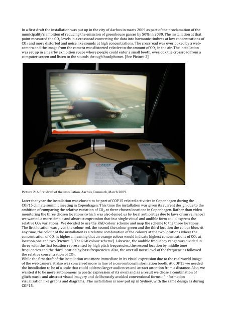
In a first draft the installation was put up in the city of Aarhus in marts 2009 as part of the proclamation of the municipality’s ambition of reducing the emission of greenhouse gasses by 50% in 2030. The installation at that point measured the CO₂ levels in a crossroad converting the data into harmonic timbres at low concentrations of CO₂ and more distorted and noise like sounds at high concentrations. The crossroad was overlooked by a web-camera and the image from the camera was distorted relative to the amount of CO₂ in the air. The installation was set up in a nearby exhibition space where people could enter a small booth, overlook the crossroad from a computer screen and listen to the sounds through headphones. [See Picture 2] Picture 2: A first draft of the installation, Aarhus, Denmark, March 2009. Later that year the installation was chosen to be part of COP15 related activities in Copenhagen during the COP15 climate summit meeting in Copenhagen. This time the installation was given its current design due to the ambition of comparing the relative variation of CO₂ at three chosen locations in Copenhagen. Rather than video monitoring the three chosen locations (which was also denied us by local authorities due to laws of surveillance) we wanted a more simple and abstract expression that in a single visual and audible form could express the relative CO₂ variations. We decided to use the RGB colour scheme and map the scheme to the three locations. The first location was given the colour red, the second the colour green and the third location the colour blue. At any time, the colour of the installation is a relative combination of the colours at the two locations where the concentration of CO₂ is highest, meaning that an orange colour would indicate highest concentrations of CO₂ at location one and two [Picture 3, The RGB colour scheme]. Likewise, the audible frequency range was divided in three with the first location represented by high pitch frequencies, the second location by middle tone frequencies and the third location by bass frequencies. Also, the over all noise level of the frequencies followed the relative concentration of CO₂. While the first draft of the installation was more immediate in its visual expression due to the real world image of the web camera, it also was conceived more in line of a conventional information booth. At COP15 we needed the installation to be of a scale that could address larger audiences and attract attention from a distance. Also, we wanted it to be more autonomous (a poetic expression of its own) and as a result we chose a combination of glitch music and abstract visual imagery and deliberately avoided conventional forms of information visualization like graphs and diagrams. The installation is now put up in Sydney, with the same design as during COP15.