Download the Corporate Visual Guidelines (PDF ... - Jewish Heritage
Download the Corporate Visual Guidelines (PDF ... - Jewish Heritage
Download the Corporate Visual Guidelines (PDF ... - Jewish Heritage
- No tags were found...
You also want an ePaper? Increase the reach of your titles
YUMPU automatically turns print PDFs into web optimized ePapers that Google loves.
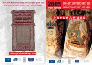
INSTITUTIONALIDENTITYMANUALv.1.0 / January 2008
0. INDEX OF CONTENTS1. The Brand ........................................................................................................... 52. The symbol ....................................................................................................... 63. Logotype Composition ............................................................................... 74. Correct Applications ................................................................................... 85. Incorrect Applications ................................................................................ 96. Institutional Colours ...................................................................................10
1. THE BRAND: LOGOTYPEThis is <strong>the</strong> brand of AEPJ. It is composed by a typographical symbol and aline tag. According to its final application, it can be used in a way or ano<strong>the</strong>r.The symbol with <strong>the</strong> '<strong>Jewish</strong>eritage' tag line may be limited to applications in connectionwith AEPJ website (www.jewisheritage.org).association européennepour la préservation et lavalorisation de la cultureet du patrimoine juifsMINIMUM RESOLUTION: 20mm.MINIMUM RESOLUTION: 20mm.MINIMUM RESOLUTION: 40mm.MINIMUM RESOLUTION: 40mm.association européennepour la préservation et lavalorisation de la cultureet du patrimoine juifsassociation européennepour la préservation et lavalorisation de la cultureet du patrimoine juifs
3. LOGOTYPE COMPOSITIONThe logotype and its tag line can be composed in two different ways. One version with <strong>the</strong> tag lines beneath <strong>the</strong> symboland ano<strong>the</strong>r one with <strong>the</strong> tagline at right. The proportions must be always <strong>the</strong> ones presented here. In no case can bewritten or redesigned its elements again as <strong>the</strong>ir kernings and interlines have been retouched.association européennepour la préservation et lavalorisation de la cultureet du patrimoine juifsassociation européennepour la préservation et lavalorisation de la cultureet du patrimoine juifs
4. CORRECT APPLICATIONSThese are <strong>the</strong> correct applications of <strong>the</strong> logotypeaccording to <strong>the</strong> printing options or <strong>the</strong> backgroundcolour where <strong>the</strong> logotype is placed. All applicationsdifferent to <strong>the</strong>se are incorrect.Application in colour over white backgroundApplication in black over white backgroundApplication in colour over dark backgroundApplication in white over dark backgroundApplication over dark backgroundApplication in white over dark background
5. INCORRECT APPLICATIONSBelow some examples on incorrect applications of <strong>the</strong> logotypeThey can be considered erronial.Application in brown (symbol + tagline)Application with inverted coloursApplication with inverted colours over dark backgroundApplication in white over light backgroundApplication in black over dark backgroundApplication in black over dark background
6. INSTITUTIONAL COLOURSThese are <strong>the</strong> basic palette of <strong>the</strong> brand.For <strong>the</strong> printing applications, it is recommended to use<strong>the</strong> brown ink (Pantone 471) as a direct ink.In o<strong>the</strong>r words, if a printed piece need quatricomy, <strong>the</strong>brown ink must be added as a fifth.PANTONE 1365PANTONE 471PANTONE 534


