MATLAB Function Reference (Volume 2: Graphics)
MATLAB Function Reference (Volume 2: Graphics) MATLAB Function Reference (Volume 2: Graphics)
uicontrolSliders accept numeric input within a specific range by enabling the user tomove a sliding bar. Users move the bar by pressing the mouse button anddragging the pointer over the bar, or by clicking in the trough or on an arrow.The location of the bar indicates a numeric value, which is selected by releasingthe mouse button. You can set the minimum, maximum, and current values ofthe slider.Static text boxes display lines of text. Static text is typically used to label othercontrols, provide directions to the user, or indicate values associated with aslider. Users cannot change static text interactively and there is no way toinvoke the callback routine associated with it.Toggle buttons are controls that execute callbacks when clicked on and indicatetheir state, either on or off. Toggle buttons are useful for building toolbars.More information about toggle buttons.RemarksPropertiesThe uicontrol function accepts property name/property value pairs,structures, and cell arrays as input arguments and optionally returns thehandle of the created object. You can also set and query property values aftercreating the object using the set and get functions.Uicontrol objects are children of figures and therefore do not require an axes toexist when placed in a figure window.This table lists all properties useful for uicontrol objects, grouping them byfunction. Each property name acts as a link to a description of the property.Property Name Property Description Property ValueControlling Style and AppearanceBackgroundColor Object background color Value: ColorSpecDefault: system dependentCDataTruecolor image displayed on thecontrolValue: matrixForegroundColor Color of text Value: ColorSpecDefault: [0 0 0]2-536
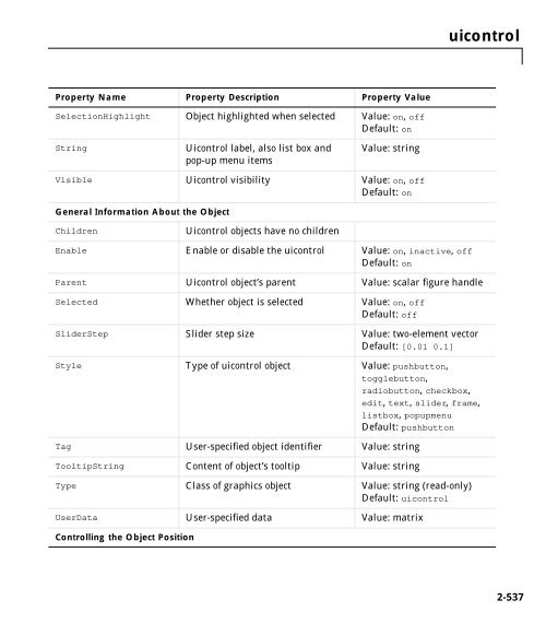
uicontrolProperty Name Property Description Property ValueSelectionHighlight Object highlighted when selected Value: on, offDefault: onStringUicontrol label, also list box andpop-up menu itemsValue: stringVisible Uicontrol visibility Value: on, offDefault: onGeneral Information About the ObjectChildrenUicontrol objects have no childrenEnable Enable or disable the uicontrol Value: on, inactive, offDefault: onParent Uicontrol object’s parent Value: scalar figure handleSelected Whether object is selected Value: on, offDefault: offSliderStep Slider step size Value: two-element vectorDefault: [0.01 0.1]Style Type of uicontrol object Value: pushbutton,togglebutton,radiobutton, checkbox,edit, text, slider, frame,listbox, popupmenuDefault: pushbuttonTag User-specified object identifier Value: stringTooltipString Content of object’s tooltip Value: stringType Class of graphics object Value: string (read-only)Default: uicontrolUserData User-specified data Value: matrixControlling the Object Position2-537
- Page 515 and 516: Surface PropertiesEdgeColor{ColorSp
- Page 517 and 518: Surface PropertiesFaceColorColorSpe
- Page 519 and 520: Surface Propertiesgetframe, or paus
- Page 521 and 522: Surface PropertiesMarkerSize size i
- Page 523 and 524: Surface PropertiesVertexNormals vec
- Page 525 and 526: surfllight source, use surfl(X',Y',
- Page 527 and 528: surfnormPurpose2surfnormCompute and
- Page 529 and 530: terminalPurpose2terminalSet graphic
- Page 531 and 532: texlabelPurpose2texlabelProduce TeX
- Page 533 and 534: textPurpose2textCreate text object
- Page 535 and 536: textannotate the point at (pi,0) wi
- Page 537 and 538: textProperty Name Property Descript
- Page 539 and 540: textProperty Name Property Descript
- Page 541 and 542: Text PropertiesCreateFcnstringCallb
- Page 543 and 544: Text PropertiesExtentposition recta
- Page 545 and 546: Text PropertiesWhen a handle is not
- Page 547 and 548: Text PropertiesPosition[x,y,[z]]Loc
- Page 549 and 550: Text PropertiesCharacterSequenceSym
- Page 551 and 552: Text PropertiesVerticalAlignment to
- Page 553 and 554: titlePurpose2titleAdd title to curr
- Page 555 and 556: trimeshPurpose2trimeshTriangular me
- Page 557 and 558: uicontextmenuPurpose2uicontextmenuC
- Page 559 and 560: uicontextmenuWhen the user extend-c
- Page 561 and 562: uicontextmenu Propertiesdefines a d
- Page 563 and 564: uicontextmenu Propertieswhere vecto
- Page 565: uicontrolString property (even thou
- Page 569 and 570: uicontrolProperty Name Property Des
- Page 571 and 572: uicontrolObjectHierarchyRootFigureA
- Page 573 and 574: uicontrol Propertiesinterrupting ca
- Page 575 and 576: uicontrol Properties• on - The ui
- Page 577 and 578: uicontrol PropertiesFixedWidthFontN
- Page 579 and 580: uicontrol Propertiesdefined, that c
- Page 581 and 582: uicontrol Properties• Toggle butt
- Page 583 and 584: uicontrol PropertiesFor multiple li
- Page 585 and 586: uicontrol PropertiesSet the Value p
- Page 587 and 588: uigetfileSee Alsouiputfile2-557
- Page 589 and 590: uimenuYou can set and query propert
- Page 591 and 592: uimenuExamplesThis example creates
- Page 593 and 594: uimenu Propertiescallbacks; see the
- Page 595 and 596: uimenu PropertiesForegroundColor Co
- Page 597 and 598: uimenu Propertiescharacter while th
- Page 599 and 600: uiputfilePurpose2uiputfileInteracti
- Page 601 and 602: uiresume, uiwaitPurpose2uiresume, u
- Page 603 and 604: uisetfontPurpose2uisetfontModify fo
- Page 605 and 606: viewPurpose2viewViewpoint specifica
- Page 607 and 608: viewaxes graphics object properties
- Page 609 and 610: viewmtxT = viewmtx(az,el,phi,xc) re
- Page 611 and 612: viewmtxTransform the cube vectors t
- Page 613 and 614: waitforPurpose2waitforWait for cond
- Page 615 and 616: warndlgPurpose2warndlgDisplay warni
uicontrolProperty Name Property Description Property ValueSelectionHighlight Object highlighted when selected Value: on, offDefault: onStringUicontrol label, also list box andpop-up menu itemsValue: stringVisible Uicontrol visibility Value: on, offDefault: onGeneral Information About the ObjectChildrenUicontrol objects have no childrenEnable Enable or disable the uicontrol Value: on, inactive, offDefault: onParent Uicontrol object’s parent Value: scalar figure handleSelected Whether object is selected Value: on, offDefault: offSliderStep Slider step size Value: two-element vectorDefault: [0.01 0.1]Style Type of uicontrol object Value: pushbutton,togglebutton,radiobutton, checkbox,edit, text, slider, frame,listbox, popupmenuDefault: pushbuttonTag User-specified object identifier Value: stringTooltipString Content of object’s tooltip Value: stringType Class of graphics object Value: string (read-only)Default: uicontrolUserData User-specified data Value: matrixControlling the Object Position2-537


 Change language