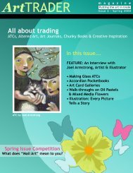
All About Trading - ArtTrader Magazine
All About Trading - ArtTrader Magazine
All About Trading - ArtTrader Magazine

You also want an ePaper? Increase the reach of your titles
YUMPU automatically turns print PDFs into web optimized ePapers that Google loves.
Art TRADER<br />
m a g a z i n e<br />
Critique Corner by<br />
XKati<br />
Barrett<br />
A border of some kind can give the card a more finished look; because of the theme, one could choose to<br />
give the card either a light border (for example, duplicating the white outline of the bird around the edge of<br />
the card as well) or a soft application of walnut ink or other darker color around the edges. I usually slide<br />
and daub a soft raised ink pad along the edges for this effect.<br />
Also, the values of the bird and background are very similar. To create a little depth and contrast in the card,<br />
you could darken the area around the bird; I would suggest using a light, warm brown watercolor, being<br />
careful not to go over the white outline. The text is also very small, but is well placed. To make it stand out<br />
a little more, outlining in some way could work (for example, by using a gold gel pen).<br />
-19-<br />
Andrea Melione<br />
Welcome to the Critique Corner. In this new regular column, reader-submitted art will be critiqued. A<br />
critique is not meant to be a negative analysis; rather, a true and proper critique is where a piece of art is<br />
evaluated in both its strengths and weaknesses, as perceived by the individual doing the critiquing. An<br />
honest critique can be valuable; many of us will ask friends or family members for their opinion, and it is<br />
also useful to see artwork created by others critiqued. Also, critiques can give us insight into how others<br />
see our art and help us look at it in ways we hadn’t thought of before. In this issue, I’ll be looking at two<br />
ATCs submitted by Kati Barrett and giving you some tips to think about when submitting your own work for<br />
critique!<br />
First off, here are a few things I think about when I look at a piece of art I am critiquing: Individual style, color<br />
scheme, composition, rendering/technical execution, complexity, and the overall immediate impact of the<br />
work (in other words, the gestalt: How all of the aforementioned points work together to create the whole).<br />
This checklist works pretty well for all types of subject matter and media, from fiber arts, to collage, to drawn<br />
work.<br />
Let’s begin with “Mellow Light.” This<br />
card is actually rather nice, and is<br />
her first attempt at drawing! The<br />
drawing of the bird is not an issue at<br />
all, as, stylistically, it has a naive folkart<br />
appeal. The colors seem to work<br />
well together, and the application of<br />
the paint gives the muted feel of late<br />
afternoon sun, supporting the “Mellow<br />
Light” text. The card could use<br />
development in a few areas though,<br />
namely in the composition and its<br />
depth. The image of the card is very<br />
simple, and some extra layers would<br />
help to give the card extra dimension.