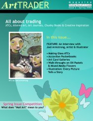
All About Trading - ArtTrader Magazine
All About Trading - ArtTrader Magazine
All About Trading - ArtTrader Magazine

Create successful ePaper yourself
Turn your PDF publications into a flip-book with our unique Google optimized e-Paper software.
ArtTRADER<br />
m a g a z i n e<br />
PUTTING THE ART IN TRADE<br />
Pen & Ink:<br />
Pen Possibilities<br />
Interviews with<br />
Randi Marx<br />
Suzan Buckner<br />
Tracie Rozario<br />
Critique<br />
C o r n e r<br />
Altered<br />
Art 101<br />
Walkthrough<br />
Art<br />
Winter Contest<br />
Vintage Collage!<br />
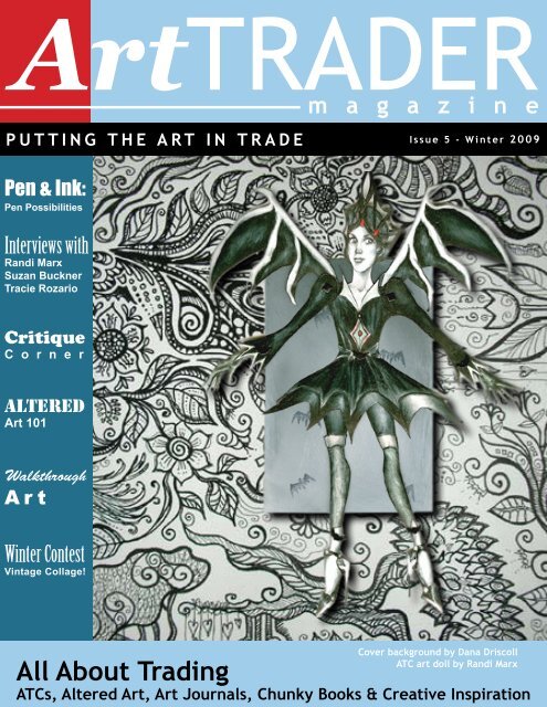
<strong>All</strong> <strong>About</strong> <strong>Trading</strong><br />
Issue 5 - Winter 2009<br />
Cover background by Dana Driscoll<br />
ATC art doll by Randi Marx<br />
ATCs, Altered Art, Art Journals, Chunky Books & Creative Inspiration
Art TRADER<br />
m a g a z i n e<br />
Table of Contents Winter 2009<br />
3<br />
4<br />
5<br />
6<br />
8<br />
9<br />
14<br />
15<br />
19<br />
21<br />
23<br />
27<br />
30<br />
32<br />
33<br />
37<br />
38<br />
41<br />
42<br />
Art Trader Contributors<br />
Editor’s Note & Letters<br />
Winter Contest: Vintage Collage<br />
Design 911: Composition<br />
Defining Mail Art<br />
Paint! Paste! Color! Interview with Suzan<br />
Buckner<br />
Gallery: Fall-Themed ATC Contest<br />
In Search of the Even Black Line: Pen<br />
Possibilities<br />
Critique Corner<br />
Gallery: Funky Mermaids<br />
Interview with Randi Marx<br />
Artistic Journeys: Altered Art 101<br />
Gallery: Halloween Postcard Contest<br />
Walk-Through Art<br />
Interview with Tracie Rozario: The Secret Side<br />
of Purple<br />
Petite Artiste: Marlena Muir<br />
Readers Gallery<br />
Advertisers’ Ads<br />
Call for Articles & Artwork<br />
-2-<br />
Page 9<br />
Page 27<br />
CHIEF EDITOR<br />
COPY EDITOR<br />
CONTRIBUTING AUTHORS<br />
ART DIRECTOR<br />
ASSOCIATE DESIGNERS<br />
PUBLISHED BY<br />
Page 21<br />
Dana Driscoll<br />
Meran ni Cuill<br />
Bonnie Driscoll<br />
Andrea Melione<br />
Sal Scheibe<br />
Dana Driscoll<br />
Abi Aldrich<br />
Sal Scheibe<br />
Brittany Noethen<br />
Andrea Melione<br />
IllustratedATCs.com<br />
ArtTRADER <strong>Magazine</strong><br />
www.arttradermag.com<br />
Editor: editor@arttradermag.com<br />
Advertising: ads@arttradermag.com<br />
Submissions: content@arttradermag.com<br />
Call for Entries: www.arttradermag.com
Art TRADER<br />
m a g a z i n e<br />
Contributors<br />
Abi Aldrich is a K-6 Art teacher in Wyoming. She sells oil paintings professionally, makes<br />
pottery because she likes to play in the mud, and generally makes text -based sculptures<br />
and installations because that is her true love. Beyond that she loves printmaking, drawing,<br />
and graphic design. In all her massive amounts of free time, Abi hangs out with her<br />
menagarie, including several rabbits, a chinchilla, a hampster, a cockatiel and a large<br />
bearded dragon. She also calls West Africa every night to talk to the love of her life, Gee.<br />
So in a nutshell, she is a nut who likes to make a mess in art!<br />
www.abigayle.etsy.com<br />
Andrea Melione is currently a full-time student, planning on eventually earning a Master’s<br />
in Library Science. She loves all types of art, but is fond of the Surreal and Symbolist<br />
movements. Her favorite artists are Michael Parkes, Daniel Merriam, Aubrey Beardsley<br />
and her buddies at IllustratedATCs.com, where she is a Moderator. She mainly works in<br />
watercolor, colored pencil, acrylics, markers and gel pens, though not all at once. She lives<br />
in NY (cow country, not the city) and has difficulty writing biographies in the third person.<br />
• artpfunkcentral.blogspot.com<br />
• www.flickr.com/photos/littleboots<br />
Bonnie Driscoll was a professional graphic designer and calligraph who works work for<br />
fun now since retirement. Her favorite mediums are watercolors, ink, and acrylic and she<br />
enjoys doing still life and landscape scenes.<br />
Brittany Noethen is an artist living in a tech manager’s body. She would rather be<br />
decapitated than give up making art, trading ATCs, or stop thinking that the phrase “Muffins<br />
or Bust” is hilarious. She currently lives in Iowa with her partner Cat, her 12 year old pit bull,<br />
Maggie, and shelves full of art supplies.<br />
• www.bnoethen.etsy.com<br />
• arty-iowa-girl.vox.com<br />
• www.flickr.com/photos/arty-ia-girl<br />
Dana Driscoll is an experimental artist working in a variety of media including watercolors,<br />
mixed media, oils, clay, book arts, hand papermaking, and altered art. She is currently<br />
working on several artistic projects, including painting her way through a 78-card tree tarot<br />
deck and combining her love of pottery and bookmaking. When not avoiding the perils of<br />
pursuing her Ph.D. in Rhetoric and Composition, she can be found frolicking in nearby<br />
forests or hanging out with her nerdy gamer friends. Dana’s work can be found at her blog:<br />
artisticjourneys.blogspot.com and she can be reached at adriayna@yahoo.com.<br />
• www.artisticjourneys.etsy.com<br />
Meran niCuill Fascinated by nature and science, Meran ni Cuill attempts daily to translate<br />
her passions into art. Sometimes she feels she even succeeds! And then something else<br />
will catch her attention and off she’ll go! Chasing another ideal. Meran enjoys gardening,<br />
sunsets, dogs, birds, and just about anything as long as it’s not endless crowds of people.<br />
When those present, she’ll retreat to a quiet place and read a book, or cut some glass, both<br />
of which she finds therapeutic.<br />
• www.meran.etsy.com<br />
• atcs2008.meran.fastmail.fm<br />
Sal Scheibe works as a creative designer for print and web and also as a freelance<br />
illustrator. Her designs and artwork have appeared in books, CDs and DVDs and posters.<br />
Sal is currently working on a number of large canvas paintings for art shows. She also<br />
enjoys trading ATCs and is an administrator at IllustratedATCs.com. Sal’s favorite artists<br />
and illustrators include Joe Sorren, J.C. Leyendecker, William Bougereau and John Singer<br />
Sargent. Her favored mediums are acrylic paint, colored pencils and markers.<br />
• www.slscheibe.com<br />
• www.flickr.com/photos/amerasu<br />
-3-<br />
•
Art TRADER<br />
m a g a z i n e<br />
Letter from the Editor<br />
New Year’s is a wonderful time to reflect back upon your past artistic successes and make commitments and<br />
plans for your future as an artist. Consider how adding a new artistic technique, advancing a skill, or even dabbling<br />
in a new type of art might enrich your life! To make these plans though, think big but start small, considering<br />
both your long-term goals and short-term plans. Where do you see yourself next week? Next month? In a year?<br />
In five years? Make a list of what is important to you in your artistic<br />
progress, and see how it might change over time.<br />
Where do you see your art going from here? How might you expand<br />
your horizons in this new year? Issue #5 of Art Trader is packed full of<br />
new ideas. Andrea Melione’s Critique Corner provides readers with<br />
suggestions for improvement of their art. This issue she addresses<br />
composition and depth of two cards created by Kati Barrett. Sal<br />
Scheibe provides us with a new “Walkthrough Art” column that<br />
provides a visual walkthrough of an ATC. Finally, my own regular<br />
Artistic Journeys column delves into the world of altered art! We<br />
are also pleased to provide a host of art galleries for your viewing<br />
pleasure. Learn more about the world of pen and ink in “In Search of<br />
the Even Black Line.”<br />
Additionally, this issue is packed with inspiration from artists around<br />
the world. We have interviews with artists Suzan Buckner, Tracie<br />
Rozario and Randi Marx. We have reader-submitted galleries,<br />
contest winner galleries, and funky mermaid and halloween postcard<br />
art swap galleries for your viewing pleasure! So read, be inspired,<br />
and think about those artistic New Year’s resolutions!<br />
Letter from<br />
our readers<br />
Hello <strong>ArtTrader</strong> <strong>Magazine</strong>,<br />
I am very new to mail art, and actually, art in general! I must admit I am overwhelmed<br />
with possibilities. But how do I choose a media to get started in? What should I<br />
focus on first?<br />
Thanks!<br />
Sandy, United Kingdom<br />
Hi Sandy,<br />
Thank you for writing! Mail Art is an exciting world, but it is certainly easy to get<br />
overwhelmed at first. There are a number of ways to get started. If you have the<br />
time and money, investing in some local art classes (such as those at community<br />
centers) or finding some artistic friends to learn from is a great way to get started.<br />
Books, tutorials online, and even YouTube videos can really help expand your<br />
artistic horizons. But above all, we suggest making time each day or each week<br />
set aside for art—as it is only through lots of practice and experimentation with<br />
different styles can you find your own niche in the mail art world!<br />
-<strong>ArtTrader</strong> <strong>Magazine</strong><br />
-4-<br />
Dana Driscoll
Art TRADER<br />
m a g a z i n e<br />
Winter Contest: Vintage Collage<br />
It’s time to get your fingers sticky and show us your vintage collage skills!<br />
We’re accepting ATCs or postcards - as long as the genre is vintage collage<br />
your entry will be welcome (nudity is acceptable as long as it’s tasteful). You<br />
are allowed to enter up to 3 separate images. Please be sure to use copyright<br />
free images or those you have a license to use.<br />
-5-<br />
Grand Prize & Contest Submission Info<br />
A stuffed bubble envelope of collage ephemera<br />
and papers! Yummy!<br />
Our grand prize winner along with other selected<br />
entries will appear in the next issue of <strong>ArtTrader</strong><br />
(Spring 2009).<br />
The winner will be chosen by the <strong>ArtTrader</strong><br />
<strong>Magazine</strong> editorial staff. The contest is open to<br />
anyone age 18 or older.<br />
Submit your entries in JPG format (300 DPI) to<br />
art@arttreadermag.com by March 15, 2009.
Art TRADER<br />
m a g a z i n e<br />
iDesign 911p<br />
by Andrea Melione<br />
Welcome back to Design 911! Last time, we discussed some basics in composition: symmetry, asymmetry<br />
and proportion. In this issue however, we’re going to discuss a few design buzzwords: tangents,<br />
ambiguity and negative space, and how they can be incorporated (or avoided!) in your artwork.<br />
Tangents: tan·gent Function: adjective Etymology: Latin tangent-, tangens, present<br />
participle of tangere to touch; perhaps akin to Old English thaccian to touch gently, stroke<br />
Date: 1594<br />
If you remember geometry class at all, you may know that tangent means “to touch”. Tangents in<br />
design mean two elements that are touching one another, not overlapping and not near, but when the<br />
edges actually meet. For example, an amateur photographer may accidentally take a photo of a friend,<br />
who is standing in front of a bookcase and, as a result, the friend may look like they are holding books<br />
up with his head. Tangents can also be used for a laugh, like when tourists ‘hold up’ the Leaning Tower<br />
of Pisa; but for the most part, unless you are intentionally trying to break the No Tangents rule, (and can<br />
pull it off successfully), you can risk having your drawing, collage, etc. look unintentional, unplanned,<br />
and naive.<br />
Tangents can pose problems in your work because they<br />
can eliminate any sense of depth (which is the sense of a<br />
foreground, middle ground and background.) In addition,<br />
they can also make a composition uninteresting. ATCs in<br />
particular are vulnerable because there is so little space to<br />
begin with; if you have a tangent in your ATC, there may not<br />
be extra room to add an additional element that can offset<br />
the awkward tangents.<br />
Here is a good example of how tangents can make your art<br />
look unintentional: This princess looks a little worried, and<br />
you would be too, if you had a castle tower attached to your<br />
flowing red locks! Both the princess and the tower are about<br />
the same length and width, and when you place two objects<br />
of similar dimensions right next to each other, the eye can<br />
make no sense of their relationship, nor where the objects<br />
are in the context of foreground, middle or background. This<br />
card is drawn, but the idea applies to any art form, even<br />
abstract or collage. In this case, the tower should be made<br />
smaller to give the appearance of being farther away.<br />
-6
Art TRADER<br />
m a g a z i n e<br />
Ambiguity and Negative Space:<br />
Ambiguity is a great concept to incorporate into art: It is when you’re unsure if you are seeing one thing<br />
or another. Take for example zebra stripes; is the animal black with white stripes or white with black<br />
stripes? The Surrealism movement is a great example of ambiguity in art as well. Research artists like<br />
Salvador Dalí, René Magritte, Victor Brauner and Max Ernst for inspiration in your own works.<br />
Negative space is a highly effective design tool. You can create visual twists that can surprise and<br />
interest your viewer. Negative space is also popular in Logo design (the Ram image is the logo for<br />
Dodge for example). Next time you see ‘FedEx’ look at the negative space between the E and the X;<br />
you will in fact see a little white arrow!<br />
Ambiguity and Negative space can be used really effectively in ATCs, and the following cards are a<br />
good example. I painted these cards with pink gouache and used the white of the paper for the figures.<br />
For the card on left, the negative space is used to define the line of her bust and torso. On all of the<br />
cards I use negative space to ambiguously create the clothing; the clothing is pink, but then so is the<br />
background; where does the clothing leave off and the background begin?<br />
Tangents, ambiguity and negative space are all concepts to keep in mind when creating your artwork;<br />
by doing so, you’ll create art that is more dynamic and visually arresting. Next issue, I’ll be discussing<br />
how to use color to enhance your design!<br />
-7-i
Art TRADER<br />
m a g a z i n e<br />
Defining Mail Art<br />
In Issue 2 of Art Trader <strong>Magazine</strong>, we asked our readers to help us define Mail Art. We<br />
asked people to create their own artistic interpretation of their definition of “mail art” by<br />
emailing us their creations - open media, open genre. Our winning entry, a postcard,<br />
was sent in by Marguerite Bryant from California.<br />
jkjgflv<br />
-8-
Art TRADER<br />
m a g a z i n e<br />
D<br />
Paint! Paste! Color!<br />
Suzan Buckner is a mixed-media<br />
master whose body of work includes<br />
meticulous abstract masterpieces, fun<br />
D<br />
and funky art journals, and whimsical<br />
portraiture. Her attention to detail<br />
and the fine-tuned play of color brings<br />
forth work that is multi-dimensional<br />
in not only physical layers, but in<br />
conceptual layers as well. An antique<br />
dealer as well as artist, Suzan shares<br />
with us her sources of inspiration, and<br />
advice for those wanting to venture<br />
into collage.<br />
D<br />
Suzan: My family consists of my husband Chuck (who I met on the Internet 8 years ago, and have<br />
been married to for 7), and my 21 year old daughter--who I affectionately refer to as “She who knows<br />
everything.” She’s in nursing school, and I am very proud of her. I also have 2 step-daughters, and 4<br />
step-grandchildren. Additionally, I am the owner of Petey the Wonderdog. Petey was an abused dog<br />
that wondered into my yard a little over a year ago, and whom I fell in love with. He helped me get over<br />
the “empty nest” syndrome when my daughter moved away to college, and for that he has been my<br />
saving grace in life. He’s still not very social with humans, but neither am I, so we understand each<br />
other perfectly.<br />
Can you start by telling us a little bit about your family?<br />
Did you study art in school?<br />
-9-<br />
D<br />
Suzan: The only art that I have studied was in high school. I graduated in 1982, and a year and a half<br />
ago--I decided I wanted to be an artist. After being out of high school for 25 years, I started doing art.<br />
What artists have inspired you over time?<br />
Suzan Buckner<br />
Interview by Andrea Melione<br />
Suzan: When I first started doing mixed media collage the journal pages of Teesha Moore inspired me. I<br />
looked at the art of others, and was inspired by many, many more artists along the way. I still constantly<br />
check out other artists’ work, and am still inspired by a great deal of it that I find on the Web.
Art TRADER<br />
m a g a z i n e<br />
Your work is so zany and colorful! Are there any art<br />
themes are you most drawn to?<br />
Suzan: Really the only “theme” that I have been drawn<br />
to is a circus theme. I love anything to do with vintage<br />
circus. Other than that, I have hard time with “themes.” I<br />
completely work out of intuition, with very little planning, so<br />
themes seem to get thrown to the wayside.<br />
You have also been an antique dealer. Has that<br />
provided any inspiration to your art?<br />
Suzan: Yes, it has. I have a life-long love of anything old,<br />
and I use a lot of vintage images in my art. I think that<br />
being an antique dealer (I am still one, only now part-time)<br />
has made it easier to keep fresh ideas on hand, because<br />
if I am not making art, then I am out hunting for old things.<br />
I am inspired a lot by older color combinations, and finding<br />
things with those colors is always exciting.<br />
What types of antiques hold the most interest for you<br />
and why?<br />
D<br />
D<br />
Suzan: The ones that are worth the most money! When you sell antiques to make money to live<br />
on, then the interesting things are the most valuable. I especially like antique dolls, and old pictures<br />
(photographs), if you are talking about a more personal level. But, even those Dare for sale. When I first<br />
started, I wanted to keep everything that I found, but have since gotten over that, and have sold most of<br />
my personal collections. It wasn’t hard to do when we couldn’t walk around freely in our house because<br />
of the antiques.<br />
-10-<br />
D
Art TRADER<br />
m a g a z i n e<br />
Have you any favorite artists?<br />
Suzan: I have one all-time, super, favorite artist, and have loved<br />
his stuff for many years. He is a science fiction illustrator named<br />
BROM. His stuff is very shocking, and dark. But, I love his talent.<br />
I am envious that I cannot draw like he does. A lot of people are<br />
surprised when they look him up because he’s so different than the<br />
happy, bright colors that I normally use.<br />
Your artwork covers a wide range of media. Can you share<br />
some techniques with us?<br />
Suzan: This is a very hard area for me. I never used “planned”<br />
techniques, and when I try, they never work like they are supposed<br />
to. I just mainly do whatever I want, and keep working it (sometimes<br />
with over 20+ coats of paint, and collage) until I like something. I<br />
buy books about techniques--end up looking at the pretty pictures,<br />
and never read the first word or instruction. There’s not anything<br />
you can’t learn by trial and error; that’s my technique.<br />
-11-<br />
D<br />
D<br />
D<br />
D
Art TRADER<br />
m a g a z i n e<br />
I know artists, including myself, have had to<br />
deal with artist’s block. Have you ever had<br />
artist’s block? Do you have any suggestions<br />
for those who encounter it?<br />
Suzan: Funny that you ask this, because I have<br />
been suffering with it for about a month. I am<br />
still producing, but not much art that I am happy<br />
with. I haven’t been able to reach my “LA-LA-<br />
LA” stage, where I am just kicking out wonderful<br />
things, and my mind is working towards<br />
producing art. I am not finding inspiration in<br />
anything, and nothing seems to go like I want<br />
it to.<br />
-12-<br />
D<br />
D<br />
gfWhen I get like this--I just keep making stuff. I keep<br />
putting paint on top of paint, on top of paint, and<br />
keep plugging along. I feel like the worse thing<br />
that you can do is stop creating, simply because<br />
you aren’t “feeling” it. Making bad art is better than<br />
making no art, in my opinion. I know my muse will<br />
return; I worked her too hard, and she’s just taking<br />
a break.<br />
D<br />
Your colors are bold yet always harmonious<br />
and this isn’t always easy! How do you create<br />
such great color combinations with such<br />
variety of color?<br />
D<br />
Suzan: First, Thank you for the compliment!<br />
Second, I make color mistakes just like everyone<br />
does. I just have no trouble dumping white over<br />
a color and reworking it, or making it a completely<br />
different color. I guess that I am different than most<br />
people, bcause my color mistakes usually involve<br />
muted, neutral colors like beige or brown. I have the<br />
hardest time with anything that is soft and muted.
Art TRADER<br />
m a g a z i n e<br />
Do you have any advice for someone starting out in collage, or wanting to advance further?<br />
Suzan: Get rid of the fear. Don’t be afraid. The worse that you can do is mess up, and have to rework<br />
something or throw it away. It isn’t the end of the world, and doesn’t make you a failure. Use photocopies,<br />
or scan images into your computer, print them and glue to your heart’s content. Some things are going<br />
to work, some are not--but it’s all a learning process.<br />
If you want to advance artistically--once you get comfortable doing something, put all thoughts of it<br />
away, and do something different, even if you aren’t liking the uncomfortable feeling of stepping outside<br />
the box and even if you are afraid. For every new thing that I have learned, I have a dozen failures to<br />
show for it.<br />
Also, don’t think. This is probably the most important thing to learn. You wouldn’t be creating art, if<br />
something inside of you wasn’t creative. So, let it out. The only way to do this is to stop thinking and<br />
just do it!<br />
-See more of Suzan’s work here-<br />
Website: www.suzanbuckner.com<br />
Art Blog: www.thriftycollageartist.blogspot.com<br />
Flickr: http://www.flickr.com/photos/thriftycollageartist/<br />
ETSY: http://thriftycollageartist.etsy.com<br />
-13-
Art TRADER<br />
m a g a z i n e<br />
Gallery: Fall-Themed ATC Contest!<br />
ATCsforall.com hosted a fall-themed ATC contest open to all members. We encouraged people to<br />
be inspired by fall colors, fall scenes, fall food and fall leaves—and the members responded with an<br />
amazingly amount of beautiful cards. After voting, three winners emerged! Congratulations to Janet<br />
Dickenson & Donna Hawk (winners of our People’s Choice Awards) and Cindy Vasquez (our randomlychosen<br />
winner!). Here are their cards!<br />
Donna Hawk<br />
Cindy Vasquez<br />
Janet Dickenson<br />
-14-
Art TRADER<br />
m a g a z i n e<br />
In Search of the Even Black Line: Pen Possibilities<br />
By Bonnie Driscoll and Dana Driscoll<br />
Any mail artist working with ink extensively knows how difficult<br />
it is to find a consistently producing and economically priced<br />
pen. After many years of experience and numerous purchases,<br />
we provide you with reviews of some of the best types of pens<br />
for your needs. This article introduces four primary possibilities<br />
for artistic pens. It does not consider markers, like sharpies,<br />
nor does it consider standard writing pens, like BIC pens. The<br />
article covers technical pens, dip pens, artist felt-tip pens, and<br />
finally other options like gel pens.<br />
-15-<br />
<strong>All</strong> <strong>About</strong> Inks<br />
The following are some common<br />
qualities of ink:<br />
Waterproof Ink: Once dry, a<br />
waterproof ink will not smear or<br />
smudge if it encounters water. This<br />
is perfect for individuals who want<br />
to sketch in pen and use watercolor<br />
washes over it. Additionally, if you<br />
plan on sealing your artwork with<br />
any kind of gloss or matte finish/<br />
medium, you will need to use<br />
waterproof ink.<br />
Archival Ink: Archival inks have<br />
several main qualities—they are<br />
fade resistant to time, they will<br />
adhere to the page and not flake off<br />
and have a pH neutral composition<br />
to prevent decay of the underlying<br />
paper.<br />
Acrylic Ink: A polymer, pigmented<br />
ink that often has bold colors and<br />
opaque features. Acrylic ink is<br />
supposed to be used with dip pens<br />
and technical pens, although the<br />
inks we’ve tried have all clogged<br />
the pens due to their thickness.<br />
Instead, we use a brush or dip<br />
pen.<br />
India Ink: A simple black ink made<br />
of carbon. India ink is an ancient<br />
formula, used by the Romans and<br />
Chinese. It can be found in cakes,<br />
sticks, or liquid form. Its commonly<br />
used in artistic work as it is often<br />
archival and waterproof.<br />
Inks come in all colors and<br />
thicknesses. Your choice of inks is<br />
largely dependent on the types of<br />
pens you want to use and the types<br />
of art you wish to create.
Art TRADER<br />
m a g a z i n e<br />
Technical & Mechanical Pens<br />
Technical pens were the standard in graphic design work before<br />
the advent of computer-aided design. They are still popular today<br />
with artists, drafters, and illustrators. Technical pens are re-usable<br />
pens that come with ink refilling options and a variety of line sizes.<br />
The main benefit of a technical pen is that they provide you with<br />
the most consistent and fine lines out of any of the pens we review<br />
in this article. Most brands do not get clogged up by mixed media<br />
like acrylics and they go over bumpy surfaces well without wearing<br />
down the point of the pen (since it’s a solid metal point). The main<br />
drawback of these pens is that they require refilling and cleaning<br />
by hand, which can be messy. They are also fragile—dropping<br />
the point of the pen on the ground will damage it.<br />
There are several types of technical pens, including refillable/<br />
self-filling/plunger pens and pens with cartridges. Although the<br />
cartridges are less messy, they are often not waterproof. The<br />
self-filling kinds come with waterproof, archival quality black ink,<br />
but can be time consuming and messy to fill.<br />
Our favorite of the technical pens are Koh-i-Noor Rapido Sketch<br />
pens because they provide the most consistent line, are the most<br />
reliable, sturdier, and easier to take apart and clean than some<br />
other varieties. The older Rapidograph pens are also quite nice,<br />
but the Rapido Sketch pen provides more flexibility and allows<br />
you to hold the pen at more angles. You can find them at online<br />
art retail stores and occasionally in office supply stores. Other<br />
technical pen brands include Rotring, Staedtler, and Pelikan.<br />
Who should use these pens? We recommend these pens for<br />
individuals who do frequent and extensive pen work—they will be<br />
the most economical to you in the long run. These pens are not<br />
for occasional use—they can clog up and dry out without common<br />
use. If you get a set of these pens, you should plan on using<br />
them at least once a week. Additionally, if you do a lot of pen work<br />
over mixed media or acrylic backgrounds, these pens have the<br />
best flow and do not get clogged like other pens presented here.<br />
Most of these pens only accept specially made black ink, although<br />
some use other types.<br />
Finally, individuals who are environmentally conscious of their<br />
own waste will be pleased with these reusable pens, due to their<br />
refillable and waste-reducing nature.<br />
How much do they cost? Although these pens represent a<br />
substantial investment up front (approx $10-25 per pen), in the long<br />
term and with frequent use, they represent the most economical<br />
of the choices.<br />
-16-<br />
How to Clean Your<br />
Technical or Dip Pen<br />
Simple clean up methods for dip<br />
pens with nibs or technical pens include:<br />
Soap and water: soak your pen parts<br />
for a few hours and then dry on a paper<br />
towel. Blot them on the paper<br />
towel to get all of the water out of the<br />
point before you refill it.<br />
An old toothbrush and some soap<br />
can help remove caked-on ink.<br />
Windex: pour a bit of window cleaner<br />
in a container and let the pens soak<br />
in. Do not dilute the Windex.<br />
Do not ever use bleach with your<br />
pens because it can destroy or corrode<br />
the pen.
Art TRADER<br />
m a g a z i n e<br />
Using a Dip Pen<br />
The following are some tips for<br />
using a dip pen:<br />
• When using a dip pen, one<br />
of the biggest challenges is<br />
figuring out how much ink you<br />
should have on the pen. When<br />
dipping, keep a paper towel or<br />
piece of scratch paper nearby.<br />
After dipping your pen into the<br />
inkwell, dab it on the paper towel<br />
before beginning a line. Beware<br />
of paper towel fibers in the nib.<br />
Additionally, if you wash your pen<br />
nib, be sure to dry it thoroughly<br />
before beginning a line as this<br />
can also cause uneven flow.<br />
• The angle of the pen is<br />
important as well—keep the pen<br />
slightly lower than a 90 degree<br />
angle—hold it naturally in your<br />
hand as you would a pencil. Pay<br />
attention to which way the nib is<br />
facing so that your line comes<br />
out as you expect.<br />
• Dip into your ink frequently.<br />
Infrequent dipping can lead to<br />
your pen scraping against your<br />
paper and leaving marks.<br />
• Use a smooth surface—a<br />
bumpy surface will lead to more<br />
uneven lines. Once you become<br />
more skilled at using the pen,<br />
you may find it possible to work<br />
on more uneven surfaces.<br />
Although dip pens are tricky at<br />
first, they can lead to a lifetime of<br />
enjoyment in pen-and-ink work!<br />
Dip Pens<br />
Dip pens are a very cheap and classic alternative to more modern<br />
technical or felt-tip artist pens. Dip pens are very useful because a<br />
number of different low-cost nibs can be purchased for drawing and<br />
calligraphic work. These nibs allow for many different types of inks and<br />
colors to be used that are not present in other pen types, such as acrylic<br />
or colored inks. You can also use your own handmade inks (such as<br />
walnut or elderberry) with these pens to great success! Many types of<br />
inks, including archival and waterproof, are available for use with these<br />
pens.<br />
Dip pens have a substantial learning curve and have frequent problems<br />
with dripping and uneven lines. Although it is possible to use them<br />
effectively, building your skill with these pens takes time.<br />
Our favorite of the dip pen brands is Speedball, whose pen nibs are<br />
built to last and provide a consistent line.<br />
Who should use these pens? We recommend dip pens for anyone<br />
looking for a bit more flexibility in lines, those interested in calligraphy<br />
work, and those looking to use the many fine colored and acrylic inks<br />
that are on the market. These pens are challenging and frustrating at<br />
first, but can be rewarding with perseverance and practice.<br />
Again, individuals who are concerned about environmental issues and<br />
waste will enjoy using dip pens due to their reusable nature.<br />
How much do they cost? Pen sets run about $6-12; replacement nibs<br />
are about $2 each. Inks to go with them run $3-5 per ink. Nibs can last<br />
quite a while if you care for them properly with cleaning and storage.<br />
Inks for Dip Pens<br />
Because of Bonnie’s extensive experience as a calligrapher for 30<br />
years, she has used nearly all of the inks on the market. Many of these<br />
brands have waterproof and/or archival-quality ink options. Here are<br />
some she recommends:<br />
Higgins Inks: Her favorite of the inks because of the vibrancy of the<br />
colors and the flow.<br />
Winsor and Newton Inks: These inks have a large color selection.<br />
They are a bit more translucent compared to the Higgins ink.<br />
Pelican Inks: Vibrant, opaque inks.<br />
Bonnie does not recommend the Speedball brand inks because they<br />
build up on your pen point causing you difficulty as you write or draw.<br />
-17-
Art TRADER<br />
m a g a z i n e<br />
Artist Pens<br />
Disposable or one-use artist pens, like ZIG Millennium, Pigma<br />
Micron, and Faber-Castell PITT artist pens represent a newer line of<br />
artist pens. These pens are the most readily accessible of the pens<br />
discussed in this article and they are often found in scrapbooking<br />
sections of hobby and art supply stores. Artist pens produce a very<br />
consistent line, but come in a limited amount of sizes and colors. The<br />
biggest benefit to these pens is that they are not messy and are the<br />
easiest to use and purchase. The negatives of these pens is that<br />
they run out extremely quickly, are wasteful, are limiting in pen sizes/<br />
colors and can be very costly over time. Most of these pens feature<br />
archival, waterproof inks.<br />
Our favorite of the artist pens is the Faber Castell PITT Artist pens<br />
and the Micron pens because these pens clog less frequently on<br />
mixed media work and seem to last longer than their competitors.<br />
Who should use these? Individuals occasionally doing pen work,<br />
those who do not want to deal with the cleaning of the technical pens,<br />
or those who do not have the funds to invest in a more expensive<br />
technical pen.<br />
What do they cost? Although the initial investment per pen is only<br />
$2-4, if you use ink pens a lot, the cost of each pen adds up. At one<br />
point, Dana (one of the authors of this article) was using 8-12 pens<br />
a month, amounting to $40-$50 per month. After that, she switched<br />
to a technical and dip pen combination and has saved substantial<br />
amounts of money in the long run. In less than 2 months time, her<br />
technical pen set paid itself off!<br />
Conclusion<br />
Overall, we find the technical pens to have the most consistent line,<br />
the least amount of clogging over mixed media work, the best flow,<br />
and the best value for your money over time. We highly recommend<br />
the Rapido Sketch Koh-I-Noor line of pens if you are a serious pen<br />
and ink artist. Keep an eye on online retailers for sales—we recently<br />
scored a set of 7 technical pens for less than $60.<br />
It’s important to know that there is not a “perfect pen” for everyone.<br />
Rather, as you develop your own working style and needs, different<br />
types of pens will work better for you. Some people will enjoy working<br />
with an older style dip pen or technical pen, while others will prefer<br />
the newer felt-tipped artist pens. If costs are a major factor, weigh the<br />
short-term low-cost artist pens with the long-term technical pens and<br />
decide which is the best for you. We hope this article provided you<br />
with possibilities for your pen needs!<br />
-18-<br />
g
Art TRADER<br />
m a g a z i n e<br />
Critique Corner by<br />
XKati<br />
Barrett<br />
A border of some kind can give the card a more finished look; because of the theme, one could choose to<br />
give the card either a light border (for example, duplicating the white outline of the bird around the edge of<br />
the card as well) or a soft application of walnut ink or other darker color around the edges. I usually slide<br />
and daub a soft raised ink pad along the edges for this effect.<br />
Also, the values of the bird and background are very similar. To create a little depth and contrast in the card,<br />
you could darken the area around the bird; I would suggest using a light, warm brown watercolor, being<br />
careful not to go over the white outline. The text is also very small, but is well placed. To make it stand out<br />
a little more, outlining in some way could work (for example, by using a gold gel pen).<br />
-19-<br />
Andrea Melione<br />
Welcome to the Critique Corner. In this new regular column, reader-submitted art will be critiqued. A<br />
critique is not meant to be a negative analysis; rather, a true and proper critique is where a piece of art is<br />
evaluated in both its strengths and weaknesses, as perceived by the individual doing the critiquing. An<br />
honest critique can be valuable; many of us will ask friends or family members for their opinion, and it is<br />
also useful to see artwork created by others critiqued. Also, critiques can give us insight into how others<br />
see our art and help us look at it in ways we hadn’t thought of before. In this issue, I’ll be looking at two<br />
ATCs submitted by Kati Barrett and giving you some tips to think about when submitting your own work for<br />
critique!<br />
First off, here are a few things I think about when I look at a piece of art I am critiquing: Individual style, color<br />
scheme, composition, rendering/technical execution, complexity, and the overall immediate impact of the<br />
work (in other words, the gestalt: How all of the aforementioned points work together to create the whole).<br />
This checklist works pretty well for all types of subject matter and media, from fiber arts, to collage, to drawn<br />
work.<br />
Let’s begin with “Mellow Light.” This<br />
card is actually rather nice, and is<br />
her first attempt at drawing! The<br />
drawing of the bird is not an issue at<br />
all, as, stylistically, it has a naive folkart<br />
appeal. The colors seem to work<br />
well together, and the application of<br />
the paint gives the muted feel of late<br />
afternoon sun, supporting the “Mellow<br />
Light” text. The card could use<br />
development in a few areas though,<br />
namely in the composition and its<br />
depth. The image of the card is very<br />
simple, and some extra layers would<br />
help to give the card extra dimension.
Art TRADER<br />
m a g a z i n e<br />
This next card has a lot of potential; the color scheme has<br />
already been established (purple, green and neutrals) and<br />
the placement of the elements (text, boy, window, skull)<br />
is fairly solid. The elements, however, are competing for<br />
the eye’s attention, rather than working together to create<br />
a cohesive whole. This can be fixed by lessening the<br />
dominance of the green window, and bringing the boy<br />
visually ‘forward’.<br />
In order to do this, the window needs to be ‘pushed’ into<br />
the background. This can be done in a variety of ways:<br />
1) Distress the image using fine sandpaper and apply a<br />
light wash of walnut ink or darker-colored distressing ink.<br />
2) Apply gesso mixed with a little brown paint, just to<br />
the window area, to make the bright green color appear<br />
less saturated, and more subtle; then re-create the brown<br />
punchinello ‘circle’ texture over the area, to blend it with<br />
the background. The window will still be visible, but it won’t<br />
compete with the boy any longer.<br />
3) To bring the boy ‘forward’, outline the figure using<br />
metallic pens or any light-colored acrylic paint, or give the<br />
figure a ‘shadow’ by painting the area around the outlines<br />
a darker color, like a deep purple, or green.<br />
I hope this critique has been helpful to our readers. Thanks<br />
Kati, for starting off this column!<br />
Here are some Critique Corner submission guidelines to keep in mind when<br />
choosing work for critique:<br />
* Don’t submit your masterpiece! Submit something you already feel you’re having trouble with.<br />
This way you will not feel your Best-Work-Ever is being ripped into.<br />
* Copyright Issues: When submitting a collage, make sure the images you have used have<br />
expired copyright protection. Dover Publications has a wide range of image collections that are<br />
copyright free.<br />
* Don’t take anything personally: Remember, the person doing the critique is working from his or<br />
her own perspective, and it’s okay if you don’t agree with them.<br />
* Just Ask! Feel free to ask several questions when you submit your piece. Let us know what<br />
areas you’d like some specific help with! Email us at art@arttradermag.com<br />
-20-<br />
Kati Barrett
Art TRADER<br />
m a g a z i n e<br />
Tabitha Ladin<br />
kFunky Mermaids<br />
Handdrawn and painted ATCs from IllustratedATCs.com<br />
-21-<br />
Ang Westermann<br />
Joy Saethre Andrea Melione Lynne Lemyre
Art TRADER<br />
m a g a z i n e<br />
Keela Cleghorn<br />
Sal Scheibe<br />
-22-<br />
Leah Budin<br />
Robyn Tisch-Hollister Liz Stevens Tracie Rozario
Art TRADER<br />
m a g a z i n e<br />
An Interview with<br />
Randi Marx<br />
Randi is an enigma; her colored pencil works evoke mood and invite<br />
meditation, or delight us with bold colors and masterful execution.<br />
But who is the individual behind the art? In this interview, Randi<br />
reveals to us her musings and ‘no shortcuts’ attitude to excellence<br />
in art.<br />
Tell us a little about yourself:<br />
Randi: I know it’s a bit cliché, but I have been drawing my whole life. I have gone down many paths,<br />
trying to figure out exactly what art is, and/or what art should be. The more I learn, the less I know. I<br />
love the line from Bono in the U2 song: “I knew more then than I do now.” It’s how I feel. I do have some<br />
favorite ideas, though, and one of those is that art should “make extraordinary that which is ordinary.”<br />
I’ve thought a lot about that. Some examples would be Monet’s haystacks or Cezanne’s fruit. It’s not<br />
what they painted, but how they painted it. And I’ve thought a lot about photography. Since one can<br />
capture a scene instantaneously, and then just print it up, change it in Photoshop, do about anything<br />
in the world with it, then why draw? Why paint? This is an unanswered question that has been going<br />
on since the daguerreotype. After all, the very word “photograph” means “to draw with light.” And now<br />
we have pixels…. so much to consider. I don’t have the answers, but I do believe that being an artist<br />
is more than just making pictures. It’s about creating questions and attempting to organize them into a<br />
visual language.<br />
And don’t get me wrong, I also believe art can be simple fun, as well. It can serve the artist (and the<br />
viewer) in many ways! It has the ability to be everything from attempting to make order out of chaos, to<br />
escape, or for meditation--just to name a few.<br />
Therefore, I spend my days searching. I want to be an alchemist. The alchemist attempts to turn base<br />
metals into gold. And this can be metaphoric, which is how it is for me. Base metal can be anything<br />
without spirit. It can be a day without meaning. Going into the creative realm, I can use all the formulas<br />
forged by all those before me--artists, poets, musicians, dancers, a shaman, magicians--and attempt to<br />
change a common day into a series of exceptional hours!<br />
-23-
Art TRADER<br />
m a g a z i n e<br />
Did you study art?<br />
Yes. I graduated from a Liberal Arts college. I was actually the<br />
first person in the college history to graduate with a 4.0 grade<br />
average and major in the Department of Fine Arts. This doesn’t<br />
necessarily mean I’m some outstanding artist, it simply means I<br />
was very competitive in academics. I loved it all--from Chemistry<br />
to English Lit to 3D Design. I see it all as important to my artistic<br />
development. One thing that I discovered was that the more I<br />
learned--I realized the less I knew. And I wanted to know more;<br />
I wanted to understand more. I didn’t simply want to graduate<br />
with the knowledge of how to stretch a canvas and compose a<br />
still life. I wanted to be able to hear the music of Chopin, to read<br />
the visual language of Kandinsky, and experience the sound<br />
and movement of Nijinsky and Diaghilev. And I was fortunate<br />
to have amazing art professors--ones who forced me to work.<br />
And by “work” I don’t mean simply “make pictures;” I had to<br />
defend my work.<br />
I had to learn how to verbalize my direction and goals. It deepened the experience. Because, so many<br />
times, even today, I have NO idea what in the world I’m doing. And sometimes, an artist has to go with<br />
her gut. And after the work is finished, the artist can step away, look back, and then the reason, the<br />
awakening, the enlightening is evident!<br />
Are there any artists who particularly inspire you?<br />
There is no way I could list who all have inspired me, guided<br />
me, or taught me. Every day I find new inspiration. And I<br />
believe that there is something to learn in any experience,<br />
whether the experience is positive or negative. The entire<br />
world inspires me. And this doesn’t mean I am always<br />
inspired! Far from it. Most days I can’t think of any direction.<br />
I can sit and sit for a long time and not come up with one<br />
thing I want to do. The fact is, having too many influences<br />
can be confusing. Because if one can’t limit something, then<br />
instead of having direction, there’s confusion! That’s where I<br />
am most the time--right in the middle of my big pot of boiling<br />
bewilderment.<br />
-24-
Art TRADER<br />
m a g a z i n e<br />
I will list some that come to mind: Marie Laurencin, Alice in Chains, Munch,<br />
Kandinsky, Picasso’s “Woman Ironing,” Percy Shelley, Virginia Woolf; the<br />
books: Veronika Decides to Die (Paulo Coelho); The Bonesetter’s Daughter<br />
(Amy Tan); Widow Basquiat (Jennifer Clement); Chelsea Horror Hotel (Dee<br />
Dee Ramone) (and more); the ballet “Giselle;” the Hotel Chelsea in New York;<br />
any books on magick, alchemy, tarot cards and/or visual symbolism; The Virgin<br />
Mary and images of the Virgin Mary (especially Our Lady of Lourdes); anything<br />
to do with <strong>All</strong> Hallow’s Eve, Dia De Los Muertos, Carnivals/state fairs/side<br />
shows; Nancy Spungen, and the piano of David Lanz; any master violinist; the<br />
music of Secret Garden; and anyone who forges new paths and breaks down<br />
barriers. I also find great truth in fairy tales.<br />
An angel pops up a lot in your work; is there special<br />
significance there?<br />
Randi: Yes, very much so. When I went to a local cemetery, ages ago, I wanted to photograph the images of<br />
these silent sentinels. While I was there, this one statue overwhelmed me. I stood for a very long time in the<br />
presence of this beautiful figure. The name “Manuel” came to mind, so that’s what I call him. At the time, he was<br />
almost black with moss and mold, but I saw this beauty underneath, and I photographed him many times.<br />
During this time, I was friends with a man named Malcolm. Malcolm was from New Orleans, a Cajun, and an<br />
amazing cook. He also was HIV positive. He was so spiritual. I told him about Manuel. Malcolm had become<br />
very ill at this time but told me that his hope was that he could go with me and help me clean this angel’s face.<br />
He told me how we could do it. Because of his failing health, this never came to pass. In time, Malcolm died.<br />
<strong>About</strong> six months later, I went to the cemetery to photograph<br />
Manuel again. At first, I couldn’t find him! Finally I realized, I<br />
was standing right before him. I didn’t recognize him at first<br />
because he was pure white--completely clean of the moss and<br />
mold. I was overwhelmed for a moment, but then, I thought of<br />
Malcolm. I thought to myself, did Malcolm do this? I stood in<br />
silence for a moment, and then I whispered, “Malcolm?” And at<br />
that moment, a breeze came and blew leaves across my feet. I<br />
really believe I witnessed an amazing miracle at that moment.<br />
To update this story, I went to visit Manuel this past week of<br />
<strong>All</strong> Hallow’s Eve. <strong>About</strong> three years ago, I lost another friend<br />
to AIDS. This friend was even closer than Malcolm. His name<br />
was Ron. I’d taken Ron to visit Manuel before and had told him<br />
the story of Malcolm. He had known Malcolm as well. Well,<br />
as I was standing there this past October, I thought of Ron.<br />
I whispered, Ron? But nothing happened. I went ahead and<br />
photographed Manuel. As I was going back to the car, I looked<br />
down and saw something I hadn’t noticed before. I don’t know<br />
how I missed it, because it was right there. Lying there on<br />
the ground was a bouquet of red flowers (plastic, like from an<br />
arrangement). I wonder if that was from Ron? Because I hadn’t<br />
noticed it before. Anyway, I picked it up and put it in Manuel’s<br />
hand and photographed it.<br />
-25-
Art TRADER<br />
m a g a z i n e<br />
Figure 3<br />
-26-<br />
O<br />
How did you discover ATCs and Mail Art? What kind of impact have they had on your life as an<br />
artist?<br />
Randi: I was a member of a group called EBSQ. They had monthly challenges and feature groups,<br />
and one time they featured the ATC. I had just returned from one of my visits to the Hotel Chelsea and<br />
wanted to do something with my photographs. I have always painted so large, and I’d already decided<br />
to do something small. This would be a double challenge for me. One: That this work would have no<br />
figure in it; and Two: They would be small instead of large. It was at this time I discovered the ATC group.<br />
I didn’t join in over at EBSQ; I went to my Chelsea photos and started drawing. I was obsessed! As time<br />
went by, I found the ATC group online and joined. It was at that time that I noticed the group projects<br />
and theme trades. I started joining them to challenge myself and to learn. Over the years, I can’t stress<br />
how much I’ve learned and how my work has grown from joining this group and the theme trades! I will<br />
not only join theme trades that I love and are fun for me, I join at least one that is challenging to me.<br />
The most recent was one called Beautiful Trees. It was amazing and I felt my imagination grow as I was<br />
working on it. And not only that, but to see all the other styles and methods the other ATC artists use to<br />
solve their own challenges has taught me so much. I can’t stress how encouraging, enlightening, and<br />
inspiring this group has been for me!<br />
Find Randi on the web at:<br />
The Arcane Harvest<br />
www.randimarx.com
Art TRADER<br />
m a g a z i n e<br />
Artistic Journeys: Altered Art 101<br />
By Dana Driscoll<br />
Recently, my mother and I stopped at a yard sale. It was a great sale—full<br />
of lots of old antiques, books, junk boxes to root through, and so forth. As<br />
we were walking around the garage, I stopped next to a basin filled with<br />
old rolling pins. I looked at mom and I said, “Look at these! What a find!” I<br />
grabbed up two of them and she said back, “Dana, what could you possibly<br />
need with two? One for the kitchen I understand, but two?” I replied, “Mom,<br />
I’m going to use one to make cookies and alter the one as a gift for one of<br />
my Secret Santa art partners!” She just laughed and said, “Of course!”<br />
Altered art has been all the rave in the last few years. But what exactly is<br />
it and how far can you go? This article will define altered art, provide lots<br />
of examples, and provide some common techniques to use when altering<br />
using a sample art project—the altered wooden rolling pin!<br />
What is Altered Art?<br />
Webster’s dictionary defines “alter” as “to make different without changing<br />
into something else.” When we combine this with “art”, we get something<br />
like the following: “To take an ordinary object and, using artistic techniques,<br />
make it different without changing it into something else.” In other words,<br />
the object you are working on becomes “altered” through art but not entirely<br />
changed. With altered art, it’s important that some of the original object<br />
remains (such as the pages on a book or the base of the spoon you are<br />
altering).<br />
These alterations can be anything and everything you can think of. This<br />
includes hand-painted, collaged, digitally altered, hand-drawn, sewn,<br />
stitched, stamped, glazed, splattered, sprayed, sanded, distressed, and<br />
more. A lot of altered art is mixed media (i.e. more than two mediums)<br />
because altered art lends itself well to this kind of work.<br />
-27-<br />
The sky is the limit<br />
when it comes to<br />
altering!<br />
Here are some common<br />
and not so common<br />
objects to alter:<br />
• Spoons/silverware<br />
• Dominos<br />
• CDs<br />
• Game pieces (Scrabble<br />
tiles, etc)<br />
• Shoes<br />
• Books<br />
• Tables/furniture<br />
• Kitchen utensils<br />
• Keyboards/electronics<br />
• CDs<br />
• Ccomputers/iPods<br />
• Tins/boxes<br />
• Bottles<br />
• Matchboxes<br />
• Mirrors<br />
• Clothing<br />
• Keys<br />
•<br />
Luggage tags
Art TRADER<br />
m a g a z i n e<br />
With altered art, the sky is the limit! The largest thing that I<br />
have personally altered is my car, followed by my bass guitar.<br />
After that, it goes into an innumerate amount of silverware,<br />
bottles, books, Scrabble tiles, and more! Altering is great fun,<br />
regardless of the size.<br />
Where do I find stuff to alter?<br />
My best advice is to always be on the lookout for things worth<br />
altering. I often find the best alterable stuff at yard sales, flea<br />
markets, thrift stores and other types of rummage sales. Our<br />
local library has a book sale of all the old books they no longer<br />
want and I always find a wonderful assortment of books to<br />
alter there. Thrift stores like Goodwill can be full of tins, boxes,<br />
bags, silverware, and game pieces to alter. Be ever vigilant<br />
and always on the lookout!<br />
But should I?<br />
One of the biggest challenges altered artists face is the<br />
hesitation factor—often I talk to artists who say, “Can I really<br />
rip the pages out of that book?” “Should I really paint over this<br />
nice old spoon?” And my answer is most definitely always<br />
“Yes!” Altered art is all about repurposing, revising, recreating<br />
and taking what exists and making it better (at least “better” in<br />
the artist’s perspective!) If you aren’t willing to destroy a few<br />
old books in the process, you’ll never be able to call yourself<br />
an altered artist!<br />
The only thing I suggest before beginning your altering<br />
process is to make sure that the object you are altering is<br />
neither incredibly valuable nor a family heirloom. Check to<br />
see if that book is a first edition before you alter it! This is<br />
why garage sale and thrift store finds are so useful to you.<br />
Otherwise—go for it!<br />
“Can I really rip the pages out of that<br />
book?” “Should I really paint over this<br />
nice old spoon?” And my answer is most<br />
definitely always “Yes!”<br />
-28-
Art TRADER<br />
m a g a z i n e<br />
Altered Rolling Pin: The Walk-Through<br />
After purchasing the wooden rolling pin for a cool two dollars at the yard<br />
sale, I took some time to think through how I might alter this for my Secret<br />
Santa partner. I decided on an Asian altered “Art Queen” theme with bright<br />
reds, combining two of her favorite themes.<br />
1) I started by sanding the wood on the rolling pin slightly. Sanded wood<br />
takes glue, paper, and paint much better than non-sanded. I always sand<br />
any wooden or plastic surface I will alter—Scrabble tiles, Dominos, and<br />
so forth.<br />
2) Next, I coated the rolling pin with Asian papers of various types. To<br />
coat it, I used a collage recipe I created myself: 1/3 part water, 1/3 part<br />
Tacky Glue, and 1/3 part Modge Podge. This gets rid of the too-sticky<br />
nature of Modge Podge and is a bit more economical.<br />
3) I used a combination of acrylics and glazes to paint the rolling pin<br />
papers. I also added some watered down acrylics to the handle to give it<br />
a bit of a red glow.<br />
4) After that, I began layering collage and hand-painted elements on the<br />
rolling pin. I added the Asian woman, a crown, the hand-lettering, and<br />
more and more layers of papers. I added Distress Inks as necessary to<br />
keep with the red and orange color scheme.<br />
5) Finally, I added outlines in ink and painted on lovely plum blossoms to<br />
finish the piece.<br />
-29-<br />
5<br />
1<br />
2<br />
3<br />
4
Art TRADER<br />
m a g a z i n e<br />
Wanda Edwards<br />
Winning entry!<br />
Catherine Parmelee<br />
gallery: halloween<br />
postcard contest<br />
By the artists of www.mailartworld.com<br />
In October, Mail Art World held its first contest for Halloween<br />
postcards. The winner (at left) was the fun but slightly<br />
naughty pumpkin lady created by Wanda Edwards.<br />
Congratulations, Wanda!<br />
Roxann Nichols<br />
-30-<br />
Robyn Tisch-Hollister<br />
Paula Bendig
Art TRADER<br />
m a g a z i n e<br />
Donna Ratcliff<br />
Mary Watkin<br />
Stuart Nash<br />
-31-<br />
Andrea Melione<br />
Diane Glass<br />
halloween<br />
postcards
Art TRADER<br />
m a g a z i n e<br />
Walk-Through Art<br />
B y Sal Scheibe<br />
This new feature is going to take us through the creation of an<br />
ATC, from start to finish. There won’t be any step-by-step guide<br />
for readers, just the photos to show you how different artists<br />
create their art. It’s often elightening to see how others work<br />
and compare it to your own methods. A great way to pick up a<br />
few tips and tricks.<br />
This Artist <strong>Trading</strong> Card is based on a photo portait taken by Richard Avedon of Louise Nevelson, a<br />
very talented and skilled sculptor. I started off with a pencil sketch based on the photo reference. I then<br />
colored the card with base colors using Prismacolor markers.<br />
Various colors of Prismacolor pencils were used to capture shadows and highlights. I used a colorless<br />
blender to smooth out the color blends and my shading was built up in layers. I based the background<br />
on the style of Nevelson’s assemblage art. Unfortunately, sometimes Prismas don’t blend so well when<br />
there is a build up. I know I shouldn’t get to a build up but it happens. In this case, I used a matte<br />
finishing spray, let it dry, then added a bit more pencil work on top of the finish. Then I finished off with<br />
a Micron and gel pen for final highlights.<br />
-32-
Art TRADER<br />
m a g a z i n e<br />
Tracie Rozario:<br />
The Secret Side of Purple<br />
-33-<br />
Interview by Andrea Melione<br />
Tracie Rozario is best described as “Purple,” with all of the feelings<br />
and concepts this powerful color can evoke. She is mystical, fun, and<br />
bohemian with a true gypsy soul. Her fantasy work has both a light and<br />
dark side. She is the queen of her artistic domain and her confident pencil<br />
technique, ability in the altered arts and mixed media realms makes her<br />
a truly versatile artist. She is the owner of MailArtWorld.com, where she<br />
works as administrator and member of the Art Panel.<br />
Tell us a little about yourself.<br />
Tracie: I live on the sunny West Coast of Australia in the Perth Swan<br />
Valley with my husband, 3 children, 2 dogs and 2 cats. My hubby runs our<br />
family business while I take on the job of Domestic Engineer. When I’m<br />
not chasing the kids or looking after the household, I can usually be found<br />
doing something creative. I find it to be a little bit of ‘me’ time in my crazy<br />
and hectic days. That being said, most of my ‘me/creative’ time usually<br />
occurs between the hours of 9pm and 1am.<br />
My friends say I’m a little bit crazy (hopefully in a good way!) and somewhat<br />
of a hippie. The hippie part mostly comes from my dress style, I’d imagine,<br />
and that I am somewhat ethereal in nature. I love the fantasy realm and<br />
would say that is the theme I am most comfortable with. I am also quite<br />
infamous for my love (or crazy addiction) to the color purple.<br />
I am always trying new things and love the challenge of learning something<br />
new or pushing myself to create in a different way. So I often end up<br />
with more than one project on the go at once. I dabble in many areas:<br />
Parchment Craft, Encaustic Art, Jewelry–Making, and, more recently,<br />
Fused Glass, just to name a few.
Art TRADER<br />
m a g a z i n e<br />
Your college studies focused on the sciences; how did you<br />
develop your artistic talents?<br />
Tracie: For as long as I remember, I have always loved to draw<br />
and paint. Creating in some form seems to be a part of me that<br />
never goes away. I often feel that there are two sides to me: the<br />
creative side and the scientific side, both happily existing alongside<br />
each other in a complimentary fashion.<br />
While at the university, I still found time to ‘create’. It seemed to<br />
balance me in some way. However, my art ‘development’ was<br />
somewhat stagnant. I wasn’t actively trying to further myself<br />
in that area; it was more something that I just did or was just<br />
there.<br />
Why did you decide to pursue the sciences, and has<br />
scientific knowledge had any impact on your art?<br />
Tracie: When I was in my final year of high school, I felt like<br />
I had to make one of the hardest decisions of my life. I had<br />
done well academically as well as artistically throughout my<br />
final year so I had to decide which side of ‘me’ to pursue at the<br />
university.<br />
I had (and still do have) a passion in both areas. It finally came down to logic. I could study chemistry and<br />
science and do art as a hobby, but I couldn’t study art and do chemistry/science as a hobby. This way I was<br />
able to keep both parts of me together.<br />
I would say that scientific knowledge has really only impacted my artwork in two areas. Anatomy lessons<br />
were invaluable in learning the human form.<br />
Understanding how the human body works, from skeleton<br />
to skin, has enabled me to draw the human form more<br />
accurately.<br />
And my chemical knowledge has helped me in areas involved<br />
with the mixing of certain types of artistic supplies. Knowing<br />
what each chemical is, in a substance, means I know the<br />
outcome of a mix without having to ‘test’. That has come in<br />
handy a few times.<br />
What are your favorite materials for both your drawn and<br />
mixed media work?<br />
Tracie: For my drawn artwork, my favorite materials would be<br />
Prismacolor pencils, lead pencils, and fine-line black markers.<br />
I would consider those items to be my trusty faves and ones I<br />
just couldn’t do without. For mixed media artwork, my favorite<br />
materials would be anything I can get my hands on! Even then,<br />
most of my mixed media work usually contains paints, markers<br />
and pencils also.<br />
-34-
Art TRADER<br />
m a g a z i n e<br />
Q: Any favorite mixed-media<br />
techniques?<br />
Tracie: Taking a collage image and adding<br />
my own touches is my favorite technique in<br />
this area. And using pencils, markers, gel<br />
pens and paint to alter the image, whether<br />
it be to add an element like a hat or wings,<br />
re-color the image with my own rendering<br />
or to just completely change the color of<br />
parts of the image.<br />
How have you solved any organizational issues? Do you have any<br />
tips?<br />
Tracie: No matter how hard I try, I am completely un-organized with my<br />
art supplies. The only organization I have is with my colored pencils,<br />
markers, brushes and paints. These are just kept together. My art room/<br />
studio is almost classed as a disaster zone. So much so that I don’t create<br />
in there, but do my artwork on a table in our alfresco [ed. - outdoor] area.<br />
To enter and navigate the room requires locating small open spaces of<br />
spare floor and bending, twisting, and jumping over to where one needs to<br />
go. A background in gymnastics or ballet would certainly come in handy.<br />
My biggest tip on being organized... is to be organized!<br />
Do you have any favorite pencil techniques?<br />
Tracie: Blending by Burnishing is my favorite pencil technique. Burnishing<br />
is best described as the layering of at least two colors, blending them<br />
together with a light color (usually white or a blending pencil), then<br />
layering more colors and blending again. Keep doing this until the paper<br />
surface is entirely covered. This technique helps me create rich colors,<br />
depth and intensity in a piece.<br />
-35-yx
Art TRADER<br />
m a g a z i n e<br />
And finally, the old interview standby; If you were stuck on a desert island, what would you<br />
HAVE to have with you?<br />
Tracie: Well, if I had a limited amount of ‘haves’ they would be (and of course multiples if possible),<br />
a 2B pencil, an eraser, a sketchbook or paper, a knife, some matches, a blanket, a book by any of my<br />
favorite authors, a musical instrument - guitar or alto saxophone, and not to forget the Coca-Cola!<br />
f~Find Tracie on the Web~<br />
ETSY: www.etsy.com/shop.php?user_id=5354053<br />
Blog: www.purplerealm.net/blog<br />
Flickr: www.flickr.com/photos/purplerealm<br />
www.MailArtWorld.com<br />
-36-
Art TRADER<br />
m a g a z i n e<br />
Petite Artiste<br />
by Abi Aldrich<br />
Marlena Muir, aka Darth Marl, is a thirteen-year-old artist from Manitoba, Canada. She said, “I was drawing<br />
ever since I was about 3 years old. I’ve always drawn stuff.” Her mom, Melissa, added, “Not always on<br />
paper, unfortunately! LOL!”<br />
Some of Marlena’s favorite things to draw include, “anime, animals, tattoo-like designs, cartoons, and<br />
flowers.” Marlena said, “I use pencils the most; and I also like to paint, with watercolors and acrylics.”<br />
With all the artwork Marlena creates, she said, “I mostly give it away to other people, like my family and my<br />
friends. I do keep some of my art, like my ‘Blood Red Moon’ that I painted. It’s a favorite of mine.”<br />
“I have an art teacher in my Jr. High - Ms. Harrison. Also my Mom teaches the Afterschool Art Club on<br />
Wednesdays, where we do other art projects that we don’t get to do in school. I haven’t won any awards<br />
yet, although I am planning on entering a contest this December,” said Marlena. She added, “The type of<br />
art I like has kind of a Rock ‘n’ Roll, Gothy edge to it, so my art is reflecting that. I do like to try new things,<br />
like glass etching, soapstone carving and clay. I find that art is very relaxing, and it helps with my other<br />
pursuits, like poetry!”<br />
-37-<br />
Marlena Muir<br />
Winnipeg, Canada
Art TRADER<br />
m a g a z i n e<br />
Collage ATCs by <strong>All</strong>ison Berringer<br />
ACEOs from Linda Williams<br />
-38-<br />
Readers<br />
Gallery<br />
We receive a lot of great altered<br />
art and Mail Art from our readers.<br />
We want to show it off! Please<br />
kfeel free to submit your own art.<br />
Check our website for details on<br />
submissions.<br />
www.arttradermag.com
Art TRADER<br />
m a g a z i n e<br />
Readers Gallery<br />
-39-<br />
Vintage collage ATCs by Lorri Lennox<br />
k<br />
Abstract beauties by<br />
Sarah Bentvelzen
Art TRADER<br />
m a g a z i n e<br />
Readers Gallery<br />
Acrylic painted ATCs by Rosanna Johansen<br />
Beautiful!<br />
-40-
Art TRADER<br />
m a g a z i n e<br />
-41-<br />
Advertise in the<br />
next issue of<br />
<strong>ArtTrader</strong> Mag!<br />
Please visit our<br />
website for details.<br />
www.arttradermag.com
Art TRADER<br />
m a g a z i n e<br />
Call for Articles and Artwork<br />
Thank you for your interest in contributing to <strong>ArtTrader</strong> <strong>Magazine</strong>. <strong>ArtTrader</strong><br />
<strong>Magazine</strong> is a web-based publication (in PDF format) focused on Mail<br />
Art for trade such as ATCs (Artist <strong>Trading</strong> Cards), ACEOs, art journals,<br />
chunky books, altered art and altered books.<br />
We are always accepting the following types of materials:<br />
• “How to” or Step-by-step articles on artistic techniques. We are<br />
interested in techniques that can be applied to any mail art. These include<br />
illustrative techniques, and also works in fabric, digital, collage, mixed<br />
media, and more.<br />
• Articles on artistic journeys or experiences. Do you have an interesting<br />
story that you would like to share? We would like to hear it.<br />
• Artist Spotlight/Profile. Do you have a body of work you would like<br />
share? We would love to feature you in our artist spotlight.<br />
• Showcasing Art. We are interested in showcasing assemblages,<br />
mixed media work, creative journaling, chunky books, fat books, inchies,<br />
ATCs (Artist <strong>Trading</strong> Cards), post cards and more. These types of articles<br />
usually have a small bit of background accompanying them but primarily<br />
are visual in nature.<br />
• Product and Book Reviews. If you are interested in writing a review of<br />
a new product or book that is connected to the Mail Art world, we would<br />
enjoy hearing about it.<br />
Submissions of Artwork<br />
Almost all of our articles require artwork submissions. You might also want<br />
to submit artwork to appear in our webzine galleries. Our call for artwork<br />
is always open and we welcome your submissions of ATCs, ACEOs, art<br />
journals, chunky pages or altered books. Everyone is welcome to submit<br />
their art. You do not need to be a member of IllustratedATCs.com to submit<br />
artwork.<br />
You must submit your work to us in digital format.<br />
•<br />
•<br />
•<br />
300-400 DPI is sufficient. Do not submit artwork lower than 300 DPI.<br />
Acceptable formats include: JPG, BMP, TIF. Do not submit GIF files.<br />
Any submitted artwork should be at least 500 pixels wide and high<br />
(they can be much larger than this, of course!)<br />
-42-<br />
Art TRADER<br />
www.arttradermag.com<br />
Article Submissions<br />
Dana Driscoll, Editor<br />
editor@arttradermag.com<br />
Artwork Submissions<br />
Sal Scheibe, Art Director<br />
art@arttrader.com<br />
Advertising Inquiries<br />
ads@arttradermag.com<br />
For additional details on our<br />
submission and artwork guidelines,<br />
please visit our website<br />
www.arttradermag.com<br />
“Meathead” ATC by Sal Scheibe