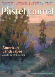
Pastel Journal December 2011 Sample - Artist's Network
Pastel Journal December 2011 Sample - Artist's Network
Pastel Journal December 2011 Sample - Artist's Network
- No tags were found...

You also want an ePaper? Increase the reach of your titles
YUMPU automatically turns print PDFs into web optimized ePapers that Google loves.
A crucial lesson in value helpedBarbara Courtney Jaenicke movebeyond theory to an interpretative,more expressive approach to color.BY DEBORAH SECORawakening36 The <strong>Pastel</strong> <strong>Journal</strong> • <strong>December</strong> <strong>2011</strong>
Early Morning Reflections (20x30)<strong>December</strong> <strong>2011</strong> • www.pasteljournal.com 37
UPON SEEING THE DELICATELYcrafted color in the rolling hills and softlyshadowed trees of a Barbara CourtneyJaenicke landscape, you might identify theartist a “natural talent,” but the artist woulddisagree. “Color wasn’t always intuitive forme,” she says. “I had to really study howit worked, and then I had to move beyondapplying the principles of color theory onlyto local color.” Over the years, Jaenicke hasspent a lot of time examining the work ofother artists she admires, searching for theirsecrets to a more interpretive approach. Notsurprisingly, then, she delights when othersdescribe her work as emotionally striking.“I don’t think I have inborn artistic talent,”Jaenicke says. “It’s a skill that I’ve developedwith a nose-to-the-grindstone vengeance.”Necessary ObsessionJaenicke describes her relationship with artas an obsession. She always knew she’d be anartist, although at first she headed into theworld of advertising as an art director. But inReference photoStretching ColorAfter having awakened to the possibilitiesof interpretive color, Barbara Jaenicke nolonger seeks to copy local color. A comparisonof the reference photo for QuietMorning By the River and the finished piece,which she painted on location, demonstrateshow the artist took liberties in hercolor selections to create a meaningfulexpression of the scene. “Most of the yearhere in Georgia, we have an enormousamount of green to work with when painting the landscape,”Jaenicke says. “ This is something most people love about theSoutheast. I, however, don’t like the color green enough tofeature that much of it in my landscapes. It became motivationfor a more interpretive use of color.”Quiet Morning by the River (12x9)38 The <strong>Pastel</strong> <strong>Journal</strong> • <strong>December</strong> <strong>2011</strong>
up with her art journals and books. “It’s likesitting down with friends to see how they’veapproached similar subject matter,” she says.She’s learned that often the paintings thatvisually grab her are the ones that possessparticularly strong contrasting color combinations,“like striking shades of vibrantcolors contrasted against muted grays,” shesays. “My favorite paintings have nice harmonythroughout, a balance of warms andcools, and often use good transitions, placinga particular color between two others, such asalong the edge of a shadow—between it and ahighlighted area.”Jaenicke points to the color sense of artistSusan Ogilvie (see pages 26-27) as havingbeen particularly instructive. “At one time Iwent through a phase when I tried to increasethe color temperature I used in my paintings,”Jaenicke says, “but after awhile I learned thatvibrant colors need to be balanced with moresubdued ones. That was the time when mypaintings seemed to require sunglasses, but anice set of Terry Ludwig grays helped me outwith that. When I learned to save the brightsand use muted colors first, I found the saturatedcolors had more impact. They direct theeye around the painting.”Puzzling It OutAs an art student, Jaenicke hated taking timefor thumbnails; now she finds it an essentialfirst step. “I remember not really understandingthe goal of thumbnails. Why draw itsmall and then just draw it all over again?”she says. “But as an art director, designingads back in the 1980s before computers, weused tracing paper to quickly design andmake adjustments, and I’ve come to like thatapproach for my thumbnails.”Today she prints out her reference photo(at about 4x6 inches) on high-quality whiteprinter paper and then puts tracing paper ontop to redraw the elements. “I can quicklysee the overall impact,” she says, “whetherit helps to make the horizon lower or higher,or helps to change a vertical to horizontal.Quiet Stream at Sunrise (12x14)Reference photo and thumbnailThumbnail SolutionsMaking a thumbnail, says Barbara Jaenicke, “is a bit like solvinga puzzle. My goal is to map out the placement of each major shapeand decide where the focal point will be.” She does this quicklyby laying tracing paper (with the outer “frame” already markedin proportion to the size of the painting) over her referencephoto. “I move the tracing paper over the photo so each elementis placed exactly where I want it,” she says. She marks the centerpoint on each of the four sides of the sketch to avoid placing anoticeable shape or line directly in the center. Then, using the ruleof thirds, she decides where her focal point will be.“Sometimes it’s simply a matter of shifting some of the shapeshere and there to place them nicely in the composition,” Jaenickesays. “But if I’m unsure about the composition, or just wantto explore ideas—such as a vertical versus horizontal format—this process allows me to quickly and easily envision thoseoptions.” Marking where key lines intersect the outer framehelps the artist quickly and accurately size up the thumbnailto her painting surface.<strong>December</strong> <strong>2011</strong> • www.pasteljournal.com 41
It’s a bit like working a Rubik’s Cube; youshift parts over and over until all the piecesfit together nicely. I find it’s an easy way toquickly see all my options.” (See “ThumbnailSolutions” on page 41.)The thumbnail process also helps the artistto interpret the photo, rather than copy it.“I’ve found that some of my more successfulpaintings were from photos that needed lotsof help during the thumbnail process, forcingme to use more of my own artistic visionto create a piece of artwork instead of a directcopy of the photograph,” says Jaenicke. “NowI actually enjoy making thumbnails.”Barbara Courtney Jaenicke (www.barbarajaenicke.com) earned a B.A. in art and advertisingdesign at The College of New Jersey and workedin advertising and marketing communicationsbefore focusing on fine art. She has studiedwith pastel artists Susan Ogilvie, Albert Handelland Duane Wakeham, among others. Her work,which has appeared in numerous exhibitions,has received several awards including theConnecticut <strong>Pastel</strong> Society Award in the <strong>Pastel</strong>Society of America’s 38th Annual <strong>Pastel</strong>s Onlyexhibition and an honorable mention in the12th <strong>Pastel</strong> 100 competition. She lives in Roswell,Ga., with her husband and son.This crucial first step launches virtuallyevery painting. “Even when working en pleinair, I do a quick thumbnail in a tiny sketchpadjust to see where my main shapes will beplaced within the four borders of the painting,”she notes. “On location there can be somuch pressure. I know things will go betterif I think ahead and plan. I draw out smallrectangular boxes in my little plein air sketchpad ahead of time, using a proportionalwheel to make it easy and be sure they’re inproportion to the size of the board I intendto use. I then set my ViewCatcher so I knowthe proportions will match.”Preparation and ProcessJaenicke currently prefers to work on Gatorboardthat she prepares with Golden’s FinePumice Gel. First she tones the board usingliquid acrylic paints, in order to allow a colorto pop through from beneath, most of thetime choosing a warm color, medium-darkin value. She brushes the pumice gel overthis tone, experimenting with various thicknessesto allow more or less of the brushtexture to remain apparent. “I can put the gelon really thickly or thinly, making it morewatery and smooth,” she says. “I apply itusing random strokes, brushing in differentdirections to give it an oil painting texture.”Occasionally she prefers to paint on a whitegessoed panel coated with the pumice gel.42 The <strong>Pastel</strong> <strong>Journal</strong> • <strong>December</strong> <strong>2011</strong>
She’ll roughly lay in pastel colors, over whichshe’ll brush Turpenoid or alcohol to makean underpainting.With the ground prepared, Jaenickebegins lightly with Nupastels, followed primarilyby softer pastels such as Unison, TerryLudwig or Schmincke. “I avoid caking it on,”she says. “I put in very dark values becauseI can layer over them with strong dark colors,but I also add some of my light values. If Igo to the lightest lights too quickly the colorcan get chalky, but I want to view the wholevalue range right away.” She avoids using thelightest of the light values, however, until thevery end, which gives her more informationwhen pushing the brightest highlight areas.“I also try to avoid using too many highlysaturated colors until later in the process,allowing them to pop out among the moremuted values, and to be sure I don’t overusebright colors,” she says.Teaching and PersistenceAt her home studio in Roswell, Ga., Jaenickehosts weekly classes for a few students, aswell as workshops and classes throughoutthe Atlanta area. “I try to help my studentsunderstand what I see,” she says. Sometimesshe uses magazines in the classroom to illustratewhat other artists have done successfully.“Now when I look in my copies of The <strong>Pastel</strong><strong>Journal</strong> from years ago,” she says, “I see thingsI missed before. Teaching forces you to analyzethis way. I believe that artists who have toreally work at learning and struggle to figureout what makes a really good painting tendto be effective instructors. I very much enjoyteaching, and I fall into the category of artistswho learned the hard, painstaking way.”Knowing this, Jaenicke is determined toencourage others to persevere. “Learning topaint is a process that takes years, one paintingat a time, not simply learning a particularmagical technique,” she says. “Once I figuredthat out, I relaxed and enjoyed the processmuch more. I no longer look at a failed paintingas a waste of time or materials, but asmuch needed practice time.”With an active 7-year-old boy at home,Jaenicke has to carefully arrange her paintingand teaching time, but her obsession withpainting remains. “The gift I have is the passion,”she says. “I can’t imagine not giving itmy all and taking it as far as possible.”<strong>Pastel</strong> artist Deborah Secor (www.deborahsecor.com) is a longtimecontributing writer for The <strong>Pastel</strong> <strong>Journal</strong>. She is currently on the rosterof art professionals offering individual critiques for Artist’s <strong>Network</strong>Critiques (www.artistsnetwork.com/artists-network-critiques).Aspen Road at Sunset(far left; 9x12)To the Chattahoochee(center; 12x16)Across the Field(above; 16x12)To see more paintings by the artist, visit www.artistsnetwork.com/medium/pastel/barbara-jaenicke-gallery.<strong>December</strong> <strong>2011</strong> • www.pasteljournal.com 43
Did you enjoythis article?Order the entire issue, available in print ordigital format, at northlightshop.com.Get the bestart instruction all year long!Subscribe to The Artist’sMagazine for one yearfor $21—a savings of63% off the newsstand price!As a Bonus, get anothergreat art magazineat a discounted price:• one year of Watercolor Artistfor just $10 more—a savings of72% off the newsstand price!• OR one year of <strong>Pastel</strong> <strong>Journal</strong>for just $16 more—a savingsof 65% off the newsstand price!Subscribe today at http://artpubs.artistsmagazine.com.All media, collageand illustrationwww.artistsmagazine.comWatercolor, acrylic andmixed watermediawww.watercolorartistmagazine.com<strong>Pastel</strong> and pastelmixed mediawww.pasteljournal.com
Ideas. Instruction. Inspiration.The Artist’s MagazineWatercolor Artist<strong>Pastel</strong> <strong>Journal</strong>Visit www.artistsnetwork.com/magazines to subscribe to the bestin art instruction magazines.Receive a FREE downloadable issue of The Artist’s Magazine when you sign upfor our free newsletter at www.artistsnetwork.com/newsletter_thanksFind these and other best-selling North Light fine artbooks & DVDs at www.northlightshop.comCheck out our great online communities atwww.wetcanvas.com and www.artistsnetwork.com
Top resources for artistsMake money selling your art!ArtistsMarketOnline.com gives you the resources to makeit possible.3 Features over 2,000 listings of where to sell your art– updated weekly3 Track your submissions and manage your contacts3 Advice and inspiration from experts and so much moreJoin us now for as little as $1.67 a month!Where & how to sell what you create.BuildingArt Careersfor Over35 Years!Try it FREE for a week!Visit ArtistsMarketOnline.com for more information.Brought to you by the Publishers of North Light Books & The Artist’s MagazineLearn from the best artistswith video workshops in your home!Front row instruction,anytime you want!3 Subscriptions now available by medium3 Over 80 workshops to choose from3 Features a variety of media & skill levels3 Convenient – watch what you want, when you want3 Preview every video free – before you buy3 New videos added every weekDozens of Popular Artists including RichardMcKinley, Lee Hammond, Nancy Reyner, Charles Reidand so many more!Visit www.artistsnetwork.tv for the best art instruction videos.Painting Oil Portraits inWarm Lightwith Chris SaperFrom the Publishers of North Light Booksnorth lightB r i n g i n g A r t t o L i f e