Perfection in color meets perfection in paint. - Pantone
Perfection in color meets perfection in paint. - Pantone
Perfection in color meets perfection in paint. - Pantone
You also want an ePaper? Increase the reach of your titles
YUMPU automatically turns print PDFs into web optimized ePapers that Google loves.
<strong>Perfection</strong> <strong>in</strong> <strong>color</strong> <strong>meets</strong> <strong>perfection</strong> <strong>in</strong> pa<strong>in</strong>t.
Inspir<strong>in</strong>g the World’s Color Palette<br />
with Pa<strong>in</strong>t.<br />
In the ever-evolv<strong>in</strong>g world of trends, it’s important to update and<br />
modernize your th<strong>in</strong>k<strong>in</strong>g and to look at <strong>color</strong> and styl<strong>in</strong>g <strong>in</strong>fluence<br />
through “modern-eyes.” As ever, <strong>color</strong>s for <strong>in</strong>teriors are <strong>in</strong>fluenced<br />
by <strong>color</strong> directions <strong>in</strong> fashion, pop culture, <strong>in</strong>ternational affairs,<br />
social issues and the world of enterta<strong>in</strong>ment. From casual or<br />
eclectic to stunn<strong>in</strong>gly modern, the over 3,000 shades <strong>in</strong> the<br />
PANTONE Palettes reflect a variety of design styles, play styles and<br />
comfort levels. The three pa<strong>in</strong>t palettes highlighted <strong>in</strong> this brochure<br />
are examples of how <strong>Pantone</strong>, Inc. can help express the wide range<br />
of <strong>color</strong>s that speak to today’s culture. Simply choose the <strong>color</strong><br />
comb<strong>in</strong>ations that resonate, allow<strong>in</strong>g you to best convey your<br />
<strong>in</strong>dividual taste and sensibilities.<br />
Silver Blue / PANTONE 16-4706<br />
Deep Mahogany / PANTONE 19-1420<br />
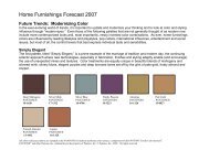
simply elegant<br />
Where traditional taste melds<br />
with contemporary sensibilities,<br />
rich tones make a seamless<br />
connection.<br />
The first palette, titled “Simply Elegant,”<br />
is a prime example of the marriage of<br />
tradition and modern day, the cont<strong>in</strong>u<strong>in</strong>g<br />
eclectic approach where new technologies,<br />
especially <strong>in</strong> fabrication, f<strong>in</strong>ishes and<br />
styl<strong>in</strong>g adeptly enable (and encourage)<br />
the use of unexpected mixes and textures.<br />
Color treatments are equally unique <strong>in</strong><br />
beautiful blends of mahogany and silvered<br />
m<strong>in</strong>k, silvery blues, elegant purples and<br />
deep bronzed tones set off by the gl<strong>in</strong>t of<br />
pale gold, frosty almond and copper.<br />
For design tips us<strong>in</strong>g these <strong>color</strong>s,<br />
please visit pantonepa<strong>in</strong>t.com.<br />
Silver M<strong>in</strong>k / PANTONE 17-1312<br />
Copper / PANTONE 16-1325<br />
www.PeterRymwid.com
Air Blue / PANTONE 15-4319<br />
Snow White / PANTONE 11-0602<br />
Pesto / PANTONE 18-0228<br />
Keith Scott Morton<br />
Green Sheen / PANTONE 13-0648<br />
fresh air<br />
No matter what the season, <strong>in</strong>fuse<br />
the atmosphere with the sooth<strong>in</strong>g<br />
<strong>color</strong>s of spr<strong>in</strong>gtime.<br />
The dictionary def<strong>in</strong>es someth<strong>in</strong>g fresh as<br />
that which is “refresh<strong>in</strong>gly different from<br />
what has been done previously.” Certa<strong>in</strong>ly<br />
the spontaneity of the stylized designs and<br />
f<strong>in</strong>ishes mixed <strong>in</strong>to this palette is truly like<br />
a breath of “fresh air,” where woven tw<strong>in</strong>es<br />
may meet with metallic sheens and smooth<br />
res<strong>in</strong>s are coupled with textured leathers.<br />
Color comb<strong>in</strong>ations are equally <strong>in</strong>ventive,<br />
for example, green pesto, vibrant yellow<br />
and yellow-greens comb<strong>in</strong><strong>in</strong>g artfully with<br />
cyclamen p<strong>in</strong>k, purples and violets, sky<br />
blues and snow whites.<br />
For design tips us<strong>in</strong>g these <strong>color</strong>s,<br />
please visit pantonepa<strong>in</strong>t.com.<br />
mélange<br />
Friendly, warm<strong>in</strong>g, nurtur<strong>in</strong>g hues<br />
<strong>in</strong>vite you to enjoy the<br />
convivial atmosphere.<br />
Flavored by melon, apricot, strawberry<br />
and orange, Mélange is an assortment<br />
of tantaliz<strong>in</strong>g shades guaranteed to<br />
stimulate the visual appetite. In addition<br />
to the warm fruit flavors, and feed<strong>in</strong>g the<br />
need for fresh, vital comb<strong>in</strong>ations, there<br />
is a toasty tan, a vibrant poppy red,<br />
a vivacious yellow — all well-grounded<br />
by a balanc<strong>in</strong>g blue and a rustic khaki.<br />
For design tips us<strong>in</strong>g these <strong>color</strong>s,<br />
please visit pantonepa<strong>in</strong>t.com.<br />
www.PeterRymwid.com<br />
Apricot / PANTONE 15-1153<br />
Flame / PANTONE 17-1462<br />
Poppy Red / PANTONE 17-1664<br />
Freesia / PANTONE 14-0852
Color Confidence from Inspiration<br />
to Application.<br />
For over 40 years, <strong>Pantone</strong>, Inc. has been the global<br />
provider of professional <strong>color</strong> standards and a source of<br />
<strong>in</strong>spiration for those work<strong>in</strong>g <strong>in</strong> the design community<br />
worldwide. Our wide rang<strong>in</strong>g <strong>color</strong> palette is used by design<br />
professionals <strong>in</strong>ternationally to access <strong>color</strong> trends,<br />
communicate <strong>color</strong> choices and control consistency<br />
of <strong>color</strong> across every imag<strong>in</strong>able surface, texture,<br />
material and f<strong>in</strong>ish.<br />
The Color System that Covers the<br />
World Now Covers Your Walls.<br />
Through a relationship with F<strong>in</strong>e Pa<strong>in</strong>ts of Europe,<br />
designers, architects and discern<strong>in</strong>g homeowners can<br />
now confidently specify and match <strong>Pantone</strong>’s <strong>color</strong><br />
standards <strong>in</strong> pa<strong>in</strong>t.<br />
Now Pa<strong>in</strong>t and Color Speak the<br />
Same Language.<br />
Quick dry<strong>in</strong>g, easy-to-apply and eco-friendly, PANTONEmatched<br />
pa<strong>in</strong>ts from F<strong>in</strong>e Pa<strong>in</strong>ts of Europe represent the<br />
p<strong>in</strong>nacle of the Dutch art of pa<strong>in</strong>t mak<strong>in</strong>g. These real Dutch<br />
pa<strong>in</strong>ts are richly laden with the f<strong>in</strong>est pigments, oils and<br />
res<strong>in</strong>s, and are t<strong>in</strong>ted with a unique proprietary system<br />
employ<strong>in</strong>g two separate dispens<strong>in</strong>g systems, one for waterbased<br />
acrylic pa<strong>in</strong>ts and one for traditional, oil-based<br />
pa<strong>in</strong>ts. By utiliz<strong>in</strong>g these product-specific <strong>color</strong>ants,<br />
the F<strong>in</strong>e Pa<strong>in</strong>ts of Europe T<strong>in</strong>t<strong>in</strong>g System provides superior<br />
<strong>color</strong> accuracy, enhanced <strong>color</strong> depth, and excellent<br />
coverage for long-last<strong>in</strong>g value. F<strong>in</strong>e Pa<strong>in</strong>ts of Europe<br />
is the only pa<strong>in</strong>t company authorized by <strong>Pantone</strong>, Inc. to<br />
match pa<strong>in</strong>t <strong>in</strong> PANTONE Colors.<br />
Every Designer’s Life Just Got<br />
Easier.<br />
Whether you are a design professional look<strong>in</strong>g to<br />
<strong>in</strong>corporate brand identity standards and easily coord<strong>in</strong>ate<br />
multiple materials such as fabrics, furnish<strong>in</strong>gs, carpets and<br />
pa<strong>in</strong>t for <strong>in</strong>terior design projects, or a savvy consumer<br />
look<strong>in</strong>g for the right <strong>color</strong> for your home, <strong>Pantone</strong> has the<br />
<strong>color</strong>s you want. And as our portable guide is chromatically<br />
arranged by <strong>color</strong> family, you will be able to easily locate<br />
the shade you are seek<strong>in</strong>g.<br />
So, imag<strong>in</strong>e your life <strong>in</strong> <strong>color</strong> and set your creativity free.<br />
Great Design is<br />
Now as Easy as<br />
Pa<strong>in</strong>t by Numbers<br />
Interior / Exterior<br />
Traditional oil<br />
High-performance, mar<strong>in</strong>e quality alkyd<br />
enamel suitable for <strong>in</strong>terior and exterior<br />
use. Heavily pigmented formulation<br />
provides superior hid<strong>in</strong>g power and resists<br />
fad<strong>in</strong>g. Suitable for any properly primed<br />
<strong>in</strong>terior or exterior surface – wood, plaster,<br />
wallboard, metals and plastics. Available <strong>in</strong><br />
Brilliant and Sat<strong>in</strong> f<strong>in</strong>ishes; over 3,000<br />
PANTONE Colors and custom t<strong>in</strong>ts.<br />
Hollandlac Sat<strong>in</strong><br />
Applications: Walls, ceil<strong>in</strong>gs, doors, trim<br />
rail<strong>in</strong>gs, baseboard, mold<strong>in</strong>gs, cab<strong>in</strong>ets,<br />
furniture and w<strong>in</strong>dows.<br />
Hollandlac Brilliant<br />
Applications: W<strong>in</strong>dows, doors, floors, trim,<br />
rail<strong>in</strong>g, cab<strong>in</strong>ets, wa<strong>in</strong>scott<strong>in</strong>g, furniture,<br />
mach<strong>in</strong>ery, exterior architectural facades,<br />
shutters, garden furniture, gazebos, trellises,<br />
wooden and wrought iron, fences, exterior<br />
decks, porches and boats.<br />
Color Cue ® 2<br />
Capture your <strong>in</strong>spiration. Click on any<br />
surface or material and easily cross-match<br />
it to the closest <strong>color</strong> from our PANTONE<br />
PAINTS + INTERIORS or PANTONE<br />
MATCHING SYSTEM ® Color Palettes.<br />
With over 3,000 designer <strong>color</strong>s to choose from, the new PANTONE —<br />
matched pa<strong>in</strong>ts yield the depth and vibrancy of <strong>color</strong> to dramatically enhance<br />
any environment.<br />
Interior Acrylic<br />
High performance, odorless, scrubbable,<br />
quick dry<strong>in</strong>g <strong>in</strong>terior pa<strong>in</strong>t. Easily applied<br />
by homeowner or professional. Comb<strong>in</strong>es<br />
beauty and longevity <strong>in</strong> a state-of-the-art<br />
formulation. Cleans up with water,<br />
environmentally friendly. Low VOC.<br />
Available <strong>in</strong> matte, sat<strong>in</strong> and gloss<br />
f<strong>in</strong>ishes. Over 3,000 PANTONE Colors<br />
and custom t<strong>in</strong>ts.<br />
Eurolux Matte<br />
Applications: Preferred by most clients for<br />
walls and ceil<strong>in</strong>gs.<br />
Eurolux Sat<strong>in</strong><br />
Applications: Walls, ceil<strong>in</strong>gs or any other<br />
surface on which a durable, sat<strong>in</strong>, easily<br />
ma<strong>in</strong>ta<strong>in</strong>ed surface is required.<br />
Eurolux Gloss<br />
Applications: Primarily for doors, trim<br />
cab<strong>in</strong>ets and w<strong>in</strong>dows, but may be used<br />
effectively on walls and ceil<strong>in</strong>gs when a<br />
gloss f<strong>in</strong>ish is desired.<br />
PAINTS + INTERIORS <strong>color</strong> guide<br />
Chromatically arranged by <strong>color</strong> family, <strong>color</strong>on-paper<br />
fan deck is designed for portable<br />
use. Each <strong>color</strong> is numerically referenced and<br />
has an <strong>in</strong>spirational <strong>color</strong> name. Perfect for<br />
select<strong>in</strong>g pa<strong>in</strong>t choices, as well as specify<strong>in</strong>g,<br />
match<strong>in</strong>g and coord<strong>in</strong>at<strong>in</strong>g all of your <strong>color</strong><br />
choices from pa<strong>in</strong>ts and fabrics to furniture<br />
and floor cover<strong>in</strong>gs.<br />
Interior / Exterior<br />
Waterborne<br />
Advanced water and oil formulation<br />
pa<strong>in</strong>t suitable for <strong>in</strong>terior and exterior<br />
use on woodwork and other “non-wall<br />
elements.” “Hybrid” formulation yields<br />
best attributes of both traditional solvent<br />
borne and modern waterborne coat<strong>in</strong>gs.<br />
Easily applied by homeowner or<br />
professional. Odorless, cleans up with<br />
water, environmentally friendly – low<br />
VOC. Available <strong>in</strong> Brilliant and Sat<strong>in</strong><br />
f<strong>in</strong>ishes; over 3,000 PANTONE Colors<br />
and custom t<strong>in</strong>ts.<br />
Eco Brilliant<br />
Applications: W<strong>in</strong>dows, doors, trim,<br />
cab<strong>in</strong>ets, shutters and garden furniture.<br />
Eco Sat<strong>in</strong><br />
Applications: W<strong>in</strong>dows, doors, trim,<br />
cab<strong>in</strong>ets, shutters and garden furniture.<br />
PAINTS + INTERIORS <strong>color</strong> specifier<br />
Six larger sized tear-out chips perforated<br />
for easy removal. Chips can be used to<br />
communicate <strong>color</strong> choices, develop <strong>color</strong><br />
palettes or attach to draw<strong>in</strong>gs and submittals.<br />
PAINTS + INTERIORS <strong>color</strong> chooser<br />
An easy way to <strong>in</strong>tegrate the PANTONE<br />
PAINTS + INTERIORS <strong>color</strong> palette <strong>in</strong>to<br />
your design software programs.
For over 40 years, <strong>Pantone</strong> has been the global<br />
provider of professional <strong>color</strong> standards and a source<br />
of <strong>in</strong>spiration for those work<strong>in</strong>g <strong>in</strong> the design community.<br />
And now through our partnership with F<strong>in</strong>e Pa<strong>in</strong>ts of<br />
Europe, we can make your life easier by match<strong>in</strong>g your<br />
favorite PANTONE Colors <strong>in</strong> pa<strong>in</strong>t. Quick dry<strong>in</strong>g, easy-<br />
to-apply and eco-friendly, PANTONE-matched pa<strong>in</strong>ts<br />
from F<strong>in</strong>e Pa<strong>in</strong>ts of Europe represent the p<strong>in</strong>nacle of the<br />
Dutch art of pa<strong>in</strong>t mak<strong>in</strong>g. So now the <strong>color</strong> system that<br />
covers the world can cover your walls. You couldn’t<br />
design a better match.<br />
pantonepa<strong>in</strong>t.com<br />
Visit our site to f<strong>in</strong>d your local authorized PANTONE Pa<strong>in</strong>t retailer,<br />
take advantage of our helpful <strong>color</strong> tools and discover the latest<br />
<strong>color</strong> trends. If there is not yet a PANTONE Retailer <strong>in</strong> your community,<br />
please place pa<strong>in</strong>t orders at pantonepa<strong>in</strong>t.com or call 866.MYCOLOR<br />
for prompt delivery to home or work site.<br />
PANTONE Colors displayed here may not match PANTONE-identified standards. Consult current<br />
PANTONE PAINTS + INTERIORS <strong>color</strong> system publications for accurate <strong>color</strong>. Eurolux, Eco,<br />
Hollandlac, F<strong>in</strong>e Pa<strong>in</strong>ts of Europe and other F<strong>in</strong>e Pa<strong>in</strong>ts of Europe, Inc. trademarks, registered<br />
trademarks and/or service are property of F<strong>in</strong>e Pa<strong>in</strong>ts of Europe, Inc. Trend content provided by<br />
Leatrice Eiseman, executive director of the <strong>Pantone</strong> Color Institute ® . PANTONE ® and other<br />
<strong>Pantone</strong>, Inc. trademarks are the property of <strong>Pantone</strong>, Inc. © <strong>Pantone</strong>, Inc., 2006. All rights<br />
reserved.


