You also want an ePaper? Increase the reach of your titles
YUMPU automatically turns print PDFs into web optimized ePapers that Google loves.
12 Defining styles<br />
Since the integration of METAPOST into CONTEXT, a complete new range of layout fetaures became available.<br />
In this document we have introduced several ways to include graphics in your document definition. In this<br />
chapter we go one step further and make dynamic graphics part of a document style.<br />
12.1 Adaptive buttons<br />
14<br />
So far we have seen a lot of graphic ingredients that you can use to make your documents more<br />
attractive. In this chapter we will define a simple document style. This style was written for the<br />
PDFTEX presentations at the TUG 2000 conference in Oxford (UK).<br />
This style exploits a few tricks, like graphics calculated using positional information. It also<br />
demonstrates how you can make menu buttons that dynamically adapt their shapes to the rest<br />
of the page layout.<br />
A Few Nice Quotes<br />
A Simple Style Demo<br />
Hans Hagen, August 2000<br />
Douglas R.<br />
Hofstadter<br />
Donald<br />
E. Knuth<br />
Edward<br />
R. Tufte<br />
Hermann<br />
Zapf<br />
close<br />
Douglas R. Hofstadter<br />
Donald Knuth has spent the past several years working on a system allowing<br />
him to control many aspects of the design of his forthcoming books.from the<br />
typesetting and layout down to the very shapes of the letters! Seldom has an<br />
author had anything remotely like this power to control the final appearance of<br />
his or her work. Knuth's TEX typesetting system has become well-known and<br />
available in many countries around the world. By contrast, his METAFONT<br />
system for designing families of typefaces has not become as well known or<br />
available.<br />
In his article “The Concept of a Meta-Font”, Knuth sets forth for the first time<br />
the underlying philosophy of METAFONT, as well as some of its products. Not<br />
only is the concept exiting and clearly well executed, but in my opinion the<br />
article is charmingly written as well. However, despite my overall enthusiasm<br />
for Knuth's idea and article, there are some points in it that I feel might be<br />
taken wrongly by many readers, and since they are points that touch close to my<br />
deepest interests in artificial intelligence and esthetic theory, I felt compelled<br />
to make some comments to clarify certain important issues raised by “The<br />
Concept of a Meta-Font”.<br />
Douglas R.<br />
Hofstadter<br />
Donald<br />
E. Knuth<br />
Edward<br />
R. Tufte<br />
Hermann<br />
Zapf<br />
close<br />
Donald E. Knuth<br />
Thus, I came to the conclusion that the designer of a new system must not<br />
only be the implementer and first large--scale user; the designer should also<br />
write the first user manual.<br />
The separation of any of these four components would have hurt TEX significantly.<br />
If I had not participated fully in all these activities, literally hundreds<br />
of improvements would never have been made, because I would never have<br />
thought of them or perceived why they were important.<br />
But a system cannot be successful if it is too strongly influenced by a single<br />
person. Once the initial design is complete and fairly robust, the real test begins<br />
as people with many different viewpoints undertake their own experiments.<br />
Douglas R.<br />
Hofstadter<br />
Donald<br />
E. Knuth<br />
Edward<br />
R. Tufte<br />
Hermann<br />
Zapf<br />
Adaptive buttons Defining styles<br />
close<br />
Edward R. Tufte<br />
We thrive in information--thick worlds because of our marvelous and everyday<br />
capacity to select, edit, single out, structure, highlight, group, pair, merge,<br />
harmonize, synthesize, focus, organize, condense, reduce, boil down, choose,<br />
categorize, catalog, classify, list, abstract, scan, look into, idealize, isolate,<br />
discriminate, distinguish, screen, pigeonhole, pick over, sort, integrate, blend,<br />
inspect, filter, lump, skip, smooth, chunk, average, approximate, cluster, aggregate,<br />
outline, summarize, itemize, review, dip into, flip through, browse,<br />
glance into, leaf through, skim, refine, enumerate, glean, synopsize, winnow<br />
the wheat from the chaff and separate the sheep from the goats.<br />
Douglas R.<br />
Hofstadter<br />
Donald<br />
E. Knuth<br />
Edward<br />
R. Tufte<br />
Hermann<br />
Zapf<br />
close<br />
Hermann Zapf<br />
Coming back to the use of typefaces in electronic publishing: many of the<br />
new typographers receive their knowledge and information about the rules of<br />
typography from books, from computer magazines or the instruction manuals<br />
which they get with the purchase of a PC or software. There is not so much<br />
basic instruction, as of now, as there was in the old days, showing the differences<br />
between good and bad typographic design. Many people are just fascinated by<br />
their PC's tricks, and think that a widely--praised program, called up on the<br />
screen, will make everything automatic from now on.<br />
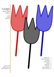
page 1 page 2 page 3 page 4 page 5<br />
Later we will see an instance with some more randomness in the graphics. While writing this<br />
style, the random alternative made me think of those organic buildings with non equal windows<br />
—we have a few of those in The Netherlands—, so I decided to label this style as pre-organic. If<br />
you use CONTEXT, you can load this style with:<br />
\usemodule[pre-organic]<br />
At the end of this file, there is a small test file, so when you process the file s-pre-19.tex 14 with<br />
the options --mode=demo and --pdf, you will get a demo document.<br />
We use one of the standard screen ‘paper' sizes, and map it onto the same size, so that we get a<br />
nicely cropped page. Other screen sizes are S4 and S5.<br />
\setuppapersize[S6][S6]<br />
Like in this METAFUN manual, we use the Palatino as main bodyfont. This font is quite readable<br />
on even low resolution screens, although I admit that this style is developed using an 1400 × 1050<br />
pixel LCD screen, so the author may be a little biased.<br />
\setupbodyfont[ppl]<br />
The layout specification sets up a text area and a right edge area where the menus will go (see<br />
chapter 6 for a more in depth discussion on the layout areas). Watch how we use a rather large<br />
This style is the 19 th presentation style. Those numbered styles are internally mapped onto more meaningful names like<br />
in this case pre-organic.<br />
Douglas R.<br />
Hofstadter<br />
Donald<br />
E. Knuth<br />
Edward<br />
R. Tufte<br />
Hermann<br />
Zapf<br />
close<br />
261