
Create successful ePaper yourself
Turn your PDF publications into a flip-book with our unique Google optimized e-Paper software.
168<br />
8 8<br />
8<br />
Edward R. Tufte<br />
We thrive in information--thick worlds because of our marvelous and everyday capacity to select,<br />
edit, single out, structure, highlight, group, pair, merge, harmonize, synthesize, focus, organize,<br />
condense, reduce, boil down, choose, categorize, catalog, classify, list, abstract, scan, look into,<br />
idealize, isolate, discriminate, distinguish, screen, pigeonhole, pick over, sort, integrate, blend,<br />
inspect, filter, lump, skip, smooth, chunk, average, approximate, cluster, aggregate, outline, summarize,<br />
itemize, review, dip into, flip through, browse, glance into, leaf through, skim, refine,<br />
enumerate, glean, synopsize, winnow the wheat from the chaff and separate the sheep from the<br />
goats.<br />
Donald E. Knuth<br />
Thus, I came to the conclusion that the designer of a new system must not only be the implementer<br />
and first large--scale user; the designer should also write the first user manual.<br />
The separation of any of these four components would have hurt TEX significantly. If I had not<br />
participated fully in all these activities, literally hundreds of improvements would never have been<br />
made, because I would never have thought of them or perceived why they were important.<br />
But a system cannot be successful if it is too strongly influenced by a single person. Once the initial<br />
design is complete and fairly robust, the real test begins as people with many different viewpoints<br />
undertake their own experiments.<br />
Douglas R. Hostadter<br />
Donald Knuth has spent the past several years working on a system allowing him to control many<br />
aspects of the design of his forthcoming books.from the typesetting and layout down to the very<br />
shapes of the letters! Seldom has an author had anything remotely like this power to control the<br />
final appearance of his or her work. Knuth's TEX typesetting system has become well-known and<br />
available in many countries around the world. By contrast, his METAFONT system for designing<br />
families of typefaces has not become as well known or available.<br />
In his article “The Concept of a Meta-Font”, Knuth sets forth for the first time the underlying<br />
philosophy of METAFONT, as well as some of its products. Not only is the concept exiting and<br />
clearly well executed, but in my opinion the article is charmingly written as well. However, despite<br />
my overall enthusiasm for Knuth's idea and article, there are some points in it that I feel might be<br />
taken wrongly by many readers, and since they are points that touch close to my deepest interests<br />
in artificial intelligence and esthetic theory, I felt compelled to make some comments to clarify<br />
certain important issues raised by “The Concept of a Meta-Font”.<br />
Edward R. Tufte<br />
8 8<br />
9 9<br />
Edward R. Tufte<br />
We thrive in information--thick worlds because of our marvelous and everyday capacity to select,<br />
edit, single out, structure, highlight, group, pair, merge, harmonize, synthesize, focus, organize,<br />
condense, reduce, boil down, choose, categorize, catalog, classify, list, abstract, scan, look into,<br />
idealize, isolate, discriminate, distinguish, screen, pigeonhole, pick over, sort, integrate, blend,<br />
inspect, filter, lump, skip, smooth, chunk, average, approximate, cluster, aggregate, outline, summarize,<br />
itemize, review, dip into, flip through, browse, glance into, leaf through, skim, refine,<br />
enumerate, glean, synopsize, winnow the wheat from the chaff and separate the sheep from the<br />
goats.<br />
Donald E. Knuth<br />
Thus, I came to the conclusion that the designer of a new system must not only be the implementer<br />
and first large--scale user; the designer should also write the first user manual.<br />
The separation of any of these four components would have hurt TEX significantly. If I had not<br />
participated fully in all these activities, literally hundreds of improvements would never have been<br />
made, because I would never have thought of them or perceived why they were important.<br />
But a system cannot be successful if it is too strongly influenced by a single person. Once the initial<br />
design is complete and fairly robust, the real test begins as people with many different viewpoints<br />
undertake their own experiments.<br />
Douglas R. Hostadter<br />
Donald Knuth has spent the past several years working on a system allowing him to control many<br />
aspects of the design of his forthcoming books.from the typesetting and layout down to the very<br />
shapes of the letters! Seldom has an author had anything remotely like this power to control the<br />
final appearance of his or her work. Knuth's TEX typesetting system has become well-known and<br />
available in many countries around the world. By contrast, his METAFONT system for designing<br />
families of typefaces has not become as well known or available.<br />
In his article “The Concept of a Meta-Font”, Knuth sets forth for the first time the underlying<br />
philosophy of METAFONT, as well as some of its products. Not only is the concept exiting and<br />
clearly well executed, but in my opinion the article is charmingly written as well. However, despite<br />
my overall enthusiasm for Knuth's idea and article, there are some points in it that I feel might be<br />
taken wrongly by many readers, and since they are points that touch close to my deepest interests<br />
in artificial intelligence and esthetic theory, I felt compelled to make some comments to clarify<br />
certain important issues raised by “The Concept of a Meta-Font”.<br />
9 9<br />
Page backgrounds Crossing borders<br />
Edward R. Tufte<br />
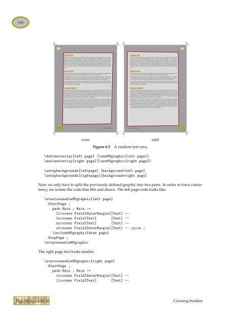
even odd<br />
Figure 6.5 A random text area.<br />
\defineoverlay[left page] [\useMPgraphic{left page}]<br />
\defineoverlay[right page][\useMPgraphic{right page}]<br />
\setupbackgrounds[leftpage] [background=left page]<br />
\setupbackgrounds[rightpage][background=right page]<br />
Now we only have to split the previously defined graphic into two parts. In order to force consistency,<br />
we isolate the code that fills and draws. The left page code looks like:<br />
\startreusableMPgraphic{left page}<br />
StartPage ;<br />
path Main ; Main :=<br />
llcorner Field[OuterMargin][Text] -lrcorner<br />
Field[Text] [Text] -urcorner<br />
Field[Text] [Text] -ulcorner<br />
Field[OuterMargin][Text] -- cycle ;<br />
\includeMPgraphic{draw page}<br />
StopPage ;<br />
\stopreusableMPgraphic<br />
The right page text looks similar:<br />
\startreusableMPgraphic{right page}<br />
StartPage ;<br />
path Main ; Main :=<br />
lrcorner Field[OuterMargin][Text] -llcorner<br />
Field[Text] [Text] --<br />
9