Best Practices.indd - Hablamos Juntos
Best Practices.indd - Hablamos Juntos
Best Practices.indd - Hablamos Juntos

You also want an ePaper? Increase the reach of your titles
YUMPU automatically turns print PDFs into web optimized ePapers that Google loves.
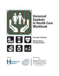
UniversalSymbolsIn Health CareWorkbookExecutive Summary<strong>Best</strong> <strong>Practices</strong>for Sign SystemsProduced byWith support from
CREDITSThis Workbook would not be possible without the followingorganizations, professionals and contributors:OVERALL PROJECT UNDERWRITERS AND ADMINISTRATORSThe Robert Wood Johnson Foundation; <strong>Hablamos</strong> <strong>Juntos</strong> NationalProgram OfficeCONTENTSExecutive Summary 1:1-1:8<strong>Best</strong> Practises for Sign Systems 2:1-2:15Summary of Recommendations 2:16-2:19UNIVERSAL SYMBOLS DESIGN AND TESTINGManaging Design Firm JRC Design, Jamie Cowgill, Jim BolekDesign Team Jack Biesek, Biesek Design; Gladys Brenner, AB Design,Inc.; Meg Faye, FayeWorks Design, LLC; Jamie Cowgill, Jim Bolek,JRC Design; Kate Keating, Kate Keating Associates, Inc.Symbol Testing Consultant Wendy T. Olmstead, Ivy Tech CommunityCollegeSYMBOLS WAYFINDING TESTINGTechnical Advisory Committee Craig Berger, SEGD; John Bosio, Hillier;Dan Clements, Karlsberger Companies; Ken Ethridge AIA RIBA, iZone;David Gibson, Two Twelve Associates; Lance Wyman, Lance WymanLtd; Roger Whitehouse RIBA FSEGD, Whitehouse & CompanyWayfinding Test Design Phil Garvey; Penn State VisualCommunications Research Institute; Craig Berger, SEGDPILOT TESTING SITESSomerville Hospital, Somerville, Massachusetts; Saint Francis MedicalCenter, Grand Island, Nebraska; Grady Memorial Hospital, Atlanta,Georgia; Kaiser Permanente, San Francisco Medical Center, SanFrancisco CaliforniaMANUFACTURERS AND FABRICATORS OF TEST SIGNSAlcan Composites USA Inc; APCO; Poblocki Sign Company; DesignCommunications, Inc.WORKBOOKWriter and Editor Craig Berger, SEGDLayout JRC Design
EXECUTIVE SUMMARYOne of the most important issues facing health care executives today is thedemand for health services from an increasing number of patients with LimitedEnglish Proficiency (LEP). The design community is challenged to developdesign tools and methodologies that will enable access to those with LEP aswell as limited literacy. Universal symbols are an effective key design tool tohelp visitors navigate health facilities. This summary will cover the importanceof universal symbols and the benefits they provide to hospitals and health carefacilities including:• Universal symbols are proven more effective and efficient than otherwayfinding methods.• Patients find symbols are easier to see and understand.• They can be flexible and simple to implement, yet can be integratedinto complex and far reaching sign, print and internet programs.What are Universal Symbols?Long before written language, pictographs (symbols) served as a meansof communication. As societies grew and written languages developed,pictographs were employed to provide information to people who were largelyilliterate. However, pictographs served mainly an informal function until the20th century. When air travel and expanding world immigration increased,universal symbols served as an international communication tool.Designer and researcher, Jim Bolek, describes Universal symbols as a languagethat is “read” by connecting the picture with the viewer’s concept of itsmeaning. Some symbols like an airplane or train can be universally understoodwhile other symbols like a cross or money are subject to the viewer’sinterpretation which is highly influenced by their culture and background.However, either type of symbol can become universally understood after beingwidely used over time.U N I V E R S A L S Y M B O L S I N H E A L T H C A R E | E X E C U T I V E S U M M A R Y1:1
Why Universal Symbols in Hospitals?In hospitals, universal symbols on signs are rare. Alternatives such as the useof identification signs using text, letters, and numbers as well as symbols andlandmarks that are pertinent to a specific hospital, is quite common. Althoughhospital symbols have been developed in countries from India to Australia toArgentina, it was not until recently that universal health care symbols havebecome an important option for wayfinding in North America due to changingAmerican demographics and new health care developments.Terminal 4 at John F. KennedyInternational Airport.Chermayeff and GeismarPhoto by Chermayeff and GeismarSeveral American trends make a case for symbols based wayfinding in health care:• Increased immigration from around the world has dramatically enlargedthe population with Limited English Proficiency (LEP). The Census 2000Supplementary Survey estimates that over 44 million Americans over theage of 5 speak a language other than English at home, and that languageis Spanish for 62% of those 44 million.• Through common use in transportation, parks, and institutional buildings,universal symbols and pictograms have become familiar sights. Since theirdevelopment in the early and mid-1970s, universal symbols have beenused in over 90% of American international airports and most significantlyin large immigrant hubs like New York’s John F. Kennedy Airport.• Resurgent attention to federal and state laws requiring health facilities tomake signage available in the language of their patients as a result of aPresidential Executive Order 13663.• Hospitals are increasingly hiring health interpreters to meet the languageneeds of their LEP patients.• Some hospitals and health care management companieshave developed approaches to assessing wayfindingsystems. These testing projects, promoted byorganizations like the Center for Healthcare Design,have measured the positive effects of efficient andcomprehensive wayfinding systems on the bottom linethrough decreasing staff time used in directing visitorsand greater visitor satisfaction.1:2 E X E C U T I V E S U M M A R Y | U N I V E R S A L S Y M B O L S I N H E A L T H C A R E
The Current Options for Hospital Multilingual Signs and Wayfinding SolutionsHospitals currently use many means to direct hospital patients and visitorsthrough their complex facilities, such as:• Multilingual word signs that contain two or more languages. Multilingualword signs, often with English in larger and bolder print, are frequentlyused for non-English language groups. These are often complex to designand maintain, and pose challenges to adhere to ADA guidelines and toproduce correctly translated signs in multiple languages.• Words, numbers, landmarks, and unique symbols.Designers have ingeniously and successfullyused words, numbers, and floor lines to createsymbols for wayfinding systems that can respondto the language needs of LEP patients. Thesesystems, when used with print, directory, orkiosk backup can be successful within specificenvironments. The unique nature of these systemsrequires significant public education that is nottransferable beyond an individual hospital.• Interpreters. Interpreters can help guide LEPpatients through facilities or provide instructionalsupport at kiosks, but are impractical andexpensive solutions.The Advantages of Universal Health Care SymbolsUniversal symbols have a variety of advantages that make them very attractivein health care settings:• Universal symbols are much easier to implement and maintain thanmultilingual signs. They can be designed without troublesometranslation processes and can be updated and changed with fewmistakes. Translation approaches that utilize software often leadto errors when unusual accent markings or non-Latin letter basedlanguages are used.(Top) A hospital directionalsign in both English andSpanish. Note the diminishedsize of the Spanish text.(Left) Boston Children’sHospital Identification Signusing unique symbols.TwoTwelve DesignAssociates(Right) Kaiser PermanenteNumber symbol sign.Kate Keating DesignPhotos by (Top) Craig Berger, (Left) Kevin Burke, (Right) Kate Keating DesignU N I V E R S A L S Y M B O L S I N H E A L T H C A R E | E X E C U T I V E S U M M A R Y1:3
• Universal symbols are more easily noticed and comprehended comparedto multilingual word signs.• Universal symbols are simpler to integrate into American withDisabilities Act Guidelines because signs can be user-friendly to thevisually impaired due to consistency in size and clarity of configuration.• Universal symbols can be equally successful in simple identificationsigns and complex wayfinding systems. Universal symbols can also beused in combination with numbers and letters to make those systemsmore effective.(Left) Signs with multiplelanguages can be difficult todesign, correct and change.(Middle, Right) Universalsymbols are easier to makeADA accessible.How Were The Universal Health Care Symbols Developed?The development of universal symbols required an extensive design and researchprocess. Funded by The Robert Wood Johnson Foundation and overseen by theNational Program Office of <strong>Hablamos</strong> <strong>Juntos</strong>, the 28 health care symbols weredeveloped by a design team of leading health facility designers led by JRC Designand tested by Wendy T. Olmstead, a top symbols researcher, using testing methodsadopted by the International Organization for Standardization (ISO). Startingwith 600 symbols already in use, the design team created additional symbols foreach of the referent terms. The symbols were tested across four language groups:English, Spanish, Indo-European, and Asian, in ten states. Based upon each round’sresults, symbols were either rejected or accepted and refined for further testing.With an iterative symbol design and testing process, consisting of three roundsPhotos by (Left) Craig Berger, (Middle) Ronald Shakespear, (Right) Craig Berger1:4 E X E C U T I V E S U M M A R Y | U N I V E R S A L S Y M B O L S I N H E A L T H C A R E
of testing and nearly three hundred test subjects, the health care symbolsdeveloped represents one of the most comprehensive symbols design efforts everundertaken.A few of the lessons learned in the symbol design testing process includedfocusing on a limited number of distinct symbols that could be recognizedinstead of a large group of symbols similar in appearance.It was also learned that while some symbols, representingeasy to understand destinations, could be read with fewproblems, other were difficult to comprehend. This isendemic of a lack of understanding of the meaning ofcertain hospital functions by the general population, andbrought to light the need to design symbols for tough tocomprehend destinations as educational tools.Symbol development andtesting.Once developed, a team led by the Society forEnvironmental Graphic Design (SEGD) and the PennsylvaniaState University evaluated the symbols by using them onsigns and print formats in diverse health care settings.They conducted wayfinding exercises with four languagegroups in each facility to compare wayfinding with symbolsversus multilingual word signs. This testing enabled thedesign team to assess the symbols‘ appropriateness amongdifferent cultural groups and the effectiveness of universal symbols in the healthcare environment. Furthermore, focus groups with facility staff enhanced theunderstanding of how symbols could best be implemented in hospital settings.The design and management recommendations included in this workbook arebased on the lessons learned from the observations made during the wayfindingtesting process in the pilot hospitals, matched to examples of best practicesfound in different facilities around the world. The final universal health caresymbols are the product of many contributors and are a testament to a uniqueand extensive open testing process.Photos by (Top) Craig Berger, (Bottom) Phil GarveyU N I V E R S A L S Y M B O L S I N H E A L T H C A R E | E X E C U T I V E S U M M A R Y1:5
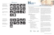
17 SYMBOLS TESTING >87Surgery, Billing Department,Intensive Care Unit, FamilyPractice Clinic,Social ServicesCardiology, Radiology, OBClinic, Immunizations,Waiting RoomChapel, Ambulance Entrance,Pharmacy, Laboratory,Medical RecordsPediatrics, Emergency11 SYMBOLS TESTING ≤87Oncology, Internal Medicine,Diabetes Center, Care StaffArea, MammographyInterpretive Services,Registration, OB/GYN,Physical Therapy, OutpatientInfectious Diseases1:6 E X E C U T I V E S U M M A R Y | U N I V E R S A L S Y M B O L S I N H E A L T H C A R E
Universal Symbols are Effective in HospitalsThe overall conclusion of this work is that universal health care symbols areeffective in hospitals for the following reasons:• Seventeen of the 28 symbols were found to be “most meaningful” byat least 88% of the tested multilingual population group. Thesesymbols represent commonly understood destinations like Radiologyand Pediatrics.• The 11 remaining symbols did not meet the threshold of 88% acceptance.These symbols tended to represent concepts like Oncology and Outpatient.Recognition of these symbols and the meaning behind them will improvewith further use and public education.• During testing, participants walked one foot per second faster to find theirdestination when guided by symbols versus multilingual word signs.• In a test of 86 study participants, only one person felt that word signswere superior to symbol signs, 19 felt symbol and word signs were equallyeffective while 66 stated that symbol signs were more effective.• In a test of 85 study participants, 70 felt that using symbol print supportincreased their ease in finding a destination.• In focus groups of hospital staff, 41 of 49 participants felt that symbolswould facilitate dispensing hospital directions.Identifying destinations withsymbols is a simple first stepto developing and effectivewayfinding system.Universal Health Care Symbol Ingredients for <strong>Best</strong> <strong>Practices</strong>Universal symbols are an exciting design innovation that can improve the healthcare environment. For successful implementation, there is no need to createcomplex systems when four important elements are considered:• Sign Location Identification. The first and most important task in usingsymbols in a hospital is to properly identify visible locations for placement.• Incorporate Wayfinding. A wayfinding program using universal symbols canbe combined with existing wayfinding systems. Symbols can be used withtext or with other symbol support including numbers and letters. Therecan be endless successful creative solutions to designing the optimalwayfinding system.Photo by Craig BergerU N I V E R S A L S Y M B O L S I N H E A L T H C A R E | E X E C U T I V E S U M M A R Y1:7
Massachusetts GeneralHospital has a printprogram that connects to asymbol system in multiplelanguages.TwoTwelve DesignAssociates• Print and Interpretive Media Support. Print support, including handoutsand maps, are an ideal opportunity to deepen the understanding of thesymbols and customize information to respond to diverse languages andpopulation groups.• Establish Staff and Volunteer Support. Symbols are an easy tool forteaching hospital staff and volunteers direction giving skills.FOR MORE INFORMATIONMore workbook informationwill be available as wellas additional tools athablamosjuntos.org orsegd.org.Universal Health Care Symbols Can Be Part of a Successful Health CareWayfinding SystemFor hospital executives and administrators, universal symbols can be a simplerand more flexible way to create a culture of communication and wayfindingamong the entire hospital staff, stretching from the facilities staff andstrategists to the doctors and nurses, interpreters, and volunteers. For architectsand designers of wayfinding systems, universal symbols can be the cornerstoneof creative and unique solutions for a wide variety of health care facilities,while minimizing errors in the implementation and ongoing maintenance of signsystems. For everyone who works in health care environments, universal symbolscan be the key ingredient in satisfying their core health care mission of providingaccess and help to all in need.Photo by Kevin Burke1:8 E X E C U T I V E S U M M A R Y | U N I V E R S A L S Y M B O L S I N H E A L T H C A R E
BEST PRACTICES FOR SYMBOLS IN WAYFINDINGWayfinding is a term that many people associate only with signs, butwayfinding is an overall design philosophy that aids a diverse population toarrive at a destination with ease and comfort. Universal symbols can be a keyfactor in successfully increasing hospital efficiency and visitor satisfaction,and are an essential part of any effective wayfinding strategy.Start Simple but Think “Big Picture”A wayfinding strategy does not need to be implemented completely at onetime. A program can start by identifying key destinations using symbols,and then expand into more complex signs systems and print support.Simultaneously, it is important to ensure that a long range plan is kept inmind, so that symbols will be an integral part of all design decision making.Hiring a Qualified Design FirmWhen it comes to developing a complete new wayfinding sign system in ahospital, it is important to hire a qualified design firm that specializes inplanning, design, and implementation of wayfinding sign systems. Most of thesefirms will have experience working with universal symbols on other projects,but it is crucial to specify the use of universal health care symbols whenselecting a designer for a wayfinding hospital sign project. Universal health caresymbols must play a central role at the onset of the planning process.Steps to Developing a Universal Health Care Symbol Based Wayfinding SystemEven though it is important to work with a qualified design firm when workingon a wayfinding project, it is also important to understand all of the partsinvolved with creating a complete system. Many of these parts extend beyondcreating a sign system, and include architectural and interior elements, printand interactive media, and staff and volunteer training programs. Hospitalexecutives and facilities managers must have an understanding and assumeactive management of all these parts in order to develop a successful andcomplete system.<strong>Best</strong> <strong>Practices</strong> for Symbolsin WayfindingIntroductionPart 1 The Levels ofUniversal HealthCare SymbolsPart 2 Wayfinding ConceptsUsing UniversalHealth Care SymbolsPart 3 The Types andLocations of SymbolSignsPart 4 Symbols and Texton SignsPart 5 Symbol Signs andADAPart 6 Reducing ClutterPart 7 Lighting and Color ofSymbol SignsPart 8 Symbols with Printand InteractiveMediaPart 9 Staff and VolunteerSymbol TrainingSummary ofRecommendationsU N I V E R S A L S Y M B O L S I N H E A L T H C A R E | W O R K B O O K2:1
Part 1: The Levels of Universal Health Care Symbols(Top) Universal Health CareSymbols. (Clockwise)Pharmacy, Laboratory,Cardiology, Medical Records.(Middle) Examples ofsupport symbols. (Clockwise)Elevators, Restaurant,Telephone, Women’s Room.(Bottom) Examples oftertiary symbols. (Clockwise)No Parking, Steep Grade,Roadside Bench, Road Left orForward.It is important to begin any design project using symbols by understanding thetypes of universal symbols available, and where they can be most effectivelyused in a health care facility.Universal Health Care Symbols are graphic representations of language that canbe understood by most people or easily learned. In addition to the 28 universalsymbols designed for hospital functions, there are a number of other symbolsthat can be used in medical facilities.Primary Activity Based SymbolsThese symbols are for people using specific hospital functions and includethe 28 universal health care symbols profiled in this workbook. These symbolsrepresent activities that only exist in hospitals. These symbols are readilyconnected to their associated hospital activity by diverse populations.Sometimes additional support, including printed text, is needed tocommunicate the meaning, especially for specialized hospital functions like adiabetes clinic or cancer (oncology) lab.Secondary Support SymbolsThese symbols are for hospital functions that are universal to most buildingsand are easily recognized. Common secondary support symbols are thoseused for elevators, restrooms, and cafeterias. These symbols need very littleadditional support to be understood. The Federal Highway Administration has asymbol set (available on www.aiga.org) designed for airports and train stationsthat are also commonly used in hospitals and other public buildings.Tertiary Exterior SymbolsThese symbols are part of the landscape outside of the hospital and directdrivers and pedestrians around the building’s exterior. These external symbolsconnect the building to parking and other information. The symbols are easilyread by drivers and pedestrians, need little or no additional support to beunderstood, and are common sights in most cities.2:2 W O R K B O O K | U N I V E R S A L S Y M B O L S I N H E A L T H C A R E
Part 2: Wayfinding Concepts Using Universal Health Care SymbolsEffective wayfinding systems are based on two basic concepts: visibilityand consistency. The signs must be easily visible for people, consistent inheight, and placed in easily observable locations. It is difficult for manyhospitals to achieve this goal because they are often developed over a periodof time and consist of several connected buildings with few landmarks andvisual references. In this environment, successful design is based on havinga multitude of wayfinding elements in consistent locations and at sizes thatmake them easily visible.Wayfinding with Universal Health Care Symbols on One FloorHospitals often contain many of their functions on one floor. These sprawlingcomplexes often have confusing floor plans and need large numbers ofoverhead and wall directional signs to assist visitors.It is important to space symbols at consistent distanceson long corridors. Symbols are easier to see than textover longer distances, allowing for greater distancesbetween wayfinding signs. When small symbols (3-6inches) are used, signs should be placed close together(less than 50 feet apart). If larger symbols (8 inchesand larger) are used, much longer distances are possible.Other factors affecting the number and frequency ofsigns needed include lighting and clutter. It is importantto test symbol signs for legibility in the specific hospitalenvironment in order to determine optimal visibility.Sign information should be placed in consistent places at every decision point.Whenever signs are placed in a corridor or at a corner, the sign informationmust be at exactly the same height and in the same location, i.e., symbols thatoccur on the left side of a sign must stay on the left side on every sign.In wayfinding tests it wasevident that large symbolscan be visible from a muchlonger distance than text.Numbers, letters, and physical landmarks augment universal symbols andPhoto by Craig BergerU N I V E R S A L S Y M B O L S I N H E A L T H C A R E | W O R K B O O K2:3
permit them greater flexibility. Using additional physical and graphicinformation is also important on campuses and interconnected buildings.(Left) Building unitinformation supportsuniversal symbols.New York City HospitalCorporation, Hillier Group(Middle) LaGuardia Airporthas easy to read symbols ondirectory signs.Chermayeff and Geismar(Right) Lankenau Hospitalhas well identified symbolinformation on elevator doors.AGSWayfinding with Universal Health Care Symbols across Many FloorsIn multi-floor hospitals, directories are needed to inform visitors about whatexists on other floors in the building. Testing has shown that directories arevery difficult for many people to find and use. The following recommendationscan increase the visibility and usability of directories with symbols:• Symbols on directories must be of a legible size. It is recommendedthat symbols be at least 3/8 inch in height on directories.• Directories must be strategically located. Directories need to be seenin order to be used. Directories should be large and placed in the mostprominent location possible, and should also be placed in a consistentlocation on each floor.• Backup information and identification. Many visitors have difficultyusing directories to locate elevators and staircases. Identifying theseareas with symbols or color information on directories can help createa link between the elevator and the directory.Photos by (Left) John Bosio, (Middle) Chermayeff and Geismar, (Right) AGS2:4 W O R K B O O K | U N I V E R S A L S Y M B O L S I N H E A L T H C A R E
Part 3: The Types and Locations of Symbol SignsEffective wayfinding depends on the consistent location of specific sign types.Appropriately designing and installing signs in a hospital can be difficult dueto the many specific issues unique to hospitals, such as:• Ceilings that are often low and at varying heights.• Hallways that are narrow and often of varying widths.• Lighting that is inconsistent.• Large numbers of people, equipment, and information that makevisibility difficult.Hospital Wayfinding Sign Types: Identification SignsTo place identification signs correctly, it is important to consider twopopulation groups: the visually impaired and the blind. Each group hasdistinctly different needs that require two different types of signs:• For both the sighted and visually impaired, an overhead signperpendicular to the destination entrance is preferable for visibilityfrom a distance. In testing, people saw identification signsperpendicular to destinations 50% farther away than parallel signs.• The Americans with Disabilities Act mandates that Grade II Braillebe used on identification signs. These signs are to be parallel tothe wall surface and be centered 60 inches above the finished floor.Identification signs must always be at the same height to be effective.It is important to use both parallel and perpendicular signs to identifyimportant locations like departments and functions. Redundant identificationinformation assures visibility by all population groups.Directional SignsSince ceilings in hospitals are often low or of varying heights, it is importantto develop creative approaches when dealing with universal symbols. Thereare a variety of approaches that can be successfully implemented. Thesedirectional signs include:Using two signs forimportant destinations arebetter than one.Kaiser Permanente, KateKeating Associates, Inc.Photo by Kate Keating Associates, Inc.U N I V E R S A L S Y M B O L S I N H E A L T H C A R E | W O R K B O O K2:5
(Above Left) Airportwayfinding signs are atconsistent heights withoutregard to ceiling height.Lester B. PearsonInternational Airport,Toronto, Pentagram(Above Right) Overheadsigns at low heights havelittle room for complexinformation.Boston Children’s Hospital,Two Twelve DesignAssociates(Bottom) Kiosk signsshould have easily visiblelandmarks to attractattention.Christiana Healthcare,Mitchell AssociatesOverhead SignsOverhead signs are commonly used when allowed by ceiling heights.Because overhead signs must be at least seven feet off the ground,existing conditions must be carefully assessed. For symbols to be effective,two approaches are possible:• For high ceiling (9 feet and above). Large, complex signs withsymbols and text can be placed on overhead signs. It is importantwith atrium spaces and varying ceiling heights that signs areplaced at the same height.• For low ceilings (9 feet and below). With less than 2 feet ofclearance, symbol information should be very simple with onlythree or four of the most important destinations placed on thesigns and little other additional information. It is important tocombine overhead signs with redundant wall signs and maps if thesigns require more information.Wall, Pillar, and Kiosk Mounted Directional SignsIn many cases ceilings may be too low (8 feet and below) to installwayfinding signs. In these cases, signs can be mounted on walls or pillars.The bottom of wall mounted signs should be high enough off the groundto be easily visible above the clutter of the hospital hallways. If the signsare placed lower or are freestanding kiosks, they should have a prominentlandmark or symbol.Photos by (Top Left) Peter Mauss/Esto, (Top Right) Kevin Burke, (Right) Mitchell Associates2:6 W O R K B O O K | U N I V E R S A L S Y M B O L S I N H E A L T H C A R E
Part 4: Symbols and Text on SignsThe key to success in designing with universal symbols in hospitals isremembering that the symbols are not intended to replace text, but shouldbe integrated with the text on signs. There are a large number of successfulsolutions possible for combining text and symbols on signs. These solutionsusually fall into two categories:Dominant Symbols, Secondary TextIn this approach, the universal symbols are much larger than the text onthe signs, making the symbol the first and most visible design elementto be seen by the visitor. Text becomes only a secondary source ofinformation and is not visible until the visitor is only a few feet away.The text reinforces the meaning of the symbol while allowing the symbolto be the dominant wayfinding approach. This method works well inenvironments with a high percentage of non-English and low-literacyvisitors by placing the focus on the graphic. To be effective, these signsneed considerable backup information that includes print graphics, maps,and other identification to support the system. The Buenos Aires Hospitalsystem by Ronald Shakespear is a good example of the dominant symbolapproach. Text is much smaller than the symbols and only in one language,but sign size allows for the placement of more information and the symbolto be seen from great distances.(Top) Buenos Aires HospitalSystem.Ronald Shakespear(Bottom) The LaredoHospital uses wall mounteddirectional signs withsymbols of equal height.Lebowitz GouldBalance of Text and SymbolsIn facilities where English speakers comprise a large percentage of thevisitors or in which there may be a desire for two languages on the signs,larger text can be used and balanced with the symbols as support. Forthese signs to be effective, it is important that the print is of adequatesize to be seen from a distance three inches for overhead signs for interiorenvironments) and that the symbols are close to being the same size as thetext height. It is also important that the symbols be placed on consistentlocations on the signs to be visible across multiple signs.Photo by Ronald ShakespearU N I V E R S A L S Y M B O L S I N H E A L T H C A R E | W O R K B O O K2:7
Part 5: Symbol Signs and ADAThere are a number of building codes and regulations pertaining to healthcare signs. The most important of these regulations is the Americans withDisabilities Act (ADA). The ADA is civil rights legislation developed by theDepartment of Justice and administered by individual states. The ADA rulesare the basis for sound best-practices for creating visible and effective signsystems. While state sign codes may vary slightly, these standards are the mostcommonly used with symbol and multilingual signs.Symbols on identification signs must be contained withina contrasting color field at least six inches in height. Thereis no maximum height for the symbols themselves. Symbolscan be very large and more than one symbol can be usedon the same sign. There are no rules governing symbols ondirectional and directory signs.All wall mounted identification signs must have text andBraille standards readable for the blind. Text for the blindmust be no less than 5/8 inch and no more than 2 inchesin height, all upper case letters. All text and Braille mustbe separated from each other and the sign edge by at least3/8 inch.Wall mounted identificationsymbol sign.Corbin DesignLetter heights for wall-mounted directional signs arenot specified. These types of signs do not require Brailleor raised letters like identification signs. However, letter height should beconsidered for legibility purposes. These signs must follow character proportion,sign finish, and contrast as specified in the ADA. It is also advised that symbolson wall mounted directional signs be no less than 5/8 inch in height. Text onoverhead signs must be at least three inches in height.There are no ADA rules for multiple languages. The ADA rules regarding text onmultilingual signs are for the English language only. It is good design practice toPhoto by Danny Roberts2:8 W O R K B O O K | U N I V E R S A L S Y M B O L S I N H E A L T H C A R E
use other languages based on the same regulations.Note: The ADA is currently being reviewed and revised, with significant changesbeing projected for the signage portion of the Act. As of this writing (November,2005) the changes have not been enacted. This is expected to happen in mid-2006 or early 2007.(Left) Even though there isno height requirement forlanguages other than Englishit is advisable that text inother languages be as visible.Ottawa McDaniel InternationalAirport, Gottshalk and Ash(Right) Wayfinding signswhere symbols are theprimary wayfinding elementcan have smaller text.MD Andersen Cancer Center,FD2SPhoto by William P. McElligott PhotographyU N I V E R S A L S Y M B O L S I N H E A L T H C A R E | W O R K B O O K2:9
Part 6: Reducing ClutterConsistently placed designelements include furnitureand floor patterns.Lankenau Hospital, AGSClutter is one of the biggest issues affecting wayfinding in hospitals today.In symbols testing, clutter ranked among the largest issues affectingpeople finding their destinations. Signs, planters, bulletin boards, and otherinformation can prevent wayfinding signs from being visible while alsodegrading the quality of signs. Additionally, too much information on a sign canreduce the ability to recognize the required information. There are two kindsof clutter that need to be addressed when designing and placing symbol signs:clutter in the environment and clutter on individual signs.Clutter in the EnvironmentConsistency in the health care environment is the key tolegible identification signs. Not only should unnecessaryinformation be removed, but the entire environment mustbe designed to avoid inconsistencies. All wall and floorcoverings should be consistent in circulation areas. Evendesign elements like planters, paintings, sculptures, anddonor walls can affect legibility if placed indiscriminately.Sign ClutterDesigning wayfinding signs using symbols is a balancingact of simplicity and clutter. There are two approachesto controlling clutter: putting a large amount ofinformation on a few signs, and spreading out information among a largenumber of sign and print elements.Prioritize information on complex signsSymbol signs have an advantage over text signs because of their abilityto include a much larger amount of information on a single sign. Complexsymbol signs can be illegible if not carefully designed. Complex symbolsigns should have a clear hierarchy where the most important informationis most visible from a distance and less important information further inthe background. For example, in the New York City Health and HospitalsPhoto by AGS2:10 W O R K B O O K | U N I V E R S A L S Y M B O L S I N H E A L T H C A R E
Corporation design guidelines, designed by Hillier, a single sign containsbuilding unit identification, the identification of adjacent units, and parkingand transportation information. These symbols are all different sizes withunit identification being most prominent, providing a hierarchy of the mostimportant information.Simplicity should be supported across a number of signsSymbols also can be used on very simple signs, where only three or four piecesof information can be seen. For these signs to be successful there must bea great amount of backup information that includesmaps, directories, landmarks, and print directions. Anexcellent example is the M.D. Andersen Cancer Center,designed by the firm fd2s, where very simple wayfindingsigns with just a few symbols are used. These simplesigns are augmented with interactive directories, maps,and landmarks. This large number of elements must becarefully managed to avoid an overload of information,but are necessary to support the complete system.(Top) Coney Island Hospital,Hillier Group(Bottom) MD AndersenCancer supports a largenumber of simple symbolelements with print andgraphic support.fd2hsPhotos by (Top) John Bosio, (Bottom) David OmerU N I V E R S A L S Y M B O L S I N H E A L T H C A R E | W O R K B O O K2:11
Part 7: Lighting and Color of Symbol Signs(Top) MassachusettsGeneral Hospital uses signswith light backgrounds fordarker hallways.Two Twelve DesignAssociates(Bottom) ASI-Modulex colorcalculator.Hospitals are different from other institutional facilities in that they servea residential population as well as a large number of visitors. Lighting levelsare often set very low in hospital facilities, and are often too low for sightedpeople, let alone those with vision disabilities. When using the symbols,developing color and lighting standards is crucial to creating a visible andconsistent system. The following three standards are most important to considerwhen establishing standards:• Minimum lighting requirements are needed, especially in public areas.Lighting in hospital environments should make signs legible to mostpeople from a distance of at least 25 feet. This requires either a higherlevel of overall internal lighting, or lighting the signs directly. Directlylighting the signs increases their legibility by contrasting the signs witha darker surrounding environment.• If lighting levels are low it is advised that a light background be used.Light backgrounds reflect rather than absorb light. If lighting levels arelow, a reflective surface can generate light in a low lighting area. Sinceglare can be an issue in reading signs, light backgrounds can provideminimum glare visibility.• Color contrast on signs should be a minimum of 60% and isrecommended to be 70%. Color contrast between foreground andbackground sign elements is also an excellent way to make signsmore visible. The greater the contrast the easier it is to see the signinformation. Color calculators like the one provided by ASI-Modulex atwww.asi-modulex.com are ways to measure contrast between two colors.Photo by Kevin Burke2:12 W O R K B O O K | U N I V E R S A L S Y M B O L S I N H E A L T H C A R E
Part 8: Symbols with Print and Interactive MediaGood environmental design and sign systems are not the only factors used increating effective wayfinding systems. Adding symbols to print and electronicmedia can provide ideal additional support and reassurance for people trying tolocate their destination.Elements of Print and Electronic GraphicsPrinted HandoutsHandouts are simple and successful print pieces. In testing, handouts were(Top) Portion of handoutexplaining the meaningof universal symbols inSpanish. Sample handoutsin multiple languagesare available at www.hablamosjuntos.org orwww.segd.org.found to be effective in 98% of participants relying on signs. Handouts cansimply explain the meaning of the universal symbols in multiple languageswhile allowing the signs to perform most of the wayfinding duties. Withprinted handouts it is important to consider the following:(Bottom) New YorkHospitals Corporation mapstandards.Hillier Group• Translations must be absolutely correct. Mistakes reduce trust in theentire sign system.• If using an ambiguous name, i.e., Birthing Center instead of OB Clinic,be sure that there is a clear definition along with the name.• Names and definitions used on the handouts must match informationon the signs.Printed MapsPrinted maps are more difficult to read than handouts. A smaller number ofpeople can read and understand maps, especially when discerning buildinginteriors. Some tips for effective maps using symbols include:• Universal symbols should be at least 3/8 inch in size, if possible, to beeasily legible.• Interior maps should be very simple and contain limited information.Many hospitals use specialized maps meant to serve a specific use ormany maps that represent individual buildings or units.Cards and Printed InstructionsUniversal symbols can be integrated into medical paperwork and other supportprint material. These graphics have the advantage over maps and handouts inU N I V E R S A L S Y M B O L S I N H E A L T H C A R E | W O R K B O O K2:13
that they can be highly specialized, focusing only on the functions in whichvisitors are interested.The Internet and Electronic KiosksSymbols can be highly effective when used with electronic media. The key toeffectively using Web sites and electronic kiosks is attracting people to usethem. There is evidence that younger people are more comfortable with usingelectronic media than their elders. It is important to consider electronic mediaas part of an overall wayfinding program and not the main support system.Electronic graphics must match print and sign graphics.(Left) Internet directionsand kiosk. MD AndersenCancer Center.fd2hs(Middle) Interactive map.Saint Vincent’s Hospital.TTSS(Right) Visitor informationdesk at Somerville Hospital,Somerville, Massachusetts.Locations of Print MaterialsHospitals have made large investments in visitor information kiosks andhelp desks. Visitors gravitate to these areas, making them the best places tolocate print information. Since visitors often do not arrive through a centralentrance, it is important to include smaller information centers containingprint information. These should be placed strategically in hospital departmentsthroughout the building.Photo by Craig Berger2:14 W O R K B O O K | U N I V E R S A L S Y M B O L S I N H E A L T H C A R E
Part 9: Staff and Volunteer Training with SymbolsSigns and print graphics can be highly effective in helping people find theirway in buildings and can save hospital staff and translators time in directingpeople. Hospital staffs need clear instructions on how to best use the signs.Information desks must have a clear and legible sign for interpretive services.It is a legal public access requirement to have sign information aboutinterpretive services in many languages. Putting maps and handouts nextto the sign for interpretive services helps make the connection for visitors.Visitors have ready access to information to find their way on their own or theycan request interpretive services if they have higher level needs.(Top) Sign in multiplelanguages directing visitorsto interpretive services.(Bottom) A trained staffis one of the best aids forinterpretive services.All hospital staff and volunteers must be trained in teaching visitors how touse the signs. Hospital staff should be given training in instructing people howto find their way to a specific destination using symbol signs and graphics.Some simple procedures will save staff time and energy when giving directions:• Training should include a walk-through of the hospital, pointing outsigns, maps, locations of print graphics, and major destinations.• Instructions on how to best use printed handouts when helpingvisitors. Circling the specific symbol on a print piece or map helpsvisitors easily find their destination.• Training on how to give verbal instructions using the symbols onthe signs.• Training on directing visitors with interpretive needs to the nearestinformation desk.Trained interpreters should teach people about the sign system. Often,interpreters accompany people to their destination without pointing out wherethey are going. Interpreters should focus on teaching visitors how to f<strong>indd</strong>estinations on their own. Interpreters should also keep print materials onhand that support the sign system.Photos by Craig BergerU N I V E R S A L S Y M B O L S I N H E A L T H C A R E | W O R K B O O K2:15
Summary of RecommendationsPart 1: The Levels of Universal Health Care Symbols• Create a hierarchy of symbol information based on destination importance.Part 2: Wayfinding Concepts Using Universal Health Care Symbols• Symbols should be in the same location on every directional signif possible.• Signs can use visible numbers, letters, and landmarks.• Signs should be placed in every location where a decision must be made.• Signs should be spaced so that successive signs are completely visible toeach other.• Symbols on building directories should be at least 3/8 inch in height.• Directories should be in the same location on every floor.• Directories should be large landmarks in prominent locations.Part 3: The Types and Locations of Symbol Signs• Two identity signs should be used, the first parallel and at eye level tothe destination entrance and the second perpendicular and overheadat the destination entrance.• Overhead signs must have at least 80 inches of clearance.• Wall mounted directional signs should be at least 60 inches offthe ground.Part 4: Symbols and Text on Signs• Use extensive print and map support for symbol dominant signs.• Use for signs that have an equal emphasis on symbols and text.Part 5: Symbols and the Americans with Disabilities Act• Signs must centered at 60 inches off the ground.• The symbol field on identification signs must be at least 6 inchesin height.• Raised text and Braille must be in English.2:16 W O R K B O O K | U N I V E R S A L S Y M B O L S I N H E A L T H C A R E
Part 6: Reducing Sign Clutter• Reduce the number of information elements not directly related towayfinding and identification.• Use fewer signs, with a clear hierarchy of information for complex signs.• Use many sign elements that indicate specific tasks for simple signs.Part 7: Lighting and Color of Symbol Signs• Provide lighting that can make signs readable from at least 25 feet away.• Use a white or light background if lighting is low.• Sign contrast should be at least 60% between type or symbol andbackground colors.Part 8: Symbols with Print and Interactive Media• Multilingual handouts and cards provide the best support of symbol signs.• Maps can be effective if kept very simple.• Locate print support in multiple locations through the hospital.Part 9: Staff and Volunteer Symbol Training• Train volunteers and staff in giving directions using signs and handouts.• Interpreters should focus on teaching people how to use the sign systemon their own when providing directions.U N I V E R S A L S Y M B O L S I N H E A L T H C A R E | W O R K B O O K2:17
Final SummaryThis workbook is meant to serve as a resource to help health care executives,designers, and facilities managers become acquainted with universal healthcare symbols and how they can be integrated into wayfinding systems andmanagement strategies.If you would like more information on developing a strategy for LimitedEnglish Proficient users in health care facilities, and how universal symbolscan be involved in that strategy, visit www.hablamosjuntos.org. This Website contains information on the efforts of <strong>Hablamos</strong> <strong>Juntos</strong> to create moreaccessible health care facilities using interpretive services, improved writing,wayfinding, and management.For more information on technical issues related to symbols and wayfindingin health care facilities, visit the Society for Environmental Graphic Design atwww.segd.org. Their web site contains information on best practices for healthcare wayfinding, case studies on specific programs, and educational programsand publications on health care wayfinding. For a CD containing all documentreports and a tutorial on wayfinding in health care based on previous SEGDeducational programs contact SEGD at 202.638.5555 or segd@segd.org.2:18 W O R K B O O K | U N I V E R S A L S Y M B O L S I N H E A L T H C A R E
U N I V E R S A L S Y M B O L S I N H E A L T H C A R E | W O R K B O O K2:19