- Page 2 and 3:
1. What Is PANCROMA TM ? ..........
- Page 4 and 5:
Compute Single Histogram...........
- Page 6 and 7:
67. Tutorial - Pan Sharpening Full
- Page 8 and 9:
2. What Useful Things Can PANCROMA
- Page 10 and 11:
4. PANCROMA TM Features____________
- Page 12 and 13:
5. System Requirements_____________
- Page 14 and 15:
7. Getting Started_________________
- Page 16 and 17:
Each color and NIR band channel con
- Page 18:
determine if one number is differen
- Page 21 and 22:
will be shown at the bottom of the
- Page 23 and 24:
12. File I/O_______________________
- Page 25 and 26:
13. System Variables_______________
- Page 27:
14. Display________________________
- Page 30 and 31:
15. The PANCROMA User Interface____
- Page 32:
not find this file , you will be pr
- Page 35 and 36:
If you check the ‘Generate Graysc
- Page 38 and 39:
19. Image Subsetting_______________
- Page 40 and 41:
IMPORTANT NOTE: There is a check bo
- Page 42 and 43:
IMPORTANT NOTE: Saving and opening
- Page 44 and 45:
When the Input Box becomes visible,
- Page 46 and 47:
20. Batch Subsetting_______________
- Page 48 and 49:
21. Quick Start - Pan Sharpening an
- Page 50 and 51:
During the internal processing of t
- Page 52 and 53:
is unlikely that the settings will
- Page 54 and 55:
The default method is checked. The
- Page 56 and 57:
around 4000 rows by 4000 columns. I
- Page 58 and 59:
the ‘Pan Sharpening Pre Processin
- Page 60 and 61:
lowerLimit upperLimitThe following
- Page 62 and 63:
Another type of unwanted artifact i
- Page 64 and 65:
matching algorithm to be applied. T
- Page 66 and 67:
25. ENHG Algorithm - Manual Method_
- Page 68 and 69:
The next image is the result of pan
- Page 70 and 71:
26. ENHG Algorithm - Automatic Meth
- Page 72 and 73:
Next, compute the XIONG file. Open
- Page 74 and 75:
The XIONG algorithm is one of the m
- Page 76 and 77:
29. AJISANE Algorithm______________
- Page 78 and 79:
An example of a pan sharpened image
- Page 80 and 81:
The spectral match is indicated by
- Page 82 and 83:
You must be careful when selecting
- Page 84:
31. ELIN Local Optimization Algorit
- Page 87 and 88:
IMPORTANT NOTE: Regions of high con
- Page 89 and 90:
Add the green band and the red band
- Page 91 and 92:
33. Pan Sharpen Batch File Processi
- Page 93 and 94:
34. Working with SPOT® Data_______
- Page 95 and 96:
the special image processing utilit
- Page 97 and 98:
35. Working with ASTER Data________
- Page 99 and 100:
36. Working with Formosat-2 Data___
- Page 101 and 102:
100
- Page 103 and 104:
ALI data is similar to Landsat with
- Page 105 and 106:
38. Working with Digital Globe® Da
- Page 107 and 108:
spectral transmission of the telesc
- Page 109 and 110:
ow. Make sure you check this before
- Page 111 and 112:
40. Working with Landsat Surface Re
- Page 113 and 114:
41. Working with Landsat GEOCOVER D
- Page 115 and 116:
foreground and background applicati
- Page 117 and 118:
GEOCOVER can offer a very attractiv
- Page 119 and 120:
After navigation and selecting your
- Page 121 and 122:
Although not designed as a data sou
- Page 123 and 124:
44. Working with USGS DOQQ and NAPP
- Page 125 and 126:
46. Working with MODIS Surface Refl
- Page 127 and 128:
47. Working with RapidEye Data_____
- Page 129 and 130:
The Transfer method processes the f
- Page 131 and 132:
using the PANCROMA TM ‘Preprocess
- Page 133 and 134:
and band 5 (MIR) also be input. Thi
- Page 135 and 136:
134
- Page 137 and 138:
50. Automatic Image Registration of
- Page 139 and 140:
The next two images are the registe
- Page 141 and 142:
At the present time, PANCROMA TM ca
- Page 143 and 144:
Since only a portion of EMR reachin
- Page 145 and 146:
144
- Page 147 and 148:
‘File’ | ‘Open’. After your
- Page 149 and 150:
Haze reduction may be useful in con
- Page 151 and 152: Save your image using GeoTiff file
- Page 153 and 154: The correction is made according to
- Page 155 and 156: 54. Image Processing Utilities - Gr
- Page 157 and 158: Input Channel Adjust Group Utility
- Page 159 and 160: 55. Image Processing Utilities - SP
- Page 161 and 162: 56. Image Processing Utilities - AS
- Page 163 and 164: 57. Image Processing Utilities - Pa
- Page 165 and 166: Channel Level AdjustPANCROMA TM pro
- Page 167 and 168: ENHG Scale FactorThe ENHG slider ba
- Page 169 and 170: 59. Image Preprocessing____________
- Page 171 and 172: select ‘File’ | ‘Open’ and
- Page 173 and 174: Analyzer. Doubling is done by first
- Page 175 and 176: high pixel brightness in one image
- Page 177 and 178: There are a few rules of thumb rega
- Page 179 and 180: You will need three control points
- Page 181 and 182: • image resampling• geometric m
- Page 183 and 184: ROWS groupsFirst row of dataSecond
- Page 185 and 186: Where QCAL are the calibrated image
- Page 187 and 188: When you select ‘OK’ the surfac
- Page 189 and 190: The rendering below shows a color t
- Page 191 and 192: Q cal = Quantized and calibrated st
- Page 193 and 194: A section of a SPOT metadata file s
- Page 195 and 196: Temperature (measured in degrees Ke
- Page 197 and 198: Calibration requires multiplication
- Page 199 and 200: NIR band, band 2 (green) and band 3
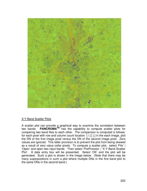
- Page 201: and 1 (Brightness, a measure of soi
- Page 205 and 206: presented. Check the ‘Compute Lin
- Page 207 and 208: PANCROMA TM has a utility for regre
- Page 209 and 210: 60. Image Post Processing__________
- Page 211 and 212: You can adjust weighting factors fo
- Page 213 and 214: Unsupervised ClassificationUnsuperv
- Page 215 and 216: 214
- Page 217 and 218: Grayscale and Color Image TilingIt
- Page 219 and 220: GeoreferencingPANCROMA TM has a uti
- Page 221 and 222: 61. Spectral Analysis______________
- Page 223 and 224: When you click ‘OK’, the select
- Page 225 and 226: The plot shows all of the computed
- Page 227 and 228: PANCROMA TM computed that the cover
- Page 229 and 230: Landsat Reflectance Point Spectrum
- Page 231 and 232: SPOT ® Point Spectrum Generator TM
- Page 233 and 234: will become disabled and the Color
- Page 235 and 236: When the ‘Zoom Disabled’ radio
- Page 237 and 238: Digital spectra are recorded for mi
- Page 239 and 240: The next step is to overlay the Lan
- Page 241 and 242: http://www.science.aster.ersdac.or.
- Page 243 and 244: Although the run was not successful
- Page 245 and 246: The pan sharpened image was created
- Page 247 and 248: Now select ‘Spectral Analysis’
- Page 249 and 250: RapidEye ® Spectral Analyzer TMSpe
- Page 251 and 252: Click ‘OK’. The TOA Reflectance
- Page 253 and 254:
The second plot is shown below, dis
- Page 255 and 256:
have to rationalize the file sizes.
- Page 257 and 258:
Euclidean Distance Fraction TM Anal
- Page 259 and 260:
The idea is to adjust the included
- Page 261 and 262:
In addition to Landsat 7, Spectral
- Page 263 and 264:
Low numbers mean high discriminatio
- Page 265 and 266:
Copyright USGSAlthough this data is
- Page 267 and 268:
Note that the band 6 (TIR) track ba
- Page 269 and 270:
higher (whiter) the grayscale pixel
- Page 271 and 272:
The table with the manually input r
- Page 273 and 274:
this does not correspond to physica
- Page 275 and 276:
L71005068_06820030919_B10.TIFL71005
- Page 277 and 278:
L71005068_06820040804_B50.TIFL71005
- Page 279 and 280:
278
- Page 281 and 282:
The parameters are as follows:Compu
- Page 283 and 284:
Object Oriented ClassificationPANCR
- Page 285 and 286:
to the other. For example a filter
- Page 287 and 288:
carefully. PANCROMA TM is able to p
- Page 289 and 290:
Landsat imageImage magnitude spectr
- Page 291 and 292:
Considerable smoothing has occurred
- Page 293 and 294:
IMPORTANT NOTE: In reality, the con
- Page 295 and 296:
The following is an example of an i
- Page 297 and 298:
In order to deconvolve using fixed
- Page 299 and 300:
63. Writing an Index File for an SR
- Page 301 and 302:
It will be saved as a .dat file. A
- Page 303 and 304:
64. Processing Huge Files and File
- Page 305 and 306:
My area of interest for this image
- Page 307 and 308:
306
- Page 309 and 310:
Now we will start the pan sharpenin
- Page 311 and 312:
66. Tutorial - Pan Sharpened Image
- Page 313 and 314:
The next step will be to create an
- Page 315 and 316:
The panchromatic image is the one i
- Page 317 and 318:
And my result looked like this:As y
- Page 319 and 320:
67. Tutorial - Pan Sharpening Full
- Page 321 and 322:
68. Tutorial - Gap Filling using Tr
- Page 323 and 324:
You can use the 'Max Cloud' drop do
- Page 325 and 326:
'Enter' and the Adjust file will be
- Page 327 and 328:
326
- Page 329 and 330:
PANCROMA TM does the rest after tha
- Page 331 and 332:
70. Tutorial - Gap Filling using Ha
- Page 333 and 334:
Another reason to keep the Search E
- Page 335 and 336:
Gap Filled Grayscale ImageGap Fille
- Page 337 and 338:
When you do so a batch processing d
- Page 339 and 340:
The images below show subsets taken
- Page 341 and 342:
340
- Page 343 and 344:
It is also apparent that the graysc
- Page 345 and 346:
73. Tutorial - Six File TERAS Batch
- Page 347 and 348:
common areas of both scenes. See th
- Page 349 and 350:
348
- Page 351 and 352:
Use the checked image processing ut
- Page 353 and 354:
IssuesAlthough the gap filling proc
- Page 355 and 356:
76. Tutorial - Pan Sharpening Lands
- Page 357 and 358:
77. Tutorial - Image Processing Wor
- Page 359 and 360:
From Next PageSection 13Subset One
- Page 361 and 362:
I again selected ‘Close Graphic I
- Page 363 and 364:
I then selected ‘Pan Sharpening
- Page 365 and 366:
the vegetation tones are still norm
- Page 367 and 368:
Reduction’ and then ‘Apply Cont
- Page 369 and 370:
acquired during different seasons o
- Page 371 and 372:
This image is better than the Trans
- Page 373 and 374:
I also prepared an image using the
- Page 375 and 376:
Full sized Landsat scenes can be pr
- Page 377 and 378:
78. Tutorial - Improving Image Qual
- Page 379 and 380:
The following image is the RGB colo
- Page 381 and 382:
Press ‘OK’. The transformed gra
- Page 383 and 384:
However it is close enough to illus
- Page 385 and 386:
The second image is a straightforwa
- Page 387 and 388:
It is also possible to combine the
- Page 389 and 390:
80. Pan Sharpened Image: Landsat Mo
- Page 391 and 392:
82. Pan Sharpened Image: Landsat De
- Page 393 and 394:
84. Pan Sharpened Image: Landsat Mo
- Page 395 and 396:
86. Pan Sharpened Image: Landsat Mo
- Page 397 and 398:
88. Pan Sharpened Image: EO-1 Mount
- Page 399:
Multiple Linear Regression, 205Mult