You also want an ePaper? Increase the reach of your titles
YUMPU automatically turns print PDFs into web optimized ePapers that Google loves.
V ARNISH<br />
TECHNIQUES<br />
ON STROBE<br />
The Idea Exchange from <strong>Sappi</strong> > Volume 1 > Number 1 >
V ARNISH<br />
The<br />
Idea Exchange is<br />
dedicated to inspiring<br />
graphic designers through<br />
its forum for creative new<br />
ideas and innovative<br />
techniques.<br />
TECHNIQUES<br />
The issue of IE that you hold<br />
in your hands marks the beginning of<br />
a new phase. We have expanded the scope of<br />
the Idea Exchange and the ways in which we make<br />
it available to you.<br />
This book is the first in a series through which we bring you new<br />
work and ideas from around the world – from places we know well<br />
to places we have never been. New work selected not simply<br />
to illustrate technology and techniques, but to fuel<br />
creative inspiration and exploration.<br />
A tinted halftone dull varnish on<br />
the highlights and halftone<br />
gloss varnish on the blacks<br />
intensify the impression of a<br />
It is our hope that those of you who have appreciated<br />
and collected The Warren Standard in the past<br />
will find the IE even more useful – and<br />
more exciting.<br />
solid, material moon floating in<br />
the dark sea of space. Halftone<br />
varnish is used to create a more<br />
natural transition from light<br />
to dark. Tinted gloss varnished<br />
circles encapsulate the text<br />
to draw the eye to it while<br />
subtly reinforcing the shape of<br />
the moon.
The<br />
Idea Exchange is a<br />
tangible way for those of us at<br />
<strong>Sappi</strong> Fine Paper to demonstrate<br />
our dedication to helping you excel<br />
at what you do. Now, as the largest<br />
coated woodfree paper manufacturer,<br />
we reaffirm our commitment to<br />
bringing you the best new ideas<br />
that the world has<br />
to offer<br />
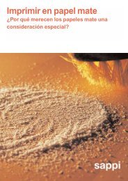
IE’s Varnish Techniques is a comprehensive resource on the<br />
uses and effects of varnish. It is intended to help you<br />
explore ways not only to protect, but to add depth, dimension,<br />
and interest to a printed surface. In other words,<br />
to make it more beautiful.<br />
Of course, to enhance the beauty of a printed surface, you<br />
must start with a beautiful surface – and nothing, we believe,<br />
is more beautiful than the surface of Strobe paper.<br />
Strobe Gloss, Strobe Dull, Strobe Silk, present different<br />
finishes on which you can create variety and excitement<br />
through the application of varnishes. And the beautiful<br />
arctic blue-white shade and extraordinary performance<br />
of Strobe make it even more irresistible. Used alone or<br />
together, the Strobe family affords an unparalleled<br />
opportunity to add depth and dimension to anything you<br />
print.<br />
We hope this book inspires you to try new ideas – and<br />
provides proof that Strobe is the best idea ever in your<br />
choice of paper. Throughout these pages, you will see<br />
varnish techniques illustrated on Strobe Gloss, Strobe Dull,<br />
Strobe Silk, and – for an added touch of elegance – Lustro<br />
Dull Cream.<br />
Applying a halftone gloss varnish<br />
on the highlights and<br />
halftone dull varnish on the<br />
blacks, heightens the illusion of<br />
a three-dimensional moon rising<br />
off the flat page.<br />
1
100% varnish<br />
dull varnish<br />
satin varnish<br />
gloss varnish<br />
g l o s s a n d s a t i n o v e r l a p<br />
g l o s s a n d s a t i n o v e r l a p<br />
s a t i n a n d d u l l o v e r l a p<br />
s a t i n a n d d u l l o v e r l a p<br />
100% varnish<br />
STROBE GLOSS<br />
2
0% varnish<br />
g l o s s a n d s a t i n o v e r l a p<br />
g l o s s a n d s a t i n o v e r l a p<br />
s a t i n a n d d u l l o v e r l a p<br />
s a t i n a n d d u l l o v e r l a p<br />
0% varnish<br />
3 STROBE GLOSS
On this page, dull varnish in<br />
the pattern of fish scales overprints<br />
an overall gloss varnish<br />
on the four color.<br />
CONTENTS<br />
Page 5:<br />
What is varnish?<br />
Page 6:<br />
How does varnish work?<br />
Page 8:<br />
What are your options?<br />
Page 14: Utilitarian uses of varnish<br />
Page 16: Basic design effects<br />
Page 24: Advanced design effects<br />
Page 43: Technical background and problem-solving<br />
STROBE<br />
GLOSS<br />
4
what is<br />
VARNISH?<br />
Varnish can be thought of as a unique class of inks with special<br />
protective and reflective properties. Varnish can be clear<br />
or tinted. It can have a glossy, dull, or satin finish. On press,<br />
varnish behaves much like ordinary ink.<br />
Varnish can be purely functional. Applied over ink and paper,<br />
it provides a protective surface that helps prevent scratching<br />
and scuffing – enabling printed pieces to keep their fresh-offthe-press<br />
look longer. Dull varnish, which protects without<br />
the slickness associated with gloss, can be used on glossy<br />
stock to reduce glare – and improve readability.<br />
Employed independently or together, gloss and dull<br />
varnishes can also enhance design. Applied overall, they can<br />
make a sheet sparkle – or give it a smoother, more satinlike<br />
finish. Used to highlight key areas, “spot” varnishes can add<br />
crispness and brilliance to color, drama and dimension to<br />
photography, and punctuation and clarity to diagrams and<br />
charts.<br />
Used as a halftone instead of printed as a flat or solid coating,<br />
varnish can work to subtly reinforce the dimension of an<br />
image without calling attention to itself. Conversely, varnish<br />
can be an eye-catching presence, enriching the printed page<br />
with unexpected pattern and texture. When tinted, varnish<br />
may even be substituted for ink.<br />
Gloss varnish makes the headline<br />
pop off the black background<br />
which has an overall dull varnish.<br />
As a separate element in design, varnish creates dimension<br />
that simply cannot be achieved any other way.<br />
5<br />
STROBE<br />
DULL
VARNISH work?<br />
The crispness of the illustrations and type, the depth and<br />
saturation of the colors – these are what draw attention to a<br />
varnished piece. Certain images may actually seem to rise from<br />
the background, while others appear to recede. This effect is<br />
produced by the degree of reflectivity of different varnishes. It<br />
can be creatively used to separate images, to emphasize contrast,<br />
and to provide surprise and dimension in design.<br />
Gloss varnish creates a surface that looks smoother than the ink<br />
and paper it overprints. Gloss-varnished images appear sharper<br />
because light traveling through the clear varnish film is<br />
Dull varnish imparts a velvety texture that scatters and diffuses<br />
reflected light, eliminating glare. Dull-varnished images and type<br />
have a softer look than those overprinted with gloss varnish –<br />
or those printed on plain paper.<br />
Effects achieved with a single varnish can often be heightened<br />
by using a combination of varnishes to maximize contrasts, or by<br />
applying a second hit of the first varnish to emphasize its effect.<br />
Playing varnishes off dull and gloss inks, and gloss and dull<br />
coated papers, can also add drama to design. In each instance,<br />
the variation in reflectivity is accentuated.<br />
reflected back to the eye with minimal diffusion.<br />
The different reflective properties<br />
of dull, and gloss varnish<br />
are illustrated in the headline<br />
type, the background has an<br />
overall satin varnish.<br />
STROBE<br />
DULL<br />
6
NO<br />
VARNISH<br />
ink<br />
paper<br />
This diagram represents the surface of a coated paper overprinted with<br />
a uniform film of ink. This paper-ink combination produces a surface<br />
that is relatively smooth. There is only a slight variation in the angle at<br />
which light rays are reflected back to the eye. The result: no significant<br />
diffusion of light or pronounced dulling of the printed image.<br />
GLOSS<br />
VARNISH<br />
DULL<br />
VARNISH<br />
gloss varnish<br />
ink<br />
paper<br />
dull varnish<br />
ink<br />
paper<br />
Gloss varnish fills in the irregularities of a<br />
paper and ink surface, drying to form its own<br />
virtually level surface. Because light rays<br />
reflect off this smoother surface at identical<br />
angles, there is little, if any, diffusion of light.<br />
The result: the printed image appears crisp and<br />
sharp.<br />
When dull varnish overprints paper and ink, it<br />
produces a velvety effect. This occurs because<br />
dull varnish contains platelets that rise to the<br />
surface as it sets and dries. The final arrangement<br />
of the platelets is so irregular that light<br />
rays striking them are reflected back in many<br />
different directions, diffusing the light. The<br />
result: the printed surface appears dull.<br />
7<br />
STROBE<br />
GLOSS
what are your<br />
OPTIONS?<br />
HALFTONE GLOSS VARNISH NO VARNISH HALFTONE DULL VARNISH<br />
G L O S S B L A C K I N K<br />
D U L L B L A C K I N K<br />
HALFTONE GLOSS VARNISH NO VARNISH HALFTONE DULL VARNISH<br />
The effects demonstrated on<br />
this page were achieved using<br />
halftone varnishes on gloss<br />
white stock.<br />
STROBE<br />
GLOSS<br />
8
Your choice of paper, and even ink, will have a strong influence<br />
on any effect you intend to create with varnish. This<br />
spread and the next two demonstrate what happens when<br />
these elements are combined in various ways.<br />
SOLID GLOSS VARNISH NO VARNISH SOLID DULL VARNISH<br />
G L O S S B L A C K I N K<br />
D U L L B L A C K I N K<br />
SOLID GLOSS VARNISH NO VARNISH SOLID DULL VARNISH<br />
Note how using solid varnishes<br />
and dull white stock changes<br />
the look and feel of the printed<br />
page.<br />
9<br />
STROBE<br />
DULL
HALFTONE GLOSS VARNISH NO VARNISH HALFTONE DULL VARNISH<br />
G L O S S B L A C K I N K<br />
D U L L B L A C K I N K<br />
HALFTONE GLOSS VARNISH NO VARNISH HALFTONE DULL VARNISH<br />
Note how halftone varnishes<br />
influence design effects<br />
when printed on dull white<br />
stock.<br />
STROBE<br />
DULL<br />
10
When varnishes are used as halftones rather than solids,<br />
their effects on design become more expressions of subtle<br />
nuance than statements of overt drama. Note, too, how<br />
paper stock influences the overall impression created.<br />
SOLID GLOSS VARNISH<br />
NO VARNISH<br />
SOLID DULL VARNISH<br />
G L O S S B L A C K I N K<br />
D U L L B L A C K I N K<br />
SOLID GLOSS VARNISH NO VARNISH SOLID DULL VARNISH<br />
The rich effects on this page<br />
were achieved by using solid<br />
varnishes on warm, dull cream<br />
color stock.<br />
11<br />
LUSTRO DULL CREAM
HALFTONE GLOSS VARNISH NO VARNISH HALFTONE DULL VARNISH<br />
G L O S S B L A C K I N K<br />
D U L L B L A C K I N K<br />
HALFTONE GLOSS VARNISH NO VARNISH HALFTONE DULL VARNISH<br />
Halftone varnishes more subtly<br />
heighten warmth and realism<br />
when printed on dull<br />
cream stock.<br />
LUSTRO DULL CREAM<br />
12
As you can see by comparing the various effects demonstrated<br />
on these six pages, it is the interplay of paper, ink,<br />
and varnish that affords you so many intriguing options<br />
when using varnish as an element in design.<br />
SOLID GLOSS VARNISH NO VARNISH SOLID DULL VARNISH<br />
G L O S S B L A C K I N K<br />
D U L L B L A C K I N K<br />
SOLID GLOSS VARNISH NO VARNISH SOLID DULL VARNISH<br />
The crisp color effects on<br />
this page were produced<br />
using solid varnishes on<br />
gloss white stock.<br />
13<br />
STROBE GLOSS
utilitarian uses<br />
of VARNISH<br />
Spot gloss varnish adds luster and mouth-watering appeal to the<br />
4-color image. Dull varnish on the black border strengthens the<br />
focus on the framed image.<br />
STROBE GLOSS<br />
14
Varnish helps protect any printed piece from fingerprints, smudges, and wear and tear.<br />
While this functional role of varnish is shown clearly on the following pages, these demonstrations<br />
reach beyond simple utility to reveal some of the creative ways varnish and paper<br />
can be combined to produce sparkling images and glare-free text.<br />
Gloss varnish on the square of type, with a band of dull<br />
varnish on the black border and image.<br />
15<br />
STROBE GLOSS
asic<br />
DESIGN EFFECTS<br />
Varnish allows you to take a two-dimensional medium and<br />
push it toward the third dimension.<br />
This impression of added depth and dimension is achieved<br />
not only by exploiting the best features of each of your<br />
materials – paper, ink, image, and varnish – but by taking<br />
advantage of the way they interact when combined to<br />
intensify or “multiply” the desired effect.<br />
On these pages, we’ll show how different varnishes can be<br />
used together, or in contrast with unvarnished surfaces, to<br />
accentuate this “multiplier effect,” creating images that<br />
appear to rise up or recede from the page because of the<br />
varying degree of reflectivity of the surface finishes.<br />
Many of the demonstrations in this section are quite simple –<br />
overall varnish, small accent spots, frames, and patterns.<br />
But whether simple or elaborate, each illustrates our basic<br />
point: Varnish can be used to intensify perceived dimension<br />
in a printed piece to help make whatever you design more<br />
exciting and memorable.<br />
Sleek, slippery gloss varnish adds dimension and a<br />
heightened sense of cold, wet reality to the frozen waterway; dull<br />
varnish on the type panel diffuses reflected light, making the text<br />
easier to read. The headline type is left unvarnished: note the way it<br />
seems to recede from the gloss-varnished surface and pop out from<br />
STROBE GLOSS<br />
the surface with the dull varnish.<br />
16
Here, dull varnish is<br />
applied to the black<br />
areas only, to soften<br />
and flatten them. Note<br />
how they appear to be<br />
slightly recessed from<br />
the white ice and red<br />
boat, which are left<br />
unvarnished.<br />
In this demonstration,<br />
spot gloss varnish is<br />
applied to the frozen<br />
snow to heighten its<br />
chilly white wintery<br />
feel, in contrast to the<br />
black water and boat,<br />
which are left unvarnished.<br />
The properties of color<br />
and varnish are used<br />
to dramatize perceived<br />
depth. Gloss varnish<br />
heightens the effect<br />
of white snow rising<br />
off the page. Dull<br />
varnish on the blacks<br />
reinforces the way they<br />
visually recede. The<br />
red boat is left unvarnished<br />
to emphasize a<br />
third-dimensional plane<br />
between them.<br />
Here, the bright red boat<br />
is brought to the foreground<br />
through the<br />
application of spot gloss<br />
varnish. The snow is left<br />
unvarnished, while dull<br />
varnish is used on the<br />
black areas to make<br />
them appear to recede<br />
even further.<br />
17<br />
STROBE<br />
GLOSS
To create this sophisticated<br />
black and white design effect,<br />
spot dull varnish was applied<br />
over the entire black background<br />
area. Solid spot gloss<br />
varnish on the flower heads<br />
and stems makes them appear<br />
to pop off the page.<br />
STROBE GLOSS<br />
18
The basic design effects of varnish are<br />
easy to see in black and white. Here,<br />
solid gloss varnish, applied overall, not<br />
only protects but reinforces the character<br />
of the moist petals and glistening<br />
flower stems.<br />
In this example, spot gloss varnish is<br />
used to dramatically isolate the flowers<br />
so that they appear to float above the<br />
unvarnished black background, while<br />
highlighting their fresh, dewy texture.<br />
Spot dull varnish is applied to the flowers<br />
in this demonstration to accent the<br />
contrast between background and the<br />
subject matter producing a more uniform<br />
overall visual effect.<br />
Here, the overall application of solid<br />
dull varnish minimizes contrasts and<br />
maximizes diffusion of light, creating a<br />
soft, muted effect while adding a protective<br />
finish to the printed area.<br />
19<br />
STROBE GLOSS
One of the most popular and effective uses of gloss varnish in design is to enhance a subject’s inherent radiance and sparkle. Here,<br />
halftone gloss varnish is applied both to the highlights of the rings to bring out their fiery brilliance, and to their reflected image, heightening<br />
the visual contrast between the polished surface on which they rest and the gloss finish of the printed page.<br />
STROBE GLOSS<br />
20
Here, the rings are silhouetted from<br />
a halftone window of gloss varnish,<br />
subtly bringing their polished platinum<br />
glow and diamond radiance to the<br />
foreground. Note how this effect compares<br />
to the one diagonally opposite.<br />
In this example, a solid spot dull<br />
varnish is applied to the rings, and a<br />
halftone gloss varnish to their reflected<br />
image, to focus attention on the<br />
mirror like quality of the surface on<br />
which the rings are arranged.<br />
In this demonstration, the eye is drawn<br />
to the icy white, radiant sparkle of the<br />
diamond rings, which has been made<br />
more brilliant with solid spot gloss<br />
varnish, while a halftone dull varnish<br />
suffuses their reflection.<br />
Focus and dimension are created in this<br />
example by silhouetting the diamond<br />
rings from a halftone window of dull<br />
varnish. Strobe Gloss stock also works<br />
to give the rings subtle sparkle and<br />
contrast against their dull frame.<br />
21<br />
STROBE GLOSS
1<br />
2<br />
When you are creating graphs<br />
and charts that incorporate<br />
detailed images, varnish can<br />
be used to add elegance and<br />
subtlety to the result. Here,<br />
there is no varnish on our<br />
4-color black background<br />
image.<br />
1. Silver-tinted dull varnish is<br />
used to create an opaque box.<br />
2. Gloss varnish is used to flag<br />
3<br />
attention to this box.<br />
3. In this box, satin varnish, a<br />
mix of dull and gloss, adds<br />
extra protection without added<br />
4<br />
contrast.<br />
4. Dull varnish on the white<br />
tree trunks and gloss varnish<br />
on the dark areas within this<br />
box create surprise.<br />
5. This dull-varnished box<br />
appears to recede from the<br />
unvarnished area that surrounds<br />
it.<br />
5<br />
STROBE GLOSS<br />
22
Applying dull varnish to the<br />
black areas and highlighting<br />
the whites with gloss varnish<br />
heighten the dramatic impact<br />
of this 4-color black and white<br />
forest scene. The ghostly white<br />
birch trees seem to be emerging<br />
from the eery black depths<br />
of the woods. Note how, in box<br />
4 on the facing page, the trees<br />
appear to recede when the<br />
opposite technique is used.<br />
Lorem ipsum dolor sit amet,<br />
consectetuer adipiscing elit,<br />
sed diam nonummy nibh<br />
euismod tincidunt ut laoreet<br />
dolore magna aliquam erat<br />
volutpat. Ut wisi enim ad<br />
minim veniam, quis nostrud<br />
exerci tation ullamcorper<br />
suscipit lobortis nisl ut<br />
aliquip ex ea commodo consequat.<br />
Duis autem vel eum<br />
iriure dolor in hendrerit in<br />
vulputate velit esse molestie<br />
23<br />
STROBE<br />
GLOSS
ADVANCED<br />
design effects<br />
In this final section, you’ll see how varnish can be applied<br />
as halftone dots to create visual roundness that, at a<br />
glance, might actually be taken for three-dimensional. In<br />
other demonstrations, you’ll see varnish applied tonally to<br />
blend or separate images, producing illusions of reality far<br />
more vivid and convincing than many would imagine could<br />
be achieved in print.<br />
You can employ these varnish techniques to make your<br />
work more outstanding and memorable – not only to bring<br />
Printed in dégradé tinted<br />
gloss varnish the background<br />
excitement to special projects like annual reports, but to<br />
elevate the design impact of everyday jobs.<br />
becomes an airy, understated<br />
design element.<br />
STROBE GLOSS 24
Spot dull varnish on the letters separates them from both the<br />
photographic image and the tinted gloss varnish background;<br />
halftone gloss varnish adds a touch of luster to the highlights on<br />
the translucent green and tan bars of natural soap and to the green<br />
veined botanical leaf.<br />
25<br />
STROBE<br />
GLOSS
In the top and bottom panels,<br />
dull varnish applied as a<br />
halftone over the dark areas<br />
gives them depth; spot gloss<br />
varnish highlights the shiny<br />
rivulets of running water. In the<br />
contrasting middle panel — a<br />
4-color negative image—shiny<br />
spot gloss varnish makes the<br />
water droplets look wet and<br />
raised against the dullvarnished<br />
background.<br />
STROBE GLOSS<br />
26
GLOSS VARNISH<br />
DULL VARNISH<br />
The design and texture of the photographic subject are reinforced by contrasting varnishes: Halftone gloss varnish adds polish to the<br />
silhouetted boot shown in profile. Gloss varnish is also used to spark the highlights on the tread of the sole and the white line grid<br />
patterns that mimic it. Halftone dull varnish is applied to all the dark areas to enhance the three-dimensional, floating-in-space effect.<br />
27<br />
STROBE<br />
GLOSS
GLOSS VARNISH<br />
DULL VARNISH<br />
Two contrasting halftone<br />
varnishes – gloss on the highlights,<br />
dull on the shadows – are<br />
printed in register to create depth<br />
and natural-looking contrast in<br />
the horses’ brindled coats.<br />
STROBE GLOSS<br />
28
This spread illustrates two approaches to creating tonal<br />
effects: a soft, graduated transition from areas overprinted<br />
Once again, gloss varnish<br />
is used on the highlights, dull<br />
varnish on the blacks; but here<br />
the halftone varnishes have<br />
with varnish to those that are not; or a contrast between<br />
areas overprinted with different varnishes. Note the way a<br />
single modification in technique produces two very different<br />
looks.<br />
been shifted horizontally on<br />
the image, creating a striking<br />
and unusual three-dimensional<br />
effect that resembles a hologram.<br />
29<br />
LUSTRO DULL CREAM
The spot satin varnish on the animal, the halftone gloss varnish on the main body of water, and the halftone dull varnish on<br />
its murky black depths create a compelling image, remarkable for its dimensionality, of a hippopotamus wading in a river.<br />
LUSTRO DULL CREAM<br />
30
GLOSS VARNISH<br />
2ND GLOSS VARNISH<br />
DULL VARNISH<br />
SATIN VARNISH<br />
Halftone and spot gloss varnish are combined to add<br />
dimension and drama to this 4-color image of the<br />
fresh catch of the day. 100% gloss varnish on<br />
the light areas, emphasizing the fishes’ still-wet<br />
freshness, gradually fades out to 20% on the dark<br />
areas, visually heightening the impression of depth.<br />
A second hit of spot gloss varnish on the lenses of<br />
their eyes reinforces the fishes’ blank, glassy stare.<br />
31<br />
STROBE<br />
GLOSS
The 4-color black and white<br />
image of this prickly desert<br />
succulent plant takes on a<br />
silvery metallic look when the<br />
darks are overprinted with<br />
halftone dull varnish and the<br />
highlights have a halftone<br />
gloss varnish.<br />
STROBE<br />
GLOSS<br />
32
GLOSS VARNISH<br />
DULL VARNISH<br />
The difference in reflectivity created by juxtaposing gloss and dull halftone varnishes is used to visually<br />
enhance the short depth of field, which gives this photographic image its character. Gloss varnish<br />
on the areas in sharp focus brings them further to the foreground. Dull varnish on the soft-focus areas<br />
makes them appear to recede even more.<br />
33<br />
STROBE SILK
Gloss and dull varnishes, with<br />
their opposing reflective and<br />
nonreflective properties, are<br />
played against one another to<br />
enhance the striking, contemporary<br />
quality of this 4-color<br />
image. Halftone dull varnish on<br />
the textured metal table’s dark<br />
areas makes them visually<br />
recede; while halftone gloss<br />
varnish on the bright highlights<br />
of the glass pitcher and mugs<br />
amplifies the clear crystal<br />
sparkle.<br />
GLOSS VARNISH<br />
DULL VARNISH<br />
SATIN VARNISH<br />
SILVER VARNISH<br />
STROBE<br />
SILK
Here we demonstrate one of the design effects you can create by combining varnish and ink. Offline dull silver tinted<br />
varnish overprints the 4-color image to form the translucent border. Satin varnish is applied overall within the framed<br />
area except on the cactus flowers. Solid gloss varnish gives the bright red blooms their added spark.<br />
35<br />
STROBE GLOSS
On this spread, we show how ink and varnish have been combined<br />
to alter an existing photographic image, creating the<br />
look of falling snow. This page reproduces the left half of the<br />
original snow-covered city street scene as it was photographed:<br />
The roadways are thick with accumulated snow, but the air is<br />
clear. Overall satin varnish enhances the image.<br />
STROBE GLOSS<br />
36
An overall satin varnish is used to protect and soften the image.<br />
But here, an overprint of pearlized dull varnish is used to create the<br />
realistic look of heavy snowflakes falling on deserted, snow-bound<br />
city streets.<br />
PEARLIZED VARNISH<br />
SATIN VARNISH<br />
37<br />
STROBE<br />
GLOSS
A photographic negative, dull<br />
ink, and contrasting tinted and<br />
clear halftone varnishes are<br />
combined to create this startling<br />
and memorable graphic image.<br />
The negative of peas on the vine<br />
is printed in a halftone dull varnish<br />
tinted with opaque white to<br />
further separate the peas and<br />
pods from the darker background.<br />
A reverse of the halftone<br />
is printed in gloss varnish,<br />
adding another layer of surprising<br />
contrast and dimension.<br />
STROBE GLOSS<br />
38
To create this positive/negative effect, the photographic image of<br />
radishes is printed in tinted black dull varnish. A dégradé gloss varnish<br />
creates the graphic circular shape.<br />
DULL VARNISH<br />
TINTED WHITE<br />
DULL VARNISH<br />
GLOSS VARNISH<br />
TINTED BLACK<br />
DULL VARNISH<br />
39 STROBE GLOSS
To create the elegant look of this<br />
photographic chart, an overall<br />
dull varnish is applied to the<br />
cross section of a pine tree trunk<br />
with ghosted grid lines overprinted<br />
in gloss varnish.<br />
2000<br />
1999<br />
1998<br />
$191 Million<br />
1997<br />
$94 Million<br />
1996<br />
1995<br />
$147 Million<br />
$122 Million<br />
$82 Million<br />
GLOSS VARNISH<br />
DULL VARNISH<br />
PEARLIZED VARNISH<br />
SATIN VARNISH<br />
STROBE<br />
GLOSS<br />
40
14<br />
13<br />
12<br />
Cytoplasmic<br />
reticulum<br />
damage<br />
Chlorophyll deficiency<br />
Abnormal<br />
nucleic<br />
formations<br />
Weakened fibrous<br />
support<br />
11<br />
Compromised<br />
protoplasm<br />
production<br />
10<br />
9<br />
8<br />
7<br />
6<br />
5<br />
4<br />
3<br />
2<br />
A variety of varnish techniques contribute to the dimensional<br />
impression of this chart on plant root development. Gloss varnish<br />
1<br />
accents the highlights on the stalks; and the roots. The<br />
black background is overprinted with satin varnish; spot<br />
dull varnish is applied over it to create the square “floor.” The<br />
reverse-type chart is divided into two sections by overprinting a<br />
portion off-line with pearlized spot dull varnish.<br />
41<br />
STROBE GLOSS
The soft tonal effects of gloss and satin varnish halftone are used<br />
here to heighten the somber feel of the photographic subject.<br />
Halftone gloss varnish on the snow covered forest floor stresses its<br />
wintery wetness; halftone satin varnish brings out textural detail in<br />
the rough bark of the trees. Words that whisper like wind in the<br />
woods are printed in tinted dull varnish, adding atmospheric<br />
sophistication to the printed page.<br />
GLOSS VARNISH<br />
SATIN VARNISH<br />
TINTED VARNISH<br />
STROBE GLOSS<br />
42
technical background<br />
and PROBLEM-SOLVING<br />
1. THE IMPORTANCE OF PLANNING<br />
3. GENERAL CHARACTERISTICS OF VARNISH<br />
Varnishing effects are not difficult to produce. Most of those<br />
demonstrated in this book should be familiar to any experienced,<br />
quality-oriented printer.<br />
However, because varnish does add an additional element to<br />
the printing process, it must be considered an integral part<br />
of a job and taken into account during the earliest stages of<br />
planning. When problems do occur, they’re usually the result<br />
of introducing varnish as an afterthought, particularly as a<br />
remedy for oversights or complications in paper choice or<br />
presswork.<br />
Remember that varnishes differ considerably from one to<br />
another and that a varnish that works well with a specific<br />
paper and set of inks may be unsuited to others.<br />
Follow these guidelines, and the potential for varnishing<br />
problems will be greatly reduced:<br />
A Be sure that the designer, production manager, and<br />
printer all understand and are in agreement on specifications.<br />
Like any variable in a job, varnish must be carefully<br />
chosen.<br />
B Make sure that your varnish is compatible with your<br />
press as well as with your inks and paper stock.<br />
C Make sure that it will meet your predetermined end-use<br />
requirements.<br />
Varnish is actually a type of ink. Although sometimes tinted,<br />
it is usually clear. On press and while drying, varnish<br />
behaves very much like any other ink.<br />
The characteristics of varnish have been greatly improved<br />
over the past twenty years. Today’s varnishes set and dry<br />
faster, harder, and glossier (or duller); and most of them provide<br />
multiple functional features.<br />
4. DIFFERENT VARNISHES MEET DIFFERENT RUNNING NEEDS<br />
Varnishes can be formulated for a variety of uses. For sheetfed<br />
offset, there are both gloss and dull varnishes, some<br />
applied in-line, others off-line. The in-line varnishes have<br />
low tack for good trap and are fast-setting to minimize<br />
absorption. Off-line varnishing (over a dry ink film) produces<br />
higher gloss because a thicker film can be applied.<br />
Gloss and dull varnishes are also available for web offset.<br />
The major difference between these and sheet-fed varnishes<br />
is in their drying systems. All varnishes formulated for web<br />
are designed to release solvents by the heatset (or oven drying)<br />
process.<br />
5. SPECIFIC END-USE FEATURES<br />
2. CHEMISTRY OF VARNISH<br />
Varnishes contain varying combinations of resins that provide<br />
strength, body, and gloss, which are dissolved in drying<br />
oils such as tung, linseed, or an alkyd. Solvents, waxes, and<br />
sometimes pigments are also included in the formula.<br />
Although the final selection of resin/oil composition depends<br />
on end-use requirements, the primary objective in formulating<br />
a gloss varnish is to achieve high gloss with good rub<br />
resistance.<br />
Resins with tung or linseed oil give the best gloss but have<br />
a tendency to yellow with time. Resin with selected alkyds<br />
yields a nontoxic, nonyellowing varnish, but one with less<br />
gloss and hardness.<br />
To reduce gloss in the formulation of a dull varnish, an agent is added.<br />
The agent contains platelet-like particles that migrate to the surface<br />
and “stand” upright when the varnish has dried, scattering light and<br />
thus reducing gloss.<br />
43<br />
Varnishes can be made either “imprintable” (which is waxfree<br />
so that distributors’ names and addresses can be<br />
imprinted on catalog covers, for example) or “nonimprintable”<br />
(therefore more scuff-resistant).<br />
Varnishes can be formulated with virtually any tack value<br />
(and thus be compatible with any set of inks).<br />
They can be “nonyellowing” (an important feature in<br />
posters, point-of-purchase, and other items exposed to light<br />
over long periods of time), and they can be “low-odor” and<br />
“nontoxic” (for food packaging).<br />
They can have “low-slip” properties (reducing the tendency<br />
of printed pieces to slide when stacked or pressed together).<br />
And they can have “high rub resistance” (good protective<br />
qualities so neither varnish nor ink is likely to rub off).<br />
STROBE DULL
6. HOW DOES VARNISH BEHAVE ON PRESS?<br />
Although the running characteristics of varnish are almost<br />
identical to those of ink, a few exceptions should be kept in<br />
mind.<br />
An average film thickness is usually sufficient to achieve<br />
desired effects. With more varnish, effects can be enhanced;<br />
however, too thick a film, particularly at high press speeds,<br />
can cause blocking. Conversely, if a film is too thin, varnish<br />
drains into the paper and its effects are lost. Thin films also<br />
have higher tack (again because of fast drainage) that may<br />
become contaminated by the underlying wet inks.<br />
7. DRYING<br />
Drying time for varnish is about the same as it is for ink and<br />
is influenced by a combination of factors: type of varnish,<br />
type of ink overprinted, percentage of ink coverage, paper<br />
characteristics, fountain solution, humidity, and temperature.<br />
Most varnishes dry mainly by oxidation augmented by<br />
absorption. These varnishes are somewhat slow in hardening<br />
(or polymerizing) and may require anti-setoff to prevent<br />
sheets from sticking together. But powder reduces gloss and<br />
gives a “sandy” feel to the sheet if too much is used.<br />
COMMON PROBLEMS<br />
Problem: Failure to specify imprintability.<br />
This is one of the most common and easily avoided varnishing<br />
problems. It occurs because a client fails to inform the<br />
printer that one or more areas of a gloss-varnished piece will<br />
be imprinted at a future date. Or, in the case of folders, it’s<br />
not specified that glue will later be applied to tabs or other<br />
“structural” features.<br />
Solution: Plan ahead.<br />
Problem: Burnishing or polishing.<br />
This condition occurs when dulling particles are flattened by<br />
scraping or when the spaces between them are moistened by<br />
oil from fingers during handling. In both cases, a smoother surface<br />
is the result, which appears glossy in the affected areas.<br />
Solution: Order the hardest dull varnish available. Design so<br />
that dull-varnished areas have least wear.<br />
the reverse side of a sheet. Such ghosts are created by ink<br />
solvent vapors breaking through the varnish film. These<br />
vapors get sealed in by the ink as it sets. When varnish is<br />
applied, it re-wets the ink surface and releases them. The<br />
vapors then escape through the varnish, leaving behind vent<br />
holes, which create the “ghostly” image.<br />
The problem might be avoided altogether by varnishing in-line<br />
or by waiting until the ink film is completely solvent-free.<br />
When ghosts do occur, an additional layer of varnish may be<br />
applied to fill in the vent holes and create a uniform gloss<br />
(or dull) level. Experience has shown that the varnish originally<br />
used rarely works in this role, and finding one that does<br />
may require numerous trials.<br />
If ghosts are noticed before an entire job has been varnished,<br />
sheets can be blanked through a press equipped<br />
with an infrared heater. When such a press is not available,<br />
simply blanking the sheets on a regular press can add<br />
enough oxygen to accelerate ink drying.<br />
Solution: Varnish in-line or wait until the ink film is completely<br />
solvent-free. When ghosts do occur, run additional<br />
varnish; or if the problem is noticed before the job is finished,<br />
blank the remaining sheets through the press.queous<br />
coating<br />
Page 10: Black, cyan, magenta, yellow, and overall gloss<br />
varnish (40% screen of cyan under solid black for copy<br />
bar)<br />
Page 11: Black, cyan, magenta, yellow, and overall gloss<br />
varnish<br />
Pages 12, 16, 17, 20, and 22: Black, cyan, magenta, yellow,<br />
and spot gloss varnish<br />
Page 13: Black, cyan, magenta, and spot gloss varnish<br />
Page 14: Black, cyan, magenta, yellow, and overall gloss<br />
varnish<br />
Page 15: Black, cyan, magenta, yellow, special match red,<br />
and spot gloss varnish<br />
Page 18: Black, cyan, magenta, yellow, special match red,<br />
and overall gloss varnish<br />
Page 19: Black, cyan, magenta, yellow, special match red,<br />
and overall gloss varnish (40% screen of cyan under solid<br />
black for copy bar)<br />
Page 21: Black, two hits of cyan (40% screen of cyan<br />
under solid cyan in copy blocks), magenta, yellow, and<br />
spot gloss varnish<br />
Page 23: Black, and spot gloss varnish<br />
Problem: Varnish ghosts.<br />
Varnish ghosts are faint silhouette images, usually milky<br />
white and identical in shape to whatever backs them up on<br />
Page 24: Black, cyan, magenta, yellow, and spot gloss varnish<br />
(40% screen of cyan under solid black)<br />
STROBE DULL<br />
44
PRODUCTION notes<br />
Strobe Gloss Cover 100lb./270gsm<br />
OUTSIDE COVERS AND FLAPS:<br />
1st pass: Black, cyan, magenta, yellow, special match<br />
orange, matte black, special match black, 20% opaque<br />
white tinted spot gloss varnish<br />
2nd pass: 10% opaque white tinted halftone and spot dull<br />
varnish, halftone and spot gloss varnish<br />
INSIDE COVERS AND FLAPS:<br />
Black, spot gloss varnish<br />
Strobe Gloss 100lb./148gsm<br />
PAGE 1:<br />
1st pass: Black, cyan, magenta, yellow, special match<br />
orange, 20% opaque white tinted spot gloss varnish<br />
2nd pass: Halftone gloss varnish, halftone dull varnish<br />
PAGES 2 AND 3:<br />
1st pass: Black, cyan, magenta, yellow, special match<br />
orange, dégradé satin varnish<br />
2nd pass: Dégradé gloss varnish, dégradé dull varnish<br />
PAGES 4, 18, 19, AND 40<br />
1st pass: Black, cyan, magenta, yellow, special match<br />
orange<br />
2nd pass: Spot gloss varnish, spot dull varnish<br />
PAGE 7:<br />
1st pass: Black, cyan, magenta, yellow, special match<br />
orange, special match black, spot satin varnish<br />
2nd pass: Spot gloss varnish, spot dull varnish<br />
PAGE 8:<br />
1st pass: Black, cyan, magenta, yellow, special match<br />
orange, special match black, dull black<br />
2nd pass: Halftone gloss varnish, halftone dull varnish<br />
PAGE 13:<br />
1st pass: Black, cyan, magenta, yellow, special match<br />
orange, special match black, dull black<br />
2nd pass: Spot gloss varnish, spot dull varnish<br />
PAGES 14 AND 15:<br />
1st pass: Black, cyan, magenta, yellow, special<br />
match orange, special match black<br />
2nd pass: Spot gloss varnish, spot dull varnish<br />
PAGE 16:<br />
1st pass: Black, cyan, magenta, yellow, special match<br />
orange, special match black<br />
2nd pass: Spot gloss varnish, spot dull varnish<br />
PAGE 17:<br />
1st pass: Black, cyan, magenta, yellow, special<br />
match orange<br />
2nd pass: Spot gloss varnish, spot dull varnish<br />
PAGE 20:<br />
1st pass: Black, cyan, magenta, yellow, special<br />
match orange<br />
2nd pass: Halftone gloss varnish<br />
PAGES 21, 23, 26, 27, 28, AND 32:<br />
1st pass: Black, cyan, magenta, yellow, special<br />
match orange<br />
2nd pass: Halftone gloss varnish, halftone dull varnish<br />
PAGE 22:<br />
1st pass: Black, cyan, magenta, yellow, special<br />
match orange<br />
2nd pass:Halftone and spot gloss varnish, spot silver tinted<br />
dull varnish, spot satin varnish, halftone and spot dull<br />
varnish<br />
PAGE 24:<br />
1st pass: Black, special match orange, 50% black tinted<br />
gloss dégradé varnish<br />
2nd pass: Dull varnish<br />
PAGE 25:<br />
1st pass: Black, cyan, magenta, yellow, special match<br />
orange, 50% black tinted gloss dégradé varnish<br />
2nd pass: Halftone gloss varnish, spot dull varnish<br />
PAGE 31:<br />
1st pass: Black, cyan, magenta, yellow, special match<br />
orange, halftone gloss varnish<br />
2nd pass: Halftone gloss varnish<br />
PAGE 35:<br />
1st pass: Black, cyan, magenta, yellow, special match<br />
orange, 60% silver tinted spot dull varnish<br />
2nd pass: Spot gloss varnish, spot satin varnish<br />
PAGE 36:<br />
Black, cyan, magenta, yellow, special match orange, spot<br />
satin varnish<br />
PAGE 37:<br />
1st pass: Black, cyan, magenta, yellow, special match<br />
orange, spot satin varnish<br />
2nd pass: Halftone “pearlized” dull varnish<br />
PAGE 38:<br />
1st pass: Black, special match black, special match<br />
orange, spot dull varnish<br />
2nd pass: Halftone gloss varnish, 30% opaque white<br />
tinted halftone dull varnish<br />
PAGE 39:<br />
1st pass: Black, special match orange<br />
2nd pass: Dégradé gloss varnish, 5% black tinted halftone<br />
dull varnish<br />
PAGE 41:<br />
1st pass: Black, cyan, magenta, yellow, special match<br />
black, special match orange, spot satin varnish<br />
2nd pass: Spot gloss varnish, spot dull varnish, spot<br />
“pearlized” dull varnish<br />
PAGE 42:<br />
1st pass: Black, cyan, magenta, yellow, special match<br />
orange<br />
2nd pass: Halftone gloss varnish, halftone satin varnish,<br />
30% opaque white tinted spot dull varnish<br />
45<br />
STROBE DULL
STROBE DULL 100LB./148 GSM<br />
PAGE 5:<br />
1st pass: Black, special match black, special match<br />
orange<br />
2nd pass: Spot gloss varnish, spot dull varnish<br />
PAGE 6:<br />
1st pass: Black, special match black, special match<br />
orange, spot satin varnish<br />
2nd pass: spot gloss varnish, spot dull varnish<br />
PAGE 9:<br />
1st pass: Black, cyan, magenta, yellow, special match<br />
orange, special match black, dull black<br />
2nd pass: Spot gloss varnish, spot dull varnish<br />
Strobe Gloss is available in 80lb./118gsm and 100lb./148gsm<br />
text; 80lb./216gsm, 100lb./270gsm, and 120lb./325gsm cover.<br />
Strobe Dull is available in 80lb./118gsm and 100lb./148gsm<br />
text; 80lb./216gsm, 100lb./270gsm, and 120lb./325gsm cover.<br />
Strobe Silk is available in 80lb./118gsm and 100lb./148gsm<br />
text; 80lb./216gsm and 100lb./270gsm cover.<br />
Lustro Dull Cream is available in 80lb./118gsm and<br />
100lb./148gsm text; 80lb./216gsm, and 100lb./270gsm cover<br />
PAGE 10:<br />
1st pass: Black, cyan, magenta, yellow, special match<br />
orange, dull black<br />
2nd pass: Halftone gloss varnish, halftone dull varnish<br />
PAGES 43,AND 45:<br />
Black, special match black, special match orange, overall<br />
satin varnish<br />
PAGES 44,AND 46:<br />
Black, special match orange, overall satin varnish<br />
LUSTRO DULL CREAM 100LB./148 GSM<br />
PAGE 11:<br />
1st pass: Black, cyan, magenta, yellow, special match<br />
orange, special match black, dull black<br />
2nd pass: Spot gloss varnish, spot dull varnish<br />
PAGE 12:<br />
1st pass: Black, cyan, magenta, yellow, special match<br />
orange, dull black<br />
2nd pass: Halftone gloss varnish, halftone dull varnish<br />
PAGE 29:<br />
1st pass: Black, cyan, magenta, yellow, special match<br />
orange<br />
2nd pass: Halftone gloss varnish, halftone dull varnish<br />
photo creditsx<br />
moon: NASA / courtesy of Lunar and Planetary Institute<br />
two fish: Marty Snyderman<br />
fabric: Maryanne Solensky/courtesy of Pollack<br />
salad bowl: Maria Robledo<br />
boat on ice: Stuart Klipper<br />
three poppies: Tom Baril<br />
rings: Todd Flashner / jewelry whitneyboin.com<br />
forest: Brett Weston<br />
soaps: Bob Kato<br />
PAGE 30:<br />
1st pass: Black, cyan, magenta, yellow, special match<br />
orange, spot satin varnish<br />
2nd pass: Halftone gloss varnish, halftone dull varnish<br />
STROBE SILK 100LB./148 GSM<br />
PAGES 33 AND 34<br />
1st pass: Black, cyan, magenta, yellow, special match<br />
orange<br />
2nd pass: Halftone gloss varnish, halftone dull varnish<br />
shower: James Wojcik<br />
boot: Geoff Spear<br />
horses: Liberto Macarro<br />
hippo: Henry Horenstein / Photonica<br />
fish: Susie Cushner<br />
cactus: Brett Weston<br />
oranges in wire bowl: Andrew Garn<br />
glassware: Bob Hiemstra<br />
flowers: Eliot Porter<br />
subway entrance: Jan Staller<br />
peapods: Charles Jones / courtesy eyestorm.com<br />
beets: Charles Jones / courtesy eyestorm.com<br />
wood cross section: courtesy of Dorling Kindersley<br />
trees in snow: Brett Weston<br />
STROBE DULL<br />
46
V ARNISH<br />
TECHNIQUES<br />
V ARNISH<br />
TECHNIQUES<br />
Cover technique: Debossing the dark areas adds physical dimension to<br />
the recessed dimples of the orange peel. Halftone gloss varnish on the<br />
highlights visually enhances the citrus fruit’s wet, juicy, just-plucked<br />
appeal. The cover stock is Strobe Gloss Cover 100 lb./270 gsm.
In this issue of the Idea Exchange,<br />
<strong>Sappi</strong> has presented options, not<br />
rules, for using varnish. We hope IE<br />
will inspire you to explore and<br />
experiment with these techniques.<br />
Let your creative spirit be your<br />
guide as you discover the many<br />
exciting ways varnish can be used<br />
to add drama, dimension, richness,<br />
and excitement to the printed<br />
pieces you design.
The word for fine paper<br />
<strong>Sappi</strong> Fine Paper North America<br />
S.D. Warren Services Company<br />
225 Franklin Street Boston, MA 02110<br />
Telephone 1.800.882.IDEA<br />
www.ideaexchange.sappi.com