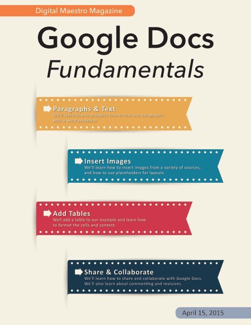
Google Docs Fundamentals
In the April 15th, 2015 issue we look at Google Docs. We learn how to properly format sentences, paragraphs, insert images and tables. We also learn how to share and collaborate on documents. Google Docs is a free cloud service from Google. There are many advantages to using a cloud service like Google Docs. We explore many of the traditional features used in most word processors and look at the features that make cloud services like Google Docs very useful.
In the April 15th, 2015 issue we look at Google Docs. We learn how to properly format sentences, paragraphs, insert images and tables. We also learn how to share and collaborate on documents. Google Docs is a free cloud service from Google. There are many advantages to using a cloud service like Google Docs. We explore many of the traditional features used in most word processors and look at the features that make cloud services like Google Docs very useful.

You also want an ePaper? Increase the reach of your titles
YUMPU automatically turns print PDFs into web optimized ePapers that Google loves.
Digital Maestro Magazine<br />
<strong>Google</strong> <strong>Docs</strong><br />
<strong>Fundamentals</strong><br />
Paragraphs & Text<br />
We’ll learn how to properly format text and paragraphs<br />
with a word processor.<br />
Insert Images<br />
We’ll learn how to insert images from a variety of sources,<br />
and how to use placeholders for layouts.<br />
Add Tables<br />
Well add a table to our example and learn how<br />
to format the cells and content.<br />
Share & Collaborate<br />
We’ll learn how to share and collaborate with <strong>Google</strong> <strong>Docs</strong>.<br />
We’ll also learn about commenting and revisions.<br />
April 15, 2015
<strong>Google</strong> <strong>Docs</strong> <strong>Fundamentals</strong><br />
Authors Note<br />
In this issue we look at the fundamentals for using <strong>Google</strong> <strong>Docs</strong>. Along<br />
the way we’ll explore some of the things that are essential for using any<br />
word processing application. The lessons we learn here can be applied<br />
to any document and should set the standard by which you and students<br />
begin to create documents. These are the skills we all need to be aware<br />
of and use regularly.<br />
The typewriter as a writing instrument has disappeared from the scene<br />
for several years now, but we still cling onto some of those old standards<br />
for creating documents. I’m often surprised to see students using skills<br />
meant for the typewriter. Most students have probably never seen a<br />
typewriter in person or touched one. They probably picked up these<br />
skills from a teacher that learned to type using a typewriter.<br />
Back then many of us were fortunate enough to learn to use the typewriter<br />
and learned skills we used in one way or another over the years.<br />
Our students are not as fortunate. They don’t attend classes for word<br />
processing skills. Sure, many students probably use some software for<br />
keyboarding, but keyboarding is not the same as using a word processor.<br />
When we learned to use the typewriter, we learned the various rules<br />
needed to create a properly formatted document.<br />
In the lessons for this issue we will learn some of the proper formatting<br />
rules for documents when using a word processor. Those rules are similar<br />
to the ones used on a typewriter but with slight changes and variations.<br />
We’ll learn about fonts, spacing after punctuation and formatting of<br />
paragraphs.<br />
As teachers we feel we need to be experts, but that is far from the truth.<br />
Learn along with your students. Put them to work. Act as their guide and<br />
be aware of what can be done with technology.<br />
– Alex Reyes<br />
Designed by Freepik.com<br />
1<br />
Digital Maestro
<strong>Google</strong> <strong>Docs</strong> <strong>Fundamentals</strong><br />
What is <strong>Google</strong> <strong>Docs</strong>?<br />
<strong>Google</strong> <strong>Docs</strong> is part of your free gmail account. <strong>Google</strong><br />
and Gmail is more than a search engine and email.<br />
<strong>Google</strong> provides an array of free tools for productivity,<br />
entertainment and learning. <strong>Google</strong> docs has free apps<br />
that fit neatly into productivity and education. Most of<br />
the tools that are used in business and productivity can<br />
be used in education by students and teachers.<br />
<strong>Google</strong> <strong>Docs</strong> is a word processor and part of a collection<br />
of free apps that includes spreadsheets and presentations.<br />
These apps are all cloud services. Cloud services<br />
are applications and storage provided by companies<br />
like <strong>Google</strong>. This means the applications and storage<br />
are managed by the company and we can use it on any<br />
device that has access to the Internet. This is very true<br />
for <strong>Google</strong> <strong>Docs</strong>.<br />
There are many advantages to cloud services like<br />
<strong>Google</strong>. The major advantage is that <strong>Google</strong> takes care<br />
of managing the applications. They regularly update<br />
the applications. They also take care of managing your<br />
documents. The documents are stored on their computers<br />
and they take care of securing them so they are not<br />
lost or damaged. Documents in the cloud also provide<br />
several advantages. These include the ability to share<br />
and collaborate.<br />
You might think that needing an active Internet connection<br />
to work on documents might be a major drawback.<br />
Of course it’s not, because <strong>Google</strong> provides applications<br />
that can be installed onto most mobile devices. Mobile<br />
devices include tablets, smart phones and Chromebooks.<br />
Applications allow you to create and edit documents<br />
if you have an Internet connection or not. When<br />
there isn’t an Internet connection, the applications<br />
saves your document on the device.<br />
This next part is the beauty of services like <strong>Google</strong> <strong>Docs</strong>.<br />
Once you are connected to the Internet, the documents<br />
are automatically sent to the cloud. A copy remains on<br />
the device to edit. Changes are regularly synced to your<br />
cloud storage. If you work on the same document with<br />
another device or computer, the changes are automatically<br />
available on all devices connected to your account.<br />
Cloud syncing provides advantages when sharing documents.<br />
We’ll learn more about sharing later. Cloud syncing<br />
also has advantages in collaboration. Collaboration<br />
is one of the important tools I will spend time talking<br />
about later.<br />
Why should we use <strong>Google</strong> <strong>Docs</strong> in the classroom?<br />
You should use it for all the reasons I just wrote about.<br />
In addition, you should use it to make your life easier as<br />
a teacher. How can <strong>Google</strong> <strong>Docs</strong> make your life easier?<br />
That is what we will explore in this issue. You should<br />
use it because it will engage your students. Students are<br />
engaged by meaningful and purposeful learning. Developing<br />
and creating provide avenues for meaningful<br />
learning. This process engages higher levels of Blooms<br />
and deeper levels of Depth of Knowledge.<br />
Digital Maestro 2
<strong>Google</strong> <strong>Docs</strong> <strong>Fundamentals</strong><br />
Start At The Beginning<br />
The focus here will be on using <strong>Google</strong> <strong>Docs</strong> with a<br />
computer and a web browser. You can use any computer<br />
that has access to the Internet. The computer<br />
should have the latest operating system and the most<br />
current browser. On windows computers that would<br />
be Windows 7 or later. On a Mac that should be 10.8,<br />
Mountain Lion or later.<br />
<strong>Google</strong> <strong>Docs</strong> works on most browsers like Internet<br />
Explorer, Safari or Firefox. I recommend you download<br />
and install <strong>Google</strong> Chrome. I will be using <strong>Google</strong><br />
Chrome in this lesson. If you can’t install <strong>Google</strong><br />
Chrome, that’s fine. Use the browser you prefer.<br />
A New Document<br />
If you don’t have a <strong>Google</strong> email account, go and create<br />
one for yourself. Sign into your account.<br />
The <strong>Google</strong> Apps Launcher is a square button made of<br />
nine smaller squares. Click on the Apps launcher.<br />
Click on the Drive button. This will open your <strong>Google</strong><br />
Drive cloud storage. This is where all your documents<br />
will be created and saved.<br />
On the left side is a panel of folders. These folders are<br />
titled My Drive, Shared with Me, Recent, Starred, and<br />
Trash. Above these folders you’ll find a menu button<br />
titled ‘New’.<br />
3<br />
Digital Maestro
<strong>Google</strong> <strong>Docs</strong> <strong>Fundamentals</strong><br />
Start At The Beginning<br />
Click on ‘New’ menu and a list of selections will display.<br />
We can create a folder, upload files, upload a folder of<br />
files or create one of three documents. These documents<br />
include <strong>Google</strong> <strong>Docs</strong>, <strong>Google</strong> Sheets, and <strong>Google</strong><br />
Slides. Click on <strong>Google</strong> <strong>Docs</strong>.<br />
The Toolbar<br />
The toolbar has a basic set of formatting tools. These<br />
include a font selector, font size and font styles. The<br />
font, font size and style are automatically set to Arial 11<br />
regular. <strong>Google</strong> <strong>Docs</strong> refers to the regular font style as<br />
Normal text. The other font styles available include bold<br />
and italic.<br />
The toolbar includes buttons on the left to print, undo<br />
an action, redo an action and a button to copy and<br />
paste formatting style information.<br />
A new document will automatically be created and<br />
opened. The document is given the generic name ‘untitled’.<br />
Let’s provide a meaningful name for the document.<br />
Click once on the document name. Type a name<br />
for the document and press enter.<br />
The other buttons include a link tool and a comment<br />
tool. The link tool is used to link to web sites or locations<br />
within the same document. The comment tool<br />
is used to comment on documents. This is very useful<br />
when sharing and collaborating on documents. You’ll<br />
find it useful when editing and grading student papers.<br />
Digital Maestro 4
<strong>Google</strong> <strong>Docs</strong> <strong>Fundamentals</strong><br />
Start At The Beginning<br />
To the right of the link and comment tool are buttons<br />
to align text. Text is automatically left-aligned. The<br />
other options include center, right and full or justified.<br />
Justified text gives even text on the left and right side.<br />
Normally, when we left-align text, it is straight on the<br />
left and leaves ragged or un-even edges on the right.<br />
When the menu is collapsed a search box is available<br />
on the left. This search box is there to help access menu<br />
options that are hidden when the menu is collapsed.<br />
For example, if we want to align text, type align in the<br />
search box. A list of text align options will appear. Use<br />
the mouse to select a text align option.<br />
To the right of the text align buttons we have the line<br />
spacing button, the numbered list button, the unordered<br />
list button, and the indent buttons.<br />
To the right of the indent buttons is the clear formatting<br />
button. This button is useful when you want to return<br />
your text to regular text without any formatting.<br />
Above the toolbar we have several menu options. All<br />
the toolbar options are available in the menu options.<br />
Most of the time we can do most formatting with the<br />
toolbar.<br />
If you find yourself using the toolbar more than the<br />
menu, you can click on the hide menu button. This<br />
comes in handy if you have a computer with a small<br />
screen and need more space for text. The same button<br />
can be used to show the menu again.<br />
The mouse isn’t the only way to select items. When a<br />
list of options is displayed in the menu, you can use the<br />
up and down arrow keys to highlight the option and<br />
press the enter key to run the selection.<br />
Shortcut keys are another way to avoid using the<br />
mouse. In this example we see a list of shortcut keys<br />
that can be used to execute the option. The ‘command’<br />
plus ‘shift’ plus ‘E’ keys can be used to center-align text.<br />
On Windows computers this would be ‘Control’ plus<br />
‘Shift’ plus ‘E’. You would press all these keys at the<br />
same time.<br />
Some people like shortcut keys while others don’t care<br />
for them. I personally like them because they are a<br />
time saver. People that don’t like them usually don’t<br />
like them because they can’t remember the keys and<br />
because it requires some finger acrobatics.<br />
5<br />
Digital Maestro
<strong>Google</strong> <strong>Docs</strong> <strong>Fundamentals</strong><br />
Web Fonts<br />
<strong>Google</strong> provides eight basic fonts. These include Arial,<br />
Comic Sans MS, Courier New, and Georgia. These fonts<br />
are a mix of sans serif fonts like Arial and Verdana.<br />
There are also serif fonts like Georgia and Times New<br />
Roman. Comic Sans MS and Impact are considered<br />
decorative fonts. The default Arial font is good for most<br />
purposes.<br />
What’s the difference between fonts? Serif fonts have<br />
little tails at the ends of each letter. These tails make<br />
it easy to read letters and words in physical print. Sans<br />
Serif fonts don’t have those tails. These fonts are commonly<br />
used for small blocks of text like titles and headings.<br />
They are more commonly used today on digital<br />
documents, which don’t have as high a resolution,<br />
although this is changing.<br />
Sans Serif fonts are easier to read on digital devices<br />
like computer screens and book readers. Screens and<br />
devices are available with greater resolutions now and<br />
it’s just as easy to read digital documents in either serif<br />
or sans serif fonts. Sans serif fonts are still used for titles<br />
and short blocks of text. Serif fonts tend to be used for<br />
longer text.<br />
Decorative fonts like Comic Sans MS or Trebuchet MS<br />
are meant for small bits of text. This would be text in<br />
flyers, invitations or signs. This font is difficult to read<br />
for long blocks of text.<br />
More Web Fonts<br />
At the bottom of the font menu list is a more fonts<br />
option. Clicking on this option will open a module with<br />
a list of fonts.<br />
These are additional fonts we can use in documents.<br />
They are referred to as web fonts. Web fonts are not<br />
installed on your computer but are available to use<br />
through the Internet. There are hundreds of fonts available.<br />
Scroll down the list to see many more.<br />
At the top of the module is a search box to search for<br />
fonts.<br />
Digital Maestro 6
<strong>Google</strong> <strong>Docs</strong> <strong>Fundamentals</strong><br />
Web Fonts<br />
To the right of the search box is a font category menu.<br />
Click on the show all fonts pull down menu. The fonts<br />
are categorized into display, handwriting, monospace,<br />
serif and sans serif.<br />
Adding Fonts<br />
We can easily add fonts to use in our documents. To<br />
add a font, find a font and click it once. The font will be<br />
listed on the right under the ‘My Fonts’ section. We can<br />
add several fonts at once.<br />
Click on the handwriting fonts category. These are fonts<br />
that resemble hand written characters.<br />
To the right of the category pull down menu is a sort<br />
option menu. This menu will sort the fonts by popularity,<br />
alphabetically, by date added and by the font most<br />
trending at the time.<br />
Click on date added. These fonts are the ones most<br />
currently made available by <strong>Google</strong>. This list is likely to<br />
change regularly.<br />
Just because you can, doesn’t mean you should. Adding<br />
too many fonts could make it difficult to find the fonts<br />
you need. Instead of adding lots of fonts all at once,<br />
select the fonts you want to use now and add more as<br />
you need them.<br />
To get rid of fonts from the my fonts section, click on<br />
the ‘x’ next to font name. Don’t worry about accidentally<br />
deleting a font you’ve used in a document, <strong>Google</strong><br />
will remember and use it when you open the document.<br />
A benefit of using web fonts in <strong>Google</strong> is that they are<br />
available to anyone that opens the document with a<br />
<strong>Google</strong> account. They don’t have to install the font.<br />
<strong>Google</strong> will load the font automatically.<br />
7<br />
Digital Maestro
<strong>Google</strong> <strong>Docs</strong> <strong>Fundamentals</strong><br />
Formatting Text<br />
<strong>Google</strong> <strong>Docs</strong> automatically use Arial 11 point font. Fonts<br />
are measured in a system called points. When formatting<br />
text, we usually change the font using the font<br />
selector menu. Once we’ve selected a font we usually<br />
change its point size from the font size pull down menu.<br />
We can stylize a font by selecting bold or italics. Bold<br />
and italics are really other fonts in the world of typography.<br />
Bold and italics are a way to change the appearance<br />
of text. Bold text is often used to add emphasis to<br />
a word or a line of text. Italic fonts are used for titles or<br />
worlds that can stand on their own. Both of these are<br />
used to add emphasis. Citations are another common<br />
use of bold or italics.<br />
An underline option is available in most word processors<br />
like <strong>Google</strong> <strong>Docs</strong>. Underline text is used less often<br />
today. Underlining was used with typewriters to add<br />
emphasis or in citations. It’s used less often today because<br />
underlined words are often seen as links to web<br />
site or resources. Don’t use underline to add emphasis<br />
to words unless used in a citation or you are told to do<br />
so.<br />
With the advent of computer technology we have other<br />
ways to add emphasis to words. We can change the<br />
color of text. Next to the underline button we have a<br />
color palette selector. Like bold or italics, its important<br />
to use color in text to add emphasis sparingly. Don’t use<br />
color in all your text unless its applied a high contrast<br />
background. Black text on a white background is the<br />
easiest to read because there is a lot of contrast. Colorful<br />
text is often used in flyers, magazine covers and with<br />
very large text. It is also used sparingly.<br />
Text Styles<br />
Each time you start a new document, <strong>Google</strong> <strong>Docs</strong> uses<br />
the Arial font at 11 points. This is called the default font.<br />
It can be tedious to change this font each time you create<br />
a new document. <strong>Google</strong>, like most modern word<br />
processors, uses styles to format bodies of text. To the<br />
left of the font selector pull down menu we see a style<br />
menu that reads normal text. This normal text is set to<br />
Arial 11 point.<br />
Let’s change this style to another font and size. Use the<br />
font selector to choose Georgia and change the size to<br />
12 points. Click on the arrow next to normal text. On<br />
the right side of the word normal text is an arrow pointing<br />
to the right. Move your mouse over to this arrow<br />
and click on it.<br />
We have two options. We can apply the normal text<br />
style, in which case the font and size will be changed<br />
back to Arial 11 point. We can update normal text style<br />
to match our current font choice. This means that the<br />
normal text will change from Arial 11 point to Georgia<br />
12 point. Click on the option to update normal text to<br />
match.<br />
Click on the normal text pull down menu. The Normal<br />
Text is now set to Georgia 12 point. Type Hello World or<br />
anything you like.<br />
Digital Maestro 8
<strong>Google</strong> <strong>Docs</strong> <strong>Fundamentals</strong><br />
Formatting Text<br />
At this point we’ve only changed and applied this style<br />
to the current document. To make sure this style is<br />
available to all future documents, we need to set this as<br />
our default style. Click on the styles format menu and<br />
go to the bottom of the styles and options. Click on save<br />
as my default styles. This style will now be applied to all<br />
future documents.<br />
We can repeat the same process to change the font and<br />
size for the other available styles. These styles include<br />
title, subtitle, and heading.<br />
Styles are very powerful. When using styles we can<br />
change the style and all the text that used the style<br />
will automatically be updated with the new style formatting.<br />
This means that if we decide to switch back to<br />
Arial 11 point, all we need to do is change the normal<br />
text style and all the text that uses this style will automatically<br />
be changed to match.<br />
Styles are useful if you plan on having a table of contents<br />
or on publishing the document as an Ebook.<br />
Let’s see how this worked. To create a new document,<br />
click on file in the menu and select new document. If<br />
you’ve hidden the menu, type new in the search box<br />
and select new document. Look at the font selector and<br />
the point size. It is set to Georgia 12 point.<br />
9<br />
Digital Maestro
<strong>Google</strong> <strong>Docs</strong> <strong>Fundamentals</strong><br />
Formatting Paragraphs<br />
We’ve learned about fonts, formatting text and styles<br />
in the previous lessons. In this lesson we bring it all<br />
together and learn about formatting paragraphs. Paragraphs<br />
are of two kinds. There are paragraphs with the<br />
indented first line and paragraphs without a first line<br />
indent. The later paragraph format is often referred to<br />
as block formatting. Paragraphs with indented first lines<br />
tend to be used for fiction text and block formatting is<br />
often used for non-fiction text.<br />
When formatting paragraphs there are some basic<br />
rules. Those rules have changed over time to adapt to<br />
modern technology. When we were in school teachers<br />
told us to indent our first paragraph about half an inch<br />
or about the width of your thumb. This is because we<br />
were often using pen or pencil and paper. When we<br />
took keyboarding in a typing class we learned that the<br />
first line indent was one tab stop.<br />
With technology, the rules have changed for a variety of<br />
reasons and the biggest reason has more to do with the<br />
fonts we use to compose on computers. I won’t go into<br />
that here but at the end of the issue I have a brief overview<br />
of why fonts have changed the world of writing<br />
with word processors.<br />
The first line indent with modern word processors is<br />
one Pica. Picas are used in the world of desktop publishing<br />
but are often used with plain old word processing.<br />
A pica is equivalent to two spaces. This is different from<br />
a tab stop which is five spaces. Why two spaces or one<br />
Pica? I explain all that at the end of this issue. In brief,<br />
five spaces is too much of an indent and leaves a large<br />
hole in our writing.<br />
What about the spacing between paragraphs? In school<br />
we were taught to skip one line on our paper between<br />
paragraphs. On a type writer we were taught the same<br />
thing. There was some difference and it depended on<br />
how you were taught. If you indented paragraphs, you<br />
might have been told not to skip a space. In the world<br />
of word processing the rules are similar but modified<br />
to accommodate modern typography. The common<br />
way most people are taught to skip a space between<br />
paragraphs is to press the enter key twice. This is a hold<br />
over from the type writer days and old habits are hard<br />
to break.<br />
Another hold over from the days of the typewriter is<br />
the use of two spaces after a period. There is only one<br />
space used after a period.<br />
Now that we’ve reviewed how it used to be, let’s learn<br />
how it should be done.<br />
Digital Maestro 10
<strong>Google</strong> <strong>Docs</strong> <strong>Fundamentals</strong><br />
Block Paragraphs<br />
Let’s begin by setting our normal text style. Select a font<br />
and font size for your body text. In my example I’ll stay<br />
with Arial 11 point font. Most people use Times New<br />
Roman or Georgia 12 point font. This font and size is<br />
easy to read. Once you’ve updated the body text font<br />
and size, select update normal text to match.<br />
Let’s work on the paragraph. Go to the menu and select<br />
format. Go down the list of options to line spacing. In<br />
the options menu for line spacing, select custom spacing.<br />
A line spacing customization box will open with options<br />
to change the spacing before or after paragraphs. In the<br />
box that reads ‘after’, enter the number 6.<br />
Why six? We set our font size to 12 points. If we were<br />
to press the enter key twice we would have a space of<br />
12 points plus some additional space above and below<br />
the line so we don’t crowd the letters like g or q, which<br />
have descenders. The tails that make the letter g and<br />
the letter q are descenders because they go below<br />
the imaginary line where all the other letters sit. That<br />
leaves a large space between paragraphs. If we enter<br />
the number 6, we are telling the word processor to use<br />
6 points instead of 12 points for a line once we hit the<br />
return key. When we do this there is still space used by<br />
the font for descenders, and enough space between<br />
paragraphs to know there are separate paragraphs.<br />
Without going into a lot of detail that’s the basic reason<br />
for setting this paragraph styling option.<br />
After you type the number 6, click the ‘apply’ button.<br />
Type a few lines of text for a paragraph and press the<br />
enter key once. Type a few more lines for the next paragraph.<br />
Notice the spacing between paragraphs. <strong>Google</strong><br />
Doc styles does not keep this information as part of the<br />
normal text style. The good news is that if you create<br />
this style in a document it’s automatically applied it to<br />
all the text in the document.<br />
11<br />
Digital Maestro
<strong>Google</strong> <strong>Docs</strong> <strong>Fundamentals</strong><br />
Indented Paragraphs<br />
Paragraphs with indented first lines are much easier to<br />
setup. Keep in mind that extra space after a paragraph<br />
is used to separate paragraphs. First line indents are<br />
used to indicate the start of a new paragraph. Using a<br />
first line indent and extra space between paragraphs is<br />
too much. When using first line indents, don’t use extra<br />
space between paragraphs.<br />
To create the first line indent in paragraphs we’ll use<br />
the ruler. In the ruler there are two shapes. The upside<br />
down triangle is used to set the left indent. The left<br />
indent will indent all the text in a paragraph. Above the<br />
upside down triangle is a small bar. This is used to set<br />
the first line indent. It recognizes the first line in a paragraph<br />
and applies the indent to the first line.<br />
In my example you’ll see the first letter of the paragraph<br />
is above the third letter of the sentence below. That’s<br />
all you need to do to set the first paragraph indent.<br />
All paragraphs you create from this point will have the<br />
same first line indent.<br />
Click and drag the rectangle to the right. As you move<br />
the rectangle it will snap to points on the ruler. Move it<br />
until it snaps to one point then to another. This should<br />
now place your first line indent two character spaces<br />
into the paragraph.<br />
Here’s something to keep in mind. The first paragraph<br />
is not indented. Indents are used to show the start of a<br />
paragraph. You don’t need to show that the first paragraph<br />
is a paragraph. I hope that makes sense.<br />
<strong>Google</strong> <strong>Docs</strong> is still a little primitive in what it can do<br />
compared to industry standards like Microsoft Word.<br />
You will need to help it along. If you’ll be using block<br />
paragraphs then you can set the font, font size and<br />
spacing after paragraphs. Once this is done all you need<br />
to do is compose your content.<br />
If you’ll be using first line indents, you can set the font<br />
and font size. Write your first paragraph and when you<br />
are ready to write your second paragraph, set the first<br />
line indent. From this point forward the first line of the<br />
paragraph will automatically be indented.<br />
Digital Maestro 12
<strong>Google</strong> <strong>Docs</strong> <strong>Fundamentals</strong><br />
Image Placeholders<br />
We just went through something a little complicated so<br />
I thought we’d do something fun. Let’s put some pictures<br />
into our document. <strong>Google</strong> <strong>Docs</strong> provides several<br />
ways to place images into a document. We’ll explore<br />
each option and talk about what that means for teachers<br />
and students.<br />
As a teacher I recommend students write out content<br />
before they go through the process of inserting any<br />
images into the document. Placing images in the document<br />
should be the very last thing they do before<br />
publishing. If you don’t do this, students will spend<br />
more time getting pictures and putting them into place<br />
and almost no time creating content. I recommend they<br />
write out the content, edit and revise for publishing.<br />
Once the content is ready and polished, students can<br />
begin looking for pictures and placing them into the<br />
document.<br />
This does not mean they should not think about where<br />
to place images in the document. As they write out the<br />
content of the document the location for images will<br />
be very easy to figure out. I go through this every time I<br />
write this magazine. The content is first and it leads me<br />
to the images and where they should go.<br />
It’s important to keep this teachable moment in mind.<br />
Make your students aware of copyright and citing<br />
their sources for media they plan to use in documents.<br />
Whenever possible try to use images and media that is<br />
in the public domain or part of the creative commons.<br />
The first option we have for inserting images into our<br />
document is the option to upload an image from the<br />
computer. This option requires you to plan ahead a little<br />
and gives you the opportunity to prepare the image.<br />
Thinking of where images go is a big part of publishing<br />
anything that contains images. The placement and size<br />
of images is very important. Documents have a finite<br />
amount of space. Digital documents we create still<br />
conform to their physical counter parts. Documents are<br />
typically 8.5 inches wide and 11 inches tall in the United<br />
States. This is often a balancing act between the space<br />
for content and the space for images. Images have as<br />
much to say as content and vise versa.<br />
Once the content is created, placing images on the document<br />
can be a decision made by students as they work<br />
either individually or as a group. I will give you some<br />
ideas to help students decide where to place images.<br />
Providing a guide to students that is visual and easy to<br />
manipulate can be very helpful.<br />
It might seem that the easiest thing to do is to click the<br />
insert option in the menu and select image. I’m going to<br />
recommend you resist that temptation and follow me<br />
through a process you might find more useful.<br />
As I produce this magazine I use an application called<br />
InDesign to layout my content. This application helps<br />
me see where I can place images and what they might<br />
look like. Before I place an image in the document I set<br />
placeholders for the images. These placeholders are<br />
rectangular boxes that represent the eventual location<br />
of my images. The rectangular boxes represent not only<br />
the location but the width and height of the image.<br />
We can do the same thing right here inside of <strong>Google</strong><br />
<strong>Docs</strong>. This will make students work look more polished<br />
and teach them a few more things in the process. This<br />
process has an added advantage is that it will give you<br />
a little more control over the images you place onto the<br />
document.<br />
13<br />
Digital Maestro
<strong>Google</strong> <strong>Docs</strong> <strong>Fundamentals</strong><br />
Image Placeholders<br />
In my example I have some lorem ipsum text. Lorem<br />
Ipsum text is often used to provide filler text for a document<br />
so that those deciding on the layout of a document<br />
can have an idea for where text and images will<br />
go. The lorem Ipsum text will be replaced by the actual<br />
content later.<br />
With some text in your document, click on the insert<br />
menu option and select drawing. The Drawing tool in<br />
<strong>Google</strong> <strong>Docs</strong> will help us create place holders for our<br />
image and eventually help us prepare the images for<br />
placement onto the document.<br />
The mouse arrow will change to a cross-hair. Click and<br />
drag out a rectangle. The size doesn’t matter. Just don’t<br />
make it too big.<br />
We now have a rectangle to use as a place holder.<br />
Click the save and close button.<br />
Click on the shape menu option.<br />
The rectangle will be placed in the document where we<br />
had our cursor. Images, drawings and media are automatically<br />
placed at the location of the cursor. They’re<br />
also placed as in-line elements. This means that the<br />
document treats the image as just another piece of<br />
text. In my example the rectangle pushed the text to<br />
the right and is on the same line as the text.<br />
Hover over shapes and choose the rectangle.<br />
Digital Maestro 14
<strong>Google</strong> <strong>Docs</strong> <strong>Fundamentals</strong><br />
Image Placeholders<br />
Text Wrap<br />
Click once on the placeholder.<br />
Below the rectangle you will see a menu of options<br />
appear. The first option is the in line option. The option<br />
next to it is the wrap text option. Click once on this<br />
option.<br />
Click on the wrap text option and move the rectangle<br />
back to the left edge of the page. As you move the<br />
rectangle, red lines will appear near the edges of the<br />
document. These are guides to let you know you are at<br />
the edge of the printable document or the margins.<br />
The text will wrap to the right of the box.<br />
We can resize this rectangle by using the handles. Use<br />
the right handle to make the rectangle thinner by moving<br />
it to the left. Use the top or bottom handle to make<br />
the rectangle shorter.<br />
Click and drag the box over to the right. The text will<br />
wrap around the box to the left and to the right if there<br />
is still more space on the right. With the rectangle<br />
selected, click on the break text option. The break text<br />
option pushes the text either up or down below the<br />
rectangle.<br />
Which one do you use? That depends on how you want<br />
the image and the content to look on the document.<br />
In most situations you will probably use the wrap text<br />
option.<br />
Move the rectangle around and the text will automatically<br />
wrap around.<br />
15<br />
Digital Maestro
<strong>Google</strong> <strong>Docs</strong> <strong>Fundamentals</strong><br />
Image Placeholders<br />
This is our placeholder. We can create as many of these<br />
placeholders as we want, and use them in our document<br />
to give us an idea where images can or should go.<br />
The placeholder is very useful because it gives us immediate<br />
feedback for what will happen to the text when<br />
we place an image onto a location.<br />
Most images we’ll place onto our document are either<br />
oriented as portrait or landscape. Portrait oriented images<br />
have a narrow width and a tall height. Landscape<br />
images have a wide width and a short height. Images<br />
can also be square.<br />
We can control the flow of text around place holders<br />
and images. To the right of the text break option is a<br />
pull down menu with several measurement options.<br />
On my document these measurements are in inches.<br />
In the rest of the world that used metrics, these measurements<br />
will be in centimeters. Click on the smallest<br />
measurement 1/16 and the text will get closer to the<br />
placeholder or image. Choose other measurements to<br />
find one that will work in your document. I usually select<br />
the 1/8 inch option, which is the automatic spacing<br />
selected by <strong>Google</strong> <strong>Docs</strong>.<br />
In this example I have the place holder frame close to<br />
both the top and left margin. The text that flows around<br />
the place holder looks awkward on top because there<br />
is a 1/8 space at the top. To avoid this awkward look,<br />
try not to place your images where text and margins<br />
conflict.<br />
The spacing is applied uniformly around the image. This<br />
is fine for most situations but can cause problems when<br />
working with text along the edges of the margin.<br />
Digital Maestro 16
<strong>Google</strong> <strong>Docs</strong> <strong>Fundamentals</strong><br />
Adding Images<br />
Now that you have decided where to place images, let’s<br />
get images and place them on the document. In this<br />
example I will place images from my computer. Later we<br />
will explore adding images from other locations.<br />
Click once on the placeholder and click on edit in the<br />
menu below the placeholder.<br />
Click on the ‘choose image’ button or drag and drop an<br />
image into the upload area.<br />
The drawing app will open. Click on the ‘add image’<br />
button.<br />
In this example I’ve selected an image of the Earth from<br />
space. The image is very large at 1280 by 1280 pixels. I<br />
mention this for two reasons. People will usually select<br />
images that are way too big or too small. Very large<br />
images are easy to resize and not loose quality. In this<br />
image I can resize it and it will still look very good.<br />
17<br />
Digital Maestro
<strong>Google</strong> <strong>Docs</strong> <strong>Fundamentals</strong><br />
Adding Images<br />
I’ve uploaded a smaller version in this example to<br />
demonstrate. This image is much smaller than the place<br />
holder.<br />
With the larger image the image quality looks very good<br />
when we make it smaller.<br />
After I resize the image we can see that the image quality<br />
has suffered.<br />
Using the drawing program we can use the placeholder<br />
to help us resize the image. When resizing the image<br />
it’s important to use the corner handles. The corner<br />
handles will help resize the image proportionally. This<br />
means you won’t accidentally make the image too fat or<br />
too thin.<br />
Resize the image and place it next to the place holder.<br />
When its next to the place holder move the image up<br />
or down until a red smart guide appears that helps you<br />
align the top edge of the image with the top edge of the<br />
placeholder. The smart guide helps snap the image to<br />
match the top of the placeholder.<br />
Digital Maestro 18
<strong>Google</strong> <strong>Docs</strong> <strong>Fundamentals</strong><br />
Adding Images<br />
Drag the lower right corner of the image to the left until<br />
smart guides help you snap the lower part of the image<br />
to the lower part of the placeholder. These smart guides<br />
are blue and they will appear on either side of the image.<br />
They are measurement guides to let you know that<br />
the image height matches the placeholder height.<br />
Now I need to get rid of the place holder. Click once on<br />
the placeholder and tap the delete key on your keyboard.<br />
Click the save and close button.<br />
In my example I’ve modified the placeholder so it’s<br />
square. This makes it easy to use this image in my document.<br />
The image will be placed into the same location as the<br />
place holder.<br />
19<br />
Digital Maestro
<strong>Google</strong> <strong>Docs</strong> <strong>Fundamentals</strong><br />
Cropping Images<br />
In our next image we will be using an image that is a<br />
rectangle placed for a landscape image. Click once on<br />
the place holder and click the edit option.<br />
We will crop out parts of the image we don’t need and<br />
keep the area we do for the rectangle. Click once on the<br />
image to select it and click the crop tool in the menu.<br />
Click on the import image button.<br />
I’ve selected another very large image. This image isn’t<br />
in the landscape format. We will be using some of the<br />
draw tools to help us crop and place this image in the<br />
area we’ve designated.<br />
Black handles will appear around the inner part of the<br />
image.<br />
I’ll resize the image and place it next to the placeholder.<br />
Digital Maestro 20
<strong>Google</strong> <strong>Docs</strong> <strong>Fundamentals</strong><br />
Cropping Images<br />
I’ll drag the top black handle until the top red smart<br />
guide aligns to the top of the place holder. Make sure to<br />
use the black handle.<br />
Click once outside the image to see what the image<br />
looks like.<br />
Click and drag the image below the place holder until<br />
the left smart guide helps align the image to the left of<br />
the placeholder.<br />
At this point it doesn’t matter where in the image the<br />
cropping takes place. We will be fine tuning the selection<br />
later. I’ll repeat the process using the bottom black<br />
handle.<br />
The blue smart guides will let us know that the height<br />
of our image matches the placeholder.<br />
21<br />
Digital Maestro
<strong>Google</strong> <strong>Docs</strong> <strong>Fundamentals</strong><br />
Cropping Images<br />
The image is much wider than my place holder. Let’s<br />
use the crop tool to adjust the width. Click the image<br />
once to select it and click the crop tool.<br />
Notice that the complete image is still there. The drawing<br />
tool is non-destructive. Use the black handles to<br />
move the right crop area to match the width of the<br />
placeholder. Don’t worry yet if the image isn’t looking<br />
the way you intend.<br />
Use the blue corner handles to drag in the image and<br />
make it smaller. I’ll make mine smaller so that the right<br />
of the image fills in the rectangle. The smart guides will<br />
help you align the edges of the image to the cropped<br />
area.<br />
The image has been cropped to match the placeholder.<br />
My image is missing a large part on the right and isn’t<br />
centered on what I want to show.<br />
After resizing the image, the area I want to show is not<br />
in the cropped area of the rectangle. To move the image,<br />
click inside the cropped area and move the image<br />
around. Click outside the image to see what it looks like.<br />
Digital Maestro 22
<strong>Google</strong> <strong>Docs</strong> <strong>Fundamentals</strong><br />
Cropping Images<br />
If you need to adjust the image, double click the image.<br />
The crop and resize handles will be available to adjust<br />
as needed.<br />
Get rid of the placeholder and click the save and close<br />
button.<br />
This process of using placeholders did take a few extra<br />
steps but you’ll find it will be more helpful than just<br />
dumping images into the document.<br />
If you were to simply insert an image, <strong>Google</strong> <strong>Docs</strong><br />
would place the image into the insertion point and<br />
move all your text to accommodate the image. This<br />
causes problems when adding multiple images. Your<br />
text will jump all over the place because it will try to accommodate<br />
the text wrapping options for other images.<br />
Try inserting multiple images without using this process<br />
and you’ll see why this is much better.<br />
23<br />
Digital Maestro
<strong>Google</strong> <strong>Docs</strong> <strong>Fundamentals</strong><br />
Other Image Options<br />
Snapshot<br />
A snapshot uses the web-cam on your computer to take<br />
a picture. In the draw program click on the insert image<br />
button. Click on the take a snapshot option.<br />
<strong>Google</strong> and your browser use the Adobe Flash player to<br />
access your computer’s screen and devices. You need<br />
to grant the Flash player permission. Click on the ‘allow’<br />
radio button and click the ‘close’ button.<br />
If you have a web camera connected to your computer,<br />
it will display anything that is shown in front. Mine is<br />
covered so you see the orange Post-It I put in front.<br />
Place something to take a picture of in front of the web<br />
cam. Below the web-cam stream is a button to take a<br />
snapshot. Click on this button.<br />
To use this snapshot, click the select button. The image<br />
will appear in the draw area. Use the same tools we<br />
learned about earlier to prepare this image.<br />
The web-cam snapshot option is great if you don’t have<br />
a digital camera handy. If you have access to take a<br />
picture with a digital camera I highly recommend you<br />
use it. The pixel resolution on web-cams is very low.<br />
With smart phones you can take a picture and use the<br />
<strong>Google</strong> Drive app to upload it into your drive for access<br />
here.<br />
A Picture From A URL<br />
URL is an acronym for Universal Resource Locator. A<br />
URL is a link to anything on the Internet. Using the URL<br />
for an image is not very common. There are several<br />
drawbacks when linking to a URL. The owner of the<br />
image can remove it or change the image location. In<br />
which case the image will no longer appear in your<br />
document. The image itself can be changed and the<br />
replaced image may not be what you want. You need<br />
to have the exact URL to the image in order for it to<br />
appear in your document.<br />
The benefits of using a linked image means you don’t<br />
have to download the image onto your computer. It’s<br />
best if you link to an image on your own <strong>Google</strong> Drive<br />
or web site.<br />
I’ll be using an image from Wikimedia Commons. The<br />
images in Wikimedia Commons use the Creative Commons<br />
License for its media. Find an image you want to<br />
use and right click on it. Select copy image location or<br />
copy image URL from the contextual menu.<br />
Digital Maestro 24
<strong>Google</strong> <strong>Docs</strong> <strong>Fundamentals</strong><br />
Other Image Options<br />
Paste the URL into the URL box. If the image URL is correct,<br />
you will see the image appear below the link.<br />
Click select to place the image into the drawing application.<br />
Your Albums<br />
This option accesses your images in <strong>Google</strong> Plus.<br />
Through <strong>Google</strong> Plus you can take images with your<br />
smart phone and upload them for use in your documents.<br />
<strong>Google</strong> Plus is a free app from <strong>Google</strong> that can<br />
be used on most smart phones and tablets.<br />
<strong>Google</strong> Drive<br />
Your Albums with <strong>Google</strong>+ may not be accessible in<br />
your district because it’s a social networking site. In this<br />
case you can use <strong>Google</strong> Drive. <strong>Google</strong> Drive is for more<br />
than just documents. <strong>Google</strong> also provides free apps for<br />
most smart phones and tablets.<br />
Find the image you want to use and click on it to select<br />
and place in the drawing application.<br />
Search<br />
<strong>Google</strong> provides a link to many images in the public domain<br />
and the Creative Commons. Search for an image,<br />
click on it, and click select to place it into a document.<br />
There are many resources to gather and place images<br />
into documents. Encourage your students to take their<br />
own images or use the <strong>Google</strong> search option to make<br />
sure they don’t violate copyright. Use a combination of<br />
these methods to place images into documents.<br />
25<br />
Digital Maestro
<strong>Google</strong> <strong>Docs</strong> <strong>Fundamentals</strong><br />
Tables<br />
Tables are very useful for organizing information. When<br />
we insert tables into documents they are always in-line.<br />
Remember when we started adding images. In-line images<br />
were the automatic option when new images were<br />
inserted. Images have text wrap options available, but<br />
these options are not available for tables. Tables will<br />
automatically wrap text above and below. Tables cannot<br />
be moved unless you copy and paste the table to a new<br />
location on the document.<br />
Once you have a table in place there are several tools<br />
to help format the table and the contents of the table.<br />
Let’s place a simple table into our document. Click once<br />
in the location where the table will be placed. Make<br />
sure you have enough room on the page for all the<br />
information in the table. We can make the table longer<br />
but it might run across pages and this doesn’t look very<br />
good.<br />
Click on Insert in the menu and move over the table option.<br />
A fly out menu will open with a grid. This grid will<br />
help you select the number of columns and rows for the<br />
table. If you don’t know how may rows or columns you<br />
will need, it’s okay, we’ll learn how to add or remove<br />
columns and rows later. For this example let’s create a<br />
table with four rows and four columns.<br />
When the table is inserted each row and column is<br />
uniform in size and the entire table takes up the space<br />
between the page margins. The cursor appears in the<br />
first cell. Each box of a table is called a cell. The top row<br />
is usually used for the column headers. These are the<br />
titles for the columns of information.<br />
This table will hold data for the Apollo Lunar Landings.<br />
We’ll place the Apollo mission, landing date and location.<br />
Our table has one too many columns. Let’s delete the<br />
last column.<br />
Click once on the top cell in the last column. Once the<br />
cursor is in the cell, right click to get a contextual menu<br />
Select delete column from the menu options.<br />
Digital Maestro 26
<strong>Google</strong> <strong>Docs</strong> <strong>Fundamentals</strong><br />
Tables<br />
You can also go to the menu and click on Table. The<br />
option to delete the column is available here too.<br />
The columns are automatically resized to fill in the<br />
space of the missing column.<br />
There were six Apollo landings and we only have three<br />
rows. Let’s add rows. Click once on the first cell of the<br />
last row. Either right click to get the contextual menu or<br />
click on table in the menu.<br />
Select the option to insert row below. Repeat this step<br />
two more times.<br />
We have a nice table but it’s a little plain. Let’s add<br />
some color. Select the first column by clicking on the<br />
first cell then dragging to the right to highlight all three<br />
cells.<br />
Right click for the contextual menu or go to the menu<br />
and click on table. Select table properties from the<br />
menu options.<br />
In my example the table has run off the page and onto<br />
the next page. That’s okay we’ll learn how to adjust this<br />
later.<br />
The table properties module will open. Click on the cell<br />
background color option. A palette of colors will display.<br />
Let’s select a color.<br />
27<br />
Digital Maestro
<strong>Google</strong> <strong>Docs</strong> <strong>Fundamentals</strong><br />
Tables<br />
Once you’ve selected the color, click the Ok button.<br />
Highlight the cells again and let’s make the text bold.<br />
Click on the bold style button in the menu.<br />
When selecting colors for your table cells make sure the<br />
text is legible. I say this because my students like to pick<br />
very dark colors where mere 51 year old mortals like<br />
myself can no longer see the text!<br />
To force the table onto the next page, click on an empty<br />
line before the table. In the menu click on insert and<br />
select page break. The table is forced onto the following<br />
page.<br />
We still have a problem where the table runs from one<br />
page to another. You should avoid this when possible.<br />
There are several ways to fix this issue. We can edit our<br />
text so there is room for the table. In most situations<br />
this may not be a good option, because it requires a<br />
great deal of editing. Another way is to force the table<br />
to go onto the next page. This leaves us with a large<br />
blank space at the bottom of the page. It’s better than<br />
breaking up the table across pages.<br />
There is one more way to fix this table problem. We will<br />
touch on that in the next lesson.<br />
Digital Maestro 28
<strong>Google</strong> <strong>Docs</strong> <strong>Fundamentals</strong><br />
Page Setup<br />
<strong>Google</strong> <strong>Docs</strong> still assumes you will one day choose to<br />
print this document. To that end, it uses standard page<br />
preferences when new documents are created. Click on<br />
file and select page setup<br />
The page is automatically setup for 8.5” by 11”. The<br />
margins are set to one inch all the way around. If you<br />
don’t plan to print this document, we can add some<br />
real-estate for our content.<br />
Default Page Setup<br />
We can change the page size and margins for all future<br />
documents. Click on File and select page setup.<br />
In my example I’ll keep the standard letter size but<br />
adjust the margins. I like to have a larger margin at the<br />
bottom of the page for footers. Students will place their<br />
citations in the footer. I’ll leave three quarter inches at<br />
the bottom and half an inch on the other sides.<br />
To set this as my default for future documents, I’ll click<br />
the ‘set as default’ button. Once the default is set, click<br />
the OK button. The changes will be applied to this document<br />
and all future documents.<br />
In my example I’ll change the top and bottom margins<br />
to a quarter inch. I’m doing this because I don’t want to<br />
disturb the placement of my images along the left and<br />
right margins.<br />
In the previous lesson we had difficulty with the table<br />
going across pages. Our solution was to force the table<br />
onto another page. We can avoid this by adjusting the<br />
top and bottom margins. With the margins adjusted I’ll<br />
click the OK button.<br />
29<br />
Digital Maestro
<strong>Google</strong> <strong>Docs</strong> <strong>Fundamentals</strong><br />
Share and Collaborate<br />
A very powerful feature of using cloud services like<br />
<strong>Google</strong> <strong>Docs</strong> is the ability to share and collaborate on<br />
documents. This is becoming more common place as<br />
the Internet is available to more people.<br />
Students can share their documents with teachers or<br />
other students. Sharing a document with the teacher<br />
is one way to submit a finished assignment. Sharing<br />
documents with other students is a way for students to<br />
collaborate.<br />
Sharing documents is very easy. A share button is available<br />
within the document while you are editing. It is<br />
part of the menu options. The share button is located<br />
on the far right. Let’s click the share button.<br />
To the right of the email field is a pull down menu with<br />
the can edit option automatically selected. This means<br />
that the recipient will be able to make changes to the<br />
document.<br />
If we don’t want the recipient to make changes, we can<br />
select the can view option. This means that the recipient<br />
will be able to see the document but cannot make<br />
any changes.<br />
The pull down menu also provides a ‘can comment’<br />
option. This option can be used for collaboration if you<br />
don’t want to give the other person edit rights but you<br />
want feedback.<br />
You will be prompted to provide the email address of<br />
the recipient. The email address should be another<br />
gmail account so the recipient can view the document<br />
or edit as needed.<br />
Digital Maestro 30
<strong>Google</strong> <strong>Docs</strong> <strong>Fundamentals</strong><br />
Share and Collaborate<br />
Can Edit Privileges<br />
When you give someone privileges to edit a document,<br />
he or she can do anything to the document that you<br />
can. The person that receives the shared document<br />
can delete it from their Drive account but it will not be<br />
deleted from your account. You are the owner of the<br />
document and it cannot be deleted by anyone but you.<br />
Keep in mind that if you delete a document owned by<br />
you and shared with others, they will no longer have<br />
access to the document. This is true when the owner of<br />
a document deletes any original shared document.<br />
A document can be edited live with other collaborators.<br />
When someone is working on a document, you will see<br />
their <strong>Google</strong> avatar in the upper right side of the document.<br />
You will also see a color coded cursor when the<br />
person is editing the document.<br />
View Only Privileges<br />
When a user has view only privileges, that’s all the<br />
person can do. The menu options of the person are very<br />
limited. The document can be copied, or downloaded.<br />
It can also be shared but the owner must approve the<br />
sharing.<br />
Can Comment<br />
The option to give comment privileges is a cross between<br />
edit privileges and view only privileges. The<br />
person can make changes to the document like someone<br />
that has edit privileges, but the changes are only<br />
suggestions. On the right side of the page the person<br />
will see a green menu option that reads suggesting. The<br />
changes or additions are surrounded by a green box.<br />
The owner of the document or the ones that have edit<br />
privileges can decide to accept or reject the changes.<br />
Those with edit privileges can edit the suggestion<br />
before applying them. A document can have multiple<br />
suggestions from multiple people that have comment<br />
only privileges. Those with edit privileges can switch<br />
over to suggesting mode and provide suggestions to a<br />
document.<br />
31<br />
Digital Maestro
<strong>Google</strong> <strong>Docs</strong> <strong>Fundamentals</strong><br />
Share and Collaborate<br />
Integration<br />
The suggesting option is a great way for teachers to<br />
provide feedback to students. Teachers can made suggestions<br />
or leave notes about specific words, sentences,<br />
paragraphs or media in a document. Students can take<br />
the recommendations and apply changes as needed.<br />
Students can reply to teacher suggestions if they are<br />
unsure about what to do with the suggestions.<br />
This two way communication is much more efficient<br />
than the traditional paper and pencil. Students are<br />
more willing to make updates and changes in a living<br />
document. You can see their updates and provide more<br />
feedback regularly. This means you don’t have to wait<br />
until assignments are due.<br />
Digital Maestro 32
<strong>Google</strong> <strong>Docs</strong> <strong>Fundamentals</strong><br />
Revision History<br />
<strong>Google</strong> <strong>Docs</strong> automatically keeps a revision history. Any<br />
significant changes to a document can be tracked back<br />
in time from the time the document was created.<br />
To access the revision history, you will need to click the<br />
link that reads ‘all changes saved in Drive’. A panel will<br />
open on the right side of the browser with all the saved<br />
changes. The revision history also contains the revisions<br />
made by collaborators and suggestions.<br />
The revisions represent significant changes to the document.<br />
If we want to look at more detailed changes to<br />
the document there is a show more detailed revisions<br />
button at the bottom of the panel.<br />
If we don’t want to restore a version all we need to do<br />
is close the revision history panel.<br />
We can click on one of the revisions and it will update<br />
on the document.<br />
If we want to return to this version of the document,<br />
click ‘restore this version’ link.<br />
33<br />
Digital Maestro
<strong>Google</strong> <strong>Docs</strong> <strong>Fundamentals</strong><br />
About Fonts<br />
The topic of fonts is a very long topic and not one that<br />
I can fully cover here. I want to explain why we have<br />
changed the way we write sentences and paragraphs in<br />
word processors as apposed to type writers.<br />
Typewriters<br />
Back when Gutenberg developed the printing press,<br />
all the letters were etched onto metal. Each letter was<br />
fashioned to print clearly and legibly onto paper. There<br />
were bits of metal used to space sentences and even<br />
lines between sentences. Most of the names used for<br />
these spacers are still used in typography today.<br />
With the advent of the typewriter anyone could quickly<br />
create printed works. The typewriter was a machine<br />
that needed standardization to work properly. This<br />
standardization meant that the space between each<br />
letter was exactly the same. There was only one font on<br />
the typewriter until the advent of electric typewriters<br />
and movable type options at the end of a ball, but these<br />
were still limited to two or three typefaces. The fixed<br />
space between letters had more to do with the rail that<br />
slowly advanced the roller across the page. The notches<br />
were evenly spaced and so was the space between<br />
each letter.<br />
Because the space between each letter was the same,<br />
we needed a way to separate paragraphs. Five spaces<br />
was used to indent paragraphs. If a paragraph was not<br />
indented, then the roller was advanced two lines by a<br />
handle to separate paragraphs. The electric typewriter<br />
removed the lever and provided a motorized advance<br />
of the roller with a return key. That’s why people still<br />
press the enter key twice on a computer to space out<br />
blocked paragraphs. The typewriter used the same<br />
space for each letter and the same space between each<br />
line. Rules had to be created to deal with paragraphs.<br />
Similar rules had to be created for emphasizing text.<br />
With typewriters we used the back space to go over the<br />
word we wanted to bold and type over the same letters.<br />
Wow! Did we really do that? We also used the underline<br />
key to underline words. To do this we did the same<br />
thing. We back spaced and used the underline key to go<br />
over the same word.<br />
Computers<br />
Modern word processing didn’t come right away with<br />
the advent of the computer. Text on the screen was<br />
pretty much like the text on a type writer. The resolution<br />
of monitors was very primitive back then and<br />
letters were placed in blocks of pixels. Computers used<br />
monospaced fonts. This means that each letter took up<br />
the same amount of space as each other letter. This was<br />
pretty much the same way as with typewriters.<br />
Computers became more sophisticated and companies<br />
developed software for desktop publishing. They developed<br />
software to create documents that looked like<br />
those in magazines and newspapers, which used type<br />
setting metal letters much like the old Gutenberg’s original<br />
printing press.<br />
Word processors started appearing and so did the variety<br />
of fonts. With better technology we could now get<br />
better type setting. Instead of using monospaced fonts,<br />
word processors and desktop publishing software could<br />
use proportional fonts. Proportional fonts don’t use the<br />
same space as every other letter. The space allotted<br />
to each letter is proportional to the letter. The space<br />
between letters is also proportional. With proportional<br />
fonts the average person could create professional<br />
quality looking documents just like news papers and<br />
magazines.<br />
Proportional fonts changed the way we write documents.<br />
Proportional fonts made the five spaces in<br />
front of a paragraph look awkwardly large. Pressing the<br />
return key twice between paragraphs also produces a<br />
large space between paragraphs.<br />
We still use styles to add emphasis to words. These<br />
styles include bold, italics and underline. With the advent<br />
of the Internet and hyper-links we encountered another<br />
issue. An underlined word means a link to a web<br />
Digital Maestro 34
<strong>Google</strong> <strong>Docs</strong> <strong>Fundamentals</strong><br />
About Fonts<br />
page. As a result, we don’t underline text anymore. The<br />
citation styles have been changed to reflect the need to<br />
move away from the typewriter to the modern world of<br />
word processing.<br />
This is a very simplified version of the evolution of fonts<br />
and producing documents. We still carry a lot of the<br />
old type writer habits. I’m always fascinated when my<br />
students, who have never seen a typewriter, still indent<br />
five spaces and press the enter key twice between paragraphs.<br />
Proportional Font<br />
Monospaced Font<br />
Sans Serif Font<br />
Serif Font<br />
35<br />
Digital Maestro
<strong>Google</strong> <strong>Docs</strong> <strong>Fundamentals</strong><br />
Copyright, Public Domain and Creative Commons<br />
Copyright should be part of any lesson we have with<br />
students. Copyright is more important when using<br />
technology. It’s very easy for students to copy and paste<br />
content from anywhere. Copyright is easy as long as you<br />
sight sources.<br />
There is plenty of content in the public domain and part<br />
of the creative commons. Content that is in the public<br />
domain is content that is no longer covered by copyright<br />
law. This often includes older works from authors<br />
like Mark Twain and Shakespeare. There is plenty of<br />
media in the public domain from early years of movies<br />
and music. Plenty of images are also in the public domain.<br />
To find content in the public domain do a search<br />
on the Internet for the term public domain.<br />
More recent content is often covered by copyright.<br />
There is a small and growing segment of content that is<br />
covered by a Creative Commons license. Content that<br />
falls under the Creative Commons License is free for<br />
you to use and in some instances modify as long as you<br />
give credit to the creator of the content. That’s the idea<br />
behind sites like Wikimedia Commons. All the media<br />
on this site falls under the Creative Commons license.<br />
Students can use the content on this site and provide<br />
citation for the source.<br />
Digital Maestro 36