Lateral interference, spacing, and word legibility
Lateral interference, spacing, and word legibility
Lateral interference, spacing, and word legibility

Create successful ePaper yourself
Turn your PDF publications into a flip-book with our unique Google optimized e-Paper software.
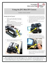
Page 1 of 5<br />
<strong>Lateral</strong> <strong>interference</strong>, <strong>spacing</strong>, <strong>and</strong> <strong>word</strong> <strong>legibility</strong><br />
Jim Sheedy<br />
Abstract<br />
Visual processing of individual characters within a <strong>word</strong> can interfere with<br />
one another thereby decreasing <strong>word</strong> <strong>legibility</strong>. This largely results from the<br />
lateral <strong>interference</strong> occurring in the retina <strong>and</strong> the primary visual cortex, with<br />
the distance over which it operates largely fixed in size. Analysis of previous<br />
data demonstrates that the default <strong>spacing</strong> for 10 <strong>and</strong> 12 pt font is just large<br />
enough to avoid significant lateral <strong>interference</strong> effects. These results suggest<br />
that empirical design skirts the limit of lateral <strong>interference</strong> <strong>and</strong> that lateral<br />
<strong>interference</strong> is to be avoided for good design.<br />
This proposal suggests 2 areas of investigation related to the effects of<br />
lateral <strong>interference</strong> on font design.<br />
The first relates to character <strong>spacing</strong>. Currently, common practice is that the<br />
same proportional <strong>spacing</strong> is applied to the range of font sizes; as a result<br />
the <strong>spacing</strong> of smaller fonts causes lateral <strong>interference</strong> effects <strong>and</strong><br />
compromises <strong>word</strong> <strong>legibility</strong>. This suggests that proportional <strong>spacing</strong> across<br />
font sizes may not be the best strategy; <strong>word</strong> <strong>legibility</strong> for smaller fonts may<br />
be enhanced with greater <strong>spacing</strong>, <strong>and</strong> <strong>word</strong> <strong>legibility</strong> for larger fonts may be<br />
retained with decreased character <strong>spacing</strong>. We propose to test the effects of<br />
character <strong>spacing</strong> on <strong>word</strong> <strong>legibility</strong> <strong>and</strong> response time measures for a range<br />
of font sizes to include small <strong>and</strong> large fonts. This will test the hypothesis<br />
stated above <strong>and</strong> will provide data that can be used in design.<br />
The second area of investigation relates to the specific lateral <strong>interference</strong><br />
effects between adjoining letters. Different characters have different lateral<br />
contours. It is possible that the strength of lateral <strong>interference</strong> may be<br />
affected by the shapes of adjoining characters <strong>and</strong> by rendering technique.<br />
We propose to categorize character contours <strong>and</strong> determine the effect of type<br />
of letter contour <strong>and</strong> font rendering on character <strong>spacing</strong>. The expected<br />
findings will help improve character <strong>spacing</strong> in current <strong>and</strong> future font design.<br />
Background<br />
Current default character <strong>spacing</strong> negatively affects <strong>word</strong> <strong>legibility</strong>. This has<br />
been shown for both size threshold determination of <strong>legibility</strong> <strong>and</strong> also for<br />
supra-threshold response time (RT) measurements.<br />
Figure 1 shows <strong>word</strong> <strong>legibility</strong> data as a function of character <strong>spacing</strong>. These<br />
data were determined with the size-threshold method whereby the<br />
characters <strong>and</strong> <strong>word</strong>s are effectively reduced in angular size to determine<br />
recognition threshold; a smaller size at threshold indicates better relative<br />
<strong>legibility</strong>. At default <strong>spacing</strong>, <strong>word</strong> <strong>legibility</strong> is clearly less than for an
Page 2 of 5<br />
individual letter; we have called this the “letter superiority effect.” This<br />
effect is almost certainly due to lateral <strong>interference</strong> (aka “contour interaction”<br />
<strong>and</strong> the “crowding phenomenon”), which is explained by the lateral inhibition<br />
known to exist in retina <strong>and</strong> primary visual cortex.<br />
With increased character <strong>spacing</strong>, the <strong>word</strong> <strong>legibility</strong> likewise increases <strong>and</strong><br />
reaches asymptote at approximately the same <strong>legibility</strong> as individual<br />
characters. The improvement in <strong>word</strong> <strong>legibility</strong> with increased <strong>spacing</strong> is<br />
likely due to reduced effect of lateral <strong>interference</strong>.<br />
1.3<br />
Relative Legibility<br />
1.2<br />
1.1<br />
1<br />
0.9<br />
0.8<br />
*<br />
# # *<br />
#<br />
#<br />
# # #<br />
#<br />
* *<br />
# #<br />
* *<br />
*<br />
*<br />
*<br />
#<br />
0.7<br />
0.6<br />
Single letter<br />
Condensed 0.6<br />
Condensed 0.4<br />
Condensed 0.2<br />
Deafult <strong>spacing</strong><br />
Exp<strong>and</strong>ed 0.2<br />
Exp<strong>and</strong>ed 0.4<br />
Exp<strong>and</strong>ed 0.6<br />
Exp<strong>and</strong>ed 0.8<br />
Exp<strong>and</strong>ed 1.0<br />
Exp<strong>and</strong>ed 2.0<br />
Exp<strong>and</strong>ed 3.0<br />
Exp<strong>and</strong>ed 4.0<br />
Exp<strong>and</strong>ed 5.0<br />
Exp<strong>and</strong>ed 6.0<br />
Exp<strong>and</strong>ed 7.0<br />
Exp<strong>and</strong>ed 8.0<br />
Exp<strong>and</strong>ed 9.0<br />
Exp<strong>and</strong>ed 10.0<br />
*<br />
* *<br />
Character Spacing (points from default)<br />
Figure 1: Relative <strong>legibility</strong> of individual letters <strong>and</strong> <strong>word</strong>s with various <strong>spacing</strong> levels in the<br />
letter/<strong>word</strong> <strong>legibility</strong> task. Error bars are the st<strong>and</strong>ard error of measure. The “#” signs indicate a<br />
significant difference (p < 0.05) from the single letter <strong>legibility</strong>; the “*” signs indicate a<br />
significant difference (p < 0.05) from the <strong>legibility</strong> for default character <strong>spacing</strong>.<br />
The data in Figure 2 are response times for letters <strong>and</strong> <strong>word</strong>s that are shown<br />
at various supra-threshold sizes – designated by the acuity size of the<br />
characters. According to the usual method of font scaling, character <strong>spacing</strong><br />
within <strong>word</strong>s was proportional to size – i.e. <strong>word</strong> shape integrity was<br />
maintained for different character sizes.<br />
The letter superiority effect is demonstrated for smaller sized characters; i.e.<br />
the response time for smaller sized letters (20/20 to ~20/50) was faster than<br />
for <strong>word</strong>s of the same size. However, for larger sizes the response times are<br />
similar for letters <strong>and</strong> <strong>word</strong>s. These results show that the letter superiority
Page 3 of 5<br />
effect demonstrated at size threshold also exists for supra-threshold sized<br />
text, but that the magnitude of the effect decreases <strong>and</strong> asymptotes with<br />
larger character sizes.<br />
1600<br />
1400<br />
Letter<br />
Word<br />
Response Time (ms)<br />
1200<br />
1000<br />
800<br />
600<br />
400<br />
20/80<br />
20/62<br />
20/50<br />
20/40<br />
20/32<br />
20/25<br />
20/20<br />
20/80<br />
20/62<br />
20/50<br />
20/40<br />
20/32<br />
20/25<br />
20/20<br />
20/80<br />
20/62<br />
20/50<br />
20/40<br />
20/32<br />
20/25<br />
20/20<br />
20/80<br />
20/62<br />
20/50<br />
20/40<br />
20/32<br />
20/25<br />
20/20<br />
20/80<br />
20/62<br />
20/50<br />
20/40<br />
20/32<br />
20/25<br />
20/20<br />
Verdana_Grayscale Consolas_Grayscale TNR_ClearType TNR_Grayscale TNR_Low_Contrast<br />
Viewing Steps by Conditions<br />
FIGURE 2.<br />
Average response time (RT) for orally reporting the identity of individual letters <strong>and</strong> <strong>word</strong>s for the 5 font<br />
conditions. RTs are shown for several supra-threshold sizes (20/80 is largest). For a typical computer display<br />
viewing distance of 50 cm, 6, 8, 10, <strong>and</strong> 12 pt lower case Verdana font have acuity sizes of 20/41, 20/48, 20/54,<br />
<strong>and</strong> 20/66 respectively.<br />
These findings provide further insight into the effect of lateral <strong>interference</strong> on<br />
character <strong>and</strong> <strong>word</strong> recognition. At larger sizes, when letter recognition is<br />
unburdened from the lateral <strong>interference</strong> of neighboring letters, <strong>word</strong>s <strong>and</strong><br />
letters have the same response times. At smaller sizes, where the<br />
characters are closer together <strong>and</strong> lateral <strong>interference</strong> is significant, the<br />
letters within a <strong>word</strong> interfere with one another, thereby rendering the <strong>word</strong><br />
less legible than individual letters. Since lateral <strong>interference</strong> operates over a<br />
relatively fixed retinal distance, smaller <strong>spacing</strong> between characters causes a<br />
larger lateral <strong>interference</strong> effect on <strong>word</strong> recognition.<br />
Implications for font <strong>spacing</strong>: Spacing <strong>and</strong> font size<br />
The most commonly used font sizes for reading are between 10 <strong>and</strong> 12 pt –<br />
they have largely been empirically determined. For a typical computer<br />
screen viewing distance of 50 cm these lower case characters have acuity<br />
sizes of 20/54, <strong>and</strong> 20/66 respectively. As seen in Figure 2, these commonly<br />
used font sizes have greater acuity values for which the <strong>word</strong> response times<br />
are close to the asymptotic value; i.e. apparently just large enough to<br />
disengage the effects of lateral <strong>interference</strong>. However, 6 <strong>and</strong> 8 pt fonts<br />
(20/41 <strong>and</strong> 20/48) are more within the sloped portion of the curves for which
Page 4 of 5<br />
the response time is greater <strong>and</strong> for which there is a difference between<br />
letter <strong>and</strong> <strong>word</strong> response; i.e. lateral <strong>interference</strong> has a significant effect.<br />
In typical text presentation, character <strong>spacing</strong> within <strong>word</strong>s scales directly<br />
with character size. Such proportional scaling maintains the shape integrity<br />
of the <strong>word</strong> across all sizes, but perhaps is not the best strategy for<br />
optimizing reading performance. For st<strong>and</strong>ard 10 <strong>and</strong> 12 pt font, default<br />
proportional character <strong>spacing</strong> appears to be just large enough to optimize<br />
RT, whereas default proportional <strong>spacing</strong> for smaller font sizes does not. The<br />
effects of <strong>spacing</strong> on RT appear driven by lateral <strong>interference</strong>, the effect of<br />
which decreases with distance between contours. The default proportional<br />
<strong>spacing</strong> for 10 <strong>and</strong> 12 pt font avoids the effects of lateral <strong>interference</strong>, but<br />
not for smaller fonts. This suggests the likelihood that RT to <strong>word</strong>s for<br />
smaller font sizes can be improved with greater <strong>spacing</strong>, <strong>and</strong> also that RT to<br />
<strong>word</strong>s for larger font sizes would not be compromised with less <strong>spacing</strong>.<br />
Implications for font <strong>spacing</strong>: Character-specific <strong>spacing</strong><br />
Different font designs entail different contours for individual letters. <strong>Lateral</strong><br />
<strong>interference</strong> between characters therefore is likely determined by not only<br />
the actual <strong>spacing</strong> between the edge of adjoining characters but also the<br />
interaction between their contours. Figure 2 demonstrates that in some<br />
fonts, such as the mono-<strong>spacing</strong> Consolas, less lateral <strong>interference</strong> might<br />
result than others, such as the heavily shriffed TNR. Furthermore, it is likely<br />
that the contours of “oo” interfere with one another differently than “kf”. The<br />
specific contours of each character <strong>and</strong> how they interact with characters<br />
with other types of contour are critical in determining optimal character<br />
<strong>spacing</strong>.<br />
Furthermore, as has been adopted for font display, it is important to consider<br />
the additional effect of ClearType (CT) rendering on character <strong>and</strong> <strong>word</strong><br />
<strong>legibility</strong>. Our findings suggest that lateral <strong>interference</strong> is exacerbated by the<br />
use of CT when default <strong>spacing</strong> <strong>and</strong> font size (11 pt) are used, <strong>and</strong> that<br />
smaller-font CT rendering impedes character <strong>and</strong> <strong>word</strong> <strong>legibility</strong>. It will be<br />
important to underst<strong>and</strong> the effects of CT rendering on character <strong>spacing</strong>.<br />
Proposed testing<br />
We suggest 2 areas of testing concerning the effects of lateral <strong>interference</strong>.<br />
1) Determine the minimal functional <strong>spacing</strong>: For a range of font sizes (6, 8,<br />
10, 12, 14, <strong>and</strong> 16) <strong>and</strong> rendering methods (black&white, grayscale, <strong>and</strong><br />
CT) at a typical working distance of 50 cm, we will test the effects of<br />
incremental <strong>spacing</strong> on <strong>word</strong> <strong>and</strong> letter response accuracy <strong>and</strong> reaction<br />
times, generating data similar to those in Figure 2. Spacing will be<br />
altered using techniques similar to those used to generate the stimuli for<br />
data in Figure 1. A minimum functional <strong>spacing</strong> for each font size <strong>and</strong><br />
rendering method is determined as the smallest <strong>spacing</strong> that optimizes
Page 5 of 5<br />
the RT. We hypothesize that, relative to current default proportional<br />
<strong>spacing</strong>, the minimal functional optimal <strong>spacing</strong> will be larger for smaller<br />
font sizes <strong>and</strong> smaller for larger font sizes. These trends may be<br />
enhanced with CT.<br />
Table 1: Lower case characters categorized according to left- <strong>and</strong> right-side contour shape.<br />
Numbers in the parenthesis indicates the additional frequency needed for displaying any of the<br />
characters in the cell to balance the frequency of all possible contour combinations. The total<br />
frequencies of contour types are 30 for straight, 31 for curved, 30 for slanted, <strong>and</strong> 31 for<br />
complex.<br />
Right side<br />
Left side Straight Curved Slanted Complex<br />
Straight h i l m n u B p (+3) k r (+3)<br />
(0)<br />
Curved d g q (+2) O (+6) c e (+3)<br />
Slanted<br />
V w y<br />
(+15)<br />
Complex a j (+3) f s t x z<br />
(+3)<br />
2) Individual inter-letter lateral <strong>interference</strong>: We also hypothesize that<br />
specific contours can interact to affect the strength of lateral <strong>interference</strong>. To<br />
test this, the left <strong>and</strong> right edges of individual characters are assigned to four<br />
categories: straight (ST), curved (CV), slanted (SL), complex (CX), as shown<br />
in Table 1. Subjects will be asked to identify two horizontally adjoined<br />
letters, with all 676 combinations of letters tested in a r<strong>and</strong>om order.<br />
Additional redundant pairings will be added to balance the frequency of all 9<br />
types of possible contour combination. The default <strong>spacing</strong> <strong>and</strong> 12 pt font<br />
size will be used to generate all characters with three rendering methods<br />
(black&white, grayscale, <strong>and</strong> CT). Letter identification accuracy <strong>and</strong> reaction<br />
time will be measured to determine the the level of lateral <strong>interference</strong> for<br />
each contour pairings <strong>and</strong> each combination of contour types. We<br />
hypothesize that higher contour <strong>interference</strong> will be observed for some<br />
specific pairing of contour types than others, <strong>and</strong> CT might have a higher<br />
degree of contour <strong>interference</strong>.<br />
The results of these areas of research can lead to enhanced <strong>legibility</strong> from<br />
better character <strong>spacing</strong> across font sizes <strong>and</strong> between individual letters.