Visual Language Magazine Contemporary Fine Art Vol 2 no 10 October 2013
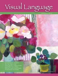
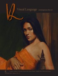
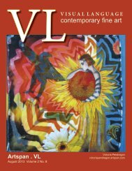
Visual Language Magazine is a contemporary fine art magazine filled with dynamic international fine art, brilliant colors and stimulating composition. This month features the Miller Gallery Fall Show in Cincinnati, and studio visits with Nocona Burgess, Artspan artist Joe Belt, Sarah Beth Banning, Dave Sime, Connie Morse, and Texas artist Kristine Byars. Enjoy an up close and person interview with Texas Artspan artist Sharon Hodges and the gallery show of Texas Artspan artist Melissa Doron. The issue would not be complete without the fascinating photography of Artspan Photographer Rudolph De Ram. On the Cover is the artwork of Artspan Artist Joe Belt. Visual Language is the common connection around the world for art expressed through every media and process. The artists connect through their creativity to the viewers by both their process as well as their final piece. No interpreters are necessary because Visual Language Magazine crosses all boundaries.
Visual Language Magazine is a contemporary fine art magazine filled with dynamic international fine art, brilliant colors and stimulating composition. This month features the Miller Gallery Fall Show in Cincinnati, and studio visits with Nocona Burgess, Artspan artist Joe Belt, Sarah Beth Banning, Dave Sime, Connie Morse, and Texas artist Kristine Byars. Enjoy an up close and person interview with Texas Artspan artist Sharon Hodges and the gallery show of Texas Artspan artist Melissa Doron. The issue would not be complete without the fascinating photography of Artspan Photographer Rudolph De Ram. On the Cover is the artwork of Artspan Artist Joe Belt. Visual Language is the common connection around the world for art expressed through every media and process. The artists connect through their creativity to the viewers by both their process as well as their final piece. No interpreters are necessary because Visual Language Magazine crosses all boundaries.

You also want an ePaper? Increase the reach of your titles
YUMPU automatically turns print PDFs into web optimized ePapers that Google loves.
Painter’s Keys<br />
with Robert Genn<br />
Mountain rules<br />
August 30, <strong>2013</strong><br />
Dear <strong>Art</strong>ist,<br />
Robert Genn’s<br />
Studio Book<br />
Trudging around in the Bugaboos, I’m thinking how rules are meant to be broken. Having said that, a few<br />
rules for acrylic and oil painters are well worth following. My only reason for backing up my helicopter and<br />
dumping them off on you is that these rules can save a lot of trouble and make work fresher. Up here in the<br />
scudding clouds and creaking glaciers I’m also realizing they’re <strong>no</strong>t my rules but the rules of the truly great<br />
painters who have trudged in humbling spots like this before.<br />
1. Start with a toned ground. It can be grey, brown, red or whatever, and it can be wet or dry. When you<br />
prime your canvas with a coloured ground, you won’t have to fight the tyranny of white. Leave the fighting<br />
of white to the watercolourists. This way, there will be a significant tone on all parts of your canvas--happy<br />
accidents or paucities will occur, and the ground becomes part of the overall effect.<br />
2. Establish your foreground first. We painters tend to start by painting the part of the landscape that first<br />
k<strong>no</strong>cks our socks off, and it’s <strong>no</strong>t always the foreground. Actually, compelling foregrounds are often the most<br />
difficult part, even though they are vital to a strong composition. Foregrounds determine where farther-back<br />
focal elements may be placed.<br />
Painter’s Keys - Robert Genn<br />
3. Plan ahead to one, two, three, four, five. You don’t want to make the painting just a foreground and a<br />
background. Even though your painting may be two dimensional and flat, it needs to have at least five elements<br />
of interest as it recedes. At the expense of being too simplistic, an example would be foreground rocks,<br />
a lake, a mountain range, a distant mountain range and a sky.<br />
4. Establish at least five large complex shapes. Dynamic, even abstract shapes add magic to the magic. Patches<br />
of s<strong>no</strong>w, omi<strong>no</strong>us spires, dark and light rocks are generously pressed into compositional service. Interlocking<br />
with one a<strong>no</strong>ther, these shapes tease your viewer’s eyes into seeing your magical experience.<br />
5. Take your brush here and there like a bee in an alpine meadow. In other words, don’t laboriously work on<br />
or try to finish off one particular part. Paint promiscuously. Watch the greater image materialize. You need<br />
that thing over there to tell you what to do about that thing over here.<br />
Like life itself, there’s more to this than meets the eye. You can make up a pile of additional basics and rules<br />
for yourself. These five are a good start. Ours is a game of rugged individualism. But even rugged individualists<br />
have a few rules that make their climb easier.<br />
Best regards, Robert<br />
PS: “Oh the difficulties of mountain art for too little genius.” (J. E. H. MacDonald)<br />
Esoterica: Plein air invites a Zen-like attitude and acceptance of the spiritual flow. Lost in a cloud of our own<br />
making, days pass far too quickly. The more I look at this life, the more it seems a combination of inhaling<br />
the gifts and letting your work tell you what it needs.<br />
<strong>Visual</strong><strong>Language</strong><strong>Magazine</strong>.com - VL <strong>Magazine</strong> | 11