Tiina Kivinen - Kunstverket Galleri
Tiina Kivinen - Kunstverket Galleri
Tiina Kivinen - Kunstverket Galleri

Create successful ePaper yourself
Turn your PDF publications into a flip-book with our unique Google optimized e-Paper software.
<strong>Tiina</strong> <strong>Kivinen</strong><br />
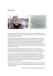
<strong>Tiina</strong> <strong>Kivinen</strong> (born 1971) studied at the North Karelia College of Arts, where she majored in<br />
printmaking and graphic art. She has had solo exhibitions in Finland, Germany, Estonia and Spain,<br />
and participated in group exhibitions also in China, South Korea, Japan, Russia, Germany, Italy,<br />
Estonia, Poland and Sweden. She is represented in numerous collections including Wäinö Aaltonen<br />
Museum of Art, Aboa Vetus & Ars Nova museo, The Government of Finland, The Finnish Parliament,<br />
and in the Collections of The Art Museums of Helsinki, Tampere, Oulu, Jyväskylä and Kouvola.<br />
In 2012 she was the first winner of the Queen Sonja Nordic Art Award.<br />
Instinct and emotions<br />
A small gesture in a landscape, weakness of a human, or a strong presence of an animal are things<br />
that are difficult to illustrate. They are states of mind, momentary perceptions. As topics of visual<br />
arts they become concrete. At the same time they tend to lose their original, intuitive sensitivity. A<br />
landscape turns into a still, colored surface; a human being becomes a person and an animal turns<br />
into a symbol.<br />
Printmaker <strong>Tiina</strong> <strong>Kivinen</strong> has taken on the challenge. She concentrates on intuition. She reaches<br />
forthe original frame, where sensitivity can be seen. Her work is about boundaries which are not easy<br />
to observe in real life – because stopping time is impossible.<br />
<strong>Kivinen</strong> slows time down for us. She shows us images that offer a prolonged presence. From tiny<br />
premonitions arise thoughts and a restless motion appears to be coherent.<br />
<strong>Kivinen</strong> offers us the possibility to see but at the same time she also forces us to take a closer look.<br />
She does not disregard the smallest things in life. Although the smallest might be left unseen in<br />
everyday life, <strong>Kivinen</strong> makes them visible in her works. The most vulnerable and trampled are<br />
defended by <strong>Kivinen</strong>.<br />
Nevertheless, <strong>Kivinen</strong> does not preach, she shows empathy. She relies on the empathy of the viewer<br />
and works subtly, just like Asian lyricists. Her work can be compared to Japanese Tanka and Haiku<br />
poems. A light, breathing rhythm and the endless layers of contents and aesthetic colors emphasize<br />
the lyricism of her works.<br />
Fire Grafiske Foretellinger – <strong>Kunstverket</strong> <strong>Galleri</strong> 10-27 oktober 2012
Representation is a wavering notion for <strong>Kivinen</strong>. At times there are recognizable elements in the<br />
picture. In most cases, it is the viewer’s own need to find the reason for the picture, the storyline<br />
that the picture entails. This need is deeply humane. The feeling of closeness when recognizing the<br />
motif makes the viewing experience pleasant, reflecting the viewer’s own memories and<br />
experiences.<br />
The strictest representatives of abstract art wanted to eliminate the possibility of recognizing the<br />
motifs. <strong>Kivinen</strong>’s aim is quite the opposite. She tunes the viewer into a sensitive mood. She creates<br />
images that are easy to grasp.<br />
The viewer is, however, on a narrow field: without concentration the motif is not easily understood.<br />
<strong>Kivinen</strong> plays with the viewer’s need of recognizing the topic and at times she dares to make<br />
recognition almost impossible. The viewer’s need to recognize the motif has to be deep enough so<br />
that the work is not merely considered as an abstract composition.<br />
<strong>Kivinen</strong>’s work is easy to view as a series because of the interesting interaction of abstract and<br />
figurative. Recognizing the topic in one piece encourages the viewer to find the topic in another<br />
piece as well. This is why her body of work is not seen in the same way as a group of mere abstract<br />
compositions.<br />
<strong>Kivinen</strong> works with intaglio. It is often considered to be technical, heavy work lacking in direct<br />
processing of the motif. This is not true. Intaglio printmaking is very similar to drawing. Working on<br />
the image is possible also in the printing stage.<br />
<strong>Kivinen</strong> uses etching very seldom. She works mainly with drypoint, mezzotint and monotype<br />
techniques.<br />
With these techniques it is possible to print only small editions. A large number of <strong>Kivinen</strong>’s prints are<br />
unique. Working on the image in the printing stage demands the presence of the artist, and that is<br />
the reason why only few of <strong>Kivinen</strong>’s prints are printed by a professional fine art printer.<br />
<strong>Kivinen</strong> concentrates on the most essential things. She prefers large surfaces but she has the ability<br />
to express herself in smaller surroundings as well. A square is one of her favorite forms. It is not<br />
obvious which way the print is finally displayed.<br />
She expresses herself in an aphoristic way. A condensed message is often interestingly elliptical.<br />
Though being elliptic does not mean losing the meanings of the print. The meanings have a lyrical<br />
form, emphasizing the aesthetic features of the print.<br />
<strong>Kivinen</strong> is a storyteller. The titles of her prints are contemporary and typical for everyday language<br />
use. The titles offer the viewer one possible way to interpret her works.<br />
<strong>Kivinen</strong> expresses herself with lines and colors. The colors she uses are not loud - they are sheer and<br />
toned. There are bright greens and warm reds bringing light onto the surface. The most important<br />
color is black. The velvety black is created with mezzotint technique. The surface of the copper is<br />
broken into even holes that are filled with the hand rubbed ink. The ink transfers into the grains of<br />
the heavy printing paper. By polishing the broken surface of the copper, the black ink gets new<br />
shades and light.<br />
In intaglio printmaking the colour black has a strong status. In <strong>Kivinen</strong>’s work it raises up to a topic. At<br />
the same time it links the works to the traditional printmaking in a fine, respective way.<br />
Fire Grafiske Foretellinger – <strong>Kunstverket</strong> <strong>Galleri</strong> 10-27 oktober 2012
<strong>Kivinen</strong> composes with the deep, velvety black and makes the picture rest on the surface. The black is<br />
completely empty and brimful at the same time. It is rarely dismal. It is breathing, wide, and leaves<br />
room for the viewer’s interpretation.<br />
When taking a closer look at the black, it can be seen that it is by no means pure. The black that<br />
<strong>Kivinen</strong> uses is strongly toned. Sometimes it is warm, sometimes cold, but never insignificant. The<br />
shades of black appear in ways that are unnoticeable in a direct viewing experience. The difference<br />
would be noticeable if the same work would be printed with pure black.<br />
The black presented in different shades and tones is not agonizing. It is the color of dusk, the<br />
horizon and the color of a campfire burned out. It does not compete with the whites: it wraps them<br />
alternately inside and around it. The other colors play minor roles in the play where black and white<br />
take the lead.<br />
The line drawn by <strong>Kivinen</strong> lives a transitional stage. It has more nuances and it has made the works<br />
more drawing-like. A fragile line creates veil-like images that make the deep black surfaces even<br />
more noticeable.<br />
In her newest prints the line is like hair. The mark strongly scratched on the copper has a new<br />
companion: a fine line, lightly carved. <strong>Kivinen</strong>’s technique is drypoint. The line is carved directly on<br />
the copper plate. The technique is laborious and demanding, but it enables direct working on the<br />
image, so that the act of drawing is being emphasized and reflected to the print.<br />
As an abstract, <strong>Kivinen</strong>’s prints can be defined as drawings. They are stages for simple,<br />
humaneobservations. The black surface and the network of lines form an abstract composition or a<br />
recognizable object, depending on the context.<br />
The epic intensity of her work is parallel with the ultimately tuned visual delight. <strong>Kivinen</strong> presents<br />
this in a very skilful way. The strong presence of the artist is transmitted from her work. It is lifelike<br />
and constantly open for new interpretations.<br />
Veikko Halmetoja<br />
Fire Grafiske Foretellinger – <strong>Kunstverket</strong> <strong>Galleri</strong> 10-27 oktober 2012