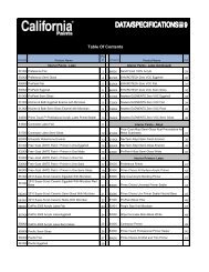
color stories here - The California Paints Blog
color stories here - The California Paints Blog
color stories here - The California Paints Blog

Create successful ePaper yourself
Turn your PDF publications into a flip-book with our unique Google optimized e-Paper software.
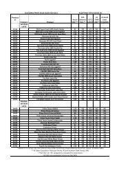
Color Stories<br />
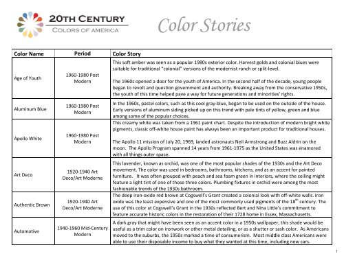
Color Name Period Color Story<br />
Age of Youth<br />
Aluminum Blue<br />
Apollo White<br />
Art Deco<br />
Authentic Brown<br />
Automotive<br />
1960‐1980 Post<br />
Modern<br />
1960‐1980 Post<br />
Modern<br />
1960‐1980 Post<br />
Modern<br />
1920‐1940 Art<br />
Deco/Art Moderne<br />
1920‐1940 Art<br />
Deco/Art Moderne<br />
1940‐1960 Mid‐Century<br />
Modern<br />
This soft amber was seen as a popular 1980s exterior <strong>color</strong>. Harvest golds and colonial blues were<br />
suitable for traditional “colonial” versions of the modernist ranch or split‐level.<br />
<strong>The</strong> 1960s opened a door for the youth of America. In the second half of the decade, young people<br />
began to revolt and question government and authority. Breaking away from the conservative 1950s,<br />
the youth of this time helped pave a way for future generations and minorities' rights.<br />
In the 1960s, pastel <strong>color</strong>s, such as this cool gray‐blue, began to be used on the outside of the house.<br />
Early versions of aluminum siding picked up on this trend with pale tints of yellow, green and blue<br />
among some of the popular choices.<br />
This creamy white was taken from a 1961 paint chart. Despite the introduction of modern bright white<br />
pigments, classic off‐white house paint has always been an important product for traditional houses.<br />
<strong>The</strong> Apollo 11 mission of July 20, 1969, landed astronauts Neil Armstrong and Buzz Aldrin on the<br />
moon. <strong>The</strong> Apollo Program spanned 14 years from 1961‐1975 as the United States was enamored<br />
with all things outer space.<br />
This lavender, known as orchid, was one of the most popular shades of the 1930s and the Art Deco<br />
movement. <strong>The</strong> <strong>color</strong> was used in bedrooms, bathrooms, kitchens, and as an accent for painted<br />
furniture. It was often grouped with peach and sea foam green in interiors, w<strong>here</strong> the ceiling might<br />
feature a light tint of one of those three <strong>color</strong>s. Plumbing fixtures in orchid were among the most<br />
fashionable trends of the 1930s bathroom.<br />
<strong>The</strong> deep iron‐oxide red brown at Cogswell’s Grant created a colonial look with off‐white walls. Iron<br />
oxide was the least expensive and one of the most commonly used pigments of the 18 th century. <strong>The</strong><br />
use of this <strong>color</strong> at Cogswell’s Grant in the 1930s reflected Bert and Nina Little’s commitment to<br />
feature accurate historic <strong>color</strong>s in the restoration of their 1728 home in Essex, Massachusetts.<br />
A dark gray that might have been seen as an accent <strong>color</strong> in a 1950s wallpaper, this shade would be<br />
useful as a trim <strong>color</strong> on ironwork or other metal detailing, or as a shutter or sash <strong>color</strong>. As Americans<br />
moved to the suburbs, the 1950s marked a time of consumerism. Most middle class Americans were<br />
able to use their disposable income to buy what they wanted at this time, including new cars.<br />
1
Color Name Period Color Story<br />
Baby Boom<br />
Ballroom Blue<br />
Bauhaus<br />
Beatnik<br />
Beauport Green<br />
1940‐1960 Mid‐Century<br />
Modern<br />
1900‐1920<br />
Craftsman/Arts & Crafts<br />
1920‐1940 Art<br />
Deco/Art Moderne<br />
1940‐1960 Mid‐Century<br />
Modern<br />
1900‐1920<br />
Craftsman/Arts & Crafts<br />
One of the iconic <strong>color</strong>s of the 1950s, this clear, strong pink was popular in all aspects of fashion and<br />
interior design. It had strong connections with the First Lady at the time Mamie Eisenhower, a<br />
foremost <strong>color</strong> trendsetter. During the era the <strong>color</strong> was commonly referred to as “Carnation Pink”.<br />
<strong>The</strong> post‐World War II “baby boom” from 1946 to 1964 resulted in an estimated 78.3 million births in<br />
the United States. Sylvia Porter, a columnist with the New York Post, is often credited with coining the<br />
phrase in 1951.<br />
This optimistic clear blue taken from a 1912 wallpaper has none of the gray undertones that<br />
characterized many of the popular blue shades from later in the century.<br />
<strong>The</strong> early 20th century gave life to a newly accepted form of dance; "modern" ballroom. This form of<br />
partner dance was popular socially and competitively and began to mirror the changes in morals and<br />
attitudes during this time.<br />
This light pearl‐gray is used with dramatic effect on the ceiling of the master bedroom at Historic New<br />
England’s Gropius House in Lincoln, Massachusetts. Ceilings painted in light <strong>color</strong>s, rather than simply<br />
in white, were an innovation of the 1930s. Most were in pastels, rather than the sophisticated and<br />
elegantly modern gray used at the Gropius House, home of Bauhaus founder, Walter Gropius.<br />
Staatliches Bauhaus, a school in Germany that combined crafts and the fine arts, operated from 1919<br />
to 1933.<br />
A 1951 wallpaper was the inspiration for this <strong>color</strong>. <strong>The</strong> use of deep saturated <strong>color</strong>s was a hallmark<br />
of post‐war interior decoration. In upholstery, flooring, drapes, and furnishings, as well as wall paints<br />
and coverings, dark jewel‐toned <strong>color</strong>s appeared in bold and sophisticated patterns. Dark green was a<br />
favorite in hallways and living rooms, w<strong>here</strong> lush, leafy jungle prints or splashy magnolia blooms might<br />
cover a sofa or picture window.<br />
Those of Jack Kerouac's "Beat Generation" were characterized as the anti‐conformist youth of New<br />
York during the 1950s. Kerouac's beatniks are described in his own words as "down and out but full of<br />
intense conviction".<br />
This <strong>color</strong> is featured in the Green Dining Room at Beauport, on Georgian wall paneling that was<br />
salvaged by decorator Henry Sleeper from an early 18 th ‐century house in Ipswich, Massachusetts. <strong>The</strong><br />
sage green is one of several “colonial” <strong>color</strong>s Sleeper championed and reproduced in his showcase<br />
summer home in Gloucester, Massachusetts.<br />
2
Color Name Period Color Story<br />
Belfry Green<br />
Bold Backdrop<br />
Bronzed Plate<br />
Brown Sugar<br />
Call of the Wild<br />
Casablanca<br />
1900‐1920<br />
Craftsman/Arts & Crafts<br />
1920‐1940 Art<br />
Deco/Art Moderne<br />
1900‐1920<br />
Craftsman/Arts & Crafts<br />
1920‐1940 Art<br />
Deco/Art Moderne<br />
1900‐1920<br />
Craftsman/Arts & Crafts<br />
1940‐1960 Mid‐Century<br />
Modern<br />
1960‐1980 Post<br />
Modern<br />
Henry Sleeper’s artistic genius lay in creating vibrantly unified <strong>color</strong>ed interiors such as the Belfry<br />
Chamber, a rooftop bedroom with paneled walls in this rich, leafy, apple green. <strong>The</strong> sloping walls of<br />
this guest‐room, which features a secret staircase, are lined with an early 20 th ‐century reproduction of<br />
a hand‐blocked 1832 French wallpaper ‐Décor Chinois. Alive with birds, butterflies, and flowers, this<br />
paper also adorned the Park Avenue dining room of author and tastemaker Edith Wharton’s New York<br />
City home.<br />
This deep gray provides a stylish note in the master bedroom of the Gropius House w<strong>here</strong> it works<br />
particularly well as the backdrop to the brilliant red of a 19 th ‐century Iraqi woven wall hanging. <strong>The</strong><br />
wall hanging, acquired by a partner of Walter Gropius as partial payment for a project in Baghdad, is<br />
one of several textiles bartered for his firm’s design work when cash payments could not be taken out<br />
of that country. <strong>The</strong> <strong>color</strong> would work on an accent wall behind any bold and <strong>color</strong>ful artwork in a late<br />
1930s or early 1940s interior.<br />
Coppery shades such as this 1916 paint <strong>color</strong>, relate to the hand‐hammered copper and bronze<br />
objects that decorated the interior of a craftsman style home. A warm brown might be used to paint<br />
the walls of a stair hall, or the wide border above a plate rail in an oak‐furnished dining room.<br />
When indoor plumbing was first added to Cogswell’s Grant in 1937, this rich brown sugar <strong>color</strong> was<br />
painted on the walls of the master bathroom. Typical of the early restoration paint <strong>color</strong>s used<br />
throughout the interior at Cogswell’s Grant (built in 1728); this subdued and rustic <strong>color</strong> could also be<br />
used on the exterior siding on an arts and crafts home.<br />
This strong avocado green dates not from the 1960s but from 1916. Originating as an exterior paint,<br />
this <strong>color</strong> would have been familiar to painters of Queen Anne style houses w<strong>here</strong> similar shades were<br />
used on window sashes and accents. This green would not be amiss on the trim or doors of a midcentury<br />
modern home.<br />
Jack London's classic 20 th century novel, <strong>The</strong> Call of the Wild, sparked several adaptations and films.<br />
Published in 1903, London's novel tells the story of the Klondike Gold Rush through the eyes of a sled<br />
dog.<br />
This deep cream, almost the <strong>color</strong> of cake batter, is ideal for both interior and exterior use and has<br />
remained a standard throughout the century. It is a classic in the 20 th ‐century kitchen, w<strong>here</strong> it was<br />
found on painted handles of kitchen utensils and mixing bowls as well as on the walls w<strong>here</strong>, in a high<br />
gloss enamel, it provided a washable surface seen as more sanitary than some other finishes. <strong>The</strong><br />
<strong>color</strong> also works well as a body <strong>color</strong> for a white‐painted traditional home as pre‐modern whites<br />
typically had a creamy appearance.<br />
<strong>The</strong> iconic 1942 film Casablanca, was not a box office hit when it was first released. After winning the<br />
Academy Award for Best Picture that same year, the film's popularity began to build.<br />
3
Color Name Period Color Story<br />
Century Beige<br />
Clam Shell<br />
Clare Rose<br />
Classic Shutter<br />
Combustion<br />
Concord Bloom<br />
Conservative<br />
1900‐1920<br />
Craftsman/Arts & Crafts<br />
1900‐1920<br />
Craftsman/Arts & Crafts<br />
1940‐1960 Mid‐Century<br />
Modern<br />
1900‐1920<br />
Craftsman/Arts & Crafts<br />
1900‐1920<br />
Craftsman/Arts & Crafts<br />
1900‐1920<br />
Craftsman/Arts & Crafts<br />
1940‐1960 Mid‐Century<br />
Modern<br />
This neutral cool beige, useful for exterior trim on any traditional or Craftsman house, can also be<br />
used as an interior <strong>color</strong> for traditional houses of the mid 20 th century. This timeless shade was found<br />
on the trim of Historic New England’s Quincy House in Quincy, Massachusetts.<br />
This neutral oatmeal <strong>color</strong> can be found in early 20 th ‐century wallpapers. At this time, walls often<br />
featured neutral oatmeal, khaki or tan as a base <strong>color</strong> beneath stenciled border patterns in living and<br />
dining rooms.<br />
Shell textures became one of the popular elements of Art Noveau, a style of art and architecture that<br />
peaked at the start of the 20th century. This design style emphasized organic, floral, and plant inspired<br />
motifs.<br />
Light rosy pink, from a 1957 wallpaper, provided a neutral background <strong>color</strong>. <strong>The</strong> post‐World War II<br />
housing boom and popularization of modern architecture allowed interiors to feature sophisticated,<br />
modulated neutral shades like this soft pink.<br />
Clare Quilty is one of the many shocking characters within Vladimir Nabokov's Lolita (1955), a<br />
controversial novel that offers a skewed observation of American culture.<br />
This very dark olive green was a classic shutter and sash <strong>color</strong> on houses from the 1880s through the<br />
1920s. This green was used on the shutters at Historic New England's Beauport house museum, a<br />
1907 summer home and landmark overlooking Massachusetts' historic Gloucester Harbor.<br />
A rich berry red, such as this <strong>color</strong> found in a 1907 wallpaper, was a staple of a craftsman dining room.<br />
Wine‐<strong>color</strong>ed walls in burgundy and claret have been popular for dining rooms since the early 19 th<br />
century.<br />
<strong>The</strong> widespread refinement and use of the internal combustion engine directly impacted the mass<br />
production of the automobile during the 1910s and 20s, making car ownership more than an<br />
American dream.<br />
Vivid purple, such as this shade found in a 1912 wallpaper border with swags of grapes, provided a<br />
rich accent in arts and crafts interiors. Grapes were a common decorative theme for dining rooms in<br />
the early 1900s.<br />
A light peachy tan, from a 1957 wallpaper, provided a neutral background <strong>color</strong> for the bold, saturated<br />
chocolate brown, burgundy and evergreen shades that were a feature of the mid‐century modern<br />
<strong>color</strong> palette. "Modern" interiors proclaimed their individuality through the widespread use of white<br />
or pale walls, "natural" wood paneling, and deeply‐saturated contrasting accent <strong>color</strong>s.<br />
During the 1950s, the United States was considered socially conservative, due to fear of war and<br />
communism.<br />
4
Color Name Period Color Story<br />
Construction<br />
Boom<br />
Counter Culture<br />
Cozy Bungalow<br />
Craftsman Gold<br />
Crystalline<br />
Draft Card<br />
1940‐1960 Mid‐Century<br />
Modern/1960‐1980<br />
Post Modern<br />
1960‐1980 Post<br />
Modern<br />
1900‐1920<br />
Craftsman/Arts & Crafts<br />
1900‐1920<br />
Craftsman/Arts & Crafts<br />
1920‐1940 Art<br />
Deco/Art Moderne<br />
1960‐1980 Post<br />
Modern<br />
Blues such as this, found in wallpapers of 1948 and 1965, were seen as an old‐fashioned and<br />
somewhat patriotic <strong>color</strong> choice in traditional households throughout the mid 20 th century. Colonial<br />
style decorative schemes of the 1940s might feature a living room with all of the woodwork, including<br />
built‐in bookcases, painted in a uniform slate blue. In the 1960s, this <strong>color</strong> held a similar appeal for<br />
country kitchens and cozy bedrooms.<br />
<strong>The</strong> American construction boom of the 50s and early 60s was a prosperous way to recover from<br />
World War II. As Americans moved to the newly constructed homes of the suburbs, the American<br />
economy was on an upswing.<br />
This deep orange brick <strong>color</strong> is from a 1968 wallpaper. Deep shades of gold, red‐orange, and redbrown<br />
provided bursts of <strong>color</strong> in houses painted in warm beige, tan, or cinnamon tones.<br />
<strong>The</strong> 1960s brought about an era in which the youth of the nation would rise up and change the social<br />
order. A counter culture was formed that did away with the current societal rules and created a haven<br />
for non‐conformists. <strong>The</strong>se inspirational leaders started the foundation for the revolt against 'the<br />
Man.'<br />
<strong>The</strong> terracotta pink in this 1916 paint <strong>color</strong> was used both inside and outside. A stuccoed bungalow in<br />
the Spanish colonial revival style, or a living room, library, or stair hall would be equally at home with<br />
this warm neutral shade.<br />
This 1916 deep golden oak is an iconic <strong>color</strong> of the Craftsman and Arts and Crafts period. An<br />
appropriate <strong>color</strong> for exterior siding on a bungalow, this golden shade would also be found in a boldly<strong>color</strong>ed<br />
craftsman living or dining room.<br />
Pale blue has been a favored interior <strong>color</strong> throughout the 20 th century and a restful blue like this<br />
might even have been used on the ceiling in a bedroom of the 1920s and 30s. Art Deco, a purely<br />
decorative movement, was highly accepted in the 1930s and featured design influences of crystalline<br />
and faceted forms.<br />
Neutral light tans became popular in the 1970s when “natural” <strong>color</strong>s such as almond made their way<br />
onto kitchen counters and appliances. This shade was used throughout the interior, and provided a<br />
contrasting background for the saturated browns, rusts, golds, and oranges of upholstery, rugs,<br />
bedspreads, and bold artwork of the period.<br />
Some political leaders felt the elimination of the draft in 1973 would ease anti war protests. It was<br />
hoped that those protesting the Vietnam War may lose their dedication to the cause if the possibility<br />
of being drafted was eliminated.<br />
5
Color Name Period Color Story<br />
Dust Bowl<br />
Earhart<br />
Earth Day<br />
Eclectic Trim<br />
Electric Grid<br />
1920‐1940 Art<br />
Deco/Art Moderne<br />
1920‐1940 Art<br />
Deco/Art Moderne<br />
1960‐1980 Post<br />
Modern<br />
1900‐1920<br />
Craftsman/Arts & Crafts<br />
1920‐1940 Art<br />
Deco/Art Moderne<br />
A warm, sandy beige was a popular choice on walls in the 1930s interior. It was also a useful trim or<br />
stucco <strong>color</strong> for the bungalow or Tudor revival house.<br />
<strong>The</strong> severe dust storms of the 1930s had a widespread negative impact on the agricultural stability of<br />
the United States. <strong>The</strong> giant dust clouds that blew from the great plains eastward to Washington, DC,<br />
and New York were called Black Blizzards.<br />
Colors such as this grayed‐down, light ashes of roses <strong>color</strong> from a 1939 interior paint were found in<br />
sophisticated Moderne interiors and were often paired with brushed silver and taupe shades.<br />
Amelia Earhart, the world's most famous female aviator, was declared legally dead 18 months after<br />
she disappeared in 1937 during a flight over the Pacific Ocean. Much more than an air pilot, Earhart<br />
was a Red Cross nurse's aide, a faculty member of Purdue University, and a member of the National<br />
Woman's Party.<br />
Mossy and olive greens were promoted in exterior house paints in the 1970s as interest in “natural”<br />
products began to develop. This <strong>color</strong> would work well on a modern house or on a craftsman style<br />
home of the early 20 th century.<br />
<strong>The</strong> first Earth Day was April 22, 1970. It is a day to celebrate and promote awareness for the Earth's<br />
environment. Environmentalism began to gain ground in the 1970s as people became aware that<br />
what is depleted cannot always be restored.<br />
<strong>The</strong> exterior trim at Beauport in Gloucester, Massachusetts, is a deep brown ‐ the typical trim <strong>color</strong><br />
choice for Tudor revival houses. <strong>The</strong> home reflects the eclectic tastes of its builder, interior designer<br />
Henry Davis Sleeper. <strong>The</strong> mix of materials (shingle, brick, and stone) shares many stylistic features<br />
with Tudor revival houses of the same period.<br />
Taken from a 1937 wallpaper, this silvery blue captures a sense of the sheen and gloss of burnished<br />
metals that were a hallmark of the light, sophisticated interiors of the 1930s and early 1940s.<br />
<strong>The</strong> availability and use of electricity boomed from the 20s to the 40s. New products designed to<br />
accommodate the use of electricity required an efficient way to provide all Americans with electricity ‐<br />
‐‐ later known as "power". <strong>The</strong> rapid industrialization in the 20 th century made electrical grids a critical<br />
part of every day life.<br />
6
Color Name Period Color Story<br />
Emerald City<br />
Enamel Blue<br />
Fahrenheit<br />
Folk Art<br />
Free Time<br />
1920‐1940 Art<br />
Deco/Art Moderne<br />
1900‐1920<br />
Craftsman/Arts & Crafts<br />
1900‐1920<br />
Craftsman/Arts & Crafts<br />
1920‐1940 Art<br />
Deco/Art Moderne<br />
1960‐1980 Post<br />
Modern<br />
Based on a 1939 paint, deep spinachy‐green <strong>color</strong>s, mainly intended for exterior use (a sash, door, or<br />
shutter <strong>color</strong> for example), also showed up in some of the “new” rooms of the 1930s and 40s. <strong>The</strong>se<br />
dens, sunrooms or playrooms, and informal leisure spaces in basements featured casually furnished<br />
seating areas with a durable painted or linoleum floor in a neutral dark <strong>color</strong>.<br />
<strong>The</strong> classic 1939 film <strong>The</strong> Wizard of Oz is based on the 1900 children's novel <strong>The</strong> Wonderful Wizard of<br />
Oz by L. Frank Baum. En route to the Emerald City, Dorothy and her dog Toto meet an interesting cast<br />
of characters w<strong>here</strong> they are reminded that "t<strong>here</strong>'s no place like home."<br />
Called Pure Blue in a 1916 paint guide, this shade was intended for outside use on shutters, window<br />
sashes and doors.<br />
During the Arts and Crafts era, the use of highly <strong>color</strong>ed enamel to decorate jewelry was very<br />
common. High end jewelry designers such as Tiffany & Co. stylized this trend during the 1920s.<br />
A 1909 wallpaper provided this deep red‐brown typical of the saturated earth tones of the Arts and<br />
Crafts interior. Saturated <strong>color</strong>s such as this made a comeback in the 1940s and 50s in mid‐century<br />
modern wallpapers, upholstery and furnishings.<br />
Ray Bradbury's 1953 novel Fahrenheit 451 focuses on a future America w<strong>here</strong> reading is outlawed.<br />
Some say the book burning theme in the novel criticizes state sponsored censorship while others feel<br />
the book reveals insight to the effect of mass media on literature.<br />
As interest in restoration paint <strong>color</strong>s took off with the first historic paint cards produced at Colonial<br />
Williamsburg in the 1930s, other serious students of the colonial period sought to conduct their own<br />
research into historic <strong>color</strong>s. Folk art collectors, Bertram and Nina Fletcher Little, worked to restore<br />
the 18 th century <strong>color</strong>s in their 1728 farmhouse, Cogswell’s Grant. <strong>The</strong>y favored rustic shades similar<br />
to the <strong>color</strong>s found in their extensive collection of redware pottery, painted 18 th ‐century furniture,<br />
and primitive paintings and portraits. When paint <strong>color</strong>s were scraped down to identify the earlier<br />
layers on the fireplace paneling in the Little bedroom, a deep warm‐brown used to paint the wood in<br />
imitation of cedar was discovered and replicated.<br />
A pastel aqua blue, this <strong>color</strong> was taken from a 1970s interior paint. Alongside the vibrant pop‐art<br />
<strong>color</strong>s of the 60s and early 70s, more conservative pastel <strong>color</strong>s also thrived. Period fabrics and papers<br />
show that quieter <strong>color</strong> combinations in Wedgwood blue, periwinkle, and aqua had their place in the<br />
kitchen, bath or bedroom of the post‐modern home.<br />
During the 70s, many people utilized their free time to support dedicated movements including antiwar<br />
protests, environmentalism, feminism, and civil rights.<br />
7
Color Name Period Color Story<br />
Garden Terrace<br />
Garnet<br />
Gatsby Gold<br />
Glass Art<br />
Glove White<br />
Golden Age<br />
Grant's Guest<br />
1900‐1920<br />
Craftsman/Arts & Crafts<br />
1900‐1920<br />
Craftsman/Arts & Crafts<br />
1920‐1940 Art<br />
Deco/Art Moderne<br />
1900‐1920<br />
Craftsman/Arts & Crafts<br />
1920‐1940 Art<br />
Deco/Art Moderne<br />
1920‐1940 Art<br />
Deco/Art Moderne<br />
1920‐1940 Art<br />
Deco/Art Moderne<br />
<strong>The</strong> Sun Porch at Beauport features a faded blue shade perfect for the quiet glass‐enclosed sitting<br />
area that runs along the harbor side of this charming summer home, the life work of innovative<br />
interior designer, Henry Davis Sleeper. <strong>The</strong> sun porch overlooks a series of garden terraces; carefully<br />
crafted outdoor rooms whose summer plantings were as thoughtfully <strong>color</strong>‐coordinated as the shades<br />
used inside the house.<br />
A dark red, such as this <strong>color</strong> found in a 1907 wallpaper, was an essential <strong>color</strong> of the Craftsman era.<br />
Rich accents in deep shades of copper, garnet red, olive, and gold enlivened the earth <strong>color</strong>s and<br />
wood grains of this design movement. Paneling or applied molding often placed with a plate rail<br />
around the top third of the wall, allowed for the space above to be filled by a wallpaper border or<br />
painted in a deep accenting <strong>color</strong>.<br />
This deep, yellow‐brown from a 1939 paint was suitable for exterior use on craftsman, traditional or<br />
mid‐century modern houses, or on the interior of an arts and crafts or ranch house.<br />
Published in April 1925, <strong>The</strong> Great Gatsby by F. Scott Fitzgerald follows high society characters living<br />
on the North Shore of Long Island, NY, and as they enjoyed the Roaring Twenties.<br />
This 1916 exterior paint <strong>color</strong> would work on an arts and crafts home, but is also the signature siding<br />
<strong>color</strong> of Historic New England’s Cogswell’s Grant. This 18 th century Essex, Massachusetts summer<br />
home of noted folk art collectors Bertram and Nina Fletcher Little was restored in the late 1930s.<br />
Glass art, from artists like Louis Comfort Tiffany, helped create stained glass home decoratives<br />
inspired by the Arts and Crafts era.<br />
This white could be found as an interior <strong>color</strong> from a house of the 1930s. This shade shows the<br />
growing influence of modern architecture on interior design as taste shifted away from deep,<br />
saturated <strong>color</strong>s and toward a clean and uncluttered look.<br />
During the 1930s, ladies gloves were the popular fashion item to wear for both day and evening<br />
activities. Designers caught onto this trend and began to create matching gloves, scarves, and hats for<br />
these fashionable women.<br />
This exterior yellow comes from a 1939 paint and would work equally well on stucco or siding.<br />
During the Golden Age of Radio, several different forms of entertainment were featured, such as<br />
comedy, drama, horror, musical concerts, and quiz shows. Households grew to love their favorite<br />
radio shows and would gather as a family to listen, like they do today with TV shows.<br />
This red brown was used in the guest bedroom at Cogswell’s Grant in Essex, Massachusetts, and was<br />
matched with off‐white walls. By the 1930s, most residences took on a more neoclassical look with<br />
Colonial revival and Dutch colonial styles outnumbering craftsman houses, like the restoration of the<br />
1728 Cogswell's Grant.<br />
8
Color Name Period Color Story<br />
1960‐1980 Post This purple, taken from a 1968 English wallpaper, epitomizes the pop art look that showed up in<br />
Graphic<br />
Modern graphics, artwork and interior accessories in the late 1960s.<br />
This clear apple‐green can be found in the Belfry Chamber, a rooftop guest‐bedroom with paneled<br />
green walls located in Historic New England's Beauport property. This unique green has also appeared<br />
1900‐1920<br />
Green Glass<br />
in interior settings in everything from kitchen utensils to pedestal sinks in houses across America<br />
Craftsman/Arts & Crafts<br />
through the 1950s. During the Arts and Crafts movement, leaded and stained glass were both popular<br />
materials and can be found at Beauport.<br />
Pastel shades were especially popular in the 1950s and early 1960s.<br />
Green Leisure<br />
Greenberg<br />
Groovy Gold<br />
Gropius White<br />
Guilded Copper<br />
1960‐1980 Post<br />
Modern<br />
1940‐1960 Mid‐Century<br />
Modern<br />
1960‐1980 Post<br />
Modern<br />
1920‐1940 Art<br />
Deco/Art Moderne<br />
1900‐1920<br />
Craftsman/Arts & Crafts<br />
As post‐war optimism took hold and leisure time increased, these <strong>color</strong>s were seen on everything<br />
from automobiles to kitchen cabinets. For the first time outside of resort settings, houses began to be<br />
painted in light, cheerful tints like this 1961 exterior paint.<br />
<strong>The</strong> post‐World War II housing boom and the popularization of modern architecture brought bold<br />
<strong>color</strong>s in deep tones into popularity once again, like this deep green that was found in a 1951<br />
wallpaper.<br />
<strong>The</strong> term "Mid‐Century Modern" was coined by Cara Greenberg, author of Mid‐Century Modern:<br />
Furniture of the 1950s. Mid‐Century Modern style is based on architecture with organic simplicity and<br />
natural shapes.<br />
This yellow‐gold, from 1976, was a standard of the 1960s and 70s. This harvest gold <strong>color</strong> appeared on<br />
everything from living room walls to refrigerators to the siding of the ranch house or split‐level.<br />
<strong>The</strong> slang word "groovy" became a popular term among adolescents during the 1960s and 70s. <strong>The</strong><br />
term could be synonymous with great, hip, trendy, or sensational and fit well with the laid back nature<br />
of this era.<br />
<strong>The</strong> exterior siding on the Gropius House in Lincoln, Massachusetts, a landmark of modern<br />
architecture, is painted in this pure white. Though modest in scale, the house was revolutionary in<br />
impact. Every aspect of the house and its landscape was planned for maximum efficiency and<br />
simplicity in keeping with Bauhaus philosophy. <strong>The</strong> Gropius House recalls in its gleaming white paint,<br />
the thousands of other simple white houses across New England and beyond.<br />
This strong mustard yellow, a 1916 exterior paint, reflects the Arts and Crafts’ fascination with rich<br />
earth tones.<br />
Copper and brass were two of the most popular materials used by artists during the Arts and Crafts<br />
movement. Craftsmen of the time learned their trade through guilds w<strong>here</strong> they began as<br />
apprentices.<br />
9
Color Name Period Color Story<br />
Guilded White<br />
Heart of Darkness<br />
Hot Tin Roof<br />
Industrial Steel<br />
Inlaid Wood<br />
Ivory Cottage<br />
1900‐1920<br />
Craftsman/Arts & Crafts<br />
1900‐1920<br />
Craftsman/Arts & Crafts<br />
1920‐1940 Art<br />
Deco/Art Moderne<br />
1940‐1960 Mid‐Century<br />
Modern<br />
1940‐1960 Mid‐Century<br />
Modern<br />
1960‐1980 Post<br />
Modern<br />
1920‐1940 Art<br />
Deco/Art Moderne<br />
1900‐1920<br />
Craftsman/Arts & Crafts<br />
This white was found as an interior <strong>color</strong> from one of Historic New England's properties, the Nickels‐<br />
Sortwell House in Wiscasset, Maine. During the Arts and Crafts movement, ceilings were light, but not<br />
usually bright white. <strong>The</strong> warm <strong>color</strong>s often carried over onto coffered or paneled ceilings which<br />
formed an important part of the decorative scheme.<br />
During the early 20 th century, craftsmen could be part of their particular trade's guild once they<br />
received approval by other masters of that guild. To meet approval, the craftsman, who began as an<br />
apprentice, must create a masterpiece that is accepted by the guild.<br />
This deep, “oxblood” maroon 1916 exterior paint would add the needed accenting <strong>color</strong> to the<br />
exterior trim, window sashes and doors of a shingled or stucco craftsman or Tudor revival home.<br />
Published in 1902, Joseph Conrad's Heart of Darkness is known as one of the greatest symbolic pieces<br />
of English literature. Narrated by a captain transporting ivory down the Congo River, the novel<br />
explores topics surrounding imperialism and the darkness within mankind.<br />
This brilliant scarlet red is among the most favored <strong>color</strong>s of the modern style. Johannes Itten, the<br />
foremost <strong>color</strong> theorist of the 20th century and a teacher at the influential Bauhaus school of<br />
architecture, formulated his <strong>color</strong> wheel around the three primary <strong>color</strong>s. Red, used in striking<br />
contrast with bright white and black, became one of the modern movement’s signature <strong>color</strong>s.<br />
Tennessee Williams' renowned play Cat on a Hot Tin Roof revolves around a southern family and the<br />
social conflicts found in southern culture. <strong>The</strong> play won the Pulitzer Prize for Drama in 1955 and was<br />
later turned into a major motion picture in 1958.<br />
Medium gray blue was used in the 1940s to add a "colonial" look to traditional interiors. <strong>The</strong> <strong>color</strong><br />
remained a "tasteful" choice for conservative décor into the 1960s.<br />
Types of modern architecture were primarily driven by technological and engineering developments,<br />
and availability of materials such as iron, steel, and glass.<br />
This light taupe shade, taken from a 1939 interior paint, was often found as a ground <strong>color</strong> in<br />
wallpapers of the 1930s. <strong>The</strong> <strong>color</strong> was used in combination with other light, nuanced shades popular<br />
in Art Deco and Art Moderne interiors such as peach and ashes‐of‐roses.<br />
Inlaid wood was a popular material that helped characterize the Art Deco design movement.<br />
Traditional linseed‐oil based paints yielded a rich buttery yellow like this 1916 exterior <strong>color</strong>.<br />
Craftsman and Tudor revival homes incorporated multiple exterior sheathing materials which allowed<br />
for using multiple paint <strong>color</strong>s on the house.<br />
10
Color Name Period Color Story<br />
Jazz Age<br />
Jukebox<br />
Lady's Glove<br />
Little's Landmark<br />
Mid‐Century<br />
White<br />
Mission Oak<br />
Modern Elegance<br />
1920‐1940 Art<br />
Deco/Art Moderne<br />
1900‐1920<br />
Craftsman/Arts & Crafts<br />
1960‐1980 Post<br />
Modern<br />
1920‐1940 Art<br />
Deco/Art Moderne<br />
1920‐1940 Art<br />
Deco/Art Moderne<br />
1900‐1920<br />
Craftsman/Arts & Crafts<br />
1900‐1920<br />
Craftsman/Arts & Crafts<br />
1920‐1940 Art<br />
Deco/Art Moderne<br />
This deep Spanish blue, used both inside and outside the home, comes from a 1939 paint. As the<br />
sunny <strong>California</strong> culture began to influence the national taste, elements of Mediterranean<br />
architecture appeared in houses across the country. Shutters and doors, traditionally painted dark<br />
green, might sport a lively dark blue instead; while the interior might add Spanish blue tile to the<br />
bathroom.<br />
<strong>The</strong> Jazz Age, coined by <strong>The</strong> Great Gatsby author F. Scott Fitzgerald, is described as an "anything goes"<br />
era that started after World War I and ended at the start of the Great Depression. Although the name<br />
was based on the popular music trend, this era symbolizes individualism.<br />
This mid‐olive <strong>color</strong> was originally formulated in 1916 as an exterior paint for stucco, siding, or trim.<br />
This <strong>color</strong> would suit a craftsman style house or a mid‐century ranch or split level.<br />
<strong>The</strong> jukebox, invented just before 1900, played a significant part in the American culture trend during<br />
the 20 th century. After inserting coins, anyone had the option to select the music that fit their<br />
personality and taste. <strong>The</strong> term 'jukebox' came to the United States in the early 1900s from the<br />
African word 'jook,' which means to dance.<br />
This pale yellow, from a 1937 wallpaper, would work well on bedroom walls, or even on the ceiling. A<br />
popular feature of bedrooms and baths of the 1920s and 30s was the use of a delicately tinted <strong>color</strong><br />
on the ceiling, most often partnered with another light shade such as peach, jade, rose, or lavender on<br />
the walls.<br />
During the 1930s, ladies gloves were all the fashion and were a woman's most crucial accessory for<br />
both day and evening activities.<br />
This mid‐toned, seal gray, based on a simple carbon black pigment, was used in the late 1930s in one<br />
of the bedrooms at Cogswell’s Grant. When the rooms at Cogswell’s Grant were being decorated by<br />
noted folk art collectors Bertram and Nina Fletcher Little, the landmark restoration of Colonial<br />
Williamsburg had just begun. Interest in historic 18 th ‐century paint <strong>color</strong>s was strong, and<br />
knowledgeable experts like the Littles were determined to restore their 1728 house with <strong>color</strong>s<br />
appropriate to its age.<br />
This kitchen white and interior trim of Historic New England's Nickels‐Sortwell House in Wiscasset,<br />
Maine, reflects the cool, almost scientific approach that was typical of an important space w<strong>here</strong><br />
cleanliness was paramount.<br />
This golden oak is taken from a 1909 wallpaper and is the signature <strong>color</strong> of the arts and crafts home,<br />
w<strong>here</strong> oak furniture and paneling were a hallmark of the style.<br />
Cool lavender, taken from a 1937 floral wallpaper, worked well with the silvery undertones of many<br />
Moderne styled interior decorative schemes. 11
Color Name Period Color Story<br />
Modern White<br />
Moon Landing<br />
Mystique<br />
Natural Wood<br />
1940‐1960 Mid‐Century<br />
Modern<br />
1960‐1980 Post<br />
Modern<br />
1960‐1980 Post<br />
Modern<br />
1900‐1920<br />
Craftsman/Arts & Crafts<br />
In the 1920s, titanium dioxide was first used as a paint pigment. Its brightness and opacity have made<br />
titanium dioxide the most widely used white pigment in the coatings industry, but it has also changed<br />
the character of “white” house paint from a creamy tone to a brilliant, high contrast shade. This<br />
modern white is appropriate for houses from the 1940s onward, but for an older house, a more<br />
modulated white is preferred.<br />
Taken from a 1965 wallpaper, this bright "colonial" blue was a favorite in traditional interiors, w<strong>here</strong> it<br />
conveyed a sense of history and good taste. Although some may disagree, July 20, 1969, marks the<br />
day that man first walked on the moon.<br />
As Neil Armstrong, Apollo 11 mission commander, took his first steps on the moon, an estimated 500<br />
million people worldwide watched this historical event, the largest television audience for a live<br />
broadcast at that time.<br />
Beginning in the 1960s, strong earth tones, such as this coral taken from a 1965 wallpaper, made their<br />
way into interiors. <strong>The</strong>se <strong>color</strong>s were often used as accents on a single wall or room divider. Outside, a<br />
door might be painted in this shade to contrast with natural stained redwood or cedar siding.<br />
<strong>The</strong> Feminine Mystique by Betty Friedan has developed the reputation as the novel that set off the<br />
women's movement in the 1960s. Published in February, 1963, the novel caused many women to<br />
challenge their domestic situation and changed the future roles of women in society.<br />
This serviceable, neutral, warm brown is used in the Beauport Laundry room in Gloucester,<br />
Massachusetts. Colors such as this brown were frequently used in service areas but are equally useful<br />
on the exterior as a siding <strong>color</strong> for craftsman and traditional houses and give the home a natural look.<br />
Neutral Era<br />
New Wave<br />
1900‐1920<br />
Craftsman/Arts & Crafts<br />
1960‐1980 Post<br />
Modern<br />
Useful on exterior trim or as an off‐white neutral on interior walls, this <strong>color</strong> is taken from the exterior<br />
trim of Historic New England’s Merwin House c. 1825. Although this shade epitomizes the deeper offwhite<br />
tendencies of the Craftsman period, neutrals of this caliber can transcend any 20 th century era.<br />
Bright orange made a big impact in the interiors the 1960s, as this 1968 orange from a Mod English<br />
wallpaper demonstrates. In the artwork, upholstery, and accent furniture of the 1960s and 70s,<br />
saturated reds, yellows, and oranges provided <strong>color</strong>ful focal points in rooms that often featured<br />
paneling and modern furniture in teak and walnut.<br />
12
Color Name Period Color Story<br />
New World<br />
North Gallery<br />
North Pole<br />
Orange Revival<br />
Organic White<br />
Parlor Shade<br />
1920‐1940 Art<br />
Deco/Art Moderne<br />
1960‐1980 Post<br />
Modern<br />
1900‐1920<br />
Craftsman/Arts & Crafts<br />
1900‐1920<br />
Craftsman/Arts & Crafts<br />
1920‐1940 Art<br />
Deco/Art Moderne<br />
1940‐1960 Mid‐Century<br />
Modern<br />
1920‐1940 Art<br />
Deco/Art Moderne<br />
This dignified blue‐gray is featured in a 1930 wallpaper and in an exterior paint of 1961. Earlier in the<br />
period, many of the popular interior <strong>color</strong>s included metallic undertones in gun‐metal gray, bronze, or<br />
steel. Historically, blues were little used in exterior applications because the traditional blue pigments<br />
lacked <strong>color</strong> stability and faded badly. This propensity explains why houses were historically almost<br />
never painted blue, despite the <strong>color</strong>’s popularity and extensive use on interiors.<br />
Brave New World by Aldous Huxley is a novel based on a futuristic London during the year 2540.<br />
Published in 1932, the novel focuses on a society controlled by technology as the state takes over the<br />
behaviors and actions of the people.<br />
Found in Beauport’s North Gallery which was added to the rambling summer house in 1925, this midtoned<br />
taupe creates the setting for a collection of books, framed prints and Americana. Accents of<br />
purple glass and purple and cream toile curtains create the <strong>color</strong> interest for which Beauport’s<br />
creator, Henry Sleeper, was renowned.<br />
A velvety, merlot red from a 1907 wallpaper reflects the warmth and richness that characterizes arts<br />
and crafts interiors.<br />
After several attempts, the North Pole was claimed to be reached by American Navy engineer Robert<br />
Peary on April 6, 1909. Since the North Pole is actually located on water, the only “proof” of arrival to<br />
the most northern point on Earth is the calculation and combination of time and distance it took Peary<br />
to reach it.<br />
Repainting a table or chair in a bright accent such as this 1939 red‐orange, was often recommended<br />
by paint manufacturers as a cost‐saving way to give new life to Depression‐era interiors.<br />
This shade of white, from a 1948 wallpaper was a popular choice in a mid‐century modern home.<br />
"Modern" interiors proclaimed their individuality through the widespread use of white or pale walls,<br />
"natural" wood paneling, and deeply‐saturated contrasting accent <strong>color</strong>s.<br />
This soft gray‐green with undertones of blue was the <strong>color</strong> selected for the paneling in the parlor at<br />
Cogswell’s Grant. Similar to blues of the 18 th century which combined Prussian blue and yellow ochre<br />
pigments, the Cogswell parlor shade was matched to a <strong>color</strong> in the wallpaper, a reproduction of a<br />
1798 French paper, Finistere, that antiquarian owners Bertram and Nina Fletcher Little chose in<br />
restoring their 1728 North Shore farmhouse.<br />
13
Color Name Period Color Story<br />
Peace & Love<br />
Peace Core<br />
Peach Preference<br />
Peyton Place<br />
Pop Art<br />
Porcelain<br />
Post and Beam<br />
1960‐1980 Post<br />
Modern<br />
1960‐1980 Post<br />
Modern<br />
1960‐1980 Post<br />
Modern<br />
1960‐1980 Post<br />
Modern<br />
1960‐1980 Post<br />
Modern<br />
1900‐1920<br />
Craftsman/Arts & Crafts<br />
1920‐1940 Art<br />
Deco/Art Moderne/<br />
1940‐1960 Mid‐Century<br />
Modern<br />
Taken from a 1965 daisy‐strewn wallpaper, vivid sunny yellows were used in bedrooms, bathrooms,<br />
and kitchens to give a bright pop of <strong>color</strong> to the modern interior. Strong contrasts in interior<br />
decoration of the 1960s and 70s used stained woods in combination with bright white and saturated<br />
<strong>color</strong>s in paneling, furniture, countertops or cabinetry.<br />
<strong>The</strong> hippie culture was a youth movement that is well known to be part of the 1960s. Believing in<br />
peace, love, and personal freedom, this subculture was known for the popular Woodstock Festival and<br />
the 1967 Summer of Love.<br />
This 1960s interior paint <strong>color</strong> in light olive yellow is an early version of custom paint <strong>color</strong> mixing,<br />
dating just before paint mixing machines became standard in paint stores. Custom <strong>color</strong>s were usually<br />
created by mixing together two standard ready‐mixed <strong>color</strong>s from the company’s line.<br />
In 1961, President John F. Kennedy established the Peace Corps, an American volunteer program that<br />
allows participants to help with international development.<br />
This slightly darker exterior yellow dates back to 1982 . Yellow ochre has been a popular <strong>color</strong> choice<br />
for traditional homes since the 1700s. This shade could also be used as a trim <strong>color</strong> on a craftsman<br />
house.<br />
<strong>The</strong> 1960s through the 80s was an era defined by personal preference and variety, a time for social<br />
revolution and individual freedom.<br />
A 1960s exterior paint <strong>color</strong>, this gray‐green is suitable for houses of any style or period, from 1900 to<br />
1982.<br />
Peyton Place, the 1960s primetime soap opera series, based on Grace Metalious' 1956 novel was also<br />
adapted into a movie in 1957. <strong>The</strong> novel coined the term "Peyton Place" to describe a place whose<br />
occupants have hidden, dark secrets.<br />
An iconic Sixties <strong>color</strong>, this brilliant chartreuse originated in a 1968 pop art wallpaper.<br />
This warm, peachy pink 1916 interior paint, could have been used in a bedroom, dining room, or stair<br />
hall. In the early 20 th century, as <strong>color</strong>ed porcelain plumbing fixtures were introduced, such pinks<br />
became a staple in stylish bathrooms.<br />
From a 1941 wallpaper, this ripe wheat shade was a favorite in interiors of the 1930s and 40s w<strong>here</strong><br />
light neutrals in straw, sand, and rose provided an air of Moderne sophistication.<br />
Mid‐Century Modern design was known for its harmony of form and function and the architecture<br />
was defined by bringing the outdoors in. Post and beam architectural design helped eliminate bulking<br />
walls and allowed rooms to appear more open.<br />
14
Color Name Period Color Story<br />
Post Modern<br />
Post War White<br />
Precious Stone<br />
Pristine Pink<br />
Pure Restoration<br />
Radio Wave<br />
Rambler<br />
1960‐1980 Post<br />
Modern<br />
1940‐1960 Mid‐Century<br />
Modern<br />
1900‐1920<br />
Craftsman/Arts & Crafts<br />
1920‐1940 Art<br />
Deco/Art Moderne<br />
1920‐1940 Art<br />
Deco/Art Moderne<br />
1940‐1960 Mid‐Century<br />
Modern<br />
1900‐1920<br />
Craftsman/Arts & Crafts<br />
Along with new products like aluminum siding which debuted in similar pastel shades, exterior finishes<br />
such as this 1961 exterior paint in a vibrant aqua made their appearance on the ranch houses of<br />
suburban subdivisions across the country. Strong contrasts characterize the <strong>color</strong>s of the Post Modern<br />
era, like pale neutrals and pastel tints with bright, clear accent <strong>color</strong>s.<br />
After World War II, Americans brought about a housing boom and were looking for a clean, fresh<br />
start. Earth tones were a popular exterior choice, while interiors featured sophisticated neutral<br />
shades like bone, pearl gray, and taupe, similar to this popular kitchen off‐white.<br />
This warm ivory <strong>color</strong> is dated from 1916. <strong>The</strong> <strong>color</strong> can be a useful interior trim for craftsman or midcentury<br />
modern houses or on the siding of a traditional colonial revival house.<br />
Semi‐precious stones were popular in early 20 th ‐century jewelry featuring dragonflies and grass<br />
motifs.<br />
On the second floor deck of the Gropius House in Lincoln, Massachusetts, one wall was painted in this<br />
clear pink when noted architect Walter Gropius found that the sun’s reflection off the bright white<br />
siding proved too intense for the outdoor space. Hidden from public view, the pink wall is an<br />
unexpected and light‐hearted field of <strong>color</strong> in the otherwise pristine and formal white exterior of this<br />
1938 landmark of modern architecture.<br />
This deep brown comes from the 1937 pantry at Cogswell’s Grant. Another restoration <strong>color</strong> reflecting<br />
the strong interests of collectors Bert and Nina Little in 18 th century painted objects, this brown would<br />
work well in a colonial revival home of any period.<br />
This cheerful yellow, at home in many rooms in the 20 th ‐century house, was often seen in 1940s<br />
kitchen wallpapers. This shade also works on the clapboards of any traditional home or as a<br />
welcoming accent <strong>color</strong> on the door of a mid‐century modern.<br />
Radio was the lifeline for Americans in the 1940s and 50s providing news, music and entertainment.<br />
<strong>The</strong> Golden Age of Radio refers to a period between the 1920s and 50s, when the airwaves were filled<br />
with a variety of radio formats. According to a 1947 survey, 82 out of 100 Americans were said to be<br />
radio listeners. By the 1950s, television began replacing radios for entertainment in American<br />
households.<br />
This brown can be found in Beauport’s North Gallery. Beauport is a rambling harbor‐side summer<br />
house gradually expanded and enlarged over a 17 year period from 1907 to 1924. Built on rocks<br />
overlooking Massachusetts' Gloucester Harbor, a collection of <strong>color</strong>‐coordinated rooms provides the<br />
setting for displaying artful collections.<br />
15
Color Name Period Color Story<br />
Relative White<br />
Reviving White<br />
Rooftop<br />
Rosy Opal<br />
Rustic Green<br />
Science Fiction<br />
Sea Oats<br />
Seascape Jade<br />
1900‐1920<br />
Craftsman/Arts & Crafts<br />
1900‐1920<br />
Craftsman/Arts & Crafts<br />
1900‐1920<br />
Craftsman/Arts & Crafts<br />
1900‐1920<br />
Craftsman/Arts & Crafts<br />
1900‐1920<br />
Craftsman/Arts & Crafts<br />
1940‐1960 Mid‐Century<br />
Modern<br />
1900‐1920<br />
Craftsman/Arts & Crafts<br />
1900‐1920<br />
Craftsman/Arts & Crafts<br />
A popular interior trim selection from the early 1900s, this shade of white emphasizes the handcrafted<br />
and natural aspects that could be found in an arts and crafts style home and can be found in<br />
multiple Historic New England properties. Interior paint <strong>color</strong>s followed a rich palette of deep cream<br />
<strong>color</strong>s with dark stained woodwork and bright accents during this period.<br />
This 1900 interior off‐white, found in Historic New England's Nickels‐Sortwell property in Wiscasset,<br />
Maine, was a popular <strong>color</strong> of the rich palette that defined the Craftsman design movement. This<br />
design style remained strong until the 1930s, although the decorative arts continue to have several<br />
revivals to this day.<br />
A mid‐toned warm gray, this <strong>color</strong> was used to accent the fanciful animal carvings found along the<br />
rooftops at Beauport, the 1907 summer home of early 20 th ‐century interior decorator Henry Davis<br />
Sleeper located in Gloucester, Massachusetts.<br />
This rosy coral comes from a 1907 wallpaper border w<strong>here</strong> accents of bright jewel <strong>color</strong>s appeared in<br />
patterns depicting everything from Aztec geometrics to tapestry‐textured florals.<br />
Jewelry with enamel, opal and semi‐precious stones was a popular fashion trend in the early 20 th<br />
century.<br />
A darker version of Sea Oats, this shade from a 1916 exterior paint is a typical <strong>color</strong> of this period.<br />
Craftsman and Tudor revival homes used multiple exterior sheathing material, including stucco. This<br />
<strong>color</strong>, along with ochre, rust, or olive, could appropriately be used on the stucco or exterior trim of a<br />
bungalow.<br />
<strong>The</strong> source of this hunter green is a 1954 wallpaper, proving that the <strong>color</strong> was not just used on doors<br />
and shutters, but also in interiors, especially in the bold and <strong>color</strong>ful 50s.<br />
Science Fiction exploded in the 1950s. Film and television series based on science fiction <strong>stories</strong><br />
became a popular genre with American audiences, leading to an increase in film production.<br />
Almost the <strong>color</strong> of a paper bag, this golden tan shade comes from a 1916 paint <strong>color</strong>. A typical <strong>color</strong><br />
of the Craftsman period, the gold tones of oak furniture and woodwork carried over into all aspects of<br />
interior decoration.<br />
Soft blue‐green on painted tables and Windsor chairs in Beauport’s Golden Step Room ties this<br />
magical early 20 th ‐century dining room to the seascape of Gloucester Harbor. Guests of tastemaker<br />
Henry Davis Sleeper dined informally alongside a bank of windows that could be lowered into the wall<br />
to open the room to the summer breezes. A collection of jade‐green majolica displayed around the<br />
room further conveyed the <strong>color</strong> theme.<br />
16
Color Name Period Color Story<br />
Sensible White<br />
Serene Scholar<br />
Sharkskin<br />
Skyscraper<br />
Sleeper's Entry<br />
Social Norm<br />
1920‐1940 Art<br />
Deco/Art Moderne<br />
1920‐1940 Art<br />
Deco/Art Moderne<br />
1920‐1940 Art<br />
Deco/Art Moderne<br />
1960‐1980 Post<br />
Modern<br />
1900‐1920<br />
Craftsman/Arts & Crafts<br />
1940‐1960 Mid‐Century<br />
Modern<br />
White painted walls epitomize the design sensibility of the Modern era, w<strong>here</strong> neutral interiors could<br />
be continually modified and updated with a changing display of <strong>color</strong>ful artwork, posters, and objects.<br />
This white is taken from the north‐facing study of a modern home w<strong>here</strong> natural light provided an<br />
ideal setting for work and correspondence.<br />
Folk art collector and scholar, Nina Fletcher Little, chose this warm gray <strong>color</strong> for her study to blend<br />
with the reproduction block‐printed wallpaper called Chantung. <strong>The</strong> gray <strong>color</strong> plays well off the<br />
painted decoys and books that line the shelves in this intimate and serene room.<br />
This 1930s pearly light gray‐green interior paint <strong>color</strong> was used as a sophisticated neutral or paired<br />
with straw or mauve during the Art Deco era.<br />
Sharkskin, a type of untanned rough leather or rawhide, was an exotic material used during this<br />
popular design movement.<br />
This pale, baby blue comes from a 1960s interior paint. Originally offered only as a custom mix of two<br />
pre‐mixed shades, this <strong>color</strong> (probably intended primarily for the bedroom, bath or kitchen) reflects<br />
the limited range of custom tints available to consumers before modern in‐store custom paint mixing<br />
became standard.<br />
During the 1960s a new structural system for skyscrapers was developed by structural engineer Fazlur<br />
Khan. With greater economy efficiency, skyscrapers were appearing more frequently. During the early<br />
1970s, every architect wanted to have the biggest and tallest building in the world. <strong>The</strong> most<br />
noteworthy buildings of the time were John Hancock Center in Boston, Sears Tower in Chicago, and<br />
the World Trade Center towers in New York City.<br />
This yellow ochre shade from the entry at Beauport (1907‐1934) provides a sunny welcome.<br />
Beauport’s designer and owner, Henry Sleeper Davis had painted this shade of yellow on colonial<br />
paneling that he salvaged from the early 18 th century Cogswell House of Ipswich, Massachusetts. This<br />
yellow has been used both inside and outside for centuries and provides a timeless historic look for<br />
any traditional home.<br />
A light peachy‐tan, from a 1957 wallpaper, provided a neutral background <strong>color</strong> for the bold,<br />
saturated chocolate brown, burgundy and evergreen shades that were a feature of the usual midcentury<br />
modern palette.<br />
Toward the later part of the 1950s, Americans started to break away from social norms as they<br />
reached the decade of counterculture and social revolution.<br />
17
Color Name Period Color Story<br />
Sock Hop<br />
Soft Rock<br />
South Gallery<br />
Speakeasy<br />
Spiral Staircase<br />
Stainless Steel<br />
1940‐1960 Mid‐Century<br />
Modern<br />
1960‐1980 Post<br />
Modern<br />
1900‐1920<br />
Craftsman/Arts & Crafts<br />
1920‐1940 Art<br />
Deco/Art Moderne<br />
1920‐1940 Art<br />
Deco/Art Moderne<br />
1920‐1940 Art<br />
Deco/Art Moderne<br />
Taken from a 1936 modern house outside Boston, this vivid turquoise enlivens a lattice room divider<br />
added in 1955. <strong>The</strong> divider <strong>color</strong> carries through to the kitchen cabinets. This turquoise is a signature<br />
<strong>color</strong> used both inside and outside the mid‐century modern house. Historic New England has in its<br />
permanent collection a set of 1957 enameled metal kitchen cabinets in the same turquoise, complete<br />
with a chartreuse laminate countertop.<br />
Sock hop was a term that was used for American high school dances that took place during the 1950s.<br />
<strong>The</strong> name was derived from the dance attendees wearing only socks while they danced, so they<br />
wouldn't scratch the gymnasium floor.<br />
This classic 1980s off‐white paint <strong>color</strong> was useful on interior walls. This shade also had universal<br />
appeal as a toned exterior trim <strong>color</strong> for traditional and arts and crafts houses, or on the stuccoed<br />
exteriors of a Tudor revival house.<br />
Soft and hard rock became popular music genres during the late 1960s. Soft rock uses the techniques<br />
of rock and roll, but it is more mellow, light, and easy. Popular soft rock artists of the era were Cat<br />
Stevens, Fleetmood Mac, and Elton John.<br />
<strong>The</strong> South Gallery at Beauport is painted in this rich mocha brown. Shelves lined with books bound in<br />
cobalt blue leather create an unexpected accent to this room. Innovative interior designer, Henry<br />
Davis Sleeper, used similar <strong>color</strong> contrasts throughout his Gloucester summer home and was among<br />
the first to look to the 18 th century for <strong>color</strong> inspiration in the many fragments of colonial interior<br />
woodwork he salvaged and installed at Beauport.<br />
This clear light peach, taken from a 1930 wallpaper, was favored on bedroom and bathroom walls of<br />
the 1930s and 40s. <strong>The</strong> <strong>color</strong> was also utilized as an accent <strong>color</strong> on ceilings in rooms often painted<br />
with another popular <strong>color</strong> of the time, such as light jade or orchid.<br />
<strong>The</strong> Prohibition of the 1920s and 30s opened up the doors and popularity for speakeasies. Not only<br />
were these the secret spots to buy illegal alcoholic beverages, but most speakeasies were elaborate<br />
establishments that also offered food and live entertainment.<br />
<strong>The</strong> 1938 Gropius House in Lincoln, Massachusetts, designed by a pioneer of modern architecture,<br />
Walter Gropius, combines a traditional New England wooden exterior with innovative features such<br />
as glass block and ribbon windows. <strong>The</strong> trim and spiral staircase of the Gropius House, in this blue<br />
tinged dark gray, exists in very thin bands of dark <strong>color</strong> against white vertical sheathing to heighten<br />
the contrasts of light and dark on this iconic masterpiece of modernism.<br />
This shade is a classic cool neutral from the 1930s and 40s when silvery metallics became popular.<br />
Metallic tones were a favorite in Art Déco and Art Moderne interior decorations that featured<br />
furniture and accents in brushed metals. Art Deco design’s use of these metallic shades is epitomized<br />
in US train stations, the Empire State Building, and the Chrysler Building.<br />
18
Color Name Period Color Story<br />
Stickley Straw<br />
Strong Punch<br />
Stylized White<br />
Summer Haze<br />
Sunny Day<br />
Suntan<br />
Tangerine Burst<br />
Teal Accent<br />
1900‐1920<br />
Craftsman/Arts & Crafts<br />
1900‐1920<br />
Craftsman/Arts & Crafts<br />
1920‐1940 Art<br />
Deco/Art Moderne<br />
1900‐1920<br />
Craftsman/Arts & Crafts<br />
1960‐1980 Post<br />
Modern<br />
1940‐1960 Mid‐Century<br />
Modern<br />
1920‐1940 Art<br />
Deco/Art Moderne<br />
1920‐1940 Art<br />
Deco/Art Moderne<br />
1940‐1960 Mid‐Century<br />
Modern<br />
From a 1912 wallpaper, wheat shades emphasized the hand‐crafted and natural aspects of arts and<br />
crafts style homes. Interior paint <strong>color</strong>s followed a rich palette of gold, olive, tan, and deep cream with<br />
dark or oak stained woodwork and bright accents in furnishings.<br />
Gustav Stickley, an architect and maker of hand‐made wooden furniture, also founded <strong>The</strong> Craftsman<br />
magazine. This publication gave name to the most popular design style in the early 20 th century, the<br />
Craftsman or Arts and Crafts movement.<br />
Deep vermilion, such as this Chinese Red, found in a 1907 wallpaper was also popular as an accent in<br />
the 1930s. A painted table or shelf could brighten a tired interior, and could also be found in the bold<br />
interiors of a mid‐century modern w<strong>here</strong> a punch of strong <strong>color</strong> gave focus to an accent wall or room<br />
divider.<br />
This shade of white, from Historic New England's Nickels‐Sortwell House, fits the arts and crafts design<br />
style and can be a useful interior trim for craftsman or mid‐century modern houses or on the siding of<br />
a traditional Colonial revival house.<br />
This pale yellow‐green 1961 interior paint <strong>color</strong> became popular when custom <strong>color</strong> mixing became<br />
more common in the 1960s. Wider variations on the traditional yellows became feasible and stylish<br />
with a wide range of greenish yellows from chartreuse to this delicate light shade.<br />
<strong>The</strong> Summer of Love occurred during the summer of 1967 in San Francisco. 100,000 people took part<br />
in this cultural phenomenon w<strong>here</strong> the counterculture of hippies continued to rebel against<br />
conformists.<br />
Taken from a 1941 wallpaper <strong>color</strong>, this buttery yellow would be suitable in a kitchen, bedroom, or<br />
bath.<br />
This classic yellow ochre, from a 1939 paint, has been a standard for traditional exteriors since the<br />
1700s.<br />
During the 1930s, suntans became a popular trend for both men and women, which led to new<br />
popular <strong>color</strong>s in fashion that helped accentuate one's tan.<br />
This bright tangerine <strong>color</strong> is taken from a 1930 wallpaper and also found in Moderne interior<br />
decorative finishes. Peach and orange shades were popular throughout the 1930s and well into the<br />
1940s. <strong>The</strong>se <strong>color</strong>s were often paired with warm beiges or contrasting gray in interior decoration.<br />
Vibrant jewel tones were a hallmark of the interior decoration of the mid‐ century modern home. This<br />
brilliant teal originated in a 1957 wallpaper, but similar shades found their way onto many features in<br />
the home including exterior trim and cabinetry in kitchens and baths.<br />
19
Color Name Period Color Story<br />
Time Honored<br />
University Square<br />
Urban Brick<br />
Urban Prosperity<br />
War Weary<br />
Wheatgrass<br />
Wicker Basket<br />
1960‐1980 Post<br />
Modern<br />
1960‐1980 Post<br />
Modern<br />
1920‐1940 Art<br />
Deco/Art Moderne<br />
1960‐1980 Post<br />
Modern<br />
1940‐1960 Mid‐Century<br />
Modern/ 1960‐1980<br />
Post Modern<br />
1900‐1920<br />
Craftsman/Arts & Crafts<br />
1940‐1960 Mid‐Century<br />
Modern<br />
1900‐1920<br />
Craftsman/Arts & Crafts<br />
Originally found in a 1960s interior paint, this yellow‐green was offered as a custom <strong>color</strong> that would<br />
add style and distinction to the space. A favorite in post modern interiors, this shade conveyed a sense<br />
of style and time‐honored good taste.<br />
Rustic browns were a favored siding <strong>color</strong> for mid‐century modern houses and ranches. This golden<br />
brown, a 1980s exterior <strong>color</strong>, would also suit the arts and crafts‐style home.<br />
As the war in Vietnam progressed in the 1960s, students gained power through their anti‐war<br />
protests. <strong>The</strong> centralized gathering place for student activism in the Post Modern era was the<br />
university campus.<br />
<strong>The</strong> accent <strong>color</strong> in a 1937 wallpaper, this brick red has an earthy quality that would work well on a<br />
bungalow or mid‐century ranch house. <strong>The</strong> 1920s were known for the rapid urbanization of<br />
Americans, as the majority of the population started to migrate and live in cities rather than rural<br />
areas.<br />
A deeper version of Summer Haze, also a 1961 interior <strong>color</strong>, shows the continued taste for clear,<br />
bright tones in post modern homes.<br />
With the cost of rural land and urban prosperity on the rise, fewer Americans lived in rural areas<br />
during the 1970s and began to migrate to cities.<br />
A 1960s exterior paint <strong>color</strong>, this warm mousy gray was a typical neutral tone well suited for midcentury<br />
modern or traditional homes. This <strong>color</strong> also shows up in the wallpapers of the 1950s w<strong>here</strong><br />
saturated neutrals in nuanced <strong>color</strong>s were used in bold combinations with magenta, teal, and deep<br />
green jewel tones.<br />
By the 1970s, many Americans were war weary after struggling through multiple international<br />
conflicts during the 20 th century.<br />
This light olive <strong>color</strong> was found in a 1907 wallpaper. Yellow and green shades ranging from pale olive<br />
to deep alligator green were popular in arts and crafts furnishings and made a comeback in the 1950s<br />
when tastes turned again to saturated <strong>color</strong>s.<br />
Found in the laundry room at Beauport (1907‐1934), this warm neutral has the golden <strong>color</strong><br />
characteristic of old‐fashioned linseed oil paints, and would be useful in kitchens, pantries, and other<br />
service spaces in a traditional 20 th ‐century home. <strong>The</strong>se rooms were almost always painted in a highgloss<br />
enamel to allow for regular washing.<br />
20
Color Name Period Color Story<br />
Wonderful Life<br />
World Peace<br />
1940‐1960 Mid‐Century<br />
Modern<br />
1960‐1980 Post<br />
Modern<br />
From a 1957 wallpaper, the bright undertone of this somewhat acid yellow reflects the bold optimism<br />
of the 50s.<br />
It's a Wonderful Life is a 1946 American drama that shows the difference one person can make in<br />
other people's lives. <strong>The</strong> movie brought hopes that anyone can make a difference and is now a staple<br />
of Christmas television viewing.<br />
Green pigments that retained their bright <strong>color</strong> were not commercially available until the late 1800s.<br />
Prior to the introduction of viridian (a chrome oxide), most green pigments included copper<br />
compounds that darkened over time. <strong>The</strong> traditional black‐green shutter <strong>color</strong>s used through the<br />
1800s may have started off much more like this park‐bench green, which like its historical ancestor, is<br />
perfect for use on shutters, doors and window sashes and was very popular for homes during the Post<br />
Modern era.<br />
From the beginning of World War II in 1942 to the end of the second Korean War in 1976, American<br />
took part in five major wars. By the late 1970s most of the population, not just the hippie culture, was<br />
hoping for world peace and change.<br />
©2010 <strong>California</strong> Products Corporation, Ma<br />
21