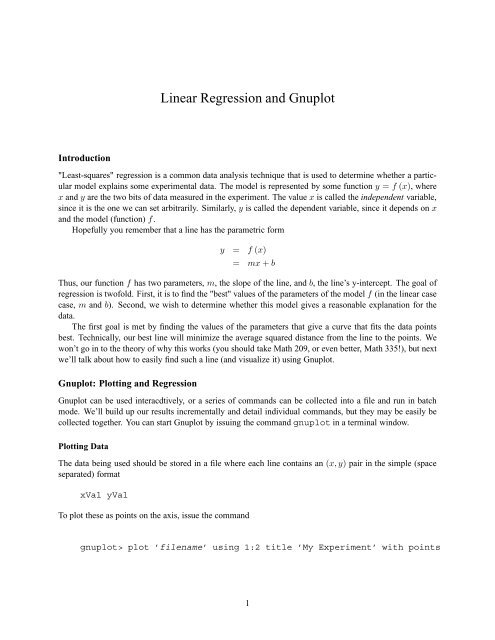
Linear Regression and Gnuplot
Linear Regression and Gnuplot
Linear Regression and Gnuplot

Create successful ePaper yourself
Turn your PDF publications into a flip-book with our unique Google optimized e-Paper software.
<strong>Linear</strong> <strong>Regression</strong> <strong>and</strong> <strong>Gnuplot</strong><br />
Introduction<br />
"Least-squares" regression is a common data analysis technique that is used to determine whether a particular<br />
model explains some experimental data. The model is represented by some function y = f (x), where<br />
x <strong>and</strong> y are the two bits of data measured in the experiment. The value x is called the independent variable,<br />
since it is the one we can set arbitrarily. Similarly, y is called the dependent variable, since it depends on x<br />
<strong>and</strong> the model (function) f.<br />
Hopefully you remember that a line has the parametric form<br />
y = f (x)<br />
= mx + b<br />
Thus, our function f has two parameters, m, the slope of the line, <strong>and</strong> b, the line’s y-intercept. The goal of<br />
regression is twofold. First, it is to find the "best" values of the parameters of the model f (in the linear case<br />
case, m <strong>and</strong> b). Second, we wish to determine whether this model gives a reasonable explanation for the<br />
data.<br />
The first goal is met by finding the values of the parameters that give a curve that fits the data points<br />
best. Technically, our best line will minimize the average squared distance from the line to the points. We<br />
won’t go in to the theory of why this works (you should take Math 209, or even better, Math 335!), but next<br />
we’ll talk about how to easily find such a line (<strong>and</strong> visualize it) using <strong>Gnuplot</strong>.<br />
<strong>Gnuplot</strong>: Plotting <strong>and</strong> <strong>Regression</strong><br />
<strong>Gnuplot</strong> can be used interacdtively, or a series of comm<strong>and</strong>s can be collected into a file <strong>and</strong> run in batch<br />
mode. We’ll build up our results incrementally <strong>and</strong> detail individual comm<strong>and</strong>s, but they may be easily be<br />
collected together. You can start <strong>Gnuplot</strong> by issuing the comm<strong>and</strong> gnuplot in a terminal window.<br />
Plotting Data<br />
The data being used should be stored in a file where each line contains an (x,y) pair in the simple (space<br />
separated) format<br />
xVal yVal<br />
To plot these as points on the axis, issue the comm<strong>and</strong><br />
gnuplot> plot ’filename’ using 1:2 title ’My Experiment’ with points<br />
1
where filename is the file containing the data you wish to plot. 1 The using 1:2 part directs <strong>Gnuplot</strong><br />
to use the first <strong>and</strong> second columns of the data, while with points part directs <strong>Gnuplot</strong> to plot these as<br />
disconnected points. There are other options, as we shall soon see.<br />
You should of course, give the plot a meaningful title (rather than “My Experiment.”) You would do<br />
well to label the axes so that others (or you, should you look back at this next week) know what is being<br />
plotted. For example, if your values represent the time to send a message via carrier pigeon with respect to<br />
the message size, you could do this with the comm<strong>and</strong>s<br />
gnuplot> set xlabel “Message size (mg)”<br />
gnuplot> set ylabel “Time (hours)”<br />
but you must issue the label comm<strong>and</strong>s before the plot comm<strong>and</strong>. Don’t forget the very useful units! This<br />
should give you something that looks like the following (on screen)<br />
14000<br />
Carrier Pigeon Delivery<br />
12000<br />
10000<br />
Time (min)<br />
8000<br />
6000<br />
4000<br />
2000<br />
0<br />
0 10000 20000 30000 40000 50000 60000 70000<br />
Message size (mg)<br />
Now we’ve got some data on some axes, <strong>and</strong> we know (vaguely) how to access it with the plot comm<strong>and</strong>.<br />
So far so good. What about this regression bit<br />
<strong>Regression</strong><br />
The first thing we need to do is define the function we want to fit to the data. In our example, we’re talking<br />
about a line, so we define our simple function (model) as a line for <strong>Gnuplot</strong>.<br />
gnuplot> f(x) = m*x + b<br />
Now, <strong>Gnuplot</strong> has the regression thing down. It knows what to do simply when you tell it:<br />
gnuplot> fit f(x) ’filename’ using 1:2 via m,b<br />
What you should see back is the results of a few iterations of the process for fitting the line. The last bit<br />
should look something like:<br />
1 We show comm<strong>and</strong>s with the <strong>Gnuplot</strong> comm<strong>and</strong> prompt “gnuplot>”. You should not type this, <strong>and</strong> if these were put into a<br />
script, you of course would not copy the “gnuplot>”.<br />
2
After 7 iterations the fit converged.<br />
final sum of squares of residuals : 5.33793e+06<br />
rel. change during last iteration : -1.30122e-12<br />
degrees of freedom (ndf) : 448<br />
rms of residuals (stdfit) = sqrt(WSSR/ndf) : 109.156<br />
variance of residuals (reduced chisquare) = WSSR/ndf : 11915<br />
Final set of parameters<br />
Asymptotic St<strong>and</strong>ard Error<br />
======================= ==========================<br />
m = 0.174844 +/- 0.0002964 (0.1695%)<br />
b = 1506.34 +/- 5.756 (0.3821%)<br />
correlation matrix of the fit parameters:<br />
m b<br />
m 1.000<br />
b -0.448 1.000<br />
There’s a lot of info there about the nature of the data, <strong>and</strong> how well <strong>Gnuplot</strong> was able to fit it, but the part<br />
you probably care most about is “What are the parameters” This is probably fairly straight forward to read<br />
off from the “Final set of parameters” section. In this data, the slope is 0.1748 <strong>and</strong> the y-intercept is about<br />
1500.<br />
The next question is, does it look like this line fits our data We can plot the line (<strong>Gnuplot</strong> stores the<br />
parameters m <strong>and</strong> b after the fitting process) with the comm<strong>and</strong><br />
gnuplot> plot f(x) title ’Line Fit’<br />
This will in fact plot the line with the appropriate values of m <strong>and</strong> b over an arbitrary domain (-10,10).<br />
However, it’s probably more interesting to see the line plotted with the original data. We can do this if we<br />
issue both directives in the same comm<strong>and</strong>:<br />
gnuplot> plot ’filename’ using 1:2 title ’Carrier Pigeon Delivery’<br />
with points, f(x) title ’Model Fit’<br />
This should give you something like the following image on screen.<br />
14000<br />
Carrier Pigeon Delivery<br />
Model Fit<br />
12000<br />
10000<br />
Time (min)<br />
8000<br />
6000<br />
4000<br />
2000<br />
0<br />
0 10000 20000 30000 40000 50000 60000 70000<br />
Message size (mg)<br />
3
Next we need to describe how to save these images to a file.<br />
<strong>Gnuplot</strong>-ting to a file<br />
Because it was designed in the days before rampant GUI usage, <strong>Gnuplot</strong> may seem a bit archaic with respect<br />
to its file-saving methods. It is more analagous to shell-based pipes <strong>and</strong> output redirection than any modern<br />
software. Saving the plots to a file involves three basic steps.<br />
1. Direct the output to an appropriate “terminal.” This acts as a filter that puts the data in the correct<br />
form for whatever format you want the output to be in. It’s sort of like using a comm<strong>and</strong>-line pipe<br />
of the format “gnuplot | gp2img” where gnuplot generates some plot structure <strong>and</strong> gp2img<br />
translates the output into an image.<br />
2. Next, we need to say where the output should finally be stored. This is just like using the shell to<br />
direct the st<strong>and</strong>ard output of a program into a file, such as “gp2img > file.dat”<br />
3. Finally, we actually need to issue the plot comm<strong>and</strong>s. This would be the input to gnuplot that tells<br />
it what to generate (that is eventually passed to a filter <strong>and</strong> written to a file). This could be akin to<br />
directing a file to st<strong>and</strong>ard input, such as “gnuplot < comm<strong>and</strong>s”. In actuality the plot comm<strong>and</strong>s<br />
may either be given in interactive mode (once the terminal <strong>and</strong> output are set above), or via a comm<strong>and</strong><br />
file.<br />
Step 3 was detailed in the previous sections. The plot comm<strong>and</strong>s may be put into a file, or given at the<br />
interactive prompt. Steps 1 <strong>and</strong> 2 are very easy. The syntax may vary with the output format desired, but<br />
PNG is a compact, widely supported format, so we’ll use that as an example:<br />
gnuplot> set terminal png<br />
gnuplot> set output ’file.png’<br />
These easily accomplish steps 1 <strong>and</strong> 2 above. Any subsequent plot directives will be stored in file.png<br />
until a new output file is specified with another ”set output” comm<strong>and</strong>. You can return to plotting to<br />
the screen by issuing another “redirecting” set terminal comm<strong>and</strong>:<br />
gnuplot> set terminal x11<br />
<strong>Gnuplot</strong> is a robust <strong>and</strong> highly versatile piece of software. There are many more options than the very brief<br />
portrait given here. To learn more, you should view some of the plethora of tutorials on the web.<br />
4