Food Magazine - The Food Commission
Food Magazine - The Food Commission Food Magazine - The Food Commission
ackbites Strokes of genius Two clinical trials have shown that cocoa flavanols can increase blood flow to the brain, which may help in the treatment of strokes and elderly dementia. A rich source of flavanols is chocolate. The flavanols may also have a mild aspirin-like effect, helping prevent platelet aggregation and maintain blood flow. And the funders of the research Masterfoods, makers of Mars bars. EFSA’s stakeholders The European Food Safety Authority is inviting organisations to participate in their Stakeholder Consultative Platform. Well, not quite. If you want to attend you can apply to be an associate member and then may be invited on a 'topic-related and case-by-case basis'. And you will pay your own attendance costs. Only a few organisations can be full members and EFSA has already made its mind up over the 24 participants who can have this higher status. We took a look at the list. The privileged participants include one consumer group, one public health group, one trade union group, four environmental organisations, and no less than seventeen commercial bodies and industry front groups. (And one of these, EuroCommerce, describes itself as 'The voice of commerce in Brussels'. This won't help it much, as EFSA recently opened its offices in Parma, Italy.) Remote-controlled calories In the previous issue, we reported on the enormous amount of calorific food and drink promoted in Blockbusters, including 'two for one' offers on large-sized chocolate, crisps and coke. The video rental store looked more like a very unhealthy supermarket. We commented that there was something of an irony in encouraging people to stuff their faces with calories when their energy expenditure over the next few hours will be at the 'hard to detect' end of the scale. Does Marks & Spencer have a similar sense of irony We found this confectionery product at the checkout in our local branch. A 380 kcalorie solid milk chocolate TV remote control unit, promoted by Homer Simpson. Coca-Cola hires fruity new image In July, Coca-Cola hired a new chief marketing officer. Now, this is no joke. We did check. His name is Chuck Fruit. The press release we received contained the memorable phrase 'Fruit is widely liked and admired'. In which case, let's hope he decides to put more of it in their drinks. Investigating the links between people's names and jobs is an amusing way to pass a lunch hour. So it's also our pleasure to remind readers that the chief marketing officer for McDonald's is the somewhat portly Larry Light. Biscuit ingredients are too small to see! The food industry's Institute for Grocery Distribution (IGD) gives the following advice to food manufacturers about legibility: 'The label is the principal source of consumer information. When creating a label consider carefully what information is helpful and important to the consumer and ensure this is prominent, concise and clearly expressed.' It goes on to advise on type size, layout and colour contrasts between type and background, and the challenges that many people face (especially older people) when trying to read poorly presented information. In the UK, around two million people have a visual impairment or are blind. Consider, then, these two types of creamfilled cocoa biscuits, purchased in an east London supermarket. For the Negro biscuits, the manufacturer provides ingredients information in 12 different languages in a panel 94mm by 16mm – approximately 400 words in all. Even for people with perfect vision, the words are little more than a blur, especially as they are printed on a shiny background. For the Biskrem biscuits, the panel is 102mm by 16mm, also containing about 400 words, again in several languages. We can't say how many because this label is pretty However, it seems that poor old Larry Light no longer fits the image of New McDonald's. By the end of the year, he will be replaced by Mary Dillon, who will become chief marketing officer and executive vice president. McDonald's reports that Mary is a fitness and running enthusiast, married and a mother of four, and that she used to work in marketing for Quaker. She will assume leadership of the McDonald's Balanced Lifestyles Initiative. How nice. Larry Light Chuck Fruit Mary Dillon much impossible to read. The letters are in dark gold on a black background, and all in capital letters so that there are no word shapes to hint at the meaning. A magnifying glass did help us to make out the words 'hydrogenated' and 'palm oil'. The box below is also 102mm by 16mm. Just like the biscuit labels, it contains about 400 words of advice – this time on legibility, from the IGD. Perhaps the manufacturers should get their own magnifying glasses out and have a go at reading them. Note: To see the IGD's advice in full size, go to the website www.igd.com and type ‘legibility’ into the search facility When creating a label consider carefully what information is helpful and important to the consumer and ensure this is prominent, concise and clearly expressed without compromising legal requirements. A succinct phrase can be better than a complex one to get the message across. Inappropriate text size, colour contrasts and texture can lead to poor legibility. However, new technologies in print, packaging and print surfaces are constantly evolving and should be used to enhance legibility. The label is the principal source of consumer information. Other sources can supplement and explain information, such as websites, customer carelines, leaflets and instore information. Multi-language labels need particular attention to ensure consistency between different languages or alphabets, and easy identification of the consumer's chosen language. Recommendations are designed to provide practical guidance to the industry in order to help consumers. Consumers have different requirements when shopping. Providing relevant information is an important factor in assisting consumer choice. The overall pack and the layout of information are the first point of contact to convey important features about the product to the consumer. Following a standardised format may be the ideal but is not always practical. Therefore each pack should accommodate a hierarchy of information, giving priority to safety information and also to the statutory field of vision requirements. It is vital to consider how the consumer will view products, such as in the freezer, on shelf or loose. Important visual cues for the consumer include branding and product name. Statutory information such as product description, variety and flavour, also assists consumer choice. Key information can be more clearly identified in frames or panels and by the use of headings in the context of the total area available. Clear separation of different languages on multi-language packs is particularly desirable. The use of colour is important to create visual contrast and to focus on key information. Clear and considered text layout can significantly enhance on-pack communication. For short, punchy messages the use of bold typeface, bullet points and italics can enhance legibility. However these should be used selectively as too many can obscure the message. Consumers get reading cues from the peaks and troughs of letters, so a structured mixture of upper and lower case is more legible than the use of upper case alone. Consider the use of blocks to draw the eye to key areas of text. Consider typefaces specifically drawn for use at small size.
- Page 1 and 2: Meaty content with a hot, spicy sau
- Page 3 and 4: news California takes Burger King t
- Page 5 and 6: news Food Commission tells FSA: Don
- Page 7 and 8: nutrition But it couldn’t happen
- Page 9 and 10: farming “This milk’ll have them
- Page 11 and 12: Invisible damage Everyday food prod
- Page 13 and 14: environment re a call to action! Th
- Page 15 and 16: society Nestlé’s unfair trade Ho
- Page 17 and 18: advertising XNestlé complaint upda
- Page 19 and 20: health EC butter scandal continues
- Page 21 and 22: ooks Dictionary of Food Science and
- Page 23: feedback letters from our readers
ackbites<br />
Strokes of genius<br />
Two clinical trials have shown that cocoa<br />
flavanols can increase blood flow to the brain,<br />
which may help in the treatment of strokes<br />
and elderly dementia. A rich source of<br />
flavanols is chocolate. <strong>The</strong> flavanols may also<br />
have a mild aspirin-like effect, helping prevent<br />
platelet aggregation and maintain blood flow.<br />
And the funders of the research<br />
Masterfoods, makers of Mars bars.<br />
EFSA’s stakeholders<br />
<strong>The</strong> European <strong>Food</strong> Safety Authority is inviting<br />
organisations to participate in their Stakeholder<br />
Consultative Platform.<br />
Well, not quite. If you want to attend you can<br />
apply to be an associate member and then may<br />
be invited on a 'topic-related and case-by-case<br />
basis'. And you will pay your own attendance<br />
costs.<br />
Only a few organisations can be full<br />
members and EFSA has already made its mind<br />
up over the 24 participants who can have this<br />
higher status. We took a look at the list. <strong>The</strong><br />
privileged participants include one consumer<br />
group, one public health group, one trade union<br />
group, four environmental organisations, and no<br />
less than seventeen commercial bodies and<br />
industry front groups.<br />
(And one of these, EuroCommerce, describes<br />
itself as '<strong>The</strong> voice of commerce in Brussels'.<br />
This won't help it much, as EFSA recently<br />
opened its offices in Parma, Italy.)<br />
Remote-controlled<br />
calories<br />
In the previous issue, we reported on the<br />
enormous amount of calorific food and drink<br />
promoted in Blockbusters, including 'two for<br />
one' offers on large-sized chocolate, crisps<br />
and coke. <strong>The</strong> video rental<br />
store looked more like a<br />
very unhealthy<br />
supermarket. We<br />
commented that there was<br />
something of an irony in<br />
encouraging people to<br />
stuff their faces with<br />
calories when their<br />
energy expenditure over<br />
the next few hours will<br />
be at the 'hard to detect'<br />
end of the scale.<br />
Does Marks &<br />
Spencer have a similar<br />
sense of irony We<br />
found this<br />
confectionery product at<br />
the checkout in our local branch. A 380<br />
kcalorie solid milk chocolate TV remote<br />
control unit, promoted by Homer Simpson.<br />
Coca-Cola hires fruity new image<br />
In July, Coca-Cola hired a new chief marketing<br />
officer. Now, this is no joke. We did check.<br />
His name is Chuck Fruit.<br />
<strong>The</strong> press release we received contained<br />
the memorable phrase 'Fruit is widely liked<br />
and admired'. In which case, let's hope he<br />
decides to put more of it in their drinks.<br />
Investigating the links between people's<br />
names and jobs is an amusing way to pass a<br />
lunch hour. So it's also our pleasure to remind<br />
readers that the chief marketing officer for<br />
McDonald's is the somewhat portly Larry Light.<br />
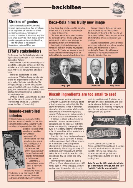
Biscuit ingredients are too small to see!<br />
<strong>The</strong> food industry's Institute for Grocery<br />
Distribution (IGD) gives the following advice<br />
to food manufacturers about legibility: '<strong>The</strong><br />
label is the principal source of consumer<br />
information. When creating a label consider<br />
carefully what information is helpful and<br />
important to the consumer and ensure this is<br />
prominent, concise and clearly expressed.'<br />
It goes on to advise on type size, layout<br />
and colour contrasts between type and<br />
background, and the challenges that many<br />
people face (especially older people) when<br />
trying to read poorly presented information.<br />
In the UK, around two million people have a<br />
visual impairment or are blind.<br />
Consider, then, these two types of creamfilled<br />
cocoa biscuits, purchased in an east<br />
London supermarket. For the Negro biscuits,<br />
the manufacturer provides ingredients<br />
information in 12 different languages in a<br />
panel 94mm by 16mm – approximately 400<br />
words in all. Even for people with perfect<br />
vision, the words are little more than a blur,<br />
especially as they are printed on a shiny<br />
background.<br />
For the Biskrem biscuits, the panel is<br />
102mm by 16mm, also containing about 400<br />
words, again in several languages. We can't<br />
say how many because this label is pretty<br />
However, it seems that poor old Larry<br />
Light no longer fits the image of New<br />
McDonald's. By the end of the year, he will<br />
be replaced by Mary Dillon, who will become<br />
chief marketing officer and executive vice<br />
president.<br />
McDonald's reports that Mary is a fitness<br />
and running enthusiast, married and a mother<br />
of four, and that she used to work in<br />
marketing for Quaker. She will assume<br />
leadership of the McDonald's Balanced<br />
Lifestyles Initiative. How nice.<br />
Larry Light Chuck Fruit Mary Dillon<br />
much impossible to read. <strong>The</strong> letters are in<br />
dark gold on a black background, and all in<br />
capital letters so that there are no word<br />
shapes to hint at the meaning. A magnifying<br />
glass did help us to make out the words<br />
'hydrogenated' and 'palm oil'.<br />
<strong>The</strong> box below is also 102mm by<br />
16mm. Just like the biscuit labels, it contains<br />
about 400 words of advice – this time on<br />
legibility, from the IGD. Perhaps the<br />
manufacturers should get their own<br />
magnifying glasses out and have a go at<br />
reading them.<br />
Note: To see the IGD's advice in full size,<br />
go to the website www.igd.com and type<br />
‘legibility’ into the search facility<br />
When creating a label consider carefully what information is helpful and important to the consumer and ensure this is prominent, concise and clearly expressed without compromising legal requirements. A succinct phrase can be better than a complex one to get the<br />
message across. Inappropriate text size, colour contrasts and texture can lead to poor legibility. However, new technologies in print, packaging and print surfaces are constantly evolving and should be used to enhance legibility. <strong>The</strong> label is the principal source of<br />
consumer information. Other sources can supplement and explain information, such as websites, customer carelines, leaflets and instore information. Multi-language labels need particular attention to ensure consistency between different languages or alphabets, and<br />
easy identification of the consumer's chosen language. Recommendations are designed to provide practical guidance to the industry in order to help consumers. Consumers have different requirements when shopping. Providing relevant information is an important<br />
factor in assisting consumer choice. <strong>The</strong> overall pack and the layout of information are the first point of contact to convey important features about the product to the consumer. Following a standardised format may be the ideal but is not always practical. <strong>The</strong>refore<br />
each pack should accommodate a hierarchy of information, giving priority to safety information and also to the statutory field of vision requirements. It is vital to consider how the consumer will view products, such as in the freezer, on shelf or loose. Important visual<br />
cues for the consumer include branding and product name. Statutory information such as product description, variety and flavour, also assists consumer choice. Key information can be more clearly identified in frames or panels and by the use of headings in the<br />
context of the total area available. Clear separation of different languages on multi-language packs is particularly desirable. <strong>The</strong> use of colour is important to create visual contrast and to focus on key information. Clear and considered text layout can significantly<br />
enhance on-pack communication. For short, punchy messages the use of bold typeface, bullet points and italics can enhance legibility. However these should be used selectively as too many can obscure the message. Consumers get reading cues from the peaks and<br />
troughs of letters, so a structured mixture of upper and lower case is more legible than the use of upper case alone. Consider the use of blocks to draw the eye to key areas of text. Consider typefaces specifically drawn for use at small size.


