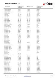
PDF Sample - Fontworks UK Ltd
PDF Sample - Fontworks UK Ltd
PDF Sample - Fontworks UK Ltd

You also want an ePaper? Increase the reach of your titles
YUMPU automatically turns print PDFs into web optimized ePapers that Google loves.
hh is for heinemann<br />
Nice and easy for anyone<br />
concerned with legibility
e is for eye<br />
You don’t need eagle<br />
eyes to decipher the<br />
Heinemann font<br />
i is for impala<br />
i<br />
Your reading will come on<br />
in leaps and bounds
n is for number<br />
Count on us for legibility
e is for elephant<br />
Our font comes in a special,<br />
ultra-heavy, Black cut
m is for mouse<br />
It can be reduced<br />
considerably without<br />
compromising legibility
aa is for apple<br />
Have you ever seen an<br />
alphabet chart without one
n is for nest<br />
Our font family<br />
consists of 12 cuts
n is for nut<br />
After 8 years of testing,<br />
we think we’ve cracked it
heinemann fonts<br />
nice and easy<br />
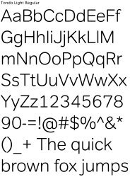
Heinemann Roman<br />
Heinemann Roman Italic<br />
Heinemann Bold<br />
Heinemann Bold Italic<br />
Heinemann Black<br />
Heinemann Black Italic<br />
Heinemann Special Roman<br />
Heinemann Special Roman Italic<br />
Heinemann Special Bold<br />
Heinemann Special Bold Italic<br />
Heinemann Special Black<br />
Heinemann Special Black Italic<br />
Buy Heinemann Fonts<br />
Call <strong>Fontworks</strong> on +44 (0)20 7226 4411<br />
email sales@type.co.uk<br />
or visit www.type.co.uk
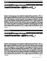
We often forget that each letter is an image.<br />
And not recognising what it represents inevitably<br />
impedes our reading.<br />
We have developed these fonts in consultation<br />
with children, literacy advisers, primary school<br />
teachers and teachers of children with special needs<br />
and dyslexia.<br />
They have been tested and improved over an eight<br />
year period. They have become our favourite<br />
for use in print and electronic products and are now<br />
available in response to hundreds of requests from<br />
publishers, designers and teachers.<br />
It’s been a great pleasure developing these fonts<br />
and we’re proud to see them go out and make<br />
their way in the world.<br />
We hope you enjoy them.<br />
heinemann fonts<br />
nice and easy
Heinemann Roman<br />
abcdefghijklmnopqrstuvwxyz<br />
ABCDEFGHIJKLMNOPQRSTUVWXYZ<br />
0123456789<br />
Heinemann Roman Italic<br />
abcdefghijklmnopqrstuvwxyz<br />
ABCDEFGHIJKLMNOPQRSTUVWXYZ<br />
0123456789<br />
Normal ‘a’s and ‘g’s<br />
One of our first priorities was getting the ‘a’<br />
and ‘g’ right. No funny typographical ones<br />
which are too fiddly for our taste.<br />
great
Heinemann Bold<br />
abcdefghijklmnopqrstuvwxyz<br />
ABCDEFGHIJKLMNOPQRSTUVWXYZ<br />
0123456789<br />
Heinemann Bold Italic<br />
abcdefghijklmnopqrstuvwxyz<br />
ABCDEFGHIJKLMNOPQRSTUVWXYZ<br />
0123456789<br />
Rounded corners<br />
We wanted to avoid the harsh edges of<br />
many typefaces. This has produced<br />
a warmer, friendlier font, where ‘o’ and ‘k’<br />
are happy together.<br />
ok
Heinemann Black<br />
abcdefghijklmnopqrstuvwxyz<br />
ABCDEFGHIJKLMNOPQRSTUVWXYZ<br />
0123456789<br />
Heinemann Black Italic<br />
abcdefghijklmnopqrstuvwxyz<br />
ABCDEFGHIJKLMNOPQRSTUVWXYZ<br />
0123456789<br />
Different ‘I’s and ‘l’s<br />
If it reads wrong, it is wrong. We made sure<br />
our capital ‘I’ and lower case ‘l’ don’t look<br />
similar, preventing words like ‘Illustration’<br />
or ‘Illicit’ from looking silly.<br />
Ill
, ; : . ¿ ¡ ! - – — ( ) [ ] { } … ‘ ’ “ ” „ « »<br />
' " # & % ‰ / | \ * † ‡ § • μ ƒ @ ® © <br />
$ € £ ¥ + − ÷ × = < > ≤ ≥ ± ¹ ² ³ ½ ¼ ¾<br />
áÁ àÀ â äÄ ãà åÅ éÉ êÊ ëË èÈ çÇ íÍ îÎ ïÏ ìÌ<br />
óÓ ôÔ òÒ öÖ õÕ úÚ ûÛ ùÙ üÜ ñÑ ýÝ ÿŸ šŠ žŽ<br />
ðÐ þÞ łŁ fi fl ¢ ß æÆ øØ œŒ<br />
^ _ ~ ° ª º ¬ ‹› ı ¦ ` ´ ¨ ˆ ˜ ˘ ˙ ˚ ¸ ˝ ˛ ˇ<br />
Odds and ends<br />
We thought you might find these useful.<br />
醩.
Heinemann Special Roman<br />
abcdefghijklmnopqrstuvwxyz<br />
ABCDEFGHIJKLMNOPQRSTUVWXYZ<br />
0123456789<br />
Heinemann Special Roman Italic<br />
abcdefghijklmnopqrstuvwxyz<br />
ABCDEFGHIJKLMNOPQRSTUVWXYZ<br />
0123456789<br />
Minding ‘p’s and ‘q’s<br />
One of the most common letter recognition<br />
difficulties with dyslexia are ‘q’ and ‘p’.<br />
Heinemann helps prevent this.<br />
qp
Heinemann Special Bold<br />
abcdefghijklmnopqrstuvwxyz<br />
ABCDEFGHIJKLMNOPQRSTUVWXYZ<br />
0123456789<br />
Heinemann Special Bold Italic<br />
abcdefghijklmnopqrstuvwxyz<br />
ABCDEFGHIJKLMNOPQRSTUVWXYZ<br />
0123456789<br />
Special ‘b’s and ‘d’s<br />
In the Special cut, our ‘b’ and ‘d’ get<br />
a special treatment.<br />
bad
Heinemann Special Black<br />
abcdefghijklmnopqrstuvwxyz<br />
ABCDEFGHIJKLMNOPQRSTUVWXYZ<br />
0123456789<br />
Heinemann Special Black Italic<br />
abcdefghijklmnopqrstuvwxyz<br />
ABCDEFGHIJKLMNOPQRSTUVWXYZ<br />
0123456789<br />
Kerning<br />
We’ve adjusted the kerning on specific pairs.<br />
Our ‘rn’s won’t appear as ‘m’s.<br />
kern
Heinemann Roman<br />
Heinemann Roman Italic<br />
Heinemann Bold<br />
Heinemann Bold Italic<br />
Heinemann Black<br />
Heinemann Black Italic<br />
Heinemann Special Roman<br />
Heinemann Special Roman Italic<br />
Heinemann Special Bold<br />
Heinemann Special Bold Italic<br />
Heinemann Special Black<br />
Heinemann Special Black Italic<br />
Design by Brighten the Corners www.brightenthecorners.com<br />
Buy Heinemann Fonts<br />
Call <strong>Fontworks</strong> on +44 (0)20 7226 4411<br />
email sales@type.co.uk or visit www.type.co.uk<br />
(all fonts are available in OpenType format)<br />
heinemann fonts<br />
nice and easy