Proper Color Usage PANTONE Reflex Blue PANTONE 185 Proper ...
Proper Color Usage PANTONE Reflex Blue PANTONE 185 Proper ... Proper Color Usage PANTONE Reflex Blue PANTONE 185 Proper ...
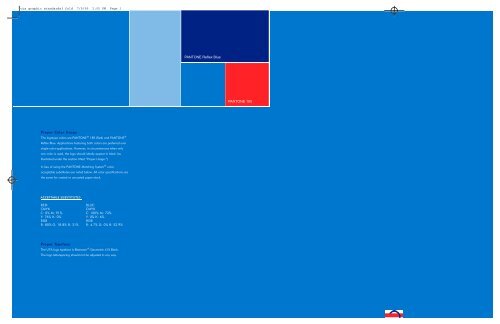
uta graphic standards3 fold 7/9/99 2:05 PM Page 1 PANTONE Reflex Blue PANTONE 185 Proper Color Usage The logotype colors are PANTONE ® 185 (Red) and PANTONE ® Reflex Blue. Applications featuring both colors are preferred over single-color applications. However, in circumstances when only one color is used, the logo should ideally appear in black (as illustrated under the section titled “Proper Usage.”) In lieu of using the PANTONE Matching System ® color, acceptable substitutes are noted below. All color specifications are the same for coated or uncoated paper stock. AC C E P TABLE SUBSTITUTES R E D: B LU E: C M Y K C M Y K C: 0% M: 91% C: 100% M: 72 % Y: 76% K: 0 % Y: 0% K: 6 % R G B R G B R: 80% G: 18.8% B: 31 % R: 4.7% G: 0% B: 52 . 9 % Proper Ty p e f a c e The UTA logo typeface is Bitstream ® Geometric 415 Black. The logo letterspacing should not be adjusted in any way.
uta graphic standards3 fold 7/9/99 2:05 PM Page 1<br />
<strong>PANTONE</strong> <strong>Reflex</strong> <strong>Blue</strong><br />
<strong>PANTONE</strong> <strong>185</strong><br />
<strong>Proper</strong> <strong>Color</strong> <strong>Usage</strong><br />
The logotype colors are <strong>PANTONE</strong> ® <strong>185</strong> (Red) and <strong>PANTONE</strong> ®<br />
<strong>Reflex</strong> <strong>Blue</strong>. Applications featuring both colors are preferred over<br />
single-color applications. However, in circumstances when only<br />
one color is used, the logo should ideally appear in black (as<br />
illustrated under the section titled “<strong>Proper</strong> <strong>Usage</strong>.”)<br />
In lieu of using the <strong>PANTONE</strong> Matching System ® color,<br />
acceptable substitutes are noted below. All color specifications are<br />
the same for coated or uncoated paper stock.<br />
AC C E P TABLE SUBSTITUTES<br />
R E D: B LU E:<br />
C M Y K<br />
C M Y K<br />
C: 0% M: 91% C: 100% M: 72 %<br />
Y: 76% K: 0 % Y: 0% K: 6 %<br />
R G B<br />
R G B<br />
R: 80% G: 18.8% B: 31 % R: 4.7% G: 0% B: 52 . 9 %<br />
<strong>Proper</strong> Ty p e f a c e<br />
The UTA logo typeface is Bitstream ® Geometric 415 Black.<br />
The logo letterspacing should not be adjusted in any way.
uta graphic standards3 fold 7/9/99 2:07 PM Page 4<br />
C O R P O R A T E I D E N T I T Y<br />
C O R P O R A T E I D E N T I T Y<br />
B a c k g r o u n d<br />
The development of a new logo and corporate identity symbolizes<br />
change, vision, fresh thinking, and new leadership — all of which<br />
aptly describe UTA at this point in its histor y.<br />
The purpose of this standards guide is to assure proper usage of<br />
the new UTA logo so that a consistent, well-recognized brand<br />
identity can be developed and maintained.<br />
<strong>Proper</strong> <strong>Usage</strong> of Logo<br />
The examples offered here indicate acceptable usage of the UTA<br />
logo. Always use appropriate reproduction art in any application<br />
of the logo. If you need reproduceable copies of the logo, or have<br />
questions, please contact the UTA Marketing Department.<br />
The size ratios of the type and logo combination shown here should<br />
never be changed. The letters “UTA” should always be the same<br />
height as the logo’s two stripes. In a single-color application, the<br />
SM<br />
SM<br />
SM<br />
SM<br />
SM<br />
SM<br />
SM<br />
SM<br />
larger red stripe should be printed as a 45% screen. For s i n g l e -<br />
color copying or low-end printing, a line screen at 65 is acceptable.<br />
Both “UTA” and “Utah Transit Authority” versions of the logo a re<br />
acceptable in any situation. Likewise, either the horizontal or vertical<br />
(stacked) version may be used depending on space parameters.<br />
The logo may not be manipulated, tilted, tinted, condensed, or<br />
stretched. (Please review the section titled “Improper <strong>Usage</strong>.”)<br />
SM<br />
<strong>Proper</strong> <strong>Usage</strong> with Service Entity Names<br />
The logo‘s application to various UTA service entities should<br />
be treated as depicted here – either horizontally or vertically.<br />
Care should be taken to assure that letter spacing remains<br />
consistent with the examples shown.<br />
The new logo not only reflects the attributes listed above, but its<br />
colors and striping are reminiscent of UTA’s past graphic identity,<br />
suggesting a continuity of existing service, skills, and strengths. The<br />
positioning of stripes within a circle suggests movement and pro g re s s .<br />
It also portrays connections and intermodal coordination — the<br />
linking of services, routes, and commuter transportation options.<br />
The guidelines contained in this document should be applied,<br />
without exception, to all visual materials produced and printed for<br />
and about UTA. Unauthorized reproduction of the UTA logotype<br />
or its elements is a violation of law and subject to penalties.<br />
SM<br />
SM<br />
SM<br />
SM<br />
SM<br />
SM


