WHAT DOES IT TAKE TO SURVIVE? - Airbrush Megastore
WHAT DOES IT TAKE TO SURVIVE? - Airbrush Megastore
WHAT DOES IT TAKE TO SURVIVE? - Airbrush Megastore

You also want an ePaper? Increase the reach of your titles
YUMPU automatically turns print PDFs into web optimized ePapers that Google loves.
To answer, I can only draw on my own<br />
experience. For although attendance and foot<br />
traffic are issues at the parks where I’m located<br />
(Valleyfair and Nickelodeon Universe in<br />
Minnesota and Six Flags in St. Louis), my<br />
sales and per-caps are either holding strong or<br />
going up in all three locations. How is this<br />
possible With all of the challenges consumers<br />
face today, how am I able to thrive<br />
The answer lies in continual growth and<br />
adaptation; I’m constantly looking for ways to<br />
improve my operation and my work.<br />
To best answer questions of business survival<br />
requires a comprehensive approach. So<br />
although I’d need to write a book to cover<br />
them, I’m at least going to glance here at the<br />
main strengths of my operation. Just a few<br />
issues back, I outlined some of the business<br />
aspects: booth location and layout, display<br />
layout, order forms, and so on. Now I’m<br />
going to focus more on the front line of<br />
attack: the types of shirts and peripheral<br />
items to offer, required equipment and materials,<br />
hot new design trends, the approach to<br />
selling, and the overall look of the operation.<br />
You see, I’m dedicated not only to my<br />
own business but to the entire airbrush T-<br />
<strong>WHAT</strong> <strong>DOES</strong> <strong>IT</strong><br />
<strong>TAKE</strong> <strong>TO</strong><br />
<strong>SURVIVE</strong><br />
ABy Kent Lind PART 1 OF 2<br />
LTHOUGH I STILL GET MANY TECHNICAL QUESTIONS ABOUT<br />
how to airbrush T-shirts, the recent trend of inquiry<br />
has been much more geared to business survival.<br />
Lately, many people have seen a decrease in their<br />
discretionary incomes, the money they spend on<br />
whatever they want. To me this is evident in foot traffic at the amusement<br />
parks and malls where I work. Whatever your situation, I’m sure you’ve<br />
noticed a fall-off in consumer spending as well.<br />
Recently, I had two phone calls in one week from individuals in Virginia<br />
and Wisconsin describing to me their difficulties staying in business. Both<br />
have had years of experience airbrushing on all types of surfaces and in all<br />
types of settings, but now they are hard pressed to make a go of it.<br />
“What should I do” was the bottom-line question. >><br />
shirt industry; if I can aid the industry, in the<br />
long run I’ll aid myself. Let’s get busy.<br />
The first thing is the airbrush itself. I’ve<br />
used pretty much every kind of T-shirt brush<br />
out there and have settled on what I think is<br />
“<br />
the best: the Iwata Eclipse HP-BCS. Simply<br />
put, it is a dependable work horse. Its performance<br />
is second to none in the T-shirt world,<br />
and it’s made by a reputable and forwardthinking<br />
company out to advance the airbrush<br />
industry as a whole. The price is<br />
actually middle of the road, but it is definitely<br />
top of the line among T-shirt airbrushes. I like<br />
to operate with12 to 15 airbrushes. I find<br />
that’s enough to maintain excellent speed and<br />
not be overwhelmed in terms of cost, space,<br />
or maintenance. The best sources for the<br />
Eclipse and its replacement parts are Coast<br />
<strong>Airbrush</strong>, of Anaheim, California, Dixie Art,<br />
of New Orleans, and a couple of others.<br />
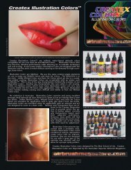
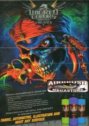
Next is the matter of paint. Anyone who’s<br />
followed this column knows I’m a big proponent<br />
of Createx textile paint. Their dedication<br />
to continual improvement of their<br />
product line and willingness to listen to artists<br />
were what attracted me to them initially and<br />
kept me coming back. And now, after a year<br />
and a half of working with Terry Hill and<br />
Craig Kennedy at Createx, I am honored and<br />
excited to introduce their line of Wicked<br />
paint. I hinted at its performance in the last<br />
issue, where I wrote about the white I used on<br />
airbrushed boots. Craig recently sent me the<br />
finished formula to test, and it’s perfect. I’ve<br />
tried it on T-shirts, hard surfaces, paper, cardboard,<br />
pellon—you name it—and couldn’t<br />
have been happier. As for the kind of line I<br />
can pull with this white, I set up a piece of<br />
mat board, and after two continuous minutes<br />
of swirls, daggers, thick-to-pencil-thin lines<br />
and thinner, with no breaks and virtually no<br />
tip dry, and without ever stopping paint flow,<br />
I was convinced. The paint comes out with a<br />
powdery look and feel, with sharp edges. Of<br />
course I also painted a quick design to check<br />
covering ability; after all, great flow without<br />
great opacity doesn’t mean much. And, as<br />
expected (given 18 months of tests and retests),<br />
the covering ability is fantastic. I<br />
haven’t been this excited about a paint since I<br />
started airbrushing 21 years ago. Don’t take<br />
W<strong>IT</strong>H ALL OF THE CHALLENGES<br />
CONSUMERS FACE <strong>TO</strong>DAY, HOW AM I<br />
ABLE <strong>TO</strong> THRIVE THE ANSWER LIES IN<br />
CONTINUAL GROWTH AND ADAPTATION;<br />
I’M CONSTANTLY LOOKING FOR WAYS <strong>TO</strong><br />
IMPROVE MY OPERATION AND MY WORK.”<br />
my word for it, judge for yourself. Not incidentally,<br />
you can buy the new Wicked line<br />
from Coast <strong>Airbrush</strong>.<br />
Products like these are great, but you also<br />
need to understand how to use them. As I<br />
always say, unless you’re ready to be successful<br />
you won’t be. What separates my business<br />
from those that are struggling It comes<br />
down to just a few points.<br />
First, you have to be good at everything. I<br />
know that many artists can do one or a few<br />
things very well: this guy paint portraits like
2 3<br />
1<br />
nobody else, that girl can really paint cartoon<br />
characters, this dude is off the hook at<br />
graffiti. But nine times out of ten that’s all<br />
they can do. The rest of their work suffers by<br />
comparison. There is, of course, room for<br />
these people in a niche market, and many do<br />
wonderfully within that market. But we’re<br />
talking about surviving in the airbrush T-<br />
shirt world. For that you’ve got to be good at<br />
it all—portraits, caricatures, lettering, cars,<br />
bikes, animals, cartoons, etc. This is where<br />
most people fail. Many artists are better than<br />
me at those things separately, but I know of<br />
very few who are superior in all. This does<br />
not mean you have to be great at painting<br />
on everything. It’s a popular misconception<br />
that an airbrush artist must know how to<br />
paint on T-shirts, walls, cars and cycles,<br />
mailboxes—whatever. That doesn’t hurt, but<br />
at some point you need to focus on one. The<br />
assumption here is that your niche market is<br />
the T-shirt, but you need to know how to<br />
paint any and all types of subject matter<br />
within that framework. That’s really the<br />
thrust of what you’re going to see in the<br />
step-by-steps that follow. I’m attempting to<br />
set a standard here for the subject matters<br />
that must be mastered if you’re going to<br />
make a go of T-shirt airbrushing.<br />
Second is the manner in which you display,<br />
advertise and sell your ability to do it<br />
all. I know display is extremely important<br />
and has been covered by many other<br />
CARICATURE:<br />
The caricature is not a huge staple of my business<br />
in terms of quantity. So why include it in<br />
the list of top designs The reason is its ability<br />
to attract customers, based on artistic difficulty<br />
and the readily recognizable figure. People are<br />
drawn to what, or whom, they know. If you recognize<br />
your subject in the caricature, chances<br />
are someone else will, too; and they will at the<br />
very least come over for a closer look.<br />
As subjects for caricature, choose people<br />
you find interesting. I’ve always been a fan of<br />
the Foo Fighters and couldn’t think of a better<br />
person to caricature than their lead man,<br />
Dave Grohl. I’ve seen the Foo a few times in<br />
concert, and the one thing that really stuck<br />
out was Dave’s energy when he’s singing. To<br />
4 5<br />
get that energy across was the most important<br />
element in picking a reference. I came across<br />
the image below on Google and thought it fit<br />
the bill perfectly. And what caricature of<br />
Grohl would be complete without him banging<br />
away on his guitar With the layout complete<br />
in my head, and my references ready, it<br />
was time to get to the fun stuff.<br />
DAVE GROHL 1:<br />
In any attempt to convey Dave’s energy, the<br />
shape of his head and how it relates to his<br />
hair jump out right away. His nostrils flair and<br />
he also has pretty formidable choppers, all of<br />
which contributes to the aforementioned<br />
energy level. His mouth extends downward,<br />
but his jaw remains small. I used the top pic-
ture as the main reference, but I also like to<br />
keep a secondary angle to help me mentally<br />
round out the face.<br />
DAVE GROHL 2:<br />
Here’s the completed drawing with the first<br />
layer of color. I chose to keep the palette<br />
black and white, and all shades in between,<br />
and focus the color on the background with a<br />
bit bleeding into the figure. The first color<br />
was medium grey with a squirt of white and<br />
just a few drops of light brown. You’ve got to<br />
remember to treat this initial color as though<br />
it’s the only one you’re using to complete<br />
every aspect of the figure.<br />
DAVE GROHL 3:<br />
I took that initial color and added more<br />
Wicked Black and a few drops of dark brown<br />
to give more value. The idea was to build on<br />
what I already had to create as much depth as<br />
possible. Also, notice I’d been working on the<br />
peripheral items as well, like his clothing, guitar,<br />
and microphone. Elements such as these<br />
are important to the overall feel of your piece.<br />
6 7<br />
DAVE GROHL 4:<br />
Here’s the completed mono-chromatic figure,<br />
without the highlights. The last color in the<br />
figure was roughly half medium gray, one third<br />
Wicked Black, and a squirt of dark brown<br />
blended to constitute the darkest color. It was<br />
added to dark existing areas for more depth.<br />
Remember to reference your photo often!<br />
DAVE GROHL 5:<br />
Now it was time for the background. I’d<br />
already decided I wanted the palette to be<br />
blue, so I planned accordingly. Before starting,<br />
I sprayed a few pieces of wax paper with adhesive<br />
for a mask to cover the figure. Using an<br />
X-Acto blade, I cut around the figure and the<br />
Foo Fighter’s FF logo, which I included to offset<br />
the figure itself. A word of caution: use<br />
only light pressure to cut around the figure; a<br />
heavy hand will shred the shirt. I started with<br />
a mixture of Brite Blue and Fluorescent<br />
Yellow, with a squirt of white for the lightest<br />
color, added depth with Brite Blue, then finished<br />
off the effect with a mixture of Brite<br />
Blue, deep blue, and a few drops of black. I<br />
also did a fade within the FF logo.<br />
DAVE GROHL 6:<br />
Here’s the completed background with the<br />
paper pulled away. You might get residue from<br />
the adhesive, so look for it. If you find any, it’s<br />
8
authorities in terms of what to paint,<br />
quantity, location, pricing, etc. But what’s<br />
equally important, and really hasn’t been<br />
looked at extensively, is the way you move<br />
your product. Allow me to elaborate. This<br />
summer I was talking to my supervisor at<br />
Valleyfair about the way things are going<br />
at the park and, specifically, at my location.<br />
After mulling it over, we both concluded<br />
that the booth was about as<br />
effective and diversified, and as saturated<br />
with designs and display, as the space<br />
would allow.<br />
“So what’s the deal Why are some<br />
days busier than others” I asked.<br />
He answered that, based solely on sales<br />
figures, he could tell me what days I, or my<br />
assistant, or both of us work, without looking<br />
at our schedules. It took me a few minutes<br />
to understand what he was saying.<br />
“If you want the booth to perform better,<br />
you’ll have to work every day yourself,”<br />
he explained.<br />
Then it hit me. My ability to connect<br />
with the customer is what drives sales, my<br />
gift of gab some might call it. I call it<br />
reading what customers want and directing<br />
them towards an actual sale. I put<br />
myself out there and talk to people. Yet,<br />
that can be harder than it sounds. I try to<br />
instruct all of my artists to be this way, but<br />
results are mixed. Some get it, others<br />
don’t. A simple “Hi, how’s your day<br />
going” might be all it takes for a customer<br />
to stay a few minutes longer and<br />
decide to buy. “Let me know if there’s<br />
anything you need” is so simple yet effective<br />
for creating a connection, it’s scary.<br />
Trust me. Of course, knowing this without<br />
the skill to deliver on it will seriously hinder<br />
sales. Again, success goes back to<br />
being able to do it all.<br />
Now that we’ve got the selling attitude<br />
down, plus the inventory that goes with<br />
it, what do we do It’s crunch time; here’s<br />
where performance and the skill to deliver<br />
come into play. I’ll say it again: you’ve got<br />
to be able to do it all! So, next, I’m going<br />
to run through what “doing it all” might<br />
look like in terms of styles. The step-bysteps<br />
I’ve included cover merely the rudiments<br />
for each, but that should give you<br />
enough to grab onto and run with. Here<br />
are the two of the style categories you<br />
need to excel at, a sample of each, and<br />
why they’re top dogs.<br />
easy enough to pull off using tape. It will<br />
further reduce when you heat-set the shirt.<br />
DAVE GROHL 7:<br />
( AND CLOSE-UP PHO<strong>TO</strong> 8 )<br />
Finally, the completed design! I used<br />
Wicked White to add further depth and secondary<br />
lighting. I achieved the lighting by<br />
referencing my photo and understanding<br />
where the light was coming from. The hair<br />
was the coolest effect. This is where the performance<br />
of the new Wicked White really<br />
shone. I was able to spray fine line after fine<br />
line in the hair, with virtually no line breaks<br />
and without having to stop to clean my tip.<br />
LETTERING:<br />
Never underestimate the selling effect of<br />
well painted lettering. Here I’m going to give<br />
you just a small taste of style, paying close<br />
attention to application and composition.<br />
You’ve seen the two styles here before; the<br />
twist is that I did them in exactly the same<br />
color palette. Why Well, these styles and complementing<br />
colors are huge sellers for me. The<br />
slash style and tag style sell neck and neck and<br />
1<br />
2<br />
The covering ability was perfect, and I was<br />
able to range from subtle to completely<br />
opaque. After the initial white overlay, all I<br />
had to do was add Fluorescent Green for the<br />
desired effect. I also added a little atmospheric<br />
out-of-focus lighting to complete the<br />
rock star look.<br />
Remember that the power of the caricature<br />
in your display comes from its ability to<br />
attract people to the familiar. However, in<br />
your display as a whole, try to have as<br />
diverse a look as you can, ranging from<br />
complex, as in this one, to simpler, with<br />
only the face and a limited background.<br />
Pricing on caricatures will range from about<br />
$35 to $95. USA<br />
definitely compete with the all-powerful script.<br />
Also, I wanted to give you a look that maybe<br />
you hadn’t thought of for your current display.<br />
The colors were Pearl Silver, Wicked Black,<br />
and white. It was that simple. Many of you may<br />
not have pearl colors in your arsenal. I like to<br />
keep Pearl Silver and Pearl Gold on hand;<br />
you’d be surprised how many schools have gold<br />
or silver as one of their principal colors. At any<br />
rate, it pays to have both at the ready.<br />
TAG STYLE:<br />
This style really ties into the<br />
hip hop culture, where it is<br />
very popular. I applied it in<br />
block style rather than as a<br />
straight print to give you<br />
another look.<br />
TAG STYLE 1:<br />
First I laid out the lettering<br />
with the Pearl Silver.<br />
Remember to keep it flowing<br />
and to give it some flair.<br />
TAG STYLE 2:<br />
Next I outlined and shaded<br />
with the Wicked Black. This<br />
was the most difficult step.<br />
Keep your lines clean and<br />
try to move at a consistent<br />
rate around the letters. I also<br />
added depth by fading with<br />
the Wicked Black down<br />
from the top.<br />
TAG STYLE 3:<br />
The outside of the letters is<br />
really whatever you’re feeling.
3 4<br />
I like to do a swirl pattern that has somewhat<br />
of a pinstripe effect. This is probably the most<br />
popular look for us lately, for it spans name,<br />
heart, and cartoon designs.<br />
TAG STYLE 4:<br />
The last step was to highlight the design.<br />
Remember that less is more, and keep your<br />
white really clean and tight. This look is<br />
extremely effective (not to mention quick)<br />
in that the price is generally $20 USA, including<br />
the shirt.<br />
Australia's Master Importer<br />
www.airbrushmegastore.com