BRAND IDENTITY STANDARDS - Baldwin Filters
BRAND IDENTITY STANDARDS - Baldwin Filters
BRAND IDENTITY STANDARDS - Baldwin Filters

Create successful ePaper yourself
Turn your PDF publications into a flip-book with our unique Google optimized e-Paper software.
APPAREL ITEMS<br />
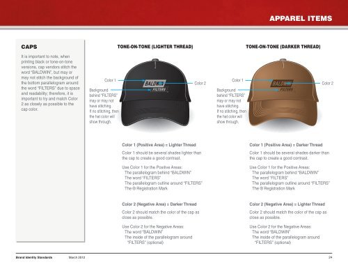
CAPS<br />
TONE-ON-TONE (LIGHTER THREAD)<br />
TONE-ON-TONE (DARKER THREAD)<br />
It is important to note, when<br />
printing black or tone-on-tone<br />
versions, cap vendors stitch the<br />
word “BALDWIN”, but may or<br />
may not stitch the background of<br />
the bottom parallelogram around<br />
the word “FILTERS” due to space<br />
and readability; therefore, it is<br />
important to try and match Color<br />
2 as closely as possible to the<br />
cap color.<br />
Color 1<br />
Background<br />
behind “FILTERS”<br />
may or may not<br />
have stitching.<br />
If no stitching, then<br />
the hat color will<br />
show through.<br />
Color 2<br />
Color 1<br />
Background<br />
behind “FILTERS”<br />
may or may not<br />
have stitching.<br />
If no stitching, then<br />
the hat color will<br />
show through.<br />
Color 2<br />
Color 1 (Positive Area) = Lighter Thread<br />
Color 1 should be several shades lighter than<br />
the cap to create a good contrast.<br />
Color 1 (Positive Area) = Darker Thread<br />
Color 1 should be several shades darker than<br />
the cap to create a good contrast.<br />
Use Color 1 for the Positive Areas:<br />
The parallelogram behind “BALDWIN”<br />
The word “FILTERS”<br />
The parallelogram outline around “FILTERS”<br />
The ® Registration Mark<br />
Use Color 1 for the Positive Areas:<br />
The parallelogram behind “BALDWIN”<br />
The word “FILTERS”<br />
The parallelogram outline around “FILTERS”<br />
The ® Registration Mark<br />
Color 2 (Negative Area) = Darker Thread<br />
Color 2 should match the color of the cap as<br />
close as possible.<br />
Color 2 (Negative Area) = Lighter Thread<br />
Color 2 should match the color of the cap as<br />
close as possible.<br />
Use Color 2 for the Negative Areas:<br />
The word “BALDWIN”<br />
The inside of the parallelogram around<br />
“FILTERS” (optional)<br />
Use Color 2 for the Negative Areas:<br />
The word “BALDWIN”<br />
The inside of the parallelogram around<br />
“FILTERS” (optional)<br />
Brand Identity Standards March 2012<br />
24