6_Appropriate_Displays_Histograms_WS
6_Appropriate_Displays_Histograms_WS
6_Appropriate_Displays_Histograms_WS

Create successful ePaper yourself
Turn your PDF publications into a flip-book with our unique Google optimized e-Paper software.
Name:<br />
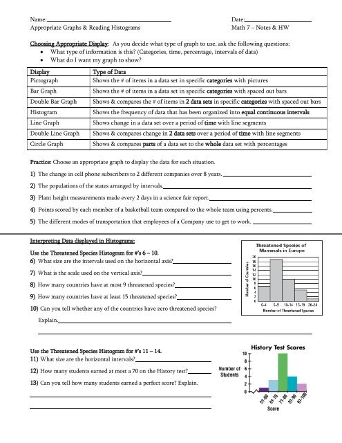
<strong>Appropriate</strong> Graphs & Reading <strong>Histograms</strong><br />
Date:<br />
Math 7 – Notes & HW<br />
Choosing <strong>Appropriate</strong> Display: As you decide what type of graph to use, ask the following questions;<br />
What type of information is this? (Categories, time, percentage, intervals of data)<br />
What do I want my graph to show?<br />
Display<br />
Pictograph<br />
Bar Graph<br />
Double Bar Graph<br />
Histogram<br />
Line Graph<br />
Double Line Graph<br />
Circle Graph<br />
Type of Data<br />
Shows the # of items in a data set in specific categories with pictures<br />
Shows the # of items in a data set in specific categories with spaced out bars<br />
Shows & compares the # of items in 2 data sets in specific categories with spaced out bars<br />
Shows the frequency of data that has been organized into equal continuous intervals<br />
Shows change in a data set over a period of time with line segments<br />
Shows & compares change in 2 data sets over a period of time with line segments<br />
Shows & compares parts of a data set to the whole data set with percentages<br />
Practice: Choose an appropriate graph to display the data for each situation.<br />
1) The change in cell phone subscribers to 2 different companies over 8 years.<br />
2) The populations of the states arranged by intervals.<br />
3) Plant height measurements made every 2 days in a science fair report.<br />
4) Points scored by each member of a basketball team compared to the whole team using percents.<br />
5) The different modes of transportation that employees of a Company use to get to work.<br />
Interpreting Data displayed in <strong>Histograms</strong>:<br />
Use the Threatened Species Histogram for #’s 6 – 10.<br />
6) What size are the intervals used on the horizontal axis?<br />
7) What is the scale used on the vertical axis?<br />
8) How many countries have at most 9 threatened species?<br />
9) How many countries have at least 15 threatened species?<br />
10) Can you tell whether any of the countries have zero threatened species?<br />
Explain.<br />
Use the Threatened Species Histogram for #’s 11 – 14.<br />
11) What size are the horizontal intervals?<br />
12) How many students earned at most a 70 on the History test?<br />
13) Can you tell how many students earned a perfect score? Explain.
Directions: Choose an appropriate graph to display the data for each situation.<br />
1) The number of each letter grade the members of a class earned on a test.<br />
2) The number of students who have 0-2 pets, 3-5 pets and 6-8 pets.<br />
3) The amount of beef flavored dog food sold compared to all dog food sold<br />
4) The price of gas over the past 8 months.<br />
5) Numbers of Americans whose first language is Spanish, Mandarin, or French using percents.<br />
6) The number of boys verses girls in the following sports, basketball, volleyball, and soccer.<br />
7) The scores of a class of students on a math test arranged in equal intervals.<br />
8) The amount of money that two sisters saved over the course of 5 years.<br />
Rich is a member of a bowling league on Tuesday and Thursday evenings. The following histogram shows his<br />
bowling scores in numerous games.<br />
9) How many scores are included in each horizontal interval?<br />
10) How many times did Rich score higher than 150?<br />
11) In what interval does the mode score lie?<br />
12) How many games did Rich play?<br />
13) How many times did Rich score lower than 126?<br />
14) How many times did Rich score higher than 200?<br />
15) How many times did Rich score at most 150?<br />
16) Can you tell if Rich ever scored a perfect score of 300? Explain.